
Brand Guideline Book

The Brand guideline book introduces the new Icon Design System for AZAH feminine hygiene brand. This book introduce feminine product should look like in all of markets and categories, and also explains how best to present them. Book designed to bring feminine hygiene products in a market and introduce a awareness for hygine. Brand will make sure that their design never loses sight of who they are. This book introduce and show the new packaging of products and what kind of changes can be relevant to the brand and which one are not relevant.
Content
Logo
Tagline
Signature
Clear space
Incorrect uses of logo
Logo color
Product color
Incorrect uses of color
Marketing Material
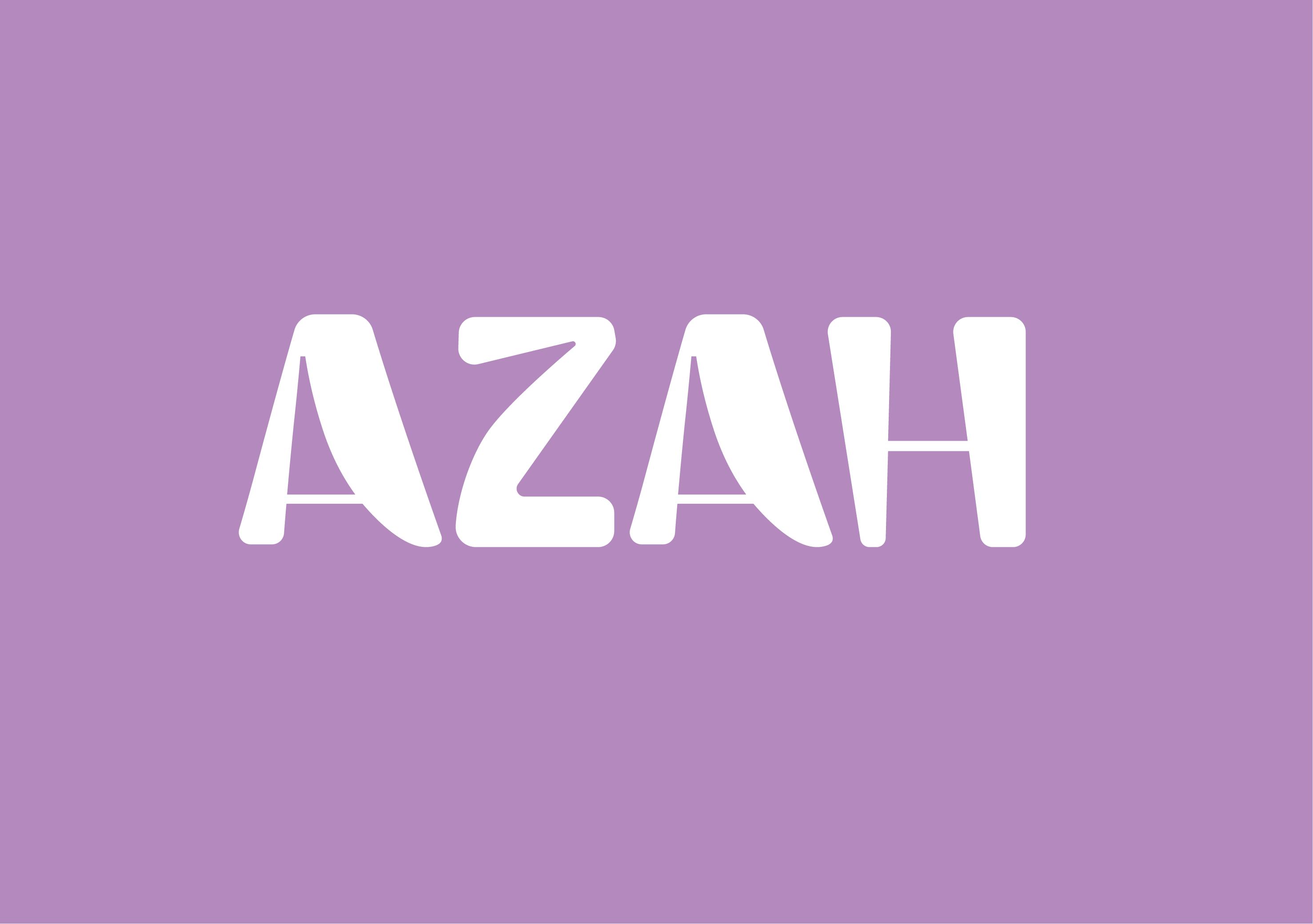
AZAH LOGO
Azah logo is the primary asset for the brand. It stands for the softness Azah’s products provide. Catering to a female target audience, Azah logo gives a soft and strong feminine look.
Boring sans C in bold is used for the logo to reflect dominance. Rounded corners of the logo makes the consumer feel that the product is welcoming and ecofriendly.
Boring sans C used for the Azah logo should not be used for anything other than the logo in Azah’s brand identity material.
Logotype
Azah logo is a wordmark logotype, no other element should ever be added to the logo. The logo sits freely in its lockup specification.
Tagline
The Azah tagline “made safe” aligning with the brand's mission and vision stands for its organic products and making women safe with one step towards menstrual hygiene.

Signature
Azah signature comprises of the brand logo and tagline. The spacing in the signature should never be changed. The background of the logo in signatures should be a rounded rectangle in pink color as shown in right. The color of the tagline should also remain the same and in “Bodoni MT” font. The signatures should always be printed in white color.
Clear Space -
 Clear space surround the Azah logo is equal to the minimum H's right bottom bright.
Incorrect uses of logo

Logo Color
Color executions of the Azah logo include the standard Azah logo in a pale pastel background. Visibility and legibility should always be maintained.

Azah logo should always be put against a colored background of specific saturation and brightness variants.
Azah logo must never be shown in other colors even if the colors adhere to the brands color palette.
Exceptions
For media in which color is not an option, Azah logo will always be white
In products where the background is white, the logo will have a colored background only on the restricted spacing around it.


#8BBDD2 #89CED3 #9388C1 #B389B
Hair removal Product Personal care Intra -vaginal Product Sanitary Product Product
#D188B #D2879C #D28989 #A9D387 #8BCC9D #D3BD89 Product Color
Incorrect color uses in logo
Do not change background color. Do not change logo color.
Do not use black color in logo.
Do not use pink color in logo. Do not change color of any letter in logo. Do not use multiple color in logo.

Marketing mate
All Marketing materials of the brand should have a logo placed in them. The logo should be placed on colored backgrounds. All marketing materials should follow the brand's color palette.

Logo placement on video ads should be at the end of the video.
Logo placement on social media posts should be on the top centre.
Logo placement on banners and posters should be on the bottom right.
Voice and Tone
The voice and Tone of Azah in all the marketing materials should be soft and feminine to provide comfort to the audience. The identity of Azah should reflect in all the collaterals.
Catering to the feminine target audience, Azah’s content should sound homely and provide trust to the audience.
Imagery

Azah imagery is a soft and comfortable feminine products. Azah promoting sustainable and bio-degradable products.


Graphic System The Typeface
Not My Type
Always aim for clarity and consistency when laying out type. Use it to create freindly, logical, and readable text.. not brash or challenging typographic design.
Please Do Not
Rotate typography on extreme angles Change the font to anything other than hell vatica. Use any other color than specified Add any unwanted embellishments. Change font which is difficult to read. Rearrage the typographic hirearchy. Outline typographic hierarchy. Create challenging type layouts.
Mensurationcup Mensuration cup Mensuration cup Mensuraion cup Mensuraion cup Mensuration cup Mensuration cup Mensuration cup MensurationCup Mensuration cup