O OU CHEN LING
×

Ou, Chen-Ling
Class: Graphic Design Advisor: Hsu, Tzu-Ching
Letterforms 7
Letterforms and words 11
Letterforms, words and text with graphic elements 15
Texture and positive / negative 20
Composition is the organization or grouping of the different parts of a work of art so as to achieve a unified whole.
Although typographic composition utilizes the same basic composi tional concepts that are part of all visual arts, there are unique ways that typography relates to each of these concepts. By forming relationships between the elements, and incorporating visual concepts in abstract ways, a new and more open relationship with typography is achieved.
Shown on the following pages, the exploration of typographic composition started with simple elements--three letterforms--and became a process of identifying abstract concepts as they became visualized. Additional elements were added each week, and new relationships evolved as we explored positive/negative and texture image use.
These compositions feature three letters from the alphabet, set in any of the following typefaces: Garamond, Times Roman, Century, Baskerville and/or Bodoni. By using size, scale, spacial relation ships, bleeds and positioning as the variables, I created six compo sitions using only the three letterforms. The final compositions are 18cm x 18cm (standard format throughout).
Keeping the three letters from the previous assignment, I have now included three words. The words do not have to have any particular meaning or association with each other. Each letter and word is set in one of the following typefaces: Garamond, Times Roman, Centu ry, and/or Bodoni. Using only the three letters and three words, I created the following compositions.
Starting with the same three letters and three words from the previous assignments, I am now adding some text. I am setting the text in one of the approved typefaces from before, adjusting the leading, column width, type size, etc. to achieve different results. As abstract compositions, it is not necessary that the text or other typographic elements be readable.
nretsatheellaback,kingoolyehTs fodlehebedi raP esida , riehtetalos syppah at,e vaw tahtybrveode etagehtd,nrabgnimalf iw rdht secaflufdae smrayreifdnadegnorht: yehtsraetlarutanemoSd mehtdepiwtubd,epporn;oos wdlrowheT llaas esoohcoterehwm,ehterofeb dnat,serfoecalpriehtp e;diugriehtecendviord,nahnidna,hyeTh thiw ,wolsdnaspetsgnirednawt riehtkootnedEhguorh koolyehTy.awyratilos disnretsaeehtllak,cabgni eetalose,sidaraPfodleheb devawt,aesyppahriehto d,narbgniamlfthatybrev t tiwetageh aerdh caflufd se rayreifdnadegnorht larutanemoSs:mppordyehtsraet de , b wtu pi n;oosmehtde rowehT dl ofebllasaw hter oterehwm,e ecalpriehtesoohco serf vorpdnat, ecnediy,hehTe;diugrieht dna
hniawhtiwd,na dn re ni g s t dnaspEhguorhtw, ned oot htk yratilosrie aw y.c
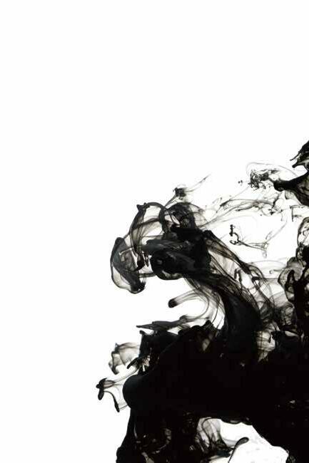
Positive/negative is the relationship between figure and ground. Texture is the ability to render type in ways other than just hard edge black and white. Combining these two allows me to define type in unusual and unique ways-challenging me to see it different ly. Starting with the same three letters, three words and text used in the last assignments, I incorporated positive/negative and texture as major design components.
,h
l
y
i n g b a c k, a
a
l
l
a
a n d p r o vi d e n c e t h e i r g u i d e; Th
t h e i r s o l i t a r y w a y. T he y l o o k
eat, w a v e d o v
p py s
r h a
m, w h e r e t o c h o o s e t
t h e e a s t e r n s i d e b e h e l d o f P a r a d i s e, s o l a t e t h e i
r h a p p y s e
d f u
l
e
g a t e w i t h d r e a
s t e r n s i d
h w a n d e r i n g s t e p s a n d s l o w , t h r o u g
a c
e i r p l ac e o f r e s t,
h
a v e d o v e r b y t h a t f l a
e r b y t h a t f l a m i n g b ra n d, t h e g a t e w i t h d r e a d f u l f a c e s t h r o n g e d a n d
h E d e
e b e h e l d o f P a r
s e, s o l a t e t h e i
a d i
f i e r y a r m s: S o m e n a t u r a l t e a r s th e y d r o p p e d, b u t w i p e d t h e m s o o n; T h e w o r
n t o o k
m i n g b r
h e
d w a s a l l b e f o r e t h e
d, t
a n
d, b
e s t h r o n g e d a n d f i e r y a r m s: So m e n a t u r a l t e a r s t h e y d r o p p
i
u t w
t, w
l f
e a n
n
e s
f r
p e d t h e m s o o n; T h e w o r l d w a s a l l b e f o r e t h e m, w h e r e t o c h o o s e t h e i r p l a c
i n h a n d, w i t h w a n
e o
t, a n d p r o v i d e n c e t h e i r g u i d e; T h e y,h a n d
e r i
k t h e i r s o l i t a r y w a y.c
d
p
g s
t
t o o
d e n
s a n d w, t h r o u g h E
ed n t o o w a y .c
g h r y
h e
a n d w, s o l i t
s t p s i r
nawh d re i n g t
t h r o a
o rf e s vorpdnat, y,hehTe;diugriehtecnedi na d ni tiwd,nah k
r dl ofebllasaw htersoohcoterehwm,e lpriehte a c e E
b u wt i p osmehtdeowehTn;o u
l f ca yreifdnadegnorhtses:mra rutanemoSppordyehtsraetla e d,
iehtet pahr esyp a t,
iti aerdh ufd
w a htybrevodev alfta
rbgnim na d,
d ebe odleh raPf ida se,s alo
eh htesoohcoterehwm, calprie erfoe t,s pdna vior iehtecned The;diugr e y ,h
E d e kootn ht
atilosrie Ty.awyrkoolyeh ni k,cabg la aeehtl isnrets
t eh wetag
tiwd,nahnidna gnirednawhorht,wolsdnaspets hgu
aw as terofebll
vaw brevode bgnimalftahty d,nra
ht rdhtiwetage aflufdae
sec ht or gn e ad
n d
if anemoSs:mrayresraetlarut ubd,eppordyehthTn;oosmehtdepiwt e ow dlr