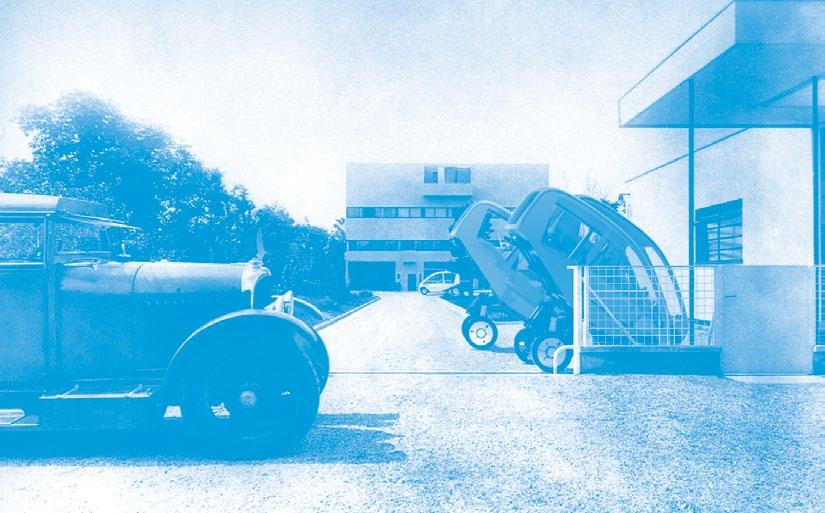
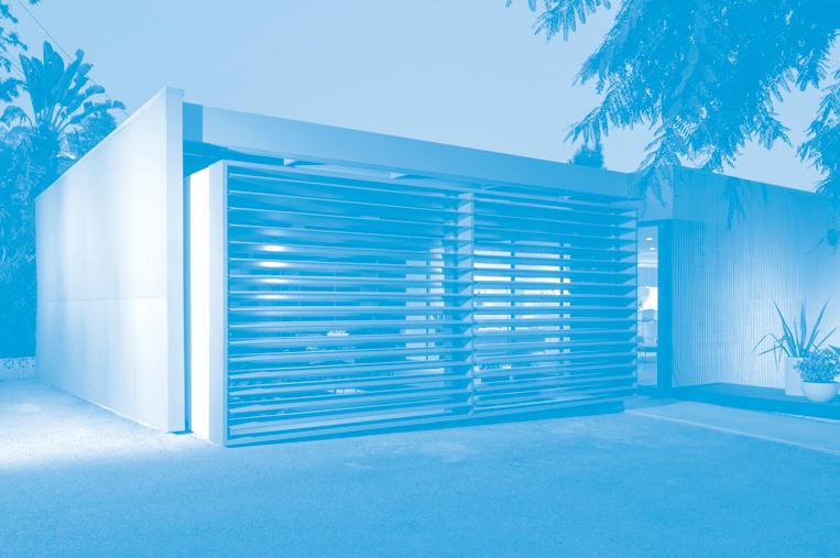
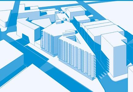
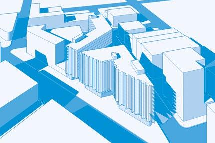
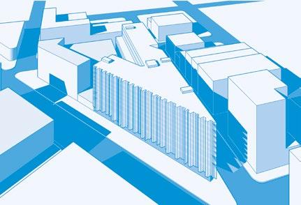
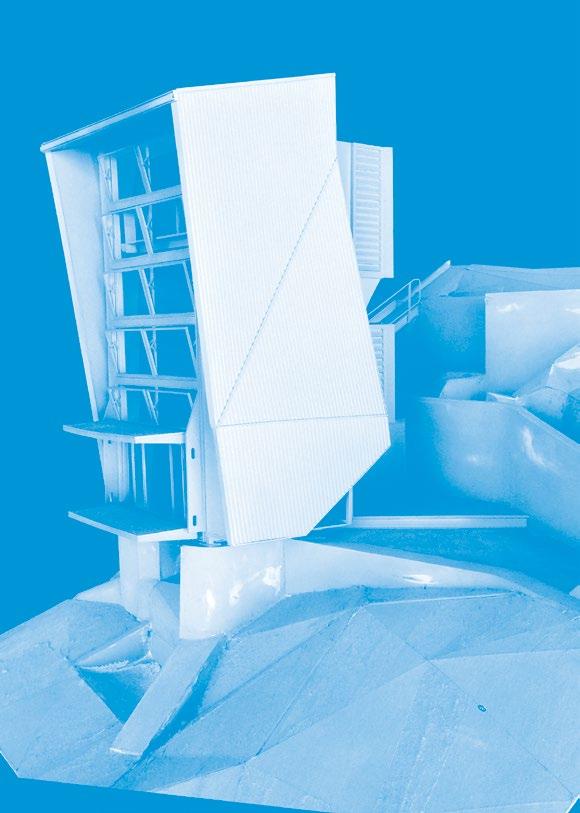
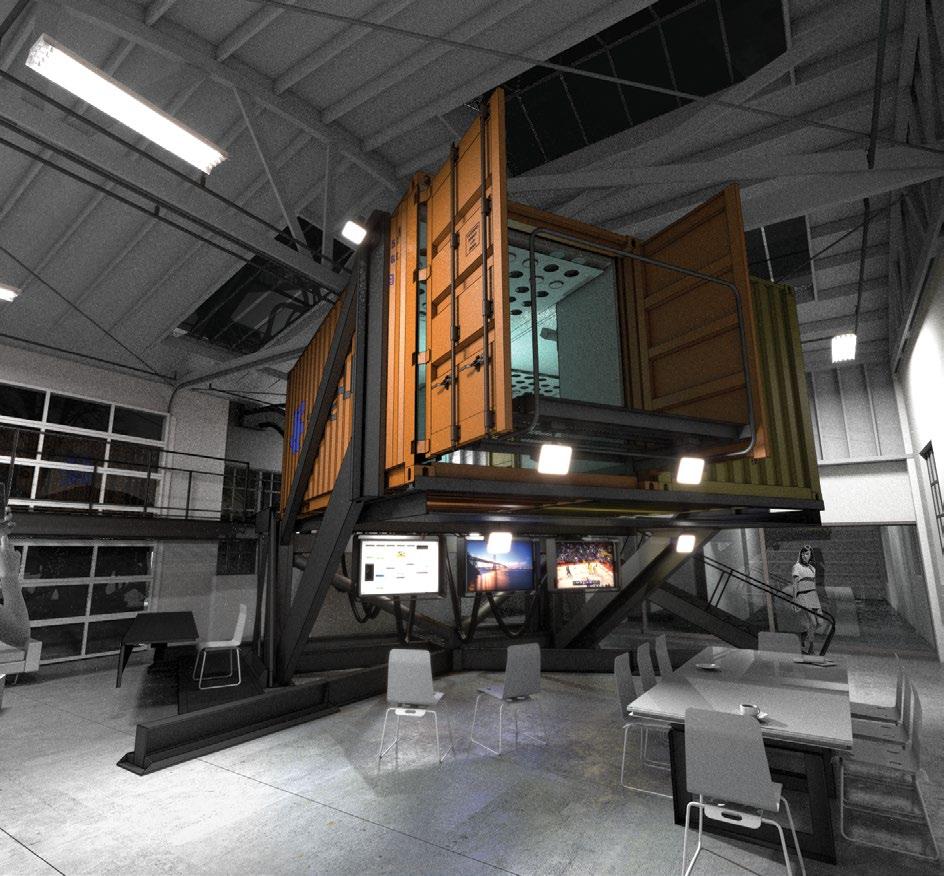
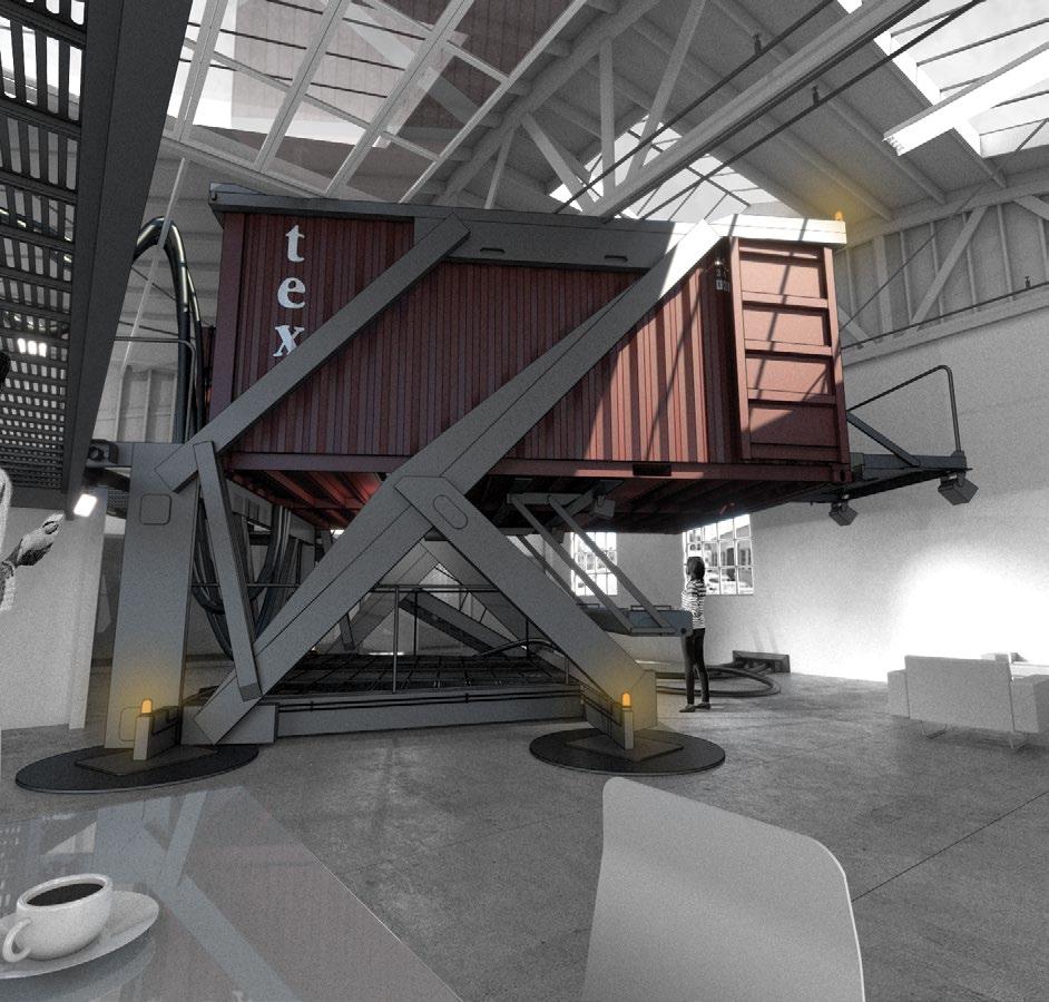
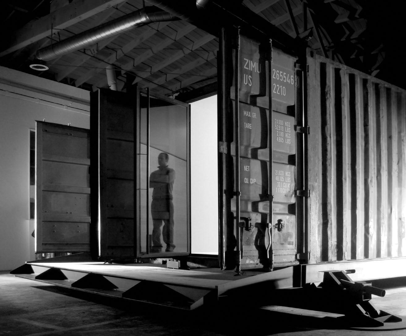
HSI PRODUCTIONS
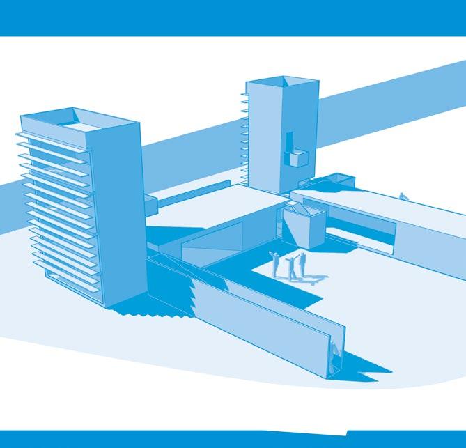
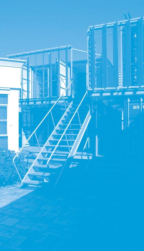
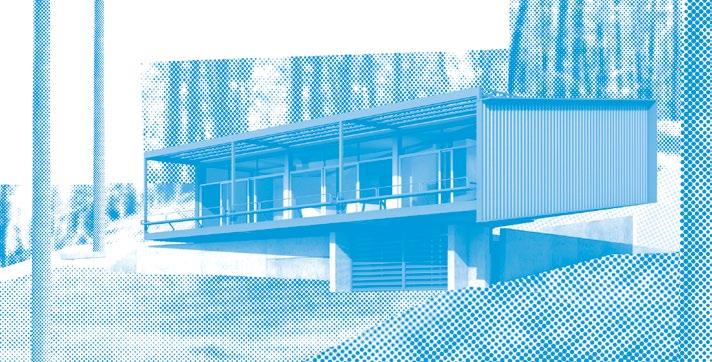
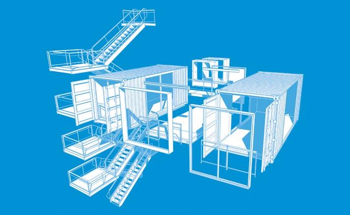
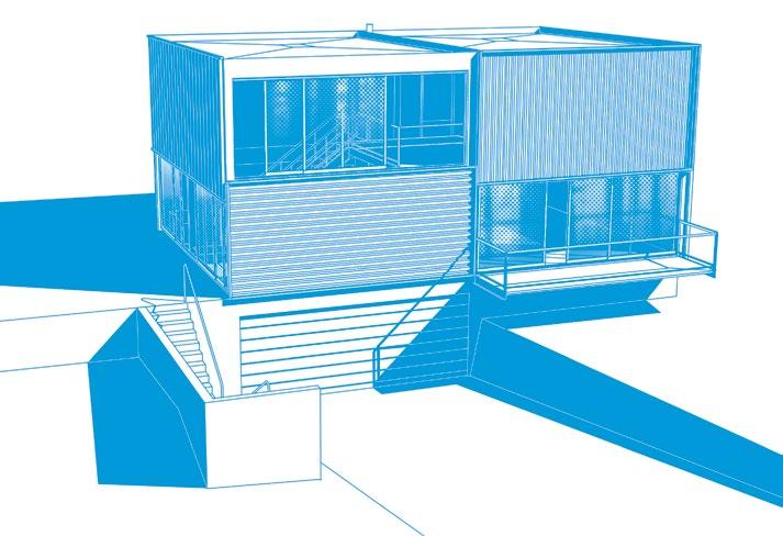
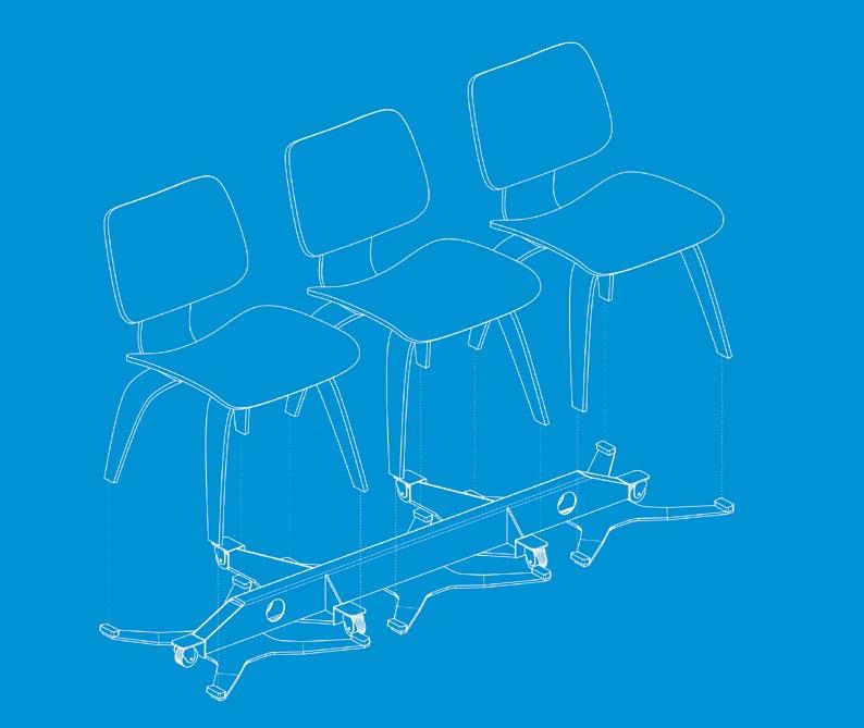
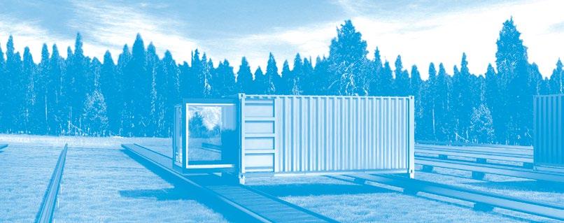
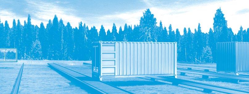
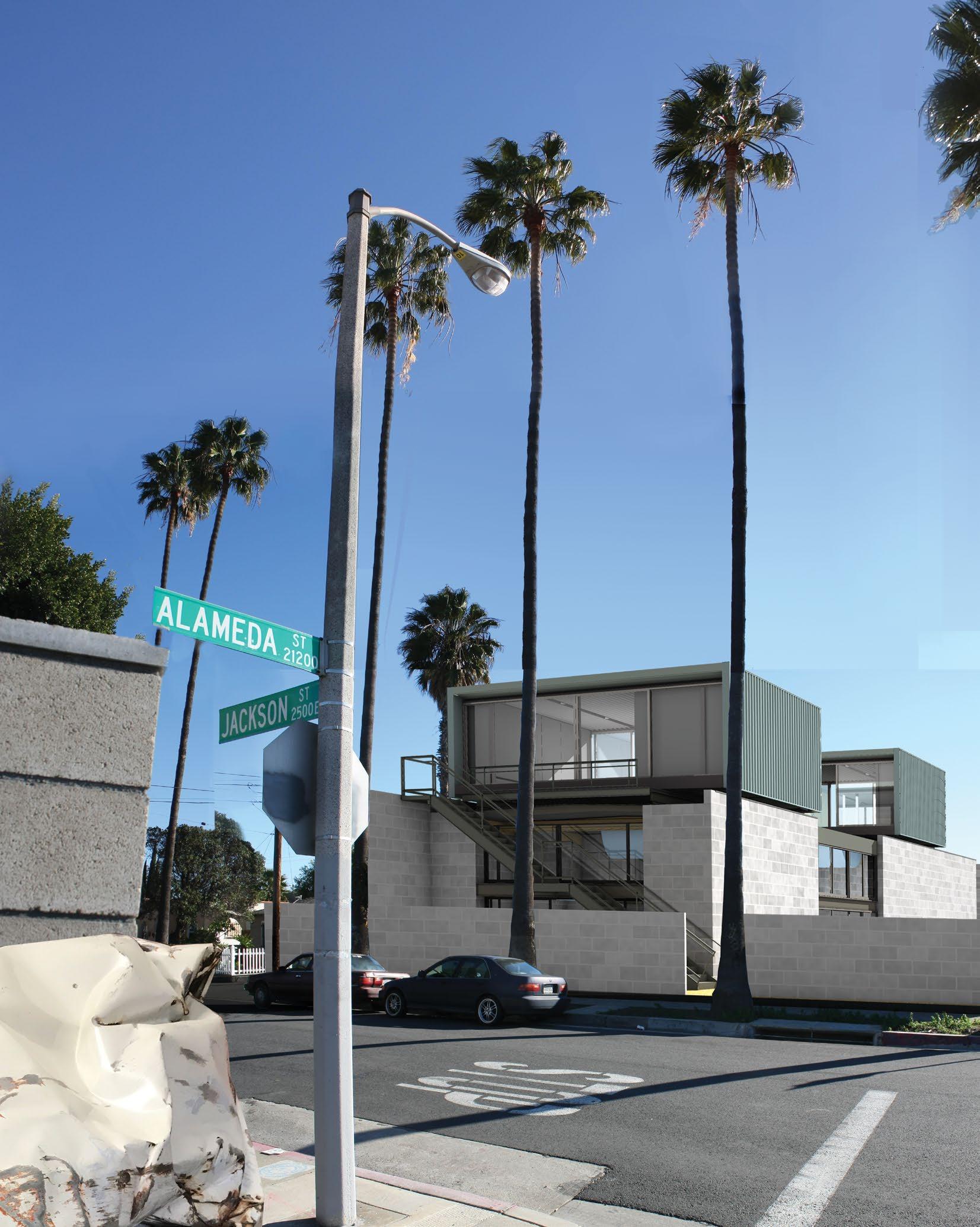
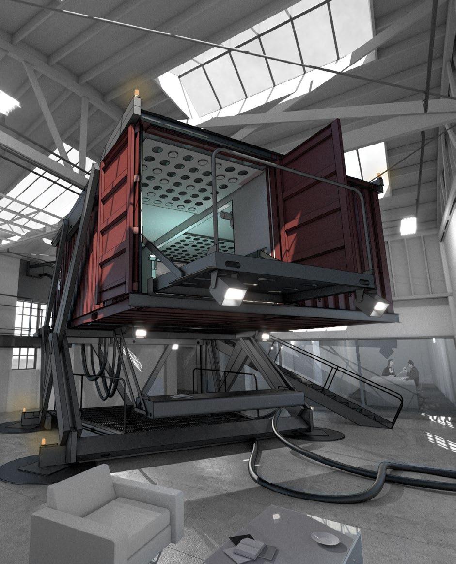
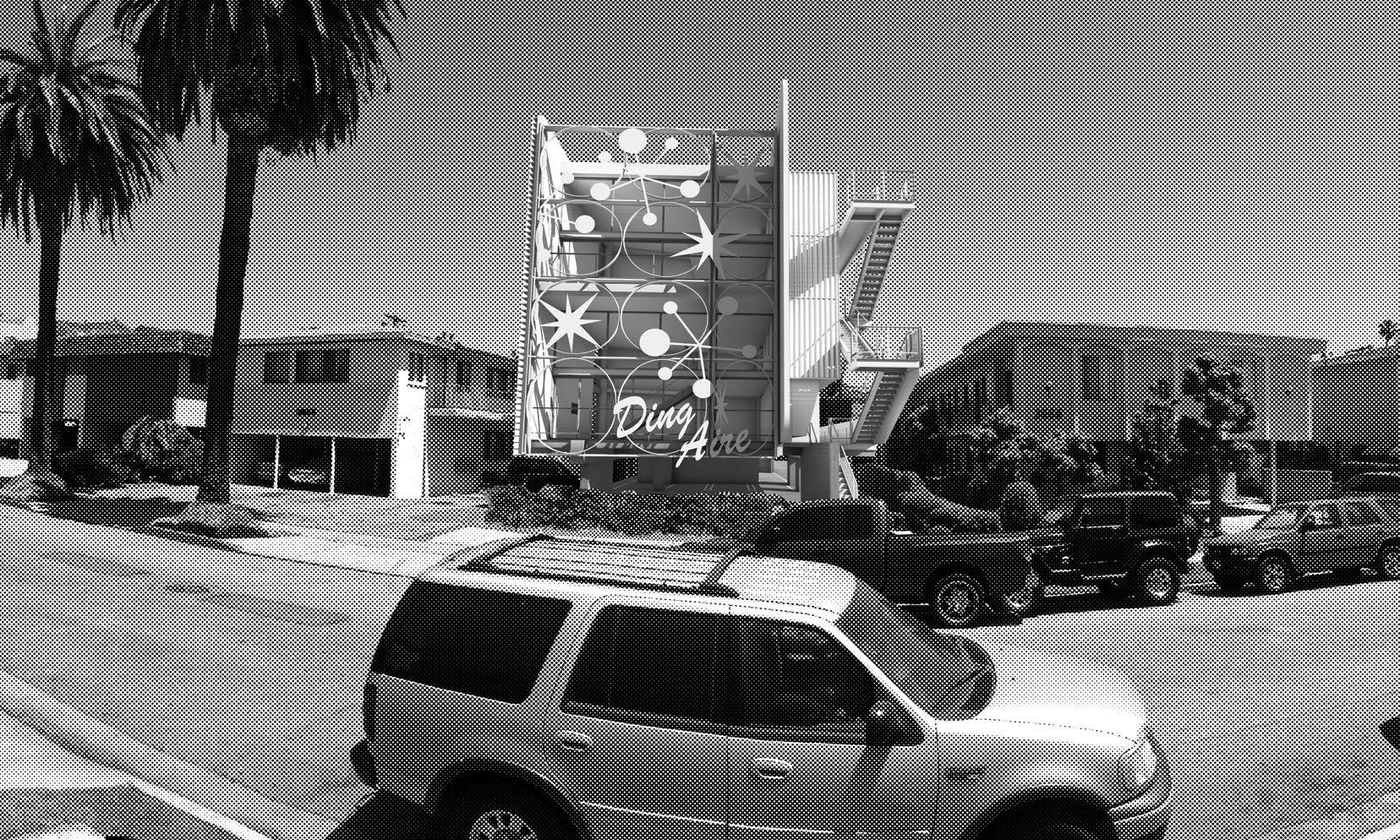
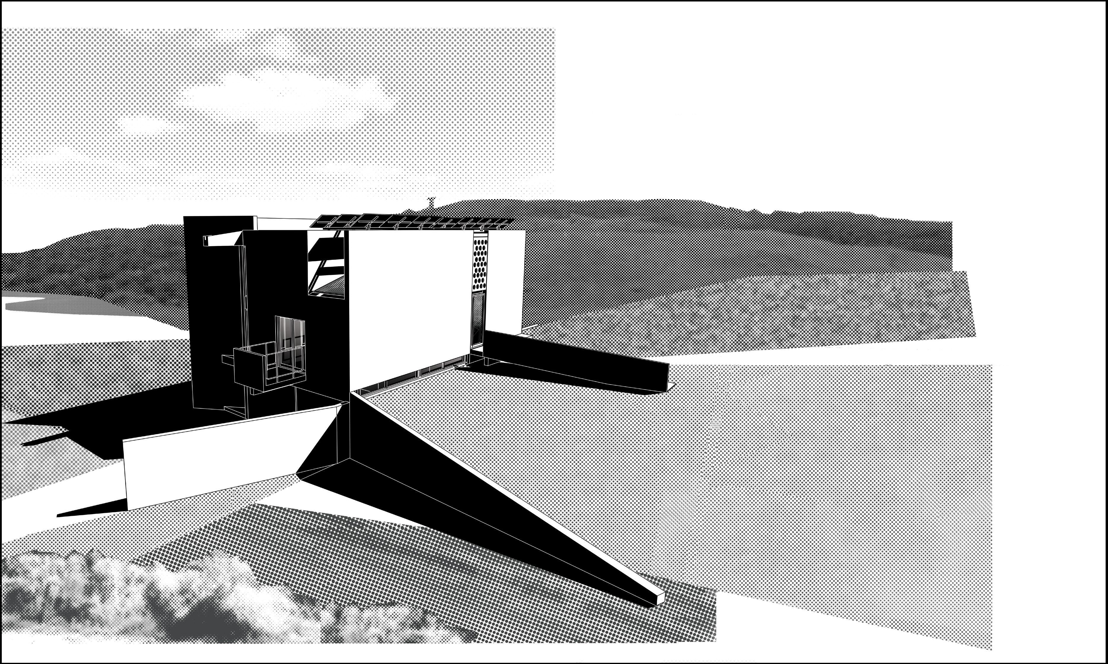
J,P:A was approached to provide a theatrical working space for a famous director of music videos. The project makes a classic statement in this vein, featuring an object-on-astage parti that captures the energy and spirit of its famous occupant, contrasted with a less
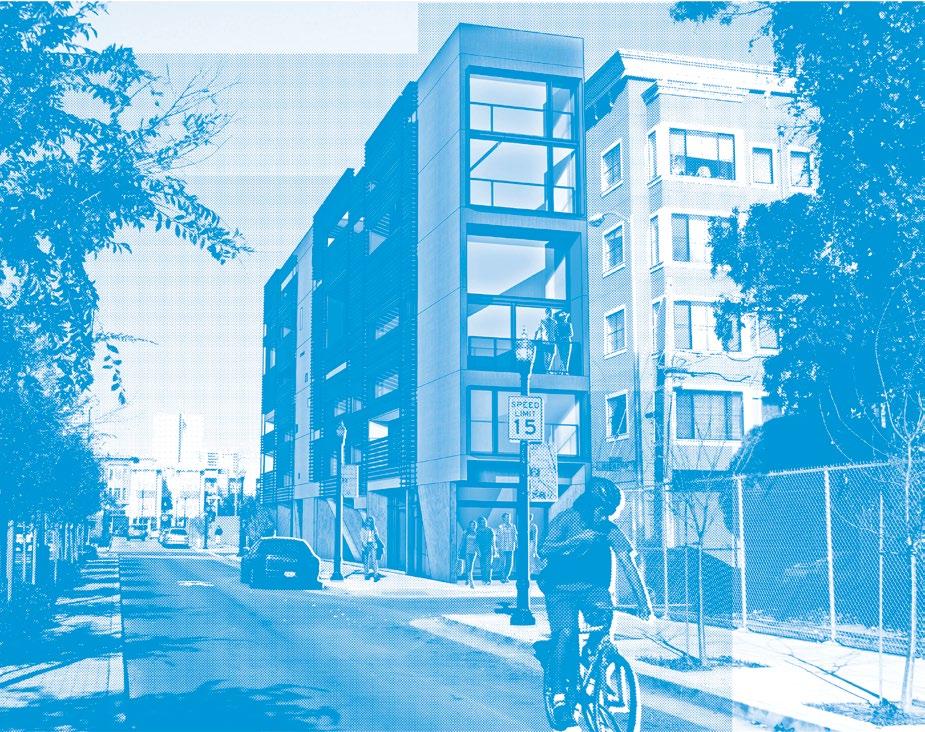
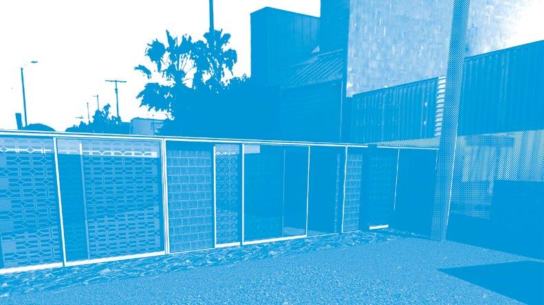
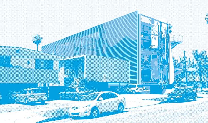
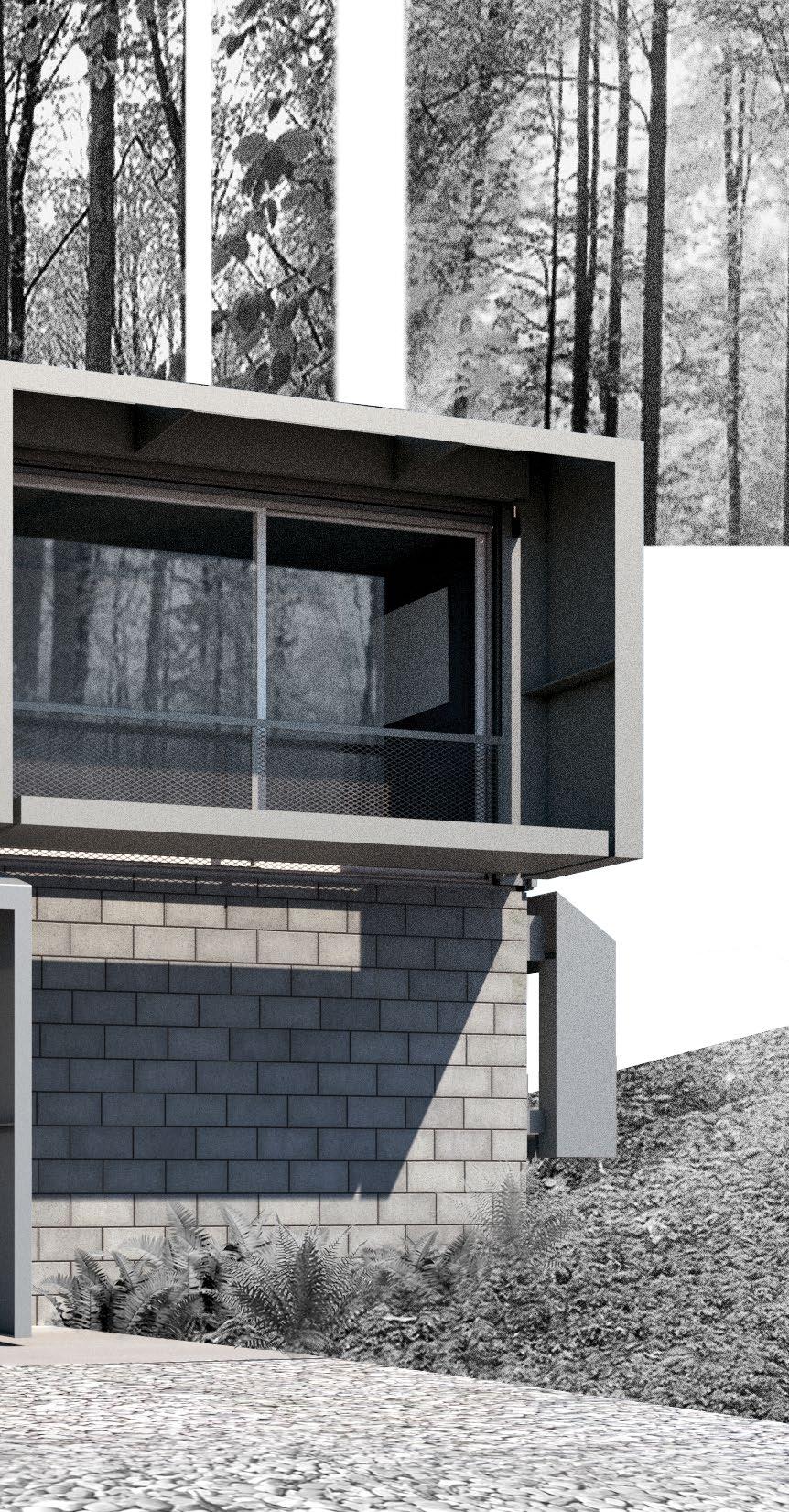
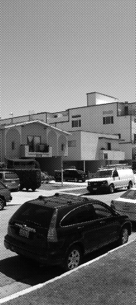
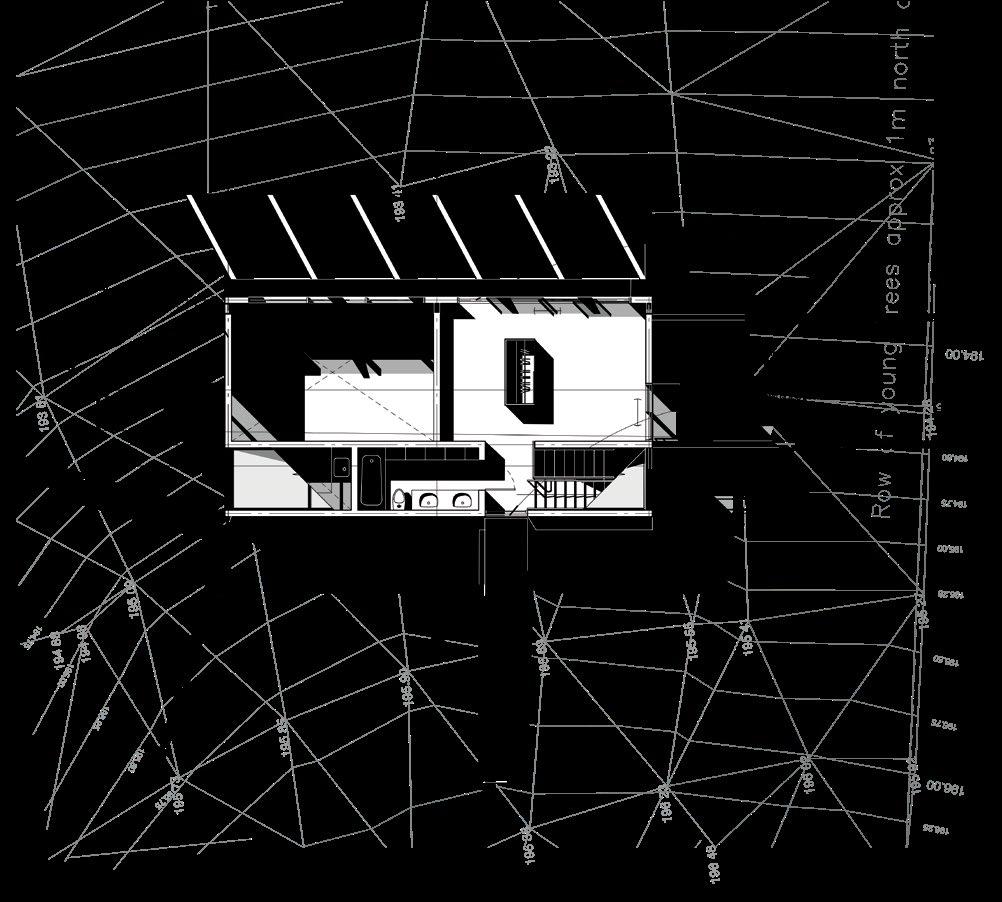
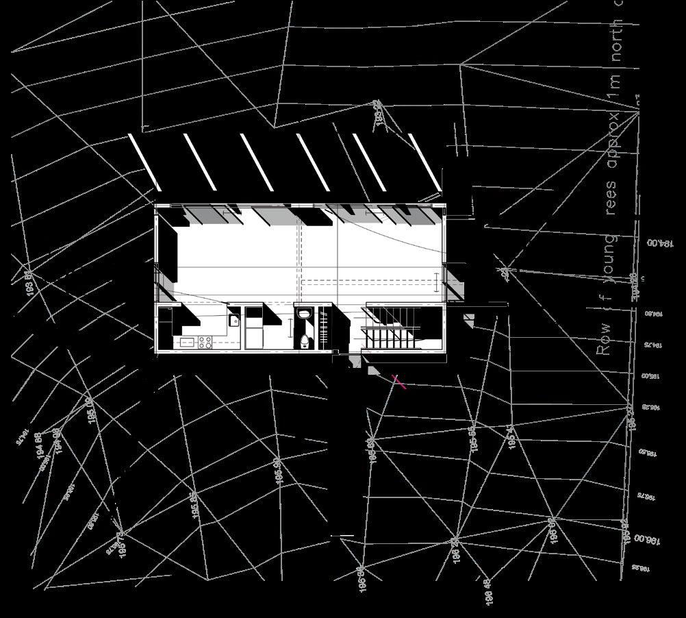
Location Existing single-story wood and plaster warehouse structure in Culver City, CA
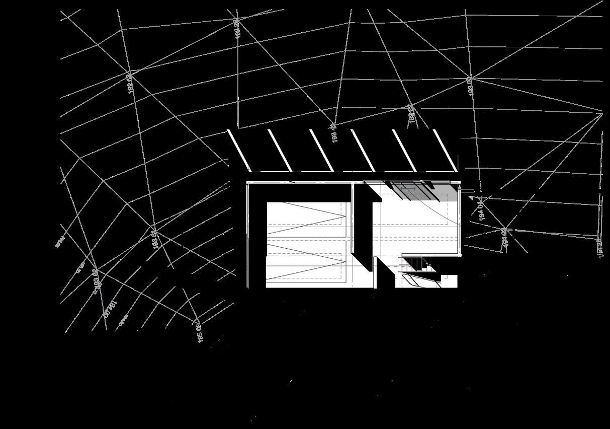
Program Design/build Tenant Improvement project for a video production company, featuring offices and support spaces for its premier director, including a conference room, restrooms, work stations, and exhibit areas. As part of the spatial rehab, a new front door/ entry experience, skylights, HVAC, and a feature office were designed and constructed.
Size 3,300 sq. ft.
Completion June 2007
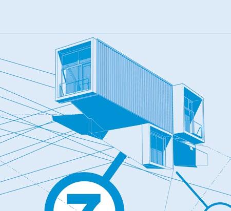
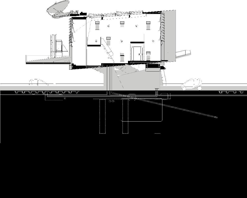
Materials + Systems New construction of Type V-B light gauge metal framing; acoustically isolating sliding glass wall system, “feature” office constructed from two 20’ ISO shipping containers on structural steel support dunnage
underground in the low plinth. Any temptation to embody the greater (and unwarranted) expressive personification of the Marseilles examples (which would otherwise be understandable since the drawings for the massive pilotis were Keatinge-Clay’s principle assignment in Le Corbusier’s atelier) are forestalled by the pin connections that elucidate the structural resolution with more precision. The transposition of the Miesian models into the Corbusian béton brut prevents more overt quotation in the other direction as well. The result is both clearer and more original than the Mt. Tamalpais pavilion.
Such restraint was not exercised at the San Francisco Art Institute, yet this concrete addition of studios and classrooms to a board-formed concrete WPA-era Romanesque art school remains one of the two inarguable masterpieces of Keatinge-Clay’s career. Since this was not, strictly speaking, a free-standing building, the issue of ideality was not addressed at the parti level, yet the pavilion still lurks in spirit within this more urbanistically complex composition, while the continuing interest in ideality makes itself known in the character of the topological relations between the elements of the composition. The pavilion’s roof has become a tabletop upon which the differentiable program (which the pavilion would have hidden in the plinth) is now arranged in a characteristic Marseilles roof garden still-life of carefully arranged objects, with brise-soleil skirting what now must be read as the base but in a pavilion would be the principal space. In fact, this area beneath the table is the principal space—treated as a large, undifferentiated studio environment (that would be later divided by non-loadbearing partitions).
While
aggressive background fabric. Of course, that “background” is not devoid of interest itself, revealing quiet, telling details that contrast a refined sophistication with the raw exuberance of the central piece.
In this project the formalism of Le Corbusier was given free reign, and at first glance the result could be mistaken as the master’s other, unknown North American project. But the differences become apparent soon enough as the influence of Mies, rationalizing and systematizing what Le Corbusier would leave to willfully free expression, asserts itself. Thus, while the usual pavilion-type long span condition is
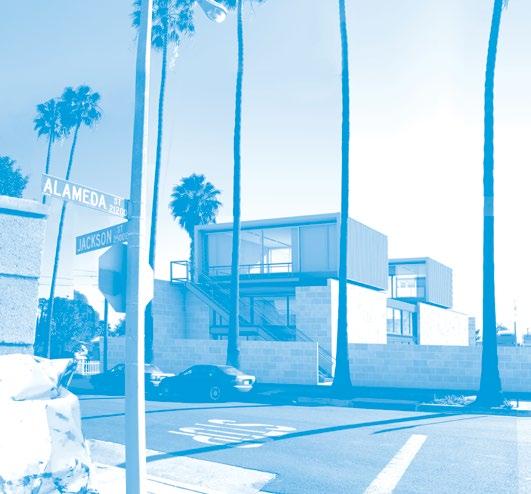
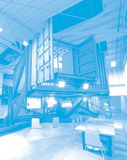
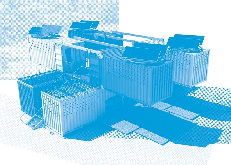
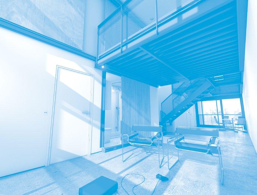
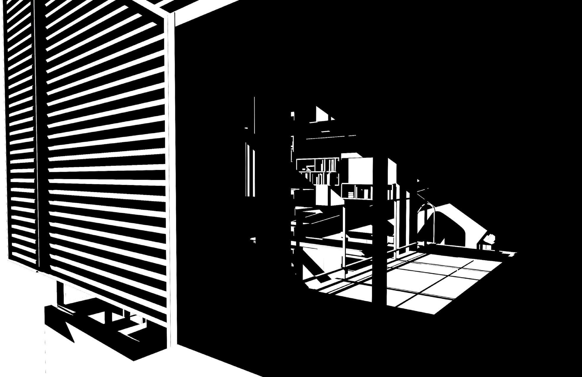
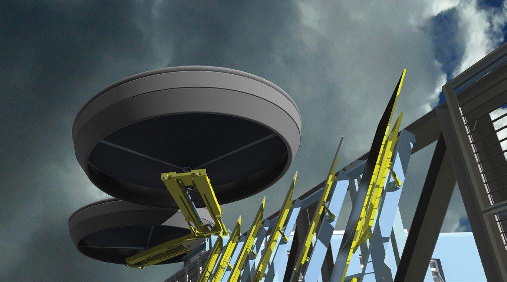
The reception desk is located beneath the raised office and provides a position from which the space may be run
the container units would not actually raise and lower, the suggestion of that possibility helps organize the space and set the tone
the rules proceed naturally, deductively. On the other hand, it could be said that the very notion of hitting farther rather than nearer, or any particularity of effect related to the action, exhibits discrimination that implies a prior sense of rule. Thus, in architecture, the impulse to build, specially, would seem to precede the determination of what “special” is, yet as obviously, the difference implied in that specialness must be evidence of a prior ability to discriminate between special and not special.
In a general way architecture can be considered the embodiment of such judgment; this is facilitated by the definitive rule structure at its heart: “the possibility of judgment is the mark of (a) discipline, the sign of maturity in the formal program. There is in the very possibility of judgment itself something that leans toward architecture…the architecture of any condition is precisely that-which-judges or by which judgment is conceivable.” The sense of the intrinsic nature of architecture’s disciplinarity is also captured in the formula: “architecture is the transformation of constraint into restraint,” which rejects external factors of definition (constraints) in favor of internal factors— indeed, in favor of the only state that may be internally determined (restraint). This is the clearest statement of the difference, say, between architecture and engineering and a strong demonstration of the capability of a discipline to determine its own boundaries as the limits of its restraint.
Discipline: Vastness
The use of words like “field” and “boundary” naturally leads to a generalized spatial metaphor that can be useful in describing various aspects of a discipline. Because the “extents” of the discipline are determined by the internal working of a living, evolving rule structure, but the discipline is concerned about its boundaries, the boundary function is blurred, though the boundaries themselves may be sharply figured. The resulting (metaphoric) paradoxes capture some of the complexity of the disciplinary dynamic. For example, while the discipline limits, is limited, it is also vast. What the boundary—the shape that is synonymous with the identity of the discipline in this metaphor—frames is the visible part of the discipline, extending as wide as the identifying borders. It makes it visible as such, and so identifies it. Beyond this, though, extending deep into its history and around the corner of present conception is a vastness of related possibility. A disciplinary statement carries the sense that there is more to it than meets the eye, at the same time it is claiming a restrictive choice. The discipline’s overt effort to circumscribe a territory of concern, excluding much more than it includes, serves to make what is included richer, more substantial and reverberant.
The frame delimits the area by setting the conditions of perception. The rules for what counts as architecture can be expressed in a list of necessary, exclusionary laws or principles, but the final
importance of the student’s studies. It may inculcate in the students the same sort of pride of association as membership in the crew of a ship or citizenship in a small town.
BUILDING SYSTEMS
/
The design avoids breaking new ground with regards to structural or mechanical systems. Beyond a more contemporary interest in the principles of sustainability, the building sticks to the tried and true, cost-effective and easily constructible systems that have been perfected by the local building trades over the last forty years, namely castin-place concrete and zoned central AC. Recognizing that with a limited budget not every wheel can be reinvented, the design makes a virtue out of necessity, relying on the sometimes brutal nature of these systems for the architectural character of honesty and strength that can help forge an identity for the Hong Kong Design Institute, supporting the student’s sense of pride in their school and confidence in their futures.
A nine-meter square column grid and two way slab system carries the bulk of the building; the circular perimeter wall acts as a shell structure and provides lateral resistance, along with the stair and elevator core towers. The structure is sized to be adequate to carry the loads of future building expansion. This admitted cost factor seemed appropriate given the advantages of preserving the open area for positive community relations, as discussed later in this Design Statement.
The internal partitions are either light CMU or light gauge metal framing for ease in modification, taking advantage of the flexibility of the column grid system. In keeping with the theme of honesty, flexibility and robustness, there are no embedded systems: all electrical, plumbing, voice/data and air conditioning systems run externally to the cast-in-place concrete. In this way the building itself can serve as a teaching laboratory and subject of endless experimentation.
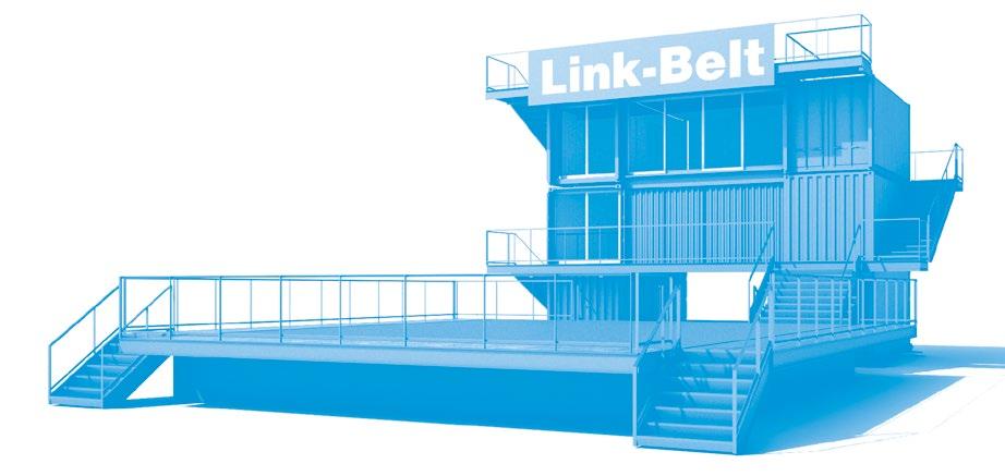
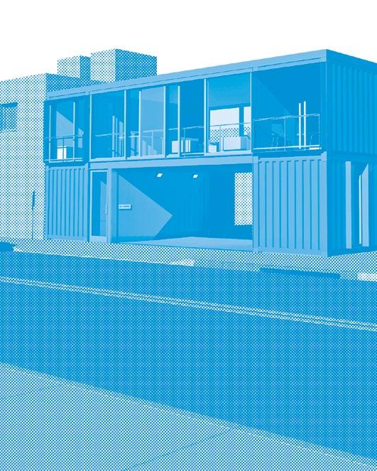
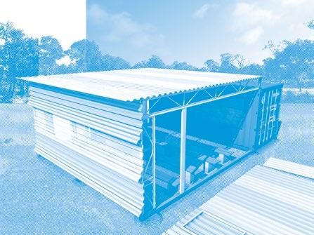
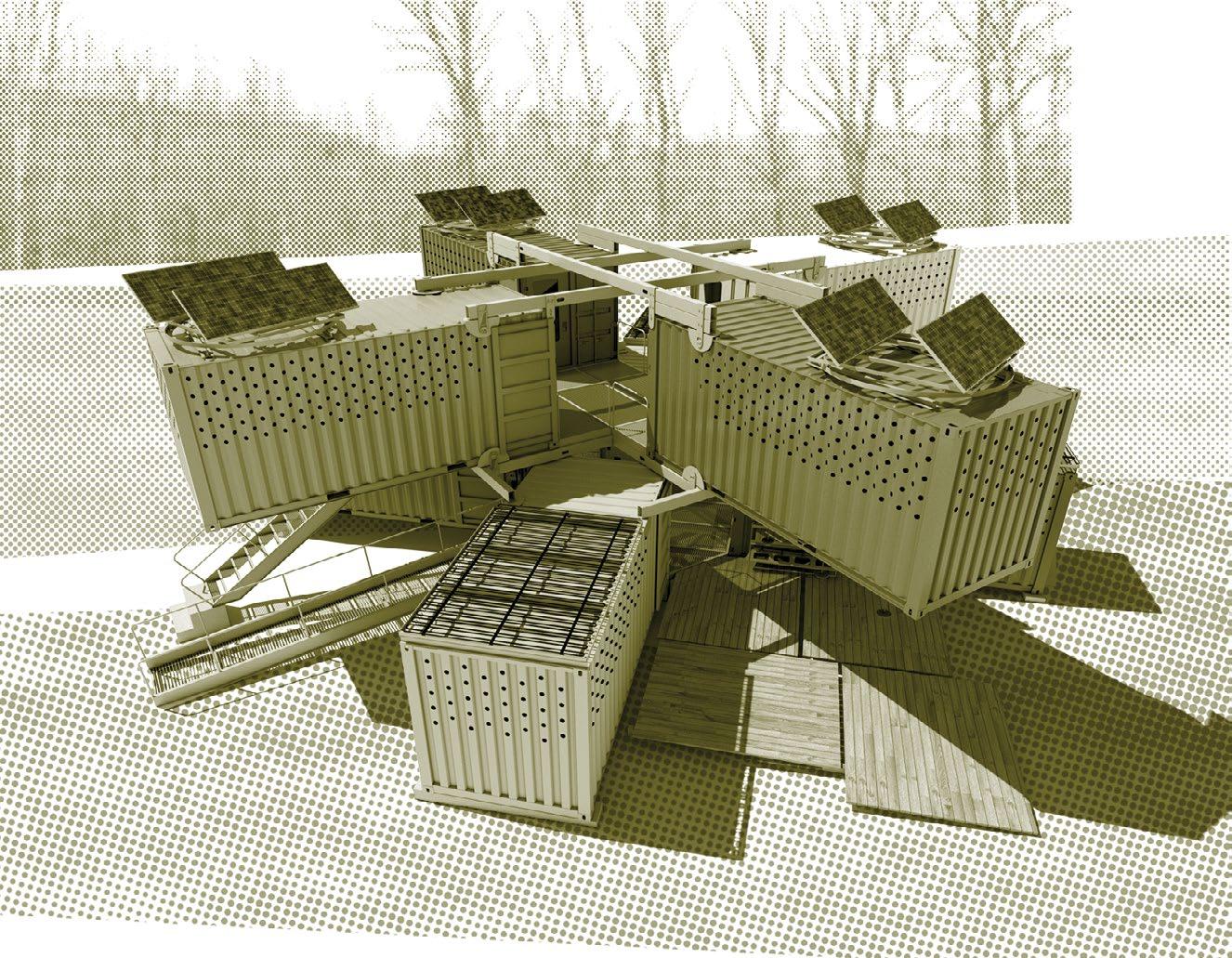
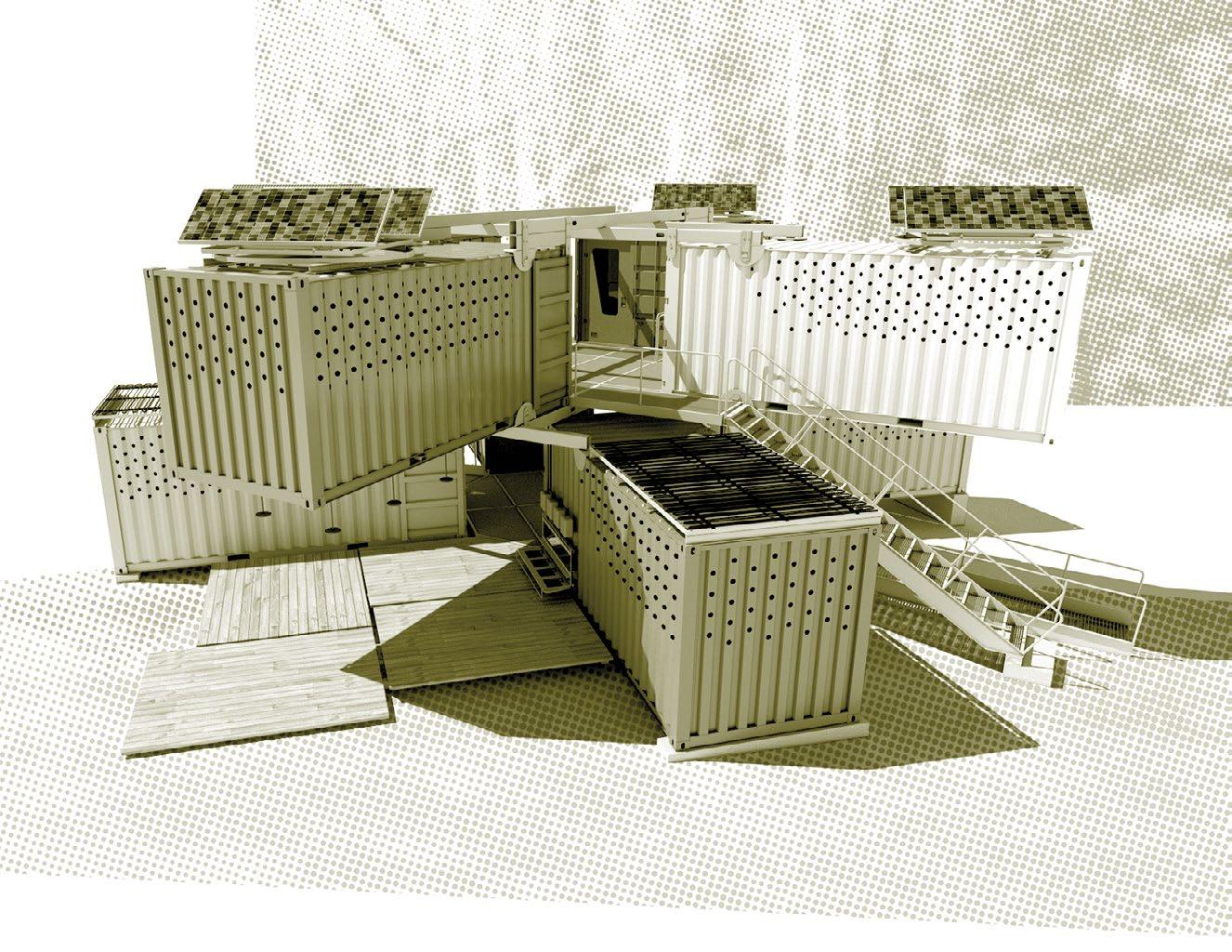
systems (because of their reduced loading they can be stacked 10 high, as shown in the present scheme for dramatic effect), which serves as the primary structure from which the other external prefabricated elements may be hung, 3. the hanging of these access elements, including stairs, catwalk breezeways, decks and the floors for the inter-container “spaces-between” that are the key to this proposal, 4. running of the hosebased services, including plumbing and electricity, in the provided chases. Once this exterior work is done, within a maximum of two or three days, the work to the interior may commence. This would involve; 1. reinforcing the door ends of the containers, allowing the doors to be opened in a permanent position to support an external deck, 2. cutting the single hole in one long side of each container, identical except for handedness, and 3. reinforcing that opening, 4. outfitting the containers with the calamari PRO/dek stacks by predetermined unit type through the container door opening (this step could also be taken prior to the containers arrival on site), 5. sealing the envelope at the door end and the space between with prefabricated glazing elements, and then finally 6. investing the gaps between the containers with blown insulation and then sealing the seams with expandable rod. More elaborate versions of the present scheme may be envisioned, including the provision of enclosures for the breezeways.
Breakdown and removal of the structure after use mirrors its installation, except that the interior elements may remain inside during the unstacking of the containers. These “outfitted” containers may then be recycled as temporary housing or office space elsewhere, or the interior elements may be removed and stored for later reuse.
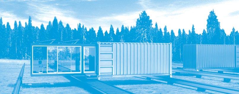
REI&D PREFAB
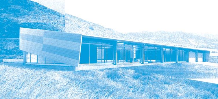
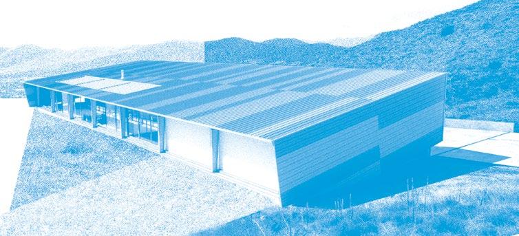
The owner has 11 lots in a rural Pennsylvania vacation area that includes several lakes and golf courses. The lots vary in size but are generally about 1/3 acre; they also vary in slope—from almost flat to very steep. The owner desires to build speculative houses on all of the lots; in two cases the lots are contiguous, and the Owner may combine them to put up a single, larger residence. The owner requests J,P:A to design a full range for the varying lots and conditions. A target con-
Location Treasure Lake, PA
Program Residential spec. development of varying single-family programs, based on a locallyavailable prefabrication system
Size 1,200-2,400 sq. ft.
Completion July 2008
Materials + Systems Reinforced masonry and concrete foundation incorporating basement and lower levels, wood-framed prefab. envelope wall construction with corrugated metal panels, thermal sliding-door glazing systems, miscellaneous steel detailing
struction budget of less than $200,000 has been established for each house except the house(s) on the combined lots, which have a target construction budget of less than $400,000. In order to meet these tight budgets and still build houses of around 1,200 sq. ft. and 2,400 sq. ft. respectively, the designs will be optimized for prefabrication by a nearby construction firm identified by the owner. Also for this reason, it is anticipated that J,P:A will produce a minimal number of original designs to be used for all the different lots, adapted to the specifics of the individual sites as necessary.
Beyond the contract language and its description of an economically driven
The hoods provide shade, privacy, and interest to the form. Are they decoration? Maybe…
the house and eroded a portion of the backyard.
The owner has amassed a significant collection of historically important Modern furniture and will use the new studio to store and show his collection. Because there is a limited amount of space available on the lot in the vicinity of the mudslide for new construction, and also because of the City of Los Angeles’s parking policy regarding Hillside construction, it is desired that the footprint of the new studio be minimized. Consequently, the project is envisioned as a multilevel structure with a 600 sq. ft. footprint. A single level/ platform will translate vertically via an elevator mechanism through the volume of the tower, allowing it to access the furniture and books arranged on shelves running up the full height of the walls. In addition to this platform and the space through which it travels, the studio will include a kitchen and dining area, a bedroom area, and a single bathroom/shower space (as well as the shelving), bringing the entire assignable area to approximately 800 sq. ft. The new studio/library will itself be accessed separately from the existing house, via a new stair leading up to the street and new parking at the street level; the new stair will be designed in such a way that it may be used to transport/slide the owner’s collection up and down to the new studio. A target budget of $300,000 has been established for this project. The owner intends to use the contractor presently engaged in the hillside repair and underpinning of the existing building to construct the new building. It is anticipated that the contractor will be involved in value engineering the project during design and documentation phases.
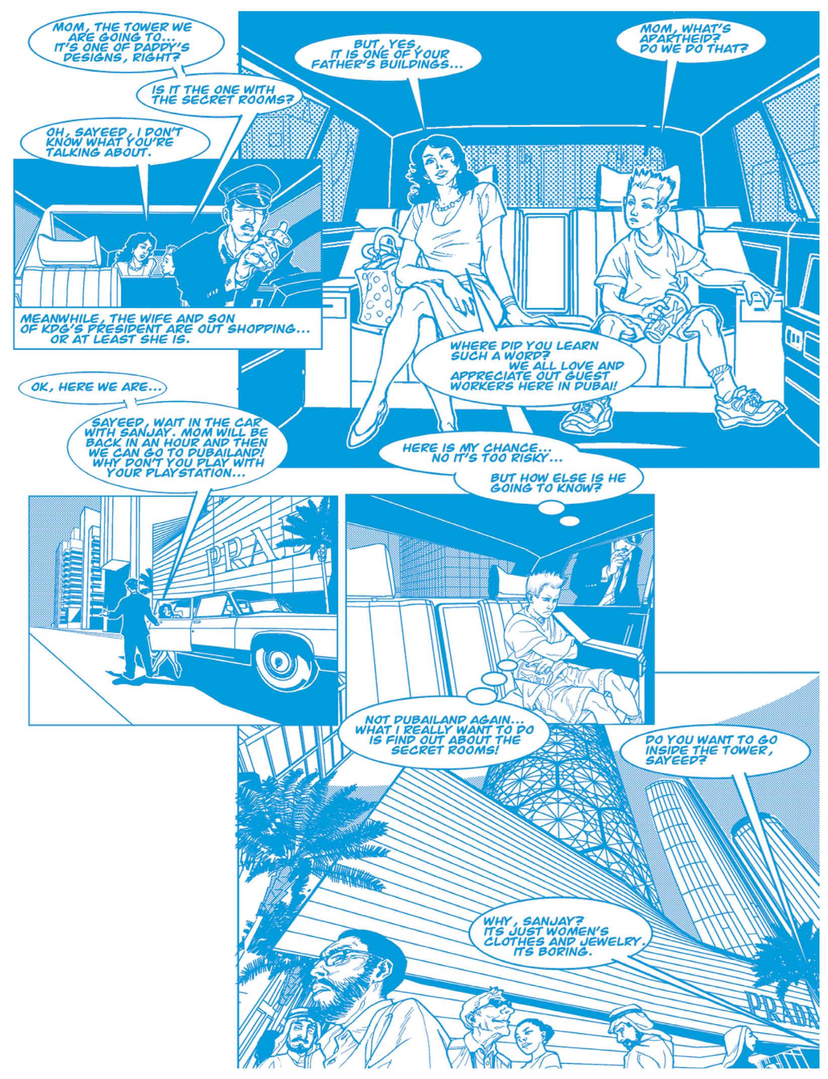
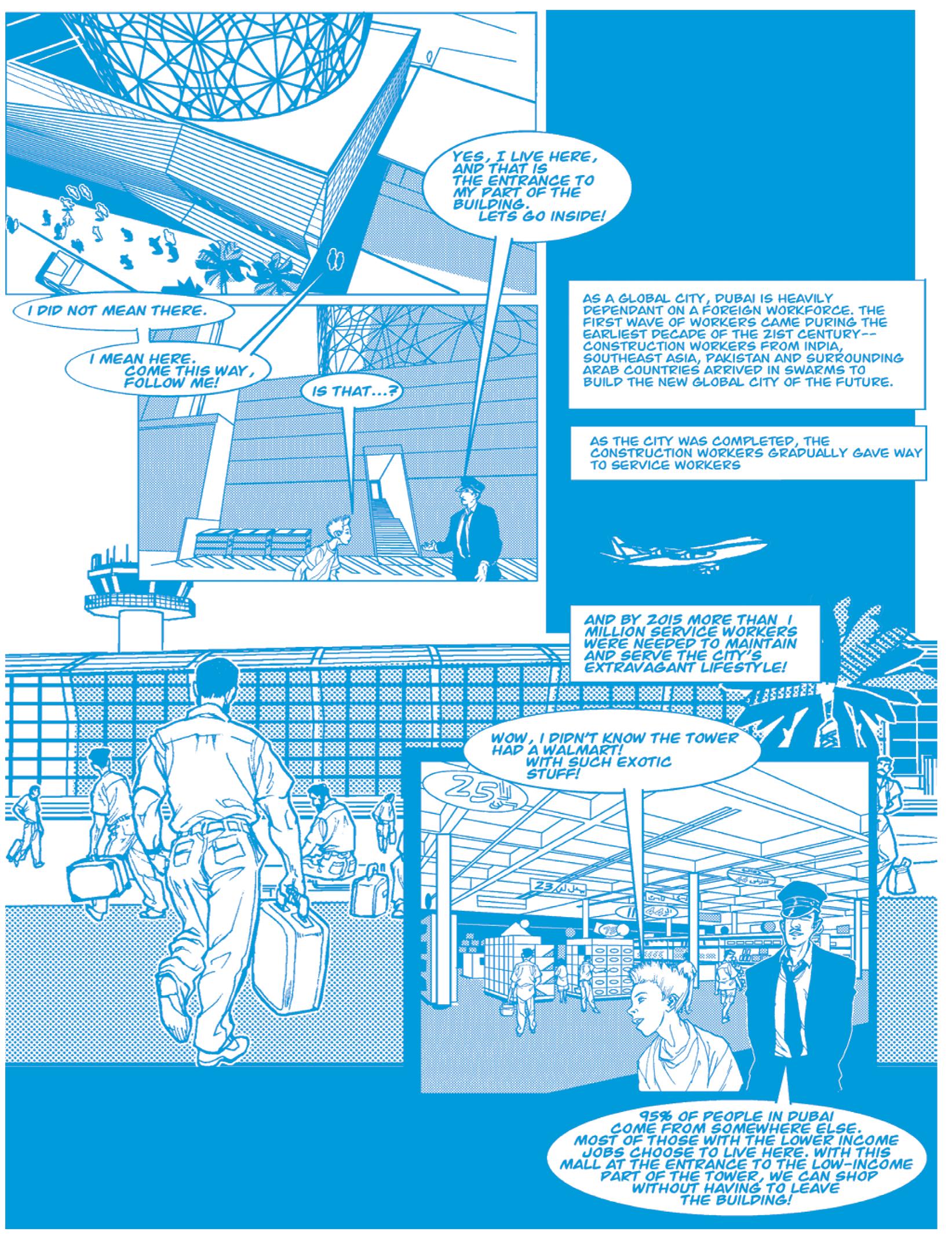
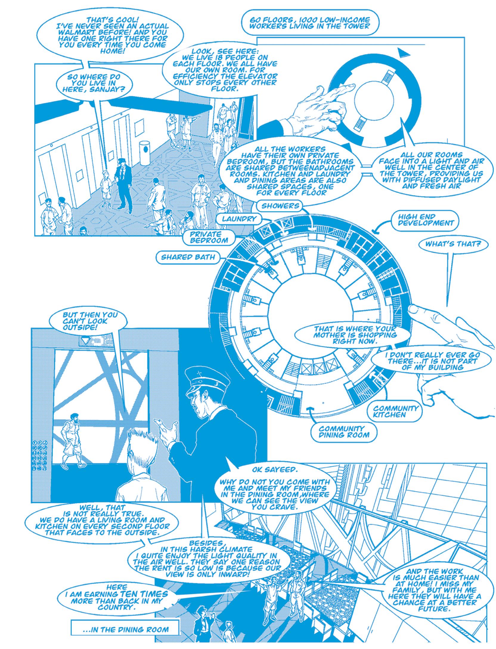
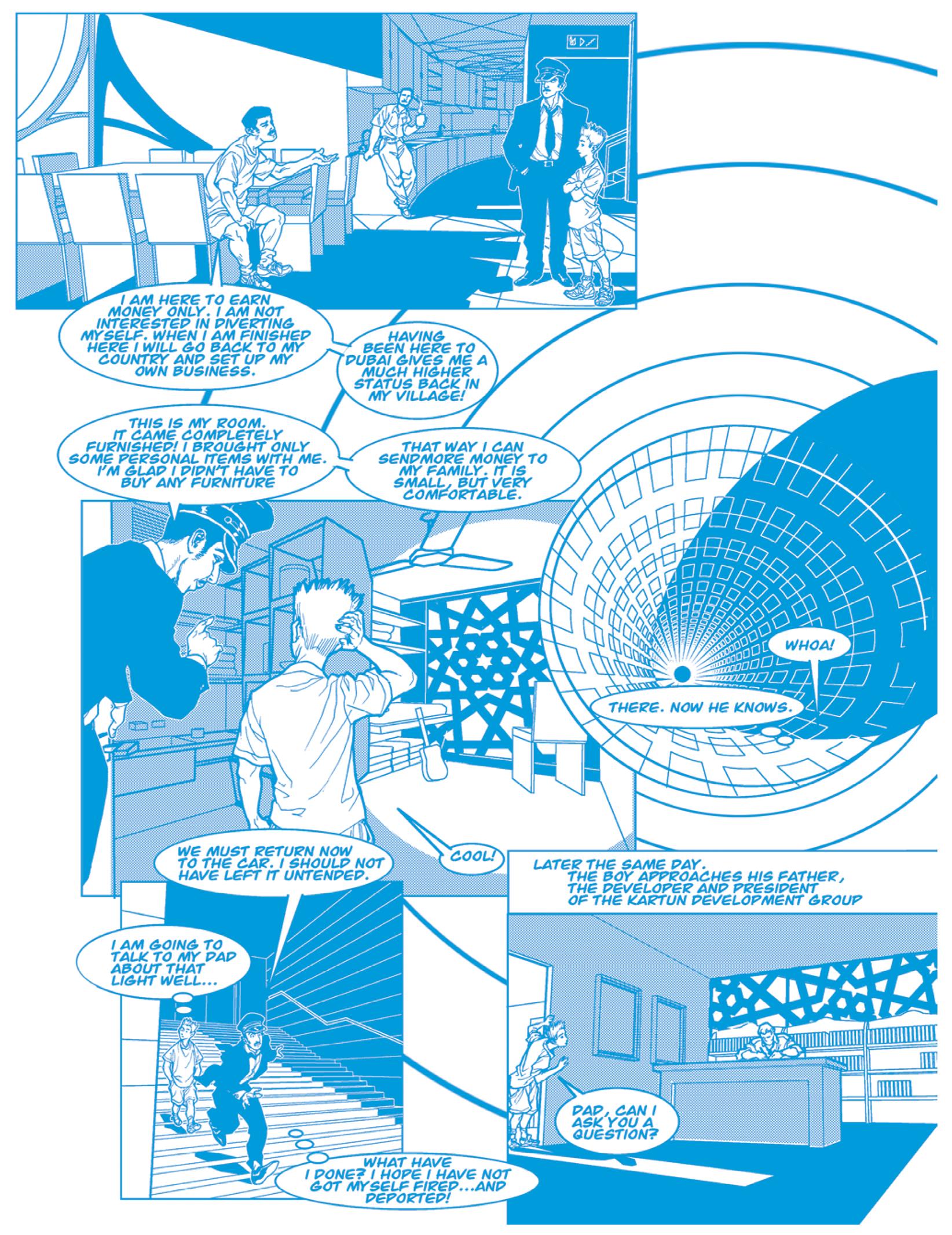
Dubai from a fragile bubble city to the middle-east’s most heroic urban model. But saving Dubai will require a powerful economic argument, based upon an enduring financial rule. The scarcity principle will guide the future city of Dubai: by prohibiting development everywhere in the Emirate except for a limited number of highly concentrated urban centers, the highest value is created. Additional benefits follow directly, intrinsically: the most cohesive communities are founded, the least environmental impact occurs, and urban icons are inevitable, rather than forced.
The first principle is to prohibit further development anywhere in the 1,588 square mile emirate except for several highly concentrated urban centers, strategically located across the desert. The paradox in this case involves the creation of cumulatively greater development value through limiting the supply of land available for development. Such (artificial, legislated) scarcity of land will naturally build value in that area remaining available, ultimately exceeding that achievable by covering the entire emirate with the typical, environmentally irresponsible, sprawling development pattern. In fact, the proposed new city model assembles about 1.2 times the value than sprawl development and uses about 150 times less land than the current development pattern.
Several non-policy-dependant strategies are used to contain the development. First, a super podium, built incrementally, lifts the city off the desert floor; second, a harsh and unwelcoming desert edge envelopes the city, where heat exhaust and solar reflection make for an intentionally hostile environment; and last, an envelope of land owned by KDG, held as a conservation easement, acts as a growth boundary. The plan shape of the city itself forms a strong, centralized figure that naturally resists corruption by external additions, reinforcing the legislated development prohibitions with psychological and cultural inhibitions: “You’re either in or you’re out.” The rectangle is sized in its short dimension to facilitate cross-town walking and access to public transit, which will operate in a longitudinal direction along the central axis of the plan.
The second principle is to use the oasis as a model for sustainability. Thus, on top of this parking podium a year-round paradise for one million inhabitants rises by taking advantage of contemporary
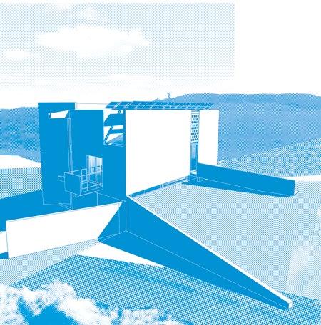
As seen from the street (the (E) house, ghosted on the left) an alternate entry stair is shown, with a (F) portion potentially taking you right down to the bedroom patio
The view in from the lower level entry patio
One chief difference amongst the designs is the way the uphill, or backside is treated
Looking down from the top level, with the elevator platform nearly at its lowest position. In this version a three-sided, vertically-continuous pegboard mounting system for the furniture storage is used in lieu of shelves, which reinforces the idea that these are not fixed floor levels.
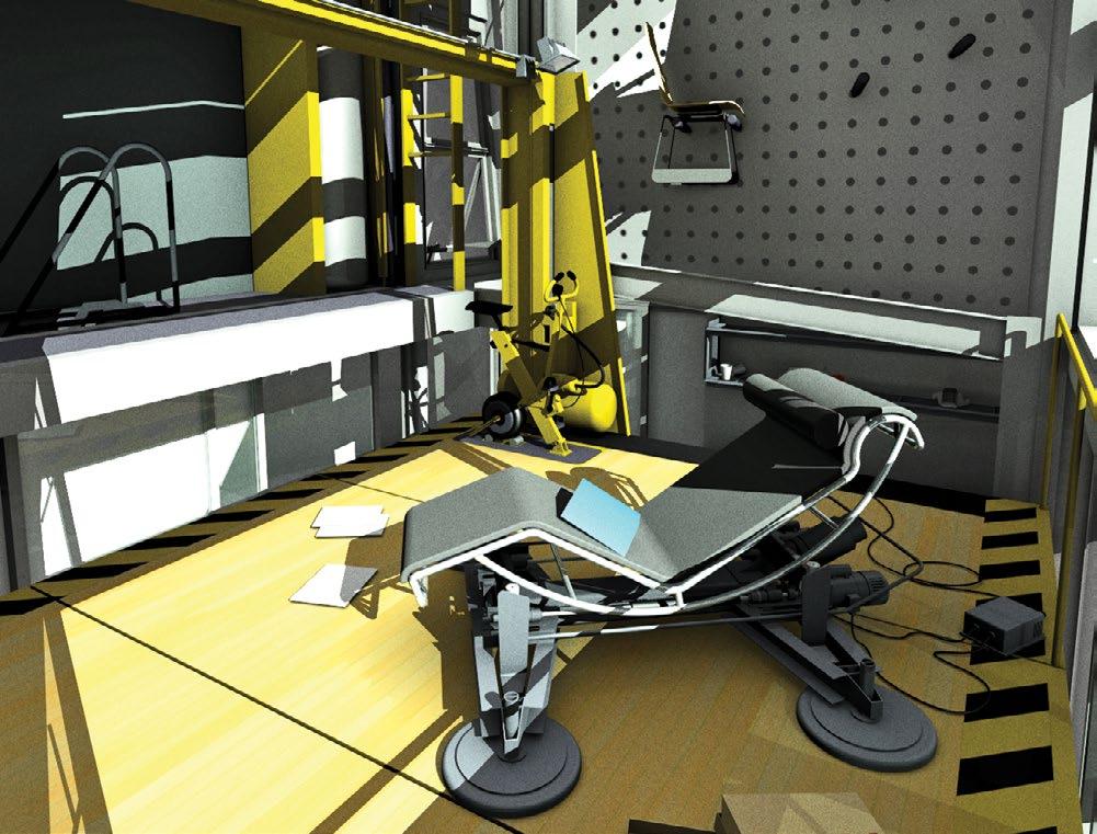
Also prominently visible on the exterior, the elevator is counterbalanced using a water storage tank, “pumped” via the fixed stationary exercise bike mounted to the corner of the platform. The foreground features Instrumental Form’s soupedup Chaise Lounge LC4 chair.
View of the GA HOUSES submission-entry version, from the neighbors unused and inaccessible back yard. This was the earliest design completed, and made gratuitous use of full-height sliders instead of awning windows.
The surfaces on the ground visible in both schemes are wood planking “mats” to avoid the mud that will naturally form under the outdoor showers
The solar thermal pipes which give the showers hot water a boost are visible here on the roof of the lower containers
Shown opposite is the site assembly process, describing how the mutually-counterbalanced loads are sequenced during the construction. Every aspect of the job is prefabricated and assembled on site, including the footings. The layout of both schemes, with their extreme cantilevers, shows off the natural strength of the containers monocoque construction.
concrete footings poured, level datum for containers established
containers slid into position, acting as counterweights for each other
lower containers positioned, secured
second set of upper containers set onto dunnage, all upper supports fixed
support dunnage for upper containers positioned, secured
second set of upper containers slid into position, acting as counterweights for each other
first two upper containers set onto dunnage, tension supports affixed
the primary form driver of the dingbat is the parking arrangementhow it penetrates directly from the street to the interior of the site, pinning the dingbat between the street and the alley, with the pedestrian circulation strung between
the overall form of the dingbat is determined by the setbacks, but this envelope is filled willy nilly by nonsystematic interior demising and scatterend plumbing walls/zones
the primary form driver of the dingbat is the parking arrangementhow it penetrates directly from the street to the interior of the site, pinning the dingbat between the street and the alley, with the pedestrian circulation strung between
the dinkbat is completely determined by the interaction between the codes and real estate market dynamics set in motion by the new rule that prohibits parked cars from backing out onto city streets. This leads to the sub-grade parking garage
the primary form driver of the dingbat is the parking arrangementhow it penetrates directly from the street to the interior of the site, pinning the dingbat between the street and the alley, with the pedestrian circulation strung between
interior demising layout is pure efficiency and logic, with service zone along the north, entry face and living zone occupying the free volume to the south where the dingbats traditionally chintzy glazing is updated in 2.0 with double height window walls
the overall form of the dingbat is determined by the setbacks, but this envelope is filled willy nilly by nonsystematic interior demising and scatterend plumbing walls/zones
Though it is taller than the neighbors, at least until the block turns over with the new development diagram, the proposal attempts to be a good neighbor by showing team spirit
While not exactly Carlo Scarpa, details matter even here—and nothing gets J,P:A excited like a stair system!
the overall form of the dingbat is determined by the setbacks, but this envelope is filled willy nilly by nonsystematic interior demising and scatterend plumbing walls/zones
a.
The primary form driver of the dingbat is the parking arrangement—how it penetrates directly from the street to the interior of the site, pinning the dingbat between the street and the alley, with the pedestrian circulation strung between
the dinkbat is completely determined by the interaction between the codes and real estate market dynamics set in motion by the new rule that prohibits parked cars from backing out onto city streets. This leads to the sub-grade parking garage
the overall form of the dingbat is determined by the setbacks, but this envelope is filled willy nilly by nonsystematic interior demising and scatterend plumbing walls/zones
the dinkbat is completely determined by the interaction between the codes and real estate market dynamics set in motion by the new rule that prohibits parked cars from backing out onto city streets. This leads to the sub-grade parking garage
the primary form driver of the dingbat is the parking arrangementhow it penetrates directly from the street to the interior of the site, pinning the dingbat between the street and the alley, with the pedestrian circulation strung between
the dingbat is celebrated for its facade decoration, made possible or even necessary by the blankness of the street-facing wall, a function of the new affordable aluminum windows which restricted the amount of glazing
the dingbat is celebrated for its facade decoration, made possible or even necessary by the blankness of the street-facing wall, a function of the new affordable aluminum windows which restricted the amount of glazing
The overall form of the dingbat is determined by the setbacks, but inside, this envelope is filled willy-nilly by non-systemic interior demising and scattered plumbing walls/ zones
The dingbat is celebrated for its facade decoration, made possible (or even necessary) by the blankness of the newly-affordable aluminum windows which previously restricted the amount of glazing
the overall form of the dingbat is determined by the setbacks, but this envelope is filled willy nilly by nonsystematic interior demising and scatterend plumbing walls/zones
interior demising layout is pure efficiency and logic, with service zone along the north, entry face and living zone occupying the free volume to the south where the dingbats traditionally chintzy glazing is updated in 2.0 with double height window walls
The relative success of MVRDV does not prevent it from serving as a warning of the fate that lies down the path of quantification untempered by architectural judgment, though. The dull repetition (clever the first time, merely funny the second…) of the numbers endgame, however inarguable, must finally be intolerable to the spirit of cleverness. In the end, cleverness enjoys the argument, the challenge to find advantage where none expect it. So, after the exhaustion of cleverness in the architecturally self-loathing quantification of MVRDV, the even more cleverly (at least in English) anonymous BIG (Bjarke Ingels Group) practice discovers a softer version of the numbers that preserves room for design. By using computation more in the spirit (if not fact) of post-rationalization rather than true generation—just enough numbers to provide a veneer of intellectual respectability, but nowhere near what any self-respecting Functionmixer operator would want to see—the BIG practice makes sure that the final products are recognizable as architecture by the glossy mags. BIG’s design for the Boscolo Hotel in Nice, for example, a swooping “symbiotic” transformation of a mixed-use vernacular context into a multi-spired luxury high rise, or their winning entry in the Faroe Islands Education Center competition, which dramatically coils separate strands of program around a central outdoor gathering space, are exemplary of a “signature process” that describes, explains, and justifies the spectacular results as if they were merely the inevitable outcomes of a really quite reasonable and straightforward logical process with no ulterior design motives.
the dingbat is celebrated for its facade decoration, made possible or even necessary by the blankness of street-facing wall, a function of the affordable aluminum windows which restricted the amount of glazing
the traditional emphasis decoration is updated a layered screen, through outer units can gaze
the dingbat is celebrated for its facade decoration, made possible even necessary by the blankness street-facing wall, a function of the affordable aluminum windows which restricted the amount of glazing
interior demising layout is pure efficiency and logic, with service zone along the north, entry face and living zone occupying the free volume to the south where the dingbats traditionally chintzy glazing is updated in 2.0 with double height window walls
the overall form of the dingbat is determined by the setbacks, but this envelope is filled willy nilly by nonsystematic interior demising and scatterend plumbing walls/zones
the dinkbat is completely determined by the interaction between the codes and real estate market dynamics set in motion by the new rule that prohibits parked cars from backing out onto city streets. This leads to the sub-grade parking garage
the traditional emphasis on facade decoration is updated in 2.0 with a layered screen, through which the outer units can gaze
the dingbat is celebrated for its facade decoration, made possible or even necessary by the blankness of the street-facing wall, a function of the new affordable aluminum windows which restricted the amount of glazing
interior demising layout is pure efficiency and logic, with service zone along the north, entry face and living zone occupying the free volume to the south where the dingbats traditionally chintzy glazing is updated in 2.0 with double height window walls
Now, the DINKbat is completely determined by the interaction between the codes and real estate market dynamics—set in motion by the new rule that prohibits parked cars from backing out into city streets. This leads to the sub-grade parking garage, with code-compliant aisle and stall dimensioning.
the traditional emphasis on facade decoration is updated in 2.0 with a layered screen, through which the outer units can gaze
the dingbat is celebrated for its facade decoration, made possible or even necessary by the blankness of the street-facing wall, a function of the new affordable aluminum windows which restricted the amount of glazing
Interior demising layout is pure efficiency and logic, with a service zone along the north, entry face and living zone occupying the free volume to the south, where the dingbats traditionally chintzy glazing is updated in with double-height window walls
interior demising layout is pure
efficiency and logic, with service zone along the north, entry face and living zone occupying the free volume to the south where the dingbats traditionally chintzy glazing is updated in 2.0 with double height window walls
The traditional emphasis on facade decoration is updated in ver. 2.0 with a layer screen, through which the outer units can gaze
The final self-consuming (if finally unoriginal) irony in this Dutch story of a descent into objectivity is evident in the recent monograph cum manifesto put out by BIG, which gives the work an extended comic book treatment.12 Perhaps offered as proof against criticism that the overtly pretty work might be mistaken for an uncool earnestness, the comic format of the book is cleverly self-effacing and overtly expedient. The simple format of recomposed fragments from the original client presentations and office photos, rendered cartoonish with text bubbles, enabled it to be rushed out when BIG’s surprising arrival on the scene, announced by the presentation of their Danish SuperHarbor (cleverly repurposed for China by transforming the Mærsk seven-point star into a PRC five-point star) that was a sensation on YouTube, created a need for a momentum-sustaining follow-up. It is a post-critical collage: the hipster’s scrapbook.
the traditional emphasis on facade decoration is updated in 2.0 with a layered screen, through which the outer units can gaze
the traditional emphasis decoration is updated a layered screen, through outer units can gaze
Just as the nihilism of Dutch work was foreshadowed in Delirious New York, so the seeds of the digital’s overweening ambition were planted in Eisenman’s
the
demising layout is pure
and logic, with service zone along the north, entry face and the traditional emphasis on facade decoration is updated in 2.0 with a layered screen, through which
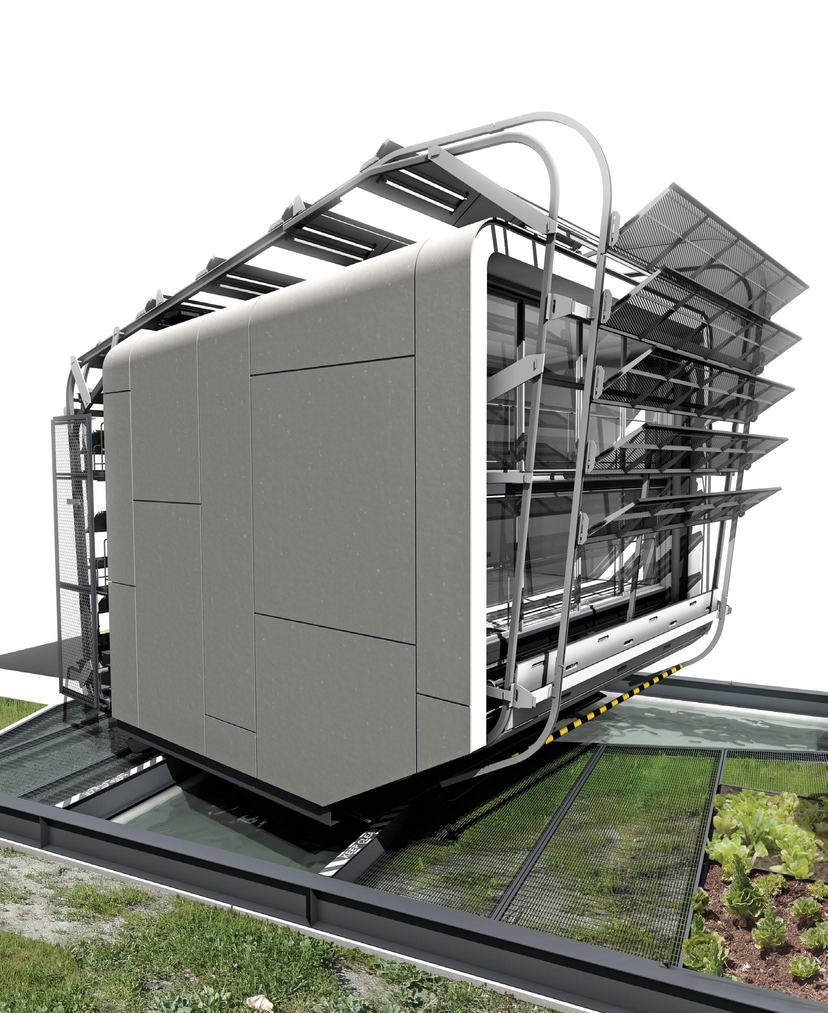
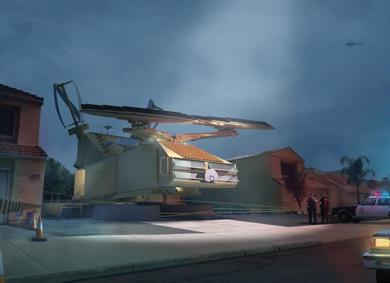
Although brimming with highly visible kinetic assemblies and devices, both inside and out, perhaps its most spectacular and compelling feature— beyond the aforementioned SRMS monumental articulated arm and its series of attachments—is the residence’s catapult-like retrieval and deployment armature for its occupants’ small electric vehicles. In the absence of any available driveway or service lane, this system is designed to catch and release the house’s assortment of elovs at freeway speeds. With precision timing, the Energy Absorption System platform-gondola swings down to meet the elov, traveling still at full speed, catching the elov and swinging it up out of traffic. The energy of the rapidly decelerating elov is transferred to the house via a flywheel and stored for future use. The system operates in reverse in order to launch the vehicles into traffic, using the stored energy captured during the retrieval in order to accelerate the elov to freeway speed.
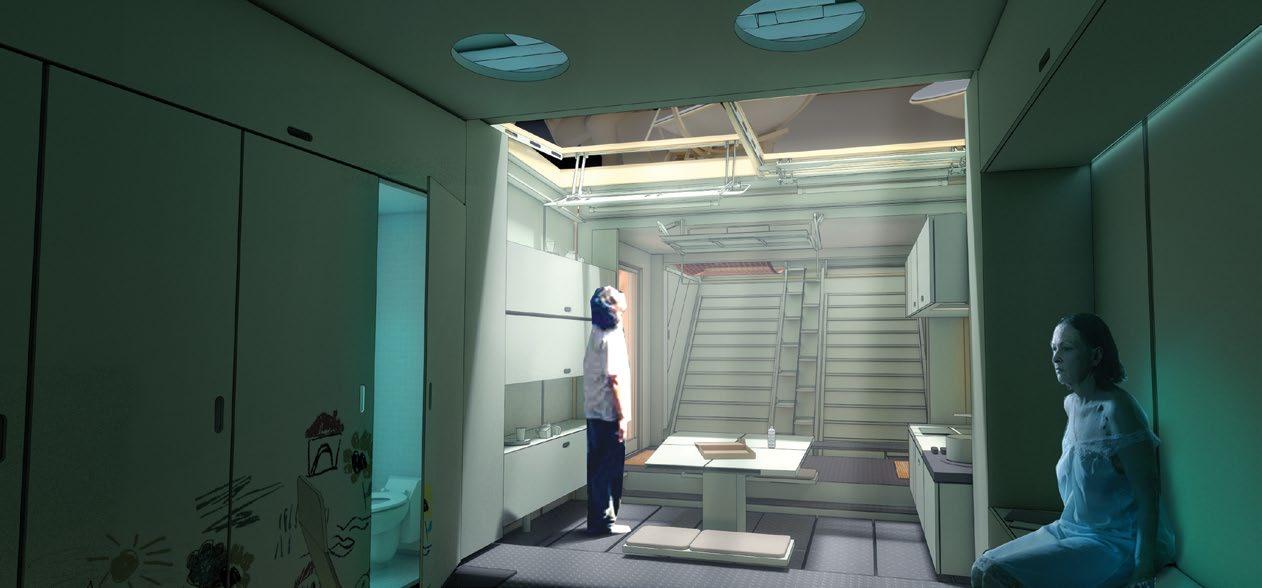
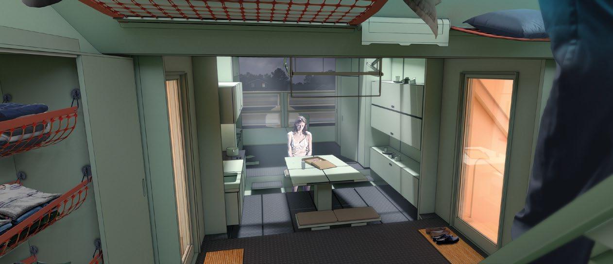
On the interior of the house the same spirit of movement reigns: a volume with flexibly moving stuff in it, arranged on levels demarcated by the tracks along the walls on which they slide. These moving elements include a kitchen counter element, a bathroom pod, and a cargo net bed or hammock at the highest level, and an alternating tread stair element that weaves itself between all these to provide access.
All of these moves attempt to broaden the idea of “green” to include a more general engagement with the environment, including the personal and interior environments—to make dwelling a verb again, an active pursuit, like sailing a boat. In addition, the highly expressive nature of these green technologies transforms the typically banal nature of transportation infrastructure into a public spectacle that serves as a continuous reminder of active green living.
The plan at the level of occupation—approximately set at the height of the freeway signage—shows the dwelling nestled between the two elov launch and retrieval mechanisms, aka catapults
Detail view showing one configuration of end effector attachments (inflatable water collection bowls), along with the adaptive freeway signage solar panels and a windbelt-type generator panel
The roof plan shows the operable skylights that this project shares with the original MOMO/Redondo project (seen in El Segundo) and the Jukebox Towerino, included earlier in this volume
A cleaned-up and simplified section from an earlier version of the project
roof plan
1. 2. 3. 4. 5. 6. 7. 8. 9. 10. 11. 12. 13. 14. 15. 16. 17. 18. 19. 20. 21. 22. 23. 24. 25. 26. 27. 28. 29.
20 15 10 22
photovoltaic panels lightweight grow tray orbital frame feeder hose balcony unused double-insulated shell rainscreen panel unused site dunnage unused fish run leeching pond unused inverted roll-up door interior stair unused unused interior compartment privacy screen heavyweight grow tray chicken coop multi-slide sliding glass door system pump assembly unused gantry beam T5 grow lights exented tray integrated hydraulic sliders
and express this way we are in the world. Architecture exceeds technology but cannot escape it.
So, we have two things, worshipping different gods. The two most readily overlap or possibly intersect for us tonight in that technology that produces expression in architecture: design technology as opposed to construction technology, and thus in the question of beauty. The question of efficiency for technology in relation to architecture is not necessarily related just to physical production of things, but also to the technology of design generation. How is the god of efficiency served there? The efficiency of design technology is measured by AGENCY—how transparent is the technology to intention: how good is the autobot/power pencil?
EVERYTHING, a trend that Heidegger warned about when he coined the term ENFRAMING. When this singularity is reached, all of possibility will stand in reserve, and be limited there to what will fit those toggles and sliders.
So: the alien is not alien because it is “other,” but because it is not “other” enough. It has no Being; it is itself sterile. It is not autonomous, but too completely slaved to the author, to the script, with no will of its own. Thus, finally maybe not alien after all, because it is too human. But it is also dead in itself. I think you know where this is going: having no life of its own it is not an alien, but a zombie.
The other side of the coin isn’t much different. Still hovering over a water element (an acrylic floor above the slewing mechanism would let occupants look down into the fish run, contemplating what to eat first), privacy and security are provided via the re-purposed (inverted) roll-up door and and expanded metal panel panels, which can be fine-tuned as warranted.
At about this time last night I was prepared to finish my talk discussing this question of agency, in an extended version of one of my usual anti-PCAD rants. The gist of that is to point out how the intentionality of the author is lost in the automatic design processes we seem to favor these days. Originally, as diagramming, this was a critical act, leading to a breaking of conventions and surprise, but now it just seems more a default and laziness, trading on the political bona fides of that surprise and its potential for difference.
I have been calling this stuff alien because it is untouched by human hands, and incapable of touching the human heart, as Corbu would insist. That’s been my line for the last 15 years, and it’s still basically true…
but then just last week in talking with Marianna about this symposium I realized, looking at her work, as well as the work of others like Scott, who do this stuff well enough that it seems no longer automatic, that I had the reasoning completely backwards.
I realized that the stuff was not alien because it had removed the hand and eliminated all agency, but the opposite: the parametric leads to surprise only because of our presently imperfect vocational skills, our lack of mastery/knowledge, not because of its access to hidden realms beyond our ken. So, as we get better at it, we can begin to imagine a time where the distance between the intending mind and the effect disappears entirely.
In fact, at that point the use of these tools will stamp out truly “other” possibilities, making their use another example of the general trend towards the quantification of
So, anyway, that’s where I was going with all this last night, but then in an exceedingly rare, for me, flash of sensitivity, I thought maybe not the best idea to call my good friends here zombies. Of course, I except their work from this charge anyway, for reasons that will soon become clear. So, instead, I will take the last few minutes of the talk to show some images of work to illustrate ways technology can serve architecture’s interests without the potential psychodrama of transgression and betrayal.
Given what we talked about at the beginning, how is this going to be possible? Well, it could be as simple as: if you talk about it first, or while you are doing it, then it’s not transgression or betrayal. Of course, we all know you can’t really talk to a zombie; the zombie has no ontological, only ontic status. It has no internal will, there is no there there; Were Kahn to ask the parametric brick what it liked, it would respond: you tell me.
A conversation requires an interlocutor, a conversation ensures that we are drawn out of ourselves, that we extend ourselves to meet the other. That is work, that kind of work is involved; this involvement is interpreted by the brain and our perceptual apparatus as life.
The first way I want to talk about this, before getting specifically to my stuff, is to remind us in the age of versioning, about the line that “searches” for its form, retracing an outline or shape many times with increasing conviction. This is the original artistic conversation. The brilliance or plasticity of such a line has been explained as the product of the mind’s effort to resolve these many layers of linework into a final, consistent, certain image. The brain’s perceptual apparatus must continue to operate throughout the
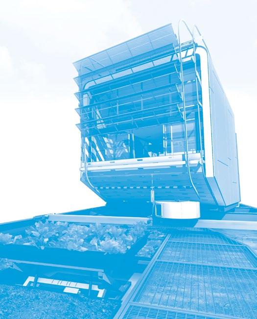
While technology is amusingly often at the forefront of “green” innovations, it is our intention to also incorporate it as an emphatic and expressive means to rebalance mans relationship with actual green: nature. The need for efficiency and localized consumption has been extolled extensively in prior schemes, but if our goal is to indeed also use technology as a transformative experience, we must be more direct and literal in its manifestation.
So, unless some hostile existential force drastically changes the mode of production and consumption, urban agriculture will start from the micro. To date, vertical farming has remained a wistful academic thesis, as no proven proforma has manifested itself in an increasingly conservative and constricting fiscal reality. With far fewer risk hungry and boom fed investment portfolios, and green tech government monies and initiatives withering under shifting policy, this movement will begin as many now fundamental things have; at the grass roots. As the micro benefits trend clear, community and city initiatives will start to establish normalized conditions for furthering localized urban
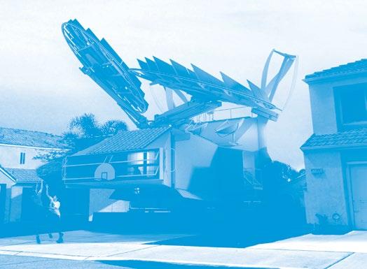
In this resigned update, the hegemonic spread of that sub-‘burbal mat is traded for a modest dispersion of isolated instances-of-futurity, scattered through the existing suburbs, relinquishing the former dreams of densification for more realistic (at least in the nearer term) ambitions of net-zero invisibility. Of course, in order to be invisible to the grid the object must be excessively visible to the neighbors. While it makes a polite gesture toward “fitting in,” with its Spanish tiles and basketball backboard, the model YF-22 instance-of-futurity is not shy about showing off its advanced environmental mediation package, in the hope that maybe the neighbors can learn something.
Beyond the overtly legible mediation package, the fuselage of the dwelling takes extreme advantage of the latest developments in AR and VR to reduce the need for meat space on the interior. This provides a dramatic contrast to the bloated neighbor pocket mansions, which fill out the allowable envelope on the lot and eliminate outdoor yard space in favor of three story entry halls and multiple other (listable!) single activity rooms.
Crewdson shot this scene after Nelson Nelson 22b-æ∑ was swatted by Jimmy down the block. However, Jimmy doesn’t know that he’s been traced.
As part of an assignment to document this particular crèche, Crewdson spent a week embedded with them at the residence
It was a very long week, needless to say
These elevations show the North American variant of the design, with the Southern California environmental package, featuring wind, solar, electromagnetic effectors and multiuse recycling/generation breeder tanks., all formatted to fit within the suburban lot size standard to it’s LA County location.
sketch movie you can see how all this works, and hopefully imagine how the kinetic dimension of architecture doesn’t need to be a betrayal of either architecture or technology. This would also be an example of the conversation in which the brick is pretty clear on its interests, and the architect is there more as an advocate than a master.
This effect is definitely aided by the absurdity of the initial proposition and tends to eliminate the rote answers and easy responses, forcing the architect to really listen and try to be helpful and supportive. While it is constitutionally necessary for architecture to be judgmental, this need not be negative or demeaning of the other, and her space can be respected while still guiding the conversation in an ultimately useful direction. And then, when she has accepted this and feels safe and respected, suggestions for…transgressive…. practices can be made without as much risk of rejection.
[images of the Astronauts Memorial, p. 24 in Instrumental Form] I want to end here with a couple images of the Astronauts memorial to reassert that epistemological kinship of architecture and technology, as conjoined ways of seeing the world and therefore of Being in that world. Traditionally architecture is said to reflect its world, but this seems too passive to me. I like the more active sense of placing us in the world. It captures better the sense of the will the object must have to live, to participate in the conversation, to be a companion and witness our own living.
By placing us in the world, architecture has skin in the game, it has a stake. Then, when things don’t work out, when the supportive technology fails, we both feel it, and that bond might keep us from becoming zombies.
south elevation
1A
1A
1A
1B
1B
1C
1C
1C /
2A /
2A
/
1BR Flat / 385 Sq ft
1BR Flat / 385 Sq ft
this volume. However, despite these similarities the reader is dared to imagine such work settling into the kind of overtly marketable “style” the aforementioned larger firms rely on for their bread-and-butter. Indeed, the stereotypical courtyard planning idea that illustrated the city’s RFQ/P preference is eschewed in favor of a row housing arrangement that eliminates the distinction between inside and outside oriented units in favor of a breezeway organization that connects every unit to the outside world on some level (if only as a view out the end of the raised street/yard between the rows of the units).
2B
/
2B
/
1BR Flat / 415 Sq ft
1BR Flat / 415 Sq ft
2BR Loft a / 735 Sq ft Upper Level - 265
2BR Loft a / 735 Sq ft
Level - 265
- 470
Level - 470
2BR Loft / 745 Sq ft
2BR Loft / 745 Sq ft
2BR
2BR Loft b/ 785 Sq ft
- 315

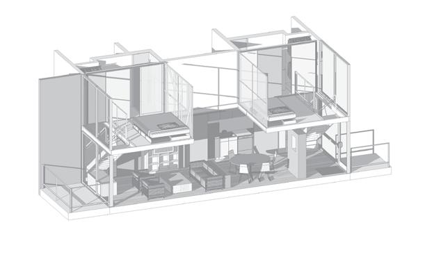
And despite the snark about breadand-butter, this scheme is also an example of the J,P:A belief that every project should strive to be exemplary: becoming subject to wider replication, as a type or model, as even a vernacular movement. In this sense, the attitude is distinctly Miesian. The units are designed as idealized spaces, with each component reduced to what Barthes called its “condition degree zero.” So, the program wall is condensed into a special zone of sliding and folding panels, opened to reveal various activity-supporting cabinets, each tailored to their specific requirements and all out of the way of the living space, which itself is bare of any distractions. When the panels are not opened, the program it hides is taken out of the equation, leaving the adjacent erstwhile supported space free to be used for other things. This living volume is either one or two stories; a simple tube of space. In the case of two, floating platforms and access stairs divide it spatially up into defined volumes without walls so that the platforms are both included and private, while the areas beneath the platforms gain an intimacy without enclosure. Opposite the topologically quilted program wall is a pure, smooth mural surface that is available for any adornment, yet requires none.
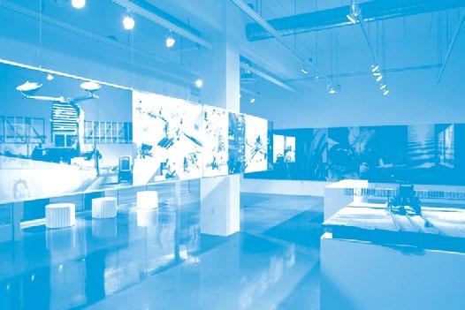
construction. In fact, New Sculpturalism was originally intended to include only built work, but since the curating team discovered there wasn’t enough cool, recently-built stuff in LA to fill such a large space, that requirement was relaxed half-way through the process.
The Chiller / Cogen. project was chosen for the exhibit because of the availability of the bitchin’ overlayed linework, drum-scanned from the original ink-onmylar drawings. The unbuilt Towerino, which had gotten through the Design Development phase but was still facing a substantial entitlement battle with City of LA Planning (and neighbors!) was included because we wanted to build a model of it anyway and had no other occasion. Multiple versions of this project are presented elsewhere in this volume, while the UCLA plant is covered in an earlier monograph, Instrumental Form.
e12.01