This document contains the rules communication system. Follow these rules strictly to maintain brand consistency. This includes all of the elements you may need logos,tyepface,colors,and more!
At Infinite Burn, our brand’s identity and growth are fueled by strong creative leadership and innovation. We are dedicated to fostering a dynamic vision that inspires every product, collaboration, and campaign.
Our creative lead plays a pivotal role in maintaining the brand’s consistency and creativity, ensuring that every aspect of Infinite Burn aligns with our core mission to deliver cutting-edge fashion that resonates with our audience.
Creative Lead
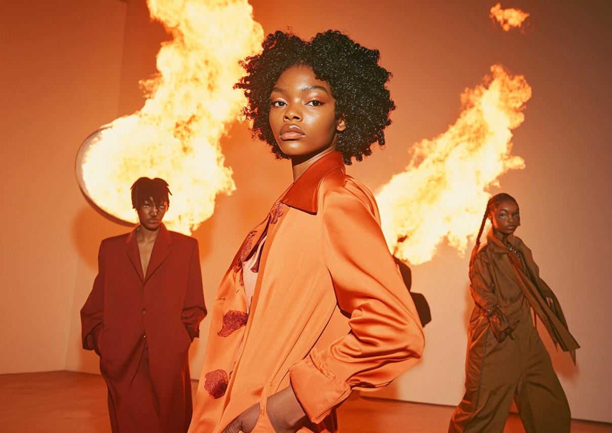
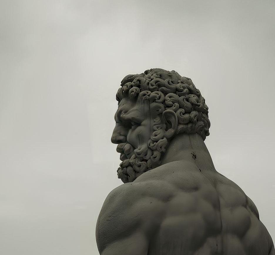
At Infinite Burn, visual storytelling is essential to how we connect with our audience. This image embodies the confident, bold aesthetic that defines the brand. Our designs are crafted to inspire individuality and ignite a sense of purpose.
Tosin Afolaranmi
Creative Lead
Our creative lead ensures that all brand visuals remain cutting-edge and aligned with our core message. They guide the brand’s visual tone, ensuring consistency in both marketing campaigns and product design
BRAND PERSONA
The Infinite Burn persona embodies a fusion of passion, creativity, and authenticity. We represent a brand that appeals to individuals who are driven by self-expression and a desire for quality and uniqueness. Our persona influences how we communicate and engage with both customers and partners.
PROFESSIONAL AND KNOWLEDGEABLE INNOVATIVE AND CREATIVE
We provide trusted expertise in fashion and branding.
We push boundaries with bold, forward-thinking designs.
We celebrate individuality and the pursuit of passion.
We make thoughtful, strategic choices to stay relevant.
Integrity and authenticity guide all our relationships.
We draw inspiration from adventure and the natural world.
We stay on top of trends and cultural innovations.
Our brand is versatile and meets diverse audience needs.
ATTRIBUTES
The Infinite Burn brand personality is built on a balance of key traits. These attributes define how the brand communicates and resonates with its audience.
YOUTHFUL
RESERVED BOLD
LOGO
The Infinite Burn logo is a core element of the brand identity. It combines a modern symbol with a bold, minimalistic typeface, designed to convey energy, transformation, and endless creativity. To maintain brand consistency, always adhere to the prescribed proportions and clear space guidelines. Avoid resizing, altering colors, or distorting the logo in any way.
This document contains the rules communication system. Follow these rules strictly to maintain brand consistency. This includes all of the elements you may need logos,tyepface,colors,and more!
Brand Identity Overview: This document outlines the key branding elements for Infinite Burn. These guidelines are essential to maintaining a consistent, recognizable identity
across all communication platforms. From logo usage to typography, color palettes, and design principles, adherence to these rules ensures a unified brand presence.
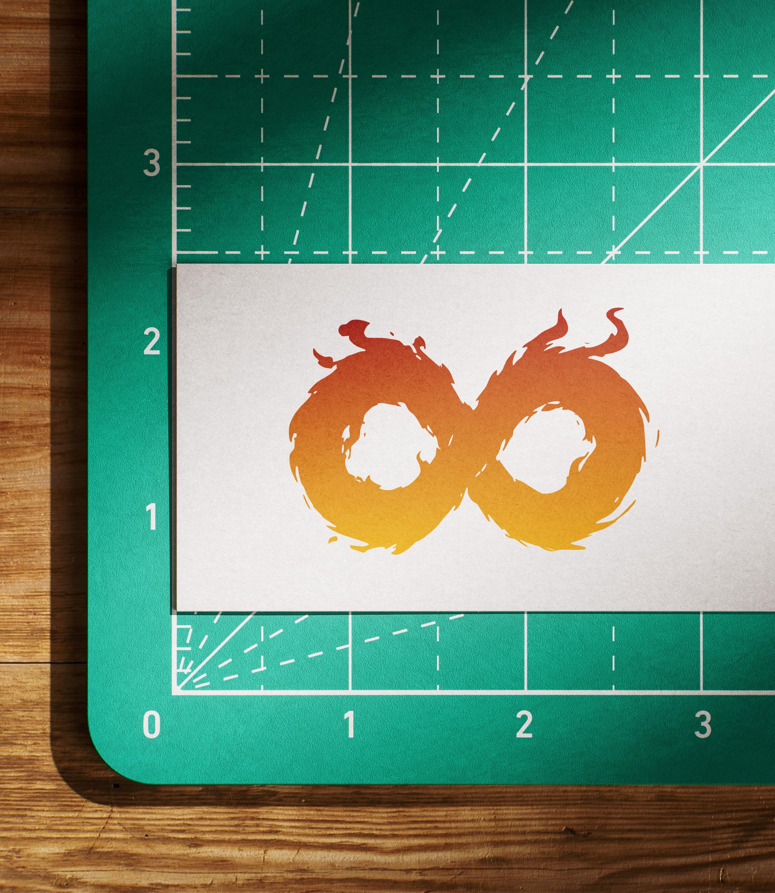
LOGO MARK
The Infinite Burn logo mark represents a powerful, iconic flame—a symbol of passion, transformation, and endurance. This mark embodies the core message of the brand: to ignite creativity and resilience within fashion.
LOGO TYPE
The Logo consists of a symbol and a typeface. When thewidth is much greater than the height (from-strip) the logo of this design is use
16PX
THUMBNAIL MARK
Compressed mark used for small and where applicable
LOGO USAGE
Here are acceptable ways the logo is applied.
To maintain brand integrity, the Infinite Burn logo must be used correctly and consistently across all applications. Below are the approved and unacceptable uses of the logo.
PIRIMARY
SECONDARY
AVOID USING OF NON BRAND COLORS
AVOID BUSY BACKGROUND
AVOID STRETCHING
ALTERNATIVE USE
MINIMUM SIZE
Compressed mark used for small and where applicable
When Significantly reduced, the logo will become illegible. These are the pixel size units we recommend Staying within to preserve the quality of the logo.
COLOR
The color palette will cover the majority of our brands.It’s Internationally small in variety so as to not dilute the brand visual,which adds confusion.
This
document contains the rules communication system. Follow these rules strictly to maintain brand consistency. This includes all of the elements you may need logos,tyep-
face,colors,and more!
The Infinite Burn color palette forms a crucial part of the brand’s identity. It conveys the core emotions and style of the brand—bold, dynamic, and transformative. The palette has been designed to be versatile yet distinct, ensuring easy recognition across all touchpoints.
The palette has been designed to be versatile yet distinct, ensuring easy recognition across all touchpoints.
BRAND COLOR
The color palette will cover the majority of our brands.It’s Internationally small in variety so as to not dilute the brand visual,which adds confusion.
COLOR PALETTE
Here are acceptable ways the logo is applied.
BRAND COLOR
The color palette will cover the majority of our brands.It’s Internationally small in variety so as to not dilute the brand visual,which adds confusion.
TYPOGRAPHY
Typography is a key element of Infinite Burn’s brand identity. It enhances communication and creates a recognizable style across all platforms. Our type choices reflect boldness and sophistication.
This document contains the rules communication system. Follow these rules strictly to maintain brand consistency. This includes all of the elements you may need logos,tyepface,colors,and more!
Our primary font is designed for headlines and major brand elements. It captures attention and establishes a strong, modern presence
Typography Guidelines
1. Consistency: Maintain type hierarchy for clarity and emphasis.
2. Readability: Avoid using decorative fonts in core communications.
3. Spacing: Ensure proper letter and line spacing for clean, professional presentation.
TYPOGRAPHY
Typographic hierarchy system based on human interface guideliness. Aesthetic from while keeping text legibility, prioritize content and emphasize important information.
TYPOGRAPHY
Typographic hierarchy system based on human interface guideliness. Aesthetic from while keeping text legibility, prioritize content and emphasize important information.
INTERFONT
Brick
TYPOGRAPHY
Typographic hierarchy system based on human interface guideliness. Aesthetic from while keeping text legibility, prioritize content and emphasize important information.
abcdefghijklmnopqrstuvwxyz
ABCDEFGHIJKLMNOPQRSTUVWXYZ
abcdefghijklmnopqrstuvwxyz
ABCDEFGHIJKLMNOPQRSTUVWXYZ
BRAND ELEMENTS
The Infinite Burn brand is built on key elements that work together to create a strong, unified identity. These elements include the logo, colors, typography, and imagery, all designed to communicate the brand’s core values and personality.
This document contains the rules communication system. Follow these rules strictly to maintain brand consistency. This includes all of the elements you may need logos,tyepface,colors,and more!
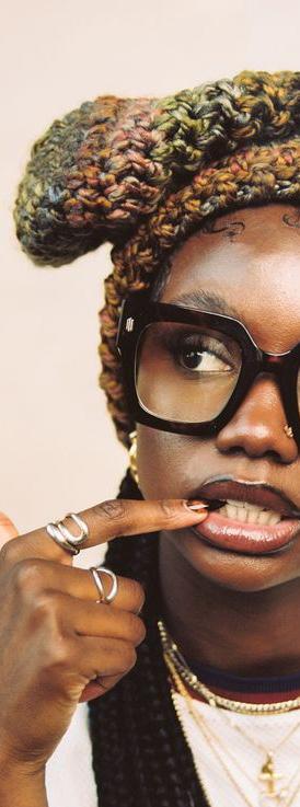
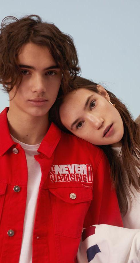
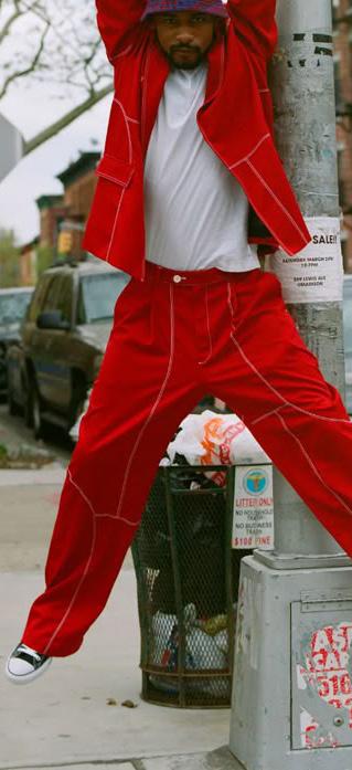
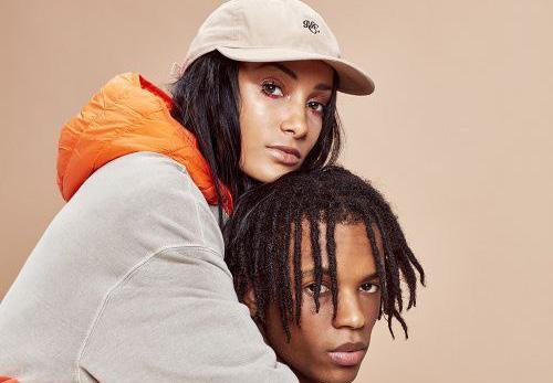
Photography and visuals should evoke confidence, individuality, and a sense of adventure.
IMAGE-GRAPHY
Imagery is a powerful way for Infinite Burn to communicate its brand essence. Our visuals are bold, expressive, and reflective of individuality, diversity, and a sense of adventure. Images should inspire and connect with our audience by capturing the essence of self-expression and creativity.
Floral white 01.
Engineering orange 02.
GRID SYSTEM
The grid system is essential for maintaining structure and consistency in Infinite Burn’s visual layouts. It ensures clean alignment, balance, and organization across all media, enhancing the overall presentation of content. Heading_01 Grid system
HEX #1080 x 1080
WEBSITE
Compressed mark used for small and where applicable
The Awesome Headline Here
MOBILE APPS
Compressed mark used for small and where applicable
Login/sing up
Login/sing up
Get the best deals today
Premium Clothing apparel
BRAND ELEMENTS
The brand elements form the core of Infinite Burn’s identity, ensuring recognition and consistency across all communication channels. These elements work together to express the brand’s style, values, and message.
This document contains the rules communication system. Follow these rules strictly to maintain brand consistency. This includes all of the elements you may need logos,tyepface,colors,and more!
The brand elements form the core of Infinite Burn’s identity, ensuring recognition and consistency across all communication channels. These elements work together to express the brand’s style, values, and message.
WHITE PAPER
Compressed mark used for small and where applicable
Email: lorem@example.com
Phone: +1234 567890
Fax: +01234 567 89093
Twitter: #m_john098
Lorem ipsum dolor sit amet consectetuer na aliquam erat volutpat. Ut wisi enim ad minim veniam, quis nostrud.Occum sitiam qui nos eossitibus aut vel iliquo ium ventori onsequid ea natem.
Imin consed ut et parum hil ero mo blam senditi consendae illuptae sam expliti bus minctasperio mossincia nonsed cit quiam, idempor atquasi moluptasimus imusdant.
El ipide maxim et dic tem qui ipitio eario ea quo voluptaestArit et miligen dipiento is modit vendandic tem id quid etume dolute nones inimillorum, sit volorem versperunt erciendit re quuntin consequi nobis in cusandis sentemque nos des eture, none conserent, cum secus dolor autemqui res miliquis adi sequis es
volendae eum velliqu odigenes im et voluptus accuptatem sequi dolorem porrovit laboresPudam, serro maxim diatusert
Michael John Post title
Michael John Post title
infinite burn
WHITE. PAPER
BIZ CARD
Compressed mark used for small and where applicable
ENVELOPE & BAG
Compressed mark used for small and where applicable
Enim adminim veniam quis nostrud exerci tation suscipit aliquip
Lorem ipsum dolor sit amet, consec tetuer adipiscingelit
Consectetuer adipiscingelit, sed dia de et explaut quasped.
ILLUSTRATIONS
Illustrations play a key role in enhancing the visual appeal of Infinite Burn’s brand identity. They provide visual storytelling, break down complex ideas, and add personality to communications. Our illustration style is bold, clean, and aligned with the brand’s modern aesthetic.
FILE & INFO
All brand files and contact information are organized to ensure easy access and consistent usage. This section provides the essential details for business communication and branding assets.