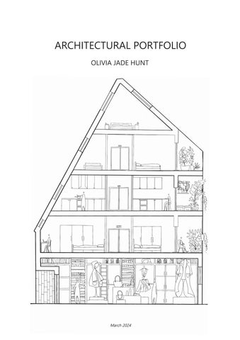
ARCHITECTURAL PORTFOLIO
OLIVIA JADE HUNT
March 2024
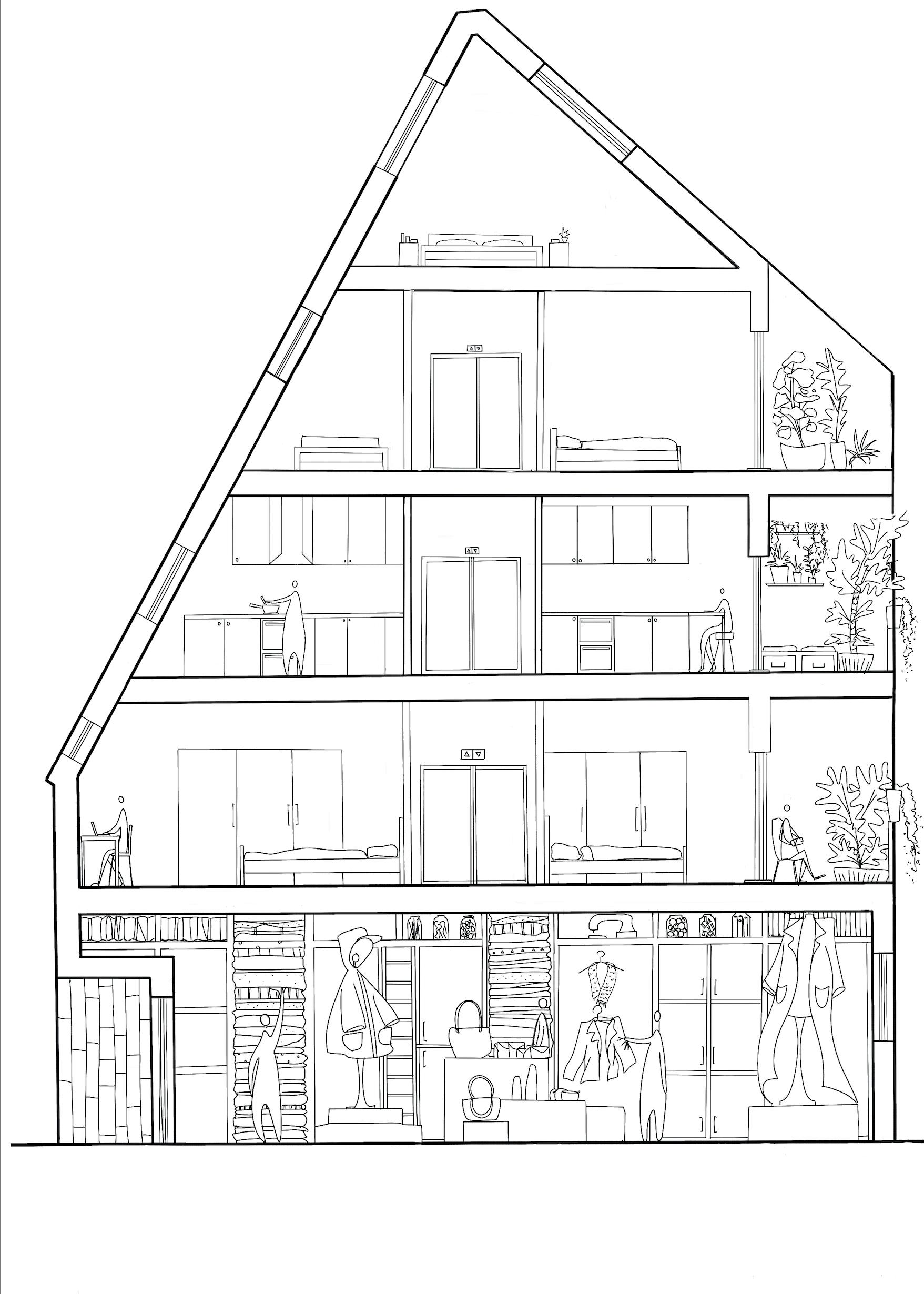
TABLE OF CONTENTS: Concept Models ............................................................................................................................................................................................................................................................. pg 4 Castle Caves Pavilion ............. pg 5 Walnut Tree Ceramic Therapy Centre .................................................................................................................................................................................................................. pg 6 - 9 Design Development examples ............................................................................................................................................................................................................................... pg 10 Site Analysis examples ............................................................................................................................................................................................................................................... pg 11 Hybrid Housing Masterplan ...................................................................................................................................................................................................................................... pg 12- 13 Hybrid Housing Textile Workshop ........................................................................................................................................................................................................................... pg 14-15 Urban Farm Year 1 ....................................................................................................................................................................................................................................................... pg 16 Whitby Museum of Whaling Year 2 ....................................................................................................................................................................................................................... pg 17 Nottingham Industrial Museum Marketing Project ........................................................................................................................................................................................ pg 18-19 Niall McLaughlin Architects : Royal Academy Art Installation .................................................................................................................................................................... pg 20-21 Zervas Project : Mosaic Mural Crescent 2 ........................................................................................................................................................................................................... pg 22 Zervas Project : Renderings ..................................................................................................................................................................................................................................... pg 23
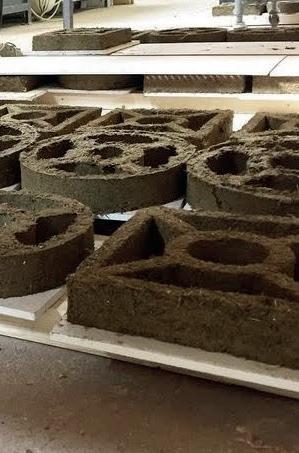
CONCEPT MODELS
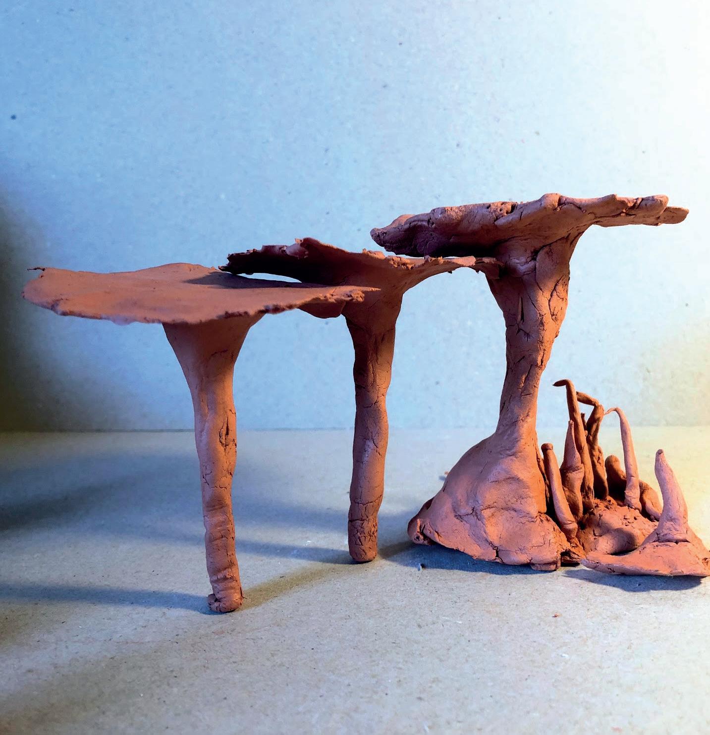
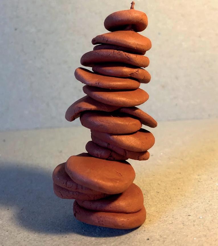

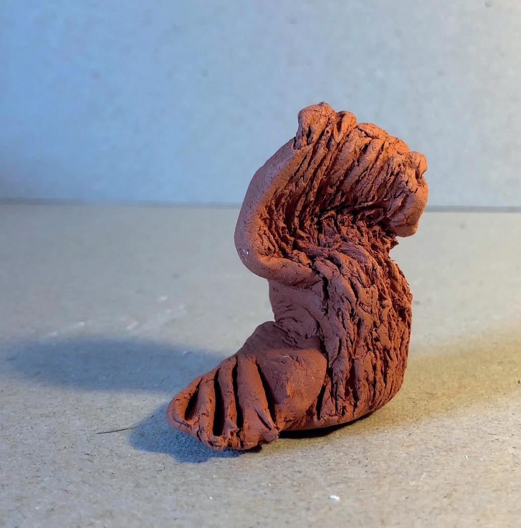
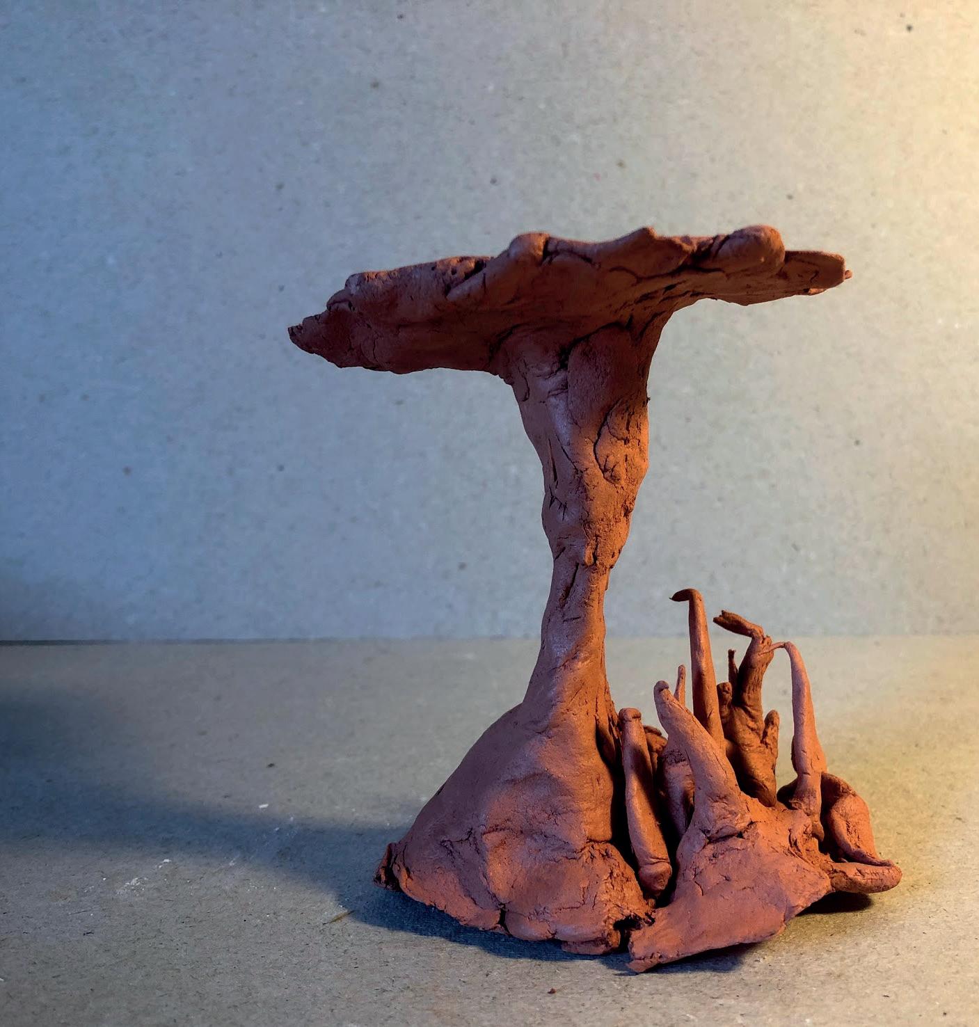
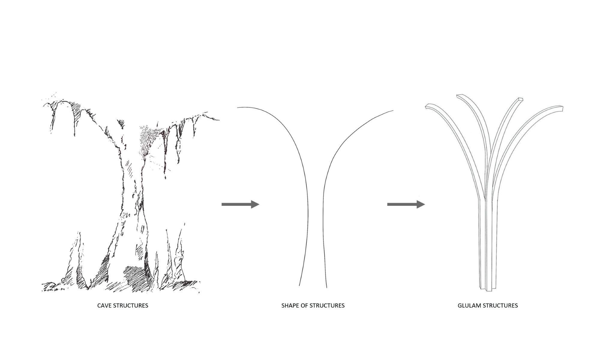
I used clay to create these abstract shapes, they represent two different things:
- One representation being ‘Support’ in the form of the supporting structures found in caves as well as different types of supporting and balancing structures. I was also exploring how different shaped structures can support themselves and I found that the strongest was model 2 as it is short and solid. However its short stature makes it unsuitable to support a structure. The next strongest were models 1&3 as they have wide bases and so are bottom heavy. This is inspired by the structures found in the Nottingham caves so I have decided to use this shape in my further development.
- The other representation is ‘Material’. Clay is malleable and goes on a form of journey as the creator is moulding it and reshaping it. This I think is, in part, why this material is used in art therapy as it influences the craftsmen to embark on their own journey, alongside the clay. This is also a concept I would like to develop further.
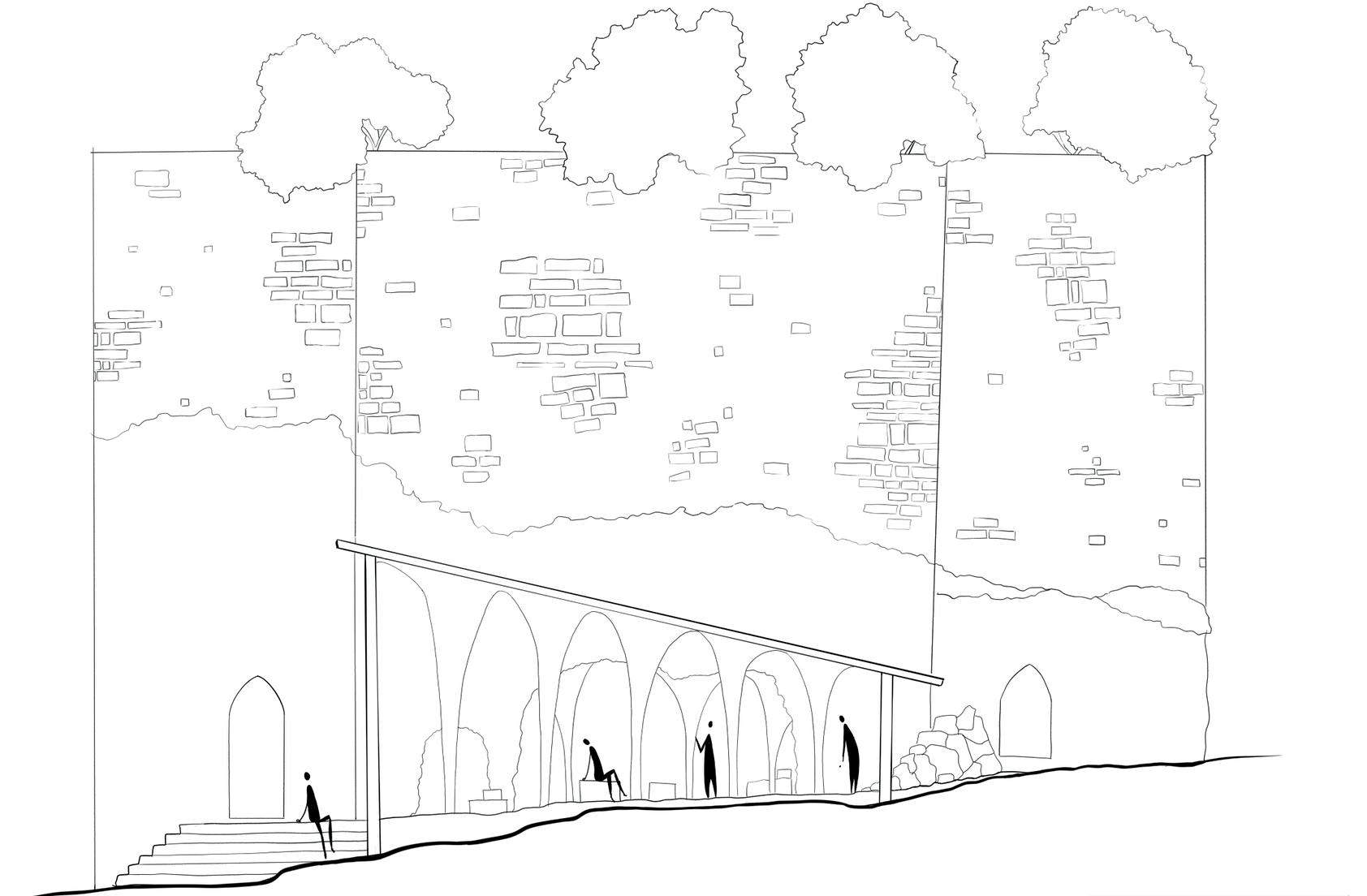
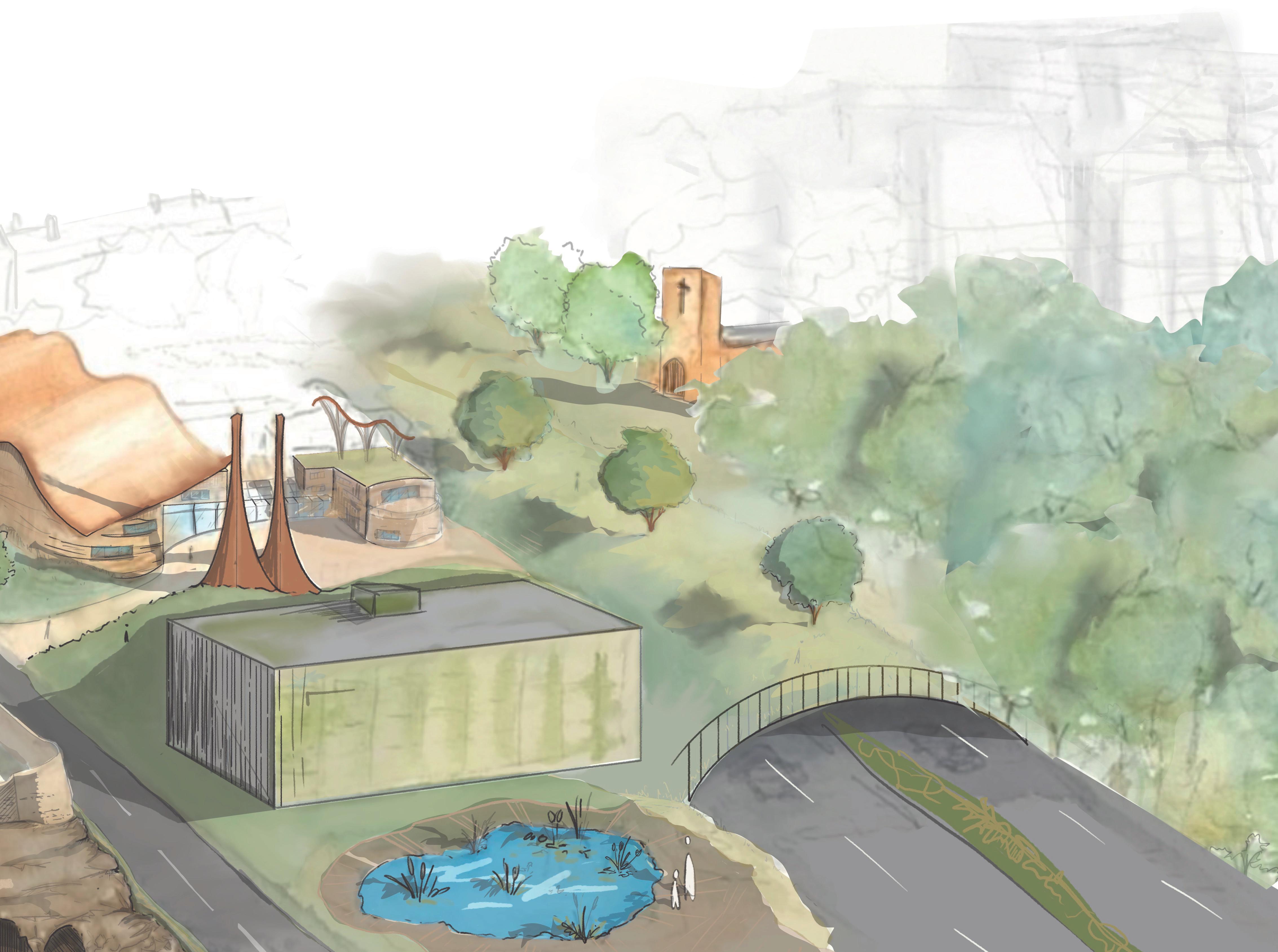
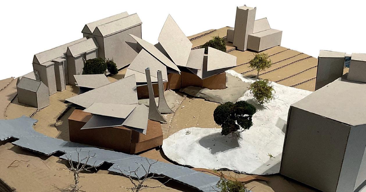
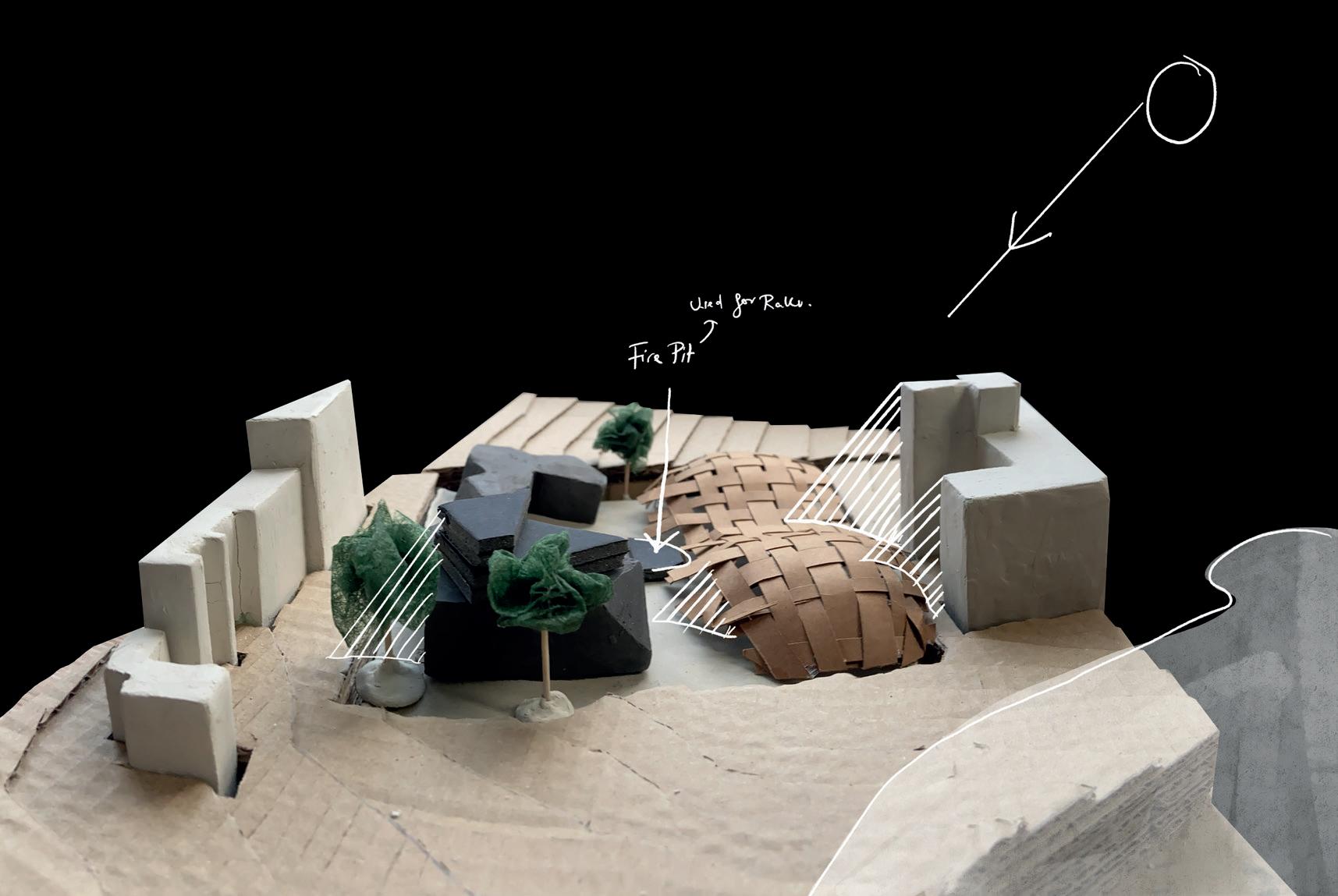
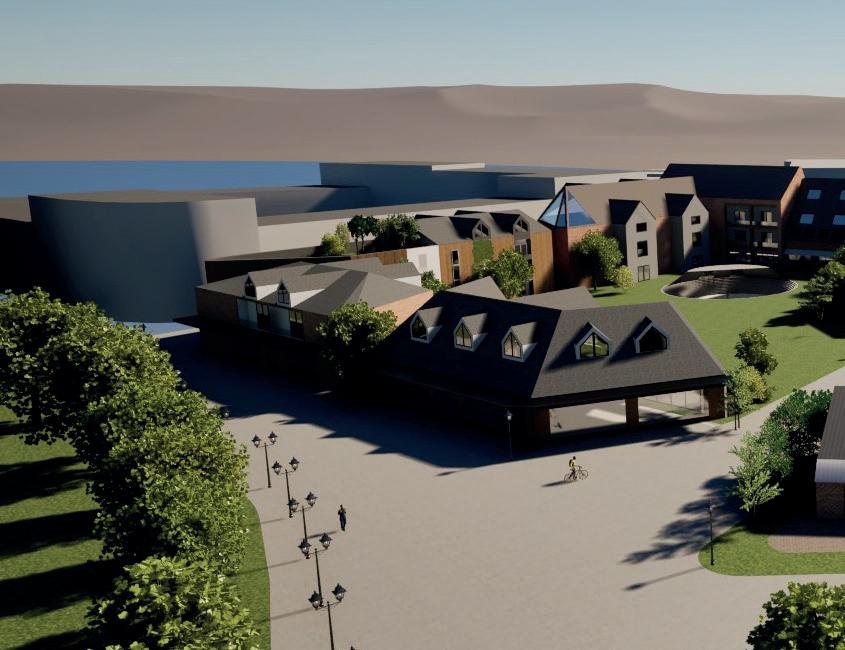
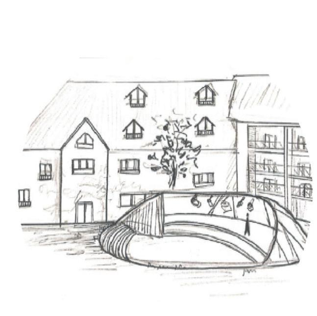
CASTLE CAVES PAVILION
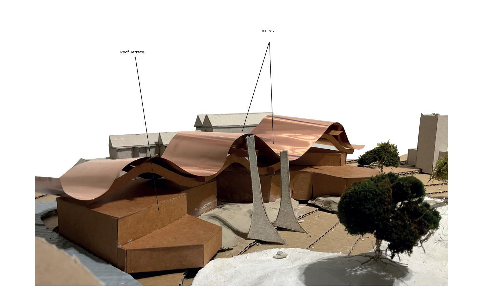
The ‘Castle Caves Pavilion’ serves as a space for mindfulness partnered with the neighbouring Ceramic Therapy Centre, but also as an entrance to the famous cave system that runs under the city of Nottingham.
The design is comprised of 2 main elements; the structural uprights and the slanted, staggered copper roof. The structural uprights are precast concrete sculptural details that take inspiration from the supporting shapes found within the cave system itself whilst the slowly oxidising copper roof shows the phenomenological journey of the water which acts as a symbol for the journey experienced within the Ceramic Therapy Centre.
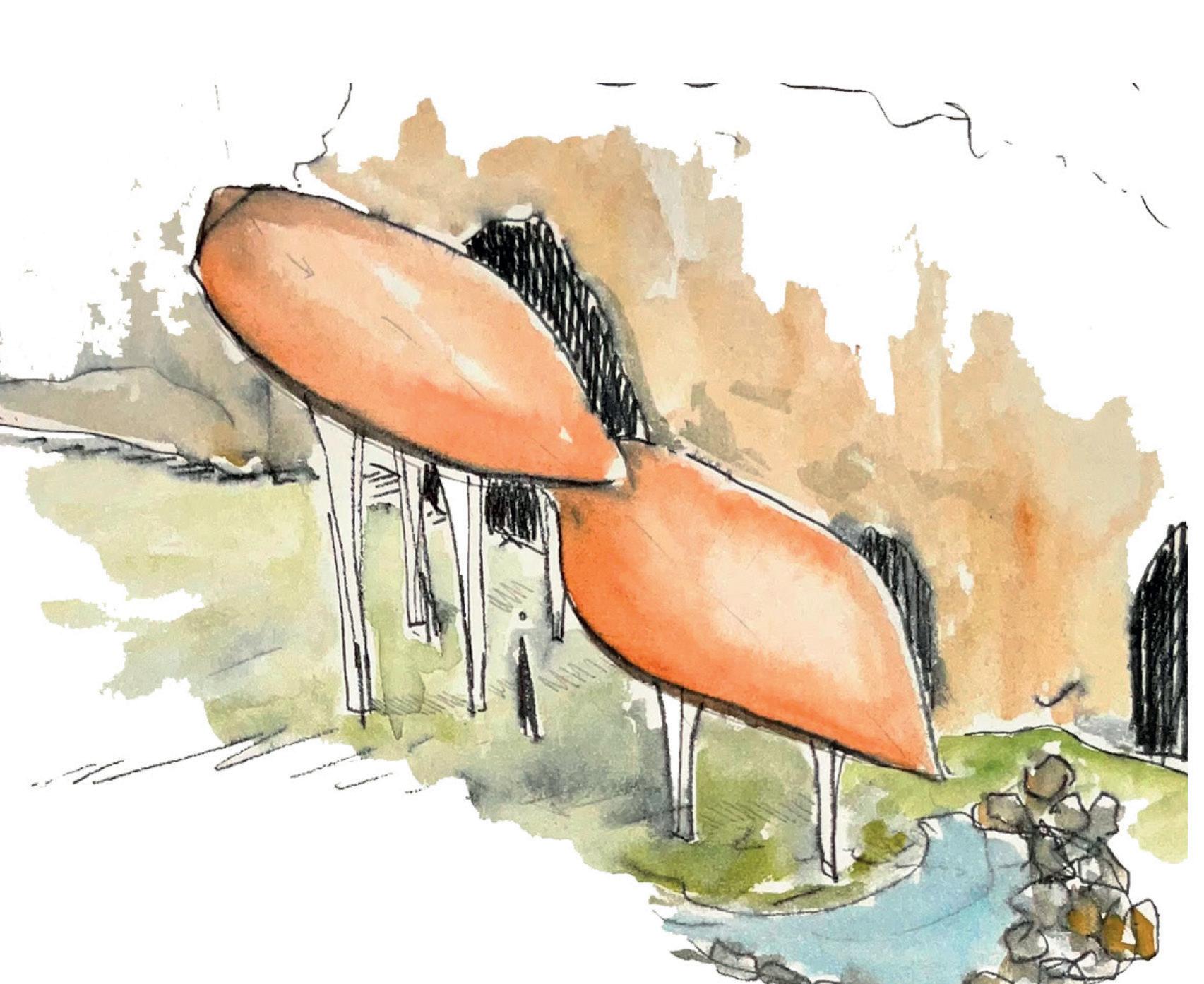
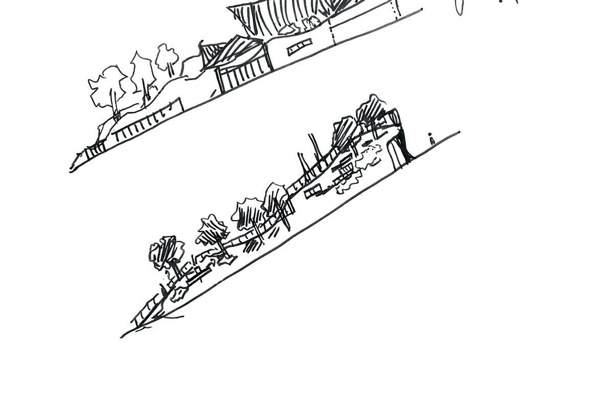
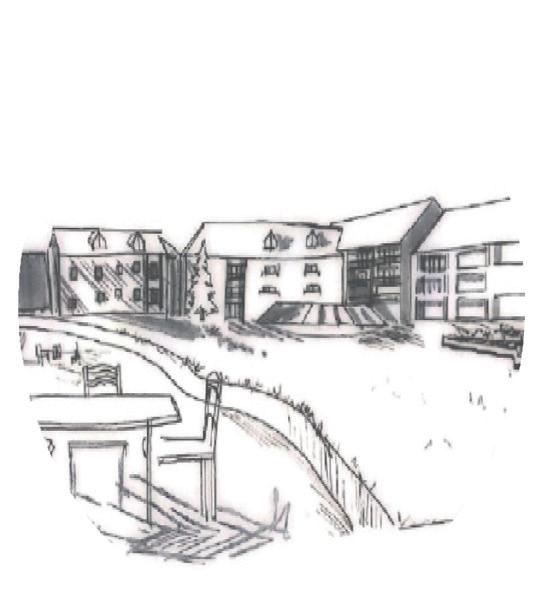
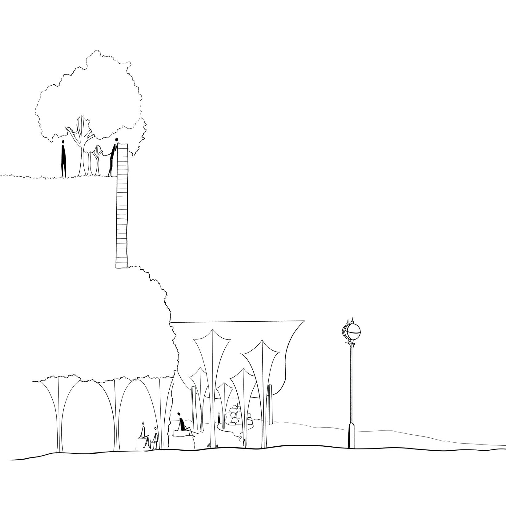 This watercolour shows the slope of the copper roof and the phenomenological Journey of the rain water running down and leaving the oxidisation pattern on the surface. This water finishes its journey in a rockery and pond.
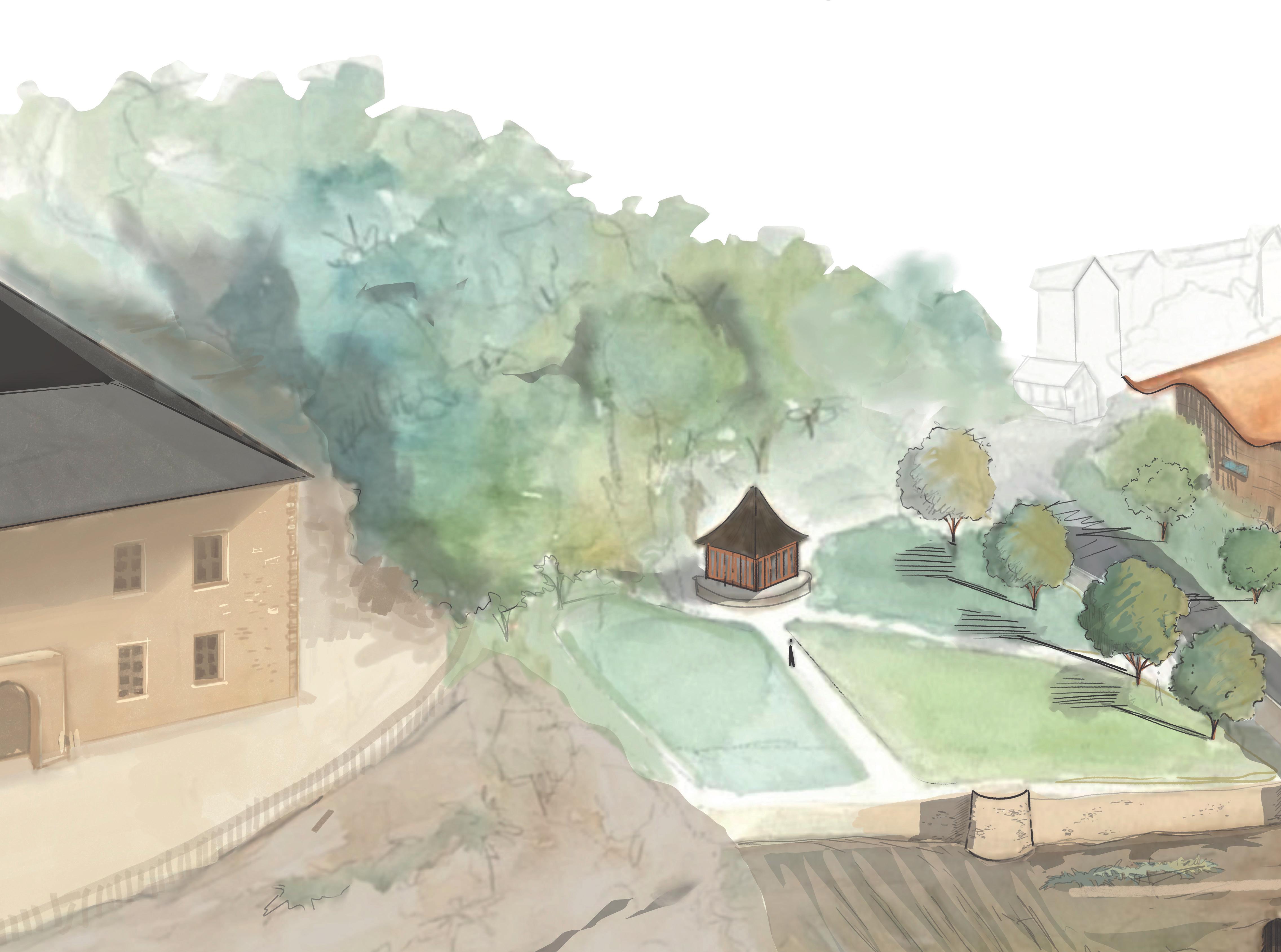
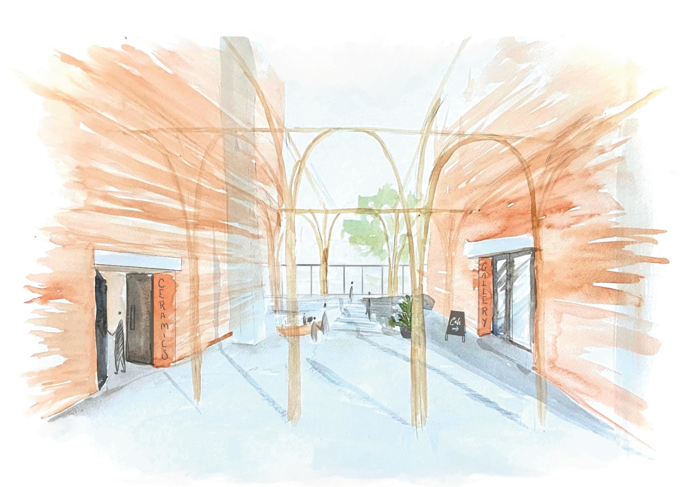
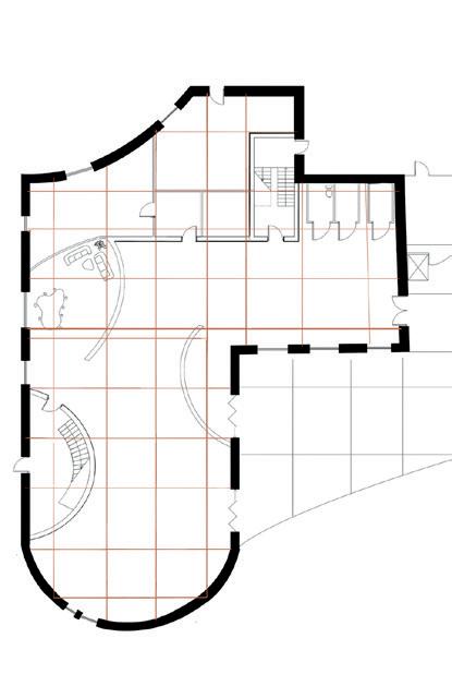
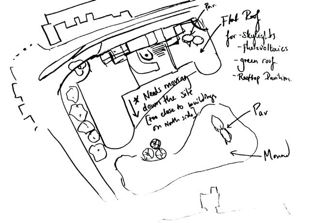
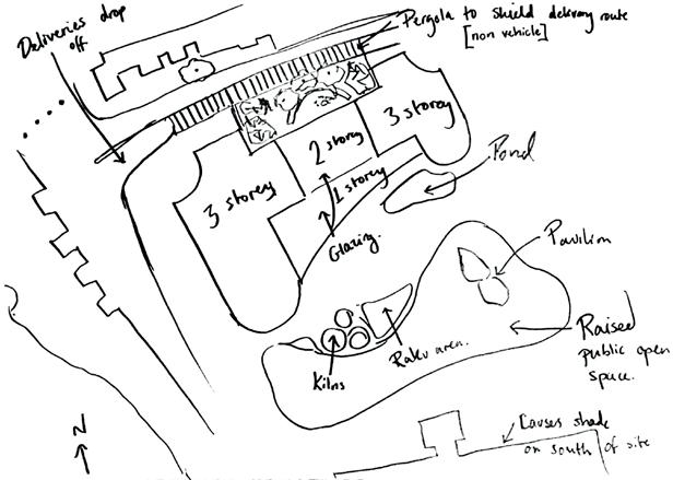
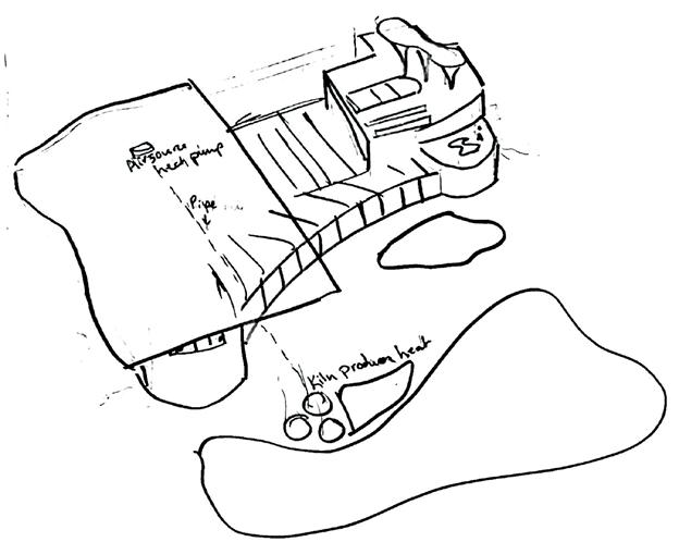
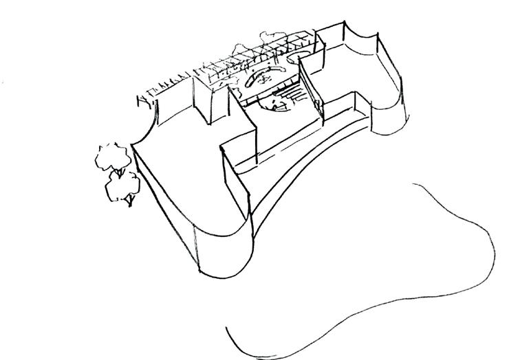
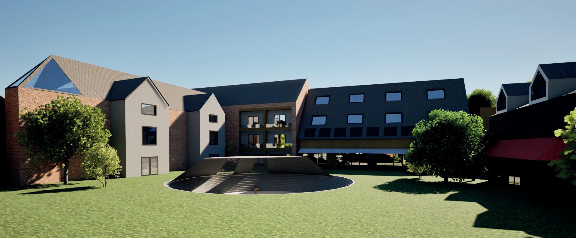
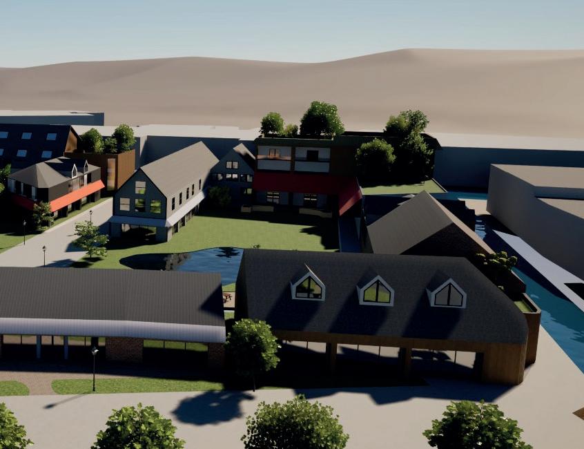
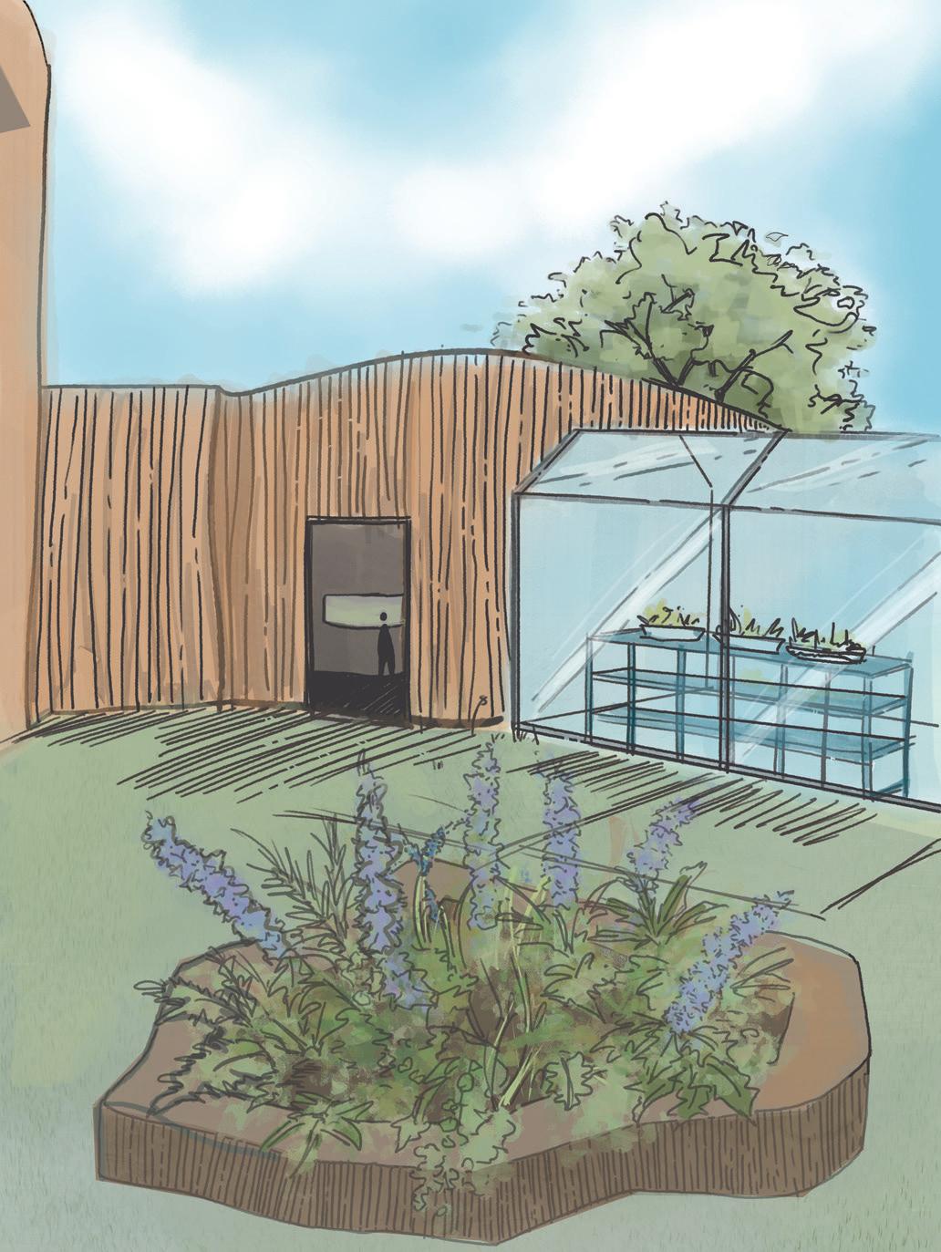
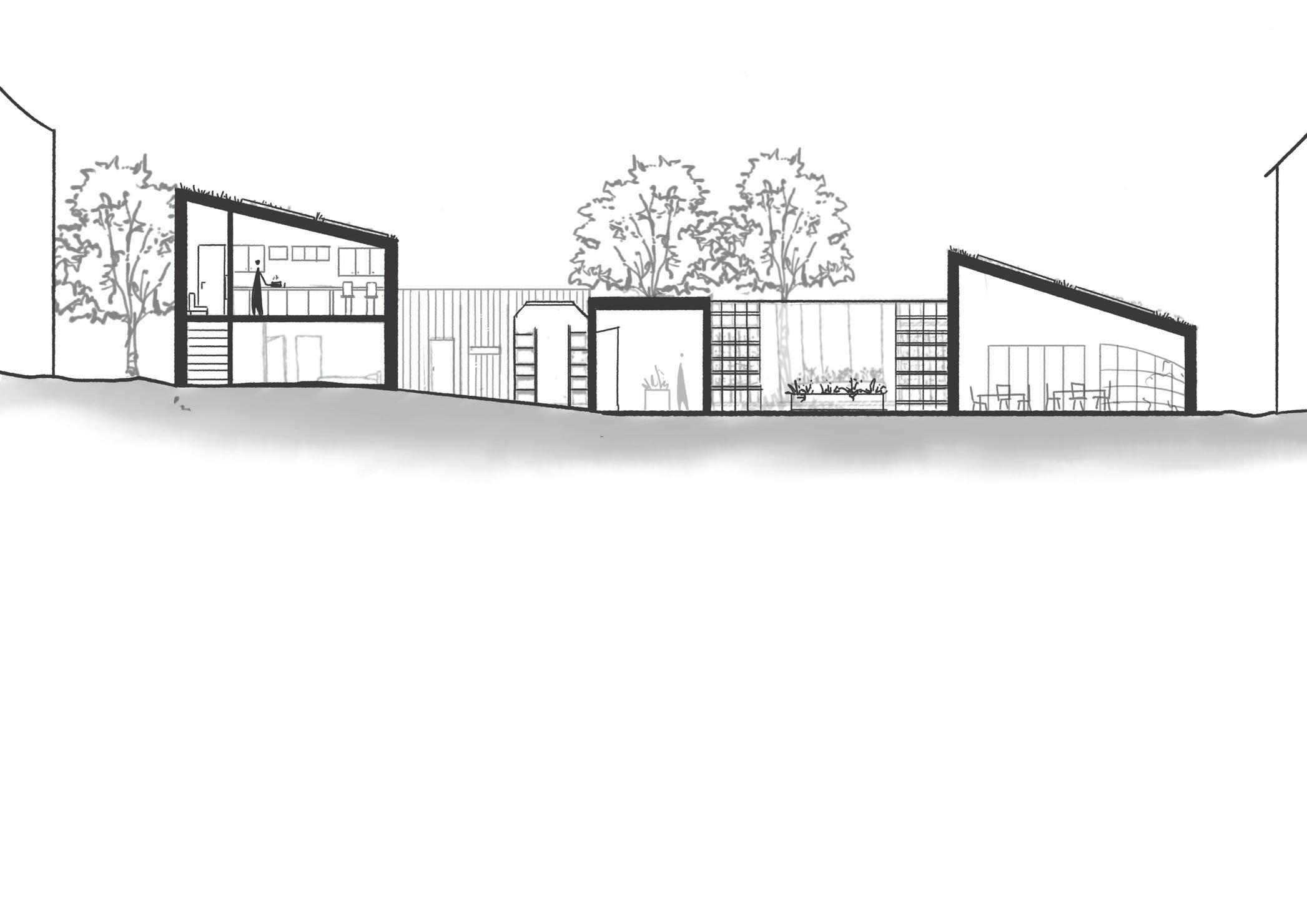
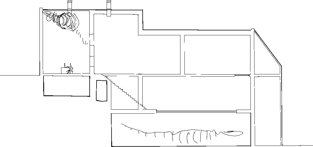
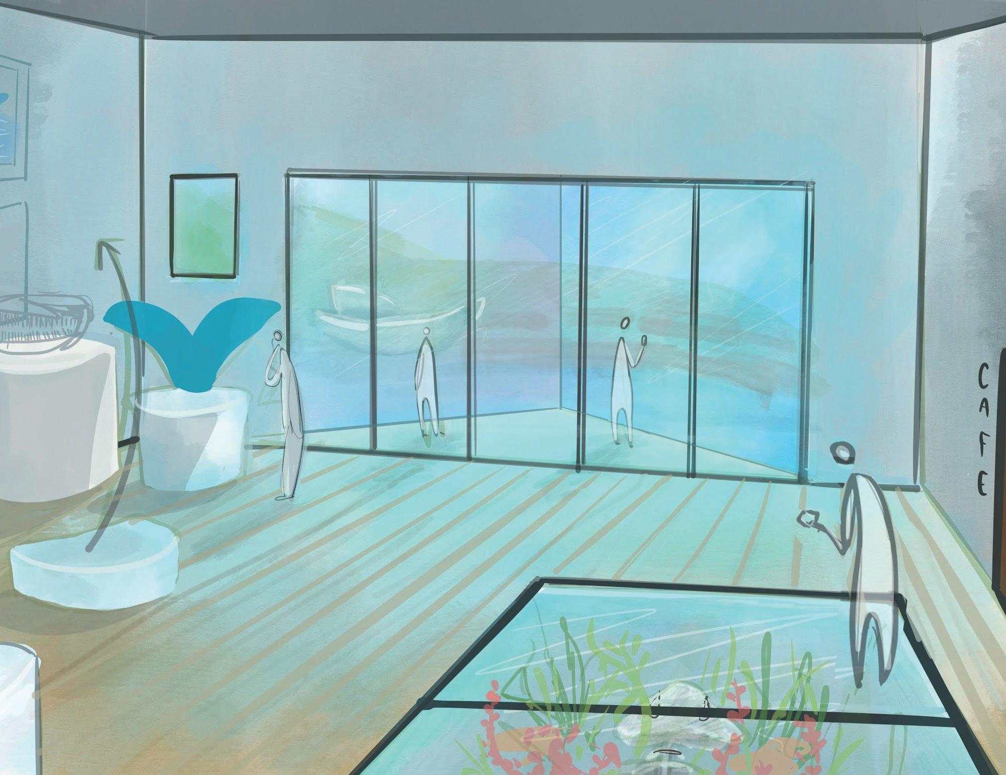
WALNUT TREE CERAMIC THERAPY CENTRE
Design theses: ‘Support through Interconnectivity’
The Walnut Tree Ceramic Therapy Centre is a response to the ever increasing need for help and support to establish and maintain a positive connection with society. Mental and physical needs have been ignored for too long. COVID, isolated many people further from services and help they desperately needed to be able to function in an ever deteriorating climate of international turmoil.
My architectural design creates a hub of interconnectivity, a safe, secure space providing practical services at a pace suitable for ‘the individual’. Through the medium of clay, communication at various levels can be initiated, practically and verbally, encouraging new friendships, fun and laughter, surrounded by the new green holistic spaces.
Through support, the Therapy Centre is able to provide visitors with a calm nurturing environment facilitating the process of gentle interconnectivity with society.
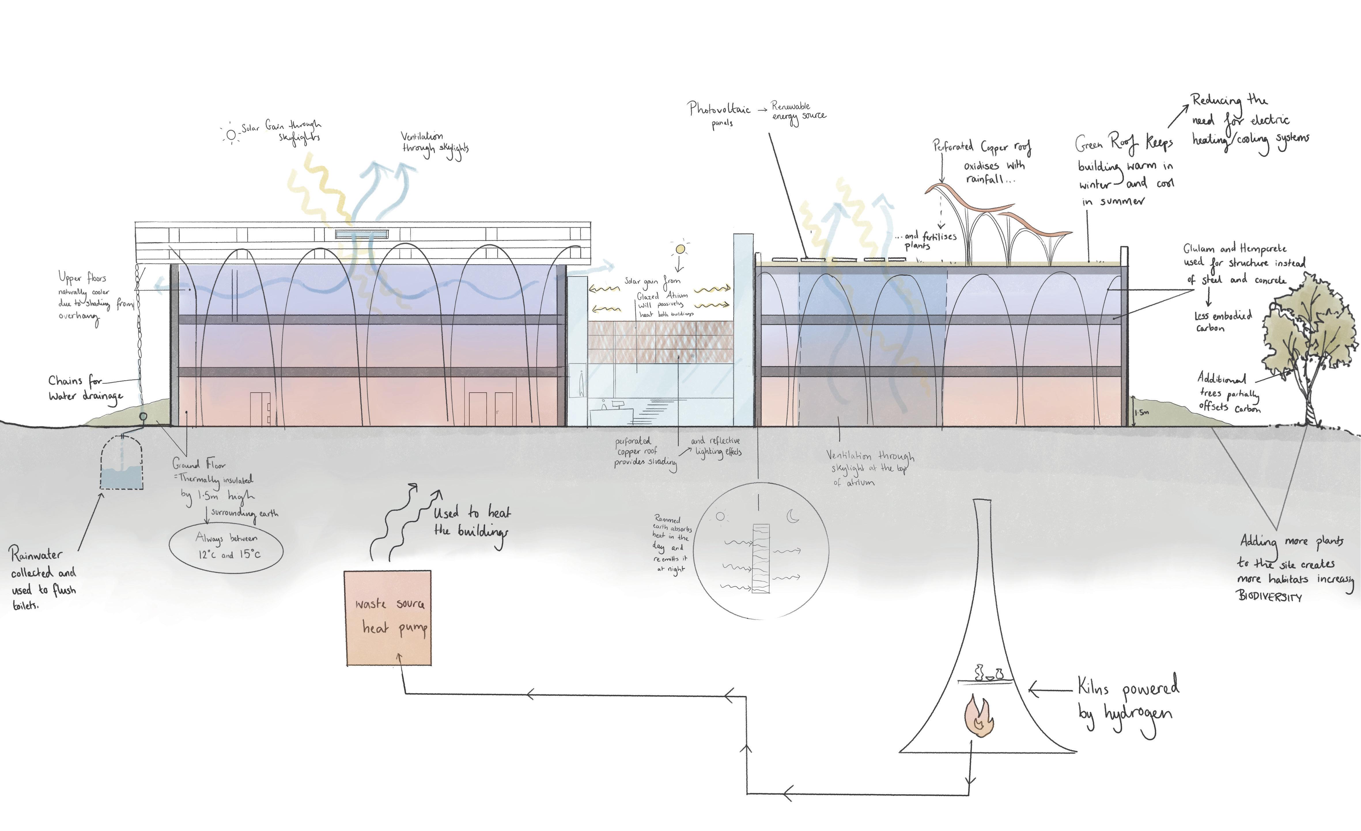
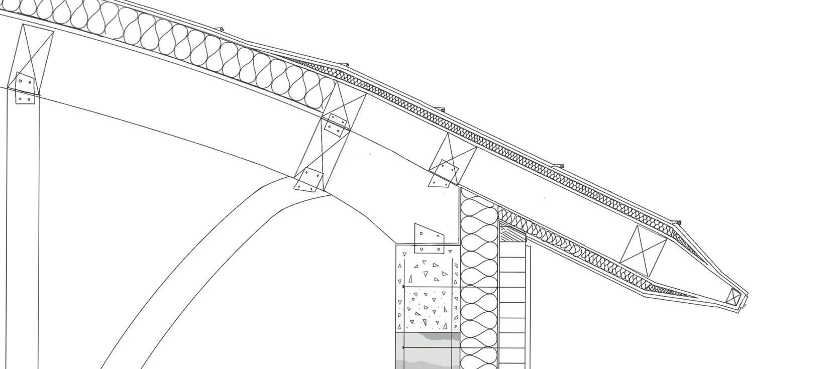

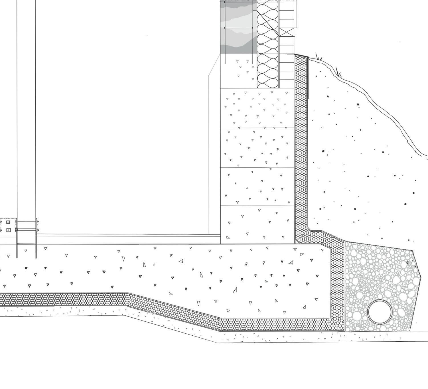
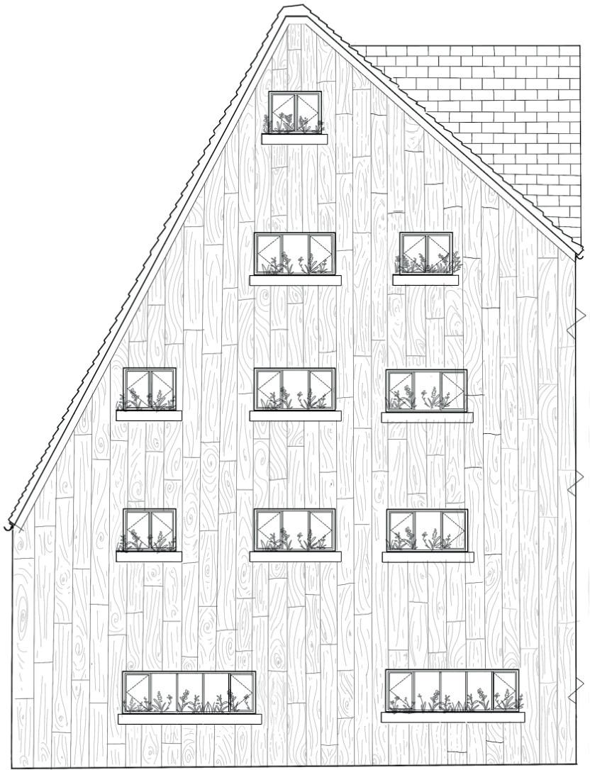
1 [ROOF DETAIL 1:10] Clay Bricks 102mm Clay render 5mm Breather membrane 2mm Glulam beam 50 Copper seam with folded timber battons Steel plate connecting silica fume concrete slab to glulam beam 150 300mm Copper 3mm Damp proof membrane Steel plate connecting 2 glulam beams to cantilever the overhang Steel plate connecting drainage chain to glulam beam Copper drainage chain Flexible Joint Steel ties between bricks 2 [FOUNDATION DETAIL 1:10] Cavity tray earth 300mm Wooden panelling to house the electrics and pipes as they cannot be fed through rammed earth. Counter Flashing Silica Fume x 300mm Silica Fume Concrete slabs 300 650mm Angled Mortar fillet prevents pooling Waterproof tanking membrane Hempcrete floor slab (also acts as insulation) Shingles for drainage Studded membrane with geotextile layer Waterproof tanking membrane Pistol Brick Weep hole Clay render 5mm Breather membrane Glasswool Insulation 150mm Elasticised tanking sluirry (2 coats) Rigid Insulation 100mm TECHNICAL STUDY: Walnut Tree Ceramic Therapy Centre Environmental strategy
Details [scaled to fit page]
1:10
1:20 Axonometric Detail [scaled to fit page]

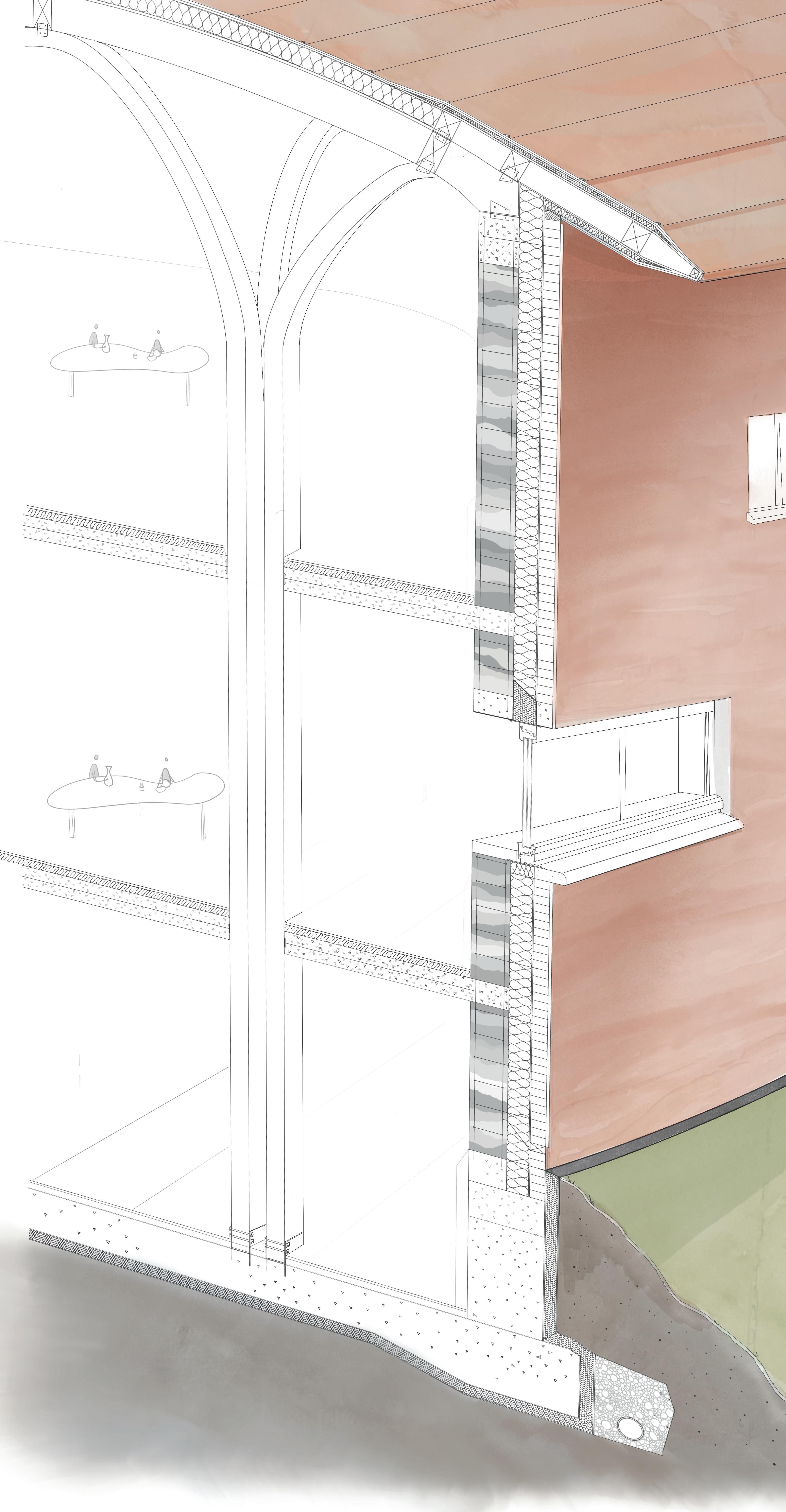

1 [ROOF DETAIL] 2 [FOUNDATION DETAIL] 1. Glasswool insulation 200mm 2. Damp proof membrane 2mm 3. Plywood deck 15mm 4. Glulam Beams 150 x 200mm 5. Copper with batton seam finish 6. glulam beams 150 x 300mm 7. Glulam Columns 150 x 150mm x4 8. Closed cell Insulation 9. Silica fume Concrete slab 300 x 600mm 10. Flexible joint 102mm 11. Clay render 5mm 12. Rammed earth 300mm 13. Steel reinforcement 14. Silica fume lintel 15. Aluminium lintel 16. rigid insulation 17. Impact Insulaton 100mm 18. Aluminium window frames 19. Timber cill 20. Sandstone cill 21. Cavity Closer 22. Breather membrane 2mm 23. Hempcrete 300mm with steel reinforcement 24. Steel plate 25. Cavity tray 26. Pistol bick 27. Weep hole 28. Studded membrane with geo textile layer 2mm 29. Rigid Insulation 100mm 30. 2 coats of elasticised tanking slurrey 31. Filter membrane 32. Perforated drain 33. Silica fume Concrete blinding 34. Silica fume concrete slab 35. Ceramic floor tiles 1 1 2 3 4 4 5 9 6 8 14 15 16 14 17 18 35 35 35 19 20 21 22 23 22 24 25 26 27 29 30 31 28 32 34 Section taken through south facade facing east
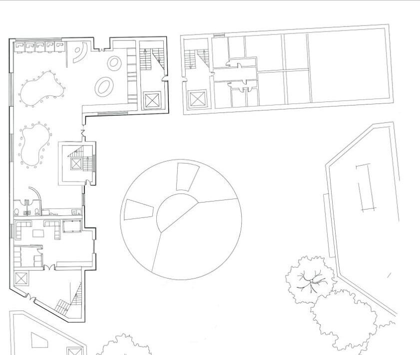
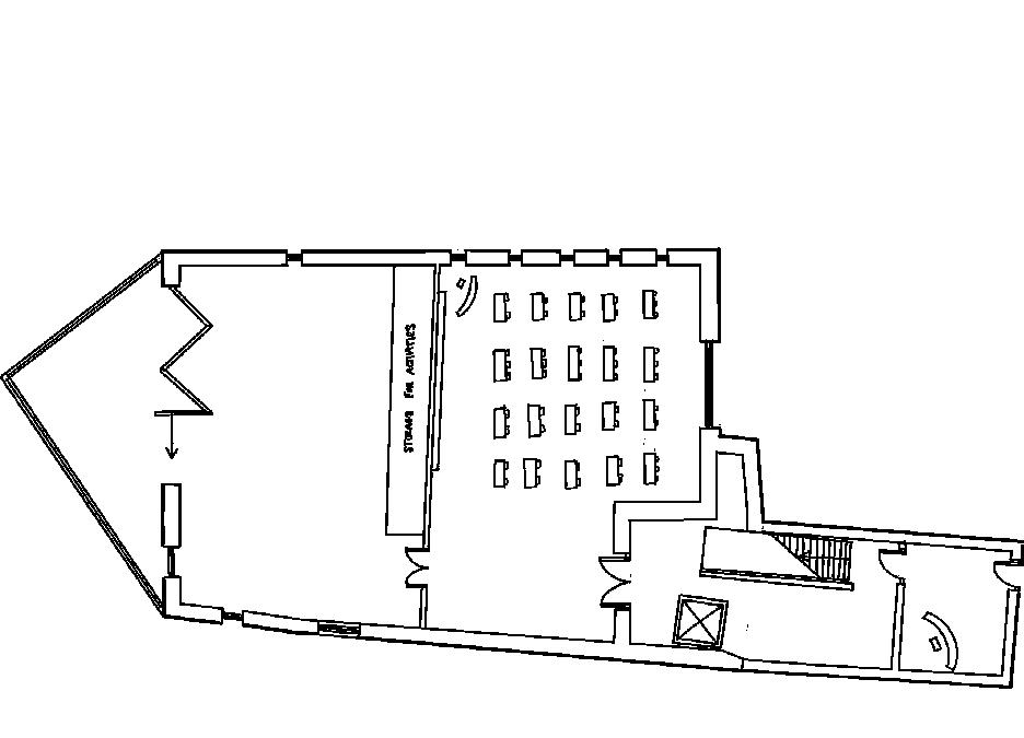
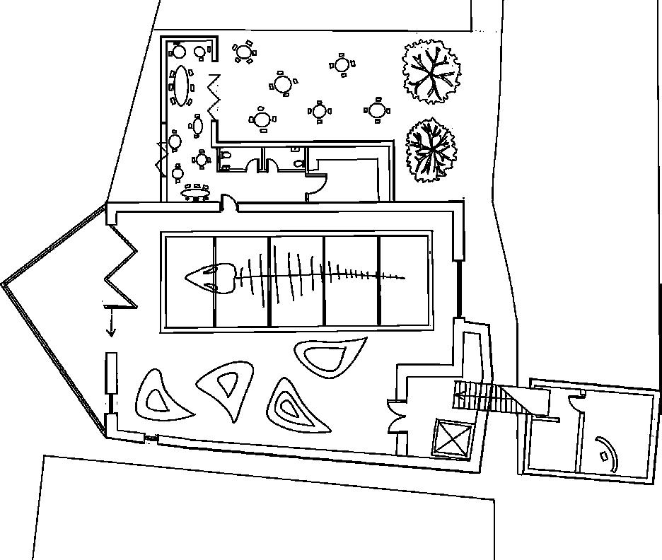
EXAMPLES OF DESIGN DEVELOPMENT:
Walnut Tree Ceramic Therapy Centre
GALLERY POTTERY BUILDING WORKSHOP INDIVIDUAL THERAPY ROOMS / EXTRA STORAGE SPACE. CAFE KITCHEN GLAZING WORKSHOP Ground level raised Public open space on top of the Individulal therapy spaces. This is a slightly developed version than the one in the sketch as it has the geometric roof canopy on both pottery buildings not just Surrounding contextual buildings = Foam blocks coated in clay. Mixture of black clay and black foam board Trees = cocktail sticks and green wire wool. Waved green roof section made with stencil card. Castle Wall
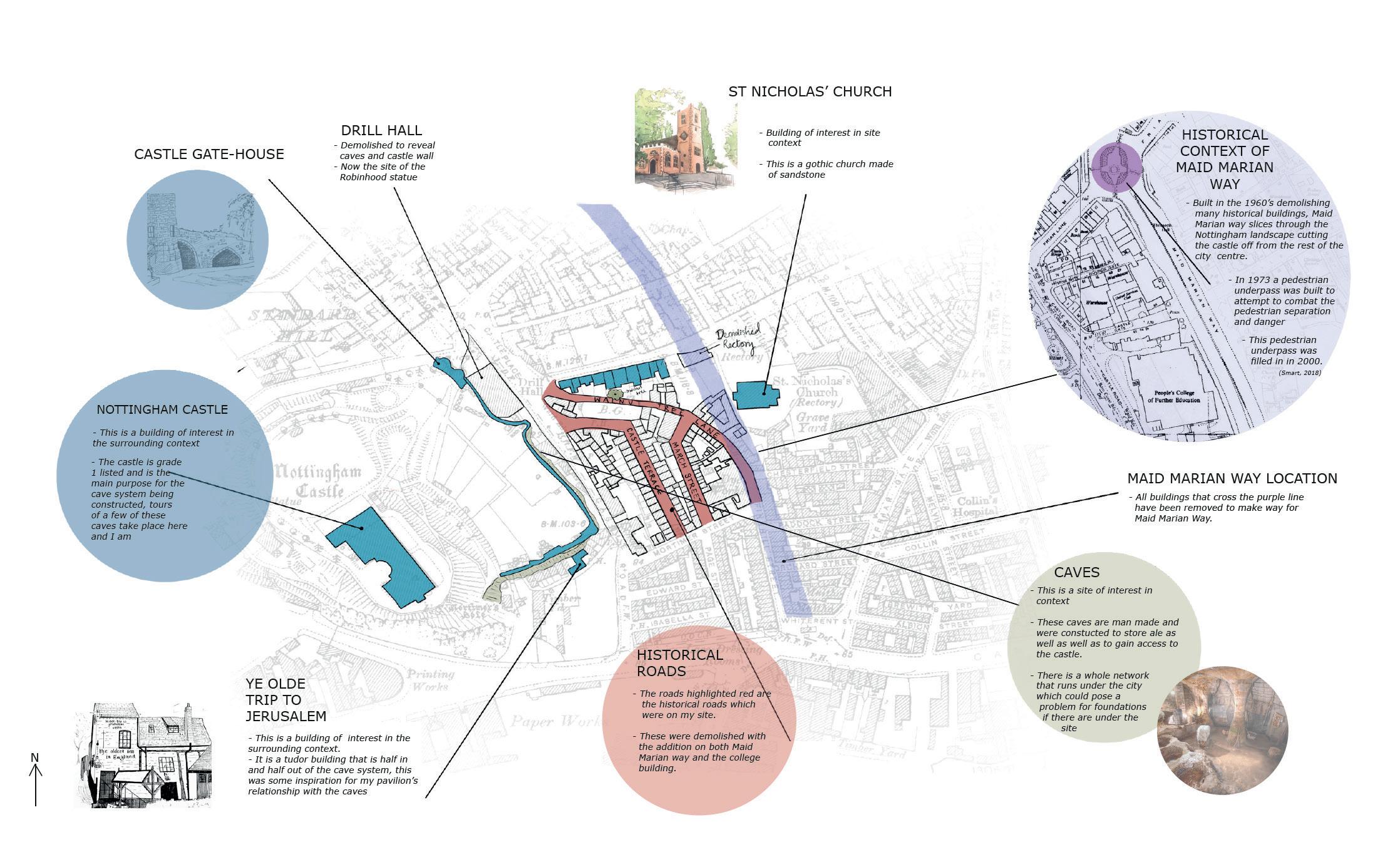
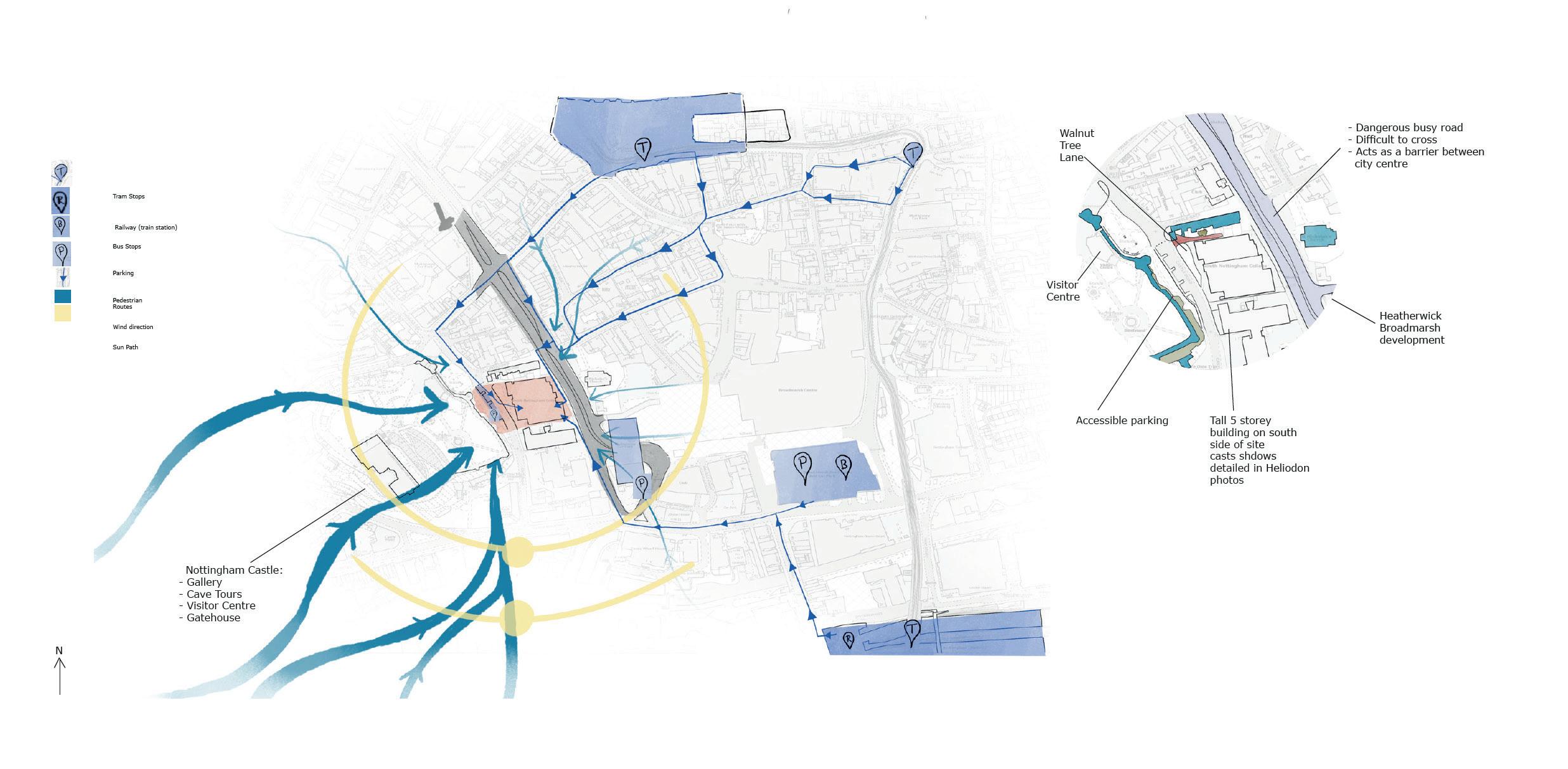
EXAMPLES OF SITE ANALYSIS:
Walnut tree ceramic therapy centre
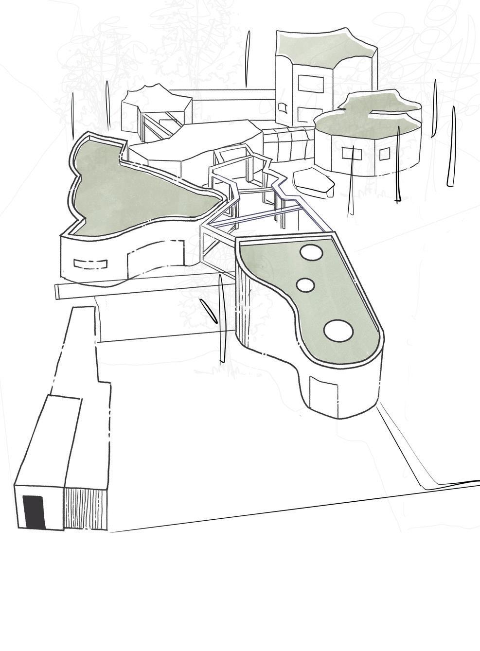
2ND YEAR: St Philip’s Marsh
Community Masterplan
[Hybrid Housing & Masterplanning project]
‘Bringing a countryside feel to the city’
This project is located on St Philip’s Marsh in Bristol, previously this site has been used as an industrial site, mostly containing warehouses and derelict buildings. This site had been earmarked for development by Bristol council and as part of my 2nd Year project I took on the role of designing this portion of the city.
Our year group took part in a collaborative masterplanning workshop where we identified the most beneficial block layout as a base for our designs. From this initial masterplan I reworked it to fit better with my brief and building purpose. [see image on the right].
Our next task was to zoom in on a designated portion of our masterplan and refine it. Part of this brief was to include a workshop for a creative industry on the ground floor with living accommodation above.
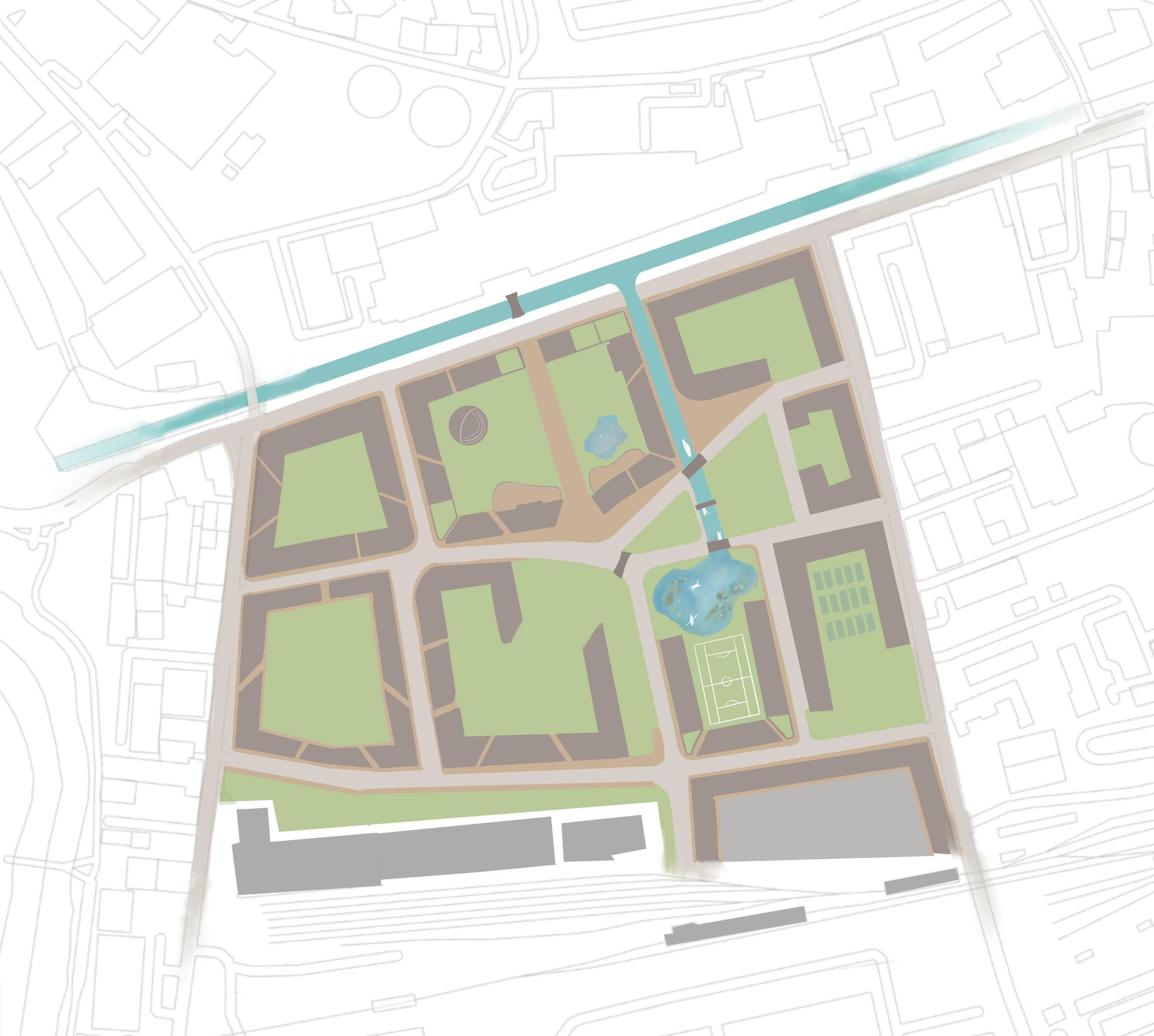
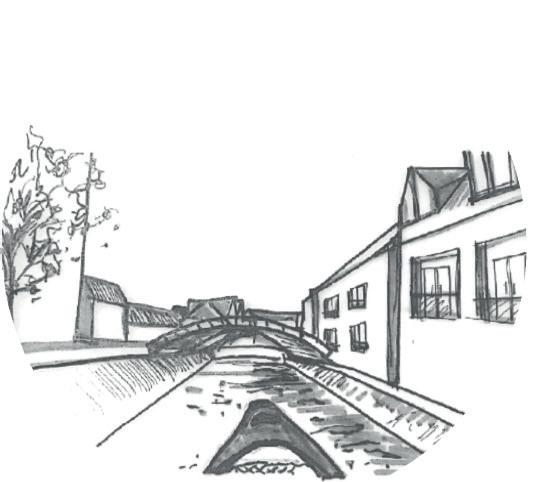
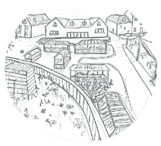
2. 1. VIEW FROM CAFE TABLES 1. 2. 3. 3. 4. CANAL VIEW FROM CANOE FARMERS MARKET VIEW Produce from allotments 4. THEATRE AND TEXTILE WORKSHOP
2ND YEAR: St Philip’s Marsh Textile Workshop
[Hybrid - Housing Masterplanning project]
The building I chose to focus in on was the textile workshop, located in the northwestern corner of the upper central block of the masterplan. It is a south facing building and uses concepts from the ‘Soft City’ handbook to create an inviting shop and workshop for the community’s use. It is 5 storeys high with the workshop on the ground floor and flats in the upper levels, creating the ‘hybrid’ element of this design.
A typical 5 storey urban building of this scale would look quite intimidating and uninviting in this environment so by lowering the roof line and placing multiple flats within the ‘roof space’ it brings the vertical line of the building create the illusion that the building is shorter than it actually is.
1ST YEAR: Urban Honey
Farm and wildflower community garden
[Lace Market Car Park - brownfield site]
This project is a honey farm and wildflower community garden situated in Nottingham city centre, it is designed on the former Lace Market Car Park and is therefore a brownfield site.
I have looked at shapes in the wing of a honeybee to determine the shapes used for my designs.
Green roofs have been added both for sustainability and water attenuation purposes.
The levels of the site create an obvious split between the public and private areas
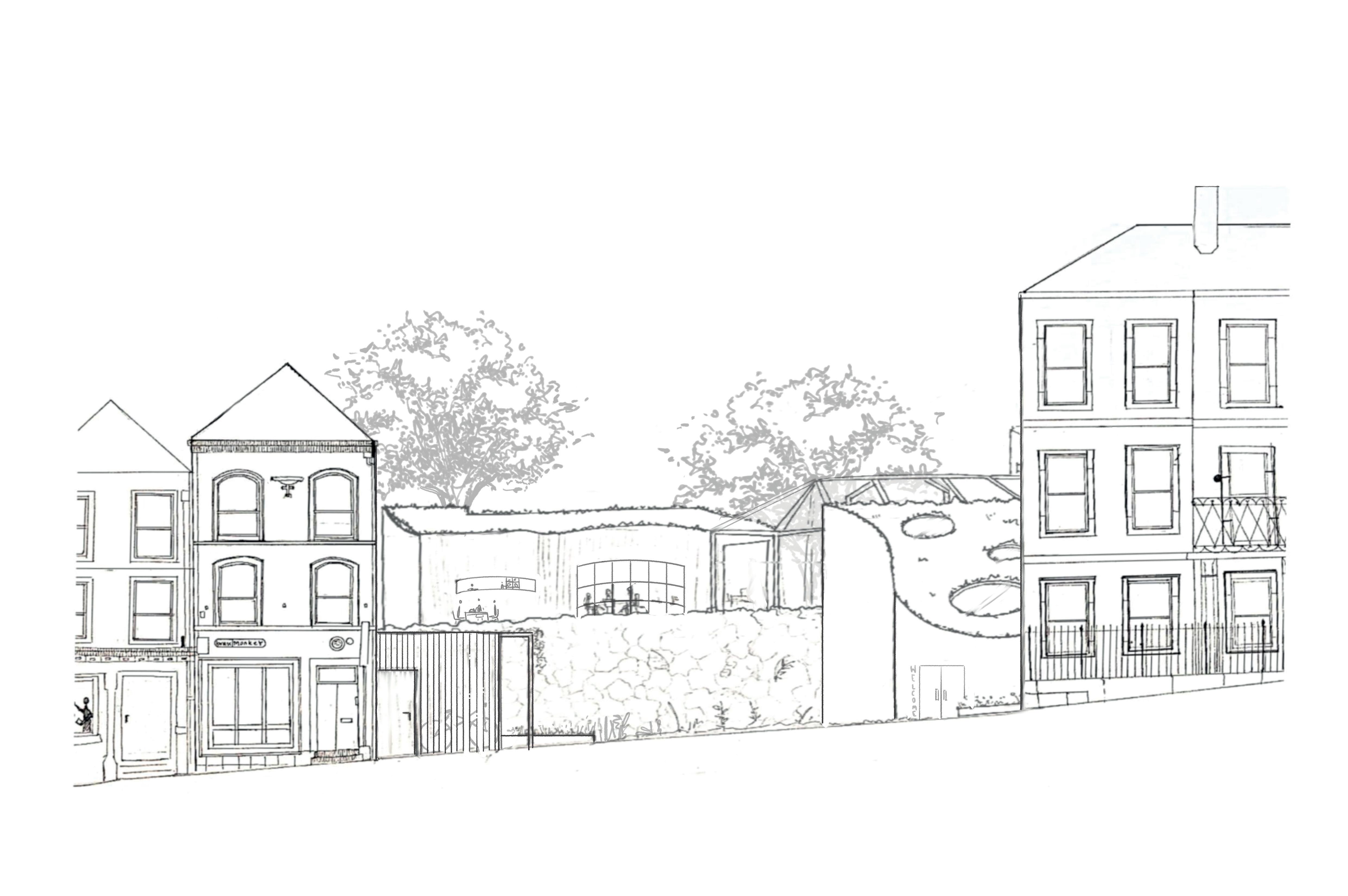
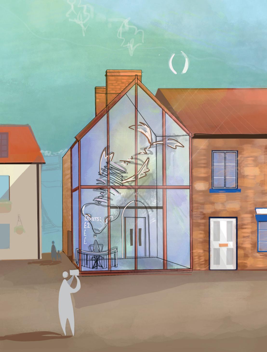
2ND YEAR: Whitby Museum of Whaling
[Listed building transformation Project]
This project was inspired by the historical context of the surrounding North Yorkshire town of Whitby, which is famous for its maritime heritage including fishing and most importantly whaling. Our brief was to regenerate the ‘Friendly Rowing Club’ into a museum and gallery to entice tourists to learn the rich heritage of the town and to maximise revenue. The existing building is a grade 2 listed Victorian sandstone building, with a 70’s extension on the south facade.
OTHER PROJECTS:
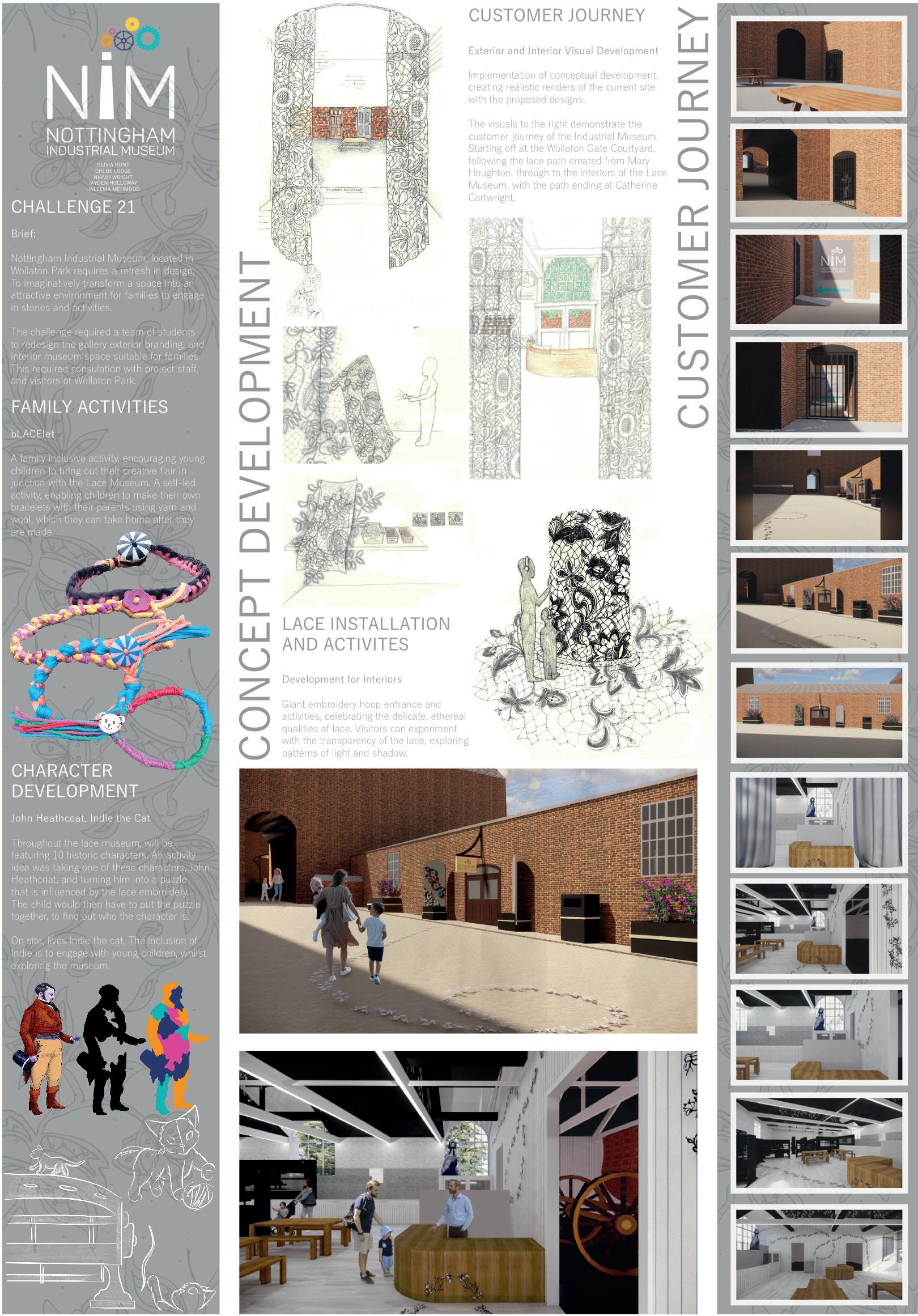
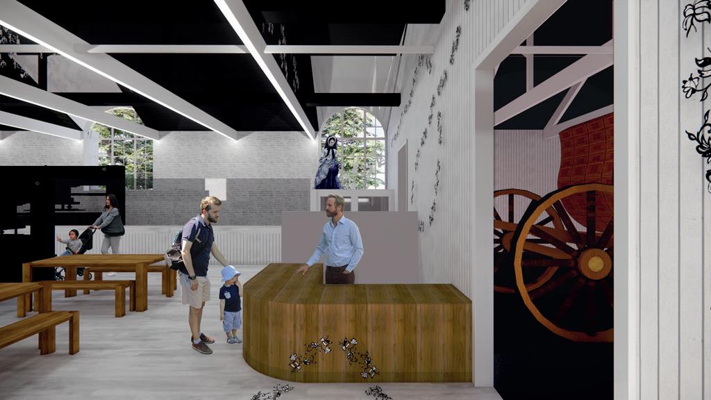
Nottingham Industrial Museum
Grads4Nottingham scheme
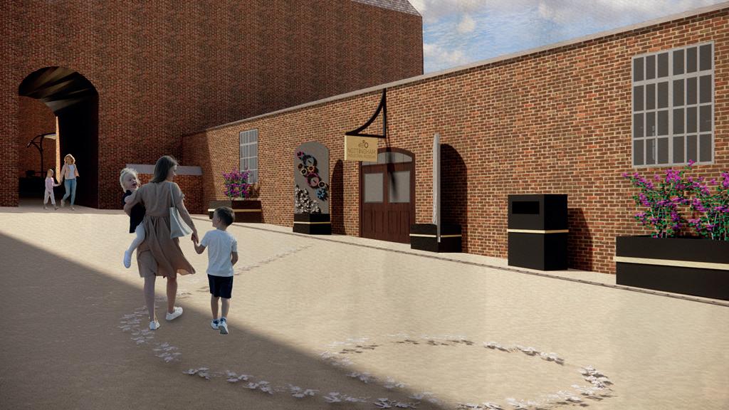
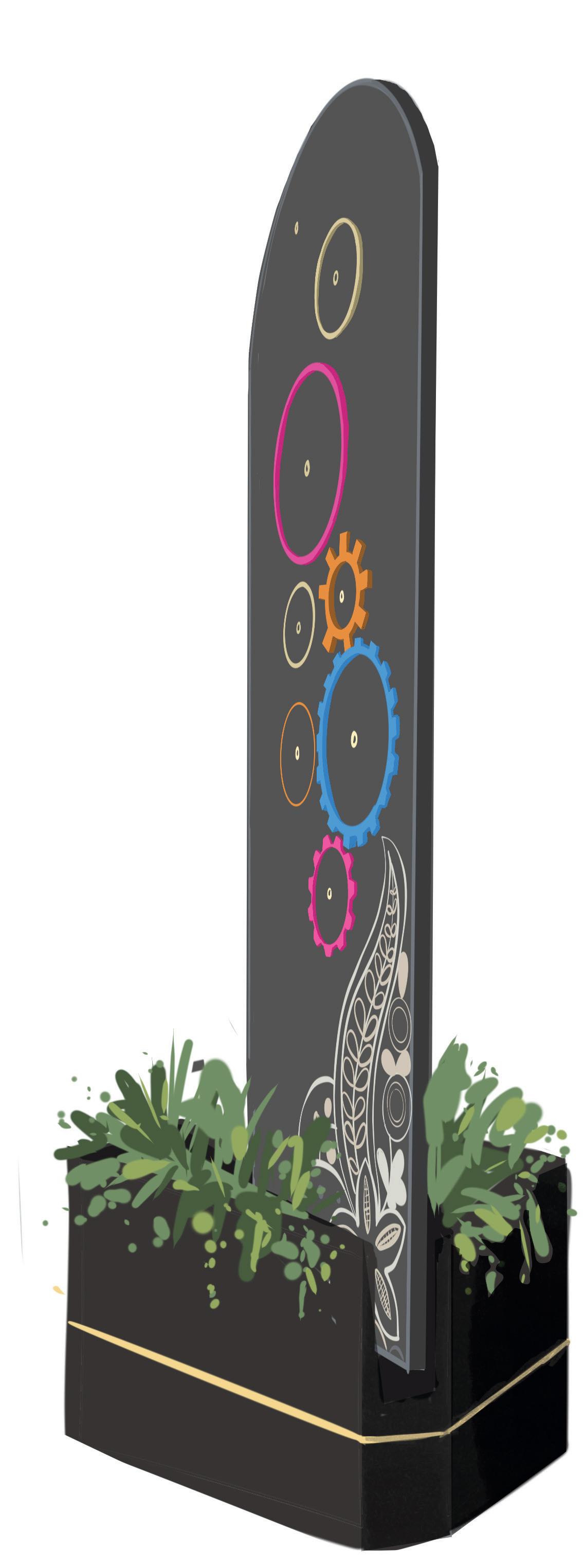
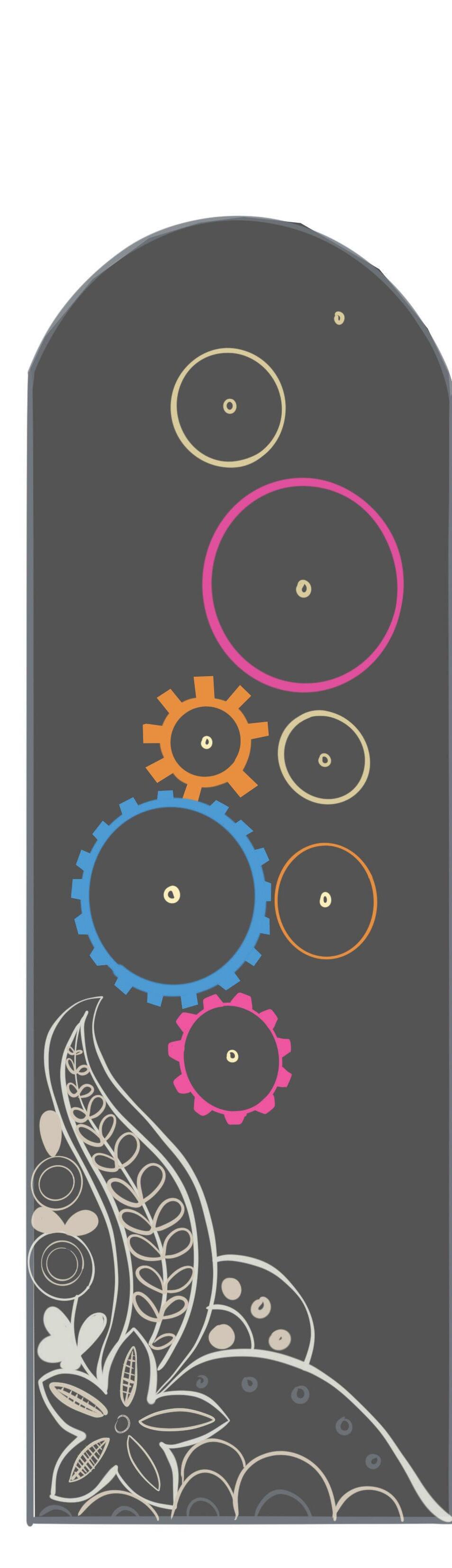
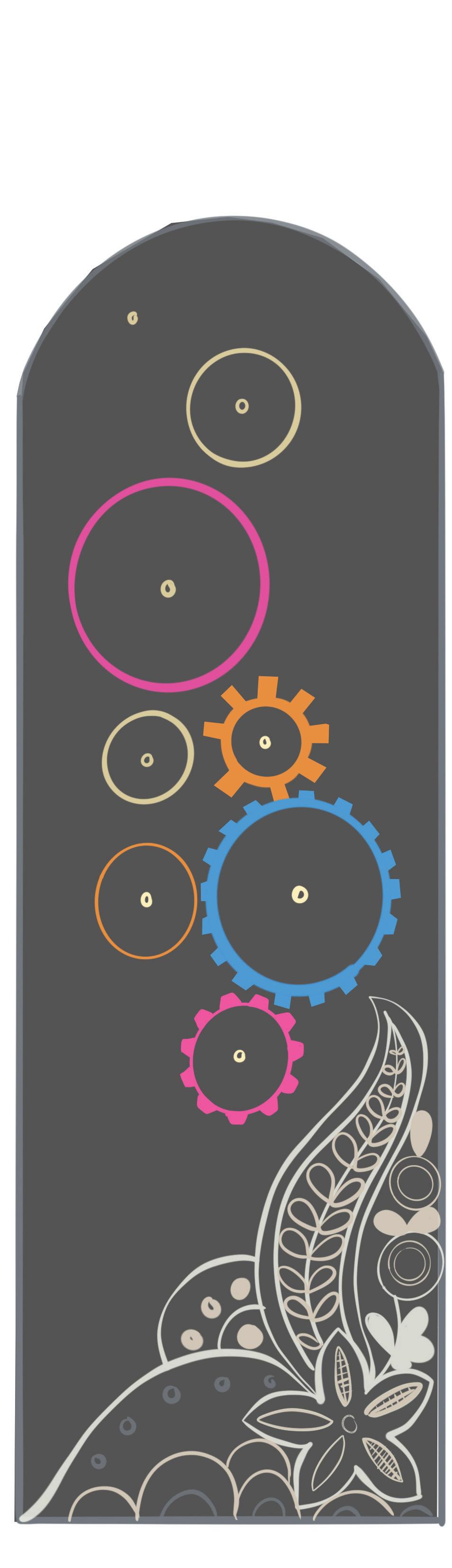
This was a group project that took place at Wollaton Park as part of the Grads4Nottingham scheme. I worked in the marketing department for the Nottingham Industrial Museum designing creative ways to signal to the public that the museum was open. These design solutions needed to be temporary as it is only open at the weekend. The final design solution for my section consisted of wooden cog signs that slot in to custom planters designed to mimic the historical planters that are currently in use on the site. These removable signs are angled in a way that enlarges the entrance and ‘funnels’ visitors in through the doors. (see diagram for more details).
At the end of the placement all of the groups that were part of the Grads4Nottingham scheme working in local businesses came together to present the work that we had produced during our time in the Grads4Nottingham programme.
WELCOME SIGNS - EXTERIOR BRANDING
The brief for this section of the project was to produce removable signs to indicate that the museum was open.
The design we decided on was Lightweight MDF signs with movable cogs for a tactile element, as well as keeping on theme with the branding of the museum which has a series of cogs to represent the mechanical element.
However, half of the museum is dedicated to Nottngham’s rich history of lace, the manufactuing process and the famous lace designs. So we felt it was appropriate to incorporate some lace elements in the welcome signs.
These signs slot into custom planters at 45 degrees to create a ‘wider opening‘ around the main doors (see image on the left). These planters are designed to mimic the original planters on the site
OTHER PROJECTS:
Royal Academy Art exhibition 2022
Niall McLaughlin Architects
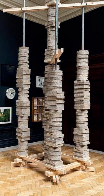
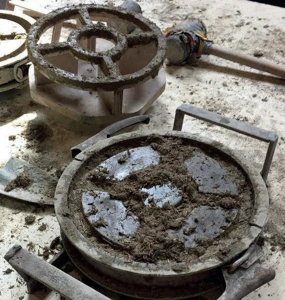
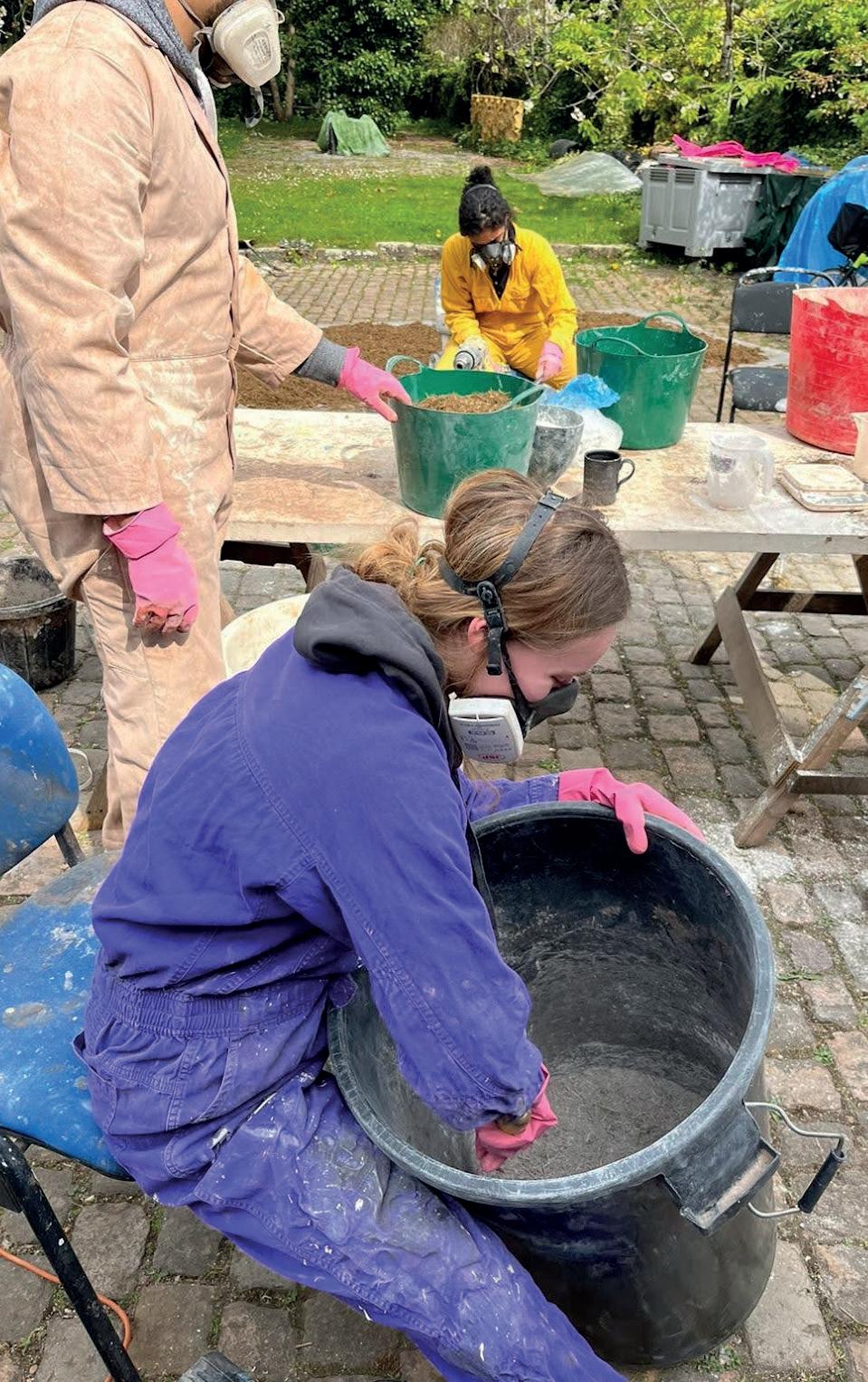
This project was Niall McLaughlin Architects’ Royal Academy of Art Exhibition entry 2022. The idea was to use experimental sustainable materials to create sculptural bricks in interesting shapes. These bricks were then stacked into towers of varying heights to create an installation. Myself and two other NTU architecture students were chosen to be a part of the brick making stage of this project. The bricks themselves were made out of a material similar to hempcrete, but instead of using hemp, we used dried elephant dung from Chester Zoo! This is actually a very similar material to hemp as it is mostly grass so it has similar fibres to hold the bricks together. It also has the benefit of being a material that would otherwise be disposed of, making it extremely sustainable.
A lime binding agent was mixed in using a drill and mixing attachment. Eye protection and masks were needed for this stage as the dust can be very harmful. Once the lime and elephant dung were combined, water was added and the mixture was then ready to be pressed into the moulds. The moulds were made up of 2 main shapes; circular and squared. These were stacked on top of each other to create varying widths and textures in the final sculpture. All of the moulds have a central ring to be able to slot them together with the cross pieces to limit the weight, and attach the inner and outer rings.
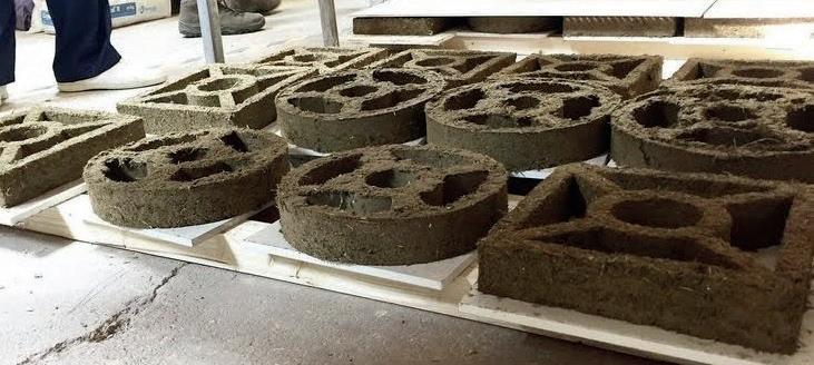
All photos on this page taken by Holly Galbrraith from Niall McLaughlin Architects FINAL ROYAL ACADEMY ART SCULPTURE DISPLAY
MIXTURE INTO MOULDS CLOSE UP
PACKING
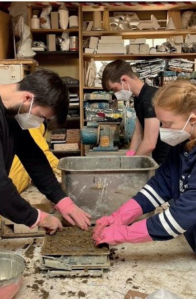
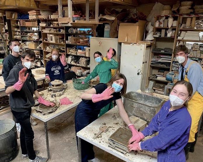
ACTION SHOT OF ME MIXING THE LIME AND ELEPHANT DUNG PACKING THE MIXTURE INTO THE BRICK MOULDS FINISHED BRICKS DRYING THE TEAM:
ZERVAS ARCHITECTS INTERNSHIP
Mosaic
Mural
design
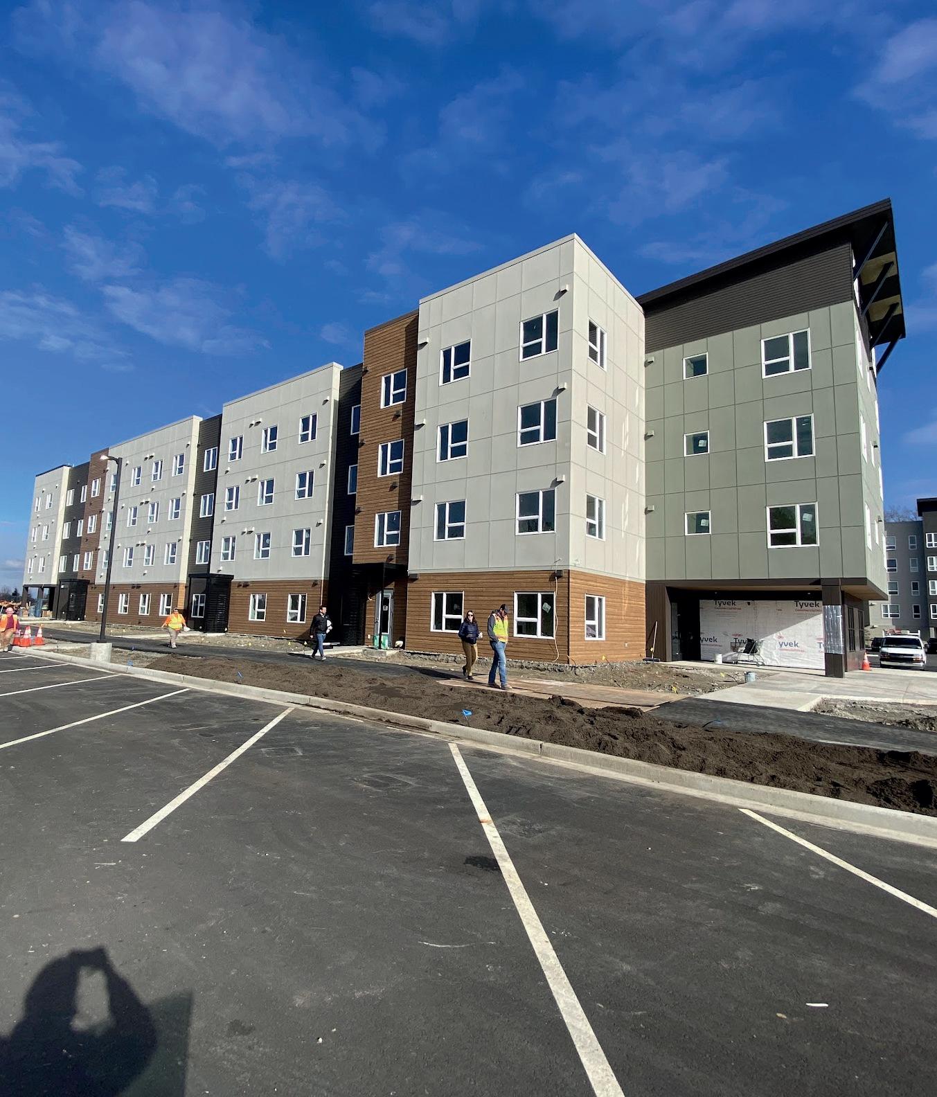
- Crescent Apartments, Cordata WA
This project took place on my placement year in the USA. The brief for this mosaic mural was to reflect the context of the surroundings and celebrate the heritage of the site. The client also requested an alternative brief that linked with the name ‘the crescent’. The images below show my design responses to this brief.
1: THE CRESCENT NEBULA

This image is based on ‘The Crescent Nebula’ image taken from the Hubble Telescope I felt this was a fun abstract way to honour the name without being too obvious. It is a bright fun abstract piece that translates well into mosaics but was ultimately decided that a link to the context was preferred.
3: SCENE FROM THE CHANTERELLE TRAIL [VIEW 1]
This image is drawn from photos of my hike to the nearby Chanterelle trail. They ultimately liked this one the best as they felt the colours were more in keeping with the rest of the building as well as the subject matter being more subtle and mirroring the surrounding context. They felt it would be more obvious to viewers that it was a bespoke piece as it is recognisable to locals.
FINAL DESIGN CHOICE AND POSITION OF THE MURAL
2: MT BAKER, LAKE WHATCOM AND THE CRESCENT NEBULA

This image is inspired by the local landmarks of Lake Whatcom and Mt Baker. I decided to also include the Crescent Nebula in this to add an extra element to the design and encompass both design requests in the same image. This was a favourite for a while until the cladding colour for the building was decided, at which point a more green image was the goal.
4: SCENE FROM THE CHANTERELE TRAIL [VIEW 2]
This image is also drawn from my photos of the Chanterelle trail hike however, this image had too much fine detail so when transferred into mosaic form all structure to the piece became lost. As a result the composition of View 1 was preferred which was the design taken forward, see image below:

MURAL LOCATION
This is the final design choice from the client, they felt this scene was the most encompassing of the brief and the colour choices matched the cladding and surroundings as it was a mirror of the landscape.
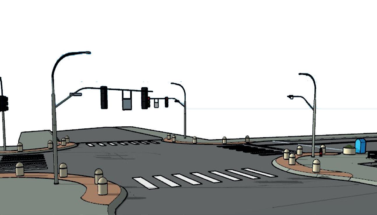
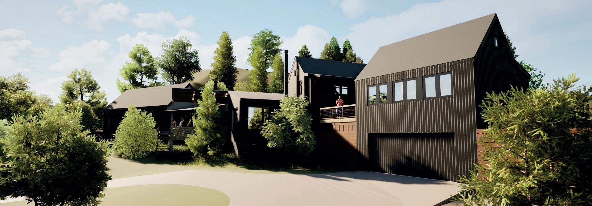
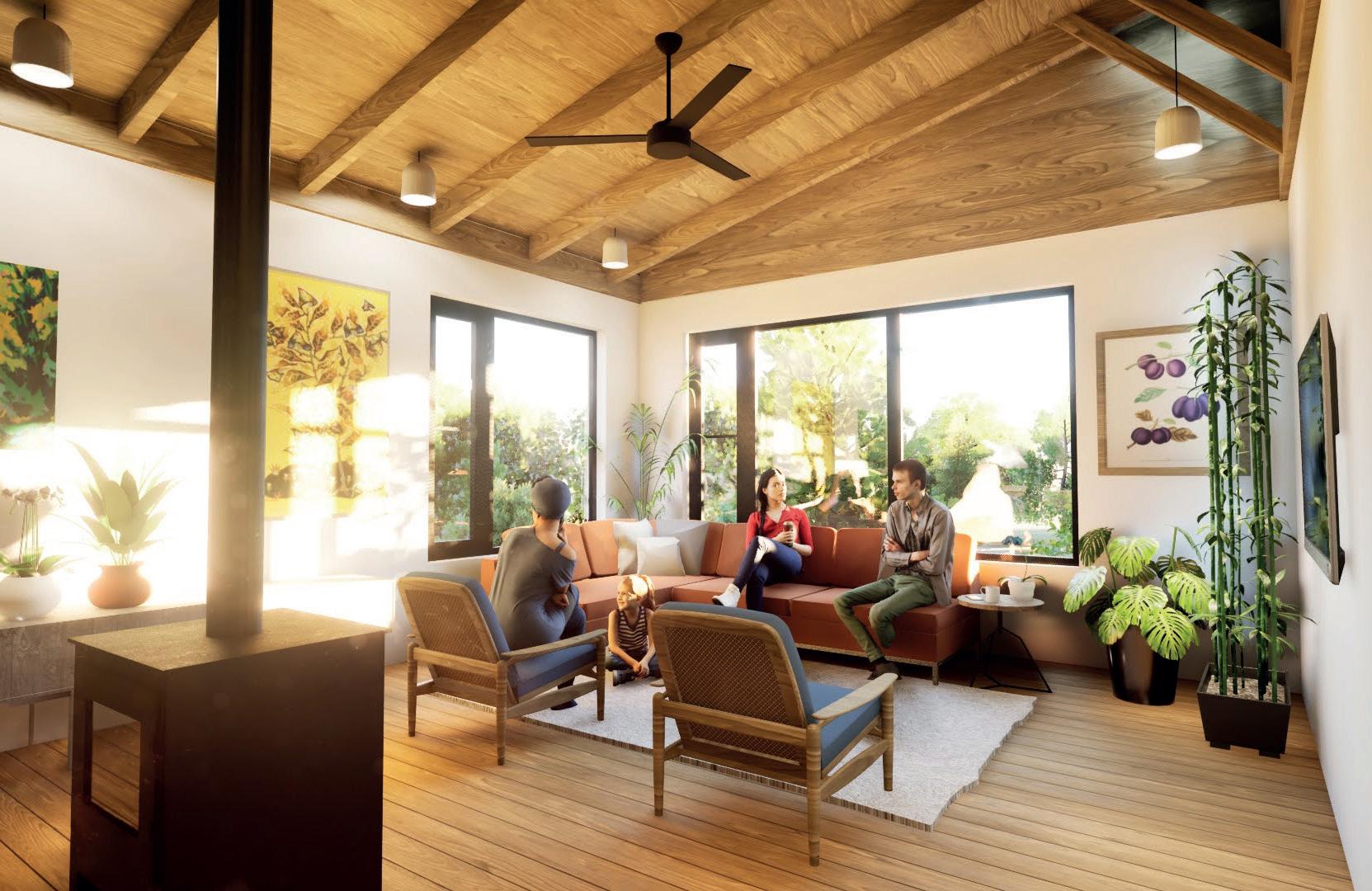
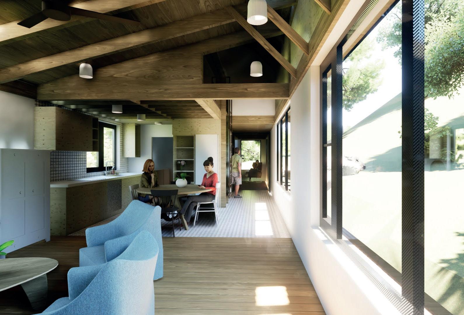
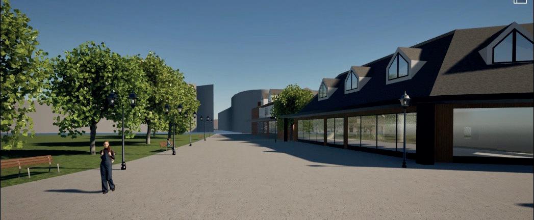
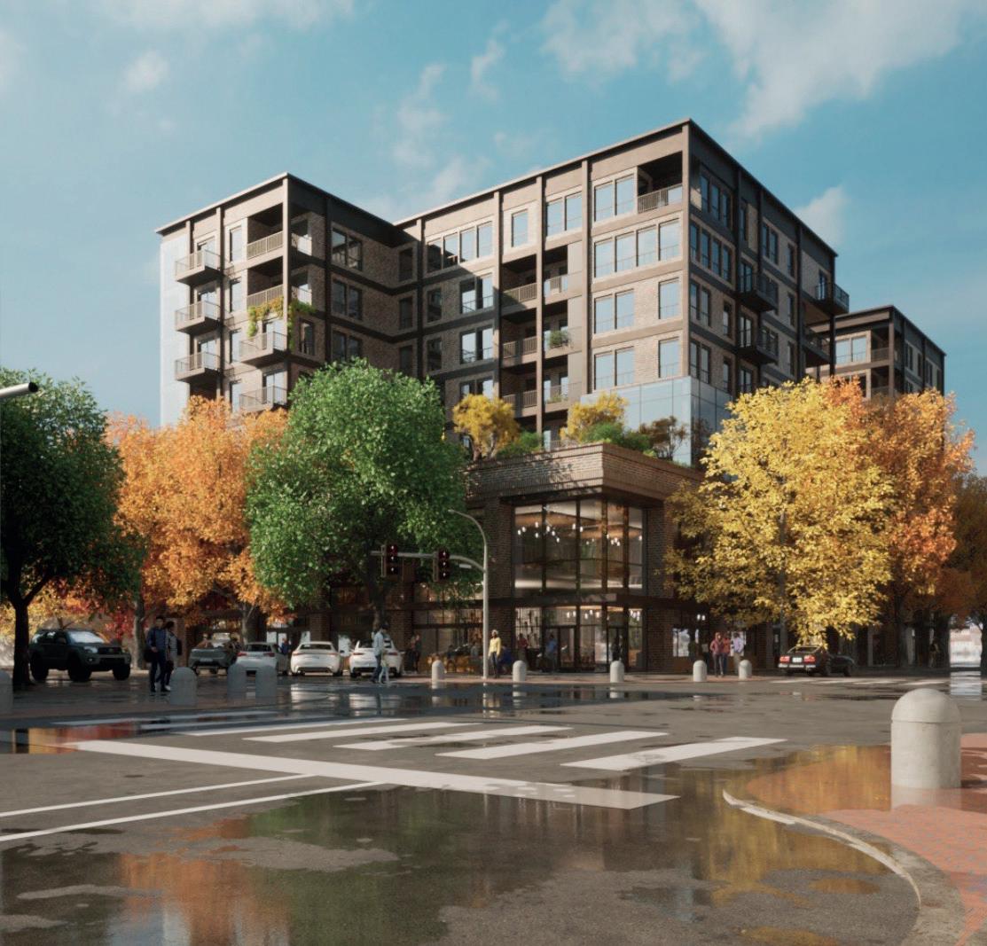
ZERVAS ARCHITECTS INTERNSHIP - RENDERING PROJECTS
RITE AID REDESIGN RENDER - SHADOWING PROJECT
CHUCKANUT RESIDENCE - RENDERING
This project is a residential project split into a 3 bedroom house and a 1 bedroom annexe. This is a dormant project which I was asked to render for marketing purposes.
I created these on twinmotion using the skills I learned shadowing Dan on the Rite Aid project.
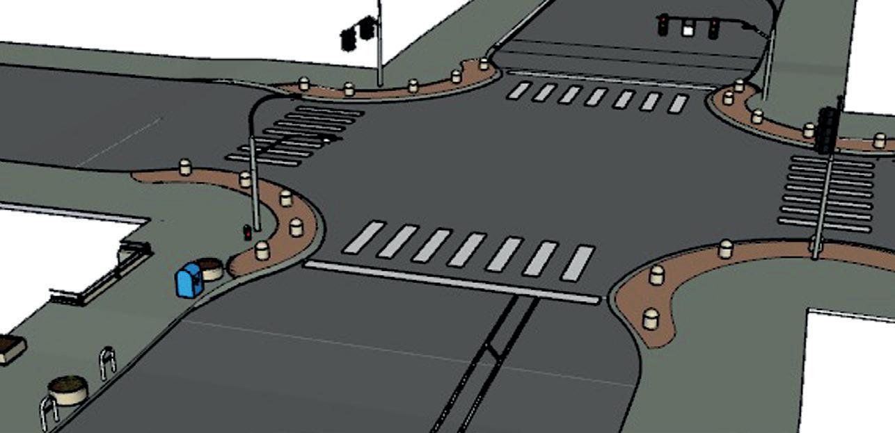
This project is the redevelopment of a shopping centre in the centre of Downtown Beliingham. This is a collaboration project with Daniel Lawrence who I was shadowing on Twinmotion. I was tasked to model the sloped topography of the intersection in SketchUp as well as populating the scene. I was taught how to manipulate lighting and environment settings to achieve a more realistic render.
This site is on my walk to work so it is an intersection I know very well which was very helpful in the modeling process.