ARCHITECTURAL PORTFOLIO
OLIVIA JADE HUNT
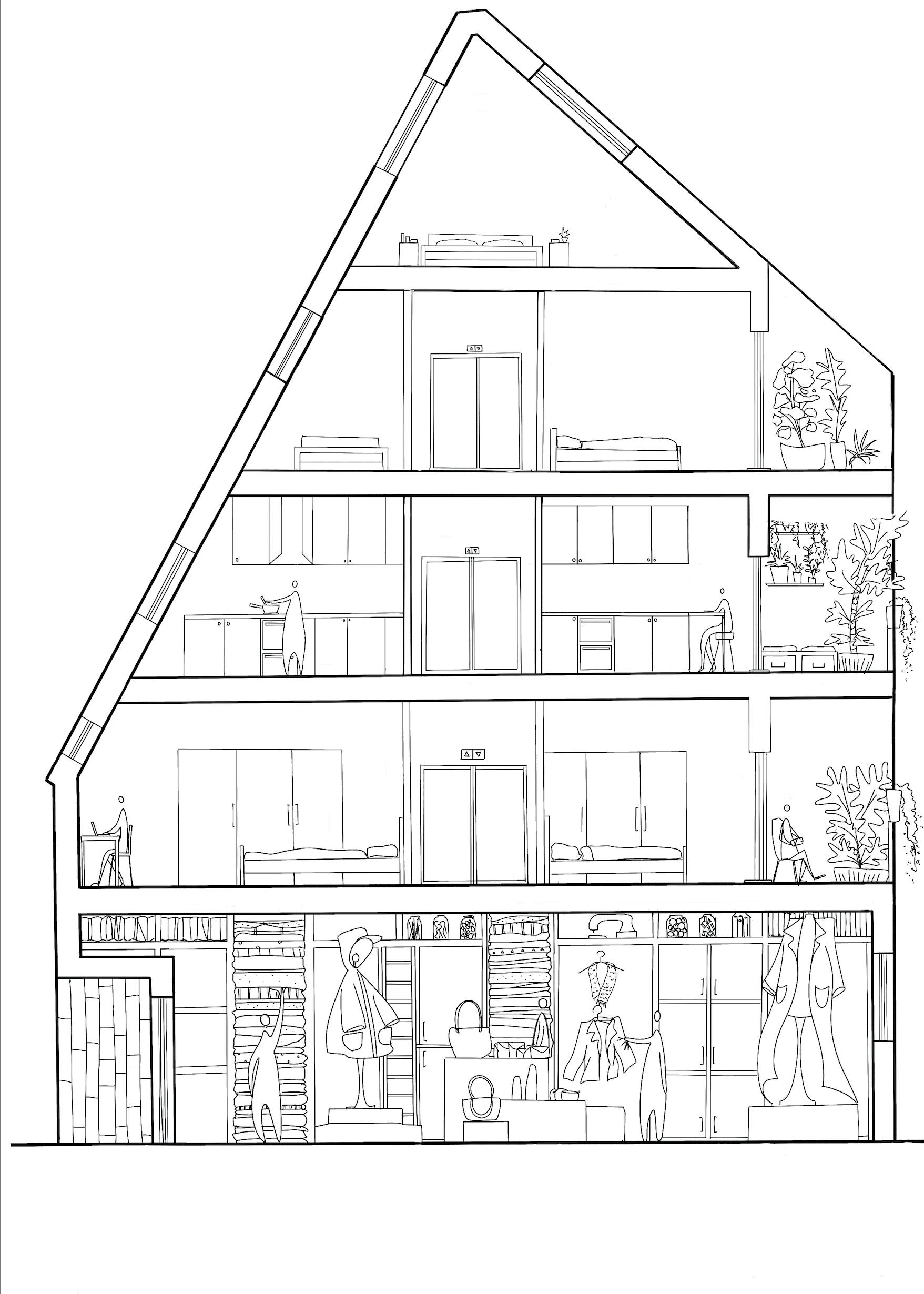
March 2024
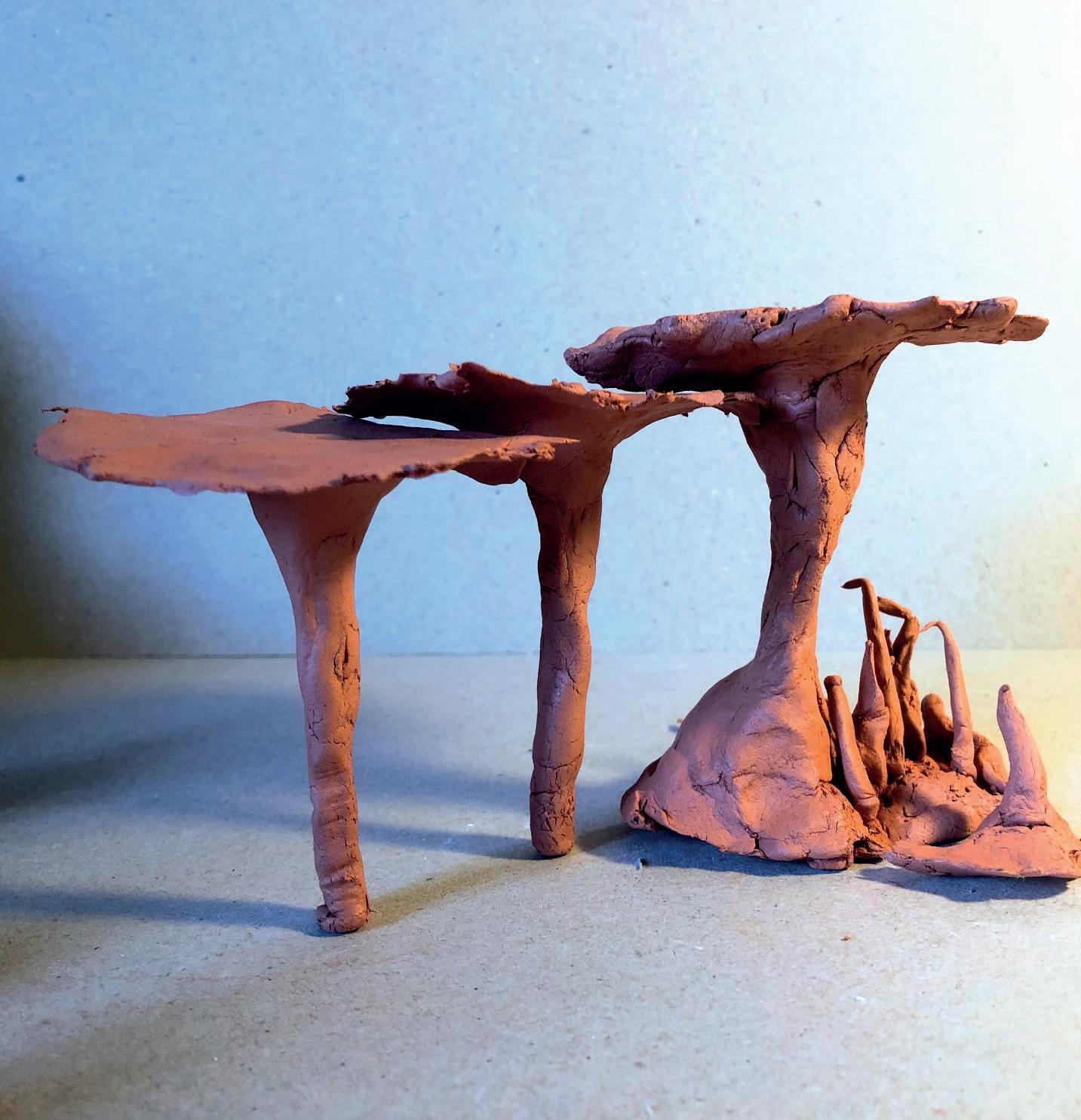
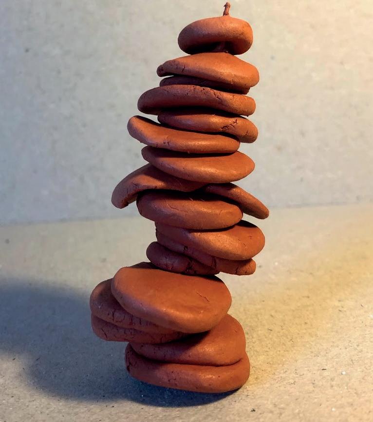
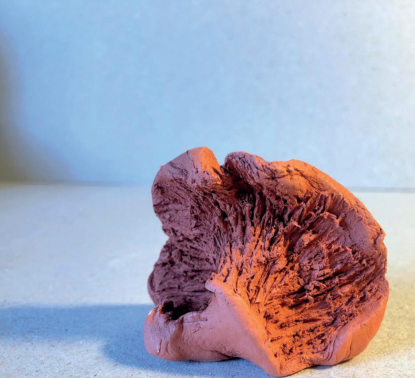
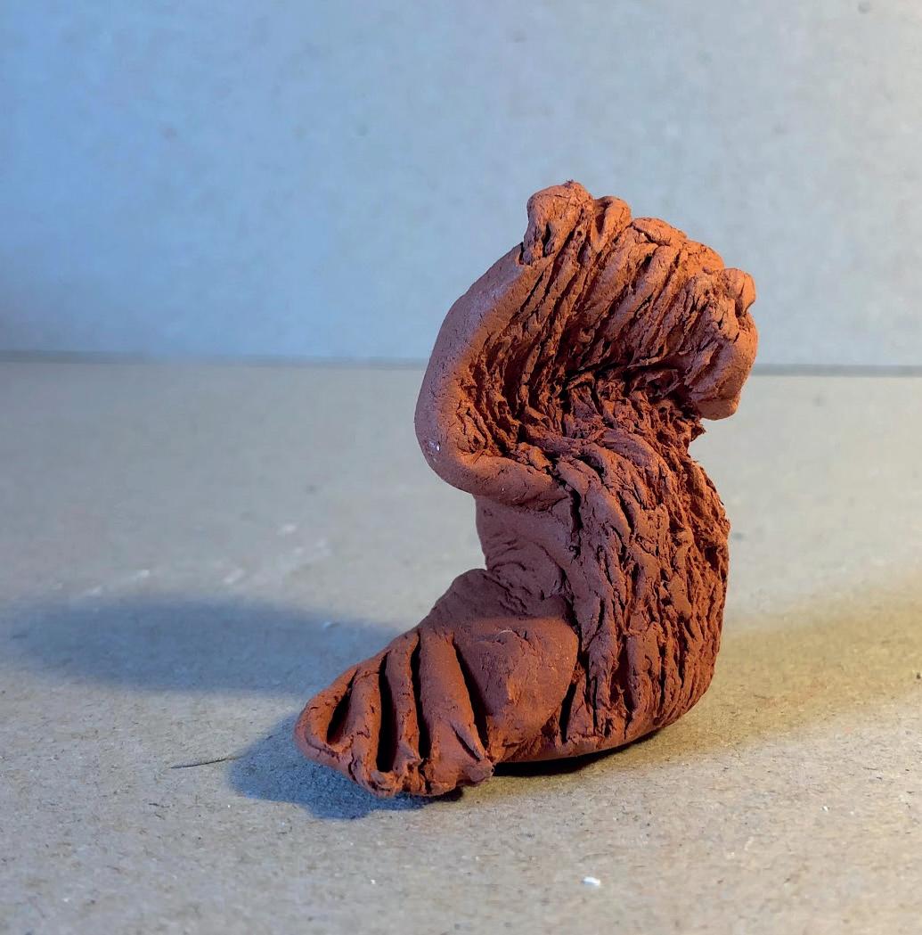
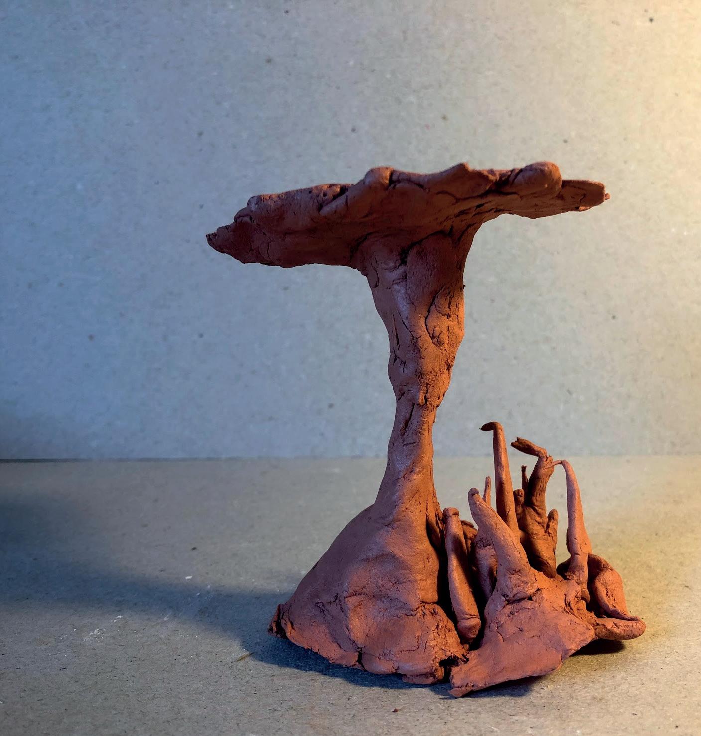
I used Clay to create these abstract shapes, they represent two different things:
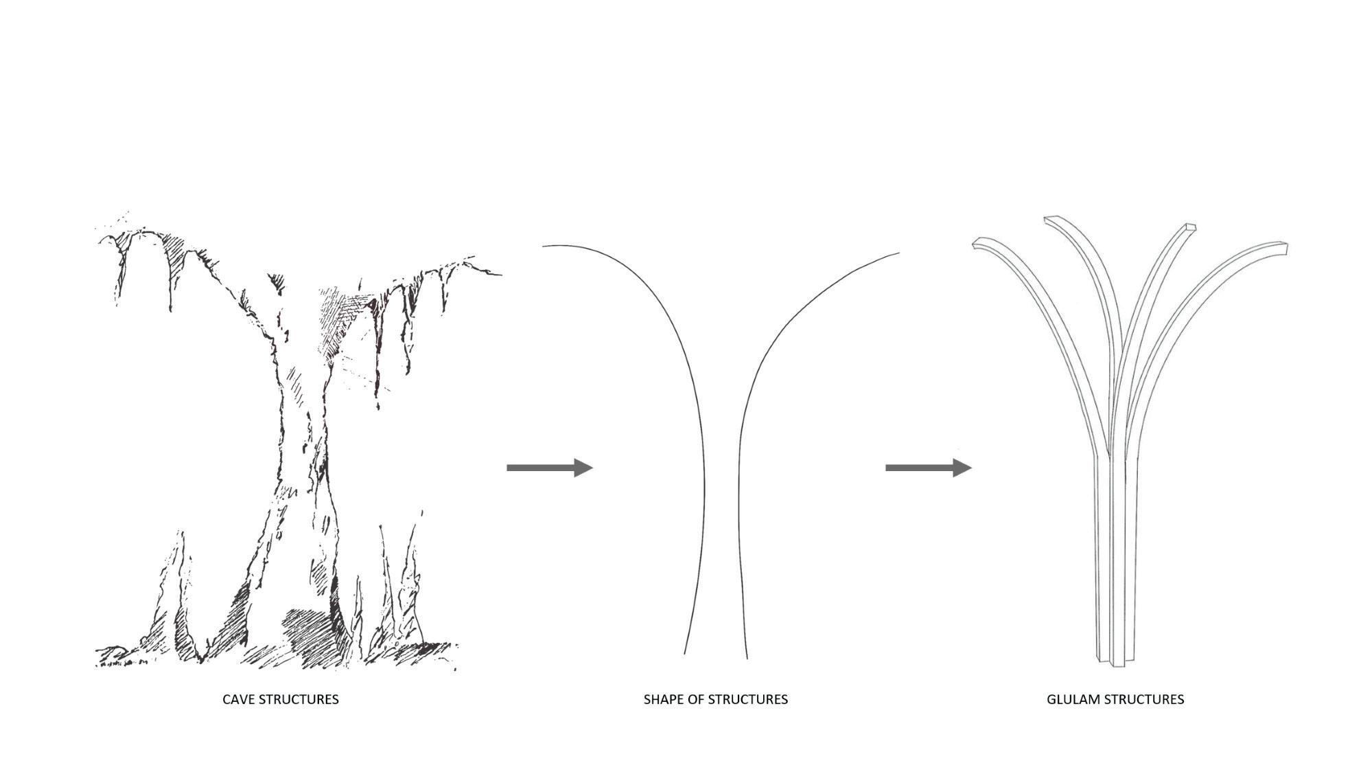
- One representation being ‘Support’ in the form of the supporting structures found in caves as well as different types of supporting and balencing structures. I was also exploring how different shaped structures can support themselves and I found that the strongest was model 2 as it is short and solid. However its sort stature makes it unsuitable to support a structure. The next strongest was model 1&3 as this has a wide base and is bottom heavy. This is inspired by the structures found in the Nottingham caves so I have decded to use this shape in my further development.
- The other representation is more to do with the material itself. Clay is malleable and goes on a form of journey as the creator is moulding it and reshaping it. This I think is, in part, why this material is used in art therapy as it influences the craftsmen to embark on their own journey, alongside the clay. This is also a concept I would like too develop further.
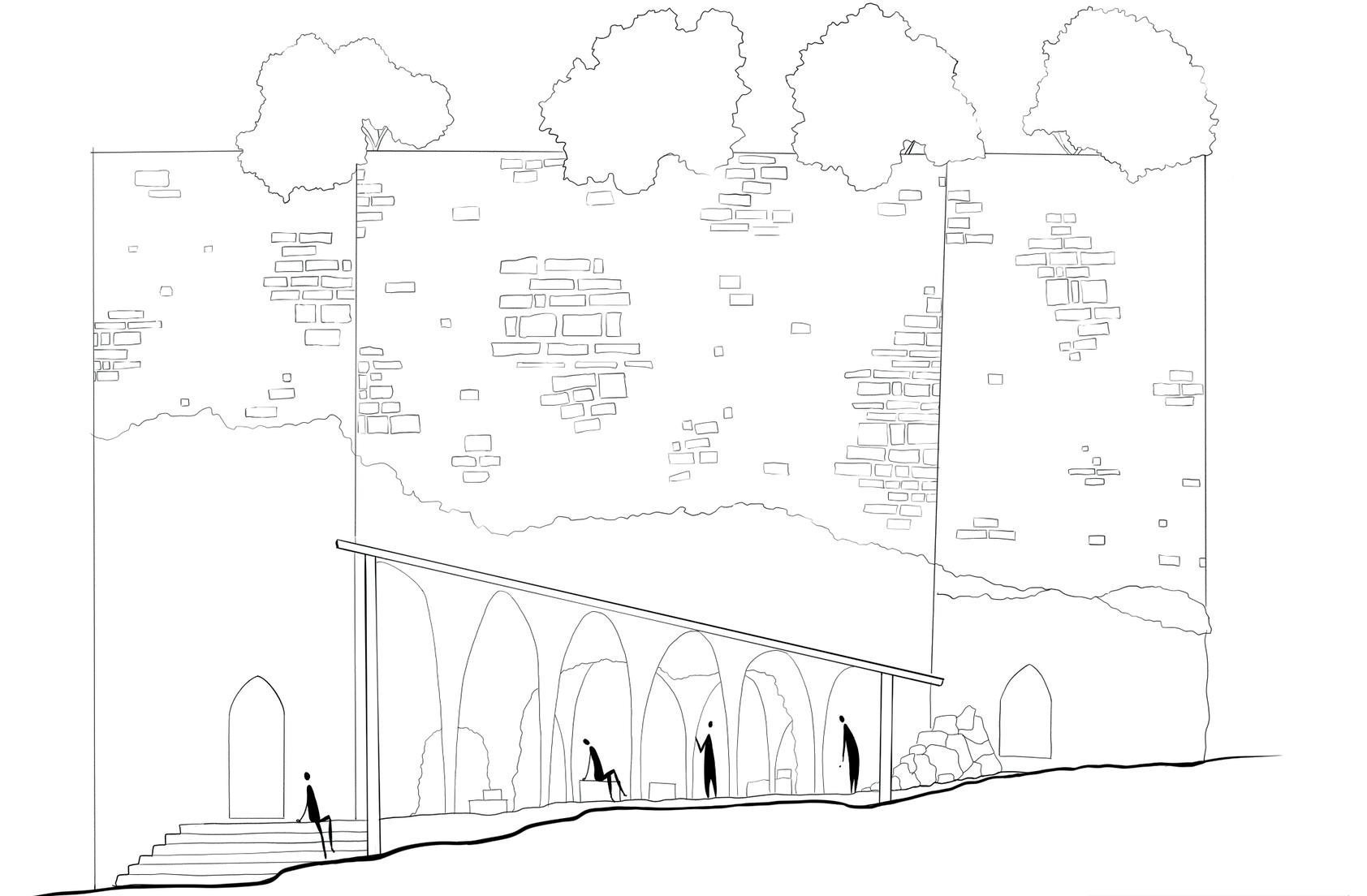
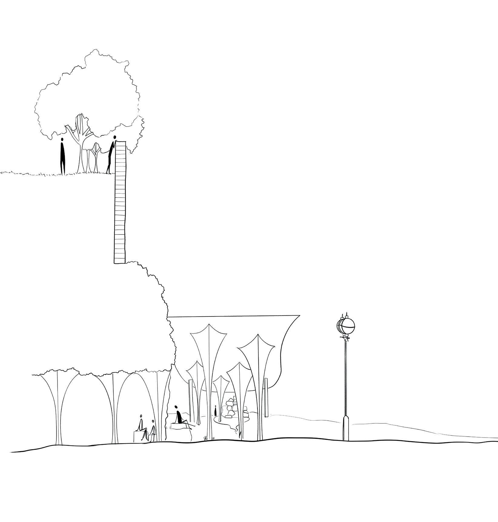
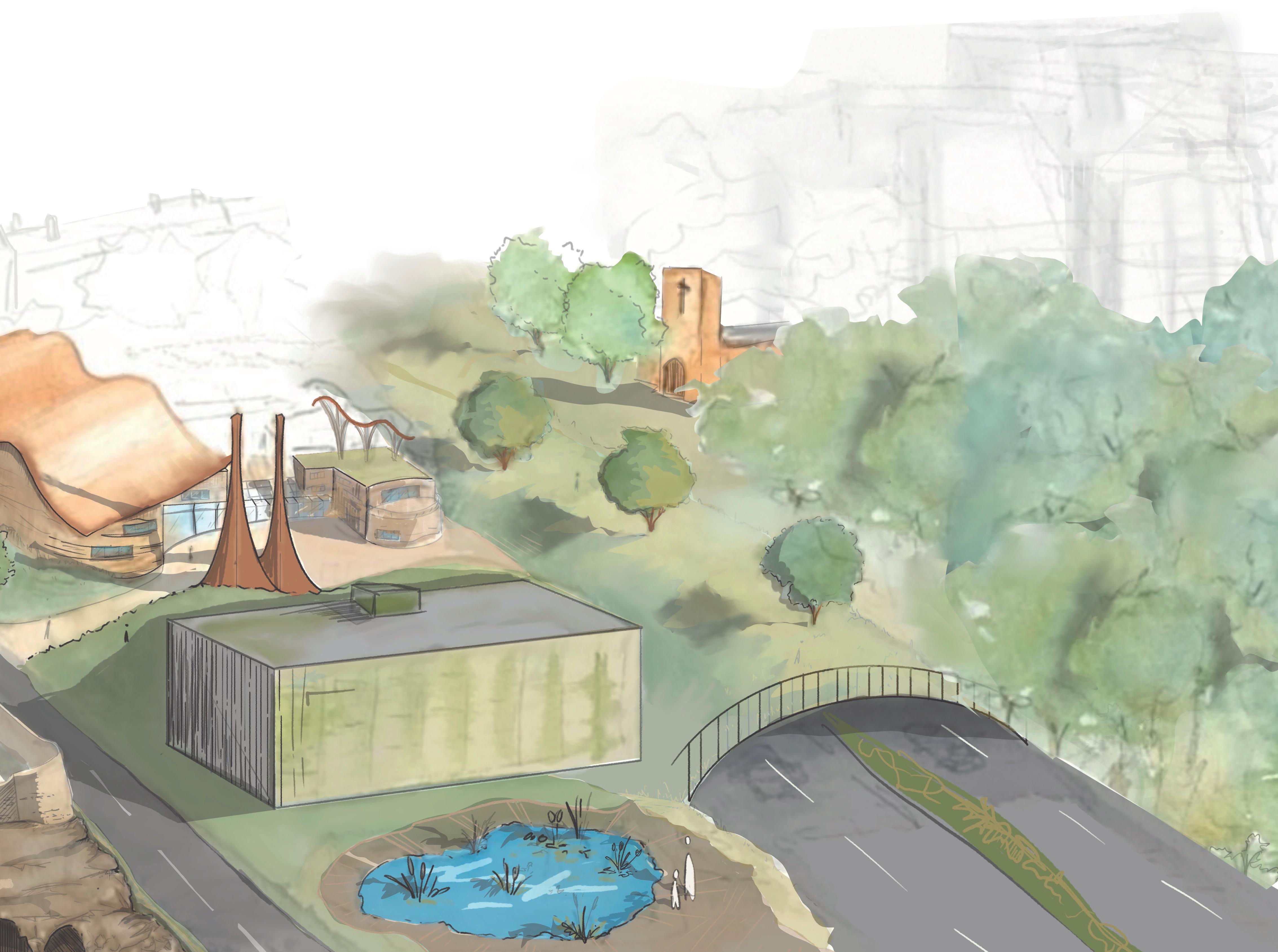
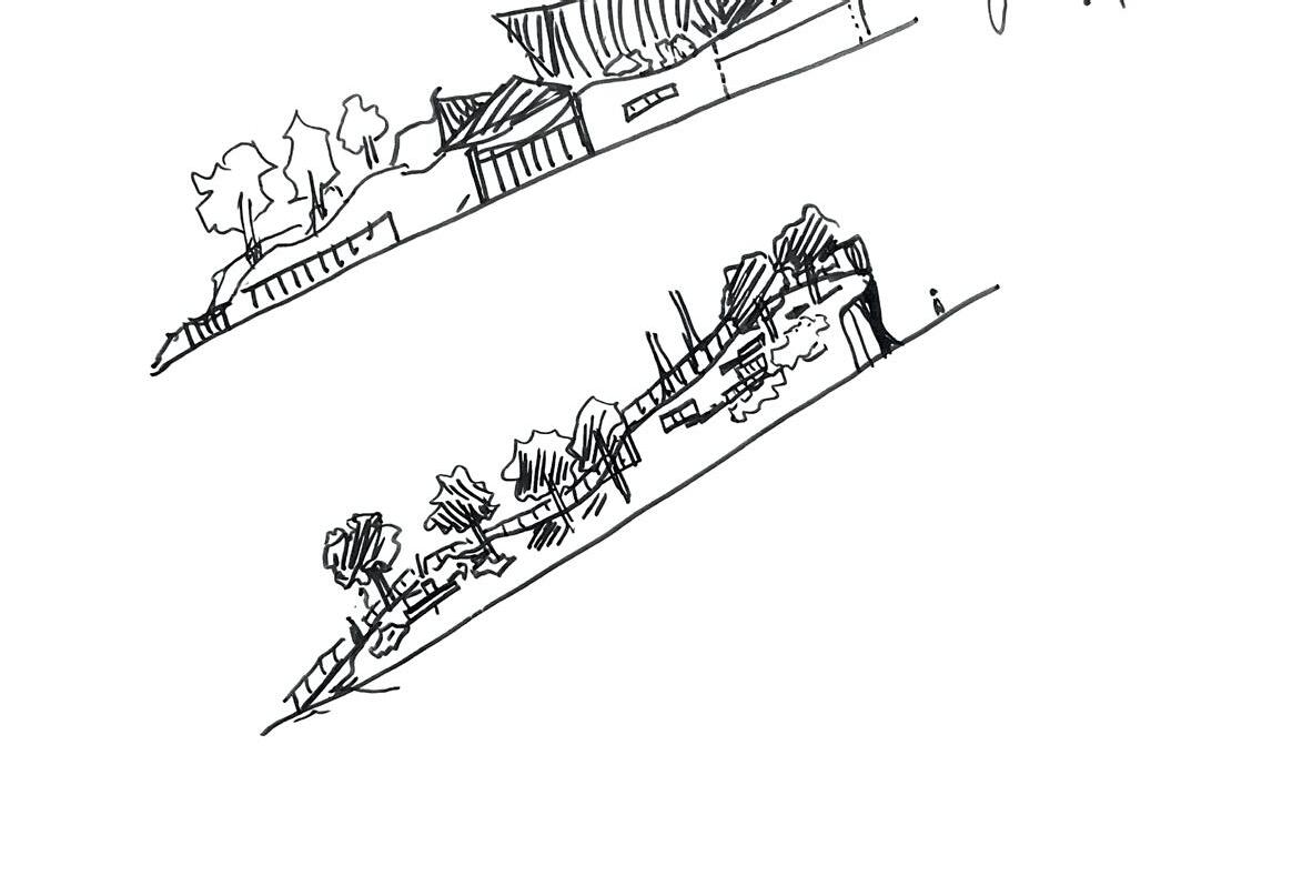
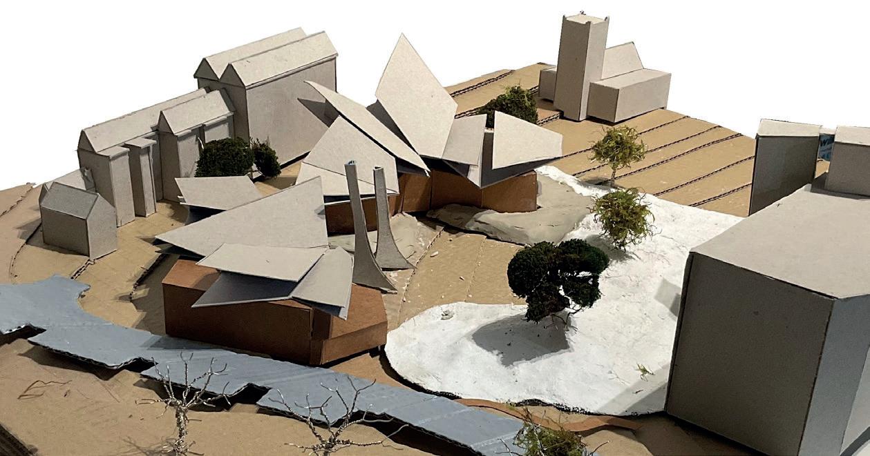
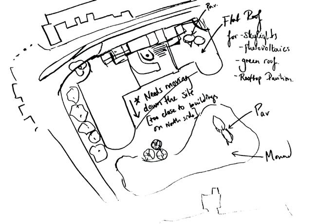
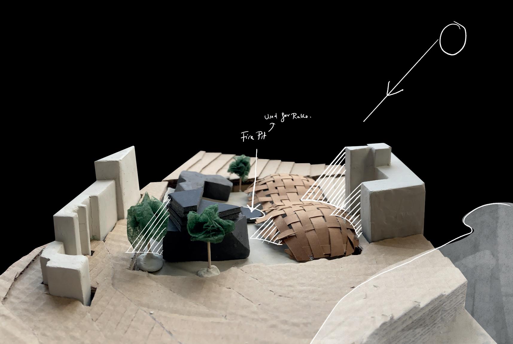
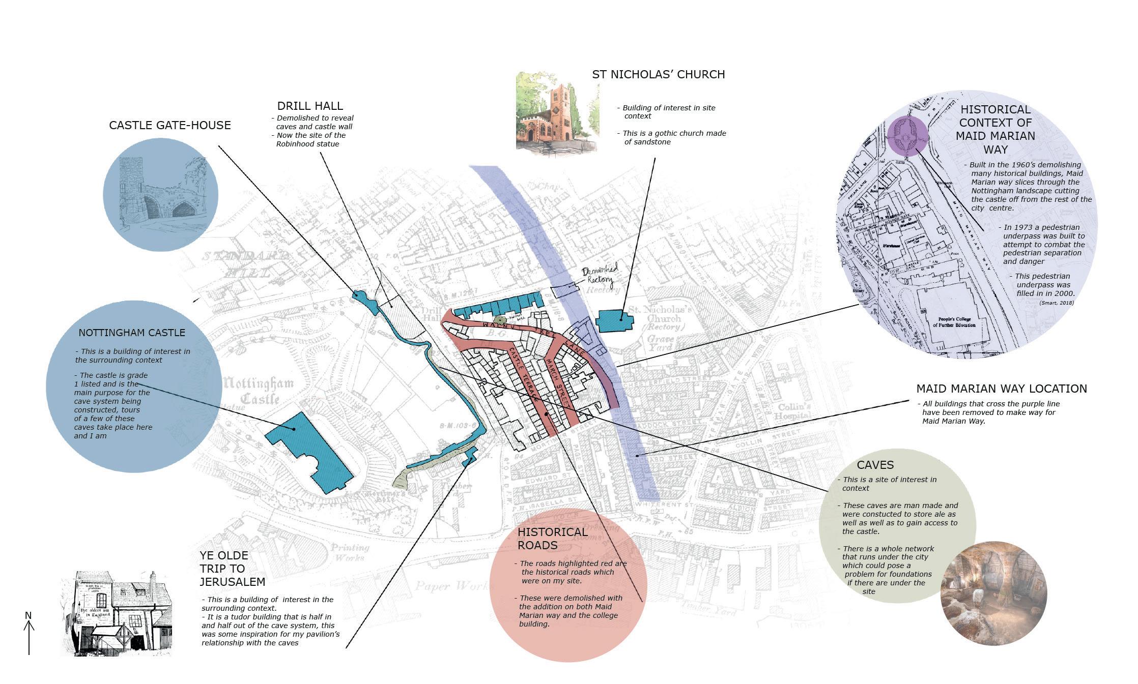
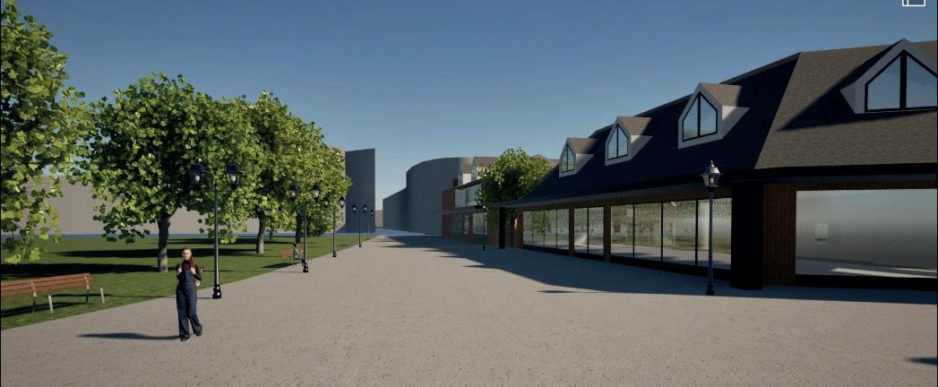
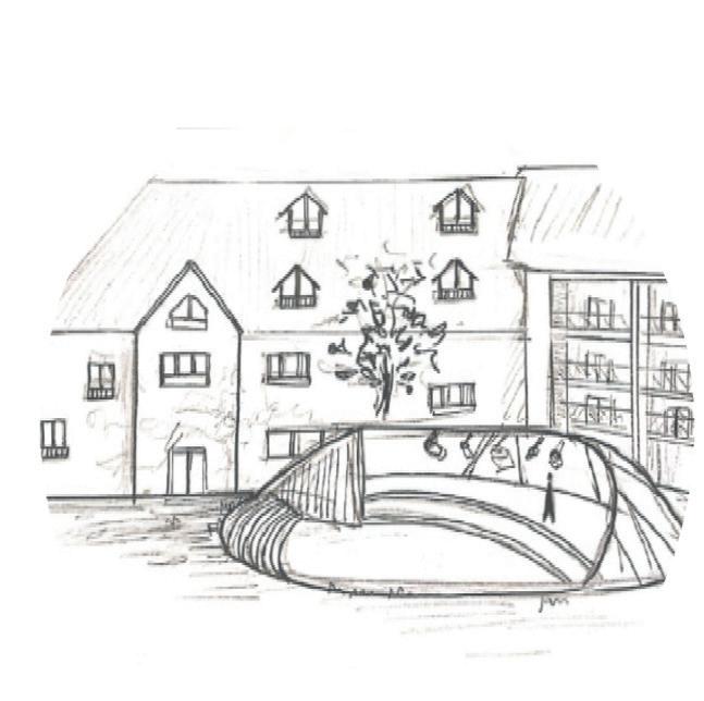
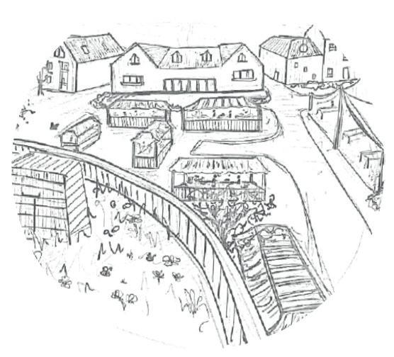
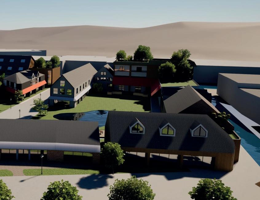
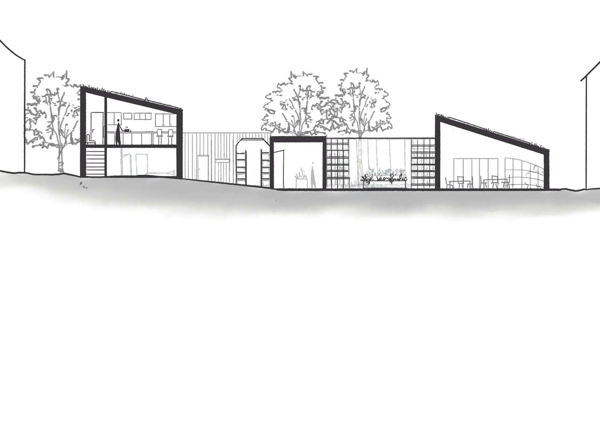
The ‘Castle Caves Pavilion’ serves as both a space for mindfulness partnered with the neighbouring Ceramic therapy centre, but also as an entrance to the famous cave system that runs under the city of Nottingham.
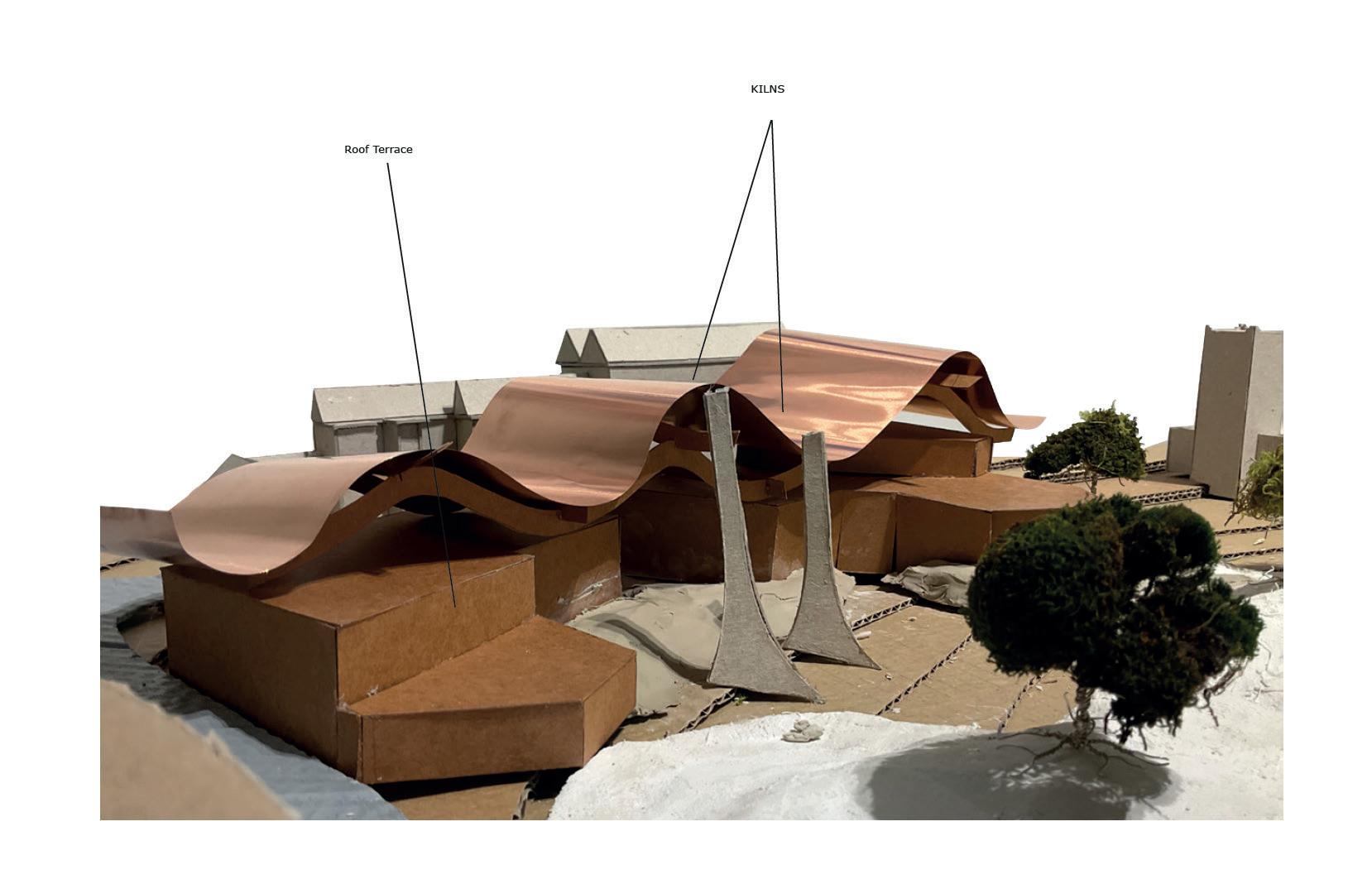
The Design is comprised of 2 main elements; the structural uprights and the slanted staggered copper roof. The structural uprights are precast concrete sculptural details that take inspiration from the supporting shapes found within the cave system itself whilst the slowly oxidising copper roof shows the phenomoenological journey of the water which acts as a symbol for the journey experienced within the ceramic therapy centre.
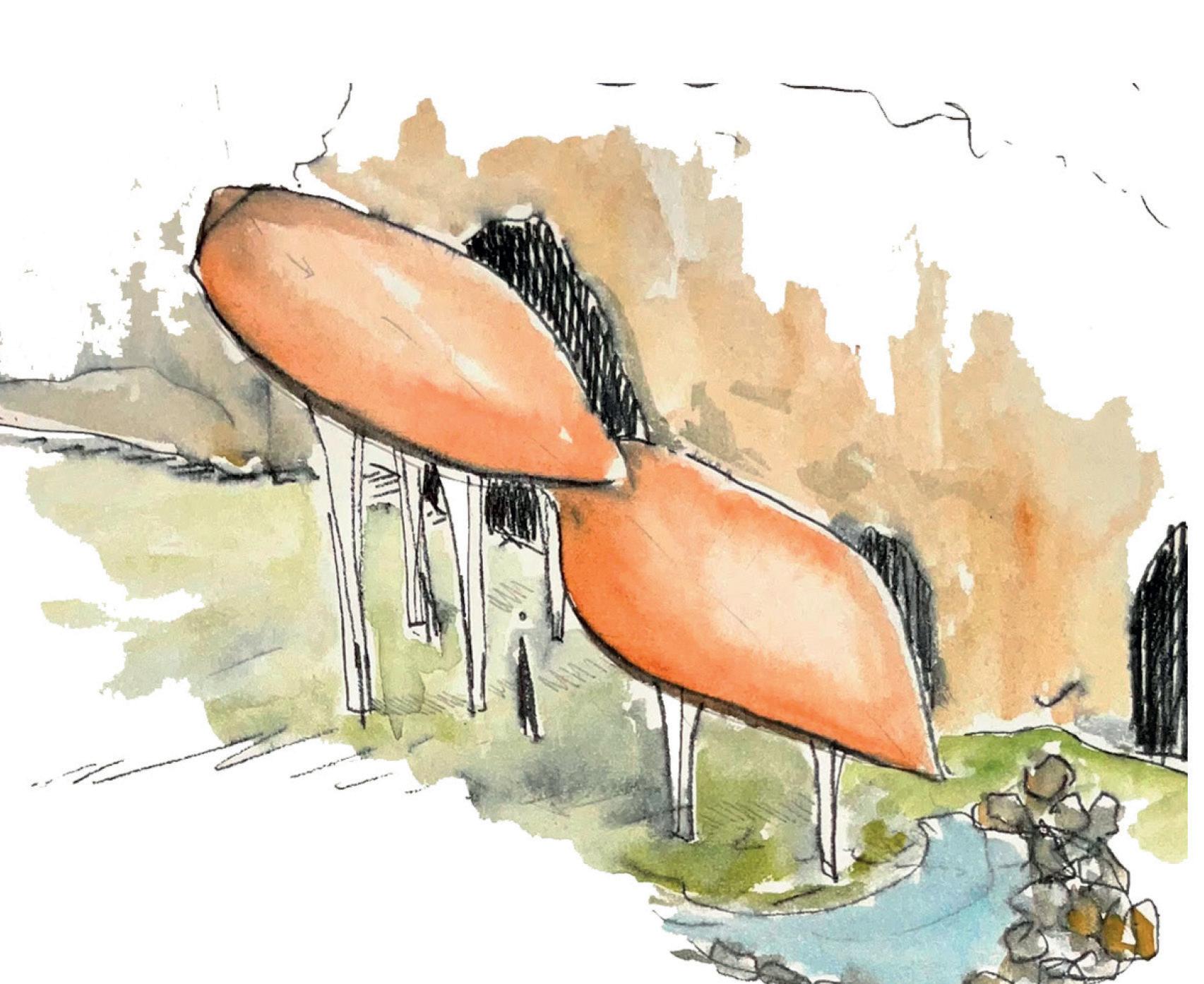
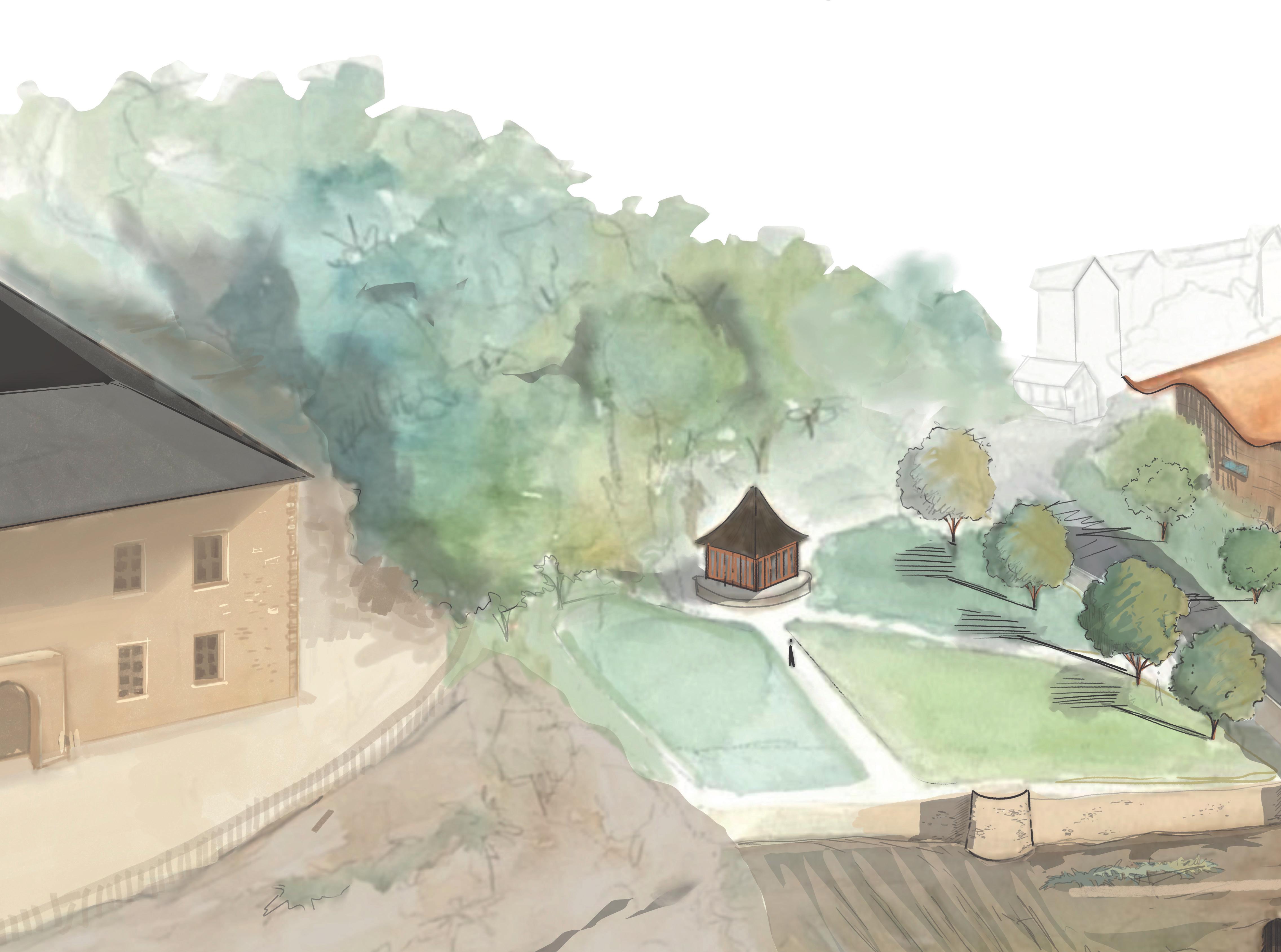
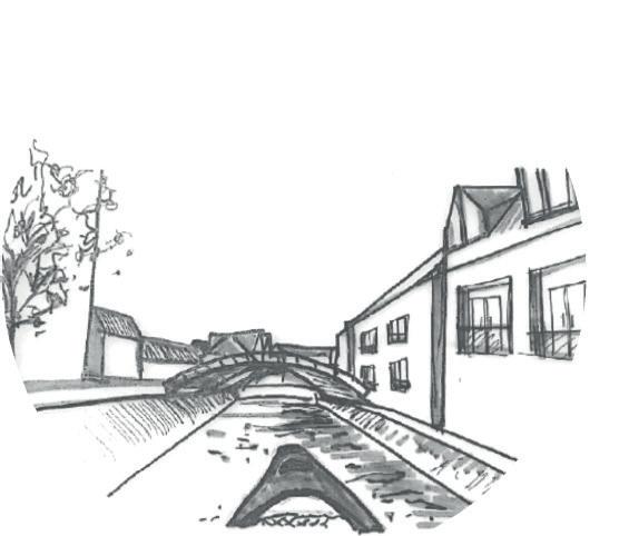
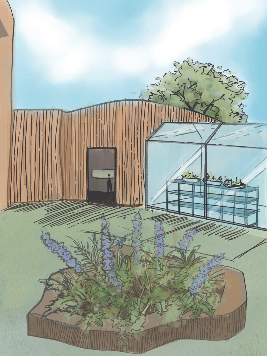
 This watercolour shows the slope of the copper roof and the phenomenological Journey of the rain water running down and leaving the oxidisation pattern on the surface. This water finishes its journey in a rockery and pond.
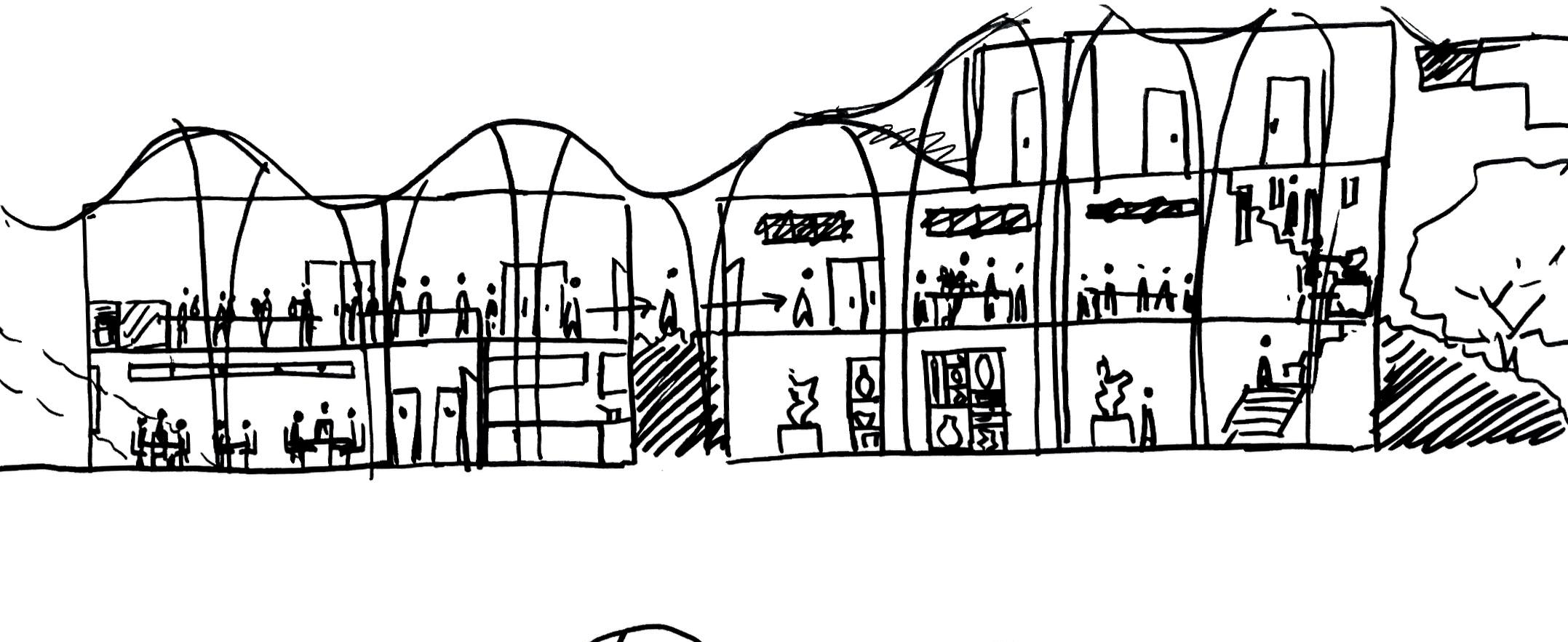
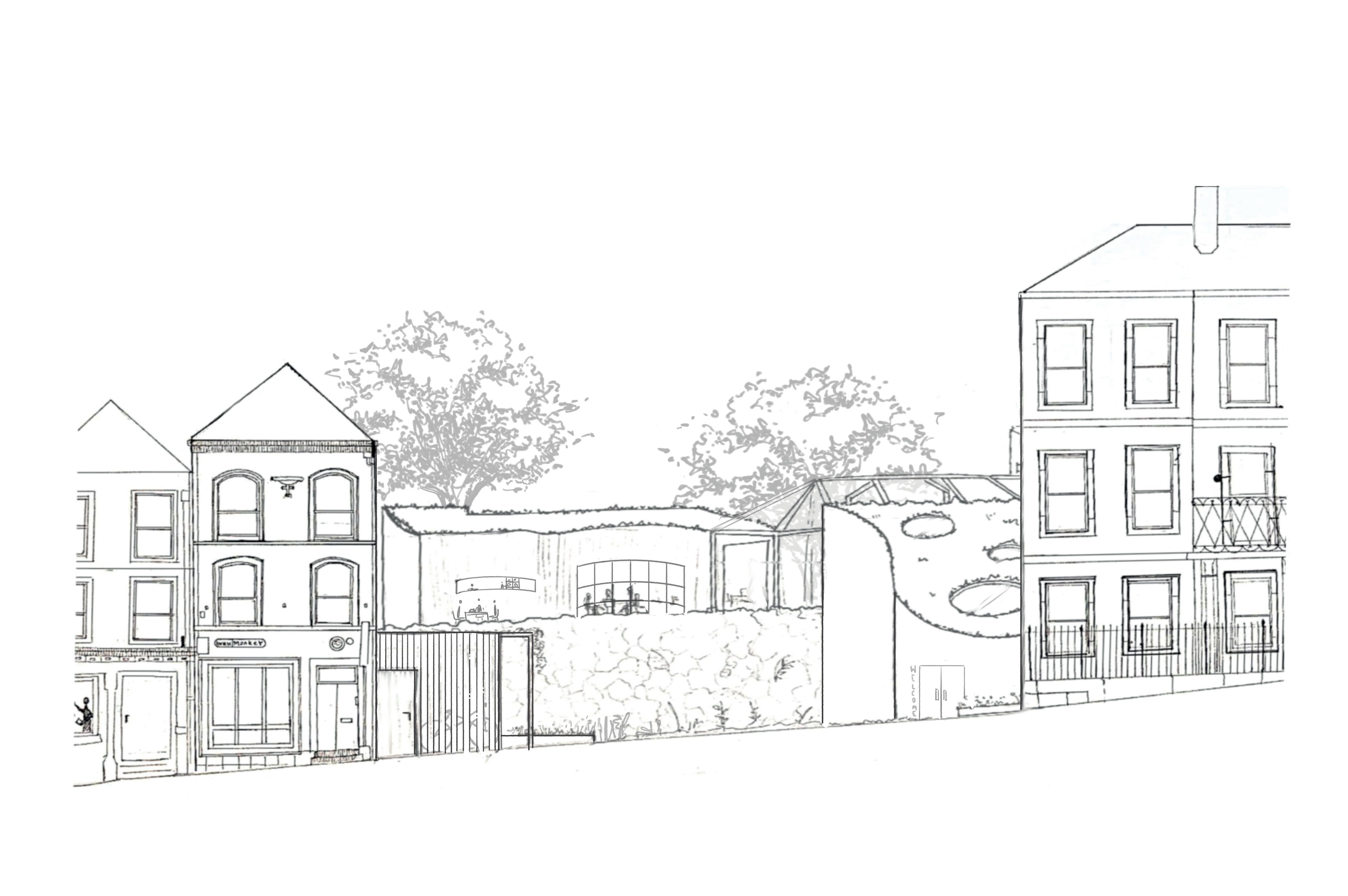
The Walnut Tree Ceramic Therapy Centre is a response to the ever increasing need for help and support to establish and maintain a positive connection with society. Mental and physical needs have been ignored for too long. COVID, isolated many people further from services and help they desperately needed to be able to function in an ever deteriorating climate of international turmoil.
My architectural design creates a hub of interconnectivity, a safe, secure space providing practical services at a pace suitable for ‘the individual’. Through the medium of clay, communication at various levels can be initiated, practically and verbally, encouraging new friendships, fun and laughter, surrounded by the new green holistic spaces.
Through support, the Therapy Centre is able to provide visitors with a calm nurturing environment facilitating the process of gentle interconnectivity with society.
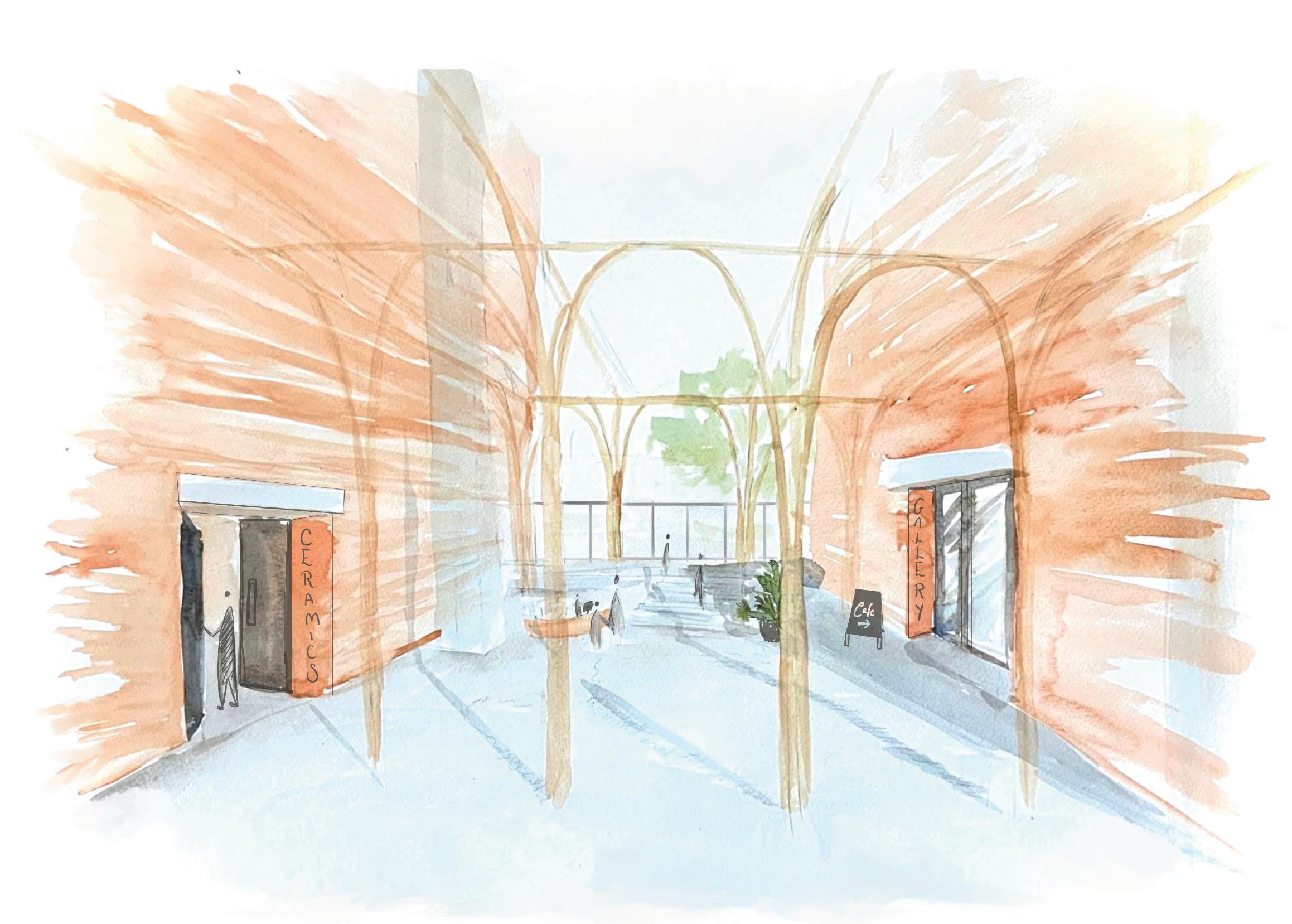
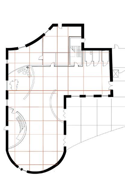
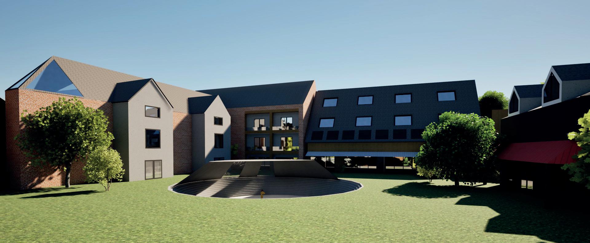
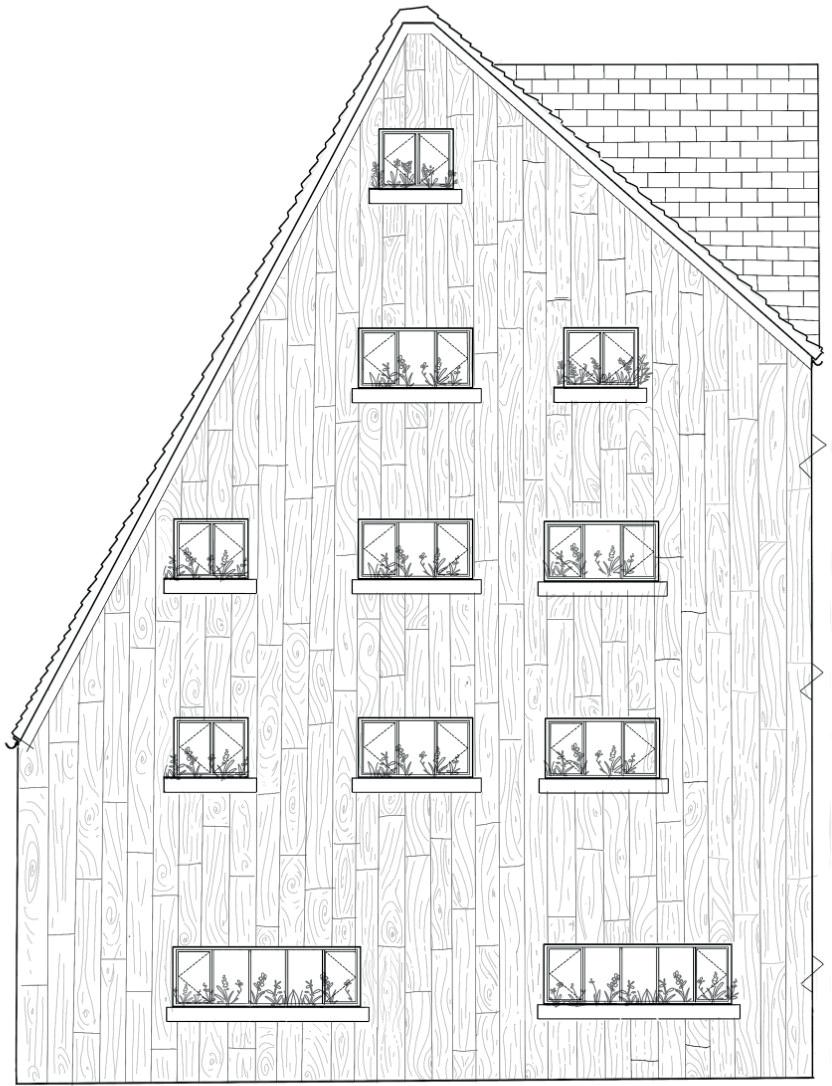
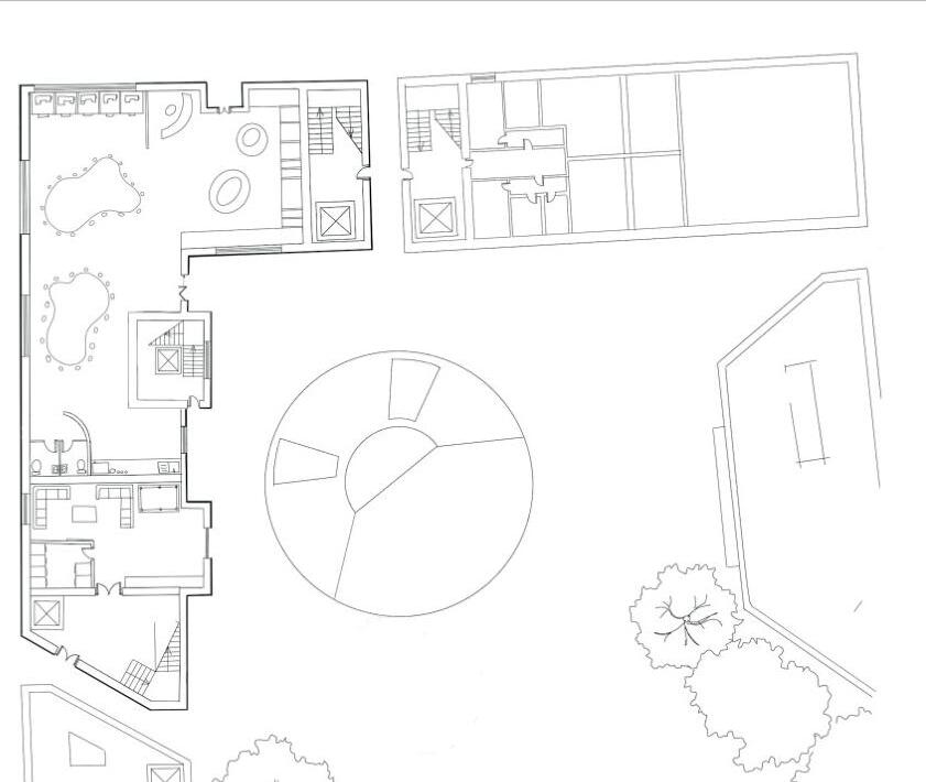
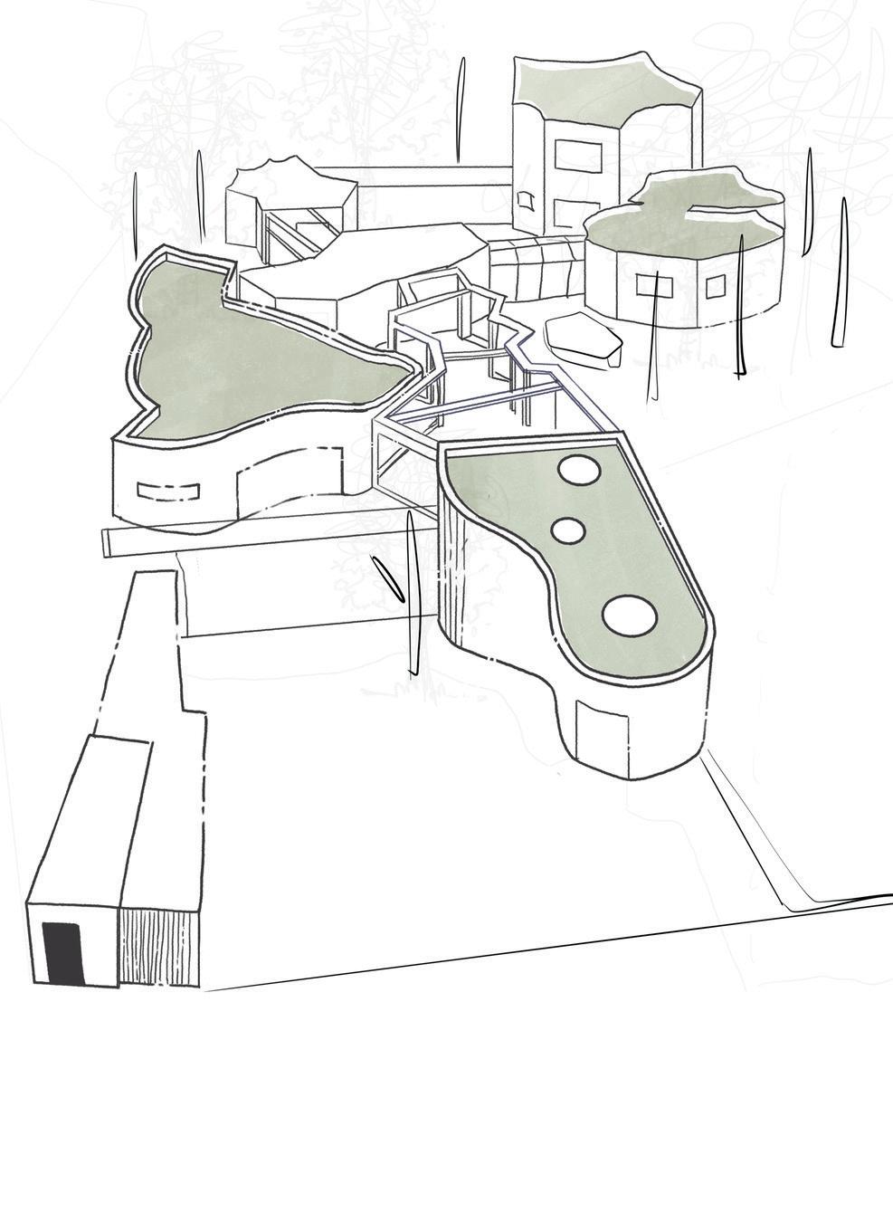
Walnut tree ceramic therapy centre
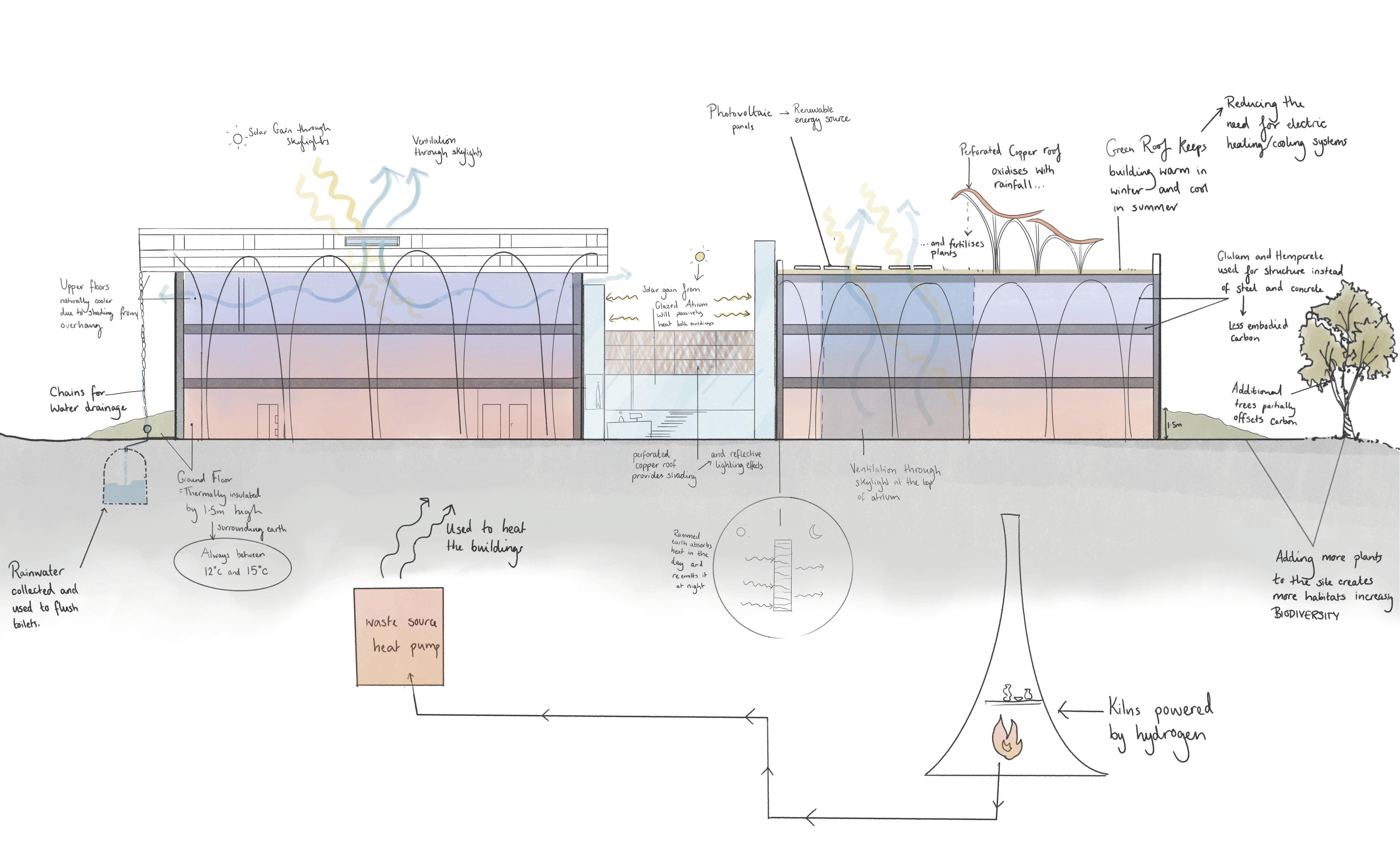
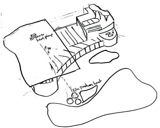
Envonmental strategy
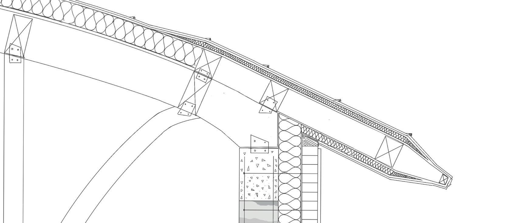

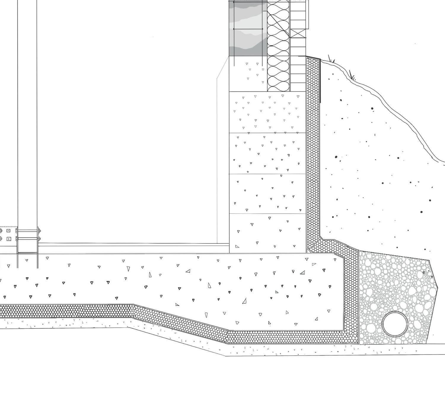
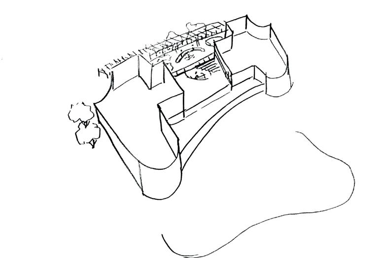
1:20 Axonometric Detail [scaled to fit page]

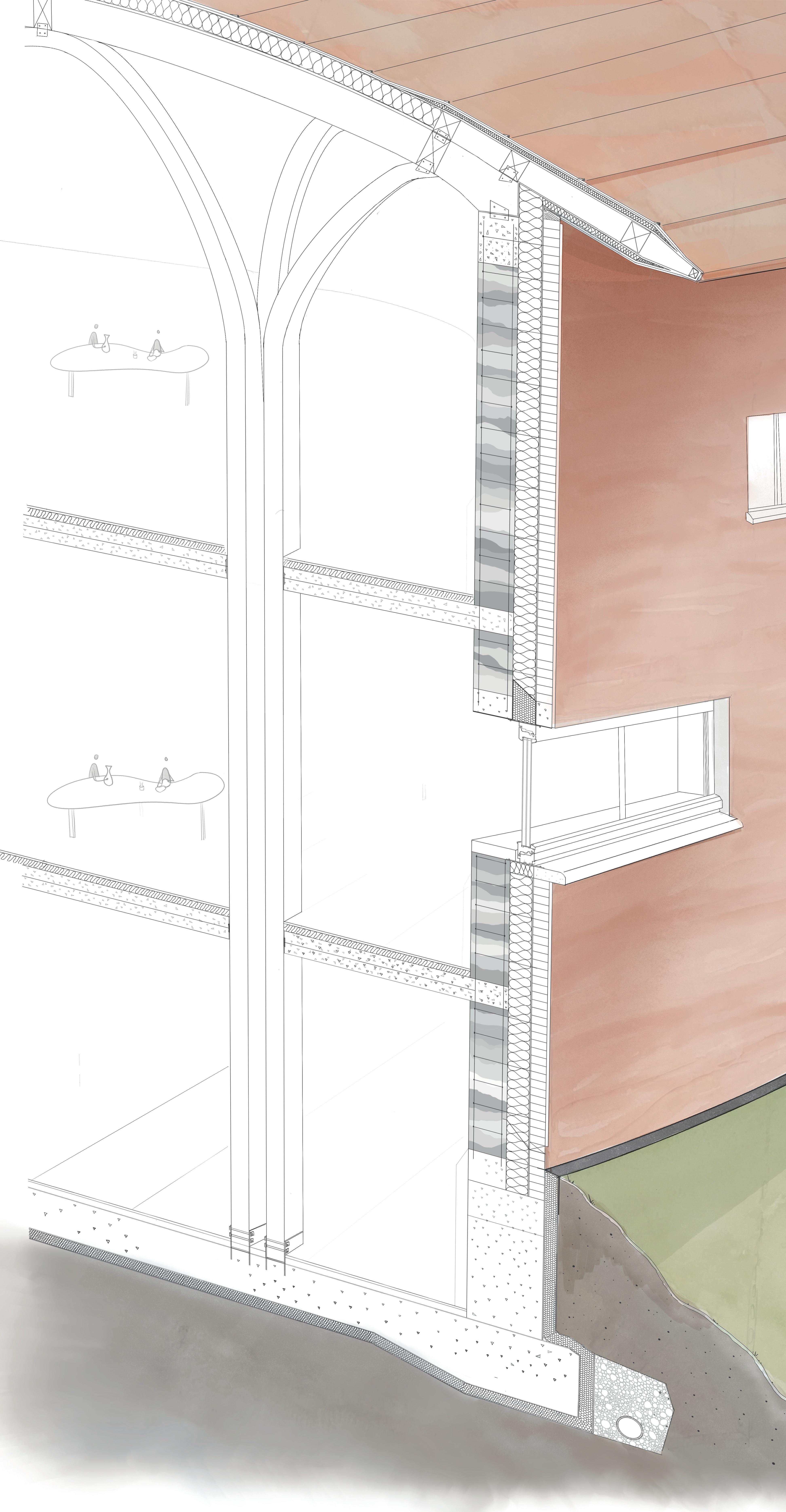
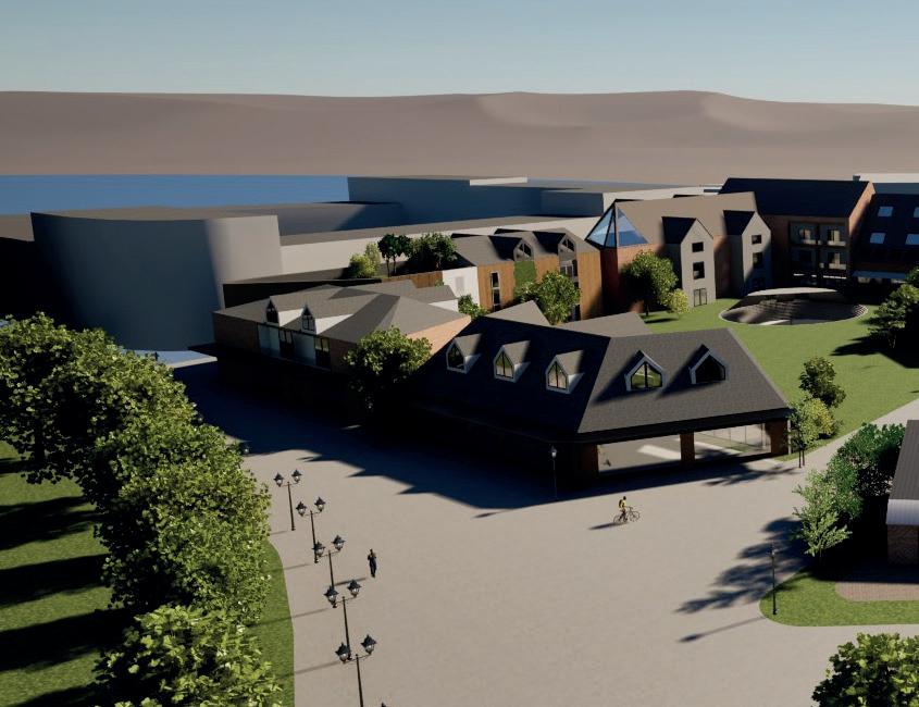
Walnut tree ceramic therapy centre
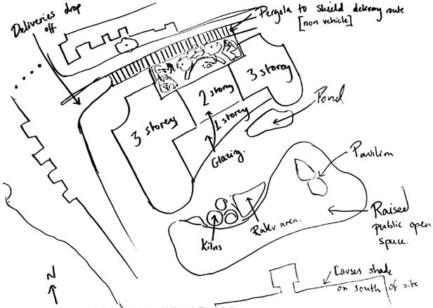
Walnut tree ceramic therapy centre
‘Bringing a countryside feel to the city’
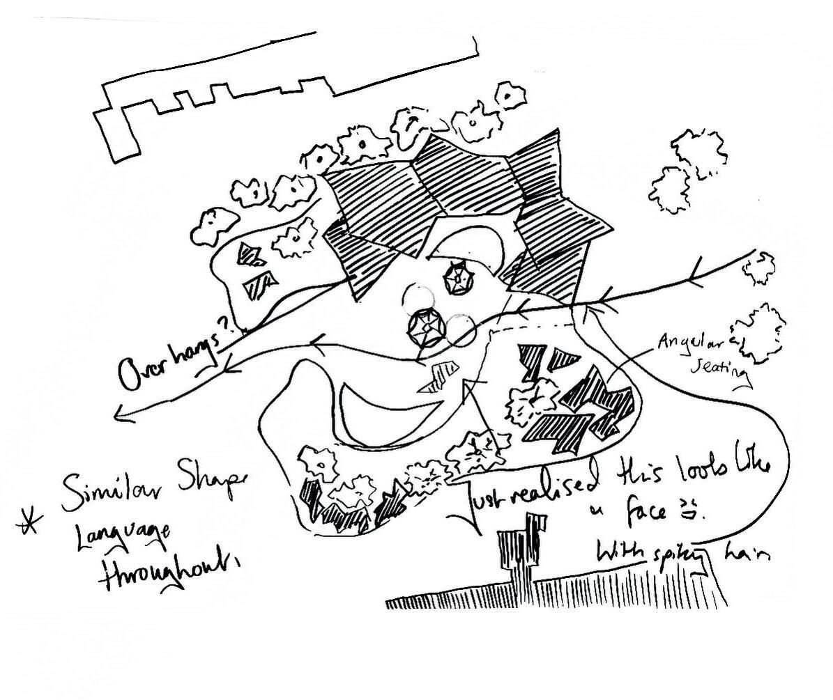
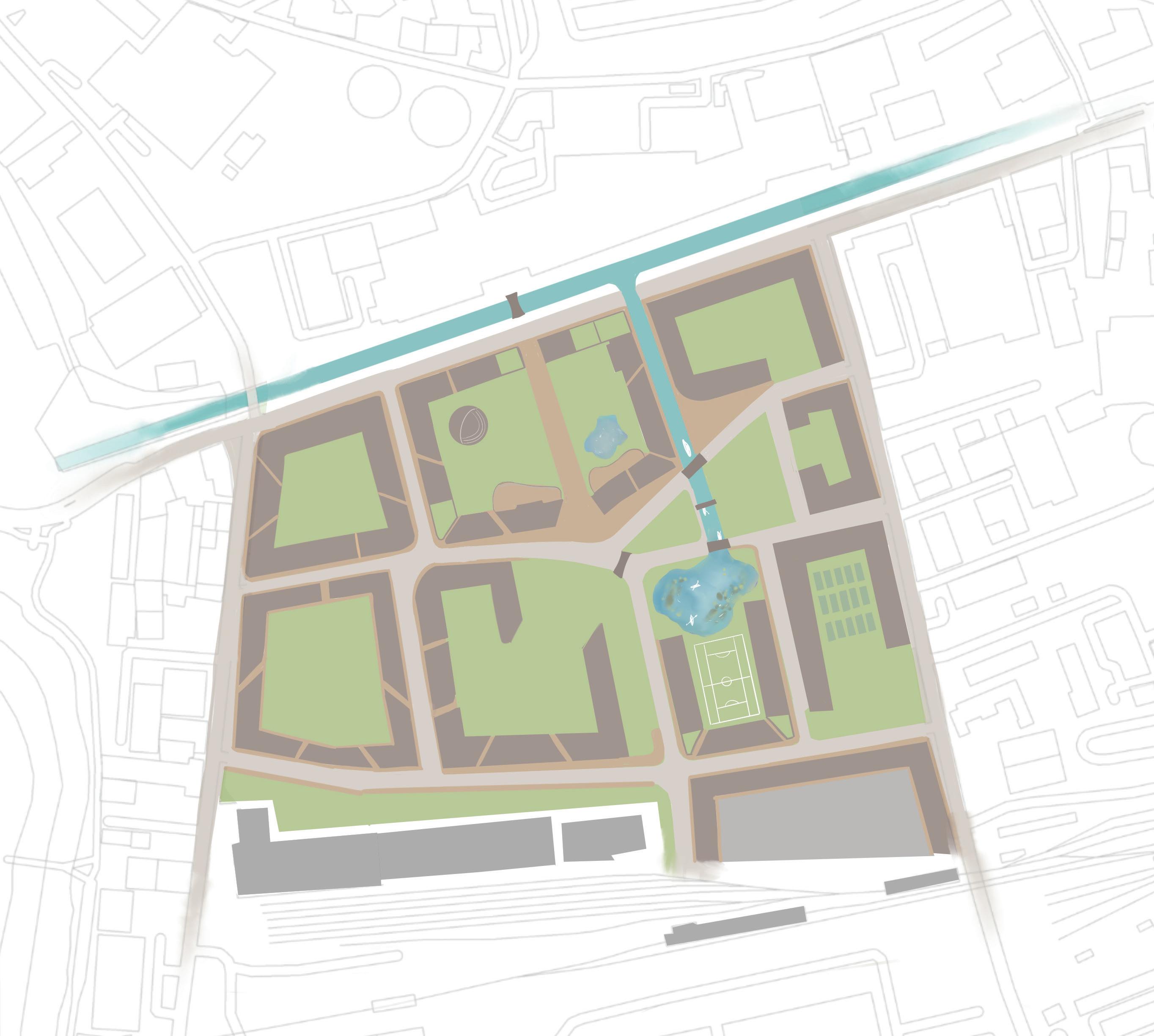
This project is located on St Philip’s Marsh in Bristol, previously this site has been used as an industrial site, mostly containing warehouses and derelict buildings. This site has been earmarked for development by Bristol council and as part of my 2nd Year project I took on the role of designing this portion of the city.
Firstly our yeargroup took part in a collaborative masterplanning workshop to identify the most beneficial block layout as a base for our designs. From this initial masterplan I took it away and reworked it to fit better with my brief and building purpose. [see image on the right].
Our next task was to zoom in on a designated portion of our masterplan and refine it. For our group we were assigned the top middle block. Part of this brief was to include a workshop for a creative industry on the ground floor with living accommodation above (this creates
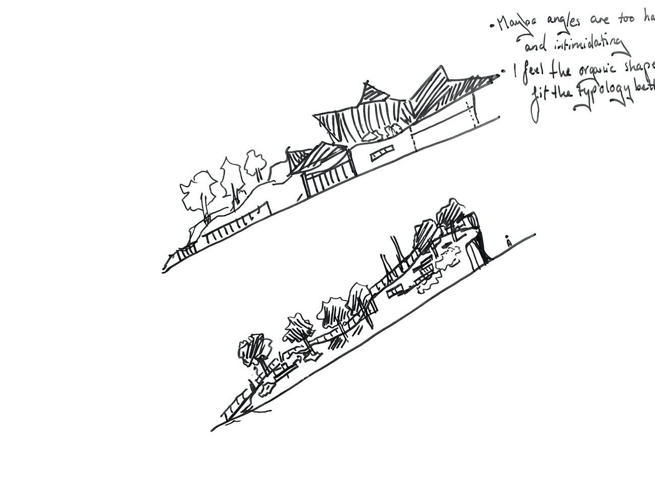
The Building I chose to focus in on was the textile workshop, located in the North western corner of the upper central block of the masterplan, It is a south facing building and uses concepts from the ‘soft city’ handbook to create an inviting shop and workshop for the communities use. The building is 5 storeys tall with the workshop on the ground floor with flats in the upper levels, creating this hybrid housing environment.
A typical 5 storey urban building of this scale would look quite intimidating and uninviting in this environment so by lowering the roof line and placing multiple flats within the ‘roof space’ it brings the vertical line of the building down to create the illusion that the building is shorter than it actually is.
1ST YEAR: Urban Honey Farm and wildflower community garden.
This project is a honey farm and wildflower community garden situated in Nottingham city centre, it is designed on the former lace market car park and is therefore a brownfield site. I have looked at shapes in the wing of a honeybee to determine the shapes used for my designs. Green roof features have been added both for sustainability and water attenuation purposes.
The levels of the site creeate an obvious split between the public and private areas
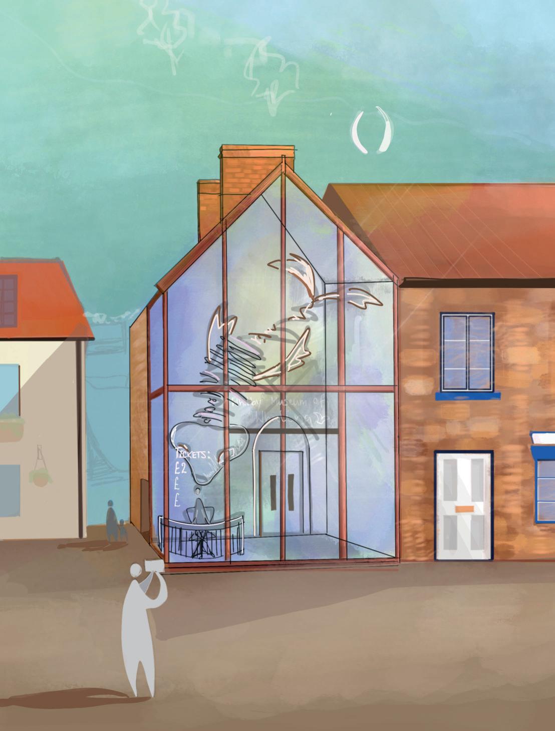
[Listed building transformation Project]
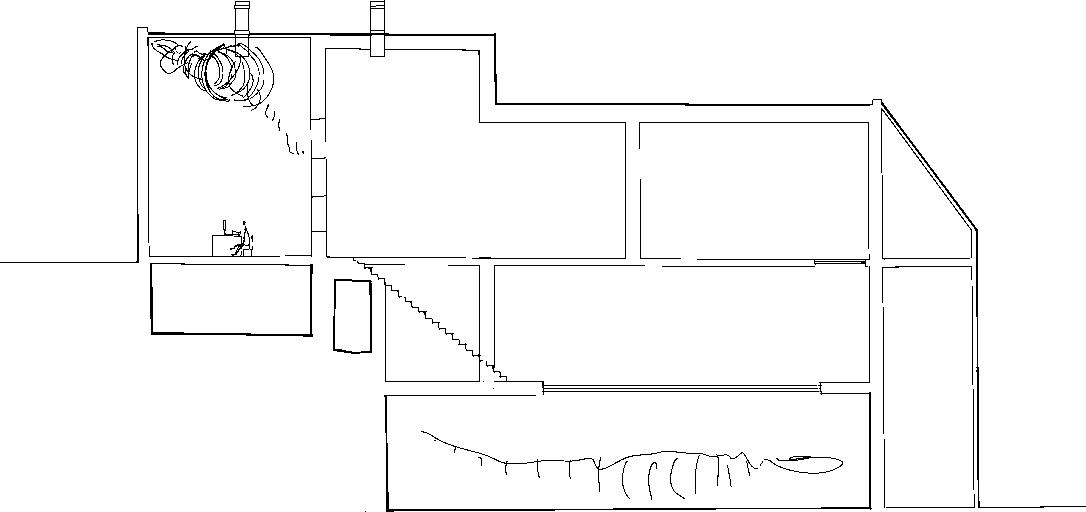
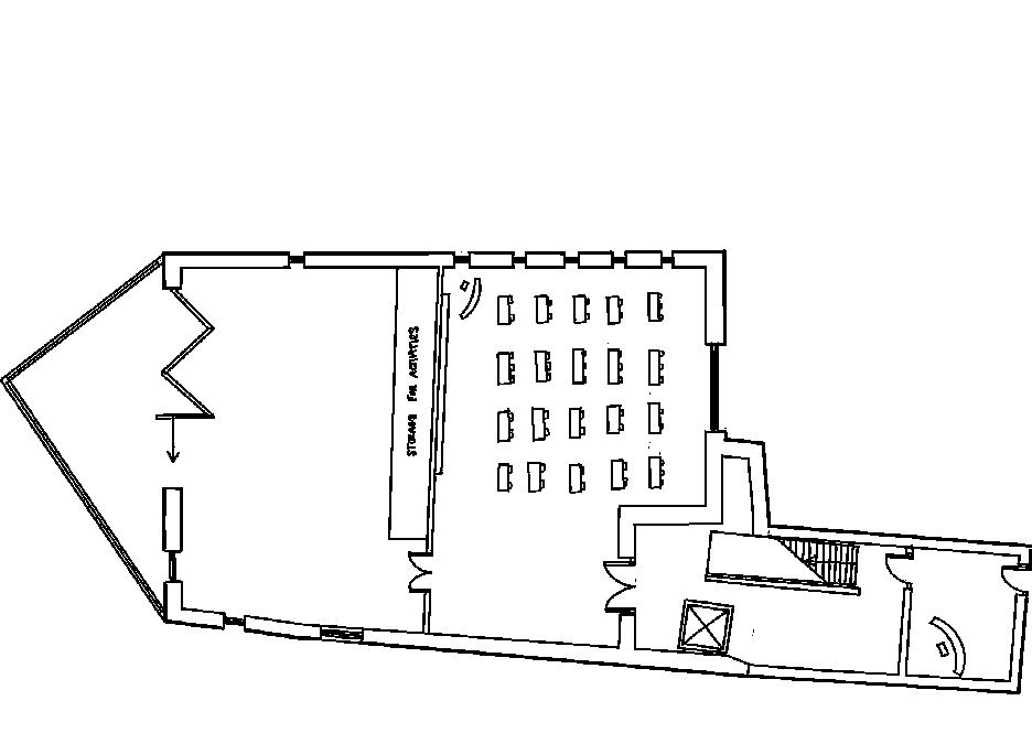
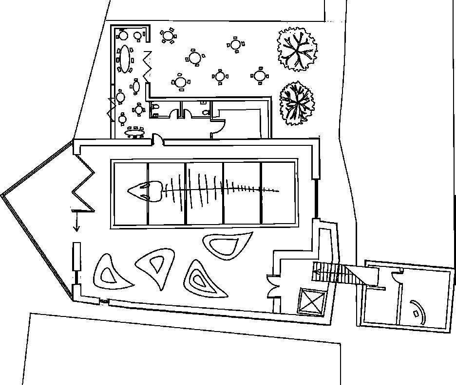
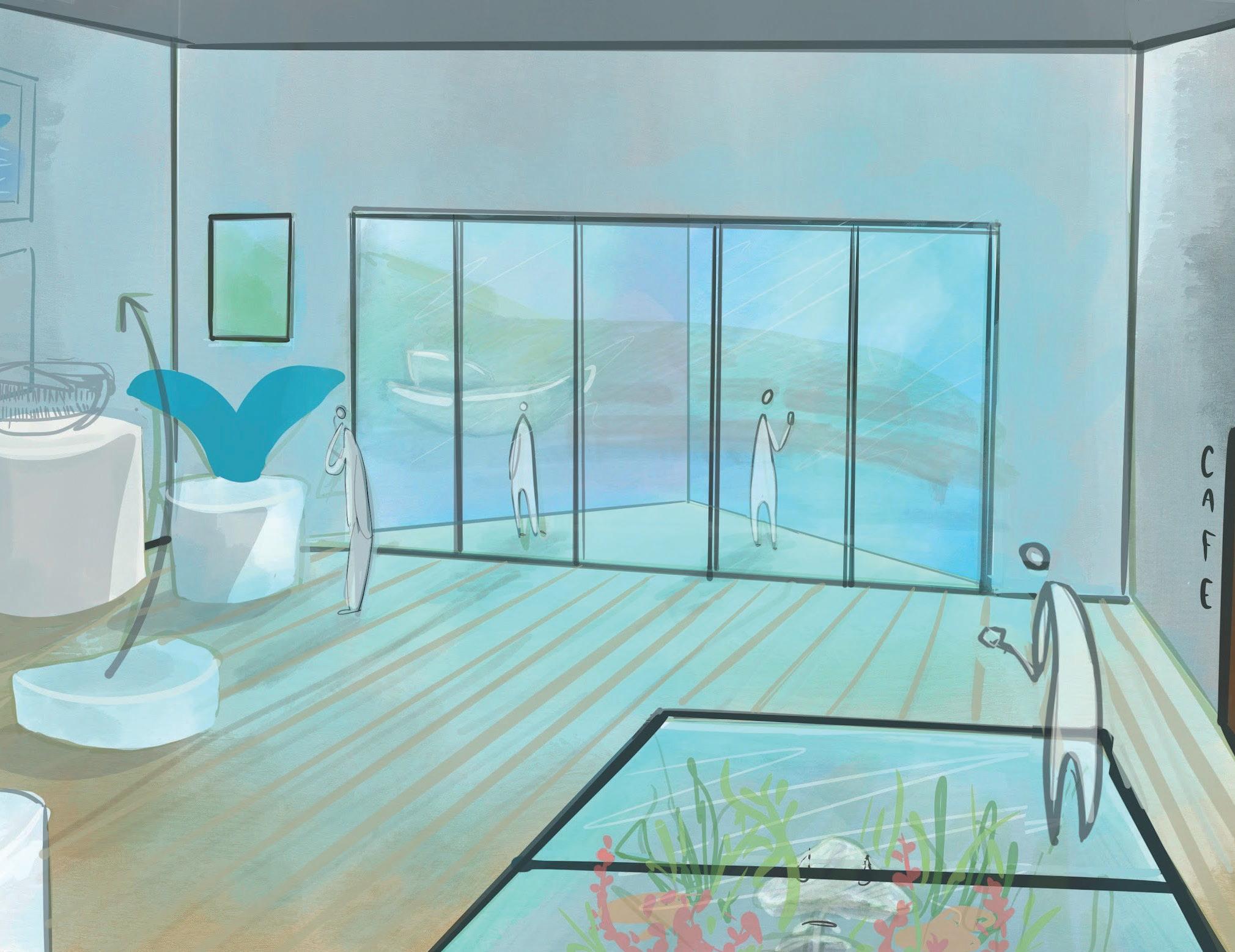
This project was inspired by the historical context of the surrounding North Yorkshire town of Whitby, which is famous for its maritime heritage including fishing and most importantly whaling. Our brief was to regenerate the ‘Friendly Rowing club’ into a museum and gallery to intice tourists to learn the rich heritage of the town and bring in some extra revenue. The existing building is a grade 2 listed victorian sandstone building, with a 70’s extension on the South facade.
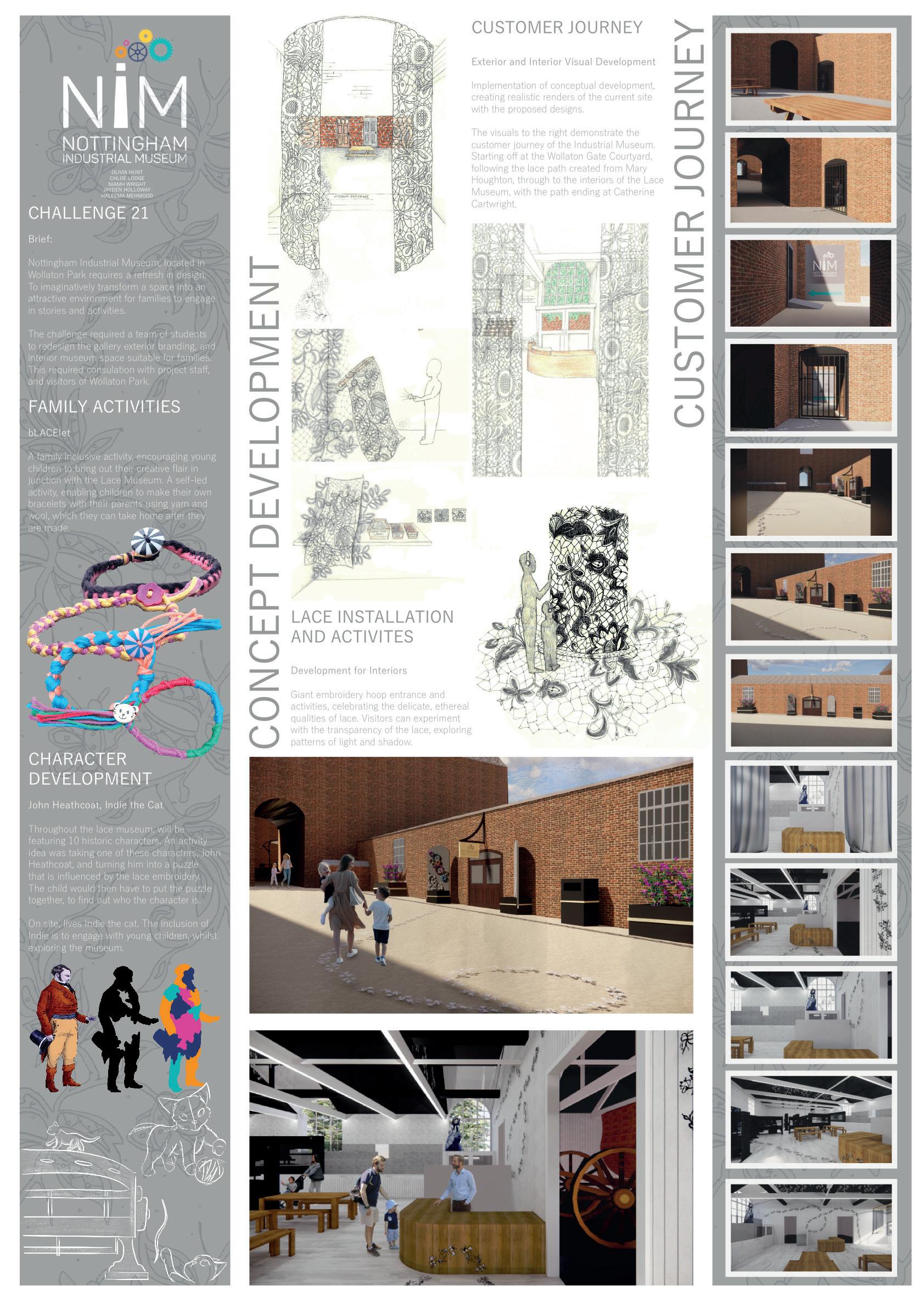
This was a group project that took place at Wollaton park as part of the Grads4Nottingham scheme. I worked in the marketing department for the Nottingham Industrial museum designing creative ways to signal to the public that the museum was open. These design solutions needed to be temporary as it is only open at the weekend. The final design solutions (detailed in the poster below) consisted of removable wooden cog signs that slot in to custom planters designed to mimic the histoical planters that are currently in use on the site. These signs are designed to be removable for the weekend and are angled in a way that enlarges the entrance and ‘funnels’ visitors in through the doors.
This project took place on my placement year in the USA. The brief for this mosaic mural was to reflect the context of the surroundings and celebrate the heritage of the site. The client also requested an alternative brief that linked with the name ‘the crescent’. The images below show my design responses to this brief.

This image is based on the Crescent nebula image taken from the Hubble Telescope I felt this was a fun abstract way to honour the name without being too on the nose. It is a bright fun abstract piece that translates well into mosaics but was ultimately decided that a link to the context was prefered.
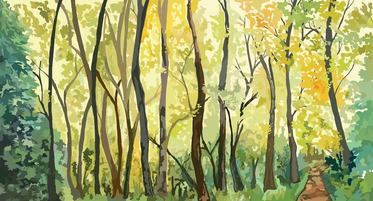
This image is drawn from photos of my hike to the nearby Chanterelle trail. They ultimately liked this one the best as they felt the colours were more in keeping with the rest of the building as well as the subject matter being more subtle and mirroring the surrounding context. They felt it would be more obvious to viewers that it was a bespoke piece as it is recognisable to locals.
2:
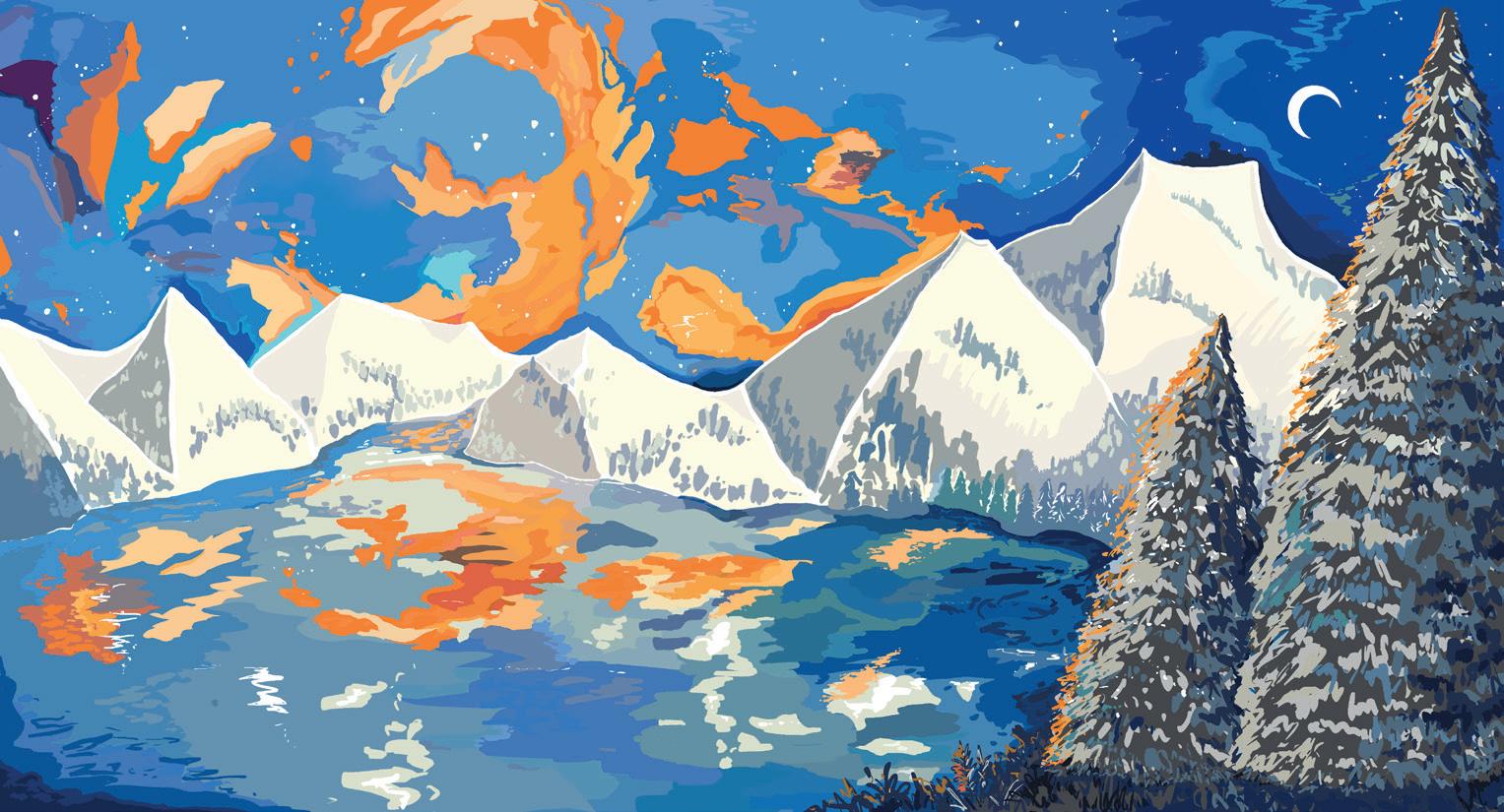
This image is inspired by the local landmarks of Lake Whatcom and Mt Baker. I decided to also include the crescent nebula in this to add an extra element to the design and encompass both design requests in the same image. This was a favourite for a while until the cladding colour for the building was decided, at which point a more green image was the goal.
4: SCENE FROM THE CHANTERELE TRAIL [VIEW 2]
This image is also drawn from my photos of the Chanterelle trail hike howeveer, this image had too much fine detail so when transferred into mosaic form all structure to the piece became lost. As a result the composition of View 1 was preferred which was the design taken forward, see image below:
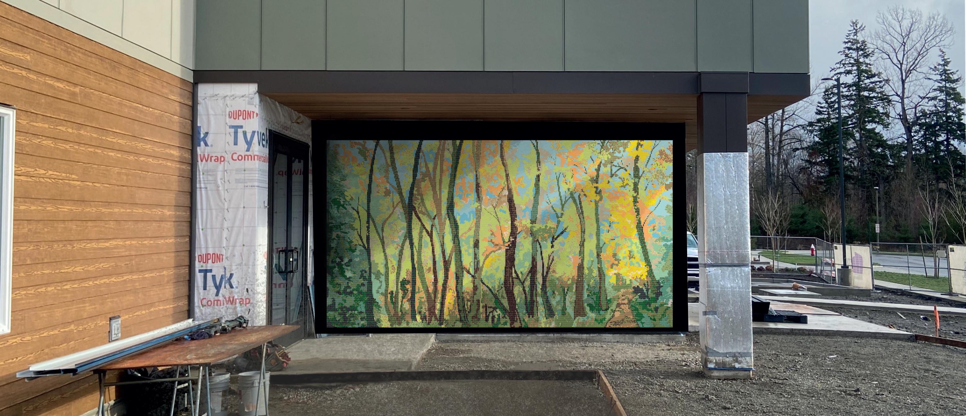
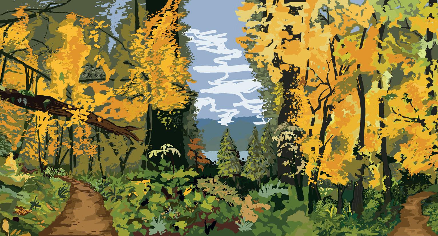
This is the final design choice from the client, they felt this scene was the most encompassing of the brief and the colour choices matched the cladding and surroundings as it was a mirror of the landscape.
1: THE CRESCENT NEBULA MT BAKER, LAKE WHATCOM AND THE CRESCENT NEBULA 3: SCENE FROM THE CHANTERELLE TRAIL [VIEW 1]