woodgrain and contemporary options. Our Deep Matte Charcoal, Walnut and Cedar colours have experienced a sharp increase. And we see this trend continuing in 2017.”
The Look and Feel of 2017 “Another great trend this year will be texture,” advises Mazur. “Be it great lush fabrics like velvets and natural linens or rough-hewn barn board, faux furs and metals. Rich jewel tones are still trending, but are now warmer and more muted, adding a richness and luxury to our designs. As popular as the deep, rich muted tones are, we are also seeing softer, more romantic palettes that add a hint of colour to an easy neutral environment. I’m particularly fond of Benjamin Moore’s Colour of the Year selection of Shadow 2117-30, a rich royal amethyst colour that is adaptable to many environments and design styles.” Lockhart also sees jewel tones in a big way for her 2017 collection—some of her inspiration derived from recent travels. “The most striking, memorable site has been modern furniture in jewel tones juxtaposed against crumbling, centuries-old brick walls,” Lockhart wrote from southern Spain. We can consequently expect jewel-toned colours (rich reds, deep greens, golden yellows) to frequent Lockhart’s collections of furniture and client work in the coming year. As for Mazur, “This year ahead is not about perfect, shiny finishes,” she stresses. “In fact, it’s quite the opposite. Warm matte black—including in kitchens—continues its popularity, beautiful polished concrete that exudes texture and warmth is notable, and great coloured metals are being seen in an abundance of applications. You’ll be seeing a lot of colours this coming year that are inspired by metallics.” Lockhart concurs. “We’re going to see a lot more gold in antique matte finishes. Pinks mixed with gold will reflect a more feminine side in decor. Rose is back in a big way and we’re seeing the ’80s returning with matte gold finishes instead of polished brass. Sparkle will still have its place, but mixed metal tones will be everywhere. My personal colour prediction is that we’ll see a deep, indigo blue become a new neutral. You can add lots of colour and metallic accessories to this denim-like blue, and it’s easy to live with.” Sherwin-Williams’ Wadden echoes the sentiment. “While the
typical models of faux finishing have been trending down over the last several years, we do see continued interest in metallic finishes,” Wadden says. “More important, it seems that consumers are looking for high-end paint products that deliver technology and innovation. For instance, our Paint Shield product is a revolutionary coating (that actually has the power to kill infectious bacteria). Another product that I love is our Snap Dry, a quick-dry, high-quality paint recommended for front doors (see sidebar). Mazur agrees that colour isn’t everything for buyers. “People are generally looking for a durable paint that is washable, able to withstand sticky fingers and the hardships of day-to-day living. As a designer, I prefer matte finishes for the paints I use, as I find it can absorb light beautifully without causing any reflectiveness. Environmental concerns and sustainability also continue their importance, with people seeking out VOC-free or low-VOC paints in their homes.”
Predicting the Future If you’re trying to guess where colour preferences are going to go, but lack an international team of experts, just look to the economy, suggests Lockhart. “It is a great predictor of both style and colour,” she says. “It comes from people’s perception of their own economic condition. Are they feeling wealthy or not? Depending on that collective perception, spending increases to support that positive attitude, often through purchasing home and decor items. Colour is an aspect of that. But it’s also affected by a consumer’s age. As millennials continue to have more influence in the market, we’ll see more colour because they embrace it, while older generations generally prefer a more relaxed, muted palette. We’re seeing younger baby boomers looking to stay relevant and hip and they want the freedom to have colour in their homes, and are no longer worried about what will help sell a home.” And what’s with those crazy paint names? “That task usually falls on the marketing teams who are trying to create an image for a colour,” Lockhart explains. “Like ‘Picket Fence.’ It’s one of the main reasons people buy certain paint colours—because it conjures up the image they want to identify with.” Which means Canadians probably won’t be seeing a Benjamin-Moore Trump Orange anytime soon. OHB
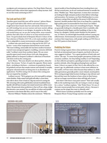
SHERWIN-WILLIAMS
SICO
A combination of warm brown and cool grey, Sherwin-Williams’ Colour of the Year is Poised Taupe, a beautifully balanced neutral inspired by organic materials, weathered and worn finishes.
Sico’s Colour of the Year, the rich, calming Mozart purple, is versatile enough to infuse a living area with a luxurious feel or a bedroom with a soothing vibe.
56
ontario home builder Winter 2017
ohba.ca
