
Hi!
My name is
Oli
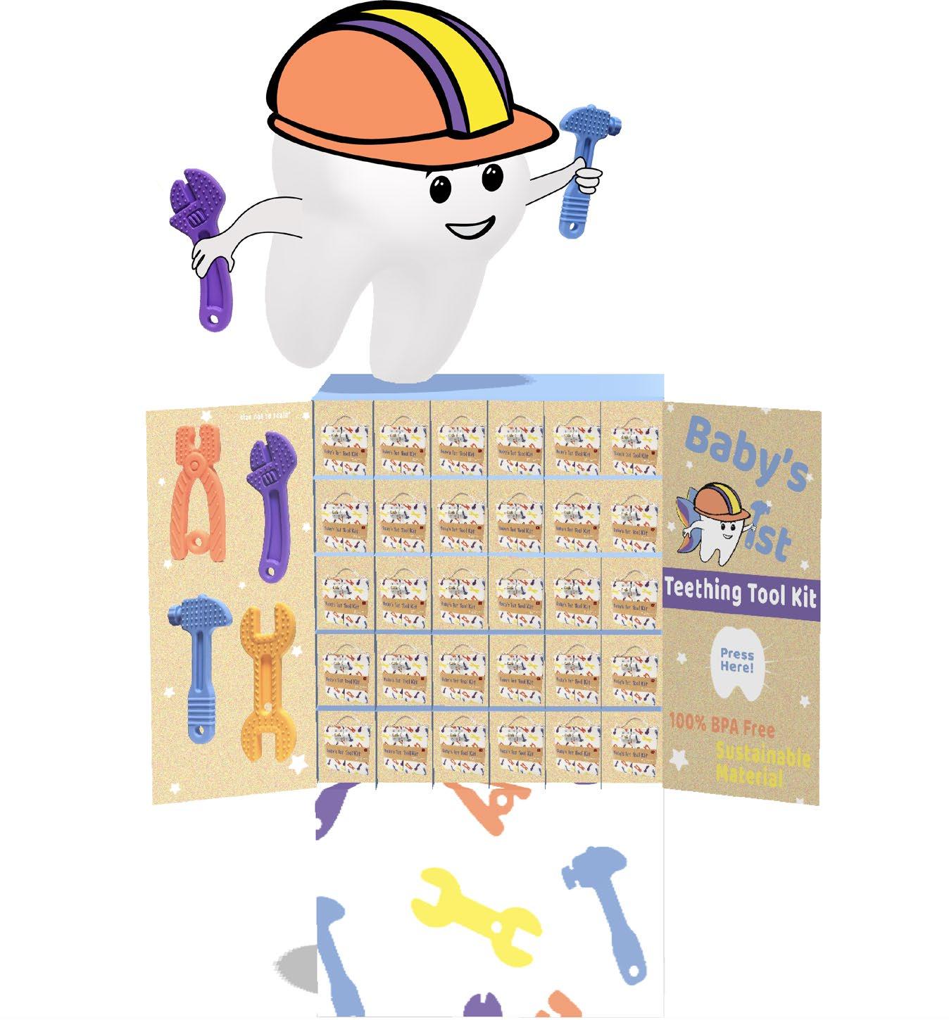
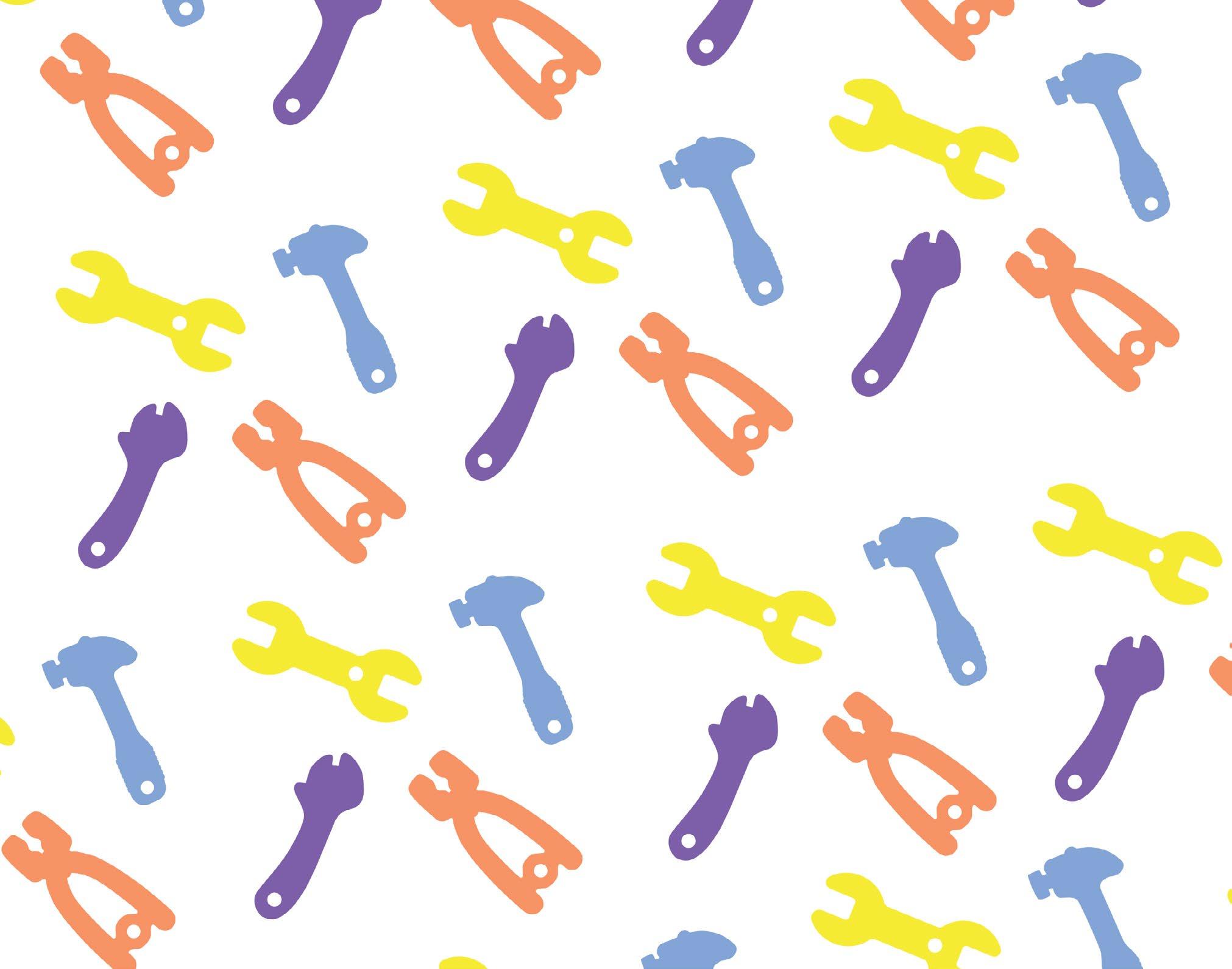
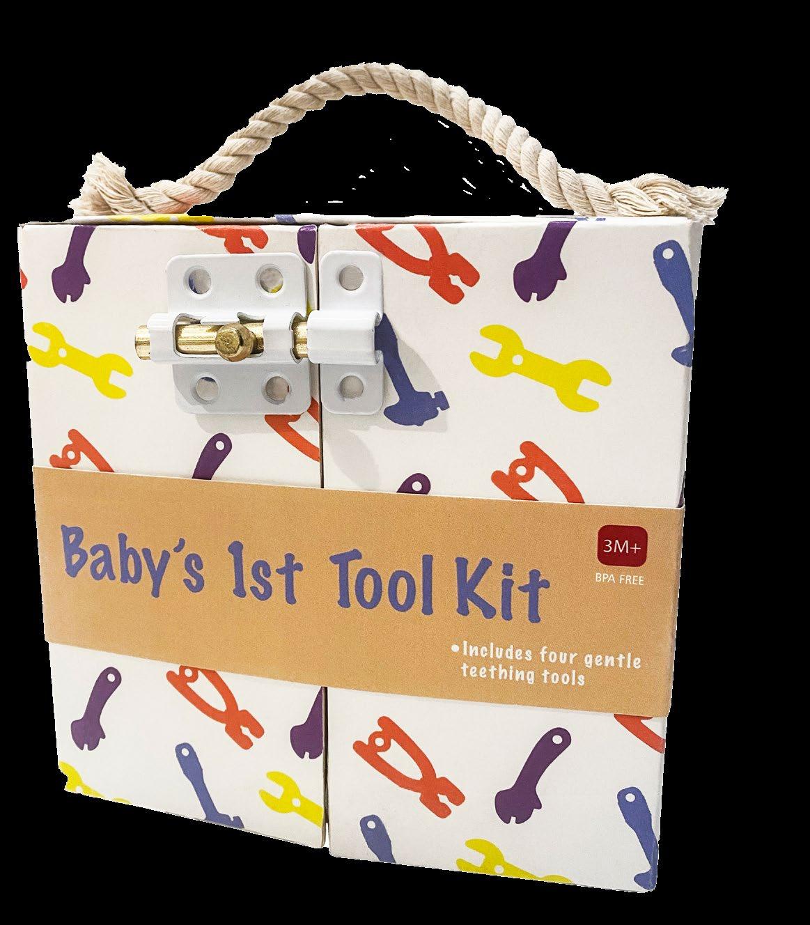
Baby’s Tool Kit Home Again
Funky Babe Florence +
Alms + Fare App Valley Brews Livin App
The Machine
ia.
The design goal was to create a rigid box structure aimed to promote sustainability while delivering a unique teething experience for the child and the parent. The interior includes durable straps that can be easily sanitized, allowing parents to store the tools when not in use. To promote sustainability the interior also includes a time log to record when teeth are lost, as well as a container to store lost teeth. Essentially, this box was designed to last as a keepsake in the form of a physical timeline of an infant’s growth.
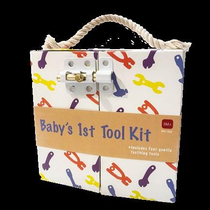
1 st Tool Kit Package Design | POP Display
Baby’s
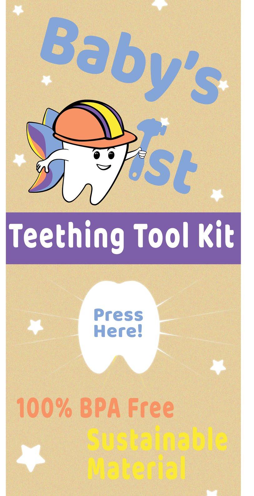
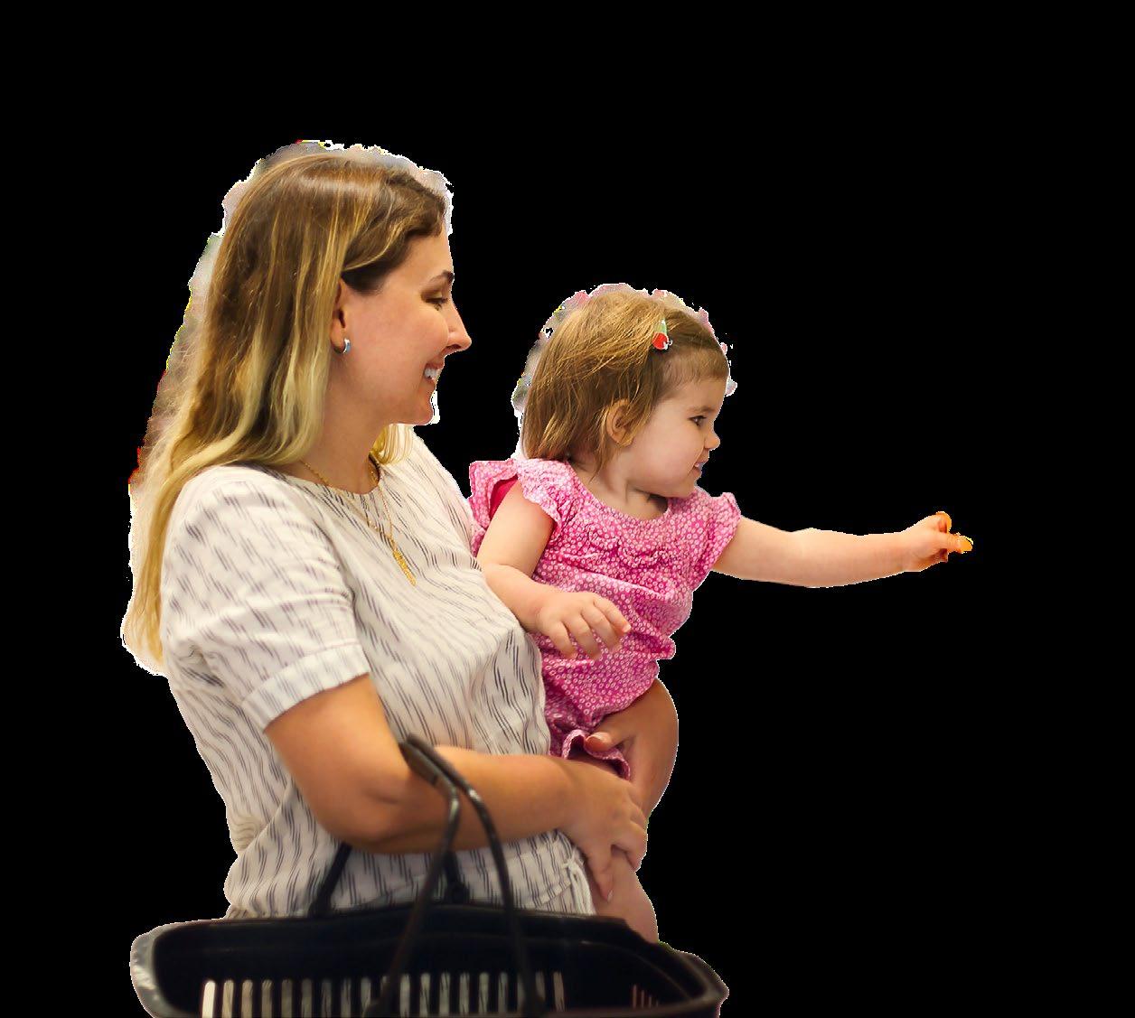
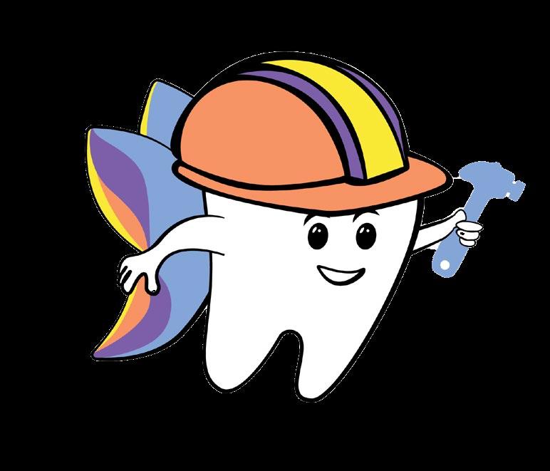
Hey there! My name is Nate, soon to be the VERY first tooth to make way into your baby’s mouth. Now, I am sure you’re happily anticipating my arrival, so I am here to give you a few tips beforehand. First off, I might be sharp and shiny, but I can be a REAL pain when I first show up. Luckily I have the magic tools to help. Baby’s 1 st Teething Tool Kit helps fix tender and sore gums caused by me. Additionally these soft and gentle tools will help prepare your baby to be eating solid foods in no time. Keep track of everytime you lose one of me with my magical tracker. Say goodbye to sore gums and hello to your baby’s magical teething experience!
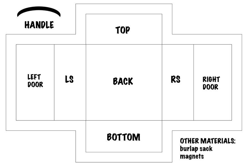
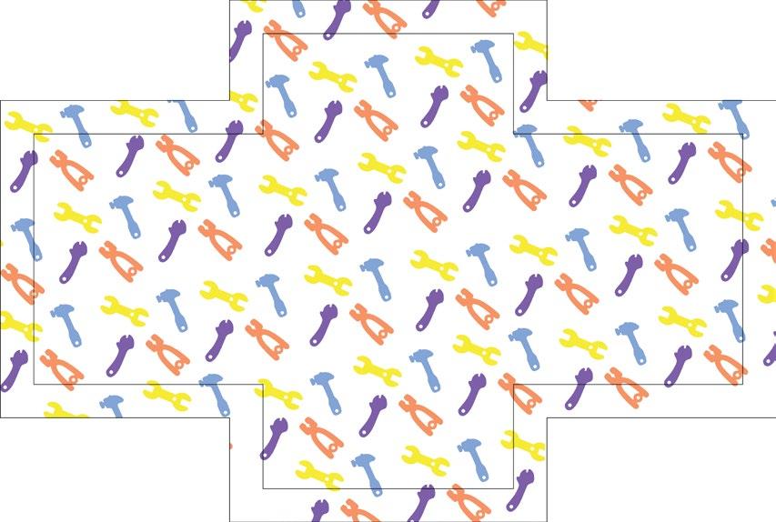
Die Lines
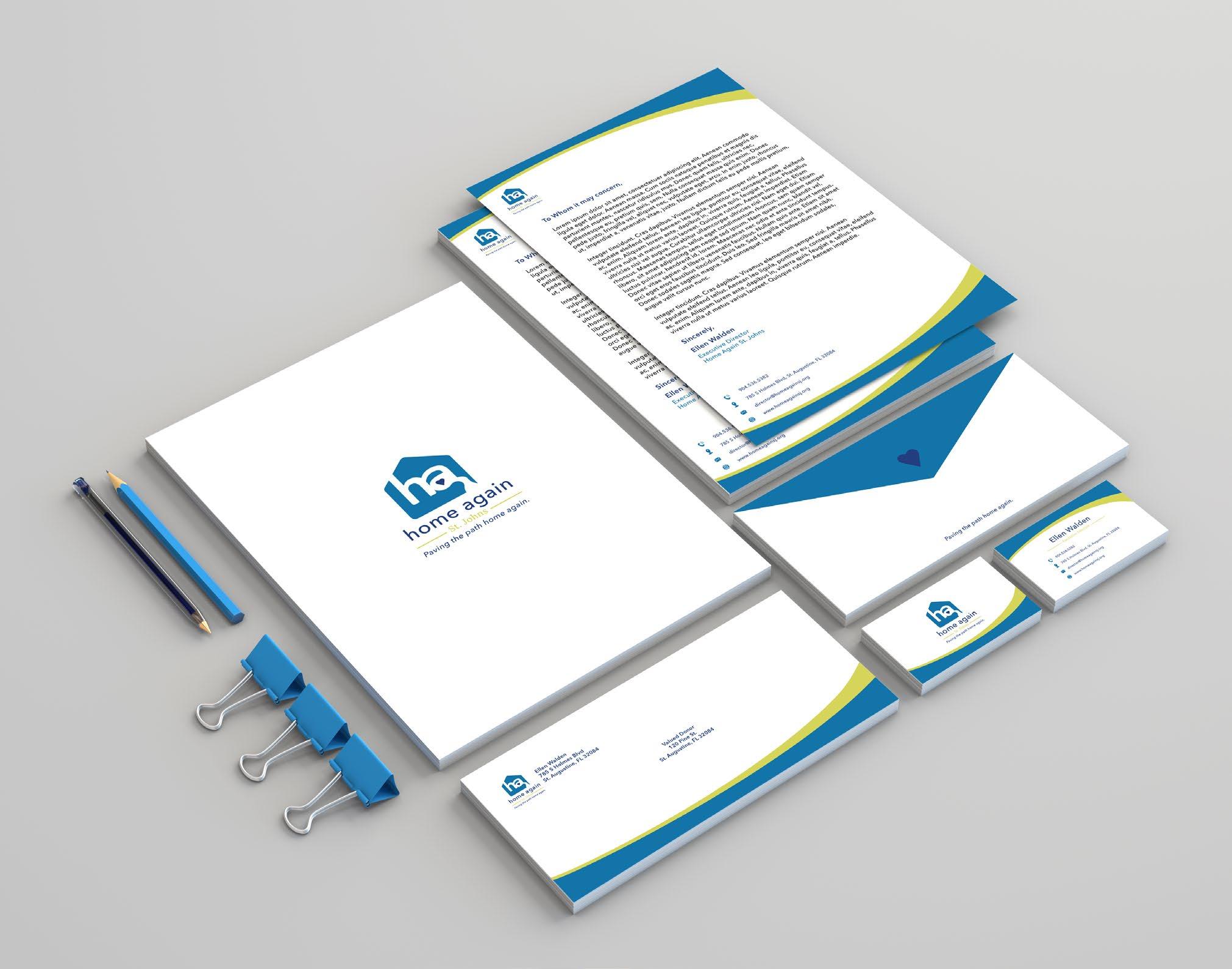
Home Again
Brand Identity | Advertising Design
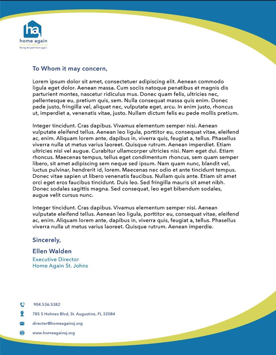
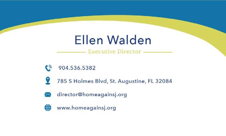
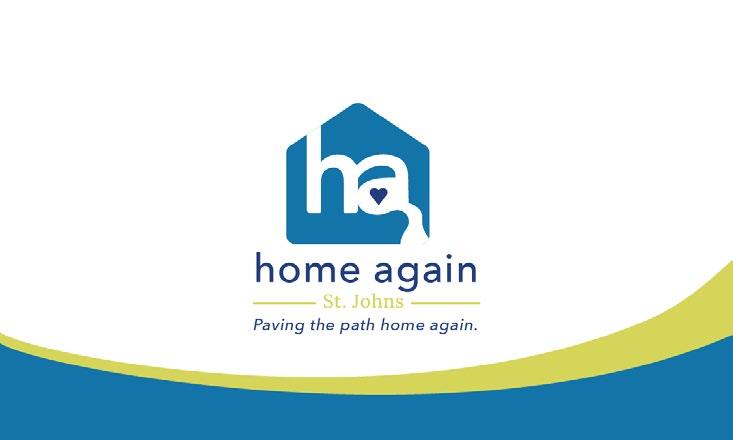
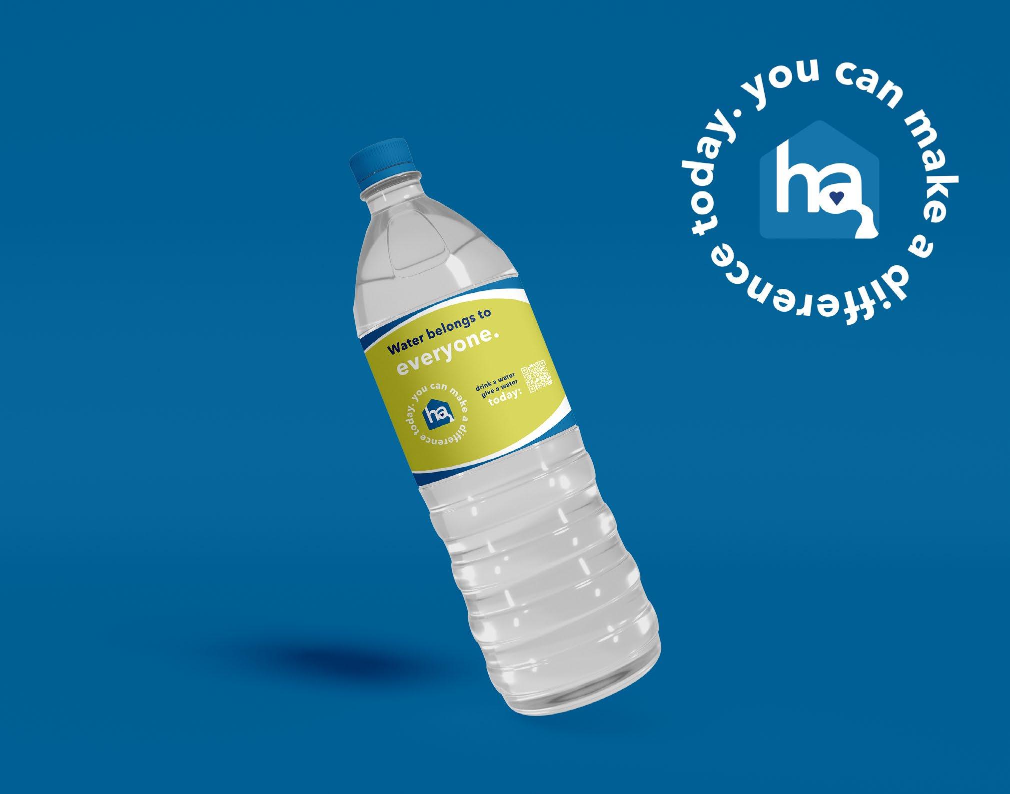
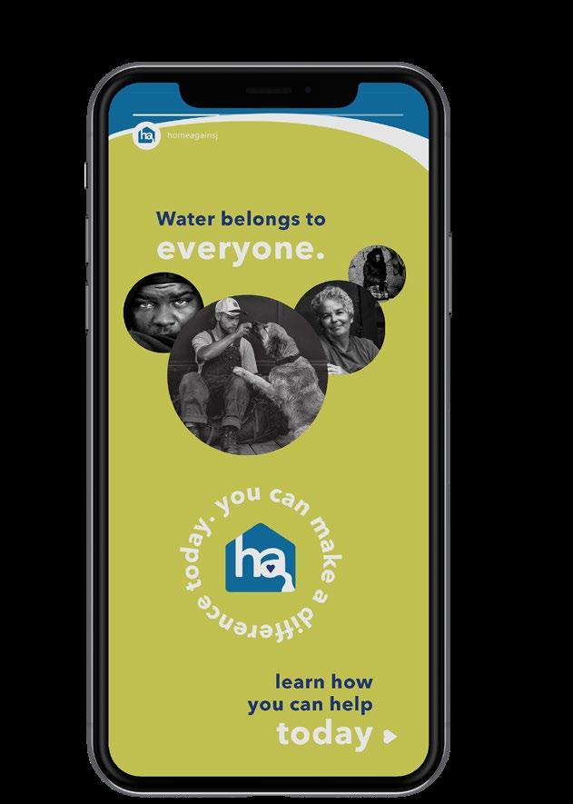
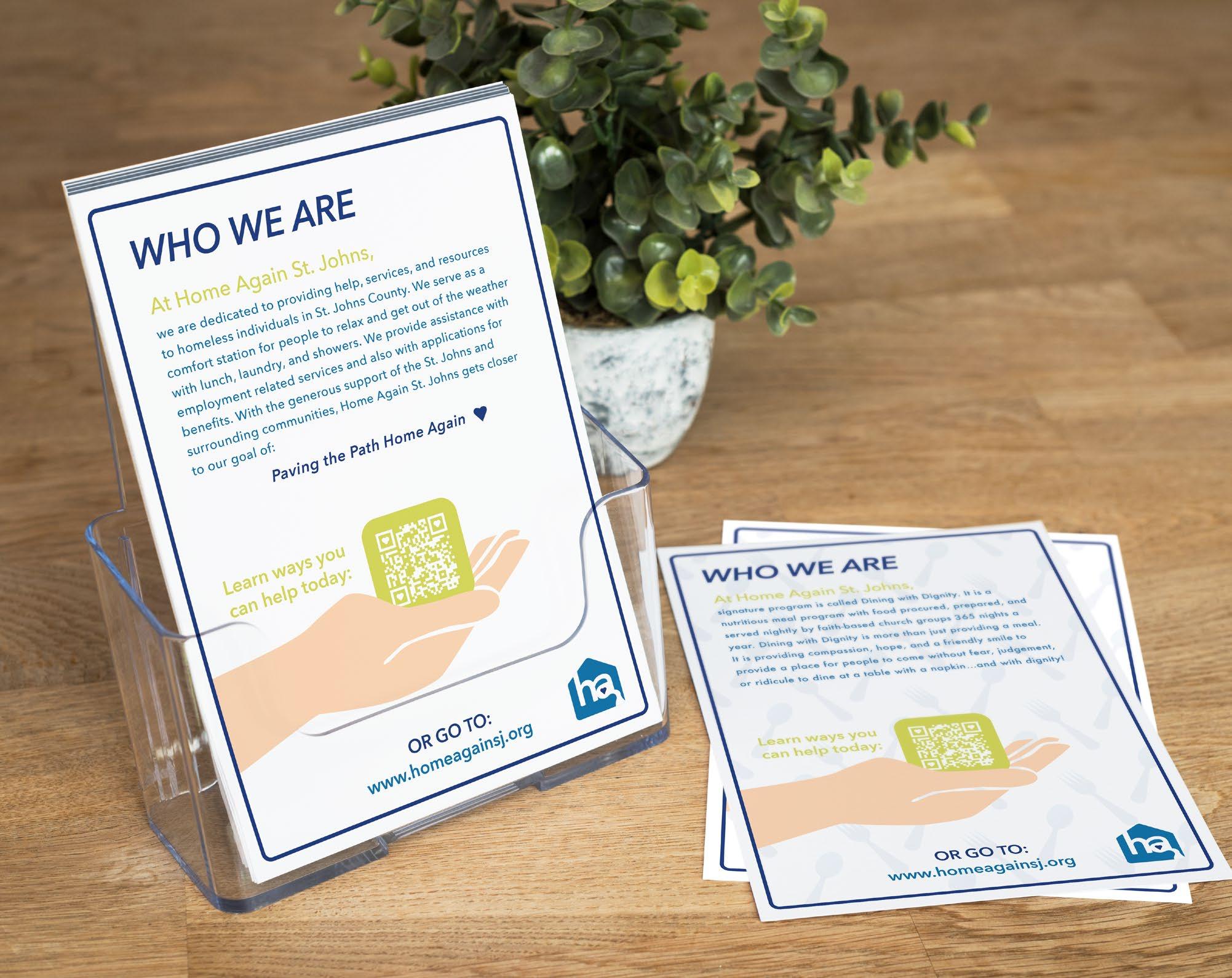
Home Again St. Johns is a nonprofit organization located in St. Augustine, FL. Their main goal is to provide temporary housing and assistance to the homeless people of St. Johns County. Prior to this project, there was little to no pre ‑existing branding and limited knowledge of Home Again’s remarkable impact in the community. Furthermore, the objective of this project was to make their presence known on a larger scale by delivering a modern and eye popping brand identity.
Alms
+
Fare App
UX/UI Design | Interactive Design
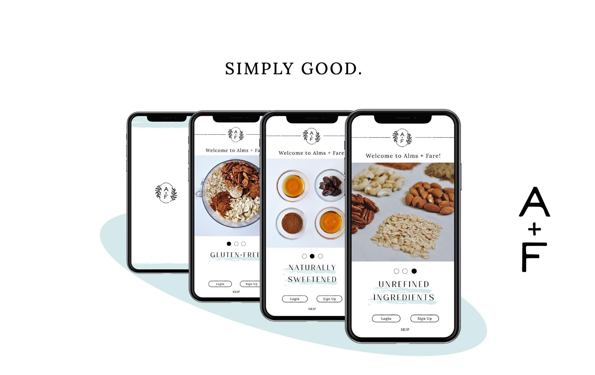
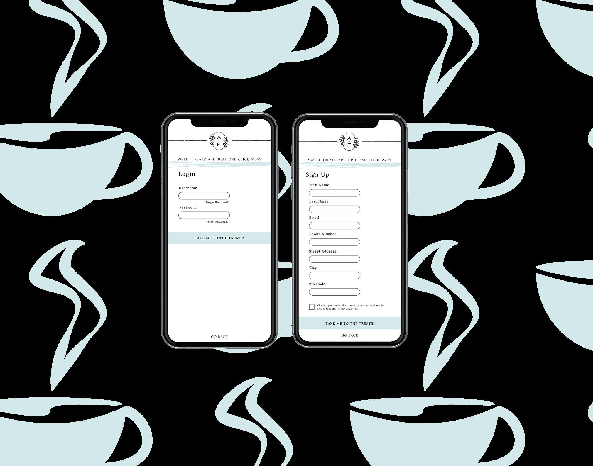
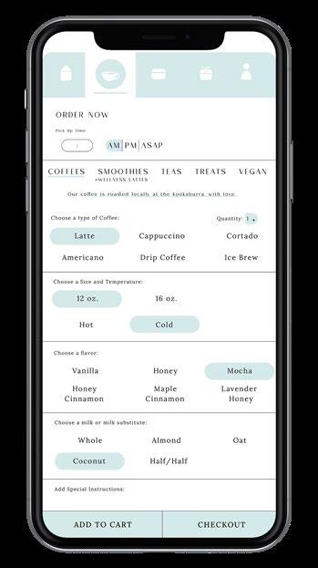
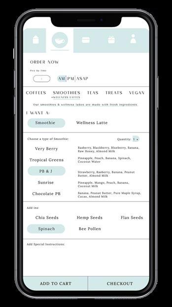
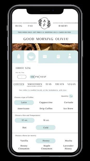
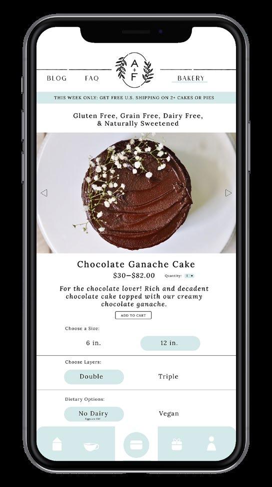
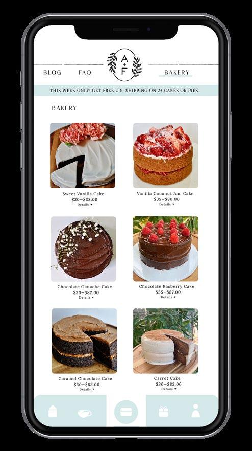
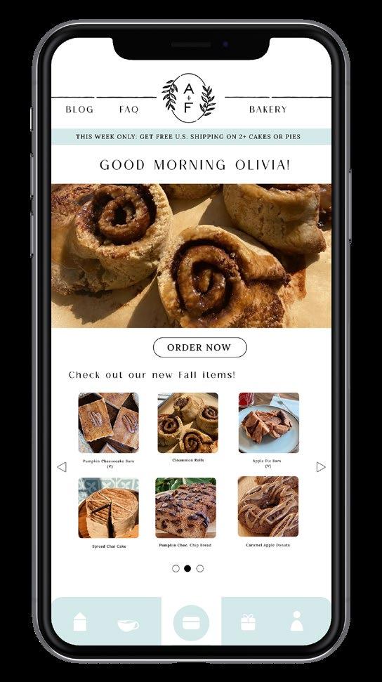
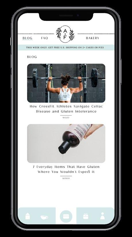
Alms + Fare is a wellness bakery & cafe in St. Augustine, FL that specializes in accomodating a gluten free and dairy free diet. It features a modern, simplistic brand identity, with a touch of classiness. As an employee at Alms + Fare, I notice how much of a hurry people are in to get their coffee and go. In the busier hours, this often leads to unnecessary stress for both customers and employees. Furthermore, a quick and easy way for people to order items ahead of time was necessary. The main component of this app features a mobile ordering option for people who want to skip the line. This app interface was designed in accordance to Alms + Fare’s pre existing brand guidelines.
Order ahead.
Order coffee, smoothies, teas, treats & more through this virtual menu.
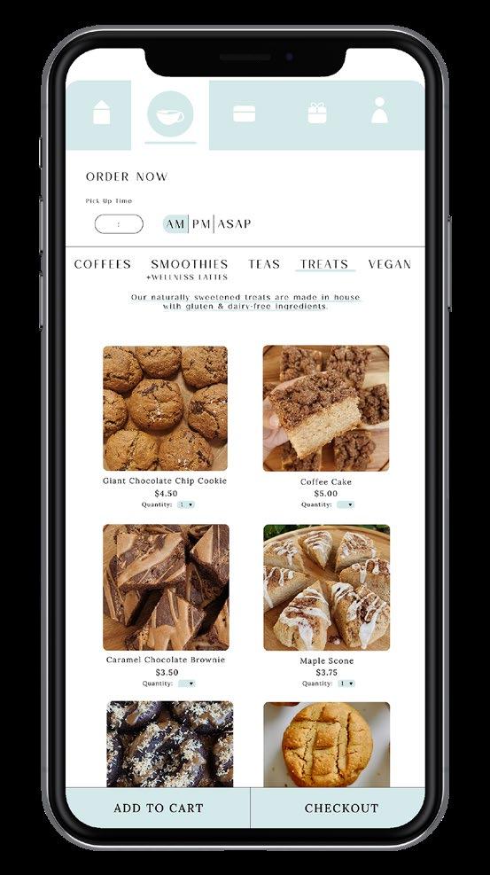
Order anywhere, anytime.
Go to the bakery to order treats to be shipped anywhere in the U.S.
Directly message the shop through instant customer support chat feature.
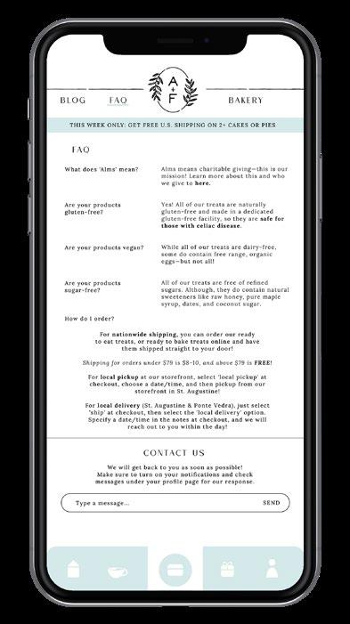
Stay informed on the latest gluten free, dairy free, and Celiac health news.
Home Screen
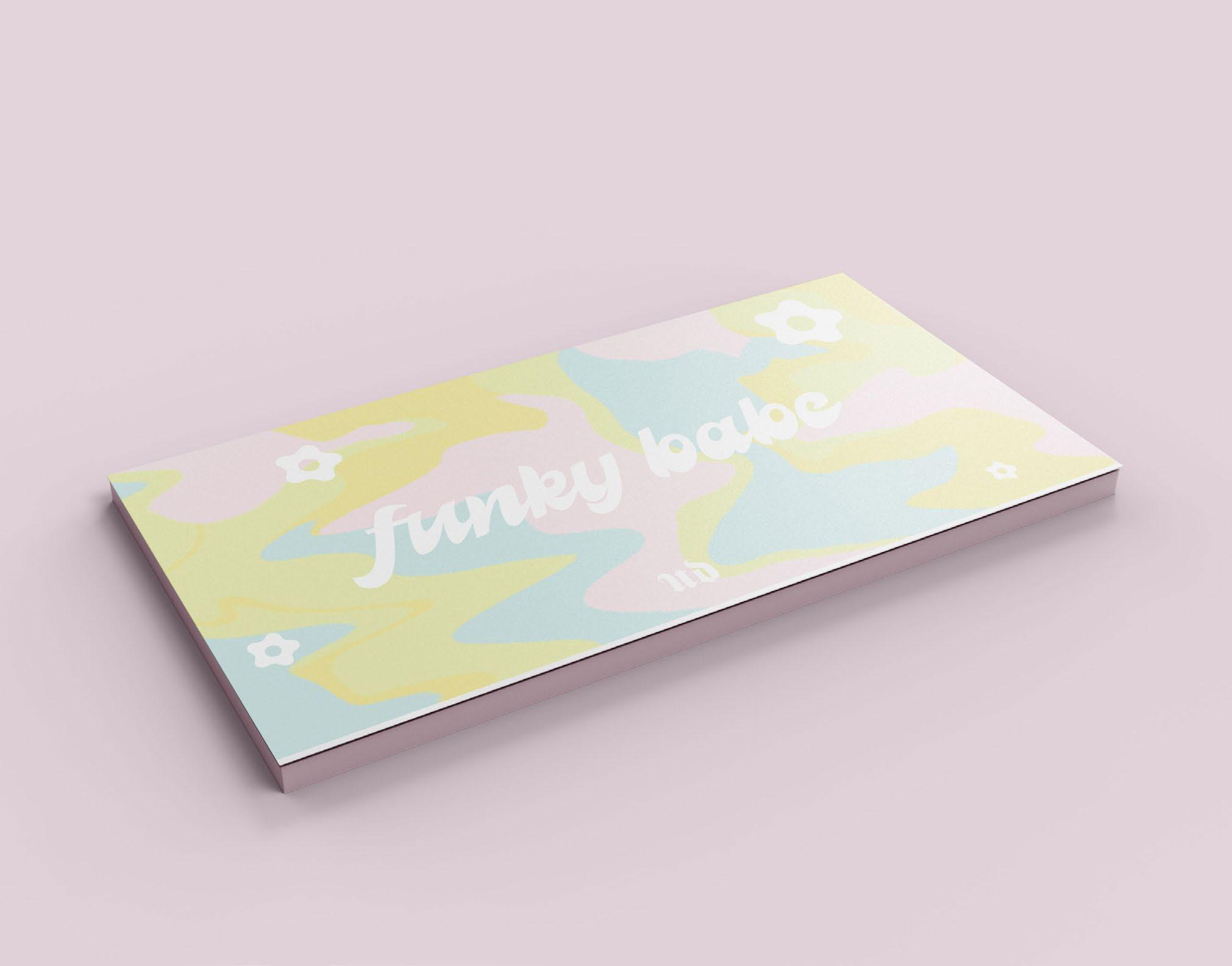
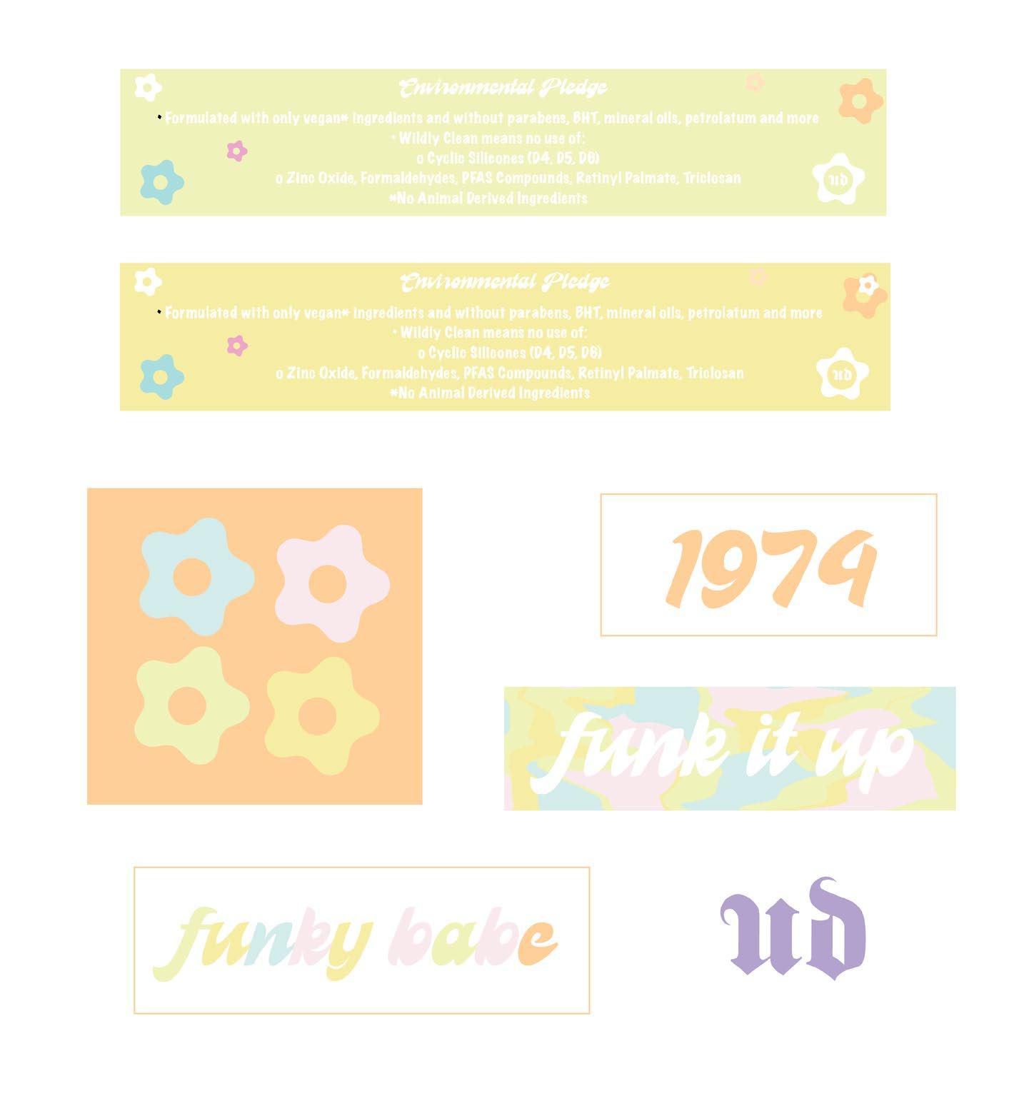
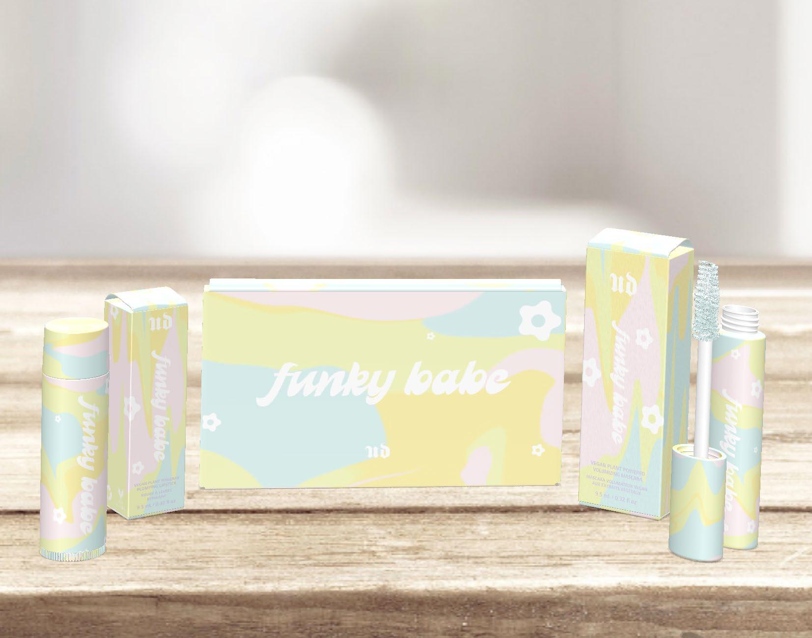
Funky Babe
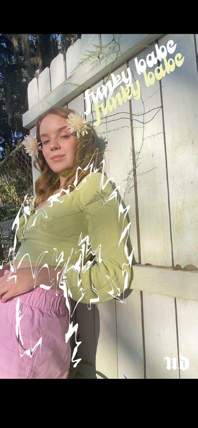
Package Design | Advertising Design
The 1970s was a time of freedom and expression. A second wave Feminist Movement sparked an urge for a natural, transparent look for women. The design goal of this project was to create a fun, spontaneous, funky, makeup line highlighting the pastel colors utilized in the 70s for a more free/natural look. Based out of France, Urban Decay is an edgy cosmetic company, known for their, “badass, cruelty free, high performance makeup.” These values closely coincide with the strong values the second wave Feminist Movement brought to the table. Furthermore, Funky Babe was designed to combine the strong independent values of Urban Decay with the feminist advancements made in the 1970s. Funky Babe features a pastel eyeshadow palette, a voluminous mascara, along with a series of soft, matte lipsticks.
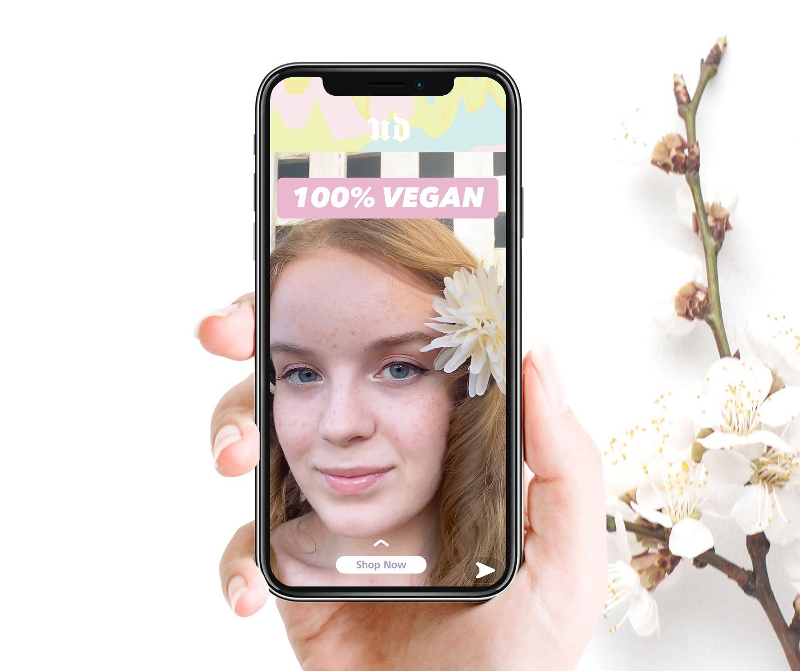
Snapchat Advertisement
Stickers

Slip Inside of Packaging
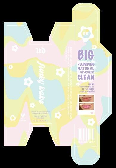
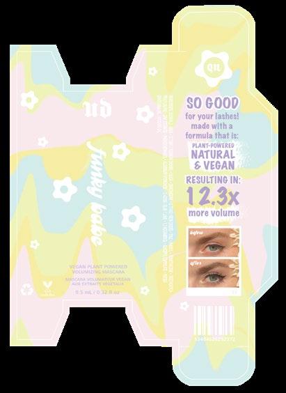
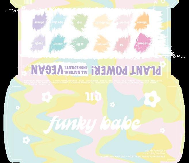
Lip Stick Packaging Mascara Packaging Eye Shadow Packaging
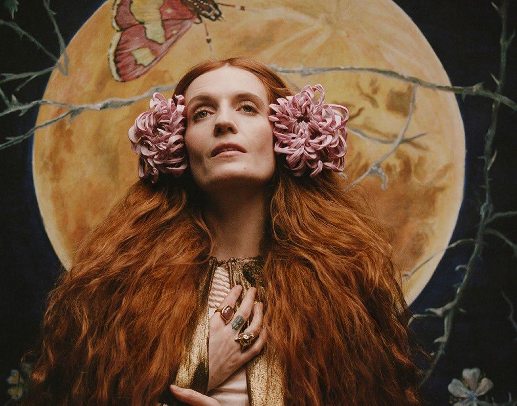
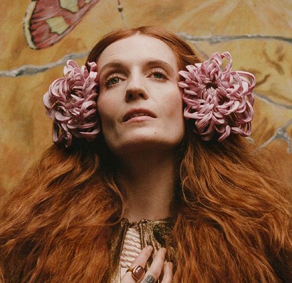
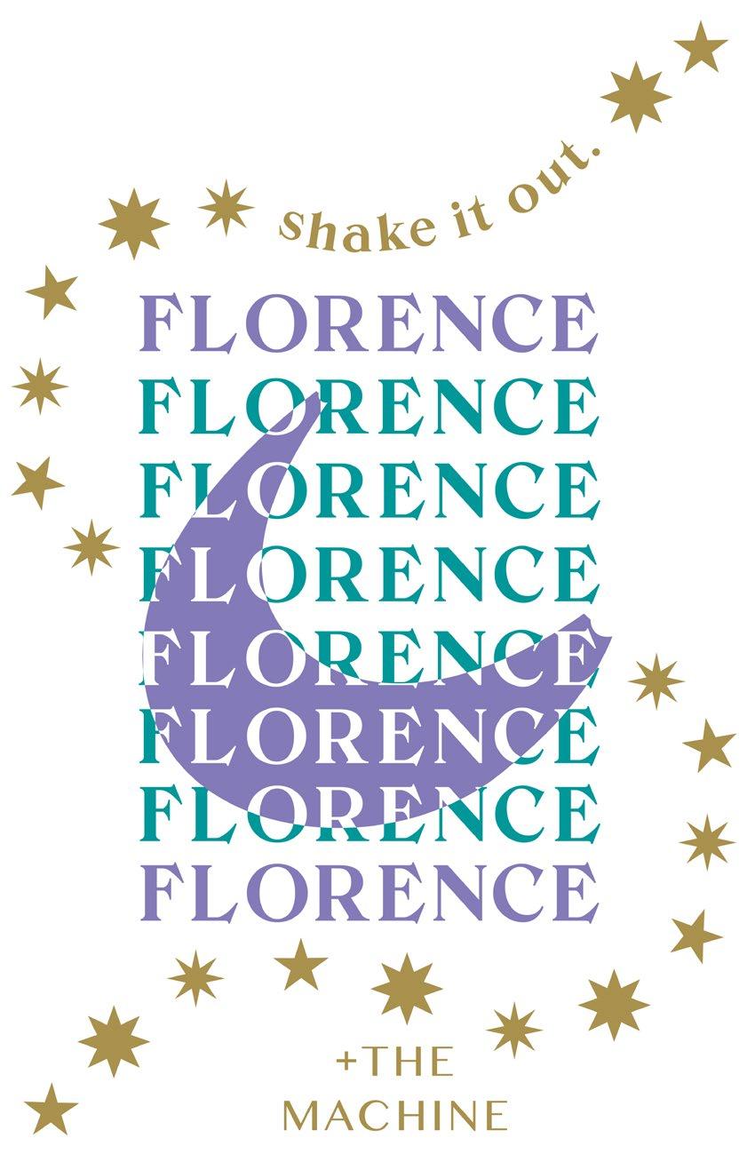
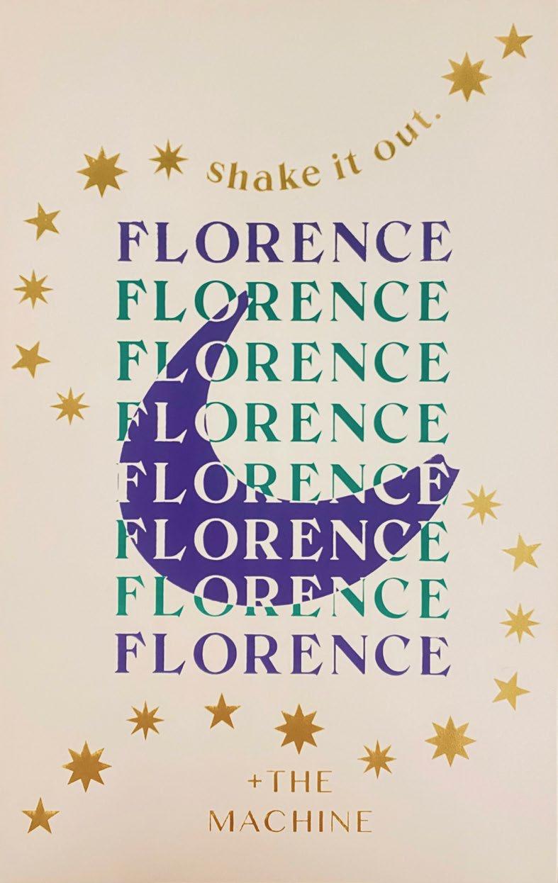
Florence + The Machine
Digital Illustration | Screen Printing
The design goal of this project was to embody the powerful emotions of the song Shake it Off by Florence + The Machine. The song symbolizes the release of negative emotions by mentally and physically shaking it off. The inverted text represents the sharp change in life paths one must endure in order to reach happiness and fulfillment. The final and third layer features a metallic gold ink to bring visual body in a metaphorical sense to the excitement and freedom experienced once one overcomes the hard conditions, when taking this dramatic turn in life.
Digital
Illustration
3
Silk
Print
Color
Screen
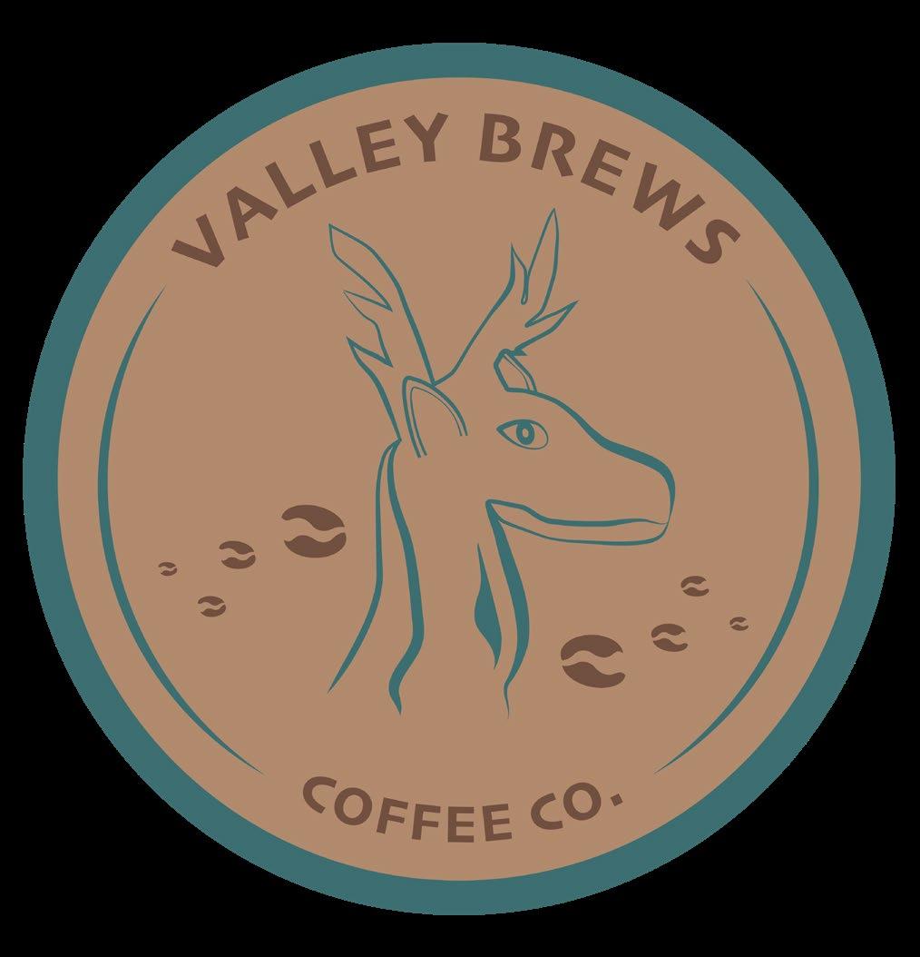
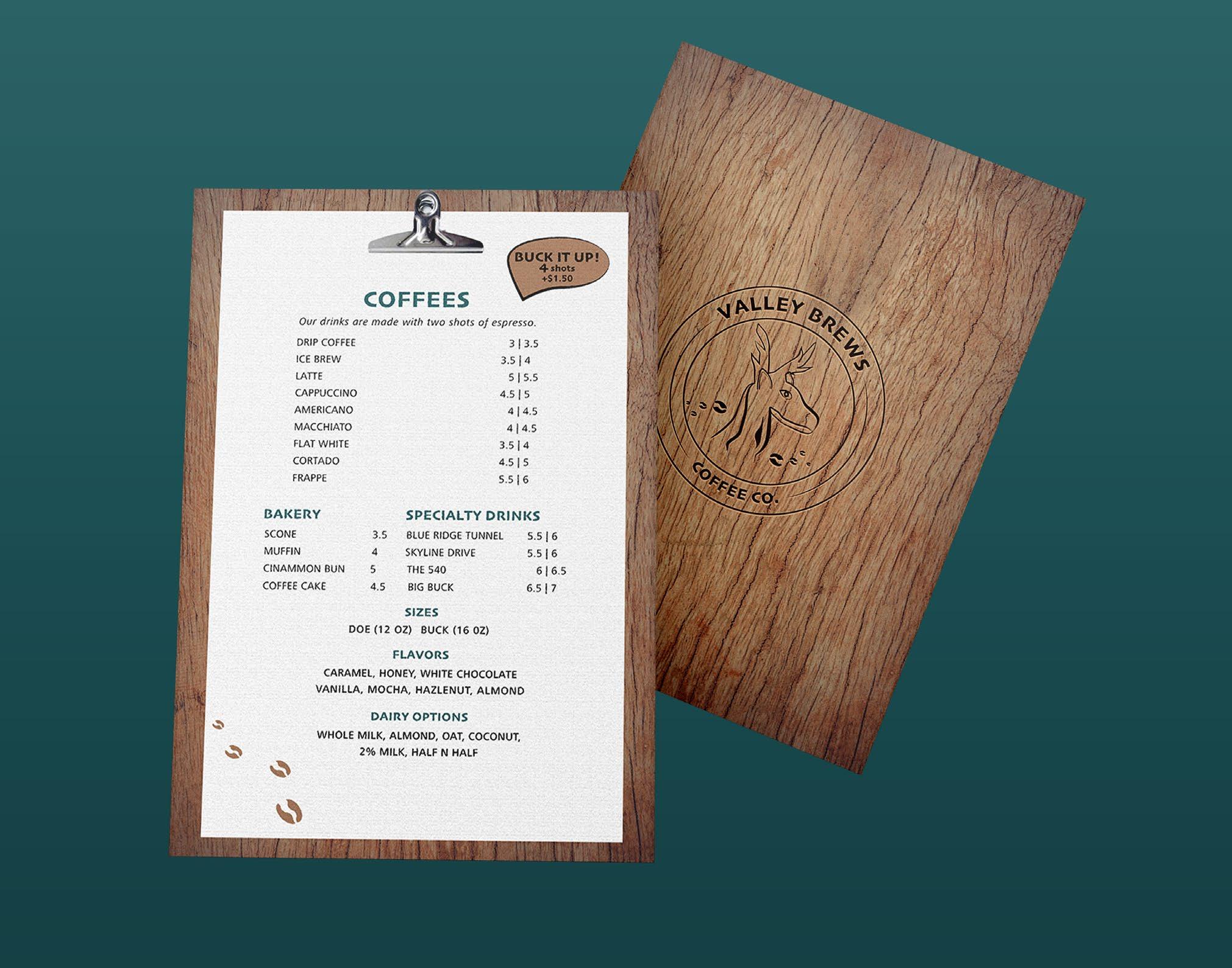
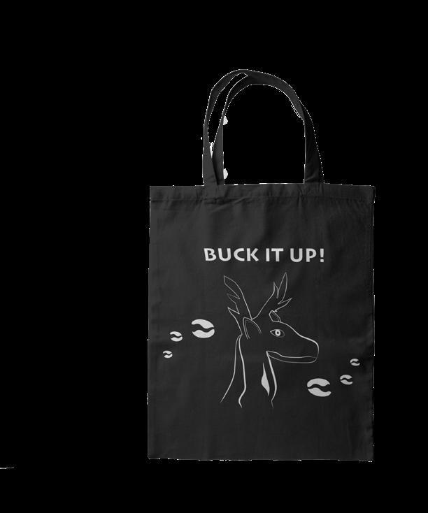
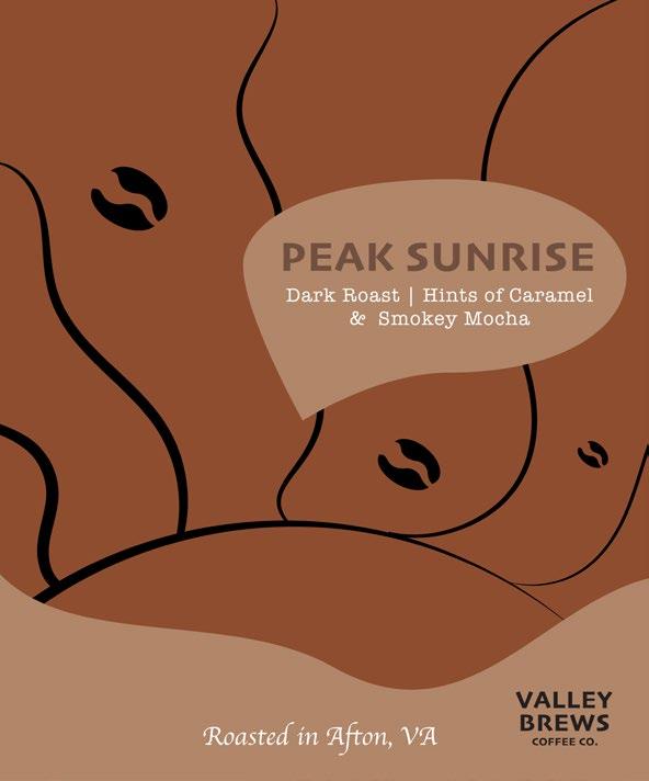
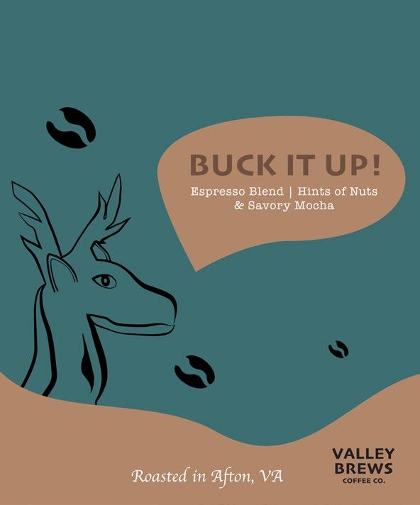
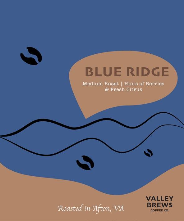
Valley Brews
Digital Illustration | Brand Identity
In a small town called Waynesboro, Virginia, there is a large market for local businesses to thrive. With a variety of demographics there is a wide range of target markets to approach. While there are a few coffee shops, none of them are themed distinctly around the biggest attraction Waynesboro has to offer— The Blue Ridge Mountains. Valley Brews Coffee Co. will be a nature themed coffee shop, focused on using locally sourced products from the large agricultural resources around it. This will be attractive to the consumer as locals take pride in their jobs, as well as promoting the products that have resulted in their hard work. The Waynesboro are is classified as part of the Shenandoah Valley, which is where the name “Valley Brews” plays a leading seller in attraction from locals as well as travelers in passing.
Coffee Packaging
 App
Design | Brand Identity | Layout
App
Design | Brand Identity | Layout

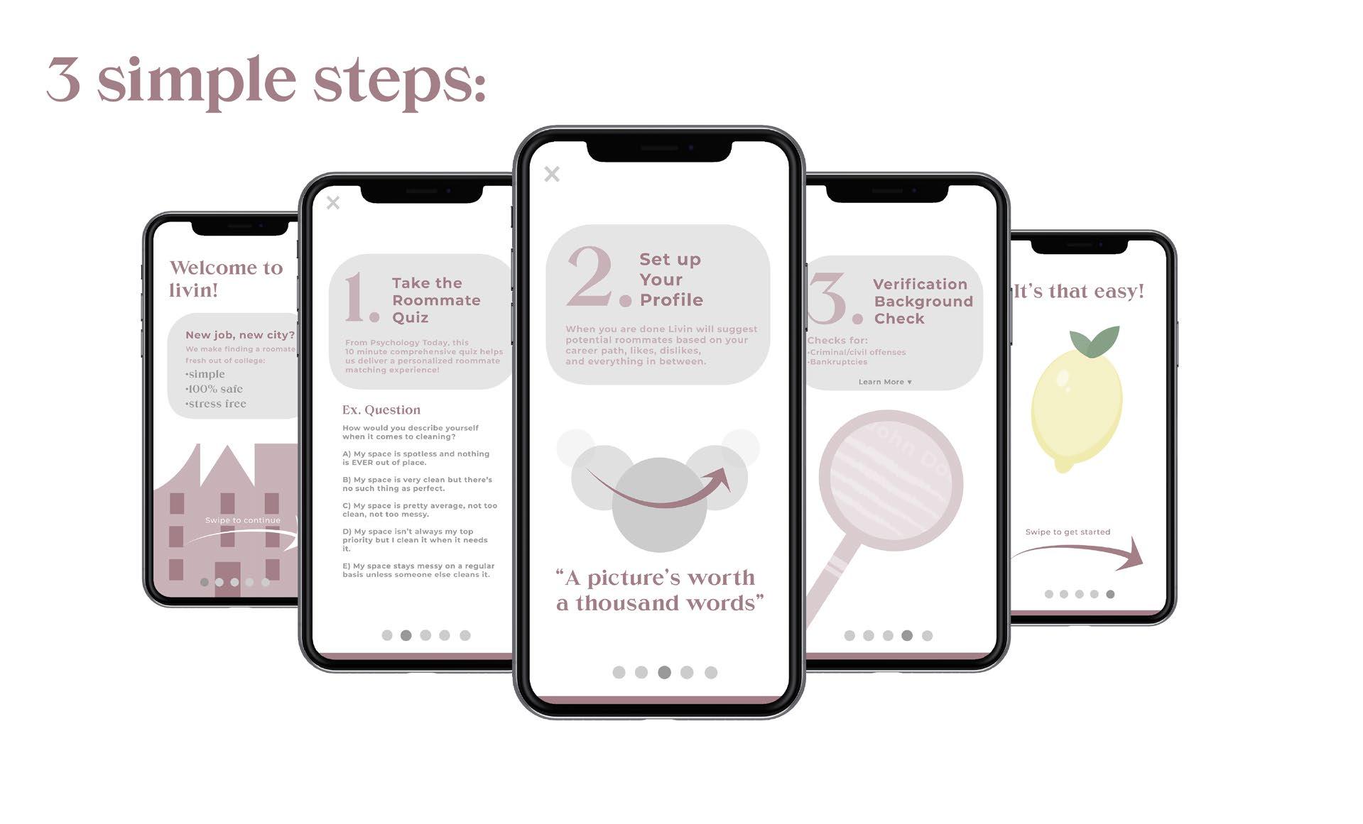
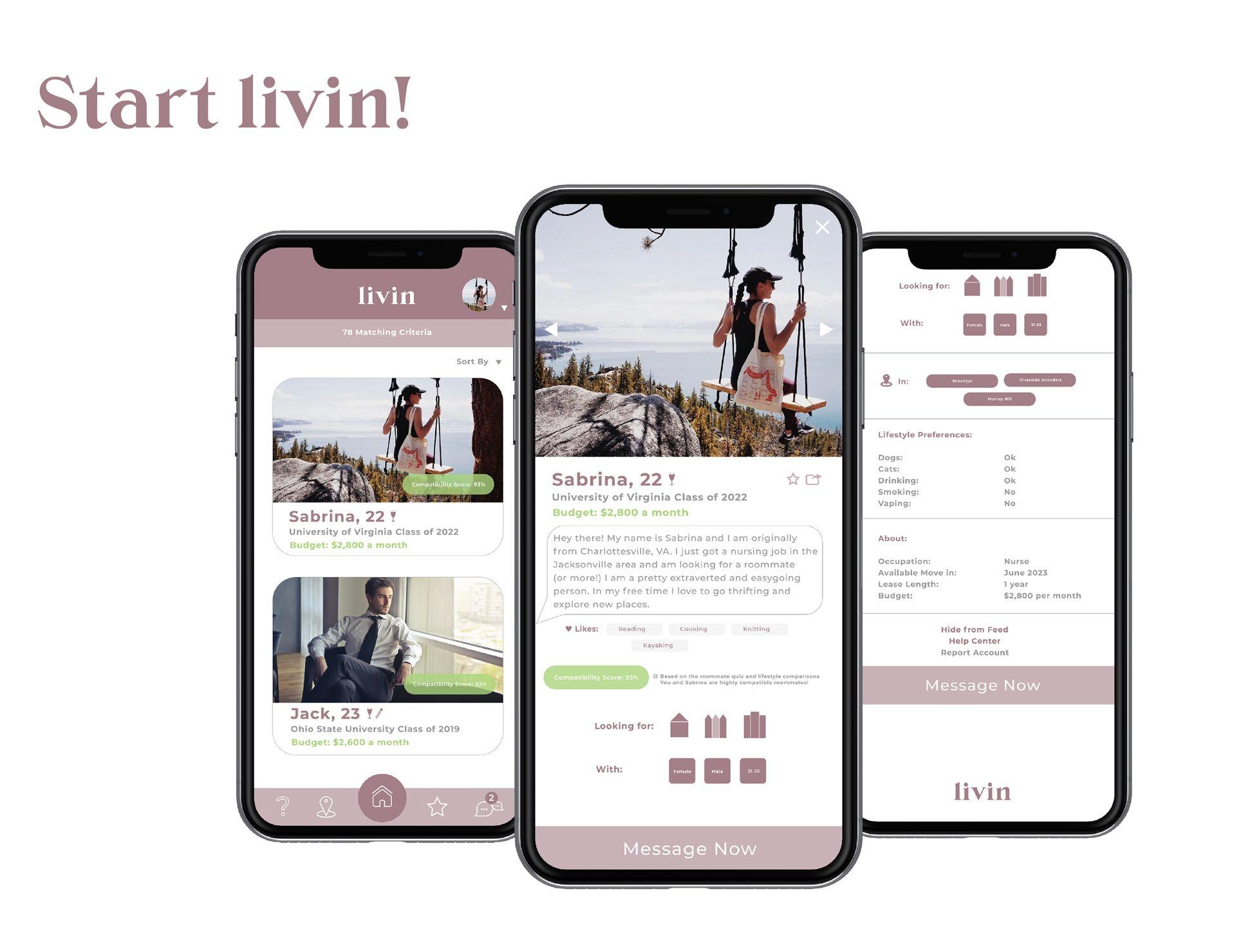
Picture this: You just accepted your 1st dream job offer hundreds of miles away. A new city, a new you.
Then it hits you: There’s one problem. You don’t know anyone that lives there!
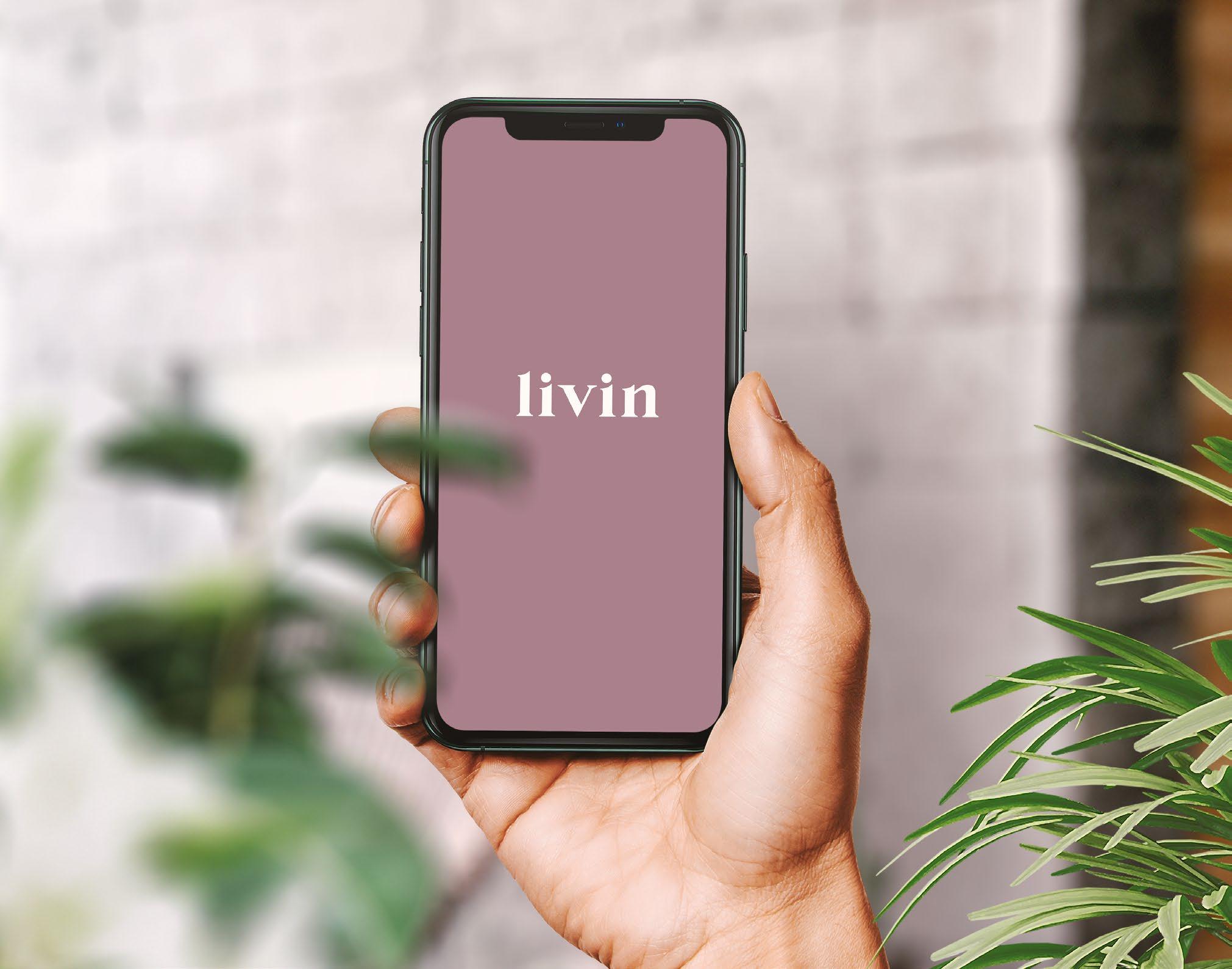
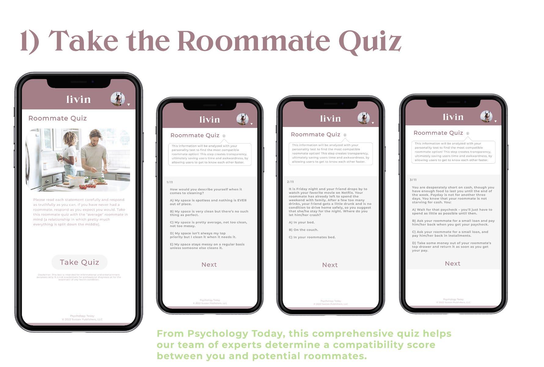
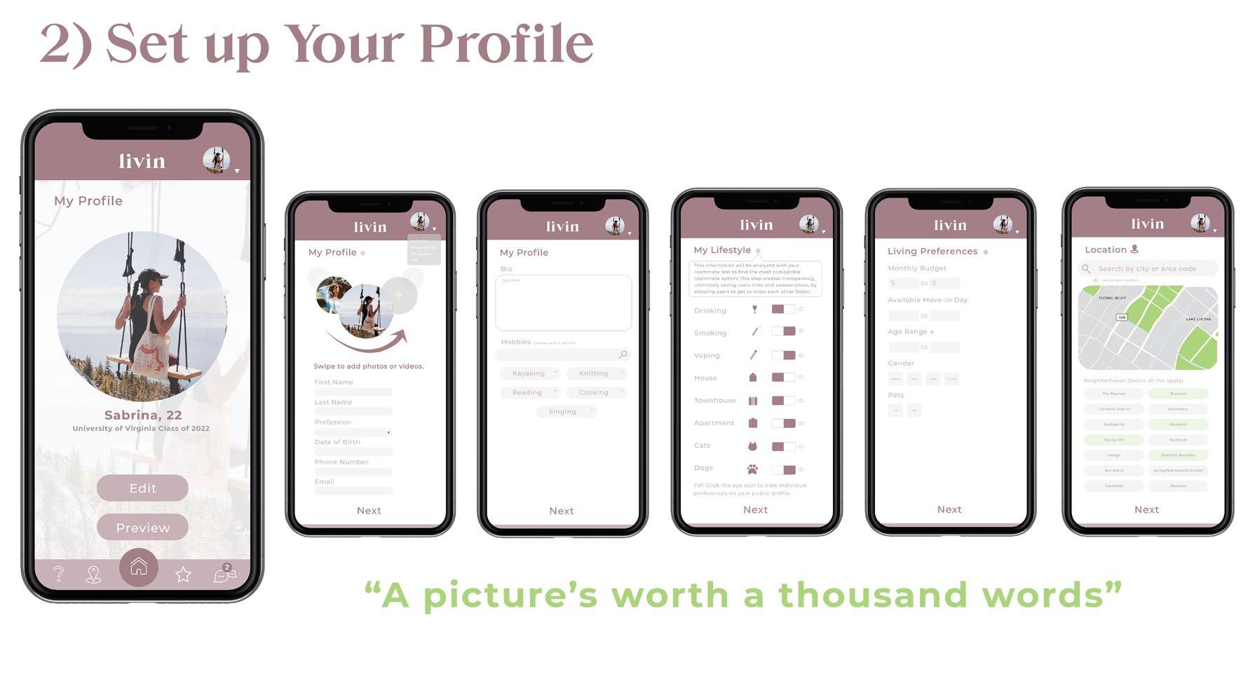
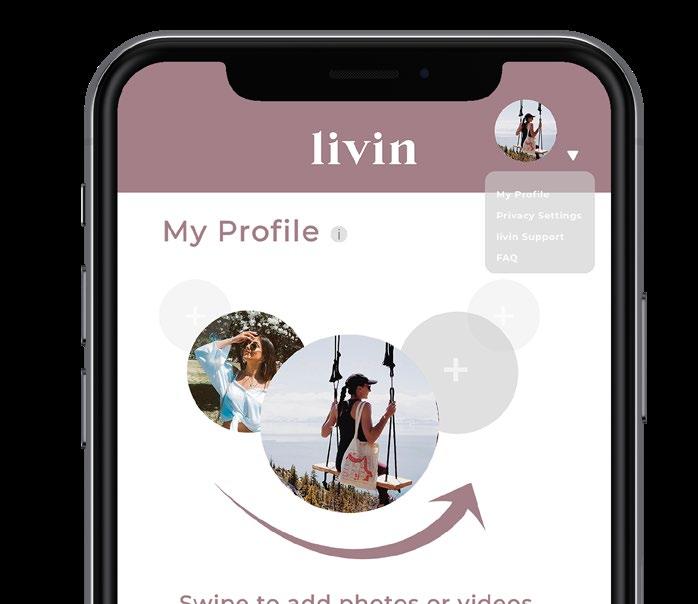
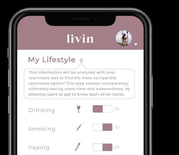
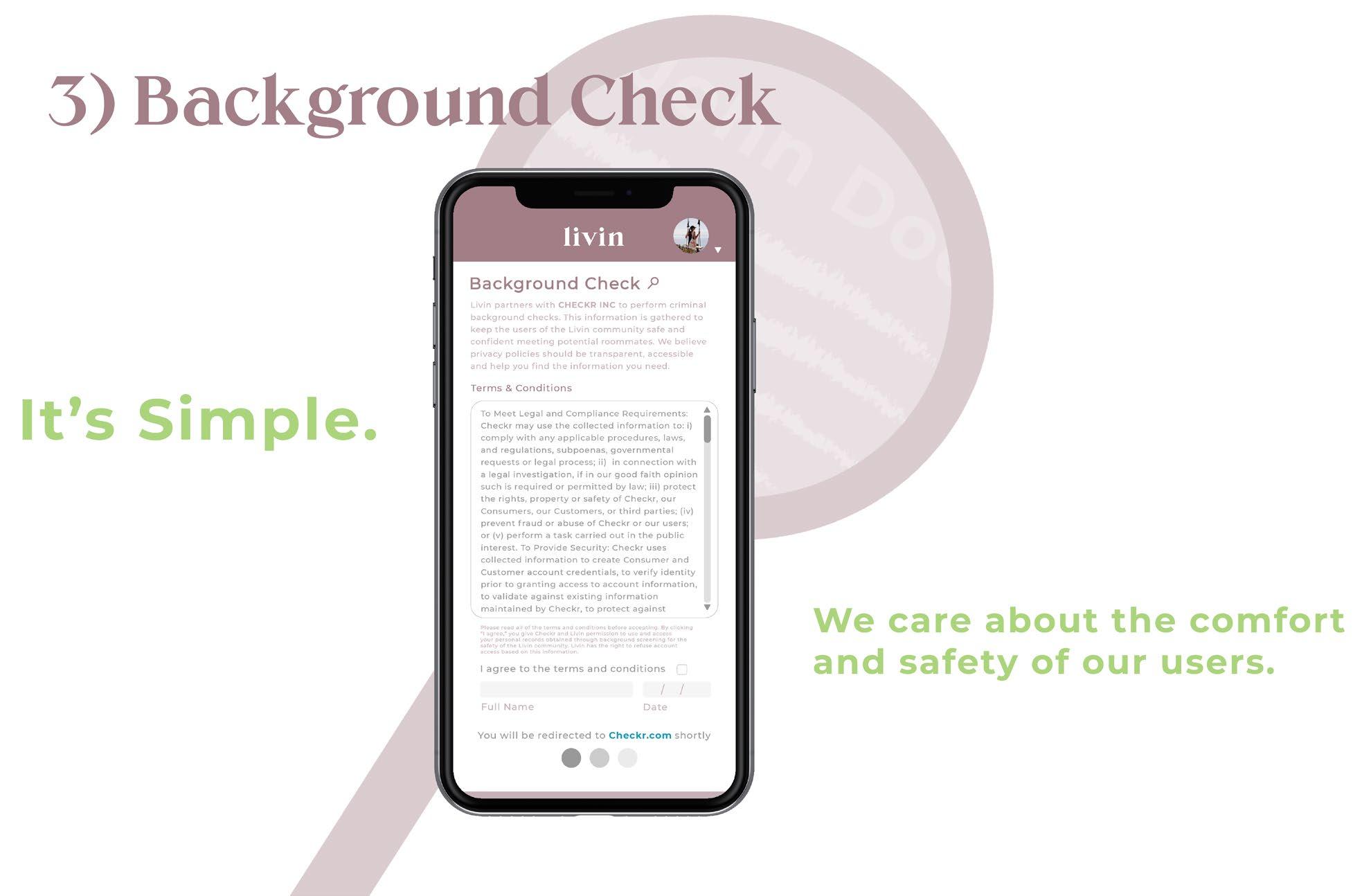
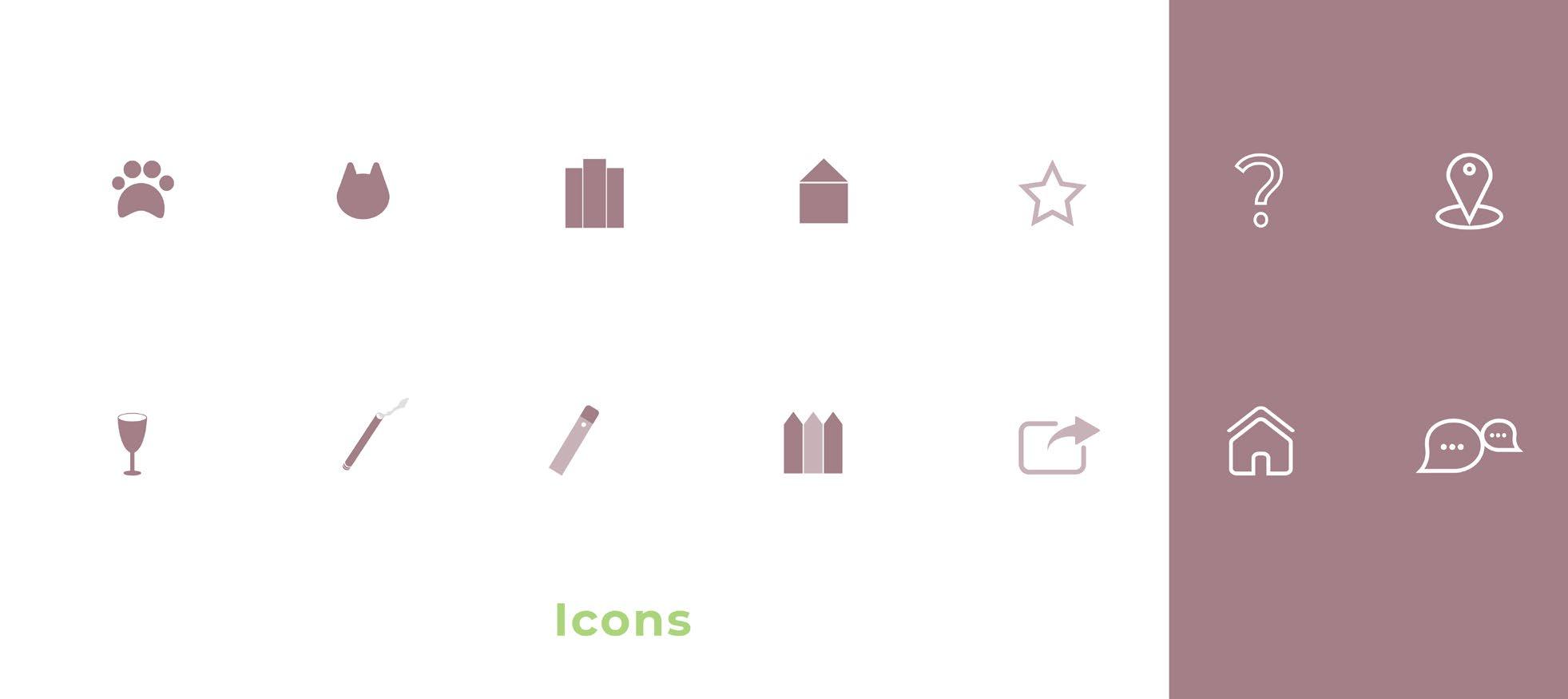
Livin was designed to help freshly graduated undergraduate and graduate college students (ages 20 to 31) find roommates as they turn the page to the next chapter of their life. This app was aimed to attract this age range, through a modern, sleek, and simplistic interface. The user journey includes only a few simple steps. Through a series of questions, the app will ultimately give the user a compatibility score with potential roommates, easily establishing transparency, as well as eliminating awkward and timely “get to know you” questions. Just sit back, relax, and answer the questions. Livin will do the rest!
Livin
UX/UI
Thanks for looking!
Until next time
Contact:
Olivia R. Farley
ofarleydesigns@gmail.com https://ofarley.myportfolio.com
