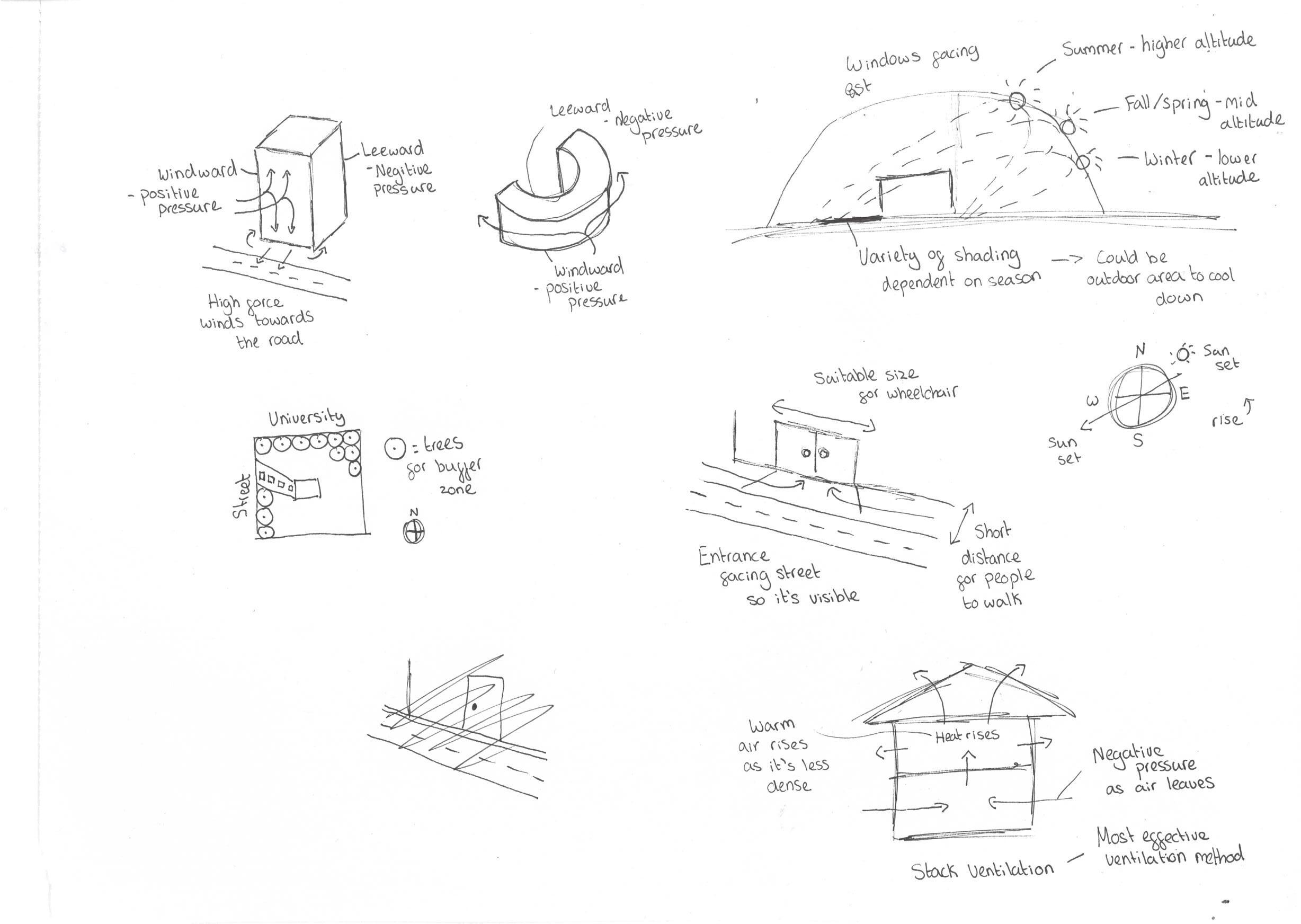
WIND
Wind will impact the orientation of the building. From this research, I can direct my materials, wall size and form appropriate windward and leeward. Having a curved design will direct the wind round the building however, having a vertical tall wall facing the wind will direct the wind down causing high force winds towards the road. The situation of rooms would be a key thing to investigate as you need wind to direct smell out of the house.
BLOCKAGE OF SOUND POLLUTION
Add buffer zone to block sound out from the University and streets.
ACCESS ROUTES/ MOVEMENT OF CITIZENS
The entrance of my building will need to be visible and available for universal access so that wheelchairs can move from and to the street with no difficulties. It is important that it is identifiable so it is convenient to locate.
SUN/ SHADING
Will impact the materials, amount of windows and where they could be situated. I would want as much light as possible making it more sustainable. Having a shaded area is also important so that people can cool down in summer therefore, this would impact orientation. Positioning of rooms will be considered for well being. Altitude needs to be considered too.
AIR PRESSURE
Positive and negative pressure is very important for a building. With opening systems like windows, the design needs appropriate ventilation systems.
44 CONCLUSION
44
46
47 3 PLANNING (DESIGN) (47-68) 47
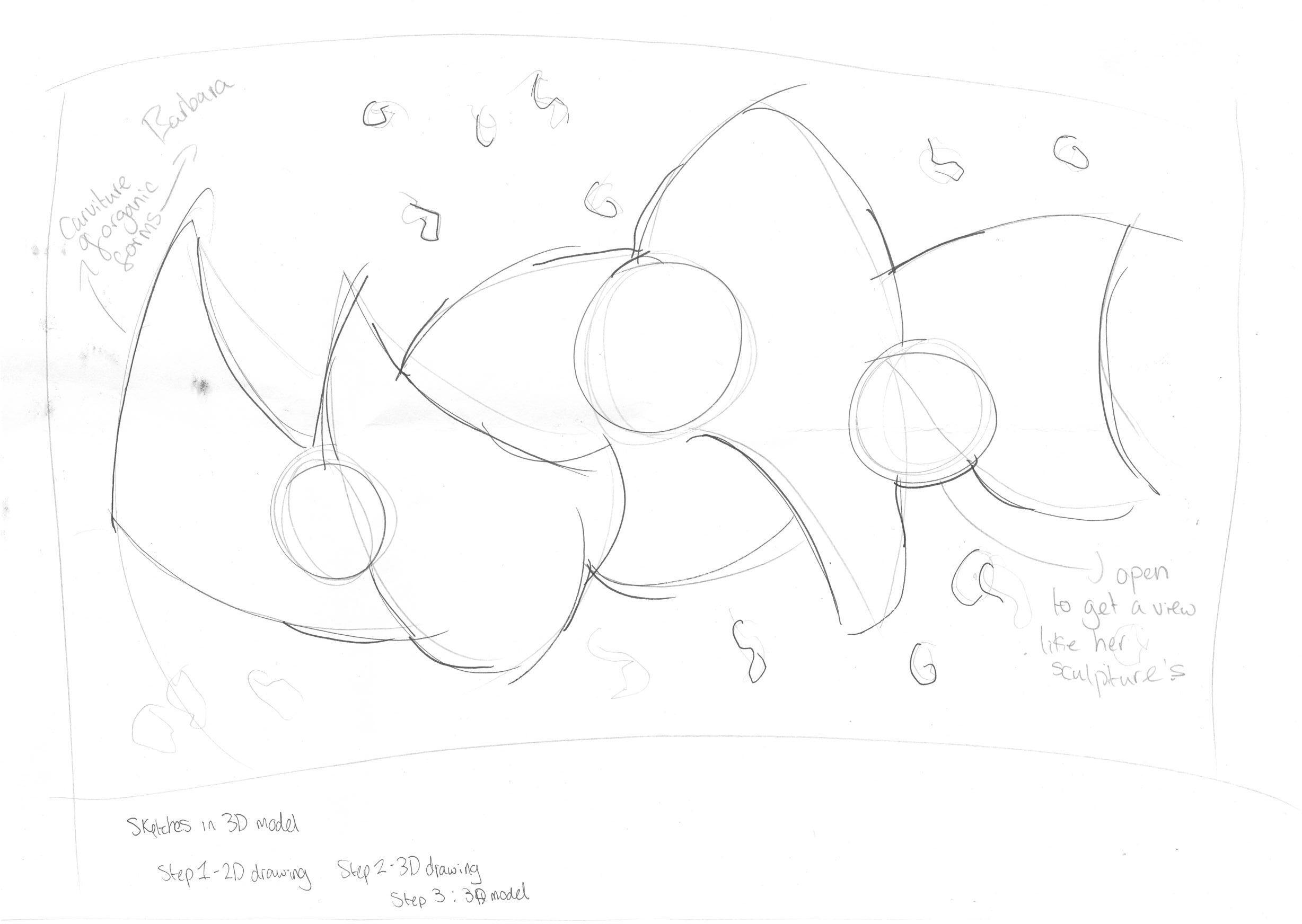
DESIGN 1THE FORM AND HOLLOW
This concept is formed from a quote Barbara Hepworth has said during an interview. The quote says ‘I am the form and I am the hollow’. By intercepting the form and hollowness, I wanted to design this building as the ‘heart of Barbara.
Ben Nicholson work is very simple but bold. This explains the landscape architecture surrounding it in the form of rectangular large partitions to direct you to an entrance.
48
49
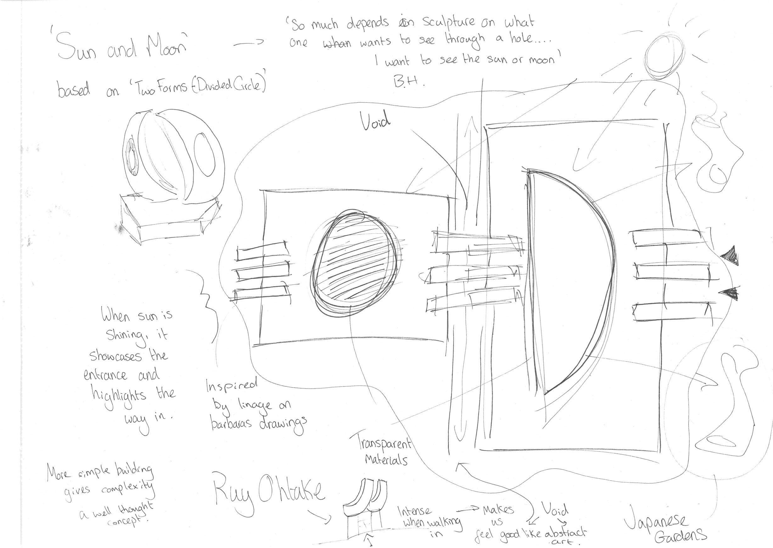
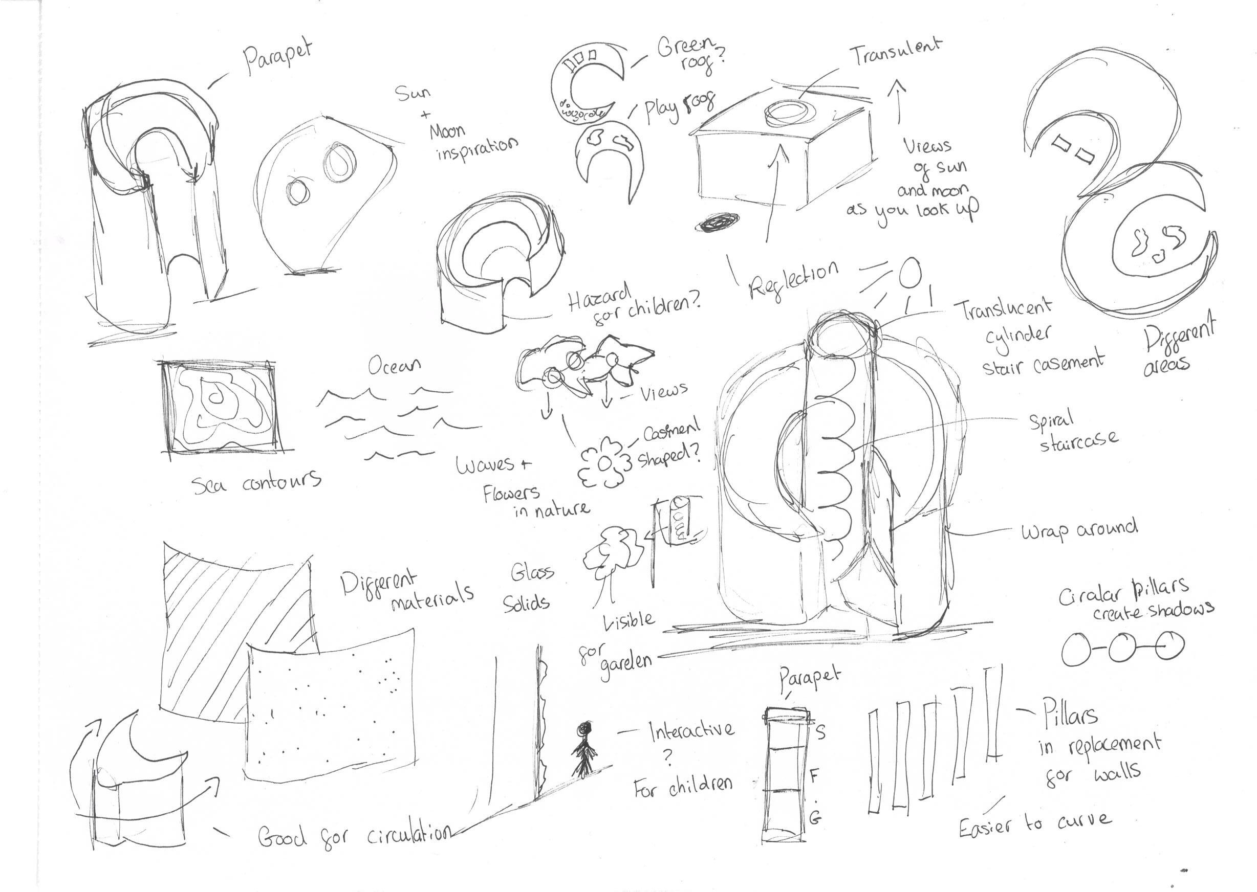
DESIGN 2SUN AND MOON
The concept behind this design if from a sculpture piece called ‘two forms’. In her interview explaining that she wanted to see not only the landscape but the suna nd the moon too. This is why I have formed openings on the roof shaped in a crescent moon and sun showing these.
A vast amount of this building has been inspired by the comparison of harsh lines and geometry in Ben Nicholson work. Having both buildings geometric it works hand in hand with the more psycolgic approach on Barbras work.
50
51
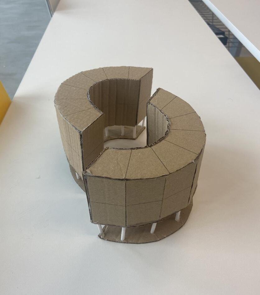
DESIGN 3A BEND IN THE WAVES
From previous research, Barbara Hepworth was largely into her organic forms of nature which concludes why my building is shaped as waves. Using lots of curved geometry in her work, by adding stairs with a glass casement allows visitors to capture her inspiration.
Ben’s work is almost very strict with the choice of shapes he uses however the compositions in which he places them are fundamental in my design as they appear to be very chaotic.
52
53
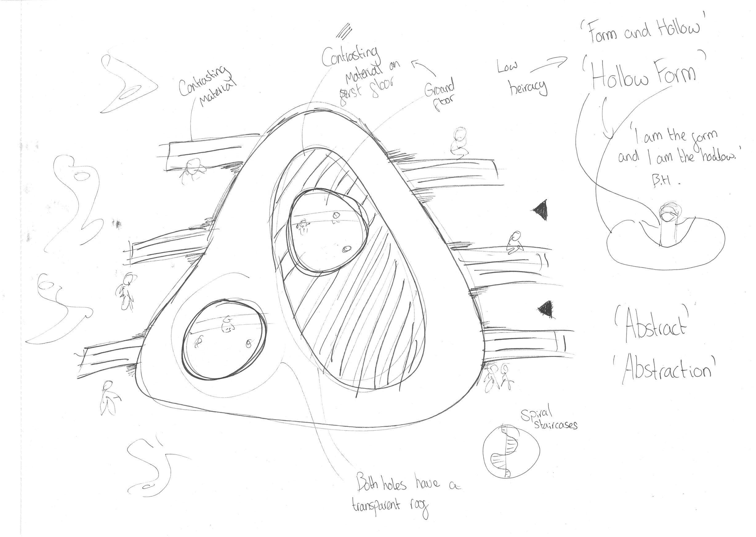
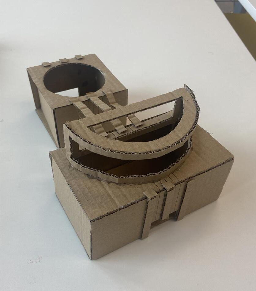
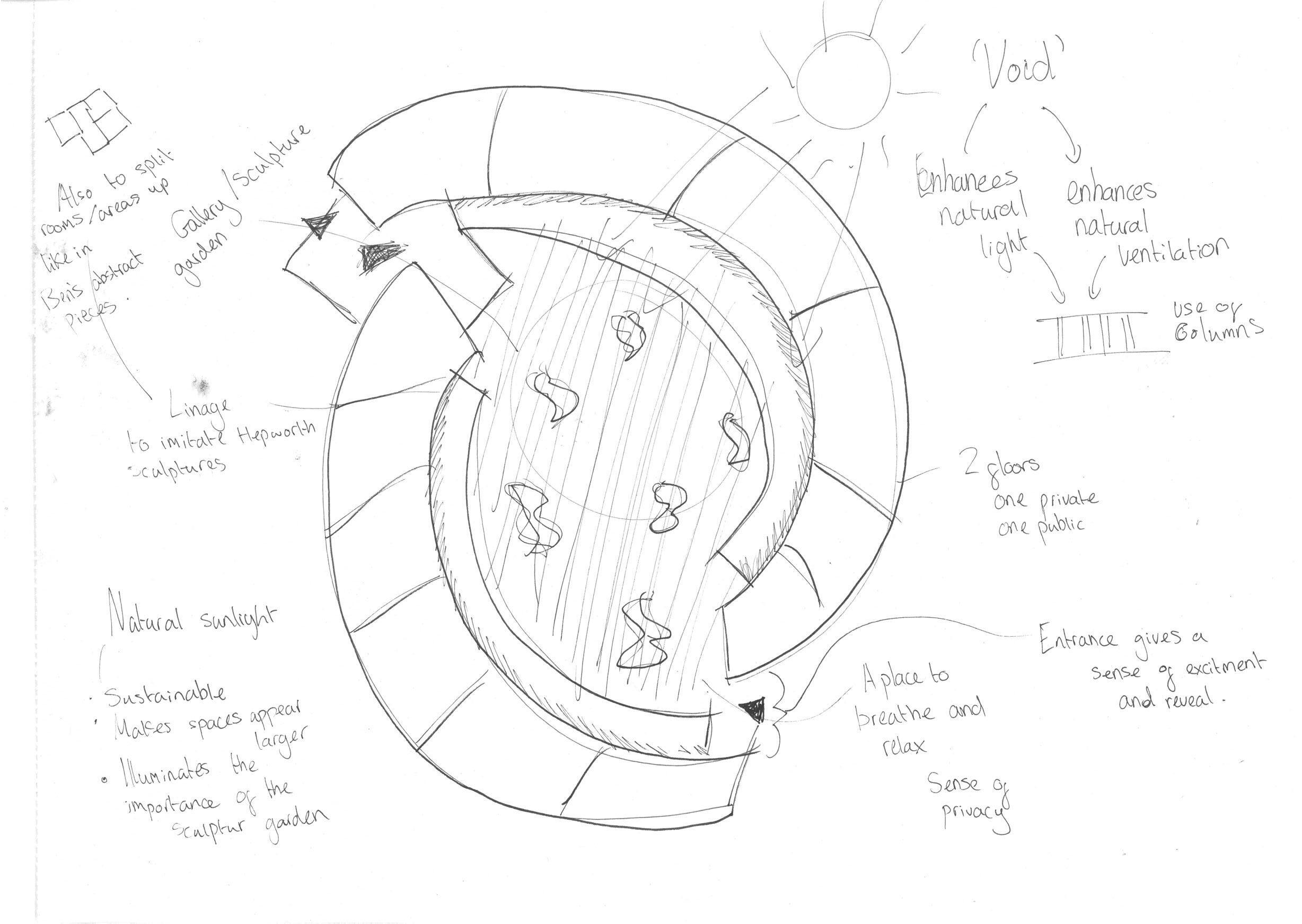
DESIGN 4 - CHOSEN DESIGNINHABITING A VOID
In Barbara’s work, the holes express a place to relax, a place to breathe and calm your thoughts. Barbara was deeply spiritual and wanted to conceive this in her work to create an experience for the viewer. Linking this with architecture, a void is a space to reflect largely linking with her work.
As seen on the design, there is linage placed on top of the building of which will travel down to the ground. This is to imitate Ben Nicholson strict way of drawings and psychologically presenting Barabras motivation from Ben.
54
55
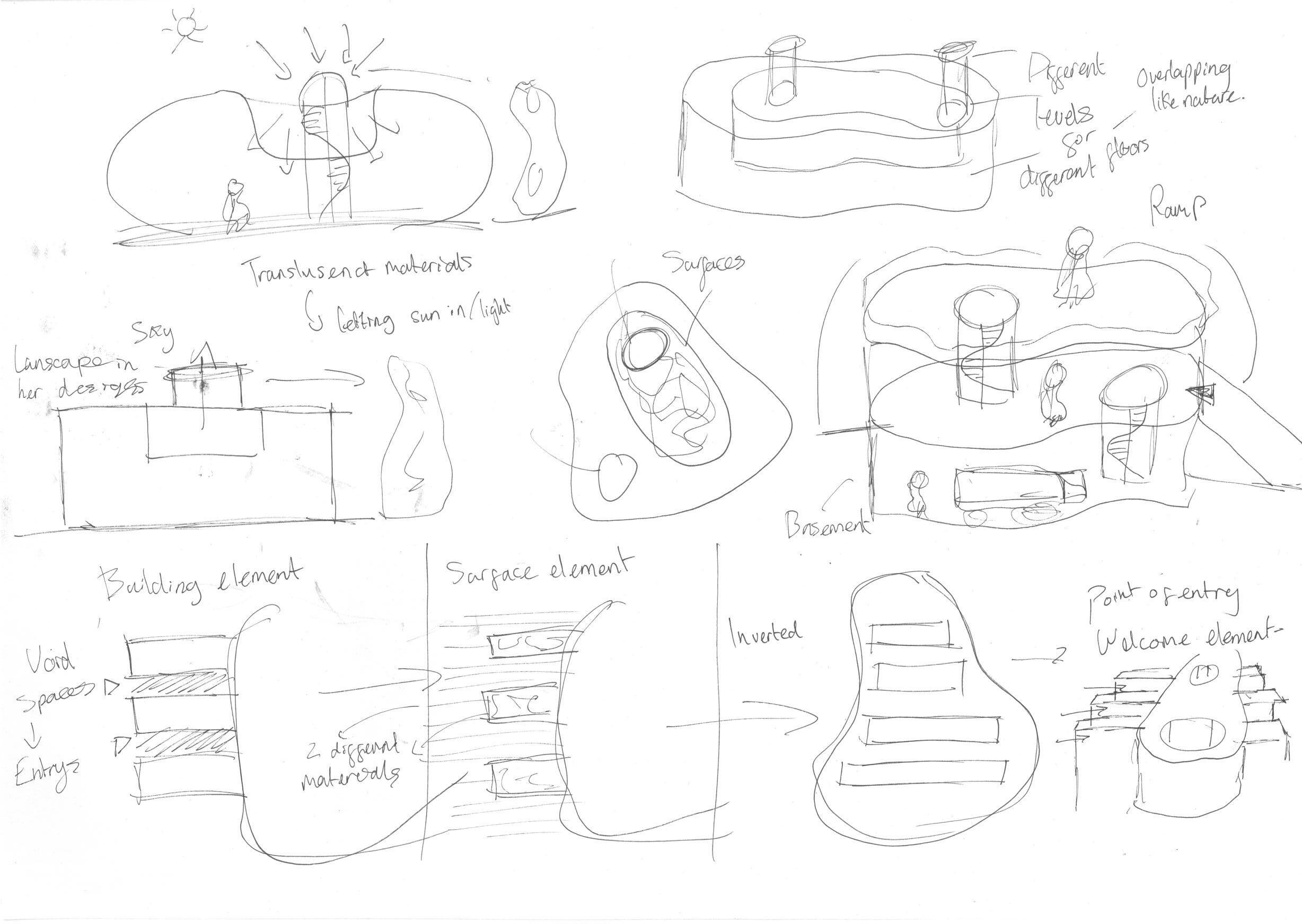
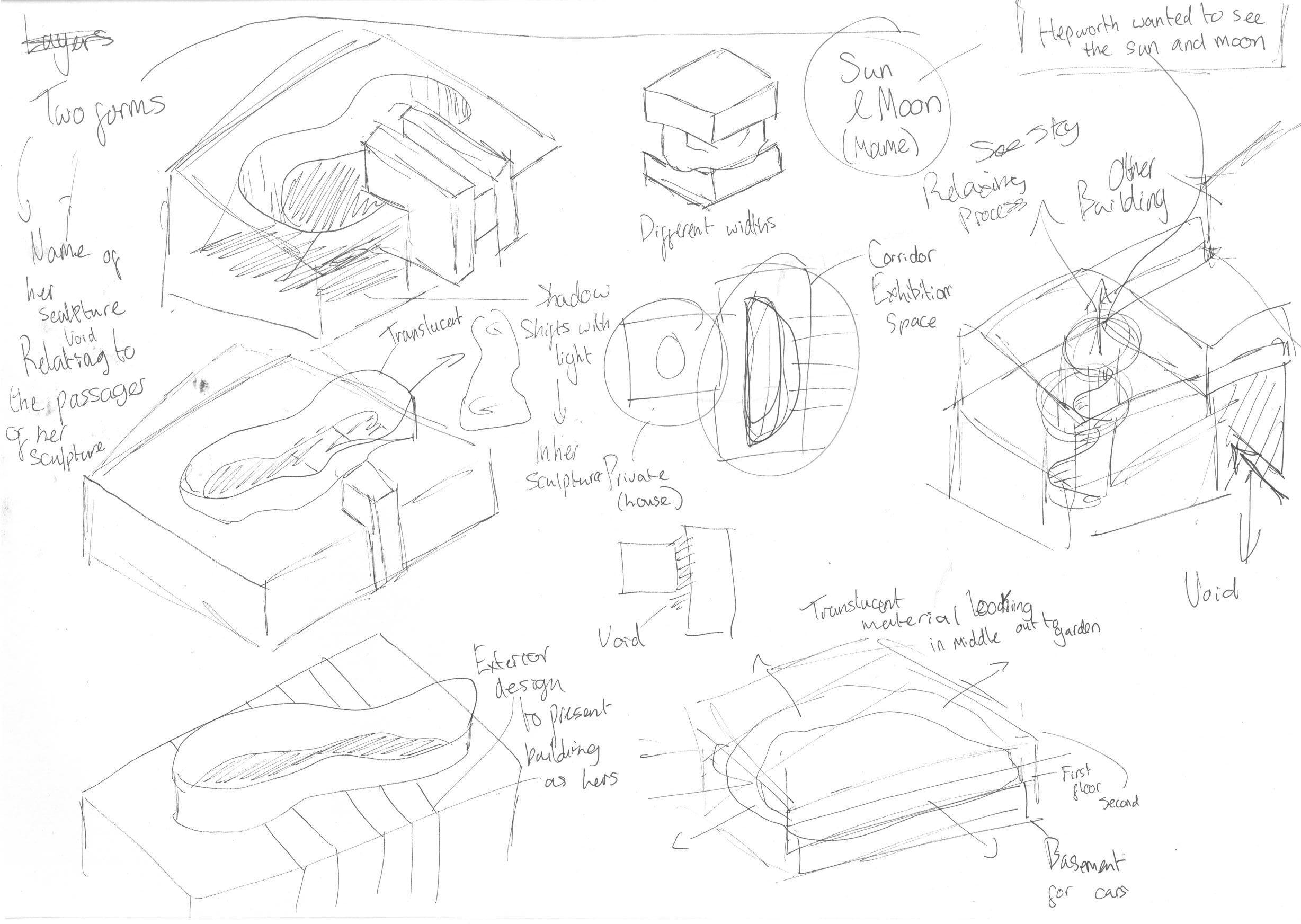
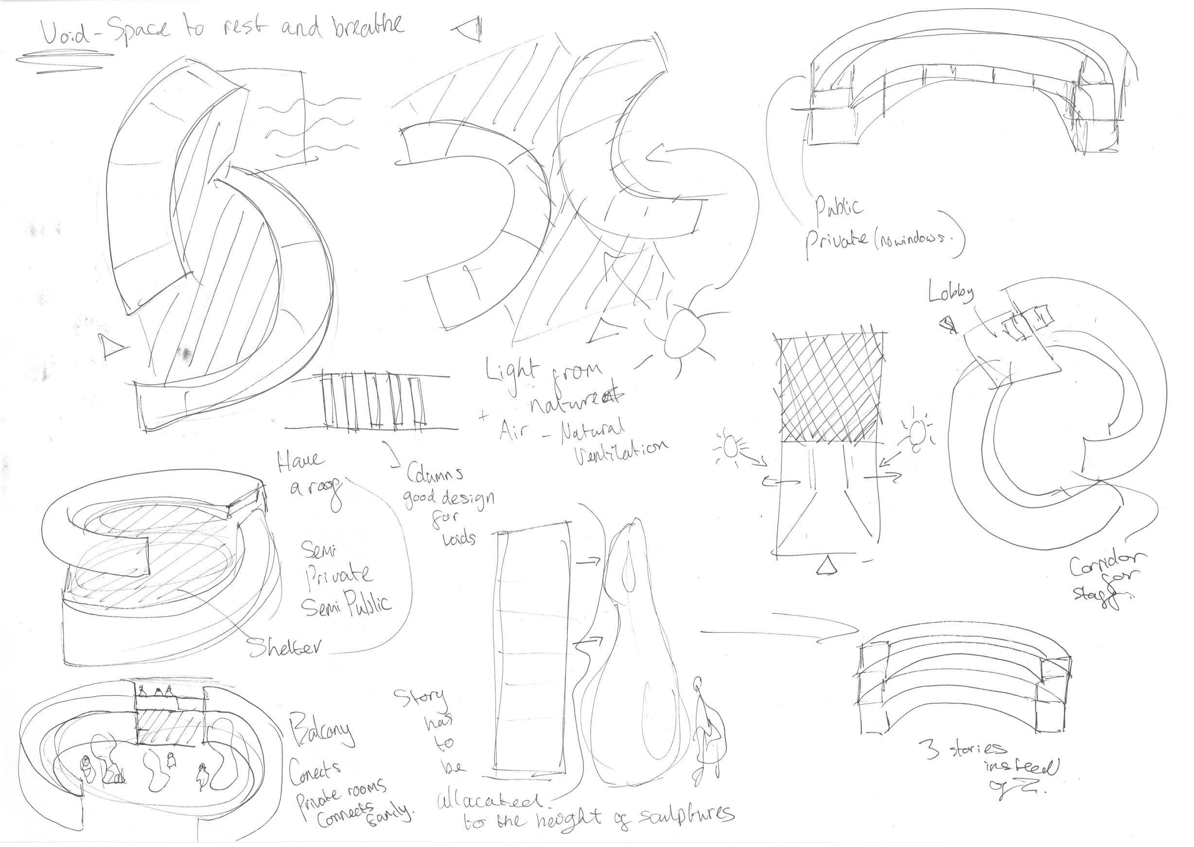
SKETCHING FOR A SOLUTION
To begin my design development, I began searching and receiving valuable feedback from peers and tutors. I started to define, respond and resolve any problems or improvements I could make to form a place rather than a space.
I sketched in 3D and 2D, defined the geometry of the building and processed my own bubble and block diagrams to most importantly identify a form and layout.
56
56
SKETCH 1
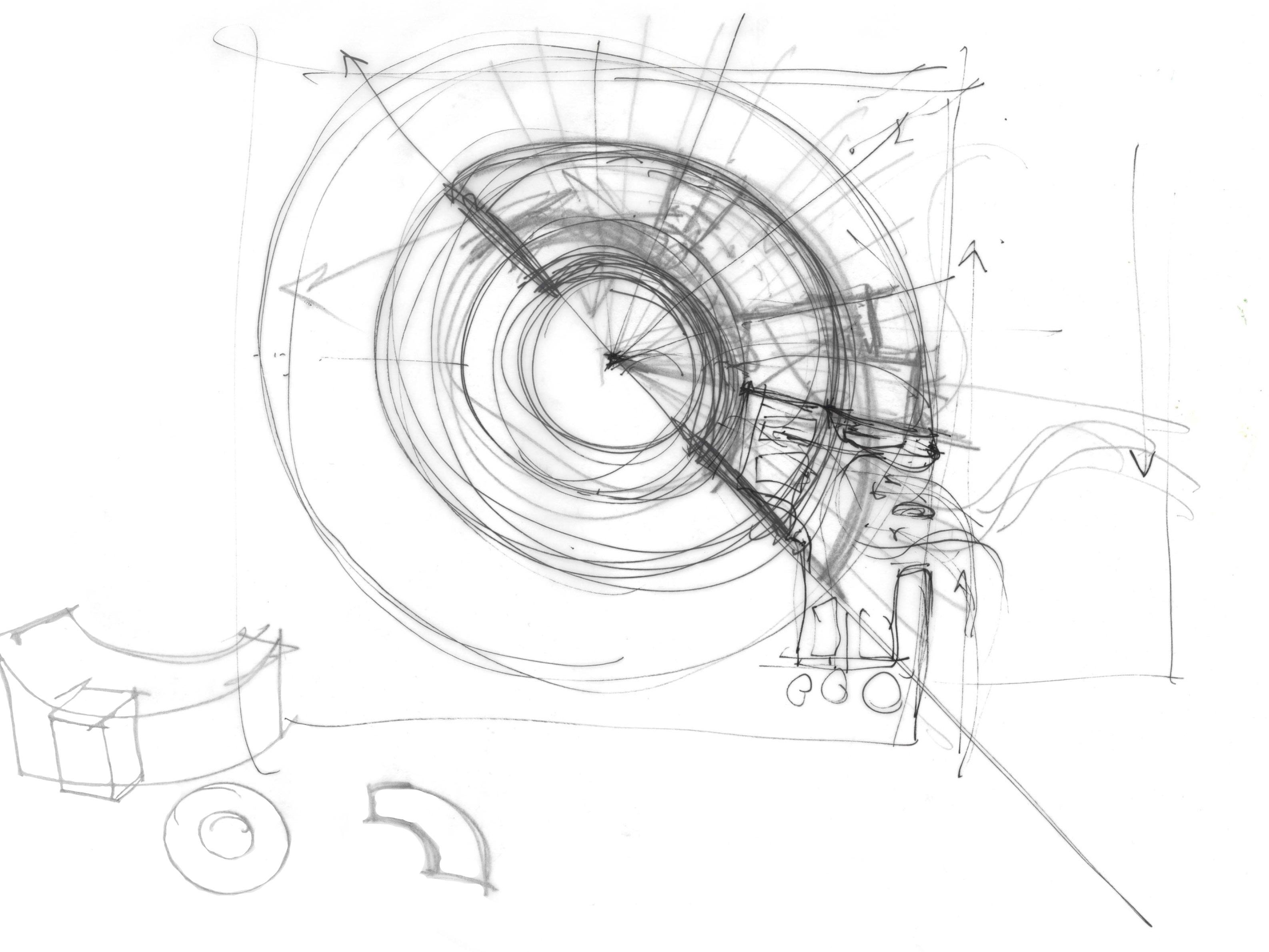
Presented here are a few sketches consisting of bubble diagrams, 3D sketching and a section. Extruding volumes make me visualise the height in response to each floor.
GLASS
VEGATATION VIEWS
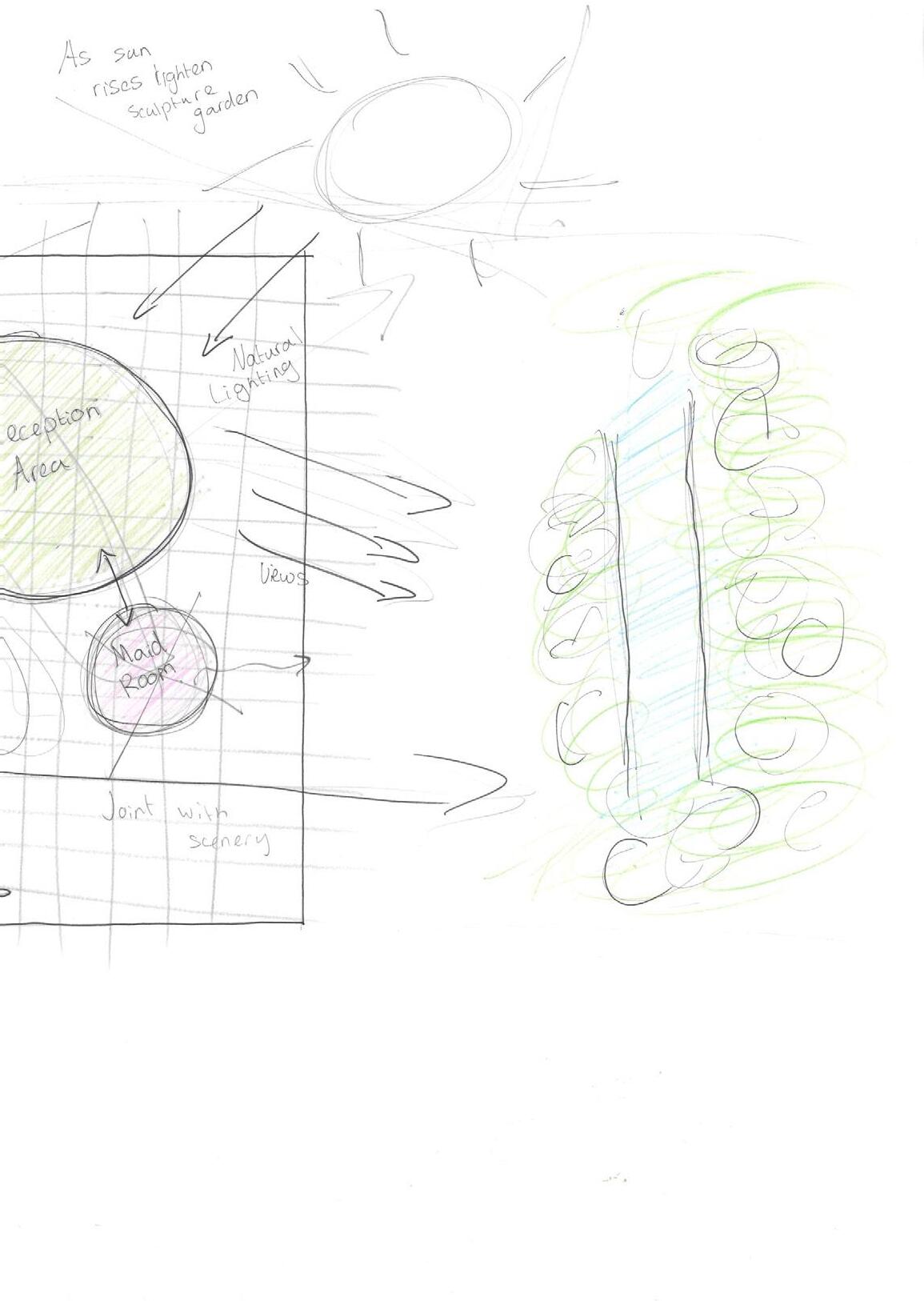
It helps me place sculptures at eye-level and allows me to organise. I have used colours to present materials.
57
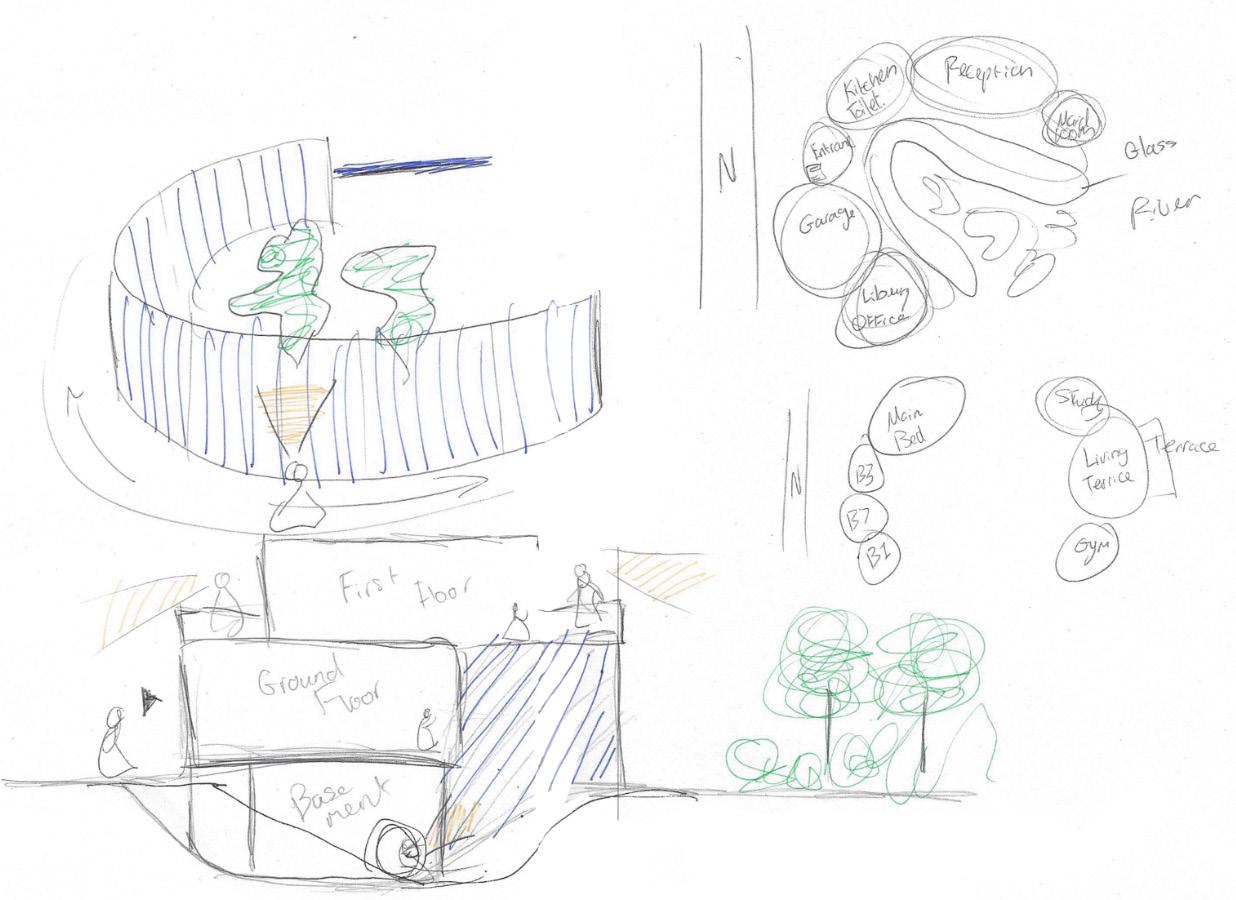
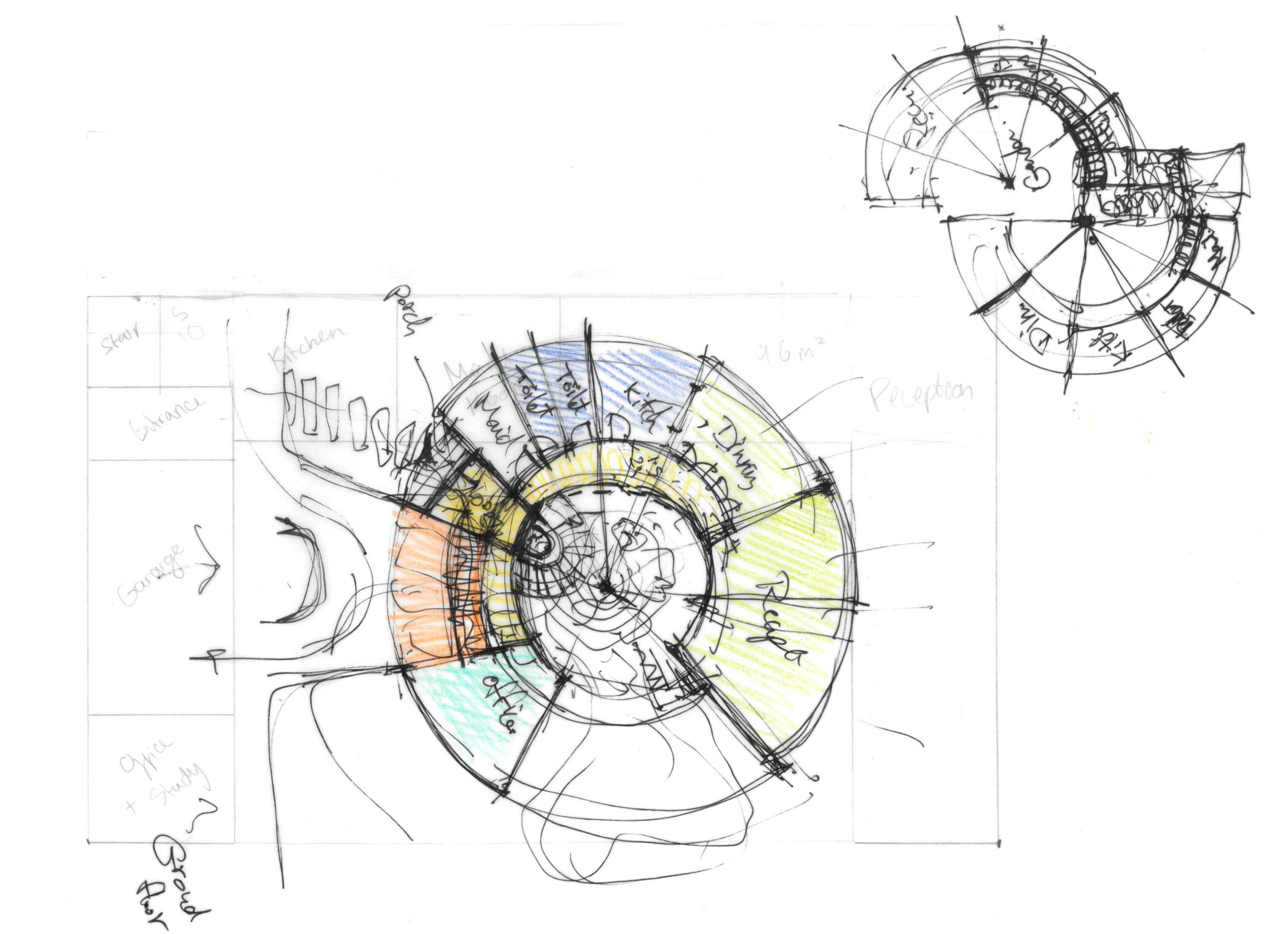
GROUND FLOOR
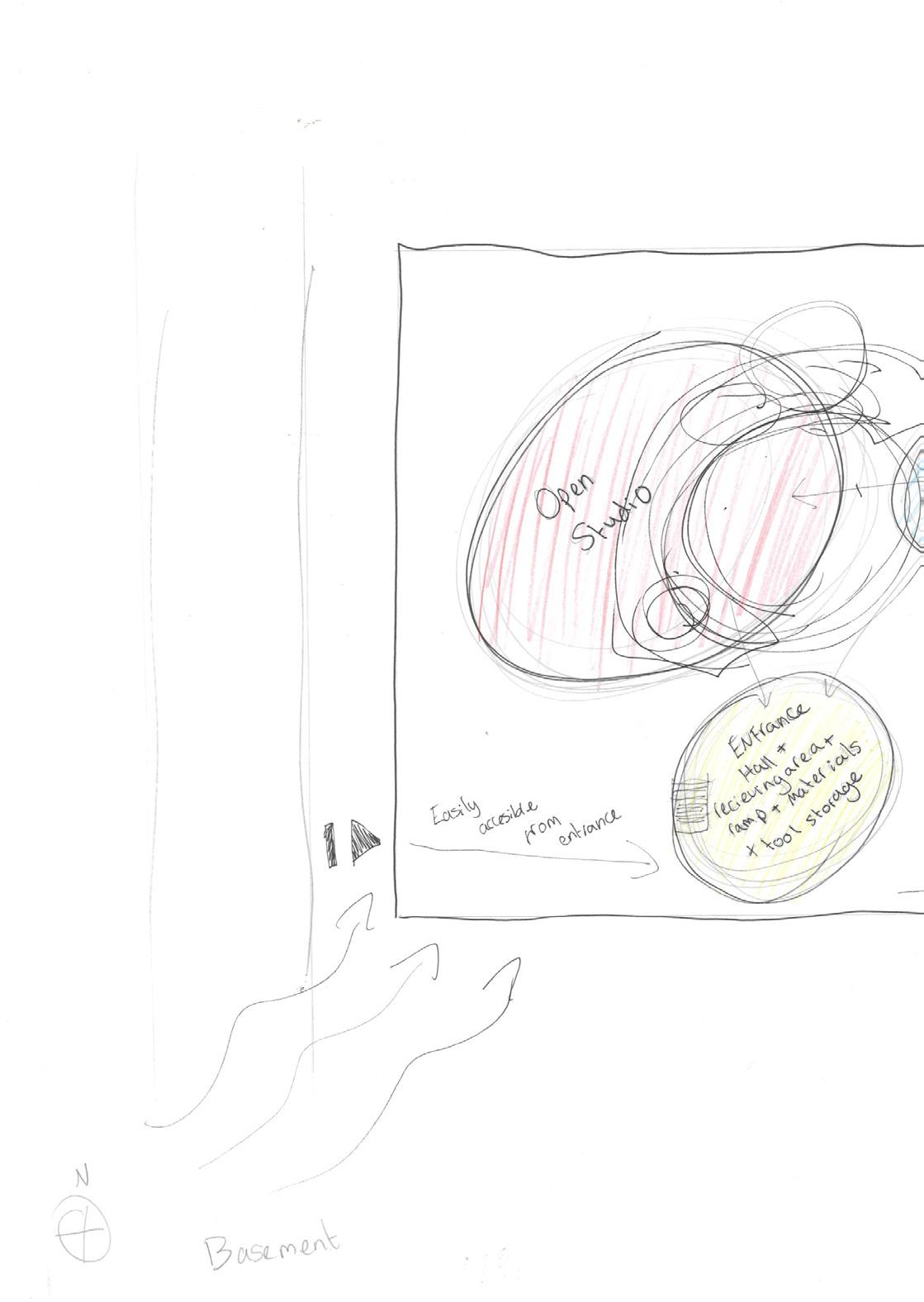
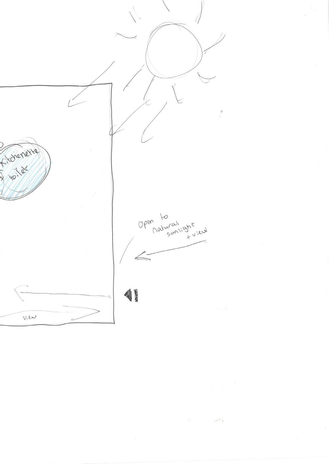
BASEMENT
SKETCH 2, 3 & 4
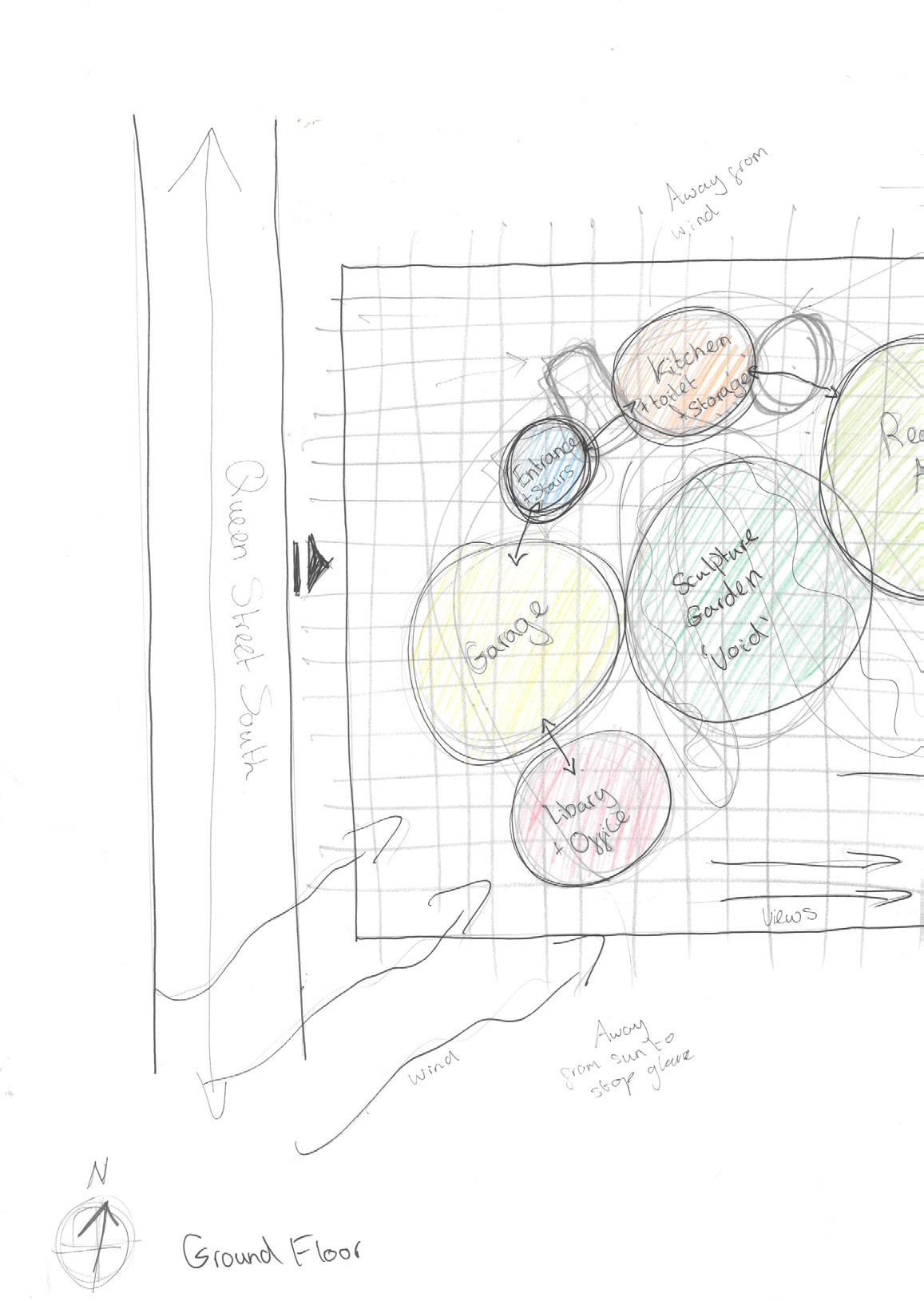
Below and to your right are three bubble diagrams to show my initial though process of placement and spatial organisation of functional rooms. They show the sun path and why I have placed them in their allocated position due to wind, views, pollution or glare.
59
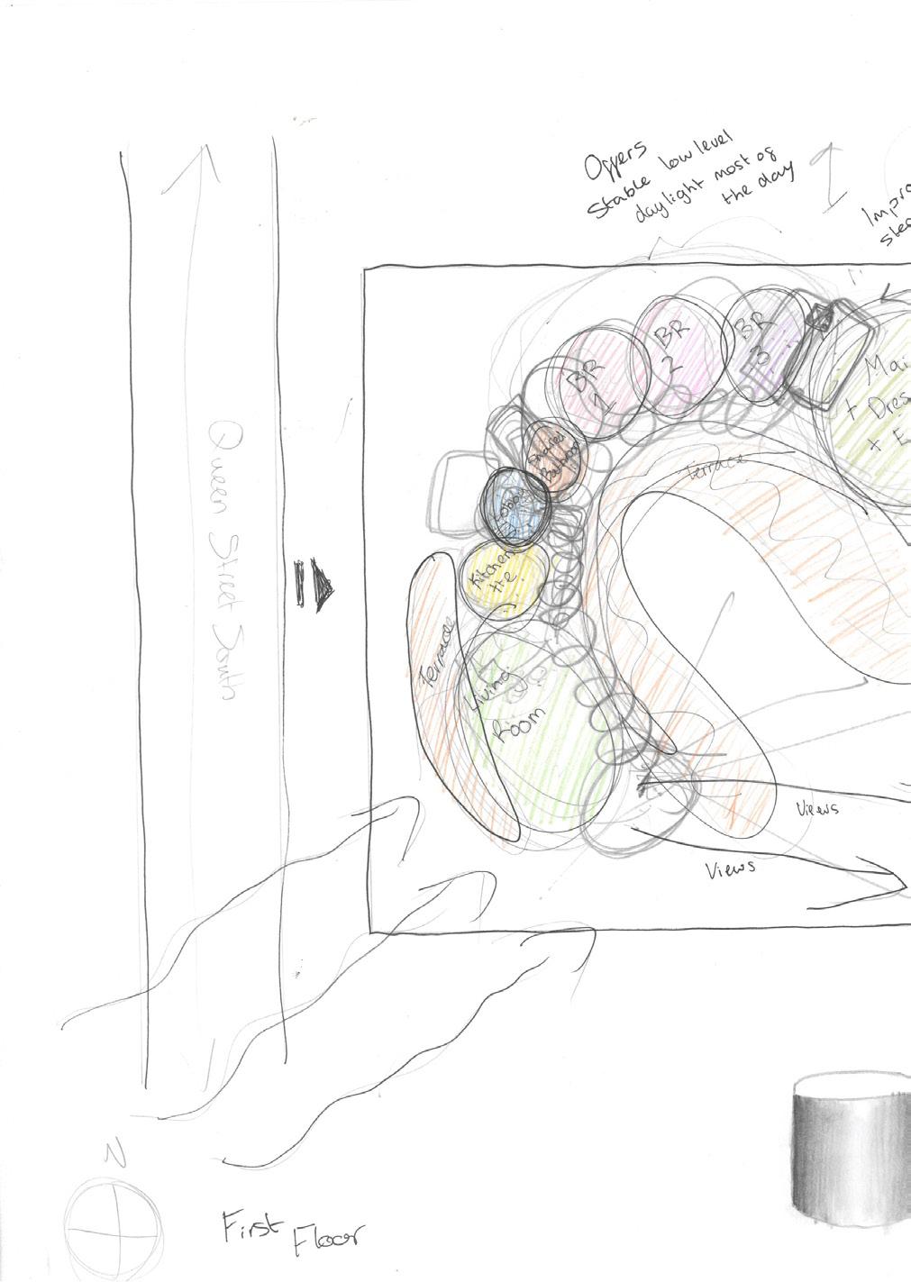
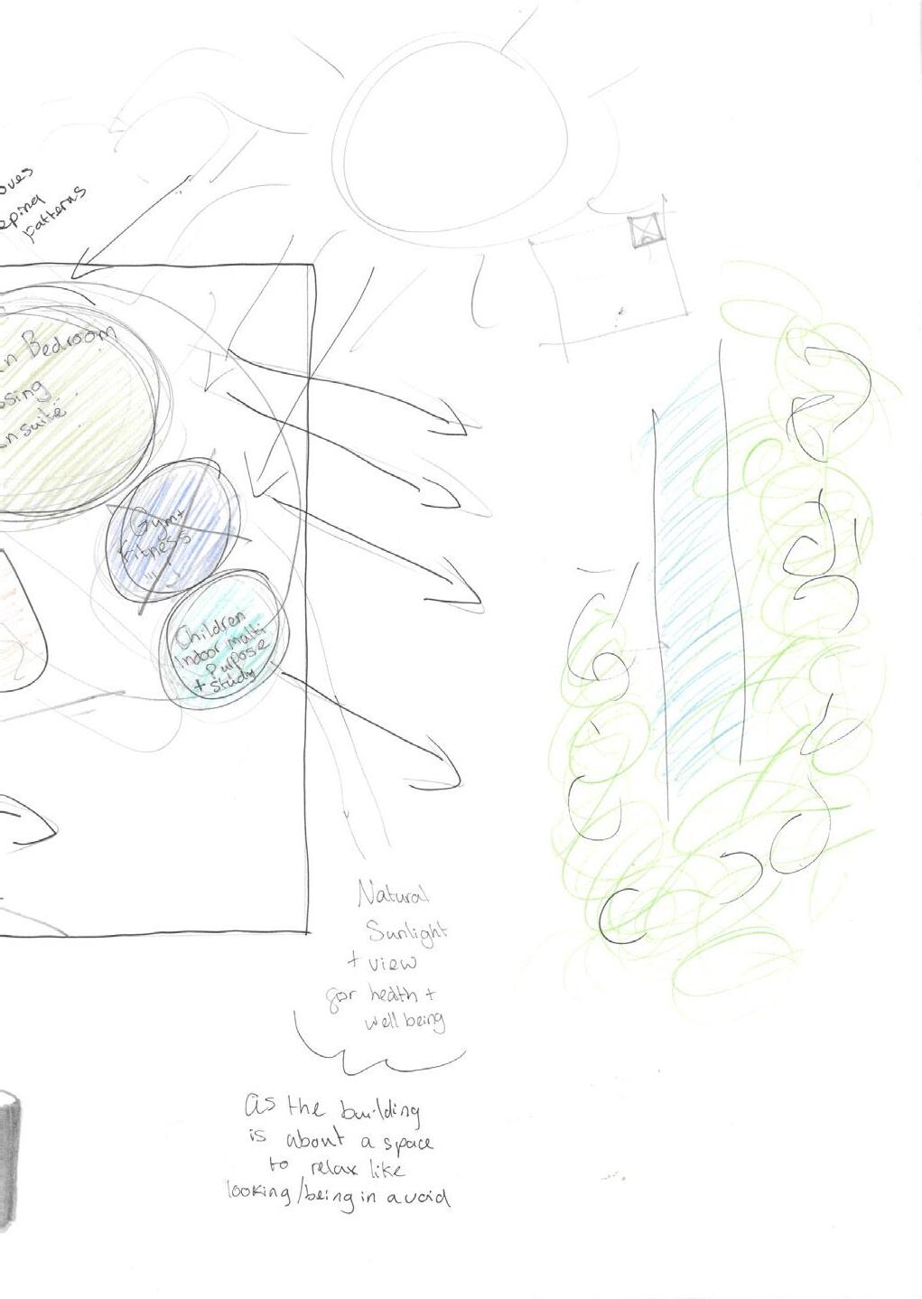
FIRST FLOOR
60
SKETCH 5 & 6
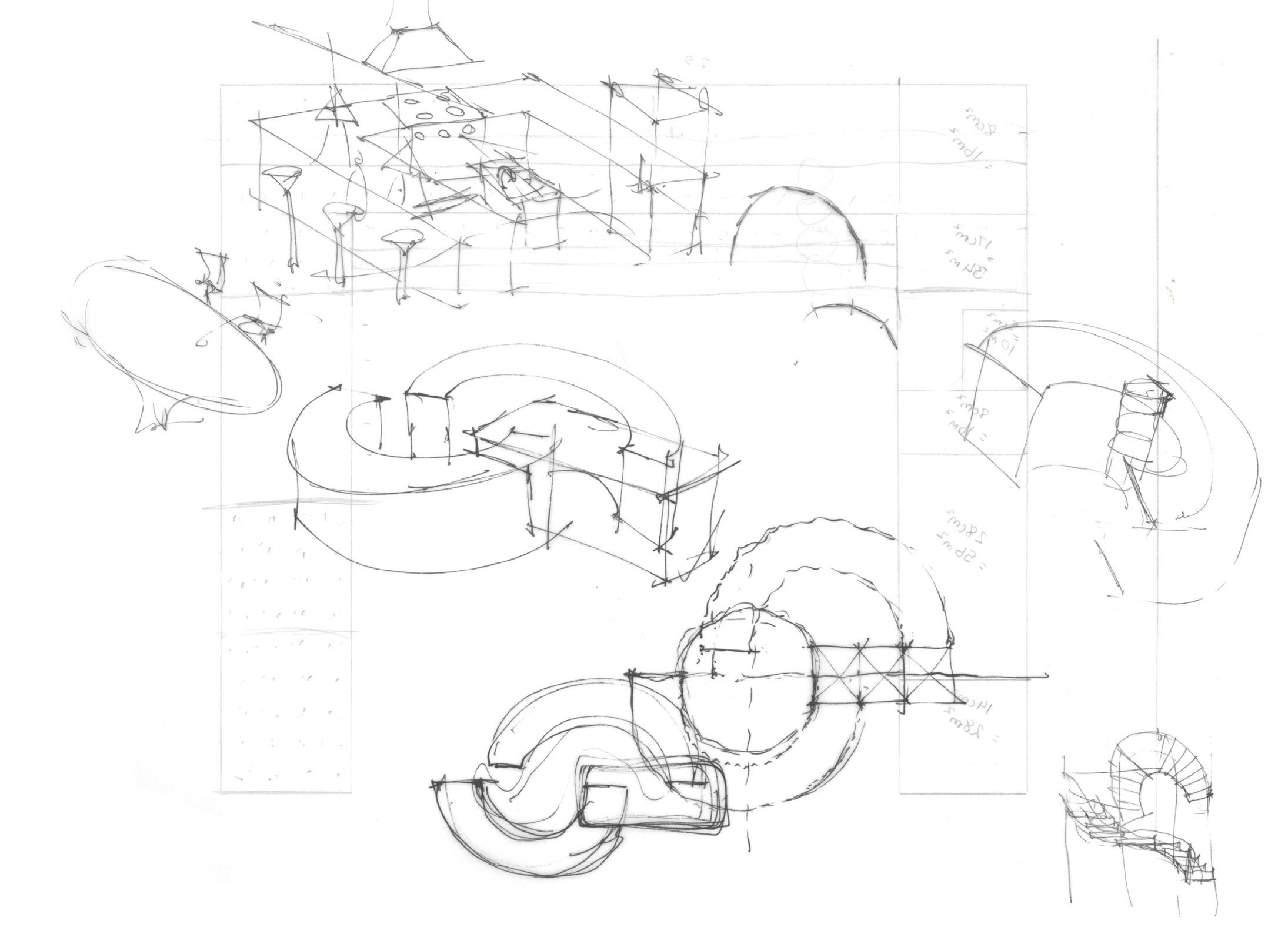
Sketch 5 & 6 focuses on the importance of geometry. Geometry gives us space, plan and form through subdivision and dynamic symmetry. Geometry is important as ‘form follows function’ conveying that the way a building is set out is the way the user will feel comfortable and operate through it.
Shown are a few compositions on how the two original building blocks could form one. Using 2D squares, circles, archs and rectangles we finalised an idea of an arch.
The shape of an arch works cooperatively with ventilation, circulation and even shading.
61
GROUND FLOOR
FIRST FLOOR
62
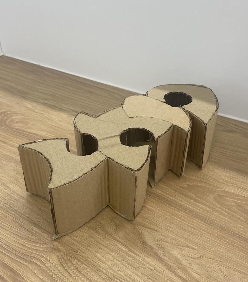
SKETCH 7 & 8
Sketch 7 & 8 (ground & first floor plan) is a sketch of a block diagram. We drafted entry points, stairs and placement of rooms where visitors would feel comfortable and hassle free to move into.
The sketch demonstrates a pathway to help me visualise different materials to give visitors a guide towards the entrance close to the street.
By diverting the form from two blocks to one, it will help me arrange and make it more accessible for the family and visitors.
63
BASEMENT
64
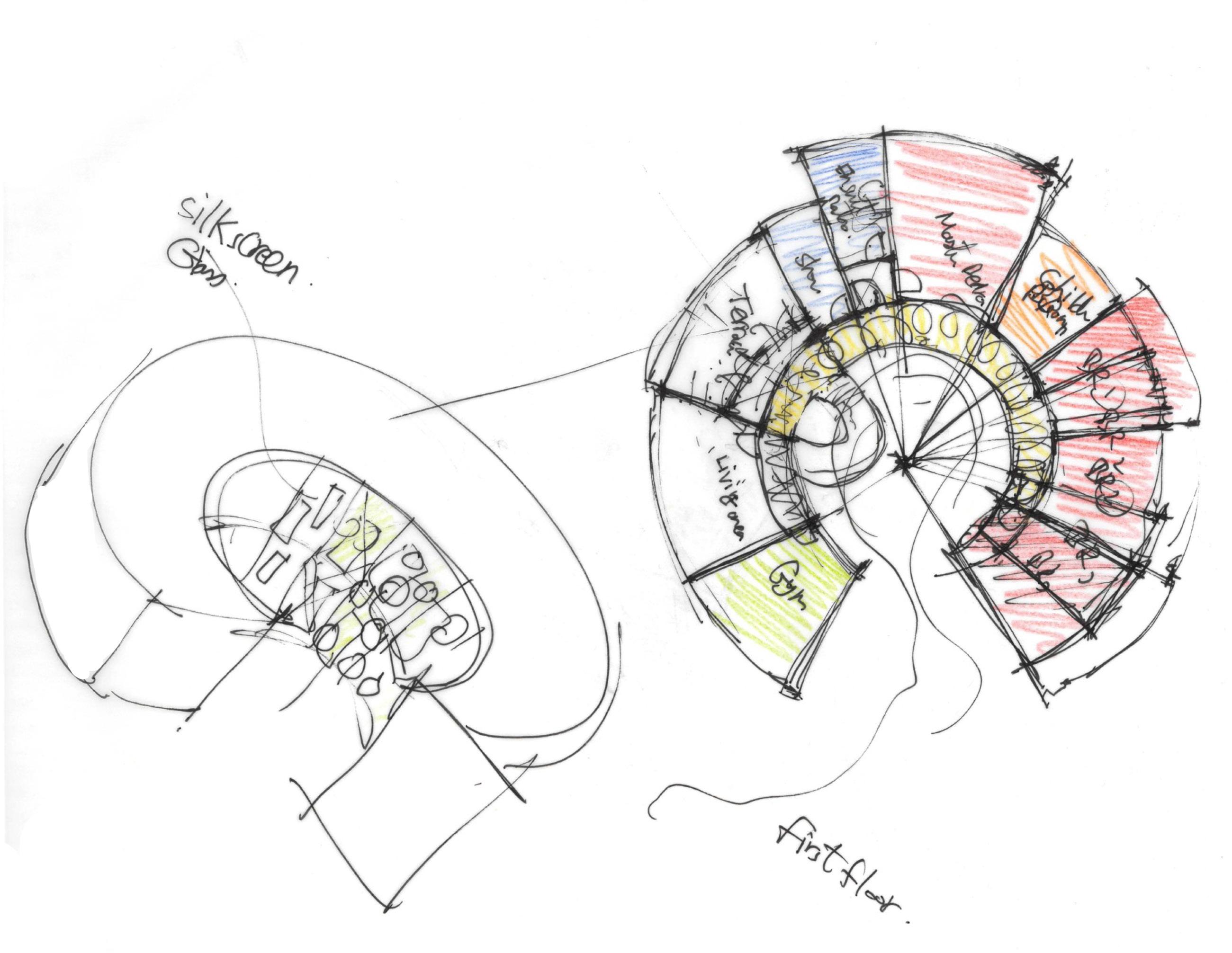
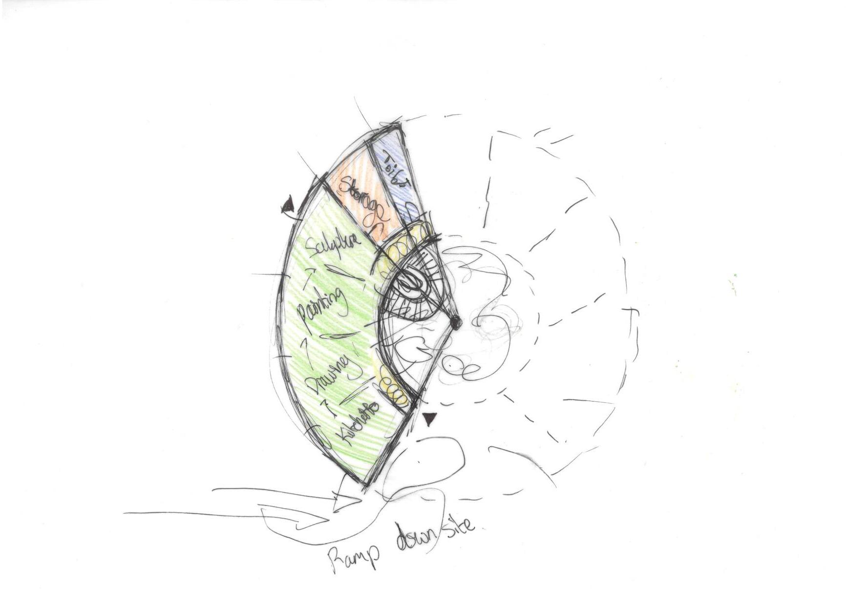
SKETCH 9
Sketch 9 (basement plan) is the block diagram for the basement made clear by the halved arch due to area limitations.
The basement has two entry points, one as a more easy vacuation point (ramp). As the main entrance is occumpined by a ramp, it makes it easier for disabled users to function in the facilities.
As seen on the previous page, both toilets are situated at the same place on each level. This is to make piping easier and prevent any interference with the aesthetic of the building.
Sections are dedicated to stages of sculpture such as drawings, painting and construction.
65
69 4 OUTCOME (VISION) (69-127) 69
TEMPLATE
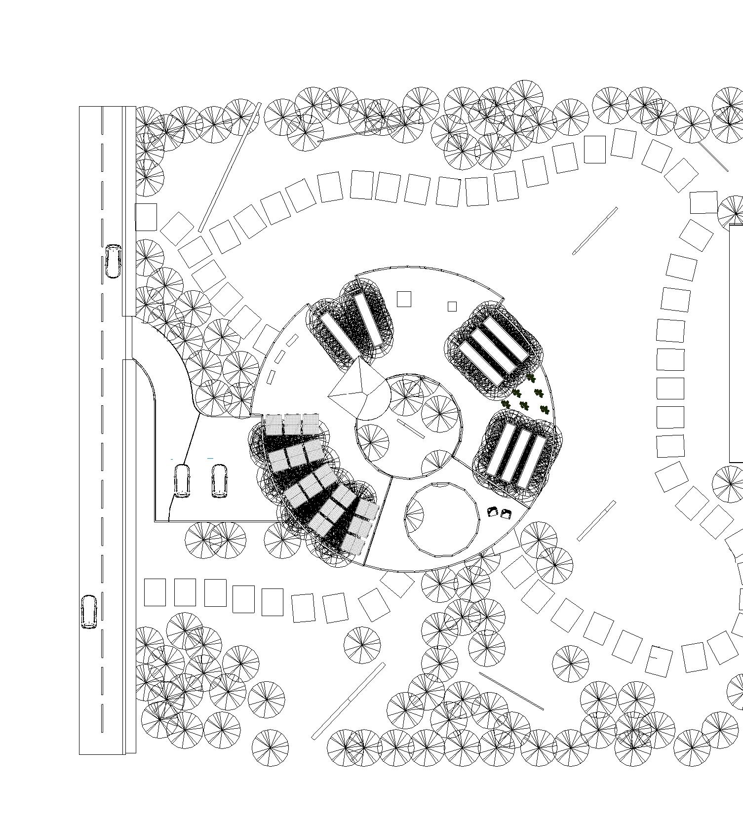
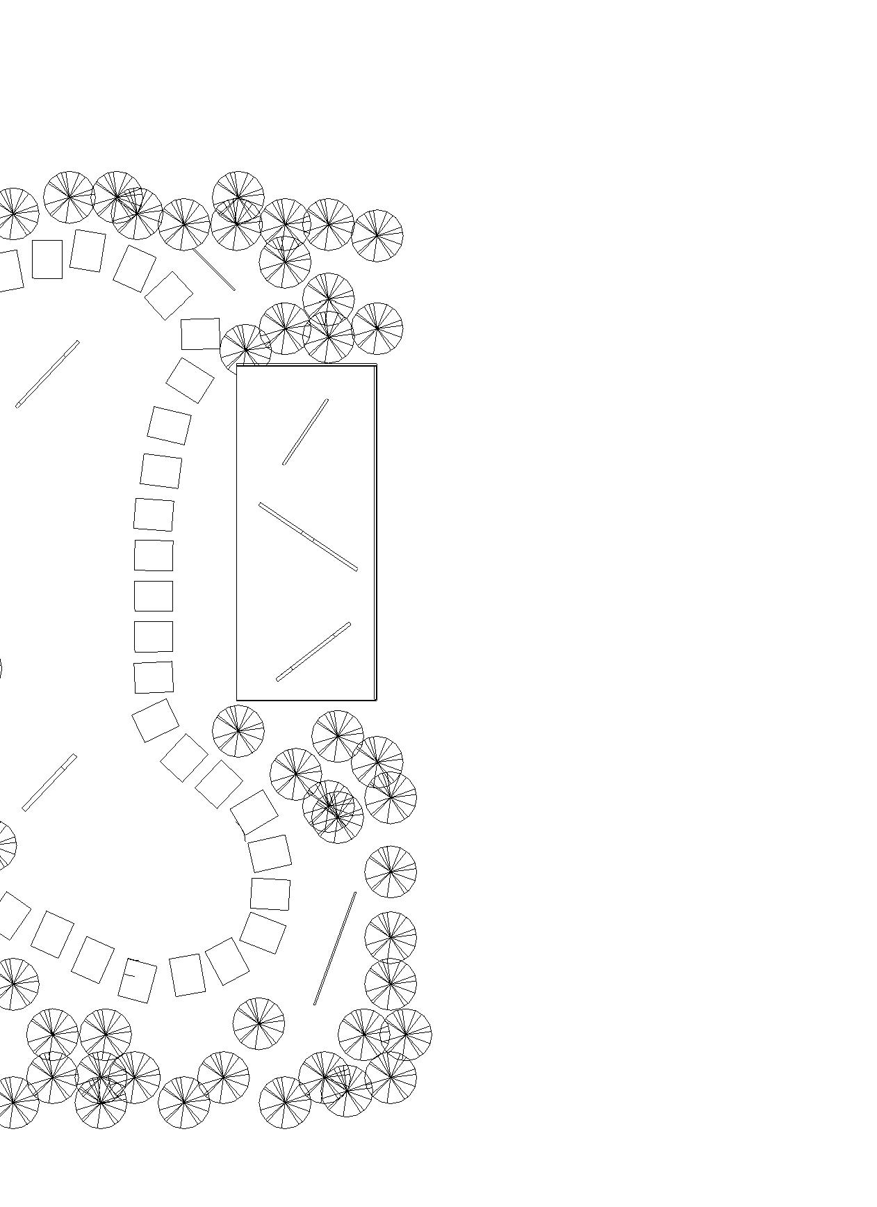
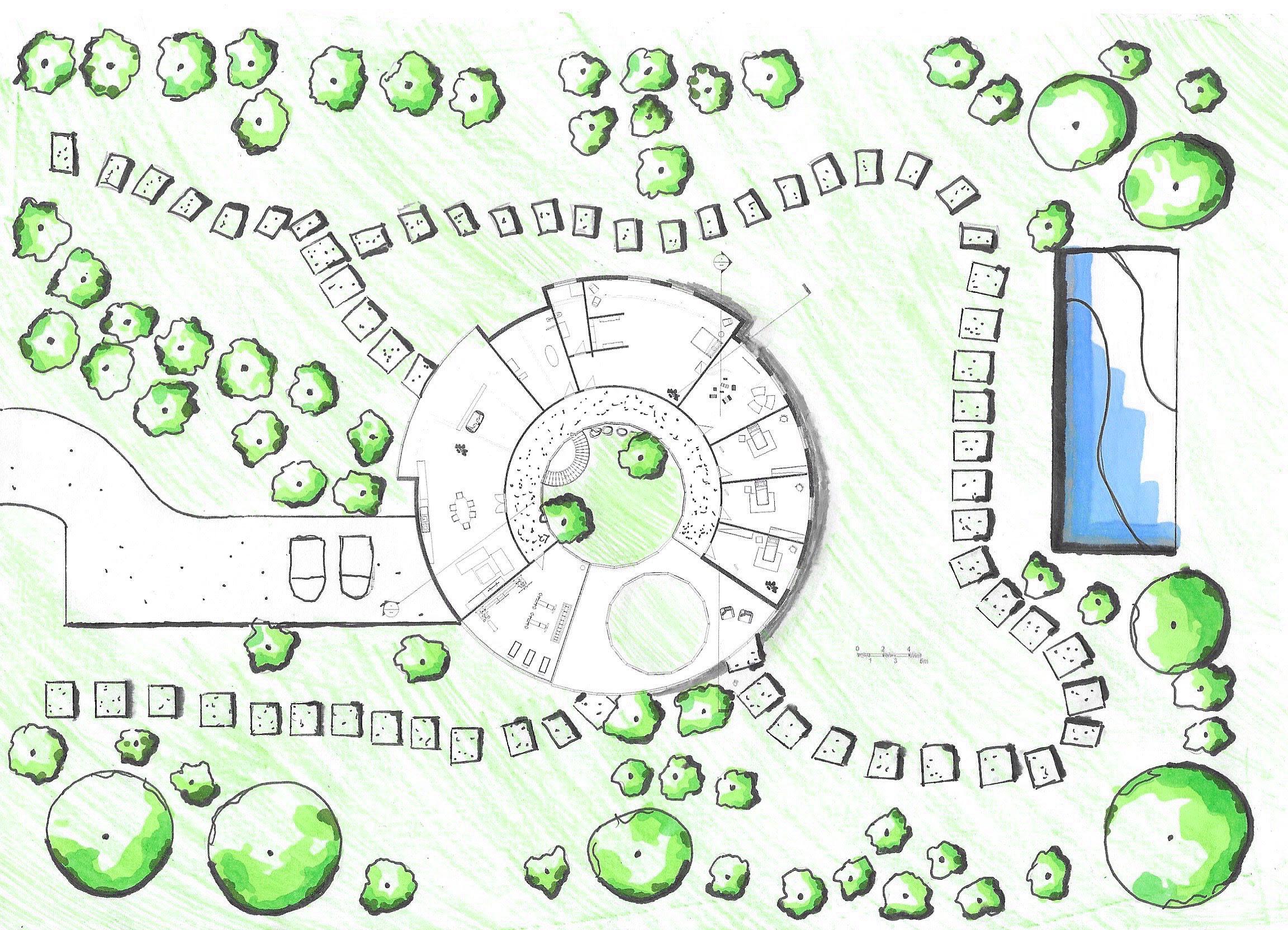
To begin a draft of my floor plans, I have made a circular template each expanding by 1cm. Having my drawings all being 1:200, I have place my site in comparison to the 1cm gaps with a dimension of 25cmx22.5cm.
Not to scale.
70
70
BASEMENT
GROUND FLOOR
FIRST FLOOR
71
DESIGN STATEMENT
My design of Barbara Hepworth’s house and studio fuses scape in an attempt to create an atmosphere that evolves tinue to follow the path of the garden. Making a space with natural materials, elements and sculptures takes Blending with the environment the green features compliment tions and intentions she conveys in her art. The sculpture tors on a journey through history showcasing her most ing from her preliminary creations to her most recent. building and art is implemented from a variety of precedents Barbara’s work but Ben Nicholson geometric pieces.
72
72
fuses architecture with landevolves for visitors as they conspace to a place filling the void makes commend her work. compliment Barbara’s aspirasculpture garden invites the visimost successful artwork developThe abstract merging of both precedents considering not only
73
73
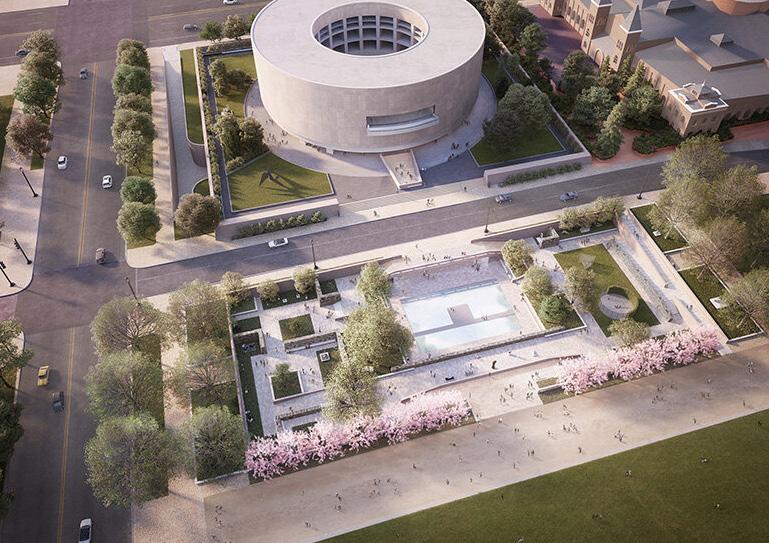
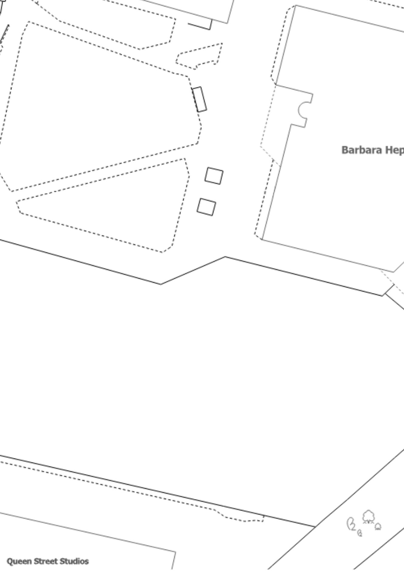
HIRSHHORN MUSEUM
BY HIROSHI SUGIMOTO
In the 1980s Japanese artist and architect Sugimoto designed a sculpture garden to compliment the museum which is currently being renovated.
The aim of this design was to raise more visibility to the museum attracting more guests by making it more accessible.
To direct the visitors on a journey, Sugimoto divides sectors into 3 key areas. One for modernist works, one for performances and one for new installations.
Some sculptures are secluded with the likes of fountains and benches to portray relaxation. Some are directed towards more extensive views.
This precedent made me aware of the placement of historical and more recent sculptures to illustrate Barbara’s impact she made on art in the past. Perhaps dividing sectors in the landscape architecture into peaceful areas to show Barbara’s intention in her designs of tranquillity.
74
75
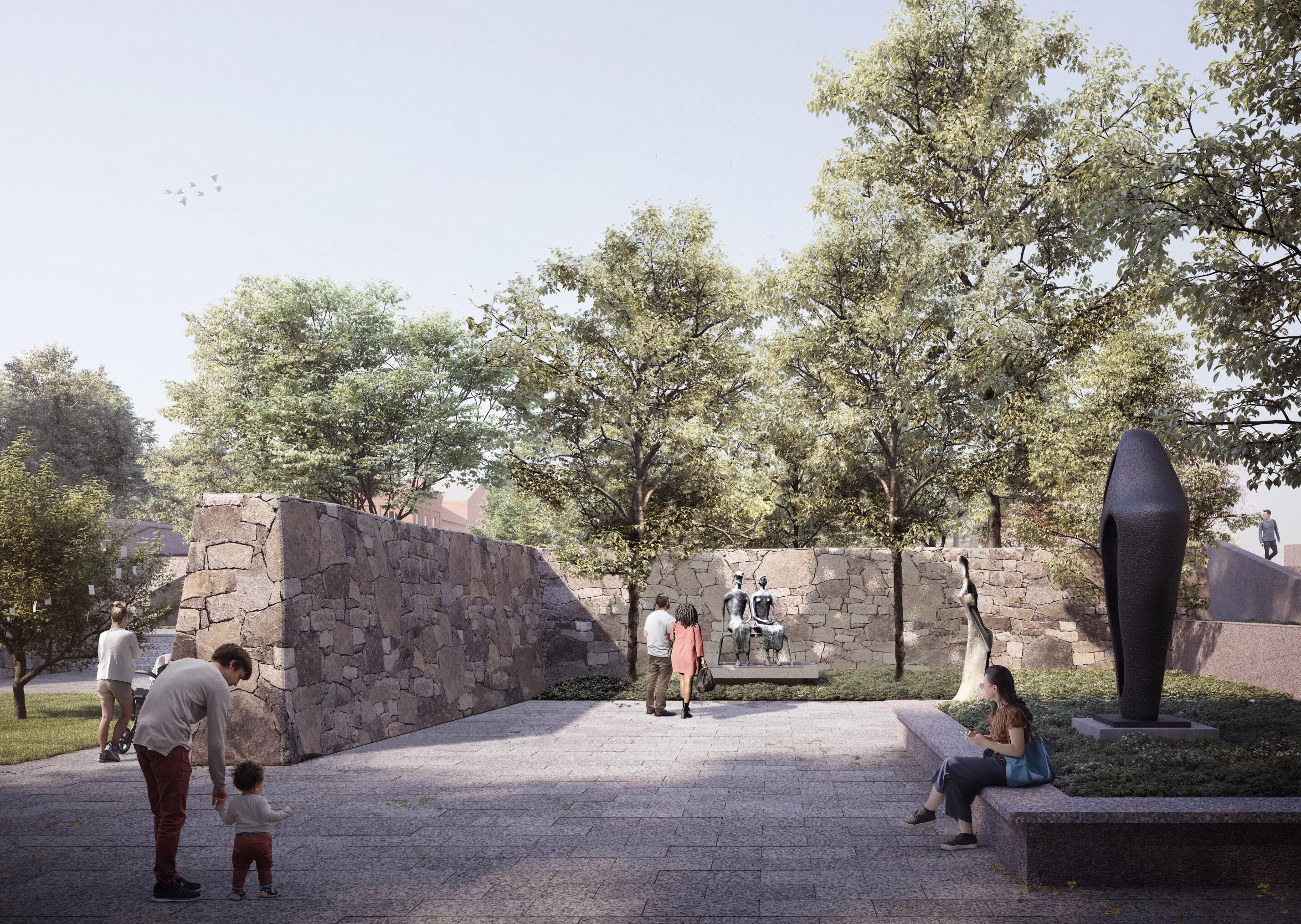
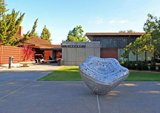
MITCHELL PARK OUTDOOR LIBRARY
BY GATES + ASSOCIATES
This library is an urban outdoor space consisting of landscape architecture. The green garden consists of interactive sculptures to show the cultural diversity of the city.
Sculptures greet visitors to the library and with the use of mirrors, guests (more specifically children) can see their own reflections inspiring them through materials.
It also acts as a playful stimulation for children and a learning opportunity. As children develop their senses and well being with art it is a great feature.
The architect uses a variety of different materials on the ground to not add an aesthetic but to guide visitors on a path get the best experience.
From learning about this library, I will take careful consideration in the selection of materials to walk on. Making sure they are firstly environmentally friendly but also make it an accessible and fun for family’s. To enable children’s interaction, I will chose a reflective addition to my garden that is not too overpowering and corresponds with the surroundings.
76
77
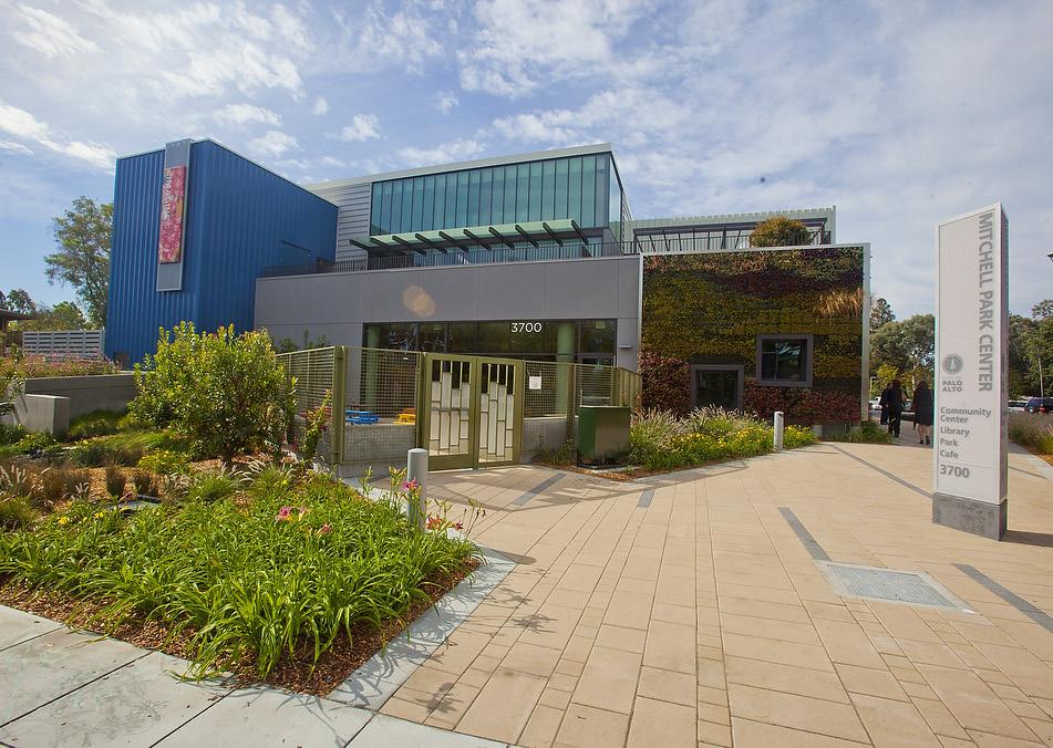
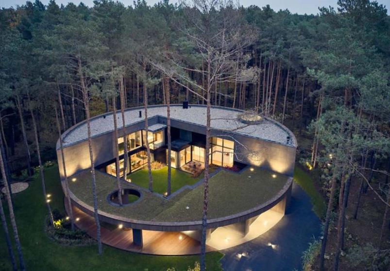
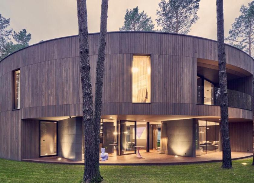
CIRCULAR HOUSE
BY MOBIUS ARCHITEKCI
This is a house largely relating to my brief, it was built for a art collector who wanted to showcase their work with the aesthetic inspired by art galleries taking advantage of the full 360 views.
Some elements the architect used to pursue this was large windows, large surface areas and allowing lots of natural light balancing private and public spaces using shadow and light.
The circular roof is insulated with a green roof accessible to all. This aesthetic is sustainable and allows the house to blend with its natural surroundings.
The main colour palette of brown, black, grey and white expresses the significance of the local landscape which is covered by forest and greenery.
As the surrounding aesthetic of my building will be the river and sculpture garden but I also need to take consideration of the materials of surrounding buildings. An idea may be diverting materials in the interior and exterior.
This precedent has furthermore inspired me to play with shadows to highlight some important features of the house. Options on having a green roof would add to the character of the aesthetic therefore also making a fun private area for the family.
78
79
80
81
82
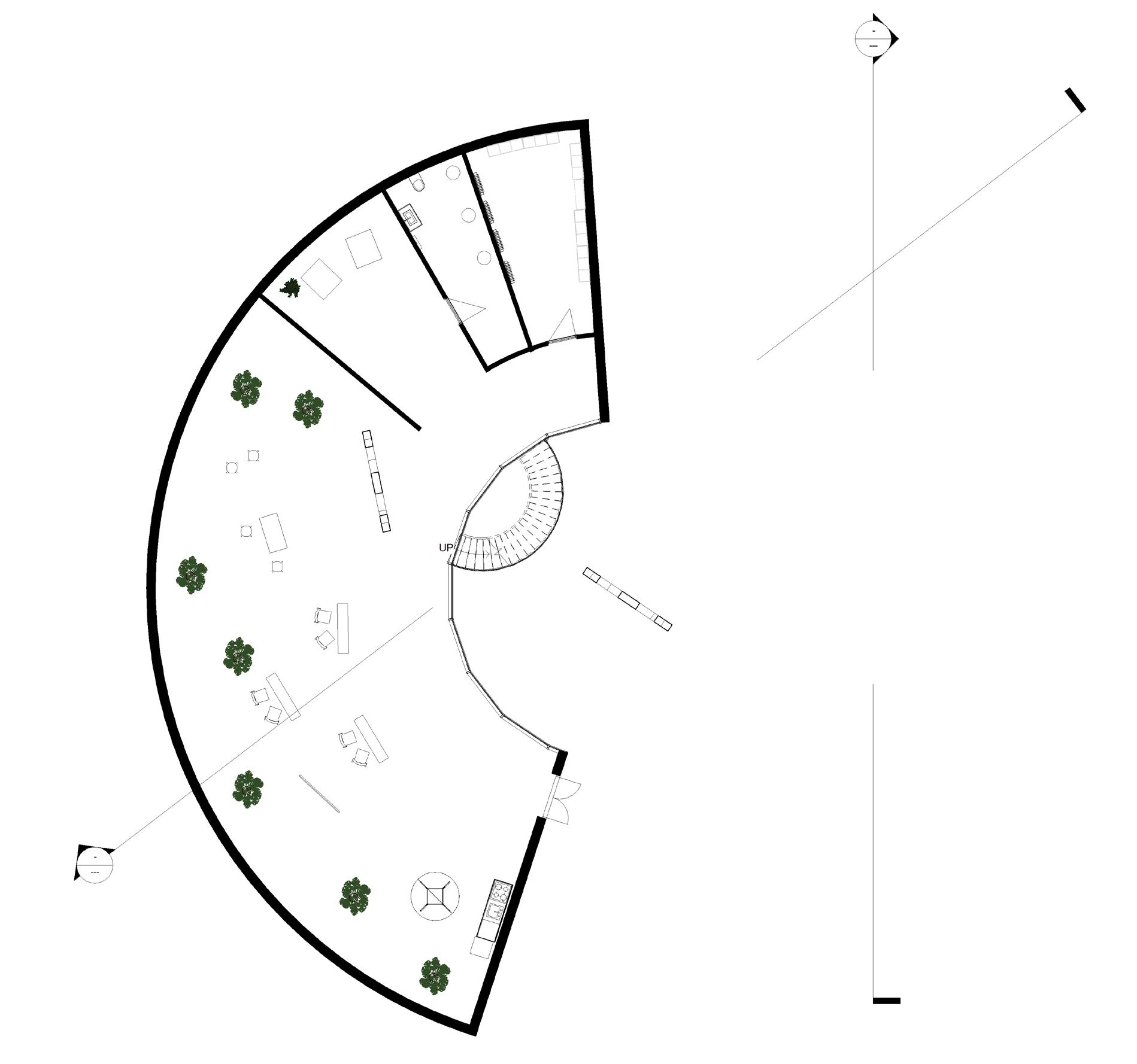
N W.C STORAGE
BASEMENT FLOOR PLAN | Scale 1:100
BB
OPEN ATELIER + KITCHENETTE
AA
GROUND FLOOR PLAN | Scale 1:100
83
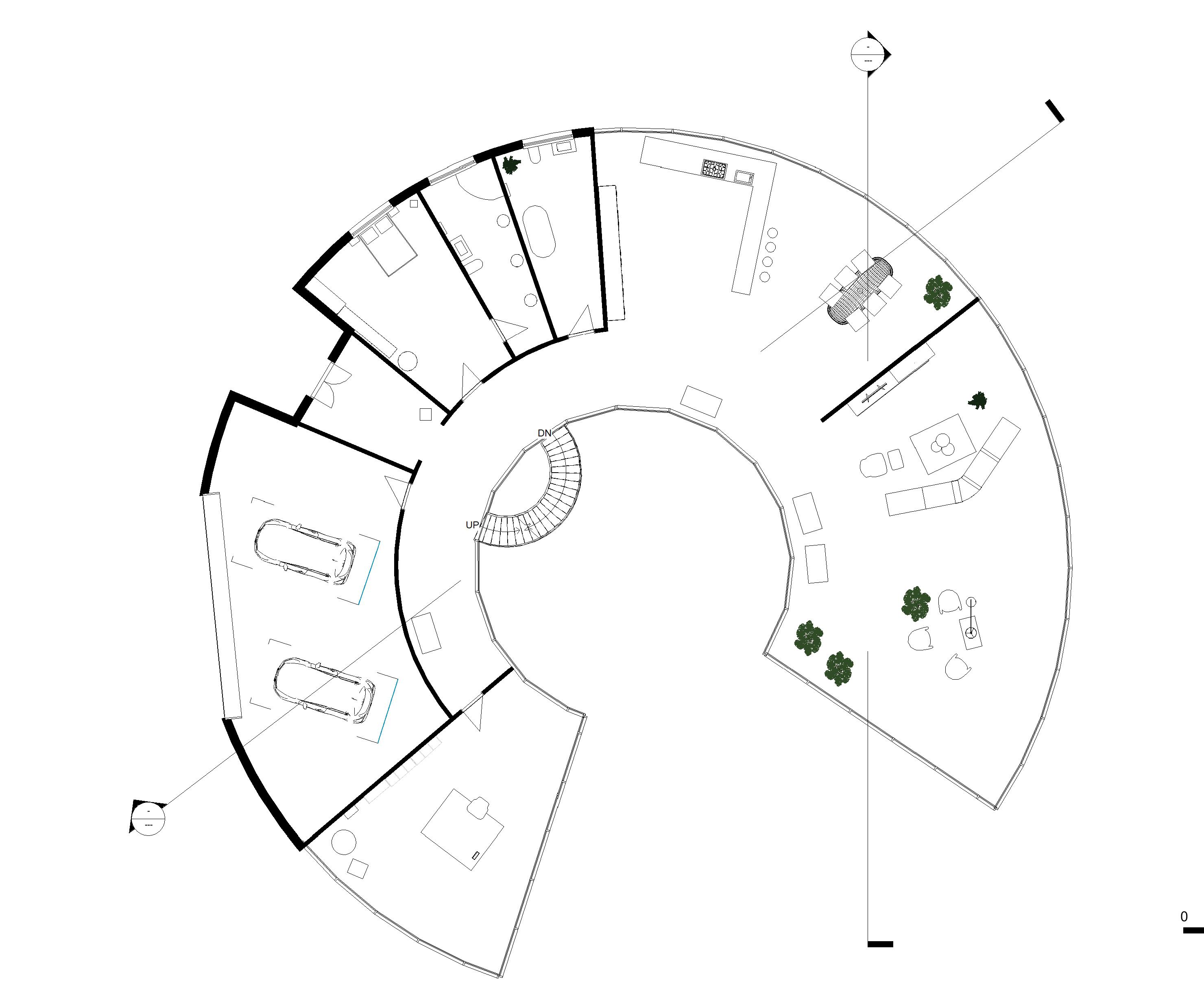
N OFFICE + LIBARY RECEPTION AREA GARARGE FOR 2 CARS (OUTDOOR SPACE FOR EXTRA 2 CARS) MAID ROOM W.C KITCHEN + DINING ROOM W.C AA BB
FIRST FLOOR PLAN | Scale 1:100
84
N
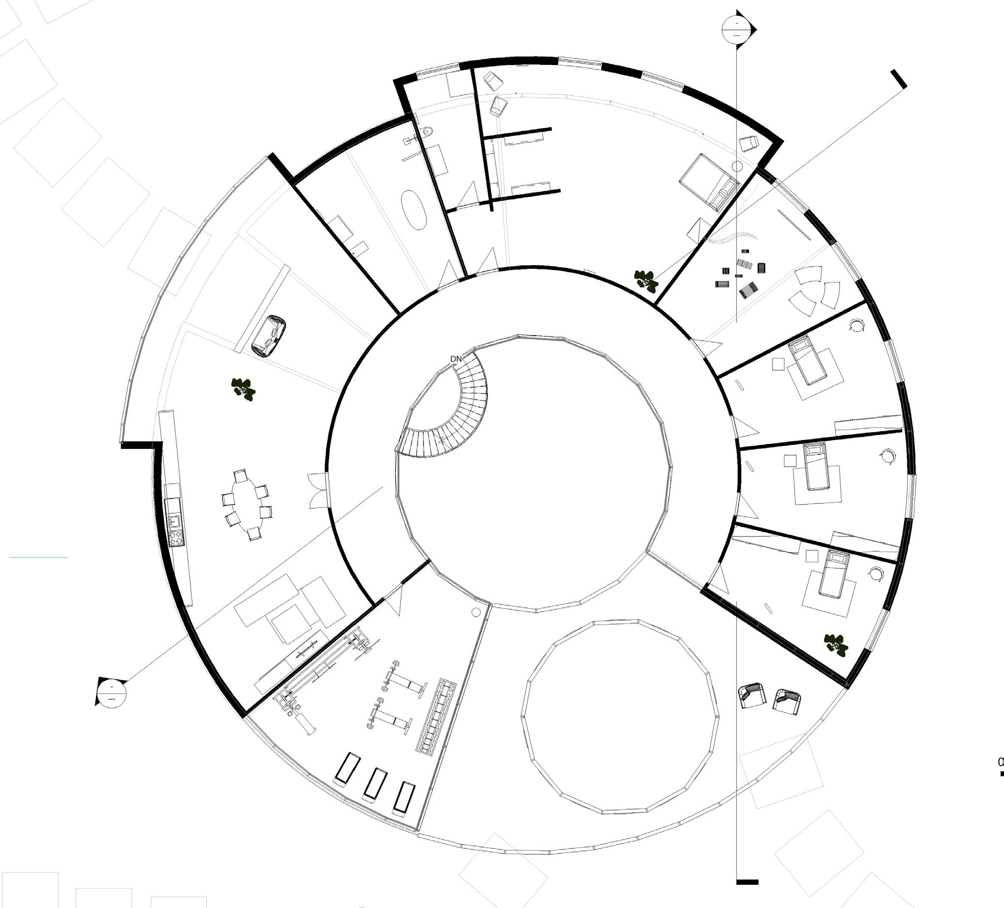
FITNESS AREA TERRACE
+ DRESSING
+ EN SUITE BATHROOM B.R. 1 B.R. 2 B.R. 3 CHILDREN PLAYROOM AA AA BB
SHARED BATHROOM LIVING AREA + TERRACE GYM +
MAIN BEDROOM
ROOM
ILLUSTRATED FLOOR PLAN | Not to scale
85
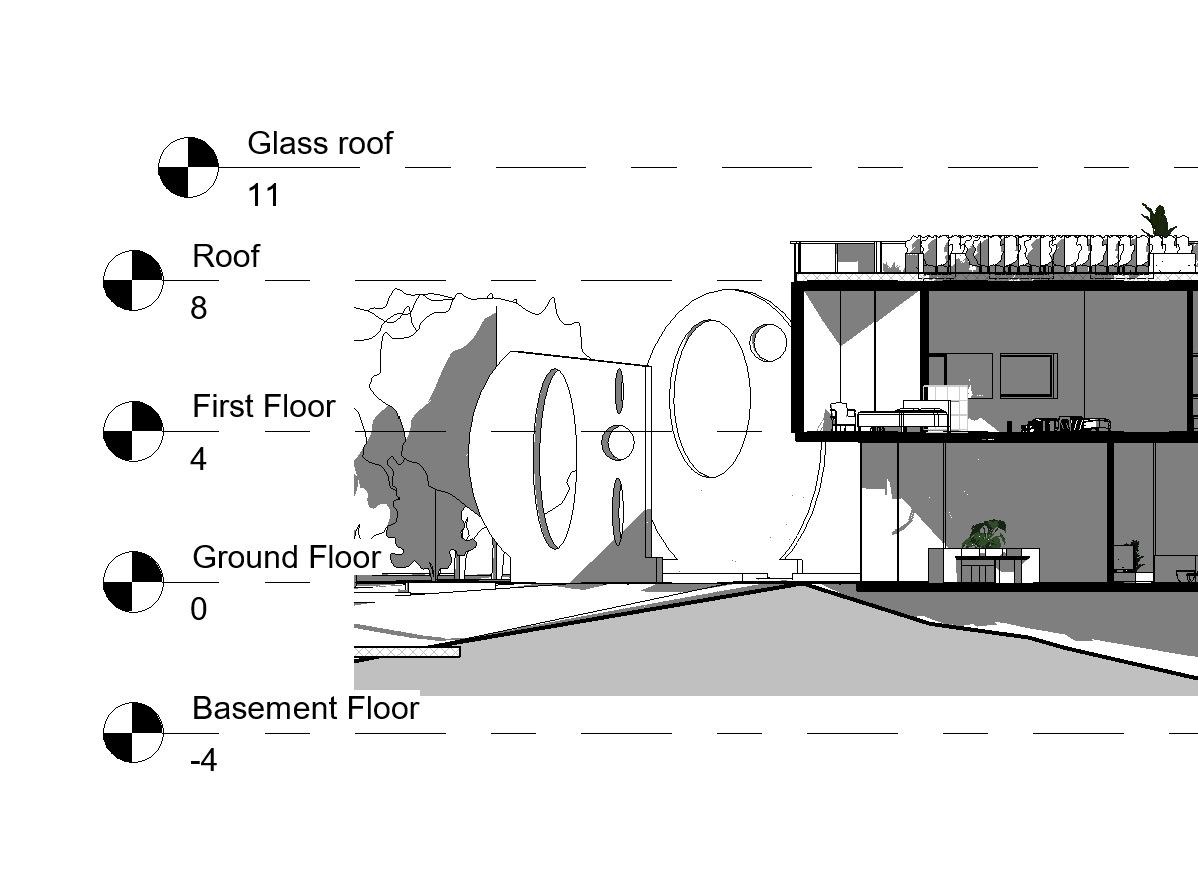
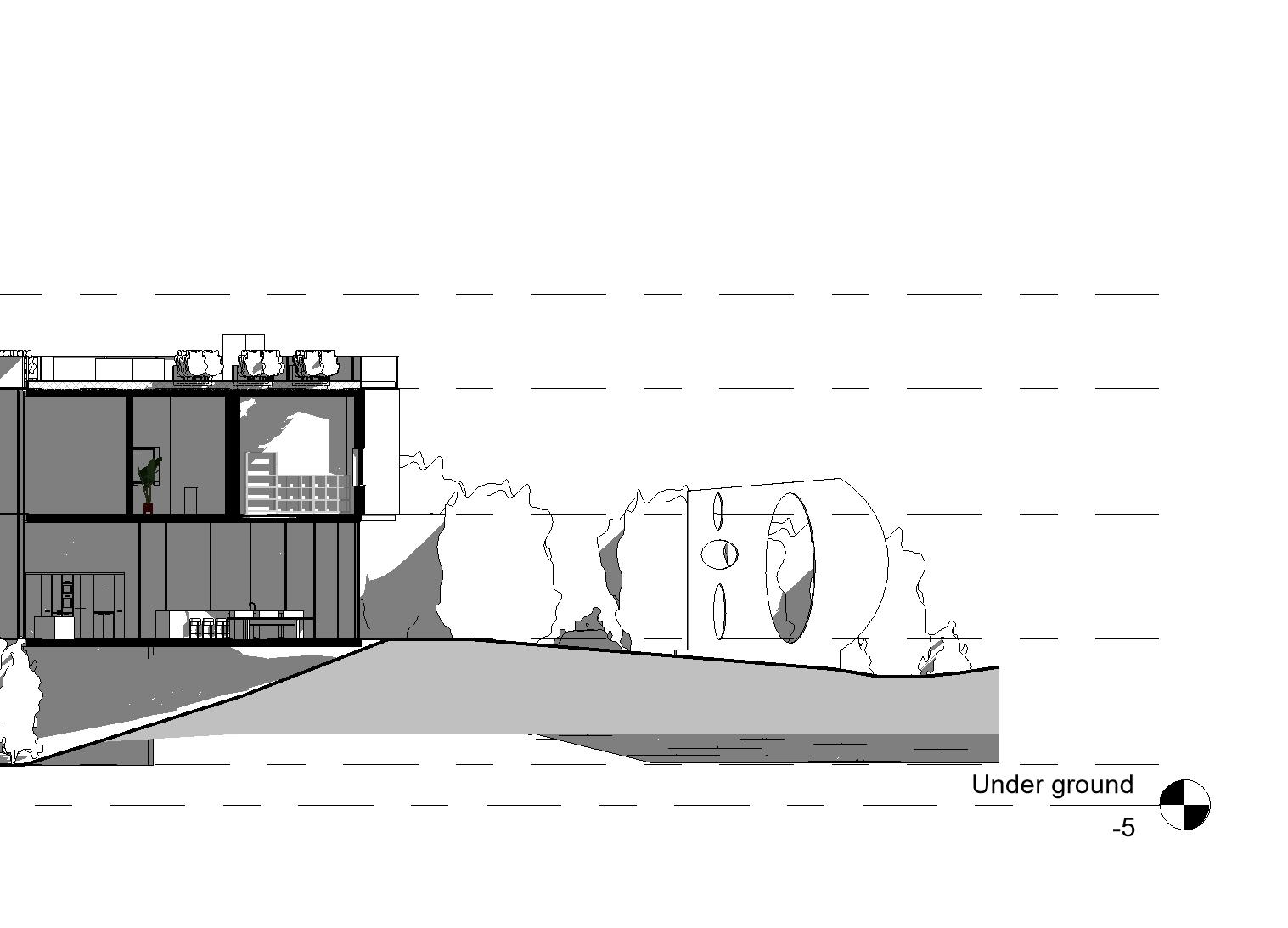
SECTION AA | Scale 1:100
86
86
See page 84 for reference on position.
87
87
88
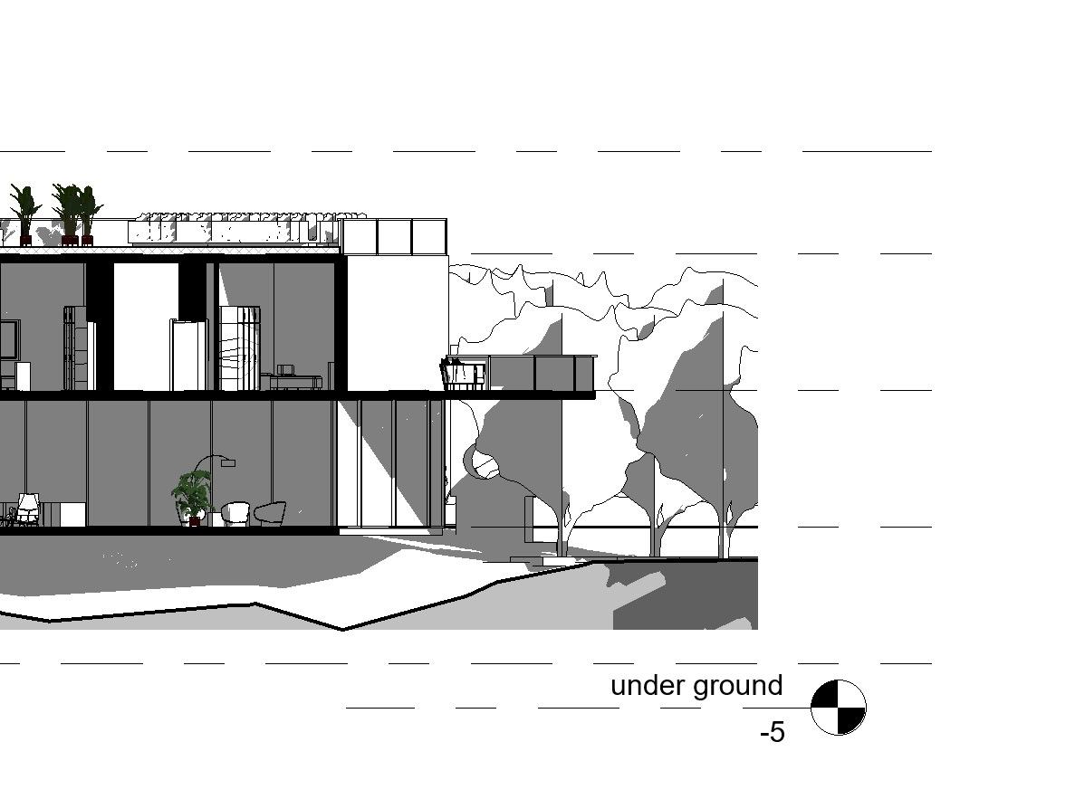
BB | Scale 1:100 88
SECTION
See page 84 for reference on position.
89
89
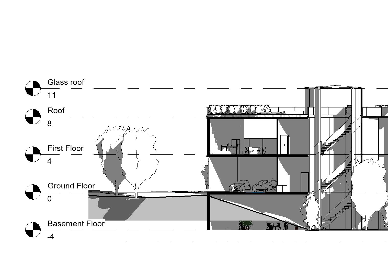
STAIR VIEW | Scale 1:100
90
90
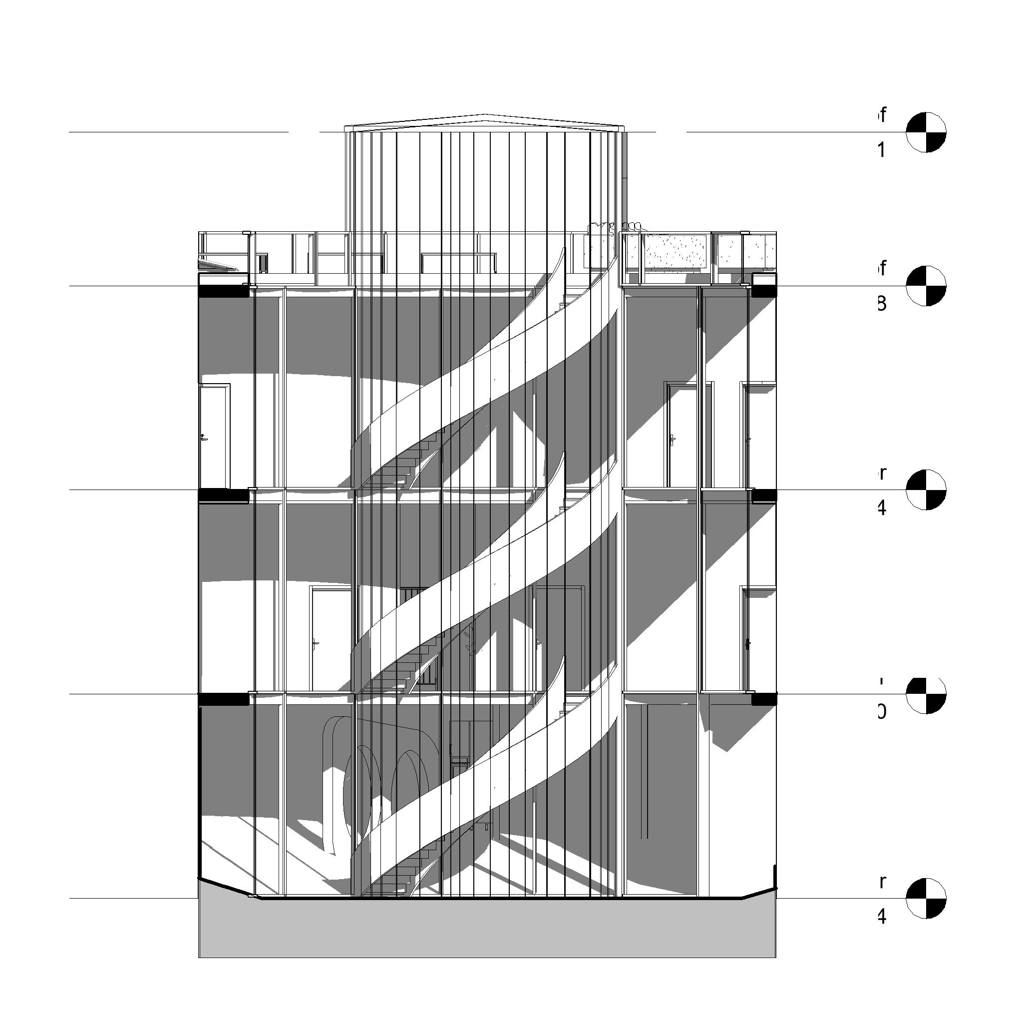
91 Glass Roof Roof First Floor Ground Floor Basement Floor 11 8 4 0 -4
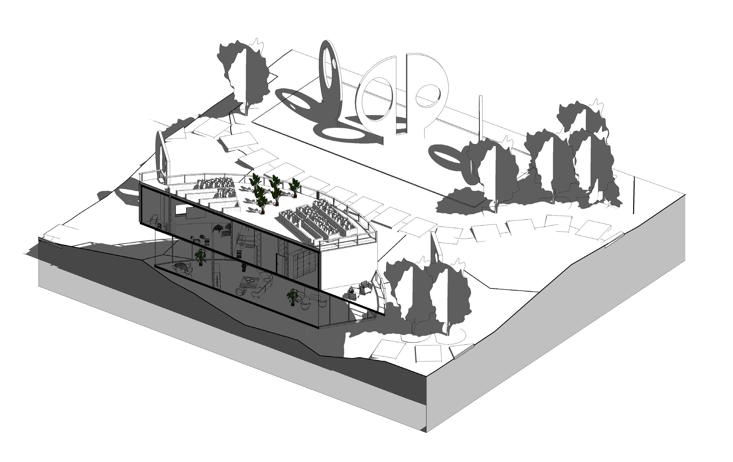
92 SECTION AA (3D) | Scale 1:100 92
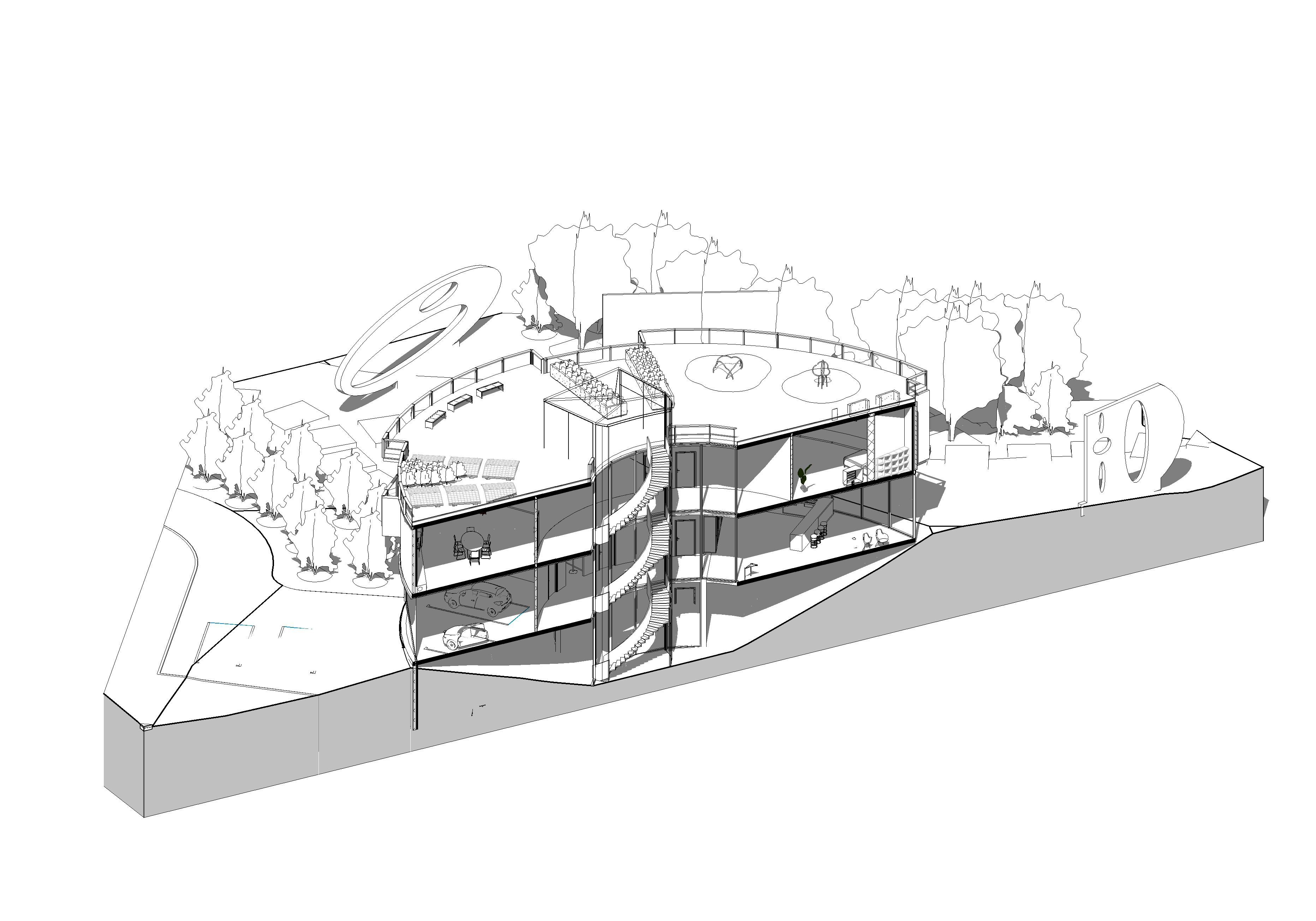
93 SECTION BB (3D) | Scale 1:100 93
