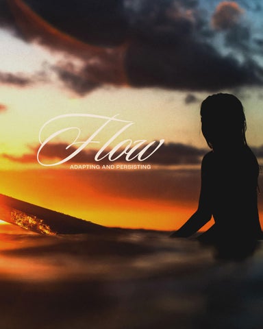

Flow
ADAPTING AND PERSISTING
Flow
ADAPTING AND PERSISTING

COPYRIGHT © KYRA ODA
All rights reserved. No portion of this portfolio may be reproduced, stored in a retrieval system, or transmitted in any form or by any means—electronic, mechanical, photocopying, recording, or otherwise—without the prior written permission of the copyright holder.

My Ohana
It truly takes a village. None of this would have been possible without the love and support of my friends and family—thank you all from the bottom of my heart.
To Tiffany: Your unwavering support, patience, and encouragement inspire me to grow into a better version of myself every single day. I love you.
01 HUNTRESS | P06
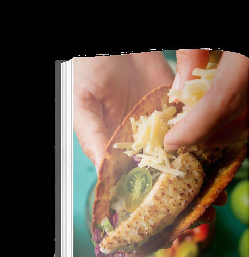
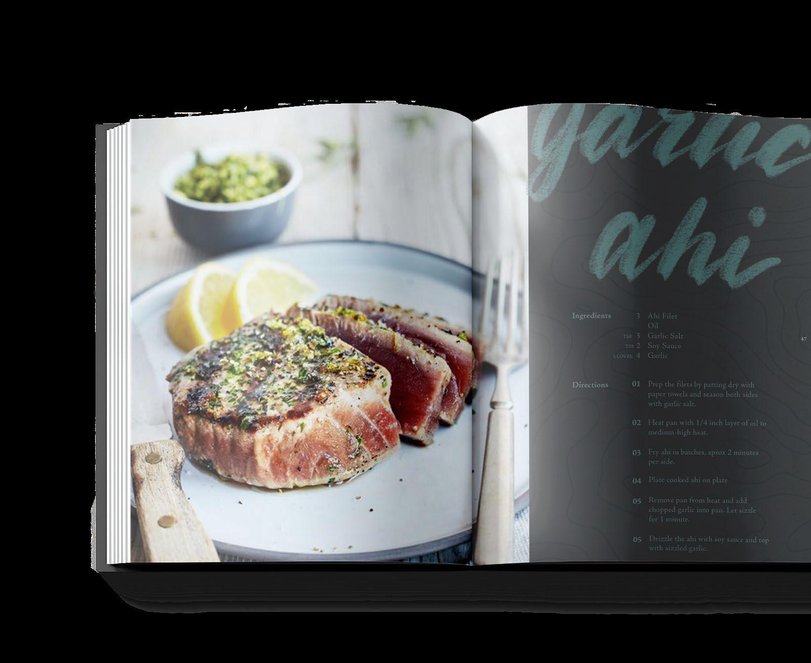
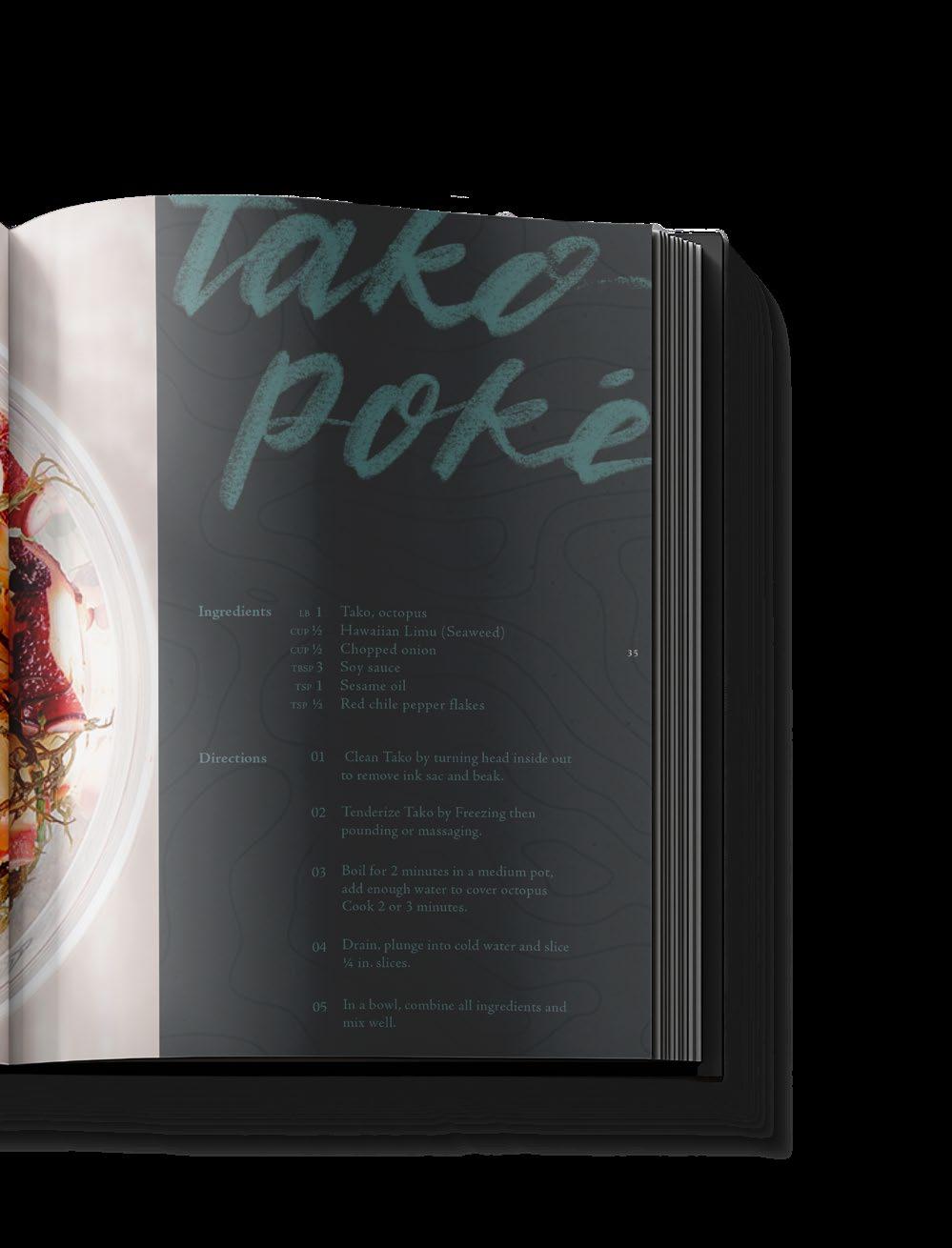
Recipe book – From Ocean Depths to Home-cooked Heights
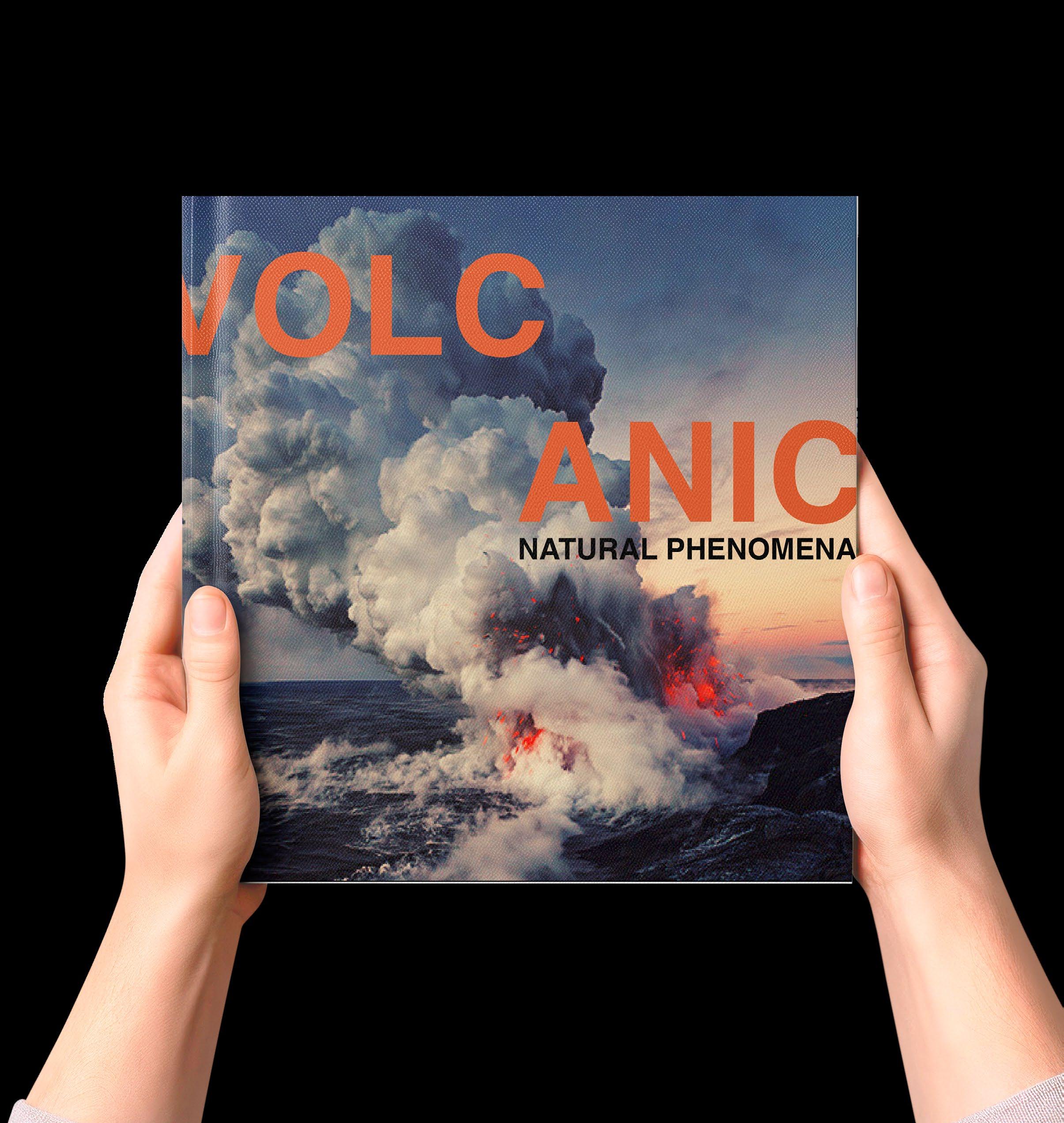
02 VOLCANIC | P20 A natural phenomenon – Life of the Land
03 WORLD SKATE | P44
Brand identity event – A New Era of Skateboarding
04 SPOTTED HYENA | P64
Beer packaging – Ferociously Good Beer
05 SPOTIFY | P92
CSR Report – Changing the World, One Stream at a Time
06 HANDSOME OXFORD | P118
Vintage Thrift Rebrand – Vintage Finds, Personal Touch
07 LETTERFORMS | P136
Typographic Posters – Behind the Details
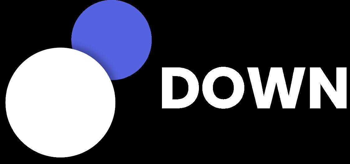
08 DOWN | P148
Social App Design – Are You Down for a Good Time?


ALOHA
Rooted in Hawai‘i, I carry the spirit of the islands and the ocean that surrounds them. The sea is more than just a force of nature—it’s a way of life, a teacher, and a reflection of who I am. Like the tides that shape our shores, I embody both gentleness and strength.
I flow with grace, grounded in aloha and compassion, yet I rise with fierce determination when faced with challenges. In my work, I honor this duality—shaped by the culture, resilience, and natural beauty of Hawai‘i.
I design with intention, moving forward like the ocean itself: adaptable, purposeful, and deeply connected to where I come from and those who keep me anchored—my friends and family, whose love and support guide me through every wave. Mahalo.
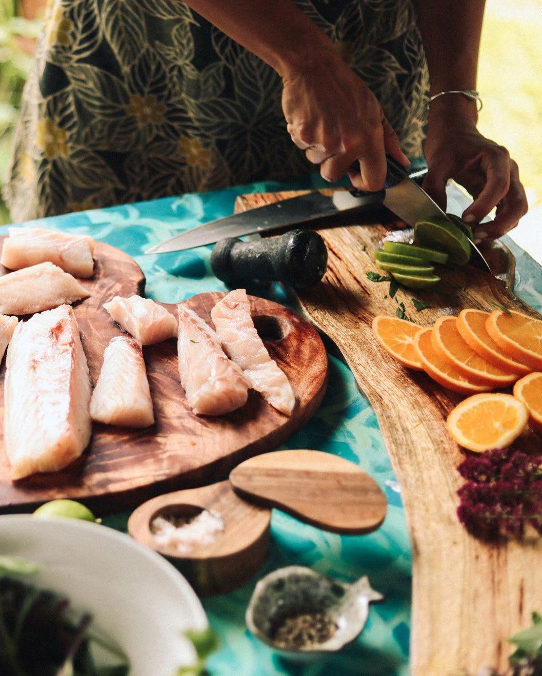
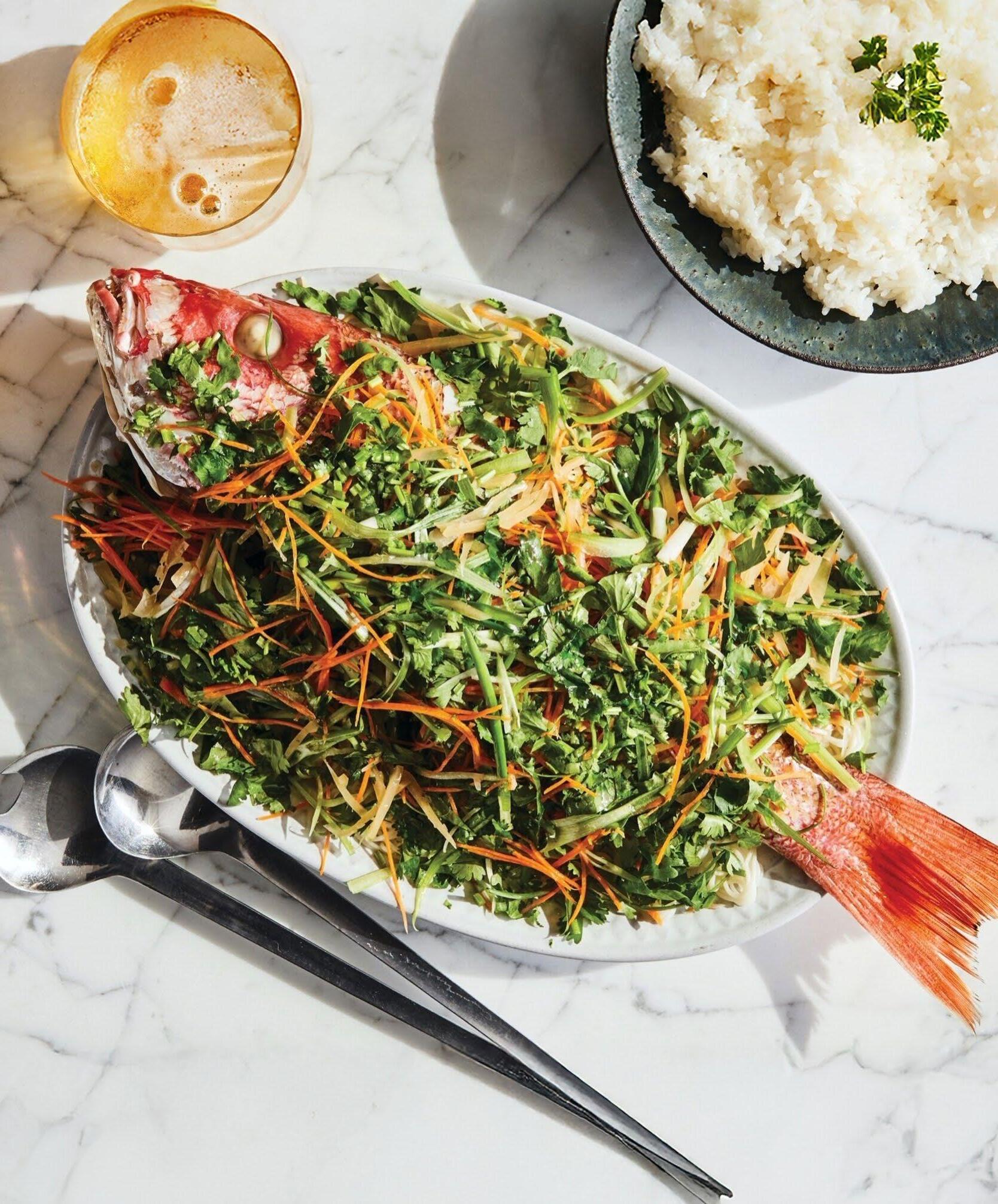
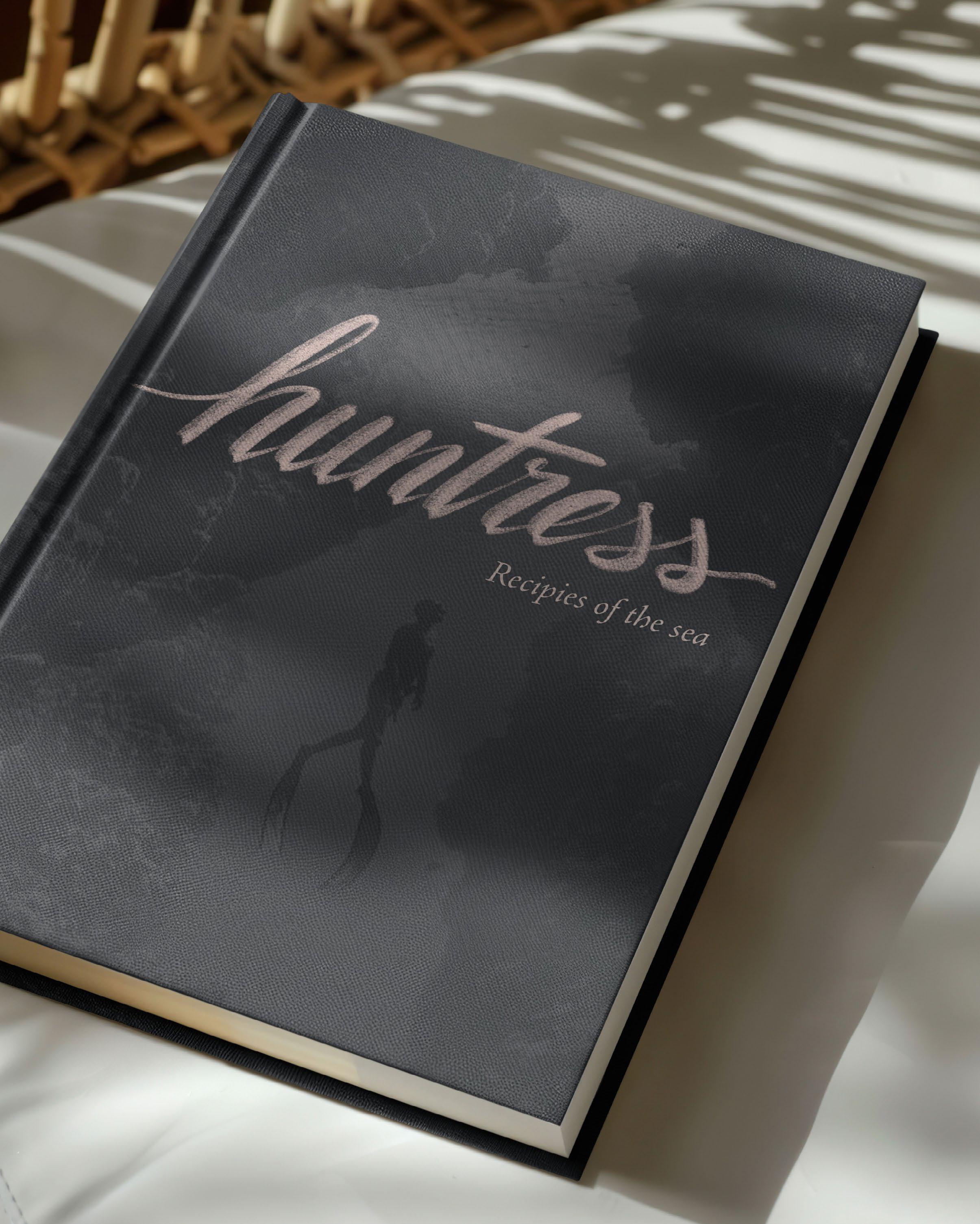
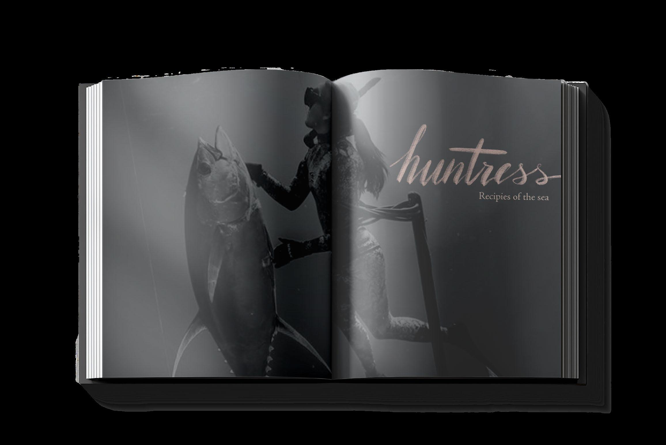
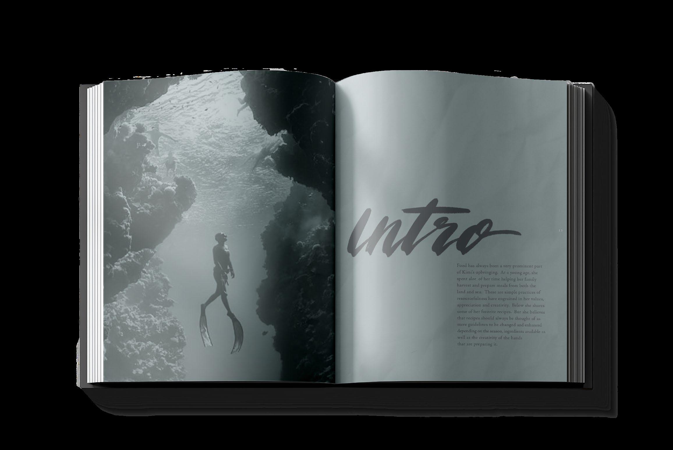
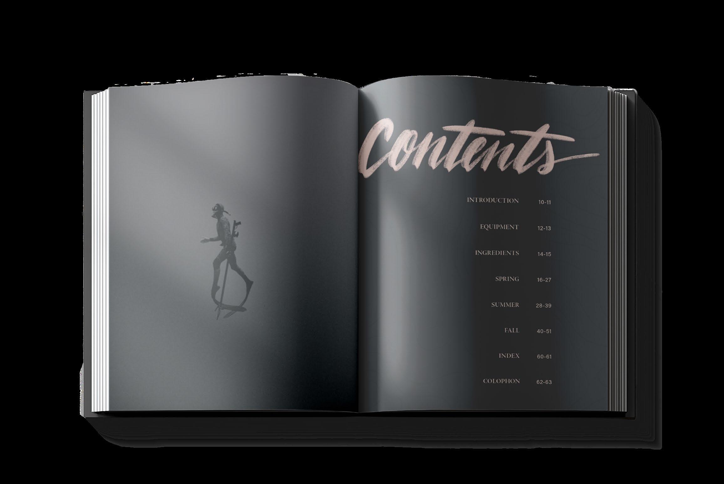
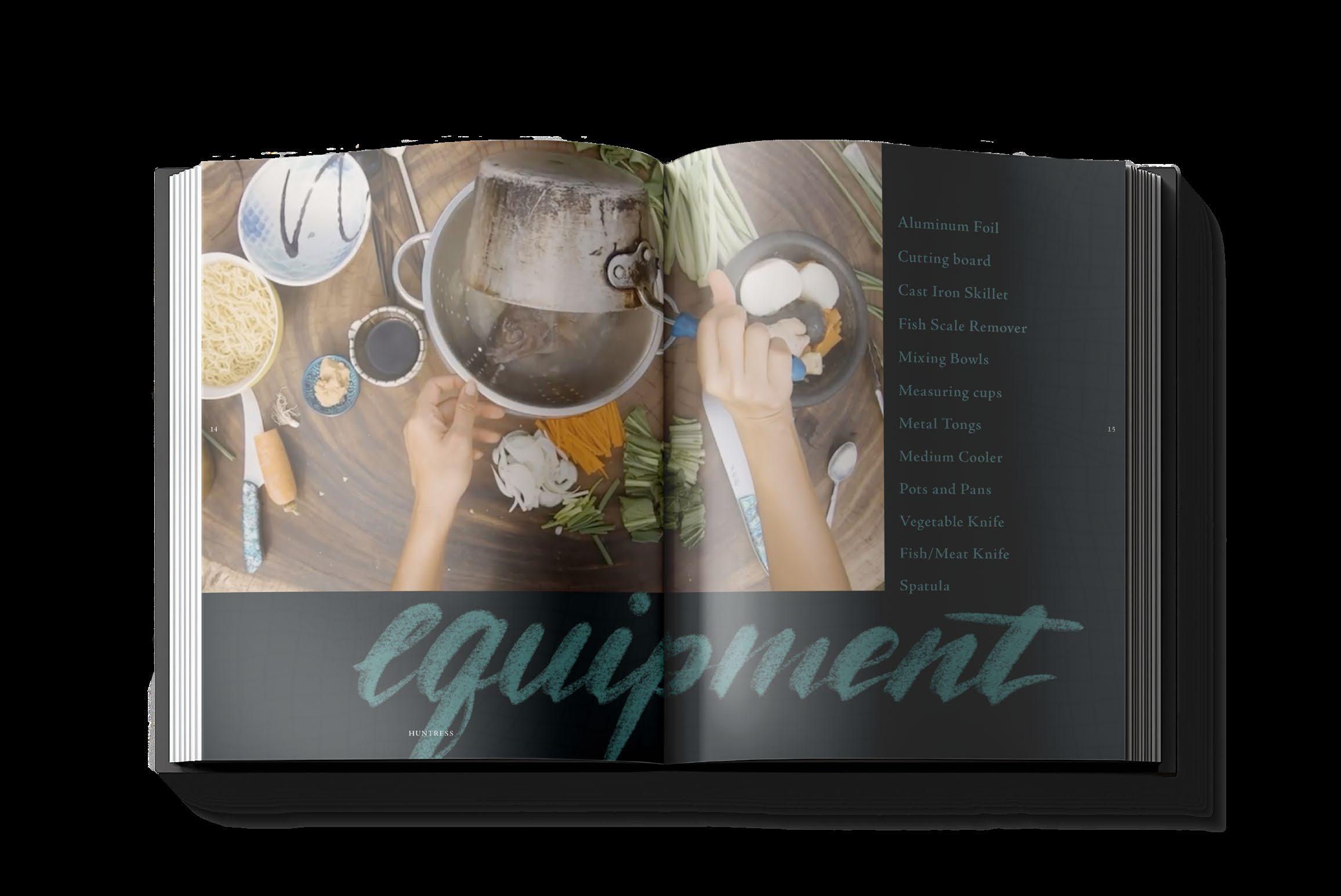
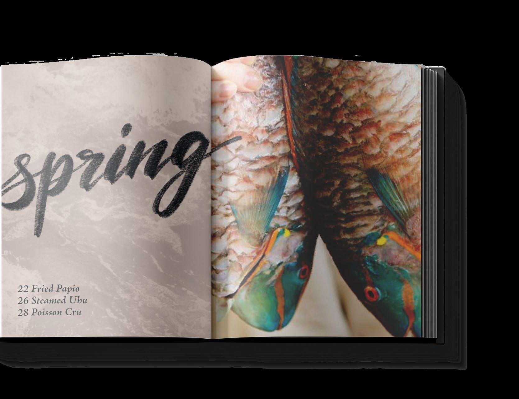
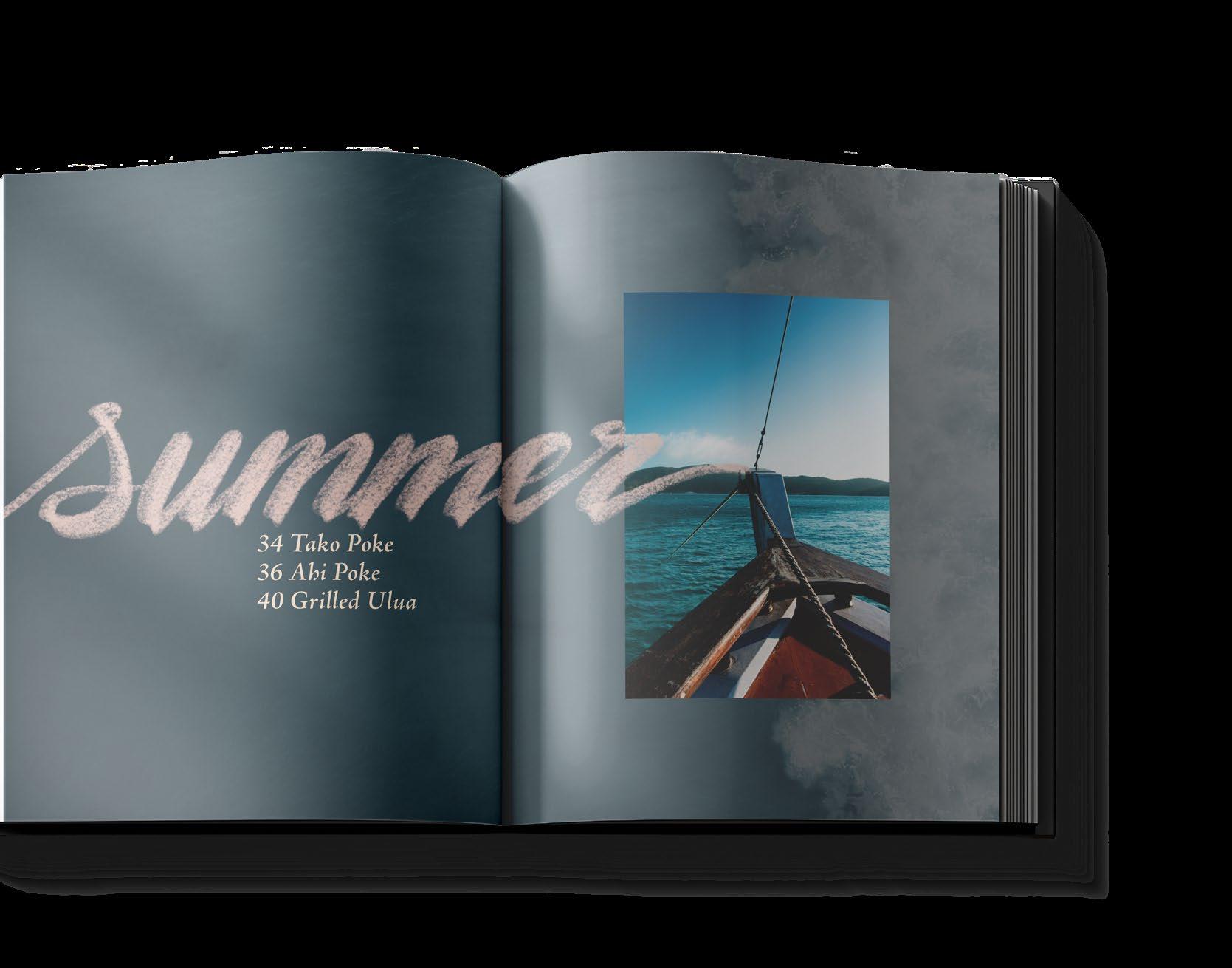
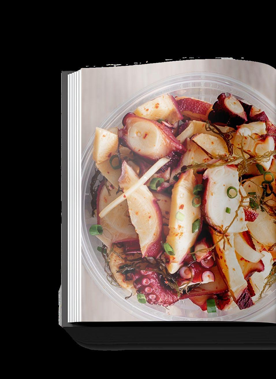
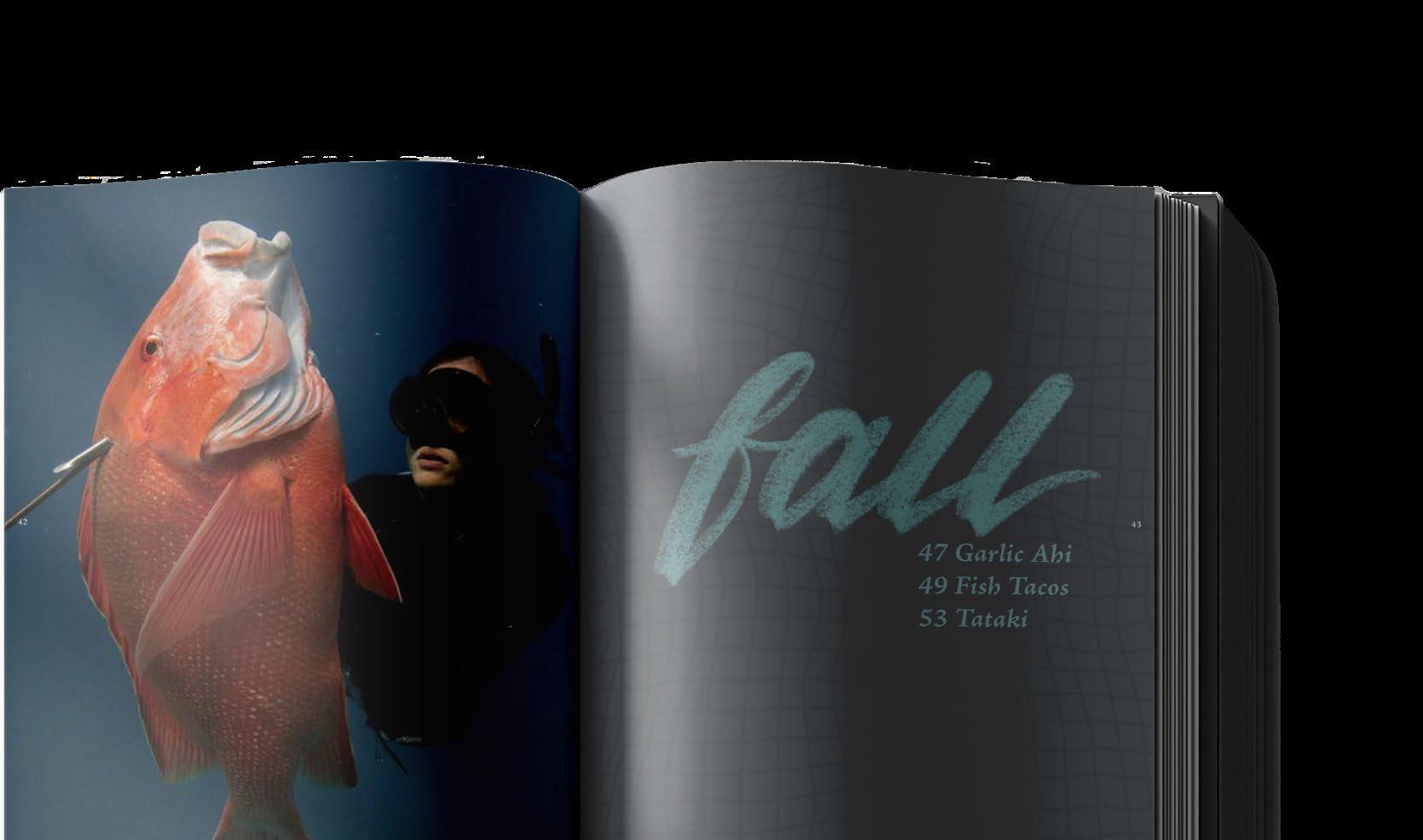
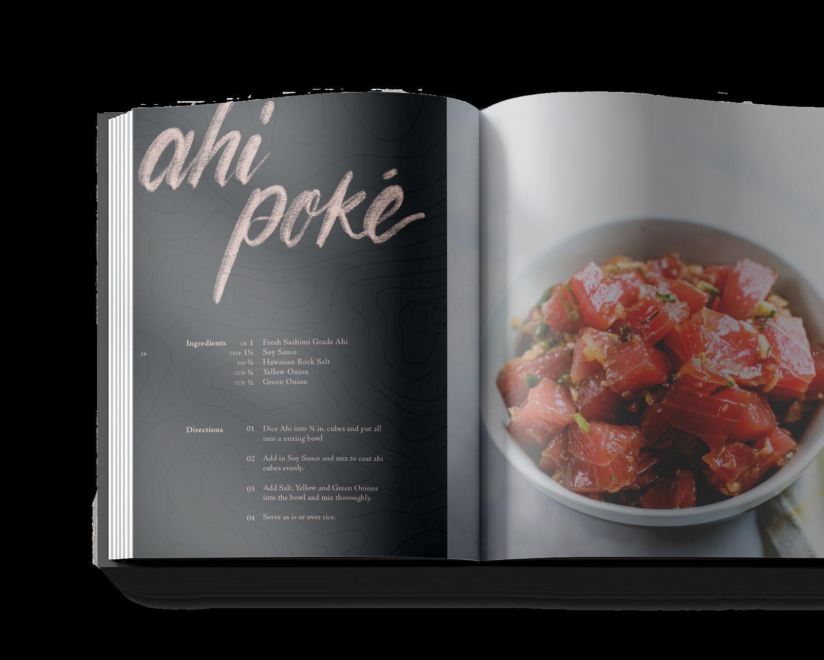
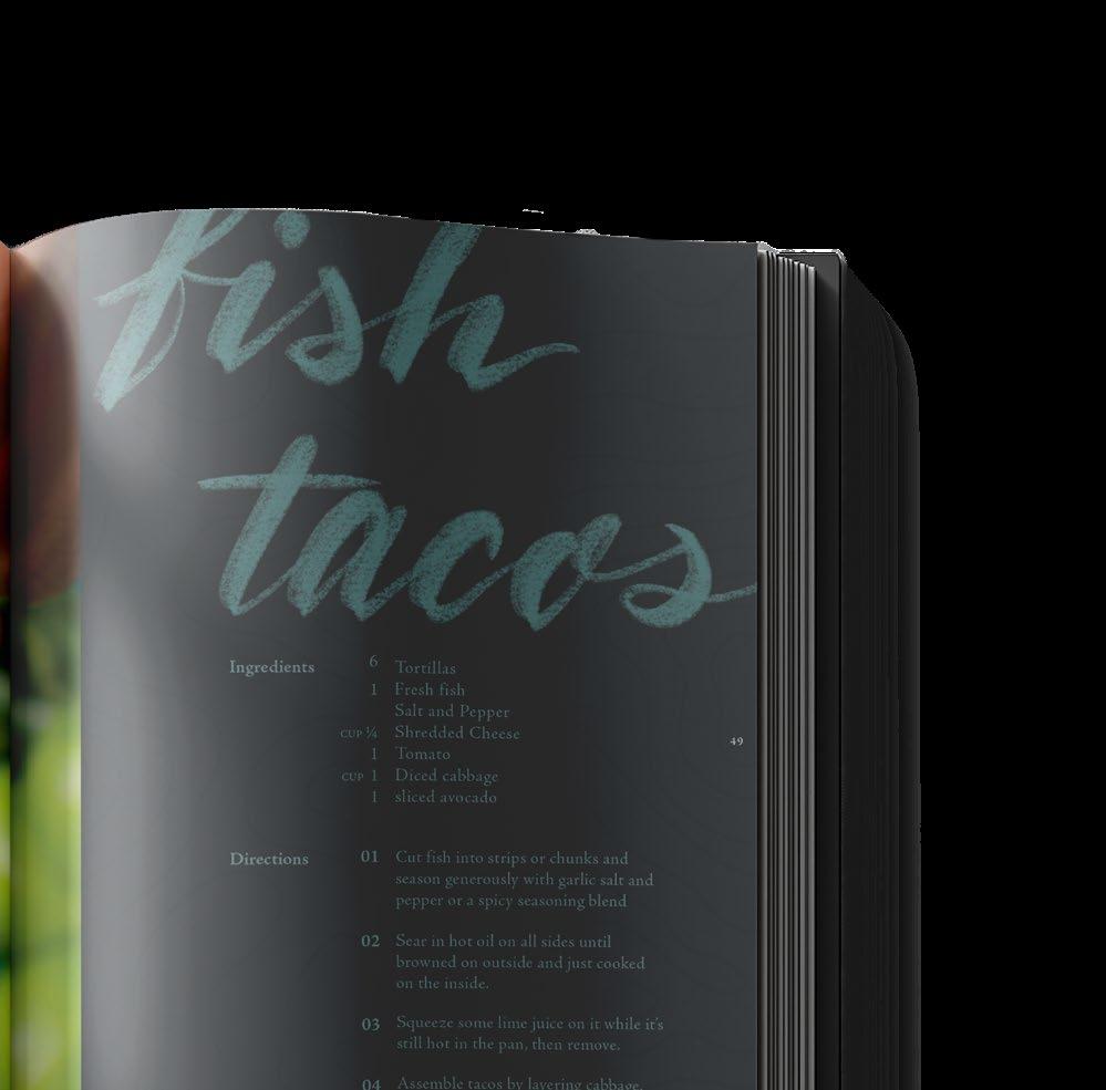
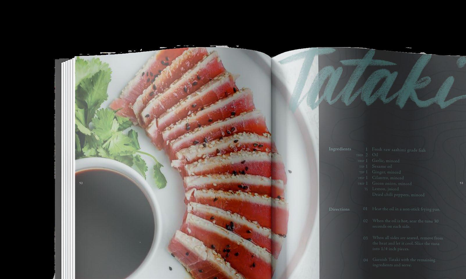
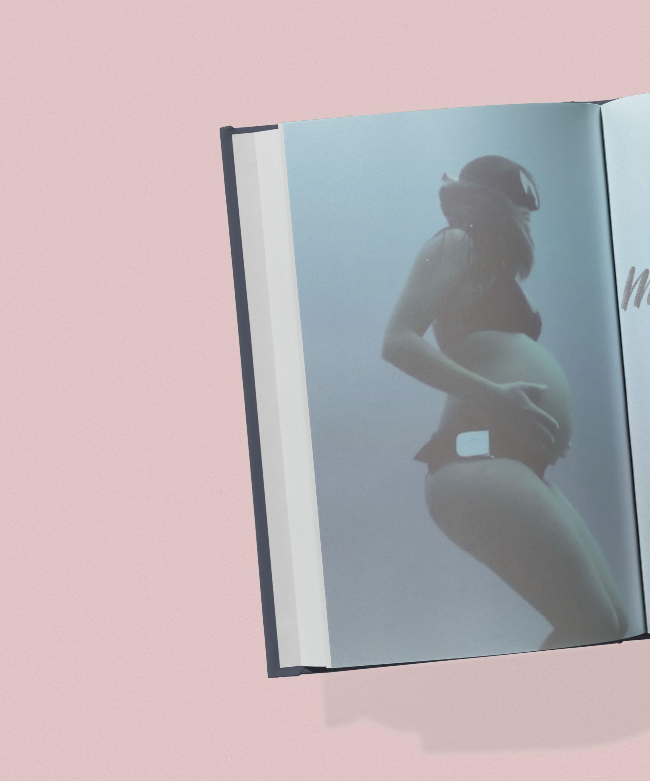
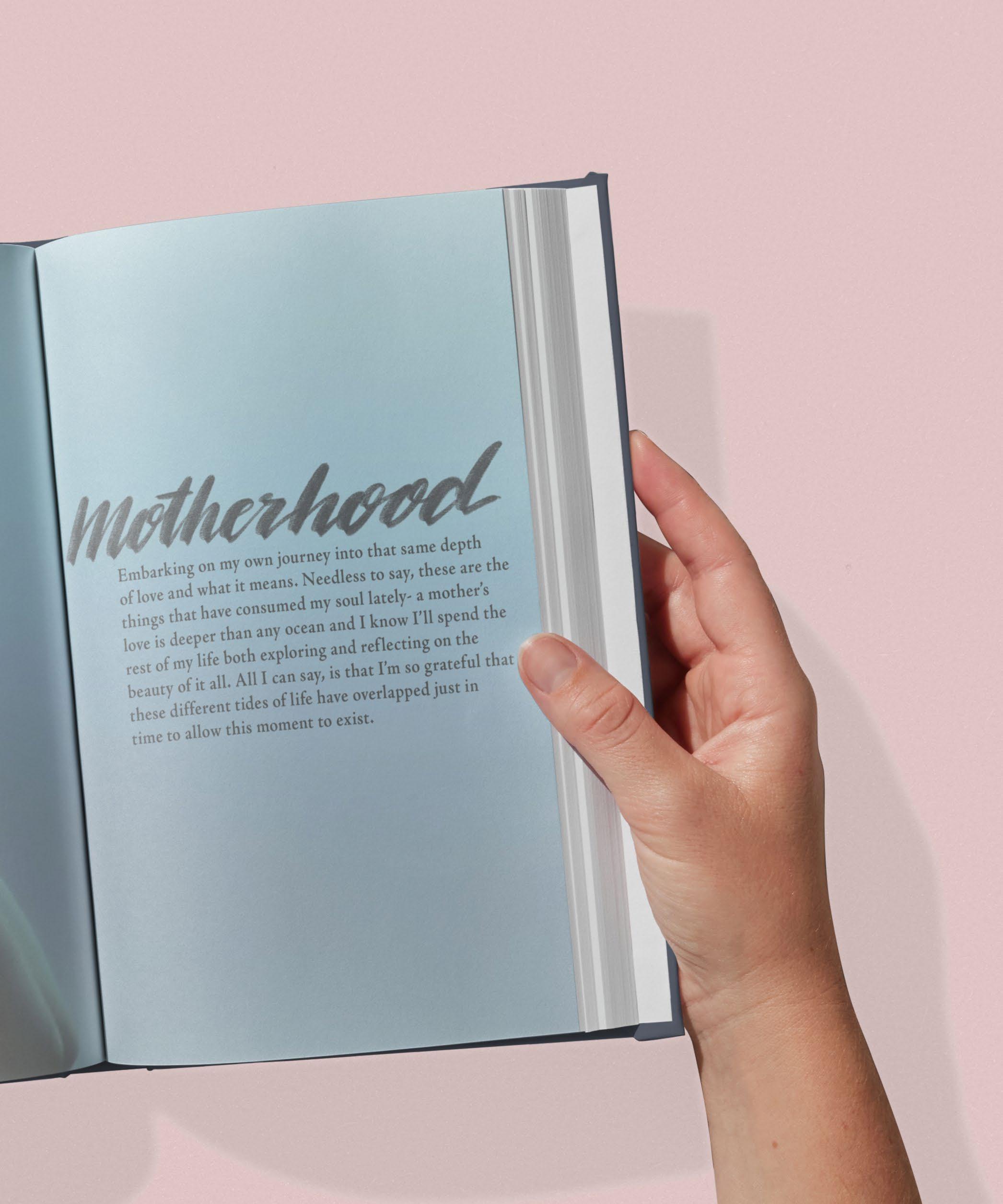
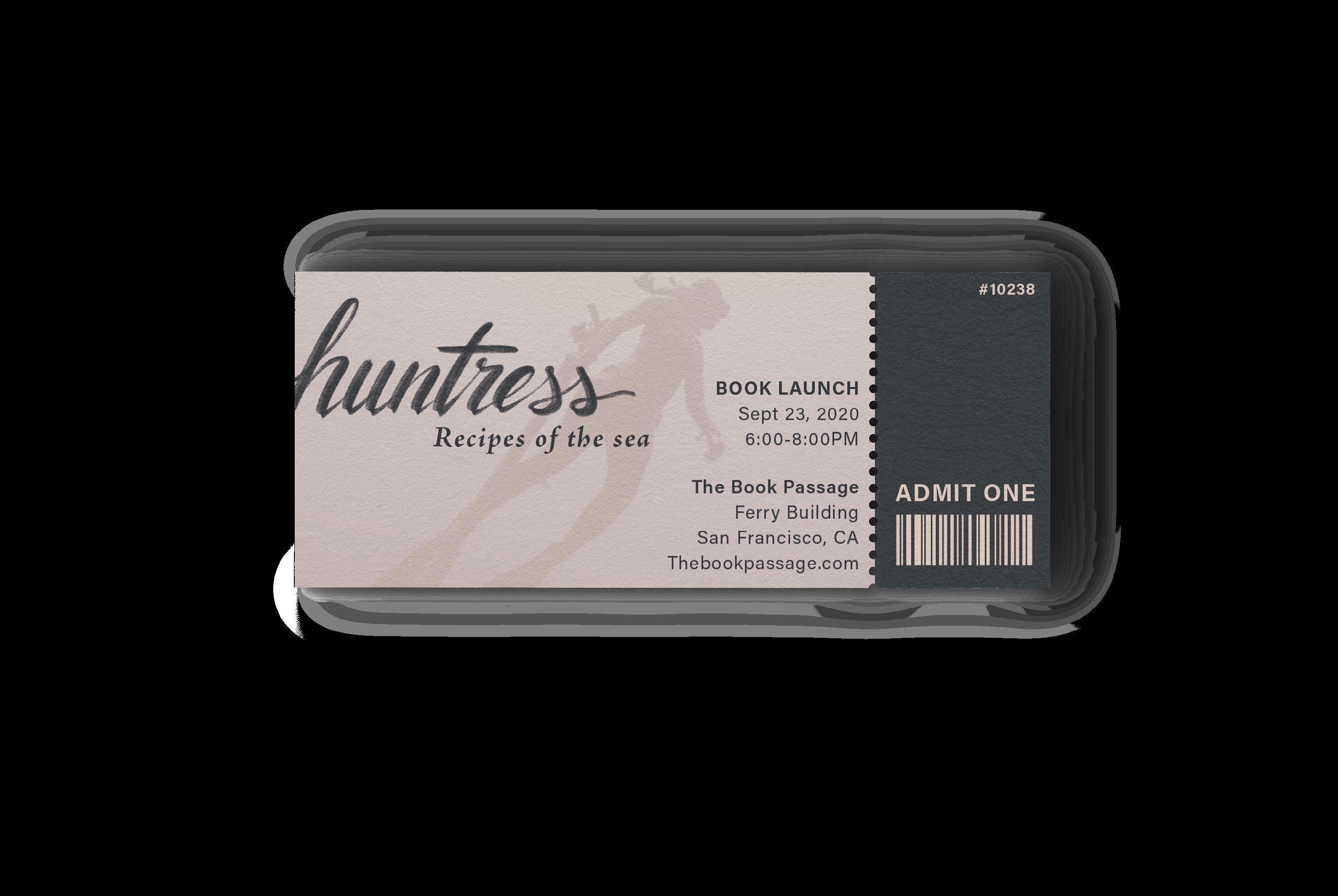
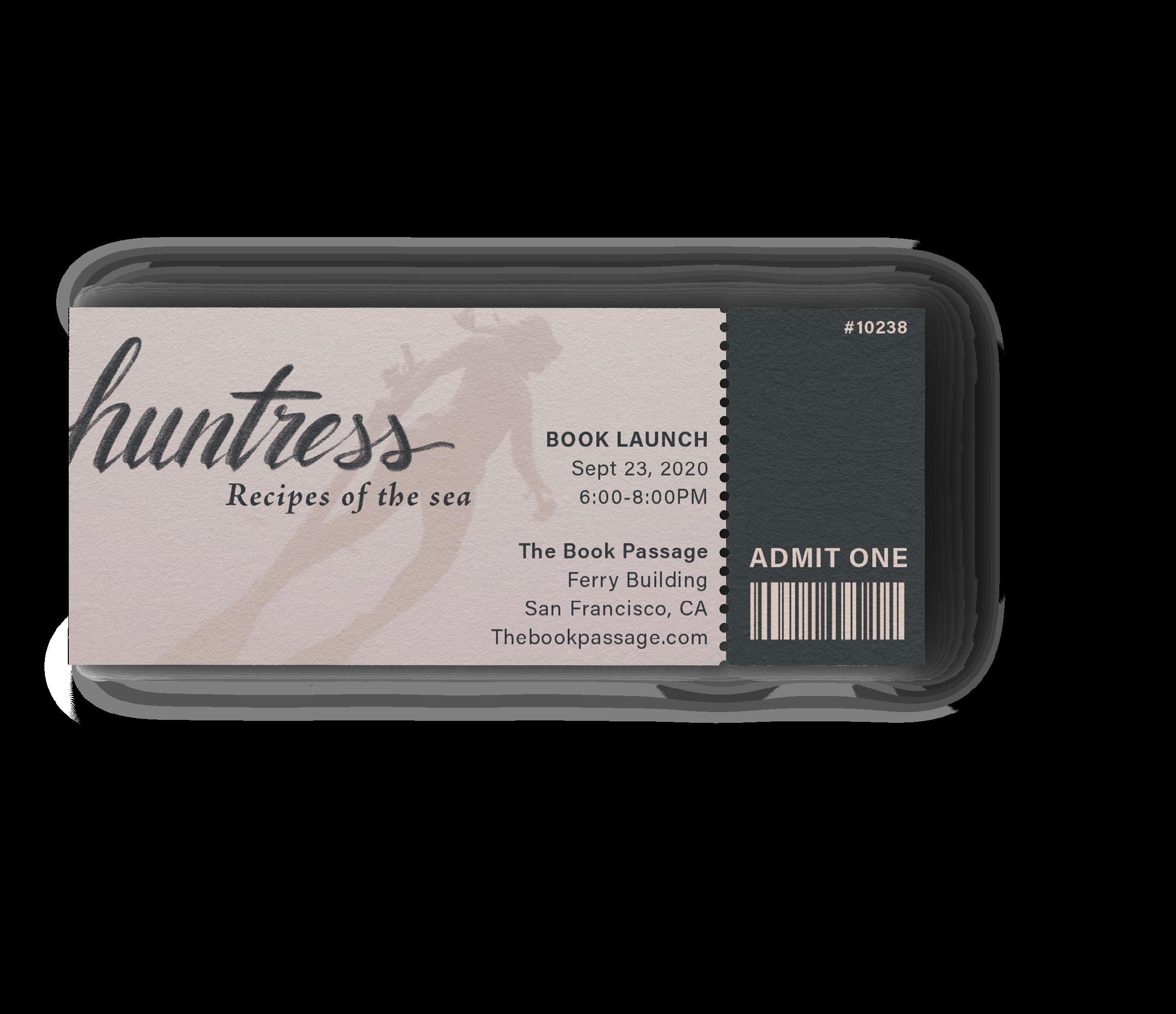
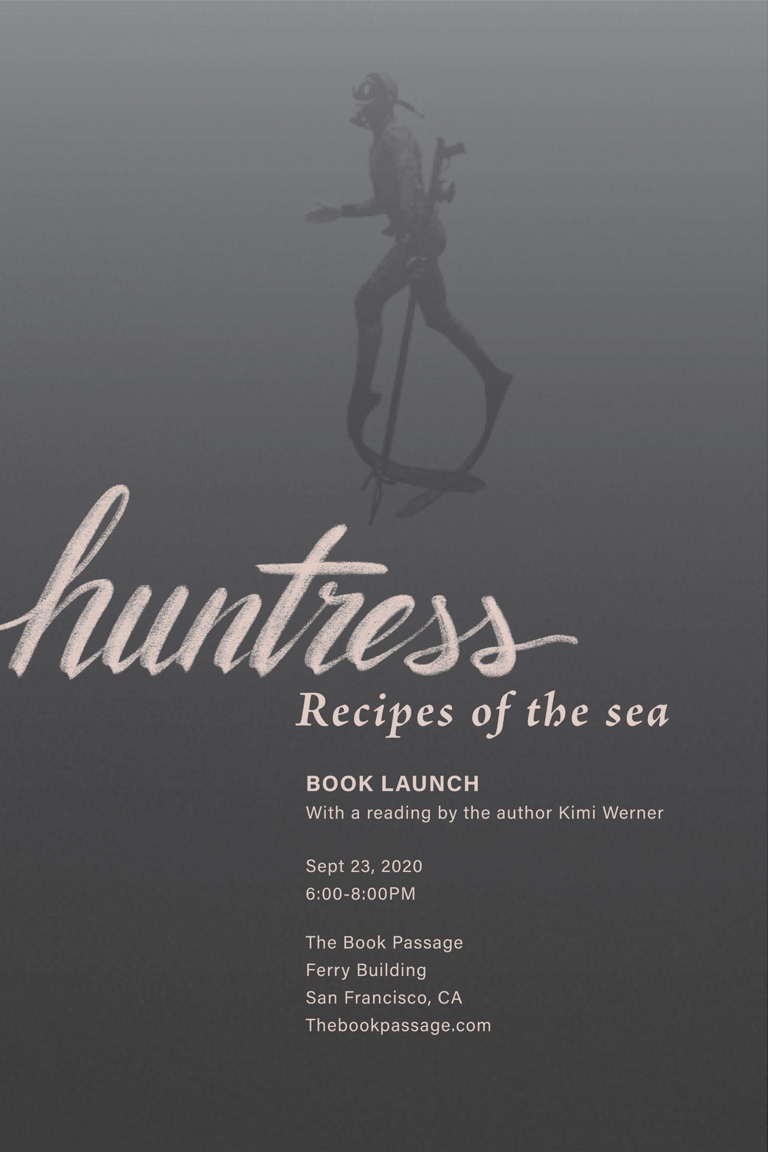
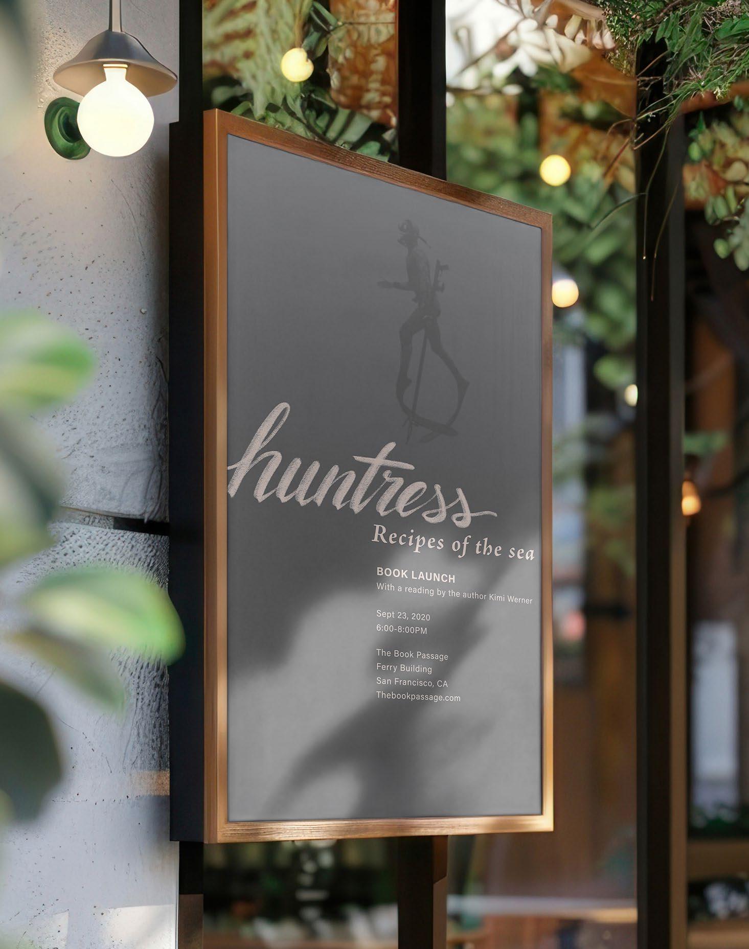
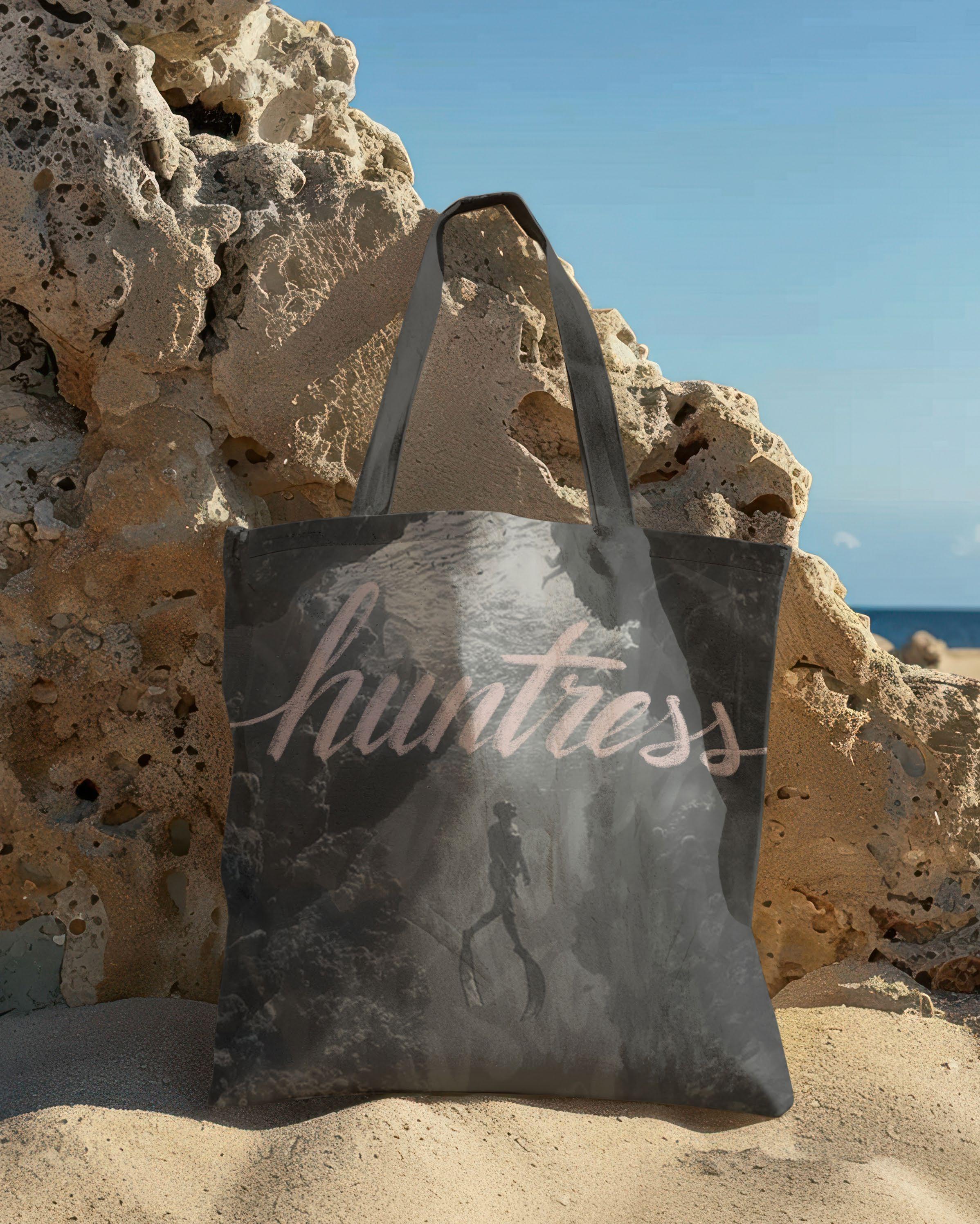
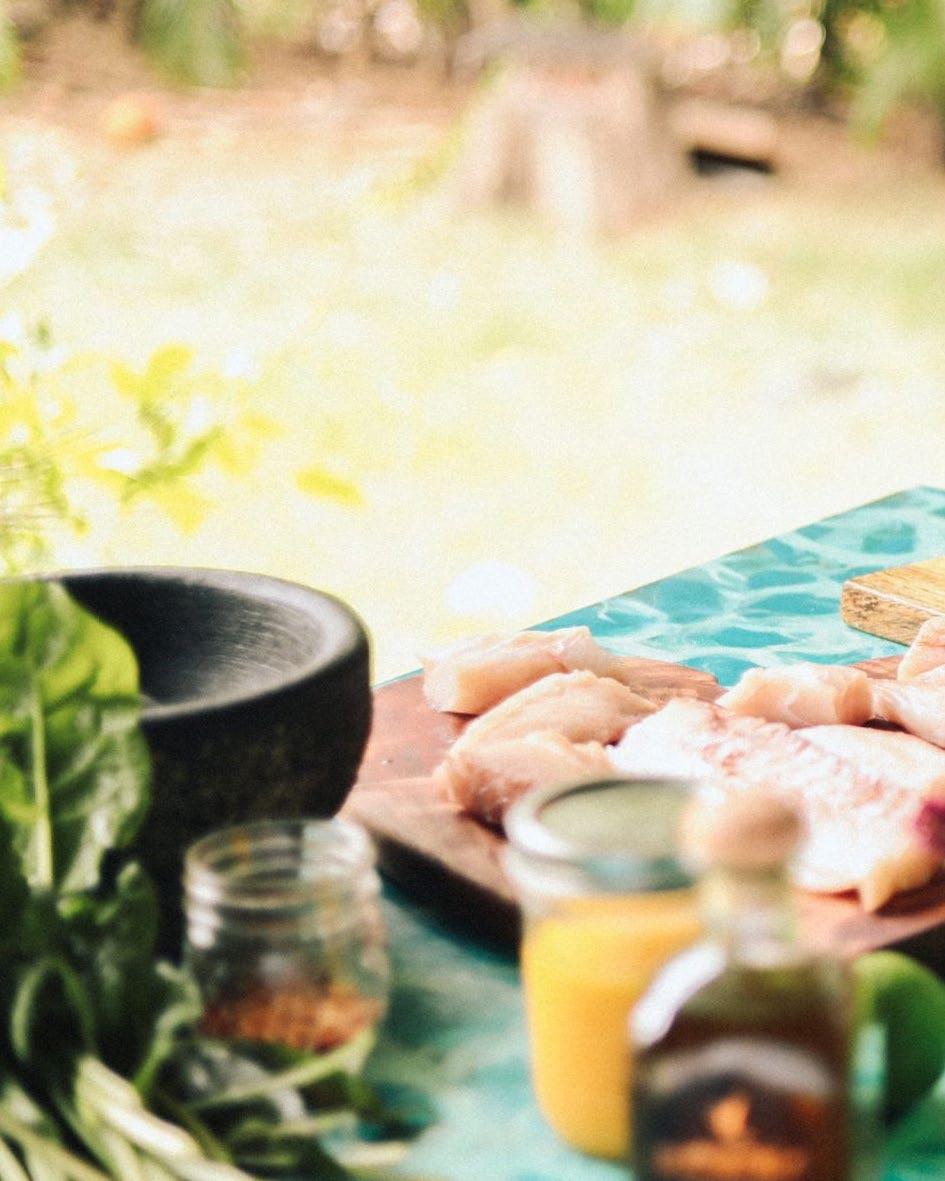
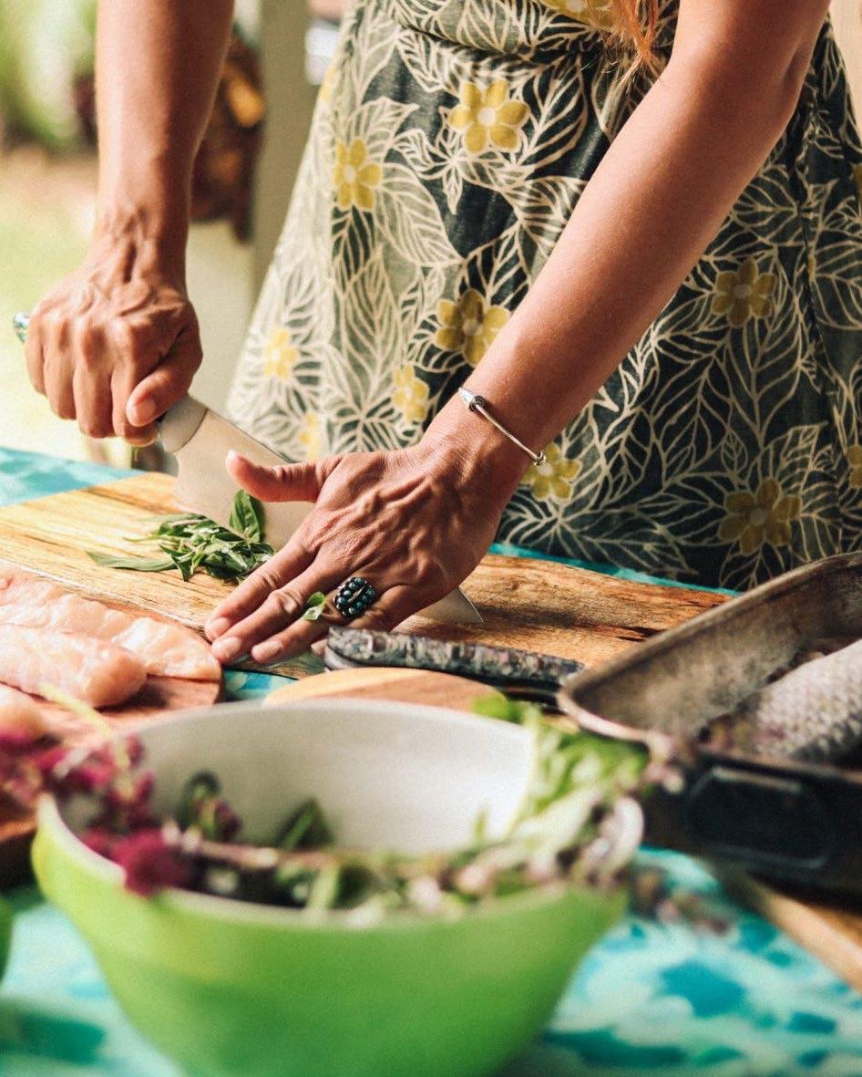
HUNTRESS
From Ocean Depths to Home-cooked Heights
COURSE
TYPOGRAPHY 3
INSTRUCTOR
ARIEL GREY
MEDIA TYPE BOOK DESIGN
3 KEYWORDS FEARLESS RESILIENT FEMININE
OBJECTIVE
Develop a distinctive cookbook concept supported by a cohesive and expressive typographic system.
APPROACH
Capture the powerful balance in Kimi Werner’s life as both a skilled hunter and a nurturing chef. This cookbook will reflect her identity as a national spearfishing champion, mother, and storyteller by emphasizing her connection to nature, self-reliance, and cultural heritage. To honor her raw, grounded lifestyle, the design will incorporate organic textures, minimal polish, and handwritten taglines that feel personal and intimate—like notes in a well-worn journal. The typography mixed with imagery together will highlight the emotion, adventure, and intention behind every catch and every meal.


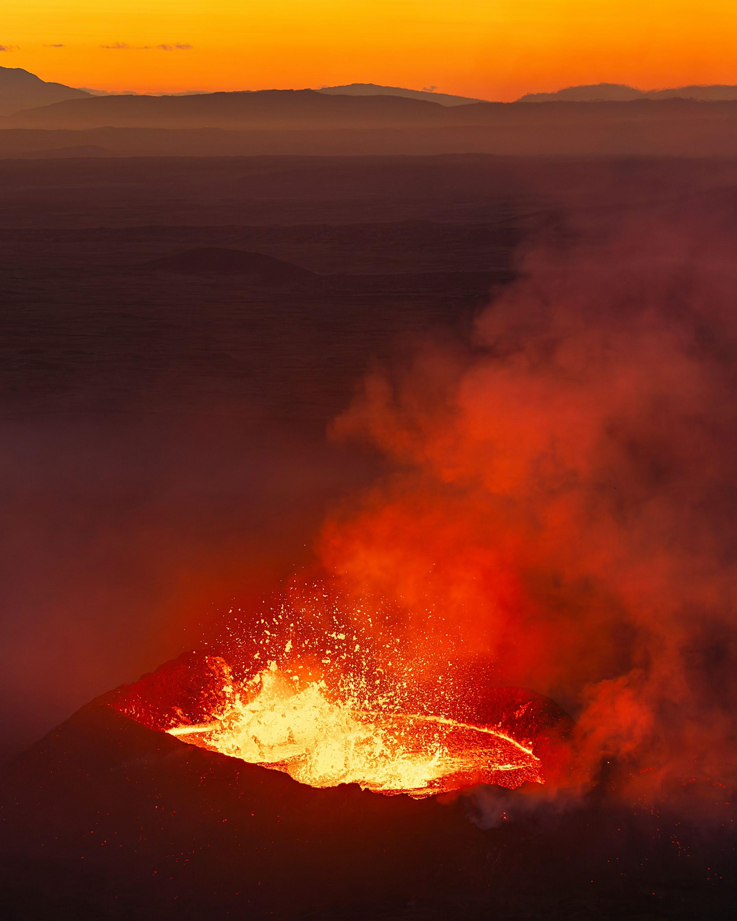
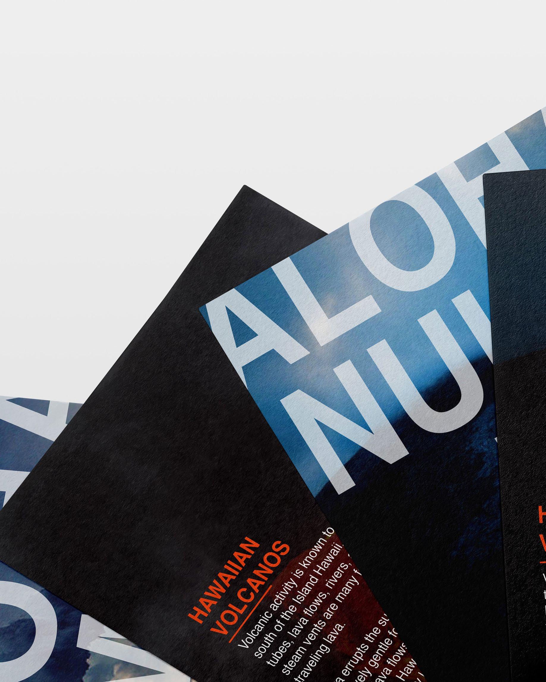
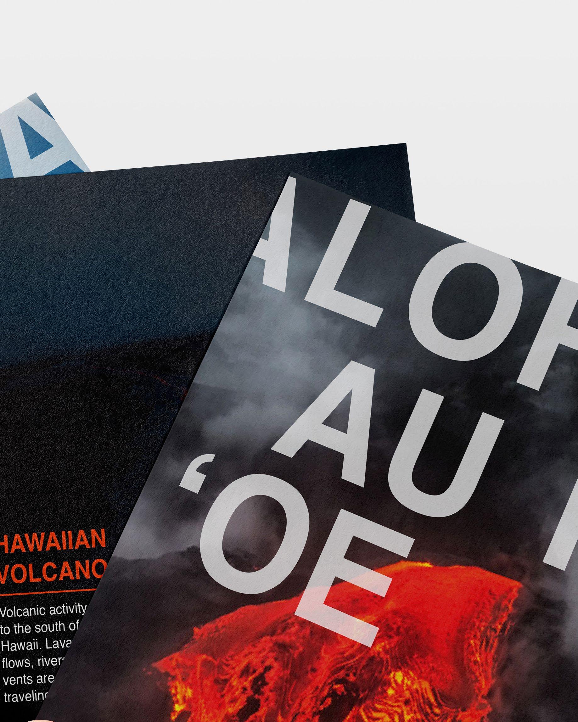
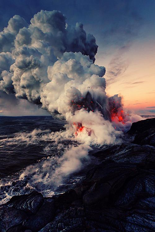
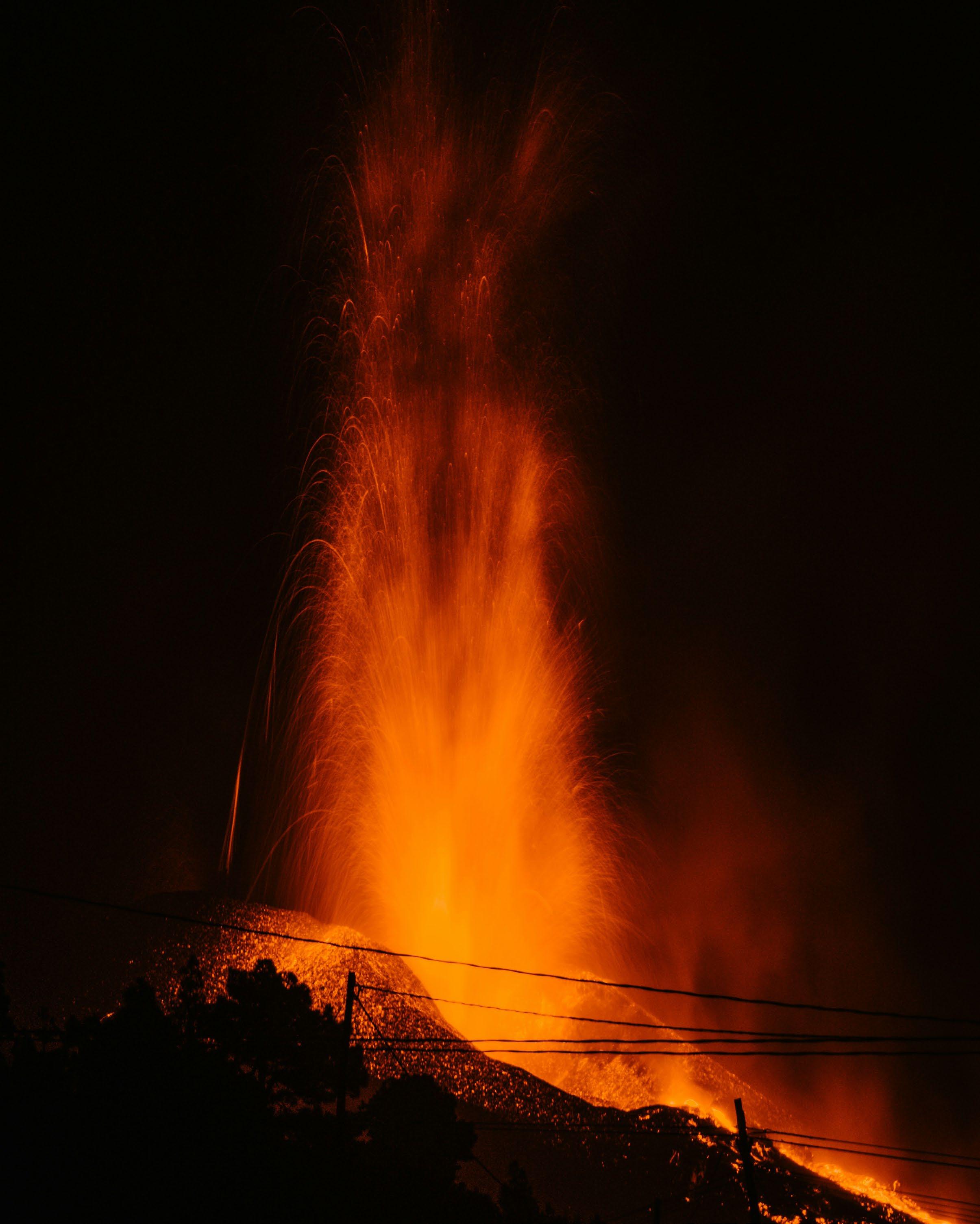
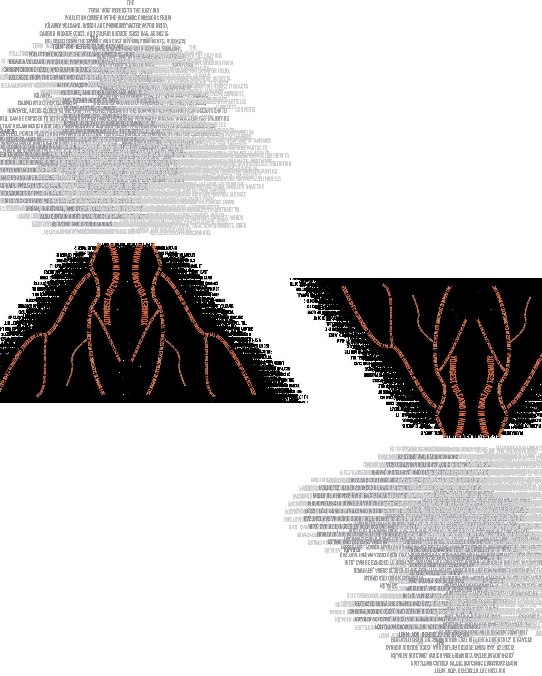
Life of the Land VOLCANIC
COURSE
GRAPHIC DESIGN 1
INSTRUCTOR
JANE BROWN
MEDIA TYPE BOOK DESIGN
3 KEYWORDS SOPHISTICATED POWERFUL DYNAMIC
OBJECTIVE
Craft a visually compelling book that delves into the beauty and complexity of a natural phenomenon. Develop a cohesive brand identity and conceptual framework for a hypothetical art exhibition, thoughtfully aligning visual elements with the chosen theme to create an immersive experience.
APPROACH
Express the diverse forms of volcanic activity as they naturally unfold through typography, photography, pattern illustrations, & other visual media. Develop designs that highlight the striking beauty & raw power of volcanoes, a profoundly destructive natural phenomenon.
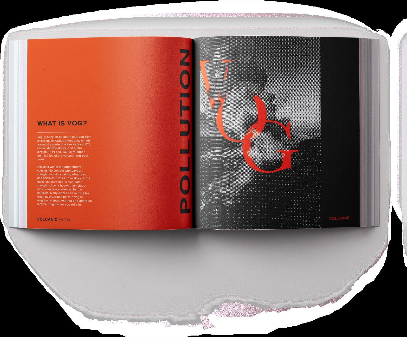
ALOHA K Ā KOU MAI ALOHA
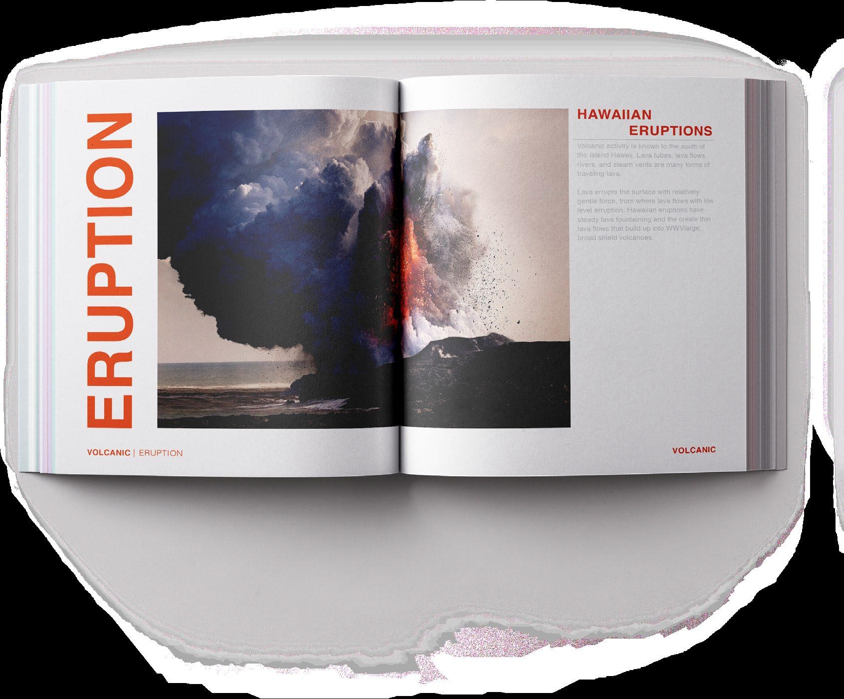
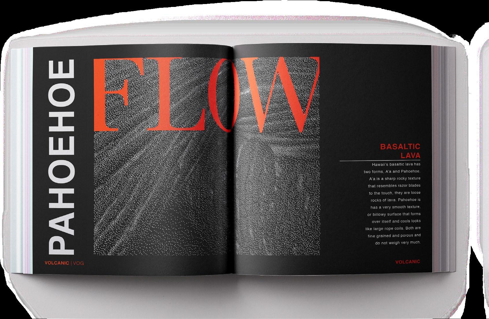
Volcanic activity is known to the south of the Island Hawaii. Lava tubes, lava flows, rivers, and steam vents are many forms of traveling lava.
Lava errupts the surface with relatively gentle force, from where lava flows with low level erruption. Hawaiian eruptions have steady lava fountaining and the create thin lava flows that build up into large, broad shield volcanoes.


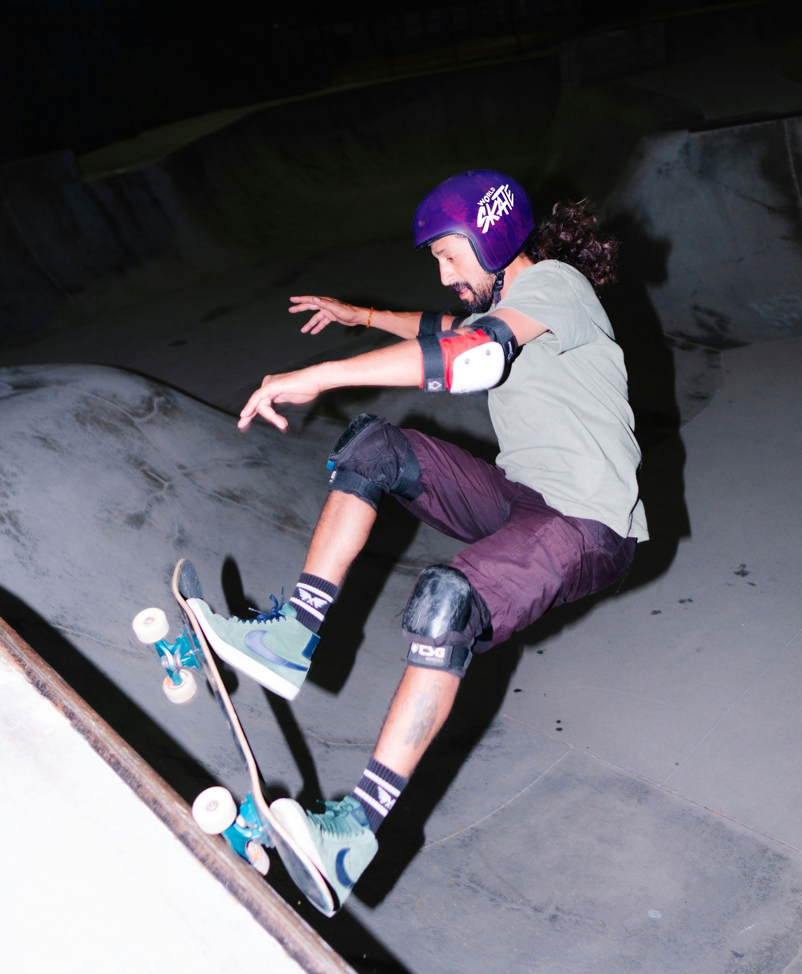
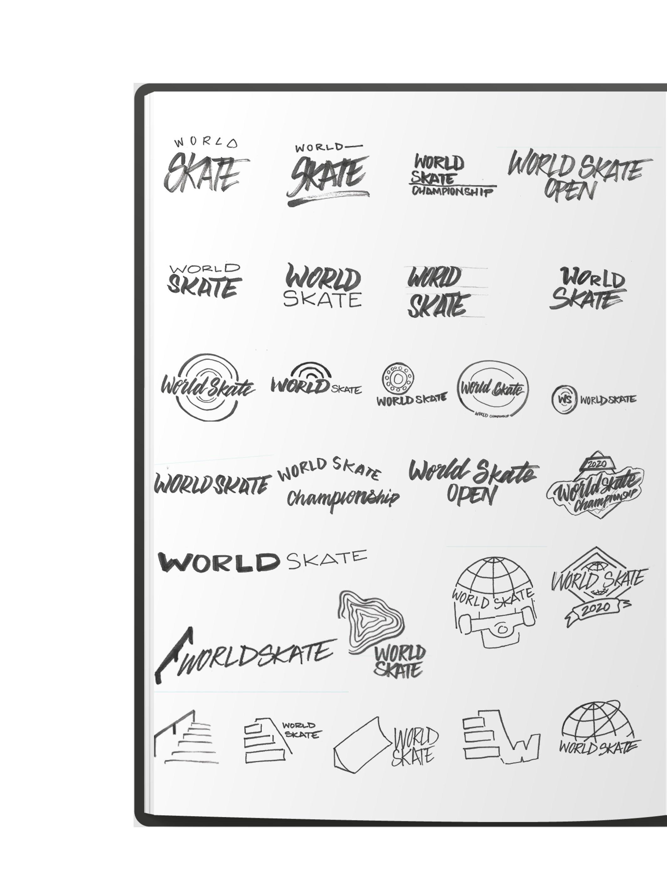
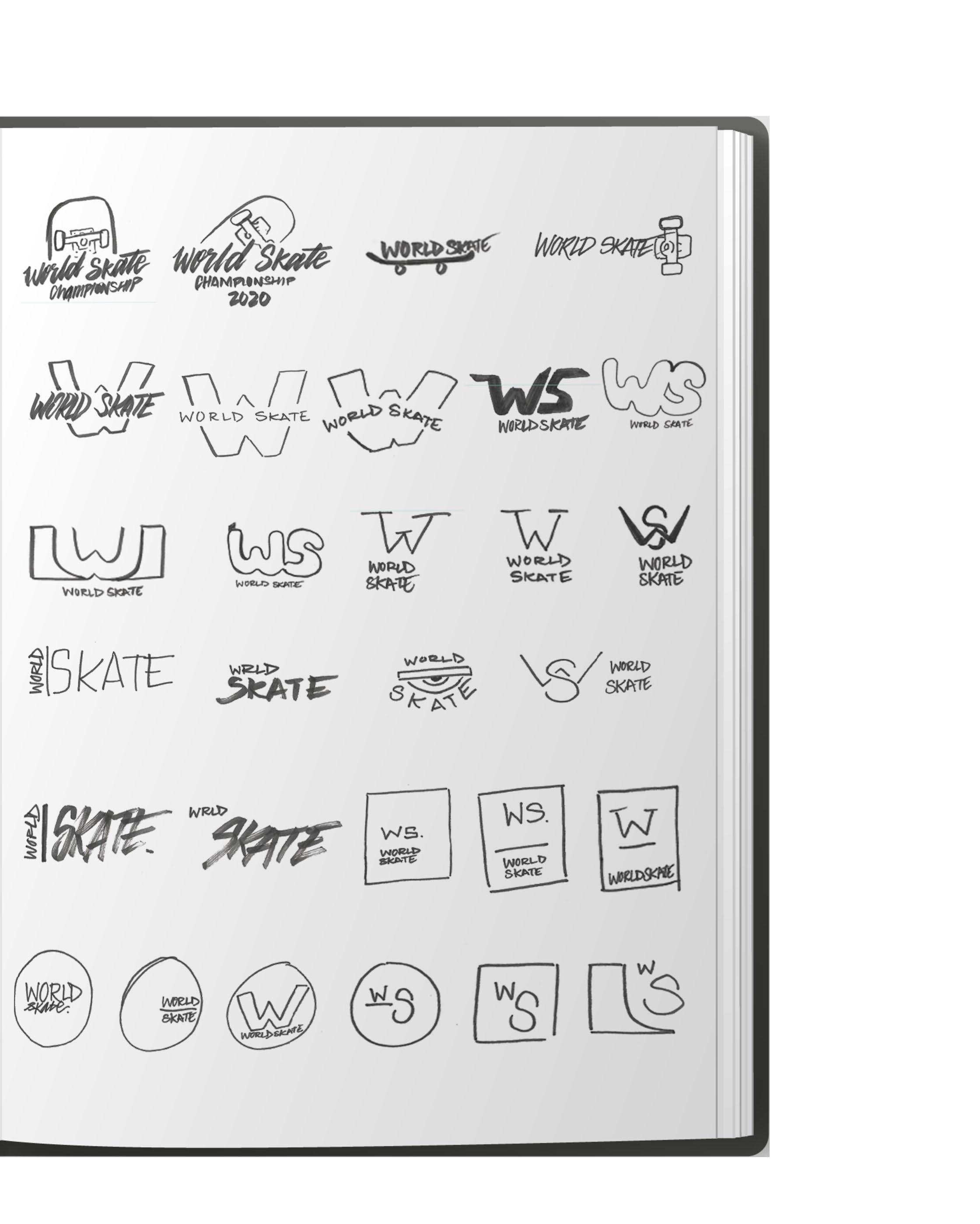
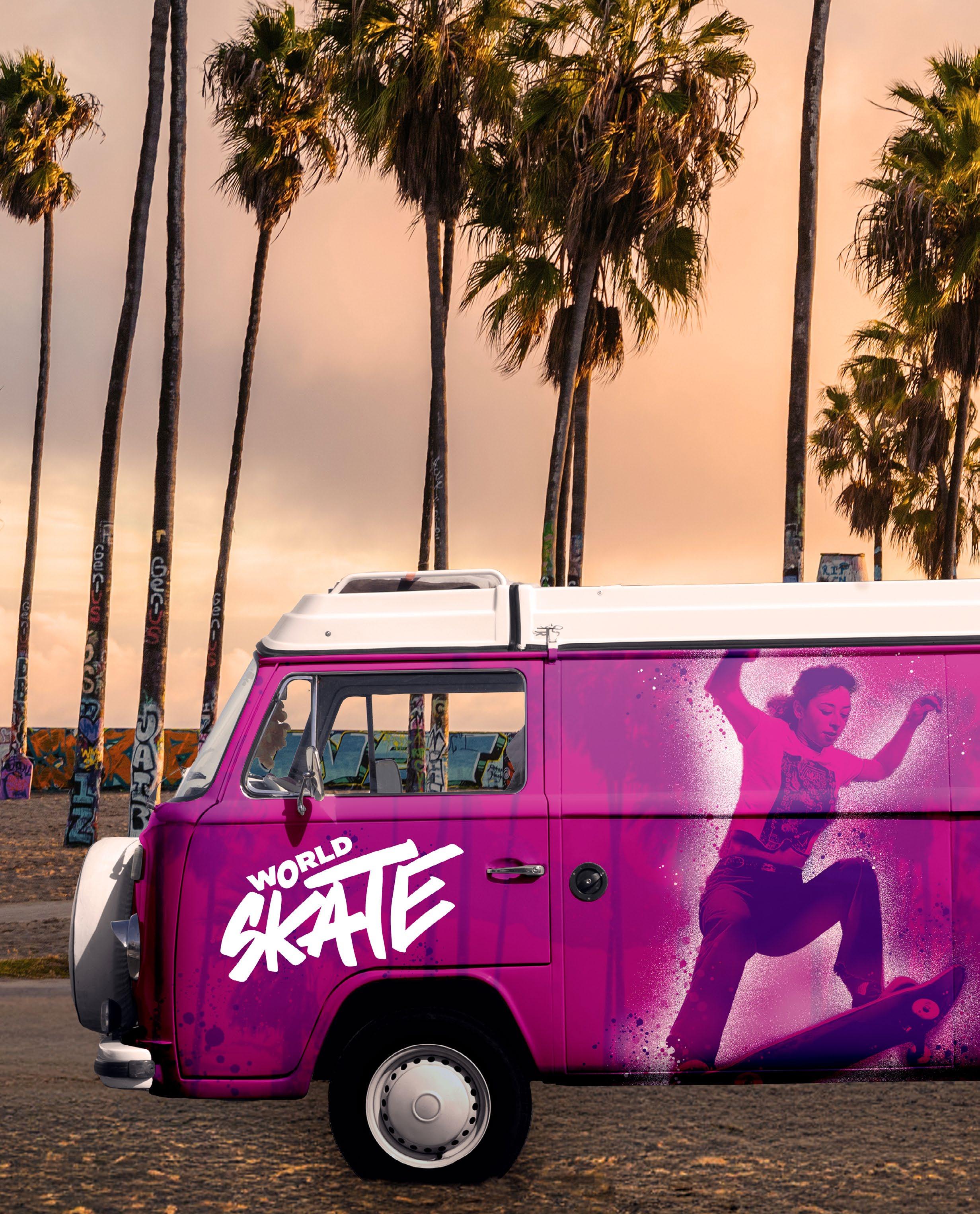
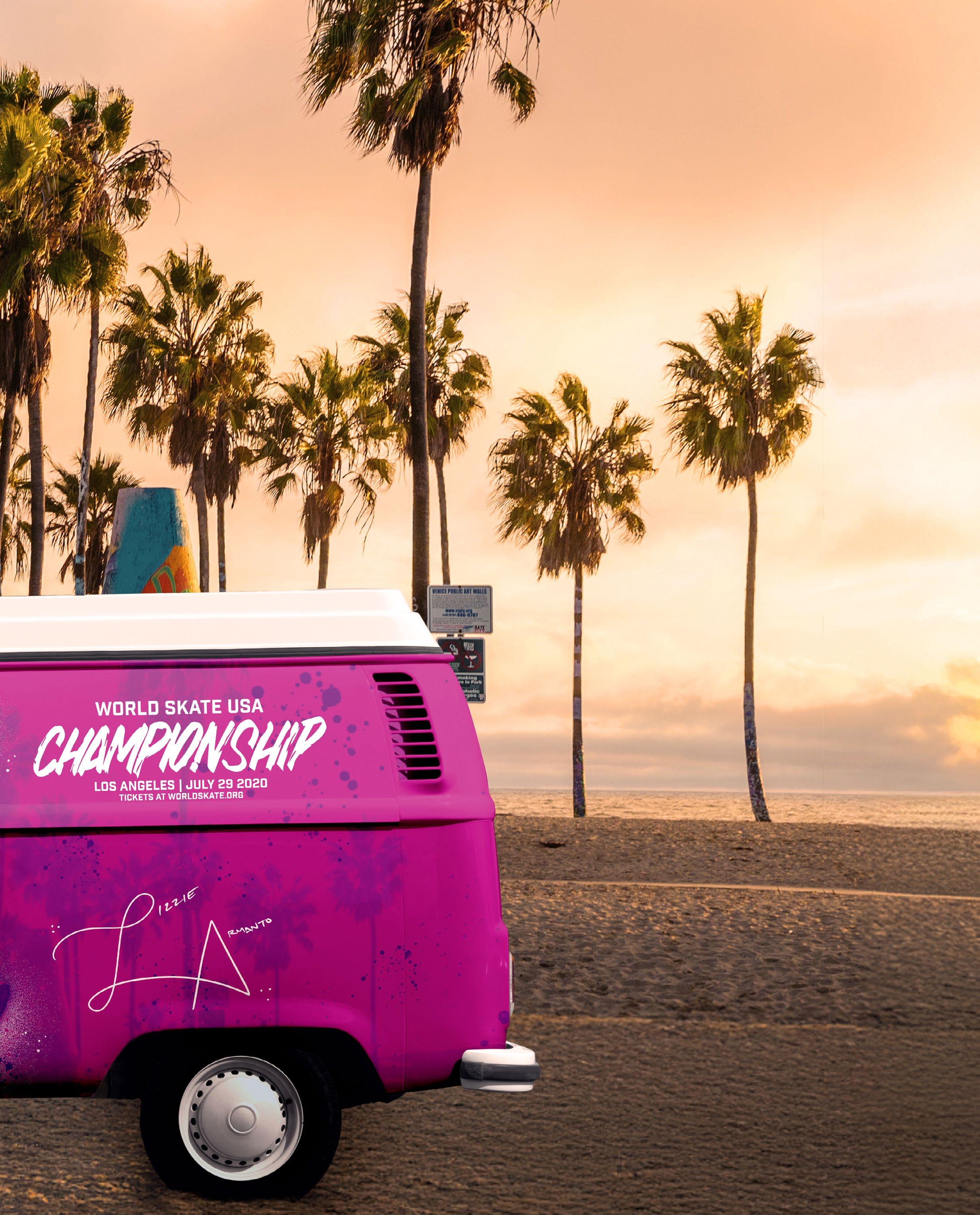
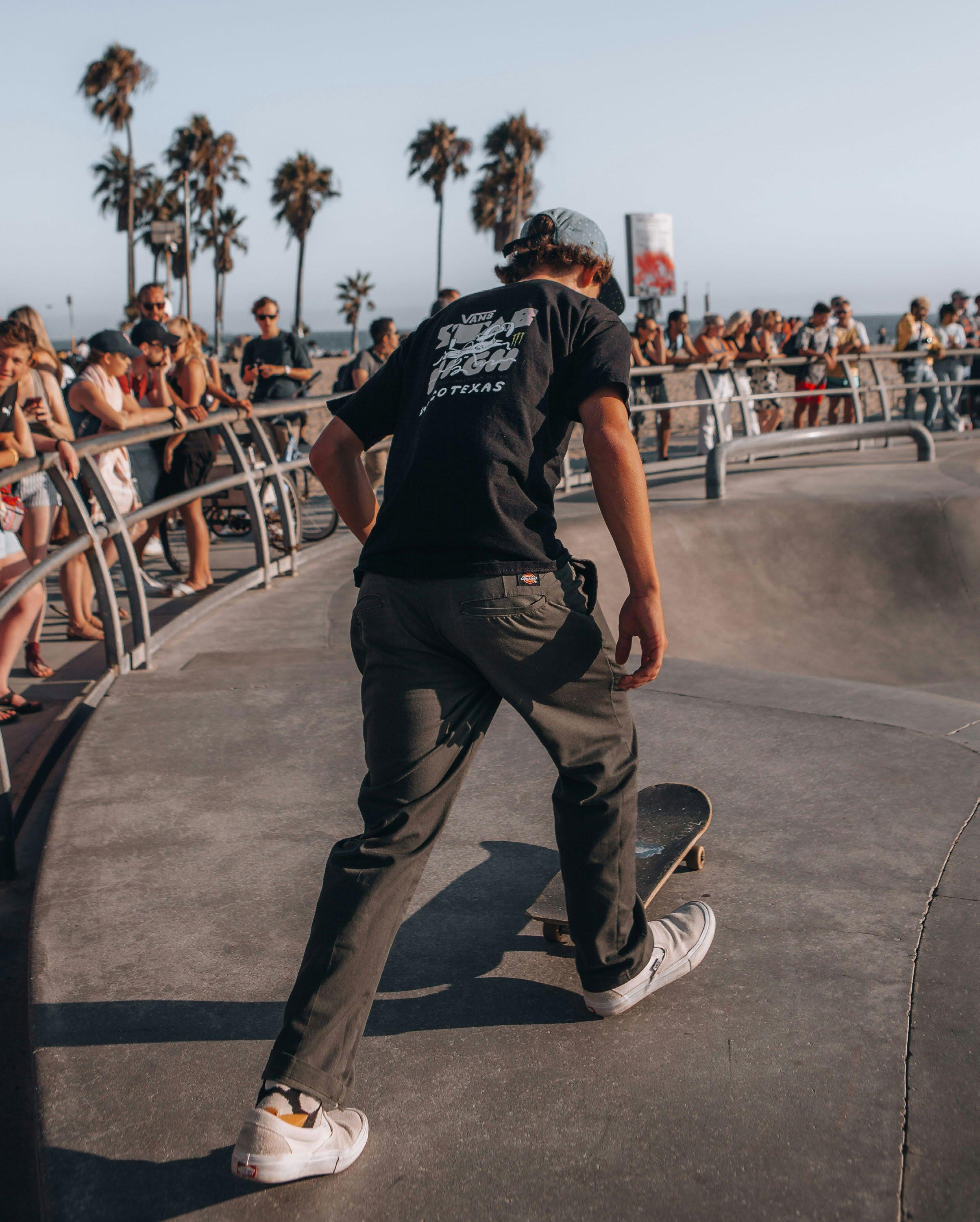
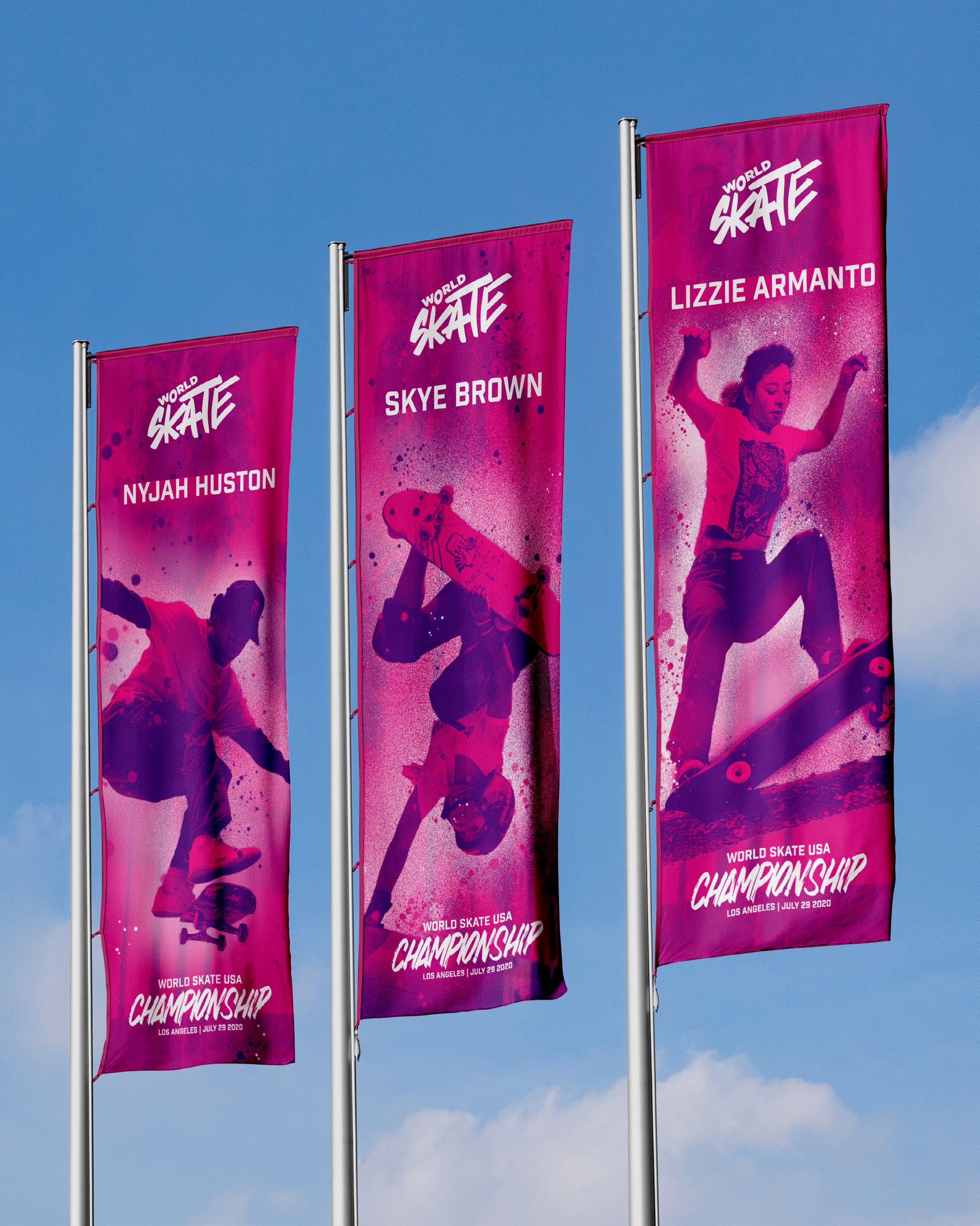
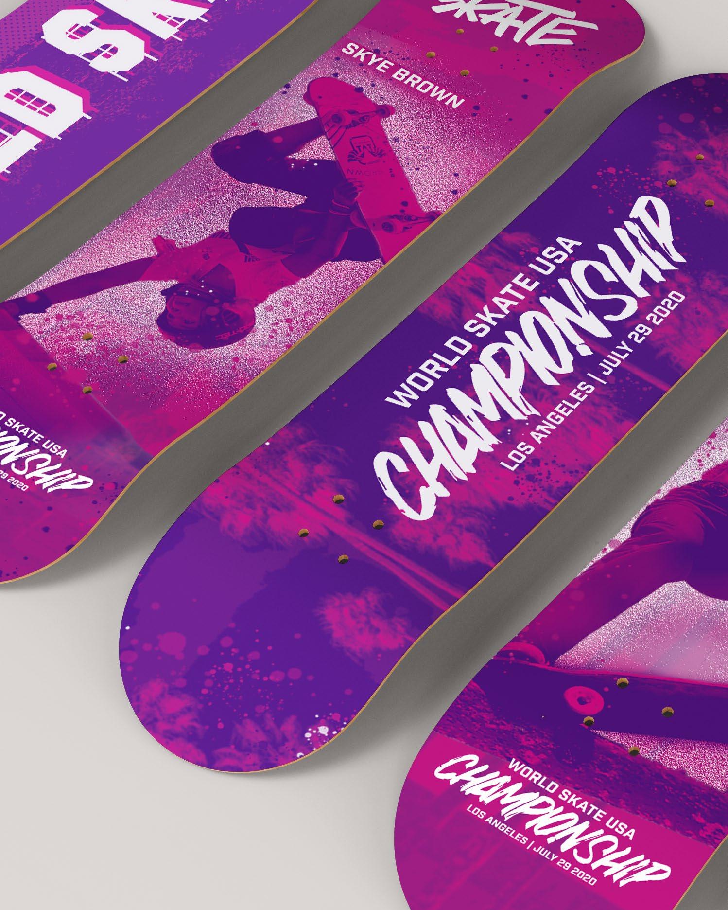
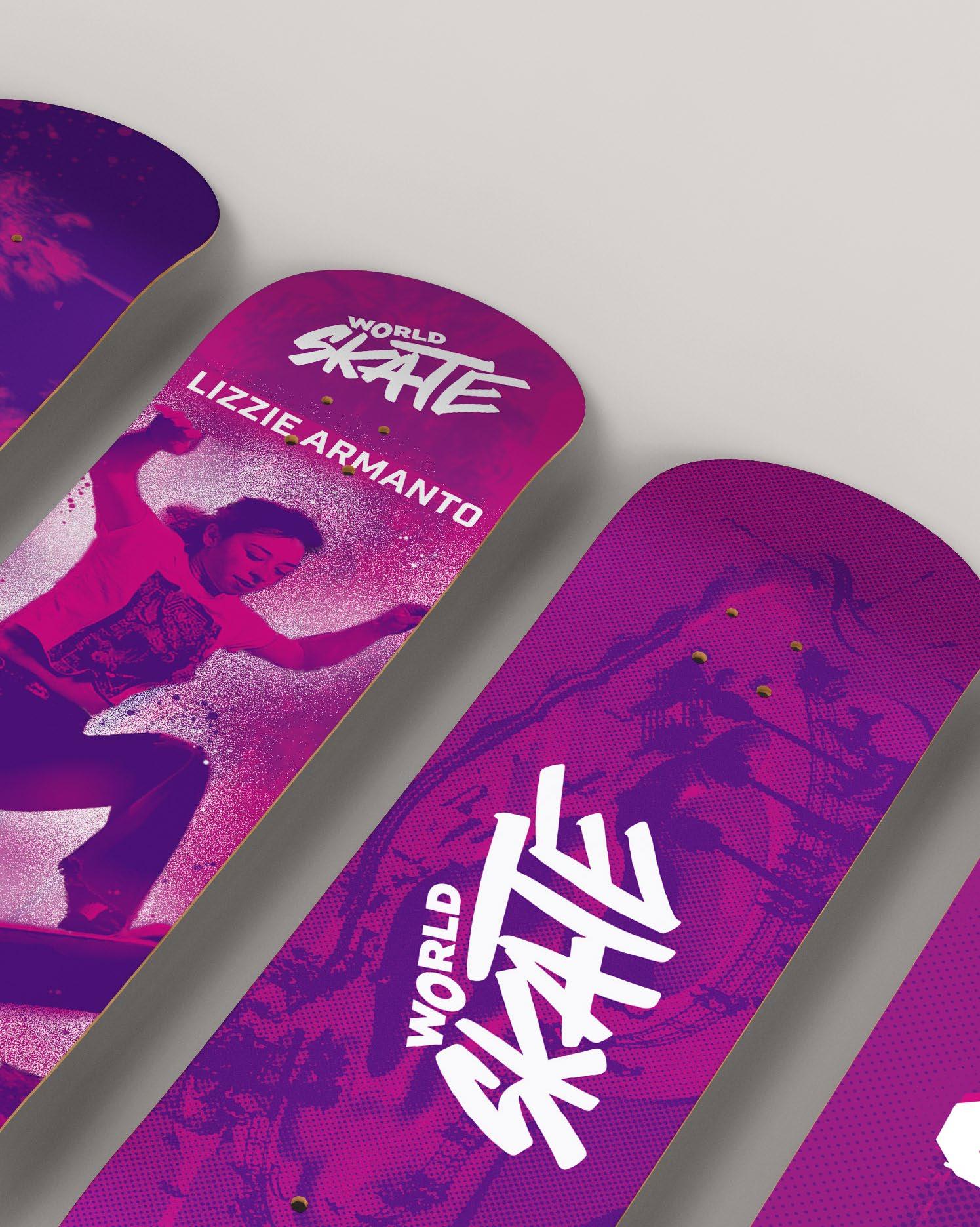
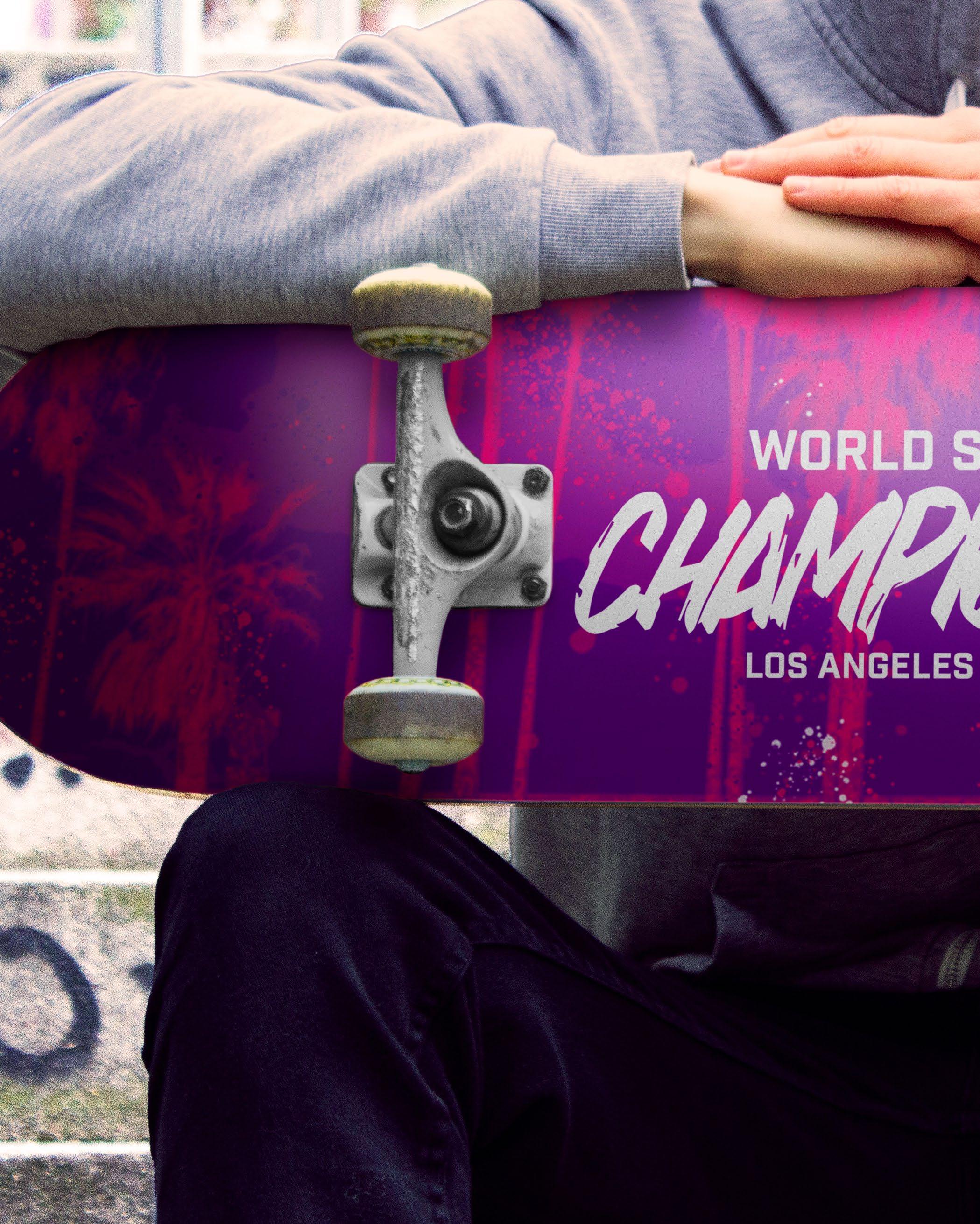
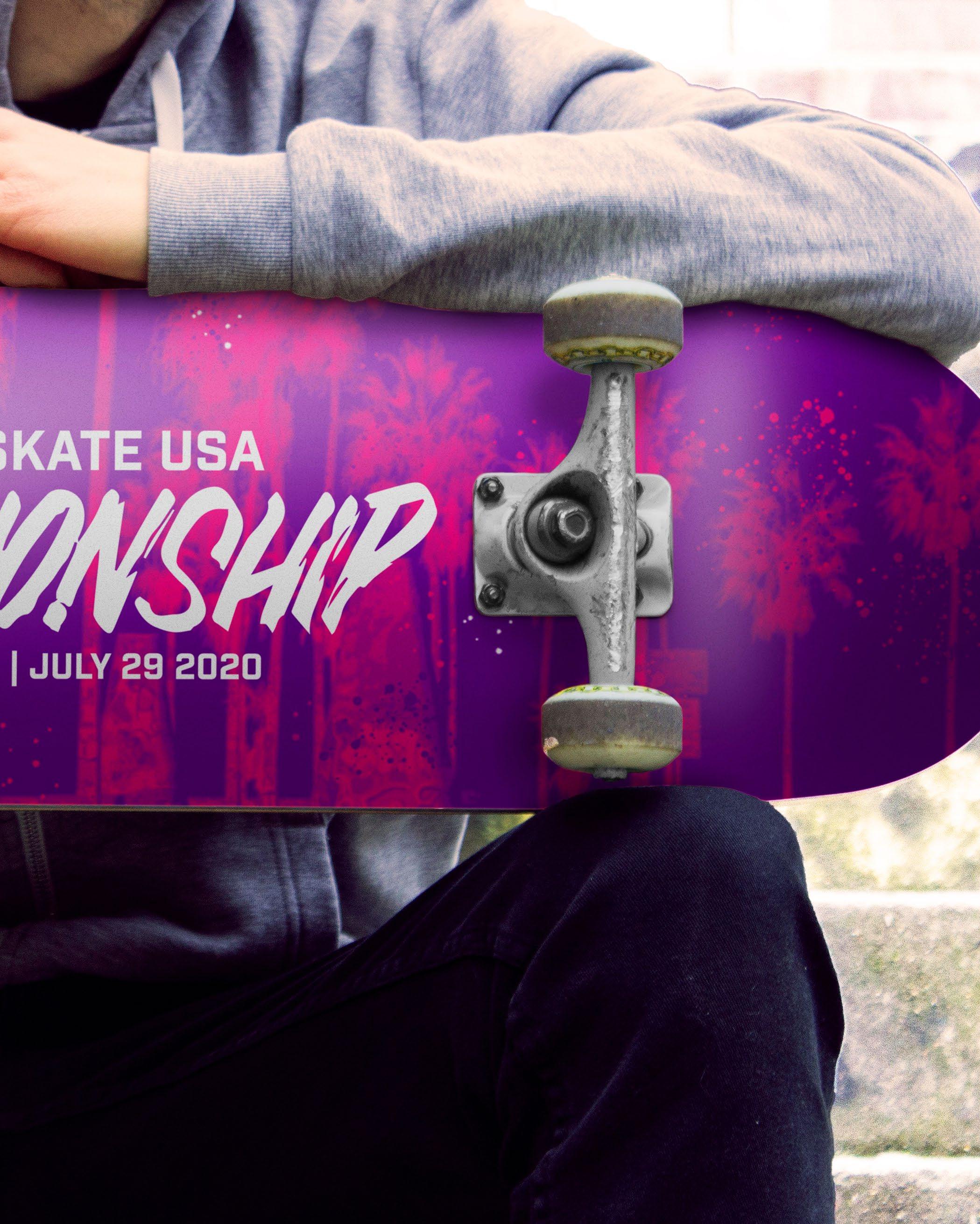
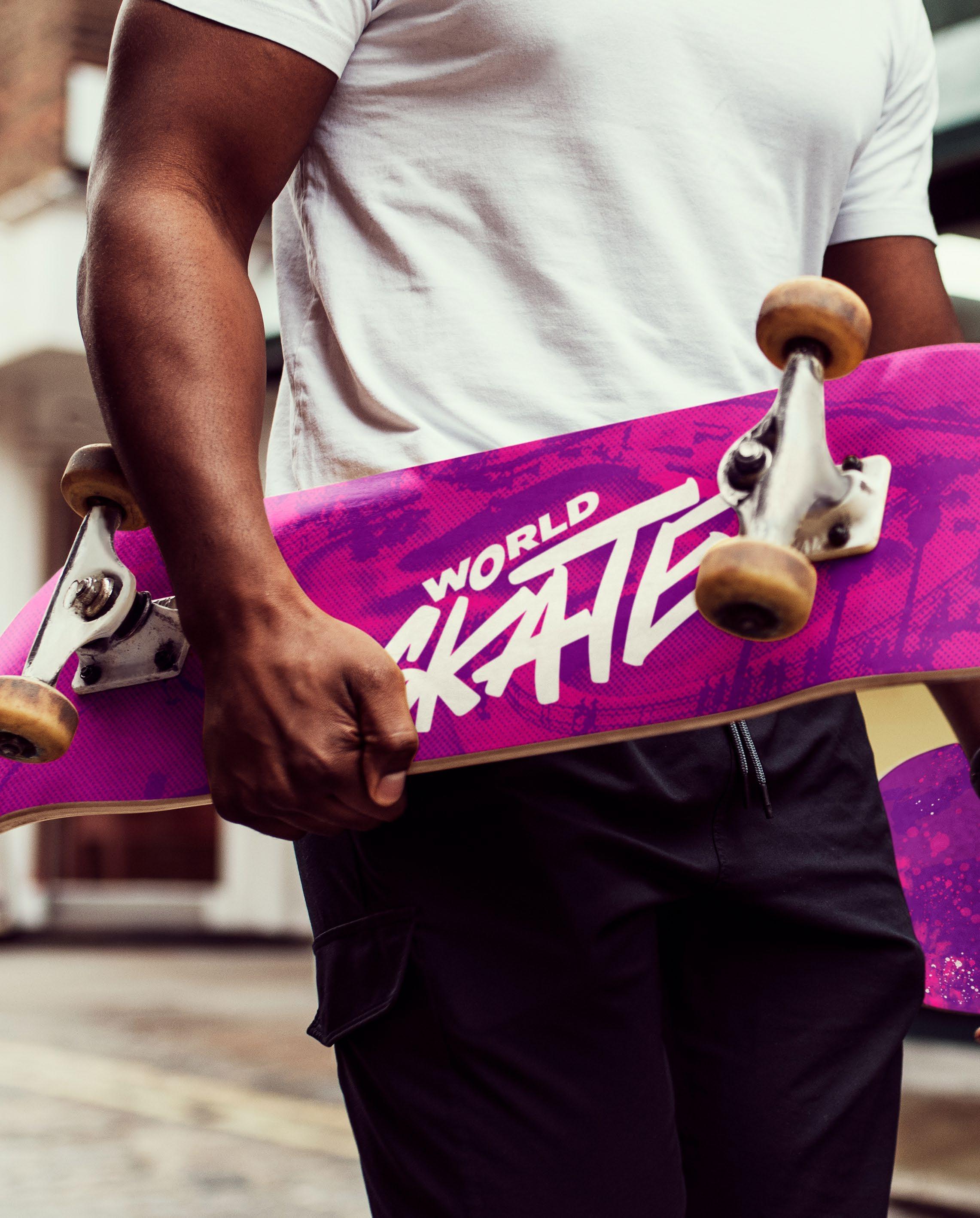
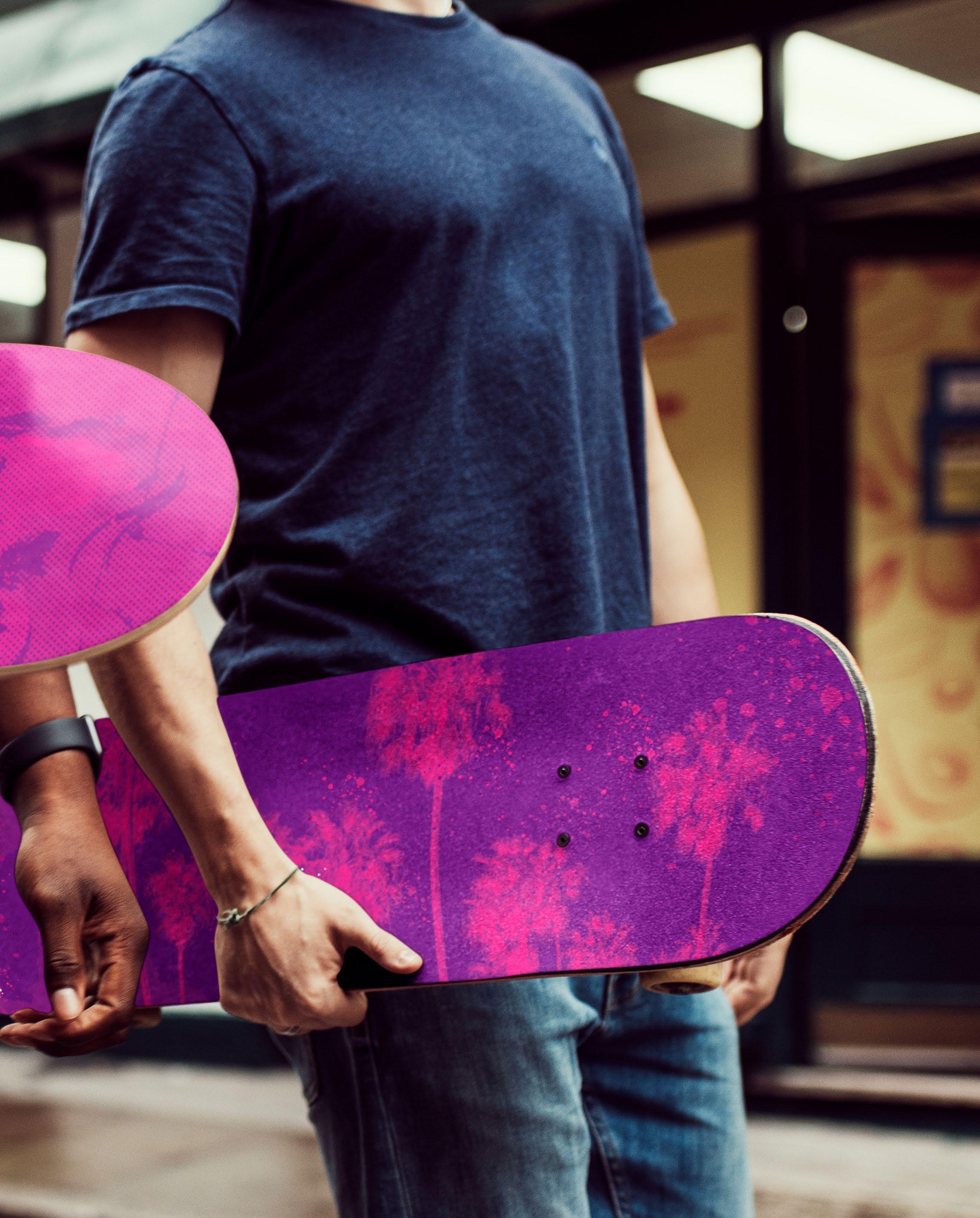
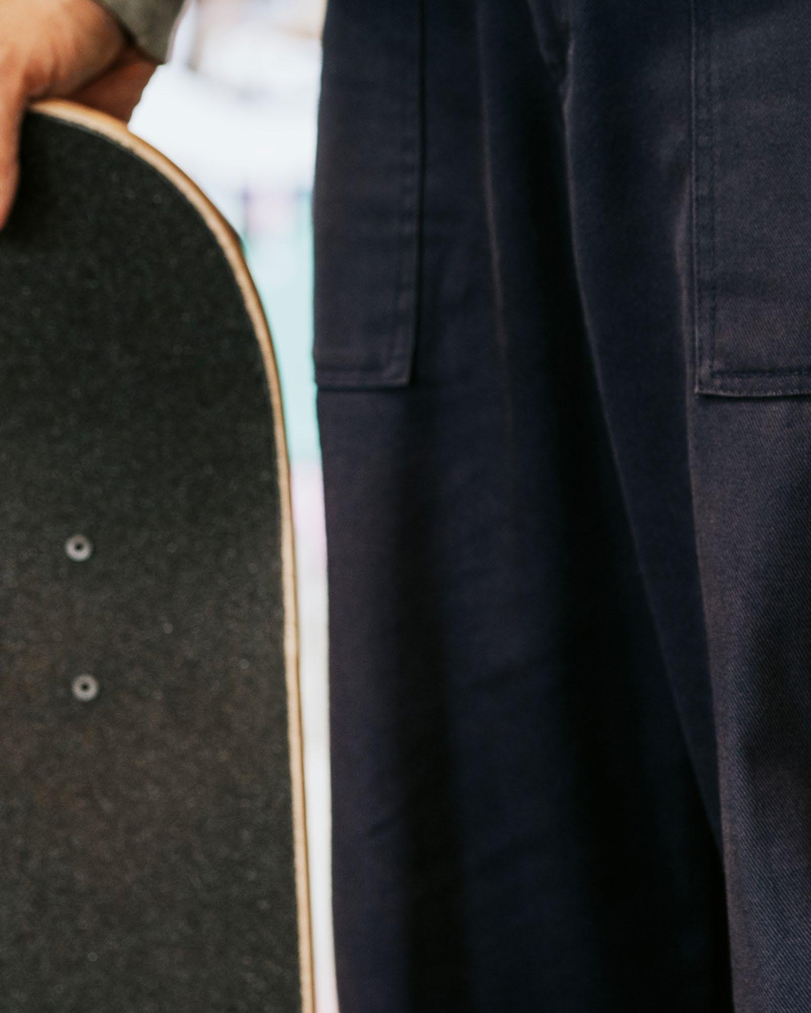
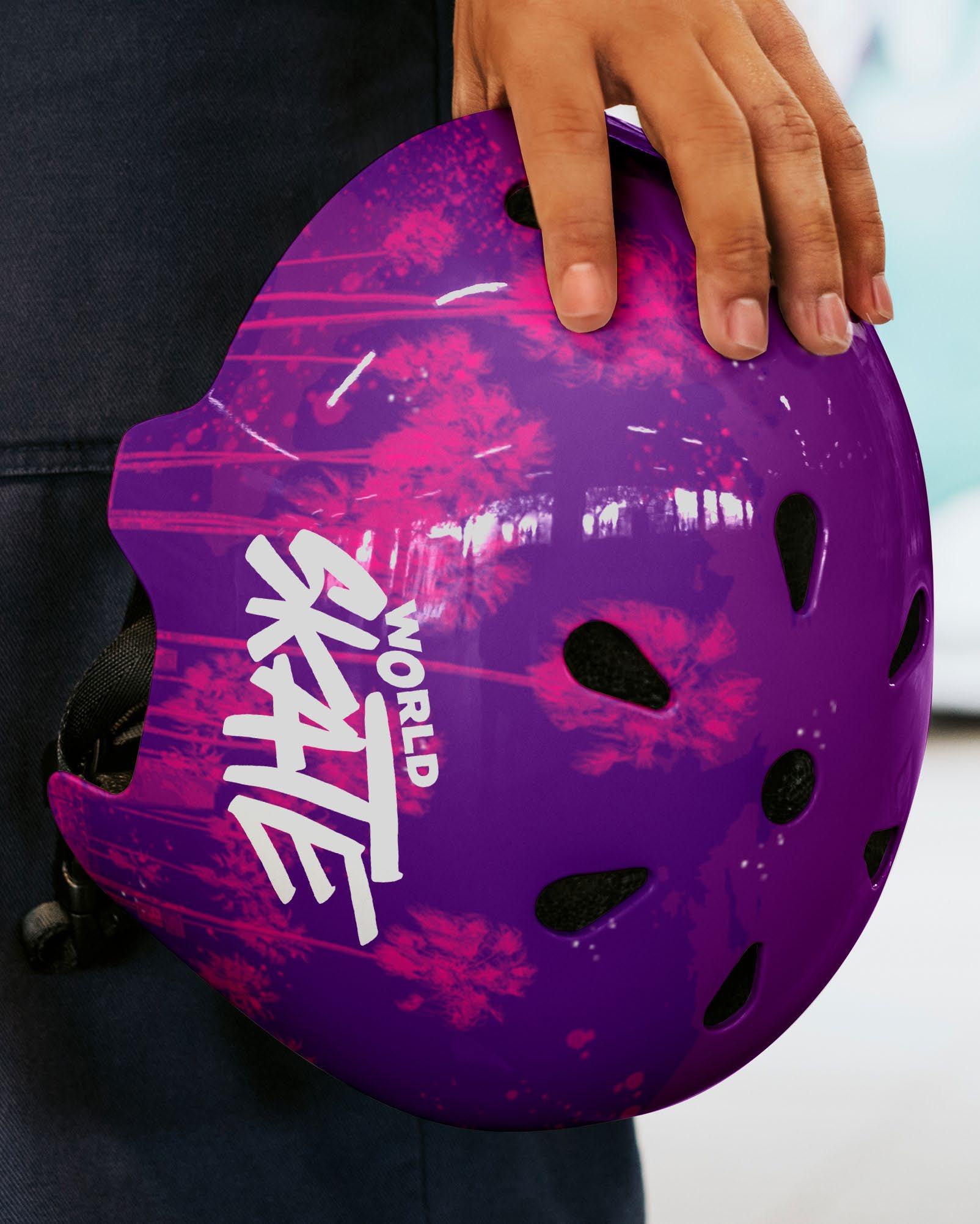
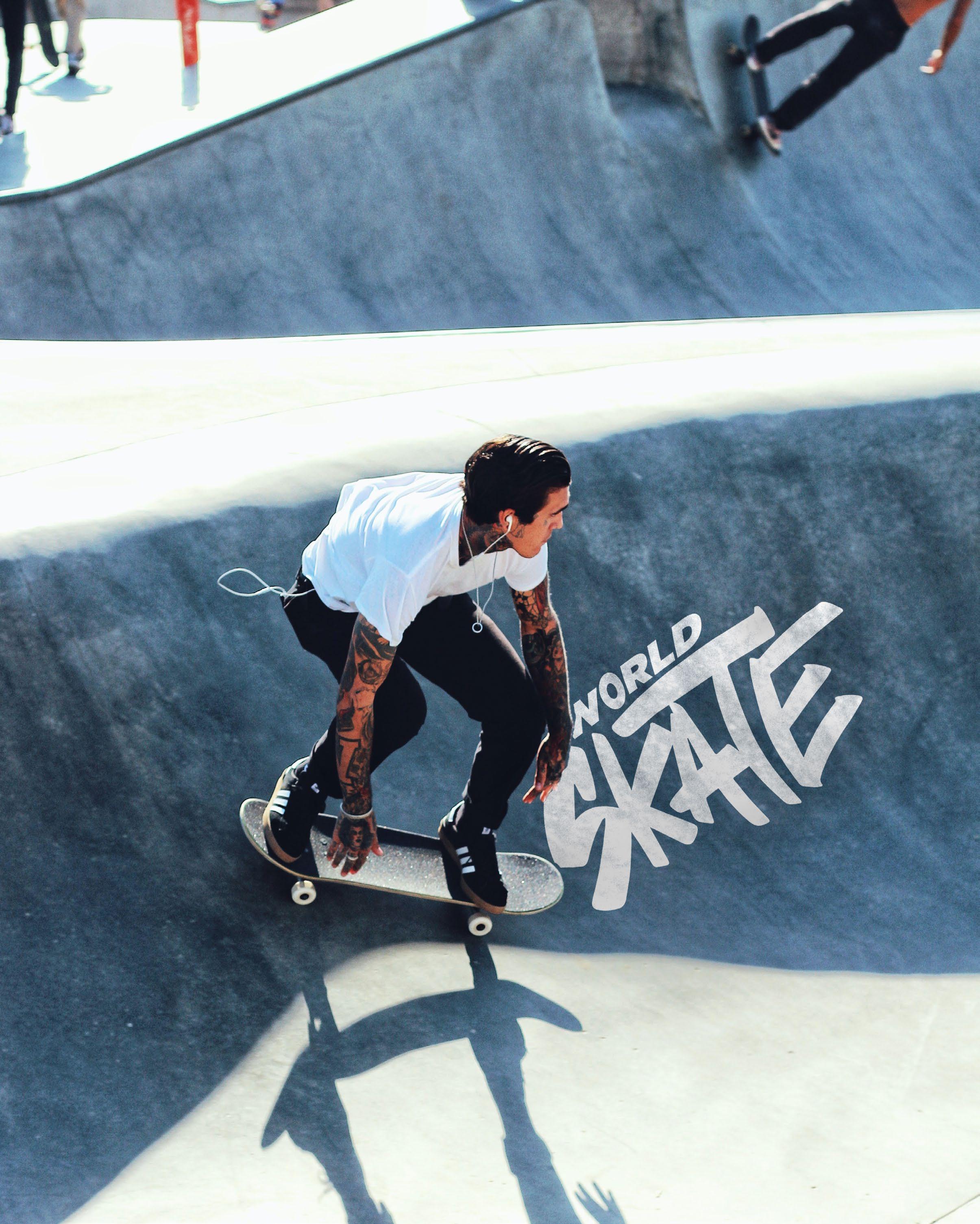
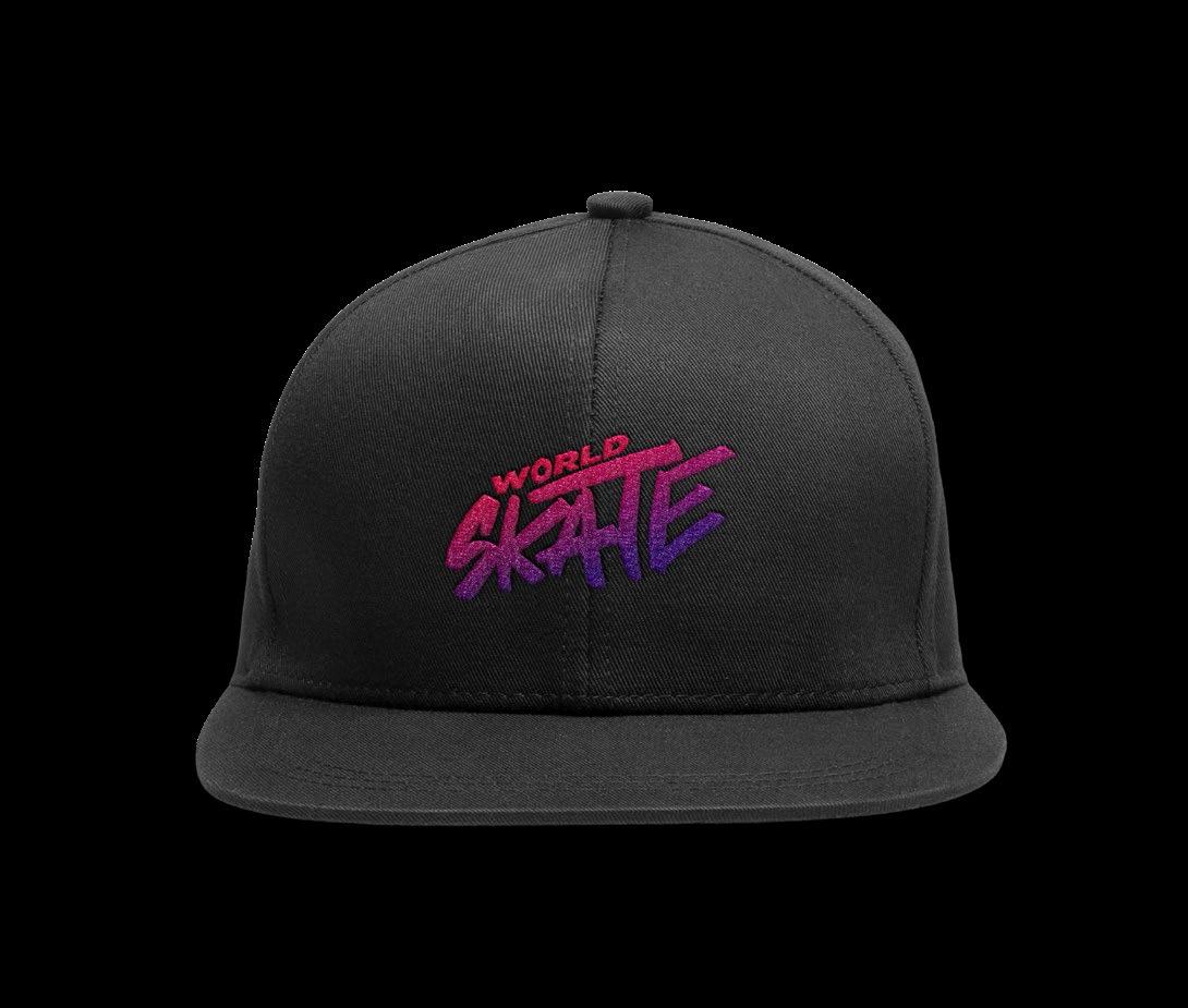
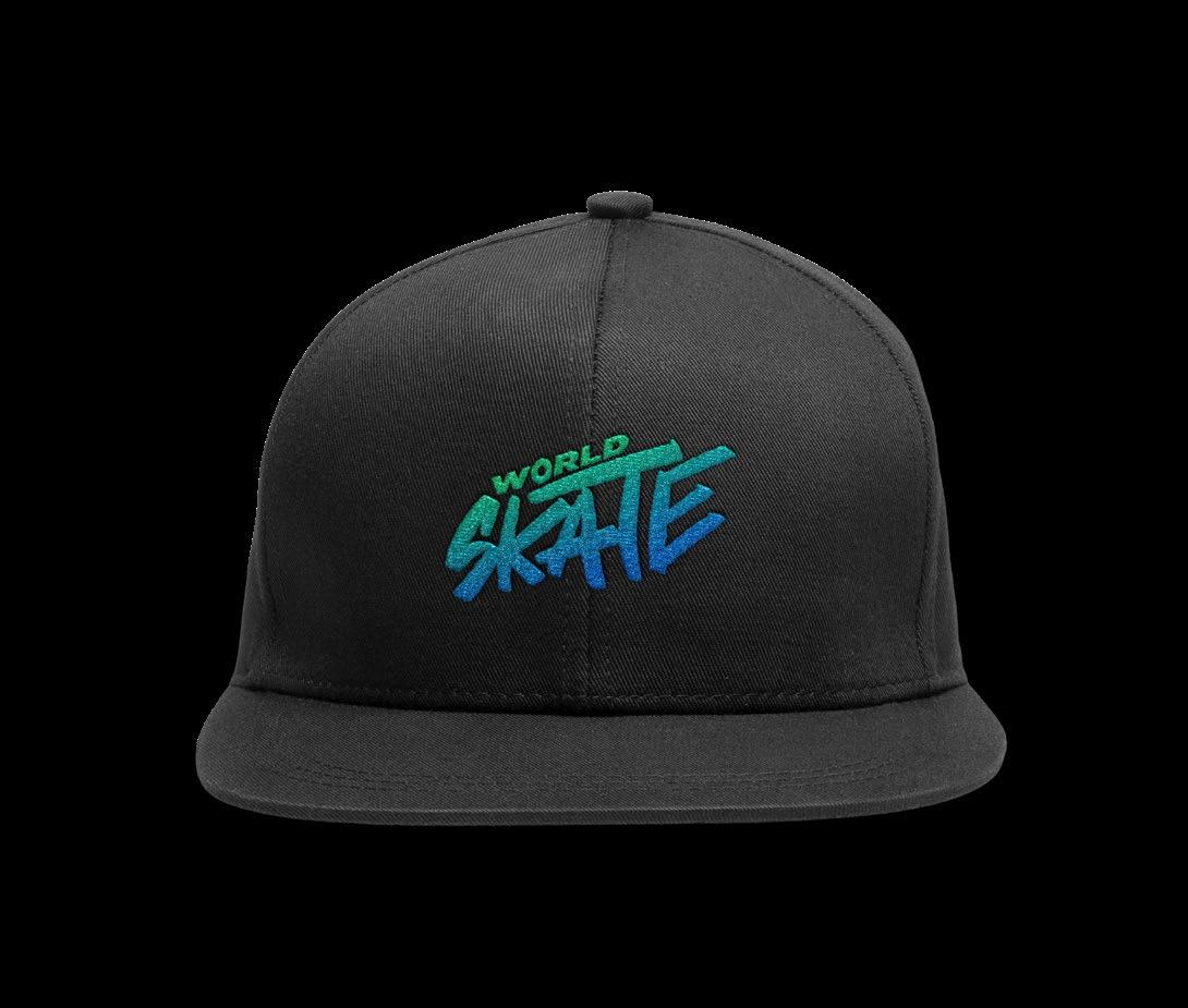
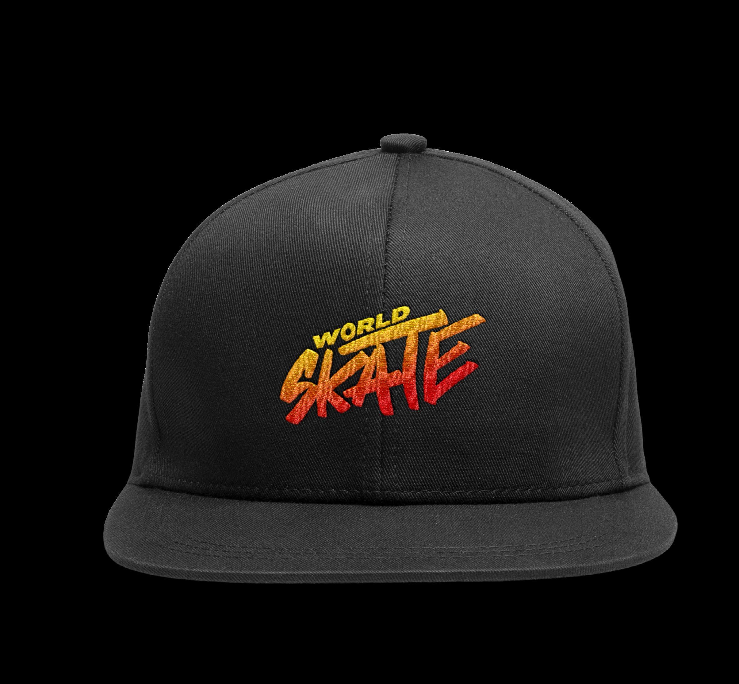
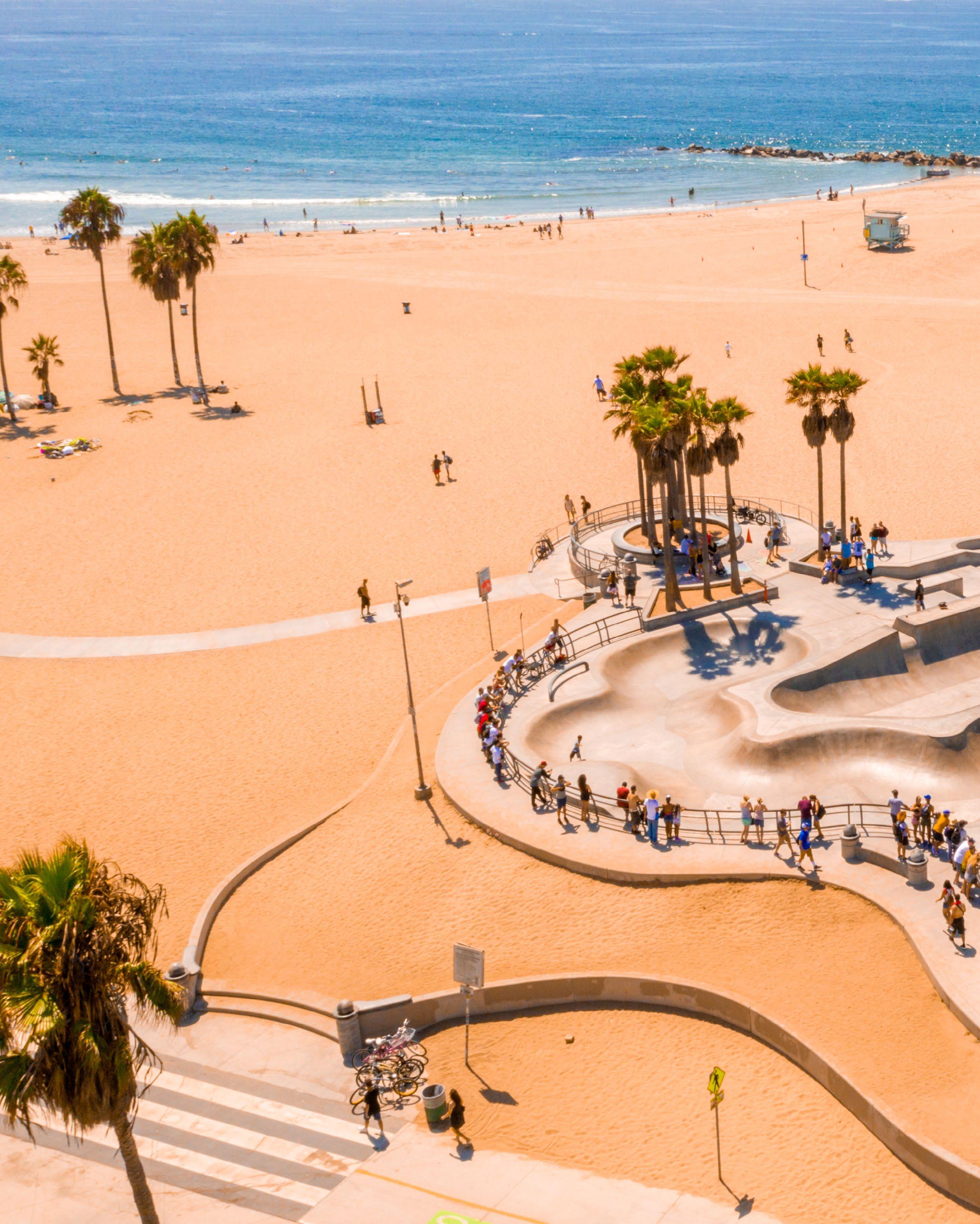
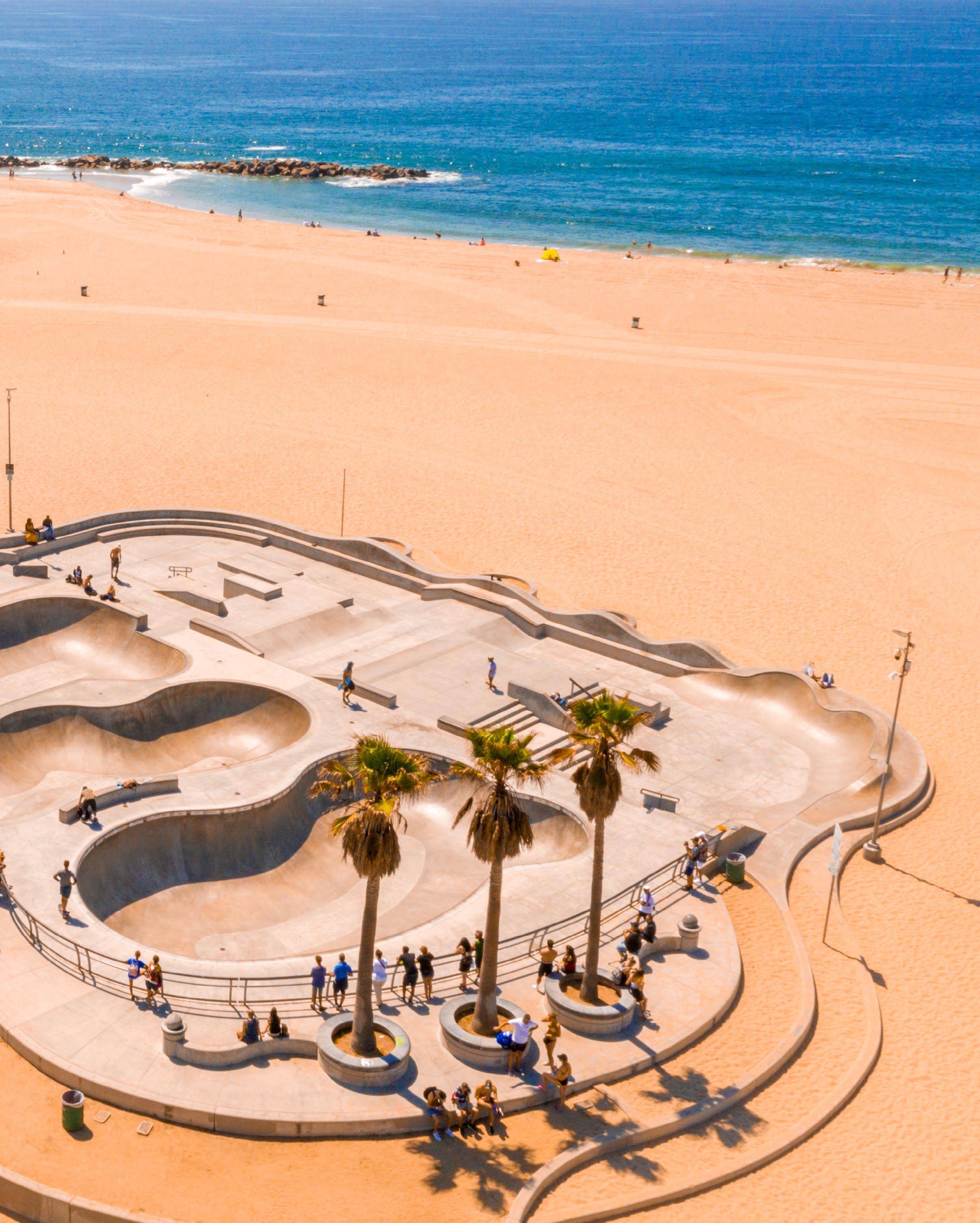
A New Era of Skateboarding WORLD SKATE
COURSE STRATEGIES FOR BRANDING
INSTRUCTOR
THOMAS MCNULTY
MEDIA TYPE BRAND IDENTITY
3 KEYWORDS EXHILARATING INCLUSIVE DYNAMIC
OBJECTIVE
Develop a new brand system and identity for an existing organization, extending its visual language through a concept-driven, hypothetical event that demonstrates its full potential across real-world applications that would be relevant to the brand.
APPROACH
Leverage the energy and culture of skateboarding and action sports to transform World Skate into a bold, immersive brand experience. This rebrand aims to captivate athletes, fans, and sponsors through a culturally relevant Olympic debut event.

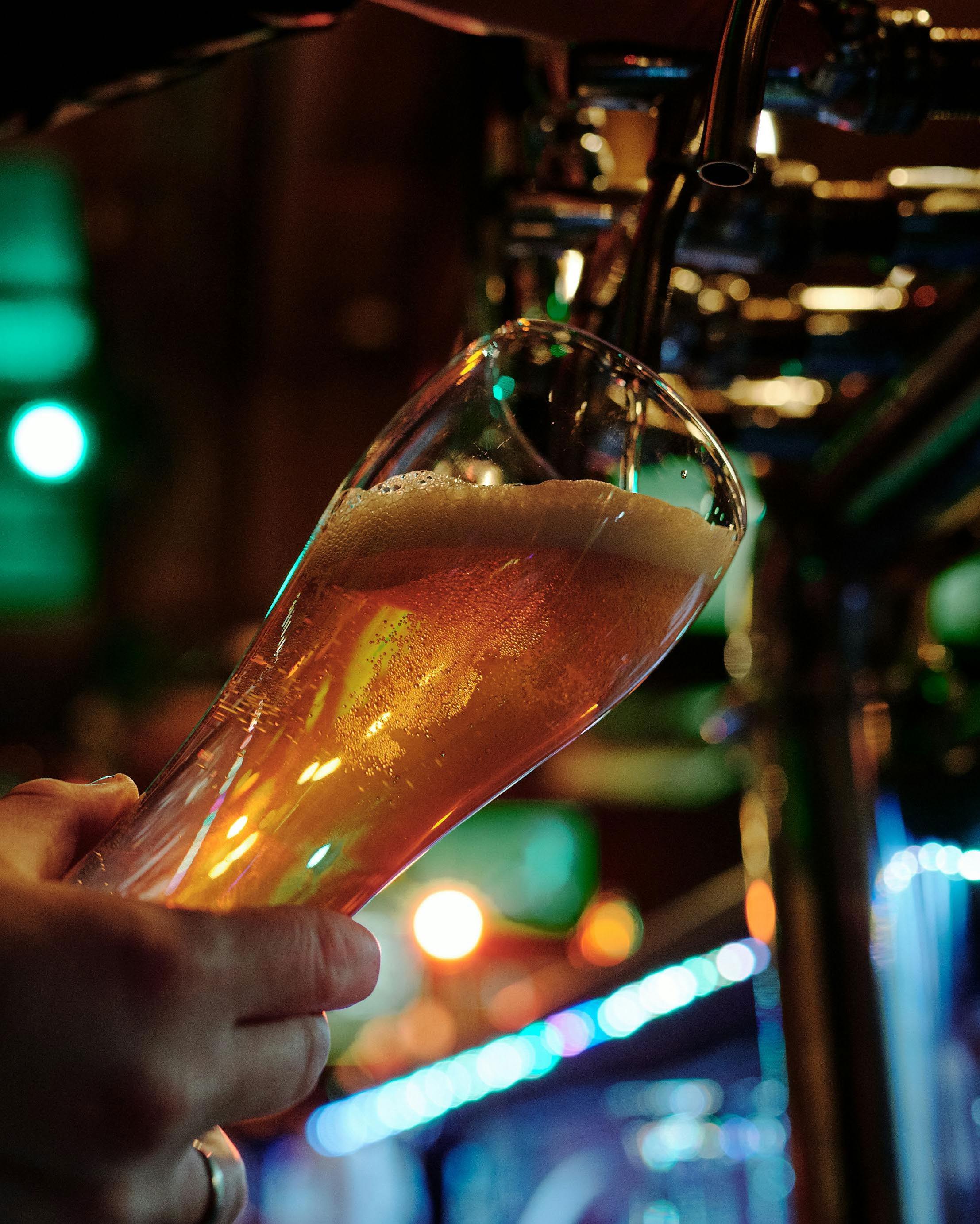
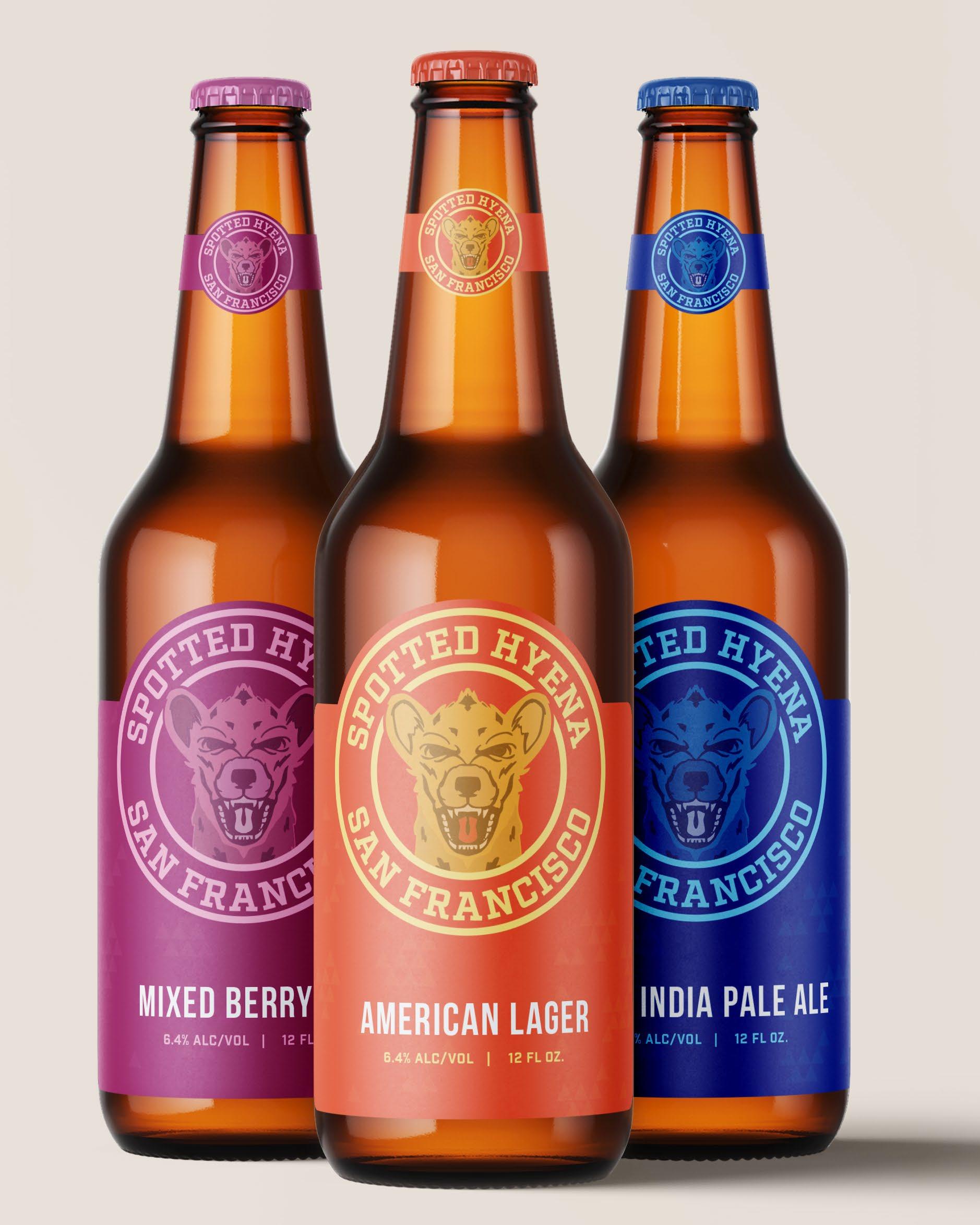
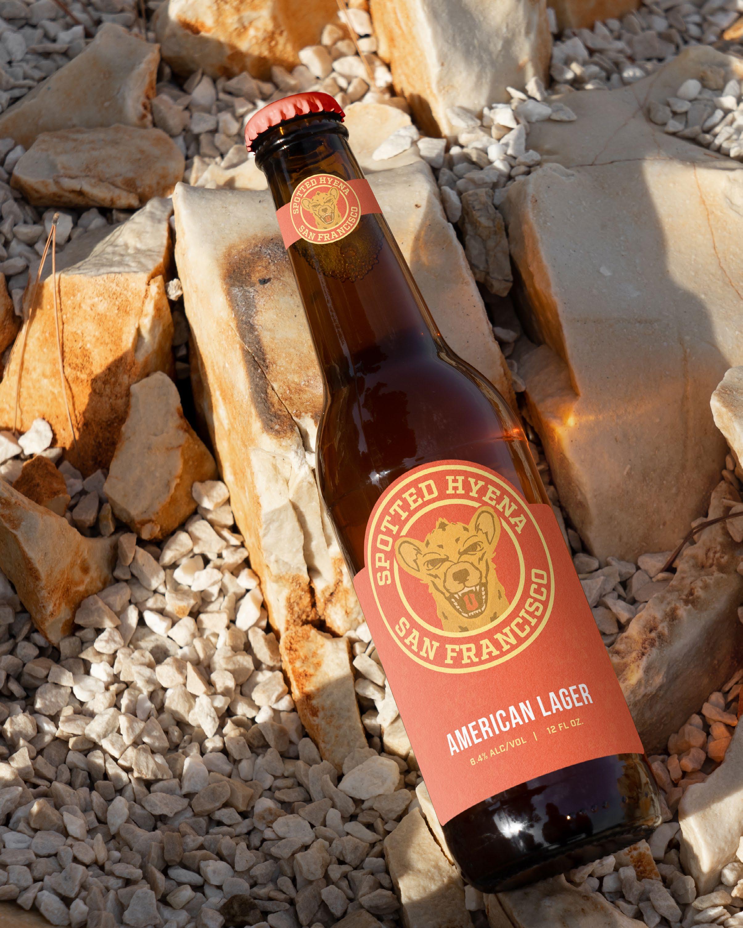
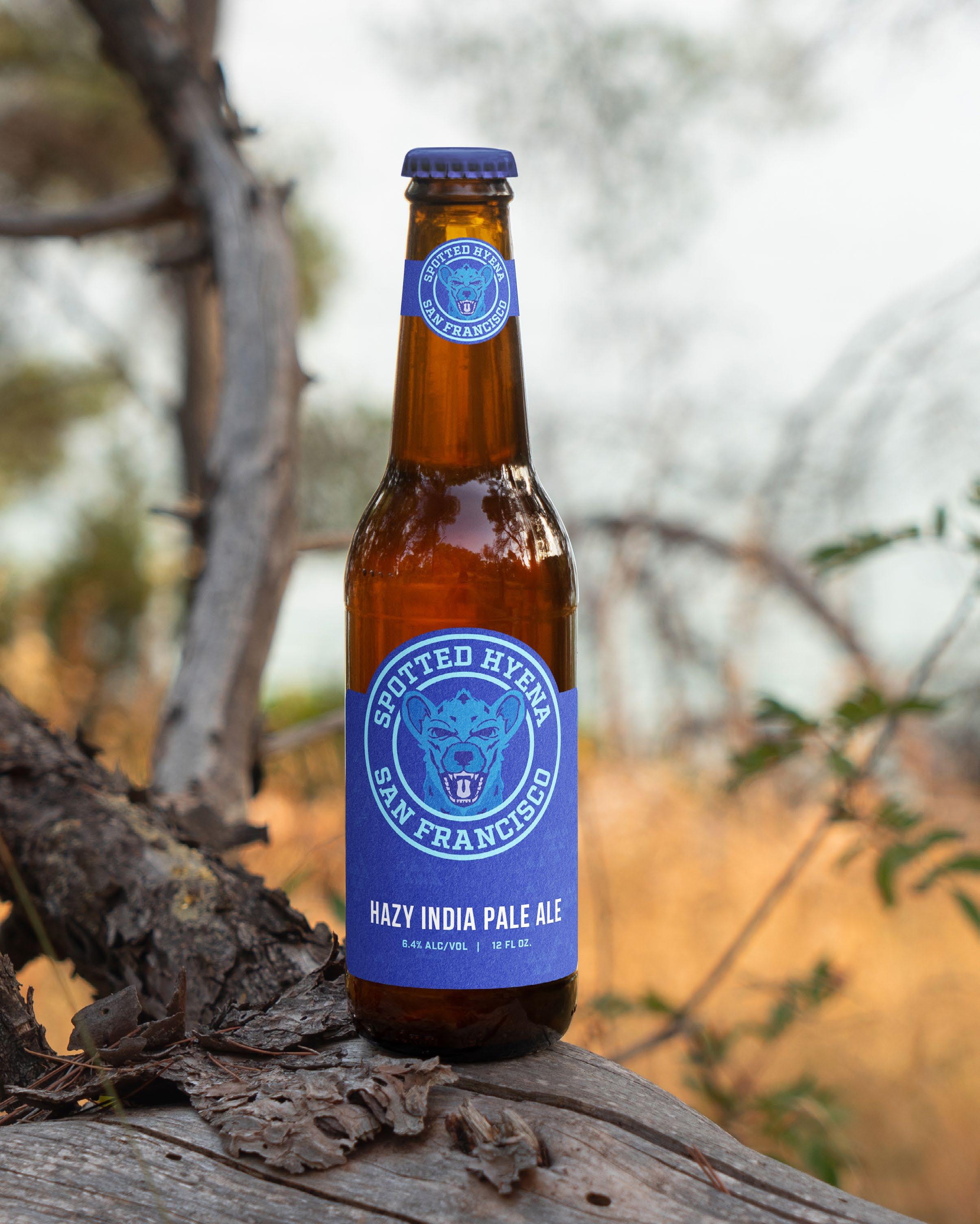
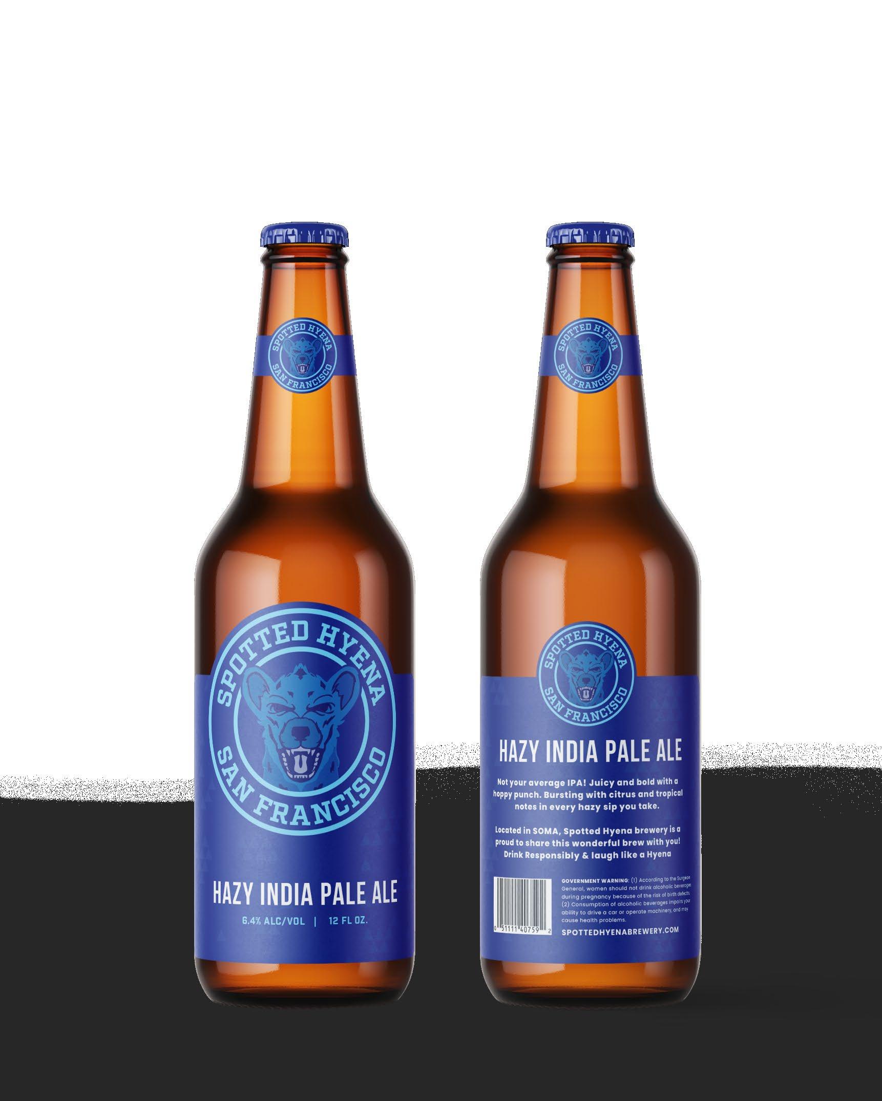
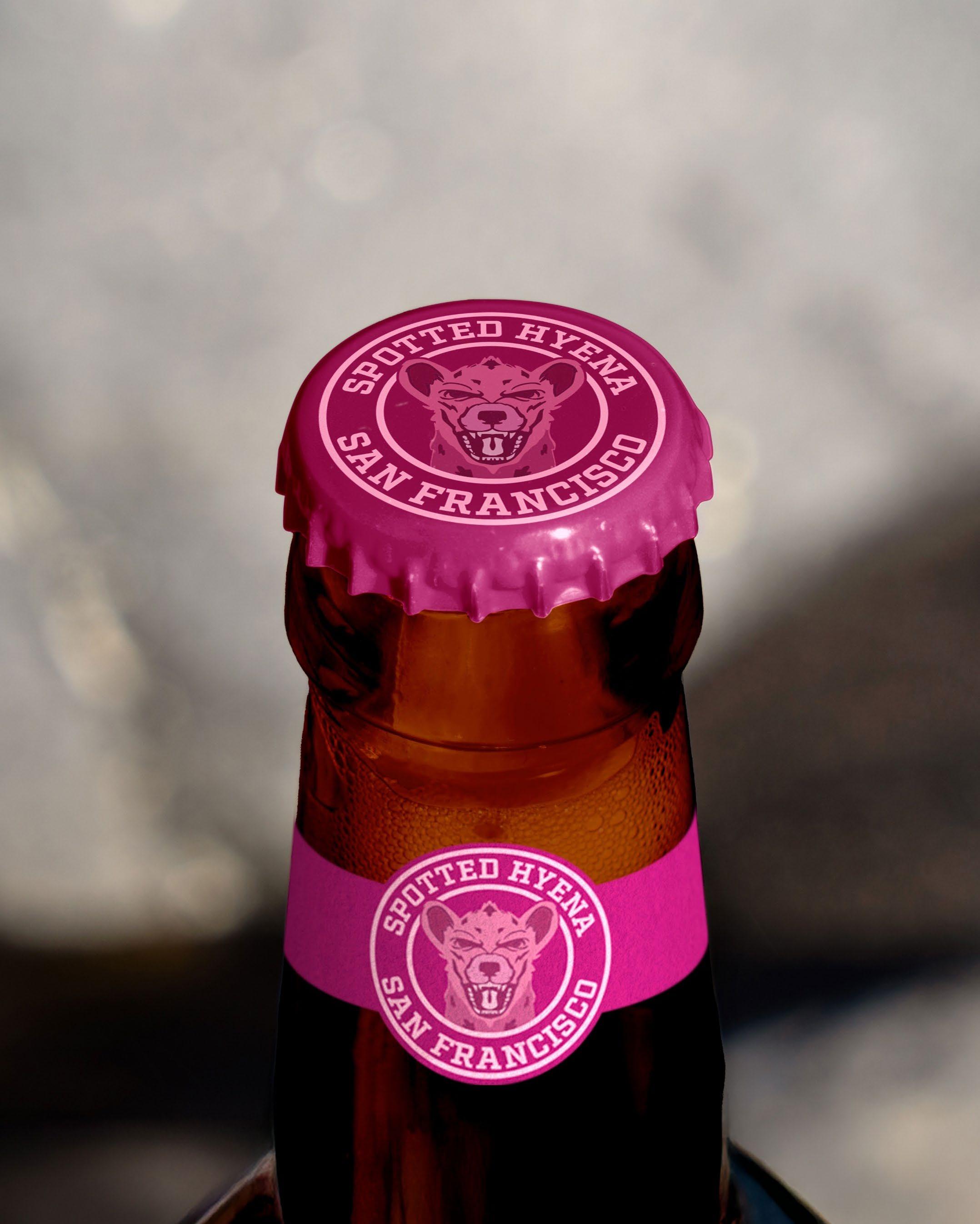
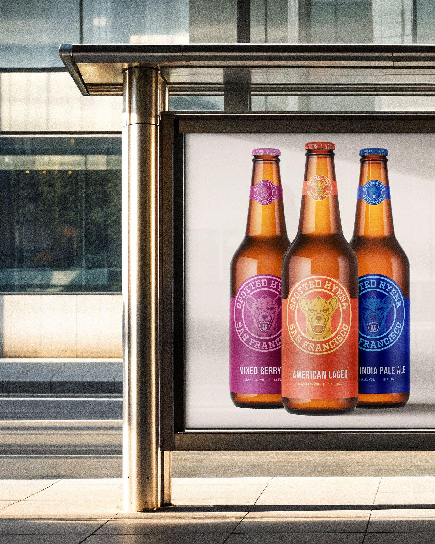
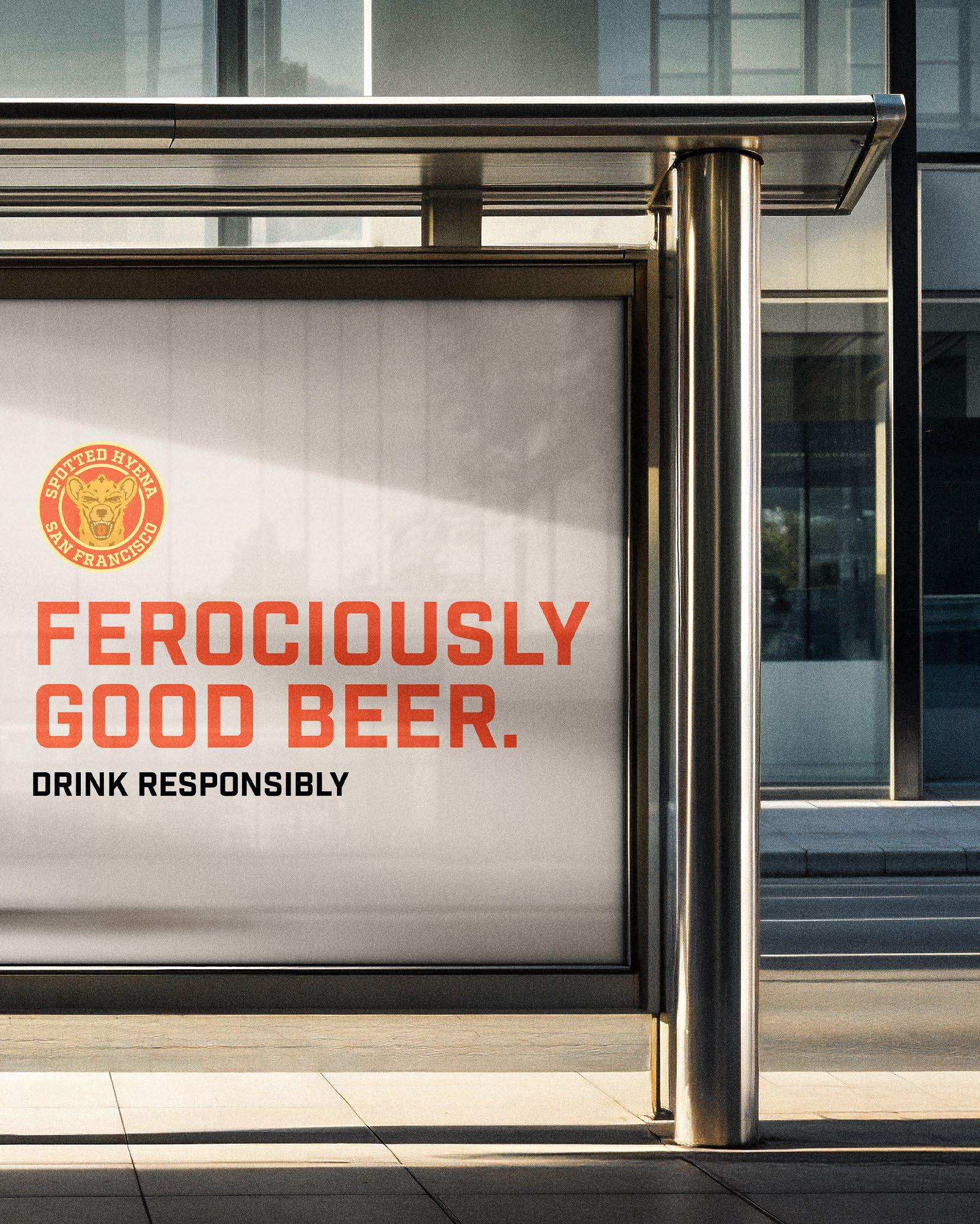
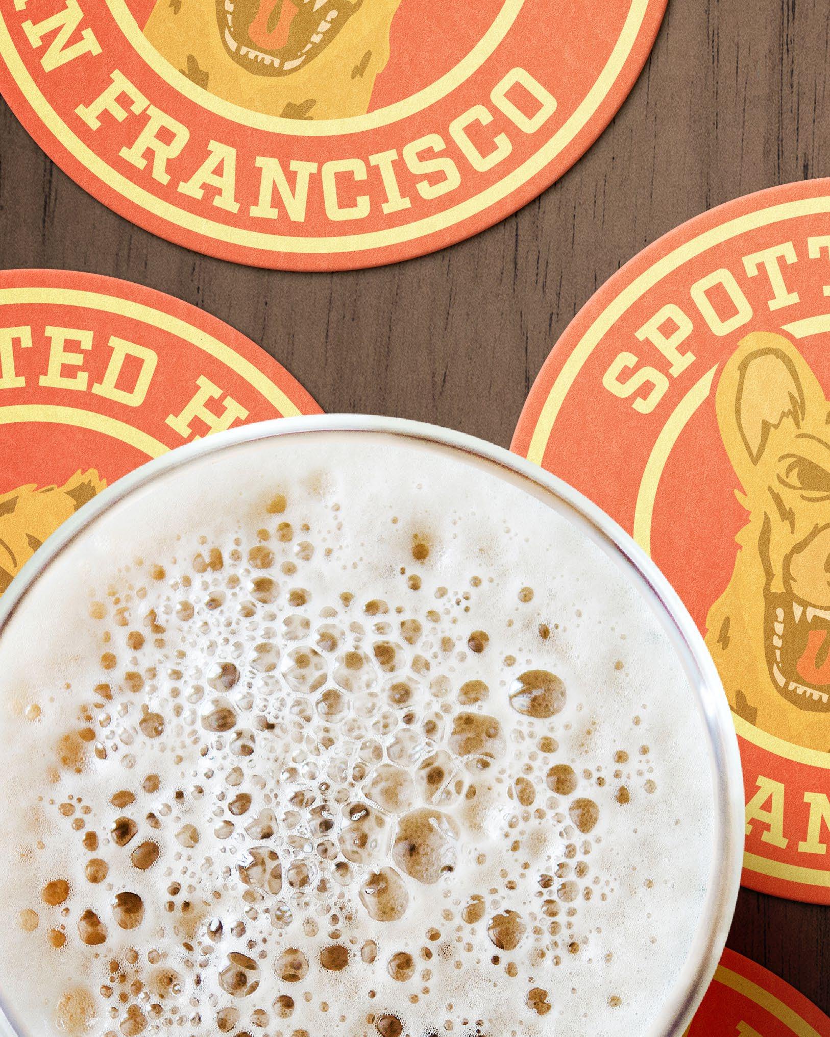
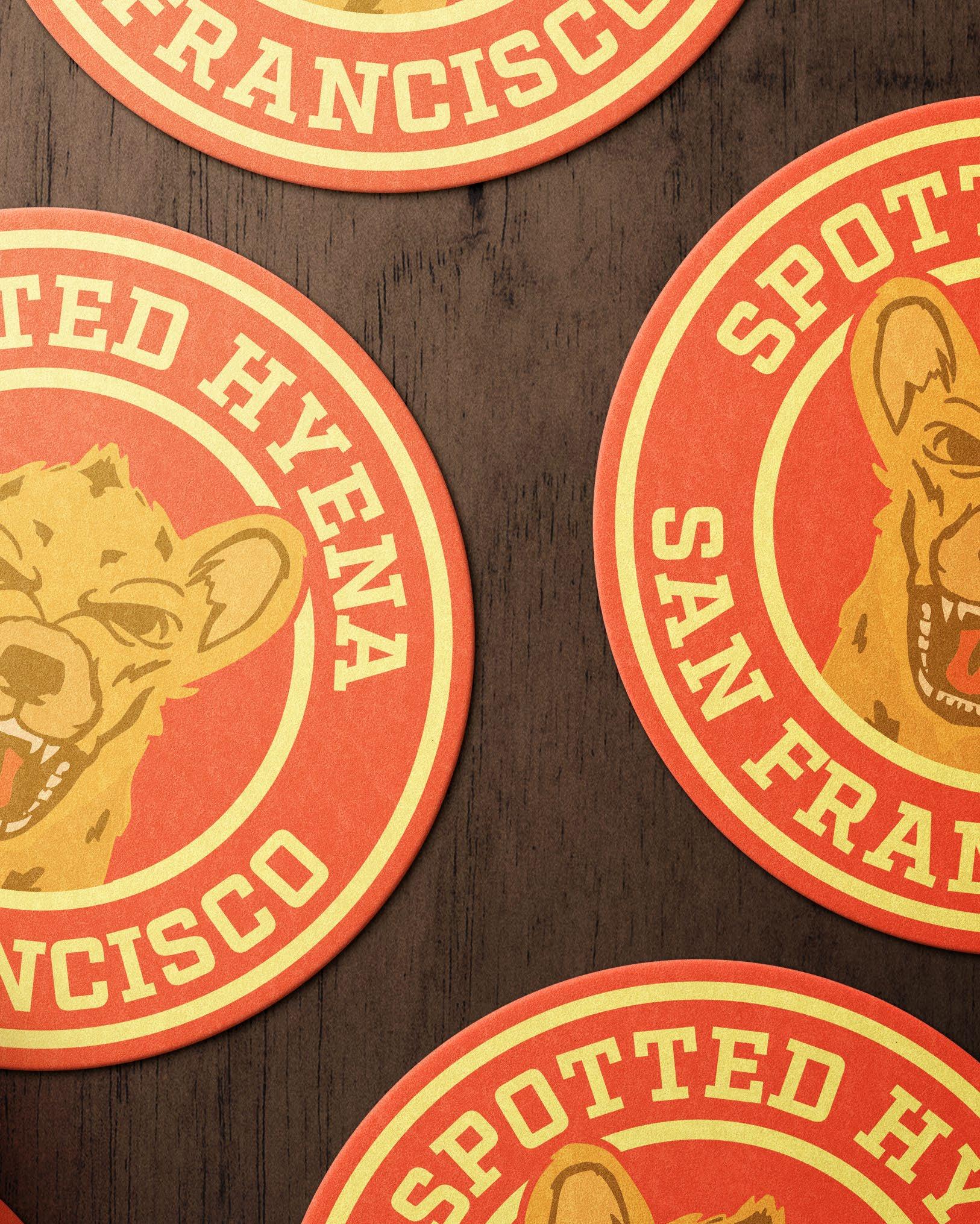
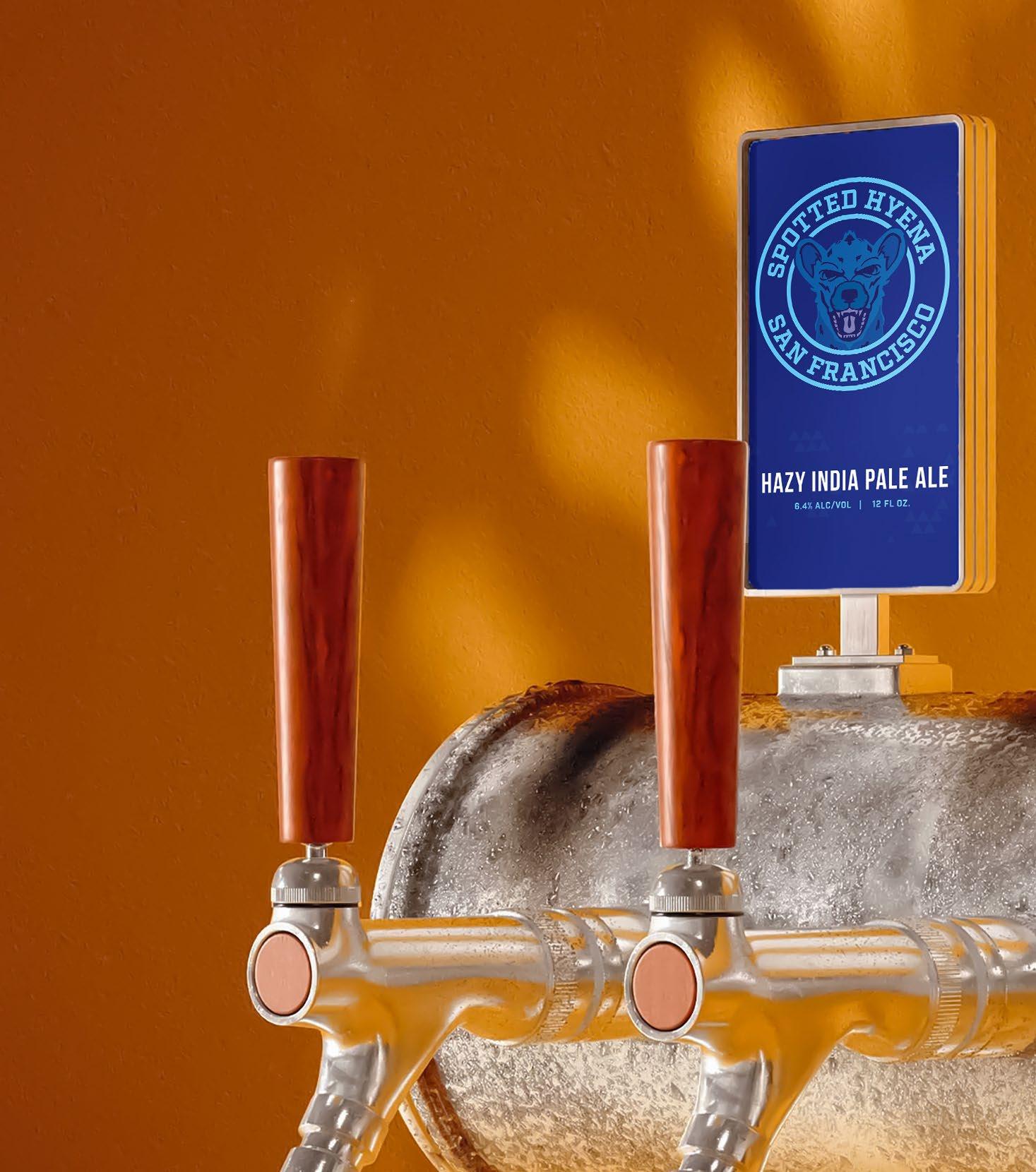
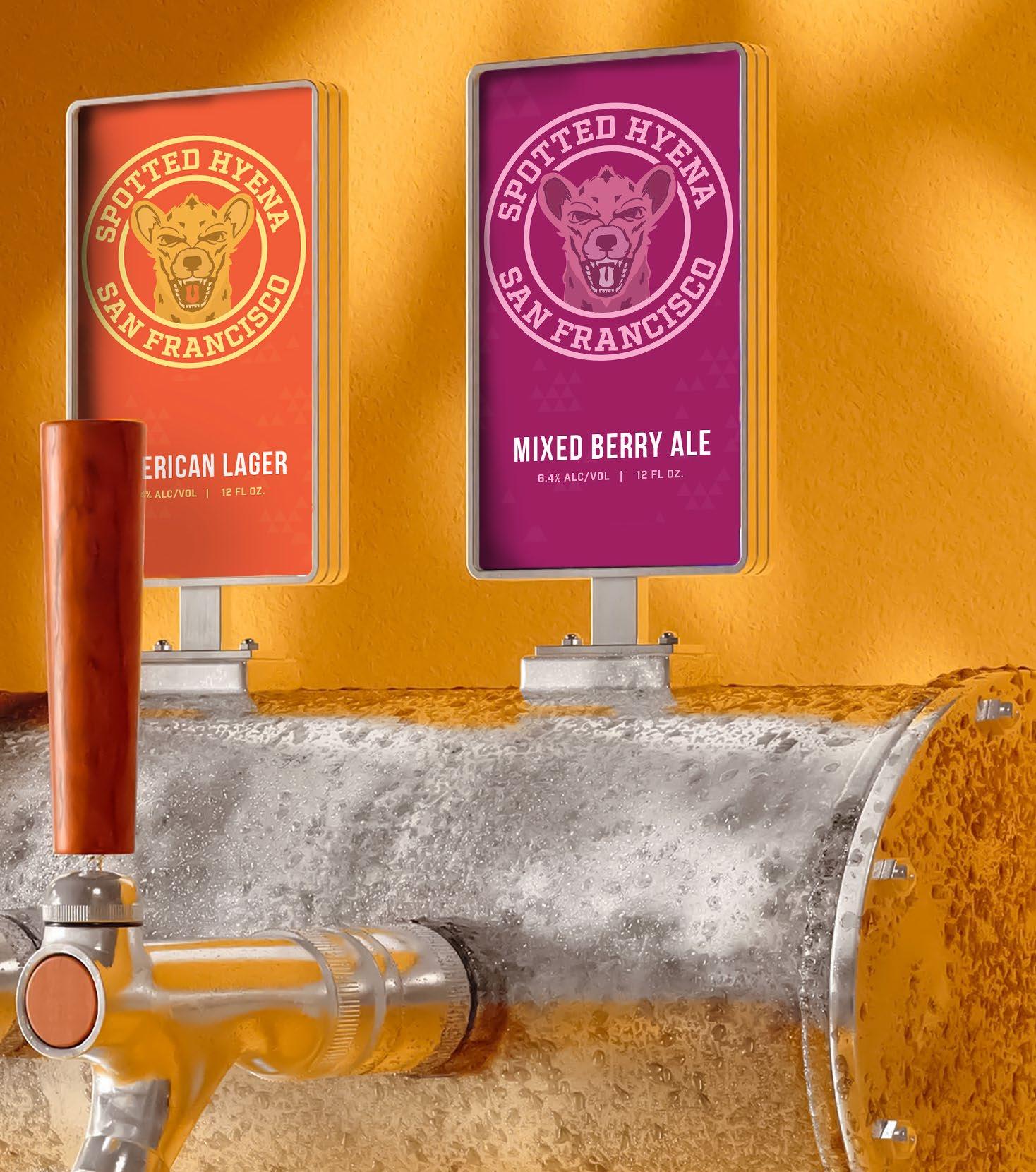
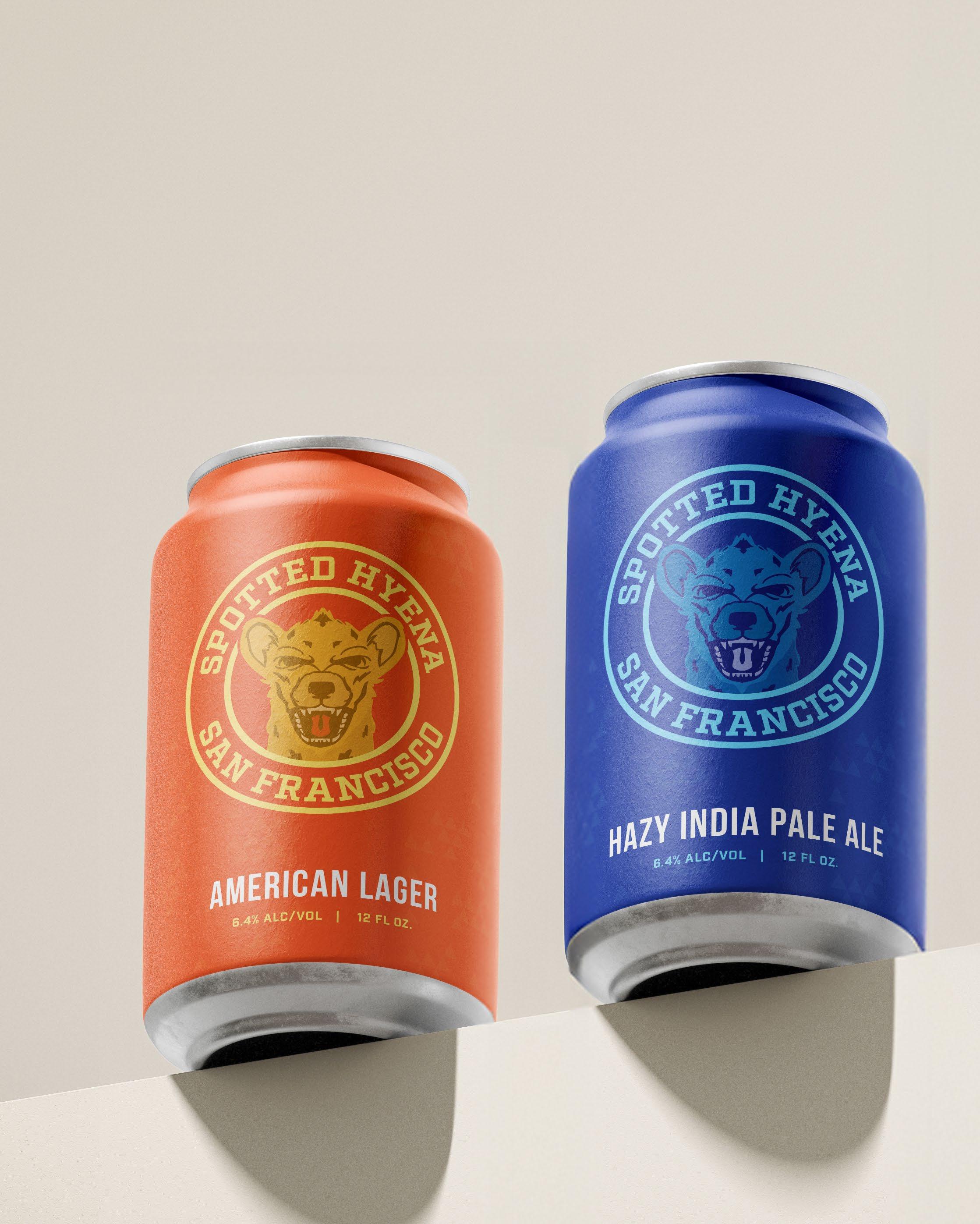
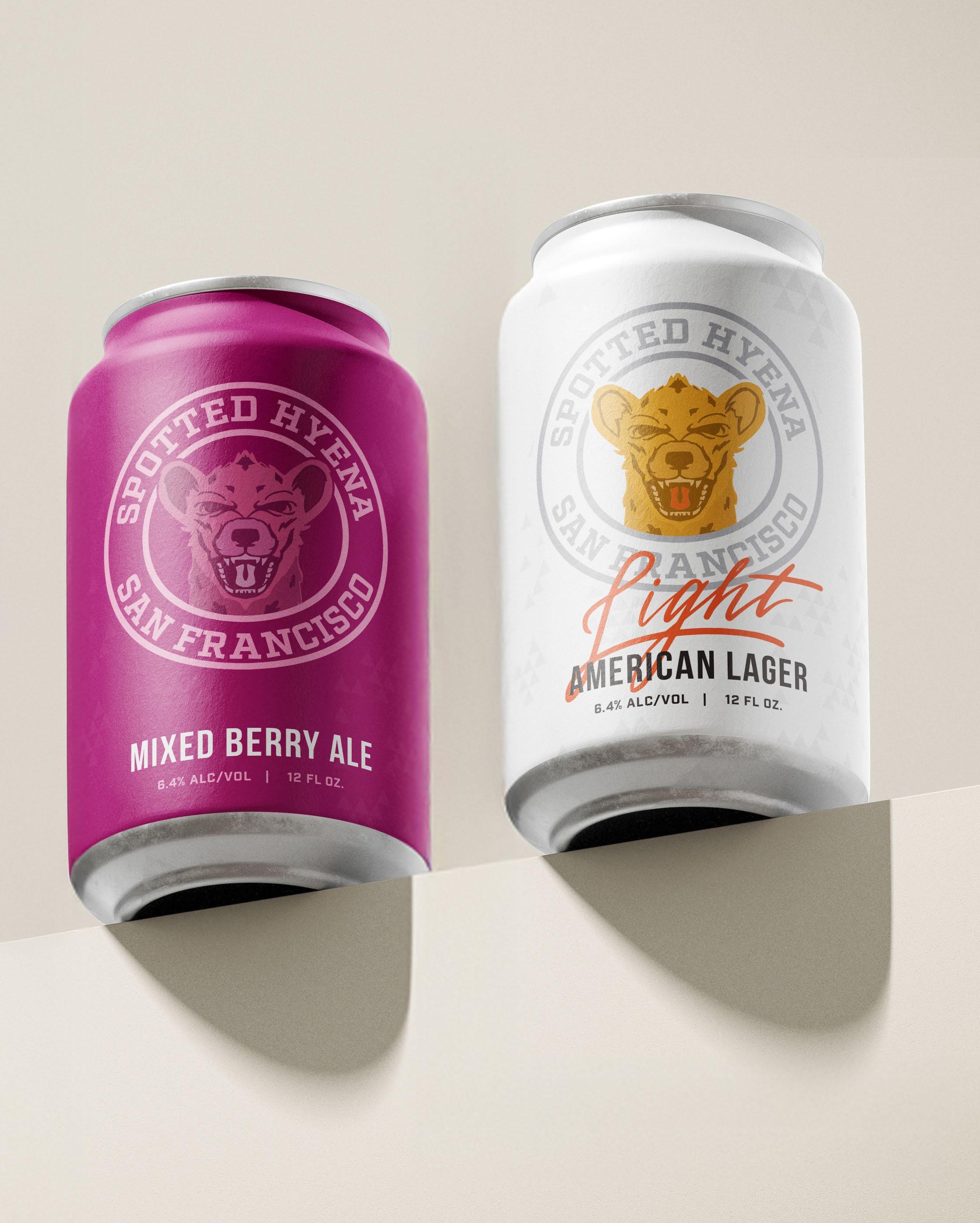
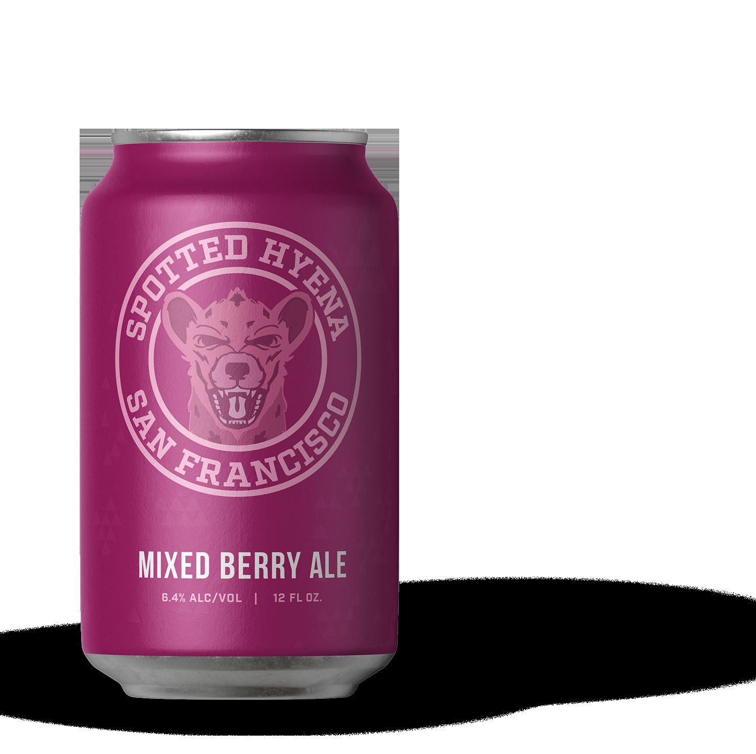
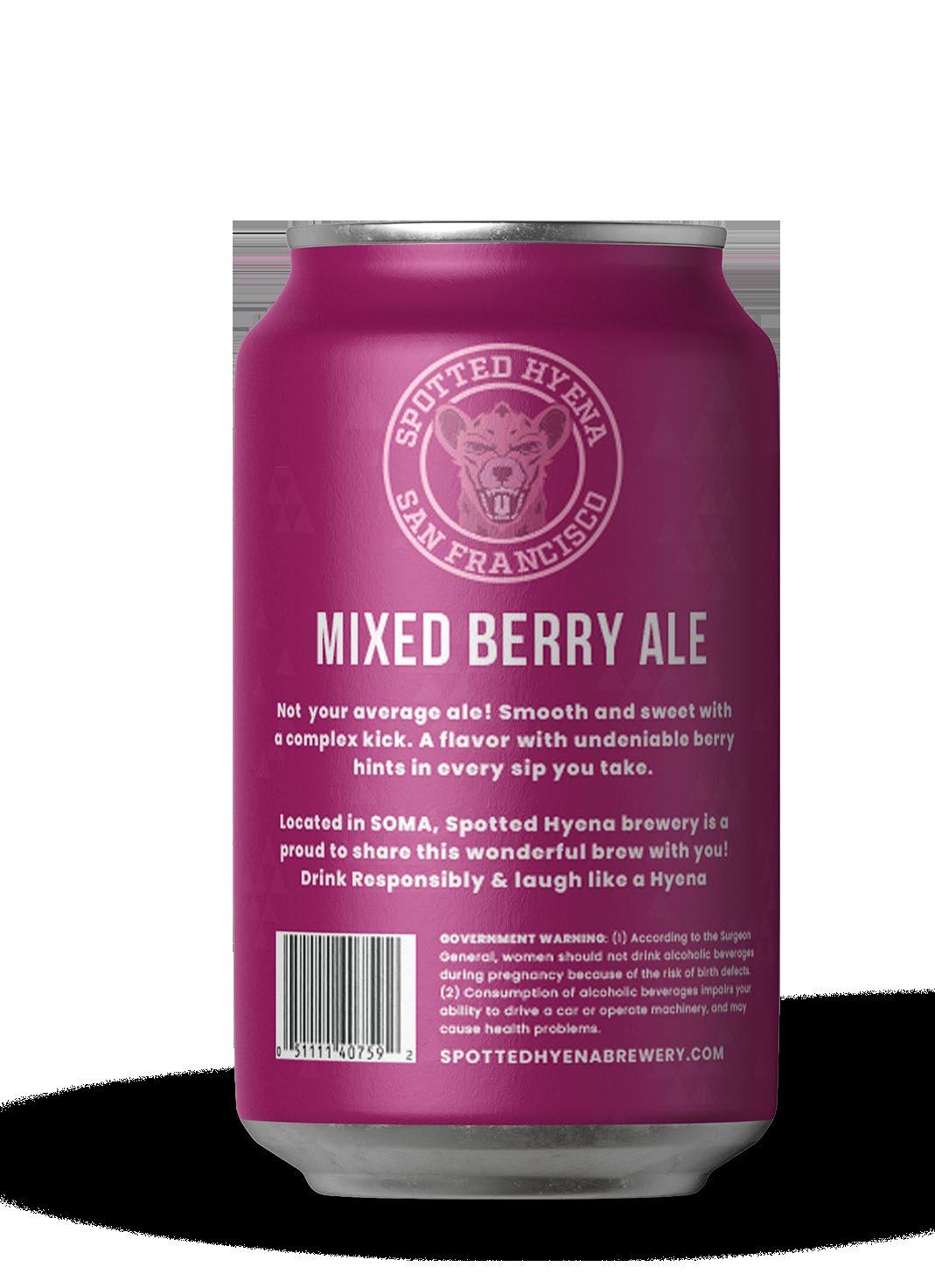
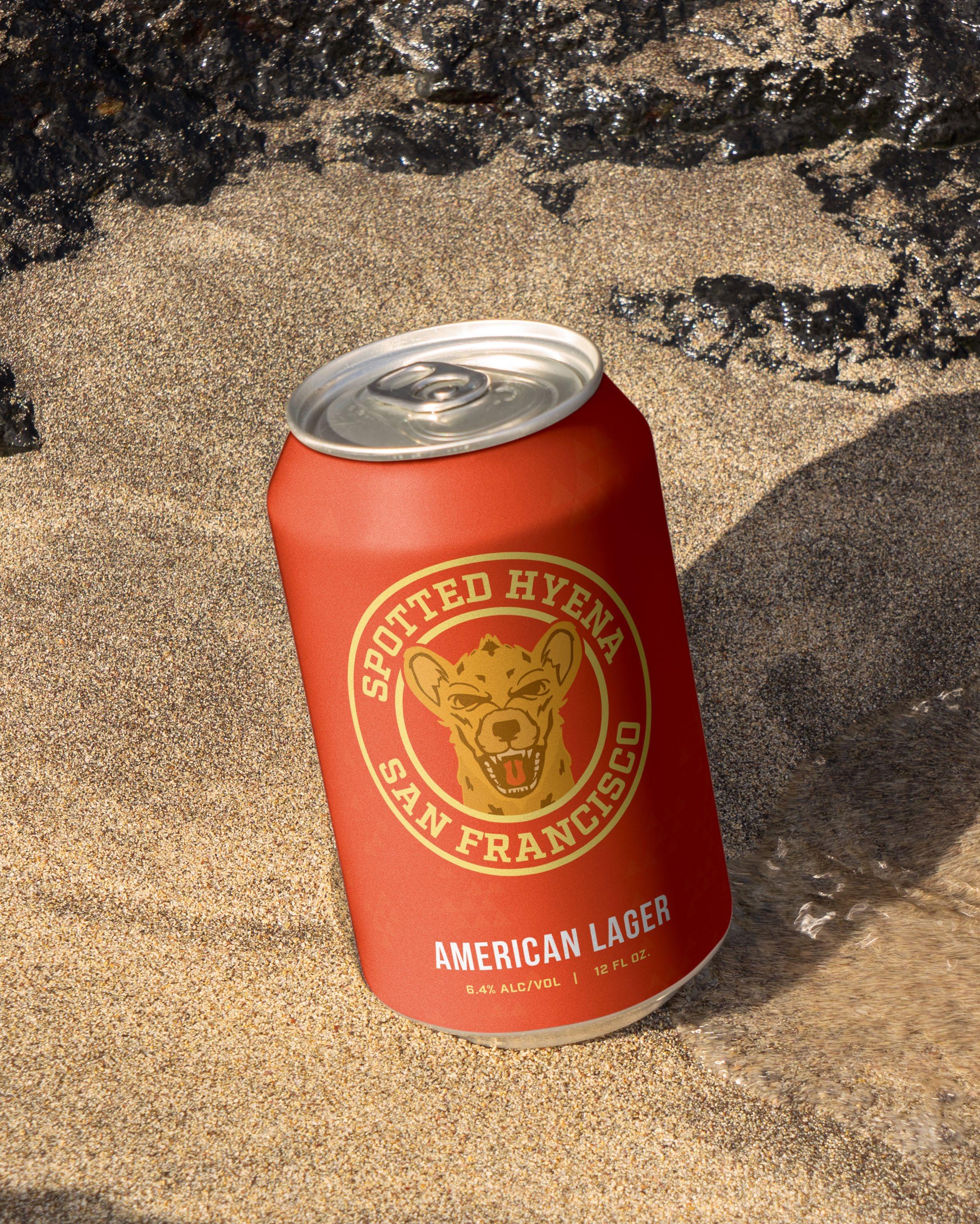
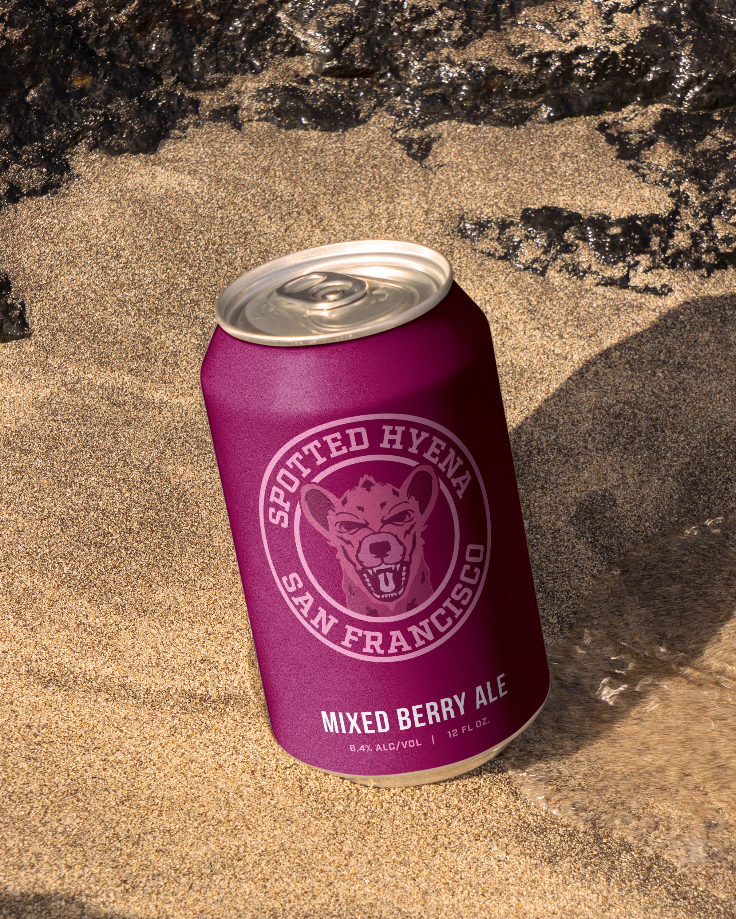
SPOTTED HYENA
COURSE
PACKAGE DESIGN 3
INSTRUCTOR
THOMAS MCNULTY
MEDIA TYPE
BRAND IDENTITY
PACKAGE DESIGN
3 KEYWORDS CARE-FREE EMPOWERED FIERCE
OBJECTIVE
Design packaging for a hypothetical brewery that would stand out to customers in a competitive market.
APPROACH
Create an identity around a woman-owned brewery that could compete in a male dominated industry. Utilize color to catch attention of potential customers. Intend to strengthen the brand's equity by creating a recognizable identity that can be remembered and can be enjoyed by anyone.
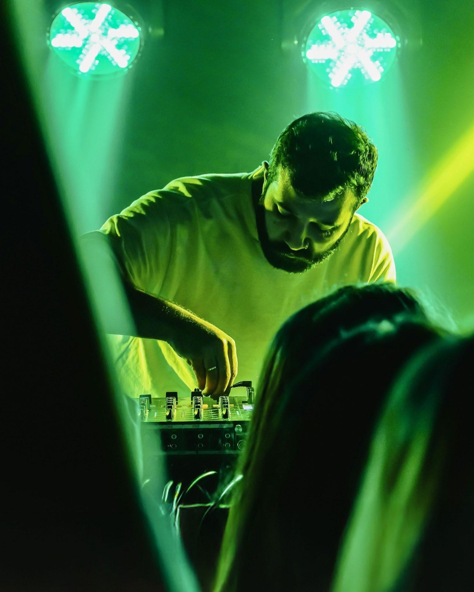
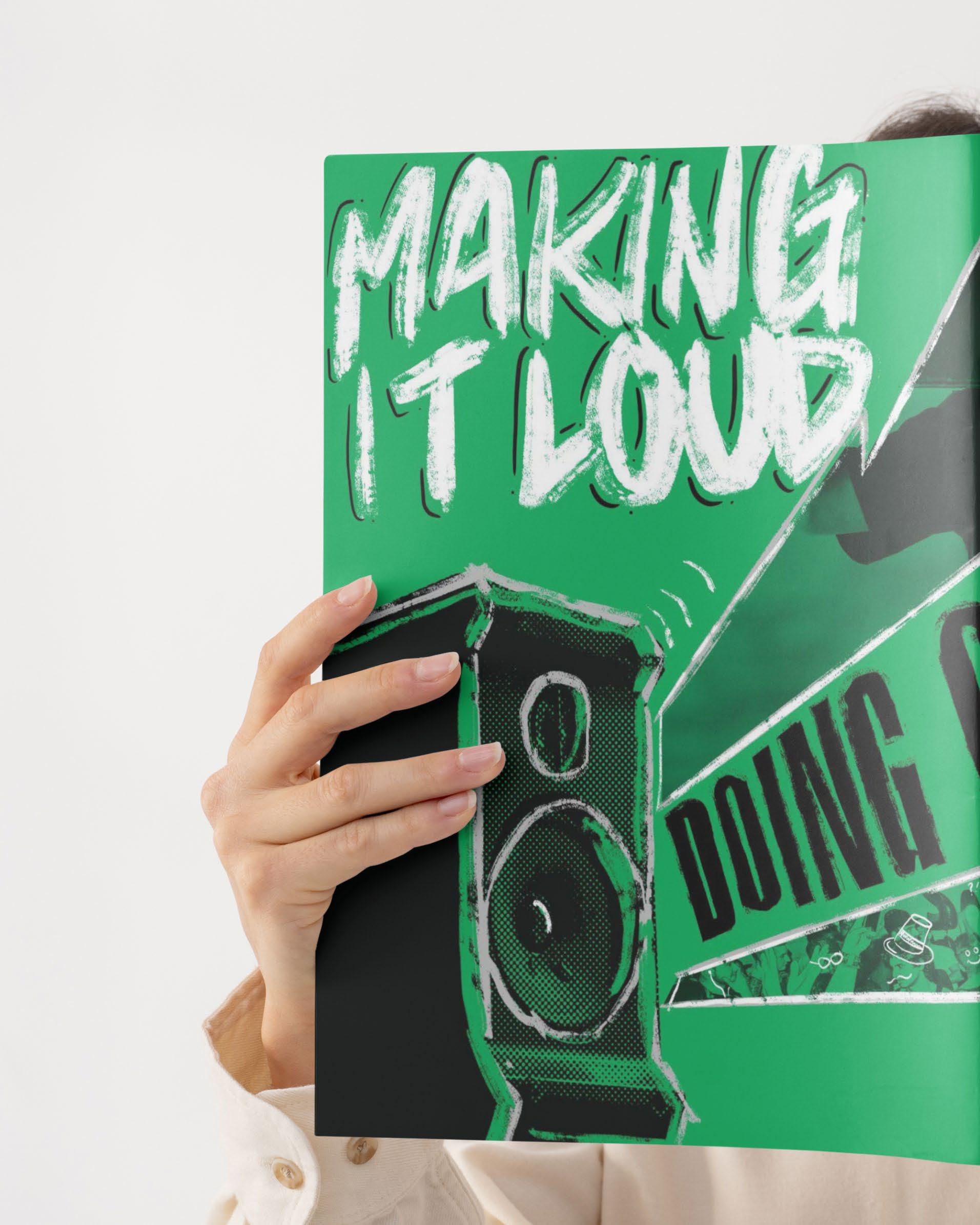
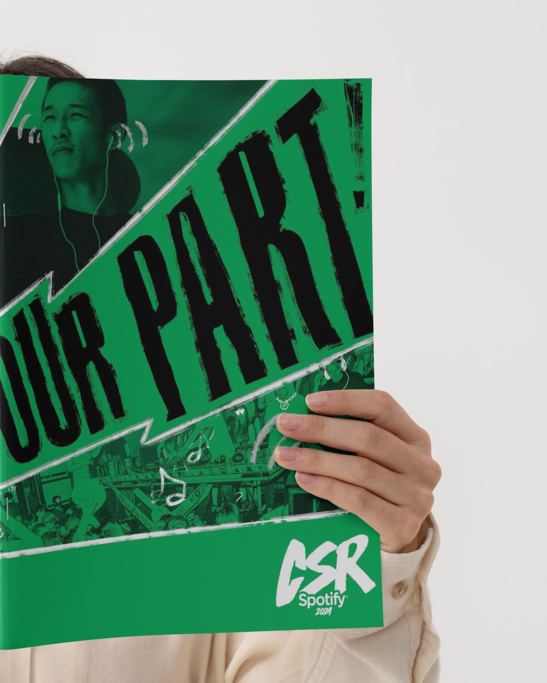
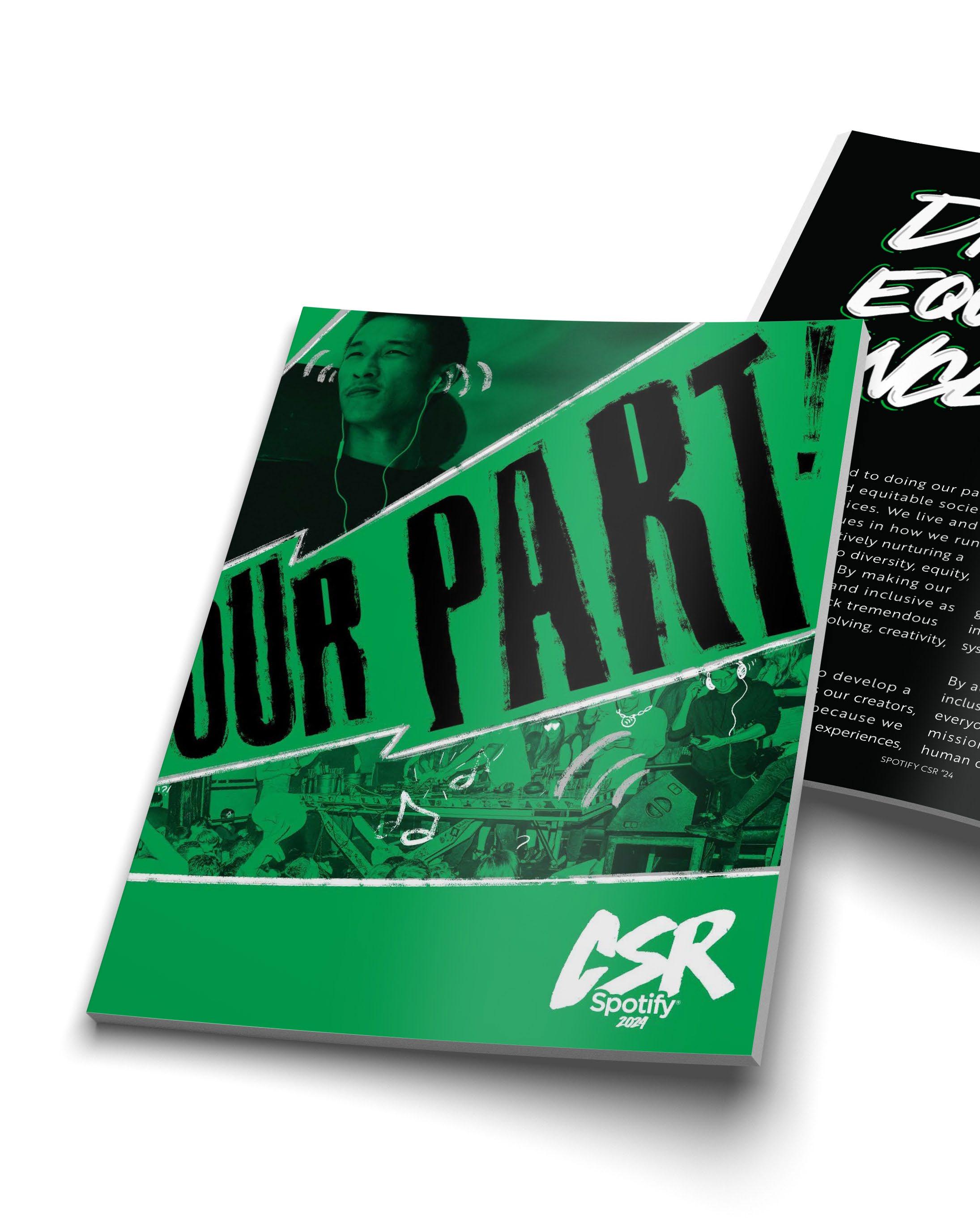
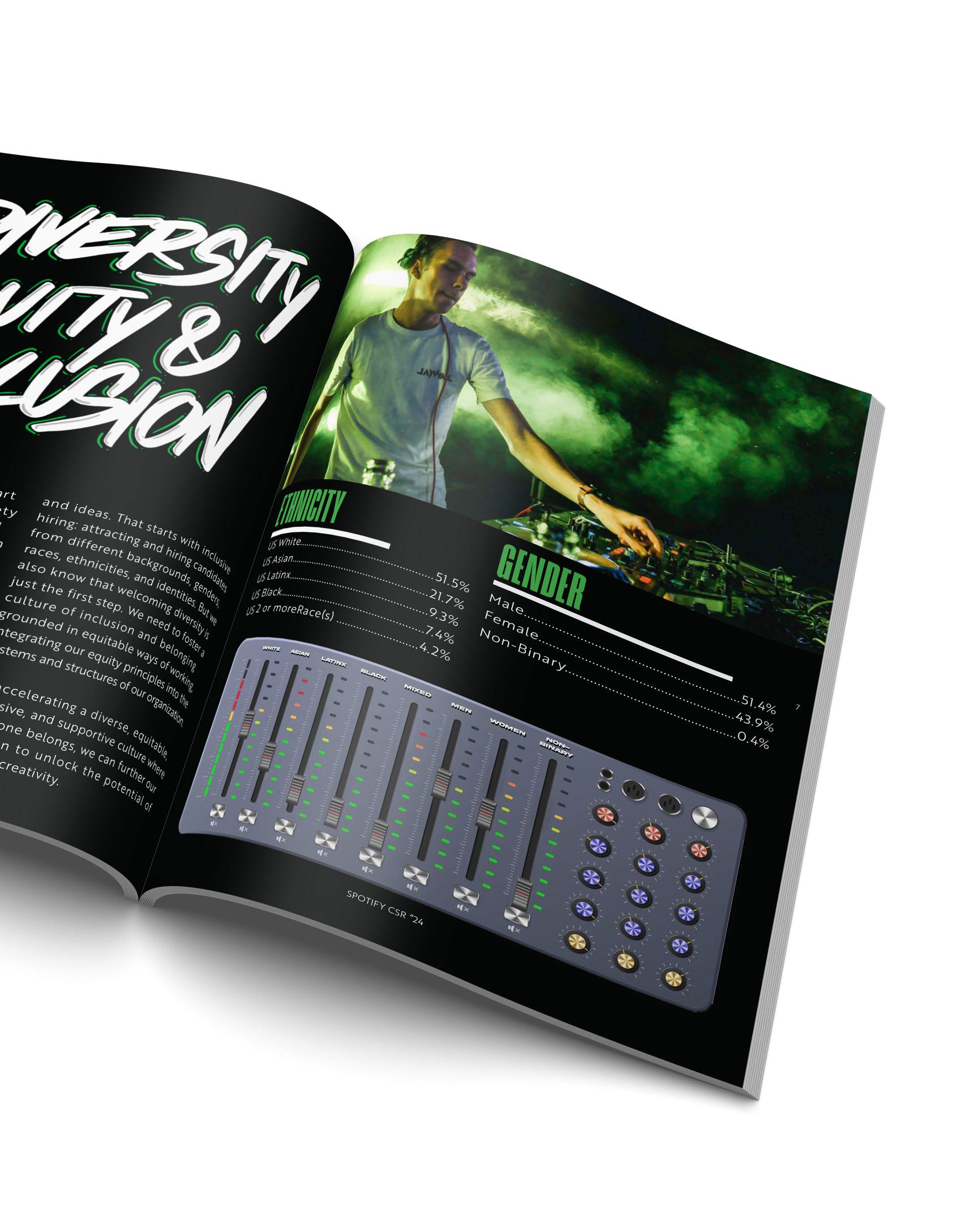
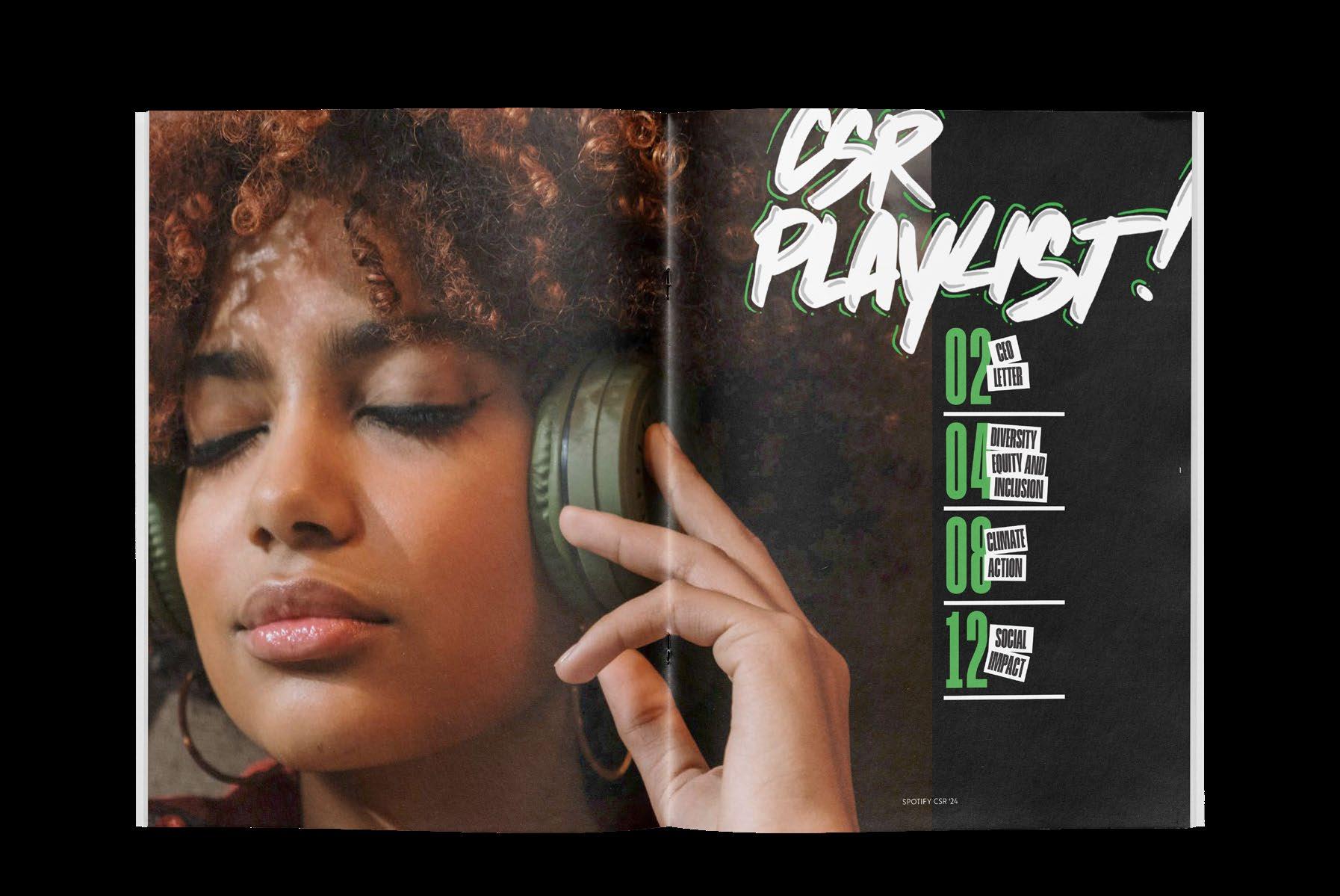
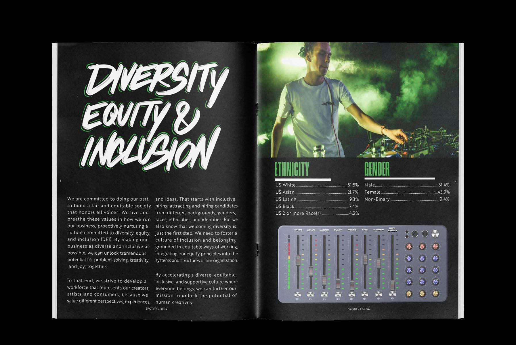
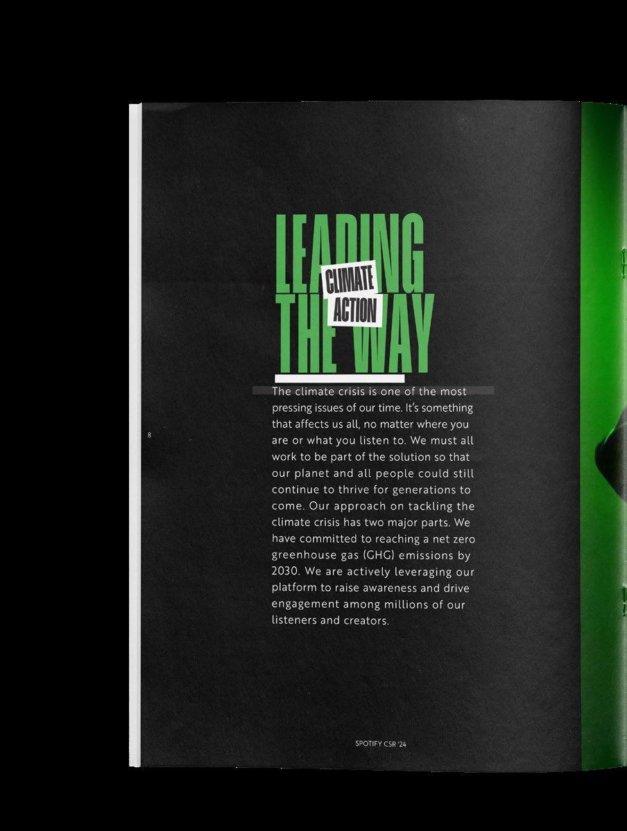
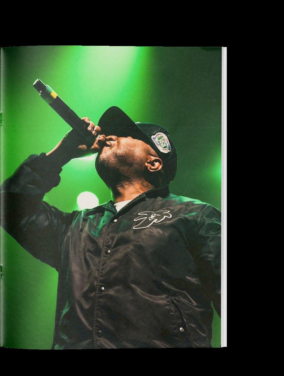
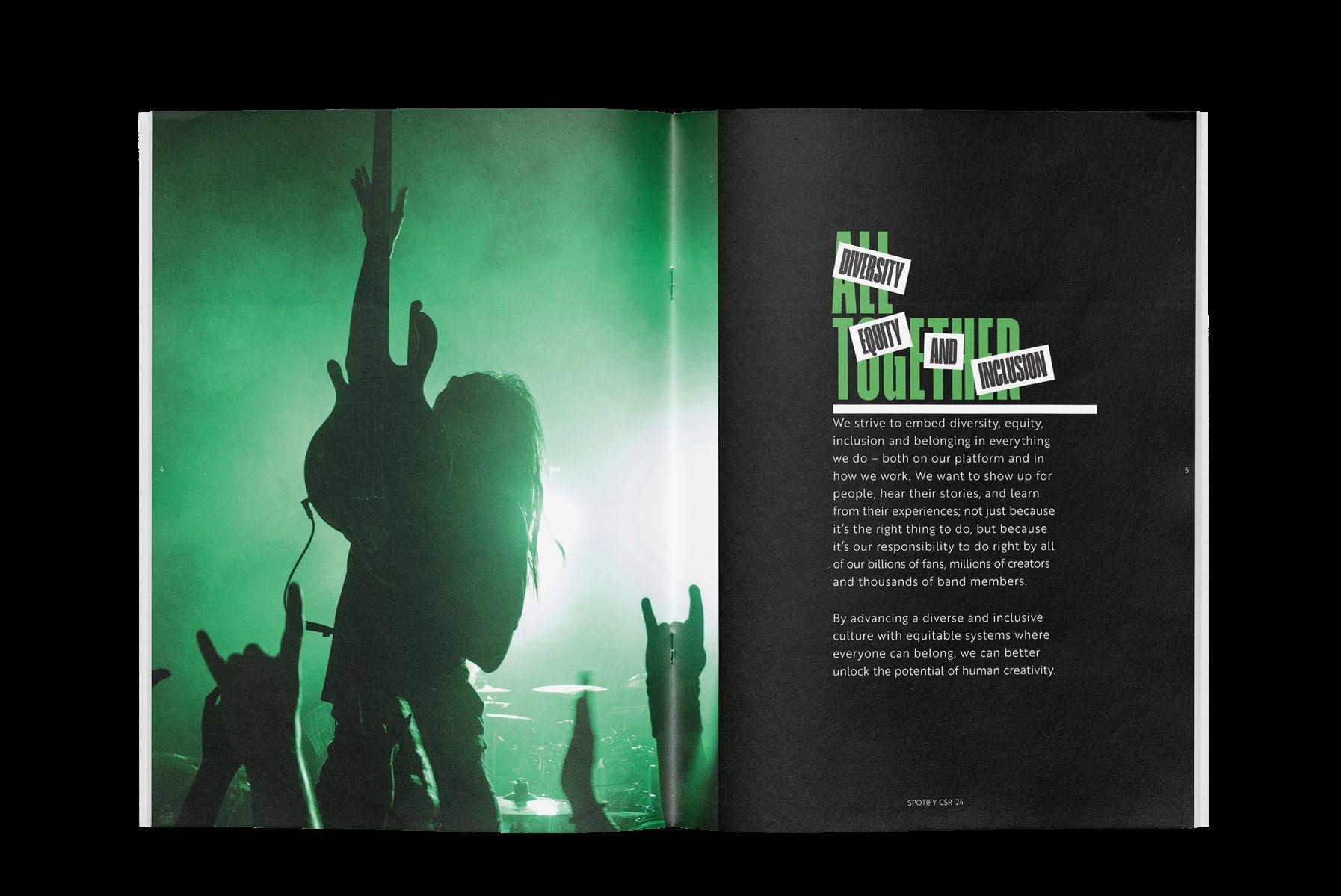
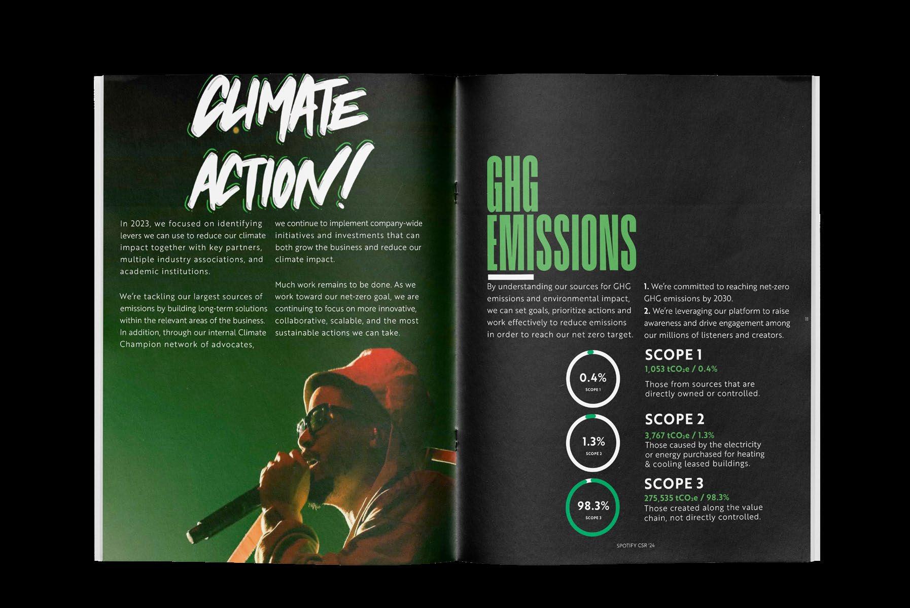
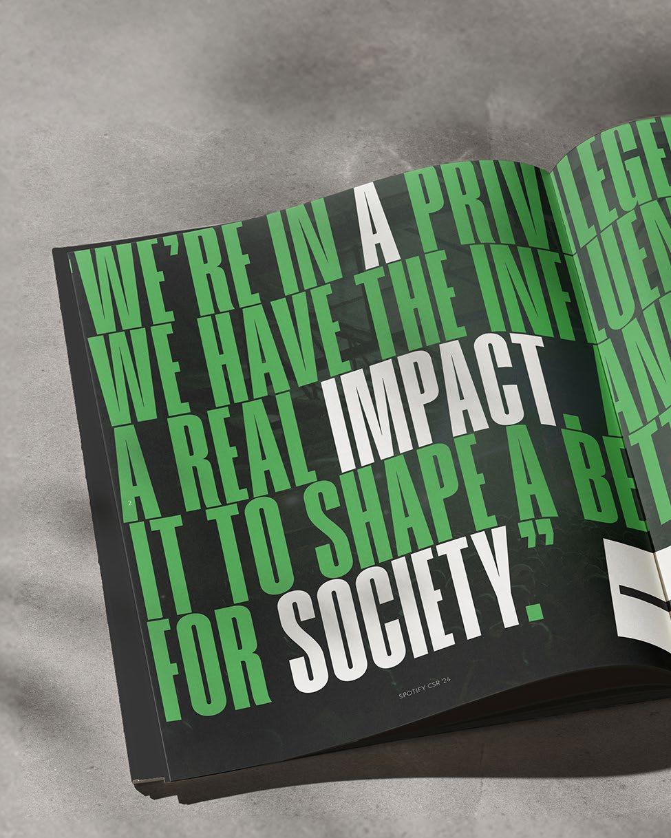
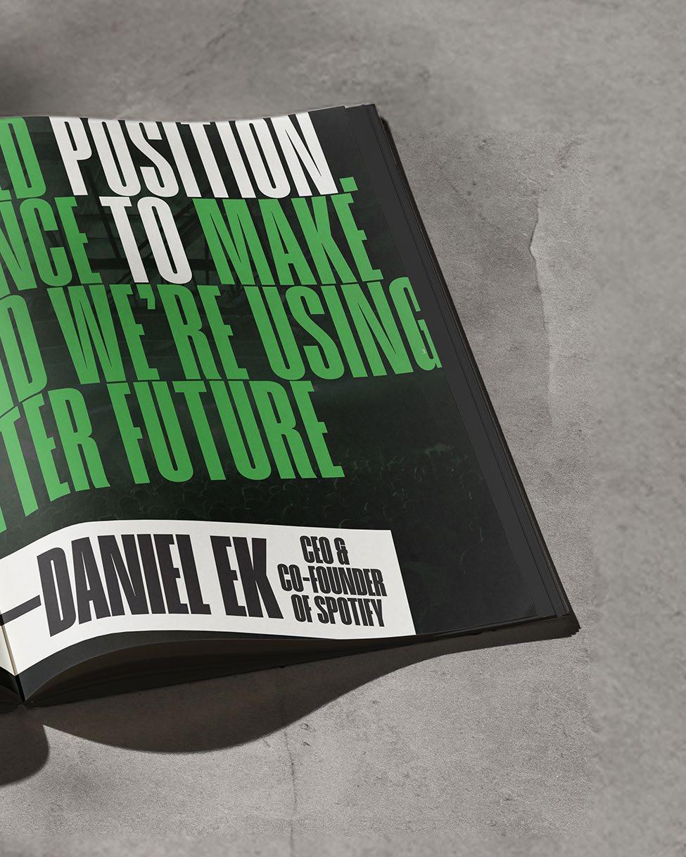
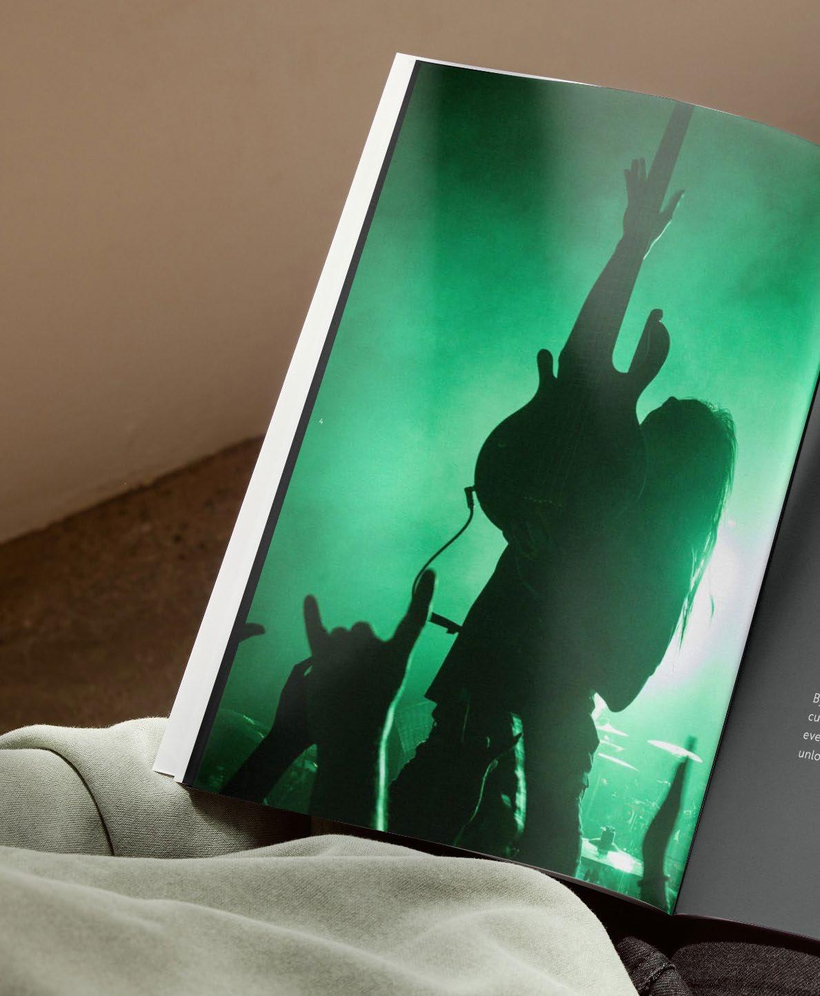
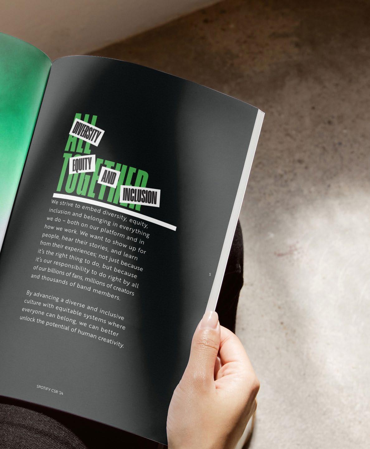
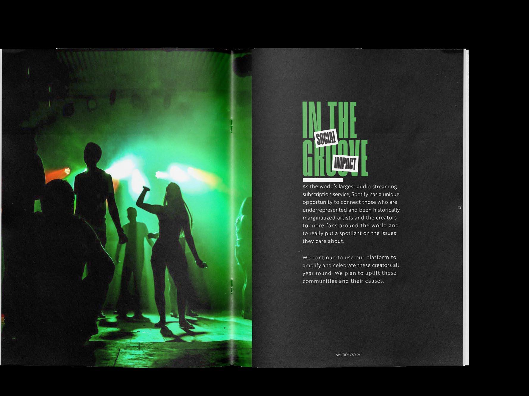
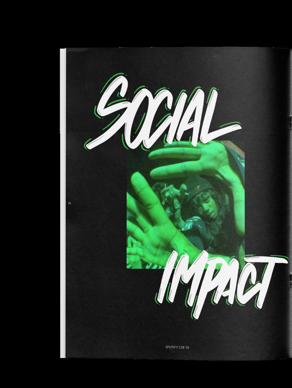
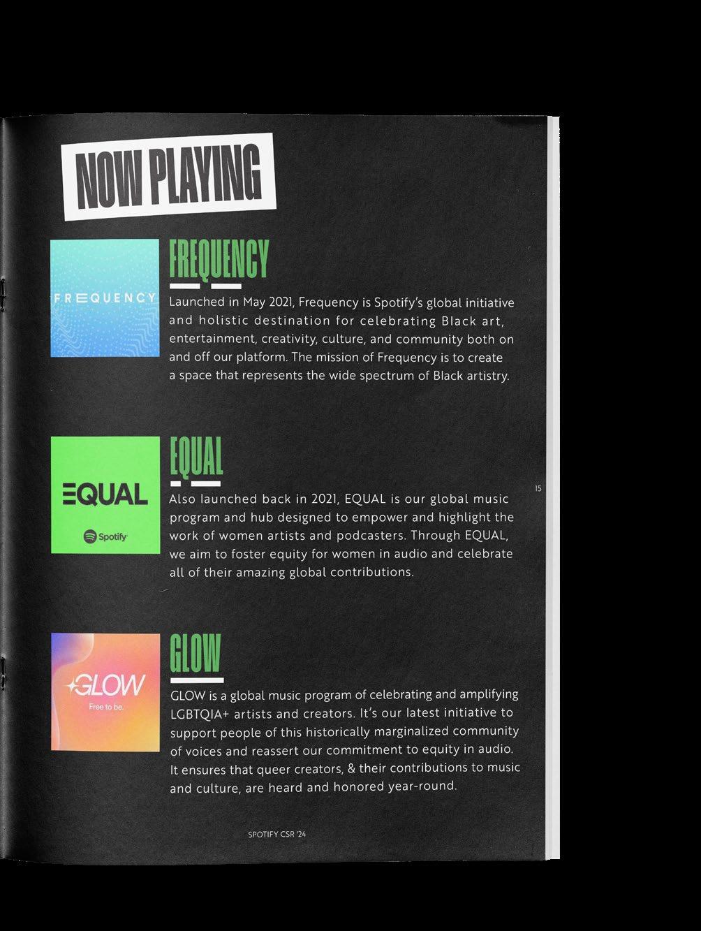
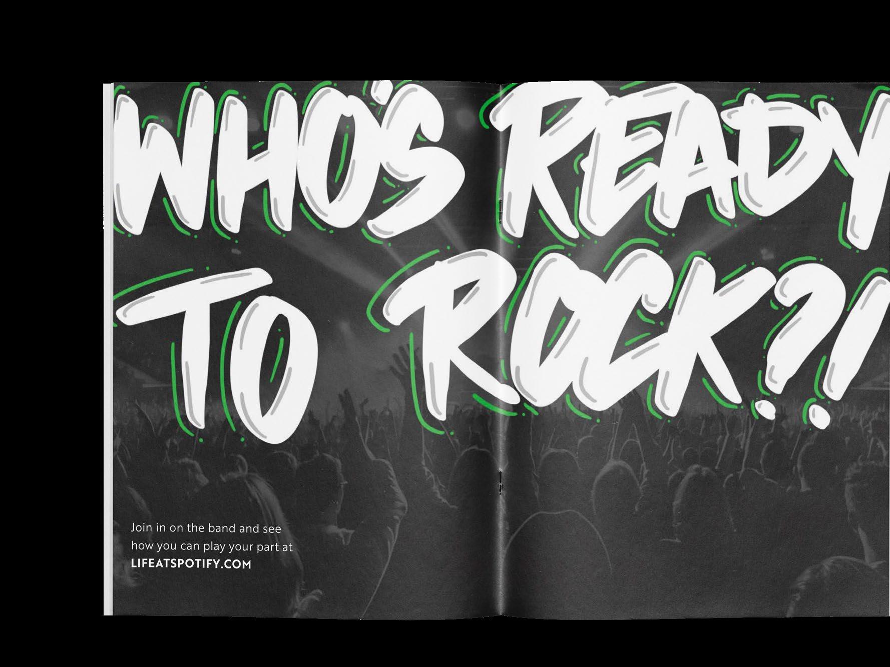
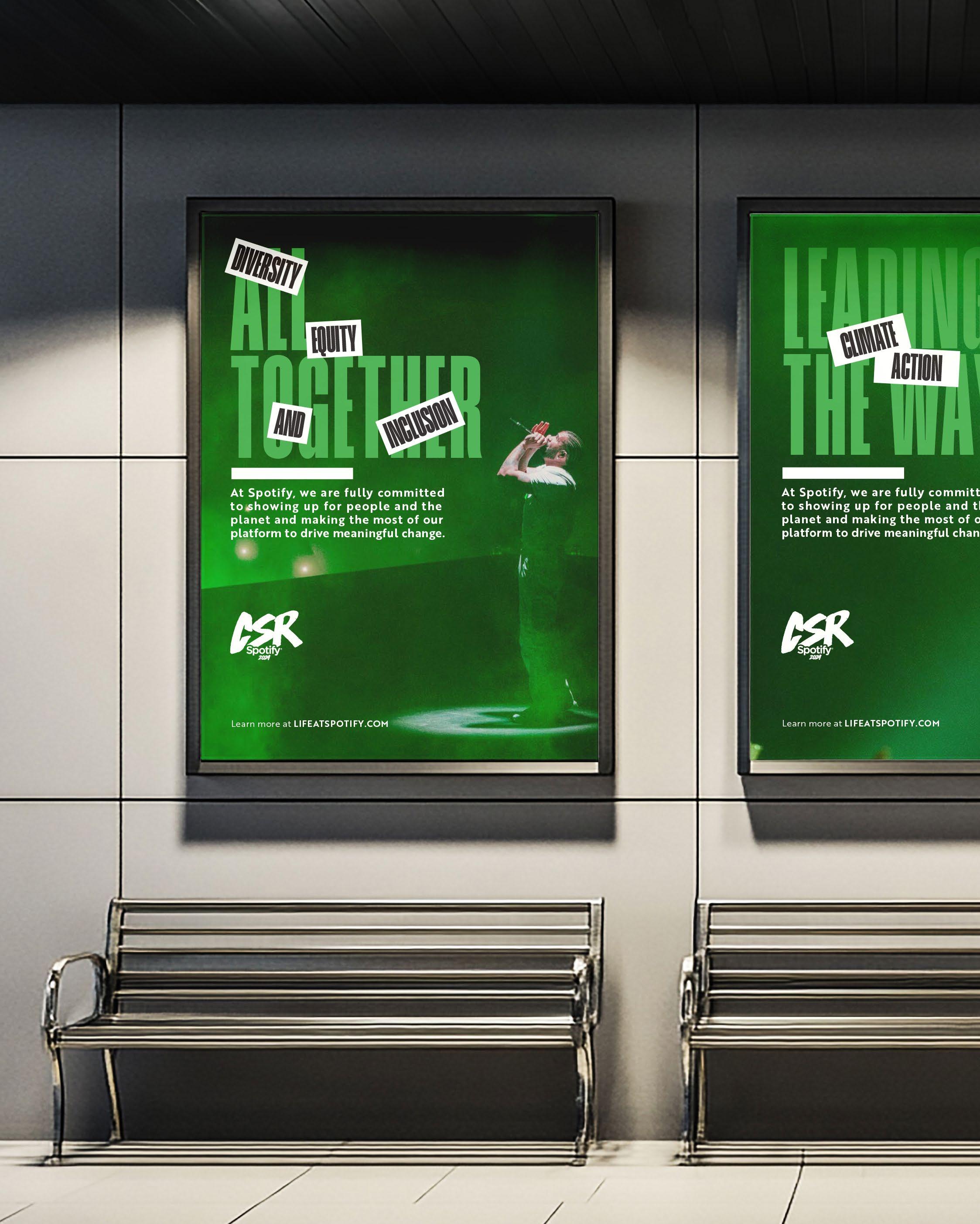
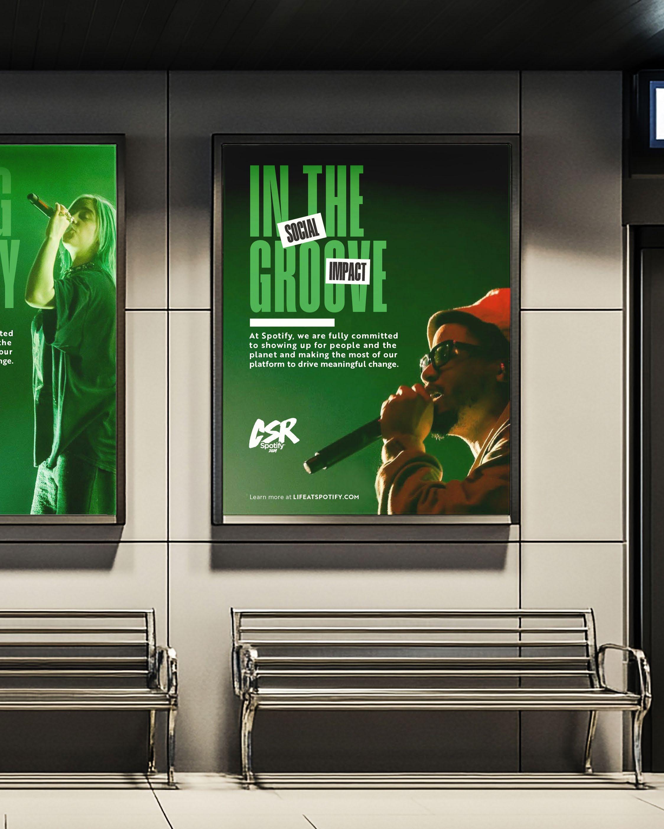
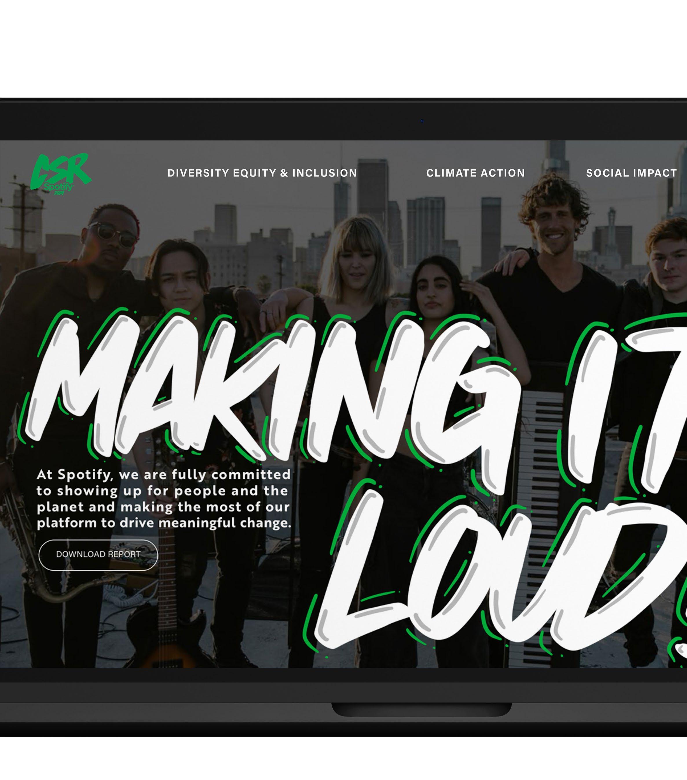
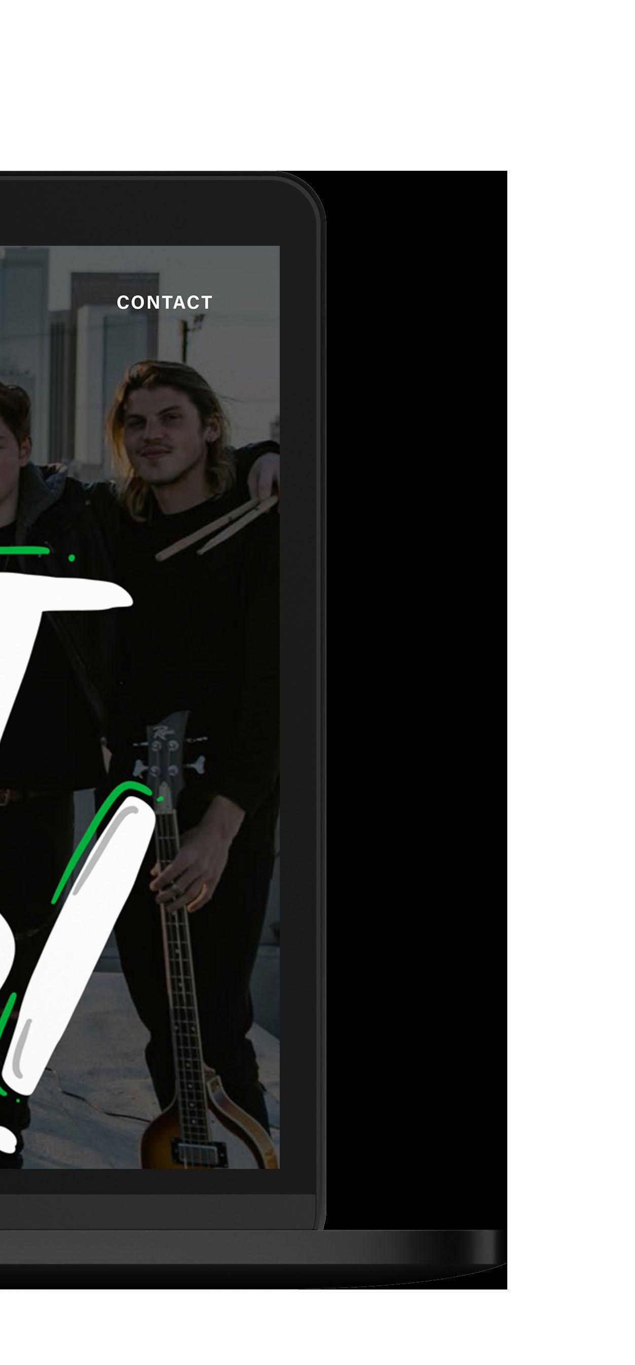
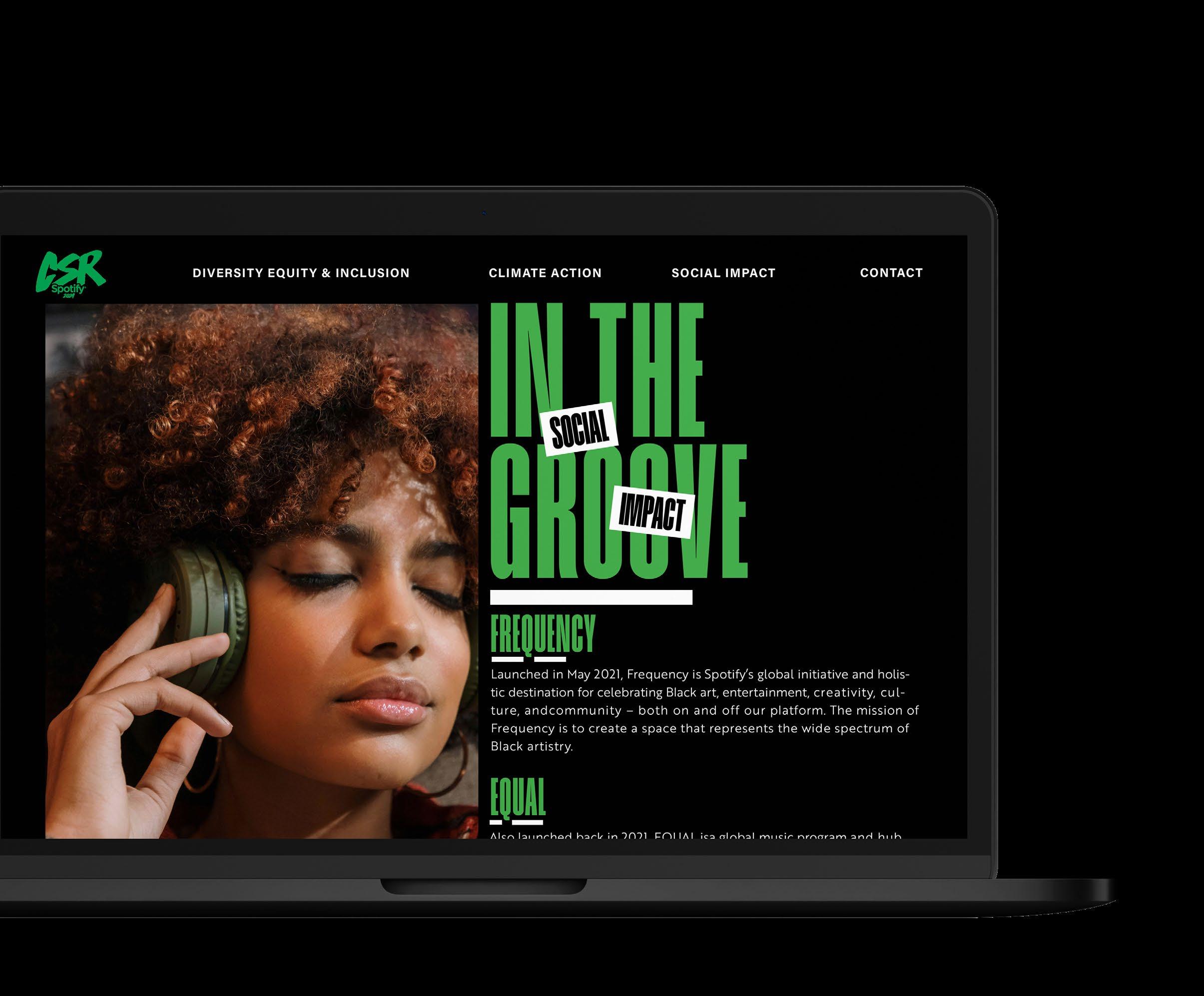
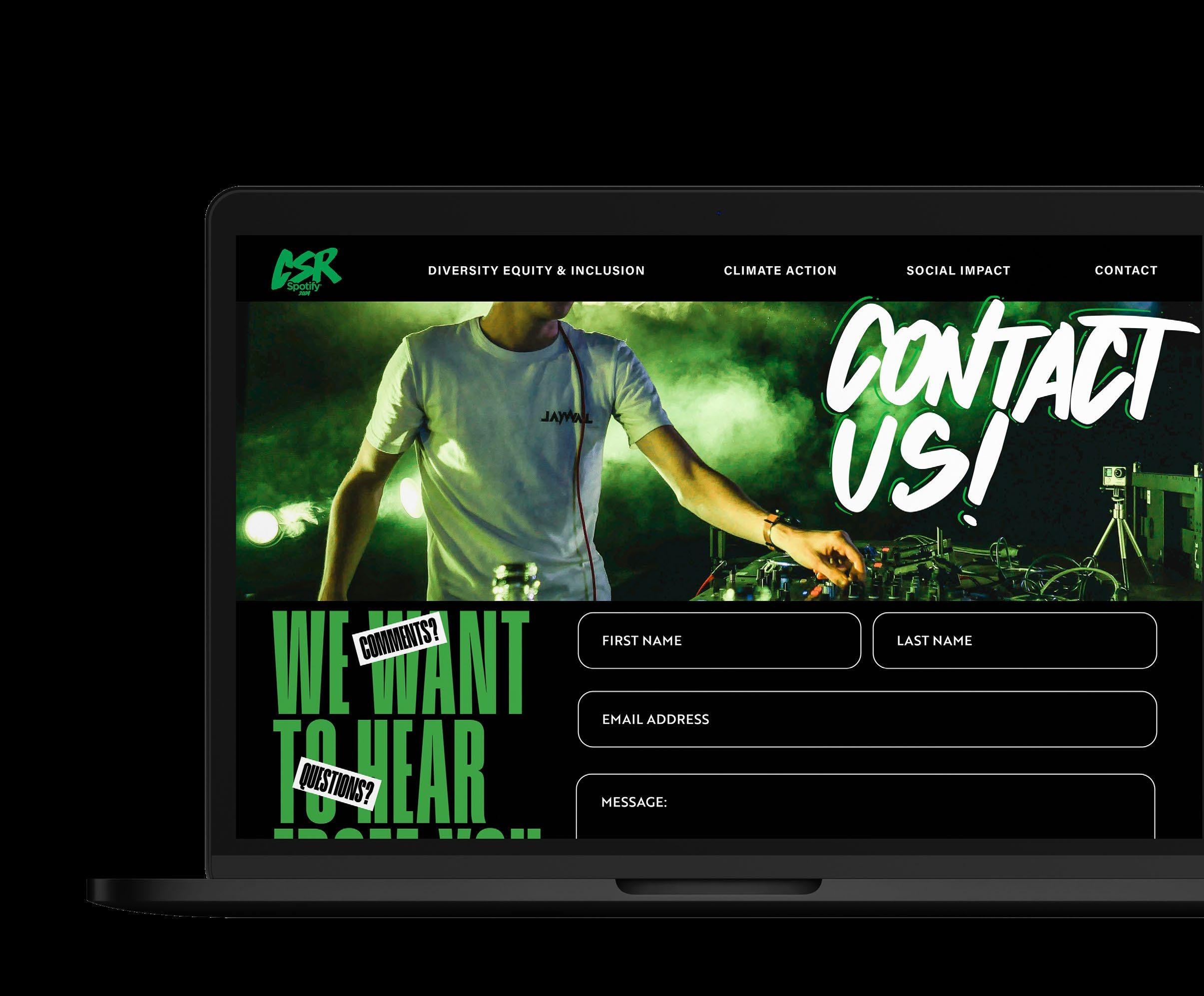
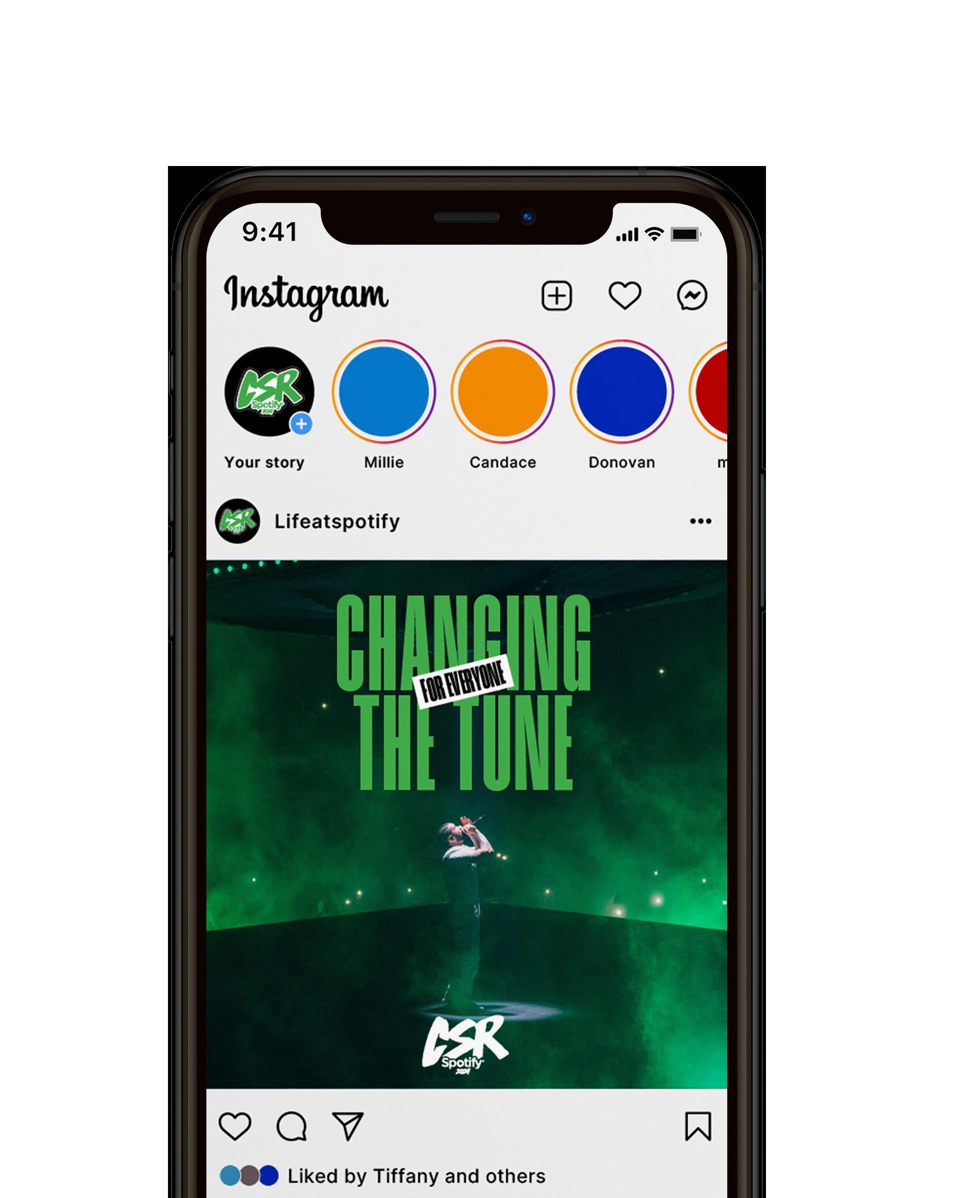
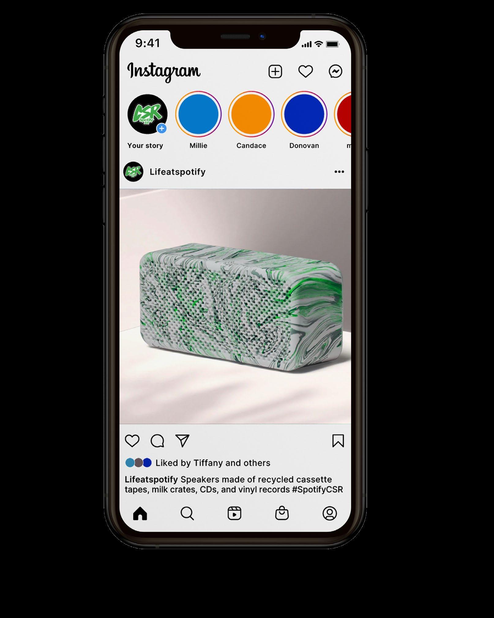
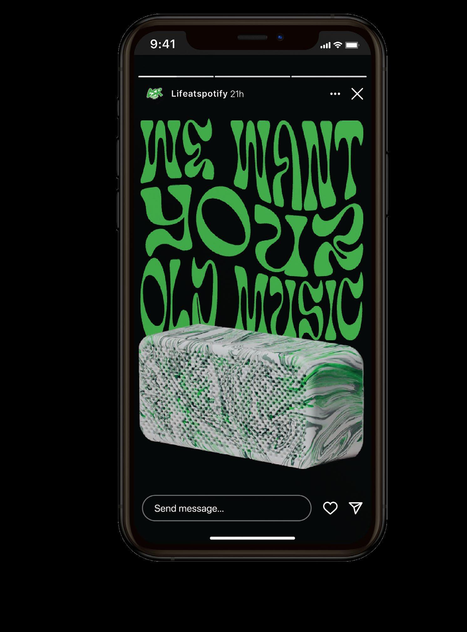
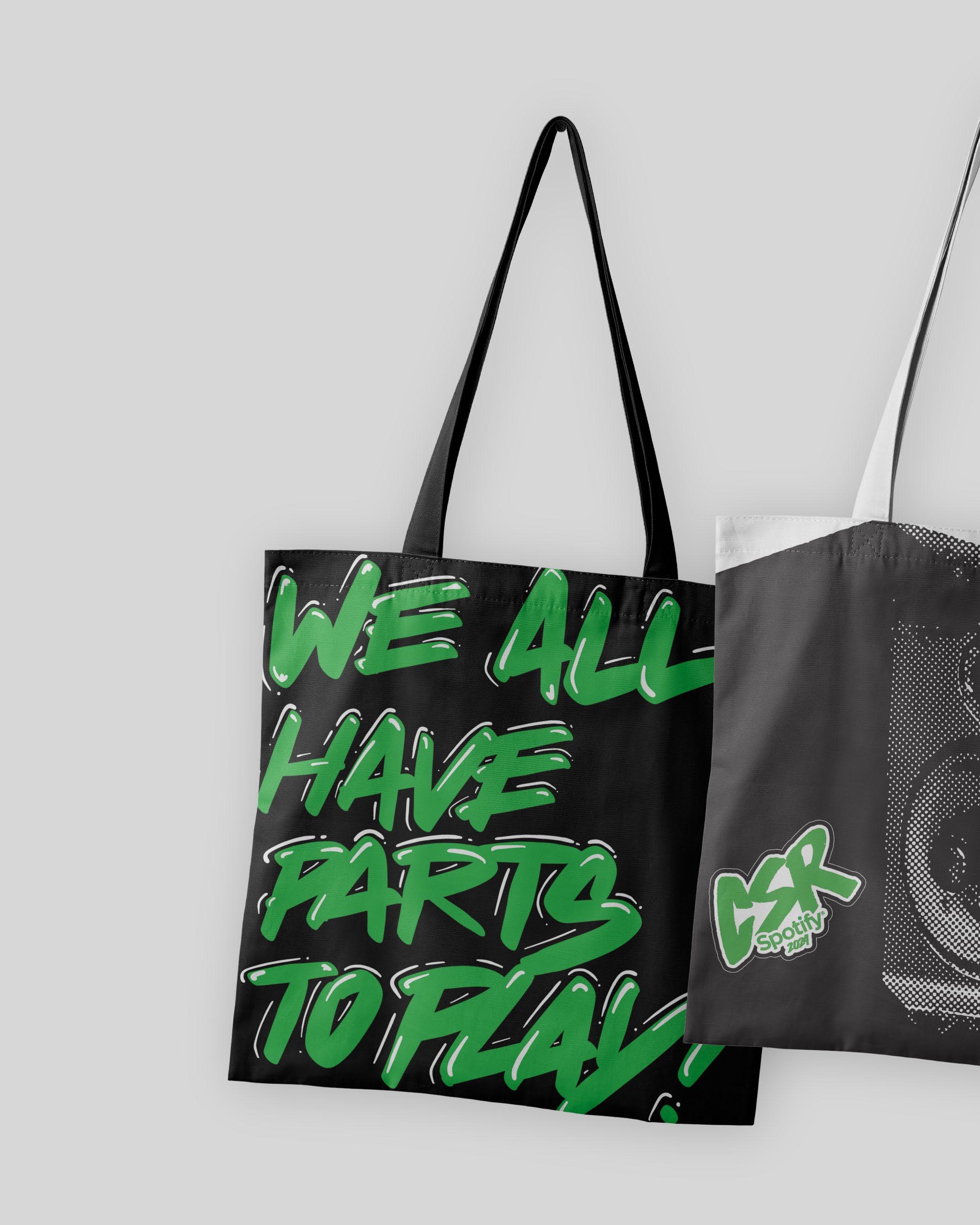
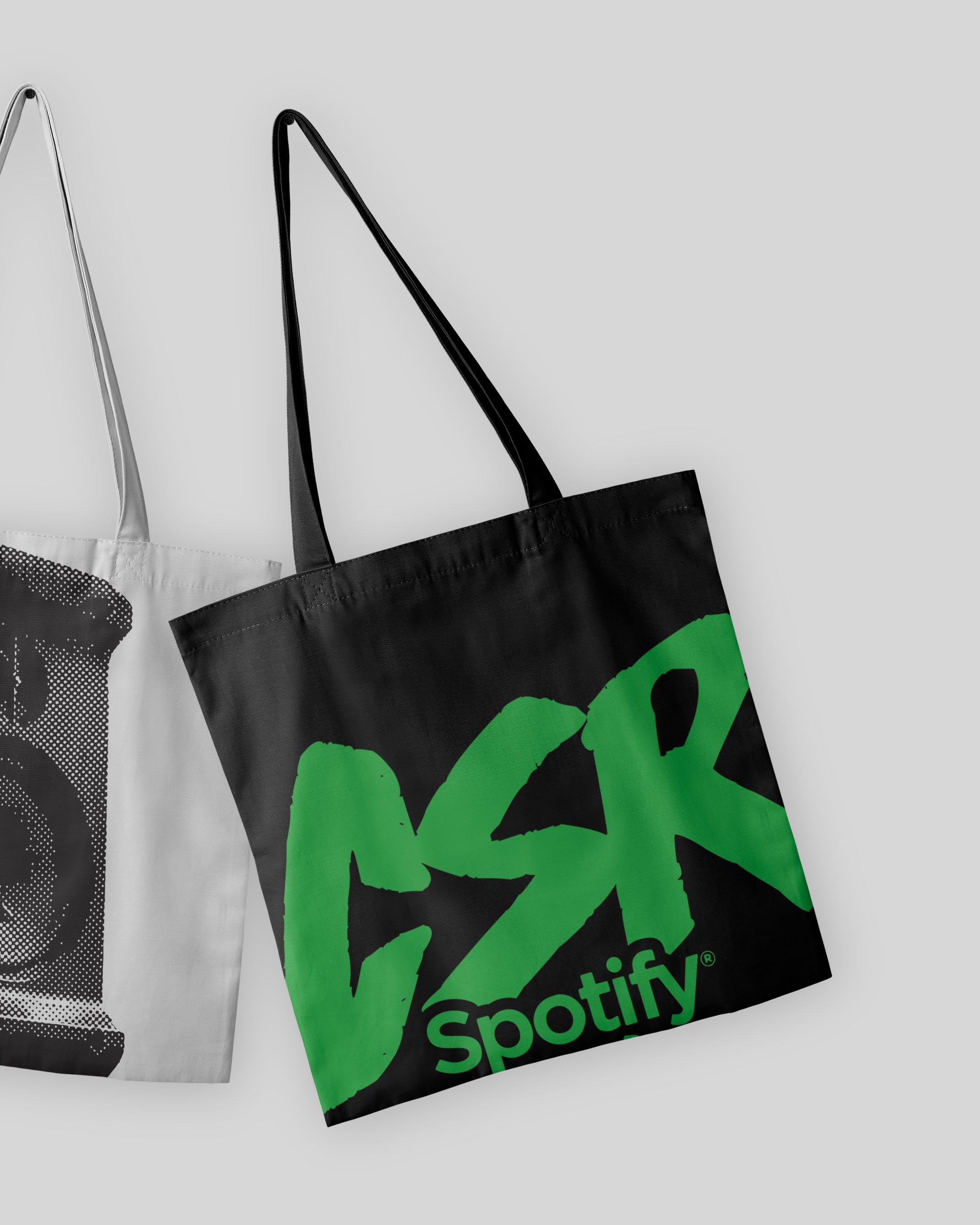
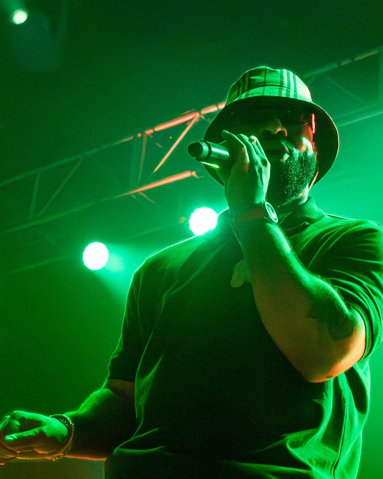
SPOTIFY
Changing the World, One Stream at a Time
COURSE VISUAL SYSTEMS 2
INSTRUCTOR
HUNTER WIMMER
MEDIA TYPE
BRANDING BOOK DESIGN
WEB DESIGN
3 KEYWORDS BOLD PASSION MOVEMENT
OBJECTIVE
To develop a thorough and visually engaging CSR report and accompanying deliverables for a company that clearly conveys their strong dedication to Diversity, Equity, and Inclusion (DEI), as well as environmental and social responsibility. The goal is to inspire consumer engagement and strengthen the connection between Spotify, its employees, artists, and to the millions of loyal listeners.
APPROACH
The report focuses on the authentic, people-first energy that defines Spotify, highlighting real voices through bold photography and sincere storytelling. The brand’s iconic green is used throughout to represent growth, passion, and a commitment to inclusion. Handwritten headlines add a layer of rawness and personality, reflecting a company driven by its people and their impact. Together, these elements create a CSR report that feels genuine & engaging, designed to connect, inform, and inspire.


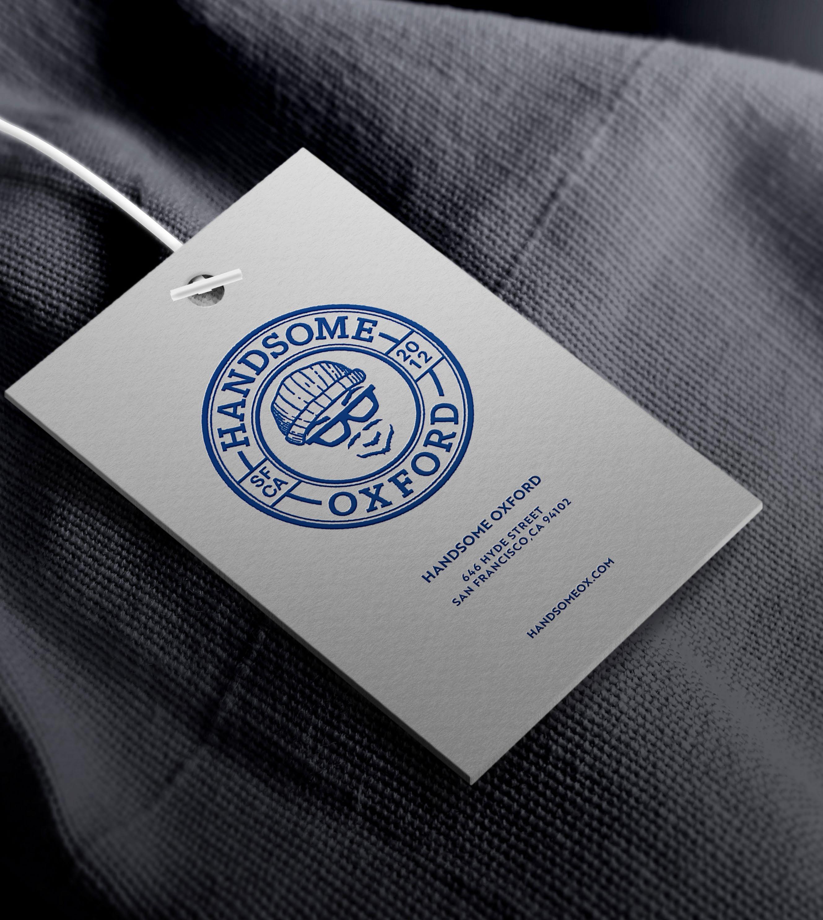
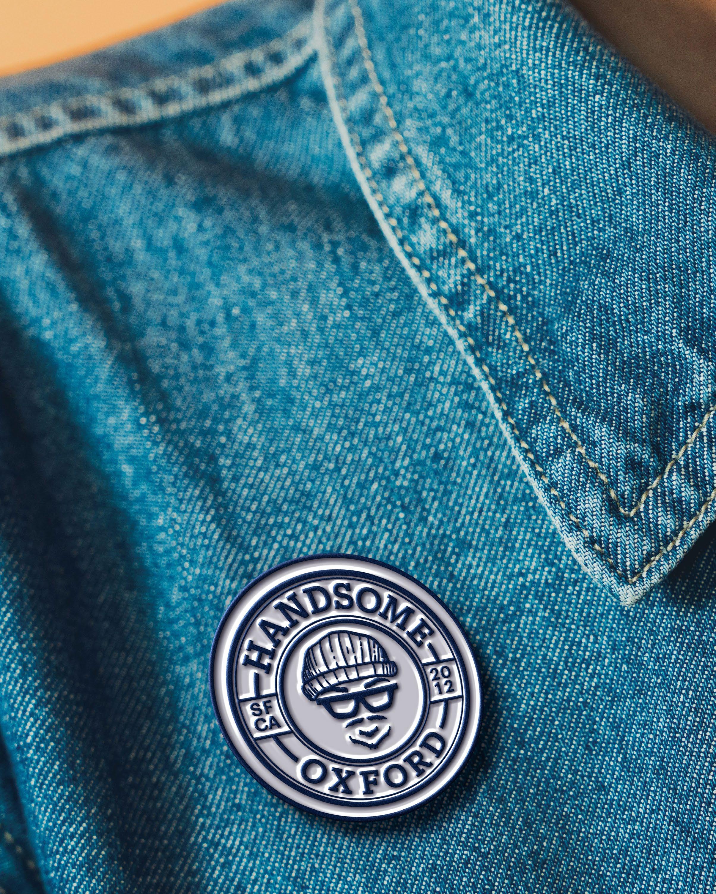
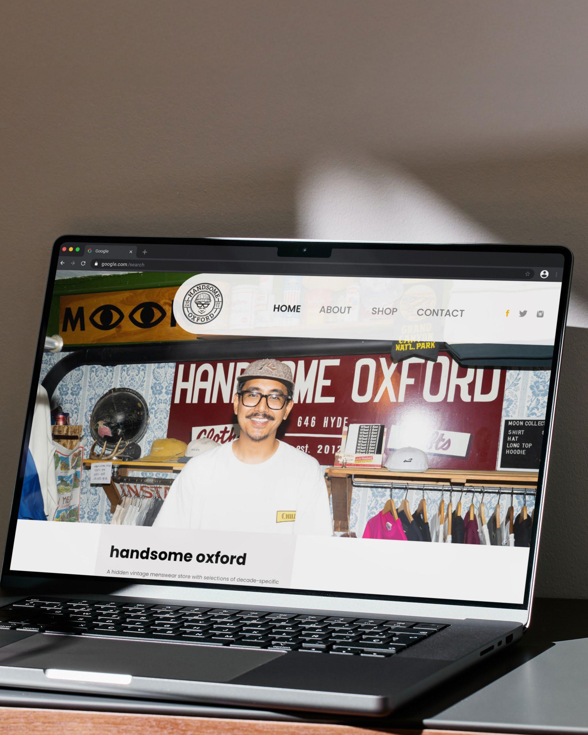
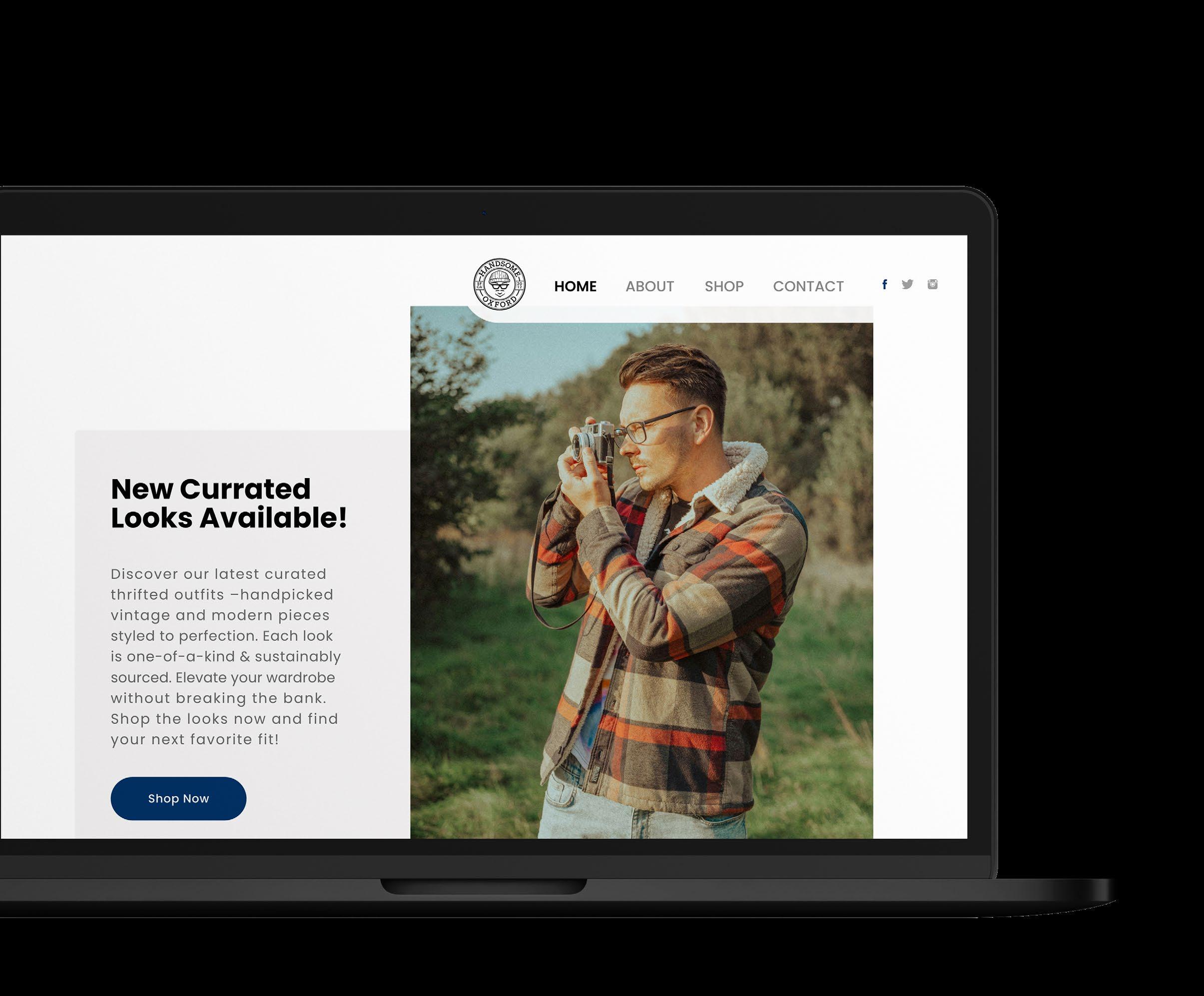
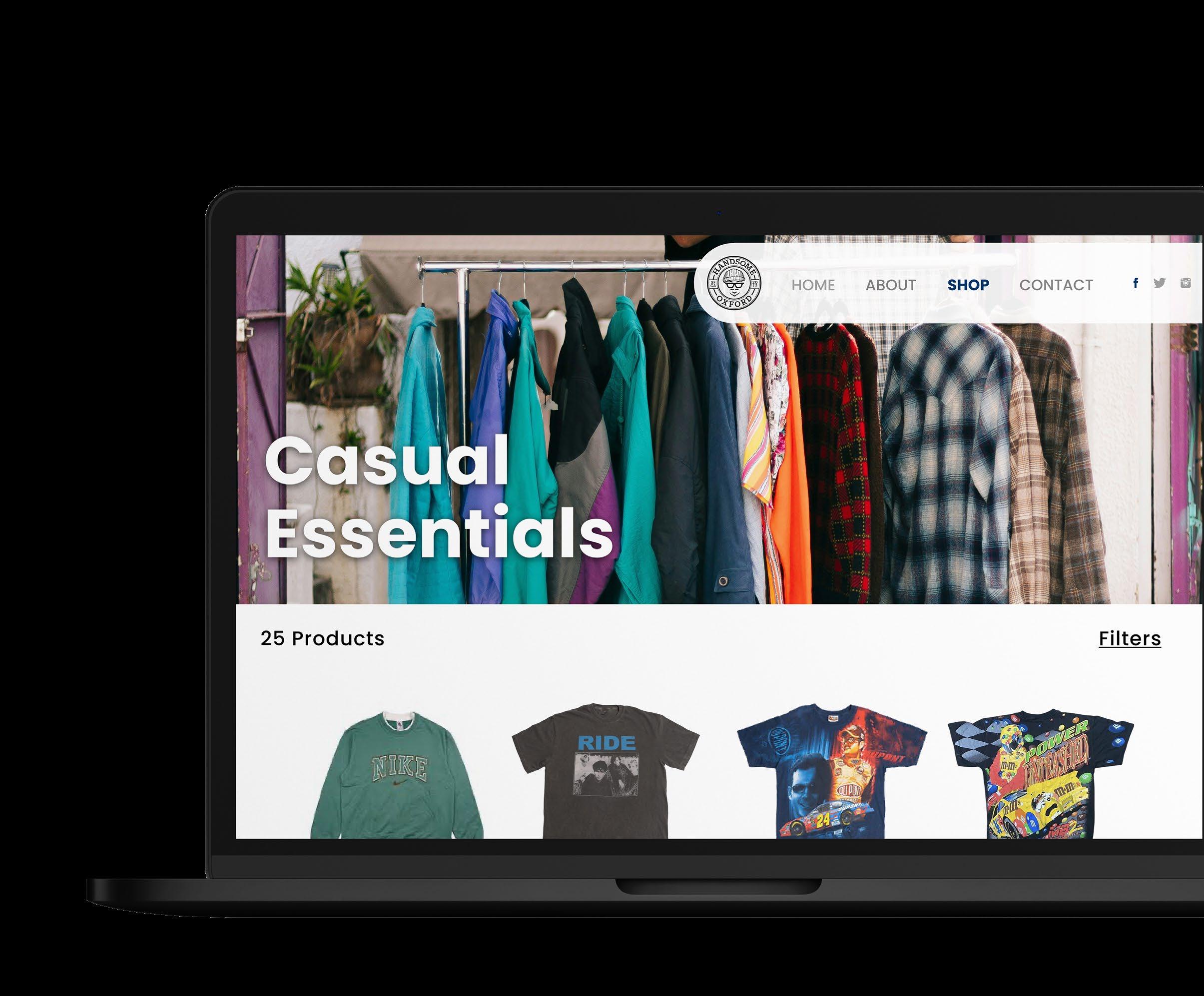
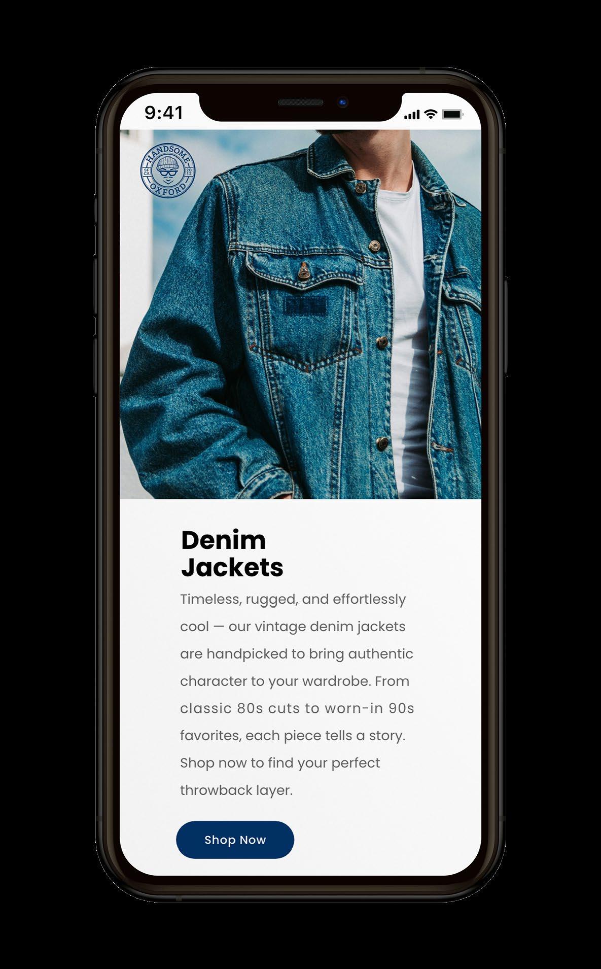
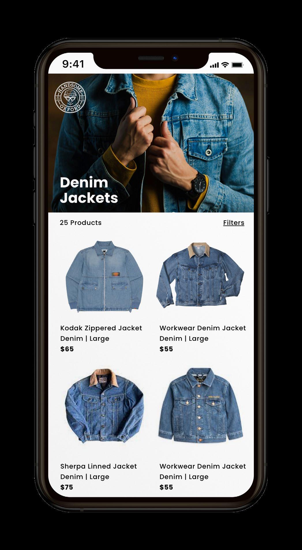
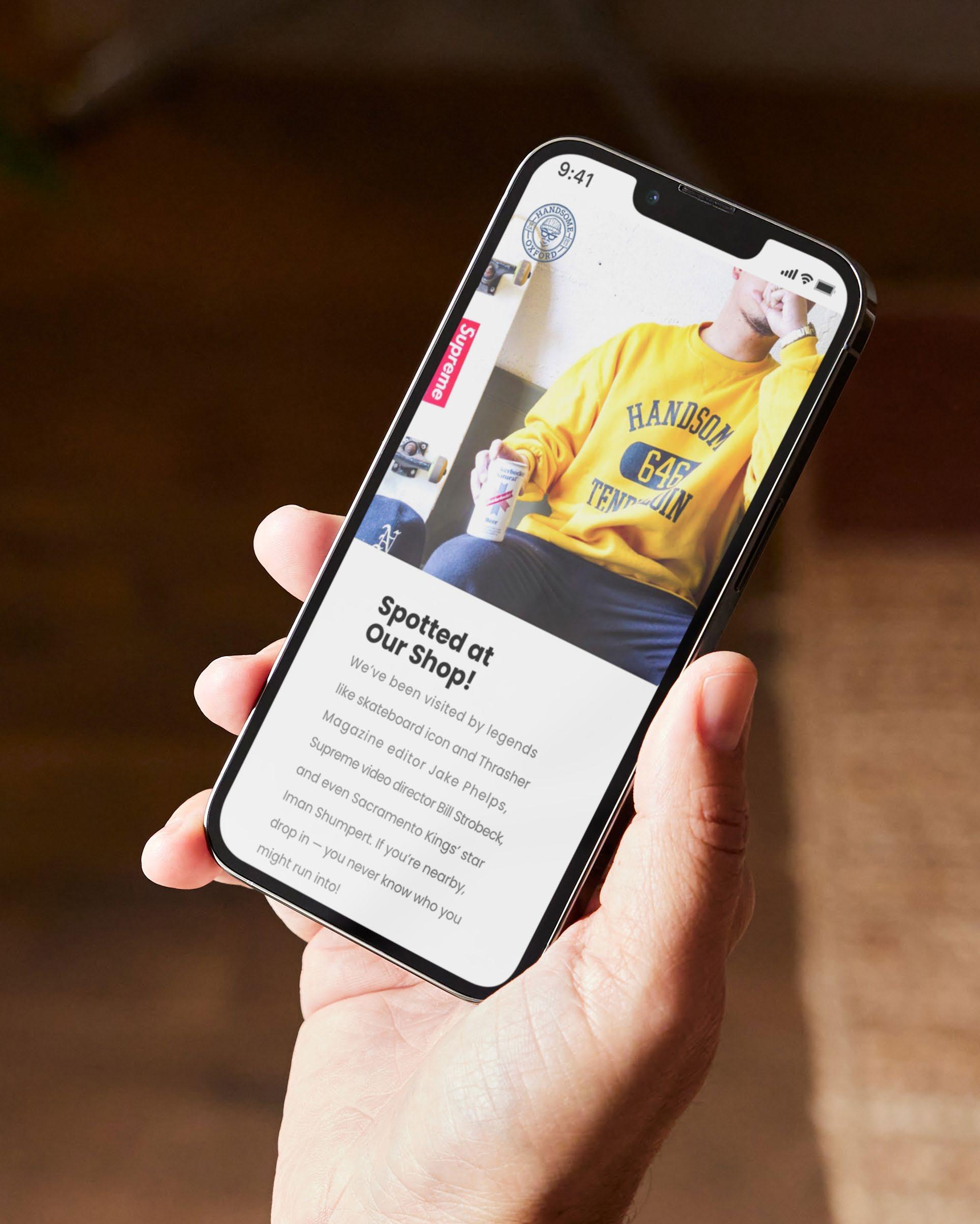
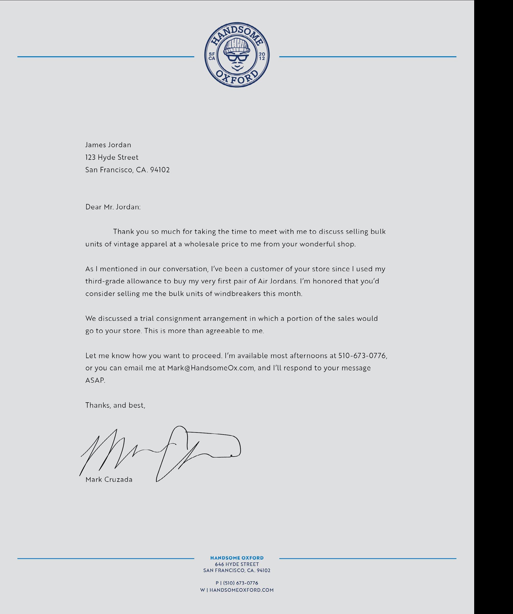
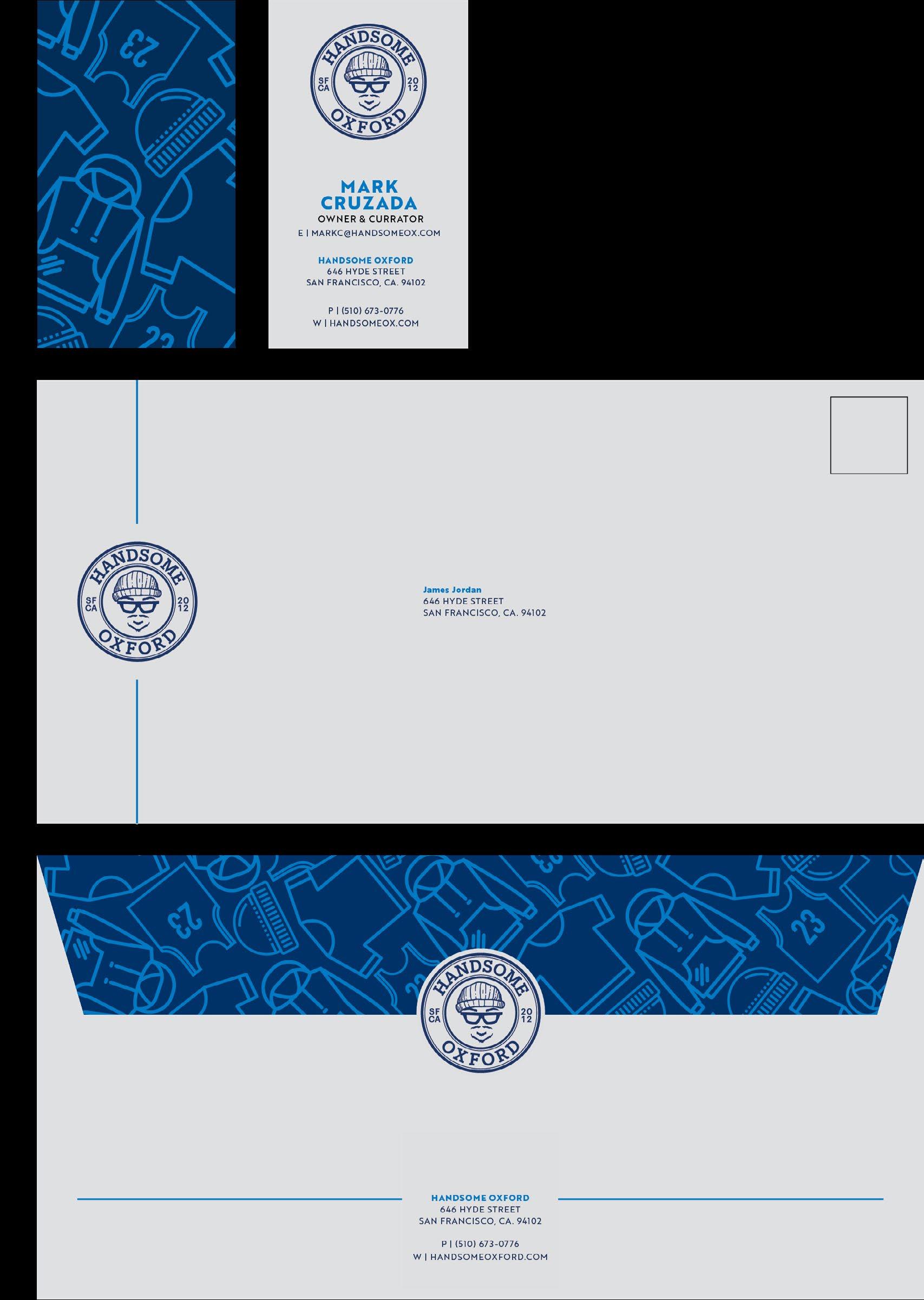
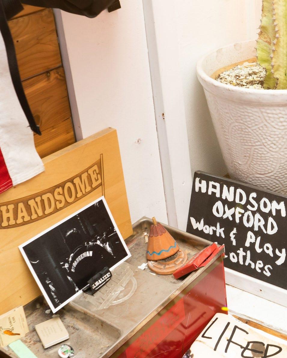
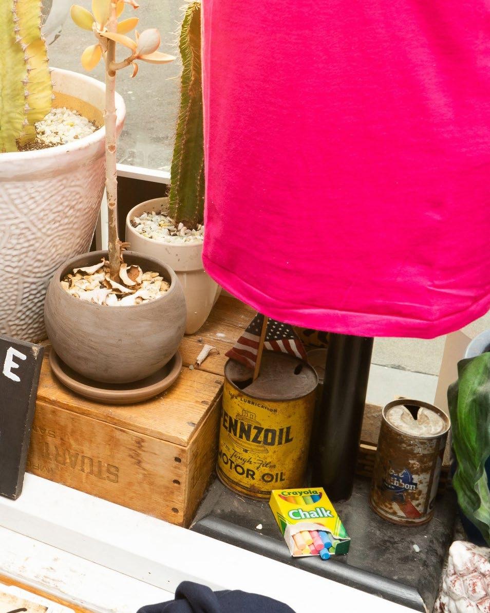
HANDSOME OXFORD
Vintage Finds, Personal Touch
COURSE
BRANDING IDENTITIES 2
INSTRUCTOR
THOMAS MCNULTY
MEDIA TYPE
BRAND IDENTITY
WEB DESIGN
UI/UX DESIGN
3 KEYWORDS
VINTAGE
MASCULINE QUIRKY
OBJECTIVE
Redefine the brand identity of The Handsome Oxford to better reflect its one-of-a-kind personality that is rooted in authenticity, curated style, and community. The goal is to create a visual and verbal system that honors the store’s personal touch, vintage roots, and welcoming environment, while helping it stand out in San Francisco’s competitive retail scene.
APPROACH
The re-brand captures the personal, hands-on spirit of The Handsome Oxford, placing Mark—the owner and sole curator—at the center of the brand. The new identity reflects his distinct taste and passion for vintage fashion through nostalgic typography, warm tones, and textured visuals. It’s a brand built around one person’s eye and energy, making the shopping experience feel as thoughtful and authentic as the pieces themselves.


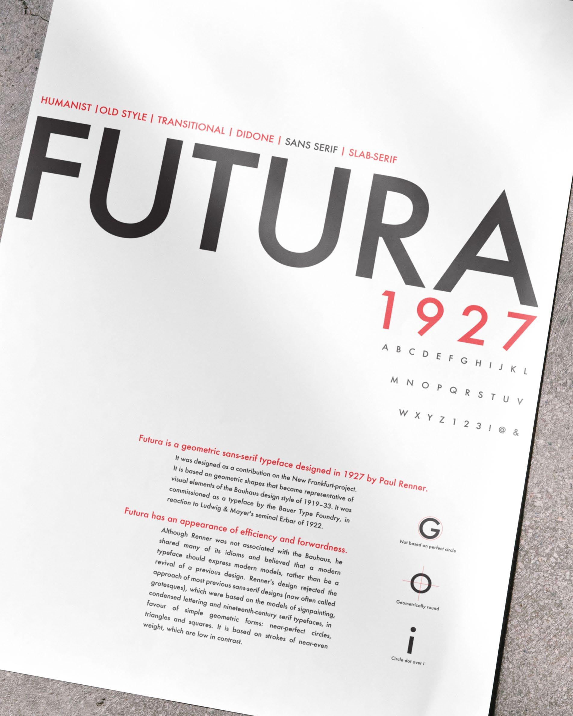
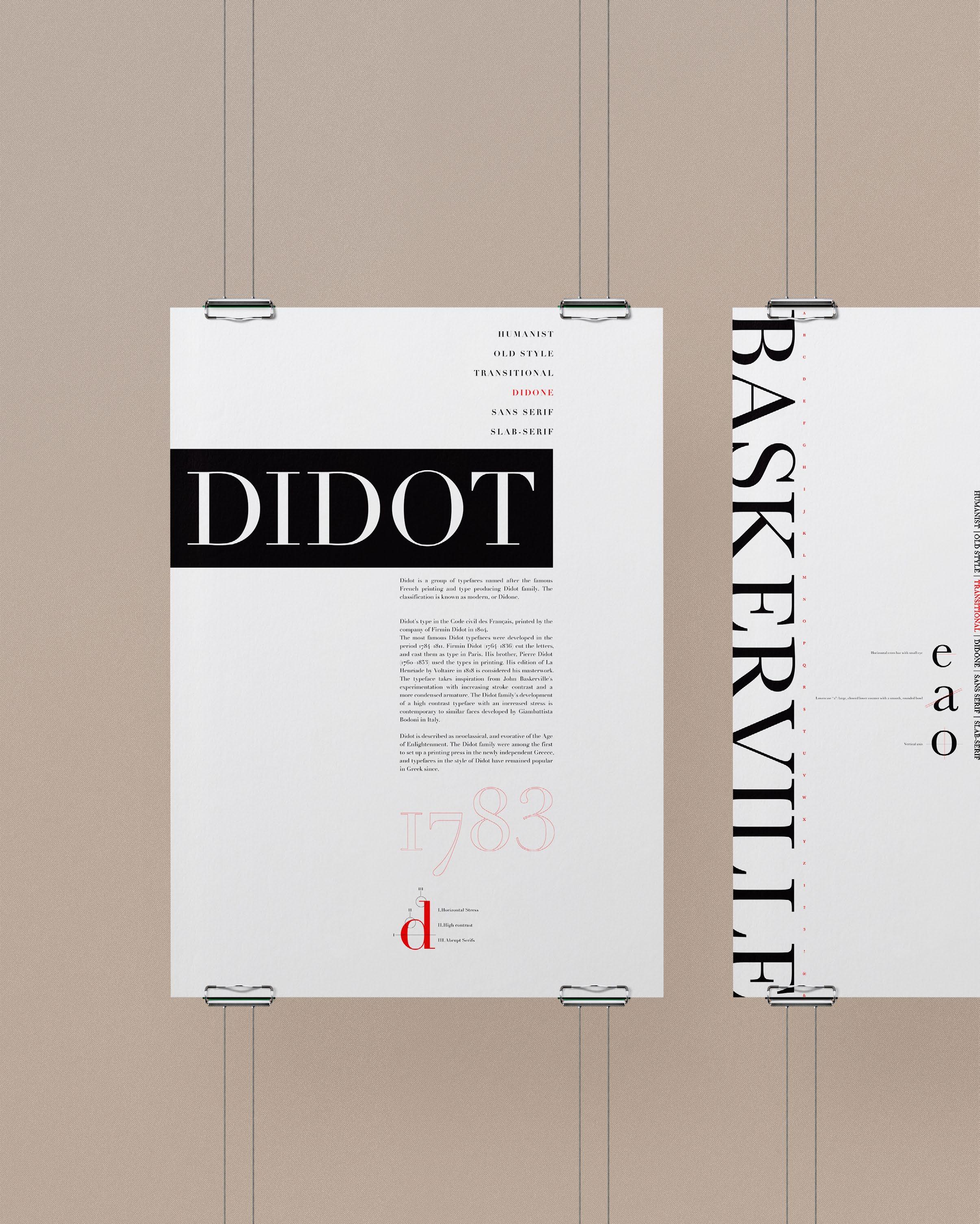
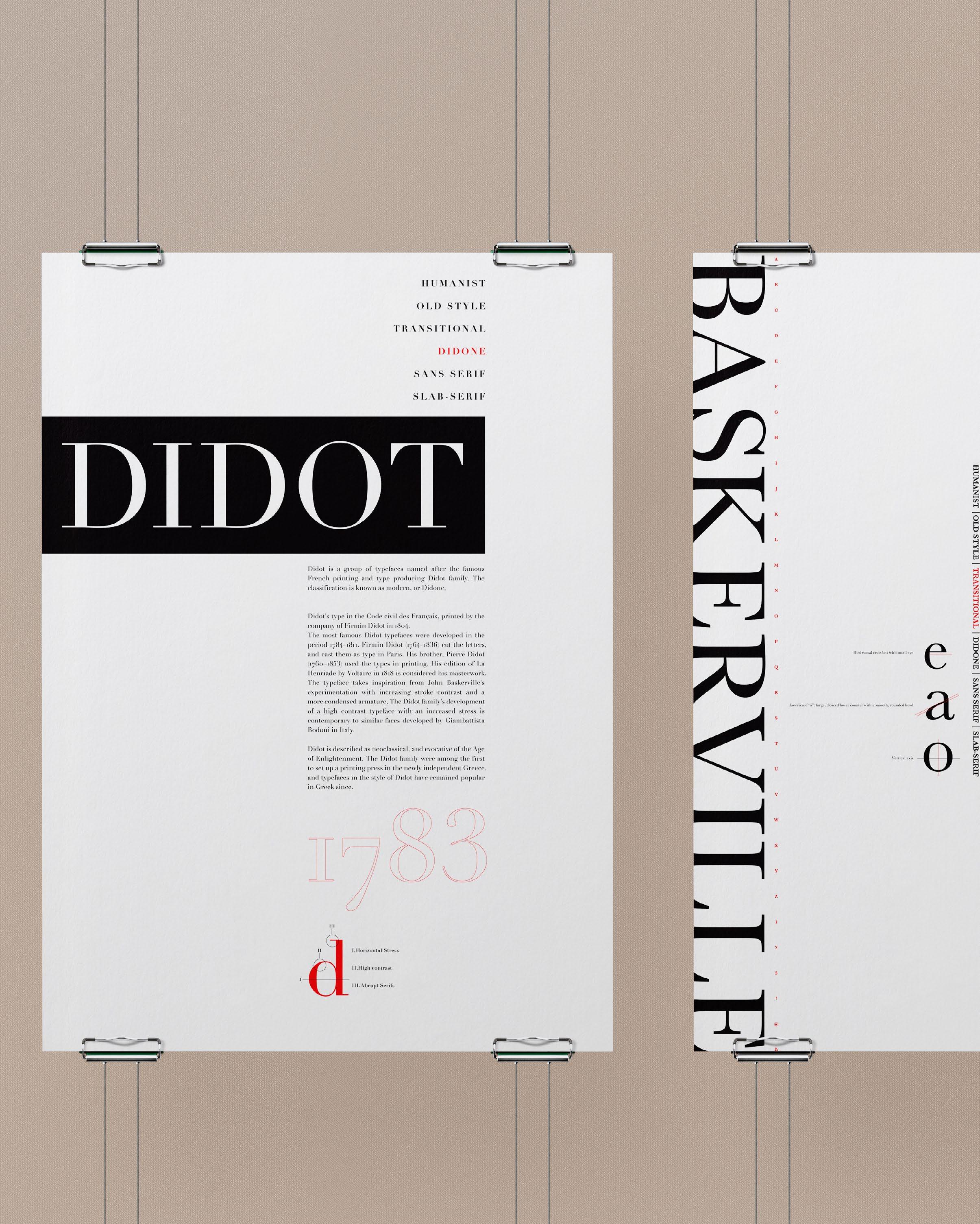
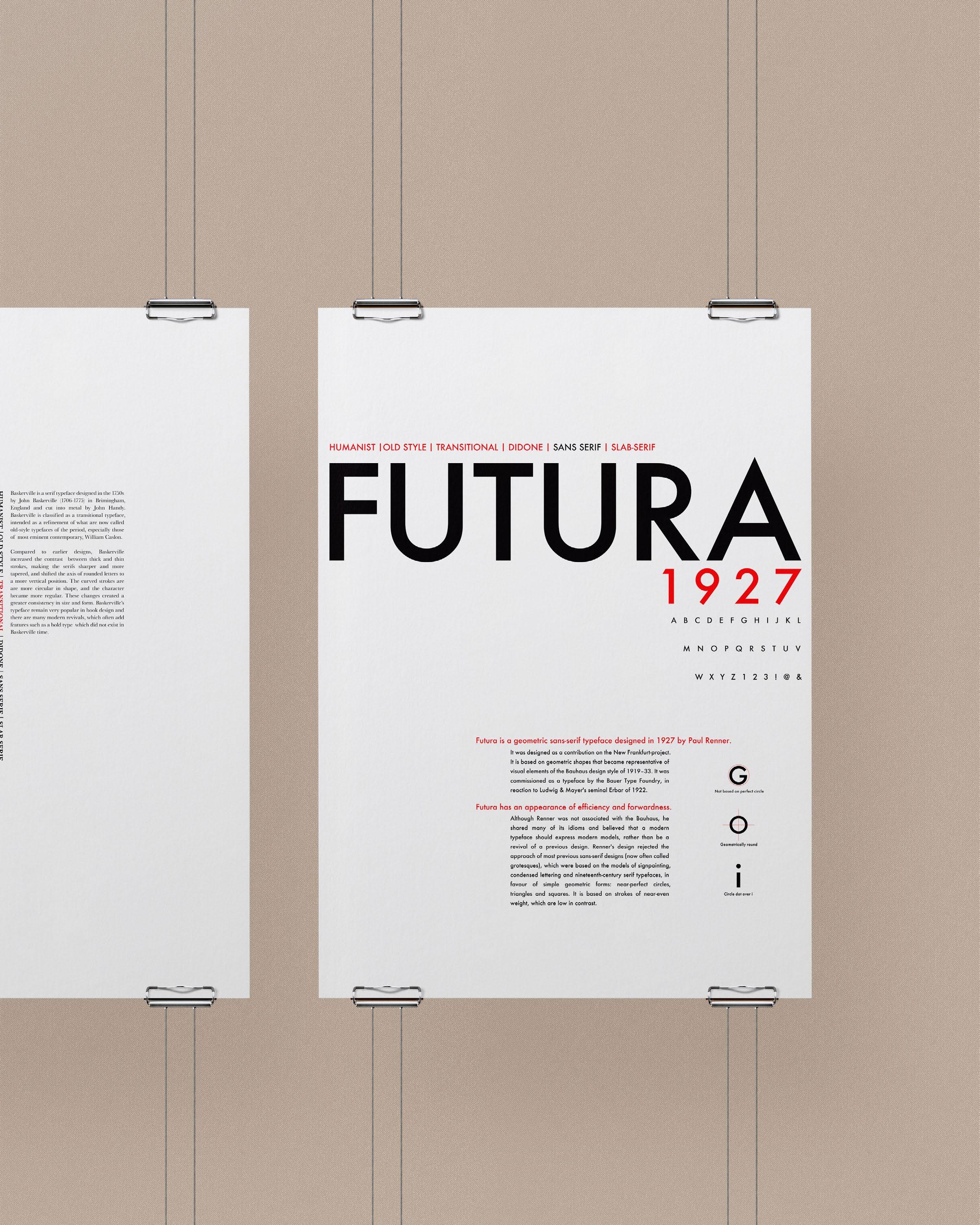
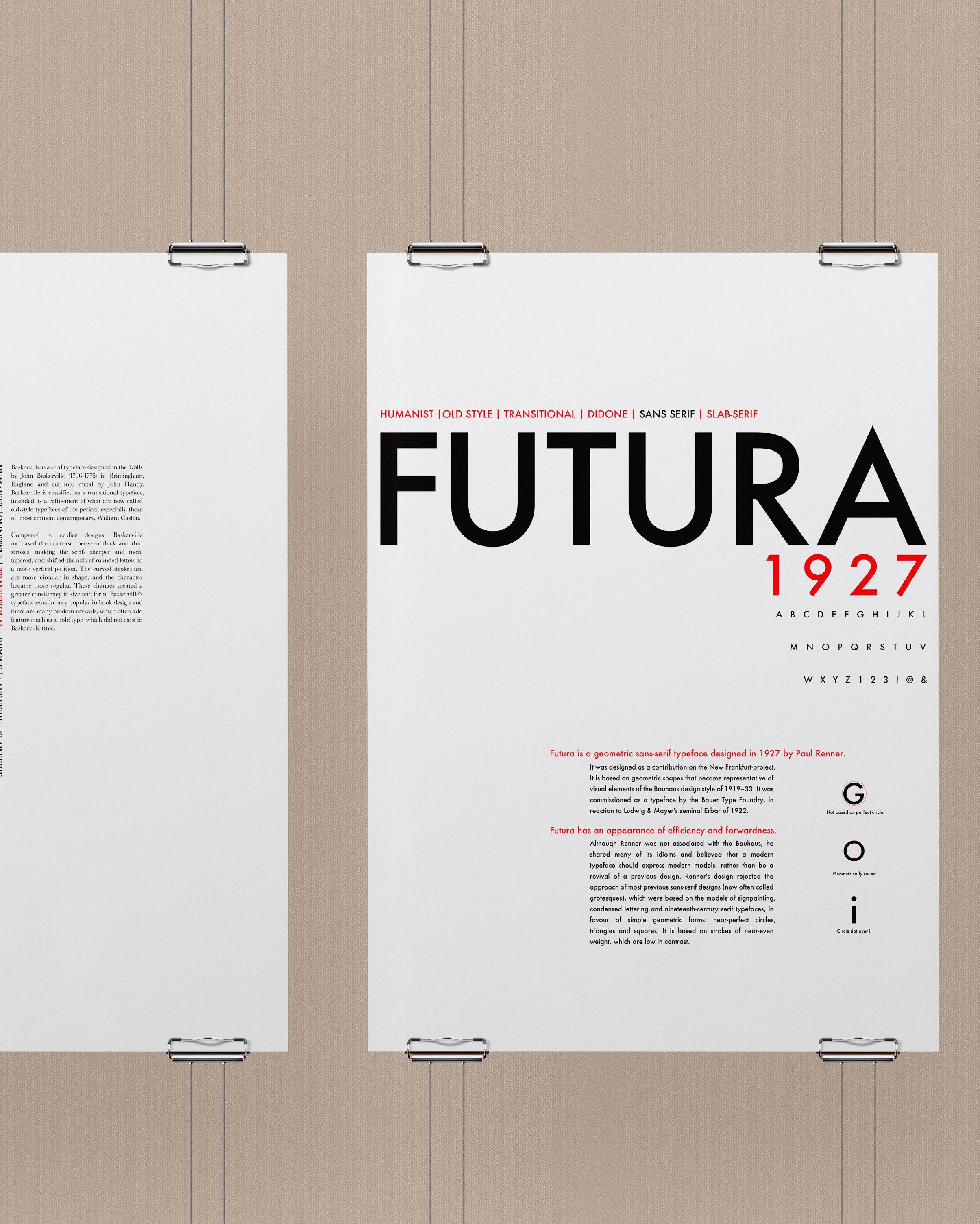
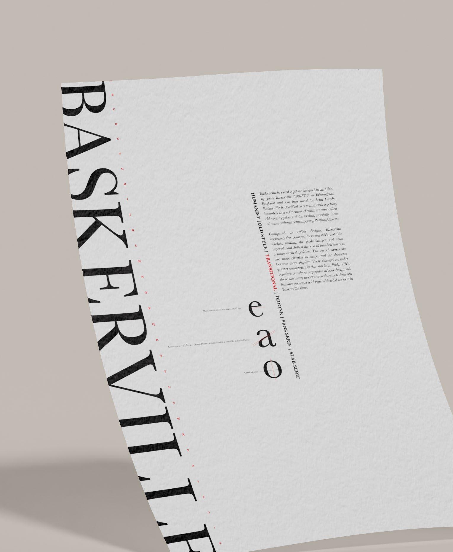
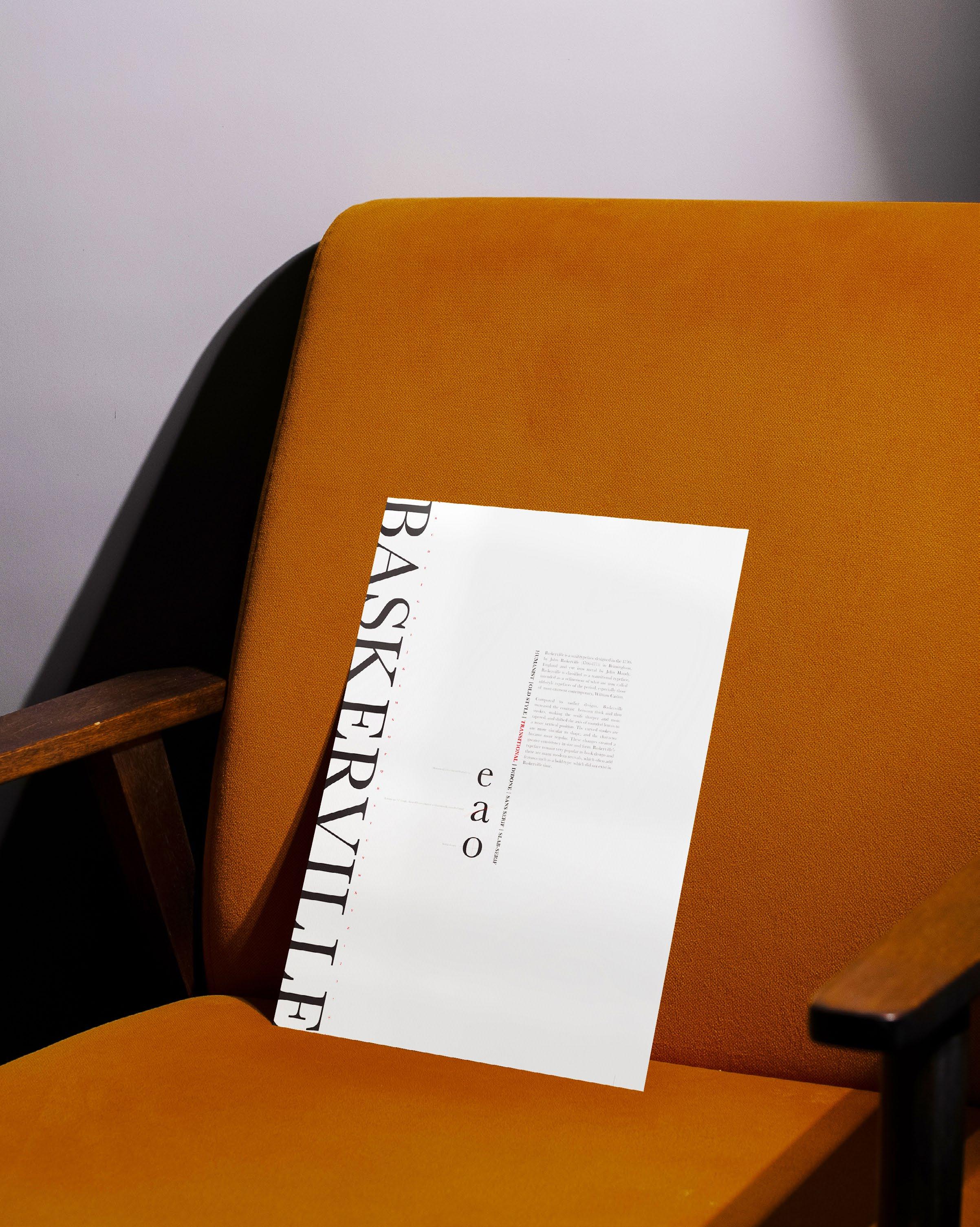
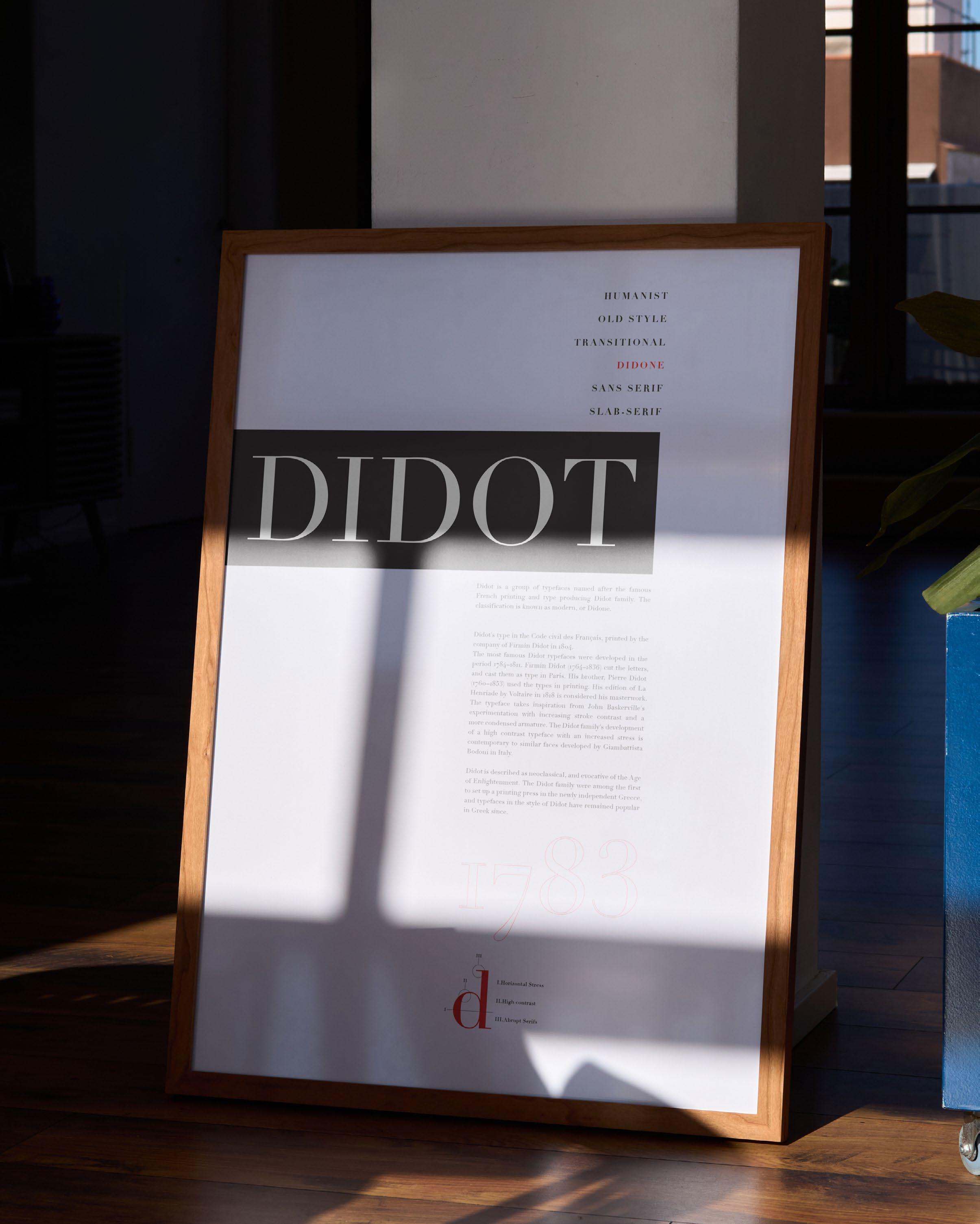
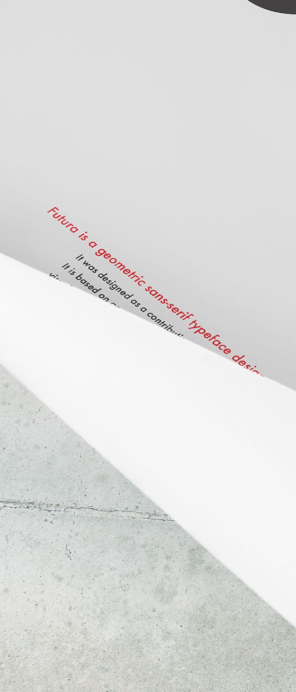
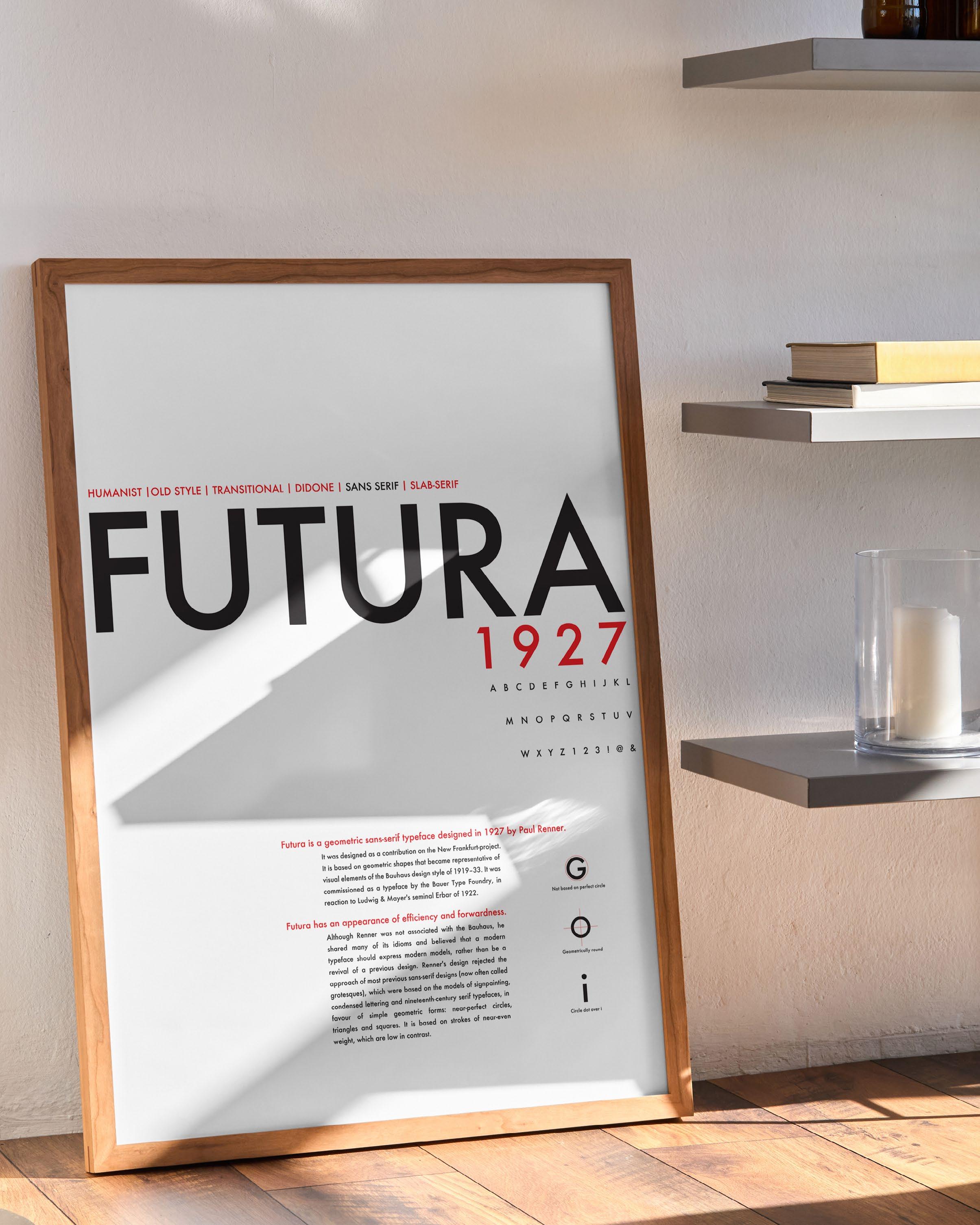
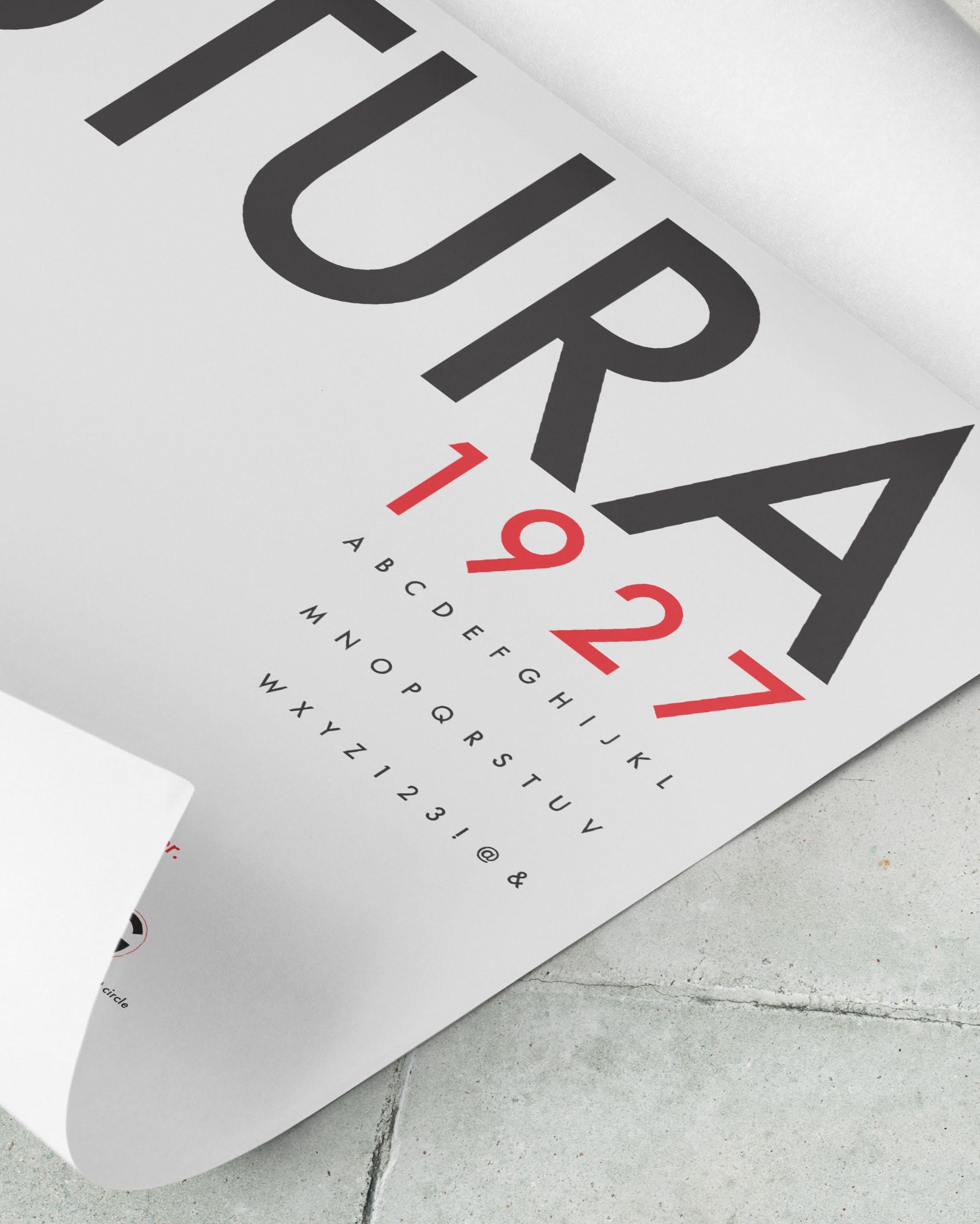
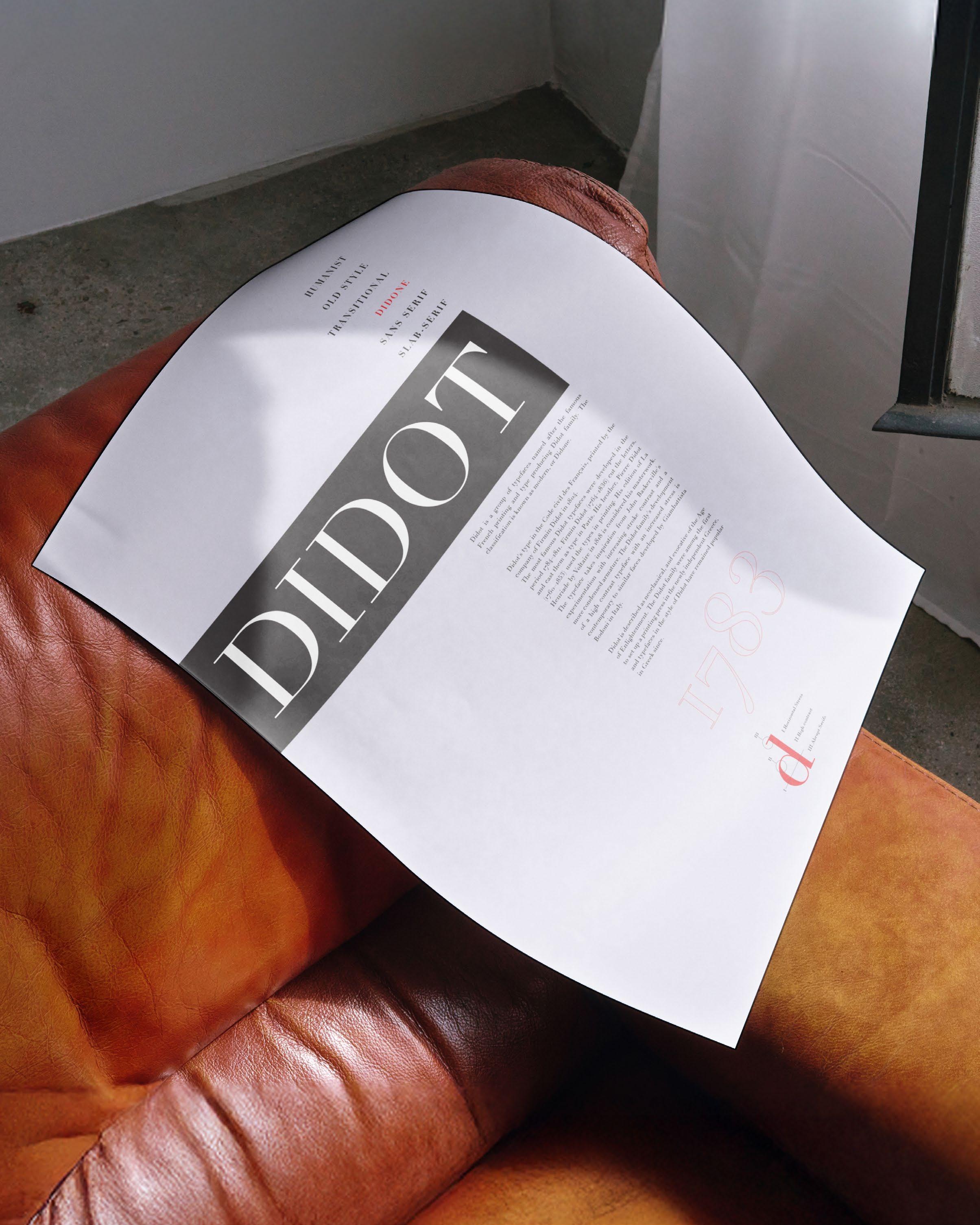
LETTERFORMS
Behind the Details
COURSE
TYPOGRAPHY 1
INSTRUCTOR JULIE LEFRANCOIS
MEDIA TYPE TYPOGRAPHY PRINT DESIGN
3 KEYWORDS ELEGANCE DETAILED MOVEMENT
OBJECTIVE
Compose detailed posters highlighting the unique characteristics of different typefaces.
APPROACH
Utilize type anatomy to emphasize the specific qualities of Baskerville, Didot, and Futura.


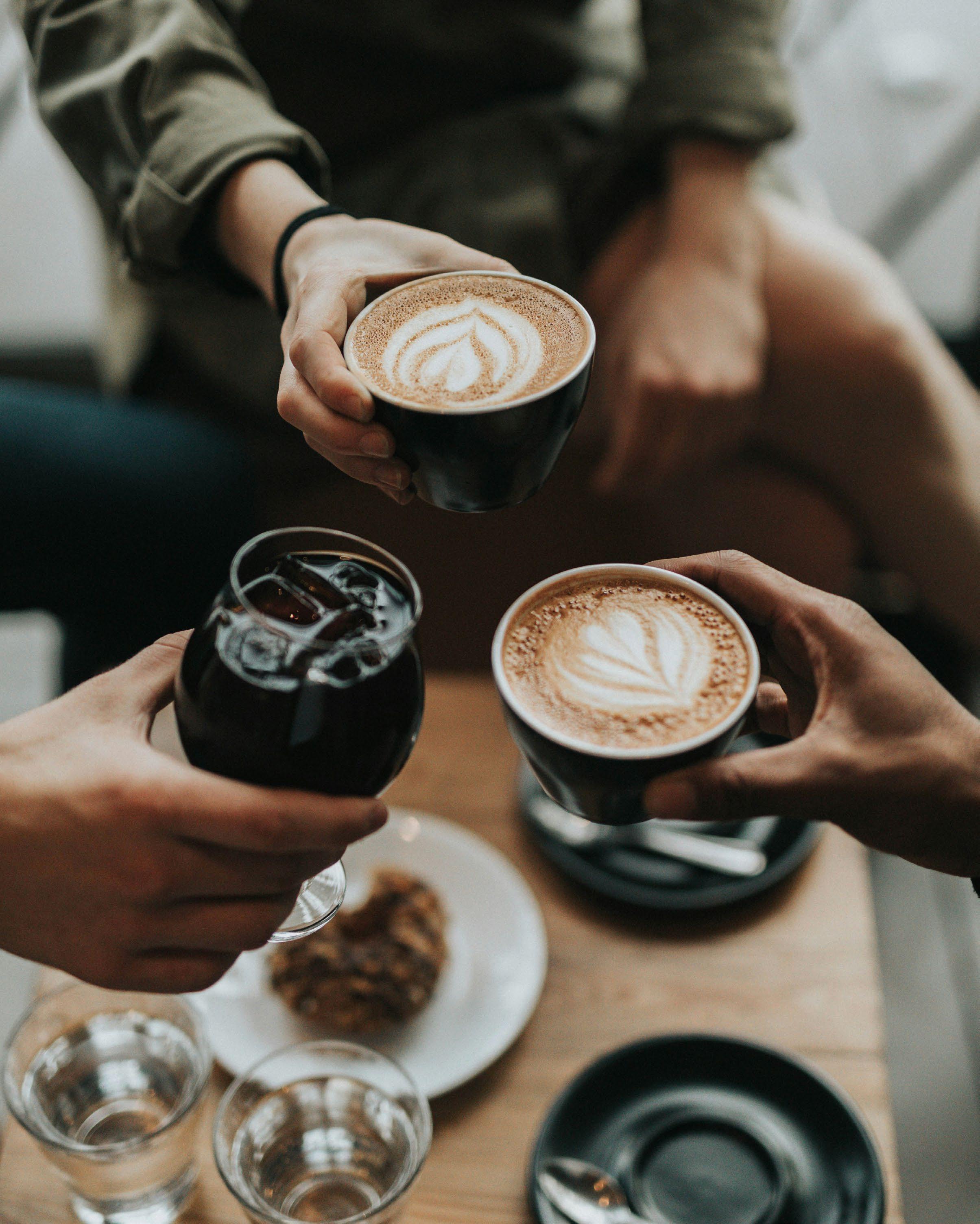
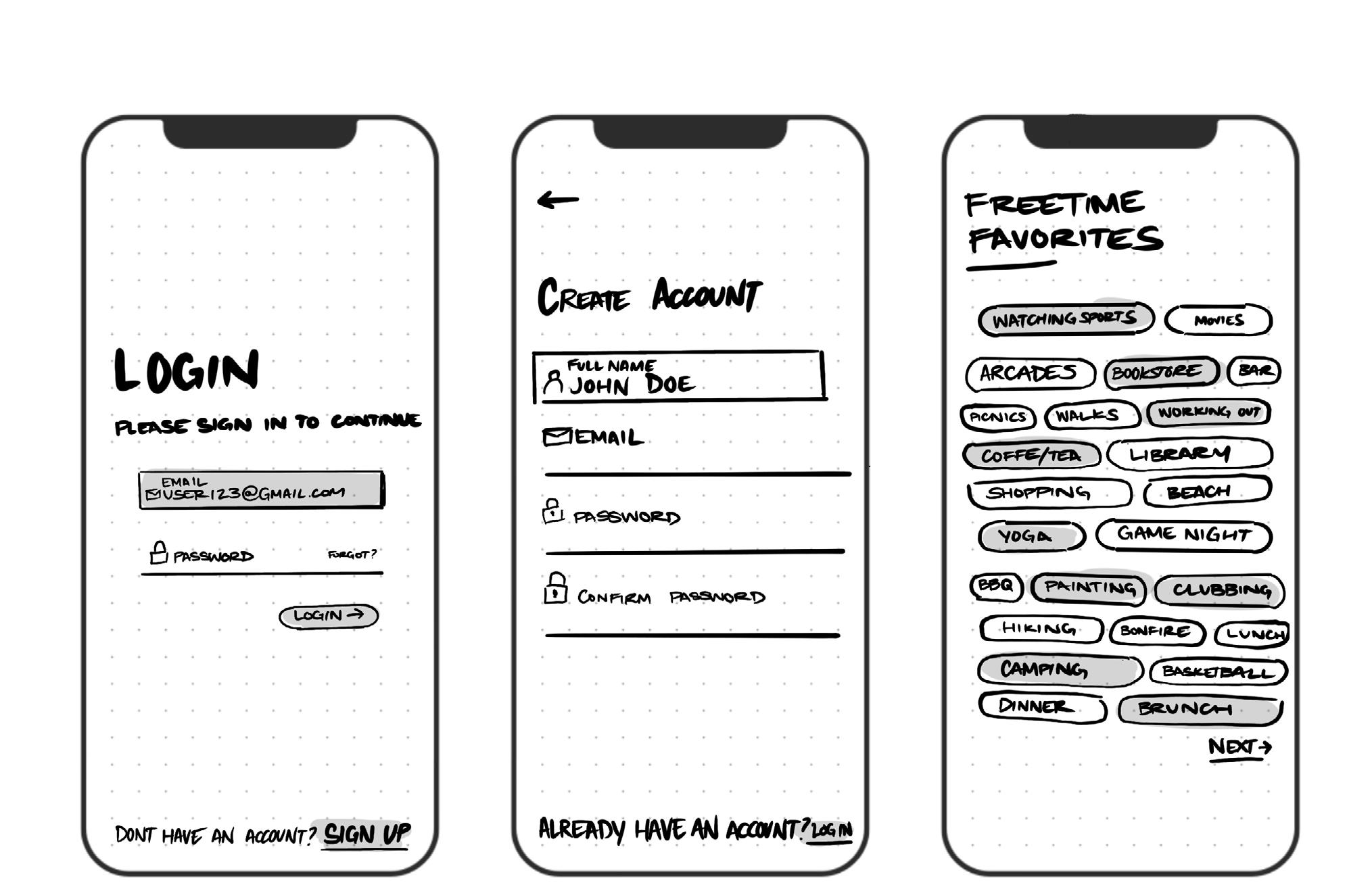
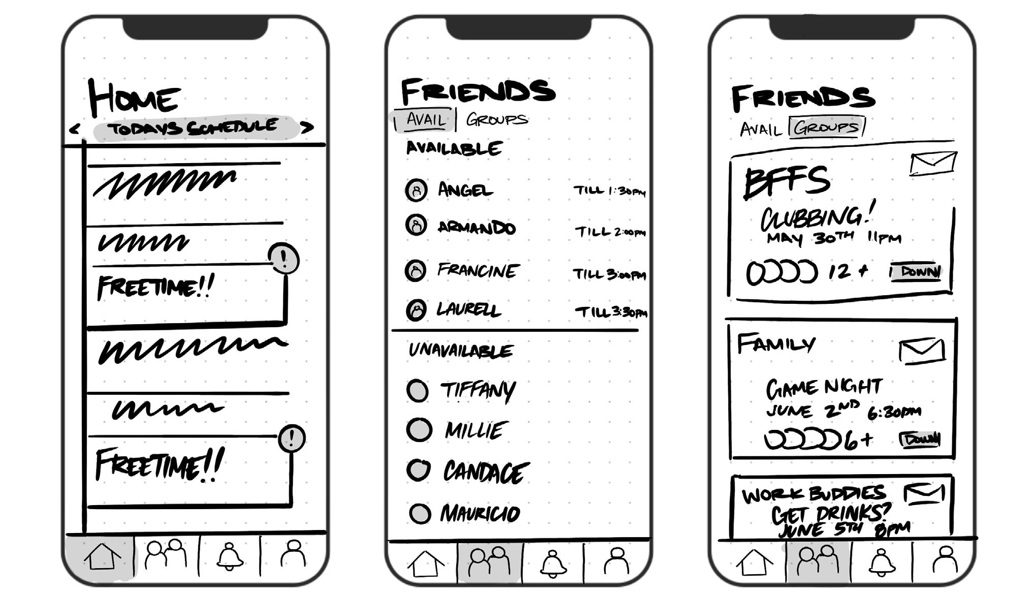
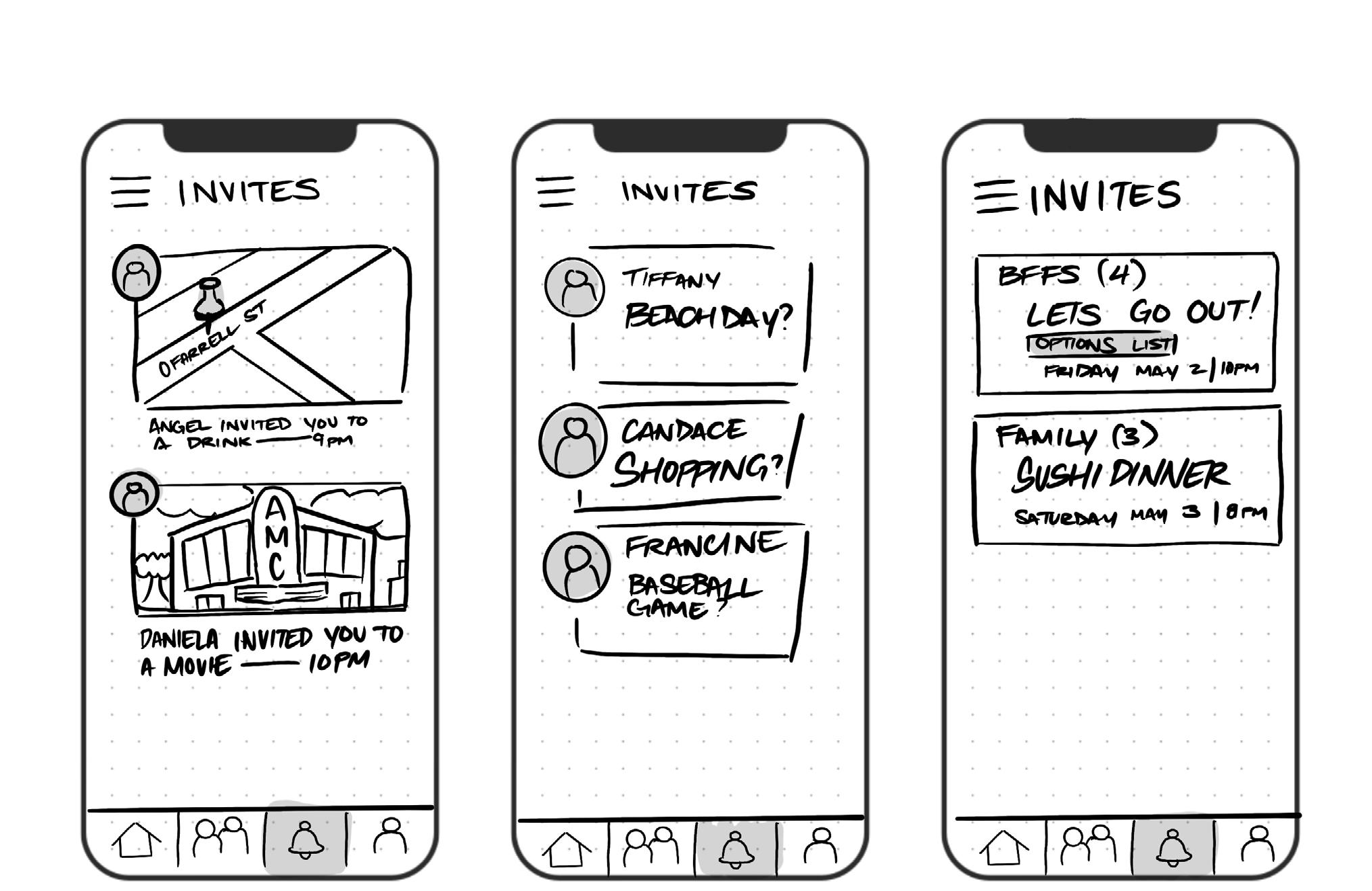
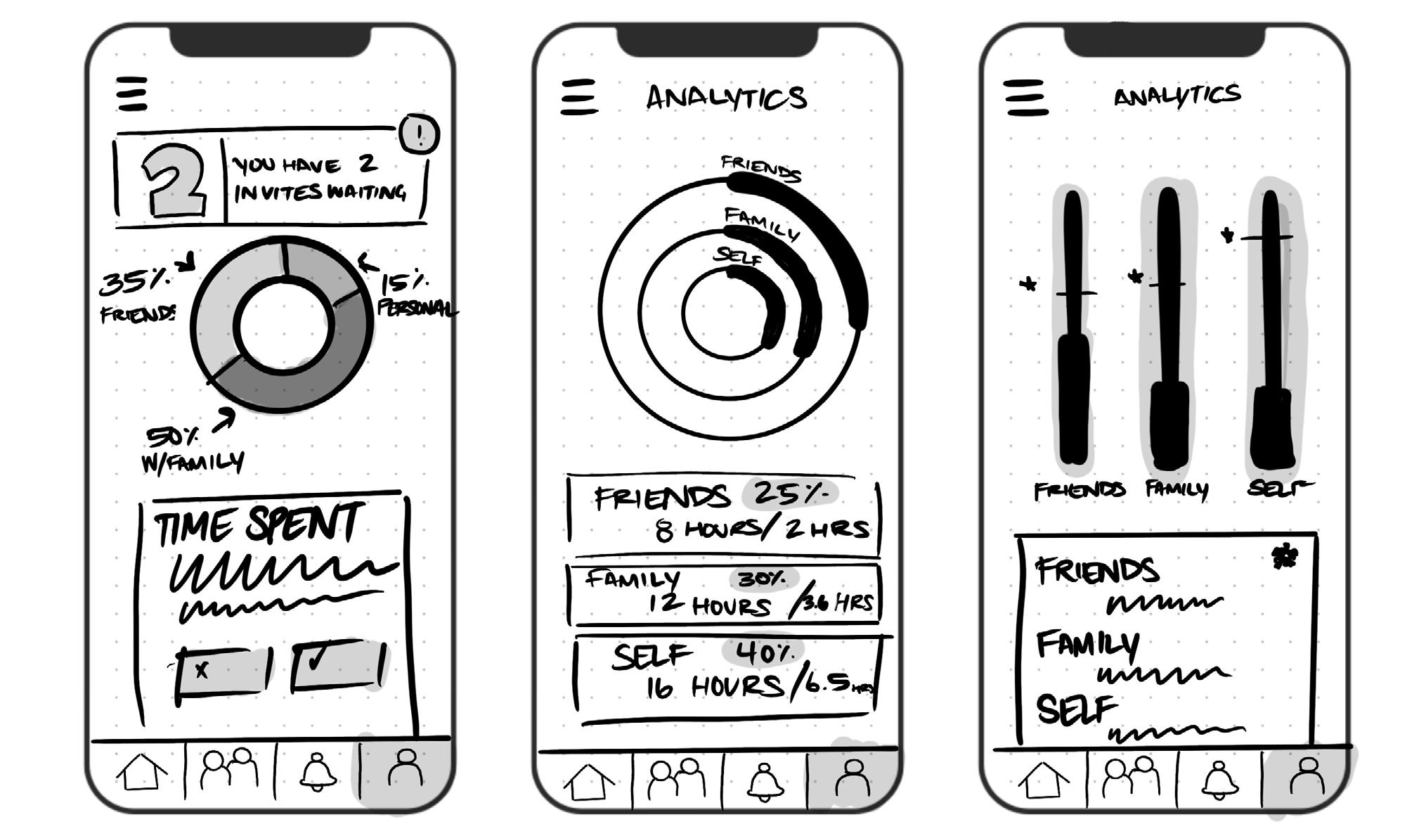
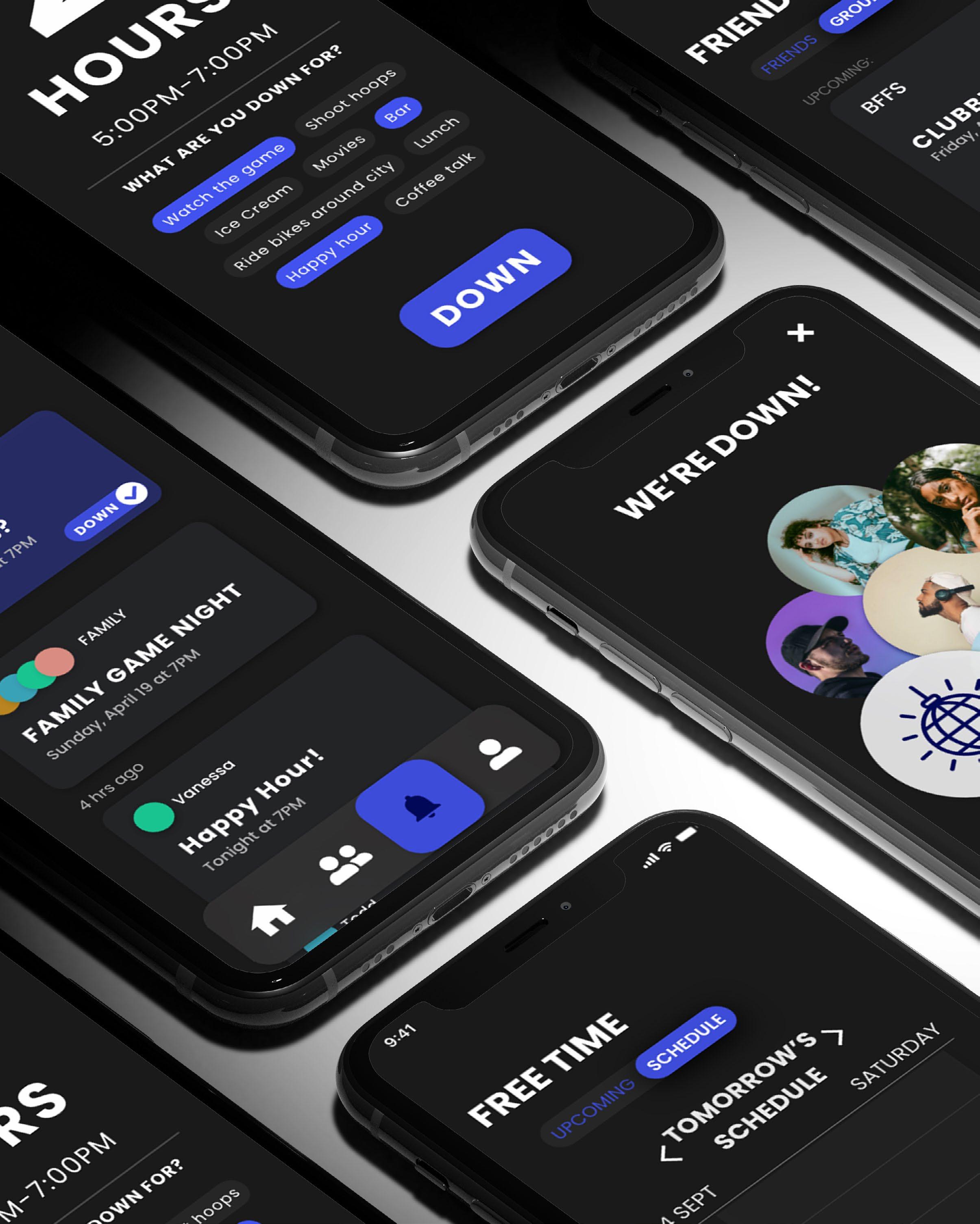
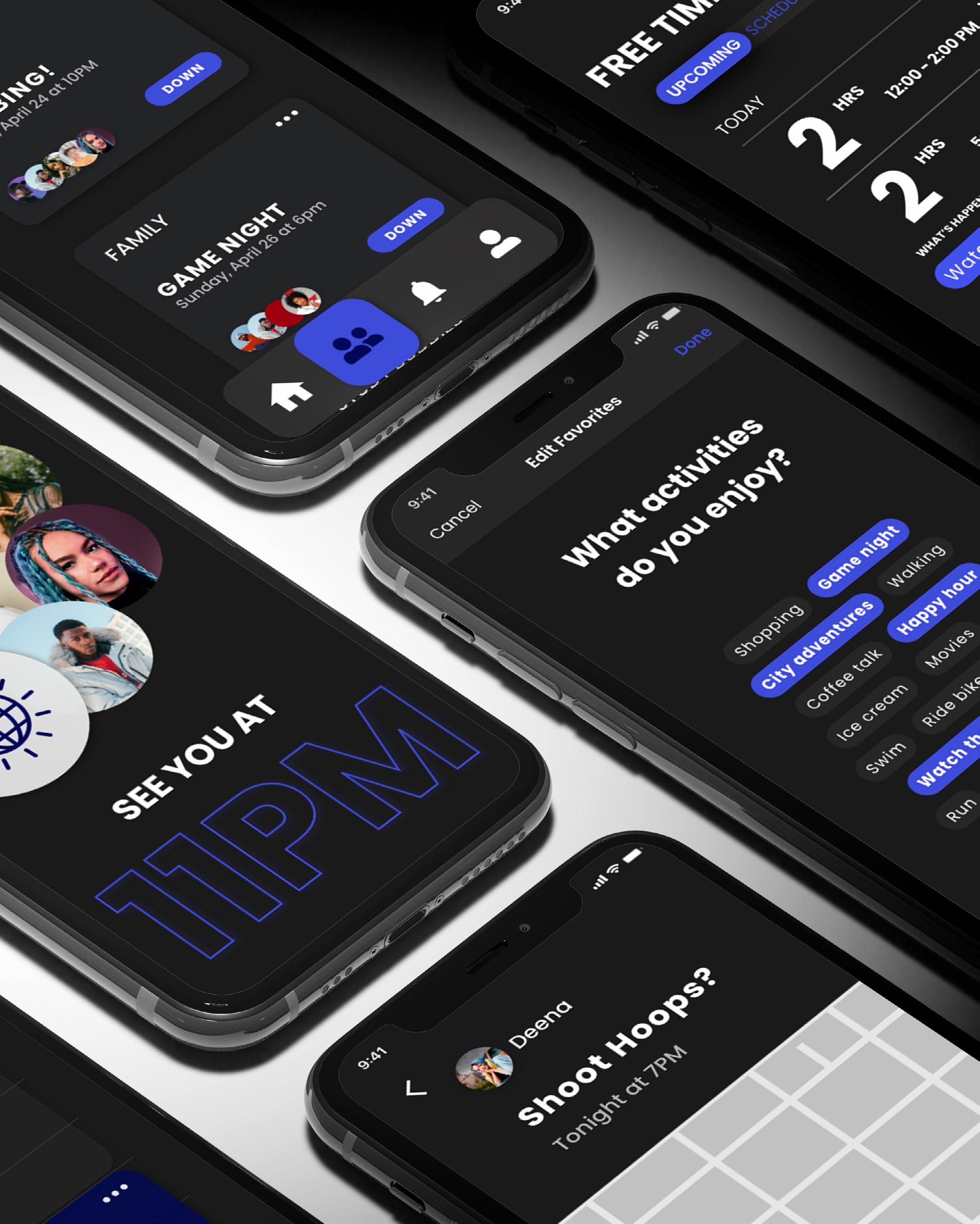
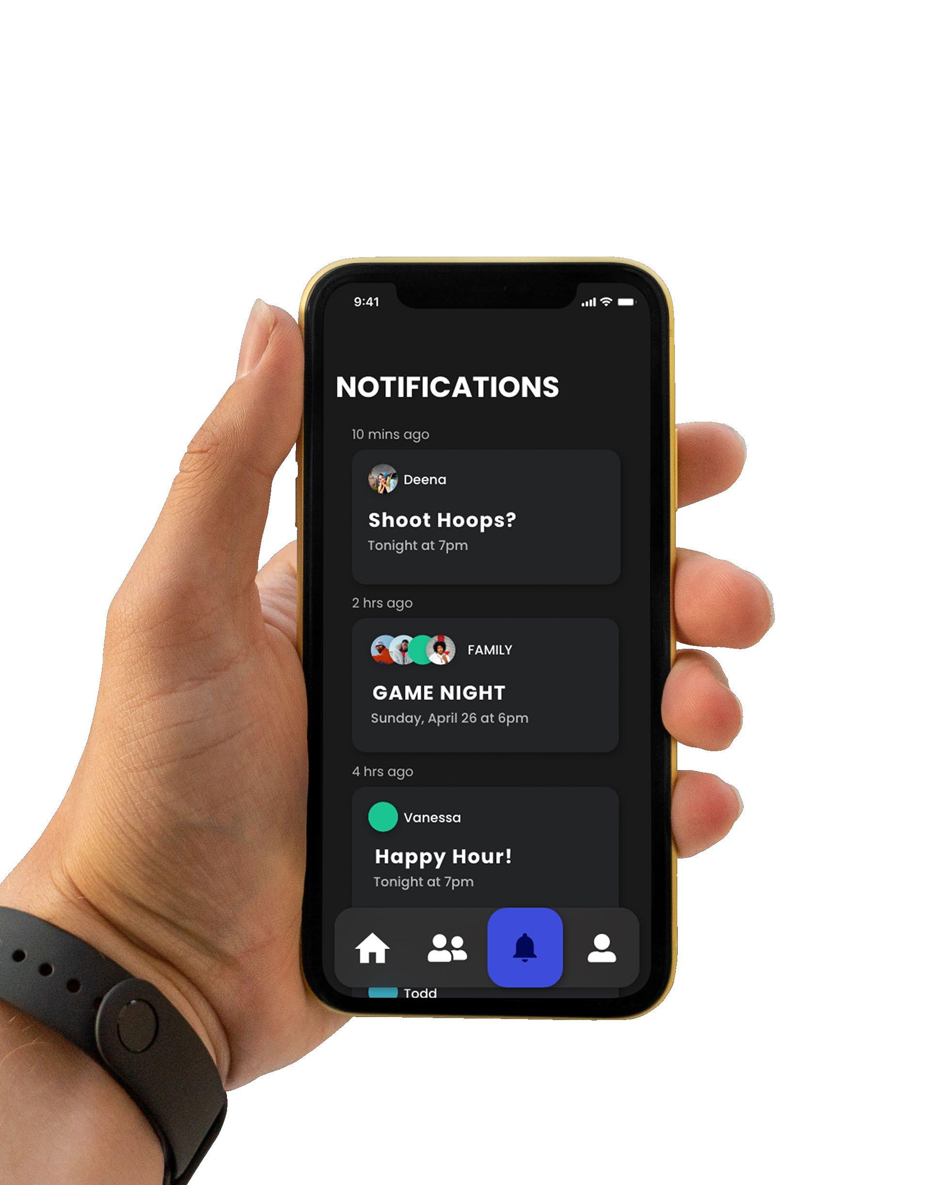
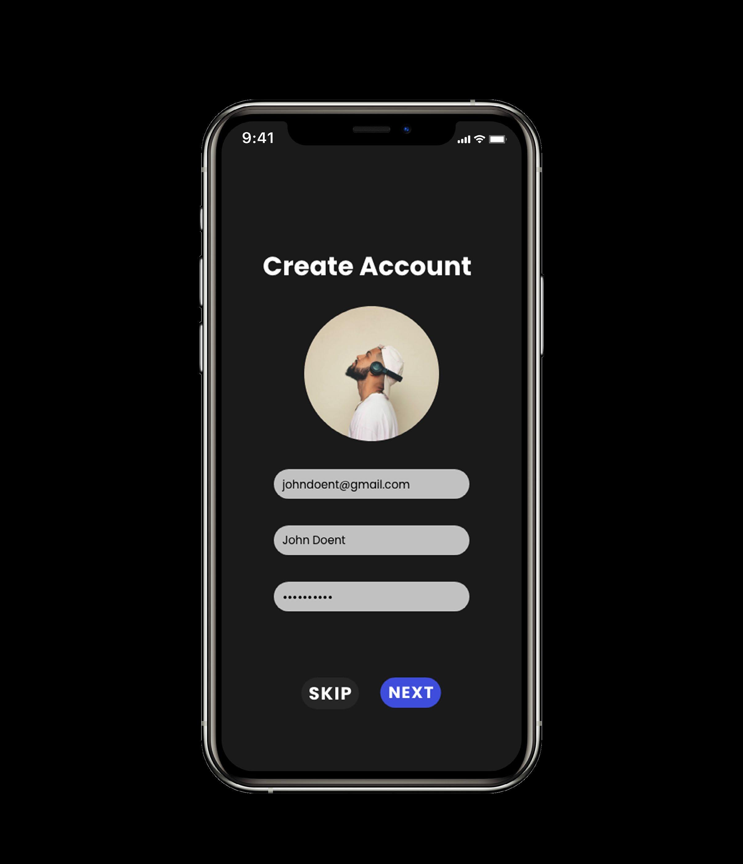
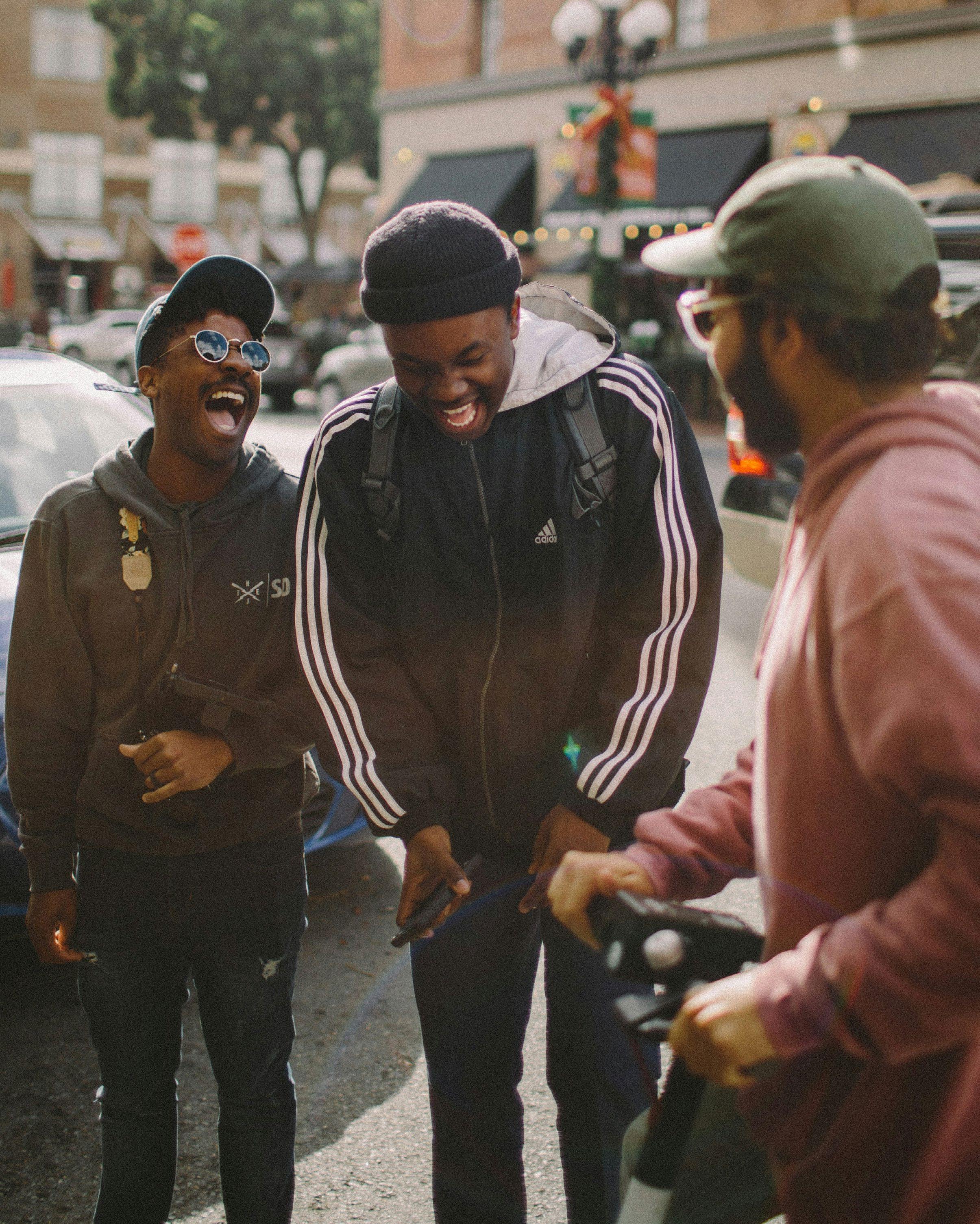
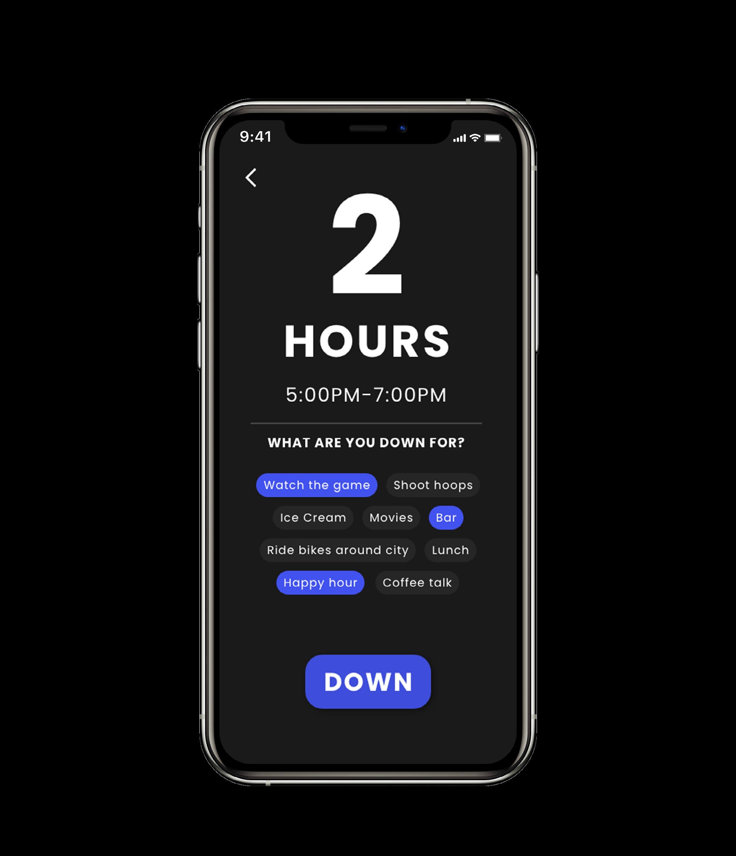
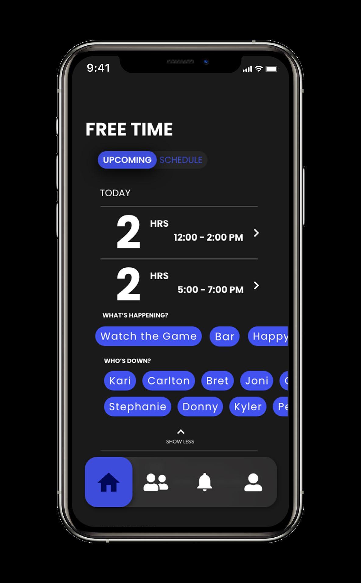
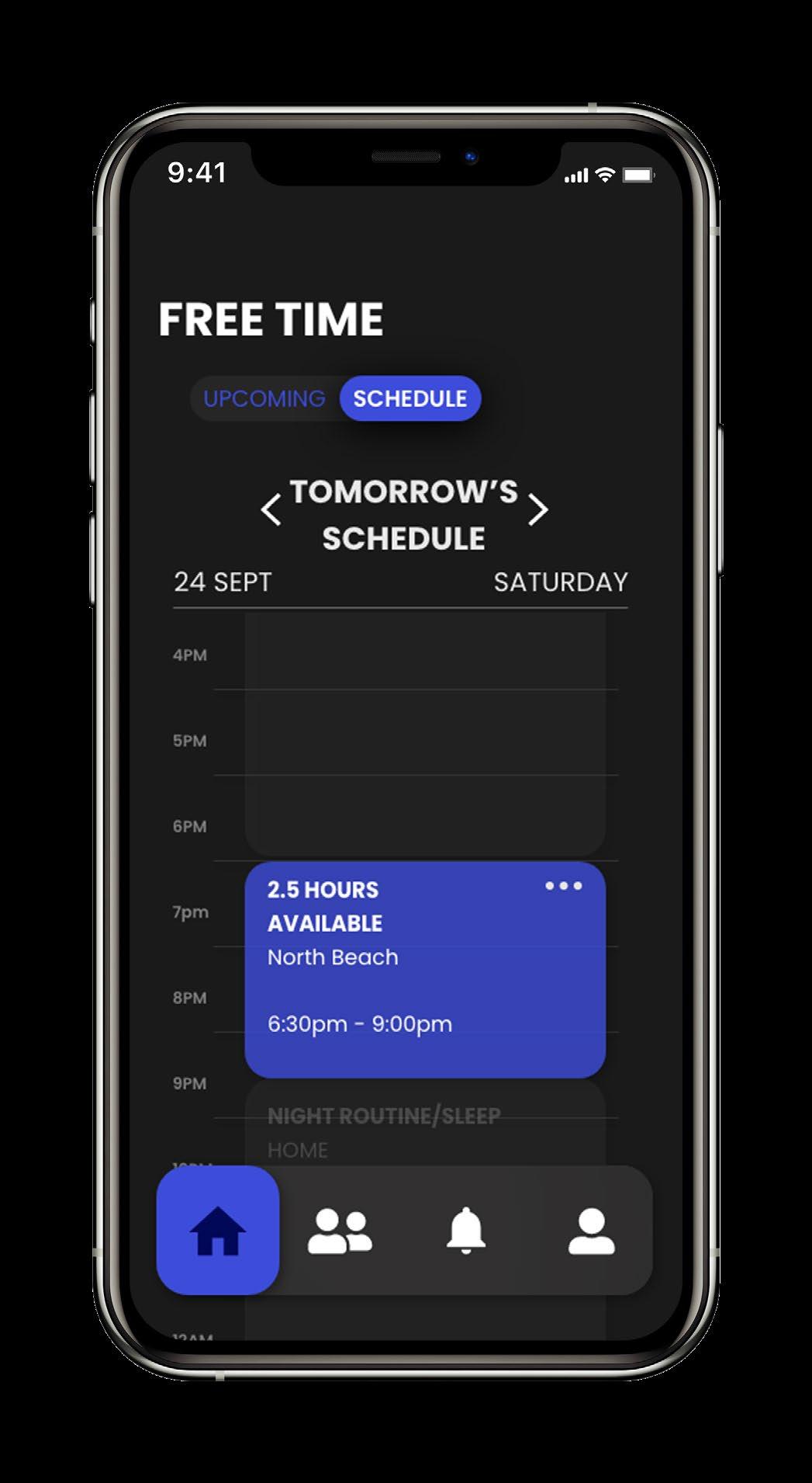
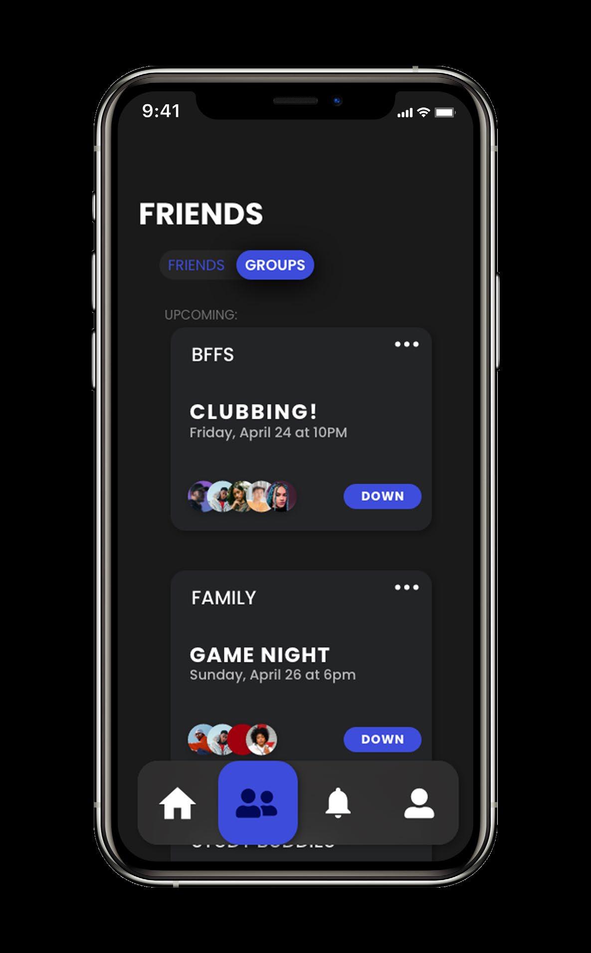
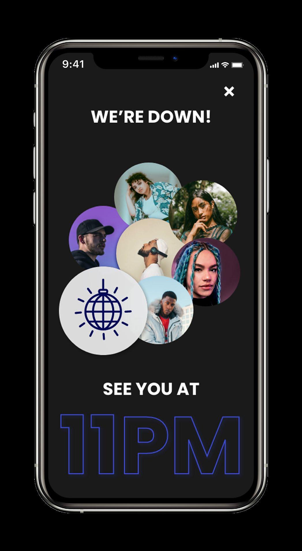
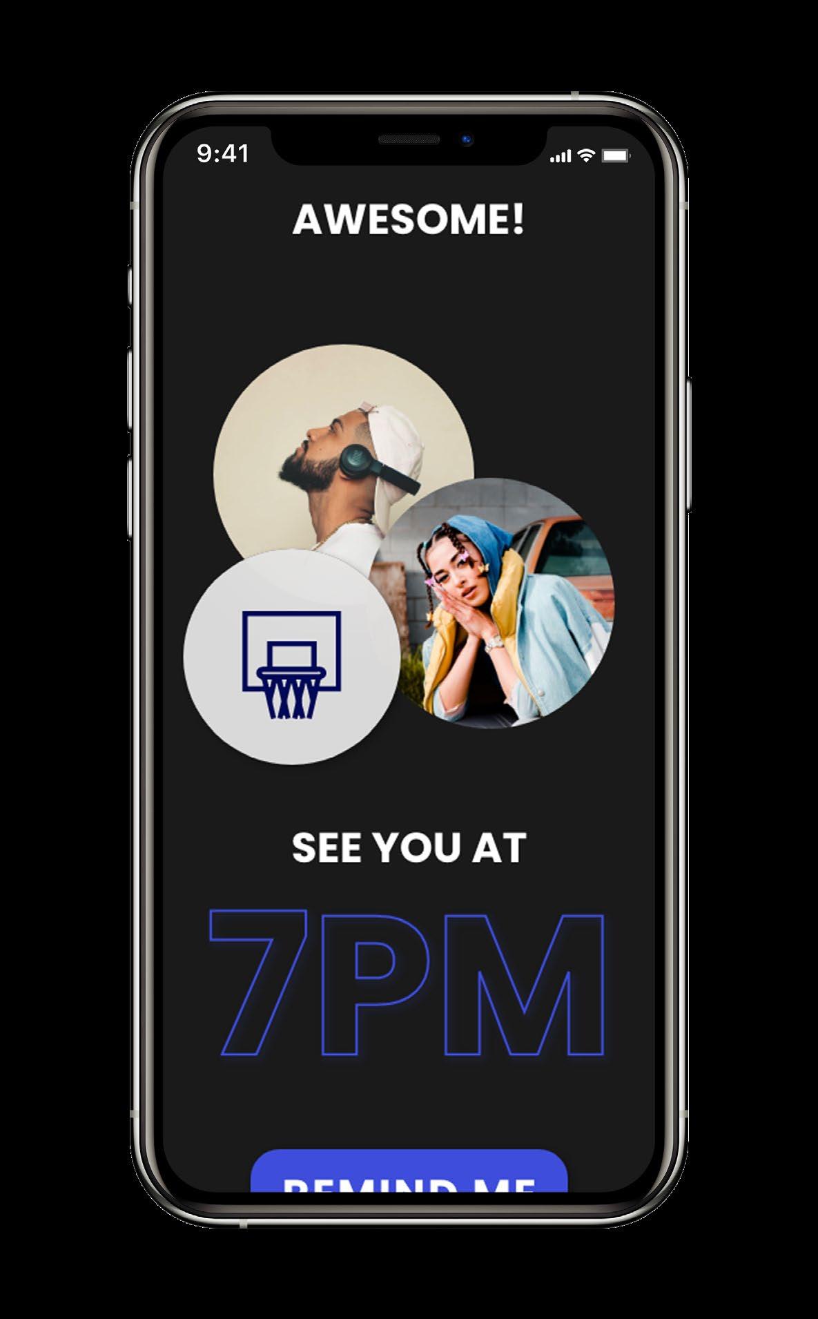
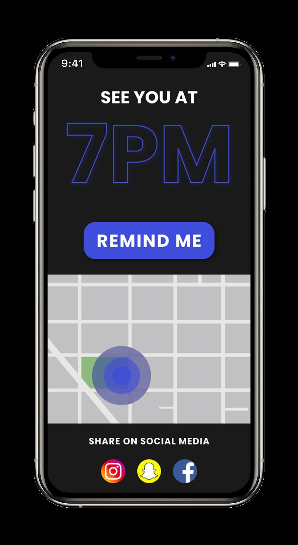
DOWN
Are You Down for a Good Time?
COURSE
GRAPHIC DESIGN 3
INSTRUCTOR PHIL HAMLETT
MEDIA TYPE BRAND IDENTITY
UI/UX DESIGN
3 KEYWORDS EFFICIENT EXCITING SPONTANEOUS
OBJECTIVE
Design a functional UI/UX app that supports individuals who struggle with balancing time management and maintaining social connections—helping them stay organized while finding time and places for meaningful social interactions.
APPROACH
Begin with research to identify common challenges related to prioritizing social time and managing responsibilities, including the impact of FOMO (fear of missing out). Use these insights to create an intuitive, user-friendly solution that streamlines planning, encourages real-life connections, and helps users make the most of their time.


Mahalo
MY MOST SINCERE & DEEPEST GRATITUDE
TO MY FAMILY & FRIENDS
Thank you for doing your best to raise me, for standing by me through every challenge, and for supporting me even when times were hard. Your love and sacrifices mean everything to me.
TO MY MOM
Thank you for your strength, your care, and your endless belief in me. I carry that with me in all that I do.
"Suffer what there is to suffer, enjoy what there is to enjoy. Regard both suffering and joy as facts of life, and continue chanting Nam-myoho-renge-kyo, no matter what happens."
TO TIFFANY
Thank you for loving me with patience, for seeing me clearly even when I don’t see myself, and for standing beside me through it all. Your presence brings me peace, and your love has helped me grow in ways I never imagined I could.
TO MY INSTRUCTORS
Thomas McNulty, Phil Hamlett, Hunter Wimmer, Julie LeFrancois, and Anna Villano—thank you for your guidance, wisdom, and constant support. Your teachings have been invaluable, and I am forever grateful for the knowledge and insight you’ve shared with me.
COLOPHON
KYRA ODA
KYRAODA.DESIGN@GMAIL.COM
KYRAODA.NET
ACADEMY OF ART UNIVERSITY
BACHELOR OF FINE ARTS SCHOOL OF GRAPHIC DESIGN
PRINTING & BINDING BLURB BOOKS
FONTS IN USE
ROC GROTESK
ADOBE GARAMOND PRO SLOOP
PHOTOGRAPHY UNSPLASH ADOBESTOCK