CALS Brand Book

The NC State brand is more than a logo. Our brand is the sum of everything we do — from solutiondriven education, research and scholarship to the work that supports and sustains our efforts in the classroom and the lab.

3 Content Visual Identity .......................................................................... 4 Logos ..................................................................................... 4 Color 8 Icons 10 Typography ............................................................................ 12 Imagery ................................................................................. 14 Design Conventions .............................................................. 16 Copy Guidelines 18 Maximum Value ..................................................................... 18 Inclusive Language Guide ...................................................... 18 Topics .................................................................................... 20 Voice and Tone ....................................................................... 23 Social Media Guidelines 24 Extension Guidelines .............................................................. 26 Contact Information ................................................................ 28
Visual Identity
The Logo
The NC State logo is an official representation of NC State University. It both identifies and defines us. It appears on all official university communications. Its directness, hard edges and unadorned type fit who we are: We are purposeful. We are modern. We are NC State.
4
DOWNLOAD CALS LOGOS
CALS Logos
2x1 Logo
The logo’s simplest configuration allows it to stand out at a glance, at a distance or when space is at a premium.
2x2 Logo
For more formal (or informational) pieces, the 2x2 logo is a bold summation of who we are.
4x1 Logo
For larger pieces, the 4x1 logo may be more appropriate. Whatever its configuration, the logo must be displayed prominently. For print pieces, it should be on the front cover where possible and on the back cover otherwise.
Logotype
Logotype is distinct from the brick and has its own proportions. There should be clear distance between the logotype itself and other design elements — at least the height of the letter N in NC State.
Red is the preferred color for the brick, but black is acceptable.
5
Rules for Units
The NC State logo is used by all of the university’s units — including colleges, departments, named entities, centers and institutes. The following guidelines apply.
CALS Departments Logos
We have provided each department a set of logo lockups specific to that division. These combined marks are subject to the same design rules as the core logo.
As an example, the BAE logo:
Unit Logos Are Not Allowed
Colleges, departments, units, initiatives and other campus entities cannot create or use their own unique logos. Graphics, photos and other artistic elements that help illustrate the purpose or mission of the unit may be created and displayed on unit communications in the general proximity of the unit name and brick logo. However, graphics that are frequently [more than three instances] displayed on unit communications in a consistent, locked-up format with campus entity names, especially when the brick logo is absent, will be deemed impermissible unit logos and the unit will be asked to remove them.
6
DOWNLOAD CALS DEPARTMENT LOGOS
Other NC State Marks


The block S, wolf’s head and chancellor’s seal have deep roots in NC State history. They are only appropriate in certain circumstances.
The Block S
The block S is reserved for student, alumni and spirit communications. The logo should not represent academic units, initiatives or fundraisers. With approval from the university architect, the block S can also reinforce pride in place in permanent physical signage on campus.
The Chancellor’s Seal
The chancellor’s seal appears only on chancellor’s office communications, graduation materials, official university certificates and awards. It should not appear as a graphic element and is subject to the same guidelines as the formal seal for internal promotional usage.
The Wolf’s Head
The wolf’s head is an official mark associated with NC State Athletics. It should not be used by academic units, initiatives or fundraisers, and it should not appear as a standalone graphic element without permission.

The University Hallmark
The University Hallmark is permitted when used to promote the university on commercial retail items that have an academic or institutional focus, as well as for college-level and department-level certificates, awards and gifts of appreciation. The University Hallmark should not be used as an icon or as part of another logo or lockup.
7
Color
Color is one of the most recognizable elements of our brand. By extracting hues from NC State’s history and from the people, places and things on our modern campus, we’ve created a large palette that resonates visually and reflects exactly who we are.
Our Core Palette
NC State’s core palette consists of three colors: Wolfpack Red, Wolfpack White and Wolfpack Black. These colors should feature more prominently than any others in NC State communications. In all communications using color, Wolfpack Red should dominate. We are, always, the Red and White of NC State.
Red Is Dominant
Wherever you are, you can spot NC State supporters by the Wolfpack Red they wear. The same is true of communications from the university. When Wolfpack Red is your dominant color — in print, online or on promotional items — your audience will know you speak for NC State.
Wolfpack Red
HEX #CC0000
RGB 204 0 0
CMYK 0 100 81 4
PMS 186 C
Wolfpack Black
HEX #000000
RGB 0 0 0
CMYK 0 0 0 100
Wolfpack White
HEX #FFFFFF
RGB 255 255 255
CMYK 0 0 0 0
As the dominant color in our core palette, Wolfpack Red should be the entry and exit point of your communications. That means generous splashes of red on front and back covers of printed documents, red title and closing slides on videos, red in the header and footer on websites.
8
DOWNLOAD
COLOR SWATCHES
Our Expanded Palette*
Our expanded palette features seven colors that complement each other and, more importantly, complement Wolfpack Red, Black and White.
Reynolds Red
HEX #990000
RGB 153 0 0
CMYK 24 100 100 24
PMS 7622C
Pyroman Flame
HEX #D14905
RGB 209 73 5
CMYK 0 76 100 0
PMS 166C
Hunt Yellow
HEX #FAC800
RGB 250 200 0
CMYK 0 20 100 2
PMS 7408 C
Genomic Green
HEX #6F7D1C
RGB 111 125 28
CMYK 46 6 100 42
PMS 7496C
Tints & Shades
Carmichael Aqua
HEX #008473
RGB 0 132 115
CMYK 87 34 51 11
PMS 3282 C
Innovation Blue
HEX #427E93
RGB 66 126 147
CMYK 75 38 26 1
PMS 7697C
Bio-indigo
HEX #4156A1
RGB 65 86 161
CMYK 86 78 5 0
PMS 2726 C
A range of tints and shades are available for each brand color. These can be used to create single-color design and illustration work with a range of values. Color swatches for tints and shades are included in the downloadable swatches.
*If you use the expanded palette, use at least two of the colors throughout your website or publication. Varying secondary colors reduces their prominence and keeps them subordinate to Wolfpack Red, Black and White.
9
Icons
Use the NC State set of on-brand icons to add visual interest and illustrate important facts and figures within your web and print content.
Icons can be changed to any color in NC State’s color palette. Either place a white icon on a field of color, or convert an icon’s color for use on a white background. Only use one color per icon. Icons should not be altered or combined.
The EPS, PNG and SVG files are available for download below. For print projects, use the EPS files to ensure that icons print clearly at any size. PNG files should only be used in PowerPoint and Microsoft Office. SVG files are for web purposes.
10
ICON SET
DOWNLOAD

11
Typography
Typography plays an important role in establishing and reinforcing our brand. Our typographic identity reflects NC State’s place as a bold, forward-thinking institution.
Univers Lt Std — Primary Typeface
NC State’s primary typeface is Univers. Univers is a broad family, and University Communications has obtained site licenses for many of the faces within the font family. Please contact CALS Communications if you are interested in a font license.
Glypha — Secondary Typeface
NC State’s secondary typeface is Glypha. University Communications has obtained site licenses for several of the faces within the font family. Glypha should be used sparingly and purposefully. It gives emphasis and personality to text, setting pull quotes, captions and Web modules apart from body copy. When it appears too frequently, it loses impact. licenses for many of the faces within the font family. Please contact CALS Communications if you are interested in a font license.
Roboto — Web Fonts
abcdefghijklmnopqrstuvwxyz 0123456789
ABCDEFGHIJKLMNOPQRSTOVWXYZ abcdefghijklmnopqrstuvwxyz 0123456789
While Univers is the university’s official font family for print mediums, Roboto is approved and recommended for all digital usecases. Roboto is a free font family available from Google Fonts. It offers close matches to our other on-brand typefaces — Roboto Light for Univers Light, Roboto Regular for Univers Roman, Roboto Condensed for Univers Condensed, and Roboto Slab for Glypha. Because of its digital-first nature, it is currently being used on several of NC State’s top-tier web properties.
12
Univers Lt Std Aa Ff Gg Qq
a Glypha Aa Ff
Qq
ABCDEFGHIJKLMNOPQRSTOVWXYZ
Gg
a
Font Licensing
A limited number of licenses for Univers are available, free of charge, to professional communicators across campus who agree to use them within brand parameters. If you’re interested in receiving a license, contact CALS Communications.
Type Guidelines
> Use no more than two or three type styles and a limited number of type sizes.
> For body text in print, use light weights (8.5 pt+ font size and a 130% or 160% leading proportion). For body text on the Web, use roman weights (14 px+ font size and a 130% or 160% line-height proportion).
9 Do keep copy blocks left- or right-aligned.
x Don’t force-justify copy blocks.
x Don’t set body copy in all uppercase letters.
Substitute Font
Our primary substitute typeface is Arial. Arial is acceptable for use in presentations, HTML emails, native apps and in Word documents that cannot be distributed as PDFs.
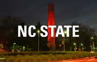
Type Over Images
Only use type over an image if it is completely legible without altering the type or the image.
9 Do make sure type on the photo is legible without altering either of the elements.
x Don’t put light type on a light photo. It is not easily legible.
x Don’t use embellishments such as drop shadows and selective photo darkening.
13
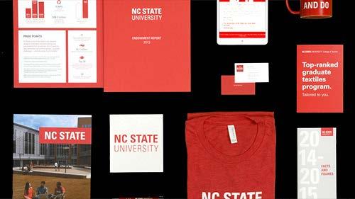
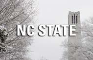
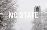
Imagery
In content and style, NC State imagery is big, bold and impactful. Our photography and video reflect momentum, optimism, and the gravity and world-changing potential of our work.
Content
We always give thought to what we purposefully feature in our images. This means both the main subject matter and the other elements in the foreground, middle and background.
What We Shoot
Our images are bold, clear and singular.
When applicable, we emphasize the real-world impacts of NC State’s work, rather than the process behind it.

Reduce Visual Clutter

Extraneous objects and visual textures can confuse viewers and detract from the story your photo is telling.


9 Do favor clean, uncluttered compositions. x Don’t let the subject get lost against a busy background.
9 Instead, crop images to focus on the subject without losing a sense of context.
14
Use a Singular Image
Make your image’s purpose clear: Use a single image (rather than an image collection) and focus on a specific subject (avoid group portraits).
9 Do choose an image with a dominant subject that communicates a single story.


Style
x Don’t use photo compilations, montages and collages.
In the image-making process, we pay close attention to lighting and vantage point. When appropriate, we also use specific special effects.


x Avoid the use of formal group portraits wherever possible.

Check out our full collection of on-brand photos HERE.
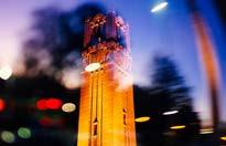
Light leaks and motion convey a sense of movement toward the future.
Bright lighting inspires optimism.
15
Design Conventions


The philosophy behind our design conventions is simple: Let the content speak. Legibility and simplicity are the essence of the NC State approach to design. Function counts here, not flair. Like the faculty and students we spotlight, our goal is to clarify the complicated for our audiences.
We’re on the Grid
To reflect our personality and brand platform, we use blocks, grids and structured elements.

The Right Angles
NC State is a modern place of hard edges and practical thinking. Our design philosophy follows that focus on what’s real, tangible and impactful. We take a more modern, flat approach that emphasizes hard angles over soft curves. Blocks and grids are integral to the architecture of the Hunt Library.
The ceiling of the renovated Talley Student Union reflects NC State’s angular aesthetic. Our design conventions adopt a similarly hard-edged style. Simplicity is the essence of our design philosophy. Designs should be unadorned and straightforward, with a focus on clearly conveying information.

16
Keep It Simple
The intentional use of negative space and minimal embellishment will enhance your audience’s ability to understand your message.
Distill your message to core elements. We keep our audience engaged in this undergraduate recruitment brochure by using large headlines, a single image and short, direct copy. The use of simple iconography and large numbers visually communicates information in a simple way that draws readers’ attention.

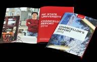
Establish a bold look. Bold, unembellished use of typography and color, straightforward labeling and authoritative photo subject posture establish the tone of content inside the chancellor’s annual report.
Less copy is more effective. Bold typography and minimal content are especially important in environmental graphics, such as this electronic billboard promoting the Hunt Library. The viewer has little time to absorb the message, so be sure not to fill the entire space with copy.

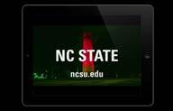
Our brand is always clear. This opening screen for videos, which you can download from our assets page, shows how to use type and logos over moving-image backgrounds. By making legibility a priority as you choose background content, you can effectively encourage viewers to take action by visiting the NC State website.
17
Copy Guidelines
Following a well-defined editorial style gives your writing a professional sheen and brings it in line with the university’s brand platform.
Maximum Value
Editorial style is a set of rules that tell you what to do when there’s more than one “correct” way to write something. Examples include spelling a number out versus writing it as a numeral, capitalizing the words in a headline and hyphenating words that have prefixes. Without a clear-cut set of style guidelines, writers often address these situations in ways that contradict each other and themselves. The resultant
inconsistencies can make your writing look amateurish, sabotaging your credibility.
NC State’s editorial style is based on The Associated Press Stylebook, with exceptions and additions as noted. When this style guide conflicts with AP style, follow this guide. To resolve questions of spelling, AP recommends using Webster’s New World College Dictionary. We give key recommendations from AP interspersed with guidelines specific to NC State.
Inclusive Language Guide
To obtain maximum value from these rules, you should follow them far more often than not; but situations may arise when bending a rule makes more sense than following it. In all matters concerning editorial style, consistency and clarity are the most important considerations.
Highlights of NC State Editorial Style can be found HERE.
NC State strives to foster an environment that welcomes, includes and empowers every member of the Wolfpack. Follow these guidelines to help make sure your writing supports this strategic goal.
18
Championing Diversity
As our university, state and nation become increasingly more diverse, it is more important than ever to communicate inclusively. Inclusiveness in our words and imagery conveys respect for others and enables people to work together effectively without causing misunderstanding or conflict that could hinder our work to fulfill a common mission. Inclusiveness helps us attract and retain students and employees who seek environments where they are valued, enhancing our ability to build the best and brightest Wolfpack. In addition, NC State’s strategic plan — Wolfpack 2030: Powering the Extraordinary — commits us to championing a culture of equity, diversity, inclusion, belonging and wellbeing in all we do.
Communicators have the power to shape perception and serve
as catalysts for improving their organizations. Words and images have the power to either perpetuate wrongs or advance equity and inclusion. Small communication choices can have a great impact. In the following sections, we provide guidance to help NC State’s communicators ensure they are being as inclusive as possible.
Guiding Philosophy
Language is constantly evolving, which makes it challenging to keep up with the details of communicating to and about different groups of people. A perspective rooted in cultural humility helps. Cultural humility is a framework based on the premises that everyone has a distinct perspective, and everyone’s perspective matters. Other components of cultural humility include a lifelong commitment to self-evaluation, a
commitment to mitigating power imbalances and partnership with those who advocate for others (Tervalon & Murray-Garcia, 1998).
Above all, cultural humility assumes a position of readiness to learn about difference and openness to the constant possibility of being more inclusive.
As a practice rooted in cultural humility, consider including statements such as the following in your messaging:
“At NC State, we strive to be a welcoming and inclusive environment, where everyone’s perspective matters. Please let us know if you have suggestions for how we can improve our communications.”
“We welcome your comments to help us embrace the diversity of our audiences. Let us know if we can do better.”
19
Topics
Representation
Acknowledging that we are a society of many different groups that don’t always receive equal treatment helps frame the way we communicate. As you create messaging, imagine diverse individuals reading or viewing it. Do they see themselves reflected as more than a token presence? Regularly check your work to see if you’ve represented multiple audiences within it.
When creating content, consider whether the names, voices, descriptions, images and experiences you are depicting represent a diverse cross-section of society. Regularly include a variety of identities and experiences in your work, and create opportunities to feature underrepresented identities.
Consider who you might be inadvertently excluding or alienating, for example, by assuming a single perspective, such as a specific religious holiday. When possible, reframe your language to encompass multiple perspectives.
Those who create visual images should keep in mind that diversity encompasses many facets,
some of which are only noticeable in subtle ways. Creativity may be required to construct rarer scenarios that accurately depict the richness of our community.
Don’t overdo it. Authenticity is critical. Overinclusion or misrepresentation can be misleading and turn inclusion into exploitation.
People-First Language
Identities are multifaceted, and individuals may identify in diverse or complex ways. It is important to keep this in mind to avoid reducing anyone to a single identity or group. Avoid oversimplification, stereotyping and generalizations when referring to individuals or any group of people.
When possible, refer to a person before their descriptor. For example, “person with a disability” is preferable to “disabled person”; “person experiencing depression” is preferable to “depressed person” or “mentally ill person”; and “uses a wheelchair” is preferable to any descriptor that places the characteristic before the person.
20
Writing About Diverse Communities
Be careful when using culturally specific descriptions, quotations or phrases with which you’re not familiar. When you’re working with this kind of material, start by doing research to learn as much as you can about the topic, culture or person you’re writing about. Context is key, and authenticity is important. Always be respectful in tone, and consult a knowledgeable reviewer if you need help.
Diversity should be woven into your content throughout the year, not just during specific events or history months for various groups.
Pay close attention to preferred terms for a given group, such as “Native American,” “American Indian,” “Indigenous” or “First Nations” rather than “Indian.” The AP Stylebook’s entry on racerelated coverage provides helpful guidance on this topic.
Sensitivity to Historical Harms
Many common sayings have problematic origins. It’s impossible to know all of them, so in general, it’s best to use straightforward wording and avoid idiomatic language. If you choose to use an idiom
or common saying, do an internet search first to learn more about the term’s origins, and don’t use it if it’s based on a historical injustice.
Gender Diversity and Pronouns
Cultural norms and legal protections for LGBTQ+ people have changed quickly over the past few decades, and communicators must keep up with the changes to be current and correct. In 2019, Merriam-Webster added the singular “they” to the dictionary. Inclusive organizations may now indicate persons’ gender pronouns after their names, e.g., “Chris Smith (he/him)” or “Sam Jones (they/them).” When writing a story about an individual, it’s good practice to ask the individual their preferred pronouns or to volunteer your own during the interview.
At NC State, we support the use of the singular “they” when referring to individuals who use this pronoun. We also support the use and display of personal pronouns on all communication media. Individuals may choose whether to use and indicate specific pronouns for themselves while supporting those who choose to use or indicate their pronouns.
21
Imagery should work together with voice and tone.

Voice and Tone
Tone can change to suit your audience, from a blog post reminding alumni why they love their university to a brochure that makes future students want to join the Wolfpack. But NC State speaks with a single voice — one that reflects and reinforces our brand.
Words and Deeds
NC State’s brand helps set us apart from our peers. We strengthen the university by speaking and writing in ways that demonstrate our brand personality: courageous, innovative, intellectual and purposeful.
We talk boldly about what we’ve already achieved. We explain how we continue to lead the pack. We communicate new ideas in terms everyone can understand. We choose practical, focused language that fits our research. We say what we mean, mean what we say and always match words with action.
Courageous
Write with conviction. Never shy from challenging or complex subjects. Describe the problems facing our world, and propose solutions. Choose bold, unambiguous language. Show our eagerness to put ideas to the test in the real world, where they count.
Innovative
Be excited by new ideas. Show how NC State is leading the way, but avoid empty buzzwords. Adopt best practices for communicating via the Web and social media. Present cutting-edge research and technology as commonplace at NC State. Focus on the end results of our innovation.
Intellectual
Inform and educate your audience. Demonstrate NC State’s expertise, but avoid academic or insider terminology. Unpack complex ideas into simpler parts. Describe how research will be applied. Make clear the benefits of learning and discovery.
Purposeful
Know your audience and what’s important to them. Use direct, uncomplicated language and sentence structure. Strike out unnecessary adjectives and adverbs. Focus on outcomes. Show how NC State solves problems. Say as much as is needed and no more.
23
Social Media Guidelines
Increasingly, NC State colleges, departments, units and programs are using social media outlets to build relationships with their audiences. To help university units make effective use of social media, NC State adopted a social media policy in June 2015.
That policy establishes procedures for launching social media accounts for an NC State unit, obtaining official university recognition and managing accounts in accordance with existing campus and state policies.
The full policy is HERE, but read on for highlights.
> The Social Media Policy applies to social media accounts created by or representing NC State department or units. It does not apply to student organizations.
> The NC State Social Media Registration system is the starting point for any department or unit seeking to launch a social media account.
> All unit or department social media accounts must have at least two registered university employees serving as account managers.
> Unit and department social media accounts cannot be used for political activities.
> Identification, promotion or endorsement of commercial goods and services provided by non-university organizations or individuals on department or unit social media accounts is strictly regulated. See section 5.3 of the full policy for details.
> The policy creates a Social Media Team to review all social media accounts registered via web registry for adherence to the Social Media Policy. The Chief Communication Officer, in consultation with the Social Media Team, will approve social media accounts for registration.
> All approved, registered social media accounts will be publicly listed in the “Officially Recognized Accounts” section of this web site.
Account Registration
Under the NC State social media policy, officially recognized social media accounts must be registered. To gain university recognition, use the Social Media Registration system to submit your account.
24

25
Extension Guidelines
North Carolina is home to two land-grant institutions, NC State University and N.C. A&T State University. Each school operates individual Extension units — NC State Extension and Cooperative Extension at N.C. A&T — which provide programming both independently and as a strategic partnership called N.C. Cooperative Extension.
NC State Extension Logos
Extension efforts that are funded, coordinated and developed through NC State should follow the NC State Extension university brand guidelines. This applies to campus-based initiatives and resources.
Brick Logos
Logotype
DOWNLOAD NC STATE EXTENSION LOGOS
Please refer to the NC State Extension style guide for more information.
26
N.C. Cooperative Extension Logos
N.C. Cooperative Extension is a strategic partnership comprising NC State and N.C. A&T State universities, along with local, state and federal governments.
Extension efforts that are funded, coordinated and developed jointly should follow the N.C. Cooperative Extension brand guidelines. This applies to county-based employees and all local centers, which always involve partnerships with local government (even if only one university staffs the center).
Logos
Logo Versatility
The N.C. Cooperative Extension partnership logo consists of two main elements:


1. N.C. Cooperative Extension Block
2. A&T logo and the NC State logo, which should always be grouped together as one graphic.

DOWNLOAD
PARTNERSHIP LOGOS
If the imprint area on a resource will render the full logo illegible, you may separate the two elements. Even when separated, BOTH elements – Extension block and paired university logos – should be included whenever possible.
Color is preferred when possible, but there are also black / grayscale logos are available. Please view the N.C. Cooperative brand guide for more information.
27
Blue HEX #004684 RGB 0 70 132 CMYK 100 65 0 31 PMS 288 Red HEX #CC0000 RGB 204 0 0 CMYK 0 100 81 4 PMS 186 C Yellow HEX #FDB927 RGB 253 185 39 CMYK 0, 30, 94, 0 PMS 123
28 For the history and more information on the NC State brand, please refer to the official NC State brand website, brand.ncsu.edu. Contact CALS Communications with questions, calscommunications@ncsu.edu.
