COVER STORY//
THE TREND:
home comfort The way we view our personal space has changed. So much so, that it is shaping the way we style our homes. Australia’s two colour powerhouses – Dulux and Haymes Paint – confirm this trend with the release of their latest palettes.
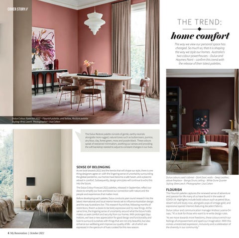
Dulux Colour Forecast 2022 – Flourish palette; and below, Restore palette Styling: Bree Leech. Photographer: Lisa Cohen
The Dulux Restore palette consists of gentle, earthy neutrals alongside more rugged, natural tones such as buttercream, pumice, airy blue, clay, forest green, moss and purple-black. These colours speak of restrained minimalism, soothing our senses and providing the soft backdrop needed to adjust to constant changes in our lives.
SENSE OF BELONGING As we look towards 2022 and the trends that will shape our style, there is one thing designers agree on: with the lingering sense of uncertainty surrounding the global pandemic, our homes have become a safe haven, and a place to retreat in comfort. Subsequently, design principles will continue to echo this into the future.
Dulux colours used: cabinet – Dark Door; walls – Deep Leather; above fireplace – Bongo Drum; ceiling – White Dune Quarter Styling: Bree Leech. Photographer: Lisa Cohen
The Dulux Colour Forecast 2022 palettes, released in September, reflect our desire to simplify our lives and boost our connection with nature and the people and experiences that matter most.
FLOURISH
Before developing each palette, Dulux conducts year-round research into the latest international and local interior trends set to influence Australian design and the way Australians live. This research found that, following months of restrictions, there’s a desire to be bold, expressive and try new things. At the same time, the lingering sense of uncertainty around what the future holds makes us seek comfort and security from our homes. With prolonged days indoors, we have a new appreciation for good design and functionality and look to surround ourselves with things that are not only beautiful, but also enhance our wellbeing and improve our quality of life – all of which are expressed in the spectrum of hues curated for this new season.
Dulux colour and communication manager Andrea Lucena-Orr says, “It’s a look for those who want to re-write design rules.
The Flourish palette captures the renewed sense of adventure and passion for life many of us have found in the wake of COVID-19. Highlights include bold colours such as petrol blue, desert red and dusty rose, alongside pops of vintage gold, and expressive layered interiors featuring decadent fabrics.
“As we move towards more freedoms, these colours enrich our feelings of empowerment and spark our imagination. With this comes unrestricted expression, inclusivity and a celebration of the diversity in our community.”
4 My Renovation | October 2021
04.indd 1
23/09/2021 2:46:57 PM


