4 minute read
Cover story


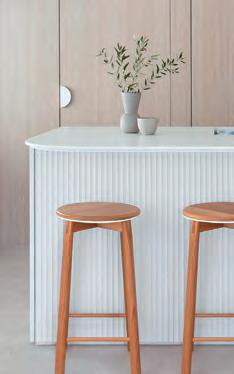
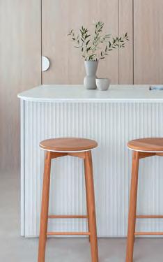
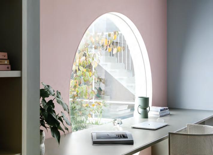
Dulux Colour Forecast 2022 – Flourish palette; and below, Restore palette Styling: Bree Leech. Photographer: Lisa Cohen
Advertisement
The Dulux Restore palette consists of gentle, earthy neutrals alongside more rugged, natural tones such as buttercream, pumice, airy blue, clay, forest green, moss and purple-black. These colours speak of restrained minimalism, soothing our senses and providing the soft backdrop needed to adjust to constant changes in our lives.
SENSE OF BELONGING
As we look towards 2022 and the trends that will shape our style, there is one thing designers agree on: with the lingering sense of uncertainty surrounding the global pandemic, our homes have become a safe haven, and a place to retreat in comfort. Subsequently, design principles will continue to echo this into the future. The Dulux Colour Forecast 2022 palettes, released in September, reflect our desire to simplify our lives and boost our connection with nature and the people and experiences that matter most. Before developing each palette, Dulux conducts year-round research into the latest international and local interior trends set to influence Australian design and the way Australians live. This research found that, following months of restrictions, there’s a desire to be bold, expressive and try new things. At the same time, the lingering sense of uncertainty around what the future holds makes us seek comfort and security from our homes. With prolonged days indoors, we have a new appreciation for good design and functionality and look to surround ourselves with things that are not only beautiful, but also enhance our wellbeing and improve our quality of life – all of which are expressed in the spectrum of hues curated for this new season.
THE TREND: home comfort
The way we view our personal space has changed. So much so, that it is shaping the way we style our homes. Australia’s two colour powerhouses – Dulux and Haymes Paint – confirm this trend with the release of their latest palettes.
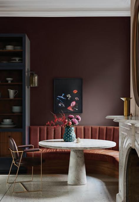
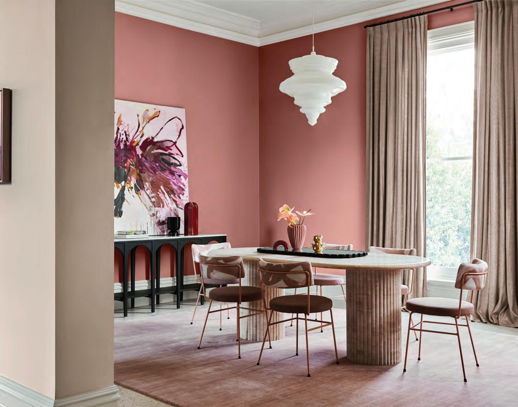
Dulux colours used: cabinet – Dark Door; walls – Deep Leather; above fireplace – Bongo Drum; ceiling – White Dune Quarter Styling: Bree Leech. Photographer: Lisa Cohen
FLOURISH
The Flourish palette captures the renewed sense of adventure and passion for life many of us have found in the wake of COVID-19. Highlights include bold colours such as petrol blue, desert red and dusty rose, alongside pops of vintage gold, and expressive layered interiors featuring decadent fabrics. Dulux colour and communication manager Andrea Lucena-Orr says, “It’s a look for those who want to re-write design rules. “As we move towards more freedoms, these colours enrich our feelings of empowerment and spark our imagination. With this comes unrestricted expression, inclusivity and a celebration of the diversity in our community.”

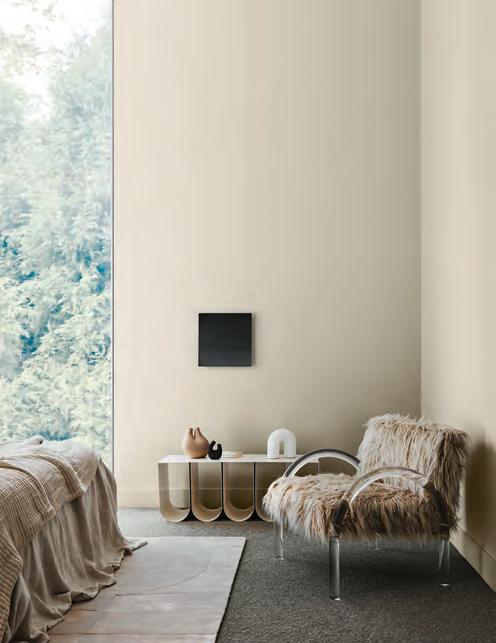
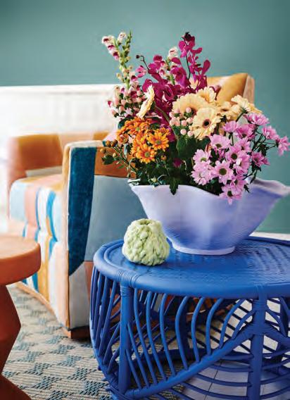
As pretty as a picture, Dulux’s Wonder palette features light pastels and playful, summery hues such as cornflower blue, lilac, lemon, green quartz and rose gold. It is cheerful and evokes optimism – something we all need right now. “These colours set the stage for regeneration and growth, with unexpected tones drawn from the natural world around us,” says Dulux’s Ms Lucena-Orr. “As we add more colour to our interiors, our imaginations are rekindled.” Features include quaint florals and eclectic colours and patterns paired with sleek contemporary furniture. “Now that we are spending more time in our homes, it’s important that each space feels diff erent – particularly if you are working or studying from home. “Viewing room by room, consider the appearance you want to achieve as well as ensuring the right mood and ambience is suitable for the function of the space.” Dulux colour used: walls – Edvard. Styling: Bree Leech. Photography: Lisa Cohen
Haymes Expressions Interior paint in the colours Sunset Pink and Faded Blue Photography by Martina Gemmola and styling by Ruth Welsby
AWAKENING
The Haymes’ colour library is a respected and celebrated tool that highlights future trends. Its latest release, Volume 15: Awakening, centres on the individual, their environment and evoking a sense of happiness. These colours are about celebrating the people who live in the home. “The internet has certainly made design and colour trends more instantaneous, but we’ve developed these new colours over several months and with extensive research. Each hue is carefully matched to the way Australians live, as well as our unique climate and terrain,” says Wendy Rennie, colour and concept manager for Haymes.
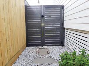
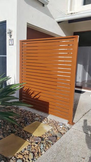
STYLE & PRIVACYfor outdoors
• Awnings • Louvres • Shutters • Fencing & Gates • Insect & Security Screens All screens and gates are custom designed to suit your needs
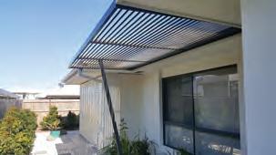
We use Australian Powdercoated Aluminium in over 300 colours
PULL DOWN/WIND DOWN BLINDS GATES, FENCING & AWNINGS ▲
DECORATIVE ALUMINIUM PANELS BIFOLDING, SHUTTERS & LOUVRES ▲
DIY FRIENDLY OR INSTALLED. CALL FOR A FREE MEASURE & QUOTE
P. 5438 2866 or Mark 0424 984 785
9 Newing Way, Caloundra (off Mark Rd at Daniel St roundabout) www.superiorscreenssc.com E. superiorscreenssc@gmail.com Agents for
ASKIN CABINETS