
A series of events connecting the very best people creating exceptional lighting projects around the world.
For more information contact Jason Pennington: j.pennington@mondiale.co.uk


A series of events connecting the very best people creating exceptional lighting projects around the world.
For more information contact Jason Pennington: j.pennington@mondiale.co.uk


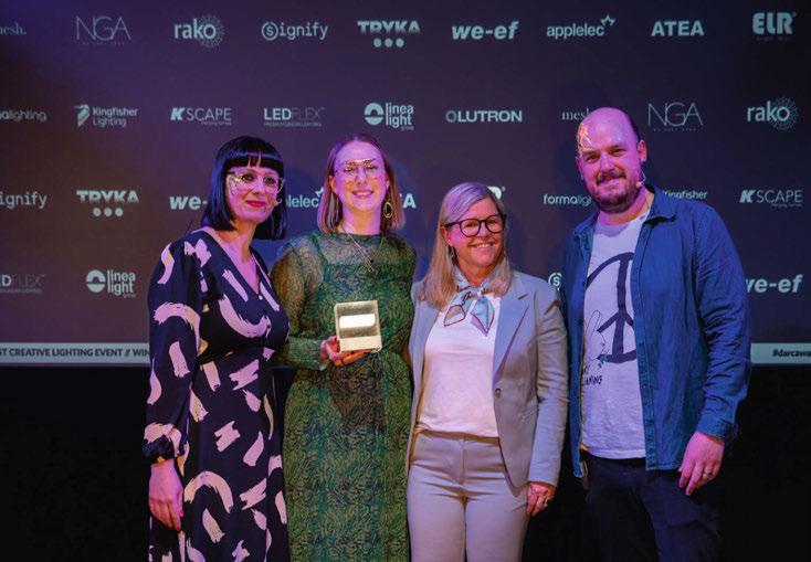
This March, the design community came out in force to support the [d]arc awards - the only peer-to-peer lighting design awards in the world.
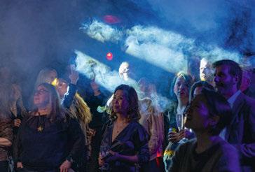
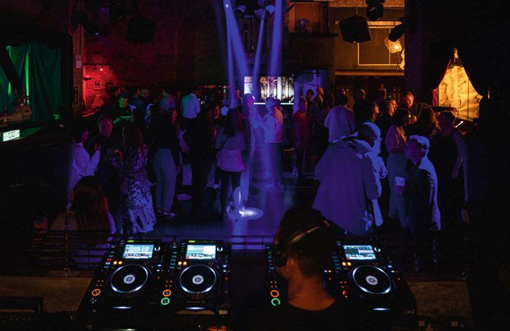
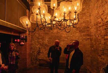
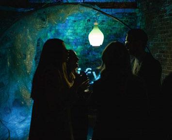
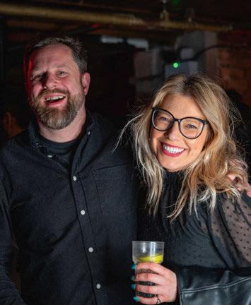
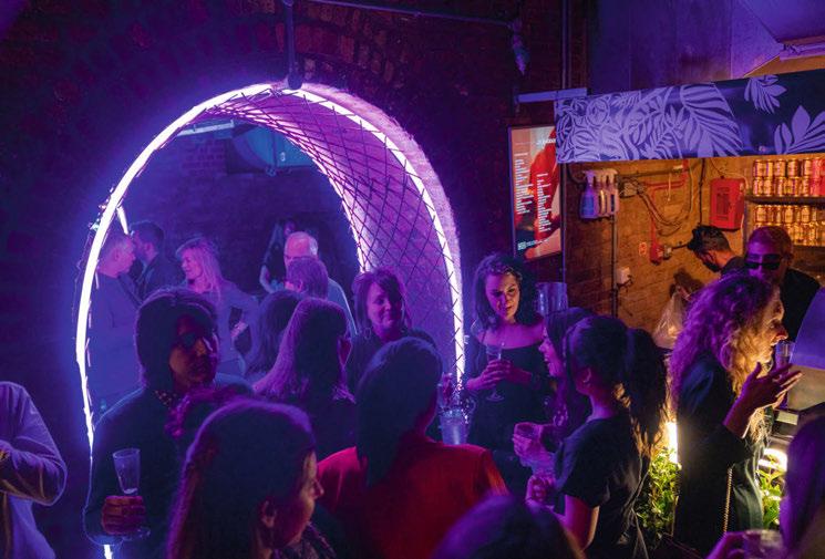
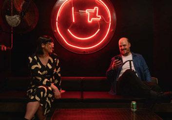
Held once again at the iconic fabric London nightclub, [d]arc night, the offical [d]arc awards party, welcomed more than 500 revellers, as the winners of the 8th edition of the awards programme were revealed.

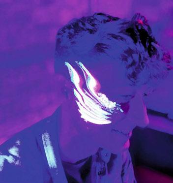
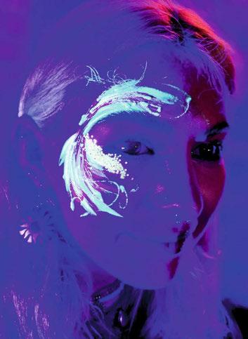
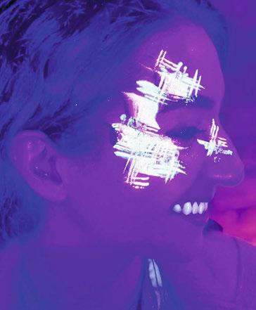
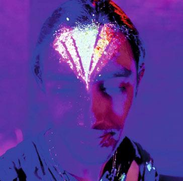
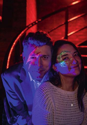
Alongside an open bar and vegetarian street food, the night featured a series of light art installations, two photo booths sponsored by Linea Light Group, and UV face painting, with the party carrying on until the early hours. This year, more than 17,000 votes were cast across the awards’ 14 categories, while 312 projects and 100 products were submitted. The
global reach of the awards was evident once again, with entries coming from 40 countries around the world. This was also reflected in the winners, with winning projects coming from as far afield as Japan, Australia, Thailand, China, Turkey, Norway, UK, and Sweden. Awarded the coveted ‘Best of the Best’ award for 2022 was Plas Y Brenin, UK by Dark Source, which also won the Spaces - Low Budget category.
The ‘Best of the Best’ prize is given to the projet that recevied the most votes overall out of all the project category winners. Huge congratulations to Kerem Asfuroglu and Dark Source for this Fantastic achievement.
[d]arc media would like to say a massive thank you to all of our design partners, sponsors and supporters, to everyone to entered a project or
product into the awards, who voted, and who took part in the awards process this year. We would also like to say a special thank you to our production partners Streeem, and to Light Collective, who we couldn’t do the awards without.
Over the next few pages you will be able to read all about the winning projects and products; the inspiration behind the installations; and check out our photo gallery from the awards party itself. See you next year!
www.darcawards.com
At its main campus in Higashiosaka, Kindai University has opened a new building for the newly established Faculty of Informatics.
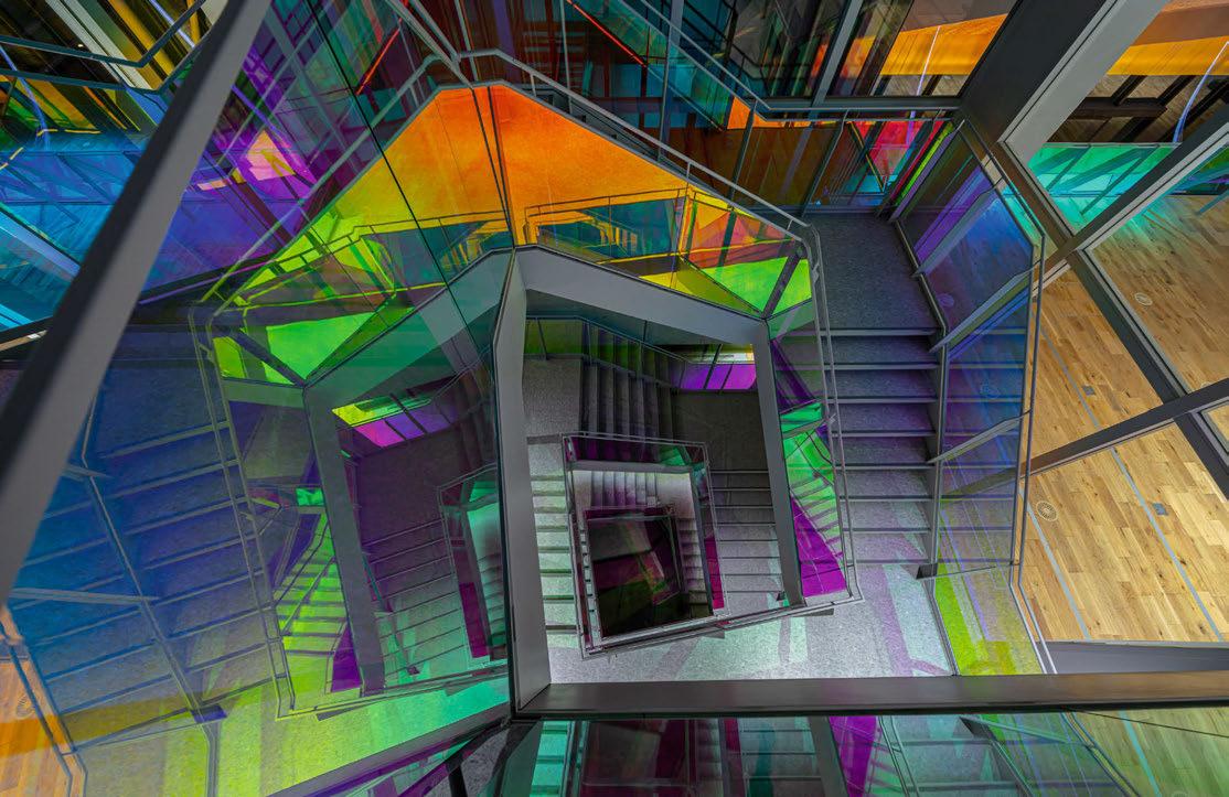
The designers chose “Light” as the theme of this project as light is what drives high-speed fiber-optic networks. After discussions with the client and architect, the team focused on the fact that white light is a collection of multiple wavelength regions (colours). They separated and revealed these colours to paint the space like a vivid water colour as the concept for the building.
The first floor of the main building has a multipurpose space with a black interior that is used as a digital art gallery and for social interactions across different faculties. The second and third floors have laboratories where natural light shines through. Stairs connect these floors at two locations. The designers laminated the glass staircase railings with dichroic film to shift the colours depending on the viewpoint and illumination angle.
The biggest challenge was providing functionality and achieving the presentation concept of the stairs while taking advantage of the characteristics of the film using a single
lighting method. The designers decided on an approach of lighting the steps with a single, easily identifiable colour in consideration of safety, while bringing forth light with a high presentation effect on the outside of the stairs. To tackle this challenge, the designers tested the lighting effect on a mock-up using actual dichroic film. This showed that light falling on the steps reflected more colours when it fell on the film directly, whereas the colours toned down as the illumination angle approached parallel. On the other hand, light transmitted through the film created colours in all lighting conditions. LED lights under the handrails were installed to illuminate the stairs directly from above and successfully produced a rainbow of colours on the outside of the stairs. Together with this, natural light shining from above reflects at various angles as time goes by, producing changing layers of iridescent colour that create the impression of an aurora. Artificial light provides a constant effect while natural light shifts with time. Stillness and motion — two kinds of lights coexisting and overlapping to create impressive visuals.
SECOND PLACE: Indigo Fitness, Switzerland by Lucespazio Lighting Design, Switzerland
THIRD PLACE: Visum Showroom by Herzeliya, Israel
PROJECT DETAILS
Lighting Design: Sirius Lighting Office + NTT
Facilities, Japan
Client: Kindai University
Architect: NTT Facilities, Japan
Additional Design: Penta-Ocean
Construction
Main Lighting Suppliers: Naka Corporation

The lighting design of the Basilica Cistern involved studying the history of its architecture, the societies and cultures that interacted with it, and the people who rediscovered it. These multiple cultural identities became the guide of the lighting concept, with the aim of conveying their stories to the visitor.
Conceptually the Cistern, built in the Roman age around the middle of 500 AD, embodies the Western world into the cradle of the Eastern world, combining the Roman and Ottoman traditions and cultures. To describe the coexistence of the two worlds, Studioillumina decided to celebrate their different traditions of visual representation: the Oriental world, with its typical two-dimensional drawings and historical miniatures, and the Western world, based on the use of perspective and three-dimensionality. The two visualisation styles are translated into two different lighting techniques. This way the Cistern gives light to, but is also lit by, the two cultures who built and lived it.
Through the columns’ lighting, the visitor’s journey is divided into three consecutive stages:
1 – The outward journey is like entering a forest revealed only by the backlight, inspired by the ancient world of miniatures.
2 – Medusas represent the end of the outward journey and the beginning of the return journey. Here, the two-dimensional world and the three-dimensional blend together in the Cistern architecture, which is revealed in its two identities.
3 – From this moment on, the return trip starts and the three-dimensional world shows the Cistern by enhancing it structurally and architecturally in a tribute of the western world and perspective.
Every four minutes of the journey, the light of the columns dissolves in order to leave room for another protagonist of the scene: submerged grazing lights show the original uneven floors and the bases of all columns by painting them in an aquamarine colour.
After another minute, the vaults are lit in an amber colour. In an unexpected and suggestive way, the Cistern is tinged with the characteristic atmospheres of Turkey, changing from aquamarine to amber.
SECOND PLACE: Hallgrímskirkja, Iceland by Liska, Iceland
THIRD PLACE: Battersea Power Station, UK by Speirs Major, UK
Lighting Design: Studioillumina di Adriano Caputo / Federica Cammarota, Italy
Architect: Atelye70 Sehir Planlama, Turkey
Interior Design: Studio Insula Architettura e Ingegneria, Italy
Additional Design: Restoration Company: Hera Restorasyon, Electrical Installer: Tepta
Lighting, Footbridge Company: Meiser Izgara
Main Lighting Suppliers: Tepta Lighting
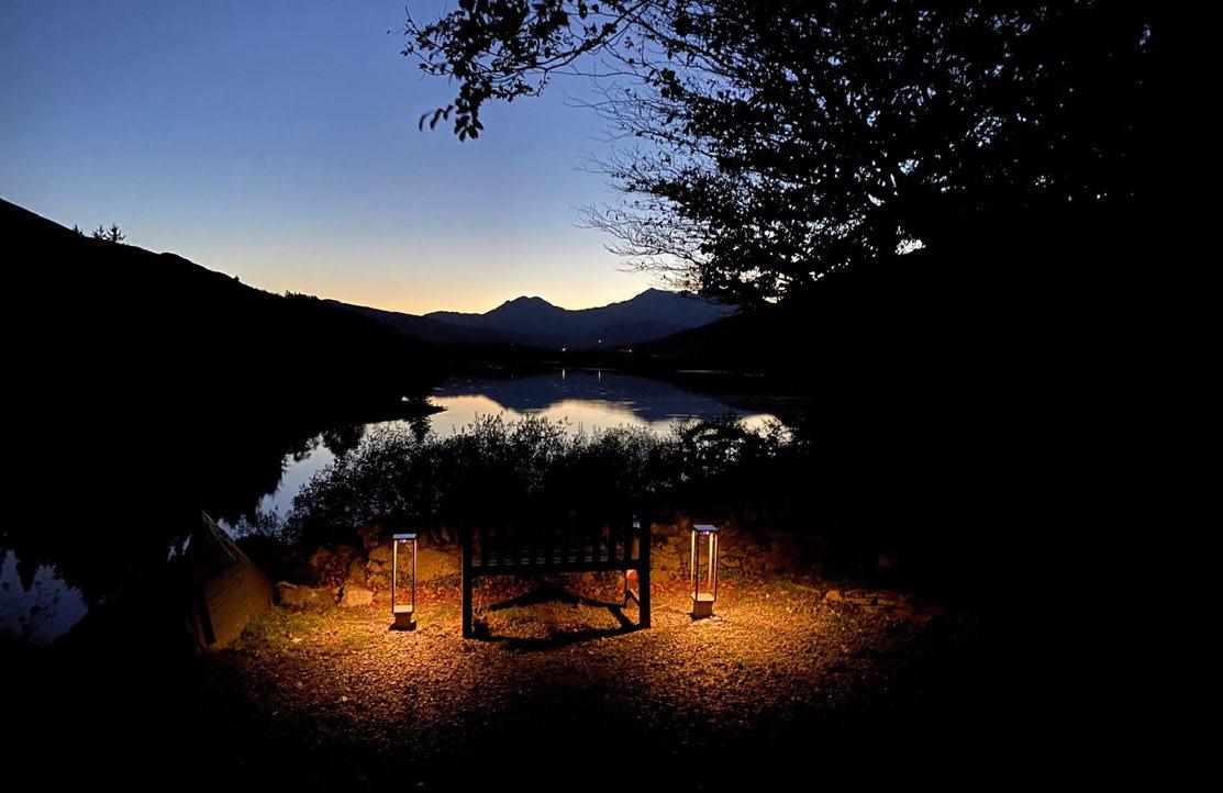
Located in the lush heart of Snowdonia, Plas Y Brenin is a vibrant national outdoor centre that attracts thousands of international visitors every year. The site has been suffering from a significant level of light pollution visible for miles, causing several issues for itself and the surrounding biodiversity.
The project aimed to reduce energy waste and impact on biodiversity while exploring further opportunities to enhance the nighttime experience. Warm-coloured, glare-free, low-intensity lighting was utilised in order to meet dark sky-friendly measures, along with high energy efficiency and lamp-life criteria to maximise the savings.
Existing lighting mostly consisted of fluorescent bulkheads and LED floodlights, which reduced the site’s legibility due to glare and uncontrolled light distribution. One of the key challenges of the project has been making the best use of the available budget and resources. The site consisted of various over-lit and light-deprived areas. The large majority of the lighting at Plas Y Brenin is achieved below the eye level and at door height, focusing the light on the horizontal plane while keeping it human scale. This also
meant all lighting is kept accessible for ease of maintenance and had to meet a high criteria of exterior rating and durability.
In areas where vertical illumination was essential for improving the legibility and wayfinding of the site, it was done in a fashion that is a by-product of downlighting. All luminaires were made to face downwards to avoid upward travelling light. All floodlights were removed from the scheme. All entrance thresholds that are not a part of the main circulation utilised passive infrared sensors (PIR) to avoid unnecessary illumination of non-essential areas. This meant when there is no activity, no light was wasted. In certain areas where supplying mains power proved to be challenging, solar PIR lanterns were used as a low-energy solution. These only come on after dark and when movement is detected. Existing bollard bodywork was refurbished and maintained. Only the light sources were replaced to reduce the material and economic waste. Luminaires with elliptical and forward throw were used to increase the reach and coverage while creating a textured visual character unique to the site.
SECOND PLACE:
Between the Sun and the Moon, UK by Studio Elisa Artesero, UK
THIRD PLACE:
Shenzhen Expobay, China by DASUN Environmental Art, China
PROJECT DETAILS
Lighting Design: Dark Source, UK
Client: Snowdonia National Park Authority, Prosiect NOS - The North Wales Dark Skies
Partnership
Additional Design: Bebbington Wilson
Main Lighting Suppliers: Heper, Stoane
Lighting, Atrium, Flos, Mesh Lighting, L&L
Luce&Light, Thorlux Lighting
Exchange Square is a tranquil new park within the urban heart of London. As natural light fades, a balance of beautifully integrated light and retained darkness reveals the multi-level topography and curved landscape features while supporting intuitive wayfinding, ease of access, and promoting social connection. The lighting design focuses on enhancing the organic and sensory aspects of the park design, while aiming to encourage people to slow down, breathe, and enjoy a moment of respite from the hard granite of the city surrounds.
A key project from the Broadgate Public Realm Framework for British Land, the park is a soft, bucolic environment that prioritises the wellbeing of both people and plants and is open access, marking an important milestone in their journey from an office-led campus to a truly mixed-use, creative environment. Much of the lighting is kept at a low height, preserving a warm and intimate ambience that encourages increased dwell time and easy social interaction. At the perimeter, light for circulation is provided from columns at a human scale, while low-level bollards reveal the internal routes and softly highlight the low-level planting.
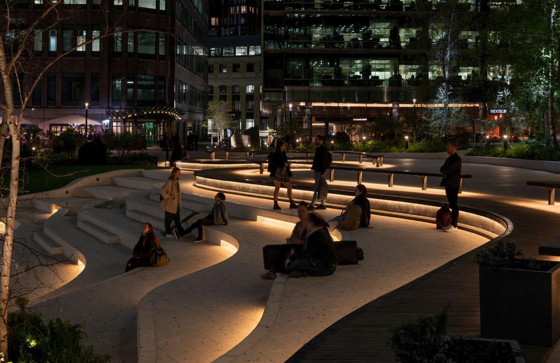
Across the site, the landscape elements softly glow with elegantly integrated light, contrasting with the areas of retained darkness to improve legibility and facilitate a sense of security while supporting the park’s ecology and biodiversity. The dark metal vertical face of the meandering ‘ribbon’ retaining wall that runs through the park is revealed with an even wash of light, while the slatted timber benches that sit up above the wall are lit from beneath. Slots cut into the faces of the terrazzo step seating also contain hidden light sources, generating mesmerising patterns and ever-changing ripples within the water feature.
The tallest elements in the park are two rows of mature silver birch trees lit from within to create shifting patterns of rustling foliage and branches on the ground. The colour of the light adjusts tonally with each season, with warmer white light enhancing the rich autumn leaves and bare wooden branches in autumn and winter and fresher, cooler, white light celebrating the green buds and vibrant leaves of spring and summer.
SECOND PLACE: Joali Being, Maldives by Inverse Lighting Design, UK
THIRD PLACE: Elephant Park, UK by Speirs Major, UK
Lighting Design: Speirs Major, UK
Client: British Land
Architect: DSDHA, UK
Additional Design: Horticulture: FFLO, Project
Manager: Stace Project Management, Energy
Consultant: Greengage, Access Consultant: David Bonnett Associates
Engineering: Arup, UK
Main Lighting Suppliers: WE-EF, DW Windsor, Architape, iGuzzini, Stoane Lighting
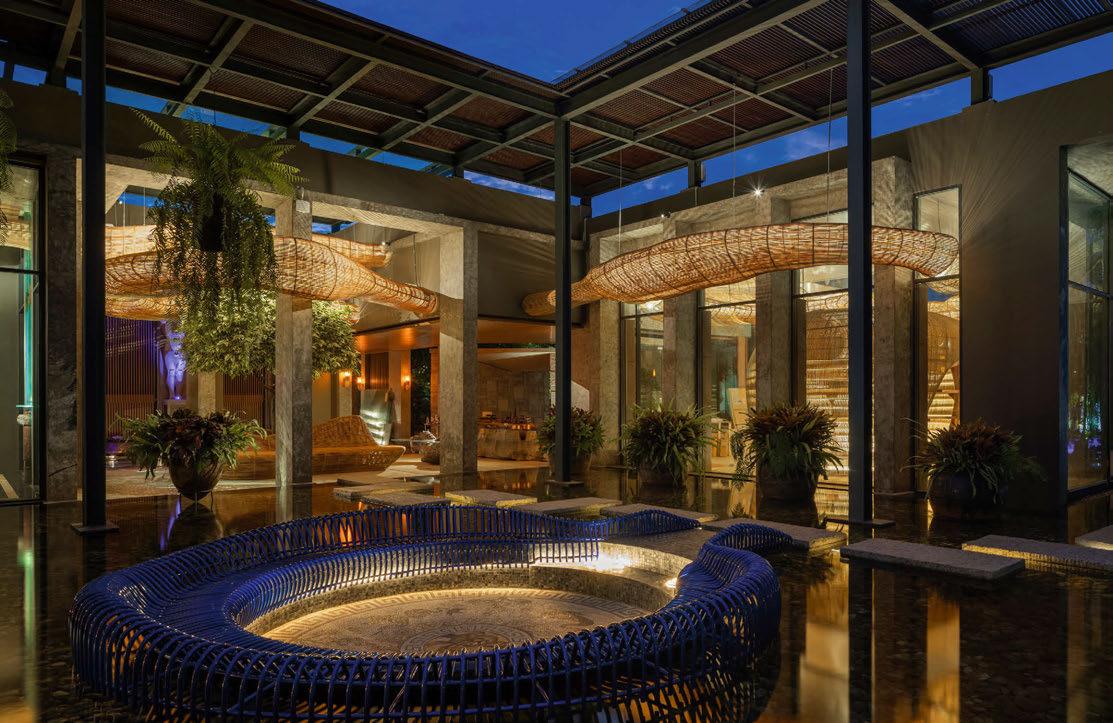
In Chiang Mai, Northern Thailand, a private collector commissioned Infusion to design the lighting scheme for a private gallery. Consisting of a handmade rattan sculpture spanning over 120-metres and three main pods, 5-metres, 4-metres and 3.5-metres high respectively. This weaves through interconnected pavilions, enclosed by intricate tropical gardens with exterior sculptures and ornate water features. The lighting concept centred on a continual passage of movement, guided by nature and the natural forms embodied in the composition of the rattan geometries. Infusion aimed to breathe ‘life’ into the sculpture, to evoke a sense of wonder and discovery, revealing the numerous dynamic layers of this irregular noble material through light.
Infusion aimed to deliver a subtle but everpresent dynamism through lighting controls, connecting, and disconnecting people and spaces, effectively in keeping with the design language of the surrounding environment. Exploring the contrasting textures and three dimensional forms creating not only a beautiful
aesthetic but an emotional response to the spaces itself.
Infusion took inspiration from nature with its ever-changing forms, the movement of clouds, steam and storms; the concept grew around creating a second sunset bringing to life the rattan, exporing the materials, evolving colours and organic shapes.
Infusion’s intention was for the reflection pool to have the three-dimensional forms of the sculpture constantly present. Infusion considered the rattan as the primary layer of ambient lighting; it is in essence an enormous luminaire created from more than two tonnes of natural rattan. Similar to traditional Thai lanterns casting playful deep shadows on the surrounding surfaces.
Infusion sought to bring pleasure to the people using a culturally relevant and immersive space. Staying true to the all-natural materials, the traditional craftsmanship and the surrounding environment.
SECOND PLACE: Reflecting on Troy, USA by lightexture, USA
THIRD PLACE: A Flicker of Light, India by Light Inspired Thinking, India
Lighting Design: Infusion, Thailand
Architects: Enter Projects, Thailand
Additional Design: Project Rattan
Main Lighting Suppliers: Soraa, Unonovesette, Vexica Technology
Cloud 9 is sculptural lighting and water installation at the Highpoint Shopping Centre, Melbourne, Australia.
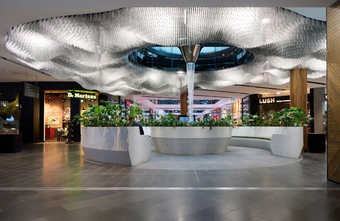
The installation is a stunning, refined and poetic piece. An expanse of anodised tubes form an undulating cloud, surrounding a cascading water feature. The observer experiences dappled light that filters through the moire of suspended tubes like the sun through a cloud. Perhaps the installation’s best measure of success are the intrigued shoppers, phones in hand, getting photos for their socials.
The installation covers 158sqm of ceiling space. A modular cassette grid system provides suspension points for the tubes. The tubes feature an integrated clip to connect to cassette, the cassette allows access to the ceiling void behind if required.
During the design phases, Australia experienced it’s largest earthquake in 50 years. With seismic concerns at the front of everyone’s minds, the suspension system not only need to be easy to install but also more than sufficiently robust.
Across the 158sqm piece, 6.5 tonnes of aluminium were used, with 26,000 individual tubes contributing to the dappled light effect. The installation was completed two weeks ahead of schedule, and under the anticipated budget. This was in part achieved thanks to two separate teams of four workers, each working around the clock to create the piece.
SECOND PLACE: Lotus Lake, Israel by Aqua Creations, Israel
THIRD PLACE: Super Bloom, UK by Nipek Lighting Design Collective, Singapore / Beam Lighting
PROJECT DETAILS
Lighting Design: Jan Flook Lighting, Australia
Client: Westfield Highpoint
Architects: Carr Architects, Australia
Additional Design: Specialist lighting and services: ADP consultants | Developers: GPT Group | Water management and fountain: H2o Designs
Main Lighting Suppliers: Jan Flook Lighting (custom)
Jonathan Coles Studio was invited to tender for the detailed design and development of a special lighting installation as part of the interior lighting of the Battersea Power Station brick washtowers. The original design, which found inspiration in the forms of powerline insulators, was developed by the lead lighting designers for Battersea Power Station, Speirs Major.
“We worked in close collaboration with Speirs Major. Their design referenced power generation – using the dials, gauges, cables and powerlines as a starting point. I liked the idea of repurposing a form or material that would never normally make its way into a decorative setting. The evocative colour of the glass drew me in, both in its natural raw beauty and in its ability to insulate thousands of volts” Coles said.
Initially looking at reclaimed glass insulators
Jonathan Coles Studio then worked with a glass craftsman to experiment with forms and colours, finally putting together working prototypes. When illuminated they discovered the glass threw a stunning array of ethereal light patterns around the room.
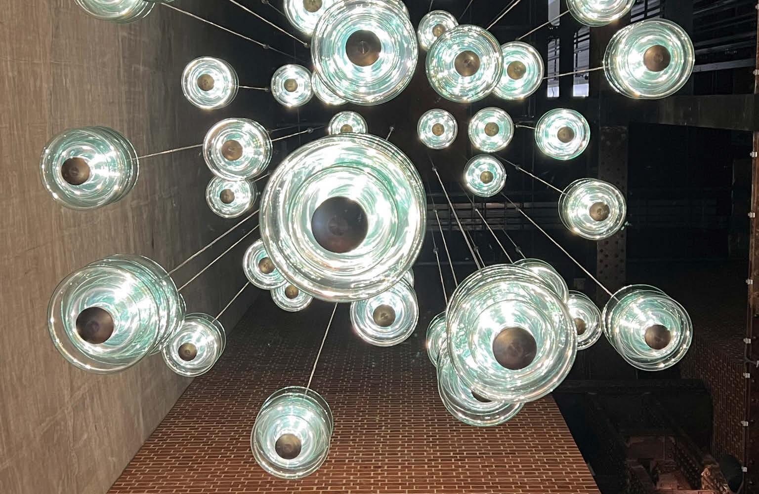
The final design was assembled in spines of three discs with the cumulative effect of the
stacked glass heightening the intensity of the green colouration of recycled glass. 200 of the lights have been hung at various heights in each of the four 30-metre towers.
The sense of dynamism of the installation is startling, and set against the bare brick and concrete of the towers, it illustrates the unexpected beauty found at the heart of industry. A mesmerising feast of voltage, the lights and their projections evoke a flow of energy spiralling upwards through the void of the towers.
Whilst all chandeliers can be viewed from the ground, the 15sqm glass lift in the power station’s northwest chimney brings guests a new vantage point as they scale the towers alongside the chandeliers, ending their journey 109-metres above the ground with a panoramic view of London.
The hugely anticipated Battersea Power Station development was opened on Friday 14th October 2022, finally unveiled fully to the public after many years’ work. Inside each of its four iconic chimney towers is a virtuoso display of light and glass, a tribute to Sir Giles Gilbert Scott’s masterpiece.
SECOND PLACE:
18 Palms, Singapore by Aqua Creations, Israel
THIRD PLACE:
#freedomchains Pavilion, Singapore by DP Lighting, Singapore
Lighting Design: Speirs Major
Client: Battersea Power Station
Architects: Wilkinson Eyre, UK
Main Lighting Suppliers: Jonathan Coles Studio
Returning for its 23rd edition, the 2022 Lights in Alingsås festival took place from 30 September to 6 November, bringing students and senior lighting professionals together in a celebration of light.
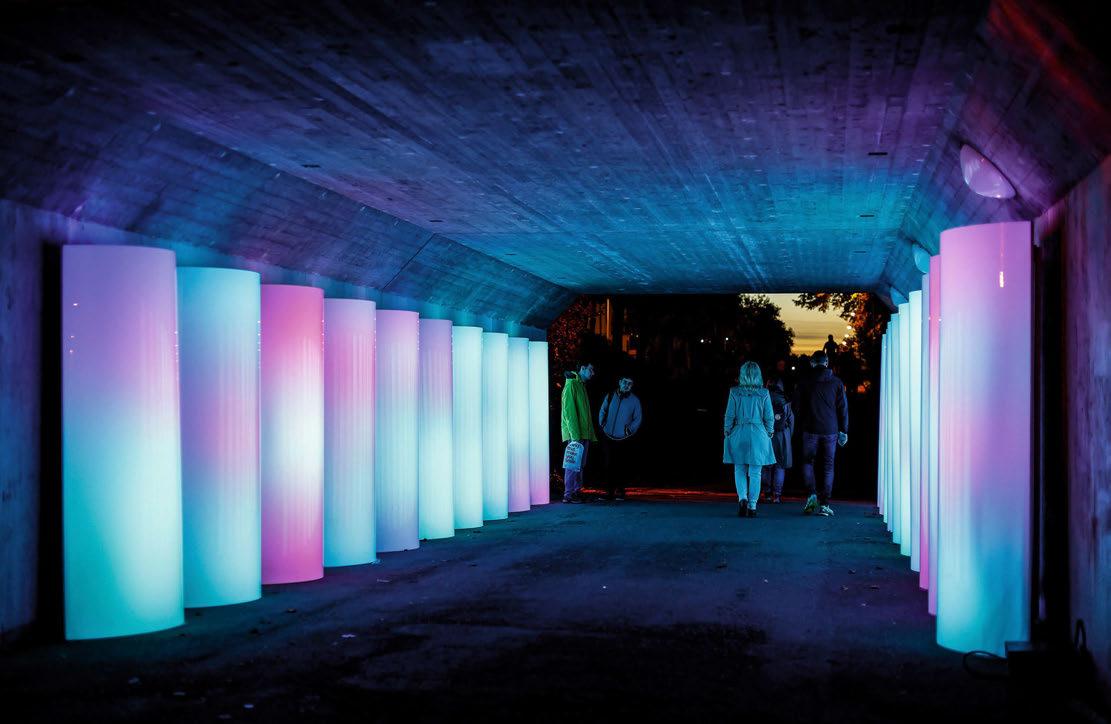
The theme for the 2022 edition was Only One Earth. 7.9 Billion Reflections. According to organisers, “Reflections is a word that symbolises the very origin of change. When light is reflected, it spreads, and even changes course. Just like when we reflect on a thought and that thought generates new ideas, dreams, and insights. This year, Lights in Alingsås wanted to illuminate the endless possibilities encapsulated in the reflections of 7.9 billion people”.
Six installations were crafted for this year’s event, each created by teams of lighting design students and orchestrated by prominent lighting designers who acted as workshop heads. These workshop heads worked with lighting design students from KTH Stockholm and JTH Jönköping, and electrical engineering students from Alströmergymnasiet i Alingsås on sites across the town of Alingsås.
SECOND PLACE:
Hermès’ collections - Milan Design Week 2022, Italy by L’Observatoire International
THIRD PLACE:
Noor Riyadh by Riyadh Art Curators: Hervé Mikaeloff, Dorothy Di Stefano, Jumana Ghouth, Arnaud Morand
Organiser: Alingsås Energi
Main Partners: Meike Goessling; Jonathan Plumpton, Principal of Jonathan Plumpton Lighting Deisgn; Kay Flounders, Senior Architectural Lighting Designer at WSP; Martina Alagna, Marketing and Business Development Manager at Linea Light Group; Berry van Egten and Ellen Goulmy of BXLD and the Lighting Design Academy in the Netherlands; and Michela Bonzi and Jörg Frank Seemann, Lighting Design Partners at Lucespazio
Main Sponsors: Cariitti, Color Kinetics, Control Dept, eCue, Effekljus, Fergin, Filix, Fox Belysning, Griven, iGuzzini, Luxlight, Martin/ Harman, Meyer, Philips Hue, Roblight, SGM, Signify, Stockholm Lighting, and Traxon
The Radiant RAD 180 Inground WE IP 67 is a customisable water effect luminaire originally developed with MBLD for use in the W Hotel Algarve project. The 100mm deep luminaires used for the project incorporated 12 high-power LEDs in a mix of whites and blues controlled by an integral eight-channel DMX driver. The decorative, dynamic lit-effects are achieved with a combination of light engines incorporating a matrix of various colour temperatures and colour LEDs, complex multi-channel DMX controlled dimming sequences, and textured glass panels. Each uplight luminaire provides up to 1,500 lumens per metre but this depends on the mix of LED colours and colour temperatures, the textured glass used and varies during the dimming control sequence.
The gently changing patterns of light formed by the textured optics can be modified for each project by adjusting the DMX controlled LED sequence, the LED configuration, and the type of textured glass panel.
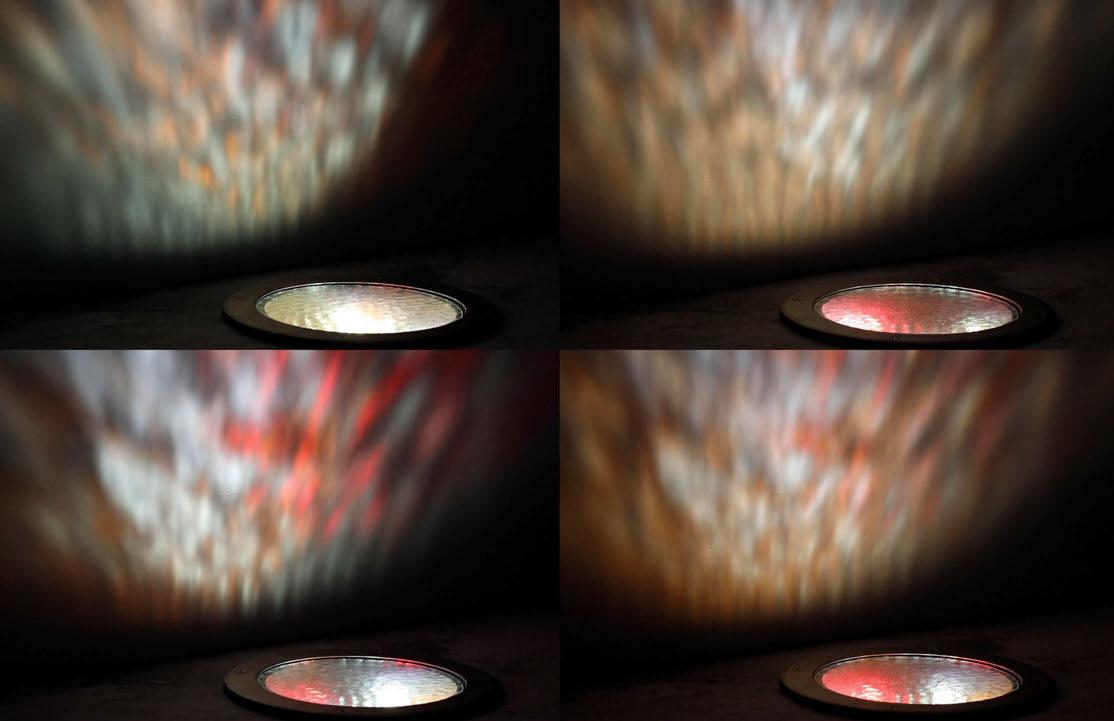
The luminaire comprises a durable walk-over rated glass window with anti-slip details, a machined 316 L stainless steel bezel, machined marine grade aluminium body and a molded housing, which contains the luminaires, separate driver enclosure, and junction box.
The overall depth of the luminaires used for the W Hotel project was only 100mm to allow for site conditions. A 300mm deep version with a single luminaire and driver configuration is also available for projects where there is no depth limitation.
SECOND PLACE:
LD50 Path Light – LightGraphix
THIRD PLACE:
IP System – Simes
FOURTH PLACE:
Exterior Niche – Stoane Lighting
FIFTH PLACE:
Flo Pool – KKDC
SIXTH PLACE:
Chameleon – ewo
SEVENTH PLACE:
BRW3 - Harte Outdoor Lighting
EIGHTH PLACE:
Skin Asymmetric – Linea Light Group
NINTH PLACE:
Monospot S – Willy Meyer
TENTH PLACE:
Ultimo Neon 10 3D – LEDFlex Group
A highly versatile, powerful, adaptable, and modular interior projector. Occular Axis features the capability to adjust on multiple axes (18° tilt, 360° rotation, 80mm extension), combined with Phos’ interchangeable baffle system, which can be finished in any colour, multiple LED type variants and is available in three different sizes (Nano/Standard/Maxi) –making this the most adaptable range within Phos’ product portfolio post-installation.
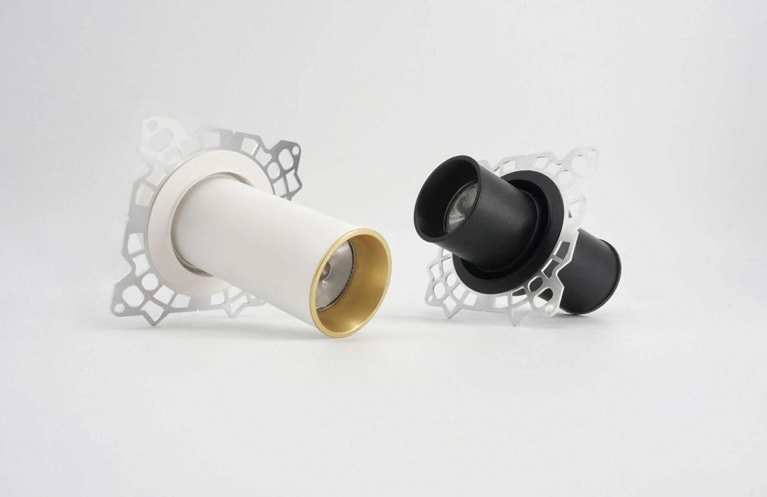
The body, ingeniously, is also the heatsink for all the Occular Axis variants. Delivering up to 1650 luminaire lumens, featuring easily interchangeable optics of 10°, 15°, 20°, 25°, 30°, 35°, 40° and 50° – all of which can accept Phos’ honeycomb anti-glare louvres, for tighter beam control and refined visual quality.
90CRI as standard with the option to upgrade to our Dim-towarm, High Efficiency, Genesis and Genesis Tuneable LEDs (98CRI) enhancing the built environment.
SECOND PLACE:
3D LED Flex 40 WE System IP 20 –Radiant Architectural Lighting
THIRD PLACE:
Enigma – Maytoni
FOURTH PLACE:
Aria – DGA
FIFTH PLACE:
TruCurve – PureEdge Lighting
SIXTH PLACE:
Crystal – iGuzzini
SEVENTH PLACE:
Aero 313 – Future Designs
EIGHTH PLACE:
Aero Vanity Downlight – Aero Light
NINTH PLACE:
Applelec LED Light Sheet RGBWW –Applelec Lighting
TENTH PLACE:
Ziggy – Designplan Lighting
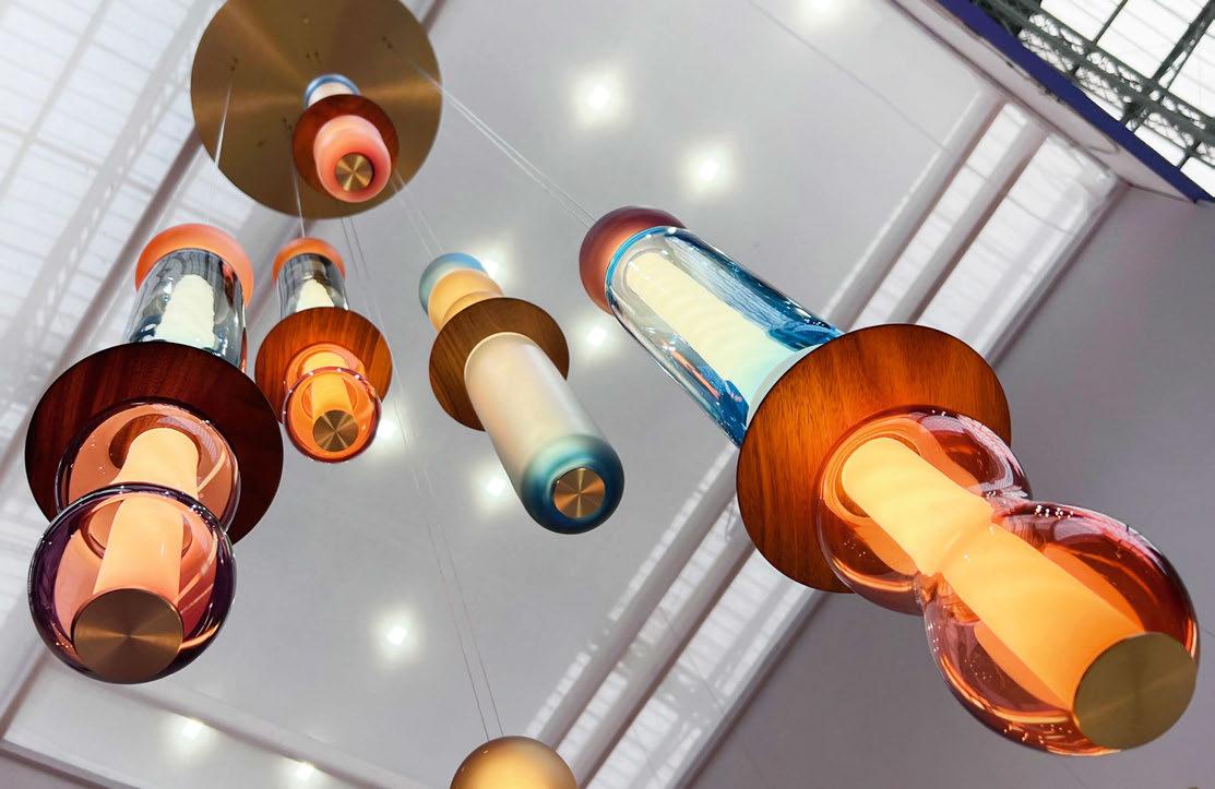
Combining the organic nature of free-blown glass with a modern aesthetic, Esther Patterson, founder of Curiousa, has pushed the boundaries and designed the Wave Collection, which includes six new lights, ranging from table lamps to vertical and horizontal statement sculptural lights. Esther said: “I wanted something that was modern and streamlined but held onto my natural bent for colour, the organic form and the ‘handmade’, something that would be interchangeable and repairable – to last a long time. Plus a piece that stands on its’ own as a sculptural entity in its’ own right – not just a light.”
Each element, whether glass, wood or metal has been carefully hand-crafted in the UK, then hand-assembled by the Curiousa Team in their Derbyshire workshop. Every piece of glass is unique as it’s free-blown, without the use of moulds, using just the skill of hand and eye to guide each shape. Careful precision and detail have been required as each glass piece is carefully ground and polished to fit perfectly together in an effortless line.
To create a floating soft beam of light, the Wave Collections uses LED technology. Each sculptural light houses a spiral of LED strips within a diffused tubular suspension, punctuated by solid brass end-caps, creating a beam of light that glows through linear stacked free-blown glass pieces. They are powered by low voltage currents through fine suspension wires creating a feeling as if they are floating on air.
With a choice of 22 colours, all Curiousa’s glass is made to order and freeblown in the UK, and all brass and wooden parts are sourced from small local workshops. It’s also important that these lights stand the test of time and are built to last. Each of these lights can be taken apart and each part can be replaced and refurbished.
SECOND PLACE:
Daydreamer – Ruta Palionyte & leva Baranauskaite
THIRD PLACE:
Crystal Spin – Preciosa Lighting
FOURTH PLACE:
LEGO Linear Luminaire – Symphony Lighting
FIFTH PLACE:
Ale BE T – Catellani & Smith
SIXTH PLACE:
ZTA.50.PLP – Stoane Lighting
SEVENTH PLACE: hymn – Ambientec
EIGHTH PLACE:
Kilter – Tala
NINTH PLACE:
Saliscendi – Linea Light Group / Stilnovo
TENTH PLACE:
Cono W – Catellani & Smith
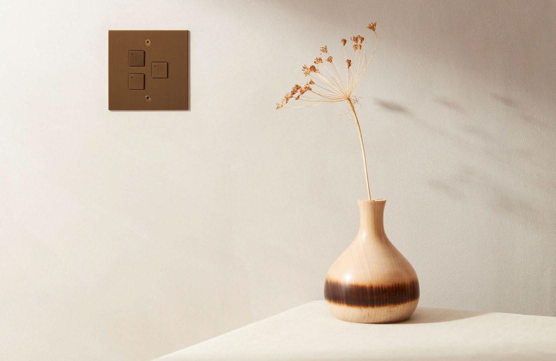
Focus SB presents its debut range of control switches for use with inline dimmers and smart home automation controls.
Developed to meet demand from luxury smart home integrators and designers, bespoke push button ‘Control switches’ by Focus SB can be configured to suit functions required, and are programmable with compatible third party lighting control or home automation systems, offering an aesthetically appealing modern alternative to proprietary controls.
Handcrafted and finished in-house, the new control switches feature the same functionality as Focus SB’s retractive (momentary action) switches with flexibility to include up to four buttons on a single and a maximum of eight buttons on twin vertical / horizontal faceplates. Button options include stylish square or circular to complement cover plate styles.
Control switches by Focus SB feature smaller terminals better suited to low voltage control cables, voltage free dry contacts and LED indicator programmable options in red (R), green (G) and blue (B) that work independently from the switch buttons.
Function settings can include multi-room audio, selection of lighting scenes, turning lights on and off when entering or leaving a property, raising or dimming lighting, opening and closing blinds, curtains and shutters. Also suitable for use with inline dimming packs (DALI and KNX systems require binary input). A voltage (V) terminal enables selection of the system voltage 20-48V and 5-20V.
The control switches fit in a 35mm back box that can be manufactured in-house. Offering precision detailing, square button control switches present a beautifully engineered minimalist angular design with switches finished to match the faceplate, including orientation of brushed finishes.
Paired with the True Edge faceplate style with its signature hand guillotined edges, the switches feature a maximum plate depth of no more than 2.5mm and can be laser marked with text or iconography.
Paired with Classic flat faceplate styles mirroring the radius corners offering a quality flowing circular button design option, faceplates can be laser marked with text or iconography below the switches.
SECOND PLACE:
Philips Hue 2022 updates – Signify
THIRD PLACE:
EOS Portrait Keypad – Rako Controls
FOURTH PLACE:
Pharos Cloud – Pharos Architectural Controls
FIFTH PLACE:
Helvar ActiveAhead – Helvar
The UK’s only dedicated lighting specification exhibition
A popular feature of the [d]arc awards party, we once again saw a series of light installations created by design partners and sponsors. This year, 10 pieces were inspired by the theme of ‘Film’.
As well as revealing the winners of this year’s [d] arc awards, one of the core components of the [d]arc night party was once again the beautiful light art installations, created by supporting design teams.
Each year, the design teams are given a theme around which to base their installations. This time around, that theme was ‘Film’.
From interactive pieces that encouraged audience participation, to ornate, sculptural works, each installation was inspired by the world of cinema, whether that be unique take on a classic movie such as Alien, Batman, The Matrix, or Alice in Wonderland, or a tribute to the moviegoing experience.
As with last year’s event, one of the core parameters for the design partners was to make their works as sustainable and eco-minded as possible. Part of the wider efforts by event organisers [d]arc media and Light Collective to make the night as carbon neutral as possible - an effort that included a fully vegetarian, locally-sourced food menu, environmentally conscious alcohol brands behind the bar and
no single use plastic on site - each design team had to provide a ‘Decarbonisation Statement’, outlining the efforts that they took to reduce their carbon footprint and create more sustainable works of art. Methods employed by the design teams ranged from using recycled luminaires and compostable materials, to reusing or repurposing the installation for future events.
Alongside the 10 installations created by supporting design teams, the awards party also featured two decorative installations from Signify and No Grey Area, as well as two sponsored photobooths from Linea Light Group.
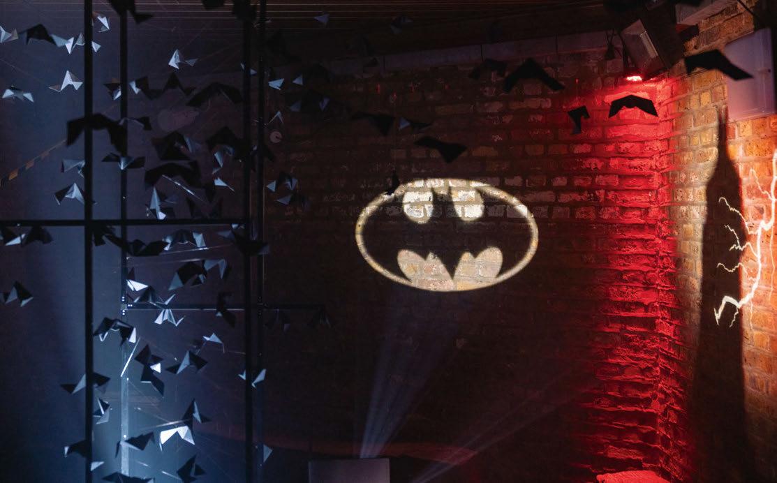
In Batman Begins Bruce Wayne falls down a well filled with bats, and when the colony is disturbed they swam up out of the well into the daylight, creating dramatic movement and shadow. The Lighting Design International and formalighting piece captures this moment with moving cool white lighting casting shadows through the installation’s bat swarm. This instance in the film creates some of Bruce’s fear of bats, leading to him becoming The Batman to provoke fear in the criminals of Gotham city. In the distance, the ‘Bat Signal’ is projected into the sky and Batman arrives in the shadows.
The fully immersive Fourth Wall installation by dpa lighting consultants and ELR sought to put the viewer in the place of the their favourite actors, by transporting them into some of the most iconicly lit moments in film history by bathing the participant in various colour palettes from the rich history of the silver screen.
The inspiration for the installation and each scene came from different lighting techniques used throughout the history of cinematography to convey a wide ranging sense of moods and emotions to the viewer.
Unique layers of light were used to set the mood within the installation, specific colours, lighting angles and effects tailored to each individually selected genre to set the scene. Directional uplighting and a deep green backdrop provided a visual effect eerily similar to early horror of the 1930s.
With a sudden change of lighting to vivid and vibrant oranges, yellows and blues, the warm, playful nature of hollywood musicals was achieved.
A dramatic twist to monotone white light and the use of a shuttered gobo meant that the participant became the star of their very own 1920s film noir.
Clockwise from above: Bruce Wayne’s Bat Incident by Lighting Design International & formalighting; Fourth Wall by dpa lighting consultants & ELR; Arch of Fame by Foster + Partners & Atea; Peep by Speirs Major & Tryka. Images: Gavriil Papadiotis, unless otherwise stated.Back to vibrant and electric colours, blues and magentas were used to bathe the person within the structure, mirroring scenes from a wide range of science fiction movies. Finally the stage is set for a classic action film, the participant is highlighted by two spotlights from the front and the backdrop is framed by flashing red and blue lights.
When the structure was not cycling through classic movie scenes, the unqiue perforated design on the structure and the internal lighting element created the sparkle and ‘wow’ factor associated with Hollywood.
For the structural framework of their installation the design team went to think quite literally ‘outside the box’. A [d]arc awards classic ‘the scaffold cube’, was re-imagined into what appears as one floating infinity loop; a thin frame that seemingly balances on its two sinusoidal throughs with all lighting equipment neatly concealed within.
Inspired by the magic of movies, Foster + Partners and Atea Lighting collaborated to create the Arch of Fame installation. Imitating the three-point lighting technique used in cinematography, the structure creates a portal to the movie set by filling a brick archway with light. Stepping into the arch, visitors are transformed into the lead characters of their favourite films, as the pixel-controlled luminaires mounted on the arch shine coloured light on their faces, creating dynamic and immersive effects.
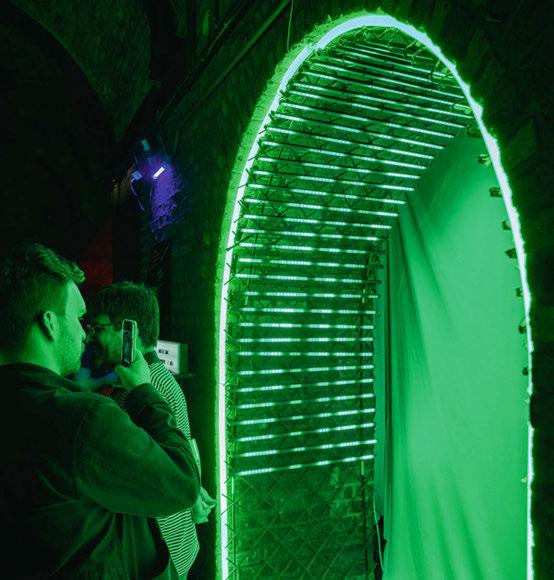
The Romulus profiles mounted along the arch were animated using patterns and colour palettes inspired by movies. The Matrix, Blade Runner, Kill Bill, and Star Wars were some of the cinematic references the visitors could immerse themselves in. The Neo 360 fixtures, mounted to follow the contours of the architecture, smoothly transitioned colours between scenes, creating a seamless flow of moods and atmospheres. Additionally, two adjustable Totem Optic linears were positioned behind a fabric backdrop to complement the set-up of the installation. The Madrix Lighting Control system allowed for a high degree of control over the lighting effects, providing customised and flexible programming.
To prioritise sustainability and minimise environmental impact, the Arch of Fame utilised natural materials for its structure, including wooden trellis and planks. This approach allows the structure and lighting fixtures to be separated and repurposed for future events and installations, providing a cost-effective and environmentally responsible solution, and ensuring the longevity and versatility of the installation’s components. The installation will be re-installed as part of future events at Foster + Partners, and exhibitions such as the London Open House and LiGHT 23.
Speirs Major & Tryka - Peep
Peep invites onlookers to experience the world through the eyes of a Mad Hatter’s tea party guest, becoming immersed in a rotating kaleidoscope of life-size characters, abstract landscapes and secret messages, drawn from the surrealistic world of Lewis Carroll’s Alice in Wonderland.
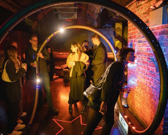

An unassuming timber box stands within a dimly lit room, peep holes flickering invitingly. Inside, a rotating core of full-height mirrors reflects and re-reflects the AI generated characters, revealing their stories of nihilism, joy, power, trickery and innocence. Suspended above the rotating chamber, a unique 3D printed bio-louvre manipulates the lit environment, adding texture and colour through a dynamic array of UV-enriched colour-changing LED nodes, and lending an almost hallucinatory quality to the experience.
Peep explores themes of voyeurism and unfolds the complex dynamic of observation. Through the eyes of the characters, the viewer becomes both subject of their own internal experience and object of the surrounding participants’ gaze. Encountered with curiosity by the many faces of Wonderland, Alice too must play both object and observer as she navigates her own vivid dreamscape.
The DesignPlusLight installation captured the consideration that movies make to both cinematography and sound, the importance of these elements and how they leave an impression in the memory of the viewer.
From the genius of KScape’s RGBW Rail, the design team was able to celebrate the luminaire’s unique design. The magic comes from the linear fittings containing a hidden sound system, which enabled the designers to blend the experience of both sound and light, seamlessly.
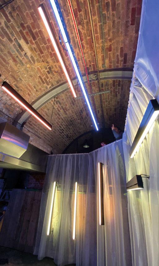
Julia Benford, Senior Lighting Designer at DesignPlusLight, said: “I’ve always been fascinated by the visual imagery and musical mastery of movies. I wanted to mix the soundtracks and colour tones of the ones I found the most moving.
“With the use of Casambi programming, the lighting and music were able to become one, creating its own profound experience.”
The installation playlist ran music from Blade Runner, Blade Runner 2049, Amelie, and La La Land.
In Blade Runner the blues and yellows have a bright electric hue, with moments of vivid orange or blood red punctuating the narrative. Benford continued: “Linking these colours with arguably the most famous moment in the film; where ‘Tears in the Rain’ begins to play, I wanted to extract these flavours and use them to illuminate the space, pulsing a second of red over the fittings with a background of blue and yellow.”
Blade Runner 2049 is another treat for any lighting designer, its colouration is deeper with amber hues juxtaposed by neon pinks and purples, then again
contrasted by a rough grey dystopian world. Using the more dramatic parts of the soundtrack deep blues and oranges were programmed to throb on and off on the most dramatic beats.
“Amelie is one of my favourite films from childhood, her innocence is framed with a watercolour of emerald and scarlet, I was able to lift and embrace these tones and work them between the soft piano notes of Yann Tiersen,” Benford added.
“Finally La La Land’s connection to the colours of violet and yellow cannot be ignored. For the start of the song, I took these colours and saturated them for a feeling of early afternoon and they would then fall into a deeper warmer purple sunset by the end of the mix.
“This was all possible with the help of Fiorella Riccardi and Tom Riby from KScape, as well as Sharon Stammers and [d]arc media for the opportunity to make something so wonderful and unique.”
The dynamic light art installation takes inspiration from the Batman comics and movies over the years and aims to tells a story using light, colour and moving elements. The light art installation goes through several scenes, a sunrise within the cityscape, to the city in danger and telephone ringing, to the bat signal shining in the sky and, of course, The Batman appearing on top of a skyscraper.
The different scenes were achieved using various luminaires, both colour changing (RGBW) and static white, and a motorised Batman that would appear and disappear.
Each luminaire and the motorised arm were individually controlled via DMX and by using a control software they were programmed into the desired sequences, to dim, change colour and strobe in order to tell the story. The effect was created using RGBW linear wall washer uplights for the lighting in between the buildings, that offered depth to the cityscape, static white spotlights to highlight different elements like the phone and the Batman silhouette, UV floodlight that revealed hidden writing on the wall, a gobo projector for the Bat signal and an internally illuminated box plinth for the phone.
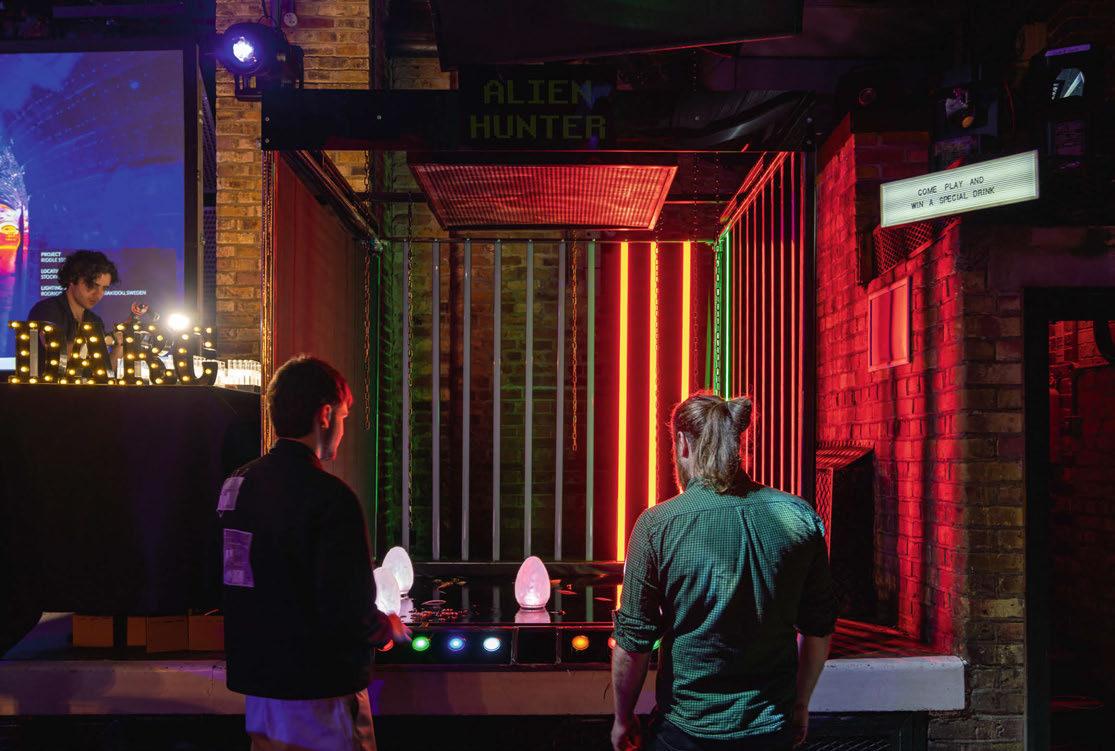
Ideaworks & LEDFlex - Alien Hunter!
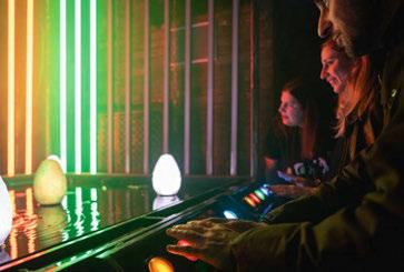
The concept for Ideaworks and LEDFlex’s installation was inspired by the film Alien and sci-fi arcade games such as Space Invaders, and with these ideas the team created a button bashing, egg smashing, two-player reaction speed game that they called Alien Hunter!
Although Alien was released more than 40 years ago its visionary sci-fi set design and portrayal of a resilient and empowered female protagonist make it a classic that stands the test of time. The film is set aboard an industrial spaceship called the Nostromo, and in one memorable scene inside a large dark mechanical space, in which chains hang and water drips from somewhere high above, the Alien, at first hidden in the shadows, descends to pounce upon one of the ship’s crew. Ideaworks and LEDFlex reimagined this mood within their lighting installation and used the chains and water as props to enhance the lit effect.
The team also drew inspiration from the minimalist light sculptures of Dan Flavin, and played with the way in which geometric light forms (the vertical bars of coloured light, also serving as a scoreboard) become distorted in reflection on chaotic surfaces such as rippling water.
Oliver Williamson, Senior Lighting Designer at Ideaworks, said: “It was brilliant to experience the fun and competitive spirit as guests at the [d]arc awards went head-to-head to extinguish the coloured eggs, make in onto the top scores of Alien Hunter and earn themselves a special glowing green cocktail.”
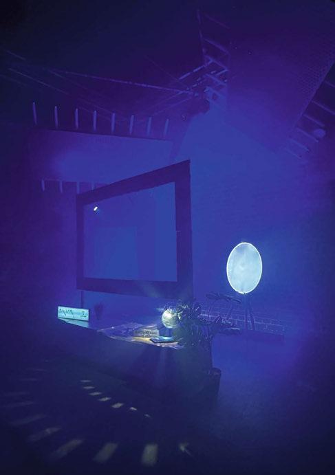
Clockwise from above: Vedo Ascolto by DesignPlusLight & KScape (Image: DesignPlusLight); Riddle Me This? by WSP & Kingfisher; Alien Hunter! by Ideaworks & LEDFlex.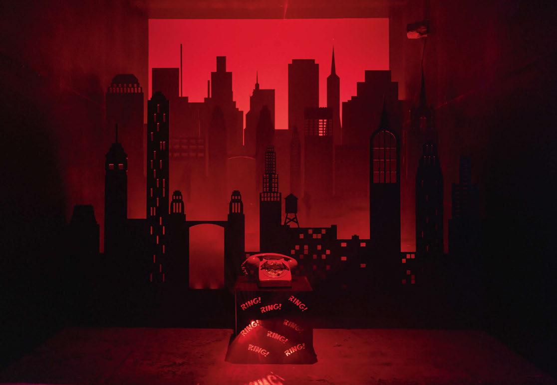
Buro Happold & Lutron - My Life is a Movie
Light is intrinsic to cinema. Supporting the characters and set in creating a mood, atmosphere, and storytelling. Be it the dramatic focused light and sharp shadows that create tension and the unknown in horror, the soft pastel shades and smooth gradients of natural lighting synonymous with romance, or the vivid neon colours that evoke a futuristic world in sci-fi.
Inspired by these film lighting techniques, Buro Happold and Lutron’s installation aimed to turn their [d]arc space into an interactive set. On one side, the film studio where attendees could become actors in their own movie. On the other, a home TV set up where the audience could choose from three distinctive film genres on their Lutron TV remote.
The Buro Happold lighting team’s sustainability ethos went hand in hand with the brief. All luminaires were existing samples and will go on to star in another movie. Most props were built using recycled cardboard or borrowed, however in one case where this wasn’t possible, materials will be easily repurposed. People are brought together over iconic films. This design team aimed to achieve the same with its [d]arc installation and create a memorable experience with the help from partner supplier Lutron Electronics, in collaboration with Applelec, Lumenpulse, and We-ef luminaires.
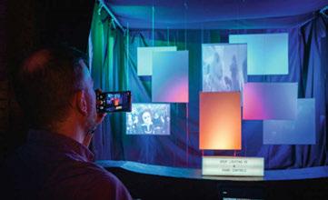
The Arup Lighting XE/Rako Controls installation utilised the team’s expertise with experience design, user interaction, lighting, and control systems to create an inviting and engaging experience. The team drew inspiration from some of the most the iconic movies from Tim Burton: Charlie and the Chocolate Factory, Alice in Wonderland, and Sweeny Todd. These were carefully selected for their richness and variety of colours. The interaction with the viewer was at the heart of the installation and the selection of these movies was triggered by viewer’s control. Additionally, given this year’s theme, image projection seemed like the perfect element to include for the installation – a harmony of light and picture that create the films we know.
Colour and light are the primary material of the installation: its concept is inspired by the “60-30-10” rule used by filmmakers to compose visually striking scenes. Essentially, the dominant colour (of various shades) is present in 60% of the frame, a secondary, complementary colour is present in 30% of the frame and the remaining 10% is an accent colour.
Colour grading choices are made in order to maintain a mood, direct the audience’s attention, and sometimes outright tell the viewer what’s going on, using colour as the vehicle for that message.
The stage where the installation was built effectively became a scene set wrapped by dark drapes and curtains. At the centre of this scene set, suspended white panels created the canvas that realises the installation concept. A series of linear LEDs were hidden behind the drapery folds so that only the lit effect was visible, and the light sources were carefully concealed. The set-up proposed by Rako had the ability to balance the composition of the colour and intensity while changing for each scene. This reinforced the effect and helped focus the viewers’ attentions on different areas of the installation while looking for different key colour and lighting details.
To further engage viewers and add a structure to the controls, the installation included a stand accessible to all viewers, where it is was possible to select one of the three films from a tablet. The selection would vary the
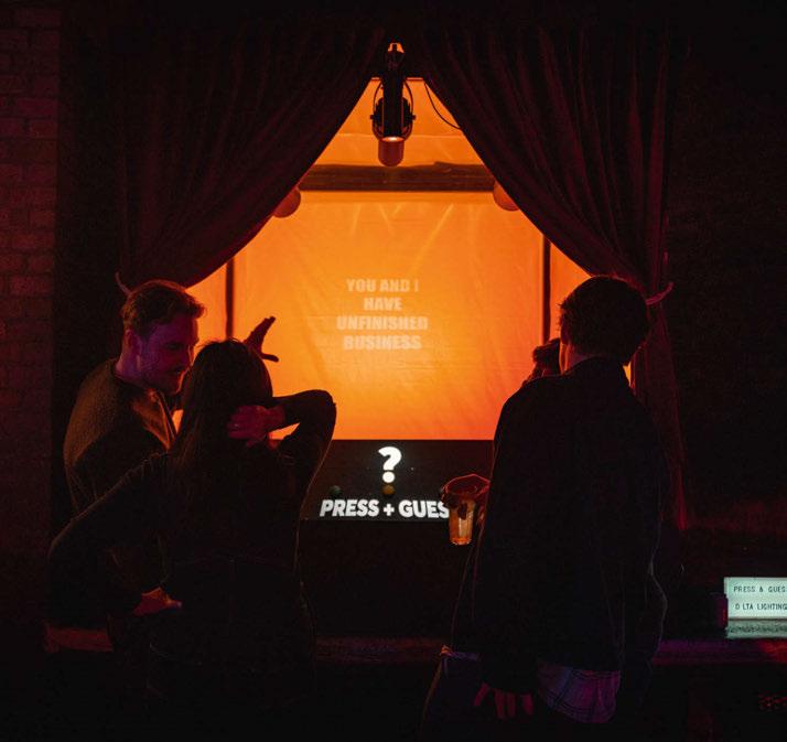
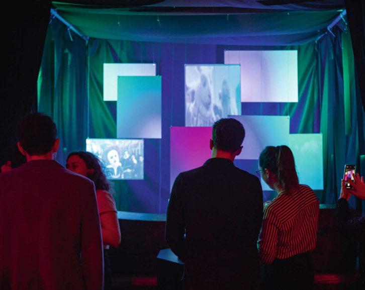 L-R: My Life is a Movie by Buro Happold & Lutron (Image: Craig Palmer, courtesy of Buro Happold); Eat Me, Burton by Arup Lighting XE & Rako Lighting Controls; Press & Guess by Delta Lighting Design & We-ef; Oceanic Glow by No Grey Area
colour scenes to appear on select panels. To reinforce the overall concept and supplement the colour scheme while making the scene more tangible, a small number of suspended panels hosted a series of image projections related to the selected movies. These projections were coordinated with the colour scheme and were able to change according to the movie selection. The result was an engaging and well executed installation bursting with colours and deliberate references to one of modern filmmaking’s best-known directors.
Delta Lighting Design & We-ef - Press & Guess

Press & Guess is an interactive light art installation that evokes a sense of playfulness and fun. The player is introduced to three push buttons, and upon pressing one, a sequence of visual lighting cues guides the player into the atmosphere of a movie. The challenge of the game is to guess the movie. The active participation of the player to this light art installation reminisces the fun factor of a child playing a game, bringing back that feeling of excitement and mystery we enjoyed when we were kids.
Press & Guess referenced three different movies – The Matrix, Avatar, and Kill Bill – each one being revealed through three subsequent scenes: colour projection, text projection and image projection.
The player is first presented with a colour associated to the movie. Colours transport us into another world, thereby creating a sense of time and place in movies. The use of colours in cinematography is a powerful tool to convey emotions, mood, and symbolism. Each colour palette sets the mood of the scene, and for each movie, the design team chose a distinct colour: yellow and orange, marine blue and crisp green. They chose yellow and orange to expresses danger and thrill, green to represent the futuristic, sci-fi theme, and blue to convey calmness and serenity.
Secondly, a relevant quote is projected onto the background wall, reminding the player of the famous dialogue from each movie.
Lastly, an image projection is introduced, completing the game sequence. Mirror side walls and carefully set scenes help enhance the visual impact of the movie.
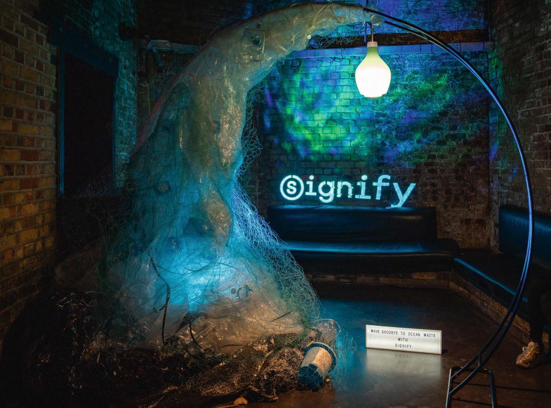
Signify’s decorative installation highlighted ocean waste and the need to preserve the beauty of coastal areas for the next generation. Repurposing plastics litter-picked from UK beaches, single-use plastic rubbish gathered by Signify employees, and discarded Cornish fishing nets, Signify created a giant wave, with a 3D-printed pendant from the Philips MyCreation Coastal Breeze Collection at its crest.
Between 10-46% of ocean plastics consists of fishing nets, lines, and ropes. These nets are often discarded in the ocean, endangering the lives of marine wildlife. Transforming this waste into 3D filament disposes of 4.5-metres of fishing net per luminaire. As well as reusing ocean plastic, Signify’s 3D printing process helps to reduce waste and contributes to a circular economy; there is no glue, fewer screws, and items are easy to disassemble and repair. With up to 76% lower emissions from material supply and manufacturing, and up to 28% savings in transport, it is the hope that 3D printed luminaires offer a lower carbon alternative to conventional manufacturing. For the Coastal Breeze pendant, original nylon fish nets were sourced from fishermen on the UK’s Cornish coast, and transformed by partner Fishy Filaments into granulate, the base material for 3D printing filament.
All materials used for the installation are from plastic waste that would otherwise have been disposed. After the event, the metal balloon arch will be donated for re-use, while the plastic waste will be sorted and taken to a recycling centre for processing.
An evening of wonder as we pay tribute to the epitome of modern cinematography interwoven with the global sustainability movement. No Grey Area’s contribution as a decorative sponsor of the [d]arc awards embodied the essence of the theme of the night and reflecting current global phenomenon.
Inspired by the cinematic masterpiece Avatar: The Way of Water, which has now earned its rightful place among the top three box-office earners of all time, No Grey Area’s fixture encapsulates the film’s key messages: the splendour of marine life, the shared compassion between human and mammal interaction, and the stark reality of the exploitation of ecosystems in the face of the global climate crisis.
Our coral reefs, among the most vulnerable ecosystems of all, are being displaced, and marine life is being disrupted. The fixture serves as a poignant symbol of the marine floor, showcasing its fragility and beauty in one captivating creation.
With the ingenious use of recycled chicken mesh, No Grey Area hand-molded fixtures that mimic the cluster of corals. 1,484cm in height and 2,382cm in width, these were then dipped in clay plaster and shaped to take form of real coral. With LED bulbs carefully placed within, the fixture illuminated the corals’ shapes and complexities, leaving a lasting impression on viewers below. www.darcawards.com
Wave Goodbye to Ocean Waste by Signify




 Supplier Partners