amyhirsch.com

203 661 1266
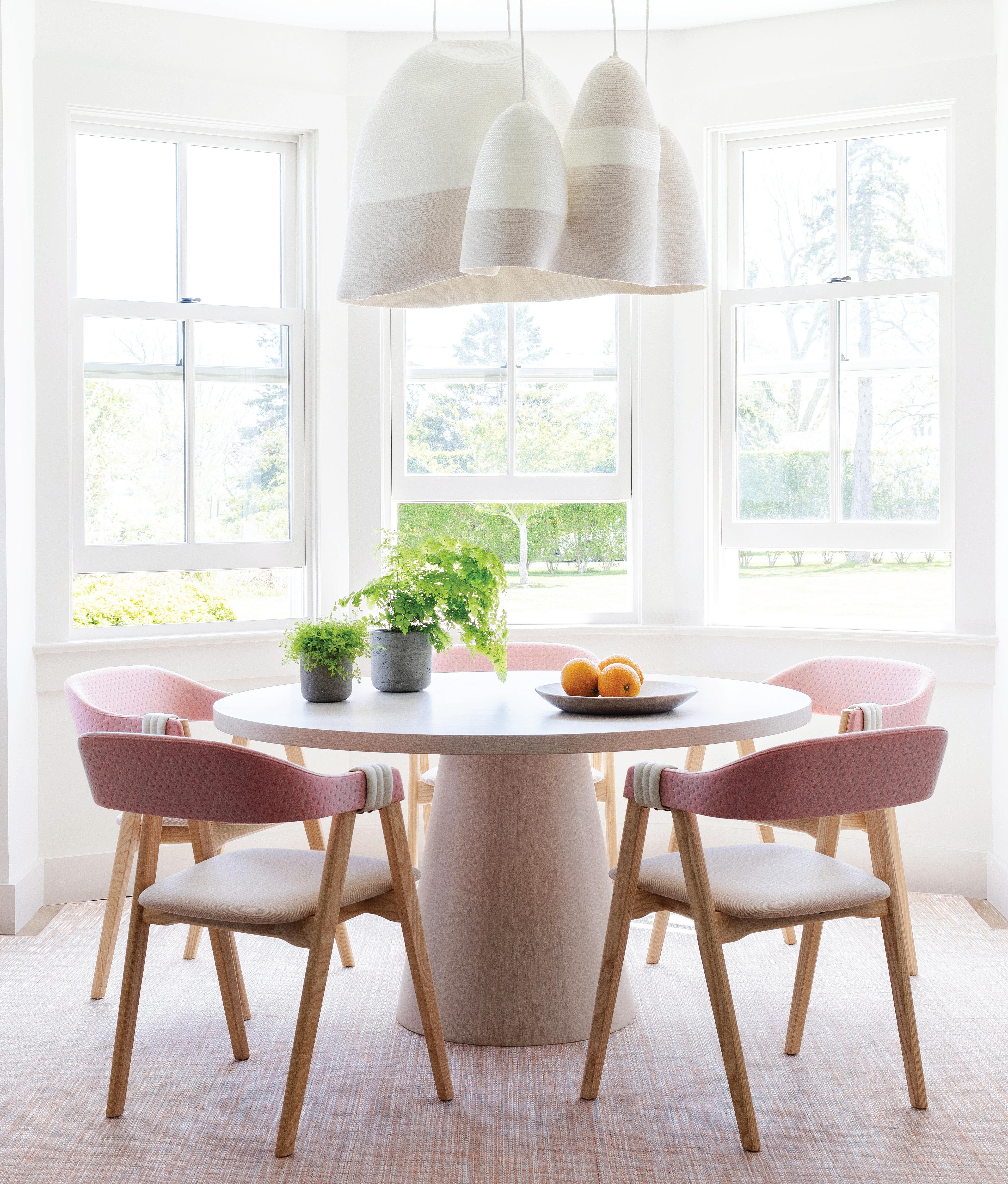
MY AIDINIS HIRSCH INTERIO R DESIG N
A
TEL. 203.622.7000 WWW.VANDERHORNARCHITECTS.COM 41 WEST ELM STREET GREENWICH, CT


CALL, VISIT A SHOWROOM, OR FIND US ONLINE TO SCHEDULE YOUR COMPLIMENTARY DESIGN CONSULTATION Connecticut 565 Westport Ave, Norwalk 203.924.8444 Westchester 16 Saw Mill River Rd, Hawthorne 914.592.1001 @caliclosetsct CALIFORNIACLOSETS . COM MAKE ROOM FOR ALL OF YOU ©2024 California Closet Company, Inc. All rights reserved. Franchises independently owned and operated. CT HIC #0657205. Photo: Stefan Radtke.


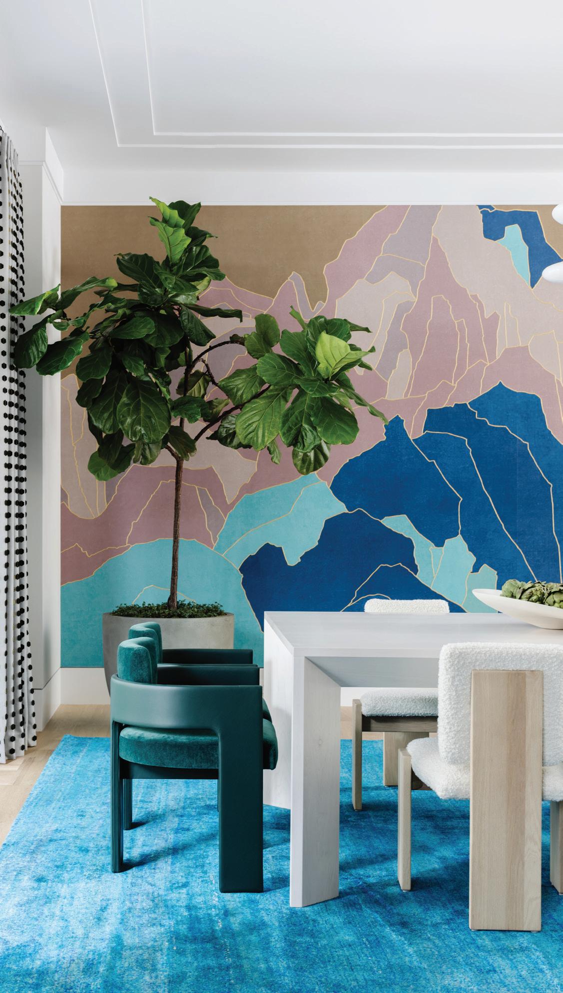

athomefc.com 6 features departments contents MAY/JUNE 2024 ATHOME IN FAIRFIELD COUNTY MAY/JUN 2024, VOL. 19, NO. 2. ATHOME IN FAIRFIELD COUNTY (ISSN 1941-9503) is published five times annually (Mar/Apr, May/Jun, July/Aug, Sept/Oct, Nov/Dec) by Moffly Media, Inc., 205 Main St, Westport, CT 06880. Periodical postage paid at Westport, CT, and additional mailing offices. POSTMASTER: Send address changes (Form 3579) to ATHOME IN FAIRFIELD COUNTY, PO BOX 9309, Big Sandy, TX 75755-9607. US subscription rates: $19.95/1 year, $34.95/2 years; Canada and foreign US$40/1 year, US$70/2 years. vol. 19 | issue 2 46 10 EDITOR’S NOTE A dining room by Amy Aidinis Hirsch Interior Design. 12 GET THE GOODS Color: Sky Blue; Geometric Patterns; Kitschy Kitchen 18 HAUTE STUFF Statement marble finds for the bathroom 20 GETAWAY Travel back in time to The Fifth Avenue Hotel on the cover doug vanderhorn, vanderhorn architects and stephanie woodmansee, henry & co. photography read m c kendree / jbsa stylist frances bailey 26 ROAD TRIP Modern Marvels driving tour 24 SHOP TALK Local design news, the latest collections, haute happenings and more 80 ATHOME WITH Norwalk artist Brian Kaspr 36 HUE’S THE BOSS Studio DB delivers the drama in Greenwich. 40 SPLASH PAD Laura Tutun dives in to create an inviting poolside retreat. 46 MAXXED OUT This sprawling Greenwich compound inspires vibrant vacation-living. 62 THE NEW FORMAL A classic Colonial home is packed with colorful surprises.

TISCHLER WINDOWS AND DOORS. UNCOMMON UNCOMPROMISING Six Suburban Avenue, Stamford, CT 06901 • Telephone: 203.674.0600 Builder: KVC Builders Architect: Shope Reno Wharton LLC TISCHLER WINDOWS AND DOORS. UNCOMMON UNCOMPROMISING Six Suburban Avenue, Stamford, CT 06901 • Telephone: 203.674.0600 Photographer: Jim Westphelan Builder: KVC Builders Architect: Shope Reno Wharton LLC
contributing editors
editorial director
Cristin Marandino cristin.marandino@moffly.com
editor, custom publishing
Elizabeth Hole elizabeth.hole@moffly.com
editor, new canaan•darien
Eileen Murphy eileen.murphy@moffly.com
editor, stamford
Melinda Anderson melinda.anderson@moffly.com
editor, westport•weston•wilton
Samantha Yanks samantha.yanks@moffly.com
art senior art director
Garvin Burke
garvin.burke@moffly.com
production director
Tim Carr
tim.carr@moffly.com
assistant art director
Lisa Servidio lisa.servidio@moffly.com
digital
digital marketing manager
Rachel MacDonald rachel.macdonald@moffly.com
audience development editor
Kaitlin Madden kaitlin.madden@moffly.com
digital assistant
Lloyd Gabi
lloyd.gabi@moffly.com
digital assistant
Jeffrey Garay jeffrey.garay@moffly.com
sales & marketing publisher, greenwich, athome, stamford, ocean house
Jonathan W. Moffly jonathan@moffly.com
publisher, westport•weston•wilton
Gabriella Mays gabriella.mays@moffly.com
publisher, new canaan•darien
Gina Fusco gina.fusco@moffly.com
account executive
Hilary Hotchkiss hilary.hotchkiss@moffly.com
account executive
Morgan Howell morgan.howell@moffly.com
partnership and big picture manager
Kathleen Dyke kathleen.godbold@moffly.com
sales assistant
Lemuel Bandala lemuel.bandala@moffly.com
business assistant
Eillenn Bandala eillenn.bandala@moffly.com
business president
Jonathan W. Moffly
editorial director
Cristin Marandino
business manager
Elena V. Moffly elena@moffly.com
cofounders
John W. Moffly IV & Donna C. Moffly
founding creative director
Amy Vischio

athomefc.com 8 vol. 19 | no. 2 | may/june 2024
PUBLISHERS OF GREENWICH FAIRFIELD LIVING NEW CANAAN • DARIEN • ROWAYTON WESTPORT STAMFORD and athome magazines 205 Main Street, Westport, CT 06880 . P hone: 203-222-0600; email: mail@moffly.com ADVERTISING INQUIRIES: Lemuel Bandala: call 20 3-571-1610 or email advertise@moffly.com TO SUBSCRIBE, renew, or change your address, please email subscribe@athomefc.com, call 877-467-1735, or write to athome in Fairfield County Magazine, 111 Corporate Drive, Big Sandy, TX 75755. U.S. subscription rates: $19.95/1 year (5 issues); $34.95/2 years (10 issues); $44.95/3 years (15 issues). Canada and foreign, US $40/year. Prices are subject to change without notice. ALL RIGHTS RESERVED No part of this periodical may be reproduced without express permission of the publisher. ©2024 athome in Fairfield County Magazine is a registered trademark owned by Moffly Media. The opinions expressed by writers commissioned for articles published by athome in Fairfield County are not necessarily those of the magazine. FOR QUALITY CUSTOM REPRINTS/E-PRINTS, please call 203-571-1645 or email reprints@mofflymedia.com editorial editor Megan Gagnon
editor
megan.gagnon@moffly.com advisory
Donna Moffly donna@moffly.com

the Contemporary Home
www.yankeecustombuilders.com Building
editor’s note / LIFE IN COLOR


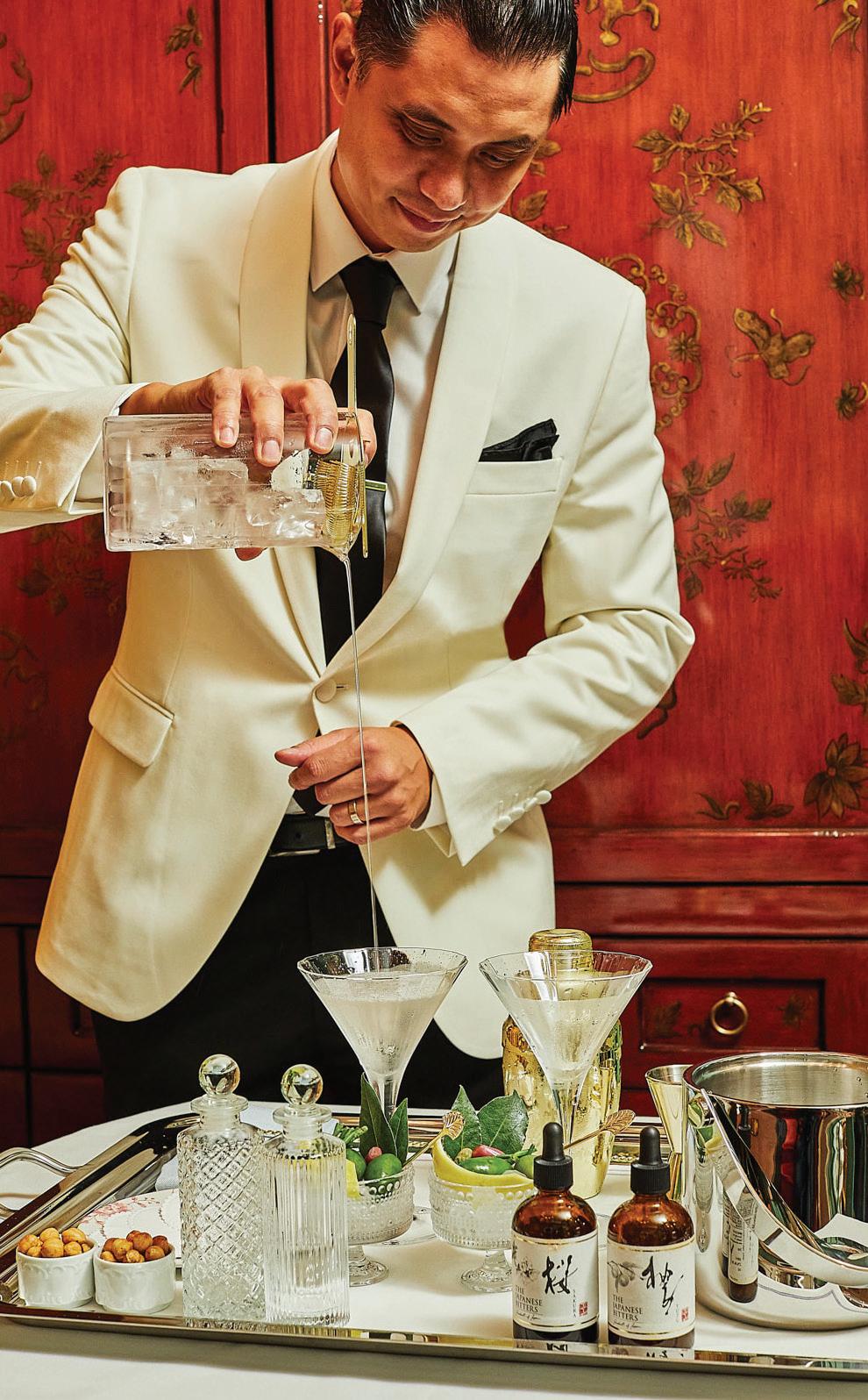
It feels like the efficiency experts are out to get me. Every day, there are new time-saving life hacks, apps to track productivity, calendars optimized to take advantage of every 30-minute window. I know AI will soon be on my case, making suggestions to maximize my workflow. But I’m not interested in hearing that. In writing about our latest Getaway (p. 20), I discovered that there’s a name for the existence that I aspire to. The Fifth Avenue Hotel—a new NoMad destination that feels like old New York—caters to those with the spirit of the flâneur; a lounger, a curious wanderer, an observer for whom time moves slow. Give me the hotel robe, give me the glamorous dining room (perfect for peoplewatching) with coordinating dress code, give me the martini butler at 5 o’clock. I know I could really master this lifestyle.
And I have a strong suspicion that all the homeowners in this issue embody that flâneur spirit as well. These are not people who are worried about minutiae. They are living colorfully, and they have the matching homes to prove it. There are the musicians in Greenwich who called on husband-and-wife partners Studio DB to transform their traditional living and dining room setup into a flexible entertaining space (p. 36). Benjamin Moore’s Bali covers the dramatic doubleheight room, creating a bold backdrop for both family gatherings and impromptu performances with friends. Laura Tutun already knew her clients were going to be game for splashes of color in their pool house (p. 40). After tackling their main house, complete with blue butler’s pantry, she came back to create a summer retreat that the family loves, regardless of the season. Back in Greenwich, a wise family put their trust in the capable hands of Amy Aidinis Hirsch and Doron Sabag of SBP Homes (p. 46). The pair—who finish each other’s sentences and tag the same slabs at the stone yard—understand what it takes to deliver a beautiful house. And these pros don’t play it safe. They know that the best payoff comes from taking the big design risks, pushing for the turquoise rug, the graphic mural wallcovering, the sculptural statement staircase. Finally, our last tour is courtesy of another dream team (p. 62). Both Doug VanderHorn of VanderHorn Architects and Stephanie Woodmansee of Henry & Co. were recruited to do what they do best. For VanderHorn, it was designing a brand-new Colonial Revival home that fits right in with the neighboring historical homes. And for Woodmansee, it was covering those classic interior walls in Gucci and Gracie, among other visual delights. Her work in the powder rooms—like the unabashedly feminine one on our cover—is reason alone to see this home.
Before I can get back to full-time flâneuring, I do need to remind you that our deadline for A-List Awards entries is May 31st. The event is always fabulous fun, and I encourage you to check out athomealistawards.com to see if you’re eligible. Even if we’re not serving martinis, I’ll be dressed up and ready to raise a glass to another year of winning design.
 MEGAN GAGNON Editor
athomefc.com 10
megan.gagnon@moffly.com
OPEN THROUGH MAY
ENTRIES
31!
the
home design competition awards
www.athomealistawards.com PHOTO: BOB CAPAZZO
premier


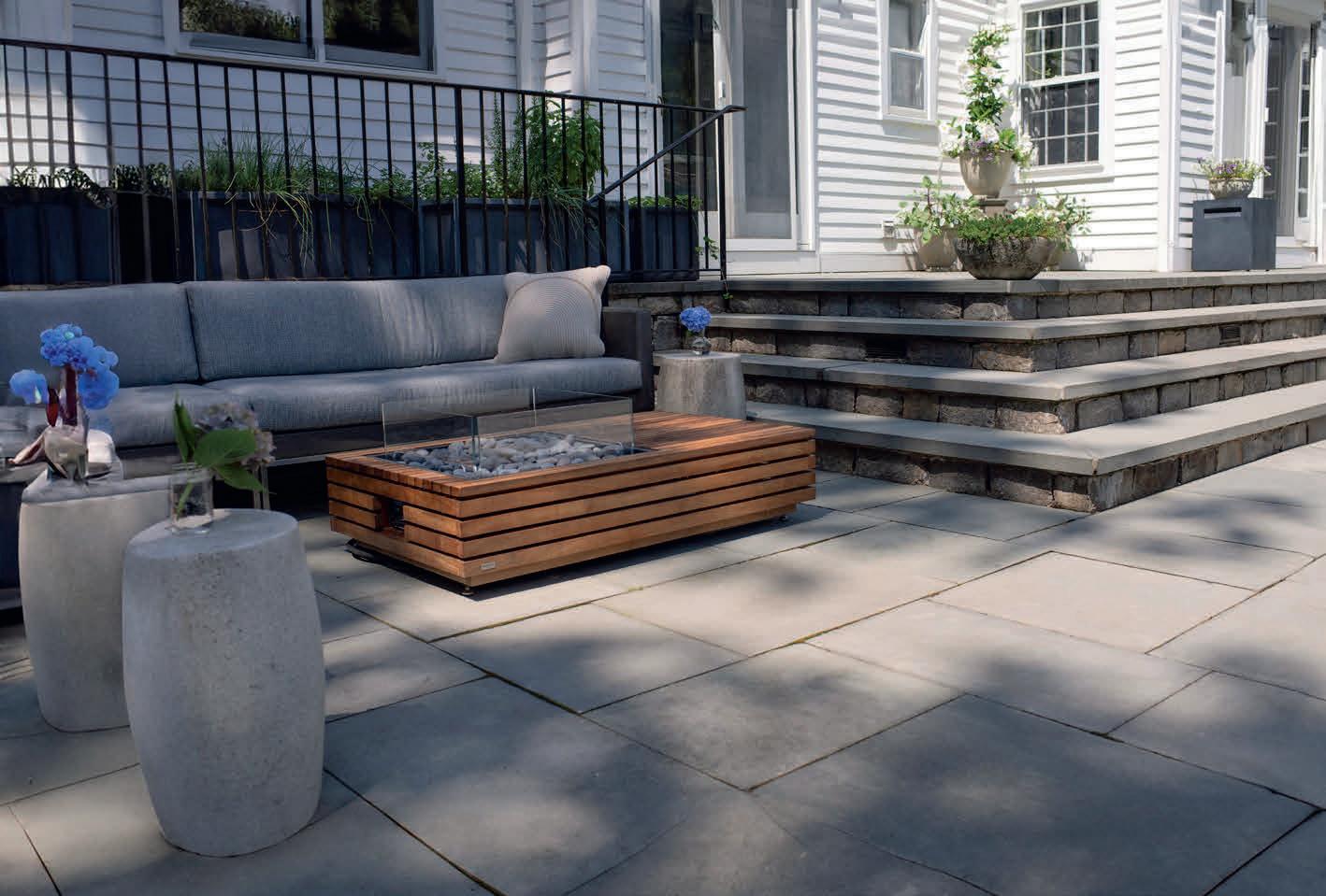

WESTPORT SHOWROOM 203.227.5181 gaultstone.com Exceptional Products, Personal Service. BETHEL SHOWROOM 203.790.9023 STONE & LANDSCAPE SUPPLIES
goods/COLOR
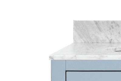


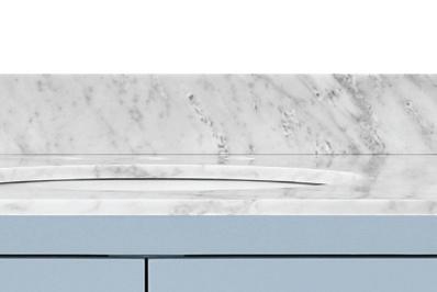


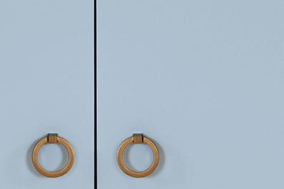
SKY BLUE SOARS AS SUMMER’S PRETTIEST PASTEL





WORLDS AWAY


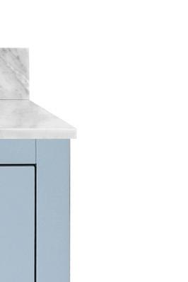
“as a coastal interior designer, a blue palette is my go-to for many spaces. i use the color ‘spindrift’ from my a la plage coastal paint collection for nearly everything. it’s the most perfect, palest shade of blue with a beautifully subtle amount of tint.”


THE URBAN ELECTRIC CO. Ace V.1; starting at $1,066. urbanelectric.com




perfect, bath vanity; $2,573.





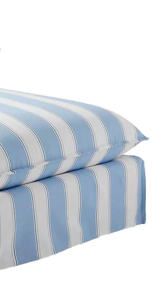
SERENA & LILY Sundial wide chaise in Hydrangea Port Stripe; $5,798. Westport; 6
serenaandlily.com




$19.95.


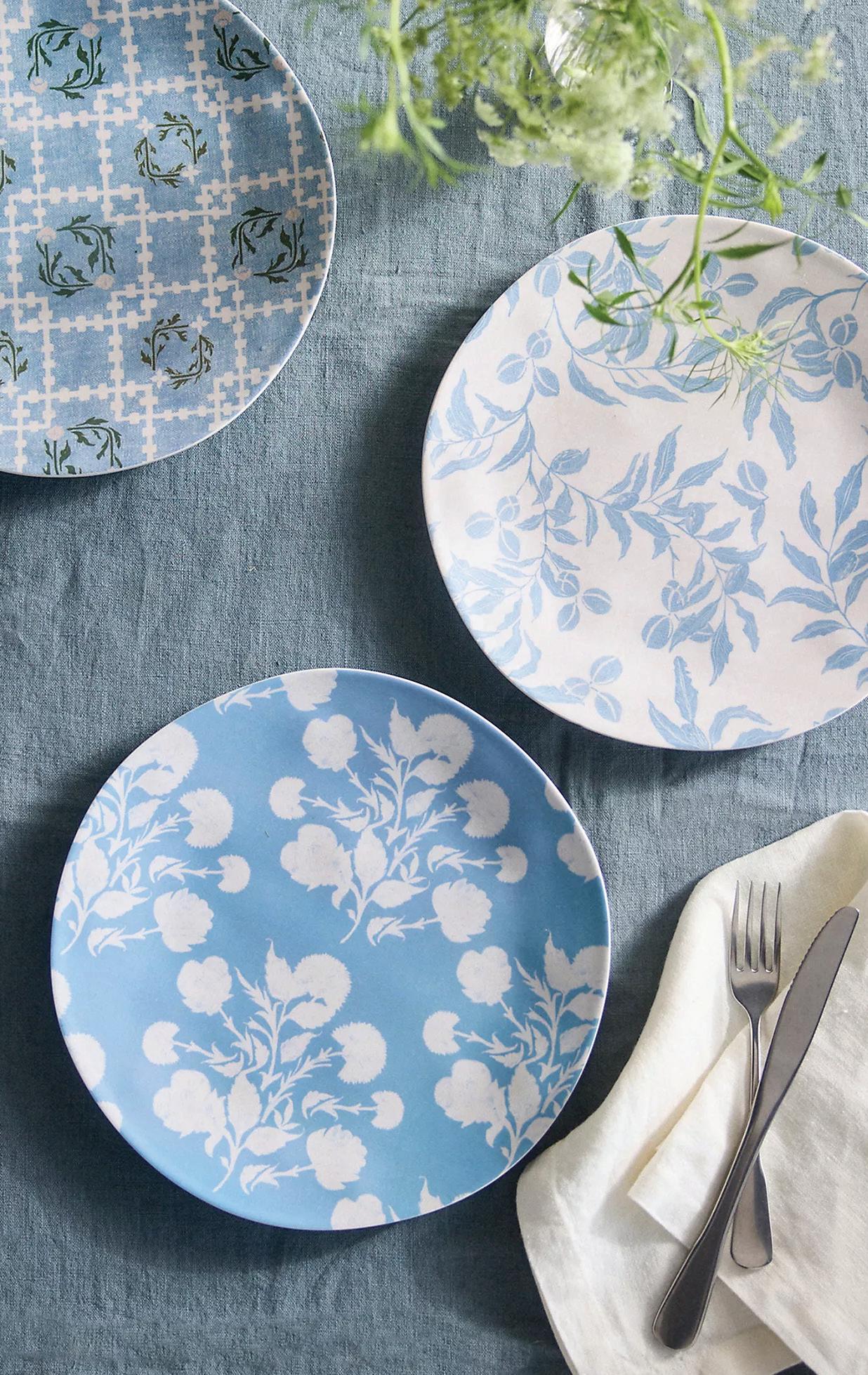
TERRAIN Lulie Wallace
plates; $36 for set of three. Westport; shopterrain.com 4




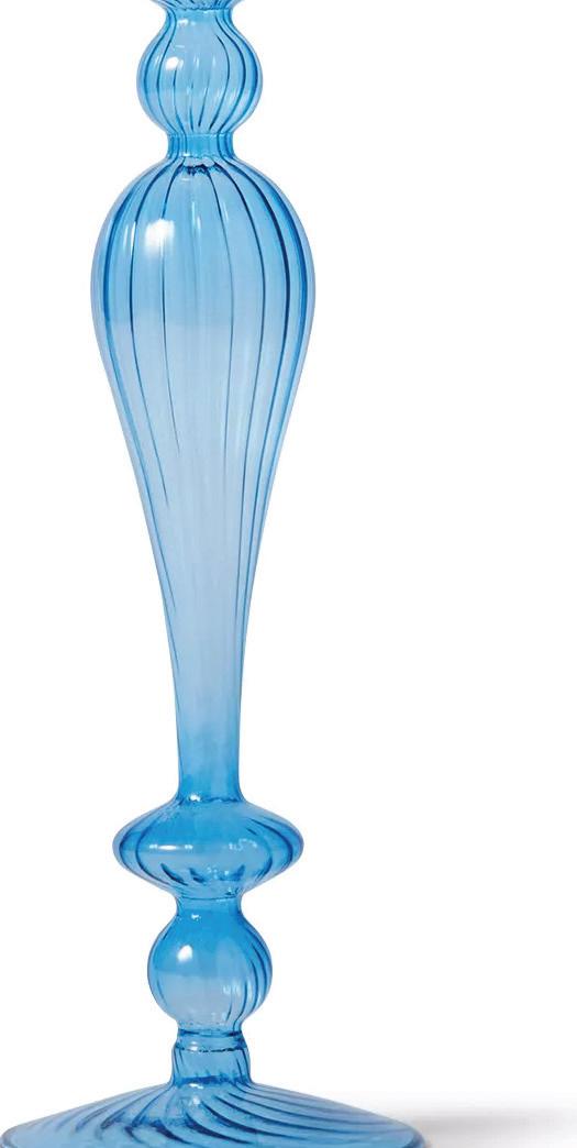
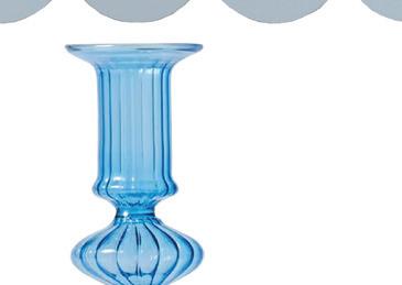
SUR LA TABLE Glass taper candle holder; Darien, surlatable.com







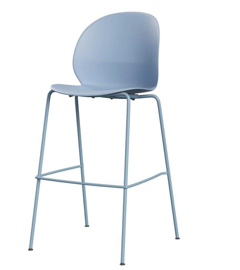
bar stool by

Nendo; $589. fritzhansen.com


Ladders


porcelain tile; $63.75 per piece. livden.com
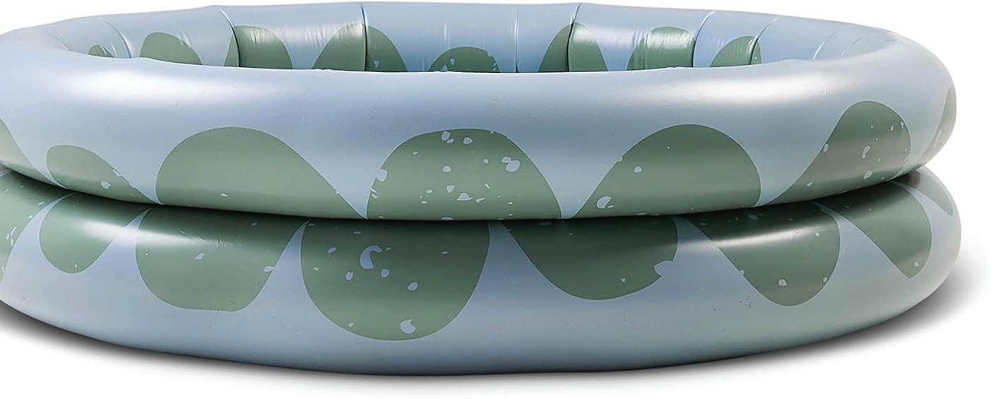
MYLLE Pond inflatable pool; $100. mylleshop.com



 by megan gagnon —gaelle dudley, gldesign
Kealey light blue Fig Linens and Home, Westport; figlinensandhome.com
melamine
OLOR
2
8
IMAGES COURTESY OF DESIGNERS/BRANDS


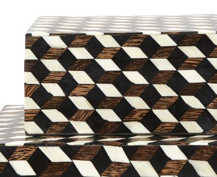
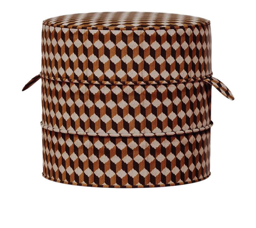
goods/GETTING GRAPHIC
ANGULAR ACCENTS ADD ANOTHER DIMENSION
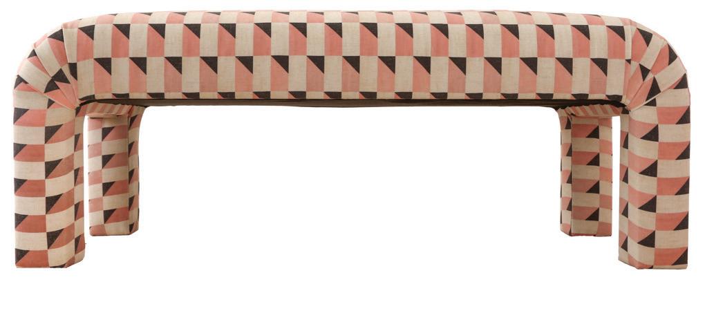
on flooring, either a painted or tile floor, especially in a powder room. it is so european-chic and has such a visual impact.”


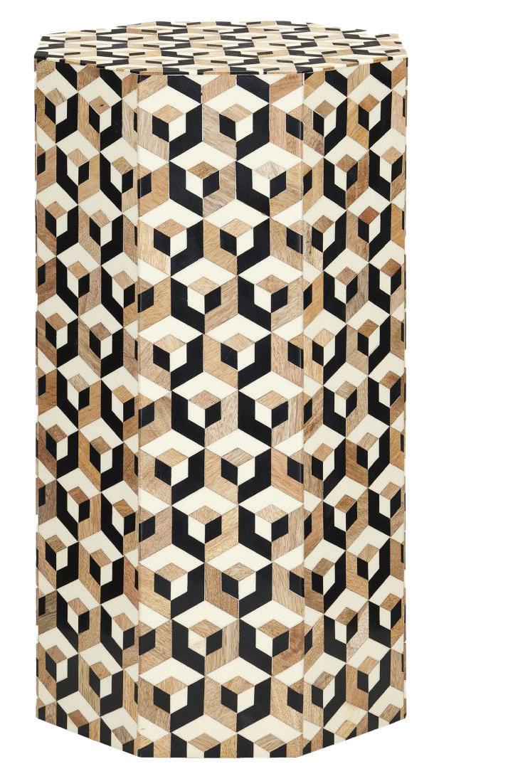
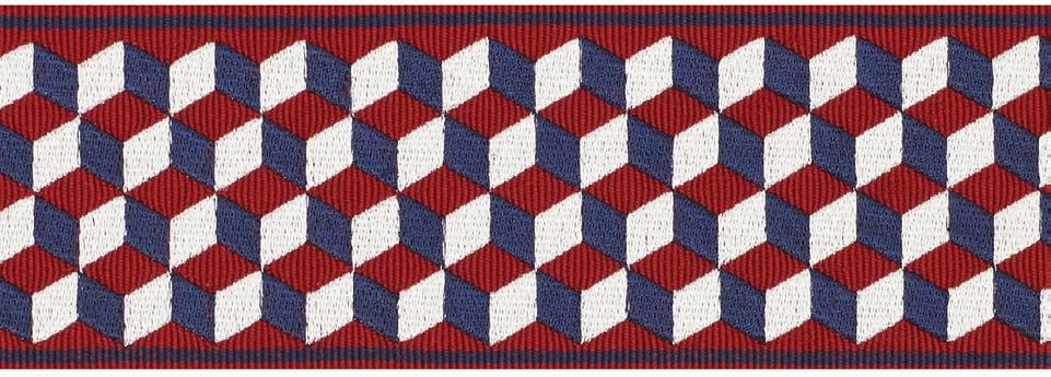









cadet blush; $749. kimsalmela.com $1,390. Beehive, Fairfield; thebeehive fairfield.com Tumbling Blocks tape; to the trade. schumacher.com


4 SOHO HOME Morrell dining chair in Elitis Farniente Monochrome; $2,695. sohohome.com

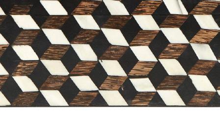


5 JAYSON HOME Tumbling Block boxes; starting at $195 jaysonhome.com


6 NICKEY KEHOE Hassock round stool; $2,000. nickeykehoe.com
7 OGGETTI DESIGNS Milano cocktail table; $7,249. oggettidesigns.com
athomefc.com 14 IMAGES COURTESY OF DESIGNERS/BRANDS
1
7
3
6
KIM SALMELA SCHUMACHER
4








Go ahead, try it out. Point your phone’s camera at the Flowcode to scan. MEET FLOWCODE, THE NEXT GENERATION OF QR CODES
goods/KITSCHY KITCHEN
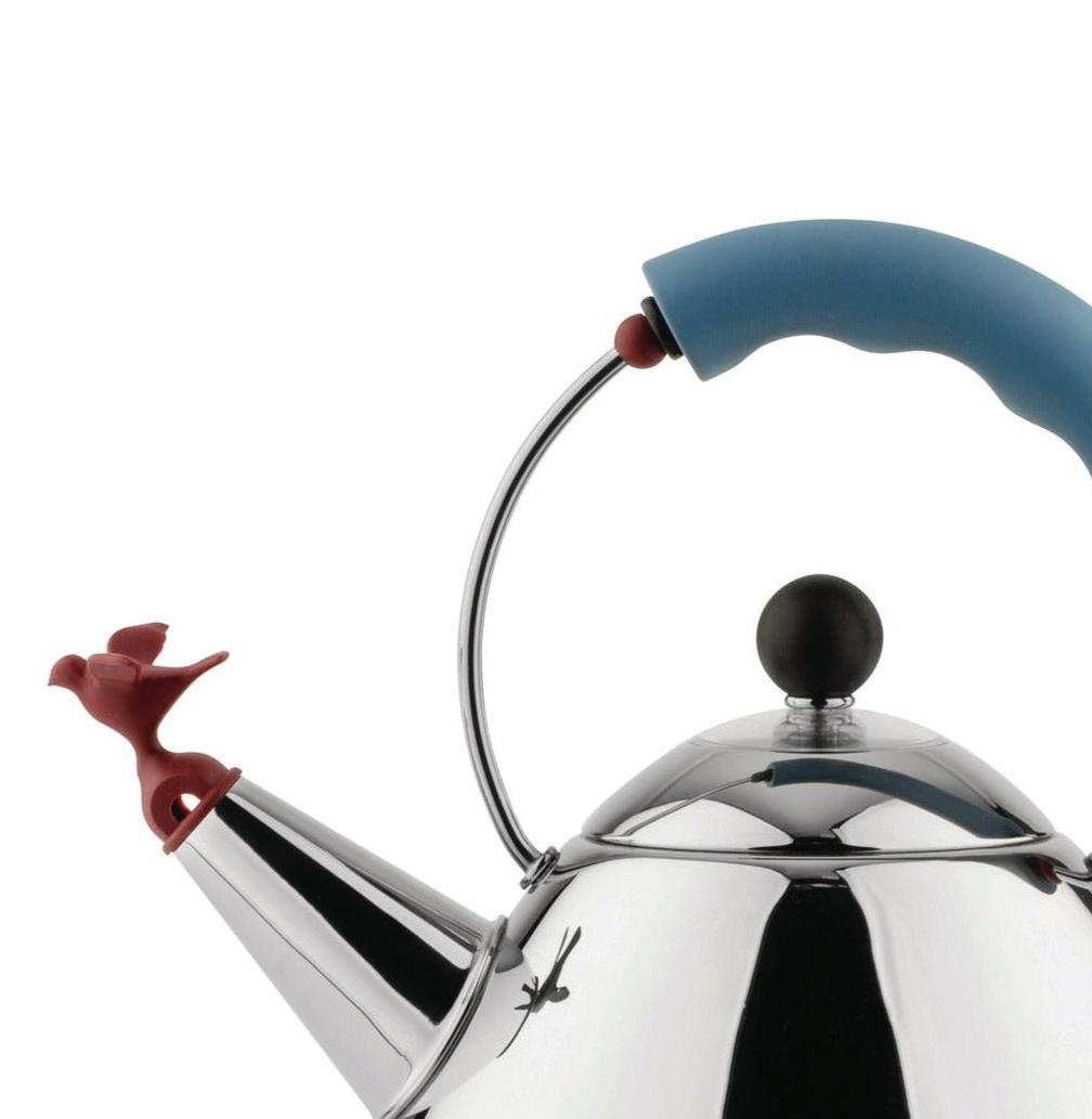




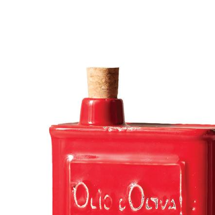
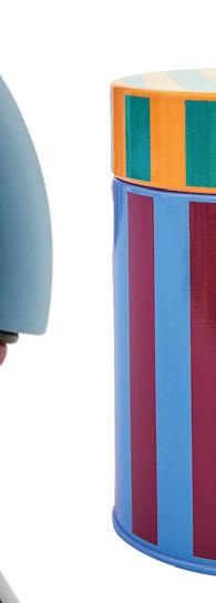





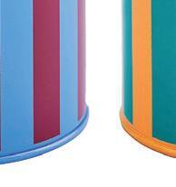


PLAYFUL COLOR IS YOUR MISSING INGREDIENT $45.
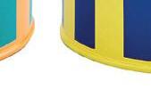


“just because the kitchen is a room with special appliances, doesn’t mean it can’t reflect the spirit and personality of the rest of your home. ‘let’s decorate!’ i always say.”





1 ALESSI
Kettle by Michael Graves; $215. Bloomingdales, Norwalk; bloomingdales.com





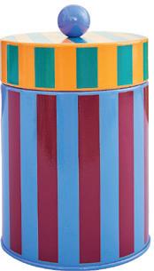
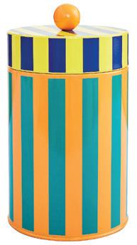
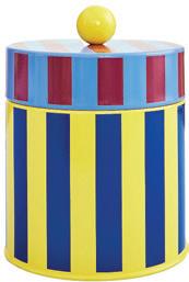
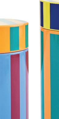
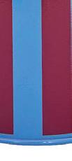
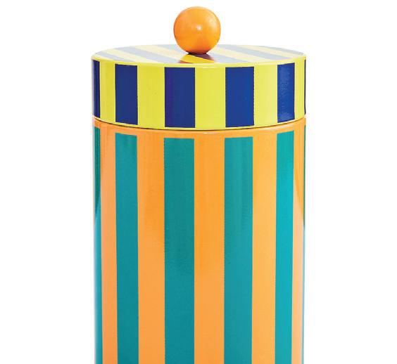
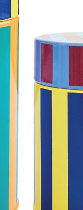
2 DUSEN DUSEN
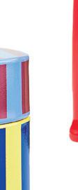
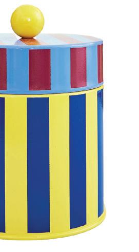
Striped canisters; $86 for set of three. dusendusen.com
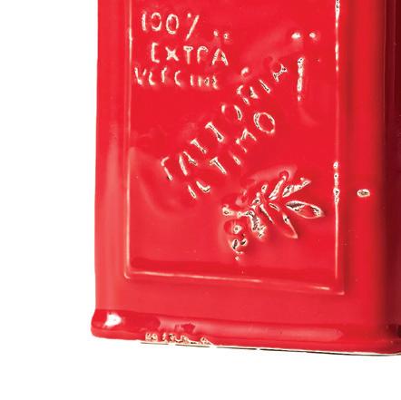
3 ANTHROPOLOGIE
Cucina olive oil cruet; $48. Westport; anthropologie.com
4 AUGARTEN WIEN
Croissant dish; $350. Eleish Van Breems Home, Westport; evbantiques.com
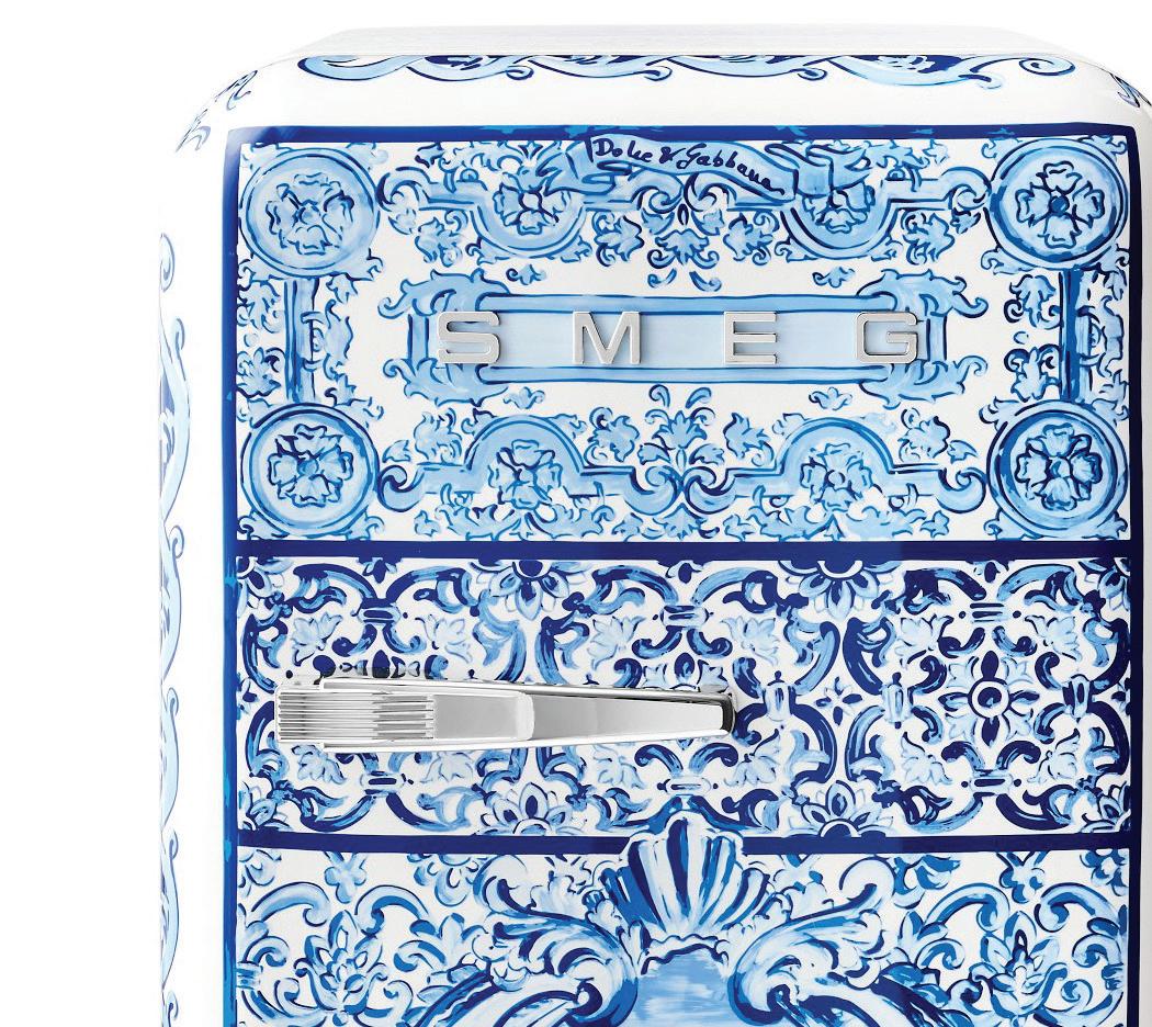
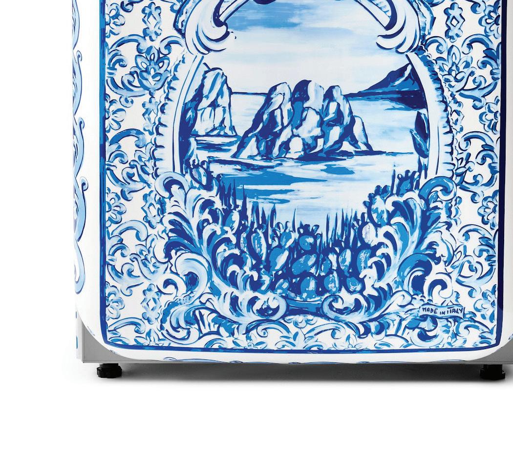
5 SMEG x DOLCE & GABBANA


Fab 5 refrigerator; $5,499.95. Williams Sonoma, Westport; williamssonoma.com
6 ADDISON ROSS
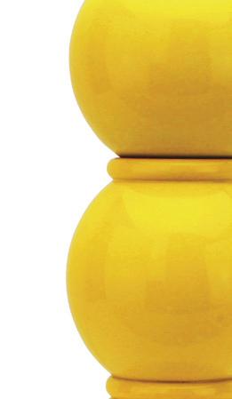
Yellow Bobbin salt or pepper mill; $96. addisonrossusa.com
7 SABRE
Bistro flatware; starting at $70 for set of five. Hudson Grace, Greenwich; hudsongracesf.com
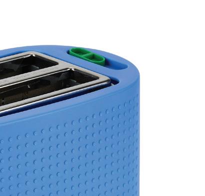
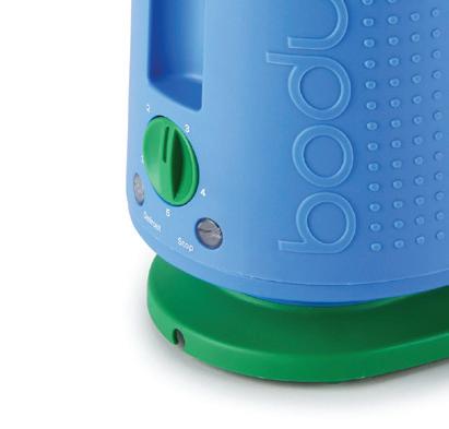
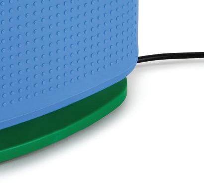
8 BODUM


Bistro two-slice toaster; store.moma.org


IMAGES COURTESY OF DESIGNERS/BRANDS
—robin henry, robin henry studio
2 3 5 8 1

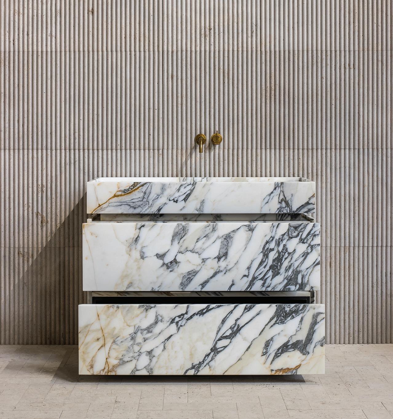
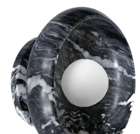
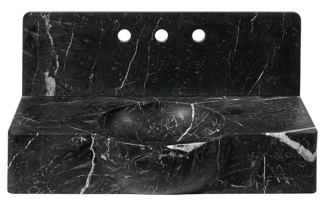
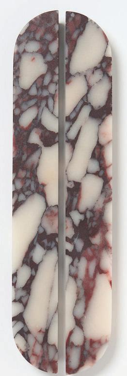
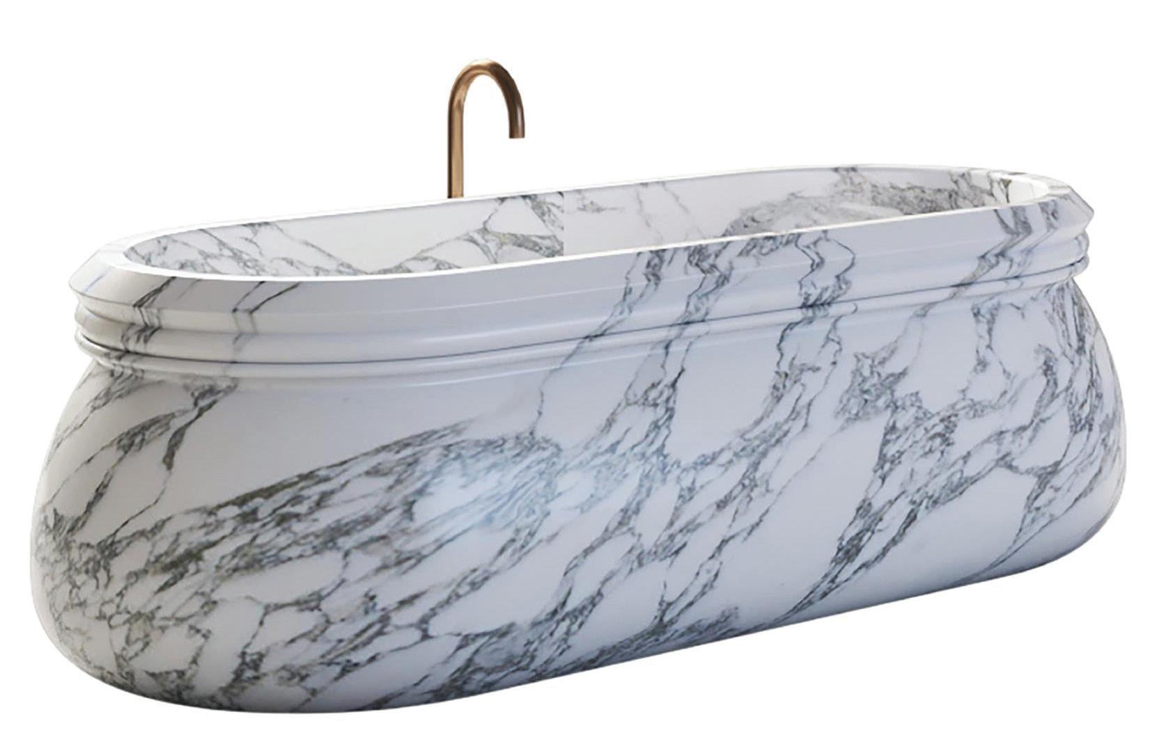
ALL IMAGES COURTESY OF DESIGNERS/BRANDS DRESS YOUR BATHROOM IN STATEMENT MARBLE, FROM FLOOR TO FAUCET by megan gagnon haute stuff / STONE WASH CARLYLE COLLECTIVE Alexis III bath vanity by Il Granito; price upon request. carlylecollective.com



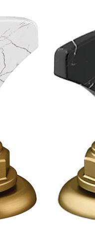
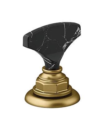
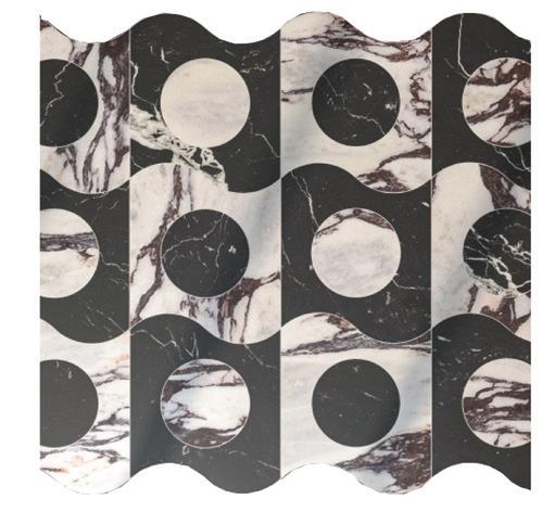
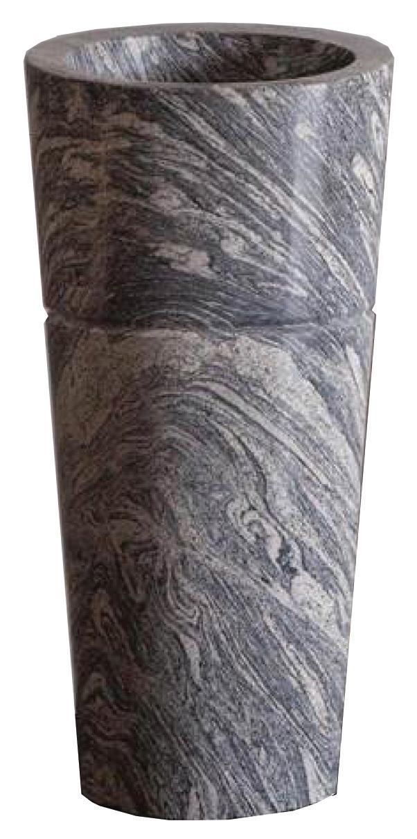
1 RH
Arabescato marble mirror; starting at $2,395. Greenwich; rh.com
2 WATERWORKS
Doria rectangular wall mounted Nero Marquina marble lavatory sink; $5,900. Greenwich; waterworks.com
3 L’AVIVA HOME
Piedra sconce in black marble; $2,375. lavivahome.com
4 LO & CO
Dot Viola marble handle; starting at $206. loandcointeriors.com
5 KOHLER
Artifacts® T-handle bathroom sink faucet handles; starting at $1,010.40. Greenwich, Westport; kohler.com
6 MC+
Contemporary White Arabesco marble carved Italian bath tub; $36,000. 1stdibs.com
7 ARTISTIC TILE
Spot On 18” waterjet mosaic tile from Game On by Michelle Gerson; price upon request. White Plains, artistictile.com
8 STONE FOREST
Veneto pedestal sink; $5,030. Bender, Norwalk; benderplumbing.com
MAY/JUNE 2024 athome 19
3 1 6 8 4 5 7 2
getaway
MORE IS MORE
THE FIFTH AVENUE HOTEL embraces a colorful past and invites guests into a world of pure imagination
by megan gagnon
Imagine stepping into a 19th-century mansion straight out of New York’s Gilded Age, complete with bow-tied butlers, decadent details and gold leaf everything. At The Fifth Avenue Hotel, you can. After a 10-year renovation
by Flâneur Hospitality, the newly opened NoMad gem is ready to welcome visitors looking for a glamorous city escape.
Once the home of society fixture Charlotte Goodridge, the brick and limestone Renaissance-style building— now referred to as The Mansion—was redesigned as a bank in 1907 by architects McKim, Mead & White. Preserving the legacy of Ms. Goodridge’s legendary soirées, design firm Perkins Eastman oversaw the meticulous restoration and worked with PBDW Architects to construct a striking modern addition: an adjoining 24-story glass tower.
Drawing inspiration from the neighborhood’s rich history and the opulence of the building itself, the interiors
DESIGNER-APPROVED DESTINATIONS
athomefc.com 20
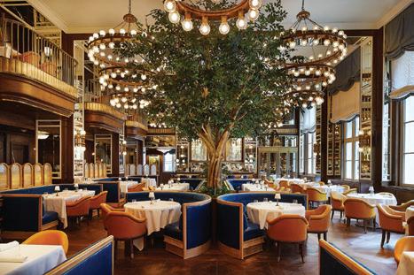
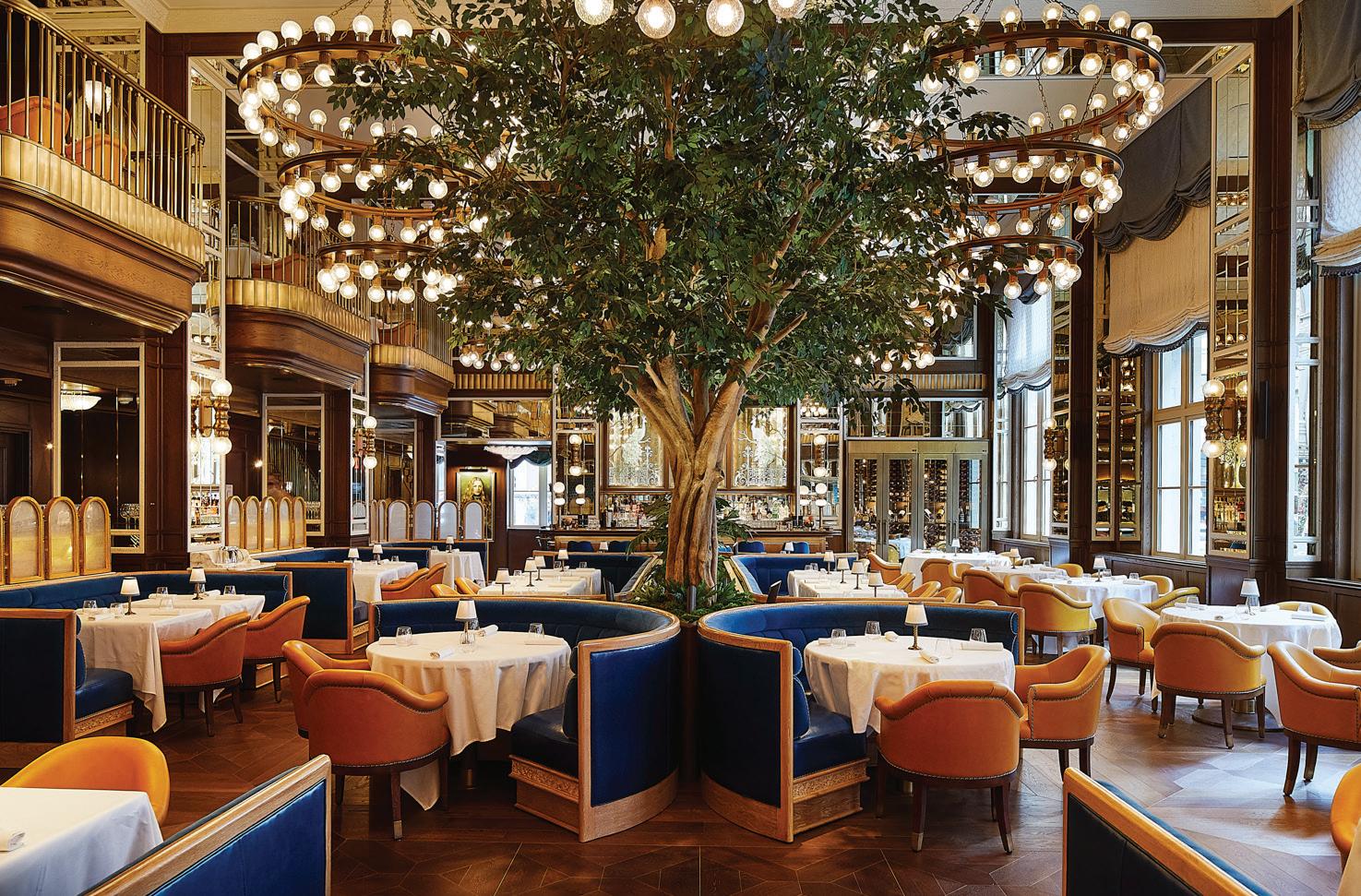
this photo: Towering trees lend a glamorous greenhouse effect at Café Carmellini. below: Martini butlers are available to hotel guests.
PHOTOGRAPHY BY WILLIAM ABRANOWICZ


Please join us for an afternoon luncheon at The Country Club of New Canaan
Thursday, May 9 at 11:30am
newcanaannature.org
At the fifth , we’re not just offering accommodation: we’re crafting an immersive journey.
Alex Ohebshalom, Owner
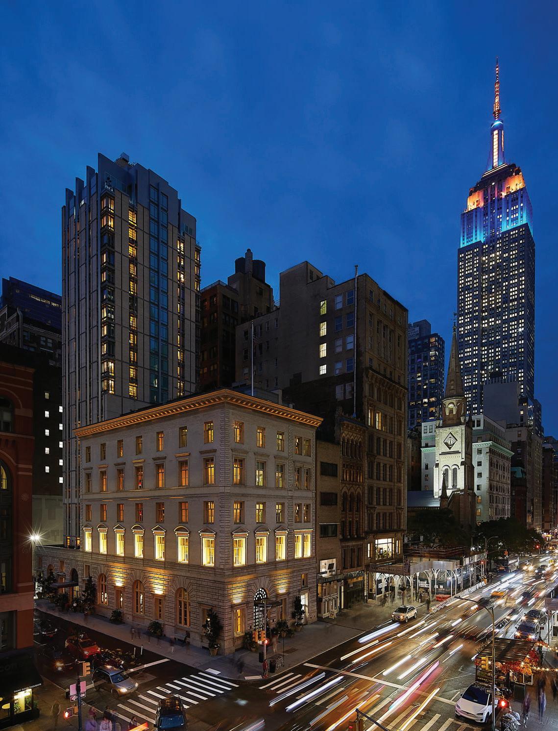
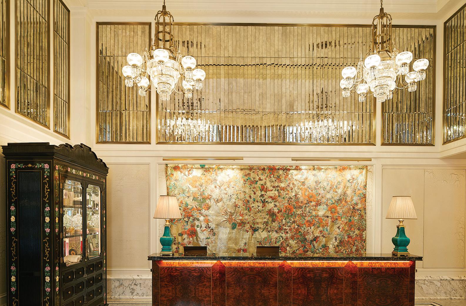
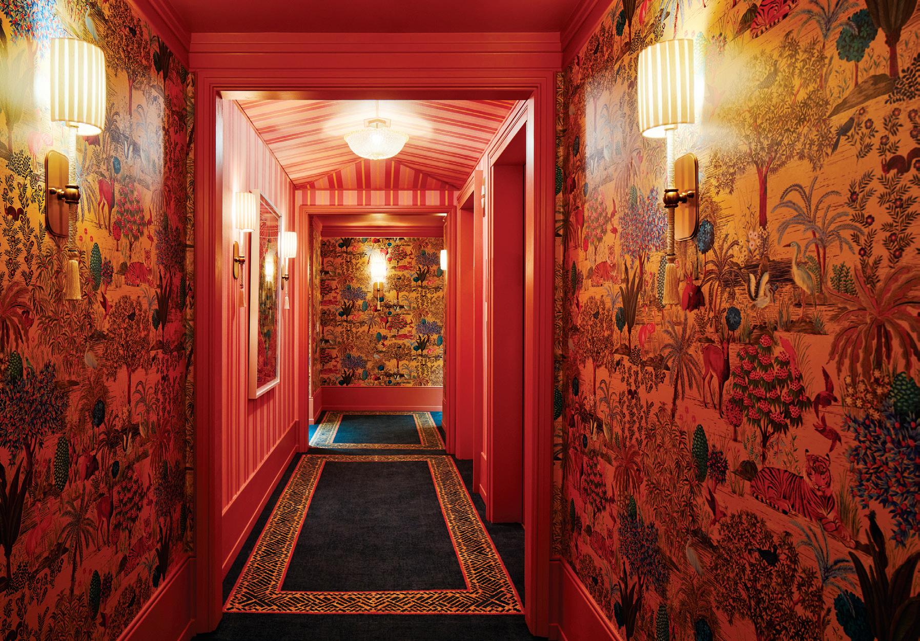
this photo: The striking exterior of The Fifth. above: A large-scale tapestry by artist Pae White, titled “Bugs & Drugs,” hangs in the lobby. left: There is maximalist print-mixing on most of the walls.
athomefc.com 22 getaway
evoke a sense of Bohemian romanticism and Gilded Age glitz with a modern twist.
Visionary designer Martin Brudnizki, renowned for his masterful blend of eras, also took cues from the travels of owner Alex Ohebshalom, filling it with painted columns, pleated pink silk canopies, rainbow-hued crystal chandeliers and boneinlaid tables; collected treasures that capture his globetrotting spirit. “At The Fifth, we’re not just offering accommodation; we’re crafting an immersive journey,” says Ohebshalom. “It’s a whimsical escape, a transformative experience right in the beating heart of Manhattan. We want our guests to slow down, to savor every moment and to truly engage with their surroundings.” And those surroundings are a visual feast, a kaleidoscope of jewel tones, eclectic accents and museum-worthy art curated from flea markets to high-end galleries. The hotel’s suites and guestrooms are a celebration of color and texture, with garden greens, buttercup yellows and peony pinks creating a vibrant backdrop for bold patterns and luxurious finishes.
Café Carmellini, the hotel’s
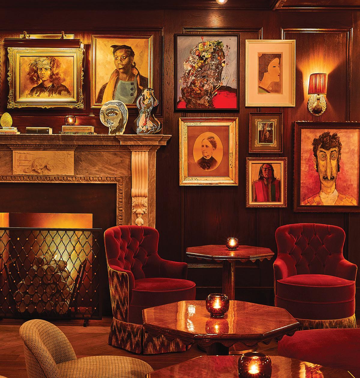
signature restaurant, is James Beard Award-winning Chef Andrew Carmellini’s love letter to New York City. He channels three decades of culinary expertise into a modern menu, marrying Italian and French influences to create a distinctly New York experience. And the dining room itself is a masterpiece. The landmark building’s neoclassical bones are bedecked with touches of maximalist flair: grand, sculptural trees, an inviting open kitchen and private balconies perched for viewing diners below. If you’re looking for a more discreet option, escape to The Portrait Bar, where guests can enjoy cocktails and snacks by the carved stone fireplace and tuck into the intimate corners of the rich, woodpaneled space.
The hardest part will be stepping out into the real world, and readjusting from the flâneur mindset of The Fifth: where the ultimate luxury is defined by your ability to slow down and savor life’s sensory delights.
The Fifth Avenue Hotel
1 West 28th Street
New York, 212-231-9400
thefifthavenuehotel.com
GET A ROOM
Each jewel box has its own personality and palette.

FIT FOR A KING
At 575 square feet, The Mansion Suite is palatial, by New York standards. Utilize the butler and luxury house car service to really feel like royalty.
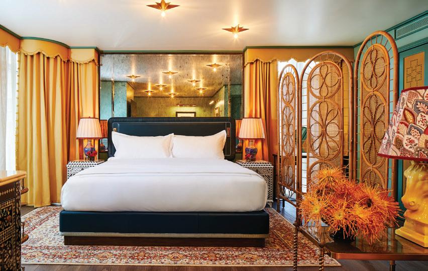
HOME, SUITE HOME
This one’s move-in ready. The Studio Suite includes a living room and study, two closets and a large entry foyer.
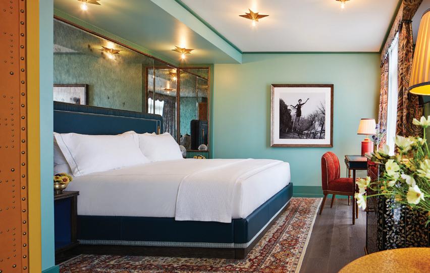
REST EASY
The city never sleeps, but you’ll get plenty in The Grand King, one of the largest of the tower rooms.
MAY/JUN 2024 23
PHOTOGRAPHY BY WILLIAM ABRANOWICZ
above: The Portrait Bar’s rich design was inspired by Italian villas.
 kim-marie galloway
SEEING BLUE
THE LANDMARK 727 Fifth Avenue; tiffany.com
When Holly Golightly got a case of the “mean reds,” she would cab it to that blue jewel on Fifth Avenue to cheer herself up. As the Breakfast at Tiffany’s icon famously said, “Nothing bad ever happens at Tiffany.” Holly would approve of the recent reimagination of the company’s flagship store. But renovation doesn’t do it justice. It’s now more than a store, it’s a landmark. Literally. It’s called The Landmark.
With video views of the Empire State Building and Central Park projected on the walls, glittering eye candy as far as the eye can see, original and commissioned paintings and sculptures, massive floral arrangements that are works of art in themselves, you’ll lose track of space and time, and love every minute.
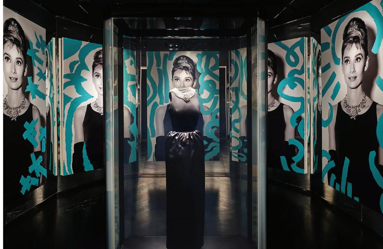
Take advantage of the Audrey Experience. This immersive installation includes the necklace Hepburn wore in the opening scene, a reproduction of the black dress from the House of Givenchy and the film’s Oscar.
Make a reservation at Michelinstarred Chef Daniel Boulud’s Blue Box Café—a jewel-box café serving
a decadent Afternoon Tea and an all-day à la carte menu.
Discover the Culture of Creativity exhibit, a curation of 70 works of art from the Peter Marino Art Foundation. Reservations are complimentary but required.
Throughout the ten floors, you’ll find more than 40 works of art by renowned artists including Daniel Arsham, Jenny Holzer and Rashid Johnson. Also on display are the world-famous Tiffany Diamond recently reset to honor Jean Schlumberg’s iconic Bird of Rock design and the latest Tiffany masterpiece—a stunning necklace featuring a brilliant cut diamond of over 100 carats.
Holly sure had it right.



competitive for the foreseeable future. You can, however, put your name in for a seat at the long bar—where it gets hectic— or at one of the high-tops by the entrance.
PHOTOS COURTESY OF TIFFANY & CO.; COQODAQ
The Audrey Experience
getaway TODAY’S Old
SHOP
New York A GUIDE TO A NYC WEEKEND FOR THE AGES by







Connection by Design


Tour exquisite homes while supporting the community work of
May 203-966-7862 New Canaan CARES newcanaancares www.newcanaancares.org
HOME TOUR 31 10:00 AM
2:00 PM *2022 DINNINGROOM
NEW CANAAN CARES.
-
SAVE THE DATE


MODERN MARVELS
GREENWICH’S BRUCE MUSEUM ORGANIZES A DRIVING TOUR TO CELEBRATE CONNECTICUT’S RICH HISTORY IN MODERN ARCHITECTURE by eileen murphy
When people think of Connecticut, they often think of historical colonial-style homes, surrounded by stone walls and lush yards. While our architecture does lean more traditional than avant-garde, our proximity to both New York City and Boston has always been a big draw to artists and pioneers of all kinds—architects included.
To celebrate our rich history in modern architecture, the Bruce Museum in Greenwich recently organized the Connecticut Modern Driving Tour. This self-guided tour takes you from Stamford to Hartford, with numerous stops along the way. You’ll find a detailed history of each site, along with location and visitor information, on the museum’s website.
CONTRIBUTED; OPPOSITE PAGE: BLACK AND WHITE PHOTO BY PEDRO E. GUERRERO. COURTESY OF PAMELA GORES athomefc.com 26
First Presbyterian Church and Carillon Tower STAMFORD From New Canaan: a 20-minute drive via CT-15 S From Greenwich: a 15-minute drive via I-95 N
road trip
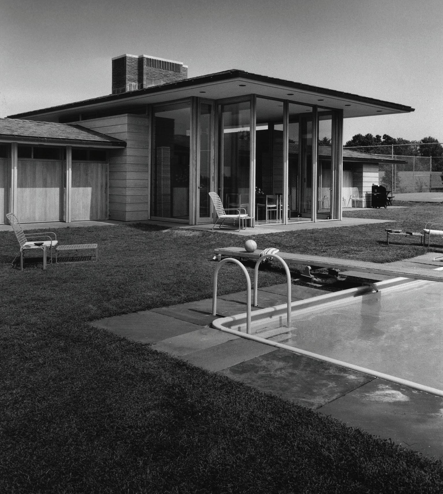
From downtown New Canaan: a 3-minute drive; a 20-minute walk
From Greenwich: a 25-minute drive via CT-15 N and I-95 N
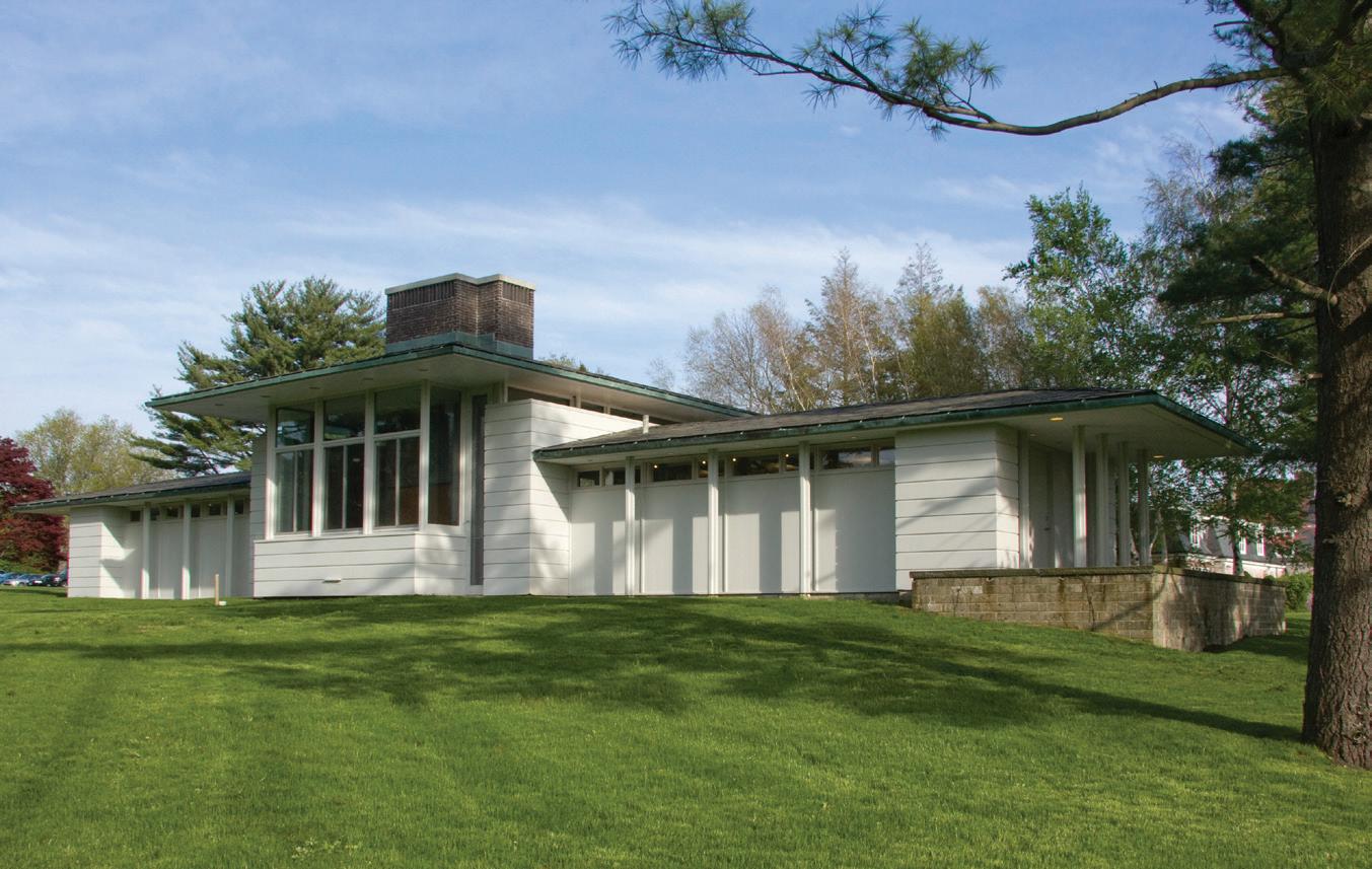
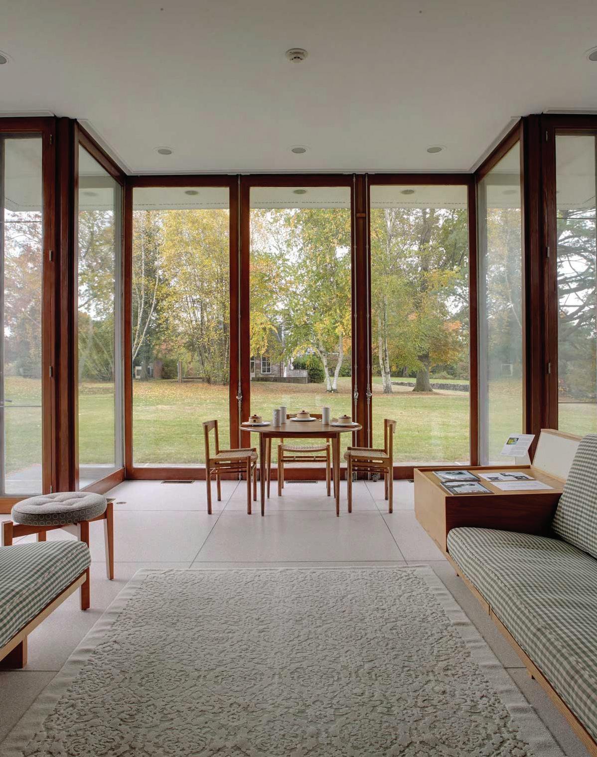
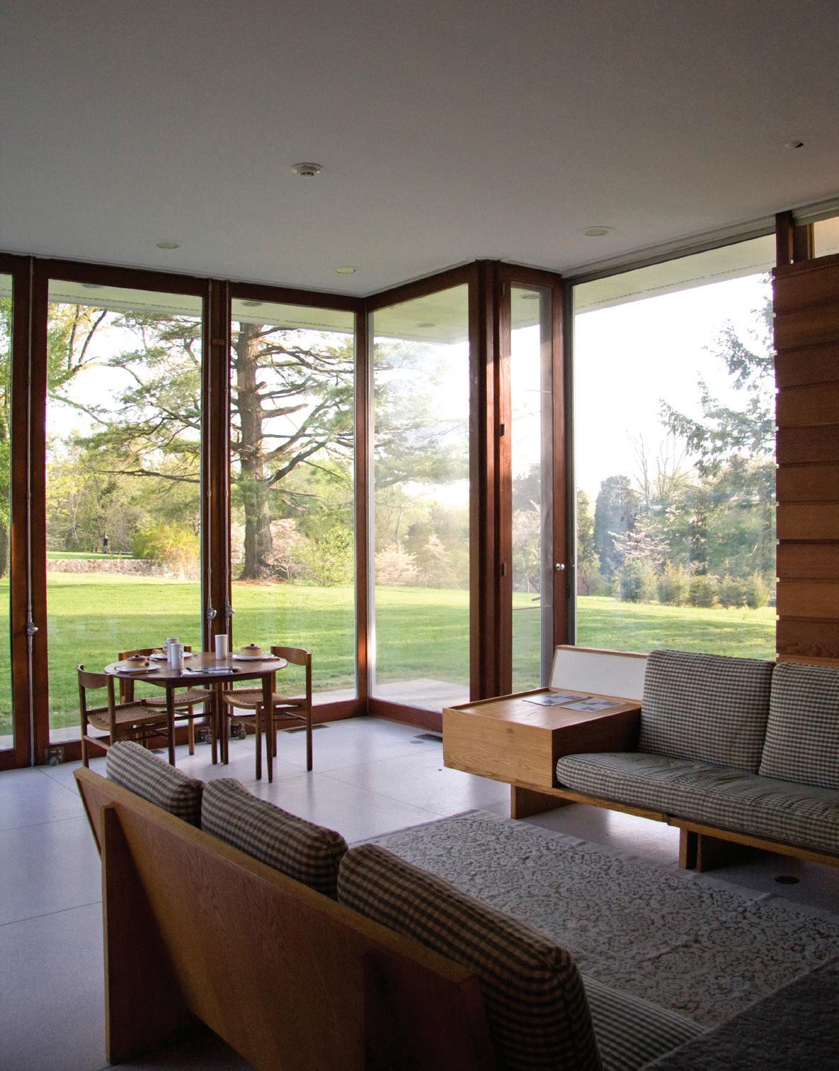
Many of these sites are open to the public, so plan ahead, as the interiors are often just as interesting as the exteriors—as is the case with Stamford’s First Presbyterian Church and Carillon Tower, which many readers might know as the “fish church.” Designed by Wallace K. Harrison, who also created Lincoln Center for the Performing Arts, the church is immediately recognizable for its two-story tower, but the colorful glass slabs that Wallace used instead of traditional stained glass, should be appreciated from the inside.
It’s no surprise that the driving tour features two locations in New Canaan, home to the Harvard Five, a famous group of modern architects that settled in the town in the 1940s. Gore’s Pavillion, located in beautiful
MAY/JUN 2024 27
clockwise from top, left: Originally a pool house and winter lodge, Gores Pavilion is now a museum. opposite page: Stamford's First Presbyterian Church.
Gore's Pavilion NEW CANAAN
road trip
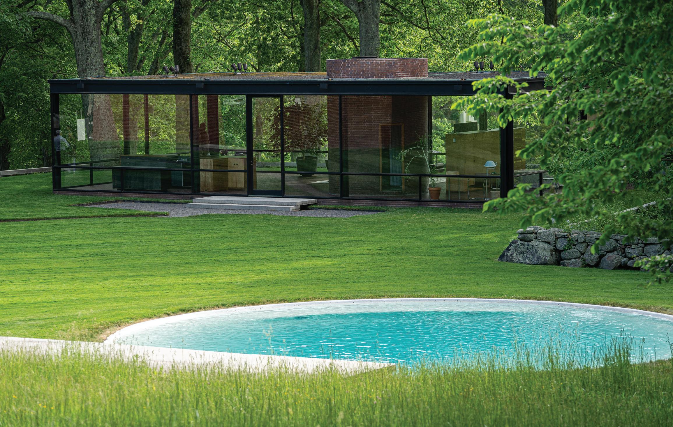
The Glass House
From downtown New Canaan: a 6-minute drive via Wahackme Road
From Greenwich: a 25-minute drive via CT-15 N and I-95 N
Irwin Park was designed as a pool house by architect Landis Gores for Jack Irwin (former ambassador to France) and Jane Watson (daughter of IBM founder Thomas J. Watson). It is now a museum operated by the New Canaan Historical Society. Less than a mile away stands the renowned Glass House, a celebrated work of the Harvard Five’s most famous architect, Phillip Johnson. Originally Johnson’s private home, it is now a National Trust Historic Site and opens for tours from April through December.
A second Johnson-designed building in nearby Ridgefield was Johnson’s first commercial project. Known as the Schlumberger Research Center, it reopened after an extensive restoration and is again operating as a private office building as initially intended by Johnson.
Heading north to New Haven, you’ll find three driving tour stops. The Louis Kahn Building at Yale University is home to the oldest college art museum in the country. Considered to be one of Kahn first masterpieces, the tetrahedral concrete ceiling is
particularly interesting.
Just across the street is another of Kahn’s buildings, the Yale Center for British Art. Completed in 1977, three years after Kahn died, the steeland-glass building is currently under construction and closed to visitors, but you can get an excellent view of the exterior while visiting the art gallery.
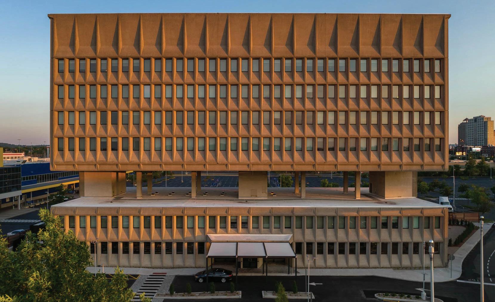
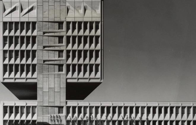
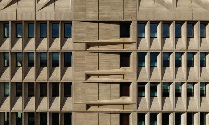
However, the most recognizable New Haven building featured on the tour is the Hotel Marcel. When designing this building for the Armstrong Rubber Company, architect
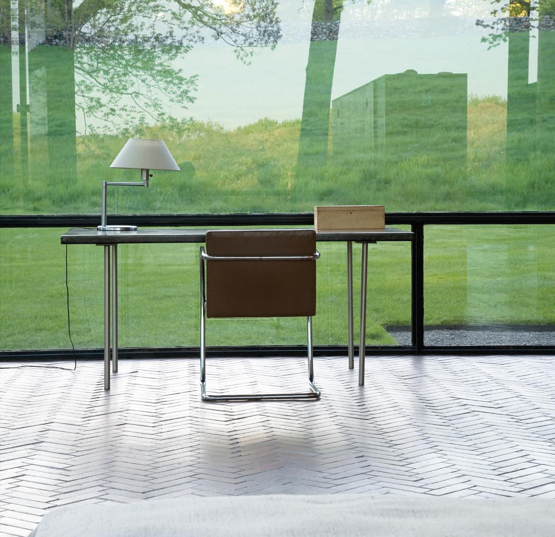
CONTRIBUTED athomefc.com 28
top: The Glass House is not visible from the road, but tours are given of the house, galleries and grounds. right: The views from inside the house are constantly changing with the seasons.
NEW CANAAN
The
Further north, you will find the Mattatuck House in Waterbury and the Avery Court at the Wadsworth Atheneum in Hartford, both art museums. Interestingly, when the Avery Court first opened in 1934 with a retrospective exhibit of artist Pablo Picasso’s work, architect Phillip
Star
David
skylight
In addition to the buildings featured on the Bruce Museum’s Connecticut Modern Driving Tour, there are also two public works of art by artist
For more on The Bruce Museum’s Connecticut Modern Driving Tour, visit brucemuseum.org
CONTRIBUTED MAY/JUN 2024 29
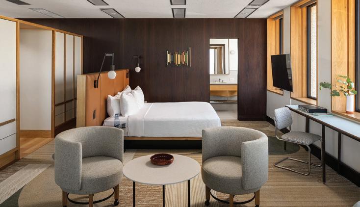
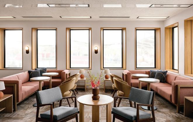
Marcel Bruer certainly achieved the company’s goal of separating the office area from the research department’s quiet space and the city’s hopes for a building that would change the city’s skyline. The interior of the Hotel Marcel is equally interesting.
Johnson was one of the many guests in attendance.
newest building on the driving tour is the Congregation Beth Shalom Rodfe Zedek synagogue in Chester. Designed by Connecticut native Sol LeWitt in 2001, the interior dome is a post-and-beam construction style that rises two stories above the sanctuary to form a
of
with a
in the middle.
Alexander Calder. In Hartford, there is a 600-foot tall, bright-red sculpture titled Stegosaurus and in New Haven is Gallow and Lollipops, an example of the type of kinetic sculpture Calder is known for.
via
N
via
N and
N
top: The office building sat empty for years until Becker + Becker bought it and turned it into The Hotel Marcel, named after the architect Marcel Breuer. Hotel Marcel
NEW HAVEN From New Canaan: a 45-minute drive
CT-15
From Greenwich: a 60-minute drive
CT-15
I-95
shoptalk
Partners IN STYLE
ADAM LIPPES X OKA ELEVATES THE HOME OFFICE


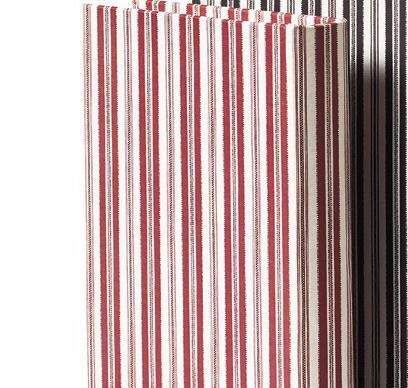

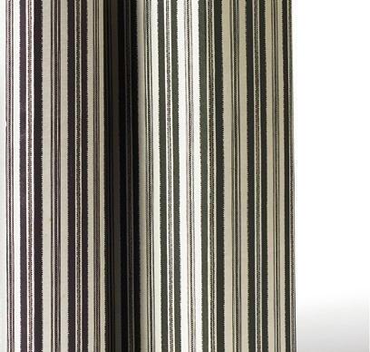

above: Everett box files; $65 for set of three.
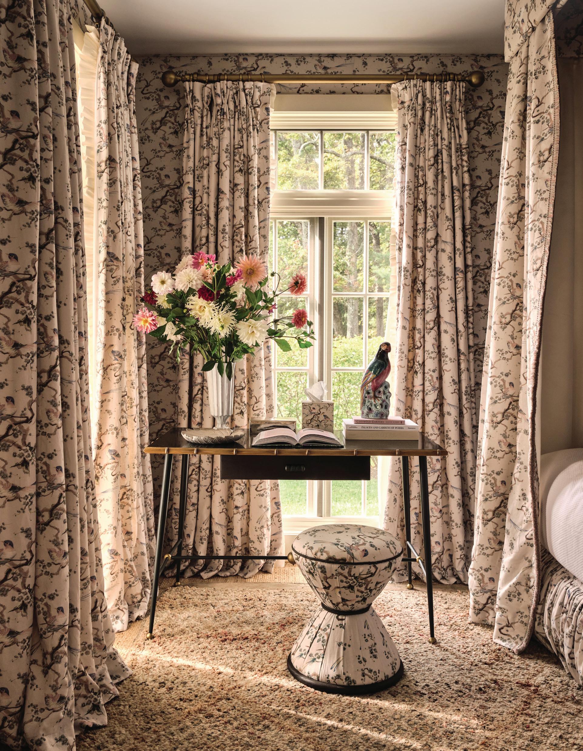
OKA is upping their fashion game. Co-founder Sue Jones has teamed up with designer Adam Lippes, collaborating on a collection that celebrates their mutual love of pattern and charm. Following the success of their dinnerware launch in 2021, the duo expands beyond the dining room and into the home office.
Inspired by vintage fabric that Lippes discovered while treasure hunting in French markets, the pieces feature botanical and bird motifs modeled from the original 19th-century design. Playful ticking stripes also make an appearance in a complementary palette of red, black and green shades. The success of their partnership speaks to their shared vision. “Sue and I speak the same language; it’s comfort, style and quality competing in a way that works,” says Lippes. “OKA is such an incredible place for a discovery. You can find things that are truly well designed or sourced from incredible places; it helps people with the mix, and that is so important to style.”
OKA

44 Main St, Westport, 203-583-8001; oka.com
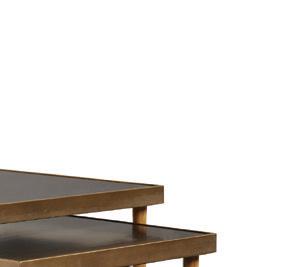
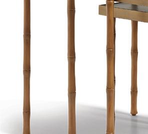
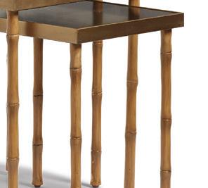

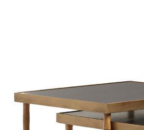
above: Avery nesting side tables; $995. left: The Avery desk—made with metal, beech and walnut wood—sits in a room draped in the Magistry fabric, a design that inspired the larger collection.
NEWS
PHOTOS: COURTESY OF OKA
THE LATEST DESIGN
the premier home design competition awards

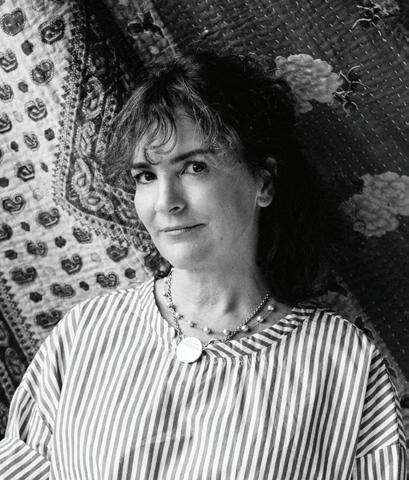



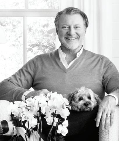
If you have a project or firm in CT, go to athomealistawards.com to learn more about getting on the 2024 A-List! Award Celebration / September 10, 2024



PLATINUM SPONSOR GOLD SPONSORS
2024 JUDGES DOUGLAS WRIGHT Douglas C. Wright Architects HEIDE HENDRICKS Hendricks Churchill JOSH GREENE Josh Greene Design MELISSA REAVIS Hollander Design SUSANA SIMONPIETRI Chango PHILIP MITCHELL Philip Mitchell Design
LAST CHANCE! A-List Awards deadline is May 31
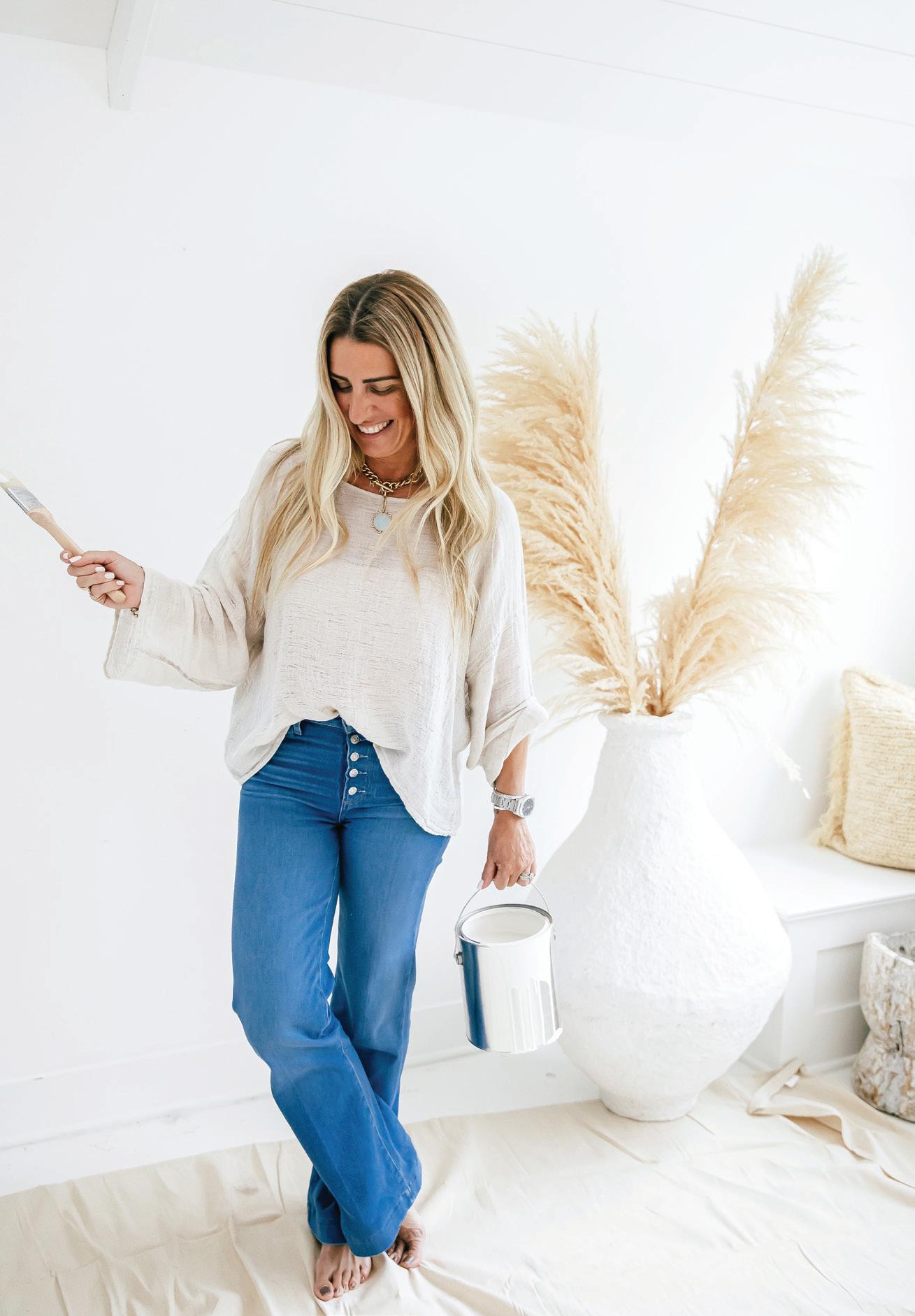
OCEAN MINDED
GAELLE DUDLEY LOOKS TO THE SEA FOR A NEW PAINT LINE WITH RING’S END
by samantha yanks
The just-launched A La Plage with Gaelle by GLDESIGN and Ring’s End capsule paint collection reflects the laid-back coastal palette
Gaelle Dudley strives to infuse in her clients’ homes. There are 14 new Benjamin Moore colors, inspired by Dudley’s penchant for referencing the coastline in her projects. We dove into the colors for you to give you the full spectrum.
“The A La Plage colors
embrace endless summer with an array of timeless earth tones, classic whites, sunset hues and pale, moody blues and greens that create the feeling of being on vacation year-round in your home,” Gaelle says. “The colors of A La Plage are not just the palette of my design, they are the palette of my lifestyle. Summer is more than a season, it’s a state of mind. I believe in a light, easy-breezy approach to living that reminds us of being on vacation from the
comfort of our own home.”
A La Plage with Gaelle is the brainchild of Gaelle Dudley and Scott Herling, VP of Paint Operations at Ring’s End.
“When Gaelle mentioned a desire to create a personalized paint line inspired by the coastal palette she lives and works in, it was a no-brainer for us to partner with her,” says Herling. “Our customers love her work; Gaelle is a nationally recognized color expert, and Ring’s End
services a predominantly coastal New England market. Creating a unique color palette with someone who is so deeply respected and tied to the coastal region was an easy decision for us to make.”
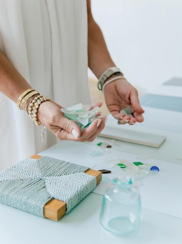
Customers can choose from a variety of shades with personal meaning to Gaelle, including: “Afterglow,” “Basalt,” “Coastline,” “La Mer,” “Low Tide,” “Morning Mist,” “Ocean Bluffs,” “Pampas Plumes,” “Sandy Kisses,” “Sea Glass,” “Seascape,” “Skipping Stone,” “Spindrift” and “Whitecaps.”
In the spring of 2024, Gaelle will be joined by interior designer friends and fellow industry leaders for conversations about choosing a paint color and tips on seasonal design, home decor, color palettes and more. The tour will take place at Ring’s End in Norwalk soon.
A La Plage with Gaelle is now available for purchase ($67.00— $76.00 per gallon) at Ring’s End locations and online at ringsend. com and gldesignhome.com.
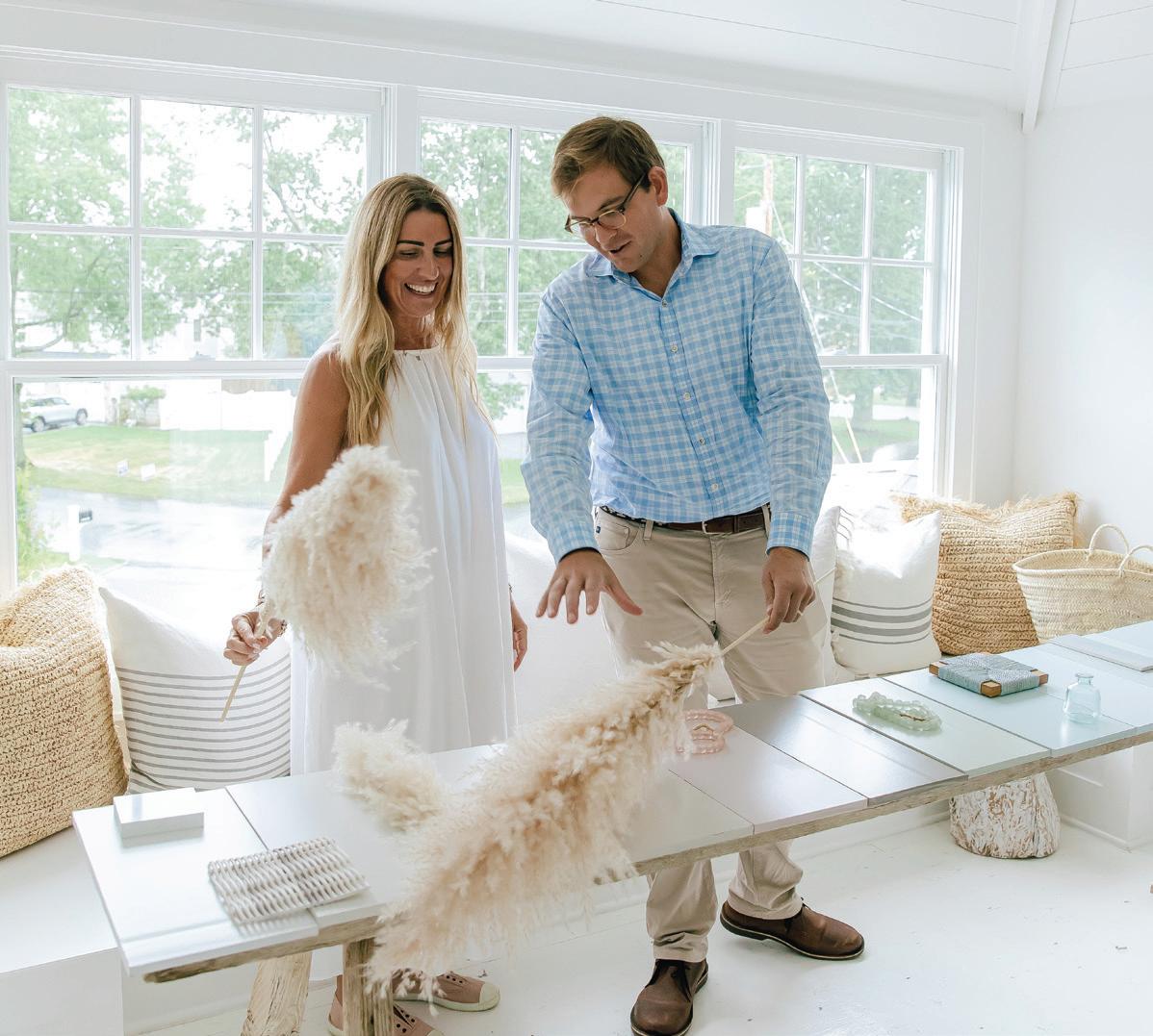
above: Founder and Creative Director of GLDESIGN, Gaelle Dudley. above, right: Dudley comparing her favorite coastal materials with the A La Plage paint palette.
shoptalk
above: Dudley and Scott Herling, VP, Paint Operations for Ring’s End, meet in her Fairfield studio.
athomefc.com 32
PHOTOS BY FRANCES V ISAAC PHOTOGRAPHY

PRESERVING HISTORY
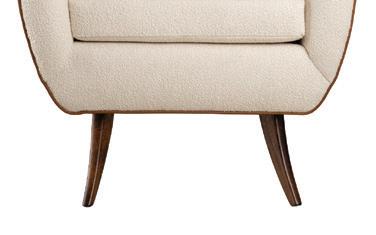
Stamford’s OBJECT REFINERY redefines restoration as an art form
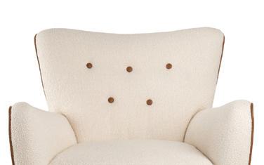
avid Belmonte is making the case for buying vintage, one Saarinen chair at a time. At his new Stamford showroom, Belmonte invites customers and collectors to discover Object Refinery. From rare finds to timeless classics, the hypercurated collection showcases his dedication to restoration, with the help of a team of skilled artisans. Upholsterers, finishers and fabricators bring Eames chairs and Danish settees—among others—to their former glory, in addition to their work to revive a mostly Mid-Century mix of accessories and lighting. Don’t see what you’ve been looking for on the floor? Belmonte will also tap into his world-wide network to source, authenticate and arrange delivery for your precious piece. He also works closely with interior designers, collaborating to create custom projects from his full-service studio.
Object Refinery, 652 Glenbrook Road, Building 3, Third floor/Suite 311A, Stamford, 203-340-1076; objectrefinery.com
PATIO, PERFECTED
With Tradition, FRITZ HANSEN reimagines outdoor luxury
Created by designer Povl B. Eskildsen, Tradition is a new series for Fritz Hansen that embodies the spirit of Danish design: clean lines, functionality, and simple sophistication. Handcrafted from FSC™-certified teak, the components create a seamless blend of form and function, with modular pieces that adapt to your needs. Lounge chairs, poufs and tables can be easily combined to create the perfect layout for your space, whether it’s a cozy balcony or a sprawling terrace. Uncompromising on quality, Tradition features stainless steel fixtures and premium cushions upholstered in weatherproofed, mildew-resistant outdoor fabric, ensuring you’ll enjoy them season after season. “Garden furniture places high demands on both design and materials,” Eskildsen notes. “It must be durable as well as comfortable, withstanding all weather conditions in a quality designed to last.” Sit and see for yourself at your local Design Within Reach and West | Out East.

GROW PRO
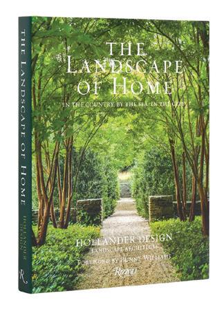
A peek inside the well-manicured world of Hollander Design
This spring, readers can get lost in The Landscape of Home: In the Country, By the Sea, In the City, a stunning exploration of Edmund Hollander’s vision.
As the president of Hollander Design Landscape Architects, he has guided the firm to singular success, with projects all over the globe and a spot on Architectural Digest’s AD100 list. Featuring 18 of his most recent projects, he discusses the pivotal elements that define each space, from the graceful procession of entryways to the strategic placement of plant life and trees. Tour the sprawling country estates, and gain access to the intimate rooftop gardens, all from the comfort of your own yard.
MAY/JUN 2024 33
above: An Eames Time-Life Lobby Chair in brown mohair; a 1920s Ernst Schwadron lounge chair
D
this photo: The series offers endless configurations, featuring five distinct seating modules and two table options.
PHOTOS: COURTESY OF OBJECT REFINERY, FRITZ HANSEN, RIZZOLI
shoptalk
BRIT LIT
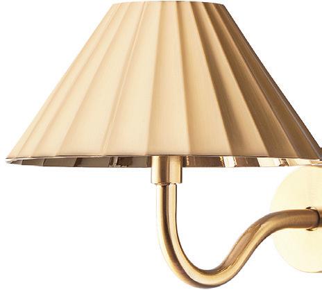
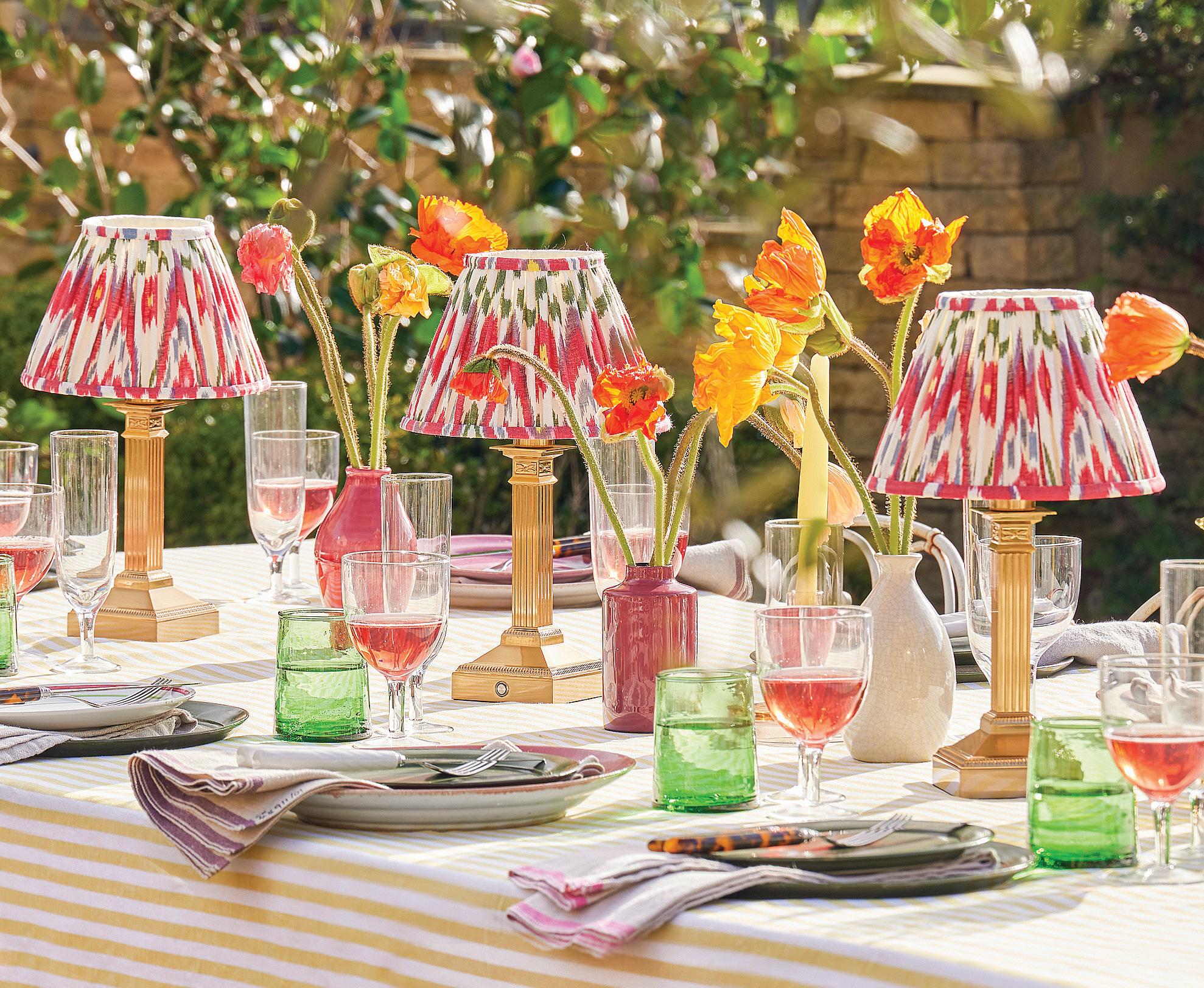
Cheerful U.K.-based lighting brand POOKY comes to America
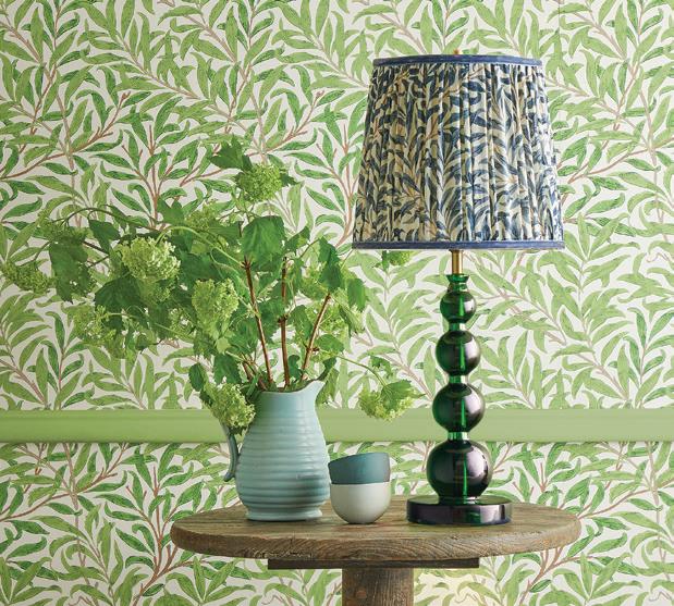


Your lamp choices just got a little more brilliant. With their U.S. arrival, customers have access to the British cult-favorite line of colorful lamps, patterned shades and stylish sconces. Boasting endless combinations of handcrafted lampshades and bases, Pooky encourages print-mixing and a maximalist approach, but there are options for every design sensibility, from cottage-core to contemporary. And there are practical features, too. Cordless lamps and outdoor options are perfect for illuminating your bedside or poolside. Rechargeable sconces not only save your walls but also spare you from having to call the electrician. See them all, along with plenty of other bright ideas at pooky.com.
HIGH CONTRAST
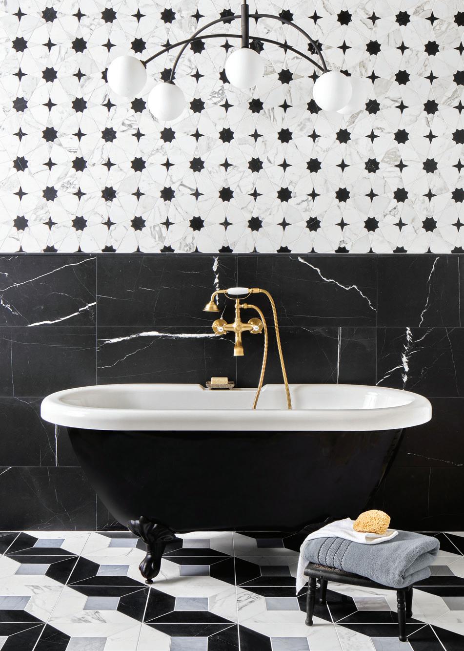
YOUNG HUH AND AKDO TEAM UP AGAIN TO MAKE MARBLE MAGIC
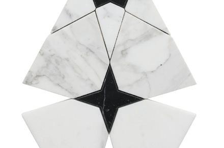
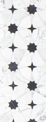
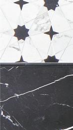
Young Huh, a designer known for her playful use of color, leans into monochromatic tones for her latest tile collection. “Inspired by the purity of form and the drama of contrast,” each black and white piece in Kaleidoscope finds harmony in the “delicate balance between simplicity and complexity.” With a limited palette, Huh gets creative with shapes and pattern, reimagining marble in geometric combinations of stars, stripes, cubes and scallop-edged circles. If you’re hoping to inject some personality into your next powder project, this is your place to start.


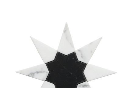

above: Star Calacatta with Tulip Black





above: Cube Calacatta with Tulip Black and Bardiglio
Past MASTER
A1435 State St., Bridgeport, 203.336.5199; akdo.com

A new stamford showroom celebrates old world design
nother welcome addition to our Waterside Design District, Saladino Furniture & Design is bringing its signature style to Connecticut. A fixture at the New York Design Center for 25 years, pros will recognize the line made famous by interiors icon John Saladino. Shop custom and ready-to-ship pieces, alongside antiques from Saladino’s private collection, some of which graced the pages of his acclaimed Style and Villa books. The mix of old and new is a trademark of his aesthetic, seamlessly blending past and present for a timeless effect. After Saladino partially retired in 2010, son Graham has been leading the company and looks forward to this next chapter. “Moving the company to Connecticut has allowed me the freedom to expand on what my father created,” he says.
330 Fairfield Ave. Suite 2-8, Stamford, 212-684-3720; saladinostyle.com
above: The Freya cordless lamps are modelled on an antique candlestick. right: Twinky, with its rechargeable shade, has been a popular choice.
above: Stacked balls of green resin create the base for the Aurora table lamp.
PHOTOS COURTESY OF POOKY, AKDO, SALADINO
SALADINO
athomefc.com 34
Westy Has Your Closet Needs Covered…




MAY/JUN 2024 35
In this Greenwich home, Studio DB takes traditional entertaining spaces to colorful new heights
HUE’S THE BOSS



 interview with britt and damian zunino, studio db photographer ian baguskas






MAY/JUN 2024 37
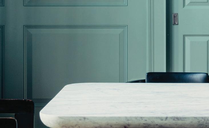
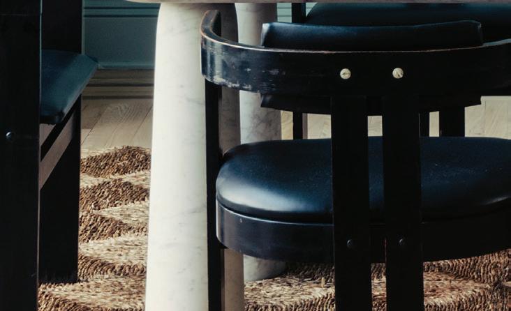
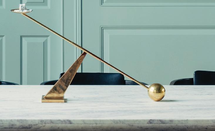
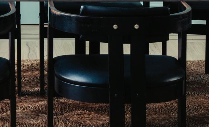
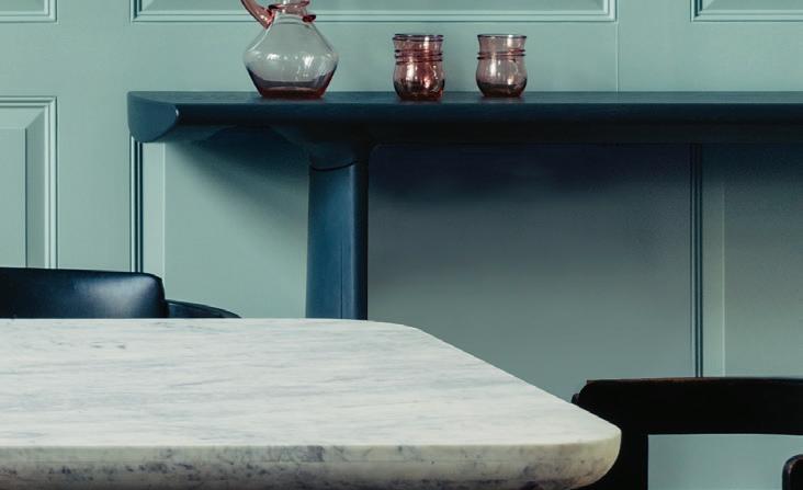
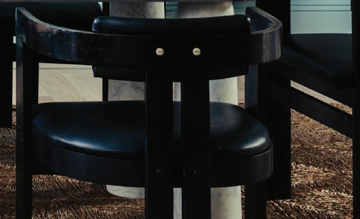
this photo: The custom white oak dining table is surrounded by Italian arm chairs with Bentwood frames.
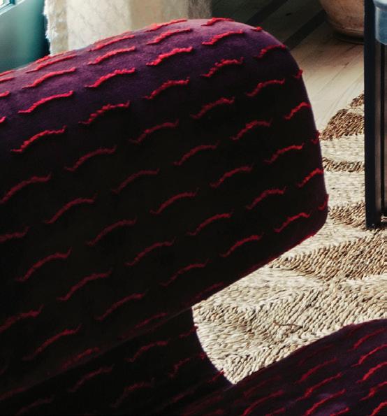
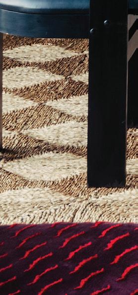
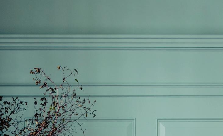
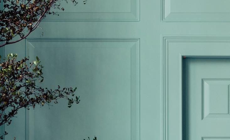
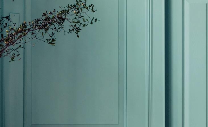
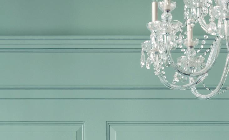
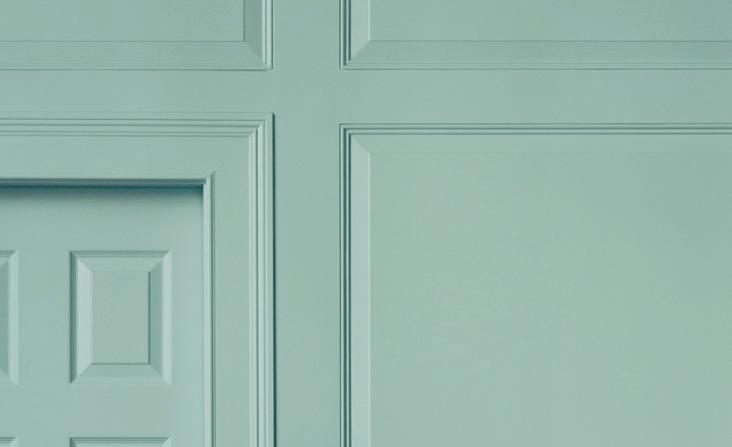
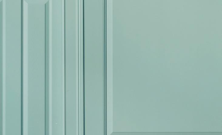
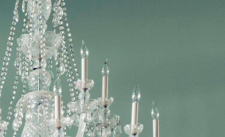
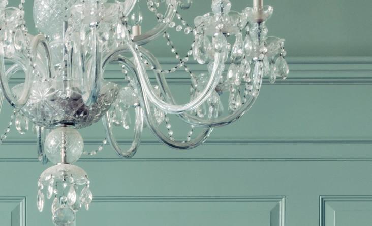
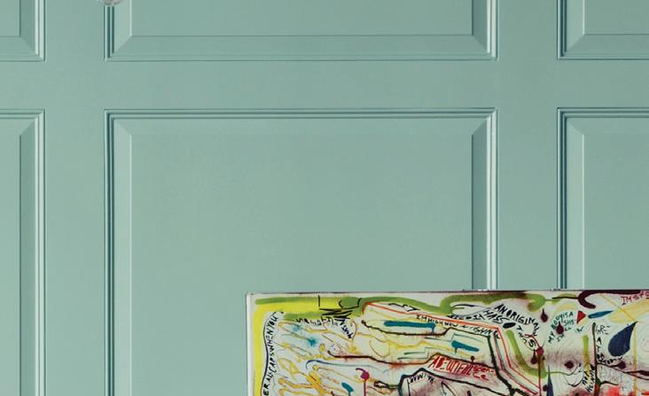
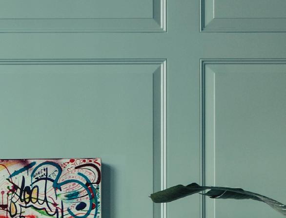
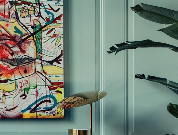
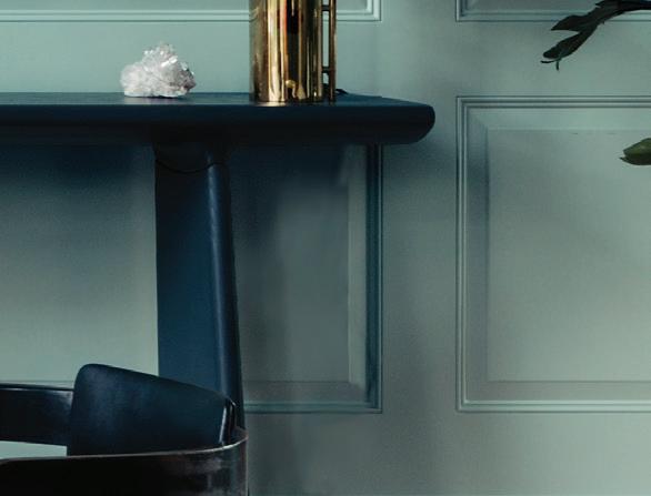
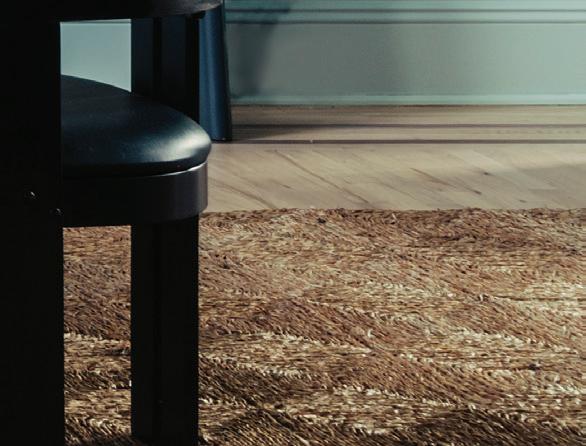
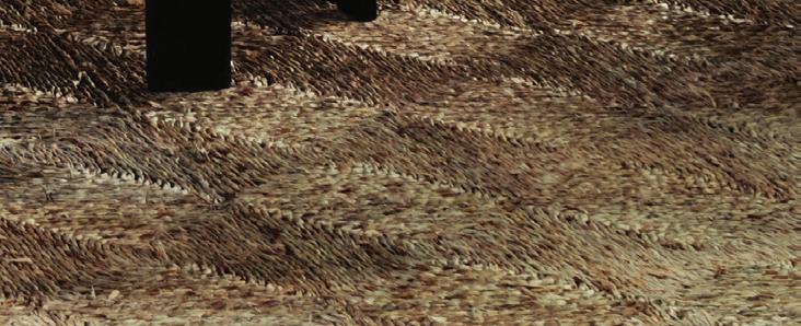
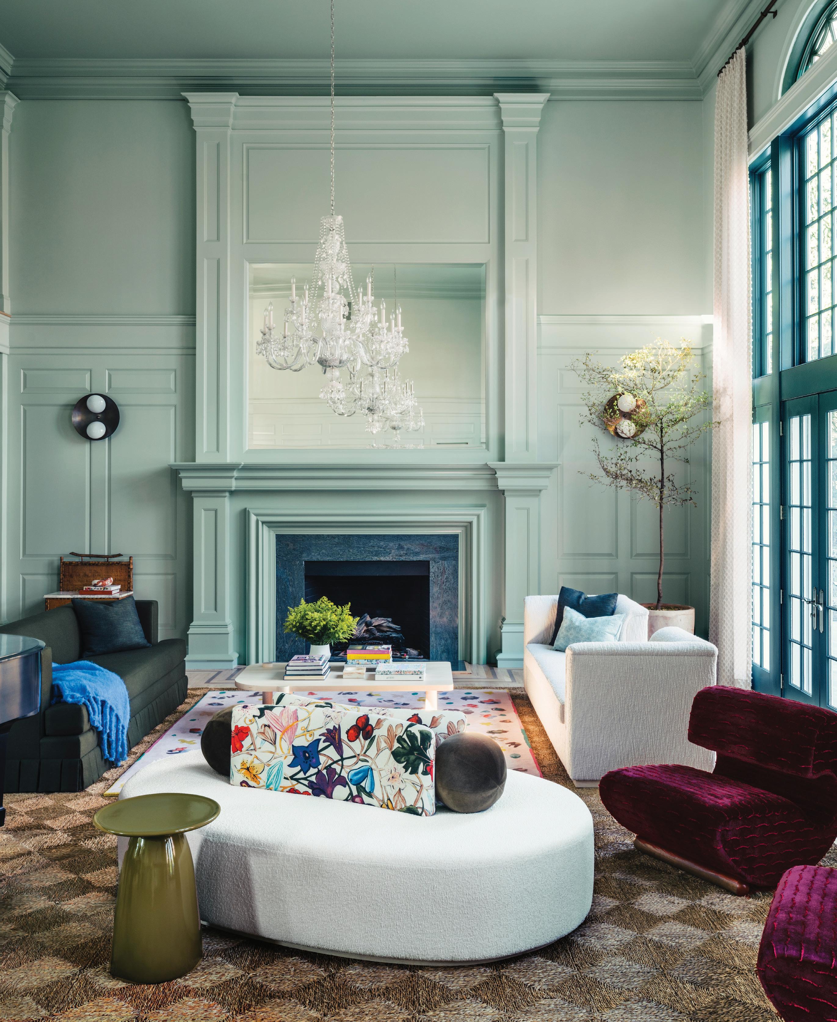
this photo: Benjamin Moore’s Bali creates a bold backdrop for the double-height living room. Custom seating encourages conversation, a priority for the clients who love to entertain. opposite page: Bouclé mushroom ottomans provide additional seating, arranged on the Jouvence area rug by Christian Berard. below: During the day, natural light streams in from the wall of windows. At night, the room is lit by the chandeliers and Binova wall lights by Gallery L7.
Tell us about the clients. What were their asks for these living and dining spaces?
Studio DB: Our clients had recently purchased the traditional property and were looking to infuse some colorful personality into the home. Our primary focus was to freshen the foundation of the main entry and grand doubleheight living room. We started by lightening the floors and creating a strong visual color direction.
Our clients are musicians and love entertaining. They often host large gatherings and play music, so they craved a flexible space that could accommodate large groups as well as intimate family gatherings. The furniture plan was created with this in mind, with various vignettes for dining and places to perch.
What was the jumping-off point for the palette?
The wife is very fashion-forward and was looking for a statement room; white walls were never a consideration. We looked to fashion for interesting color combinations, specifically the runway collections of Valentino and Stine Goya.
Assuming the paint came first, how did that affect the furniture and décor selections?
We looked at the room holistically and pulled many fabrics and finishes together in the scheme first, using our original fashion and art inspiration as a guide. We finalized the wall color closer to the end. The living room rug was more of a driving factor in the room’s color palette.
“Our goal is to expand the definition of what is neutral , considering sophisticated colors like olive green, oxblood and pale blue-green instead of beige.”
—britt and damian zunino, studio db
What’s the hardest part about working with such bold colors?
The toughest part of working with strong colors is getting the balance correct. For every bold move, the colors need to be tempered by something neutral. Our goal is to expand the definition of what is neutral, considering sophisticated colors like olive green, oxblood and pale blue-green instead of beige.
Professionals:
Interior Design: Studio DB, New York, 212-608-6379; studiodb.com
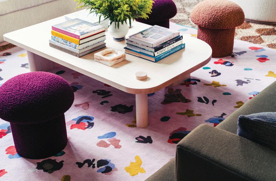

athomefc.com 40
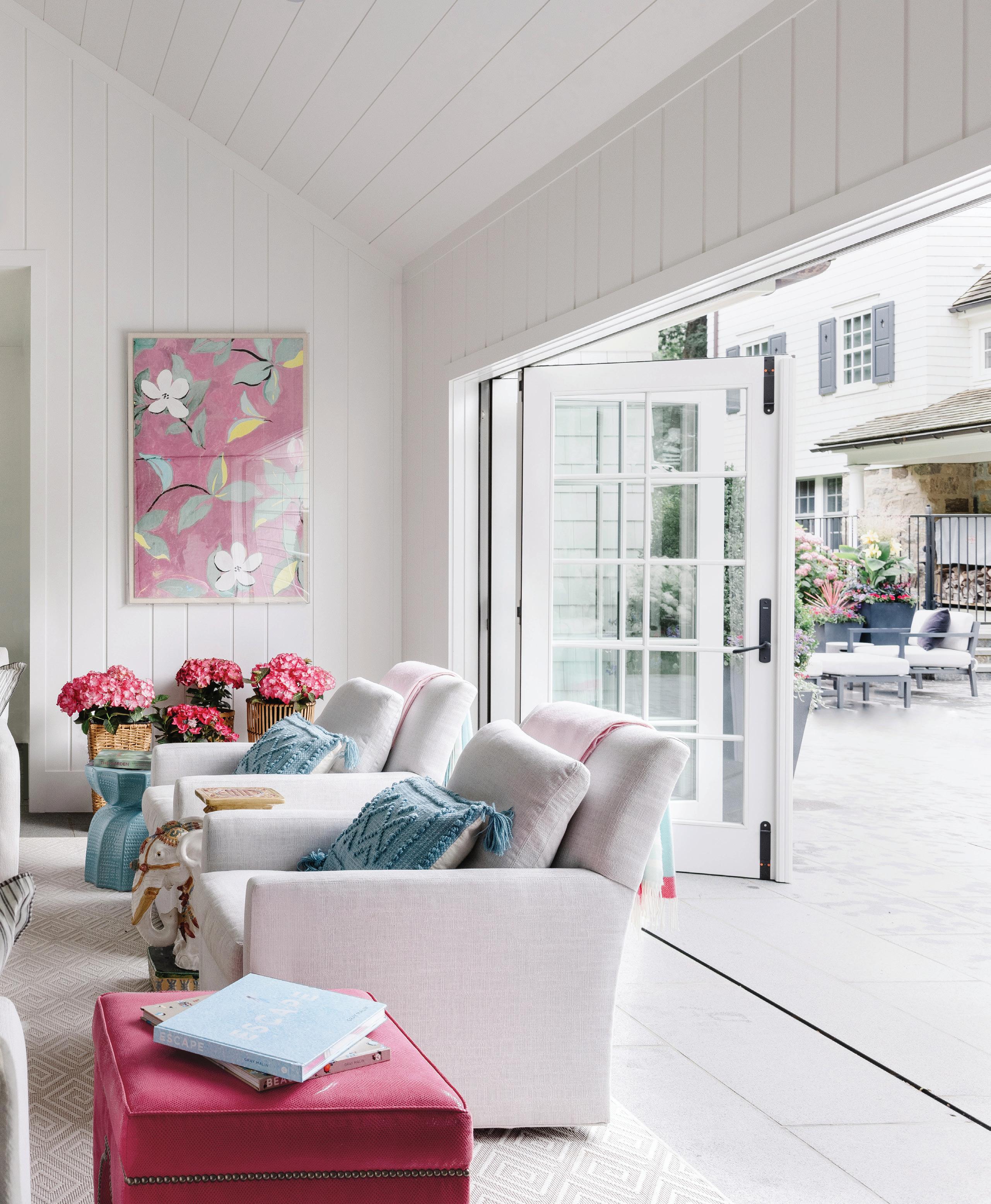
right: My client and I wanted to create a seamless flow from pool to lounge area, so we used the same bluestone on the patio for the pool house floors. When the folding doors are open, they span the width of the pool house, allowing for the space to feel as one. Paule Marrot’s “Squirrel” 1 and 2 reflect the palette for the larger space.
SPLASH PAD
An iconic hotel inspired the design for this pool house and patio, perfect for slim aarons-inspired summer living
interview with laura tutun, laura tutun interiors // photographer amy vischio
Tell us about the client.
Laura Tutun: I had worked on their main house, which is one of those beautiful old homes with a rolling backyard. It was such a huge project, so they weren’t ready to do the pool and pool house at that point. This is the third project I’ve worked on with this client, and they are the most lovely couple and family, so easy to work with. They were willing to take the dive on things they weren’t initially thinking they wanted to do. The trust was there.
Talk about the plan for the pool house.
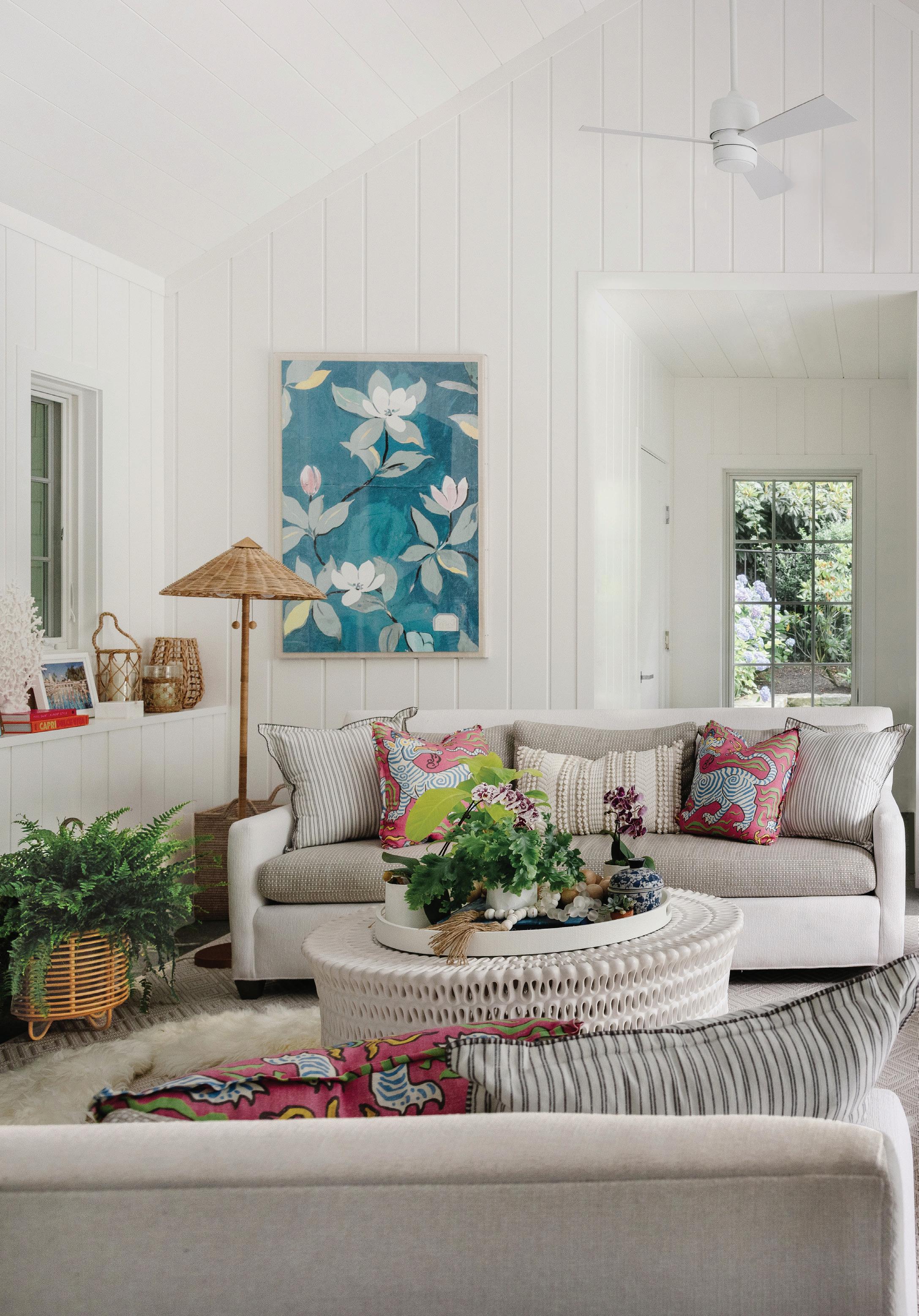
The feel of the main house is very similar to the feel of the pool house. Their three kids are now young adults. We really wanted to build a pool house where both the parents and kids could entertain, in a worry-free environment. All of the fabrics are Perennials or outdoor fabrics. The wife also wanted a space that could be an overflow for when the kids have friends sleepover and the guest room is being used. One of the sofas is a
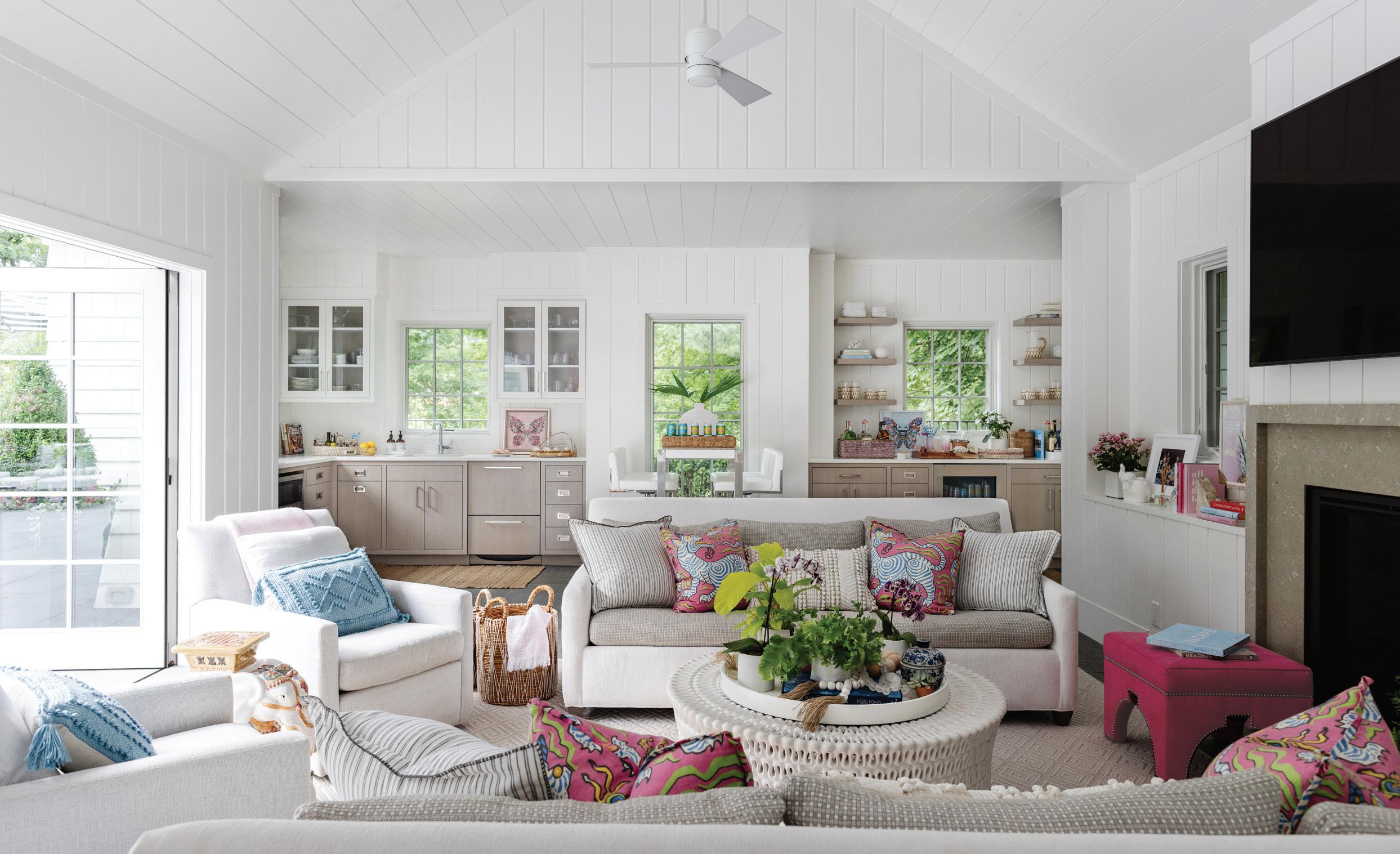
pull-out. There’s a full bathroom with a shower, as well as a full kitchen. There’s a great bar. For the size of the space, it covers everything that you would want in a pool house. It’s almost a cottage, really. Our vibe really syncs. We were going for a Hotel Bel-Air feel; old world, but a little more modern. She also really loves Slim Aarons photographs. So we pulled the pinks and blues that you see a lot in his photography. That’s where the colors launched.
Tell us about some of the design details.
One thing that’s super special about the architecture of the space is the shiplap. You’ll notice it’s vertical, and I designed it so the planks are not the same size. I think it’s so interesting, and it draws you eye up to this beautiful cathedral tray ceiling that they have. That’s one detail that we both fell in love with, even if the contractor didn’t (laughs). They did a beautiful job. And then we mixed it with that really pretty cerused wood. We carried the bluestone patio into the pool house, which is
“It really did become an extension of their beautiful outdoor space ....In the winter, they have the fireplace, or the TV for watching movies. It’s another area to entertain in .”
—laura tutun, laura tutun interiors
athomefc.com 42
MAY/JUN 2024 43
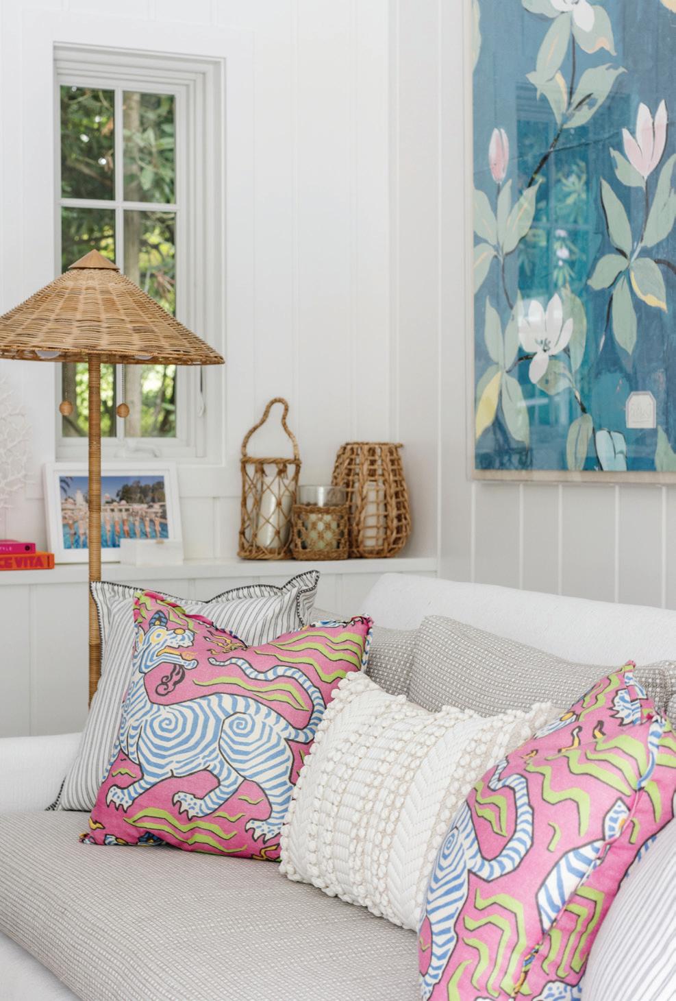
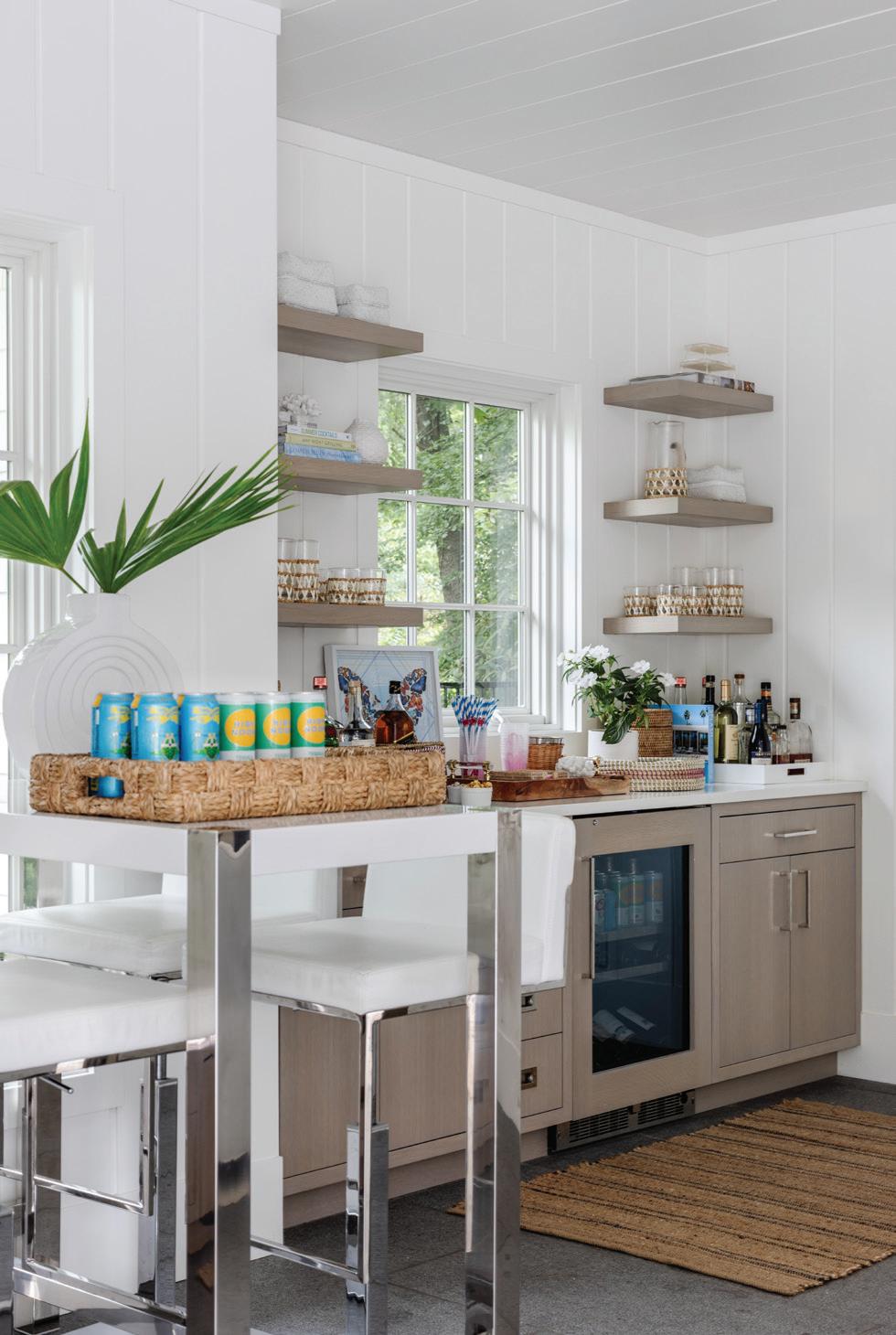
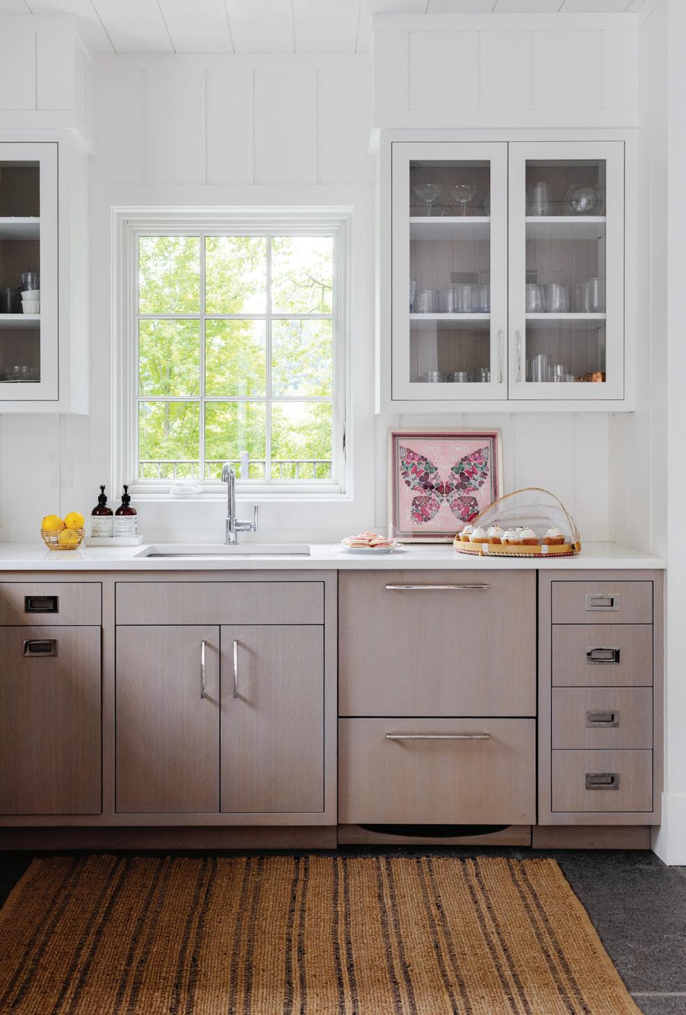
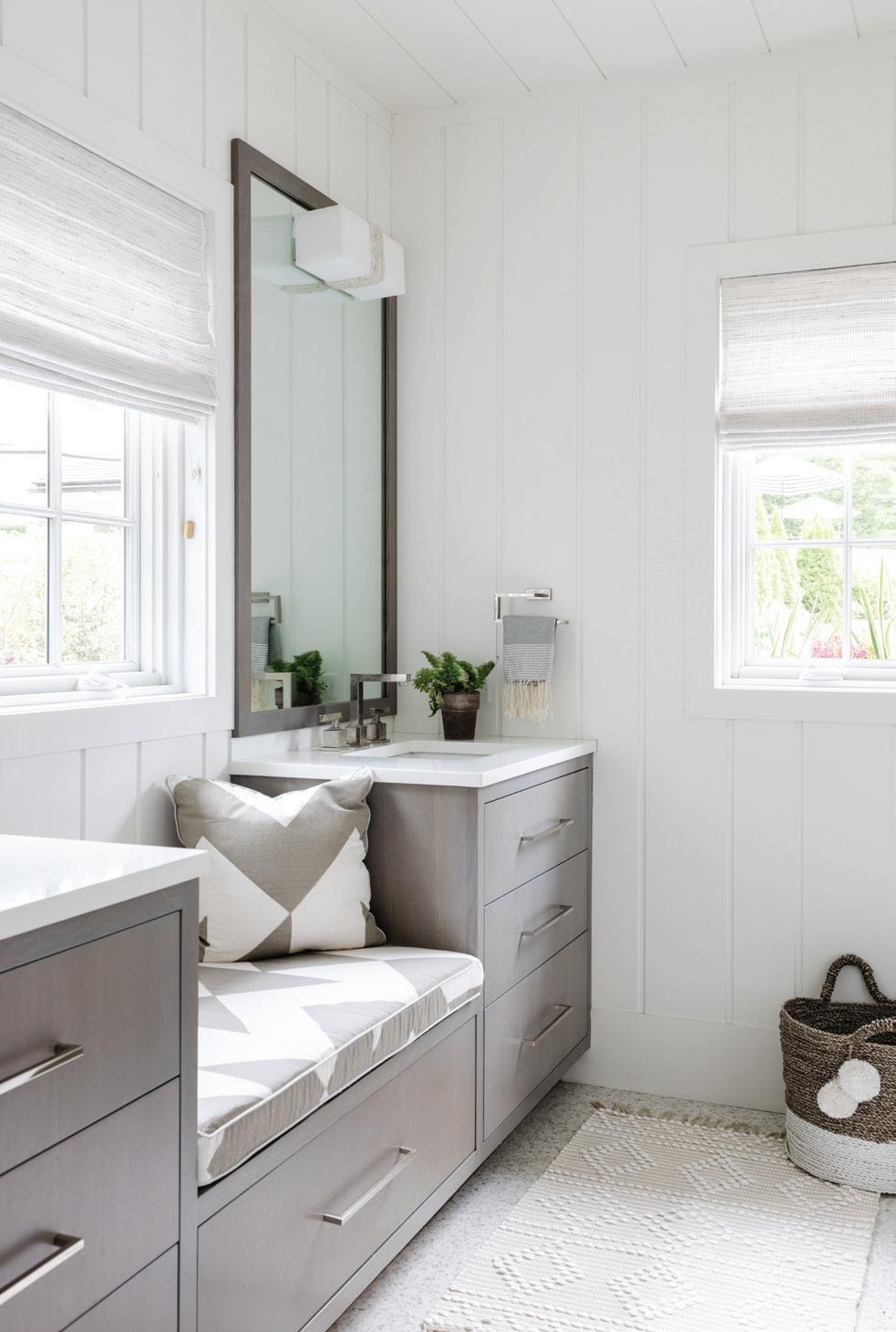
top, left: Pillows are covered in Clarence House’s Tibet in hot pink. Rattan hurricanes by Serena & Lily add natural tones and texture. top, right: Custom cerused cabinets are topped with white Quartz. bottom, left: A bar table and stools by Zuo Modern offer additional seating. bottom, right: The bathroom includes more cerused millwork and custom sconces by Ro Sham Beaux. opposite page: The custom limestone fireplace mantle has pieces of shell embedded in it, adding to the beachy vibe. Tutun’s vertical shiplap design wraps the room.
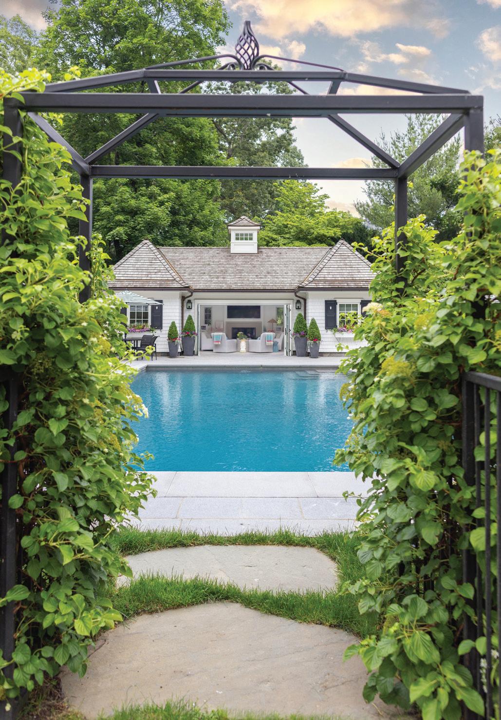
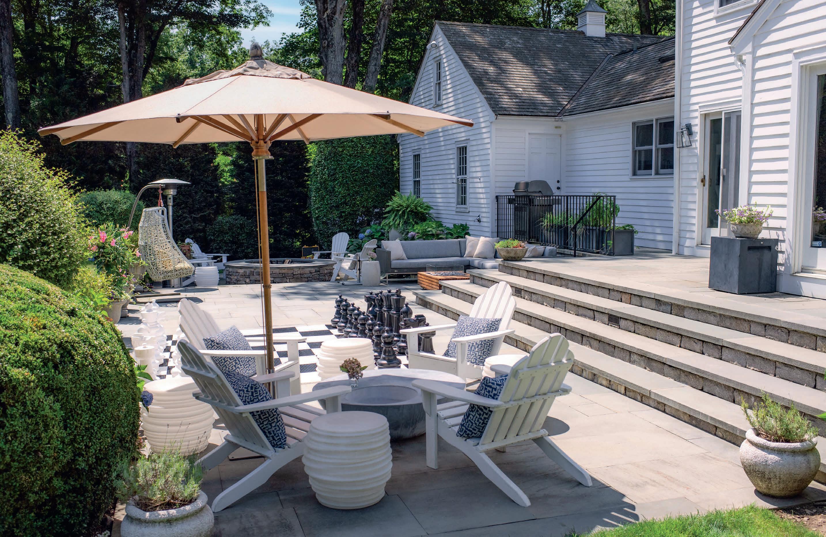
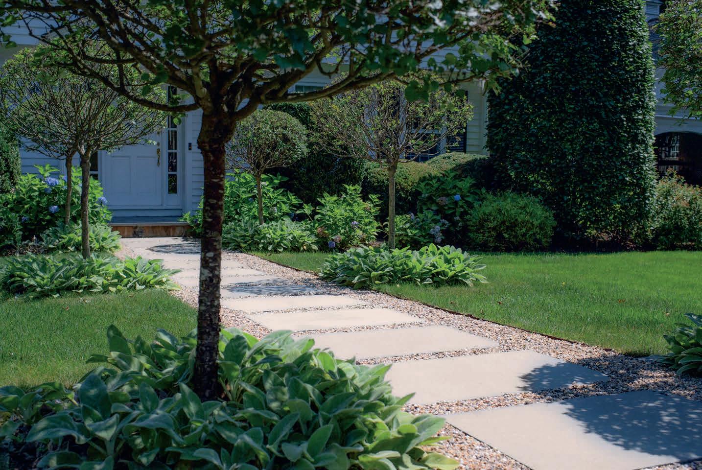
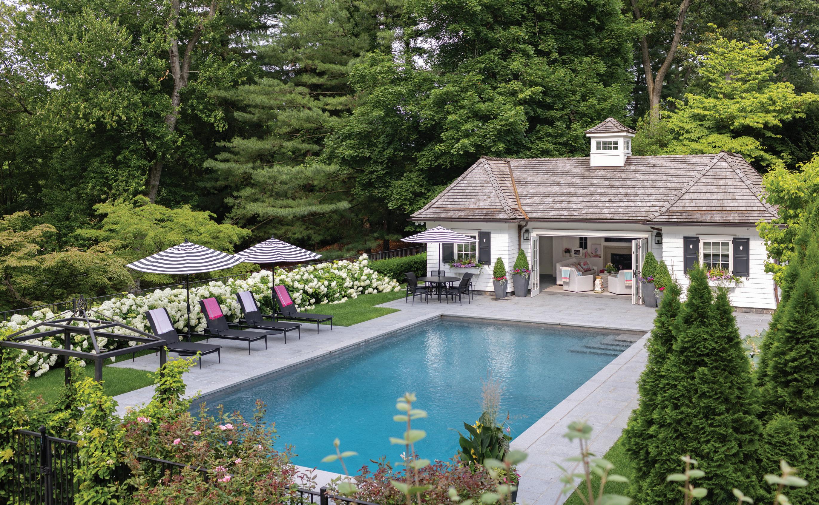
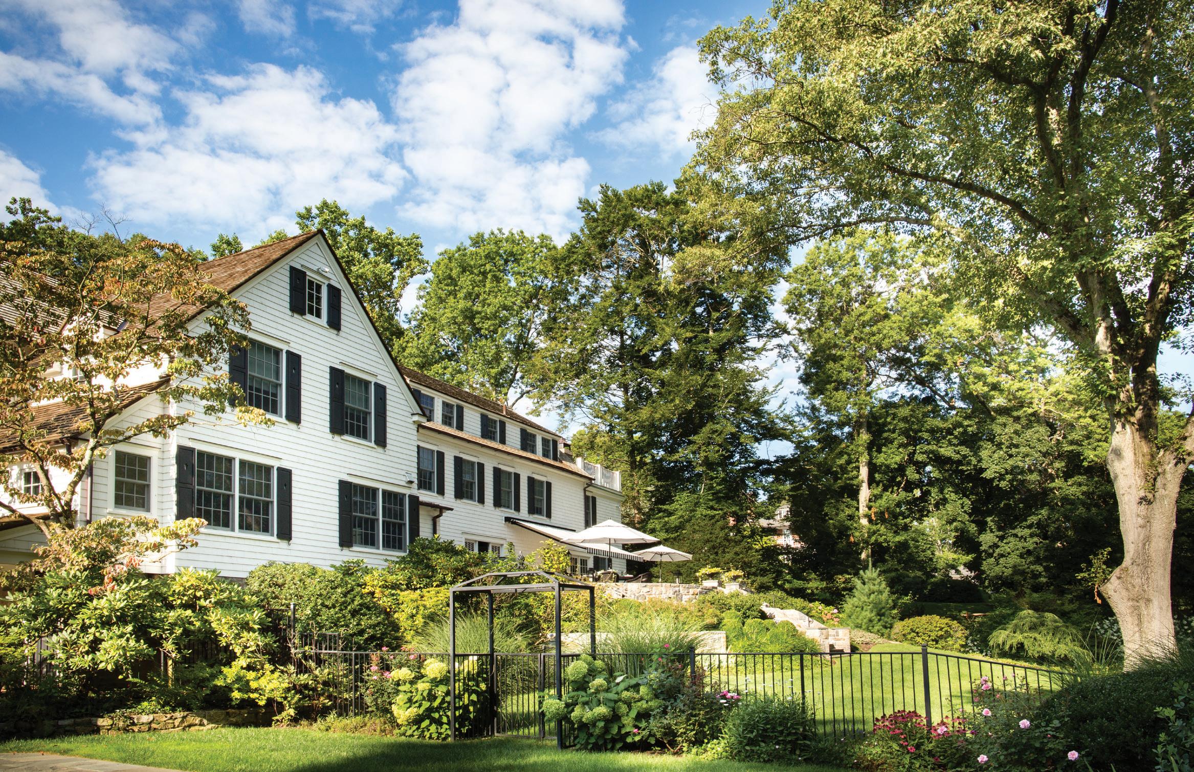 left: A peek into the pool house from the pool’s entrance. right: Tutun tried to bring the classic glamour of Hotel Bel-Air to the outdoor spaces. below: The landscape plan blends seamlessly from the main residence, which Tutun also designed.
really great, because it can get wet, and it has great texture. When that Marvin accordion door is fully open, the flow is really beautiful. There’s a beautiful limestone on the mantel called Seagrass, which actually has chunks of shells in it, which was another fun element. It really did become an extension of their beautiful outdoor space. They also wanted something that could be used year-round. In the winter, they have the fireplace, or the TV for watching movies. It’s another area to entertain in.
And the architecture is great. I love that sloped roofline. It just flows so nicely with the main house, with the symmetry of the two rooflines and the cupola above. We also have the same shutters and sconces from the main house.
Was color always part of the design plan?
Yes. We used some beautiful blues in the main house, but we didn’t use these shades. These are two of her favorite colors. We spent a lot of time talking about the feel, and she said, “Let’s bring in hot pink.”
What is your favorite part of the finished project?
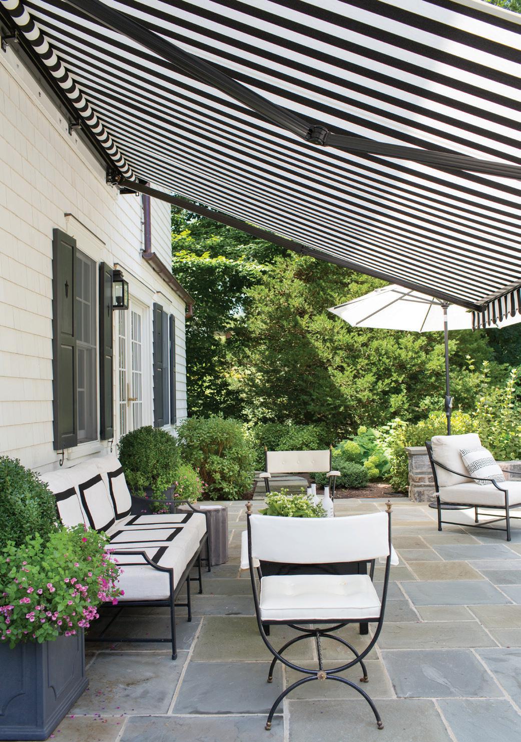
I love standing up on that main patio with the white umbrellas and looking down into the image of the pool and the pool house now, with the black and white striped umbrellas. The flow of the house is so gorgeous.
The upper patio has a lot of vintage wrought iron chairs, the stone wall. I love that transition.
And I think the vertical shiplap is special. I think it’s just a nice modern twist to a very beautiful architectural detail that’s been around forever. We didn’t want it to be so predictable.
What colors are you currently drawn to?
Right now, I am really loving yellow and green together. Maybe even with a little orange and pink. I’m loving all of these citrusy, bright colors together. My own house doesn’t have a lot of color, but it’s because I’m dealing with so much color and pattern, every day. I need to be in an environment where it’s not so stimulating.
Professionals:
Interior Design: Laura Tutun Interiors, Rye, NY, 914-772-3614; lauratutuninteriors.com
Architect: Frank Marsella, Marsella Architects, Mamaroneck, 914-630-0800; marsella-architects.com
Contractor, Pool House: Paul Fontana, Cum Laude Group Inc., White Plains, 914-946-2488; cumlaudegroup.com
Contractor, Pool Design and Landscaping: Tom Alfredo, Alfredo LDC, 914-666-3950; alfredoldc.com
MAY/JUN 2024 45
above: Brown Jordan loungers sit under striped umbrellas at the picture-perfect pool.
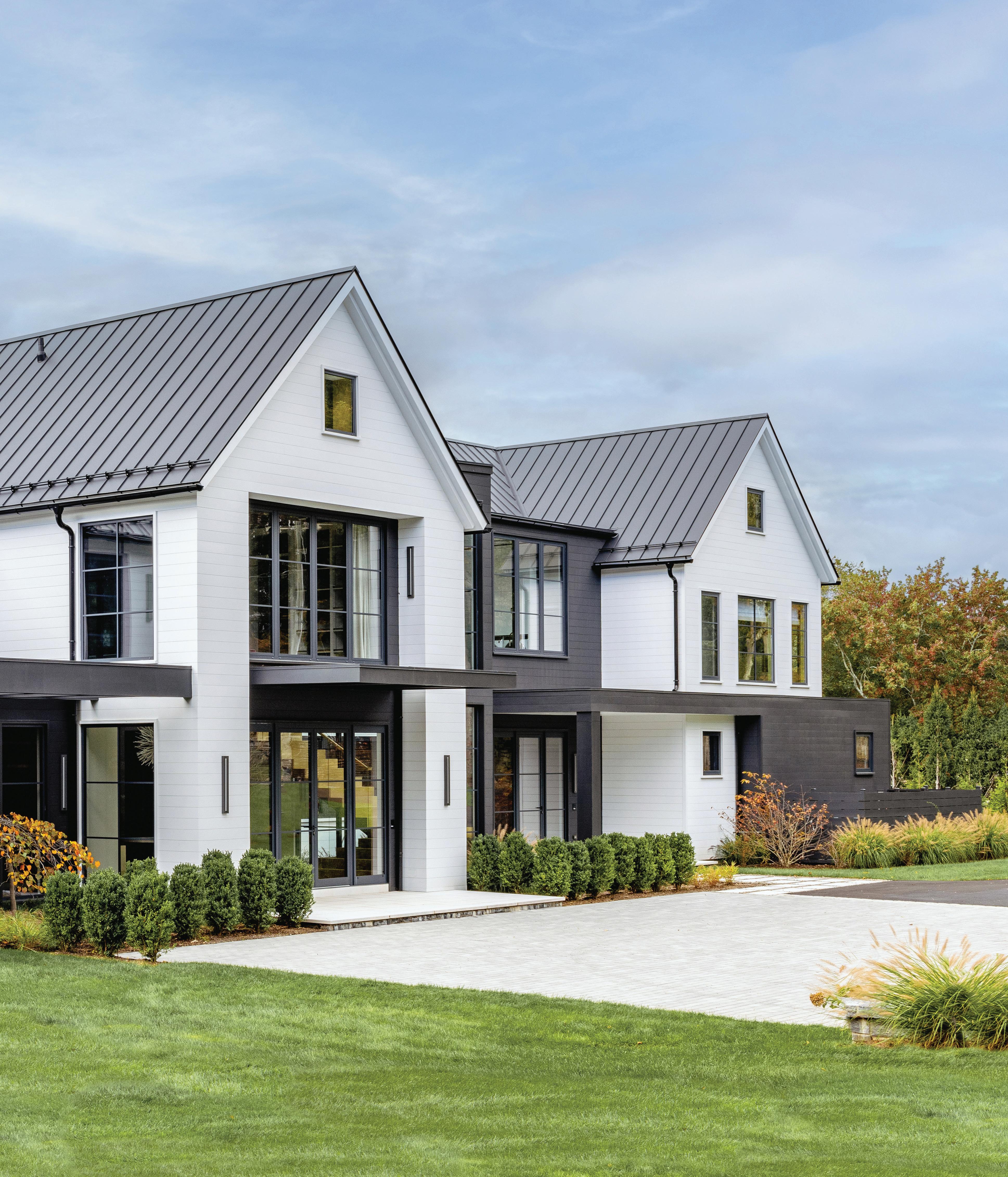
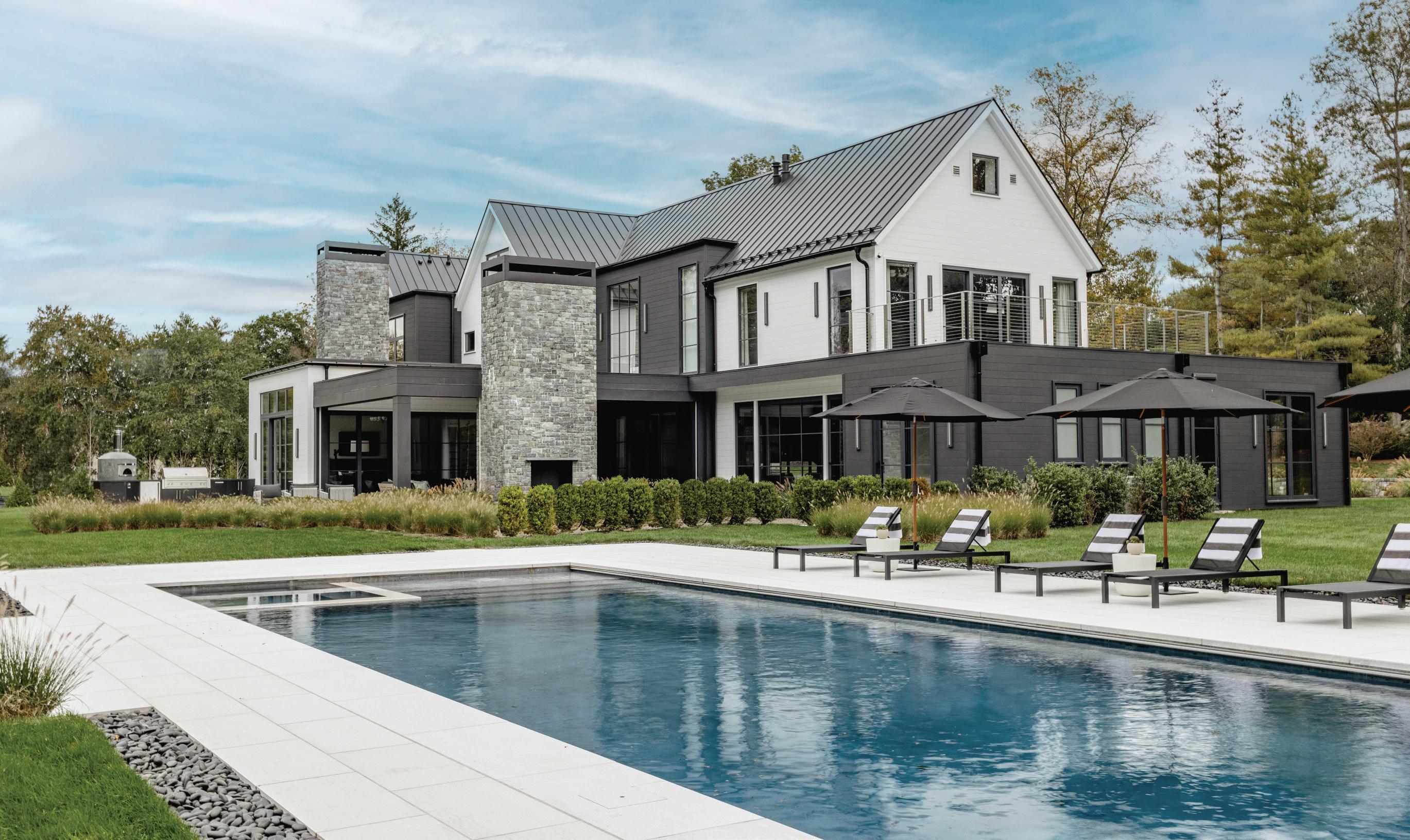
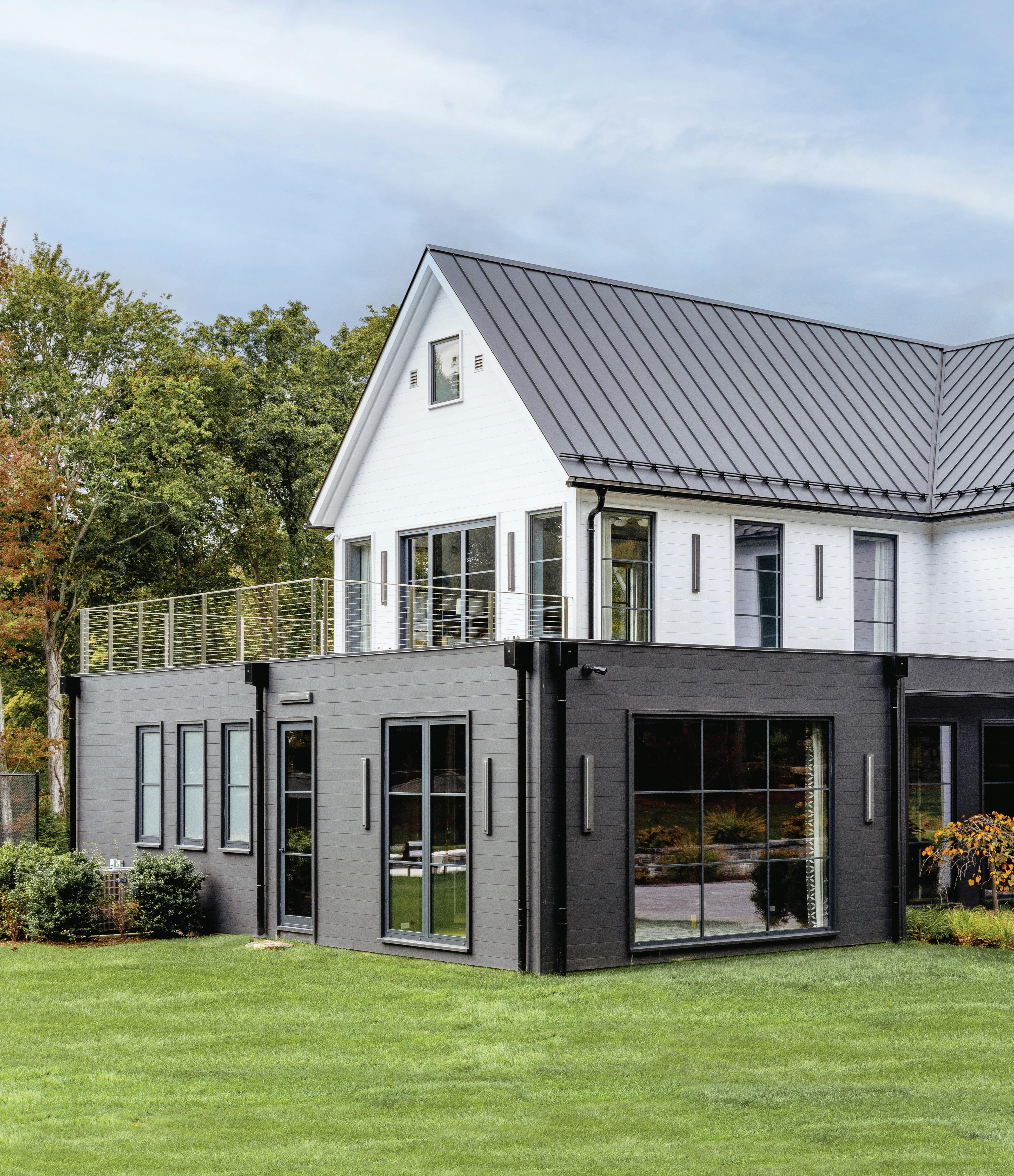 this photo: The modern exterior includes expansive glass walls and windows, ideal for capturing the east, south and west exposures.
MAXXED OUT
bold contemporary color and resort-style living make for the ultimate greenwich home
MAY/JUN 2024 47
interview with amy aidinis hirsch, amy aidinis hirsch interior design and doron sabag, sbp homes photographer amy vischio
“we don’t argue over, ‘That was my idea,’ or ‘That was your idea.’ Ideas come up, and we fly with them
.”
athomefc.com 48
—doron sabag, sbp homes
Tell us about the house and your collaboration.
Doron Sabag: We love working with Amy.
Amy Aidinis Hirsch: It’s a great collaboration. The architecture is modern, but for as big as it is, it feels intimate in so many spaces. I think that has to do with the personality of the interiors as well.
DS: You know how some people think that the exterior of the house— which I’d call a modern barn—should dictate the interior of the house?
I don’t believe that the interior of the house is a modern barn interior. I would almost call it Hollywood glam.
AAH: There are bits of organic components in there, but there’s such a pizazz, as well, with all the color. I love the unexpected complement from the outside. It’s completely different in many ways, and a lot of that has to do with the scale and vastness. I think the clients are spunky, youthful, vibrant. They wanted their house to be a place where people come together. The expanse of the house allowed us to create these destinations and zones.
DS: And for a modern barn, you’d think the interiors would be more neutral. This one is very elegant and chic. I think it’s more color than you’ve ever done, Amy.
AAH: I would say it’s certainly adventurous. It’s a confidence that most clients don’t have; they don’t usually see that vision. I also think the neutrality of the kitchen, and how it springs into all these other spaces, especially the bar, allows the vibrance to happen. The beauty about having a contemporary interior architecture is being able to do anything you want with it.
How do you know the client?
DS: A broker recommended us. And whenever I can, I recommend Amy. They were very easy and kind and wanted a team that was also easy and ego-free.
AAH: I think we have this synergy. There are elements that happen because things are orchestrated between us. We know what the tasks are and what the development is, and we can each respect one another’s opinion as it develops.
DS: We don’t argue over, “That was my idea,” or “That was your idea.” Ideas come up, and we fly with them.
AAH: These clients really let us have the vision.
DS: They wanted it to be clean and modern, but they wanted bold colors. They trusted us. I’ve been doing this for 22 years and built more than 100 houses now. I’ve done enough projects with Amy to say, “Just be creative, do your thing.” Sometimes, it’s a great client to have, and sometimes you don’t know if they ended up liking what you did until the end, which can be scary, because you don’t have the constant feedback.
AAH: They really allowed us to run with it. They had so much trust in us. That was the key to the whole thing. I think it was because of our platforms and what we presented to them, but their main focus was their children and family. It was all about entertaining and bringing people to enjoy the land; almost creating this resort-like atmosphere. They wanted a space where they can have lots of friends, and different play zones. We did unconventional things, like putting in this jungle gym zone for the young kids. It was great to have that carte blanche, to really fiddle with the layouts and be able to decorate the way we wanted to decorate. And I think that’s because they’re fun.
MAY/JUN 2024 49
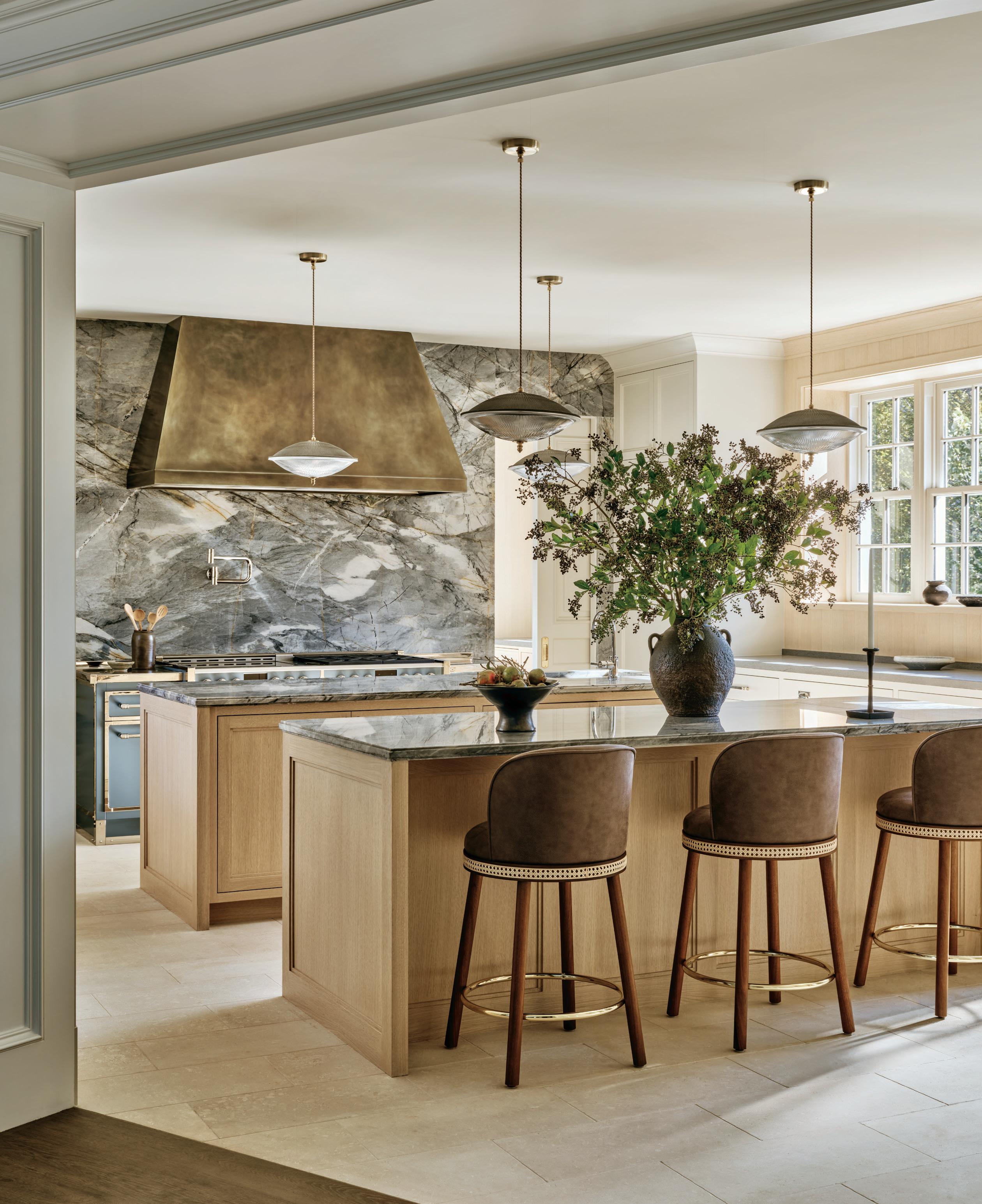
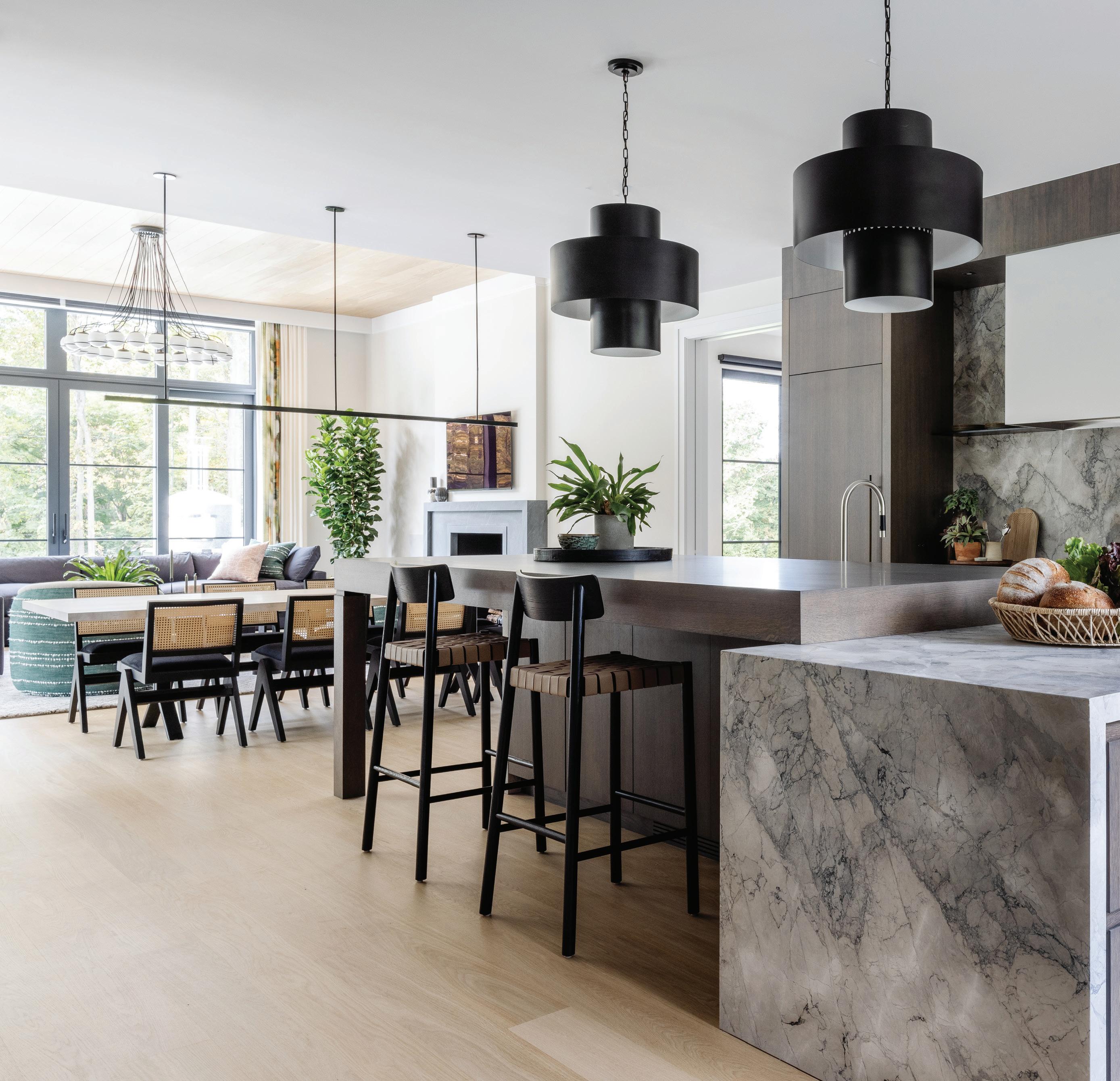
this photo: The kitchen stands as the home’s neutral heart, allowing for the rest of the spaces to push color boundaries. Visual Comfort pendants hang over the island, partially wrapped in Camouflage marble from Everest Marble in Norwalk.
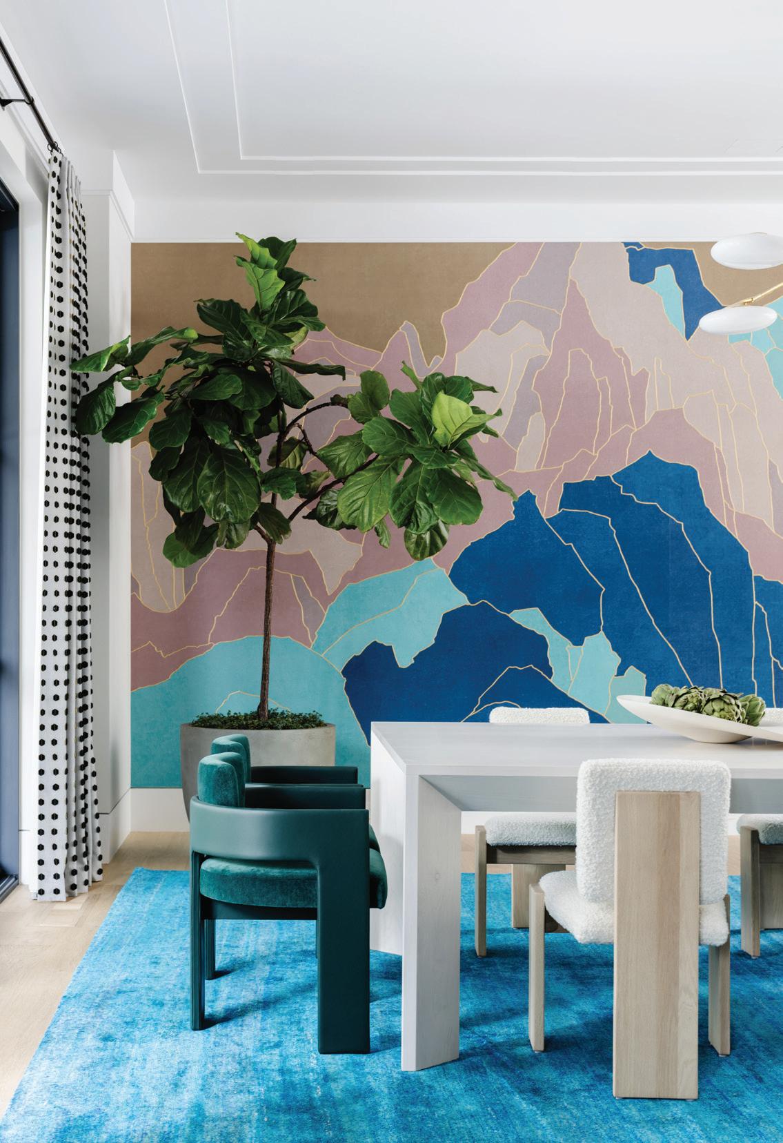
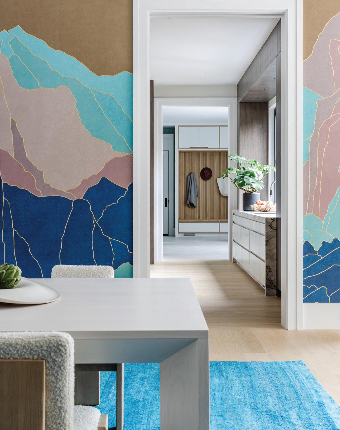
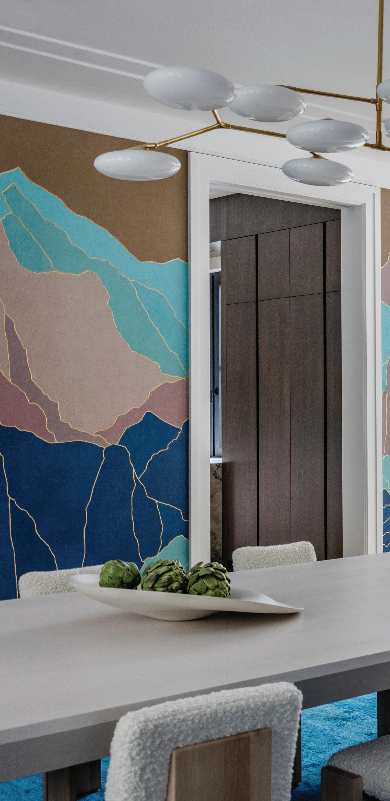
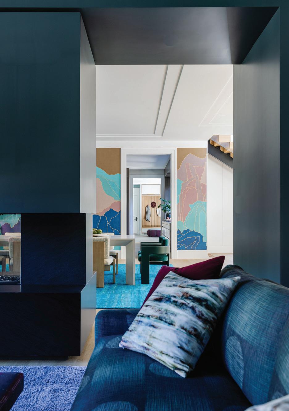
above: The Visual Comfort fixture is just one of many statement lighting choices throughout the home. above, left: Fromental’s Rockface wallpaper in the El Capitan colorway became a jumping-off point for the palette. Cuff Studio C back chairs in deep sea green anchor the table. below, left: A view from the dining table peeks into mudroom storage.
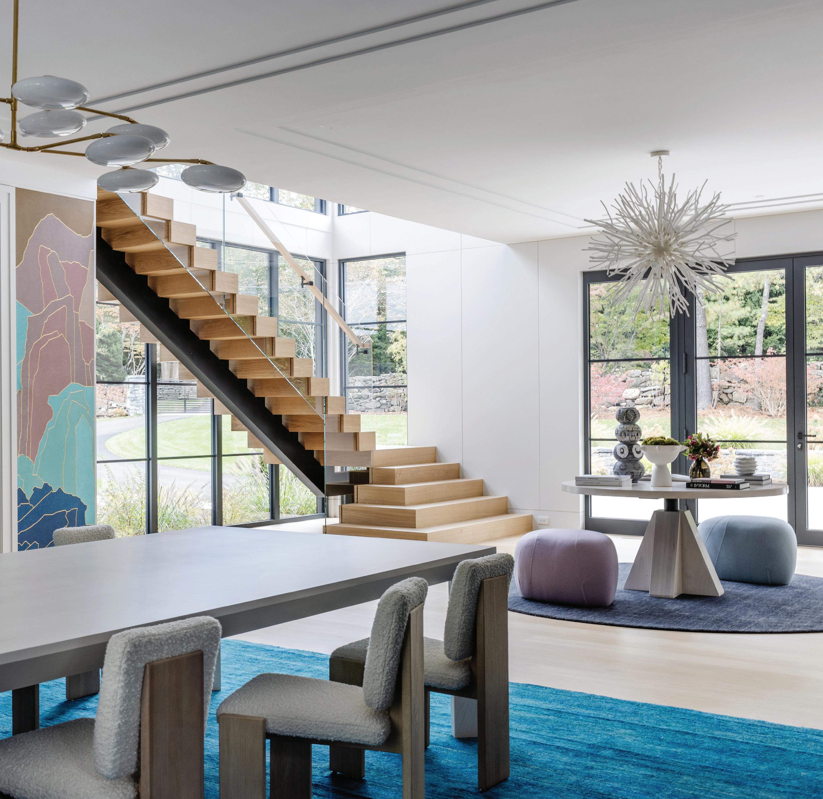
“I was dying to use the fromental wallpaper . That became the central force to the whole thing. it’s so impactful, and it allowed us to springboard off from there.”
—amy aidinis hirsch, amy aidinis hirsch interior design
MAY/JUN 2024 51
athomefc.com 52
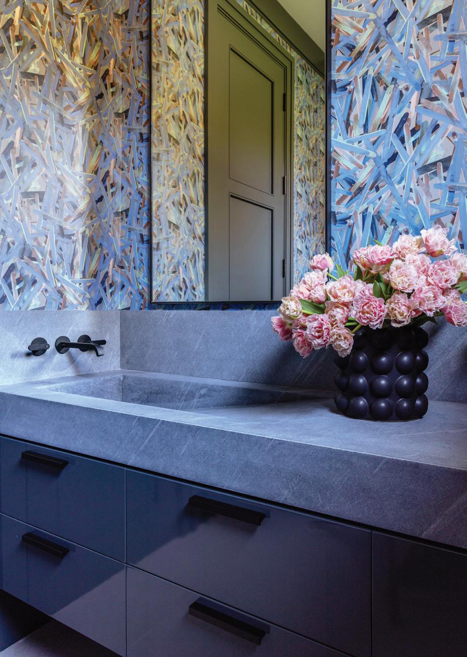
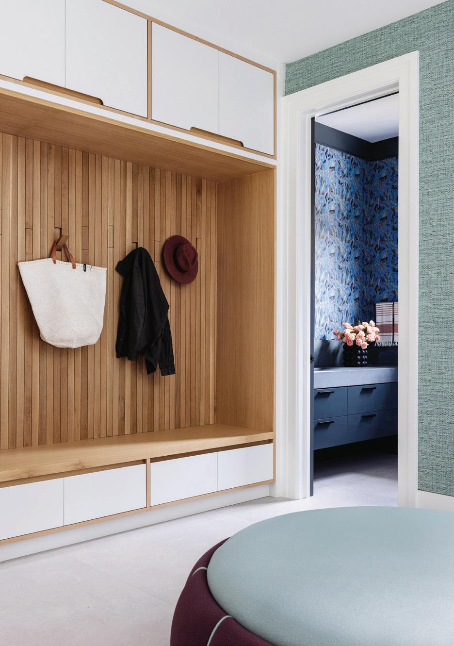
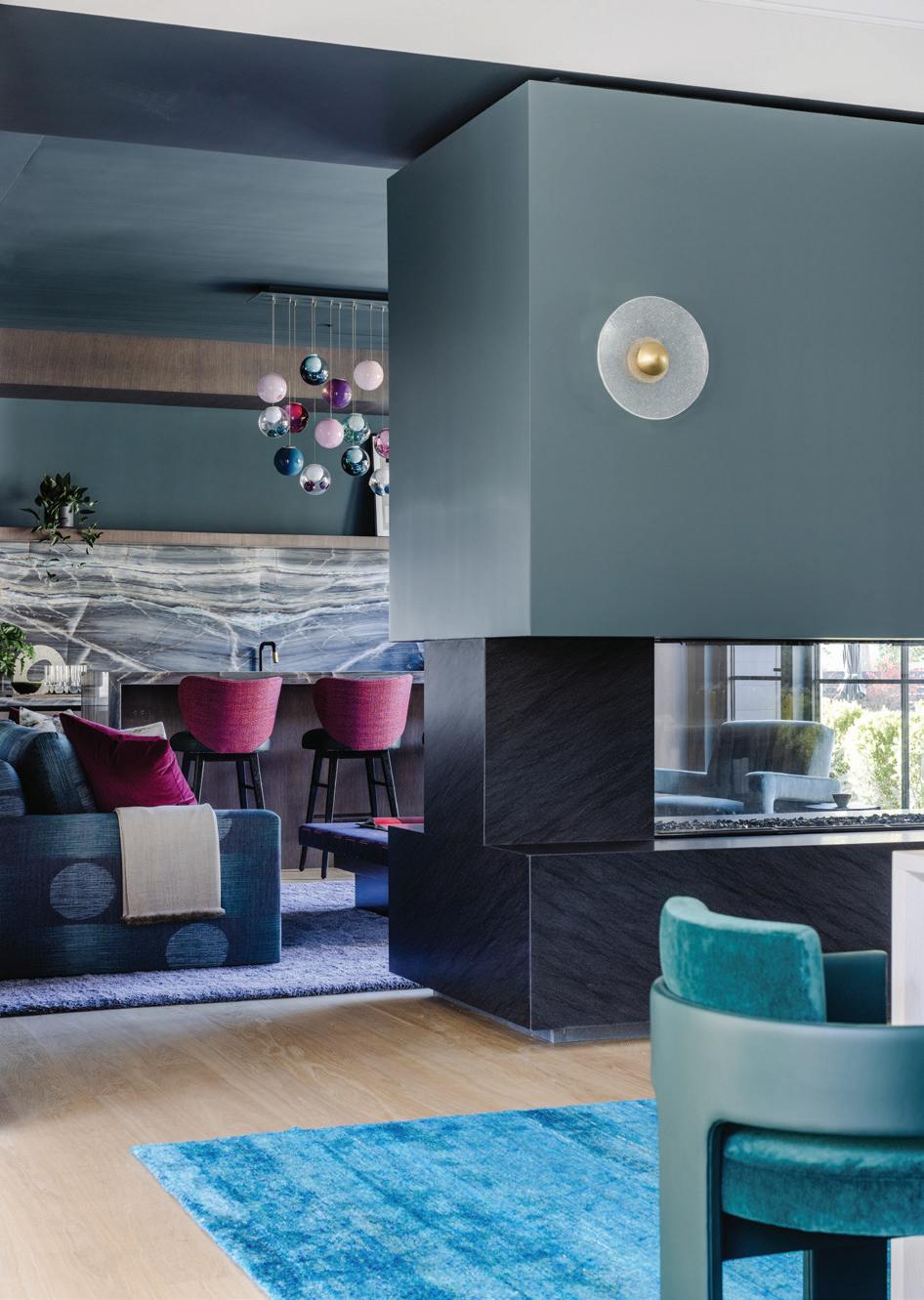
top, left: Continuity of color was important, especially for the main floor flow. top, right: A calming drop zone encourages organization. bottom, left: A custom mural from Bradley USA wraps the walls of this powder bath. bottom, right: Entertaining is easier, when guests can move from the dining table to the lounge/bar space. opposite page: Fuschia pops on the bar stool backs and from the Bocci 28 series light fixture.
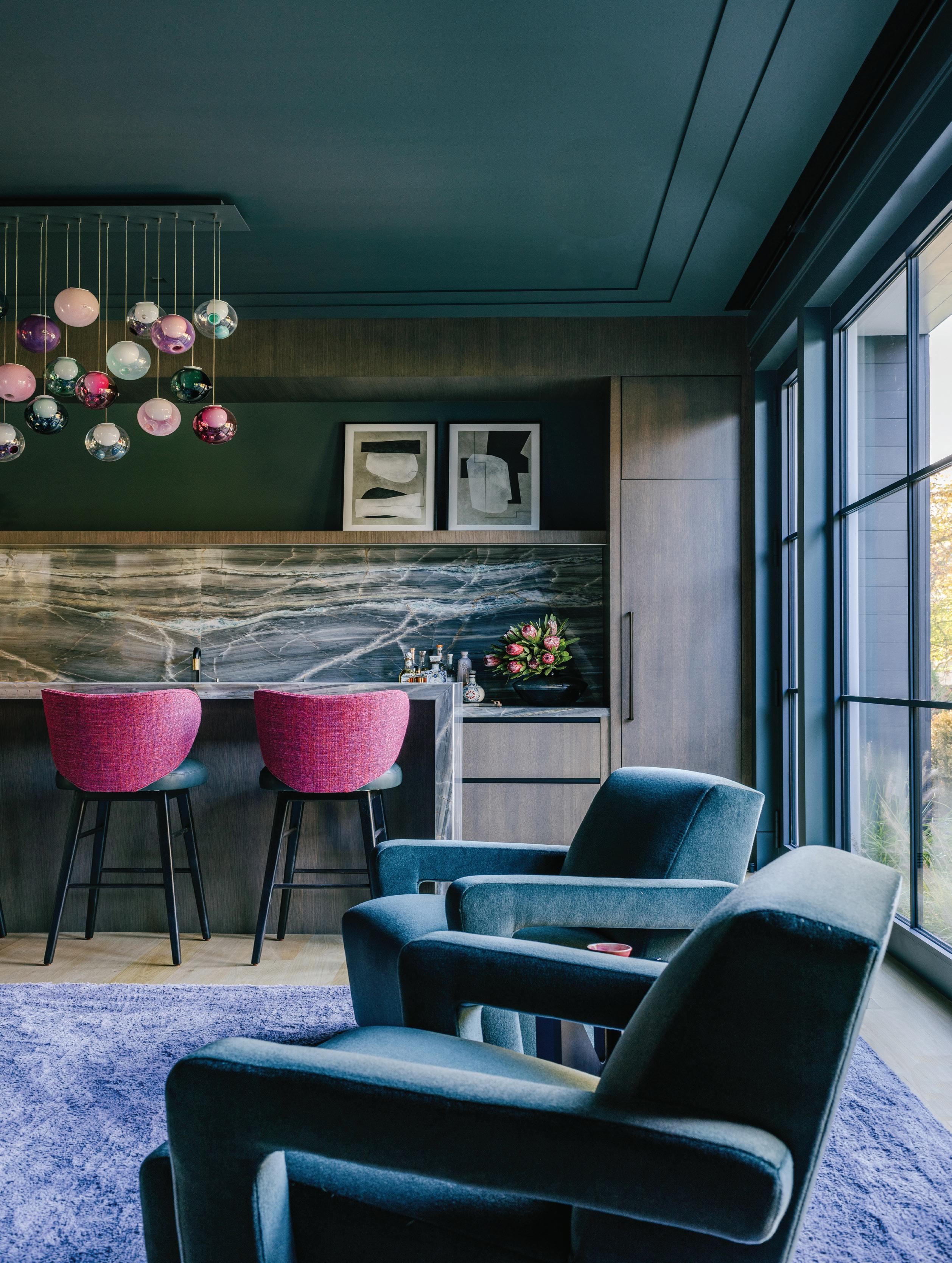
“I think bars are more popular in houses. They’re not ostentatious, but they create a destination that people would not have used in a traditional living room.”
—doron sabag, sbp homes
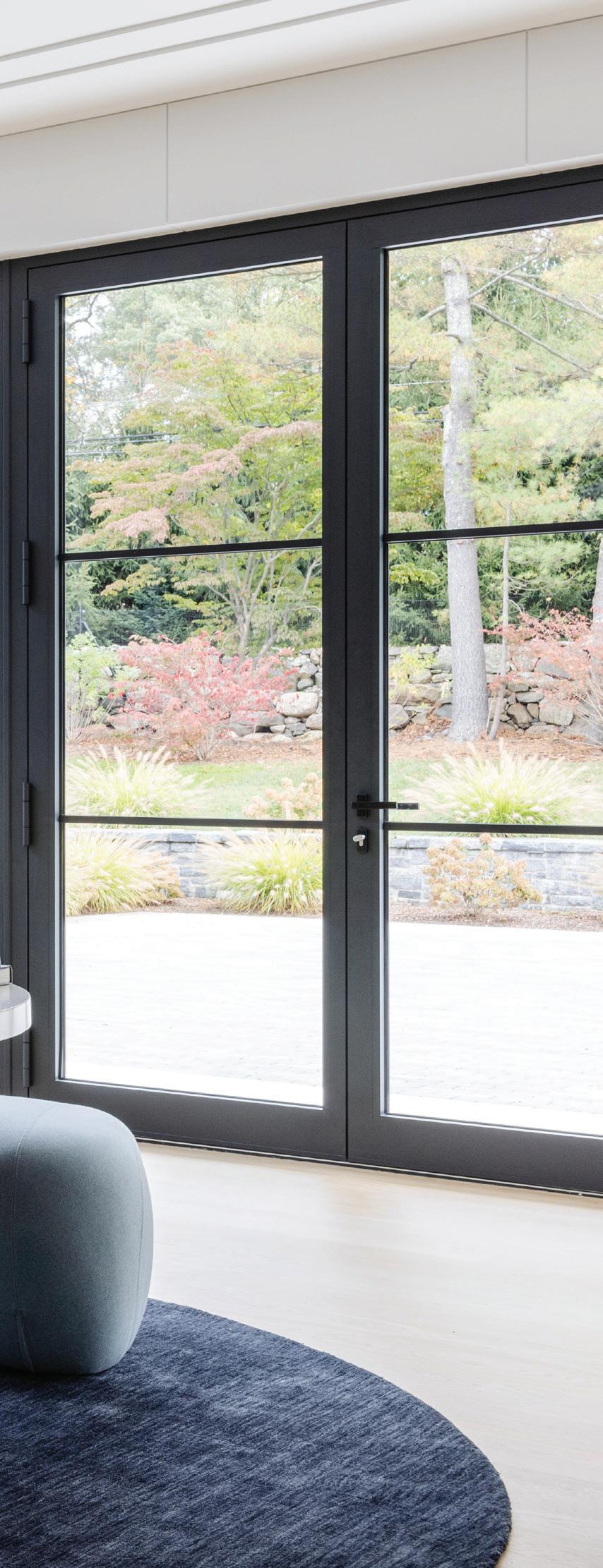
There is so much glass, opening up the house to the outside.
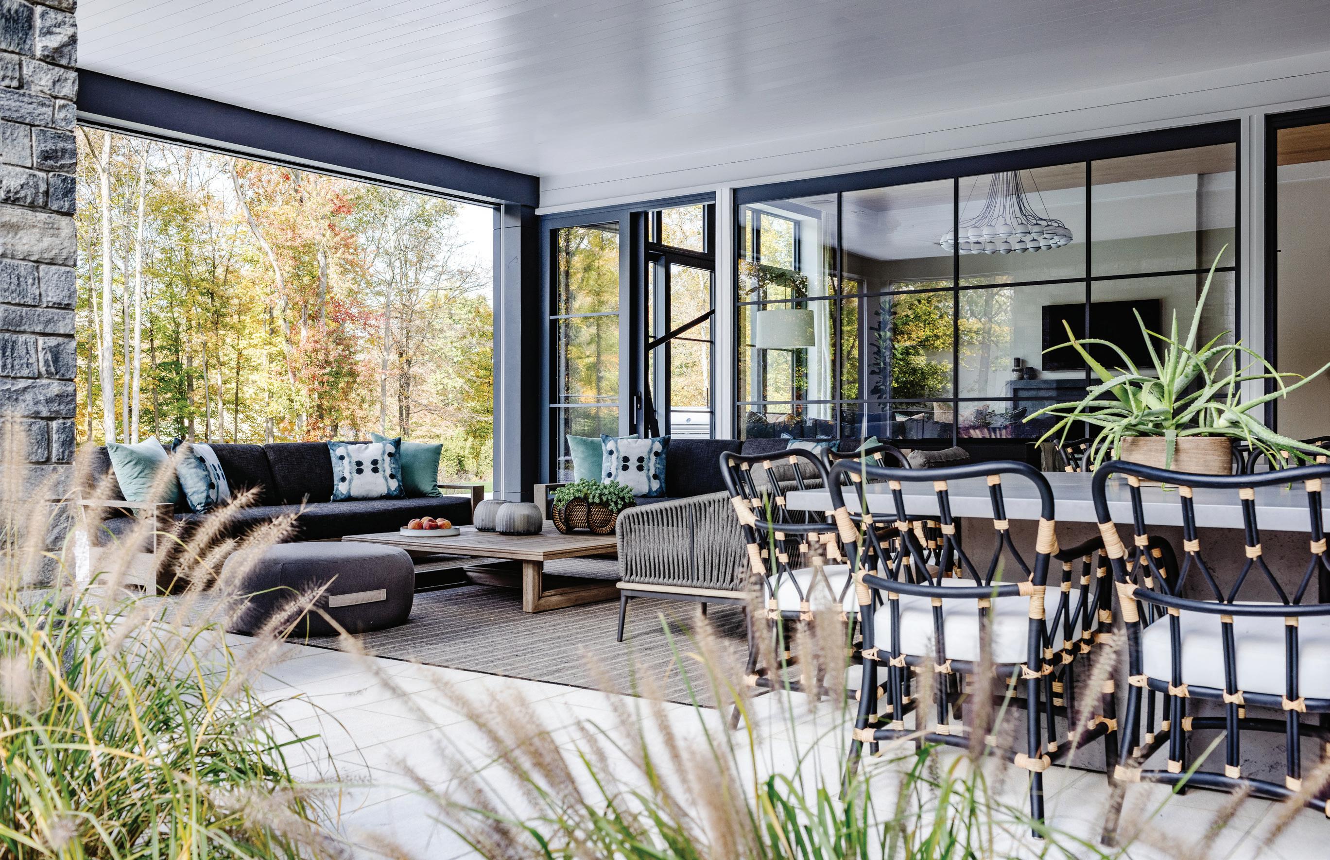
DS: The nature of a modern barn includes the expansive glass to bring the outdoors in and vice versa. We wanted the rooms to be filled with light, and this house has east, south and west exposures. We have an amazing covered porch that Amy furnished in a way that created another huge room. In all of our projects, we have one outdoor space with the fireplace, heaters in the ceiling, music, TV. You can live outside, in the houses we design (in the summer). It’s almost like it’s not a Greenwich house. AAH: It feels Southampton-y, in a way.
Tell us about these stairs.
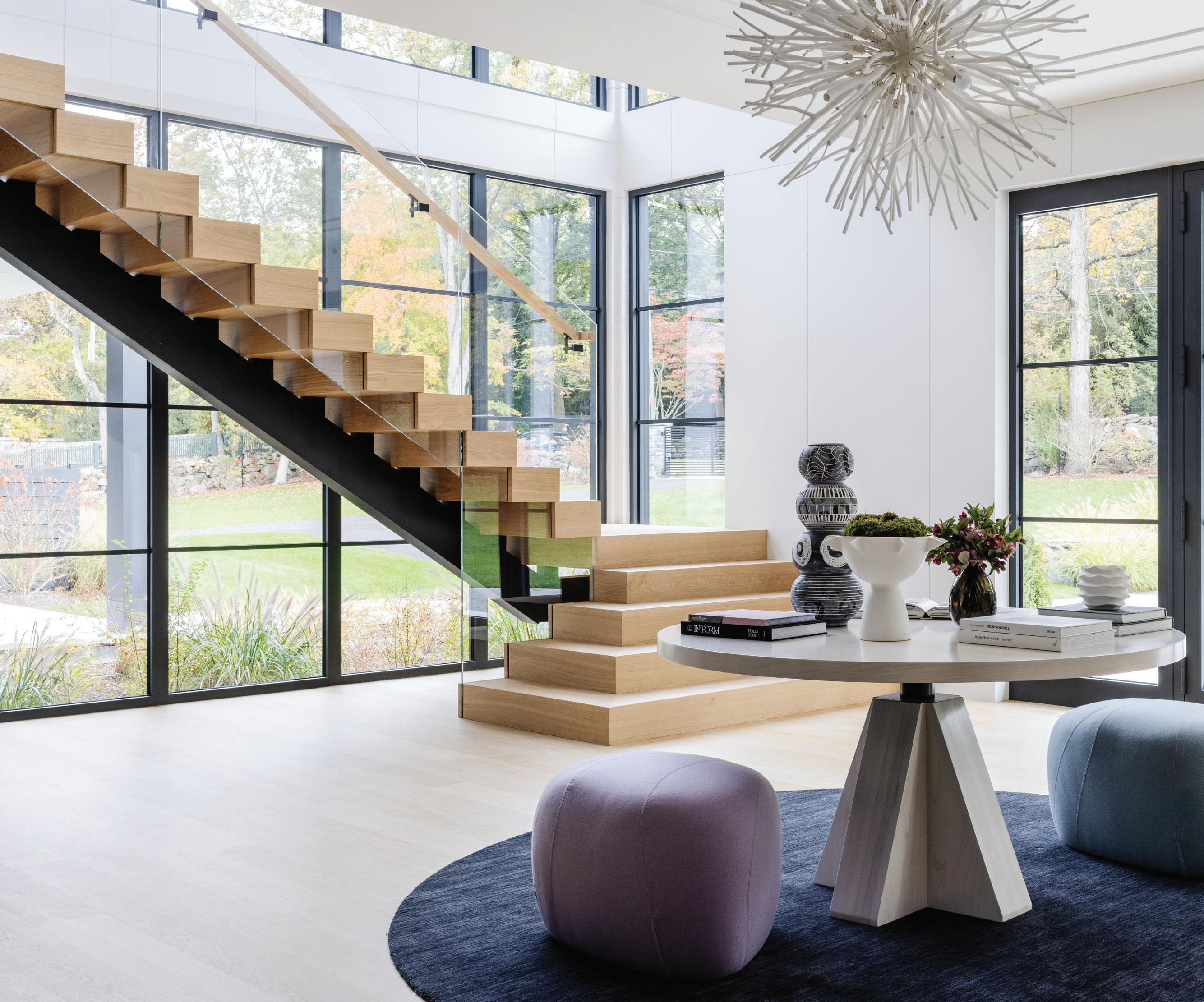
DS: They wanted modern stairs, similar to ones we’ve done in the Hamptons, but yet they didn’t want them to be open. Most have the open
risers, but we created those thick treads that sit on one another. If they wanted to do a runner, they could. They wanted it to be a focal point, and with the platform and glass railing, it’s a statement.
AAH: Where we landed was amazing, creating that platform. It’s not your typical stair. It’s one of the most important factors that you see in the house, but you don’t see it at first glance, as it’s off to the side. The husband wanted to be able to see straight back to the yard. Having that connection to the land was so important to him. The stairs themselves are sculptural, and they’re their own element, but they’re not the first thing you see.
We love all the statement stone throughout. How did you choose those?
AAH: This is where Doron and I are so sequential together. The stone
athomefc.com 54
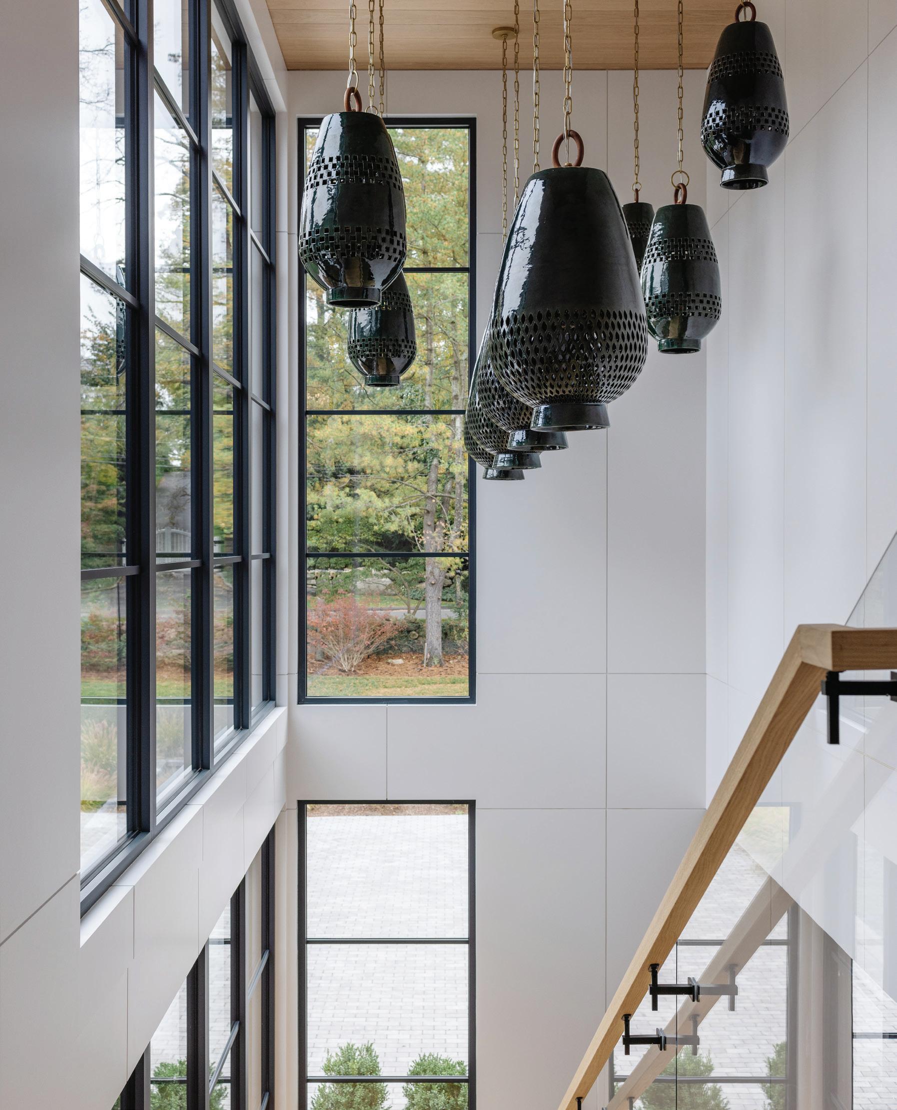
this photo: The sculptural stairs were born of creativity from Sabag’s team. An Arteriors chandelier hangs over the entry table, decorated with Lauren Kaplan pottery sourced through The Brady Collection. opposite page: Guests get a view of the L’Aviva Home Atzompa pendants from the stairs.
for the majority of the house came from Everest in Norwalk. He’ll walk through and tag stuff, and then I’ll go tag stuff, and one day I was in there and saw stone that ended up in the bar room. They only had five slabs and mentioned to me that Doron had already claimed them (laughs). In homes like this, where it’s contemporary and a blank canvas, it becomes that extra spark within the space. You have to be strategic as you’re laying it out, getting the best piece and using it properly. We’re so thoughtful, and that’s where the team comes into play. We’re all very cognizant of what we’re trying to arrive at.
Was color always part of your larger plan?
AAH: In these contemporary homes, you want to be respectful to the environment, but I couldn’t do one more gray room. I couldn’t do one
more monochromatic house. Because the architecture is so simple, I also wanted so many more layers. I’ve never done a turquoise rug. I was even pushed out of my own box, which was wonderful.
There are so many fun lighting choices in this house. How did you manage to tie them all together?
AAH: We do so much big lighting. I think it’s part of our statement, part of our format. These houses are so large, so you have to humanize them. The challenge is balancing all these different types of textural elements up on the ceiling, and finding ways to distinguish them. Going through the bar room, it was having this spark of fuchsia color in a space that’s much more masculine. It’s balancing things that are solid with things that aren’t, large scale versus small.
MAY/JUN 2024 55
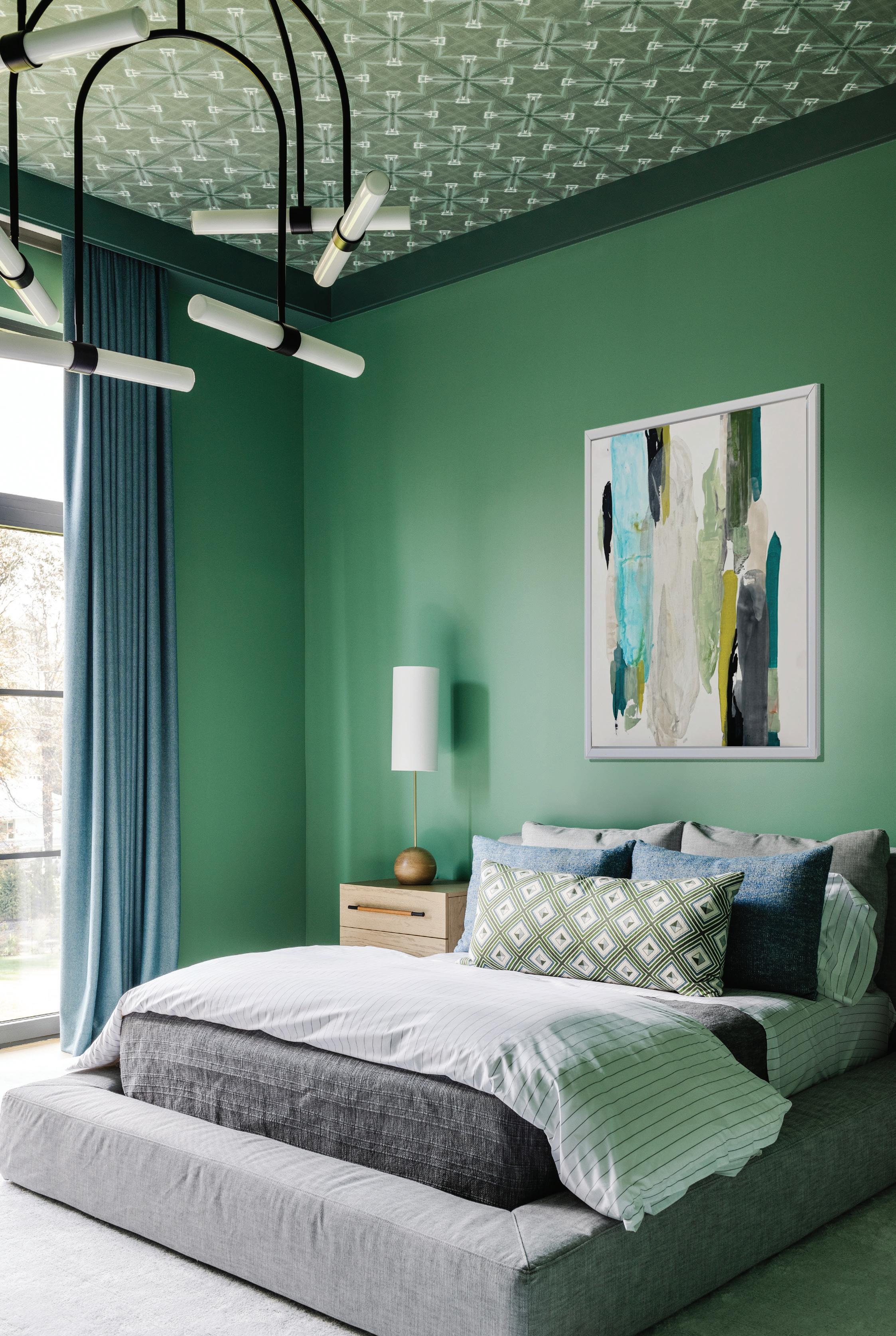 this photo: Artwork by Amy Vischio hangs on the vivid green walls of this boy’s room.
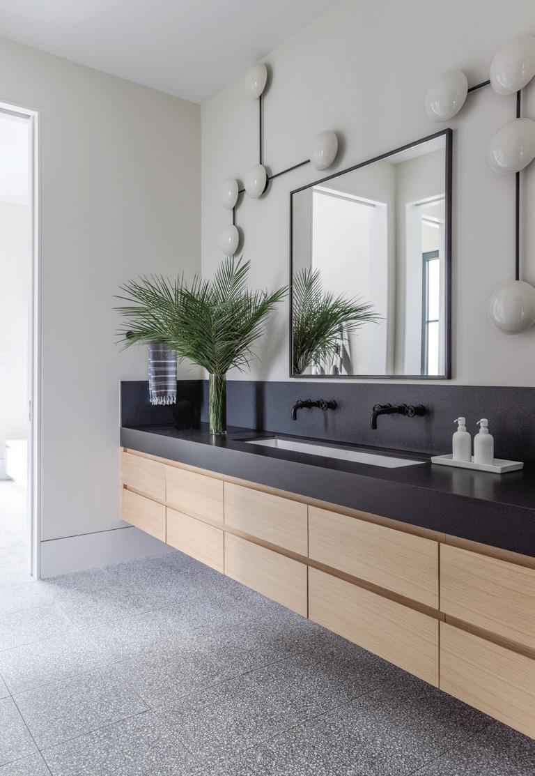
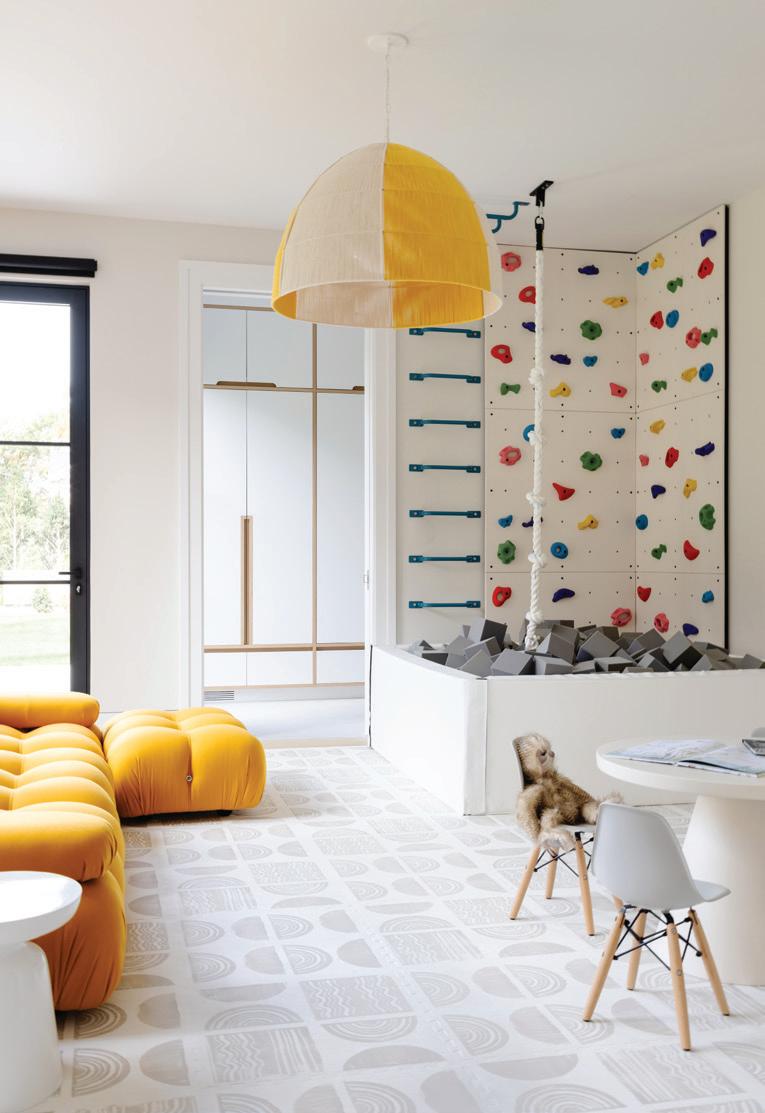

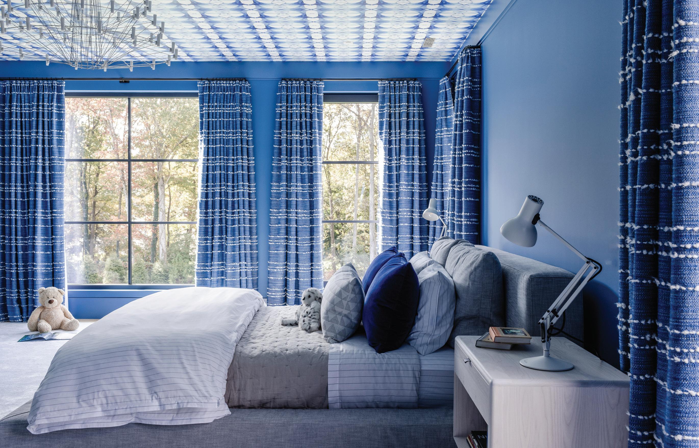
top, left: Arteriors Glaze sculptural sconces frame the mirror in this bathroom. top, middle: A custom Bone Simple pendant adds a playful touch to this kids’ space. Mat flooring from House of Noa provides extra cushion for soft landings. top, right: Hirsch found the black and white Terrazzo pieces at Greenwich Tile. below: This boy’s room gets Lindsay Cowles Alta wallpaper on the ceiling and drapery made with Élitis’ Horizon in Flânerie—one of Hirsch’s favorite fabrics.

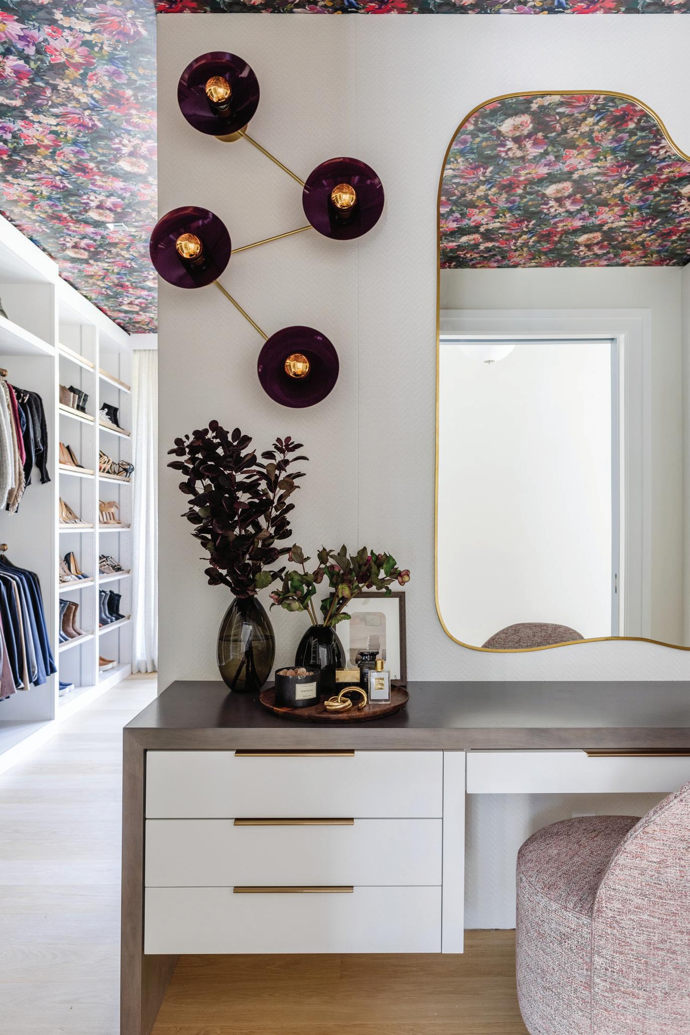
“This is one of those spaces where it has to match the personality of the client. It’s the one space that could be more feminine . ”
athomefc.com 58
left: The wife’s dressing room is unabashedly feminine, with Clarke & Clarke Exotica wallpaper and a custom ottoman. right: In addition to the expansive closet space, Hirsch created a vanity setup for the client.
—amy aidinis hirsch, amy aidinis hirsch interior design
MAY/JUN 2024 59
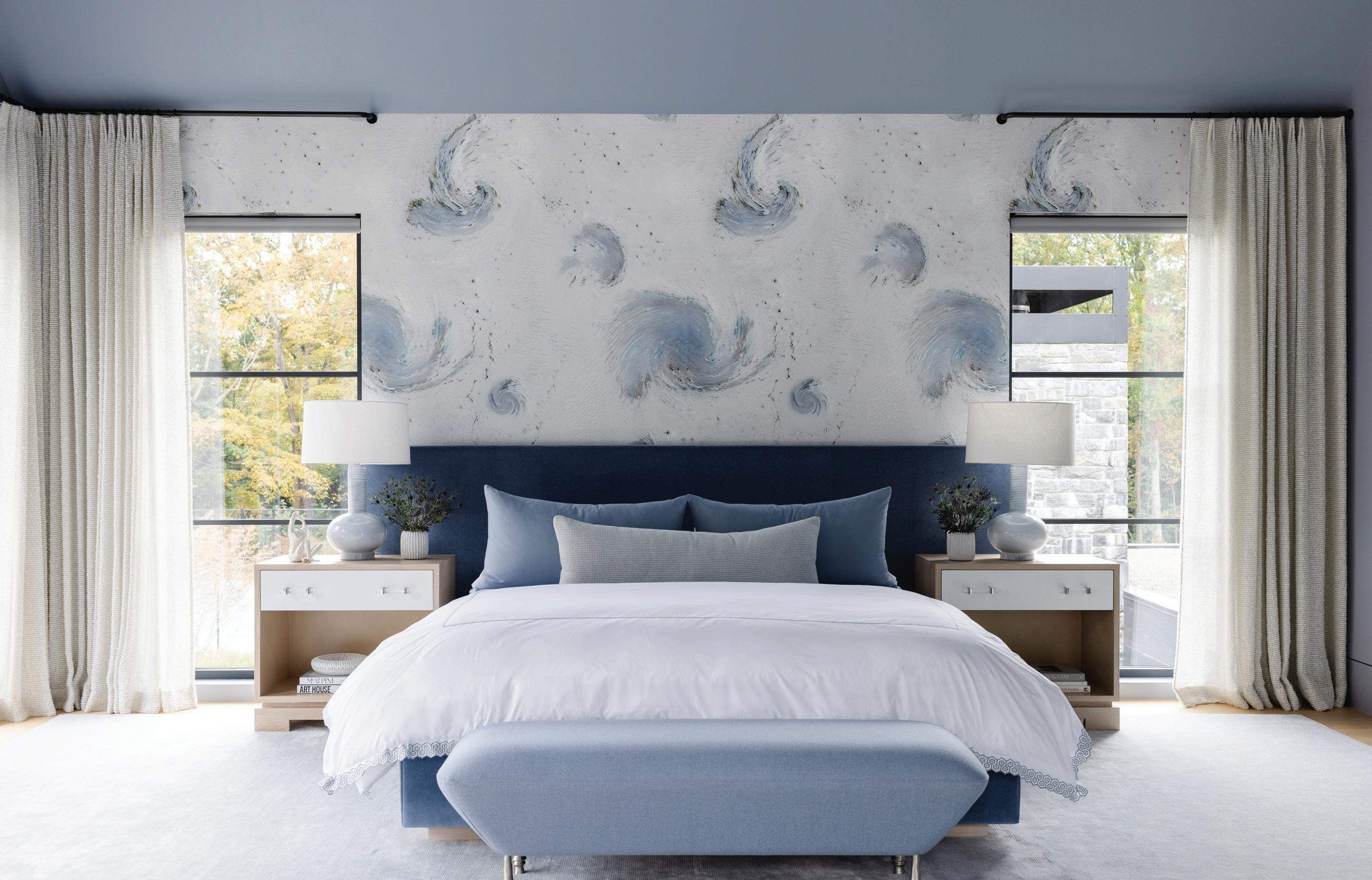
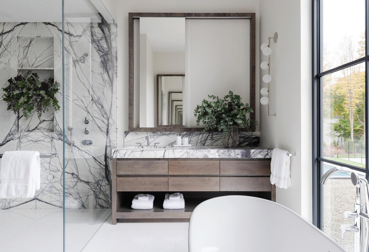
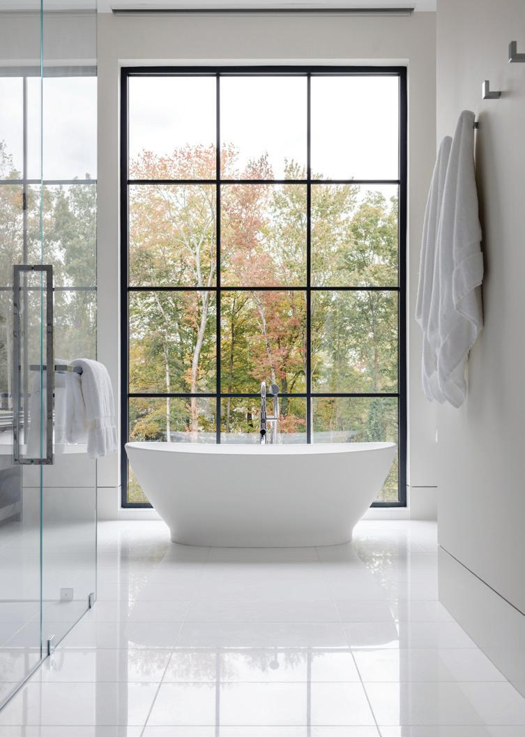
above: The primary bedroom is still colorful, but calm, with soft blues picked up from the Trove Noctis printed wallcovering. below, left: Hirsch found the Lilac slabs at Norwalk’s Everest Marble. below, right: A freestanding soaking tub anchors the serene bathroom space.
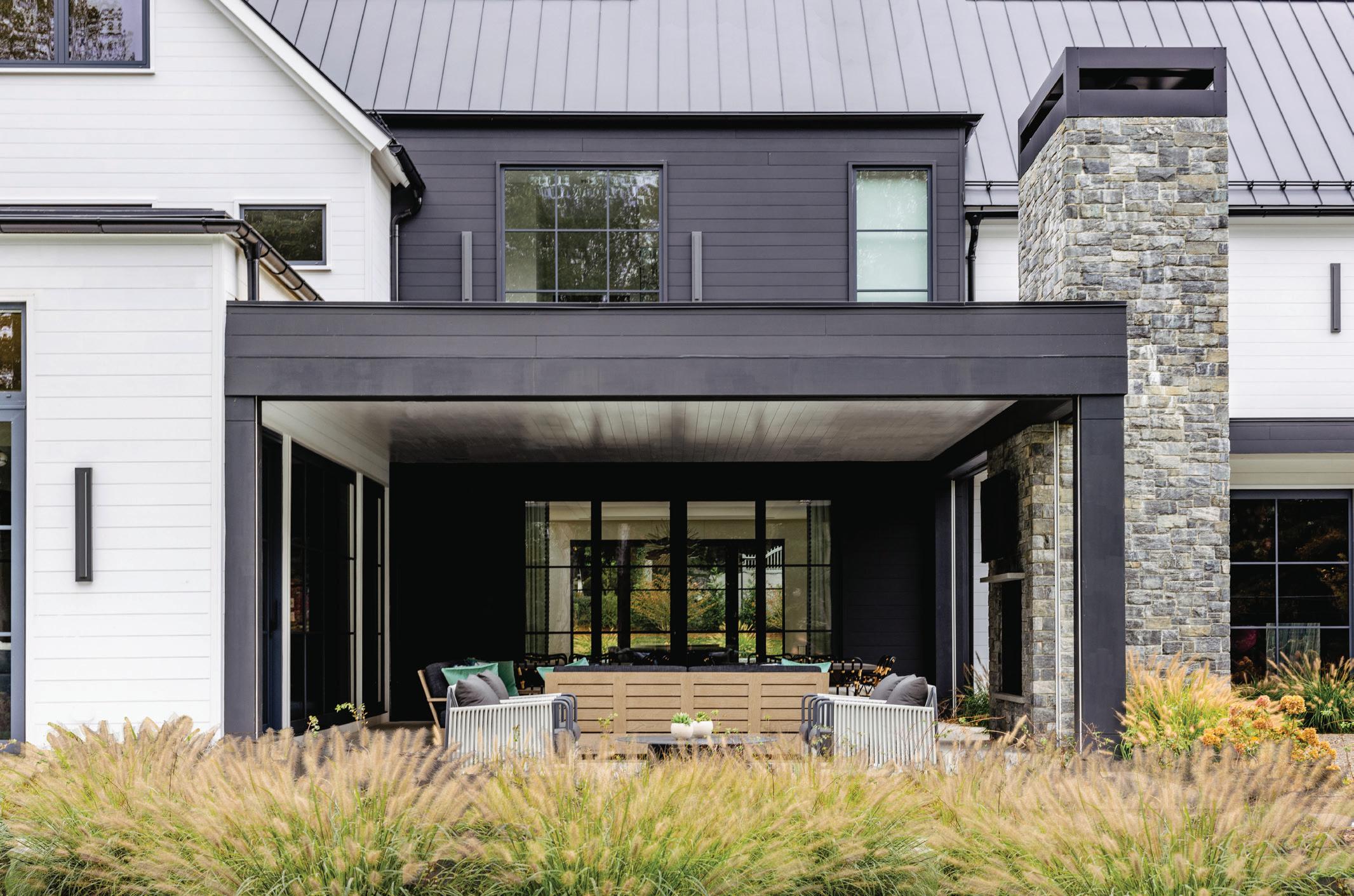
above: Sabag loves creating these exterior rooms for clients, perfect for warm-weather lounging. below: Family and friends can gather around the outdoor dining table or settle into the RH sofas.
How did you land on this palette?
AAH: I was dying to use the Fromental wallpaper (in the living/dining room). That became the central force to the whole thing. It’s so impactful, and it allowed us to springboard off from there. I was nervous that the family room would become the most monochromatic space and feel disconnected, but I’m so pleased with the way it turned out.
Tell us about this fabulous dressing room.
AAH: It’s actually much larger than what you see. This is one of those spaces where it has to match the personality of the client. It’s the one space that could be more feminine. She’s surrounded by boys, and she said, “I just need a space for me.” It’s cheerful, it’s playful, it’s spunky. It’s her. Wallpaper on a ceiling is so impactful. Without that, the room just wouldn’t feel the same.
Tell us about the kitchen.
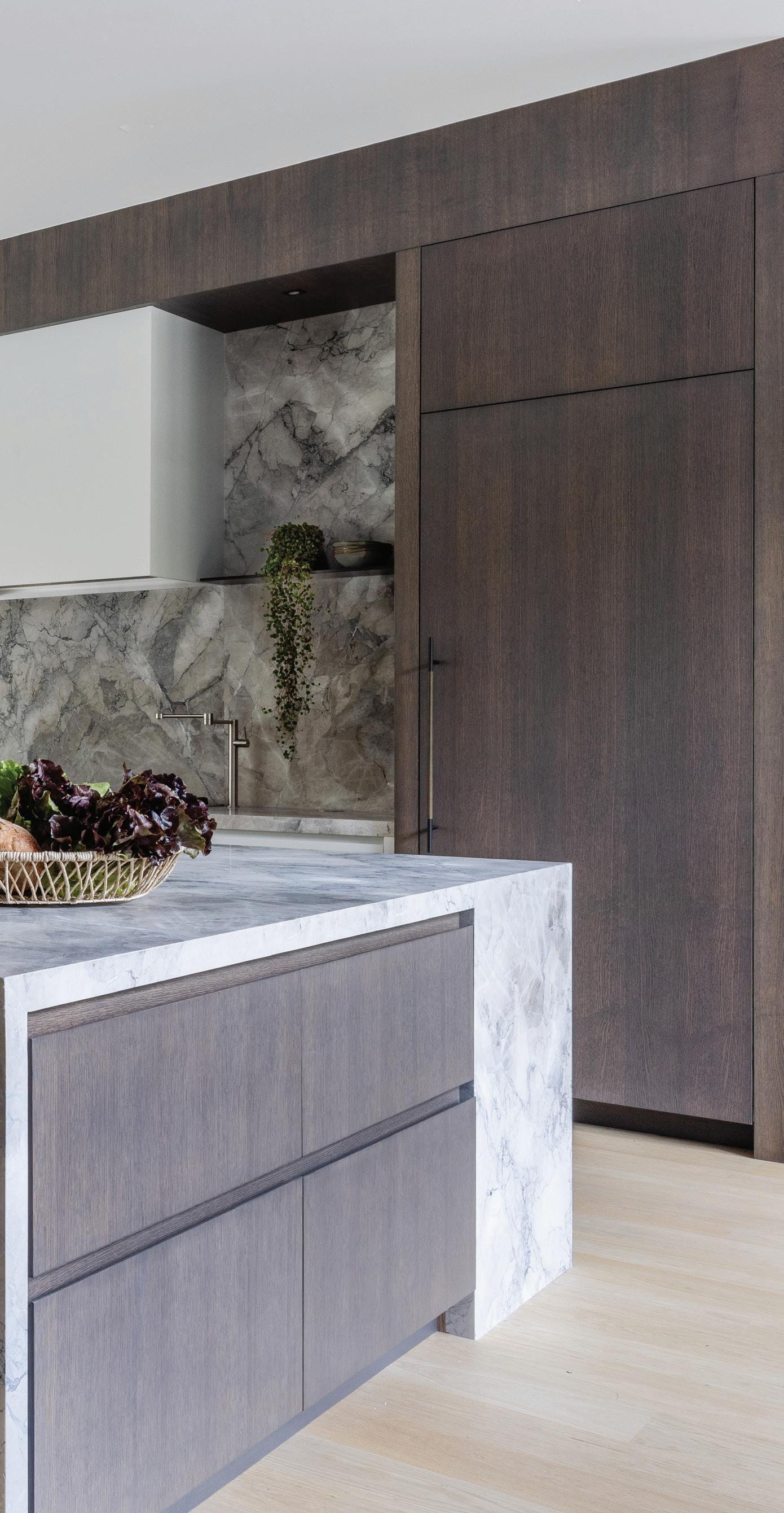
AAH: The kitchen is one of those multifunctional spaces. I think it has the utility of three different spaces: working, cleaning and bar zones. It’s the center of the home. I love the connectivity to the kids’ playroom and the family room. There’s a beautiful amount of light that travels through the windows, but I would say when I use the word “organic,” this is the most organic part of the house. It’s one of the darker components because of the wood we used. I love oak, because it’s durable and works well when you entertain and have an active household. I also love the simplicity of the hood. As a designer, one of the most important things is making sure you can be reserved. If you take it too far, it becomes overdone.
Do you have a favorite part?
DS: Working with Amy (laughs). I’d also say the bar room and the outside porch, two rooms I appreciate as I get older. When I entertain, most of my guests gather around the kitchen. They don’t want to sit in the formal living room, so we didn’t do one here. After COVID, I think bars are more popular in houses. They’re not ostentatious, but they create a destination that people would not have used in a traditional living room.
AAH: It was very strategic in terms of the placement. It’s also not just a bar. They entertain so much for their children, it could become a candy station, or a place for more service and preparing food. The proximity to the pool isn’t so far. Because of where the kitchen is, this is where they can liaison back and forth, and it acts like a butler’s pantry would.
DS: It allows you to explore the house and use the bar room alongside the dining room.
AAH: What I also really loved was the process of being able to use a lot of artisans that I adore. I got to work with a lot of people who are gifted and talented. And that one space outside is incredible. There are two dining tables and the seating area. In the summer, it’s just a haven.
Professionals:
Interior Design: Amy Aidinis Hirsch, Amy Aidinis Hirsch Interior Design, Greenwich, 203-661-1266; amyhirsch.com
Builder: SBP Homes, Stamford, 203-323-2200; sbphomes.com
Architect: Tanner White Architects, Westport, 203-283-4749; tannerwhitearchitects.com
Florist: Green of Greenwich, 203-625-6205; greenofgreenwich.com
MAY/JUN 2024 61
this photo: Vacation living at its best; this lucky family gets to enjoy a secluded retreat that’s designed to maximize easy living.
the new formal
An expert team delivers a forever home from scratch , marrying a charming traditional build with modern maximalist fun
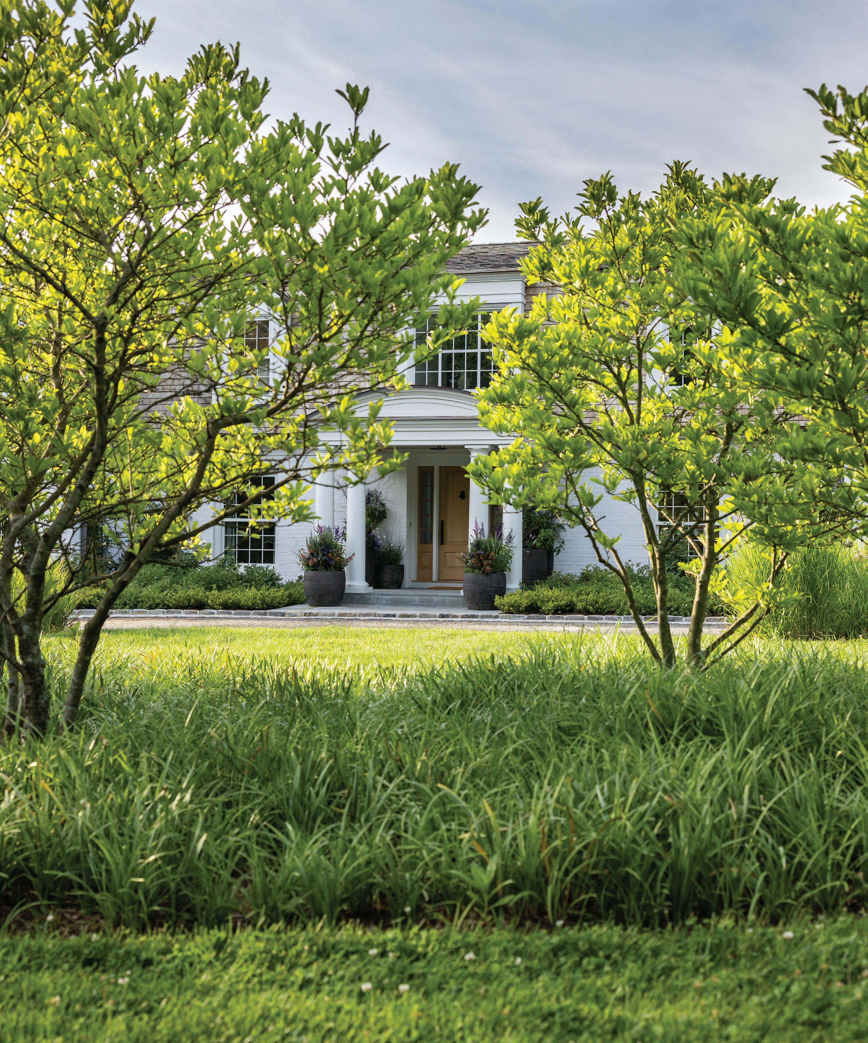
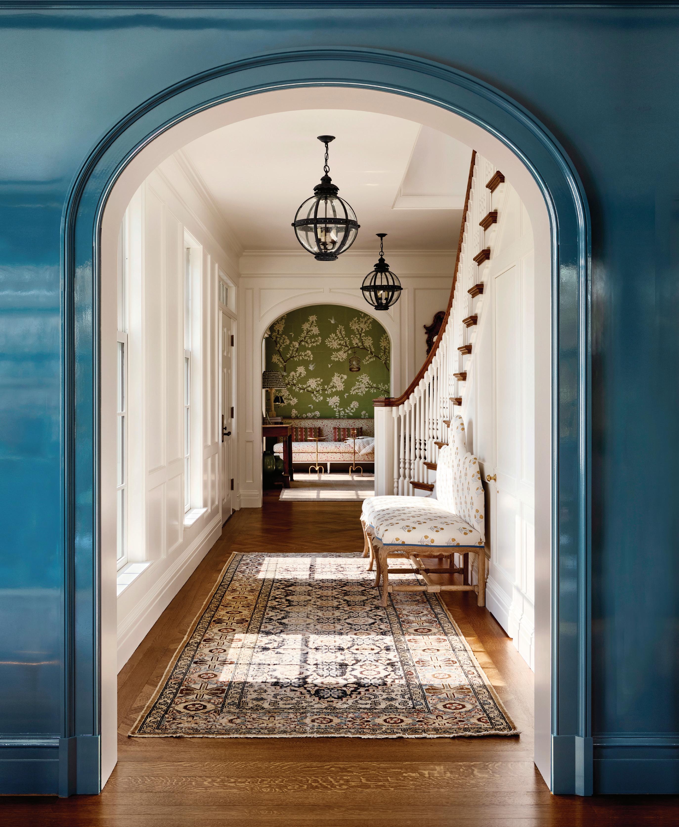
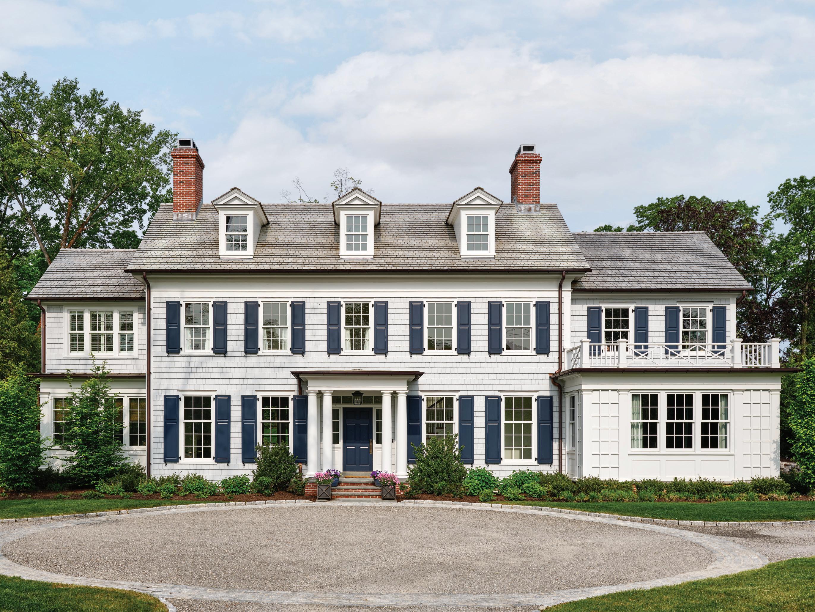 above: Elegant detailing with historic roots makes this Colonial Revival home an instant classic. opposite page: A view through one of many arched doorways into the stair hall, with a rug resized by Eliko, Vaughan light fixtures and a custom settee by Luther Quintana Upholstery using John Robshaw fabric.
athomefc.com 62
interview with doug vanderhorn, vanderhorn architects and stephanie woodmansee, henry & co. photographer read m c kendree/jbsa // stylist frances bailey

This is a new build, but it looks like local historical home. How do you achieve that?
Doug VanderHorn: For years, we did traditional additions and alterations, and that leads you to understand the additive nature of home design, and in understanding that, you can then reproduce homes that look as though they’ve grown over time. It adds charm, a playfulness to the exteriors. In this instance, the rear of the house extends quite a bit and appears to be a couple of extensions. The property is fairly narrow, so to have a good size house, we made it L-shaped, and it appears to be additive.
Stephanie Woodmansee: Doug is such a mastermind, and his team is so skilled at creating new construction that feels old. Everything has a historical nod or reference. With that foundation—and working with someone who has that passion for it—it becomes easy to build upon one another’s ideas. From the start, he was so receptive to all the ideas.
Do you have any favorite exterior features?
DVH: There are a broad variety of spaces on this home, and I think one of the architectural devices that I use to get a lot of glass in a space is to make it appear as though it’s an old porch that’s been enclosed. So even though this is a new house, there is an enclosed porch, which is just a portion of the family room where we wanted a lot of glass. I also think that the detailing on the exterior is quite elegant and traditional, with the dormers, the front portico, and that portion of the dining room on the front of the house that has that railing around it.
What did the clients want, and how did you work together to deliver that?
DVH: They didn’t want it to look like a new house; they wanted it to look like it fit in the neighborhood. They have a place in Rhode Island,
athomefc.com 64
and they were driving by a house that they thought was really special. Coincidentally, they were looking for property in Rye and saw a house there that they also thought was great. It turned out that we had done both houses, so they called us and said, “We know who our architect is going to be.” They liked that our work is traditionally based, but fresher.
SW: In talking to the wife, she was so passionate about making it feel like a house they’d been in forever, with all the layers that we kept referencing. She and I spent at least four hours together in our first meeting, going over both of our tear sheets of spaces we loved. Some clients don’t give you much, but with her, she had this romantic vision, and she loves entertaining. We became good friends, and in getting to know her, it’s like she came from another era. Especially after COVID, everyone was craving that finished house that felt warm and cozy and inviting. It was really fun to dive into it.
MAY/JUN 2024 65
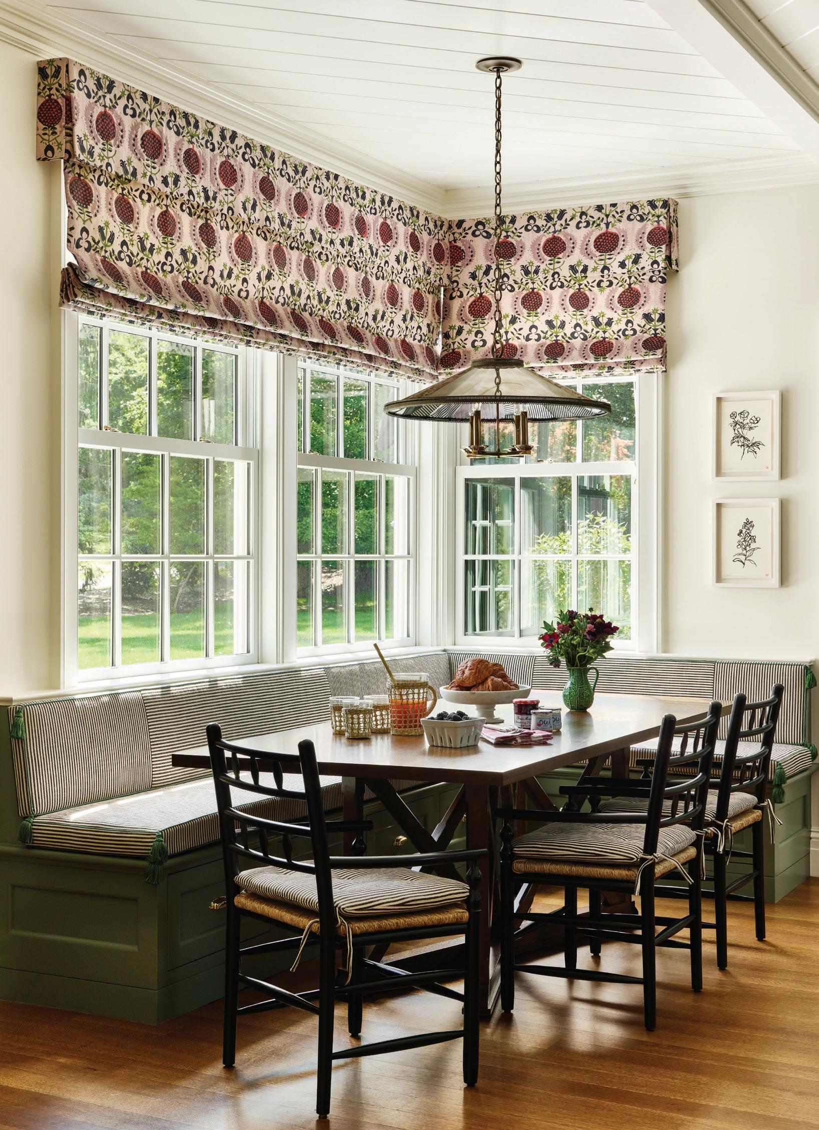
above, left: Custom cabinetry painted in Rosepine by Benjamin Moore grounds the English-inspired kitchen. Hollywood at Home counter stools tuck neatly under the island, with its shapely brass legs. above, right: Woodmansee used Peter Fasano fabric on both the bar stools and the Roman shades over the breakfast nook. Ticking striped cushions are trimmed in green tassels.
“In talking to the wife, she was so passionate about making it feel like a house they’d been in forever ... ”
—stephanie woodmansee, henry & co.
MAY/JUN 2024 67
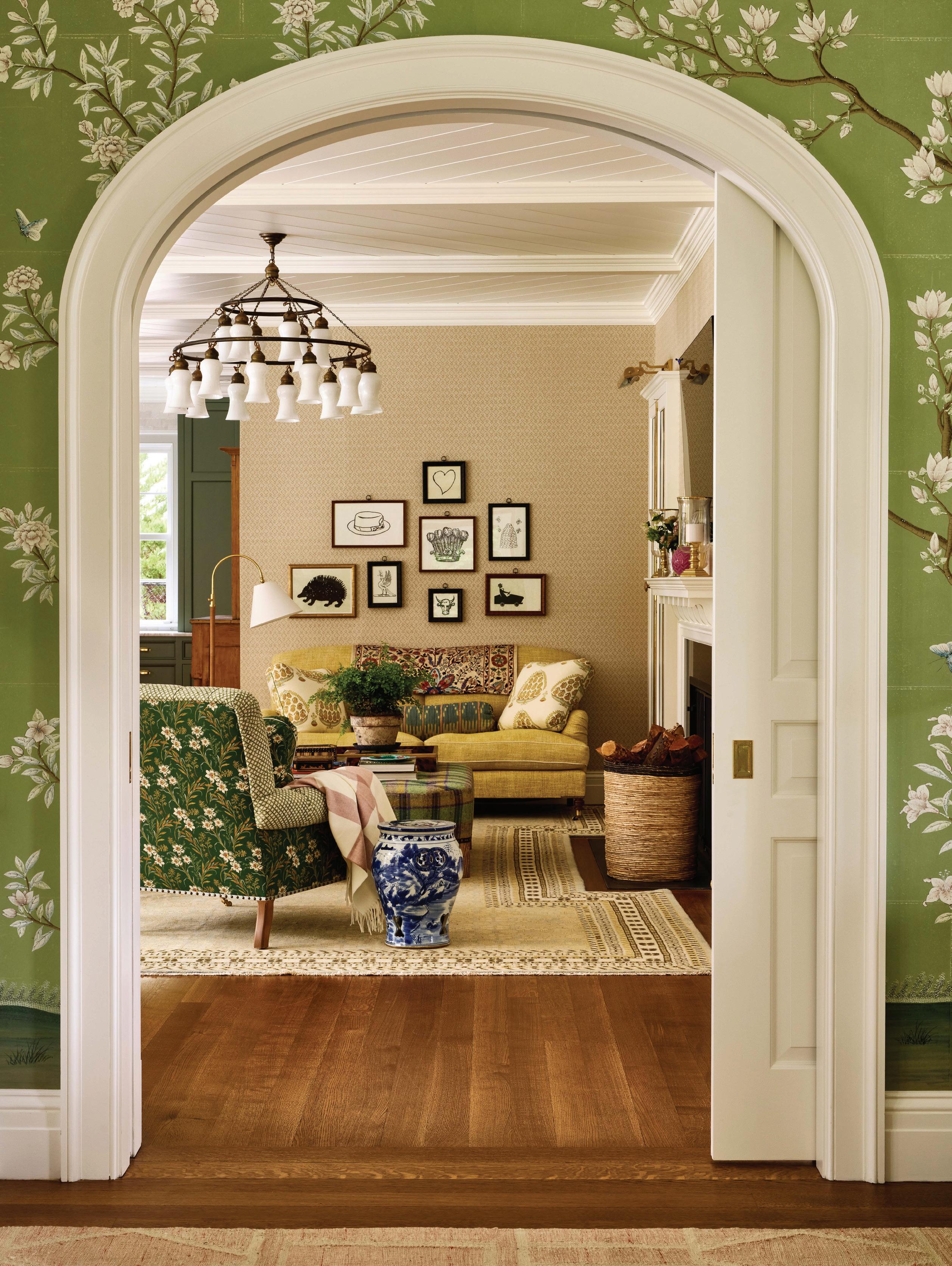
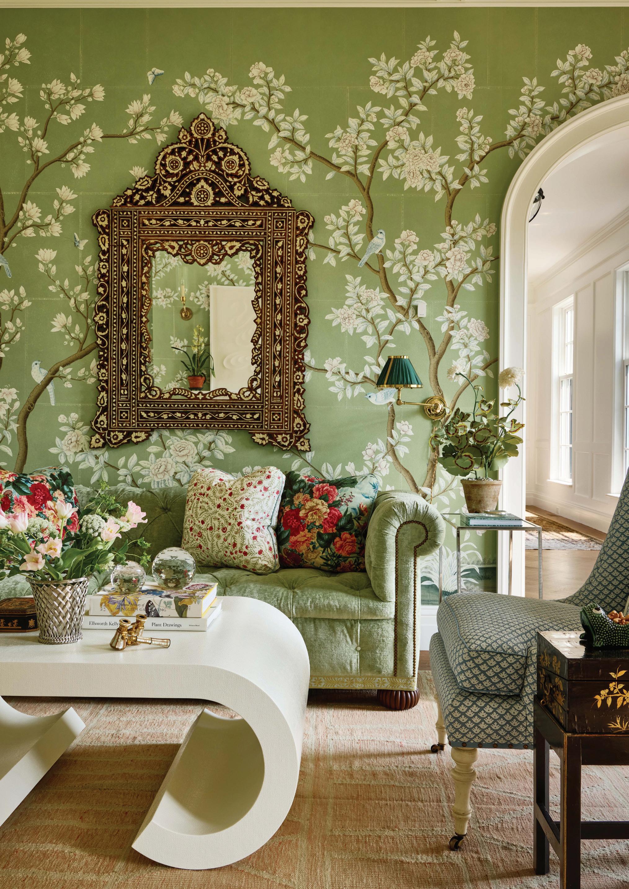
above: Usually reserved for dining rooms, Gracie wallpaper wraps the living room walls. Woodmansee found the mirror at Stamford’s Antique & Artisan Gallery. opposite page: The wife was inspired by John Derian’s layered style. His prints sit over the sofa in this seating area, layered with its own mix of pattern and color.
athomefc.com 68
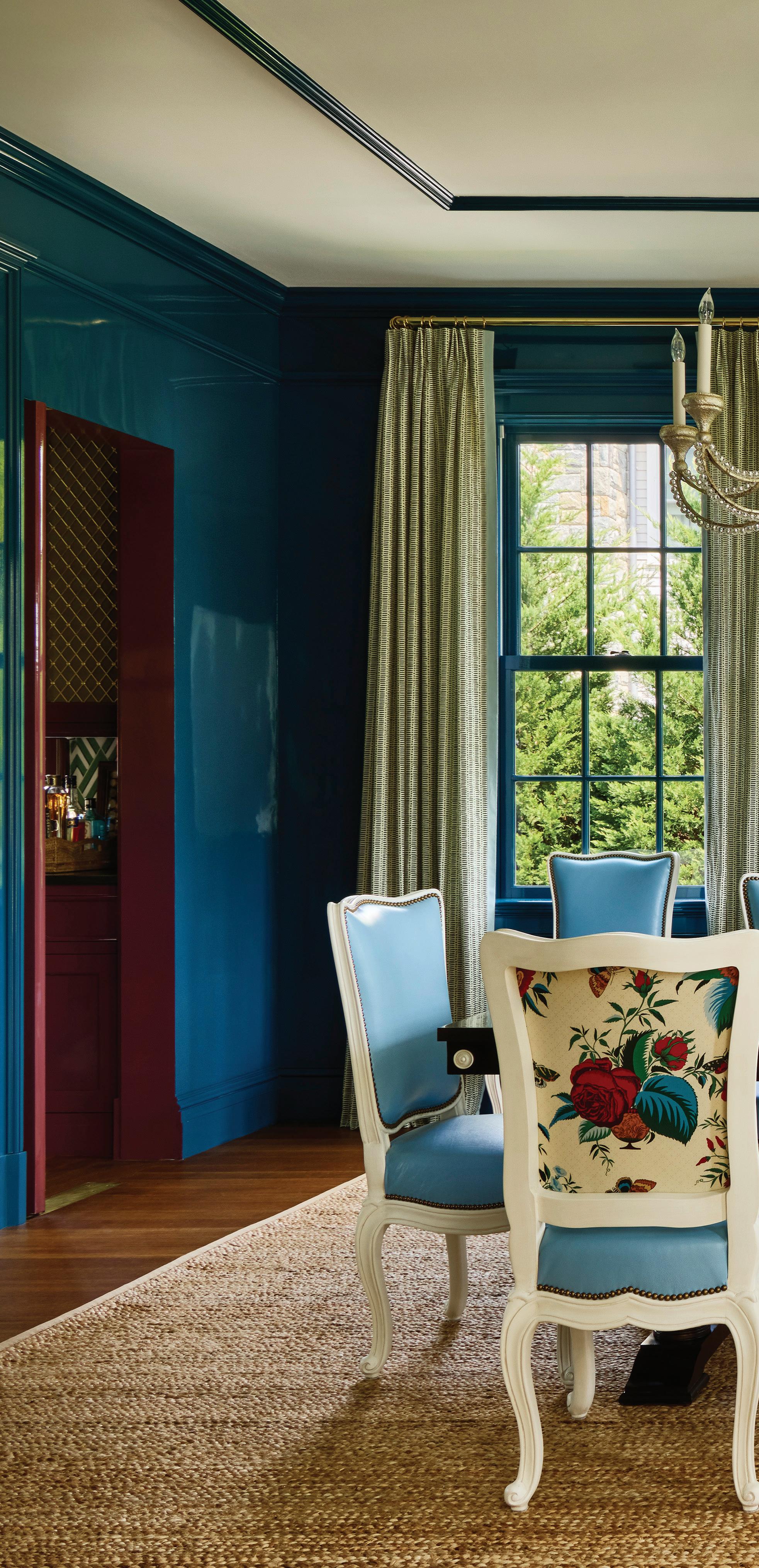
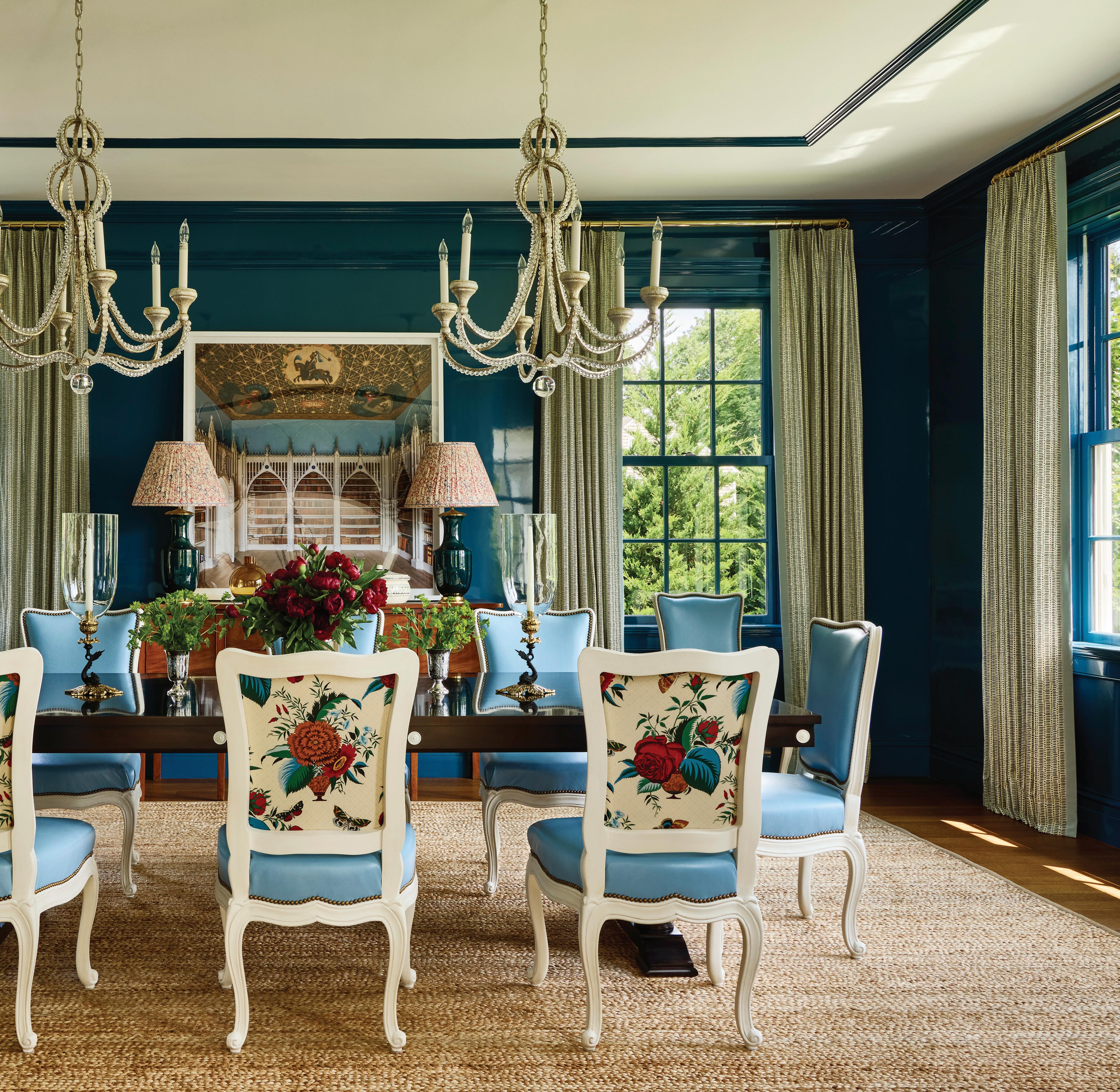
above: Clé tiles create a Deco backsplash at the bar. Cabinetry and trim are painted in Bewitched by Benjamin Moore. Schuyler Samperton fabric on the Roman shade and mini table lamp add complementary blue and green tones to the mix. right: Floe Painting added Benjamin Moore’s Prussian Blue lacquer to the dining room. The Chaddock table is surrounded by custom dining chairs, which Woodmansee created with Luther Quintana Upholstery. Visual Comfort chandeliers lend light to family dinners and friendly gatherings.
MAY/JUN 2024 69
 left: Gucci’s The Heron wallpaper makes this powder room pop. A Precision Stonetopped Waterworks washstand adds dramatic veining, while the vintage German mirror lends more feminine flair.
opposite page, left: The light-filled library is punctuated with pink grasscloth, perfect for both work (at the vintage desk) and relaxing or reading (on the Lee Industries sofa in Raoul Textiles fabric).
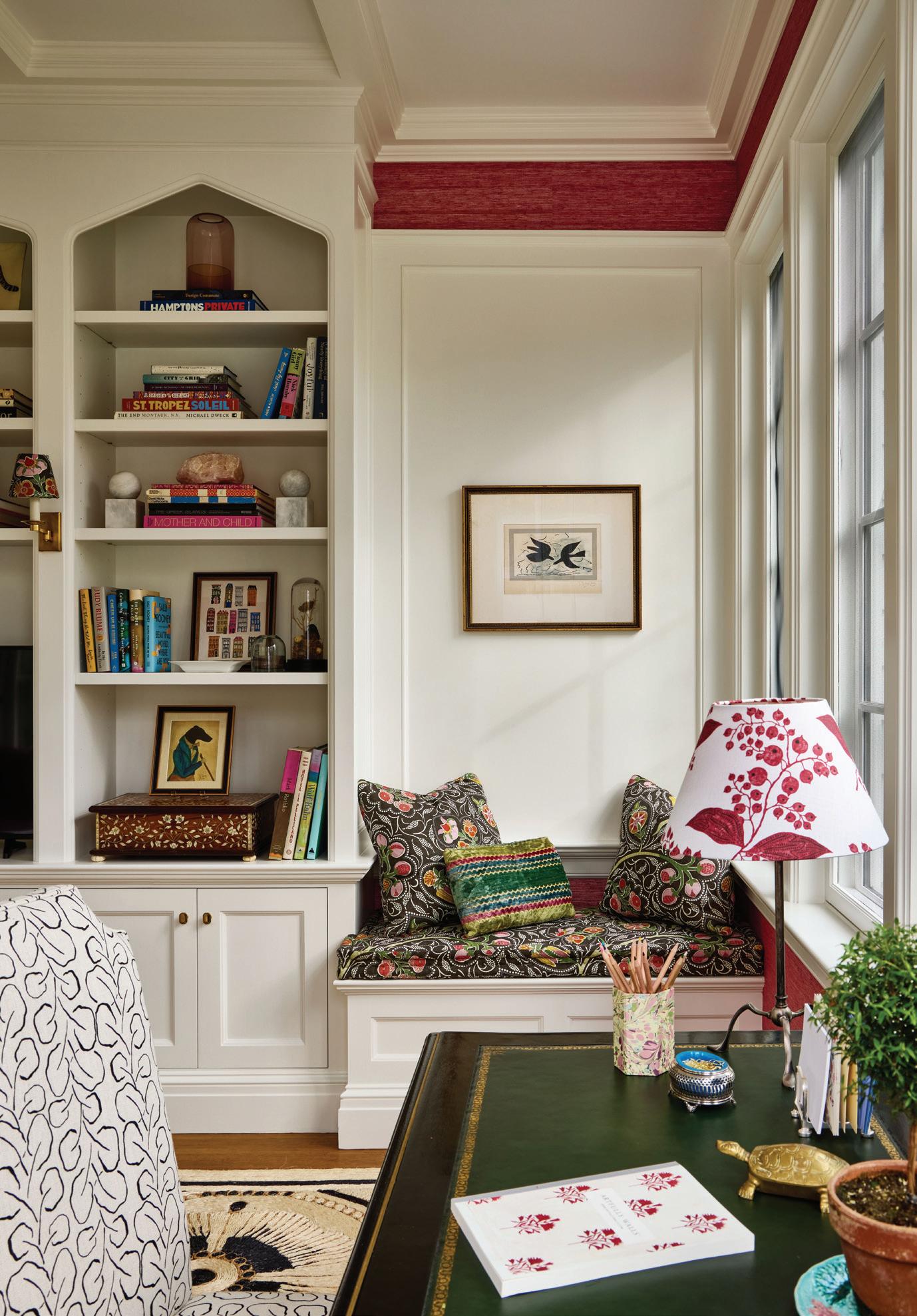
opposite page, right: VanderHorn’s team designed the built-in bookcases, and Woodmansee added the pointed detailing at the top.
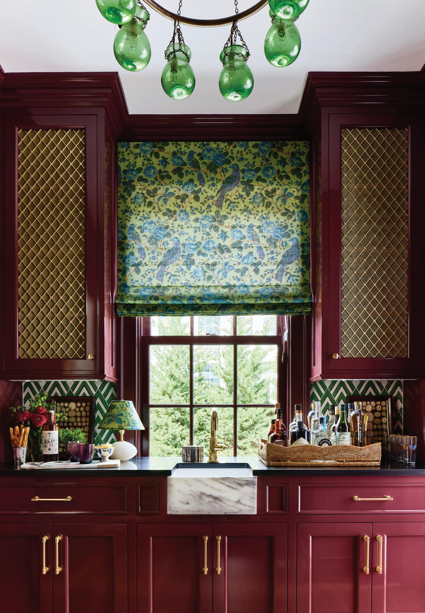
DVH: Stephanie and I worked closely on those elements that are truly integrated, like tiles and lighting. She did weigh in on our millwork design, which is something we’re known for. And it’s not just in the library and the family room, but we create the kitchen cabinets and the mantel pieces. She really liked everything we proposed. She has a great eye and I was not prepared for the level of color. This house is really just the antithesis of that beige catalogue look. It’s really fun.
Yes, there are so many bold color choices in this house. How did you land on your palette?
SW: The wife had a couple of specific small pieces and artworks that we used to start the conversation. She loves the John Derian prints and that
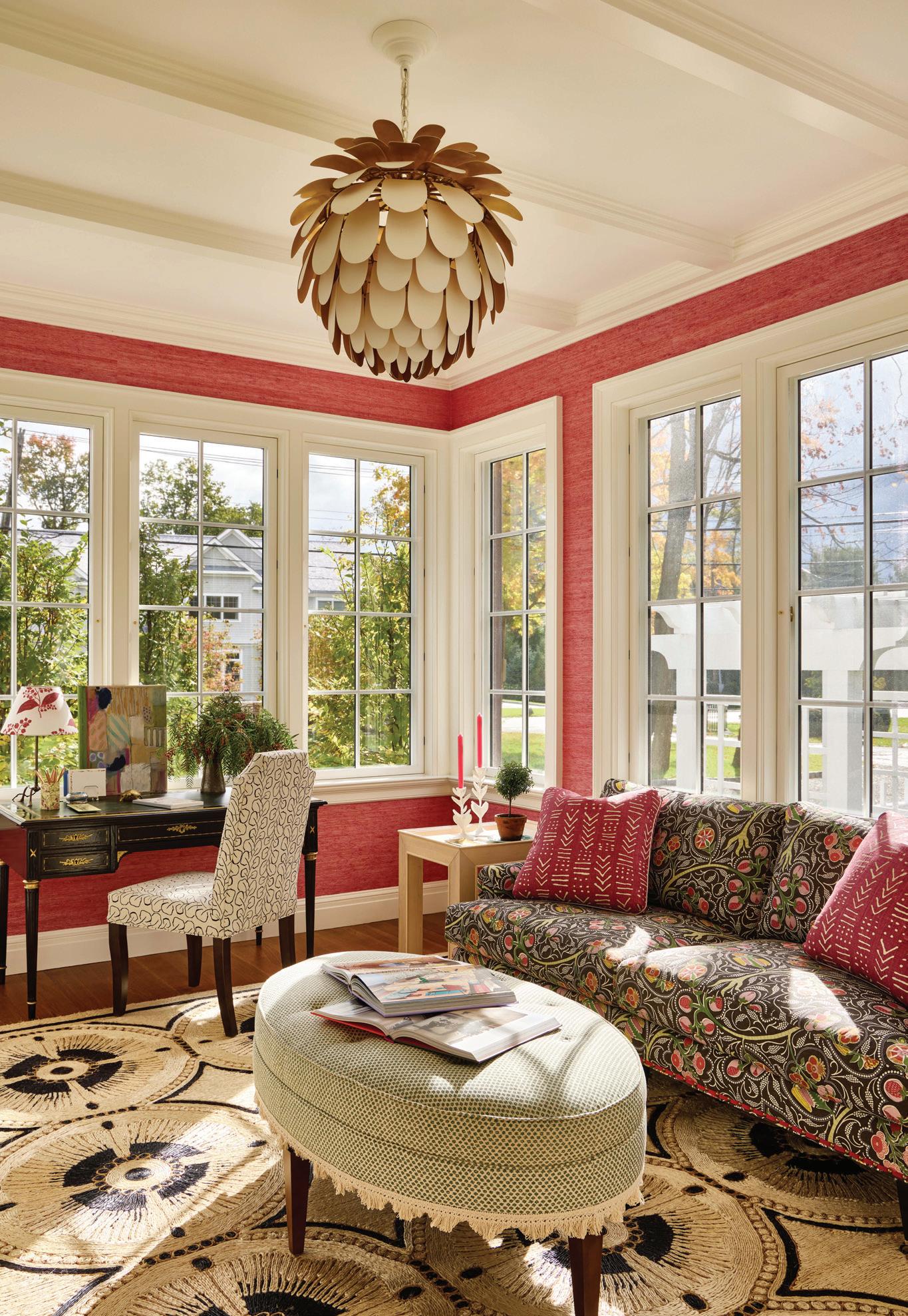
vibe, so we took that into the family room and the kitchen, which has more of a boho feel. She also had some pieces and objects that were very formal, so we knew we could take her living and dining room and go a bit over the top. With the colors, I tried to connect them with the jewel tones throughout. She always wanted Gracie wallpaper, which you typically see in the dining room. But the living room looks out to the backyard, and the dining room doesn’t. And I thought, if you have these living room doors open, it just feels like an extension of the outside; let’s switch it up a bit. We had fun in the formal spaces. The dining room chairs were antique finds that we had Luther Quintana Upholstery recreate, which look great against that Prussian Blue lacquer.
MAY/JUN 2024 71
“In terms of how it all came together with the client, Stephanie and the builder, we all enjoyed the process , even a little more than we normally do.”
—doug vanderhorn, vanderhorn architects
Tell us about the kitchen.
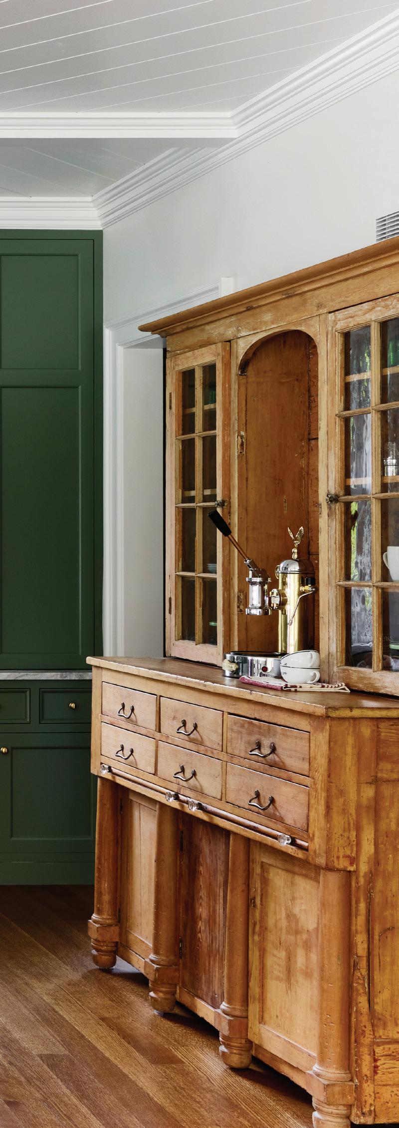
DVH: We designed the kitchen cabinetry and the layout, and then Stephanie said, we don’t we take this (coffee) area and make it a furniture piece, with an antique she found and reworked.
SW: It was one of the first things I purchased for the house. We wanted something to ground the space that wasn’t more cabinetry. The wife knew she wanted the kitchen to be green. At first, she was picking some lighter shades. But because it opens into that family room, it kept getting moodier, and we were inspired by British kitchens. I went back to Doug and said we need to get a little less fussy about it. Initially, we had tile all over the walls, and then we felt like one wall was enough, especially in a room that was so big. She had loved this cerused oak island, but I wanted to play up some brass and get a curvy, organic detail in there with the legs.
The bottom of the antique piece has similar detailing on the feet, which is where I started the design for the island legs.
The bathrooms are such fun spaces. Do you treat them as individual moments or think of them in terms of a larger cohesive design plan?
SW: I think the powder rooms can be completely independent, like little jewel boxes. In the paneled entry, the powder room is hidden under the stairs with a jib door. She loves pink, and she loves Gucci. So, we thought, why not put them together? And you see those pinks in the living room and the reds in the dining room. She wanted paper everywhere, and sometimes even I will say we need to dial it down. But as long as the scales are balanced, it works, and we had both murals and smaller
athomefc.com 72
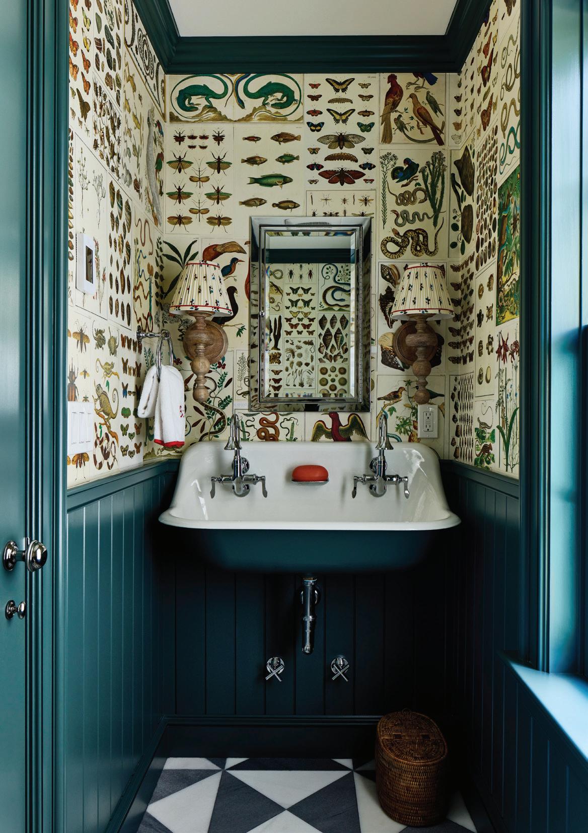
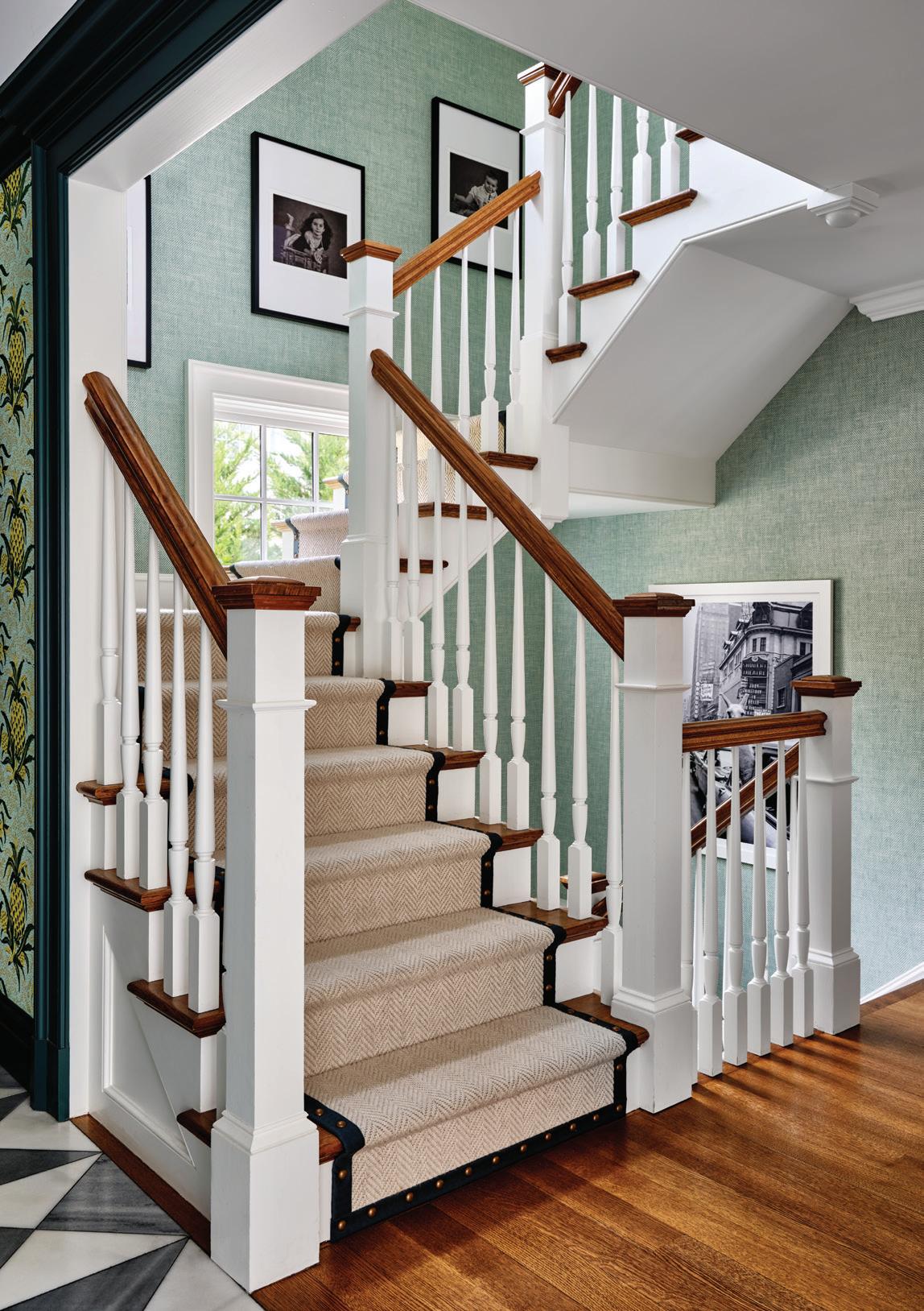
above, left: Paper for the mudroom bath was taken from the pages of the owner’s Cabinet of Natural Curiosities book. above, right: VanderHorn’s team spends a lot of time getting the staircases right, as seen on this construction at the rear of the house. opposite page: The Pineapples pattern from Adelphi Paper Hangings is circa 1830-1845. Trim is painted in Benjamin Moore Mediterranean Teal; the bamboo hall stand was found at Antique & Artisan Gallery.
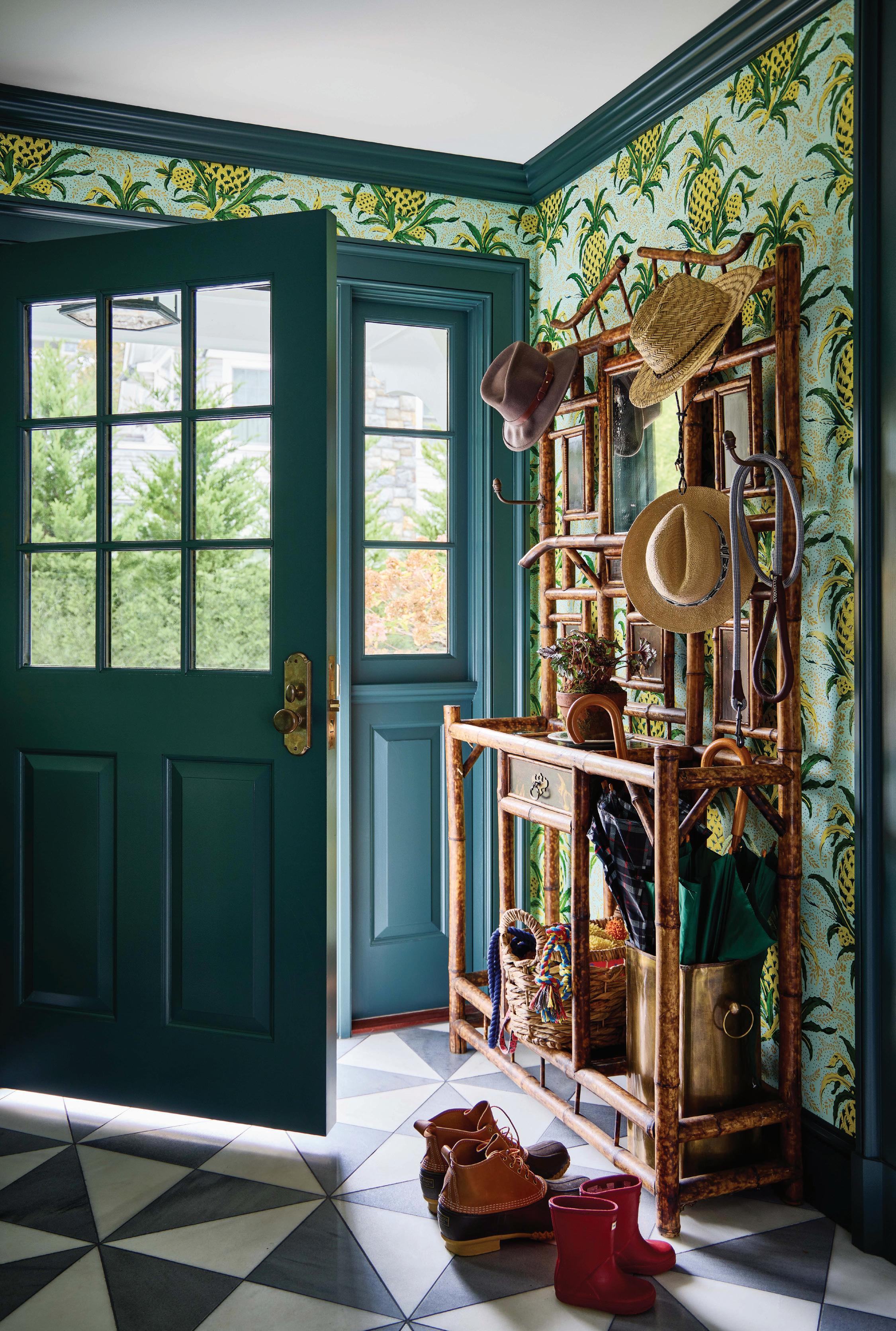
repeat patterns. Off the mudroom, we took pages from her Cabinet of Natural Curiosities coffee table book and used them as wallpaper. We were worried about preserving it, but we still have the book if any of them need to be replaced (laughs). I really did love pouring into the bathrooms. I think it’s so nice to get out of the Carrara mosaic box.
What was the biggest challenge?
DVH: The site being narrow was a challenge, and this is a big family who wanted a large home. But in terms of how it all came together with the client, Stephanie and the builder, we all enjoyed the process, even a little more than we normally do. It was such a friendly family and good working environment.
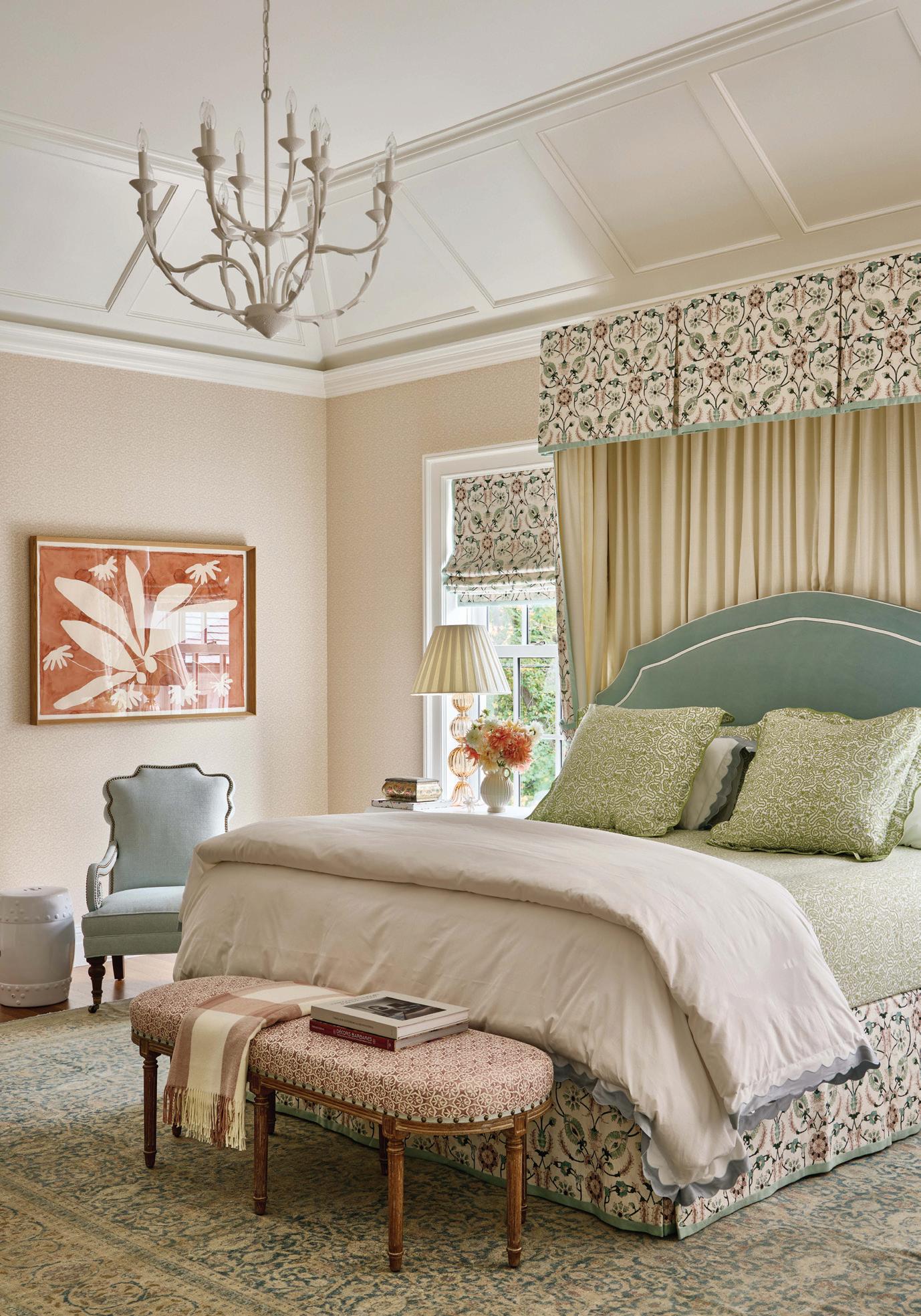
SW: The biggest challenge for me was the primary bedroom. We moved
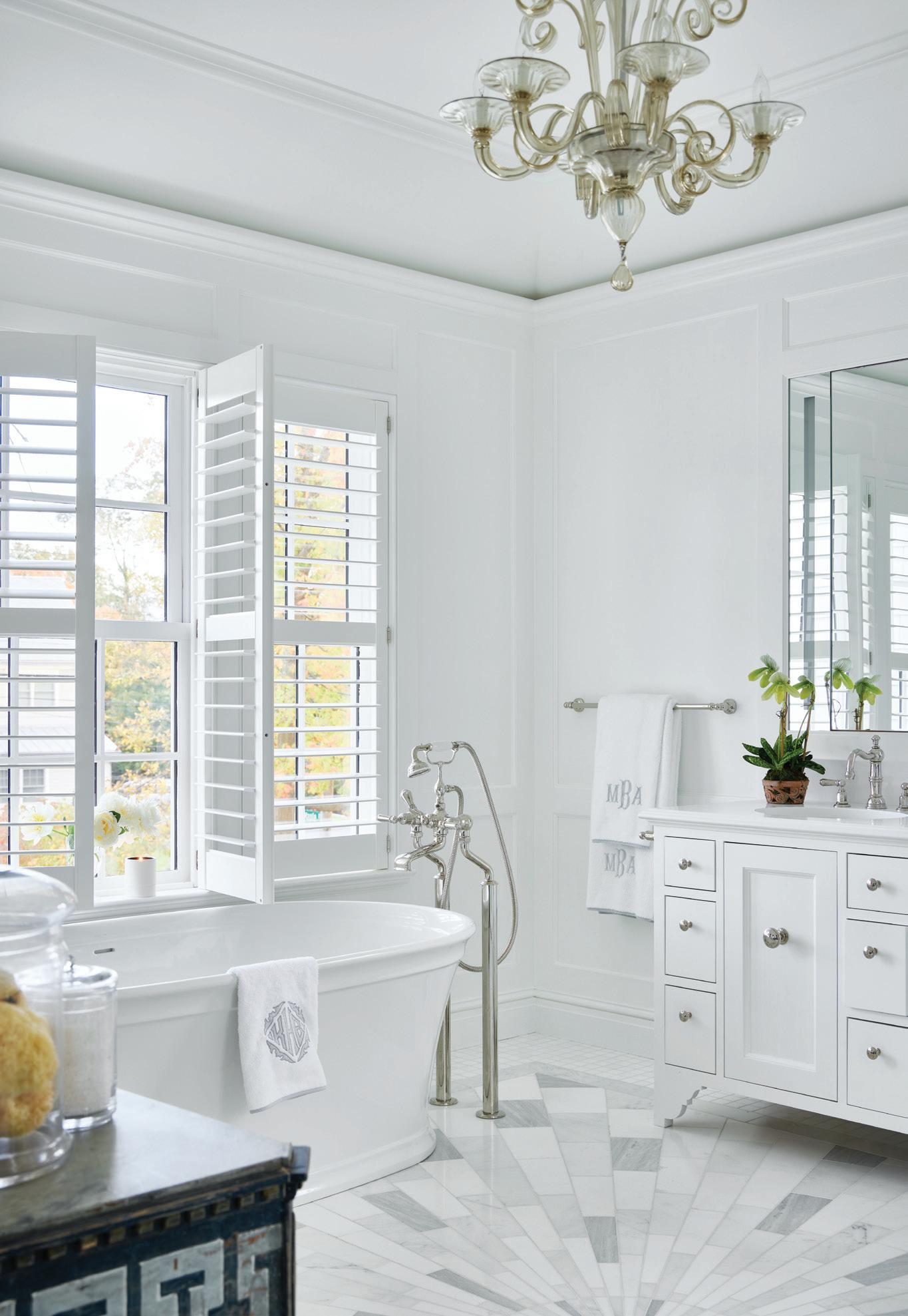
that room around into 50 different configurations trying to make it work. We wanted to capture the light and have a fireplace but also had to consider that the husband gets up early and we had to figure out a way for him to leave through his closet without coming back to the bedroom. Doug finally suggested that we flip the room around and focus on the fireplace (versus the view) and make it a calming space. We took all of her favorite colors and toned them down. It worked out in the end.
What are your favorite colors right now?
SW: I am always a green girl, and I think it goes with everything. I have the girliest four-year-old girl, so I’ve also really embraced pink. I’m working on a Hamptons project where we’re doing a salmon pink in the living room.
athomefc.com 74
left: The starbust pattern of Ann Sacks tiles adds interest to the all-white primary bath. right: Woodmansee chose a calmer palette for the primary bedroom. Walls are covered in Pierre Frey paper with art by Kate Roebuck, sourced through Uprise Art. The bed is made in Biscuit Home bedding and backed by a Ballard Designs headboard.
“She wanted paper everywhere, and sometimes even i will say we need to dial it down . But as long as the scales are balanced, it works , and we had both murals and smaller repeat patterns.”
—stephanie woodmansee, henry & co.
MAY/JUN 2024 75
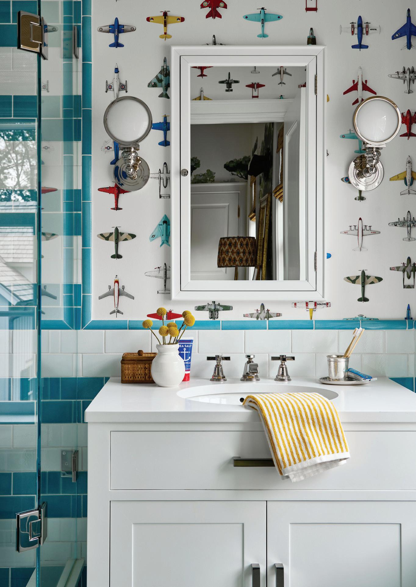
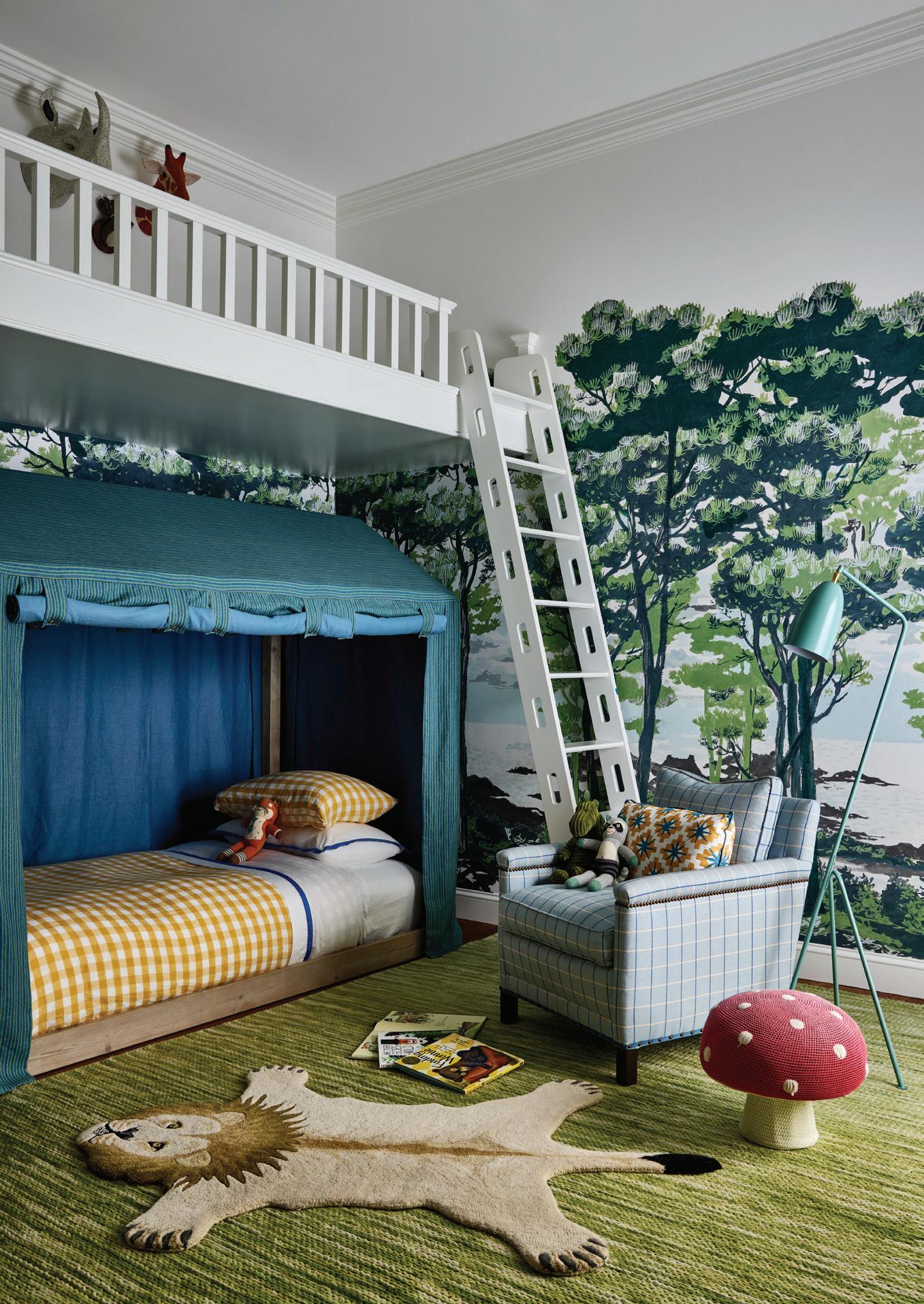
left: Studio Ditte wallpaper plays off the striped tile treatment in this kids’ bathroom. right: VanderHorn and Woodmansee created fun spaces for the family’s children, including this boy’s room, which includes a custom loft, tented bed and Rebel Walls forest mural.
What are some of your favorite custom touches?
DVH: We spend a lot of time on our staircases. The balusters are custom turned. The entry hall is fully paneled, floor to ceiling, which we’ve been doing a fair amount of. The banquette in the breakfast room is a combined design between us and Stephanie. The study has those built-ins with a point at the top, which was all Stephanie. It really did make them more interesting and custom looking. We designed the pantry cabinets, and then she asked us to incorporate the mesh fronts.
How much does the architecture factor into the landscape design?
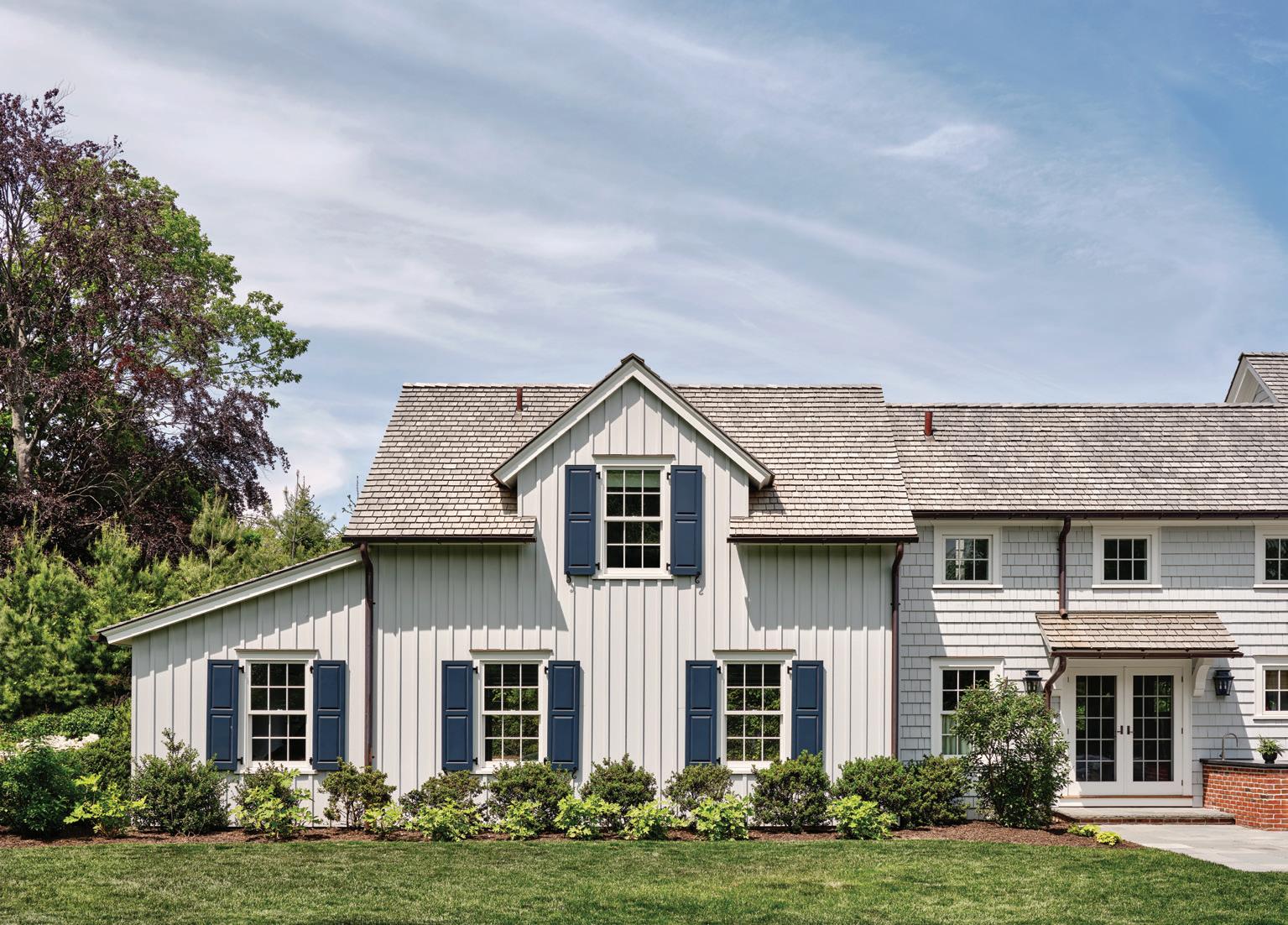
DVH: We often do our site design, and that includes the landscape design, which we did here, with the exception of the plant materials. I like when the form of a house helps to create outdoor rooms, for spaces to fit in. With an L-shaped house, the primary rooms that you live in focus on that outdoor room in the corner. We added an outdoor kitchen area and a firepit built into the terrace and also adjoined the porch that enters the family room, living room and study.
Resources:
Architect: Doug VanderHorn, David Milliken, VanderHorn Architects, Greenwich, 203-622-7000; vanderhornarchitects.com
Interior Design: Stephanie Woodmansee, Henry & Co. Design, New Canaan, 203-594-1270; henryandcodesign.com
Builder: Significant Homes LLC, New Canaan, 203-966-5700; significanthomesllc.com

athomefc.com 76
this photo: The three-car garage with home office above is clad in board and batten siding, giving it a barn-like feel. right: By appearing to be a series of additions, this large new home maintains a charming scale. An enclosed porch concept provides a full glass wall for the light-filled family room.
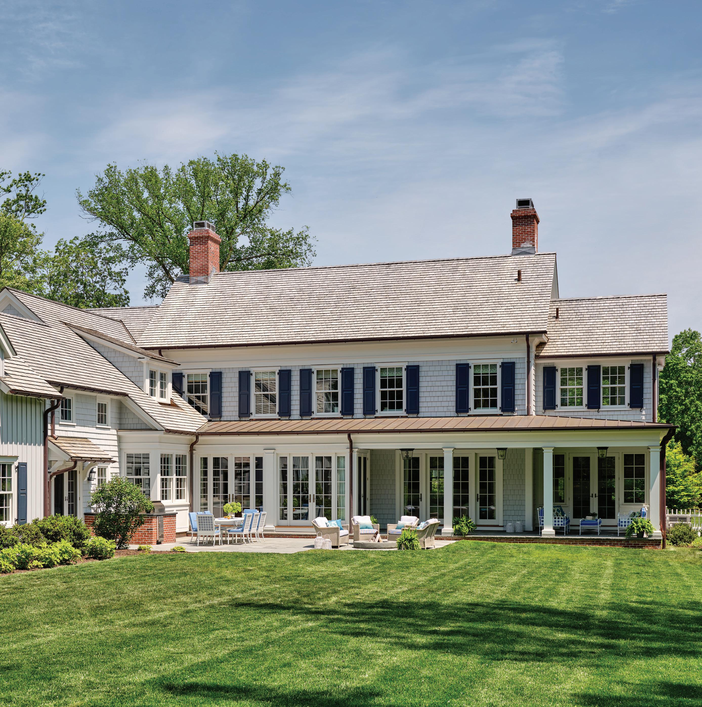
“I like when the form of a house helps to create outdoor rooms , for spaces to fit in. ”
—doug vanderhorn, vanderhorn architects
MAY/JUN 2024 77







PHOTOGRAPHY VIDEOGRAPHY SOCIAL MEDIA

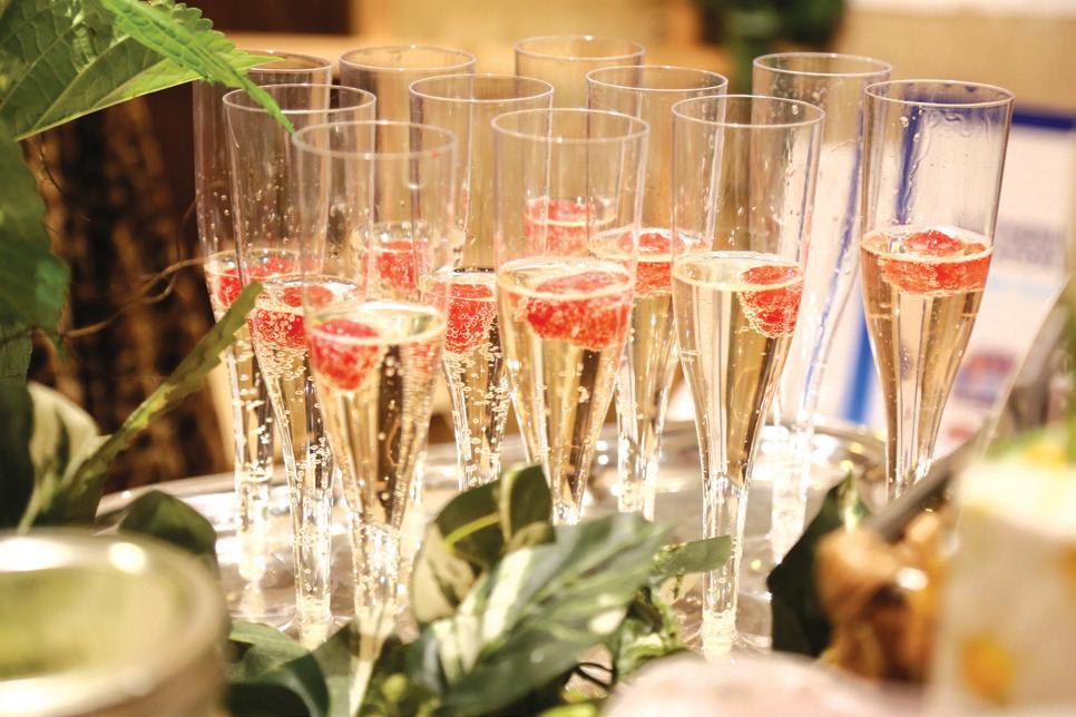
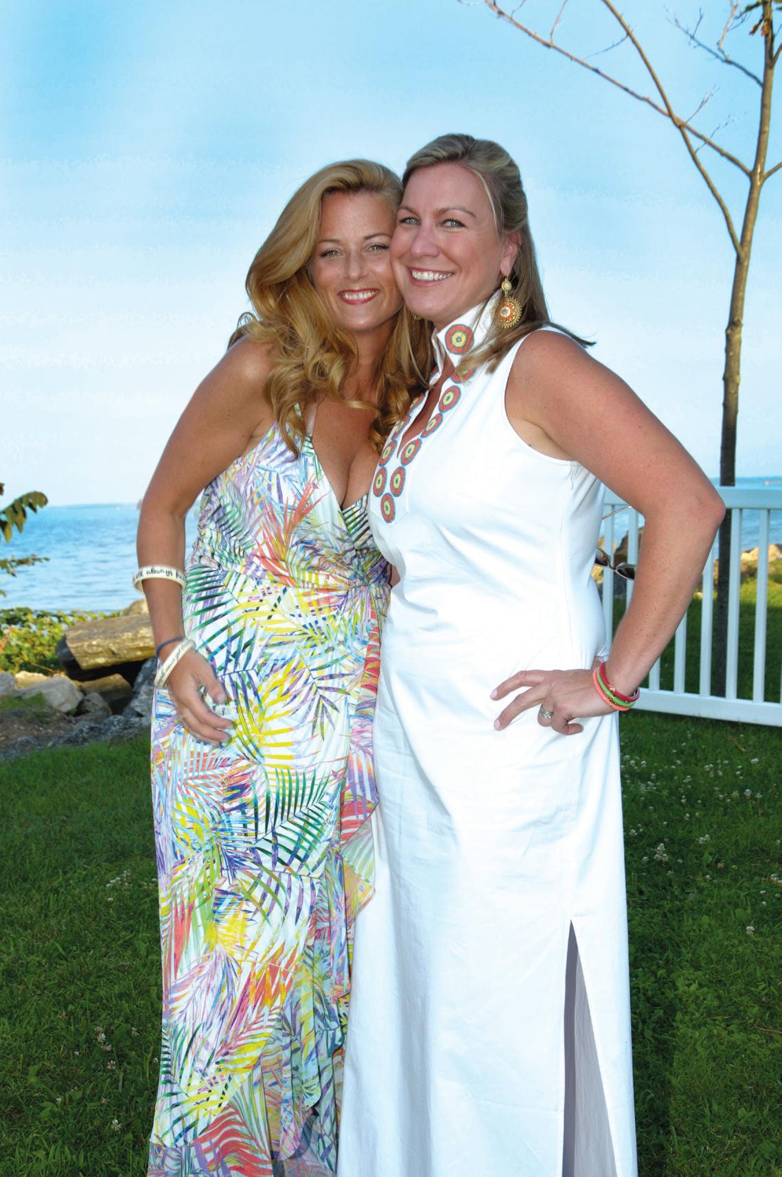
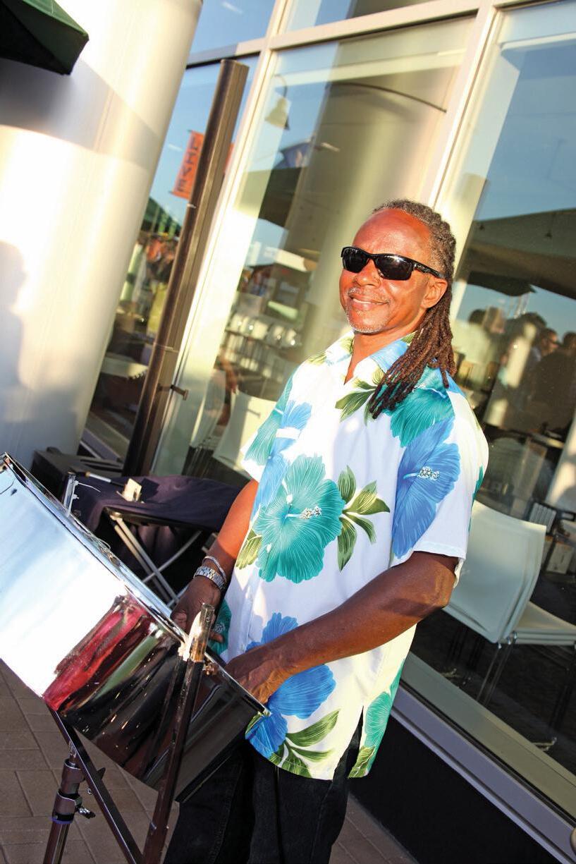
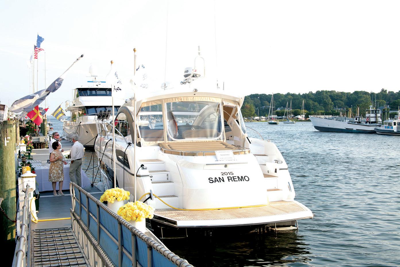
Moffly Media is one of the leading providers of professional event photography and marketing services in Fairfield County. We capture compelling, high-quality images of individuals and groups at meaningful events. With our wide range of capabilities from video to social media, Moffly will customize a marketing program that’s just right for you.


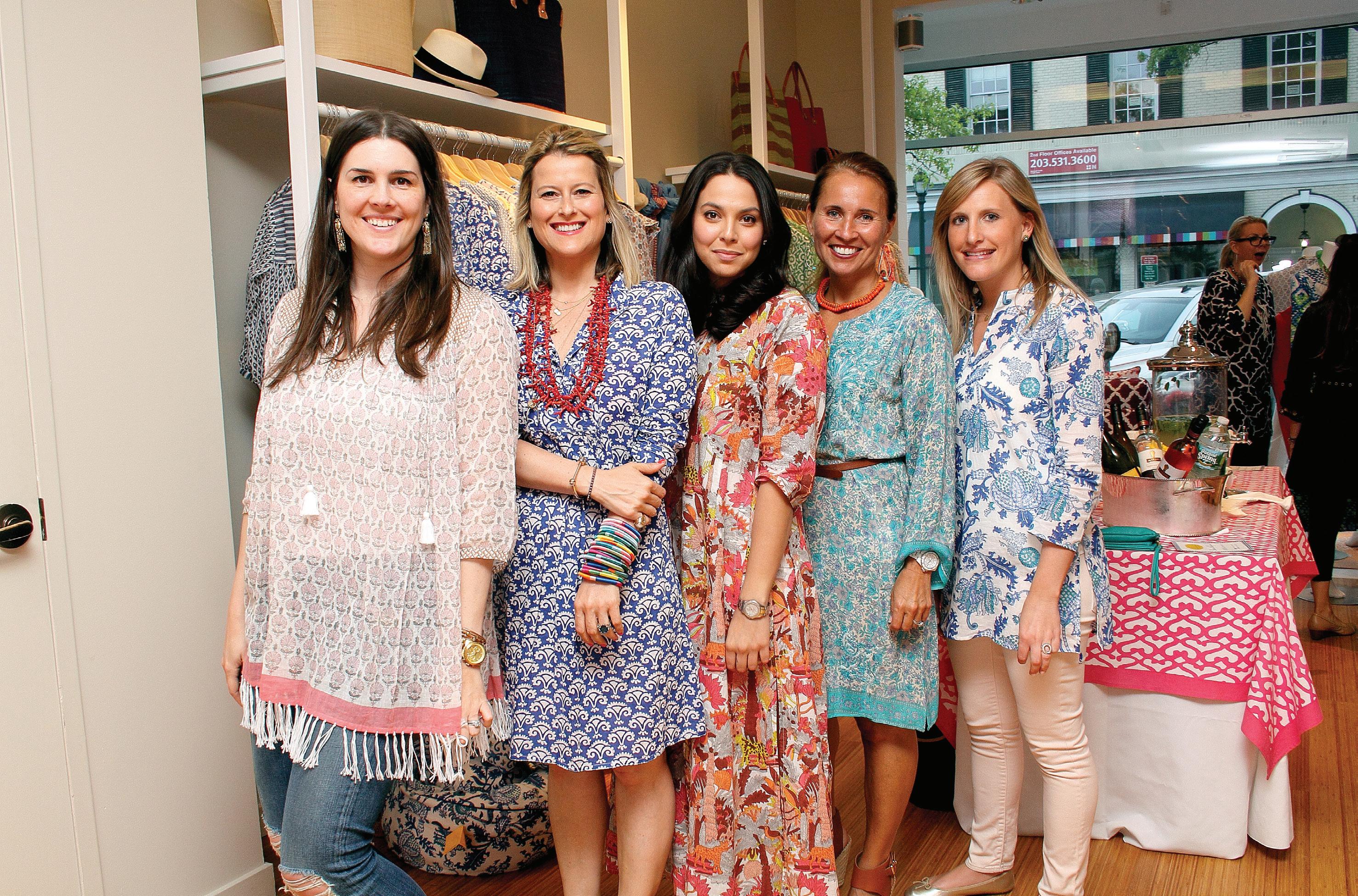 PHOTOGRAPHY BY: BOB CAPAZZO, KRISTIN HYNES, MELANI LUST & MARSIN MOGIELSKI
LEARN MORE! CONTACT KATHLEEN GODBOLD AT KATHLEEN.GODBOLD@MOFFLY.COM OR 203.571.1654

BUILDING & HOME IMPROVEMENT


MAY/JUN 2024 79
California Closets, californiaclosets.com 4, 5 Gault Family Companies, gaultstone.com 11 Interstate Lakeland Lumber - Westport + Greenwich, interstatelumber.com 13 KLAR Studio-Windows and Doors, klarstudio.com Cover 4 Tischler und Sohn, tischlerwindows.com 7 VanderHorn Architects, vanderhornarchitects.com 2, 3 Yankee Custom Builders, yankeecustombuilders.com 9 LANDSCAPING & LANDSCAPING ARCHITECTURE James Doyle Design Associates, jdda.com Cover 3 DECORATING & HOME FURNISHINGS amyhirsch.com Cover 2, 1 31 25 35 21 17 ����������������������������������������������������������������������������������������������������������������������������������������������������������������������������78 15 35
insiders’ list


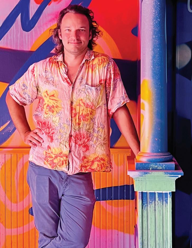
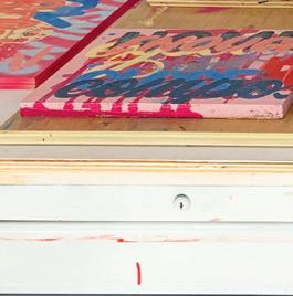
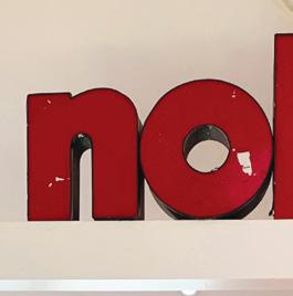
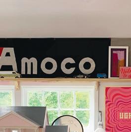
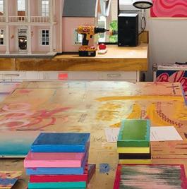
Brian Kaspr work. The Norwalkbased artist and cofounder of wallpaper and design studio
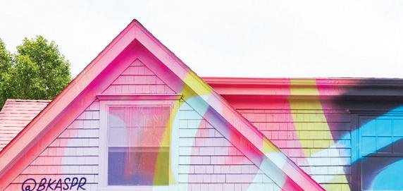
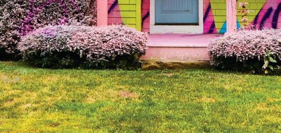
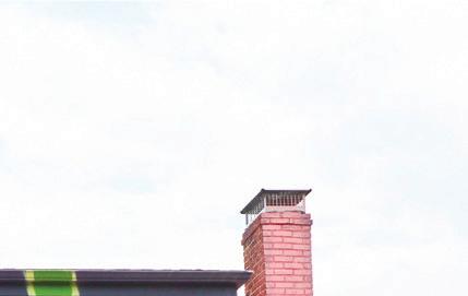
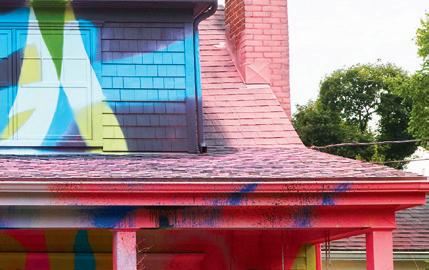
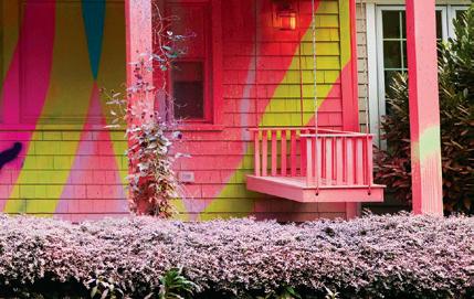
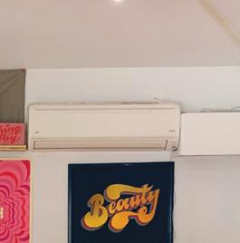
Flat Vernacular sees opportunities for murals everywhere, utilizing his painting and lettering skills to transform buildings scheduled for demolition with uplifting messaging and bold colors. Here, a peek into his vibrant world, complete with cat butts and plans for a studio


The one thing that always makes me feel at home is… My family, being close to my studio, and waking up in my own bed.
My guilty pleasure… There is no such thing as a guilty pleasure. If something brings one pleasure, there is no reason for guilt.


My favorite place in the world is… This is often changing, but my studio is frequently holding this title.

something more concrete, Art 06870 in Old Greenwich, and I can’t wait for the new home of Ursa Gallery to open in Bridgeport.
My five favorite pieces in my home are…
1. The pile of notes and cards from my wife, Payton
2. The first truly representative drawing my son did of a cat
3. The Björk animation celI found in the trash
4. A painting of a cat butt by my friend Kevin Ford
5. A painting of a Metro North switchhouse by my friend Valeri Larko
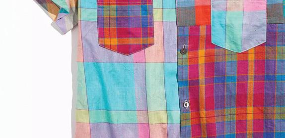
6. My vast collection of Pentimento shirts (Sorry, that was six)
My favorite weekend activity…
Color is important to me because…
It is truly magical. I can heighten, alter moods, quiet, energize, change space perception, set the scene, frustrate, scale up, shrink down and express anything and everything.
The best advice I’ve ever received… I’ll forever appreciate the advice of my high school art teacher: “When you’re stuck, clean the studio.” More recently, Kevin Ford (the aforementioned painter of cat butts) told me, “Make art like you don’t need to sell it.”


A day spent with family and friends, followed by working in the studio at night.
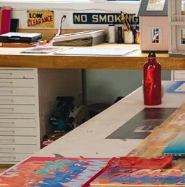
My current project is… I’ve long wanted to open a bar in my studio. I’m going to serve cocktails, French fries and art.


My favorite thing about living here… I love that it is adaptable to my needs and mood. We are in such close proximity to a variety of different environments. If I want nature and calmness or if I want the city and chaos, it’s all within arm’s reach.


My latest local obsession… Trying to carry art through the wheels of city government as the chair of the newly formed Norwalk Arts and Cultural Commission. Or for


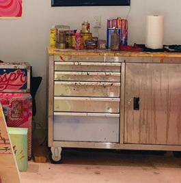
The sacred studio space is currently Kaspr’s favorite place. bar. seen ’s below:


PHOTOS: PORTRAIT BY VENERA ALEXANDROVA; HOUSE BY ANDREA CARSON; COURTESY OF BRIAN KASPR: SPRAY PAINT BY YEVHENSTOCK. ADOBE.COM ; PINK PAINT BY EVGENIYA_MSTOCK.ADOBE.COM
FAMILIAR FACES SHARE THEIR LOCAL FAVORITES
Kaspr’s closet is stocked with Pentimento shirts. below: A Rowayton home got a colorful send-off.
An acrylic on wood piece titled “Witch House”


 MEGAN GAGNON Editor


 by megan gagnon —gaelle dudley, gldesign
Kealey light blue Fig Linens and Home, Westport; figlinensandhome.com
melamine


 kim-marie galloway


 interview with britt and damian zunino, studio db photographer ian baguskas


 left: A peek into the pool house from the pool’s entrance. right: Tutun tried to bring the classic glamour of Hotel Bel-Air to the outdoor spaces. below: The landscape plan blends seamlessly from the main residence, which Tutun also designed.

 this photo: The modern exterior includes expansive glass walls and windows, ideal for capturing the east, south and west exposures.


 this photo: Artwork by Amy Vischio hangs on the vivid green walls of this boy’s room.


 above: Elegant detailing with historic roots makes this Colonial Revival home an instant classic. opposite page: A view through one of many arched doorways into the stair hall, with a rug resized by Eliko, Vaughan light fixtures and a custom settee by Luther Quintana Upholstery using John Robshaw fabric.


 left: Gucci’s The Heron wallpaper makes this powder room pop. A Precision Stonetopped Waterworks washstand adds dramatic veining, while the vintage German mirror lends more feminine flair.
opposite page, left: The light-filled library is punctuated with pink grasscloth, perfect for both work (at the vintage desk) and relaxing or reading (on the Lee Industries sofa in Raoul Textiles fabric).
opposite page, right: VanderHorn’s team designed the built-in bookcases, and Woodmansee added the pointed detailing at the top.


 PHOTOGRAPHY BY: BOB CAPAZZO, KRISTIN HYNES, MELANI LUST & MARSIN MOGIELSKI


