26 June - 1 July
Cover Image(s): In the Bottom of My Garden Study Drawing © Andy Warhol, Circa 1955
[catalogued on p. 75 ]

26 June - 1 July
Cover Image(s): In the Bottom of My Garden Study Drawing © Andy Warhol, Circa 1955
[catalogued on p. 75 ]
To view videos of any of the featured works, look for the icon

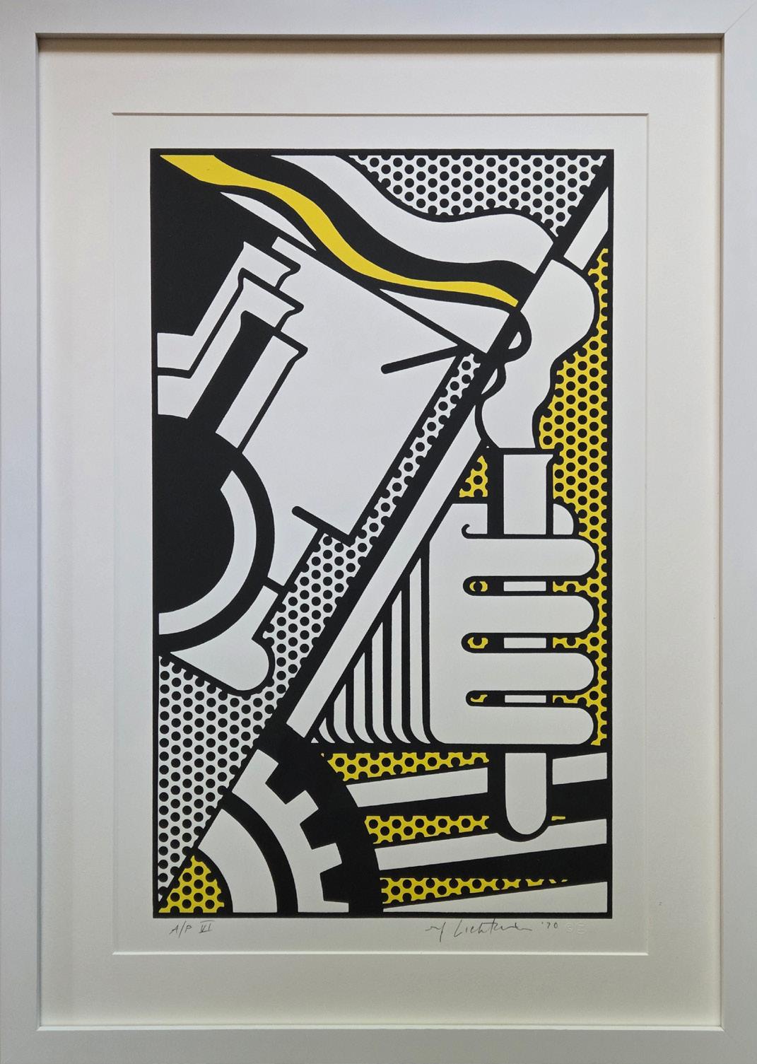
ROY LICHTENSTEIN (American, 1923-1997)
An innovative artist and founder of the American Pop Art movement, Roy Lichtenstein (19231997) is best known for his re-appropriation of the Ben Day dot pattern, a printing process similar to Pointillism, which was initially used in commercial engraving. Alluding to the mechanical technique used in newspapers and comic strips through a use of bold colors, thick lines, and texture and gradient, the artist created works that referenced popular culture by whimsically addressing the gimmicks of their conventions. Hailed ultimately for his style of “paraphrasing” (most notably in the instance of otherwise despised images and subject matter), Lichtenstein remains a pivotal figure of the movement.
The artist created his first portfolio of works in the 1950s, after his studies at the Art Students League of New York. The result was a series of paintings surrounding medieval times, which were rendered in a style reflective of the Swiss-German artist Paul Klee. Lichtenstein’s works would later transition in approach, shifting towards a new style of expressionism that was more inclusive of satire and traditionally reminiscent of American genre cowboys and Indians. It was not until the 1960s, however, that the artist developed his signature style of expression. During this exemplary period in his career, Lichtenstein gained popularity through his trademark use of parody, irony, and cliché. By 1962, he had secured his first solo exhibit at the Leo Castelli Gallery, which was entirely sold out to collectors before the opening night. Lichtenstein’s fame grew exponentially from that point forward.
Roy Lichtenstein was born in Manhattan in 1923. As a boy in New York City, he had a passion for both science and comic books. Upon discovering his interest in art, Lichtenstein began his studies at Parsons School of Design in 1937, and shortly following, studied under Reginald Marsh at the Art Students League. In 1940, Lichtenstein attended Ohio State University; however, his studies were hindered due to his obligations to the US Army during the draft of World War II. During this time, he was greatly influenced by the works of European masters and contemporary artists living in France. Lichtenstein ultimately completed his studies at Ohio State University and thereafter continued his teaching career at different universities. Over the ensuing decades, Lichtenstein continued to hone his craft as a painter, printmaker and sculptor. He passed away in 1997 due to complications from pneumonia. Roy Lichtenstein’s art now hangs in museums around the world, including the Museum of Modern Art and Tate Modern in London.
Roy Lichtenstein + Surrealism
While Lichtenstein is recognized as one of the forefathers of American Pop Art, his roots in surrealism are important to understanding his oeuvre.
By the 1940s when Lichtenstein attended art school at Ohio state University (interrupted for military service from 1943-1946), surrealism was widely acclaimed as the matrix style for contemporary American Abstract Art. Collector-dealer Peggy Guggenheim showcased European Surrealism while promoting such American artists as Pollock at her Art of This Century Gallery. Abstract and Surrealist Art in America, an exhibition surveying the exchange between European Surrealists and their American counterparts, was presented in 1944 at museums in Cincinnati, Denver, Seattle, Santa Barbara and San Francisco, in conjunction with the publication of a monograph of the same title by dealer Sidney Janis. Limiting its survey to American artists, the Art Institute of Chicago in 1947 presented Abstract and Surrealist American Art. It hardly comes as a surprise, therefore, that Lichtenstein’s paintings, drawings, and sculptures from the late 1940s and the early 1950s are fundamentally surrealist in spirit, teeming with biomorphic plants and creatures, often inhabiting dream-like nocturnal settings.
Except for their flagrant humor, of course, Lichtenstein’s Pop art and even his 1977-1979 works on surrealist themes are antithetical to fundamental principles of surrealism. Whereas classical Surrealist art strives for spontaneity with the use of automatist and chance techniques, Lichtenstein’s images are strictly premeditated and meticulously rendered. Moreover the inevitably upbeat mood of Lichtenstein’s images is far removed from the foreboding mood essential to even the sunniest Surrealist works. Even so, Lichtenstein’s Pop art works appealed to collectors with a special fascination for Surrealism.
Arguably the most complex pictures Lichtenstein had attempted up until 1977, his surrealist theme works should be understood as an ambitious response to the Whitney Museum of
American Art’s survey exhibition Art About Art, organized to investigate the widespread parody and appropriation of history of art icons by contemporary artists since the 1950s. Lichtenstein was the most extensively featured artist in this exhibition, with more than twenty works, including the Picasso-esque Girl with Beach Ball II, 1977 [source excluded].1
From 1977-1979, Lichtenstein would revisit his surrealist roots with a series of paintings and prints. During this extremely prolific period, he created about 49 surrealist paintings and two print series. Seven prints dubbed the “Surrealist Series” were created in 1978 at Gemini G.E.L. Thirteen prints dubbed the “American Indian Theme Series” were begun in 1979 at Tyler Graphics. All were very or fairly small editions (from generally 32 to 50 plus proofs).
About the Gemini G.E.L. series of works (Surrealist Series), it is said that:
[The Gemini G.E.L. prints] presented him with entirely new challenges and significantly altered his way of working. Since the 1960s Lichtenstein had generally utilized photographic and mechanical processes to obtain the clean, impersonal, mass-produced look he sought. But for the Surrealist series, he drew directly on the plates and stones with Spectracolor pencil, sometimes using a combination of Spectracolor pencil and tusche to create the larger areas of color. For this project, Spectracolor pencil proved to be a better drawing medium than the regular lithographic pencil, because its sharpened point was less likely to break against the hard surface of the plate.
One of each print in this series was designated to support Change, Inc., the organization founded by Robert Rauschenberg in 1970 to provide emergency funds to artists in need.2
1 Stuckey, Charles. 2005. Roy Lichtenstein: Conversations with Surrealism. New York: Mitchell-Innes & Nash.
2 Corlett, Mary Lee. The Prints of Roy Lichtenstein: A Catalogue Raisonné, 1948–1997, 2nd ed. New York: Hudson Hills Press in association with National Gallery of Art, Washington, D.C., 2002.
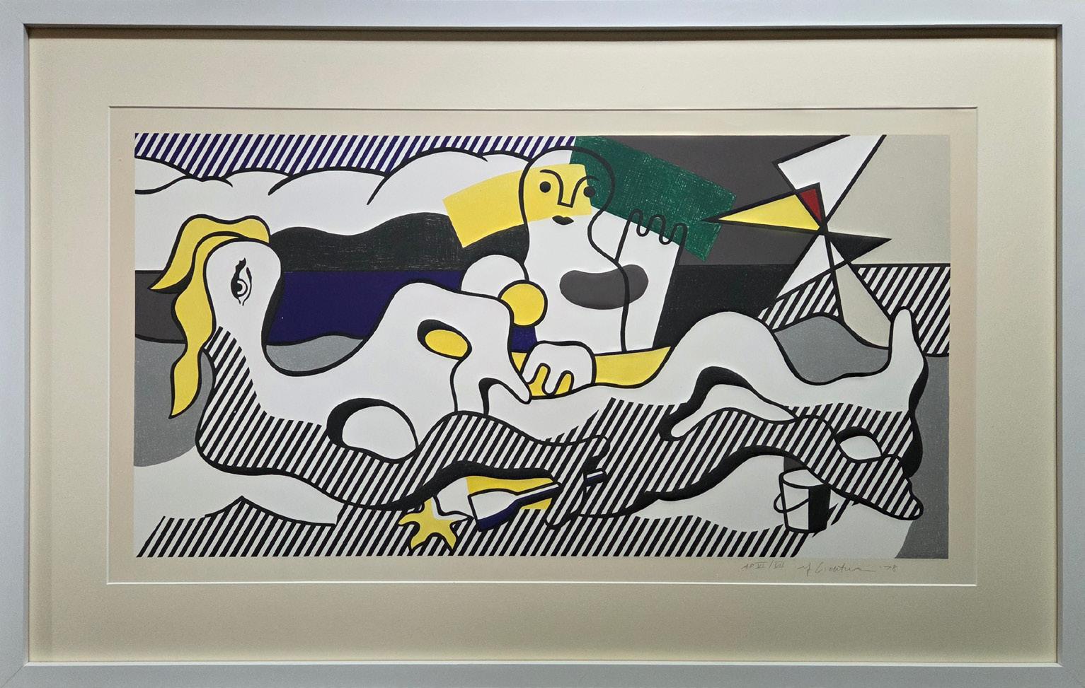
At The Beach Year: 1978
Medium: Lithograph on Arches 88 Paper
Numbered, signed [rf Lichtenstein], and dated [‘78] in pencil, lower right. Blind stamp, lower right: [copyright symbol and Gemini G.E.L. chop]. Stamped on verso, lower left: [© Gemini G.E.L. 1978]. Workshop number on verso in pencil, lower left, beneath stamp: [RL78-858]
Edition of 38; plus 7 AP, 1 RTP, 1 PPII, 1 SP, 1 WP, 3 GEL, 1 C, 1 Change, Inc.; this is AP 7/7
Image size: 17.7 x 33.9 in. (44.9 x 86.2 cm)
Sheet size: 26 x 42 in. (66 x 106.7 cm)
Frame size: 28.5 x 44.75 in (72.39 x 113.67 cm)
Provenance:
Gemini G.E.L. (the printer)
Distinguished Private California Collection (upon release) Long-Sharp Gallery
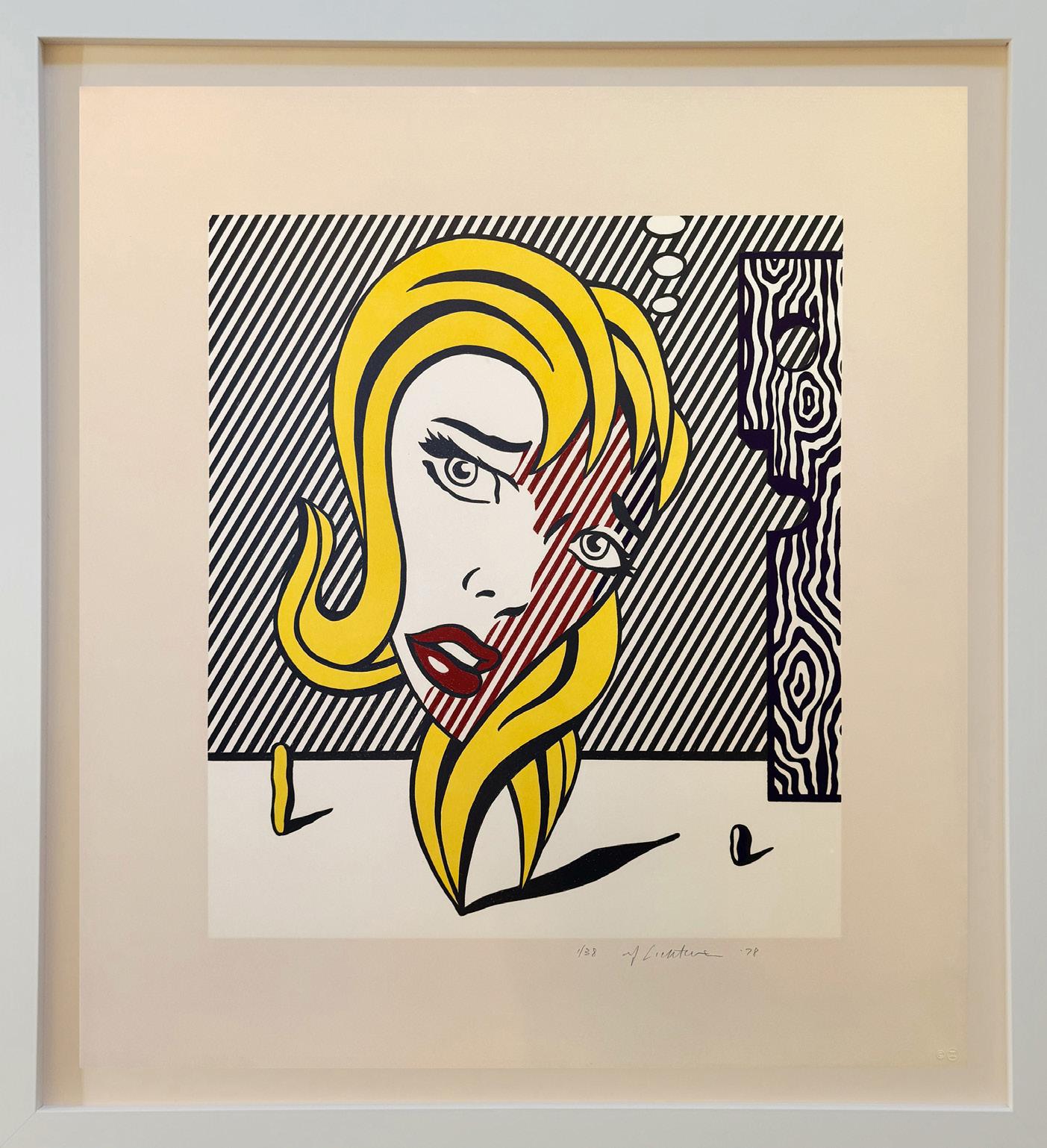
Blonde Year: 1978
Medium: Lithograph on Arches 88 paper
Numbered, signed (rf Lichtenstein), and dated (‘78) in pencil, lower right. Blind stamp, lower right: (copyright symbol and Gemini G.E.L. chop). Stamped on verso, lower left: (©Gemini G.E.L. 1978).
Workshop number on verso in pencil, lower left, beneath stamp: (RL78-855).
From the edition of 38; plus 7 AP, 1 TP, 1 RTP, 1 PPII, 1 SP, 3 GEL, 1 C, 1 Change, Inc.; this is 1/38
Image size: 21.8125 x 19.125 in (55.4 x 48.6 cm)
Sheet size: 29.75 x 27 in (75.6 x 68.6 cm)
Frame size: 35 x 32 in (88.9 x 81.3 cm)
Provenance:
Gemini G.E.L. (the printer)
Distinguished Private California Collection (upon release) Long-Sharp Gallery
[SOLD]
Click to view a film

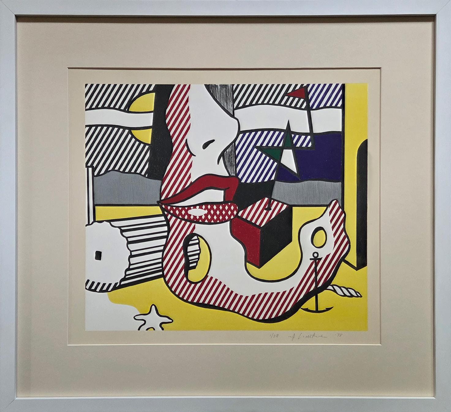
A Bright Night Year: 1978
Medium: Lithograph on Arches 88 Paper
Numbered, signed (rf Lichtenstein), and dated (‘78) in pencil, lower right. Blind stamp, lower right: (copyright symbol and Gemini G.E.L. chop). Stamped on verso, lower left: (© Gemini G.E.L. 1978). Workshop number on verso in pencil, lower left, beneath stamp: (RL78-857)
Edition of 38; plus 7 AP, 1 TP, 1 RTP, 1 PPII, 3 GEL, 1 C, 1 Change, Inc.; this is 1/38
Image size: 18.5 x 21.125 in (47 x 53.7 cm)
Sheet size: 26.5 x 29 in (67.3 x 73.7 cm)
Frame size: 30.19 x 32.875 in (76.68 x 83.5 cm)
Provenance: Gemini G.E.L. (the printer)
Distinguished Private California Collection (upon release) Long-Sharp Gallery
Inspired by the history and gravitas of the Still Life motif, Lichtenstein began creating Still Life paintings in 1972; he interspersed these paintings - and later, printsthroughout his oeuvre, incorporating subject matter ranging from flowers and fruit to famous artists from past decades. He rendered his Still Life works in the same flattened, comic-strip-style for which he was renowned. This particular print was created to benefit Rivington House (an AIDS care facility).
Click to view a film
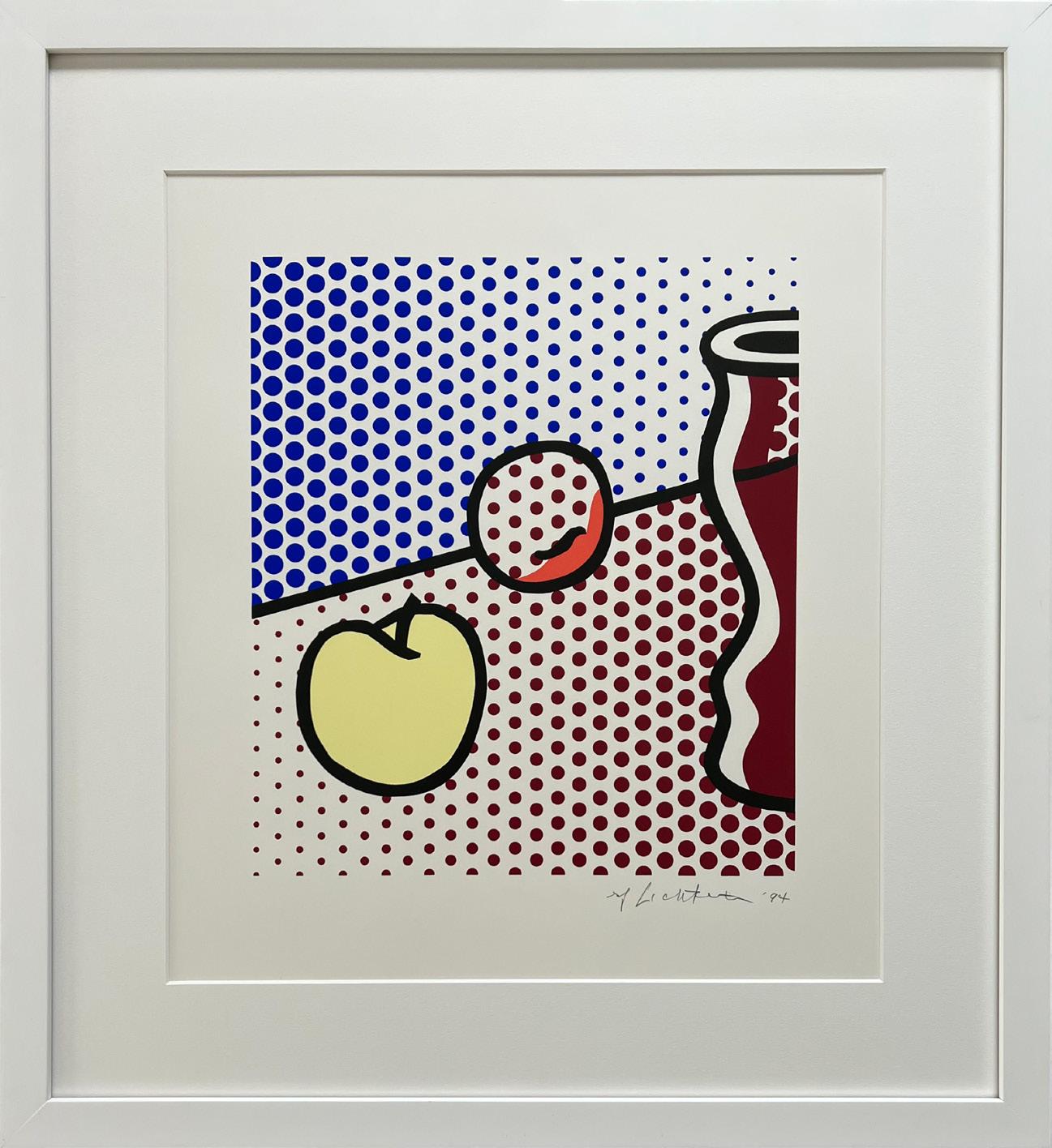
Still Life with Red Jar Year: 1994
Medium: Screenprint on Lanaquarelle watercolor paper
Numbered, signed (rf Lichtenstein), and dated (‘94) in pencil, lower right. Blind stamp, lower right: (copyright symbol, publication date, and Gemini G.E.L. chop).
Stamped on verso, lower left: (published by Gemini G.E.L., Los Angeles). Workshop number on verso in pencil, lower left, to the right of the stamp: (RL94-5206)
Edition of 250 with 50 Artist Proofs, 1 PPI, 1 PPII, 1 PPIII, 1 RTP, 3 GEL, 1 C, 30 SP, this is example AP 27/50
Image size: 15 x 13.25 in (38.1 x 33.7 cm)
Sheet size: 21.25 x 19.25 in (54 x 48.9 cm)
Frame size: 26.25 x 24.25 in (66.68 x 61.6 cm)
Provenance:
Gemini G.E.L. (the printer)
Distinguished Private California Collection (upon release) Long-Sharp Gallery
This image, related to the Peace Through Chemistry series was produced for the benefit of the University of California, Irvine, in conjunction with the exhibition Roy Lichtenstein: Graphics, Reliefs, and Sculpture 1969–1970 (October 27–December 6, 1970) (1970 Irvine University of California). It also appeared on the cover of the exhibition catalogue (Coplans 1970c) .
Chem 1A
Year: 1970
Medium: Screenprint on Special Arjomari paper
Numbered in pencil, lower left. Signed [rf Lichtenstein] and dated [‘70] in pencil, lower right. Blind stamp, lower right: [copyright symbol and Gemini G.E.L. chop].
Stamped on verso, lower left: [Gemini G.E.L. / Los Angeles, Calif.]. Workshop number on verso in pencil, lower left, beneath stamp: [RL70-368]
Edition of 100; plus 10 AP, 1 RTP, 1 PPII, 3 GEL, 1 C; this is AP 6/10
Image size: 24 x 14.4 in. (61 x 36.5 cm)
Sheet size: 30 x 20.3 in. (76.2 x 51.6 cm)
Frame size: 32.75 x 23.25 in (83.19 x 59.06 cm)
Provenance:
Gemini G.E.L. (the printer)
Distinguished Private California Collection (upon release) Long-Sharp Gallery
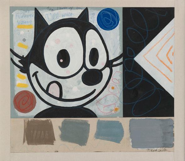
A veteran of the British Pop Art movement, David Spiller grew up in its defining period. Juxtaposing pop culture with urban sensibilities, Spiller created his own unique style of fine art that is distinctly “David Spiller.” As Martin Gayford wrote in his catalogue essay for Spiller’s 2008 exhibition at Beaux Arts London:
David Spiller’s pictures are much more than simply messages. A lot of them are also, an art historian might say, complex colour-field abstractions. […] To make works of this type, Spiller uses a technique that is, as far as I know, unique. He ‘floats’ the pigment onto pieces of canvas that he then sews together with incredible neatness and precision, so the final work is a sort of combine, made not with glue, like a collage, but with needle and thread. […] no one has ever, as far as I know, fitted geometrically precise square and oblongs of colour together in this fashion, like a precision-engineered quilt...
David Spiller’s place as an acclaimed artist was not achieved by happenstance. Spiller was trained in fine art and an early student of Frank Auerbach. He studied at the Sidcup School of Art (1957), Beckenham School of Art (1958-1962), and the Slade School of Art (1962-1965). During his distinguished career, Spiller had solo exhibits in over 10 countries (Austria, Belgium, Denmark, England, France, Germany, Holland, Italy, Spain and the United States). His work was exhibited at notable institutions such as the Rattingen Museum and Mannheim Kunstverein (Germany), Museum Van Bommel van Dam and Museum Utrecht (Holland), Museum Espace Belleville and Artcurial (Paris), the Royal West of England Academy (UK), and the Cornell Museum (Florida, US). His work is also in important public and corporate collections which include Hanwon Museum (Seoul), Foundation Carmignac Gestion (Paris), Harley Gallery Welbeck, Collection UCL, Morgan Stanley (Frankfort), and Belgacom Brussels. Important private collections also contain works by the artist; some are available on request.
When asked about his art, Spiller has said, “I really want to make paintings that put some magic on the wall. Some of them are straightforward things. Some are wild things. But underneath, it says ‘I love you.’”
Sing of Love (Elroy)
Year: 1996
Medium: Acrylic and pencil on stitched canvas panels
Size: 60 x 60 in (152.4 x 152.4 cm)
Hand signed and dated
Provenance:
The artist’s estate
Long-Sharp Gallery
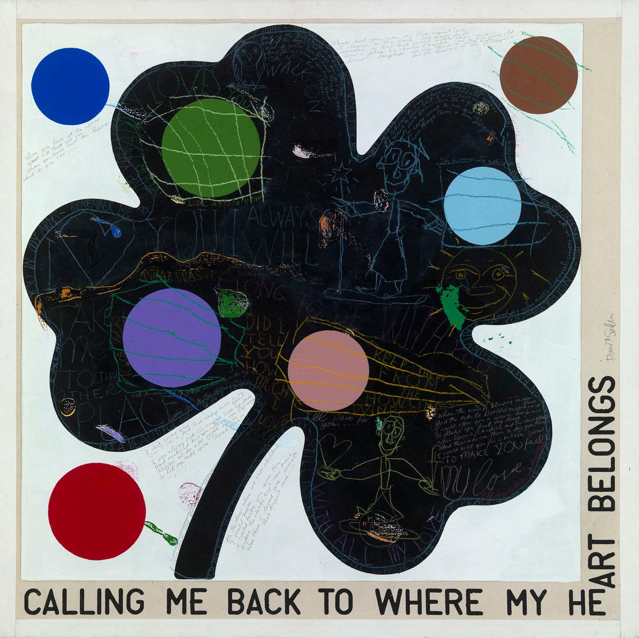
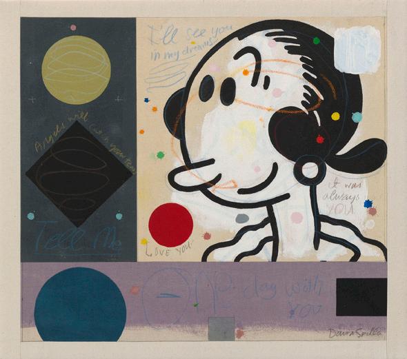
Calling Me Back Year: 2002
Medium: Acrylic and pencil on stitched canvas panels
Size: 48 x 48 in (121.9 x 121.9 cm)
Hand signed and dated
Provenance: The artist’s estate
Long-Sharp Gallery
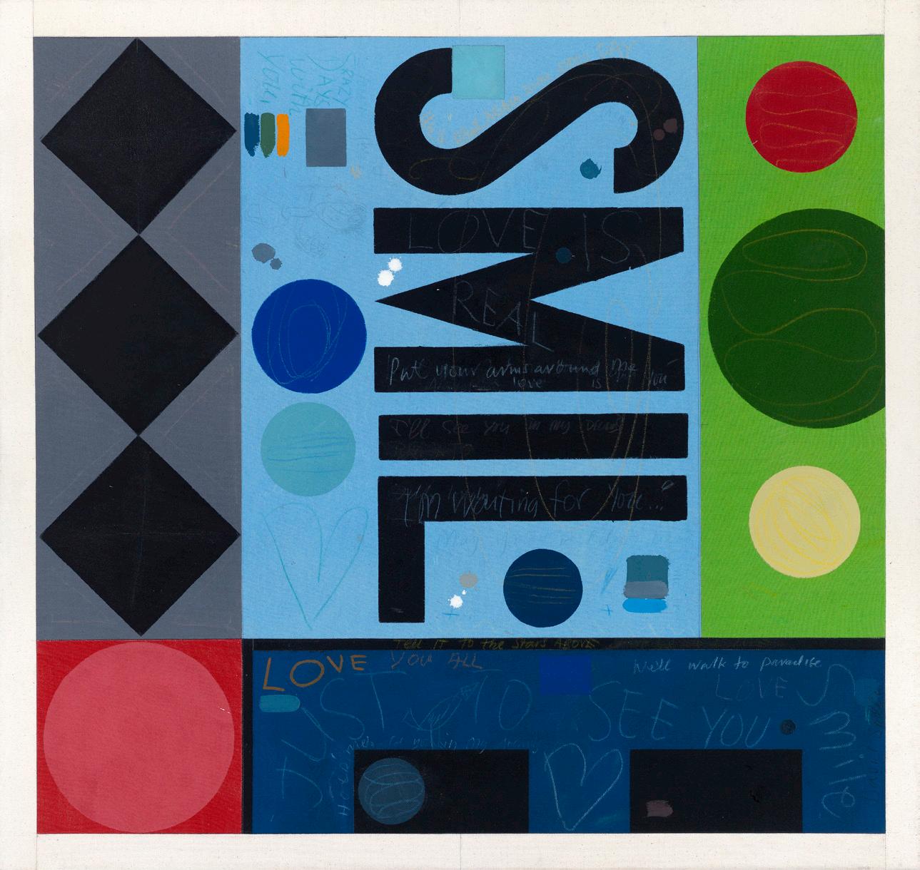
Just to See You Smile
Year: 2015
Medium: Acrylic and pencil on stitched canvas panels
Size: 34 x 36 in (85.4 x 91.4 cm)
Hand signed and dated
Provenance:
The artist’s estate
Long-Sharp Gallery
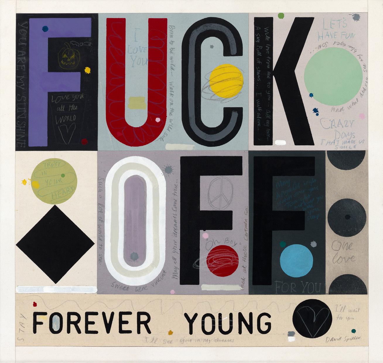
Forever Young/Fuck Off Year: 2015
Medium: Acrylic and pencil on stitched canvas panels
Size: 34 x 36 in (85.4 x 91.4 cm)
Hand signed and dated
Provenance:
The artist’s estate
Long-Sharp Gallery
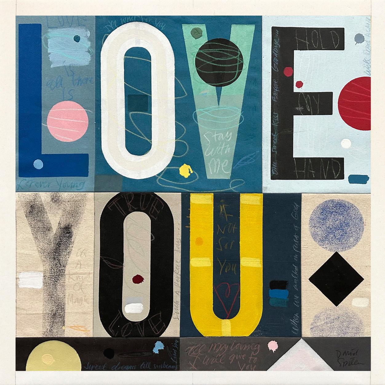
If Not For You
Year: 2015
Medium: Acrylic and pencil on stitched canvas panels
Size: 30 x 30 in (76.2 x 76.2 cm)
Hand signed and dated
Provenance:
The artist’s estate
Long-Sharp Gallery
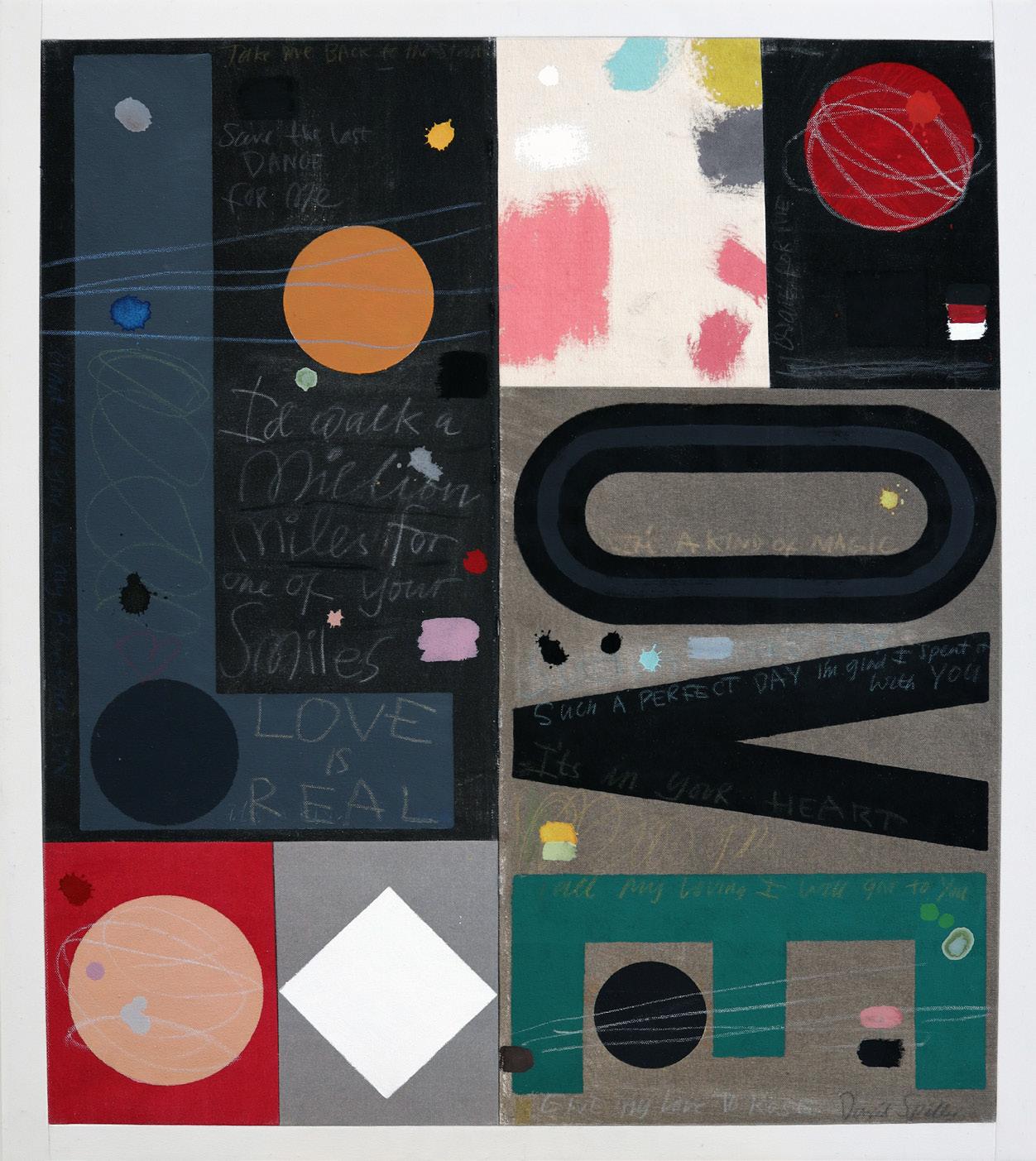
Such A Perfect Day Year: 2016
Medium: Acrylic and pencil on stitched canvas panels
Size: 30 x 26 in (76.2 x 66.0 cm)
Hand signed and dated
Provenance: The artist’s estate Long-Sharp Gallery
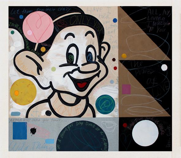
All My Loving (Dopey)
Year: 2016
Medium: Acrylic and pencil on stitched canvas panels
Size:
Hand signed and dated
Provenance:
The artist’s estate
Long-Sharp Gallery
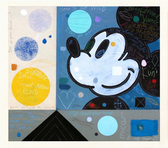
Born to be wild
Year: 2016
Medium: Acrylic and pencil on stitched canvas panels
Size: 23 x 26 in (58.4 x 66.0 cm)
Hand signed and dated
Provenance:
The artist’s estate
Long-Sharp Gallery
For You
Year: 2016
Medium: Acrylic and pencil on stitched canvas panels
Size: 23 x 26 in (58.4 x 66.0 cm)
Hand signed and dated
Provenance:
The artist’s estate
Long-Sharp Gallery
One Day With You
Year: 2016
Medium: Acrylic and pencil on stitched canvas panels
Size: 23 x 26 in (58.4 x 66.0 cm)
Hand signed and dated
Provenance:
The artist’s estate
Long-Sharp Gallery
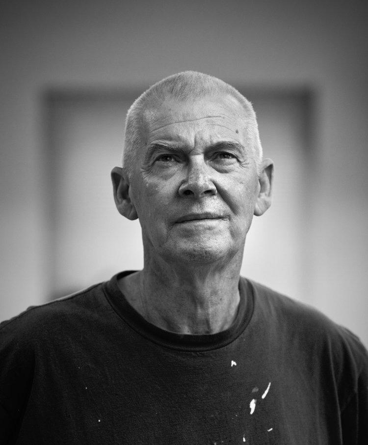
(British, b. 1962)
Moira Cameron was born in London to a family of artists. Her father was the celebrated figurative sculptor Ronald Cameron (1930-2013). Her mother, Dorothy Cameron, was a sculptor in her own right. Half a century earlier, Dorothy’s mother had been among the first women to attend art school.
Cameron earned a BA (Fine Art) from Ravensbourne College of Art and an MFA from Chelsea College of Art. In the 1980s, she and her husband, artist David Spiller (1942-2018), moved to New York City. Amidst the bustling streets and graffiti-fueled art scene, Cameron began experimenting with paper sacks as a medium for her artwork. Sourced from her daily life and travels, then cut, patched, glued, and stenciled into something new, the shopping bags are both imbued with personal memories and more broadly representative of the signs, symbols, and sayings of 1980s and 1990s popular culture. As art historian Fraser Brough notes, Cameron’s work repurposing and transforming the discarded materials of everyday life “still looks fresh, raw without being messy, expressive without being naïve.” And over thirty years later, the way in which Cameron embraced sustainable art forms and popular slogans such as “Reduce, Re-use, Recycle” feels, in Brough’s words, “remarkably prescient” for our world today.
Cameron also creates artwork in partnership with her son, Xavier Spiller-Cameron, under the moniker Spiller + Cameron. Their works are assembled in union, with each collaborator bringing his and her strengths and weaknesses to the partnership—Xavier introducing his youthful, contemporary energy to Cameron’s maturity and experience. The duo describes their artistic process as a sort of “alchemy,” in which a base product is mystically transformed into something beautiful. Like Cameron’s work with paper bags, Spiller + Cameron “upcycle” discarded paint rags and other materials; after they are primed, ironed, and meticulously stitched together, the resulting “collages” are so precise that the stitches almost disappear. The paintings harness the energy of the materials’ previous use and, like alchemy, transmute a base product into something worthy of contemplation.
Life’s Story (self-portrait)
Year: 2025
Medium: Oil on canvas
Size: 86.6 x 78.7 in (220 x 200 cm)
Hand signed and dated on verso
Provenance: The artist
Long-Sharp Gallery Click to view a film
(American, 1940-2025)
Mel Bochner received his BFA (1962) and honorary Doctor of Fine Arts (2005) from Carnegie Mellon University. He is recognized as one of the leading figures in the development of Conceptual art in New York in the 1960s and 1970s. Emerging at a time when painting was increasingly discussed as outmoded, Bochner became part of a new generation of artists including Eva Hesse, Donald Judd, and Robert Smithson - artists, who, like Bochner were looking at ways of breaking with Abstract Expressionism and traditional compositional devices. His pioneering introduction of the use of language in the visual led Harvard University art historian Benjamin Buchloh to describe his 1966 Working Drawings as “probably the first truly conceptual exhibition”.
Bochner came of age during the second half of the 1960s - a moment of radical change, both in society at large as well as in art. While painting slowly lost its preeminent position in modern art, language moved from talking about art to becoming part of art itself. Bochner has consistently probed the conventions of both painting and of language, the way we construct and understand them, and the way they relate to one another to make us more attentive to the unspoken codes that underpin our engagement with the world. [Excerpted from Mel Bochner / If The Color Changes]
Mel Bochner’s work is held in the permanent collection of museums including Museum of Modern Art, New York; Whitney Museum of American Art, New York; National Gallery of Art, Washington D.C.; Centre Georges Pompidou, Paris; Tate, London. He had created works with Two Palms since 1997.
About Monoprints: The process of creating monoprints is not inherently complicated: create a matrix, apply ink, place paper, press. Early forays into the technique were made in the fourteenth and fifteenth centuries, but it was not until the 1700s that William Blake began experimenting with what we would now recognize as monotypes. Thereafter, various monoprinting methods were developed and utilized by the likes of Edgar Degas, Camille Pissarro, and Paul Gaugin; later, Chagall, Miró, and Picasso would seize upon the technique.
Mel Bochner’s monoprints – immediately identifiable for their texture, text, and arresting color composition - are a bit more complicated, and a bit more unpredictable. His works have “immense visual variety” – though each series of monoprints is created using a single matrix, the variables [color spectrum, color density, size, etc.] can be endlessly manipulated. Though each piece is created with this single matrix, each piece is unique.
This variety results from a host of variables: the medium used (oil paints altered with different oils and varnishes), the viscosity of the paints, color placement (determined by Bochner and sometimes – in an effort to quell his inherent color biases – the printer), and the paper itself. (The paper is handmade and multi-layered, resulting in stark levels of differentiation once the paint is applied.) The incalculability of these variables and the skill of the artist and Two Palms (his printer) result in works that are striking for their brilliance and for their contrast.
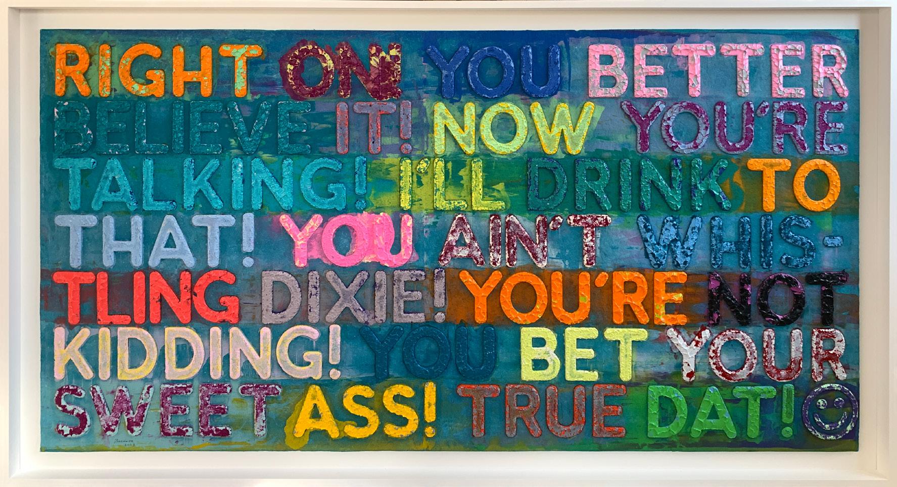
Right On Year: 2023
Medium: Monoprint in oil with collage, engraving, and embossment on handmade paper
Signed and dated in graphite on recto
Size: 32.375 x 62.625 in (82.2 x 159.1 cm)
Frame size: 36.5 x 67 in (92.7 x 170.1 cm)
Provenance:
The printer (Two Palms) Long-Sharp Gallery
Head Honcho Year: 2024
Medium: Monoprint in oil with collage, engraving and embossment on handmade paper
Signed and dated recto in graphite
Size: 30 x 20 in (76.2 x 50.8 cm)
Frame size: 33 x 23 in (83.82 x 58.42 cm)
Provenance: The printer (Two Palms) Long-Sharp Gallery
Amazing Year: 2019-2022
Medium: Etching in 18 colors
Signed and dated on front in graphite
Size: 36 x 27.5 in (91.4 x 69.8 cm)
Frame size: 40.75 x 32.125 in (103.51 x 81.6 cm)
Edition of 30 plus 5AP, 5PP, 4 HC; this is 3/30
Provenance:
The printer (Two Palms) Long-Sharp Gallery
Oh Well
Year: 2020
Medium: Etching with silkscreen
Hand signed, numbered and dated in the lower margin in graphite
Image size: 30 x 22.25 in (76.2 x 56.5 cm)
Sheet: 35 x 26.25 in (88.9 x 66.7 cm)
Frame size: 41 x 32.5 in (104.1 x 82.5 cm)
From the edition of 20 with 5AP, 4PP, 1BAT, this is example 2/20
Provenance:
The printer (Two Palms)
Long-Sharp Gallery
Click to view a film
Widely considered as one of the most influential artists of the twentieth century, Andy Warhol (1928-1987) is celebrated for his signature depictions surrounding daily objects of mass production. Identified as the first artist to convey the influence of mass media culture on the American life, Warhol created his most prolific works in the 1960s, when the US was quickly becoming a culture built upon television and mass consumerism. Consequently surrounded by a fascination with impactful and lasting images, audiences soon began to reject typical print media to embrace Warhol’s representation of media and commercialism. Throughout his successful career and numerous iconic collaborations, Warhol continued to firmly establish his patented impact of imagery on the development of our environment and identity. His beloved Campbell’s Soup cans and Coke bottles, as well as his silkscreen prints of famous personalities such as Marilyn Monroe and Elvis Presley are still widely celebrated today. Simply, Warhol is regarded as the King of Pop Art. His influence went beyond painting and printmaking.
Warhol founded The Factory in 1962, as a result of his interest in the mass production of his own works. In addition to serving as an industrial setting for his employees to extensively produce the artists’ prints and posters, The Factory also functioned as a performance venue for the Velvet Underground, and a filmmaking studio for his experimental films.
Born “Andy Warhola” in 1928 to Slovak immigrants, Warhol displayed an early talent for drawing and painting. Following high school, he enrolled in Pittsburgh’s Carnegie Institute of Technology, where he studied commercial art. After graduating in 1949, Warhol moved to New York to work as an illustrator for various magazines, such as Vogue and Harper’s Bazaar. He soon became one of New York’s most sought after and successful illustrators, and in 1952, he held his first oneman exhibition at New York’s Hugo Gallery. Warhol quickly became one of the most celebrated commercial artists in New York. His works were featured in every important magazine from Vogue to Harper’s Bazaar. The 1950’s also marked his most prolific period for his illustrating and publishing books – during this period he would go on to publish eight books.
In July of 1968, Warhol narrowly survived an attempt on his life by Valerie Solanis. Solanis, who had worked at The Factory occasionally, shot Warhol multiple times in the chest, proclaiming upon her arrest that he “had too much control over my life.” Throughout the 1970s, Warhol continued to produce art, as well as to expand his entrepreneurial interests through such ventures as founding Interview magazine as well as the opening of a successful nightclub. Warhol died tragically in February 1987 from complications following a gall bladder operation.
About this work: Andy Warhol’s work as an Illustrator ran the gamut – from illustrations of shoes for Glamour Magazine to Christmas cards for Tiffany & Co. The latter was perfectly suited for Warhol, whose love for Christmas has become more and more understood in the last several years. Tiffany’s published Warhol’s Christmas cards from 1956 to 1962.
“Warhol reduced and radicalised his Flowers to such an extent that the banal subject matter was now transformed into a powerful pictorial concept. The directionless format contributed to this: the pictures can be read in all directions; like an abstract painting, top and bottom, left and right, have been revoked” (Nina Zimmer cited in: Exh. Cat., Basel, Kunstmuseum, Andy Warhol: The Early Sixties – Paintings and Drawings 1961-1964, 2011, p. 177).
Whether starting with a drawing or a photograph (depending on the decade), Warhol’s multi-step process remained: his foundational drawing or a photograph would be transformed into drawings, acetates, screenprints, and paintings. In the 1980s, Warhol created a series of prints and paintings of Poinsettias based on photographs that he had taken.
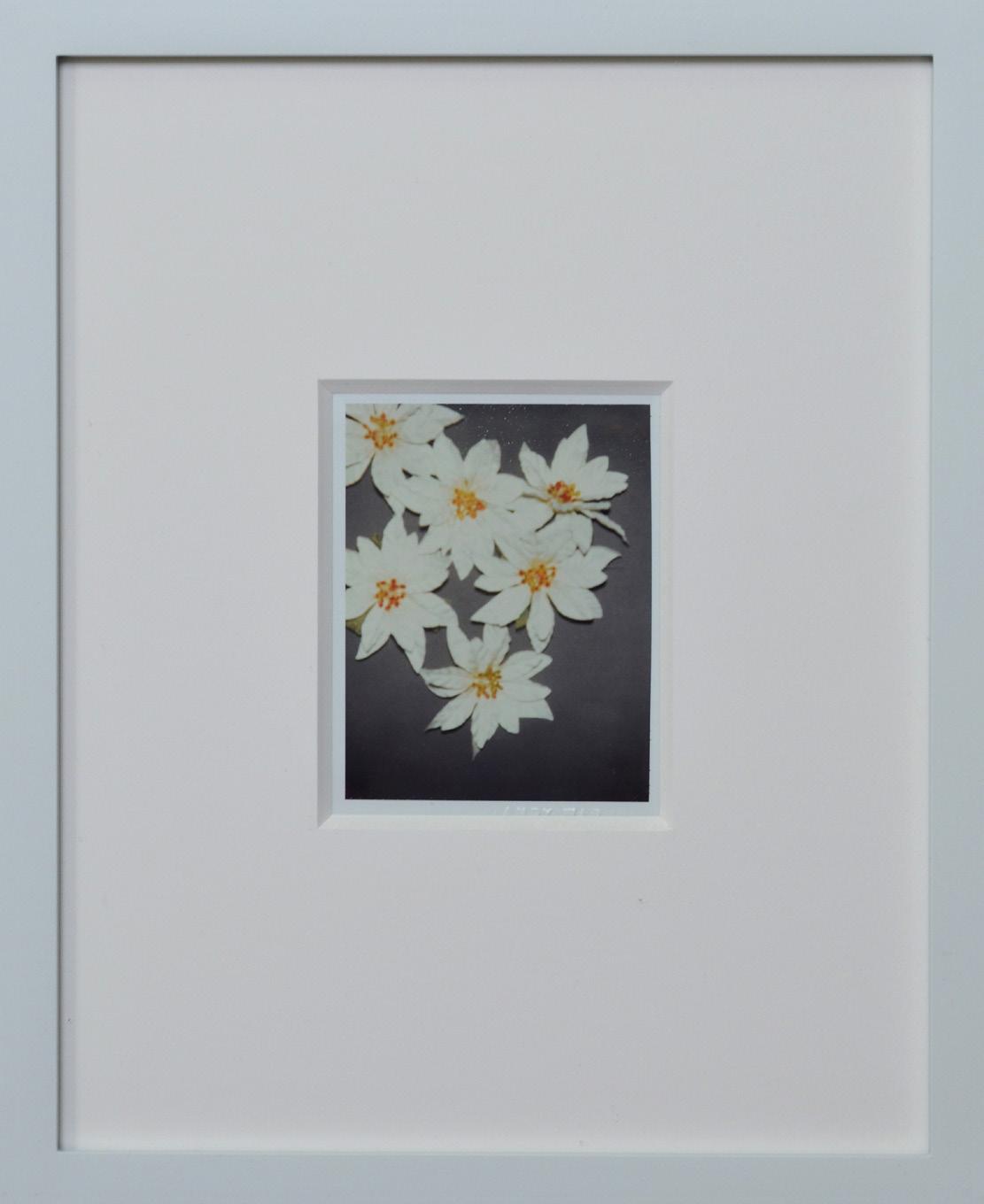
Poinsettias
Year: 1983
Medium: Unique polaroid print
Size: 4.25 x 3.375 in (10.8 x 8.6 cm)
Frame size: 11 x 8.875 in (27.9 x 22.5 cm)
Provenance:
Estate of Andy Warhol (stamped)
Andy Warhol Foundation for the Visual Arts (stamped) Long-Sharp Gallery
Authenticated by the Authentication Board of Andy Warhol Foundation for the Visual Arts (stamp on verso), Foundation archive number (FA09.02007) on verso in pencil, initialed by the person who entered the works into the Foundation archive.
About this work: Andy Warhol’s work as an Illustrator ran the gamut – from illustrations of shoes for Glamour Magazine to Christmas cards for Tiffany & Co. The latter was perfectly suited for Warhol, whose love for Christmas has become more and more understood in the last several years. Tiffany’s published Warhol’s Christmas cards from 1956 to 1962.
“Warhol reduced and radicalised his Flowers to such an extent that the banal subject matter was now transformed into a powerful pictorial concept. The directionless format contributed to this: the pictures can be read in all directions; like an abstract painting, top and bottom, left and right, have been revoked” (Nina Zimmer cited in: Exh. Cat., Basel, Kunstmuseum, Andy Warhol: The Early Sixties – Paintings and Drawings 1961-1964, 2011, p. 177).
Whether starting with a drawing or a photograph (depending on the decade), Warhol’s multi-step process remained: his foundational drawing or a photograph would be transformed into drawings, acetates, screenprints, and paintings. In the 1980s, Warhol created a series of prints and paintings of Poinsettias based on photographs that he had taken.
Click to view a film
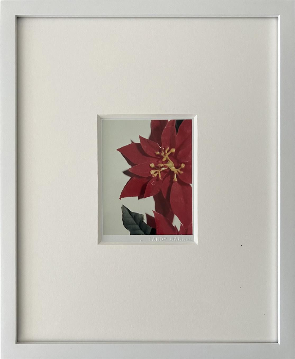
Poinsettias
Year: 1983
Medium: Unique polaroid print
Size: 4.25 x 3.375 in (10.8 x 8.6 cm)
Frame size: 11 x 8.875 in (27.9 x 22.5 cm)
Provenance:
Estate of Andy Warhol (stamped)
Andy Warhol Foundation for the Visual Arts (stamped) Long-Sharp Gallery
Authenticated by the Authentication Board of Andy Warhol Foundation for the Visual Arts (stamp on verso), Foundation archive number (FA09.01968) on verso in pencil, initialed by the person who entered the works into the Foundation archive.
About this work: Andy Warhol’s work as an Illustrator ran the gamut – from illustrations of shoes for Glamour Magazine to Christmas cards for Tiffany & Co. The latter was perfectly suited for Warhol, whose love for Christmas has become more and more understood in the last several years. Tiffany’s published Warhol’s Christmas cards from 1956 to 1962.
“Warhol reduced and radicalised his Flowers to such an extent that the banal subject matter was now transformed into a powerful pictorial concept. The directionless format contributed to this: the pictures can be read in all directions; like an abstract painting, top and bottom, left and right, have been revoked” (Nina Zimmer cited in: Exh. Cat., Basel, Kunstmuseum, Andy Warhol: The Early Sixties – Paintings and Drawings 1961-1964, 2011, p. 177).
Whether starting with a drawing or a photograph (depending on the decade), Warhol’s multi-step process remained: his foundational drawing or a photograph would be transformed into drawings, acetates, screenprints, and paintings. In the 1980s, Warhol created a series of prints and paintings of Poinsettias based on photographs that he had taken.
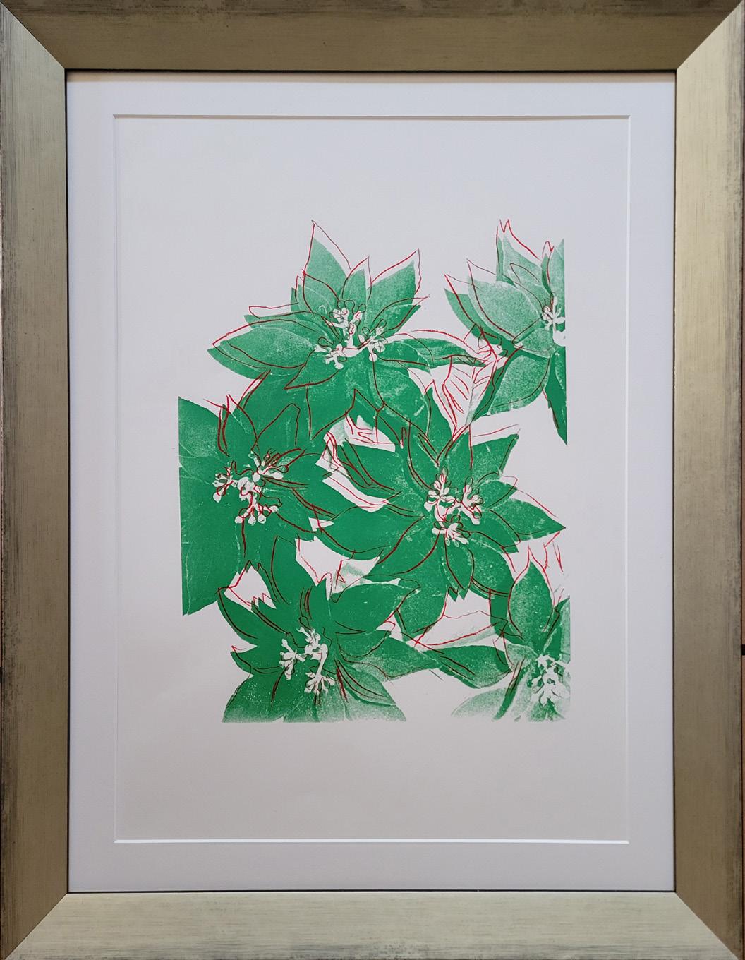
Poinsettias
Year: Circa 1983
Medium: Screenprint in colors on paper
Size: 21.75 x 15.25 in (55.2 x 38.7 cm)
Frame size: 26.25 x 20.25 (66.68 x 51.44 cm)
One of a small number of impressions
Provenance:
Estate of Andy Warhol (stamped)
Andy Warhol Foundation for the Visual Arts (stamped) Long-Sharp Gallery
Authenticated by the Authentication Board of Andy Warhol Foundation for the Visual Arts (stamp on verso), Foundation archive number (UP 39.18) on verso in pencil, initialed by the person who entered the works into the Foundation archive.
About this work: Andy Warhol’s work as an Illustrator ran the gamut – from illustrations of shoes for Glamour Magazine to Christmas cards for Tiffany & Co. The latter was perfectly suited for Warhol, whose love for Christmas has become more and more understood in the last several years. Tiffany’s published Warhol’s Christmas cards from 1956 to 1962.
“Warhol reduced and radicalised his Flowers to such an extent that the banal subject matter was now transformed into a powerful pictorial concept. The directionless format contributed to this: the pictures can be read in all directions; like an abstract painting, top and bottom, left and right, have been revoked” (Nina Zimmer cited in: Exh. Cat., Basel, Kunstmuseum, Andy Warhol: The Early Sixties – Paintings and Drawings 1961-1964, 2011, p. 177).
Whether starting with a drawing or a photograph (depending on the decade), Warhol’s multi-step process remained: his foundational drawing or a photograph would be transformed into drawings, acetates, screenprints, and paintings. In the 1980s, Warhol created a series of prints and paintings of Poinsettias based on photographs that he had taken.
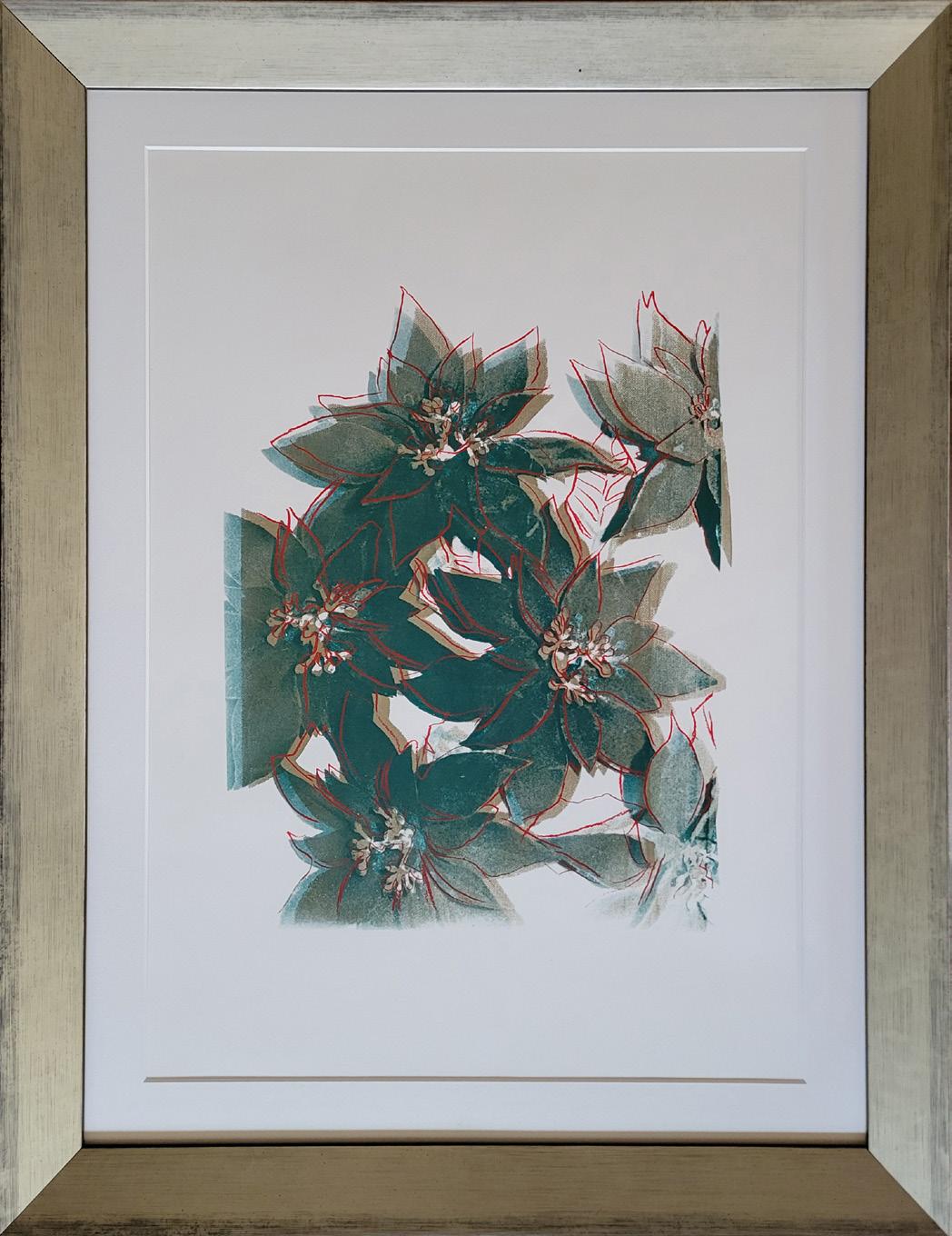
Poinsettias
Year: Circa 1983
Medium: Screenprint in colors on paper
Size: 21.75 x 15.25 in (55.2 x 38.7 cm)
Frame size: 26.25 x 20.25 (66.68 x 51.44 cm)
One of a small number of impressions
Provenance:
Estate of Andy Warhol (stamped)
Andy Warhol Foundation for the Visual Arts (stamped) Long-Sharp Gallery
Authenticated by the Authentication Board of Andy Warhol Foundation for the Visual Arts (stamp on verso), Foundation archive number (UP 39.25) on verso in pencil, initialed by the person who entered the works into the Foundation archive.
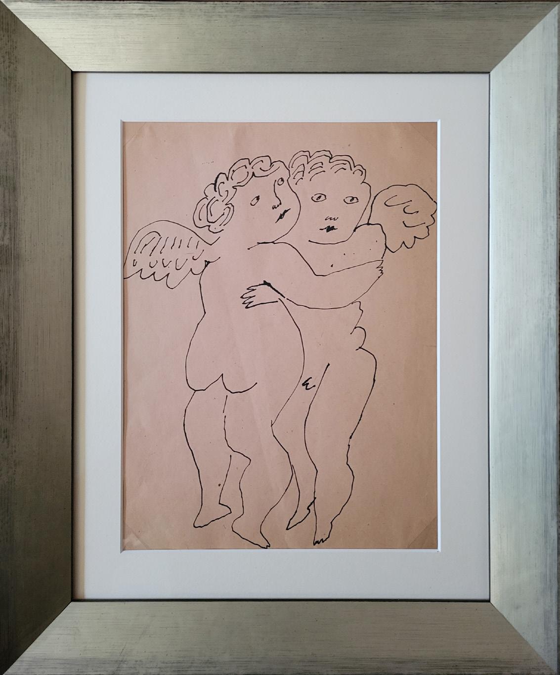
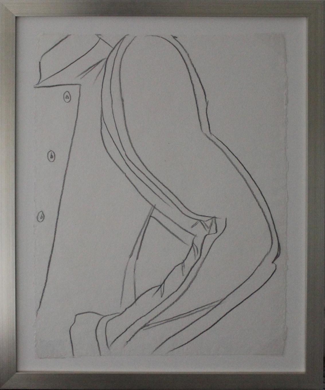
About these works: Andy Warhol’s drawings from the 1950s stand in stark contrast to the Pop icon’s famous images of soup cans, Mickey Mouse, and dollar signs; they are whimsical, intimate, and – oftentimes – cheeky. Many of these drawings – especially his drawings of angels, cherubs, and fairies – served as studies for a book, In the Bottom of My Garden, that Warhol published in 1956.
In the Bottom of My Garden had numerous inspirations. The title was derived from the song “There Are Fairies at the Bottom of Our Garden” by Rose Fyleman and Liza Lehmann (1917). The vision for some of the cherubs and fairies was sparked by J.J. Grandville’s Les Fleurs Animées (1847). Further inspiration was gleaned from the fantastical flowers and fairies created by English illustrator Cicely Mary Barker (1923). According to Charles Lisanby, Warhol’s close friend who accompanied him on his first trip abroad in 1956, Warhol was enthralled with several books he encountered during their time in Amsterdam. For In the Bottom of My Garden, “Warhol adapted some putti from Jack Stella. To those inspirations one can add the famous Dance of Cupids (after Raphael) (1517-20) by Marcantonio Raimondi” (Schlief 2013, 108).
Equipped with a masterful hand and a whimsical style, Warhol blended bits of these songs, books, and imagery to create a new world. With cherubs, cats, flowers, and other miscellany cavorting and frolicking throughout the book, every page of In the Bottom of My Garden brings a new surprise.
Schleif, Nina. 2013. “Clever Frivolity in Excelsis: Warhol’s Promotional Books.” In Reading Andy Warhol, edited by Nina Schleif, 78-133. Ostfildern: Hatje Cantz Verlag.

In the Bottom of My Garden Study Drawing
Year: Circa 1955
Medium: Ink on paper
Size: 12 x 8.875 in (30.5 x 22.5 cm)
Frame size: 17.125 x 14.25 in (43.5 x 36.12 cm)
Provenance:
Estate of Andy Warhol (stamped) Andy Warhol Foundation for the Visual Arts (stamped) Long-Sharp Gallery
Authenticated by the Authentication Board of Andy Warhol Foundation for the Visual Arts (stamp on verso), Foundation archive number (TOP 273.011) on verso in pencil, initialed by the person who entered the works into the Foundation archive.
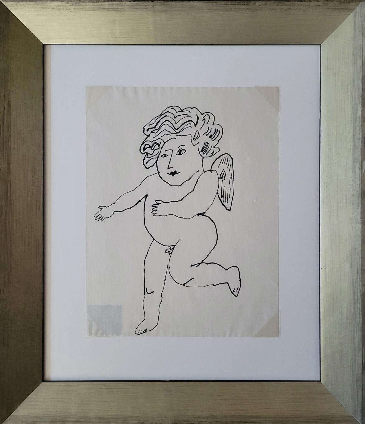
Untitled (Angel)
Year: Circa 1955
Medium: Ink drawing on news print
Size: 11 x 8.5 in (27.9 x 21.6 cm)
Frame size: 15.05 x 17.75 in (28.23 x 45.09)
Provenance:
Estate of Andy Warhol (stamped)
Andy Warhol Foundation for the Visual Arts (stamped) Long-Sharp Gallery
Authenticated by the Authentication Board of Andy Warhol Foundation for the Visual Arts (stamp on verso), Foundation archive number (TOP 272.043) on verso in pencil, initialed by the person who entered the works into the Foundation archive.
Click to view a film
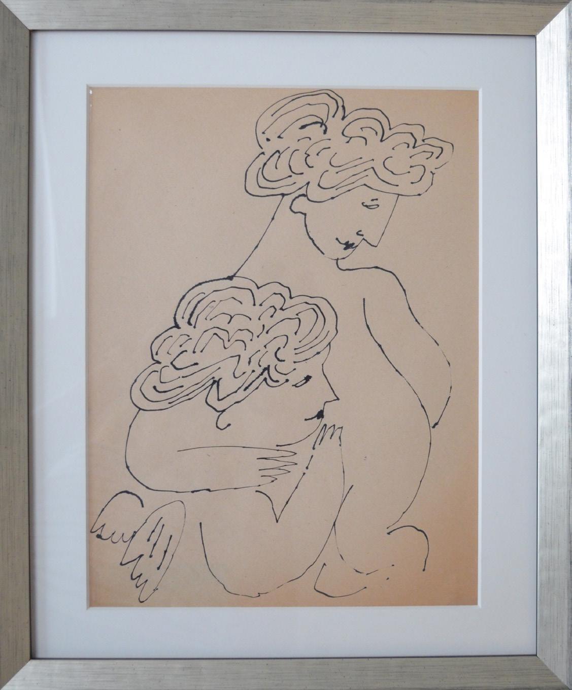
Untitled (Two Cherubs Embrace)
Year: Circa 1955
Medium: China ink drawing on paper
Size: 11.75 x 8.875 in (29.8 x 22.5 cm)
Frame size: 14.25 x 17.125 in (36.2 x 43.5 cm)
Provenance:
Estate of Andy Warhol (stamped)
Andy Warhol Foundation for the Visual Arts (stamped) Long-Sharp Gallery
Authenticated by the Authentication Board of Andy Warhol Foundation for the Visual Arts (stamp on verso), Foundation archive number (TOP 273.001) on verso in pencil, initialed by the person who entered the works into the Foundation archive.
Click to view a film
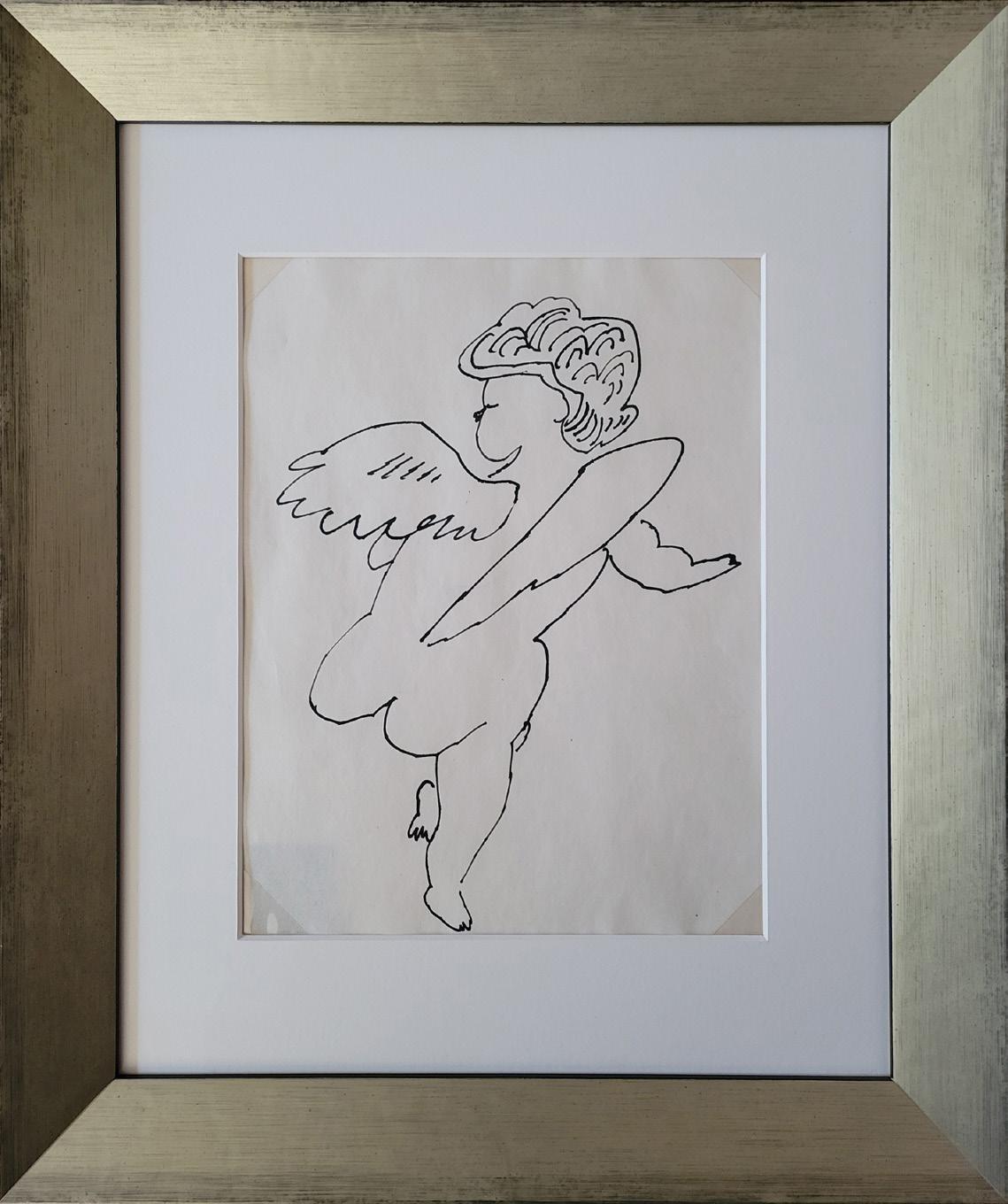
Angel (Back View)
Year: Circa 1954
Medium: Original china ink drawing on paper
Size: 11 x 8.5 in (27.9 x 21.6 cm)
Frame size: 18 x 15.19 in (45.72 x 38.58 cm)
Provenance:
Estate of Andy Warhol (stamped)
Andy Warhol Foundation for the Visual Arts (stamped) Long-Sharp Gallery
Authenticated by the Authentication Board of Andy Warhol Foundation for the Visual Arts (stamp on verso), Foundation archive number (TOP 272.033) on verso in pencil, initialed by the person who entered the works into the Foundation archive.
Click to view a film
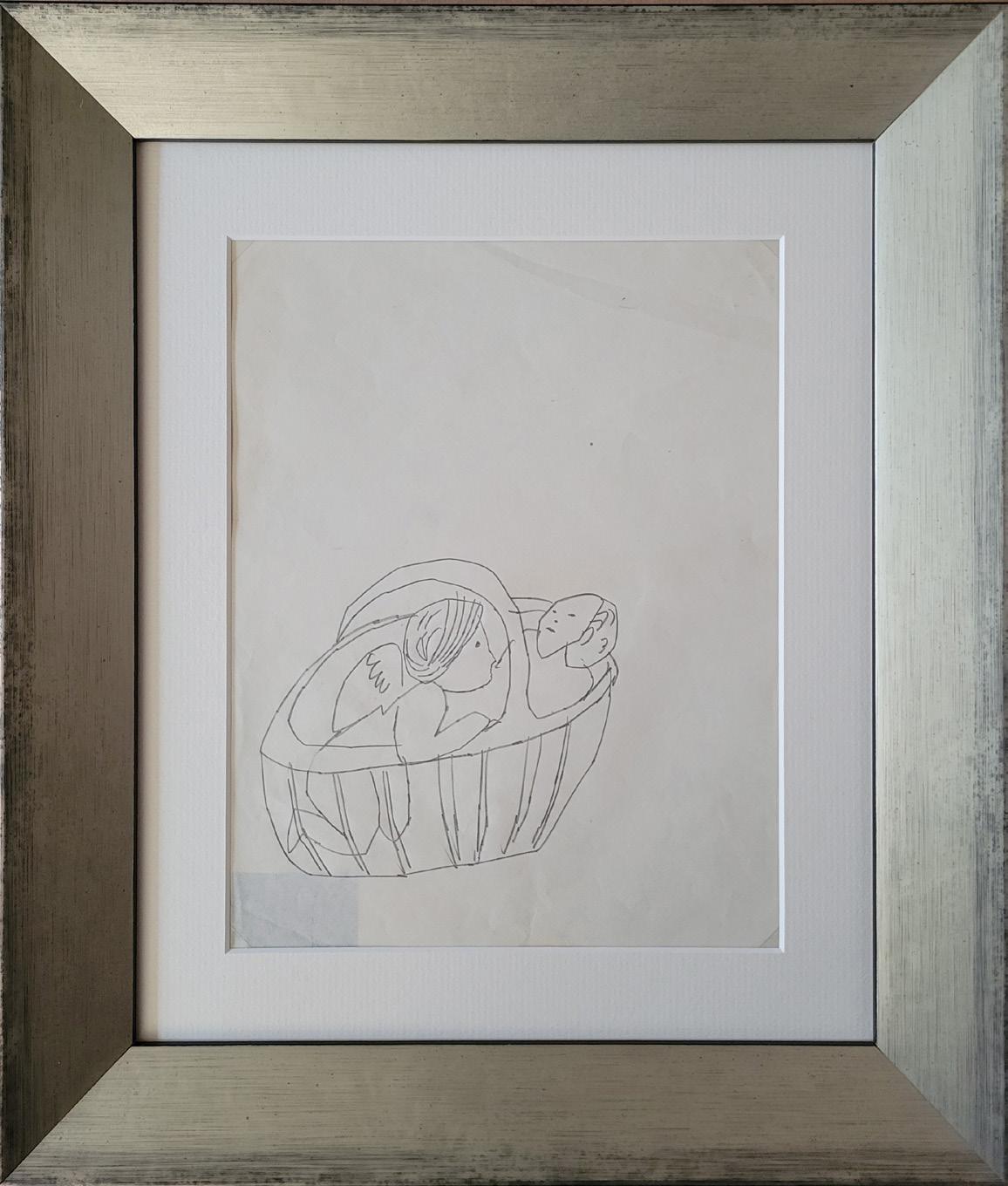
Angels
Year: Circa 1954
Medium: Ink on paper
Size: 11.25 x 8.75 in (28.6 x 22.2 cm)
Frame size: 15.69 x 13.75 in (39.85 x 34.93 cm)
Provenance:
Estate of Andy Warhol (stamped)
Andy Warhol Foundation for the Visual Arts (stamped) Long-Sharp Gallery
Authenticated by the Authentication Board of Andy Warhol Foundation for the Visual Arts (stamp on verso), Foundation archive number (TOP 364.033) on verso in pencil, initialed by the person who entered the works into the Foundation archive.
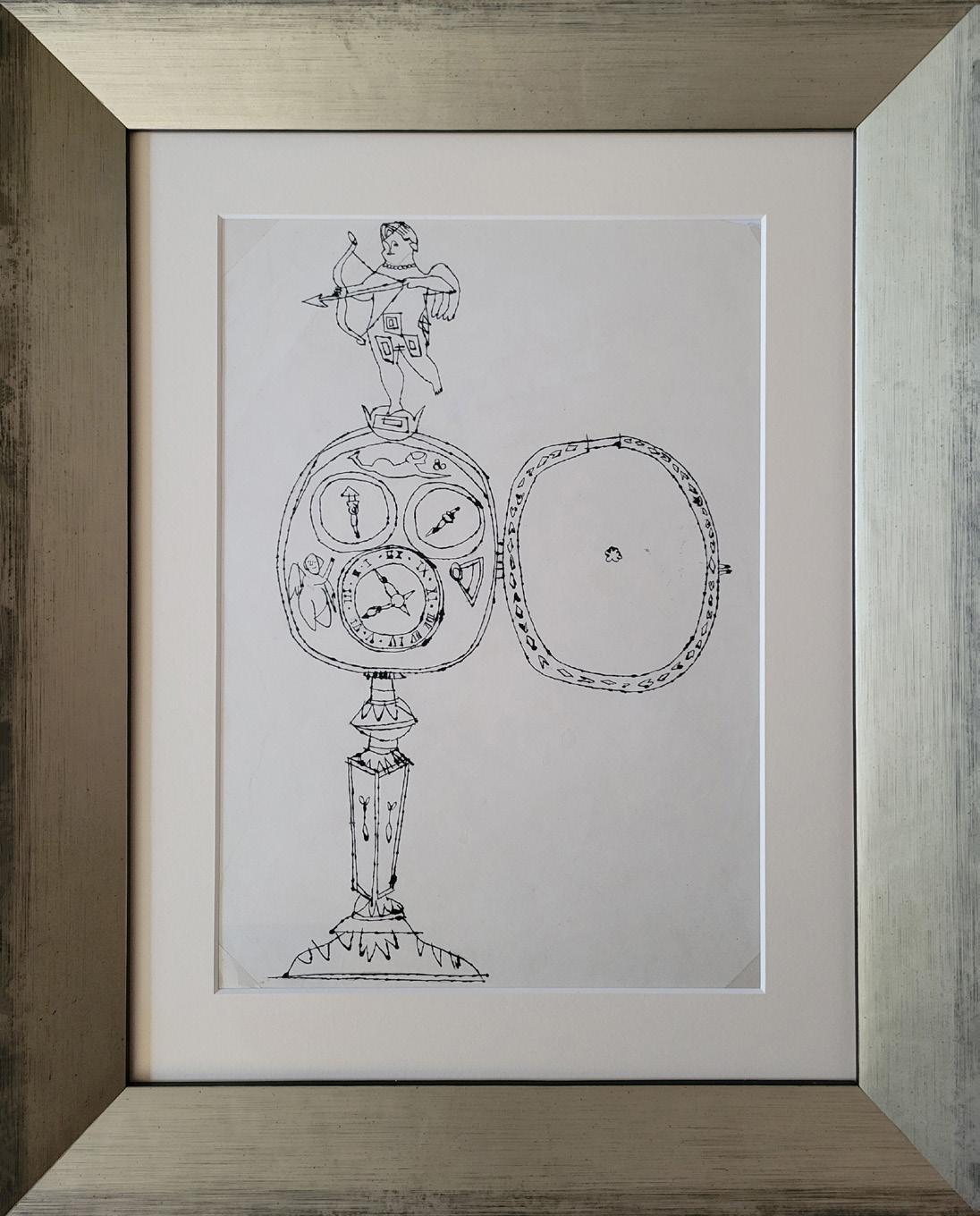
Angels with Clock Year: Circa 1955
Medium: Ink on paper
Size: 11.5 x 8.75 in (29.2 x 22.2 cm)
Frame size: 17 x 13.75 in (43.18 x 34.93 cm)
Provenance: Estate of Andy Warhol (stamped)
Andy Warhol Foundation for the Visual Arts (stamped) Long-Sharp Gallery
Authenticated by the Authentication Board of Andy Warhol Foundation for the Visual Arts (stamp on verso), Foundation archive number (ARD 415.015) on verso in pencil, initialed by the person who entered the works into the Foundation archive.
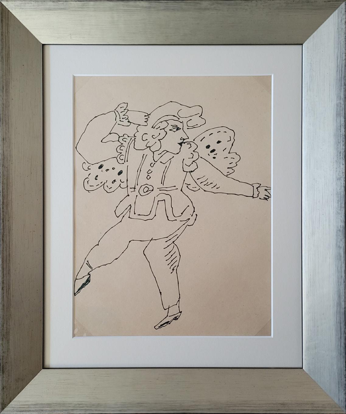
Dancing Gentleman
Year: Circa 1956
Medium: Ink on paper
Size: 11.75 x 8.875 in (29.8 x 22.5 cm)
Frame size: 17.06 x 13.75 in (43.33 x 34.92 cm)
Provenance:
Estate of Andy Warhol (stamped)
Andy Warhol Foundation for the Visual Arts (stamped) Long-Sharp Gallery
Authenticated by the Authentication Board of Andy Warhol Foundation for the Visual Arts (stamp on verso), Foundation archive number (TOP 272.106) on verso in pencil, initialed by the person who entered the works into the Foundation archive.
About this work: Upon graduating from Carnegie Tech (now Carnegie Mellon) with a degree in Pictorial Design, Andy Warhol moved to New York in 1949 to become a commercial illustrator. He was quickly hired on by the likes of Glamour, Vogue, and Harper’s Bazaar magazines. According to Simon Doonan’s foreword in Andy Warhol: Fashion: “From his whimsical line drawings of cats to sleek renderings of ladies’ shoes, Warhol’s work became a hit in the fashion publishing world. Warhol sketched hundreds of drawings of shoes, handbags, jewelry, and gloves.”[1]
Warhol’s interest in fashion, however, was not limited to commercial illustrations and advertisements. Over the decades, Warhol would befriend, collaborate with, and create portraits of designers including Halston, Yves Saint Laurent, and Diane von Furstenberg. Models, especially in the 1960s, were a new kind of celebrity, and Warhol capitalized on this notoriety. He is recognized as one of the first artists to print his work onto clothing and sell it exclusively to high profile clientele. At one time, Warhol himself could be booked as a model through the Zoli and Ford Models agencies. As to the importance of fashion during his time, Warhol captured it best: “Fashion wasn’t what you wore someplace anymore; it was the whole reason for going.”
Click to view a film
[1] Simon Doonan, Andy Warhol: Fashion (San Francisco: Chronicle Books, 2004), 7.
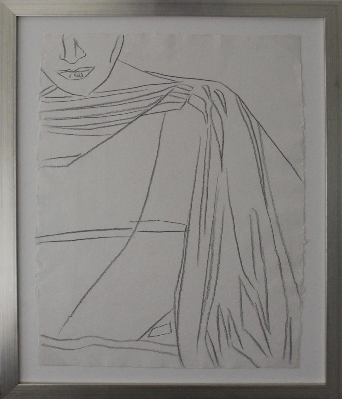
Fashion Year: Circa 1984
Medium: Graphite on paper
Size: 31.625 x 23.625 in (80.3 x 60 cm)
Frame size: 38.25 x 30.75 in (97.1 x 78.1 cm)
Provenance:
Estate of Andy Warhol (stamped)
Andy Warhol Foundation for the Visual Arts (stamped) Long-Sharp Gallery
Authenticated by the Authentication Board of The Andy Warhol Foundation for the Visual Arts (stamp on verso), Foundation archive number (TOP 78.006) on verso in pencil, initialed by the person who entered the works into the Foundation archive.
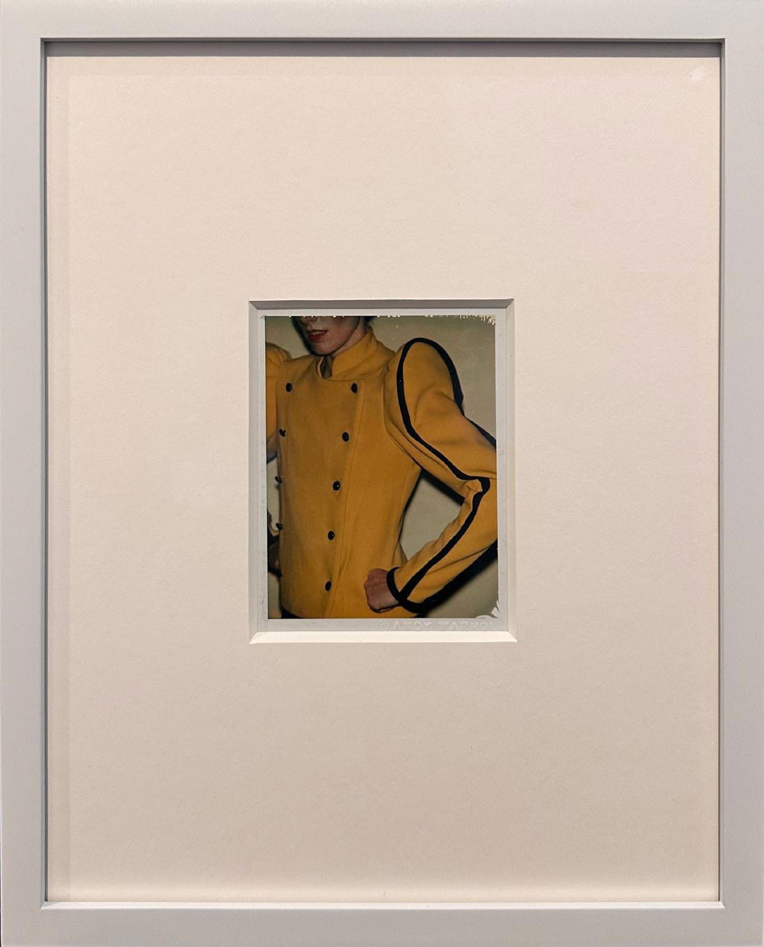
About this work: Paola Dominguin grew up in a family of creatives. Her father was a renowned Spanish bullfighter, her mother an Italian actress, and her brother, Miguel Bosé, a famous musician. (Warhol created the cover art for one of Bosé’s albums in 1983.)
Dominguin was a model in New York in the 1980s and walked in Carolina Herrera’s first show as a fashion designer. Herrera, adored by Warhol, presented her collection on April 27, 1981, at the Metropolitan Club in New York.[1] It was the first time the venue had permitted a fashion show within its walls.[2] The debut was attended by Warhol, Paloma Picasso, Diana Vreeland, and Bianca Jagger. [3] American fashion giant Bill Blass helped Herrera book the group of models that included Dominguin. Later, Warhol took polaroid photographs of the model in addition to sketches like the one shown here.
[1] Alexander Fury, Carolina Herrera’s Very First Show — and What It Meant for Fashion, The New York Times Style Magazine, April 16, 2018, https://www.nytimes.com/2018/04/16/t-magazine/fashion-1980s-carolina-herrera.html
[2] Ibid.
[3] Ibid
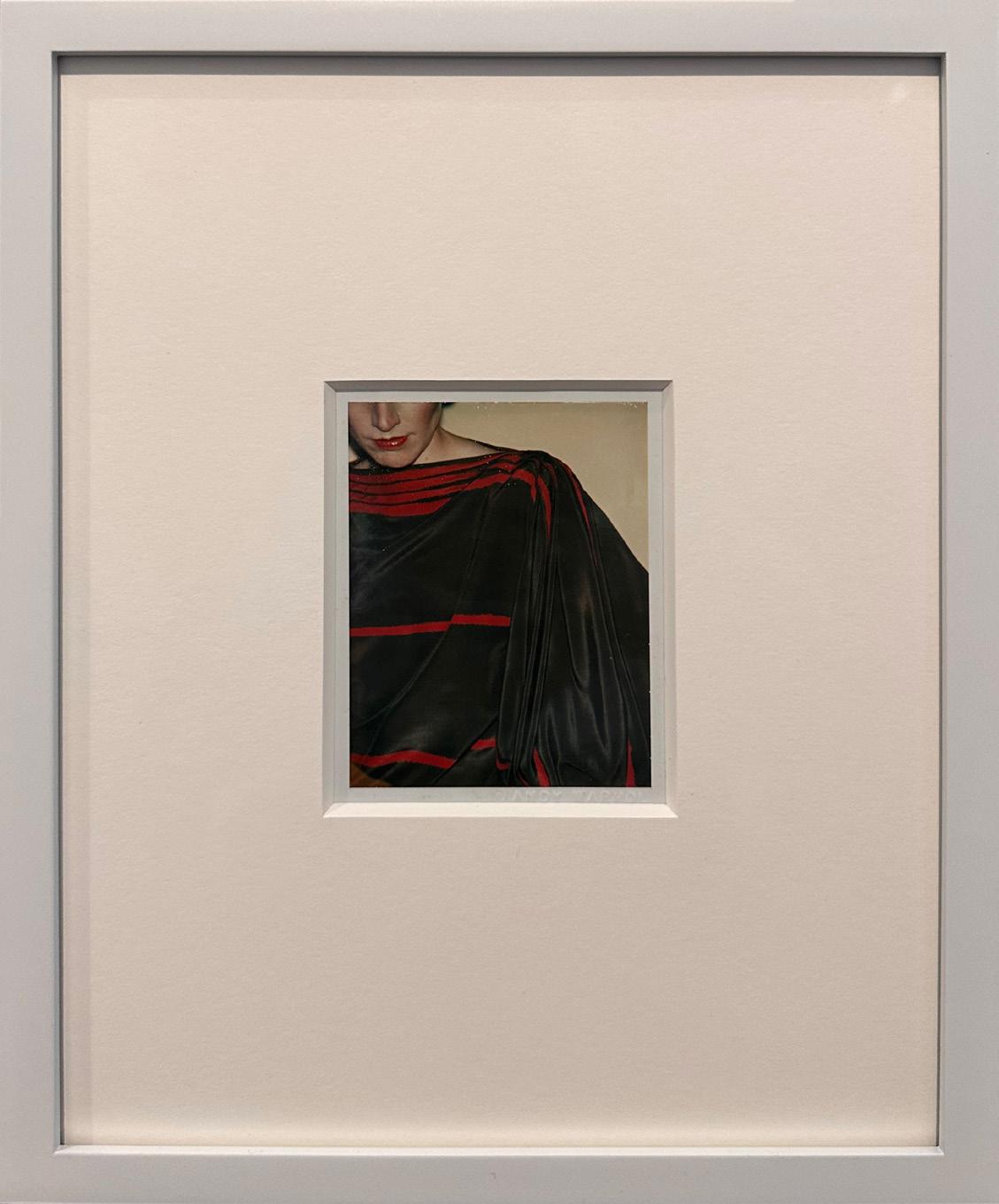
Fashion Year: Circa 1981
Medium: Unique polaroid print
Size: 4.25 x 3.375 in (10.8 x 8.6 cm)
Frame size: 11.25 x 9.25 in (28.5 x 23.4 cm)
Provenance:
Estate of Andy Warhol (stamped)
Andy Warhol Foundation for the Visual Arts (stamped) Long-Sharp Gallery
Authenticated by the Authentication Board of The Andy Warhol Foundation for the Visual Arts (stamp on verso), Foundation archive number (FA12.00146) on verso in pencil, initialed by the person who entered the works into the Foundation archive.
About this work: Upon graduating from Carnegie Tech (now Carnegie Mellon) with a degree in Pictorial Design, Andy Warhol moved to New York in 1949 to become a commercial illustrator. He was quickly hired on by the likes of Glamour, Vogue, and Harper’s Bazaar magazines. According to Simon Doonan’s foreword in Andy Warhol: Fashion: “From his whimsical line drawings of cats to sleek renderings of ladies’ shoes, Warhol’s work became a hit in the fashion publishing world. Warhol sketched hundreds of drawings of shoes, handbags, jewelry, and gloves.”[1]
Warhol’s interest in fashion, however, was not limited to commercial illustrations and advertisements. Over the decades, Warhol would befriend, collaborate with, and create portraits of designers including Halston, Yves Saint Laurent, and Diane von Furstenberg. Models, especially in the 1960s, were a new kind of celebrity, and Warhol capitalized on this notoriety. He is recognized as one of the first artists to print his work onto clothing and sell it exclusively to high profile clientele. At one time, Warhol himself could be booked as a model through the Zoli and Ford Models agencies. As to the importance of fashion during his time, Warhol captured it best: “Fashion wasn’t what you wore someplace anymore; it was the whole reason for going.”
Fashion Year: Circa 1984
Medium: Graphite on paper
Size: 31.25 x 23.5 in (79.4 x 59.7 cm)
Frame size: 37.75 x 30.375 in (95.8 x 77.1 cm)
Provenance:
Estate of Andy Warhol (stamped)
Andy Warhol Foundation for the Visual Arts (stamped) Long-Sharp Gallery
Authenticated by the Authentication Board of The Andy Warhol Foundation for the Visual Arts (stamp on verso), Foundation archive number (TOP 78.007) on verso in pencil, initialed by the person who entered the works into the Foundation archive.
Fashion Year: Circa 1981
Medium: Unique polaroid print
Size: 4.25 x 3.375 in (10.8 x 8.6 cm)
Frame size: 11.25 x 9.25 in (28.5 x 23.4 cm)
Provenance:
Estate of Andy Warhol (stamped)
Andy Warhol Foundation for the Visual Arts (stamped) Long-Sharp Gallery
Authenticated by the Authentication Board of The Andy Warhol Foundation for the Visual Arts (stamp on verso), Foundation archive number (FA12.00125) on verso in pencil, initialed by the person who entered the works into the Foundation archive.
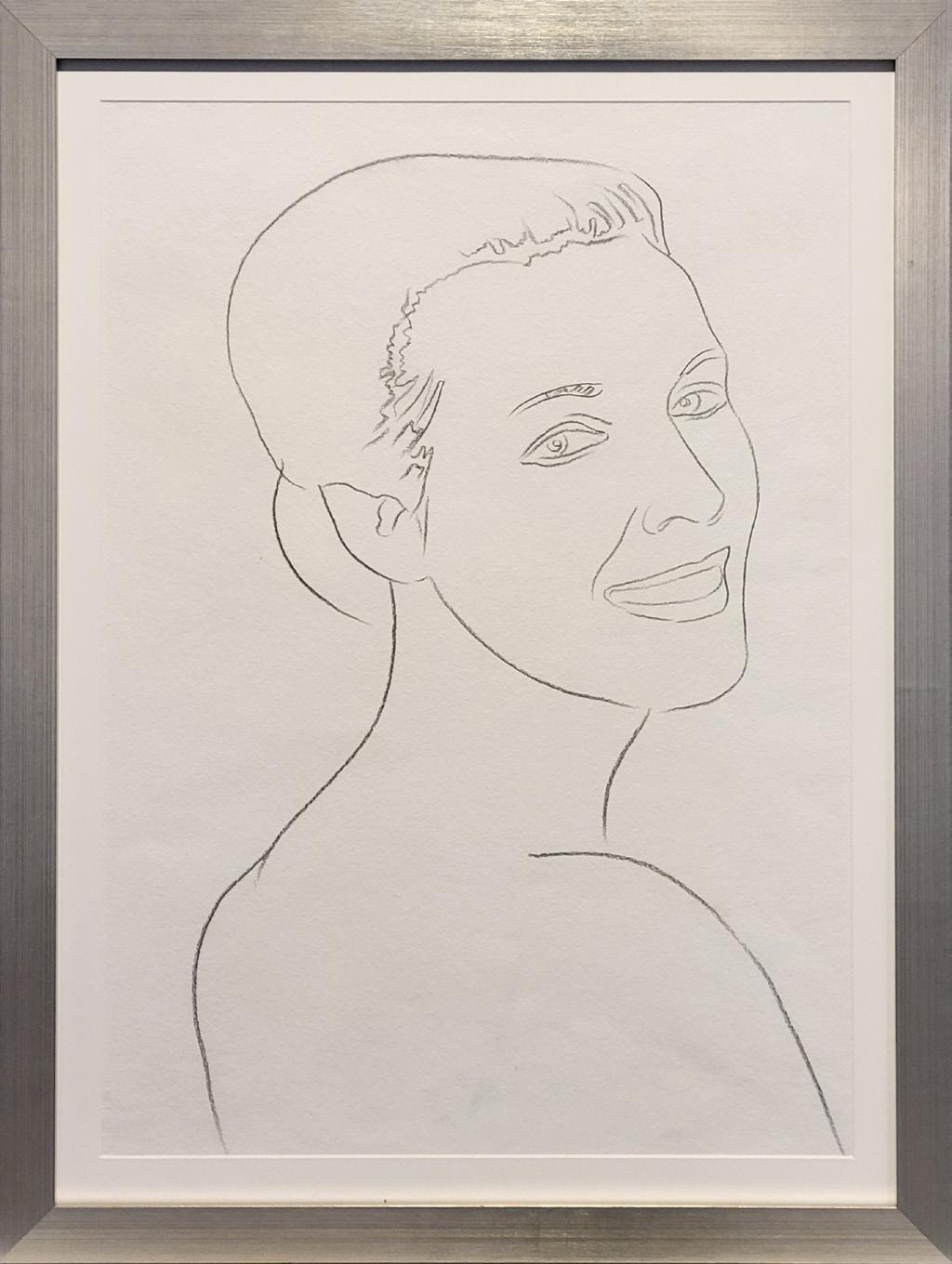
Female Portrait Year: 1982
Medium: Graphite on paper
Size: 31.375 x 24 in (79.7 x 61 cm)
Frame size: 36.25 x 27.25 inches (92.1 x 69.22 cm)
Provenance:
Estate of Andy Warhol (stamped) Andy Warhol Foundation for the Visual Arts (stamped) Long-Sharp Gallery
Authenticated by the Authentication Board of Andy Warhol Foundation for the Visual Arts (stamp on verso), Foundation archive number (TOP 114.150) on verso in pencil, initialed by the person who entered the works into the Foundation archive.
About this work: Long-fascinated by the culture of the American West, Andy Warhol released a series of “Cowboys and Indians” prints – the portfolio was one of the last major series completed before Warhol’s death in 1987. Ten portraits were chosen for the series, including John Wayne, George Custer, Annie Oakley, and Apache leader Geronimo. A portrait of Sioux Chief Sitting Bull was also considered for the portfolio; it was ultimately replaced by another portrait and never published in the regular edition.
Click to view a film
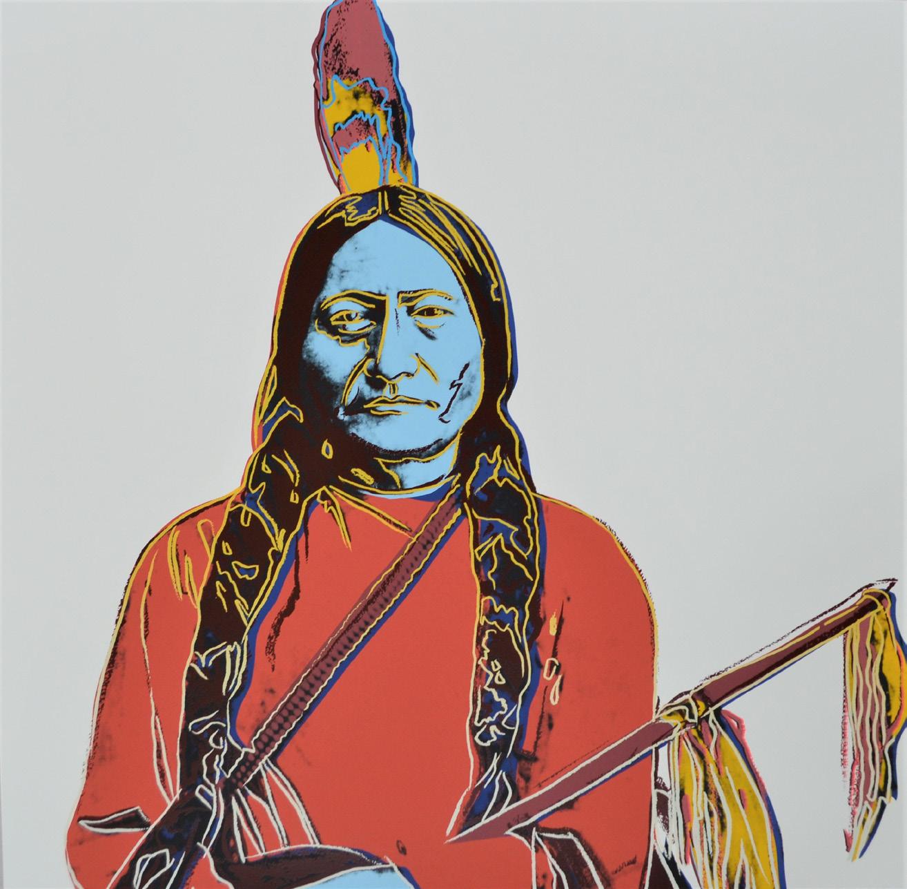
Sitting Bull Year: 1986
Medium: Screenprint in colors on Lenox Museum Board
Size: 36 x 36 in (91.4 x 91.4 cm)
Frame size: 40.125 x 40.125 in (101.92 x 101.92 cm)
One of a small number of impressions
Provenance:
Estate of Andy Warhol (stamped)
Andy Warhol Foundation for the Visual Arts (stamped) Long-Sharp Gallery
Authenticated by the Authentication Board of Andy Warhol Foundation for the Visual Arts (stamp on verso), Foundation archive number (UP 100.183) on verso in pencil, initialed by the person who entered the works into the Foundation archive.

(b. 1954)
Classically trained in the arts, industrial design, and architecture, Tarik Currimbhoy is a trifecta of artistic prowess. Having earned a Bachelor of Fine Arts and a Master of Architecture from the Pratt Institute, as well as a Master of Arts from Cornell University, Tarik later went on to teach at both institutions (Drawing at Cornell and Design at Pratt).
In both architecture and sculpture, Tarik searches for tranquility, simplicity and tactility, expressed in purity of both form and material. Inspired by ancient architecture of building blocks resting on each other in tension and compression, Tarik’s sculptures are “stories of structure and gravity”, held together under compression in stone and metal.
Tarik has mastered the juxtaposition of the old and the new, using handcrafting and ancient casting techniques to create sculptures that are modern and minimal in form. His design work has been published internationally and his sculptures may be found across the world in public spaces as well as corporate and private collections.
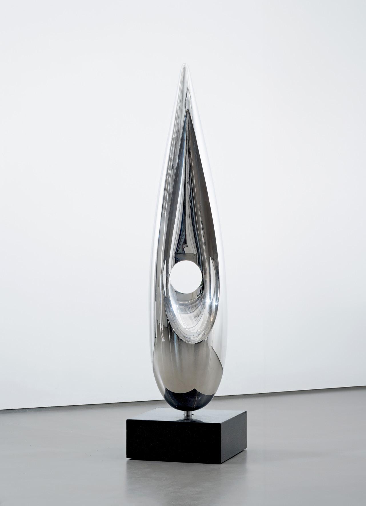
Phoenix Year: 2025
Medium: Stainless Steel with granite base
From the edition of 4 plus proofs; this is 3/4
Size: 66 x 16 x 11 (167.6 x 40.6 x 27.9 cm) (includes base)
Base: 12 x 12 x 12 (30.5 x 30.5 x 30.5 cm)
Provenance:
The artist’s studio Long-Sharp Gallery
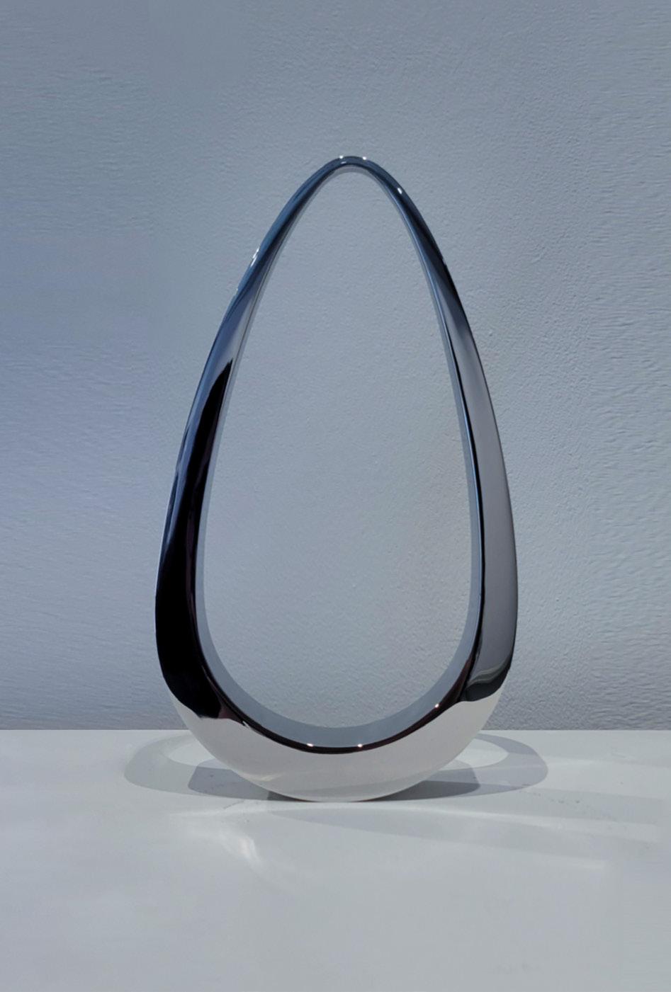
Pendulum Year: 2025
Medium: 316 Stainless steel
Stamped with artist’s initials and edition number on side
From the edition of 11 plus proofs; this is 5/11 [and 6/11]
Size: 10 x 5.375 x 1.25 in (25.4 x 13.65 x 3.175)
Provenance: The artist’s studio Long-Sharp Gallery
Click to view a film
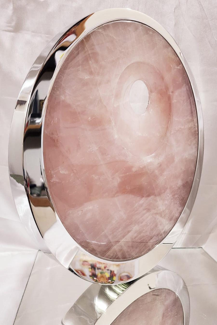
Surya 2025
Medium: Stainless steel with pink rock crystal
Stamped with artist’s initials on side
Size: 16 in (40.6 cm) high x 3 in (7.6 cm) at its thickest point
Provenance: The artist’s studio Long-Sharp Gallery
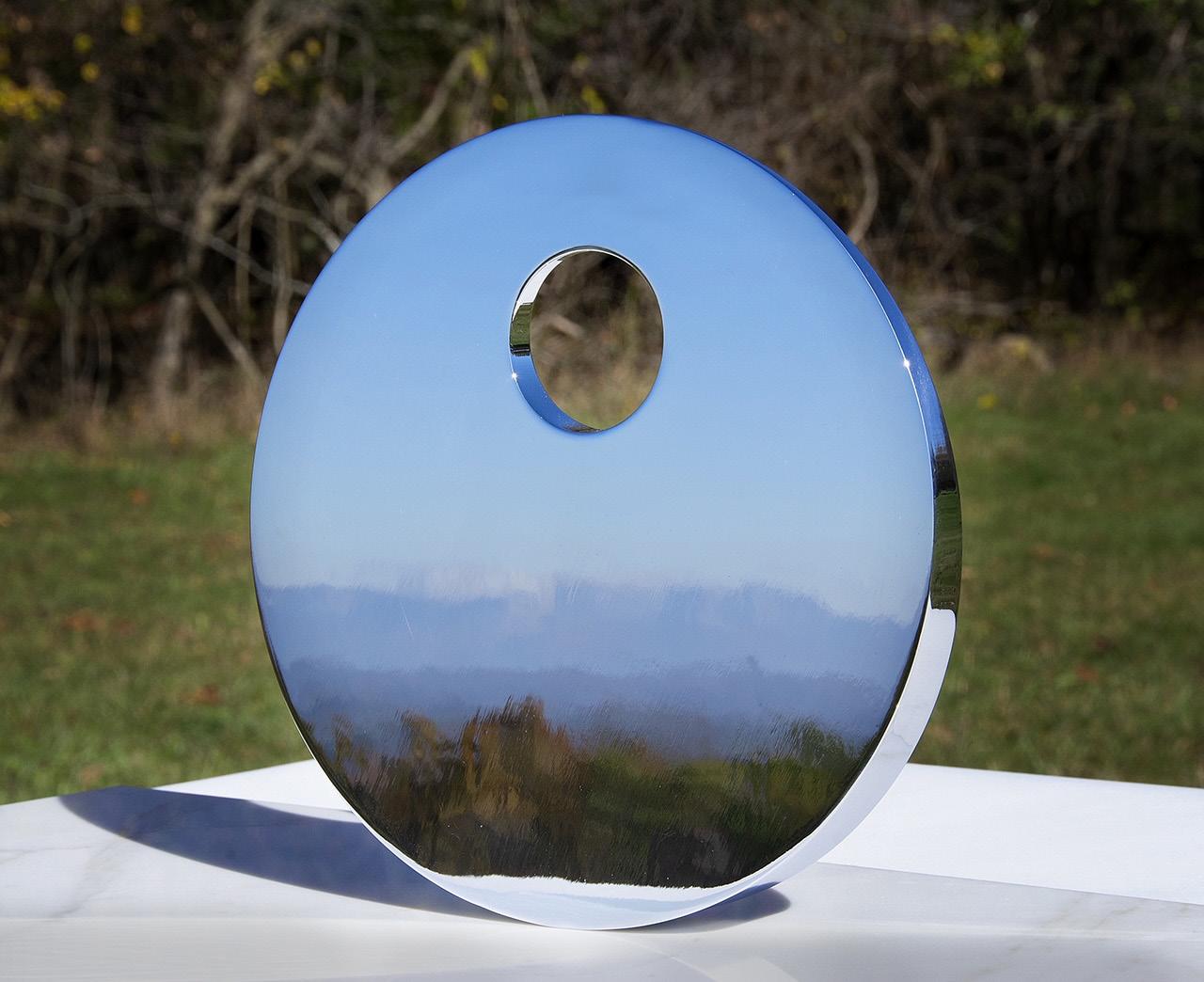
Reflections
Medium: 316 Stainless steel
Stamped with artist’s initials and edition number on side
Edition of 11 plus 2 artist’s proofs
Size: 12” in diameter
Provenance:
The artist’s studio
Long-Sharp Gallery
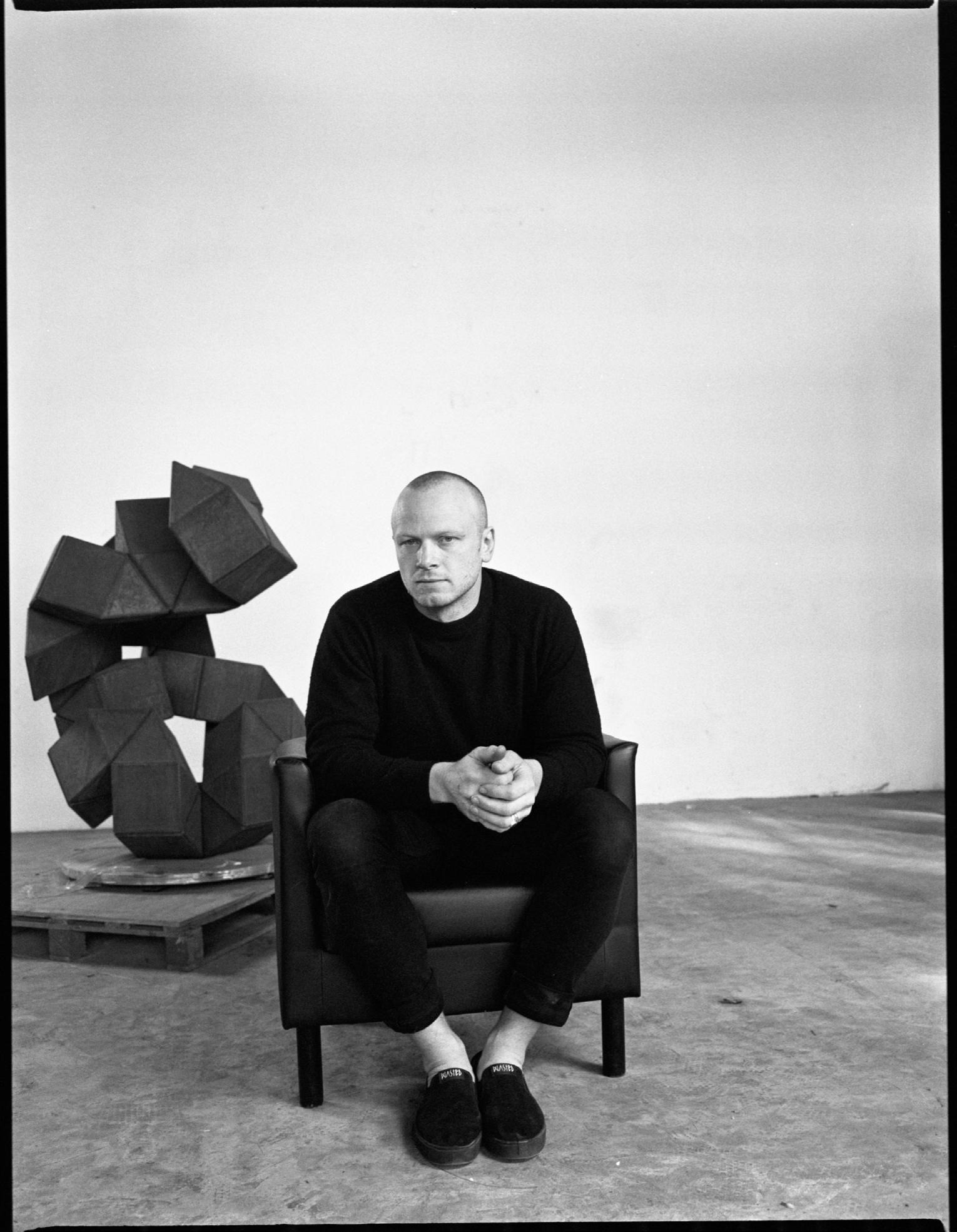
(British, b. 1988)
Patrick Hurst, born in Cambridge and currently residing in Rome, is a contemporary British sculptor. His artistic practice is characterized by a rigorous exploration of geometric abstraction, manifested through meticulously crafted metal sculptures.
Hurst’s technique is notable for its synthesis of manual machining, computer-aided design, and industrial manufacturing processes, enabling him to achieve precise forms and flawless surfaces. A defining element of his work is the strategic use of mirror-polished finishes which manipulate light and reflection, thereby challenging the viewer ’s perception of space and form. His sculptures exhibit a profound engagement with mathematical and physical principles, translated into a visual language that transcends cultural boundaries. Hurst’s work often creates a dialogue between the object and its surrounding environment, prompting contemplation on the interplay of materiality, geometry, and light.
Hurst has exhibited at venues including Masterpiece London, Eye of the Collector, Art Miami, and Ann Norton Sculpture Gardens.
According to the artist: “The sculpture Plane to See seeks to play with traditional ideas of 3D geometry. Plane to See retains the vertices of a regular cuboid but uses parabolic lenses in lieu of flat planes. The curved surfaces join to form an elongated lenticular box that differs from the canonical composition of a flat box. The light reflected on the polished surfaces offers the viewer a deformed reflection of the environment.
In other words, Plane to See challenges our commonly accepted preconceptions about the world around us, starting from the fundamental form of geometry that is a box. The deformation of the box puts into doubt our certainties about our environment. It calls into question our perception of and our conviction about what we believe to be real, and in doing so, the artwork allows us to see the world and others with open eyes. It is in our awareness of the world wherein lies the mystery, the beauty, and the scale of everything. It is already there; we just have to choose to see it.”
Fabrication: Plane to See is formed through a collaboration of computer aided design, large scale industrial manufacturing, and precision welding. The work is made from five individually aero-formed lenses typically used for large scale industrial applications. A sophisticated five-axis laser cutting machine cuts the complex profiles that seamlessly come together in the artist’s studio. These industrial processes combined with a high-grade manual diamond polish done in the studio make Plane to See the culmination of precision modern engineering and artisanal skill.
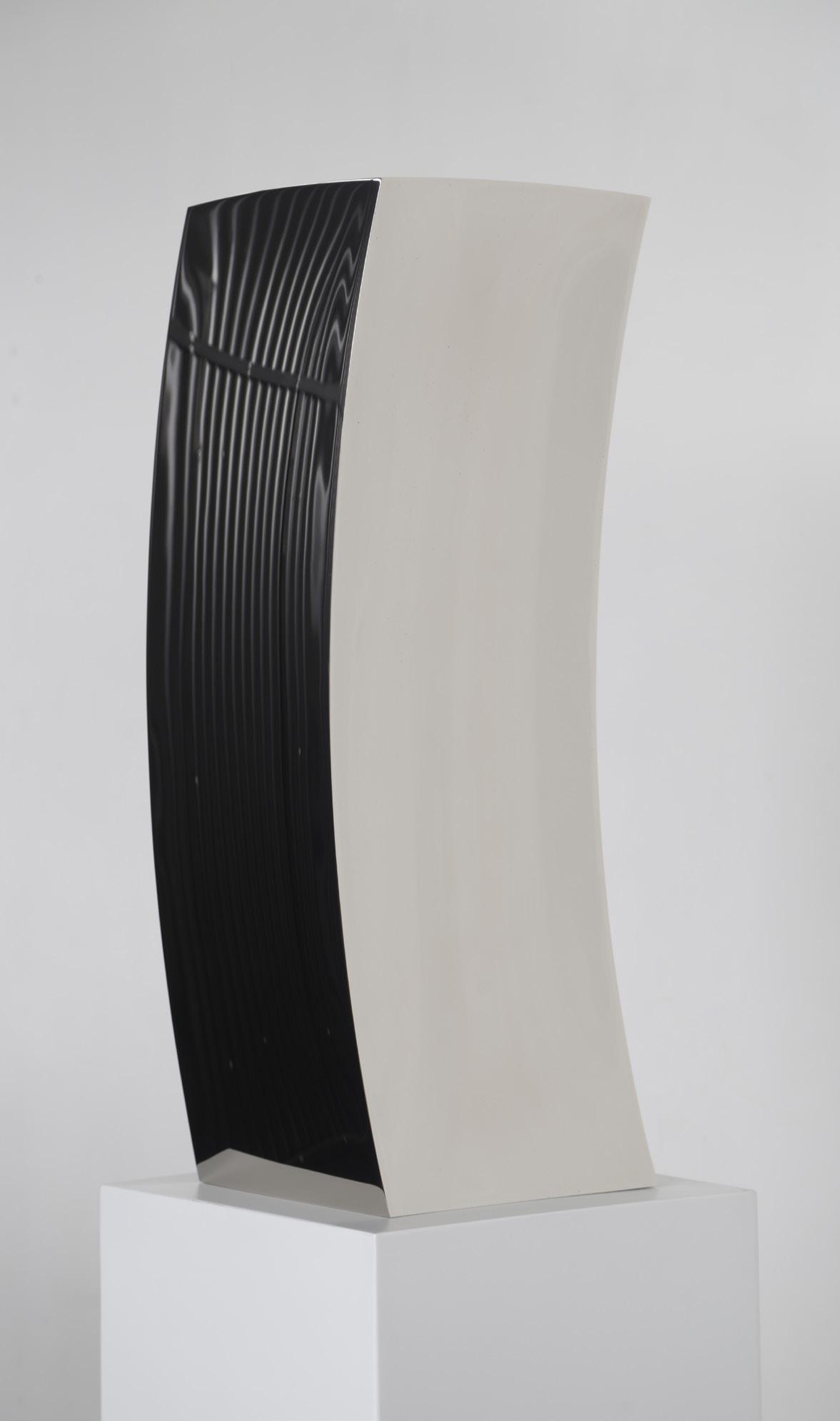
Plane to See Year: 2024
Medium: 316 Marine-grade stainless steel
Size: 31.5 x 11.75 x 11.75 in (80 x 30 x 30 cm)
From a unique edition of 3 with 1 AP; this is 3/3
Provenance: The artist’s studio Long-Sharp Gallery
According to the artist: “Singularity” is a topological metaphor for changing perspective. Made in mirror polished stainless steel, Singularity presents the viewer with a reflection of themselves that migrates between concave and convex curvatures across its singular unbroken surface. The images produced on the surface move across still planes, through dynamic transitions and land in inverted views. This dance of light embodies the metaphor of the shift in our perspective, the world reflected is the same, but the way we perceive it has changed.”
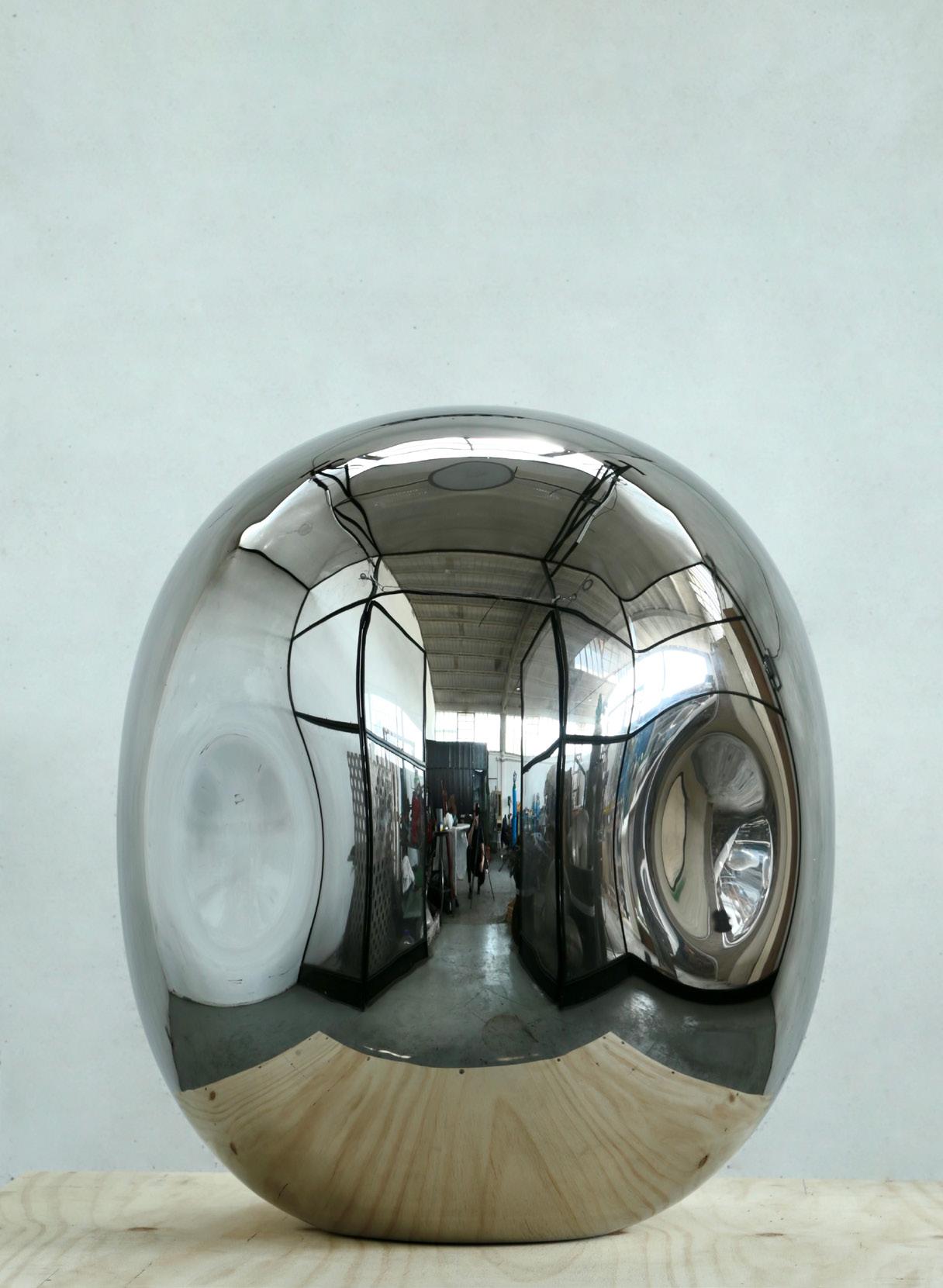
Singularity 1.0
Year: 2025
Medium: Stainless steel
Size: 25 x 20 x 20 in (70 x 50 x 50 cm)
From a unique series of (); this is ()
Provenance: The artist’s studio Long-Sharp Gallery
(Jordanian & British, b. 1980)
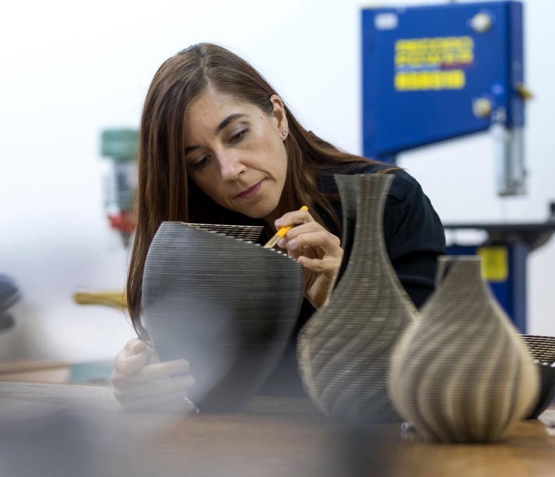
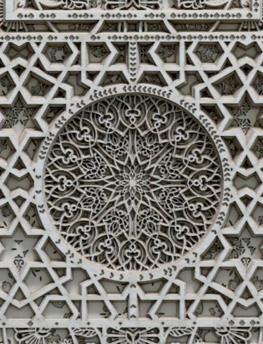
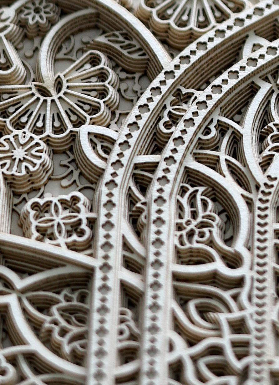
Julia Ibbini is a visual artist and designer with a background in graphics and collage. She earned a BA (Hons) in Visual Communications from the Leeds University College of Art and Design, UK. Her work combines digital design processes and traditional craftsmanship to create highly detailed, visually complex, and delicate pieces that intersect contemporary design, art, and craft.
Studio Ibbini is an ongoing collaboration between Ibbini and Stephane Noyer, a computer scientist and maker with an interest in computational geometry. Ibbini and Noyer have worked on projects together since 2016, traversing analog and digital to create works of extreme intricacy and machined precision, but which remain distinctly human in origin. Studio Ibbini works predominantly with materials such as archival paper, veneer woods, or mother of pearl— selected for their delicate, tactile qualities—that are then layered and meshed together using a complex collaging method. Individual projects take up to a year to complete.
In 2019, Studio Ibbini received the prestigious Van Cleef & Arpels Middle East Designer Prize. Over the last few years, the work has been shown at Sharjah Islamic Arts Festival 2018, Art Basel Miami, LA Art Fair, Tashkeel Dubai and Jeddah 21,39 - 2020.
Studio Ibbini is based in Abu Dhabi in the United Arab Emirates.
According to the artist: “For the ‘Sands of Time’, it’s this idea of a rich visual history evolving and changing into a new narrative through our contemporary perspective and use of technology. Pattern, ornament and symmetry were unfortunate casualties of Modernism and although they are very much alive today, our viewpoint of these visual languages has changed forever.
Some of the patterning used in these pieces is very ancient (early 9th century) and I felt it was important to record it by using it within my pieces in the hope that the ‘language’ as such will continue to live on and evolve.”
Click to view a film
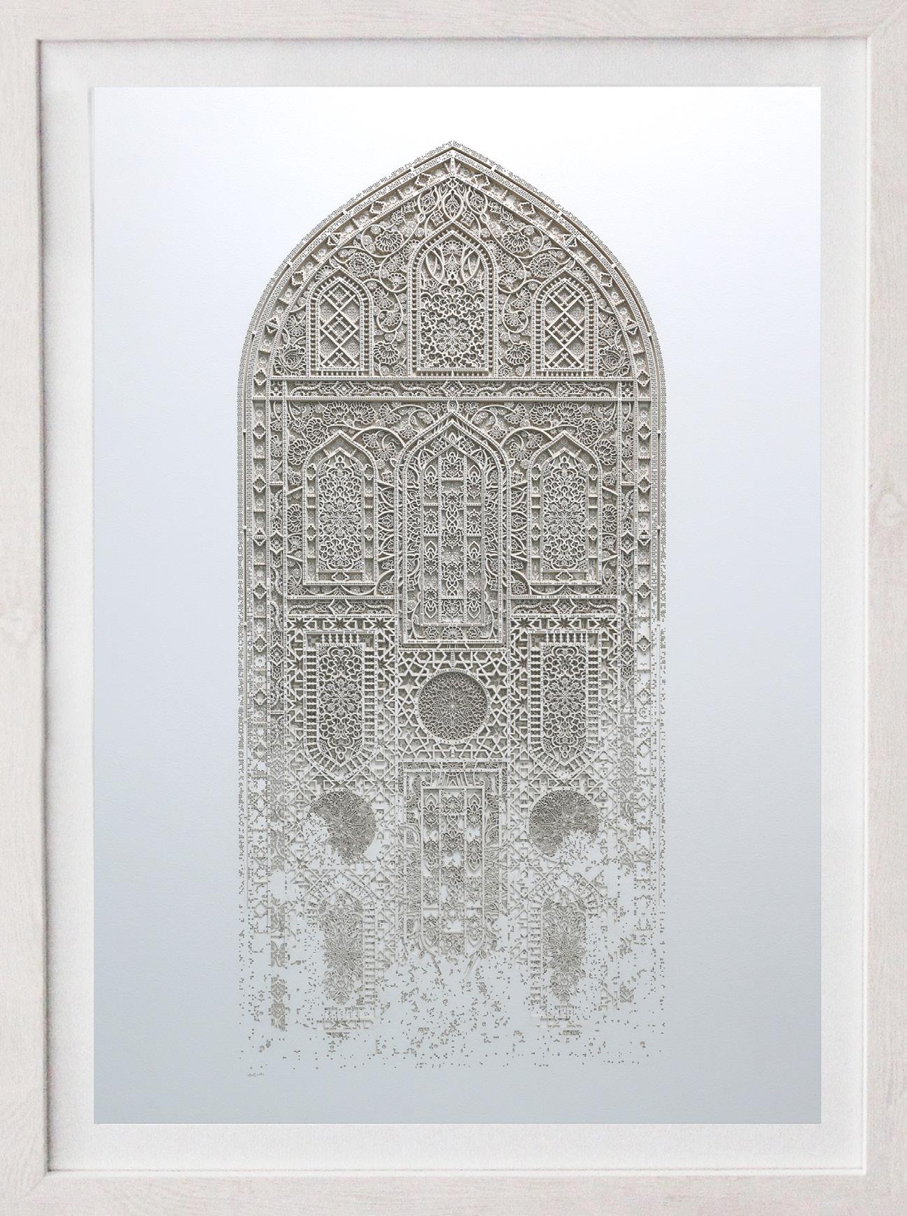
The Sands of Time 7.0
Year: 2024
Medium: Layered papers
Hand signed
Size: 22 x 13.375 in (55.9 x 34 cm)
Frame size: 26 x 17 in (66 x 43.2 cm)
Provenance:
The artist’s studio
Long-Sharp Gallery
According to the artist: “I find solace in patterns of high frequency. Frenetic detailing fascinates me; geometry, symmetry, minutiae; complexity giving me a feeling of quietude. I believe many people can relate to this. Humans are after all pattern seeking creatures, patterns help elicit order in our experience and surroundings.Here we referenced complex radiolaria, delicate skeletons, oceans of fragility, radii, and fractals - the final piece constructed using a deep appreciation of geometry. The resulting work sits somewhere between nature and mathematics, a contemplation on both.
The complexity of the subject contrasts with the simplicity and exquisite delicateness of the final material used; paper.”
Click to view a film
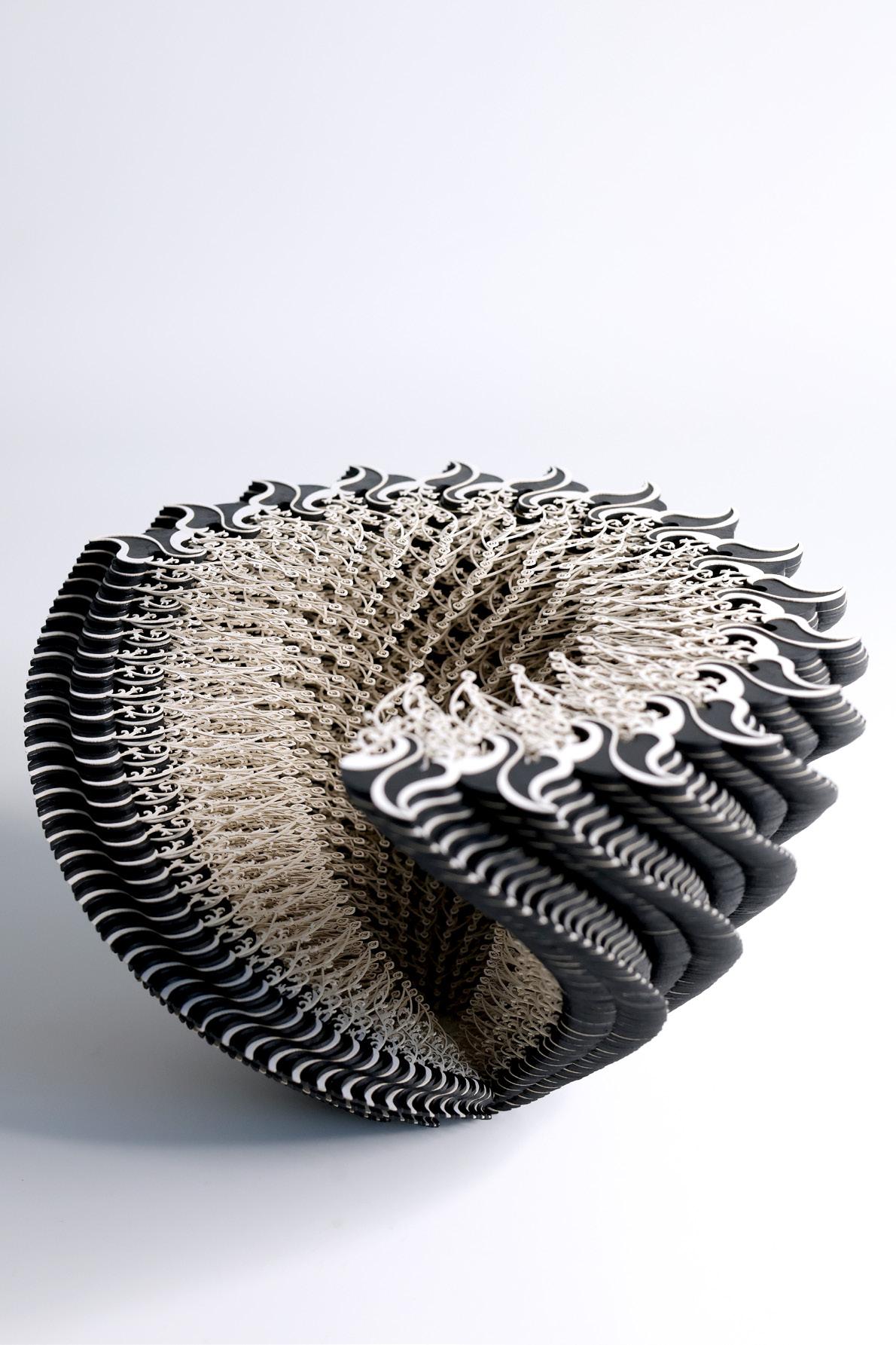
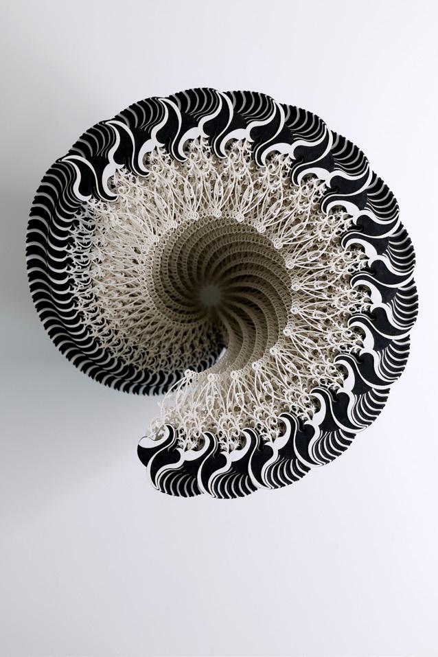
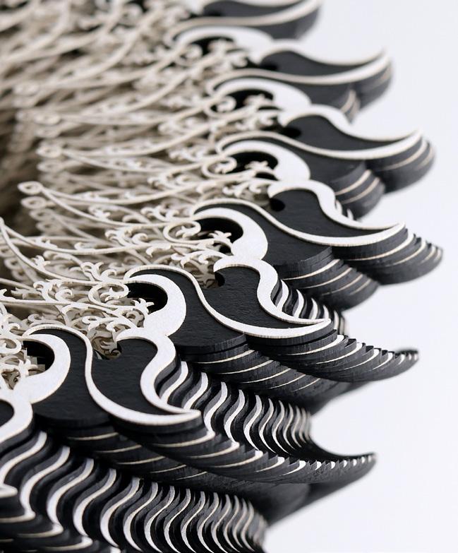
Symbio Vessel (Fragile Frequencies 1.0)
Year: 2025
Medium: Layered papers and card
Hand signed
Size: 10.24 (d) x 8.66 (h) in (26 x 22 cm)
(British Anglo-Indian, b. 1984)
A sculptor based in the UK who has created public artworks around the world from Los Angeles to Singapore. Nicola was appointed as artist-in-residence for the UK Government in Dubai (2021-2022), and has shown work in museums internationally. One of her most noteworthy permanent sculptures was commissioned for Steven Spielberg’s USC Shoah Foundation, featuring the story of a Holocaust survivor (2018, Los Angeles).
Nicola is known for her signature metal text sculptures which tell powerful stories, connecting with history, people and places. (As featured in the New York Times, Architectural Record, Blouin Artinfo, BBC, among others). She gathers words, narratives and patterns in a variety of methods including collecting anonymous stories and confessions, inviting letters, sourcing big data from the depths of the web, and scouring traditional texts to find previously unknown subtexts.
Nicola says “I aim to give voice to important and often unspoken stories, revealing our inner worlds, exploring the tangled threads of history, roots, identity and universality which connect us all.”
Select public sculptures are in London (Embankment); National University of Ireland (commissioned by European city of culture 2020); Aspen, Colorado; USC Shoah Foundation (Los Angeles); Marina Bay (Singapore), Lim Chin Tsong Palace (Myanmar), and National Design Centre (Singapore).
Her artworld accolades include being shortlisted for the Sovereign Art Prize in 2020 for her artwork in Singapore, as well as the Sovereign Asian Art Prize in 2021 for her work on the subject of the migrant crisis. In 2019 whilst based in Dublin she received a ‘New Voices Of Ireland’ award. Nicola has recently had 3 works acquired by Ingram Collection of British Art and has been spotlighted by SmArtify as one of 50 noteworthy female artists.
Notable exhibitions include a solo exhibition at Singapore Art Museum (2017), and exhibited works at the Kuala Lumpur Biennale (2018).
Nicola is also a diversity champion, a trustee, poet and paper aeroplane collector. Fellow of the Royal Society of Arts, member of the Royal Society of Sculptors, alumni of Central St Martin’s (University of the Arts London) and Loughborough University.
About this series: Each piece from the Unexpected Happiness series captures something remarkable about the human spirit. The sculptures feature a few moving sentences from the artist’s research, reverse-cast in stainless steel and captured inside a glass bell dome.
Featured text: “Fixing something that is broken, the feeling of breeze on skin, seeing a treasured person after a few days apart, having a sunny morning which stretches out peacefully because there are no other obligations today. In these moments there is such unexpected happiness. Hold on to these moments, they are there often. But they may surprise you by being humble, not the showy ones you may expect from true joy.”
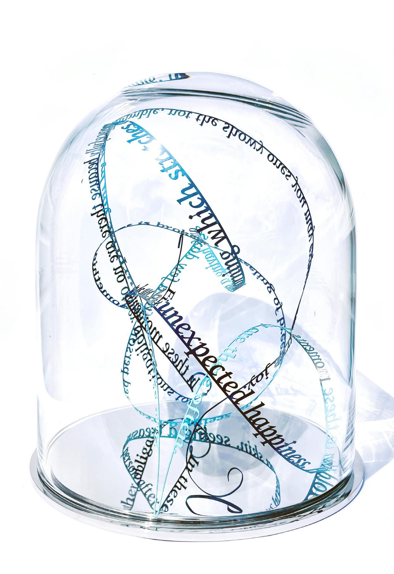
Unexpected Happiness (Hold onto these moments)
Year: 2024
Medium: Stainless steel on mirrored base; in hand-blown glass dome
Size: 11.75 x 9.8 in (30 x 25 cm)
From a unique edition of 2; this is 2/2 (the color edition)
Provenance:
The artist’s studio
Long-Sharp Gallery