
ART MIAMI 2023
Cover Image(s): Expose Exposed 230627 © Cha Jong Rye [catalogued on p. 75]
Long-Sharp Gallery Highlights
ART MIAMI 2023
To view videos of any of the featured works, look for the icon

The Preserve Andy Warhol ..................................................................................................................... 8 Patrick Hurst 22 More Than Words David Spiller ................................................................................................................... 32 Moira Cameron 42 Mel Bochner ................................................................................................................... 48 Nicola Anthony 52 Abstraction Joan Miró ........................................................................................................................ 66 Cha Jong Rye 70 Oliver Marsden ............................................................................................................... 86 Julia Ibbini 88 Figures and Objects in Perspective Jean-Michael Basquiat 98 Roy Lichtenstein ........................................................................................................... 102 David Hockney 106 Lavett Ballard................................................................................................................ 112 Jason Myers 116 Table of Contents
6
The Preserve:
Works by Andy Warhol + Patrick Hurst (UK) focused on wildlife and the elements
About Vanishing Animals and Endangered Species
In the 1980s, Andy Warhol embarked on several projects focused on animals, including among them his series of Vanishing Animals and Endangered Species, a suite. Studies and screenprints of Vanishing Animals led to an eponymous book created in collaboration with German conservationist Kurt Benirschke of the San Diego Zoo.[1]
Warhol’s interest in endangered animals was in some ways an extension of themes Warhol had explored throughout his career. As gallerist Fergus McCaffrey posits in the catalog accompanying the 2006 exhibition Andy Warhol – Vanishing Animals:[2]
“Warhol’s concern about the death of entire species of animals fits neatly into the lexicon of untimely and unseemly ends that he repeatedly mused on during his long career. Bearing in mind the self-referential nature and frequent quotation of his own earlier work in much of the output of the 1980s, it does not take much of a leap to imagine Warhol making a connection between the suicides, car crashes, poisonings, executions, and pervasive threat of nuclear annihilation of the 1960s and the tragic plight of Vanishing Animals in the 1980s. After all, extinction is just another variety of death, and one gets the sense that Warhol was sensitized to care equally for man and beast.”
Works in this section are evidence of Warhol’s focus on animals and wildlife
[1] Kurt Benischke and Andy Warhol, Vanishing Animals (New York: Springer-Verlag, 1986).
[2] Fergus McCaffrey, Andy Warhol: Vanishing Animals (St. Barthélemy, French West Indies: Me.di.um, 2006).
7
8
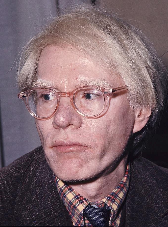
ANDY WARHOL
(American, 1928-1987)
Widely considered as one of the most influential artists of the twentieth century, Andy Warhol (1928-1987) is celebrated for his signature depictions surrounding daily objects of mass production. Identified as the first artist to convey the influence of mass media culture on the American life, Warhol created his most prolific works in the 1960s, when the US was quickly becoming a culture built upon television and mass consumerism. Consequently surrounded by a fascination with impactful and lasting images, audiences soon began to reject typical print media to embrace Warhol’s representation of media and commercialism. Throughout his successful career and numerous iconic collaborations, Warhol continued to firmly establish his patented impact of imagery on the development of our environment and identity. His beloved Campbell’s Soup cans and Coke bottles, as well as his silkscreen prints of famous personalities such as Marilyn Monroe and Elvis Presley are still widely celebrated today. Simply, Warhol is regarded as the King of Pop Art. His influence went beyond painting and printmaking.
Warhol founded The Factory in 1962, as a result of his interest in the mass production of his own works. In addition to serving as an industrial setting for his employees to extensively produce the artists’ prints and posters, The Factory also functioned as a performance venue for the Velvet Underground, and a filmmaking studio for his experimental films.
Born “Andy Warhola” in 1928 to Slovak immigrants, Warhol displayed an early talent for drawing and painting. Following high school, he enrolled in Pittsburgh’s Carnegie Institute of Technology, where he studied commercial art. After graduating in 1949, Warhol moved to New York to work as an illustrator for various magazines, such as Vogue and Harper’s Bazaar. He soon became one of New York’s most sought after and successful illustrators, and in 1952, he held his first oneman exhibition at New York’s Hugo Gallery. Warhol quickly became one of the most celebrated commercial artists in New York. His works were featured in every important magazine from Vogue to Harper’s Bazaar. The 1950’s also marked his most prolific period for his illustrating and publishing books – during this period he would go on to publish eight books.
In July of 1968, Warhol narrowly survived an attempt on his life by Valerie Solanis. Solanis, who had worked at The Factory occasionally, shot Warhol multiple times in the chest, proclaiming upon her arrest that he “had too much control over my life.” Throughout the 1970s, Warhol continued to produce art, as well as to expand his entrepreneurial interests through such ventures as founding Interview magazine as well as the opening of a successful nightclub. Warhol died tragically in February 1987 from complications following a gall bladder operation.
9
10
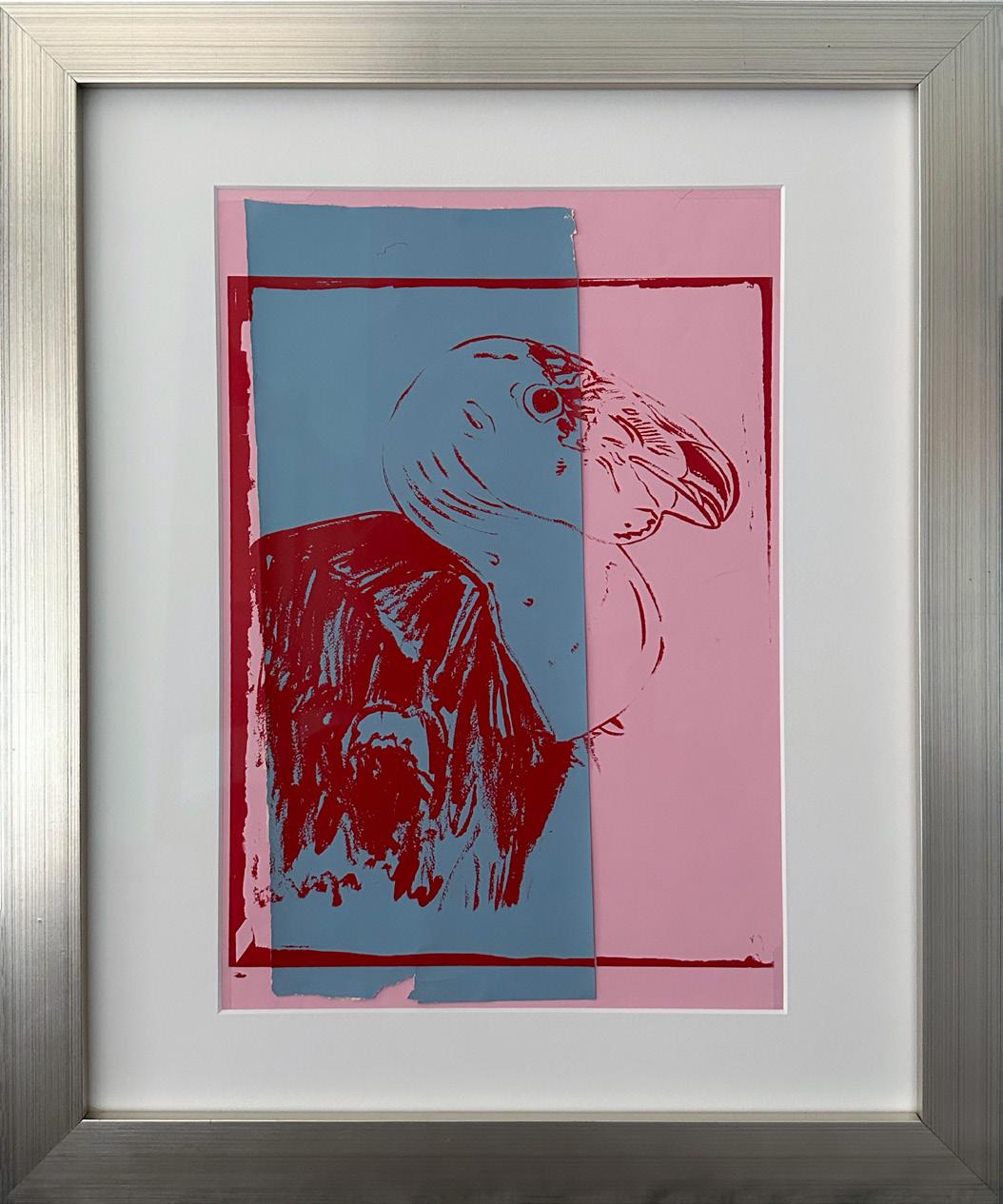
California Condor
Year: 1986
Medium: Silkscreen inks on colored paper collage on colored paper (unique)
Size: 18.5 x 12 in (47 x 30.5 cm)
Frame size: 23.625 x 19.75 in (60 x 50.1 cm)
Reference: F.S.III.52; Vanishing Animals p.11 (No prints were made from this illustration.)
Provenance:
From the Estate of Andy Warhol (stamp on verso) to the Andy Warhol Foundation for the Visual Arts to Long-Sharp Gallery
Authenticated by the Andy Warhol Foundation (stamp and archive number, TOP 89.015, on verso).
11
12
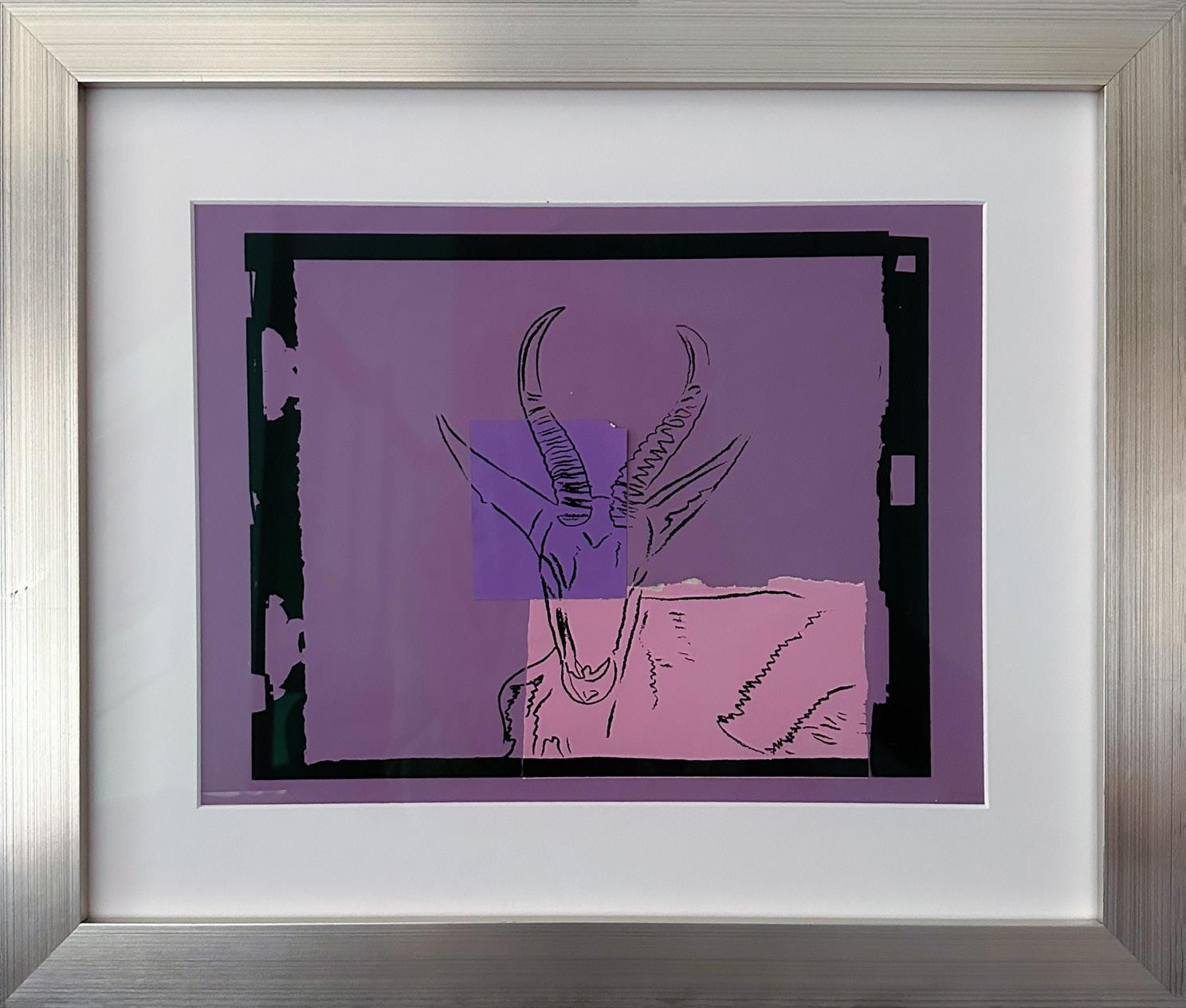
Sömmering Gazelle
Year: 1986
Medium: Silkscreen inks on colored paper collage on colored paper (unique)
Size: 14 x 18 in (35.6 x 45.7 cm)
Frame size: 19.75 x 23.75 in (50.1 x 60.3 cm)
Reference: F.S.III.B.65; Vanishing Animals p.83
Provenance:
From the Estate of Andy Warhol (stamp on verso) to the Andy Warhol Foundation for the Visual Arts to Long-Sharp Gallery
Authenticated by the Andy Warhol Foundation (stamp and archive number, TOP 89.081, on verso).
13
14

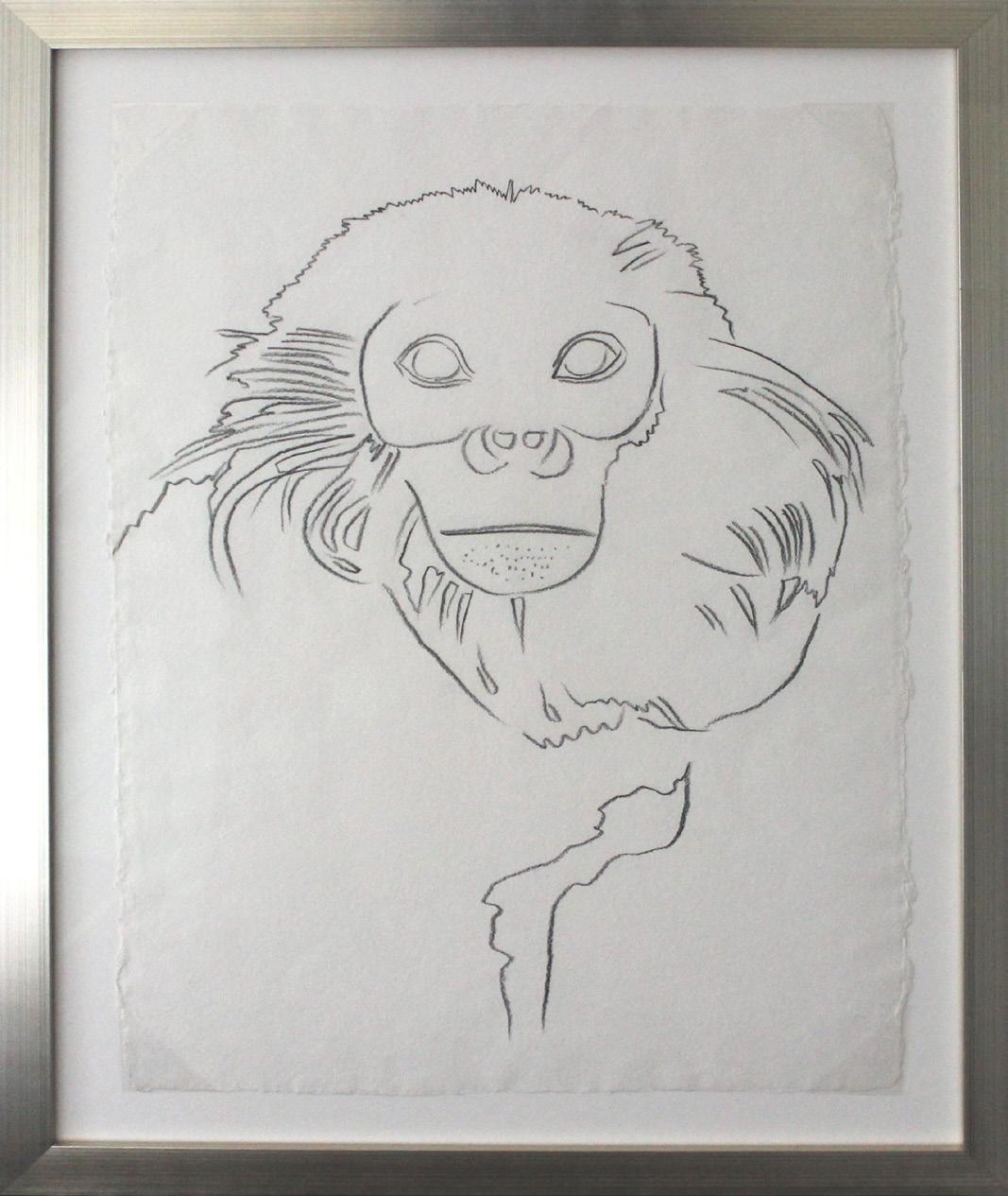
Douc Langur
Year: 1986
Medium: Silkscreen inks on colored paper collage on colored paper (unique)
Size: 15.875 x 13.5 in (40.3 x 34.3 cm)
Frame size: 23.5 x 19.625 (59.6 x 49.8 cm)
Reference: F.S.III.B.61; Vanishing Animals p.65
Provenance:
From the Estate of Andy Warhol (stamp on verso) to the Andy Warhol Foundation for the Visual Arts to Long-Sharp Gallery
Authenticated by the Andy Warhol Foundation (stamp and archive number, TOP 89.063, on verso).
15
16
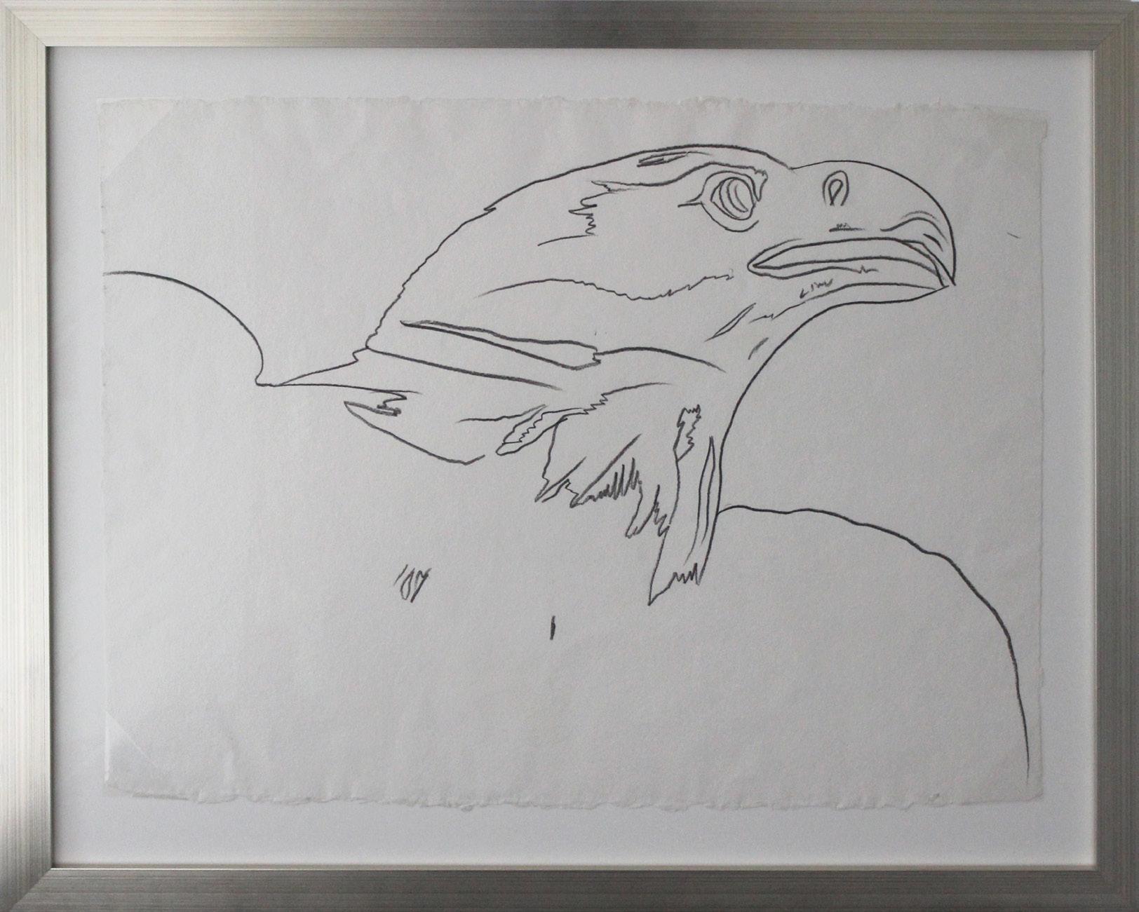
Douc Langur
Year: Circa 1986
Medium: Graphite on paper
Size: 31.5 x 23.5 in (80 x 59.7 cm)
Frame size: 38.25 x 30.25 in (97.1 x 76.8 cm)
Reference: F.S.III.B.61; Vanishing Animals p.65
Provenance:
From the Estate of Andy Warhol (stamp on verso) to the Andy Warhol Foundation for the Visual Arts to Long-Sharp Gallery
Authenticated by the Andy Warhol Foundation (stamp and archive number, TOP 89.065, on verso).

17
Click to view a film
18
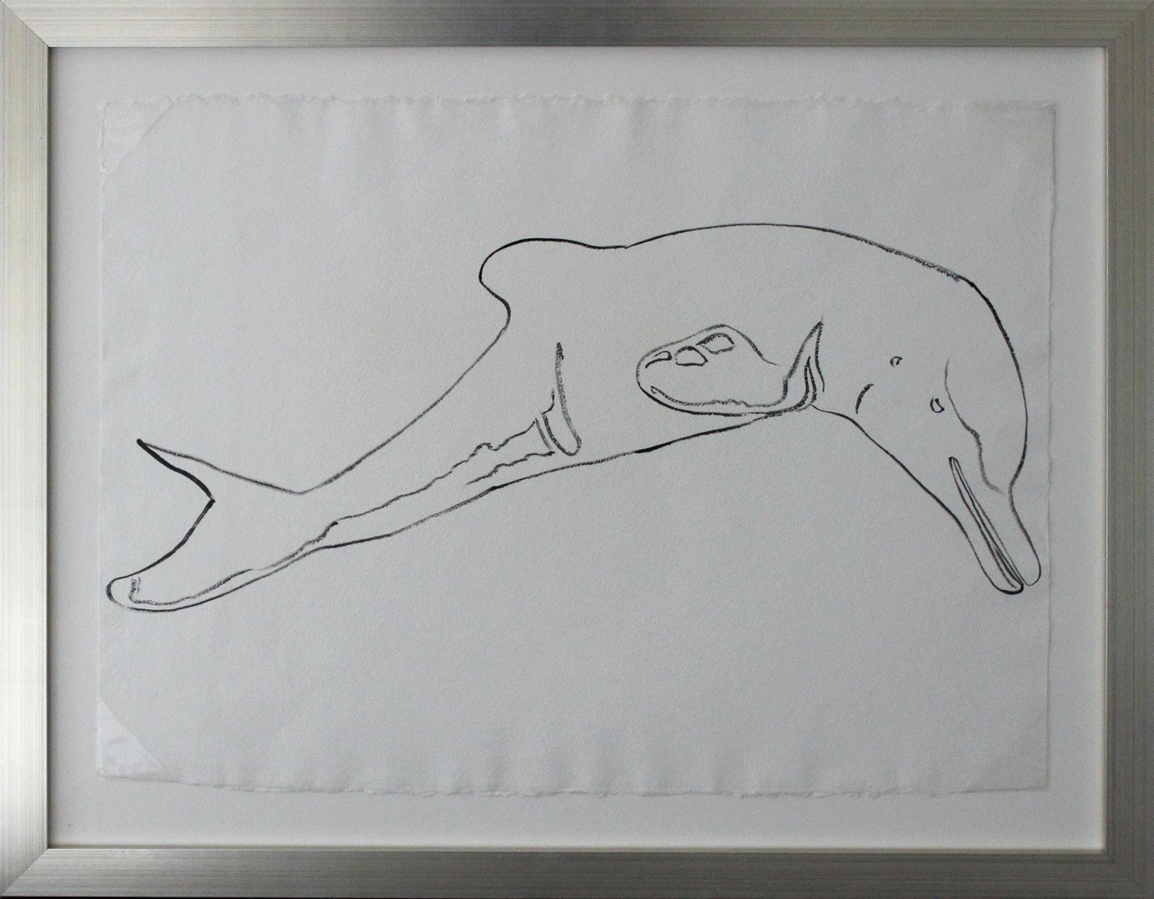
La Plata River Dolphin
Year: 1986
Medium: Synthetic polymer on paper
Size: 23.325 x 31.5 in (59.4 x 80 cm)
Frame size: 30.5 x 38.25 in (76.8 x 97.1 cm)
Reference: F.S.III.B.53 (No prints were made from this drawing.)
Provenance:
From the Estate of Andy Warhol (stamp on verso) to the Andy Warhol Foundation for the Visual Arts to Long-Sharp Gallery
Authenticated by the Andy Warhol Foundation (stamp and archive number, TOP 89.017, on verso). Click to view a film
19
In 1983, Andy Warhol was commissioned by publisher Ronald Feldman to create a portfolio of screenprints dedicated to endangered animals. This series featured depictions of ten animals, including an orangutan, zebra, rhinoceros, tree frog, and bald eagle, among others. This graphite drawing is a study for the bald eagle that appeared in the famed Endangered Species Suite
20
Click
to view a film
Bald Eagle
Year: 1983
Medium: Graphite on paper
Size: : 23.5 x 31.625 in (59.7 x 80.5 cm)
Frame size: 30.75 x 38.5 in (78.1 x 97.7 cm)
Reference: F.S.II.29
Provenance:
From the Estate of Andy Warhol (stamp on verso) to the Andy Warhol Foundation for the Visual Arts to Long-Sharp Gallery
Authenticated by the Andy Warhol Foundation (stamp and archive number, TOP 27.012, on verso).
21
22
PATRICK HURST
(British, b. 1988)
Patrick Hurst works primarily with metals to create large- and small-scale sculpture. His visual identity revolves around the minimal language of abstraction with a strong connection to geometry.
As Hurst has observed, “there is a strong similarity between the creative mind of the artist and the engineer.” Throughout his practice, Hurst employs manual machining, computeraided design, and industrial manufacturing processes to transform the raw materials for his sculptures into highly-finished, tactile shapes. He is a skilled fabricator with a deep knowledge of and interest in material and process.
The artist applies mathematical laws when conceiving the shapes of his sculptures, and most of his work has a satisfactory sense of proportion derived from Euclidean geometry. He frequently uses mirror-polished surfaces to challenge viewers’ expectations of reality when they encounter their reflections in the artwork. Hurst’s sculptures are therefore informed both by the objective and the subjective realms: the first fueled by science and facts, the second by the emotional response of his audience.
Hurst’s artwork is in part a response to our divisive times. Through application of the universal languages of physics, geometry, and mathematics, Hurst seeks to create opportunities for shared understanding. As Cassie Beadle, curator at Cob Gallery, London, describes: “Hurst’s recent sculptural work seeks to condense and harness the complexities of ancient mathematics, human history, and its experience into pure form – Hurst urges us to question the universalities of human experience.”
Hurst graduated in 2011 from the Cardiff School of Art and Design in Wales, UK with a BA (Hons) Fine Art. After graduation, he returned to his native Cambridge and worked at Kettle’s Yard Gallery, home to an eclectic collection of 20th century British masters, before pursuing his passion for sculpture. His work has been shown at Masterpiece London and Eye of the Collector. The artist now lives and works in Italy.
23
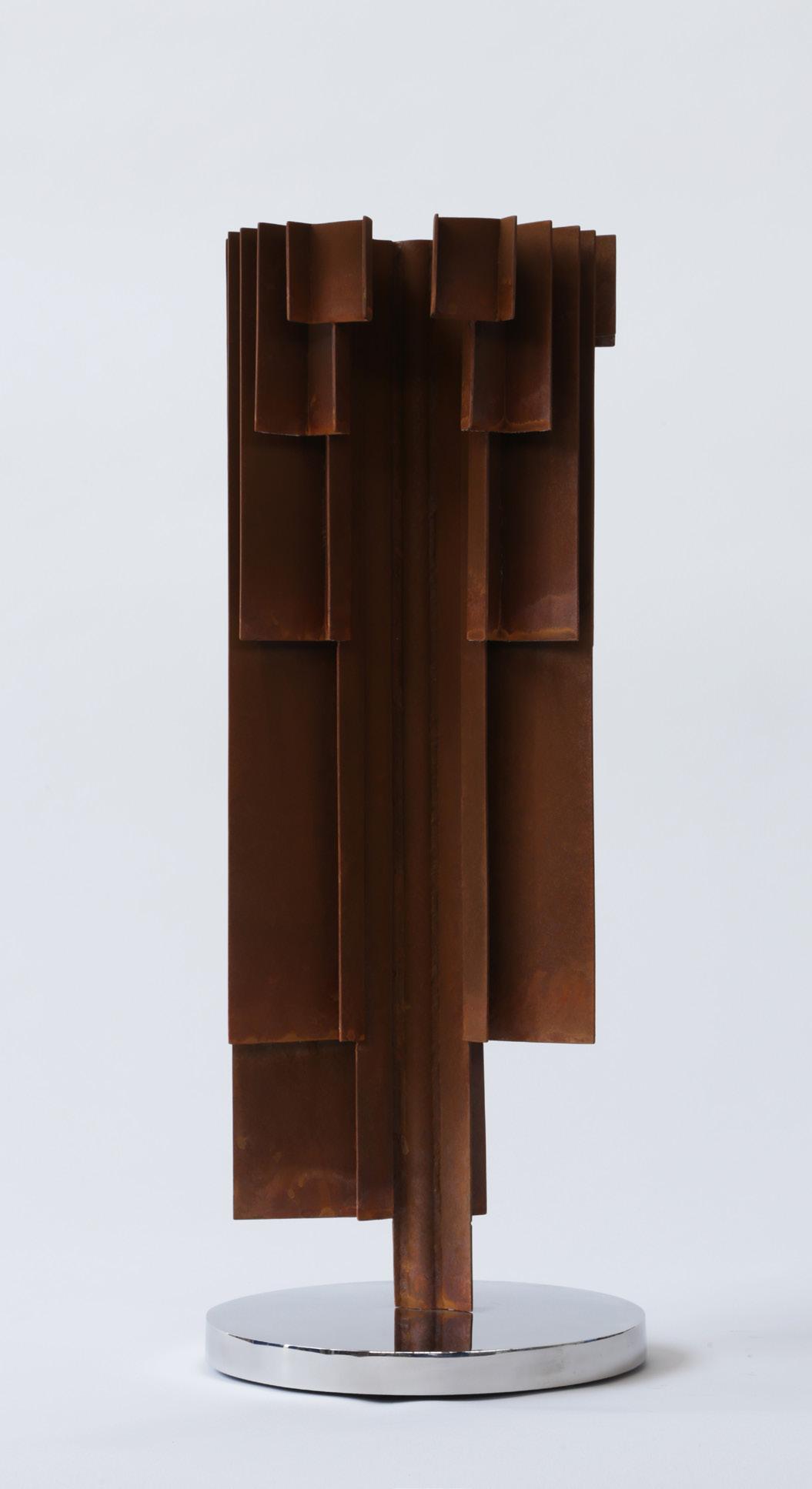
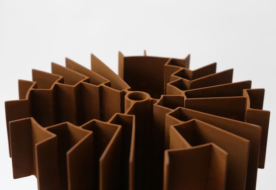
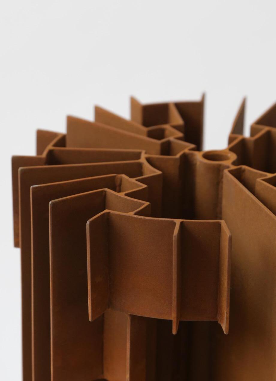
The Tree of Life takes inspiration from “Phylogenetic Trees”, a diagram that displays the evolution of species through time. This concept has been developed to become evolutionary trees, the subject of which can be varied, from the evolution of religions, languages, and individual ancestry to the lineage of a specific species (e.g. butteflies, bacteria, etc). As the evolutionary map of an isolated case is laid out, the study of its history becomes visually apparent.
This work pulls the two dimensional “evolutionary tree” into three dimensional space. It imbues a palpable physicality to a concept that seeks to convey a truth beyond our human scope, something obscured by time. The flat graphic is turned physical by extruding the lines into flat planes, relative to their position on the diagram. The closer they are to the centre, the longer they become and further back in time they represent. The closer to the edge the shorter the plane and the closer in time they become. This rationale generates the abstract form of a tree with a taller central core/trunk. This ramifies into a flat canopy with the form of the evolutionary tree.
The radiating branches cast their shadows along the planes of the “trunk”, obscuring its progression while hinting at its development. This speaks to a common concept in Hurst’s work that invites people to cultivate an awareness of the world beyond their own personal experience. The Tree of Life tree works with this concept both on a grand scale and a personal level. We can consider this tree a relationship, a cultural movement, a revolution as well as an evolution. Whatever it may represent, we can appreciate its origin and progression but its true history becomes more obscure the further back we regress. Click
24
to view a film

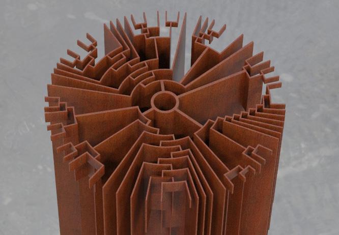
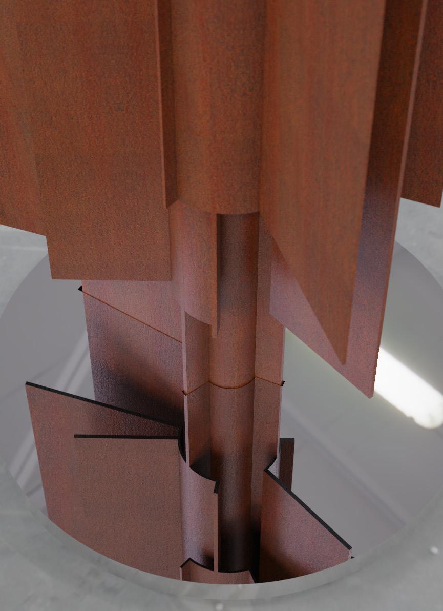
The Tree of Life
Year: 2023
Medium: Corten steel on 316 stainless steel base,comprised of 171 pieces
Signature incised on base
From a unique series of 9; this is 1/9
Size: 96 x 34 x 34 in (244 x 86 x 86 cm)
25
26
The Tree of Life (Maquette)
Year: 2023
Medium: Corten steel
Size: 25 x 9 x 9 in (62.5 x 22 x 22 cm)
27
According to the artist: Water is fundamental to humans; as a species, we are made of fifty to seventy-five percent water. The mirror-polished spheres that compose the works from Hurst’s Water Series suggest bubbles rising in water. In the contemporary world, where people increasingly are inwardly focused and strongly divided on many issues, the bubbles symbolize the elements of our shared humanity rising to the water’s surface. In this way, Hurst’s Water Series strives to represent the common ground in the human experience.
Works in the Water Series are inspired in part by a commencement address by author David Foster Wallace, “This Is Water” (later a published essay of the same name). In the speech, Wallace highlights the importance of choice in how we see and think about our world. He posits that “if you’ve really learned how to think, how to pay attention, then… it will be within your power to experience a crowded, hot, slow, consumer-hell-type situation as not only meaningful, but sacred, on fire with the same force that lit the stars.” That is, in confronting even the most mundane and frustrating parts of contemporary adult life, it is within our power to choose to see “the subsurface unity of all things.”
Hurst also finds inspiration for the Water Series in the disciplines of mathematics and astrophysics; in particular, a principle of quantum mechanics called “von Neumann entropy.” Expressed as a complex mathematical formula, the principle encapsulates the philosophical idea that, without knowing for certain, the unseen world can be more than one thing at the same time. However far-fetched the possibilities may seem, they are not impossible. Viewed through this lens, the “bubbles” in the Water Series represent events occurring within the “water” of our shared experience. They encourage viewers to see their world from new vantage points and, in doing so, to see the marvelous possibilities that exist all at once.
28
Click to view a film
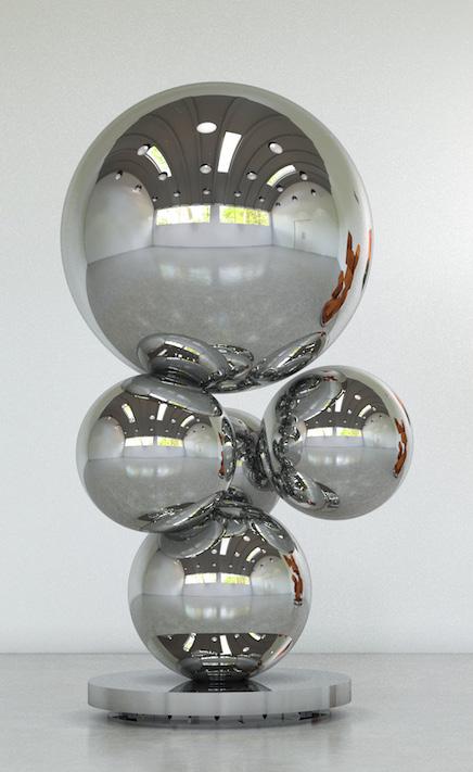
Questa è Acqua
Year: 2023
Medium: 316 stainless steel on 316 stainless steel base
From a unique series of 5 plus proofs; this is 4/5
Size: 88.625 x 53.125 x 37.375 in (225 x 135 x 95 cm)
From the artist’s studio to Long-Sharp Gallery
29
30
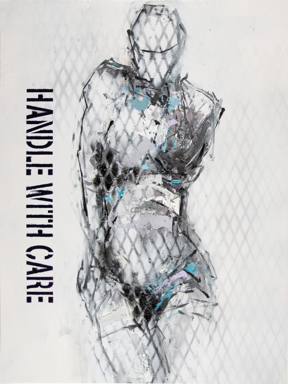
More Than Words:
Sculptures by Nicola Anthony (UK), paintings by David Spiller (UK) and paintings on paper by Moira Cameron (UK) emphasizing the use of text
31
32
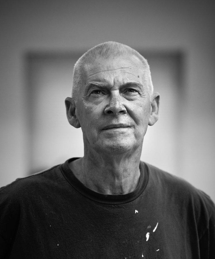
DAVID SPILLER (1942-2018)
A veteran of the British Pop Art movement, David Spiller grew up in its defining period. Juxtaposing pop culture with urban sensibilities, Spiller created his own unique style of fine art that is distinctly “David Spiller.” As Martin Gayford wrote in his catalogue essay for Spiller’s 2008 exhibition at Beaux Arts London:
David Spiller’s pictures are much more than simply messages. A lot of them are also, an art historian might say, complex colour-field abstractions. […] To make works of this type, Spiller uses a technique that is, as far as I know, unique. He ‘floats’ the pigment onto pieces of canvas that he then sews together with incredible neatness and precision, so the final work is a sort of combine, made not with glue, like a collage, but with needle and thread. […] no one has ever, as far as I know, fitted geometrically precise square and oblongs of colour together in this fashion, like a precision-engineered quilt...
David Spiller’s place as an acclaimed artist was not achieved by happenstance. Spiller was trained in fine art and an early student of Frank Auerbach. He studied at the Sidcup School of Art (1957), Beckenham School of Art (1958-1962), and the Slade School of Art (1962-1965). During his distinguished career, Spiller had solo exhibits in over 10 countries (Austria, Belgium, Denmark, England, France, Germany, Holland, Italy, Spain and the United States). His work was exhibited at notable institutions such as the Rattingen Museum and Mannheim Kunstverein (Germany), Museum Van Bommel van Dam and Museum Utrecht (Holland), Museum Espace Belleville and Artcurial (Paris), the Royal West of England Academy (UK), and the Cornell Museum (Florida, US). His work is also in important public and corporate collections which include Hanwon Museum (Seoul), Foundation Carmignac Gestion (Paris), Harley Gallery Welbeck, Collection UCL, Morgan Stanley (Frankfort), and Belgacom Brussels. Important private collections also contain works by the artist; some are available on request.
When asked about his art, Spiller has said “I really want to make paintings that put some magic on the wall. Some of them are straightforward things. Some are wild things. But underneath, it says ‘I love you.’”
33
34
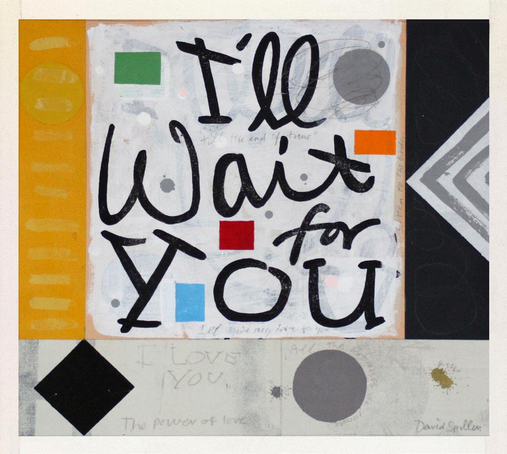
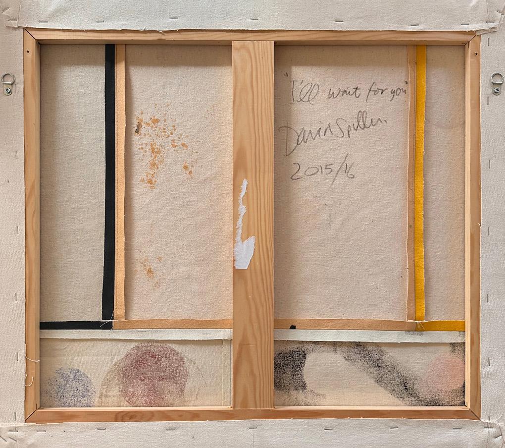
I’ll Wait For You
Year: 2015-2016
Medium: Acrylic and pencil on stitched canvas
Size: 88.625 x 53.125 x 37.375 in (225 x 135 x 95 cm)
From the artist’s studio to Long-Sharp Gallery
35
36

I’d Walk a Million Miles for One of Your Smiles
Year: 2015
Medium: Acrylic and pencil on canvas
Titled, hand signed and dated on verso
Size: 33.875 x 35.5 in (86 x 90 cm)
Frame size: 35.25 x 36.75 in (89.5 x 93.3 cm)
From the artist’s estate to Long-Sharp Gallery
37
According to writer Simon Grant: “Spiller’s works exist as love letters.... [he] wears his heart on his sleeve.” This is evidenced by his patchwork paintings, hand-sewn on the floor of his London studio, often overlaid with song lyrics and the artist’s musings about life, love, and longing. In his text-based paintings, Spiller’s letters and words are often nonlinear, wrapping around the sides of the canvas. About this, Spiller shared: “A big influence for me was seeing those beautiful blue advertisements on the sides of old French barns as you drove along. I’d never seen anything like it back where I came from in Kent. They couldn’t always get the whole message into the space, so they’d wrap it round a corner or run a word vertically. They stood out like beacons in the landscape, and I guess that’s what I’d like my paintings to do.”
38
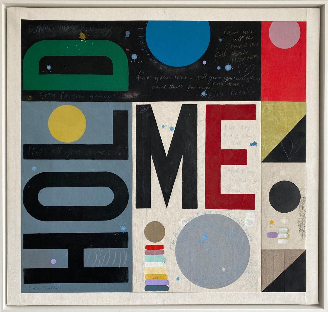
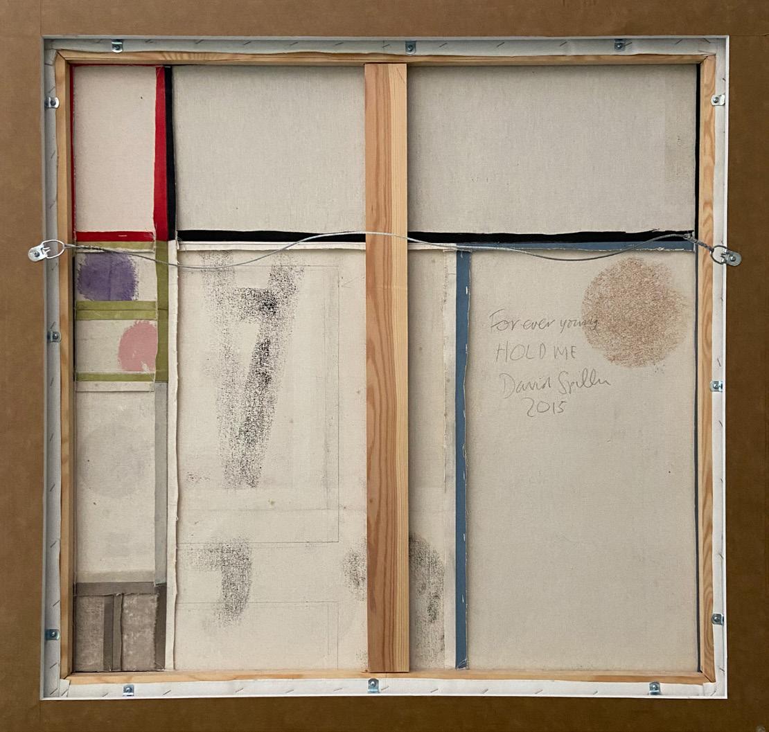
Hold Me
Year: 2015
Medium: Acrylic and pencil on stitched canvas panels
Hand signed on verso
Size: 34 x 36 in (86.36 x 91.44 cm)
Frame size: 36 x 38 in (91.44 x 96.52 cm)
From the artist’s estate to Long-Sharp Gallery
39
About this work: Perhaps best known for his text-based paintings and depictions of cartoon figures, landscapes, too were always close to Spiller’s heart. Initially inspired by Van Gogh (“as an artist, one is merely a link in a chain”), Spiller contemplated how Van Gogh’s art would differ if created in modern times, with modern freedoms. When painting his landscapes – on canvases the same size as his own studio windows –Spiller wanted to make a pure and perfect surface, removing brushstrokes so that his signature “dots” floated magically on the surface of the canvas.
40
Click to view a film
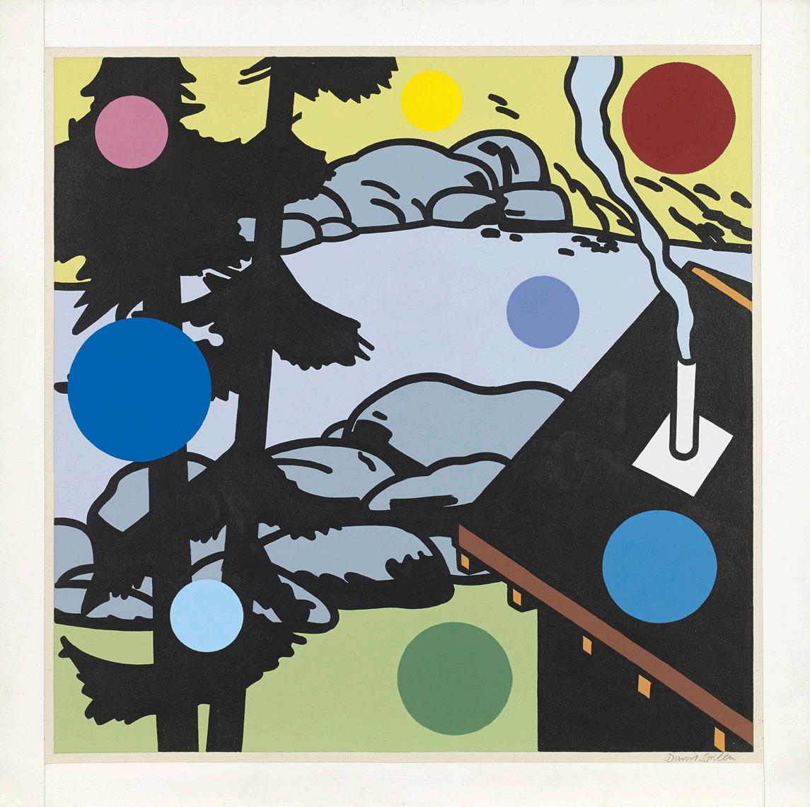
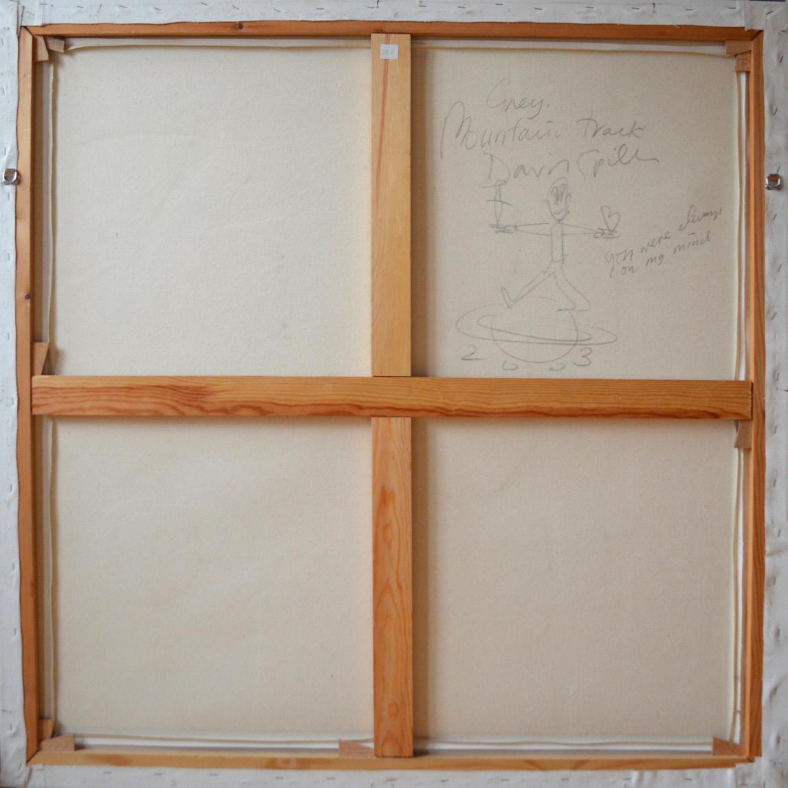
You Were Always on My Mind
Year: 2003
Medium: Acrylic and pencil on canvas
Hand signed and dated on verso
Size: 41.75 x 41.75 in (106 x 106 cm)
From the artist’s estate to Long-Sharp Gallery
41
42
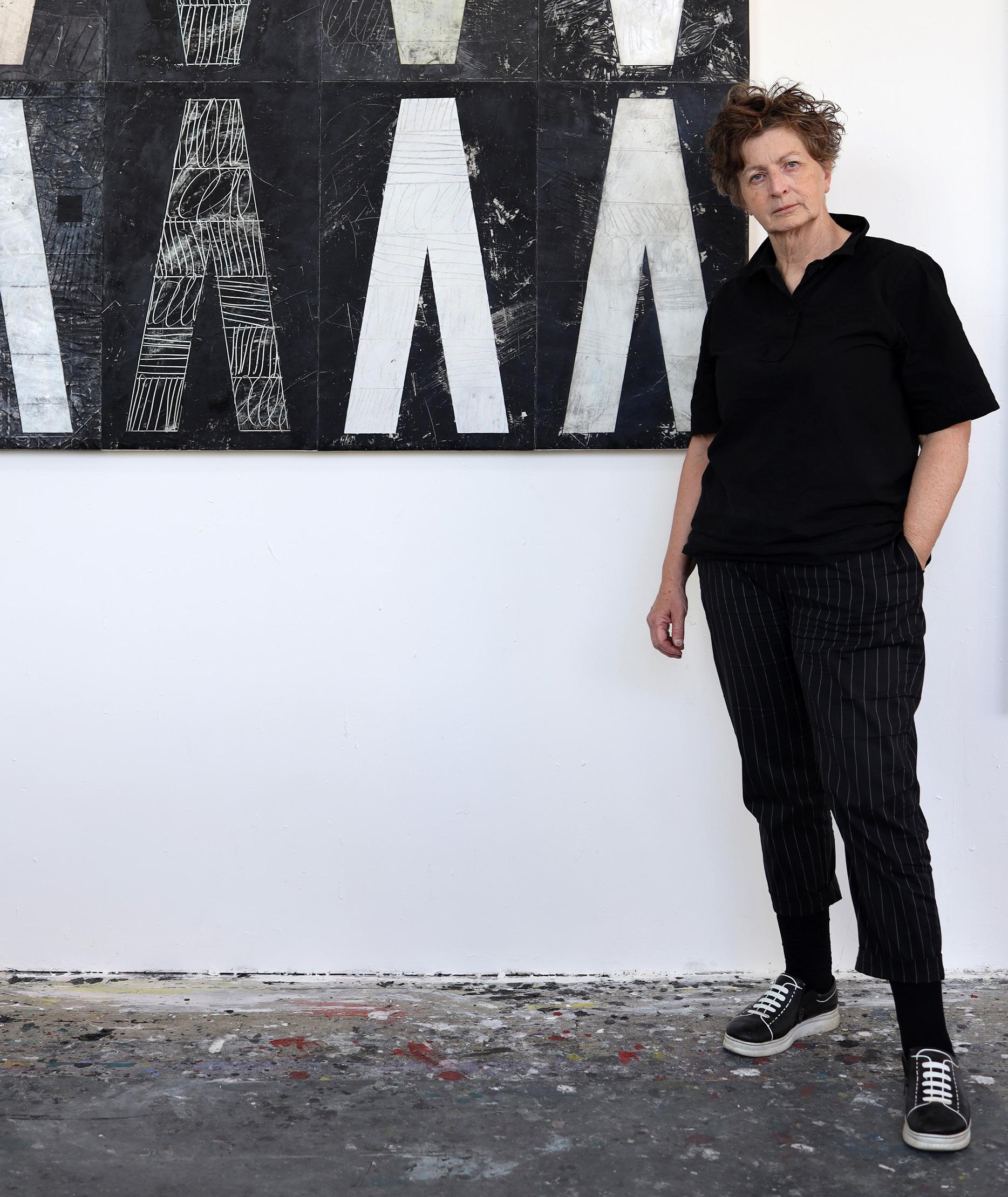
MOIRA CAMERON (British, b. 1962)
Moira Cameron was born in London to a family of artists. Her father was the celebrated figurative sculptor Ronald Cameron (1930-2013). Her mother, Dorothy Cameron, was a sculptor in her own right. Half a century earlier, Dorothy’s mother had been among the first women to attend art school.
Cameron earned a BA (Fine Art) from Ravensbourne College of Art and an MFA from Chelsea College of Art. In the 1980s, she and her husband, artist David Spiller (1942-2018), moved to New York City. Amidst the bustling streets and graffiti-fueled art scene, Cameron began experimenting with paper sacks as a medium for her artwork. Sourced from her daily life and travels, then cut, patched, glued, and stenciled into something new, the shopping bags are both imbued with personal memories and more broadly representative of the signs, symbols, and sayings of 1980s and 1990s popular culture. As art historian Fraser Brough notes, Cameron’s work repurposing and transforming the discarded materials of everyday life “still looks fresh, raw without being messy, expressive without being naïve.” And over thirty years later, the way in which Cameron embraced sustainable art forms and popular slogans such as “Reduce, Re-use, Recycle” feels, in Brough’s words, “remarkably prescient” for our world today.
Cameron also creates artwork in partnership with her son, Xavier Spiller-Cameron, under the moniker Spiller + Cameron. Their works are assembled in union, with each collaborator bringing his and her strengths and weaknesses to the partnership—Xavier introducing his youthful, contemporary energy to Cameron’s maturity and experience. The duo describes their artistic process as a sort of “alchemy,” in which a base product is mystically transformed into something beautiful. Like Cameron’s work with paper bags, Spiller + Cameron “upcycle” discarded paint rags and other materials; after they are primed, ironed, and meticulously stitched together, the resulting “collages” are so precise that the stitches almost disappear. The paintings harness the energy of the materials’ previous use and, like alchemy, transmute a base product into something worthy of contemplation.
43
According to the artist: “The paper grocery bag came from the Grand Union Supermarket on Washington Square, the local store to get groceries from during the time I was living in Manhattan in 1986. I transcribed elements of the printed text from the bag, re-emphasising the slogan in my own stencil text format. It proclaimed a ‘new’ environmental message, now seen as a powerful, prophetic slogan. Spray paints, metallic paint, and pearlescent paints were layered on and scraped off with ridged paint scrapers to achieve a richly textured surface and the look of a worn poster.” Click
44
to view a film
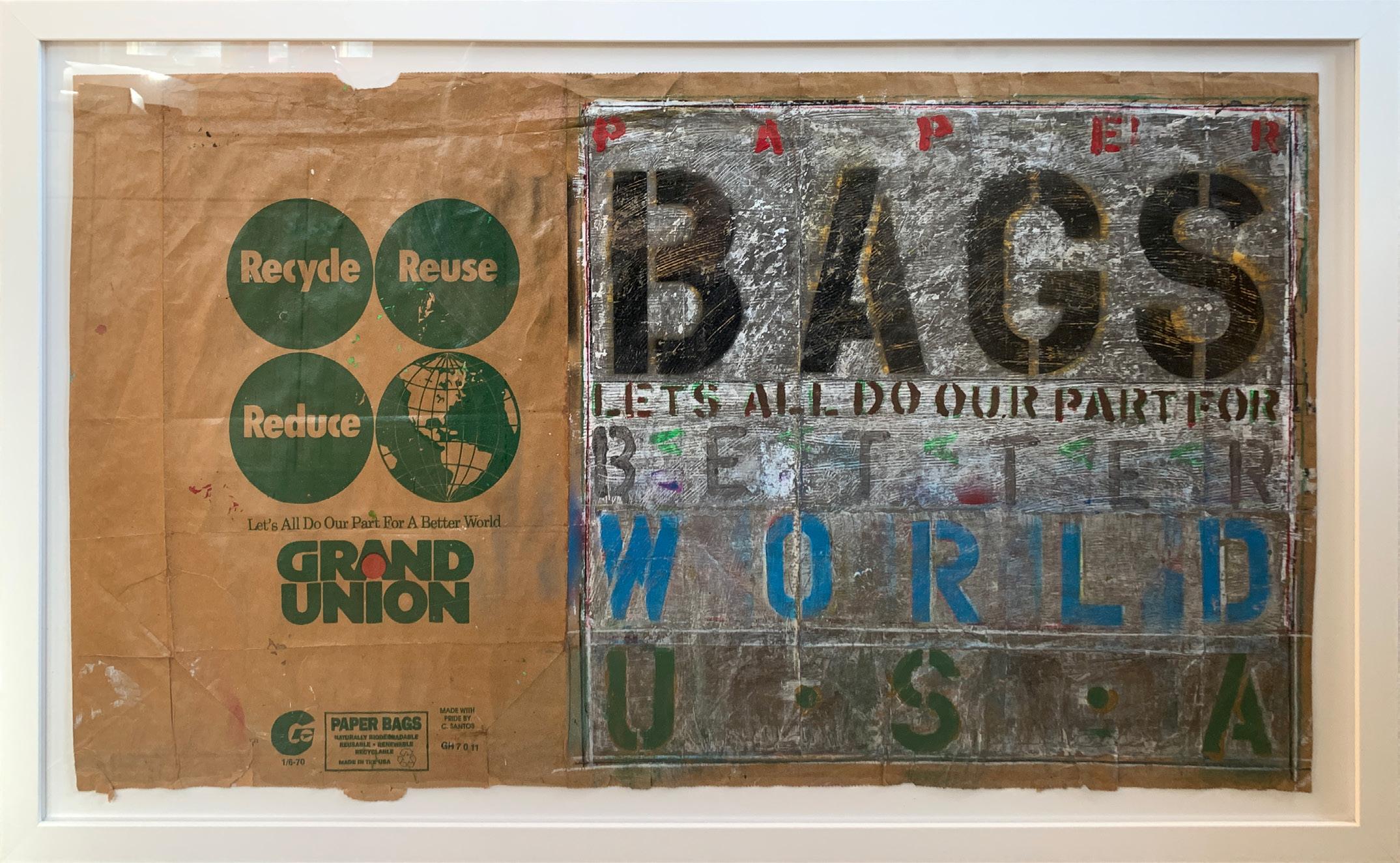
Better World
Year: 1990
Medium: Acrylic and spray paint on paper bags
Hand signed and dated on verso
Size: 21 x 36.5 in (53.3 x 92.7 cm)
Frame size: 25 x 40.625 in (63.5 x 103.2 cm)
From the artist’s studio to Long-Sharp Gallery
45
According to the artist: “I used a paper grocery bag from the A&P (Atlantic & Pacific) supermarket in New York, the slogan on the bag reading: ‘America’s choice.’ (An appropriate message for its return to America for the show at Long-Sharp Gallery.) This work made was made in 1988 while I was living in a small loft, a block south of Canal Street, the stenciled lyrics taken from the iconic song about New York by Frank Sinatra, encapsulating the consistent buzz and vibrancy, with the egalitarian possibilities afforded to anyone, and the importance of ‘making it’ in New York, the city that captured my heart.” Click
46
to view
film
a
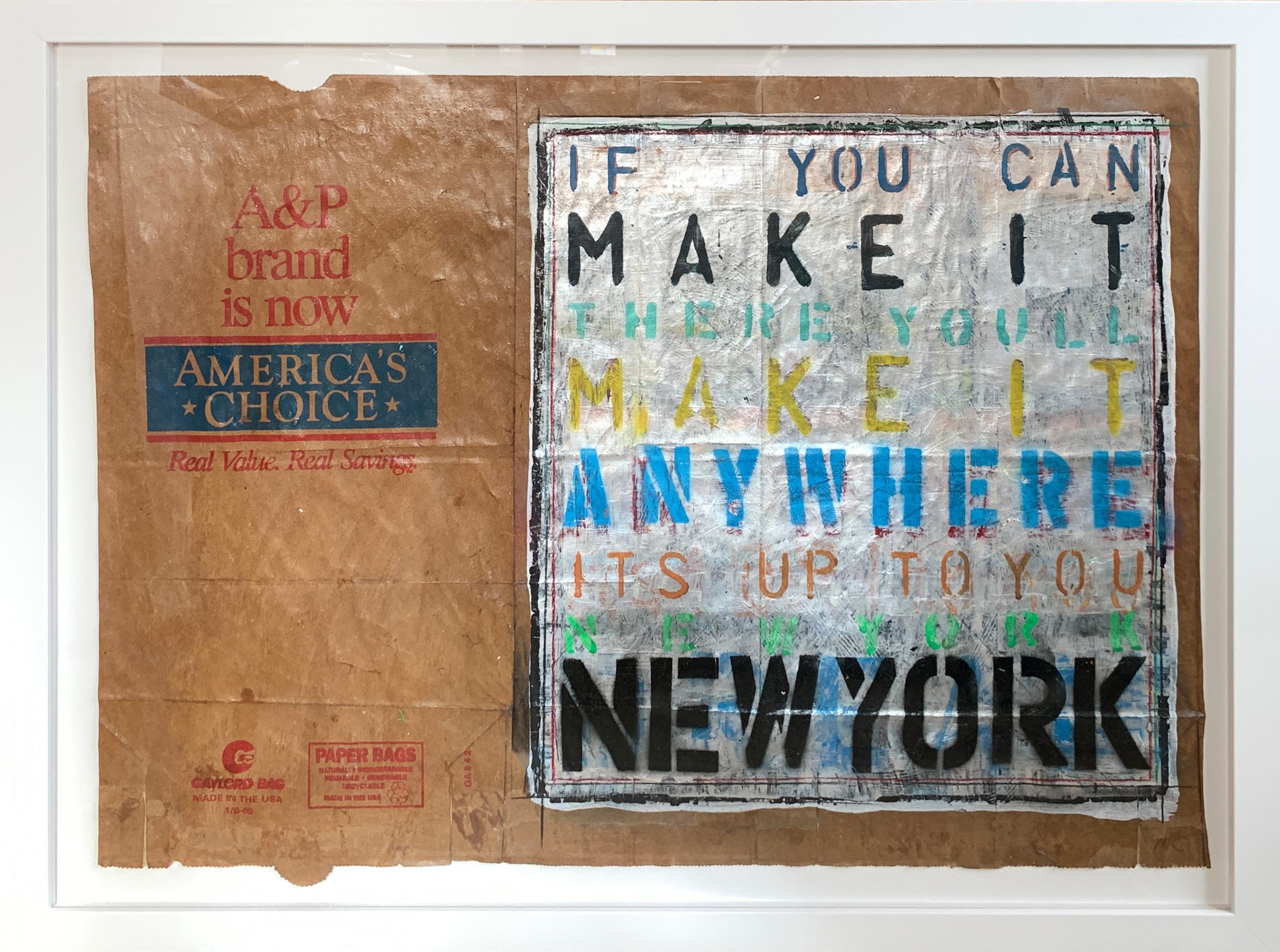
America’s Choice
Year: 1990
Medium: Acrylic and spray paint on paper bags
Initialed lower right in pencil on front; Hand signed and dated on verso
Size: 20.75 x 29.5 in (52.7 x 74.9 cm)
Frame size: 25 x 33.625 in (63.5 x 85.4 cm)
From the artist’s studio to Long-Sharp Gallery
47

48
MEL BOCHNER (b. 1940)
Mel Bochner received his BFA (1962) and honorary Doctor of Fine Arts (2005) from Carnegie Mellon University. He is recognized as one of the leading figures in the development of Conceptual art in New York in the 1960s and 1970s. Emerging at a time when painting was increasingly discussed as outmoded, Bochner became part of a new generation of artists including Eva Hesse, Donald Judd, and Robert Smithson - artists, who, like Bochner were looking at ways of breaking with Abstract Expressionism and traditional compositional devices. His pioneering introduction of the use of language in the visual led Harvard University art historian Benjamin Buchloh to describe his 1966 Working Drawings as “probably the first truly conceptual exhibition”.
Bochner came of age during the second half of the 1960s - a moment of radical change, both in society at large as well as in art. While painting slowly lost its preeminent position in modern art, language moved from talking about art to becoming part of art itself. Bochner has consistently probed the conventions of both painting and of language, the way we construct and understand them, and the way they relate to one another to make us more attentive to the unspoken codes that underpin our engagement with the world. [Excerpted from Mel Bochner / If The Color Changes]
Mel Bochner’s work is held in the permanent collection of museums including Museum of Modern Art, New York; Whitney Museum of American Art, New York; National Gallery of Art, Washington D.C.; Centre Georges Pompidou, Paris; Tate, London. He has created works with Two Palms since 1997.
49
50

HA HA HA
Year: 2023
Medium: Monoprint in oil with collage, engraving and embossment on handmade paper
Signed and dated on verso in graphite
Size: 29.75 x 25 in (75.6 x 63.5 cm)
Frame size: 32 x 27.125 in (81.2 x 68.8 cm)
From the printer, Two Palms, to Long-Sharp Gallery
51
52
NICOLA ANTHONY
(British Anglo-Indian, b. 1984)
A sculptor based in the UK who has created public artworks around the world from Los Angeles to Singapore. Nicola was appointed as artist-in-residence for the UK Government in Dubai (2021-2022), and has shown work in museums internationally. One of her most noteworthy permanent sculptures was commissioned for Steven Spielberg’s USC Shoah Foundation, featuring the story of a Holocaust survivor (2018, Los Angeles).
Nicola is known for her signature metal text sculptures which tell powerful stories, connecting with history, people and places. (As featured in the New York Times, Architectural Record, Blouin Artinfo, BBC, among others). She gathers words, narratives and patterns in a variety of methods including collecting anonymous stories and confessions, inviting letters, sourcing big data from the depths of the web, and scouring traditional texts to find previously unknown subtexts.
Nicola says “I aim to give voice to important and often unspoken stories, revealing our inner worlds, exploring the tangled threads of history, roots, identity and universality which connect us all.”
Select public sculptures are in London (Embankment); National University of Ireland (commissioned by European city of culture 2020); Aspen, Colorado; USC Shoah Foundation (Los Angeles); Marina Bay (Singapore), Lim Chin Tsong Palace (Myanmar), and National Design Centre (Singapore).
Her artworld accolades include being shortlisted for the Sovereign Art Prize in 2020 for her artwork in Singapore, as well as the Sovereign Asian Art Prize in 2021 for her work on the subject of the migrant crisis. In 2019 whilst based in Dublin she received a ‘New Voices Of Ireland’ award. Nicola has recently had 3 works acquired by Ingram Collection of British Art and has been spotlighted by SmArtify as one of 50 noteworthy female artists.
Notable exhibitions include a solo exhibition at Singapore Art Museum (2017), and exhibited works at the Kuala Lumpur Biennale (2018).
Nicola is also a diversity champion, a trustee, poet and paper aeroplane collector. Fellow of the Royal Society of Arts, member of the Royal Society of Sculptors, alumni of Central St Martin’s (University of the Arts London) and Loughborough University.
53
Borrowing its title from a line in the poem ‘Still I rise’ by Maya Angelou, this artwork muses on human resilience in the face of hardship. In the creation of her work Anthony dives deep into literature, cultural and historical events to distil the essence that will eventually be portrayed through her art. For I Will Rise, her research focused on literature, thinkers, and words that have guided society over the generations, or been synonymous with turning points in the pursuit of liberty and equality. Inspired by their words and in recognition of the role of artists and dreamers in shaping the world, Nicola Anthony has penned her own sculptural poem.
This artwork explores the power of resilience and affirmation within the infinite cycle of life. The words reference times of conflict and struggle so we are reminded that there is often a need to find strength, to find a better way forward, to rise. It is this balance of confronting the darkness of life but bringing out hopefulness that has informed Anthony’s artistic practice throughout her career.
Each individual hoop is titled as follows:
I Will Rise (A paradox blooms)
“IN DEFEAT, A PARADOX BLOOMS: FOR VICTORY MAY YET UNFURL IN YOUR SOUL”
I Will Rise (Courageous heart)
“IT’S ABOUT CULTIVATING A COURAGEOUS HEART. IT’S NOT ABOUT HAVING A STEEL BACKBONE”
I Will Rise (Just Like Moons, Like Suns)
“I WILL RISE, JUST LIKE MOONS & LIKE SUNS”
I Will Rise (Fighting a hard battle)
“BE KIND, FOR EVERYONE YOU MEET IS FIGHTING A HARD BATTLE”
I Will Rise (The dreamer of dreams)
“YOU ARE THE SPARK, YOU ARE THE DREAMER OF DREAMS”
I Will Rise (Bound by fate’s fabric)
“FROM ONE ANCIENT PATH, BOUND BY FATE’S FABRIC, IN THIS WORLD WE ALL SHARE”
I Will Rise (I am a seed)
“THEY MAY TRY TO BURY ME, BUT I AM NOT JUST ONE VOICE, I AM A SEED”
54
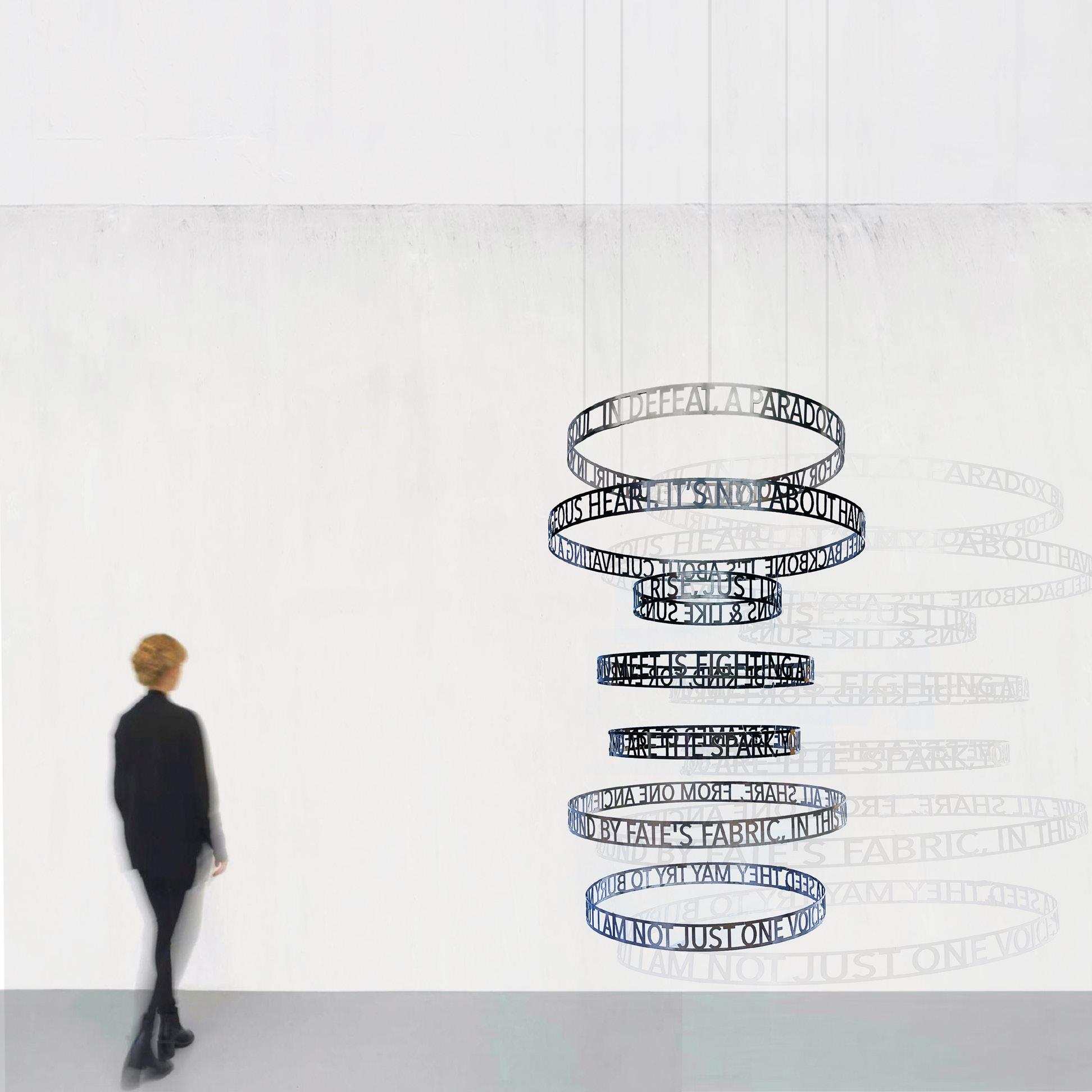
I Will Rise
Year: 2023
Medium: Marine grade stainless steel suspended by wire
Size: 67 x 39.4 x 39.4 in (170 x 100 x 100 cm)
From a series of 3 plus 2 artist proofs
55
Click to view a film
About Amulets: This series of metal text sculptures is based on beliefs about luck across multiple cultures. The artist considers these artworks as amulets (defined as an object that is believed to possess magical or protective powers).
The artist wrote each text by researching folklore, stories and symbols about luck that are still present in modern society and can give us a fascinating insight into human nature - our fears, hopes and desires. The concepts contained have come from religions, myths, proverbs and superstitions. The artist has also woven in some of the concepts from mathematics, astronomy and science that guide our contemporary worldview.
Featured text: “Up in the dark sky of ancient Greece, the moon goddess looks over us. She sleeps languidly on the curve of the moon, whose gentle light brings fertility and good fortune. The delicate lunar crescent rotates to become a horseshoe. If you find one, rub it seven times while making a wish. Don’t worry if it tips upside down, the luck collected within will flow down onto your mind and heart.”
Click to view a film
56
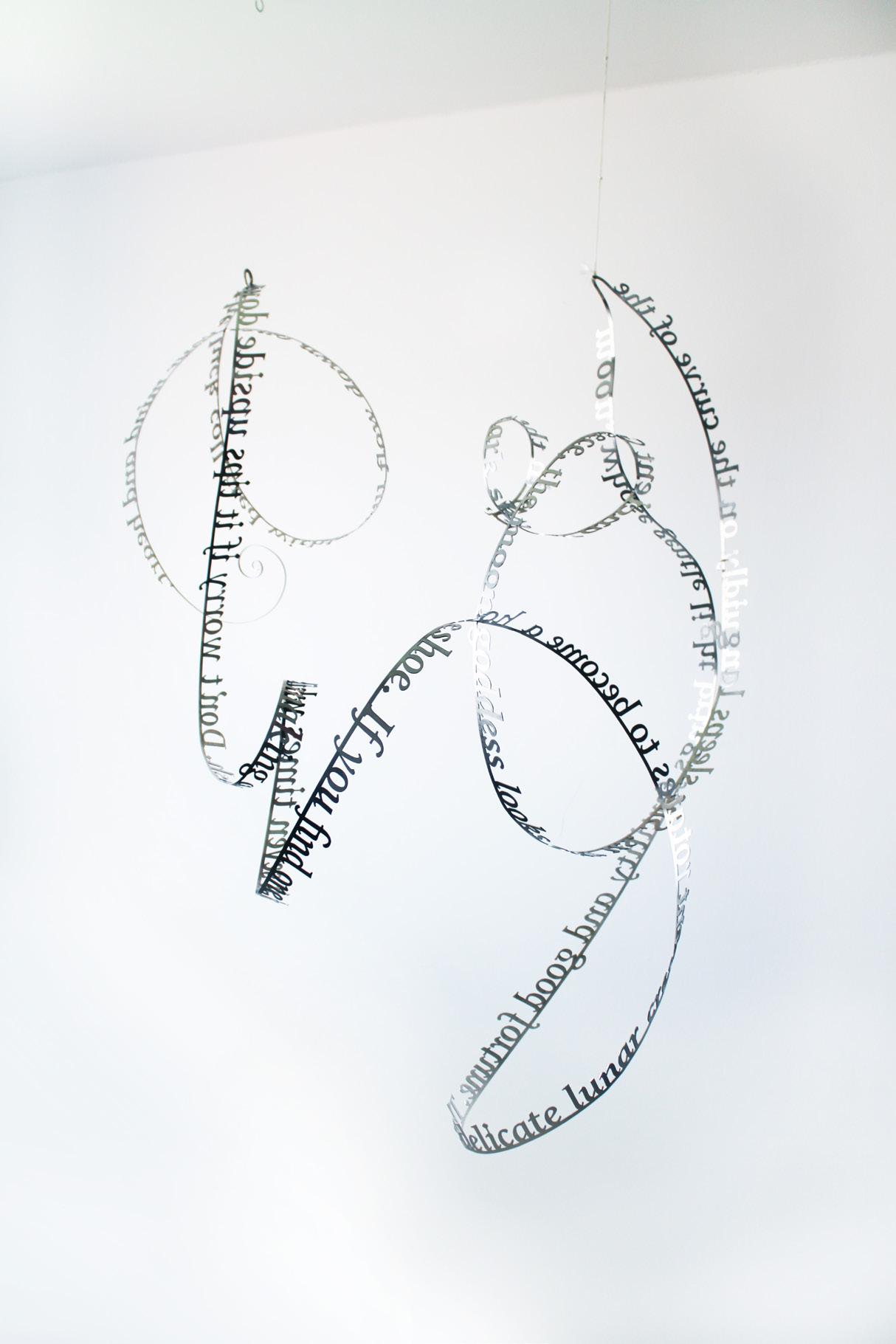
The moon goddess
Year: 2023
Medium: Stainless steel
Size: 39.3 x 39.3 x 29 in (100 x 100 x 75 cm)
From a unique series of 3 + 1AP
From the artist’s studio to Long-Sharp Gallery
57
About Amulets: This series of metal text sculptures is based on beliefs about luck across multiple cultures. The artist considers these artworks as amulets (defined as an object that is believed to possess magical or protective powers).
The artist wrote each text by researching folklore, stories and symbols about luck that are still present in modern society and can give us a fascinating insight into human nature - our fears, hopes and desires. The concepts contained have come from religions, myths, proverbs and superstitions. The artist has also woven in some of the concepts from mathematics, astronomy and science that guide our contemporary worldview.
Featured text: “The last letter in the Greek alphabet is shaped like a horseshoe. You feel malevolence evaporate in its presence. You hear it reverberate on the lips of yogis saluting the sun. Meanwhile, Nietzsche’s universe recurs in an infinite loop and physicists are busy measuring the density of all that exists. Whether we collapse or find our equilibrium with Ω, in the end, its cosmic significance will complete you.” Click
58
to view a film
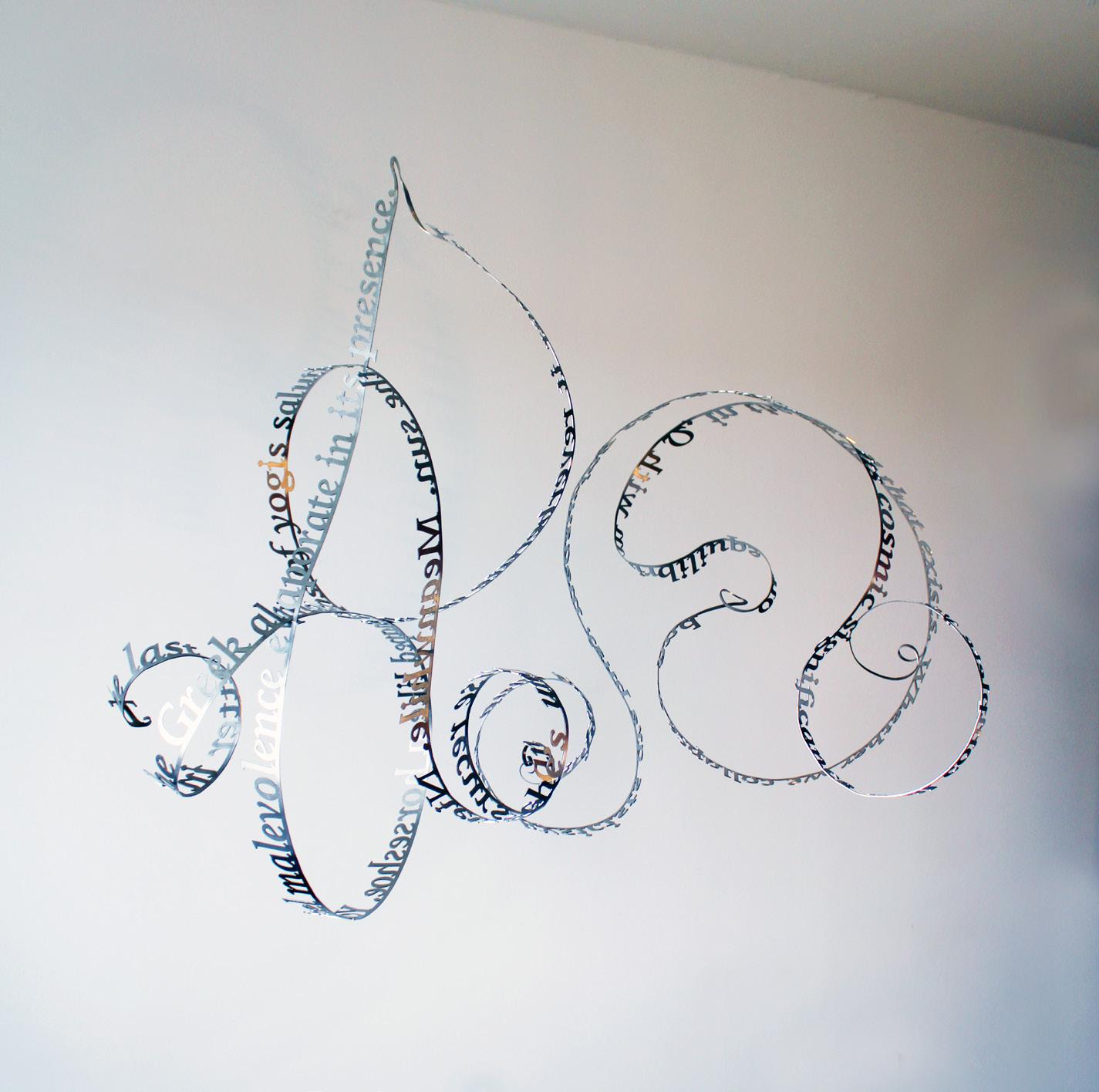
Omega-Om
Year: 2023
Medium: Stainless steel
Size: 39.3 x 39.3 x 29 in (100 x 100 x 75 cm)
From a unique series of 3 + 1AP
From the artist’s studio to Long-Sharp Gallery
59
About Amulets: This series of metal text sculptures is based on beliefs about luck across multiple cultures. The artist considers these artworks as amulets (defined as an object that is believed to possess magical or protective powers).
The artist wrote each text by researching folklore, stories and symbols about luck that are still present in modern society and can give us a fascinating insight into human nature - our fears, hopes and desires. The concepts contained have come from religions, myths, proverbs and superstitions. The artist has also woven in some of the concepts from mathematics, astronomy and science that guide our contemporary worldview.
Featured text: “Wish upon a star: Venus brings love, and what could be more charming. Love is all. Polaris guides us in the arc of life. At the end of a rainbow we discover a gemstone glittering in the world’s hem.”
Click to view a film
60
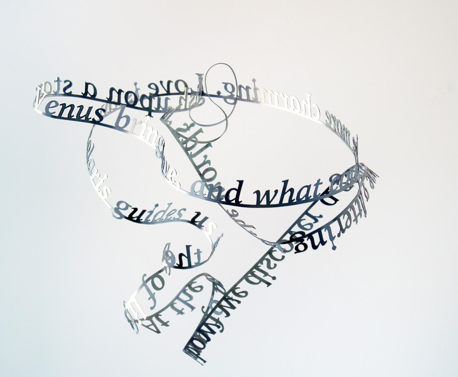
Lucky charm
Year: 2023
Medium: Stainless steel
Size: 20 x 21 x 15.75 in (50.8 x 53.3 x 40 cm)
From a unique series of 3 + 1AP
From the artist’s studio to Long-Sharp Gallery
61
About the Unexpected Happiness series: Each piece from the Unexpected Happiness series captures something remarkable about the human spirit. The sculptures feature a few moving sentences from the artist’s research, reverse-cast in stainless steel and captured inside a glass bell dome.
Featured text: “Waking up early in the morning. All is quiet and very dark. It feels peaceful and safe. All around, are the sounds of loved ones sleeping, they are peaceful and safe too. Quiet happiness warms your soul. This moment is perfect. Let us stop time and live in this moment.”
Click to view a film
62

Unexpected Happiness (This Moment is Perfect)
Year: 2023
Medium: Stainless steel on mirrored base in handmade glass dome
Size: 11.75 x 9.75 in (29.8 x 24.9 cm)
63
64
Abstraction:
A survey of the movement through works by Joan Miró, Cha Jong Rye (South Korea), Julia Ibbini (UAE), Spiller + Cameron (UK), and Oliver Marsden (UK)
65
66
JOAN MIRÓ
(1893-1983)
A pivotal figure in 20th century avant-garde painting, Barcelona born artist Joan Miró created a unique innovatory style rooted in memory, imaginative fantasy, and the irrational. Boasting an early portfolio heavily influenced by Fauvism, Cubism, and the folkloric Catalan art of his heritage, Miró created works that are distinguished by their juxtaposition of brilliant pure colors against flat neutral backgrounds. The artist’s signature abstract amoebic shapes are contrasted against sharp lines to create visions that are often whimsical and ethereal, resulting in their significant contribution to the Surrealist movement. Throughout his career, Miró experimented with various media, including etchings, lithographs, ceramics, sculpture, and tapestries.
The artist held his first solo exhibition in 1918 at José Dalmau’s gallery in Barcelona. Shortly afterwards, he made his first trip to Paris in 1920, where he was introduced to Pablo Picasso, André Breton, and other emerging artists of the time. It was during this time that Joan Miró aligned with the Breton led Surrealist movement. Although his future work was influenced by the tenets of Surrealism, the artist never fully accepted the movement’s creed, instead remaining on its periphery. Despite this rejection of the movement, Breton later described Miró as “the most Surrealist of us all.” In contrast to his art, Miró’s personality was orderly, detail-oriented, and meticulous.
Born in Spain, in 1893 as the son of a goldsmith and a jewelry maker, Miró displayed an early aptitude and passion for art in contempt of his parents’ discouragement. At the age of 14, Miró attended Fine Arts and Business school at La Lonja’s School of Fine Arts in Barcelona. After three years of studies, Miró followed his parents’ wishes, taking a job as an accountant, in which he later suffered a nervous breakdown. After his recovery, he abandoned his business career to re-commit himself to his art studies, enrolling at Francesco Gali’s Escola d’Art in Barcelona. Miró settled in 1956 in a villa in Palma de Majorca, Spain, which was later transformed into the beloved Miró Museum. Though the artist died at age 90, his iconic works are displayed today in such collections as the Art Institute of Chicago, The Museum of Modern Art, and the Tate Gallery in London.
67
Joan Miró and Josep Llorens i Artigas (a celebrated Spanish ceramicist) visited the Altamira Cave in Cantabria, Spain in 1957. He returned from the trip inspired by the ancient artworks painted on the caves walls, and by the artists’ lasting influence. The works resulting are two series of etchings inspired by the cave paintings, Els Rupestres and Grans Rupestres, both created in 1979.
68
Rupestres XII
Year: 1979
Medium: Lithograph
The hand signed Bon a Tirer aside from the hand signed and numbered edition of 30 + 15 not-for-sale examples.
Size: 29.825 x 22 in (76 x 56 cm)
Frame size: 36.25 x 28.36 in (92.06 x 72.03 cm)
Published by Maeght, Barcelona
Printed by Joan Barbara, Barcelona
Reference: Dupin 1046
Certified by Rosa Maria Malet on reverse
69
70
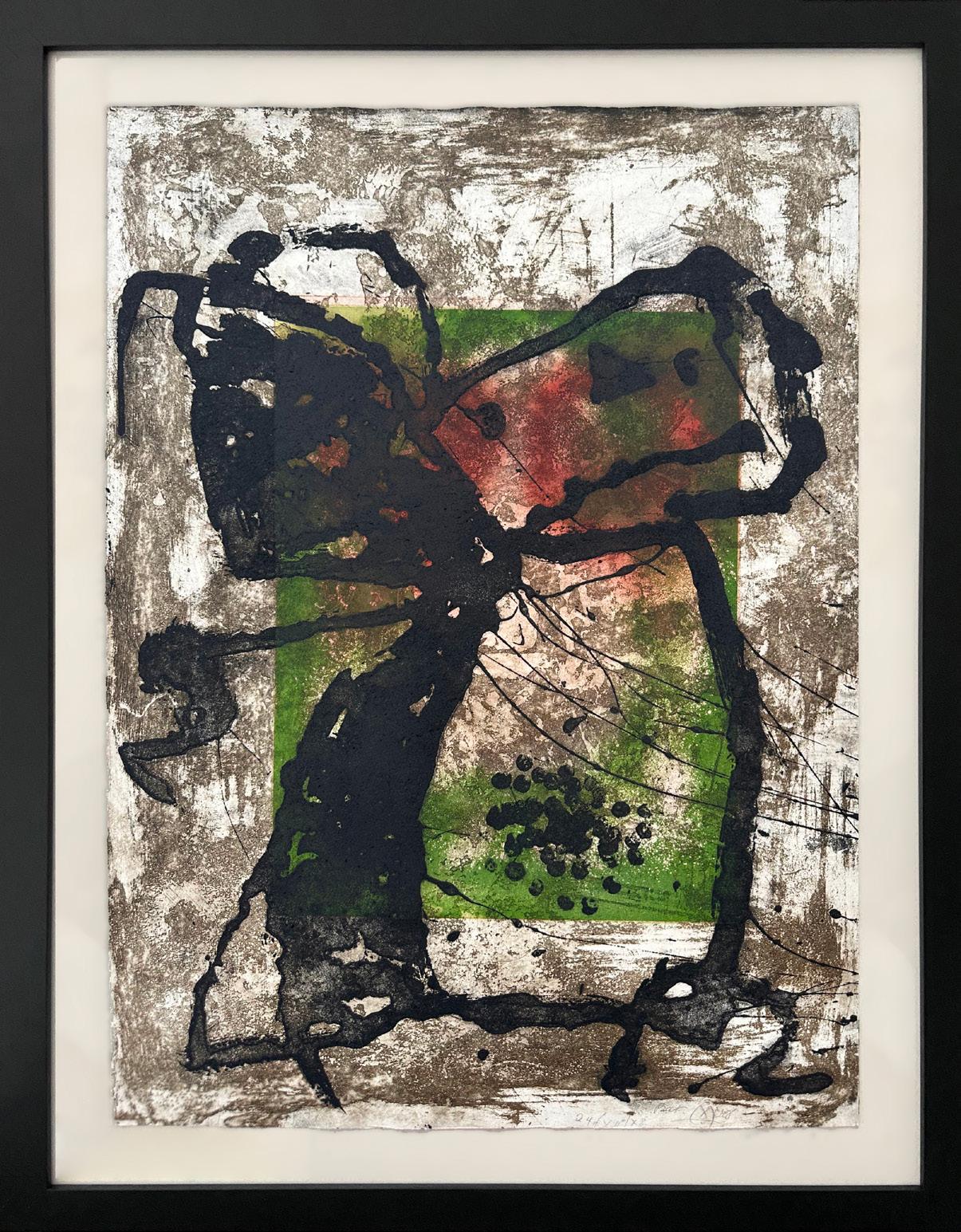
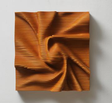
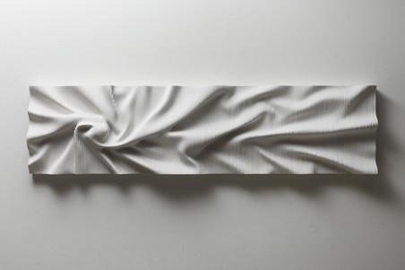
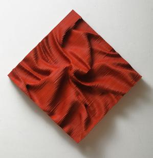
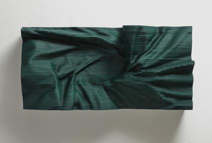
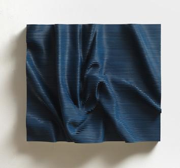
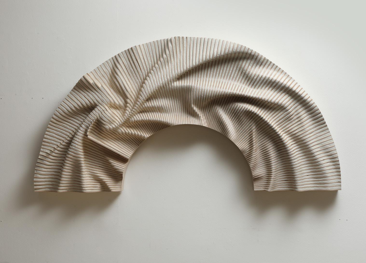
CHA JONG RYE (Korean, b. 1968)
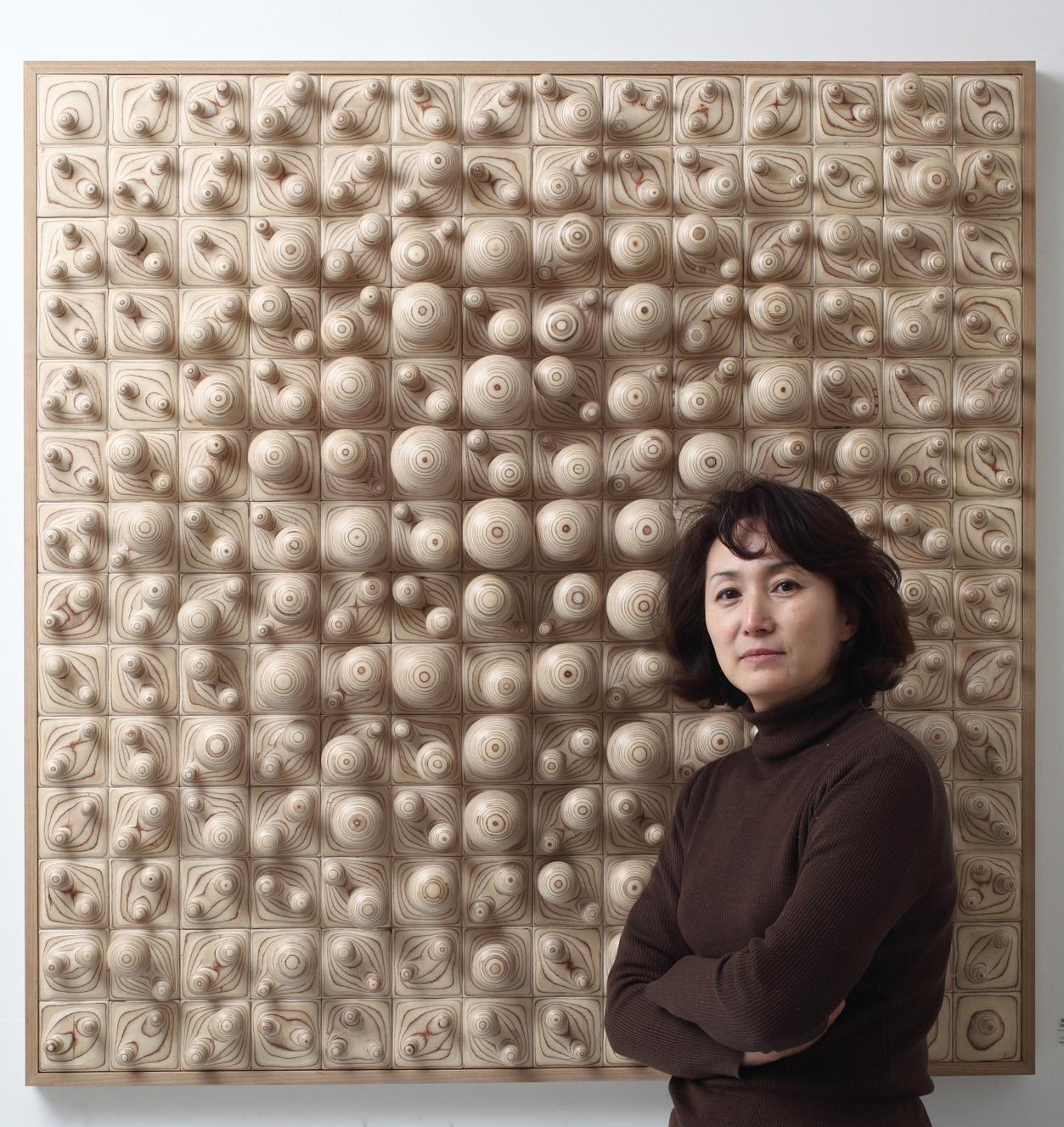
Born in Daejeon, Korea and the recipient of an MFA in Sculpture from Ewha Women’sUniversity in 1996, sculptor Cha Jong Rye (b. 1968) meticulously crafts works which havebeen featured in exhibits and collections worldwide. Among her solo exhibitions are showsat the Sungkok Art Museum (Seoul, 2011), the Nampo Art Museum (Goheung, 2012), RedSea Gallery (Singapore, 2015), Bauzium Sculpture Museum (Gosung, Gangwon-do, 2017),and The Center for Art in Wood (Philadelphia, 2018). Selected group exhibitions includethe Berkshire Museum (2015), the Nampo Art Museum (2014), and the Kim Chong YungMuseum (Seoul, 2017), among many others.
Using wood as her chosen medium, Jong Rye constructs seamlessly intricate woodenlandscapes through her often wall-mounted sculptures. Sanding and layering hundreds ofdelicate wood boards, her process is intentionally unintentional; rather than executing apredetermined design, she allows herself to discover images in the fluidity of arrangingand rearranging the uniquely hand-shaped blocks. The result is a richly textured three-dimensional canvas upon which light and shadow dance, transforming the once-recognizable wood material into entirely abstracted landscapes reminiscent of wrinkledlinen or rippling water.
Equally important to her own subjectivity in the creative process is the subjectivity of heraudience--the freedom of the viewer to interpret her work from a unique perspective. JongRye considers her work to rely on the interaction and communication between viewers andherself, and feels that a sculpture is most complete when a viewer interprets it in a waythat is unique from her own understanding. Cha Jong Rye currently works and resides justoutside of Seoul, South Korea.
71
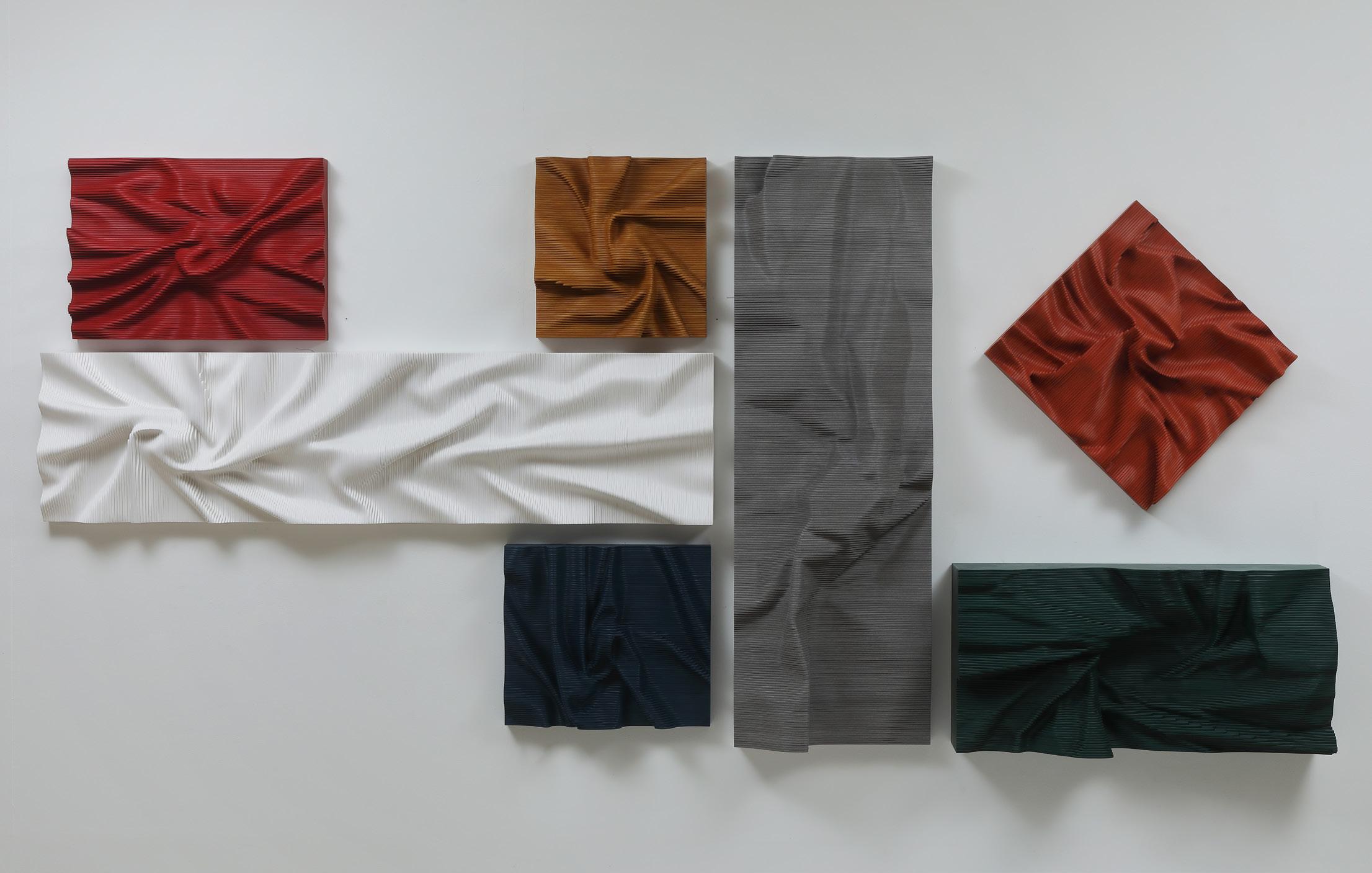
Expose Exposed 220512, 1-7
Year: 2022
Medium: Engineered wood, fomax
Installation size: 55 x 127 in (139.7 x 322.5 cm)
From the artist’s studio to Long-Sharp Gallery
72

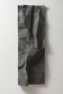
Expose Exposed 220512-1, Red
Year: 2022
Medium: Engineered wood
Size: 16.5 x 22.5 x 5 (42 x 60 x 13 cm)
From the artist’s studio to Long-Sharp Gallery
Expose Exposed 220512-2, Yellow
Year: 2022
Medium: Engineered wood
Size: 16.5 x 15.75 x 6 (42 x 40 x 15 cm)
From the artist’s studio to Long-Sharp Gallery
Expose Exposed 220512-3, White
Year: 2022
Medium: Fomax
Size: 15.75 x 62 x 6 (40 x 158 x 15 cm)
From the artist’s studio to Long-Sharp Gallery
Expose Exposed 220512-5, Gray
Year: 2022
Medium: Engineered wood
Size: 54.5 x 18 x 6.75 (138 x 46 x 17 cm)
From the artist’s studio to Long-Sharp Gallery
Expose Exposed 220512-6, Orange
Year: 2022
Medium: Engineered wood
Size: 20.5 x 19.75 x 4 (52 x 50 x 10 cm)
From the artist’s studio to Long-Sharp Gallery
Expose Exposed 220512-7, Green
Year: 2022
Medium: Engineered wood
Size: 16.5 x 33.9 x 8.5 in (42 x 86 x 22 cm)
From the artist’s studio to Long-Sharp Gallery
Expose Exposed 220512-4, Blue
Year: 2022
Medium: Engineered wood
Size: 16.75 x 19 x 4.5 (42.5 x 48.5 x 42.5 x 11 cm)
From the artist’s studio to Long-Sharp Gallery
73
Expose Exposed 230425
Year: 2023
Medium: Wood, sibatool
Size: 27.5 x 55.1 x 6.25 in (70 x 140 x 16 cm)
From the artist’s studio to Long-Sharp Gallery
74
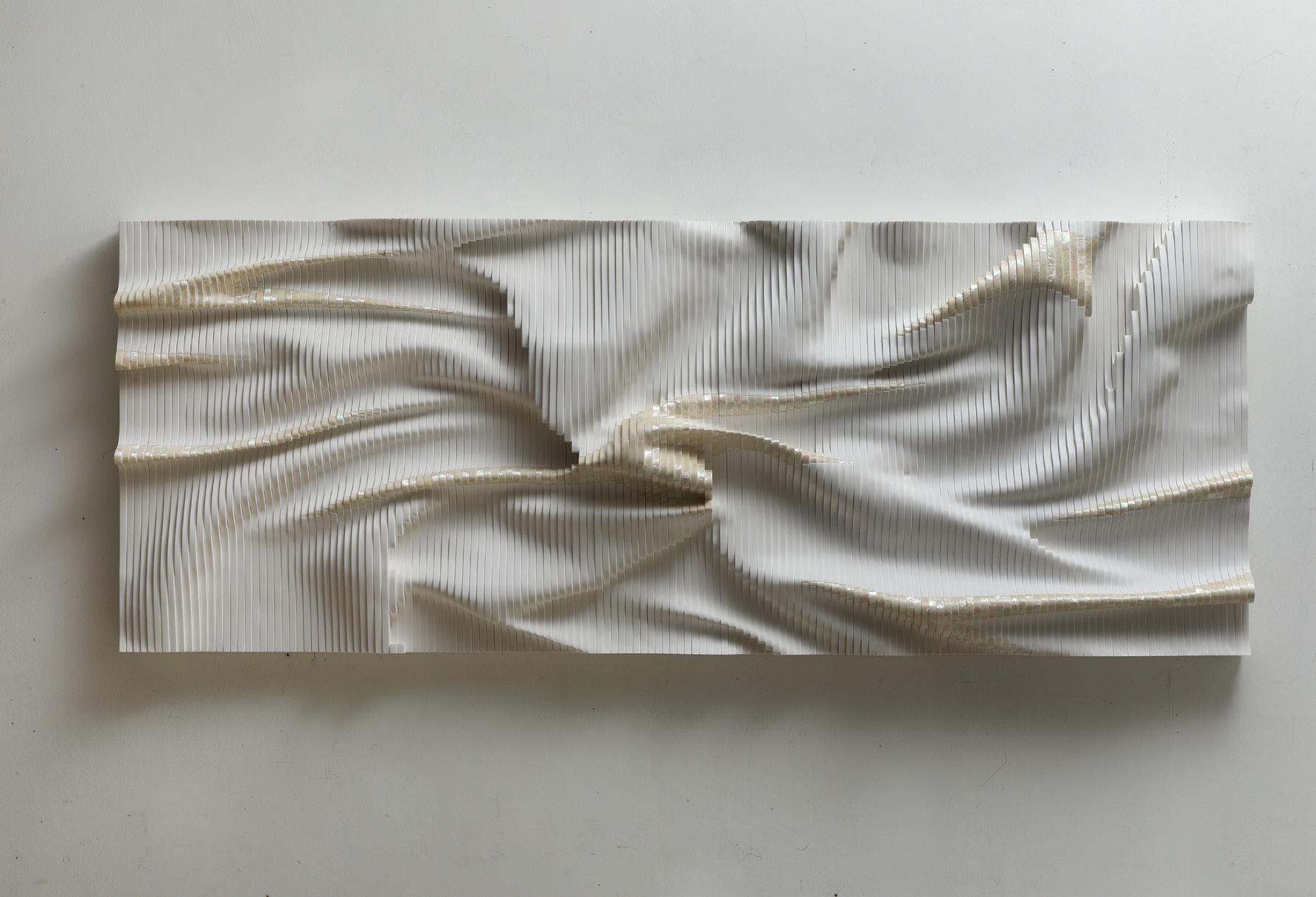
Expose Exposed 230627
Year: 2023
Medium: Fomax, mother-of-pearl
Size: 23.6 x 66.5 x 6.3 in (60 x 169 x 16 cm)
From the artist’s studio to Long-Sharp Gallery
75
76
SPILLER + CAMERON
(British, b. 1991 and 1962, respectively)
During a period of time spent caring for Moira’s husband when he was ill, Spiller + Cameron began to work ever more closely. Spending time in his deserted studios, the environment filled with emotions and strange discarded objects, they used the abandoned detritus to fuel their imaginations. Like archaeologists and treasure hunters forensically collating the resident ephemera that held poetic potency and ghost traces, they focused on regeneration and reincarnation, challenging perceptions of perceived beauty by demonstrating aesthetic merit in junk.
According to Xavier: “The idea originated when we began working in my late father’s studio, where we would find things that were never deemed art before, objects seen as just a byproduct of the creative process. A box of old rags was among the first things we discovered. Used to clean brushes and spills, the rags had been stored in a box for over 20 years and slowly amassed into a vast collection. Discovering this grungy box of crumpled, congealed, and completely disheveled linen brought back my childhood memories of fossil hunting in Folkestone - the feeling of ‘hunting’ for the best specimens, having to scrub and clean to unearth an ammonite.”
The Genesis works are made from salvaged artist paint rags, torn up sheets, and pillowcases used for many years and harvested in a state of decay. The notion of preserving something previously overlooked appealed to the artists – the idea of incorporating a new material and source not seen before in painting. The delicate cotton cloth retained accidental marks and traces that would be impossible on more robust materials.
The rags have undergone a washing process to flatten them. They have been primed, ironed, and meticulously stitched together, always into a 9-panel construction. Xavier has been compulsively drawn to the number 9 since childhood – a number representative for love, completeness, enlightenment, and propensity to convey messages.
77
Spiller + Cameron consider their Angel/Heads to be guardians, abstracted faces representing deities or mythological being who watch over those in their purview. Each work from this series is dedicated to one such being.
Said to have been borne of Poseidon’s submerging of the mountains into the sea, the Nesoi are the deified presence of islands, each under the dominion of their own unique personality.
78
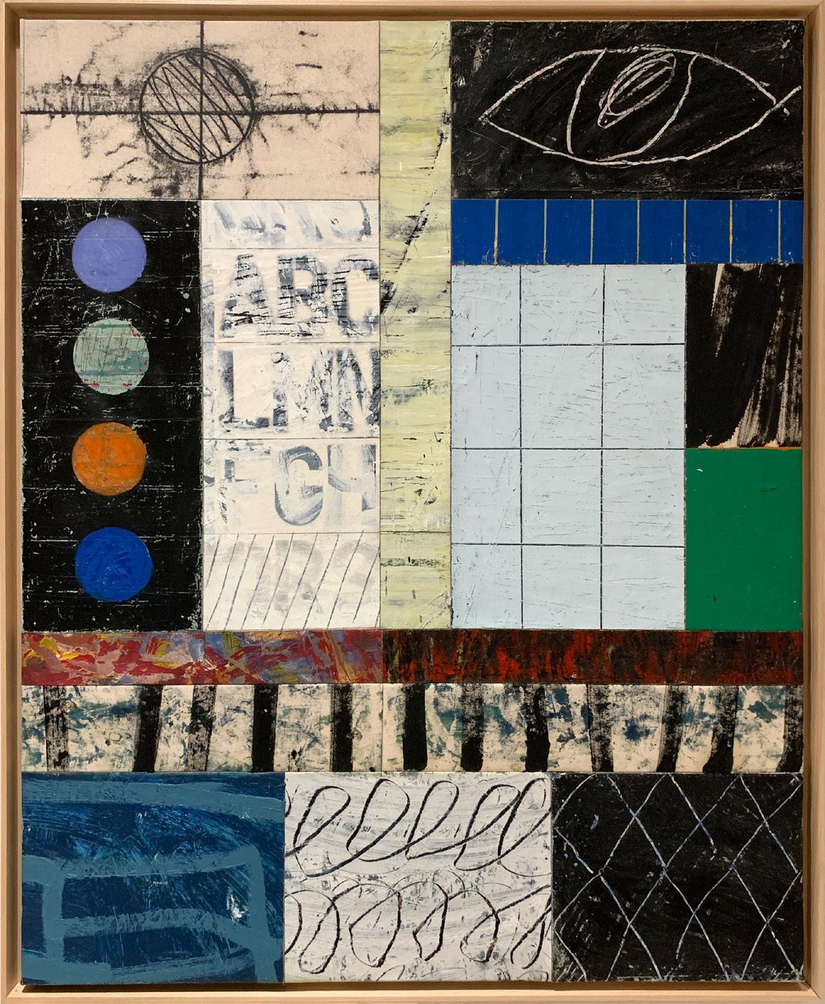
Nesoi
Year: 2023
Medium: Mixed media
Hand signed, titled, and dated on verso
Size: 48 x 39 in (122 x 99 cm)
Frame size: 49.75 x 40.875 in (126.4 x 103.9 cm)
From the artists’ studio to Long-Sharp Gallery
79
Spiller + Cameron consider their Angel/Heads to be guardians, abstracted faces representing deities or mythological being who watch over those in their purview. Each work from this series is dedicated to one such being.
Often identifiable by her stoic posture and showcasing of justice’s golden scales, Themis serves as a beacon for arbitration and acts as the executor of sound rationale.
80
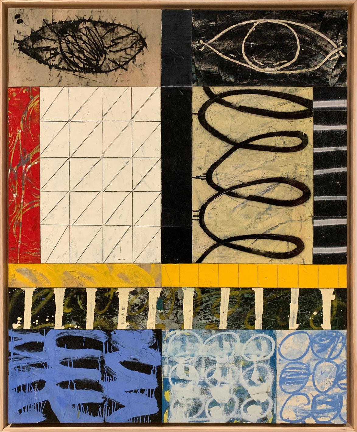
Themis
Year: 2023
Medium: Mixed media
Hand signed, titled, and dated on verso
Size: 48 x 39 in (122 x 99 cm)
Frame size: 49.75 x 40.75 in (126.4 x 103.9 cm)
From the artists’ studio to Long-Sharp Gallery
81
About works from this series: The Constellation series of works are made by cutting up a number of different paintings into component elements. The existing paintings are destroyed and reassembled, creating a new universe.
The larger canvas back panel is a completed painting of stripes or blocks, painted in oils, sometimes stitched together. The backdrop has been allowed to thoroughly dry before circles are cut out. Corresponding painted circles are carefully arranged and inlaid into the holes. The circles all come from different paintings and are set into the backdrop to give a seamless transition between the dots and main canvas. The paintings are designed such that no two panels are repeated.
This deconstruction technique allows Spiller + Cameron to combine painted elements from both of their practices, using different textures and designs that amalgamate into hard edged, abstract ‘order’. By causing their unique worlds to collide, Spiller + Cameron make a new artwork, creating individual unique constellations.
According to the artists: “Draco is one of the 88 modern constellations. The constellation series of paintings follow on from Spiller +Cameron’s previous works that concentrated on building gods and angels.
Draco is made up from five individual paintings, four separate oil paintings have been cut into circles and inlaid into a single larger canvas panel with four holes cut in. The desired effect is to make a seamless connection between the painted areas. This technique allows for random abstract panels hand painted by Spiller or Cameron to be aligned into hard edged, abstract ‘order’. Combining elements evolved from their previous iterations and series, the Constellations utilize coloured panels with different textures and techniques. The paintings undergo a reincarnation process of being destroyed and re-ordered, assembled into a pattern, creating their own space, titled after a known constellation.”
82
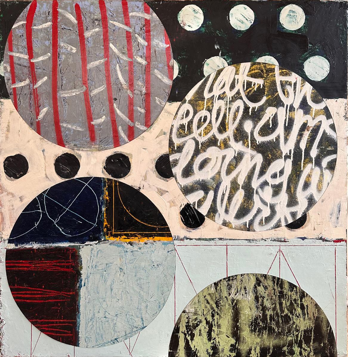
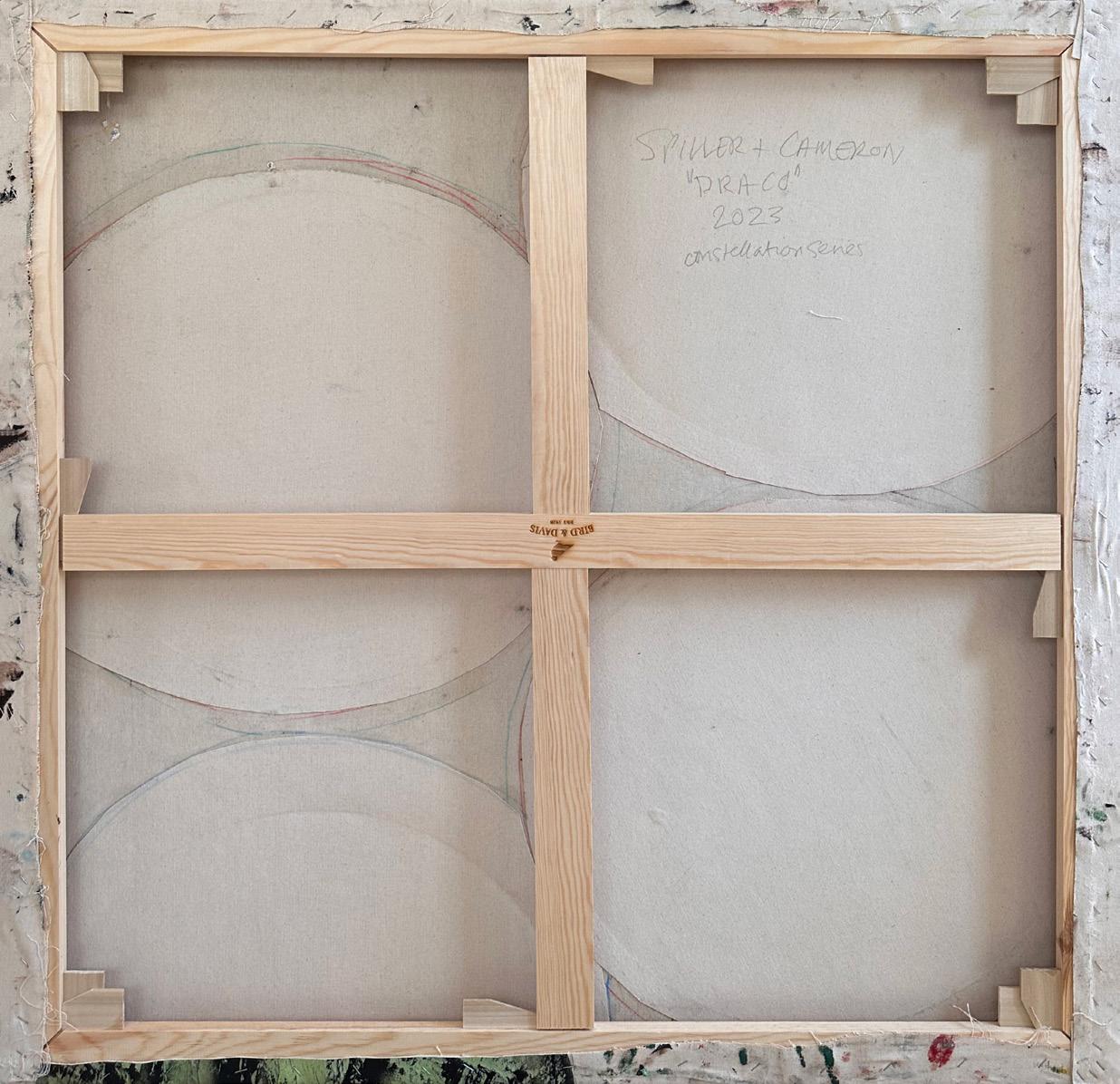
Draco
Year: 2023
Medium: Oil on canvas with inlaid dots
Hand signed, titled, and dated on verso
Size: 47.2 x 41.7 in (120 x 106 cm)
From the artists’ studio to Long-Sharp Gallery
83
84
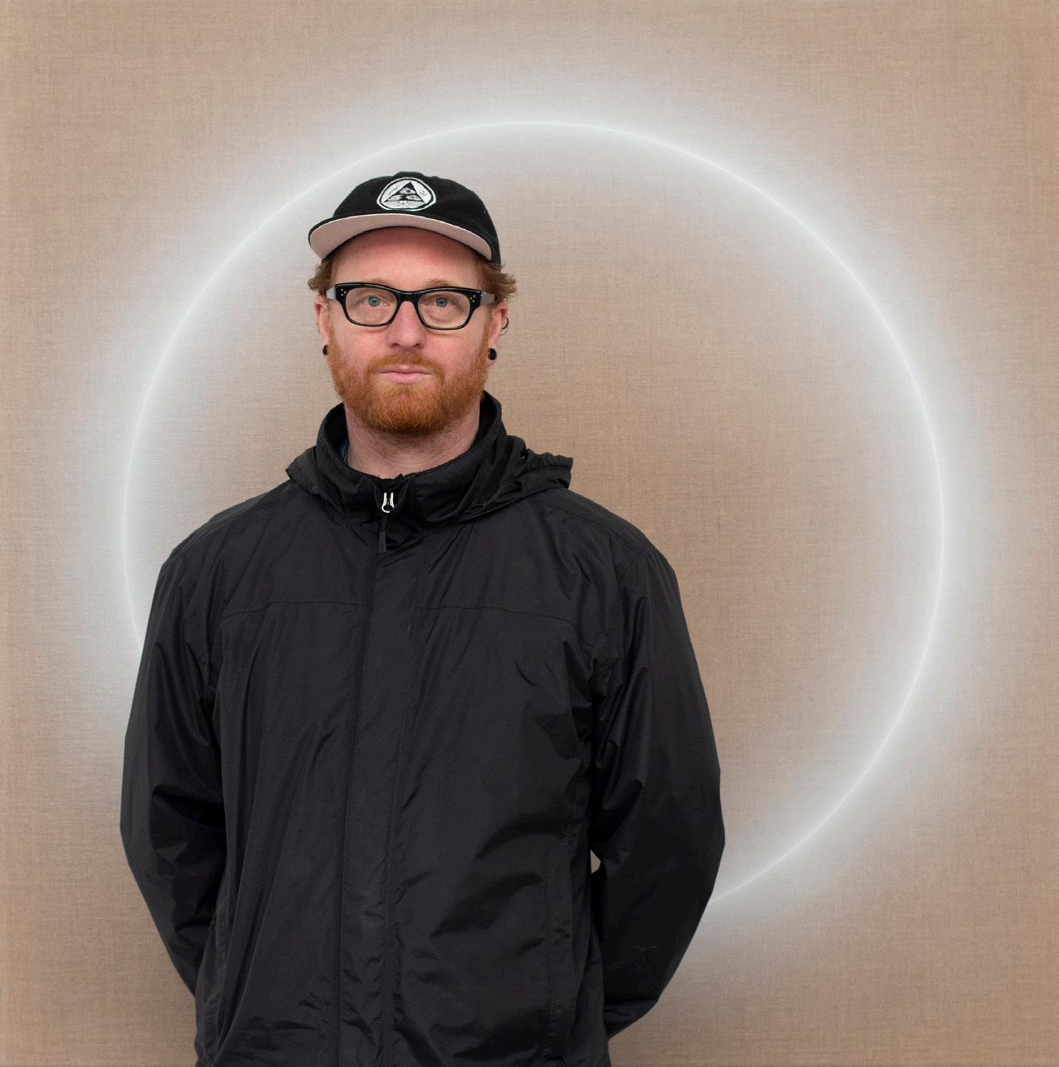
OLIVER MARSDEN (British, b. 1973)
Oliver Marsden is a British painter whose work seeks to represent the invisible, natural, and physical forces of sound, motion, energy, and gravity. He plays with viewer’s perceptions of color, form, light, and space. His canvasses are imbued with a seductive resonant visual tension, that captures and holds the viewers’ gaze perfectly still while resonating a harmonious energy.
Marsden was born in Reading, UK and studied at Edinburgh College of Art in the mid-nineties. It was here that he began exploring notions of “liquid reality”. Inspired by nature, biological structures, Morphogenesis, David Bohms’ “Implicate order”, Eastern philosophies, and contemporary music, his work achieved a psychedelic minimalism.
After art school, he lived in Miami and New Zealand before returning to Gloucestershire. Damien Hirst noted about Marsden, “Olly Marsden picks up the challenge and makes a kind of science of painting and creates pictures that have nothing to do with Richter or Poons or Bridget Riley or Albers or even Op. They’re about the urge or the need to be a painter above and beyond the object of a painting. They are like sculptures of paintings.”
Marsden’s works can be found in private and public collections, including: Jumex collection, Mexico; David Roberts Foundation, London; Horiuchi Collection, Japan; Kresge Art Museum, Michigan; Murderme Collection, London; Robert Devereux Collection, UK; Royal Bank of Scotland; St James Group, London; and The Weisman Art Foundation, Los Angeles.
85
According to the artist: “The crucial part of painting a Halo is finding the right state of mind. I need to be completely focussed, grounded, and present in the moment. A slip in concentration and I can overload with paint or splatter and lose the piece.
I generally start by cleaning and tidying the studio. I clear the floor of all other work and sweep. It’s a way for me to start focussing in, letting go of the chatter in my mind. I concentrate on my breath and combine yoga into my movements.
I work to release tension in my shoulders and open my hips. I need to be able to hold my hand perfectly still with the airbrush millimetres away from the spinning canvas. I imagine spirals travelling up and down my spine and loosen my neck. I move into Surya Namaskar and salute the sun.”
Click to view a film
86
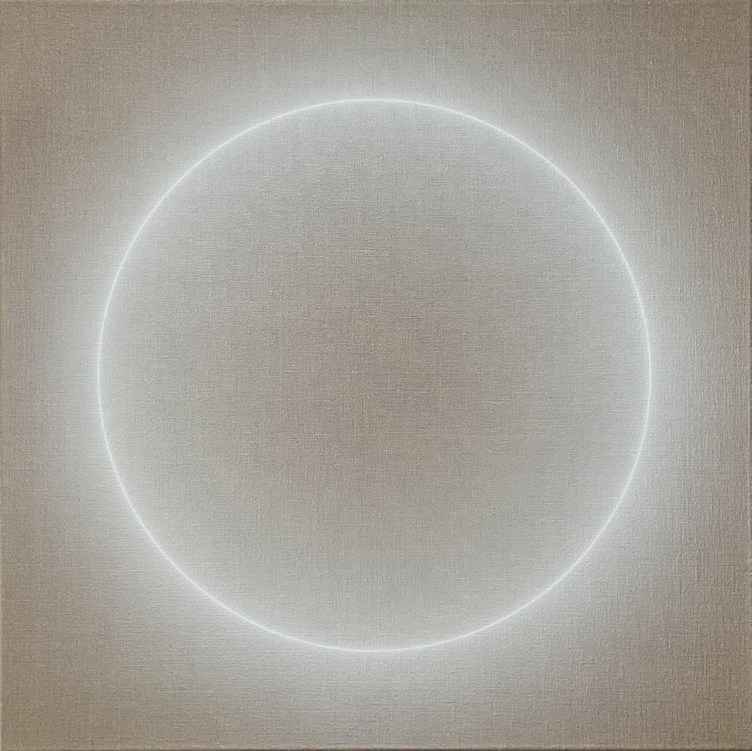
Halo
Year: 2022
Medium: Acrylic on linen
Hand signed, dated and title on verso
Size: 29.5 x 29.5 x 2 in (74.9 x 74.9 x 5.1 cm)
From the artist’s studio to Long-Sharp Gallery
87
88
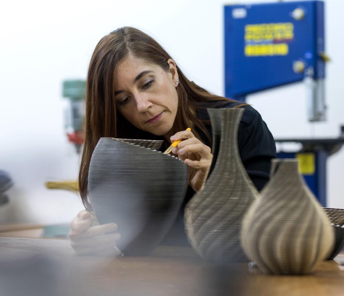
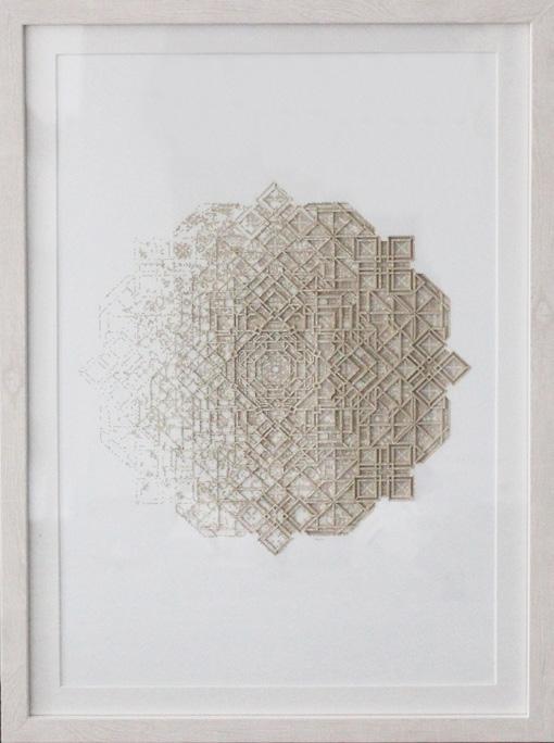
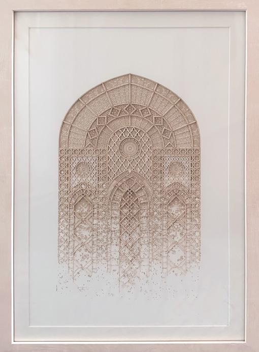
JULIA IBBINI
(Jordanian & British, b. 1980)
Julia Ibbini is a visual artist and designer with a background in graphics and collage. She earned a BA (Hons) in Visual Communications from the Leeds University College of Art and Design, UK. Her work combines digital design processes and traditional craftsmanship to create highly detailed, visually complex, and delicate pieces that intersect contemporary design, art, and craft.
Studio Ibbini is an ongoing collaboration between Ibbini and Stephane Noyer, a computer scientist and maker with an interest in computational geometry. Ibbini and Noyer have worked on projects together since 2016, traversing analog and digital to create works of extreme intricacy and machined precision, but which remain distinctly human in origin. Studio Ibbini works predominantly with materials such as archival paper, veneer woods, or mother of pearl— selected for their delicate, tactile qualities—that are then layered and meshed together using a complex collaging method. Individual projects take up to a year to complete.
In 2019, Studio Ibbini received the prestigious Van Cleef & Arpels Middle East Designer Prize. Over the last few years, the work has been shown at Sharjah Islamic Arts Festival 2018, Art Basel Miami, LA Art Fair, Tashkeel Dubai and Jeddah 21,39 - 2020.
Studio Ibbini is based in Abu Dhabi in the United Arab Emirates.
89
According to the artist: “The Sands of Time emphasize visual history evolving and changing into a new narrative through our contemporary perspective and use of technology. Pattern, ornament and symmetry were unfortunate casualties of Modernism and although they are very much alive today, our viewpoint of these visual languages has changed forever.
Some of the patterning used in these pieces is very ancient (early 9th century) and I felt it was important to record it by using it within my pieces in the hope that the ‘language’ as such will continue to live on and evolve.”
Click to view a film
90
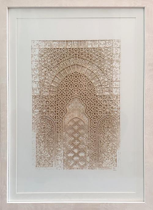
Sands of Time 4.2 [SOLD]
Year: 2023
Medium: Layered papers
Size: 16.875 x 11.325 in (43 x 29 cm)
Frame size: 19 x 13.5 in (48 x 33 cm)
Sands of Time 5.1 [SOLD]
Year: 2023
Medium: Layered papers
Size: 16.875 x 11.325 in (43 x 29 cm)
Frame size: 19 x 13.5 in (48 x 33 cm)
Sands of Time 2.9 [SOLD]
Year: 2022
Medium: Layered papers
Size: 16.875 x 11.325 in (43 x 29 cm)
Frame size: 19 x 13.5 in (48 x 33 cm)
91
92
Figures and Objects in Perspective:
Exploration of these themes through the works of David Hockney, Roy Lichtenstein, Jean-Michel Basquiat, alongside Jason Myers and Lavett Ballard
93
94
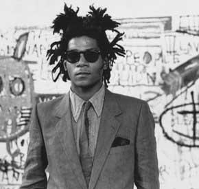
JEAN-MICHEL BASQUIAT (American, 1960-1988)
Jean-Michel Basquiat was born and raised in Brooklyn, the son of a HaitianAmerican father and a Puerto Rican mother. At an early age, he showed a precocious talent for drawing, and his mother enrolled him as a Junior Member of the Brooklyn Museum when he was six. Basquiat first gained notoriety as a teenage graffiti poet and musician. By 1981, at the age of twenty, he had turned from spraying graffiti on the walls of buildings in Lower Manhattan to selling paintings in SoHo galleries, rapidly becoming one of the most accomplished artists of his generation. Astute collectors began buying his art, and his gallery shows sold out. Critics noted the originality of his work, its emotional depth, unique iconography, and formal strengths in color, composition, and drawing. By 1985, he was featured on the cover of The New York Times Magazine as the epitome of the hot, young artist in a booming market. Tragically, Basquiat began using heroin and died of a drug overdose when he was just twenty-seven years old.
Biography courtesy of the Brooklyn Museum
95
This very early drawing by Jean-Michel Basquiat was created in the notebook of a high school friend (along with 5 other drawings) (interview with original owner on file with Long-Sharp Gallery). This work, which he called “Mrs. Bill”, speaks to the times (the late 1970s).
“Mr. Bill” was a clay figure star of a children’s animation show created by Walter Williams. It debuted in 1974. In 1976, Mr. Bill was featured on Saturday Night Live. He became an immediate hit. The words “Oh No!” being spoken by Mr. Bill quickly became part of popular culture. Walter Williams started writing full-time for SNL in 1978 – the year that Jean-Michel Basquiat created this “Mrs.”
Mr. Bill was last seen on SNL in 1982 but appeared on numerous other TV shows into the 1990s.
96
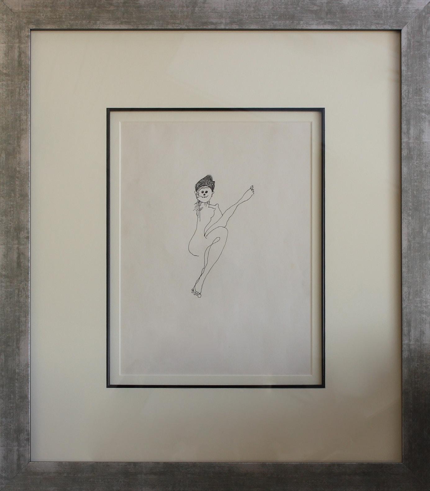
Mrs. Bill
Year: 1978
Medium: Ink/Rapidograph pen on paper
Size: 13.875 x 10.93 in (35.2 x 27.8 cm)
Frame size: 25.18 x 21.875 in (63.9 x 55.5 cm)
Authentication: Accompanied by a Certificate from the Estate of Jean-Michel Basquiat
Provenance: From the original owner (friend of the artist) to Long-Sharp Gallery
a Private Collection (Seattle, WA)
Long-Sharp Gallery
97
98
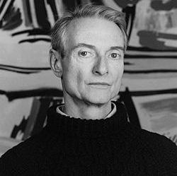
ROY LICHTENSTEIN
(American, 1923-1997
An innovative artist and founder of the American Pop Art movement, Roy Lichtenstein (19231997) is best known for his re-appropriation of the Ben Day dot pattern, a printing process similar to Pointillism, which was initially used in commercial engraving. Alluding to the mechanical technique used in newspapers and comic strips through a use of bold colors, thick lines, and texture and gradient, the artist created works that referenced popular culture by whimsically addressing the gimmicks of their conventions. Hailed ultimately for his style of “paraphrasing” (most notably in the instance of otherwise despised images and subject matter), Lichtenstein remains a pivotal figure of the movement.
The artist created his first portfolio of works in the 1950s, after his studies at the Art Students League of New York. The result was a series of paintings surrounding medieval times, which were rendered in a style reflective of the Swiss-German artist Paul Klee. Lichtenstein’s works would later transition in approach, shifting towards a new style of expressionism that was more inclusive of satire and traditionally reminiscent of American genre cowboys and Indians. It was not until the 1960s, however, that the artist developed his signature style of expression. During this exemplary period in his career, Lichtenstein gained popularity through his trademark use of parody, irony, and cliché. By 1962, he had secured his first solo exhibit at the Leo Castelli Gallery, which was entirely sold out to collectors before the opening night. Lichtenstein’s fame grew exponentially from that point forward.
Roy Lichtenstein was born in Manhattan in 1923. As a boy in New York City, he had a passion for both science and comic books. Upon discovering his interest in art, Lichtenstein began his studies at Parsons School of Design in 1937, and shortly following, studied under Reginald Marsh at the Art Students League. In 1940, Lichtenstein attended Ohio State University; however, his studies were hindered due to his obligations to the US Army during the draft of World War II. During this time, he was greatly influenced by the works of European masters and contemporary artists living in France. Lichtenstein ultimately completed his studies at Ohio State University and thereafter continued his teaching career at different universities. Over the ensuing decades, Lichtenstein continued to hone his craft as a painter, printmaker and sculptor. He passed away in 1997 due to complications from pneumonia. Roy Lichtenstein’s art now hangs in museums around the world, including the Museum of Modern Art and Tate Modern in London.
99
Inspired by the history and gravitas of the Still Life motif, Lichtenstein began creating Still Life paintings in 1972; he interspersed these paintings - and later, printsthroughout his oeuvre, incorporating subject matter ranging from flowers and fruit to famous artists from past decades. He rendered his Still Life works in the same flattened, comic-strip-style for which he was renowned. This particular print was created to benefit Rivington House (an AIDS care facility).
Click to view a film
100
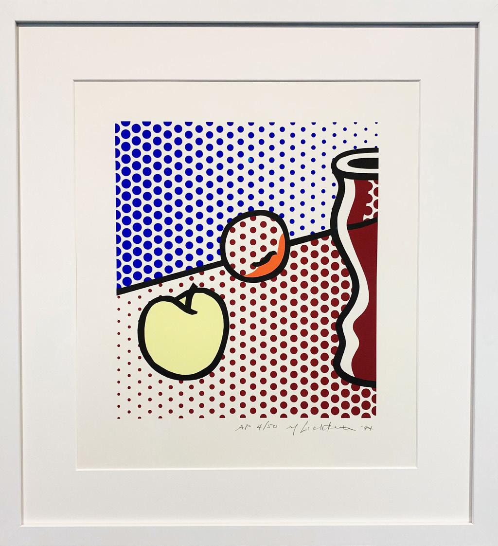
Still Life with Red Jar [SOLD]
Year: 1994
Medium: Screenprint on Lanaquarelle watercolor paper
Numbered, signed (rf Lichtenstein), and dated (‘94) in pencil, lower right. Blind stamp, lower right: (copyright symbol, publication date, and Gemini G.E.L. chop).
Stamped on verso, lower left: (published by Gemini G.E.L., Los Angeles). Workshop number on verso in pencil, lower left, to the right of the stamp: (RL94-5206)
Edition of 250 with 50 Artist Proofs, 1 PPI, 1 PPII, 1 PPIII, 1 RTP, 3 GEL, 1 C, 30 SP, this is example AP 4/50
Image size: 15 x 13.25 in (38.1 x 33.7 cm)
Sheet size: 21.25 x 19.25 in (54 x 48.9 cm)
Frame size: 27.875 x 25.5 in (70.8 x 64.8 cm)
Provenance: From the Estate of the artist (via its broker) to Long-Sharp Gallery
101
102
DAVID HOCKNEY (British, b. 1937)
David Hockney is considered one of the most influential British artists of the 20th century From an early age, he found an interest and inspiration in Picasso and Matisse, who he cites as influences in his works. He attended the Bradford College of Art before entering the Royal College of Art for graduate school; even as a student, his paintings won prizes and were purchased for private collections. Hockney studied under Francis Bacon and Peter Blake, both of whom Hockney cites as founts of inspiration. Hockney is a prolific multimedia artist, having utilized painting, drawing, printmaking, photography, and digital media in the course of his career. Best known for his depiction of pools, landscapes, and portraits, Hockney’s works are said to “capture the perceived world of movement, space and time in two dimensions.”
His works are in the collections of the Museum of Modern Art (New York), The Getty Center (Los Angeles), National Gallery of Victoria (Melbourne), Museum of Fine Art (Boston), The Long Museum (Shanghai), Smithsonian American Art Museum (Washington, DC), Los Angeles County Museum of Art (Los Angeles), and the Centre Georges Pompidou (Paris), among others.
103
Hockney’s experimentation with perspective spans decades, most notably perhaps in his photographic collages started in the 1980s. He continues this exploration in what he calls “photographic drawings” like Seven Trollies, Six and a Half Stools, Six Portraits, Eleven Paintings, and Two Curtains – to create these works, hundreds of photographs are digitally assembled and merged into a single image. By placing these multiple “vanishing points” into one image, Hockney intends to create work that is even “more real” than ordinary photography. Much like “3D photographs without the glasses”, these works give the impression of being inside a room while staring at the flat plane of the piece.
The artworks depicted in this piece are Hockney’s own creations. Many are presently located in private collections, including Still Life (2017), Focus Moving (2018), and A Bigger Interior with Blue Terrace and Garden (2017).
104
Click to view a film
Seven Trollies, Six and a Half Stools, Six Portraits, Eleven Paintings, and Two Curtains
Year: 2018
Medium: Photographic drawing printed on paper, mounted on Dibond
Hand signed, dated and numbered lower right
From an edition of 25, this is example 15/25
Size: 32.75 x 89.75 in (83.2 x 228 cm)
Frame size: 34.25 x 91.5 in (86.9 x 232.4 cm)
Provenance:
From Annely Juda Fine Art (London)
Jonathan Novak Contemporary Art (Los Angeles)
Long-Sharp Gallery (Indianapolis)
105
David Hockney created his first photocollage several decades after he had established himself as a leading figure in contemporary art. (Though he experimented with photography in the 1960s and 1970s, his first photocollage did not come to fruition until 1982.) According to Cameraworks: David Hockney, “From March, 1981, until June, 1983, David Hockney spent virtually all of his creative time in voracious experimentation with the camera. He shot thousands of pictures, and in the end produced more than 350 photocollages that ranged from intimate “sketches” to dizzying panoramas containing a myriad of details and hundreds of micro-perspectives.” [1] He bagan with a polaroid camera, photographing a subject from various perspectives; once the polaroids were in-hand and assembled, the piece was essentially finished. A second iteration of collages was born in the years that followed – no longer shot with a polaroid camera but with his Nikon 35mm or Pentax 110 single reflex camera; in these works (like Canal and Road), the actual photographing could take minutes, but assembling the prints often took hours. In photographing and assembling, Hockney had only one rule: never crop the prints. [2] As these works evolved, Hockney became “increasingly interested in the depiction of movement through space… movement as [people] walked, the movement of cars and trains, [the artist’s] own movement, walking or driving through the field of vision.” [3]
The idea of the photocollage appealed to Hockney for many reasons, among them that –by compiling photographs taken from slightly different angles at slightly different times – he could alter both the perspective and the scale of his images. They had the added benefit of acknowledging the artist’s Cubist influences: according to Hockney, “[t]he main point was that you read it differently. It wasn’t just a photograph. It was abstracted, stylized: the ideas were based on Cubism in the way that it filters things down to an essence… It worked so well that I couldn’t believe what was happening when I looked at it. I saw all these different spaces and I thought” ‘My god! I’ve never seen anything like this in photography.’ Then I was at the camera night and day.” [Excerpt from The David Hockney Foundation.]
According to Hockney: “From the first day [creating Polaroid collages], I was exhilarated. First of all, I immediately realized I’d conquered my problem with time in photography. It takes time to see these pictures – you can look at them for a long time, they invite that sort of looking. But, more importantly, I realized that this sort of picture came closer to how we actually see, which is to say, not all-at-once but rather in discrete, separate glimpses, which we then build up into our continuous experience of the world.” [4]
[1] Lawrence Weschler, Cameraworks: David Hockney (New York: Alfred A. Knopf, Publishers, 1984), jacket cover.
[2] Ibid., 21.
[3] Ibid, 32
[4] Ibid., 11.
106
Canal and Road, Kyoto, Feb. 19, 1983
Year: 1983
Medium: Photographic collage mounted on board
Signed, titled and dated, lower center
From an edition of 10, this is #5
Size: 59 x 75.25 in (149.9 x 191.1 cm)
Frame size: 60.5 x 76.5 in (153.7 x 194.3 cm)
Provenance: From Sotheby’s New York (May 2020) to Long-Sharp Gallery
107
Click to view a film

108
Photo by Jonathan Kolbe
LAVETT BALLARD
(American, b. 1970)
Lavett Ballard holds dual Bachelor’s degrees Studio Art and Art History with a minor in Museum Studies (Rutgers University), as well as a MFA in Studio Arts (University of the Arts, Philadelphia).
Ballard describes her work as a re-imagined visual narrative of people of African descent. Her use of imagery reflects social issues affecting primarily Black women’s stories within a historical context. Her current body of work uses collaged photos adorned with paint, oil pastels, and metallic foils. These photos are deconstructed and layered on reclaimed wood fences; the use of fences is a symbolic reference to how fences keep people in and out physically, just as racial and gender identities do so socially. The fusion of wood and photography offers artwork that both explores Ballard’s southern roots, as well as visually speaks volumes to continuing themes within her community.
Her artwork has been featured on the cover of TIME Magazine, selected for the “100 Women of the Year” edition in 2020. Named by Black Art in America as one of the Top 10 Female Emerging Artists to Collect, Ballard has placed works in the private collections of the African American Museum of Philadelphia, the Colored Girls Museum, the Petrucci Family Foundation Collection, and the Grant and Tamia Hill Private Collections.
109
According to the artist: “This work is the first in my new Goddess Myths and Legends body of work. This body will include images of friends and family as the central figures and reimagine them as deities. Here I have used my friend Nina ‘Lyrispect’ Ball, a well-known spoken word poet. The theme of love and passion is reflected in the work with the colors and choice of roses as decorative elements throughout. I tie the figures to their African roots by either marking or carving tribal patterns and designs on their faces. Much like love, the fence panel I chose is scorched from its past and broken yet still beautiful.”
110
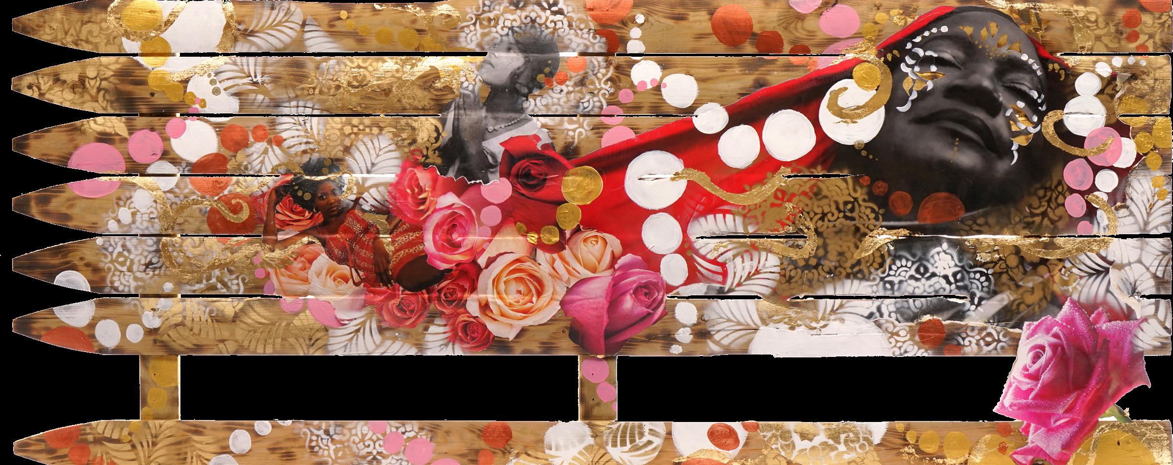
Ase’ (Ah-Shay) So Be It
Year: 2022
Medium: Mixed media/collage on reclaimed wood fence panel
Size: 29.5 x 71 in (74.9 x 180.3 cm)
111
112
JASON MYERS
(American, b. 1972)
Jason Myers is a prolific multi-disciplinary artist with a breadth of experience working with different media. Over the years, his artistic practice has consistently evolved in both style and technique. His recent body of work is primarily figurative and includes paintings, drawings, prints, digitally manipulated images, and large-scale sculpture and installations.
Myers utilizes a unique combination of traditional artistic and industrial raw materials such as steel, resin, and computer-generated prints. Complex, layered, and exquisitely executed, Myers’s work often questions our current political and socioeconomic environment, reflecting on themes of technology, alienation, greed, wealth, and power.
Myers received his bachelor’s degree from the Kansas City Art Institute (Kansas City, MO) and his MFA from American University (Washington, DC). Forgoing the “typical” trajectory perhaps expected from modern-day artists (a New York studio, numerous assistants), Myers instead opts to work more solitarily from his studios in Indiana and the Netherlands.
With works exhibited across the United States and abroad, Myers’s acclaim has grown in recent years. His solo museum exhibit “STATUS: fluid/dynamic” has traveled to both the Polk Museum of Art (Florida) and the Art Museum of Greater Lafayette (Indiana); a solo exhibition in the Lambla Gallery at the University of North Carolina (Charlotte). Myers’s monumental (60-foot tall, 38-ton) steel sculpture, Trials of Gavin, was commissioned for the Lowlands Music Festival (Netherlands) and currently towers over the train station in Zwolle, Netherlands. His works are in the permanent collections of several museums, including the Indianapolis Museum of Art (Indiana). In addition, individual works have been featured in museum exhibitions at the Mint Museum of Art (North Carolina), Museum de Fundatie/Kasteel het Nijenhuis (Netherlands), and Cornell Art Museum (Florida).
Myers’ most recent series, Fragility: Embracing the Impermanence and Beauty of Life , debuted at Long-Sharp Gallery Indianapolis which ran concurrently with his third solo museum exhibition at UNC Charlotte, I Am Algorithm curated by Adam Justice, Director of Galleries at UNC Charlotte.
113
According to the artist: “The most interesting thing about life is that our mortality makes us ‘all in’. No matter what you do, you are not getting out alive. We should live every day of life to its fullest potential. Take risks, do things that scare you. Fragility is what makes us feel alive. In some ways, we absorb this fear, in other ways we perpetuate it. Embracing this state of fragility is healthy and truly living, rather than just existing.”
114

State of Fragility #7
Year: 2023
Medium: Mixed media on panel with resin
Signed on lower right side
Size: 48 x 36 in (121.9 x 91.4 cm)
State of Fragility #8
Year: 2023
Medium: Mixed media on panel with resin
Signed on lower right side
Size: 48 x 36 in (121.9 x 91.4 cm)
115
According to the artist: Gavin Luminescence is made directly from recycled scrap steel, salvaged building materials, and neon lighting. The subject is a solitary figure, weathered and worn, but bright and still standing strong. Gavin is a metaphor for all of us, struggling through the trials and tribulations of life, caught in a moment between resisting their past and becoming their future.
Each of the sculptures in the Gavin series takes on a new element in the structure. Each sculpture attempts to explore variations of the human condition, through the drawing process of different materials. Gavin Luminescence is a collaboration with artist Scott Young, to bring the element of light into the Gavin series. Our internal essence is embodied by this internal drawing with neon light.
116
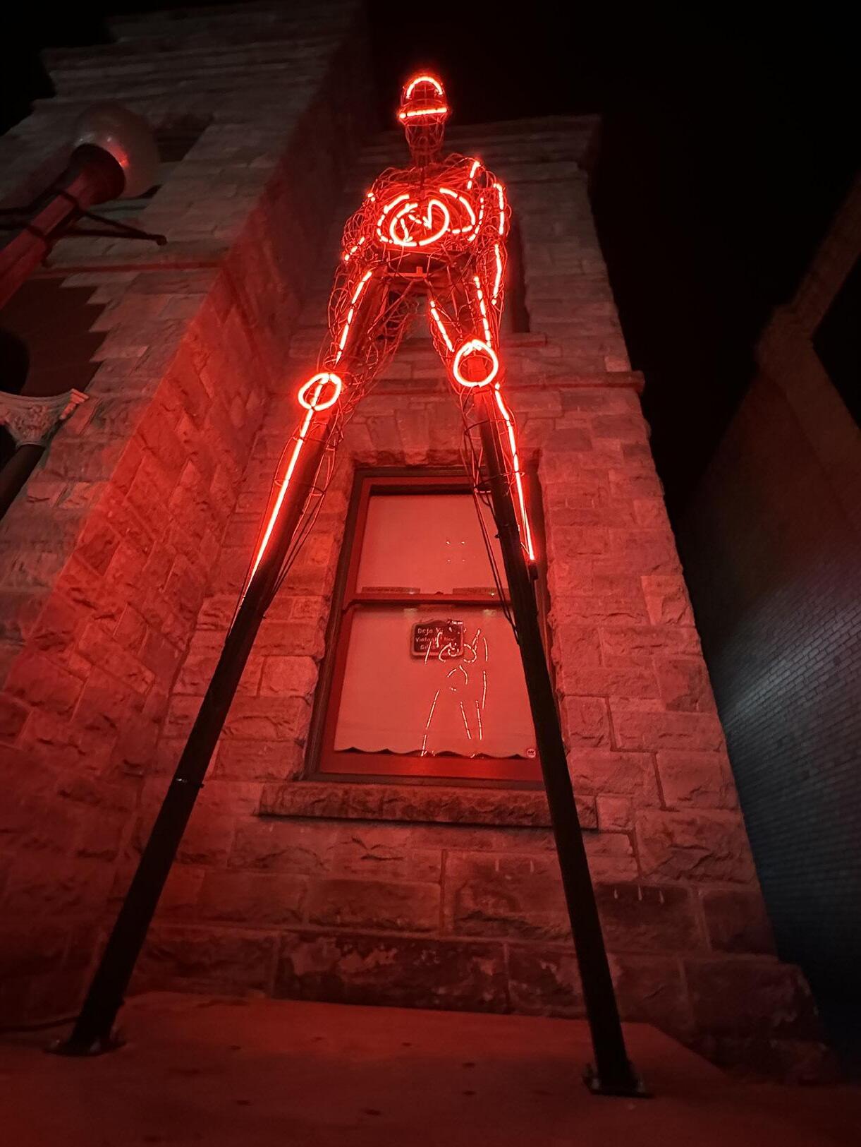
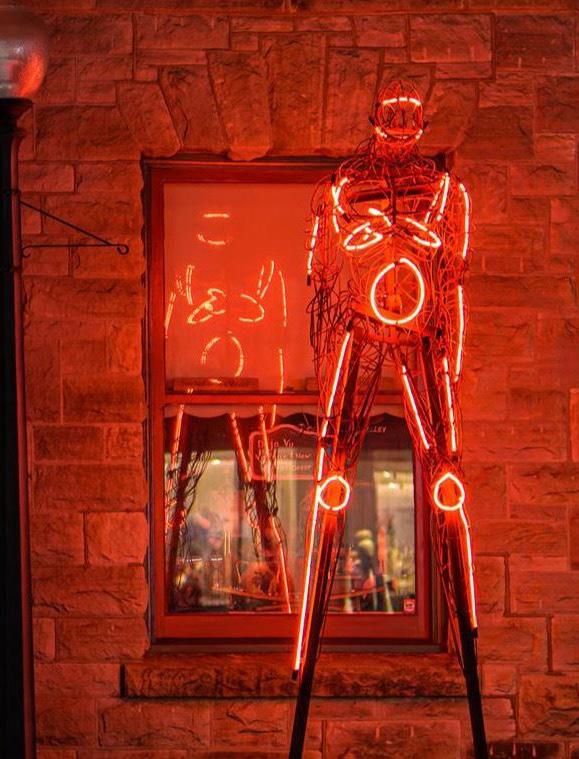
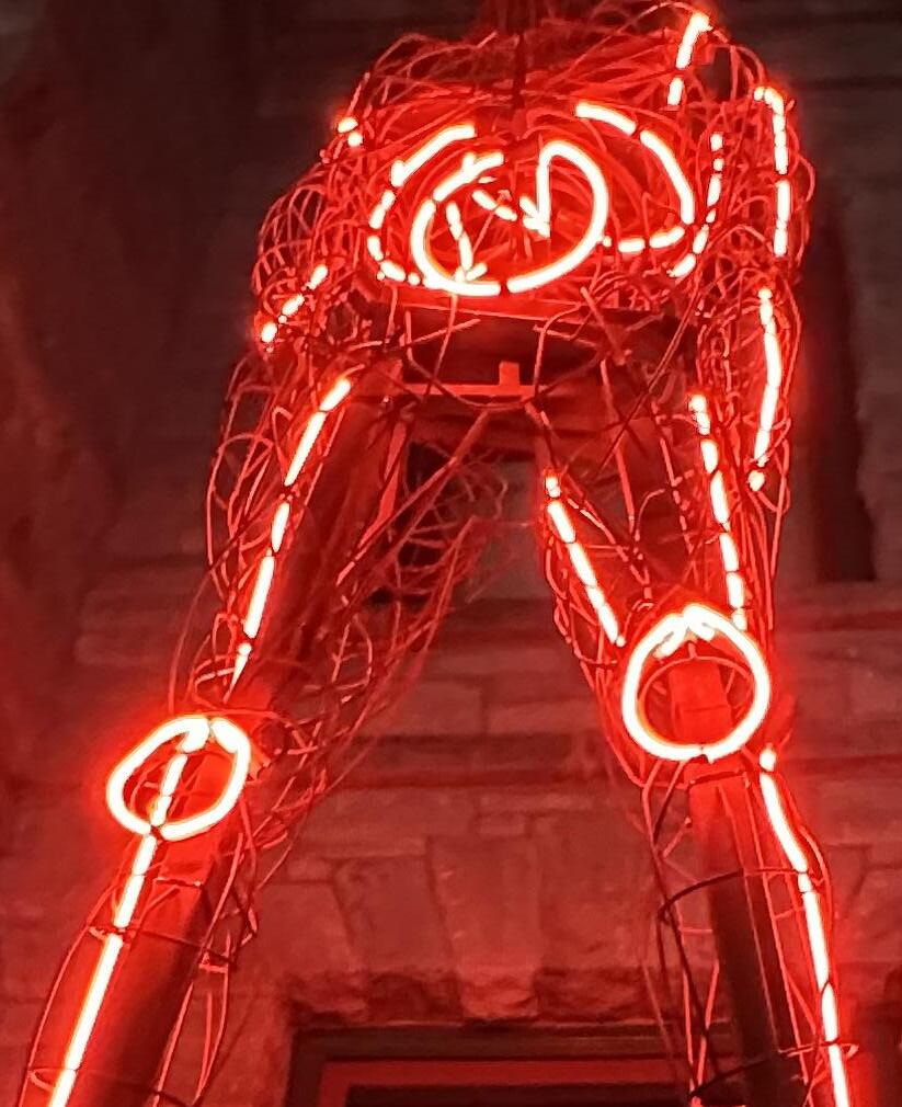
Gavin - Luminescence
Year: 2022
Medium: Carbon steel, neon lighting, and graniteneon lighting fabricated by Scott Young
Signed on lower right side
Size: 140 x 43 x 34 in (355.6 x 109.2 x 86.3 cm)
Full exhibition history: Napa lighted Art Festival 2022
117
118 1 North Illinois, Suite A | Indianapolis, IN 46204 | 866.370.1601 longsharpgallery.com