
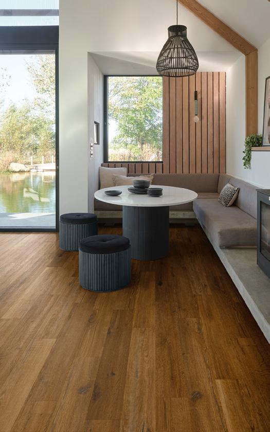


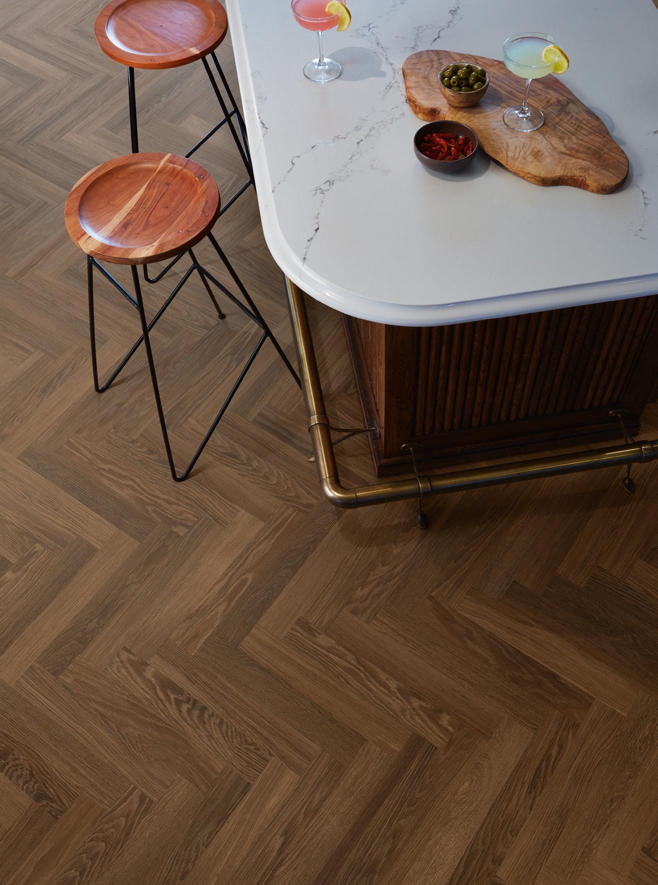


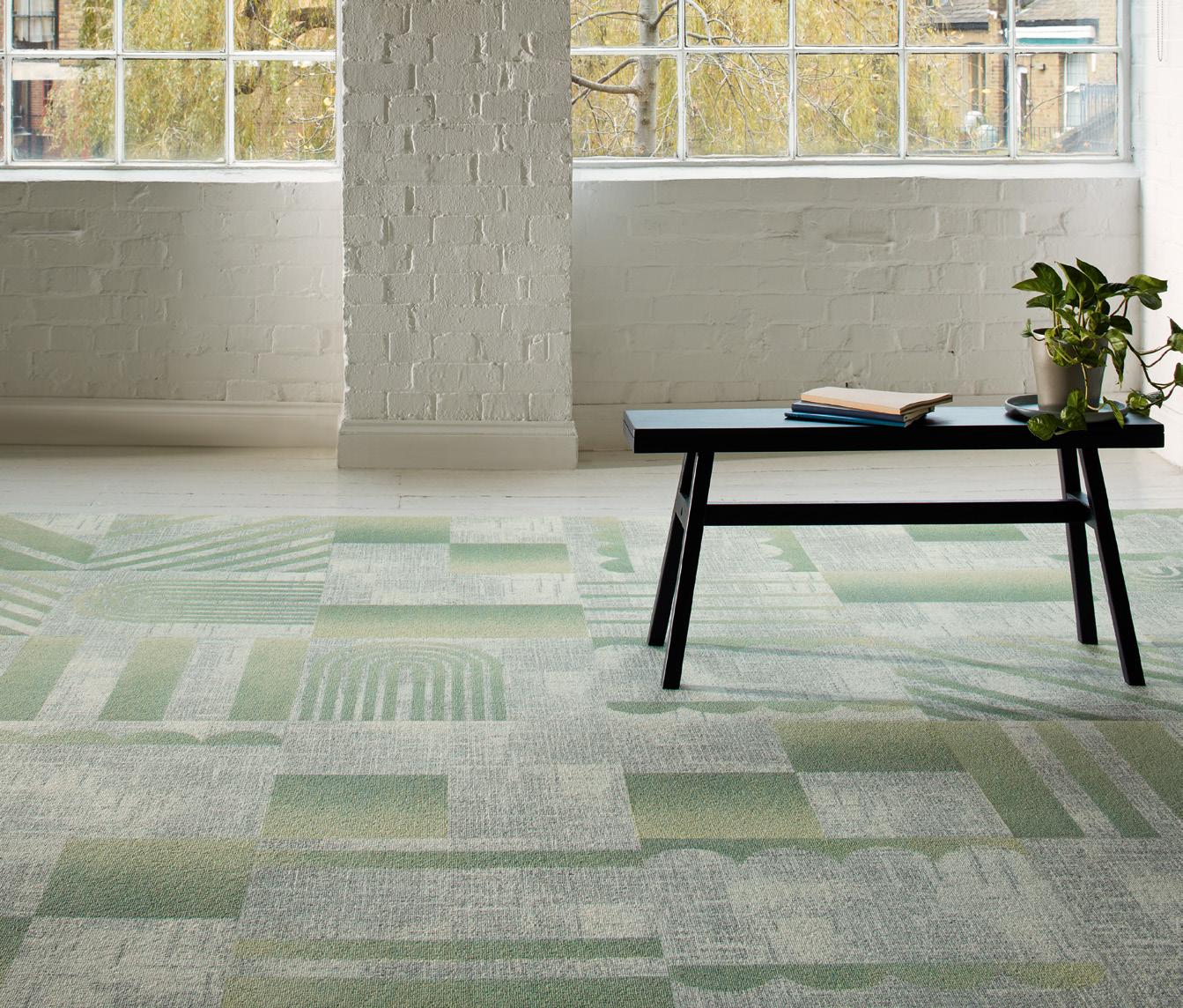
NEW DESIGN-LED EDIT FROM THE KNIGHT TILE COLLECTION.
Wood, stone and marble floor designs, launching August 2025.


12 Upfront Projects, products and people through a future-centric lens.
22 Things I’ve Learnt
Associate director at M Moser France Gain shares five insightful lessons from her personal journey in design.
24 The height of design Sisters and founders of Kapitza, Petra and Nicole Kapitza, reveal what represents the epitome of design for them.
26 Living Better
Architect, researcher and multidisciplinary Artist
Itai Palti speaks to designing for openness in times of polarisation.

28 In conversation with: Flaviano Capriotti
The leading architect on designing for our times, problem solving and the scourge of Instagram.
36 In conversation with:
Studio Truly Truly
We sit down with Netherlands-based practice
Studio Truly Truly to discuss taking risks and staying fascinated.
44 Colour Story
Colour expert and author of The Colour Bible
Laura Perryman on designing for joy and neuroinclusive spaces.
46 Case Study:
A by Adina Vienna
The first from the aparthotel brand in Europe, the BWM-designed property brings Australia to Austria.
52 Case Study: Jamie Lloyd
2LG Studio creates a home away from home for theatre director Jamie Lloyd at the prestigious Somerset House.
60 Case study: Reed Smith
At global law firm Reed Smith’s London HQ, tp bennett explores the art of the possible.
68 Case Study: Dock Shed
Conran and Partners, together with Allies and Morrison, crafts a workplace in London’s first new town in over 50 years.
74 Case Study: Flint HQ
Nodding to terroir, Mowat & Company designed a new-old workspace for wine merchant, Flint.
80 Building Narrative Co-founder of art consultancy, Artiq, Patrick McCrae muses on a summer centred around optimism.
82 Positive Impact
Likening design to zerowaste cooking, Mitre & Mondays regard ‘waste’ as a fundamental system failure.
88 Fast Forward
We explore the role of space, objects and ideas can play in creating a more optimistic future.
94 Mix Roundtable with Specialist Group
We speak to the rise of artificial intelligence and its potentially seismic impact on the commercial interior design industry.
102 Mix Roundtable with Milliken
A discussion on the transformative power of reuse and how it can guide a new approach to design and the built environment.
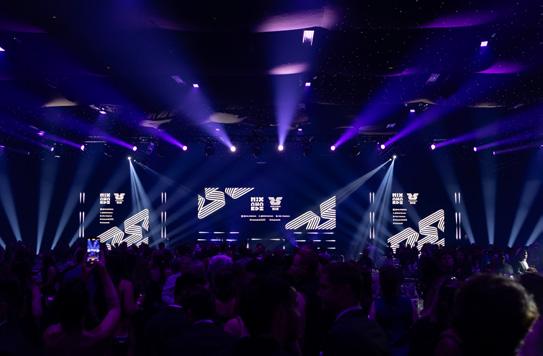
110 Mix Awards 2025
Looking back on the industry’s biggest event, we remind ourselves of the lucky few who took home the trophies.
136 Mix Talking Point: What do Gen Z want?
We look at the return to analogue for the digital generation.
140 The Making of: Pedrali
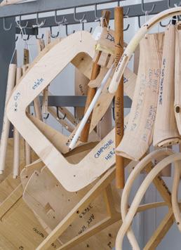
Six decades in, Italian furniture manufacturer Pedrali continues to stay true to its roots of local production and Italian craftsmanship.
144 Material Matters Director of materials research design studio Ma-tt-er, Seetal Solanki selects which materials have made the most impact on her life and work.
145 Material Innovation
Creating a new purpose for London’s discarded coffee cups, Blast Studio’s Cupsan interprets waste as a ‘neo-vernacular’ resource.
146 Innovative Thinking
M Moser’s Steve Gale on the difference between technology and engineering.
All designs, in all colours manufactured in 10 days PLAY TO CREATE


Get in touch
Managing Editor Harry McKinley harry@mixinteriors.com
Deputy Editor Chloé Petersen Snell chloe@mixinteriors.com
Editorial & Social Executive
Charlotte Slinger charlotte@mixinteriors.com
Editorial Assistant
Ellie Foster ellie@mixinteriors.com
Managing Director
Leon March leon@mixinteriors.com
Account Manager
Stuart Sinclair stuart@mixinteriors.com
Account Manager
Patrick Bowley patrick@mixinteriors.com
Account Manager Gaia Cafarella gaia@mixinteriors.com
Marketing Manager Paul Appleby paul@mixinteriors.com
Head of Operations Lisa Jackson lisa@mixinteriors.com
Advertising and Events Operations Manager Maria Da Silva maria@mixinteriors.com
Art Director Marçal Prats marcal@mixinteriors.com
Founding publisher Henry Pugh
Office S&M Architects created a sensory experience that invites curiosity and discovery, drawing design cues from the calming qualities of sensory toys. Intended to feel both calming and energising, the design reflects the productive, playful environments the London-based practice is known for. Inspired by Karndean’s approach to neuro-inclusivity, the cover pairs a soothing yet strong colour palette with diffuse forms and sharper elements to evoke both hyper- and hyposensitivity.
officesandm.com
This year, Karndean introduced its CPD seminar Designing Neuro-Inclusive Environments, responding to the growing need for inclusive design. With one in seven people identifying as neurodivergent, the seminar provides critical insights into how flooring choices and spatial design supports cognitive and sensory wellbeing. By raising awareness and equipping designers with practical tools, Karndean hopes to shape more accessible, empathetic spaces for all, blending inclusivity with functional design intelligence.
karndean.com
To ensure that a regular copy of Mix Interiors reaches you or to request back issues, call +44 (0) 1161 519 4850 or email lisa@mixinteriors.com
Annual Subscription Charges UK single £45 50 Europe £135 (airmail) Outside Europe £165 (airmail)

Unit 2 Abito, 85 Greengate, Manchester M3 7NA
Telephone +44 (0) 161 519 4850 editorial@mixinteriors.com www.mixinteriors.com
Instagram @mix.interiors LinkedIn Mix Interiors
At the recent Mix Awards 2025 (revisited on p112) one of the judges seated at my table exclaimed, “you must be wonderful to work with, you’re always so positive”. I can only imagine the guffaw this would generate from some of my colleagues. Not because I’m a tyrant, but simply because I’ve never been one to believe anyone can exist in a state of permanent, performative joyfulness. Those that try? Well, it’s all just a bit annoying, isn’t it. No no, that wasn’t a question.
Yet while I don’t subscribe to a Hallmark-approved view of ceaseless cheerfulness, the pursuit of happiness is a recurring theme this issue. Whether as an antidote to a doleful global climate or as a response to the rise of AI (and all the ways we’re losing touch with the innately human), we’re increasingly looking at the role design can play in creating a more positive society. It’s the basis of this issue’s Fast Forward feature (p88), which explores if we can design our way to a happier future, and the foundation of two of our columns: with Laura Perryman charting the ways in which colour can breed optimism (p44) and Patrick McCrae asking if designing the arts into our spaces can support wellbeing (p80).
It’s also a motif that runs through our Mix Roundtables. With Specialist Group, we ask how AI can complement not replace human expertise (p94) – one of our guests mulling on whether more time (freed up by AI) will actually bring us more joy. While with Milliken, a discussion on reuse challenges us to think what ‘better’ looks like, if ‘more’ is no longer sustainable.
Across our case studies –from a workplace for a law firm to a Vienna aparthotel (from p46) – the desire to devise places that provoke delight and contentment reflects a changing design sensibility. It isn’t, perhaps, enough that environments work hard and look great, they should make us feel better – inhabit them not because we need to, but because we want to. Speaking to this same notion, our cover, with Office S&M and Karndean, is a statement on neuro-inclusivity and the ways in everyone should be able to enjoy spaces (more on that on p148).
So am I always ‘so positive’? Well, no. But if this issue is anything to go by, maybe design has the power to change that.
Harry McKinley Managing Editor
brunner-uk.com

Welcome to our public promise and a transparent account of our mission. This manifesto is a living document, an invitation to explore the systems, data, and partnerships that define our commitment to engineering a truly circular future for the acoustics industry. For us at Impact Acoustic, sustainability is the core of our business, the catalyst for our innovation, and the metric by which we measure our success as one of the world’s leading acoustics brands. We started Impact Acoustic to prove a simple but radical idea: that the world’s waste could be the raw material for a beautiful, functional, and sustainable future.

We’re here to redefine what’s desirable—elevating new materials, reshaping circularity, and setting a bold new template for the architecture and design world. This isn’t just a sustainability policy; it’s our promise, our passion, and the blueprint we live by.
founders, impact acoustic
1. radical materiality
2. designing for longevity
3. total transparency
4. strategic collaborations
5. united nations sustainable developemnt goals
6. the eco-warriors within
7. engineering tomorrow
8. partner and client enablement

It’s eye-catching. It’s honest. It’s a never-ending sofa, challenging the concept of sustainable public seating. Combining simplicity and versatility with unmatched durability for an endless seating experience.


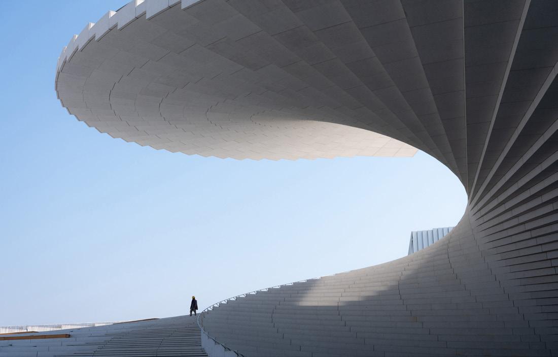
Offering traditional opera, concerts and experimental performances, Shanghai Grand Opera House is set to be a major cultural landmark for the Chinese metropolis, opening its doors late 2025 Designed to captivate a diverse audience, the principal intention with the space was to engender a sense of public ownership through impressive – not oppressive –architecture, enticing open spaces and 24-hour visitor access.
Selected in a 2017 international design competition, Snøhetta’s proposal –encompassing architecture, landscape and interiors – comprised a robust architectural concept with an equally vigorous spatial strategy; one that
prioritised community-centric design and welcomed visitors, not just from Shanghai, but from all four corners of the globe. Allowing public right of way at all hours, 365 days a year, a sprawling plaza converges with a sculptural helical surface – a stage-cum-stairway that winds into the sky, inspired by the dynamism of the human body.
Located in the neighbourhood of Houtan along the Huangpu River waterfront, the radial roof will become an accessible stage and meeting place, presenting opportunity for large-scale, open-air events as well as the coalescing of artists, local people and tourists alike. Another key priority for Snøhetta – alongside
partners East China Architectural Design & Research Institute (ECADI), Theatre Projects and Nagata Acoustics – was that the overall geometry of the building harmonised with the surrounding landscape, solidifying the connection between the opera and the city with direct view paths at all angles.
Founding Partner of Snøhetta, Kjetil Trædal Thorsen comments, "The Shanghai Grand Opera House is a product of our contextual understanding and values, designed to promote public ownership of the building for the people of Shanghai and beyond."
snohetta.com

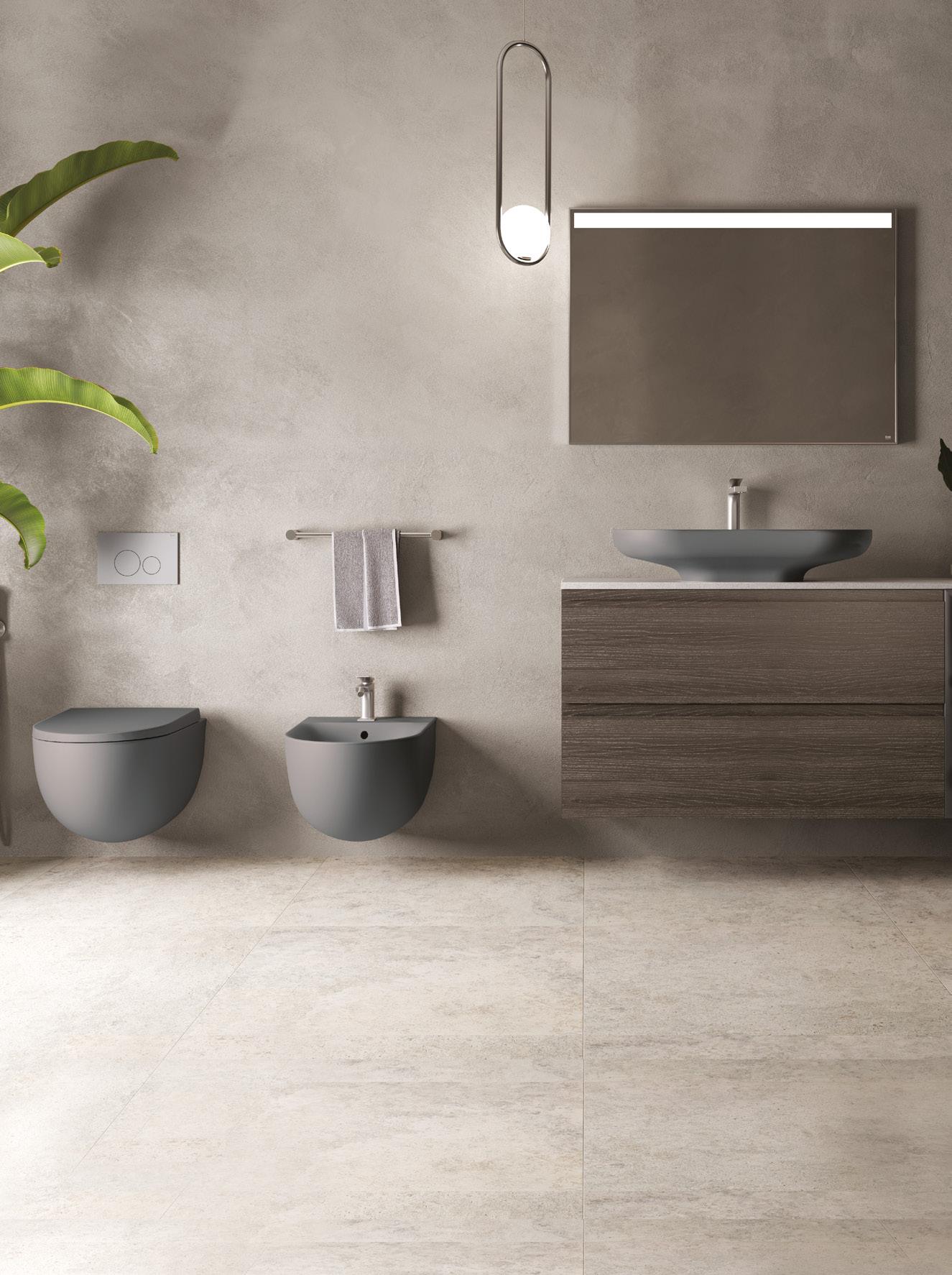
The award-winning RAK-Des collection is inspired by Bauhaus design principles and features minimalist sanitary fixtures, including countertop and freestanding washbasins with clean, sleek lines. Now available in a range of matt colours – Black, Grey, Cappuccino, Greige, and White.
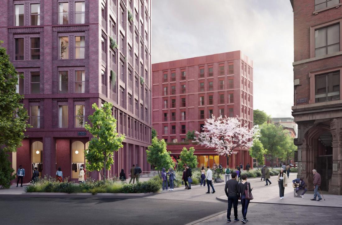
Guarding ‘the gates’ to one of Manchester’s most lively districts, Northern Quarter, a mud-brown multi-storey from the 1970s sits monolithic, but somehow largely ignored by visitors making a beeline for the popular bars and restaurants of Stevenson Square and Thomas Street.
Replacing what council leader Bev Craig describes as ‘an eyesore and a barrier to the ongoing success of the Northern Quarter,’ the car park is scheduled for demolition later this year. A new development will replace the existing structure, posing a much more appropriate arrival sequence to the centre’s most highly trafficked areas; one that will become a natural part of the neighbourhood’s offering.
Manchester City Council marketed the Church Street site for clearance in 2024 and, following a competitive process, it was decided that developers Glenbrook Property would oversee the
transformation of the 1.54-acre plot, subject to formal decision making and planning permission. With design by Tim Groom Architects, the proposal is set to deliver more than 300 new apartments with 60 (20%) being affordable homes, providing accessible opportunity to live on the cusp of the quarter.
At street level, commercial space will offer a mix of smaller, affordable units to ensure that the local independent businesses that characterise NQ can still access the neighbourhood – alongside a new flexible community and gallery space.
Also central to Glenbrook’s plans, four new squares and significant urban greening will align with Manchester City Council plans to pedestrianise the surrounding streets to uplift the new mixed-use development, while supporting scenic and safe travel options to and through the area.
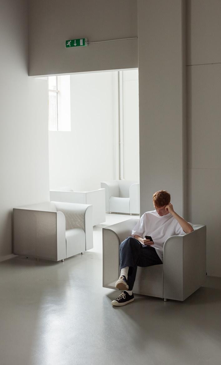
One of the furniture industry’s greatest environmental challenges is the widespread use of polyurethane (PU) foam – a petrochemical product that relies on isocyanates as a catalyst during manufacturing. PU foam off-gases harmful chemicals, is highly flammable and, due to its limited lifespan, cannot be truly recycled – only downcycled. Ultimately, it ends up being incinerated or, worse, polluting our oceans and landscapes.
Designed by Copenhagen-based designer Boris Berlin in collaboration with +Halle® and German textile technologists Krall+Roth, SHRINX is a protest against material overuse, proposing to product designers that luxury design isn’t always synonymous with ‘more.’
The antithesis of traditional upholstery, Krall+Roth developed SHRINX 4903 to be a semi-translucent mesh, crafted from 68% polyester and 32% polyamide, which is then draped around the SHRINX steel frame and shrunk to size. Conceptual designer Boris Berlin explains, “Normally, when you apply textile to be stretched, you must stretch more fabric than what is in use. With the SHRINX Lounge Chair, you apply a loose piece of pre-sewn textile cover, place it neatly in the groove or tunnel of the frame, and then apply heat, allowing it to reshape in its entirety.”
Berlin’s pairing of a stocky club chair typology with the gauzy nature of SHRINX 4903 not only curbs environmental impact but is a direct response to the rise of ‘soft privacy.’ Inspired by Shiro Kuramata’s How High the Moon chair, made for the Memphis group in 1987, the overall design of SHRINX responds to recent shifts in both sustainability standards as well as human behaviour in contemporary public spaces – to be both alone and amongst people.
krallroth.com
plushalle.com

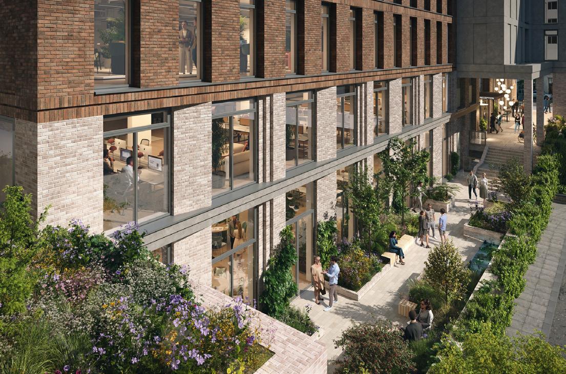
Two end-of-life office buildings behind London’s Victoria Station – including a former 1975 cash depository – are due to be transformed into new sustainable workplace, The Langfield, meeting the increased demand for modern and adaptable workspace in the area. With design by tp bennett, 80,000 sq ft of floorplates will be subdivided for multitenancy, with street level units given over to an onsite café with access to a ‘pocket’ park. Four private rooftops will be available for tenants with ample integration of biophilia.
Spread across eight floors, The Langfield retrofit repurposes original construction where possible, however the compromised nature of the site’s Gillingham Street elevation has prompted the design team to carefully consider alternatives to the building’s aesthetics, MEP systems and material specifications to reduce both embodied and operational carbon in the development.
Striking a steady balance between heat loss, heat gain and solar comfort, the distinctive new façade synergises with the style of the 70s build visually, whilst bridging the technological gap between
the existing building fabric and newer materials. Because of this precision-based patchworking, the building will achieve an embodied carbon of 600kgCO2e/m2 and whole-life carbon of 950kgCO2e/m2, outperforming GLA embodied carbon targets. The optimisation not only brings about a reduction in energy consumption but also significantly enhances interior comfort levels for tenants and those utilising the F&B spaces at ground level.
The combined buildings now fulfil the area’s need for flexible workspace while swerving the wrecking ball.
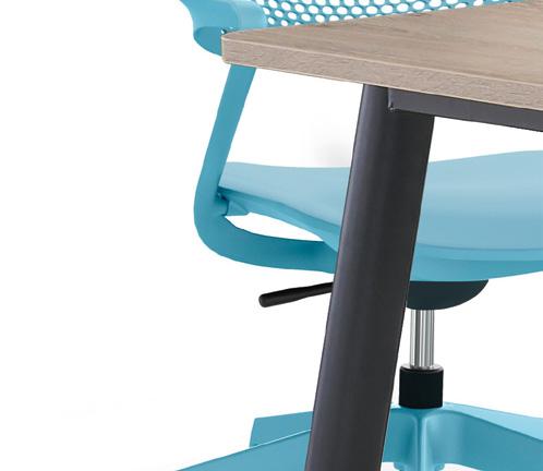
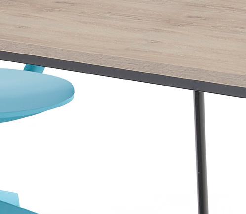


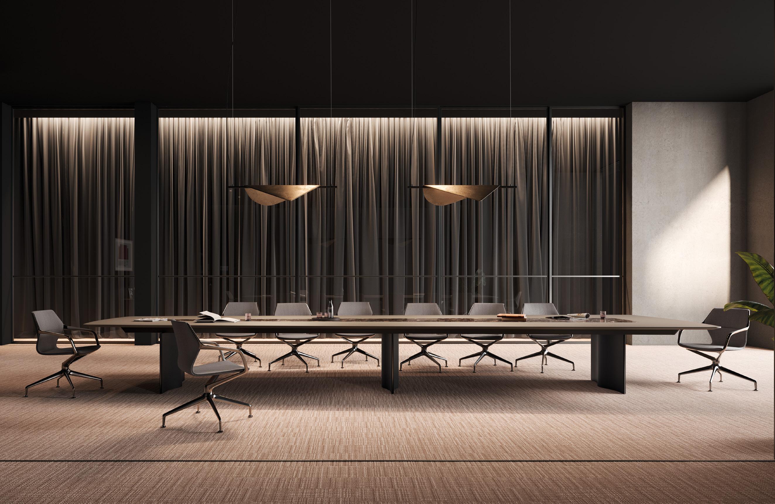
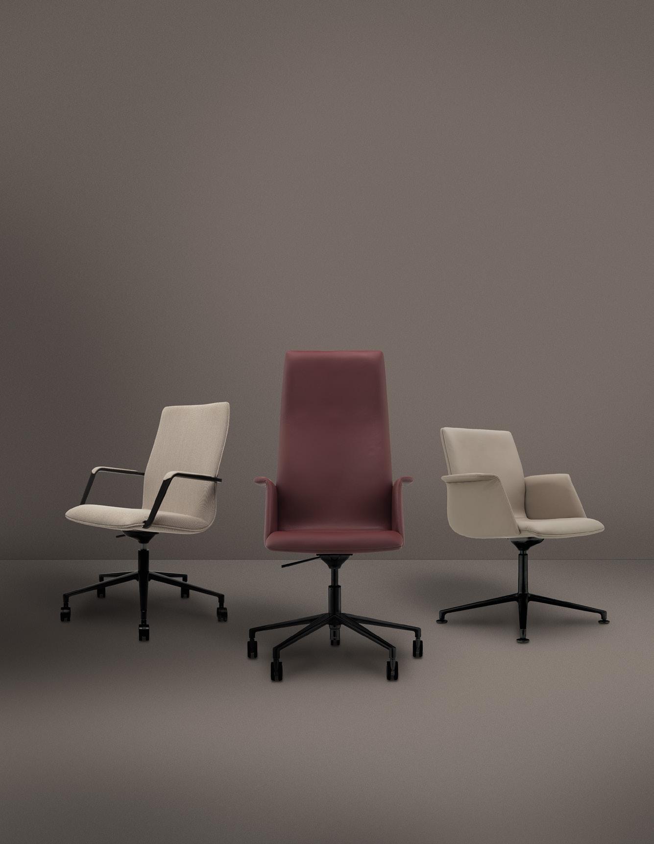
Fin. Modular and linear, with a deceptively simple design, a Fin table brings refinement to the meeting room. With sleek elliptical steel legs, the fin frame changes its profile depending on your viewpoint, always maintaining its clean and simple lines.
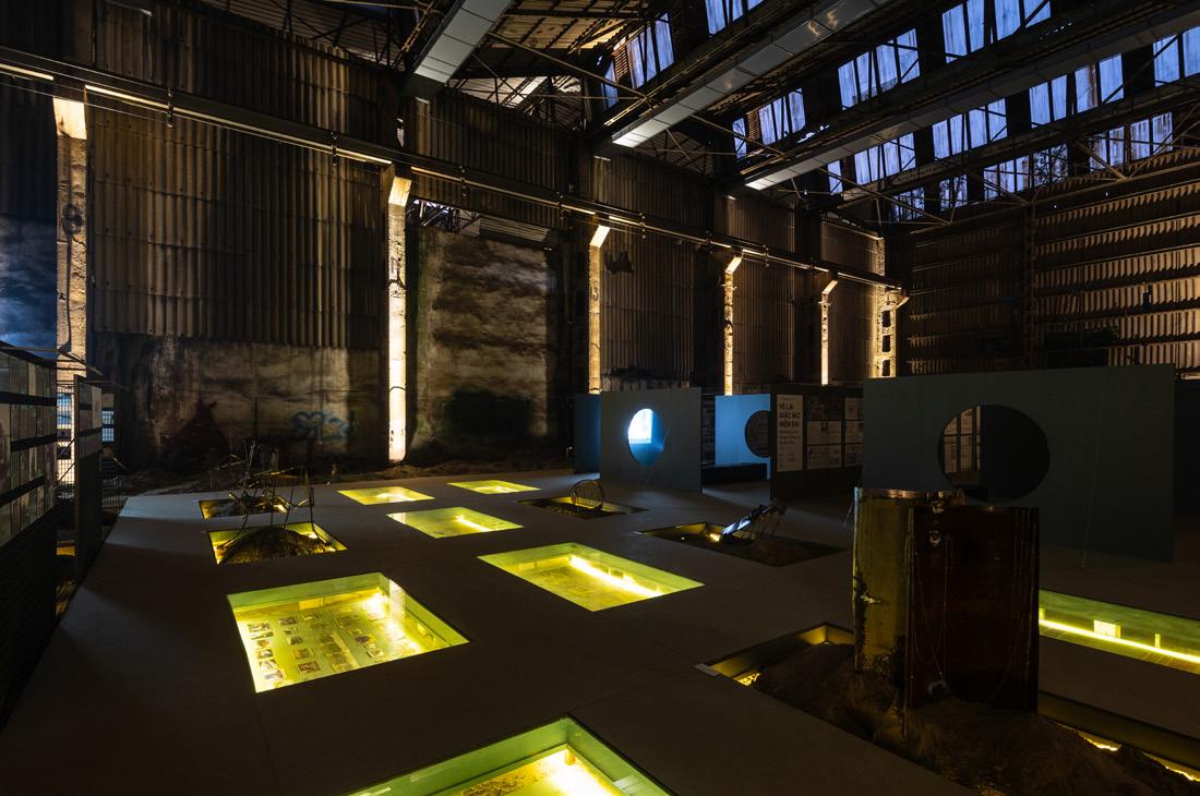
Recent and rapid urbanisation has had Hanoi in its clutches, with hundreds of inner-city factories scheduled for demolition. Making way for modern residential blocks and office units, these 20th century heritage structures are more than mere production spaces – they shaped the everyday life of their original users and are responsible for the neighbourhoods that settle around them today.
Initially built as a mechanical depot where train locomotives underwent maintenance, Gia Lam Train Factory is but one of many facing the risk of erasure; the pressure of redevelopment threatening to erode the collective memory and socio-spatial dynamic of the Vietnamese capital. Recognising
this, the Hanoi-based Trung Mai / Ad hoc Practice has transformed the abandoned warehouse into a semipermanent exhibition space, serving as both a cultural landmark and a preventative measure against the actions of urban developers.
Inside, The grid acts as a ‘memorial’ to a bygone industrial era, while relating to the socialist architectural theory of gridded formats fostering equitable and efficient cities. Metal grating delineates the floorplate in a nod to the famed Eixample district in Barcelona designed by Ildefons Cerdà in the 19th century, where furniture is fashioned from ammunition boxes dating to the Vietnam war, discovered within the factory. Art
objects were also crafted using reclaimed fragments from the warehouse, such as industrial ventilation ducts and other salvaged materials.
An example of elevating forgotten spaces into vibrant cultural showcases, The grid stands as a testament to the enduring relevance of mindful urban planning and preserving Hanoi’s cultural heritage for generations to come. Visitors of the exhibition are encouraged to critically examine the repercussions of modern construction methods, retrofitting processes as well as consider how the site could further support collaboration within the local community.
adhocpractice.com
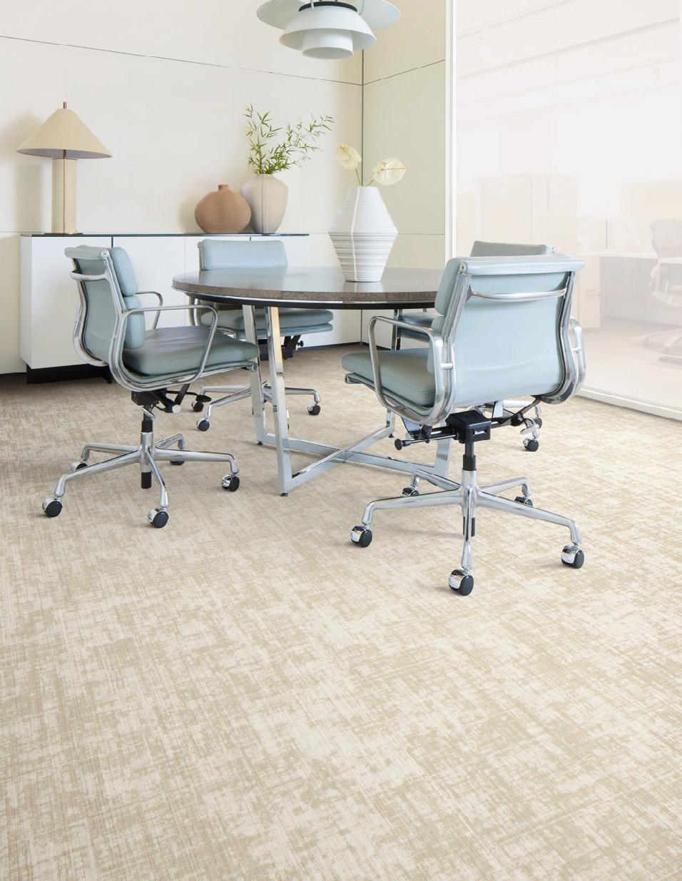


Explore the depth, dive into the craft. Lasting Impressions™ brings ancient ways to modern spaces.
In Heirloom™, the textures of tatami weaving make for a fresh take on tradition. While Plaster™ takes inspiration from handfinishes and natural patinas.
Two heritage styles, each drawing on crafts handed down. And your chance to take these legacies and make them your own.
For more information:
+44 (0)800 313 4465
ukcustomerservices@interface.com interface.com

Frances Gain is associate director at M Moser –blending her diverse background in marketing, architecture and academia to develop future workplace and design strategies, from change management to cultural mapping.
mmoser.com
@mmosersocial
Everything matters, but nothing actually matters. This is a mantra I've picked up along the way, which I say regularly to the team. What I mean by this is that the small things – the details, the wording, the page design – really do matter, especially when presenting work to clients or speaking with leadership. We care about getting them right. But the paradox is that they don't matter quite as much as we think. Will that typo or the phrasing of a headline make or break the whole presentation? Probably not, but it's still worth addressing. It's about developing a mindset that everything you do matters –so start strong and care about the work, but don't let the pressure overwhelm you. Care deeply but don't stress unnecessarily.
Do what you're good at.
Figure out your strengths, skills and passions, then focus on those. Seek out projects, roles and environments that align with your unique skillset. This will set you up for success far more than trying to ‘fix’ what you can't do.
I've assessed my skillset; I know what I'm good at and what I'm not. I'm comfortable expressing this to others – my boss, my peers, the team – and I make sure that most of my time and energy is spent in those areas. All while staying humble, staying hungry and learning every day. As a new(ish) parent, I've heard the rhetorical question: "If your child was good at tennis and bad at math, would you hire a tennis coach or a math tutor?"
If you want to go far, go together.
I'm proudly South African and there's a beautiful Ubuntu saying: "If you want to get somewhere fast, go alone. If you want to go far, go together." Sometimes, collaborating with others feels harder and slower. I often catch myself thinking, this would be quicker if I just did it myself. Delegating, coaching, sharing and reviewing takes time and effort. As someone naturally quite independent, learning to step back and let go was a challenge.
But, over time, I've prioritised learning how to co-create through clear communication, iterative feedback and empathy – and the long-term benefits have absolutely paid off.
You don't need to know what you're doing when you start.
At any scale! I've worked across several fields – marketing, architecture, academia and now workplace strategy and change management. If there's one thing I've learnt it's that you don't need to have it all figured out before you begin.
On a project level, part of our role as consultants is to uncover the problem and figure out the solution. You can't wait for clarity to begin – you start and clarity follows.
During my yogi years, I had a phrase written on a chalkboard that's stuck with me: "As you step onto the journey, the path will appear." It turns out we can figure out many things if we're willing to just begin.
Sometimes, it's better just to keep quiet.
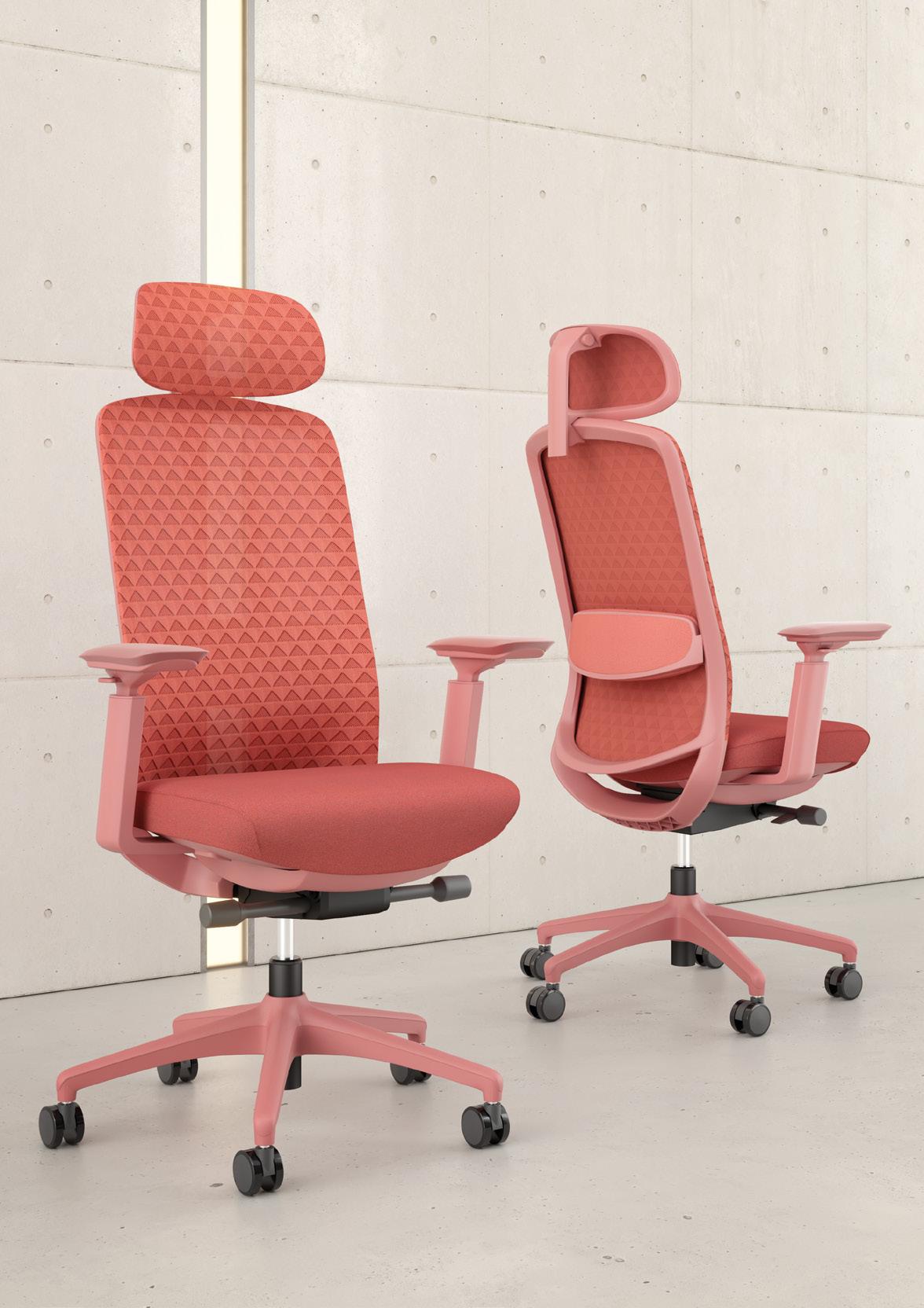

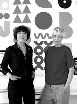
Kapitza is a visionary art and design studio founded in 2004 by sisters Petra and Nicole Kapitza. Known for its bold use of colour and geometric art, the East London-based studio creates large-scale murals, vibrant public art, uplifting hospital installations and joyful placemaking projects that invite connection and inspire wellbeing.
kapitza.com
@kapitza_studio
The item
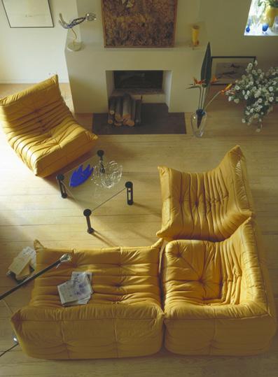
The Togo sofa by Michael Ducaro.
why
The Togo sofa represents the height of design for us because it gave people a new way to interact, both with furniture and each other. When Michel Ducaroy first designed it in 1973, most furniture was stiff and formal – Togo’s soft, low and inviting shape was a revolution. Bold and cosy, it invited people to relax and connect in a more casual, comfortable way that matched the free spirit of the 70s. It showed that comfort and great design don’t need rules or formality. For us, it captures the heart of humancentric design: bold, cosy, timeless and made for real life.
The inspiration
This piece shows that bold design can be both daring and also deeply thoughtful. Initially met with scepticism, Togo became an icon, reminding us that to create something truly groundbreaking we must push boundaries and challenge norms in our work. We love how the Togo’s design is strong and bold, yet playful and soft to the touch.
impact
Togo challenged design norms by introducing a more informal, flexible approach to living spaces. As a cultural icon, it bridges high design with everyday comfort, inspiring generations of designers to focus on emotional connection and how spaces feel, rather than adhering to rigid formalities. Its impact is clear: the Togo sofa helped to redefine what makes a space truly liveable.
The personal connection
We’ve lived with our Togo sofa for over 10 years now and we still absolutely love it. We remember being nervous about investing so much in one piece, but it’s been completely worth it. It’s our favourite object in the house – cool, timeless, comfy and genuinely a joy to use every day. Togo is more than just a sofa, it’s part of our life and a quiet stand against disposable culture. We’ll keep it forever.


In an era where even benches and bins seem to carry ideological weight, public and commercial spaces are increasingly designed not just to serve, but to signal. But when spaces become too symbolic to be lived in, what’s left for those who simply want to feel welcome?
Place is often treated as a medium for values, a chance to showcase commitment to justice, sustainability, heritage or identity. That’s not inherently wrong. But when political messaging dominates or reflects a single worldview, it risks excluding the very communities it’s meant to serve. Worryingly, the idea that “there’s no such thing as neutral design” has spilled from matters of health and comfort into the aggressive politicisation of shared spaces.
In commercial environments especially, where a diverse mix of people pass through, over-politicisation can act like a gate; subtle to some, glaring to others.
Public environments and commercial spaces thrive on openness. It’s what turns a plaza into a favourite spot, or a high street café into a second home. But attachment rarely grows in places that feel like
they’ve already made up their mind about who belongs there. When a space declares itself too strongly, whether through corporate branding, political symbolism or social messaging, it leaves little ground for belonging to take root.
Ironically, this is often most evident in places trying hardest to “stand for something.” A retail park plastered with slogans about community can still feel sterile if the messaging feels imposed. A shopping centre decked in activism might alienate those it’s trying to welcome if the sentiment feels hollow or, worse, performative. Many public spaces have also too easily submitted to loud, extreme minorities who seek to exclude and politicise the shared realm.
Depoliticising space doesn’t mean scrubbing it clean of meaning. It means designing spaces that allow for difference without demanding allegiance. Environments should invite people to inhabit their own identity, not perform one. The most successful examples often feel effortless: a market square with places to linger, a bookstore with no agenda beyond comfort and curiosity, a plaza where protest, play and pause can coexist without contradiction.
This doesn’t mean designers or developers should abandon ethics or impact. Quite the opposite. The most inclusive environments are those where values are structural, not symbolic, where accessibility, safety and comfort are built into the bones of a place, not pinned on as statements.
Still, that may no longer be enough. Today’s social landscape suggests we need protection from ourselves, and perhaps the built environment can play a role. We must design spaces that repel tribalism, that reject aggression and hate. Can we create places so deeply inclusive that they overcome our own failures in empathy?
Belonging isn’t a design language, it’s a condition we create. It emerges where people feel safe and free in their identity. It means resisting the urge to brand ideology onto every surface and refusing to let space be appropriated as another battleground.
In a world full of signals, sometimes the most radical thing a place can do is stay quietly confident and resolutely welcoming to all.
Words: Harry McKinley
Photography: Courtesy of Flaviano Capriotti Architetti
Architect Flaviano Capriotti discusses changing the face of luxury, designing for the times we live in and why he doesn’t care about Instagram.
I first met Flaviano Capriotti in Milan, during the city’s Design Week; a small industry dinner at the Park Hyatt, which he designed. I arrived on time, but barely, fatigue setting in as I entered the latter hours of a day stretched thin. Each year, for this week in April, Milan swells as countless thousands of industry professionals coalesce on the city, schedules creaking at the seams. At times, the sheer volume of displays, activities and events sees them blur into one creative mass; live talks increasingly perfunctory, even laboured, as the days roll on and discussion points are rehashed. The week is undoubtedly a vital showpiece, but stressing under the weight of its own importance, and the pressure to see and do, it can fail to stir a crucial aspect of design: joy.
This was thrown into relief when I met Capriotti. Introductions out of the way, he quickly launched into an impassioned treatise on the delights of Italian culture, his passion for creating spaces that evoke meaning and, on a personal level, his enduring gratitude for a career doing something he loves. During breaks between cocktails or courses, he led me by the arm to point out design details in the hotel’s restaurant – speaking with infectious enthusiasm about the rationale of a colour choice or a tile. He was joyful.
When we join each other to speak more formally, months later, that same zest is present from the off – Capriotti in his Milan office, flanked by books. “I could talk all day,” he announces, laughing, “until a beer this evening.” Half wondering if I should nix a subsequent meeting, I believe him.
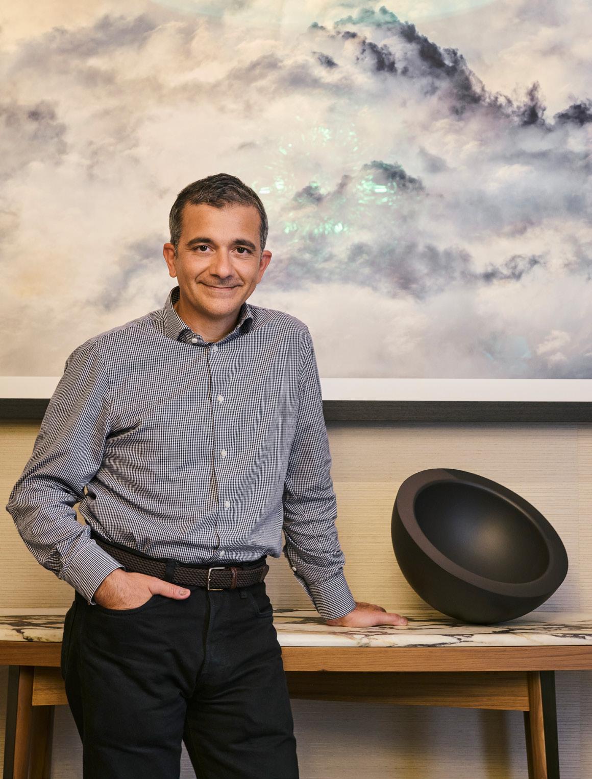
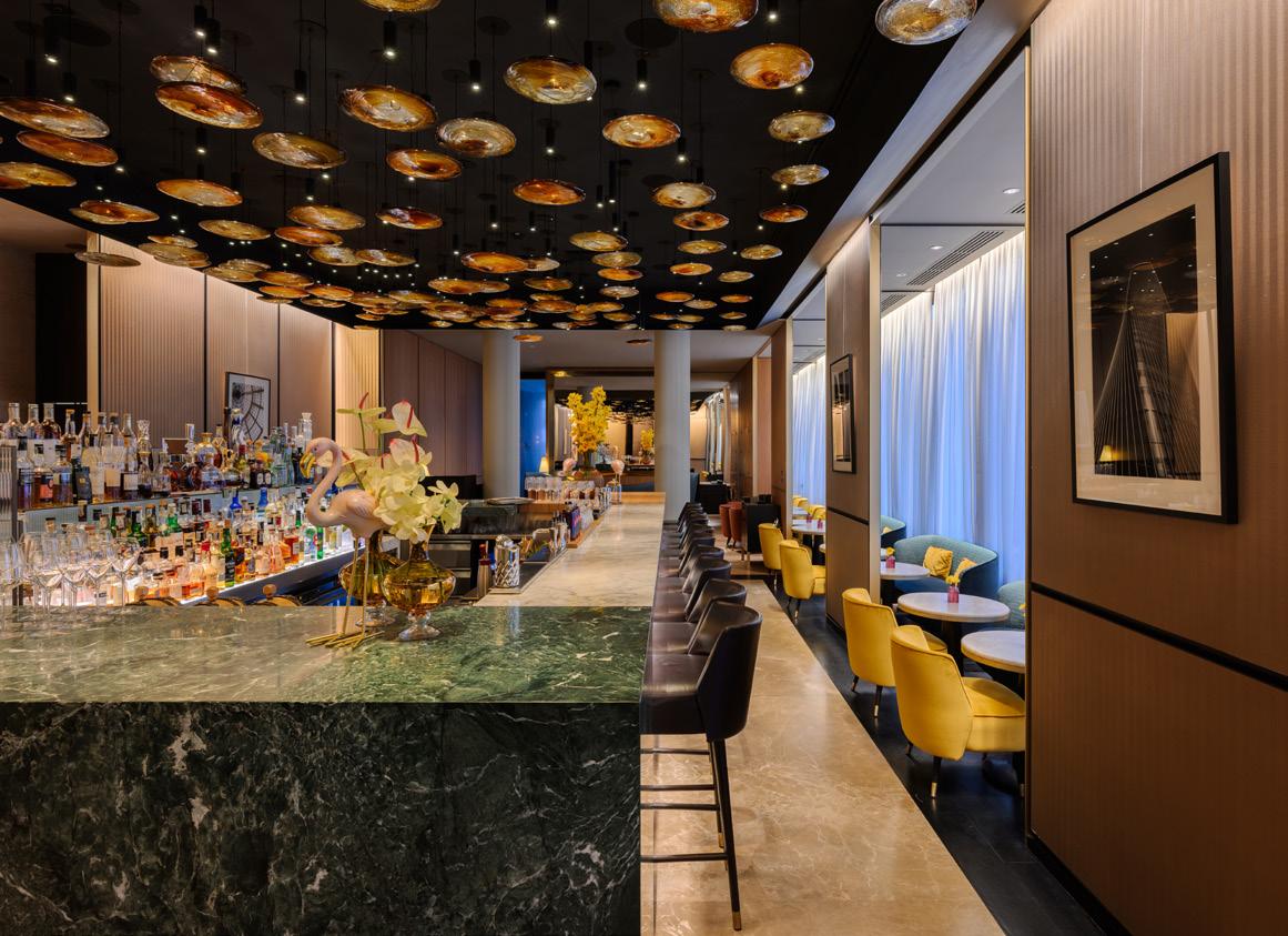
Image on previous page: Flaviano Capriotti
Above left:
Park Hyatt Milano, image Leo Torri Studio
Below right:
Park Hyatt Milano –Monte Napoleone suite, image Leo Torri Studio
Capriotti leads a prolific practice, Flaviano Capriotti Architetti, but his glee for design and architecture started at an early age. He recounts sitting in a traffic jam aged four or five and, instead of bemoaning the wait, wondering why the whole kit and caboodle hadn’t been devised differently. What if the road had more lanes? What if the cars could fly? At this suggestion, his father – a telecommunications engineer – began to explain the basics of aerodynamics, detailing what makes the chassis of a car different from that of an aeroplane. He was enrapt, realising not only that the wildest ideas can be rooted in some notion of reality, but that design itself is about solutions to problems.
“So I was always inventing and creating,” he explains, “but I was drawn to architecture because there was some understanding there – of what makes a building good – that I hadn’t grasped; that no one grasps until they study.
Most of us can understand if someone is elegant, well-dressed, or casual. We have some knowledge of those things, but not architecture. People visit an old cathedral and either feel it’s beautiful, or think it must be beautiful, because everyone goes there. But very few people can understand and read architecture; what architects wanted to express and, actually, if a building is well designed or not.”
Capriotti would study architecture at the prestigious Politecnico di Milano, graduating in 1998. The same year he won the XVIII Compasso d’Oro Premio Progetto Giovane (the Young Design prize) for an early project with Kartell. The Compasso d’Oro is sometimes nicknamed the ‘Nobel Prize of design’, and so to win the Young Design version of the award not only marked Capriotti as a prodigious talent, but remains a towering achievement even decades later – and still one of his proudest moments.
“Interiors are almost more important than what’s outside, because that’s where we truly experience buildings, it’s where we live.”
As for understanding architecture, well, Capriotti has some advice. Firstly, though reflecting on the exterior is important, one can never truly know a building –or gauge its success – without stepping inside. “In fact, interiors are almost more important than what’s outside,” he stresses, “because that’s where we truly experience buildings, it’s where we live.” This philosophy guides his practice today – the sense that architecture needs to satisfy a purpose. It isn’t just to be looked at, it’s to be functional and, crucially, it needs to evoke some emotion. “I’m not saying you need a person to cry,” he suggests, “but emotion can be to feel comfortable, to feel connected or to feel welcomed. As an architect, it’s a rarity to design something for yourself and, really, that’s an indulgence, so you need to understand how a building responds to the needs of others.”
Another of his central tenets is authenticity. It’s an overused word in design, but for Capriotti it’s shorthand for a much more complex and nuanced viewpoint – one that weaves together timeliness (and timelessness), a relationship to place and a clear point of view. He lives in a country of monuments and, while he clearly has a deep reverence for the grandeur of the past, good architecture and design, he forces, is about designing for the ‘time we live in’. Cities are not museums, or shouldn’t be. The same should be true of brands and experiences, he feels, which need to bend, flex and evolve to remain relevant – turning his whip-smart invective to the world of hotels.

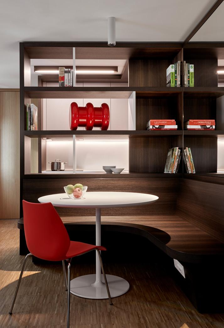
“Emotion can be to feel comfortable, to feel connected or to feel welcomed.”
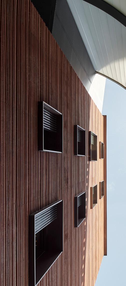
“That hotel is the same today as it was 21 years ago, so that’s the real test.”
“One of my most formative projects was the Bvlgari Hotel in Milan,” he says. Capriotti worked on it in his late 20s, during his tenure with Citterio Viel, today ACPV Architects. It opened in 2004. “It’s still a milestone in hotel development and, at the time, we were asked to create something that reflected five-star luxury in a genuinely contemporary way. Up until then, everything felt like a version of Buckingham Palace and there wasn’t really an example to follow, of what a new luxury might look like.” But the seeds of new ideas were being sown in lifestyle hotels, from figures such as Philippe Starck. Even though they didn’t sit in the luxury space, Capriotti saw something in the ‘energy’ they created as a source of inspiration.
Bvlgari Milan was a quiet revolution, then. Though it occupies an 18th-century palazzo, the gilded opulence that had reigned until the early noughties was supplanted with restraint; black Zimbabwe marble, Vicenza stone, teak wood and bronze suggesting sumptuousness, not by yelling for attention but through exquisite precision and craftmanship. Even the entrance, on a private street, is not brazenly signposted – unmarked until the entrance itself, in what has been described as one of the first ‘anti-luxury’ statements in hotel design. Milan became the blueprint for the Bvlgari hotels that followed – from Bali to Beijing, all carrying the same DNA, but with light-touch local
adaptions. “Other than changing some fabrics or some small details to keep it fresh, that hotel is the same today as it was 21 years ago,” Capriotti says. “So that’s the real test. It worked because it was authentic to the time and still is.”
Beyond aesthetics, what Capriotti’s hotel work demonstrates is an understanding that culture shifts. “There wasn’t just a visual style that was old,” he notes, reflecting on how hotel hospitality has pivoted, “there was a service style that was old. The bellmen were dressed so formally they might as well have been policemen, considering how off-putting it felt. You didn’t feel like you could walk in dressed casually. Now the world’s richest people live in t-shirts and jeans.”
Creating comfort and ease in spaces is something that echoes through the studio’s work – be it a luxury hotel, a workplace in Kuwait or a pioneering educational project in Lugano. The McNeely Centre of Ideas and Imagination, for example, part of Franklin University Switzerland (FUS), comprises two distinct but interconnected blocks, one a semi-transparent glass structure housing public and teaching space, and a pigmented concrete residential wing with a façade that suggests the pages of an open book. Its layout encourages intuitive navigation and gentle transitions. It won an Architecture MasterPrize in 2024.
“Creating comfort in buildings is about seeing not just how technology can change the architectural landscape, but how society is changing it,” he says. “Our world is not strict and straight anymore, it’s very soft and it’s very fluid. We want spaces and buildings that can cope with that; flexible and adaptable.”
Not all change is positive though and when talk meanders into the world of ‘Instagrammable’ architecture, he lets out an exaggerated, comical sigh. “What a nightmare,” he wearily exhales. “It’s the opposite of everything I stand for. I was reading the other day that, thanks to Instagram, our attention spans have shrunk to eight seconds – eight seconds is the opposite of timeless. Plus, what we’re talking about here is flattening architecture down into an image, when these are spaces to exist in. If I see on Instagram that you’ve been somewhere: great, I’m happy for you. But what’s important is to meet each other, talk to each other, touch each other. Buildings create that opportunity. I’m an architect, I care about real life.”
“I’m an architect, I care about real life.”
The compressing of a three-dimensional world into scrollable fragments – the distilling of experiences into something to be consumed, not lived – is a problem architecture is unlikely to solve. But, in an attempt to bring things full circle, I wonder how that appetite for meaningful solutions manifests with Capriotti today, in a world that still has traffic jams.
“I like to remind myself of Renzo Piano, who said something along the lines of, ‘when you start a project you enter a dark tunnel’, because you don’t yet have the solutions, even though you have the tools to find them,” he tells me. “And then you
keep walking very slowly, until you see a little light that tells you you’re heading in the right direction. It gets bigger and bigger until eventually you find your way to the end of the tunnel. Or maybe another way of looking at design is like a mathematical process. So, for me, until I have a correct answer, a project is not resolved. But getting to the answer is a wonderful part of design.”
And there it is, the mistakable optimism and love for the craft that, for me, has become defining of Capriotti – the spark of joy we can all strive to kindle, even during Design Week.

Studio Truly Truly’s Kate and Joel Booy on taking risks and staying fascinated.
Meeting as students in Australia, husbandand-wife team Joel and Kate Booy are two people who have grown together both personally and creatively across careers, continents and parenthood – evident in the way they finish each other’s sentences throughout our conversation. Carving out a niche between product design and the experiential, their design practice Studio Truly Truly offers a unique, tactile blend of function and art that has resulted in a diverse international portfolio, working with brands from Ikea to Leolux. “Although we have different personalities, we have the same goal,” says Joel. “We
have different functions and strengths but we’re both interested in well-made things that are really beautiful and functional.”
Former graphic designers frustrated with the limitations of 2D design, the pair upped sticks and moved from sunny Queensland to arty Eindhoven – Joel studying 3D design at the Design Academy and Kate taking on a graphic design job, slowly launching the studio two years later in 2013. A formative moment arrived in a visit from Ikea’s design team, led by Marcus Engman, right before Joel’s graduation. Intrigued by the intricate
Words: Chloé Petersen Snell
Photography: courtesy of Studio Truly Truly
textile work the studio had created for TextielMuseum, inspired by handknitting techniques and produced by the TextielLab's computer-controlled knitting machine, Ikea commisioned an initial project designing cushions. “Because we’re graphic designers, we did around 250 cushion designs,” Joel laughs, “as well as some furniture and objects. These caught [Ikea’s] attention, the cushion project dropped and we were put into the Ikea PS collection. And for us, that was a big deal.” The cushion concept remained an integral key to the resulting sofa – the studio exaggerated standard cushions into cloud-like forms that users can attach to a minimal metal frame. The frame and cushions were sold separately, not only making it easily recyclable, but also allowing for personalisation with any 50cm cushion and essentially futureproofing the design.
Joel graduated – the design work completed for Ikea in 2015 – and the sofa was released in 2017. In the interim, the pair created a few collectible design pieces, typical of Design Academy graduates –Joel gesturing to a cabinet behind him. “It's really difficult to make – a interesting process of marble mixed with hard epoxy to create a really artistic object. But it's such a difficult world because you've got to keep pushing, pushing, pushing. We weren’t like the other younger artists that had the time and financial support; we
“When we get a new project, we often look at the material and our fascination in that material.”
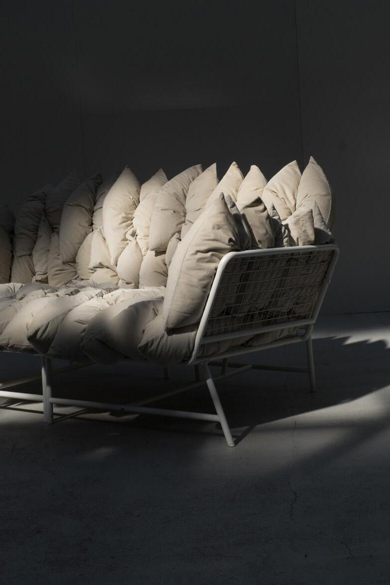
weren’t living at home. We were like, 'shit, we're running out of money'. We realised we needed to find an avenue to be able to be paid for this.”
The studio prepared for SaloneSatellite in 2017, the Daze table quickly picked up by Italian furniture manufacturer Tacchini. The design incorporates architectural shapes and discrete slits through which vibrant colours appear, inspired by observing hazy light escaping from a crack. The metal table was a unique experiment in applying powder coating – a typically Truly Truly exploration of material, form and ultimately functionality.
“When we get a new project, we often look at the material and our fascination in that material,” says Joel. “What's interesting? What would move us if we saw that object? How does it bend and is that interesting to deal with? [For example] the heaviness of an object and how that contrast of
heaviness be given a way to communicate through the object. That’s how we see objects – they should communicate, they should inspire us, or give us a feeling when we see them.”
“It's balancing and tweaking all the different properties of how a material expresses and communicates to us,” Kate adds, “to find that place where it's a little bit surprising or special in some way and makes you look twice. There are areas where we can be more expressive and extreme in how artistic something is, and then there are other times when things need to be more classically functional, and so it might include a little portion of that sort of interesting expression, but in the details or not as an overriding function.”
“I find it very hard to make things that are not functional; I hate them,” Joel laughs. “I have to try and tame myself to not put in too many ‘functions.’”
Below:
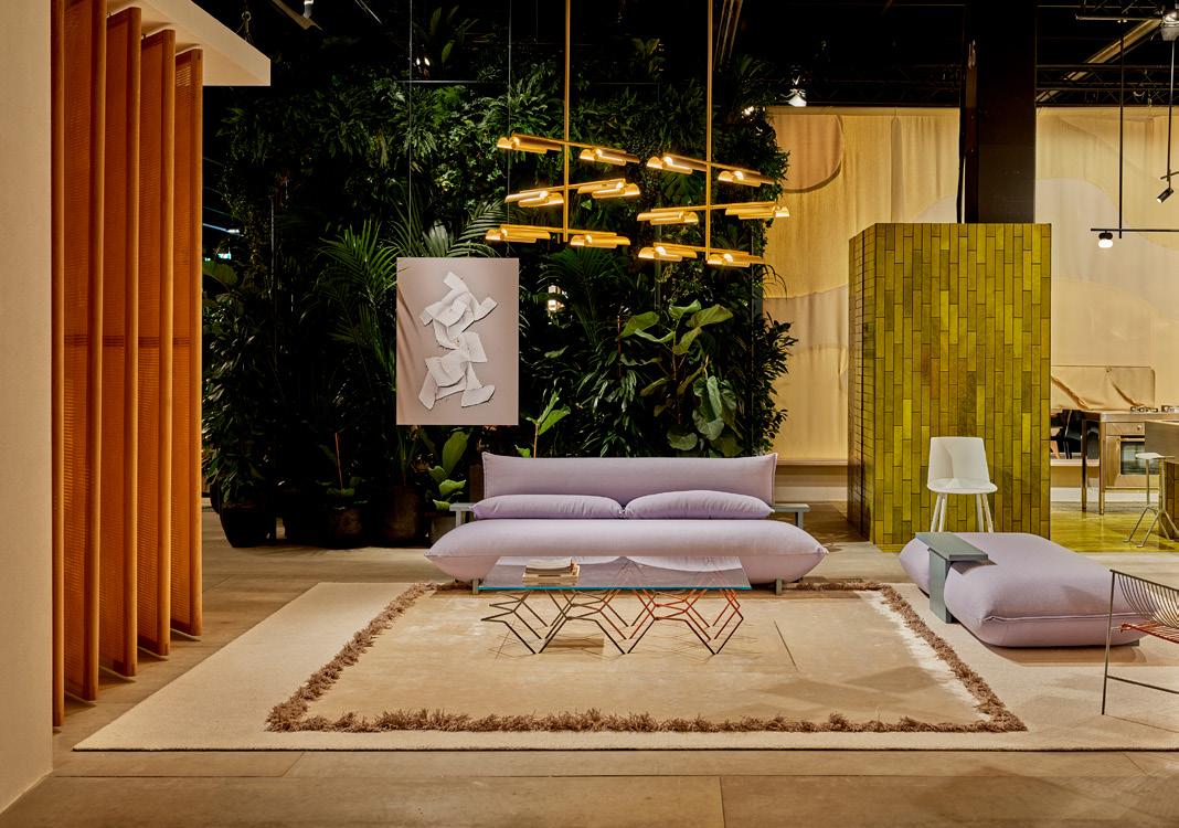
Below: VELA is part of Rakumba’s Typography lighting system
Right: The Big Glow light for Rakumba.
Credit: Josh Robenstone
“I find it very hard to make things that are not functional.”

This thread of function isn’t utilitarian by any means – the studio’s work balances the fun and purposeful, with a philosophy of bridging artistic expression with practical application. “We play on this spectrum,” Kate details, “and it’s interesting for us to switch back and forth between the two: how extreme, how familiar.”
The contents of their Dordecht studio speaks to this; converted from a restaurant, it’s a colourful museum of prototypes and intriguing-looking materials. The Grove Vessel, a sculptural vessel made from synthetic resin, plays with opacity and light – details revealed through varying degrees of thickness from which light is allowed to pass through. This experimentation with translucency and light caught the eye of Michael Murray, CEO of Australian lighting brand Rakumba, and was the start of a fruitful and continuing relationship – starting with Typography in 2018, a mix-andmatch track lighting system inspired by the way letters form words. Clearly graphic design still plays an important role; Typography not a direct application but rather an exploration of its underlying principles, says Joel.
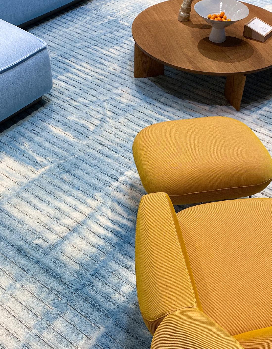
A year later, the studio was invited to create Das Haus at IMM Cologne in 2019 – each year the fair invites a designer or studio to create a full-scale, simulated house within its exhibition halls. Studio Truly Truly’s take on contemporary living, Living by Moods, was a departure
from traditional room divisions, instead focusing on creating a fluid living space defined by different mood zones: Active, Reclining, Serene and Reclusive. This experimental approach aimed to reflect the blurring of boundaries in how people live, work and relax, focusing on moods and atmophere over the stictly functional. It was certainly ahead of its time one year before the pandemic. A hero piece, the volumptuously sculptural Press sofa, was a prototype created especially for the exhibition, launching commercially at this year’s 3daysofdesign by Australian manufacturer Design by Them.
At Milan Design Week 2025 the studio unveiled Big Glow with Rakumba – a collection of sustainable and innovative lighting that reimagines the classic glowing sphere. Taking inspiration from a trip to Copenhagen in the winter, the pair were struck by the charming and dark atmosphere of a hotel breakfast room, where soft, warm lights provided skillfull highlights.
“We have such different experiences of light between Europe and Australia,” Kate notes. “[In Australia] you’re embalmed in it for your whole life and then we moved over here and it’s a completely different feeling; it’s an adjustment. We miss that light sometimes, but here it’s much more subtle and refined.”
“We have such different experiences of light between Europe and Australia.”
“We have fun together.”
“And you get to experience it through the use of really functional light,” Joel adds. “[Big Glow] really had to be functional – it needed to really glow, it needed to be flat packed, it needed to be LED and have a functional down light too.”
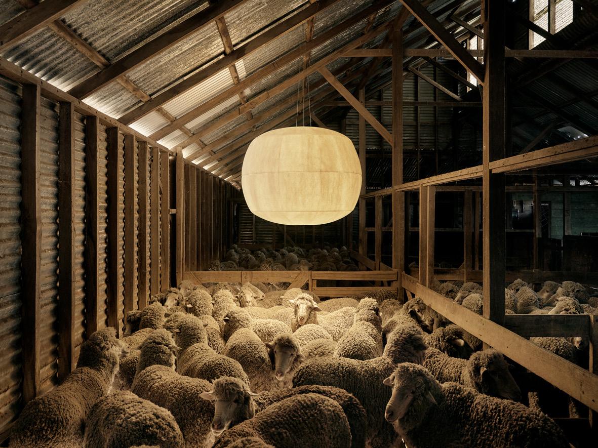
The collection is distinguished through its use of Australian wool blended with plantbased bioplastic, creating a material that is not only beautiful with natural acoustic benefits, but is also certified compostable. It was a personal project for both the studio and manufacturer – Rakumba’s Murray growing up on a wool farm in Australia, where the product’s campaign was photographed. “Rakumba are so invested and interested that they want to put in that that layer of detail. That doesn't happen a lot,” Joel adds.
Where next? A slew of future projects awaits, from upcoming furniture and lighting launches to experimental projects in marble and textile. The duo have a desire to work with more UK-based brands. “There’s a cultural connection between Australia and the UK,” Joel muses. “It's an ‘island mentality’ – the UK and Australia being sort of separated from other cultures. Over here in Europe we are so much more connected to different cultures of design – Italian, German, we see it all. For example, with Danish design, you often know what you're going to get. UK design is about being contemporary and an exciting mixture of all these other cultures.”
As for sustaining a happy marriage alongside a happy business, the couple’s work-life balance appears to hang perfectly. “We like spending time together,” Kate smiles. “We’re not lone wolves – we have fun together.”

Laura Perryman is a colour designer and forecaster with over 18 years of experience in CMF design across multiple industries. The author of The Colour Bible, she is interested in material and sensorial experiences of colour. She directs Colour of Saying, a UK-based colour and material futures consultancy.
colourofsaying.com
@colour_of_saying
When did we start believing that professional spaces had to be serious to be taken seriously? Walking through countless corporate environments, I've witnessed what I call 'beige fatigue' – endless expanses of clinical whites and corporate greys. Yet something fundamental is shifting. There's growing recognition that our spaces need to do more than function, they need to lift us up.
The conversation around 'happy design' isn't feel-good rhetoric; it's a response to mounting evidence that our physical environments directly impact mental wellbeing and productivity. But what makes one person feel joyful might overwhelm another. This is where neuroinclusivity enters the colour conversation, acknowledging that our brains process sensory information differently.
Recent research reveals that certain colour combinations can measurably boost mood and cognitive performance. Warm yellows stimulate creative thinking, while specific greens reduce eye strain and promote focus. But the magic happens in nuanced layering, creating what I call 'thoughtful colour layering.'
Take a recent studio project at The Eades in Walthamstow, where I designed a guest suite using colour psychology principles. Rather than defaulting to rental-standard neutrals, we created distinct
emotional zones: warm, welcoming tones in living areas with pops of orange, green, pink and blue; while the bedroom embraced moody, high-contrast shades, with dark reds and blues that research shows promote deeper sleep. Neuroinclusive design means providing variety within a cohesive framework.
Traditional accessibility focuses on physical barriers, but neuroinclusivity challenges us to consider cognitive and sensory accessibility. For individuals with autism, ADHD or sensory processing differences, colour intensity, contrast levels and surface finishes significantly impact their ability to thrive.
This doesn't mean bland environments, quite the opposite. In one hospitality project, we created distinct zones: high-contrast, vibrant areas for those who find stimulation energising, and softer sections for those needing respite. The result wasn't segregation but an inclusive environment where everyone could seek out their optimal sensory space.
The business implications are compelling. Research shows that employing warm shades within waiting zones manipulates users' perception of time; customers feel more at ease and stay longer, encouraging exploration before making a purchase. Most significantly, these
approaches attract and retain diverse talent. As workforces become increasingly neurodivergent, creating environments where different minds flourish isn't just ethical, it's essential.
How do we translate this into actionable strategies? The Eades project taught me about creating ‘emotional zoning’ – using colour to define psychological territories within a space. This means designing gentle colour progressions that allow people to migrate naturally to environments suiting their needs.
Consider texture and finish as carefully as hue. Matte surfaces reduce glare for light-sensitive individuals, while strategic reflective accents energise without overwhelming. Layer lighting temperature with colour choices; warmer light makes even ‘cool’ colours feel more inviting.
The most exciting projects I'm working on involve collaboration with neuroscientists and neurodivergent consultants. Together, we're discovering that designing for difference creates richer experiences for everyone. The optimistic palette isn't about forced cheerfulness; it's about spaces acknowledging the full spectrum of human experience.
After all, if colour is one of our most powerful sensory design tools, shouldn't we use it to create environments where every mind can flourish?

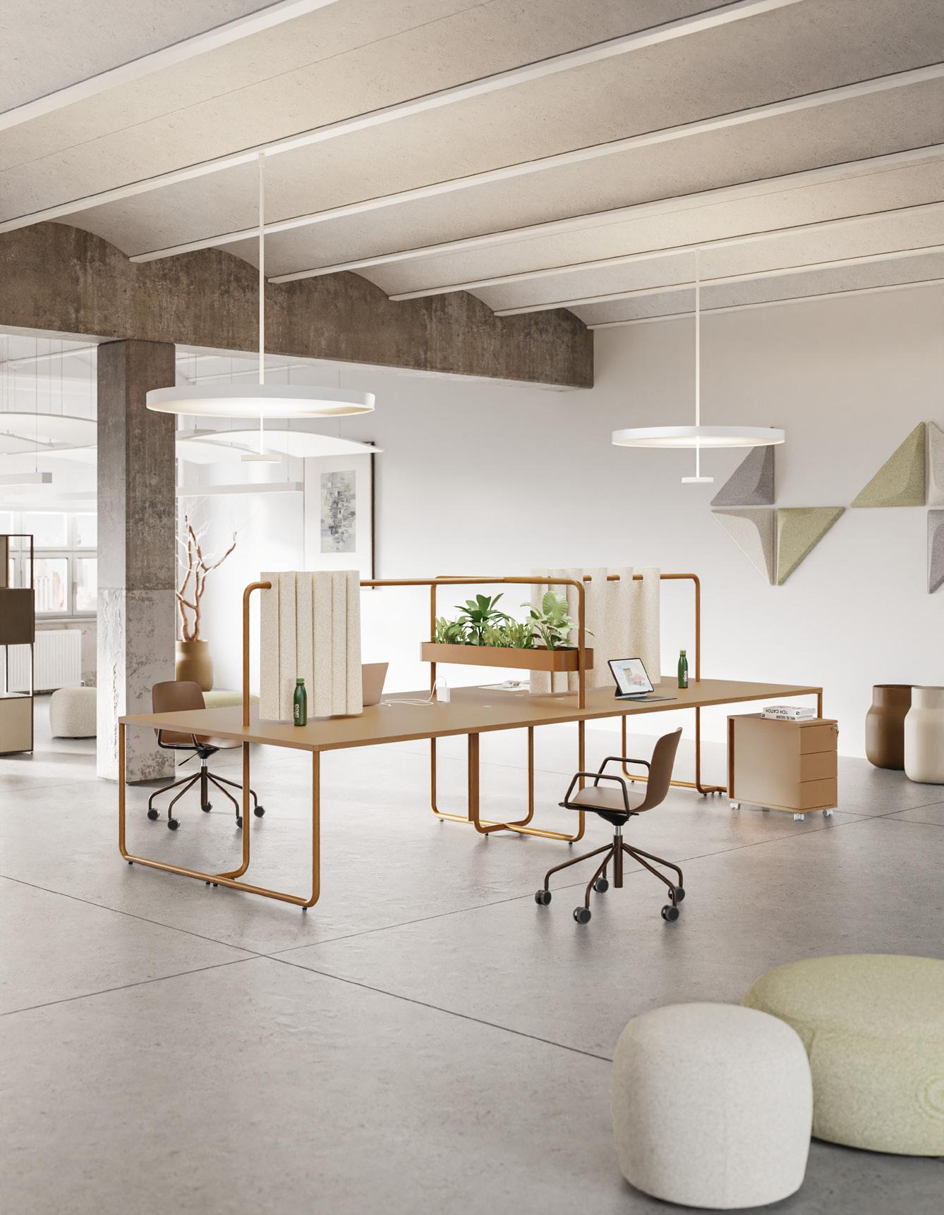
Smart, scalable, and effortlessly stylish, Align is our contemporary desking collection designed for the modern workspace.
With a choice of leg styles and a variety of finishes to suit your scheme, Align adapts beautifully to any setting – from focused solo work to collaborative, open-plan layouts.
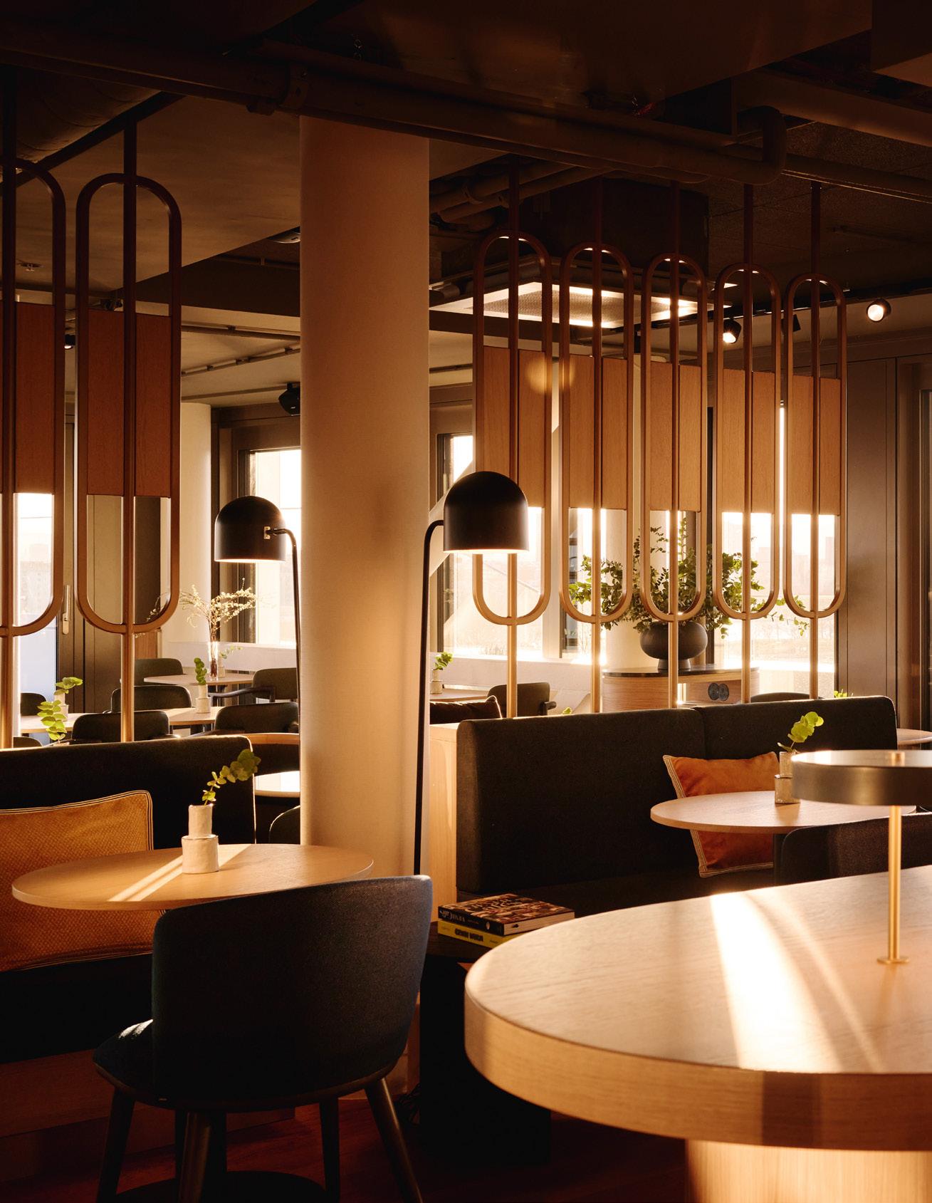
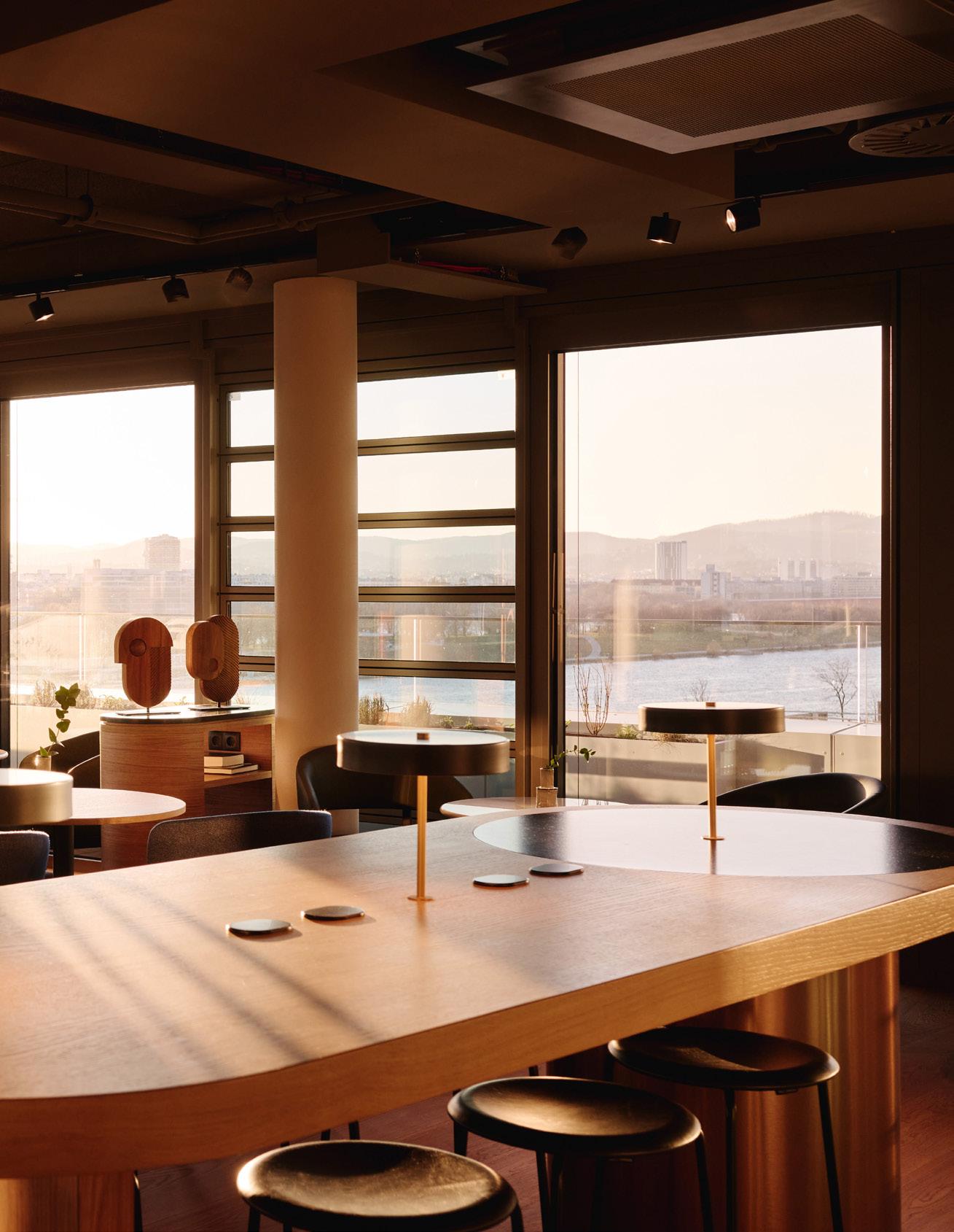
For the first A by Adina in Europe, BWM Designers & Architects brings a flavour of Australia to Austria.
A certain mythos surrounds Vienna. It’s a city famously swathed in shadow in the 1949 film noir, The Third Man, and the title of Ultravox’s enduring 80s lament – Midge Ure’s cry of ‘oh Vienna’ set to a haunting musical base, the video all smoke-cloaked streets and buttoned-up trenches. Then, of course, there’s its long association with classical music and art, a rarefied cultural aura manifest in its stately architecture and courtly demeanour. By contrast, it isn’t a place one thinks of in relation to towering, glassy skyscrapers; the dusty, sun-worn colours of Australia; or of sipping cocktails in swish infinity pools. And so, in this respect, the recently unveiled A by Adina Vienna is a dash of the unexpected.
A 120-key aparthotel, A by Adina Vienna is an assembly of novelties: the first of the A by Adina brand (from the Australia-born TFE Hotels) in Europe, occupying five floors of the tallest residential tower in Austria, in a location removed from the traditional tourist core overlooking the Danube. In Donau City, one of Vienna’s newest urban quarters, one won’t find gaudy souvenir shops or queues of coaches, instead contemporary high rises, sprawling green space and, on the adjacent Danube Island, riverside bars and restaurants. On a clement summer’s day, locals languish in swimwear by the water, cycle along tree-lined paths and while away the hours on park benches. It’s all a dramatically different vision of Vienna than the more familiar imperial grandeur, but equally enticing and – for visitors – largely untapped.
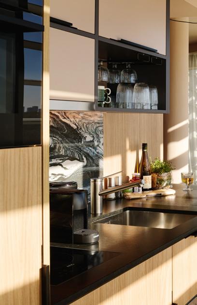
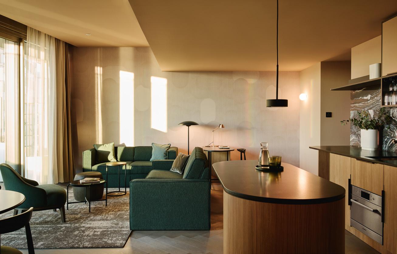

BWM Designers & Architects led on the interiors of A by Adina, which also sidesteps the usual Viennese tropes. Instead, Australia provides the primary inspiration.
“They [A by Adina] have more of a brand spirit than a brand standard,” explains Erich Bernard, BWM’s founder and managing partner, on the brief established at the outset. “It wasn’t that people should feel like they had arrived in Australia, but that it should establish a connection to the brand’s homeland.”
By virtue of its height (the building stretches to 180m), and the raft of floor-to-ceiling glass, the property innately befitted from bewilderingly panoramic views. And so, as Bernard explains, Vienna was already a constant and inescapable presence; the city’s increasingly eclectic skyline not something he wanted, or needed, to compete with. “Those astonishing views were really [a gift],” he continues, “as it meant we didn’t have to lean too heavily on the Viennese idea; we have Vienna outside, so we don’t have to do Vienna inside. I didn’t want to do another ‘fake’ take on the city – there was scope to do something different.”
Image on previous page: Inside Lottie’s main dining room at A by Adina
Left:
A guest suite lounge area with soft seating
Centre:
Cyclical panoramas from the guest suite kitchenette
Right:
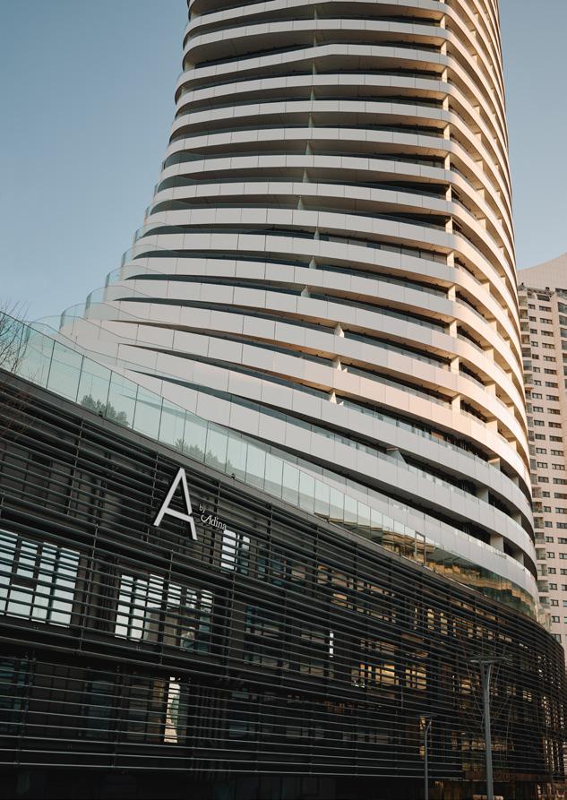
The external elevation and branding
“It’s the best view of the best city in the world.”
Above right:
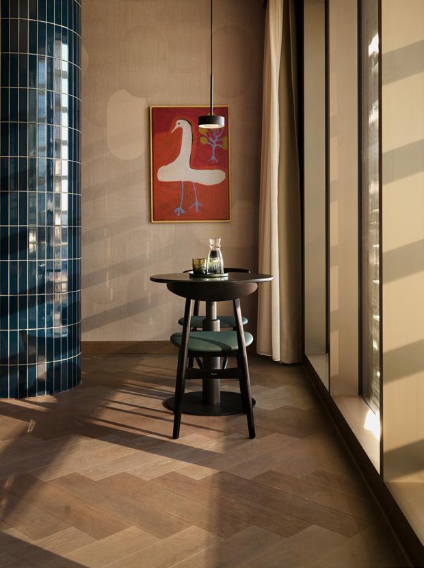
Dining area and artwork inside a guestroom
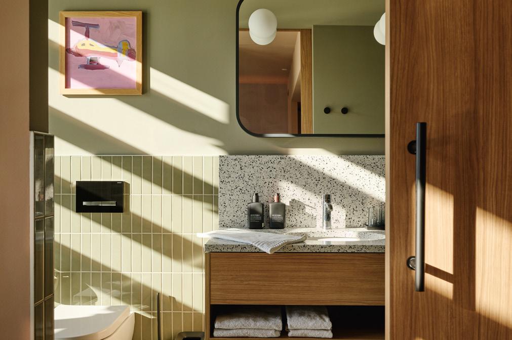
Below right: Green tiles characterise guest suite bathrooms
Avoiding pastiche across the board, the antipodean influence isn’t heavy handed but – across the studios and one- and two-bedroom apartments – reflected in materiality, colour and silhouette. An earthy palette nods to dry grass, with muted, chalky green; to the open sea, with deep blues; and to the wide, rolling mountains, with a weathered, sensitive red. “And then there’s the curves,” suggests Barnard, “in the free forms of the carpets, in lamps, in the softness of some of the details. This is really a representation of the Australian landscape, but expressed subtly.”
The apartments vary in scale from a neat 30 sq m to a roomy 96 sq m, but remarkably no two are the same. One of the challenges for BWM – and quirks of the build – was the sheer diversity of the floorplates, necessitating design that could be thematically, if not exactly,
replicated throughout. The studio developed an initial set of 20 broad-stroke room variations and, from those, adapted individually – esoteric corners becoming banquette-lined spaces for morning coffees, narrow through-spaces imaged as reading nooks and expansive outdoor terraces furnished for entertaining. But, still, those common threads: Cipollino marble splashbacks in the compact kitchenettes, robust parquet flooring and artwork by Indigenous Australian artist, Doreen Chapman; in the larger quarters, a few extra amenities, including deep, freestanding Laufen bathtubs.
“They aren’t ‘supermarket hotel rooms’,” details Barnard, “every one is special. And what A by Adina wanted us to deliver is a very particular kind of luxury – not cliché luxury, loud or gold and shiny, but instead understatement as luxury, cosiness as luxury.”
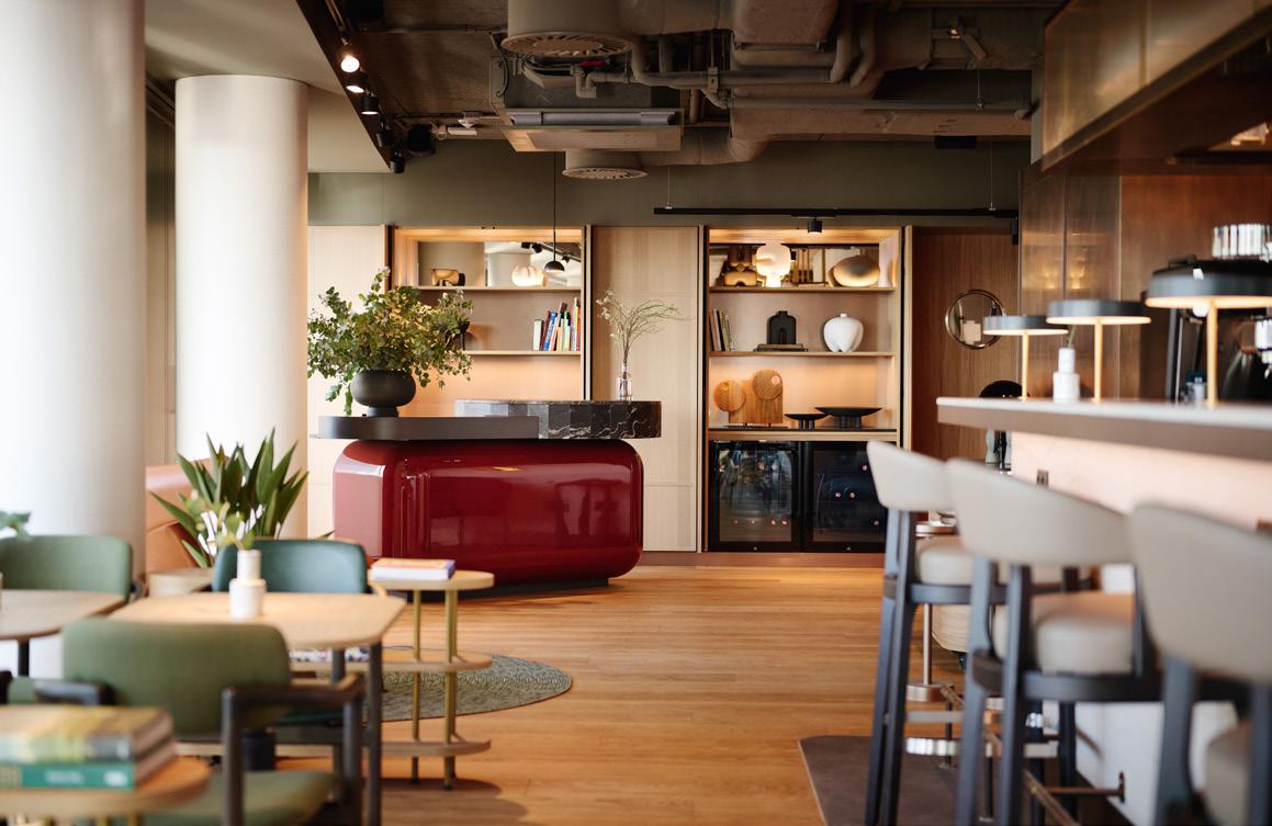
Whether on a shorter city jaunt or a longer stay, saunas, a state-of-the-art gym and that infinity pool, provide opportunity for both activity and respite without leaving the building, while Lottie’s segues from breakfast room and lounge to bar and small plates restaurant by evening.
“What became Lottie’s was only intended to be a kind of living room at first,” notes Bernard, on what is now one of the aparthotel’s defining and most impressive spaces. “Because it was something of an architectural leftover; a difficult room with a shaft in the middle. But it has this incredible view and as the concept for the property kept developing, the opportunity for it to be something more than a living room also grew. So we removed the shaft, which made room for a bar, and the idea of Lottie’s as a proper place to eat and drink was born out of that.”
It’s an undeniably slick spot, unfurling from an unobtrusive reception desk into a comfortable hangout and further onto a planted terrace overlooking the river and into Vienna – landmarks such as the ferris wheel and St. Francis of Assisi Church punctuating the skyline. “For me,” says Barnard, “it’s the best view of the best city in the world.”
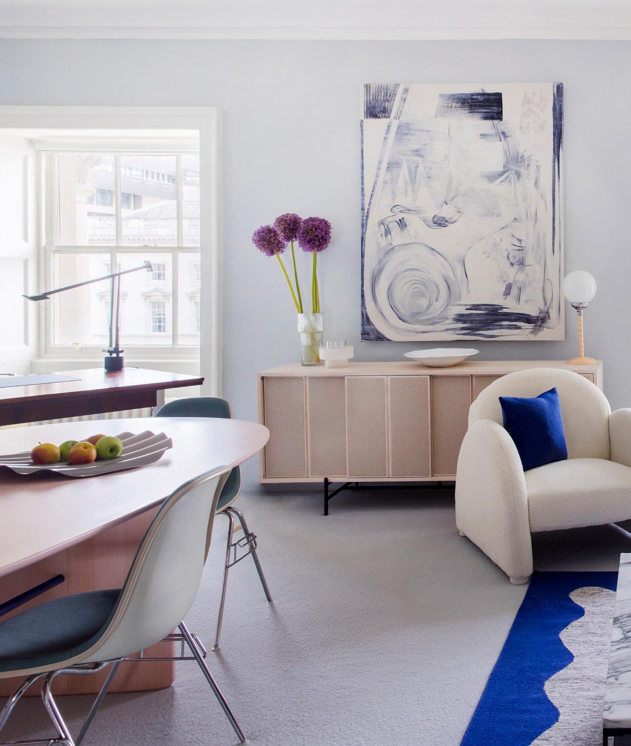
Marking its first commercial office project, 2LG Studio creates a home away from home for theatre director Jamie Lloyd at the prestigious Somerset House.

Words: Charlotte Slinger
Photography: Megan Taylor
Image on previous page: The lounge area is awash with natural light
Above: Refreshment station and soft seating
The site of major historical events dating back as far as 1604, Somerset House has been ingrained in the fabric of London for centuries, from hosting treaty negotiations for the Anglo-Spanish War to narrowly escaping the Great Fire of London. In more recent history, the vast neoclassical building has operated as a centre for arts and culture since 1779, hosting exhibitions, festivals and screenings for some of the world’s leading artists. Not many people spend their 9-5 in a heritage landmark like this one, but for staff at the award-winning Jamie Lloyd Company, this is home.
Winner of four Olivier Awards, two Evening Standard Awards and, most recently, the Tony Award for his revival of Sunset Boulevard, this spring director Jamie Lloyd moved his theatre company into the West Wing of Somerset House –for the second time in a year. Soon after the space was first completed in August 2024, it seemed that the building’s past fortune of avoiding fires ran out, and the West Wing caught ablaze. The office and much of the furnishings within suffered significant damage, providing designers 2LG Studio the rare opportunity to revisit one of their most recent projects. Founded by partners Russell Whitehead and Jordan Cluroe, London studio and consultancy 2LG has long been a recognisable name
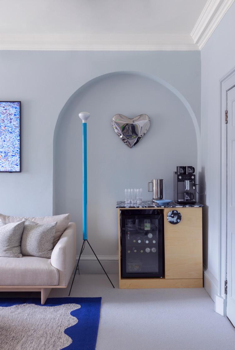

on the design scene, creating tentpole installations at Clerkenwell Design Week and appearing as guest judges on Channel 4’s Changing Rooms. Known for their distinctive use of colour and joyful, expressive product collaborations, Lloyd reached out to the duo and prompted them to undertake their first commercial workspace. Despite his typically minimalist style onstage, the director envisioned his office with a softer, more homely feel, something that spoke to 2LG’s experience in residential design and styling.
“We both had previous careers in theatre and TV as actors, so this project was hugely significant to us,” say Whitehead and Cluroe. “I think Jamie chose us for this project because he wanted a residential feel to the space and he doesn’t see boundaries between work and home design in many ways – it’s all part of the human experience.”
Occupying a modest footprint of 700 sq ft, the office consists of two adjoining rooms for Lloyd’s small team. The airy, light-filled shared workspace was informed by Lloyd’s beliefs as a practicing Buddhist, with each desk arranged according to his team’s ‘power positions’ – the direction each individual faces for success to flow easily.
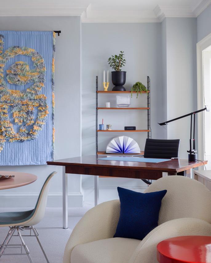
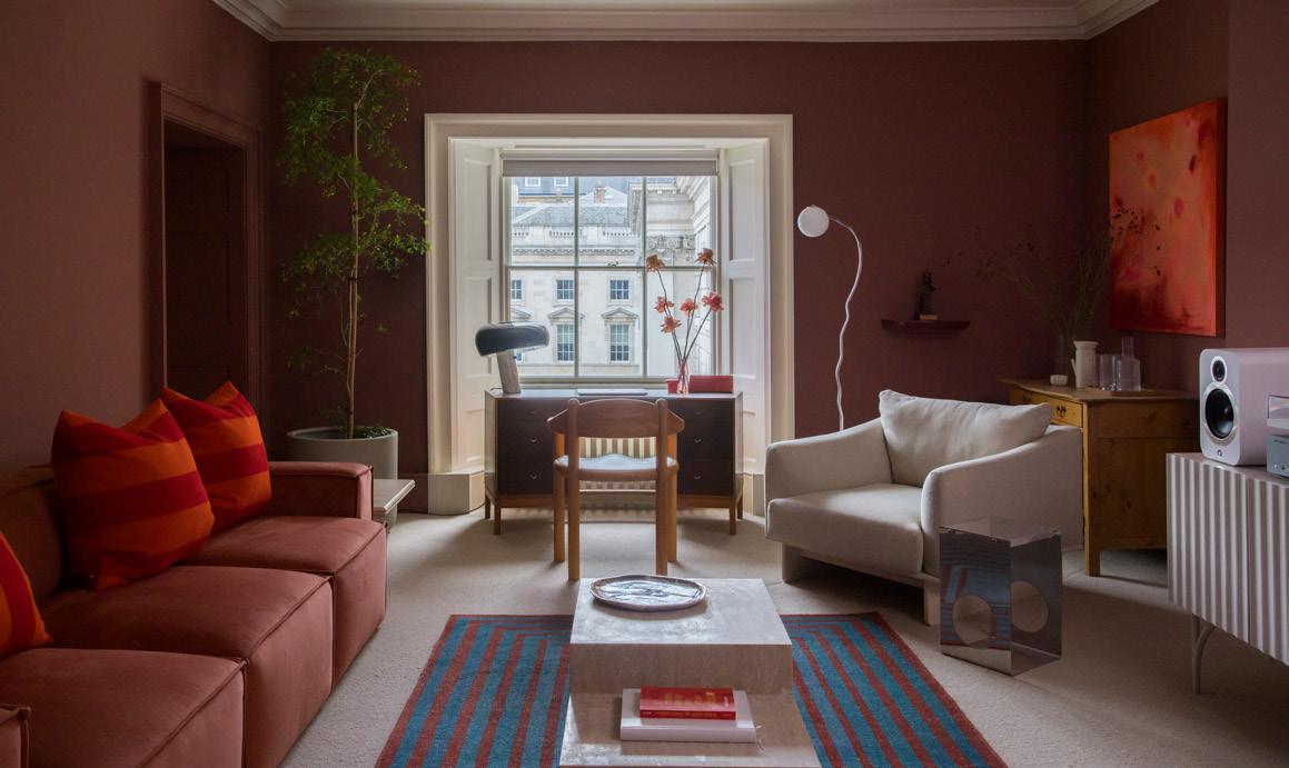
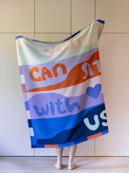
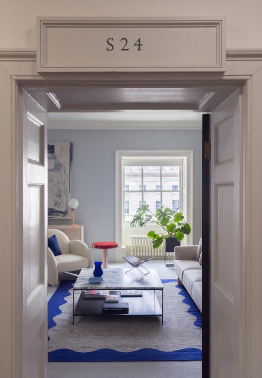
“There was also a strong steer to eliminate clutter and reduce the number of drawers, to discourage items being left or forgotten about,” adds 2LG. “It’s all about living in the present moment and not being held back by physical clutter.” Lloyd therefore gave the studio full rein to create a dynamic space for his assistant and close-knit team of young creatives. Against a backdrop of grey-blue walls, a tufted wall hanging with cobalt blue and butter yellow accents smiles down at the central table and mid-century chairs below, a collaboration with Granite + Smoke for 2LG’s exhibition at London Design Festival 2023, ‘You Can Sit With Us’.
Despite moving the office two doors down after the fire, Lloyd wanted much of the original concept to stay the same. “The challenge was to make it feel fresh whilst retaining the atmosphere Jamie loved so much when we first delivered it,” the duo explains. “Changes were small and we tried to save any pieces we could so that there was no needless waste.” For his own office in the neighbouring room, the director wanted the space to feel comfortable yet elevated, with a ‘moodier, Bat Cave vibe’.
Often hosting meetings with actors such as Sigourney Weaver and Nicole Scherzinger, the space had to make an impact, with terracotta-hued walls, Gubi dining chairs, bespoke rugs created with FLOOR_STORY and, at its heart, an enveloping, cloud-like sofa by Phillipe Malouin.
As is the rule in most design lovers’ homes, the ‘big light’ is banned – but not just for aesthetics. The Grade II-listed building has strict parameters as to what can be altered, with the original doors and existing light fixtures out of bounds.
Flooring
Floor Story x 2LG Studio
Westminster Carpets
Furniture
SCP
Ercol
Crystal Palace Antiques
Swyft
Nest
Surfaces
Smile Plastics
Kvadrat (Raf Simons)
London Marble
Lighting
Aram
Flos
Hay
Six Dot
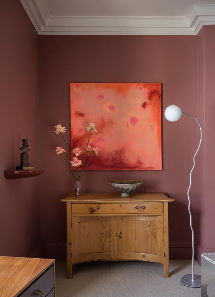
Opting to leave the large, overhead panel lights turned off, the space instead receives a softer, more forgiving glow from freestanding pieces including an abstract Six Dots floor lamp and a Flos Snoopy lamp perched on Lloyd’s desk. The smaller footprint allowed 2LG to fill each room with these tightly curated picks and personal touches, with vintage pieces selected from local gems like Crystal Palace Antiques and display shelves stacked with eclectic vinyls, ranging from Nils Fram to Tyler, the Creator and, of course, the Sunset Boulevard soundtrack. Also drawing from a background in art, Whitehead created custom artwork for the space, weaving in hidden references to actress Betty Buckley – whose West End performance in Sunset Boulevard had a huge impact on the designer as an early teen.
With their first office project now restored to its former glory, can we expect more from 2LG in the commercial sector? “We would love to explore more workspaces and certainly have a passion for designing more commercial spaces going forward,” the duo says. “The challenges are different, but our approach is the same: to create a human space that promotes connection, creativity and growth. It’s why we love what we do.”

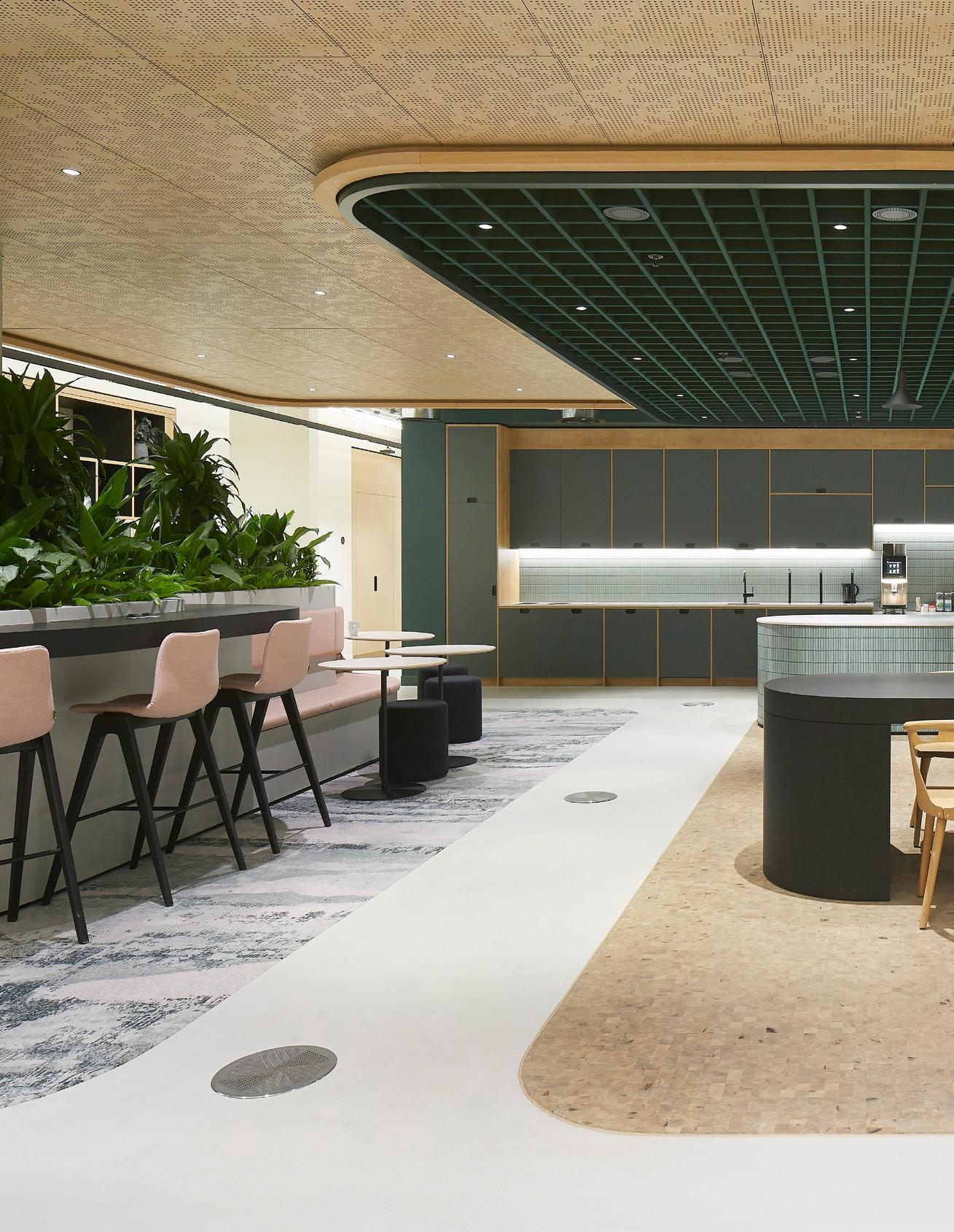

At Reed Smith’s London HQ, tp bennett explore the art of the possible.
Words: Helen Parton
Photography: Hufton+Crow
Image on previous page:
Communal kitchen and dining facilities
Below:
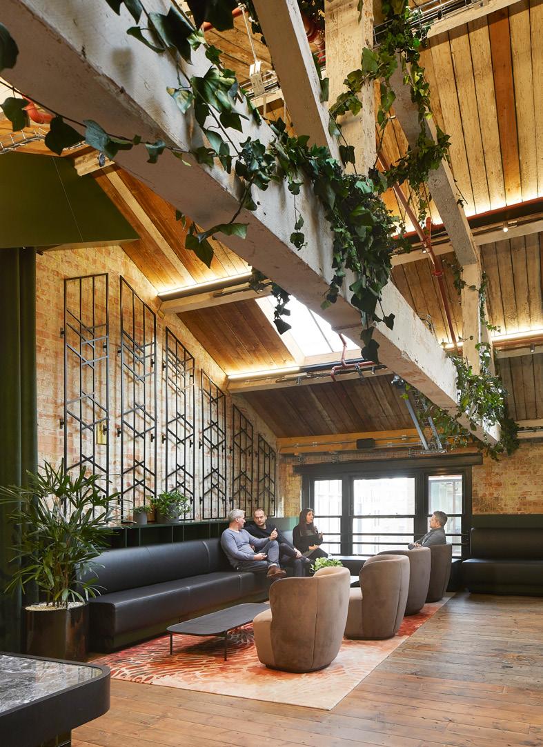
Breakout spaces for relaxation and collaboration
ne of the things the client asked was 'are we cool enough to pull it off'; that was their challenge,” says Mark Davies, principal director at tp bennett, the practice responsible for the new home of law firm Reed Smith. We’re standing in the reception of Blossoms Yard, near London’s Liverpool Street, part of a 115,000 sq ft workspace which spans eight floors. As we head to the first floor reception, Davies goes on to explain that the interior “brings in that edge of Shoreditch”.
The legal sector is known more for its cautious approach to workplace design (still clinging on to cellular working when most other industries embraced open plan long ago). So what was tp bennett’s secret in bringing Reed Smith into a new era of flexibility, variety and style?
“We created an area in their old office which allowed them to see the art of the possible,” adds Davies, citing that before 30% of the space was open plan, with 70% cellular but, here in their new office, those figures have flipped. “From a business perspective, we wanted people making connections and working in other environments,” adds Mark Matthews, Reed Smith’s EME Operations Director.
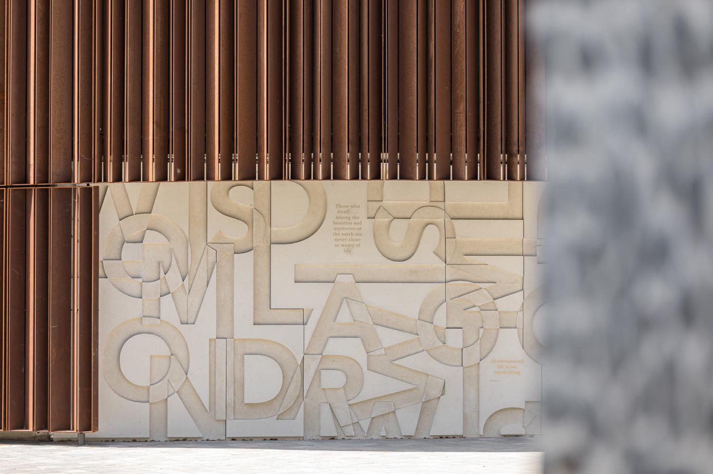
The office is composed of two buildings, Blossom Studios, which was built in the 1890s and the new-build Blossom Yard, which faces onto the main road. The base build, by architects AHMM, has a modern brick warehouse aesthetic with ceramic panels that reference the cladding of what was a showroom for Nicholls & Clarke, a 150-year-old building materials supplier.


Standing in the courtyard of the project, Broadgate Tower, Reed Smith’s former high-rise home, peeps over the horizon.
Image on next page:
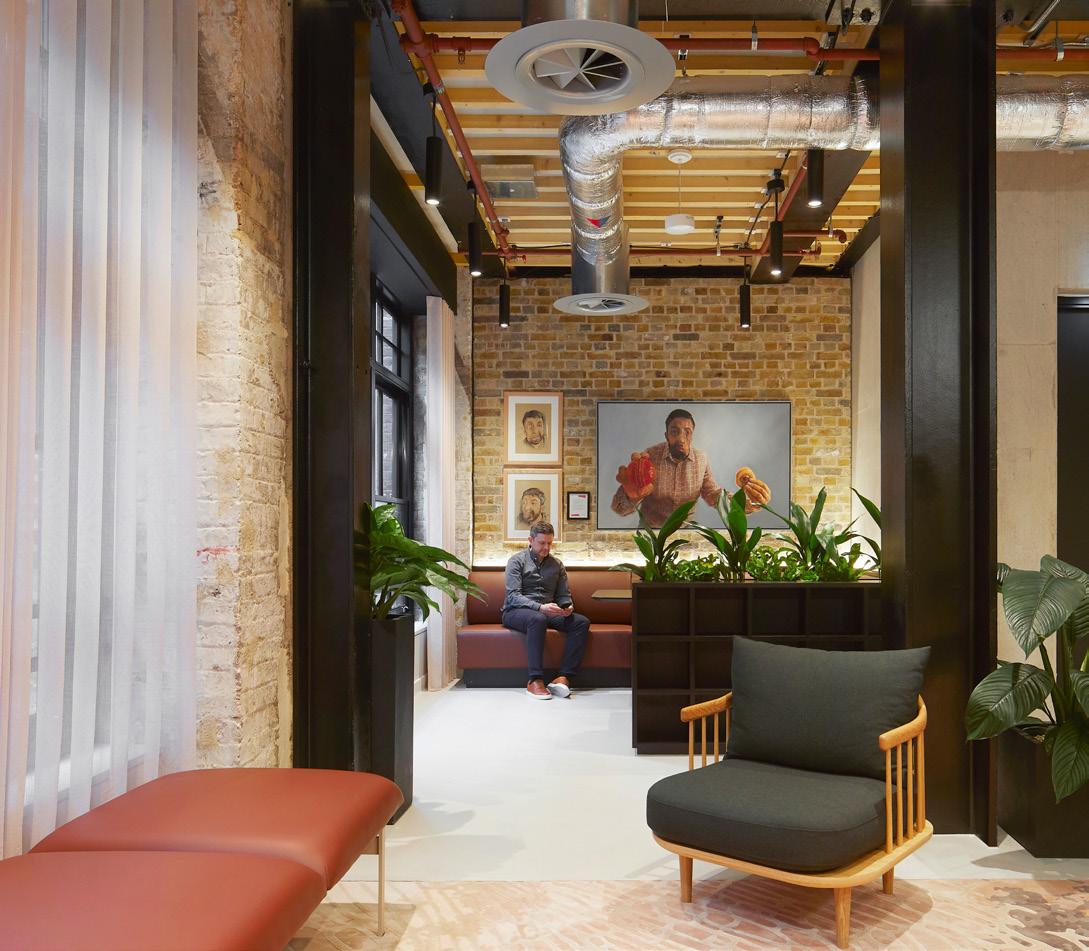
“This is not your average corporate tin can,” says Davies, provocatively drawing a comparison between past and present places of work for the law firm. Indeed the theme of old and new runs through this scheme, such as breaking through one of the walls of the old structure to create an internal atrium that reveals the brickwork of the warehouse’s former façade. The first three floors span across both buildings and one of the other primary connectors is a central staircase, designed within an existing lightwell, offering a physical and visual link between these floors of the Studios and the Yard.
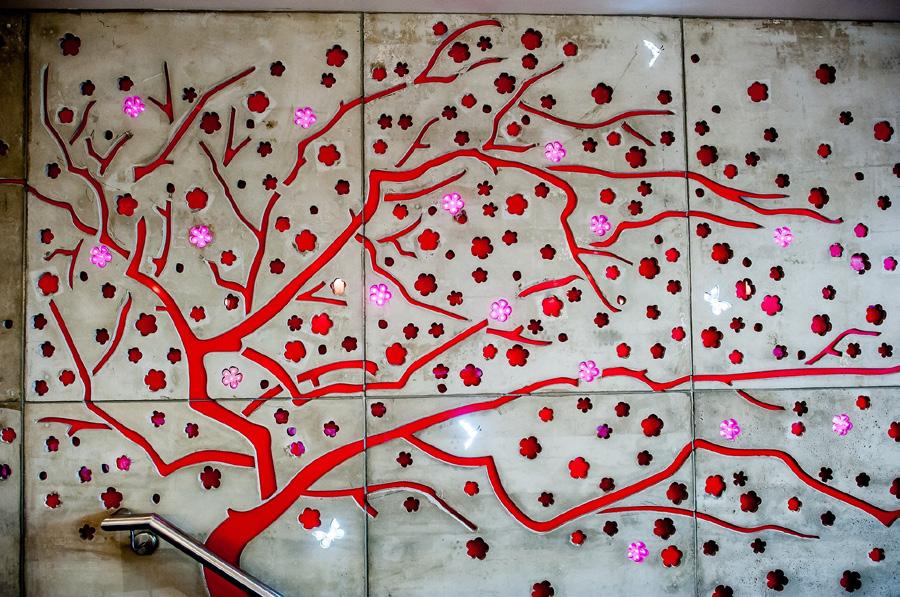
Level 1 is a bright welcoming reception with intricate blossom shapes cut out in the ceiling and a microscreed floor, while a level above brings you into one of two ‘hub’ spaces (the other being on level 7) with homely informal seating setups, lockers aplenty and flexible meeting rooms. Pinks, greens and pale timber dominate the colour scheme here with a slightly darker, moodier look and feel on level 2 – a floor also featuring a whole wellness suite with fitness studio, quiet room, parents’ room and a multi-purpose treatment room. This floor is also where you’ll find a carefully designed workspace for global children’s charity Theirworld, reflecting Reed Smith’s commitment to supporting social opportunities.
“The design is based on three interconnecting circles or cogs, and it also doubles up as an events space.”
You’d be forgiven for thinking you were in an East London night spot on level 3 with its club-like space and stone bar, with walls of exposed brick and timber frame, raspberry hued seating and masses of planting, where colleagues and clients can mingle.
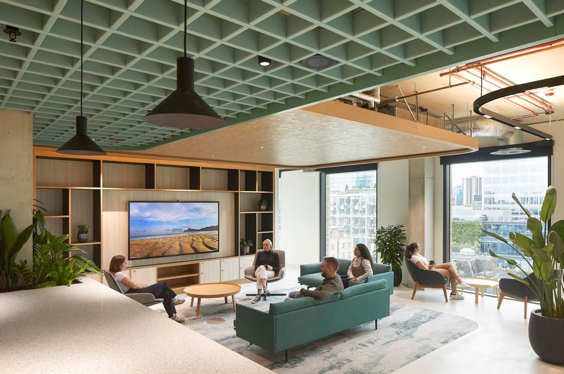
The same goes for level 4, a social hub called ‘The Mill’ intended for eating and gathering. “The design is based on three interconnecting circles or cogs,” explains tp bennett’s Chiara Dal Pozzo, associate director, adding that “it also doubles up as an events space.” Mark Matthews and his team are also based on this floor, in the heart of the action and he’s keen to stress that before client and employee spaces were quite segregated. “Now there’s a nice overlap,” he says. This space features adaptable furniture elements that can be
easily be moved depending on the type of event. It’s also connected to an adjoining external terrace with furniture in ontrend blush shades. Further refreshment points can be found in the ‘kiosk’ style setups on, for example, level 3.
There is, of course, desk-based work to be done here too for the 640-strong staff headcount and to this end, there are a mix of open, agile and private workspace to suit the employees’ preferences. The open plan areas have been prioritised along the façade side of the floorplates, while the cellular spaces are on the inside, a deliberate move to encourage greater collaboration. And this being the legal profession, confidentiality is paramount with effective soundproofing in meeting rooms where private discussions are being held. Elsewhere, acoustics were
“This is not your average corporate tin can.”
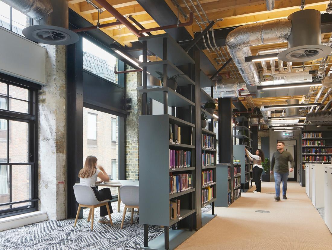
an interesting case in point, “We weren’t allowed to spray the soffits,” explains Dal Pozzo, “so we had to think of alternative solutions.” These range from colourful grids in the ceiling to fan shaped pendants by BuzziSpace to perforated timber solutions. Quiet is the order of the day in library areas too, where black bookcases separate small group areas.
Crisscrossing more into the ‘old’ Studios part of the project, there are remnants of its former use: a fire door and an original winch in a meeting room here, another exposed brick wall there. “It was something of a coordination challenge but these imperfections are what makes the building interesting,” says Davies, describing the scheme in conclusion as “the essences of a new and old building in a way that responds to architectural heritage and offers a modern, rejuvenated workspace. It’s a characterful not corporate office and not faddish.”
Flooring
Mafi
Element 7
Furniture
The Furniture Practice (products from: Gubi, Knoll, NaughtOne, &Tradition, NORR11, Cappellini, Normann Copenhagen, Muuto, Brunner, Kettal)
Other
Autex (acoustic ceiling panels), Shaw Carpets, Havwoods, IdealWork (microscreed), JBH (fabric walls and ceilings), TMJ (joinery), Tai Ping (rugs), ADS (decorators), TopAkustik (acoustic timber ceilings), Quadrant (carpets), Radii (partitions), Soltech (blinds & curtains), SAS International (ceilings)

aleaoffice.com |
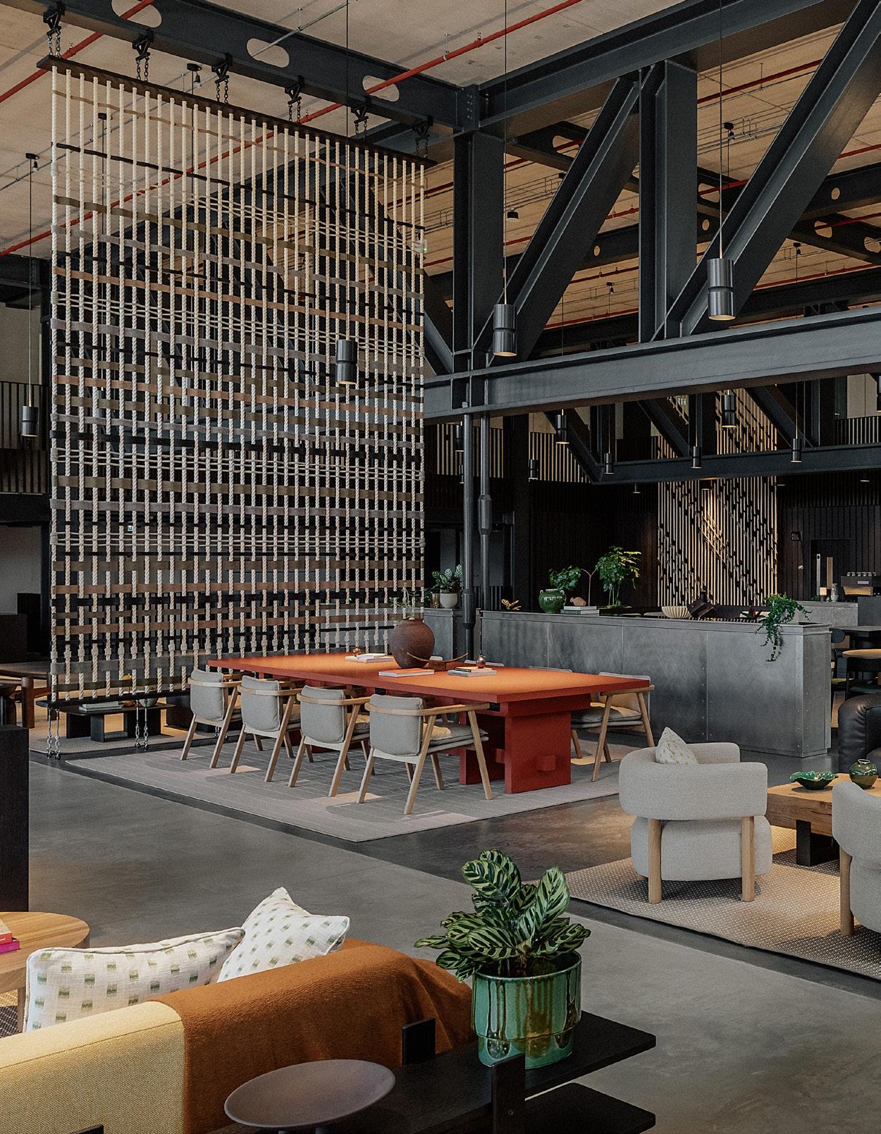
Unveiling hybrid office space in London’s first new town for over 50 years, Conran and Partners and Allies and Morrison craft a warehouse space with heart.
“One of the best ways to create a place that feels real is to look at the history of the place and its people.”
Canada Water is an emerging development hub with an enviable postcode. Decades in the making, this area in Southwark’s Old Surrey Docks has been undergoing some form of regeneration or investment since the 2000s, with the current 53-acre masterplan by developers British Land promising to deliver London’s first new town in over 50 years.
With 130 acres of wildlife-rich green space, the dockland neighbourhood (set to include state-of-the-art offices, new homes, retail spaces and leisure centres) is being positioned as something of a rival to the nearby Canary Wharf – its leafier, trendier and somehow more tranquil sister, if only a ten-minute tube ride away. In progress for nine years, the first commercial building has now been completed, with architects Allies and Morrison and interior designers Conran and Partners tapped to create Dock Shed: a warehouse space with heart.
For 200 years, this dockland brought building supplies into the Thames from Europe and North America. Dock Shed therefore receives its name from the buildings that once occupied its footprint: simple sheds that covered stacks of

timber, drying them out ready for construction. “When you're working in a masterplan like this and have to create basically a brand-new neighbourhood, it's so hard to create authenticity,” says Michael Delfs, development executive at British Land. “One of the best ways to create a place that feels real is to look at the history of the place and its people. This history is what we've leaned on for a lot of the masterplan to create something that is both new, but which also feels authentic – like it belongs here.”
Architects Allies and Morrison also looked to archival photos to offer its contemporary take on the docklands, crafting a champagne-hued slat façade inspired by the old timber-clad buildings. “Because this was the first building going up on the masterplan, it was important that it had a mission statement and set a precedent,” explains Director Mark Foster. “We were mindful that it needed to be a precursor for what’s going to come next, setting
Image on previous page: Interdepartmental coworking space at Dock Shed
Left: Conference tables for collaborative working Centre: The floorplate is split into different islands with rugs and seating clusters
the mood for the development and how the architecture should be approached.”
Creating an L-shaped footprint, Foster’s team flanked the building with side streets and introduced plant-filled step-downs instead of a monolithic rear wall, in consideration of local residents. Dock Shed is also British Land’s most sustainable building to date, thanks to its use of XCarb steel, repurposed raised access floor tiles and recycled window frames saving as much as 400 tonnes of embodied carbon.
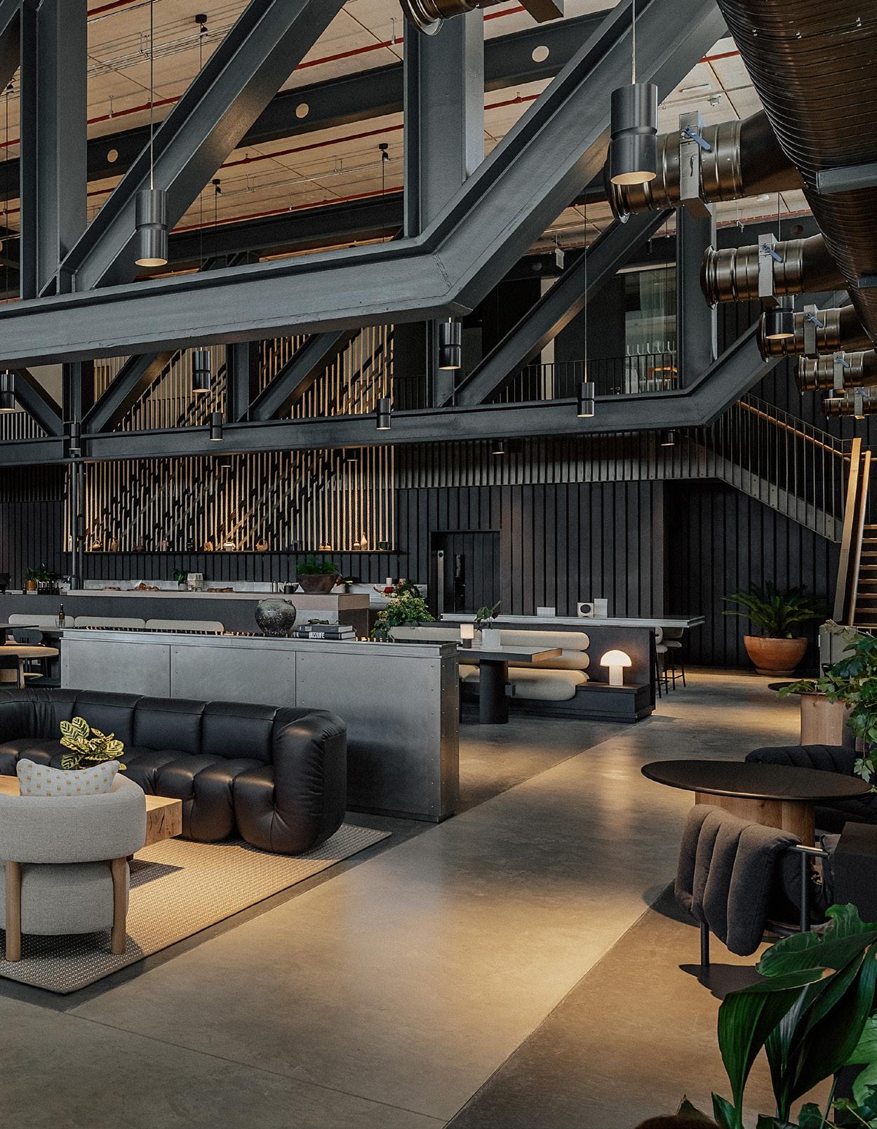
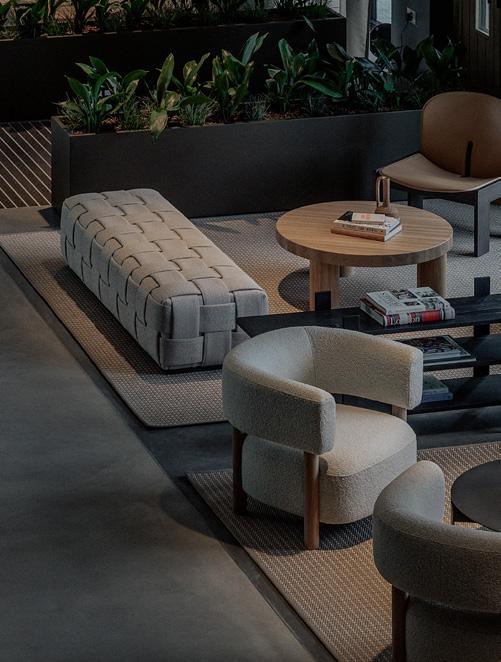
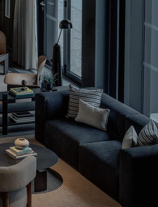
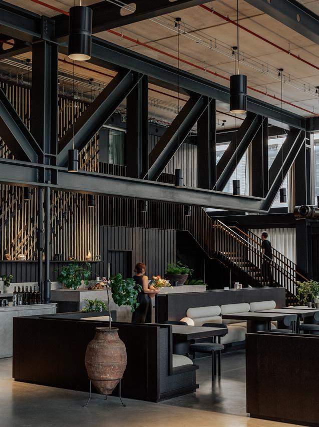
Inside, Dock Shed opens into an expansive, seven-metre-high warehouse: part lobby, part café and part social hub, it’s a welcoming face for the six-storeys of office space above, each level boasting a 40,000 sq ft floor plate and outdoor terraces with protected sight lines to landmarks like St. Paul’s and the Gherkin. The hybrid concept offers tenants a more informal space for coworking, taking meetings or simply a coffee break, with Conran and Partners tasked with bringing warmth and an elevated feel to an otherwise
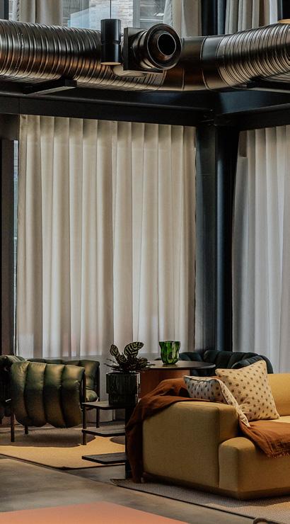
industrial scheme. Cultivating a communal atmosphere that also offers enough privacy, layered interventions like soft, doubleheight drapery balance the generous volume and acoustics, while sculptural seating arrangements encourage different modes of work and leisure.
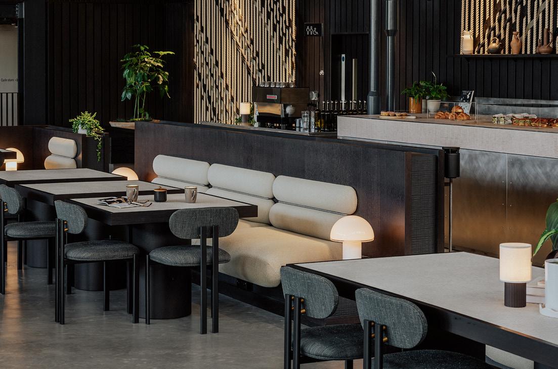
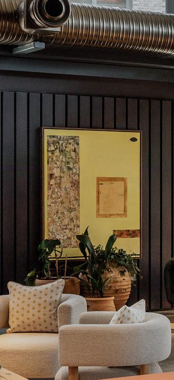
“Another challenge was our recurring theme of the ‘warm warehouse’ – if it felt cold, hard and a bit empty then we had definitely failed,” explains Conran and Partners’ Simon Kincaid. Ambient lighting, cushioned banquettes and verdant planting soften the concrete screed flooring and black steel trusses, introducing tactility with rattan rugs, Faye Toogood’s quilted Puffy Lounge chair and a modular leather sofa by de sede. And what it is it, exactly, that draws us to converted spaces like these? “As well as a feeling of authenticity, a lot of it is down to the flexibility and generosity of space,” answers Delfs. “There are so many things you can do with an old warehouse that you just can't in a typical office floorplate.”
Left: Spaces for dining back onto kitchen facilities
Below: Charcoal walling is offset by vibrant artworks
Right:
Steel beams and trusses have been painted and left exposed
Flooring
Lazenby screed Rols rugs
Furniture
Dodds & Shute for procurement. & Tradition
Mattiazzi
Aperatus
Carlo Scarpa Van Rossum de sede
Toogood
Surfaces
Na – joinery by Horohoe
Lighting 18 Degrees
Artwork
Installation fabrication by Art Story
Planting
Patrick Featherstone
Thanks to these generous proportions, the studio could enlist longtime collaborators Dodds & Schute to procure bespoke, oversized pieces, including a vast timber waiting bench and Van Rossum’s Adjacencies coffee table – both evoking a fallen tree. “High quality means longevity, so if you replace it less often, that’s a massive save in energy and carbon,” explains Kincaid. “This is something [Dodds & Schute] take very seriously – as a B-Corp company, they interrogate a lot of the supply chain to ensure that they're using materials that have been ethically sourced or manufactured, and that the furniture pieces come from companies that have the same morals and positions on sustainability as they do.”
The most notable custom pieces, created by Art Story, hang from the ceiling: three double-height installations weave sisal rope, cotton and carved timber to create permeable divisions that subtly zone each space, without blocking valuable light.
Diagonal woven lines echo the geometry of the colossal steel beams, an architectural feat in themselves bearing the 30-tonne weight of a new leisure centre below. This material honesty and raw, unfinished aesthetic continues with a stainless-steel communal table, crafted with a handfinished patina and exposed rivets. Against black timber cladding and sheer cream curtains, soft furnishings and artwork from British Land’s own collection also provide welcome accents of bottle green, burnt orange and mustard yellow.
With neighbouring mixed-use project
Three Deal Porters almost complete, British Land hope to turn Canada Water not only into a destination to work, but a place to stay. The developers use King’s Cross as an example, somewhat floundering in its early days before the bars and restaurants of Coal Drops Yard opened – instead, with spaces like Dock Shed, they’re baking in these ‘reasons to stay’ from the very beginning.
Words: Natasha Levy
Photography: Tim Salisbury
For wine merchant Flint, Mowat & Company designed a new-old workplace that nods to terroir.
It was 2006 when Sam Clarke and Jason Haynes founded the wine merchant Flint, with the aim of bringing fine wines from around the world to discerning oenophiles in the UK. Since its beginnings, Flint has championed the notion that the best tasting bottles are those that demonstrate a deep connection with their terroir: the natural environment in which they’re produced. Earlier this year the merchant sought to strengthen
its relationship with its own locale by commissioning architecture studio Mowat & Company to renovate its office in Kennington, South London.
The office occupies the ground floor unit of a four storey mixed-use building and has served as Flint headquarters since 2013. As time passed it came to be outdated and overcrowded, particularly as the number of staff grew to more than double in size. When Managing Director
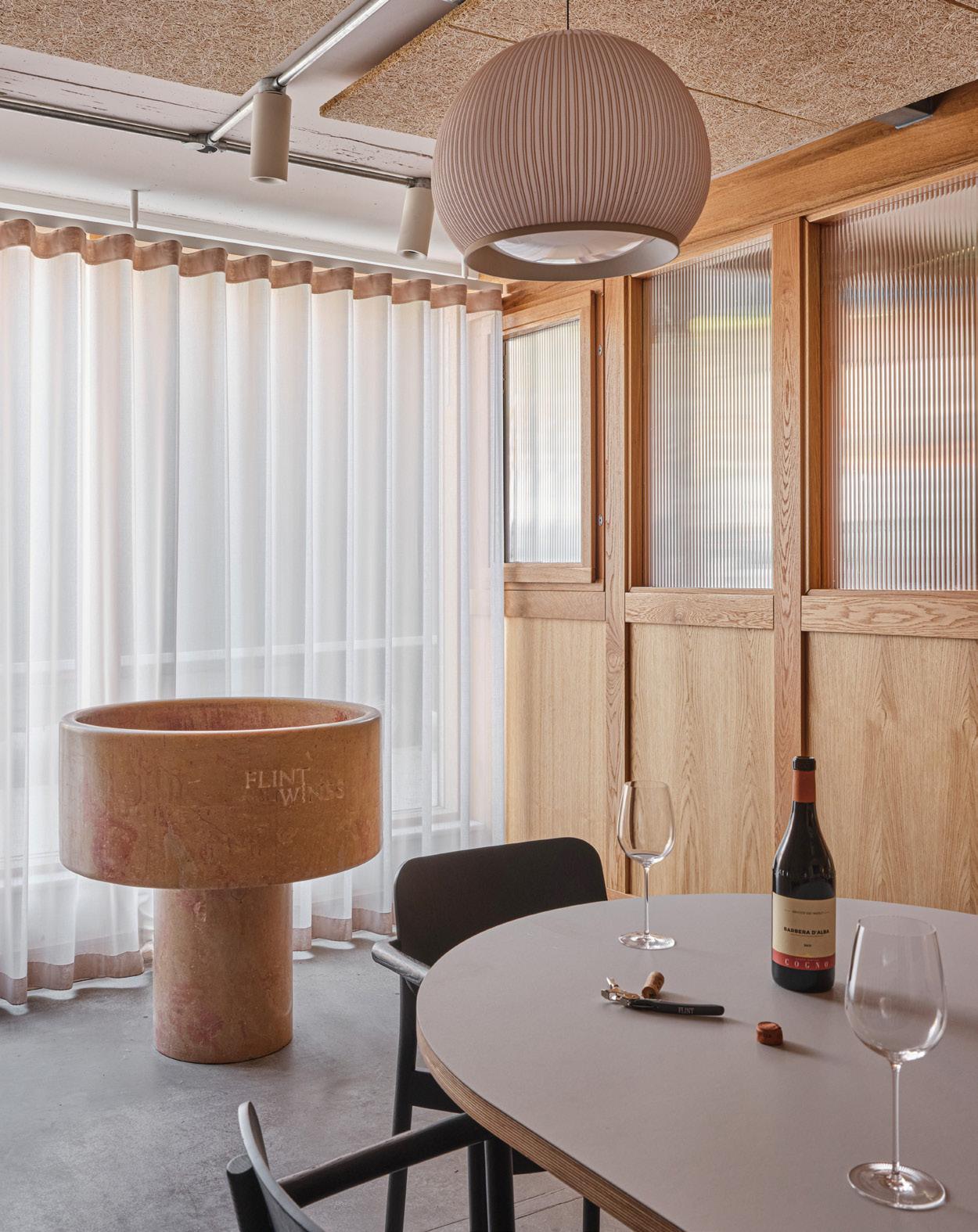
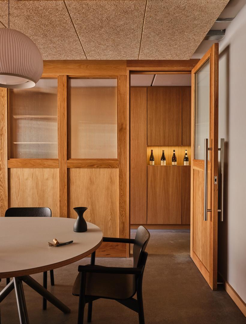
“It looked a bit like a student flat because there were wine bottles in every kind of nook and cranny.”
Image on previous page:
A wine spittoon is the focal point of the tasting room
Left: Timber panelling delineates the tasting room
Below right:
The entrance to Flint Headquarters is through a residential façade
Katy Keating came on board in 2023, she began searching for a solution. “We looked at all the options – move, or rent an additional office – but decided that with the right partners, our preferred route would be to stay in our quarters in Kennington,” she explains. “We envisioned a space that maximised the use of natural light and we wanted one that facilitated collaboration and connection – the reasons people come to an office in the first place.” In search of design inspiration, Keating went to visit the Mowat & Company team – who are based in the same building, on the first floor – to see how they had fit-out their own office. Following a few conversations and exchange of ideas, it seemed natural that the architects should take on the overhaul of the Flint office.

Mowat & Company ultimately decided to completely reverse the office floor plan. A lacklustre tasting room that used to sit at the back of the unit has now been relocated to the front where there’s a huge window, allowing for an abundance of light and views through to the street. The space has been finished with limewash walls, tactile wood-wool ceiling panelling and sheer floor-length curtains that can be drawn for privacy. Positioned just in front of the window is a spittoon that Flint has had for over a decade; its pink-tinged stone hails from the Burgundy region of France, where the merchant sources a majority of its wines. There’s also a table and chairs by furniture makers Very Good & Proper, whose showroom is located just a 10-minute walk away, and a trio of white lantern-like lamps. A cupboard that used to hold the boiler has additionally been converted into a butler’s pantry with a sink, glass storage and temperaturecontrolled wine cabinets, meaning tasting sessions can be carried out with the seamlessness of restaurant service. “It isn't really just an office, there’s also a bit of hospitality,” agrees Alex Mowat, the studio’s founder. “I think those two worlds are coming together more and more.”
“We are definitely more productive when we’re here.”
The rear of the plan accommodates the rest of the office, which has been decked out in natural materials. Oak cabinetry has been installed in the kitchen, along with a terracotta tile backsplash and pendant lights. Tall oak cupboards then span the length of the office’s north-east elevation. Cutting through the centre is an illuminated shelf where Flint can showcase a curated selection of wines that have been opened and sampled by clients; prior to the renovation, these bottles were retired to the exposed steel beams that ran across the office.
“It looked a bit like a student flat because there were wine bottles in every kind of nook and cranny,” jokes Emma Clarkson, architectural assistant at Mowat & Company. To ensure that the bottles stay in place and equidistant from each other, the architects created circular niches for them to rest in. “We spent a lot of time working out how many [niches] was too much, or too few,” adds Mowat. “If we spaced them out too much, it would be too minimal and wouldn’t show the range [of wines]; too many felt crowded and didn't look special. It was almost like setting up an exhibition.”
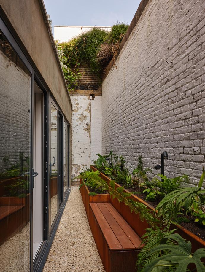
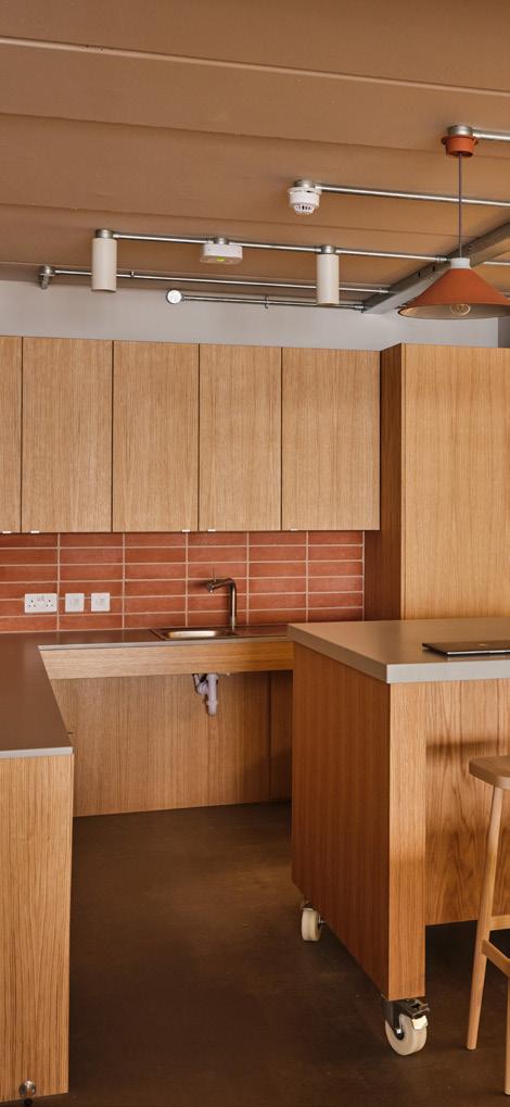
“We envisioned a space that maximised the use of natural light and collaboration.”

Running parallel to the shelf are a pair modular desks (also designed by Very Good & Proper), accompanied by Herman Miller chairs. Beyond this, there are two WCs and a pocket-sized meeting room where staff can go for one-to-one chats or private calls. Mowat & Company has also revamped the office’s rear garden, with the help of Kennington-based horticultural charity Walworth Garden. The narrow space was previously choked with climbing ivy that blocked natural light from filtering through to the office, but this has been cleared and replaced with low-lying plant beds made from Corten steel.
Overall the project took three months to complete, and now they’re settled in the Flint team are better connected to their office than ever: “We love our new-old space,” says Keating. “Our team comes in more often, we host more external meetings and we are definitely more productive when we’re here.” But it seems the renovation has fostered human connection too. “In any city you sort of know your neighbours, but you also don't,” concludes Mowat. “It became a bonding experience.”
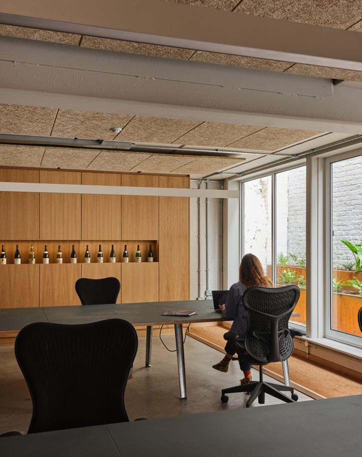

Something wonderful happens in cities across the country over the summer. Its councils, boroughs and private estates investing in cultural programming; bringing delight and optimism with creativity and culture.
I recently had a memorable day with my team, that reminded me how powerful these cultural experiences can be. We kicked off with a scavenger hunt across the city with each group racing to complete playful creative challenges. The day culminated in a visit to the new V&A East Storehouse where we got a behind-the-scenes look at countless artifacts displayed in the most creative way. I was reminded that in a world that so often feels difficult or divided, moments like this can underscore how culture offers a much-needed escape.
The unifying power of creativity isn’t limited to large public events, it can be harnessed in everyday spaces too. I’ve been thinking a lot about how and where we encounter culture, and who gets to decide what counts. I believe we’re in the middle of a shift, of how artists, businesses and communities
are creating new models that move beyond how we have traditionally ‘consumed’ art, in the museum or gallery. Today we are embedding art in our cities, lobbies, offices, hotels and public spaces. My business has spent years working with other businesses to do exactly this: bringing meaningful, surprising artistic experiences into the spaces people already inhabit. It’s not about replacing institutions, but expanding the idea of what cultural value looks like — making it more visible, more democratic and more alive.
Crucially, this kind of everyday access to creativity isn’t just a nice-to-have, it is increasingly understood to be essential to our wellbeing. The uplifting effect I felt walking around the V&A East, or the attendees of the Edinburgh Fringe are feeling this summer. isn’t just anecdotal, it reflects a broader truth that engagement with arts and culture can tangibly improve wellbeing. In the last decade, healthcare professionals in the UK have increasingly embraced social prescribing, where patients are referred to community activities like art classes or museum visits in lieu of medication. The results have
been remarkably positive: on average for every £1 spent on these activities, GP consultation rates drop by 37% and hospital admissions by 27%, equating to a £4 to £11 ROI. By reducing isolation and inspiring hope, the arts can play a therapeutic role for individuals and communities alike.
Ultimately, the true magic of culture is how it helps build belonging. Cities are vast and fast-paced, yet a communal cultural moment can make even strangers feel part of one big community. The arts have an incredible power to bring people together, a first step toward feeling at home. In that sense, taking part in cultural life can even be part of understanding the wonderful diversity of this country. You share the same joys and inspirations as your neighbours, forging common reference points and memories. It reminds us that no matter how difficult the wider world may seem at times, our creative and cultural life offers a hopeful refuge. By coming together to enjoy art, music, stories and creativity, we reaffirm what is best about being human –our capacity for imagination, connection and optimism in the face of adversity.


Words: Finn Thomson
Photography: Courtesy of Mitre & Mondays
Mitre & Mondays on design that’s like zero-waste cooking and viewing ‘waste’ as a system failure.
Mitre & Mondays is a London-based design studio and workshop founded in 2019 and led by Finn Thomson, Josef Shanley-Jackson and Freya Bolton, guided by a systems-based approach and a belief in the power of material storytelling. Its distinctive portfolio is defined by spaces, objects and environments that explore how we live now – and how we could live better.
Drawing on expertise in circularity, regenerative materials and bioregional design, Mitre & Mondays builds with longevity in mind – designing for disassembly, reuse and repair. Working with organisations including IKEA, The British Library and Faber Futures, the studio is rooted in a deep understanding of place, process and planetary responsibility, showing that design can be a tool for connection and curiosity. Finn Thomson explains.
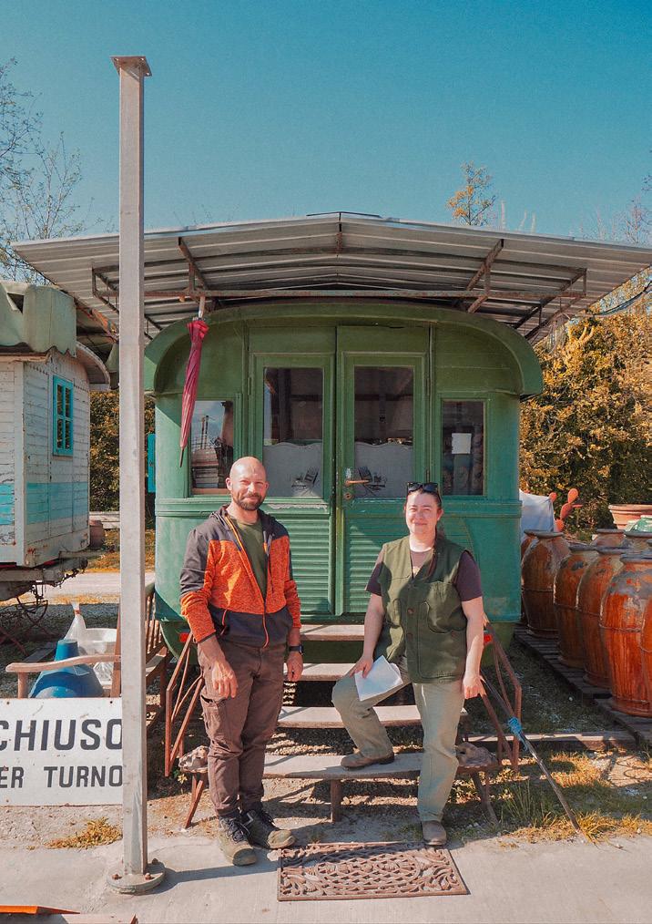
Our practice started from a workshop and that space is still central to how we work. To make something is to engage directly with materials – often, with their waste. Staring at a pile of unusable offcuts at the end of a build is a powerful signal: something went wrong upstream. What we call ‘waste’ is often just a symptom of failed systems thinking. The culture around zero-waste cooking has been influential for us. In food, nothing is wasted – scraps are pickled, dehydrated, fermented. In design, what’s the equivalent? Chefs understand the techniques that allow them to work as part of the food system while celebrating the creativity in resourcefulness. What if we designed interiors like larders: as stores of potential, full of parts that can be recombined, preserved, reinterpreted?
Rather than framing our work around the obsolete language of ‘sustainability’ (sustain what exactly?) we prefer terms that reflect agency and systems: regeneration, reuse, disassembly. The practice of spolia – the reuse of stone elements from earlier buildings in new ones – is something we have been exploring which covers these three terms. Spolia requires the careful and skillful
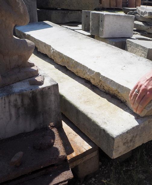
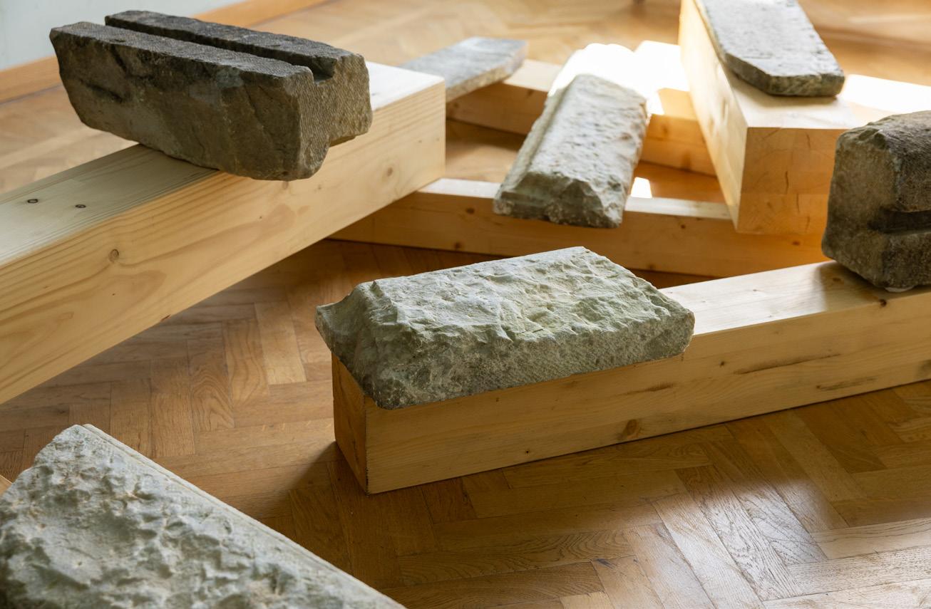
disassembly of an existing building so that those parts can be reused in new projects, without the added layer of postprocessing and alteration.
Spolia is not about nostalgia, it is about continuity and embedded meaning. We reinterpret that practice today through strategies of disassembly, resourcefulness and localised circular supply chains; treating materials as ongoing participants, not static resources. If stone can survive centuries, why should it be crushed and poured into new concrete, emitting more carbon while erasing its future potential?
The stakes for these questions are rising. In May 2023, climate scientists warned that we are likely to surpass 1.5°C of global warming within five years. Meanwhile, new carbon targets for buildings issued by the Science Based Targets initiative
(SBTi) make the challenge plain: to meet climate goals, embodied carbon emissions in new buildings must fall by around 99% within 25 years. That means reducing emissions to just 10kg CO₂/m² of floor area – a number that makes nearly all current construction methods unviable.
In other words, by mid-century, demolition must become a last resort. Full new construction will be rare. The energy embedded in the existing built environment will become a vital reserve – a material and carbon inheritance we cannot afford to squander.
This has deep implications for commercial interior design. It means designing less for aesthetic novelty and more for transformation over time. It means learning to work with existing elements, not in spite of them. It means designing systems, not just spaces.
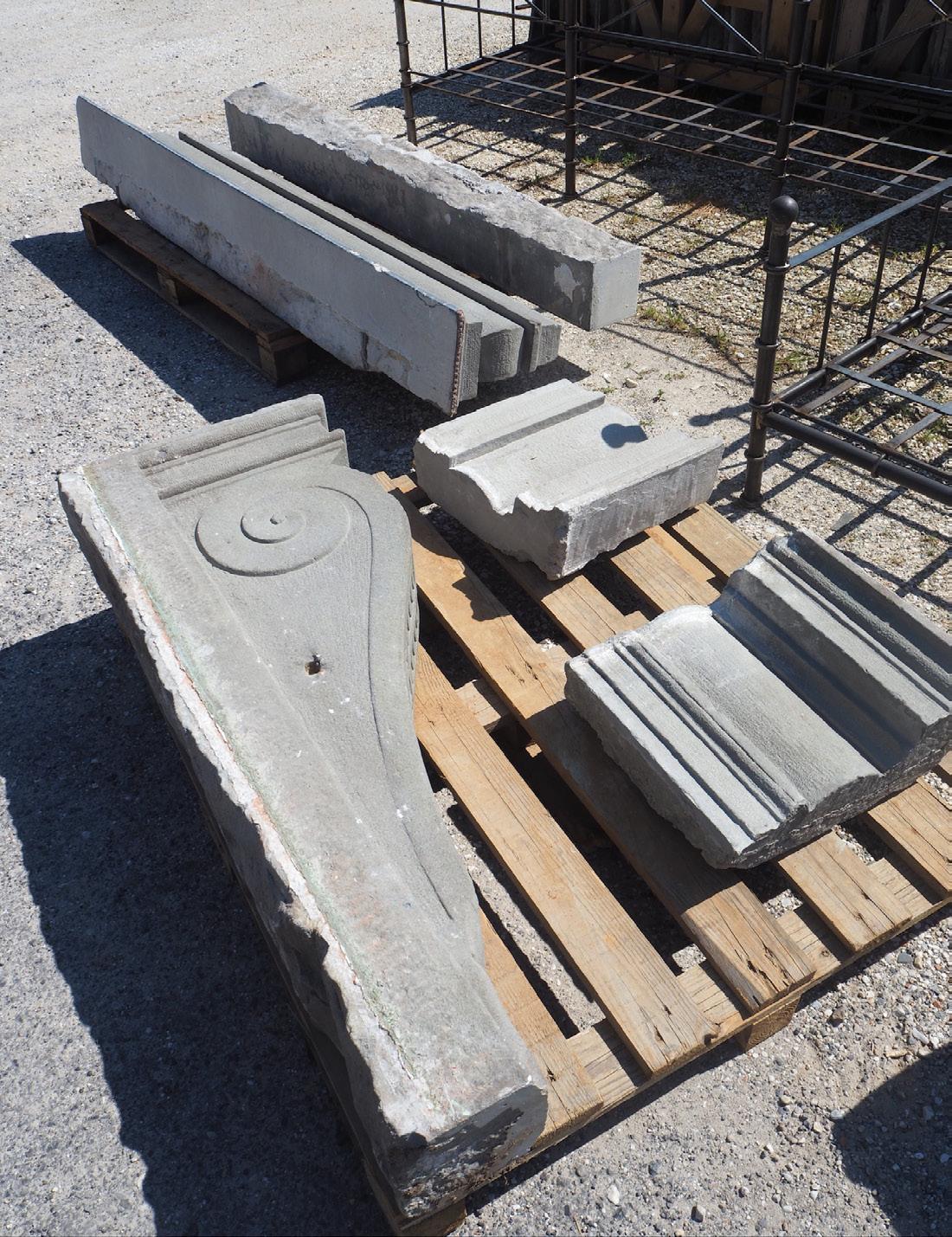
“By midcentury, demolition must become a last resort.”
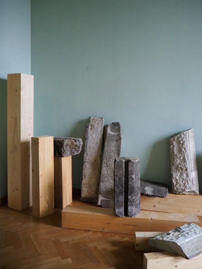
We explored the practice of spolia in our British Council commissioned project A Stone’s Throw, exhibited during Milan Design Week in April. Partially inspired by Luigi Lineri, who over the course of 50 years collected and categorised thousands of river stones along the bed of the River Adige, we acknowledge that there is meaning in the materials around us – if we choose to look. Lineri described his project as “a strange dialogue between man and stone, past and present.”
Exhibitions are often highly extractive – materials assembled for a few days, discarded without thought. Instead, we designed the parameters for reuse. The material was local stone. The circumstance was a short exhibition. The approach was to build relationships with Milanese salvage yards and exhibit materials that could be carried forward, not thrown
away. A Stone’s Throw wasn’t about stone –it was about proposing that the role of the designer is to facilitate future reuse.
This attention to systems thinking is rooted in the work of Donella Meadows, whose writing on leverage points in complex systems has helped us ask: where can designers intervene most meaningfully? Not always in the material itself, but in the rules around it – in specifications, maintenance documents, supply chains. The most powerful design decision could be to convince a client not to demolish, not to replace, not to reinvent.
The data confirms this necessity. Most contemporary buildings still emit hundreds of kilograms of carbon per square metre in their construction – far above the 10kg target for 2050. Meeting these targets means building less,
salvaging more, and designing from what already exists. To help visualise what 10kg of carbon looks like, in current building methods that would just about cover a square metre lick of paint on the wall. When you consider that one mature tree can absorb roughly 10–20 kg CO₂ per year, the scale of the challenge ahead begins to reveal itself.
As we move into an era of energy austerity and material scarcity, we need new design values: ones rooted in stewardship, not spectacle. This doesn’t mean we stop building. It means we build with precision, purpose, and humility. We design as if we are not the last ones to touch these materials, but simply their stewards for now.
mitreandmondays.co.uk
Words: Dominic Lutyens
We explore the role spaces, objects and ideas can play in creating a more optimistic future.
Is the idea that design can make people happy quixotic? After all, happiness is subjective – what makes one person feel happy makes another person feel bored, even miserable. The International Style, championed by modernist architects, was purportedly universally appealing. It was both paternalistic – conceived to ameliorate the lives of the masses – and progressive: architects envisioned flats for single, professional women and large windows allowing more daylight to enter buildings. Yet the movement fizzled out in the 1970s with the advent of postmodernism. Changing tastes militate against a universal idea of happinessinducing design.
Even so, some consider happiness to be objectively quantifiable. An upcoming exhibition, Designing Happiness, to be held during Helsinki Design Week (that runs from 5 to 14 September), is partly inspired by Finland ranking the happiest country in the world for the eighth consecutive year in the World Happiness Report. In Finland, happiness springs partly from a culture of tolerance and humility, says curator Anniina Koivu. The show doesn’t explore the subject naively, however. “In Finland there’s a sense that nature is more powerful than the individual. There are fewer street signs prohibiting actions than in other countries, which engenders a culture

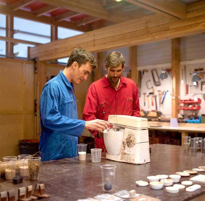
“Happiness is paradoxical because it cannot exist without its opposite –sadness.”
of respect for others. But I don’t want to romanticise this attitude – it isn’t exclusive to Finland.”
“Happiness is paradoxical because it cannot exist without its opposite –sadness,” she continues. Today many designers engage with the huge wellbeing trend, which, some have argued, exploits people’s anxieties, ultimately encouraging them to consume more, a subject explored in William Davies’s 2015 book, The Happiness Industry: How Government and Big Business Sold Us Well-Being. “Countless self-help manuals and a booming coaching industry have turned happiness into a multi-billion Euro business,” acknowledges Koivu.
The show poses the question, “Can happiness be designed?”. Koivu references the tradition of moral philosophers, such as Jeremy Bentham, the godfather of utilitarianism, which encourages actions that lead to the greatest good for the greatest number of people. “In biology we found a scientifically grounded starting point

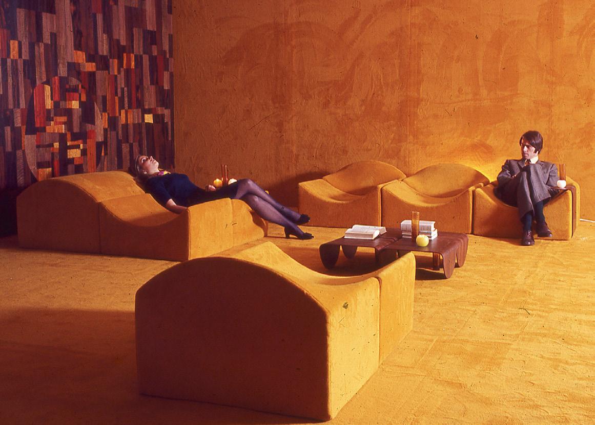

that helped to lay the basis for our happiness through design research,” she says, citing the four hormones in our bodies, frequently described as ‘the happiness cocktail’: dopamine, serotonin, oxytocin and endorphins. “Exposure to daylight increases serotonin production. Bright light tells your body, ‘It’s time to wake up, feel good and get going’. That is the perfect starting point for a designer’s brief.”
Of course, an uncomplicated vision of design engendering happiness underpinned the 20th-century spaceage era. “Newly available materials and colours allowed designers to create a thrilling vision of how we might live in the future, but this evaporated in the mid-1970 s,” says Peter Martin, author of Space Age Design (teNeues). “Yet this optimism is being rediscovered. In the West, designer Giampiero Tagliaferri
Image on previous page: Crashed Smurf by Paula Pääkkönen
Left: Studio ThusThat at Future Labs. Credit: Adrian de Groot
Below: Samples in the Material Library of India. Credit: HOGA Film
Above: Lounge chairs extracted from by Peter Martins’s Space Age Design Book
Above:
is embracing the verve of 20th-century space-age designers, while in China, designers such as Peng Zheng and Eason Zhu are creating spaces that celebrate the future.”
Today, sustainability is one area of design that is indisputably allied to human happiness in the future. But this will require the combined input of “scientists, manufacturers, financiers and policymakers,” argues Grant Gibson, co-founder of design fair Material Matters, which takes place this year from September 17 - 20 at the London Design Festival. “Foresight consultancy Futures Lab will showcase work that places nature and biodiversity at the centre of designing more equitable and resilient futures.”
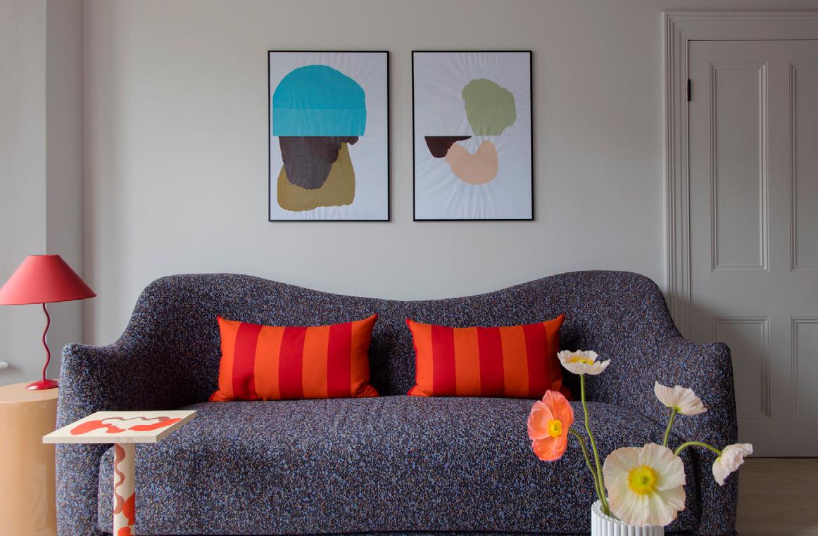
“Happiness comes from finding beauty in simple gestures and juxtapositions.”
Designers today still continue to dream up personal visions of design to make people feel happy and these are also valid. “For us, happiness comes from finding beauty in simple gestures and juxtapositions of a colour, texture, a new material, a hand-crafted ceramic,” says Russell Whitehead, co-founder of London interior design outfit, 2LG Studio. “A clean, simple statement placed in contrast to another simple gesture can have a sensory impact that feels like happiness – a bulbous 3D-printed vase with the organic shapes
of blooms or washed linen with chunky brushed woodgrain.” And designer Lara Bohinc feels happiness in design cannot be dissociated from the past: “Objects allow us to form emotional attachments or trigger memories from our childhood. We live in such crazy times that nostalgia is powerful and valuable. My Betsy furniture line, made of overlapping leather mimicking feathers, was inspired by the delightful, dancing Muppet Show character Betsy Bird.”
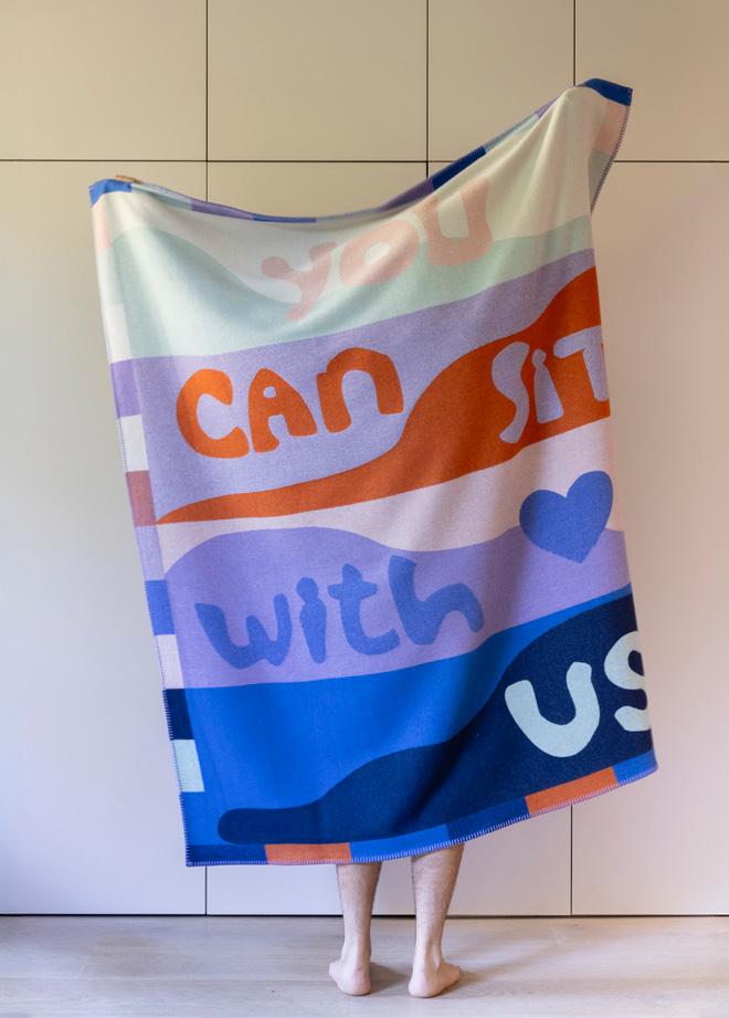
How can AI complement, rather than replace, human expertise in design and craftsmanship?
Words and moderated by:
Harry McKinley
In partnership with Specialist Group, we explored the rise of artificial intelligence and its potentially seismic impact on the commercial interior design industry, asking what its rapid adoption will mean for the future of creativity and the people behind it.
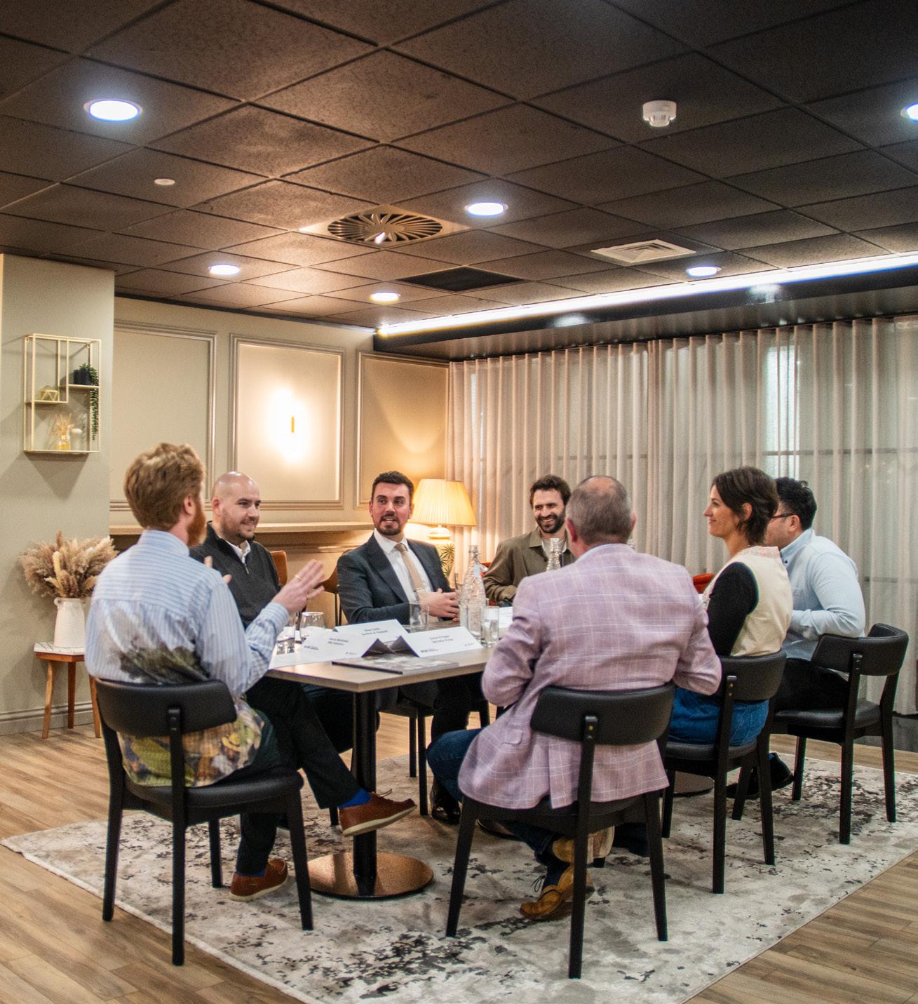



The
good: How is AI affecting positive change for the design industry and amplifying the creative and practical process?
While trepidation and fascination surround the advance of artificial intelligence (in variable degrees), our guests began by focusing on its practical and positive contributions to their professional lives. Far from currently replacing creativity, AI is, in many cases, helping to facilitate it – streamlining administration, accelerating research and opening new avenues for ideation.
Mace’s Max Kidwai was quick to describe how integral AI already is to his day-to-day work. “I use it all
the time,” he said. “Pretty much for everything I do, from emails to diary management. I’ll say, ‘These are the days and times I’m free, put in a half-hour meeting.’ Granted, that’s admin, but it’s immensely helpful for creating efficiencies.”
This kind of time-saving benefit resonated strongly with the group. Yet, it was the question of how we use that freed-up time that sparked the richest discussion. For Joelle Laney, Perkins&Will, AI’s greatest value lies not just in generating efficiency, but in what we do with what’s left. “I think if you’re using AI for processes like writing minutes or documentation, then it creates efficiencies, where you can then use that time for something creative,” she said. “That’s the thing that interests me most about AI: what are we doing with the time we unlock and is it valuable to the process?”



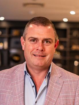
This idea – AI as a tool for reclaiming design time – was echoed by Ciaran O’Hagan, Specialist Group. “That’s the most valuable question in the whole AI debate,” he posited. “If, at its most simple level, AI gives us more time by taking on tasks, what do we do better with that day? Too often, we just fill it with more of the same, rather than something that might drive meaningful progress – and that goes not just for the design world.”
Laney elaborated on that theme by framing the potential benefits within the wider responsibilities of the design industry. “In the design process, you’ve got three key pillars: creativity, impact on people and impact on the planet. If you’re using that time to make a positive contribution to one of those, that’s a
win. But if you’re using it just to add more meetings or squeeze in more deliverables, the question becomes, is that really value?”
Others saw AI as a powerful research assistant. For Hassell Studio’s Jonathan Irawan AI has transformed the initial stages of his workflow. “We use it a lot for deep research at the beginning of a project,” he explained. “So we're drawing out
“What are we doing with the time we unlock and is it valuable to the process?.”
this regenerative design process and we have to understand the layers of context within a design project. I used to research for a couple of days and now we're almost using it like a librarian – so ‘give me all the information related to this place or this person or this organisation’, which then allows us to distil that very quickly and massively speeds things up at the start.”
Still, there was a shared recognition that these tools require structure and care. Luke Reveley, tp bennett, discussed how his practice has developed a proprietary AI model to protect sensitive data. “We’ve built our own model so that all our data is private. That means it’s not being absorbed by open AI systems to train future models. That privacy gives us more confidence and control.”
And while speed was celebrated, the table stressed that it shouldn’t be the only goal. “You have to be intentional about what you’re doing with the technologies,” said Laney. “If you don’t fill the space AI creates with work that preserves your creativity and the value of your profession, then you’ve missed a trick.”
“[AI] will enable a lot of ‘good enough’ design, but in my view the gap between good and great might get wider then.”
But in considering efficiencies versus value, then, can we really avoid the topic of money and the ways in AI might make design – or even access to expertise – more democratic? And if this, inevitably, makes the process cheaper, what is the wider cost? “I’m not a designer –we build what you create,” suggested O’Hagan, “but for years we’ve seen design budgets shrink,” he said. “Rather than cutting costs and quality, what if AI could give back time for creative thinking; to spend more time on design, not less? Because design shouldn’t always be about ‘making it cheaper’. If we’re not careful and we go down that route, it’s a race to the bottom.”
Oliver Smith, Gardiner & Theobald, picked up the point. “Yes, I think AI will democratise design, but only to a point,” he noted. “It will enable a lot of ‘good enough’ design, but in my view the gap between good and great might get wider then. So you get more mediocrity, but maybe you also get more brilliance. And the input still matters: AI only produces what it’s been given. If we feed in better knowledge – on sustainability, inclusivity, wellbeing – then that becomes the new baseline and that’s exciting.”
Even within this optimistic outlook, the panellists recognised that these tools must remain rooted in human intent. As Kidwai concluded, “AI could become like a second brain, giving you ideas you might not have considered. But it still needs your ideas to begin with.”
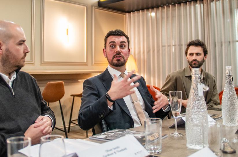
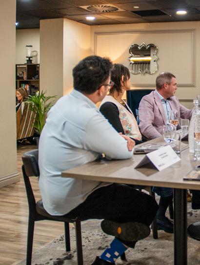
The bad: What are the downsides of this bold and rapidly evolving technology, and are any of the fears around its adoption warranted?
Despite the many advantages, the speakers were clear-eyed about AI’s limitations, particularly when it comes to empathy, context and narrative. In design, these are not luxuries, they’re fundamental.
“You can use AI to gather data on how spaces are used, but it’s very difficult to analyse how a space makes someone feel,” said Smith. “As designers, we’re working on people’s emotions as part of the process and feeding that into what the space becomes. AI centres the functional, but over the human experience.”
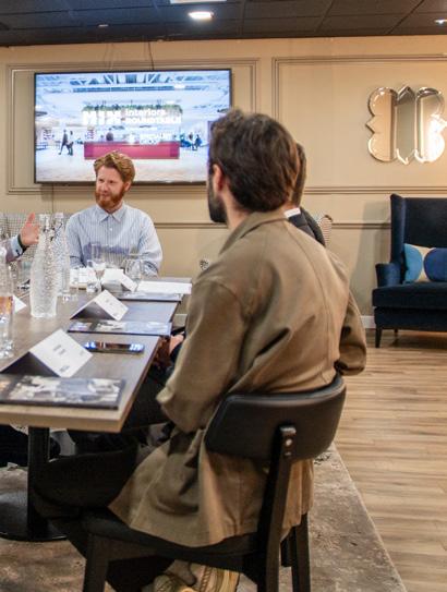
“What we bring as designers is the ability to interpret. That’s not something AI can pick up on – it’s intangible, it’s about people.”
The fear, as articulated by several of the assembled experts, is that AI could steer design towards that cold functionality, stripping away emotional resonance. “There’s a danger,” Smith continued, “that AI pushes us towards spaces that are purely efficient, because it doesn’t
recognise that experience isn’t separate from purpose, it’s part of it. That would be a real loss.”
Irawan pointed to the flattening of meaning in AI-generated content. “Everything happens so quickly that there’s no real narrative behind it,” he opined. “We’re trained to follow a design process –starting with a problem, exploring it and arriving at a solution. With AI, it can ‘look’ good without doing any of that, but where’s the thought? Where’s the story?”
For Laney, we shouldn’t forget or reduce the importance of subtle, human-specific insights. “If you look at two briefs on paper, they might seem identical. But behind those briefs are different people, different organisations and different cultures,” she explained. “What we bring as designers is the ability
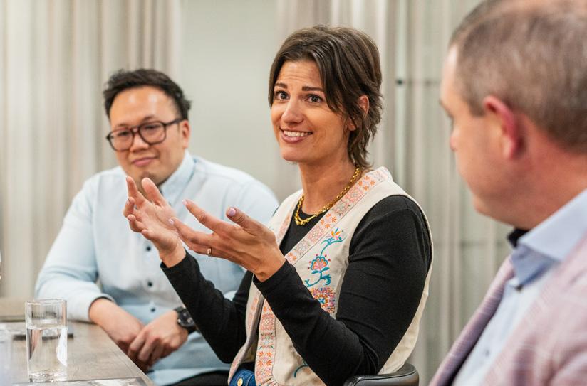



to interpret that difference and to connect with it. That’s not something AI can pick up on – it’s intangible, it’s about people.”
“There’s IQ – your technical intelligence – and EQ, your emotional intelligence,” continued O’Hagan. “AI has IQ in abundance but it’s emotion that creates connection in design.”
For some, it’s that difficult to quantify emotional element that is the bedrock of originality; the human touch that makes something special. As Kidwai expanded, “Everyone wants something unique. Think about it: if you could fully customise your car – every detail – you’d want that. But AI, working from databases and prompts, can feel generic. It doesn’t feel like it was made for you.”
“And what about joy?” Laney asked. “What about the joy of creating something together, of connecting through the process? AI can’t replicate that feeling of sitting around a table with people, throwing ideas around and challenging each other. That’s the magic.”
“What about the joy of creating something together, of connecting through the process?.”
Even on the client side, education is needed to ensure AI outputs aren’t mistaken for thoughtful design. “We need to help clients understand they’re not just getting data,” said Smith. “It’s been interpreted, analysed and contextualised. Otherwise, they’ll see AI output and think that’s all they need.”
What emerged was a shared belief that AI could never fully substitute the emotional labour of design – its sense of connection, its nuance and even, as Laney stressed, its joy.
And the ugly: Can AI ever match the creative potential of human beings or genuinely spearhead innovation?
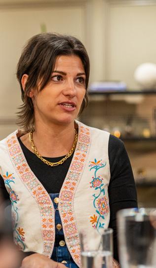

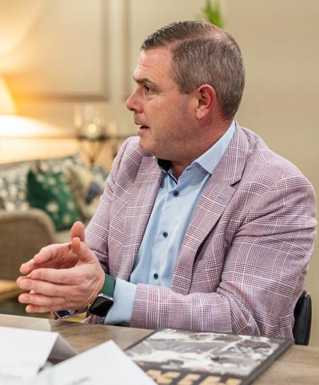
In the final chapter of the conversation, the panel turned their focus to a tougher, more philosophical question: when it comes to design, can AI ever do what humans do?
Kidwai summed it up succinctly: “It has no understanding of context. It’s just looking at data it’s been trained on – whether right or wrong. And when it comes to aesthetics, that’s highly subjective and AI doesn’t understand subjectivity.”
Even AI’s apparent ability to generate images or concepts was met with scepticism. “When people talk about AI designing something,” said Reveley, “it’s not actually design. It’s an image. It’s a visual output. That’s not the same as going through the process of design thinking.”
Irawan challenged the current focus on image-generation, calling for more grounded applications. “People talk about image output, but what about real data?” he asked. “What about daylighting studies, thermal comfort or cost modelling? If you use AI to combine those things, it can inform your design. But when it’s just aesthetic, when it
doesn’t understand what’s actually buildable, you’ve got a problem.”
“AI might aid the process,” suggested Laney, “but it doesn’t replace the experience of someone falling in love with how a tree becomes a piece of joinery. That’s what makes design powerful.”
That was echoed by O’Hagan, who concluded the discussion with a profound reminder: “The key is not whether we use AI, it’s how we use it. If we use it to protect what makes design human, then we’re on the right track. If we forget that, then we’re in trouble.”
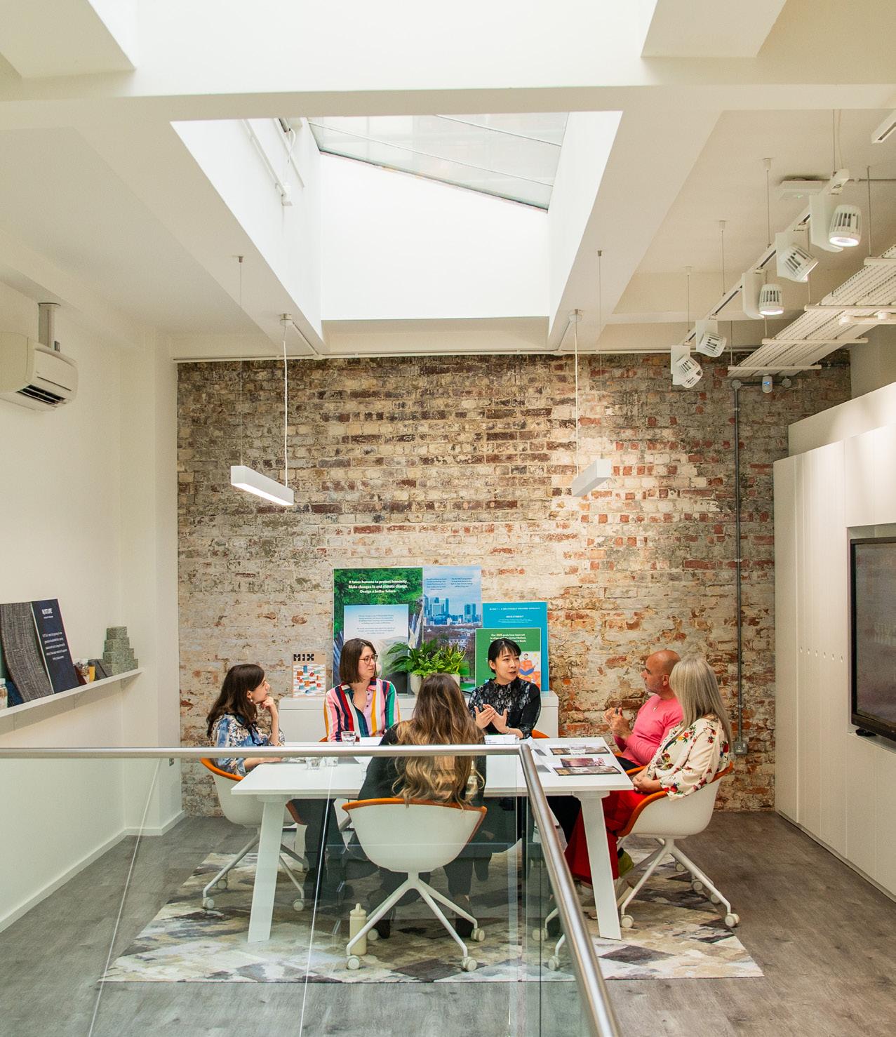
In

In partnership with Milliken we explore the transformative power of reuse, its challenges and opportunities, and how it can guide a new approach to design and the built environment.
Words and moderated by:
Chloé Petersen Snell
The concept of reuse is nothing new – buildings have always been repurposed and materials salvaged and recycled, from the Tate Modern (once a power station) to the enduringly popular terrazzo. A focus on reuse has the potential to transform design and the built environment by treating buildings and materials as valuable assets rather than waste – however, realising this potential requires overcoming several challenges, including policy and economic
hurdles, a shift in mindset and practical issues like material availability and certification. And while reuse incurs some carbon costs from storage, transport and refurbishment, these are typically outweighed by the higher wholelife emissions of new products –embodied carbon from construction and refurbishment accounts for 20% of UK built environment emissions, projected to exceed 50% by 2035 as operational emissions decline.1 1 ukgbc.org / floorseurope.milliken.com



As with many sustainability initiatives, the core challenge is to shift perspectives, said Hawkins\ Brown’s Nii An – if companies and clients begin to view these materials as assets with inherent value, it changes the entire dynamic of demolition and construction.
In Brussels, a local company is pioneering the reclamation and reuse of building materials, she detailed – stripping materials from existing buildings, storing them and then reselling them for new projects. This approach not only diverts waste from landfills but also creates a new revenue stream, transforming what was once a costly disposal into profit.
“There is definitely a challenge in scaling up to a wider industry level. One or two companies [working like this] is not enough.”
Is Europe leading the charge and how can the UK catch up? France has mandated pre-demolition material audits for large buildings since 2023 – requiring detailed inventory and reuse potential assessment, said Milliken’s Karen Burt. A regulatory push for a circular economy model for carpets means Milliken has invested in partners like ORAK, a carpet maintenance company that has embraced this new model. ORAK cleans and maintains carpets throughout their lifecycle, ensuring they remain in good condition for resale – turning used carpets into an asset for clients, who are even paid when their old carpets are resold. This system not only encourages reuse but also forces materials to be “future proofed,” she explained.


“30% reuse is required in public buildings in France, so we’ve invested in different partners – investment needed from manufacturers. We’re future proofing using coated backing and avoiding adhesive, which means reuse is more viable. Similarly, in the UK, we are working with a reuse company called Encore, which already has the storage requirements and logistics. It is about collaboration and trying to scale different partnerships.”
Of course, policy acts as a big driver for the shift towards material reuse and away from demolition and landfill – particularly at a local government level, highlighted Francesco Draisci, AHMM.
“Councils in London forbidding demolition meant we saw a huge uptake in reclaimation and reuse practices,” he said. “Without this pressure it’s unlikely individuals or businesses would adopt these more sustainable pactices. Economy and policy go hand in hand.”
This collective pressure is accelerating wider adoption – a new dynamic where partnerships are driving impactful change rather than traditional competition, agreed MCM’s Ana Rita Martins. “I've been part of a lot of meetings
“There is definitely a challenge in scaling up to a wider industry level.”
As a result, the reuse of construction materials, initially championed by smaller, agile companies, is now being adopted by major suppliers –signalling a significant market shift. “We’ve been hammering on for years asking suppliers about their [reuse] offering,” said Sarah Keetch of reuse champions Orms, who has found she In partnership with
where sustainability leads from different companies meet with suppliers to encourage change, to share what’s not working and to ask how we can all test and improve. If my competitors are all testing that in their project, suppliers are compelled to respond – it's an invitation for the supply chain to be more engaged and more involved. I find that it’s creating a collaborative spirit that relies on partnerships and doesn't have that normal competitiveness.”
“We’ve been hammering on for years asking suppliers about their [reuse] offering.”
is often met with a lot of resistance.
“Now the UK's largest raised access floor supplier is offering reused products – they’ve got the right people involved and it's going to completely change the market.”
Our table also emphasised the invisible nature of structural reuse – from BBM’s Waste House in Brighton, with carpet tile cladding and walls insulated with toothbrushes, to more challenging structural projects in Central London. “A prime example is 20 Giltspurt Street,” detailed MCM’s Ana Rita Martins. “What makes this project unique is their risky and pioneering approach: they kept existing beams, relocated them within the building and rewarrantied them. The beauty of this is that the reuse will be invisible to
the end-user. They understand it's a building that has circularity, but when you use the building, you're not going to see it.”
Think of building reuse, and you might think of a grand Victorian building, perhaps with some modern additions beautifully juxtaposed, celebrating its history. And preserving and incorporating a building's history into a project offers significant advantages, not least an increasingly enticing appeal for clients. This means it's less impacted by trends that quickly shift and become outdated, commented An.

“When a proposal is grounded within the building, even at the end of its life cycle when redesign is needed, some elements can be reused. So yes, it's about reusing in our designs right now, and future-proofing so designers can reuse design components in the future.”
This sort of building reuse is especially appealing in a heritage context, noted AHMM’s Draisci, highlighting a shifting aesthetic tolerance much like the cyclical nature of fashion – suggesting that we are still cherry-picking what we consider attractive for reuse, driven by trends. “If you were presented with an 80s building designed by a lesserknown architect, would we react the same way? The biggest limit to reuse is aesthetic tolerance, because you need to accept what you have in front of you. Curating and transforming
“It's about reusing in our designs right now, and futureproofing so designers can reuse design components in the future.”
At Orms' new London offices, reuse is rife – furniture, carpet and lighting from their old office were reused or reconditioned with a polished feel that goes against the typical aesthetic perceptions of reuse. The studio even prioritised demountable lighting to enable future disassembly, combating the shockingly low 7% recycling rate of UK light fittings. “When people come in to our office, they always comment on how polished it looks,” Orms’ Keetch added. “Reuse doesn’t always have to look ‘reused.’”
existing elements can be powerful –artists like Rauschenberg gathered and stuck ‘junk’ to canvases and Picasso incorporated found objects in his work. It's about the transformative way you approach what already exists.”
“If a design is component-based, like a timber reception desk, it can be reconfigured or renewed. Instead of discarding an item after a few years, it can be sanded down and refinished, effectively renewing it,” Draisci continued. This concept is boosting the repair

“Research is the first thing needed to strengthen the repair industry to ensure designers can use older materials.”
market, where companies stock reused materials and create new banks for projects. “While there's sometimes a short supply of specific items, renewal means the product doesn't have to look old unless that distressed aesthetic is desirable. It's a matter of preference – choosing between embracing the charm of a grandmother with wrinkles or opting for plastic surgery to remove them!”
Refurbishing existing furniture and materials presents significant challenges. For furniture, a lack of skilled craftspeople and
manufacturers' reluctance to service products not their own, due to warranty risks and outdated manufacturing processes, hinder widespread reuse, said Hawkins\ Brown’s An.
“Reusing materials from older buildings from the 50-80s is difficult because manufacturing technologies have changed drastically,” she said.
“For instance, older tiles are much thicker than modern ones due to different kiln processes and the original factories no longer exist. Research is the first thing needed to strengthen the repair industry to ensure designers can use older materials. It’s a big challenge, but an exciting one – we work with

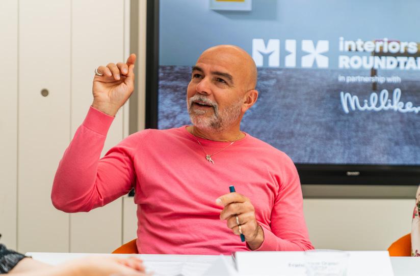
some people that are reinventing product systems. This is technology that needs to be researched, and that requires investment from manufacturers.”
Outside of the industry, modern reuse initiatives, like Globechain, demonstrate the success of community involvement too – but Orms' Keetch decribed it as a "relatively blunt tool" due to the
unknown fate of items after they are taken. “ROMULUS is an equivalent, more controlled program building a trusted marketplace among suppliers, architects and local authorities [in London]. The aim is to try and get this marketplace going here. Then we can start to say, ‘Look, we’ve shown this works. How do we now facilitate an expanded version of it?’”
It is important to be aware of where that material will end up, Milliken’s Burt emphasised. Initiatives like Uplyfted track materials directly from client sites. “The client is
recognised and we see where exactly it's going in terms of social housing where they didn't have carpet, sometimes just concrete floors.”
Companies have a consistent opportunity to make ethical and socially conscious decisions when selecting suppliers and services, added Martins, extending beyond just specifying materials. “Pause – look at your supply chain and decide who your money is supporting,” she said.
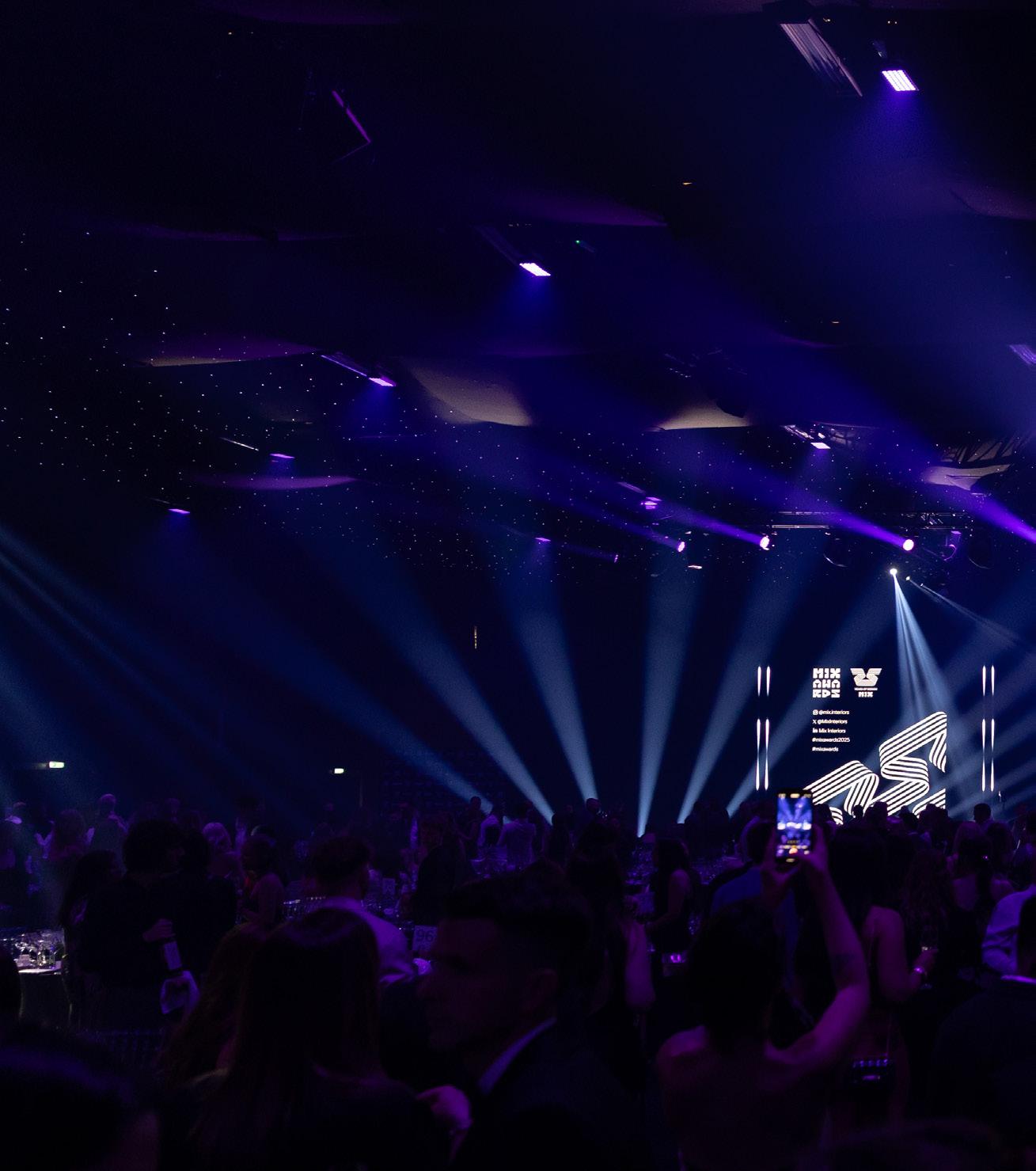
Looking back on the industry’s biggest event.
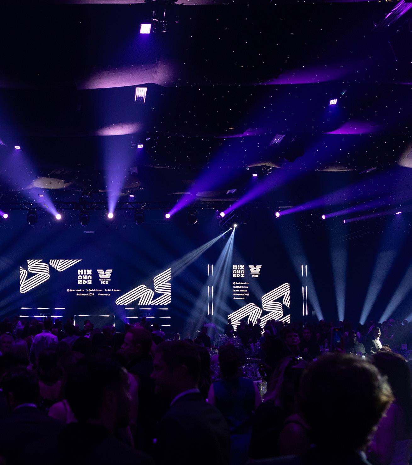
In a glittering evening taking place on 26 June, we welcomed A&D’s biggest names to Evolution London for one of the most anticipated gatherings on the industry calendar. Representing an unprecedented calibre of design, we celebrated the industry’s leading products, projects and people, with our panel of expert judges rewarding 24 winners for their continued commitment to future-leaning, innovative and environmentally conscious design. Once the winners
collected their trophies, it was time to dance, with spellbinding performances from La Discotheque and non-stop floor fillers from Horse Meat Disco.
For the full gallery of event photography, visit mixinteriors.com





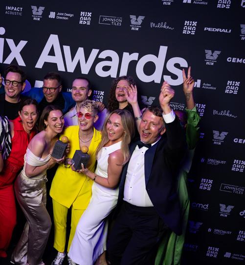

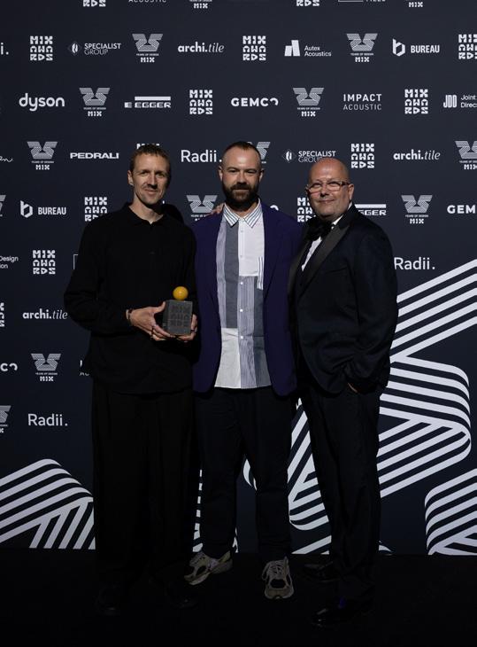
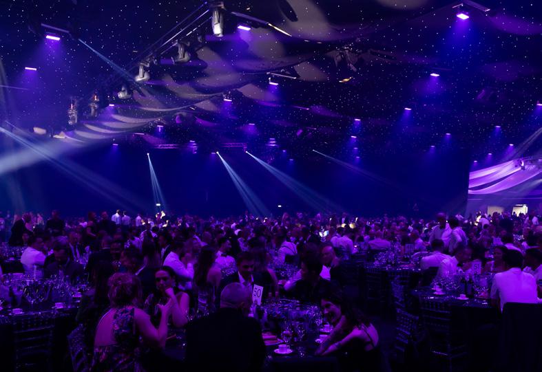
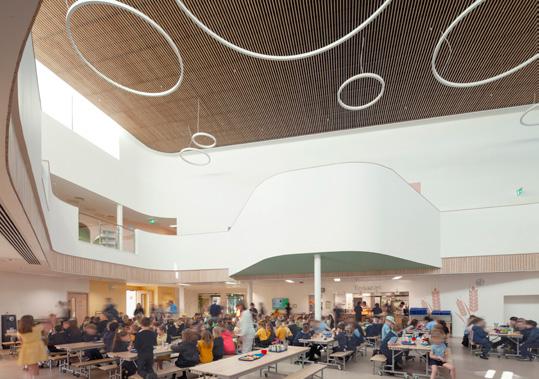
Neilston Learning Campus, East Renfrewshire
Neilston Learning Campus by BDP forms part of a wider regeneration effort in Neilston, near Glasgow. Bringing together two primary schools and the Madras Family Centre, it creates a community education hub. Designed with input from pupils, staff and families, the campus features inclusive spaces like peer-learning nooks, a ‘presentation mountain’, an ‘Exploratorium’ and nurturing home-like rooms to support diverse learning needs.
What the judges said
“Sustainability achievements set an outstanding benchmark for future public buildings. Most importantly, the spaces are thoughtfully designed to enhance learning and support every child’s needs –physically, socially and psychologically.”
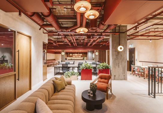
One Smart’s Place, London
One Smart’s Place in Covent Garden offers a revitalised working environment with a refurbished reception, CAT A+ ground floor workspace and The Press business lounge. Designed by Thirdway Interiors, the fit-out blends bold colours and rich tones with functional amenities, setting new standards in modern commercial design while prioritising tenant experience.
What the judges said
“The scheme brings a lot of warmth into the workplace – an inviting and inclusive atmosphere where team members can feel a deeper sense of belonging and connection.”
BDP – Neilston Learning Campus, East Renfrewshire
Architecture 00 with Fletcher Priest Architects –London City Hall
INUCE - Mountain Church of Julong, China
Reddy A+U – James Joyce Library, Dublin
Office S&M – MEplace Nursery, Kings Cross
LOM architecture and design – Point Blank Music School, London
Wright & Wright Architects – The British Academy Transformation Project, London
Willmott Dixon Interiors – Brent Civic Centre
Thirdway Interiors – One Smart’s Place, London
SpaceInvader – Eden, New Bailey, Manchester
MoreySmith – 24 Marshalsea Road Studio, London
Piercy&Company – Fairfax House, London
Gemco Contracts – Natilik, London
IOR Group – The IOR Studio, London
Morgan Lovell – Arctos, London
The Bon Collective – Artisan Partners, London
K2 Space – Alfreton Capital, Hertfordshire
Emil Eve Architects – Drama Republic Workspace, London
Two – Transition, London

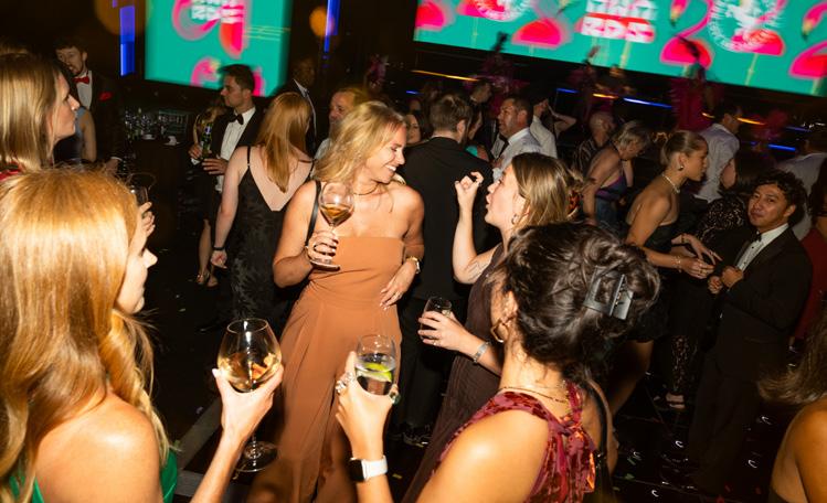

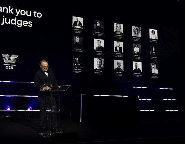


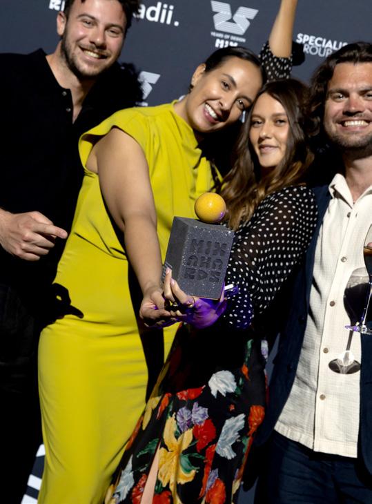
Sponsored by Egger (UK)
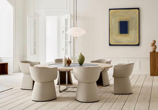
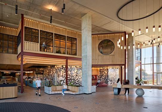
Winner Winner
Fritz Hansen X Cecilie Manz
Monolit
The Monolit chair by Cecilie Manz for Fritz Hansen combines comfort with sculptural elegance. Its cocooning form offers privacy and includes space for personal items. Available in two seat heights for dining or lounging, it suits both work and leisure. Featuring refined upholstery and leather piping, Monolit embodies Fritz Hansen’s commitment to quality, longevity and timeless design.
What the judges said
“Attention to the smallest details has ensured that this chair meets the heritage brand’s ethos for ensuring design and longevity. The clean aesthetic paired with physical and emotional comfort aligns with contemporary user needs. Stunning.”
Finalists
NOOM – Archipen Chair
Fritz Hansen X Cecilie Manz – Monolit
Humanscale – Freedom 25
Arper – Catifa Carta
Tamart – Highgate Chair
Normann Copenhagen – Burra Lounge Chair Outdoor
Pedrali – Stiel
Morgan – Barricane
KI – Postura+ One Piece Stool
Bene – NOOVO
Kusch+Co – Smile
IA Interior Architects and Design Partnership
Amazon, Cape Town
IA Interior Architects and Design Partnership designed Amazon’s Cape Town campus, uniting multiple sites into a full-time workplace. Featuring biophilic elements like greenhouses and native plants, it preserves 20 endangered species. Conservation-led landscaping and African art enhance the space, centred on a treehouse hub promoting collaboration and cultural authenticity. Green Star, WELL certification and Carbon Net Zero targets are planned by 2026
What the judges said
“Authentic, sensitive and incredibly impressive. Innovative through its use of local materials and approach to sustainability, delivering on the concept of intersecting workplace, nature and culture. There’s a clear focus on conservation – the design features biophilic elements and supports local biodiversity – but integrates them in a considered and not overly-earnest manner.”
Finalists
Reddy A+U – Eastpoint P2, Dublin
IA Interior Architects and Design Partnership –Amazon, Cape Town
Feix&Merlin – Impact Hub, Euston
SpaceInvader – Eden, New Bailey, Manchester
WeWantMore – McDonald’s, Belgium
Tetris – Carden Nursery & Primary School, Brighton buildgen. – Citizens Advice Bureau, London
5-10k sq ft
Sponsored by Autex


Winner Winner
The Living Lab, London
The Living Lab, created by Gensler, ISG, Turner & Townsend Alinea and Hilson Moran, embodies sustainability, collaboration and innovation. Designed for flexibility and growth, it integrates accessible mechanical, electrical, lighting and smart systems. Featuring biophilic elements and sustainable materials, the office targets BREEAM RFO 2014 Excellent and WELL V2 Platinum certifications, celebrating the intersection of technology and design.
What the judges said
“176 kgCO₂e/m² GIA is a great score for embodied carbon, reflecting responsible design choices and placing the project among the most climate-conscious in the industry. The project also quantifies embodied carbon in the first place, which still seems to be an uncommon practice.”
The Cabanon, Netherlands
Designed by STAR strategies + architecture and BOARD, The Cabanon is a 6.89 sqm micro-apartment in Rotterdam, possibly the smallest with a spa. Converted from a 1950s attic, it includes four defined areas, an infrared sauna, whirlpool bath and a large window. Built using mainly second-hand materials with sustainable transport, it exemplifies adaptive reuse and compact living.
What the judges said
“Like a suit by a master tailor, this bespoke space is moulded to the size, shape and lives of its creator and occupiers. Nuanced and hyper-local, the ideas and consideration of a major scheme are condensed into a perfect, tiny cube.”
Finalists Finalists
Feix&Merlin – Impact Hub, Euston
Hilson Moran – The Living Lab, London
HUT Architecture – 18 Clerkenwell Close
dMFK Architects – West London HQ
Whiteroom – Sweaty Betty Global HQ, London
Park Studio – Gram Games Istanbul Office
Thirdway – Blockspace & Digital Frontier, London
Office S&M – The Academy, London
Area – Office Space in Town, London
M Moser – London living lab
The Bon Collective – Liberty Blume, Leeds
STAR strategies + architecture X BOARD – The Cabanon, Netherlands
Mookerjee Design – Borradill, Scotland
Ekho Studio – The Place, Nottingham
Johnson Naylor – Bloom West, London
Jasper Sanders + Partners – Potterrow, Edinburgh
Way of Life – Riverstone Heights, London
TEN – Broad Street, Birmingham
Reddy A+U – Newmarket Yards, Dublin


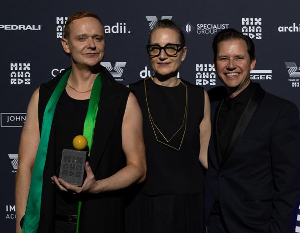
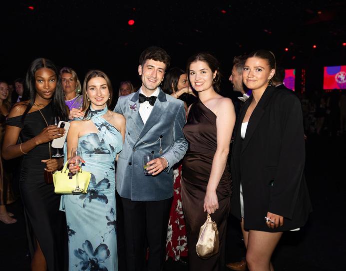
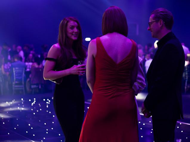
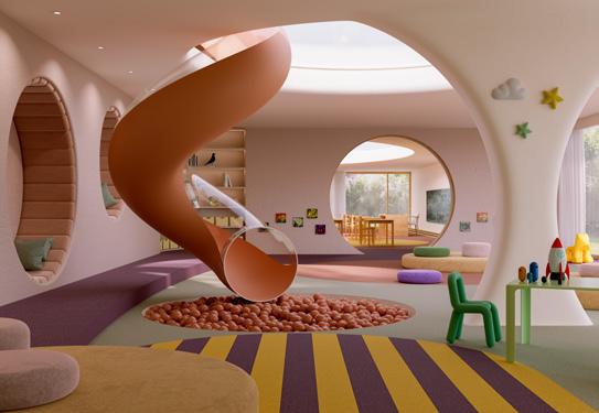
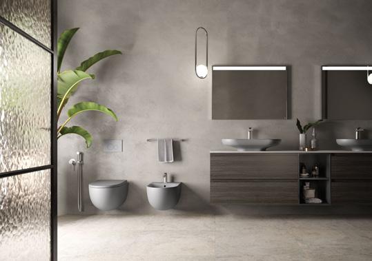
Winner Winner
Plus collection
modulyss’ Plus collection offers sustainable, highperformance carpet tiles for commercial spaces, featuring ecoBACK PLUS backing made from 85% recycled and renewed materials. Lightweight and easy to install, it reduces carbon emissions and supports acoustic and technical performance. Inspired by modern design and Belgian textile heritage, the four-tile range combines style, comfort and practicality with a broad colour palette.
What the judges said
“85% recycled or renewed materials with impressive functionality. Timeless colour palette and patterns with nods to biophilia, plus a focus on neuroaesthetics – an important consideration.”
Finalists
modulyss – Plus collection
Tarkett – iD Square
Parador – Trendtime 5 and 10 Vinyl
Egger – AquaDura (+)
Bolon - Elements
Shaw Contract – Art + Science
Forbo Flooring Systems – Tessera Topology
Amtico – Form
Milliken - Pattern Play
Karndean Commercial – Art Select
Ege Carpets – ReForm Memory
Interface – Etched & Threaded
Mohawk Group – Relaxing Floors
Balsan – Nexus
RAK-Des (Colour)
The RAK-Des collection, inspired by Bauhaus design, features sleek, minimalist sanitaryware including countertop and freestanding basins. Now offered in matt finishes like Black, Grey and Cappuccino, it suits modern interiors. The WC, with hidden fixings, can be wall-hung or back-to-wall and includes a touchless flushing system, enhancing hygiene and water efficiency through advanced technology.
What the judges said
“Bauhaus minimalism for the modern market. Versatile colours and slick functionality.”
Finalists
Duravit – Aurena
Woodio – Cube40 Slim
RAK Ceramics – RAK-Des (Colour)
KEUCO – EDITION 11 Art
BagnoDesign – Toko Flavours
Crosswater – Module MPRO Push
Neolith – Ignea
Marazzi – Terramater
Cosentino – Dekton Pietra Edition
Sponsored by CMD

Lina Stores Shoreditch, London
A-nrd Studio has reimagined a Grade II listed former bank as Lina Stores Shoreditch – a dual-concept venue blending Italian elegance with East London flair. The brasserie-style restaurant upstairs contrasts with Bar Lina’s 1970s-inspired basement lounge. Featuring restored Victorian mosaics, rich tones and bespoke furnishings, the design fuses heritage and modernity in a bold, immersive experience.
What the judges said
“It’s fantastic to see how this reinvention has embraced the building’s existing beauty while seamlessly layering in everything needed for a successful hospitality space. Transforming once light-deprived basement areas into a moody, atmospheric bar feels like the perfect evolution for this building – right in the heart of Shoreditch.”
Sponsored by Bureau
Studio Luiz Albisser
Universal Music HQ, Zurich
Universal Music Switzerland’s Zurich headquarters, designed by Studio Luiz Albisser, offers a modern, flexible workspace promoting collaboration. The open plan uses colour contrasts and custom furniture, combining rich blues, violets, reds and greens with natural finishes. Key zones include a collaborative area with bold desks and meeting tables and a Focus Zone. Modular elements support adaptability and sustainability.
What the judges said
“Wow – clever use of colour and modular furniture to zone and enhance different areas for focused work or collaboration. Recycled materials, no adhesives, energy-efficient – a joyful and colourful design that doesn’t compromise on functionality.”
Finalists Finalists
A-nrd – Lina Stores, Shoreditch
B3 Designers – Lita, Marylebone
Jolie Studio – The Nest, Frankfurt
Studio Modijefsky – Hotel Rumour, Netherlands
Studio Found – Wildflowers, London
Other Side – Caravan, Manchester
BDP – Surf Ranch, Abu Dhabi
Astet Studio – Bibo, Budapest
WeWantMore – Le Petit Bon Bon at Hotel Corinthia, Brussels
Studio Luiz Albisser – Universal Music HQ, Zurich
Spacelab x Whitepaper – Moss. Headquarters, London
BDG architecture + design – UniCredit, London
Piercy&Company – Crane Building Flexible Workspace, London
Quarterback Real Estate – Qube, London
Ekho Studio – AstraZeneca UK Alexion, London
D/DOCK – Semrush, Amsterdam
Paola Leon Design – Capital Tower, London
Unispace – Boston Scientific Institute for Advancing Science, Madrid
Studio Caro Lundin – Yard Works, Shoreditch

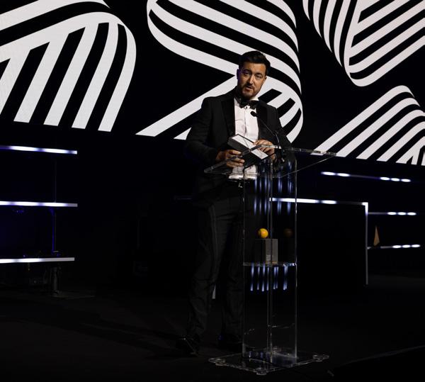

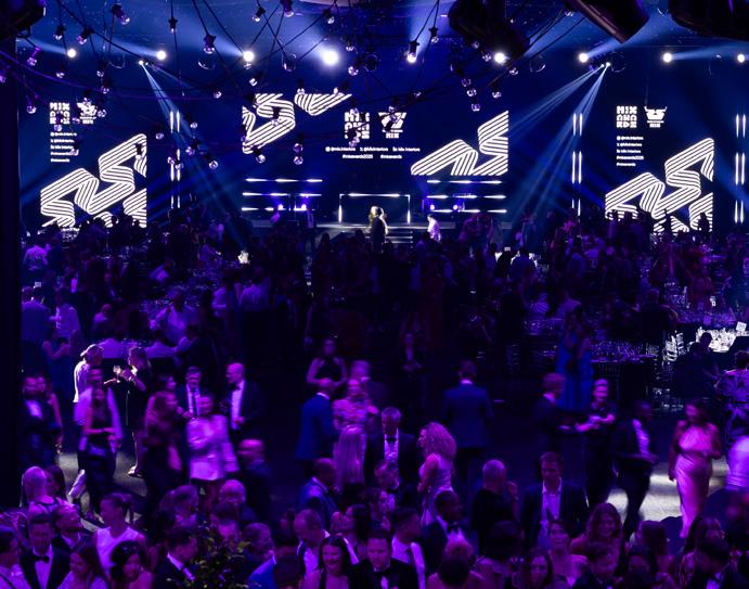

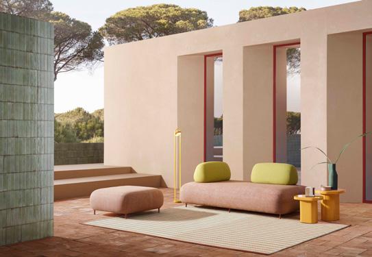
Buddy Oasi
Buddy Oasi by Pedrali, designed by Busetti Garuti Redaelli, is a flexible soft seating system for indoor and outdoor use. Evolving from the original Buddy range, it features waterproof linings, customisable fabrics and powder-coated aluminium legs. Its standout feature is a movable backrest in injected polyurethane foam, enabling versatile configurations and balancing bold seating with lightweight design.
What the judges said
“A thoughtful and adaptable seating solution with beautiful organic shapes. The fact it’s built to be disassembled demonstrates a commitment to longevity and reuse.”
Sponsored by Impact Acoustic

Partners
Space House, London
Squire & Partners have transformed Grade II-listed Space House in Covent Garden, creating 255,000 sq ft of workspace, retail and event areas. Restoring Seifert and Partners’ 1968 design, they removed later alterations and added a new extension with a clubhouse and terrace. The refurbishment meets high sustainability and wellness standards, achieving BREEAM Outstanding and Fitwel certification.
What the judges said
“A sensitive yet innovative renovation of an unusual and incredibly impactful – dare I say iconic – building. The fact that the design is so bold and celebratory of the existing structure, not to mention the heritage and period of the original project, is really commendable. To have achieved BREEAM Outstanding too is a demonstration of the ability and skill involved in the work – really brilliant to see.”
Bo&Ko – mod system
MARA – ELLE
Icons of Denmark – BLOX
Workbench – Orbital
Humanscale – Float Adjustable Collaborative Tables
Tecno S.p.A – Cosmos
Hors Studio X Emmanuel Hugnot – Trosne
Modus – Climb
Pedrali – Buddy Oasi
Connection – Spaces
Orangebox – Diggs
BDP – Neilston Learning Campus, East Renfrewshire
Squire & Partners – Space House, London
INUCE – Mountain Church of Julong, China
IA Interior Architects and Design Partnership –Amazon, Cape Town
Feix&Merlin with General Projects – Walworth
Town Hall, London
Buckley Gray Yeoman – HEALS, London
De Matos Ryan – The New Pavilion at Cowley Manor
EPR Architects – OSMO, London
Sponsored by JDD Furniture
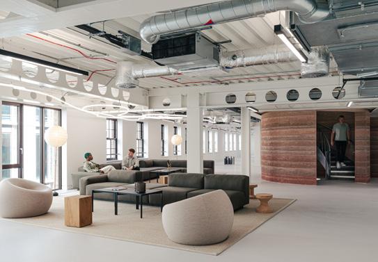
On, London
M Moser designed On’s London headquarters, reflecting the brand’s values and fostering connection. Featuring rammed earth walls of local clay alongside a minimalist aesthetic, the fluid layout encourages movement to collaborative zones and a central tea point. The office includes a showroom with interactive tech and a sculptural staircase, prioritising sustainability through low-carbon materials and energy-efficient solutions.
What the judges said
“An exquisitely designed and executed headquarters with rammed-earth walls and a precision aesthetic. A wonderful example of an adaptable and people-first design with cutting-edge innovation and a strong sustainability focus.”

Smart Lockers
Blocks is a smart locker technology designed to enhance how items are stored, received and exchanged in workplaces, buildings and retail spaces. As a plug-and-play system, it integrates with any locker design, transforming it into a smart solution for tasks such as personal storage, parcel delivery and asset management – creating a system that makes managing physical items as simple as managing digital files.
What the judges said
“An elegant and sophisticated locker system that can be easily integrated into work and living spaces. Smart, plug-and-play tech that actually enhances a project’s design.”
Finalists Finalists
M Moser Associates – On, London
M Moser Associates – Sony Music, Mumbai
Buckley Gray Yeoman – Davies House, London
Modus Workspace – Lotus, London
Fletcher Priest Architects – One Hooper’s Court, London
Bluebottle Interiors – MYO Piccadilly, London
Threefold – 12 Little Portland Street, London
Loop Interiors – Uncommon Creative Studio, London
HLW – Tech Company, London
Unispace – Zoom Experience Centre, London
Roar – Global Management Consulting Firm, Dubai
Blocks – Smart Lockers
Omnicharge – Omni 80C+
OJMAR – OTS 40 Batteryless
Cascando – Pillow Space Wide
Workstories – STAXX by Sourcetec
Do Digital Agency – SoDA Suite
Lowe & Fletcher – ECHO Lock
CMD – Caplet
Workbench x OE Electrics – Atoll Cart

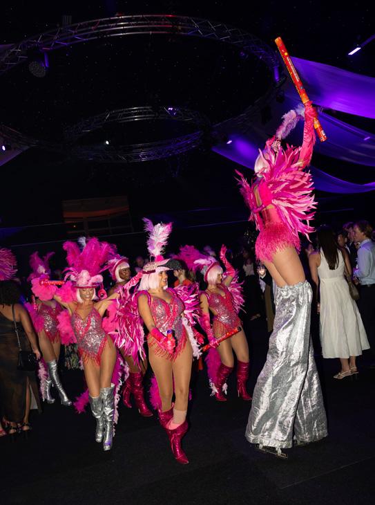



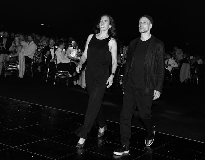

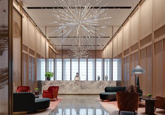
Park Hyatt, Changsha
Conran and Partners transformed the upper floors of IFS Tower 2 into Park Hyatt Changsha, converting unused office space into a luxury hotel that blends modern design with local culture and nature. Featuring 230 guestrooms across 18 types and communal spaces including restaurants, a bar and wellness areas, the interiors showcase Changsha’s identity through refined cultural details and craftsmanship.
What the judges said
“Incredibly elegant blend of nature and local culture. Use of local materials and craftsmanship offers guests an authentic experience that celebrates the area and its beauty.”
Sponsored by Pedrali
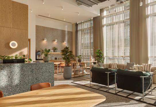
MYO New Street Square, London
dMFK refurbished and extended Landsec’s 3 New Street Square, enhancing sustainability, flexibility, and amenities within the MYO workspace portfolio. The five-storey building, originally by Bennetts Associates, now features a 248sqm pavilion and events space with perforated metal design. A triple-aspect terrace offers panoramic views and wellness benefits, supporting modern occupier needs in the Fleet Street Quarter.
What the judges said
“The project uses innovation in services and materials beautifully. An impressive retrofit with sustainability at its core – enhancing green spaces and empowering the local community.”
Finalists Finalists
Conran and Partners – Park Hyatt, Changsha
WeWantMore – Mövenpick, Brussels
De Matos Ryan – The New Pavilion at Cowley Manor
ACME – MM:NT Berlin Lab
Goddard Littlefair – Imperial Riding School, Vienna
Feix&Merlin – TRIBE, Düsseldorf
93FT – Treehouse Hotel, Manchester
Fettle – Le Jardin de Verre by Locke, Paris
DLSM Studio – The Trafalgar St. James, London
YOD Group – Mountain Residence, Ukraine
Lore Group – Pulitzer, Amsterdam
D/DOCK – De L’Europe Amsterdam ‘t Huys
dMFK Architects – MYO New Street Square, London
Woods Bagot – Convene Sancroft, St. Paul’s, London
Feix&Merlin with General Projects – Walworth Town Hall, London
Universal Design Studio – Norton Folgate, London
IA Interior Architects and Design Partnership – Amazon, Cape Town
Quarterback and Fora – Fora 60 London Wall
SpaceInvader – Arden Square, Radius Global Telematics HQ, Crewe tp bennett – Proskauer Rose, London
Loop Interiors – Huckletree, Bishopsgate, London
Gensler – Buro Happold London Headquarters
Fathom Architects with Fettle – The Waterman, London
Barr Gazetas – SIX, Farringdon, London
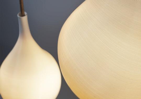
Lacrimosa Pro
Lacrimosa Pro by LumiAdd is a sculptural luminaire with an asymmetric, teardrop-inspired form, 3D printed using non-planar techniques for a seamless finish. Made from plant-based polymers, including repurposed waste, it offers a sustainable alternative to traditional lighting. Combining decorative appeal with high-efficacy performance, it supports flexible installation and circularity through LumiAdd’s buyback reuse scheme.
What the judges said
“Exceptionally strong – made from plant-based polymers, zero-waste 3D printing, buy-back scheme, local UK production and independently verified. Excellent circularity rating – includes specific CO2 savings vs. fossil-based plastics and aluminium.”
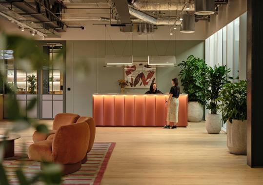
Fora 60 London Wall, London
Fora at 60 London Wall, developed with LaSalle and Quarterback Real Estate, transforms ground and first floors into a premium, design-led workspace. Featuring a sculptural staircase and light-filled atrium ceiling, the project advances from Stage 2 to Stage 4. It prioritises sustainability with an Outstanding BREEAM rating, reducing carbon emissions by 15%.
What the judges said
“Great sustainability story from both environmental and social standpoint. Beautiful use of textures and materials – brings a warmth to the space that works with natural light. Love the ‘secret garden’ concept!”
Finalists Finalists
LumiAdd – Lacrimosa Pro
Örsjö Belysning – Terrace Chandelier
Flos – Workmates
Intra Lighting – Pyrymyd
Normann Copenhagen – Act Lamp
Deltalight – Nebbia
Lumenear Acoustic Lighting – Toad
Future Designs – A-PLANE
Lumie – Dash
Quarterback and Fora – Fora 60 London Wall
Maris – Pentland Brands, London
Thirdway – Blockspace & Digital Frontier, London
Buckley Gray Yeoman – HEALS, London
Morgan Lovell – Greystar, London
SPACE - A SIMUL Group Company – Private Client, Surrey
Woods Bagot – The International, Sydney
Workplace Creations – Confidential Client, London
Oktra – Paysafe, London
Peldon Rose – Aristocrat, 80 Strand
TSK – SilverDoor, London

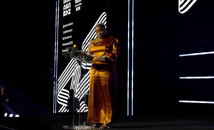




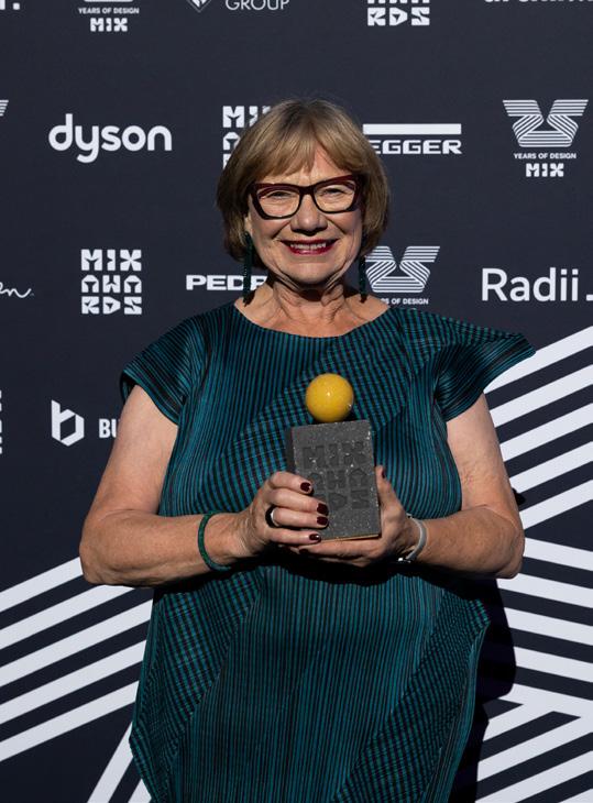
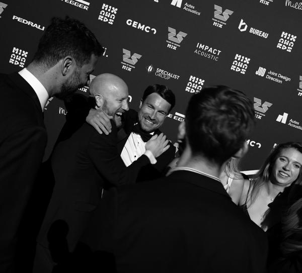
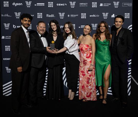


Sponsored by Milliken
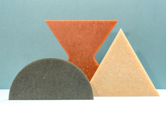
New Earth Collection
Smile Plastics’ Earth Collection features five new materials – Aber, Flint, Marlais, Moss, and Seastone – crafted from 100% recycled and recyclable plastic packaging. Each design offers a distinct aesthetic, from bold black to soft blues and vibrant greens. Complementing the existing range, the collection celebrates nature-inspired visuals while advancing sustainable innovation in material design.
What the judges said
“It’s fantastic to see truly sustainable and creative products with ethical manufacturing and a transparent supply chain. Closed-loop, 100% recycled, durable – and beautiful to boot.”

Space House, London
Squire & Partners retrofitted and extended Grade II-listed Space House in Covent Garden for Seaforth Land, creating 255,000 sq ft of premium workspace, flexible retail, event space and enhanced public realm. The 1968 building’s original architecture was restored by removing later additions. The project includes a tower extension and clubhouse with terrace, achieving one of the UK’s largest BREEAM Outstanding listed developments.
What the judges said
“An exceptional exercise in architectural preservation and modernisation with an unwavering commitment to sustainability. A benchmark for listed building retrofits!”
Finalists Finalists
Acoufelt – Formation Wall Panels
Smile Plastics – New Earth Collection
Impact Acoustic – Noren
Plyboo – Pleat&Weave
Ignorance is Bliss – Stone Waste is Bliss
AllSfär – Vault Acoustic Ceiling pit-to-table – pit-board
Camira Fabrics – ReSKU 2.0
Autex Acoustics – Mirage
Johnson Tiles – Ligne
RAK Ceramics – RE-USE
Florim Ceramiche – SensiTerre
Squire & Partners – Devonshire Square, London
Squire & Partners – Space House, London
Modus with Fora and Nice Projects – Henry Wood House, London
EPR Architects – OSMO, London
Perkins&Will – Confidential Client, Dublin
dMFK Architects – Temple Chambers, London
M Moser Associates – HSBC, New York
HLW - Wix Headquarters, Tel Aviv
Gensler – Virgin Media O2 London Headquarters
GSK HQ – Project Emerald, London
LOM architecture and design – Triton Square for Santander, London
tp bennett – Deutsche Bank, London
Sponsored by Gemco Contracts
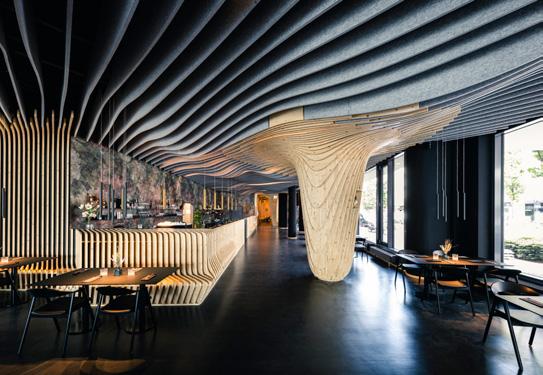
Sponsored by Specialist Group
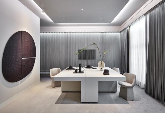
Winner Winner
Impact Acoustic is redefining circular manufacturing with sustainable, design-led acoustic solutions. Using materials like ARCHISONIC Felt, Cotton, Textile and Riftcut—made from recycled or natural content — it transforms waste into high-performance products. Emphasising reuse, refurbishment and resale, its “Reduce by Design” approach supports architects in creating efficient, expressive and environmentally responsible spaces.
What the judges said
“Impact Acoustic is setting the standard for products that meet the UK market’s high expectations – combining technical excellence with sustainability and beautiful design. Manufacturers like Impact Acoustic lead by example, showing the industry how it should be done.”
D/DOCK is a creative studio designing socially inclusive, sustainable spaces with global impact. Combining imagination, environmental psychology and research, it challenges conventional design. Recent innovations include interdisciplinary workspaces and inclusive living solutions. With a collaborative, non-hierarchical culture, D/DOCK empowers all team members to contribute equally, fostering creativity and shared purpose in human-centred design.
What the judges said
“D/DOCK impresses with its holistic approach to innovation, blending commercial success with deep societal and environmental impact. From adaptive reuse in housing and healthcare to pioneering social concepts, the studio shows how design can actively shape culture, inclusion and sustainability.”
Finalists Finalists
Impact Acoustic
Ege Carpets
BOLON
EGGER UK
Balsan UK
Autex Acoustics
JDD Furniture
Icons of Denmark Specialist Group Amtico Lammhults Pedrali
TMJ Interiors
D/DOCK
LOM architecture and design
Studio Sutton
HLW International
NCstudio
MF Design Studio
Sponsored by Dyson
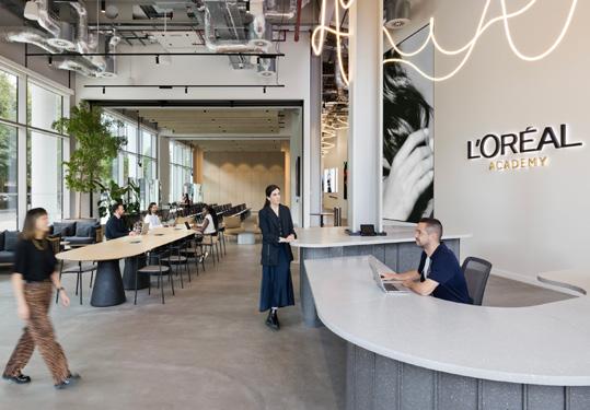

Gensler, a global design leader, shapes cities and drives sustainability through projects across the UK, including The London Cancer Hub and Bishopsgate Goodsyard. The firm promotes urban regeneration and innovation, supported by initiatives like its Product Sustainability Standards v2.0. Committed to staff development, Gensler delivers low-carbon, high-performance spaces, exemplified by projects like 10 Gresham Street.
What the judges said
“Gensler’s success is built upon a foundation of extensive experience, robust financial performance and strong ethical practices. They further distinguish themselves through their commitment to sustainability and dedication to fostering a diverse and inclusive workplace. These factors combine to create a truly impressive profile.”
Finalists
dMFK
tp bennett
Thirdway Interiors
ID:SR Sheppard Robson Morgan Lovell
As one of the first women to occupy a leadership role within a global design practice, and founder of the Interior Design School, Dunbar has been instrumental in laying the path for successive generations of designers. Listen to Dunbar’s episode of the Mix Interiors podcast, Things I’ve Learnt – where she discusses why creativity belongs to everyone, why failure is just another possibility and why an idea’s only as good as making it happen; available on Spotify, Apple Podcasts and at mixinteriors.com.

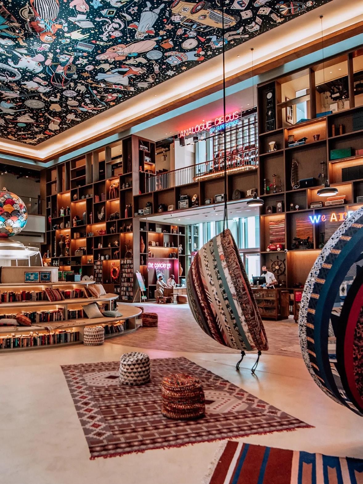
Think of Gen Z and it’s likely that the archetype of teenagers and twentysomethings glued to their phones comes to mind – the idea of a young, seemingly hard-to-impress generation motivated by digital convenience and the latest TikTok trends. But while they are the first demographic of digital natives, having grown up in tandem with the internet and mobile devices, arguably no one is more aware of this than Gen Z themselves. Terms like ‘doomscrolling’, ‘brain rot’ and ‘chronically online’ are now appearing in the modern lexicon to describe this sense of digital fatigue and a pervading awareness of (or guilt over) our everdwindling attention spans – often used as indicators that it's time to put the phone down and ‘go touch some grass’. So, are we fundamentally misunderstanding Gen Z and the way they interact with the world? And how can the design industry shift to both accommodate and learn from them?
Even though much of this generation are self-aware of their phone usage and even view advancements in AI with a healthy dose of suspicion, it’s not that they’re shunning the latest digital tools altogether. Quite the opposite: most have come to
expect high-speed Wi-Fi, charging points and integrated tech in spaces such as smart offices and hotels as standard, or as fundamental necessities to be included in any new design scheme. However, at the same time, there’s a form of analogue revival afoot, with vinyls, digital or film cameras and even typewriters making a triumphant return among young people – albeit with these digital photos or analogue purchases then shared, somewhat paradoxically, on social media.
Hospitality brands such as 25hours Hotels have begun tapping into this revival and offering a stylised take, collaborating with designers Woods Bagot in 2022 to create an ‘Analogue Upgrade’ to the Hotel One Central in Dubai – supplying rooms with VHS tapes, LPs, typewriters, analogue phones and Polaroid cameras, and encouraging social connection with creative, tech-free spaces such as pottery studios and games rooms. Similarly, last year hi-fi speaker brand KEF unveiled KEF Music Gallery London, recruiting Conran and Partners to reimagine the standard audio showroom into a buzzing listening café and flexible event space that invites music lovers to come together and connect.
Words: Charlotte Singer
“Gen Z seem to be tiring of digital escapism and instead seeking out community and physical experiences IRL.”
This blend of convenient digital tools and in-person connection was also seen inspiring changes at this year’s 3daysofdesign in Copenhagen. Under the banner of ‘KEEP IT REAL’ (itself a call to preserve authenticity in an age marked by AI and social disconnect), the Danish fair introduced its new i-Points initiative, alongside an international team of Design Ambassadors. Using the 3daysogdesign app, visitors could easily find directions to an informative i-Point in each of the eight design districts, which in turn would be manned by an ambassador – a welcome face to guide attendees
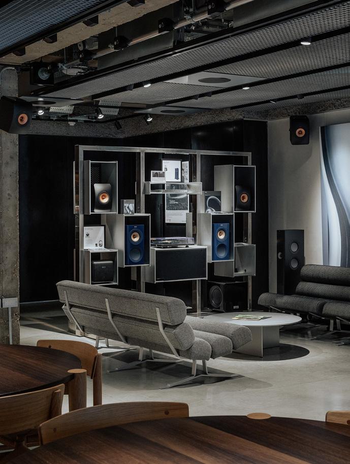
around the festival, host talks and share their industry expertise. Organised in partnership with Leica Camera, the ambassadors documented this more hands-on approach through photography, taking visitors on photo walks and capturing this with Leica’s digital and hybrid instant-print cameras. Polaroid’s latest advertising campaign has similarly run with this newfound appreciation for the analogue, debuting billboards in New York with candid party or holiday snaps accompanied by handwritten captions: “Remember that night we spent on our phones? Me neither.” Or, offering a not-sosubtle dig at Instagram, “real stories, not stories and reels.”
More than just nostalgia or retro aesthetics, then, much of Gen Z seem to be tiring of digital escapism and instead seeking out community and physical experiences IRL. In design terms, this is prompting a growing demand for third spaces, hubs where younger people can form connections with one another face-to-face, rather than through a screen – shunning e-books for the real thing, for instance, and heading back to public libraries or local bookshops. This impulse is in turn shaping the retail sector, with immersive, experiential design seen as something of an antidote to our floundering high streets. No longer just a place to shop, trendy concept stores are becoming increasingly hybrid in nature, hosting events and incorporating cafés or interactive elements that not only get people through the doors, but encourage them to stay and gather there. In some cases, there has even been some pioneering crossover between built-to-rent and public sector spaces: an intergenerational coliving initiative launched by Dutch care home Humanitas offers students free accommodation in exchange for time spent with residents, combating loneliness among both demographics as well as addressing the rising cost of living for students.
Despite this shift, with many young people valuing experiences and participation over digital disconnection, when it comes to the workplace, employers are arguably still misunderstanding what they really want or respond well to. The idea that all young employees expect a pool table, beanbags, nap pods or ‘pizza Fridays’ in the office is a misguided if not outdated one. As a highly media literate generation who are generally more suspicious of corporate jargon and greenwashing, there’s an argument most would in fact prioritise real, tangible improvements to staff wellbeing over empty bells and whistles –seeking out flexible working models, offices with natural light, equality initiatives like menstrual leave or affordable food, and, quite simply, a liveable wage.
Far from an unbothered generation tethered to their mobile devices, much of Gen Z are therefore using the wealth of information at their fingertips to forge social connections, engage in activism and demand transparency from decision makers on topics like sustainability –qualities that, when taken seriously, could begin to shape our design landscape for the better.

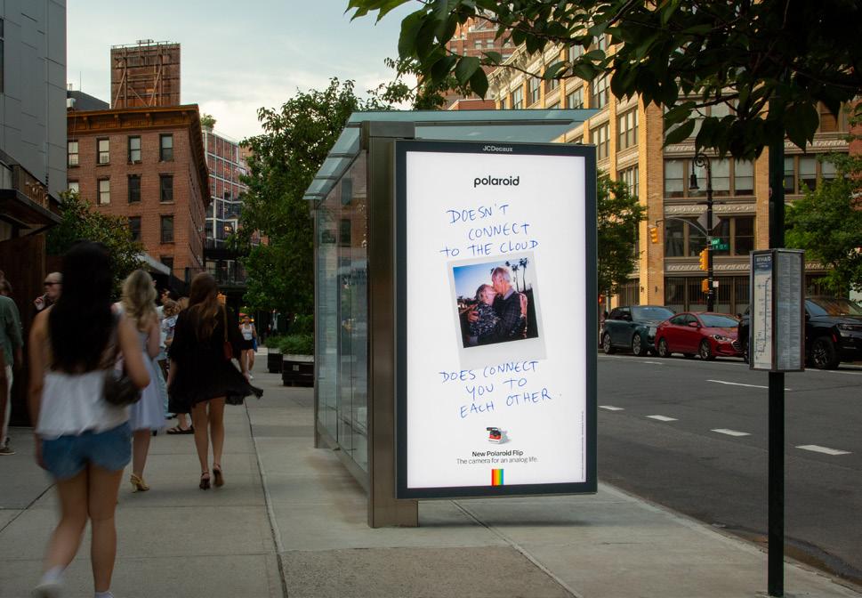
Words: Chloé Petersen Snell
Photography: Courtesy of Pedrali
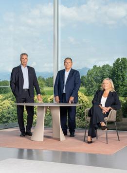
Six decades in, Italian furniture manufacturer Pedrali continues to evolve – staying true to its roots of local production and Italian craftsmanship.
A country steeped in tradition and history, Italy has long been home to some of design’s biggest players, from fashion to furniture – ‘Made in Italy’ now synonymous with quality and craftsmanship, despite increasing competition from overseas. Blending timeless techniques with cutting-edge industrial production, manufacturer Pedrali stands as a testament to this enduring excellence, crafting contemporary furniture for work, hospitality and everything in between.
Starting modestly in 1963, Mario Pedrali founded a small workshop in the province of Brescia, Italy, focusing on creating outdoor furniture and wrought iron seats. From the 1970s, the eponymous company started to expand its scope – collaborating with architects and designers from across the globe and beginning to specialise in contract furniture manufacturing.
This evolution marked a transition from an artisanal beginning to a more industrialised approach; investing more and more in cutting-edge technology, research and development and digital production processes while maintaining a strong commitment to craftsmanship and Italian manufacturing, even through economic challenges. Now headquartered in Bergamo, Lombardy (the country’s industrial heartland), Pedrali is a family affair. Under the leadership of Mario's children, Monica and Giuseppe Pedrali, the company’s core values and trajectory of growth endures from two main production sites in Bergamo and Udine.
“We are convinced that ‘Made in Italy’ is something truly unique,” explains Monica Pedrali, CEO. “This is something that cannot be replicated elsewhere. Here, in our territory, we find a deep-rooted culture of beauty and art; a desire to bring
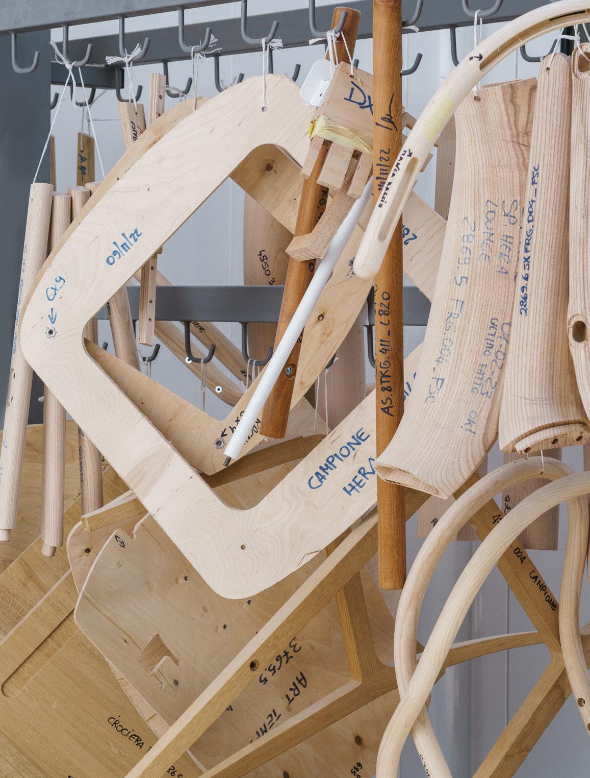
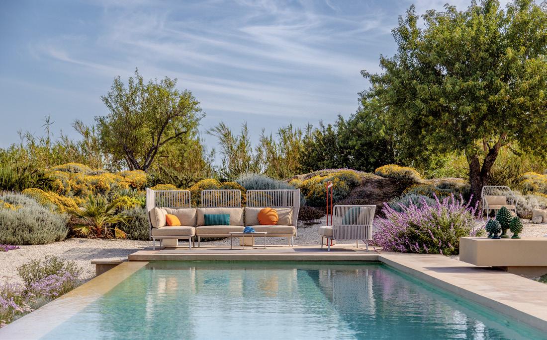
beauty into everyday life. But we also find remarkable technical expertise, creativity and advanced machinery. ‘Made in Italy’ doesn’t simply mean using the latest technologies, interconnected systems or digitalisation. It means that Italian knowhow is still shaped by a strong manual component; by craftsmanship. And the true added value lies in people. Passing on this know-how to the next generations, preserving artisanal skills and the expertise typical of our region, is essential.”
Exemplified in chair collections featuring handcrafted woven elements, such as Panarea, Reva Cocoon and Babila Twist, these processes contribute a distinct character and warmth to each product. And, in Pedrali's wood-based collections, manual craftsmanship is incorporated alongside technological innovation as a fundamental pillar of the company’s production. 2025 marks the twentieth anniversary of its wood-focused production site in Manzano, Udine, in the heart of the Friuli-Venezia Giulia ‘Distretto della Sedia’ or ‘Chair District’.
“The Manzano site is a tangible expression of how deeply [we] believe in the value of the territory and in the quality of the work carried out by its artisans,” Pedrali explains, “people whose skills make each product unique.”
For long-time collaborator Patrick Jouin, Pedrali’s local-first approach has had a profound influence on how he designs.
“Growing up in a family of carpenters, I learnt early on to value craftsmanship and the intimate knowledge of materials,” says the French designer. “For me, design begins only once I understand the material I’m working with. Pedrali shares this philosophy. Because everything is produced in-house, they often introduce me to techniques or finishes that open unexpected directions for the project.”
When working on the Reva Cocoon collection, a series of modular outdoor sofas, a key design element was intricate, weather-proof wickerwork. “[This choice] felt natural because we knew it could be fully developed and perfected
within their Italian workshops,” Jouin details. “This proximity to production makes the process incredibly fluid. I remember sitting around a table with the Pedrali family, sketching ideas for the Ester chair [now one of Pedrali’s best-selling creations]. In just a couple of hours, we arrived at a concept and they instinctively knew how to bring it to life. That immediacy and depth of collaboration is only possible with a manufacturer that masters every step of its production locally.”
“Every designer we have worked with has brought something unique and meaningful,” says Pedrali. “Each encounter, each exchange has been a moment of mutual growth, always oriented toward a shared goal: to create high-quality products that are functional and stylistically aligned with Pedrali’s identity. Each has left a mark. And seeing the results of these collaborations come to life in prestigious projects, both in Italy and abroad, continues to be a great source of pride and satisfaction for us.”
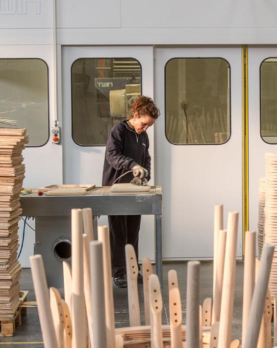
From Patrick Jouin to Robin Rizzini, relationships of trust have developed between the company and a series of high-profile, long-time collaborations over the years – allowing for an open creative exchange that blends both parties’ unique identities. This shift has marked a key evolution from furniture manufacturers to project partners, says Pedrali, capable of delivering customised and forwardthinking solutions. “I like to think that every product has two parents: the designer, as the father, and the brand, as the mother,” she explains. “A company should be seen as a true community – a team of people working together toward the development of each product.”
“And I like to think of it as composing music together,” adds Jouin. “I bring my own melody, but it must blend harmoniously with theirs. Pedrali’s aesthetic is defined by elegance, clarity and a certain softness. So my challenge is to propose new forms and ideas that enrich their collection without disrupting this balance.”
Collaborative workspaces at Park Associati.
Credit: Ottavio Tomasini
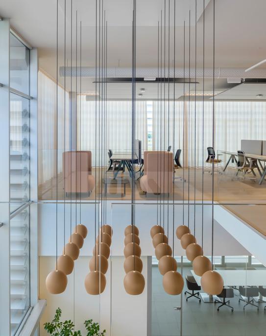
“Growing up in a family of carpenters, I learnt early on to value craftsmanship and the intimate knowledge of materials.”
When it comes to sustainability, Pedrali and her team believe a brand's actions are just as important as the product itself. “For us, sustainability has become a genuine responsibility – one that calls on all of us to do our part,” she says. “We hope consumers will increasingly base their choices not only on the quality of
a product, but also on what a brand has done and continues to do in this direction. The sustainability of a product begins with its design phase. Every choice – from materials and technologies to packaging and the ability to disassemble a product –contributes to its environmental impact.”
The company is backing up its commitment with serious numbers.
Since 2018, it has been tracking its carbon footprint and had already slashed emissions by 20% by 2023 – installing over 6,000 sq mof solar panels and using recovered hot water from plastic moulding to heat other parts of its facilities. Wood comes from certified forests, plastics are recycled from consumer and industrial waste, and paints are water and plant-based.
“For us, growth has always meant, first and foremost, quality,’ adds Pedrali. “Over time, we have come to understand that quality goes beyond the finished product –it involves the entire process behind it.”

Seetal Solanki is a Londonbased materials designer, researcher and writer, and the director and founder of materials research design studio Ma-tt-er.
@ma_tt_er ma-tt-er.org

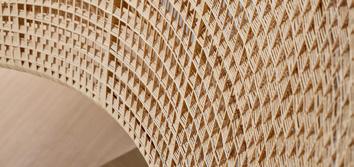
Palm fronds, falling from towering trees, have shaped Bali’s spiritual landscape for centuries. Temples are thatched with Ijuk, a renewable, anti-inflammatory material. This sacred wisdom inspired the design of lampshades by Max Lamb for Potato Head Desa, Bali, blending traditional reverence with contemporary interior design.
maxlamb.org
Jakarta-based BYO Living redefines rattan in interiors, using traditional weaving techniques to craft uniquely robust designs. Resistant to rot and ideal for humid climates, rattan gains new architectural presence in their work; most notably in their Andra Matin Venice Biennale installation, which showcased the material’s potential on a grand scale.
byoliving.com

Yasmeen Lari, Material Cultures and 22 young people have learned to use reeds to prevent rising floods, building in harmony with the land to address climate disasters. This material, found in waters across many regions, offers inherent protection and safety for all living beings in the surrounding areas.
materialcultures.org

Studio Raw Material reclaims marble offcuts from India’s northwestern plains, infusing spaces, furniture and architecture with coolness, calm and beauty. Using architectural joinery, they create pieces that interlock effortlessly, with the material’s weight and technique allowing easy assembly and disassembly. Marble’s natural coolness and polished finish make it easy to maintain.
studiorawmaterial.com
Blast Studio
Creating a new purpose for London’s discarded coffee cups, Blast Studio interprets waste as a ‘neo-vernacular’ resource found in our urban environments.
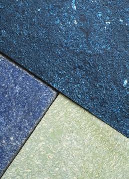
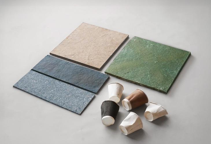
Founded in 2018 by Paola Garnousset, Martin Detoeuf and Pierre de Pignon, London-based design and manufacturing collective Blast Studio has found a niche transforming local waste into a versatile, sustainable material. Combining digital manufacturing with bio-design, the emerging studio creates unique architectural solutions for a radically circular future, using the abundance of waste created every day in the UK capital. “As architects by training, we were fascinated by vernacular architecture and how materials tell stories about a place, its people and its identity,” explains Garnousset, Blast’s co-founder and head of design. This led the team to the crucial question: What if a city could be built from the waste that it generates?
Driven by this perception of waste as a ‘neo-vernacular’ resource – one that remains in plentiful supply across our cities – the studio created Cupsan, a biomaterial comprised of discarded coffee cups. Recycling around 840 cups per square metre, the waste is first sterilised and shredded into a paper pulp, then mixed with a plastic-free binder. Using Blast’s self-built machines, this composite can then be moulded into versatile acoustic panels, furniture surfaces or lampshades, combining the durability of timber with
the manufacturing ease of plastic. Dense and strong, Cupsan can be cut, sanded and drilled with standard woodworking tools, and even responds to nails, screws, adhesives and varnishes just like wood.
The result of in-depth research and experimentation with living organisms like mycelium, each piece of Cupsan is unique thanks to the variability of biobased materials in terms of colour, texture and composition. Garnousset’s team opted to celebrate rather than downplay this inconsistency and developed a method that embraces the differences, offering architects and designers that specify Cupsan a choice between a terrazzo texture that reveals glimpses of the original waste materials, or a more homogenous, stone-inspired surface – both made in London from London’s own waste.
Following successful projects such as Camden’s Happy Sky Bakery (creating custom countertops from the bakery’s wasted cups), Blast Studio is continuing its partnership with Opendesk, crafting privacy desks and phone booths with Cupsan panels, and working with architect Stories and Spaces on bespoke furniture for low carbon roastery London Coffee Factory.
blast-studio.com
What does technology mean, especially in our sector, not known for early adoption? Is it different to engineering and where does artificial intelligence fit into the picture? Some digging reveals a lot about how we use these terms and their role in workplace design.
The discipline of engineering is easier to explain because it has always been part of our world, with its clear structural, mechanical and electrical contributions, but engineering and technology are not the same thing. If technology is knowledge, both practical and scientific, then engineering is its application. Here are a couple of examples.
Steam has obviously existed forever, but when its potential pressure as a power source was recognised, a technology was born, and steam engines were feats of engineering that employed steam technology. Electrical power is a common-place technology, gradually developed from observations in nature during the 18th century, however its distribution and regulation inside a building is an engineering exercise.
In buildings we use lots of other technologies defined like this, such as laminated timber beams, light emitting diodes and radio transmission, all used to engineer our living environments.
But use of the technology term has moved on, to refer almost exclusively to the processing power of computers, including the collection, storage and analysis of digital data, and anything to do with electronic communication and social media. In my newspaper this morning the word appears three times in the top headlines, not even buried in the copy, and in all cases it refers to the digital world. This does not imply a change of definition, simply its domination by data which has crowded out other less relevant meanings.
Now a new phrase, artificial intelligence or AI, is having its day in the sun and it is easy to see why. Public access to cloud services and limitless data through the internet have removed the constraints that made computing difficult and expensive. The possibilities are not yet understood, we are like old world travellers to
North America who stepped onto ten million square miles of unexploited fertile land. It takes a while to sort it all out.
All this means that technology, and especially AI, should accelerate our design processes and deliver better results. Not incrementally, but in extremely short order. We do not have to develop the potential, it has already rocketed ahead of any use we can think of. The power is right there at our feet and much of it uses the common language of all humans, not the technical jargon of specialists, so you do not need to be an engineer to get results from generative AI, but you do certainly need scientific training and rigour to analyse data with machine learning and data modelling.
Now that generative AI can write briefs, create designs and express different options when asked to do so by a literate human, we need to quickly identify the value we designers have beyond that delivered by AI. Digital technology and AI is a galaxy of opportunity, but unlike our North American pioneers, we do not have much time to sort it all out.
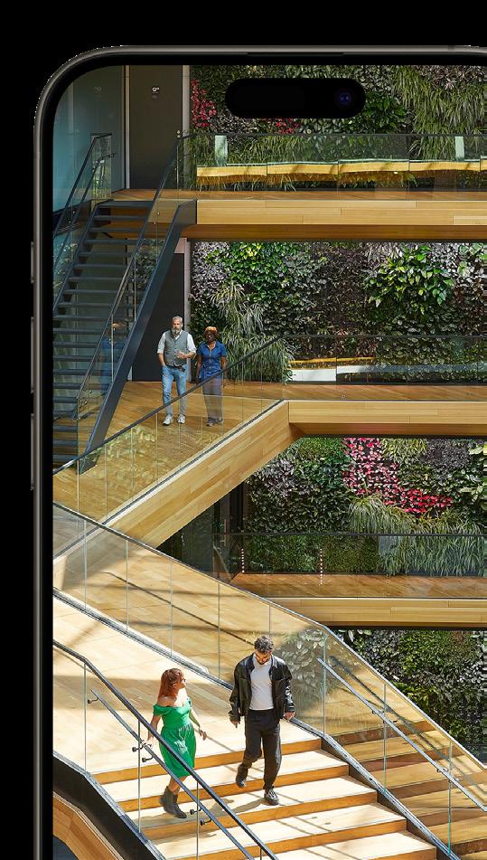
For the past 25 years at Mix Interiors, no two covers have been alike. Each issue, we hand over the reins to a different designer and manufacturer to collaborate on a unique piece of artwork – bringing their distinct style and expertise to life.

Founded in 2013 by Catrina Stewart and Hugh McEwen, over the past decade award-winning practice Office S&M Architects has gained industry recognition for its inventive, collaborative approach and wealth of experience in civic placemaking projects. As a studio driven by the belief that good design should create social value, spark joy and support wellbeing, Office S&M continues to develop its leading co-design process by listening to the needs and aspirations of local communities and undertaking detailed research to deliver spaces that make a difference.
officesandm.com
Beginning life as a small family-owned business in 1973, Karndean has become a leader in vinyl flooring known for its longwearing, realistic wood and stone designs. This year, the manufacturer introduced its latest CPD seminar, Designing Neuro-Inclusive Environments, in response to the growing need for inclusive, sensory-considerate design. With one in seven people identifying as neurodivergent and a growing population living with neurodegenerative conditions, this seminar provides critical insights into how flooring choices and spatial design can support cognitive and sensory well-being. By raising awareness and equipping designers with these practical tools, Karndean hopes to shape more accessible, empathetic spaces for all, blending inclusivity with functionality and design intelligence.
karndean.com
For this cover concept, Office S&M wanted to create a sensory experience that invites curiosity and discovery, drawing design cues from the calming qualities of sensory toys. Using a blend of pastel tones and deep blues, the design is intended to feel both calming and energising, reflecting the productive, educational and playful environments the studio builds. Inspired by Karndean’s approach to neuroinclusivity, the cover therefore pairs a soothing yet strong colour palette with diffuse forms and shaper elements to evoke both hyper- and hyposensitivity. The subtle incorporation of the Mix logo allows the observer to find it in potentially myriad ways, much like the different ways in which neurodiverse individuals will interpret and interact with a space.
Ludwig Mies van der Rohe
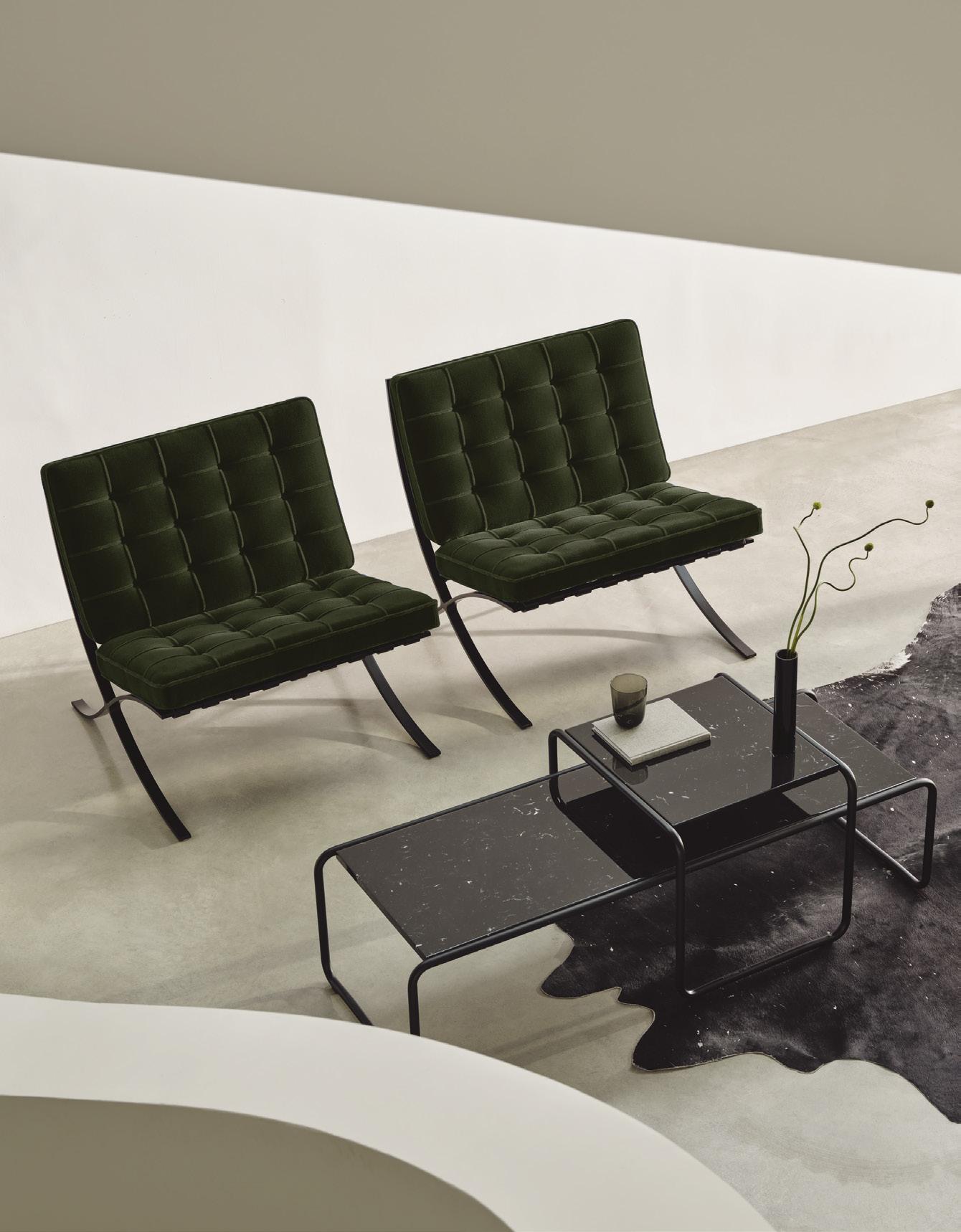
knoll-int.com

Miro

