the ask :
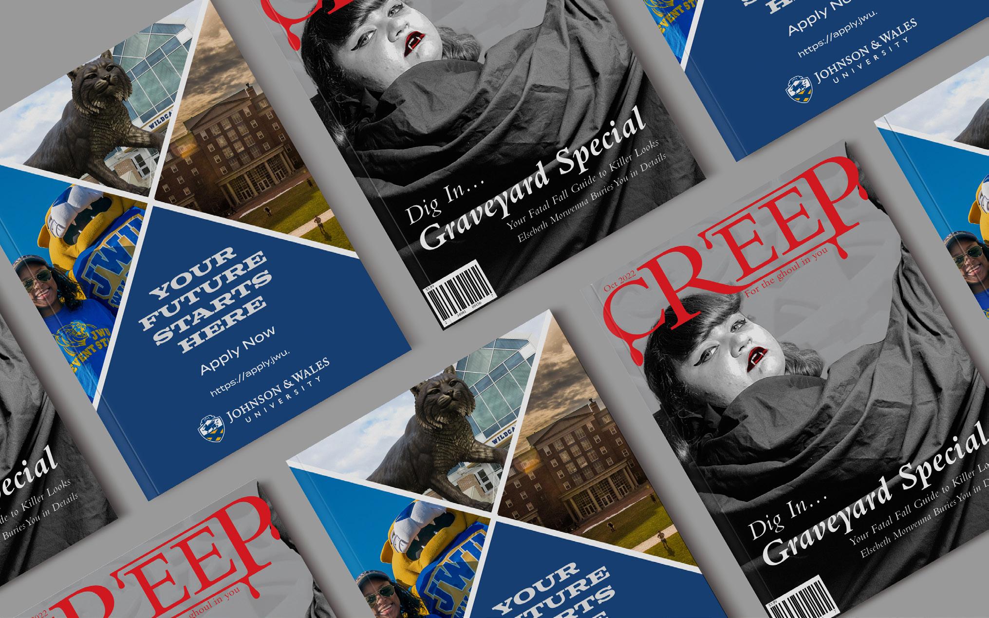
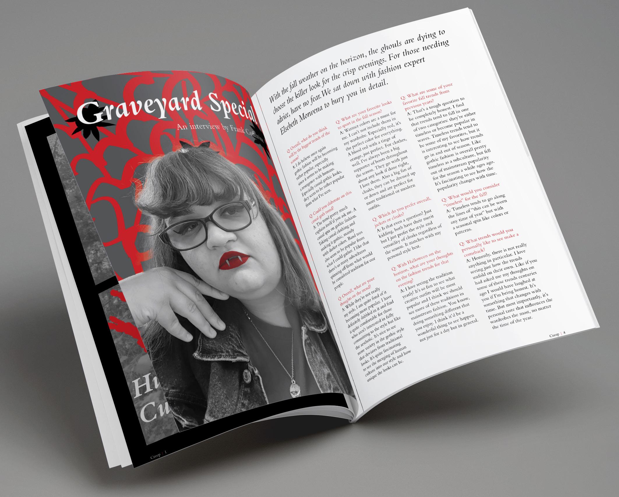
create a minizine with 8 pages a magazine for the ghoulish fashion lovers
The concept for creep is a fictitious fashion magazine centered around “monster culture” that appeals to gothic and alternative fashion. The design has vintage style influences with the use of a traditional typeface and a grayscale/red color palette.
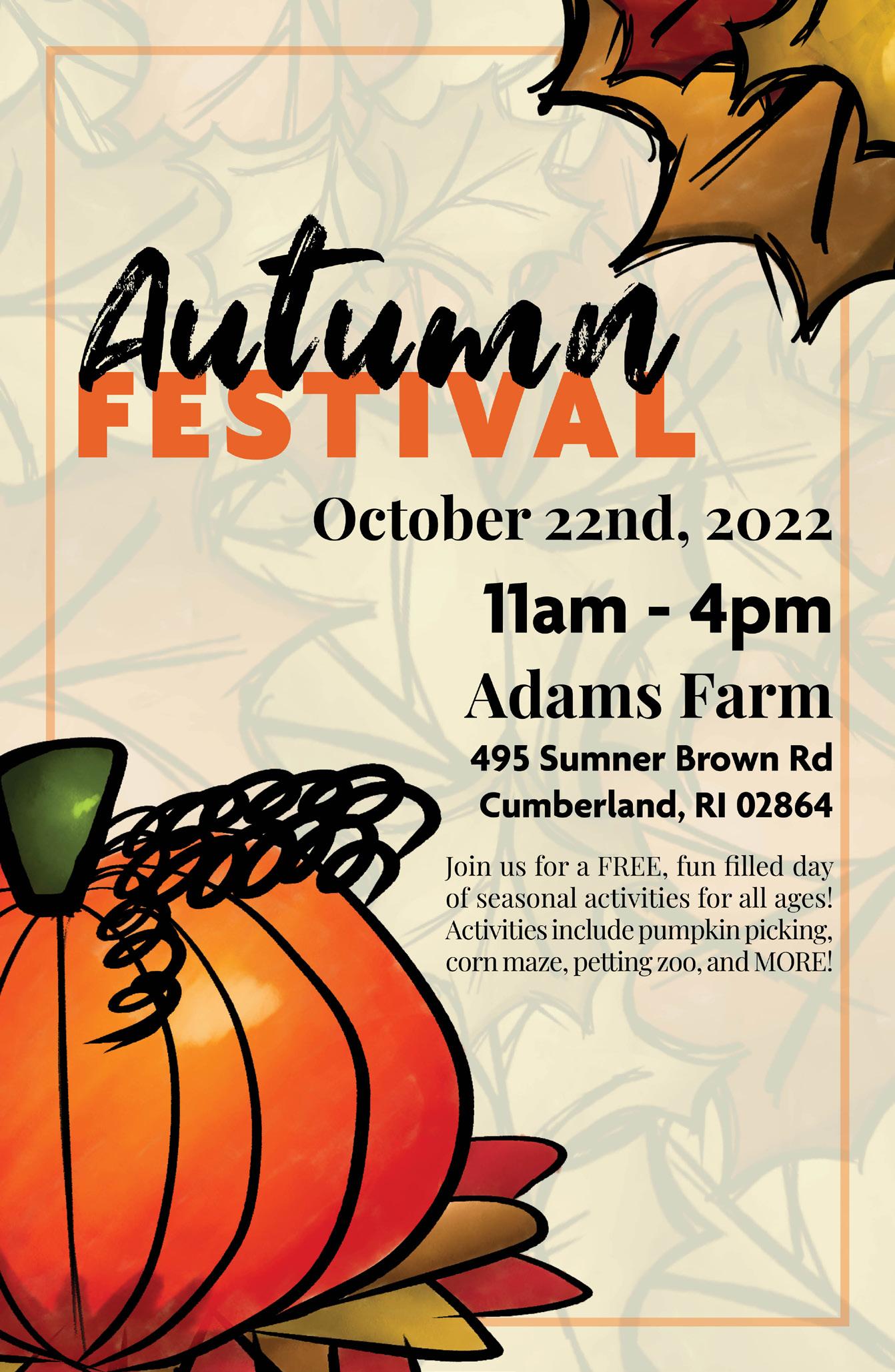
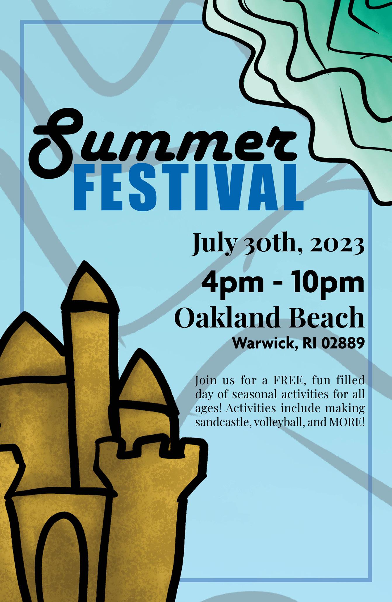
the ask : create a poster for a ficticious event something to celebrate for every season of the year
Each poster in this series is themed after a festival for every season of the year. They all share a similar layout, with the illustrations and color palette corresponding with the season represented in the poster.


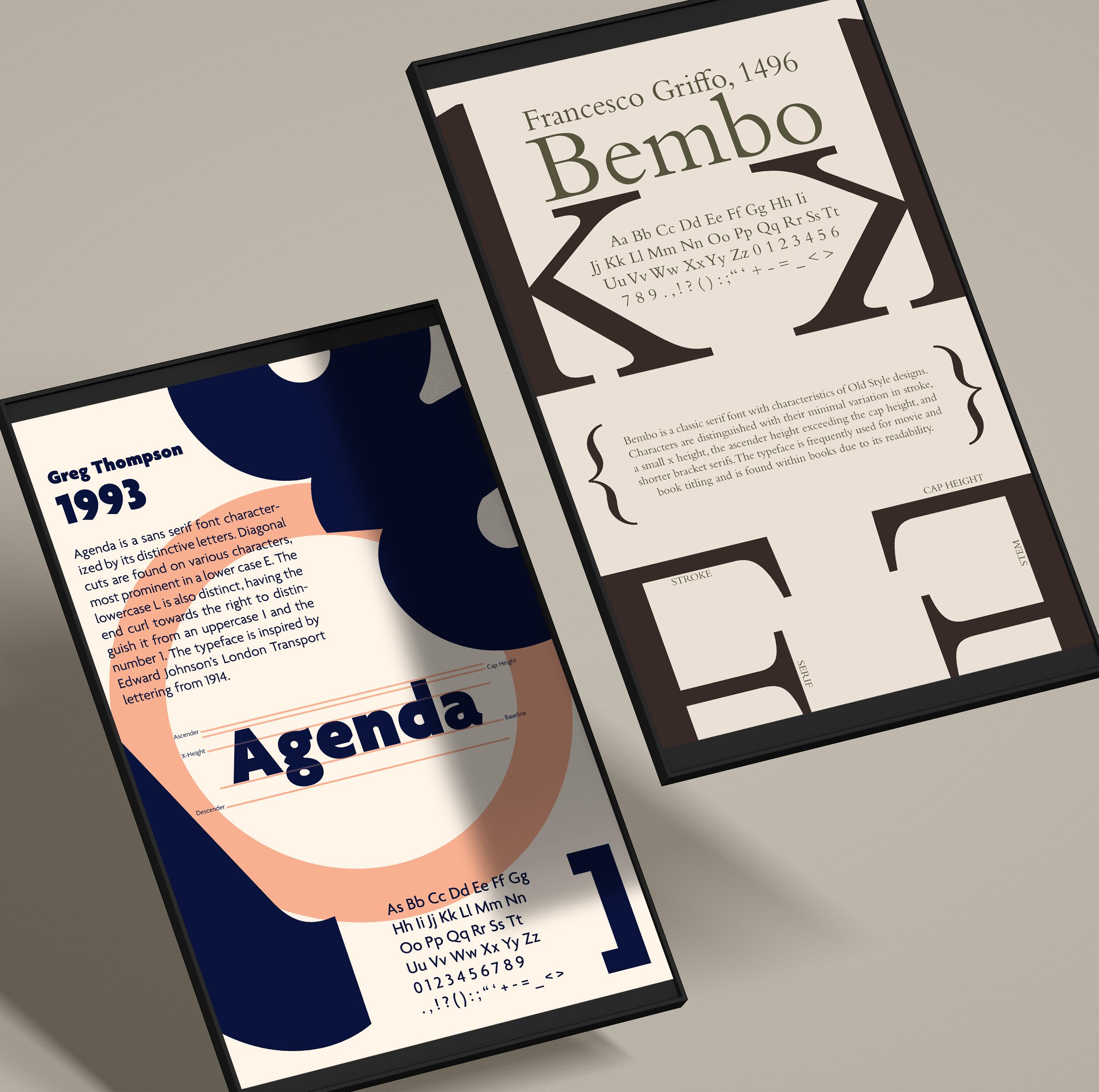
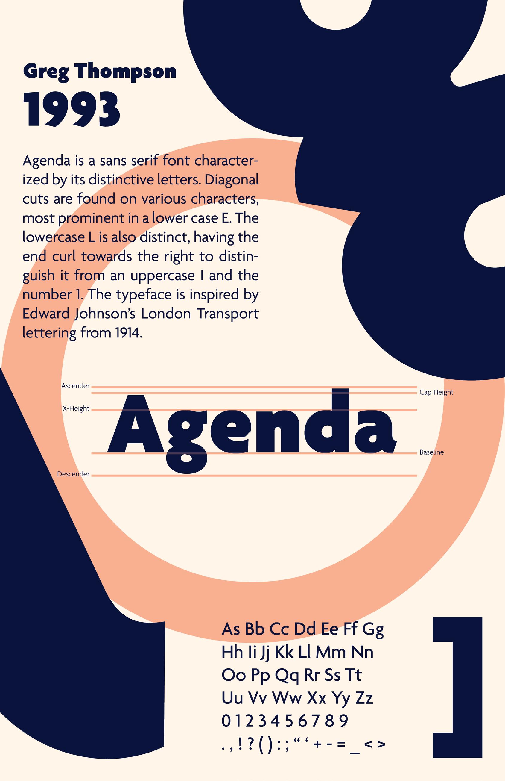
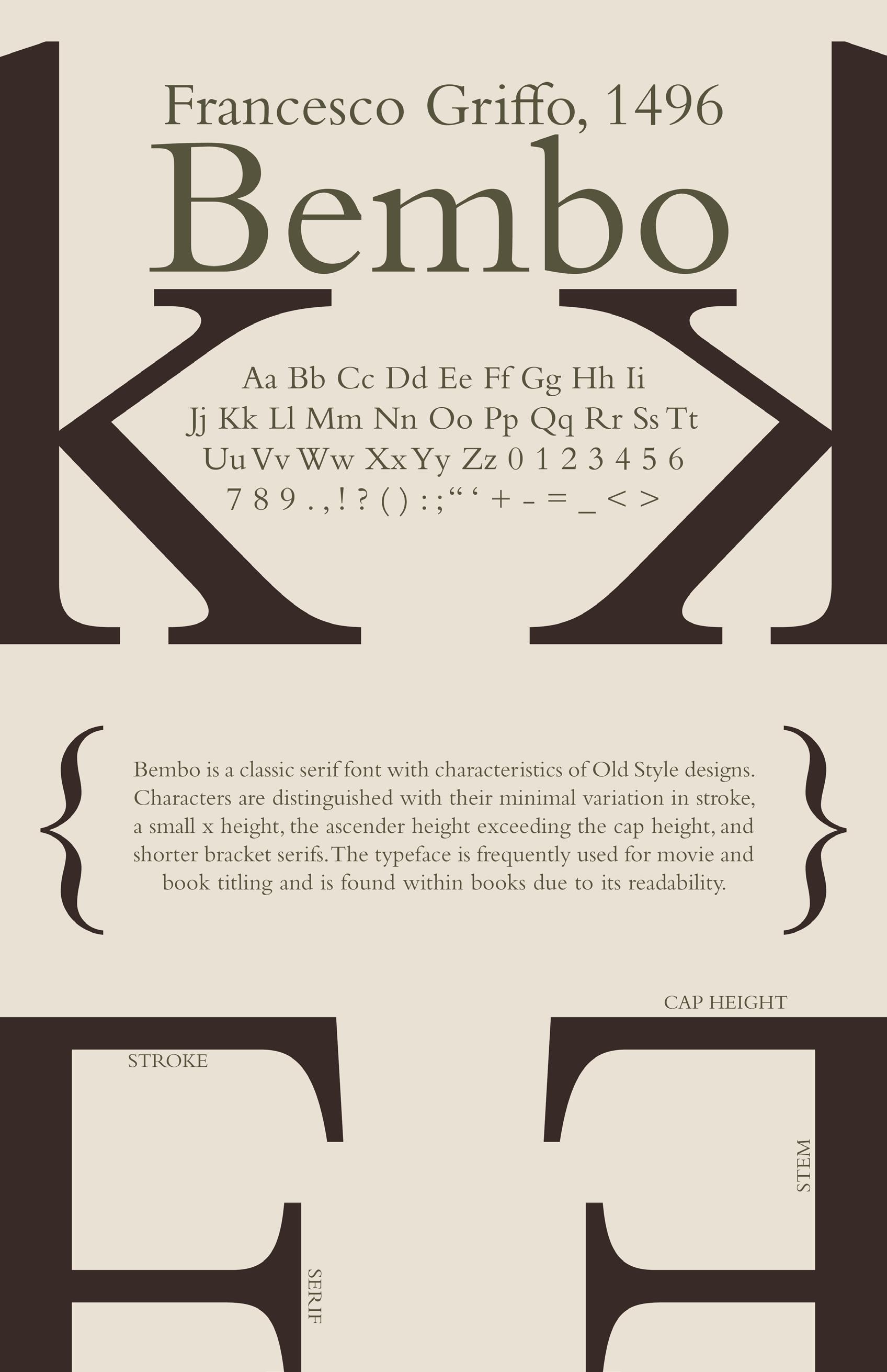
the ask : create 2 posters showing typographic anatomy on 2 typefaces
a lesson on typographic anatomy in visual form
Each poster gives a brief history of the typefaces agenda and bembo. Both typefaces have unique typographic anatomy, and the posters are centered around showcasing its unique features while incorporating specific characters as design elements.
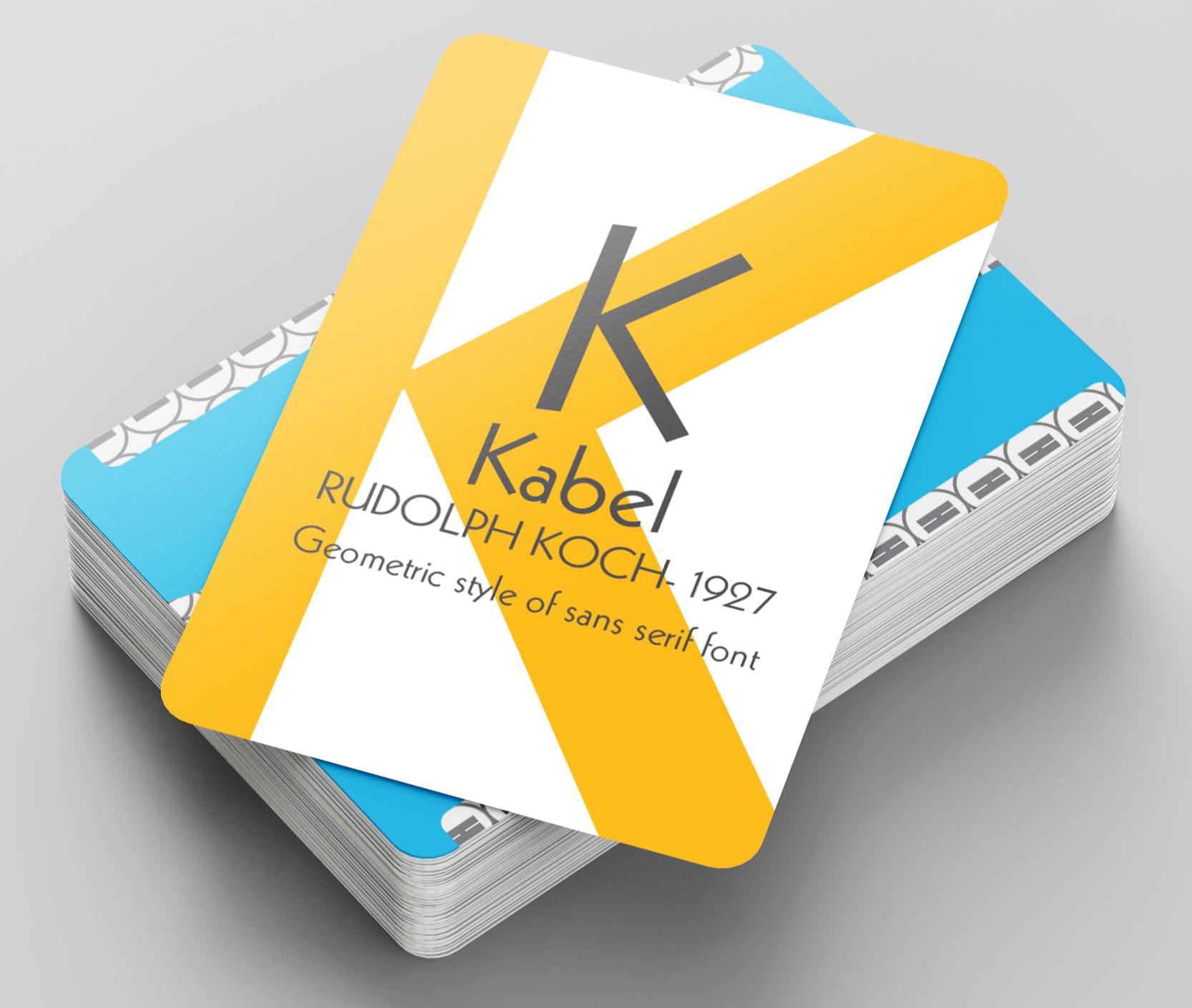
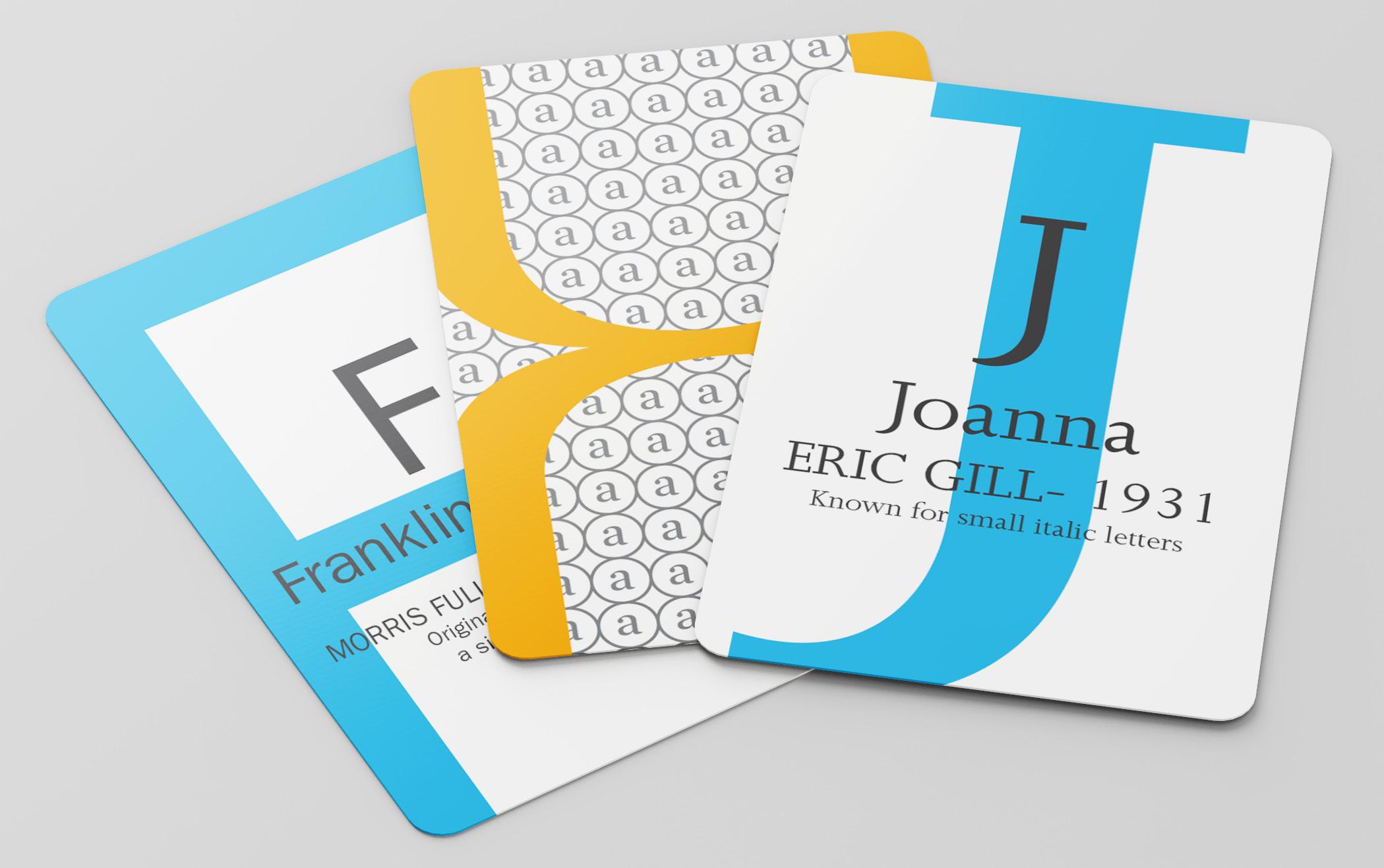
the ask : create a deck of cards based on the letters of the alphabet
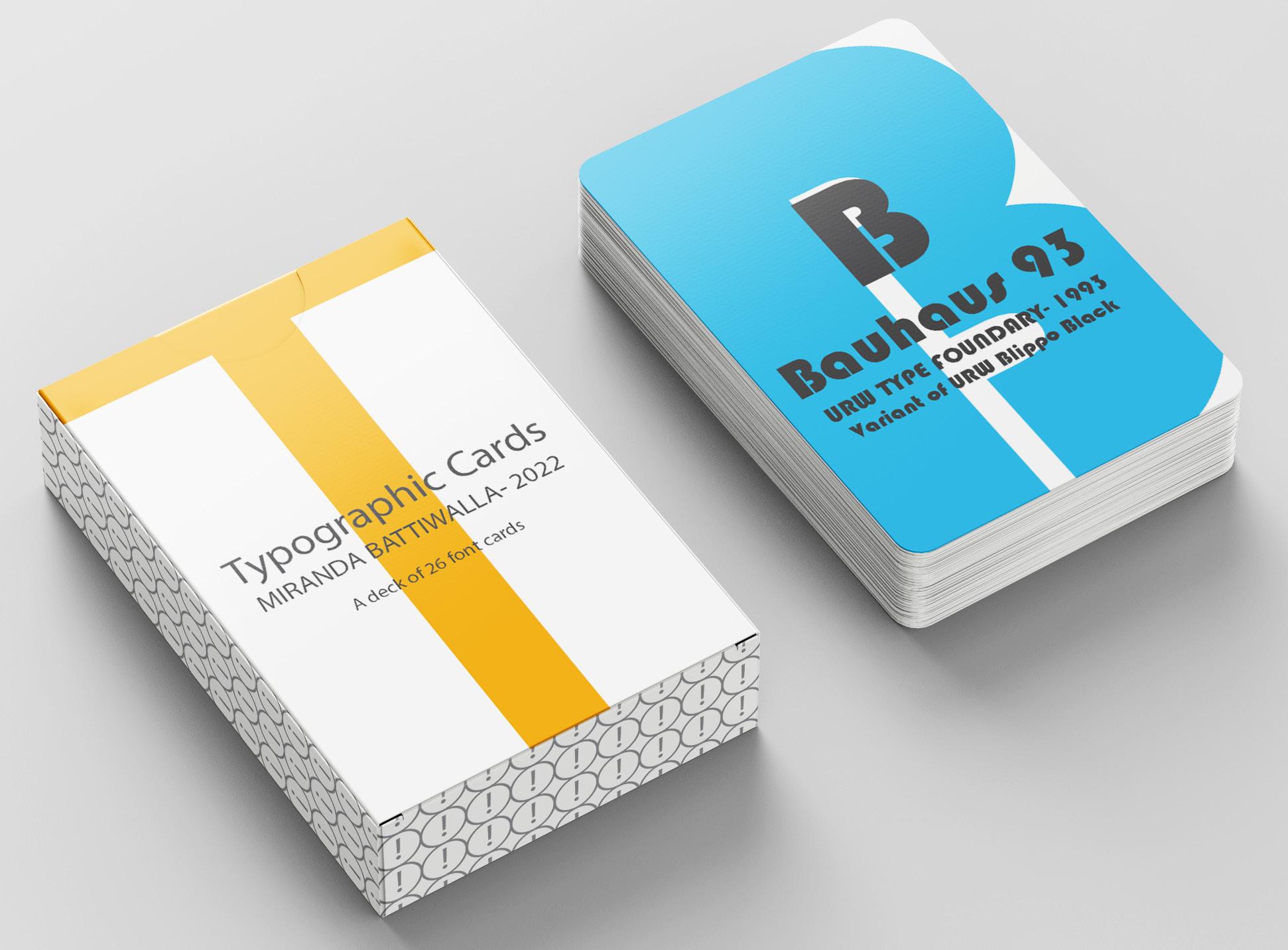
every letter has its own font
Each card in this deck gives a brief introduction with a highlighting fact about its corresponding typeface. The deck keeps cohesion with its orange and blue color palette along with a circular pattern and brackets creating an x on the back of the card in the specific typeface it represents.
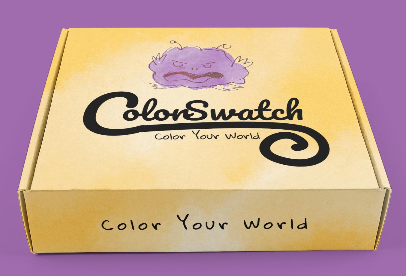
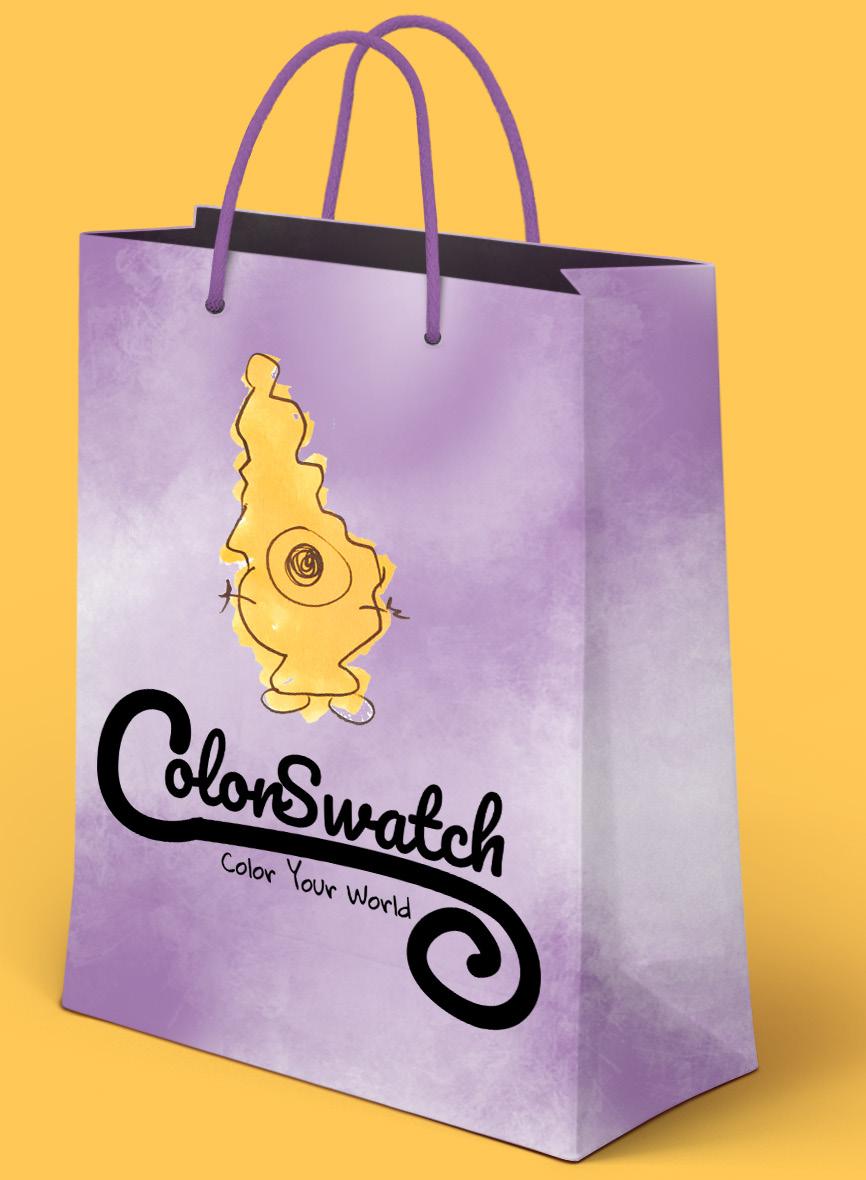
create branding and packaging for a ficticious company
color your world
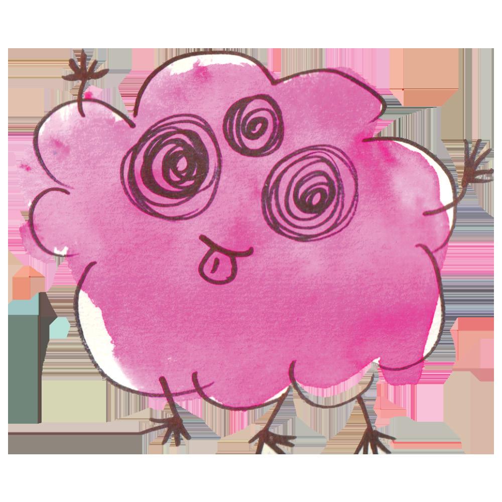
The concept for colorswatch is a fictitious stationery brand themed after inspiring creativity through color. The branding is centered around watercolor paints and creating something unique with them, pushing the idea of little monsters doodled on top of paint swatches as the main imagery.

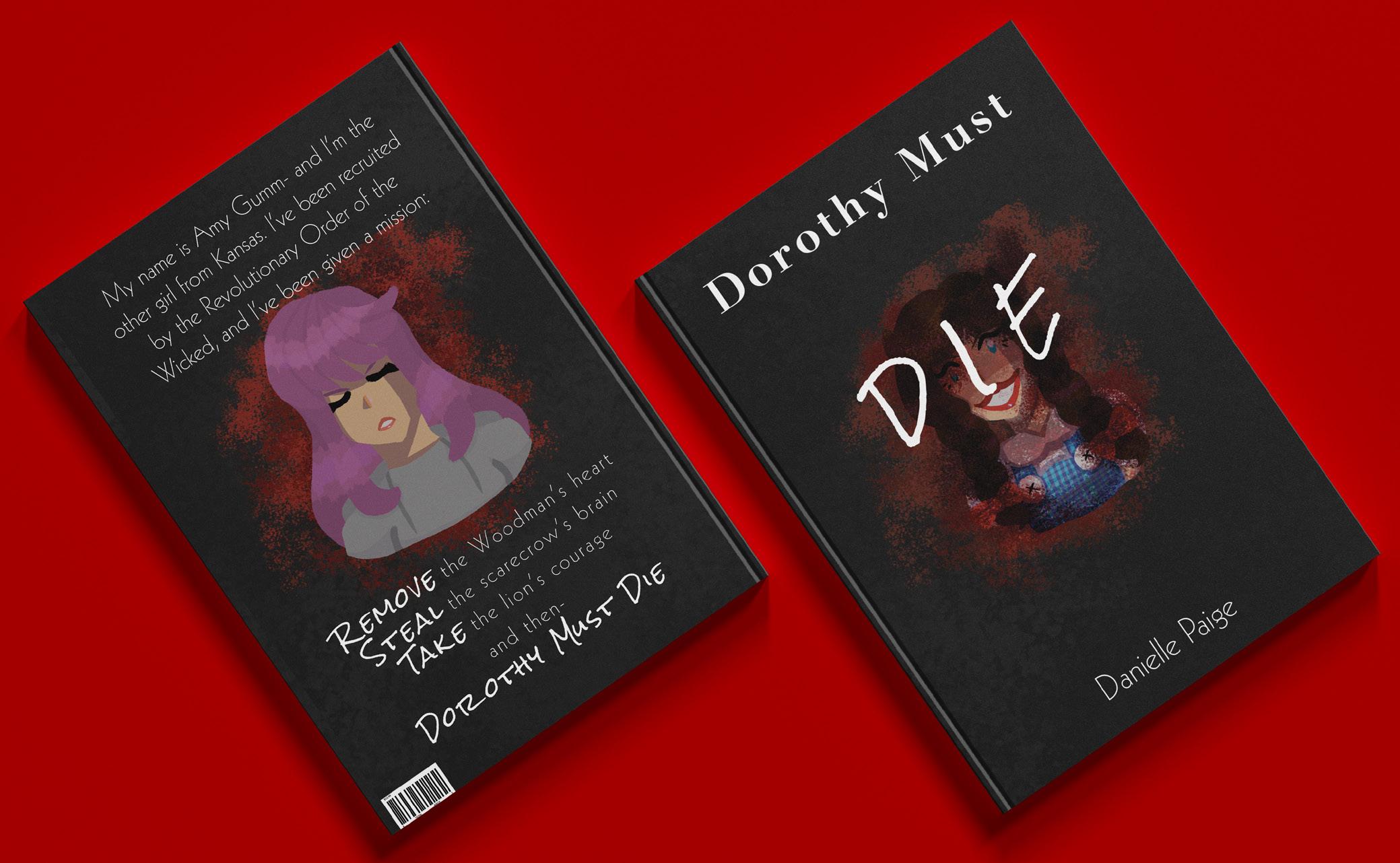
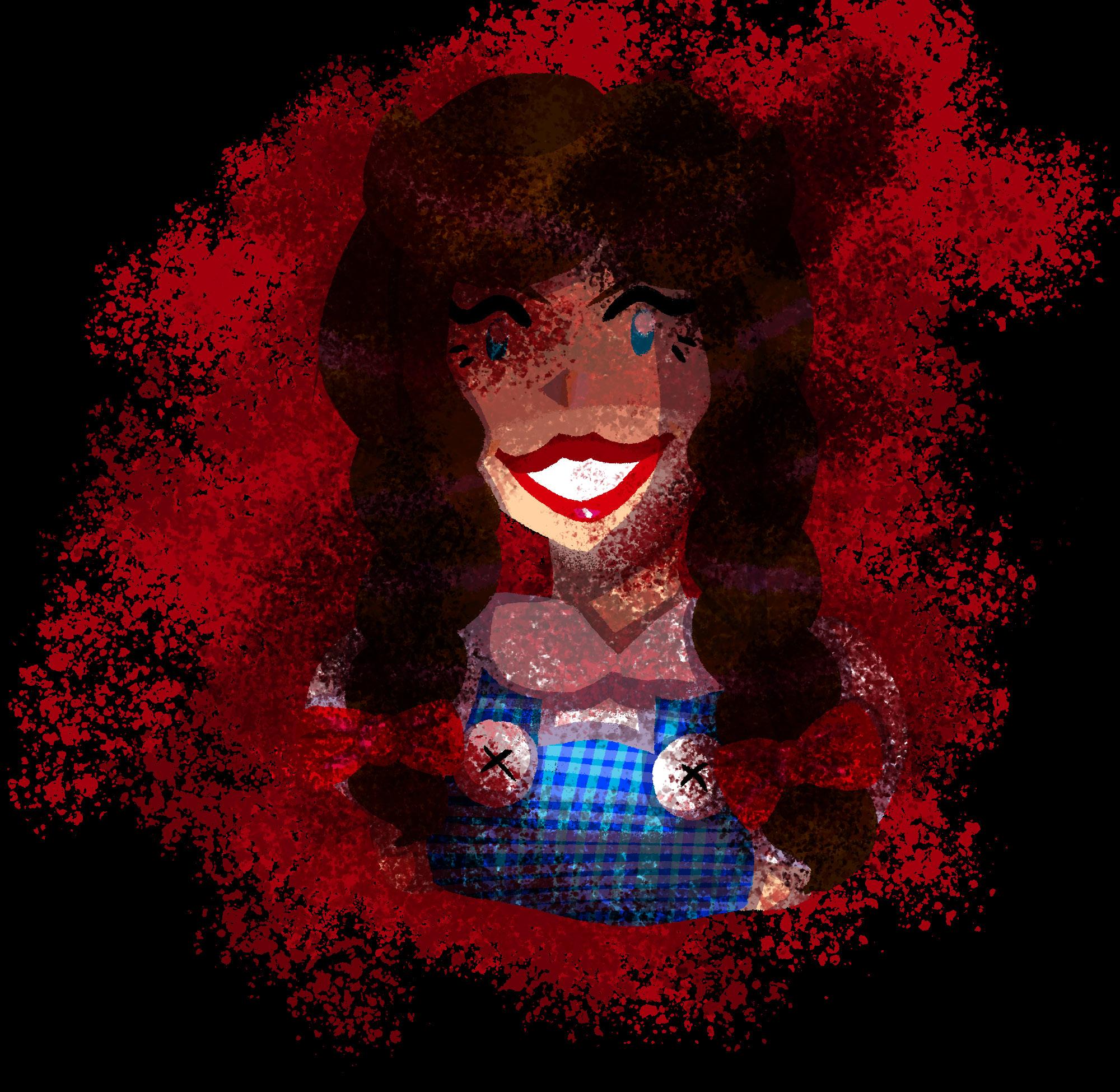
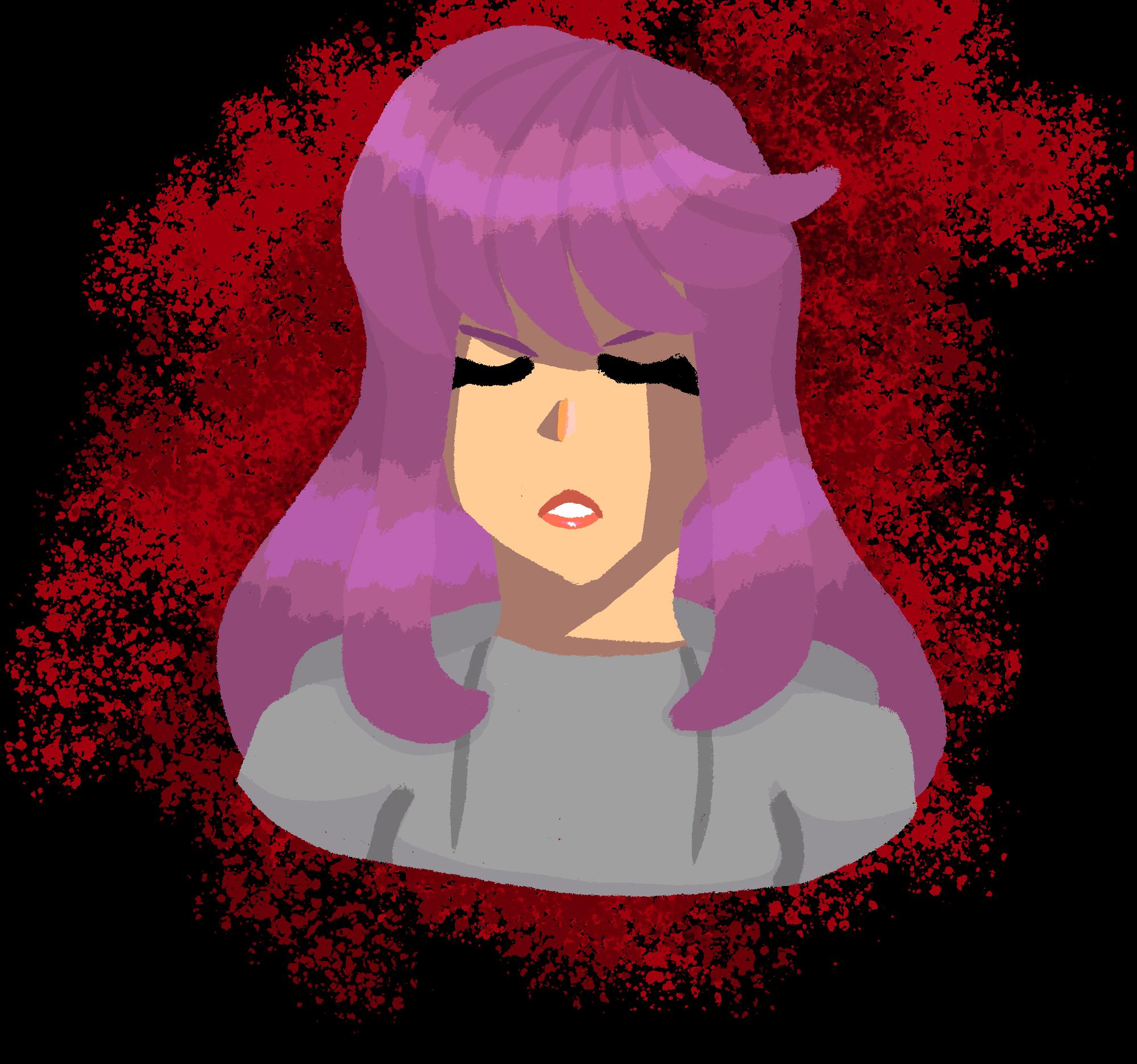
the ask : redesign the cover of a novel a character driven visual to this reimagining of the land of oz
This cover redesign takes the aesthetic of the original novel while exploring the audience’s preconcieved idea of the wizard of oz’s characters. The front cover features the iconic, loveable character of dorothy gale covered in blood, foreshadowing her villinous ways. The back cover features this story’s protagonist, amy gumm, with the same blood pattern behind her to highlight her mission of killing dorothy in order to save oz.
the ask :
create a website and branding for a ficticious business
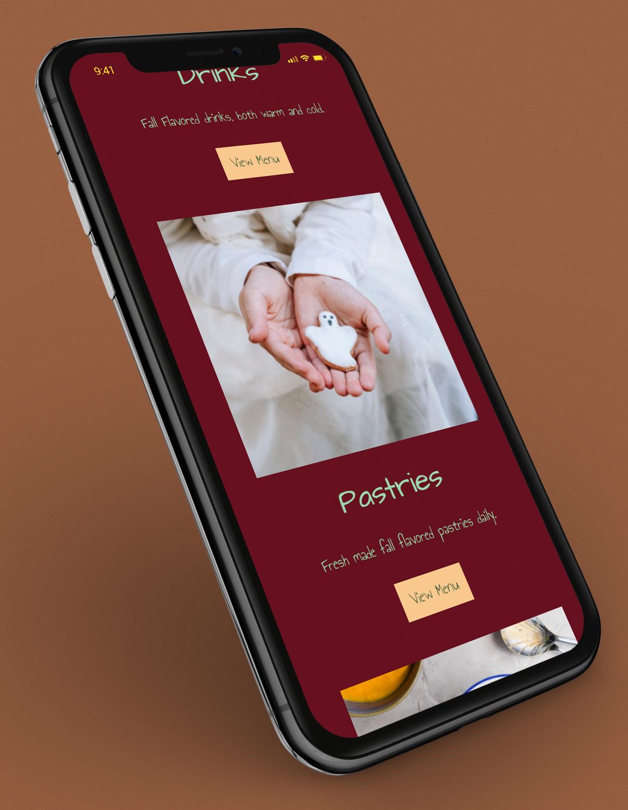
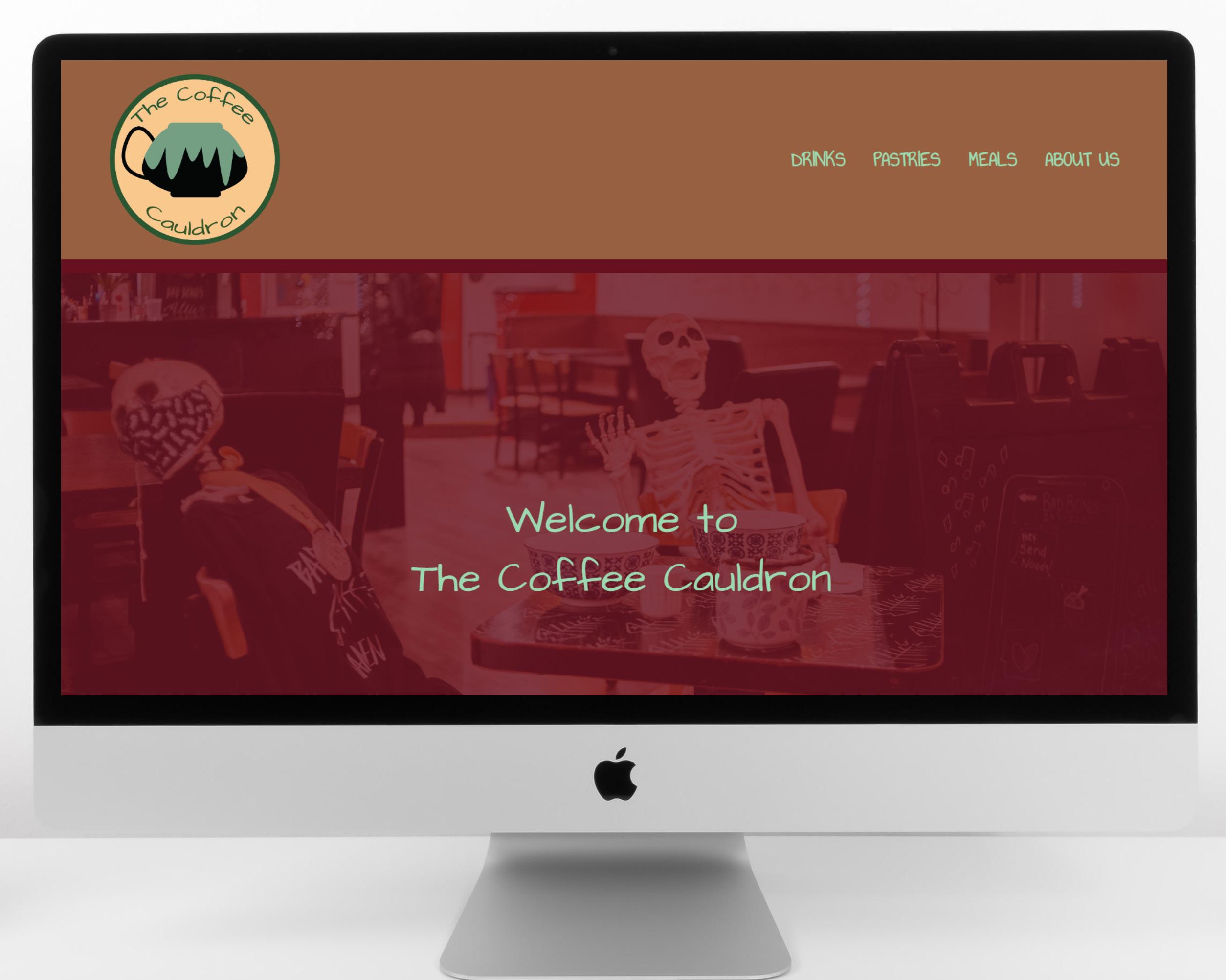
care for a cauldron of coffee?
Aa Bb Cc Dd Ee Ff Gg Hh Ii
Jj Kk Ll Mm Nn Oo Pp Qq Rr
Ss Tt Uu Vv Ww Xx Yy Zz
Aa Bb Cc Dd Ee Ff Gg Hh Ii Jj Kk Ll Mm Nn Oo
The coffee cauldron is a ficticious cafe that serves fall exclusive flavors year round. The site’s branding takes on the season’s aesthetic through its warm color palette and autumnal imagery with subtle halloween elements incorporated throughout.
Pp Qq Rr Ss Tt Uu Vv Ww Xx Yy Zz
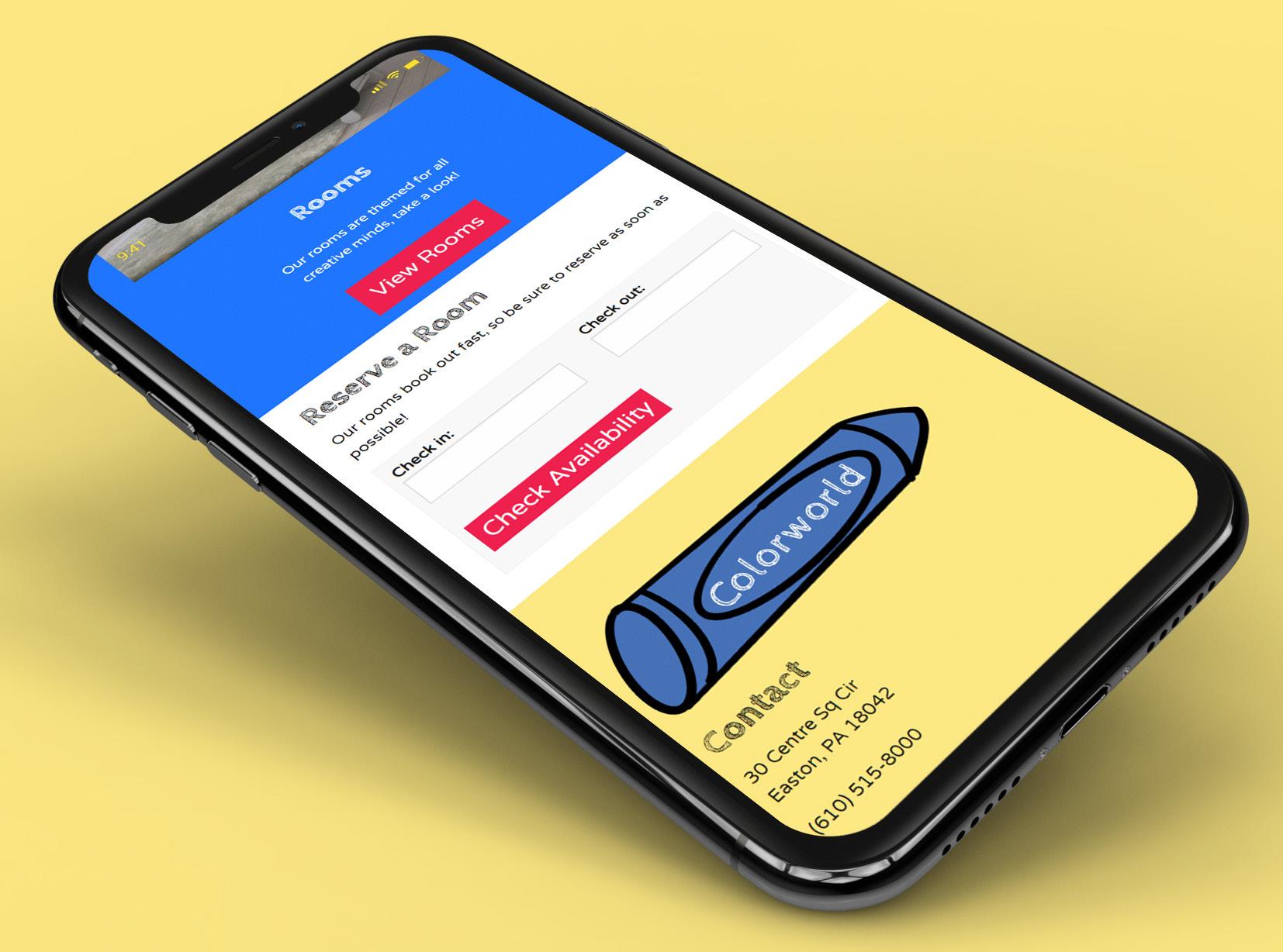
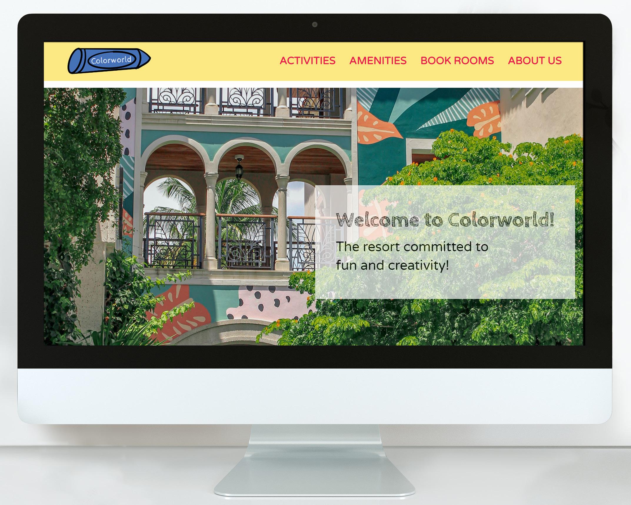
the ask :
create a landing page and branding for a ficticious boutique resort
a colorful resort experience for the young and the young at heart
Aa Bb Cc Dd Ee Ff Gg Hh Ii Jj
Kk Ll Mm Nn Oo Pp Qq Rr Ss Tt Uu Vv Ww Xx Yy Zz
Colorworld is a ficicious resort to inspire creativity for families of all ages. The branding primarily has a youthful appeal, with the primary colors as the color palette, a combination of rounded sans serif fonts and handwritten fonts, and crayon imagery used throughout the site.
Aa Bb Cc Dd Ee Ff Gg Hh Ii Jj Kk Ll Mm Nn Oo Pp Qq Rr Ss Tt Uu Vv Ww Xx Yy Zz