I am an illustrator and graphic designer based out of Rhode Island. My introduction to design goes all the way back to when I was young with my love for the arts, notably illustration. I have a massive appreciation for every artistic aspect that can be found in life. As a designer, I strive to incorporate the same creative influences that have driven my works into everything I do. It is very important to me that projects I work on instill a unique aesthetic that creates a sense of variety in what I make while still remaining harmonious with my previous endeavors.
When not working on design, you can often find me enjoying various forms of media, with my favorites being video games and music, particularly from the rock genre. I also collect items such as CDs and vinyl records, dolls, action figures, and art books. These interests have been a huge influence on my life and are often a driving force for a creative direction in everything I create.
If you are interested in creating something together, let’s get in touch! I am excited by any and all potential creative opportunities that you may be interested in and would love to work with you and your brand.
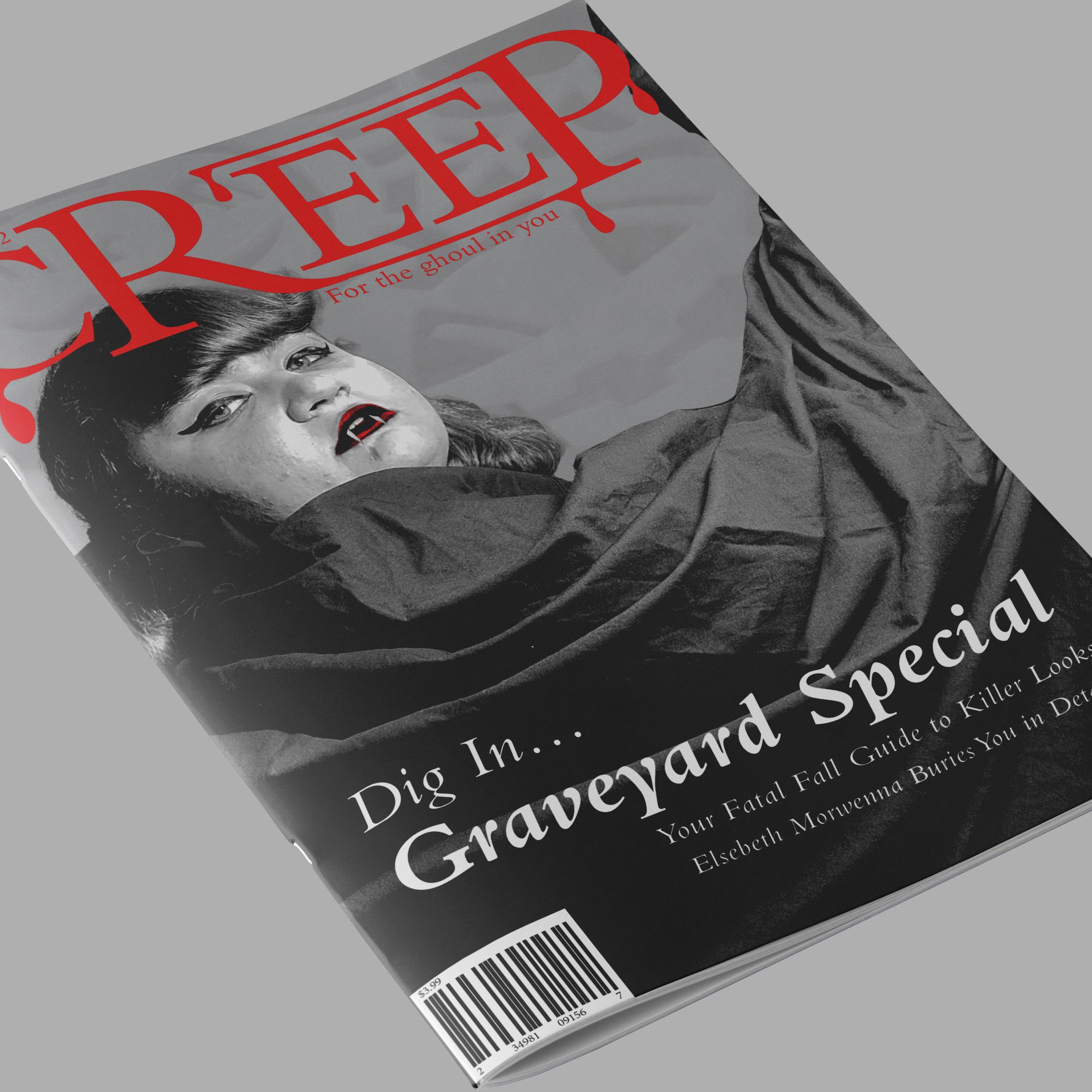
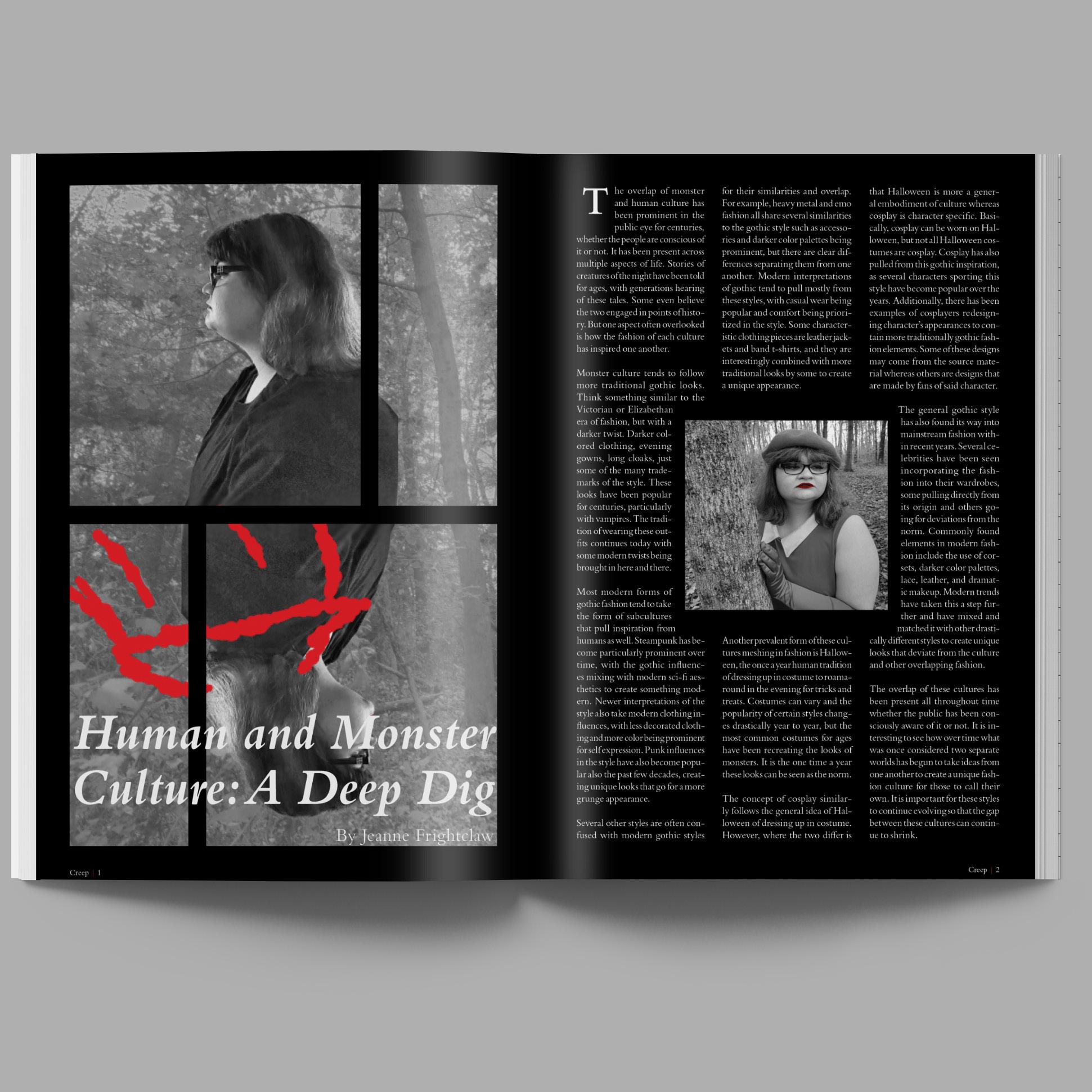
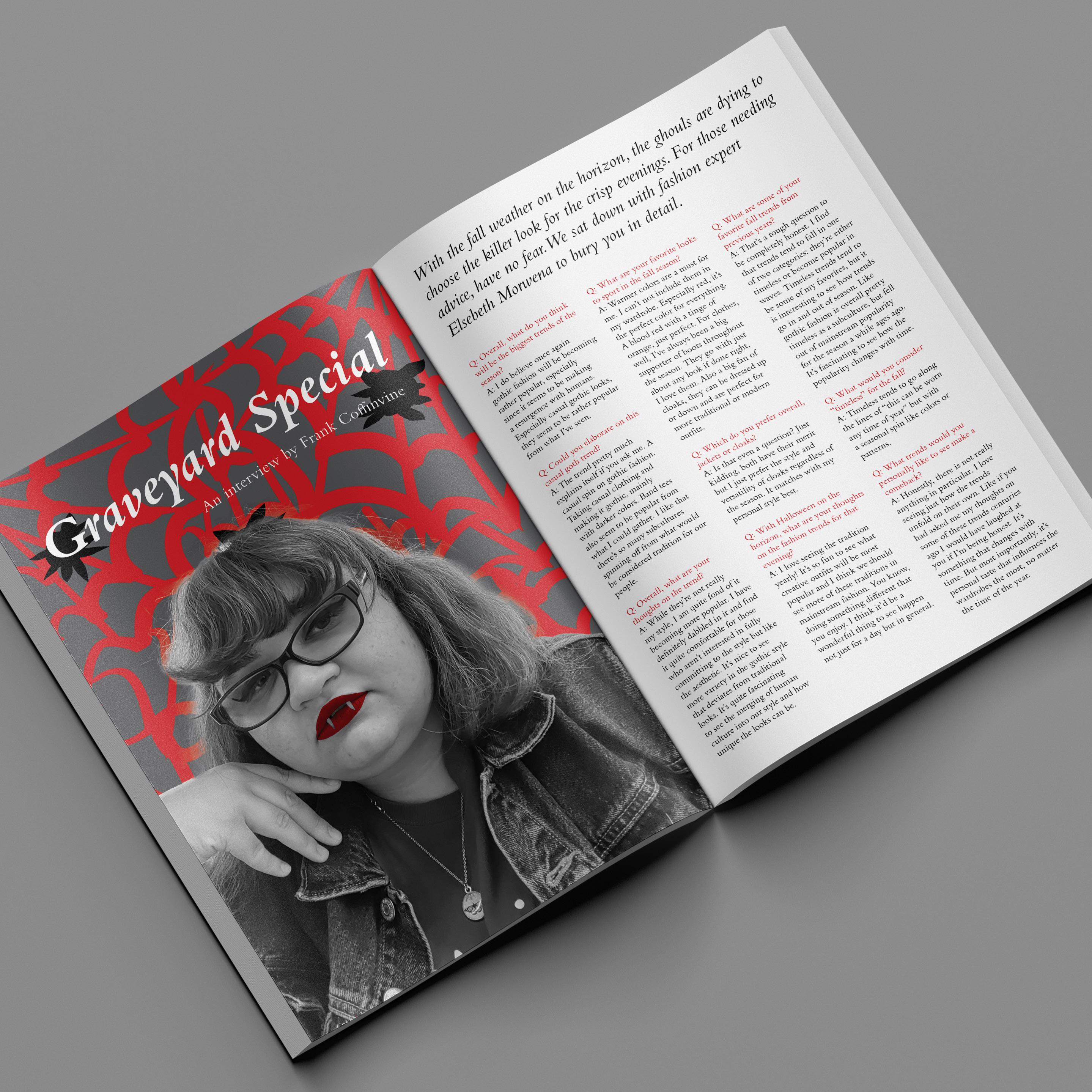
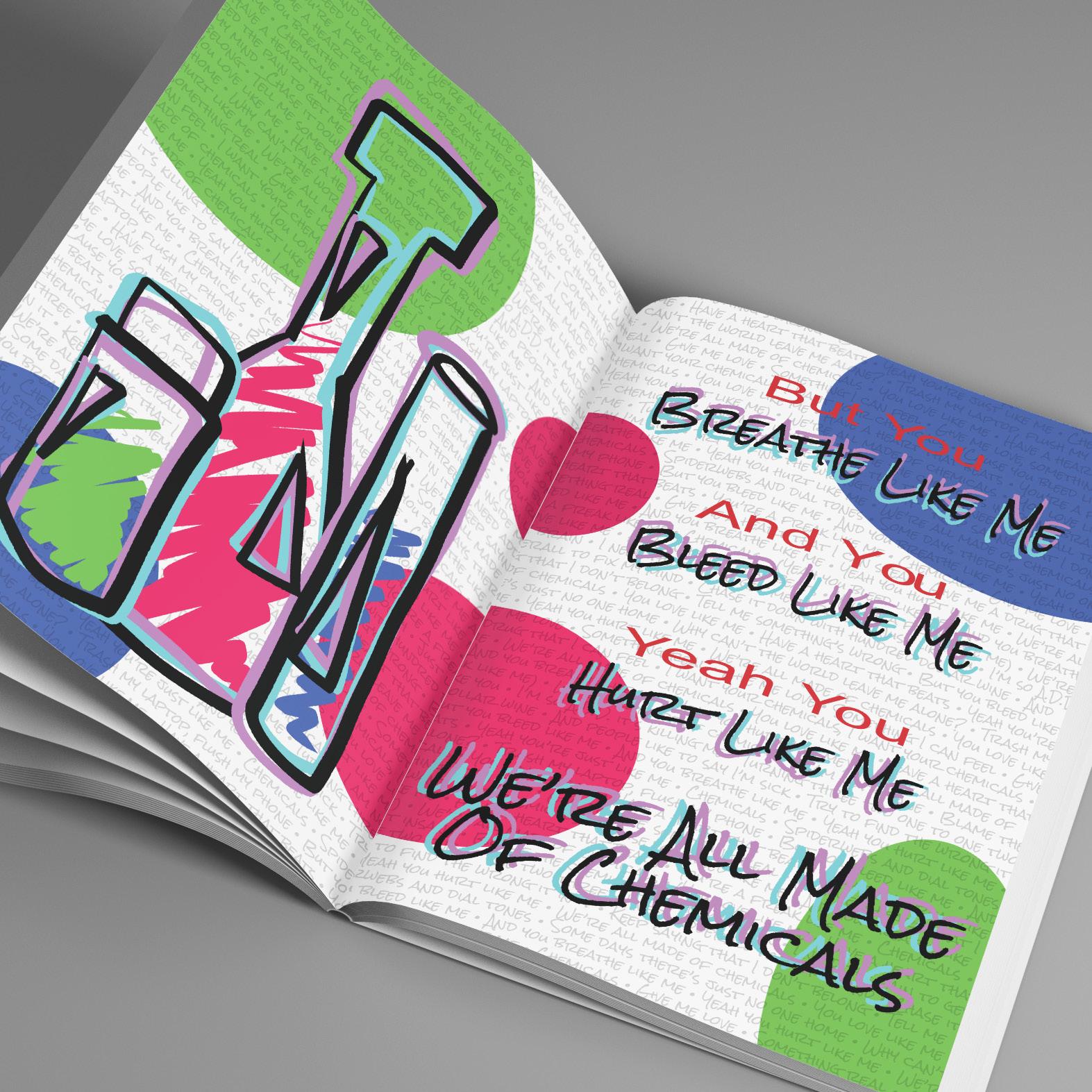
Creep Fashion Minizine
A magazine for the ghoulish fashion lovers
Skills:
Editorial
Skills:
Branding
Illustration
Photo Editing Photography
Tools:
Adobe Fresco
Adobe Illustrator
Adobe InDesign
Adobe Photoshop
Creep is a fictitious fashion magazine centered around “monster culture” that appeals to gothic and alternative fashion. The design has vintage style influences with the incorporation of a traditional typeface and a grayscale/red color palette. The combination of the clean, readable type and the darker themes and aesthetics resulted in a publication for both costume and fashion enthusiasts alike.
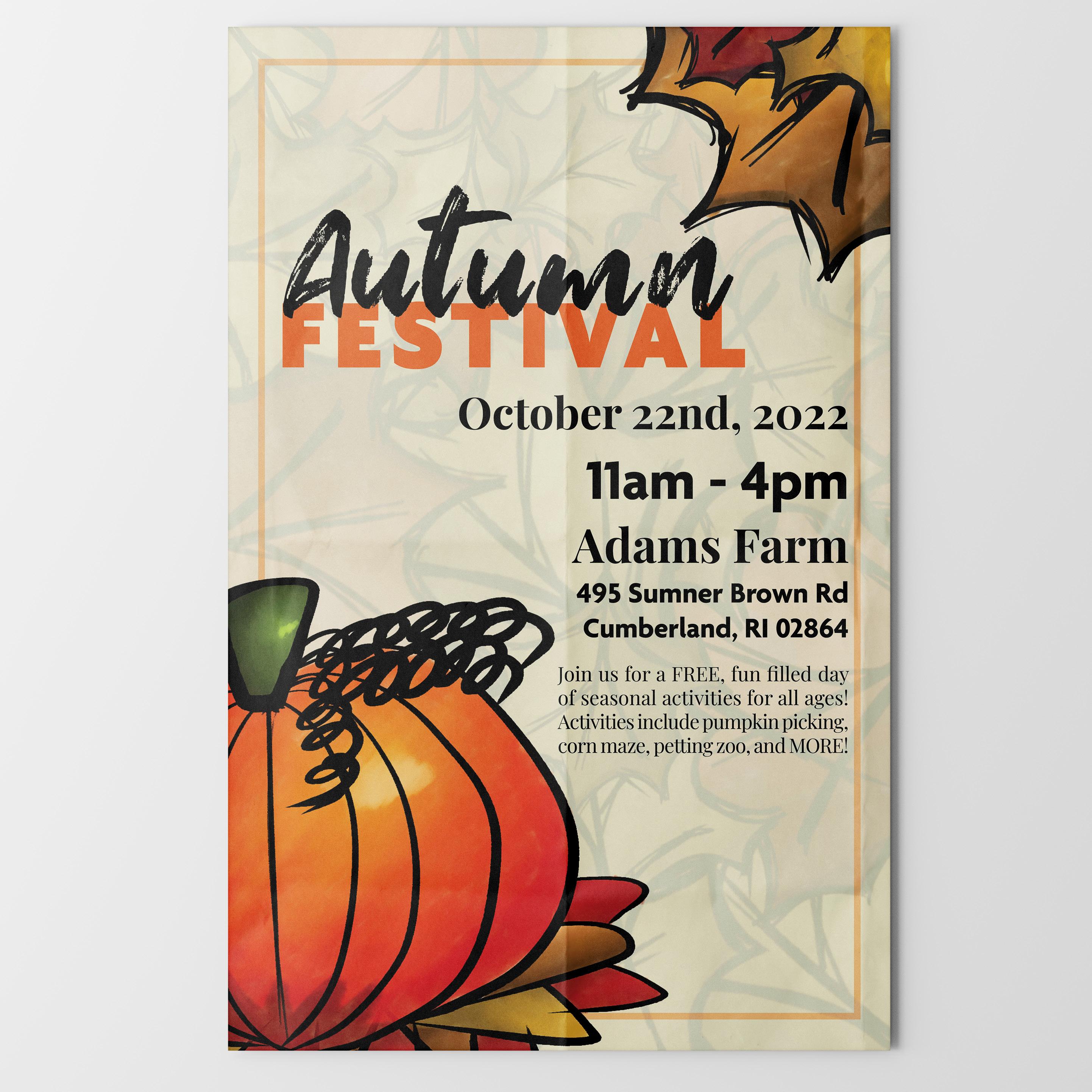
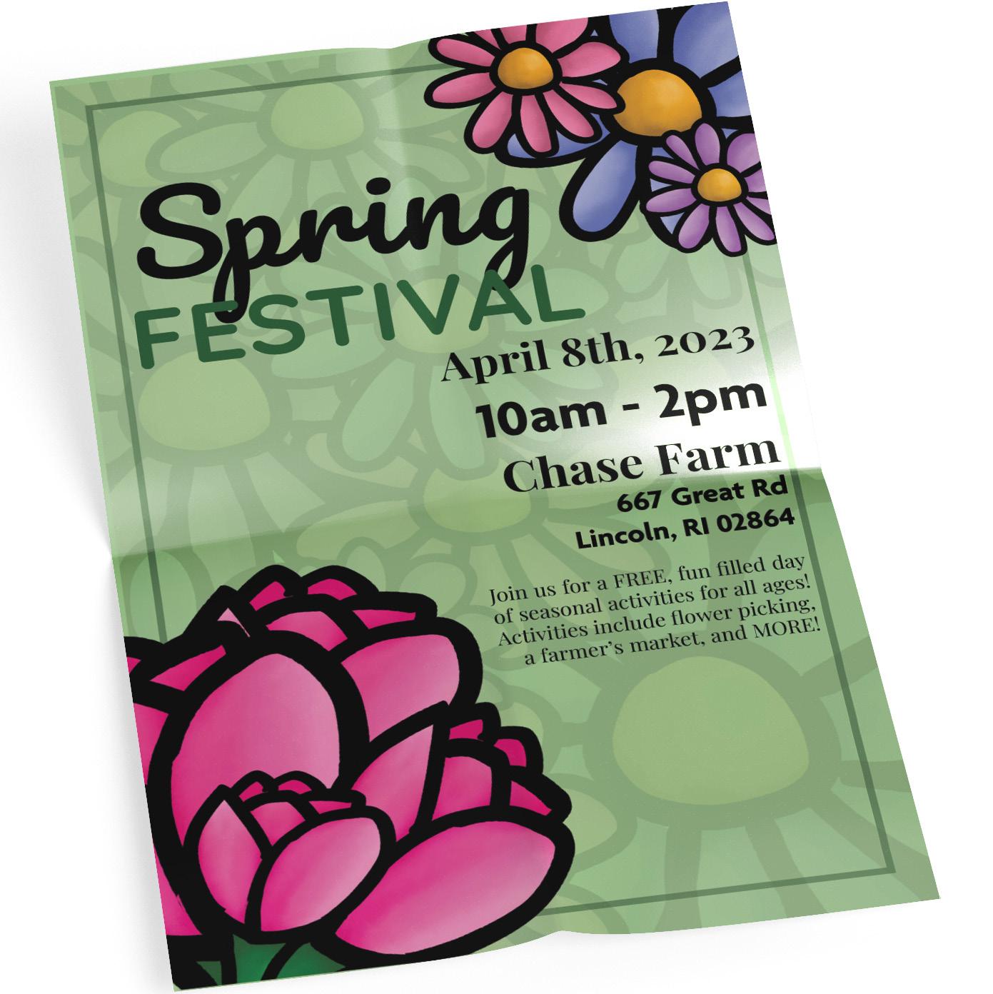
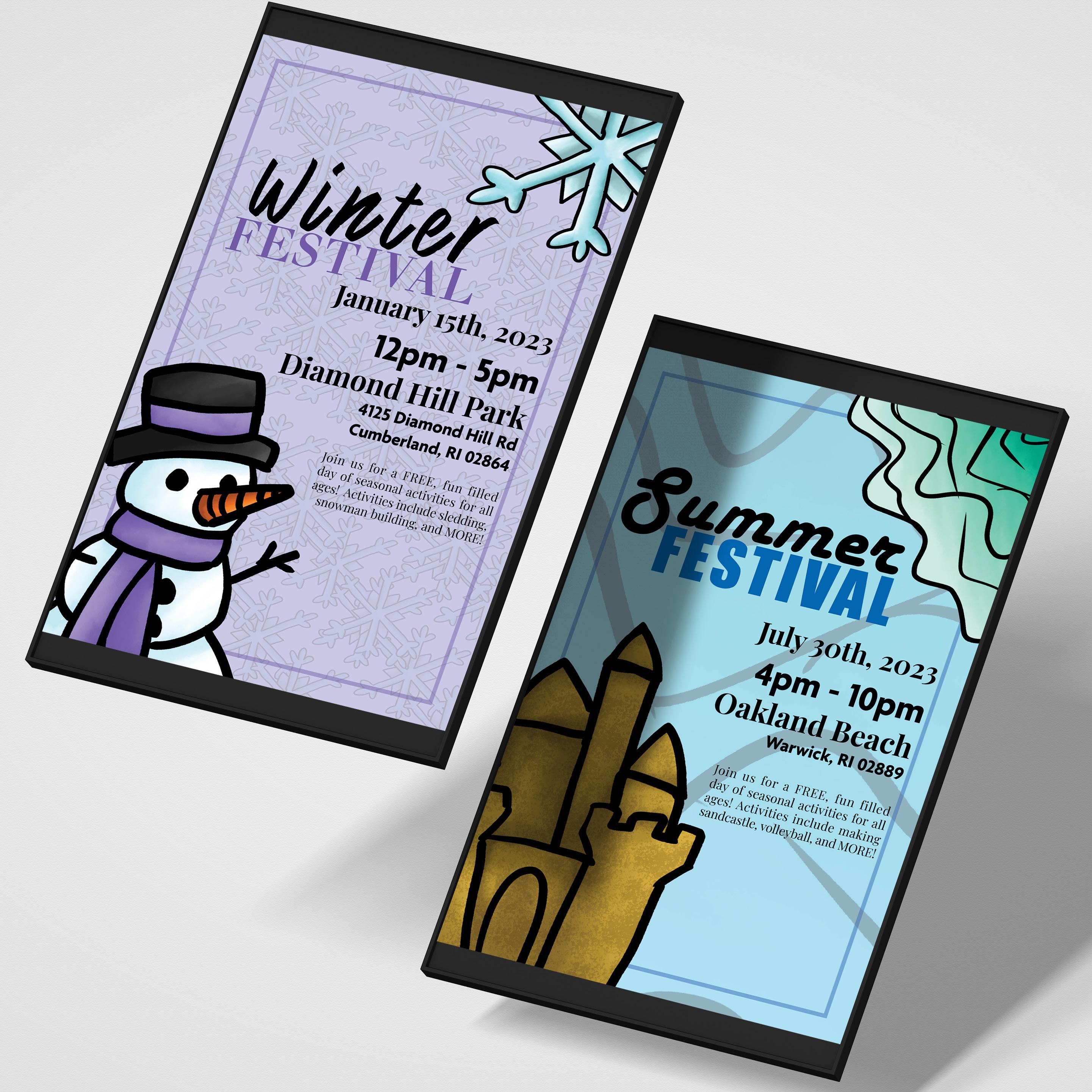
Seasonal Event Posters
Something to celebrate for every season
Project Type:
Editorial
Skills: Illustration
Typography
Tools: Adobe Fresco Adobe InDesign
Every poster in this series is themed after festivals for every season of the year. The layouts are all the same and retain a cohesive setup. The color palette and typography are swapped out to match the aesthetic of that time in the year. All of the illustrations are original to each poster and reflect the iconography commonly associated with the occasion. The combination of the unique type and illustrations create a visually interesting poster that appeals to those interested in locally based events.
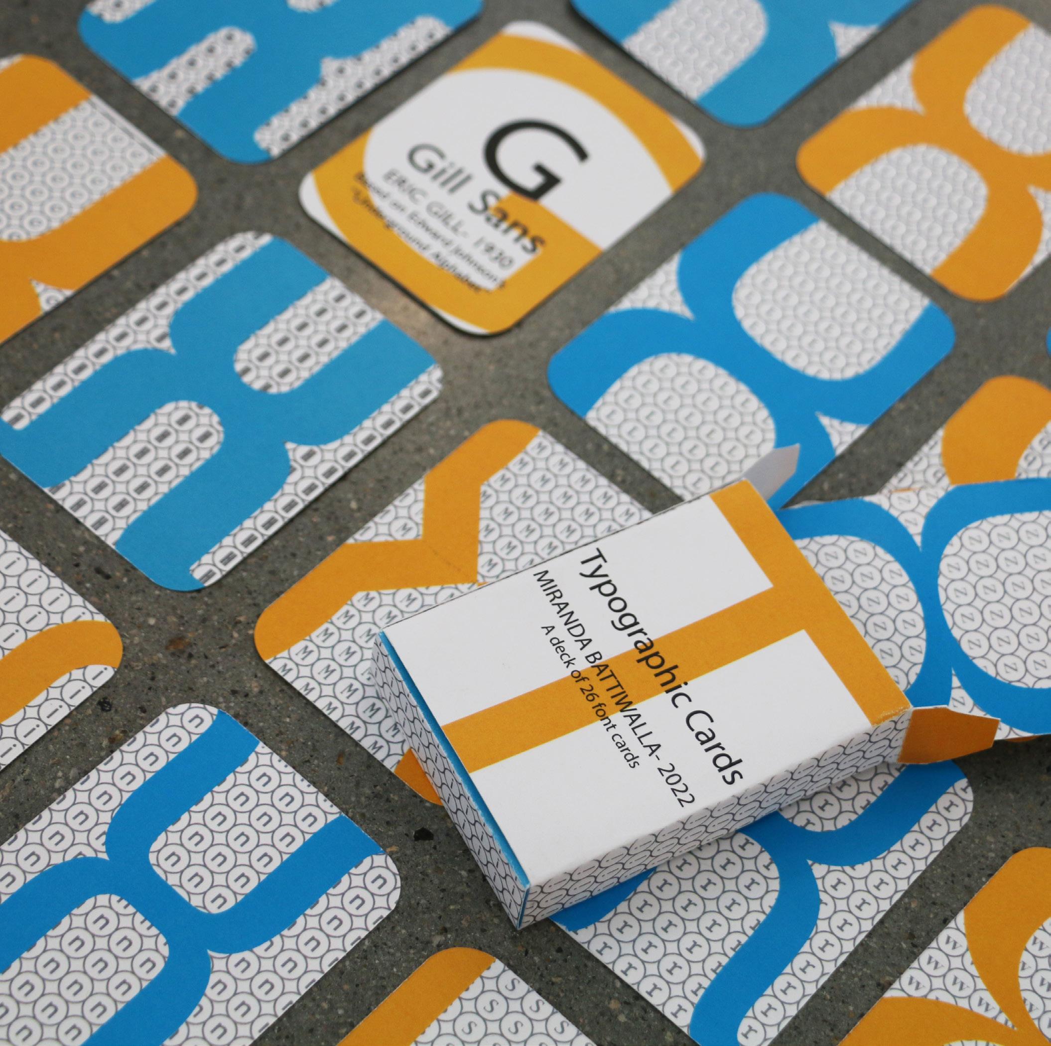
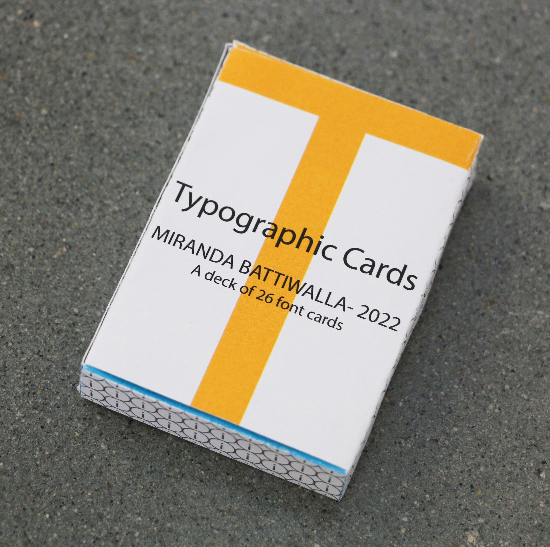
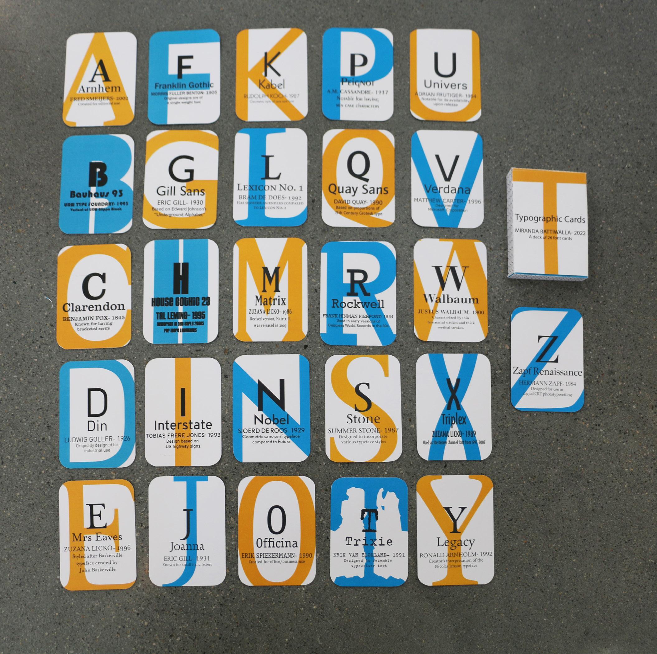
Alphabet Typeface Cards
Every letter has its font
Project Type:
Editorial
Skills: Typography
Tools:
Adobe Illustrator
Adobe InDesign
This deck of cards consists of 26 cards, with each one representing a different typeface. The card gives a brief introduction on the font, information on its creator, and highlights a fun fact. The deck keeps cohesion with its consistent orange and blue color palette. The backside of the cards has a circular pattern, with the center being a lowercase character coordinating with the letter it represents. The typeface’s bracket character is used to create an X shape in its coordinating color over the pattern.
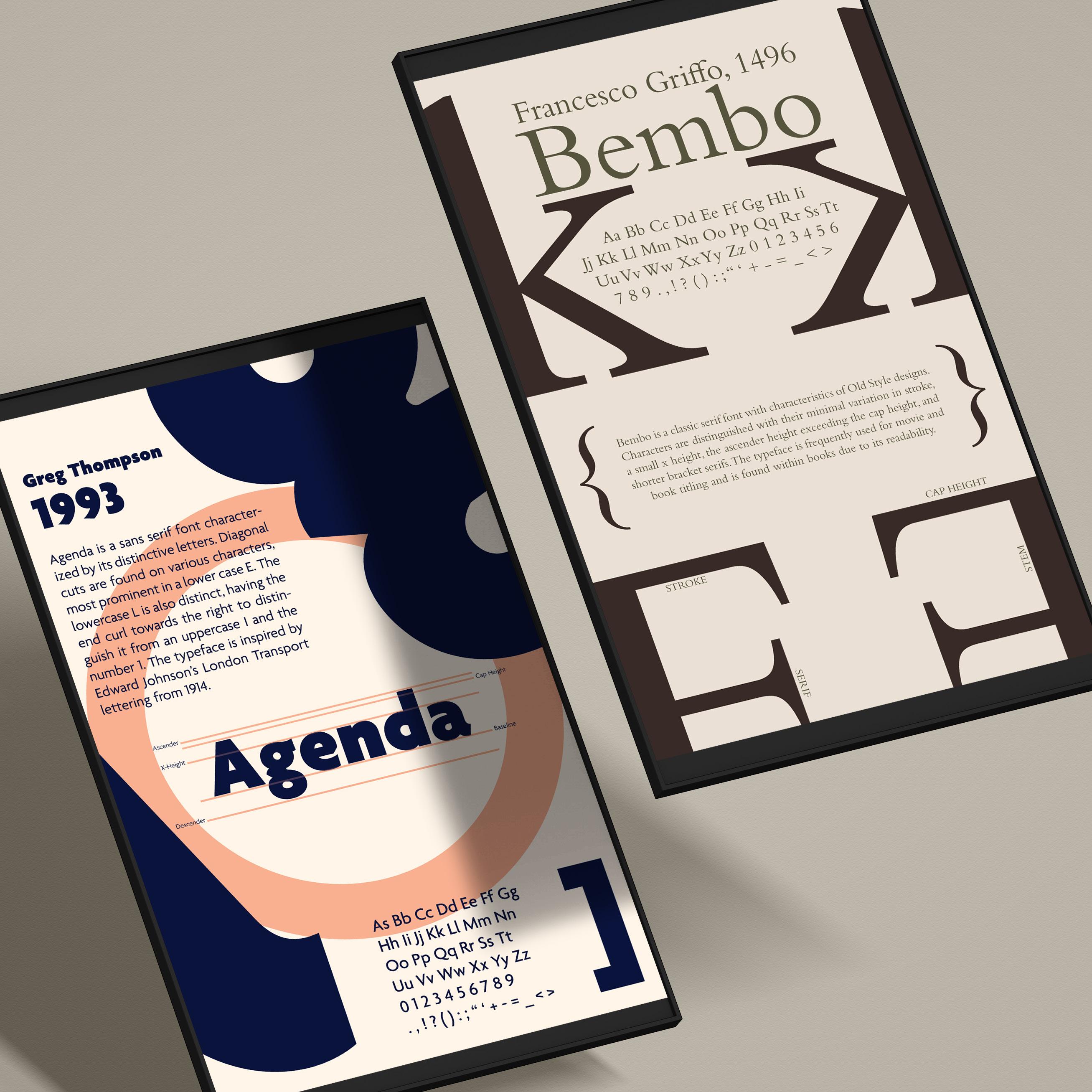
Typographic Anatomy Posters
A visual lesson on typographic anatomy
Project Type:
Editorial
Skills: Typography
Tools:
Adobe Illustrator
Adobe Indesign
This series of typographic anatomy posters utilizes specific typefaces as a basis for teaching basic type anatomy. Different characters of each typeface are incorporated into the visual design to create unique layouts that pay homage to the typeface’s history. Each poster contains basic information of the font, a brief history of it, and all of the major characters. Various elements of type anatomy are highlighted in the headlines, body copy, and visual elements of all text.
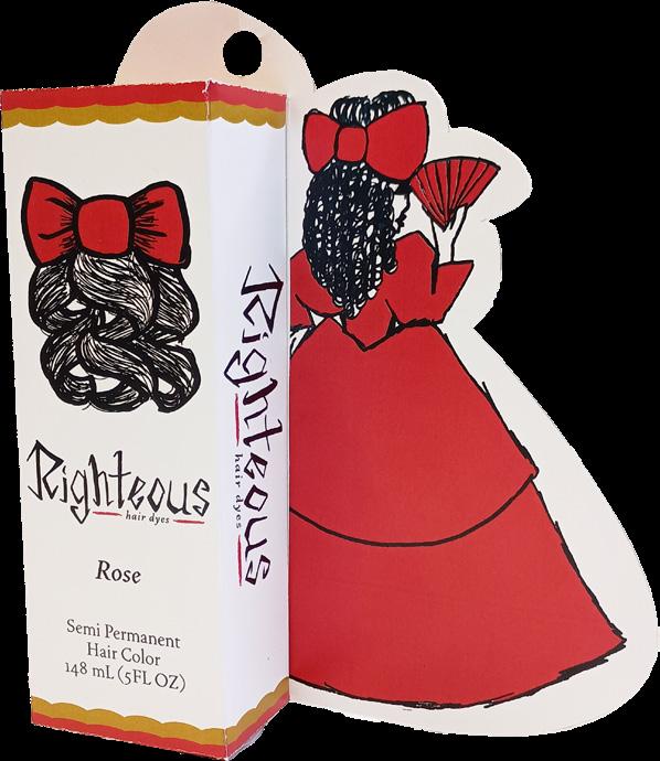
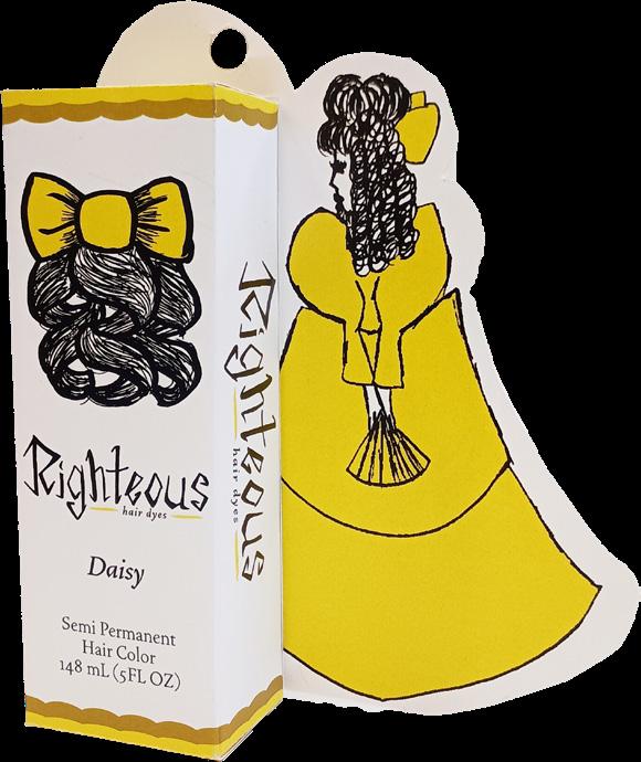
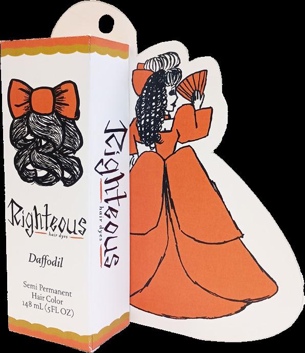
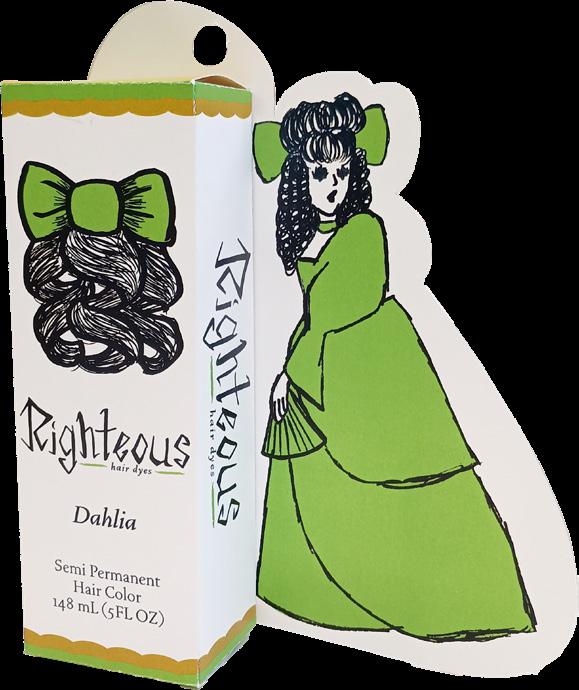
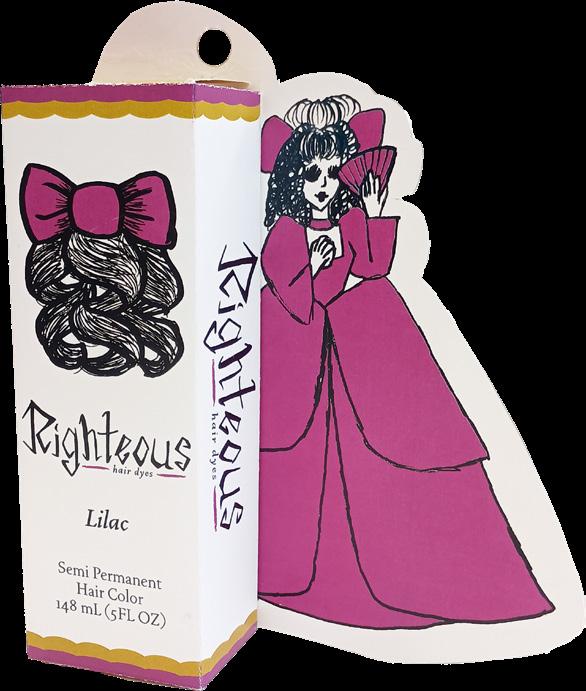
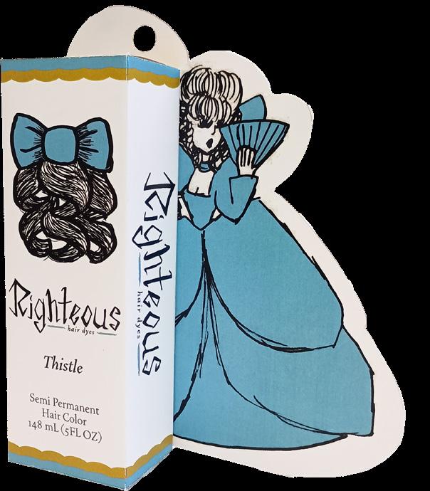
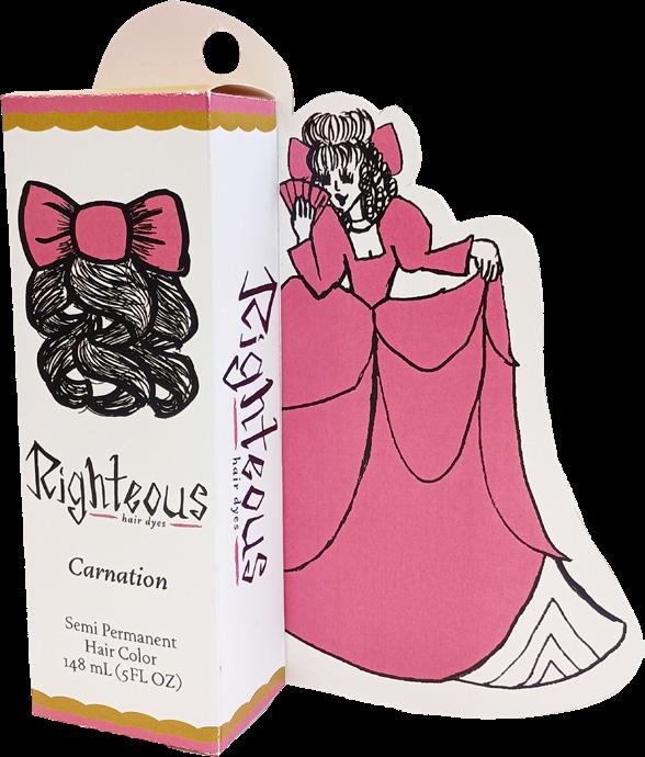
Righteous Hair Dyes
Live bold, dye righteously
Project Type: Packaging
Skills: Branding
Illustration
Tools:
Adobe Fresco
Adobe Illustrator
Adobe InDesign
Adobe Photoshop
Righteous is a fictitious hair dye company. Its main demographic is a young adult audience and separates itself from competition with its wider, readily available variety of colors. The aesthetic is meant to be a rougher, bolder take on prim and proper Victorian themes. The hand drawn logo and illustrations paired with the clean, traditional typeface and iconography of Victorian women allows the brand to stand as its own unique product for those interested in purchasing hair dye.
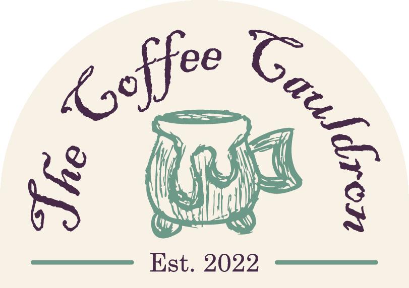
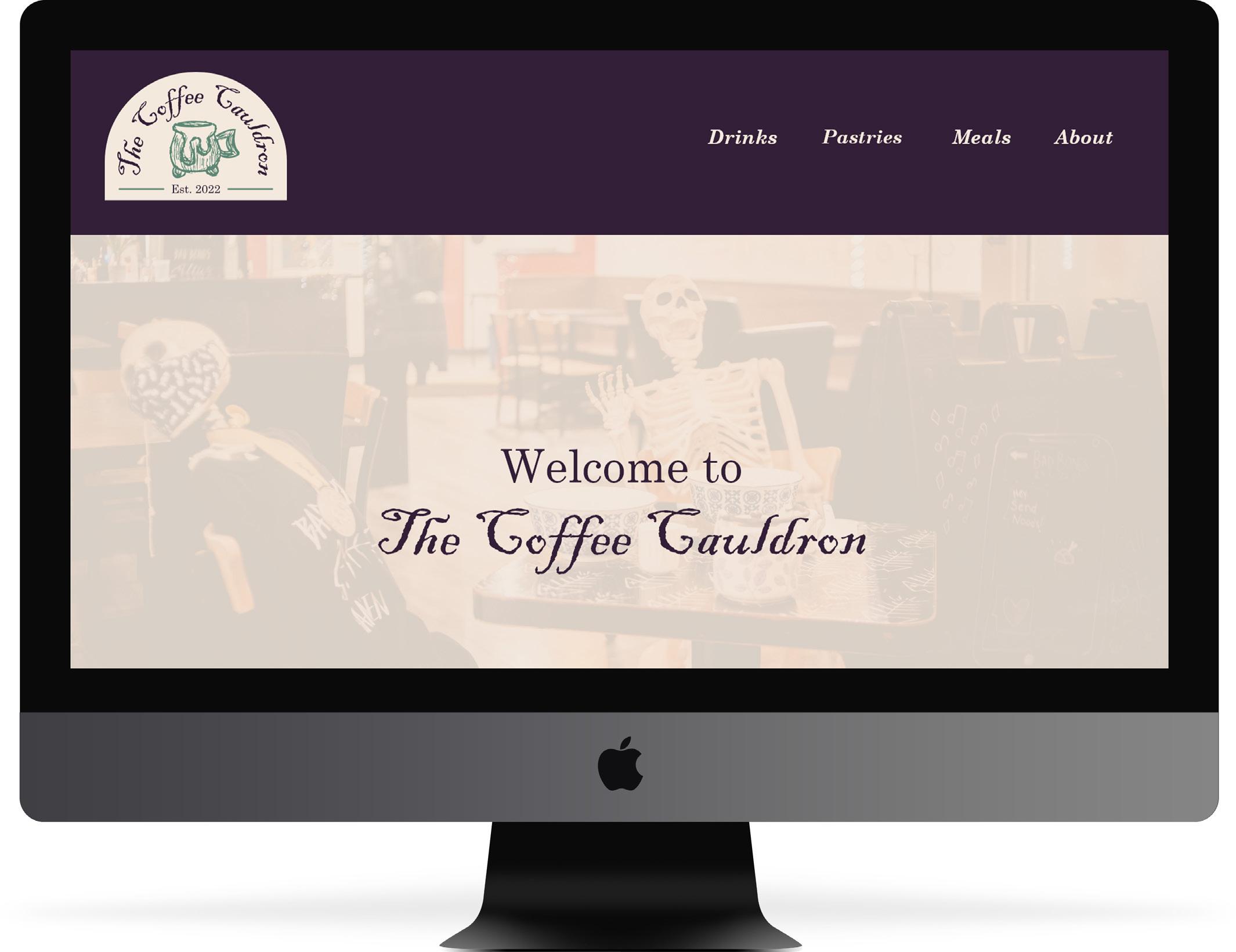
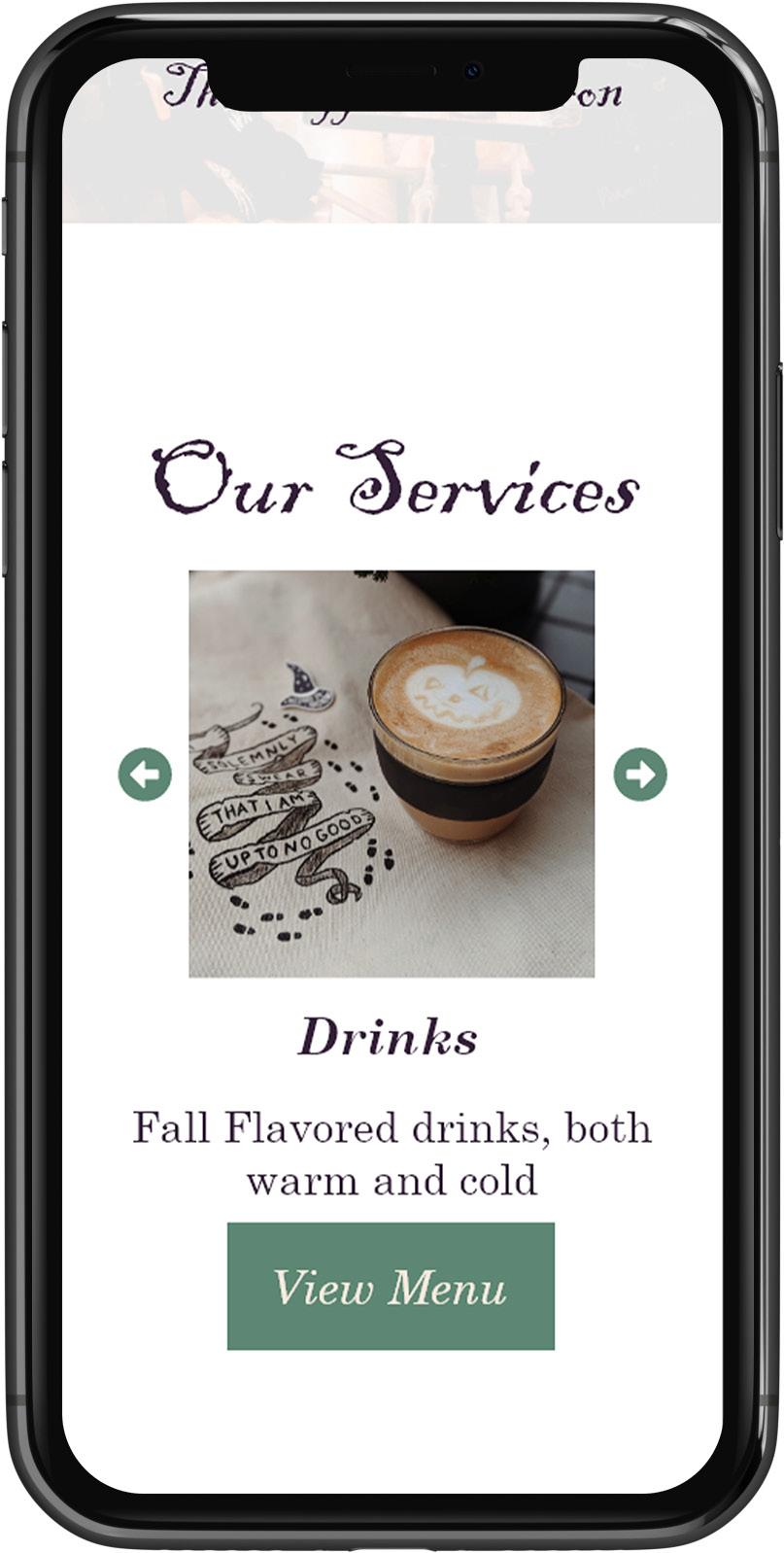
The Coffee Cauldron
A witch’s brew, made just for you
Project Type:
Web
Skills: Branding Illustration
Web
Tools: Adobe Illustrator
Adobe Photoshop
Adobe XD
The Coffee Cauldron is a fictitious cafe that serves autumn exclusive flavors throughout the year. The branding takes on a witchy aesthetic with a color palette consisting of sage greens, deep purple, and tan alongside a combination of clean, classic typefaces and handwritten headlines. The website is a simple layout with images of food with buttons linking to different pages, creating a user-friendly experience to those interested in visiting a locally based autumn cafe.
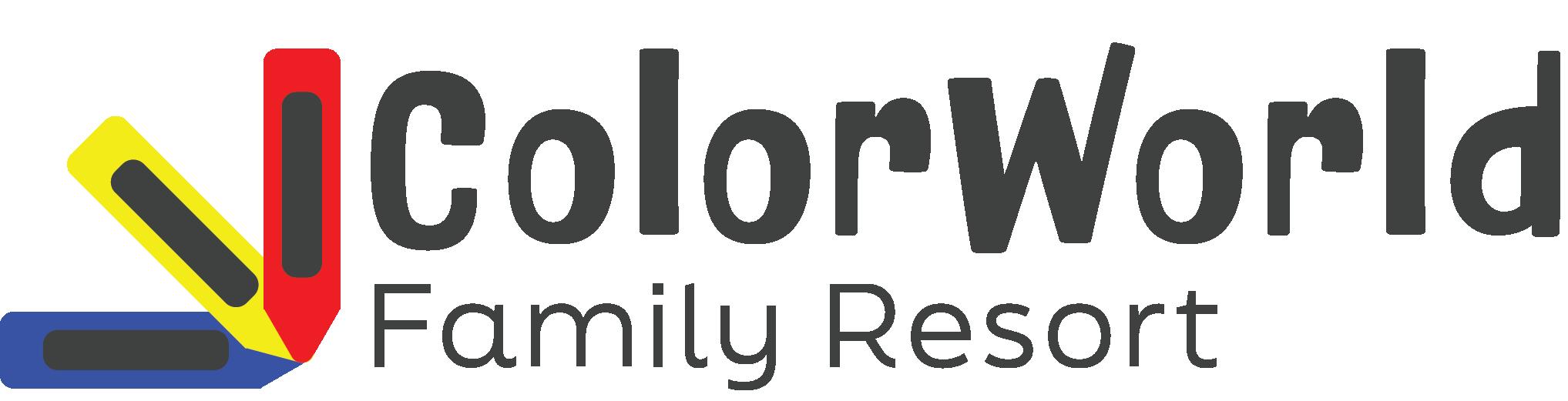
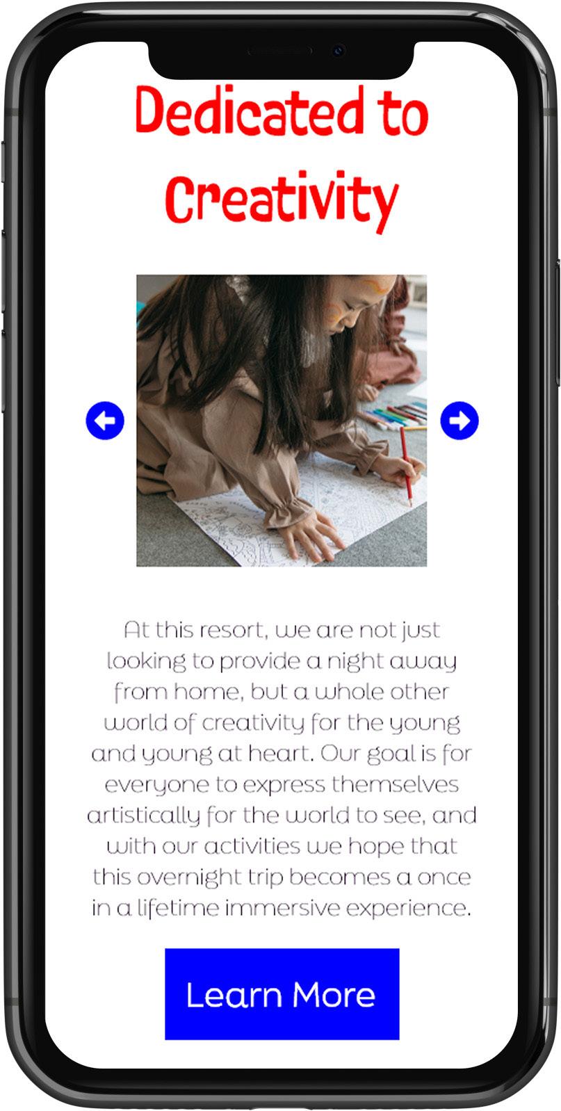
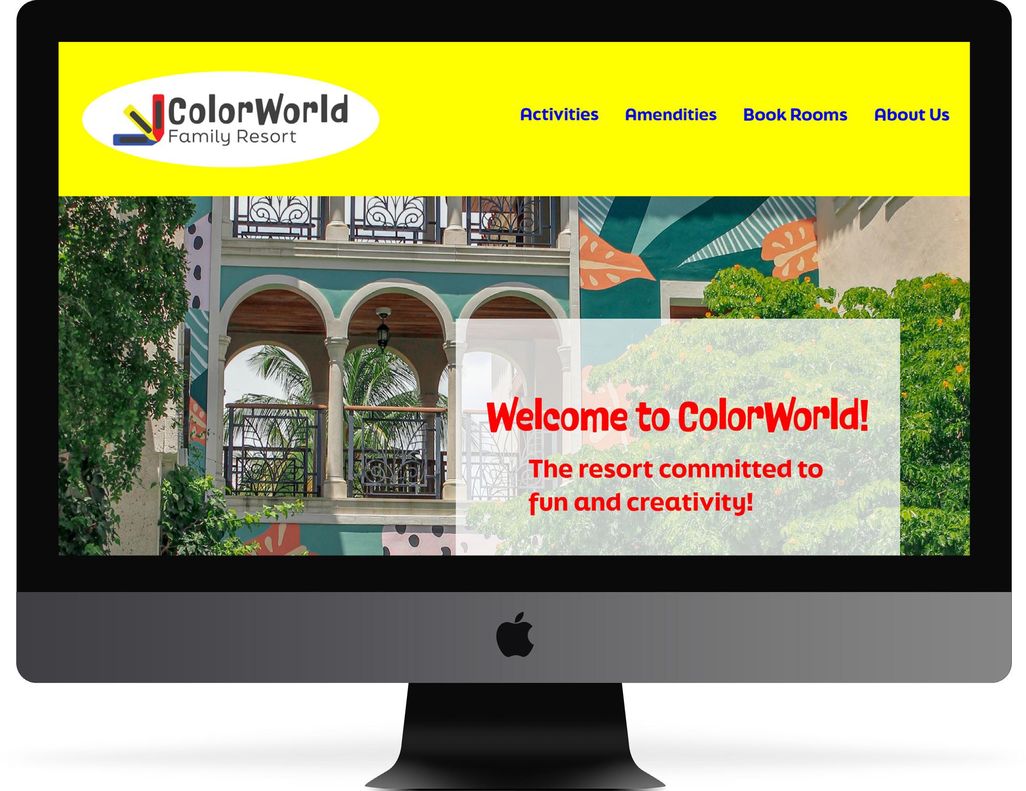
ColorWorld Family Resort
A colorful experience for the young at heart
Project Type:
Web
Skills: Branding
Digital illustration
Web
Tools:
Adobe Illustrator
Adobe Photoshop
Adobe XD
ColorWorld is a fictitious resort designed to inspire creativity for families of all ages. The branding primarily has a youthful appeal, using the primary colors on the color wheel as the color palette with a combination of whimsical and rounded sans serif typography. Crayon imagery is incorporated into the logo to draw in its audience of those both young and young at heart.
Wonder Bookstore Logo Styles
So many book genres, so many design styles
Project Type:
Branding
Skills:
Illustration
Typography
Tools:
Adobe Illustrator
Adobe Photoshop
Wonder Bookstore is a branding project with different design styles for its logo. Each individual logo explores a different design style/movement and interprets the concept of the brand in it. A bright, rainbow color palette and iconography of a swirl shape is carried across all interpretations of the logo, allowing for each style to express the whimsical nature of the brand.
bookstore WONDER bookstore
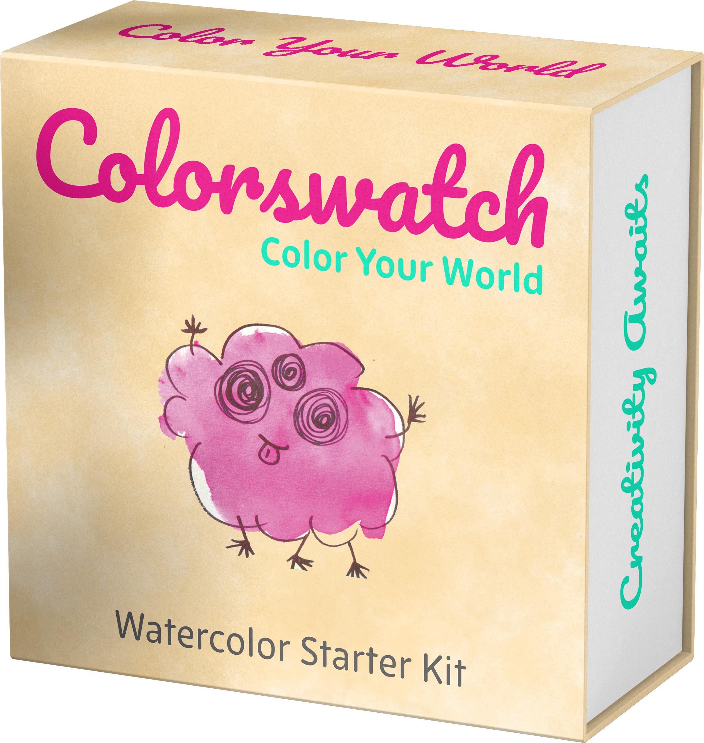
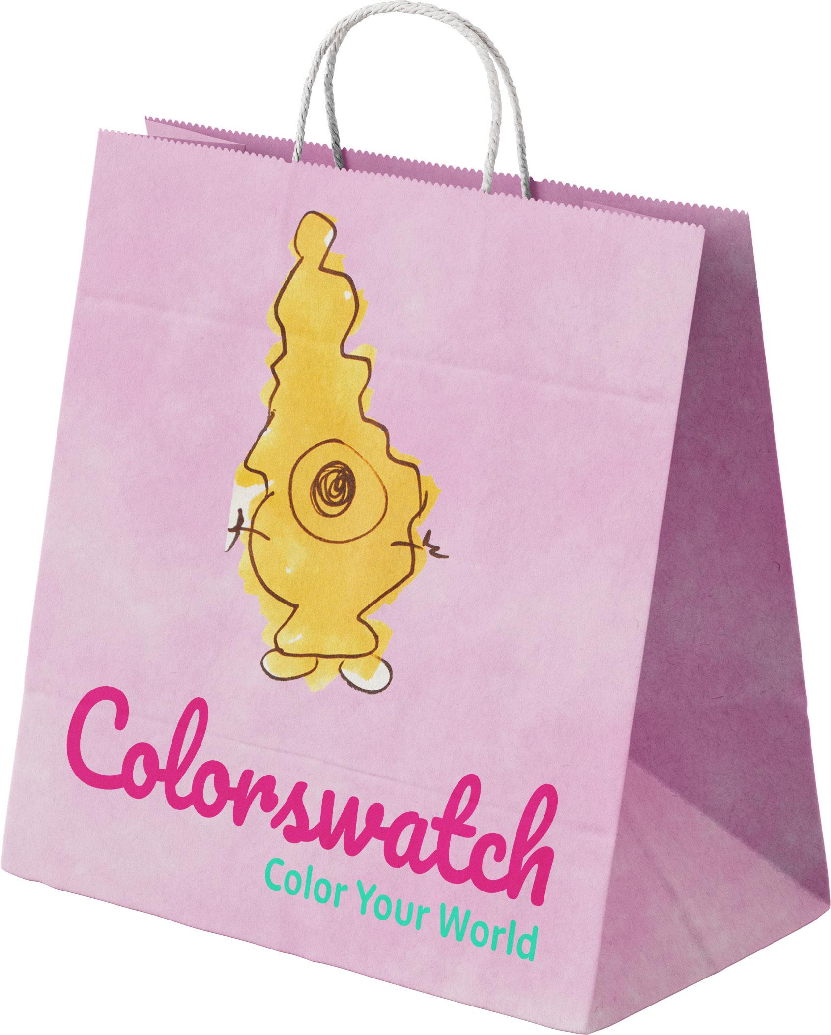
Colorswatch Stationery
Color your world
Project Type:
Branding
Skills:
Traditional illustration
Typography
Tools:
Adobe Illustrator
Adobe Photoshop
Colorswatch is a fictitious stationery brand centered around inspiring creativity through the use of color. The visuals focus on watercolor paint splotches creating iconography of monsters from them as mascots. The combination of the friendly characters, bouncy cursive type and rounded sans serif type, and a bright color palette help to create a friendly and welcoming brand for its younger audience.
Color Your World
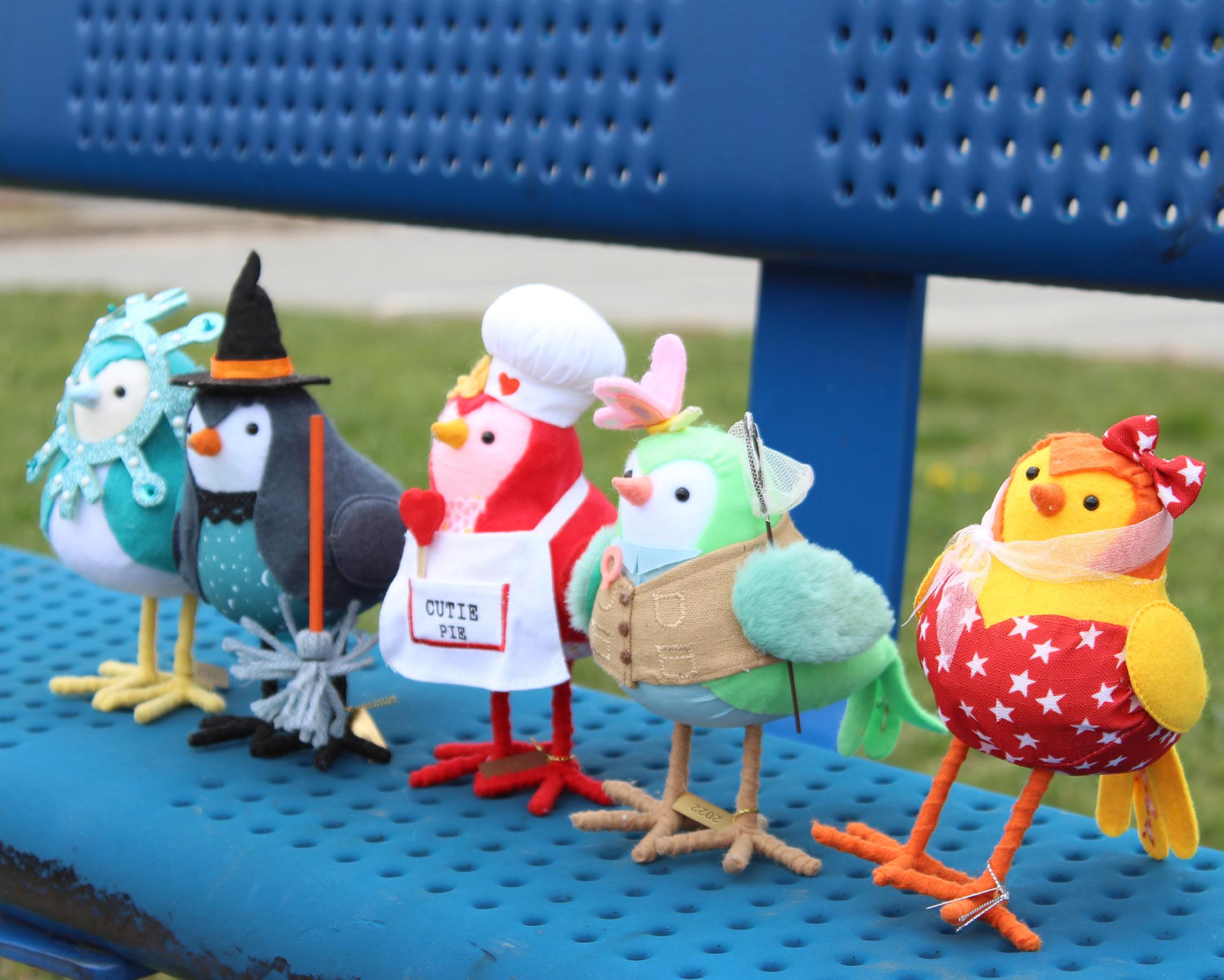
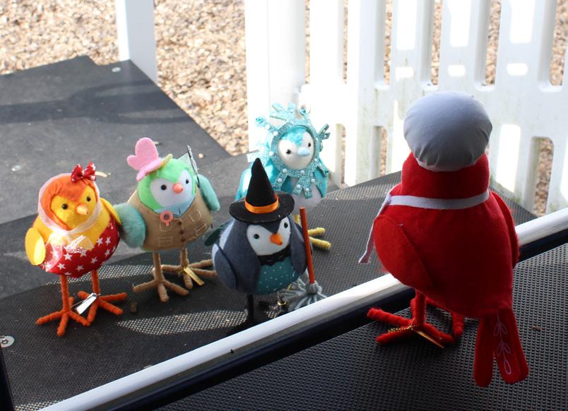
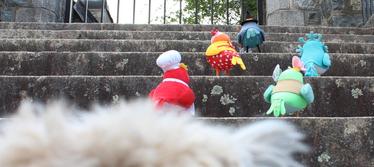
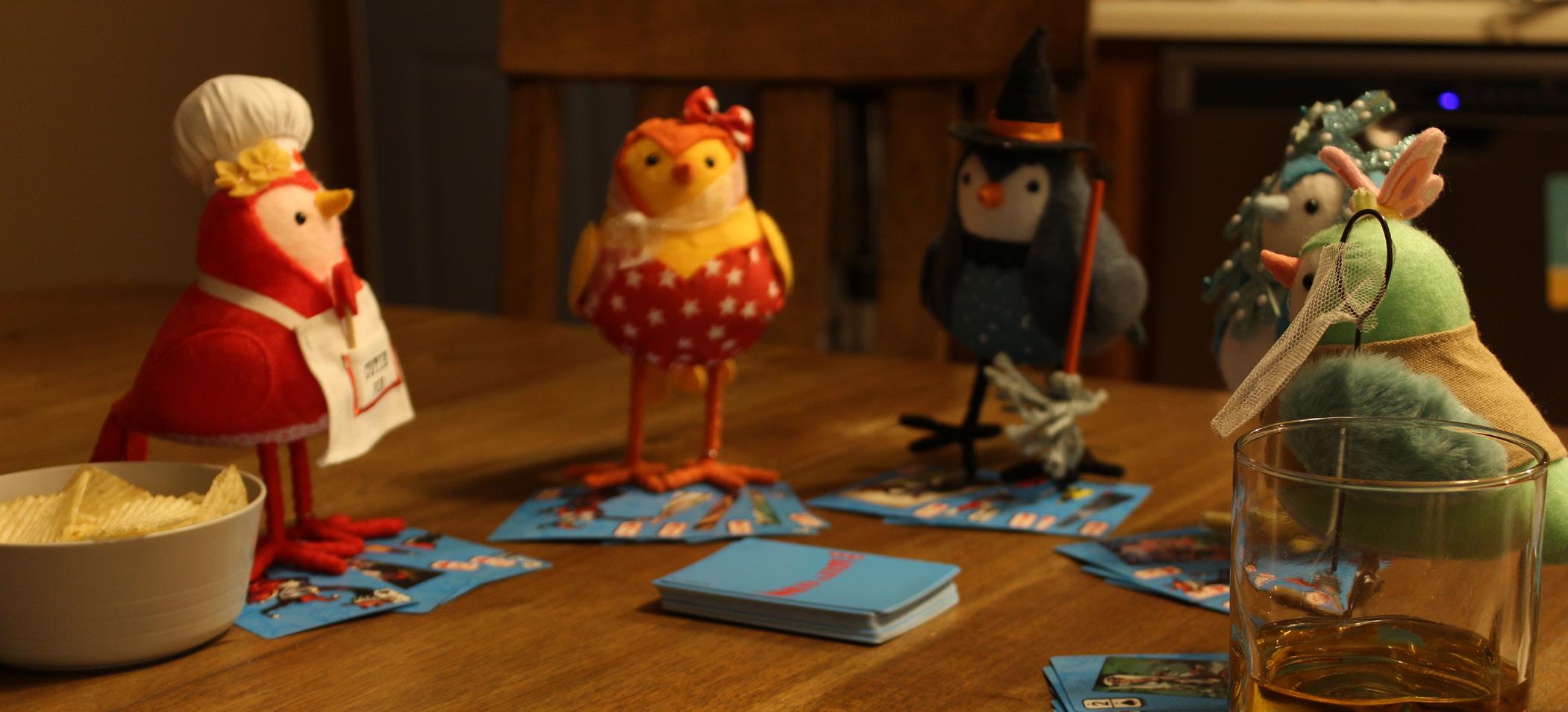
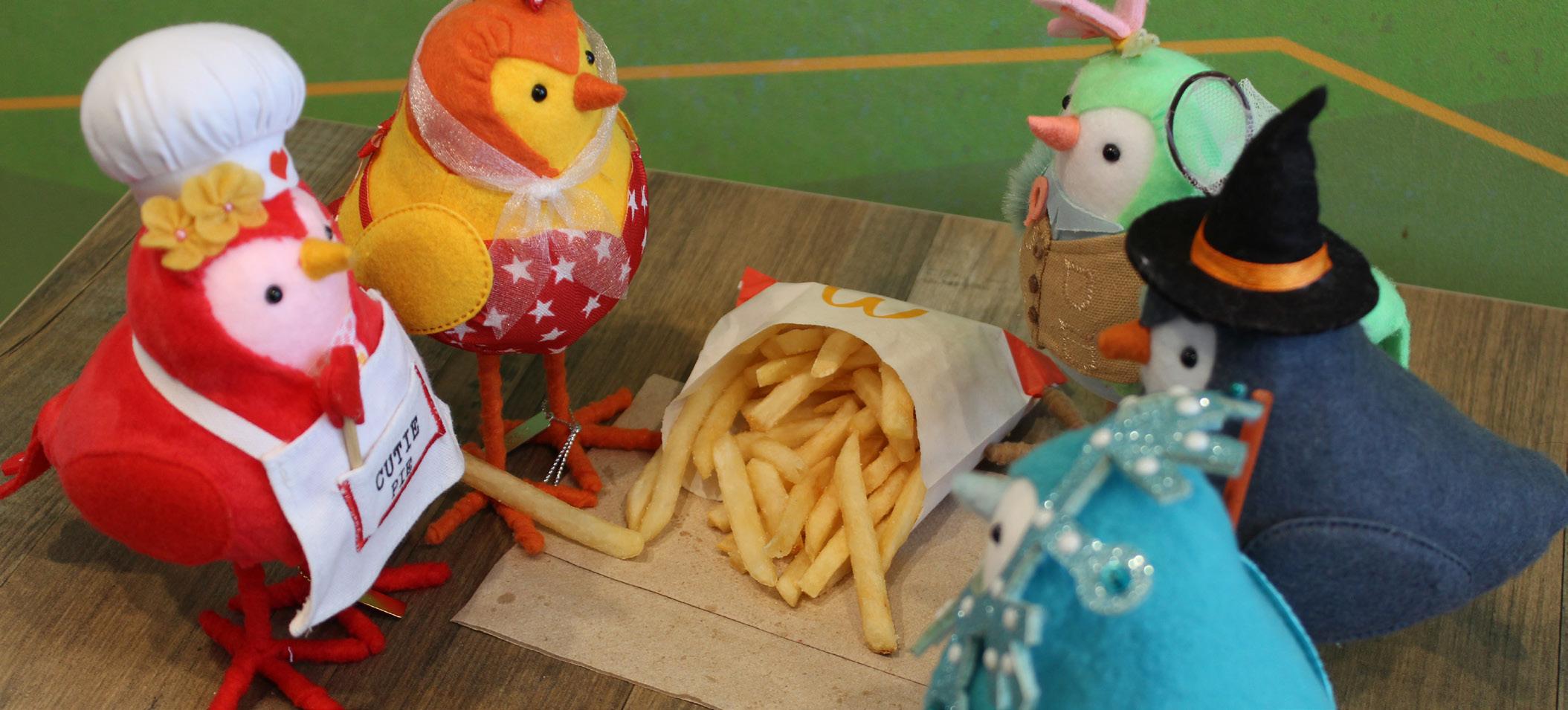
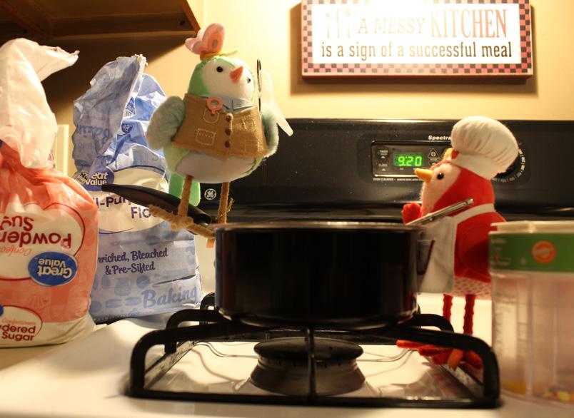
“The Birds” Photo Series
The early bird catches the episode
Project Type:
Photography
Skills: Photo editing
Tools: Adobe Photoshop
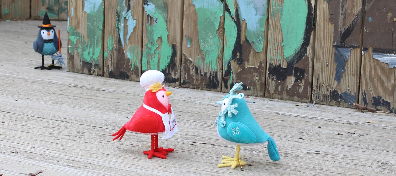
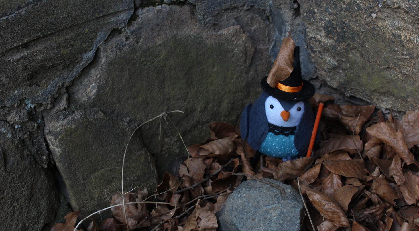
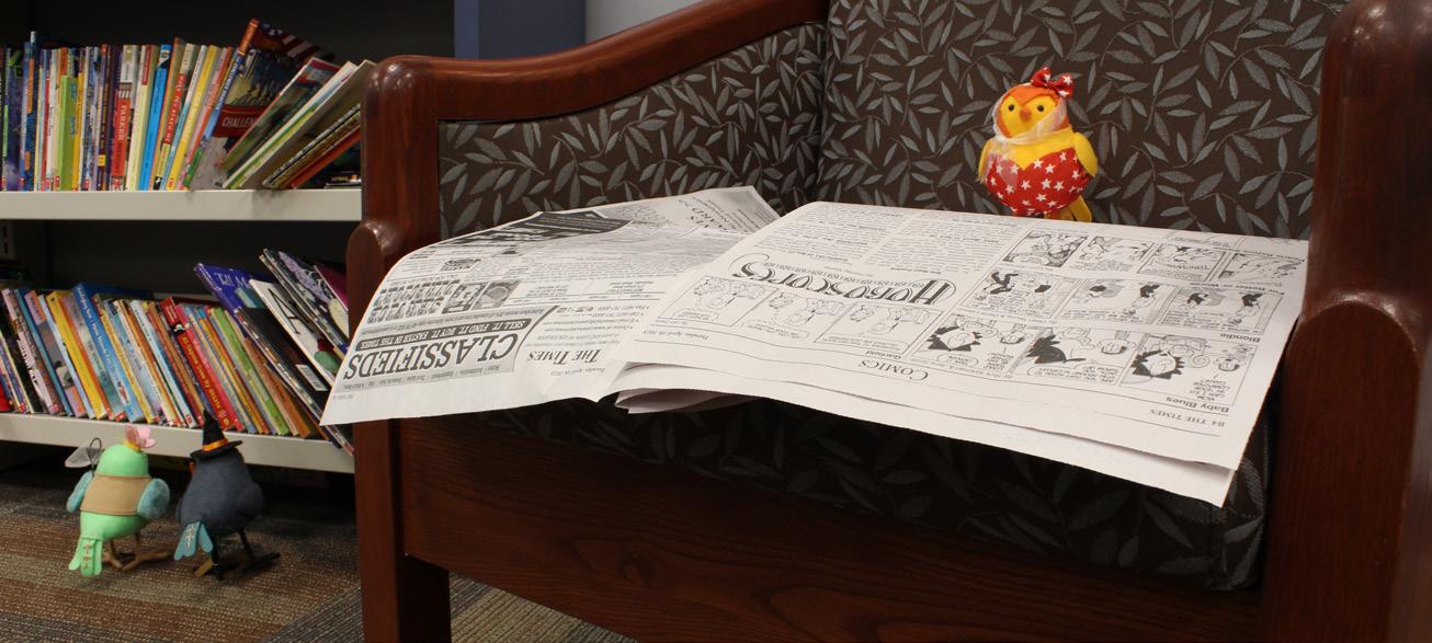
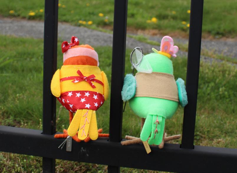
“The Birds” is a photography series that captures fabric birds used for decor as characters in a sitcom. The props are arranged so it appears that they are in life-like situations. Medium shots with a variety of angles from high and low perspectives are incorporated to give the simple photos a sense of dynamic liveliness. Each photo included serves as an “episode” in the series, with them all loosely connected by consistent “character” appearances.
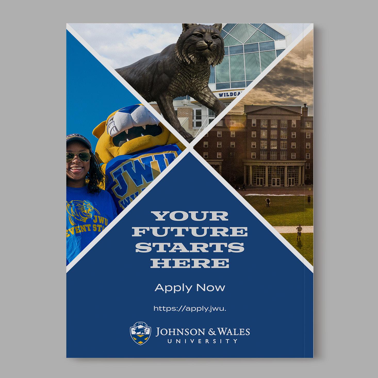
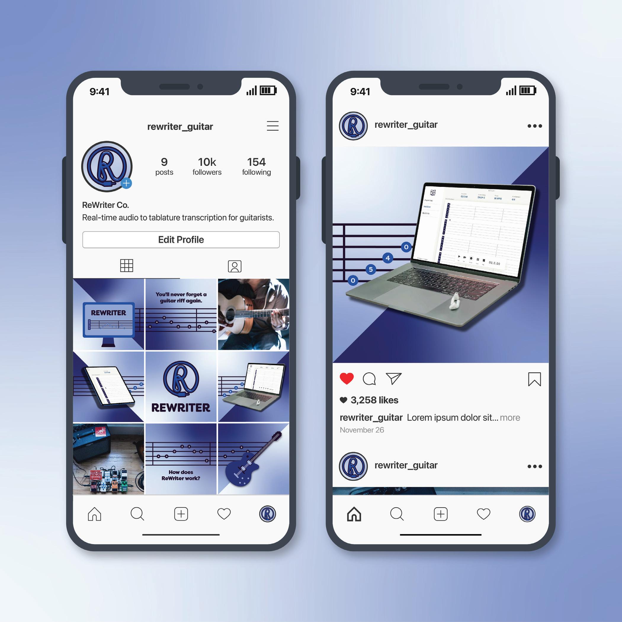
ReWriter Co.
You will never forget a guitar riff again
Project Type:
Client Work
Skills: Branding
Color theory
Digital Illustration
Social Media
Typography
Tools:
Adobe Illustrator
Adobe Photoshop
ReWriter Co. is a client that was worked with in JWU Design Team in the fall of 2024. It is a tablature program that keeps track of guitar tabs as they are played in real time. The brand refresh for the company is modern and corporate with a fun and friendly appeal with its blue color palette and clean, rounded typography. The social media posts incorporate elements of photography, vector illustrations, and brand iconography to serve as a proper introduction to the company and the software it offers its audience of new and veteran guitar players.
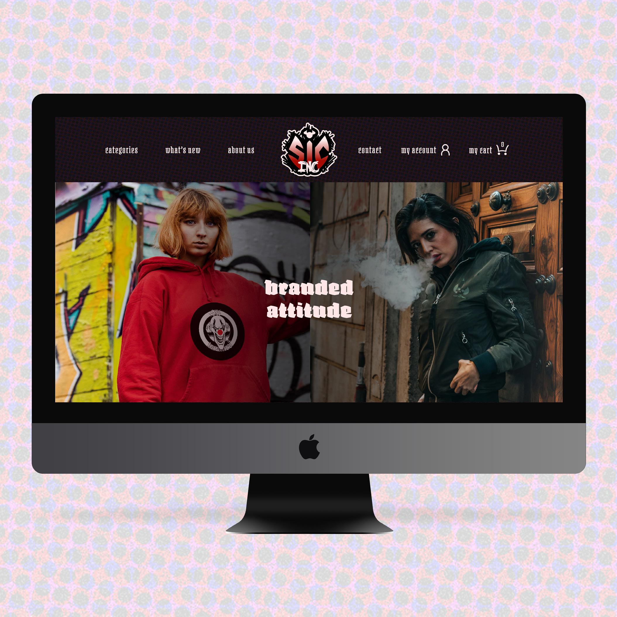
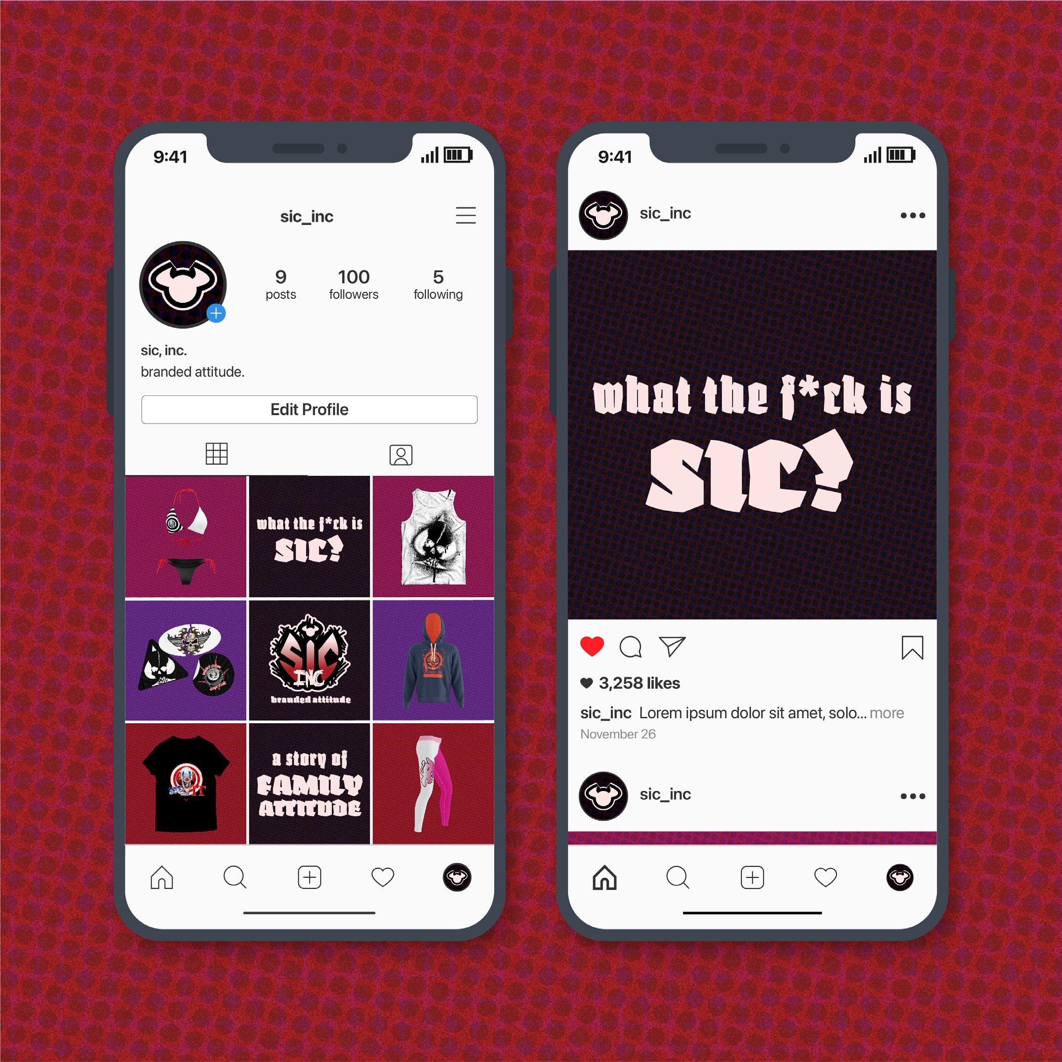
SIC Inc
Branded attitude, in your face
Project Type:
Client Work
Skills: Branding
Color theory
Digital Illustration
Social Media Design
Typography
Web design
Tools:
Adobe Illustrator
Adobe Photoshop
SIC Inc. is a client that was worked with in JWU Design Team in the fall of 2024. It is a clothing brand offering products to those seeking out uncensored designs that are in your face. The branding is inspired by Y2K and pop punk designs, incorporating bold typography, bright colors, and thick lines on type and shapes. Grunge textures are incorporated across all collateral to further define its image as a brand you can trust to deliver unique designs with no filter.