0449600615 minlisashi@gmail.com 2019-2024 MinShi portfolio Min Shi 0449600615 minlisashi@gmail.com 2019-2024 MinShi portfolio POR TFO LIO


The essence of design is creatively addressing human needs through the harmonization of aesthetics and functionality, enriching experiences and bettering lives.
Coming from a visual communication background, graphic design stands out as my forte. Central to my design philosophy is a human-centric approach, aiming to resonate with human nature and fulfill needs. I consider this ethos the very essence of design.
Yet, throughout my career, I’ve elevated my graphic design expertise by seamlessly integrating it into various spheres to meet the demands of my role. This not only enhances my ability to tackle tasks but also empowers me to approach them with a broader perspective.
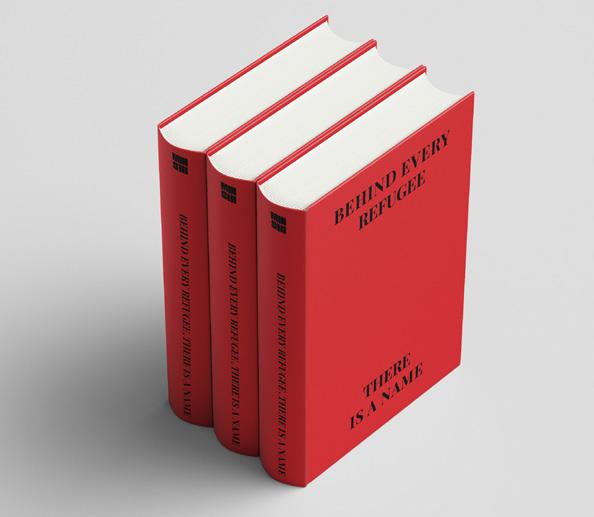
BEHIND EVERY REFUGEE THERE IS A NAME


Behind every asylum request there is a human being. Behind every refugee there is a name is a publication explores humanity from refugee perspective.
This publication memory the history of Holocaust during the world war II as well as the Jewish migration who experience it by creating a dictionary regarding the name of Jewish refugees who arrived in Melbourne Australia between 1946 and 1954.
This group of people are survival of holocaust and victims of inhumanity behaviour of Nazi. Through celebrate the history to rise general awareness and understanding of humanity in term of refugee migration.

THIS DESIGN WAS INDEPENDENTLY COMPLETED BY ME, AND IT SERVES AS MY GRADUATION PROJECT. THE THEME OF THIS PROJECT IS
This dictionary contain 6480 Jewish refugee’s names. All the names has been organise by chronological order base on their date of departure. It covers from 1946 to 1954 12 months in each year. There are 60 names in each month are listed alphabetically by their surname.
In that case surname in the front and given name at the back. The advantage of categorize by time is intend to avoid duplicate names as much as possible and keeps the number on each page manageable.


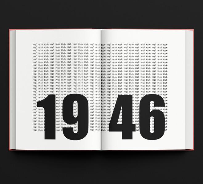
All the Jewish refugee’s names and information are credit to United States Holocaust Memorial Museum


PRESENT BY NONE DESIGN STUDIO A SMALL DESIGN TEAM WHICH I FOUNDED AFTER GRATUDATION

The Task
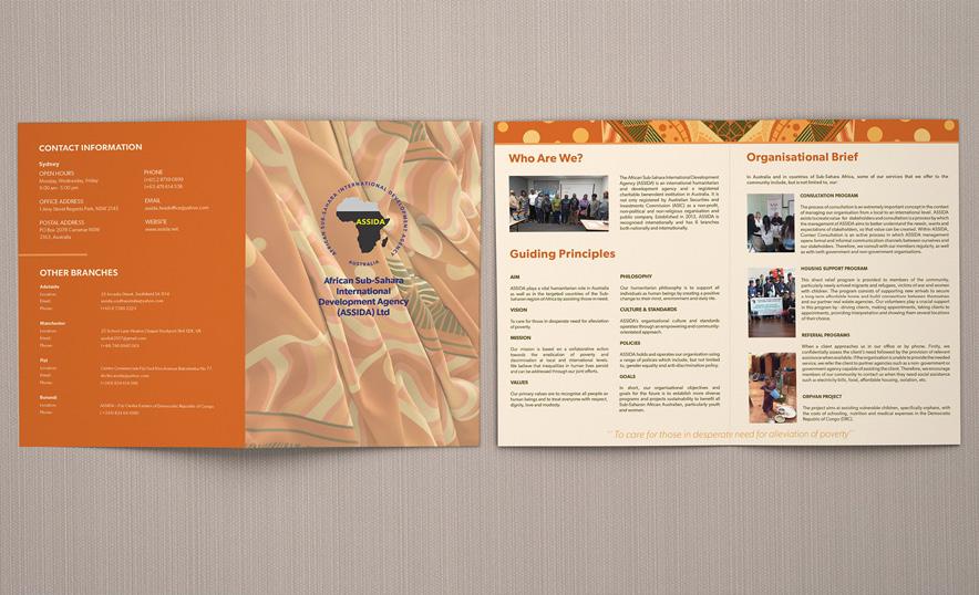
None Design were briefed to design a more consistent and professional visual style for ASSIDA. The purpose of this visual style was to:
1. Create clearer communication
2. Promote the organisation
3.Make ASSIDA appear professional to stakeholders particularly prospective new members and other non-profits.

African Sub-Sahara International Development Agency (ASSIDA) is an international humanitarian agency and a registered charitable institution in Australia which was established in 2013. It is a nonprofit, non-political and nonreligious public company registered by ASIC, and also a charitable benevolent institution registered by CNAC.
The concept we created centred around the idea of hope. We recognising that migrants come to Australia with the hope of a better life and we wanted to visualise this through bright colours, taking inspiration from the African landscape that makes the region famous also took inspiration from bold African fashion design. We were very cautious of cultural appropriation, and worked closely to ensure we were making respectful design choices.


A - Always: Being consistently visible (Customers are hit at least three times a year)
B - Beneficial: Being seen as useful (Customers find the information valuable)
C - Consistently: Being seen with consistency (Customers recognize it as your brand instantly)
D - Duplicated: Being seen widely through replication
(Spreading similar messages across multiple media platforms)


Sincerely dedicated to optimizing clients’ credit portfolios for robust wealth growth, prioritizing sustainability amidst evolving market dynamics.
With a broad financial network and experienced team, we selectively design customized credit solutions based on honest principles, tailored to each client’s specific needs.
Ensures loan success from valuation to follow-up, reflecting our sincere commitment to succeeding, epitomizing our utmost sincerity.


The Australia Property Expo is the largest and most comprehensive real estate event in the region, showcasing a wide range of properties from across the country. The expo attracts thousands of attendees, including potential homebuyers, investors, and real estate professionals. It features exhibitors from top development companies, real estate agents, and financial service providers, offering exclusive deals and valuable insights into the current market trends.

Clarity, engagement, and branding—making NewGen look like the reliable, easy-to-understand choice in a sea of competition and informative environment that positions NewGen as a leader amidst a bustling expo environment!
• Booth Signage: Created a prominent overhead sign with the company logo to attract attention from across the expo hall, ensuring brand visibility.
• Visual Graphics: Designed informative banners flanking the booth, detailing services like loans and accounting, using friendly icons and clear text to convey offerings at a glance.
• Interactive Area: Set up a prize wheel to engage visitors, making the booth an interactive experience and encouraging longer stays.
• Balloon Arrangement: Included branded balloons to add a festive, welcoming atmosphere, making the booth stand out and draw in a family-friendly demographic.
• Information Desk: Arranged a neat, branded tablecloth displaying the company logo, where brochures and information packets are easily accessible, inviting conversation and inquiries.
• Promotional Materials: Provided well-designed takeaway materials with coherent branding for lasting impact post-visit.
Each design element serves to create a cohesive, engaging, and informative booth experience that captures attention, encourages interaction, and communicates the company’s services effectively.
Video Link: https://mp.weixin.qq.com/s/v5C62SzqjEG1eKZoU9_qkg


VIDEO PRODUCTION + POST PRODUCTION
To Showcase the Event: Presenting the highlights and atmosphere of the property expo, emphasizing the booth’s design and visitor interaction.
To Educate the Audience: Providing information about the services and products featured at your booth through engaging visual content.
To Promote Engagement: Encouraging viewers to learn more about your offerings, inspiring them to attend future events or reach out for more information.
To Strengthen Brand Image: Reinforcing your company’s brand identity and values through a well-crafted visual narrative.
“ Marketing is about communicating value to drive actions and connect customers with businesses.”

I collaborated with outstanding media companies such as Meow Media to manage advertising campaigns on platforms like Google and YouTube, analyzing data traffic and determining future advertising strategies for the company.
Simultaneously, I also managed social media accounts for major platforms such as Facebook, Mailchimp, and WeChat Official Account. While this may not be my expertise, I have accumulated extensive experience and knowledge over the past three years.