

Variations
Proportions
Placement & Safe Area
Letter Casing
Do’s & Dont’s
Color
Typography
Sign System
Photography

UPJ was established in 2011 with the support of Pembangunan Jaya Group, a leading conglomerate business in Indonesia. The university is part of the educational initiative of Yayasan Pendidikan Jaya, founded by Dr. (HC) Ir.
Becoming a leading university in the development of science and technology with a focus on urban lifestyle and urban development. Vision
Providing high-quality higher education.
Conducting innovative and applicable research.
Serving the community through the application of science and technology.
Developing collaborations with various pa ies to enhance the quality of education and research.
Upholding ethics and morals, ensuring honesty and consistency in thoughts, words, and actions.
Encouraging business growth that enhances company value, driven by proactive identification of opportunities. Intrapreneurship
Respecting agreements, keeping promises, and gaining trust through reliability.
Upholding fairness and dignity in all interactions and decision-making.
Fostering a strong work ethic, characterized by spirit, intention, determination, enthusiasm, and sincerity to achieve maximum results. Achievement
Providing excellent education to prepare students for success.
Offering internships and hands-on learning.
Empower students to positively influence their communities.
At Universitas Pembangunan Jaya, we offer top-quality education and integrate practical industry experiences, preparing students for successful careers in a competitive global market. Our curriculum ensures students build strong networks and stay updated with the latest industry trends.
UPJ applies cutting-edge technology and methods to provide an exceptional educational experience, preparing students to lead and innovate in the future.
Committed to building a strong and inclusive community. We prioritize collaboration with local and global partners to enhance the educational journey of our students.
Thinking ahead and anticipating future needs. Our strategic initiatives encourage exploring new possibilities and creating a sustainable future for students, staff, and the community.
Thinking outside the box and creating new solutions.
Caring for and being responsible for environmental sustainability.
Mastering fields of study and applying knowledge professionally.
Collaborating effectively within a team and building good relationships with various parties.
Active in social activities and caring for the community.
Strengths
Strong collaboration with industry and businesses, providing internship and job opportunities for students. Strong academic programs in the field of urban lifestyle and urban development. Modern facilities and infrastructure that support teaching and learning activities.
Does not fully reflect the “urban” lifestyle/development.
Opportunities
Urbanization trends open many research opportunities.
Threats
Changes in education policy can affect funding. Rapid technological advancements require quick adaptation in teaching methods and curriculum.
Conclusion
The institution excels in industry collaboration, academic programs, and modern facilities but must better align with urban lifestyle trends. Opportunities include urbanization research, while challenges involve adapting to technological advancements and potential funding shifts.
“Qube”
Qube was designed to encapsulate UPJ's urban and progressive essence. The cube shape resembling a building, symbolizes the university's solid educational foundations while emphasizing its forward-thinking and modern approach.
A glance of solidity, innovation, and contemporary relevance, perfectly aligning with UPJ's mission to offer a toptier, forward-thinking educational experience.
A glance of solidity, innovation, and contemporary relevance, perfectly aligning with UPJ's mission to offer a toptier, forward-thinking educational experience
Universitas Logotype Logotype
HEX RGB CMYK
#E52620 (229, 38, 32) (0%, 83%, 86%, 10%)
HEX RGB CMYK
#05895A (5, 137, 90) (96%, 0, 34, 46)
HEX RGB CMYK
#0785C4 (7, 133, 196) (96%, 32%, 0%, 23%)
25)
0%, 0%, 90%)
A tool that ensures the logo's elements are aligned and proportionate, creating visual harmony and balance.
How Universitas Pembanunan Jaya’s logo was transformed into something that truly represents what it stands for.
The Jaya logomark was used as a reference in making Qube. The logo consists of the letters “P” and “J” combined, in a bold line

The design of the letters "UPJ" resembling three buildings coming together to form a singular shape conveys the university's solid foundation in education and its forward-thinking, cohesive vision.
Horizontal
Best used in websites and billboards, putting the logomark in the spotlight.
Vertical
The primary lockup, where the visual weight rests on the text.
Brandmark
The recognition of the brand. best used in favicons, among other mediums.
Horizontal
Universitas
Universitas
Universitas
Ensure all elements are balanced and harmonious, creating a design that maintains visual consistency.
Digital
Digital screens come in different sizes and resolutions. To prevent pixelation, adhering to a minimum logo size is essential to maintain high visual standards.
At smaller sizes, pigments can overlap, causing smudging. This can be avoided by ensuring logos are printed at a minimum size, preserving their legibility and clarity.
Both logo versions can be placed at any of the four corners.
The safe area, or clear space, ensures the logo stays distinct and legible by keeping it free from nearby text, images, or graphics, thus preserving its integrity and prominence.
#3 Placing the logo with typographic content
Innovate, Educate, Elevate.
This buffer zone surrounds the logo, keeping it free from any nearby text, images, or graphic elements that could distract or overcrowd the design, ensuring the logo remains visually distinct and legible.
The brand name "Universitas Pembangunan Jaya" uses title case, which capitalizes the first letter of each word. This enhances readability, emphasizes each word's distinctiveness, and makes the university's name stand out.
The capitalization imparts a sense of formality and professionalism, aligning with the institution's esteemed status and dedication to educational excellence.
In title case, as seen in the logotype.
Universitas
Pembangunan Jaya

Use the black type on white or light colored backgrounds.
Universitas
Pembangunan
Use the white type on black or dark colored backgrounds.
Universitas
Pembangunan Jaya
Use the white type on black or dark colored backgrounds.
Universitas
Pembangunan Jaya
Match the contrast of the logo in multi-color background.

Universitas
Pembangunan Jaya
Universitas
Pembangunan Jaya
Use monochrome version on any difficult image, with contrast.
Match the contrast of the logo in multi-color background.
Do not distort or alter the proportions of the logo.
Do not rotate the logo to any angle.
Do not add contours to the logo.

Do not add a drop shadow to the logo. Do not use any other gradients on the logo for any purpose.
Do not change the logo using random colors.
Color philosophy delves into the psychological and cultural significance of colors, exploring how they influence human emotions and behavior.
The logomark is colored with a gradient, a combination of UPJ’s previous primary colors; red, green, and blue.
#E52620
2°, 79%, 51% (229, 38, 32) 2°, 86%, 90% (0%, 83%, 86%, 10%)
As per Jaya’s logo, the color red symbolizes passion and a relentless attitude towards meeting future challenges. This bold color underscores UPJ's proactive approach and unwavering dedication to educational excellence.

#05895A 159°, 93%, 28% (5, 137, 90) 159°, 96%, 54% (96%, 0, 34, 46)
Green represents a dedication to environmental consciousness and sustainable practices, highlighting UPJ's efforts to integrate eco-friendly initiatives within its academic and campus activities.


Blue reflects the university's commitment to providing a reliable and profound educational foundation for its students. Blue also conveys a sense of calmness and clarity, representing UPJ's dedication to fostering a thoughtful and intellectually stimulating environment.
Nata Sans Font Family is a family of sans-serif fonts exuding a classy style. Designed for interfaces, with a generous x-height that adds a slight display look and feel. Nata Sans is a typeface with wide glyphs that contribute to generating a more relaxed, slow and clear reading.
With short ascenders and descenders, this typeface exudes a restrained personality, ideal as a substitute for the Helvetica typeface. The curvatures of the letters “o” and “a” contain the compositional principle that gives the font family a distinctive DNA.
A B C D E F G H I J K L
M N O P Q R S T U V
W X Y Z
A B C D E F G H I J K L M
N O P Q R S T U V W X Y Z 1 2 3 4 5 6 7 8 9 0
@ # $ % & ( )
Display Typeface
Body Typeface
Its bold, clean design enhances readability from a distance, making it ideal for prominent text. Additionally, its modern and sleek appearance aligns well with the brand’s progressive and forward-thinking identity.
For body text ensures readability and clarity in longer passages of text. Its clean and modern design complements the bold display text, creating a cohesive visual identity. This consistency enhances the overall aesthetic and readability of the brand materials, making them more engaging and accessible.
Readability
Refers to how easily and comfortably text can be read and understood, involving factors like font choice, text size, line spacing, and language complexity.
Legibility
Focuses on how easily individual characters or letters can be distinguished in a typeface, ensuring clarity and recognizability. Both are crucial for effective communication in design and typography, enhancing the overall user experience.
Nata Sans Bold
Smallest Size : 10 pt
Nata Sans Bold
Smallest Size : 10 pt
Nata Sans Regular
Smallest Size : 8 pt
Nata Sans Regular Body Body
Smallest Size : 10 pt
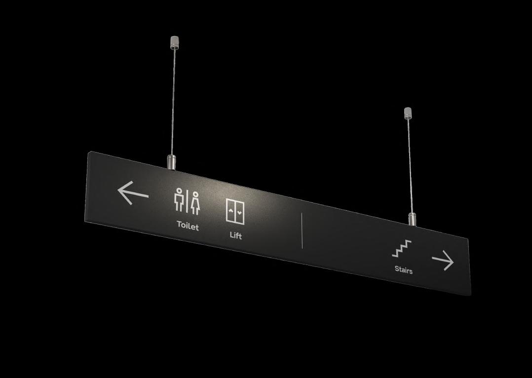
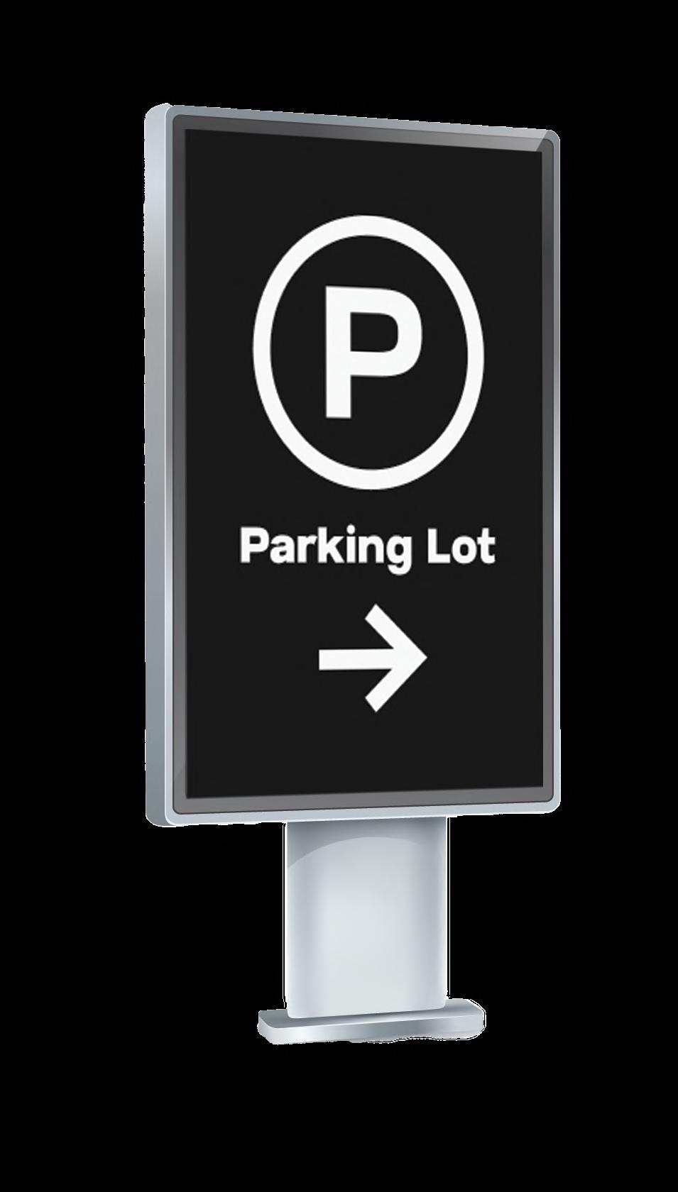
Icons are intuitive, visual representations of messages. They make nodal connections with visual memory, inspiring the desired actions with clarity.
A sign system is structured to convey information through symbols, signals, and signs, which are designed to communicate specific messages with a certain context.


Indoor photography captures interior spaces like classrooms, libraries, labs, and common areas. It focuses on lighting, architectural details, and ambiance, often adjusting camera settings for lower light and highlighting specific features or activities.
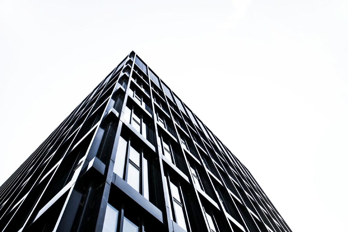
Outdoor photography showcases the campus' landscapes, buildings, gardens, and pathways. It uses natural light to highlight the campus' beauty throughout the day and in different weather conditions, capturing the overall atmosphere and activity.


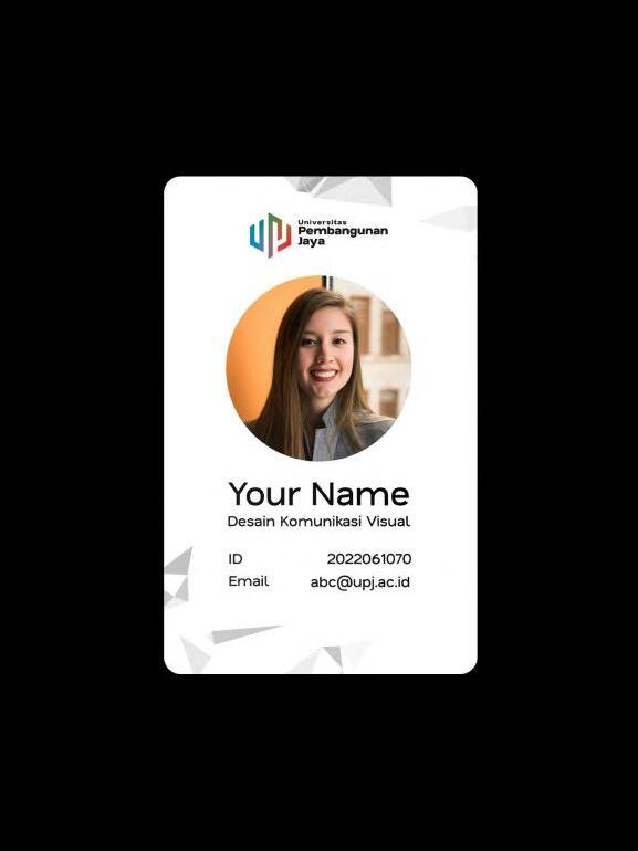
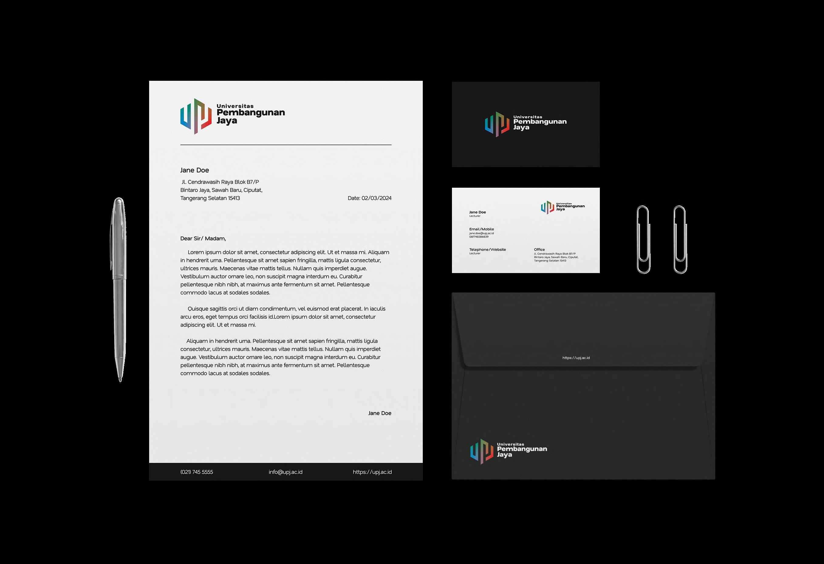
Universitas
Jane Doe
Jl. Cendrawasih Raya Blok B7/P Bintaro Jaya, Sawah Baru, Ciputat, Tangerang Selatan 15413
Date: 02/03/2024
Dear Sir/ Madam,
Lorem ipsum dolor sit amet, consectetur adipiscing elit. Ut et massa mi. Aliquam in hendrerit urna. Pellentesque sit amet sapien fringilla, mattis ligula consectetur, ultrices mauris. Maecenas vitae mattis tellus. Nullam quis imperdiet augue. Vestibulum auctor ornare leo, non suscipit magna interdum eu. Curabitur pellentesque nibh nibh, at maximus ante fermentum sit amet. Pellentesque commodo lacus at sodales sodales.
Quisque sagittis orci ut diam condimentum, vel euismod erat placerat. In iaculis arcu eros, eget tempus orci facilisis id.Lorem ipsum dolor sit amet, consectetur adipiscing elit. Ut et massa mi.
Aliquam in hendrerit urna. Pellentesque sit amet sapien fringilla, mattis ligula consectetur, ultrices mauris. Maecenas vitae mattis tellus. Nullam quis imperdiet augue. Vestibulum auctor ornare leo, non suscipit magna interdum eu. Curabitur pellentesque nibh nibh, at maximus ante fermentum sit amet. Pellentesque commodo lacus at sodales sodales.
Jane Doe
Email/Mobile
Telephone/Website Office Lecturer jane.doe@upj.ac.id 087748386839
Lecturer Jl. Cendrawasih Raya Blok B7/P Bintaro Jaya, Sawah Baru, Ciputat, Tangerang Selatan 15413