Branding Guidelines


1.0 Identity Standards
These identity standards have been developed in order to provide a foundation for consistent application of key visual elements that make up the SPR Logo.
The purpose of this manual is to explain the components of the SPR visual identity, to define its symbol, design standards, and to illustrate how these standards are applied.
The goal of these identity guidelines is to protect the strength the SPR visual identity. Used properly, the guidelines found within this document help to maintain visual continuity in all applications.
WHY IS THIS NECESSARY?
Following the guidelines and rules will aid in providing continuity to the SPR identity.

2.0 Logo Anatomy
The Symmetry PR logo consists of a symbol and a wordmark. You will see Variations of this logo later in this document. The symbol and the wordmark can be used independently or locked up together.
3.0 Symbol
CREATION STORY
Symmetry PR’s Symbol is a modern, bold, simple mark that is both sophisticated yet playful.
Building blocks served as the main inspiration for the rebrand. They represent the playful nature of the founders, Ben and Melody. The blocks also represent building... building relationships, building trust, building client foundations.
The “S” within the main symbol is composed (from an aerial perspective) - of two people, shaking hands. It is a reflection of SPR’s two founding members Ben Borne and Melody Lynch. They like to say that they are communications professionals on paper, but relationship builders at heart.

The handshake is incorporated into the main symbol. This is a common greeting within many First Nations communities. It is a sign of: respect, inclusion, friendship, connection, and integrity.


3.0 Symbol
CREATION STORY

The letters of the Symmetry wordmark are placed in the directions of the eight-point star, surrounded by a circle. The circle has no break and cannot be broken. The Inner Star points to the four cardinal points: east, west, north, and south. The eight-point star is often seen as a symbol of hope.
This symbol is both symmetrical and balanced, serving as an appropriate symbol for Symmetry PR. Their work is based on the two-way symmetrical model of public relations that emphasizes the communicator being a scientific and fact-based agent; one who acts as a liaison between organizations and their audiences rather than being a “spin doctor” or “persuader.”
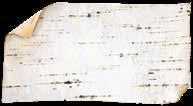
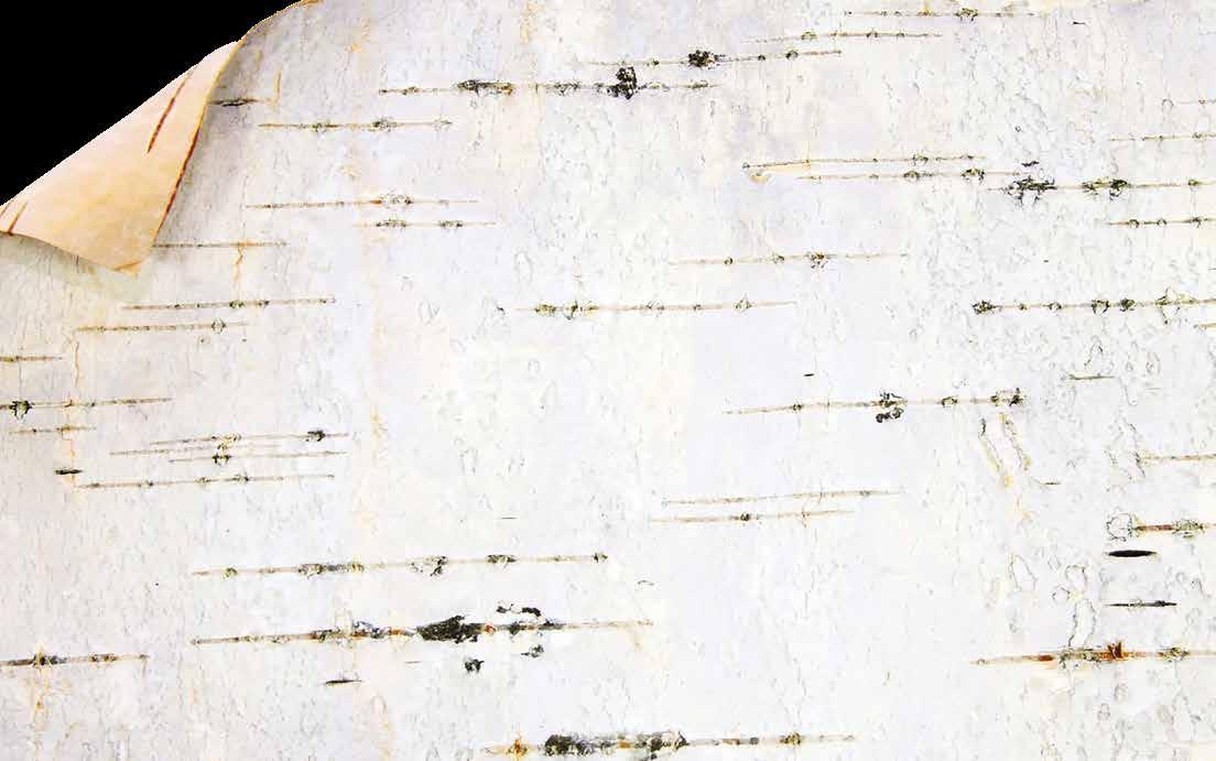
The White Birch Tree is abundant in Saskatchewan, the homelands to Symmetry PR. It is strongly revered as a source of guidance and protection. It is a symbol of rebirth representing: new beginnings and growth due to its ability to grow in many climates and because of its strength in withstanding the natural elements, it is also associated with resilience and adaptability
The SPR symbol is inspired by the art of birch bark biting, which takes skill, practice and experience, but also patience. Some of the virtues of Symmetry PR. If you attempt to work the bark too hastily or without patience, it will rip and tear apart the bark. Artists delicately create symmetrical shapes into the birch bark and pre-colonism bitings were often used to make maps, record meetings, and tell stories.
Birch bark biting is an extremely rare skill in modern times, and the rarity of the art form makes it even more special because each piece must be created individually. Birch bark bitings are unique and special; no two are exactly alike! Symmetry PR has this approach when working with their clients –they individualize their services to suit each client’s specific needs.
4.0 Wordmark
The SPR wordmark is composed of the Bellinzo typeface - bold weight, and the Bellinzo typeface all caps bold weight which has been specially kerned to fit the overall design of the logo. The Bellinzo typeface family: https://www.myfonts. com/collections/bellinzo-font-zealab-fonts-division?tab=familyPackages
5.0 Colour Palette
The consistent use of colour is vital to effective brand recognition. The SPR brand should always be represented by the colours shown on this page.
6.0 Secondary Colour Palette
The consistent use of colour is vital to effective brand recognition. The secondary colour palette should always be represented by the colours shown on this page.
7.0 Logo Variations
HORIZONTAL LOGO
HORIZONTAL LOGO BLACK WORDMARK
VERTICAL LOGO
VERTICAL LOGO BLACK WORDMARK
CIRCULAR LOGO
8.0 Colour Variations
Discretion must be used when placing the logo on a background other than white to ensure enough contrast. As a general rule, an all-white logo should be used in place of the full-colour version when the logo is placed on saturated colours greater than 75%. The primary colour set should be used whenever possible.
HORIZONTAL LOGO BLACK
VERTICAL LOGO BLACK
HORIZONTAL LOGO SKY
VERTICAL LOGO SKY
HORIZONTAL LOGO SUN
VERTICAL LOGO SUN
HORIZONTAL LOGO WHITE
VERTICAL LOGO WHITE
9.0 Typography
BELLINZO BOLD
Use for headings
Colour: Sky
Size: 16 pt
Leading: 18
Tracking : 30
Space After: 4.5
WORK SANS ALL CAPS
Use for subheadings
Colour: Fire
Size: Leading: 18pt
Tracking: 60
Space After: 4.5
WORK SANS
Use for body copy
Colour: Coal
Size: 11 pt
Leading: 18 pt
Tracking: 0
Space After: .9 pt
Bellinzo Bold
NORMAL CAPS BOLD
AaBbCcDdEeFfGgHhIiJjKkLlMmNnOoPpQqRrSsTtUuVvWwXxYyZz
WORK SANS
ALL CAPS BOLD
ABCDDEFGHIJKLMNOPQRSTUVWXYZ
Work Sans
Normal Caps - Regular
AaBbCcDdEeFfGgHhIiJjKkLlMmNnOoPpQqRrSsTtUuVvWwXxYyZz
Typography is a powerful brand tool when used consistently. This set of typefaces best represent the SPR brand and should be used across all print and web appications. Bellinzo typeface family: https://www.myfonts.com/collections/bellinzo-font-zealab-fonts-division?tab=familyPackages.
Works Sans Typeface: https://fonts.adobe.com/fonts/work-sans
10.0 Unacceptable Usage
A few rules are necessary for maintaining the integrity of the brand. Do not compromise the overall look of the symbol by skewing, or distorting in any way — that includes adding unnecessary and unattractive text decorations like drop shadows and outlines. Here are a few examples of ways you should NEVER apply the SPR Logo.
A. Do not rotate
B. Do not squash or stretch
C. Do not add dropshadows
D. Do not add an outer glow
E. Do not place on background that does not allow significant contrast