Branding Guidelines


Branding Guidelines
Tánsi
Édlanétt’é
These branding guidelines have been developed in order to provide a foundation for consistent application of key visual elements that make up the MOT identity.
Purpose
Goal
A. define its: logo, lockups, colour variations, d esign standards, provide guidelines to the applications
B. illustrate how these guidelines are applied.
C. explain components of the MOT Brand
The goal of these guidelines is to protect the strength the MOT visual identity. When used properly, the guidelines found within this document help to maintain visual continuity in all applications.

Guidelines
The MOT logo is comprised of the symbol, the acronym and the wordmark. The logo below is our horizontal lockup. You will see variations of this logo later in this document. The symbol and the wordmark can be used independently or locked up together.
Proper use of the symbol, and how it is combined with the MOT acronym, the MOT wordmark to form the MOT logo, is described on the following pages.
The Symbol The Wordmark

We have provided different logo lockups that should cover every space imaginable. Instead of trying to fit a logo into a space that is too small or crowded, simply use a different version for maximum visual impact and clarity.
Vertical Lockup H orizontal Lockup SymbolWhen blackout is used, this form of the lockups, and symbol must only be used against background colours light enough to hold enough contrast to maintain legibility.
When white out is used, this form of the lockups, and symbol must only be used against background colours strong and dark enough to hold enough contrast to maintain legibility.
When greyscale is used, when there is limitation to only a greyscale print job. This form must only be used against a light enough background colour to maintain legibility.
Blackout Whiteout GreyscaleFrom banners to brochures, especially when used with other logos, it is essential that a consistent use of positioning and colour of the logo application is maintained.
Exclusion zone: The brand is protected by an invisible exclusion zone within which no other graphic material than background should appear. This should be the 1/3 the height of the vertical logo and symbol and 100% height of the horizontal logo wordmark.
A few rules are necessary for maintaining the integrity of the brand. Do not compromise the overall look of the symbol by skewing, or distorting in any way — that includes adding unnecessary and unattractive text decorations like drop shadows and outlines. Here are a few examples of ways you should NEVER apply to the MOT Logo.
A. Do not rotate
B. Do not squash, stretch, skew or distort
C. Do not add graphic effects including drop s hadows
D. Do not edit the colour, use an off-brand c olour, or reduce the logo opacity
E. Do not place on a background that does not allow significant contrast
* If questions about usage arise please contact X-ing Design.
In this section, you will find guidance on how the logo should be positioned on a variety of media.
Placement of the logo on a page is vital to a consistent visual style. Align the horizontal lockup to the left or right corners of a page. If the layout dictates a centered alignment utilize the vertical lockup
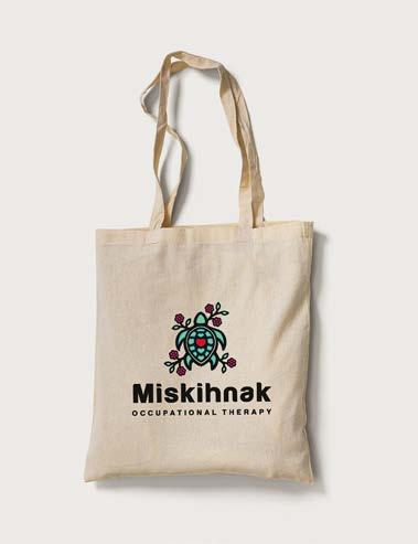
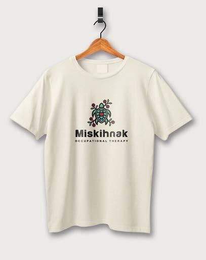
For branded merchandise like t-shirts, hats, and coffee mugs should all follow a vertical lockup placement if possible.
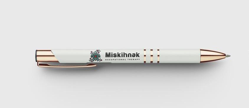
For branded merchandise like pens should all follow a horizontal lockup placement if possible.
Each piece of merchandise will carry unique limitations. Use the images on the right as a general guidance.
Branding Guidelines
11. Primary 12. Secondary
CMYK
7- 11 -31-0
231- 181
0- 15 -80-20 RGB 206- 175- 80
2- 2 -10-0 RGB 251- 248- 231
CMYK
0- 100 -30-25
RGB 176- 35- 90 Hex
CMYK
100- 2 -23-11 RGB 0- 163- 179 Hex
Harabara Mais LIght and Harabara was founded by Andre Harabara. It is a sans-serif typeface that comes in 169 characters and 169 unique glyphs. All the characters of this cozy typeface gives an elegant look. The Harabara Mais Light is a classy typeface to be utilized for section headings, headlines and titles. Harabara in regular weight should be utilized for subheadings
AaBbCcDdEeFfGgHhIiJjKkLlMm
NnOoPpQqRrSsTtUuVvWwXxYyZz
123456789!@#$%&
Heading:
Colour: Mustard
Size: 43 pt
Leading: 51 pt
Tracking :40 pt
Space After: 22.5 pt
Harabara Regular
AaBbCcDdEeFfGgHhIiJjKkLlMm
NnOoPpQqRrSsTtUuVvWwXxYyZz
123456789!@#$%&
Subheading;
Colour: Rain
Size: 11 pt
Leading: 14 pt
Tracking :200 pt
Space After: 31.5 pt
Border: .25pt top/bottom
Offset: 18pt
Tofino is a slightly squared, condensed workhorse family that is well-suited for print and to a screen environment.
This typeface is to be utilized for body copy in the Coal colour.
Size: 11 pt
Leading: 19 pt
Tracking :20 pt
Space After: 11.955 pt
Tofino Pro Personal Book
Tofino Pro Personal Regular
AaBbCcDdEeFfGgHhIiJjKkLlMm
NnOoPpQqRrSsTtUuVvWwXxYyZz 123456789!@#$%&
Tofino Pro Personal Medium
AaBbCcDdEeFfGgHhIiJjKkLlMm
NnOoPpQqRrSsTtUuVvWwXxYyZz 123456789!@#$%&
AaBbCcDdEeFfGgHhIiJjKkLlMm
NnOoPpQqRrSsTtUuVvWwXxYyZz 123456789!@#$%&
Tofino Pro Personal Bold
AaBbCcDdEeFfGgHhIiJjKkLlMm
NnOoPpQqRrSsTtUuVvWwXxYyZz 123456789!@#$%&
Guidelines
Hide Background
Beaded Border Social Media Avatar
The above branding assets when applied with consistency add to overall brand recognition. This set of assets best represent the MOT brand and should be used across all print and web applications. The HIde Background can be utilized as a header, or at full, 1/2, 1/3 or 1/4 page formats. The beaded asset should be flush to the bottom of the right or left and border of a document.
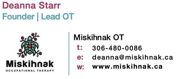
e: t:
w: Deanna Starr Founder Lead OT deanna@miskihnak.ca 306-480-0086 www.miskihnak.ca
Business Cards
Shows the branding assets applied with the following rules: a center aligned logo. The hide background as a full background and as a header. The beaded asset aligned flush to the bottom right border of the document.
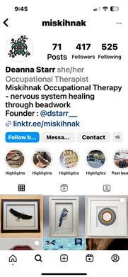
When used as social media avatars, the icononly logo should be used with the right amount of clear space on all sides. They are each approved for both circular and square avatars shapes of all sizes.
The email signature was designed to ensure that the brand carries through in all touchpoints including digital. The standardized signature encompasses key information pertaining to the organization as a whole. Personalized info would be formatted accordingly.


The files provided with this guide generally fall into two types: raster and vector files. While both can be used for most applications, typically one is more suited, depending on the usage intent.
Vector files are typically used for printing or producing the logo or other graphics in most forms. Typically, vector files end with .ai or .eps.. Vector files, made up of points and lines to create paths, can be scaled up and down without losing quality.
If you’re ever asked for a high-resolution logo file, send a vector file.
Raster files are typically used for web graphics and digital executions. Typically, raster files end with .jpg, .png, .gif, and .svg. These types of files always have a set resolution and size. Once you increase the size past its predetermined size, the quality decreases, in that case SVG files can be used to display vector graphics online.