B R A N D S T Y L E G U I D E 1TOUCH TECH Connecting Contacts with Content
CONTENTS Logo Variations Logo Usage Guidelines Color Palette Color Usage Guidelines Logo Fonts Typography Usage Guides 1 3 Logo Construction 2 4 All designs and Web font Typography Usage Guides 5 Iconography 6
LOGO VARIATIONS
1TOUCH TECH
1TOUCH TECH
1TOUCH TECH
1TOUCH TECH
LOGO USAGE GUIDELINES
1. The Logo type must not be placed with another solid shape such as a rectangle
2. The Logo type must never be shown with shadows projected from the letterforms.
3. The Letterforms in the Logo type must never be broken by a super - imposed pattern.
Connecting Contacts with Content
Connecting Contacts with Content
Connecting Contacts with Content
Connecting Contacts with Content
LOGO CONSTRUCTION 4 INCHES 1.5INCHES LOGO CLEARSPACE 1.5INCHES 1.5INCHES 2 INCHES 1TOUCH TECH Connecting Contacts with Content
GREY WHITE BLACK
COLOR PAIRING BRAND COLOR PALETTE #000000 C75 M68 Y67 K90 R0 G0 B0 FOR PRINTING FOR WEB USE A B
#1E1E1E C72 M66 Y65 K70 R30 G30 B30 FOR PRINTING FOR WEB USE #FFFFFF C0 M0 Y0 K0 R255 G255 B255 FOR PRINTING FOR WEB USE 1. The first color pairing above should be used as the primary combination 2. The background of the Logo can be any of the brand colors 3. The same color for Logo and Fonts is acceptable COLOR USAGE GUIDELINES
LOGO
LOGO FONT
LIGHT TYPEFACE
ROBOTO LIGHT FONT
ABCDEFGHIJKLMNOPQRSTUVWXYZ abcdefghijklmnopqrstuvwxyz 0123456789 ROBOTO MEDIUM FONT SPECIMEN TYPOGRAPHY GUIDELINES LOGO FONT ONE
FONTS ROBOTO MEDIUM TYPEFACE 1. Roboto medium and light fonts should be used for all 1TOUCH TECH brand logo designs Aa Bb ABCDEFGHIJKLMNOPQRSTUVWXYZ abcdefghijklmnopqrstuvwxyz 0123456789
SPECIMEN
TWO ROBOTO
Aa Bb 2. Each of the fonts family have different sizes for typeface but Montserrat bold and Montserrat light fonts should be used for all 1TOUCH TECH brand logo designs
ABCDEFGHIJKLMNOPQRSTUVWXYZ abcdefghijklmnopqrstuvwxyz 0123456789 POPPINS REGULAR FONT SPECIMEN TYPOGRAPHY GUIDELINES ALL DESIGNS FONT ALL DESIGNS AND ALTERNATE FONT POPPINS FAMILY TYPEFACE 1. Poppins regular should be use for all headings and Poppins light for all the brand designs 2. Open sans should be use as the alternate font to Poppins Aa Bb ABCDEFGHIJKLMNOPQRSTUVWXYZ abcdefghijklmnopqrstuvwxyz 0123456789 OPEN SANS REGULAR FONT SPECIMEN ALTERNATE FONT OPEN SANS FAMILY TYPEFACE Aa Bb
MEDIA
SOCIAL
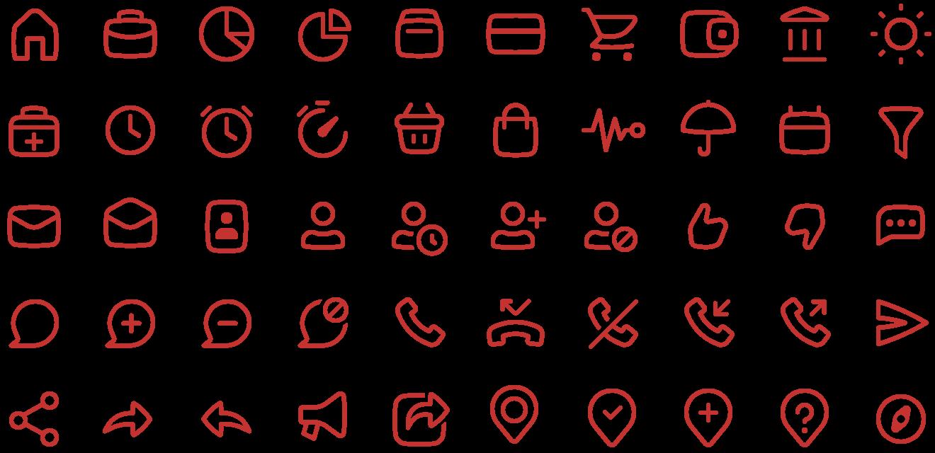
ICONS ICONOGRAPHY
Brand Guidelines
WING KXNG Brand Guidelines wingkxng.com Contents 1.0 The Brand Page 03 2.0 Logo Page 06 3.0 Colour Palette Page 12 4.0 Typography Page 17 5.0 Imagery Page 21 6.0 Application 7.0 Contact Page 23 Page 29
WING KXNG Brand Guidelines wingkxng.com The Brand 1.1 Brand Goal Page 04 1.0
Brand Goal
Wing Kxng is the very first Chicken Wing orientated Food Truck, one of its kind.
Why? Because we cater to all walks of life, all demo graphs. Who doesn’t love chicken wings!
We also offer one-of-a-kind flavours that you will not find anywhere else! Not to mention our sides! Wings on wheels!
The goals for this brand:
- Create an established brand
- Create an self-sufficient business/kitchen
- Scale to 5k Instagram followers first year of launch
- Scale to franchise within 2 years of a second truck
- Become one of the heavy hitter chicken wings establishments
For current competition we fair very well against them, especially to the point that there is no other Chicken Wing food trucks.
we are also a new brand but not completely new the name Wing Kxng stems from the original restaurant KxngsTable that scaled to 5000 plus Instagram followers. People recognize that spelling of Kxng when they see it.
We also chose a food that we could execute very well and an item that is popular worldwide.
Section 1.1: Brand Goal
WING KXNG Brand Guidelines wingkxng.com 2022 V1.0 / Page 41.0 / THE BRAND
WING KXNG Brand Guidelines wingkxng.com 2.1 Primary Logo Page 06 2.2 Logo Clear Space Page 07 Logo2.0 2.3 Brand Stamp Page 08 2.4 Brand Stamp Clear Space Page 9 2.5 Logo Misuse Page 10
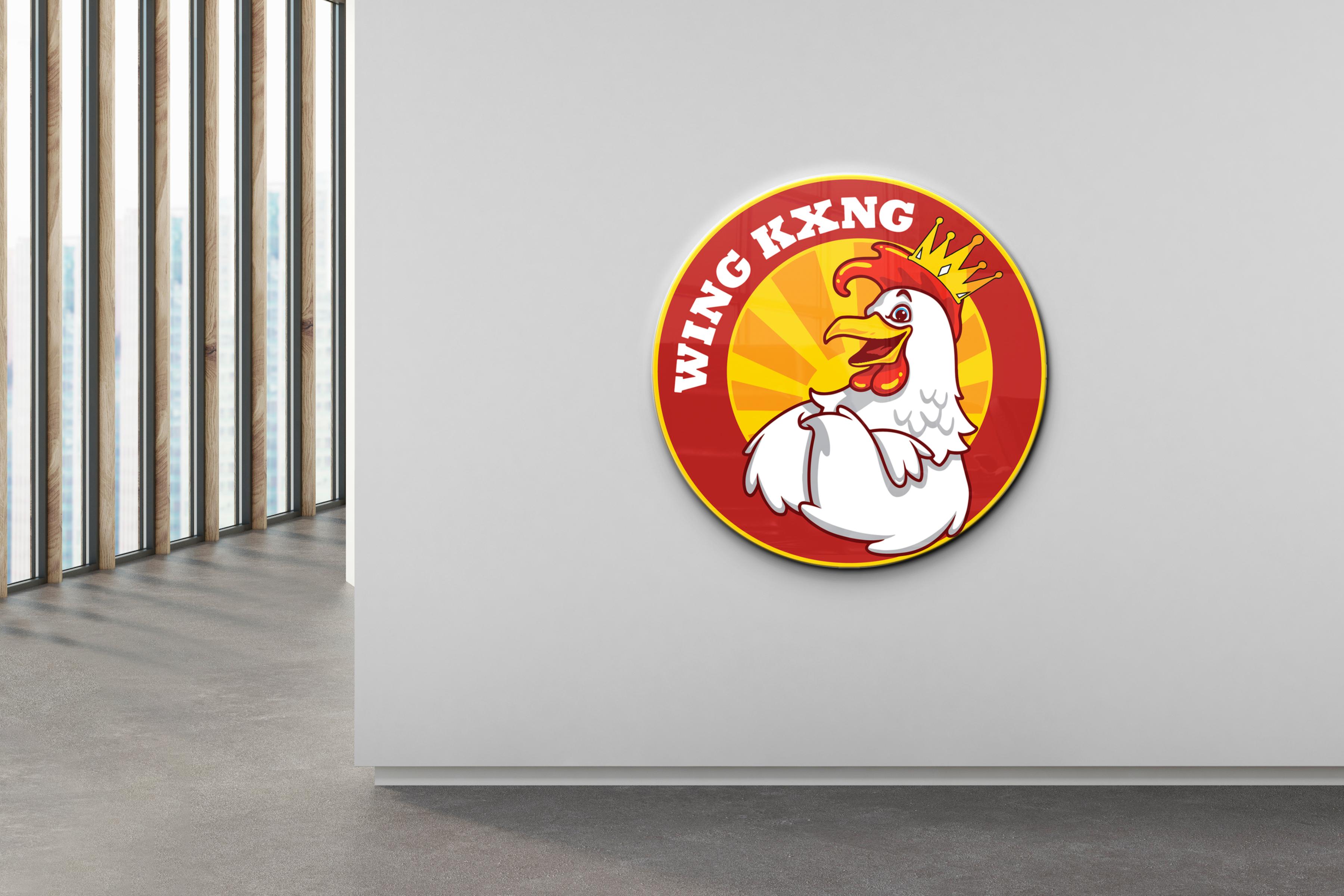
Primary Logo
This is the Primary Logo. The logo must be resized proportionately, never stretched. The Logo can be used in black on light backgrounds, or white on dark backgrounds, or in contrasting brand colours.
Section 2.1: Primary Logo
WING KXNG Brand Guidelines wingkxng.com 2022 V1.0 / Page 6
Download Logos 2.0 / LOGO
Logo Clear Space
Clear space is the area surrounding our logo that must be kept free of any text or graphic elements. By leaving space around the logo, we make sure it stands out on all our communications. The minimum clear space is 50% of the height of the entire logo.
It is sometimes necessary to increase and decrease the logo depending on the print area. Always keep in proportion. Always ensure the text is legible.
2.2: Logo Clear Space
WING KXNG Brand Guidelines wingkxng.com 2022 V1.0 / Page 7
Download Logos 2.0 / LOGO Section
10% of Logo Height 10% of Logo Height 10% of Logo Height 10% of Logo Height
2.0
LOGO
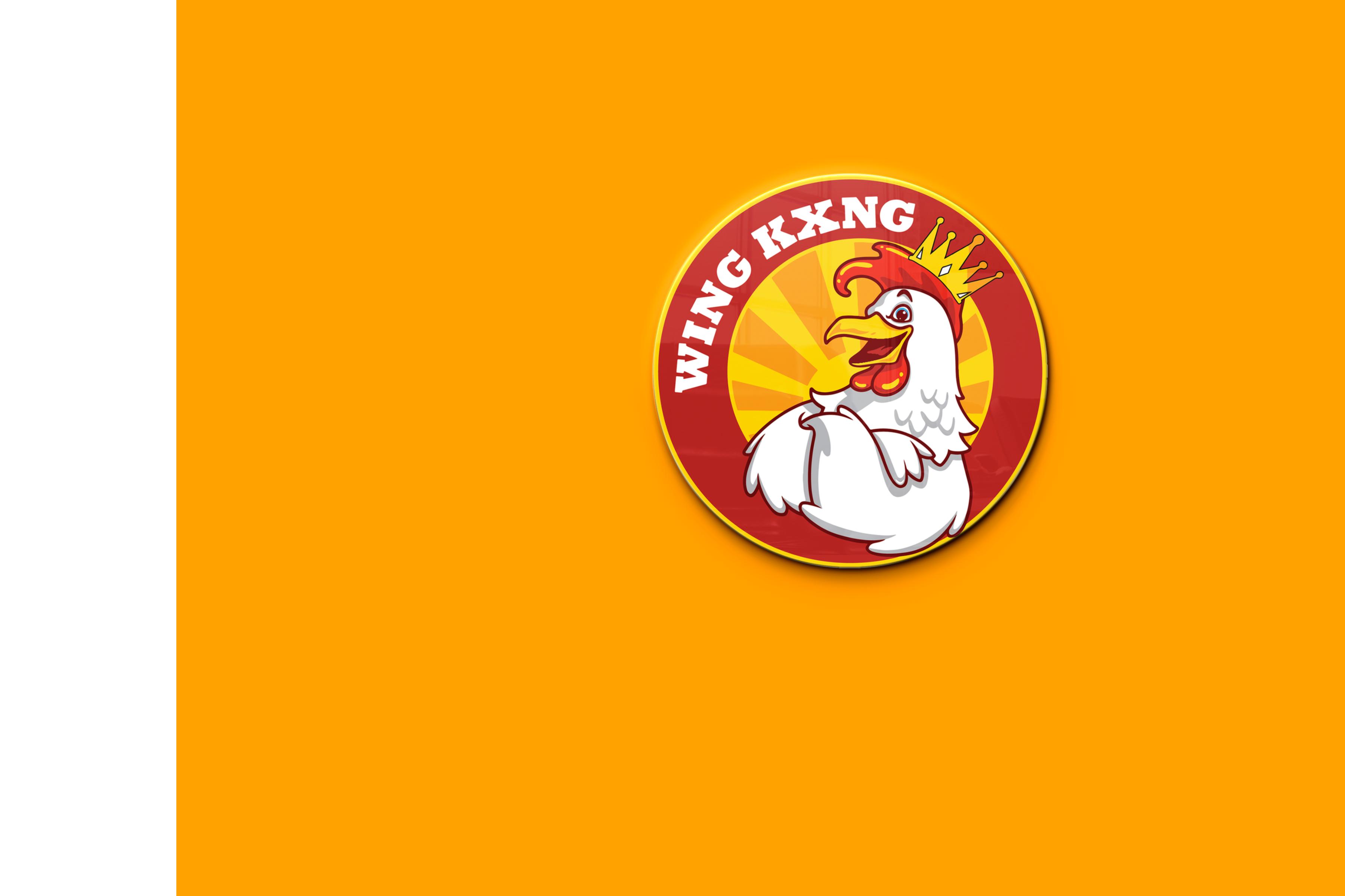
Brand Stamp
This is the Brand Stamp. Brand Stamp must be resized proportionately, never stretched. Brand Stamp can be used in black on light backgrounds, or white on dark backgrounds, or in contrasting brand colours.
Section 2.3: Brand Stamp
WING KXNG Brand Guidelines wingkxng.com 2022 V1.0 / Page 8
Download Logos
/
Brand Stamp Clear Space
Clear space is the area surrounding our brand stamp that must be kept free of any text or graphic elements. By leaving space around the logo, we make sure it stands out on all our communications. The minimum clear space is 50% of the height of the entire graphic element.
It is sometimes necessary to increase and decrease the element depending on the print area. Always keep in proportion. Always ensure the text is legible.
2.4: Brand Stamp Clear Space
WING KXNG Brand Guidelines wingkxng.com 2022 V1.0 / Page 9
Download Logos 2.0 / LOGO Section
50% of Stamp Height
Logo Misuse
Any changes to our logo diminish its integrity and the equity of our brand. The examples shown here are some specific “do nots” for our logo.
Section 2.5: Logo Misuse
Do not alter the logo’s colours in anyway
Do not place the logo in a holding shape
Do not lock-up text to the logo
Do not add elements or shadows to the logo
Do not rotate the logo
Do not alter the logo’s shape in anyway
Do not outline the logo
Do not change the relationship of the logo’s components
WING KXNG Brand Guidelines wingkxng.com 2022 V1.0 / Page 102.0 / LOGO
Download Logos
WING KXNG Brand Guidelines wingkxng.com Page 12 Page 13 Colour Palette3.0 Page 14 3.1 Brand Colours 3.2 Hero Colour 3.3 Colour Hierarchy 3.4 Colour Tints Page 15
PALETTE
Brand Colours
Section 3.1: Brand Colours
Our brand is underpinned with a colour palette designed to be fresh, modern and distinctive. Different combinations of these colours can dramatically change the tone and appearance of our brand so it is important to consider how they work together. Keeping colour consistent is a vital element to our branding. Colour is the way we differentiate and identify our brand in a crowded marketplace. To help achieve greater brand recognition it is important that our colour palette is applied accurately and consistently.
Print
Pantone colours are used to print the designs, rather than CMYK. Pantone colours will provide the maximum amount of consistency. In instances where this is not possible we have created optimised CMYK values.
Screens
Not all RGB colours render the same online. Therefore we recommend the use of hexadecimal colours when applying colours to screen.
WING KXNG Brand Guidelines wingkxng.com 2022 V1.0 / Page 12
3.0 / COLOUR
Pantone P 179-16 C CMYK 0 / 85 / 84 / 55 RGB 113 / 16 / 17 HEX #711011 Pantone 18-0317 TPG CMYK 0 / 77 / 80 / 25 RGB 190 / 42 /38 HEX #BE2A26 Pantone 11-4800 TCX CMYK 0 / 78 / 84 / 6 RGB 238 /52 / 36 HEX #EE3424 Pantone P 1-1 C CMYK 0 /35 / 89 / 2 RGB 249 / 161 / 27 HEX #F79A11B Pantone P 17-1 C CMYK 0 / 15 / 98 / 0 RGB 254 / 214 / 4 HEX #FED604 UP Maroon Orange Golden Cinnabar Orange Web Gold Web
Hero Colour
Orange Golden is our hero colour. Keeping colour consistent is a vital element to our branding. Colour is the way we differentiate and identify our brand in a crowded marketplace. To help achieve greater brand recognition it is important that our colour palette is applied accurately and consistently. The correct colour values are specified below. Make sure to use them.
WING KXNG Brand Guidelines wingkxng.com
2020 V1.0 / Page 133.0 / COLOUR PALETTE Section 3.2: Hero Colour RGB R190 G42 B38
CMYK C0 M77 Y80 K25 PANTONE® 18-0317 TPG Orange Golden
3.0 / COLOUR PALETTE
Colour Hierarchy
A colour hierarchy has been implemented, ranging from Orange Golden, UP Maroon and Gold Web. Orange Golden is used for conveying importance. Whilst Gold Web is mainly used for background washes.
Orange Golden
PMS 18-0317 TPG
CMYK 0 / 77 / 80 / 25
RGB 190 / 42 / 38
HEX #BE2A26
UP Maroon
PMS P179-16 C
CMYK 0 / 85 / 84 / 55
RGB 113 / 16 / 17
HEX #711011
Gold Web
PMS 11-4800 TCX
CMYK 0 / 15 / 98 / 0
RGB 254 / 214 / 4
HEX #FED604
Section 3.3: Colour Hierarchy
WING KXNG Brand Guidelines wingkxng.com 2022 V1.0 / Page 14
Colour Tints
If there is an occasion when you need to create contrast without adding extra colours, you can use incremental tints. Our tints are to be applied in increments of 20%. From 80%, 60%, 40% and 20%. Avoid using any other tints.
Orange Golden
PMS 18-0317 TPG
CMYK 0 / 77 / 80 / 25
RGB 190 / 42 / 38
HEX #BE2A26
UP Maroon
PMS P179-16 C
CMYK 0 / 85 / 84 / 55
RGB 113 / 16 / 17
HEX #711011
Gold Web
PMS 11-4800 TCX
CMYK 0 / 15 / 98 / 0
RGB 254 / 214 / 4
HEX #FED604
3.4: Colour Tints
100% 80% 60% 40% 20%
WING KXNG Brand Guidelines wingkxng.com 2022 V1.0 / Page 15
3.0 / COLOUR PALETTE Section
Colours
100%
WING KXNG Brand Guidelines wingkxng.com 2022 V1.0 / Page 16 5
80% 60% 40% 20% 3.0 / COLOUR PALETTE Section 3.4: Colour Tints
WING KXNG Brand Guidelines wingkxng.com 4.1 Primary Typeface Page 18 4.2 Secondary Typeface Page 19 Typography4.0 4.3 Use of Type Page 20
Helvetica Bold is our primary brand typeface. Our typography is as unique and elegant as we are. Typography is a key element in our brand. It works to maintain consistency, create clarity and provide equity to our brand. It is important to adhere to the typographic hierarchy specified in this document to help achieve brand consistency.
WING KXNG Brand Guidelines wingkxng.com ABCDEFGHIJKLMN OPQRSTVWXYZ abcdefghijklmn opqrstuvwxyz 1234567890 !@#$%^&*()+Aa Primary Typeface
Download Fonts Helvetica Bold 4.0 / TYPOGRAPHY Section 4.1: Primary Typeface 2020 V1.0 / Page 18
Secondary Typeface
Helvetica is our secondary corporate typeface, it should be used in all instances where typography is required. It is a simple, clean and legible typeface that compliments our logo. We use three weights of Helvetica. Regular, Medium and Bold. Arial and Roboto can be used as a substitute for Helvetica on digital applications such as websites and email. It is important to adhere to the leading and tracking arrangements specified in this document to help achieve brand consistency throughout.
WING KXNG Brand Guidelines wingkxng.com 2022 V1.0 / Page 19
ABCDEFGHIJKLMN OPQRSTUVWXYZ abcdefghijklmn opqrstuvwxyz 1234567890 !@#$%^&*()+ AaDownload Fonts Helvetica 4.0 / TYPOGRAPHY Section 4.2: Secondary Typeface
/ TYPOGRAPHY
Use of Type
One of the most important techniques for effectively communicating content is the use of typographic hierarchy. Typographic hierarchy is a system for organizing type that establishes an order of importance within the data, allowing the reader to easily find what they are looking for and navigate the content. It helps guide the reader’s eye to where a section begins and ends, whilst enabling the user to isolate certain information based on the consistent use of style throughout a body of text. It is important to maintain these type pairings. This allows for clarity, consistency and a strong hierarchy for all communications.
Headings & Pull Quotes
Helvetica bold is to be used for all headings and pull quotes.
Subheadings
Helvetica Medium is to be used for subheadings.
Body Copy & Captions
Helvetica Regular is to be used for body copy and captions and when a more delicate font is required.
Buttons & CTA’s
Helvetica Medium is to be used for all buttons and call to actions.
Section 4.3: Use of Type
Subheading Font
Heading Font
Helvetica Regular is to be used for body copy. Cookie dessert chocolate gummi bears oat pie donut chocolate bar macaroon muffin. Marzipan jujubes danish oat cake wafer oat cake pie chocolate bar gummies.
Heading Font
Helvetica Regular is to be used for body copy. Cookie dessert chocolate gummi bears oat pie donut chocolate bar macaroon muffin. Marzipan jujubes danish oat cake wafer oat cake pie chocolate bar gummies.
Button Font
Subheading Font
Heading Font
Helvetica Regular is to be used for body copy. Cookie dessert chocolate gummi bears oat pie donut chocolate bar macaroon muffin. Marzipan jujubes danish oat danish cake wafer macaroon muffin oat cake pie.
“Helvetica bold is to be used for pull quotes.”
WING KXNG Brand Guidelines wingkxng.com 2022 V1.0 / Page 20
4.0
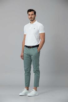
WING KXNG Brand Guidelines wingkxng.com Imagery5.0 5.1 Image Direction Page 22
Section 5.1: Image Direction
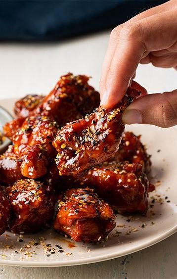
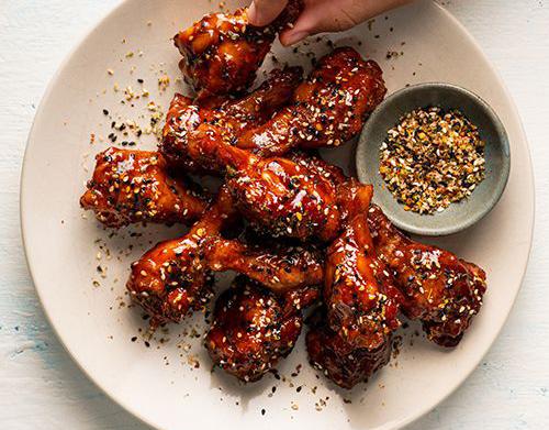
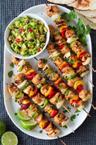
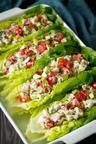
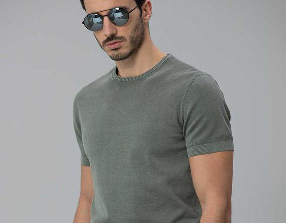
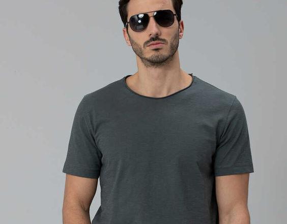
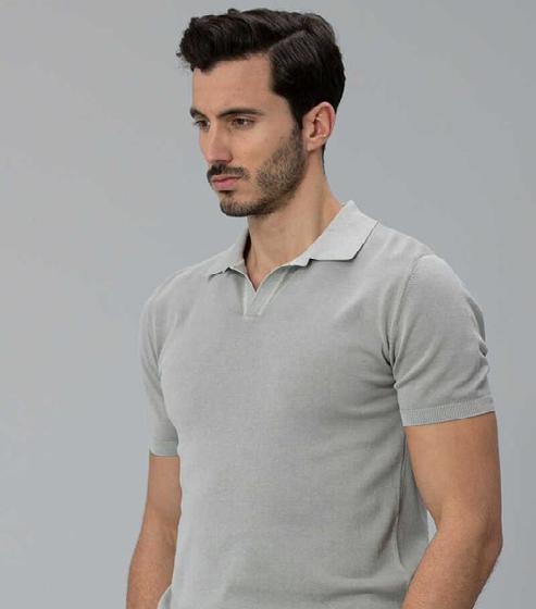
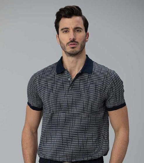
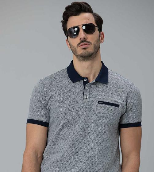
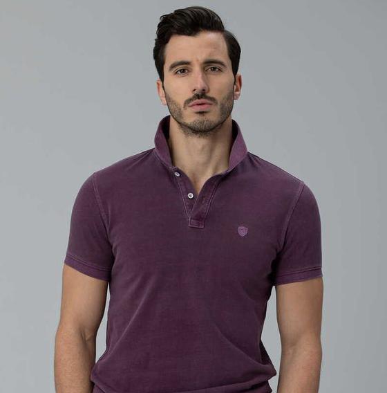
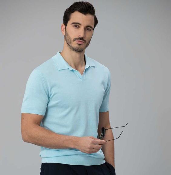
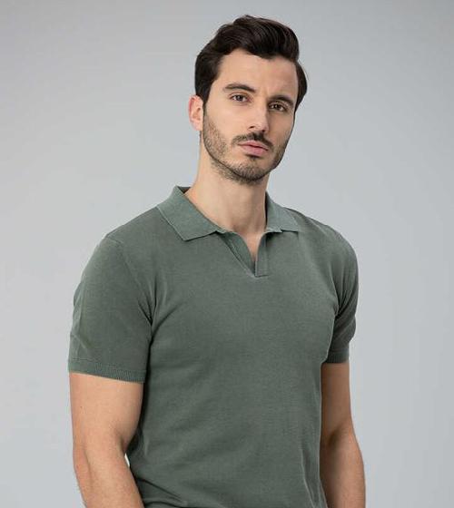
Image Direction
Our target market will be targeted to the age range of 18-35 years old. In this age of social media that range is the highest activity for people using social media that will give us the most exposure possible.
Our target geographic area will be the GTA, it allows us to reach our target age range. Although the GTA is a very broad area we want to attack the streets with heavy foot traffic.
King St
Queen St W Lakeshore Harbourfront Kensington Yonge St
WING KXNG Brand Guidelines wingkxng.com 2022 V1.0 / Page 22
5.0 / IMAGERY
Download Images
WING KXNG Brand Guidelines wingkxng.com Application6.0 6.1 Digital Application Page 24 6.2 Stationery Page 27 6.3 Icons Page 28
/ APPLICATION

Digital Application


This is an example of how our branding would be best applied to maintain consistency of look and feel on digital applications.
Section 6.1: Digital Application

WING KXNG Brand Guidelines wingkxng.com 2022 V1.0 / Page 24
6.0
/ APPLICATION


Digital Application


This is an example of how our branding would be best applied to maintain consistency of look and feel on digital applications.
Section 6.1: Digital Application


WING KXNG Brand Guidelines wingkxng.com 2022 V1.0 / Page 25
6.0
Digital Application

This is an example of how our branding would be best applied to maintain consistency of look and feel on digital applications.
 Shop
Shop
WING KXNG Brand Guidelines wingkxng.com
Now
6.0 / APPLICATION Section 6.1: Digital Application 2020 V1.0 / Page 26
Stationery
This
of how our branding would be best applied to maintain consistency of look and feel on
WING KXNG Brand Guidelines wingkxng.com 2022 V1.0 / Page 27 DL Envelope WING KXNG Level 2 123 Address St Canada WING KXNG Level 2 123 Address St Canada T +61 3 1234 5678 F +61 3 1234 5679 E hello@website.com yourwebsite.com Letterhead Large Envelope WING KXNG Level 2 123 Address St Canada Business Card Cassandra Jones Administration & Operations Manager Email @ firstname.surname wingkxng.com Tel Fax www +61 3 1234 5678 +61 3 1234 5679 wingkxng.com
is an example
stationery. 6.0 / APPLICATION Section 6.2: Stationery
APPLICATION
Icons
This is an example of how our branding icons should be used to maintain consistency of look and feel.
Section 6.3: Icons
WING KXNG Brand Guidelines wingkxng.com 2022 V1.0 / Page 28
6.0 /
WING KXNG Brand Guidelines wingkxng.com 98b Chapel St, Ottawah Canada Wing Kxng is the very first Chicken Wing orientated Food Truck, one of its kind. 7.0 / CONTACT hello@wingkxng.com 2020 V1.0 / Page 29
Brand Guidelines
OFFDAMAP Brand Guidelines offdamap.com Contents 1.0 The Brand Page 03 2.0 Logo Page 06 3.0 Colour Palette Page 12 4.0 Typography Page 17 5.0 Imagery Page 21 6.0 Application 7.0 Contact Page 23 Page 29
OFFDAMAP Brand Guidelines offdamap.com The Brand 1.1 Brand Goal Page 04 1.0
Brand Goal
Offdamap, the trendiest fashion brand from Canada, is mostly distinguished for its true international quality designs and fabrics. We are inspired by our customers- souls full of unconventional fashion senses.
Section 1.1: Brand Goal

OFFDAMAP Brand Guidelines offdamap.com 2022 V1.0 / Page 41.0 / THE BRAND
OFFDAMAP Brand Guidelines offdamap.com 2.1 Primary Logo Page 06 2.2 Logo Clear Space Page 07 Logo2.0 2.3 Brand Stamp Page 08 2.4 Brand Stamp Clear Space Page 9 2.5 Logo Misuse Page 10
Primary Logo
This is the Primary Logo. The logo must be resized proportionately, never stretched. The Logo can be used in black on light backgrounds, or white on dark backgrounds, or in contrasting brand colours.
Section 2.1: Primary Logo
OFFDAMAP Brand Guidelines offdamap.com 2022 V1.0 / Page 6
Download Logos 2.0 / LOGO
Logo Clear Space
Logo Clear Space
Clear space is the area surrounding our logo that must be kept free of any text or graphic elements. By leaving space around the logo, we make sure it stands out on all our communications. The minimum clear space is 50% of the height of the entire logo.
It is sometimes necessary to increase and decrease the logo depending on the print area. Always keep in proportion. Always ensure the text is legible.
OFFDAMAP Brand Guidelines offdamap.com 2022 V1.0 / Page 7
Download Logos 2.0 / LOGO Section 2.2:
10% of Logo Height 10% of Logo Height 10% of Logo Height 10% of Logo Height
Brand Stamp
This is the Brand Stamp. Brand Stamp must be resized proportionately, never stretched. Brand Stamp can be used in black on light backgrounds, or white on dark backgrounds, or in contrasting brand colours.
Section 2.3: Brand Stamp
OFFDAMAP Brand Guidelines offdamap.com 2022 V1.0 / Page 8
Download Logos 2.0 / LOGO
Brand Stamp Clear Space
Clear space is the area surrounding our brand stamp that must be kept free of any text or graphic elements. By leaving space around the logo, we make sure it stands out on all our communications.
The minimum clear space is 50% of the height of the entire graphic element.
It is sometimes necessary to increase and decrease the element depending on the print area.
Always keep in proportion. Always ensure the text is legible.
2.4: Brand Stamp Clear Space
OFFDAMAP Brand Guidelines offdamap.com 2022 V1.0 / Page 9
Download Logos 2.0 / LOGO Section
50% of Stamp Height
Logo Misuse
Any changes to our logo diminish its integrity and the equity of our brand. The examples shown here are some specific “do nots” for our logo.
Section 2.5: Logo Misuse
Do not alter the logo’s colours in anyway
Do not place the logo in a holding shape
Do not lock-up text to the logo
Do not add elements or shadows to the logo
Do not rotate the logo
Do not alter the logo’s shape in anyway
Do not outline the logo
Do not change the relationship of the logo’s components
OFFDAMAP Brand Guidelines offdamap.com 2022 V1.0 / Page 102.0 / LOGO
Download Logos
OFFDAMAP Brand Guidelines offdamap.com Page 12 Page 13 Colour Palette3.0 Page 14 3.1 Brand Colours 3.2 Hero Colour 3.3 Colour Hierarchy 3.4 Colour Tints Page 15
PALETTE
Brand Colours
Section 3.1: Brand Colours
Our brand is underpinned with a colour palette designed to be fresh, modern and distinctive. Different combinations of these colours can dramatically change the tone and appearance of our brand so it is important to consider how they work together. Keeping colour consistent is a vital element to our branding. Colour is the way we differentiate and identify our brand in a crowded marketplace. To help achieve greater brand recognition it is important that our colour palette is applied accurately and consistently.
Print
Pantone colours are used to print the designs, rather than CMYK. Pantone colours will provide the maximum amount of consistency. In instances where this is not possible we have created optimised CMYK values.
Screens
Not all RGB colours render the same online. Therefore we recommend the use of hexadecimal colours when applying colours to screen.
Raisin Black Upsdell Red
Green
Rose
OFFDAMAP Brand Guidelines offdamap.com 2022 V1.0 / Page 12
3.0 / COLOUR
Pantone P 179-16 C CMYK 0 / 21 / 21 / 85 RGB 38 / 30 / 30 HEX #261E1E Pantone 18-0317 TPG CMYK 0 / 81 / 77 / 29 RGB 180 / 34 / 40 HEX #B42228 Pantone 11-4800 TCX CMYK 68 / 49 / 0 / 35 RGB 52 / 84 / 165 HEX #3454A5 Pantone P 1-1 C CMYK 86 / 0 / 53 / 38 RGB 22 / 158 / 73 HEX #169E49 Pantone P 17-1 C CMYK 0 / 7 / 6 / 9 RGB 230 / 214 / 214 HEX #E6D5D6
Bdazzeled Blue
Pigment Misty
Hero Colour
Orange Golden is our hero colour. Keeping colour consistent is a vital element to our branding. Colour is the way we differentiate and identify our brand in a crowded marketplace. To help achieve greater brand recognition it is important that our colour palette is applied accurately and consistently. The correct colour values are specified below. Make sure to use them.
/
PALETTE
Section 3.2: Hero Colour
OFFDAMAP Brand Guidelines offdamap.com
2020 V1.0 / Page 133.0
COLOUR
RGB R38 G30 B30
CMYK C0 M21 Y21 K85 PANTONE® 18-0317 TPG Raisin Black
3.0 / COLOUR PALETTE
Colour Hierarchy
A colour hierarchy has been implemented, ranging from Orange Golden, UP Maroon and Gold Web. Orange Golden is used for conveying importance. Whilst Gold Web is mainly used for background washes.
Orange Golden
PMS 18-0317 TPG
CMYK 0 / 77 / 80 / 25
RGB 190 / 42 / 38
HEX #BE2A26
UP Maroon
PMS P179-16 C
CMYK 0 / 85 / 84 / 55
RGB 113 / 16 / 17
HEX #711011
Gold Web
PMS 11-4800 TCX
CMYK 0 / 15 / 98 / 0
RGB 254 / 214 / 4
HEX #FED604
Section 3.3: Colour Hierarchy
OFFDAMAP Brand Guidelines offdamap.com 2022 V1.0 / Page 14
Colour Tints
If there is an occasion when you need to create contrast without adding extra colours, you can use incremental tints. Our tints are to be applied in increments of 20%. From 80%, 60%, 40% and 20%. Avoid using any other tints.
Orange Golden
PMS 18-0317 TPG
CMYK 0 / 77 / 80 / 25
RGB 190 / 42 / 38
HEX #BE2A26
UP Maroon
PMS P179-16 C
CMYK 0 / 85 / 84 / 55
RGB 113 / 16 / 17
HEX #711011
Gold Web
PMS 11-4800 TCX
CMYK 0 / 15 / 98 / 0
RGB 254 / 214 / 4
HEX #FED604
3.4: Colour Tints
100%
40% 20%
OFFDAMAP Brand Guidelines offdamap.com 2022 V1.0 / Page 15
80% 60%
3.0 / COLOUR PALETTE Section
OFFDAMAP Brand Guidelines offdamap.com 2022 V1.0 / Page 16 5 Colours 100% 80% 60% 40% 20% 3.0 / COLOUR PALETTE Section 3.4: Colour Tints
OFFDAMAP Brand Guidelines offdamap.com 4.1 Primary Typeface Page 18 4.2 Secondary Typeface Page 19 Typography4.0 4.3 Use of Type Page 20
Aloevera Regular is our primary brand typeface. Our typography is as unique and elegant as we are. Typography is a key element in our brand. It works to maintain consistency, create clarity and provide equity to our brand. It is important to adhere to the typographic hierarchy specified in this document to help achieve brand consistency.
OFFDAMAP Brand Guidelines offdamap.com ABCDEFGHIJKLMN OPQRSTVWXYZ abcdefghijklmn opqrstuvwxyz 1234567890 !@#$%^&*()+ Aa Primary Typeface
Download Fonts Aloevera Regular 4.0 / TYPOGRAPHY Section 4.1: Primary Typeface 2020 V1.0 / Page 18
Secondary Typeface
Helvetica is our secondary corporate typeface, it should be used in all instances where typography is required. It is a simple, clean and legible typeface that compliments our logo. We use three weights of Helvetica. Regular, Medium and Bold. Arial and Roboto can be used as a substitute for Helvetica on digital applications such as websites and email. It is important to adhere to the leading and tracking arrangements specified in this document to help achieve brand consistency throughout.
OFFDAMAP Brand Guidelines offdamap.com 2022 V1.0 / Page 19
ABCDEFGHIJKLMN OPQRSTUVWXYZ abcdefghijklmn opqrstuvwxyz 1234567890 !@#$%^&*()+ AaDownload Fonts Helvetica 4.0 / TYPOGRAPHY Section 4.2: Secondary Typeface
Use of Type
One of the most important techniques for effectively communicating content is the use of typographic hierarchy. Typographic hierarchy is a system for organizing type that establishes an order of importance within the data, allowing the reader to easily find what they are looking for and navigate the content. It helps guide the reader’s eye to where a section begins and ends, whilst enabling the user to isolate certain information based on the consistent use of style throughout a body of text. It is important to maintain these type pairings. This allows for clarity, consistency and a strong hierarchy for all communications.
Headings & Pull Quotes
Aloevera Regular is to be used for all headings and pull quotes.
Subheadings
Helvetica Medium is to be used for subheadings.
Body Copy & Captions
Helvetica Regular is to be used for body copy and captions and when a more delicate font is required.
Buttons & CTA’s
Helvetica Medium is to be used for all buttons and call to actions.
Section 4.3: Use of Type
Heading Font
Helvetica Regular is to be used for body copy. Cookie dessert chocolate gummi bears oat pie donut chocolate bar macaroon muffin. Marzipan jujubes danish oat cake wafer oat cake pie chocolate bar gummies.
Heading Font
Helvetica Regular is to be used for body copy. Cookie dessert chocolate gummi bears oat pie donut chocolate bar macaroon muffin. Marzipan jujubes danish oat cake wafer oat cake pie chocolate bar gummies.
Heading Font
Helvetica Regular is to be used for body copy. Cookie dessert chocolate gummi bears oat pie donut chocolate bar macaroon muffin. Marzipan jujubes danish oat danish cake wafer macaroon muffin oat cake pie.
Subheading Font
Button Font
“Aloevera Regular is to be used for pull quotes.”
Subheading Font
OFFDAMAP Brand Guidelines offdamap.com 2022 V1.0 / Page 20
4.0 / TYPOGRAPHY
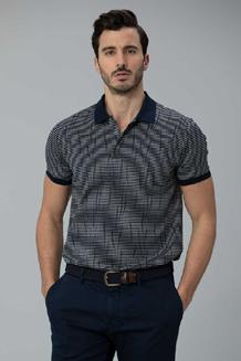
OFFDAMAP Brand Guidelines offdamap.com Imagery5.0 5.1 Image Direction Page 22
Section 5.1: Image Direction
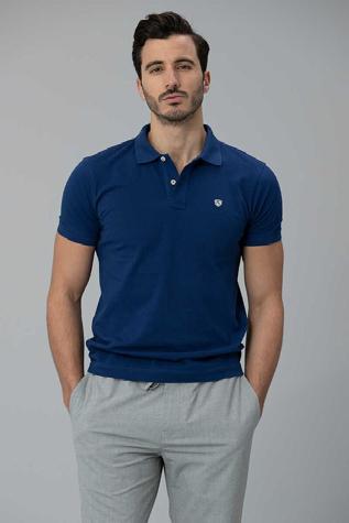
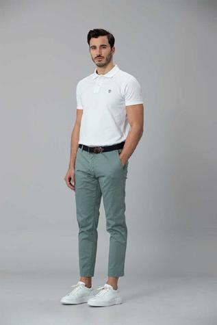
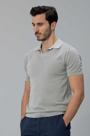
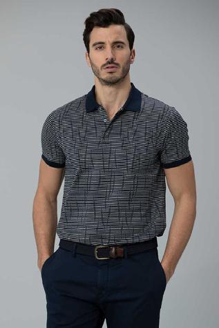
Image Direction
Our target market will be targeted to the age range of 18-35 years old. In this age of social media that range is the highest activity for people using social media that will give us the most exposure possible.
Our target geographic area will be the GTA, it allows us to reach our target age range. Although the GTA is a very broad area we want to attack the streets with heavy foot traffic.
King St
Queen St W Lakeshore Harbourfront Kensington Yonge St
OFFDAMAP Brand Guidelines offdamap.com 2022 V1.0 / Page 22
5.0 / IMAGERY
Download Images
OFFDAMAP Brand Guidelines offdamap.com Application6.0 6.1 Digital Application Page 24 6.2 Stationery Page 27 6.3 Icons Page 28
/ APPLICATION
Digital Application


This is an example of how our branding would be best applied to maintain consistency of look and feel on digital applications.

Section 6.1: Digital Application
OFFDAMAP Brand Guidelines offdamap.com 2022 V1.0 / Page 24
6.0
Digital Application


This is an example of how our branding would be best applied to maintain consistency of look and feel on digital applications.

Section 6.1: Digital Application
OFFDAMAP Brand Guidelines offdamap.com 2022 V1.0 / Page 25
6.0 / APPLICATION
Digital Application
This is an example of how our branding would be best applied to maintain consistency of look and feel on digital applications.
OFFDAMAP Brand Guidelines offdamap.com
6.0 / APPLICATION Section 6.1: Digital Application 2020 V1.0 / Page 26
Stationery
This is an example of how our branding would be best applied to maintain consistency of look and feel on stationery.
Section 6.2: Stationery
Large
Letterhead
OFFDAMAP Brand Guidelines offdamap.com 2022 V1.0 / Page 27 DL Envelope OFFDAMAP Level 2 123 Address St Canada OFFDAMAP Level 2 123 Address St Canada T +61 3 1234 5678 F +61 3 1234 5679 E hello@website.com yourwebsite.com
Envelope OFFDAMAP Level 2 123 Address St Canada Business Card Cassandra Jones Administration & Operations Manager Email @ firstname.surname offdamap.com Tel Fax www +61 3 1234 5678 +61 3 1234 5679 offdamap.com
6.0 / APPLICATION
Icons
This is an example of how our branding icons should be used to maintain consistency of look and feel.
Section 6.3: Icons
OFFDAMAP Brand Guidelines offdamap.com 2022 V1.0 / Page 28
6.0 / APPLICATION
OFFDAMAP Brand Guidelines offdamap.com 98b Chapel St, Ottawah Canada+91 174 188 934 Clothing that is high in both quality and style. 7.0 / CONTACT hello@offdamap.com 2020 V1.0 / Page 29
Brand Guidelines
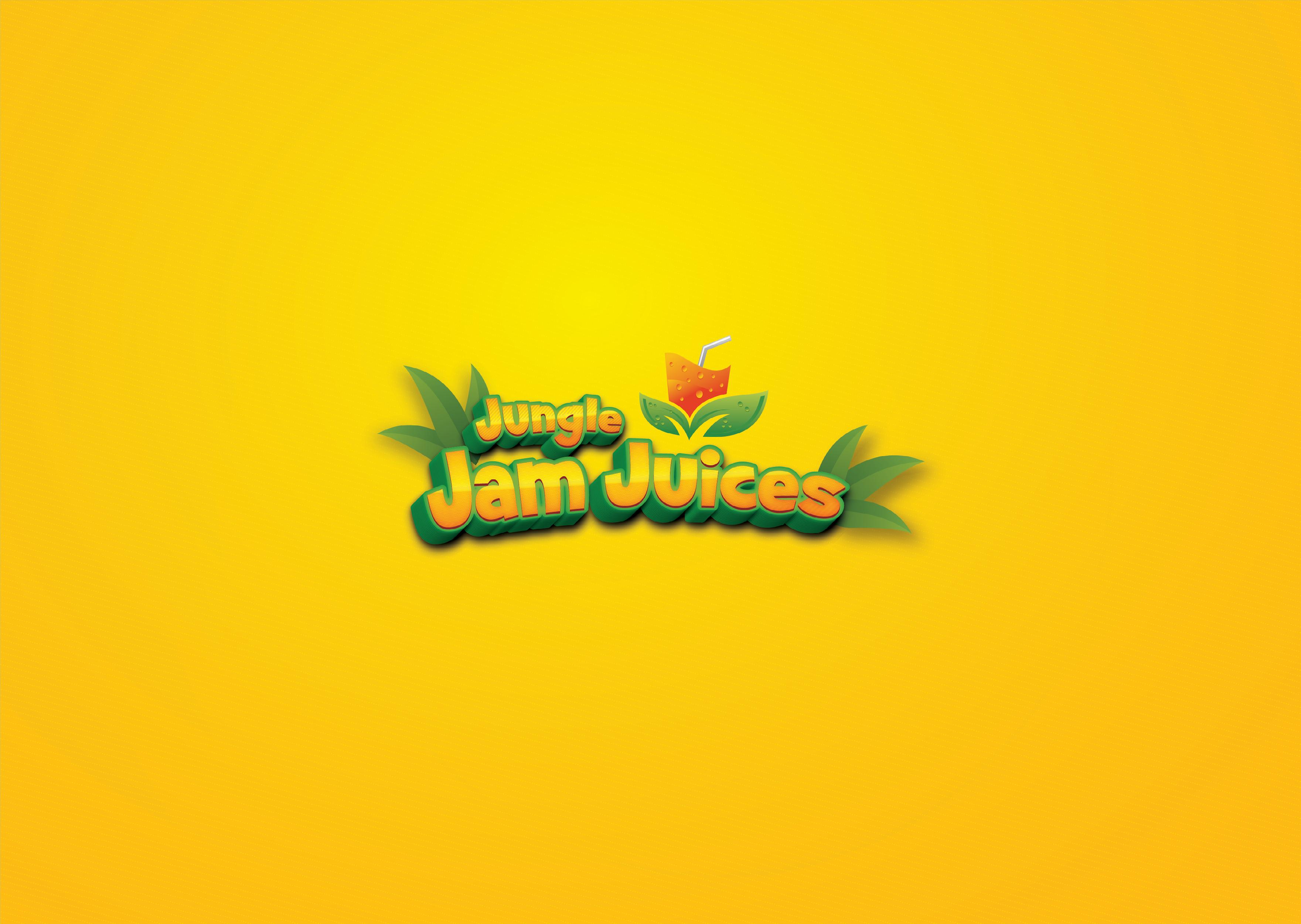
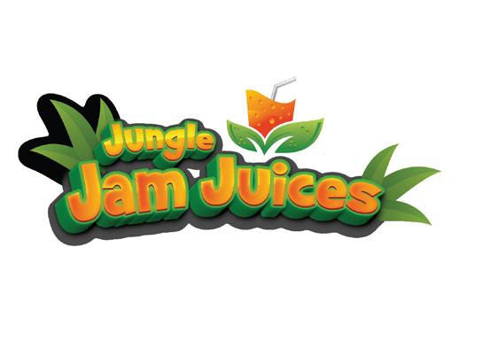
Jungle Jam Juices Brand Guidelines junglejamjuices.com Contents 1.0 The Brand Page 03 2.0 Logo Page 06 3.0 Colour Palette Page 12 4.0 Typography Page 17 5.0 Imagery Page 21 6.0 Application 7.0 Contact Page 23 Page 30
Jungle Jam Juices Brand Guidelines junglejamjuices.com The Brand 1.1 Brand Goal Page 04 1.0
Brand Goal
Jungle Jam Juices is an infused mix of juice and premium alcohol. Giving you that perfect mix of summer in a bottle. Locally made and packaged.
The goals for this brand are quite simple:
- Scale the brand to a wholesale level of production
- Make some arrangements with small restaurants who are legally allowed to sell & create partnerships with them.
- Create a pre ordering system that will drive demand from consumers.
- Long term if this brand does well then legally register it with intentions of selling in LCBO
For current competition I fair very well, there’s no small brands that are offering these mixes of drinks. The brands who are, is sticking with a very small selection of just rum punches. We’ve changed that by offering 5 different varieties of alcohol to choose from.
1.1: Brand Goal
Jungle Jam Juices Brand Guidelines junglejamjuices.com 2022 V1.0 / Page 41.0 / THE BRAND
Section
Jungle Jam Juices Brand Guidelines junglejamjuices.com 2.1 Primary Logo Page 06 2.2 Logo Clear Space Page 07 Logo2.0 2.3 Brand Stamp Page 08 2.4 Brand Stamp Clear Space Page 9 2.5 Logo Misuse Page 10
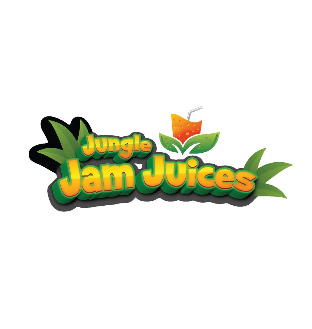
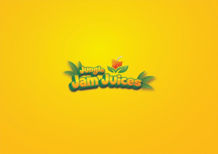
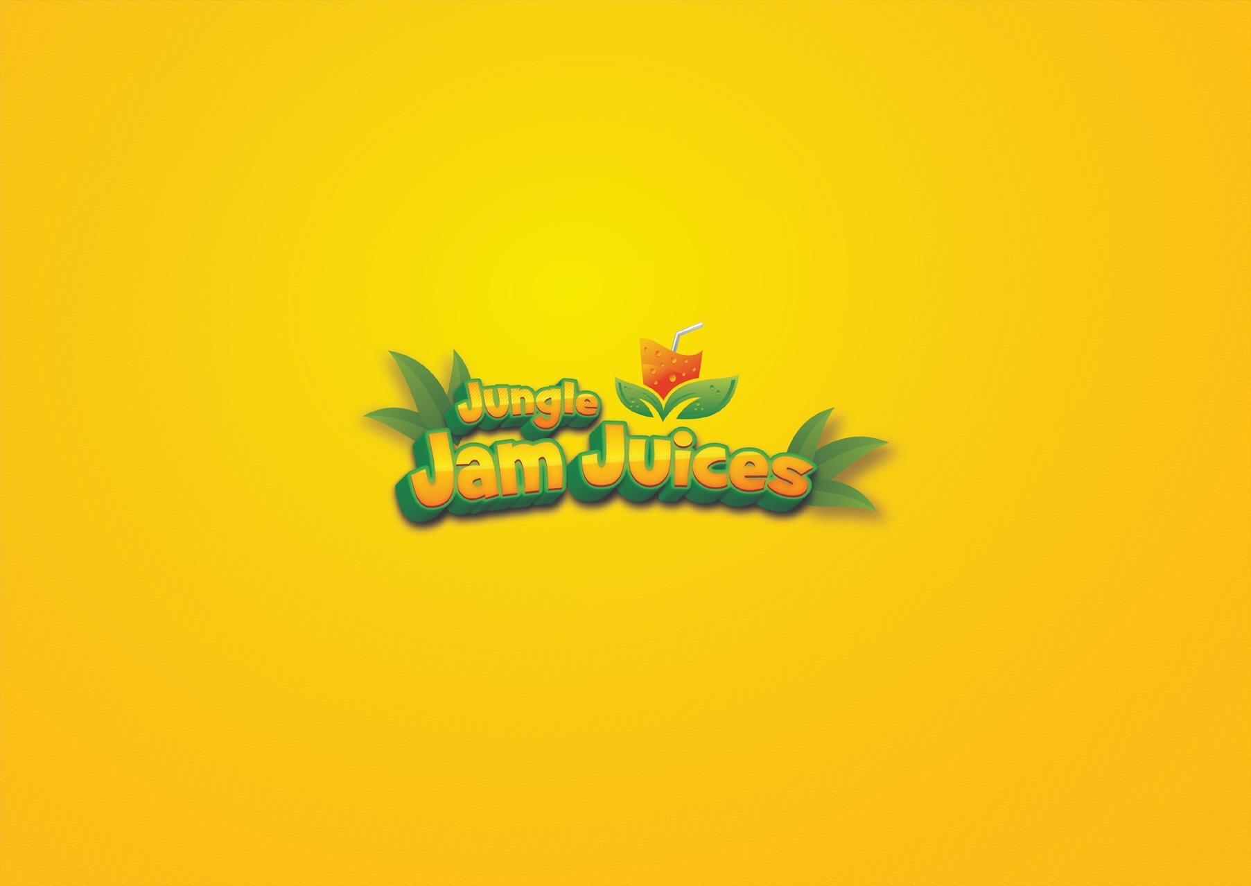
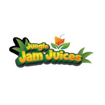
Primary Logo
This is the Primary Logo. The logo must be resized proportionately, never stretched. The Logo can be used in black on light backgrounds, or white on dark backgrounds, or in contrasting brand colours.
2.1: Primary Logo
Jungle Jam Juices Brand Guidelines junglejamjuices.com 2022 V1.0 / Page 6
Download Logos 2.0 / LOGO Section
Logo Clear Space
Logo Clear Space
Clear space is the area surrounding our logo that must be kept free of any text or graphic elements. By leaving space around the logo, we make sure it stands out on all our communications. The minimum clear space is 50% of the height of the entire logo.
It is sometimes necessary to increase and decrease the logo depending on the print area. Always keep in proportion. Always ensure the text is legible.
Jungle Jam Juices Brand Guidelines junglejamjuices.com 2022 V1.0 / Page 7
Download Logos 2.0 / LOGO Section 2.2:
25% of Logo Height 25% of Logo Height 25% of Logo Height 25% of Logo Height
Guidelines
2.0
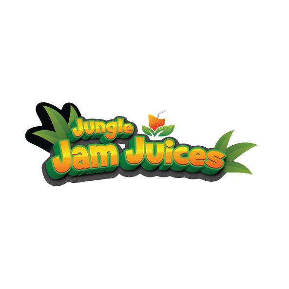
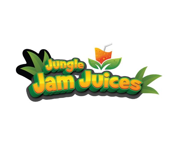
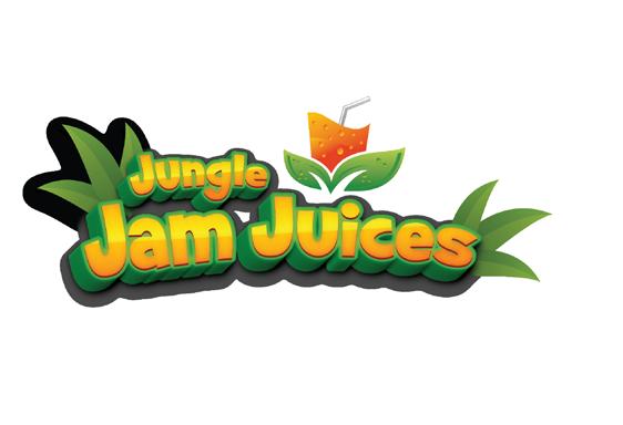
Brand Stamp
This is the Brand Stamp. Brand Stamp must be resized proportionately, never stretched. Brand Stamp can be used in black on light backgrounds, or white on dark backgrounds, or in contrasting brand colours.
Section 2.3: Brand Stamp
Jungle Jam Juices Brand
junglejamjuices.com 2022 V1.0 / Page 8
Download Logos
/ LOGO
Brand Stamp Clear Space
Clear space is the area surrounding our brand stamp that must be kept free of any text or graphic elements. By leaving space around the logo, we make sure it stands out on all our communications.
The minimum clear space is 50% of the height of the entire graphic element.
It is sometimes necessary to increase and decrease the element depending on the print area.
Always keep in proportion. Always ensure the text is legible.
2.4: Brand Stamp Clear Space
Jungle Jam Juices Brand Guidelines junglejamjuices.com 2022 V1.0 / Page 9
Download Logos 2.0 / LOGO Section
50% of Stamp Height
Logo Misuse


Any changes to our logo diminish its integrity and the equity of our brand. The examples shown here are some specific “do nots” for our logo.
Section 2.5: Logo Misuse
Do not alter the logo’s colours in anyway
Do not place the logo in a holding shape
Do not lock-up text to the logo
Do not add elements or shadows to the logo
Do not rotate the logo
Do not alter the logo’s shape in anyway
Do not outline the logo
Do not change the relationship of the logo’s components
Jungle Jam Juices Brand Guidelines junglejamjuices.com 2022 V1.0 / Page 102.0 / LOGO
Download Logos
Jungle Jam Juices Brand Guidelines junglejamjuices.com Page 12 Page 13 Colour Palette3.0 Page 14 3.1 Brand Colours 3.2 Hero Colour 3.3 Colour Hierarchy 3.4 Colour Tints Page 15
PALETTE
Brand Colours
Section 3.1: Brand Colours
Our brand is underpinned with a colour palette designed to be fresh, modern and distinctive. Different combinations of these colours can dramatically change the tone and appearance of our brand so it is important to consider how they work together. Keeping colour consistent is a vital element to our branding. Colour is the way we differentiate and identify our brand in a crowded marketplace. To help achieve greater brand recognition it is important that our colour palette is applied accurately and consistently.
Print
Pantone colours are used to print the designs, rather than CMYK. Pantone colours will provide the maximum amount of consistency. In instances where this is not possible we have created optimised CMYK values.
Screens
Not all RGB colours render the same online. Therefore we recommend the use of hexadecimal colours when applying colours to screen.
May Green
Orange CinnabarAureolin
Arnold Green
Jungle Jam Juices Brand Guidelines junglejamjuices.com 2022 V1.0 / Page 12
3.0 / COLOUR
Pantone P 179-16 C CMYK 61 / 0 / 53 / 42 RGB 56 / 147 / 68 HEX #389344 Pantone 18-025 TPG CMYK 0 / 79 / 100 / 0 RGB 241 / 92 / 34 HEX #F15C22 Pantone 11-4800 TCX CMYK 0 / 72 / 83 / 10 RGB 229 / 63 / 38 HEX #E53F26 Pantone P 1-1 C CMYK 0 / 4 / 82 / 2 RGB 248 / 236 / 43 HEX #F8EC2B Pantone P 17-1 C CMYK 12 / 0 / 65 / 19 RGB 180 / 206 / 72 HEX #B4CE48
International
Hero Colour
International Orange is our hero colour. Keeping colour consistent is a vital element to our branding. Colour is the way we differentiate and identify our brand in a crowded marketplace.
To help achieve greater brand recognition it is important that our colour palette is applied accurately and consistently. The correct colour values are specified below. Make sure to use them.
Jungle Jam Juices Brand Guidelines junglejamjuices.com
2020 V1.0 / Page 133.0 / COLOUR PALETTE Section 3.2: Hero Colour RGB R241 G92 B34
CMYK C0 M79 Y100 K0 PANTONE® 18-0317 TPG International Orange
3.0
PALETTE
Colour Hierarchy
A colour hierarchy has been implemented, ranging from International Orange, May Green and Aureolin. International Orange is used for conveying importance. Whilst Aureolin is mainly used for background washes.
International orange
PMS 18-0317 TPG
CMYK 0 / 79 / 100 / 0
RGB 241 / 92 / 34
HEX #EB6923
May Green
PMS P179-16 C
CMYK 61 / 0 / 53 / 42
RGB 56 / 147 / 68
HEX #389344
Aureolin
PMS 11-4800 TCX
CMYK 0 / 4 / 82 / 2
RGB 248 / 236 / 43
HEX #F8EC2B
Section 3.3: Colour Hierarchy
Jungle Jam Juices Brand Guidelines junglejamjuices.com 2022 V1.0 / Page 14
/ COLOUR
Colour Tints
If there is an occasion when you need to create contrast without adding extra colours, you can use incremental tints. Our tints are to be applied in increments of 20%. From 80%, 60%, 40% and 20%. Avoid using any other tints.
International Orange
PMS 18-0317 TPG
CMYK 0 / 79 / 100 / 0
RGB 241 / 92 / 34
HEX #EB6923
May Green
PMS P179-16 C
CMYK 61 / 0 / 53 / 42
RGB 56 / 147 / 68
HEX #389344
Aureolin
PMS 11-4800 TCX
CMYK 0 / 4 / 82 / 2
RGB 248 / 236 / 43
HEX #F8EC2B
3.4: Colour Tints
100%
60% 40% 20%
Jungle Jam Juices Brand Guidelines junglejamjuices.com 2022 V1.0 / Page 15
80%
3.0 / COLOUR PALETTE Section
100%
Jungle Jam Juices Brand Guidelines junglejamjuices.com 2022 V1.0 / Page 16 5 Colours
80% 60% 40% 20% 3.0 / COLOUR PALETTE Section 3.4: Colour Tints
Jungle Jam Juices Brand Guidelines junglejamjuices.com 4.1 Primary Typeface Page 18 4.2 Secondary Typeface Page 19 Typography4.0 4.3 Use of Type Page 20
Ariel bold is our primary brand typeface. Our typography is as unique and elegant as we are. Typography is a key element in our brand. It works to maintain consistency, create clarity and provide equity to our brand. It is important to adhere to the typographic hierarchy specified in this document to help achieve brand consistency.
Jungle Jam Juices Brand Guidelines junglejamjuices.com ABCDEFGHIJKLMN OPQRSTVWXYZ abcdefghijklmn opqrstuvwxyz 1234567890 !@#$%^&*()+Aa Primary Typeface
Download Fonts Ariel Bold 4.0 / TYPOGRAPHY Section 4.1: Primary Typeface 2020 V1.0 / Page 18
Secondary Typeface
Helvetica is our secondary corporate typeface, it should be used in all instances where typography is required. It is a simple, clean and legible typeface that compliments our logo. We use three weights of Helvetica. Regular, Medium and Bold. Poppins and Roboto can be used as a substitute for Helvetica on digital applications such as websites and email. It is important to adhere to the leading and tracking arrangements specified in this document to help achieve brand consistency throughout.
Jungle Jam Juices Brand Guidelines junglejamjuices.com 2022 V1.0 / Page 19
ABCDEFGHIJKLMN OPQRSTUVWXYZ àáâãäåabcdefghijklm nopqrstuvwxyz 1234567890 !@#$%^&*()+ AaDownload Fonts Helvetica 4.0 / TYPOGRAPHY Section 4.2: Secondary Typeface
Use of Type
One of the most important techniques for effectively communicating content is the use of typographic hierarchy. Typographic hierarchy is a system for organizing type that establishes an order of importance within the data, allowing the reader to easily find what they are looking for and navigate the content. It helps guide the reader’s eye to where a section begins and ends, whilst enabling the user to isolate certain information based on the consistent use of style throughout a body of text. It is important to maintain these type pairings. This allows for clarity, consistency and a strong hierarchy for all communications.
Headings & Pull Quotes
Helvetica Medium is to be used for all headings and pull quotes.
Subheadings
Helvetica Medium is to be used for subheadings.
Body Copy & Captions
Helvetica Regular is to be used for body copy and captions and when a more delicate font is required.
Buttons & CTA’s
Helvetica Medium is to be used for all buttons and call to actions.
Section 4.3: Use of Type
Subheading Font
Heading Font
Helvetica Regular is to be used for body copy. Cookie dessert chocolate gummi bears oat pie donut chocolate bar macaroon muffin. Marzipan jujubes danish oat cake wafer oat cake pie chocolate bar gummies.
Heading Font
Helvetica Regular is to be used for body copy. Cookie dessert chocolate gummi bears oat pie donut chocolate bar macaroon muffin. Marzipan jujubes danish oat cake wafer oat cake pie chocolate bar gummies.
Button Font
Subheading Font
Heading Font
Helvetica Regular is to be used for body copy. Cookie dessert chocolate gummi bears oat pie donut chocolate bar macaroon muffin. Marzipan jujubes danish oat danish cake wafer macaroon muffin oat cake pie.
“Ariel bold is to be used for pull quotes.”
Jungle Jam Juices Brand Guidelines junglejamjuices.com 2022 V1.0 / Page 20
4.0 / TYPOGRAPHY
Jungle Jam Juices Brand Guidelines junglejamjuices.com Imagery5.0 5.1 Image Direction Page 22
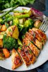
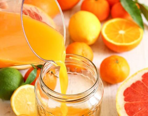
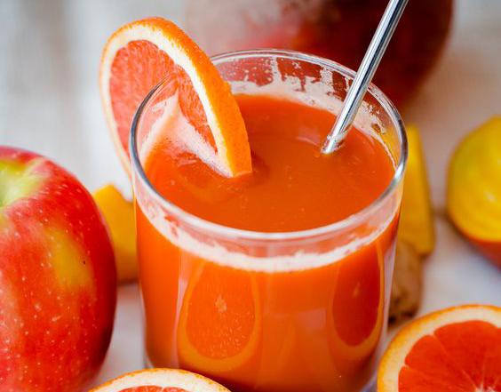
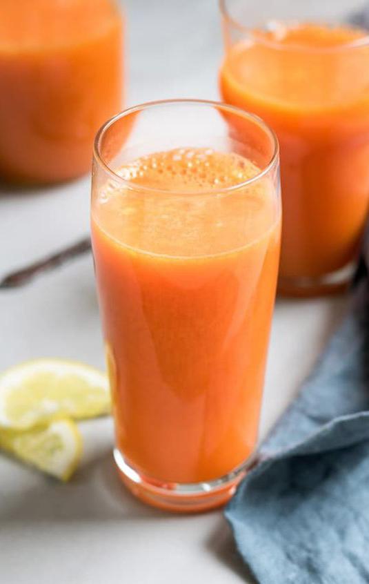
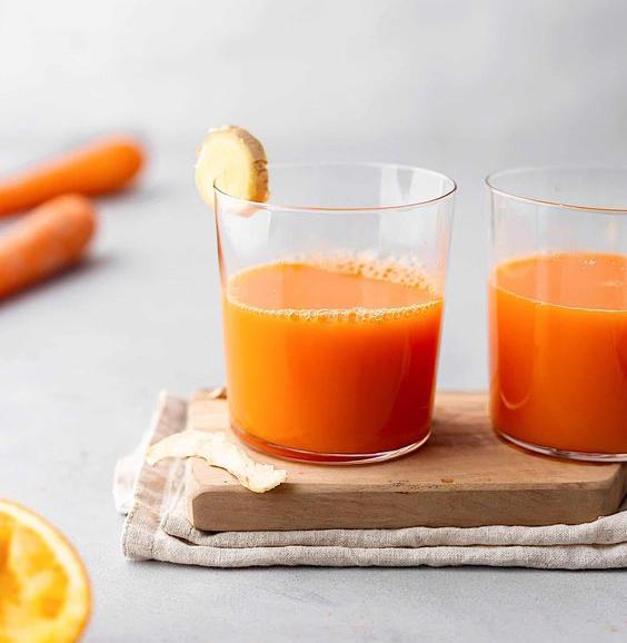
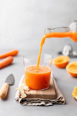
Image Direction
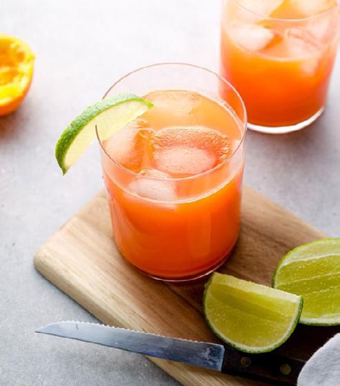
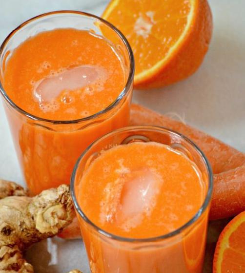
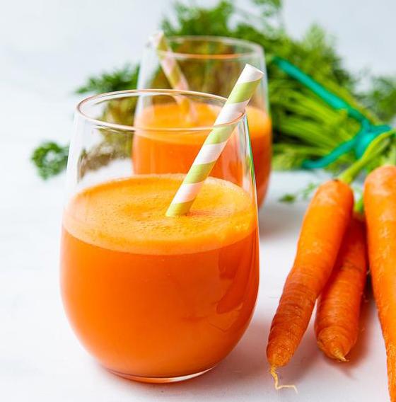
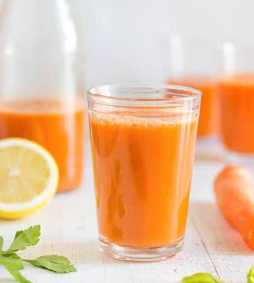
All imagery should always consist of golden based tones, with a warm and natural feel to them. Photographs must embody the brand through connection with the brand keywords.
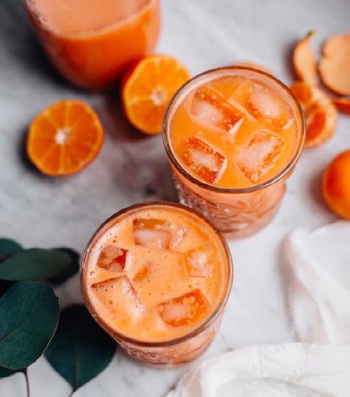
Section 5.1: Image Direction
Jungle Jam Juices Brand Guidelines junglejamjuices.com 2022 V1.0 / Page 22
5.0 / IMAGERY
Download Images
Jungle Jam Juices Brand Guidelines junglejamjuices.com Application6.0 6.1 Digital Application Page 24 6.2 Stationery Page 27 6.3 Icons Page 28
/ APPLICATION
Digital Application
This is an example of how our branding would be best applied to maintain consistency of look and feel on digital applications.
Section 6.1: Digital Application
Jungle Jam Juices Brand Guidelines junglejamjuices.com 2022 V1.0 / Page 24
6.0
/ APPLICATION
Digital Application

This is an example of how our branding would be best applied to maintain consistency of look and feel on digital applications.
Section 6.1: Digital Application

Jungle Jam Juices Brand Guidelines junglejamjuices.com 2022 V1.0 / Page 25
6.0
Digital Application
This is an example of how our branding would be best applied to maintain consistency of look and feel on digital applications.
Jungle Jam Juices Brand Guidelines junglejamjuices.com
6.0 / APPLICATION Section 6.1: Digital Application 2020 V1.0 / Page 26


Jungle Jam Juices Brand Guidelines junglejamjuices.com DL Envelope Jungle Jam Juices Level 2 123 Address St Canada Jungle Jam Juices Level 2 123 Address St Canada T +61 3 1234 5678 F +61 3 1234 5679 E hello@website.com junglejamjuices.com Letterhead Large Envelope Jungle Jam Juices Level 2 123 Address St Canada Business Card Cassandra Jones Administration & Operations Manager Email @ firstname.surname junglejamjuices.com Tel Fax www +61 3 1234 5678 +61 3 1234 5679 junglejamjuices.com Stationery This is an example of how our branding would be best applied to maintain consistency of look and feel on stationery. 6.0 / APPLICATION Section 6.2: Stationery
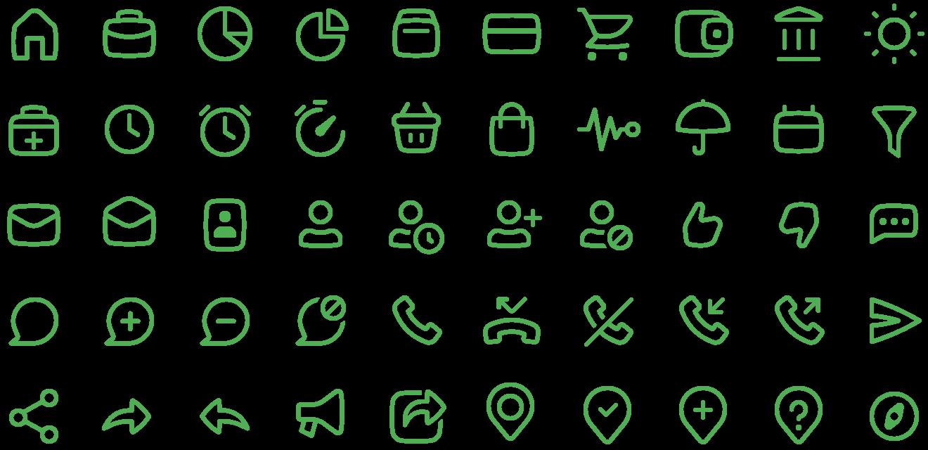
Icons
This is an example of how our branding icons should be used to maintain consistency of look and feel.
Section 6.3: Icons
Jungle Jam Juices Brand Guidelines junglejamjuices.com 2022 V1.0 / Page 28
6.0 / APPLICATION
a
Jungle Jam Juices Brand Guidelines junglejamjuices.com 98b Chapel St, Ottawah Canada Giving you that perfect mix of summer in
bottle, locally made and packaged 7.0 / CONTACT hello@junglejamjuices.com 2020 V1.0 / Page 29
