Summer Olympics Los Angeles 2028 DESIGN GUIDELINES
Maya Mircheva
Design Rationale
The design is inspired by the diverse, multicultural and colourful culture of Los Angeles as well as its positivity and optimism. The design aims to transmit the vibrant spirit of the city and the official games’ moto “Follow the Sun”.
The visual identity takes inspiration from the city’s iconic street art and in particular the graphic artist Teddy Kelly, whose works is characterised by bright coloures and geometric shapes, converging the many cultural influences of the area.
The design is intended to be simple yet iconic and instantly recognisable and appeal to a local as well as national and international audience.
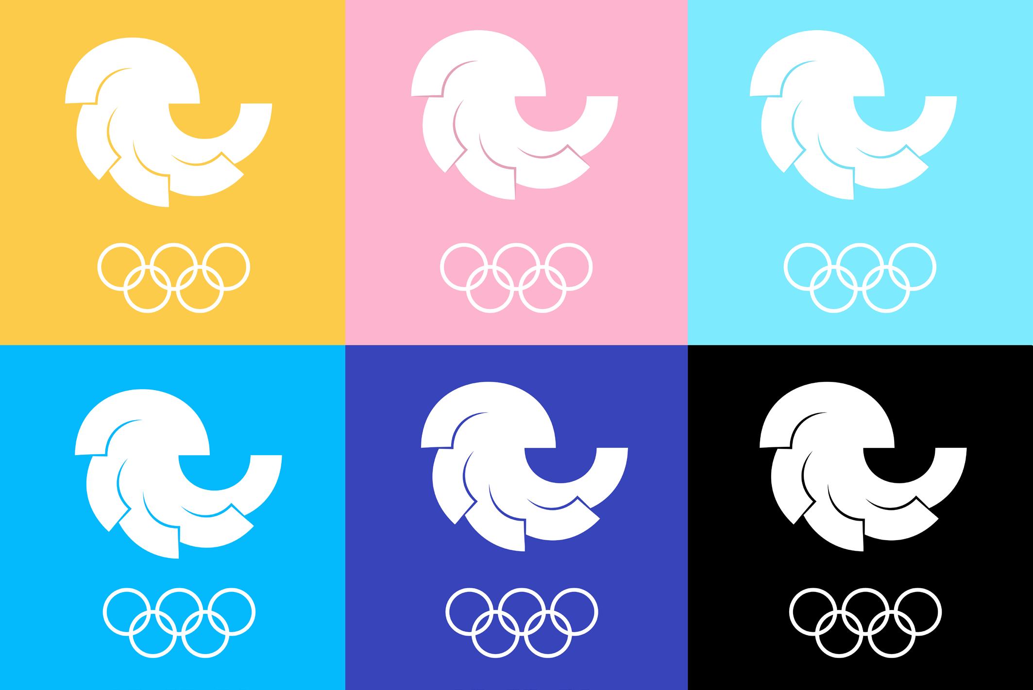
The logo is made up of five half circles, echoing the five Olympic rings. The circles are in different colours inspired by street art but also representing the sun and the ocean, which are the hallmark of Los Angeles. The arches
partially overlap. The gesture implicit in the design, a sweep from left to right, evokes the movement of olympic athletes. The circular motion also creates a spiral shape which is a symbol of harmony and is a commonly occuring shape in nature.
Logo Mark
Logo Variations
The logo is designed to work together with the five Olympic rings creating a harmonic whole thanks to the repetition of circular shapes. It could be used in either black or white against different coloured backgrounds.
Colour Palette
Graphic guidelines Los Angeles Olympic Games 2028
The colour palette includes five colours plus black and white. The colours are inspired by Los Angleles street art, in particular the work of the graphic artist Teddy Kelly who has created several of Los Angeles’ colourful murals.
The colours are also youthful and positive. The blue and the yellow symbolise the ocean and the sun while the pink is playful and bohemian. The colours can be used either opaque or semi-transparent.
#3844B9
#FDB4CE
#FDCB4A #000000
#04BAFD
#7DEAFD
Typography
Gilroy Heavy Gilroy ExtraBold Gilroy Light Barlow Regular
The brand typeface is Gilroy by the Bulgarian type designer Radomir Tinkov, a clean and elegant geometric sans serif with very low contrast which makes it easily legible and ideal for very large sized text. The font used in the logotype
is Gilroy Heavy, also suitable for large headlines which have to be seen from afar (e.g. posters, billboards). Gilroy ExtraBold is intended for regular headlines and Gilroy Light for less important text or labels. Barlow Regular is used as a
font for longer paragraphs of text. Its high x-height and low contrast make it easily legible and its narrow width creates a degree of contrast to Gilroy.
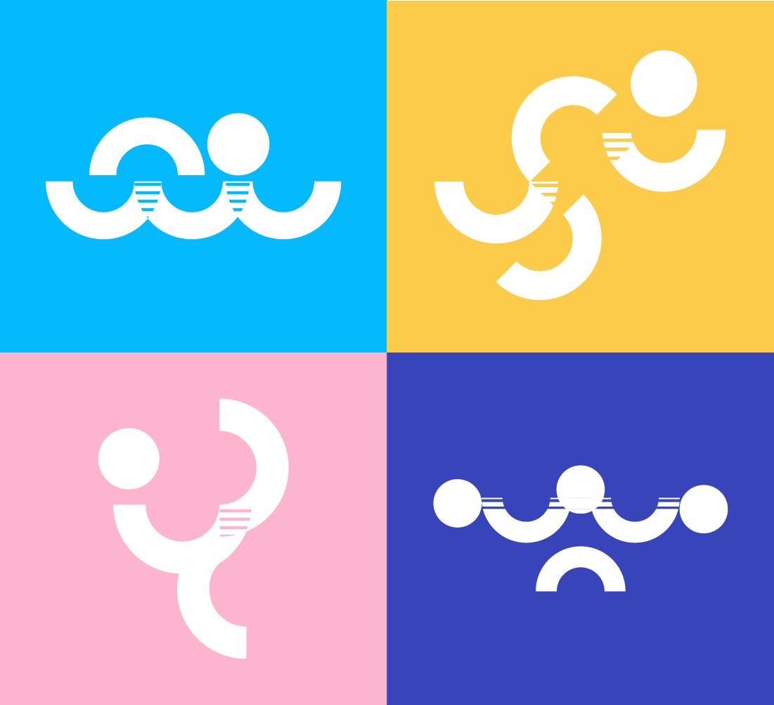
Pictograms
The pictograms use exclusively the same shapes as the logo, hence only circles and semi-circles. This poses a challenge when trying to represent certain sports poses but also aims to contribute to a cohesive visual language.
To help legibility and recognisability, the pictograms use the Gestalt principles, in particular symmetry and continuation. Areas of overlap between the shapes are indicated with lined texture.
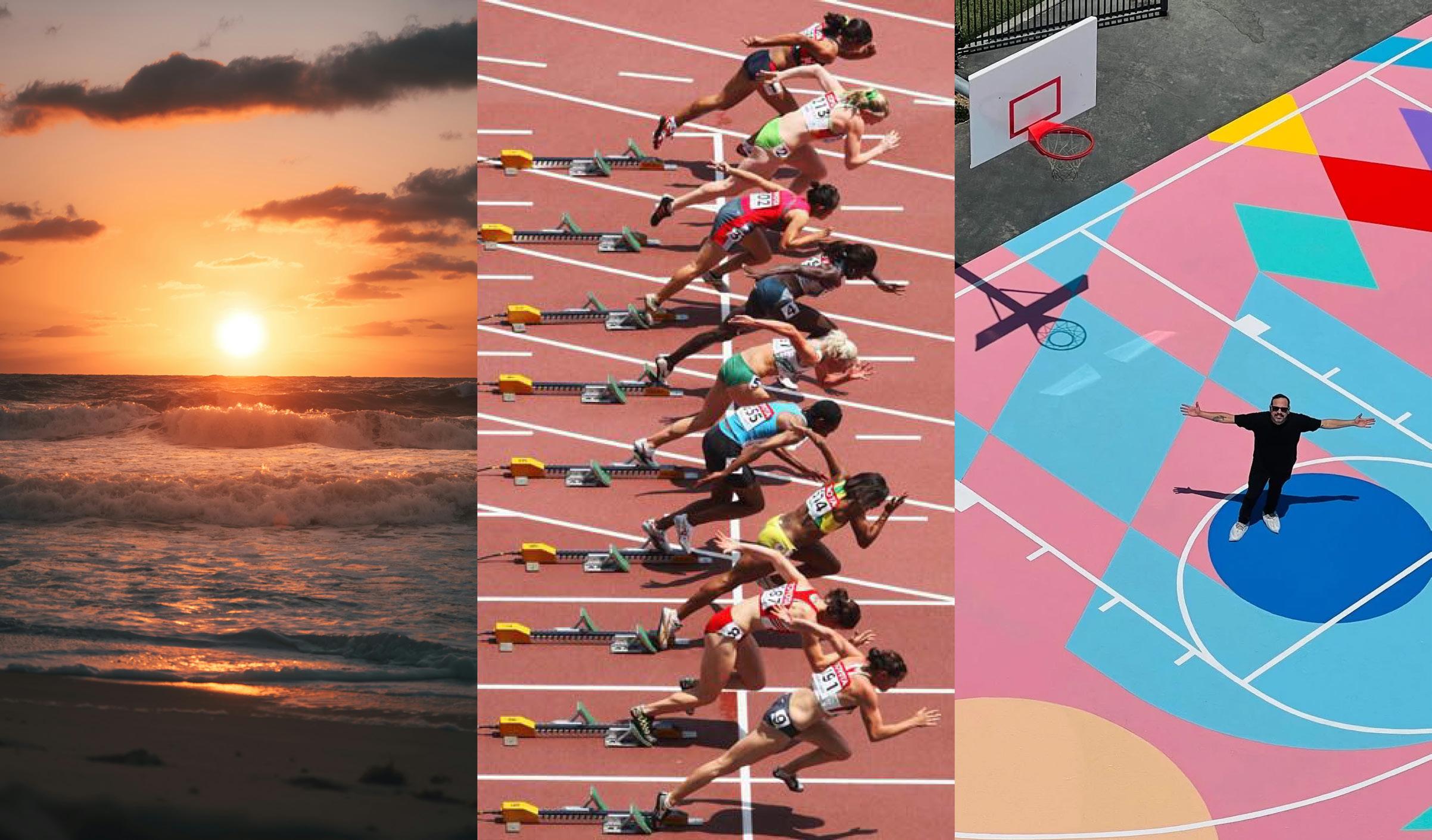
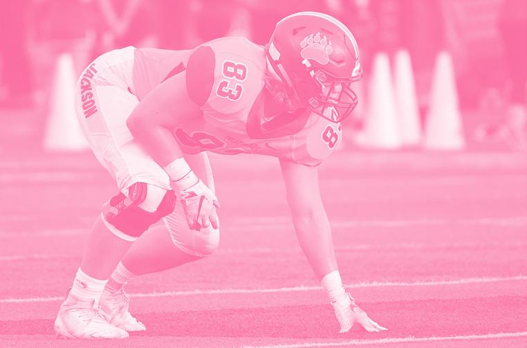
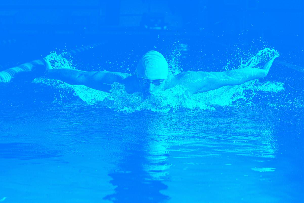
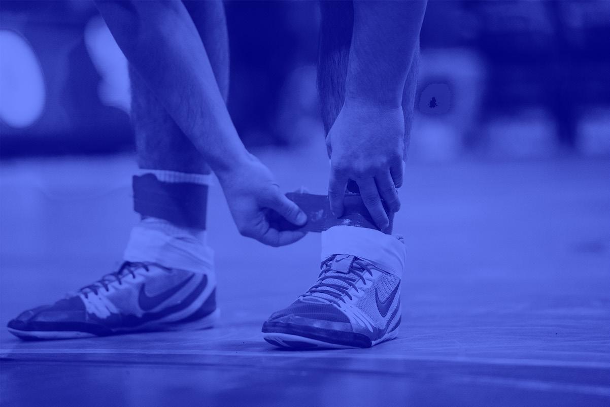
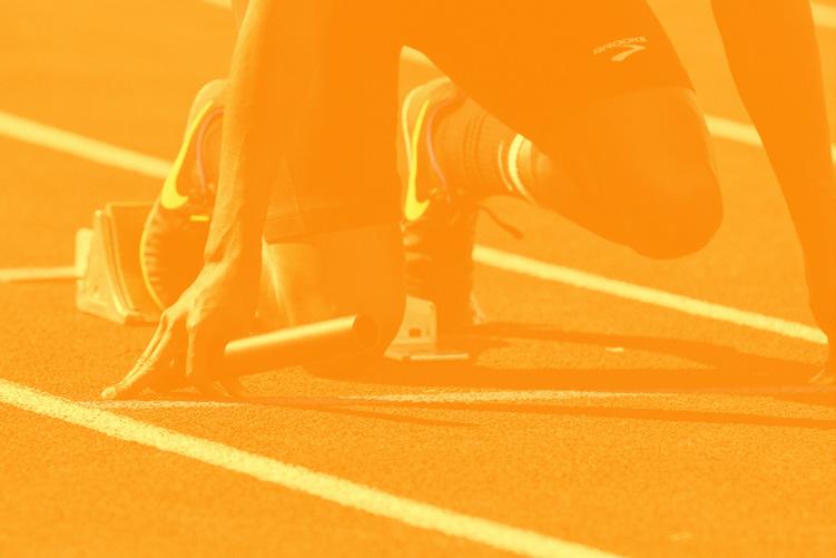
Brand Imagery
The brand imagery uses high quality photographs of athletes representing the Olympic disciplines from the Unsplash database, desaturated and with a colour overlay applied in one of the brand colours.
The images can be used in all communication channels, both print and digital.
Applications / Print
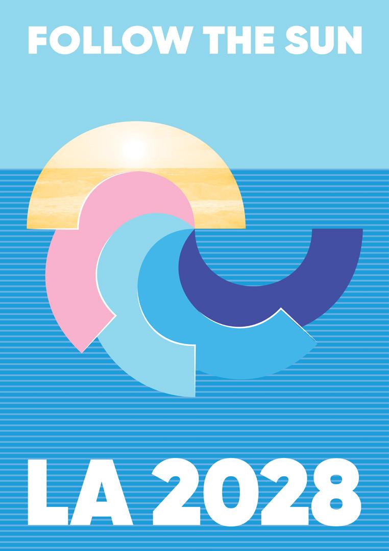
The official poster for the 2028 Summer Olympics includes the moto “Follow the Sun”, the words “LA 2028” and the Olympics logo masking an image of a California sunset. The background is light blue with a striped pattern.
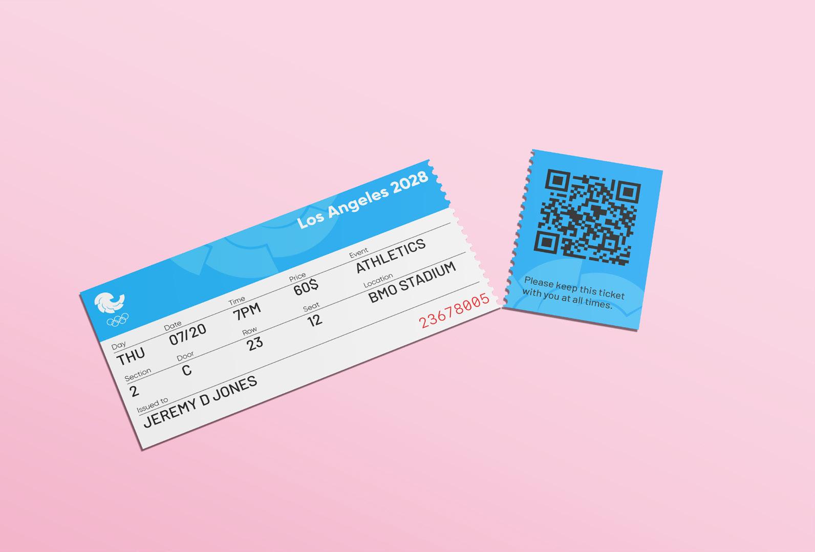
The official tickets for the sports events include a stripe in the brand blue colour with a pattern based on the logo in white with 25% transparency. The same pattern is applied to the detachable part of the ticket in blue colour.
The fonts used are Gilroy ExtraBold, Gilroy Light and Barlow Regular.
Applications / On site
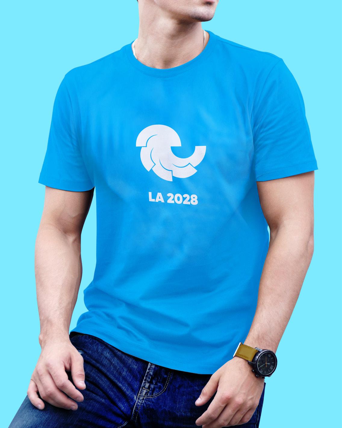
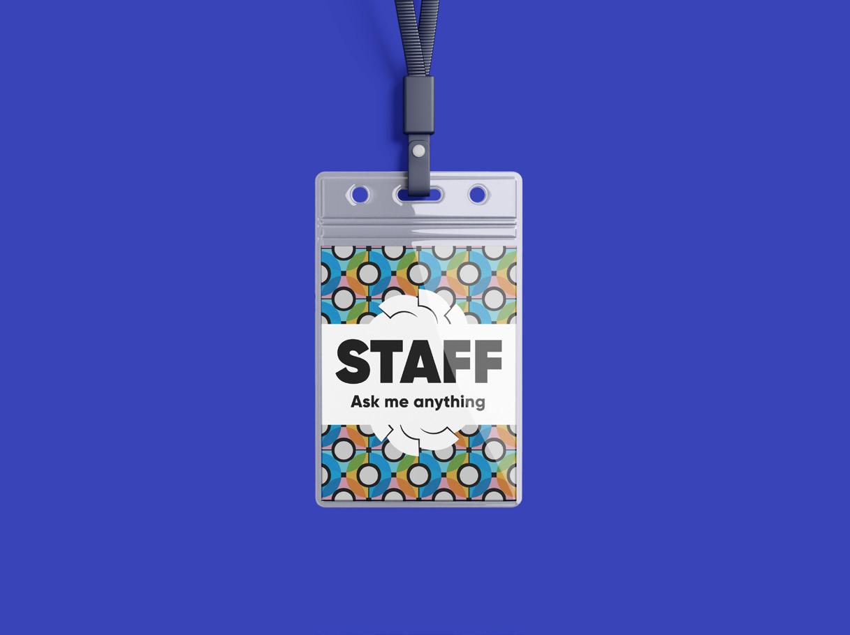
Volunteers working on site and helping visitors with orientation need to be clearly recognisable. Therefore, as a part of the graphic assets there are T-Shirts for volunteers with the official logo and staff badges.
The background of the badge is a geometric pattern made of overlapping semi-circles in the brand colours at 80% transparency against black, as well as elements of the logo. The fonts used are Gilroy Heavy and Gilroy ExtraBold.
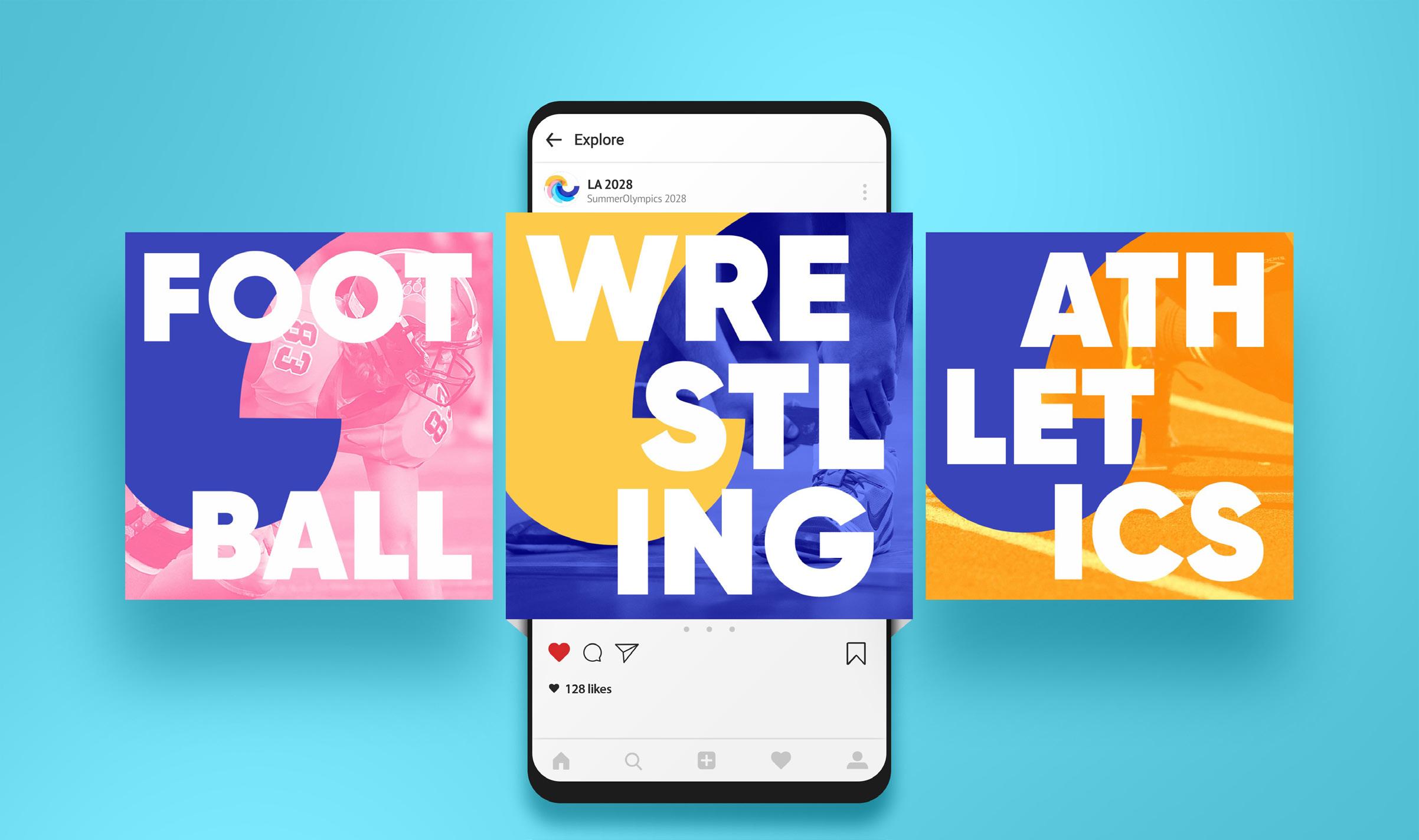
Applications / Digital
The promotional campaign on Instagram includes a series of posts with all the disciplines in the Olympic programme. The posts use the brand imagery masked by an element of the logo . The names of the different disciplines are
written in very large letters. The font used is Gilroy Heavy. Blending and overlay effects integrate the typography with the background images.