Som Tum Jinda Content Audit
Matthew Jin

Matthew Jin
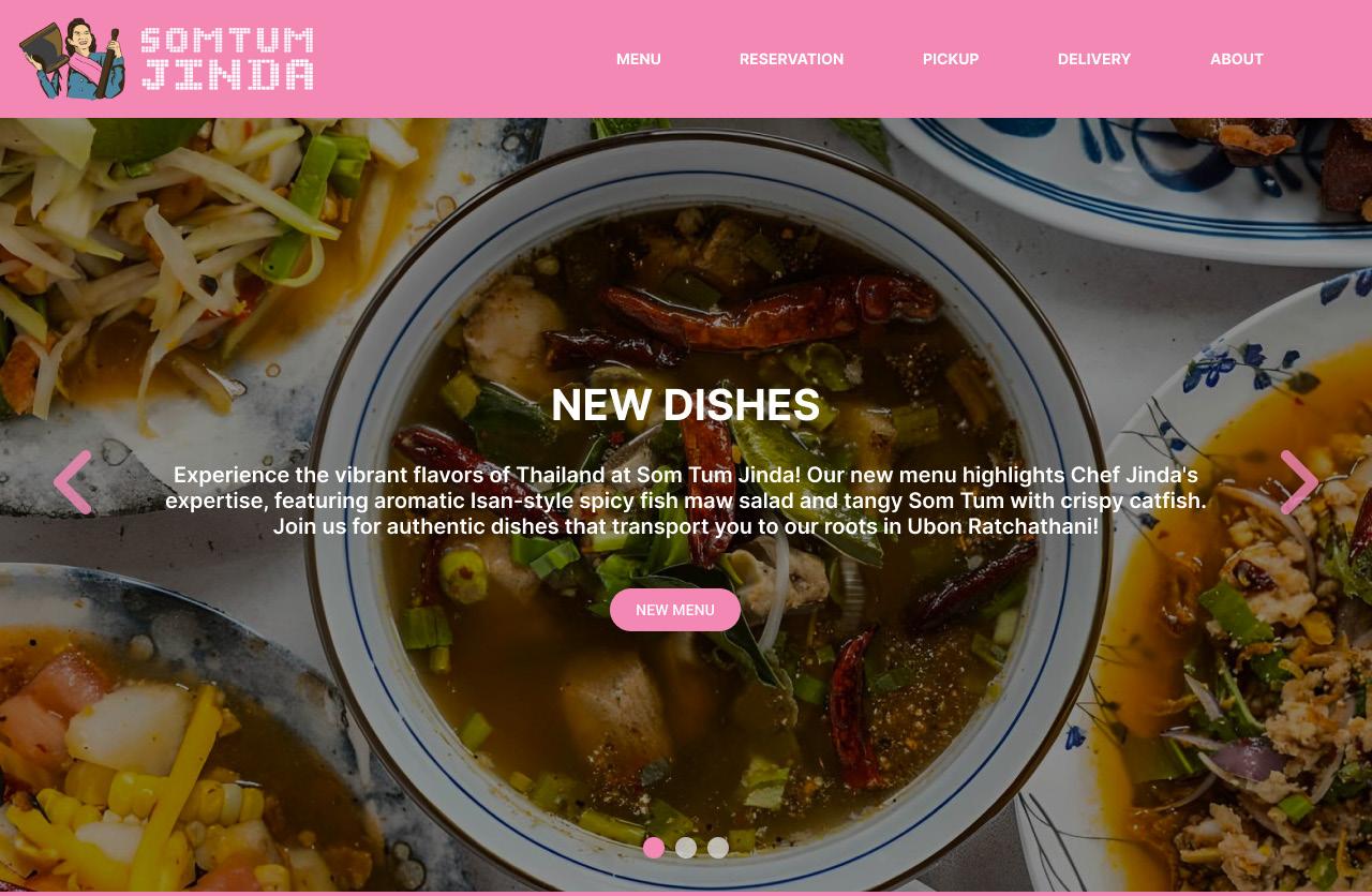
This is a content audit report on Michelin Star restaurant Som Tum Jinda’s website, located in downtown Toronto. The website’s goals are to display the restaurant’s menu to its current or potential customers, as well as display its description as well as upcoming and new dishes. It also provides the option to order delivery or pickup, as well as reservations. The site holds important information such as the restaurant’s contact and location, as well as all of its awards and accolades. This website also serves as the restaurant’s QR code menu, which customers scan to be taken to the menu page. The site itself is created using WordPress, and has a dark background partnered with white text. Its functionality is simple, with clear buttons leading to the menu, order, and reservation screens. The pick up, delivery, and reservation screens are handled by third party sites: Clover, Uber Eats, and OpenTable, respectively. This website was designed with a focus on efficiency, prioritizing functionality over aesthetics, usability, and readability to simply get the job done. This leads it to lack many features that are commonly found in well designed websites. Important features such as a navigation bar, back arrows, and other SEO functions are missing within the website’s structure, leading to many missed opportunities and possible pain points in usage. This report seeks to identify those issues, discuss why they are important, and propose solutions that can help improve the website’s customer experience as well as its search visibility.
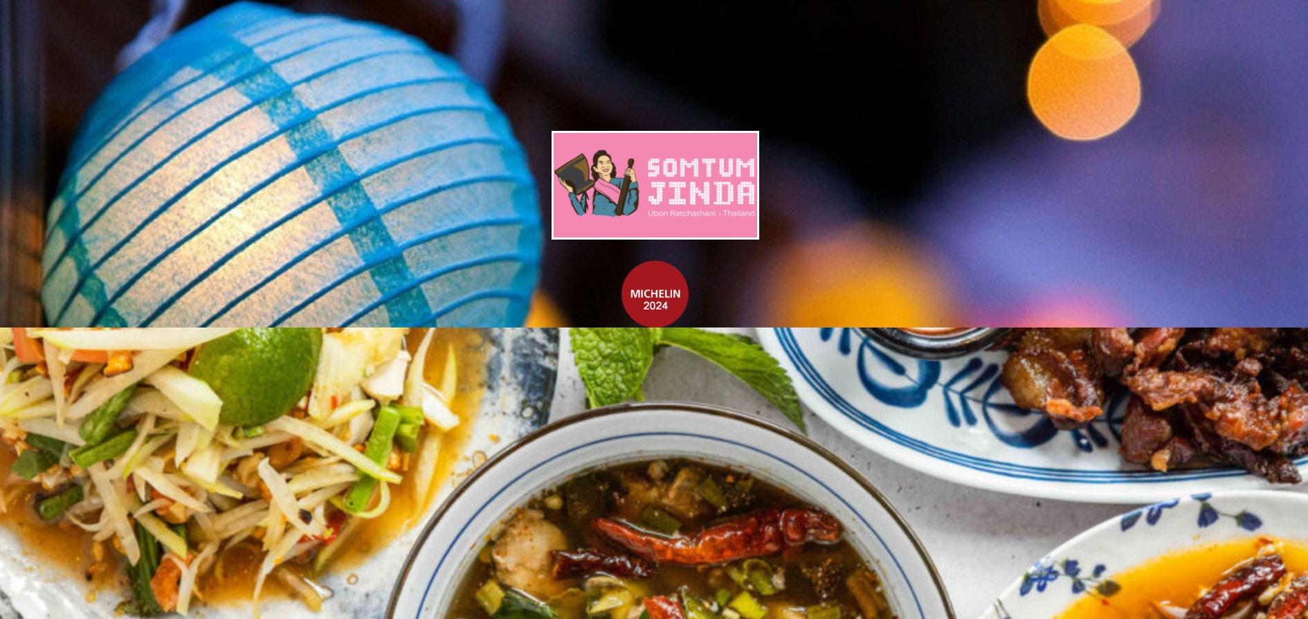
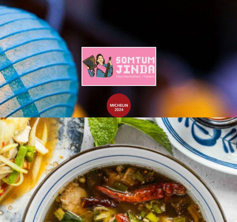
Image of the website’s hero page.
The site itself is not catered towards search engine optimization. The largest issue being that it lacks any meta description at all. Meta descriptions are especially important for a restaurant because they can highlight key details like the cuisine, location, and special offerings, enticing potential customers to visit, while also improving the restaurant’s search visibility in a highly competitive local market. As shown in the snippet of the inventory report, the site lacks any meta description at all. Additionally, the site’s main menu pages have titles under 30 characters, meaning there can be room to target more keywords that searchers may be looking for. In the same sphere, there are also pages with low content, which creates room for more descriptions which can help customers and search engines better understand the page and content. When averaging the site’s word count across menu pages, it comes out to only 155.4 words. Considering most of these words are not even formulated into full sentence descriptions, there is much more room to flesh out these descriptions to not only help with customer understanding but also the search engine’s understanding of the site.
https://somtumjinda.ca/wp-content/plugins/clover-online-orders/public/js/magnific.min.js?ver=1.5.3
https://somtumjinda.ca/wp-content/plugins/clover-online-orders/public/js/mooModifiersSelector.min.js?ver=1.5.3
https://somtumjinda.ca/wp-content/uploads/2024/05/Screen-Shot-2024-05-09-at-11.19.32-AM-1024x342.png image/png Indexable
https://somtumjinda.ca/wp-content/plugins/clover-online-orders/public/css/font-awesome.css?ver=1.5.3 text/css
https://somtumjinda.ca/wp-content/plugins/clover-online-orders/public/css/moo-small-popup.css?ver=1.5.3
https://somtumjinda.ca/wp-content/plugins/clover-online-orders/public/js/jquery.images-rotation.min.js?ver=1.5.3
https://somtumjinda.ca/wp-includes/js/jquery/jquery.min.js?ver=3.6.4
https://somtumjinda.ca/wp-content/plugins/clover-online-orders/public/css/moo-modifiersPanel.min.css?ver=1.5.3
https://somtumjinda.ca/wp-content/plugins/clover-online-orders/public/css/sweetalert2.min.css?ver=1.5.3
https://somtumjinda.ca/wp-content/uploads/2023/06/STJD_4x1ft_Signage-1024x301.jpg
https://somtumjinda.ca/wp-content/plugins/clover-online-orders/public/css/magnific-popup.min.css?ver=1.5.3
https://somtumjinda.ca/wp-includes/css/classic-themes.min.css?ver=6.2.6
https://somtumjinda.ca/wp-content/plugins/clover-online-orders/public/js/sweetalert2.min.js?ver=1.5.3
https://somtumjinda.ca/cdn-cgi/scripts/5c5dd728/cloudflare-static/email-decode.min.js application/javascriptIndexable
https://somtumjinda.ca/wp-content/plugins/clover-online-orders/public/js/moo-OnlineOrders-public.js?ver=1.5.3
Indexable
https://somtumjinda.ca/wp-includes/js/jquery/jquery-migrate.min.js?ver=3.4.0
https://somtumjinda.ca/cdn-cgi/l/email-protection text/html; charset=UTF-8Non-Indexable Email
https://somtumjinda.ca/wp-content/plugins/clover-online-orders/public/css/icheck-skins/square/blue.min.css?ver=1.5.3 text/css Indexable
https://somtumjinda.ca/wp-content/themes/twentytwentyone/assets/css/print.css?ver=1.8 text/css Indexable
https://somtumjinda.ca/wp-content/themes/twentytwentyone/assets/js/responsive-embeds.js?ver=1.8
https://somtumjinda.ca/wp-content/uploads/2023/11/2560px-Toronto-Star-Logo.svg_-300x35.png
https://somtumjinda.ca/wp-content/uploads/2024/02/Screen-Shot-2024-02-19-at-10.03.58-AM.png image/png Indexable
https://somtumjinda.ca/wp-content/uploads/2023/06/STJD_47x24in_Signage-1-edited-300x154.jpg image/jpeg Indexable
https://somtumjinda.ca/wp-content/plugins/clover-online-orders/public/js/jquery.validate.min.js?ver=6.2.6
https://somtumjinda.ca/wp-content/plugins/clover-online-orders/public/js/cart_v3.js?ver=1.5.3
https://somtumjinda.ca/wp-content/plugins/clover-online-orders/public/css/moo-OnlineOrders-public.css?ver=1.5.3
https://somtumjinda.ca/wp-content/uploads/2023/11/Screen-Shot-2023-11-22-at-11.51.18-PM.png
https://somtumjinda.ca/wp-content/plugins/clover-online-orders/public/js/jquery.payment.min.js?ver=6.2.6
https://somtumjinda.ca/wp-content/plugins/clover-online-orders/public/css/grid12.min.css?ver=1.5.3
https://somtumjinda.ca/wp-content/uploads/2023/06/som_tum_jinda_hero-e1687312170291-1024x545.jpg
https://somtumjinda.ca/wp-content/plugins/clover-online-orders/public/js/moo-small-popup.js?ver=1.5.3
https://somtumjinda.ca/menu/ text/html; charset=UTF-8Indexable Menu – SOM TUM
https://somtumjinda.ca/wp-includes/css/dist/block-library/style.min.css?ver=6.2.6 text/css Indexable
https://somtumjinda.ca/wp-content/themes/twentytwentyone/style.css?ver=1.8 text/css
https://somtumjinda.ca/wp-content/uploads/2023/04/334871951_617751033526315_676083218585848942_n-768x1024.jpg
https://somtumjinda.ca/wp-content/plugins/clover-online-orders/public/js/bootstrap.min.js?ver=1.5.3 text/javascript
https://somtumjinda.ca/wp-content/uploads/2024/04/IMG_0867-1024x614.jpg image/jpeg Indexable
https://somtumjinda.ca/wp-content/uploads/2023/09/IMG_6141-1024x615.jpg
https://somtumjinda.ca/rice/ text/html; charset=UTF-8Indexable
text/html;
https://somtumjinda.ca/wp-content/uploads/2024/08/CocoNUT-ICE-CREAM-1-edited.png
https://somtumjinda.ca/grilled/ text/html; charset=UTF-8Indexable
https://somtumjinda.ca/yum/ text/html;
https://somtumjinda.ca/yum/ text/html; charset=UTF-8Indexable
https://somtumjinda.ca/wp-content/uploads/2024/08/CocoNUT-ICE-CREAM-edited-2.png
https://somtumjinda.ca/vegan/ text/html; charset=UTF-8Indexable
https://somtumjinda.ca/tum/ text/html;
https://somtumjinda.ca/tum/ text/html; charset=UTF-8Indexable
https://somtumjinda.ca/soup/ text/html;
https://somtumjinda.ca/cdn-cgi/styles/cf.errors.css text/css Indexable
https://somtumjinda.ca/sides/ text/html;
https://somtumjinda.ca/wp-content/uploads/2023/08/tummaejeab-scaled.jpg
https://somtumjinda.ca/drinks/ text/html;
https://somtumjinda.ca/wp-content/uploads/2023/11/IMG_7445-2-scaled.jpg
https://somtumjinda.ca/soup/ text/html; charset=UTF-8Indexable
https://somtumjinda.ca/sides/ text/html; charset=UTF-8Indexable
https://somtumjinda.ca/drinks/ text/html;
Image showing average word and sentence count between the site’s main menu pages.
https://somtumjinda.ca/wp-content/uploads/2023/08/tumpuunampla-scaled.jpg
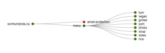
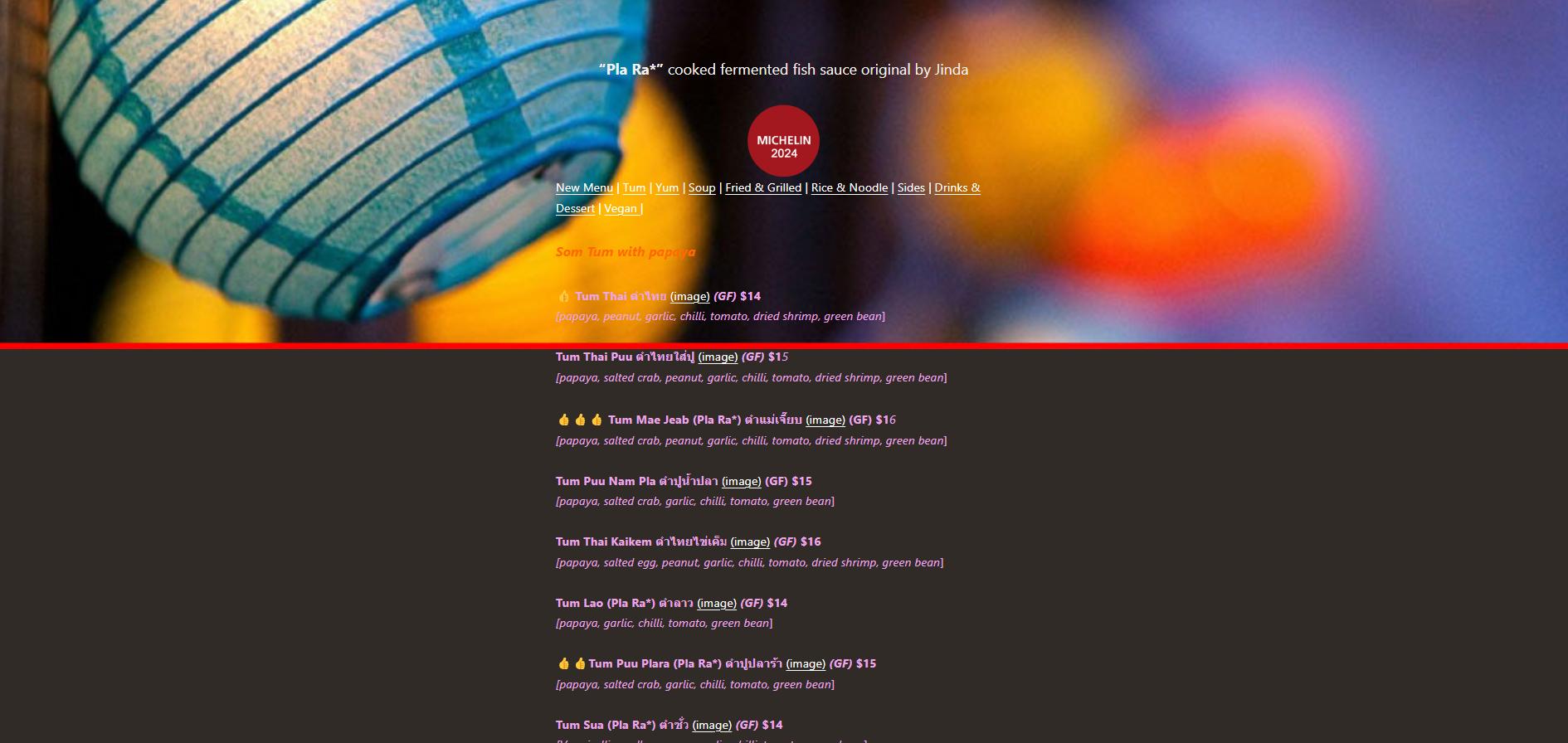
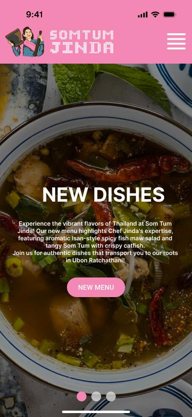
The site’s functionality performs its job adequately and clearly, but it fails to go an extra step for usability issues such as navigation. The site’s navigation is very linear with only one path leading to certain menu sections and items. For a menu site, having a linear path is a benefit in terms of simplicity, but combined with the other navigation issues with the site, it creates pain points by limiting user flexibility and making it harder to quickly access desired information. Other issues with the site, such as the lack of a navigation bar, the placement of the home button, lead to the navigation of the site to be very choppy. The user has to scroll all the way down in order to return to the menu and there are no back arrows to return to a previous page. As shown in the image, not only is the navigation options hidden at the bottom on of the page, the user is also limited to only two options. Now for a in-store user looking to order food this may be fine, but for a user looking to learn more about the restuarant and explore the site, it is not very helpful. General wayfinding tools such as a logo that leads you back to the home page are designs that have become a commonality in any website, making it something that the user is used to. These functions are all necessary to creating a menu site that can function well.
Image of site on mobile device, highlighting the limited and inconvenient navigation options. Image showing the site’s linear crawl tree.
The site also includes many content issues which can slow the site’s loading times. Serving primarily as a menu, the site is made up of a majority of images. On its own that would be fine, but many of these images are large files over 100KB. The images on the site have an average of 553168.8571 bytes (553.1688571 KB). The worst example of this would be the website’s hero image, which takes up the entirety of the window when entering the site. Ignoring the aesthetic issues this causes, it also can slow down the site’s load time right as a user enters the site. Other content issues also overlap with the site’s SEO issues. Many of the pages are below 200 characters, and this is especially important for menu pages, as offering customers a full description of the dish is important. Not only will filling out the page help with general customer satisfaction and understanding, it will also improve the site’s SEO.
https://somtumjinda.ca/wp-content/uploads/2023/06/IMG_2904-scaled.jpg image/jpeg 710473
https://somtumjinda.ca/wp-content/uploads/2023/06/IMG_2917-scaled.jpg image/jpeg 576025
https://somtumjinda.ca/wp-content/uploads/2024/04/IMG_1083-2-scaled.jpg image/jpeg 904159
https://somtumjinda.ca/wp-content/uploads/2023/07/IMG_3621-scaled.jpg image/jpeg 528217
https://somtumjinda.ca/wp-content/uploads/2023/06/IMG_2893-scaled.jpg image/jpeg 565532
https://somtumjinda.ca/wp-content/uploads/2023/06/IMG_3177-scaled.jpg image/jpeg 687431
https://somtumjinda.ca/wp-content/uploads/2023/06/IMG_2870-scaled.jpg image/jpeg 458568
https://somtumjinda.ca/wp-content/uploads/2023/06/IMG_3415-scaled.jpg image/jpeg 721646
https://somtumjinda.ca/wp-content/uploads/2023/06/IMG_3210-scaled.jpg image/jpeg 634840
https://somtumjinda.ca/wp-content/uploads/2023/06/IMG_3187-scaled.jpg image/jpeg
https://somtumjinda.ca/wp-content/uploads/2023/06/IMG_3387-scaled.jpg image/jpeg
https://somtumjinda.ca/wp-content/uploads/2023/06/IMG_3501-scaled.jpg image/jpeg 742897
https://somtumjinda.ca/wp-content/uploads/2023/06/IMG_2880-scaled.jpg image/jpeg 607675
https://somtumjinda.ca/wp-content/uploads/2023/06/IMG_3154-scaled.jpg image/jpeg 678575
https://somtumjinda.ca/wp-content/uploads/2023/06/IMG_3385-scaled.jpg image/jpeg 739635
https://somtumjinda.ca/wp-content/uploads/2023/07/IMG_4714-2048x1229.jpg image/jpeg 523418
https://somtumjinda.ca/wp-content/uploads/2023/06/IMG_3150-scaled.jpg image/jpeg 491711
https://somtumjinda.ca/wp-content/uploads/2023/06/IMG_2907-scaled.jpg image/jpeg 652758
https://somtumjinda.ca/wp-content/uploads/2023/08/IMG_5116.jpg image/jpeg 324845
https://somtumjinda.ca/wp-content/uploads/2023/06/IMG_3449-scaled.jpg image/jpeg 539772
https://somtumjinda.ca/wp-content/uploads/2023/06/IMG_3383-scaled.jpg image/jpeg 796301
https://somtumjinda.ca/wp-content/uploads/2023/06/IMG_3421-scaled.jpg image/jpeg 529238
https://somtumjinda.ca/wp-content/uploads/2023/06/IMG_3487-scaled.jpg image/jpeg
https://somtumjinda.ca/wp-content/uploads/2023/06/IMG_3378-scaled.jpg image/jpeg
https://somtumjinda.ca/wp-content/uploads/2023/06/IMG_4046-2-scaled.jpg image/jpeg 667056
553168.8571 Address
https://somtumjinda.ca/text/html; charset=UTF-8Indexable
https://somtumjinda.ca/menu/ text/html; charset=UTF-8Indexable
Image showing average byte size of the images on the site.
https://somtumjinda.ca/rice/ text/html; charset=UTF-8Indexable Rice & Noodle – SOM TUM JINDA 154
https://somtumjinda.ca/grilled/ text/html; charset=UTF-8Indexable Fried & Grilled – SOM TUM JINDA 150 30
https://somtumjinda.ca/yum/ text/html; charset=UTF-8Indexable Yum – SOM TUM JINDA 123 22
https://somtumjinda.ca/vegan/ text/html; charset=UTF-8Indexable Vegan – SOM TUM JINDA 128 22
https://somtumjinda.ca/tum/ text/html; charset=UTF-8Indexable Tum – SOM TUM JINDA 278 40
https://somtumjinda.ca/soup/ text/html; charset=UTF-8Indexable Soup – SOM TUM JINDA 94 19
https://somtumjinda.ca/sides/ text/html; charset=UTF-8Indexable Sides – SOM TUM JINDA 64 14
https://somtumjinda.ca/drinks/ text/html; charset=UTF-8Indexable Drinks & Dessert – SOM TUM133JINDA 35
Image showing average word and sentence count between the site’s main menu pages.
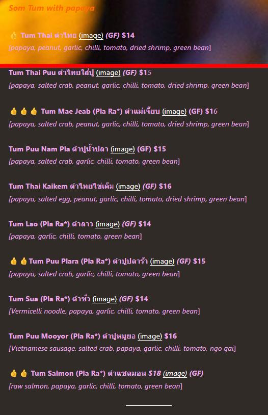
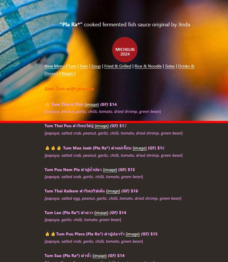
The site also has usability issues that disrupt the overall smoothness of the experience. To start, while browsing the menu, users have to click on a link to an image to even see what a dish looks like. Not only that, but when the link is clicked, it replaces the previous page to a page with just the image, with no navigation or description. This can be a nuisance, especially when one is sitting down in the restaurant trying to view which items to order. Additionally, the site also lacks an important view full menu function as well. Many customers like to compare prices and see what the entire menu has to offer, rather than flipping through multiple subsections in order to compare different dishes. These issues, combined with the navigation issues previously mentioned, create a less than ideal menu crawling experience for the user.

Now the site itself is designed to fit a mobile device as its main function is to serve as a menu for in-store customers. This on its own is no issue, but the site itself does not have responsive design, making its desktop version look very empty. This, along with no images being present on the menu page make the page not very pleasing to the eye. Although not many menu’s show images for every dish, having some image content on these pages can help with the overall legibility of these pages. The site is riddled with many other aesthetic issues such as a blurry hero image, overly sized header background, and other color palette inconsistencies. A potential customer has a chance to view the menu from a desktop or laptop, meaning that their first impression of the restaurant will be the site. Having a website that looks pleasing and attracts the customer is crucial to growing a customer base.
Lastly, the site has a few accessibility issues that can make it a struggle for those with disabilities to use. As stated before, the pages have a very low content count, and the descriptions of the items are very short and concise. Although this helps conserve space for mobile apps, it also is a pain point for those that use the text to speech function to navigate the web. Without detailed descriptions and ALT text for images, the website’s text-tospeech functionality will be limited and ineffective. To ensure a more inclusive experience, enhancing accessibility features like detailed descriptions and ALT text is essential for accommodating users who rely on textto-speech navigation. Additionally, there is a number of text that is placed over an image, some of which blend too closely with the image behind, making it hard to see, especially for those who may be color blind or visually impaired.
As shown in this graph, there are no missing ALT Attributes but there is a good amount of missing ALT text, meaning that the finction is not being used prperly.
The current website faces several critical issues related to SEO, navigation, content, usability, aesthetics, and accessibility. Each of these aspects plays a significant role in the site’s overall performance and user experience. By addressing these interconnected issues, the site can improve its functionality, attractiveness, and inclusivity, ultimately enhancing its appeal to potential customers.
One of the key shortcomings of the site is its lack of SEO optimization. Most notably, it is missing meta descriptions entirely. Meta descriptions are critical for boosting search visibility, especially in competitive local markets like the restaurant industry. Including meta descriptions that highlight essential information such as the restaurant’s cuisine, location, and special offerings will make it easier for potential customers to find the restaurant when searching online. Additionally, many of the site’s page titles are less than 30 characters, leaving room to include more relevant keywords. By expanding these titles, the site can better target search terms customers are likely to use. Moreover, the low content count on certain pages is another opportunity for improvement. Providing more detailed descriptions will not only help search engines better understand the content but also offer customers richer information, which will lead to improved SEO rankings and enhanced user satisfaction. The reson behind the priority level is although SEO improvements can help with the websites online traffic, its primary purpose is still to function as a menu. Because SEO issues do not often affect the physical appearance of a site, this priority is on the lower end.
The site’s navigation suffers from a linear structure, limiting users’ flexibility. While this simplicity can be beneficial in some contexts, the absence of a navigation bar and intuitive pathways between sections results in a clunky user experience. To address this, the site should implement a more flexible navigation system, including a clear menu bar at the top of each page. This would allow users to easily move between sections, especially as more content and descriptive text are added to the site. Furthermore, when users click on a menu item to view its image, the current setup leads to a dead-end with no way to return to the previous page. Introducing a “back” button or breadcrumb navigation will resolve this issue and prevent users from becoming frustrated while browsing. Improving navigation is particularly important as the site enhances its content and aesthetics. As more detailed descriptions and images are added, users will need a more robust and seamless way to explore the site. Effective navigation ensures that users can quickly move between different sections, improving the overall user experience. The priority for navigation is at a 9 because the website itself lacks crucial navigation that any website should have. Navigation also feeds directly into usability making it a crucial fix as it also plays a big part in the overall usability of a site as well. Additionally without these basic navigation functions, it hinders the primary function of the site as a menu. Customers will have a much easier time browsing the menu if there are upgrades to the sites navigation.
The site’s content issues not only affect usability but also impact loading times and SEO. The overuse of large images, particularly the hero image that greets users on the homepage, significantly slows down the website. Optimizing these images by compressing their file sizes to under 100KB will help improve loading speeds without compromising visual quality. Additionally, many pages on the site have minimal text content, especially on the menu pages, where short and concise descriptions fail to provide customers with enough information. Expanding these descriptions will improve the user experience by giving customers a clearer understanding of each dish. At the same time, adding more keyword-rich content will benefit the site’s SEO performance. By optimizing content and adding more descriptive text and high-quality images, the site will simultaneously enhance both its aesthetics and its SEO. However, this increase in content will make effective navigation even more essential, as users will need to be able to access the additional information easily and intuitively. Improved content will also support accessibility, as more detailed descriptions will aid text-to-speech functionality, making the site more inclusive for visually impaired users. The reasoning behind the 7 for this issues priority level is because the website still accomplishes its main function as a in-restuarant menu without extra content or smaller image sizes.
Usability is another area where the site falls short. The process of browsing the menu is cumbersome, requiring users to click on separate links just to see images of the dishes. When these links are clicked, users are taken to a page with only the image, no description, and no way to return to the previous menu. This can be frustrating, especially for customers using the site in-store to decide what to order. To resolve this, the site should introduce a lightbox or pop-up feature that allows users to view an image without navigating away from the main menu. In addition, implementing a “View Full Menu” feature will help users compare prices and dishes more easily by displaying the entire menu on one page. Enhancing usability through better image handling and full-menu viewing will also positively impact the user’s navigation experience. By reducing unnecessary clicks and improving accessibility to the full menu, the site will offer a smoother, more intuitive experience. This issue is at the top of the priority level because the website functions as a replacement for a physical menu for the restuarant. Insuring that the menu veiwing experience is comfortable and easy for the user/customer is the main focus for Som Tum Jinda. Issue such as the customers not being able to see the image of a dish until they click on another link makes the viewing process very choppy, meaning this fix will greatly help in improving this site’s primary function.
5/10)
Currently, the site is optimized for mobile users, but it lacks responsive design for desktop viewing. On larger screens, the site appears empty and visually unappealing, with issues like a blurry hero image, an oversized header, and inconsistent color schemes. To fix these aesthetic issues, the site should implement responsive design to ensure that it looks appealing on both mobile and desktop devices. Updating the hero image to a higher-quality, appropriately sized version will help make a better first impression on users, especially those accessing the site from desktops or laptops. Aesthetic improvements are closely tied to the site’s content. By adding high-quality images and detailed descriptions of the dishes, the site will not only enhance its visual appeal but also provide users with more information. As a result, effective navigation becomes even more crucial, ensuring users can easily move between sections as they engage with the enriched content. Additionally, improved aesthetics will make the site more attractive to new customers, helping to grow the restaurant’s customer base. While aesthetics are important for any small business or restuarant it still is not a direct hinderance to a site’s function. Although many of these other changes mentioned may encourage a aesthetic rennovation of the site as well, it is still not required.
The site’s current lack of detailed descriptions and ALT text for images poses significant challenges for users who rely on assistive technologies like text-to-speech. To make the site more accessible, detailed ALT text should be added to all images so that screen readers can provide meaningful descriptions for visually impaired users. In addition, expanding the descriptions of menu items will help users who rely on text-to-speech to navigate the site more effectively. Enhancing accessibility with ALT text and detailed descriptions will not only support users with disabilities but also provide additional details for those interested in the dish, while also boosting the site’s SEO performance. Search engines use ALT text to understand images, which can lead to better rankings. Furthermore, improving accessibility aligns with the overall goal of making the site more inclusive, usable, and engaging for all customers. Accessibility is crucial especially for a restuarant where customers of any demographic can dine. Having ALT text and improving text contrast is important for the site to be usuable for any user. The reason this priority level is not a 9 or 10 is because the site does not have any glaring accessibility issues. But there are still many improvements that can be made that would improve not only its accessibility but the overall experience for any user.
Addressing the SEO, navigation, content, usability, aesthetic, and accessibility issues outlined in this report will significantly improve the website’s performance and user experience. Many of these issues are interconnected, meaning that enhancing one area, such as content or aesthetics, will also impact other areas like navigation and usability. By taking a comprehensive approach to these improvements, the site will become more functional, visually appealing, and accessible, ultimately helping the restaurant attract and retain more customers.
This is a site for a Denver based restuarant called the Original. This site still maintains the clean and simply layout that the Som Tum Jinda website seems to be seeking, but includes the many of the navigation and usability functions this audit has mentioned before. Key elements of the layout include intuitive navigation menus that guide visitors seamlessly through various sections, such as the menu, hours of operation, and reservations. The use of whitespace enhances readability, allowing the vibrant food photography to shine without overwhelming the user. Additionally, the site incorporates responsive design principles, ensuring that it looks great on both desktop and mobile devices. Interactive elements, like a reservation system and contact forms, are prominently featured, making it easy for customers to engage with the restaurant. Overall, the Original’s website not only reflects its brand identity but also prioritizes user experience, inviting potential diners to explore and connect with the restaurant effortlessly.
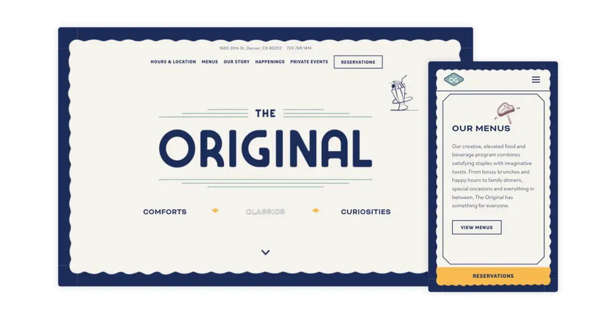
Below we have created an example of what this may look like for the Som Tum Jinda site itself. Here we show some of the changes and fixes suggested on a potentially new hero section/home page. As you can see, these changes can help the overall flow of the site, improving the user experience by giving them clear navigation and direction throughout the site.
Prioritization
- Added in priority levels to each fix
- Added reasoning behind prioritization
Navigation Issues
- Added information about wayfinding and menu commonalities that are missing on the site.
Aesthetic Issues
- Added clarification on menu images
- Clarification on that not every menu item needs an image
- Images can help fill out the page a bit more
Example Site
- Added an example site page to give more of a clear image of what improvements may look like
- Also added an example of what this may look like with the Som Tum Jinda’s very own site
- Talked about how when the fixes mentioned before are combined, it creates an overall cleaner and smoother user experience.