DESIGN PORTFOLIO
Mason Long

Curriculum Vitea
EDUCATION - UNDERGRADUATE
UNIVERSITY
PROGRAMMING
BACHELOR
BACHELOR
INTERNSHIP
Natura Urban learning Park
This project required that a Montessori school, housing approximately two hundred and forty different children’s educational and daily needs. The concept for Natura Montessori Urban Learning Park is derived from the urban setting and natural form. The context in which this projects exists led to an exploration of the merging of urban life and nature. The design aims to have nature be used as a tool for education. Experientially, this is to stimulate young minds and inspire exploration. The design does so physically with its intersecting urban and natural forms. Creating a complex that is nurturing, yet dares them to get lost in its experience. The three atrium employed serve as a means to blur the point where nature and architecture meet.
The pod style organization started as a means to simplify the programmatic requirements in an efficient manner. This is what led me to explore the connections and forms of nature further. The design mimics nature in the way that Urbanity is mixed in. The contrast felt inherent, but it was also transitional as if walking through a caves many openings.


Site
The project’s unique site conditions influenced responses that helped shape the building’s form. This all inspired by an observation that the site had an existing unearthed section. The swooping roof elements aims to achieve a sense of whimsical exploration and play. The binding element that connects this sprawling series of spaces are the atrium. This was accomplished through the atrium doubling circulation as experiential space. On grade was an open play space for younger students. Before a grand stair, a submerging stair turns into a miniature amphitheater. It is succeeded by a open plaza for the older children. Which sprawls to achieve a raised level connection in the center. Scale and experiential quality define this project.


The project invited the resurgence of an abandoned warehouse that had known many past uses. The client was a branded label that managed other local brands along with their own to tailor products. This space however would be a shared creative workspace that would house fashion lectures, product sales, design workspaces, a meeting place, a mini bar, and even be used as an event space. Having varied requests from the client, the building needed to be adaptive in its spacial composition.


The context of fashion and creative peoples in Memphis led to development of a speak-easy inspired facade design. Once inside the first walls the experience adapts to meet the call from program. Becoming warmly inviting while remaining utilitarian in experiential quality.

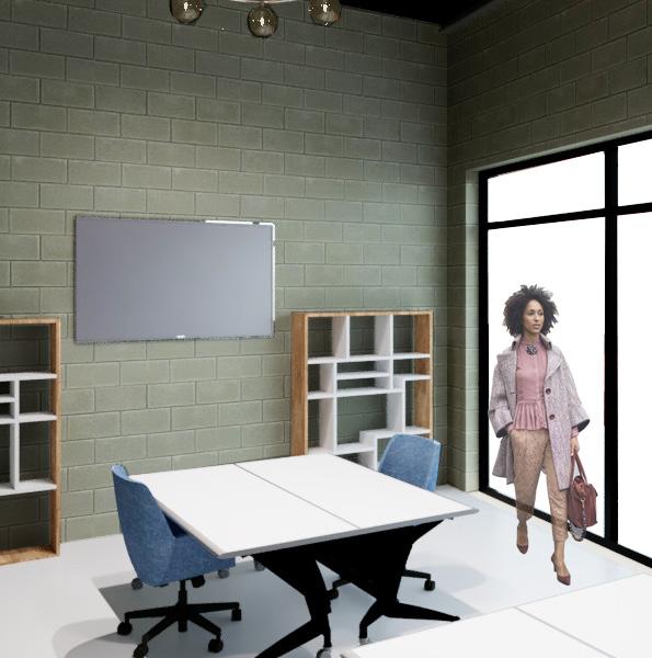

Fashion Studio Work Spaces
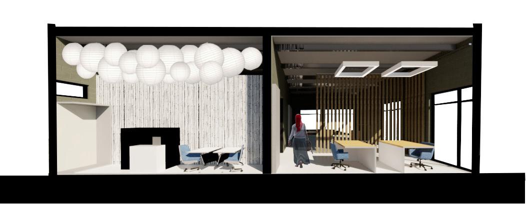
The client expressed the goal of re-establishing Memphis’ roots in fashion. Memphis has fashion roots stem all the way back to Paris. The surplus of cotton in the south during the great depression prompted the creation of what is known as the cotton carnival. The carnival inspired the fashion industry to be more inventive. Designers would come from Paris, displaying their trunks of couture. One present day designer from Memphis, Babbie Lovett, fell in love with the ideas behind that mentioned vintage fashion. One of her statements holds value as a perspective on design. She commented, “They (Young people today) have so much information and not enough filters.” I wanted to translate this architecturally, specifically within the context of Memphis and its relationship to fashion. This led me to derive the design from the industrial and art deco styles, letting those be the filter through which Creatives Co-op was created.


A Place for Speaking and Listening
times before. From, Restaurant to Bank, the existing building held remnants of its story in it’s mercurial form. The new use, a clinic for hearing healthcare would require a new organization. The concept was developed in response to the unique sensory experiences that are present in a non-hearing person’s day to day life.

Centering on sensory experience led to developing a styling that used language as a means for deriving architectural context. I focused on comfort and sensory experience being translated by material qualities. This emerged as two pointed spectrum of material qualities. From there I identified Where programmatic items fell on the spectrum to create a spatial type key. **See figure **


How does a person with auditory impairment experience space?


Through listening to professionals and personal research findings, it shows that designing for this demographic requires a delicate balance between sensory stimulation and sensory mitigation.
Visual stimuli Controlled Sensory Response
Tactile stimuli
With this basis the design began to lean into the idea that our senses can be individually or cohesively integrated into designed elements
Using the Spectrum and it’s identifiable experiential qualities catered to the needs of users. Soft spaces prioritizing focus and a sense of security were categorized as patient spaces. Semi-soft spaces lend to the adaptive tasks that the users would cycle through in a typical day. As such these were spaces of work and refuge. Finally, hard spaces implied movement and were transitional in nature. These spaces facilitate the experiential nature of changes in the spatial compression between program. An additional utility space category confines systems spaces that are a part of the built fabric which most users do not require access to.
Beg
This project was in collaboration with a local clothing label. Tasked with the creation of the first brick and mortar location’s design. The main parameters being that the design should link the brands’ messages into one experience. This meant blending the styling of three differing brands into one unique experience.

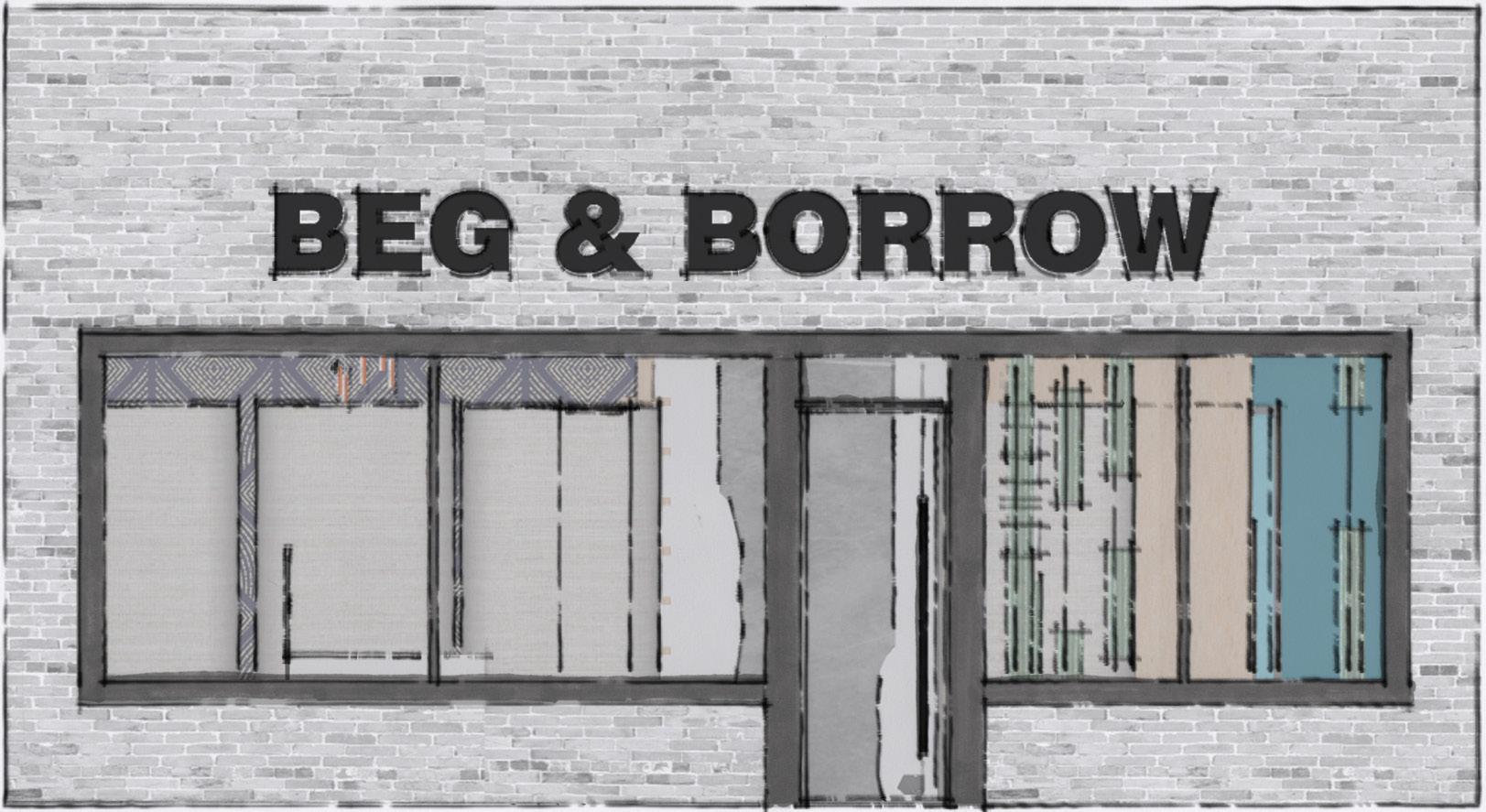
This concept is based on creating zones of experiences. Then using these experiences to link together the brands that fall under “Beg & Borrow.” The product needed to be displayed in a way that reflects the detailed works of “wearable art.” The effect was stepping into experience one after another to gain the brands a sense of self in their sequencing.


Speculative Dwelling


A residential project in collaboration with local firm, brg3s. The project offered a realistic design experience with an infill project. Assigned one of 6 lots, I designed a single family residence in a limited build-able area. The infills would become a small community. The residence needed to be private but still offer opportunities to connect with their community and neighbors. The designed response derived from this sense of community, light as a means of connection . not only to the spaces we inhabit but to those closest to us.

The key idea being “speculative” meant that it was not geared at any specific needs or desires. Lighter materials were selected to encourage the future housing of a family unit. It would be their home to make as they saw fit.


Connecting experiences throughout rooms and elevating levels provided a challenge. This was solved by highlighting natural light’s ability of fostering connection. In one aspect it being physical connection through circulation. While in another it is as personal connection to the space and connection to others through experience. Designing in section gave insight into the way that the angularity and change of solar paths would affect lighting levels in the house. The arrangement of program maximizes the amount of daylight that a facing area would receive at optimal timings for that given space. This lends itself to the social structure of the day.


Jones hall Student labs | University of Memphis

The Renovation of the student labs for the department of architecture arose from learning modeling softwares. Instruction urged us to use our creativity in a rigid, and unfamiliar program. While conceptual in nature, I took the opportunity to produce a design schema that prioritized variability in work spaces. The addition of an outdoor space not only made safety and nature more accessible but provided a keyhole for natural light.


MODULAR WALL | SOLAR Exercise
This project required creating a modular piece that would lead to a larger system. These individual modules had to react to the solar conditions that are present in Memphis. Iteration through a series of paper folding exercise led me to the prospect of turning faces away from the light to create differing experiential qualities. My studies landed in the notion that passive design was all about static pieces which change their effect based on solar positioning. The most effective of them being the apertures releasing dappled light on some panels while catching and blocking on others. This allowed light to shower the interior with scattered light consistently


This design was based off of an accordion-like structure that is lined with apertures. The apertures change the experience based on the user position. The wall was designed to mitigate eastern lighting while emphasizing a sense of play on both of its sides. Stacking the individual models and using the levels as a guide the effect is enacted on a much larger scale which is more relative to human scale.


Canary Co. Originates from the idea of us sourcing our product from the earth. Referencing the mines of old, our logo consists of a canary’s form. To remind us of the consciousness we must hold when sourcing these products. There is inherent beauty in this warning. That we are connected to all.


The concept of Canary Co. Is to offer a service that caters to the eccentric people of the world. A subscription service that would customizes a package of stones of varying type. This is meant to provide our users the ability to collect, learn, or utilize for spiritual purposes. “In addition to this we hold sustainability as a high standard. Our products come from the earth and in honour of this we do our part to minimize our effect on the environment.”
Mason Long
901-888-8888
901-888-8888
Canaryco@business.us
Canaryco@business.us
y

CREATIVES
Creatives Co op Sound
Creatives Co op
The branding for Creatives Co-op was developed along side the built project. In an exercise to style the label as of it’s time It was heavily influenced by the industrial and art deco styles. Seeking to balance the two juxtaposing styles the logo and markup are paired back in color enhancing the powerful forms derived from th project’s fashion based concept. Memphis music themes aided in inspiration
Creatives Co op
In the making of Creatives co-op a secondary challenge was connecting to a master plans that made the back corridor a pedestrian space. As so, the outside would need to remain accessible. This gave rise to an outdoor venue that was supplemental to creatives co-op. A speakeasy like garden behind the austere gates inspired “the Sound.” It was the destination that finalizes the co-op’s story.
TheSound The Sound The Sound The
Tailored to house small music events, to fashion runways, the Sound was built to generate secondary life from the lot’s outdoor space. Assorted panels adorn the stage front to enhance the idea that though cut from many pieces the experience on it would unify not only the project bu the area. Connecting to the corridor would enhance business and allow life to carry on whilst designers learn and create inside the co-op.


VISUALIZATIONS | THE KITE RUNNER
This project challenged the recreation of a story telling experience into an architectural scene. The story I chose to examine, “The kite Runner,” by Khaled Hossini. A tale of a young afghan boy who during an 1980s invasion unravels his truth. He later grows up to honor his heritage and its lasting impacts.
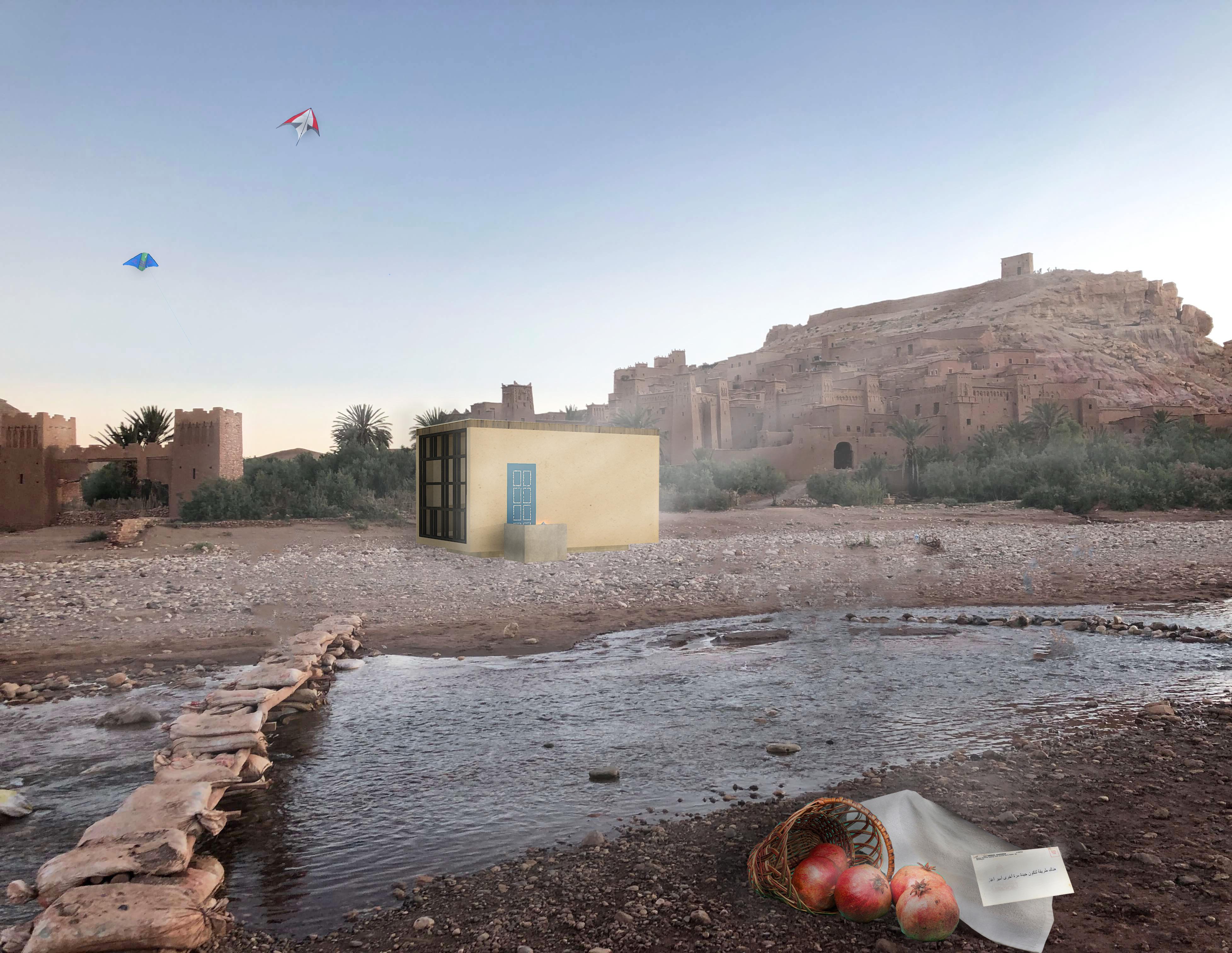
The scene I’ve chosen is about the characters’ sense of truth being upended. His sense of self is shaken. Something of importance is revealed to him, instilling a sense of urgency. However, the scene still has this quality of being emotionally vulnerable and uplifting.
I attempted to capture that sense of timeless grace that hossini evokes in the pivotal scene.
The scene is set up in a way where the person revealing the truth is the vanishing point. Light is delicate, but warm. Things that are important to connection are used as entourage. I attempt to replicate this by taking inspiration from the mood and feelings of the scene, but also the architecture. I started by importing entourage that represent important things in the scene and arrange them in a similar way. After that I adjust lighting and give the sunlight extra directionality making it very dramatic. After that I may give individual parts a boost in contrast or brightness. Finally, I make a pass that adjusts the overall temperature of the image. This replicating warm light at dusk.

MODELING | FORM + IMPLEMENTATION

Pictured in the supporting figures are the products of iteration and its conclusion by implementation.


“Associated geometries I” is a precursor to a project that asked us to create a dimensional configuration celebrating connection. I designed the object in a way that aimed to enforce the ideas of visual hierarchy and what was the primary connection. It in fact was the linear portion, the smallest of the three, that was the key to the entire object remaining in balance. I thought a funny juxtaposition. A spanning plane that teeters on the edge of a large cube. Held up by a thin line. This took much iteration, and many different prototypes to get to the final built element. However in the process I found that Connections were something that could be celebrated more often. Not just functional.

“The Carrol Cloar Center for Literature and Art” is a conceptual project that would host museum and campus like program. The design was inspired by an observed reaction to Cloar’s work and Life story. This was a sense of being a part of something much bigger than the self. The sense of wholeness encapsulated the design of a large plinth that plugged into the riverside banks. The design is Inspired from the process.


PAPER FOLDING |


The paper folding project was a focus on producing different folded forms. It was both loosen creativity but also give an understanding into Light, Space, and form. Though not selected for the next phase of the project i took an interest into my rejects and chose to document their performance when captured.

These captured photographs allowed me to study the planes of folded paper and how different lights changed their perceived presence. As well as how the inherent space of shadow is ever present.

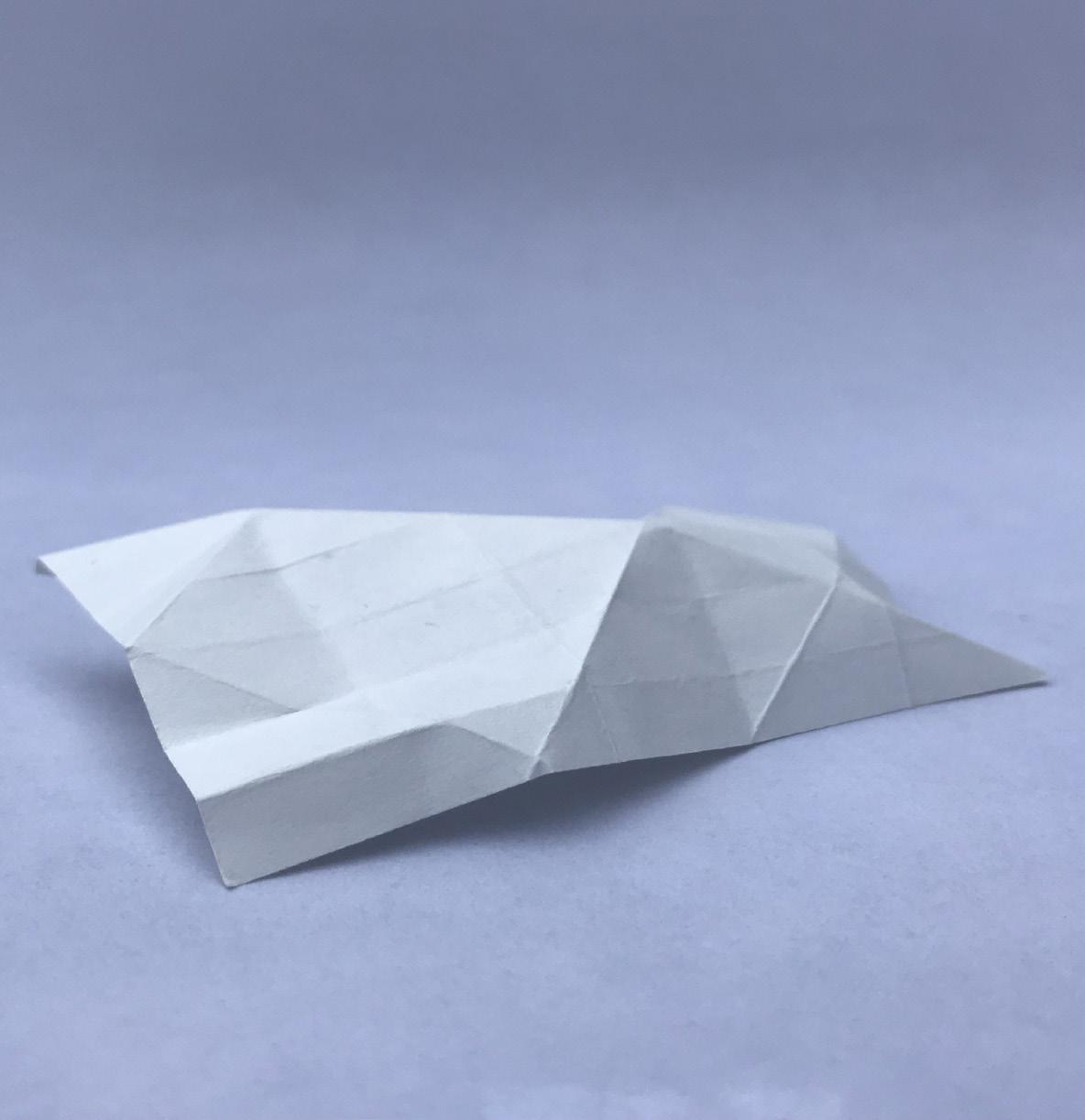


This Project challenged me to both control lighting in photography as well as maintain a balanced composition.

