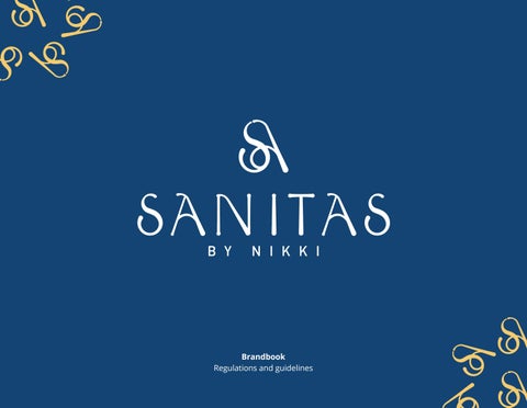
/ 1 Brandbook Regulations and guidelines
2 /
/ 3 Table of Contents The Logo 4 Construction of the Logo 6 Color Palette 7 Correct Uses 8 Incorrect Uses 10 The Typography 12 Minimum Sizes 15 Measures for Online and Print Applications 15 Brand Patterns 16 Applications 20
The Logo
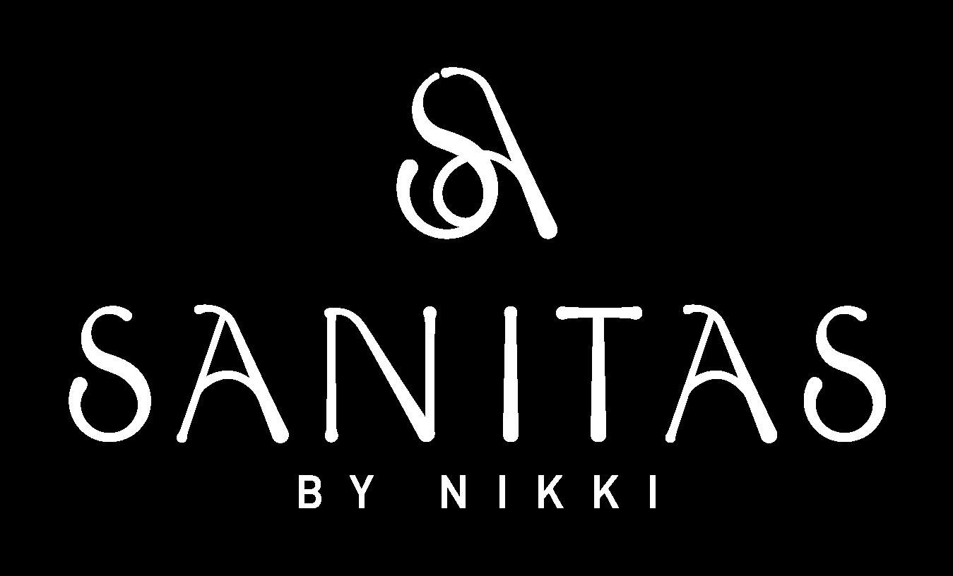
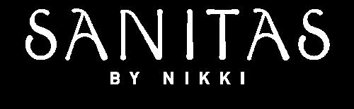
Sanitas by Nikki is the name of this brand. Sanitas means a healthy mind and healthy body. This is an umbrella brand which focuses on providing a healthy lifestyle for busy women.
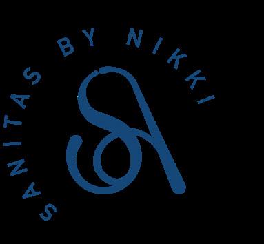
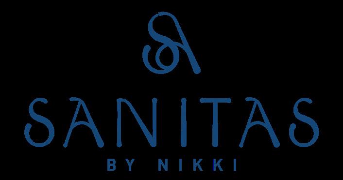
This guide shows you how to use the logo correctly in order to generate a uniform brand presence in all the scenarios where it will be used. Below is the main logo consisting of the isotype, the name of the brand and the tagline, these elements can be used individually.
This font was created exclusively for this brand and cannot be replaced by any other font. The name can be used without the tagline when it is not needed.
This is the tagline, which must be used in capital letters and with the determined spacing, the typeface must always be “DIN Alternate Bold”.
4 /
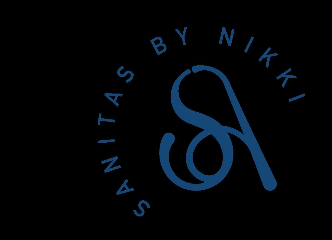
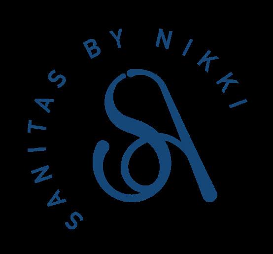
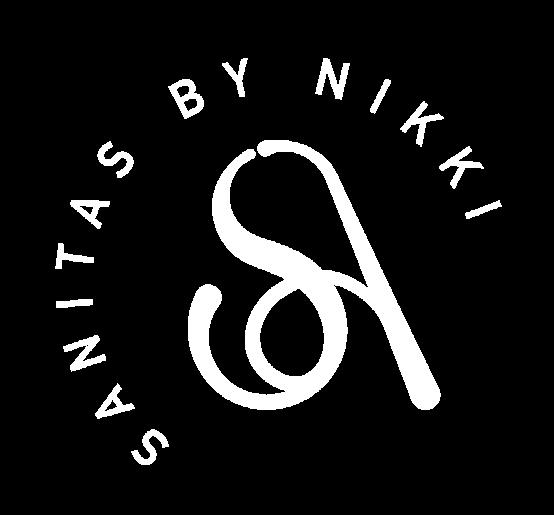
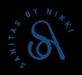
This is the variation of the main logo. In this case, the protagonist is the isotype that is formed by the union of the letters S and A. Its use is recommended when horizontal space is limited.
Using it with the surrounding words is always advised until a sufficient brand presence is generated where only the initials can be used.
/ 5
Construction of the Logo
the construction of the logo, a precise measurement system is provided using the “X” as the minimum unit. This system is intended as a guide only and should never be reproduced.
blue space is the minimum distance allowed between the logo and any other element such as graphics, objects, marks, page borders, etc. The logo must have an adequate amount of free space as shown below.
6 /
For
The
2x x 2x 17x 28x X =
/ 7 #154777 C 99 M 78 Y 28 K 13 R 21 G 71 B 119 PANTONE P 105 - 16 U #EBE6D4 C 07 M 06 Y 16 K 0 R 235 G 230 B 212 PANTONE P 168 - 9 U #F6C96D C 03 M 21 Y 67 K 0 R 246 G 201 B 109 PANTONE P 10 - 6 U # FFFFFF C 0 M 0 Y 0 K 0 R 255 G 255 B 255 PANTONE P 1 - 1 U Color Pallet These are the main colors for the Sanitas by Nikki brand. The correct use of color are key elements in establishing your brand identity and maintaining it. Use the Pantone code for printing and the HEX and RGB for web.
Correct Uses
Main logo with white background.
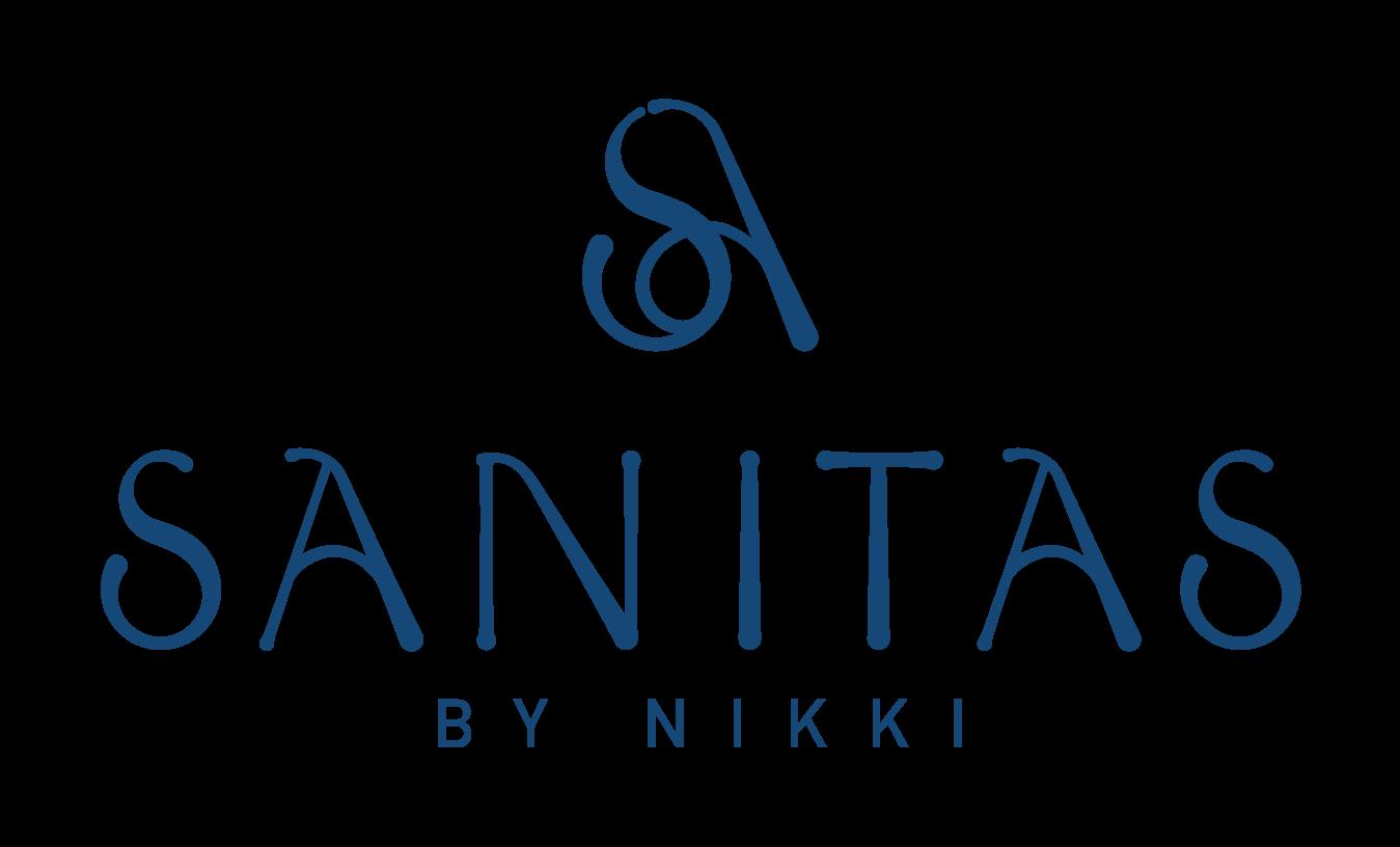
The primary use of the Sanitas by Nikki brand is represented on page 4.
However, the use of the logo may vary depending on the application in which it will be used and for this purpose here are the correct variations of the logo.
White logo on top of the main brand color.
8 /
White logo on top of the second brand color.

Variation of the logo in white with the brand colors.
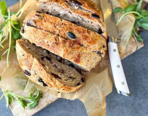
Main logo on bright photo example.
/ 9
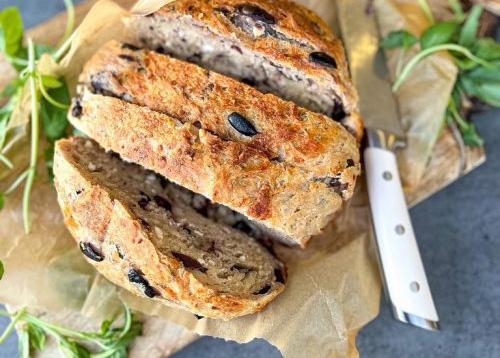
Logo variation on bright photo example.
Incorrect Uses
Do not use deform the logo.
In general, any use other than that specified above is considered a misuse of the Sanitas by Nikki brand.
In any case, any use that includes colors other than the color palette, improper combinations, gradients, shadows and effects are not correct uses.
Do not use different colors or strokes.
10 /
Do not use shadowing or gradient effects.
Do not use the logo applied in a way that cannot be properly observed in bright photos.

Do not use on color backgrounds that overshadow the logo.
Do not use the logo applied in a way that cannot be properly observed in dark photos.
/ 11
The Typefaces
The supporting typeface family to be used on all documents whether digital (post-advertising, web, etc) or for printed documents is “Source Serif Pro” for headlines, “DIN Alternate Bold” for subtitles and “Open Sans” body text.
An example of how to use them together can be found on page number 14.
Serif
12 /
Source
Pro (Headlines) A B C D E
F
G H I J K L M N Ñ O P Q R S T U V W X Y Z a b c d e f g h i j k l m n ñ o p q r s t u v w x y z 1234567890,.;::”()?
l
/ 13 DIN Alternate Bold (Subtitles) A
B C D E F G H I J K L M N Ñ O P Q R S T
U V W X Y Z a b c d e f g h i j k l m n ñ o p q r s t u v w x y z 1234567890,.;:Ç.Ñ:”()?¿ Open Sans Regular (Body text) A
B C D E F G H I J K L M N Ñ O P Q
R S T U V W X Y Z a b c d e f g h i j k
m n ñ o p q r s t u v w x y z 1234567890,.;:Ç.Ñ:”()?¿
Main Complementary Font
For Titles “Source Serif Pro” 26 pt.
Do you experience guilt around food, or in life?
Subtitles and Credits
“DIN Alternate Bold” 12pt.
General Text
“Open Sans” Light or Regular 12pt.
By Nikki Amentiatem quosse mincidi ciustiore placeat usciis dolut facest landitatur sit elesti adi volorem nus atur sequas sam exces desed maion rerit, odis cum, sum evendam re natus et lam nonet estet aceste sum es prepudae omnime esenitem dolo magnihiliate apernatem et que ea voluptas cuscit fugia incim aceperum ex es est prate aut quiae omnihitasit lanis reperib usapicius res nonse invenimodite et voloritae vel illuptas mo maione debis natio. Naturit aborum cumquid endita quamet, sit voluptaquis dolupta volenis nestio. Nem eostium im voluptur?
Modis pro voluptur, utam audi aut lacientur, odiae expel is eum hiliti delectum aut vendeliquia possinv electotat quisquo eriorum quatum fugiae magnimus ea ditia doles et est unt adit amet iunt unt od maion persped et essumenis sita que verit officiur ratent autemque earum qui dis quo quodictiorro blaborolorsam quossunt harum res nonsequid quam, omnisci duntum, is moluptas autempo ribersp ersperiat.
14 /
Minimum Sizes
x
x 53,85 pixels
The minimum size of the logo is defined as the smallest size in which it can be reproduced while retaining adequate visibility and brand identity.
size will be different depending on the medium (online or printed).
Measurements
x 1.9 centimeters
x 0.3 centimeters
x 3 centimeters
/ 15
This
110,55
3.9
2
118
20 pixels 3.2
123 x 123 pixels Measures for Online Applications
for Print Applications
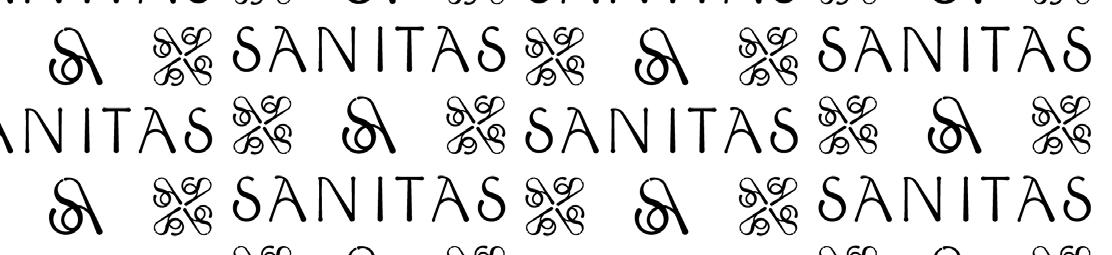
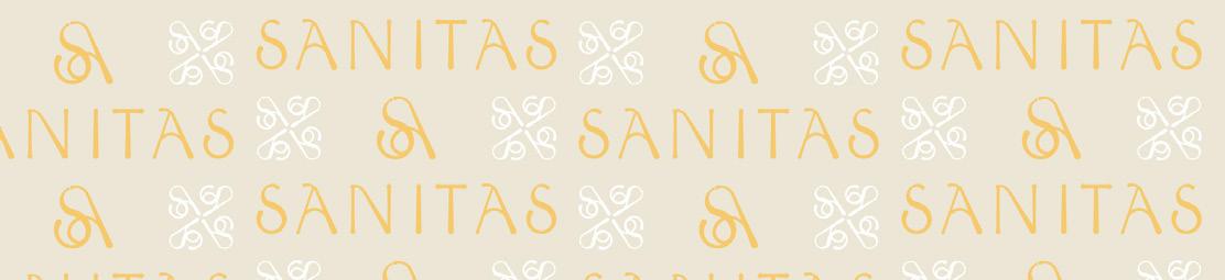
Brand Patterns
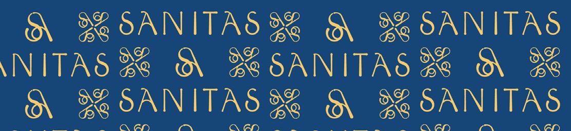
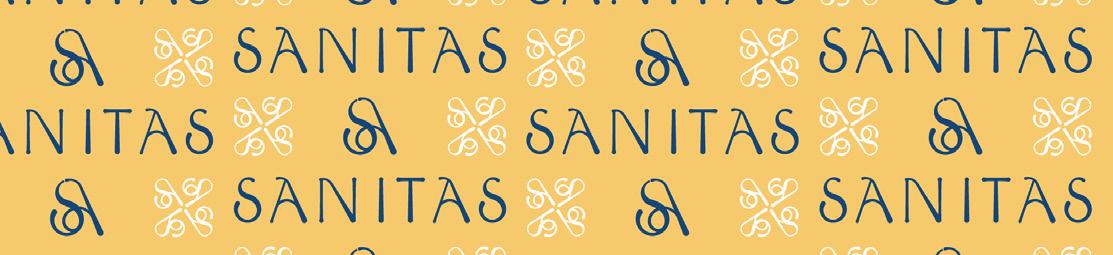
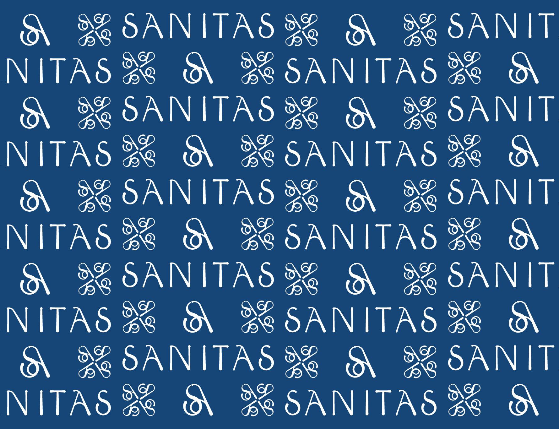
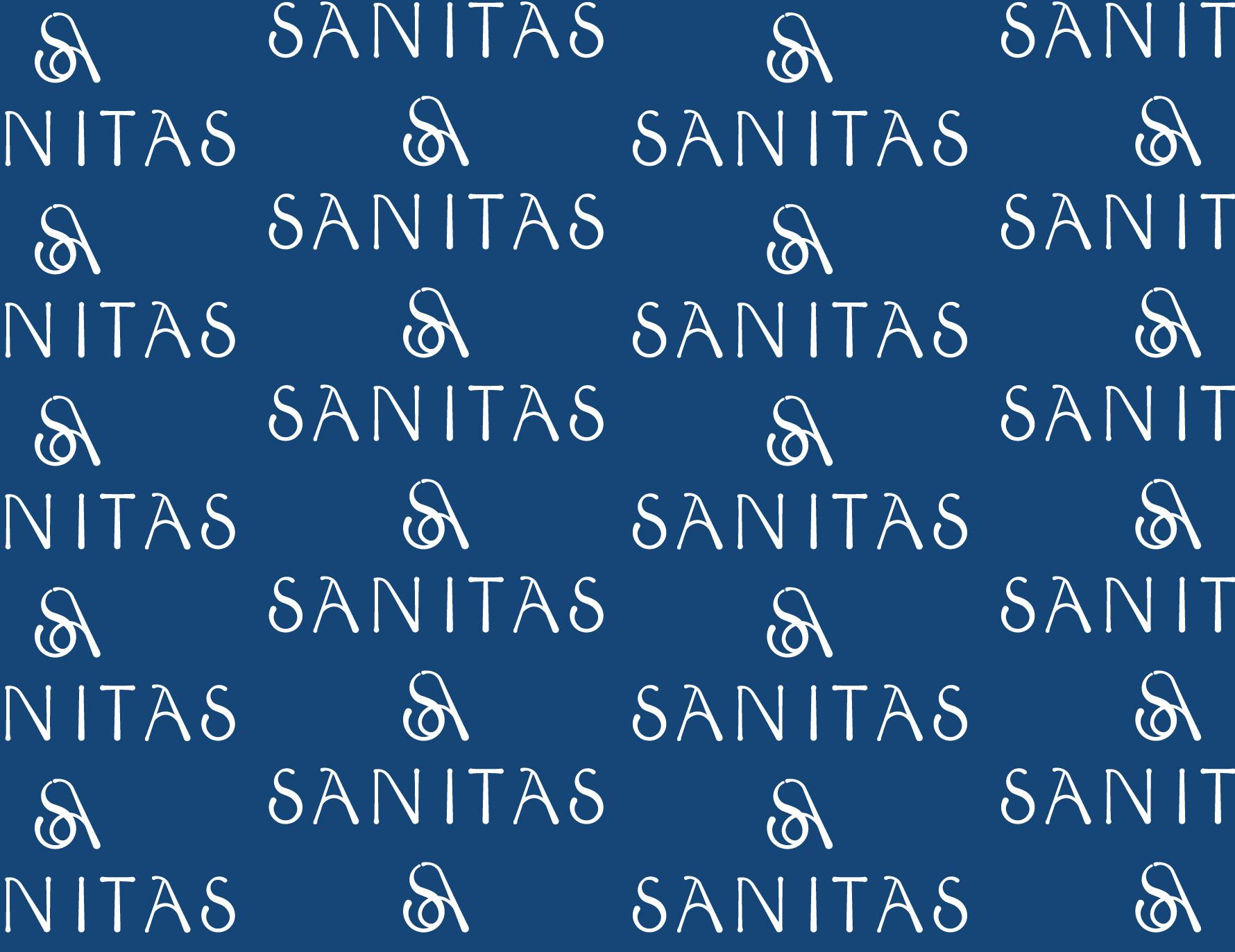
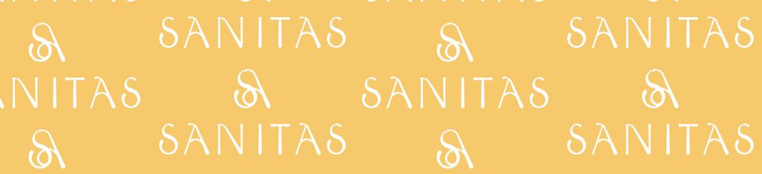
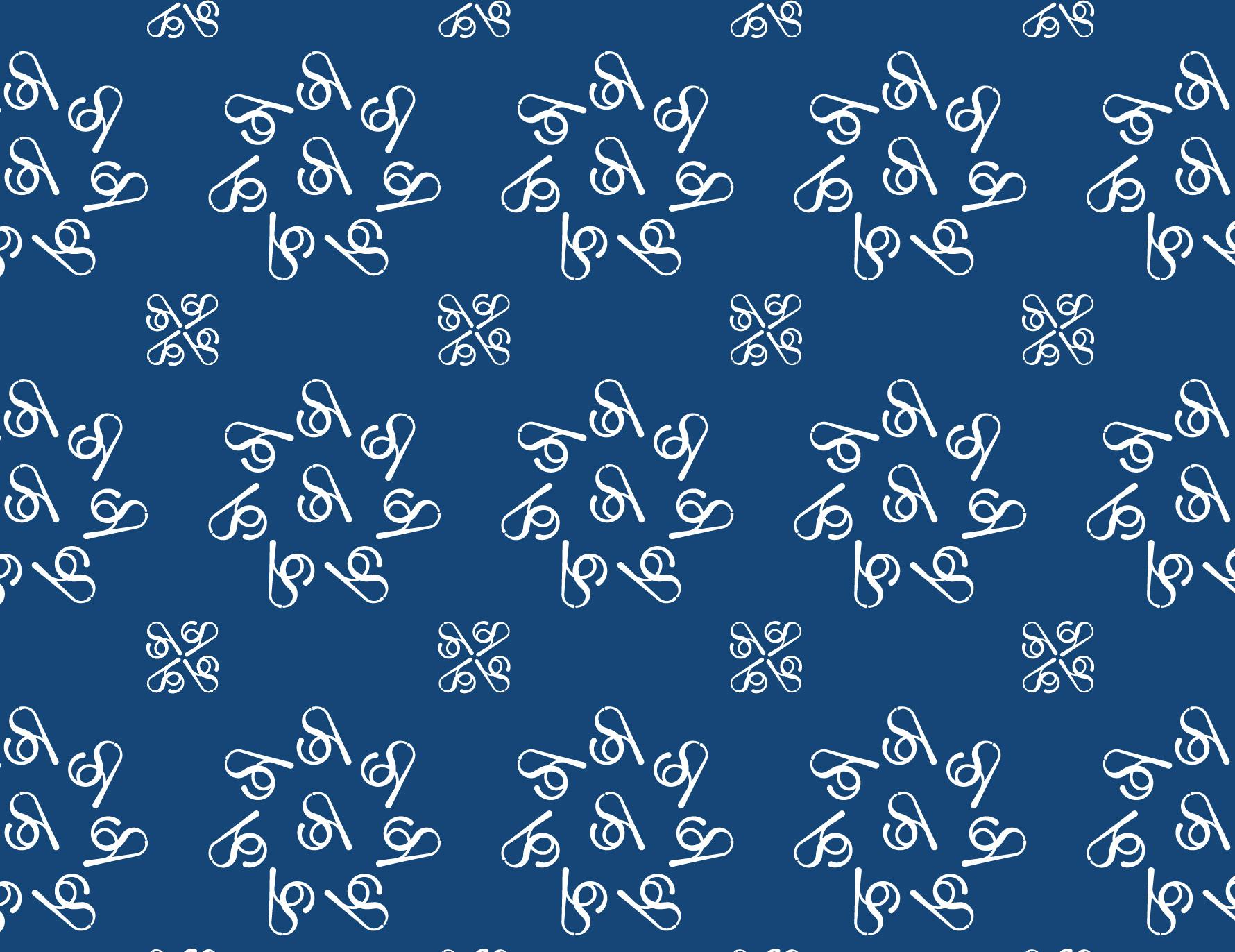
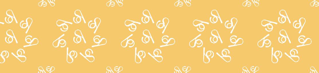
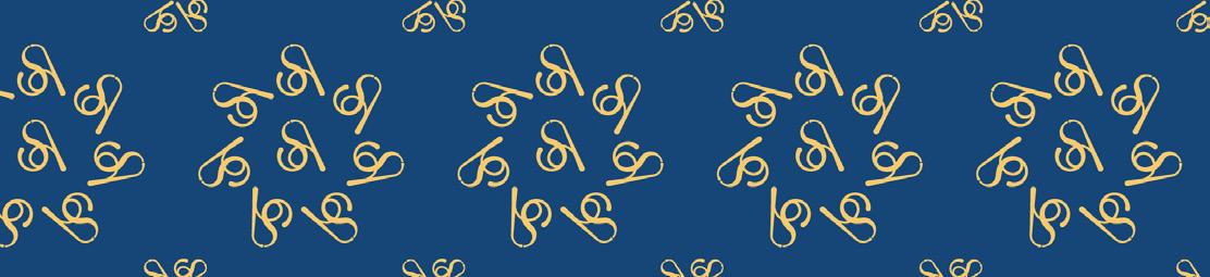
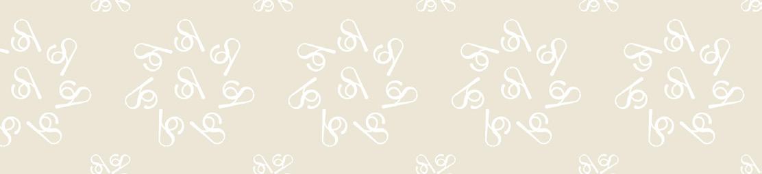
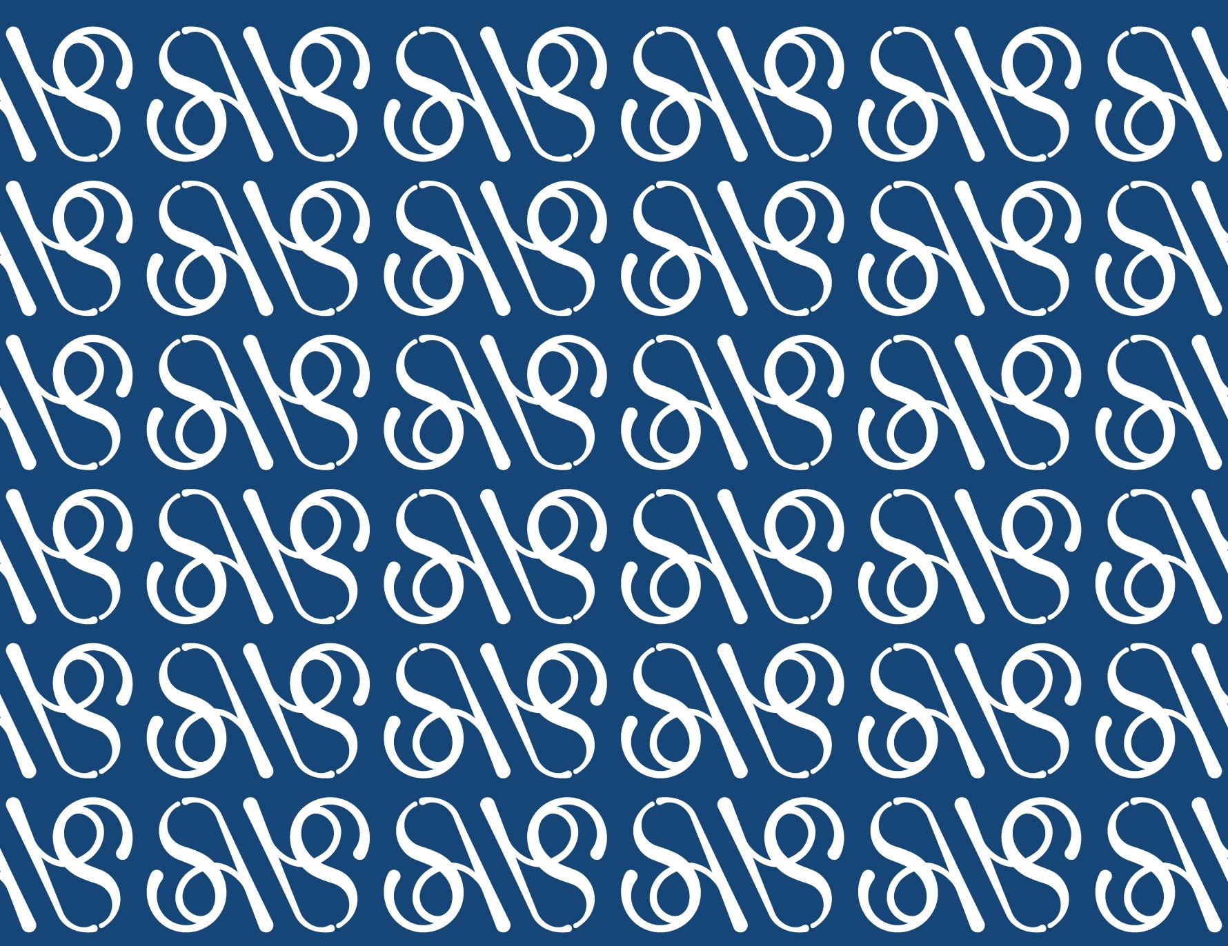
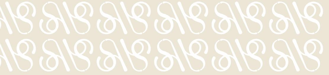
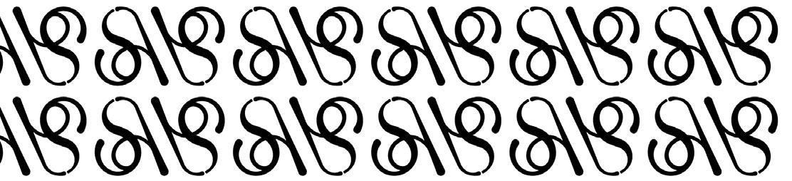
Pattern #1 with its color variations.
These patterns are complementary elements that give your brand more detail to stand out from others. These patterns can be used for printed materials such as packaging, flyers, and web applications. Keep in mind that there must be a balance between patterns and logo so that the brand is legible and does not look all cluttered.
16 /
/ 17
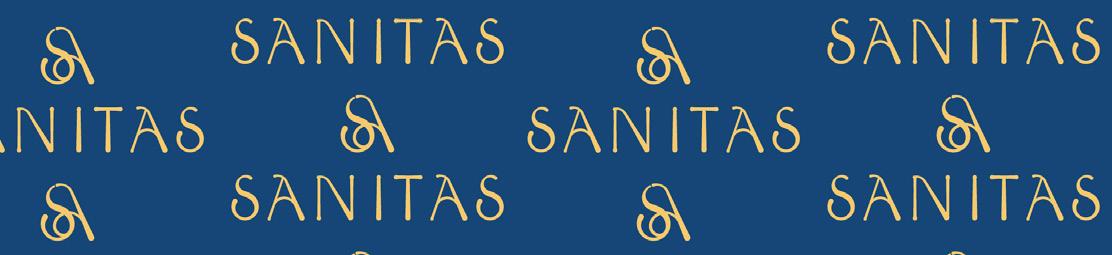
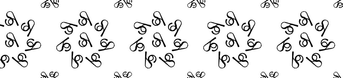
Pattern #2 with its color variations.
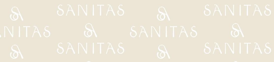
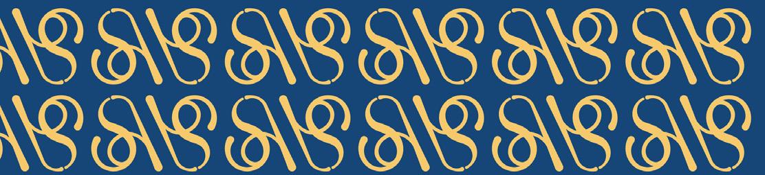
18 / pattern #3 with
its color
variations.
/ 19
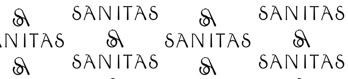
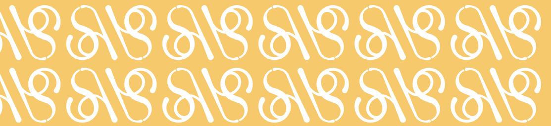
Pattern #4 with its color variations.
Applications
For the development of applications it is important to use the correct logo, color palette and typography.
In this section, we show you the correct use of Sanitas by Nikki brand identity in different applications.
20 /
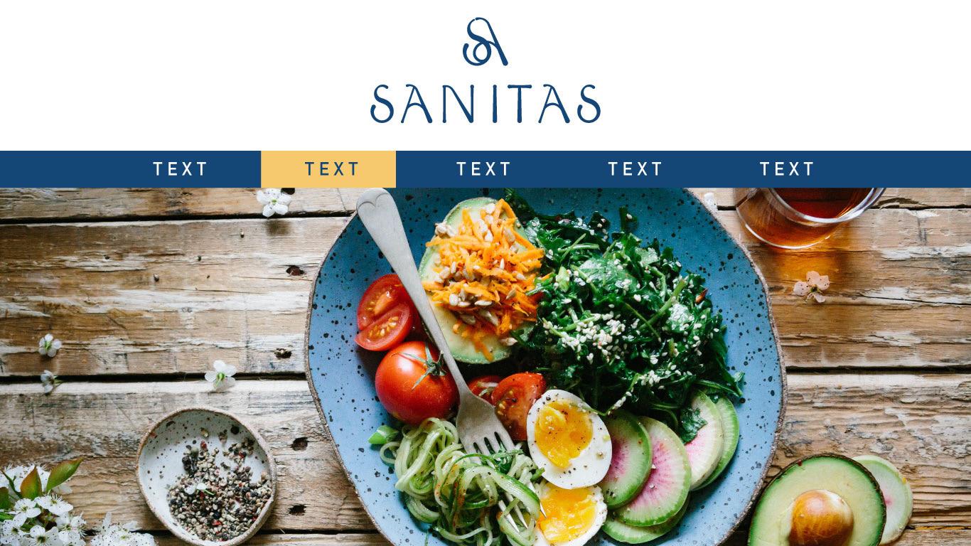
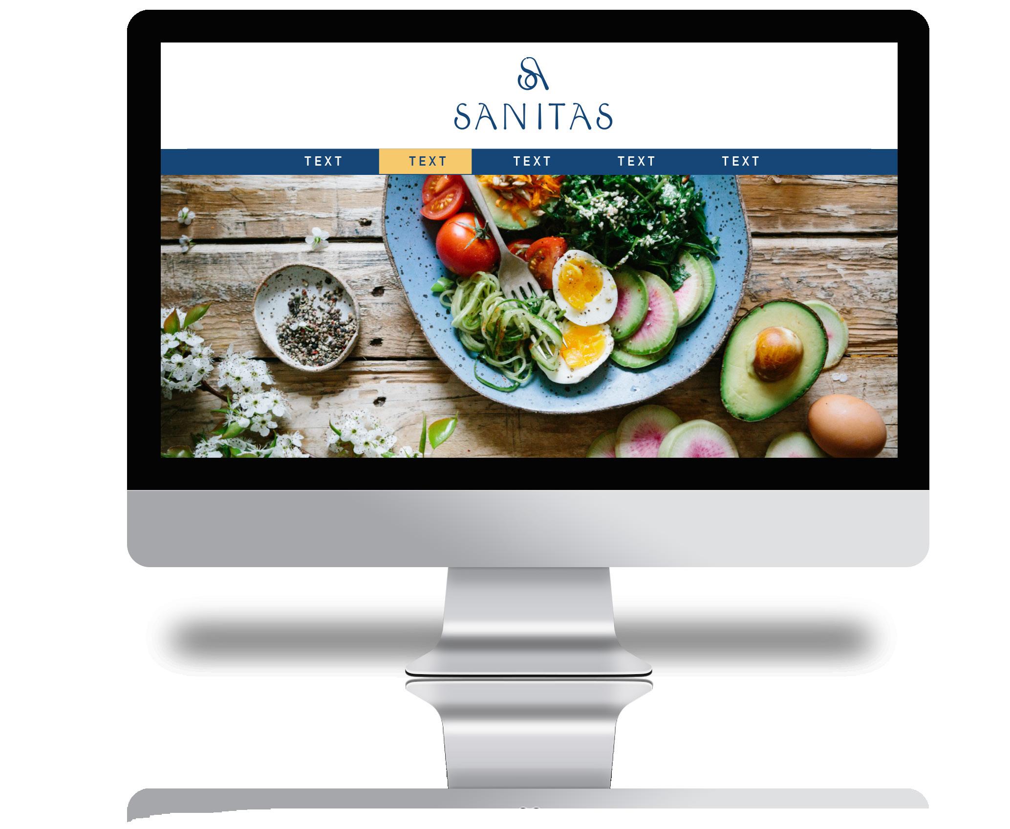
Example of branding on the web.
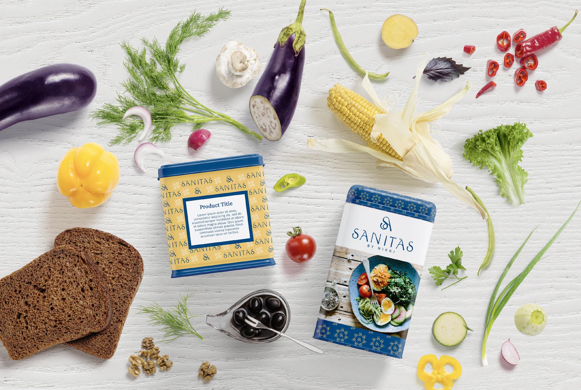
/ 21 Example of branded packaging.
22 / Brandbook Created for the Sanitas by Nikki brand by www.mytrudesign.com