Yearbook Curriculum & Adviser Guide
A reference guide to train your yearbook staff

A reference guide to train your yearbook staff

Designing pages is one of the most creative aspects of producing the yearbook. Designers work with photos, lines, color and typography to produce pages that intrigue readers and pull them into the book’s double-page spreads.
Designers must understand the elements of design: dominance, unity, contrast, repetition, internal and external margins and direction of movement. See explanations on pages 2-4.
Equally important is the terminology associated with a yearbook spread. See example on page 5.
Type face selection and use is yet another essential design aspect. See typography section on pages 6-16.
How and when to use color to enhance design is another part of creating a great yearbook. See the color section on page 35.
Understanding all aspects of design and implementing them will help your staff create an outstanding book.
Goal:
At the end of this unit, students will design pages in an eye-pleasing manner with attention to editors’ style rules to create a unified look for the book.
Objectives:
1. Staff members will understand how to plan content and execute the plan in their design.
2. Editors and section editors will assist section team member with their designs.
3. Editors and section editors will review team members’ designs, making certain they adhere to design style rules before submitting them to the adviser.
4. Staff members will complete planned designs in the online program.
Methodology:
Staff members will complete the step-by-step, “draw-along design” exercise and will reconstruct the spread in the online program.
Evaluation:
Editors and adviser will review pages submitted by section team members, returning pages for corrections and reevaluating the final pages before submitting them to the company. Pages will be evaluated according to the design rubric near the end of the Adviser Introduction Section.
Resources: Slideshows: Design elements and Step-by-step design: http://online.fliphtml5.com/traa/ijdo/index.html#p=1 Showstoppers: http://online.fliphtml5.com/traa/jnlj/index.html http://online.fliphtml5.com/traa/dfgw/index.html#p=1 Designing modules: http://online.fliphtml5.com/traa/zwpu/index.html#p=1 http://online.fliphtml5.com/traa/nhcs/index.html#p=1

When creating your book, it’s important to understand basic design elements:
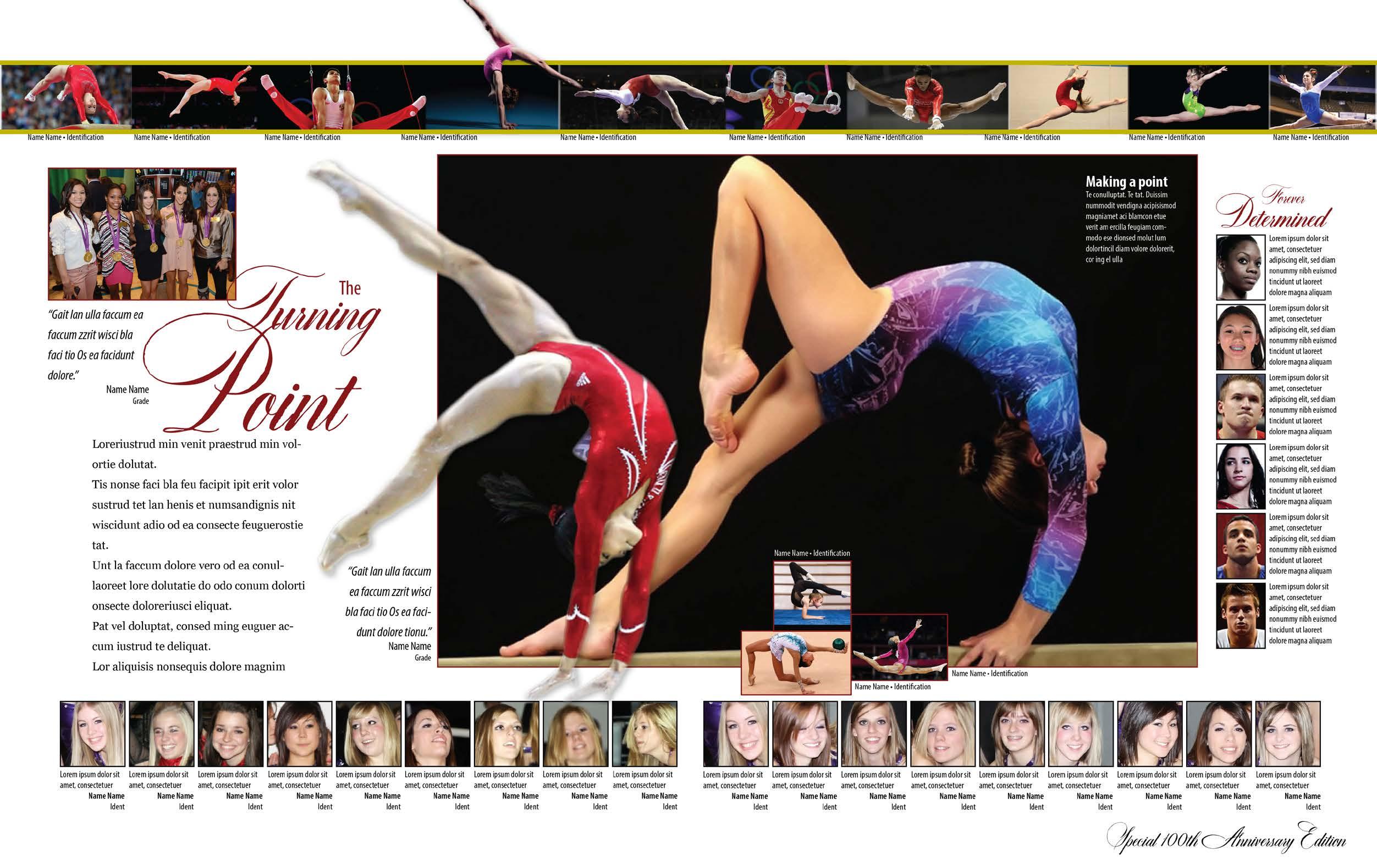
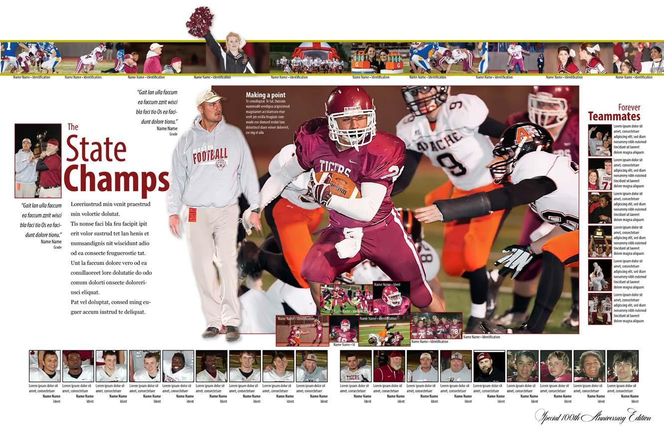
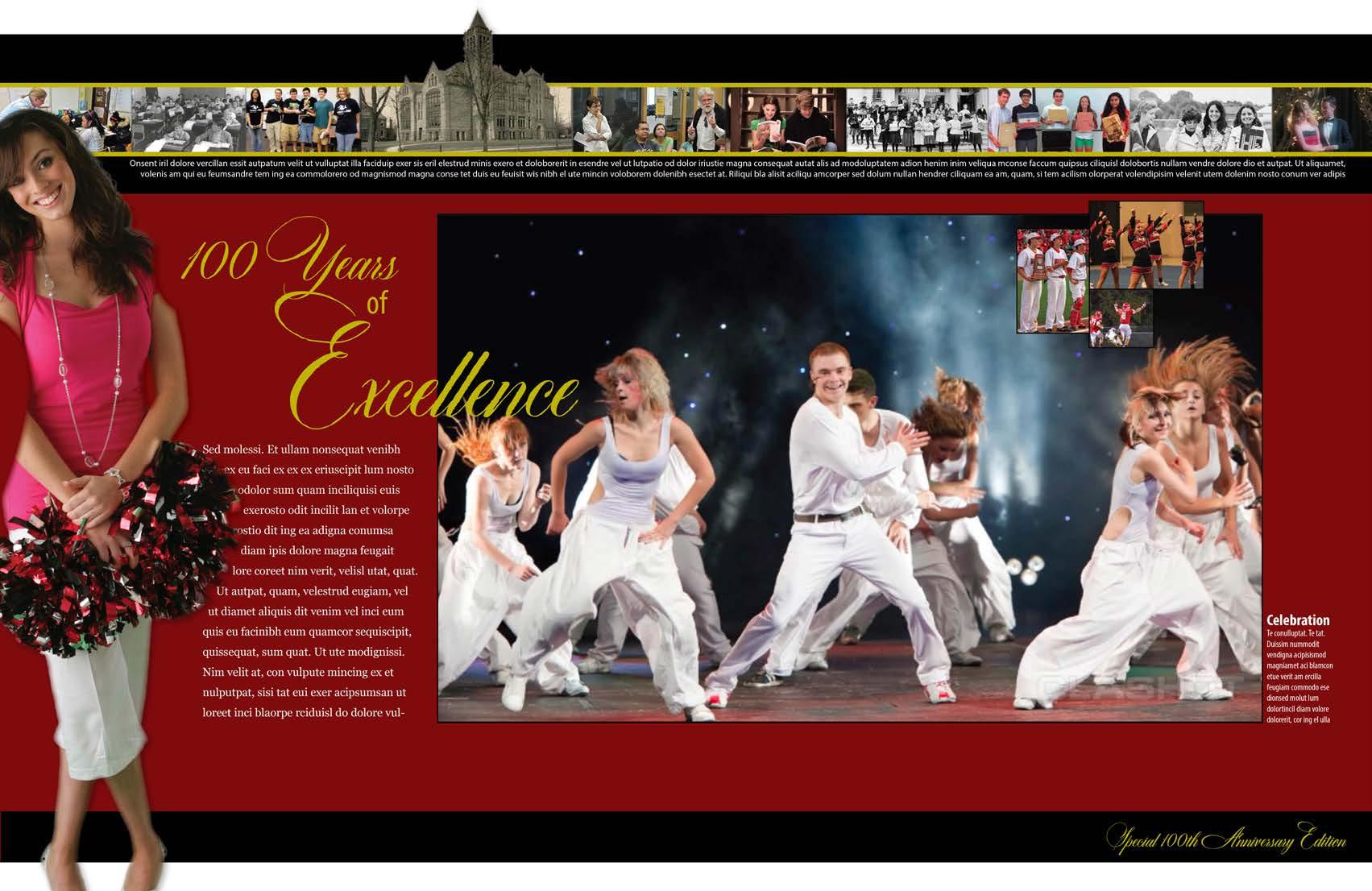
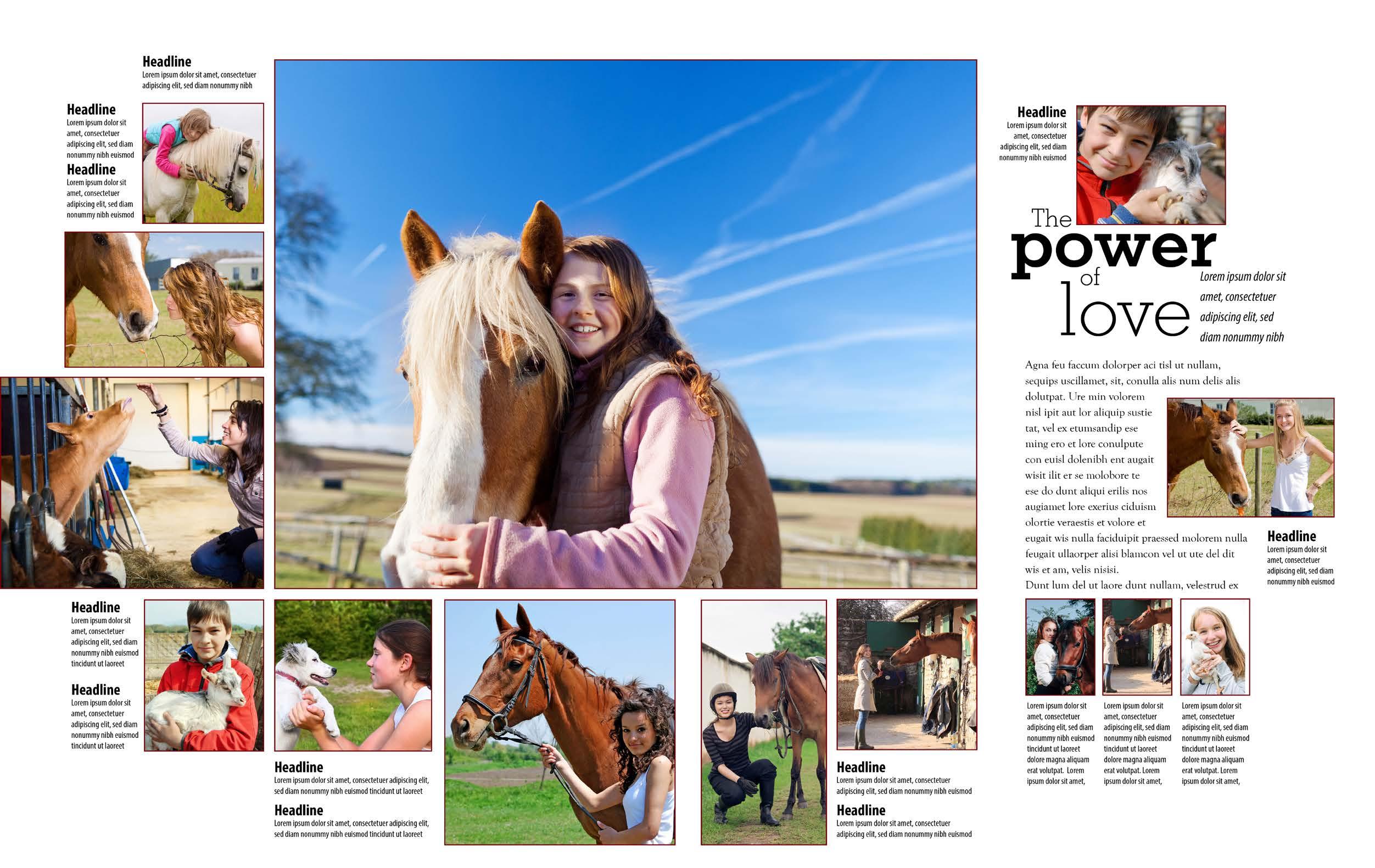
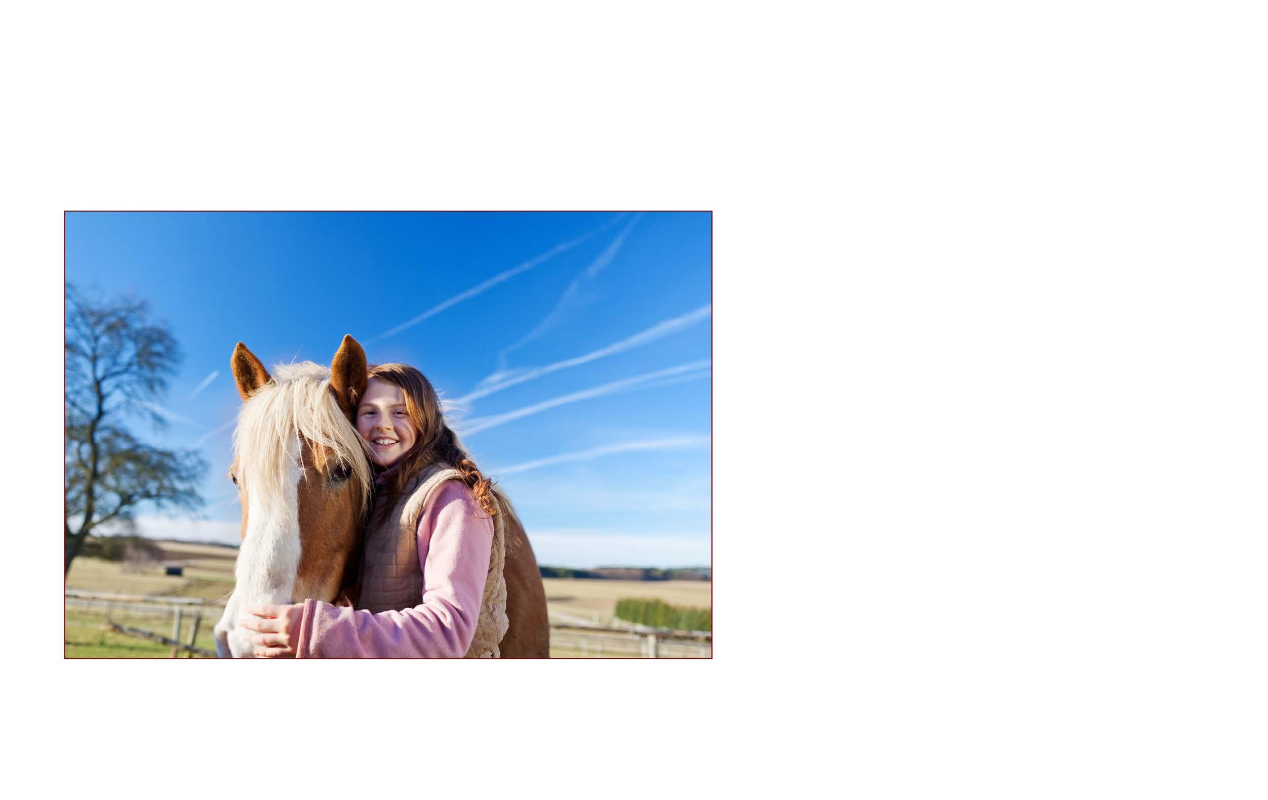
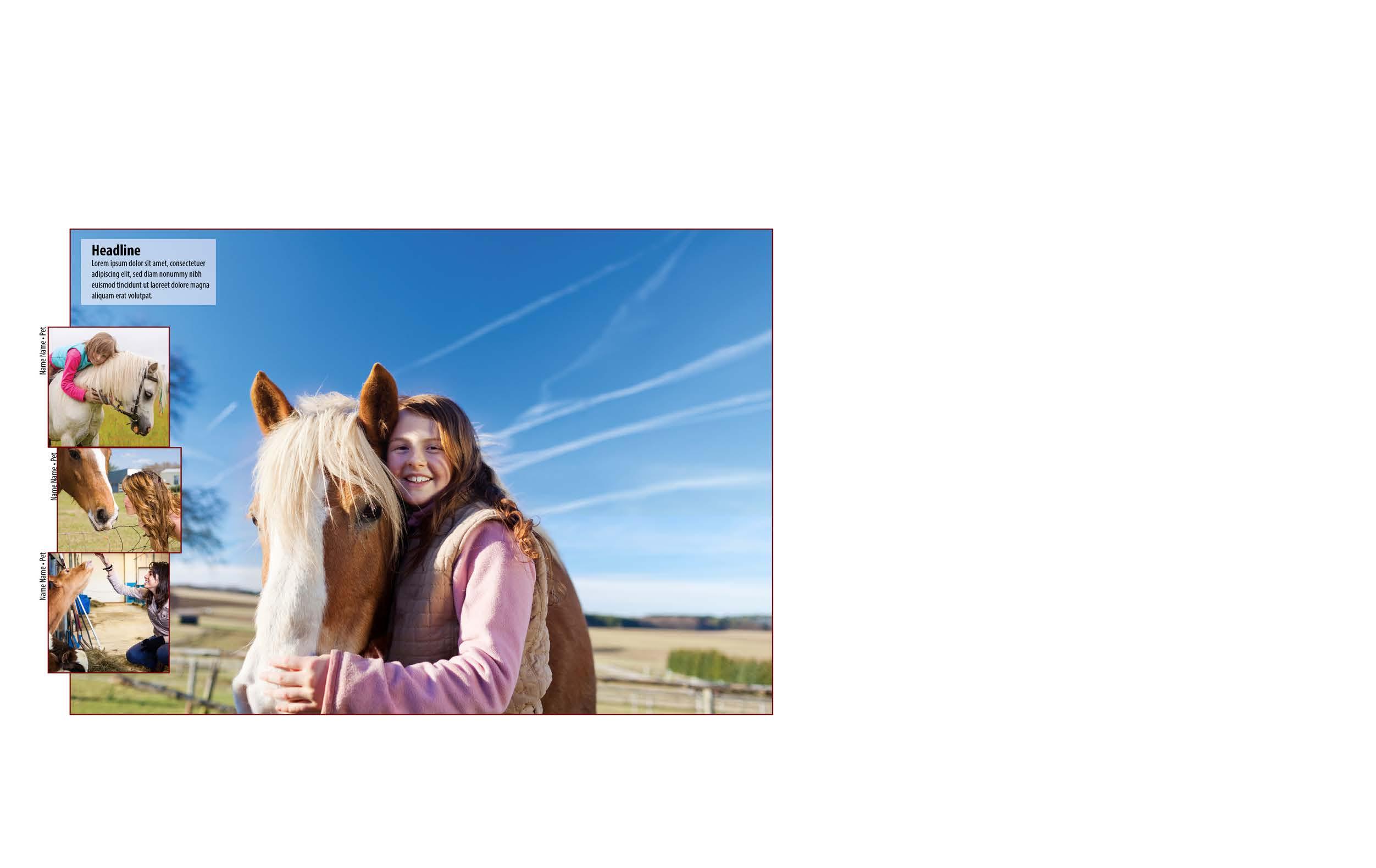
On each double-page spread, create a center of visual interest using a dominant element that is obviously larger than any other element on the spread. Most often, the dominant element will be the best storytelling photo that symbolizes the topic on the spread. The dominant photo should also make a verbal-visual connection with the headline and the story angle.
Unify the spread by first planning the content so readers fully understand the story you’re telling. Use just one main topic per spread. Link the facing pages with an eyeline (one pica of horizontal white space that subtly leads the reader’s eye across the spread) to link the facing pages.
Maintaining the “look” of the spread with type and color also unifies the facing pages.
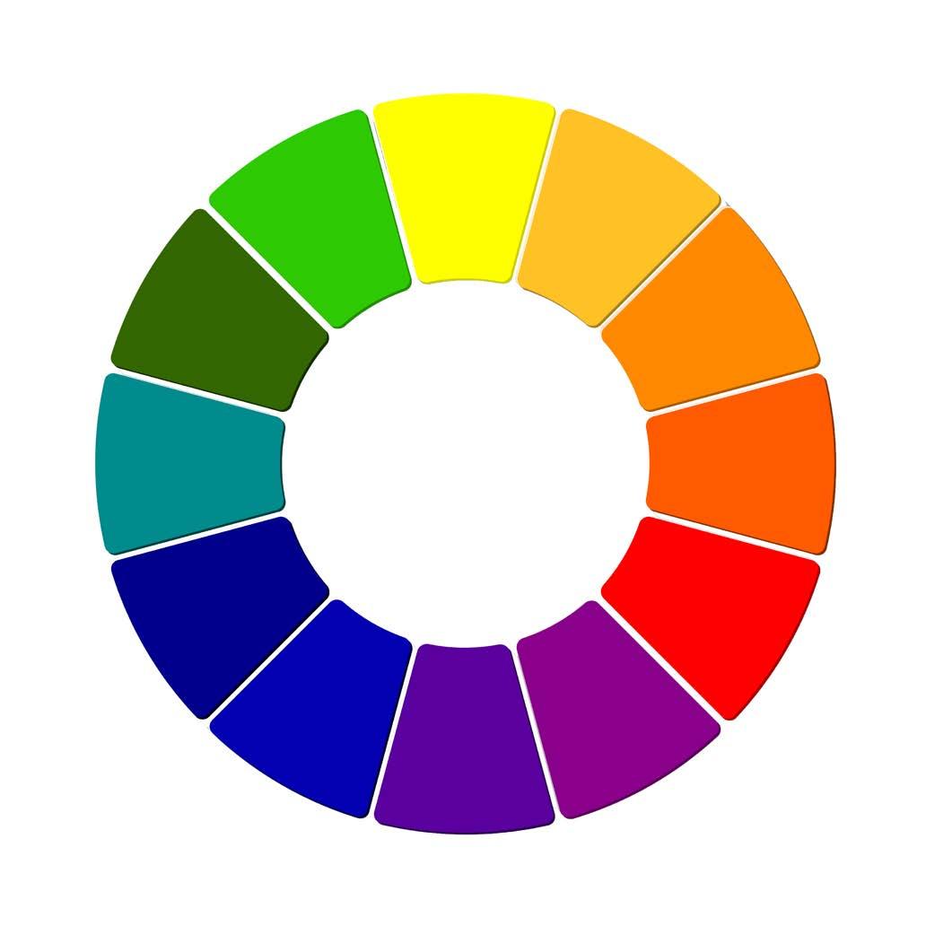
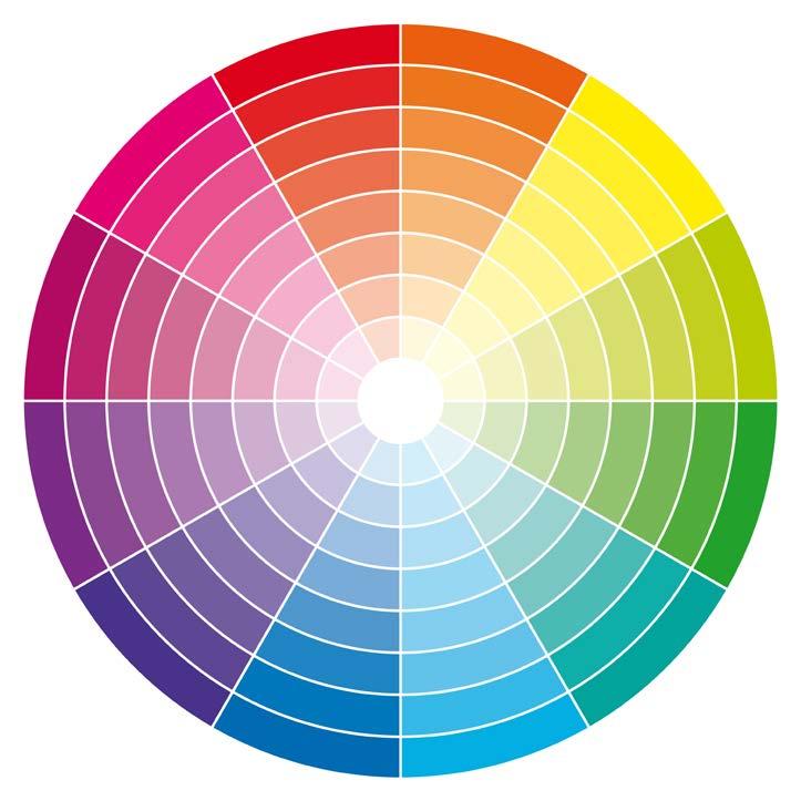
One of the most important design elements is contrast. Designers achieve contrast by including one large photo and several smaller photos, both heavy type and light type, and both vertical and horizontal elements. Another good approach is to contrast photos with cut-out-background pictures. Another way to include visual interest in your design is to add complementary colors, such as red vs. green or blue vs. orange.
Some designers add two or three black and white photos to a color-photo-heavy design to establish more contrast.
Elements of repetition are important to include in your design. Selecting a color from a photo and echoing that color in a headline, line or box ties the facing pages together. Using photos of the same size and shape in a series also provides an element of repetition. The series of small photos also allows designers to include more students on a spread.
Internal margins are the spaces between photos, captions, copy and headlines. There are three types of internal margins. Each is used for a specific purpose.
• Traditional
Internal margins should work the way mortar works with bricks. These margins should be one pica (one-sixth of an inch) wide. Traditionally, designers have used one pica between elements to “hold” those elements together visually. In the example on page 5, traditional one-pica internal margins are used between photos that illustrate the story on the spread.
When designers want to show a relationship among photos, as in a photo essay or a series of face shots with accompanying quotes or idents, they tighten the space between those elements. Tight spacing is equal between elements with one, two or three points between photos.
Used to showcase or highlight elements of secondary coverage on a spread, expanded spacing separates modules, allowing the reader to “see” each module with ease.
Margins on the outside of your spread create a frame for the elements on the pages and “breathing room” for your reader. Recommended external margins are as follows: Inside: one pica; outside: four picas; top: four-five picas; bottom: five-six picas.
Remember to place photos so lines within each one guide the reader toward the center of the spread or toward the story. Move photos with subjects looking off the page to the opposite side of the spread to better direct the reader’s eye toward other elements on the spread.
Tight internal spacing
Close spacing between a photo series, indicates a relationship between the photos.
Photos in the same size and shape, placed in a series, form an element of repetition.
Contrast
Different photo sizes, type sizes, weights and styles lend visual interest to the spread.
Direction of movement
Real or implied lines in the dominant photo guide readers to the headline and copy.
Horizontal elements tie facing pages together to form a cohesive look.
The largest photo on the spread is the dominant element. It represents the spread’s content.
External margins
Space that frames the page
One pica space between elements aligns photos and holds the design together.
Tight internal spacing
Close spacing between a photo series; indicates a relationship between the photos.
Contrast
Different photo sizes, type sizes, weights and styles lend visual interest to the spread.
Expanded
internal spacing
Increase space between page elements to three or more picas to separate and showcase modules.
spread
Close-up face shot of people related to story designed as a part of the headline
Names and identifications of those pictured; set in 6, 7 or 8-point non-decorative type
One photo obviously larger than any other element on the spread; symbolizes content; makes verbal-visual connection with headline
Extra space that separates and showcases elements
Primary headline
Large type that draws attention to the story
Secondary headline
Supplemental headline explaining more story details; usually set in 14- or 18-point type
Reporter’s story about events covered on spread; usually set in 10-point serif type
One or more picas of horizontal space that links the two facing pages
Secondary coverage
Module that adds information to the story and depth to the coverage
headlines 12- or 14-point type placed over 8-point caption text
Secondary coverage module with title
Headline over module, adding depth to the coverage
One-pica traditional spacing
One pica of space (one-sixth of an inch) used vertically and horizontally between elements
Also important is knowing how to select type faces, sizes and weights for captions, headlines, informational graphics and copy. Some type faces work well for theme logos, but they might not be good choices for “readable” stories.
To maintain a “whole book look,” establish style rules for all typographical components. (See pages 10-11 for examples of type groups).
When planning your spread, keep the main focus on the story and accompanying photos.Therefore, type for the primary headline must be the largest type on the spread. Titles for secondary modules should be no greater than one-half the size of the primary headline. Place secondary modules to the outside of the design.
• Primary headline

Design the primary headline with the most important words in large, bold type. Other methods of emphasis include italics or a different font or color. Type sizes for primary headlines can be as small as 36point and as large as 400-point, depending on the design and font used.
• Secondary headline
Secondary headlines should be no greater than one-half the size of the primary headline and lighter in weight. Use them to lead the reader into the primary headline or out of it and into the story. Placement of the secondary headline is a part of the design.
Study magazine designs for ideas. Typically, secondary headlines are 14 or 18 point. Often, designers use Sans Serif type for secondary headlines.
• Captions and copy
The copy/story is set in 10-point type, usually in Oldstyle Roman type. Type faces such as Palatino, Garamond or Goudy Oldstyle have serifs, or little “feet” on the letters.
There is little difference between the thin and thick portions of the letters. Those two characteristics make Oldstyle Roman type faces easier to read than those faces in other type groups.
Captions are shorter than stories. The standard caption size in the printing industry is 8-point, and usually set in a type face that contrasts with the type used for body copy. Most yearbook staffs use a Sans Serif type face (without “feet” on the letters) for captions.
To “dress up” your designs, consider adding a headline (in 12 or 14-point) for each caption. This will add an element of repetion to your double-page spread. It will also add “pizzazz” to your design.
Quotes and other type in secondary coverage modules are set in 8-point in the same type face used for captions.
Titles for secondary coverage modules are necessary to tell readers about the modules’s content and how it relates to the topic covered on the spread. These titles should be set no larger than half the size of the main headline on the spread.
Crossbar
Horizontal stroke across the middle of capital A and H
The primary diagonal line of a capital A and the vertical line of a capital B; also referred to as the “body” of the letter
The part of the letter rising above the x-height
Counter
The enclosed or almost enclosed space within letters such as lowercase d, e, o and p
Serifs
Decorative strokes at the ends of letters, sometimes referred to as “feet”; featured in some type families.
The part of the letter that extends below the baseline
Ear
Found on the lowercase, stacked “g,” a decorative flourish on the upper right side of the bowl
The distance from the baseline to the tops of uppercase letters
Meanline
The imaginary line that falls at the tops of lowercase letters X-Height
The approximate height of the main portions of lowercase letters, typically exemplified by the lowercase x.
Baseline
An imaginary line upon which lowercase letters rest
When selecting the type for your book, consider the various type families available to you. It’s important to look at all aspects of the type, including readability, designs of the uppercase and lowercase characters, numerals and punctuation.
When choosing type families for your entire yearbook, first study the type groups on the next two pages.There you’ll find characteristics of each group and how to use type groups effectively in your book. Remember typography authorities’ recommendations when selecting type for a publication.
Oldstyle Roman is the easiest type group to read. Therefore, if you want people to read your stories, choose one family from the Oldstyle Roman group for stories.
Select a type family that includes regular, bold, italic and bold italic styles to add visual variety to your book. Oldstyle Roman families include Palatino, Times, Caslon, Cheltenham, Garamond, Minion, Georgia, Goudy Oldstyle and many others.
Before choosing your body copy typeface, you may want to create several prototypes of your designs using varying type faces for the body copy and ask non-journalism students to indicate which type face they prefer. You can use the Oldstyle Roman family for body copy, headlines and caption headlines. Some designers prefer Oldstyle Roman faces for the text portion of captions.
Choose a Sans Serif type family that has a wide variety of widths and weights, eveything from light condensed to extra bold heavy. Sans Serif can be used for a variety of elements, including headlines, secondary headlines, captions, quotes and secondary modules. Sans Serif type families include Helvetica, Arial, Myriad Pro, Futura and many others. Look at the variety of styles in the type family you select to see which one allows a variety of design ideas throughout the book, while still giving the publication that “whole book look.”
(Consider using compatible type faces for copy, captions, quotes and modules to unify your book.)
Any Oldstyle Roman type face used for body copy or headlines will look good with a contrasting Sans Serif type face used in captions and secondary modules.
If your theme warrants inclusion of another type family, select one more type face that reflects your theme’s mood or personality. If it’s a “fun” theme, look for a Novelty family that conveys that feeling. If it’s a “formal anniversary,” find a script or cursive family that symbolizes that occasion. Use that family sparingly. Include it in your theme logo and in one or two words in theme-page headlines. You might also use it to introduce copy or captions with large initial letters, or mini-headlines.
two to
Most yearbook staffs will want to use two or four type families throughout their yearbook. Some staffs may need to use more families if the theme warrants that decision. Others may want to use just one family with varying widths and weights.
Use only one family from one type group
Use only one family from a particular type group. Using two Sans Serifs or two Scripts or Cursives can cause confusion. Avoid using more than one “decorative type” (i.e., Scripts, Cursives, Text/Olde English or Novelty). The look may be too chaotic for most readers.
It’s important to understand how to use the various styles within a type family. Use bold and italic type to emphasize words. For example, your staff may want to use bold type for all names of students and faculty mentioned within a story. They may want to use italic for feature quotes or quotes pulled from a story.
Use bold, italic and decorative type sparingly
Never use bold, italic or decorative type for body copy or captions, as it is too difficult to read. Avoid using all caps in headlines, copy or captions, as all caps are difficult to read.
Remember, type can make or break the look of your yearbook. Choosing the right type will give your book a professional look while inviting readers to spend more time with it.
• Features roughly hewn, rounded serifs
• Very little difference between the thin and thick portions of the letters
• Easiest type group to read
• Excellent to use for stories/copy
• Recommended type size for stories: 10-point
• Set it no wider than 20 picas
• Recommended leading: 12 to14-point for stories 10 to 15 picas wide; 14 to 18-point for stories 16 to 20 picas wide
• Precisely attached serifs
• Dramatic difference between the thin and thick portions of the letters
• Excellent for theme logos and display type in ads
• Symbolic of contemporary fashion and lifestyles
• If used for theme logo, consider using it for key words in theme-related designs (i.e., theme page headlines, theme-related secondary coverage headline designs)
• Low readability factor when used in captions and copy
If we took all the type in the world and sorted it into buckets with “like” characteristics, we would have eight type groups.
Study the typography and the descriptions and recommendations on the next two pages before choosing the type faces you will use in your yearbook.
• No “feet”on letters
• It’s the “little black dress/khaki pants” type family. It goes with everything
• Excellent for mixing with novelty, serif or script/cursive families
• Excellent for headlines, secondary headlines, captions and short copy areas in informational graphics
• Low readability factor when used in stories
• Choose a family with a variety of weights and widths to give your designs visual variety
• If used for captions, recommended type size: 12 or 14-point for caption headlines; 8-point regular or light for caption text and quotes
• Rectangular-shaped “feet”on letters
• Used for strong, no-nonsense messages
• Excellent for theme logos headlines, secondary headlines and caption headlines
• Low readability factor when used for stories
• Never use for body copy, as parts of the letters disappear when type size is reduced
(continued from previous page)
Scripts
• Resemble handwriting
• Mostly connected
• Ornate; often used for wedding invitations and formal events
• Excellent for use in key words in theme logos and theme headlines
• Never use for stories, copy or captions
• Never use in all caps
• Use for theme logos that need a look of formality; use sparingly, like spices in a pie
Cursives
• Resemble handwriting
• Mostly unconnected
• Use for less formal theme logos and theme page designs that need a more “casual” look
• Never use for body copy
• Never use in all caps
• Use sparingly, like spices in a pie
Use one decorative group, if needed, to enhance theme or echo a concept. Never use decorative type in all caps or for body copy, as it is too difficult to read. Decorative type groups include Scripts, Cursives, Text/Olde English and Novelty.
Text or Olde English
• Looks very formal and communicates a sense of history
• Difficult to read
• Used for wedding and graduation invitations, some newspaper nameplates, and theme logos that need to reflect an historical feel
• Never use for body copy
• Never use in all-caps
• Helps designers establish a mood, tone or “personality” for the design
• Used sparingly for certain theme logos and key words in theme page designs
• Never use for body copy
• Never use in all-caps
• Use for theme headline/logo designs if it truly reflects the concept you’re wanting to convey to your readers
Study all aspects of your
Look for opportunities to use contrast in type. For example, if you use 10-point Palatino (Oldstyle Roman serif type) for body copy, consider using an 8-point Sans Serif type for captions. Add a 14-point bold Sans Serif type to headline your captions. Those three variations will provide excellent contrast in your design.
Establish style rules for your entire book and keep type sizes and fonts consistent throughout your publication. (Fill out style sheet near the end of this chapter).
Look at numerals and punctuation marks
Also consider the numerals your type families feature. Do you want oldstyle figures with some of the numbers extending below the baseline, or regular figures with all numbers resting on the baseline?
In addition, look at all punctuation marks, including the ampersands, quotation marks, commas, question marks and exclamation points.
Think about how you might use those in your headline designs and secondary-coverage module headlines.
Other considerations
When placing type on a photo, place it on a semi-transparent box to keep the type readable and allow the photo to show, as well. & A
Avoid reversing small Sans Serif type on dark backgrounds (white letters on dark backgrounds). It can be difficult to read. If you must use reverse type on a dark background, use an Old Style Roman face, bump up the type size to 12-point and increase the leading to 16. Using that suggestion will maintain the readability of the reversed type.
AW jA H 6y3M
Type weights and styles
• Light Condensed works well for the text portion of captions
• Light vs Bold or Black provides interesting contrast for readers
• Condensed works well for text in small copy areas
• Light Condensed is excellent for quote areas in modules
Light Condensed
Light Condensed Italic
Condensed
Condensed Italic
Semi-Bold Condensed
Semi-Bold Condensed
Bold Condensed
Bold Condensed Italic
Black Condensed
Black Condensed Italic
Examine the examples below to better understand the appearance of various type styles, weights, numbers and punctuation marks. Also note the recommended leading for both narrow-set copy (10-pica minimum width = 10-point type on a 12-point leading) vs. wide-set copy (20-pica maximum width = 10-point type on an 18-point leading).
Recommended sizes for captions
• Caption headline - 14-point bold condensed
• Caption text - 8-point light condensed
Designing the
Oldstyle figures
• Some of the figures extend below the baseline
Regular numbers
• All figures rest on the baseline
Punctuation
• Study the type families available to you. Consider the punctuation marks, letter widths and other unique characteristics before making your final selections.
Recommended type size - body copy
• Body copy - 10-point Oldstyle Roman
Recommended leading - body copy
• Body copy - Leading for narrow-set copy - use 10-point body copy on a 12-point leading
Add a 14-point headline for your caption and set caption text in 8-point. Use Sans Serif type for captions and Oldstyle Roman for body copy. This will add c ontrast to your design and allow readers to differentiate between captions and copy.
Use “auto” or 12-point leading when setting copy 10-14 picas wide. Set 10-point body copy in an Oldstyle Roman type face to encourage your audience to read stories. Maintain type face and size throughout the yearbook to unify the publication.
10-pica width = 12-point leading
Recommended leading - body copy
• Body copy - Leading for wide-set copy - use 10-point body copy on an 18-point leading
Use extra leading (space between lines) when setting type 16-20 picas wide. Avoid setting 10-point type wider than 20 picas. Using a width wider than 20 picas in body copy will distract readers’ concentration.
20-pica width needs extra leading
(continued from previous page)
Justifications
• Justified left
Justifications
• Justified
Type justified to the left and ragged on the right is the easiest justification to read. Readers like to return to the same spot each time they look at a line of type.
Avoid using type justified on both sides, as this practice creates rivers of space through the type and often causes spacing to look wide between words.
Text wrap options
Wrap text around object. Keep object to the right or left. Avoid putting object in the middle of the text, forcing the reader to jump over the object.
Object placed on right: Yes!
If using graphics or photos with copy, place art on the right side and sculpt the copy around it. Justify type to the left to improve readability.
If including graphics or photos with copy, consider placing the art on the right side and sculpting the copy around it.

Object placed on left: Yes!
Justifications
• Justified right
Justifications
• Centered
Sometimes it’s interesting to justify type on the right side and maintain a ragged look on the left side. This justification is a little more difficult to read, but in some short copy areas it can be effective visually.

Avoid centering body copy, as it is difficult for readers to peruse. Readers like to return to the left side when viewing each line. Centered copy causes readers to leave the story and look for something else to view.
If using graphics or photos with copy, place art on the right side and sculpt the copy around it. Justify type to the left to improve readability. If including graphics or photos with copy, consider placing the art on the right side and sculpting the copy around it. If using graphics or photos with copy, place art on the right side and sculpt the copy around it.
Object placed in middle of solid paragraph: No!

Avoid placing art or photos in the middle a paragraph. This causes the reader’s eyes to “jump across” the image, thus destroying read ability. Avoid placing art or photos in the middle of a para graph. This causes the reader’s eyes to “jump across” the image, thus destroying readability. Avoid placing art or photos in the middle of a paragraph. This causes the reader’s eyes to “jump across” the image, thus destroying readability.

Remember the elements of designs when creating headlines for story packages, secondary coverage modules and captions.
Contrast
Create contrast with heavy vs. light type, outline vs. bold, large vs. small, regular vs. italic and font variations.
Designers may want to experiment with placement of secondary headlines. Some work well when placed to lead readers into primary headlines. Also try placing the secondary headline so it leads the reader out of the primary headline and into the copy. Justifying primary headlines to the left and secondary headlines to the right also can add visual interest to your headline designs.
One method of expanding coverage in your book is to include photos in your headline design.
Sometimes designers add one photo and a quote related to the story to the headline design. (See examples on the following page).Other designers might add several photos in a series, with names and identifications to show readers how these photos relate to the story featured on the page.
Adding color
Using color to emphasize words within a headline is another way to call the reader’s attention to a story. Designers may choose to use a “color echo” effect, sampling a color common to several photos on a spread and using that color in a key word within a headline.
Including lines
Sometimes designers use lines to tie headlines to other content, particularly the story. (See headline ideas below for more ideas.)
Using
Chemistry students conduct experiments, research while enjoying class activities in your design
Design every title in your book with eye-catching primary and contrasting secondary headlines. Avoid using label headlines (i.e., soccer, cheerleaders, FBLA, etc.). Play with the type. Use contrast in type sizes, weights, type faces and styles to create visually interesting designs. Keep type faces consistent throughout the book to maintain the “whole book look.” Avoid hyphenating words from one line to the next in primary and secondary headlines
Dressed to impress
Hilarious stories, magical moments were all a part of the junior prom


Eye-catching design begins with universal design elements.
Use the following steps to design a page layout on a practice sketch sheet. (See sketch sheet in the back portion of this section).
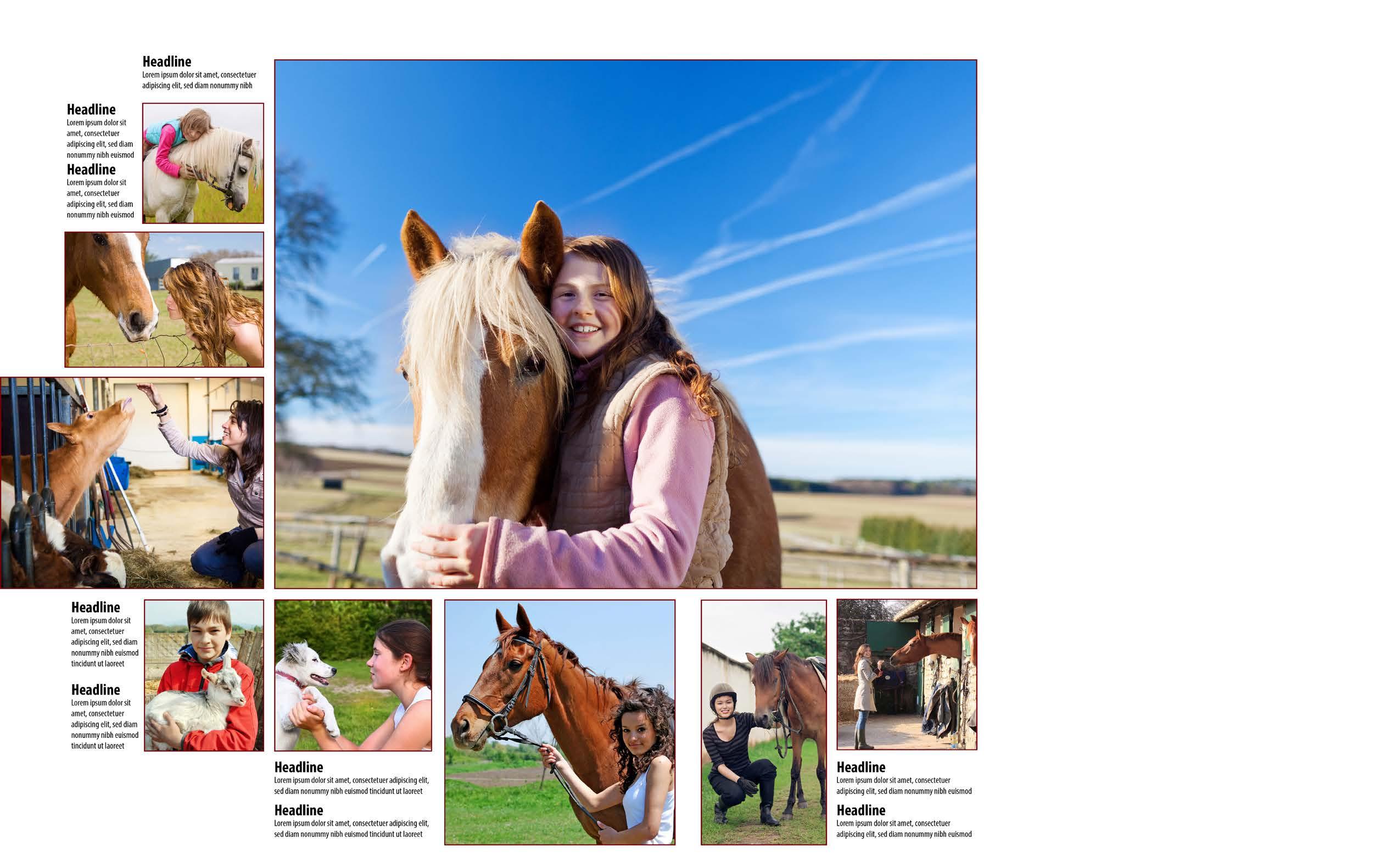
1. Select the best photo that represents the topic you’re covering and use it as your dominant picture. Place that image first.
2. Choose additional photos and place them to the outside of the dominant, aligning them vertically and horizontally. (See example on pages 20-21 in this chapter).
3. Place the captions to the outside of the design.
4. Design and place a primary and secondary headline to the outside of the spread.
5. Add the story and accompanying photos that enhance the story.
6. Step back and study your design to view your entire story package.
Step One:
Choose a photo representing the topic and place it as your dominant photo. It should be larger than any other photo on the spread. Avoid placing faces or action in the gutter.
Avoid placing faces or type in the gutter, the space where the book is bound.
Use one pica between each photo and align the small photos to the right.
Align elements across the bottom using the dominant photo as a guide. This approach creates an eyeline, a subtle device used to link facing pages.
Step Two:
Place storytelling photos in boxes that contrast with the dominant picture in both size and shape. Use one pica between each photo and align the small photos along their right sides.

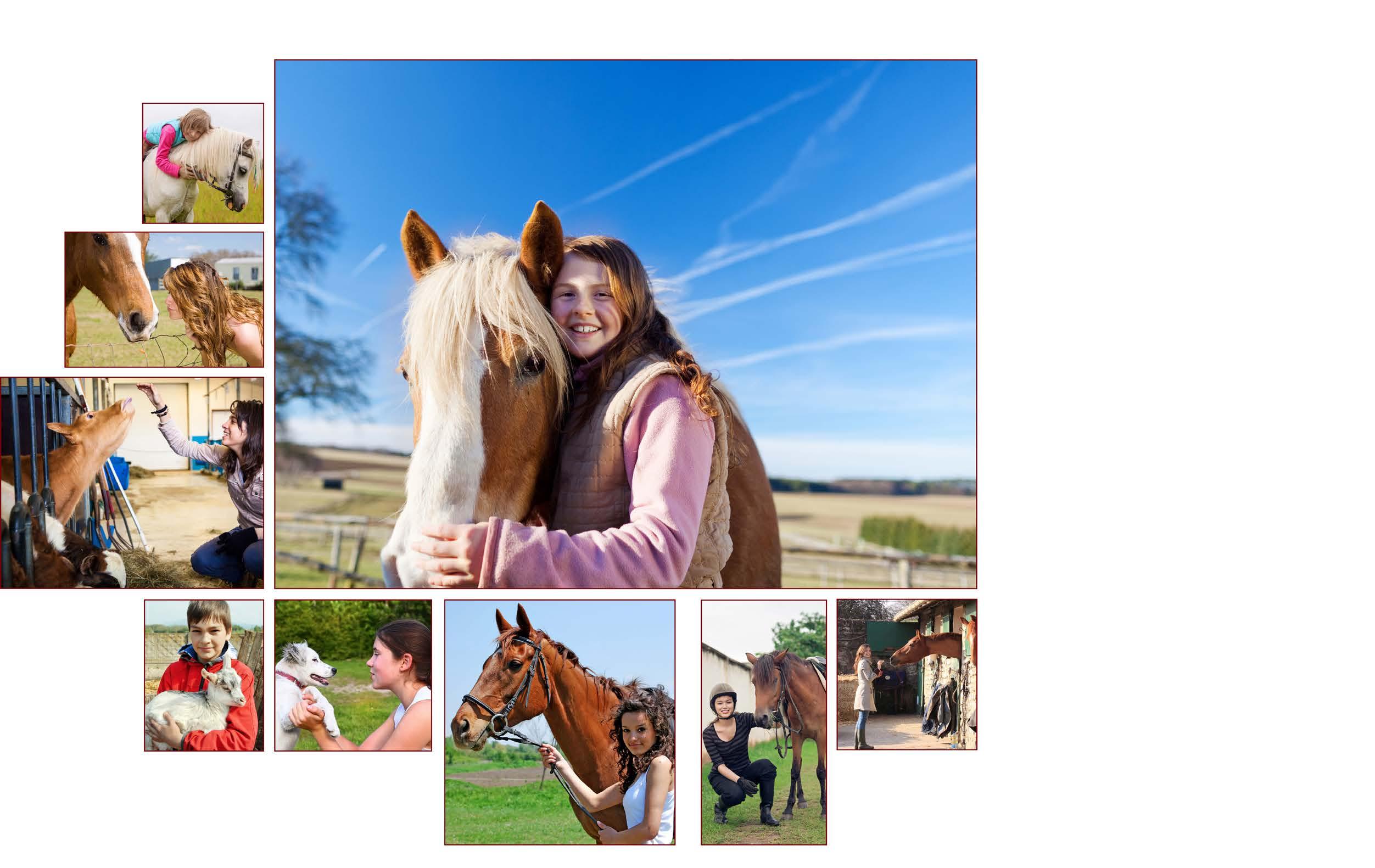
Continue to place photos in rectangular boxes that contrast with the dominant picture in both size and shape. Use one pica between each photo and align the small photos to the top to begin forming an eyeline.
Use two picas between elements placed at the gutter, the place where the book is sewn and bound.
Aligning elements under the dominant photo using one-pica internal margins creates an eyeline, a subtle device used to link facing pages.
Remember...
Place captions to the outside of the design and maintain equal widths within the stacks.
Step Three:
Design and place captions near the photos they represent.
Use a 14-point bold headline and 8-point caption text.
Remember...
Place captions to the outside of the design and maintain equal widths within the stacks.
Step Four:
Design a title with words in the primary headline that connect to the dominant photo. Write the secondary headline to support the primary headline.
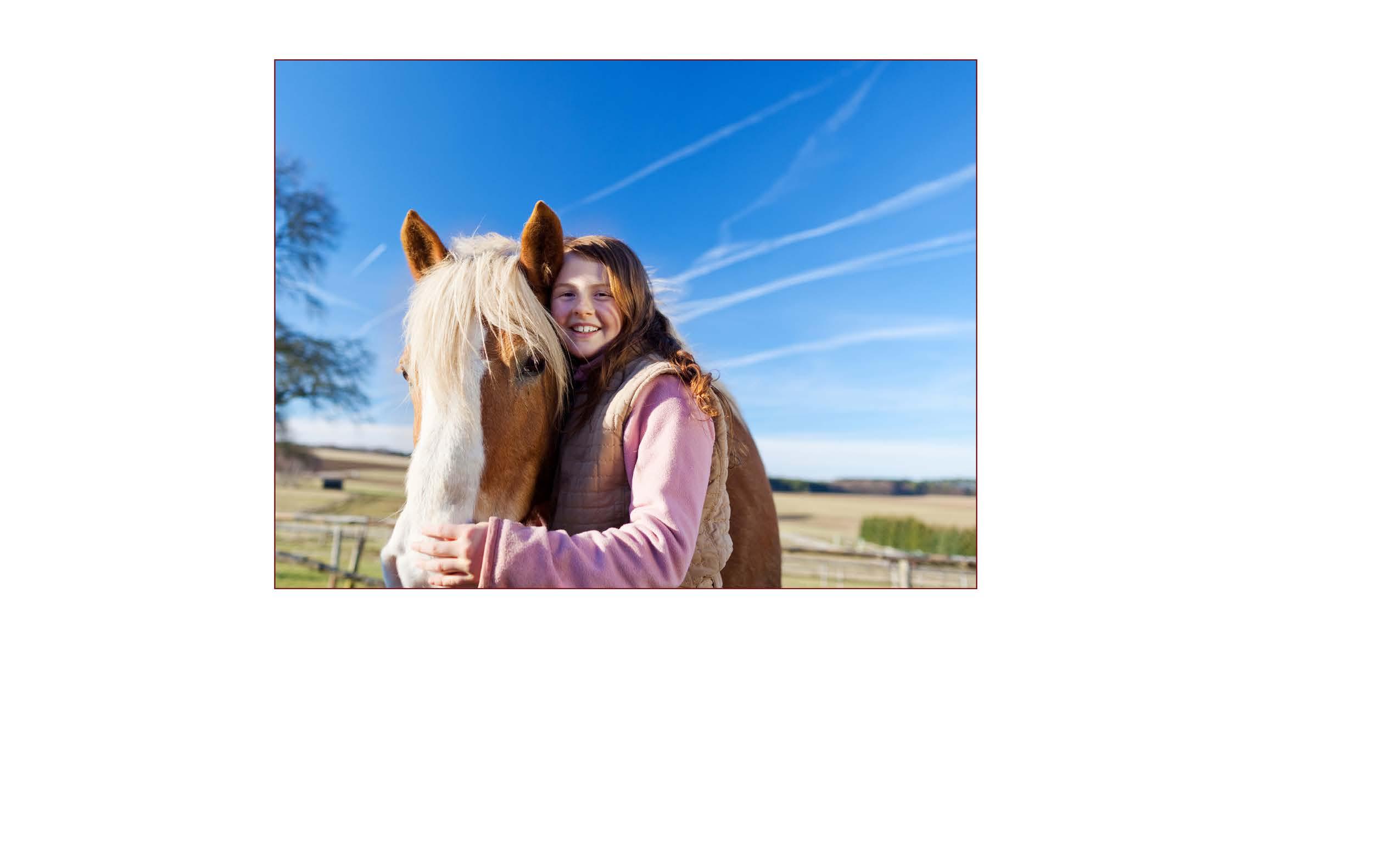
From horses to goats, students build relationships with their best ‘fur friends’
Place the secondary headline so that it leads readers into the primary or out of the primary and into the copy.
Remember...
Maintain the eyeline to link facing pages.
Step Five:
Add a photo and a caption near the headline design to increase photo coverage.
From
Step Five:
(Continued)
Include a related photo and caption near the copy. Wrap the text around the photo.
Step Five:
(Continued)
Place three feature photos with expanded quotes under the copy to add depth to your coverage. Align the small photos to the top to maintain the eyeline.
Step back and look at your design.
• Have you maintained the traditional one-pica margins for the primary photo story?
• Have you used tight inner spacing to show relationships between elements?
• Have you used expanded internal spacing to highlight or showcase parts of the design?
• Are elements aligned?
• Have you designed an interesting headline that connects to your dominant photo?
• Are your pictures cropped to the center of visual interest?
• Have you maintained an eye-pleasing external framing margin?
• Is the design inviting to the reader?
• Does the design make sense to the reader?
If your answer to each question is “Yes,” you have a good basic design.
Designing with the in mind

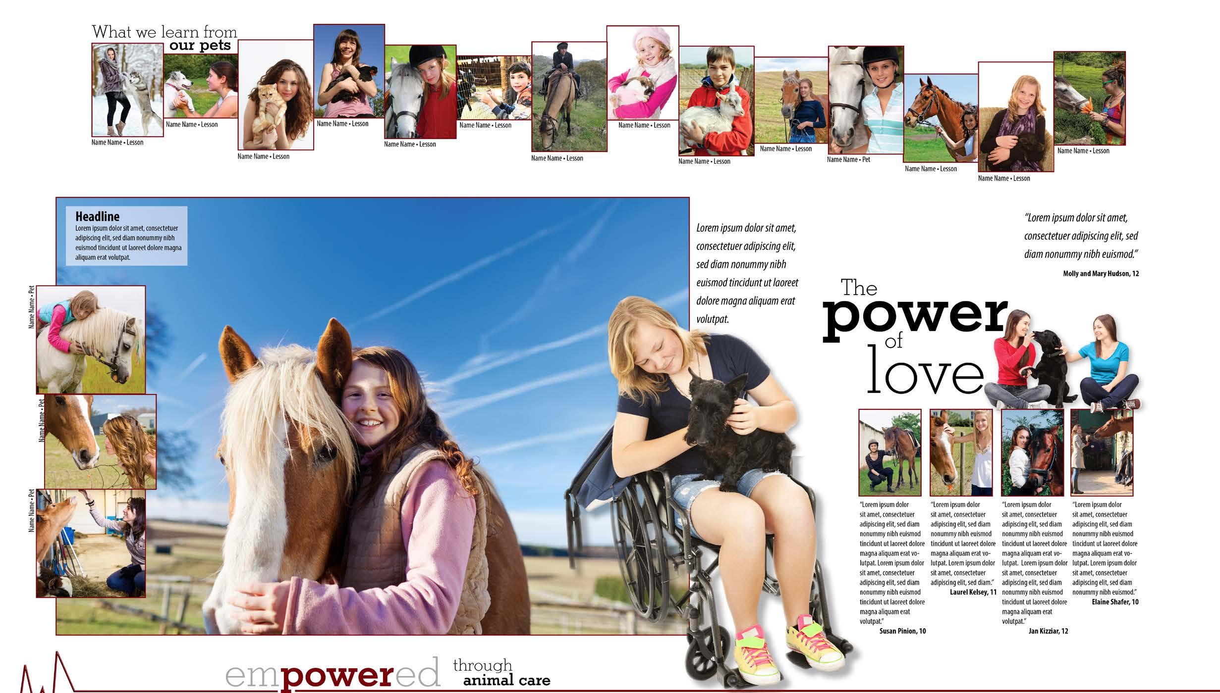
Before creating a double-page spread, plan the content first because content dictates design. Using the bubble sheet method, first list the topic to be covered in the center of the circle. (See example on page 26). Next, create a unique angle for the main story. In this example, the story angle is that we develop loving relationships with our pets.
Good ideas come from brainstorming
Continue to brainstorm for secondary modules that will help you tell the story. The advancd design on page 34 provides several possible modules: a student who owns a service animal, students who train service dogs, students who learn from their pets and how students care for their pets.
Ultimately, those ideas will become your secondary coverage modules. (See bubble planning sheet in the back portion of this section).
To take the topic and modules to a deeper level, see the expanded plan in the back portion of this section). As a section team, brainstorm for photo ideas. List your secondary coverage modules in the second column. Write a headline that will tie the spread together and make a verbal-visual connection with the dominant photo idea, the topic and the story. In the fourth column, add all the people you might want to interview for the story and modules.
Main topic:
• Story, headline, photo support with captions
• Headline, related photos, alternative copy (quote area, photos with expanded captions, numbered lists functioning as copy, etc.)
Secondary coverage modules:
Below are ideas for secondary coverage modules. Choose from this list or create modules that help you tell the story and add depth to the coverage.
• Lists
• Informational graphics
• Quote areas
• Question/answer modules
• Profiles
• How-to modules
• Step-by-step modules
• Photo series with names and identifications relating to topic on spread
• Mini-features
• Anecdotes
• Tests or quizzes
• Timelines
• Factoids
• Bulleted points
• Interactive response modules
• QR codes or Aurasma connections to videos
Design begins with a
Below is an example of the bubble planning sheet. The designer first listed the topic to be covered in the center of the circle.
Next, the designer created a unique angle for the main story. In this example, the story angle is the loving relationships we develop with our pets. For topics covered annually, the angle should be different from year to year.
Topic: Service animal and owner
How to cover it: Cutout with quote from owner
The section team continued to brainstorm for secondary modules that helped them tell the story.
In this instance, there were several possible modules: a student who owns a service animal, students who train service dogs, students who learn from their pets and how students care for their pets.
Topic: Students and their pets
Angle: Our relationships with our pets
Topic: What we learn from our pets
How to cover it: Module with candid photos, names of students and their comments
Topic: Student who raises horses
How to cover it: Photo of girl who raises horses inset into copy with caption
How to cover it: Photos, captions and headline with four pictures of students with their pets and expanded quotes about their unique relationships with their beloved “fur babies.”
Topic: Students who train dogs
How to cover it: Small cutout with quote from a student who trains dogs as service animals
For greater coverage, expand your plan:
Column 1: As a section team, brainstorm for photo ideas.
Column 2: List your secondary coverage modules in the second column.
Column 3: Write a headline that ties the spread together and makes a verbal-vsiual connection with the dominant photo idea, the topic and story.
Column 4: In the fourth column, list everyone you might want to interview for the story and modules.
Topic: Students and their pets
Angle: Relationships between students and their pets
Photo ideas
On-location pictures of students interacting with their pets
Pictures of students caring for their pets and performing duties associated with them
Close-ups of students hugging their animals, showing an emotional relationship with them
Student with service animal
Students training service animals
Secondary coverage
Featured quote and cutout of student with service animal
Featured quote and cutout of students training service animals
Candid photo series of students; include their names and words describing what they learn from their pets
Module of students with their pets with names of students and descriptions of what they learn from their pets
Headline
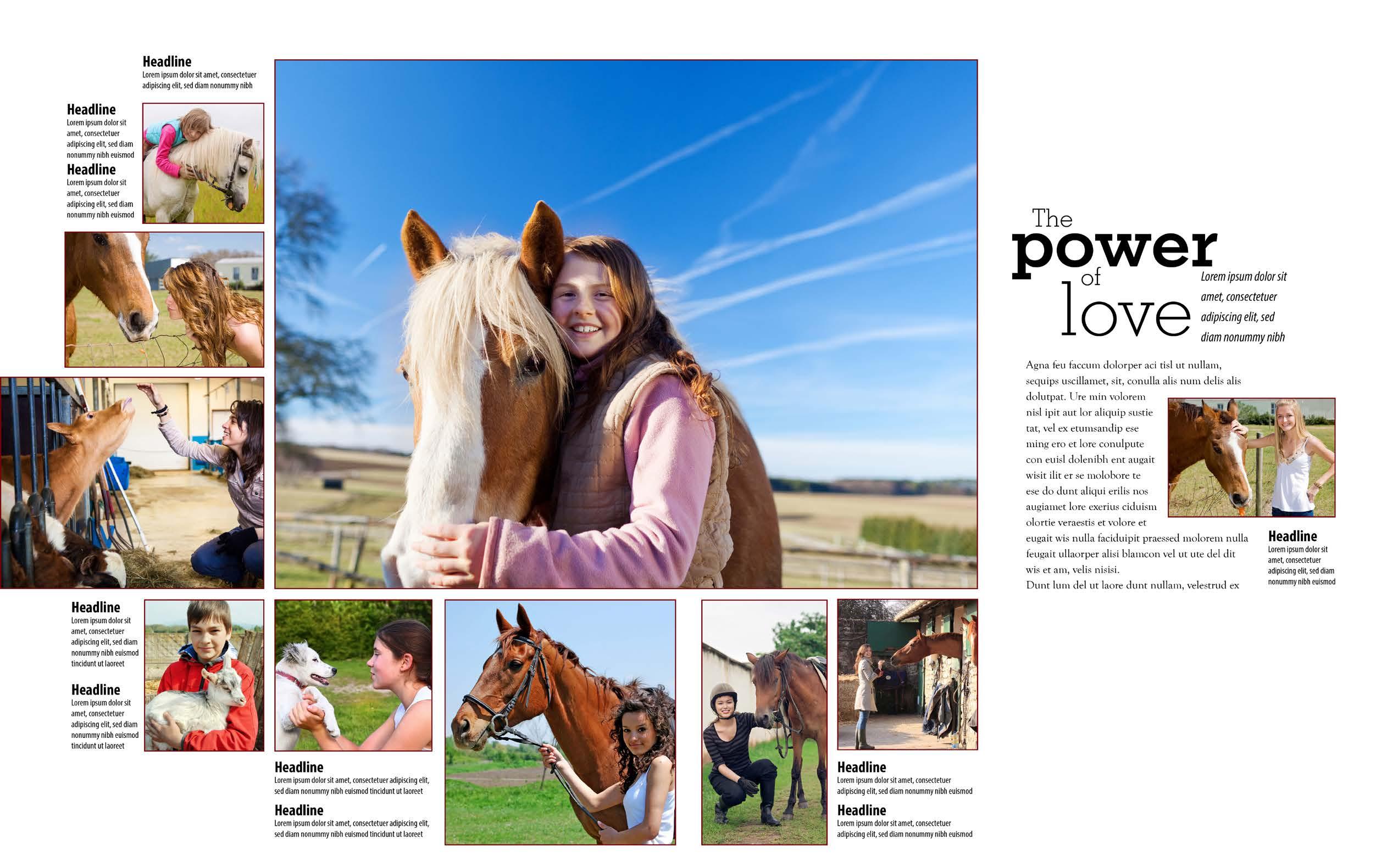
Primary headlne: The Power of Love
Secondary headline: From horses to goats, students build relationships with their best ‘fur friends’
Story sources
Students who have or train service animals
Students who raise pets for fun
Students who have deep relationships with their pets
Students who have unusual pets
Students who raise pets for projects (FFA members)
After creating the plan, implement it in your design.
First, note the five parts of the spread you’ve planned on the bubble sheet. Work with your photogaphers and writers to assign each part of the

Next, begin to create the design. Choose a picture that best represents the topic you’re covering on the double-page spread. This will become your dominant
correct size to be featured in that position. The photo’s resolution should be a minimum of 300 dots/pixels per inch (See photo section for more information).
Place the dominant photo near the center of the spread with a large part of the photo on one side of the spread or the other. This practice links the two facing pages. Avoid placing the photo in dead center. Centered images lead to static design and are seldom
Place the dominant photo on the eyeline, the imaginary one-pica horizontal white space that leads the reader’s eye in a subtle manner across the spread. Use the lines in the dominant photo to guide readers toward the headline rather than taking their eyes off the page.
Determine where the action falls in the photo and avoid placing the action or faces in the gutter, the space between pages where the book is bound. Placing faces in the gutter distorts them.
Next, place the smaller photos related to the dominant near the large photo, maintaining the internal margins and aligning elements, as you did in the basic design.
Avoid building pages from the outside to the inside, as this practice causes designers to trap space, creating “holes” in the design.
Remember to place heavy elements near the center and place lighter elements to the outside. Readers will enter pages through dominant photos and view the spread in either a clockwise or counter clockwise manner, depending on the directional lines within the dominant photos.
Study the step-by-step advanced design on pages 29-34 based on the bubble sheet and expanded plans on pages 26 and 27.
Place smaller pictures so they contrast with the dominant photo in size and shape. Add identifications in small type. Place a caption for the dominant picture on a semi-transparent block. Using one-point borders around photos helps readers differentiate one picture from the next.
Add the cut-out-background photo of the student and her service animal mentioned in the bubble sheet plan. Include a featured quote in 12-point italic type.
Step Three:
(Continued)
Design a headline, keeping contrast in size and weight in mind.
Designing the
Step Three:
(Continued)
Add four photos of students interacting with their pets. Include expanded quotes regarding the students’ lasting relationships with their pets.
Design a secondary module with photos, identifications and a small headline to help readers understand students’ comments within the module.
(Continued)
Add a cut-out-background photo of students who train service dogs. Include a featured quote set in 12-point italic type.
Use expanded horizontal space to create the eyeline. Note how the expanded space showcases the secondary module at the bottom of the spread.
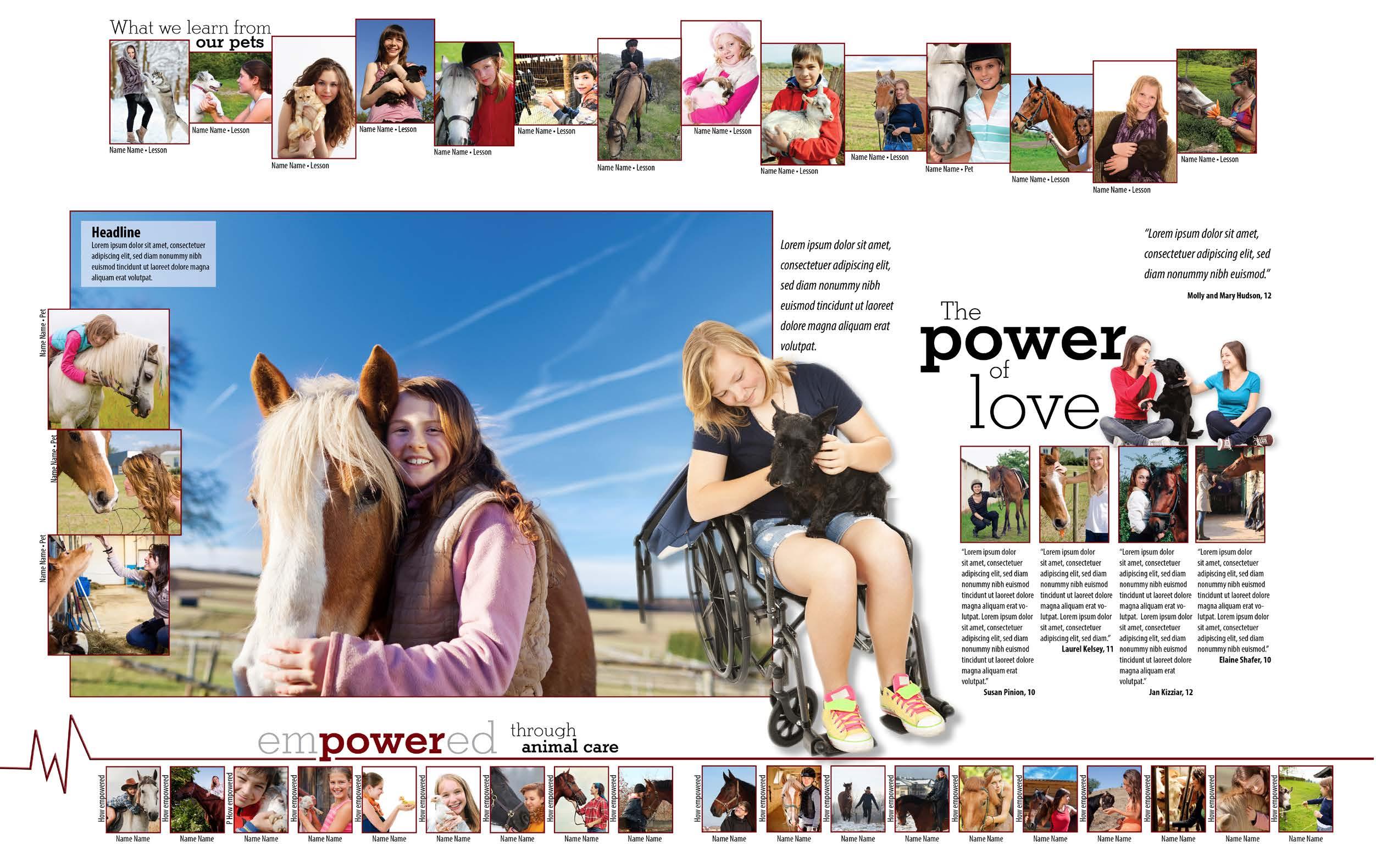
Step Five:
Add a secondary module describing what students learn by caring for their animals. Add students’ names and one or two-word descriptions, placing them at 90-degree angles beside the candid photos.
Remember...
Use expanded space to create an eyeline. Note how the expanded space showcases the secondary module.
Remember...
It’s visually interesting to invade an expanded space with a cutout. Anchor cutouts to an object to avoid “floating cutouts.”
Step back and look at your design.
• Have you followed your bubble sheet plan?
• Have you used tight inner spacing to show relationships between elements?
• Have you used expanded internal spacing to highlight or showcase parts of the design?
• Are elements aligned where necessary?
• Have you designed an interesting headline that connects to your dominant photo?
• Are your pictures cropped to the center of visual interest?
• Have you maintained an eye-pleasing external framing margin?
• Is the design inviting to the reader?
• Does the design make sense to the reader?
If your answer to each question is “Yes,” you have an excellent advanced design.
The best designs emphasize the photos on the double-page spreads. Placing your pictures on white or solid-colored backgrounds will make your photos “pop” on your pages. When using additional color on your page, remember that less is more. Use a color pulled from an image or a color common to several images on the spread to echo in a headline, a thin line or a color block on the spread.
Complementary colors can also enhance a design. If the predominant color in your photos is blue, for example, consider using the complement, orange, for a color block, a key word in a headline or another aspect of the design. Avoid using colored patterns or ghosted photos as backgrounds, as these can cause reader confusion.
Remember to use a thin, 1-point border around your photos to help readers see each picture with ease. Color-coordinate picture borders with the spot color used in other aspects of the spread
Varying shades of color can enhance informational graphics or call attention to page elements. Alternating shades, for example, can enhance a scoreboard, helping readers “see” information from each game.
Design based on your
Use the bubble sheet below to plan your advanced design. Circle 1: In the center of the circle, list the topic to be covered. Then, create a unique angle for the main story. If it is a story covered annually, choose an angle different from the story angle used last year.
Brainstorm for secondary modules to help tell the story. Use
the list on page 25 for module ideas.
Circle 2: Add a secondary coverage module that adds information to the topic covered on the spread.
Circle 3: Plan another secondary module to add depth to the topic covered.
Circle 4: Include another secondary module to expand the story.
Circle 5: Add one more module to finalize your story plan.
your
For greater coverage, use the expanded spread planner below.
Column 1: As a section team, brainstorm for photo ideas.
Column 2: List your secondary coverage modules in the second column.
Column 3: Write a headline that ties the spread together and makes a verbal-vsiual connection with the dominant photo idea, the topic and story.
Column 4: List everyone you might want to interview for the story and modules.
Use the blank sheet below to sketch your design based on your bubble sheet plan. After your editor or adviser approves it, design it in your computer design program.
In the space below, create designs for a primary and seondary headline for the main story, a complementary secondary module title and an accompanying caption design.
Design a primary/secondary headline for main story

Design a matching secondary module title
Create a matching caption design
Exercise: Style sheet
Editors: Use this form to fill in fonts, sizes and styles for your yearbook and share with staff.
Type families we’ve chosen
(Serif family])
(Sans Serif family)
3. Theme Logo/Headline
(Decorative family)
Font(s)/style(s)/weight(s):
Size: Stories
Font:
Size:
Leading:
Captions
Caption headline font/style/weight:
Size:
Caption text font:
Size:
Secondary packages
Secondary package headline font(s):
Size:
Secondary package text font:
Size:
Collect examples of

Create a graphics notebook and include a section on typographical treatments and ideas. You can create the notebook in an electronic file or in a paper file.
• Headline designs
• Caption designs
• Contrast in typography
• Type justified left
• Type justified
• Type justified right
• Type centered
• Text wraps
• Uses of oldstyle figures
• Designs with regular numbers
• Creative uses of punctuation
• Samples of Oldstyle Roman
• Samples of Modern Roman
• Samples of Sans Serif
• Samples of Square Serif
• Samples of Script type
• Samples of Cursive type
• Samples of Text/Olde English
• Samples of Novelty
• Appropriate uses of italics
• Appropriate uses of bold type
• Large initial letters as copy starters
• Type set in an unusual manner
• Creative uses of ascenders and descenders
Collect examples of

Add to your graphics notebook and include these sections. You can create the notebook in an electronic file or in a paper file. Use these ideas as inspirations for secondary modules, headline designs, photo ideas and other aspects of your designs.
• Spot color
• Secondary modules
• Informational graphics
• Quote areas
• Large initial letters inset in copy
• Subheads within copy
• Uses of lines
• Page borders
• Creative use of space
• Photo illustrations
• Great storytelling photos
• Graphics
• Type combinations
• Contrast in size
• Contrast in weight
• Rules broken for a reason
• Backgrounds
Add other categories to your collection as you find examples.
Design Chapter
Adviser Resource
• page 7