Richmond Oasis Workspace
Rural Charitable School for Disadvantaged Students in Thua Thien Hue, VIetnam
Location
Commerical/ Industrial Area, VIC
Australia
Site Classifcation
Class P - Due to Fill & Street
Building Classifcation
Class 5 - Offce
Designer
Meeko Le
Date 13th February 2021
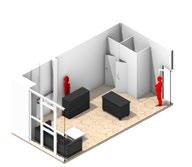
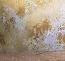
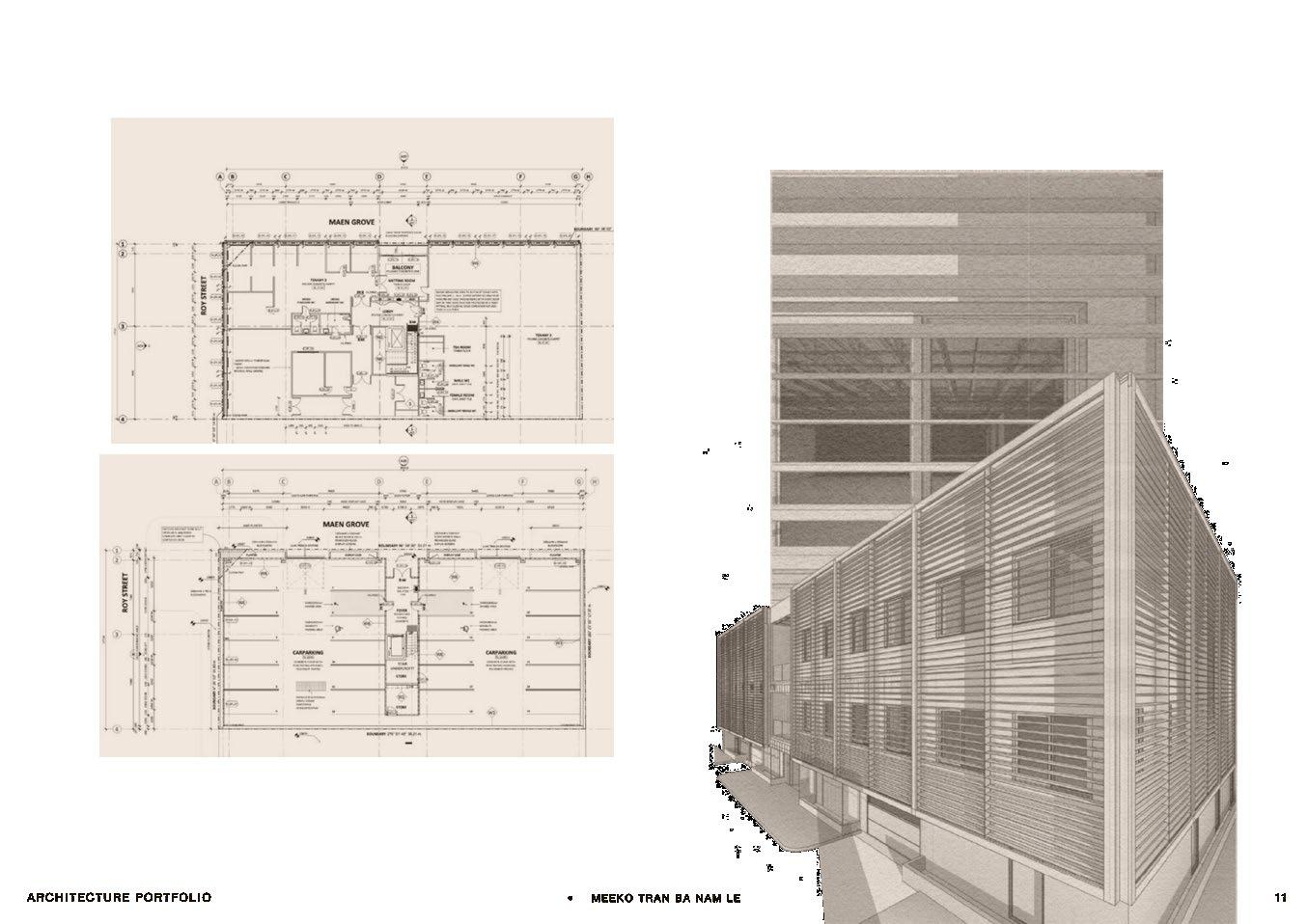
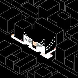
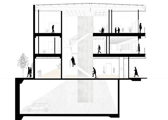
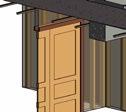
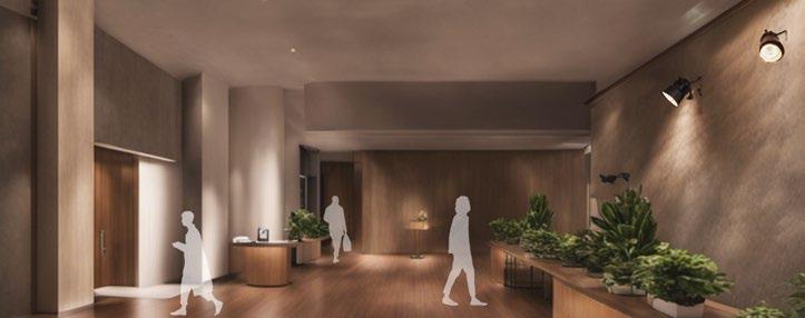
Meet ‘Richmond Design Oasis Workspace,’ a modest yet elegant addition to Richmond, Melbourne. This unassuming offce building embraces simplicity while valuing functionality. Its most distinctive feature is the timber louvers that ensure privacy and welcome the gentle touch of natural light and fresh air. The frst and second-foor balconies provide understated symmetry and quiet corners for refection. ‘Richmond Design Oasis Workspace’ humbly aspires to be a nurturing environment for collaboration Nestled within Richmond, it provides a space that values professionalism and inspiration, refecting an architectural vision for the future of work. This building offers a modest yet inviting canvas for innovative ventures in a distinctive Melbourne neighborhood.
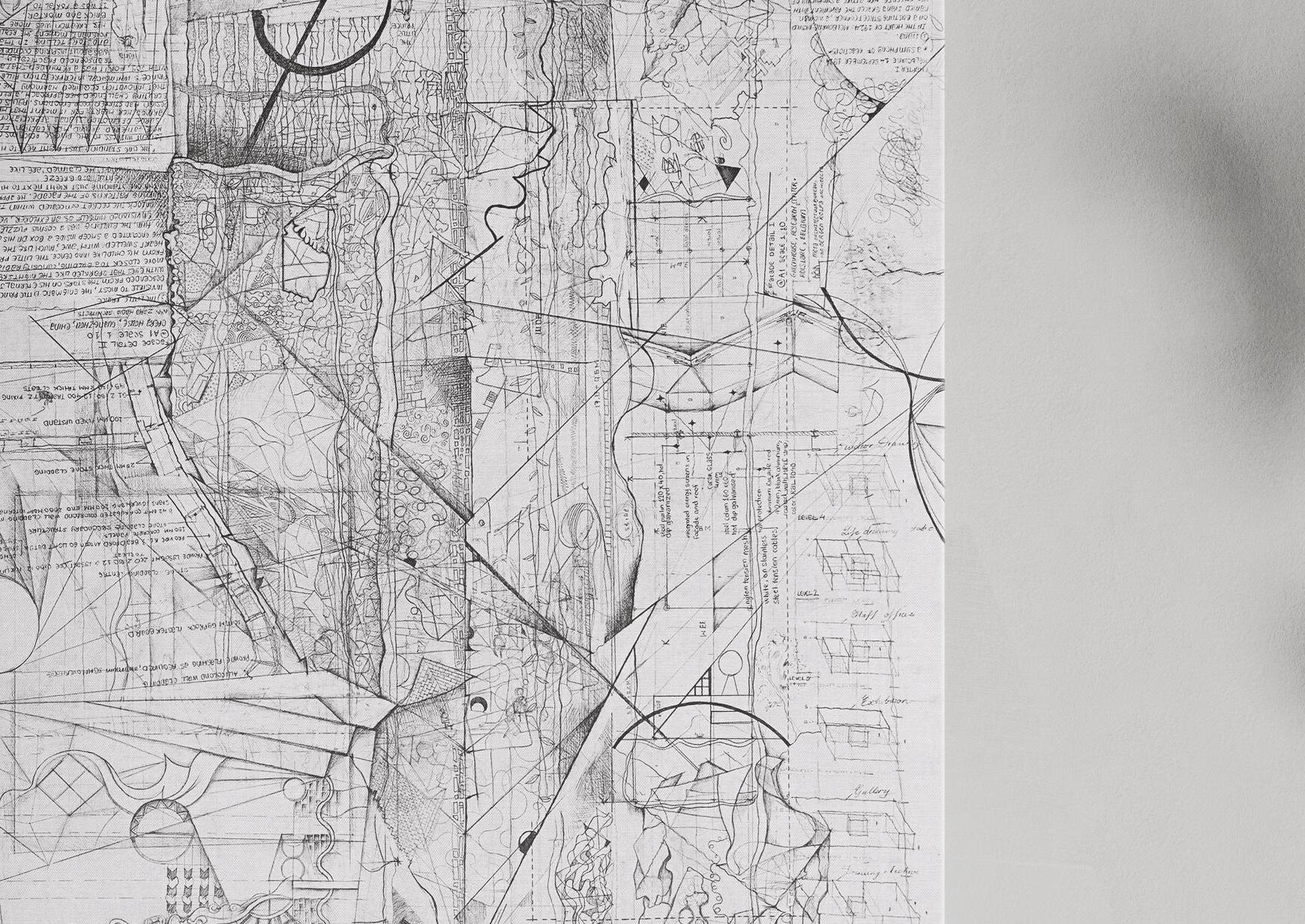
In this project, my goal is to highlight my profciency in documentation and technical drawing creation, employing software such as AutoCAD and Revit.
ARCHITECTURE PORTFOLIO | Project 01 | Richmond Design Oasis Workspace
Design Concept
A harmonious synthesis of functionality, elegance, and forward-thinking principles shaping a cohesive and visionary architectural narrative.
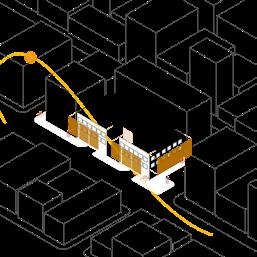
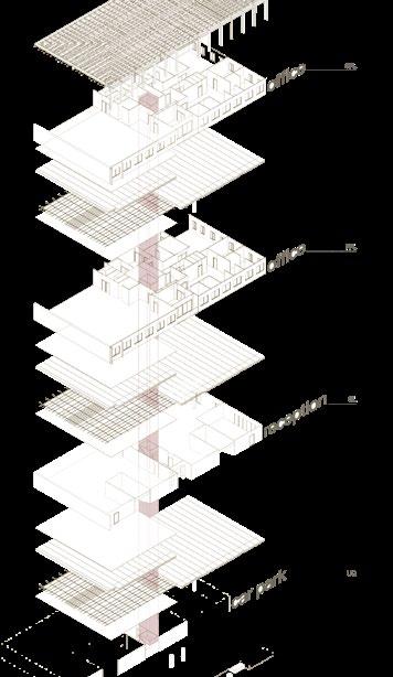
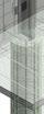
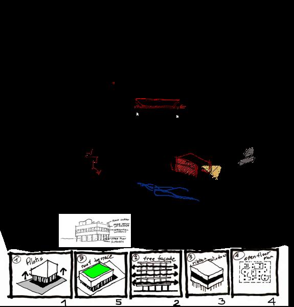
EFFICIENT RECTILINEAR CONFIGURATION
The building is conceived in a rectangular shape, strategically maximizing space utilization and functionality

CENTRALIZED SERVICE CORE WITH BASEMENT CAR PARK
A central service core placement within the building, enhancing accessibility and effciency across all foors.
The basement is designated for a practical car park, optimizing space utilization and ensuring convenient vehicle accommodation
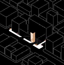
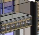
ALIGNED BALCONIES FOR VISUAL CONTINUITY WITH OFFICE SPACES OPTIMIZED FACADE WINDOWS FOR ABUNDANT NATURAL LIGHT
Aligning the balconies with the ground foor entrance, creating a harmonious visual connection throughout different levels.
The frst and second foors are dedicated to offce spaces, optimizing these levels for professional use and functionality.
01.2019 - 11.2023 Selected projects by Meeko Le
CENTRALIZED ENTRANCE WITH GROUND FLOOR LOUNGE AND RECEPTION
The centralization of the main entrance enhancing the building’s facade symmetry and visual balance.
This entry point seamlessly connects to the central service core, ensuring effcient access for occupants.
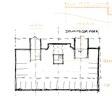
The ground foor is designed as a Reception Area, and Lounge Area.
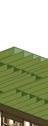
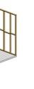
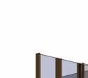
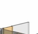
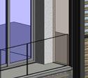
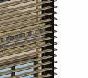
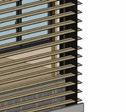
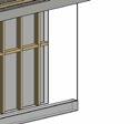
PRIVACY-ENHANCING HORIZONTAL TIMBER LOUVERS FOR AESTHETIC APPEAL
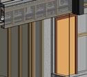
A series of strategically positioned windows across both facades, including the main facade with the balcony.
This intentional placement aims to maximize natural light penetration into the interior spaces, fostering a well-lit and vibrant environment.
The architectural emphasis lies in the implementation of a horizontal timber louver system.
This design choice not only enhances the visual aesthetics of the building but also serves the practical purpose of providing privacy for offce occupants in a high-rise environment.
ARCHITECTURAL ELEMENTS & SPATIAL VISION
The layout prioritizes functionality while creating inviting spaces for relaxation and professional engagement.


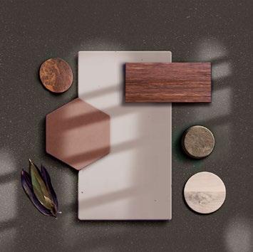
MATERIAL PALETTE & DESIGN PRINCIPLES
The design integrates signature materials like concrete, timber, and wood, complemented by white plaster walls in a strategic 60-40-10 ratio. This harmonious blend ensures a balanced aesthetic, with the dominant elements maintaining a cohesive visual appeal while allowing the accent material to add a touch of character and distinction.
60-40-10
Creates visual balance, depth, and interest, fostering a cohesive and harmonious aesthetic within a space.
Proportional Harmony within the Space
The 60-40-10 rule in design emphasizes a balanced color scheme, allocating 60% to the dominant color, 40% to the secondary color, and 10% to an accent color, achieving visual harmony and coherence.
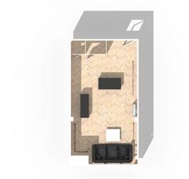
CRAFTING A WORKSPACE WHERE COMFORT MEETS PRODUCTIVITY
Catering to both focus and collaboration, our offce space features ergonomic workstations, inviting breakout areas, and seamless technology integration, fostering an environment that promotes productivity and creativity
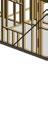
Lounge Area
Thua Thien Hue Primary School
Rural Charitable School for Disadvantaged Students in Thua Thien Hue, VIetnam
Location
Binh Loi, Binh Dien District, Huong Tra Town, Thua Thien Hue Province, Vietnam
Clients
Sung L and Thua Thien Hue Local Charitable Organization
Project Type
Private Commercial Project
Designer Meeko Le
Date
18th February 2022
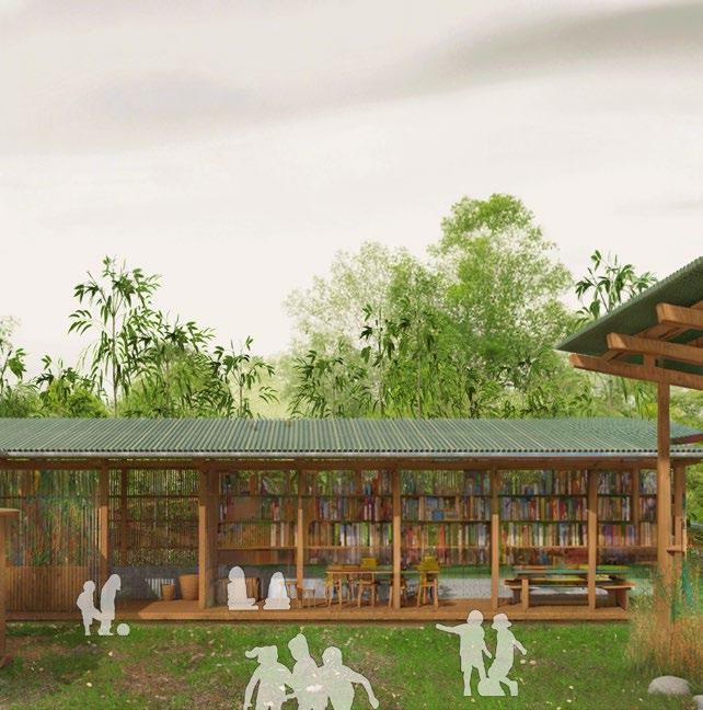
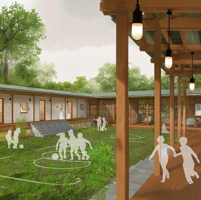
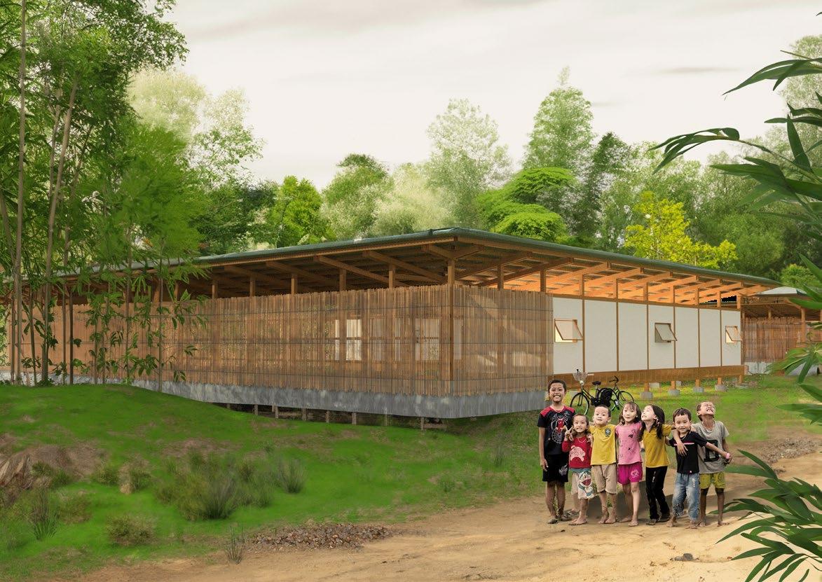
This project establishes a charitable school, Thua Thien Hue Primary School, for disadvantaged students in a rural area of Thua Thien Hue, Vietnam. HopefulHaven will provide a dedicated space for learning and play, bringing together underprivileged children from the surrounding community.
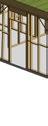
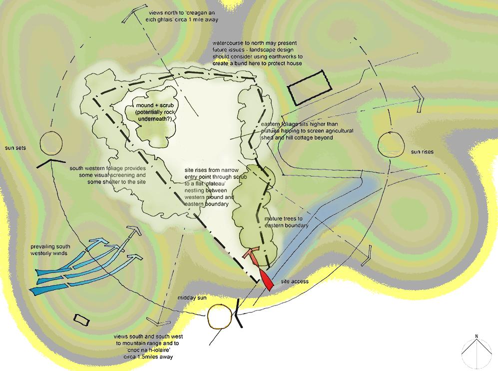
The school’s location and orientation are carefully chosen to harmonize with local traffc patterns and climate conditions. This ensures a comfortable and safe environment for students while respecting the surrounding landscape. The building is divided into public and private sections, creating a ‘bar’ arrangement that welcomes visitors to the front while providing a semi-secluded outdoor space at the back. The design prioritizes the
preservation of existing vegetation, maximizes visibility, and seamlessly integrates with the property’s existing structures. Building units feature strategically placed windows to enhance natural light and airfow throughout the day.
The layout prioritizes student comfort, with elevated classrooms oriented to maximize ventilation. In the public area, shaded thermal mass mitigates the intensity of the western sun.
In this project, I aim to showcase my ability in design, diagramming to explain the structure, and profciency in using various software tools.
Softwares Used in This Project AutoCAD Rhino

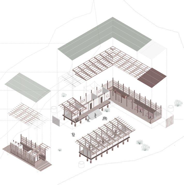
facing the prevailing winds, the classroom bar is raised and maintained light to promote air circulation. The public space bar is poured slab at grade, the thermal mass of which acts as a heat sink to counteract the western sun and improve comfort

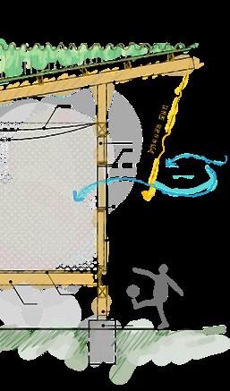
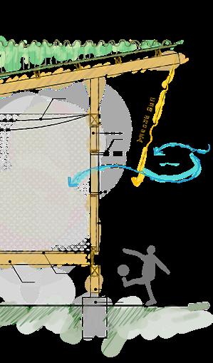
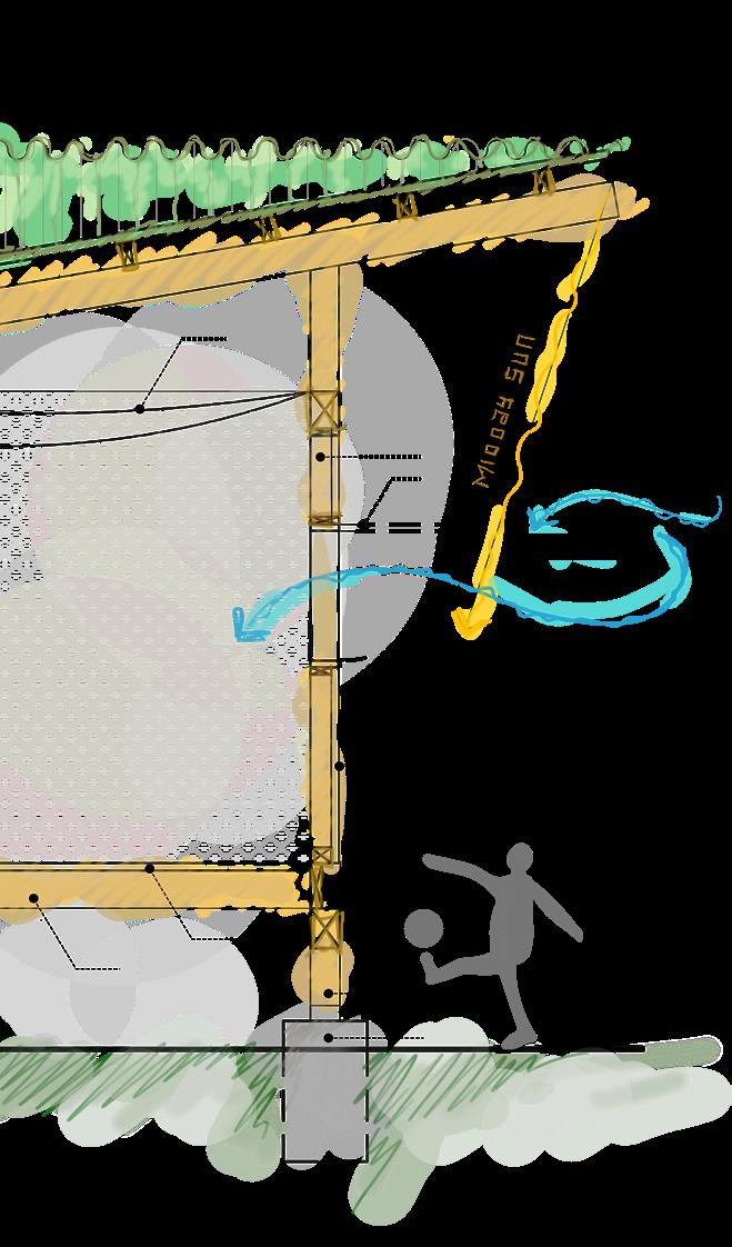
a simple roof is calibrated with overhangs situated based on the school’s solar exposure. the simple pitch of the roof means 100% of the roof runoff can be captured with two gutters which collect at both ends of the home for convenience


the diverging circulation patterns on the site create a clear location to site the house. Because of the need for privacy, an “L” scheme is chosen to block views along the circulation paths and create a protected courtyard with the nearby trees
the site approach is extruded into a simple two-bar scheme, one
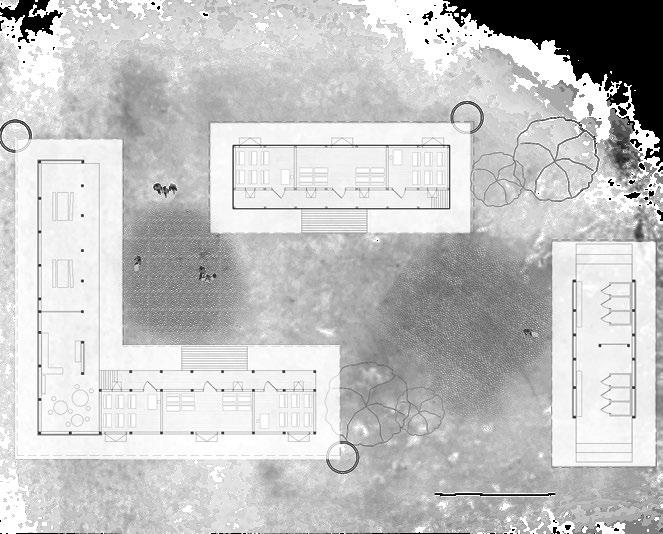
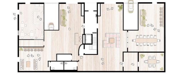
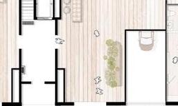
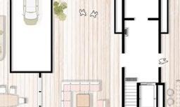
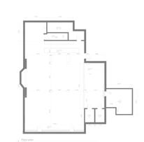
FLOOR PLAN
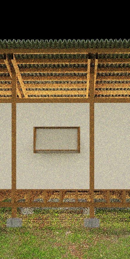
THE SCHOOL IS SITUATED IN A RURAL AREA, SURROUNDED BY BAMBOO TREES
The design emphasises integrating bamboo for sustainability while considering the region’s subtropical climate. Future plans involve local collaborations for traditional techniques and eco-friendly construction methods, marrying heritage, sustainability, and education seamlessly.
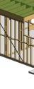
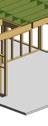
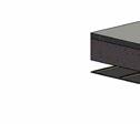
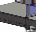
1. bamboo roof - made from cleaved bamboo stems 2. wooden truss roof, open for ventilation
3. mosquito net ceiling barrier 4. Rain water retension tank 5. classroom wall panels, light wood frame with cement fber cladding
6. men/ladies bathroom 7. second row of classrooms
8. thermal mass steps as cooling surface 9. yard 10. concrete plinth 11. bamboo screen
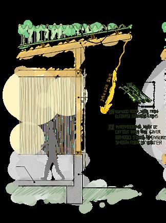
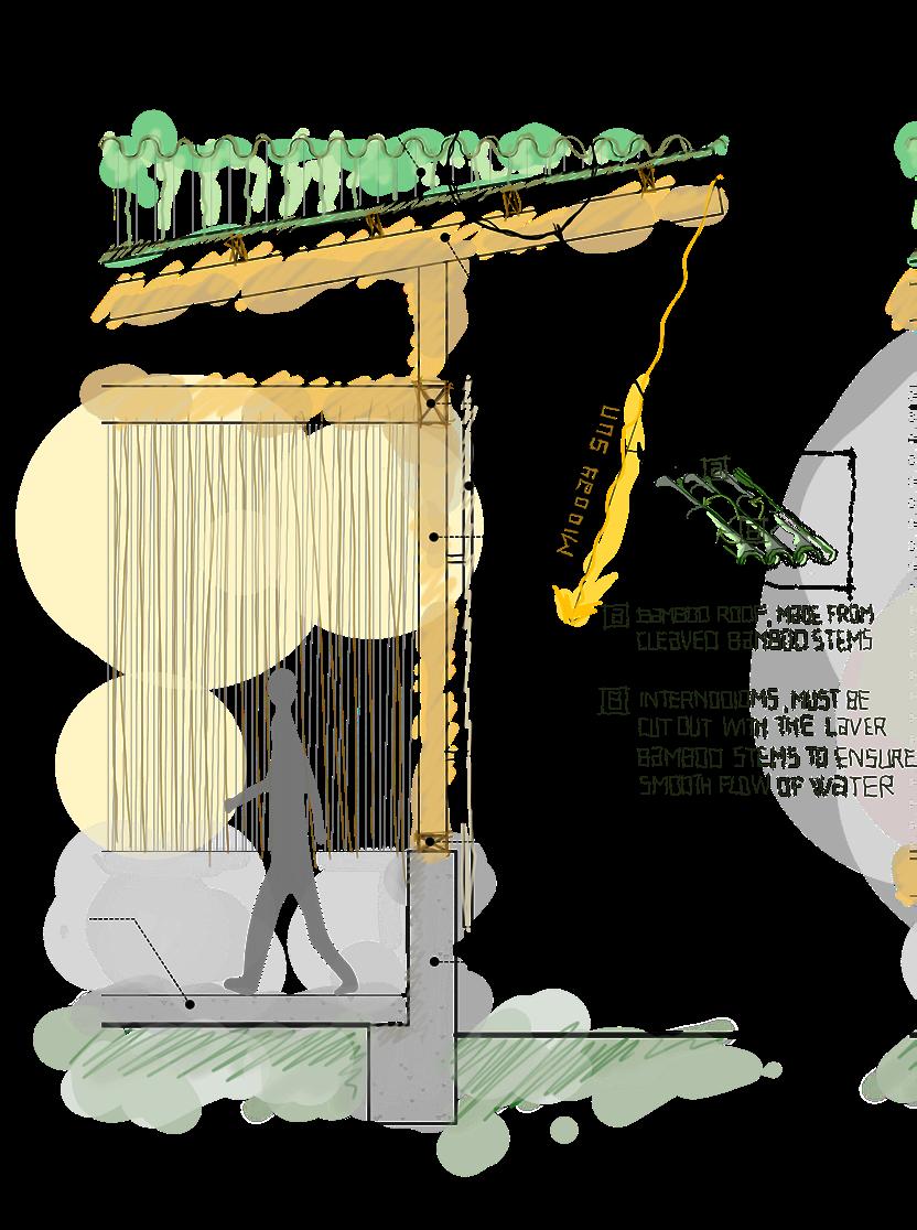

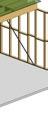
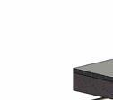
bamboo roof on 5cmx12cm purlins at 75cm on center
bamboo roof on 5cmx12cm purlins at 75cm on center
furring for attaching bamboo screen

concrete light-framed wood light-framed wood wall panel
post attachment embedded into concrete furring for attaching bamboo screen steel post attachment embedded into concrete 1m tall concrete stem wall and foundation mosquito net at open bedroom ceilings light-framed wood wall panel 15cmx15cm post on 250cm grid 18.
floor joists.
BAMBOO WEAVING CULTURAL HERITAGE INTO ARCHITECTURE

Timelessly elegant, timber introduces a natural warmth and character into the design. Its rich textures and earthy tones create a welcoming ambiance, seamlessly blending with the surroundings while adding a touch of sophistication and a connection to nature.
• Abundantly available and widely utilized in Vietnam’s architectural landscape.
• Renowned for its fexibility, durability, and sustainability.
• Commonly employed for roofs, walls, fooring, and scaffolding due to its strength
• Refects a deep cultural connection and practicality in Vietnamese design practices.
EMBRACES NATURAL WARMTH
AND SOPHISTICATED TEXTURES.
Timelessly elegant, timber introduces a natural warmth and character into the design. Its rich textures and earthy tones create a welcoming ambiance, seamlessly blending with the surroundings while adding a touch of sophistication and a connection to nature.
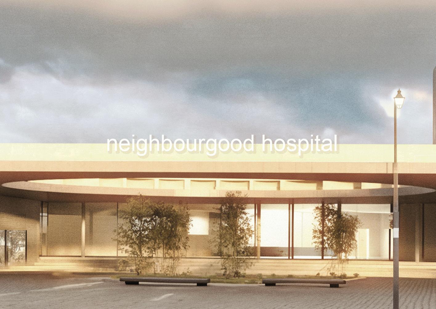
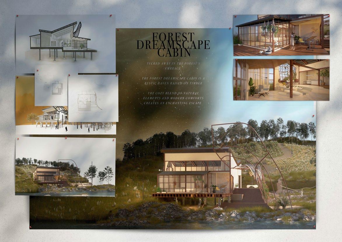
Master Studio: Healthy Suburb
Redefining Healthcare Spaces: Challenging Conventions in Melbourne’s Suburban Fringe.
Location
The Beveridge North West Precinct
Project Type
Commercial Project
Designer
Meeko Le
Date
18th February 2024
In the Healthy Suburb design studio, have gained an understanding of the problematic divide between healthcare planning and greenfeld development, both of which are heavily regulated and often result in subpar built environments.
By focusing on Melbourne’s outer suburbs, I have critically examined the tools and mechanisms that shape these areas. I have learnt the importance of prioritising civic and public space as central to the viability of a suburb or city. This studio challenged traditional approaches by placing the health sector at the forefront of design considerations.
The studio encouraged both practical and speculative outcomes, utilising a methodology based on observation and documentation. The emphasis on identity and character led to investigations into spatial arrangements, organisational types, and building typologies, which were used to challenge conventional approaches. I worked with a variety of scales, from precinct planning to prototypical room design.
By disrupting established norms, have learned to cultivate specifc characteristics of a health precinct and promote a unique suburban identity for Melbourne’s edge. The studio has equipped me with the skills to move beyond technically focused outcomes and create spaces that are both functional and meaningful.
In this project, I aim to showcase my ability in design, diagramming to explain the design concept, and profciency in using various software tools. Softwares Used in This Project
REVIT
V-RAY
PHOTOSHOP RHINO
Integrate with the Natural Environment
Buildings should be designed to complement the natural landscape and minimize their environmental impact. This can be achieved through the use of sustainable materials, watersensitive urban design, and energy-effcient technologies.
Foster a Sense of Community
Buildings should be designed to encourage social interaction and create a strong sense of community identity. This can be achieved through shared spaces, community facilities, and architectural elements that promote connectivity and engagement
Promote Active and Healthy Living
Buildings should encourage walking, cycling, and other forms of active transport. This can be achieved through well-connected pedestrian and cycling paths, proximity to amenities, and the incorporation of green spaces into building designs.
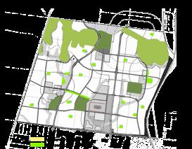
Observation & Suburban Context
Analysis
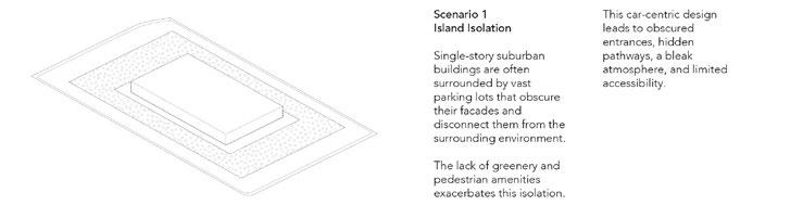
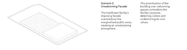
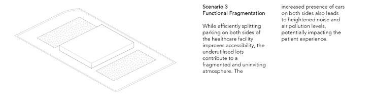
The Relationship Between Single-Storey Buildings and Car Parks
A Critical Analysis
The interaction between single-storey buildings and car parks in suburban settings presents a complex relationship with both challenges and opportunities.
Integration with Nature
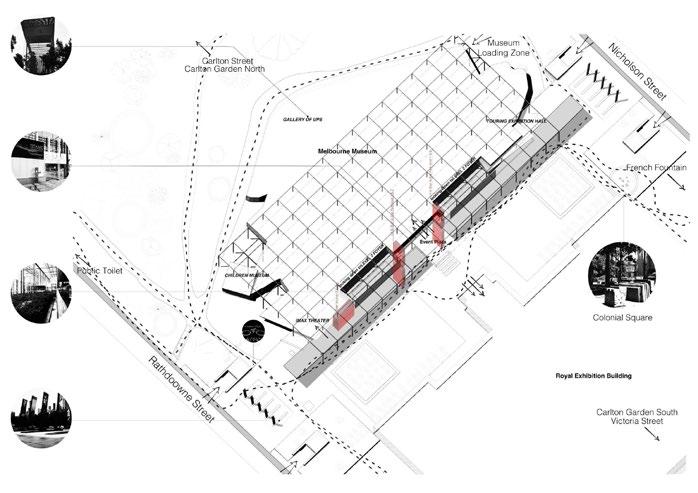
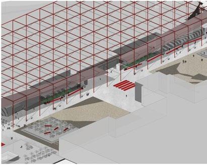
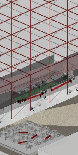
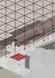
The museum’s external area seamlessly integrates with the surrounding Carlton Gardens, creating a harmonious connection between the built and natural environments. This enhances the aesthetic appeal of the site and provides a tranquil escape from the urban bustle.
Integration with Surroundings
Ample Public Space
The museum is surrounded by spacious plazas and gardens, providing ample room for outdoor events, gatherings, and relaxation. This encourages visitors to linger and enjoy the surroundings, enhancing their overall experience.
While the museum blends well with Carlton Gardens, its connection with the surrounding urban fabric could be enhanced. Creating more pedestrianfriendly pathways and connections to nearby streets could make the museum feel more integrated with the neighbourhood.
Precedent Analysis
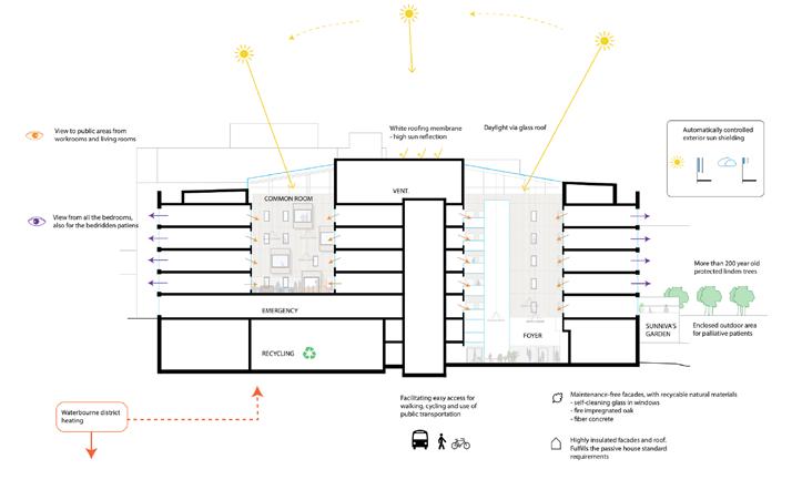
Harraldplass Hospital
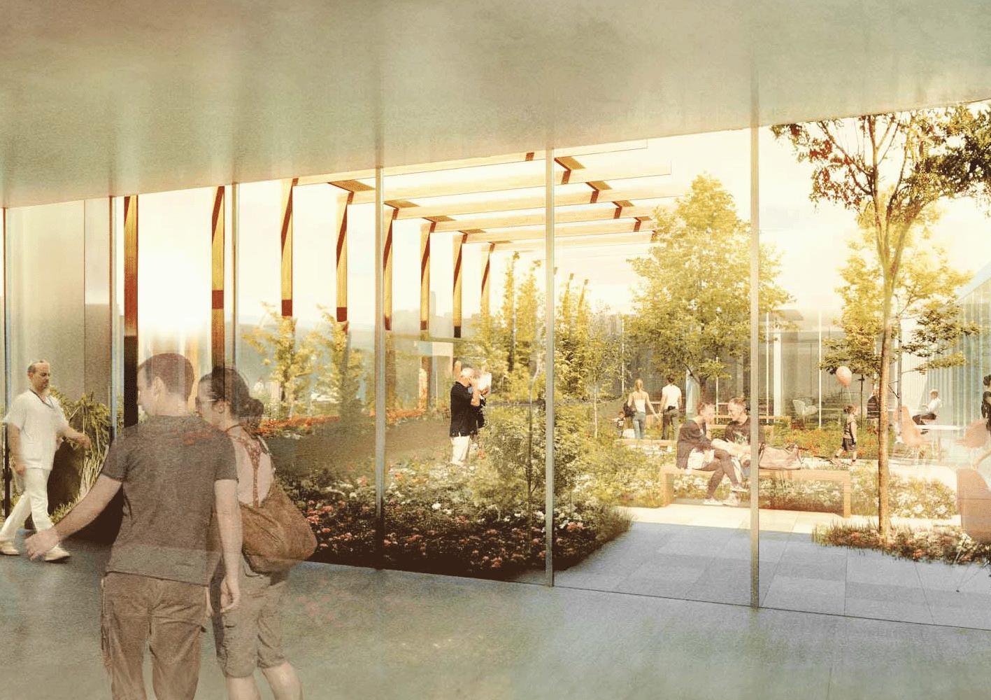
The atriums serve as luminous focal points, fooding the interior spaces of Haraldsplass Hospital with natural light. The strategic placement of windows around these atriums ensures ample daylight reaches consultation rooms and other functional areas. This design not only enhances the overall ambiance but also promotes interaction and collaboration among staff and visitors.
The left atrium illuminates the upper levels, while the right atrium brings daylight to the ground foor, creating a well-lit and welcoming environment throughout the hospital. This thoughtful arrangement, combined with the use of atriums as central gathering spaces, fosters a sense of connectivity and openness within the building.
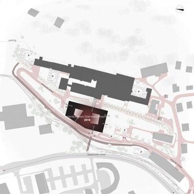
Seamless Integration
The new building’s design seamlessly integrates with the existing plan, demonstrating thoughtful consideration for the site’s history and context. The walkway connecting the old and new structures not only provides convenient access but also maintains a sense of continuity throughout the complex.
Visual Appeal
Although functional, the external area might lack distinctive architectural features or landscaping elements that could enhance its visual appeal. Integrating aesthetic elements could create a more welcoming and calming atmosphere for visitors.
Vision
Hospital Without Walls
The proposal introduces a revolutionary concept that extends healthcare beyond traditional physical boundaries, integrating care into the community and daily life through a blend of physical and digital healthcare services.
Nature›s Healing Power
The design prioritizes the inclusion of natural elements like light, air, and open spaces, leveraging these for their therapeutic benefts to enhance recovery and well-being for patients and staff alike.
Community and Connectivity
The hospital is envisioned as a community nexus, fostering connections between individuals, healthcare professionals, and the broader community, with adaptable spaces designed for both day and night activities, promoting communal engagement.
Technological Integration
Cutting-edge technology plays a crucial role in personalizing care, with telehealth, remote monitoring, and digital health records ensuring fexibility and accessibility, allowing patients to receive care beyond the hospitals physical location.
Innovative Design Paradigm
Inspired by the Melbourne Museum, the hospital aims to challenge traditional perceptions of healthcare environments, creating spaces that are functional, inspirational, and conducive to healing, making the hospital a valued part of the community
home health care
treatment at home and remote monitoring dot

we care about well-being and overall health
connection connecting people & ideas
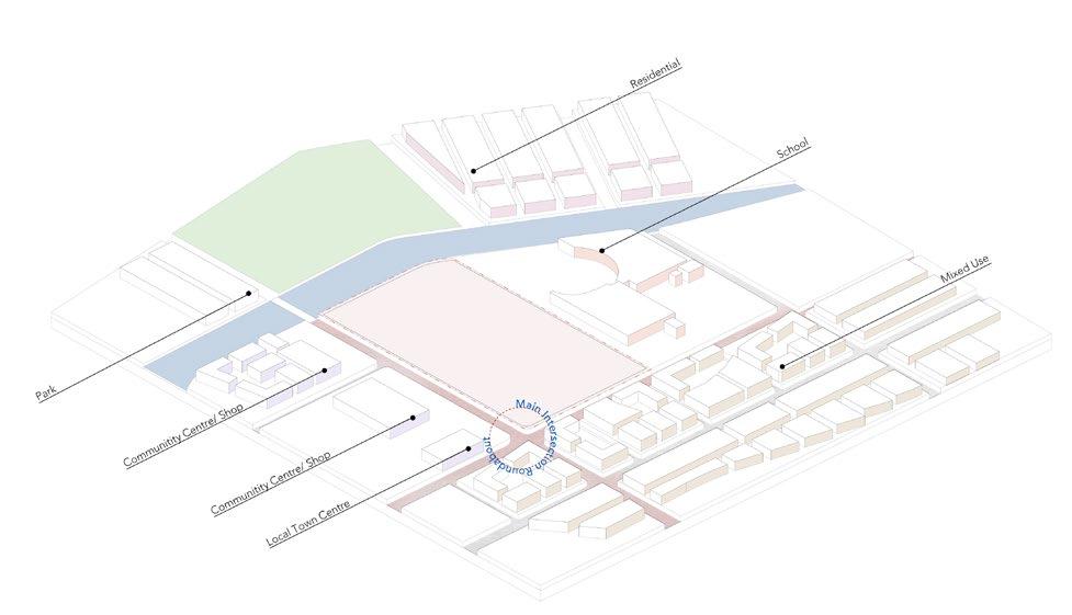
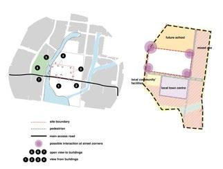
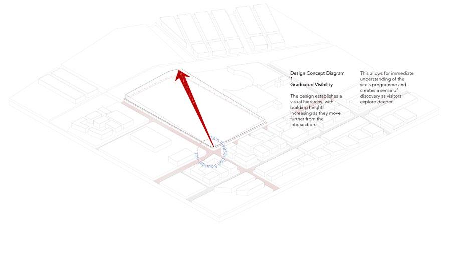
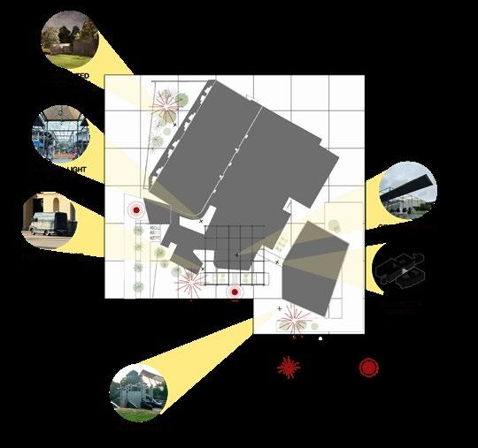
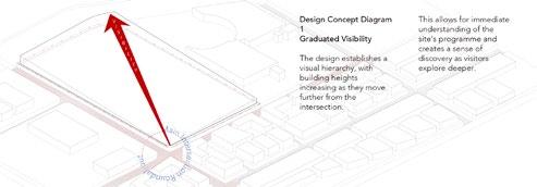
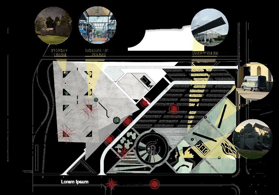
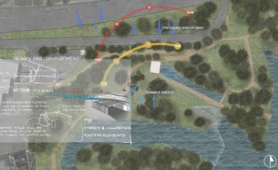
ADDRESSING VISIBILITY AND CONNECTION
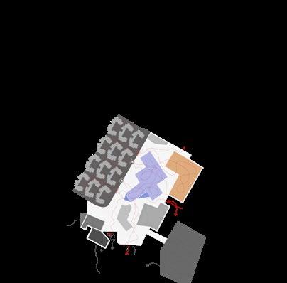
The initial concept focused on resolving the disconnect between the building and landscape by introducing a gradual elevation design.
This creates a visual focal point and enhances the building’s visibility from the intersection, while also fostering a connection with the surrounding environment through elevated views.
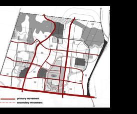
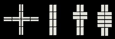
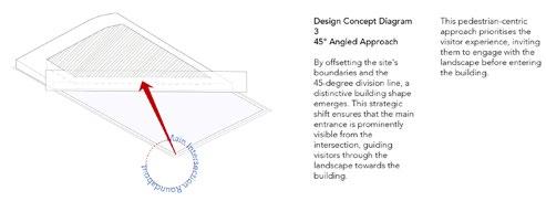
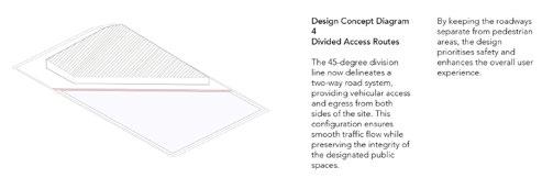
PRIORITISING USER EXPERIENCE AND WAYFINDING
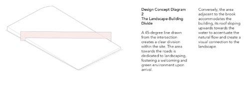
Observing the need for clear navigation, the second concept involved dividing the site with a 45-degree road layout and a rotated grid system.
This establishes a cohesive design language that guides users through the landscape to the building’s entrance, while also informing the design of the car park and internal foor plan.
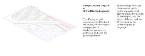
ACTIVATING GREEN SPACES AND FOSTERING COMMUNITY
Recognising the underutilisation of green spaces in suburban settings, the fnal concept centres on creating curated outdoor areas that serve specifc functions and foster a sense of community.
This involves integrating the grid system into the landscape design to create intentional spaces for both patients and visitors, with a particular emphasis on internal courtyards that serve as healing and social spaces for patients.
THE GRADUAL ELEVATION DESIGN
This concept is a solution to address the disconnect between building and landscape, between the site and experience.
By gradually increasing the height of the hospital building as it moves away from the main intersection, a visual focal point is created that emerges from the landscape.
This not only improves the building’s visibility but also offers patients and staff elevated views of the surroundings, fostering a connection with the surrounding environment.
THE 45 DEGREE ROTATED GRID SYSTEM
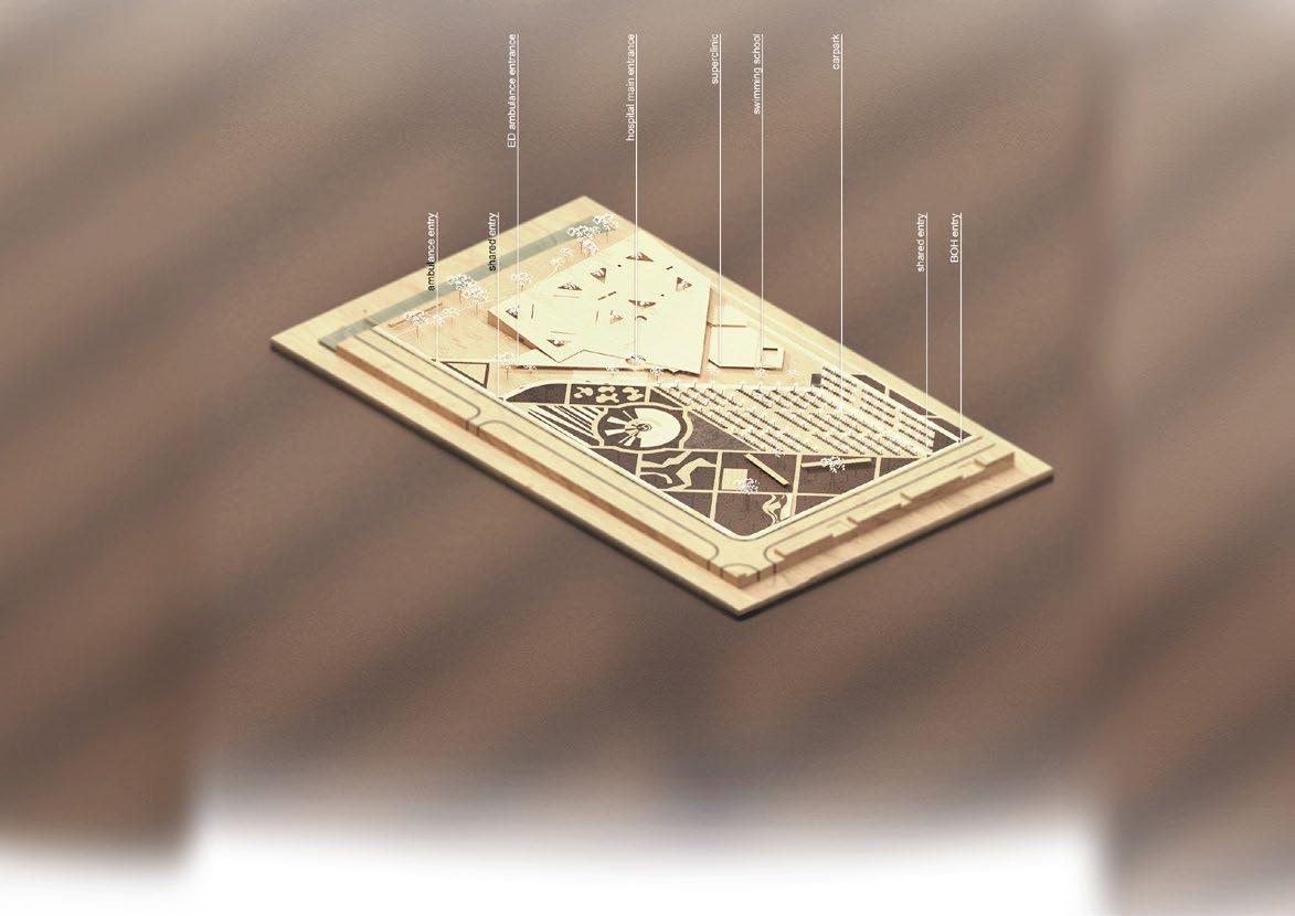
I aimed to arrange the program to facilitate easy navigation. From the intersection, people should be able to see through the landscape to the building located on the left. wTo achieve this, I divided the site into two sections, with two-way roads allowing easy entry and exit to the drop-off area and car park.
Since this is a blank space, believe the simplest approach is to establish my own context. Therefore, I employed a 45-degree road layout and a further 45-degree rotated grid structure.
THE REIMAGINED GREEN GRID
The third observation about the underutilisation and lack of purpose in the green spaces within suburban Melbourne is astute. Often, these areas are vast expanses of lawn or blank spaces that don’t contribute to the community’s enjoyment or engagement with nature.
The concept of a “curated green area” is a response to this issue. By utilizing the established grid structure from your second concept, a framework for designing intentional outdoor spaces that serve specifc functions and create a sense of community.
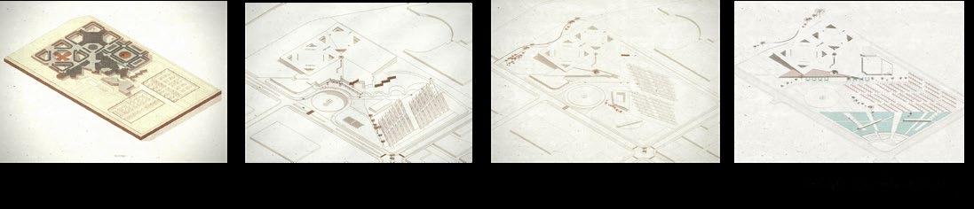
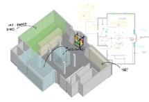
Design Concept
Testing Program
THE REIMAGINED GREEN GRID
“The Gradual Elevation Design” is a solution to address the disconnect between building and landscape, between the site and experience. By gradually increasing the height of the hospital building as it moves away from the main intersection, a visual focal point is created that emerges from the landscape. This not only improves the building’s visibility but also offers patients and staff elevated views of the surroundings, fostering a connection with the surrounding environment.
Angled Roof
The upward-sloping roof reinforces the concept of elevation and adds a dynamic element to the building’s form.
Light Poles
The increasing height of the light poles in the car park cleverly mirrors the building’s elevation and serves a dual purpose
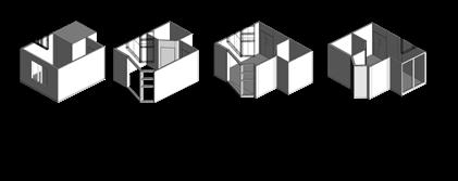
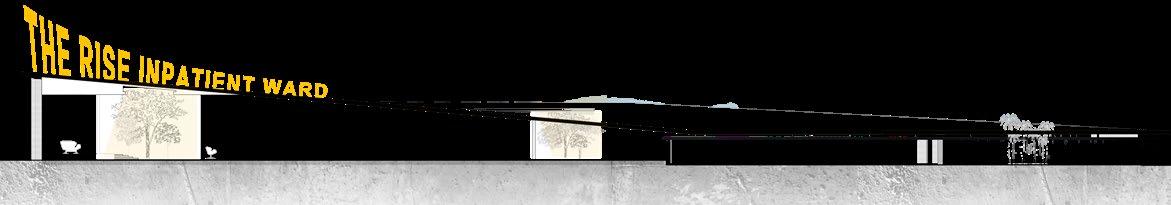
Patient room
Testing Program
IN-PATIENT BASIC MODULE
Hand washing sink
Bed
Sitting area
Bathroom
• Skylights provided based on the upper level layouts
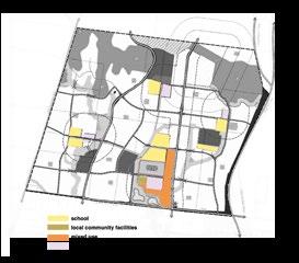
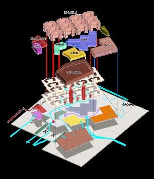
GROUND FLOOR ARRANGEMENT

Spacious and Adaptable
The room should be spacious enough to accommodate the patient, medical equipment, visitors, and personal belongings comfortably. It should also be adaptable to meet the changing needs of different patients, with adjustable beds, movable furniture, and ample storage
Natural Light and Views
Large windows with access to natural light and views of nature have been shown to improve mood, reduce stress, and promote healing. If views are not possible, consider incorporating natural elements like plants or artwork depicting nature scenes
Space Arrangement
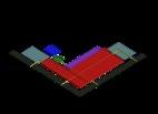
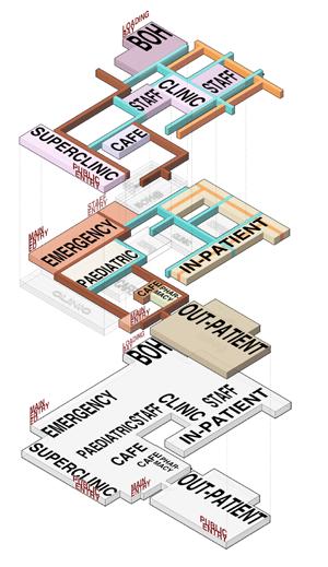
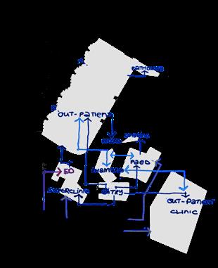
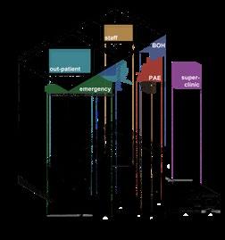
The In-patient area is separated from the Pediatric area to provide specialized care spaces for different age groups
Convenient access to the pharmacy is ensured for Outpatient, Pediatric, and In-patient areas, as it is centrally located within the building
The staff area is positioned towards the back to provide easy and direct access to various programs, recognizing the exhaustion nurses may experience from additional shifts
Back of House programs are located at the back of the building to efficiently support hospital operations
The arrangement prioritizes program connections, staff convenience, and specialized care for different patient groups

The studio suggest me to think about the role of healthcare facilities beyond just being places for treatment. We explored the idea of them becoming central hubs for the community, fostering social interaction and promoting overall health.

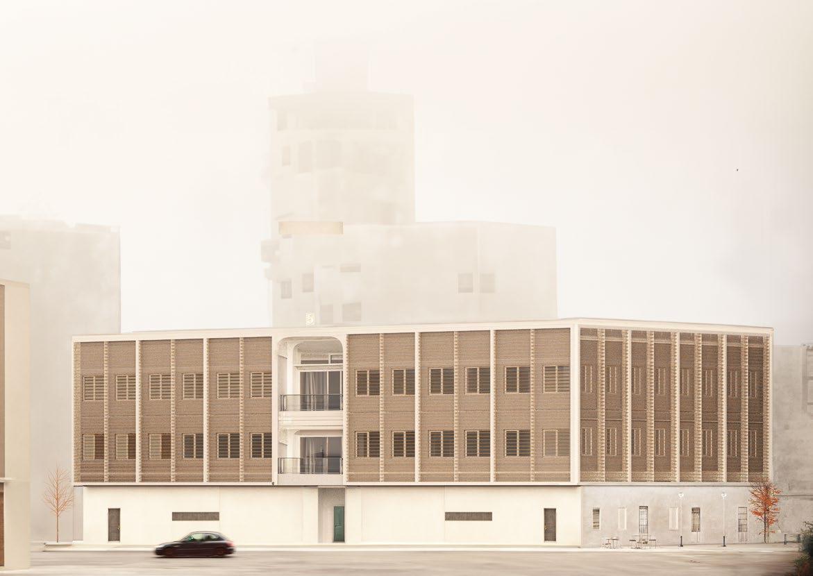
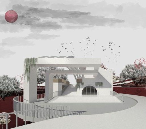
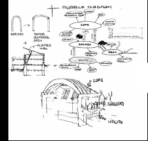
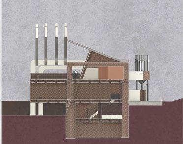
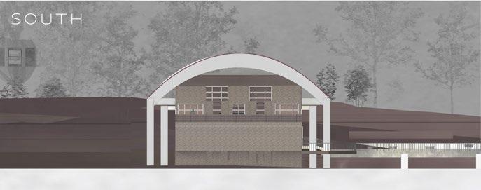
Gallery Brewscape
Art, scenic views, and a welcoming cafe environment come together harmoniously

Location
112A Trenerry Cres, Abbotsford VIC 3067, Australia
Clients
Mr. Anderson
Project Type
Class 6 & 9 : Mixed-Use
Designer Meeko Le
Date 19th June 2021
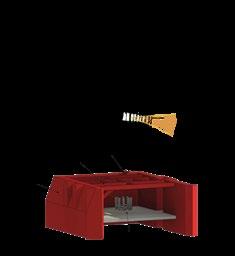
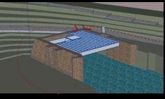
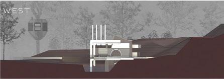
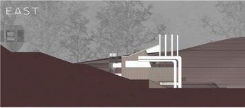
Nestled in a backdrop of natural beauty and historical signifcance, the Dights Falls Project emerges as a testament to the harmonious integration of contemporary design within a cherished landscape. Situated in a picturesque locale, the gallery and cafe are not merely structures; they are a narrative woven into the fabric of Dights Falls’ rich history.
The approach to this project is rooted in reverence for the existing environment. The decision to retain the original structure serves not only as a sustainable architectural choice but also as a deliberate nod to the bygone era, an acknowledgment of the values etched into the site.
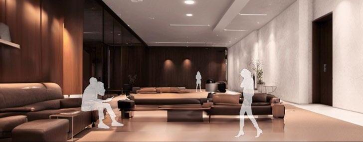
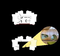
As you explore the spatial arrangement, discover the intentional interplay between the gallery and the cafe. The ground-level gallery invites patrons into a world where art takes center stage, shielded from distractions by thoughtfully placed walls. Ascend a gentle fight of stairs to the cafe on the frst foor, strategically positioned to unveil a panoramic view of Night Fall, adding a sensory layer to the culinary experience.
In this project, I aim to showcase my ability in design, diagramming to explain the structure, and profciency in using various software tools.
Softwares Used in This Project AutoCAD Rhino
Site analysis
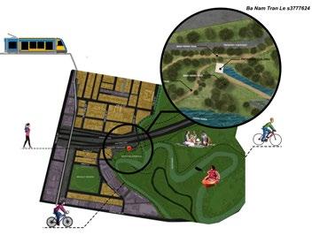
Multiple access points: Main Yarra Trail (walking/cycling), tram drop-off at Hooddle Street, and car park for drivers. Diverse activities on-site: Picnics, dog walking, fshing in the fshway, and recreational activities like cycling and running. Noteworthy: Dights Falls rapids host Victorian Canoe Slalom Championships, showcasing the community’s love for canoeing.
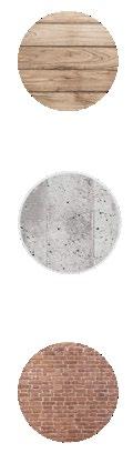
Timber:
Environmentally positive choice with a lower net environmental impact. Contributes to long-term reduction of carbon emissions, addressing climate change. Engages all senses with warm, rich, and tactile surfaces, offering a visually delightful range of hues and grain.
Concrete:
Widely chosen for strength, durability, refectivity, and versatility.
High embodied energy offset by durability and recyclability.
Natural appearance exudes a calm charm and innate, elegant quality often unmatched by modern materials.
Brick:
Energy-effcient, providing warmth in winter and coolness in summer. Integrates seamlessly with passive building design for energy harnessing. Natural density and thermal insulation reduce energy consumption, ensuring year-round comfort.
Dynamic visual experience: Bricks change color with varying sunlight angles, adding visual interest to the structure.
The spatial arrangement is meticulously planned to optimize the experience for visitors. The gallery is strategically located on the ground level, where its design prioritizes a focus on the displayed artworks. In contrast, the cafe is situated on the 1st foor, accessible through a gentle ascent of stairs from the east. The intentional placement of the cafe’s entrance is designed to offer patrons a breathtaking view of Night Fall while enjoying their coffee.
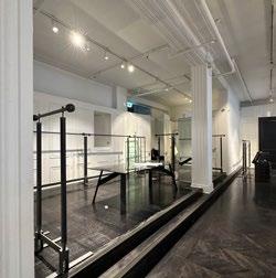
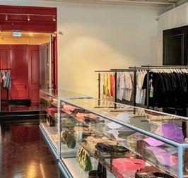
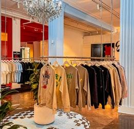
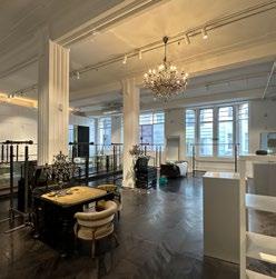
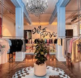
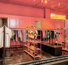
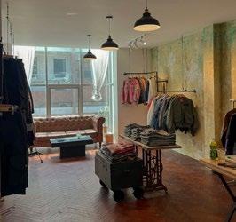
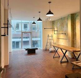
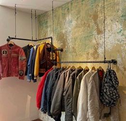
Prototype II Clothing Store