VISUAL DEVELOPMENT GUIDE
OUR HISTORY AND MISSION 01 02 03 04 LOGO & KEY PHRASES SECOND LOGO EXPLORATION THIRD LOGO EXPLORATION 05 12 21 27
WELCOME!
YM delivers guidance and inspiration for teen girls as they navigate the journey of womanhood. Instead of filling our publication with content like the YM of the past, which mainly revolved around dating advice and beauty tips, we instead are re-branding ourselves to inform, educate and empower young women through action, education and service.

05 SIMILAR MARKS 33 06 GUIDE INSPIRATION 37
4 YM | VISUAL DEVELOPMENT GUIDE
Welcome to YM!
We are very excited to present to you our new identity! Inside these pages you will find all of the components that went into redefining us as a company.
It is our hope that you enjoy looking through this manual as much as we enjoyed creating it!
Fondly,
The YM Team
5 YM | OUR HISTORY & MISSION
01
OUR HISTORY AND BRAND DESCRIPTION
BRAND DESCRIPTION
YM delivers guidance and inspiration for teen girls as they navigate the journey of womanhood. This publication offers everything from fashion spreads, make-up trends and advice columns. YM’s main mission is to empower teens to have a voice in issues we face as a society, and effect change in our world.
HISTORY
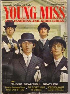
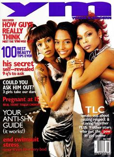
The magazine was published for 72 years. It was the oldest girls’ magazine in the United States. YM got its start as two magazines in the 1930s— Compact, which was aimed at older teens, and Calling All Girls, which was intended for younger girls and pioneered the signature embarrassing-moments column, “Say Anything”. By the late 1960s, the publications merged into Young Miss, a small digest-sized mag. The 1980s saw a change in size to a regular magazine on glossy print (similar to Teen) designed by Mark Borden. Several years later, still another title change (this time to Young & Modern) under Bonnie Fuller’s direction as editor-in-chief. The final title change came in 2000 (this time to Your Magazine), though the abbreviation “YM” was the title by which it was commonly referred. In early 2002, then editor-inchief Christina Kelly announced that the magazine would no longer run articles about dieting. YM ceased publication in 2004, with the December–January issue. Subscribers received Teen Vogue subscriptions in replacement.
6 YM | VISUAL DEVELOPMENT GUIDE
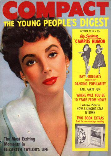
ABOVE: Compact Magazine cover from October, 1954
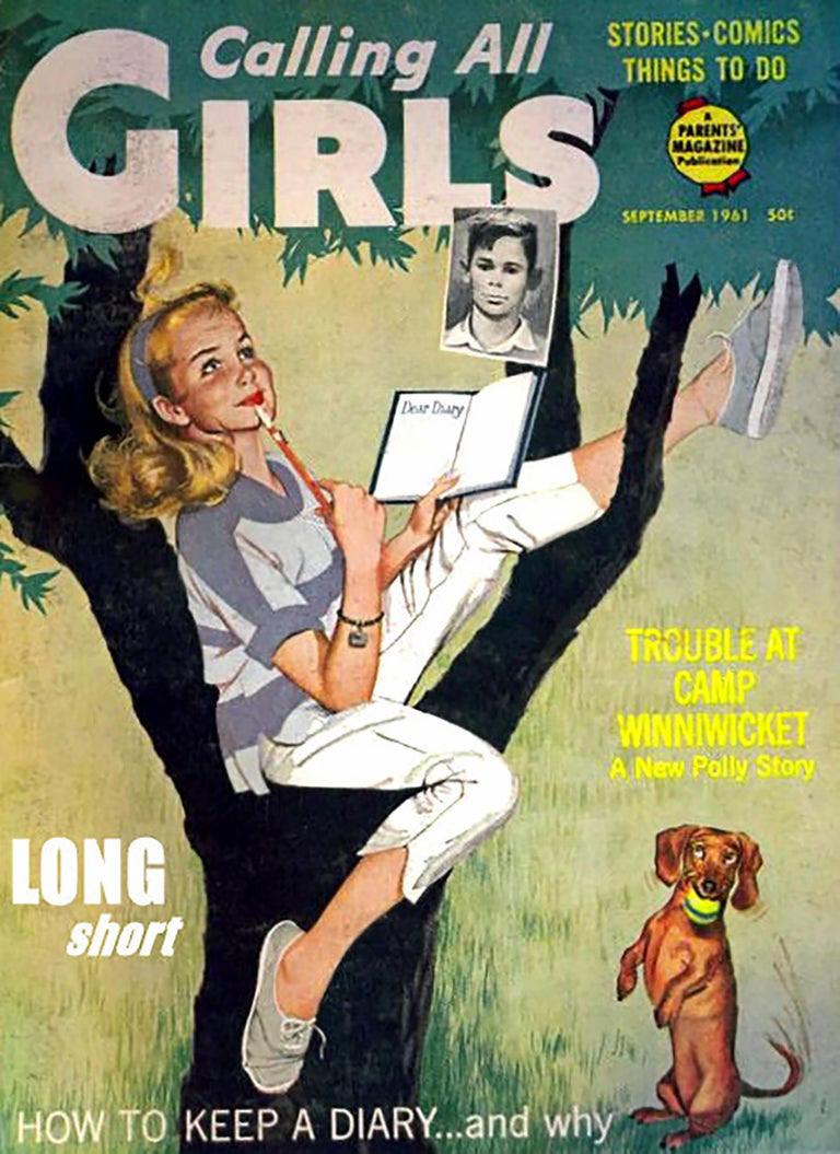
BELOW: Calling All Girls cover from September, 1961
7 YM | OUR HISTORY & MISSION

8 YM | VISUAL DEVELOPMENT GUIDE
YM
empowers, educates and informs young women, enabling them to lead impactful lives.

9 YM | OUR HISTORY & MISSION
TIME LINE
YM got its start as two magazines in the 1930s— Compact, which was aimed at older teens, and Calling All Girls, which was intended for younger girls
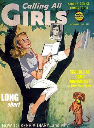
A January issue of Calling All Girls.
1930 1960 1940
By the late 1960s, the publications merged into Young Miss, a small digest-sized mag.
1980
The 1980s saw a change in size to a regular magazine on glossy print (similar to Teen) designed by Mark Borden.
10 YM | VISUAL DEVELOPMENT GUIDE
2004
YM ceased publication in 2004,with the December–January issue. Subscribers received Teen Vogue subscriptions in replacement.
The final title change came in 2000 (this time to Your Magazine), though the abbreviation “YM” was the title.
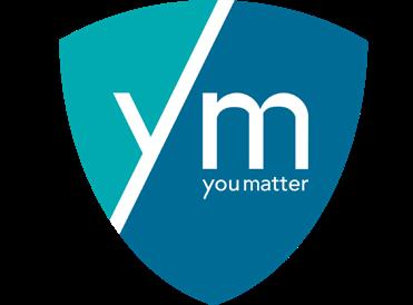
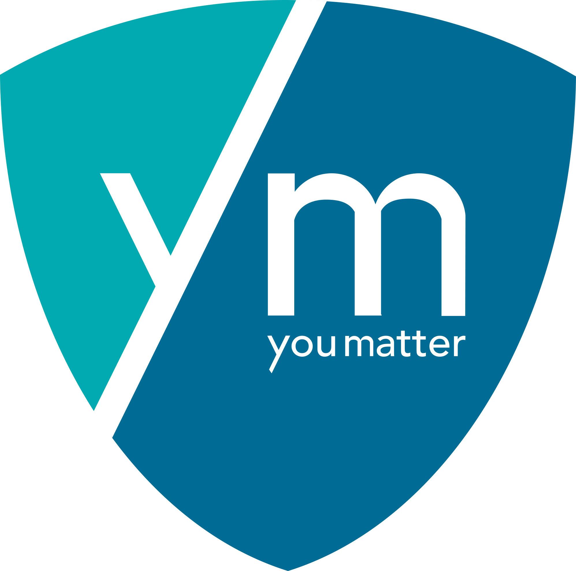
YM re-branded their magazine and became You Matter.

2000 NOW
11 YM | OUR HISTORY & MISSION
12
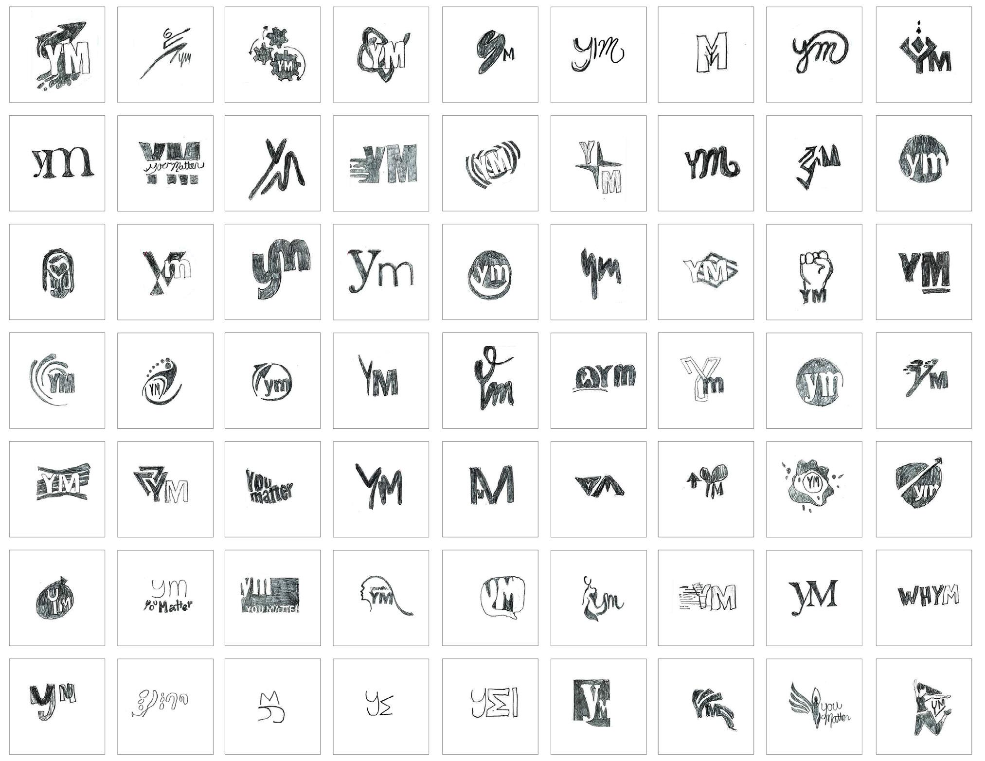
We began with three keywords, now we extended them into three key phrases. Each of these phrases define a unique and discrete attitude each having a slightly different angle, but go together because they come from the same place... the Brand Soul. These key phrases are what we used for our first and second round of logo explorations.
LOGO & KEY PHRASES 02
KEY PHRASES
BLAZING A TRAIL
This phrase represents the courage and bravery that YM’s audience embodies. Blazing a trail illustrates that our readers are not afraid to stand-up for what they believe in.
KNOWLEDGE IS POWER
This phrase represents the reader’s desire to be informed about national and global events.
Knowledge is Power embodies our reader’s willingness to learn and positively contribute to society.
LEARN BY DOING
This phrase represents our reader’s excitement to make a difference in their communities through action. Learn by doing encompasses our readers’ physical contributions to better the world through their services and efforts.
13 YM | LOGO & KEY PHRASES
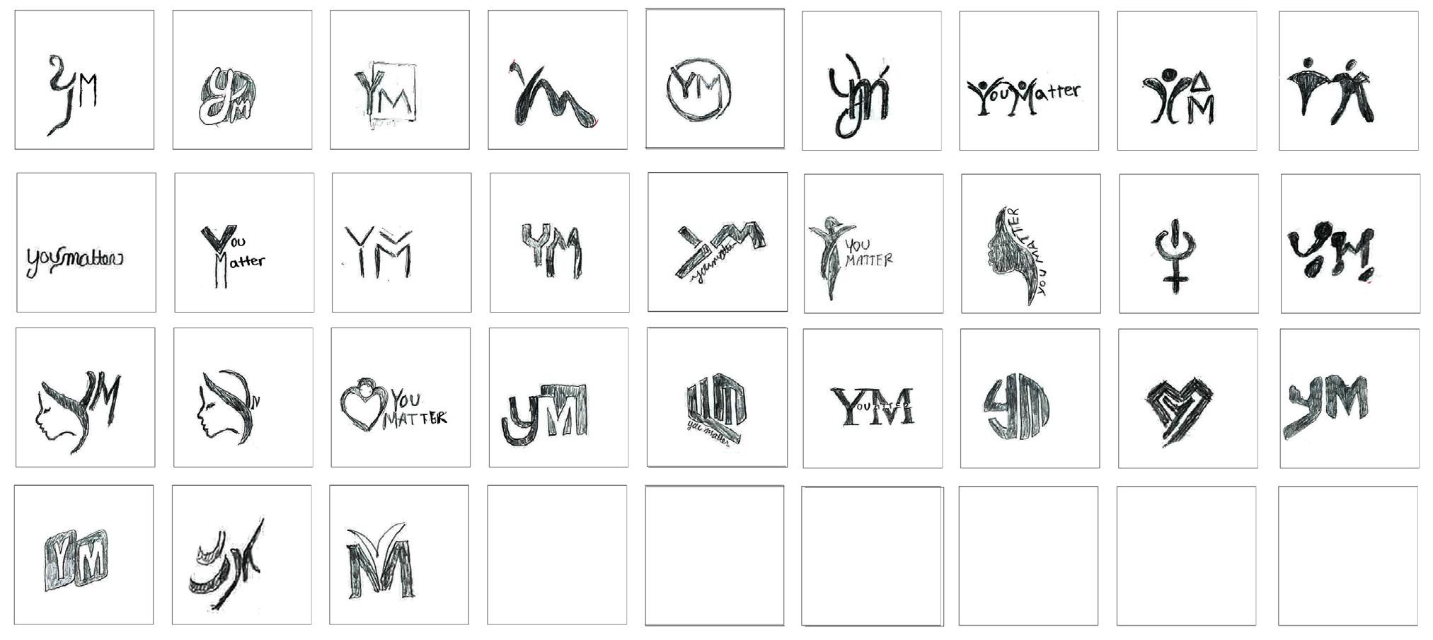
KEY PHRASE 1
YM’s new branding direction involves the empowerment of teen girls. It is our goal to create a logo that showcases our brand mission which is to educate, inform and empower young teen girls. The selected phrase, “Blazing a Trail” encompasses our vision of exploring new territories and areas of knowledge in such a way that others can follow.
BLAZING A TRAIL
This phrase represents the courage and bravery that YM’s audience embody. Blazing a trail illustrates that our readers are not afraid to stand-up for what they believe in.
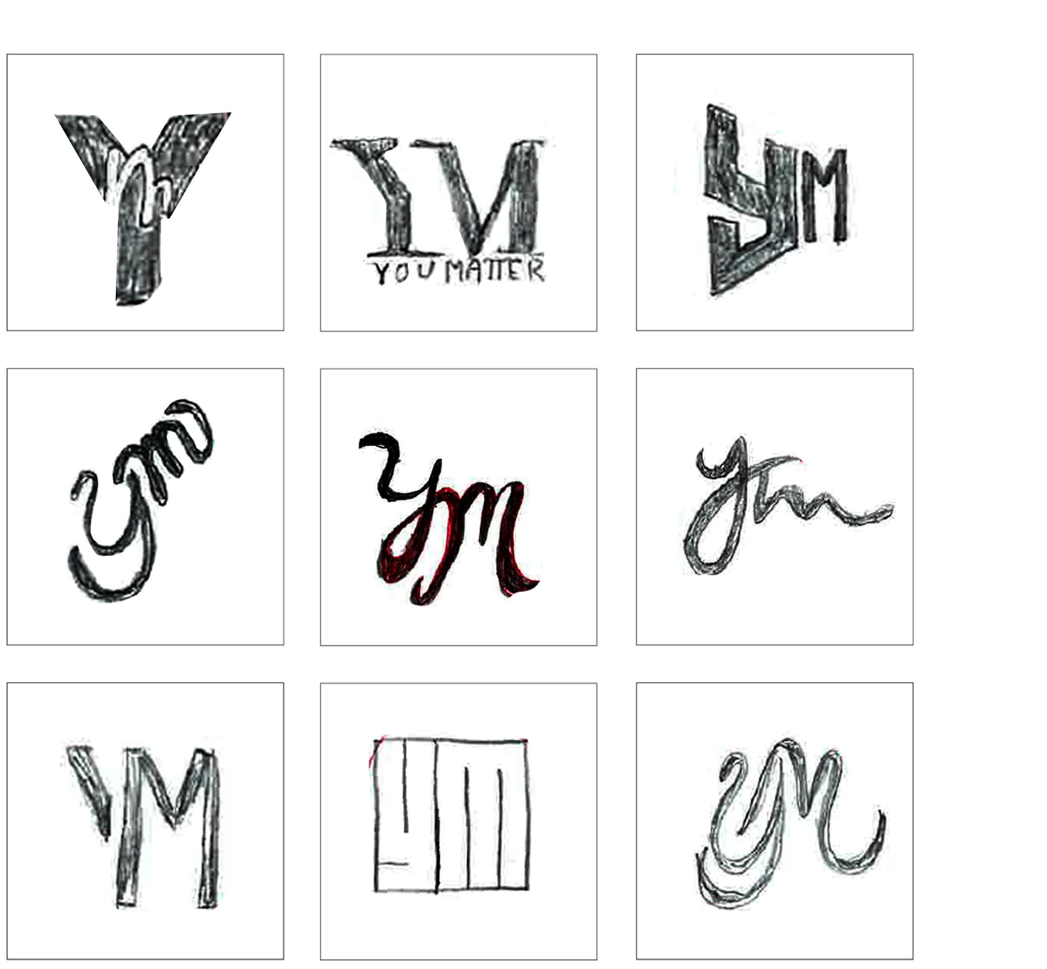
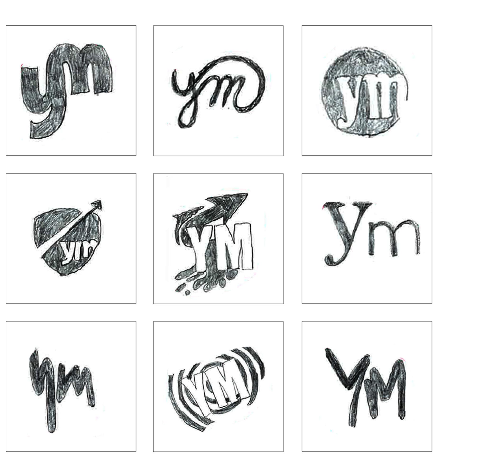
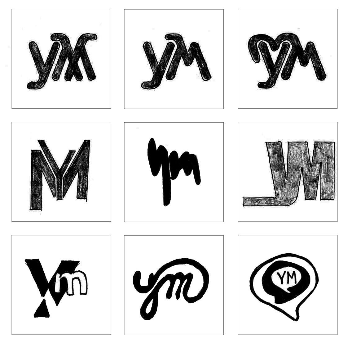
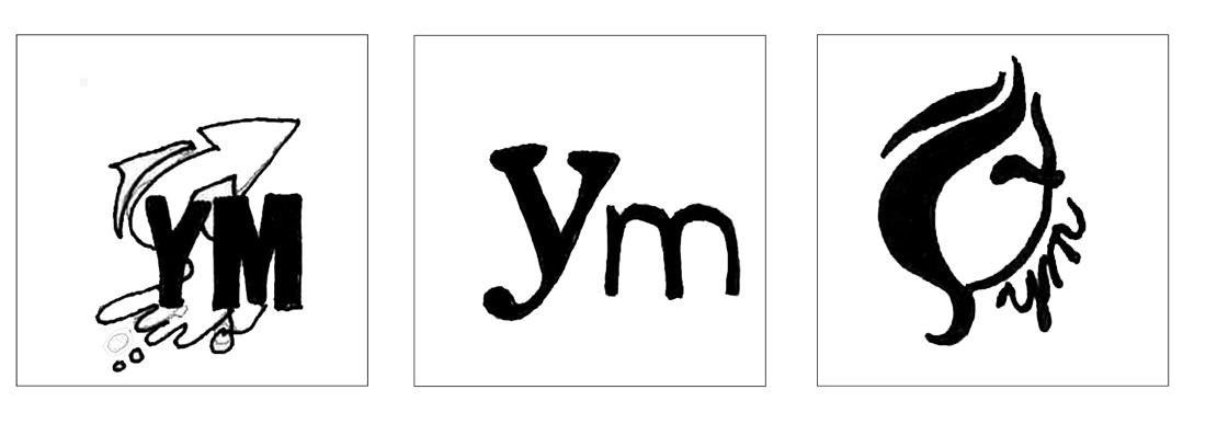
ROUGH SKETCHES
These rough sketches are only nine of the many that were rendered in this round of generating logo ideas.
14 YM | VISUAL DEVELOPMENT GUIDE

15 YM | LOGO & KEY PHRASES
REFINEMENT
SELECTED LOGOS FOR
KEY PHRASE 2
YM’s new branding direction involves the empowerment of teen girls. It is our goal to create a logo that showcases our brand mission which is to educate, inform and empower young teen girls. The selected phrase, “Knowledge is power” encompasses our vision of displaying wisdom rather than physical strength by exploring new territories and areas of knowledge in such a way that others can follow.
KNOWLEDGE IS POWER
This phrase represents the reader’s desire to be informed about national and global events. Knowledge is Power embodies our reader’s willingness to learn and positively contribute to society.
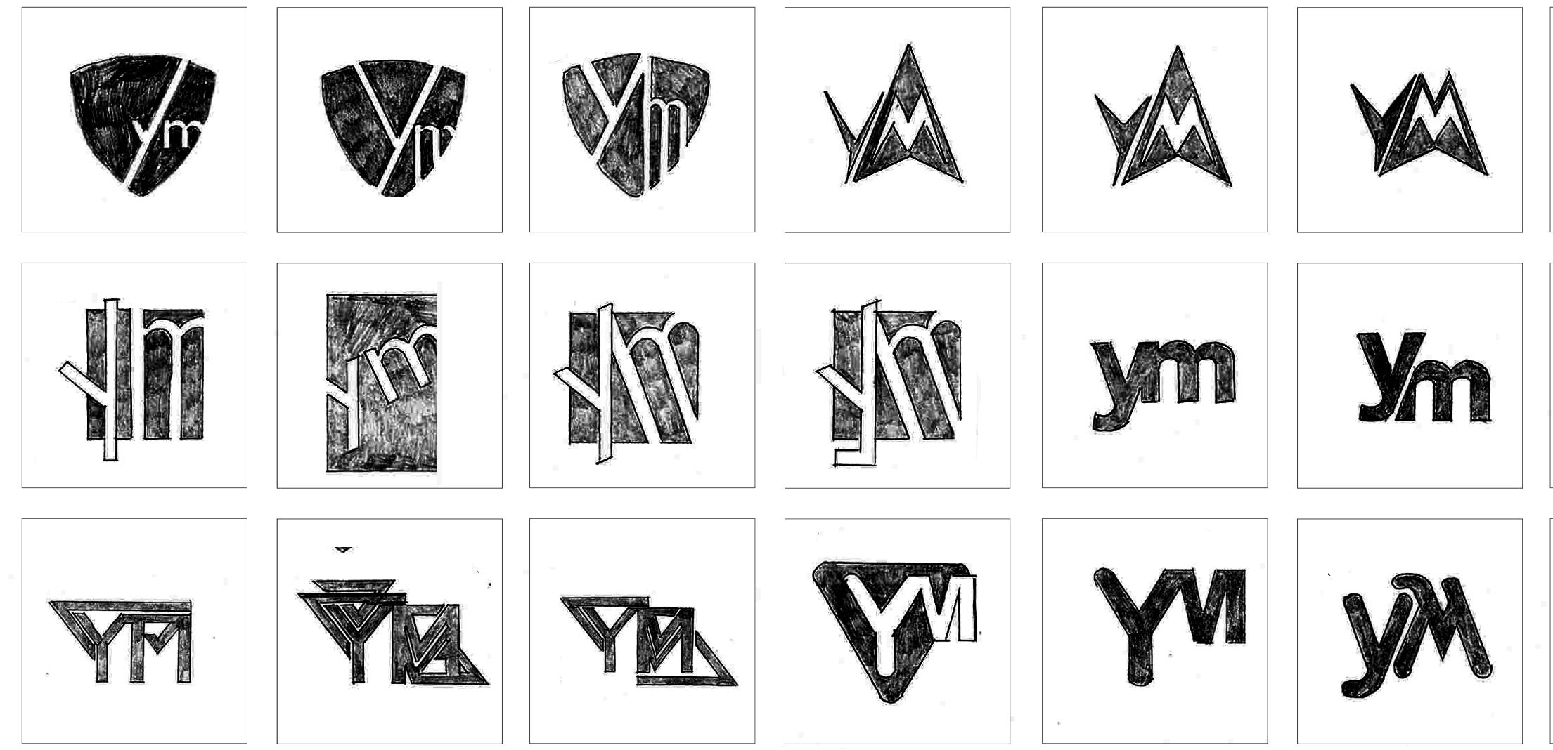
ROUGH SKETCHES
These rough sketches are only nine of the many that were rendered in this round of generating logo ideas.
16 YM | VISUAL DEVELOPMENT GUIDE
17 YM | LOGO & KEY PHRASES
FOR REFINEMENT
SELECTED LOGOS
KEY PHRASE 3
YM’s new branding direction involves the empowerment of teen girls. It is our goal to create a logo that showcases our brand mission which is to educate, inform and empower young teen girls. The selected phrase, “Learn by doing” encompasses our a handson approach to learning, meaning our readers must interact with their environment in order to adapt and learn.
LEARN BY DOING
This phrase represents our reader’s excitement to make a difference in their communities through action. Learn by doing encompasses our readers’ physical contributions to better the world through their services and efforts.
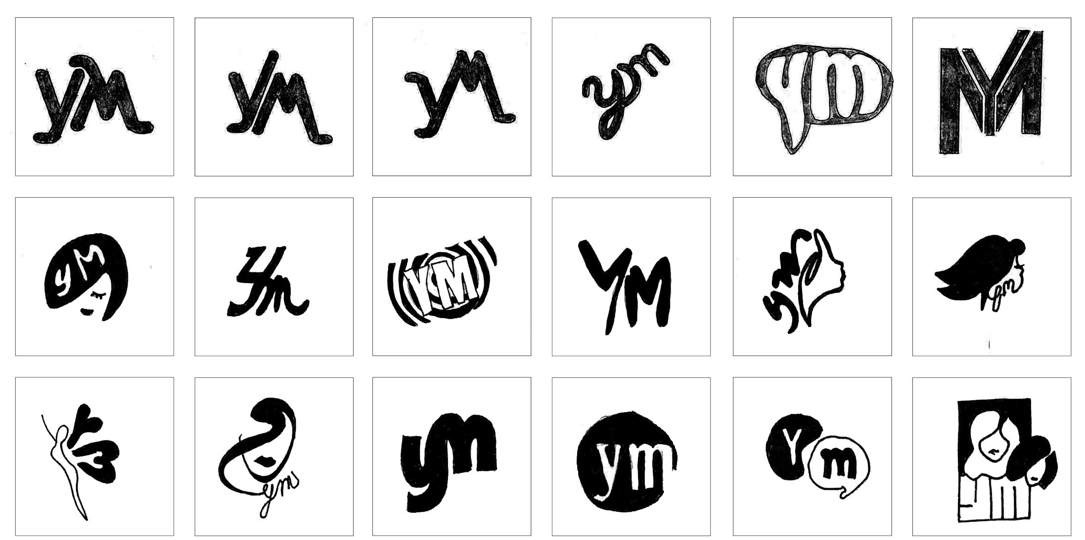
ROUGH SKETCHES
These rough sketches are only nine of the many that were rendered in this round of generating logo ideas.
18 YM | VISUAL DEVELOPMENT GUIDE

19 YM | LOGO & KEY PHRASES
SELECTED LOGOS FOR REFINEMENT
20
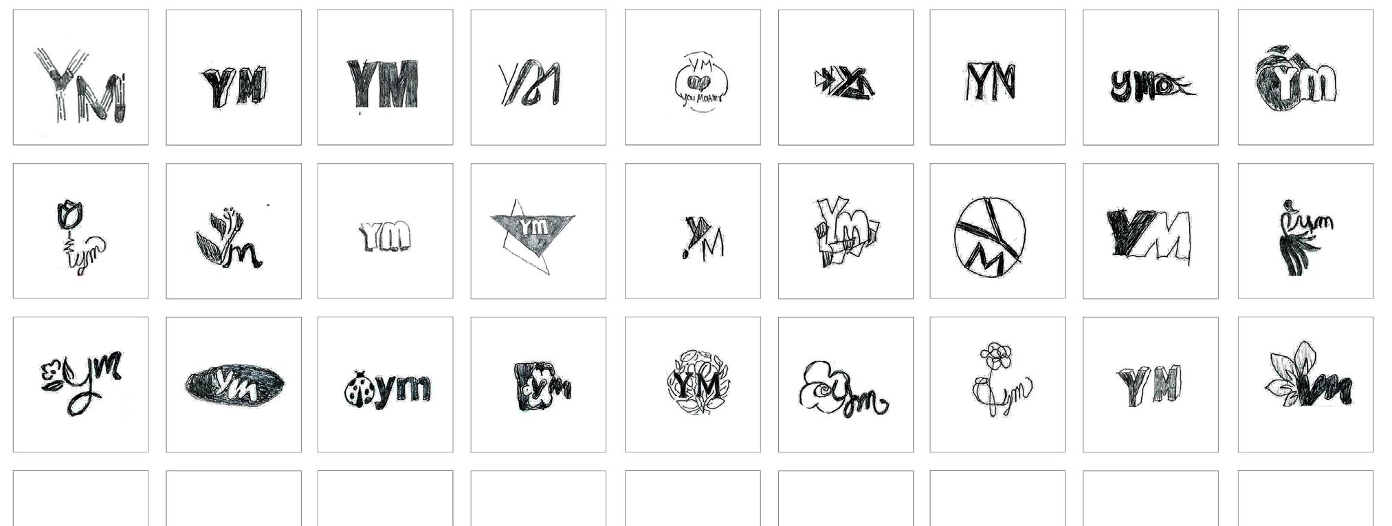
R2 LOGO EXPLORATION 03
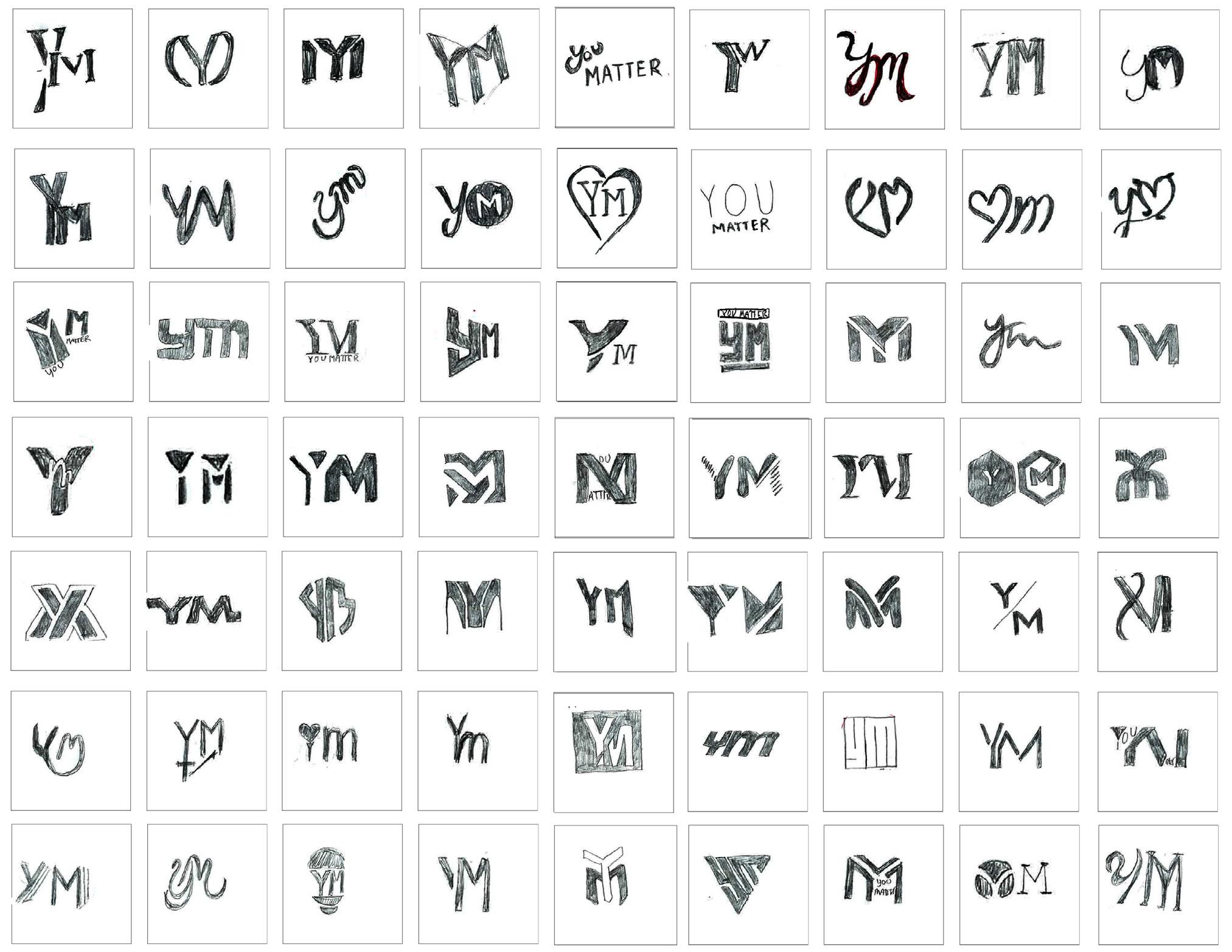
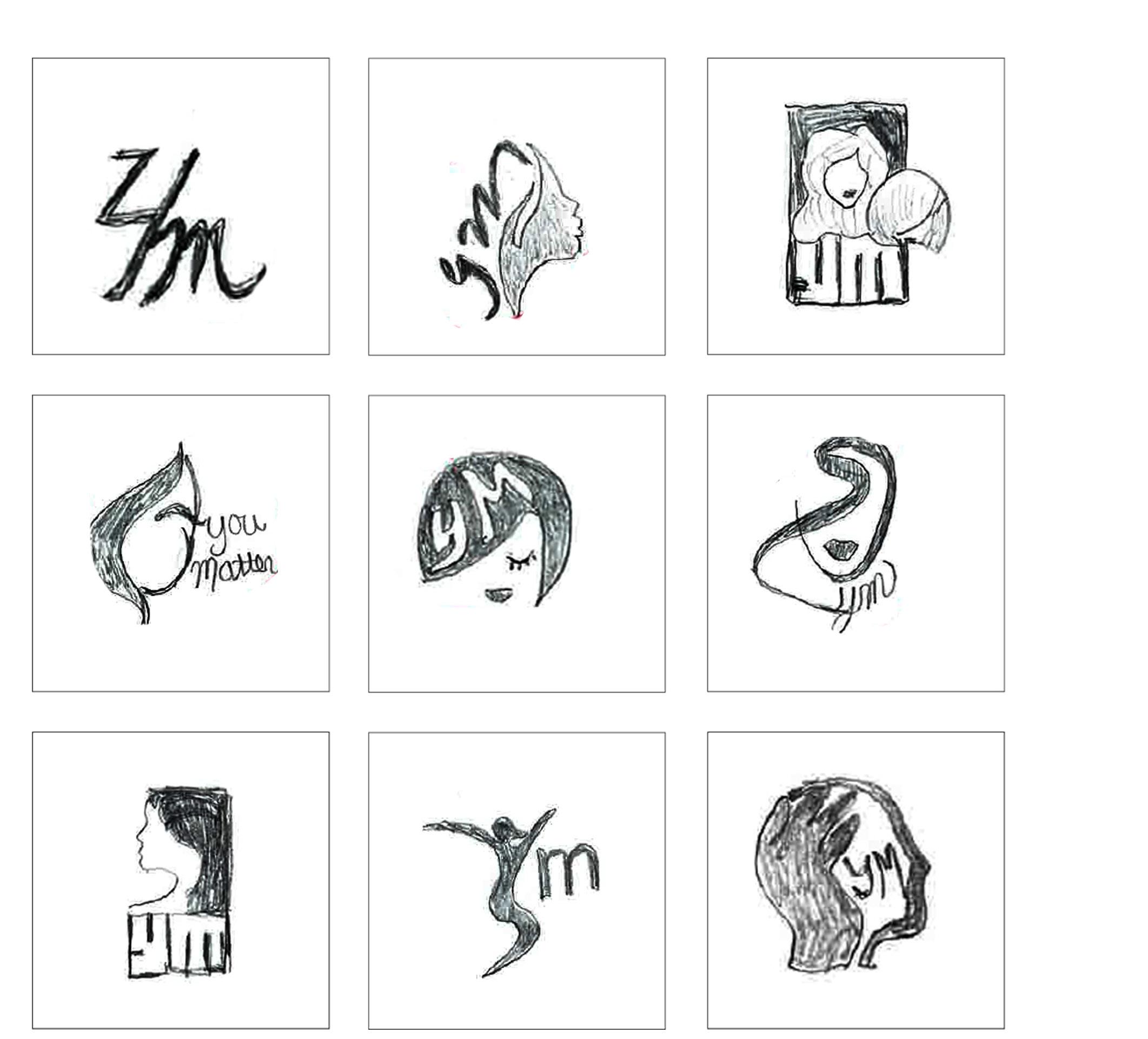
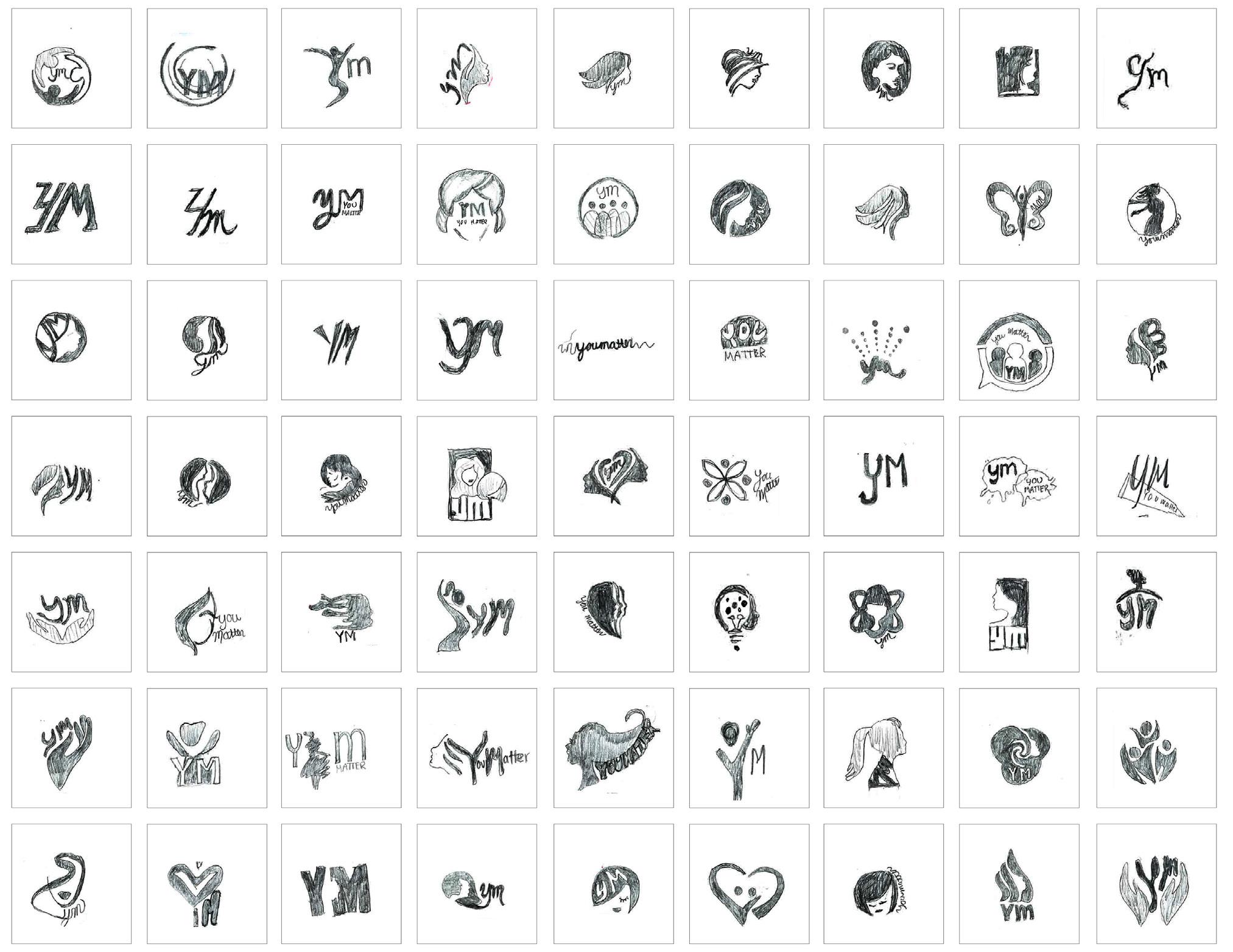
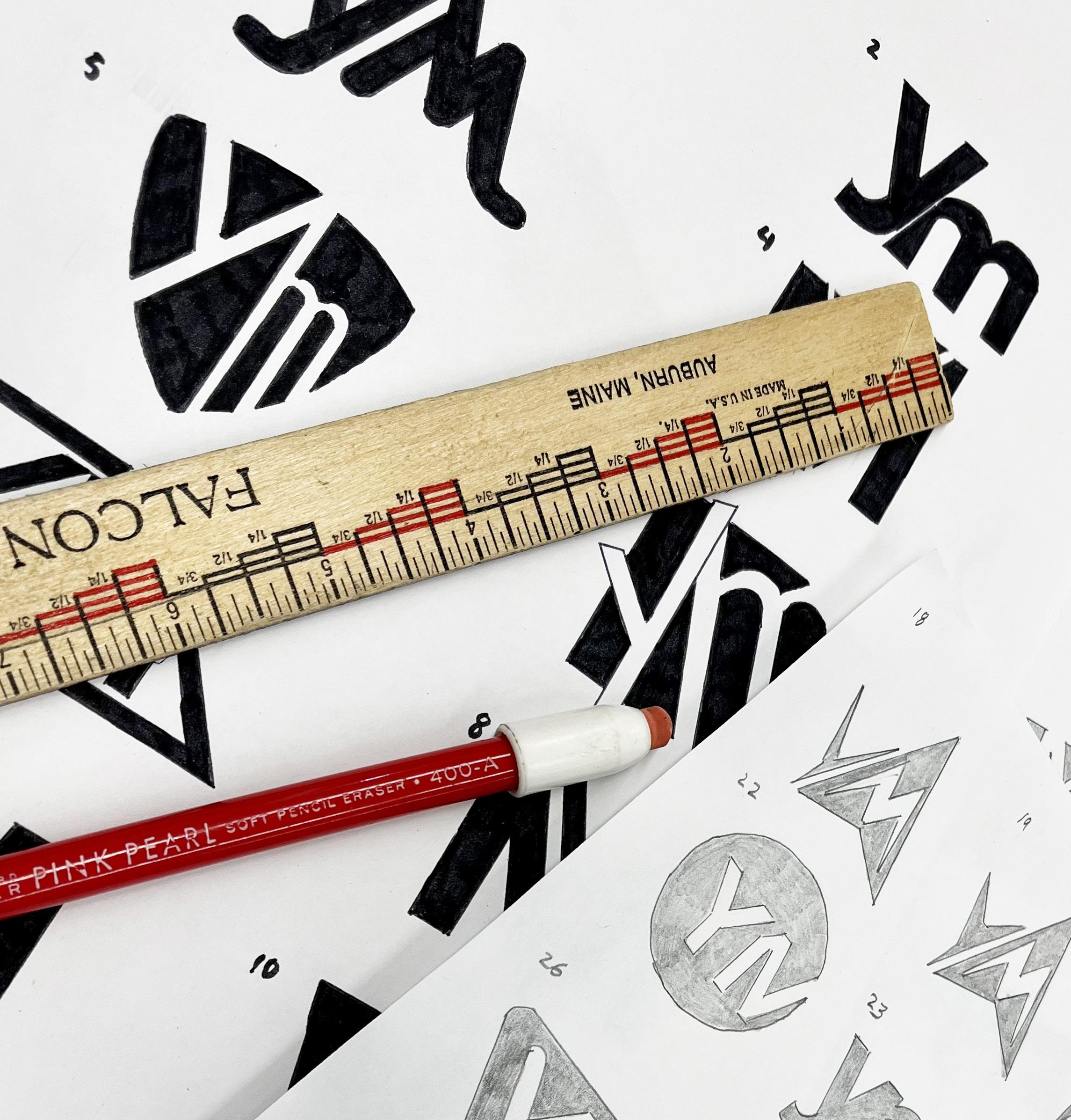
The second phase of this project was to narrow my 300 logos down to only one camp, and continue on with sketching. Finally, after continuing to evolve my initial keywords and key phrases from my narrowed down sketches, I then chose 10 logos that I felt embodied the soul of my brand.
21 YM | SECOND LOGO EXPLORATION
LEARN
BY DOING
YM’s new branding direction involves the empowerment of teen girls. It is our goal to create a logo that showcases our brand mission which is to educate, inform and empower young teen girls. The selected phrase, “Learn by doing” encompasses our a handson approach to learning, meaning our readers must interact with their environment in order to adapt and learn.
LEARN BY DOING
This phrase represents our reader’s excitement to make a difference in their communities through action. Learn by doing encompasses our readers’ physical contributions to better the world through their services and efforts.
REFINED SKETCHES
These sketches are nine of logos that made it to the refinement stage.
22 YM | VISUAL DEVELOPMENT GUIDE
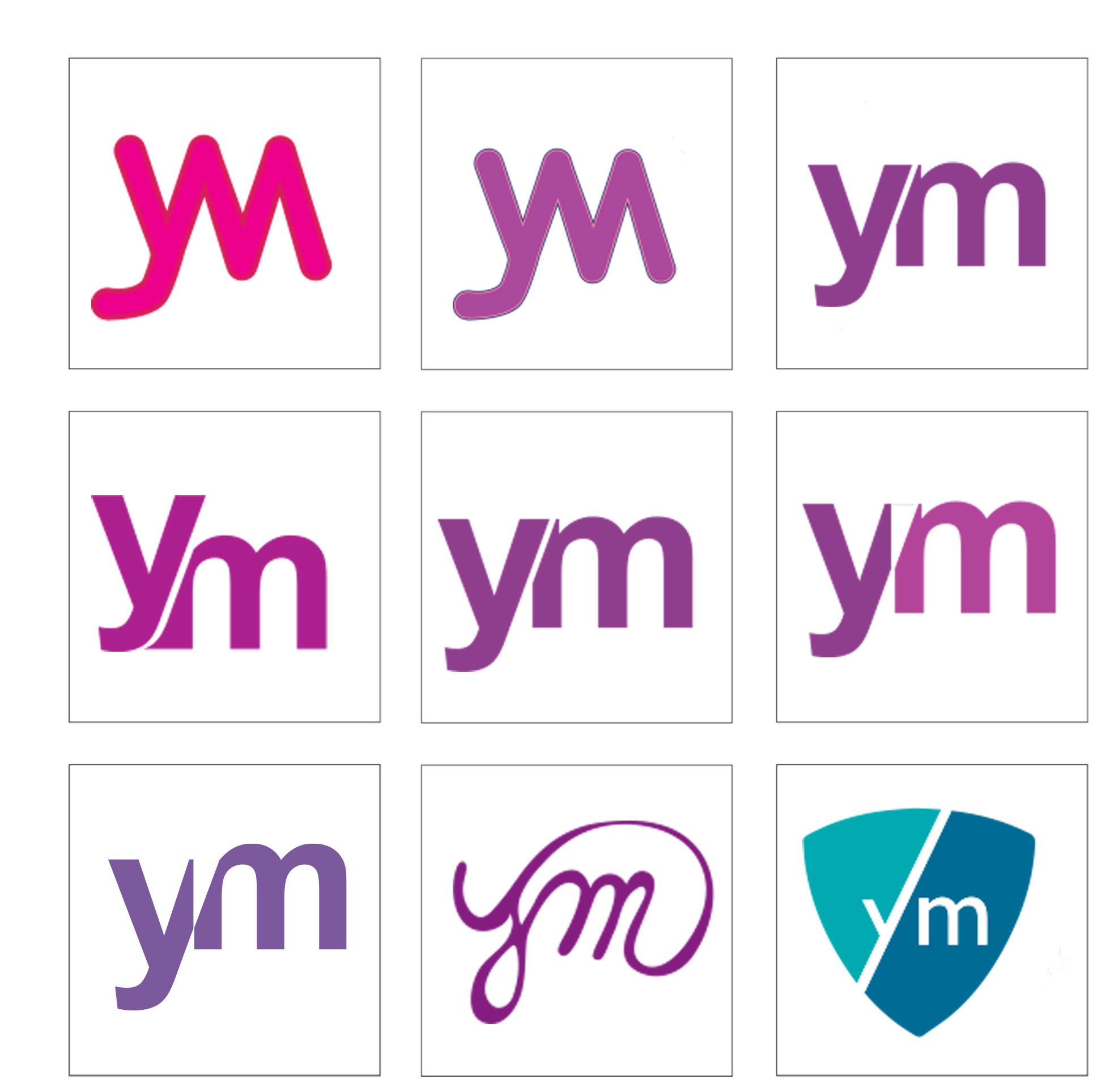
23 YM | SECOND LOGO EXPLORATION SELECTED LOGOS FOR DIGITAL
COMPUTER-REFINED
LOGOS
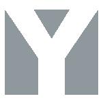
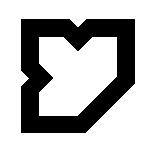
This logo uses the gestalt principal. The shoulder of the “M” is created through the use of negative space.
Initially this was hand- drawn. As I continued to refine it I copied and then vertically flipped the “y” and attached it.
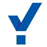
One of YM’s missions is to create good in the world, so I used a shield to represent charitable causes.
I wanted to created something here that was abstract and could almost be considered to be a graphic element.
YM also represents being bold and breaking the norm of what is expected of teenage girls, so I wanted to create something that was heavily weighted.
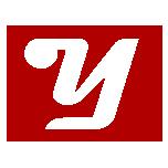
I wanted to showcase the lowercase “m” and thought that pairing this with an uppercase “y” would create some rhythm.
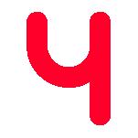
I wanted to create movement by having the tail of the “y” cut through the ascender of the “m”.
I used the ascender of the “m” to create shapes out of the negative space. I hope to color each shape differently.
I re-branded YM to stand for “you matter”, so for this logo I wanted the “you” to really make a bold statement.
This is another variation of “boldness”, which is one of the things that YM embodies.
01 02 03 04 05 06 07 08 09 10
25 YM | SECOND LOGO EXPLORATION
LOGOS FOR R2 DIGITAL
SELECTED
26
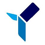
R3 LOGO EXPLORATION 04
For this exercise, we narrowed down the 10 logos from round two, to three logos–all from the same camp. In this stage, the 3 selected logos have been rendered on the computer in both black and white, and color.
27
YM | THIRD LOGO EXPLORATION
COLOR COMBINATIONS
YM’s new branding direction involves the empowerment of teen girls. It is our goal to create a logo that showcases our brand mission which is to educate, inform and empower young teen girls. The selected phrase, “Learn by doing” encompasses our a handson approach to learning, meaning our readers must interact with their environment in order to adapt and learn.
LEARN BY DOING
This phrase represents our reader’s excitement to make a difference in their communities through action. Learn by doing encompasses our readers’ physical contributions to better the world through their services and efforts.
COLOR COMBINATIONS
These digital versions represent nine possible color combinations .
28 YM | VISUAL DEVELOPMENT GUIDE


29 YM | THIRD LOGO EXPLORATION
SELECTED LOGOS FOR ADDITIONAL REFINEMENT
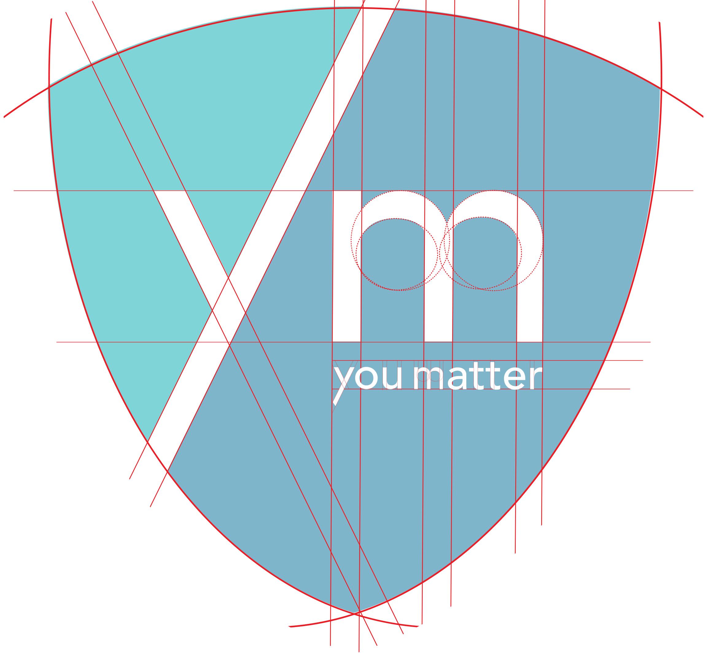
FINAL LOGO
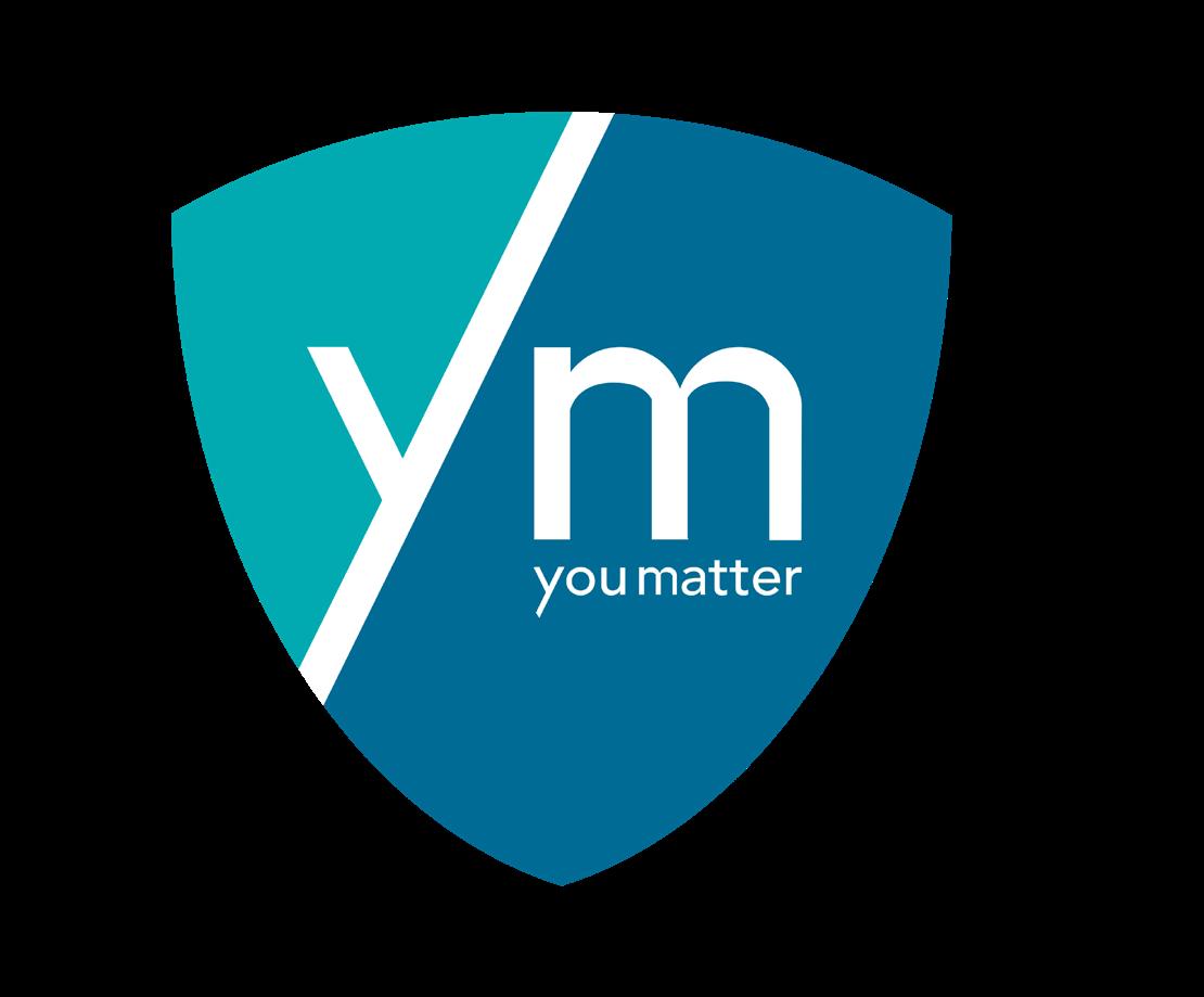
YM’s final logo uses a shield which represents stability, protection, longevity, tradition, solidity, boldness and confidence which is on brand with our mission to empower the lives of young women.
30 YM | VISUAL DEVELOPMENT GUIDE
31 YM | THIRD LOGO EXPLORATION
32
This section focuses on cataloging existing logos of professional companies to verify that our chosen mark isn’t already in use.
SIMILAR MARKS
33
05
YELLOWFIN
YARDE METALS
YOLO INVESTMENTS
Yellowfin is a global Business Intelligence and analytics platform dedicated to enabling product managers to improve their application’s analytical experiences.
Yarde Metals is a multi-metal service center specializing in aluminum, stainless, carbon steel, brass, and copper in a wide range of standard, unique and hard-to-find sizes.
Yolo Investments is a venture capital, focused on seed- and A-stage investment opportunities across gaming and fintech


Yubi is the world’s first possibility platform powering the discovery, investment, and fulfillment of credit. One-stop corporate debt solution platform for all types of debt needs.
Yaers Fashion TV, Fashion Internet TV, presents seasonal fashion shows from leading designers on the catwalks of the most famous fashion cities.
Yaourti restaurant is a Greek Mediterranean-inspired establishment in Montreal, offering a healthy menu based on the ingredient they love: Greek yogurt.
34 YM | VISUAL DEVELOPMENT GUIDE
YUBI
YAERS FASHION TV
YAOURTI
YouHodler is a FinTech platform focused on cryptobacked lending with fiat, crypto, and stablecoin loans, crypto/fiat, and crypto/crypto conversions.


Yggdrasil is a provider of superior online gaming solutions for igaming operators. Founded in 2013 it has since emerged as one of the industry’s most respected and acclaimed suppliers.

Yuper was born with the idea of “menstruation without taboo” as its embryonic concept, believing that women deserve much more, especially when it comes to their health.
CookieYes is an online tool that helps a website to easily display a cookie banner and block cookies used on that website, making them GDPR and CCPA compliant.
Youth Diversion helps youth overcome challenges by Providing prevention, intervention, and educational services that divert youth from risk and support their ability to thrive.
Yoast wants to give everyone the opportunity to rank in search engines. Their SEO plugin, blog posts, and online courses should enable both large companies as well as small websites to attract the traffic they desire.

35 YM | SIMILAR MARKS
COOKIEYES YOUTH DIVERSION YOAST
YOUHODLER YGGDRASIL YUPER
YAAS HOTEL
CANADA’S TOP EMPLOYERS FOR YOUNG PEOPLE YOTA

LOYAL YOU FM
YEKTAMAK
Yaas Hotel Dakar Almadies, located in the most branching out of Senegalese capital, offers open-air doors with vibrant colors and hot materials.
Canada’s Top Employers for Young People is an editorial competition organized by Canada’s Top 100 Employers project that recognizes the employers that offer the nation’s best workplaces and programs for young people.

Yota is the largest LTE operator in Russia and one of the world`s industry leaders in wireless broadband. It was the first provider to offer mobile broadband based on WiMAX technology and the first to launch an LTE in Russia.
Loyal is a global Venture Capital fund that relies on process, not chance, to deliver returns. The fund is designed to minimize systemic bias inherent in the investment process, unlocking greater returns.
YOU FM is one of the radio networks owned and operated by Hessischer Rundfunk, the public broadcaster for the German state of Hesse. Originally operating under the name hr XXL.
Yektamak offers high-quality customized engineering services and product solutions that meet the special needs of many sectors, especially the automotive sector, with the confidence of 35 years of experience.

36 YM | VISUAL DEVELOPMENT GUIDE
Yellow Brick Road is a wealth management company with one goal, to give Australian families and small businesses access to quality financial advice. Its local brokers and wealth managers are small business owners.

YMCA Langues, International Language School YMCA is a place of learning in an environment that contributes to individual and community growth while encouraging cultural exchange


Skyra Vajilla Profesional proposes products that transform food service to the next level and enhances the entire dining experience.
Ural Federal University is a world-class university, one of the largest universities in Russia. UrFU ranks among the Top-10 in Russia. Excellent education and world-class research in the very heart of Russia.
For more than a century, Yokohama Tire Corporation has been a world leader in the development of outstanding tire designs and technology.
Yokohama, Open Yokohama, is the second-largest city in Japan by population and the most populous municipality in Japan.
YELLOW BRICK ROAD
YMCA LANGUES
SKYRRA VAJILA PROFESIOINAL
URAL FEDERAL UNIVERSITY
YOKOHAMA
37 YM | SIMILAR MARKS
CITY OF YOKOHAMA
38
The following pages contain current and former companies’ Visual Branding Guides. I chose which I felt best demonstrated each of the following categories:
GUIDE INSPIRATION 06
39 YM | GUIDE INSPIRATION
1:
2:
3:
4:
5:
6:
New Identity Intro
Logo Anatomy
Type Specs
Main ID colors
Logo Don’ts
Alternate Logos
NEW IDENTITY INTRODUCTION
PRODUCT (RED)
What stands out amongst the others is their use of a celebrity quote instead of your generic introduction. Also, not having a table of contents immediately thrown in my face was refreshing as well. Also,I love the boldness that the designer used for the content because it set the tone of the brand immediately.
40 YM | VISUAL DEVELOPMENT GUIDE
LOGO ANATOMY
DEVON
The logo anatomy helps to define the three horizontal bars at the top right, which create a corner.
41 YM | GUIDE INSPIRATION
TYPE SPECS
DFW
I feel that DFW does a good job with their type specification. This brand clearly explains why the primary and secondary fonts were selected and additionally demonstrates the correct use of the body copy, headlines, and subhead s.
42 YM | VISUAL DEVELOPMENT GUIDE
MAIN ID COLORS
WORKDAY
In the workday’s visual guide, they have a clearly defined explanation of the color palette. The color palettes are divided into logo, background and secondary for print and digital. I like how the arranged the color spots in a vertical format, which makes it easy for viewing.
43 YM | GUIDE INSPIRATION
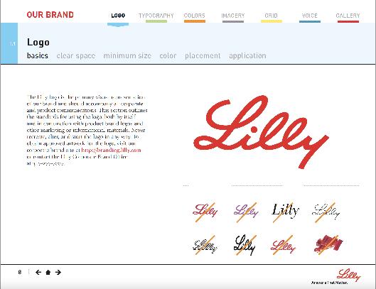
LOGO DON’TS
LILLY
The brand Lilly clearly defines circumstances where the logo might be misused. For example, it provides some examples of different parts of the logo being alternated and displaced, and also provides examples of how the colors and structure of the logo should not be altered when placed in various backgrounds.
44 YM | VISUAL DEVELOPMENT GUIDE
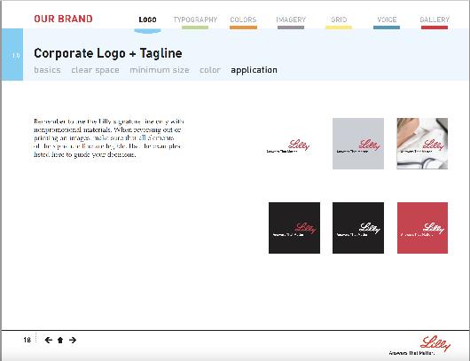
ALTERNATE VERSIONS OF LOGO
PRODUCT (RED)
PRODUCT (RED) does a fabulous job defining the alternate versions of their logo. In their brand guide, they show alternative usages for the main and sub-brand logos very well (the brackets). In the description, we can find out which version of the logo is used in which case, and use other forms of the main logo to ensure legibility and consistency.
45 YM | GUIDE INSPIRATION
SOURCES
1 | https://www.buzzfeed.com/leonoraepstein/39-reasons-ym-was-the-bestteen-magazine
2 | https://onlinebooks.library.upenn.edu/webbin/serial?id=callingallgirls
3 | https://the-avocado.org/2018/06/15/lets-read-ym-april-1997/
4 | https://fashiongrunge.com/2012/04/throwback-thursday-teen-magazines/
5 | https://en.wikipedia.org/wiki/YM_(magazine)
46 YM | VISUAL DEVELOPMENT GUIDE
47 YM | SOURCES
