‘Spice & Type’, Butler’s Wharf, River Thames.
Materials and methods
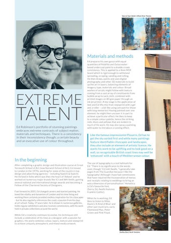
EXTREME
TALENT Ed Robinson’s portfolio of stunning paintings embraces extreme contrasts of subject matter, materials and techniques. There is a consistency in their inconsistency though; a certain beauty and an evocative use of colour throughout.
In the beginning After completing a graphic design and illustration course at Great Yarmouth School of Art (now Norwich School of Art), Ed moved to London in the 1970s, working for some of the country’s top design and advertising agencies – including Saatchi & Saatchi. He thrived in Soho which was then the heart of ‘Adland’ and he worked on numerous major brands like ICI and WH Smith, gaining several national and international design awards and becoming a Fellow of the Chartered Society of Designers. Fast forward to 2005, Ed changed careers and started painting. He loved the vitality and dynamism of London and his time living and working there certainly provided endless inspiration for his cityscapes - but he also regularly references the coast, a passion from his days at art school. Today, 17 years later, he is shown in numerous galleries, holds regular exhibitions and also receives commissions, with his work held in private collections around the world. While Ed’s creativity continues to evolve, his techniques still include a celebration of his time as a designer with a passion for graphics. His work combines colour, layers, texture and newsprint to achieve uniquely atmospheric and mixed-media artwork.
Ed prepares his own gesso with equal quantities of Polyfilla and Dulux waterbased undercoat paint to a double cream consistency. This is applied to a 4mm MDF board which is rigid enough to withstand spreading, scraping, sanding and rolling. He then draws, paints and uses digital photography and other 3D materials to build up the art in layers, balancing elements of imagery, type, materials and colour. Broad washes of acrylic might follow with texture coming from a vast array of constituents from bubble wrap to sack cloth, combined with printed images on 80 gsm paper through an ink jet printer. A key stage is the application of text and Ed lifts this from newsprint with a gel and a roller – a bit like using Letraset for those with long memories! Having painted over one element, he might then uncover it in part to achieve a particular effect. He likes to keep to a simple colour palette, hence the striking reds, blues and yellows that are evident in much of his work. He may also spray a painting with water to introduce a running effect.
Like the famous impressionist Pissarro, Ed has to get the sky sorted first and while many paintings feature identifiable cityscapes and landscapes, they also include an element of artistic licence. He wants his work to be uplifting and to look good on a wall, so recognisable British coast lines may well be ‘enhanced’ with a touch of Mediterranean colour. The use of typography is a real hallmark for Ed. “There is no significance to the words used, though,” Ed told 4walls, “I generally take pages from The Guardian because I like the typography! Although I have had commissions that have required the incorporation of menus and receipts relating to weddings to bring an extra dimension of personalisation.” Helvetica is Ed’s favourite font. (Sorry, Ed, 4walls features Franklin Gothic). When he is working, Ed likes to listen to Miles Davis’s ‘A Kind of Blue’ and other jazz musicians, early Fleetwood Mac, Peter Green and Pink Floyd.
4 Staithes Beck, North Yorkshire


