MOUNT DECORATION A MASTERCLASS WITH JON PRICE GCF (APF)
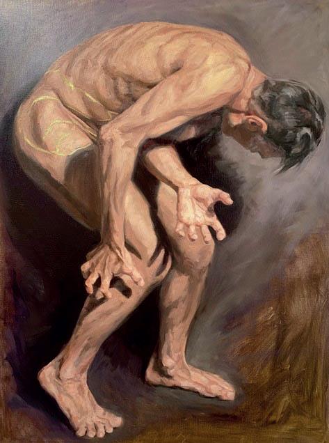
I finished my last 4walls article by writing about the ‘sum of all parts’. My point was that the artwork and frame together should be more than either would be individually. That point was emphasised for me when, prior to writing this article, I reviewed its subject, the ‘Mount Decoration’ video, which has just been released on Larson-Juhl’s website: https://larsonjuhl.co.uk/haven/vids/jon-price-masterclass. It was emphasised because the artwork that was chosen for the video really wasn’t to my taste. I struggled to find inspiration. It was only when I considered the colours within the piece and the framing design possibilities that I started to get excited. I’m still thrilled now, and that’s because the total sum of the finished pieces, the artwork and the frame together, are much greater than either would be on their own. Conservation aside, isn’t that what good framing is all about?
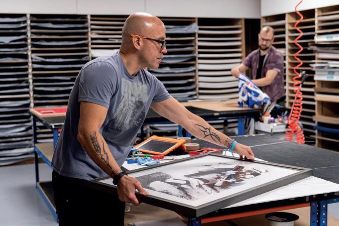
Like the Mixing and Stacking Mouldings video, the concept of the Mount Decoration video was to frame one piece of artwork in four different ways. I set one boundary: the techniques employed had to be achievable using basic equipment - in this case a Keencut Ultimat Gold mount cutter that I bought second hand for a few hundred quid. Each design is different, employing different mount colours and mount design techniques, combined with different mouldings. It’s a really good exercise for any framer to come up with lots of different frame designs for a single piece of artwork. This encourages the framer to do something different and to think out of the box. It’s also a great way to demonstrate to customers the value of your design knowledge and the techniques you utilise. As I’ve said in previous articles, when designing I normally start with the mounts. I go through my mount chevrons pulling out any board that matches a colour in the artwork. In this case beiges, browns and greys. I then select neutral colours that match the artwork’s tone or the paper colour, if any paper will be showing in the final piece. Once I’ve selected these, I play around to see what colour combinations work. When the mounts have been decided upon, I choose mouldings using the same technique i.e. matching the colours in the artwork. Now, however, I also make sure my choices match the colours of the mounts. Having chosen a number of mouldings, I experiment until I find an overall design I’m happy with. I try not to limit myself to the standard designs but instead ask: ‘Would a third mount work?’ ‘Would a fourth?’ ‘Could I stack or mix mouldings with this design?’ ‘Could I add a mount decoration technique, like a V-groove or shadow mount?’ ‘Could I do something different?’
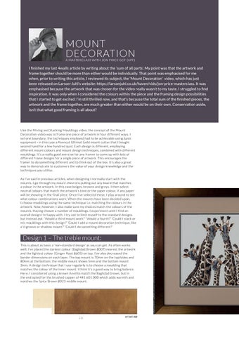
Design 1 – The treble mount: This is about as basic a ‘non-standard design’ as you can get. As often works well, I’ve placed the darkest colour (Baghdad Brown 8007) nearest the artwork and the lightest colour (Ginger Root 8605) on top. I’ve also decreased the border dimensions on each layer. The top mount is 70mm on the top/sides and 80mm at the bottom; the middle mount shows 5mm and the bottom mount 3mm. A design technique that I use regularly is to choose a moulding that matches the colour of the inner mount. I think it’s a good way to bring balance. Here, I considered using a brown Anvil to match the Baghdad brown, but in the end opted for the brushed copper of 441 601 000 which adds warmth and matches the Spice Brown 8023 middle mount.
28
441 601 000