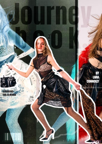
BY LARA CONNOLLY
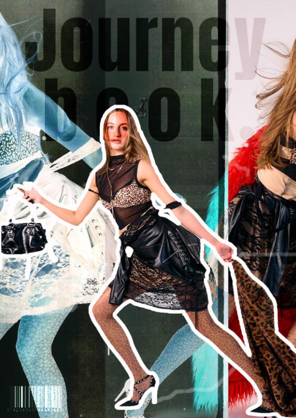

This book aims to explain and reflect on the journey that led to my FINAL MAJOR PROJECT. I will highlight key stages of this process, including the DEVELOPMENT of my personal brand, the evolution of my CONCEPT.
BY LARA CONNOLLY
This book aims to explain and reflect on the journey that led to my FINAL MAJOR PROJECT. I will highlight key stages of this process, including the DEVELOPMENT of my personal brand, the evolution of my CONCEPT.

The ‘Brand Me’ journey allowed me to better understand myself as a creative communicator. Through this process, I gained a clearer sense of my preferences, what I’m drawn to creatively, the market level that suits me, and the types of brands that resonate with my identity. From the initial selfreflection to the in-depth market research, I consistently questioned and examined my influences. Tracing these back to my upbringing, I recognised how my childhood and catholic background subtly shaped my taste, particularly my admiration for brands like Dolce & Gabbana. Additionally, my strong artistic roots have fueled my attraction to bold, expressive labels such as DSquared2. I also figured out I have strong opinions towards feminism and all the images I selected included a strong female presence. ‘Brand Me’ helped me articulate how these influences have shaped my creative identity and gave me the confidence and clarity to move forward.


From this, it was a pivotal moment in my ‘Brand Me’ journey, as it helped me understand myself on a deeper level. I realised that minimalism doesn’t reflect my creative style, I’m far more drawn to the photoshoot process and the storytelling behind the imagery than the clothing itself. This discovery initially led me to DSquared2, especially after seeing their incredible 2025 show, which fully captured my attention. Through researching my background and artistic upbringing, I came to understand my natural pull toward maximalism. Having studied art for years, and even before that, always being creatively inclined, I’ve found freedom and expression in bold, layered aesthetics. My interest in Dolce & Gabbana began with their Catholic roots, which I found especially compelling. Their Fall/Winter 2025 show stood out to me for its unapologetically rich and overt Catholic themes, something rarely seen in fashion. From there, I became intrigued by how the brand is trying to connect with Gen Z, particularly through collaborations like the one with Skims. I researched how successful that campaign was and how it reflected their evolving identity.


As I moved into Component Two, I began by researching a wider range of brands, comparing conceptual designers with luxury labels to better understand what resonated with me. On the conceptual side, I explored designers like Matty Bovan, Maison Margiela, and Charles Jeffrey, while on the luxury end, I looked into brands such as DSquared2, AVAVAV, Namilia, and of course, Dolce & Gabbana. Through this process, I confirmed that my interests align most closely with the luxury market, specifically a niche I came to identify as ‘dark luxury,’ something I hadn’t previously considered but now see as a true reflection of my style. Dark luxury feels more expressive and emotionally driven, which aligns with how I approach creativity. This stage helped me solidify my affinity for Dolce & Gabbana and DSquared2, as they both strongly represent the aesthetic I’m drawn to, assuming money were no object, they would absolutely define my wardrobe.


During Component Two, I conducted in-depth research on DSquared2, as I felt particularly drawn to their 2025 show. The runway was staged like a nightclub, with models arriving in taxis rather than simply walking the catwalk, this creative approach led me to explore set design and performance as key storytelling tools in fashion. The show stood out for its blend of nostalgia and current trends, aligning with the brand’s signature ‘80s rock band aesthetic. Their bold, rock-inspired looks, including visual references to the band Kiss, generated significant buzz on social media, effectively capturing the attention of younger audiences. Music, being a universal connector, played a key role in this impact. I also conducted a public poll with questions such as, ‘Do you think their recent show aligns with current fashion trends?’, which received mostly positive responses, and ‘Do you think this show targets a specific age group?’ The overwhelming consensus pointed to Gen Z, confirming the brand’s growing relevance among younger consumers.

At this stage, I began developing my case study concept, which proposes a collaboration between DSquared2 and Dolce & Gabbana. This idea was heavily influenced by DSquared2’s recent show, and is designed to captivate Gen Z by offering an experience unlike anything they’ve seen before. The concept merges Dolce & Gabbana’s bold, opulent aesthetic with DSquared2’s gritty, rock ’n’ roll energy to amplify the ‘dark luxury’ feel I’ve been drawn to throughout my research. The aim is to create a ‘runway event’ that transcends a typical fashion show, an exclusive cultural moment rooted in nostalgia and rebellion. By blending both brands’ identities, the event would channel the raw, iconic vibe of early 2000s fashion culture, referencing the kind of wild, legendary parties once attended by icons like Kate Moss in her ‘Kate Mess’ era. This concept positions itself as more of a party than a formal event, something that feels both exclusive and intimate, like getting ready for a house party in the 2000s. Strategically, it would benefit Dolce & Gabbana by attracting new, younger audiences in much the same way DSquared2 achieved with their nostalgic nightclub-inspired show.


While I recognise that producing a large-scale event isn’t feasible at this stage, my goal was to create campaign imagery that promotes the concept in a powerful, Gen Z-targeted way. The visuals will evoke a strong sense of nostalgia and immerse the viewer in the feeling of being part of the experience. My initial concept was a ‘getting ready to go out’ shoot, capturing intimate, candid moments that feel like you’re with your friends preparing for a party in the early 2000s. As my ideas developed, I began exploring how to incorporate impactful locations. One key idea was to shoot at Chester Cathedral, using its dramatic, gothic architecture to reflect a ‘dark luxury’ aesthetic while nodding to Dolce & Gabbana’s Catholic influences. This setting also adds a narrative layer, imagining the model either confessing sins before the night out or reflecting after it’s over.
My favorite concept is a paparazzi-style shoot, purposefully messy and chaotic, inspired by early 2000s icons like Kate Moss. Think models swearing at cameras, stumbling out of taxis, or hiding their faces, raw, unfiltered moments that echo the rock ’n’ roll energy of DSquared2. Kate Moss, often seen as the ultimate ‘rockstar’s girlfriend,’ perfectly embodies the aesthetic I want to capture. The aim is to fully immerse Gen Z in the hype, making them feel like they’re not just observers, but as if they’re about to attend this exclusive, unforgettable


As I moved into Component Three, I began focusing on styling and exploring what defines DSquared2’s rock ’n’ roll aesthetic. Their designs often incorporate punk elements and are heavily influenced by early 2000s music culture. I also looked into key motifs like leopard print, an iconic element in both Dolce & Gabbana’s collections and the broader world of rock-inspired fashion. Leopard print, in particular, stands as a symbol of bold femininity and power, which aligns perfectly with the tone of my concept.
Further inspiration came from Pamela Anderson, especially during her time with Tommy Lee. Her style in that era epitomised the ‘rockstar girlfriend’ look, think leather trousers, leopard print, band tees, chokers, smudged eyeliner, and faux fur coats. Her aesthetic was a mix of rebellious, sexy, and unapologetically 2000s, and it greatly influenced my vision. The use of faux fur, which also ties back to old Hollywood glamour, added a dramatic, playful edge that complements both the DSquared2 and Dolce & Gabbana identities within my project.


For the styling of my shoots, I began by sourcing existing garments that aligned with the aesthetic I had developed. This helped me visualise the final looks and start building cohesive outfit ideas. To support my choices, I looked into upcoming trends from my chosen brands and researched what’s predicted to perform well in the near future, while keeping in mind that nostalgic fashion remains timeless. Key elements I knew I had to include were leopard print, faux leather, heels, and bold accessories such as thick belts and studded handbags, all of which tie back to my earlier research.
One standout piece is a striking red faux fur coat, which I styled across multiple looks due to its eye-catching presence. It was inspired by the faux fur often worn by both Pamela Anderson and Kate Moss, and also reflects the recurring nostalgic themes in my concept, while aligning with current trends within Dolce & Gabbana and DSquared2. Importantly, everything I sourced was second-hand and sustainable, primarily from Vinted, with the exception of a few basics like tights.


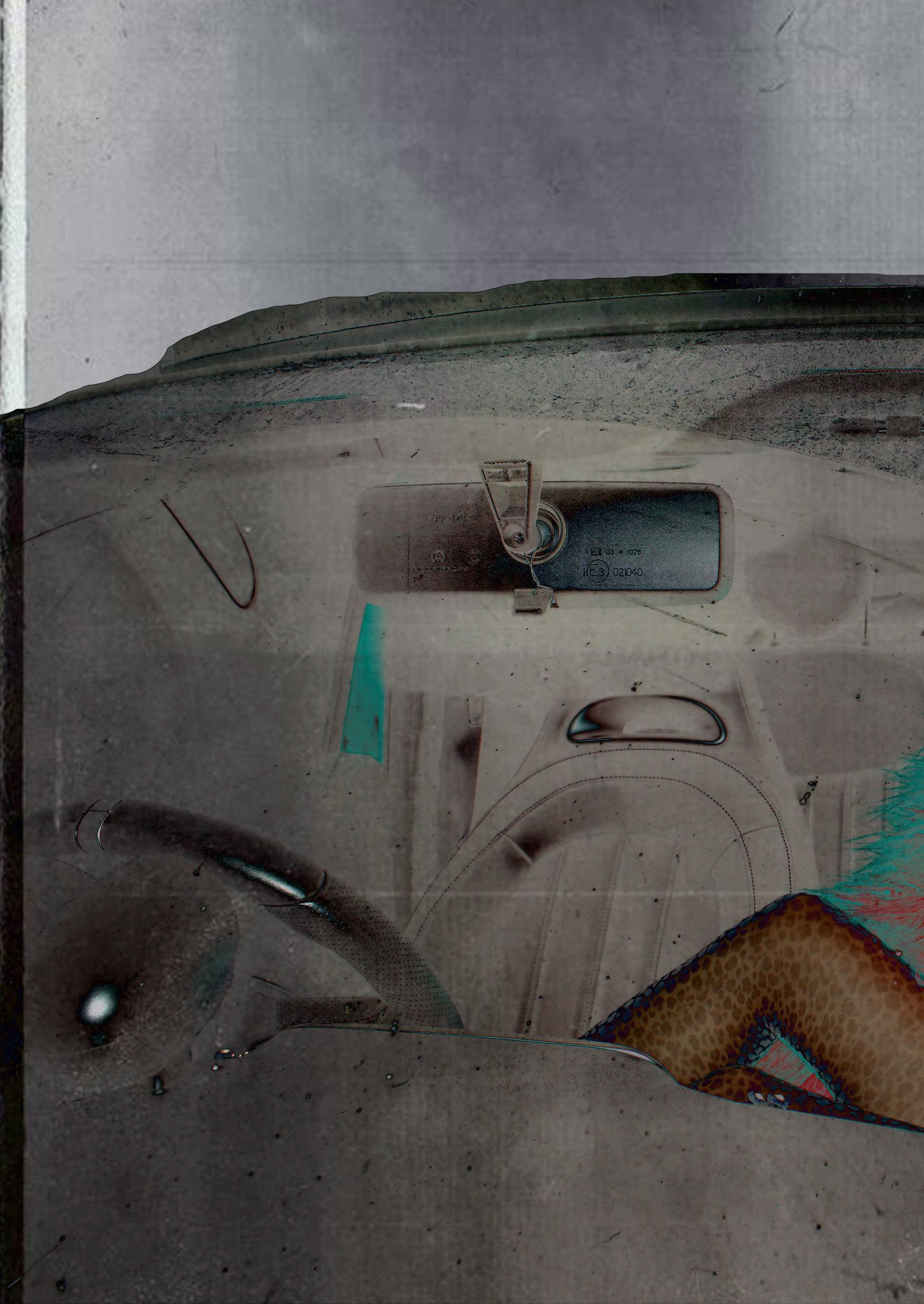
I incorporated props such as cigarettes, which, though controversial, are undeniably iconic in Kate Moss’s most famous paparazzi moments. On April 3rd, I conducted my first trial shoot, which was primarily a lighting test, as I wanted to shoot at night to capture the moody, nostalgic tone of my concept. I began by photographing around a local church using my digital camera to echo the ‘dark luxury’ feel and religious undertones of the concept. However, I quickly realised the images lacked the quality and atmosphere I needed for a professional campaign.
To improve this, I borrowed a higher-quality camera from university, which significantly elevated the results. I also refined my editing approach, focusing on saturation and flash exposure to better capture the raw, candid energy of the imagery. On the same evening, I tested the paparazzi concept using my friend’s car, channeling the unapologetic, ‘I’m famous and I don’t care’ attitude inspired by Kate Moss. For the final shoot, I plan to be more intentional with poses and framing. I’ll be using a convertible car to allow for more dynamic shots, including ones with the roof down to add movement and drama.

On April 14th, I completed another trial shoot, this time using my final model, Eva Almond, whom I sourced through the set-up modeling agency from a previous trimester. The primary focus of this shoot was to test outfit fittings, makeup looks, and posing styles. It was an essential step in preparing for the final shoot and allowed me to refine the visual direction. From this session, I decided to intensif y Eva’s eye makeup to enhance the dark luxury, rock ’n’ roll aesthetic I’m aiming for. Overall, I was very pleased with the outcome, most elements came together as envisioned, with only minor adjustments needed during post-production editing. I found that using flash in the shots worked particularly well, giving the imagery a paparazzi-style edge while also emphasizing the textures and details of the clothing. The main area I want to push further is the sense of chaos and rawness in the poses.
To better capture that ‘messy’ Kate Moss energy, I’ll be creating a new moodboard specifically focused on unpolished, expressive posing. This will help guide both the model and photographer on the final shoot day to ensure the right mood and narrative are fully realised.

After presenting Component 3, I felt confident in the direction of my project and reassured that I was on the right track. However, I also recognised the importance of pushing myself further and elevating my creativity to the next level. I want to feel genuinely proud of my Final Major Project—not only as a personal achievement but as work I can confidently use when applying for jobs or postgraduate study. My goal is to create a final outcome that reflects both my growth and potential, and that can sit proudly in my portfolio.

Throughout this process, I spent a lot of time reflecting on why I’m doing this project and uncovering the story behind it all. Even without a fixed career path in mind, I knew I wanted to challenge myself and step outside the comfort zone of traditional luxury fashion, which led me to discover the concept of ‘dark luxury.’ I realised I have a deep appreciation for rock ’n’ roll fashion and its rebellious energy.
This journey pushed me to explore beyond what I already knew, diving into unfamiliar territory and discovering new brands, styles, and cultural references. Ultimately, I recognised that the story driving my work is about embracing individuality and not being afraid to stand out. In a time when Gen Z often feels pressured by judgment and unrealistic expectations, I wanted to explore the power of nostalgia, a simpler, less filtered era, as a way to reconnect with authenticity and selfexpression. Even though I’ve experienced those pressures myself, this project gave me the freedom to push back against them through creativity.


The night starts here” is my concept for all of my shoots, aiming to convey the feeling of going out to a party or an event. This shoot aims to target gen Z for the brand Dolce and Gabbana collaborating with Dsquared.


Iconic 2. Paparazzi 3. Messy
Cool
Y2K
Rock
Street 8. Nostalgia
9. Night
10. Dark Lux


A brand collaboration between Dolce & Gabbana and Dsquared would resonate strongly with Gen Z, despite Dolce & Gabbana not traditionally targeting this audience. Gen Z is drawn to nostalgia and Y2K aesthetics, and this collaboration taps directly into that, reviving the rebellious, rock-inspired energy of the early 2000s. This was a time when icons like Kate Moss defined a raw, messy glamour that’s now being re-embraced by younger audiences seeking authenticity and edge. Dsquared’s grungy, playful identity paired with Dolce & Gabbana’s luxe heritage creates a fusion that feels both nostalgic and fresh offering Gen Z a way to connect with high fashion through a lens that speaks their language of individuality, irony, and cultural throwbacks.

I conducted one of my photoshoots at Chester Cathedral with the intention of capturing the more gothic, rock-inspired side of fashion influenced by Dsquared. The concept was designed to appeal to the Dolce & Gabbana audience, but with a Gen Z twist, drawing on nostalgia for the eras when rock fashion was at its peak. The narrative behind the shoot follows a theme of “confessing my sins before the night out”, a quiet, almost sacred moment before everything becomes wild and chaotic. For this look, the model wears a long, lacey dress paired with a bold red fur coat. The dress adds an elegant, ethereal tone, while the dramatic coat introduces that rebellious, rock edge I wanted to bring into the styling.

One of the challenges I faced during this location shoot was not receiving a response to my request for access to the cathedral grounds or interior. As a result, I had to adapt by using the exterior of the building as a backdrop instead. I focused on making the most of the architectural features available, and in the end, the grand front doors worked particularly well. In my opinion, they provided the strongest visual outcome, their dramatic, historic appearance created a striking contrast with the bold, modern styling of the outfit.

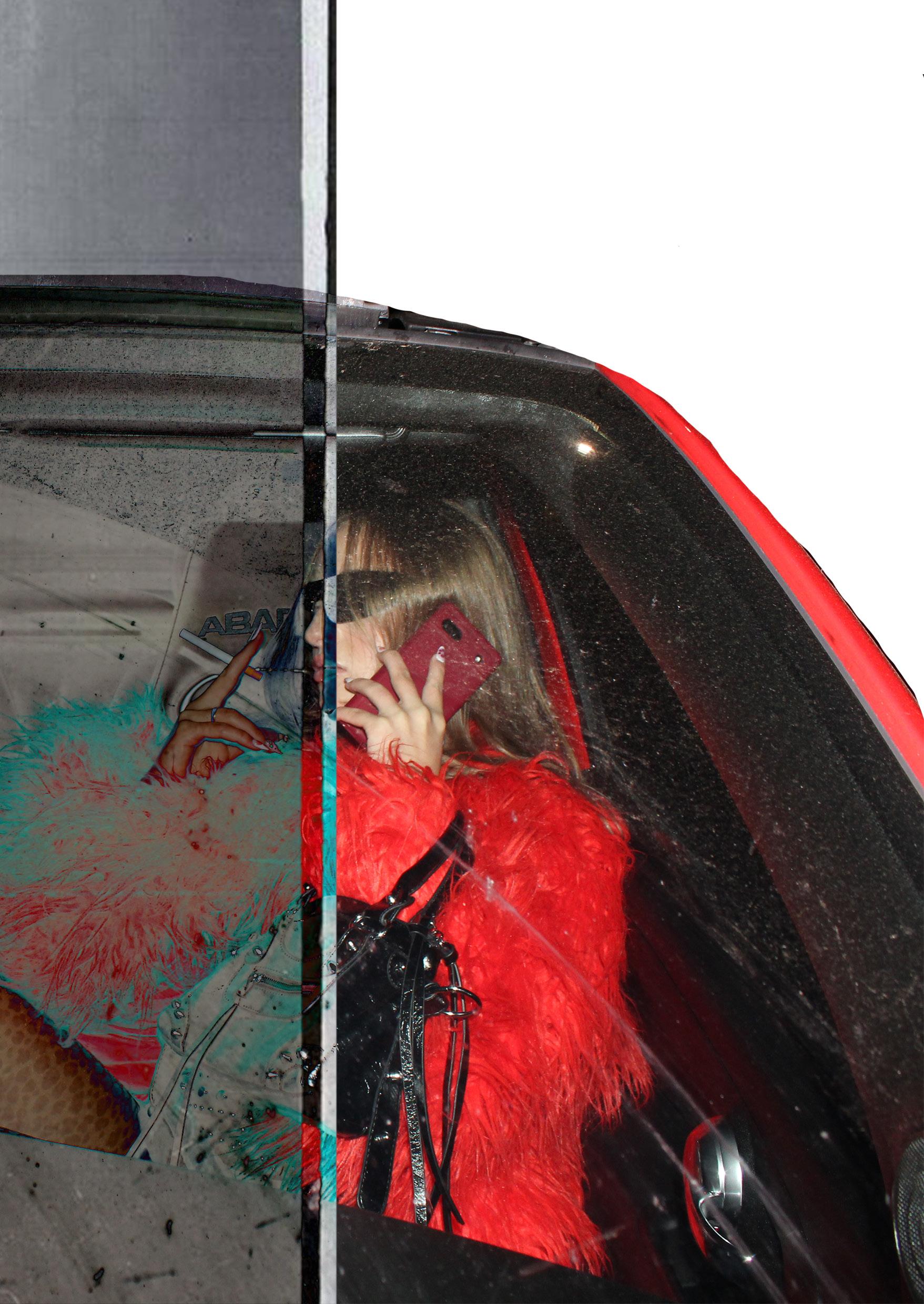
The concept for the paparazzi shoot was to capture images that feel as if the model has just been caught off-guard wearing this outfit in public. The idea was to channel a sense of frustration or attitude toward the paparazzi, expressed through bold poses, like swearing, and strong facial expressions. I aimed to mimic the raw, unfiltered energy of iconic 2000s paparazzi shots, taking inspiration especially from figures like Kate Moss, who was known for her messy yet effortlessly cool appearance. The images are meant to portray the model heading to a major event, the big reveal of the fashion collaboration, styled like an iconic 2000s party that someone like Kate Moss would have been seen at.

For my paparazzi-style shoot, I didn’t encounter any issues and felt that I successfully captured all the poses and ideas I had planned. I’m really happy with the outcome. Initially, I had considered editing the car to be black to mimic the look of a celebrity vehicle, but in the end, the red coat worked so well with the original car color that I decided to leave it. One thing I do wish I had done more of was capturing images without the sunglasses, to better showcase the makeup, which was inspired by early 2000s icons Kate Moss and Pamela Anderson. To make up for this, I plan to focus more on that element in my studio shoot, where the makeup will be styled to look messier and more worn-in, as if it’s the end of a night out.


The concept behind the third and final shoot, the studio shoot, was designed to contrast with the previous location-based shoots. While the location shoots suggest the start of a glamorous night out or the anticipation of arriving at an event, the studio shoot flips that narrative. It captures the aftermath, evoking the feeling of the model heading home after a wild, messy night, reminiscent of the way icons like Kate Moss were once photographed by paparazzi in their most unfiltered, chaotic moments. The poses and movements in the images, tripping, falling, or running, are deliberately chosen to convey that sense of raw energy and disarray. The styling reinforces this idea, garments are thrown on in a rush, layers are mismatched, tights are ripped, and pieces hang loosely off the model, suggesting she’s hurriedly dressed herself to make her way home after a drunken night. It’s imperfect, real, and intentionally undone, capturing the kind of gritty glamour that feels both nostalgic and rebellious.

I will be conducting a photoshoot with Andrew Grant as the photographer, which I see as an important step in pushing my creativity and elevating the professionalism of my overall concept. Working in such a fast-paced environment has forced me to visualise and communicate my ideas in a way that’s very different from anything I’ve done before. Because I’m collaborating with a professional photographer, I need to convey my vision clearly and efficiently. To support this, I will be creating a more detailed and developed moodboard outlining poses, shot compositions, and styling references to guide both the photographer and the model during the studio shoot.

For this shoot, I want the poses to reflect the overall messy, chaotic energy, as if it’s the aftermath of a night out. The movements will be dynamic and slightly unpolished, capturing moments like stumbling, tripping, or running away from paparazzi. I’m aiming for that raw, in-between feel that looks spontaneous and unposed, while still being visually striking. I’ve gathered a collection of reference images featuring poses that really embody this aesthetic and will use them to help guide the direction on the day of the shoot.

The hair and makeup concept for the studio shoot was all about capturing the raw, unpolished look that comes after a night out, embracing the kind of beautiful messiness that defined early 2000s icons. The makeup features smudged black eyeliner, slightly smeared lipstick, and an overall lived-in look that feels effortless yet intentional. The hair is left natural, tousled, and undone, styled to look unstyled, reflecting the chaotic, carefree energy of that era. My main inspirations were Pamela Anderson and Kate Moss, both known for their iconic, imperfect glamour. I was also particularly drawn to Kylie Jenner’s makeup in a recent shoot, where she wore smudged lipstick that perfectly captured the “night out aftermath” aesthetic. I’ve included that look on my moodboard as a reference point for the shoot.

AS FOLLOWED FROM MY RESEARCH AND TRIAL SHOOTS, MY STYLING FOLLOWS THE DARK LUXURY STYLE THAT FURTHER FOLLOWS THE ‘ROCK N ROLL’ SIDE OF FASHION THAT I WANTED TO ENHANCE FROM DSQUARED. STARTING THIS OFF BY PRACTISING ON MANNEQUINS AND THEN ON MY FRIEND TO SEE HOW IT LOOKS ON THE BODY AND VISUAL IMAGE MANIPULATION.

To improve the styling from my location shoot for the upcoming studio shoot, I decided to make some intentional changes. Since I’ll be working within a time limit, I wanted to avoid outfit changes and instead focus on capturing all elements of the look in one go. I chose to emphasize the Kate Moss aesthetic more strongly in the studio shoot, treating the location shoot as a sort of ‘before’, where the subject is still put together and ready for the night. In contrast, the studio shoot with Andrew, a professional fashion photographer, will explore the editorial side of the concept. For this, I’ve styled the looks to feel like the end of a night out, messy, layered, and undone, as if the clothes have been worn and lived in. I’ve intentionally left the dress slightly off and layered items haphazardly to reflect the raw, effortless energy often associated with Kate Moss.


This is Eva, my model, fully styled and ready for the studio shoot with the intended look. She’s wearing the correct styling that reflects the concept, layered pieces that look thrown together, hanging slightly off her as if she’s just rushed to get dressed after a chaotic night out. Her hair is left natural and tousled, deliberately messy to match the undone, early 2000s aesthetic. The makeup is exactly as envisioned: smudged black eye makeup and lipstick, channeling the raw, gritty beauty inspired by icons like Kate Moss, Pamela Anderson, and more recently, Kylie Jenner. She perfectly embodies the mood and direction of this shoot.


LIVING BILLBOARD EDIT, shows how I could go about editing my final shoot incorporating AI. This image edited on Photoshop was created using my trial studio shoot poses and an ai generated backdrop of London. The idea for this image is that the model, like Kate Moss in the 2000’s, is in London city centre, the idea of her being ‘giant’ is so the focus is on her visibility and allure, like a living billboard! The giant scale can symbolise empowerment, especially in a media-dominated culture where visibility and size metaphorically represent influence. It also might critique or celebrate celebrity culture, where personalities become larger-than-life in urban advertising.


The concept for all of my location shoots in this project is titled “The Night Starts Here”, a theme built around the anticipation and excitement of a big night out. Each image is designed to capture the energy of a moment just before a major fashion event, with the model appearing as though she’s either on her way or being caught by paparazzi. This narrative helps frame the clothing collection as something worthy of public attention, setting the scene where the outfit itself becomes newsworthy. As part of the concept development, I experimented with AI-generated images based on my model and clothing descriptions, asking for visuals in the style of a 2000s party photo. The aim was to create scenes where everyone in the image looked like the same person, emphasising the idea that true impact is when your influence is so strong that others begin to mirror you. It’s a commentary on fashion influence and fame: you don’t just stand out, you redefine the norm. While the generated results successfully communicated the concept and mood, they lacked the refinement and intention needed for a final campaign visual. However, they served as a valuable proof of concept for the visual direction and tone.

This Photoshop edit croquis, created with a deliberately abstract and exaggerated style to explore character and attitude rather than realism. The oversized heads and dramatic contrast between textures, such as the red faux fur coat and leopard print,are intentionally playful, evoking the boldness and glamour often associated with iconic fashion figures. The background, a messy city street at night, created by AI, adds an edgy, almost cinematic backdrop that contrasts with the stylized poses and luxury heels, further pushing the surreal and editorial tone. The purpose of this croquis is not just to present outfit ideas, but to tell a visual story that blends pop culture, high fashion, and urban grit, offering a creative, eye-catching way to communicate style inspiration.


Originally, my concept was to Photoshop the car black to emulate the sleek, understated aesthetic often seen with celebrity vehicles. This approach was meant to add a sense of luxury and exclusivity to the image. However, once paired with the vibrant red faux fur coat, the combination didn’t visually balance as well as expected, the boldness of the outfit clashed with the dark, muted tone of the car, making the overall image feel less cohesive. On reflection, this black car edit might work better when styled with the leopard print coat option, as the more neutral tones of the print could complement the black vehicle without competing for attention, achieving the elegant, celebrity-inspired look I originally intended.
The edit with the red car looks more visually striking than the black car version primarily due to colour harmony and contrast. The red coat complements the red car, creating a cohesive and intentional colour scheme. This coordination draws the viewer’s eye and gives the image a polished, editorial look. Against the red car, the coat blends just enough to create a strong aesthetic without losing detail. In the black car version, the red coat becomes the only strong colour in the frame, which can look more jarring

The edits in the background not only demonstrate my Photoshop skills but also highlight the contrast between the two car colours. By carefully editing the car from red to black, I was able to showcase a realistic transformation while preserving reflections, shadows, and depth. This side-by-side comparison draws attention to how dramatically the mood and aesthetic of the image can change depending on colour. It emphasises how important colour harmony is when styling a shoot, and how Photoshop can be used as a creative tool to explore and refine those choices.


In my recent photoshoot edit using Photoshop, I focused on enhancing the overall quality of the images while maintaining a natural and balanced look. Because the original photos were taken with flash, it was crucial to avoid overexposing the subjects, as this could wash out important details and create an unnatural appearance. To achieve the right balance, I carefully adjusted the brightness and saturation levels to enhance colour without making the image appear artificial. I also adjusted the contrast and exposure to bring out depth and definition, ensuring that the highlights and shadows remained well-controlled. These edits helped preserve the integrity of the flash-lit images while improving their visual impact.


Using Adobe Lightroom, I wanted to see if I could enhance my images further, especially considering the strong use of flash throughout the shoot. After speaking with Shannon Evans, a Community engagement executive at Sisters And Seekers, she advised me to adjust the contrast to help the images stand out more. Following her guidance, I also fine-tuned the saturation, highlights, and vibrancy to really make the red coat pop. Compared to Photoshop, I found that Lightroom gave the colours and lighting more clarity and definition, which has also boosted my confidence in using Adobe software more broadly. Moving forward, I’ll be using Photoshop to remove any unwanted elements or make detailed adjustments, while relying on Lightroom for lighting and colour correction.
EXPOSURE: -0.40
CONTRAST: +23
HIGHLIGHTS: -24
WHITES: +3
BLACKS: -10


For the cathedral shoot images I found that the best lighting was through reducing the highights which brought out the colours in her skin more and made her less over exposed and well lit compared to just reducing the exposure in general. also gives it a further digital camera from the 2000s feel.


For the paparazzi images I created a pre set however I adjusted it slightly for each one as it depends on the flash in the moment and also the outfit itself, so the red coat would make the image brighter overall because its so colourful, the leopard print coat needed more adjustments than the red coat with mainly the highlights and contrast. I had to edit the images in Photoshop just remove items from the background like signs or drains etc.


I COMPLETED MY STUDIO SHOOT O THE 21ST OF MAY 2025 WITH PHOTOGRAPHER ANDREW GRANT, OVERALL I FELT IKE IT WENT WELL AND I CAPTURED ALL THE POSES AND ANGLES I WANTED. MY OVERALL IDEA FOR THE STUDIO SHOOT CHANGED AND I WANTED IT TO FEEL MORE LIKE THE LOCATION SHOOT WAS HER ‘GOING TO THE EVENT’ AND THE STUDIO WAS ‘COMING BACK’ AND I WANTED IT TO HAVE THAT KATE MOSS MESSY FEEL TO IT LIKE IN THE 2000’S ICONIC PICTURES OF HER. I FEEL I HAVE CAPTURED THAT QUITE WELL. THE POSES ARE COMMUNICATING THE IDEA THAT SHE IS ‘RUNNING HOME’ OR ‘WALKING BACK AFTER A ONE NIGHT STAND’ WHERE SHE IS MESSILY DRESSED AND THE CLOTHES ARE DRAPED ON HER NOT JUST WEARING THEM NORMALLY AND VERY LAYERED UP.
FOR EDITING THESE STUDIO SHOOT IMAGES I DID IT DIFFERENTLY TO THE LOCATION ONES AS THE BACKGROUNDS ARE THE COMPLETE OPPOSITE. THE IDEA IS TO CROP THE IMAGES SO THERES LESS WHITE BACKGROUND, THEN IN PHOTOSHOP I EDITED AND REMOVED OUT THE SPACE WHERE YOU CAN SEE THE ROOM NEXT TO THE WHITE BACKDROP, MAINLY JUST BY CROPPING AS I WANTED TO REALLY ZOOM IN ON THESE POSES. I WILL BE USING LIGHTROOM TO ENHANCE THE IMAGES AGAIN HOWEVER I FEEL LIKE THEY ARE ALREADY AMAZING WITH THE COLOURING THEY HAVE FROM ANDREWS CAMERA


Dsquared2’s campaign imagery is renowned for its bold, editorial aesthetic, often characterised by highcontrast visuals. The brand collaborates with creatives, such as creative director Giovanni Bianco, to craft visually striking campaigns that align with their edgy identity.
Regarding logo placement, Dsquared2’s approach varies across campaigns. In some instances, especially within their “ICON” collections, the logo is prominently featured, either as a graphic element within the image or as part of the clothing design itself. For example, the “Icon New Generation” campaign introduced a distinctive logo that was integrated into the campaign’s visual language. In other campaigns, the branding is more subtle, allowing the imagery and fashion to take center stage without overt logo placement.
In this image, the placement of the DOLCE & GABBANA and DSQUARED2 logos serves as a bold editorial statement, blending the two brands to create visual tension.
The juxtaposition of Dolce & Gabbana’s classic, refined typography with Dsquared2’s bold, modern logo suggests a clash or fusion of luxury identities, Positioned centrally over the red car and between the model’s legs, the logos amplify the image’s provocative, rebellious tone. This deliberate branding evokes the idea of a fictional collaboration, aligning with Dsquared2’s known flair for subversion and exaggerated glamour, and reimagining the rules of high fashion advertising.


I’ve created several logo concepts for my campaign images, rather than simply placing the two existing brand logos side by side. I believe a strong brand collaboration deserves a thoughtfully integrated logo that reflects the identity of both brands. The designs I’ve developed blend the aesthetics of Dolce & Gabbana and Dsquared effectively. Dolce & Gabbana typically features a clean, sleek logo at the bottom of their editorial campaigns, while Dsquared is known for its distinctive use of the number ‘2’, though they don’t always include a logo prominently. I incorporated elements of both approaches, using Photoshop to explore variations that feel cohesive and intentional. The version I’m leaning toward is the top one, as it aligns most closely with Dolce & Gabbana’s current branding style. The concept behind the logo is “D&Gsquared”, a nod to both brand names in a unified visual.

When it came to editing my images, I had a conversation with Shannon Evans, an ex-Fashion Communication and Marketing student from the University of Chester who now works at Sisters & Seekers. I asked her for advice on editing and lighting, and she recommended adjusting the contrast and saturation to enhance the overall mood of the images. She also suggested using Adobe Lightroom for more control and consistency. For my lookbook, Shannon mentioned that it could be impactful to include some black and white edits to create a striking contrast with the dominant red featured in the styling. She also encouraged me to explore creating a preset in either Photoshop or Lightroom, so I can apply a consistent edit across the entire shoot. Additionally, she suggested using overlays, like flashing lights, to give the effect of multiple paparazzi cameras going off, adding to the chaotic, celebrity-inspired atmosphere.

When cropping the images, I focused on making the model the central point of attention, rather than including too much background. I zoomed in as much as possible to highlight the outfit and ensure the styling details were clearly visible, keeping the emphasis on the fashion rather than the setting.


During my 1-1 call sessions with Shannon, I shared my final images with her and received some valuable feedback and suggestions for further editing. She recommended incorporating overlays, specifically a flash overlay, for the paparazzi-style shots to enhance their realism and give them a more authentic, candid feel. I tested this out in Photoshop, adjusting the overlay to blend naturally with the images. While the effect does successfully amplify the paparazzi aesthetic, I found that it also slightly mutes the overall color palette, which I’m not entirely happy with. Although I may not use the flash overlay in my final edits, experimenting with it was helpful in exploring ways to deepen the narrative of the shoot.


For the overlay edits, I downloaded a flash overlay and applied it over the top of the paparazzi-style image in Photoshop. I used the ‘Screen’ blending mode to create a sheer effect and then adjusted the opacity to reduce the harsh white tones that initially covered the image. Overall, I like the final outcome, it definitely adds to the paparazzi aesthetic and gives the impression of a candid flash capture. However, I also feel that it slightly takes away from the overall image quality, making it look a bit washed out and less vibrant, which was something I had to weigh up when deciding whether to include it in the final edit.


In my 1-on-1 sessions with Karolina, I shared my images with her and received insightful feedback, particularly thanks to her extensive experience with platforms like Adobe. She suggested using AI tools to enhance certain elements of the visuals, such as adding movement to the model’s hair to create a more dynamic feel. Additionally, she recommended changing the sky in some of the cathedral shots to a sunset using AI, which helped reinforce the narrative that “the night is just starting.” These edits added atmosphere and energy to the images, pushing the story further and making the transition from day to night more visually compelling.
I really liked the idea of using AI to change the sky in the cathedral shots, and overall, it worked out well, especially in terms of enhancing the colour palette and reinforcing the mood of the images. The sunset tones added warmth and helped communicate the idea that “the night is just starting.” However, I did find the process to be a bit hit and miss. While some results looked seamless, in other cases the AI would distort or misinterpret the top of the cathedral, which disrupted the architectural detail. Despite that, it was a valuable experiment that added depth to the narrative and visual impact of the shoot.

When editing my studio shoot images, I aimed to reflect the theme of “coming back from the event”, a look that’s slightly messy but still effortlessly cool. I focused on conveying this through the model’s poses, giving her a relaxed, almost chaotic energy that suggests the aftermath of a glamorous night out. To enhance the sense of movement and spontaneity, I used Photoshop’s generative fill feature to add motion to her hair. By typing in prompts like “hair blowing,” I was able to create a wind-swept effect that made her look like she’s in motion, as if walking or running, which added a dynamic, unpolished edge to the otherwise controlled studio environment.

After the shoot was over, I realized that using a hair dryer on set to create a natural blowing effect would have been a great way to match the movement in the model’s poses, especially since I wanted to capture the feeling of her running or in motion. However, I’m pleased with how the AI edits turned out. Using AI to add movement to her hair ended up looking surprisingly realistic and helped convey the dynamic energy I was aiming for. As a result, I’ve gone ahead and edited all of the studio shoot images in this way, and they’re now ready to be included in my lookbook.


I’ve been experimenting with AI to create moving imagery, which allowed me to bring my still images to life and give them a runway effect. This technique really inspired me when it came to developing the fashion film for the launch night. I loved the way it made the model appear as if they were walking straight out of the picture and onto a digital runway, which added a bold, immersive element to the visuals. It tied in perfectly with the overall concept of the paparazzi-style shoot, blurring the lines between static fashion imagery and dynamic movement. Using AI in this way helped me push the storytelling further and create a more engaging, futuristic aesthetic for the film.


DSQUARED2’S INSTAGRAM PRESENCE IS A VIBRANT REFLECTION OF THEIR BOLD, REBELLIOUS BRAND IDENTITY. THEIR FEED SHOWCASES A MIX OF HIGH-FASHION EDITORIALS, BEHIND-THE-SCENES GLIMPSES, AND DYNAMIC RUNWAY MOMENTS, ALL INFUSED WITH A DISTINCTIVE ROCK ‘N’ ROLL FLAIR. THE IMAGERY OFTEN FEATURES DRAMATIC LIGHTING, ENERGETIC POSES, AND A RAW AESTHETIC THAT ALIGNS WITH THE BRAND’S EDGY PERSONA. WHILE SOME POSTS INCORPORATE THE DSQUARED2 LOGO, IT’S TYPICALLY USED SPARINGLY, ALLOWING THE VISUALS TO SPEAK FOR THEMSELVES. THE OVERALL EDITING STYLE EMPHASIZES CONTRAST AND INTENSITY, ENHANCING THE MOOD WITHOUT OVERSHADOWING THE FASHION PIECES.
I CREATED A SERIES OF SOCIAL MEDIA EDITS TO TEST HOW WELL MY CAMPAIGN CONCEPTS ALIGN WITH THE VISUAL STYLE OF BOTH BRANDS ON INSTAGRAM. OVERALL, I FOUND THAT THE PAPARAZZI-STYLE IMAGES FIT MORE NATURALLY WITH DSQUARED2’S AESTHETIC, THEY HAVE THAT RAW, HIGH-ENERGY, REBELLIOUS FEEL THAT REFLECTS THE BRAND’S USUAL TONE. THE LIGHTING, MOTION, AND CANDID VIBE OF THESE EDITS ARE CONSISTENT WITH THE KIND OF CONTENT DSQUARED2 OFTEN SHARES. THAT SAID, I’VE INCLUDED A SELECTION OF BOTH THE PAPARAZZI AND STUDIO SHOOT IMAGES IN THE MOCK-UP, SINCE THIS IS A COLLABORATION AND BOTH BRAND IDENTITIES NEED TO BE REPRESENTED. THE STUDIO SHOTS, WITH THEIR POLISHED, HIGH-FASHION LOOK, ALIGN MORE CLOSELY WITH DOLCE & GABBANA’S REFINED AND ELEGANT FEED. CONSIDERING THAT INSTAGRAM COLLABORATIONS SHOW UP ON BOTH ACCOUNTS, I WANTED TO SEE HOW THE EDITS WOULD BALANCE ACROSS THE TWO AESTHETICS, AND HOW THE DIFFERENT STYLES WOULD SIT SIDE BY SIDE IN A SHARED POST. THIS APPROACH HELPED ME EVALUATE HOW COHESIVE AND VERSATILE THE CAMPAIGN VISUALS REALLY ARE WHEN APPLIED TO REAL-WORLD BRANDING PLATFORMS.
DOLCE & GABBANA’S INSTAGRAM PRESENTS CAMPAIGN IMAGES THAT ARE VISUALLY STRIKING AND HEAVILY BRANDED. THEIR POSTS OFTEN FEATURE HIGH-CONTRAST BLACK-AND-WHITE PHOTOGRAPHY OR VIBRANT, CULTURALLY INSPIRED SCENES THAT REFLECT ITALIAN HERITAGE, FAMILY, AND TRADITION. CAMPAIGNS FREQUENTLY INCLUDE CELEBRITIES OR MODELS IN DYNAMIC COMPOSITIONS, HELPING TO ELEVATE THE BRAND’S ASPIRATIONAL IMAGE. A KEY FEATURE IS THE PROMINENT USE OF LOGOS, PARTICULARLY IN ACCESSORIES LIKE BAGS, WHICH REINFORCES BRAND RECOGNITION AND LUXURY STATUS. THE HEAVY BRANDING ISN’T JUST FOR VISIBILITY, IT EMPHASIZES EXCLUSIVITY AND ALIGNS WITH THE BRAND’S BOLD, CONFIDENT IDENTITY. OVERALL, THEIR INSTAGRAM STRATEGY BLENDS STORYTELLING, ICONIC IMAGERY, AND DIGITAL ENGAGEMENT TO CREATE A POWERFUL AND CONSISTENT VISUAL IDENTITY. I CREATED EDITS USING PHOTOSHOP TO SEE HOW MY IMAGERY WOULD INTEGRATE WITH DOLCE & GABBANA’S INSTAGRAM FEED. OVERALL, I FOUND THAT THE STUDIO SHOOT IMAGES ALIGNED MORE CLOSELY WITH THEIR AESTHETIC, THEY HAVE A CLEAN, SOPHISTICATED LOOK THAT MATCHES THE POLISHED AND HIGH-FASHION TONE OF THE BRAND, WHILE STILL FEELING MODERN AND COOL. HOWEVER, DOLCE & GABBANA RECENTLY FEATURED A PAPARAZZI-INSPIRED FASHION SHOW THAT’S HEAVILY DOCUMENTED ON THEIR FEED, WHICH MAKES MY MORE CANDID, PAPARAZZI-STYLE IMAGES A GREAT FIT WITHIN THAT CONTEXT AS WELL.


FOR THE COLLABORATION, I’VE DESIGNED SOME MOCK-UPS OF HOW THE DSQUARED2 WEBSITE COULD LOOK WITH THE NEW CAMPAIGN, USING THE PAPARAZZI-STYLE SHOOT IMAGES AS THE FOCAL POINT. I CHOSE THESE IMAGES BECAUSE, BASED ON DSQUARED2’S CURRENT AESTHETIC, THEY ALIGN MORE CLOSELY WITH THE BRAND’S EDGY, ROCK ‘N’ ROLL IDENTITY THAN WITH DOLCE & GABBANA’S MORE CLASSIC LUXURY VIBE. THE BOLD COLOURINGS, DYNAMIC POSES, AND STYLING CHOICES ALL HELP CONVEY A REBELLIOUS ENERGY THAT FEELS VERY TRUE TO DSQUARED2. IN THE MOCK-UP, THE MAIN IMAGE SECTION WOULD FUNCTION AS A CAROUSEL, ROTATING THROUGH A SELECTION OF IMAGES THAT EMBODY THIS HIGH-IMPACT ATTITUDE, GIVING VISITORS AN IMMEDIATE SENSE OF THE CAMPAIGN’S MOOD AND DIRECTION.


THIS IS WHAT THE LAYOUT WOULD LOOK LIKE ONCE YOU SCROLL DOWN A BIT ON THE WEBSITE. THE FEATURED IMAGES FROM THE PAPARAZZI SHOOT, SPECIFICALLY THE ONES WHERE THE MODEL IS IN THE CAR, VISIBLY ANNOYED AT BEING PHOTOGRAPHED, REALLY CAPTURE THE AGGRESSIVE, DEFIANT ATTITUDE THAT UNDERPINS THE NARRATIVE OF GETTING CAUGHT WEARING THIS BOLD NEW COLLECTION OUT IN PUBLIC. THESE VISUALS EMPHASISE THE UNAPOLOGETIC, REBELLIOUS SPIRIT OF THE COLLABORATION. JUST BELOW THE IMAGES, THERE WILL BE A DESCRIPTION PLACED UNDER THE HASHTAG #THENIGHTSTARTSHERE, WHICH WILL OUTLINE THE CONCEPT AND AIMS OF THE COLLABORATION. A SIMILAR SECTION WILL ALSO BE DEDICATED TO DOLCE & GABBANA, OFFERING INSIGHT INTO THEIR INFLUENCE ON THE PROJECT AND HOW BOTH BRANDS COME TOGETHER THROUGH THIS CAMPAIGN.

I designed this edit based on Dolce & Gabbana’s current website layout, selecting two of the strongest images from the studio shoot to feature on the main homepage. I chose the studio shoot images because they feel more in line with Dolce & Gabbana’s polished, high-fashion aesthetic, as opposed to the paparazzi or cathedral shots, which have a rawer, edgier vibe that aligns more with Dsquared2’s visual identity or something Dolce & Gabbana might reserve for their social media. Their website typically maintains a clean and refined look, so I kept that in mind while designing the layout. However, to subtly incorporate the rock ’n’ roll influence from the Dsquared2 side of the collaboration, I added the Dolce & Gabbana logo in the center using the ‘difference’ effect. This gave the logo a slightly more alternative, edgy feel, bridging the two brands’ aesthetics while still keeping the overall design sleek and cohesive.


This is what the layout would look like once you scroll down a bit. I’ve included three additional images here that highlight the collection’s styling in more detail, giving a clearer view of the garments and accessories. These selections not only showcase the fashion more prominently but also mirror the structure of Dolce & Gabbana’s current website layout, which often features a clean, grid-like presentation of editorial shots beneath the main homepage banner. The overall look remains polished and elegant, in line with Dolce & Gabbana’s brand identity, while still allowing space for the collaborative influence to subtly come through in the attitude and styling of the imagery.


I’VE DESIGNED A SERIES OF MAGAZINE FRONT COVERS TO PRESENT MY IDEAS IN A MORE DYNAMIC AND PROFESSIONAL FORMAT, GIVING A SENSE OF HOW THE VISUALS MIGHT LOOK IN A REAL-WORLD, PUBLISHED CONTEXT. I CHOSE TO USE I-D MAGAZINE AS THE TEMPLATE, AS IT HAS PREVIOUSLY FEATURED BOTH DOLCE & GABBANA AND DSQUARED, MAKING IT A FITTING CHOICE FOR THIS PROJECT. I DIDN’T FEEL THAT DSQUARED WOULD NATURALLY ALIGN WITH SOMETHING LIKE VOGUE, WHICH TENDS TO LEAN MORE TOWARDS CLASSIC LUXURY, WHEREAS I-D HAS A MORE CONTEMPORARY, EDGY AESTHETIC THAT COMPLEMENTS BOTH BRANDS. ADDITIONALLY, I-D’S FRONT COVER STYLE IS VISUALLY SIMILAR TO MY OWN SHOOTS, MAKING IT AN IDEAL MATCH FOR SHOWCASING THE OVERALL CONCEPT.


I CREATED SOME AI-GENERATED IMAGES OF MAGAZINE COVERS TO VISUALIZE HOW MY PHOTOS MIGHT LOOK AS A FRONT COVER. ONE OF THE RESULTS WAS A VOGUE COVER, WHICH MADE ME REALISE HOW WELL IT FITS, ESPECIALLY CONSIDERING KATE MOSS’S ICONIC STYLE AND HER HISTORY OF APPEARING ON NUMEROUS VOGUE COVERS.

I’ve also created an AI-generated version of one of my final images specifically designed to be displayed on a billboard. Seeing my work on a large-scale billboard has always been a personal goal of mine, it’s my one mission. I wanted to visualise what that could look like and bring that ambition to life through AI. This generation captures the essence of my concept while giving it the bold, high-impact presence that a billboard demands. It’s a step toward making that dream a reality and pushing my work into public, statement-making spaces.


I HAVE BEEN GIVEN THE OPPORTUNITY TO CREATE A FASHION FILM TO PROMOTE THE COURSE TO PROSPECTIVE STUDENTS, WHICH WILL BE SHOWCASED BOTH ON OUR YOUTUBE CHANNEL AND DURING LAUNCH NIGHT. MY CONCEPT WAS INSPIRED BY A FASHION FILM TITLED SPACES OF DESIRE BY TASKIN GOEC AND TIMO KREITZ, ORIGINALLY PRODUCED FOR SHOWSTUDIO TO PROMOTE A RUNWAY SHOW. I WAS PARTICULARLY INFLUENCED BY THE FILM’S PACE, ITS USE OF AI, AND ITS DISTINCTIVE LIGHTING TECHNIQUES. ONE OF THE KEY EDITING STYLES I’VE DRAWN FROM IS THE USE OF SPLIT-SCREEN CLIPS, WHICH ADDS A DYNAMIC, LAYERED VISUAL EXPERIENCE.
BUILDING ON THIS INSPIRATION, MY VISION IS TO CREATE A ‘DIGITAL RUNWAY’, A FASHION FILM WHERE AI-GENERATED VISUALS PORTRAY STUDENTS’ DESIGNS AS IF THEY WERE WALKING A VIRTUAL CATWALK. I’VE INCORPORATED THESE AI-GENERATED IMAGES AND EDITS TO CREATE A BALANCE BETWEEN VISUAL DESIGN AND EFFECTIVE COMMUNICATION, ENSURING THE FILM RESONATES WITH BOTH THE CREATIVE AND CONCEPTUAL ASPECTS OF THE COURSE.
MAIN AIMS:
-Showcase students work
-Represent the creative spirit of course
-Target the target audience
-Attract prospective students
-Build brand awareness
-Incorporate AI
-Editing completion in Premiere Pro
-Communicate course strengths
-Readiness for YouTube

SCAN THIS TO SEE THE CREATIVE RUNDOWN OF MY LAUNCH INVOLVEMENT

Image created on Photoshop by me to show a croquis edit of everyones imagery

DURING MY TIME AT UNIVERSITY OVER THE PAST FEW MONTHS, I’VE TAKEN ON THE ROLE OF MANAGING THE OFFICIAL INSTAGRAM ACCOUNTS FOR OUR COURSE. THIS RESPONSIBILITY INCLUDES SHOWCASING STUDENT WORK, PROMOTING THE COURSE, INCREASING ENGAGEMENT, RESPONDING TO MESSAGES FROM PROSPECTIVE STUDENTS, AND SHARING UPDATES ON FASHION NEWS. SINCE STARTING THE “BRAND ME” PROJECT, I’VE ALSO CONTRIBUTED TO REBRANDING THE COURSE’S VISUAL IDENTITY. WHILE KYLA FROM OUR CLASS DESIGNED THE NEW LOGOS, I WAS RESPONSIBLE FOR UPDATING ALL DIGITAL ASSETS TO ALIGN WITH OUR ESTABLISHED COLOUR THEME. I’VE CONSISTENTLY CREATED AND POSTED OTHERS CONTENT LEADING UP TO OUR LAUNCH NIGHT, INCLUDING A PROMOTIONAL VIDEO FOR THE MERCHANDISE, TEASER REELS PRODUCED BY OUR COMMUNICATIONS TEAM, AND WEEKLY COUNTDOWN POSTS TO BUILD ANTICIPATION AND ENGAGEMENT.

In conclusion, throughout the development and completion of my Final Major Project, Brand Me, I have engaged in multiple trial and final shoots that have allowed me to reflect critically and creatively on my practice. I believe I have successfully completed all relevant research, concept development, and experimentation to bring my brand to life in a meaningful and professional way. In doing so, I have met the trimester aims by exploring fashion communication, marketing, and promotion strategies with a critical perspective, and by deepening my understanding of branding theories and market dynamics. I have also demonstrated how to future-proof a fashion brand through a targeted and analytical promotional campaign tailored to a specific audience.
Additionally, I have met the core learning objectives by identifying and evaluating key principles of fashion brand management and applying them to produce effective and appropriate marketing outcomes. My strategy incorporated critical research into new technologies and social media platforms, which I utilised to develop a contemporary and relevant campaign. From initial concept to final visualisation, I have shown creative, strategic, and tactical thinking, with clear differentiation between each element of the campaign process. Finally, this project has highlighted my approach and my in-depth understanding of my audience, allowing me to produce a confident and authentic brand outcome that aligns with industry expectations.

BY LARA CONNOLLY