ABOUT YOUR BRAND
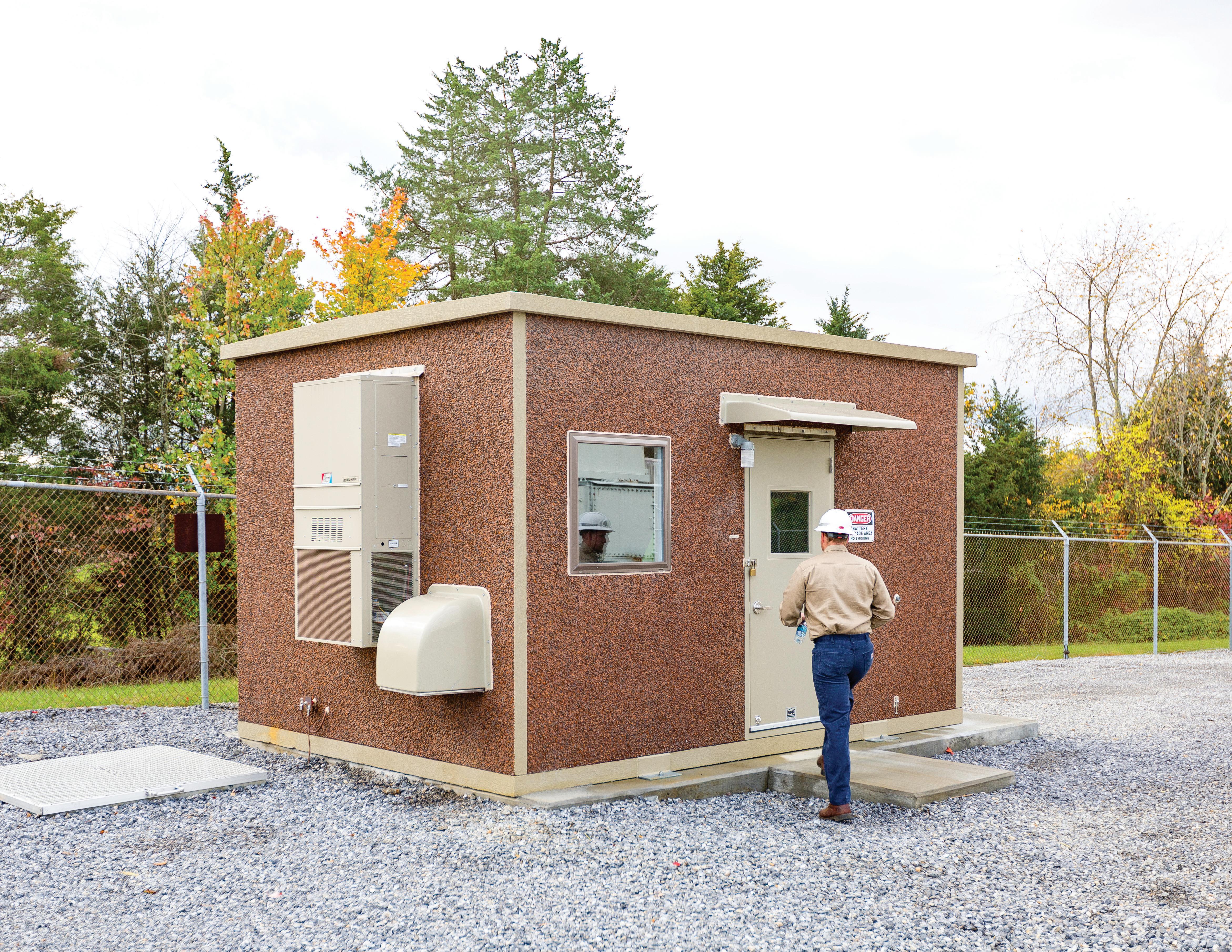
For over 55 years, VFP Inc. has done more than just be a premier manufacturer of versatile equipment shelters for municipalities, broadband providers, and Fortune 500 corporations. We provide comprehensive integrated solutions designed specifically to meet each client’s needs. Because we know that our customers need more than just a well constructed enclosure.
As a trailblazer in the manufacturing of mission critical equipment houses, our customers depend on more than just the strong buildings we construct. Our expertise and capabilities to fully integrate electrical, power, communications and additional mission critical components allows our customers to realize overall reduced installation costs and ensure a fluid field installation.
Our mission is to provide the highest quality integrated equipment shelters in a collaborative and innovative environment and create supportive partnerships for our clients and our staff.
VISION & VALUES
VISION
VFP’s vision is to be a collaborative manufacturing and integration partner while providing project innovation, reliable quality, and impeccable service to its clients. We aspire to be more than just a manufacturer but a trusted partner for our clients and their critical system needs, always striving to provide the best products and services.
VALUES
COLLABORATIVE
We believe success depends on every team member working together with our clients towards a common goal.
DEPENDABLE
We are reliable and committed to ensuring every project we pursue is completed to the highest standards and specifications.
INNOVATIVE
We always strive to apply creative solutions to each client’s unique challenges.
HONEST
We always tell the truth and operate with complete integrity.
SERVICE-ORIENTED
Our level of service is based on good communication and we continually strive to keep our clients updated and informed at all times.
PERSONALITY & TONE PROMISE:
For people who want reliable equipment shelters for energy, public safety, and network capabilities, VFP provides a variety of products and integration services that deliver building enclosures on time, within budget, and exceeding expectations.
THEMES:
• Synergistic capabilities
• Strength of capabilities showcased through manufacturing efficiencies
• Solutions based expertise
• Responsible and sustainable growth through partnerships
COLORS:
• Logo colors function as primary color palette with a few neutrals for added color variation
• Color palette exudes strength, professionalism, partnership
- welcoming and approachable, innovative and direct, tech influenced
TONE:
• Professional
• Capable
• Friendly
• Collaborative
• Supportive
BRAND COLORS
Coated Paper
Pantone 7623 Coated
Coated
28 | M 100 | Y 100 | K 35
| B 24
# 841618
Uncoated Paper
Pantone 411 Coated
Pantone 7623 Uncoated CMYK Coated
CMYK Uncoated
28 | M 100 | Y 100 | K 35
Pantone 411 Uncoated
Uncoated
USAGE - DON’TS
DO NOT
Stretch logo out of proportion
Add a dropshadow
Reorder
DO NOT
Outline
Change Colors
Use a pixelated version

TYPOGRAPHY PRIMARY FONTS
The primary font is to be used as the main content font such as body copy, subheads, captions, pull quotes, infographics and other small blocks of text that add information to the secondary headline font on all collateral and marketing materials. This font is light, legible and balances with the heavy width of the secondary font. Additionally, the primary font and secondary font are considered complimentary fonts and should always be used together.
SECONDARY FONTS
The secondary font is the typography you will use to for titles of documents, headlines, announcements, and important information. It is the font that draws a reader’s eye and communicates your main point. This font should always be used as the most immediately visible typographic element in your document, website or design.
TYPOGRAPHY
PRIMARY FONT
OPEN SANS SEMIBOLD
ABCDEFGHIJKLMNOPQRSTUVWXYZ
abcdefghijklmnopqrstuvwxyz
0123456789
OPEN SANS BOLD
ABCDEFGHIJKLM NOPQRSTUVWXYZ
abcdefghijklmnopqrstuvwxyz
0123456789
SECONDARY FONT
EUROSTILE EXTENDED MEDIUM
ABCDEFGHIJKLMNOPQRSTUVWXYZ
abcdefghijklmnopqrstuvwxyz
0123456789
Open Sans SemiBold 8pt C:0 M:0 Y:0 K:0
Open Sans SemiBold Italic 8.5pt C:28 M:100 Y:100 K:35
Open Sans Bold 11pt C:28 M:100 Y:100 K:35
Open Sans SemiBold Italic 8.5pt C:28 M:100 Y:100 K:35 Open Sans Bold 8.5pt C:28 M:100 Y:100 K:35
Open Sans SemiBold 8.5pt C:2 M:12 Y:15 K:84
Open Sans SemiBold 9pt C:0 M:0 Y:0 K:0
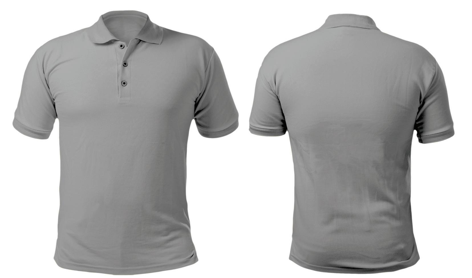
APPAREL GUIDELINES
Full color logo should be used whenever possible. Black and white logo should be used when full color logo is not legible on apparel color. Logo should be placed on front left or right pocket, no larger than 3” wide; no matter the shirt size. When placed on back, logo should be centered and no larger than 5” wide; no matter the shirt size. EPS or SVG file should be sent to vendor for use.
3” (max) left or right pocket
5” (max) centered
3”