FOLIOPORTFINALPORT Spring 2022, ARCH 22A Architecture Rendering and Delineation City College of San Francisco KRISTIAN ELIZES
PS TRAVEL PAGE 4 TABLE CONTENTSOF SOCIAL JUSTICE POSTER PAGE 6 MUSEUM OF... PAGE 10
PAGE 20 PAGE 28 GLABRATA: TOTEM PARK CHA HAUS: UNHAPPY HIPSTER
4
1TRAVELPS
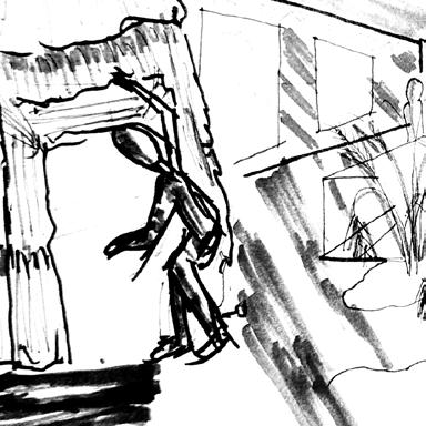
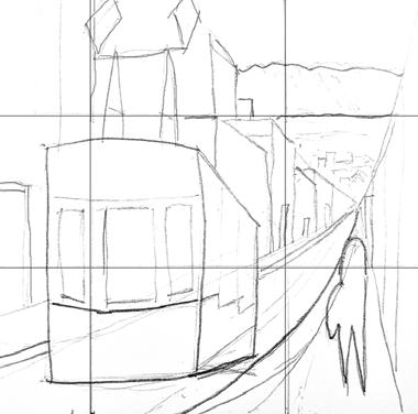
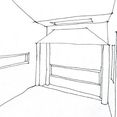
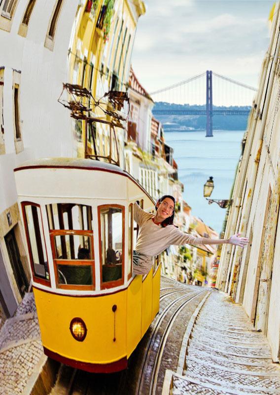
In these preliminary sketches, I experimented with two different uses for the “rule-of-thirds” composition technique, with “Hand sketch 1” using a combination of “rule-of-thirds” and “vanishing point” techniques. I decided to pursue “Hand sketch 1” for my final version.
HAND SKETCH 1 HAND SKETCH 2
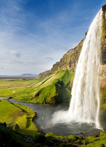
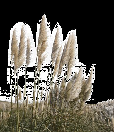
Location Statement: For this assignment, I chose Lisbon, the capital of Portugal, as my destination. The picturesque and quaint beauty of the old city by the sea is what makes it special for me. Upon the tip of a rocky peninsula lies dense medieval neighborhoods stitched together with narrow meandering cobblestoned streets. A web of red tiled roofs stretching from the mountains to the bay. A city known for its sunny beaches and old cityscape, I want to experience Lisbon by getting lost in its streets on foot.
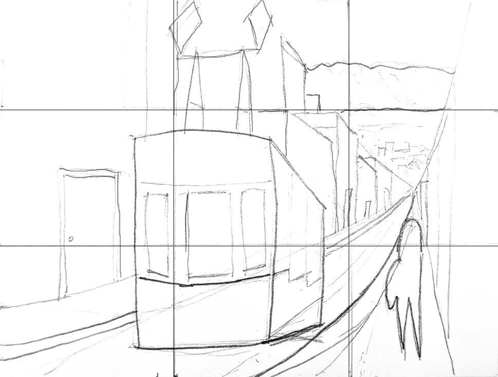
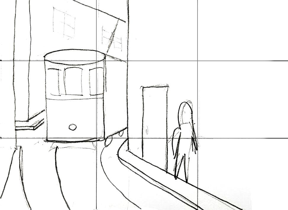
Learning and applying th concepts of composition and hierarchy create a foundation for visual storytelling. I can use these concepts in my work to emphasize focal points and represent relationships between specific elements. As I took my sketched ideas to Photoshop, I developed my concept further. One of my goals in this composition was to dramatize the relationship between Lisbon’s terrain and the sea. I achieved this by skewing the composition to curve the leading lines as they point toward the vanishing point. Not only did this dramatize the steep grade of the street, but it also gave me more room in the background to utilize. Taking what I learned from this project, I hope to be less rigid and more playful in my ideation process. I can combine my new understanding of image composition with the various tools in Photoshop to explore more possibilities in visually communicating ideas.
FINAL VERSION
5
IMAGE COMPOSITION & VISUAL HIERARCHY
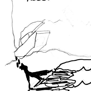
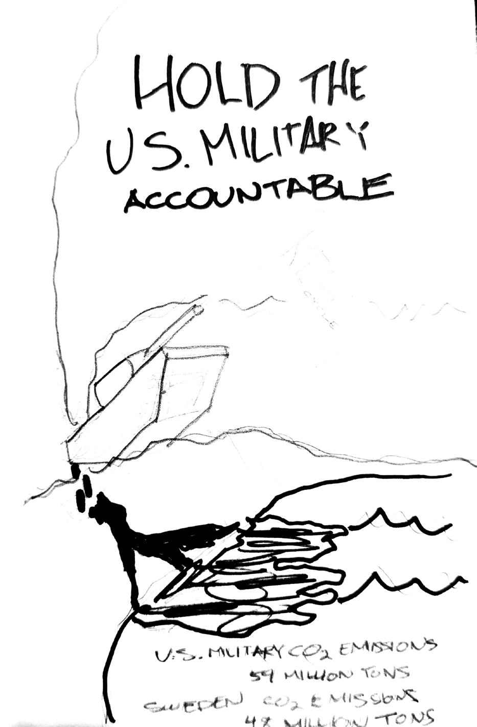
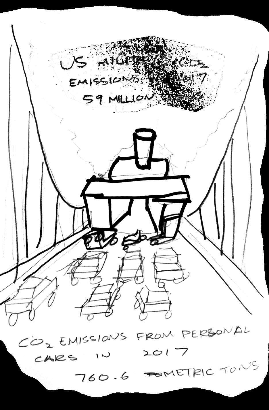
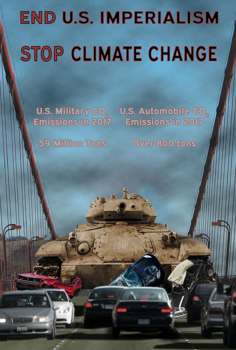
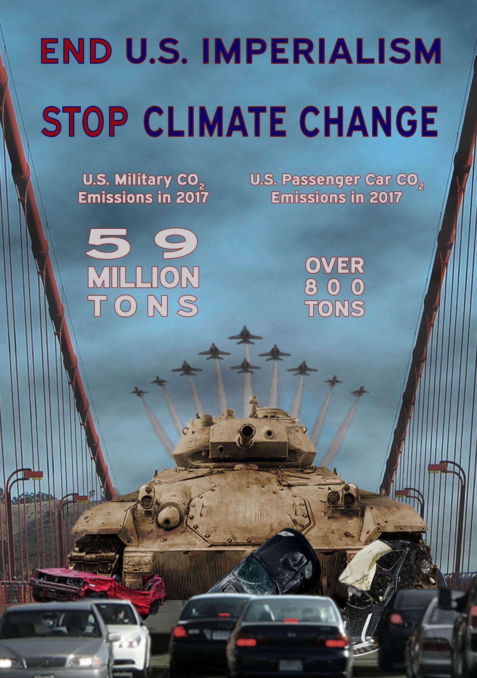
The industry that I want to shed light on in this poster is the U.S. Military. The annual amount of CO2 emissions that the U.S. military creates is comparable to that of an entire nation. In 2017, the U.S. military was responsible for 59 million tons CO2. The entire nation of Sweden was responsible for 48 million tons. In my two sketches, I’m trying to convey a level of hypocrisy. I eventually decided to pursue “Hand sketch 2” for my final version, as its use of a “vanishing point” composition makes for a easy-to-read poster.
SOCIAL 2POSTERJUSTICE
We are often told that we are individually responsible for how we manage many societal issues, from our mental wellbeing to our economic mobility, just to name a couple. Although being obviously a global issue, climate change gets treated with the same rhetoric. Yes, it is true that changing our individual habits like being vegetarian when possible or using public transit when available can help mitigate climate change to a degree. However, many argue that those amounts of carbon saved from individual actions are a mere drop in the ocean to the amount of carbon that high polluting industries unload onto our environment.
HAND SKETCH 1 HAND SKETCH 2
6
VERSION 1 Learning the concepts of color theory and text hierarchy builds off of the foundational skills I learned from Assignment 1. I can utilize these concepts to convey rich and captivating messages through consistent use of color palettes and text hierarchy. In this first draft, my goal was to test out the best placement of the main elements. This allowed me to plan ahead and anticipate the space i would need to place my text. 7 CONVEYING A MESSAGE
Taking what I learned from my first draft, I skewed the vanishing point of the poster lower, giving me more real estate to use for text at the top for this iteration. I also refine the visual elements adding shadows, adjusting colors, and blurring less important Ielements.alsobegin experimenting with text hierarchy and colors. Though the composition is good, I realized that the text is far too dark. In the final version, I will experiment with different color combinations that look brighter but as not to sacrifice color contrast and to still fit within the poster’s smoggy concept.
VERSION 2 8
Next time I do a similar project, I will define a color palette from the beginning. I feel that would have made it easier to realize that my color adjustments and text were too dark to read like in Version 2.
9
FINAL VERSION Along with adding and refining visual elements, I successfully enhanced the readability of the text while still staying within the poster’s concept. I also emphasized the message of the poster by formatting the statistics like a visual size comparison.
BACKGROUND MUSEUM EARTHHABITABLEOF...
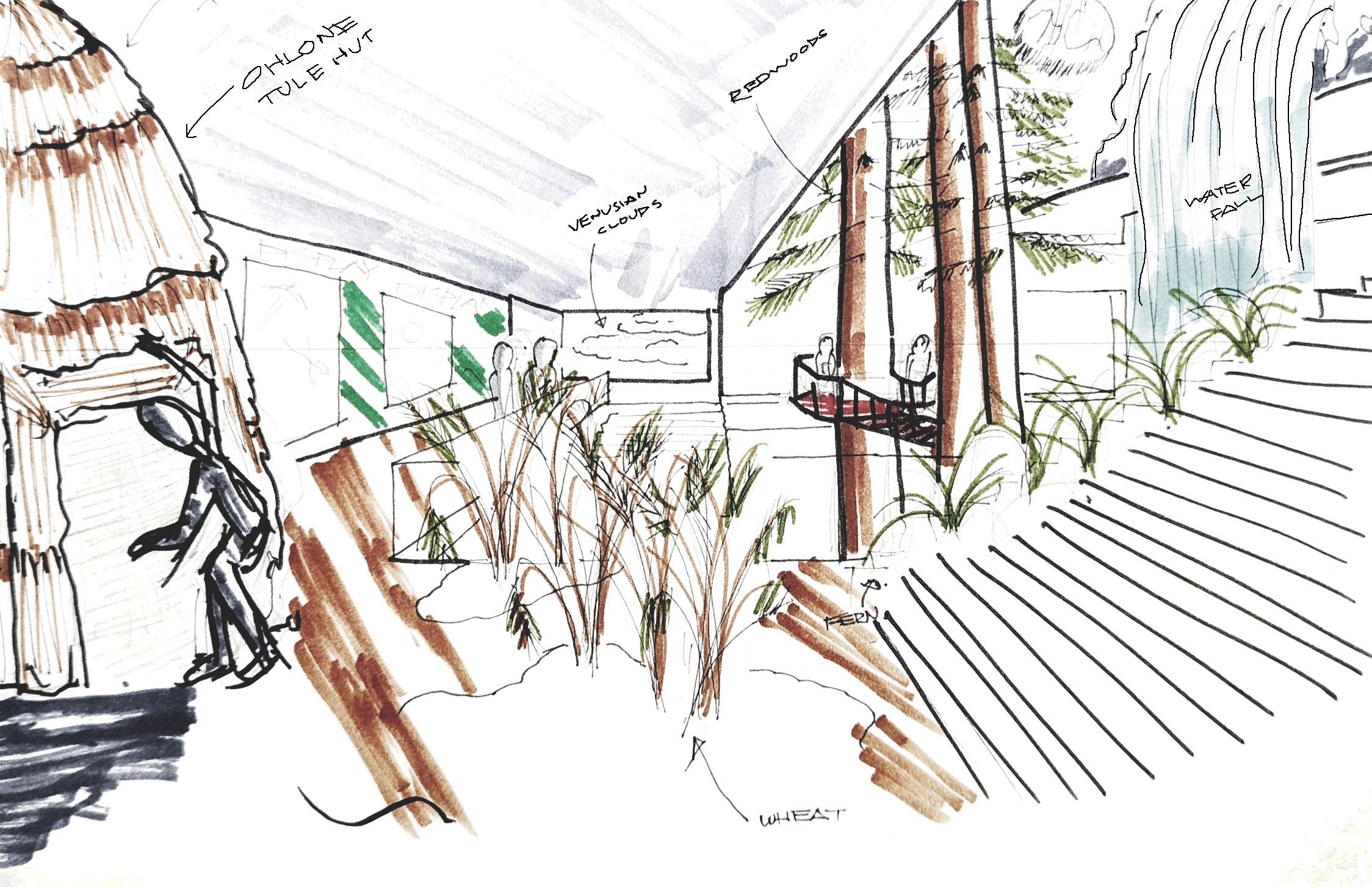
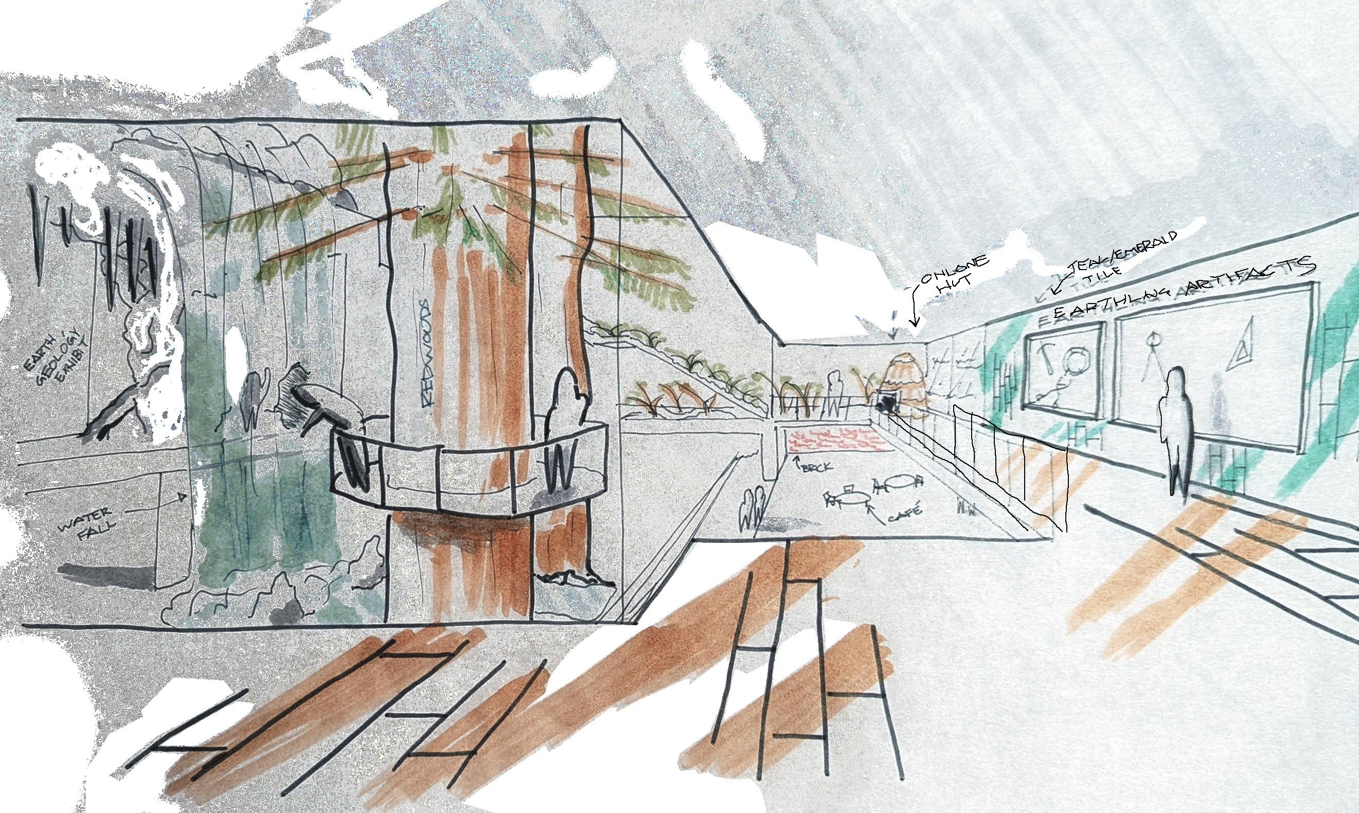
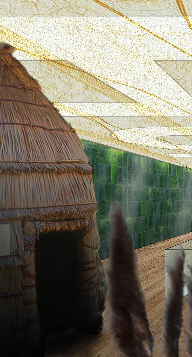
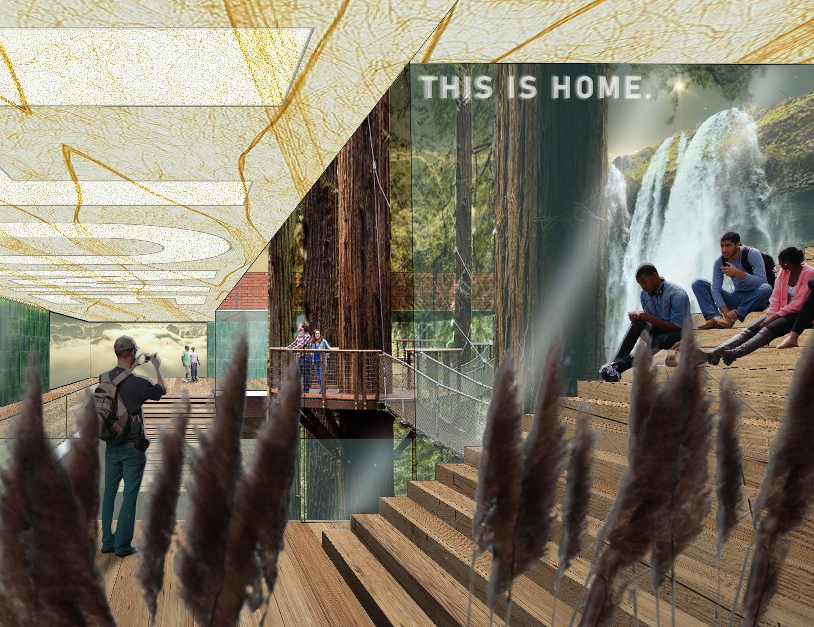
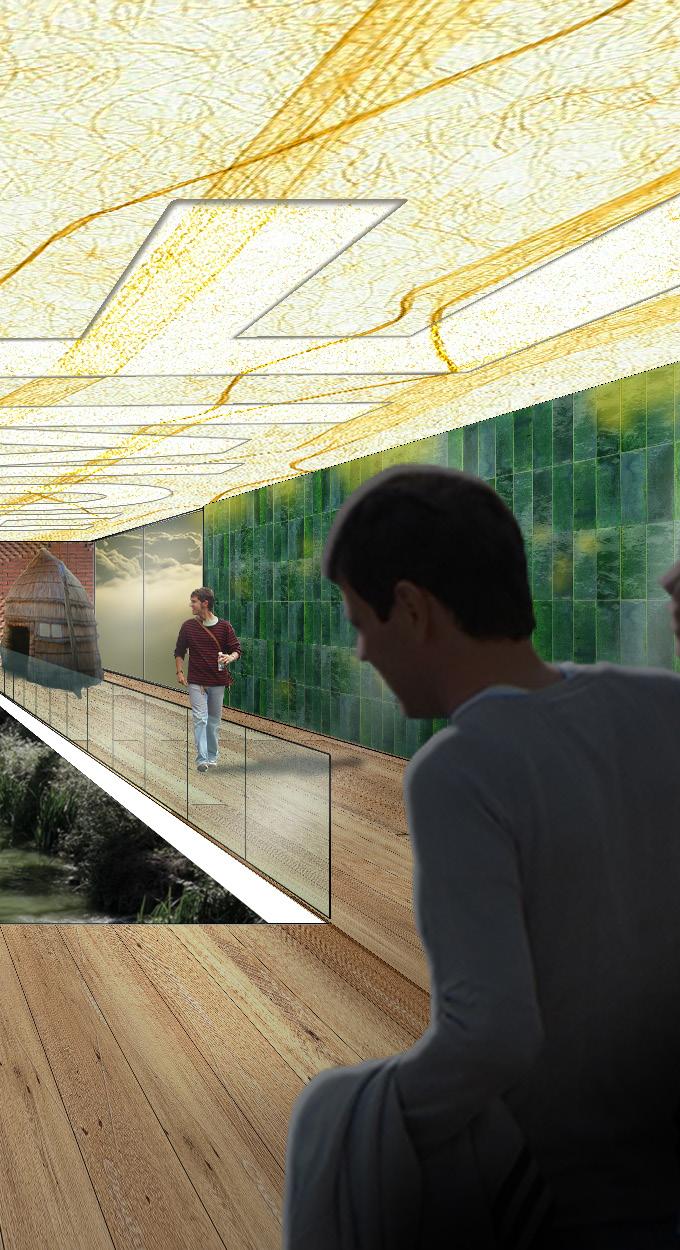
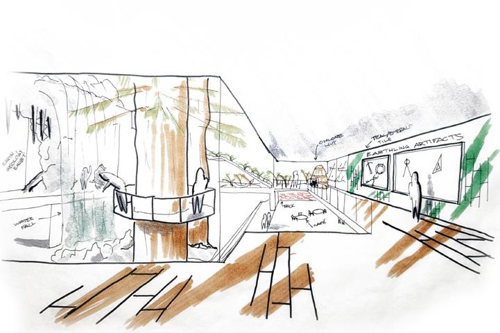
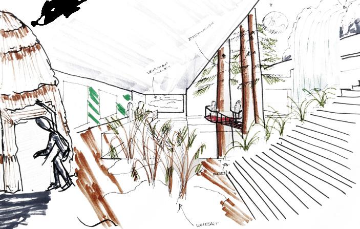
The museum I am putting together is a museum of Habitable Earth and is located in a floating colony in the clouds of Venus a few hundred years in the future. It is a historical museum meant for people of all ages featuring large immersive exhibits that show visitors what life was like on Earth when it was able to foster life. Those visitors are the descendants of humans that were privileged enough to leave Earth to start anew, choosing Venus as their new home. The interior finishes emulate what once were readily organic materials commonly used by humans in the past, like ceramic and wood, but are actually made of plastic and metal.
3OF...MUSEUM 10
Theme Statement:
MATERIALSEXHIBITS


VIEW 1 BASE VIEW 3 BASE Material application and scale concepts act as a culmination of all the skills I have learned so far in this semester. I can use these skills to emulate design concepts through different ways in my renderings, allowing me to build entire conceptualized worlds through a two-dimensional image. Using bases of VIEW 1 and 3, I begin thinking about how I want to build the world that the Habitable Earth Museum will exist in. 11 RENDERING & WORLD BUILDING
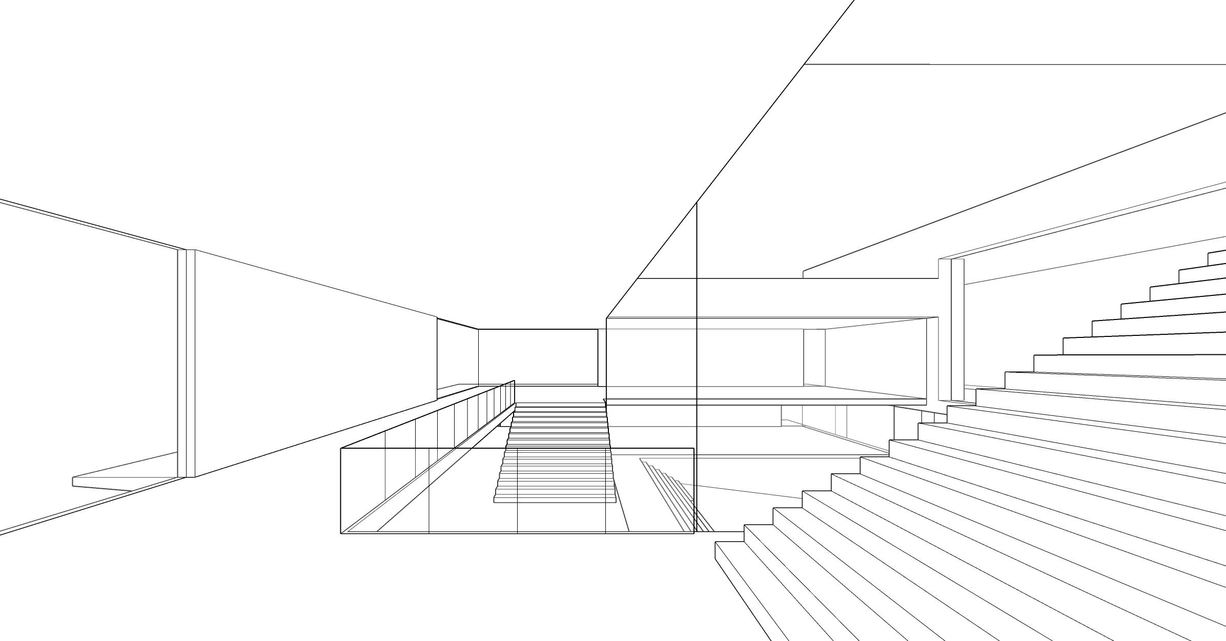
I also established which areas of the views do not require too much detail and which that do not need to be rendered at all.
VIEW 1 HYBRID DRAWING
12
I used these hybrid drawings to sketch out where I want exhibits and materials to go, as well as to establish the scale of all the elements in relation to the people in the museum.
VIEW 3 HYBRID DRAWING 13
I can use hybrid drawings in future projects as an ideation tool to quickly sketch out various design options in an easy to understand manner.
14
VIEW 1 FINAL RENDERING
Taking my hybrid drawings into Photoshop, I began putting all the elements together. The process of getting to the final renderings was not as straight of a line that I had hoped. Moving forward, I will work better to keep my layers organized and my editing as non destructive as possible.
15
16
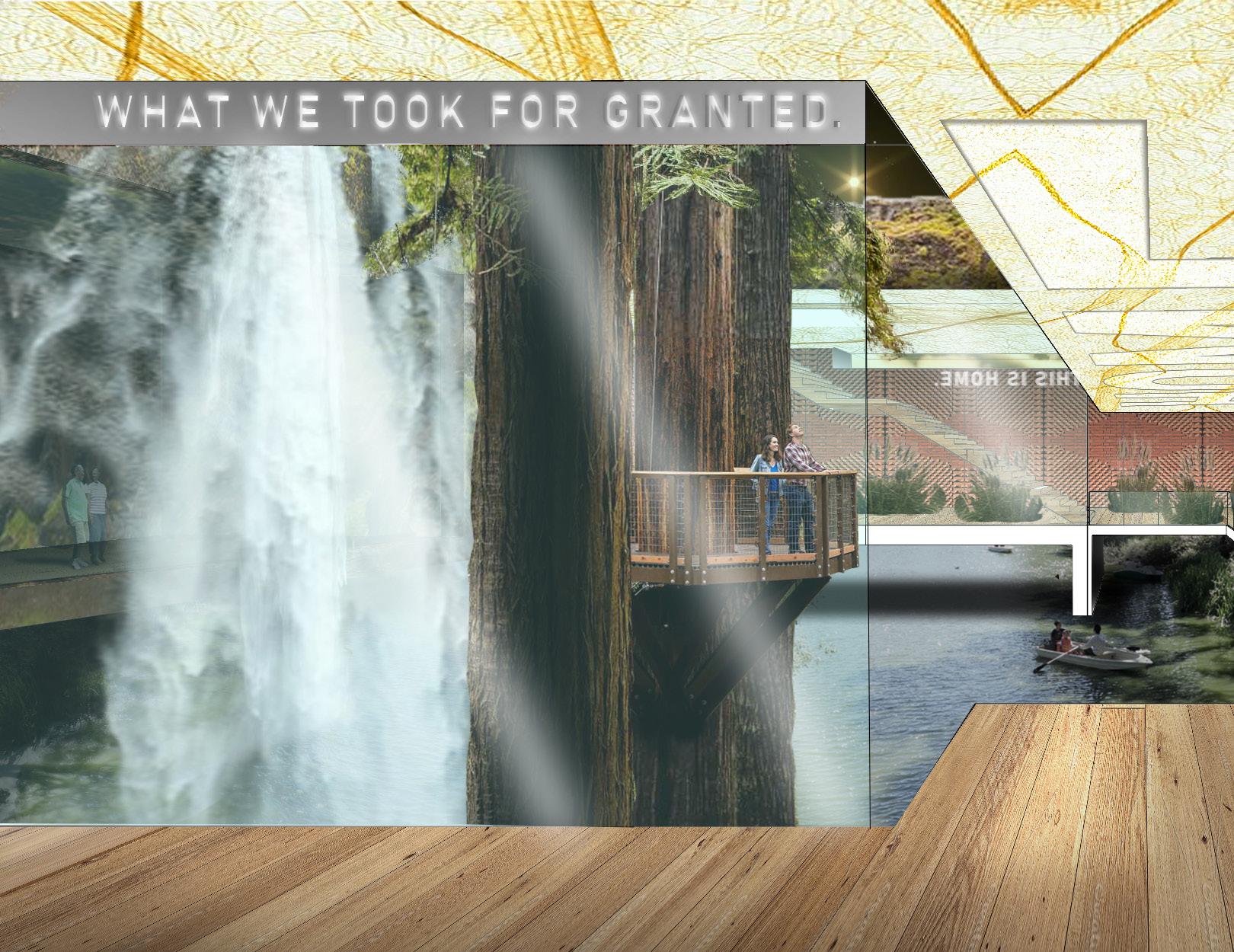
VIEW 3 FINAL RENDERING
17
As hectic as it was getting to the finish line, I am satisfied not only with the final product, but with my comfortability in exploring Photoshop techniques that I have not done before. I am also satisfied with my creative thinking to solve problems that arose, like rendering the bottom floor of VIEW 3. Overall, I appreciate the new found confidence in Photoshop that I have gained in this first half of the semester.
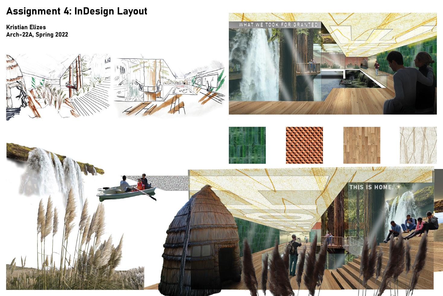
I attempted a landscape oriented board with the primary layout draft. Although I was able to achieve the collage relationship between the exhibits and Render 1, the visual relationships between the hybrid drawings and the renders were weak. I was also unsatisfied with how the weak visual relationships forced the viewer’s eyes to dark back and forth in an incoherent way.
As a way of building off of some feedback on my final renders suggesting that I “break the fourth wall” of my renders by allowing elements to break the boundary of the view, I wanted to define a collage-like relationship to the exhibits and Render 1.
PRIMARY LAYOUT DRAFT
COMMUNICATING DESIGN THROUGH PRESENTATION BOARDS
Now that I had finished the final renders, it was time to show my design process through a presentation board. Concepts learned from Assignments 1 and 2, like composition and hierarchy were applied here.
TITLE HYBRID 1 HYBRID 2 EXHIBITS MATERIALSRENDER2RENDER1 18
I can
nice
future projects
my design. RENDERRENDER2 MATERIALS1 TITLE HYBRIDEXHIBITS 1 HYBRID 2 19
can
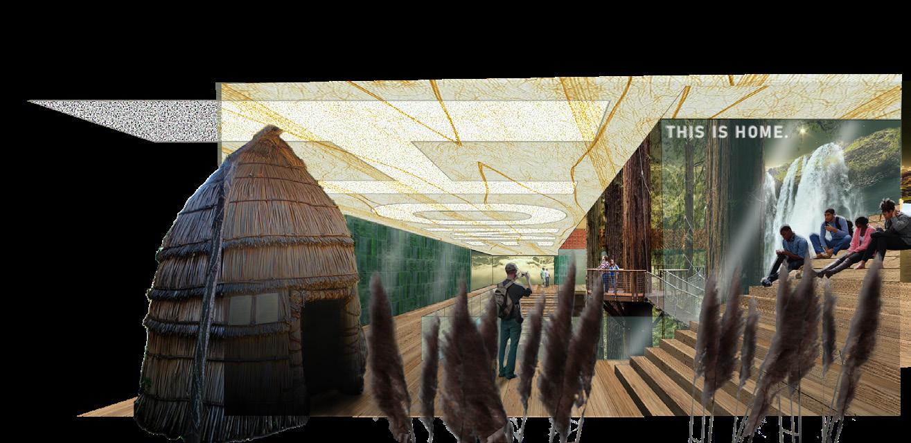
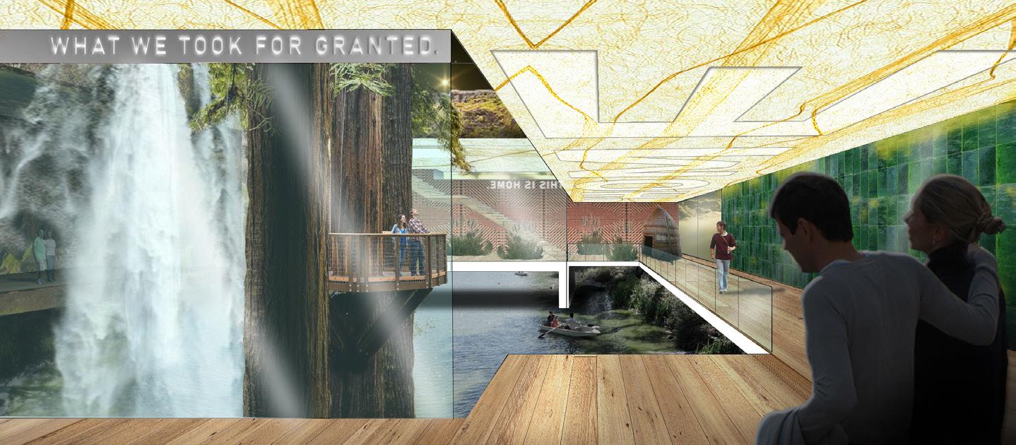
Assignment 4: InDesign Layout Kristian Arch-22A,ElizesSpring 2022 Hybrid Drawing View 3 Hybrid Drawing View 1 Wall Materials Museum View 3 Museum View 1Exhibits Museum of Habitable HOMEEarthFINAL PRESENTATION BOARD
exercise
This
fortify my design
read board
show clients or colleagues my entire design
for a conversation
Opting for a oriented board was able to create an to with a visual flow going from the top to bottom while keeping clear and direct relationships between elements. apply what from this to to process in easy to follow manner. can help and give point about
an
clients and colleagues a starting
portrait
instead, I
easy
I learned
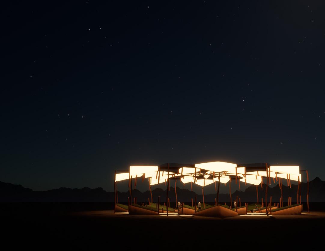
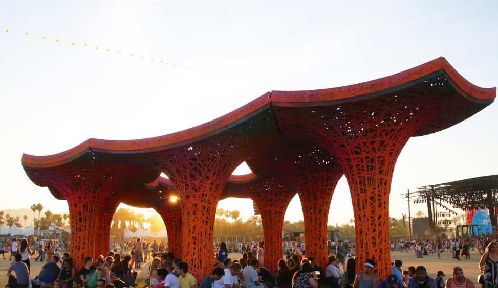
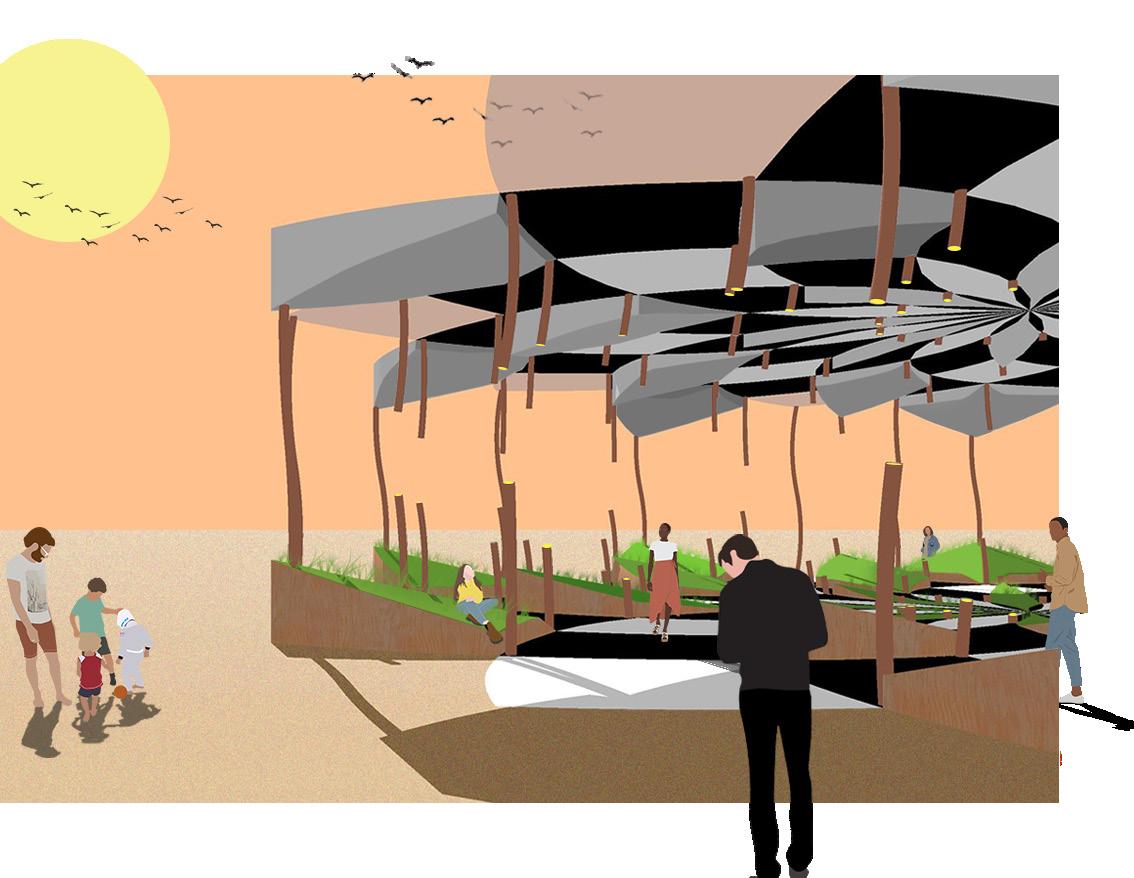
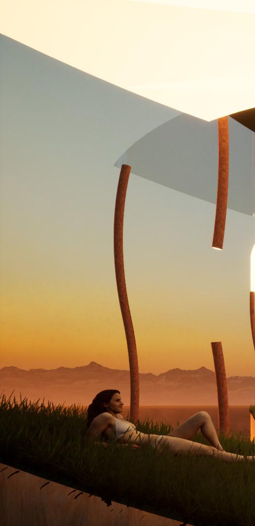
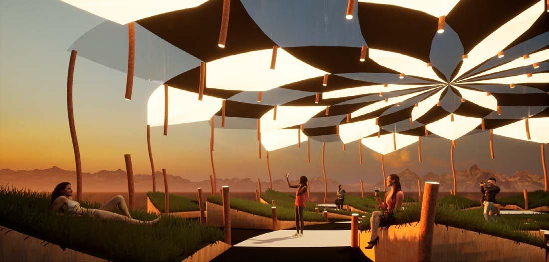
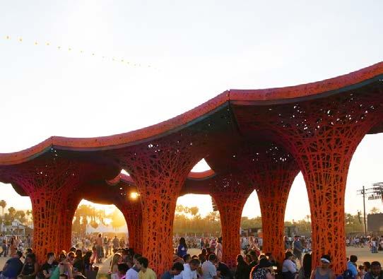
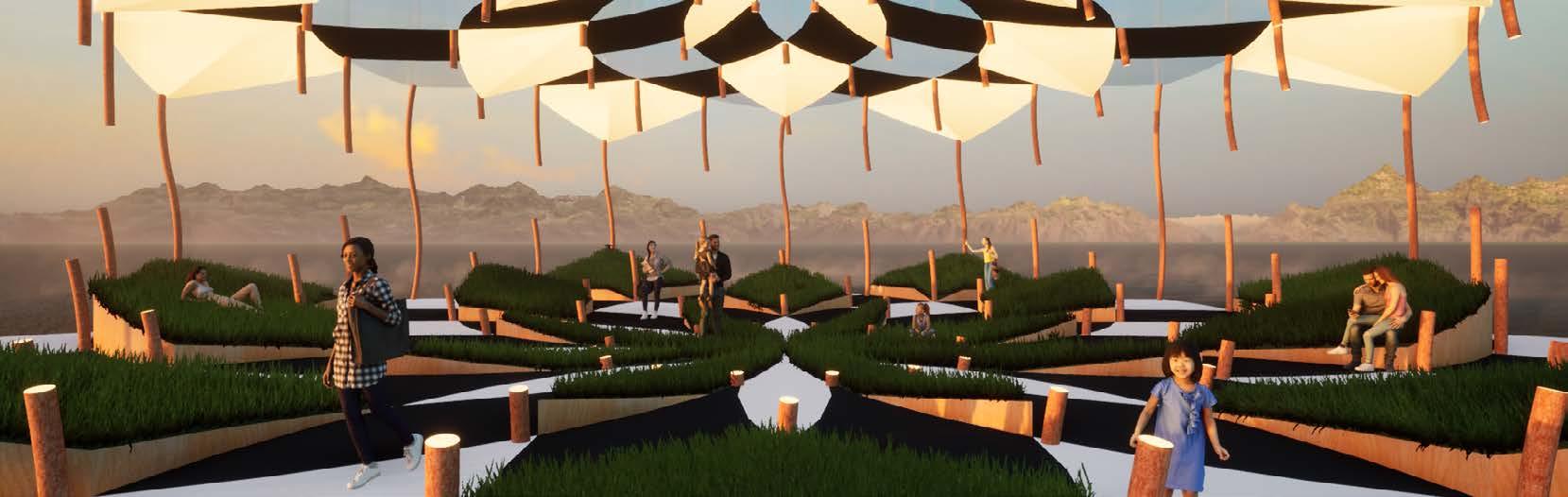
It is this aspect of the festival totem that I am emulating in my totem park. My totem park evokes a sense of refuge, safety, and unity through motifs found in nature. The floor pattern is comprised of radial spirals that converge at the center, encouraging people to meander toward the center. The totems vary in height with the tallest at the outer edges of the park and the shortest near the center, creating a small open space of refuge at the center. The totems are thin and curvilinear, vary in orientation, and are made of weathered steel. Inspiration Projects:
Theme Statement: My totem park will take inspiration from the use of “totems” at music festivals such as EDC and Coachella. In this setting, totems are customizable and often made to reference pop culture and internet memes in bizarre ways. This is to make them easily recognizable in a sea of people, as they are used as beacons for friend groups to find each other. This comes in handy if someone in a group gets lost or in an emergency requiring everyone to reconvene. In this sense, the sight of a familiar totem can bring a feeling of safety and relief upon the spectator.
20
Pulp Pavilion - Ball-Nogues Studio Sarbalé Ke - Francis Kéré
4TOTEMGLABRATA:PARK
After quickly settling on a design of what would become GLABRATA and a refresher in SketchUp, I proceeded to create the necessary drawing deliverables. These included plans and elevations, drawings I learned to make in ARCHI20.was able to apply the new skills i learned in InDesign and Photoshop to add finishing touches to my drawings, such as entourage and shadows. Learning how to add these finishing touches allows me to create visually cohesive presentations through consistent color palettes and overall style in a way that echoes my design concepts
21
CEILING + LIGHTS FLOORTOTEMS/LIGHTSFIBERGLASSGLASSACRYLICWEATHEREDSTEEL+SEATINGGRASSWALNUTLAMINATE20’ 6 5/16”1’-6 5/16”2’-6 5/16”4’-7 7/16”7’-6 1/2” 100’ 100’ 0° 18° 27° 50° 75° 105° PLAN TOTEM VARIATION ELEVATION TOTEM ROTATION PROGRESSION PLAN EXPLODED ASSEMBLY AXONOMETRIC TYING IN CONCEPTS LEARNED FROM ARCH-20


CONVEYING DESIGN CONCEPTS THROUGH POST DIGITAL RENDERS
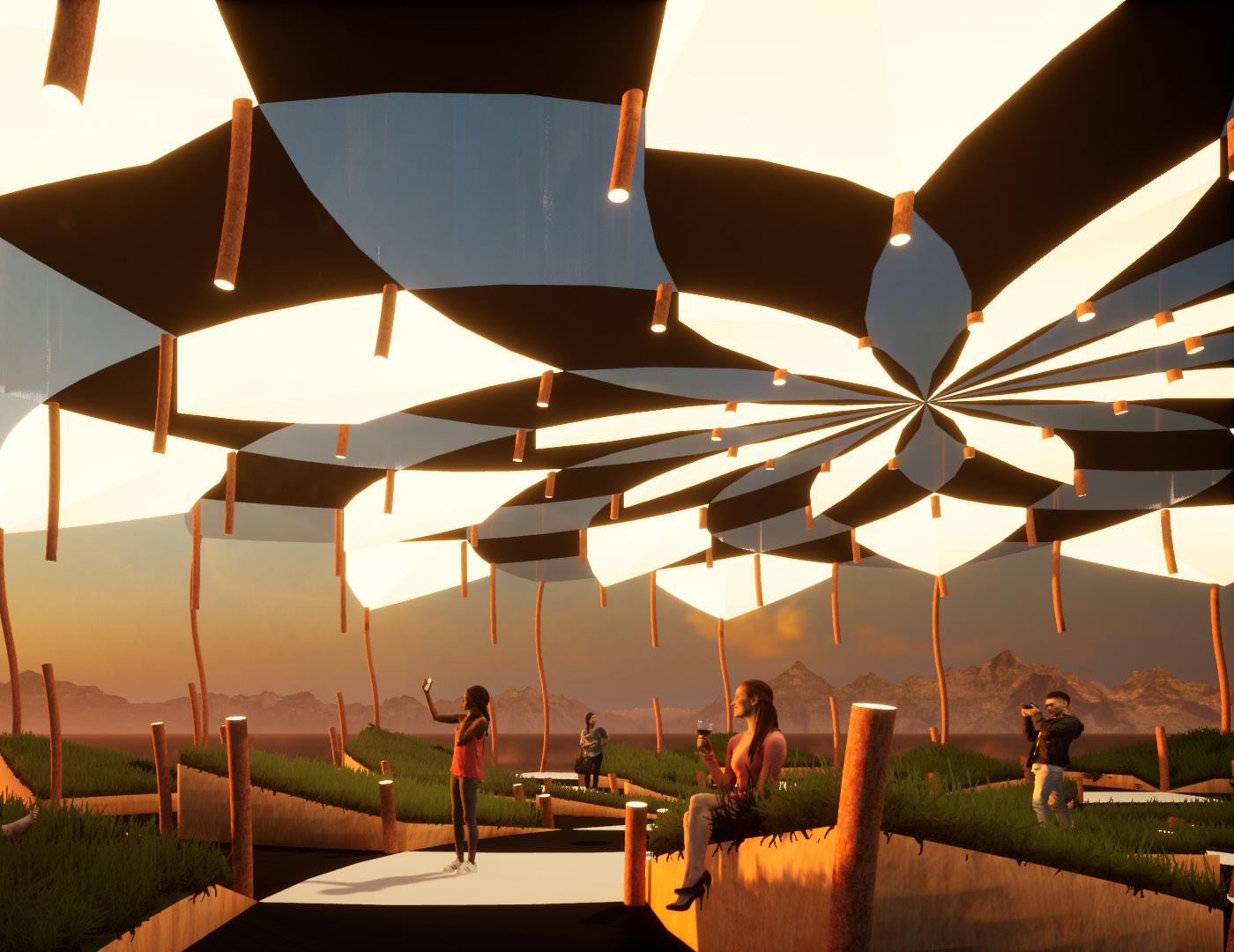
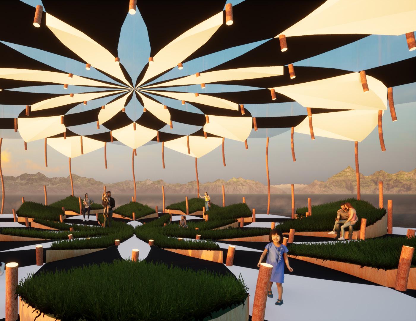
By tweaking the style settings in SketchUp and building upon them in Photoshop, I created this post-digital stylized rendering. Through stylized renderings, I can reinforce an overall design concept without doing all the of work needed to make a photo-realistic rendering. With GLABRATA being intended to be a shady and green respite in an isolated desert environment, I can stylistically represent those qualities in a simple yet dramatic way through these types of renders. I applied minimal flat materials in SketchUp and layered on simple geometry and entourage in Photoshop to enrich the desert environment.
RENDER LAYERING 22
FINAL STYLIZED RENDER 23
RENDER
Now exploring the opposite end of the spectrum from stylized rendering, hyper-realism, I brought my SketchUp model into Twinmotion. With Twinmotion, I was able to take world building to the next level. Concepts learned through this phase of rendering include camera angles, material editing, and using entourage for story telling. I had particular fun playing with lights and glowing materials to develop the music festival aspect of GLABRATA. Twinmotion is a great tool that I can use in the future to create great hyper-realistic rendered bases of designs that I can later build up from in Photoshop.
INTERIOR PERSPECTIVE 24
RENDERINGLAYERINGWITHTWINMOTION
25
INTERIOR PERSPECTIVE 26
100’ 100’ CEILING + LIGHTS FLOORTOTEMS/LIGHTSFIBERGLASSGLASSACRYLICWEATHEREDSTEELSEATINGGRASSWALNUTLAMINATE 20’ 6 5/16”1’-6 5/16”2’-6 5/16”4’-7 7/16”7’-6 1/2” ASSEMBLY AXONOMETRIC PARK PLAN TOTEM ROTATION PROGRESSION PLANTOTEM VARIATION ELEVATION ASSIGNMENT 5: TOTEM PARK KRISTIAN ELIZES ARCH - 22A, SPRING 2022 0° 18° 27° 50° 75° 105° INTERIOR PERSPECTIVE EXTERIOR PERSPECTIVE TOTEMS: pulpINSPIRATION96pavilionball-nogues studio sarbalé ke - francis kéré
27
FINAL PRESENTATION BOARD Taking what I learned from Assignment 3’s presentation board, I again went with a portrait oriented board to create a nice visual flow of process and hierarchy. I also utilized the color palette I established through my stylized rendering and drawings to create a title banner that integrates with the stylized rendering. This greatly helped my board appear more cohesive and well designed.


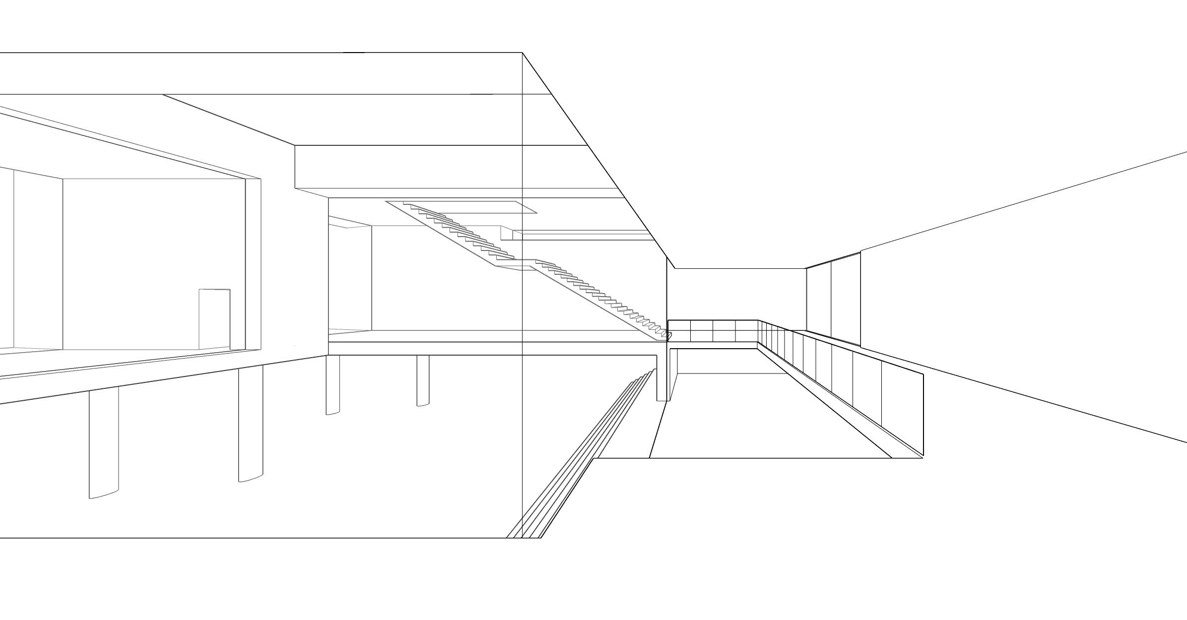
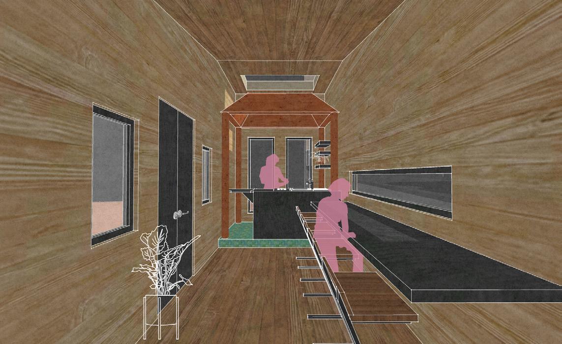
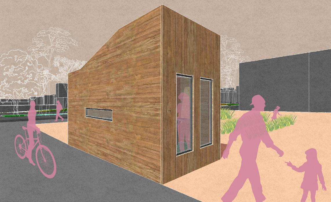
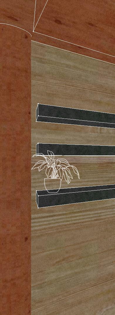
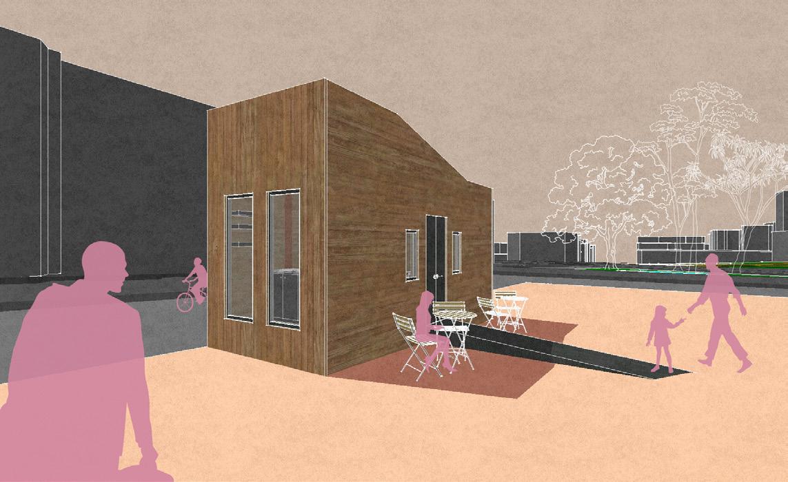
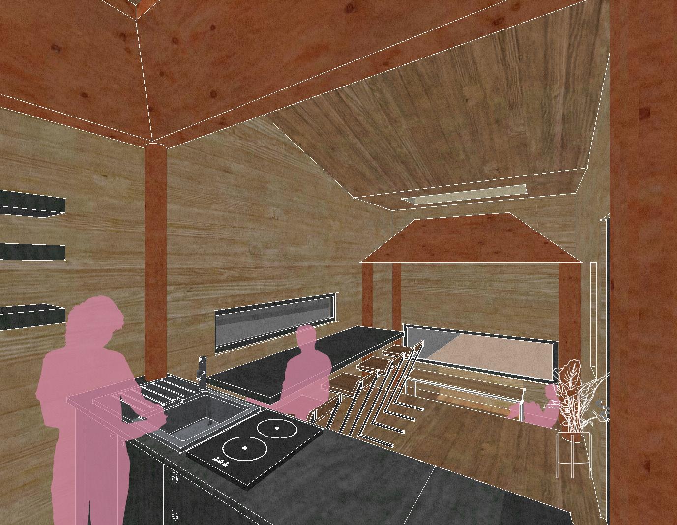
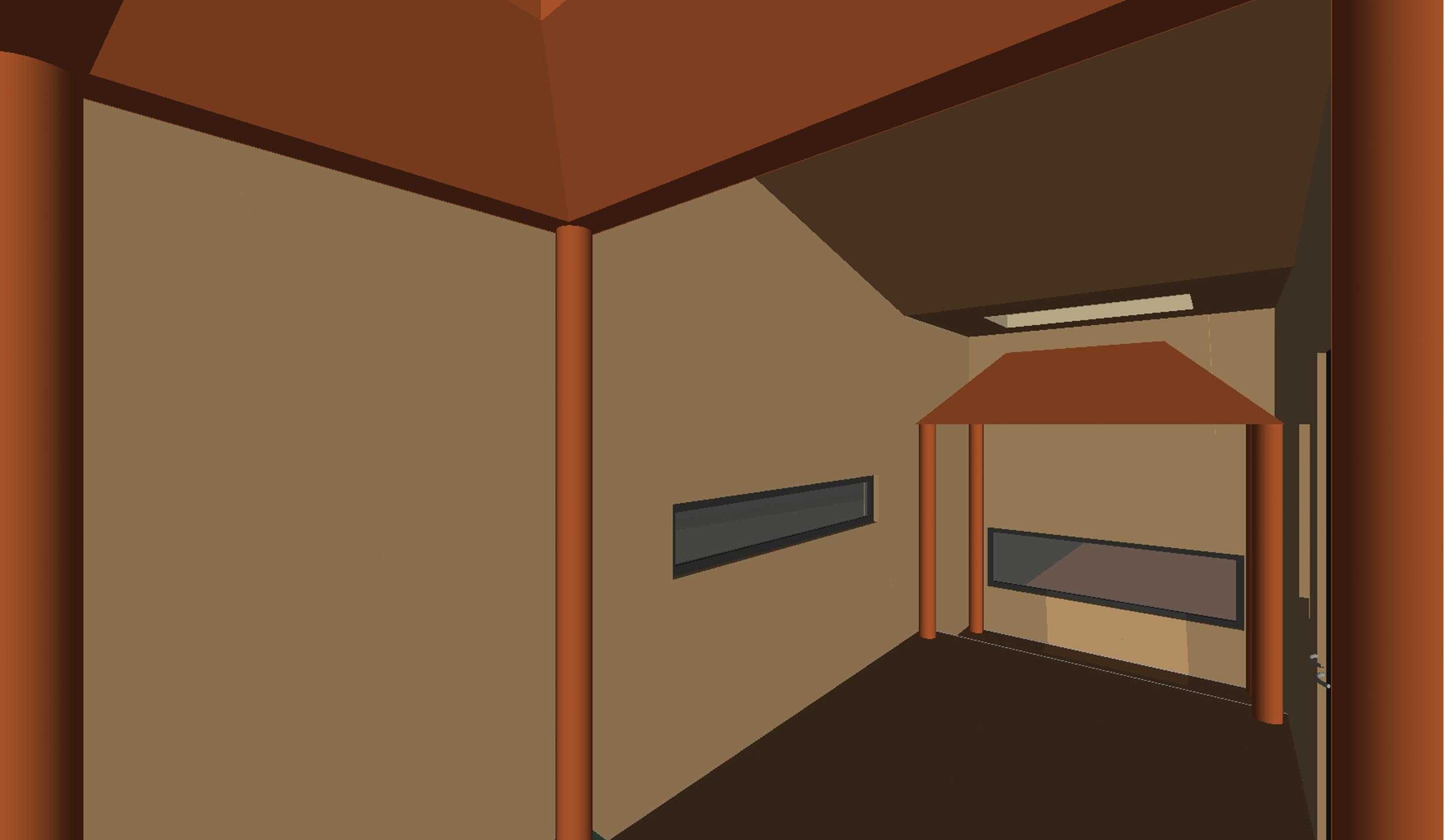
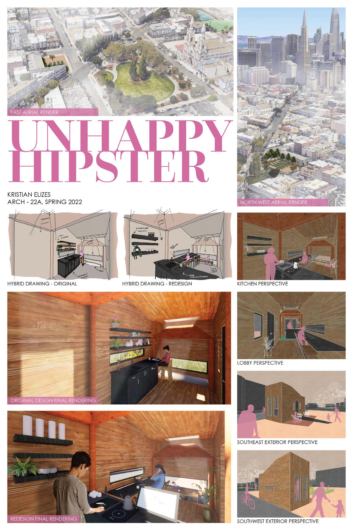
Project Statement: This model is my submission for the ARCH-20 ‘Tiny House’ project called SHRINE HOUSE. The program of SHRINE HOUSE consists of resting (sleeping), nourishing (cooking), and cleansing (showering). Using Charles Moore’s Orinda House as a precedent, the focal point of the tiny house is the interior “shrines”, along with how the interior space interacts with light from the outside. Additionally, the volume and orientation of Shrine House work in tandem to emphasize the movement of the sun. I am choosing this model to re-render in Twinmotion because I would be able to better simulate the interior lighting at different times of day. I could do this by creating different scenes with differing sun positions and playing with the various types of lights. Although my hipster client loves the building, they were frustrated that they weren’t able to monetize it with its original program. Thus, they are turning it into CHA HAUS, a minimalist urban tea house where customers could pick their own tea leaves and have them prepared into loose leaf tea on site.
CHA
5UNHAPPYHAUS:HIPSTER
NORTHWEST AERIAL PERSPECTIVE 28
29
EAST AERIAL PERSPECTIVE DEFINING THE RELATIONSHIP BETWEEN A BUILDING & ITS SURROUNDINGS
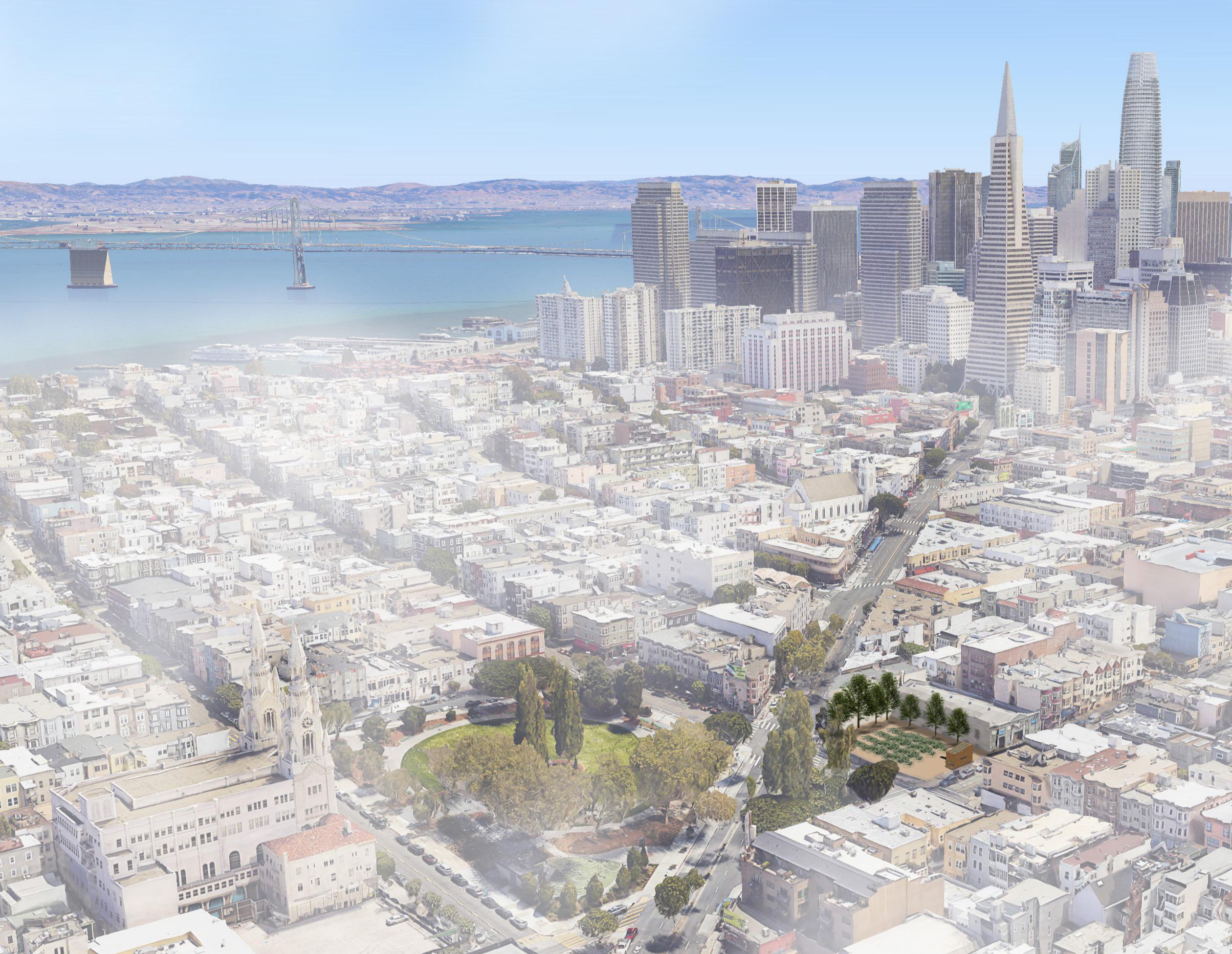
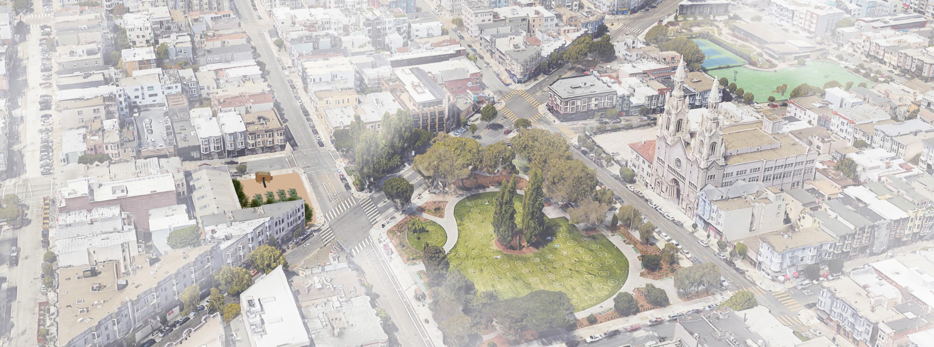
Since my hipster client is taking SHRINE HOUSE out of the Sierra Nevada and moving it into Little Italy in San Francisco to become CHA HAUS, it is important to show them what kind of relationship the building will have with its surrounding Itsneighborhood.newlocation is a medium density walkable neighborhood next to a town square with the Financial District being a 10 minute walk away, and is served by the major corridor of Columbus Avenue. Through creating these renders, I learned how to geo-locate my SketchUp model and to establish important relationships between a building and its Althoughenvironment.Ididnot end up utilizing the SketchUp geo-location tool to its fullest since there was a much larger building already at the desired lot, Google Earth served as an easy tool to build my renders upon. Having learned these skills, now I can answer questions such as “Who are the neighbors?”, “How is the terrain?”, and “How will people get here?”, for clients and colleagues in the future.
S. W. EXTERIOR PERSPECTIVE S. E. EXTERIOR PERSPECTIVE CAFE PERSPECTIVE
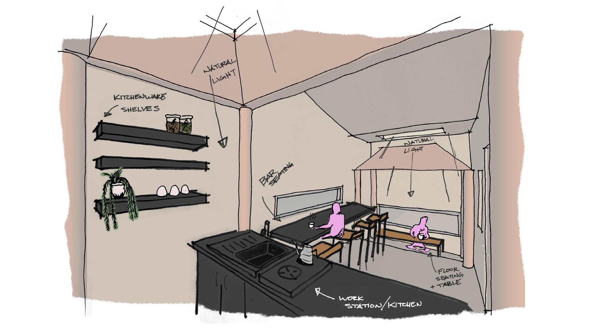
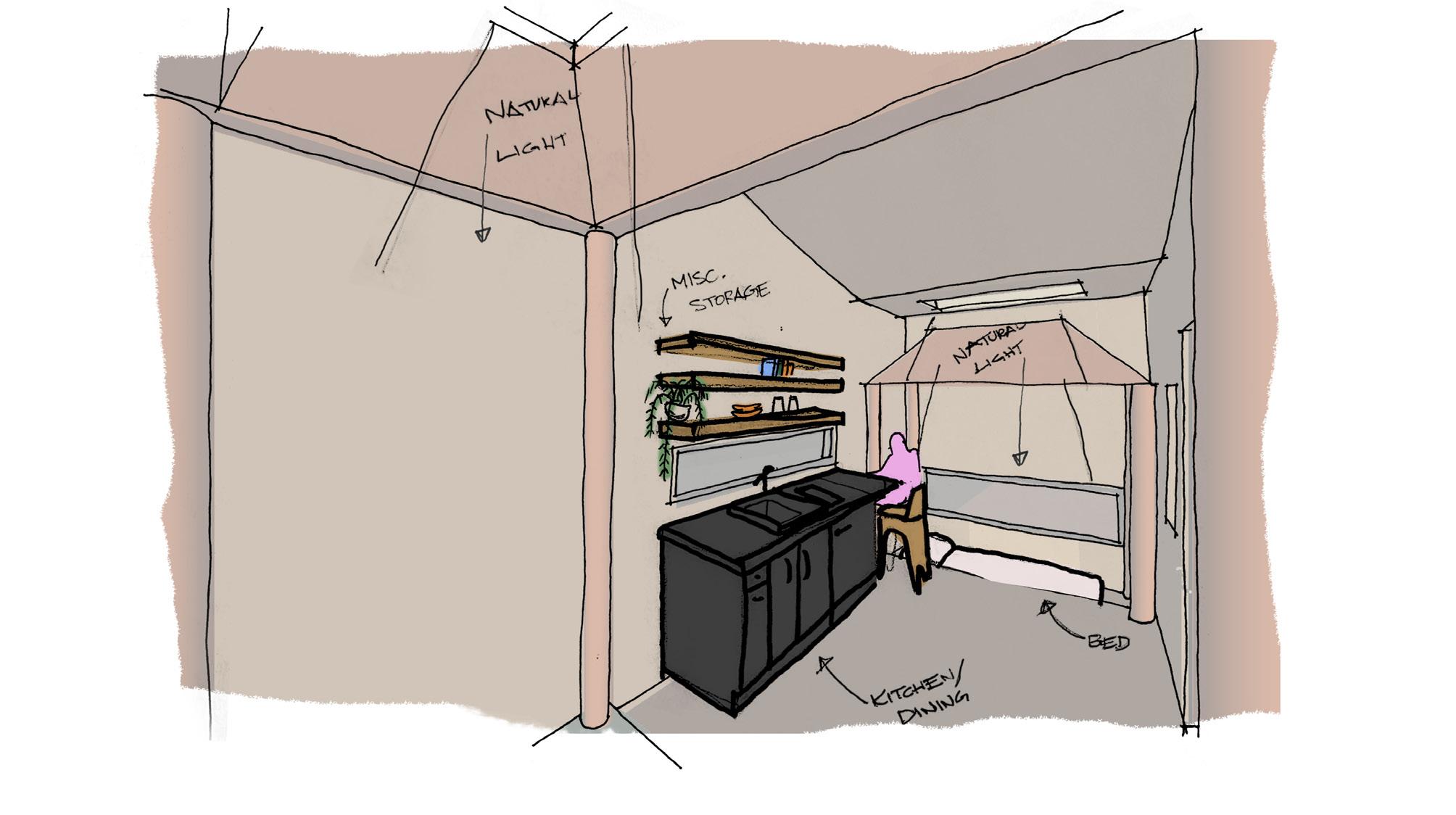
STYLIZED RENDERING AS A PLANNING TOOL In a more rapid ideation manner of the stylized rendering I did for GLABRATA, I customized a SketchUp style to be used in creating these four camera angles. These camera angles were to help me figure out and plan what I believed would be the best way to convey my hipster client’s Asredesign.Ididfor GLABRATA, I took those four angles and added stylized entourage in Photoshop. Although, these stylized renders are a planning tool for me, having them presented to clients and colleagues in a conceptualized yet clean manner opens them up to conversations for editing. The added entourage also convey scale, program, and concept.
30
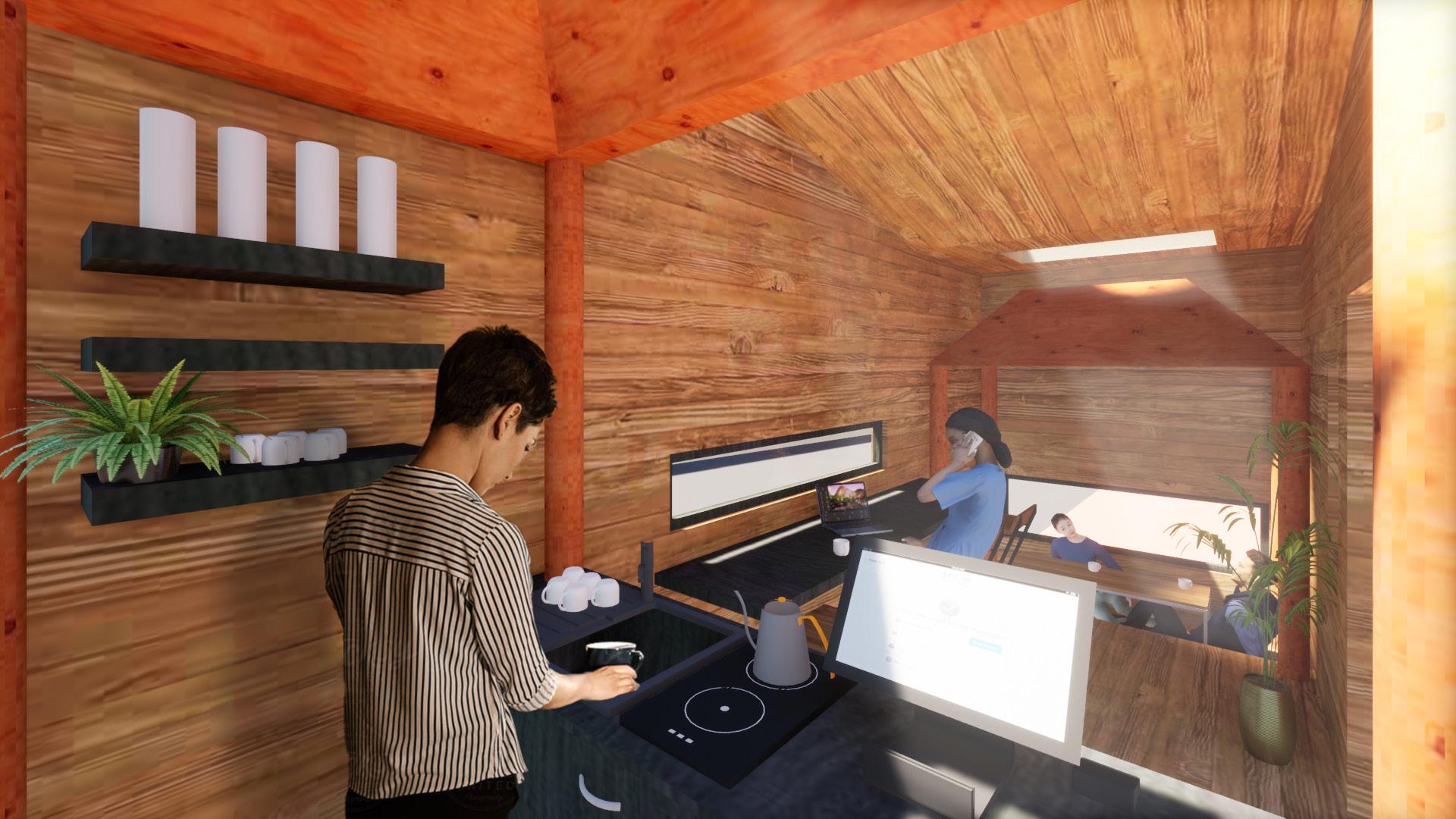
KITCHEN PERSPECTIVE 31
SKETCHUP VIEW BASE HYBRID DRAWING LAYERING ENTOURAGE FURNITURE COLOR DRAWN EDGES SKETCHUP BASE 32
Taking the skills I learned in Assignment 3, I used hybrid drawings to quickly sketch out what stories I wanted to tell in my renderings and how. I started out with a simple view taken out from SketchUp and tracing over it with trace paper, and then layering it back into Photoshop to add Ascolor.Isketched, I again established scale and I additionally keynoted any elements that I deemed important to keep in mind when taking my SketchUp model into Twinmotion.
PROGRAM IDEATION USING HYBRID DRAWING
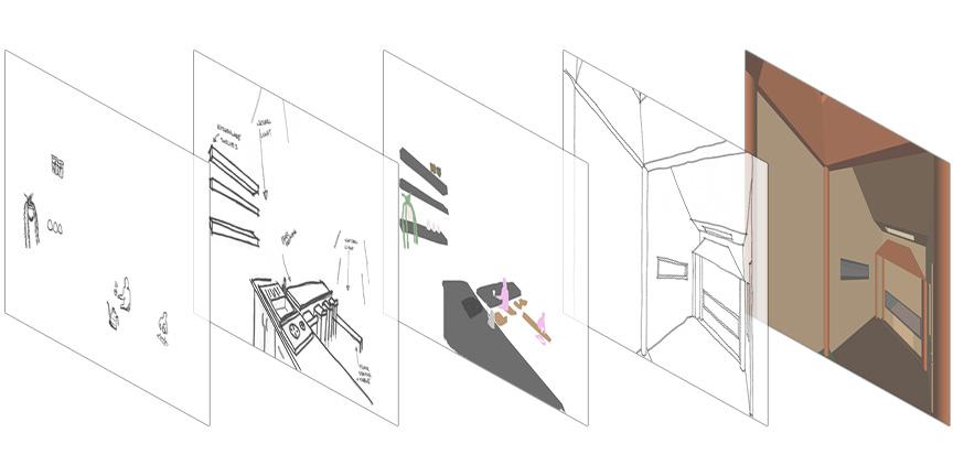
Having the skill to quickly iterate designs with hybrid drawings allows me to remain flexible in the ideation phase of design to discover various possibilities.
PROGRAM IDEATION USING HYBRID DRAWING CONT.
EXISTING PROGRAM HYBRID DRAWING PROGRAM HYBRID DRAWING
NEW
33
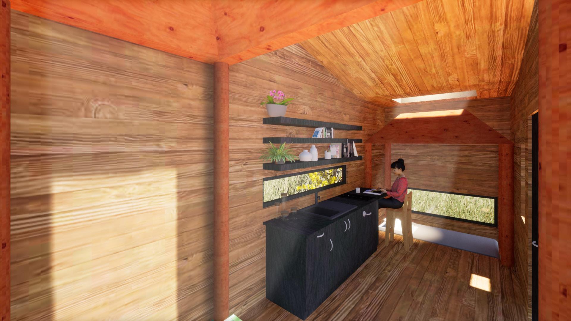
This time around of using Twinmotion, I utilized the stock models strategically to enrich the scenes with things like plants, books, and people. I added lights to dramatize the quality of light spilling into the shrines from the skylights.
REVISITING TWINMOTION
Using my hybrid drawings as a blue print, I brought the SketchUp model into Twinmotion to start creating my desired scenes.
ORIGINAL RESIDENTIAL DESIGN
34
It is a great reassurance knowing that I can always use Photoshop to add any finishing touches or to make up for mishaps that arise due to bugs from other software.
Although Twinmotion renders really well, it still serves as a good base to build upon. I added light shapes to better emphasize the light from the skylights, edited cast shadows, and added a scale figure that would have looked a bit strange had I used a model from Twinmotion since they are placed so close to the camera.
FINISHING
TOUCHES WITH PHOTOSHOP
CAFE REDESIGN
35
FINAL PRESENTATION BOARD
36
CHA HAUS serves as a culmination of what I have learned this semester and as an important reminder for me of what I am capable of creating with tools like Photoshop and Twinmotion in a small amount of time.
Being my third presentation board of the semester, this was a quick and not-so-daunting task as it was before. Something that I have learned in this board, though, was to simply work with the content to create a cohesive board rather than forcing everything into a predetermined layout. I initially wanted to copy the layout I used for GLABRATA, however I quickly found that to be difficult. The Northwest aerial render has a highly vertical quality that would not be presented well as a landscape rectangle. This resulted in me using it to frame the title in tandem with the East aerial render, serving as an intriguing introduction to the board.
37 THIS PAGE IS INTENTIONALLYLEFTBLANK
PORTFOLIOFINALPORT