Concept Exclusion Zone Size Backgrounds Use Prohibited
COLOUR PALETTE Colour System Colour Balance 17 TYPOGRAPHY
Primary Typeface
Secondary Typeface
Brand Background
ABOUT | MISSION STATEMENT | VALUES | CUSTOMER PROFILE | TONE OF VOICE
Brand Background
ABOUT
Our industry Founders Carley and Ciara Jones have taken their expertise in hair care to the retail and eCommerce world. Both Founding members have over 40 years experience within the hair care and business sectors.
Introducing “Boombiotics”; our exclusive and innovative range of hair care products which gives our customers’ hair a new lease of life by focusing on strength, growth and hair loss prevention.
Our launch product is a five piece hair kit that is a world first. A kit that looks after the hair strength and growth from the outside and a supplement (vitamin) that promotes hair growth from the inside.
Our mission is to tackle the problems of unhealthy or thinning hair by offering a range of high quality, cost effective products. We combine unique formulas and decodes of industry experience to achieve optimum results.
Brand Background
VALUES
Friendly, bubbly, bright and results-driven reliable products.
While it’s important to provide an all round positive service and high quality product, the three key strengths we focus on are experience, quality and reliability.
The brand will ensure that each product contains ‘science-backed’ key ingredients that truly work for their intended purpose.
We want our customers to trust us and our products.
Brand Background
CUSTOMER AGE RANGE
CUSTOMER PROFILE
We know that our key audience will be female. Most marketing and creatives will be female led.
The typical TikTok buyer for hair loss will be female. The brand is pink which we know is going to be primarily female orientated.
We do however not want to cut out our males completely.
Age range typically will be 25-45.
CUSTOMER GENDER
CUSTOMER HOBBIES & INTERESTS
Fig.1 Customer age range
Fig.2 Customer gender
Fig.3 Customer hobbies & interests
Fig.1
Fig.2
Fig.3
Brand Background
TONE OF VOICE
Although we value professionalism, we also like to be ourselves. This applies to our service quality but also to the way we talk to, and communicate with our customers. So ditch the corporate buzzwords and sales terms and go with a friendlier approach.
We write like we speak: We all know how chatty the salon types can be so why not transfer that quality along to retail. While our products lean towards medical use, our clientele is still suited to that casual salon-like personality.
Make a statement: While our brand style is quite clinical, we shouldn’t shy away from the way we talk giving our brand more of an edge.
First person: Speaking in first person terms is more personal and straight to the point.
“Sure, not a problem. Give us a shout anytime.”
Logo Design
CONCEPT | EXCLUSION ZONE | SIZE | BACKGROUNDS | UNE PROHIBITED
Logo Design
CONCEPT
The identity of the brand is modelled around the logo design; this aspect of the “Boombiotics” brand will ultimately set the style for all design elements including colour palette and typography which must remain consistent across all marketing. The logo should be recognisable whilst allowing originality to make your brand stand out among others in the industry.
The “Cross” element of our brand represents the medical factors behind the Boombiotics products. While our products leave your hair feeling salon-fresh, our USP is to provide products which strengthen hair and prevent hair loss so the medical science behind our formula should be a key aspect of our branding.
Logo Design
EXCLUSION ZONE
Every logo needs room to breathe to prevent it getting lost among its surroundings.
The advised minimum margin is double the overall logo height. For example, if the logo is displayed at 10mm height, the “exclusion zone” should have a 20mm margin around all sides of the logo, meaning a total height of 50mm. These are the dimensions shown in the diagram provided.
zone
Exclusion
Logo Design
SIZE
Our logo consists of clean and sharp design elements, however can still lose clarity when size is reduced to extremes.
It would be advised to print the logo with a height no less than 5mm (Fig.1). By reducing further, clarity may be lost due to potential ink bleeds or alignment issues.
The size of the logo should be as consistent as possible so all marketing materials are uniform.
5mm (height): Minimum print size
10mm (height): The visual “sweet spot”
Fig.3 20mm (height): To match 20mm margins
Fig.1
Fig.2
Fig.1
Fig.2
Fig.3
Logo Design
BACKGROUNDS
In most cases, our logo should be placed on a white (Fig.1) or pink (Fig.2) background, for a high contrast allowing the grey cross element to stand out.
In any case where our logo needs to be used over a photo, ensure that no photo objects cause the parts of our logo to be unclear. If the area where our logo is placed on a part of the logo which is pale or white, the original logo colours should be used.
Our logo should rarely be used on a dark background but if required, use the colour combination shown in “Fig.3”.
Fig.1 Solid white background
Fig.2 Solid light background
Fig.3 Solid dark background
Fig.1
Fig.3
Fig.2
Logo Design
USE PROHIBITED
Our logo has been designed using carefully measured and specifically selected elements. For brand consistency, our logo should not be altered in any way.
Fig.1 Do not outline
Fig.2 Do not change brand colours
Fig.3 Do not compress shape
Fig.4 Do not rotate
Fig.5 Do not apply shadows
Fig.6 Do not change alignment
Fig.6
Colour Palette
COLOUR SYSTEM | COLOUR BALANCE
Colour Palette
COLOUR SYSTEM
We have chosen our colour palette to be the most feminine aspect of our brand style.
For background use (specifically on printed materials), we will primarily go with white or “Pantone 7605 C”. This keeps the overall design bright and refreshing. We introduced “Pantone 446 C” to give us a contrast to work with.
Avoid use of black where possible. In the case where a dark colour is needed, “Pantone 446 C” should be used.
WHITE #FFFFFF
C:0 / M:0 / Y:0 / K:0
R:255 / G:255 / B:255
PANTONE 7605 C #E1BBB4
C:11 / M:28 / Y:23 / K:0
R:225 / G:187 / B:180
PANTONE 446 C #404444
C:70 / M:59 / Y:59 / K:44
R:64 / G:68 / B:68
Colour Palette
COLOUR BALANCE
Colour balance plays a key role in all designs to it’s important that the balance compliments the message being said.
As shown here, white and “Pantone 7605 C” will play a big part in the brand style, being used as base colours and also for design elements and features such as icon backgrounds and headings.
“Pantone 446 C” has been intoruced to the palette to offer a contrast and should be used for icons, headings and body text.
Typography
PRIMARY TYPEFACE | SECONDARY TYPEFACE
Typography
PRIMARY TYPEFACE
For our primary typeface, we have used “Kallisto”; a sans-serif typeface with a recognisable character style. This typeface should be used for headings and for feature text.
Font weight (heading): Medium
Font weight (feature text): Medium
Kerning: 0
“Kallisto” is a free-to-use typeface and can be purchased from: https://www.azfonts.net/fonts/kallisto/
Primary Typeface: Kallisto
Kallisto
Typography
SECONDARY TYPEFACE
For our secondary typeface, we have used “Open Sans”; a sans-serif typeface which is clearly visible when used at a reduced point size making it suitable for body text.
Font weight (body text): Regular Kerning (body text): 0
“Open Sans” is a free-to-use typeface and can be downloaded from: https://fonts.google.com/specimen/Open+Sans
Primary Typeface: Open Sans
Open Sans
Brand Imagery
PHOTOGRAPHY | ICONOGRAPHY
Brand Imagery
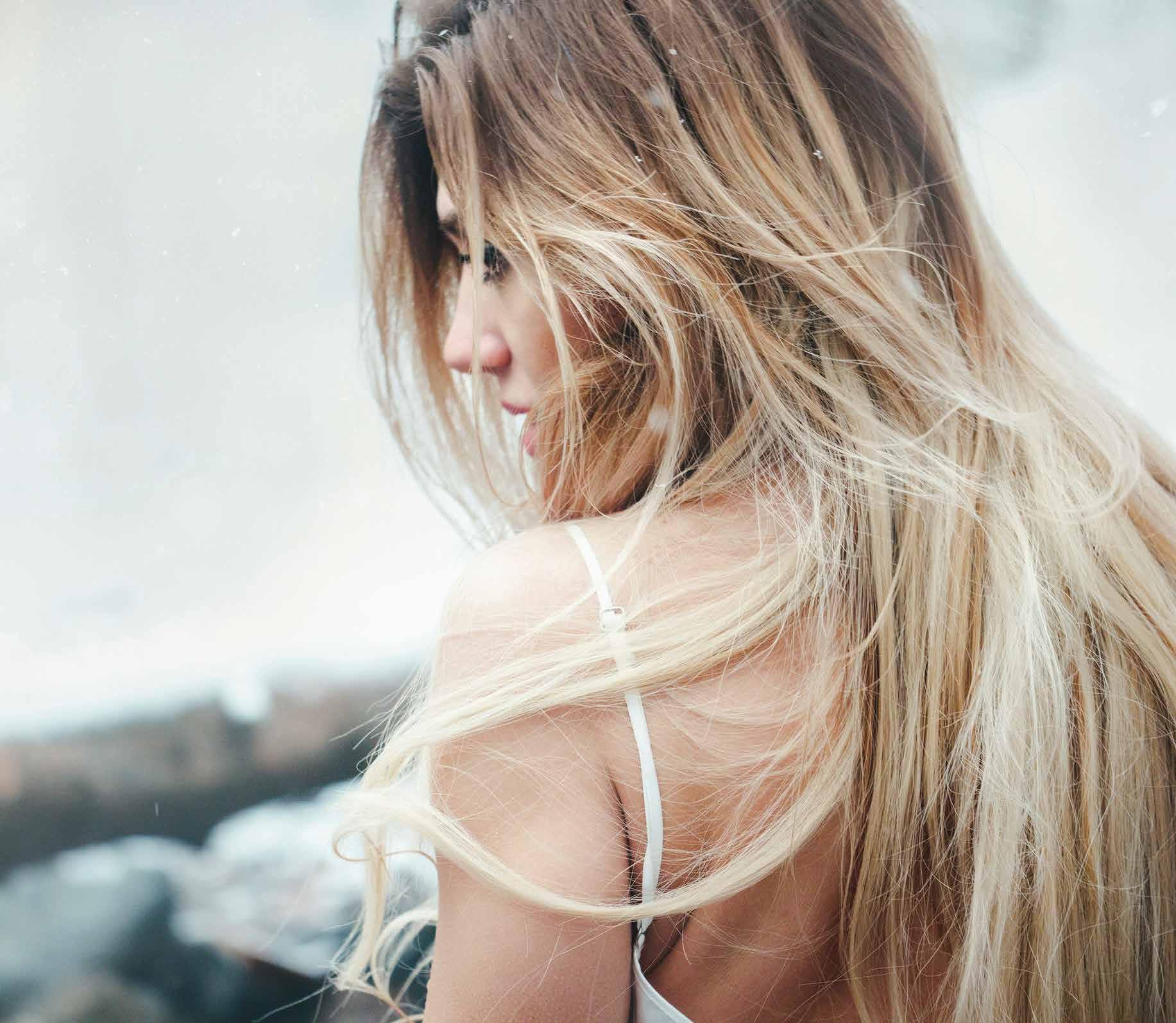
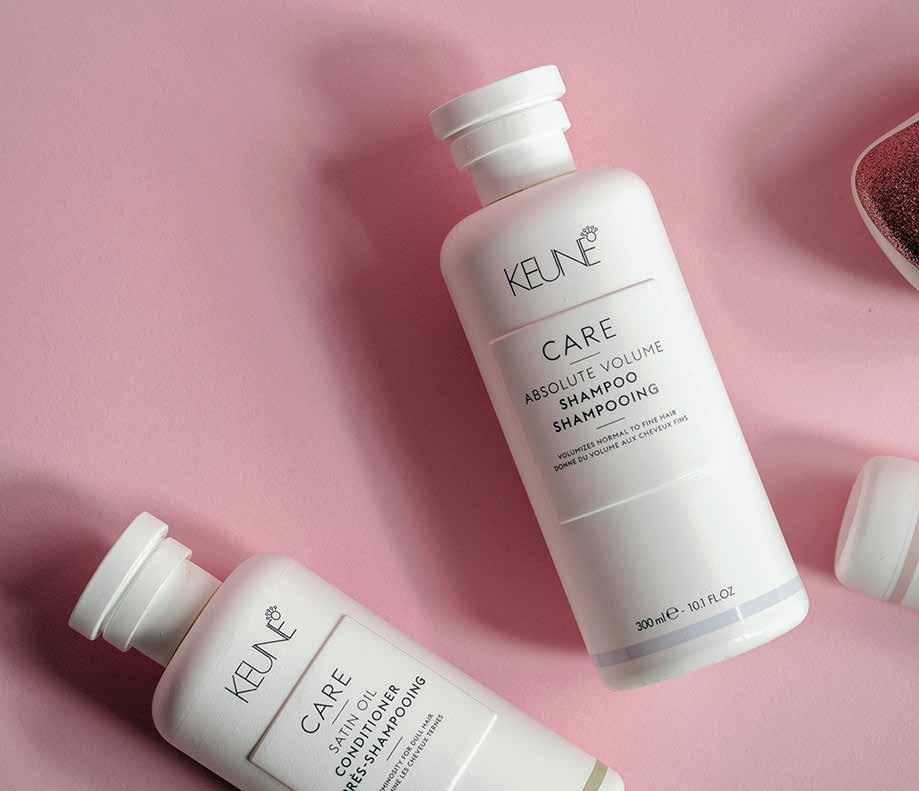
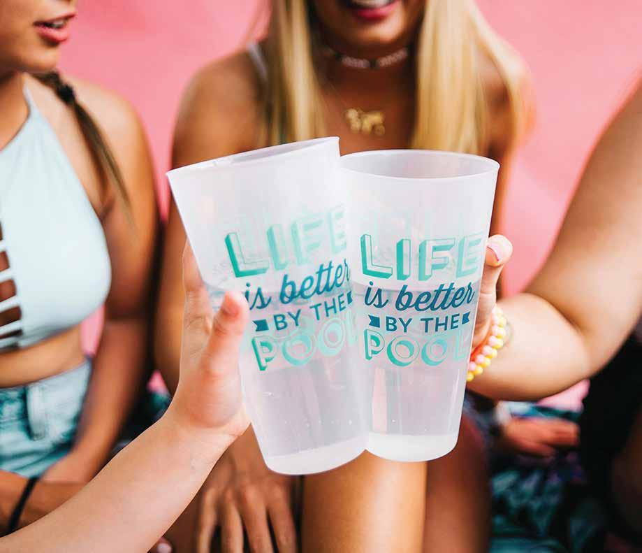
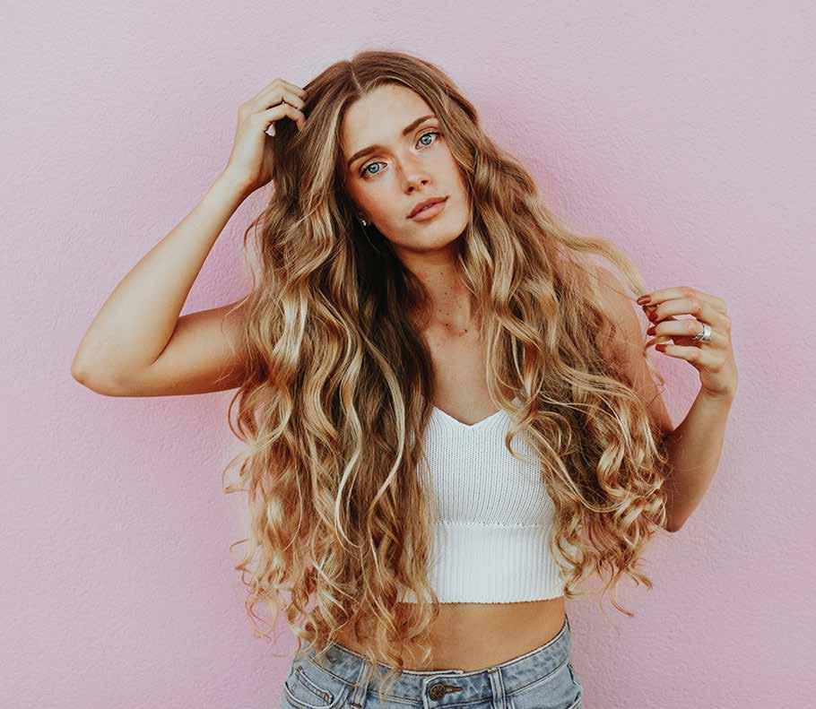
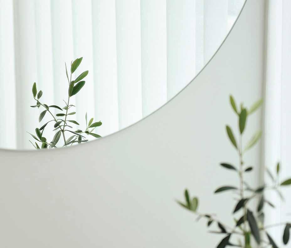
PHOTOGRAPHY
Photography used should always be professionally taken and thoughtfully selected. To ensure that the flow between photos is consistent, the colour balance should be soft and compliment the colour palette.
Be aware of the background colour when selecting photos and don’t allow the photos to overpower any content which is placed nearby on any design.
Fig.1 Product: Well lit and focus on product
Fig.2 People: Editorial, model pose
Fig.3 People: Natural shot, not facing camera, social lifestyle
Fig.4 Object: Fresh objects (eg. bathroom décor)
Fig.1
Fig.2
Fig.3
Fig.4
Brand Imagery
ICONOGRAPHY
Our icons have been created using a clean/vector style, complimenting the minimal design theme. The icon designs have been placed in circles to give them a consistent appearance when used as a group.
Be aware of the background colour when using icons and ensure they are clearly visible.
Avoid using icons at a display size less than 10mm2 (including circle) as they can become unclear.
Fig.1 Icon style for use on “Light” theme
Fig.2 Icon style for use on “Boombiotics Pink” background