

Katie Parrish GRAPHICDESIGN


E d g y d e signs n ee d ro om t o b re a the . E mphasi zi ng s i mpl i ci t y i n a p e r s ona l
brand while allowing my personal favorite e l eme n ts of d e sign to sh i ne th rough .
WITH LUV COFFEE CO.
The Ask?
I was asked to design a brand package for a coffee cart in the works. The plan was for this cart to pop up at special occasions and major events, with the ultimate goal of growing a loyal customer base and eventually transitioning into a brick-and-mortar coffee shop.
The Answer.
My client and I decided to craft a warm, inviting brand using the right colors and visuals to build a strong connection with our target audience. The final brand pakage highlights the passion behind the brand, utilizing hand drawn elements with inviting imagery and colors.
BRAND IDENTITY


NEUTRA ANNUAL REPORT
The Ask?
I was tasked with redesigning the annual report for Richard Neutra, focusing on creating a visually striking and cohesive aesthetic that reflects the innovative and groundbreaking nature of his work. The goal is to craft a report that is not only informative but also a work of art in itself, capturing the essence of Richard Nueva’s design philosophy.
The Answer.
In redesigning the annual report for Richard Neutra, I focused on showcasing his bold, innovative design philosophy to prioritize visual storytelling—using dynamic layouts, elegant typography that highlights the impact of his groundbreaking projects. The report not only conveys key information but also serves as a visual representation of Richard Neutra’s unique vision, blending form and function in a way that mirrors his approach to architecture.
EDITORIAL LAYOUT


CHATTER WINE
The Ask?
I was tasked with developing a brand and marketing campaign for a beverage company of my choice. And so, Chatter Wine was born. Chatter Wine aimed to break away from the traditional, often elitist image of the wine industry, targeting a younger demographic who value experience, community, and ease of enjoyment over traditional wine culture. The goal was to craft a memorable brand identity that was distinctive yet approachable, setting Chatter Wine apart from its competitors.
The Answer.
In creating the packaging and brand identity for Chatter Wine, I focused on what would stand out to a younger demographic of wine drinkers. Simple, goofy illustrations paired with tongue-in-cheek copy creates a vibrant brand personality that reflects the brand’s core values of fun and social connection. The final brand and packaging design not only appealed to the target demographic but also carved out a unique position in the highly competitive wine industry.
BRAND IDENTITY | PACKAGE DESIGN


NEW ORDER FONTBOOK
The Ask?
New Order is a typeface that oozes retro coolness. With its clean lines, geometric shapes, and bold, playful attitude, this font needed a font book that didn’t just show off its various weights and letterforms but also embraced the retro energy and decorative potential that the typeface has to offer. My goal was to create a book that was as much about the visual experience of the font as it was about the technical details. I wanted to take New Order beyond the page, using it as a design element, as a visual tool, and as something that could interact with the space on the page.
The Answer.
I started by getting deep into the New Order mindset — I pulled inspiration from mid-century design books, vintage signage, 60s typography, and even elements of pop art. The idea was to pull out the boldness and fun of that era while giving it a clean, minimalist twist. The retro aesthetic, combined with the experimental use of text as a graphic element, makes the book feel like a piece of art — one that not only shows how to use the typeface, but also inspires creative exploration.
EDITORIAL LAYOUT | TYPOGRAPHY


THE BASICS
The Ask?
The Basics is a no-nonsense, vegan brand on a mission to keep things simple. In a market flooded with complicated claims, The Basics makes a statement: clean, honest, and straightforward food is all you need. They needed a brand identity and packaging system that was as straightforward and bold as their products. I took the challenge of developing a brand that communicates purity, transparency, and minimalism while still catching the consumer’s eye.
The Answer.
In the crowded world of vegan and clean-label products, The Basics needed a way to cut through the noise. The result is a brand that feels authentically pure, transparent, and minimal, but also dynamic and eye-catching. Packaging that says, “This is who we are. No gimmicks. No BS.” It doesn’t just blend in on the shelf; it stands out and commands attention.
BRAND IDENTITY | PACKAGE DESIGN | WEB DESIGN


THE CULTURAL SOCIETY
The Ask?
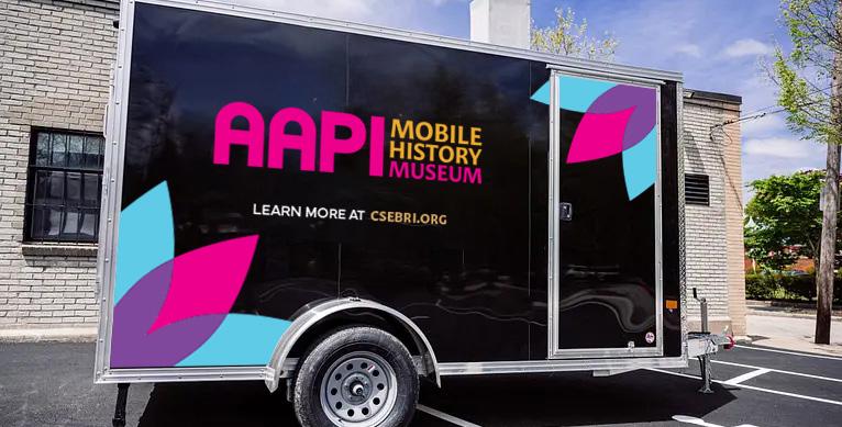
A cultural society with big dreams and even bigger ambitions approached us to help shape a brand identity for a new museum dedicated to celebrating AAPI (Asian American and Pacific Islander) history and culture. The catch? They had very little to work with — just a passionate mission and an idea for a space that would become a pivotal community hub for education, connection, and cultural pride.
The Answer.
They came to us with a request that felt equal parts exhilarating and challenging: Create a cohesive, visually striking brand identity from the ground up. So, we went straight to the roots, digging deep into the culture, history, and nuances of AAPI identity. From there, we started building a visual vocabulary that spoke the language of the museum’s mission: bold, inclusive, layered, and forward-thinking.
BRAND IDENTITY


BONEYARD TATTOO CARE
The Ask?
Boneyard Tattoo Care is the rebel of the tattoo aftercare world. No frills. No fluff. Just high-quality, effective products designed to keep tattoos looking fresh, vibrant, and badass. Their line of aftercare products — from balms to oils — is formulated to nourish and protect inked skin. This isn’t a product you pick up at your local drugstore; it’s for the true ink enthusiast who lives and breathes the tattoo lifestyle. The visual identity had to be as bold and confident as the people using the products.
The Answer.
A brand that exudes authenticity, rebellion, and attitude, with packaging that pops off the shelf and demands attention. The packaging is edgy and gritty, but still feels premium enough to be trusted for post-tattoo care. The product line feels cohesive, but each item has its own unique personality, all tied together by that core brand essence of strength, authenticity, and edge.
BRAND IDENTITY | PACKAGE DESIGN


I.F.S. EVENT PHOTOGRAPHY
The Ask?
The International Fashion Society (IFS) tasked us with capturing a compelling series of photographs for their fashion show, aiming to highlight the diverse group of models while showcasing the high-fashion garments they wore. The objective was to create images that specifically highlighted the models, while other photographers were tasked with focusing on the garments they wore..
The Answer.
The final collection of images, which included dynamic runway shots, successfully told a visual story that celebrated both fashion and identity. The result was a series of photos that were not only visually striking but also emotionally engaging, capturing the essence of both the event and the models’ unique personalities.
PHOTOGRAPHY


STUDIO 539 FLOWERS
The Ask?
Studio 539 Flowers — a beloved, family-owned flower shop in the heart of Providence — came to me with an exciting, yet slightly daunting request: rebrand the shop to reflect a new era while keeping its charm intact. I decided to move the brand into a sophisticated, visually cohesive identity that would resonate with both longtime customers and a new, younger, design-conscious audience.
The Answer.
We started by diving into the essence of what Studio 539 represents: artistry, elegance, and authenticity. The final result was a brand identity that felt fresh, professional, and distinctly Studio 539, with a clear focus on simplicity and beauty. And most importantly, it allowed their floral artistry to take center stage.
BRAND IDENTITY | WEB DESIGN


FLEETING BODIES
The Ask?
I was inspired by South African Artist William Kentridge’s style of animation. I wanted to show the impermanance of the body and how insecurity and fixation on something ever changing is useless for the mind.
The Answer.
For this piece, I used vine charcoal and pressed charcoal on Rives paper for each drawing. Each piece was created on the same paper, and once one was completed, it was smudged away. This shows how impermanant the form is, the ghost of each previous piece evident in the following one.
Fine Arts | Charcoal Relief


