
Leon Jean Bazile Perrault (1832 - 1908) Le réveil de l’Amour (The Awakening of Love) presented by Rehs Galleries

Leon Jean Bazile Perrault (1832 - 1908) Le réveil de l’Amour (The Awakening of Love) presented by Rehs Galleries
01 FOREWORD BY ZOË BILLICK
02 A CLOSER LOOK LUIGI LUCIONI (AMERICAN 1900-1988), ARTWORK PRESENTED BY A.J. KOLLAR FINE PAINTINGS
June 2025
03 COLLECTION SHOWCASE SAILORS’ WOOLWORKS: A NAUTICAL FOLK ART, ARTWORK PRESENTED BY EARLE D. VANDEKAR OF KNIGHTSBRIDGE, INC.
04 OBJECT PRESENTATION THE ELEGANCE OF SEAMAN SCHEPPS, PRESENTED BY CAMILLA DIETZ BERGERON
05 OBSERVATION, INSIGHTS, & MORE MUSEUM ACQUIRES CARRIAGE CLOCK, NEW TO THE NELSON MUSEUM OF ART COLLECTION, WORDS BY SCOTT DEFRIN
06 DEALER SPOTLIGHT MARK SCHAFFER ON THE HISTORY OF A LA VIEILLE RUSSIE, INC.

07 OBSERVATIONS, INSIGHTS, & MORE NATURE AND ART, VISIONS OF YELLOWSTONE NATIONAL PARK, WORDS BY BETTY KRULIK
08
STAY IN THE KNOW THE DIGITAL RENAISSANCE: HOW RONATI STUDIO IS TRANSFORMING THE ANTIQUES INDUSTRY
09
COLLECTION SHOWCASE THE AMERICAN LIFE AND LANDSCAPE, ARTWORKS PRESENTED BY GODEL & CO. FINE ART
10 COLLECTION SHOWCASE MOMENTS IN STILLNESS, ARTWORKS PRESENTED BY REHS GALLERIES
11
OBSERVATIONS, INSIGHTS, & MORE THE MOST OVERLOOKED PERIOD IN CHINESE CULTURE: THE MING DYNASTY (1368-1644), WORDS BY ROBYN TURNER
12 OBJECT PRESENTATION A PAIR OF SILVER SERVING DISHES, PRESENTED BY L'ANTIQUAIRE & THE CONNOISSEUR
13 COLLECTOR'S CIRCLE: THE ART OF SEEING THE DETAILS, WRITTEN BY CLINTON HOWELL
Feel free to feature your collection or gallery in an upcoming issue of The League Journal. You may share select artworks or objects, an article about an upcoming exhibition, or insights about the latest developments in the art and antique market. The opportunities for submissions are infinite and diverse and we welcome all types of topics in this field. Kindly share any text and imagery to marketing@aadla.com
"Collector's Circle" will be a new recurring section in The League Journal that will pose one thoughtful question to all AADLA members. Each issue will share the diverse responses, offering a snapshot of perspectives from across the art and antiques community, and highlighting shared passions, emerging trends, and the stories behind the collections.
Can you share a moment when a specific detail— whether it was the provenance, craftsmanship, emotional resonance, or a compelling story—that made you decide to acquire a particular piece? What was it that truly sealed the deal for you?
Send us your response at marketing@aadla.com today!
June 2025
JUNE 26 - JULY 01
Treasure House Fair
London, England
JULY 18 - 21
The Nantucket Show - AntiquesArt - Design
Nantucket, MA
JULY 26 - 27
The Newport Show - Antiques, Art & Exquisite Objects
Middletown, RI
AUGUST 7 - 9
The New Hampshire Antiques Show Manchester, NH
AUGUST 13 - 17
Downeast Art & Antiques Show
Blue Hill, ME
SEPTEMBER 04 - 07
Frieze Seoul Seoul, Korea
Armory Show
New York, NY
SEPTEMBER 04 - 07
Independent 20th Century New York, NY
SEPTEMBER 11 - 14
Sydney Contemporary Sydney, Australia
SEPTEMBER 12 - 14
Tokyo Gendai Yokohama, Japan
SEPTEMBER 18 - 21
Untitled Houston Houston, TX
SEPTEMBER 25 - 28
Atlanta Art Fair Atlanta, GA
NOVEMBER 07 - 09
The Delaware Antiques Show Wilmington, DE
→ → →
Stay connected with the League beyond the Journal—follow us on Instagram (@the_aadla) and LinkedIn (@Art & Antique Dealers League of America) for member spotlights, behind-the-scenes glimpses, upcoming events, and more.
We invite all members to follow both pages and help us grow our online community this summer!


@the_aadla
marketing@aadla.com
www.aadla.com

As the newest member of the AADLA team this summer, I’m thrilled to contribute to an organization with such a rich history and a deeply committed community. My name is Zoë Billick, and I have the pleasure of working as the League’s intern, assisting with editorial, outreach, and project development for this summer’s League Journal and beyond.
This issue is particularly exciting, as it sets the stage for a major milestone: 2026 will mark the Art and Antique Dealers League of America’s 100th anniversary. What began as the Antique Dealers Luncheon Club meeting at New York’s Madison Hotel in 1926 evolved into the Antique and Decorative Arts League, where in 1942, the organization adopted the name we know today. Throughout that century, the AADLA has remained consistent in its mission: to uphold the highest ethical and professional standards in the trade, to encourage camaraderie among dealers, and to build trust with collectors and the public alike.
As we look ahead to this major celebration, we’re also focused on revitalizing how we share our members’ expertise with the world. The League’s social media presence is now very active, and we hope our readers will follow us on Instagram (@the_aadla) and LinkedIn (@Art & Antique Dealers League of America) to stay connected to our ongoing work, exhibitions, member highlights, and special features. Whether you’re a longtime dealer or a newer member, we invite you to engage, repost, and be part of our growing digital archive.
Among other aspects, the AADLA’s legacy is grounded in deep knowledge of art and antiques, but it is also shaped by the stories we tell and the community we build. We hope this issue of the League Journal reflects just that, and we can’t wait to share what’s to come in the lead-up to 100.
Sincerely,
Zoë Billick
zoe@aadla.com

A.J. KOLLAR FINE PAINTINGS
www.ajkollar.com
By Appointment
allan@ajkollar.com colleen@ajkollar.com (206) 323 - 2156 1421 E. Aloha Street Seattle, WA 98112
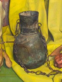
This work was included in the 137th Annual Exhibition of the National Academy of Design in 1962. It has bold color, strong geometric edges, and superior compositional elements. The painting is coming from a private collection where it has been for many years. The details of the painting are as follows:
LUIGI LUCIONI (American 1900-1988)
The Syrian Jug Oil on canvas
20 x 28 inches
Signed and dated lower right: Luigi Lucioni 1961
Exhibited:
The National Academy of Design, New York; 137th Annual Exhibition, 1962

Presented by Earle D. Vandekar of Knightsbridge, Inc.
EARLE D. VANDEKAR OF KNIGHTSBRIDGE
www.vandekar.com
By Appointment
info@vandekar.com
(212) 308-2022
PO Box 586
Downingtown, PA 19335
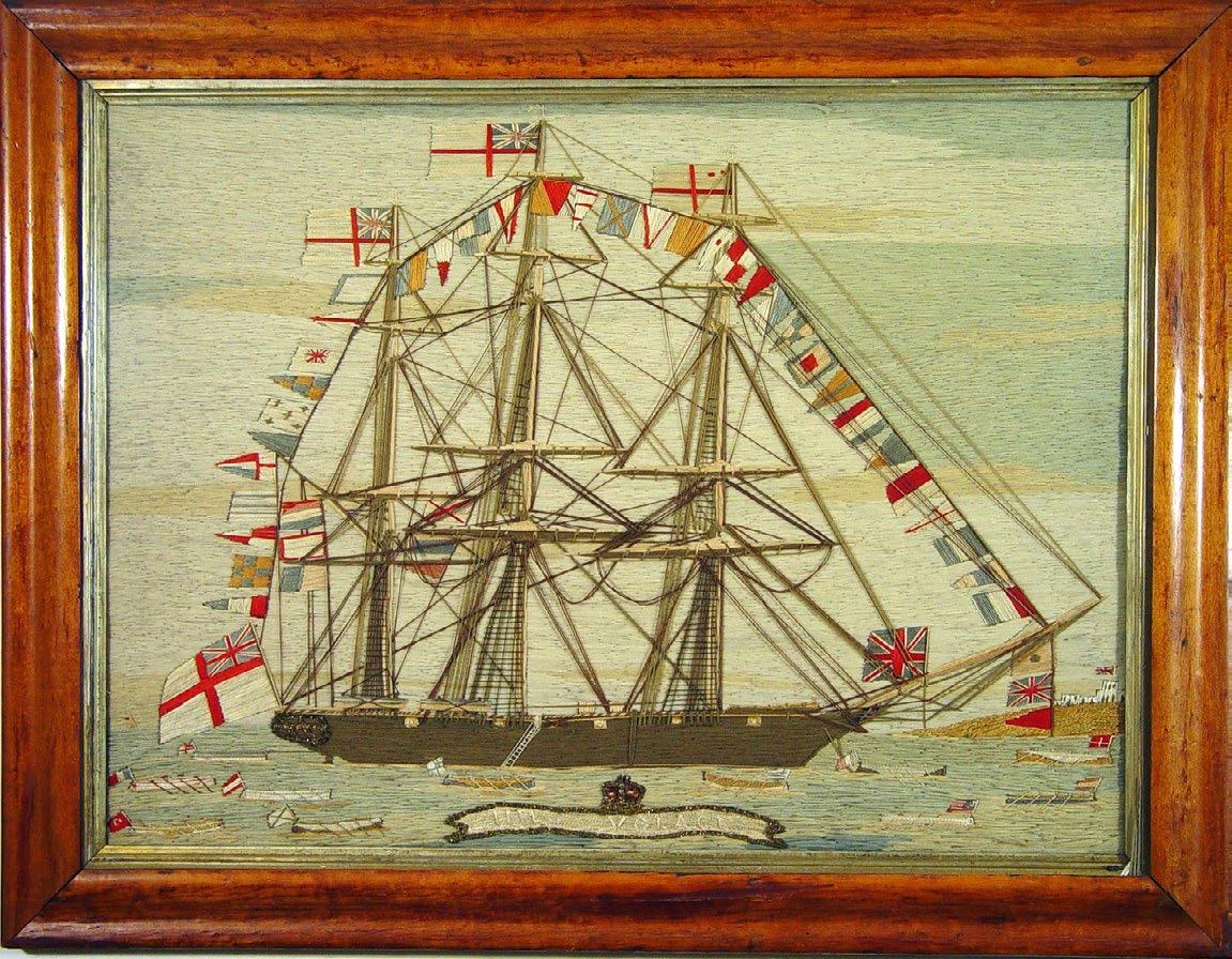
1 of 12
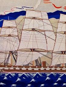
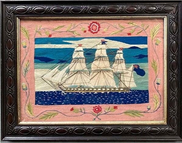
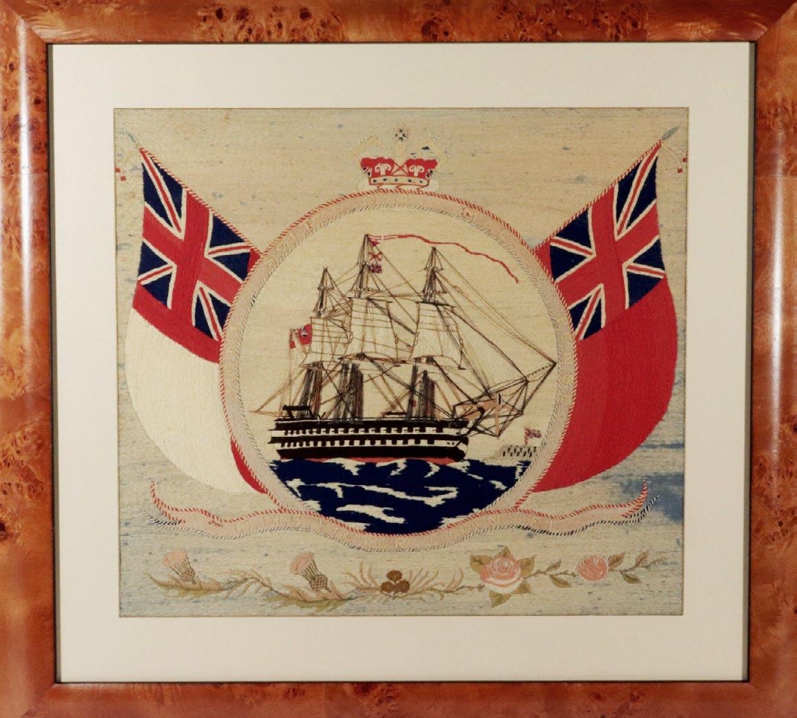
Sailor’s woolwork of a Royal Navy ship, Circa 1875
The following images a selection of (12) woolworks with short discussion beneath each about their characteristics.
The name sailors’ woolworks are often referred to as sailors’ woolies describe a textile artform created by British and sometimes American sailors from the 1860s to the end of sail in the early 20th century. The subject matter of the art was nautical: the depiction of a ship or ships at anchor, at sea or engaged in battle and sometimes depicted against identifiable locations. They are considered naive art or folk art as they were created by sailors as a form a self-expression and not by trained artists.
Continue on page 9
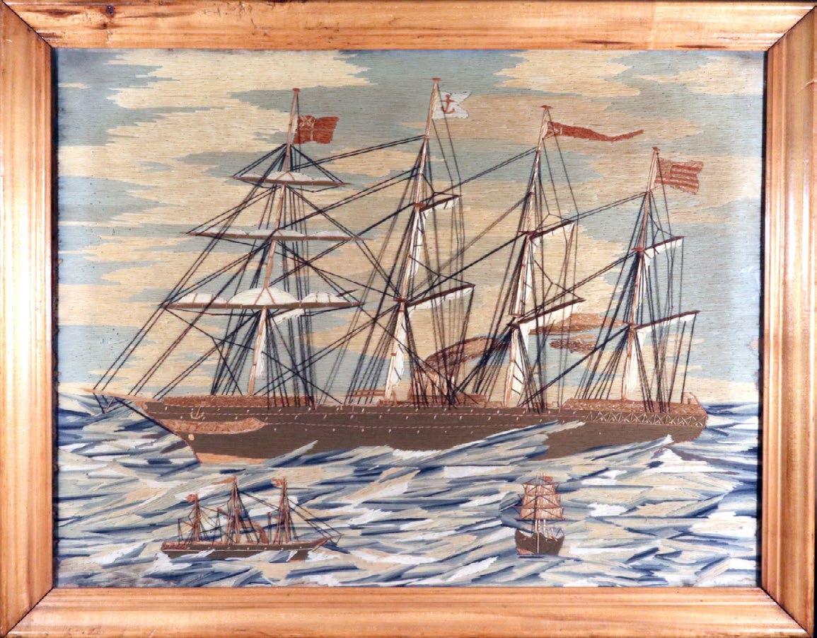
2 of 12
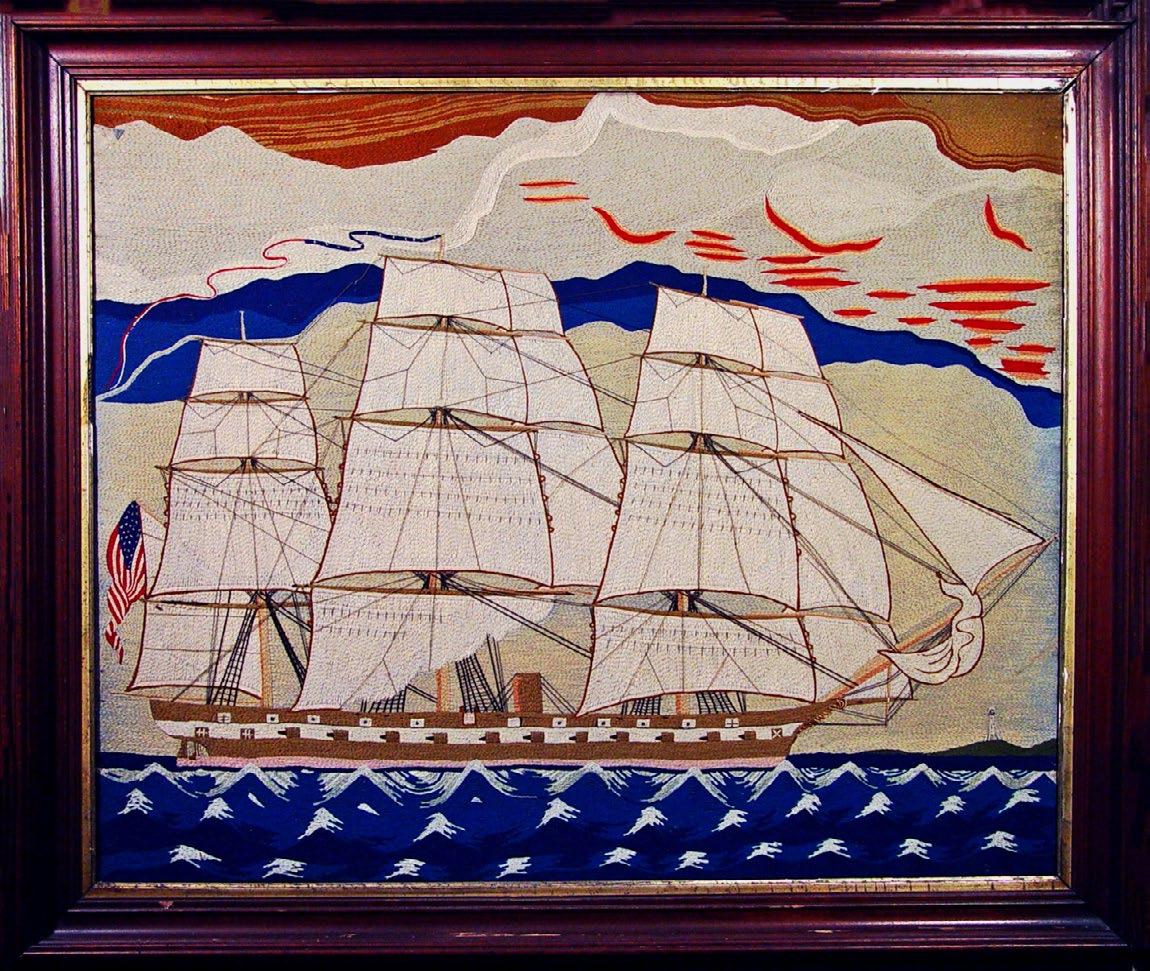
Massive American sailor's woolwork picture of a Frigate, Circa 1875
The wool above depicts an American ship, a subject which is particularly unusual in this material. British sailors over ended up on American ships in foreign ports and ended up staying in the United States and continuing this tradition but now depicting American ships.
3 of 12
British Sailor's woolwork of a Fullly-dressed H.M.S. Volage with multiple long boats at anchor
This wool above shows a common stye of sailors’ woolworks with a ship at anchor and fully dressed. This means that an array of flags are displayed on the ship when the ship is in s review or is welcoming someone of importance on board. In this case, the depicture of the Union Jack indicates that an Admiral is onboard ship. The banner in the front displays the name of the ship, something that is oten lost from the record if it has not been named on the wool. Ships can sometimes be identified withony a name if the ship has a particularly unusual feature that was limited to a small class of ships.
4 of 12
British sailor's large woolwork with the ship named The City of Rome on a rough sea, Circa 1880s
Here is another named ship but this time a merchant ship under steam. She was considered one of the most beautiful steamships built, with her classic clipper bow and sail rigging, illustrating the transitional period of sail to steam. Interestingly, she was designed by William John, who later would design the United States Navy's first battleship, the USS Texas.
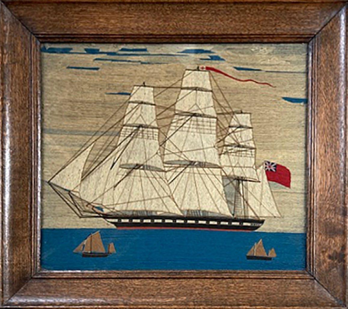
This wool shows a typical view of a ship under sail. This one is unusual with the addition of two smaller vessels in the foreground.
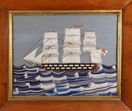
6 of 12
This wool shows a woolwork with an unusual colorful sea. The depiction of a rough or unusual sea is one of the features that adds value to a woolwork.
Sailors had always expressed themselves artistically through the creation of objects using marine ivory such as scrimshaw, ropework and by creating designs on their clothes, kit bags and tattoos on their bodies.
The emergence of the woolworks was the result of a perfect storm of events. The first event was the Crimea War sometimes known as the Eastern War. This war is considered one of the first modern wars with the introduction of technology, and particularly the telegraph. By the end of the war the telegraph was on the battleground. This was important for our story as newspaper correspondents were able to report back from the battlefront and details about the war and the involvement of troops and sailors was in almost real time providing the general public with stories where the bravery and deprivations of the troops was revealed. The public became heavily invested in the going on in this distant land and one of the consequences was that in the public’s eye the British sailor was transformed from a character who was often consider a low life to Jar Tar, The Hero of the British Empire. Many wools depict events and ships involved in this war being created by the sailors with a sense of pride in their occupation.
The second event that effected the creation of these works of art was the discovery of aniline dyes in 1857 and their subsequent use with wool. The product allowed wool to be dyed in large vats inexpensively and allowed the wool to become accessible to a working-class market at an affordable price. The product was Berlin Wool and companies in Berlin began using the best quality wool from Saxony and exporting it to England, The Empire and the United States in particular. Many of the woman the sailor might know, his mother, sister and wife were beginning to use to the wool to make objects at home, in particular embroideries which were sold as kits with designs, wool and instructions. More experienced makers could just buy the pattern. By the end of the century, over twentyseven thousand different designs had been produced. Thus, the sailor was introduced to a product, Berlin Wool, at home but rather than following patterns as the women did, he created
Continue on page 10
freehand images of their ships and exotic locations that they encountered on their journeys.
The pictures made with the Berlin Wool used a material called duck as a surface. It was a type of linen, commonly found in ports and on-board ship. British sailors who generally provided or made their own uniforms, used this material for that purpose and for repairs on their clothing. The wool pictures created by the sailors were generally made as family mementos and often given as a gift for a family member. Some were created on board ship, others in between journeys. The third event that affected the creation of this artform was the use by the Royal Navy of a regular salary. In the 18th century and Napoleonic times, the navy heavily used impressment to obtain the manpower it required. But by the 1830 onward, that became socially unacceptable and various Bills were past in Parliament to help provide manpower for the Royal Navy. One plan was for sailors to sign up and long periods of time and be provided a regular wage rather than being paid bper journey. As a consequence, the sailors did not need to go and get new jobs as soon as they were paid off and that allowed them to have a little spare time between trips to sea. Many of these woolworks were made in those times in my opinion. A number of wools were also created in retirement as they reminisced about their youthful. It does also seem though those handicapped sailors made them for sale as a means of supporting themselves financially. endeavors and postcard exist showing sailors in wheelchairs with woolworks on railing behind them.
So, there you have a short history and introduction to sailors’ woolworks or woolies as collectors affectionately call them. As mentioned previously, Analine dye was used and at the time it was not know that the dye could react to light and some of the colors, particularly light blue, could fade. Thus, some wools now have an ivory colored sky where once a light blue filled the canvas. This is known by collector and accepted and sometimes even preferred. In my mind, the retention of color is important and adds significantly to the value as does
Continue on page 15
7 of 12
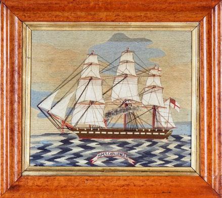
British Sailor's Woolwork of H.M.S. Challenger on Unusual Sea, Circa 1770
This is another wool with an unusual sea and a named ship. In addition, the ship is under both sail and steam propulsion.
of 12
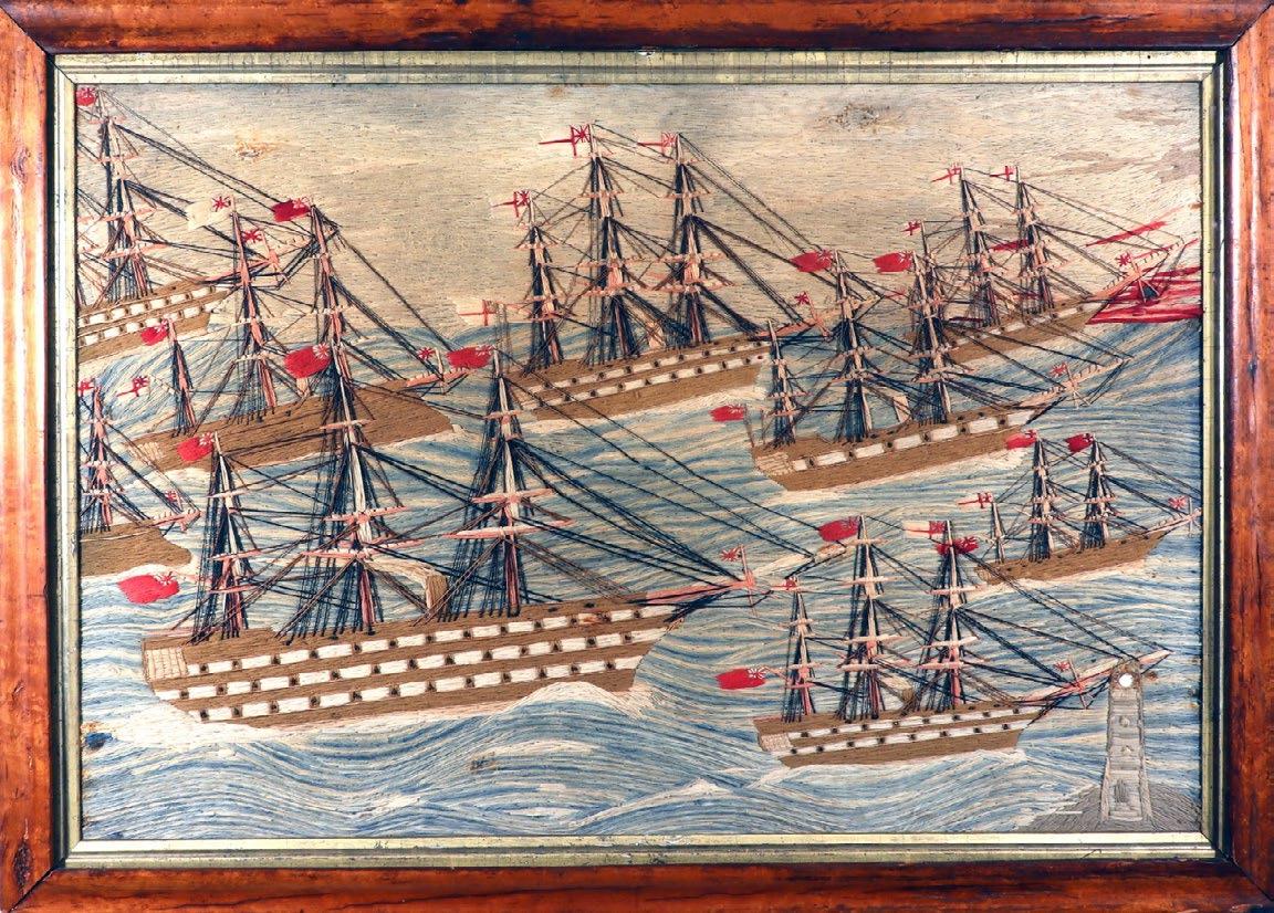
British Sailor's Woolwork of HMS Conqueror Entering Malta Harbour with Five other Ships Offshore, Circa 1857
This wool depicts a group of ships outside a port which on an old label on the reverse is identified as Malta. The label reads "H.M.S. Ship Conqueror/ Entering Malta Harbour/ October 16, 1857/...on Board”. The depiction of more than one ship adds value to the woolwork.
9 of 12
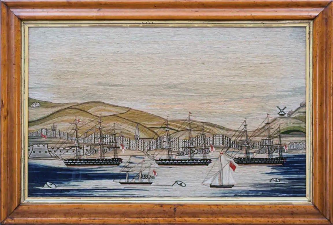
British Sailor's Woolwork of a Fleet with a Detailed View of Portsmouth, Circa 1865-75
This wool depicts a Royal Navy fllet deparing Portsmouth. The idenity of the location was determined by gthe depiction of with Porchester castle on the left and Langston mill on the right.
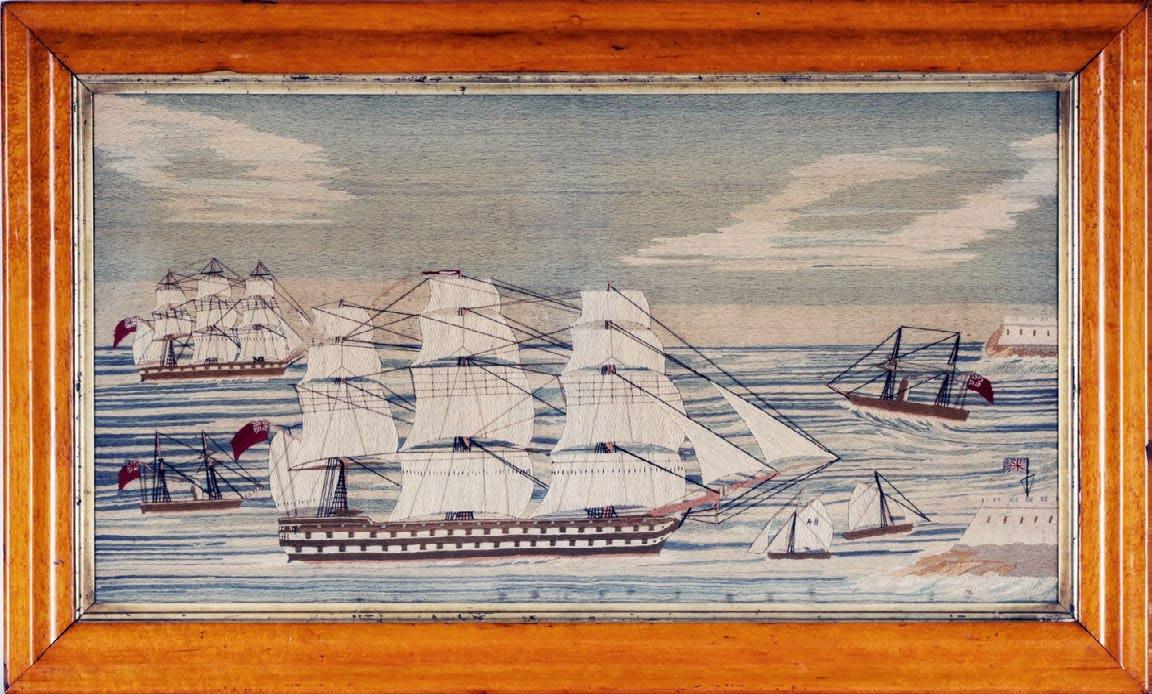
of 12
The wool above shows a fleet of ships on rough seas and with a selection of different classes of Royal Navy ships, including two ram-bow ironsides, one probably the Pallas, a First Rate battleship, Second Rate battleships, and cutters and frigates making this a very desirable wool.
British Sailor's Woolwork of HMS Victor Emanuel with Red and White Ensign Border, Circa 1865-75
The use of flags as a border became common after the 1870s. Often when flags were used, the central depiction of a ship is poorly depicted although with this wool the central image of the ship as viewed through a spy glass is very well done. The center can be a spy glass, a porthole of a life ring.
the features mentioned above - the number of ships, size and complexity in design particularly the sea. Before we sell our sailors’ woolworks we replace the glass with Museum UV glass. This protects the wool from any further damage from the sun and significantly reduces light reflection making the wool appear as though there is no glass at all allowing the beauty of the woolie to be seen clearly.
Words by Paul Vandekar
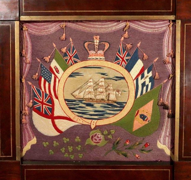
12 of 12
British Sailor's Woolwork with Flags of Nations, Circa 1875
This wool shows another variation of the use of flags which is called “Flags of Nations”. Below you will see patriotic depicts of national flowers, here the four-leaf clover, the red rose of England and the thistle of Scotland.
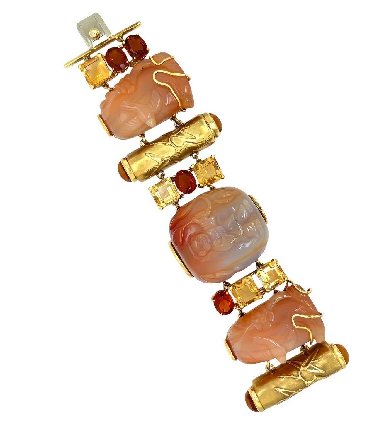
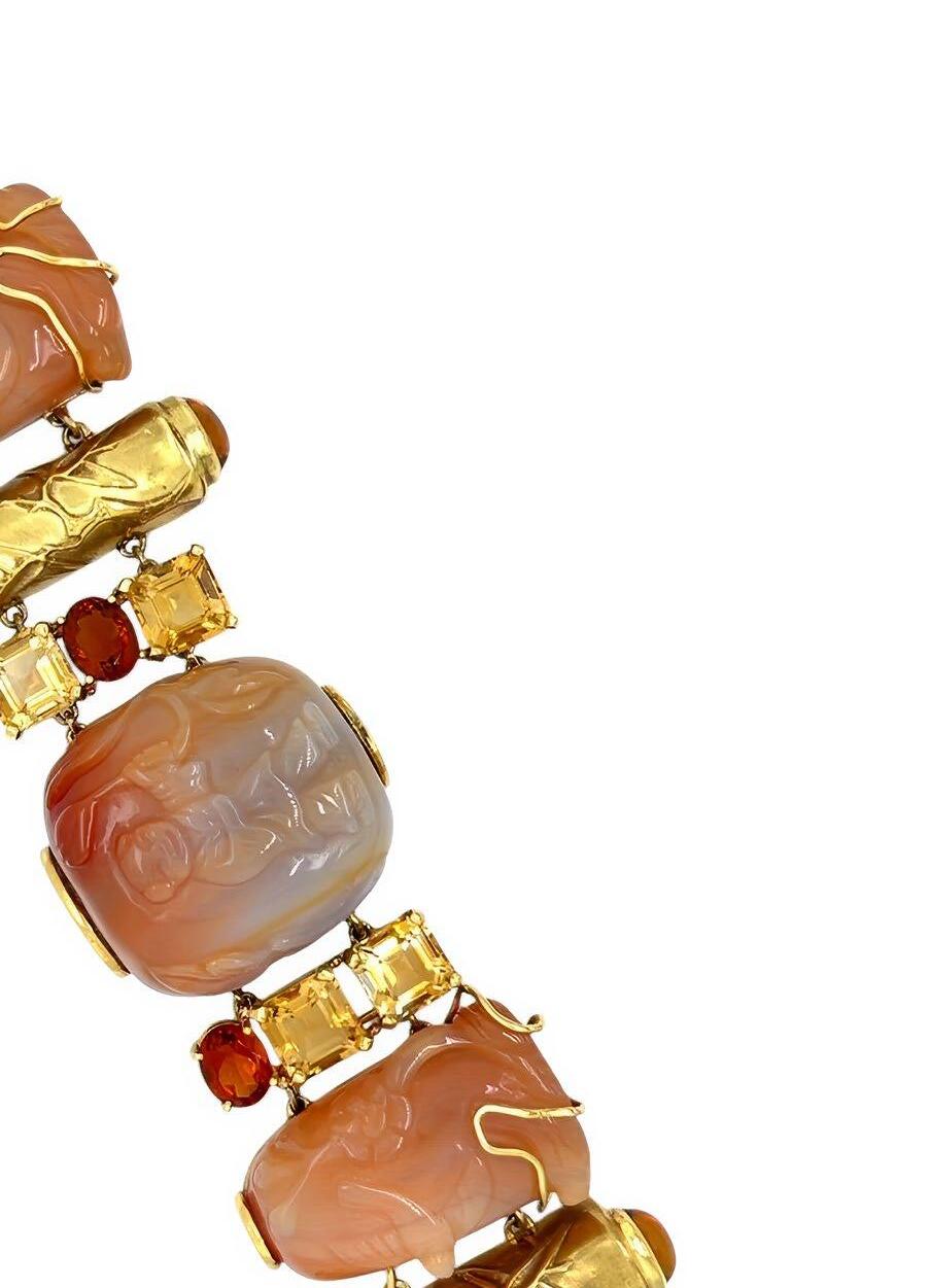
An 18 karat yellow gold, carnelian agate and citrine bracelet by American jeweler Seaman Schepps, known for his use of exotic materials and playful designs focused on color. This bracelet is inspired by Asian motifs such as bamboo, and features Chinese carved hard stone snuff bottles. Collectors are encouraged to explore the book “Seaman Schepps: A Century of New York Jewelry Design” for more information on his work.
CAMILLA DIETZ BERGERON www.cdbltd.com
By Appointment info@cdbltd.com
(212) 794 - 9100 818 Madison Avenue, 4th Floor New York, NY 10065

ProjectArt is a nonprofit organization which empowers youth, artists and communities by providing visual arts classes and artist residencies nationwide. The organization partners with public libraries to create cultural hubs which unite diverse communities of artists and children for immersion into and equitable access of artistic experiences for all communities, students, and prospective artisans!
Mission: ProjectArt empowers youth, artists and communities by providing visual arts classes and artist residencies in public libraries.
To learn more, visit www.projectart.org.

ADARSH ALPHONS
Founder & Executive Director
adarsh@projectart.org
CLAUDIA DES ROSIERS
Interim Director of Development
claudia@projectart.org


New to the Nelson Atkins Museum of Art Collection
EUROPEAN DECORATIVE ARTS CO.
www.eurodecart.com
eurodecart@gmail.com
Gallery: 516-621-8300
Mobile: 516-643-1538
299 Main Street
Port Washington, NY 11050
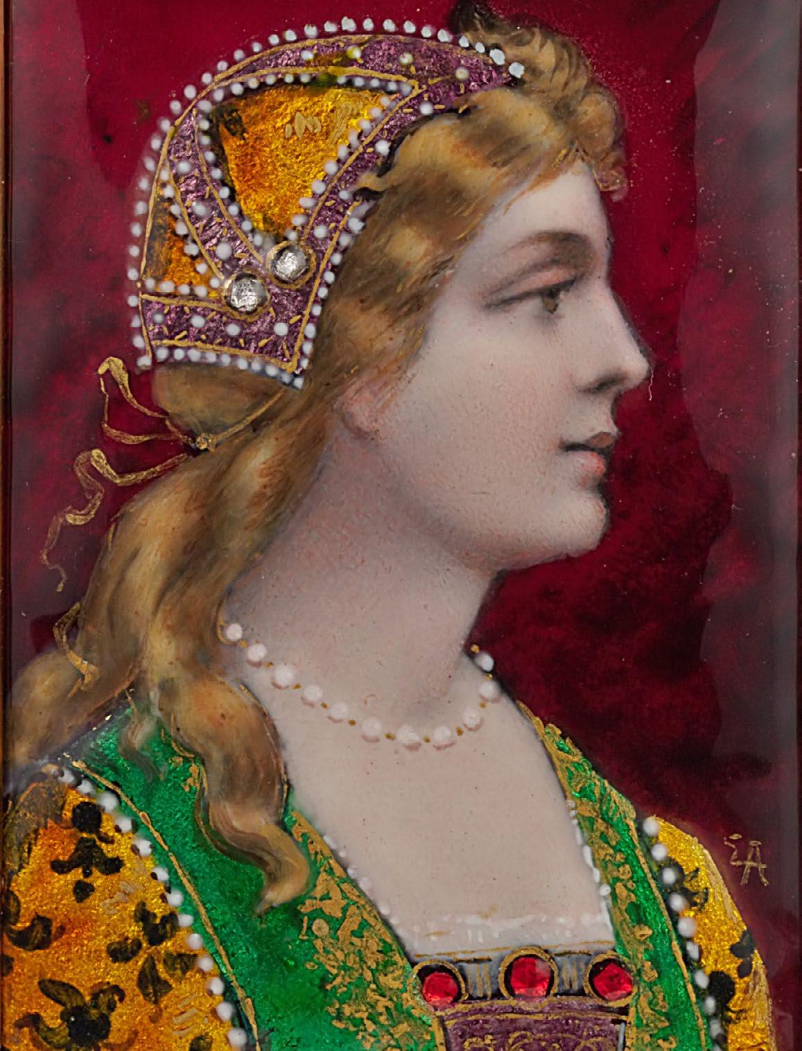
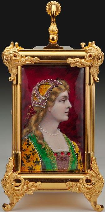
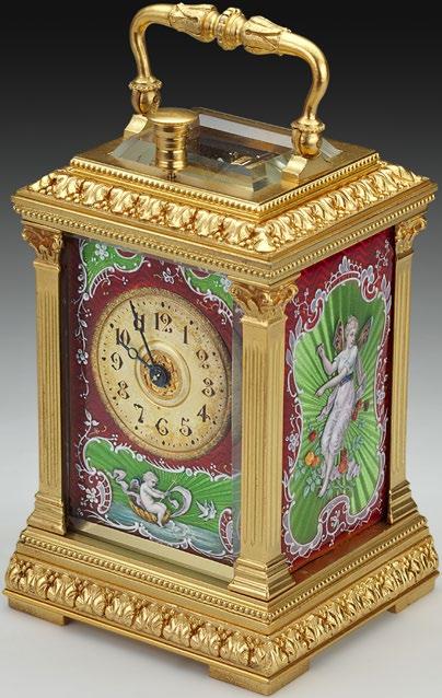
At the Winter Show 2025, The Nelson Atkins Museum of Art in Kansas City acquired its first carriage timepiece from the European Decorative Arts Company (see above for Fig. 1 & 1A).
The carriage or “travel” clock (8”) acquired was made in France in circa 1890, mounted with enamel panels by Swiss Enameller (Eugen Autran, 1838-1920) and retailed by the
At the Winter Show 2025, The Nelson Atkins Museum of Art in Kansas City acquired its first carriage timepiece from the European Decorative Arts Company (see above for Fig. 1 & 1A).
The carriage or “travel” clock (8”) acquired was made in France in circa 1890, mounted with enamel panels by Swiss Enameller (Eugen Autran, 1838-1920) and retailed by the Boston luxury items seller, Bigelow, Kennard & Co. It is a superb example of the ubiquitous carriage clock form, which first made its appearance in the late 18th century by the eminent clockmaker, Abraham Louis Breguet, and eventually blossomed into a major industry by French clockmaker Paul Garnier, in 1855.
While portable timepieces had been in existence since at least the 17th century or earlier, Breguet designed a clock movement that could function without a pendulum, using instead a balance wheel escapement, which allowed the clock to maintain time while being moved around, either at home or whilst traveling. As this type of clock movement was ostensibly shock-proof and maintained time (usually for at least 8 days before needing to be wound up), it became a trusted companion while travelling on a train or in a carriage, hence the term “carriage clock”. Most clocks were sold with their own leather (or wood) carry case, which helped protect those that had elaborate decoration and help preserve the gilded brass cases. Today, however, most clocks survive without these protective cases, as they themselves were prone to breakage and general wear and tear.
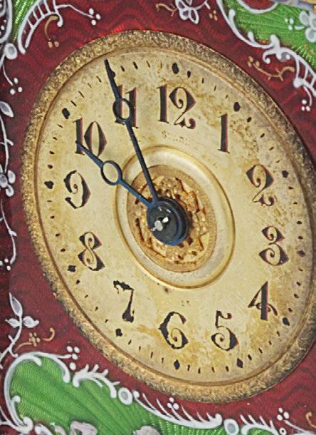
The complexity of the movements in these clocks varied greatly; some would just provide the time, but many also would strike the time on a gong (on the hour, or both hour, quarters and half hour, or even down to the minute). One of the most significant features of carriage clocks was indicating time by pressing a button on top of the clock, to hear the time on demand, which came in handy particularly during the nighttime.
While most were made for the European and English markets, several major American retailers offered European carriage
Continue on page 21
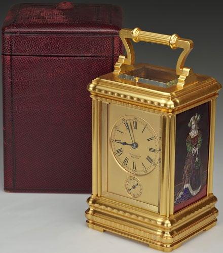
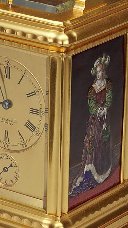
timepieces in their show rooms in the late 19th and early 20th centuries, specially commissioned. Figure 2 shows an example that was sold by Tiffany & Co (marked on the dial) mounted with enamel panels made in Limoges, France. This particular example has its original carry case. Figure 3 is an unusual example which was made also in France but retailed by Black, Starr & Frost in New York. The case was almost certainly a special order and the enamel panels (most likely Swiss) are decorated in guilloche, a technique not frequently found in carriage timepieces from this period.
The subject of carriage clocks has been well-studied and there are several books on the subject written in English. The popularity of these clocks in the 19th and early 20th centuries led to a plethora of case styles and decorative art techniques employed in their manufacture, sometimes even making the mechanical movement, however complex, a secondary feature of the timepiece. Widely available today and with a broad range of values, carriage clock collecting remains an accessible area for the new collector.
Words by Scott Defrin
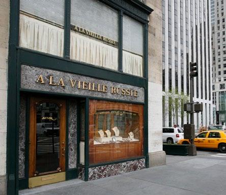
A LA VIEILLE RUSSIE, INC.
www.alvr.com
alvr@alvr.com
1 (212) 752-1727
745 Fifth Ave., Suite 415
New York, NY 10151
A La Vieille Russie’s history in the United States temporally parallels that of the Art and Antique Dealers League, of which we have been long-time members. Both have origins in New York City about 1930, and both updated their names here about 1940. Yet ALVR’s roots extend much farther back. The great uncle of my grandfather Alexander Schaffer’s business partner founded the antiques and jewelry business in Kiev in 1851, and historical necessity led the family to reopen in Paris in 1920. Schaffer immigrated to New York, and, with my grandmother Ray, opened a beautiful physical space as one of the first tenants in Rockefeller Center in 1933. They introduced the works of Russian court jeweler Carl Fabergé to the American market, and became the premier purveyor of extraordinary Russian antiques. The now-famous Imperial Easter Eggs could be found gracing their shop window, more than one at a time! Of course like all dealers they dealt in a broad range of antiques. When A La Vieille Russie opened on Fifth Avenue at
60th street in 1941, they were already well-known for the art of the goldsmith and the jeweler, ranging from English brooches, to Fabergé, to French gold snuffboxes.
I grew up knowing only our location at Fifth Avenue and 59th St., where we moved in 1961. My grandparents would show me all kinds of Fabergé treasures when I was a kid, of course only with my hands behind my back. I feel that that early exposure has benefited me to this day, in the development of my eye and gut. My father and uncle both joined their parents in business after their studies, but I nonetheless ventured off into plant biology for a few years after college, earning a Ph.D. Ultimately, the allure of working with family, and working with history in its most beautiful and tactile manifestations, drew me back to the world of art and antiques. More than thirty years have passed since that decision, and I couldn’t have imagined the fulfillment from a family enterprise, fulfillment from working with clients who share our passion for beautiful objects, and fulfillment from being able to admire and handle such beauty when the world starts to feel dark.
Today, A La Vieille Russie focuses on fine antique jewelry from Europe, England, and the U.S., along with works of our longtime specialty, Fabergé. We also handle other objets de vertu such as French gold snuffboxes, as well as important Russian decorative arts.
We are proud members of both the AADLA and the National Antique and Art Dealers Association of America (NAADAA).
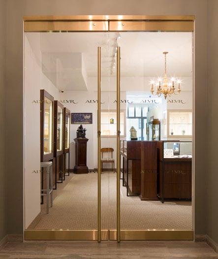
Above: ALVR at 59th St and Fifth Ave. ca. 2010
Words by Mark Schaffer
Below: ALVR in its current location on 58th St, 745 Fifth Ave, Suite 415, New York, NY 10151
OBSERVATIONS,
The confluence of nature and art is never more apparent than in Yellowstone National Park. I recently had the opportunity to walk in the footsteps of several artists whose paintings of the Park, I had long known. I could marvel at the documentary and evocative nature of these master painters: Thomas Moran
Continue on page 25
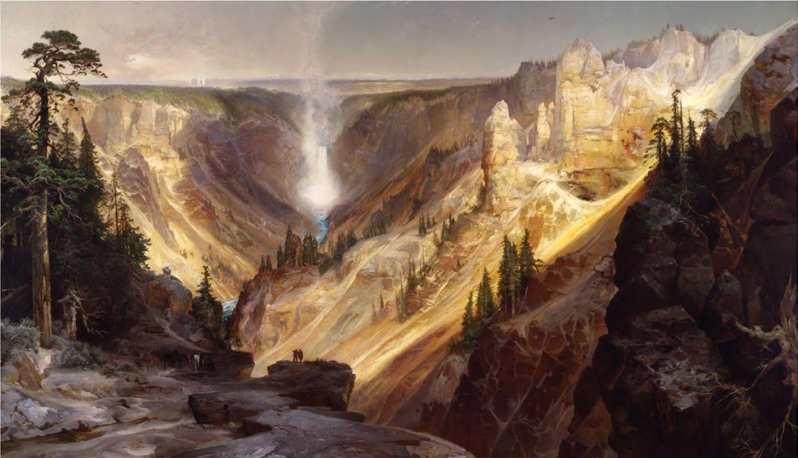
and John Henry Twachtman. They communicated the awe and majesty of this National Treasure in dramatically different ways.
Thomas Moran was a painter known for being partially responsible for the creation of Yellowstone, our very first National Park. It was his early watercolors from 1871-73 and the photographs of William Henry Jackson that made "real" the phantasmagorical stories of this remarkable landscape, creating the groundswell of enthusiasm for the National Park effort.
Seeing the Grand Canyon of the Yellowstone, one can’t grasp the grandeur of the scene in one photograph (see my meager examples). Scanning the landscape, observing the vastness, depth, color and textures of the canyon is a nontransferable experience. But Thomas Moran, with editorial tweaks, transforms the scene, majestic in its panorama. Where Twachtman evokes the power of the falls, with spray and mists,
Thomas Moran, The Grand Canyon of the Yellowstone, 1872
Oil on canvas mounted on aluminum, 84 x 144 inches
Department of the Interior Museum
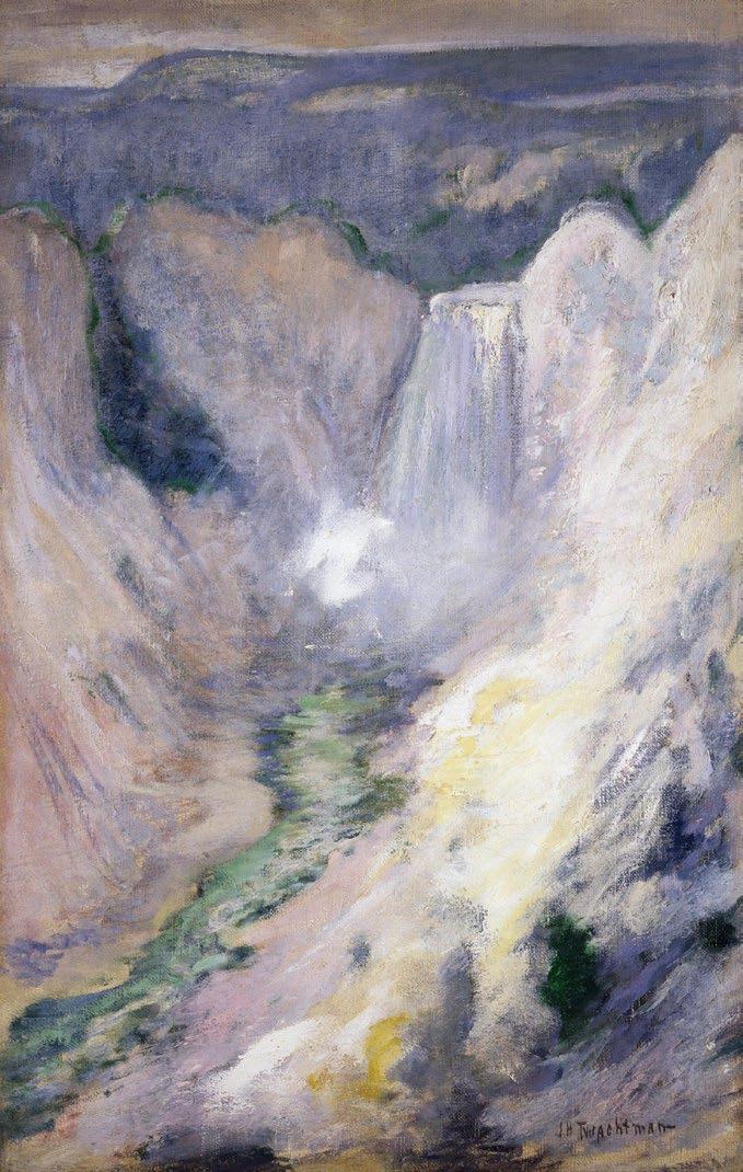

Waterfall in Yellowstone, 1895
Buffalo Bill Center of the West


which “feels” like the experience of being in the Park, rather than the more literal portrayal of Moran. Between these two dramatically different artists one can almost understand what it is like to be in this phenomenal place.
Twachtman, the master American Impressionist, visited the Park 20 years after its formation. He captured the essence of the park in the most intimate of ways. Dr. Lisa N. Peters, the author of the Catalogue Raisonne of Twachtman’s work, stated that he painted on site, unlike Moran, who would sketch on site and paint in the studio months afterwards.
Continue on page 29
The Great Blue Springs of the Lower Geyser Basin, 1874 Chromolithograph on paper. H 25, W 35.8 cm
Yellowstone National Park, YELL 29

This summer when you are away from your computers and out in nature, marvel at the way artists, with their heighten awareness of effects of light and landscape, can capture those split second moments, opening our own eyes to nature’s magic.
Words
by
Betty Krulik
BETTY KRULIK FINE ART LIMITED
www. bkrulikfineart.com bkrulikfineart@gmail.com (917) 582 - 1300
260 Birch Lane
Irvington New York 10533
John Henry Twachtman, Edge of the Emerald Pool, Yellowstone, 1895 Collection, Stark Museum, Orange Texas
RONATI
www.ronati.com
contact@ronati.com
USA +1 866 739 8343
UK +44 (0) 8081 692399
A few months ago, Ronati launched “Studio,” a self-service platform for inventory documentation and management designed for sellers of vintage, antique, and unique items. This follows four years of supporting dealers through its concierge tool, the “eCommerce Manager.”
The need and impact of the two services are clear — over 2,000 registered users, tens of thousands of mobile and online logins, and now more than 230,000 individual items have been documented and imported.
Download the App

But even more impactful than the numbers are the stories Ronati dealers are sharing of real transformation: documenting long-forgotten pieces in back shop rooms and warehouses, making additional sales at trade fairs with inventory at their fingertips, even closing their biggest deals ever thanks to professional tear sheets made in seconds.
“We celebrate every time a dealer shares a success,” says Stacey Tiveron, CEO of Ronati. “Studio was built for the remarkable businesses that have worked for years without the tools others take for granted.”
Unlike standard retail, every antique tells a unique story — age, condition, provenance, and character. Off-the-shelf tools weren’t made for that.
Studio enables dealers to surface hidden inventory easily and profitably from their shops and storage. It's a powerful two-part platform with both mobile and desktop access, designed for flexibility.
For Dolly Archer English Antiques, the impact was immediate. Founder Thais Wood credits Studio with helping them document and manage an entire offline inventory without hiring two additional staff they had earlier planned for. “The savings in time and money have been unbelievable,” she says.
Ronati continues helping a beloved industry move forward, keep its soul, and meet the rising demand for storied, sustainable pieces. Those embracing the technological shift are taken aback at the gains in time, organization, and profit, and as a result, they are ensuring a new generation can fall in love with the unique.

by
1 of 2
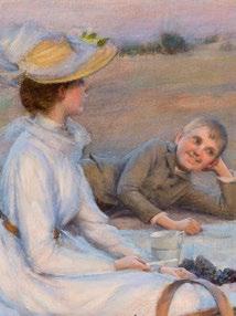
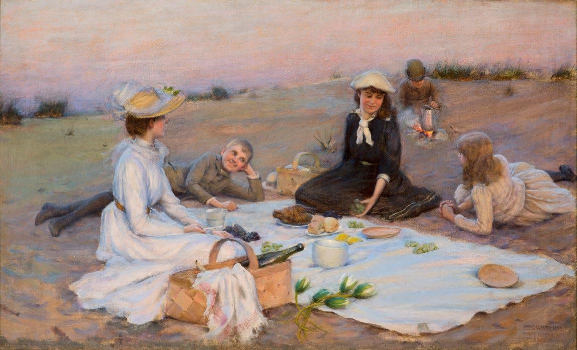
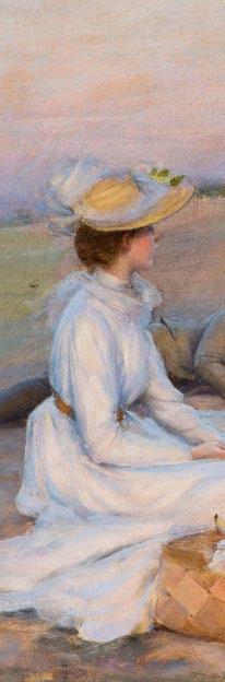
Charles Courtney Curran (1861–1942)
Picnic Supper on the Sand Dunes, 1890 Oil on canvas, 12 x 20 in.
Signed, dated, and titled lower right: Chas. C. Curran 1890 / Picnic Supper on / the Sand Dunes
Exhibited: Pennsylvania Academy of the Fine Arts, Philadelphia, 1892, no. 58.
(914)
Bedford, NY 10506
1 of 2
Charles Courtney Curran was born in Hartford, Kentucky, and studied at the Cincinnati School of Design in 1881. After moving to New York City the following year, Curran enrolled at the National Academy of Design and later continued his training at the Art Students League. He received early recognition and held his first exhibition at the age of twenty-three at the National Academy in 1883. This marked the beginning of a lifelong association with the academy; Curran took part in an impressive sixty-one consecutive annual exhibitions, as well as nearly every winter exhibition from 1906 to 1932. He also exhibited regularly at the Art Institute of Chicago from 1888 to 1919; Pennsylvania Academy of the Fine Arts, Philadelphia, from 1887 to 1935; Boston Art Club, from 1893 to 1909; and the Carnegie Institute’s International Exhibitions from 1896 to 1923.
From 1888 to 1890, Curran resided in Paris and studied at the Académie Julian under Benjamin Constant, Jules-Joseph Lefebvre, and Henri Lucien Doucet. His exposure to Impressionism while in Paris undoubtedly influenced the bright palette and attention to effects of light and atmosphere that are evident in his subsequent work. In Picnic Supper on the Sand Dunes, Curran manages to balance the academic drawing style of his teachers with the loose brushwork of Impressionism. This technique would later be replaced by a tight and precise handling of paint, as seen in his Betty Newell, 1922 (The Metropolitan Museum of Art). However, his concern with warm, enveloping sunlight and a jewel-like color palette in Picnic Supper on the Sand Dunes was consistent throughout his career.
Upon his return to America, Curran divided his time between New York City and his house and studio near Cragsmoor, New York, where he was a leader of the Cragsmoor Art Colony. Founded by Edward Lamson Henry in 1883, the Cragsmoor Colony became a favorite retreat for landscapists attracted to its clear views of the surrounding mountains and valleys. Curran first visited Cragsmoor as a guest of artist and writer Frederick Dellenbaugh in 1903. Curran later built his summer home there in 1910. He remained associated with Cragsmoor into the late 1930s and edited the publication Palette and Brush with his wife for many years.
2 of 3
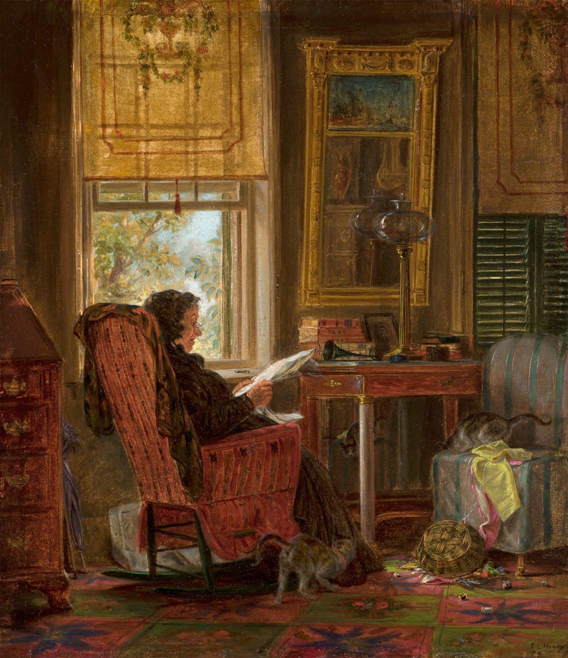
Edward Lamson Henry (1841–1919)
Totally Absorbed, 1874
Oil on board, 8 x 9 inches
Signed lower right: E. L. Henry / 74
Inscribed on verso in pencil: Totally Absorbed / E. L. Henry / 1874
Provenance: Sotheby’s, New York, June 2, 1983, lot 64; Eckert
Antiques, Indianapolis, 1984; the collection of the Honorable Paul H. Buchanan, Jr., Indianapolis, until 2009
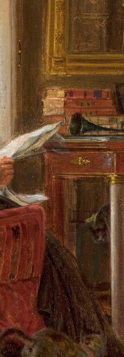
E. L. Henry was renowned in his time for his antiquarian enthusiasm for historical American life. Not only did he seek out and paint interior and exterior views of early American houses, as well as old-fashioned carriages, but he also collected historical decorative objects, costumes, and a large number of carriages, and acted as an antiques dealer for his patrons. Objects and vehicles from his collections often appear in his paintings, and some of his finest carriages have found their way into the nation’s premier collection, the Long Island Museum of American Art, History, and Carriages, in Stony Brook, New York.
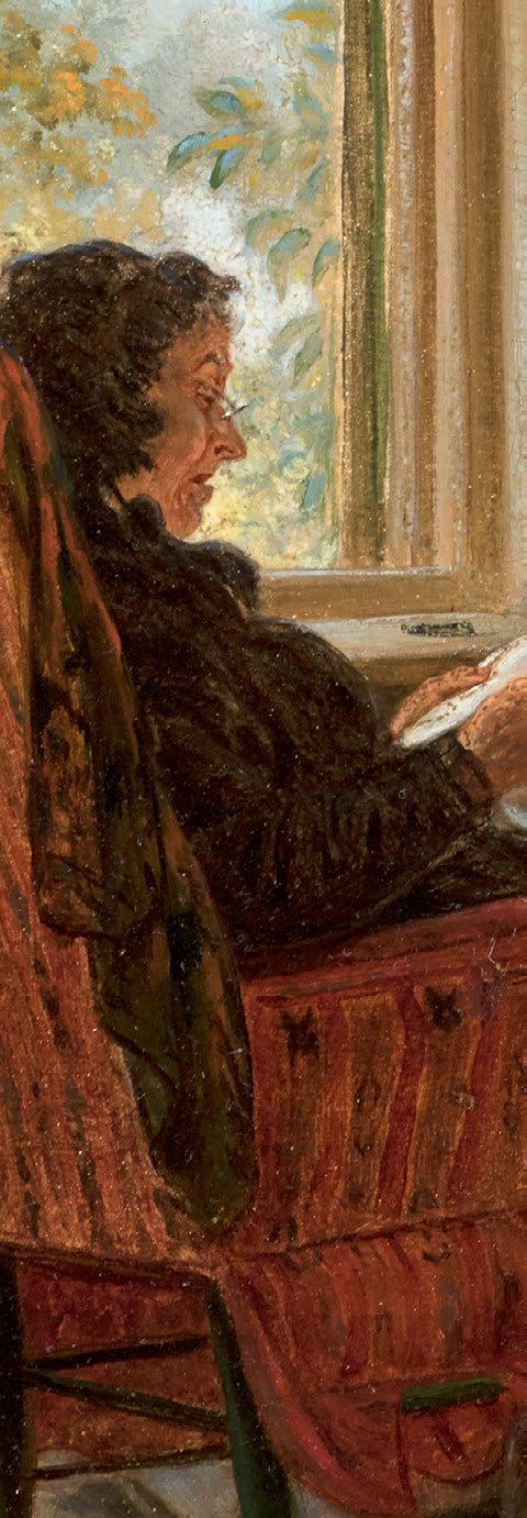
In his scenes of bygone days and ways, Henry often included elderly figures to suggest the antiquity of their surroundings. In his interiors from 1860s through the 1880s, Henry frequently depicted his friend William Kulp’s elderly Quaker aunt, Hannah Tyson, and it is probably she who appears in our Totally Absorbed, in the interior of a Colonial or Federal house in Philadelphia or nearby Germantown. She reads a newspaper by an open window, which lets sunlight into an otherwise dim room. Many of the objects that decorate the room seem to be nearly as old as she is, and some could be even older: the pier mirror, pier table, and the sinumbra lamp, date from the 1810s or 1820s, while the Chippendale desk at the left edge of the image is a product of the Colonial period.
Continue on page 53
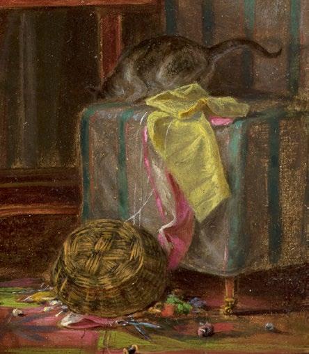
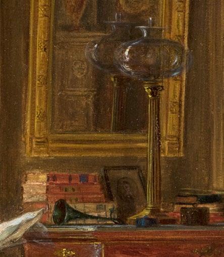
In a flight of fancy, Henry introduced a note of liveliness and humor to this venerable scene, in the form of a standoff between two cats. The one on the right, which has knocked the lady’s knitting basket onto the floor, gazes from its perch on an upholstered chair at the other cat’s reflection in the mirrored back of the pier table; the other cat crouches defensively behind the lady’s dress and looks warily back through the mirror. The cat on the right seems poised to pounce at the mirror, fall with a clatter to the ground, and spook the other cat, thereby disrupting the calm of this wellpreserved interior.
Totally Absorbed belongs to a series of small works that Henry executed in the early 1870s, which often depict Hannah Tyson in interiors that appear to be different, yet which include many of the same objects. Henry presumably observed some of these objects, like fireplaces, blinds, and wall moldings, at the Philadelphia and Germantown houses that he visited, while others likely came from Henry’s collection of antiques. Although his interiors do depict actual places and objects, the series makes clear that, at this early stage in America’s historical preservation movement, they were not meant to be factual historical documents and were not subject to the strict periodization that today’s connoisseurs of antiques have come to expect in re-creations of historical interiors. Instead, Henry creatively combined different styles to create eclectic, visually stimulating scenes that were meant to evoke the genteel atmosphere of an old home and the moods associated with lifestyles of the past
Seen from today’s perspective, paintings of Henry’s such as this one are fascinating expressions of America’s complex relationship to its past and present during the Gilded Age. Faced with the social dislocations caused by the Civil War, rapid industrialization, immigration, and urbanization, Henry was clearly nostalgic for a more harmonious time filled with elegant, hand-crafted objects. Yet his materialistic emphasis on interiors and the cultural caché of historical objects was
Continue on page 37
a product of his own time. Beginning in the 1870s, newly wealthy Americans spent unprecedented sums on lavishly decorated interiors, often filled with art and antiques—a trend which Henry vividly illustrated in one of his best-known works, Parlor on Brooklyn Heights of Mr. and Mrs. John Bullard, 1872 (Manoogian Collection, Grosse Point, Michigan). American artists also increasingly adopted an international orientation at this time, and artists such as Henry and Eastman Johnson were some of the first Americans to pick up on the European fashion for interior scenes influenced by seventeenth-century Dutch painters such as Johannes Vermeer. Finally, Henry’s active participation in the period’s historical preservation movement and promotion of historical styles indirectly resulted in the Colonial Revival style that emerged in the 1890s, which integrated Henry’s nostalgia for the past with industrial construction and production techniques and a building and consumption boom that were wholly of the present.
3 of 3
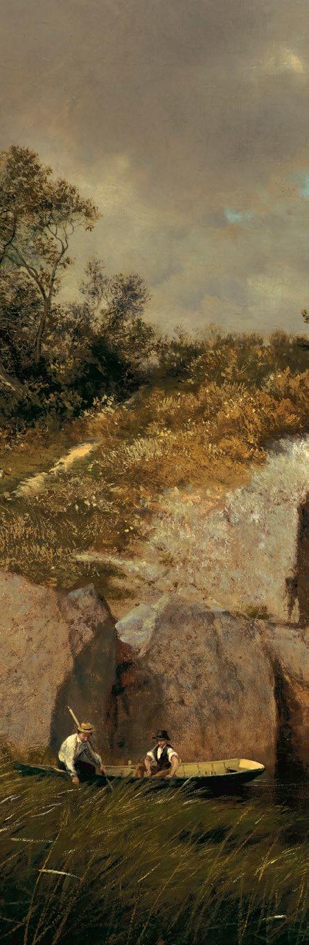
David Johnson (1827–1908)
Catnip Island near Greenwich, Connecticut, 1878-79
Oil on canvas, 22 x 34 in.
Signed and dated lower right: DJ 78
Inscribed on verso: Catnip Island near / Greenwich, / Conn. / David Johnson 1879
Provenance: G. E. Moredock, Jr., Barrington, Illinois
Related work: View of Greenwich, Connecticut, 1878, oil on board, 14 x 20 inches (Florence Griswold Museum, Old Lyme, Connecticut).
David Johnson, one of the leading second-generation Hudson River School artists, was a native New Yorker. Although he has a reputation for teaching himself to paint, he took classes at the National Academy of Design from 1845 to 1847 and briefly studied with Jasper F. Cropsey around 1850. He took sketching trips to the Catskill Mountains, Lake George, and the Adirondack Mountains, often in the company of artists such as John F. Kensett.
Although it is not known if Johnson ever visited Connecticut with Kensett, he was familiar with Connecticut scenery through Kensett’s work, and after Kensett’s death, Johnson began to take the train from New York to the Connecticut coast. Following an 1875 visit that produced Near Noroton, Connecticut, in which Johnson’s similarity to Kensett is striking, Johnson painted at least three pictures based on an October 1878 trip to Cos Cob, Connecticut. These paintings
Continue on page 39
fuse Kensett’s legacy with elements of the Barbizon style then edging out the Hudson River School, while remaining true to the close observation of nature that appears in Johnson’s work throughout his career.
Catnip Island near Greenwich, Connecticut is the largest known picture that Johnson painted based on his Cos Cob visit. The island that it depicts (now known as Bluff Island) is one of the many small outcroppings to be found in and near Cos Cob Harbor and Greenwich Cove. Like Kensett, Johnson presented these rock formations in a striking asymmetrical profile, but unlike Kensett, whose late work bordered on abstraction, Johnson included figures boating and walking along a path, as well as a good deal of foreground detail. Compositionally, the work is consistent with Johnson’s previous work and with that of many of his fellow Hudson River School painters during the 1870s.
In keeping with the Barbizon style, however, Johnson’s brushwork is loose enough to convey the volume of the clouds, the textures in the foreground, and the dull reflection of the distant trees in the water. Yet he kept it tight enough to clearly define the rock formation and the figures and foliage in the foreground as well. Always a master of tonal relationships, Johnson convincingly created a partly overcast light effect— overcast skies were a favorite of the Barbizon painters—in which the left foreground is lit with hazy sunshine, but the rest of the forms are bathed in a muted half-light. The partially silhouetted tree projecting out from the rock, the expansive sweep of the clouds to the right, and the dark storm clouds above add a hint of the moods associated with Barbizon painting without undermining the appeal of the scenery and the leisure activities taking place.
Although evidence for the painting’s exhibition has not yet surfaced, its large size and high degree of finish suggest that Johnson painted it either for exhibition or for an important commission.
REHS GALLERIES
www.rehs.com
info@rehs.com (212) 355-5710
20 West 55th Street, 5th Floor
New York, NY 10019
1 of 4
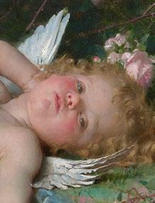
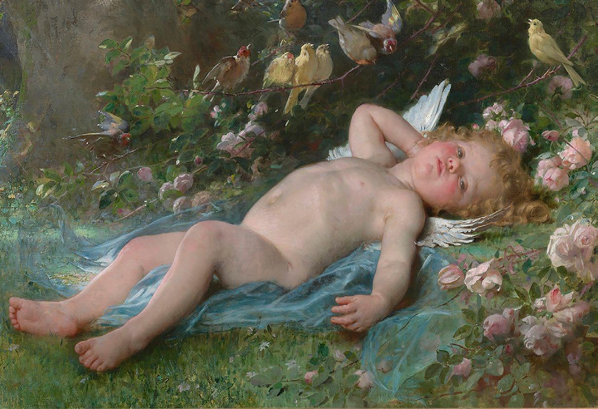
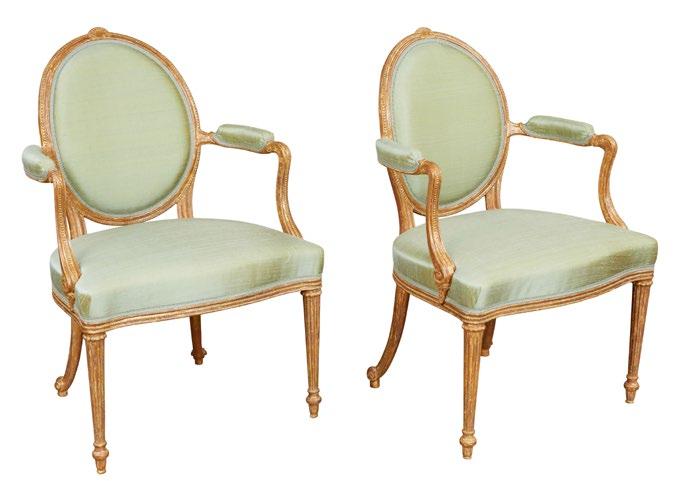
The French academic painter Léon-Jean-Bazille Perrault’s work Le réveil de l’Amour, or The Awakening of Love, is an example of the artist’s fixation on classical mythology. The sleeping Cupid, a subject popular since antiquity, typically represents dormant love. Since the Renaissance, it has been most famously depicted as a subject in a 1608 painting by Caravaggio, as well as in a now-lost 1496 sculpture by Michelangelo. While the Caravaggio painting shows the cherubic figure lying asleep in complete darkness, Perrault’s depiction is notably brighter.
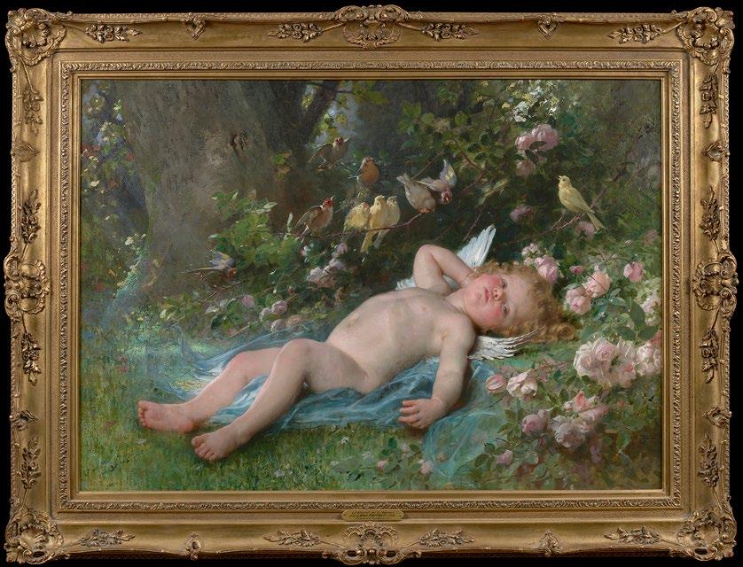
1 of 4
Leon Jean Bazile Perrault (1832 - 1908)
Le réveil de l’Amour (The Awakening of Love) Oil on canvas
32 1/4 x 44 3/8 inches
Framed dimensions:
40 1/2 x 53 1/4 inches
Signed and dated '91
PROVENANCE
Doliber, Goodale Co., Boston (c.1893)
Galerias La Granja, Mexico City
Private collection, Wichita, Kansas, 1961
By descent
Rehs Galleries, Inc., New York, 2014
Private collection, California, 2014
EXHIBITED
Paris Salon 1891, No. 1293
World Columbian Exposition, Chicago, May 1 - October 30, 1893, in the Mellin's Food Exhibit.
California Midwinter International Exposition, 1894
World's Food Fair,, Boston, 1894
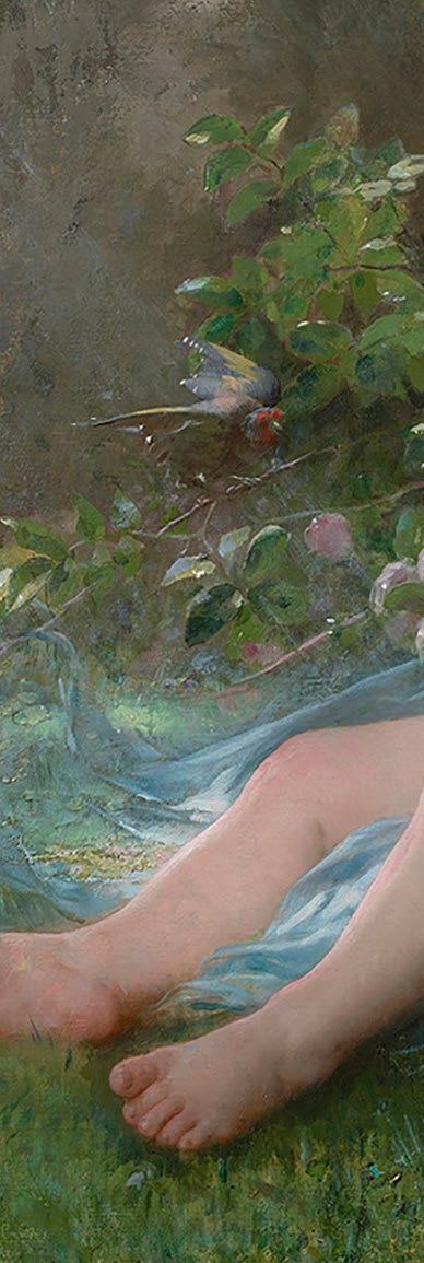
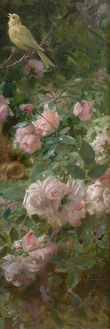
In Le réveil de l’Amour, Cupid faintly starts to open his eyes towards the viewer. He raises his left arm and arches his back, stretching out his body and shaking off his slumber. One contemporary description remarks how Perrault seemed to have captured “the idea of childhood’s innocent loveliness”. He lies against a layer of sheer cloth in what seems like a forest clearing. He is surrounded by roses, with a chorus of birds perched on a branch to bear witness to the love god waking up. Perrault places the cherub in this environment, possibly as a way of conveying to the viewer that love is part of nature itself. It’s a base impulse that many people experience, revel in, and struggle with. The work is sensual and almost decadent, which is appropriate for Perrault’s clientele. Many of his collectors were wealthy bourgeois or aristocrats seeking out well-executed academic-style paintings to serve as decorative art, similar to the Rococo paintings from over a century prior.
Le réveil de l’Amour was exhibited at two of the great cultural events of the early 1890s. First was the 1891 Salon, which also included The Shepherd’s Friends by Daniel Ridgway Knight, The Lion on Watch by Jean-Léon Gérôme, and The Catechism by Jules-Alexis Muenier (which was purchased by the French state). After the Salon, the Boston-based DoliberGoodale Company purchased the painting to display it at their stall at the World Columbian Exposition in Chicago in 1893. Since the Doliber-Goodale Company manufactured Mellin’s Food, an early form of baby food, the work’s subject seemed appropriate. Doliber-Goodale used the work’s image on packaging materials and even ordered lithographs of the painting as advertising. This made Perrault’s Le réveil de l’Amour one of the most recognized marketing images in the United States.
Antonin Proust, Le Salon de 1891, Goupil & Cie, Paris, 1891, Illustrated pg. 13.
A. Hustin, Salon de 1891, Paris, 1891, Illustrated color.
Catalogue illustre de Peinture et Sculpture, Salon de 1891, Ludovic Baschet, Paris, 1891, illustrated pg.122
Albert Wolff, 1891 Figaro-Salon, Goupil & Cie, Paris 1891, illustrated pg. 2.
G. Vapereau, Dictionnaire universel des contemporains, Paris, 1893, p. 1235.
'Chronique Artistique,' La Chronique universelle, Paris, December 1890, p. 387-388.
'A Travers les salles,' La Justice, Paris, 30 April 1891, p. 2.
'Figaro-salon 1891,' Le Figaro, Paris, 1 May 1891, p. 1.
G. Calmette, 'Le Salon,' Le Figaro, Paris, 30 April 1891, p. 2.
'Le Salon des Champs-Élysées,' Le Petit Parisien, Paris, 5 May 1891, n.p.
J. de Polane, 'Le Salon,' Le Pays, Paris, 1 May 1891, n.p.
'Le Salon aux Champs-Élysées,' La Nation, Paris, 1 May 1891, n.p.
F. Javel, 'Salon de 1891,' Le Petite presse, Paris, 6 May 1891, n.p.
M. Ellinger, 'Publisher's Notes,' The Menorah, vol. 15, New York, July 1893, p. 62-63.
'The Child in Art,' Art in Advertising, New York, May 1893, p. 109113, illustrated.
'The Child in Art,' The Century Advertising Supplement, October 1893, p. a1-a4, illustrated.
H. L. Bird, This Fascinating Advertising Business, Indianapolis and New York, 1947, p. 43.
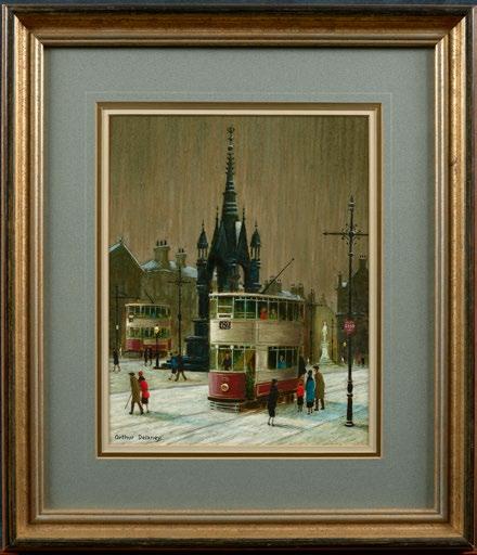
Arthur Delaney (1927 - 1987)
Trams in Albert Square
Oil on panel
14 x 11 inches
Framed dimensions:
23.5 x 20.5 inches
Signed PROVENANCE
Private collection, U.K.
Rehs Galleries, Inc., New York
Trams in Albert Square captures the feel of daily life in postwar northern England. We see double-decker street cars going through Albert Square in Manchester, with the tram in the foreground stopping to pick up passengers. The people are small and not very detailed, with their clothing being the only distinguishing feature of each figure. Delaney’s painting looks northwest across the square, with the Albert Memorial’s neo-Gothic spires extending upwards towards the muddy grey sky, either made dark by nighttime or, more likely, stained with pollution.
The painting’s setting, the city of Manchester, was the world’s first industrialized city, serving as the center of British textile manufacturing. British cities with heavy industry were nearly always blanketed with smog produced by the chimneys of factories and the coal-burning fireplaces most British people used to heat their homes. Although manufacturing has declined and air quality has improved in Britain, the image of the industrialized city remains a stereotype in the popular imagination.
For most of his professional life, Arthur Delaney worked in the Manchester textile factories’ design studios. His earliest paintings date back to the 1950s, but he would not pursue painting professionally until 1972. Despite living through a time when manufacturing was leaving the country, his paintings continued to capture the essence of living in an industrialized society. His street scenes are populated with scores of working people in flat caps and respectable dresses, all of them faceless and anonymous like Laurence Stephen Lowry’s “matchstick men”. The trams carry people across the city, all against a grey sky perpetually darkened by the fumes of far-off smokestacks. In fact, paintings like Trams in Albert Square are some of his most interesting works. The trams themselves are a symbol of urbanization and technological progress. They pass by the Albert Memorial, a monument commemorating the late consort of Queen Victoria, under whose rule Britain rose to become one of the world’s leading industrial powers. Yet the memorial still stands nearly a
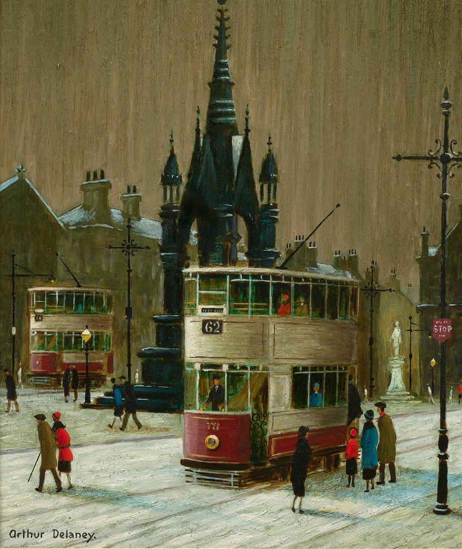
century later, watching as the industry that built Manchester starts to leave. Delaney’s Trams in Albert Square is a time capsule, showing the artist’s hometown in the final years before the uncertainty of deindustrialization. Yet it also transports the viewer to mid-century Britain in all its smoggy glory.
3 of 4
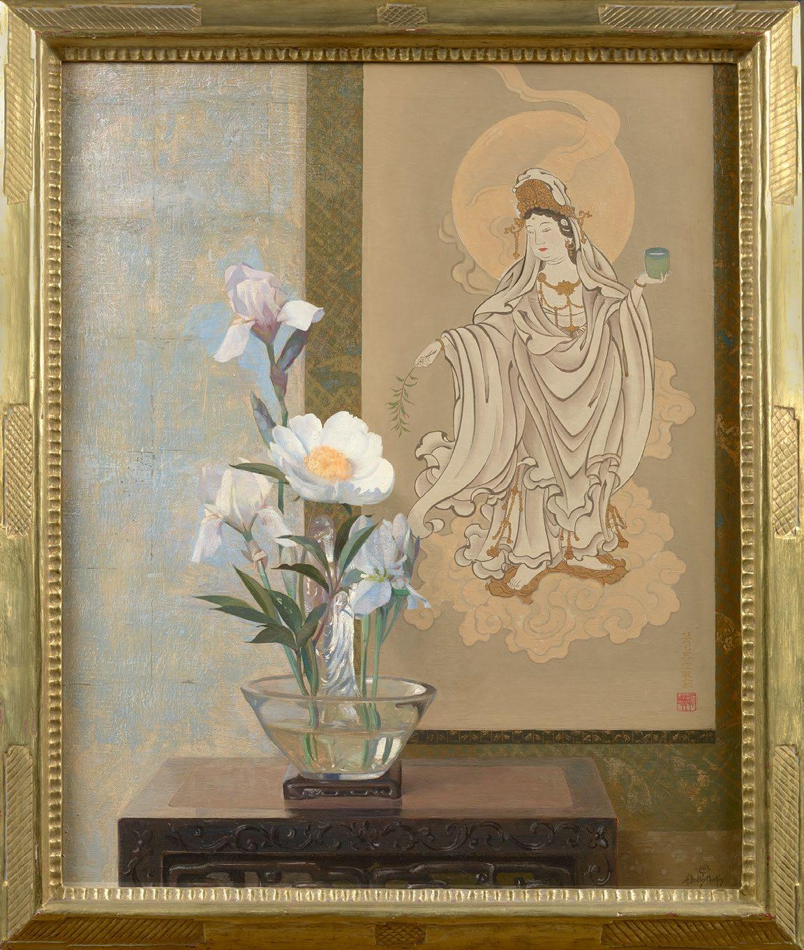
Hermann Dudley Murphy (1867 - 1945)
Peony and Kwannon
Oil on canvas
30 x 24 inches
Framed dimensions:
34.125 x 28.125 inches
Signed; also signed, titled and dated '1931' on the reverse
Hermann Dudley Murphy’s Peony & Kwannon is a thoughtful, mature work that starkly contrasts with the artist’s earlier impressionistic work. Murphy, originally celebrated as one of the Boston Impressionists and the proprietor of a frame shop, took a fascinating turn in his career. He abandoned the loose brushwork of his youth to delve into the realm of traditional floral still-life painting. This transition is evident in this painting, dating to 1931. However, it would be a mistake to describe this elegant work as simple, as not only is its subject beautifully composed, but there is a substantial amount of rich symbolism throughout the work.
The term Kwannon is the Japanese version of the word Guanyin, the figure in Buddhism and Chinese folk religion associated with mercy. This is the figure represented on the textile in the background. Although typically referred to in feminine terms, Guanyin is represented here with her robes open at the front, symbolizing androgyny and conveying that mercy resides in everyone. She carries a vessel of water in one hand and the branch of a willow tree in the other. The water is meant to represent purity, while the Willow branch represents strength and flexibility. The way Murphy has positioned the textile in relation to the flower makes it seem like she is bringing the peony into being with a flick of a wand. The two subjects also represent beauty of two kinds. The white flowers symbolize natural beauty, while Guanyin represents kindness and compassion, embodying inner human beauty.
The meaning behind the painting’s subjects and their placement in relation to one another is too complex for it to have been an accident on Murphy’s part. It demonstrates that the artist included the Japanese textile not just for its exotic appeal, but because he had a greater understanding of what Guanyin is meant to represent. It shows a level of artistic appreciation and cultural sensitivity not often seen among his contemporaries.
4 of 4
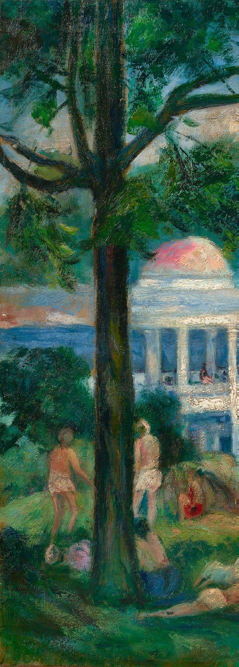
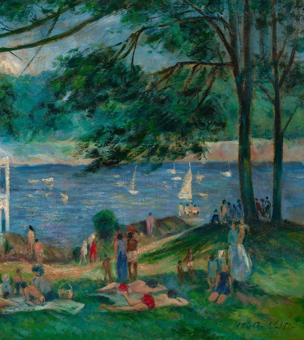
Martha Walter (1875 - 1976)
Summer Afternoon - Tuck's Point
Oil on canvas
24 x 30 inches; Framed dimensions: 31 x 37 inches
Signed; also signed and titled on the reverse
Vose Galleries, Boston, MA
Private collection, OH
Summer Afternoon – Tuck’s Point is a luminous celebration of light, leisure, and the legacy of one of America’s most influential female artists, Martha Walter (1875–1976). This exceptional 24 x 30-inch oil on canvas transports the viewer to the tranquil shores of Tuck’s Point in Manchester-bythe-Sea, Massachusetts. With sunlight filtering through the coastal air and figures gently immersed in the moment, Walter captures a scene that feels both intimate and expansive.
Trained at the Pennsylvania Academy of the Fine Arts under William Merritt Chase and further refined in Paris, Walter developed a distinctive voice in American Impressionism. Her work, especially after returning from Europe post-World War I, offered a fresh perspective during a pivotal time in American art. While many male contemporaries explored grand or urban themes, Walter turned her attention to the quiet beauty of everyday life — beaches, children, women, and the rhythms of domestic and leisure scenes. In doing so, she carved a space for female artists to express their vision with sincerity and emotional depth.
Tuck’s Point, nestled in the artistically rich Cape Ann region, became a favored location for painters returning from Europe. These artists, including Walter, brought modernist ideas with them, blending them with distinctly American themes and landscapes. In this painting, her brushwork is fluid and light, her palette sun-washed and warm. She doesn’t just depict a place, she captures a feeling. The result is a work that resonates with timeless charm and historical significance.
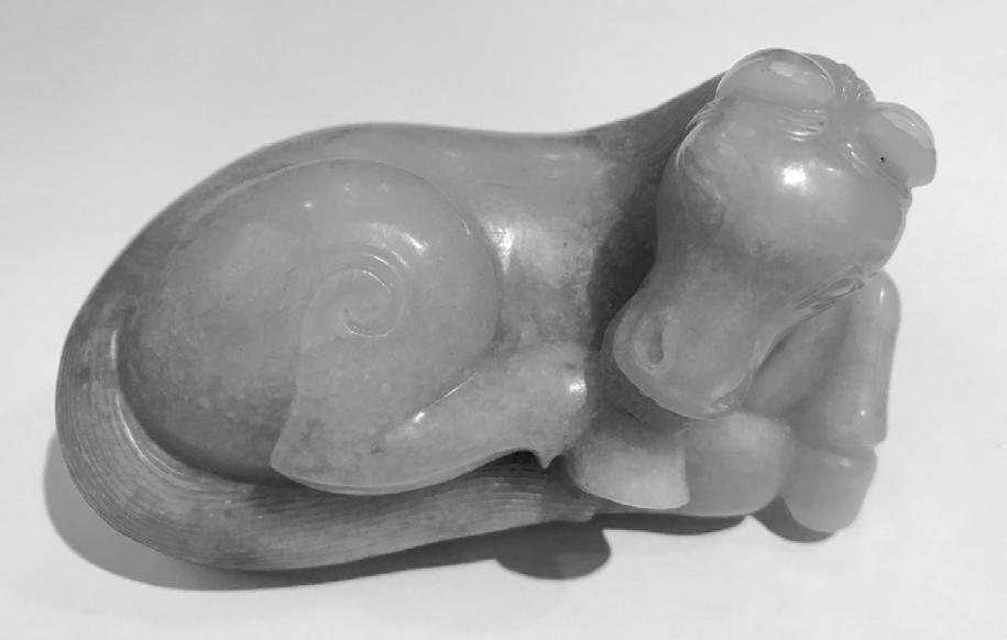
After nearly 5 decades of being in the (Chinese) Art business, I am often asked my favorite period in Chinese culture. I always answer the Ming dynasty (1368 -1644) because it was such a thrilling period of artistic achievement
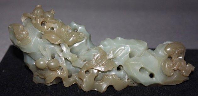
The Ming Dynasty (1368 -1644) spanning over 200 years, was a period of artistic and cultural development. It was the rebirth of Chinese traditions, reflecting the work done during the Han (206 BC -220 AD) and Song (960 -1279 AD) periods, and following the short period of Yuan Dynasty (1279-1368) when jades were three-dimensional (see Fig 1.)
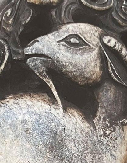
Ming dynasty carvers were celebrated for their work in jade stones. This was an important time of social acceptance for jade artisans as they were granted greater artistic freedom. The Ming dynasty is one of the most intriguing and complicated times in Chinese history. An extremely conservative totalitarian rule which appeared to be changing its traditional, rigid social hierarchy by loosening up to a highly changeable and more contradictory style. The stone (jade) used during this period was varied and marked with strange contrasts. It forced the artist to be more creative, the freedom to use the inclusions and striations in unseen ways (see Fig 2.)
In early Ming one would find the small white jade reticulated plaques, belts and pendants of attractive and brilliant craftsmanship. Jade was more plentiful. The techniques of carving and grinding were cautious and deliberate marking the development of artistic craftsmanship. This was a period
Continue on page 52
www.asianart.com/robynturner
By Appointment
T. (424) 335 - 0105 C. (415) 517 - 0152
4 ½ inches
when artisans primarily served the courtly patrons. Middle Ming period were small jades carved for the rich merchants, landlords and the wealthy so that they could wear the carvings on their person. Jades in tombs of high-ranking officials would indicate power and wealth of the person in his lifetime. Jade carvings were influenced by the Chinese literati thus the beginning of transformation to the period of later Ming jades. Businessmen, landowners and officials all aspired to be associated with the well-educated scholar when jade brush rests and ink stands became very popular (see Fig 3.)
The economic growth of the later Ming period created a new market for jade collecting which increased the demand for artistic refinement and expanded themes. Later Ming jade began (the Wanli period-1572-1620) the period of extravagance when items were inlaid with gold or jewels, showing elaborate treasures used by the emperor and his concubines. Despite the quantity of jade material in Ming, (1368 -1644) not all was of fine quality. It was during this period
Continue on page 53
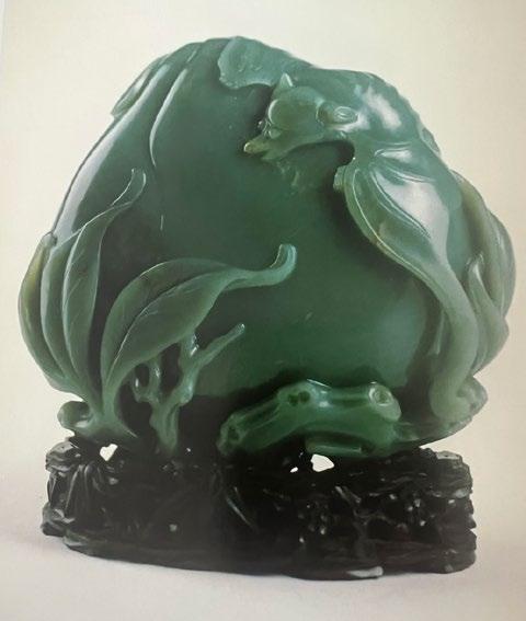
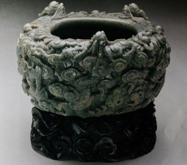
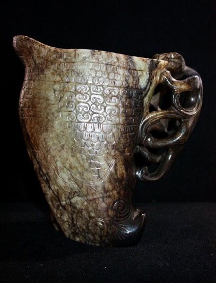
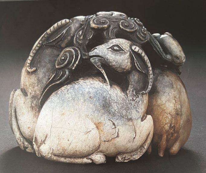
that the ordinary people began to seek peace from designs representing good fortune. Longevity also became a popular motif, and this was a period of rebus design , those of animal, plants and fruits, (see Fig 4.) The motif had to bear meaning and be auspicious. Designs of cups with dragon handles, dragon bowls, water vessels (see Fig 5), mythical beast, devotional images and scholar’s items from Chinese literati paintings were a part of this group. Animals, such as horses (see Fig 6), deer groups, ducks, lions, cranes and mythical beasts were a part of a sculptural and full bodied (robust) group associated to Ming.
Although jade boulders were readily available, it was rarely a pure stone therefore the artist was able to show his creative ability in capturing the soul of the stone while incorporating its impurities resulting in an ambitious artistic form . Large boulders of spinach green jade were also readily available; thus, it was the time of outstanding carvings of mountains, brush pots, wedding bowls, horses, elephants and buffalos. The
on page 54
most ambitious series of large animals in the history of China were most likely found in the pavilions and various palaces in Beijing.
Thus, my opinion, the most undervalued works of art in Chinese jade was during the Ming Dynasty. The Ming dynasty jades laid the foundation for the exquisite workmanship of the Qing dynasty (1644 -1912) artisans.
Words by Robyn Turner
L'ANTIQUAIRE & THE CONNOISSEUR www.lantiquaire.us info@lantiquaire.us
+1-212-517-9176
36 East 73rd Street New York, NY 10021
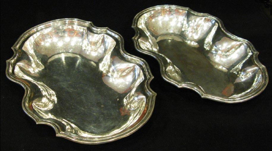
The conquest of what is now called Mexico was a boon for Spain as the riches of the country were shipped in vast quantities during the 17th and 18th century. The influx of precious metals, especially the New World’s silver, was a life saver for the Spanish economy. Queen Isabella had much earlier been most eager to send Columbus on his explorative voyages. Columbus never made it to Mexico, but subsequent voyages did! When the influx of Mexican silver arrived in Spain, some of the objects created were, in some cases, truly astonishing.
A pair of silver serving dishes, which also become a tureen as the two parts that when fit together so precisely are able to keep food hot when placed one over the other. What is truly extraordinary about this object is that aside from its beauty and practicability is its weight. Obviously destined for a very wealthy client, the Crown or a high noble.
The piece weighs an incredible 5 pounds 5 ounces, where silver is usually weighted in ounces this weighs an astonishing 85 ounces. It is hallmarked FBD and Cayenne Pisarello, Madrid 1760.
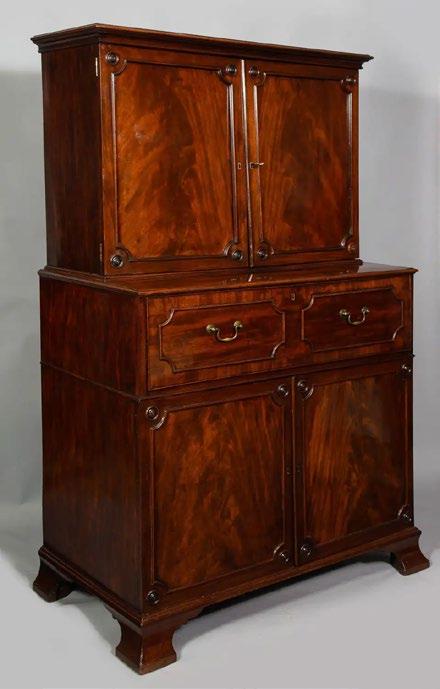
Paxton House Secretaire
Thomas Chippendale, 1770
SOLD back to Paxton House from Clinton Howell Antiques
Shakespeare asked, “What’s in a name? That which we call a rose by any other word would smell as sweet.” That is true, of course, and it is true of lots of things, but not all roses are the same and some don’t smell as sweetly as other roses. They can also be different colors and sizes and bloom at one time of the year or throughout the season. In other words, the name, rose, is representative of something that can be defined more tightly according to numerous specifications. The fine and decorative arts are no different in that not all Picassos are equally good, not all Faberge eggs are equally as interesting, not all Cartier jewelry the same, etc. The difference are in the details of all these things—the name alone may be significant but it also may mean next to nothing.
In my field of English antique furniture, the word “Chippendale” is used as common currency, as if it defines a piece of mahogany furniture quickly and easily in the minds of most people. English antique furniture dealers, however, use the term Chippendale to refer to something that either came from his workshop or that is obviously inspired by his collection of designs in “The Gentleman and Cabinetmaker’s Director”. The difference between what a dealer is talking about and what the general public are referring to comes down, most of the time, to details. What’s in a detail, you may ask and it is a legitimate question as, at times, you may not even be able to see the detail as it might be hidden under gesso, clay and gold or even sitting in plain sight—you just need to notice it.
A number of years ago, a dealer and I bought a secretaire that was also a linen press that we both, when we saw it, believed was by Chippendale’s workshop. What was it about the piece
that caused us to believe this? For me, it was the outward splay bracket feet and the very good timber of the four panel doors. Chippendale was always careful about the feet to his pieces— they were always well thought out and never what I would call, perfunctory. The splay on these feet suggested Chippendale to me right away. The mahogany on the front of the doors was also typical of Chippendale. The sides could be passable mahogany as long as the front looked spectacular. As it happens, we found on researching the piece, that it was made for Paxton House on the Scottish borders by Chippendale’s workshop. Other details emerged, one of which was extraordinarily interesting—the top cabinet is separate and lifts off the base. When we did this, we noticed that the bottom edge of the cabinet was bevelled and it nestled into a bevelled area on the linen press. This was done to prevent damage to the molded edge that the cabinet section fit into. It is very clever cabinetwork. Further, there were holes in the back of the linen storage shelves which worked like drawers without fronts and yet they fit quite snugly. In order to prevent loaded shelves from being impeded by an air lock when pushing the drawer back into the cabinet, holes were drilled to allow any trapped air to escape through the back. These were both tiny but very sophisticated details, invisible unless they were searched out.
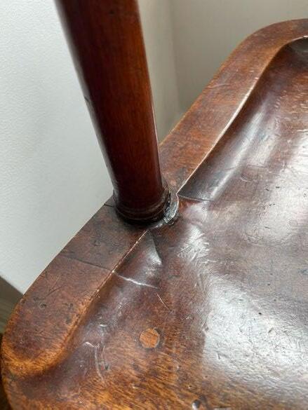
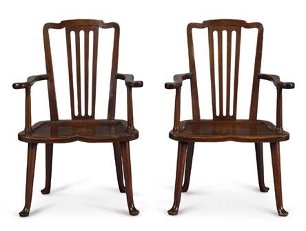
Self expression is not what you think of when you think of cabinetmaking, but that is what many details are. They are a statement by the maker about his or her ability to create a solution that others might not be able to make nor even think to create. A great example of the distinctive woodwork can be seen in how the chair maker accommodated the pillar of this armchair belonging to Michael Pashby Antiques. The diameter of the pillar was, I presume, purposely made too wide to sit on the edge of the scalloped out seat, requiring the maker to do
the rather tricky woodworking job of beveling around the column while carving out the seat. It looks easy, but I can assure you that it isn’t. It is a delightful detail, the kind of thing that you can look at again and again and get pleasure from because you know that the maker was being thoughtful as well as very skillful.
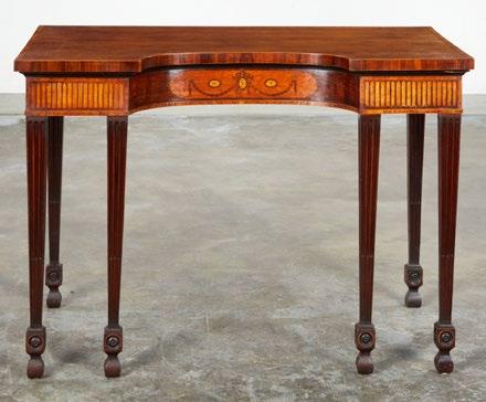
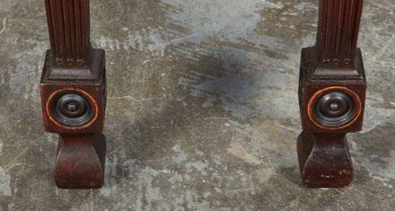
Design balance is not so much in vogue these days as a lot of contemporary furniture is about singular shapes. The shapes are designed to set a tone to the room, I suppose, but as an antique dealer, I like to see a more tangible balance—symmetry is not required although it is much easier to achieve a balanced design while using symmetry as the backdrop—it is one reason why I like 18th century furniture so much. The serving table that I am showing here is attributed to Mayhew and Ince, rival cabinetmakers to Thomas Chippendale whose work was on a par to his and to whom Robert Adam, the neoclassical architect, often turned. The four front legs on a rather small table, it’s just under four feet wide, could have looked too thick or too spindly, but they balance the front beautifully. The oval cutout of the top with marquetry in the frieze and the faux fluting in the two flat areas is just brilliant. But what is really brilliant is the use of the boxwood rings around the rosettes in the ankle blocking on the legs. Balance in both the east/west and the north/south directions. It is a great detail.
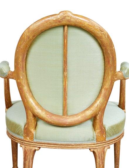
Most first class furniture has significant details. As I said earlier, these details may be hidden. The last item I want to show is a pair of gilded open armchairs. In my opinion, they are among the finest I have seen in a very long time. They aren’t grand, they’re fine and beautiful. The details of the carving and the proportion are what tell me that they are fine, but for example, the rail around the seat runs laterally, not vertically. It is a singular and interesting touch that I have rarely seen, but I am focusing on something that cannot be seen by the naked eye. I, of course, saw this detail prior to restoration, and it was the mahogany blocks in the oval of the back supporting the crest rail. This is a signature Chippendale workshop move. And, as the provenance works out to a set most likely made by Chippendale the Younger in circa 1780, it fits the chairs to a tee.
Continue on page 59
We all have our favorite roses and our reasons for liking them may be subtle and take a little time to reveal themselves. I remember a climbing rose that bloomed for most of the summer on our pergola that was quite wonderful, but it upped and died after about fifteen years—I don’t think it was a long lived rose. The furniture that one lives with should be more than just something you live with—it should hold a measure of delight and pleasure for you as well. I don’t and never have condemned any one style, but I will say that 18th century English furniture encouraged the craftsmen of the era to demonstrate their skill, to make something not just good to look at, but which worked well and held delight for the person who owned it and got to know it. Secret drawers, unusual carving, great timbers, singular veneer work, interesting brasses are all just details, but they can add up to long lived rose that you never get tired of—they may all be roses, but they are, after all, different.
Words by Clinton Howell
AADLA MEMBERS: L'ANTIQUAIRE & THE CONNOISSEUR, INC. • KELLY KINZLE ANTIQUES • KAPOOR GALLERIES
• EUROPEAN DECORATIVE ARTS COMPANY • CLINTON
HOWELL ANTIQUES • A LA VIEILLE RUSSIE • A.J. KOLLAR FINE PAINTINGS, LLC • ANDERSON GALLERIES •
ANTIQUARIUM • BETTY KRULIK FINE ART LTD. • BRAD & VANDY REH • CAMILLA DIETZ BERGERON • CARLTON HOBBS
LLC • CHARLES CHERIFF GALLERIES • CHRISTOPHER
BISHIP FINE ART • DALVA BROTHERS, INC. • RICHARD A. BERMAN FINE ART • DAPHNE ALAZRAKI FINE ART • DAVID NELIGAN ANTIQUES • DOUGLAS STOCK GALLERY
• EARLE D. VANDEKAR OF KNIGHTSBRIDGE, INC. • ENGSDIMITRI WORKS OF ART • FIND WEATHERLY • FRAMONT
• G. SERGEANT ANTIQUES, LLC • GALERIE RIENZO, LTD. •
GEORGE GLAZER • GODEL & CO. FINE ART • HIXENBAUGH
ANCIENT ART LTD. • HYDE PARK ANTIQUES, LTD • ILIAD
• J.N. BARTFIELD GALLERIES • JAMES ROBINSON, INC. • JAYNE THOMPSON ANTIQUES • JULIUS LOWY FRAME & RESTORING CO. • YEW TREE HOUSE ANTIQUES • MAISON
GERARD • MARCY BURNS AMERICAN INDIAN ART • MARY HELEN MCCOY FINE ANTIQUES • MEDUSA ANCIENT ART, LTD. • MICHAEL PASHBY ANTIQUES • O'SULLIVAN ANTIQUES • PAUL M. HERTZMANN, INC. • PHILIP COLLECK, LTD. • PHOENIX ANCIENT ART • PREHISPANICO • R. KALLERKIMCHE INC. • REHS GALLERIES, INC • ROBERT MORRISSEY ANTIQUES • ROBERT SIMON FINE ART • ROBYN TURNER GALLERY • SCHILLAY FINE ART, INC • SPENCER MARKS, LTD. • STEPHEN RUSSELL • THE ROMAN GORONOK COMPANY • THOMAS K. LIBBY • LILLIAN NASSAU •
AADLA invites you to support Himalayan Art Resources: A comprehensive education and research database and virtual museum of Himalayan art. Discover a wealth of knowledge at HimalayanArt.org The Art and Antique Dealers League of America, Inc. is the oldest and principal antiques and fine arts organization in America. Learn more at AADLA.com
Interested in working with the AADLA? Reach out to us via email: info@aadla.com or marketing@aadla.com Publication Design: Shruti