ONE TEAM. ONE VOICE.
Every member of Just For Kix plays an important role in maintaining brand integrity by applying it consistently throughout all communications, including in print, web, display, and social media. The Brand Voice is a filter that should be applied to every piece of communication to help with consistency throughout the Brand.
OUR LOGO IS OUR IDENTITY.

JUST LIKE ;)
Our Just For Kix logo is one of the key component to identify us to the world. It a graphic representation of our company and our core values. It’s important to use our logo in a way that clearly represents our brand with distinction.
Always make sure there’s enough space around the logo.
MAKE SURE IT’S LEGIBLE.
The Just For Kix Logo may appear against any background or a photograph as long as it always appears clearly and legibly. Please use your best judgment to determine whether the white or black logo renders the highest contrast. Always ensure legibility by placing the logo in an area that is simple and uncluttered.
COLORS
Black logo
White logo
All approved Just For Kix logos are to be used in Black or White. To ensure the integrity of the logo, the colors should never be altered, manipulated or filled with textures or patterns.
PROFILE IMAGE ON SOCIAL MEDIA
We’ve decided to go with white logo against black or pink background to keep it consisitent through out all programs.
For example
BRAND COLORS
JFK PINK
In most cases, keep the Just For Kix pink as the primary colors.
We expanded the color palette to tailor to social media needs. You can use these colors but keep your design bright, fresh, and fun!
DO’S
We recommend to incorporate pink in your ads/post to reflect our brand color.
If you want to use dropshadows, go as light as you can. It will keep your ads looking fresh.
DON’TS
1. Make sure it’s easy to read. Avoid using colors that are too close.
2. Colors like this could make it look like our brand’s primary color is purple. Try adding pink and other colors.
3. Sometimes black text over colored background makes it look heavy and dated. Try changing the text to white.
4. Careful with drop shadows. It could make your ad look dull.
FONTS
MAIN FONTS
Must use
OPEN SANS
EXTRABOLD
We pride ourselves in not only teaching dance techniques but also building character development along the way.
ROBOTO
We pride ourselves in not only teaching dance techniques but also building character development along the way.
HELVETICA
We pride ourselves in not only teaching dance techniques but also building character development along the way.
All the fonts are available on Canva. *Also available in Google fonts.
FUN FONTS
Pick one in each ad/post (OK, no more than 2)
Fredoka One
Moontime Sacramento
Nickainley
Brusher
COMFROTAA
DON’T USE:
TIMES
There are tons of wonderful fonts that just don’t go with our brand image. Avoid them.
IDEAS FOR YOUR POSTS

If
With the fonts and color palette, you can create a lot of fun graphics!


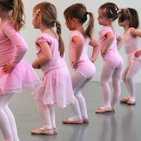
Showcase your program with THE BEST photos to post. Make sure they are appropriate, and show good skills.
Use simple graphics to create posts for your seasonal greetings.
Make your announcements stand out with bold fonts.
2023 UPDATES
As our graphics continue to improve each year, be minful and open minded to trends and fun ideas your clientle will enjoy! Examples may include...
• “Mic’d Up” Series
• “Little Miss” Trend
• TikTok trends - in general! Hop on these as quickly as you can.
• “I’m Attending _” Template
• “I’m Competing” Template
• “I’m Registered” Template
These are simply starting points and somewhat relevant trends! Use your best judgement to determine if a trend would be brand appropriate.
Keep in mind our font list are SUGGESTIONS. The simpler, the easier to understand! Recently, retro fun fonts have been trendy. Use fonts like those sparingly but have fun once in awhile!
Refer to the “Canva HOW TO” video available to you on Vimeo for a further explanation of creating your own graphics in Canva.
SCAN HERE

Feel free to reach out to Maya maya@justforkix. com with any questions. for new social media templates!
These new social media templates are ready to be posted for you... no work is necessary!
If you are wanting to customize, simply download the PNG from the Google Drive folder and drag into Canva to add text.

