MAPPING
CULTURAL FLOWS LANG // SCAPE
A community is a bounded territory of sorts (whether physical or ideological), but it can also refer to a sense of common character, identity, or interests as with the “gay community” or “virtual community”. Thus, the term “community” encompasses both material and symbolic dimensions.
-Steven G. Jones VirtualCulture
PROPOSE NEW METHODS FOR ANALYZING AND VISUALIZING THE LANDSCAPE OF COMMUNITY/IDENTITY
AIMS
IDENTITY GENERATIVE COMMUNITY VISUALIZE
The lived experience of our communities is usually felt through culture not demographics. How can identity be quantified? What are the best ways to reinterpret a communal sense of identity for the conventions of mapping?
Create a method for collecting data as it is generated rather than through surveys. Embrace the complexity of data/expression without the need for categorization.
This project aims seeks to create new methods for constructing images of our communities. How do we represent commonality and distinction in the richness of our neighborhoods?
Create a tool for visually representing complex data sets representing the presence and embodiment of a community within a place. The visualization will find inventive ways to display this information that adds, through representational method, new layers of meaning and expression to the data.
RELEVANCE RELEVANCE RELEVANCE RELEVANCE RELEVANCE
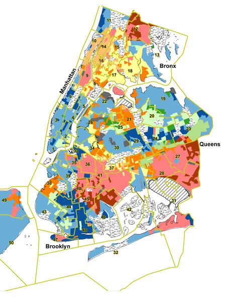
THE U.S. CENSUS
The Census is a survey which collects data, particularly demographic, from U.S. residents. Data from the Census is anonymous and collated into larger datasets to show trends at various scales. The units for the survey, the Census Block, creates arbitrary boundaries between areas and when visualized creates maps that are similarly bounded. Additionally, the very survey questions are bounded by predetermined options for respondents. This becomes a problem when taking surveys of race which force people to choose from predetermined categories, constructing political distinctions that are then used as proxy for other measures of community similarity.
(“Communities of Interest” in New York City)
QUANTIFYING CULTURE
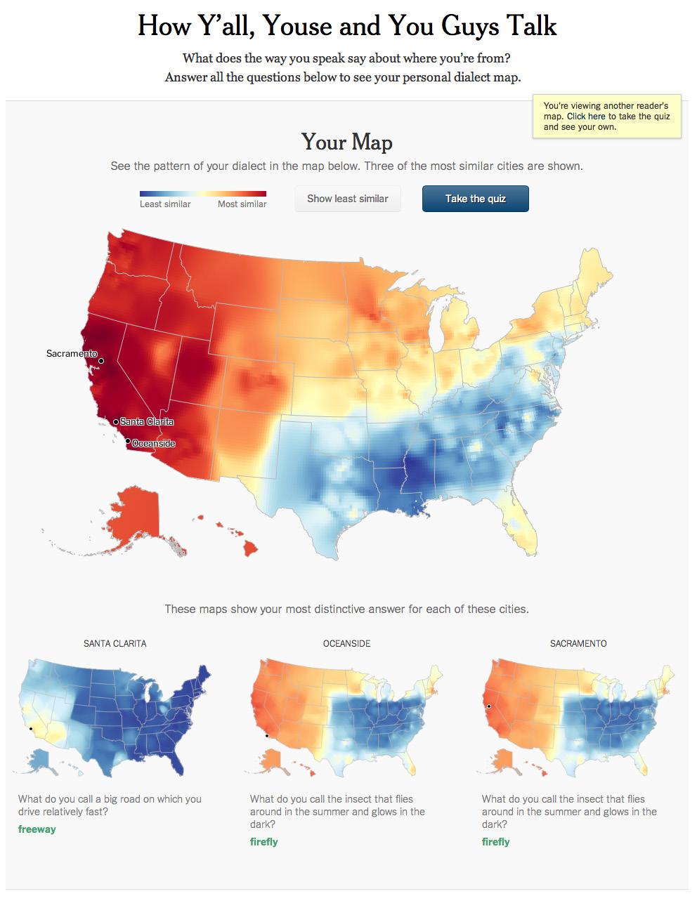
DIALECT MAP
This quiz by the New York Times asks users to answer questions about their language use in order to predict their linguistic location. The questions are based on those in the Harvard Dialect Survey which was started by Bert Vaux and Scott Goldner. Once the survey has bee submitted, the tool calculates the likely origin of the user and displays the prediction using maps of the U.S. The most consequential answers are given focus with their own maps, showing areas of concentrated use.
COLLECT TEXTUAL DATA (TWEETS) FROM USERS WITHIN A GEOGRAPHIC AREA THAT CAN BE ANALYZED ACCORDING TO SPEECH PATTERNS. CREATE A GENERATIVE VISUALIZATION POINTING TOWARD COMMUNITIES OF SHARED CULTURE.
INNOVATION
PATTERNS OF SIMILARITY LANGUAGE
Databases like the Census and their resulting visualizations use demographic data as a proxy for more ambiguous landscapes of identity, inequality, and communal networks, which can be problematic. I propose using language data as a way to create a more nuanced visualization of community.
COLLECTION
Most methods of data collection rely on the creation of standardized questions which are answered by individuals. Many questions allow participants to choose only from a set of pre-defined options. This project utilizes data from expression which is not bounded in the same way by external constraints of identity.
GENERATIVE FORM
Rather than keeping a tally of various categories, this project will collect textual data and analyze it according to similarity of speech. Thiw will allow more nuanced and rich readings of interactions between areas of the communitiy, suggesting particular networks.
The form generated from the collected data will visually reflect the nonbounded datasets. Form will coallesce from a field of similarity factors. The map, like language, will be emotional, beautiful, and complex.
STATE OF ART STATE OF ART STATE OF ART STATE OF ART STATE OF ART
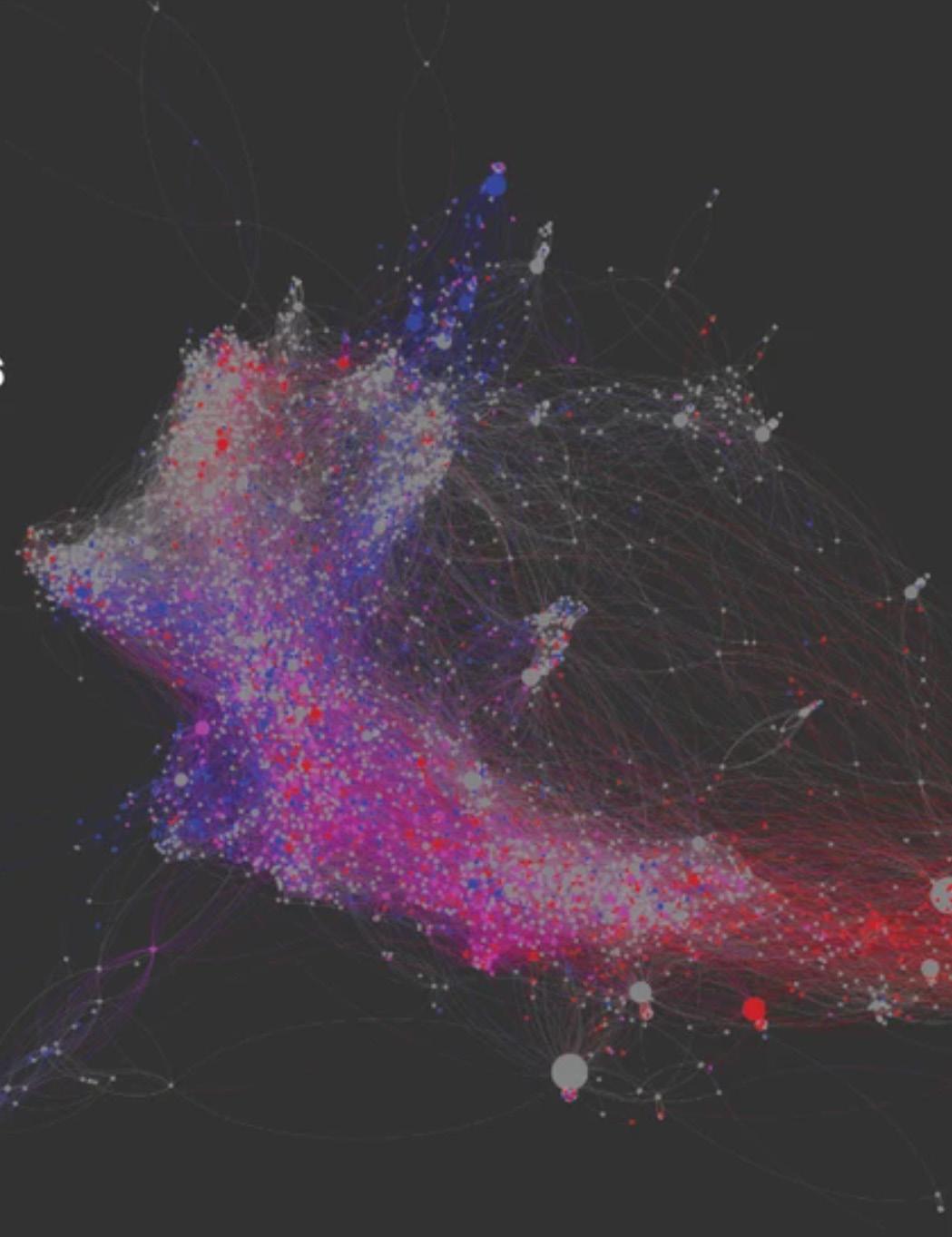
THE ELECTOME
This project collected social media data to model the distance between networks of American poltiical supporters. The complexity of the data was represented beautifully here, showcasing the different patterns of isolation found on each side of the political spectrum. This saeme tool was also used in further research into how these silos impact the prevalence of certain political topics on social media such as gun rights, queer rights, etc.
(Journalists and Trump Voters Live in Separate Online Bubbles, MIT Analysis Shows)
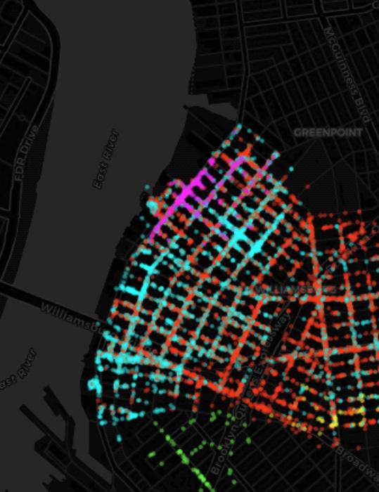
FIVE COMMUNITIES
The goal of this project was to show that there are diverse communities in Wililamsburg through taxi pick-up and drop-off data; further, they intended to show that communities do not have a “boundary” per se, but flow and overlap on top of one another.
MELTING MEMORIES
REFIK ANADOL

Utilizing cutting-edge neuroscience technology, this project explores the materiality of remembering. By showcasing several interdisciplinary projects that translate the elusive process of memory retrieval into data collections, the exhibition immersed visitors in Anadol’s creative vision of “recollection.”
The technological achievements as well as the theoretical framework for translating subjectmatter which has resisted quantification- memory in Anadol’s case- provide a roadmap for my central question of data collection and representation.

METHODOLOGY METHODOLOGY METHODOLOGY METHODOLOGY METHODOLOGY
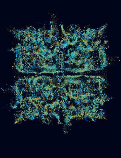
LANG // SCAPE
DEFINE METRICS DATA COLECTION
FIND USERS
TRANSLATE DATA
METHODOLOGY
VISUALIZE
LOCATION
USER
SCRAPE TWITTER DIVIDE INTO WORDS ASSIGN DATA TO PHYSICAL SPACE MODEL CURRENTS OF SIMILARITY
DISTRIBUTE WORDS BY SIMILARITY
SORT USERS ACCORDING TO LANGUAGE
The text from a single tweet. word totally sure indeed bet
user
SPECIFY DATES TO SCRAPE
QUERY BY GEOCODE
FILTER TWEETS WITHOUT GEO-LOCATION
METHODOLOGY // TRANSLATE

TWINT
PLOT POINTS BY SIMILARITY
CALCULATE MCA SIMILARITY
PLOT WORDS AND USERS ON GRAPH
EXTRACT SIMILARITY VALUES
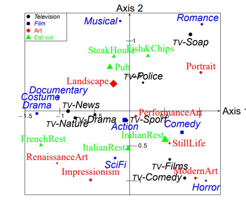
MULTIPLE CORRESPONDENCE ANALYSIS
A data analysis technique which represents data as points in a low-dimensional Euclidean space. The best-known application of MCA in the social sciences was in the writings of Pierre Bourdieu. He used MCA to visualize his interpretation of the social as spatial and relational.
(Multiple Correspondence Analysis)
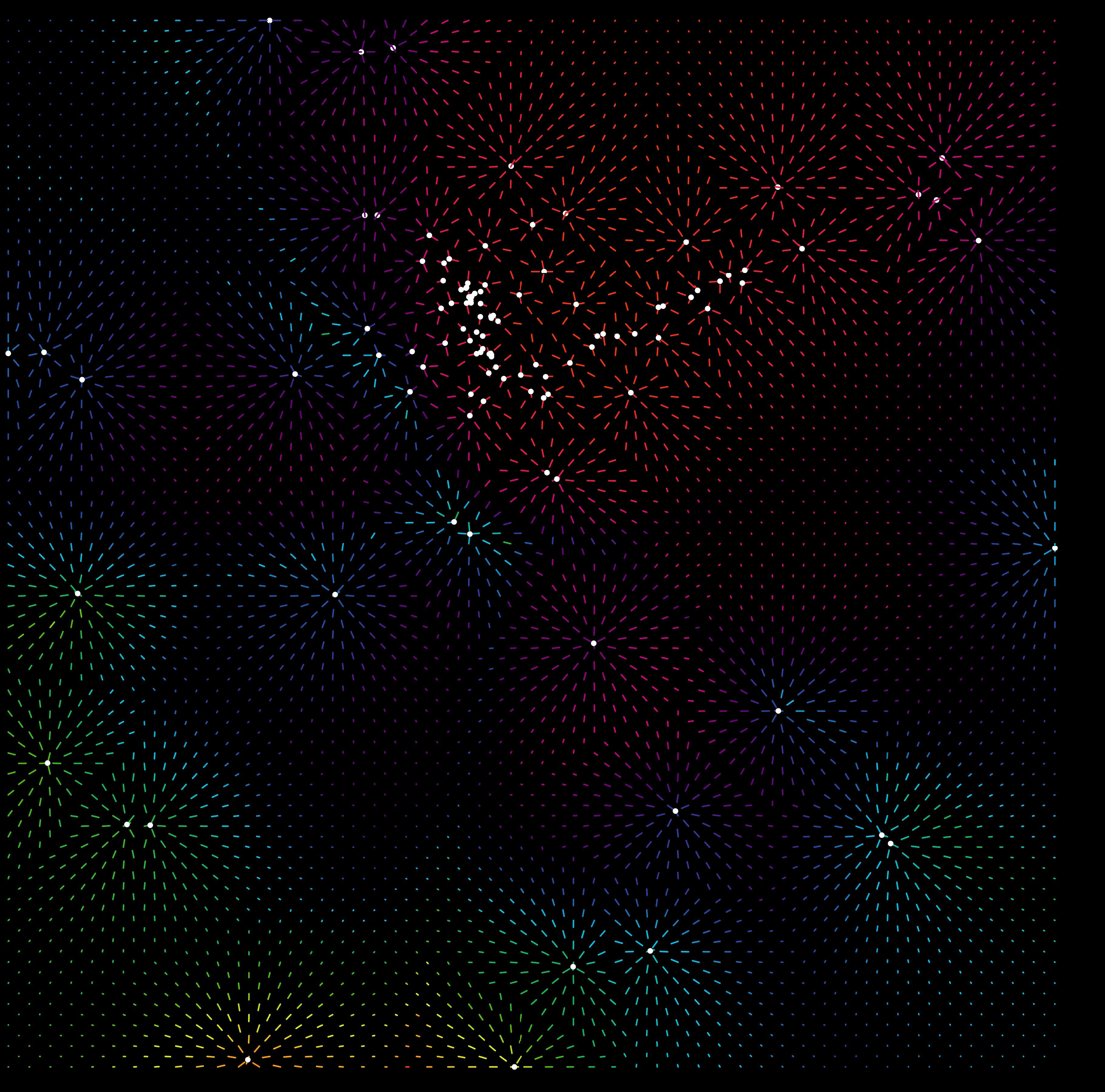
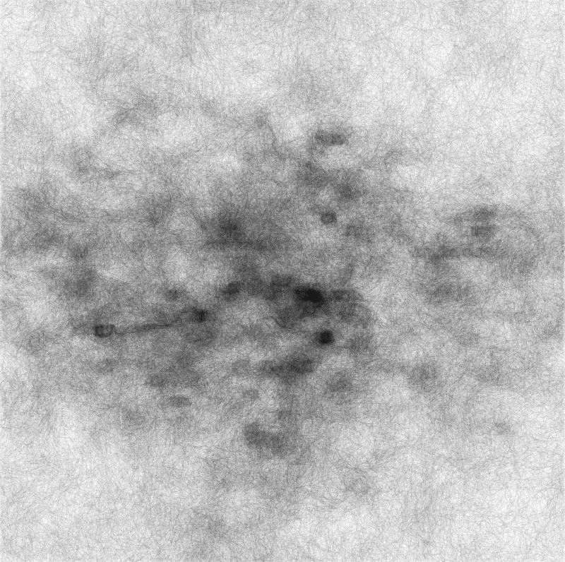
ATTRACTOR FIELD

MAP PIXELS AND TWEETS
FIND PULL DISTANCE
CALCULATE WEIGHTED AVERAGE MCA VALUES
INHERIT NEAREST TWEET VALUES
DEVELOPMENTS
INHERIT WEIGHTED AVERAGE OF FIELD OF TWEETS
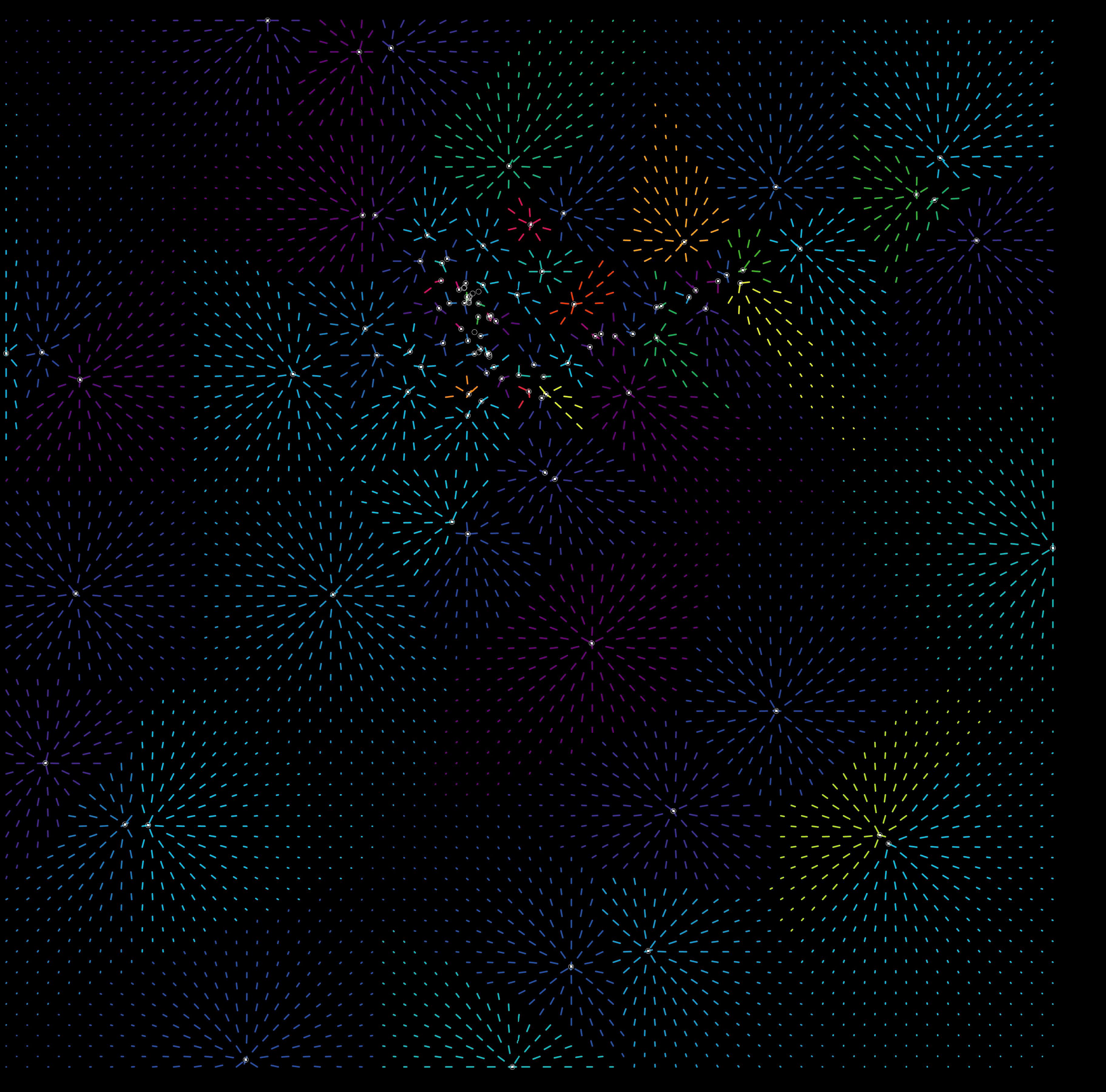
GENERATING BEHAVIOR
IMPORT POINT AND SIMILARITY FIELD
CALCULATE VECTORS
DRAW POINTS OVER TIME
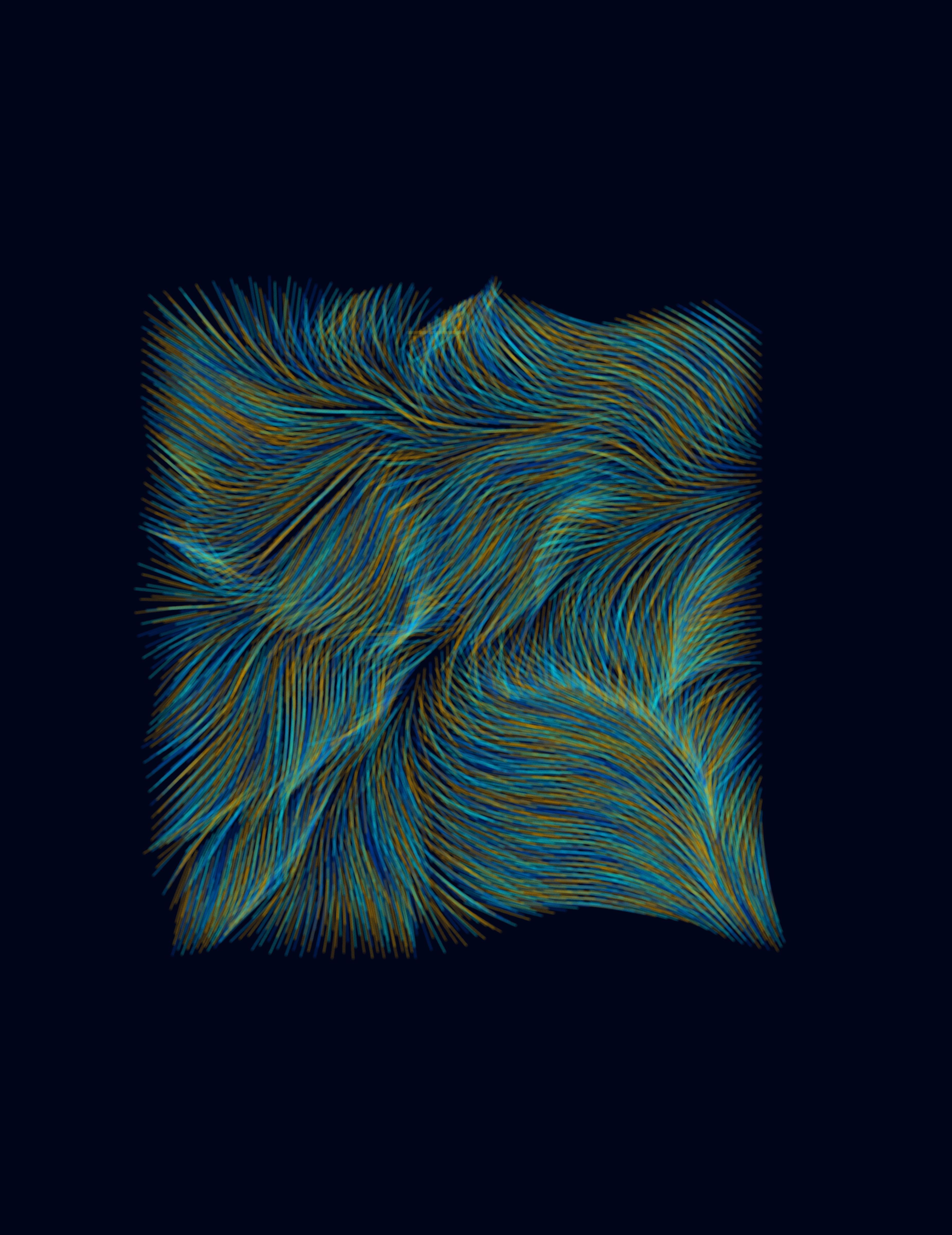
METHODOLOGY // VISUALIZE

VECTOR FIELDS
Resources for coding generative vector fields using mathematical equations such as Perlin Noise. This example code provided a foundation for integrating time and noisy color variables.
(“Drawing Vector Field”)
PRODUCT PRODUCT PRODUCT PRODUCT PRODUCT
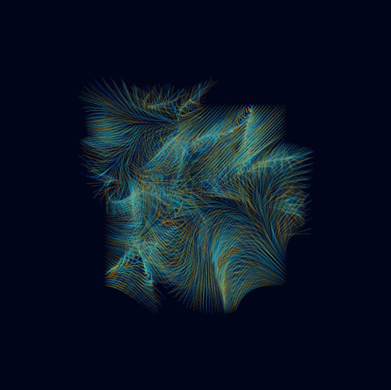
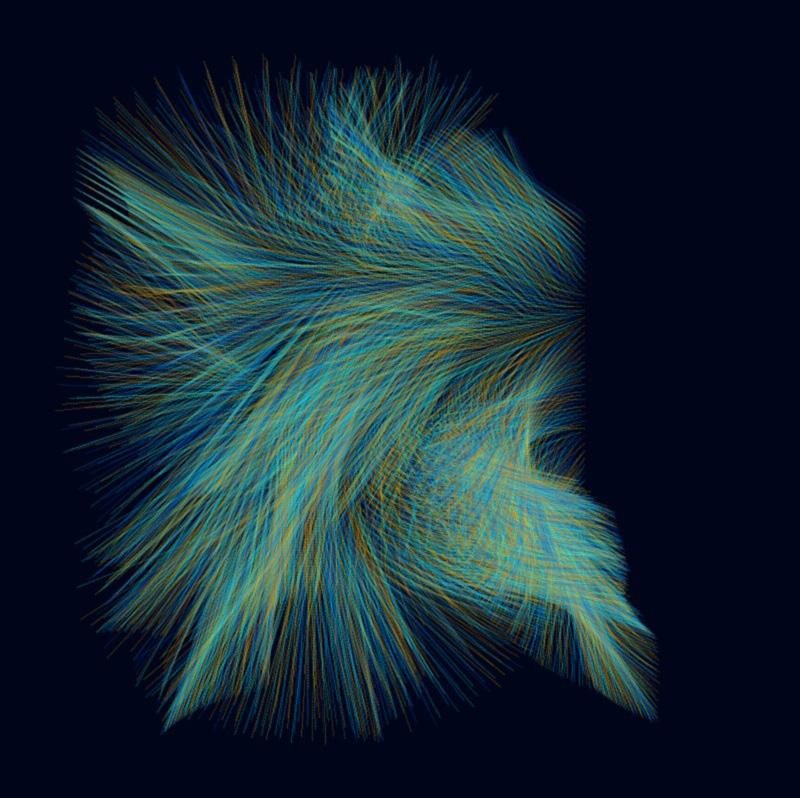
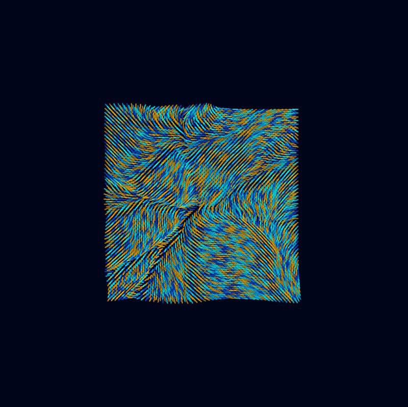
GENERATED VECTOR FIELD EXPLORATIONS


float nx = 5 * map(((TWO_PI * v_vec.get(i).x)/5),0,1,-1,1);

float ny = 5 * map(((TWO_PI * v_vec.get(i).y)/5),0,1,-1,1);
PVector v = v_vec.get(i);
float n = 50 * map(noise(v_vec.get(i).x, v_vec.get(i).y)/5),0,1,-1,1);


PVector v = new PVector(n,n);

PVector v = v_vec.get(i);
vector scale = 0.003
float nx = TWO_PI * v_vec.get(i).x;


float ny = TWO_PI * v_vec.get(i).y;
PVector v = new PVector(cos(n),sin(n);
TIME ELAPSED 15 SEC
TIME ELAPSED 60 SEC

REFERENCES
1. Adkisson, Richard. “Quantifying Culture: Problems and Promises.” Journal of Economic Issues, vol. 48, Mar. 2014, pp. 89–108. ResearchGate, doi:10.2753/JEI0021-3624480104.
2. Anadol, Refik. “Melting Memories.” Refik Anadol, https:// refikanadol.com/works/melting-memories/. Accessed 14 Feb. 2021.
3. Behance. “Multiple Realities.” Behance, https://www.behance. net/gallery/72058875/Multiple-Realities. Accessed 14 Feb. 2021.
4. Bezemer, Jeff, and Carey Jewitt. Social Semiotics. 2009. ResearchGate, doi:10.1075/hop.13.soc5.
5. CARTO. Using Location Data to Identify Communities in Williamsburg, NY. https://carto.com/blog/using-location-dataidentify-communities-williamsburg-ny/. Accessed 14 Feb. 2021.
6. CodingEntrepreneurs. 30 Days of Python - Day 21 - Twitter API with Tweepy - Python TUTORIAL. 2020. YouTube, https://www.youtube.com/watch?v=dvAurfBB6Jk&ab_ channel=CodingEntrepreneurs.
7. “Communities of Interest” in New York City. https://www. gc.cuny.edu/Page-Elements/Academics-Research-CentersInitiatives/Centers-and-Institutes/Center-for-Urban-Research/ CUR-research-initiatives/Communities-of-Interest-in-New-YorkCity. Accessed 10 May 2021.
8. “Drawing Vector Field.” GenerateMe, 24 Apr. 2016, https:// generateme.wordpress.com/2016/04/24/drawing-vectorfield/.
9. “Engelbart.” UVA Undergrad Thesis 2020, https:// uvaarch4020spring2020.squarespace.com/ advancedtechnologies/engelbart. Accessed 14 Feb. 2021.
10. Halpern, Orit. Beautiful Data. Duke University Press, 2014.
11. Journalists and Trump Voters Live in Separate Online Bubbles, MIT Analysis Shows. https://www.vice.com/en/article/ d3xamx/journalists-and-trump-voters-live-in-separate-onlinebubbles-mit-analysis-shows. Accessed 10 May 2021.
12. Katz, Josh, and Wilson Andrews. “How Y’all, Youse and You Guys Talk.” The New York Times, 21 Dec. 2013. NYTimes.com,
https://www.nytimes.com/interactive/2014/upshot/dialectquiz-map.html, https://www.nytimes.com/interactive/2014/ upshot/dialect-quiz-map.html.
13. Multiple Correspondence Analysis. SAGE Publications, Inc., 2021, doi:10.4135/9781412993906.
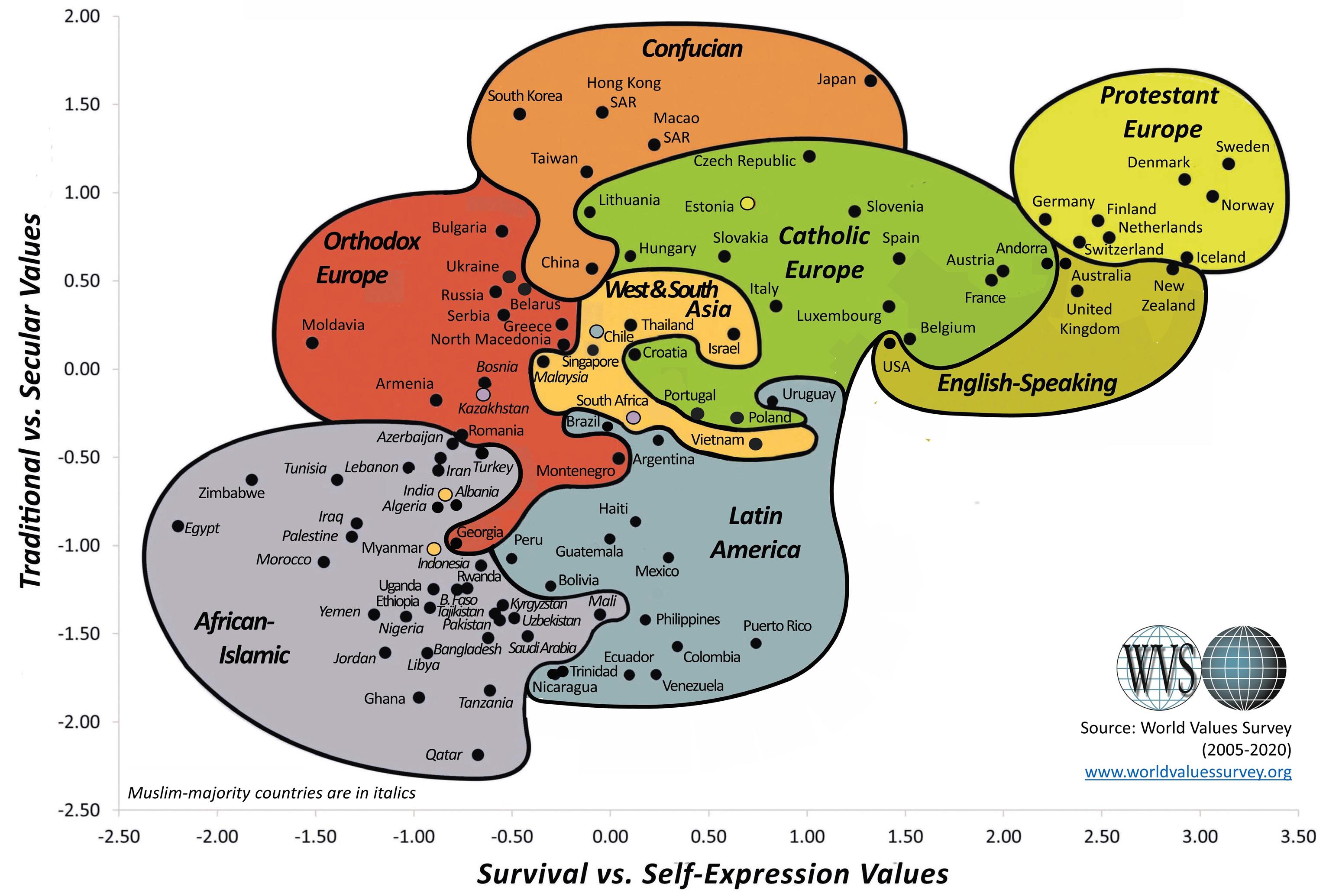
14. WVS Database. https://www.worldvaluessurvey.org/ WVSNewsShowMore.jsp?evYEAR=2020&evMONTH=-1. Accessed 10 May 2021.
ACKNOWLEDGEMENTS
THANK YOU TO:
EHSAN BAHARLOU
DEVIN DOBROWOLSKI
JONAH WERMTER