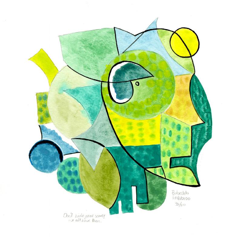
MAKING: 16 PROJECTS
100 DAYS


Sanda Iliescu’s practice spans the media of painting, drawing, and collage. Outside the studio, she makes murals and public art installations, some with students at the University of Virginia, where she is Associate Professor of Art and Architecture. Born in Romania, Iliescu received her BSE in Civil Engineering and M.Arch in Architecture, both from Princeton University. Her professional awards include The Rome Prize, a McDowell fellowship in painting, and The Distinguished Artist Award of the New Jersey State Council of the Arts. In 2009, the University of Virginia Press published Iliescu’s book The Hand and the Soul: Aesthetics and Ethics in Architecture and Art. Tentatively titled Looking Closely: Essays on the Experience of Art and Architecture, her current book manuscript will be published by Rutledge Academic Press in 2021.
Her recent art exhibits include:
Arrivals
August - September, 2019
Solo show, Les Yeux du Monde Gallery, Charlottesville, VA
Picasso, Lydia, and Friends, vol. IV
March - April, 2019
Group show, Les Yeux du Monde Gallery, Charlottesville, VA
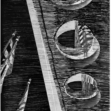
The American Flag: A Study in Grey April - May, 2018
The Elmaleh Gallery, The University of Virginia
Art on Paper March 2017
Gallery Molly Krom, Pier 36 International Art Exhibit, New York City
Sanda Iliescu’s artwork is represented by:
Gallery Molly Krom: http://www.gallerykrom.com/ Les Yeux du Monde Gallery: https://www.lydm.co/sanda-iliescu/
Six American Artists October 2016 Group show, Salon Zurcher, Paris, France
Inspired by an NYU course taught by Professor Katherine Dillon, Making:16 Projects, 100 Days grew out of the belief that artists and designers learn most when they are engaged in the daily practice of their craft. Instead of adopting the traditional class model that is centered on a final project or event (final review or paper), the work of this class revolved around the daily production and practice of each student. Each student identified a project they committed to exploring over the course of 100 days. Each student made a variation on that project and posted it every day on Instagram. Students focused on a wide variety of daily practices. For example, one student made precise technical drawings of architectural details; one other student sketched the design of imaginary pavilions; one other made a series of abstract paintings; another created a series of portraits of important people in her life; and another designed and constructed physical and digital models of sound-making “creatures.” To accompany their project, each student wrote a project text and gave brief presentations of her/his project in progress scheduled during class time. Each week, students and the professor discussed the role of discipline and routine in the creative process and examined the development of work made over the past 7 days.
GABRIEL I. CASTRO-ANDRADE
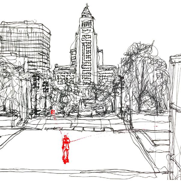
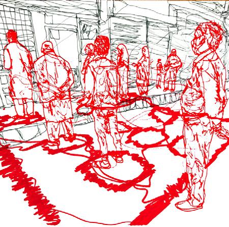
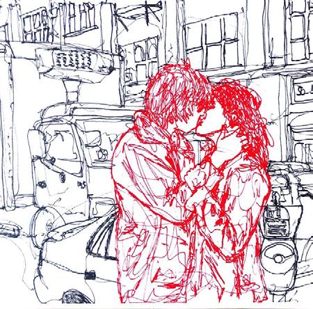
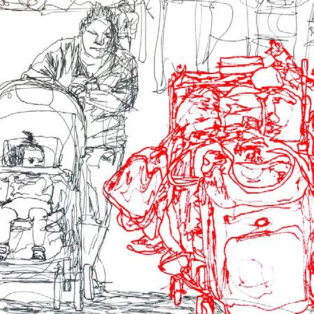
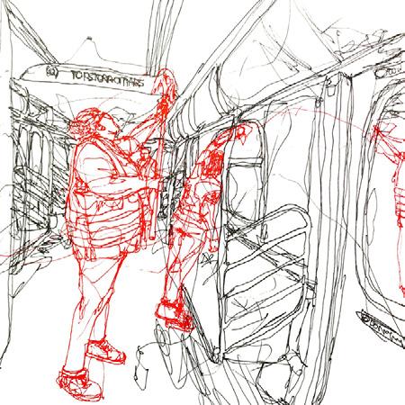
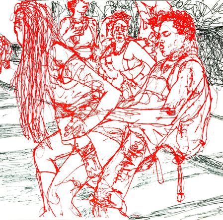
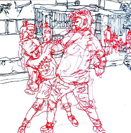
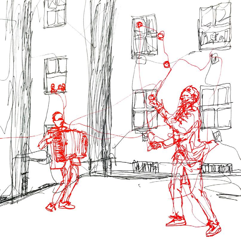
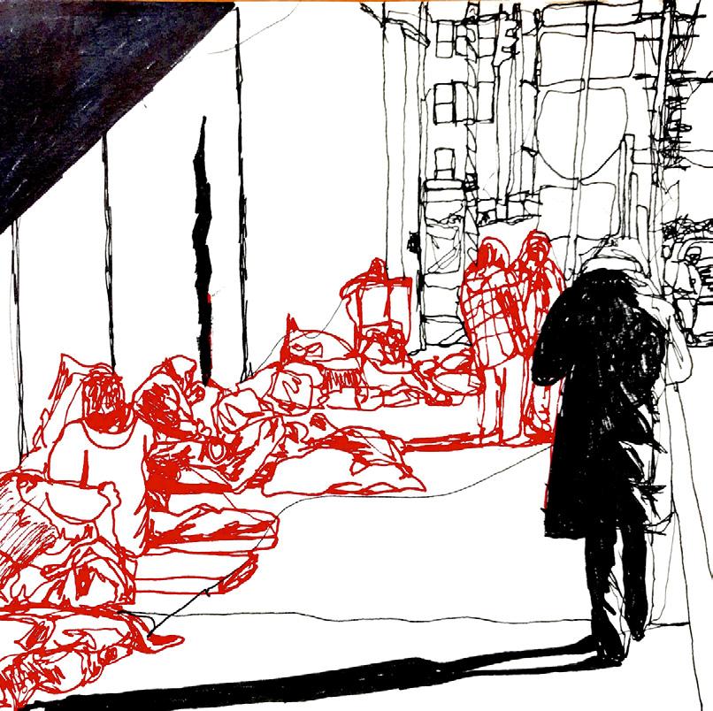
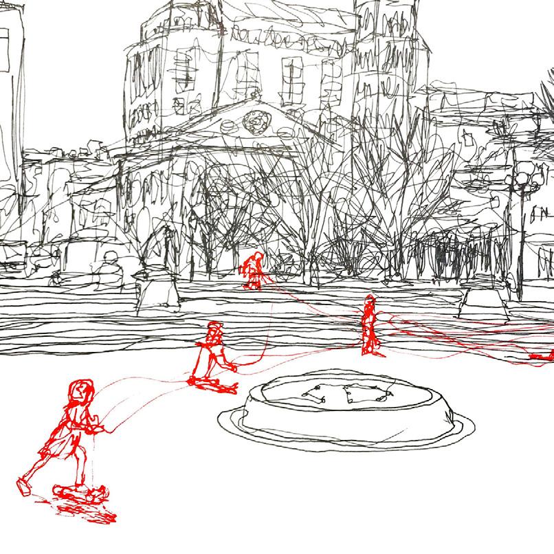
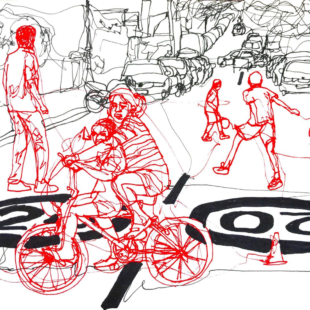
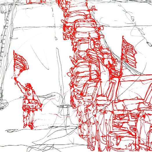
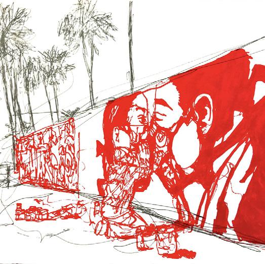
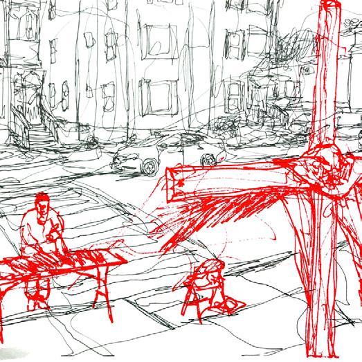
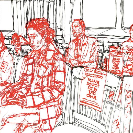
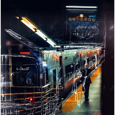
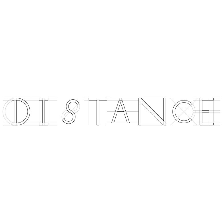
Up to the point of the pandemic outbreak, my project has explored the informal spaces that disadvantaged people create naturally in the public realm using the scant resources available to them. I focused on people in our society who lack the social respect to have spaces designed for them—people whose daily needs are often unmet. In creative ways, these people generate spaces through their own interactions such as selling and buying stuff in the street, opening a fire-hydrant to create a bathing space, homeless people finding shelter, kids playing a street soccer, a street-side barbeque, and many other everyday activities.
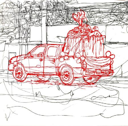
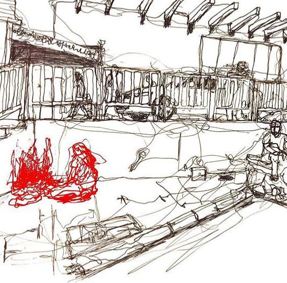
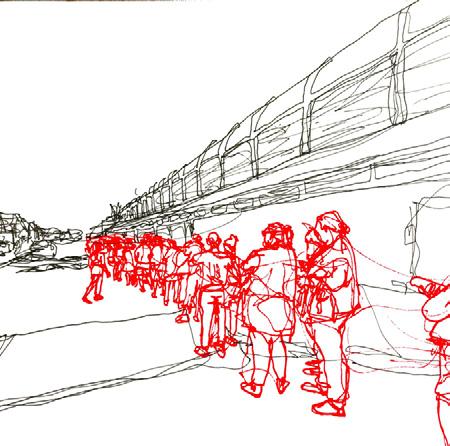
Each day, I have selected a photograph (my own or by others) depicting such a space and activity, and I have created a sketch of it using only two colors: black to depict architecture, cars, and other people or inanimate objects playing their public protocol; and red to depict human beings interacting with each other and defining an informal yet powerful space. I use fluid, dynamic lines not only to delineate human figures but also to activate the spaces between them, so that, in each sketch, individuals are connected by webs of boldly drawn lines that define critical inbetween spaces. With the advent of the Corona virus pandemic, my daily drawing of everyday spaces made by people has stayed the same, but the nature and meaning of the spaces I draw has changed dramatically, reflecting new social distancing requirements. The drawings now evoke a sense of separation and loneliness, the loss of close contact among people, and the way people are overcoming these conditions.
Both before and after the pandemic, this study has led to a nuanced exploration of people in our society (migrants, the homeless, African Americans and Latino groups) who are aren’t given the social respect they deserve. The typology of spaces I have found reflect class and spatial conflicts and negotiations that occur on a daily basis. However, during the pandemic, the set of spatial types that underline the notion of “distance for respect” has evolved from the “distance from the other” notion often found in public. The project is now watching how people form spaces in the public, when design did not prepare for issues such as Corona or human response having to be altered to protect others around them. The project will still categorize these new spaces based on human distance and the inventive ways people are either coping or maintaining their sociable nature with the context of respecting others’ health.
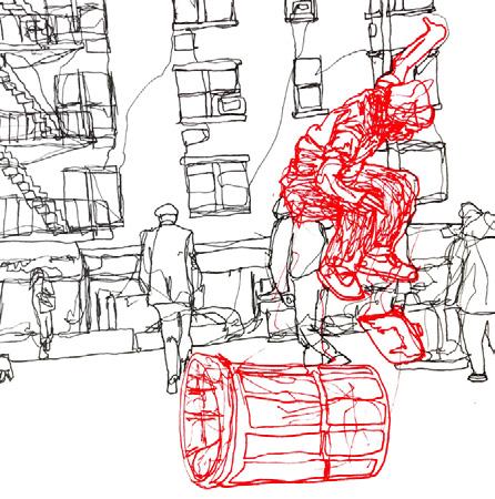
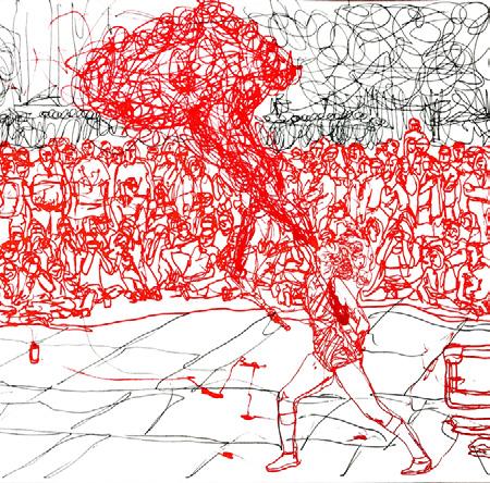
Type I: Center Condition
The type in which the generators demand attention or focus, thereby manifesting a crowd of onlookers.
Title: “Street Performers in the Pandemic”
Located: Manhattan, NY
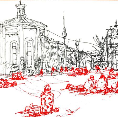
Type II: Speed Bump Condition
This type is driven based on economic conditions, it consists of a person/group maintaining a post and being actively ostracized/ignored.
Title: “The Homeless Taking Shelter”
Located: Newark, NJ
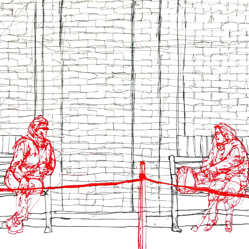
The type usually is driven based on economic conditions, it consists of a person/group maintaining a post and being actively ostracized and ignored
Title: “Catching up”
Located: Queens, NY
The type usually is driven based on a lack of spatial or economic resources. Involves stakeholders in manipulating and altering a place to a function/ program unforeseen.
Title: “Civic Center?
More like Skate Park”
Located: Hoboken, NJ
Title: “Claiming the Street”
Location: Orange, NJ
As Corona continues one method people are developing to cope, is by finding outlets to maintain and an old semblance of regular life. The Populace is taking to the empty public spaces to communicate their social fever in these times. People are developing spaces for the irregular character to either maintain or fight for the comfortability they once knew.
Title: “Tribute to Current Love”
Located: Miami, FL
Title: “Marching Against a Pandemic?”
Located: Somewhere in the Mid-West
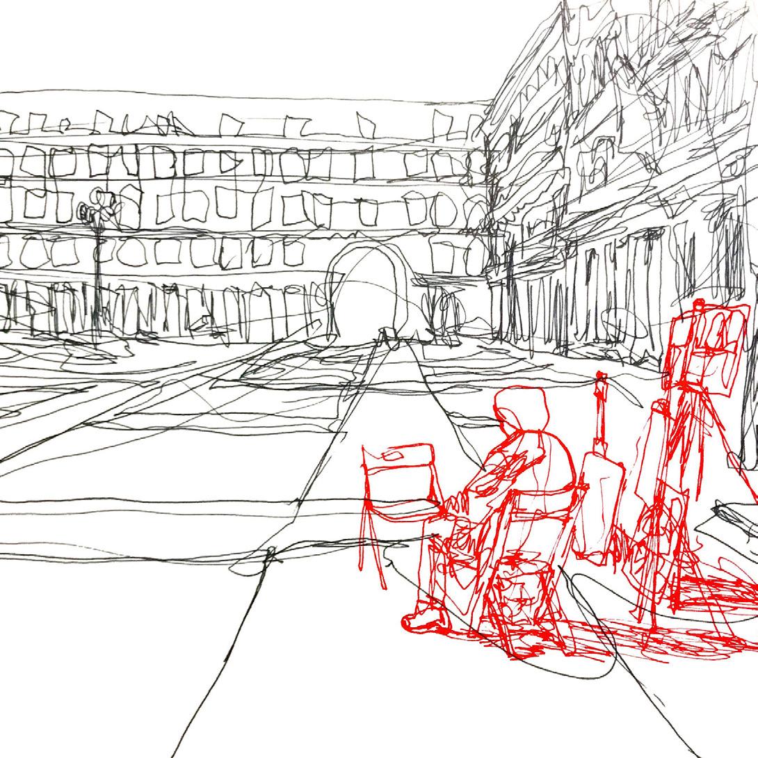
Title: “The Lone Artist”
Location: Venice, Italy
The other mode people acting amid the pandemic is by socially engineering their behaviors. People are physically disconnecting to a degree where things such as conversation, faith, and life seem so lonely and foreign. The effect this virus has on society and human interaction will either be a scar to persist for years to come or one to light a fire on the intensity of interaction.
Left-
Title: “Spaced Out Town Meeting”
Located: Philadelphia, PA
Right-
Title: “Corona Affecting Faith”
Located: Orange, NJ
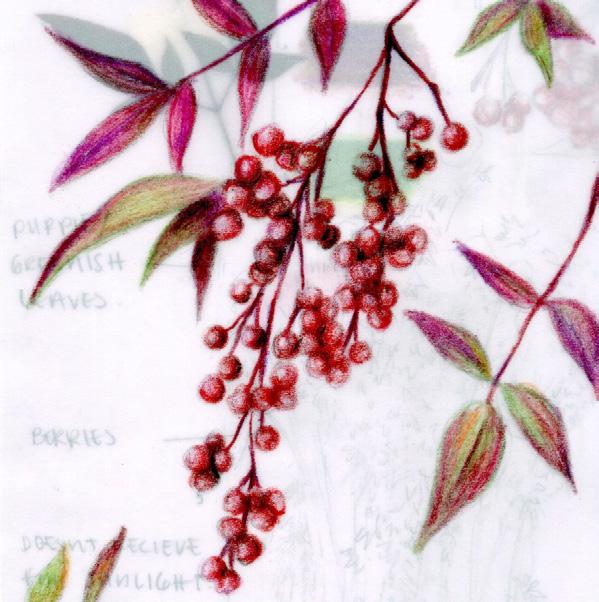
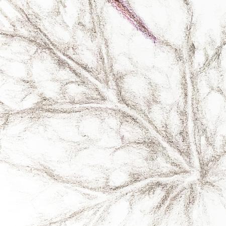
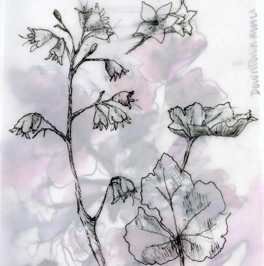
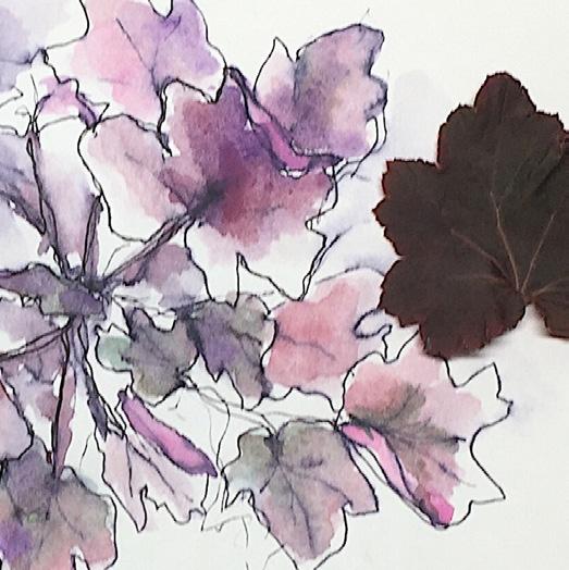
JESSICA AUER
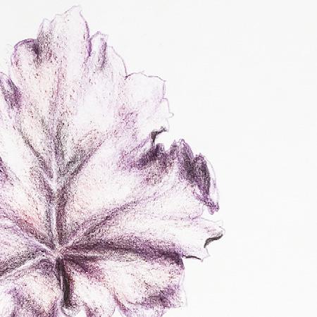
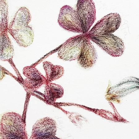
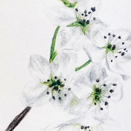
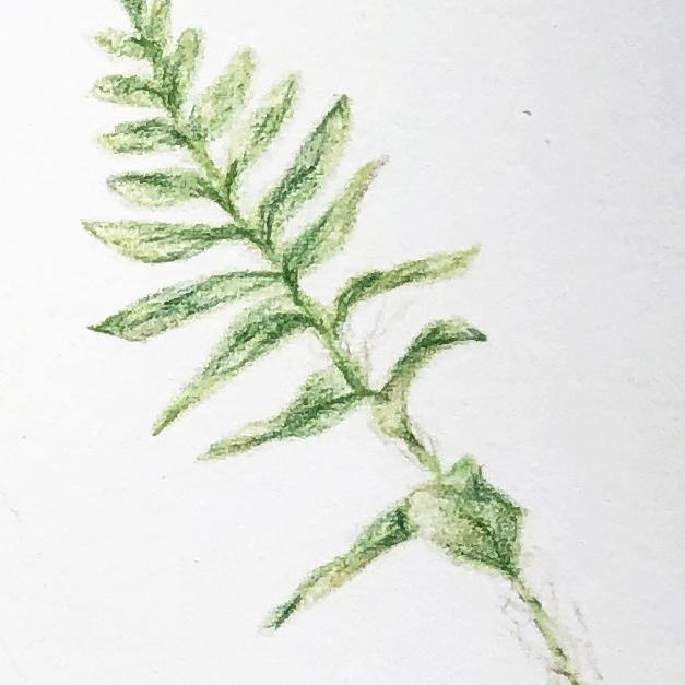
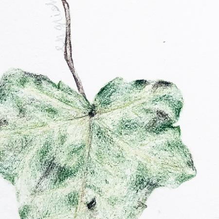
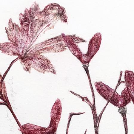
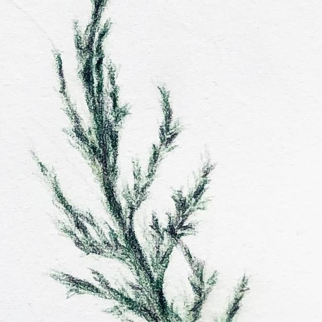
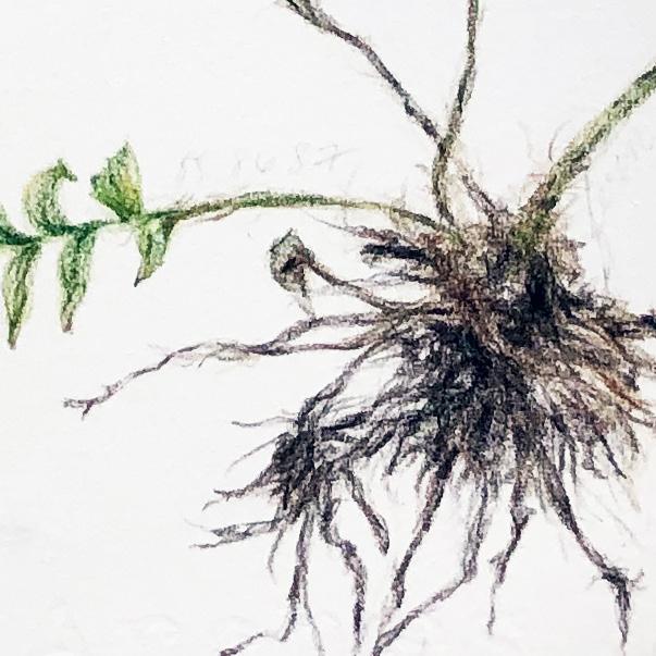
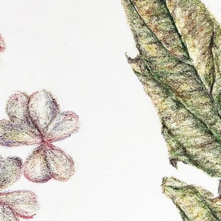
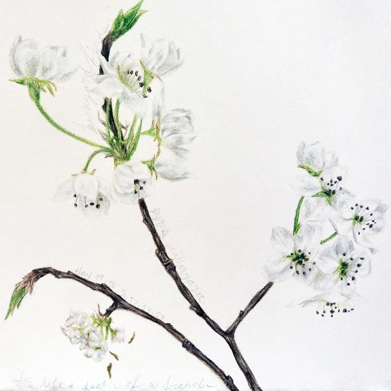
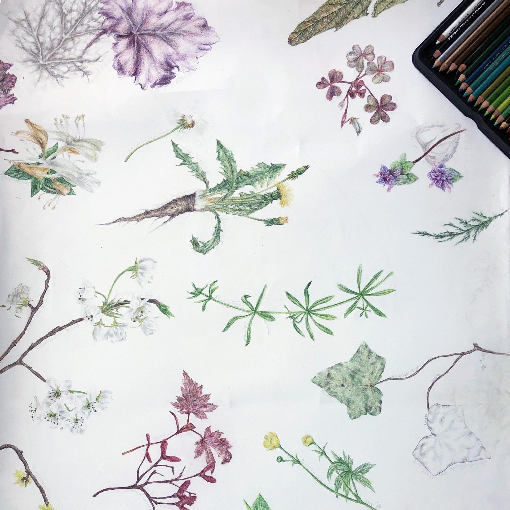
In our present pandemic crisis, my work has taken on a new meaning, reminding us that plants are still with us and that they can bring joy to our everyday lives helping us to cope with the sense of isolation, loneliness, and sadness. I think it is important to look for some positivity during this difficult time, and for me this project is a reminder of that.
For this drawing project, each day, I take a walk outside and pick a different plant that catches my eye. I bring the plant indoors and I make a detailed color study of it on a large sheet of paper that includes many such daily studies. Day by day, the drawing grows into a field of different kinds of colorful and vivid images of plants.
Being able to turn my focus on the beauty of nature and its growth has become very helpful to me. I have had a hard time finding any sort of motivation throughout this difficult and stressful period of isolation. Fortunately, I can now use this project to get out of this rut by turning my drawing process into a daily meditation. As part of the meditative process, I leave the house and enjoy the feeling and sense of being outside.
My project has grown very personal to me: a way to learn about different local plants and to improve my drawing skills. I hope that others will also take joy in my work, and that the work will inspire viewers to appreciate plants and realize their importance in our world. Especially during our current crisis, I hope that my work will encourage others to go out and to do their own meditative studies that celebrate nature.
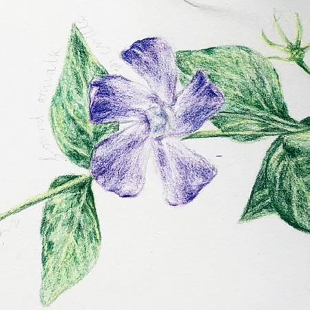
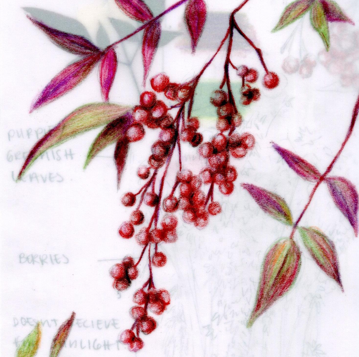
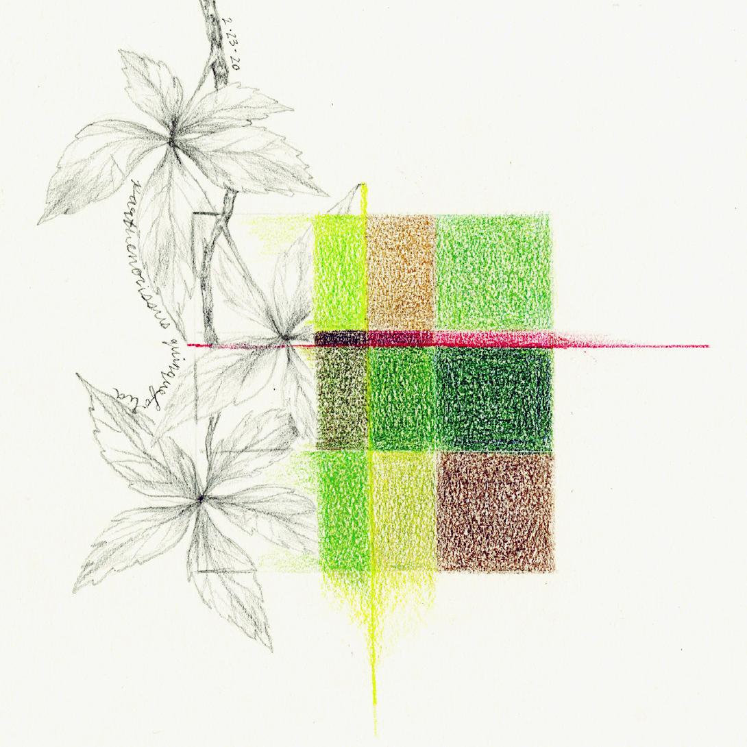
Virginia Creeper, colored pencil and graphite. 9 x 9 in.
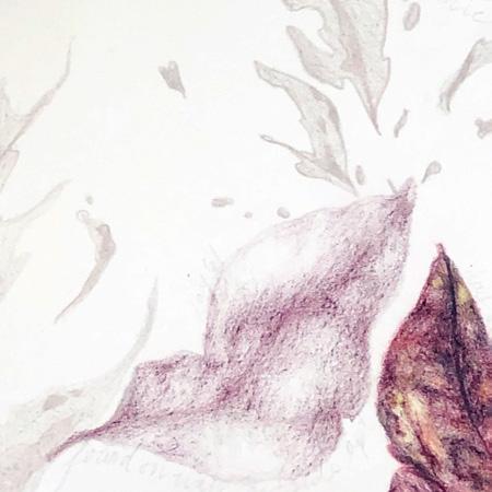
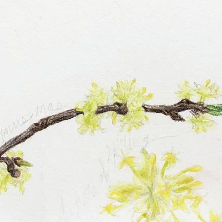
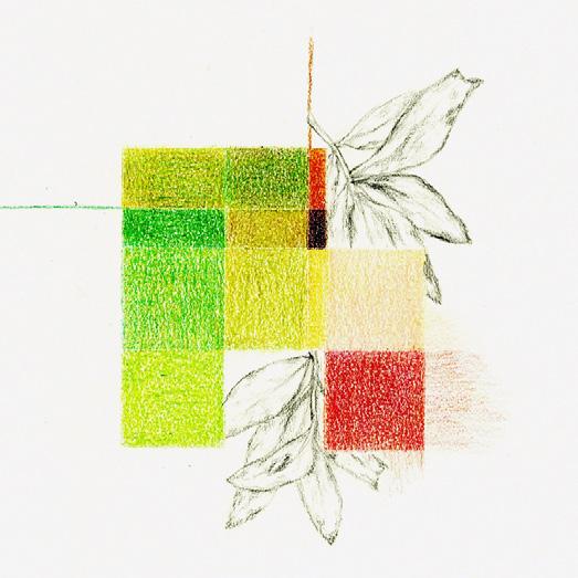
Left image: Unknown Branch, colored pencil and graphite, 9 x 9 in.
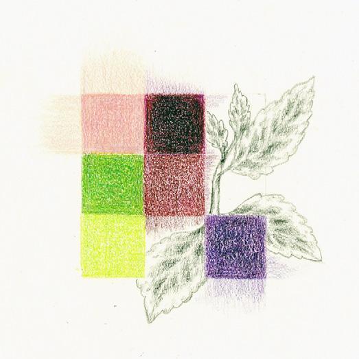
Right image: Unknown Plant, colored pencil and graphite, 9 x 9 in.
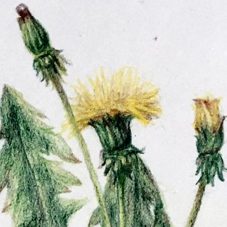
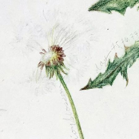
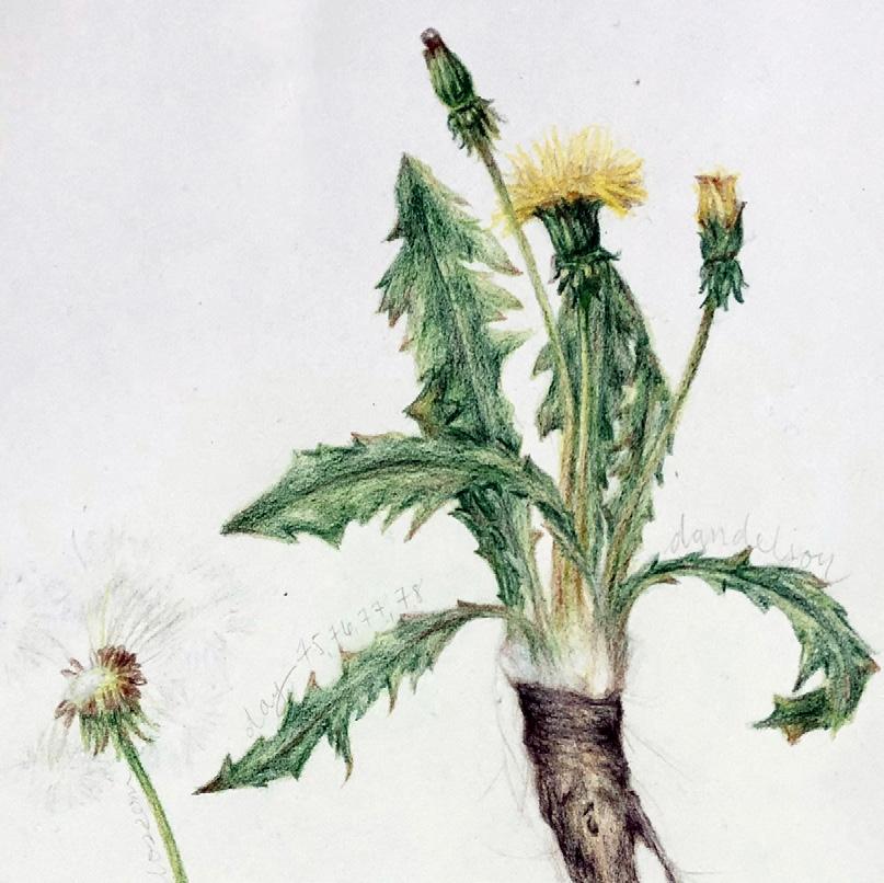
Dandelion, colored pencil and graphite, 24 x 36 in
Pyrus Communis, colored pencil and graphite, 24 x 36 in.
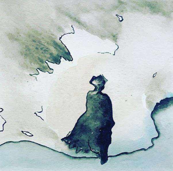
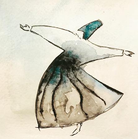
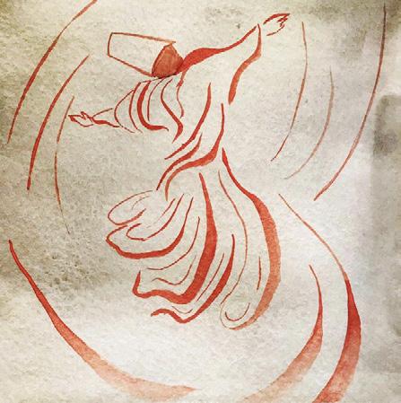
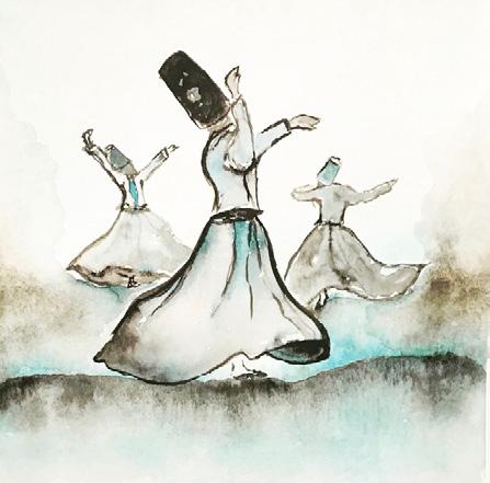
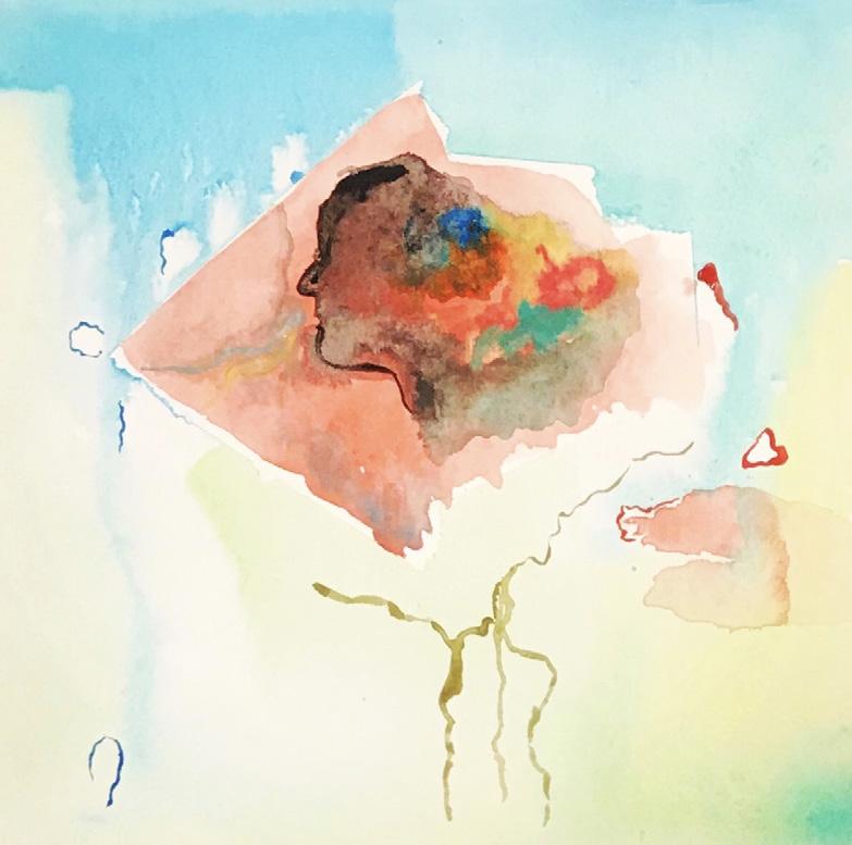
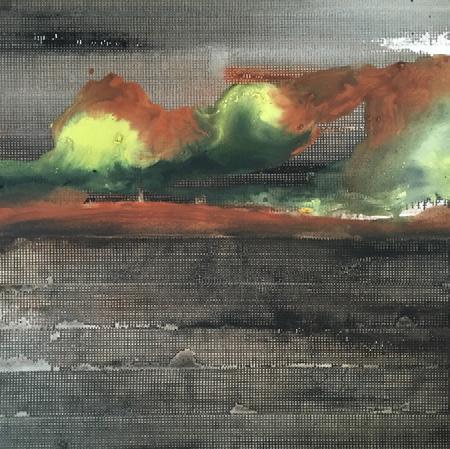
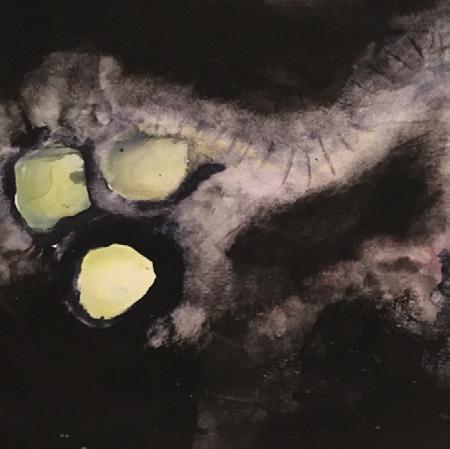
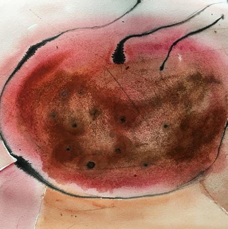
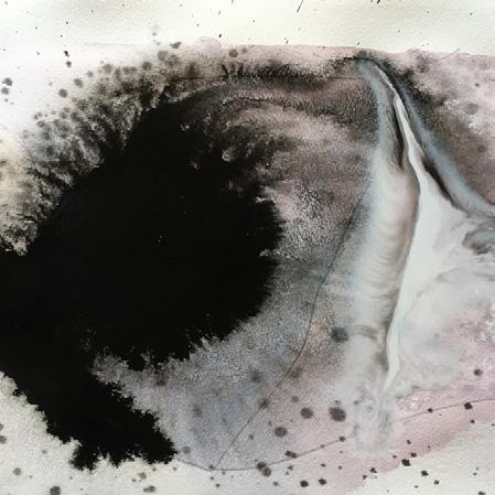
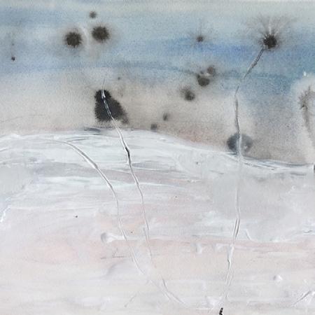
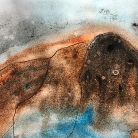
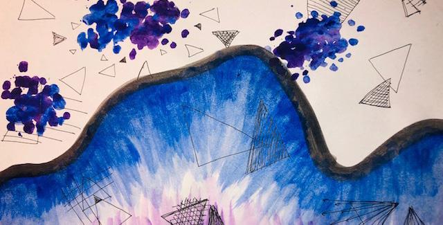
BAHESHTA AZIZI
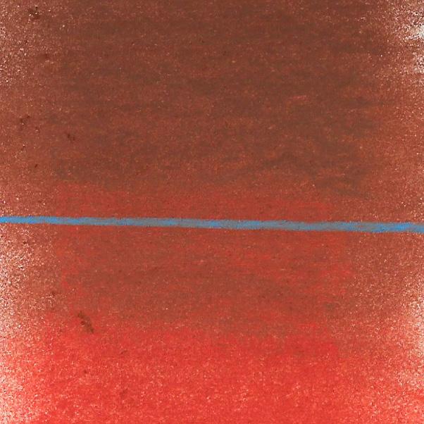
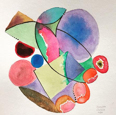
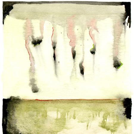
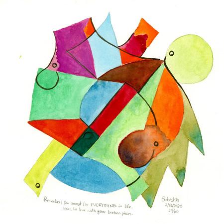
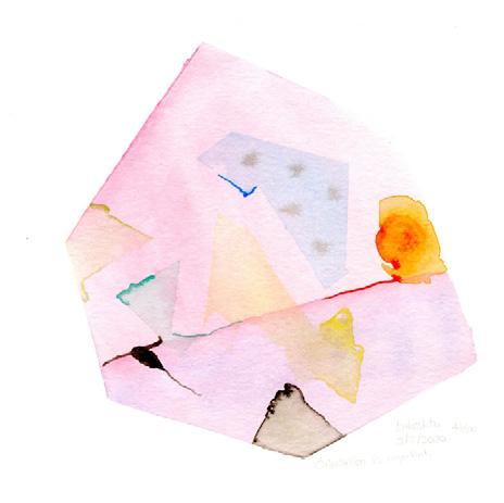
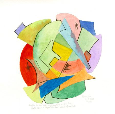
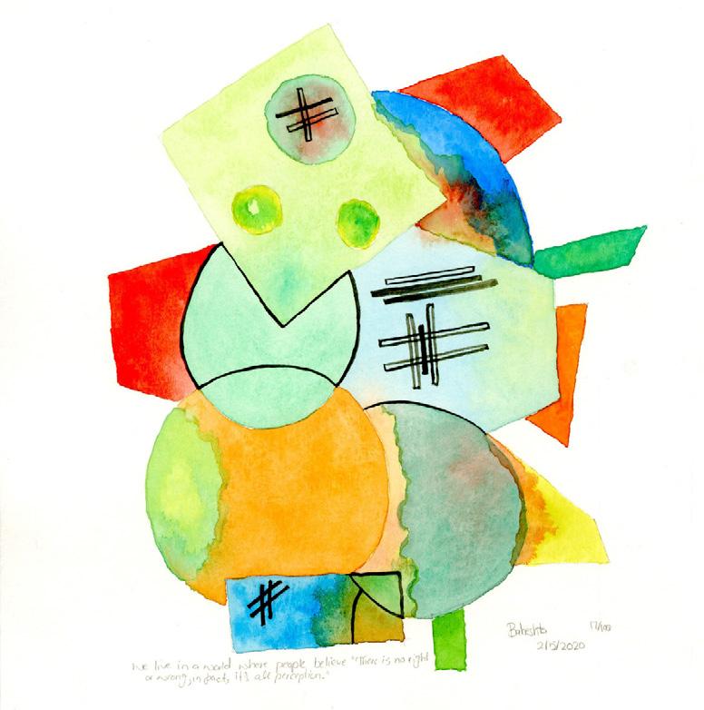
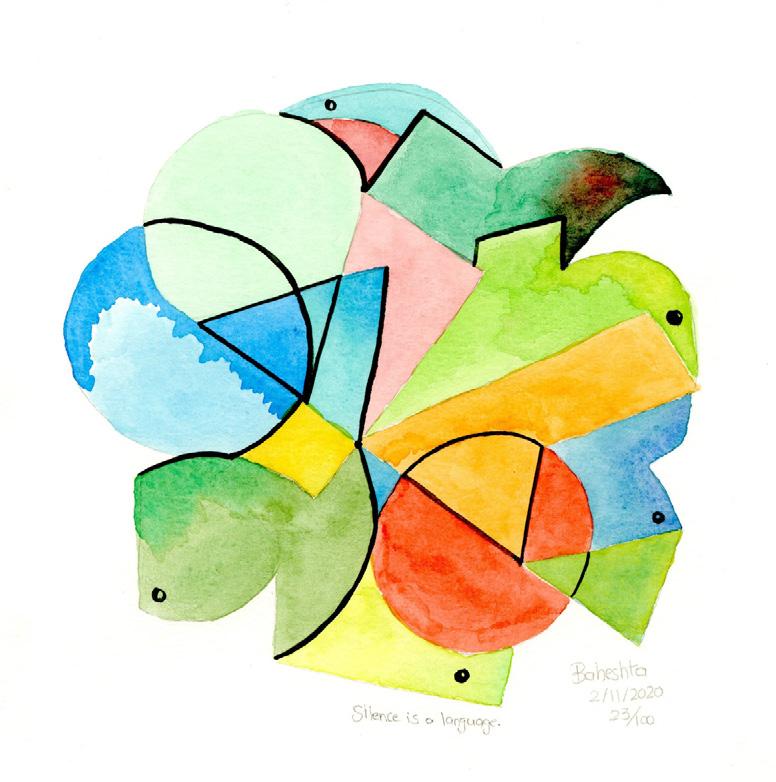
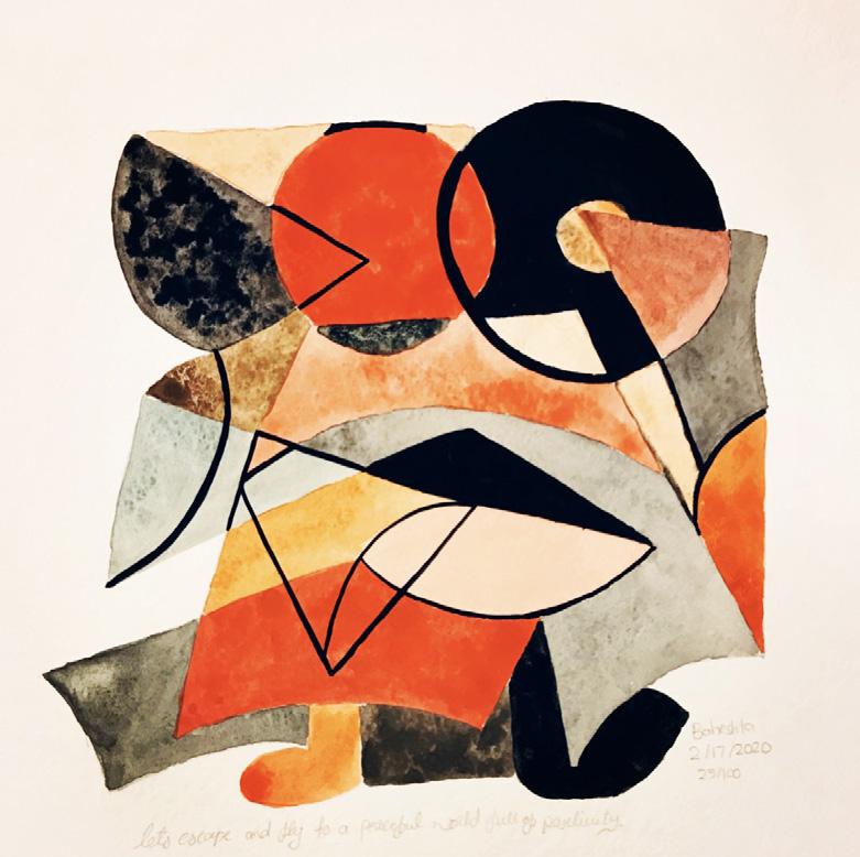
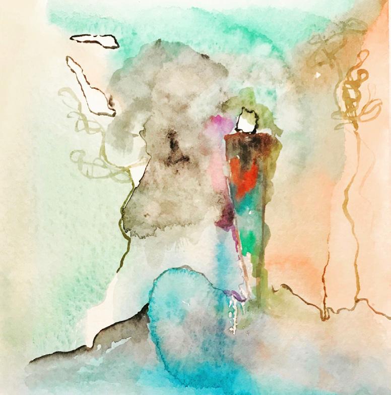
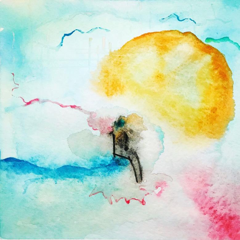
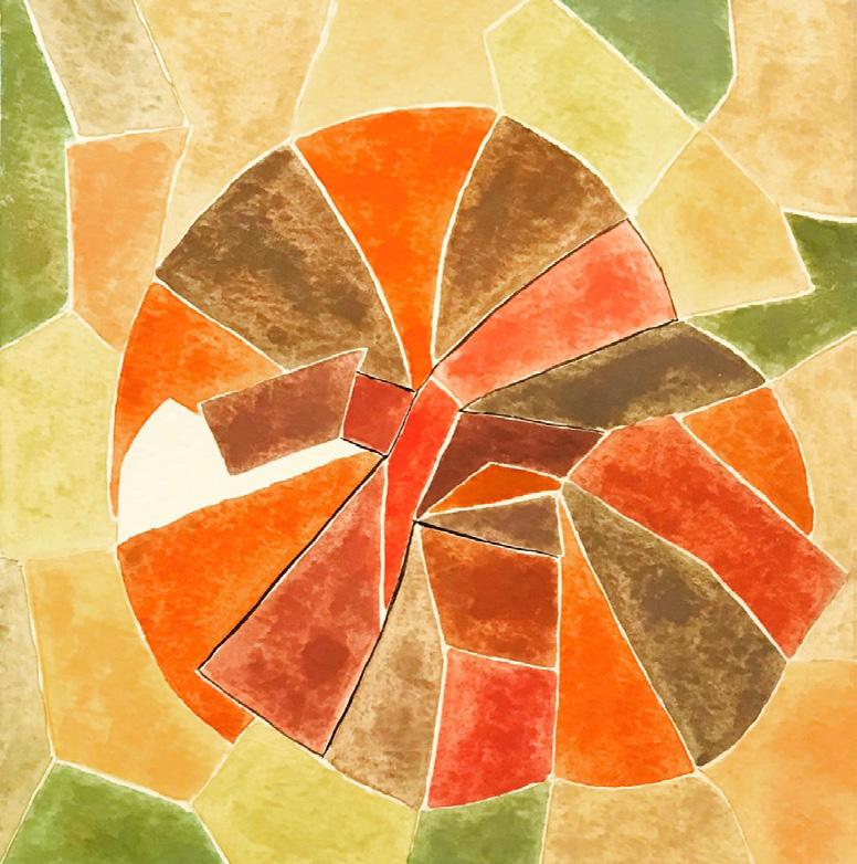
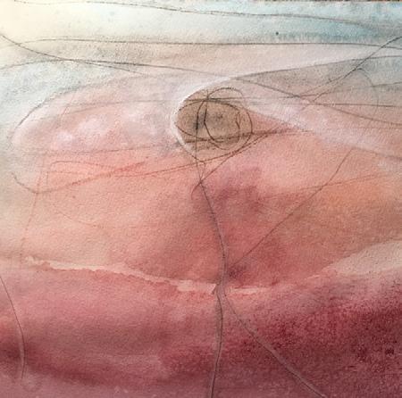
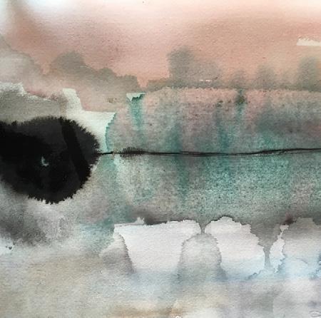
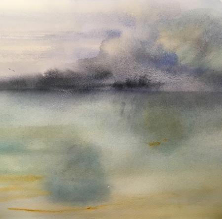
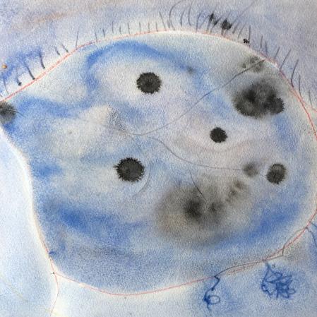
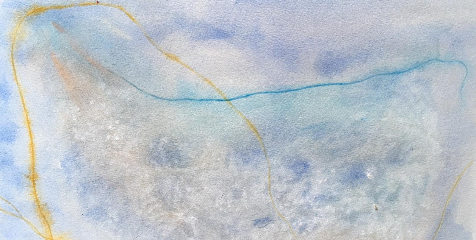
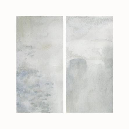
I began this project with the intention of expressing my feelings each day in the form of an abstract watercolor. I focused on formal compositional aspects such as relationships of lines, shapes, and colors. My techniques were initially applying and blending strong and bright colors with a brush on paper and later on I explored glazing, wet on dry, wet on wet and the flat wash techniques as well.
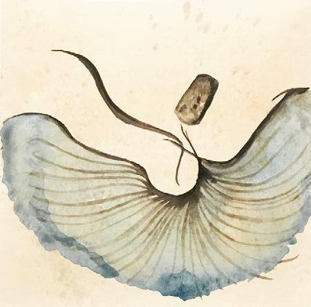
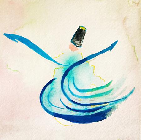
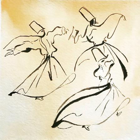
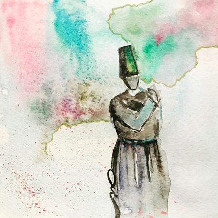
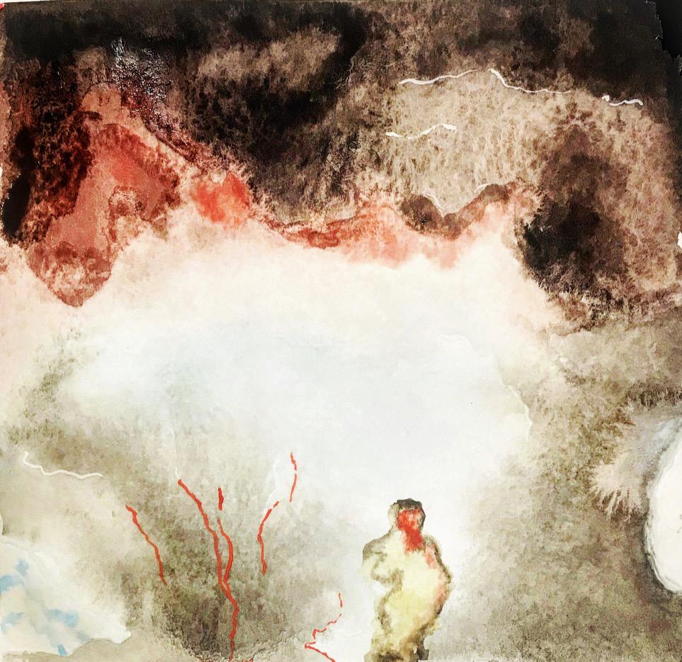
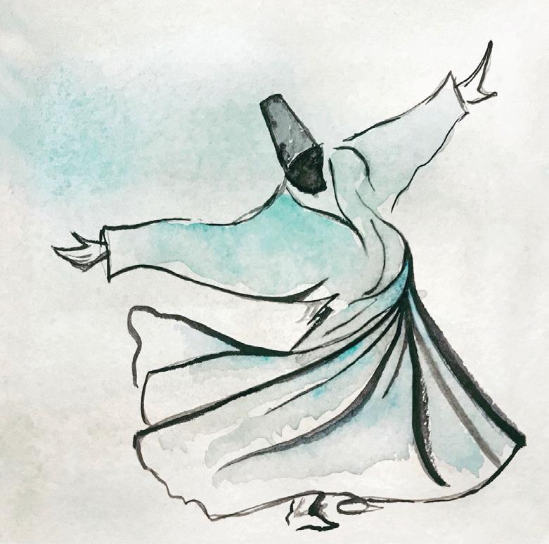
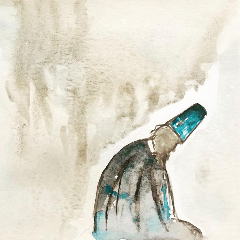
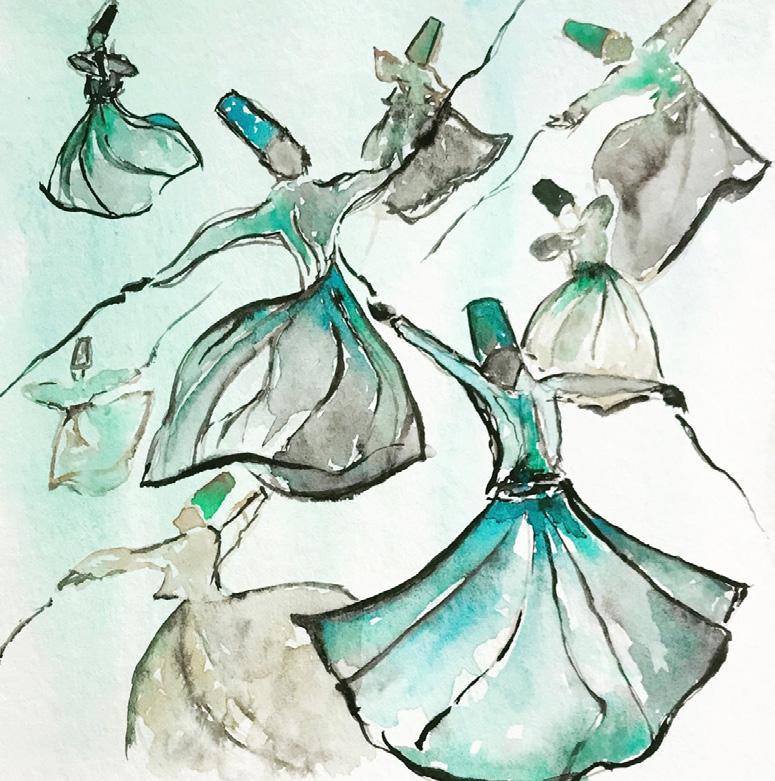
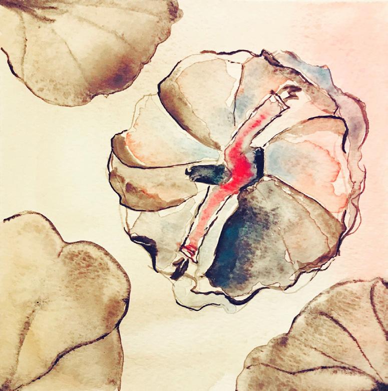
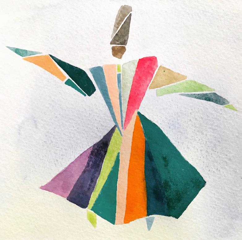
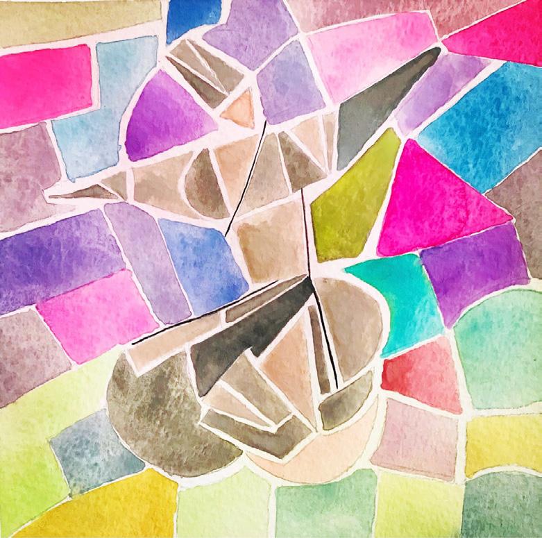
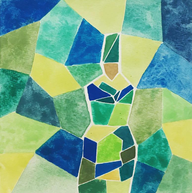
Now that we all are dealing with a difficult and unexpected situation due to our current pandemic crisis, I hope to create a series of daily watercolors that respond to our shared feelings of loneliness, sadness, and sense of loss. I deliberately use a more subdued color range of browns and grays, and I have shifted from a totally abstract vocabulary to using figuration. Specifically, in each watercolor, I am depicting the image of one or more Sufi dancers or Whirling Dervishes. Rumi, as a dervish, concentrated all his energy on spiritual development. While being an important person, he was dressed up with humbleness and modesty and believed that humans must explore the depth of themselves first in order to understand the reality of the world. His unique spin is a meditation practice performed with a worship ceremony. The right hand is directed to the sky and the left hand upon which the spinner’s eyes are fastened is turned towards the earth meaning that the spinner takes god’s beneficence with the right hand and transfers it to others with the left hand.
We should take the current situation as an opportunity to open our hearts and call it a selfexploration period not self-isolation. Although my new series of daily watercolors is a direct response to our current shortages and inaccessibility, my intention is not to emphasize the sense of sadness and loss. Rather, I hope the new work will express a sense of peace, calm, serenity, and inner strength—the kind of spiritual strength that Rumi expresses in his poetry.

Bottom
Top
Bottom
Top Left: 57/100: To those who have lost their lives in terror attacks.
Bottom Left: 62/100: Who were you before they changed you?
Top Right: 63/100: You are allowed to be a work in progress.
Bottom Right: 68/100: You cannot learn my language, I have adapted a difficult one. It’s not made of words, you cannot learn my language.
Top Left: 74/100: These pains you feel are messengers. Listen to them.
-Rumi
Bottom Left: 77/100: There is a freedom more precious than the world. Infinitely more precious than life and the world is that moment when one is alone with god. -Rumi
Top Right: 81/100: When the light returns to its source, it takes nothing
Bottom Left: 97/100: The soul has given its own ears to hear things mind does not understand.
Top Right: 98/100: In the blackest of your moments, wait with no fear.
Bottom Right: 99/100: Where there is a ruin, there is hope for a treasure.
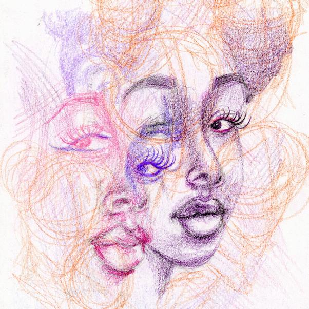
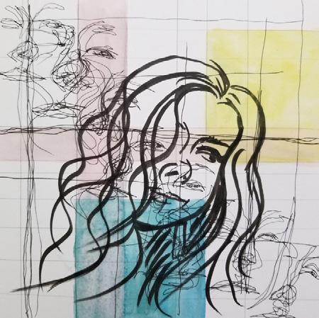
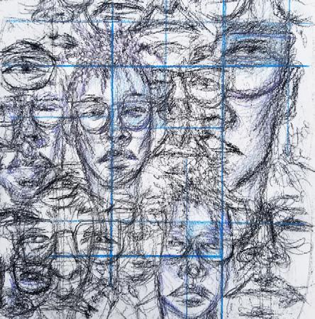
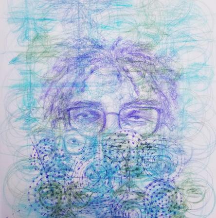
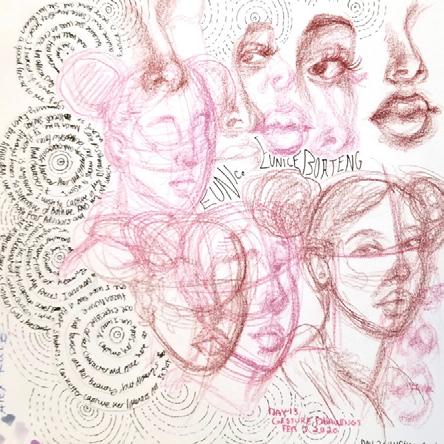
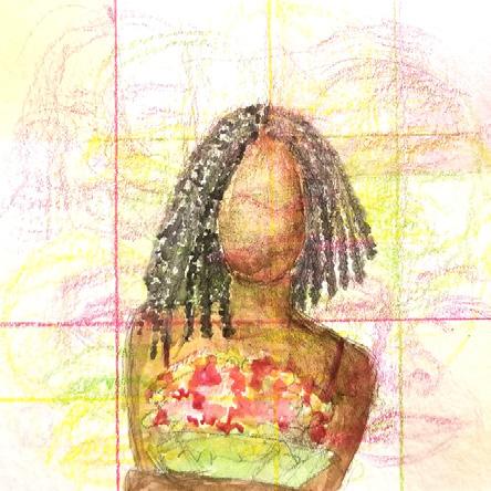
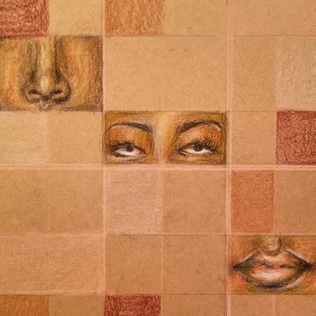
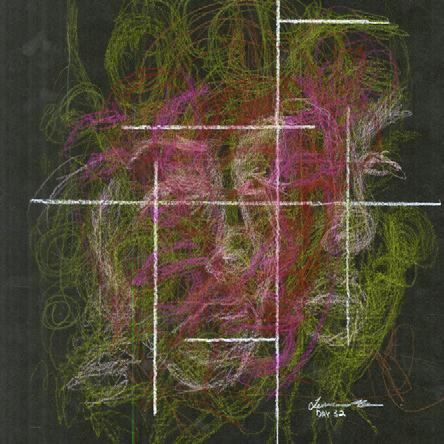
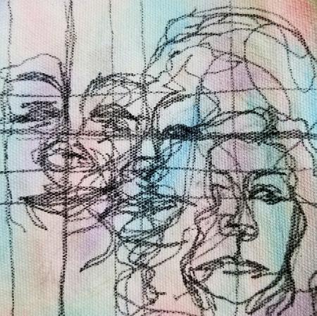
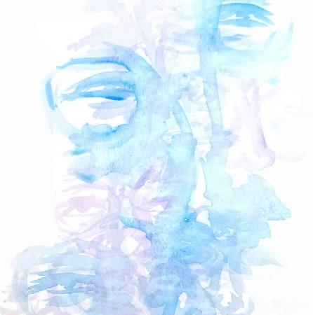
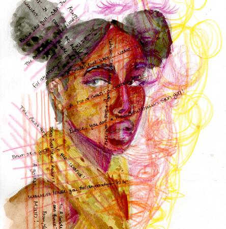
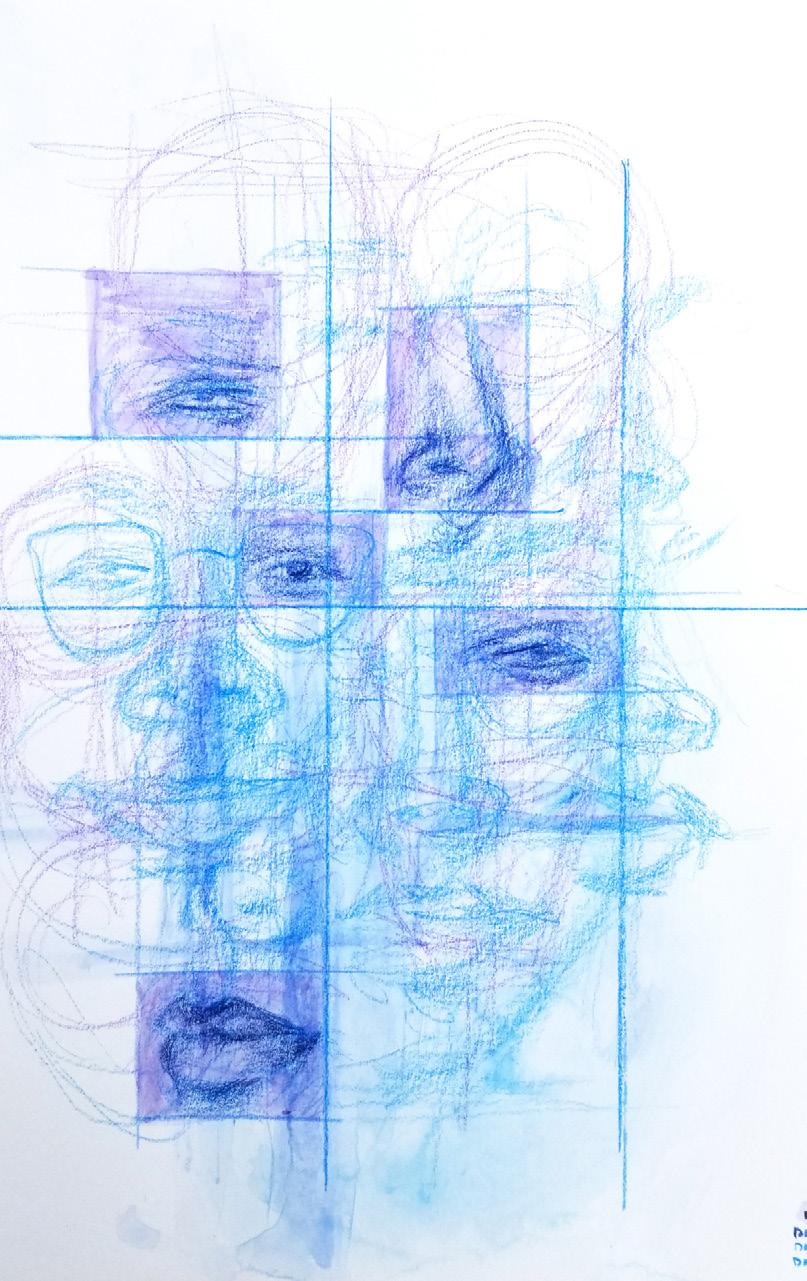
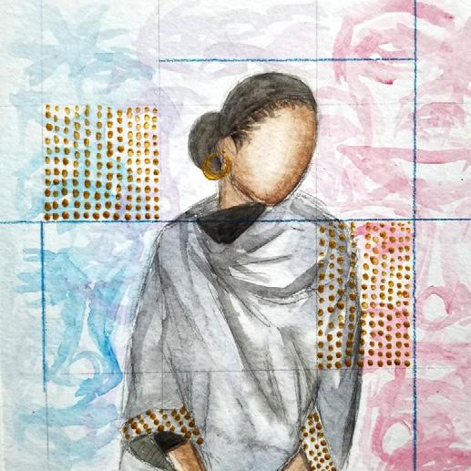
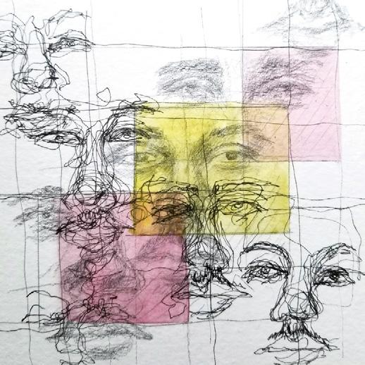
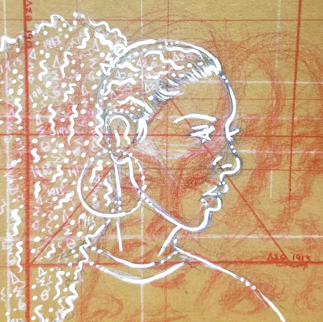
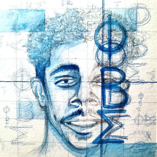
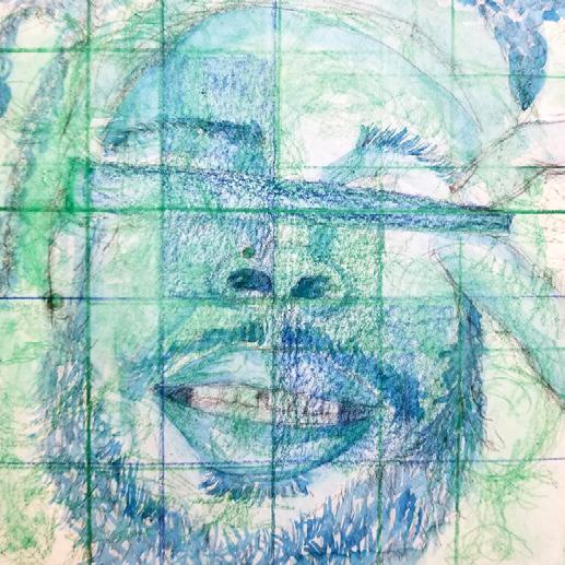
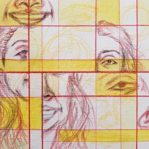
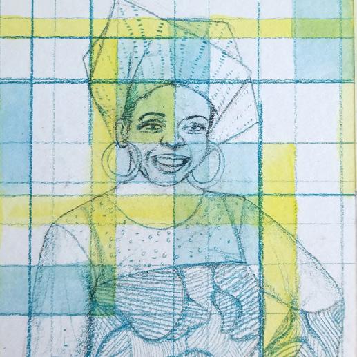
LAUREN BROWN
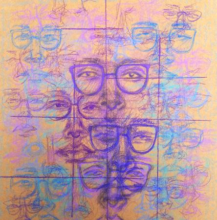
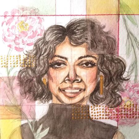
For this project, I use a variety of media to create a daily portrait of a graduating fourth year student who is important in my life. I seek to capture not only the anatomical likeness of a person’s face, but also his or her unique personality, as well as their special mood at a particular moment in time. I think of these special people as my “muses:” as sources of great strength and inspiration for me.
During the current pandemic crisis, I cannot physically spend time with my friends and experience the joys their presence brings to me. I have found, however, that working on this portraiture project has become an important coping mechanism for me to “be” with my friends although I cannot physically be near them. In light of the lack of graduation for the Class of 2020, I dedicated the final 30 days of my journey to use my art as a final goodbye to my 4th year friends who have deeply affected my UVA experience. In this portion of my journey, I revisited the methods palimpsest and grid I used in my earlier studies to familiarize myself with my muse. Some of my friends came alive in quick gesture studies while others took a few days to come alive in more formal portraits. No matter the style media or figure created, the spirit of each portrait embodies the happiness, wisdom, love, and support each of these students have given me over the years. Each meditation was crafted on a 6”x6” square to mimic the square proportions of the graduation caps each of these students would have worn down the lawn in the later half of this month.
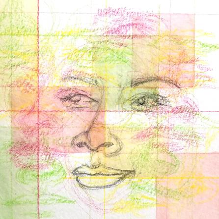
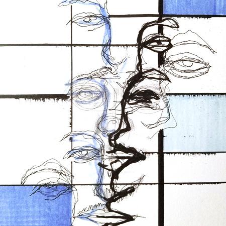
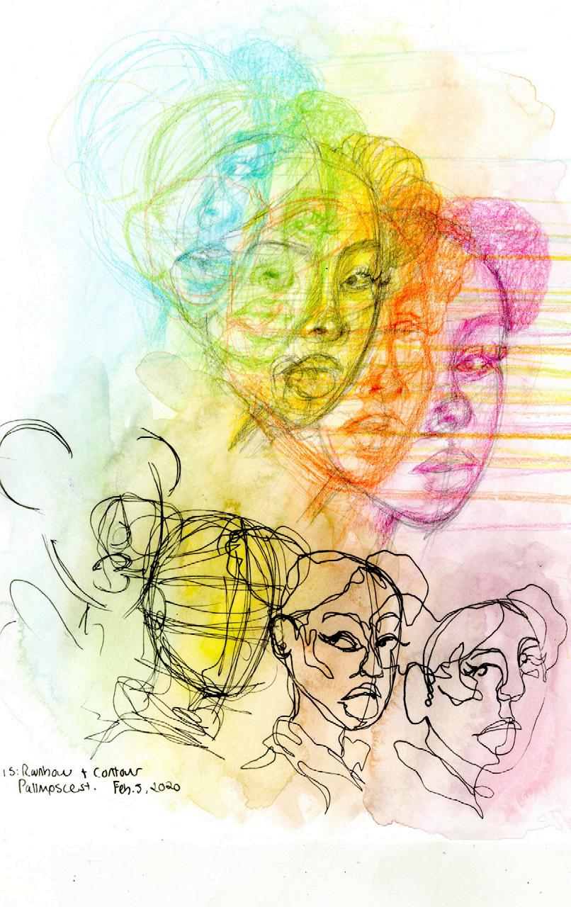
Rainbow Contour Day 15
Expressions + Grid No. 4 Day 46
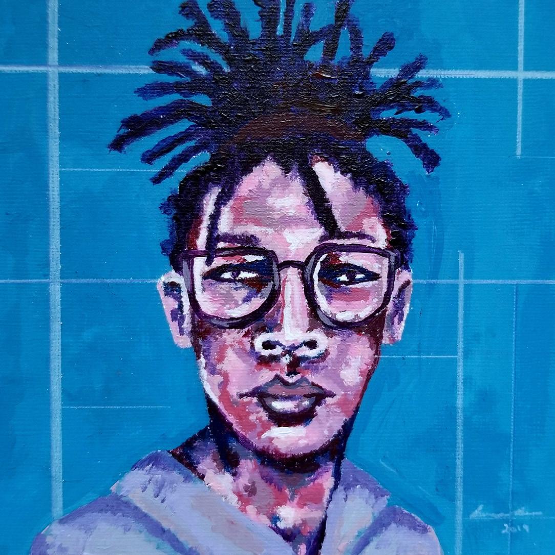
Tarin Jones Day 70
Day 94
Day 92.
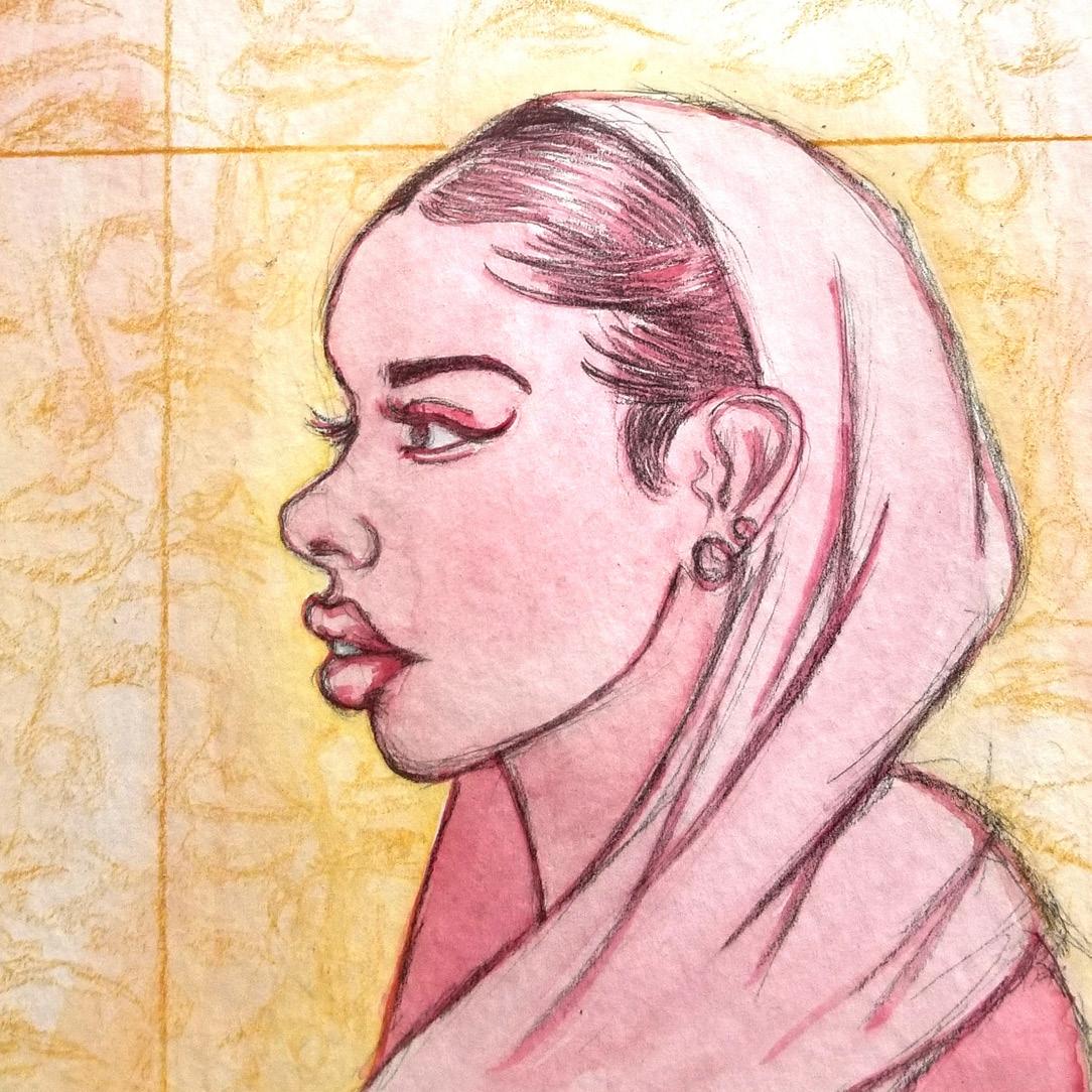
Lailah Said Day 73
Left image: Kaitlyn Diaz Day 83
Right image: Oluwafunmilayo Ogungbade Day 87
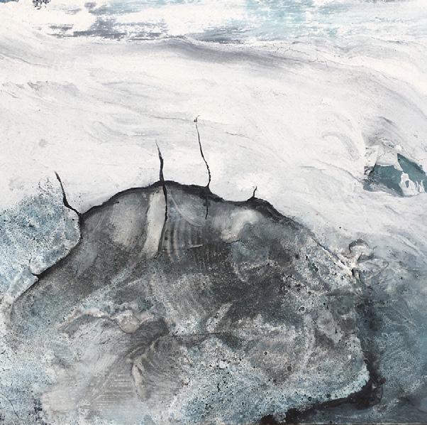
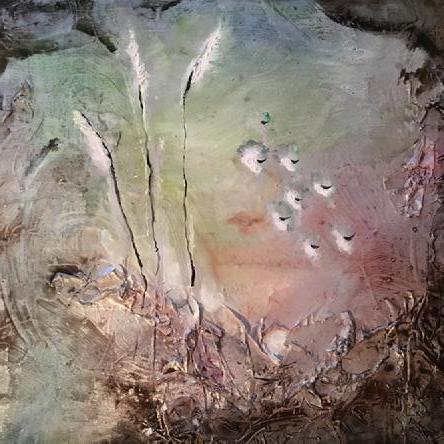
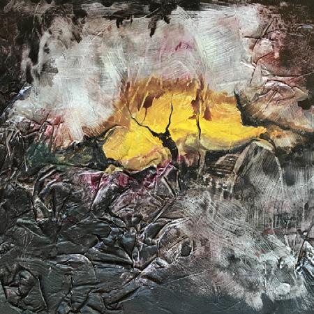
My daily project is to create sculptural and textural paintings that illustrate landscapes or “dreamscapes” of my subconscious and past personal experiences.
My series is painted with acrylics and watercolors on canvas and watercolor paper. As part of my process, I have experimented with different layering techniques, using drywall tape, sand, and collage. Sometimes I must build up several layers over time to create a final piece.
I have been employing the Dada and Surrealist technique of automatic drawing in my work and have been finding inspiration also through dreams and personal life experiences. I play with figure-ground relationships in my work and I believe that landscapes are bodies and that bodies are landscapes. That the terrain etched on our skin and imprinted on our energies has the power to tell stories that can bring us together.
I believe that, under our current isolating circumstances, there is a potential for diving deeply into the process of making, for both personal development and for sharing one’s experiences to create connection in the midst of quarantine. Returning to my childhood home, I find mysely physically in a beautiful place with inspiring panoramas that hold significant sentimental memories for me. Since my stay in quarantive, my paintings have become more colorful, soft, and dreamlike. In the context of the changing times, I believe that my paintings can be read as verging on post-apocalyptic. I seek to illustrate feelings of isolation and expanse thta I feel and that the world feels, while preserving the beauty and hope that land and life bring.
WILLIAM ROBERT CLARK
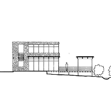
The COVID-19 crisis adds depth to the divide between public and private realms. For my project, this creates a chance to focus on the internal personal space of residences. The location of the site is isolated itself. Although it is a part of a larger community, ¬the house remains its own isolated entity, utilized by only the family. The house is broken up into shared common spaces at the core, with various individual private spaces around the sides. The logic of the plan sits within current footprint of the house and minimizing the cost of the project, and wasted material. The idea of isolation continues, as the circulation spaces radiate out in order to give maximum distance between the various occupants of the building. The primary connection from the interior to the exterior is through the central common spaces which focus the occupant out of the back of the building towards a communal pavilion and the woods surrounding it. The focus on nature creates an isolated habitable space with strong connections to the setting, without endangering the occupants inside.
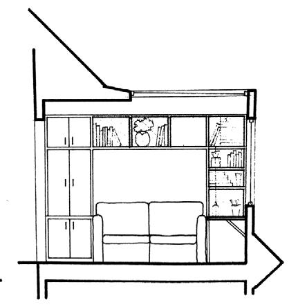
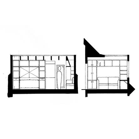

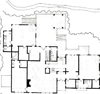
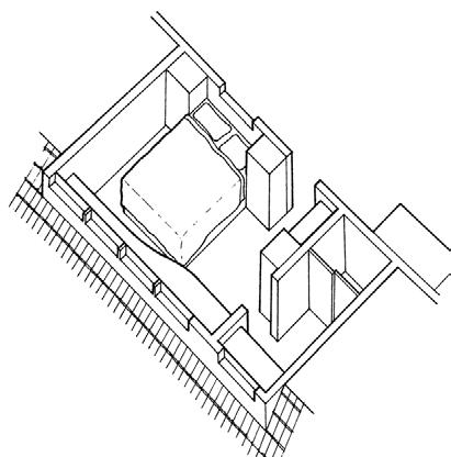
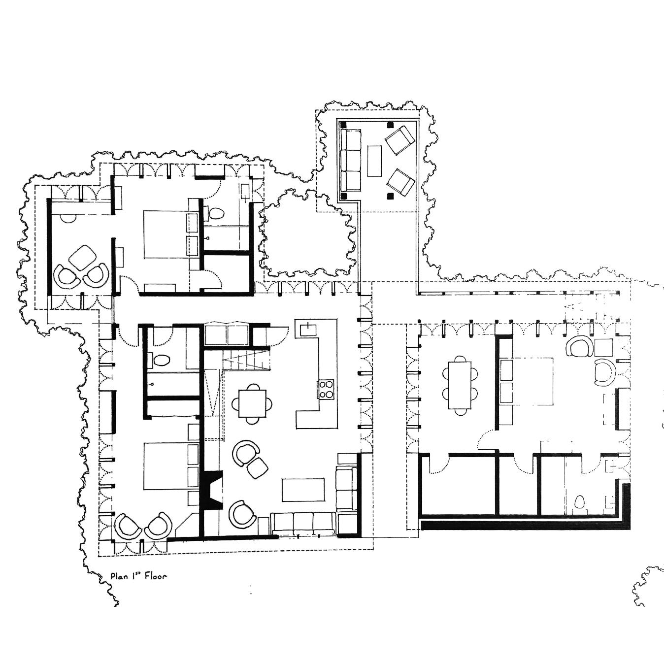
Revised First Floor House Plan: The foundation footprint is maintained, while various aspects of the plan are rearranged. The number of bedrooms is maintained, and the elemination of a single bathroom opens up the entire central space of the house for common use.

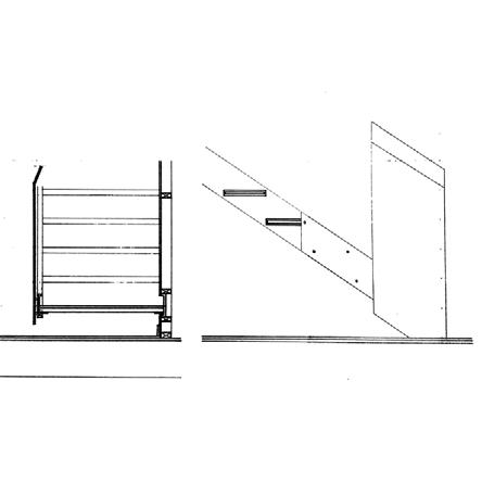
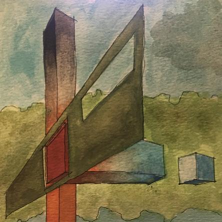
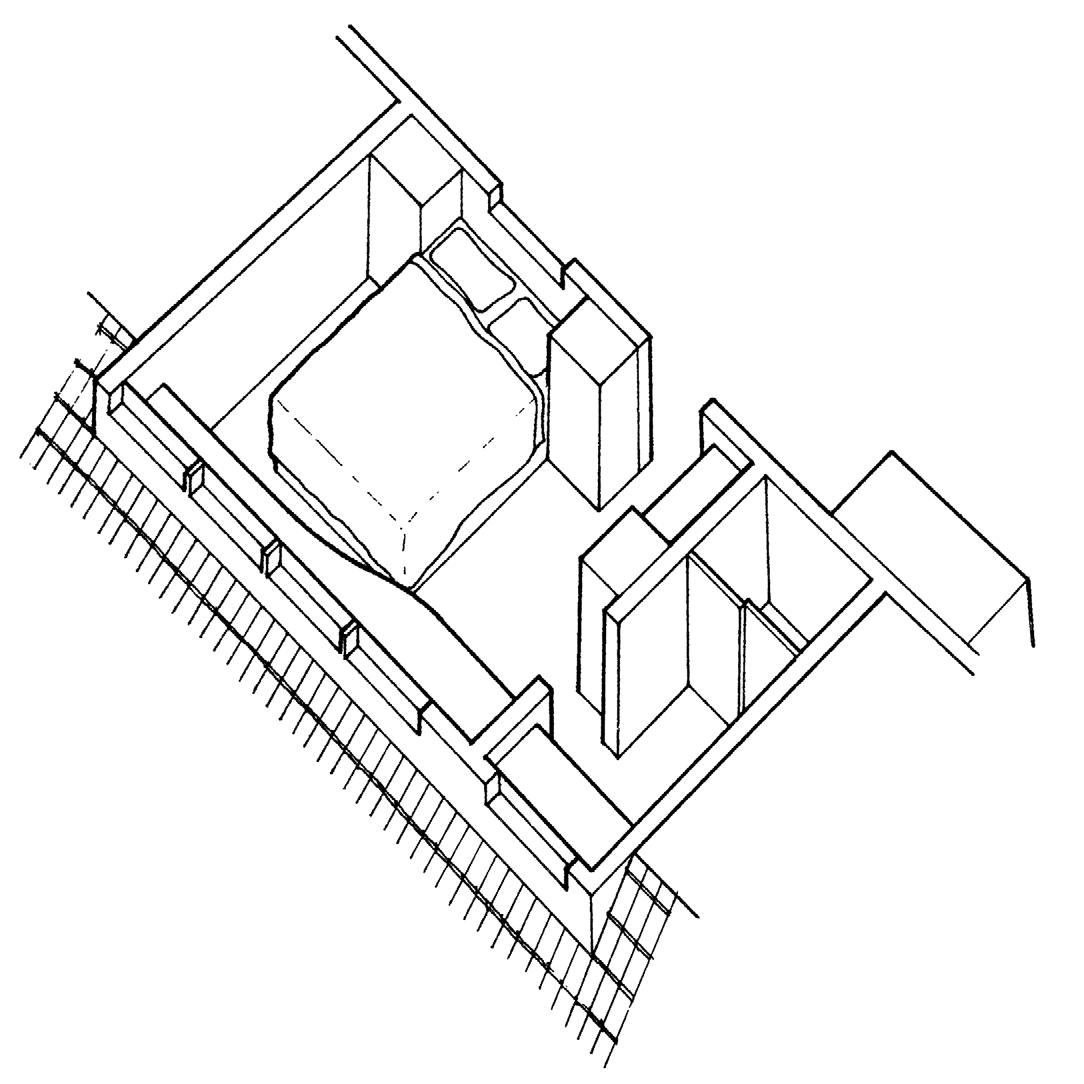
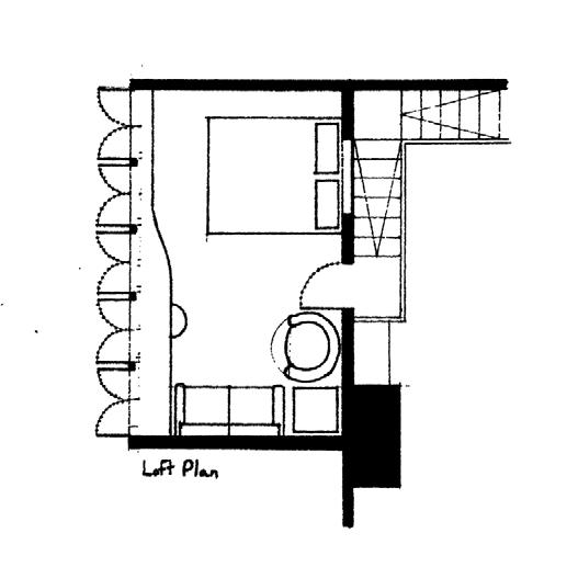
Loft Bedroom Axonometric: Large Windows open the space to Western light, and an opening at the back of the space allows for airflow and views down into the house common areas. Versions can be with or without upstairs bathroom.
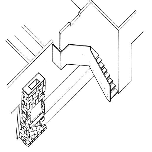
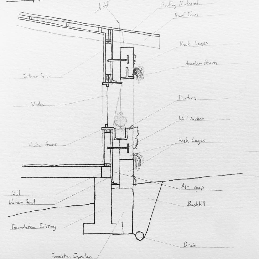
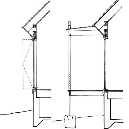
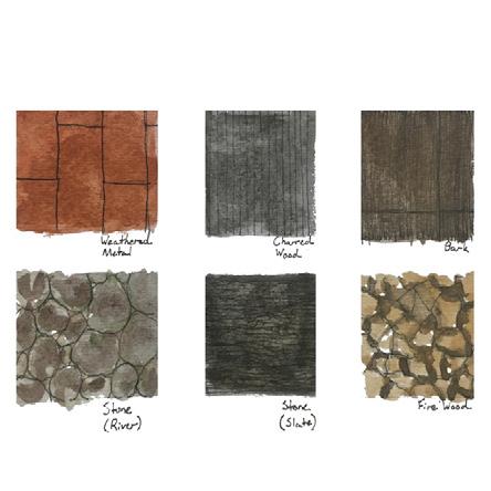
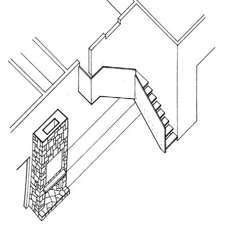
Gabion Wall Detail Section: the Stone wall is meant to act both as a planter for native plants, as well as a passive solar cooling techniques, obsorbing energy and protecting the interior from heat on the south facade.
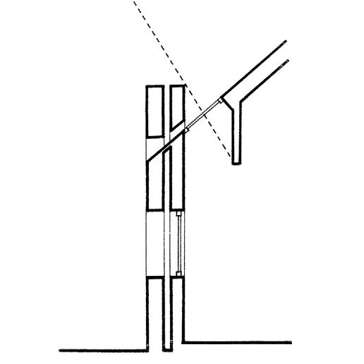
Left image: Overhead Reading Sklight detail. An extended hanging wall from the skylight relects natural light down towards the laps of readers, and avoids letting direct sunlight into the space heating it up.
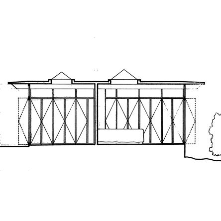
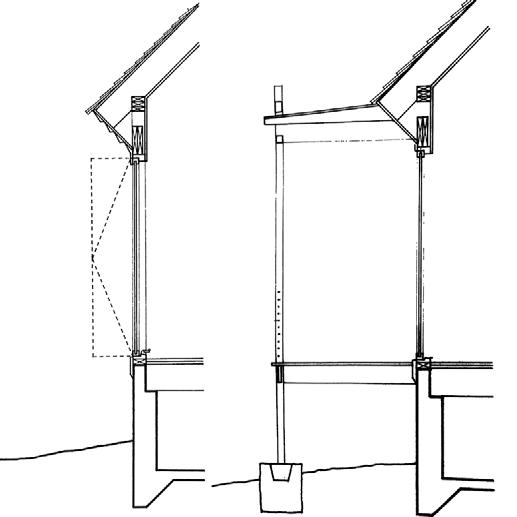
Right image: Window Detail. A series of tall french door like windows open up the rear of the house to the deck, and cool air on the North side of the house.
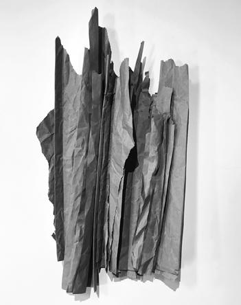
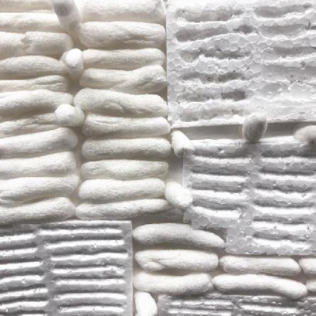
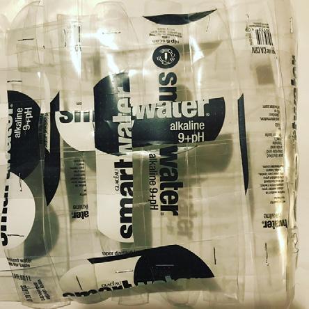
ANGEL DIAZ
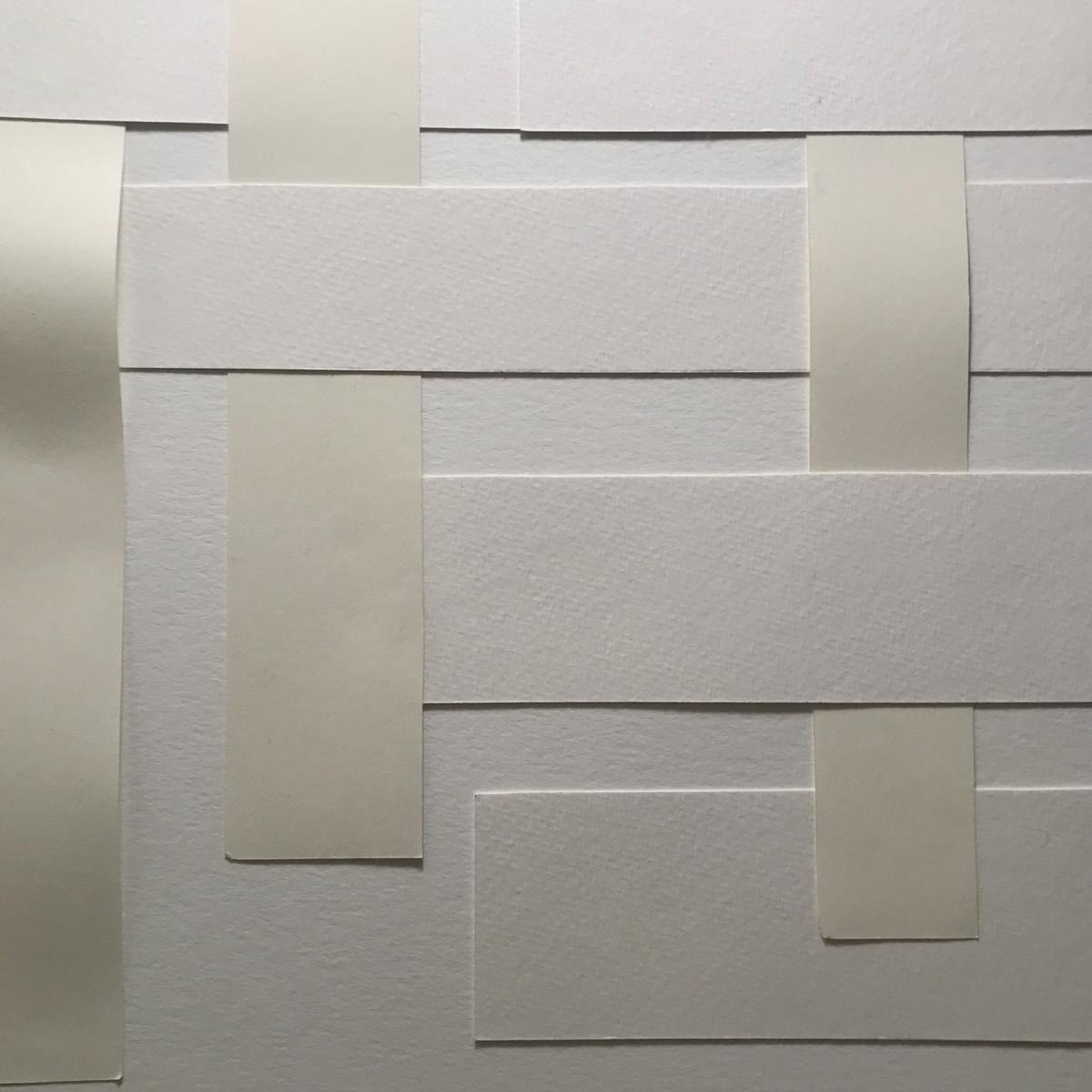
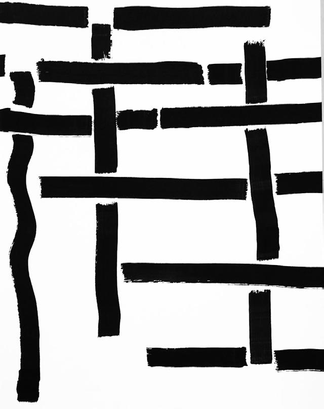
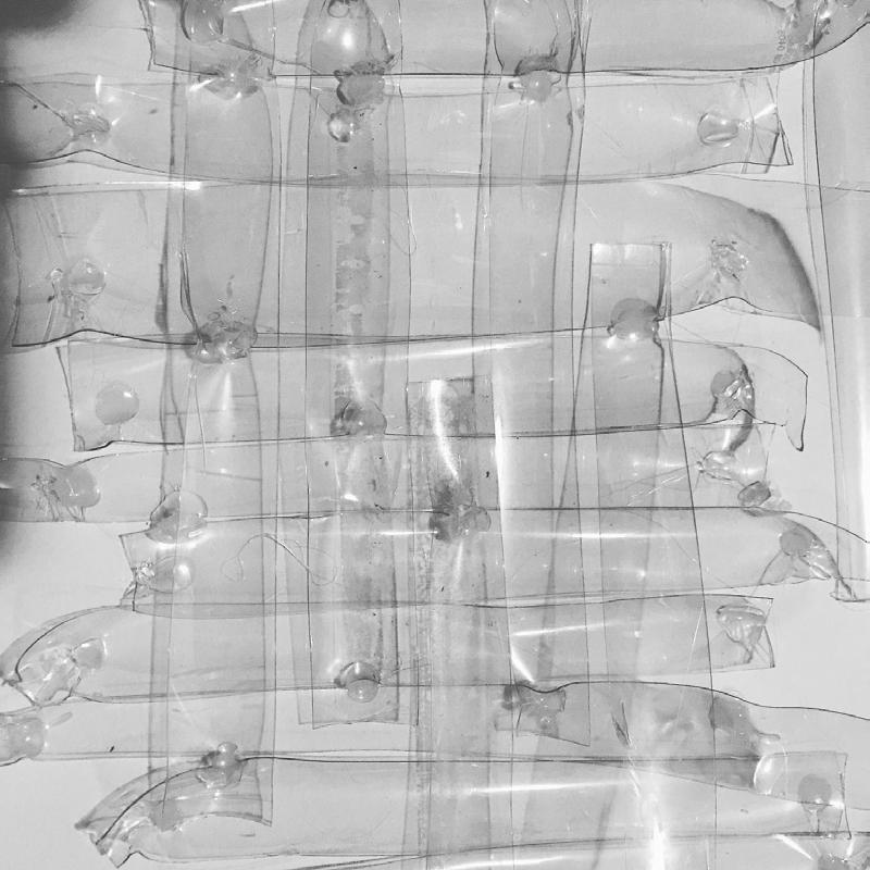
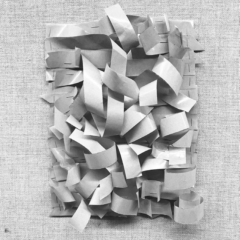
I began this project by collecting discarded materials in Campbell Hall and transforming them into new artistic compositions. Occasionally, I have also created line drawings based on these recycled compositions. This way of working interested me because it has both aesthetic and ethical dimensions. Aesthetically, I hoped to create compelling, highly nuanced, and visually exciting compositions. Ethically, I hoped that the work demonstrated that the huge amount of material we discard everyday—the old, used, and fragmentary bits and pieces of our daily lives— could become useful as well as beautiful. By extension, I hope that the project conveyed the idea that everything that we might disregard or consider useless or ugly can in fact be transformed and become meaningful to us.
Because of our current pandemic crisis, my project faces some new, yet potentially interesting, limitations. I no longer have access to power tools or to the wealth of discarded architectural materials in Campbell Hall. I am limited to a very different palette of simple and humble materials that are available in my own home. But these limitations have led to some very compelling changes in my project. Because I no longer have access to a lot of architectural materials such as cardboard and paper, I am now developing ways to interlock materials and eliminate the need for a base support. In essence, this is an exciting transition in the project from “processing architecture elements” to “processing to architecture elements.”
With so many human activities transitioning online, I have also reinterpreted the drawing component of my project. I now use digital tools to turn my physical work into vector drawings. Many of these pieces create fields of shapes through shadows that can be picked up by tracing tools. With these digital drawings, I hope to highlight the fact that, in our current crisis, we are learning the value and potential of technology as a tool that fosters human connection, productivity, and even new forms of beauty.
Exploration of overlap.
Strips of watercolor paper glued on water color paper.
(Not shown in 4x4 matrix in page before)
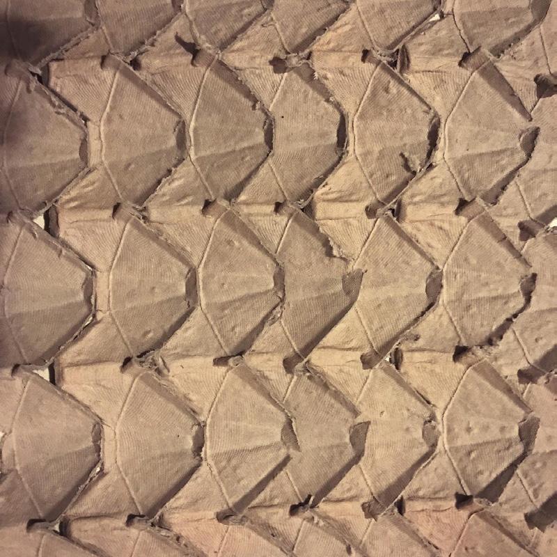
Exploration of processing material and fields.
Egg carton that have been cut into strips, flatttened, and glued next to each other.
Made after the spring break.
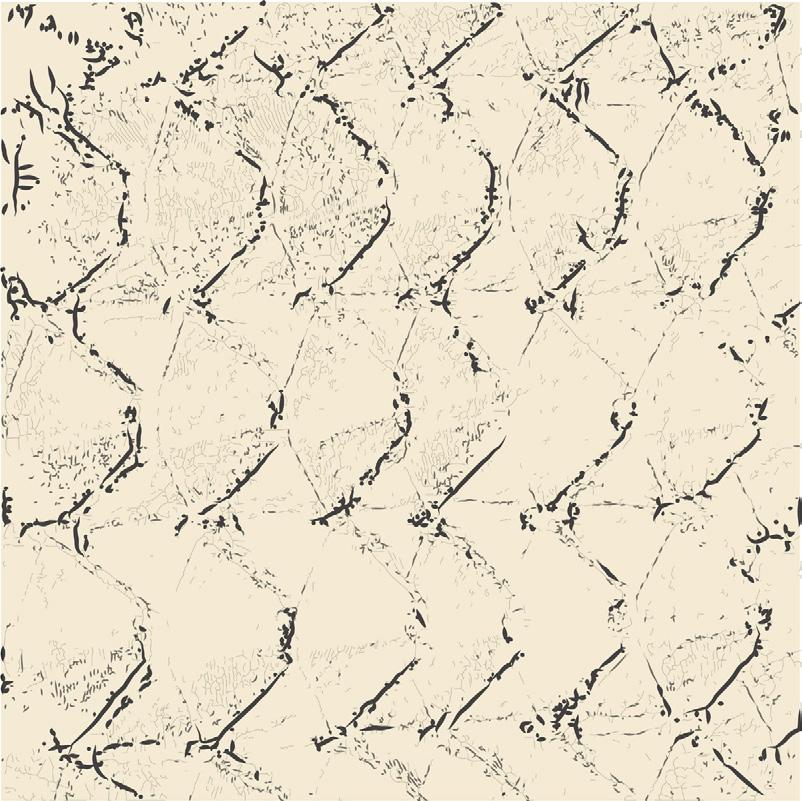
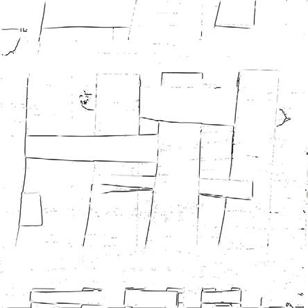
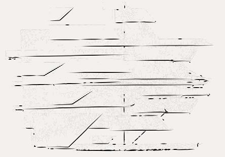
Line reinterpretation of image on opposite side.
Made with marker.
Line reinterpretation of image on opposite side.
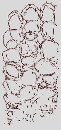
Made as a vector drawing using image trace.
Exploration of color and texture.
Exploration of processing material and shadows.
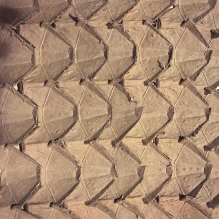
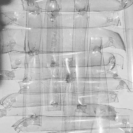
Plastic bottles that have been cut into strips and hot glued together.
Made after spring break.
Exploration of overlapping and interlocking material, and 3-dimensionality.
Made with strips of waxy paper stapled onto paper.
(Not shown in 4x4 matrix in page before)
Line reinterpretation of image on opposite side.
Made as a vector drawing using image trace.
Exploration of line manipulation and contrasting colors.
Line reinterpretation of image on opposite side.
Made as a vector drawing using image trace.
Exploration of figure ground.
LAURYN DOWNING
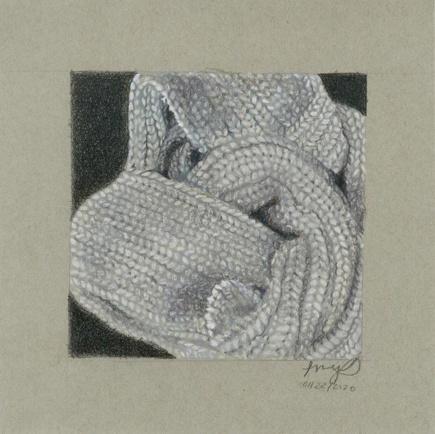
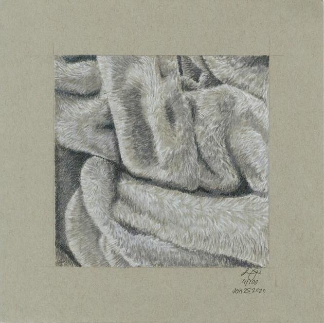
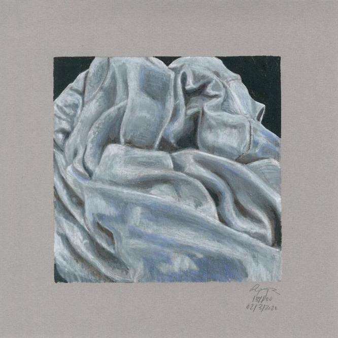
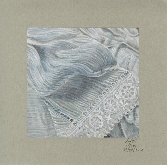
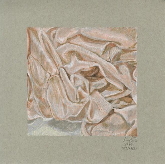
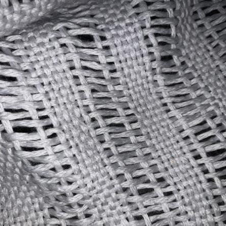
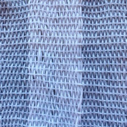
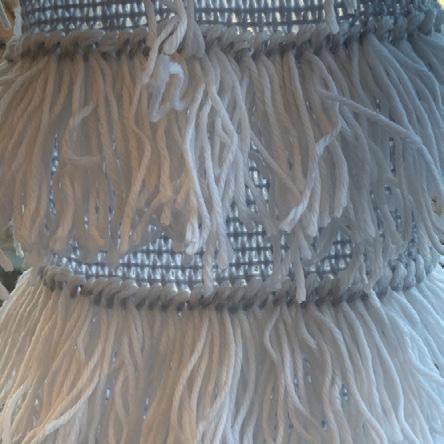
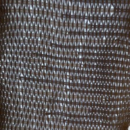
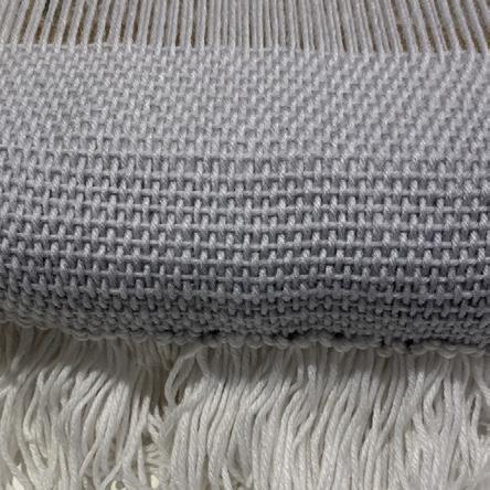
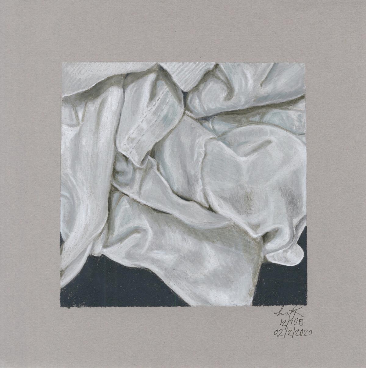
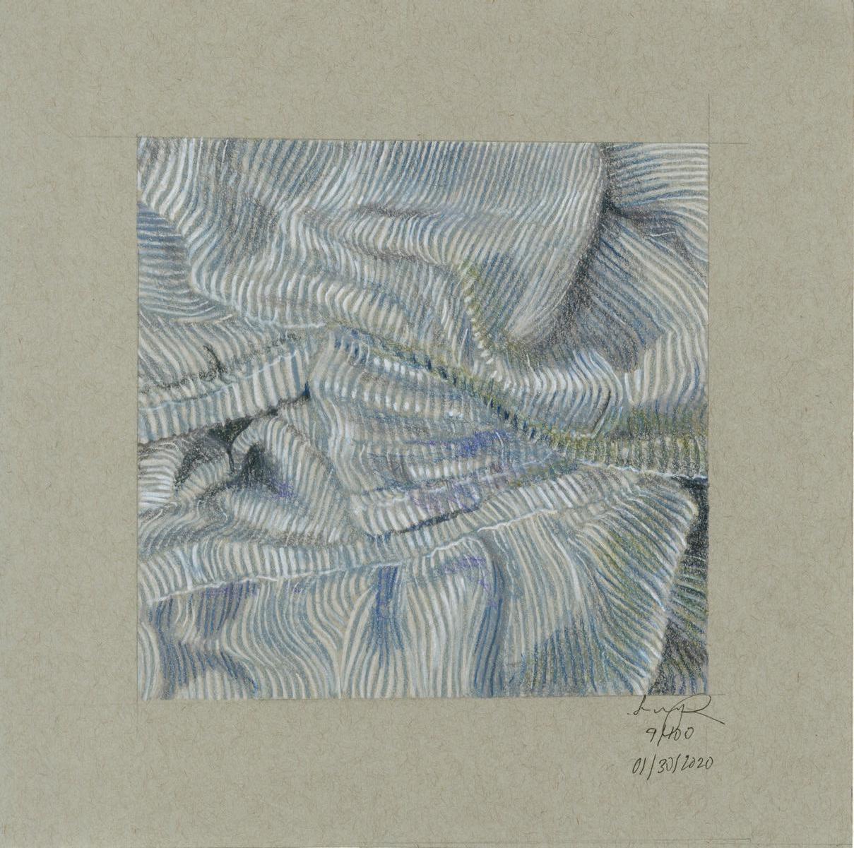
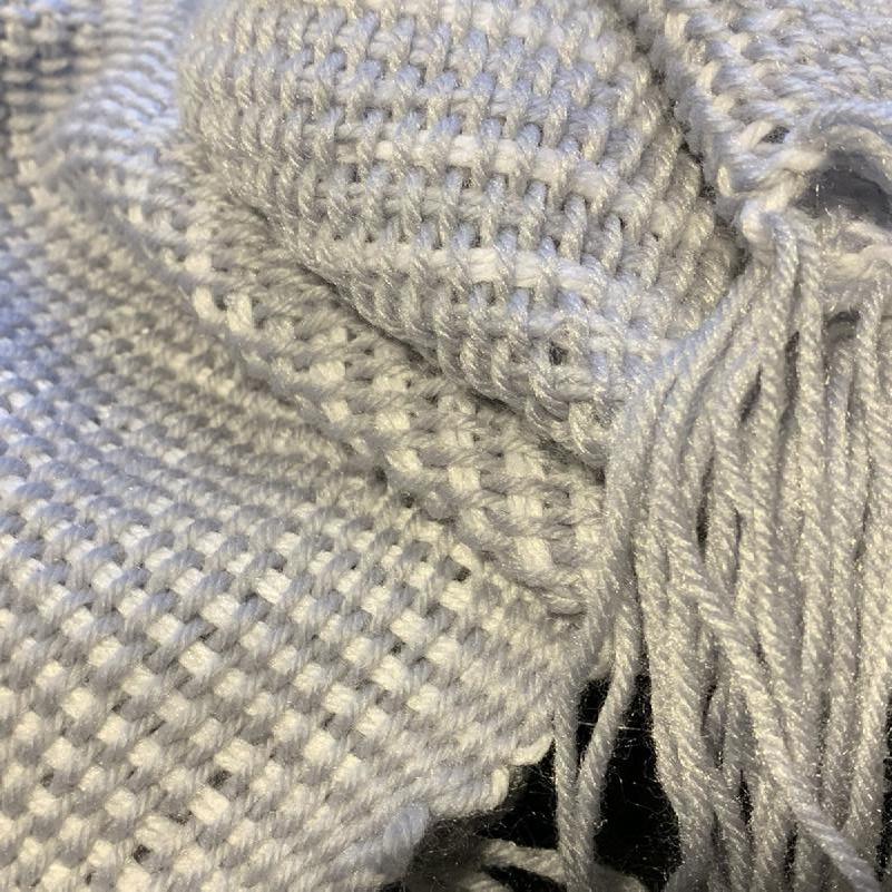
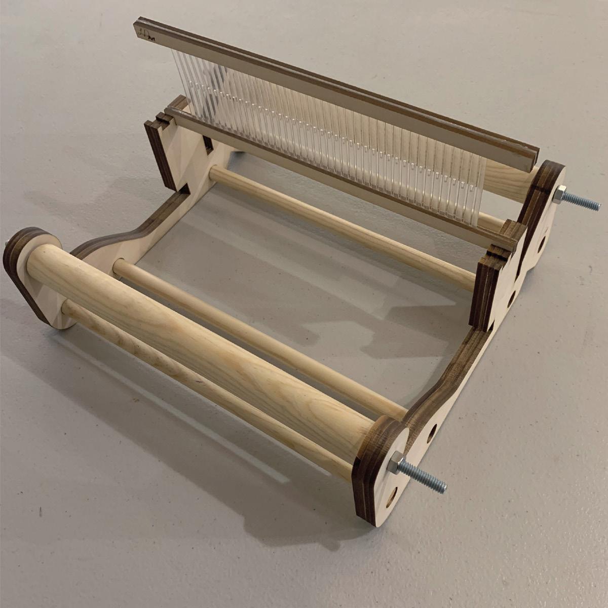
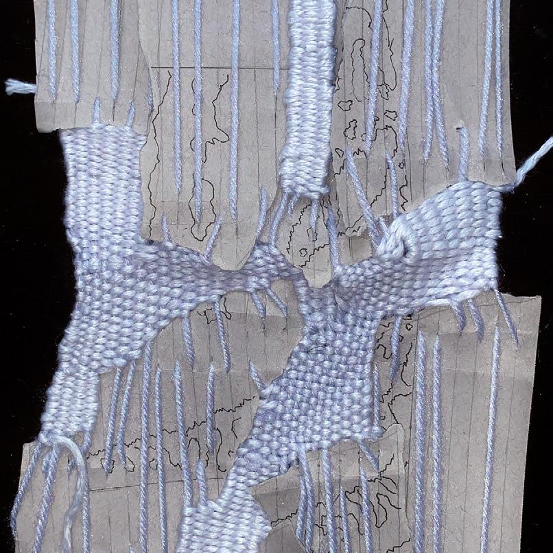
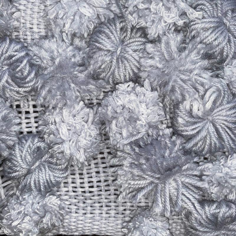
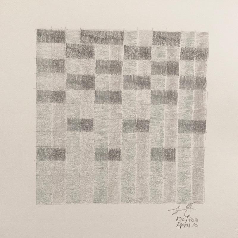
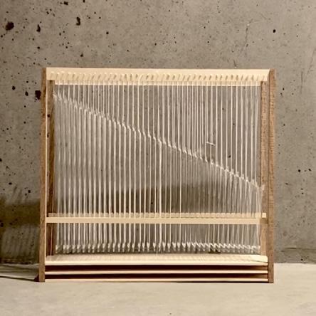
In my project, I seek to celebrate the sense of touch by investigating fabrics beyond the scope of the objects that they make up. I work in two distinct ways: I make detailed colored drawings of different folded fabrics; and I weave new fabrics using a portable loom I have designed and fabricated as part of the project. My hope is that the drawings and the fabrics I weave can evoke the sensation of touch through visual and physical means.
Before our current pandemic crisis, others could literally touch my fabrics and experience my original drawings in physical embodied ways. These experiences were an important aspect of the project. In the context of mass quarantine, physical touch is no longer possible, and the visual experience is itself impoverished due to the limitations of the computer screen. As a result, my hand-made fabrics are now just as visual as my drawings. Given that we are not allowed to have close physical contact with other people to prevent the spread of the coronavirus, many of us have found comfort in the softness of other things. Whether it be tissues, socks, or blankets, the lack of human’s touch may push people to observe things that they can touch more closely. Rather than remaining purely investigative, my project may shift more to the creation of “comfort items.” This would push my work into being more loom based than drawing focused.
12:
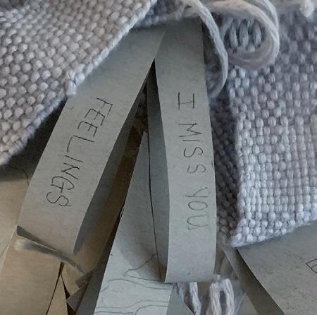
Day 72: Torn and Sewn Together Again
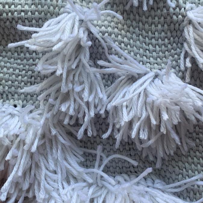
Day 79: Pompom
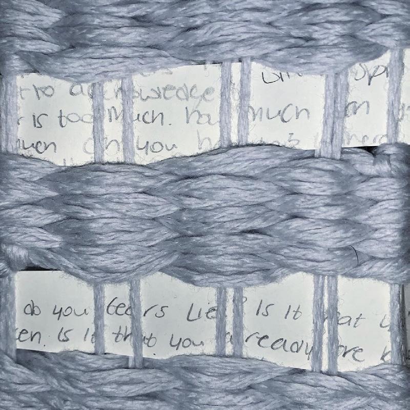
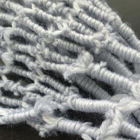
Day 83: Writing in a Basket Weave
Day 100: Abstraction
OMER GORASHI
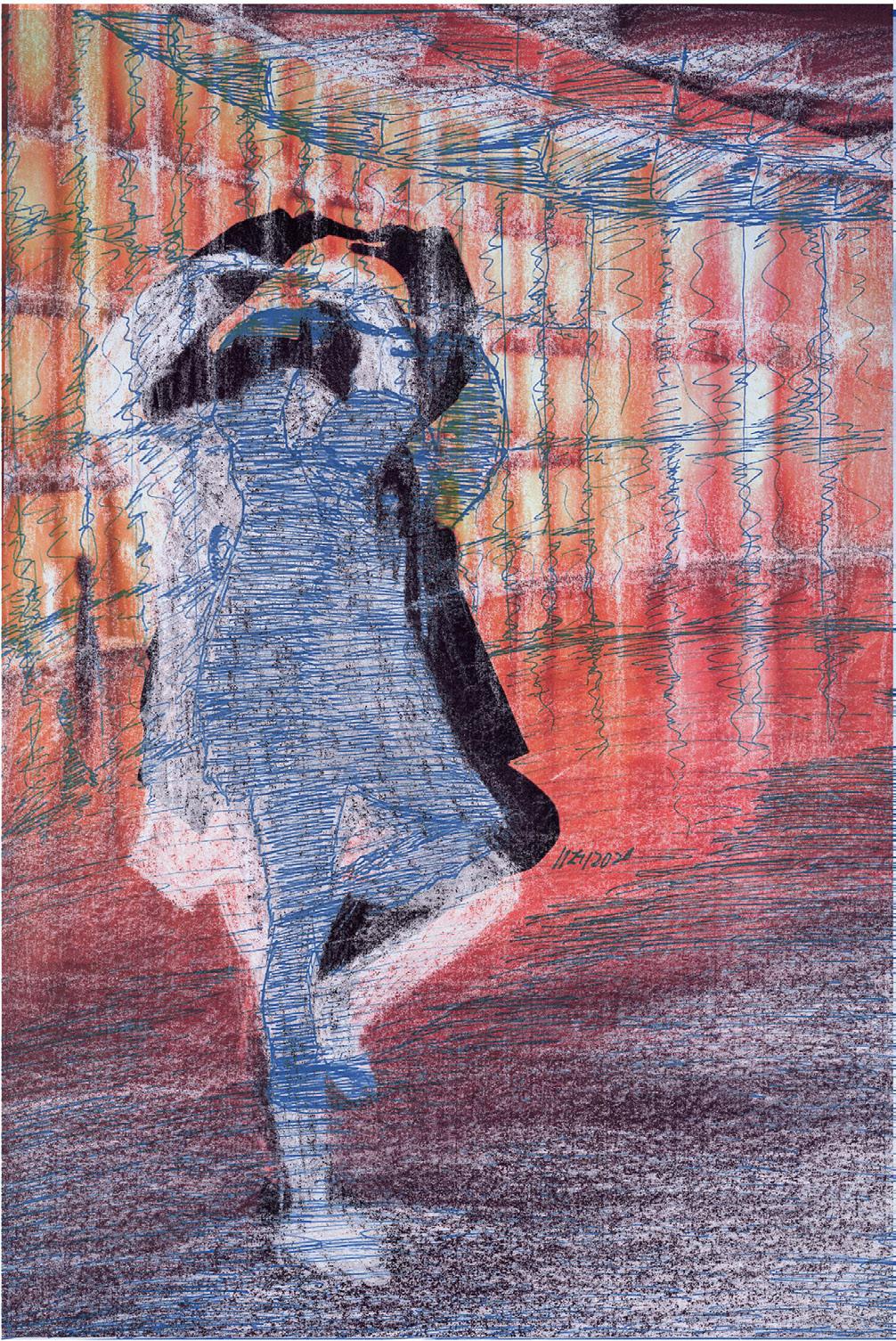
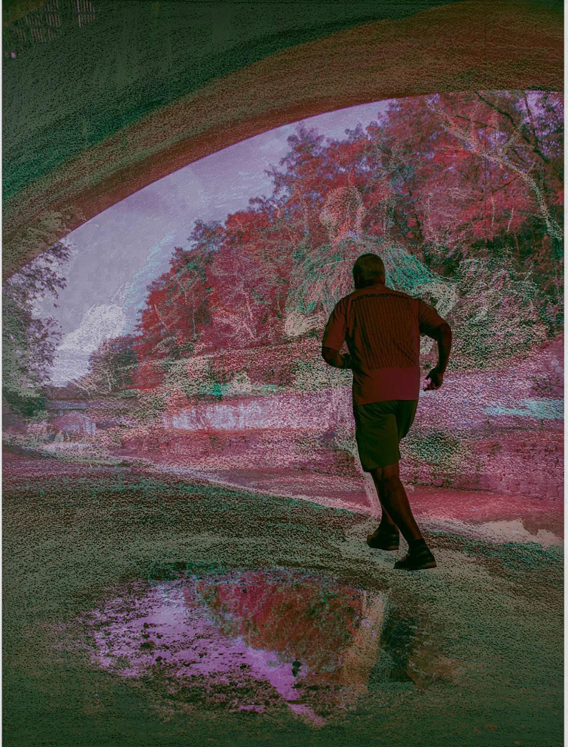
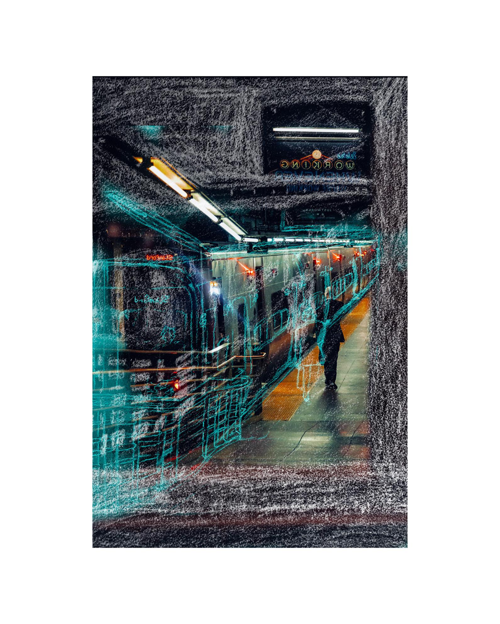
Without the privelege of wandering about and visually capturing what moves me, I have begun this project as a means of reflecting upon the significance of my photography work. I asked myself certain questions;
Why do I photograph what I photograph?
What does a photograph mean in an age of digital media proliferation to the creative as well his/ her audience?
And, in the age of image manipulation, what is a photograph?
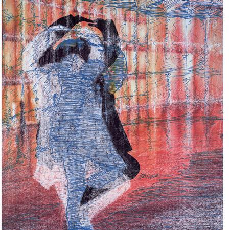
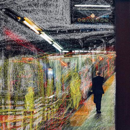
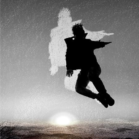
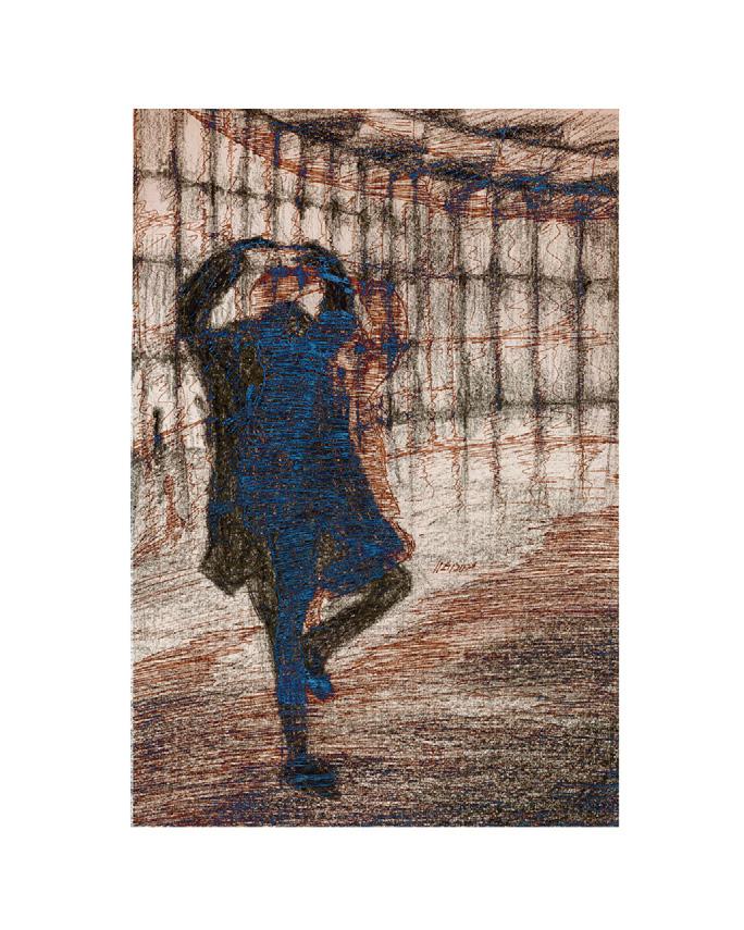
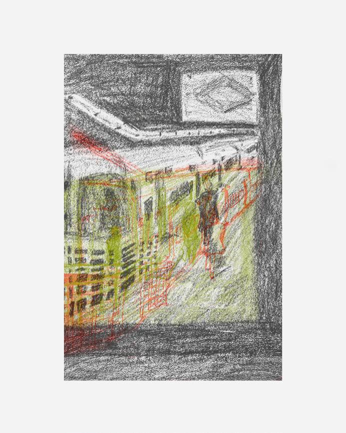
To explore these questions I have chosen select images that personally move me, then draw them using mediums that have shifted from pencil to pen and finally conte crayon. The drawing then becomes a physical manifestation of my meditation on select photos. After completing the drawing, I scan it, and via photoshop then overlay the drawing and the original photo creating a visually rich palimpsest. Each day becomes an analysis of error of the past, celebrating the margins of error that each day brings.
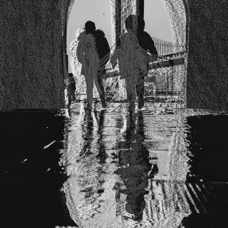
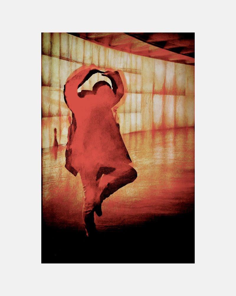
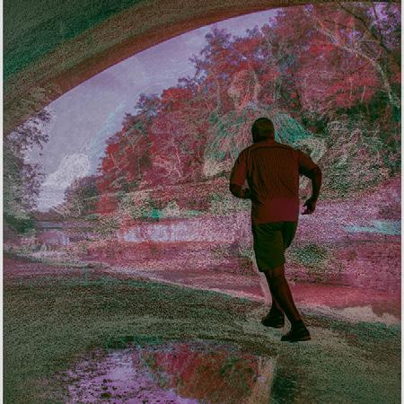
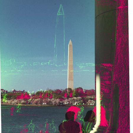
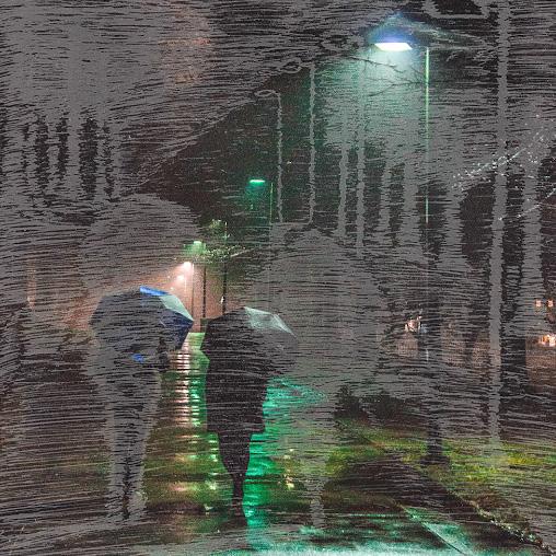
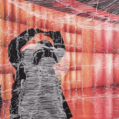
In the current pandemic crisis, many of us have been removed from the public spaces we normally occupy, forced to take refuge in small domestic places such as homes and flats. It is important to find solace in these places and in solitude itself. It is also important to reflect on our simple everyday spaces and on how they can comfort us and nourish our imagination. In response to these new conditions, I consciously work with photographs that depict single human forms, then process them digitally to evoke a current sense of loneliness and isolation and take time to dwell and better understand it.
More recently with the corruption of my hard drive, containing my lifes work so far, I have begun to use the mere thumbnails I only have access to, as I means to protest this idea that photographs have been reduced to mere thumbnails that are observed for mere instants, normally via instagram.....

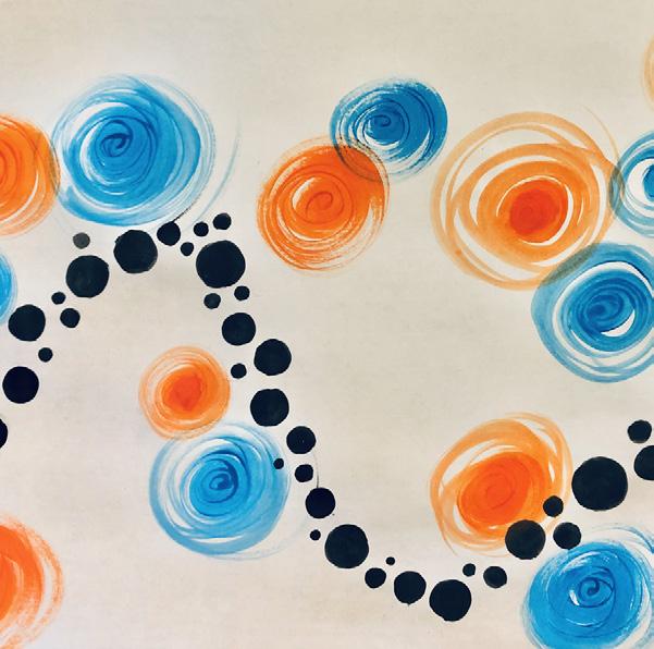
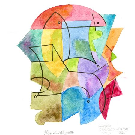
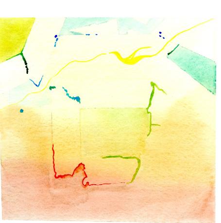
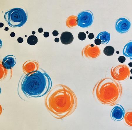
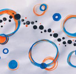
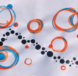
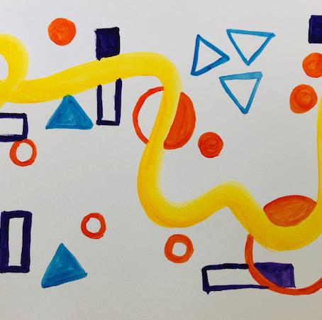
PEARL HA
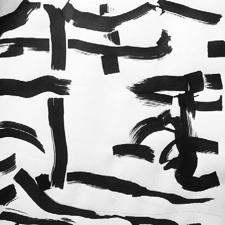
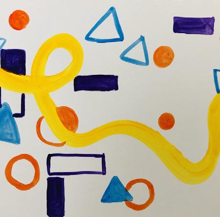
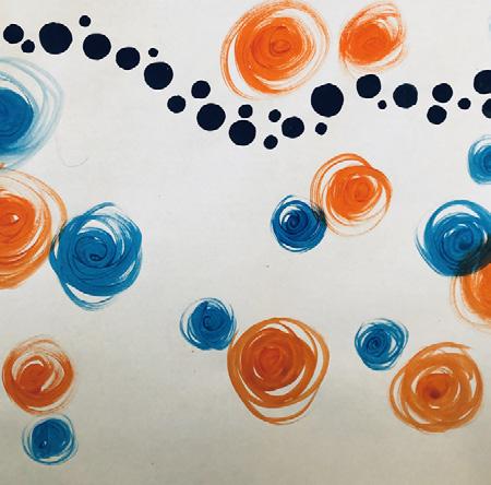
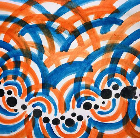
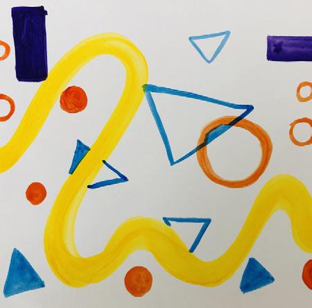
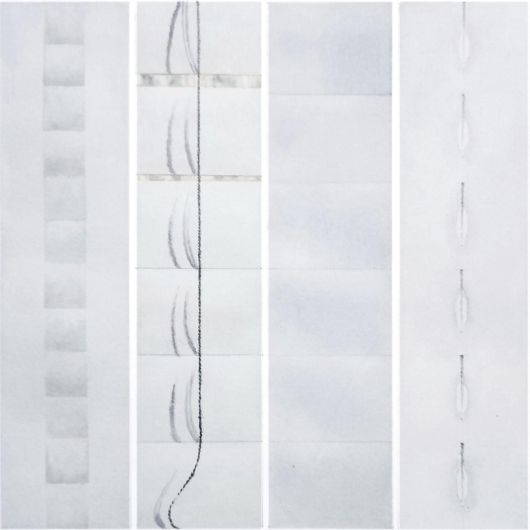
I began my daily project by creating abstract paintings that evoke the experience of listening to a particular song—a song that I find interesting and meaningful. Another way to describe my work is to say that I am seeking to create visual analogs to music. Formally, I have been working with a palette of bright colors and curved sweeping and looping lines, as well as a variety of geometric and organic shapes. In some ways, my project is also a journal of my everyday life compiled into weeks. Each week I listen to a different song every day and try to translate it into abstract forms. The most powerful form is always a major line that crosses the entire page and that links with the corresponding lines on other pages.
In response to our COVID-19 crisis, I would like my project to also begin to reflect the impact this pandemic is having on my life. One of the most shocking things about this virus is how contagious it has proven to be, and I have tried to record my response to this frightening fact in my most recent paintings. Going forward, I would like to use the same abstract shapes, lines, and vivid colors that I have used in earlier paintings in order to create new paintings that evoke some aspect of this new situation. Each week I will remain open to new ideas while remaining consistent with the original idea of the continuous line that connects each day with others.


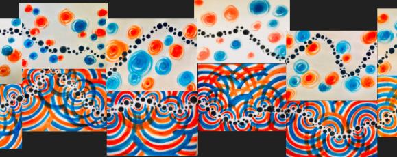
Compilation of two weeks combined. Each row and paint pattern describes one week. While earlier week paintings were made so that the lines would connect when each painting was lined up perfectly, I wanted to make the later weeks more interesting by staggering the paintings while still connecting the lines.
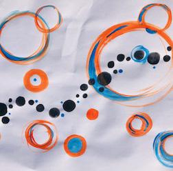
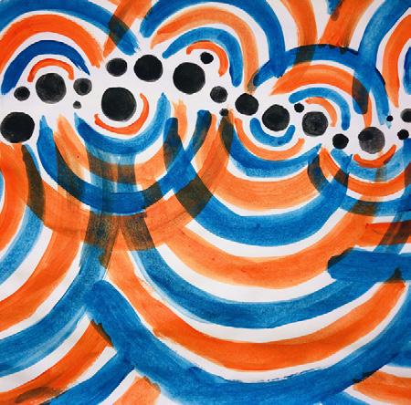
This week was a series on studying color. It is also the first week after the pandemic started and we were instructed to quarantine. I wanted to reflect the contagiousness of the virus that I was surprised by when thinking about how quickly this pandemic became underway. This was illustrated primarily through color while still remaining consistent with the continuous line.
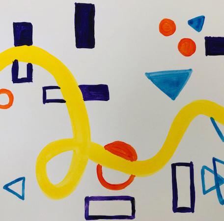
These images were part of a collection from one of the earlier weeks of this project. This week was focused on the abstract elements of my project and challenged me as I wasn’t the most comfortable in creating abstract pieces but allowed me to be more creative in using simple shapes and colors.

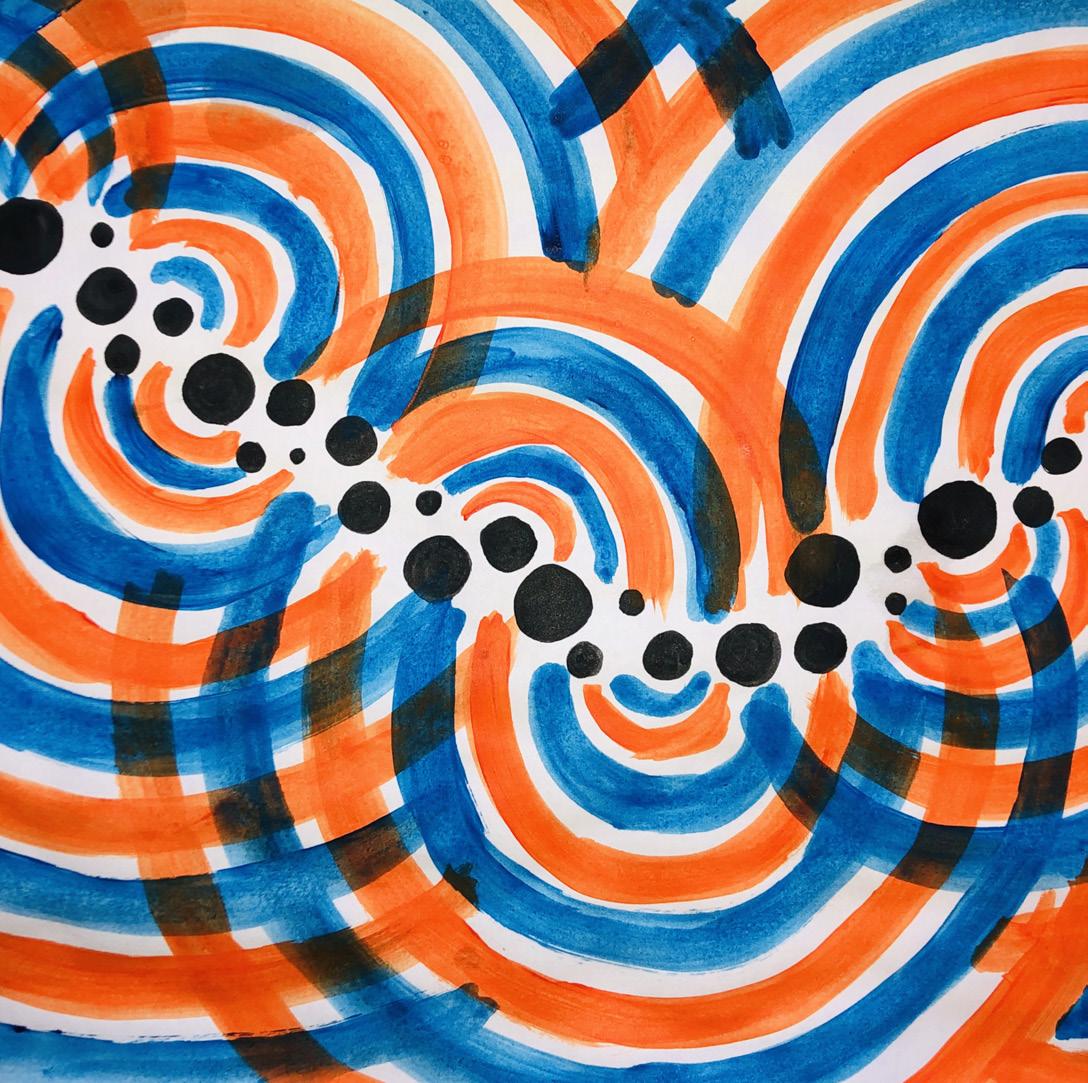

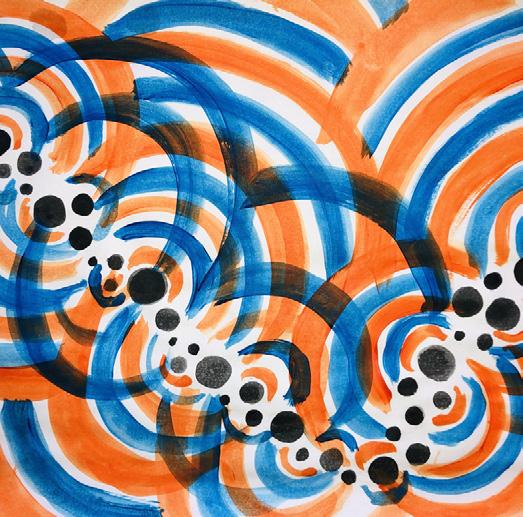
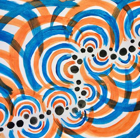
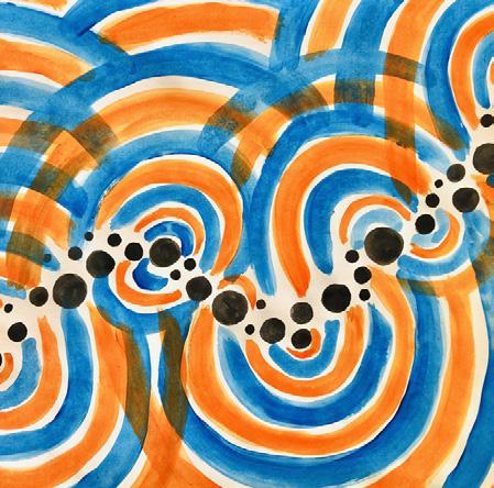
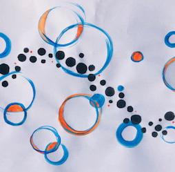
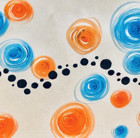
Cutting out the distractions involving too many colors, this week and the following series just focused on the colors blue and orange. This week was unique in the sense that I left little white space on the paper and focused on creating rings reflecting off of the line resonating throughout the paintings.
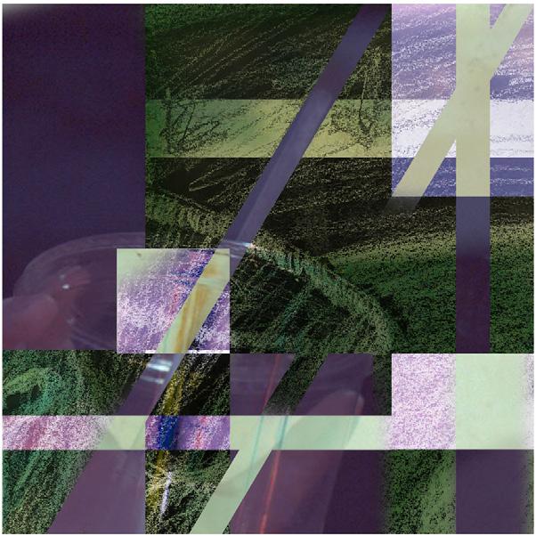
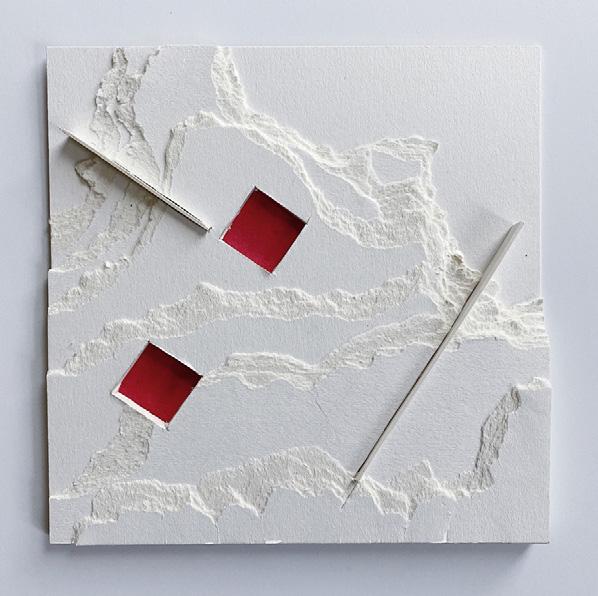
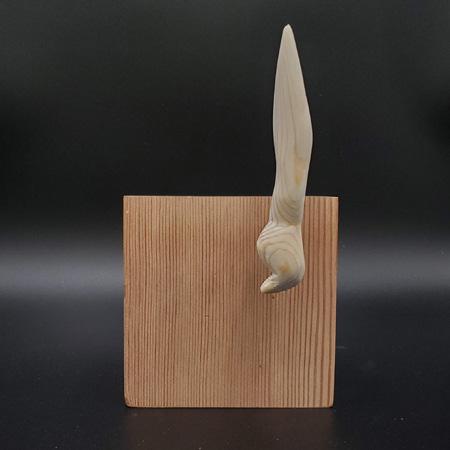
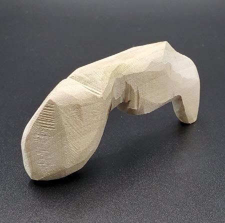
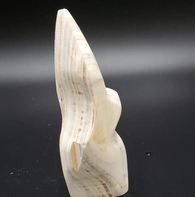
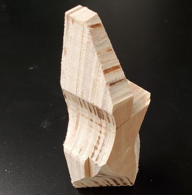
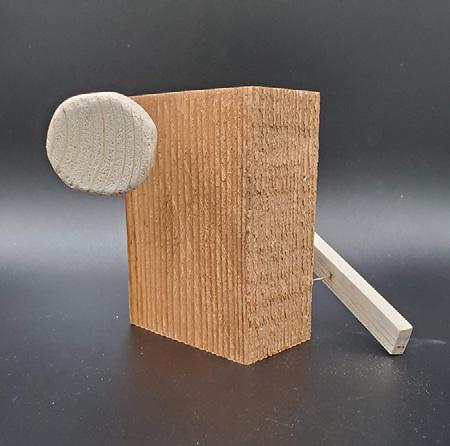
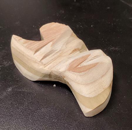
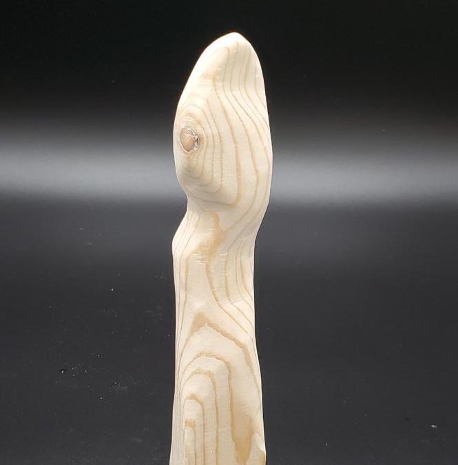
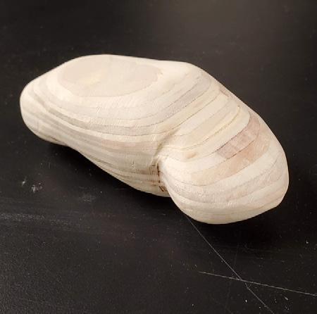
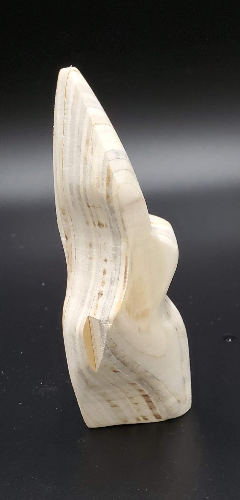
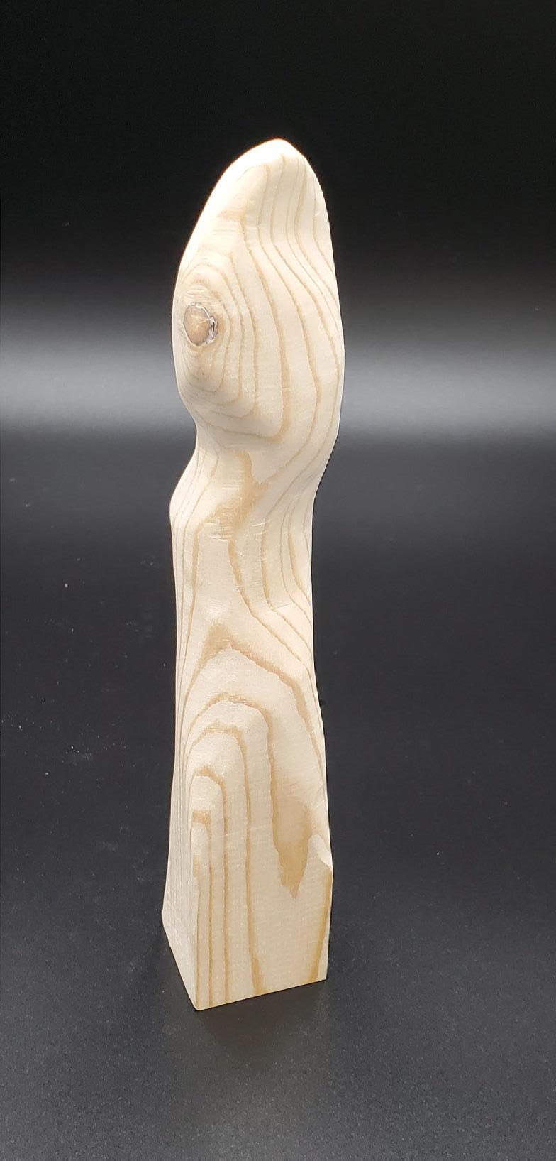
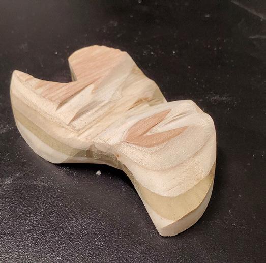
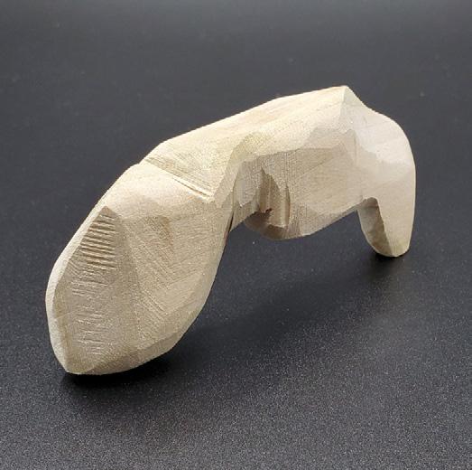
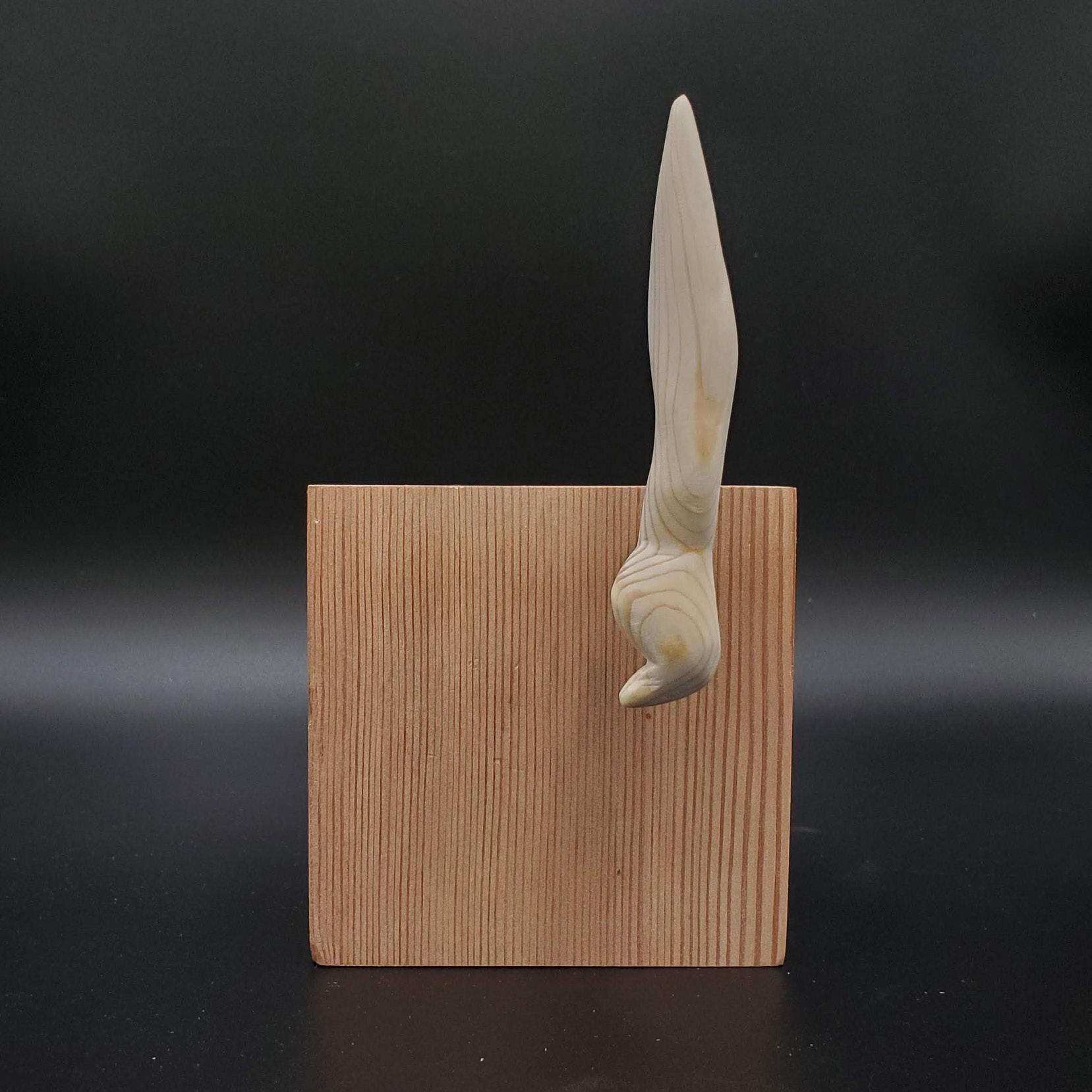
During the first half of the semester, I hoped to explore one material, wood, through a process of creation. I experimented with different woodworking methods, learning about the characteristics of wood and its associated tools. At first, I restricted myself to methods of subtractions. After sourcing wooden scraps from a community discard pile, I would saw off parts of the block. Then I would sand the block into a rounder and smoother surface. Hand tools and sanding paper allowed me to reach a level of smoothness that imbued my sculptures with a luscious quality. Tactility revealed itself to be a central theme in my work.
Later iterations would explore the texture, grain, and color of different wood types. At a certain point, I began to assemble the objects which I had made into larger compositions. Copper wire joined a collection of things into cohesive compositions.
At this point, our unprecedented situation regarding COVID-19 threatened the fundamental framing of my work. The physical limitations I had accepted as part of the work, that I would rely heavily on access to the Architecture school and its resources, have necessitated a drastic change in how I work. New restrictions on physical proximity and contact have eroded the central theme to my pieces- touch.
Moving forward, I continued the methodology and spirit of my original project, while changing the subject. The importance of learning new techniques and exploring textures remains, but I have traded a project focused on tactility created through woodworking for one which is centered around color, typography, and a process of visual creation through digital means.
My projects in the second half of the semester start with the creation of a new typeface which I then use in a variety of studies around color. The first projects I created focused more intently on the geometries of these typefaces. I then began exploring atmospheric and colorful projects. Finally, I ventured into transformations of color over time, producing animations which showcase a rich spectrum of color and suggest the luscious tactility of my original work.
Top Left: Day 19/100
Top Right: Day 20/100
Bottom Left: Day 11/100
Bottom Right: Day 31/100
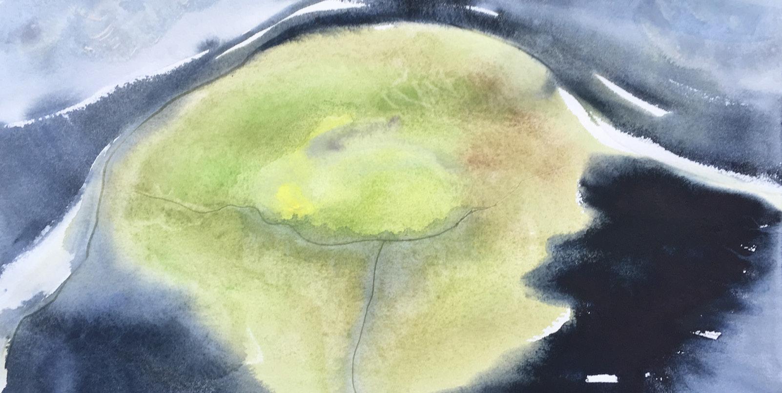
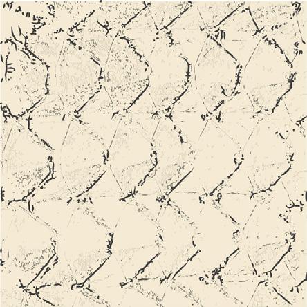
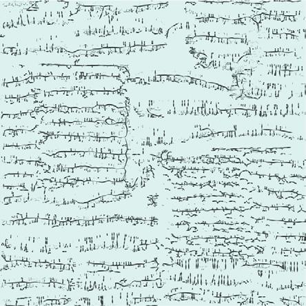
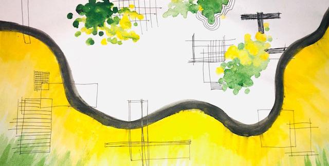
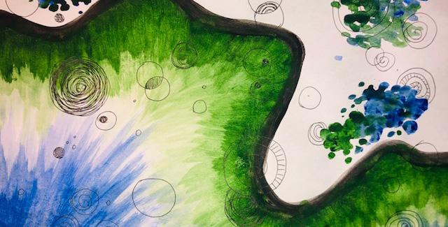
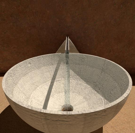
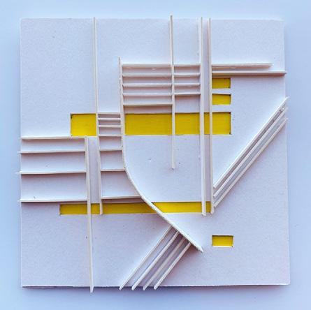
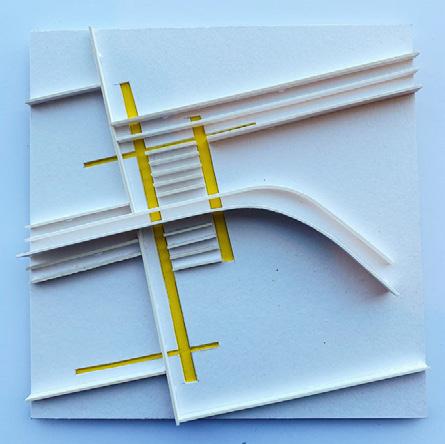
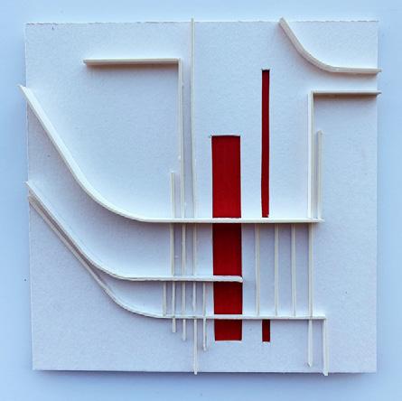
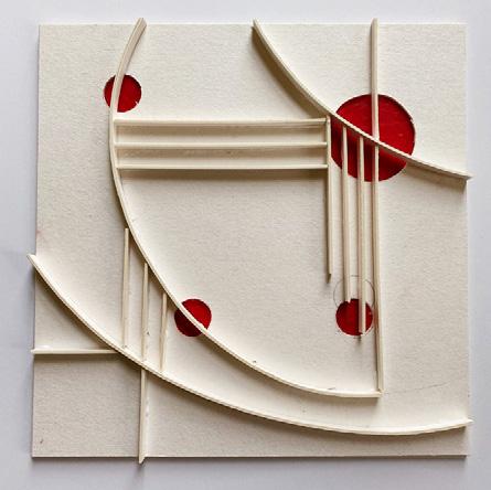
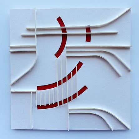
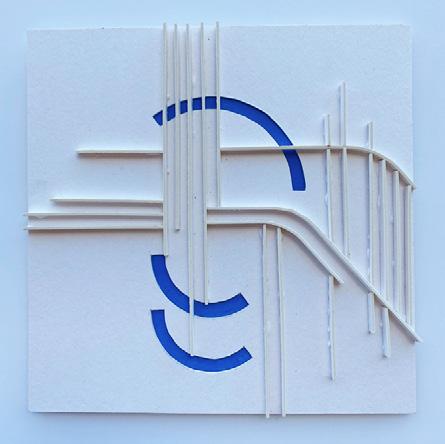
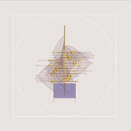
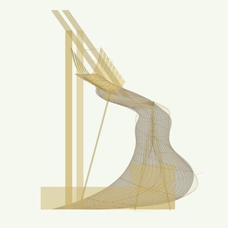
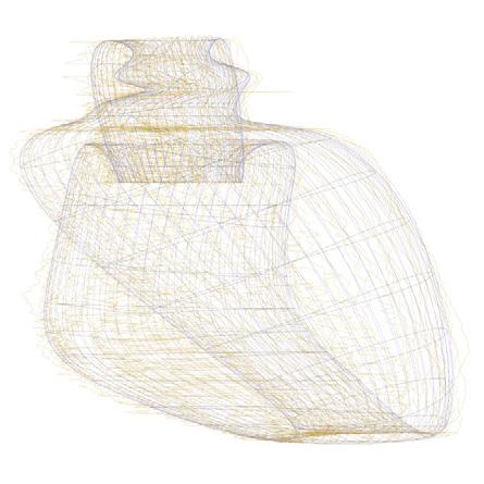
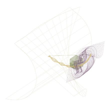
My project focuses on the four cardinal elements—earth, wind, water, fire—as they might be experienced within a natural setting. Specifically, each day, I work on the design of a pavilion that represents one of these four elements. By means of formal composition, I seek to express qualities of each element and to create an evocative, though imaginary, architectural space. The scale of the design is vast and all encompassing, and it might be described as sublime or even perverse.
The basic essentials of any house contain all the four elements. However, they remain invisible. It is perhaps due to this imperceptibility that I adopted the elements as my focus; an effort to readdress the “domesticated” perception of such fundamental resources. I felt as if these primal and mythical elements, which are and have been celebrated throughout all cultures, are now unappreciated and taken for granted. I wonder now, given our current crisis, if the rest of the world has shifted its perception about the elements in their homes. The anxiety that is fueled by worst-case-scenarios has only proven the importance of the four elements in our lives. Despite our advanced technology (electricity, computers, artificial “daylight”), earth, fire, air, and water remain essential to our social, cultural, and aesthetic well-being.
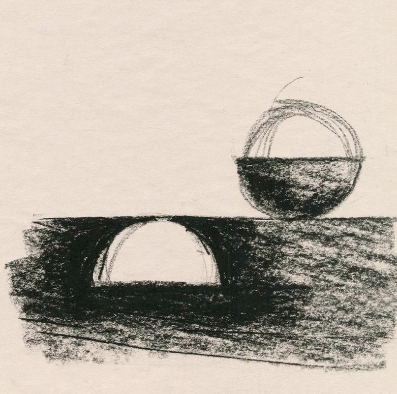
In regards to materials, I tried not to limit myself and explored a variety of mediums from charcaol drawings to computer renderings. The earlier weeks were spent observing each element sperately and by the end, the lessons derrived from these studies culminated into a single, combined pavilion.

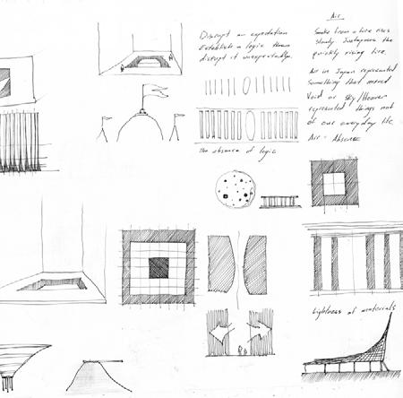
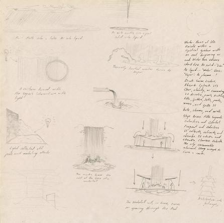
Each week, initial sketches and word associations are drawn to reach a poetic and physical understanding of each element.
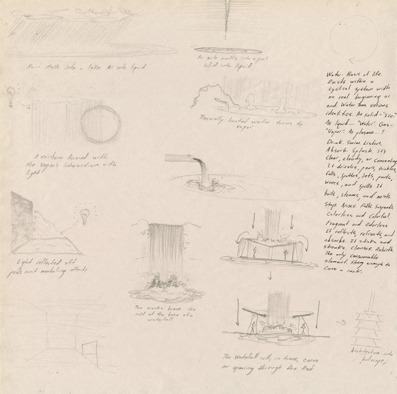
Top Image: Sketeches and poems exploring water.
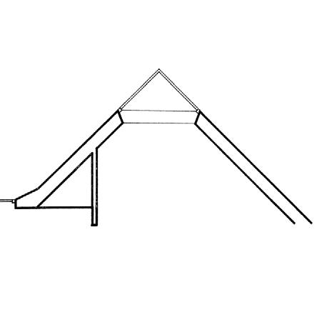
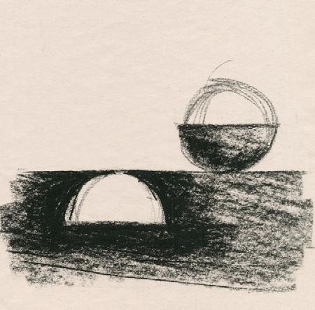
Bottom Image: Charcaol sketch of the Earth pavilion. A process of subtraction and addition.
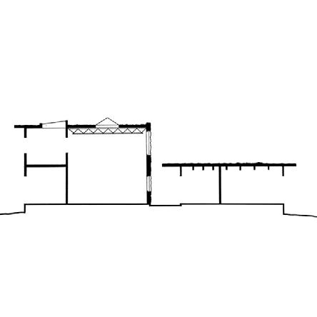
Diagrams help illustarte the functional or poetic systems that underline the pavillions.
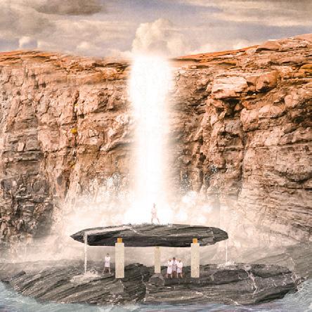
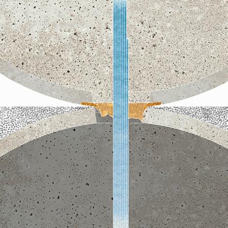
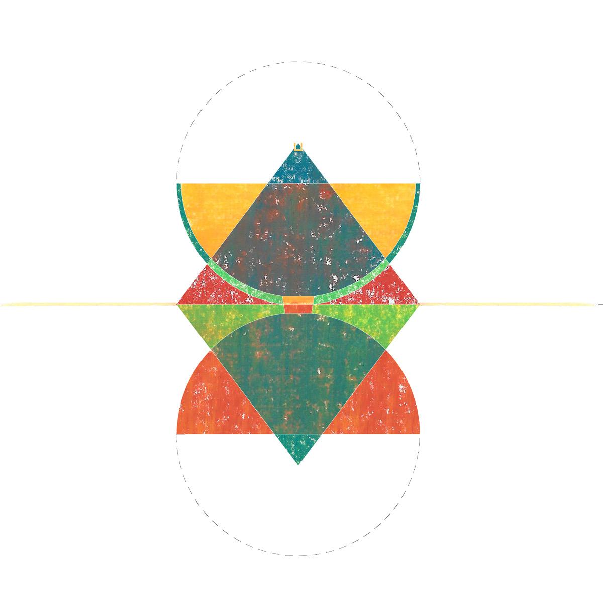
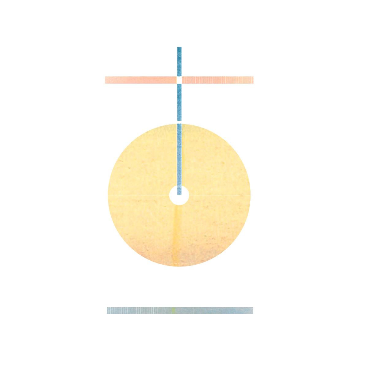
Top Image: Section elevation diagram of the combined pavilion. This shows the associations of the elements (in color) made with the spaces.
Bottom Image: Plan diagram of the same pavilion showing the water spout.
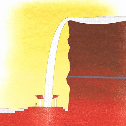
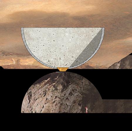
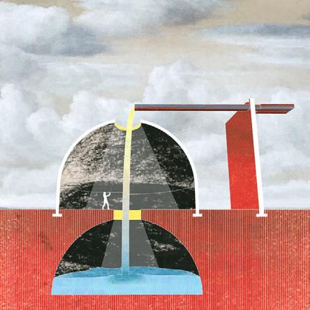
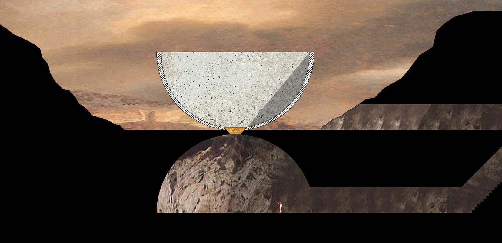
Top Image: Digital collage of the water pavilion. The waterfall will eventually carve a hole into the stone roof.
Bottom Image: WSection of the Earth pavilion. A statement on subtraction and
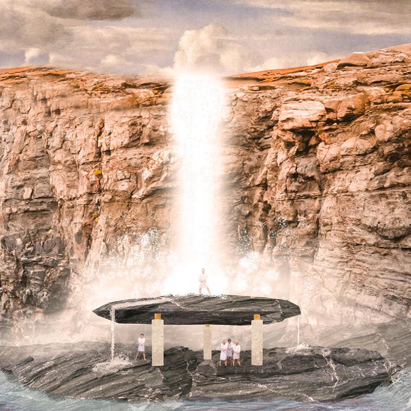
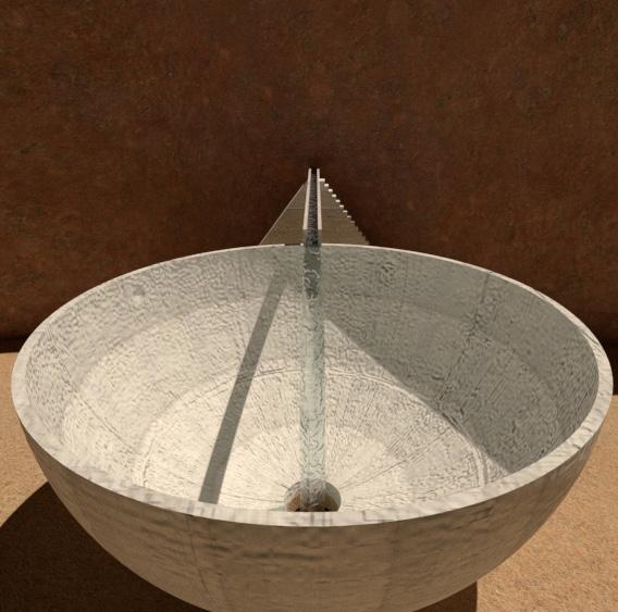
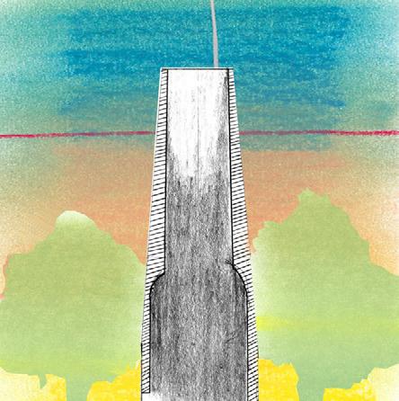
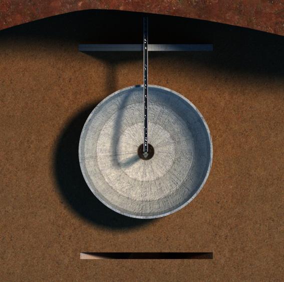
Rendering of the combined pavilion. Water is poured into the concrete basin.
Plan showing the seperate elementsStairs, Bowl/ Oculus, Stairs.
JONAH PRUITT
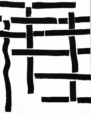
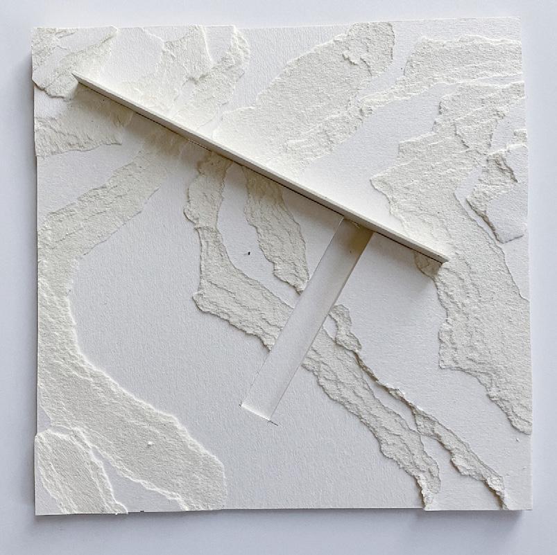
My work began as a study in precision, geometry, and abstracted space. With primary colors and staunch square frames, the project worked best as a series: one day flowing into another. Each day, I made a new white square to which I added a primary color and linear projections and recessions. My goal was to explore formal relationships and expressive potentials within the square format.
During the current pandemic crisis, heartbreak, and my intense isolation at home, the project has changed. Still in the tight rule of the square, the new series is a study in texture, field conditions, and topography. The introduction of precise cuts maintains some of the previous formal language while allowing the pieces to reflect the intense confinement of day to day life, as well as the earthshattering changes happening all around us. Color is slowly being reintroduced back into the compositions, as a new feeling of normalcy allows days to become tolerable and moments of joy come back into life.
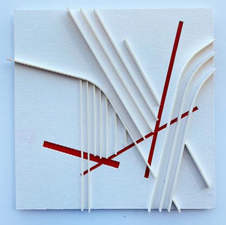
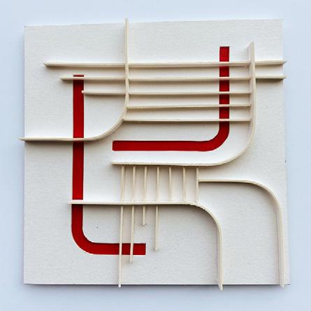
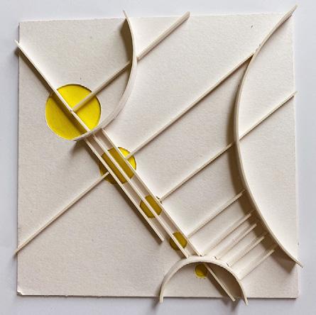
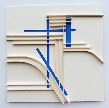
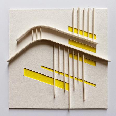
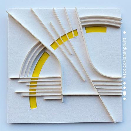
Mixing color, topography, and interjecting wall elements became the expression of the project after quarantine began.
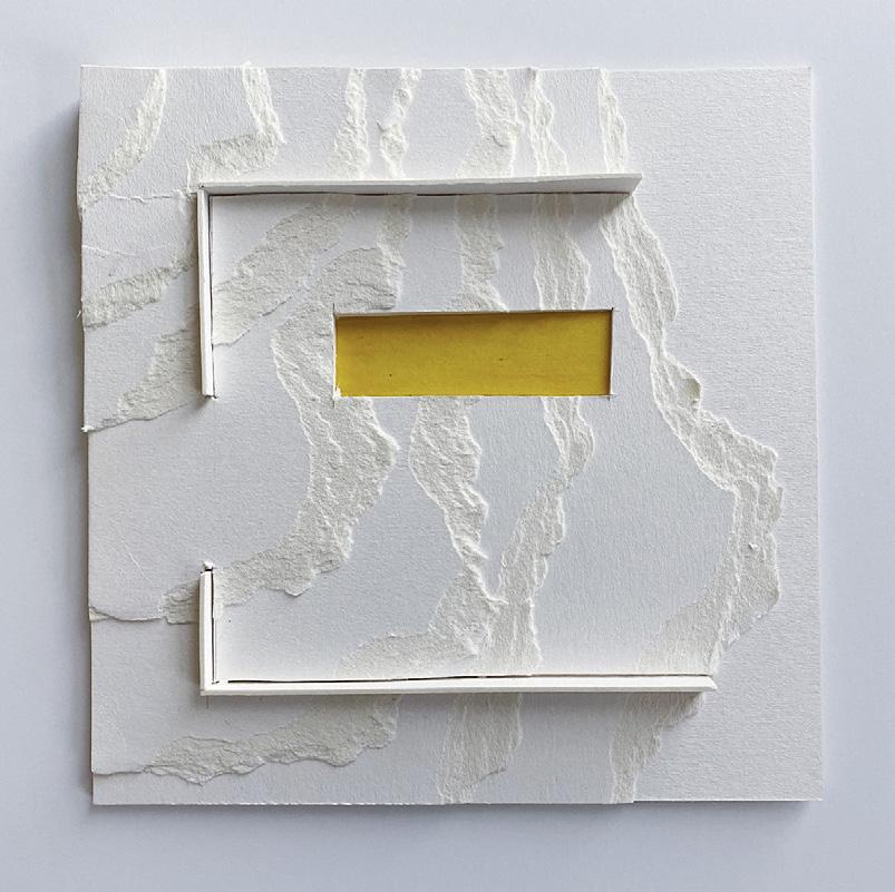
I remained with the square format and primary colors for the whole project.
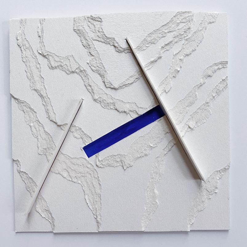
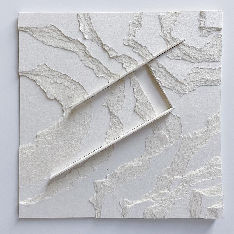
Bleaching out the compostions to all white also had interesting effects.
These pieces feel like they could go on forever despite the tight square frames.
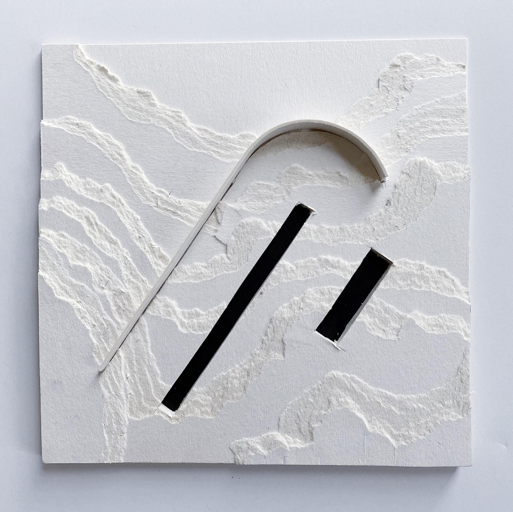
The last experiment was to use black as the central color. This gives the series an ominous tone, where it is unclear how deep the cuts extend backward.
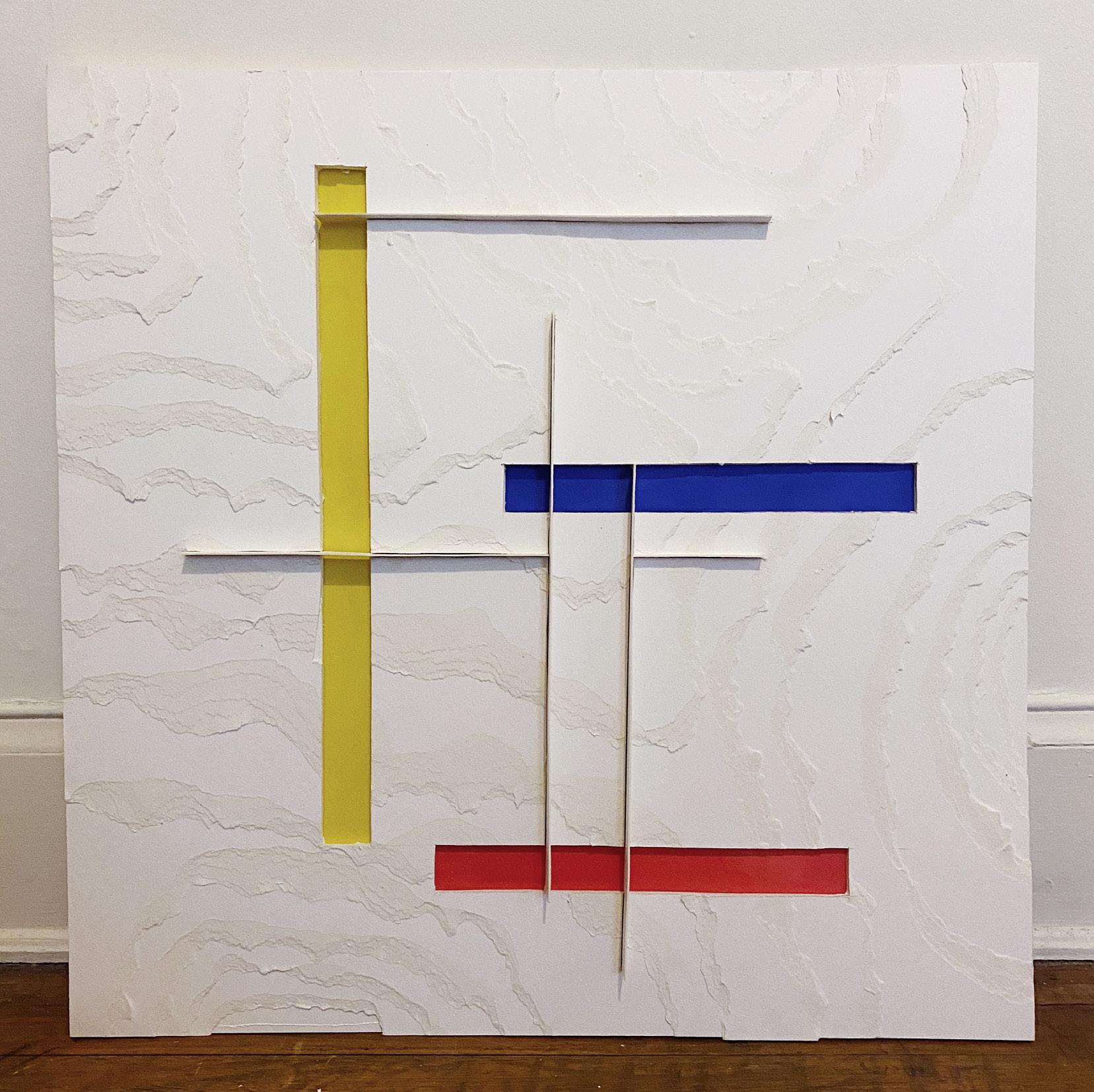
The final composition for the course complete on day 100 is 30”x30” and uses elements from all phases of the project.
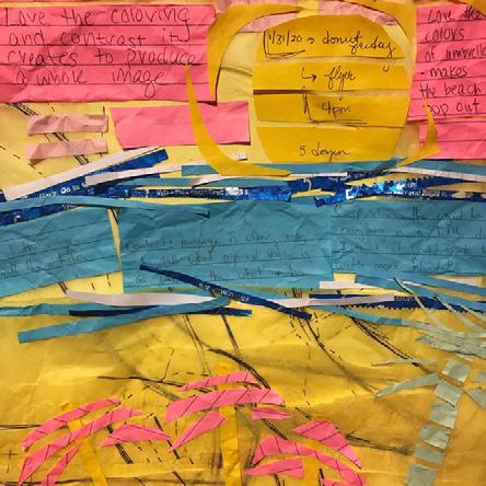
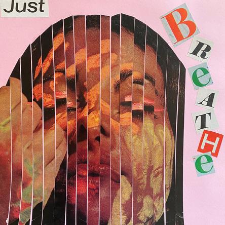
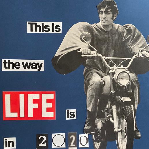
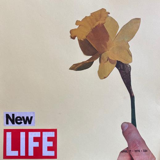
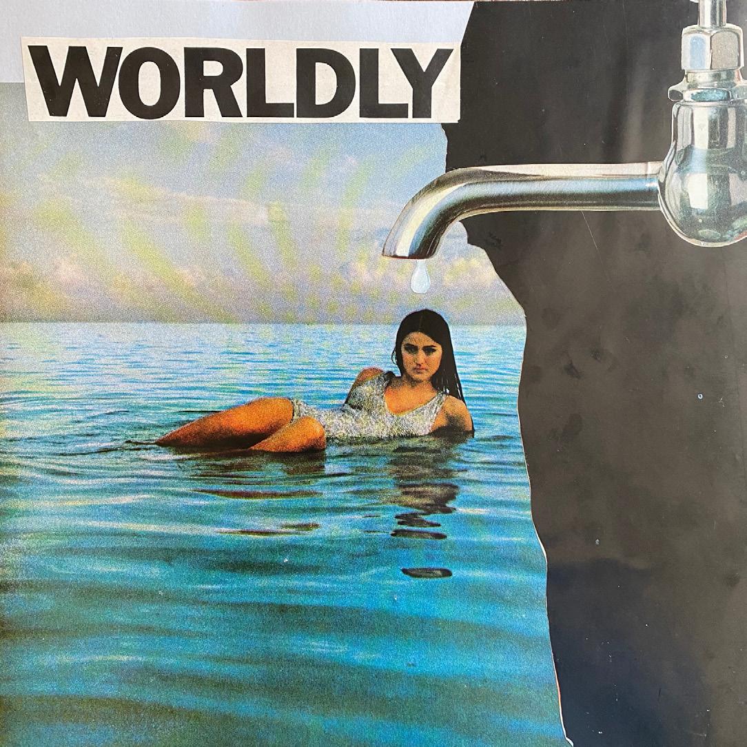
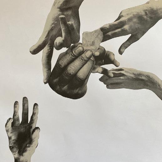
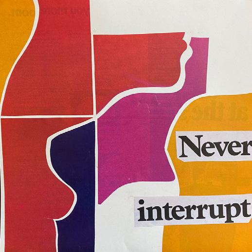
SIMOPOULOS
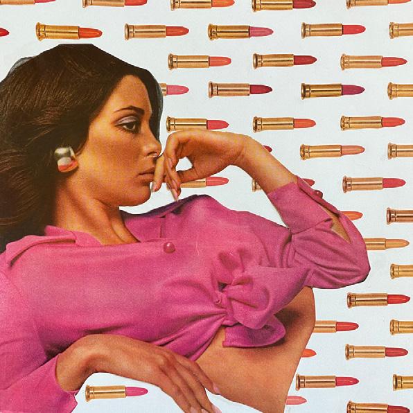
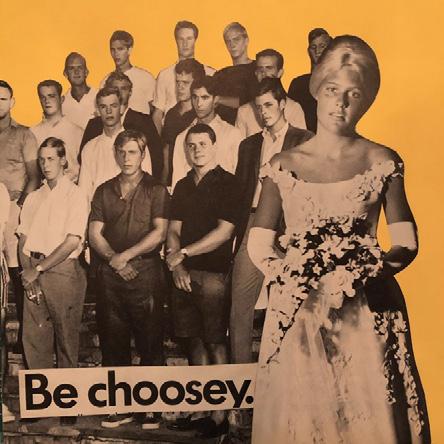
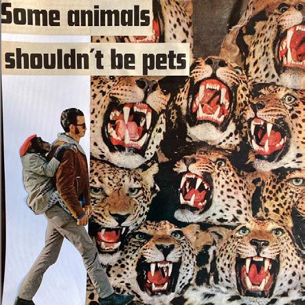
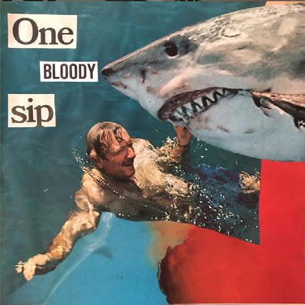
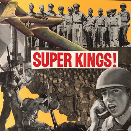
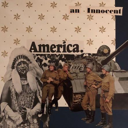
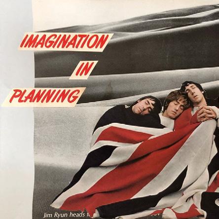
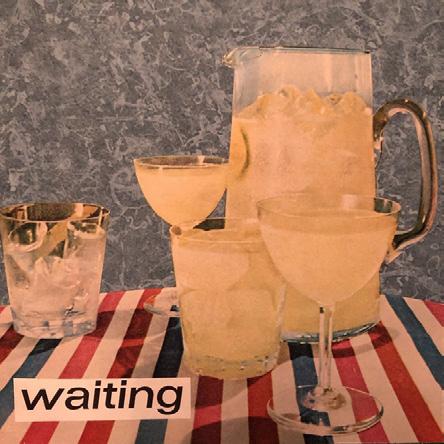
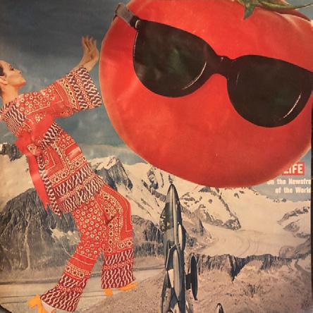
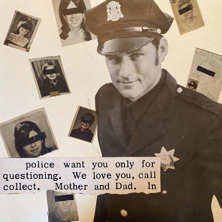
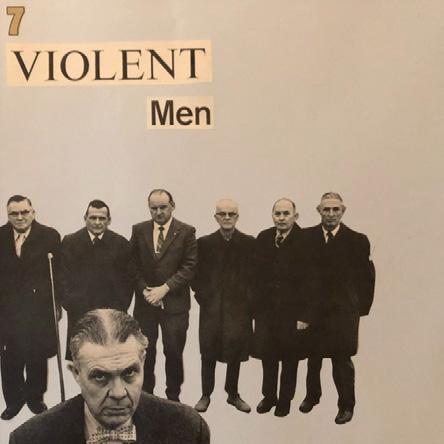
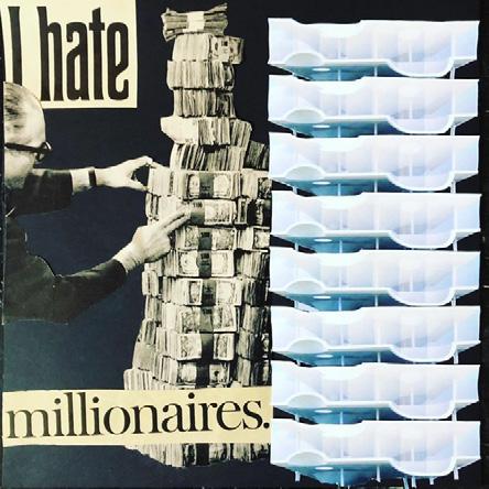
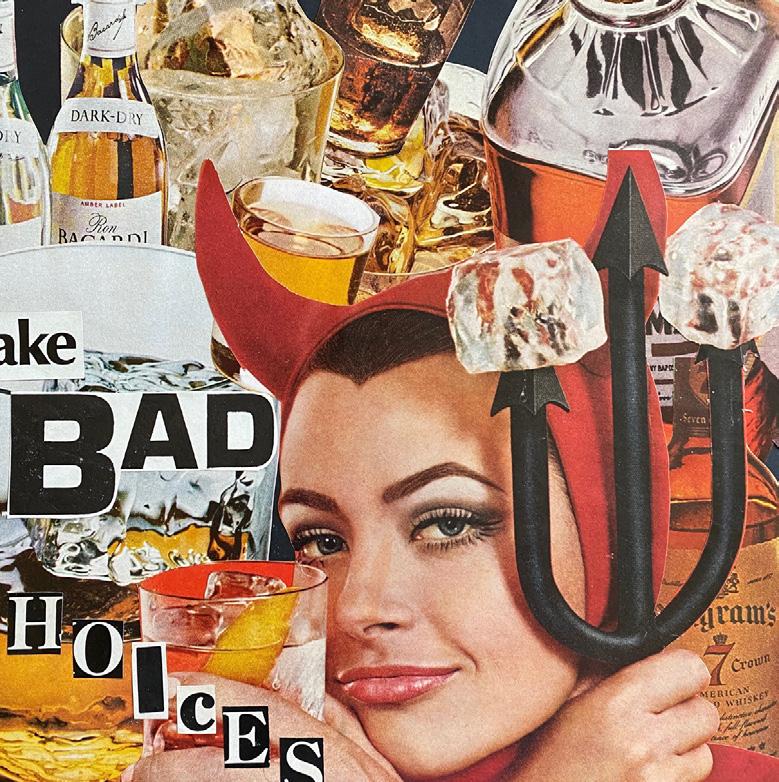
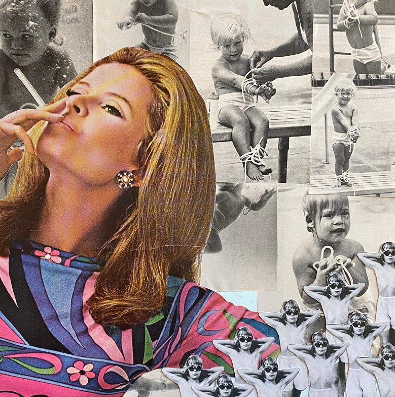
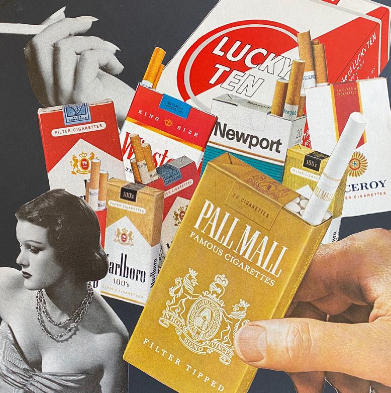
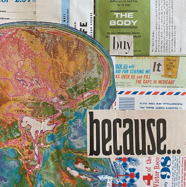
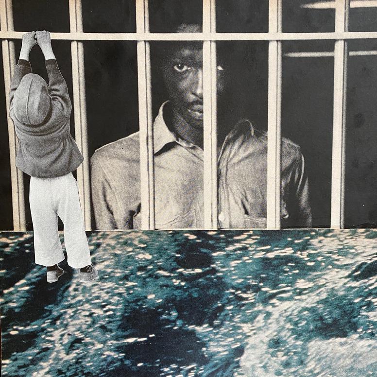
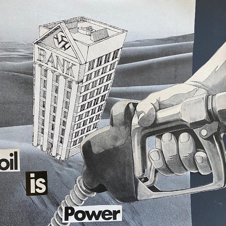
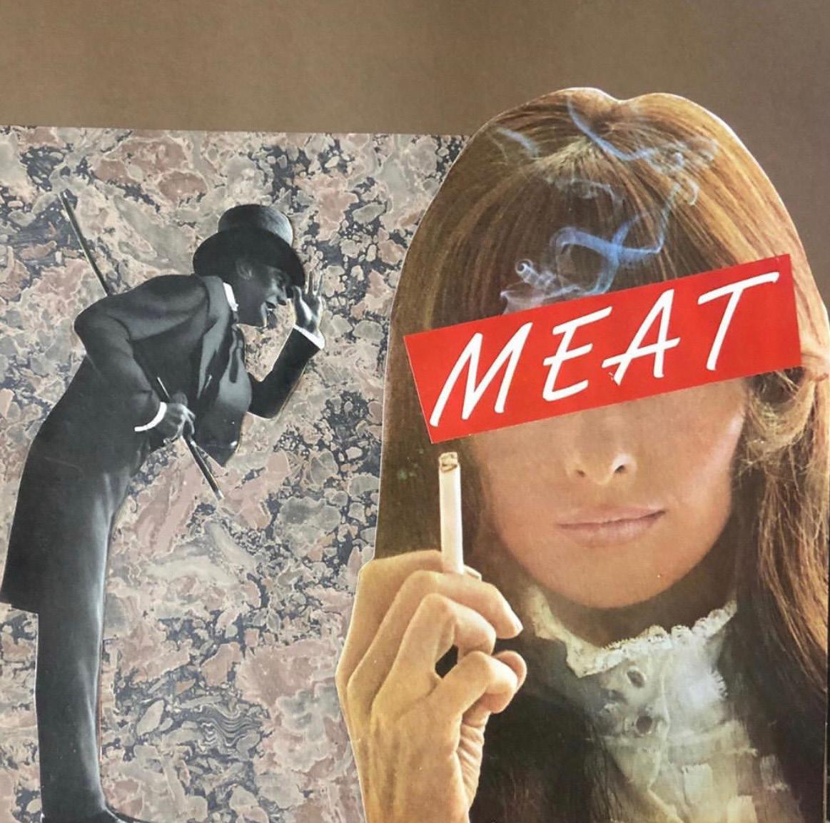
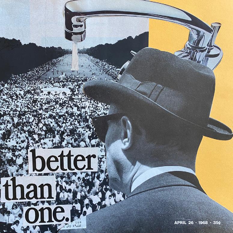
In this project, I explore the social, political, and cultural issues of our contemporary world. Using old copies of LIFE magazine, I make collages in which I seek to express my ideas in unexpected and compelling ways. Most of the collages that I create portray the issues I see in the world around us in both more obvious and apparent ways, as well as inconspicuous and subtle manners. My work is also about formal relationships and achieving a sense of balance, tension , or ambiguity on the page through the collage’s composition. For instance, one formal method I use is amking curious, odd, or surprising justapositions that suggest certain poignant questions. For example, what are some prevlaent cultural images of women today? What were they in the 1960’s when this magazine was published? How do these two images differ? How are they still similar a generation later?
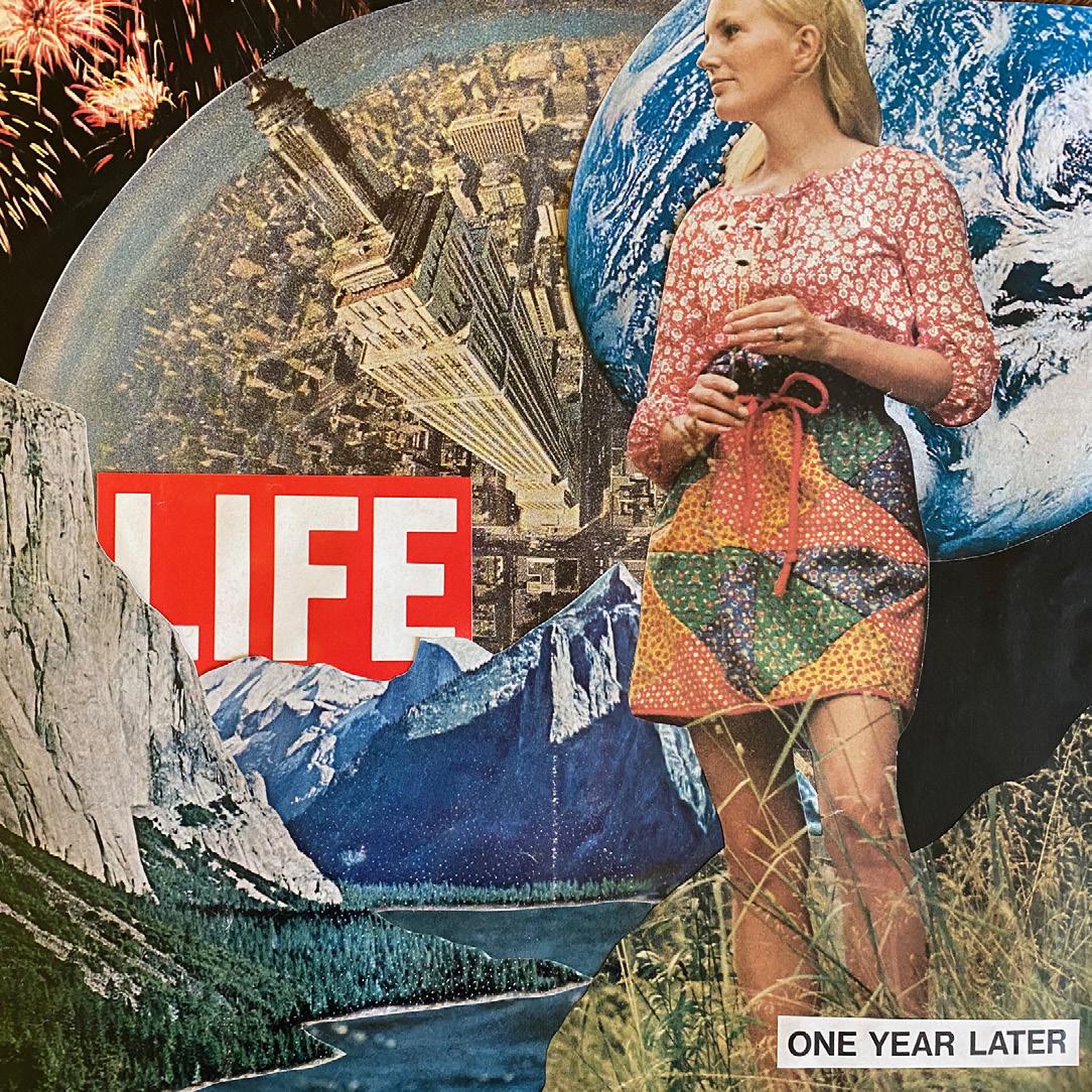
In addition to many of the more serious collages with political undertones that make up the bulk of my work, I also create collages that are reflections on a specific time, place, or memory. These have been a therepetuic exercise, especially during the pandemic, as a way to relive and memorialize so many important things that have shaped my experience at the University of Virginia over the past four years.
My process to create these collages is simple, but incredibly time intensive. The collages you see here consist of hundred of images cut out of LIFE magazines that range in publication date between 1940-1980. I thumb through these magazines and select compelling images and text, then cut them out using an x-acto knife, and add the new cut-out to my collection of several hundred other images waiting to be used in a collage. Next, I find one or several images that relate to each other, or I form these relationships through collage. For instance, dozens of liquor bottles from seperate ads have an obvious relationship, but images of a desert, bank, and gas pump have a very different meaning when standing alone than they do when combined. After gluing images together in the assemblage of the collage, I often find text that either relates to the images and makes a short but striking political statement, or I juxtapose the text with the pictures and leave room for ambiguity and interpretation.
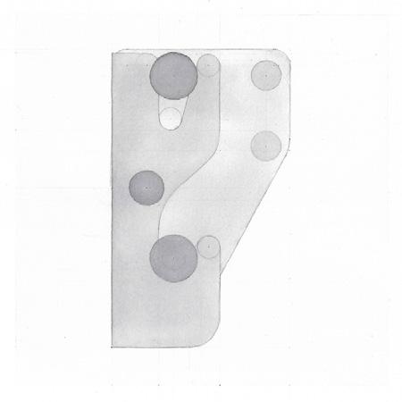
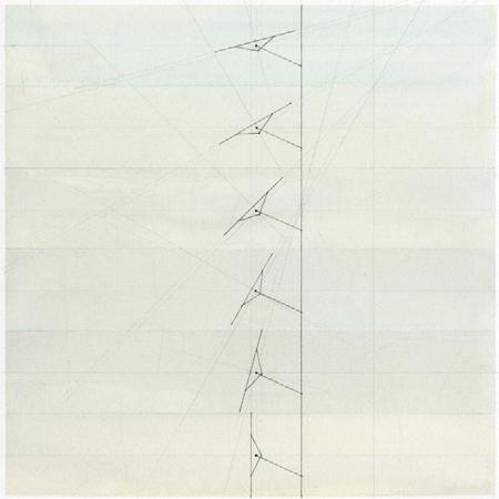
AILSA THAI
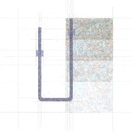
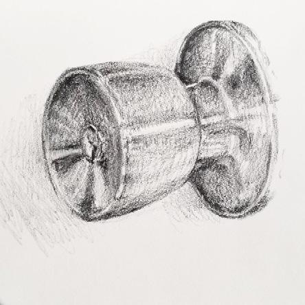
I began this project by creating drawings of interesting joints and details that I admired and that could teach me about making architecture at a very small, granular scale. All my subjects were located in various places of Campbell Hall, a very familiar building that I wanted to re-discover and experience in new ways. The earlier studies were simple graphite drawings, while the later ones introduced watercolor washes. My intention was to study particular joints and details in great depth, as well as to create compelling visual compositions to understand them in ways beyond the technical.
Because of the emergence of our current pandemic crisis, my project faced some new, yet potentially interesting, limitations. I no longer had access to Campbell Hall. The only details that I could study were very modest ones in my own student apartment. There’s nothing special in this apartment, except, ironically, for the fact that much of what makes up the doors, cabinets, walls and windows here can be found anywhere else. My fear was that these things could be dull and uninformative.
Yet, as I began drawing and sketching, I discovered that the forms of these joints and details in my apartment, despite their everydayness, can be surprisingly elegant in their functional simplicity, or subtly complex due to machine production, and sometimes touching in their wear and tear. I am talking about a simple white door hinge, an imperceptibly curved metal knob, and the kitchen base molding, falling apart as I write. They are everywhere yet ignored and therefore worthy of being celebrated especially in a time where we are dependent on our often humble homes more than ever. And because we form intimate relationships with the spaces we live in, there’s the inevitable yet now limited sense of touch, more prevalent in a dwelling than say, in Campbell Hall. We touch the same doorknob, the same faucet, the same kitchen counter; our feet step on the same floor, many times every day. This kind of intimate tactile experience is now only possible in our own homes. My work during a time of self-isolation and social distancing aims to document the ordinary joints and details of my apartment, so that they are seen and celebrated as the dependable and familiar moments that shape our experiences of everyday spaces.
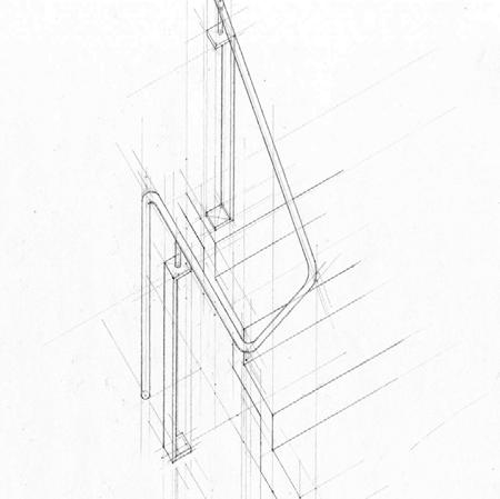
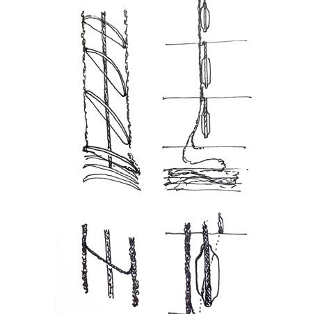
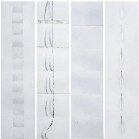
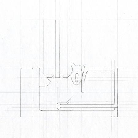
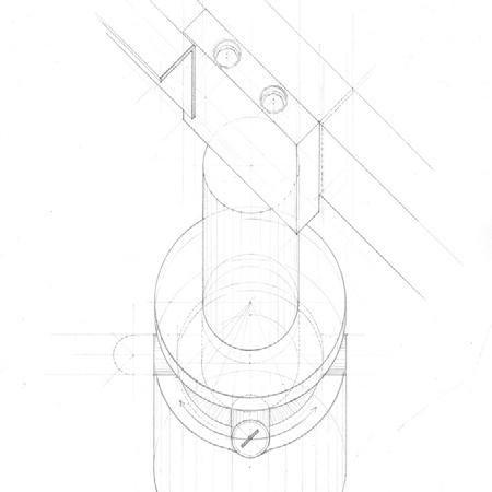
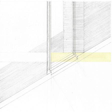
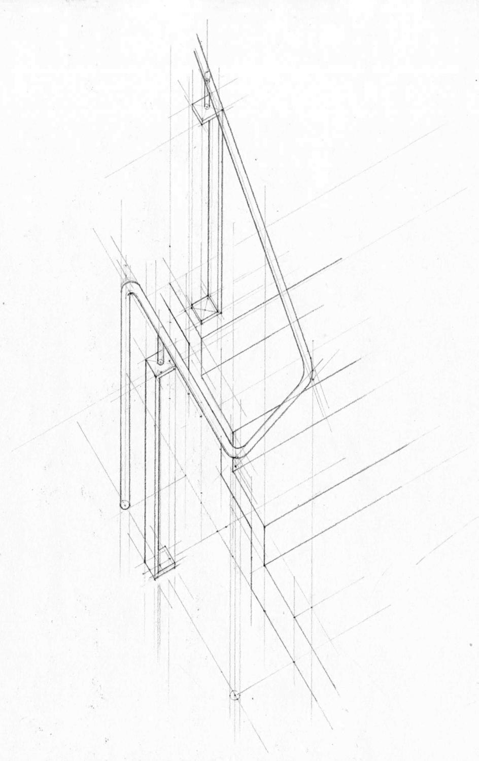
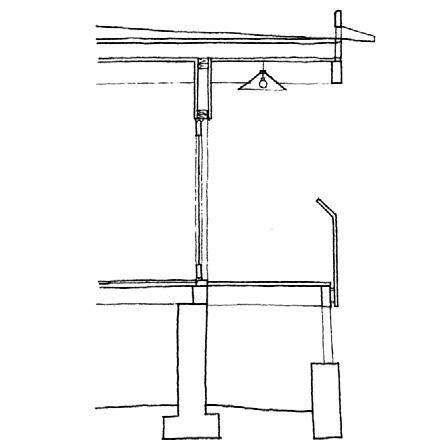
Drafted study of stair railing in Campbell Hall’s east addition, designed by WG Clark, with interest in how the railing turns and ends.
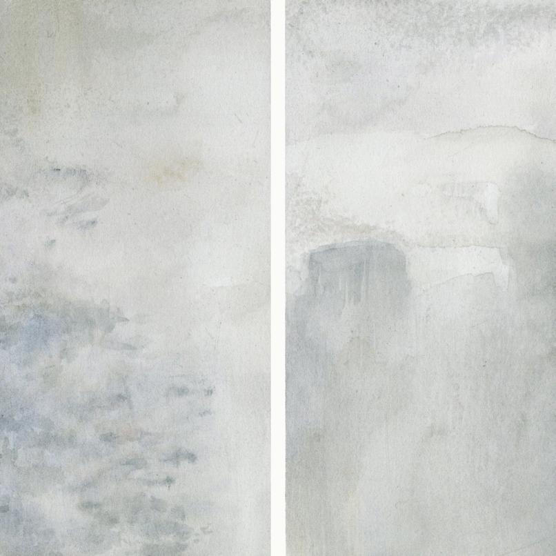
Concrete material study in watercolor, reflective of the atmophere of the east addition created by the material qualities.
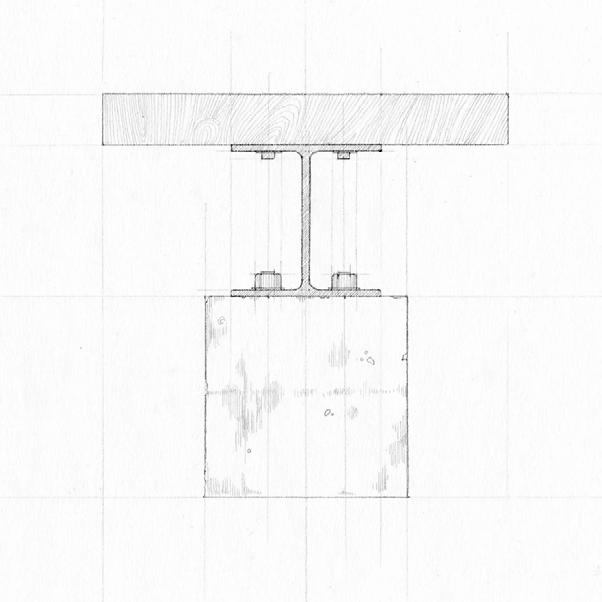
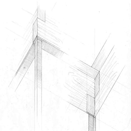
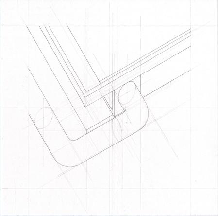
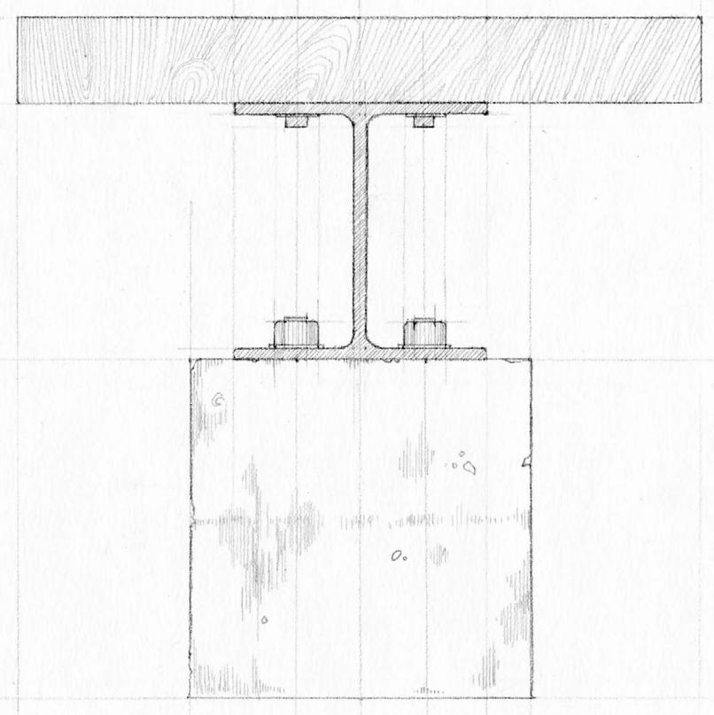
Drafted elevation of bench in the east addition review rooms, a composition of squares and three materials - concrete, steel, and wood.
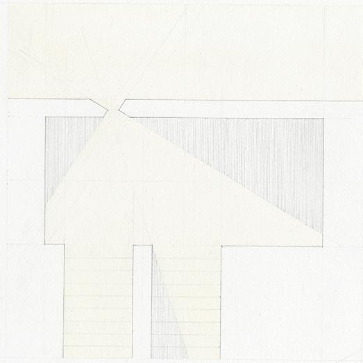
Abstraction of the south addition louvres, designed by Bill Sherman, showing the rotational and material qualities.
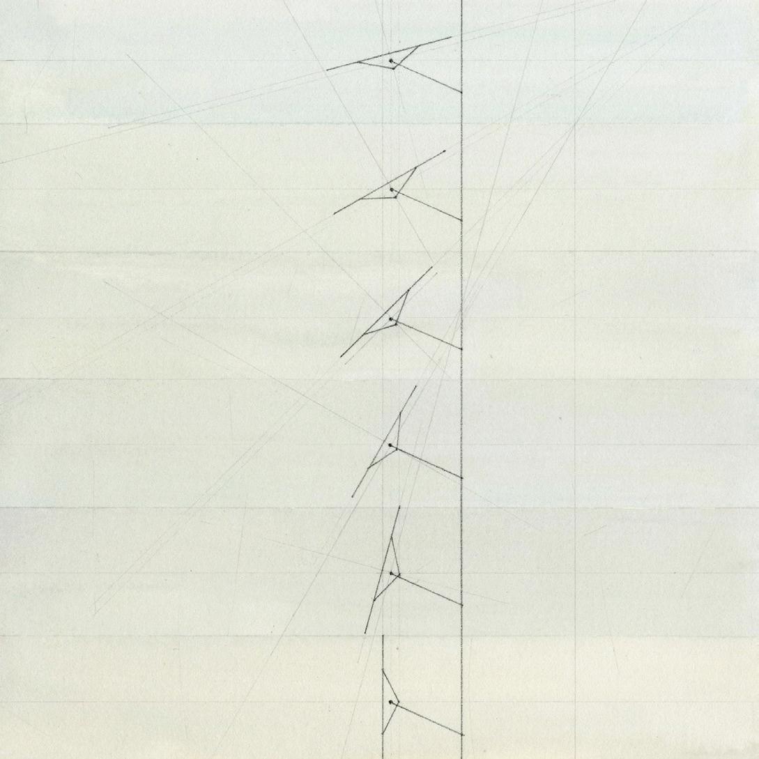
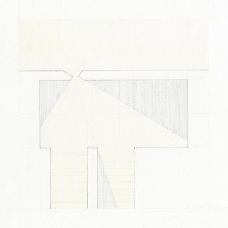
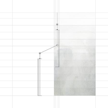
Left image: Plan of the south addition stair well, to show how the sun window is angled to light the length of the landing.
Right image: Drafted detail of the sun window, intended to depict the sculpted quality of the angled concrete.
Abstract composition of the rhythmic light and lines of venetian blinds, a meditation on interiority and domesticity during social distancing.
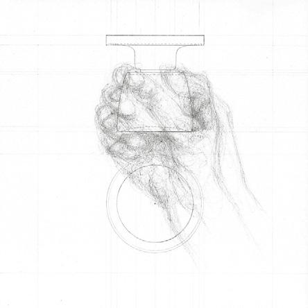
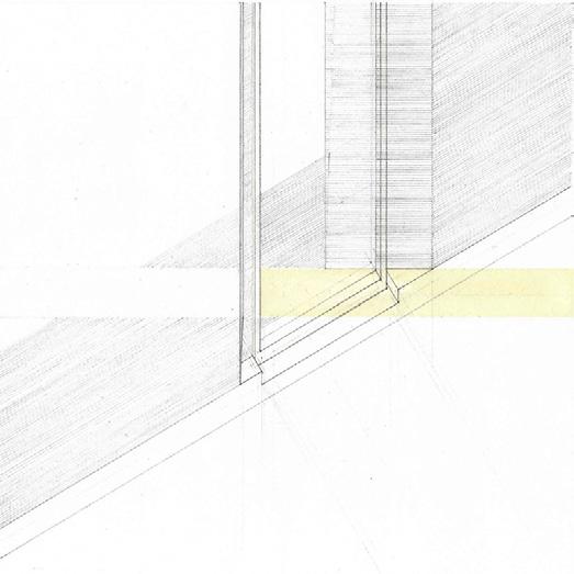
Left image: Drafted doorknobs, processed in photoshop to show hte variations between lock and keyhole.
Right image: Frames of an animated door hinge, a simple study and venture into animation.
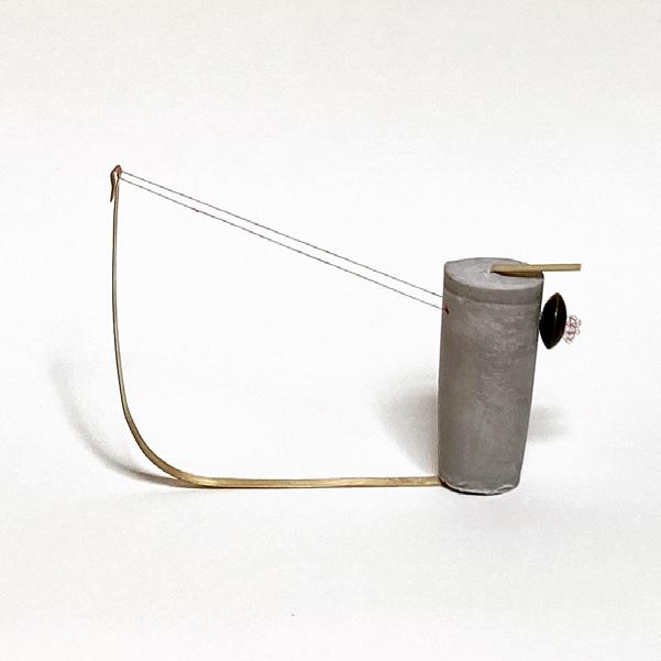
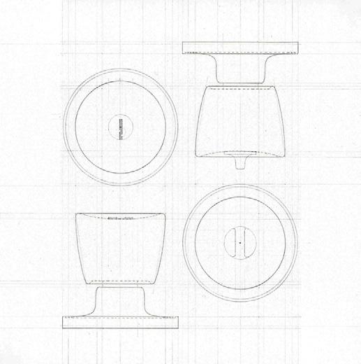
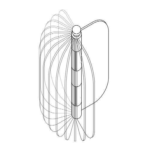
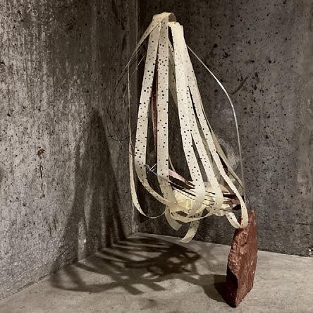
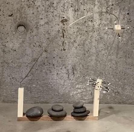
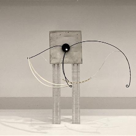
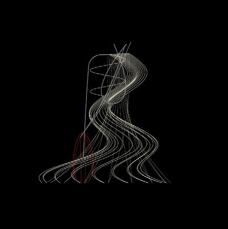
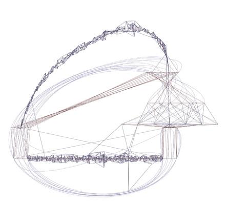
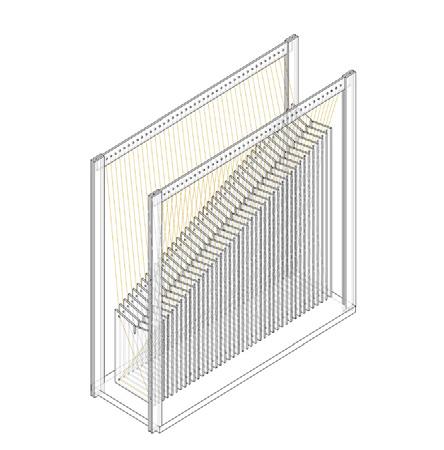
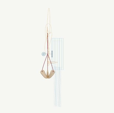
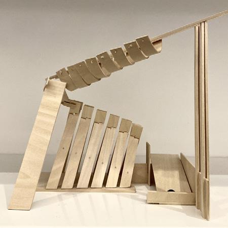
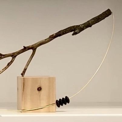
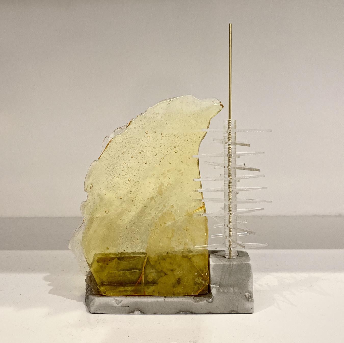
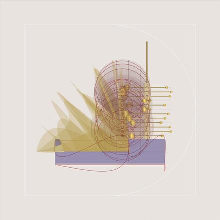
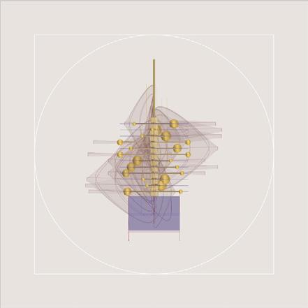
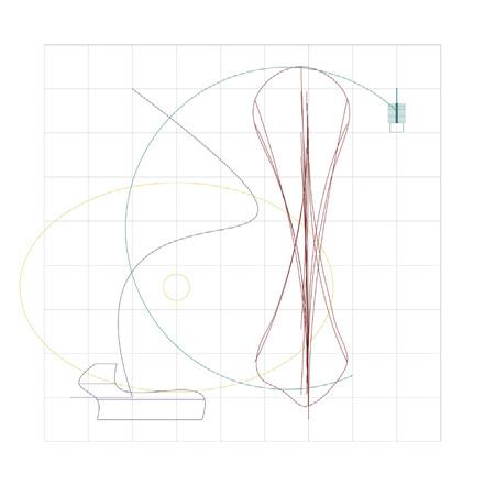
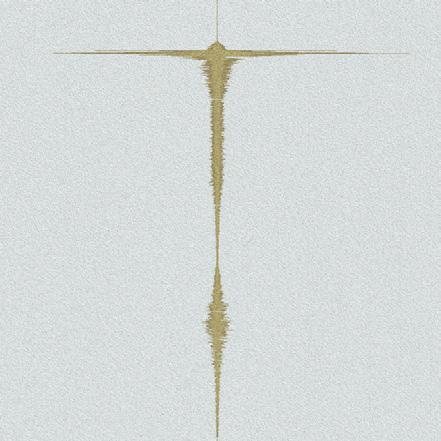
I began this project by creating physical sculptures that made sound and could be played like musical instruments. The sculptures were made using a variety of new and recycled materials such as cast concrete, wood, steel wires, plexiglass, found stones, beads, and paper. During the making process, each sculpture acquired a life and character of its own. To emphasize this unique character, I titled each piece or “creature” with names such as Doris, Phillis, and Orpheus. I made sound recordings of each physical model, and I later used these soundtracks to create analogous digital models and images that served as sound visualizations. I also wrote various musical and visual “plays” using the sound recordings and digital creatures as moving characters.
Due to our current pandemic crisis, my project faced some new, yet potentially interesting, limitations. Originally, I focused on making interactive “creatures” meant for physical touch and play. Our new situation of social distancing does not allow for this kind of physical interaction. In response to this new context, I plan to maintain the idea of interaction, but make it an entirely digital interaction that leaves out literal, physical touch. I used Arduino to create new creatures that could react to one’s presence, breath, sound, or behavior.


Instructor
Sanda Illiescu
Students
Gabriel Andrade
Jessica Auer
Baheshta Azizi
Lauren Brown
Jessica Burnam
William Clark
Angel Diaz
Lauryn Downing
Omer Gorashi
Pearl Ha
Jolie Magenheimer
Holden Miles
Jonah Pruitt
William Simopoulos
Ailsa Thai
Nita Wareechatchai
Lead Book Designer
Jolie Magenheimer
Book Designers
Jessica
Auer
Jessica Burnam