Ole Humlum is former Professor of Physical Geography at the University Centre in Svalbard, Norway, and Emeritus Professor of Physical Geography, University of Oslo, Norway.
THE STATE OF THE CLIMATE 2024
Ole Humlum
1. Introduction and précis
This report is written for reflective people wishing to form their own opinion on issues relating to climate and its variations. The report’s focus is on observations as they are made available by various databases, and not on output from numerical models, with few exceptions (e.g., Figure 43). References and data sources are listed at the end of the report.
The observed data series presented here reveal a vast number of natural variations, some of which reappear across different data series. The existence of such natural climatic variations is not always fully acknowledged, or included in today’s climate models, and therefore not usually considered in contemporary climate conversations. The drivers for all such recurrent climatic variations are far from being fully understood but should represent an important focus for climatic research (and derived political initiatives) in the coming years.
In the present report, meteorological and climatic observations are described according to the following overall structure: atmosphere, oceans, sea level, sea ice, snow cover, precipita-
tion, and storminess. Finally, in the last chapter the available observational evidence for 2024 is briefly summed up.
The global climate represents a highly complex system involving sun, planets, atmosphere, oceans, land, geological processes, biological life, and the complex interactions between them. Many components and their interrelationships are still not fully understood or perhaps not even recognised. Among all these influences, human CO₂ emissions have, in all probability, only contributed modestly to current warming (Humlum et al. 2012). The global climate has remained in a stable condition within certain limits for millions of years, although with important variations playing out over periods ranging from years to centuries, or more, but it has never been in a fully stable state without change. Modern observations show that recent years are also characterised by this normal behaviour, and there is no observational evidence for any global climate crisis.
2. Ten facts from 2024
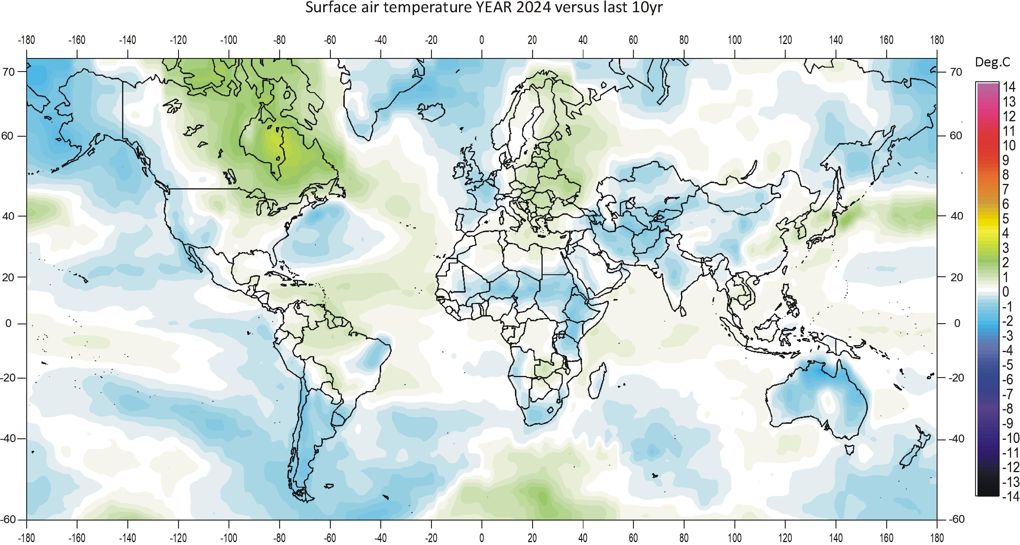
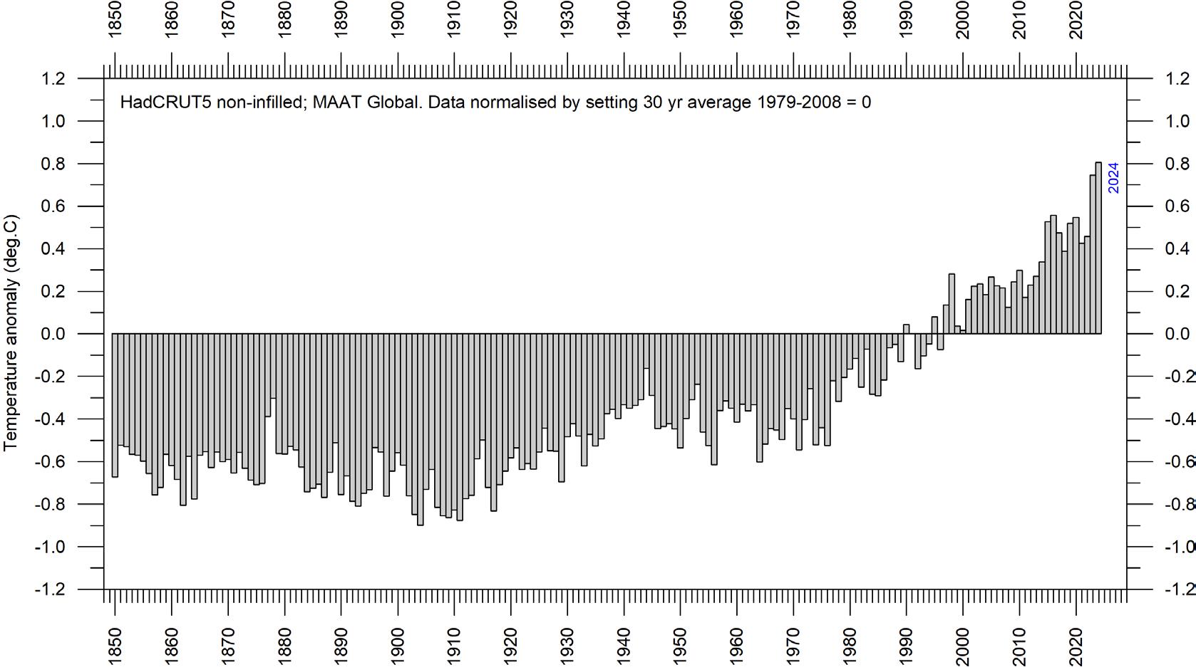
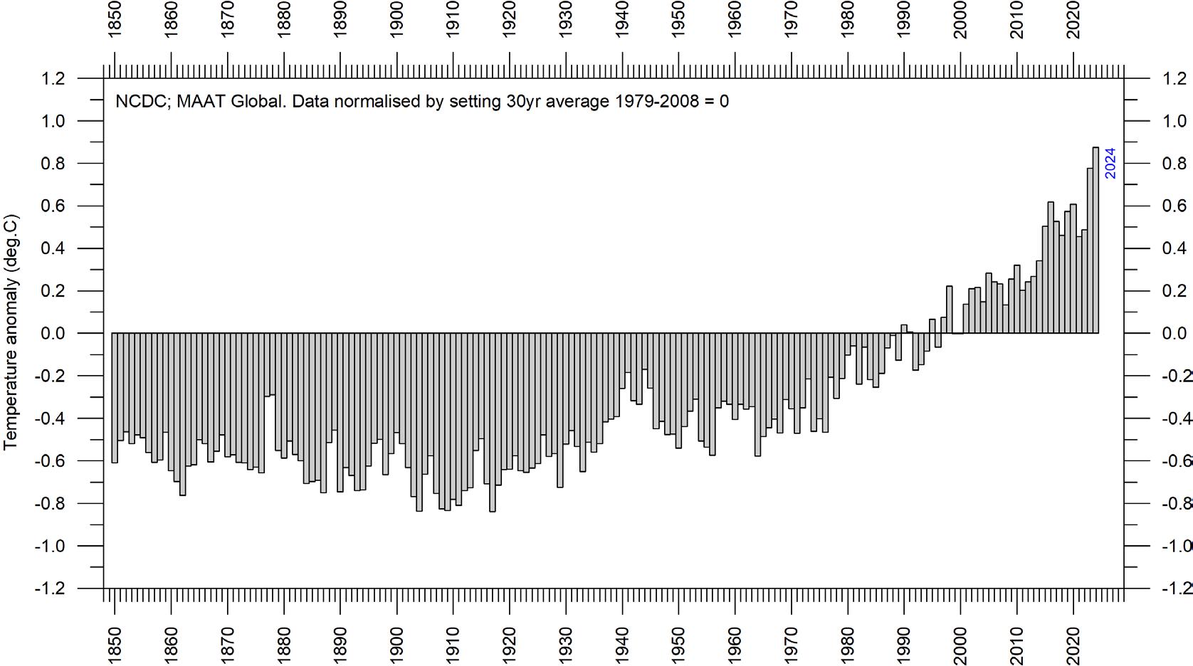
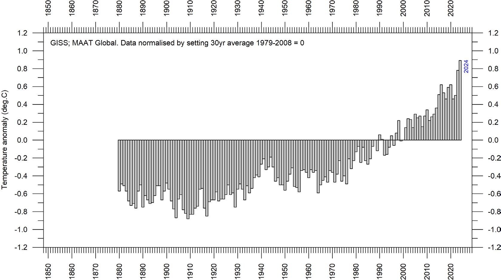
1. Air temperatures in 2024 were the highest on record for the instrumental era (since 1850/1880/1979), according to the five data series considered in this report. Recent warming is globally asymmetrical, being mainly a Northern Hemisphere phenomenon (Figure 13).
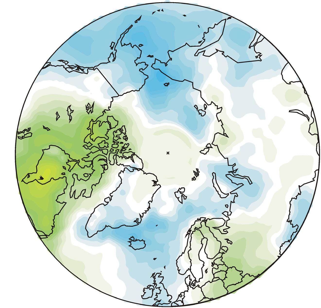
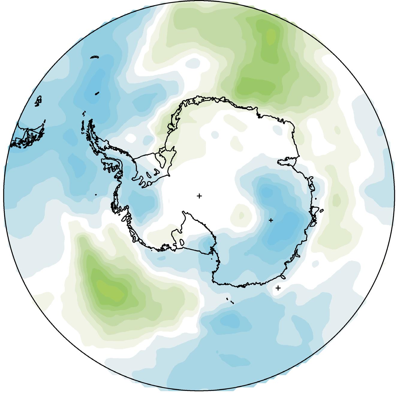
2. Arctic air temperatures have increased during the satellite era (since 1979), but Antarctic temperatures have remained essentially stable (Figure 14).
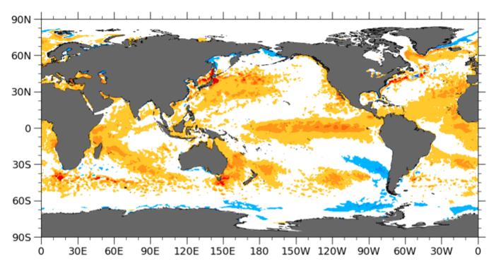
3. Since 2004, the upper 1900 m of the oceans have globally experienced a net warming of 0.037oC. The maximum net warming (about 0.2oC) affects the uppermost 100 m of the oceans, and mainly in regions near the equator, where the highest amount of solar radiation is received (Figure 31).
4. Since 2004, the northern oceans (55–65oN) have on average experienced a marked cooling down to 1400 m depth, and slight warming at greater depths (Figure 30). The southern oceans (55–65oS) have on average seen some warming at most depths (down to 1900 m) since 2004, but mainly near the surface.
5. Global sea level has increased by about 3.7 mm per year or more according to satellites, but only 1–2 mm per year according to coastal tide-gauges (Figure 40 and 42). Local and regional
sea level changes frequently deviate widely from global averages.
6. Sea ice extent globally remained well below the average for the satellite era (since 1979). Since 2018, however, global sea ice extent has remained stable, or even with a small increase indicated (Figure 44).
7. Global snow cover has remained essentially stable throughout the satellite era (Figure 48), albeit with important regional and seasonal variations.
8. Precipitation varies from more than 3000 mm per year in humid regions to almost nothing in desert regions. Global average precipitation undergoes variations from one year to the next, and from decade to decade, but since 1901 there is no clear overall tendency towards wetter (or drier) conditions (Figure 51 and 52).
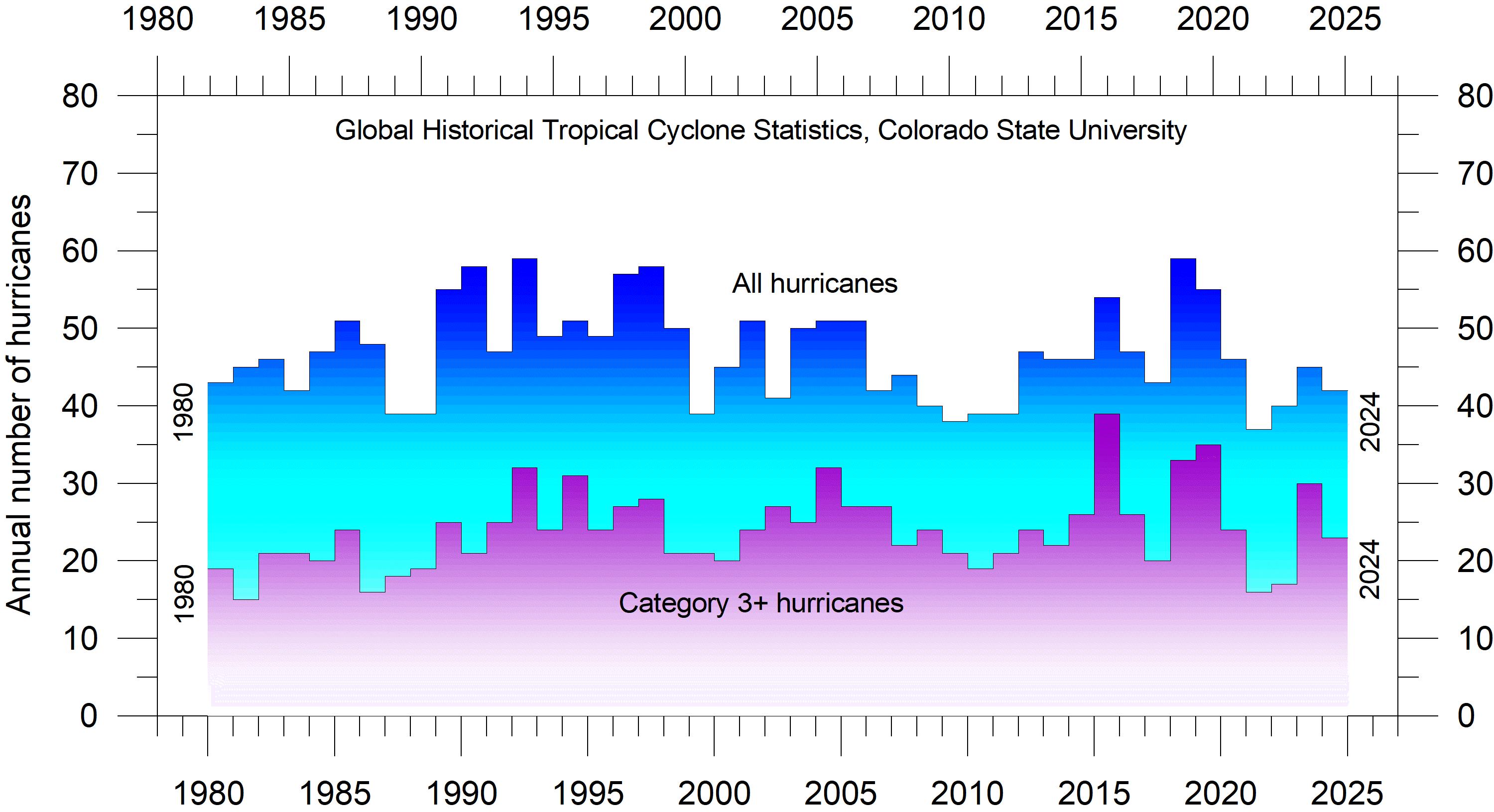
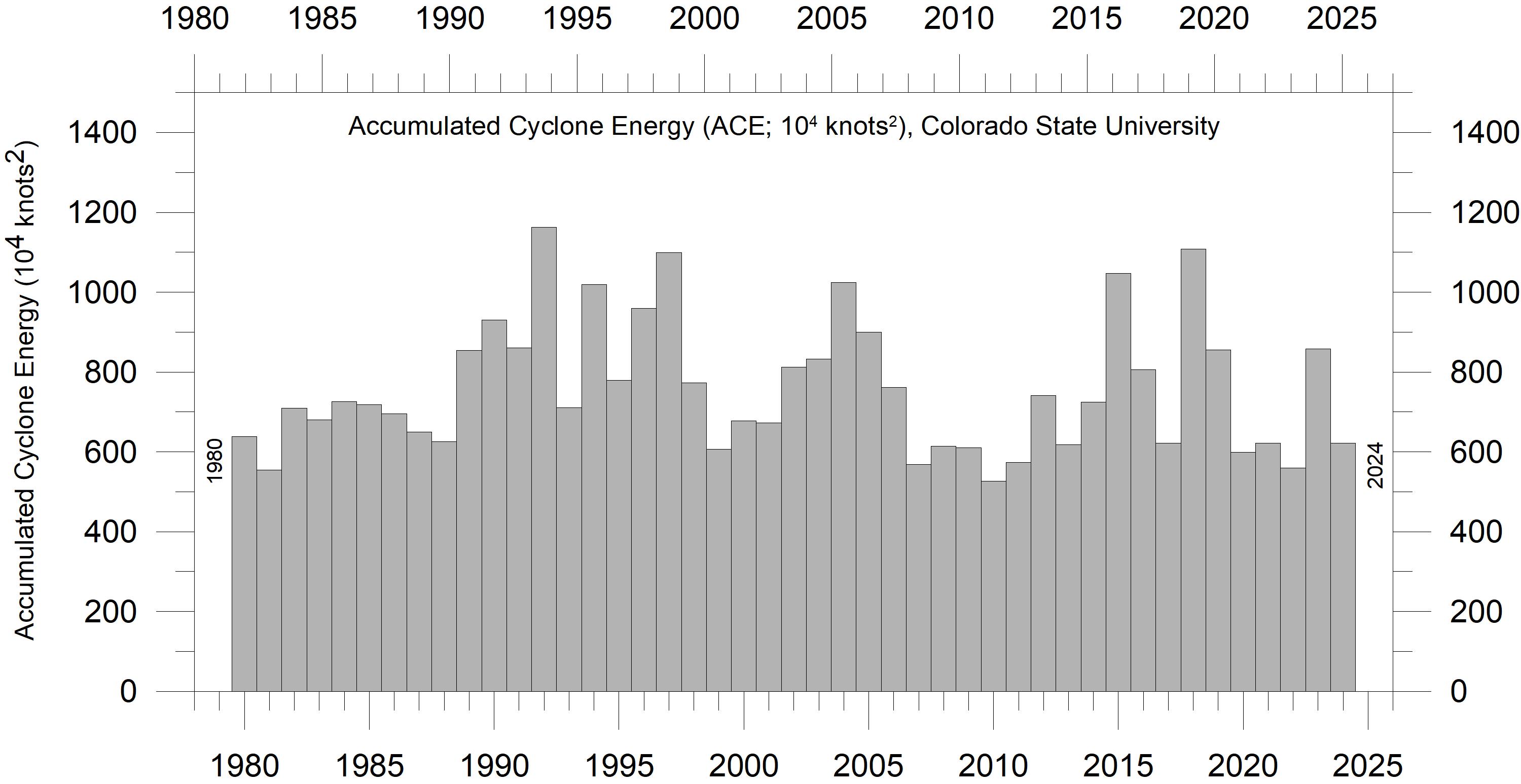
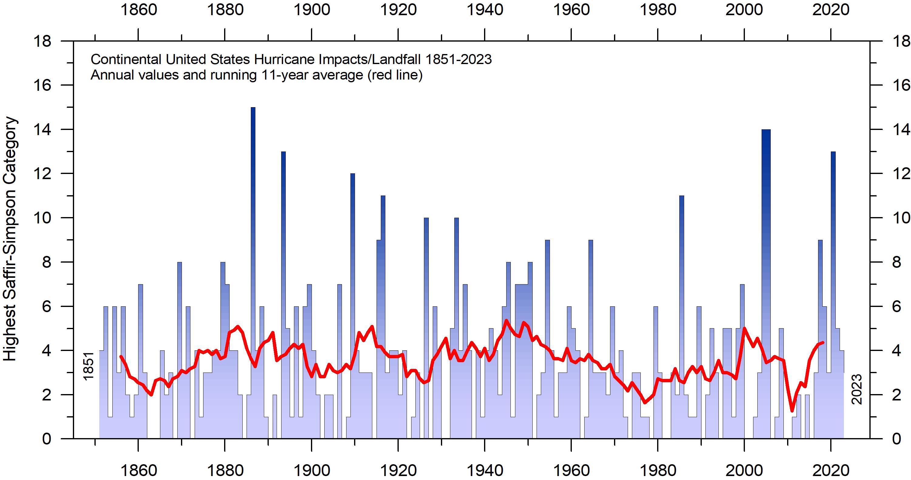
9. Storms and hurricanes display variable frequency over time, but without any clear trend towards higher or lower values at a global level (Figure 58 and 59).
10. Observations confirm the normal overall variability of average meteorological and oceanographic conditions, and do not support the notion of an ongoing climate crisis.
3. Air temperatures
The spatial pattern of global surface air temperatures in 2024
The global average surface air temperature for 2024 was the highest on record for all databases considered in this report. The years 2023 and 2024 were both affected by a warm El Niño episode. Towards the end of 2024 the most recent El Niño episode declined.
The Northern Hemisphere was characterised by regional temperature contrasts, especially north of 30oN. The most pronounced temperature developments in 2024 were high average temperatures in northern and eastern Canada. In contrast, western Europa, Alaska and eastern Siberia had relatively low average temperatures in 2024 (compared to the previous 10 years).
In the Arctic, the Canada sector was relatively warm, while the Atlantic, Siberia and Alaska sectors were relatively cool.
Near the Equator, surface air temperatures were generally close to the average for the previous 10 years, reflecting the ongoing, but now disappearing, El Niño episode in the Pacific Ocean. This is a contributing explanation for the high 2024
average global temperature, as no less than 50% of the planet’s surface is located between 30oN and 30oS.
In the Southern Hemisphere average surface air temperatures in 2024 were near or below the average for the previous 10 years. South America and most of southern Africa and Australia were cool compared to the previous 10 years. Ocean temperatures were near or below the 10-year average, except the Southern Ocean south of Africa, which was relatively warm.
In 2024, the ocean around Antarctica was characterised by relatively low annual surface air temperatures in the South American and Australian sectors. In contrast, the adjacent regions experienced above average temperatures. Most of the Antarctic continent had temperatures near or below the average for the previous 10 years.
The influence on global 2024 meteorological conditions of the Hunga Tonga–Hunga Ha’apai eruption (South Pacific Ocean) in January 2022 is still uncertain. The eruption released an enormous
Figure 1: 2024 surface air temperatures compared to the average for the previous 10 years. Green-yellow-red colours indicate areas with higher temperatures than average, while blue colours indicate lower than average temperatures. Data source: Remote Sensed Surface Temperature Anomaly, AIRS/Aqua L3 Monthly Standard Physical Retrieval 1-degree x 1-degree V006 (https://airs.jpl.nasa.gov/), obtained from the GISS data portal.
years.
plume of water vapor into Earth’s stratosphere, but any influence of this on atmospheric temperatures is not evident (Figure 16). However, Sellitto et al. (2022) found that this eruption produced an enormous perturbation of stratospheric aerosols, and the largest perturbation of stratospheric water vapour observed in the satellite era.
Summing up for 2024, global average surface air temperatures were at a record high relative to a long instrumental timescale (since 1850), a result of the recent El Niño episode. In contrast, the preceding years, 2021 and 2022, were influenced by a cold La Niña episode in the Pacific Ocean. Thus, the global surface air temperature record in 2024 continued to be influenced significantly by oceanographic phenomena.
In the present report, a 10-year reference period is used for comparison in the maps displayed in Figures 1 and 2. Traditionally, a 30-year reference period is often used by various meteorological institutions for comparison purposes, and are supposed to be updated through the end of each decade ending in zero (e.g., 1951–1980, 1961–1990, 1971–2000, etc.). The concept of a normal climate goes back to the first part of the
20th century. At that time, lasting until about 1960, it was generally believed that for all practical purposes, climate could be considered constant, no matter how obvious year-to-year fluctuations might have been. On this basis meteorologists opted to operate with an average or ‘normal’ climate, defined by a 30-year period, named the ‘normal’ period, assuming that it was of sufficient length to iron out all intervening variations. In fact, using a 30-year normal period is truly unfortunate, as several observations demonstrate that various global climate parameters are influenced by periodic changes of 50–70 years' duration (see comments to Figure 6). The traditional 30-year reference period is roughly half this time interval and is therefore particularly unsuited as a good reference period.
Deciding the optimal length of a reference period is not straightforward and requires competent knowledge of natural cycles embedded in the data series. The decadal approach taken for the above maps corresponds to the typical memory horizon for many people and has been adopted as reference period by other institutions, for e.g., the Danish Meteorological Institute (DMI).
(a) Arctic
(b) Antarctic
Figure 2: 2024 polar surface air temperatures compared to the average for the previous 10
Details as per Figure 1.
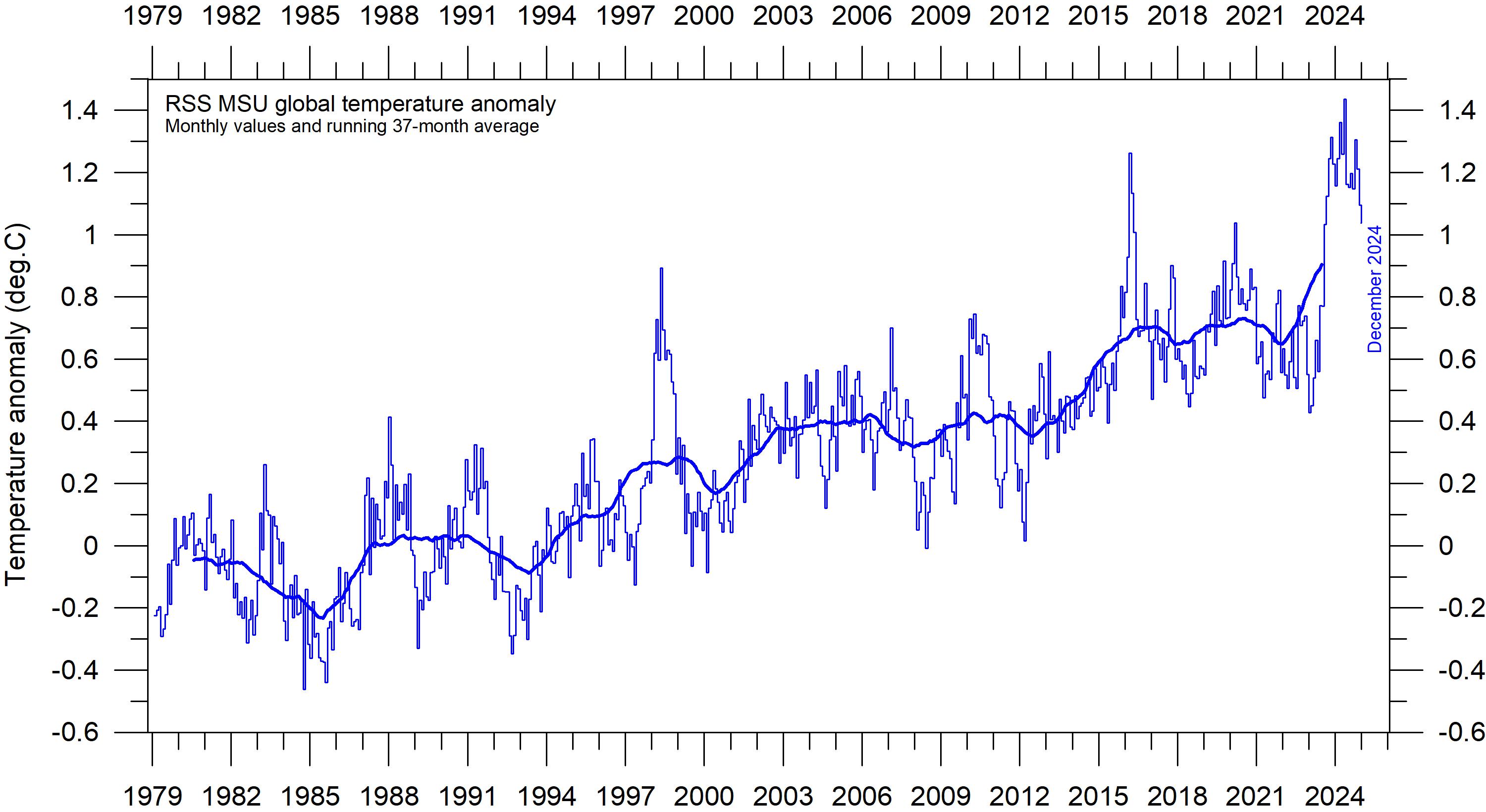
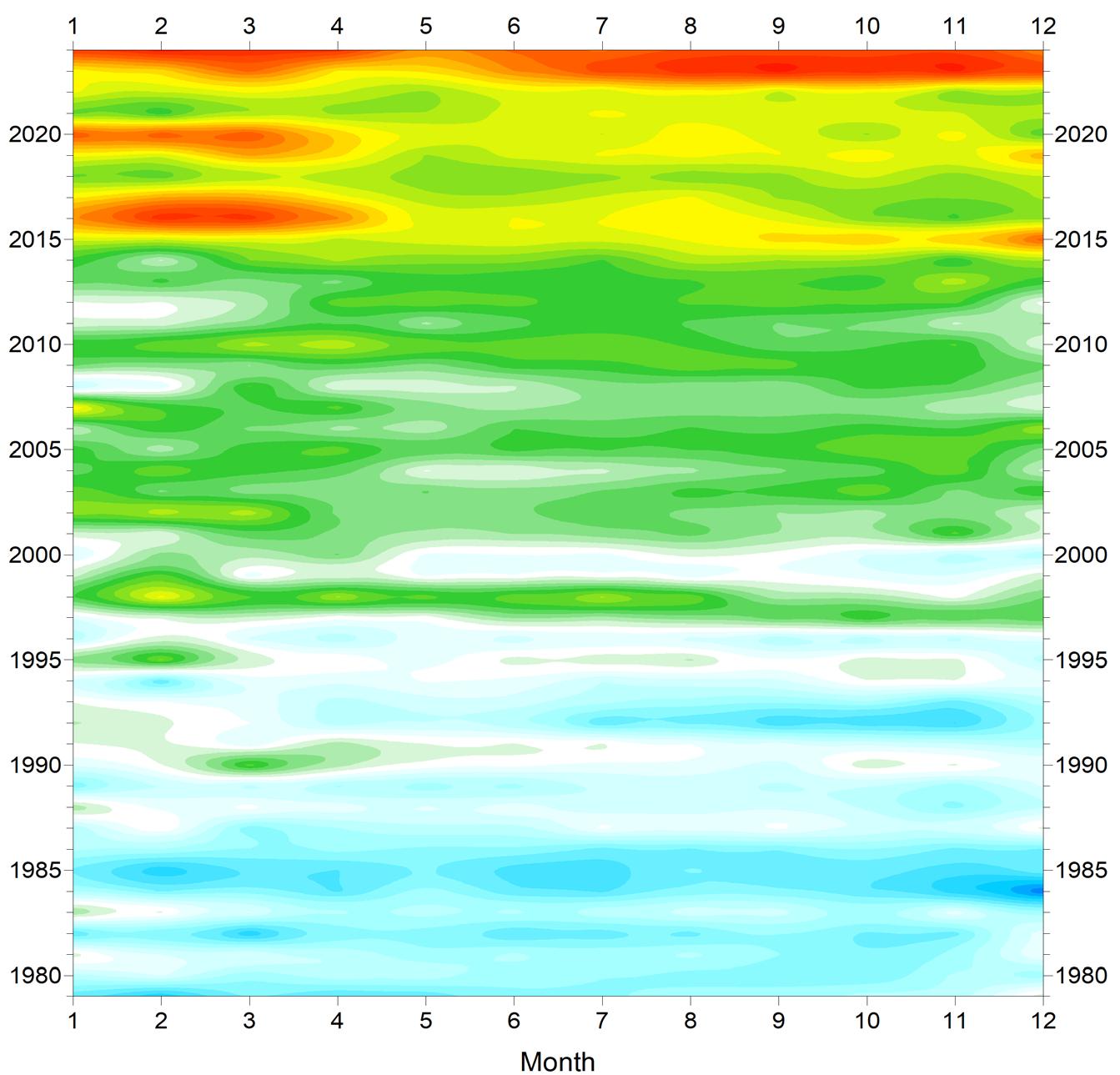
Global monthly lower troposphere air temperature since 1979
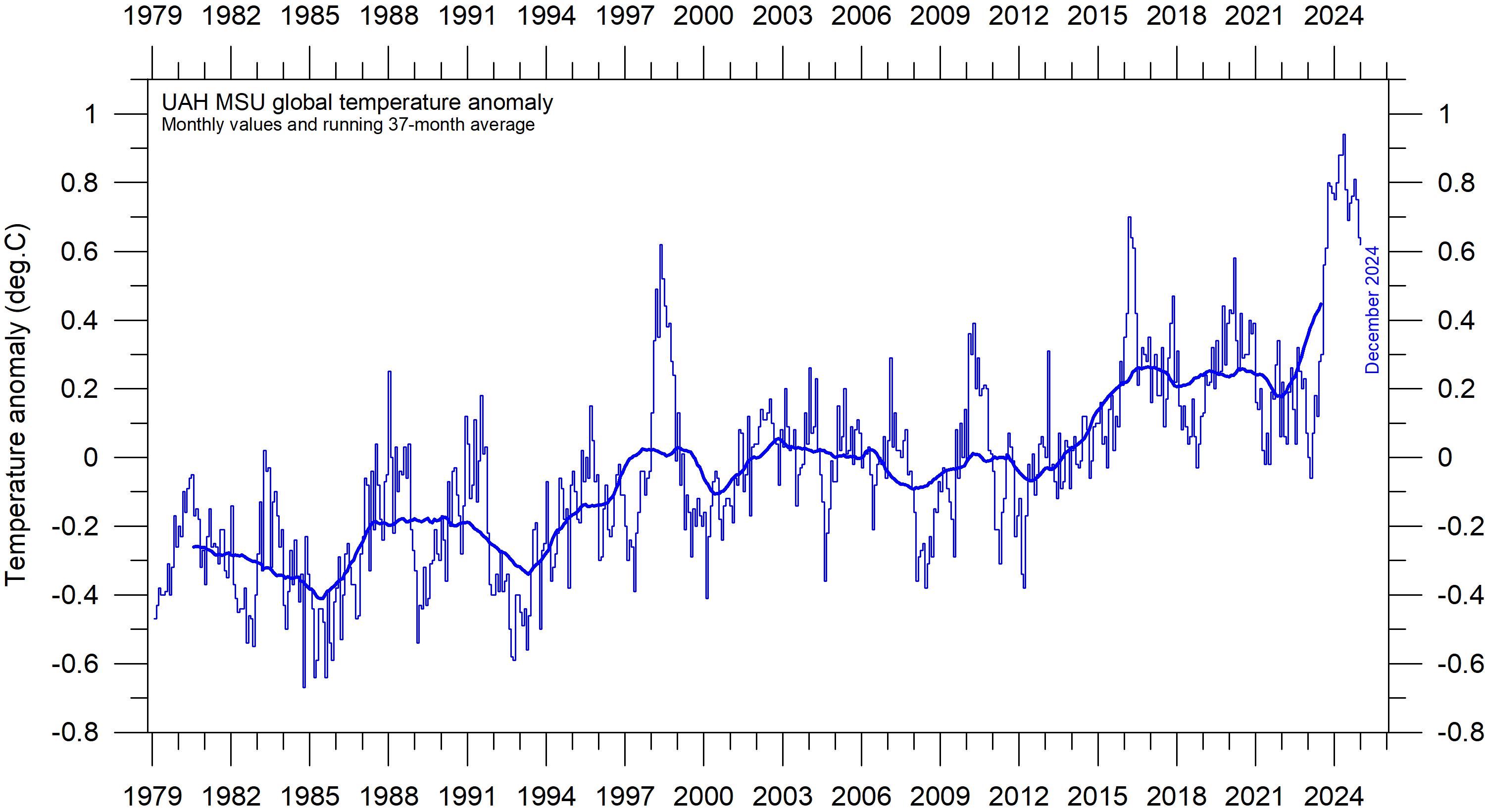
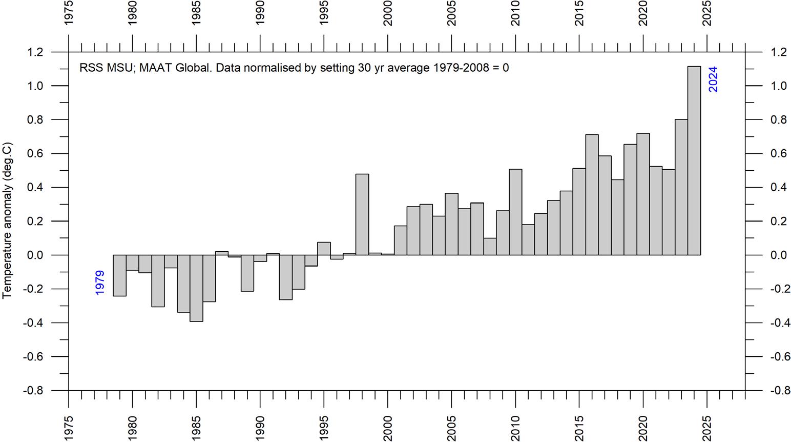
Both satellite records for the lower troposphere temperature clearly show a temperature spike associated with the 2015–16, the 2029–20 and the 2023–24 El Niños episodes, with subsequent temperature drops due to following La Niñas. The latest development is a renewed temperature increase since May–June 2023, affecting entire 2024, due to a new and now fading El Niño episode in the Pacific Ocean. There is a tendency for many El Niños to culminate during the Northern Hemisphere winter. From the two diagrams in Figure 3 it looks as if the most recent El Niño had a somewhat longer duration than usual.
The overall temperature variation in Figures 3–4 is similar for the two data series, but the overall temperature increase from 1979 to 2024 is larger for RSS than for UAH (Figure 5). However, before the rather substantial adjustment of the RSS series in 2017, the temperature increase was almost identical for the two data series. Figure 4 illustrates today’s similarities and differences between the two data series.
A Fourier analysis (not shown here) show that both the UAH and the RSS records display a statistically significant 3.6-year period.
3: Global monthly average lower troposphere temperatures since 1979 (RSS). The chart represents temperatures at around 2 km altitude. (a) UAH and (b) RSS. The thick line is the simple running 37-month average, approximately corresponding to a 3-year running average.
Figure
(a) UAH
(b) RSS
Figure 4: Temporal evolution of global lower troposphere temperatures since 1979.
Temperature anomaly versus 1979–2008. The effects of the El Niños of 1998, 2010, 2015–2016 and 2023–2024 are clearly visible as ‘warm’ bands, as is the tendency for many El Niños to culminate during the Northern Hemisphere winter. As the different temperature databases use different reference periods, the series have been made comparable by setting their individual 30-year average for 1979–2008 to zero.
Lower troposphere: annual means
Figure 5: Global mean annual lower troposphere air temperatures since 1979.
Satellite data interpreted by (a) the University of Alabama in Huntsville (UAH), and (b) Remote Sensing Systems (RSS), both in the USA.
(a) UAH
(b) RSS
(a) UAH
(b) RSS
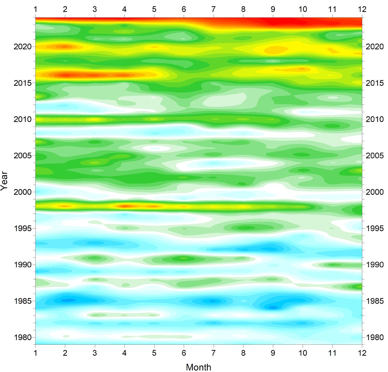
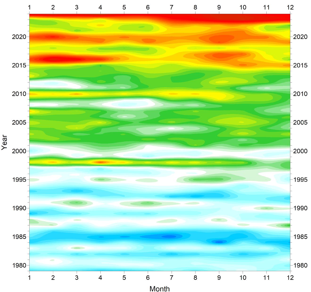
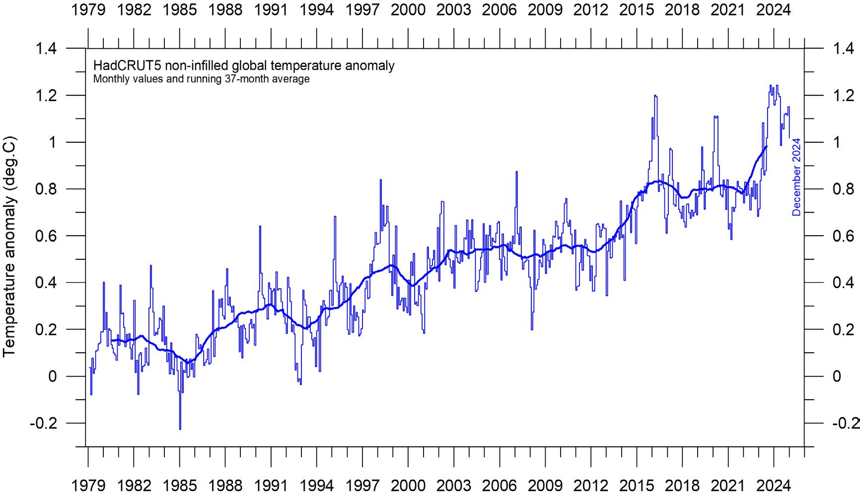
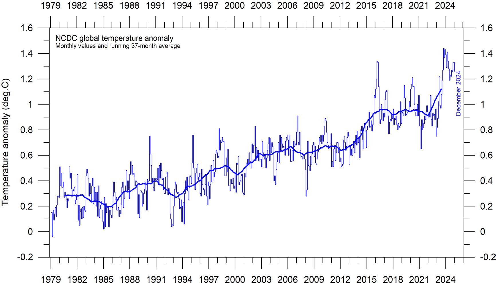
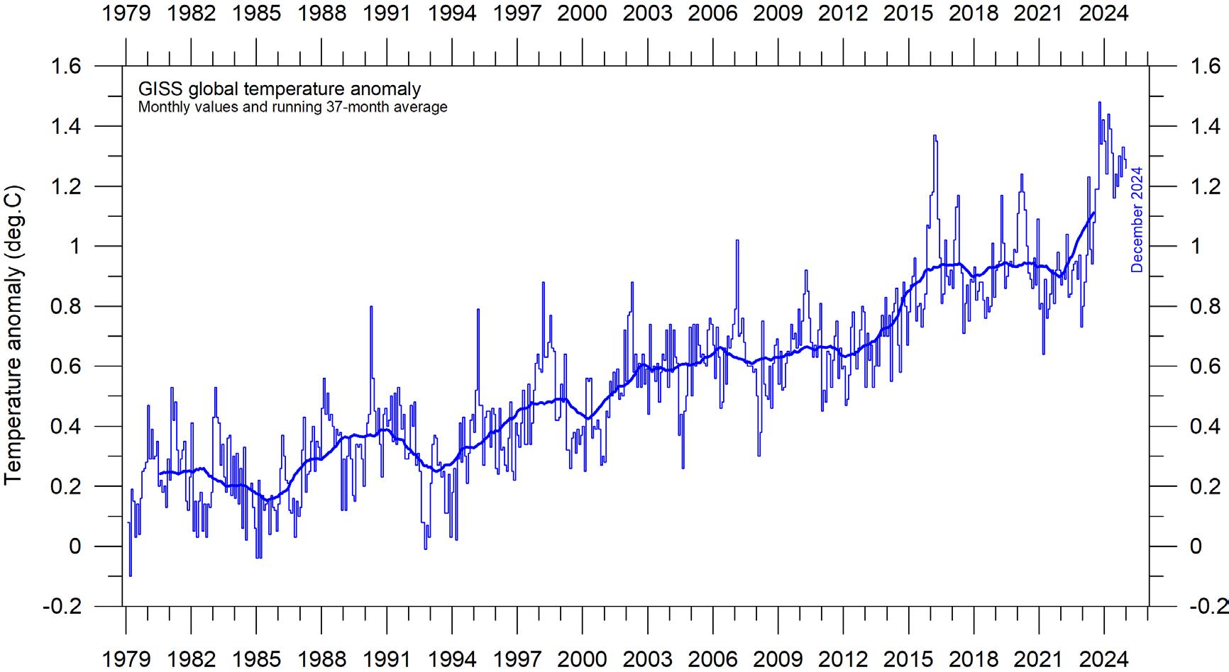
Global monthly surface air temperature since 1979
All three surface air temperature records clearly show variations in concert with El Niños and La Niños playing out in the Pacific Ocean (Figure 25). The latest important development is a renewed temperature increase since May–June 2023, affecting entire 2024, due to the most recent and
Figure 6: Global mean monthly surface air temperatures since 1979.
(a) HadCRUT5 (b) NCDC (c) GISS. The thick line is the simple running 37-month average, nearly corresponding to a running 3-year average.
now declining El Niño episode. Global surface air temperatures are greatly influenced by this oceanographic phenomenon. Figure 7 illustrates similarities and differences between the three data series.
(a)
(b)
(c)
Figure 7: Temporal evolution of global mean monthly surface air temperatures.
(a) HadCRUT5 (b) NCDC (c) GISS. Temperature anomaly (°C) versus 1979–2008. As the different temperature databases are using different reference periods, the series have been made comparable by setting their individual 30-year averages for 1979–2008 to zero.
(c) GISS
(a) HadCRUT5
(b) NCDC
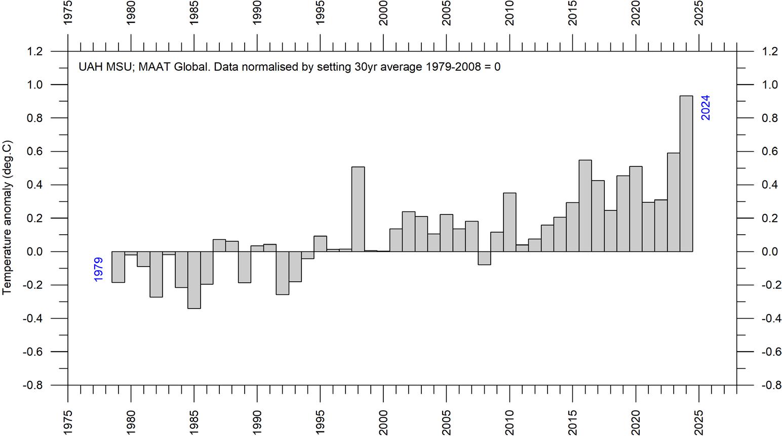
Global mean annual surface air temperature
All three average surface air temperature records show the year 2024 to be the warmest year on record. Year 2024 was influenced by a strong El Niño episode playing out in the Pacific Ocean (see sequence in Figure 22).
A Fourier analysis (not shown here) show that both the HadCRUT5 and the NCDC records display a significant 74-year period, while the GISS record displays a statistically significant 64-year period.
Figure 8: Global mean annual surface air temperatures. (a) HadCRUT5 (b) NCDC (c) GISS temperature anomaly (°C) versus 1979–2008.
(c) GISS
(a) HadCRUT5
(b) NCDC
Reflections on the margin of error, constancy, and quality of temperature records
The surface records represent a blend of sea-surface data, collected by moving ships or by other means, and data from land stations, of partly unknown quality and unknown representativeness for their region. Many of the land stations have also been moved geographically during their period of operation, instrumentation has been changed, and most have been influenced by ongoing changes in their surroundings.
The satellite temperature records have their own problems, but these are generally of a more technical nature and therefore are probably easier to rectify. In addition, the temperature sampling by satellites is more regular and complete on a global basis than for the surface records. It is also important to note that the sensors on satellites measure temperature directly, by emitted radiation, while most modern surface temperature measurements are indirect, using electronic resistance.
All temperature records are affected by at least three different sources of error, which differ between the individual station records used for calculation of a global average temperature estimate. 1) The accuracy is the degree of closeness of measurements to the actual (true) values. 2) The precision is the degree to which repeated measurements under unchanged conditions show an identical value, true or not. In addition, we 3) have the measurement resolution, which is the smallest change in temperature that produces a response in the instrument used for measurement. Combined, these represent the margin of error for temperature records. This is probably at least ±0.1ºC for modern average global surface air temperatures, and feasibly more for old data in the global records. This often makes it statistically difficult to classify any year as representing a global temperature record, as several other years may be within the ±0.1oC range of the value considered.
In addition, two other issues relating to the margin of error for surface records have not been similarly widely discussed: First, as an example, it will not be possible to conclude much about the actual value of the December 2024 global surface air temperature unitil March–April 2025, when data not yet reported (in January 2025) are even-
tually incorporated in the surface air temperature databases. This is what might be described as the effect of delayed reporting. Secondly, surface air temperature records often display administrative changes over time, which makes it even more difficult to draw conclusions about the significance of any recently reported monthly or annually surface air temperature.
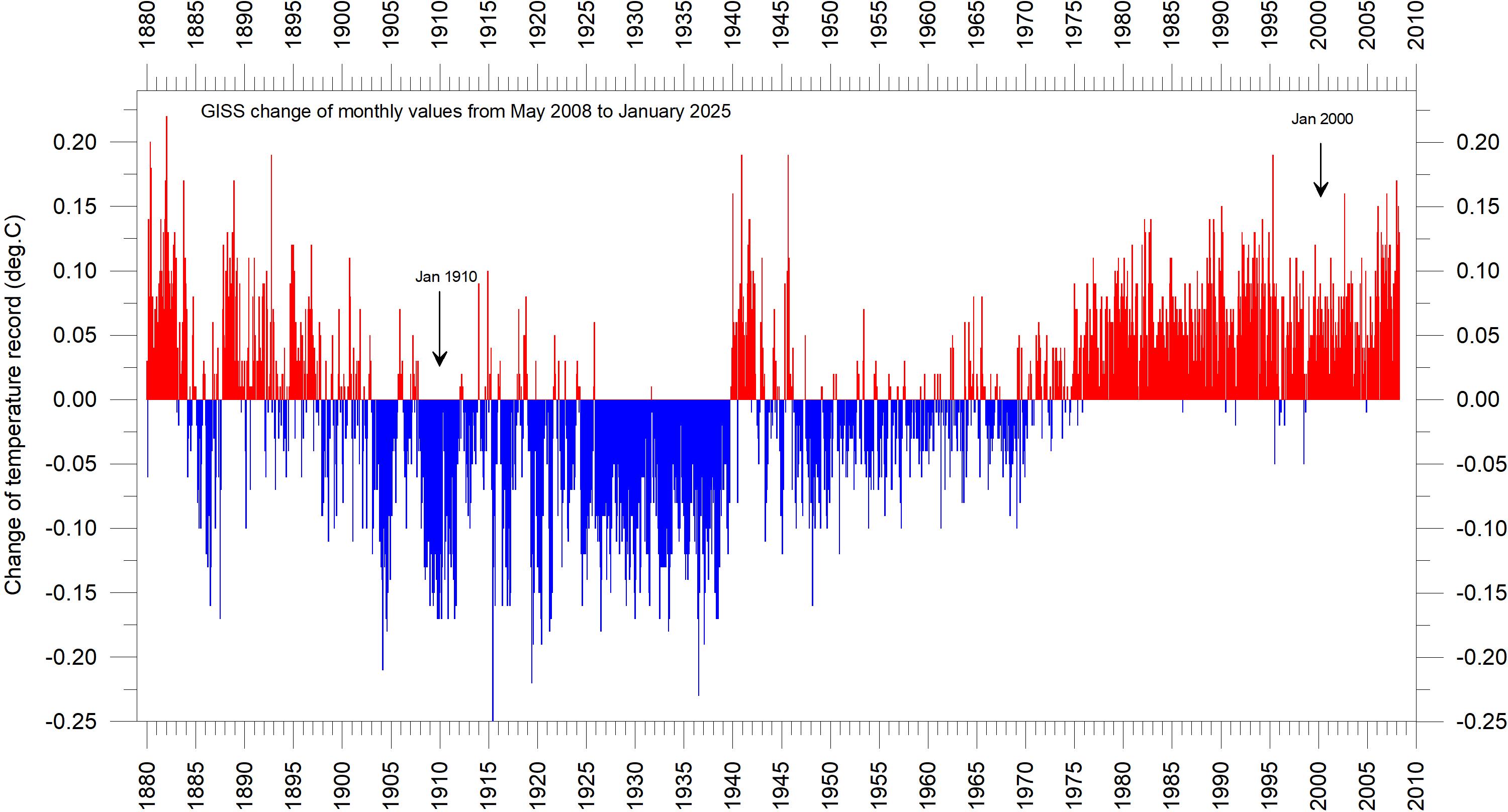
The second (administrative) issue arises from the apparently perpetual changes of monthly and annual temperature values carried out for several temperature databases, with the consequence that what in one particular year was reported as the average global temperature for previous years will later change due to ongoing administrative corrections. These appear to have little or nothing to do with delayed reporting of missing data: particularly concerning the GISS and NCDC databases, changes are made to monthly temperatures for periods far back in time, even before the year 1900, for which the possibility of reporting delays is exceptionally small. Most likely, such administrative changes are the result of alterations in the way average monthly values are calculated by the various databases, in an attempt to enhance the resulting record.
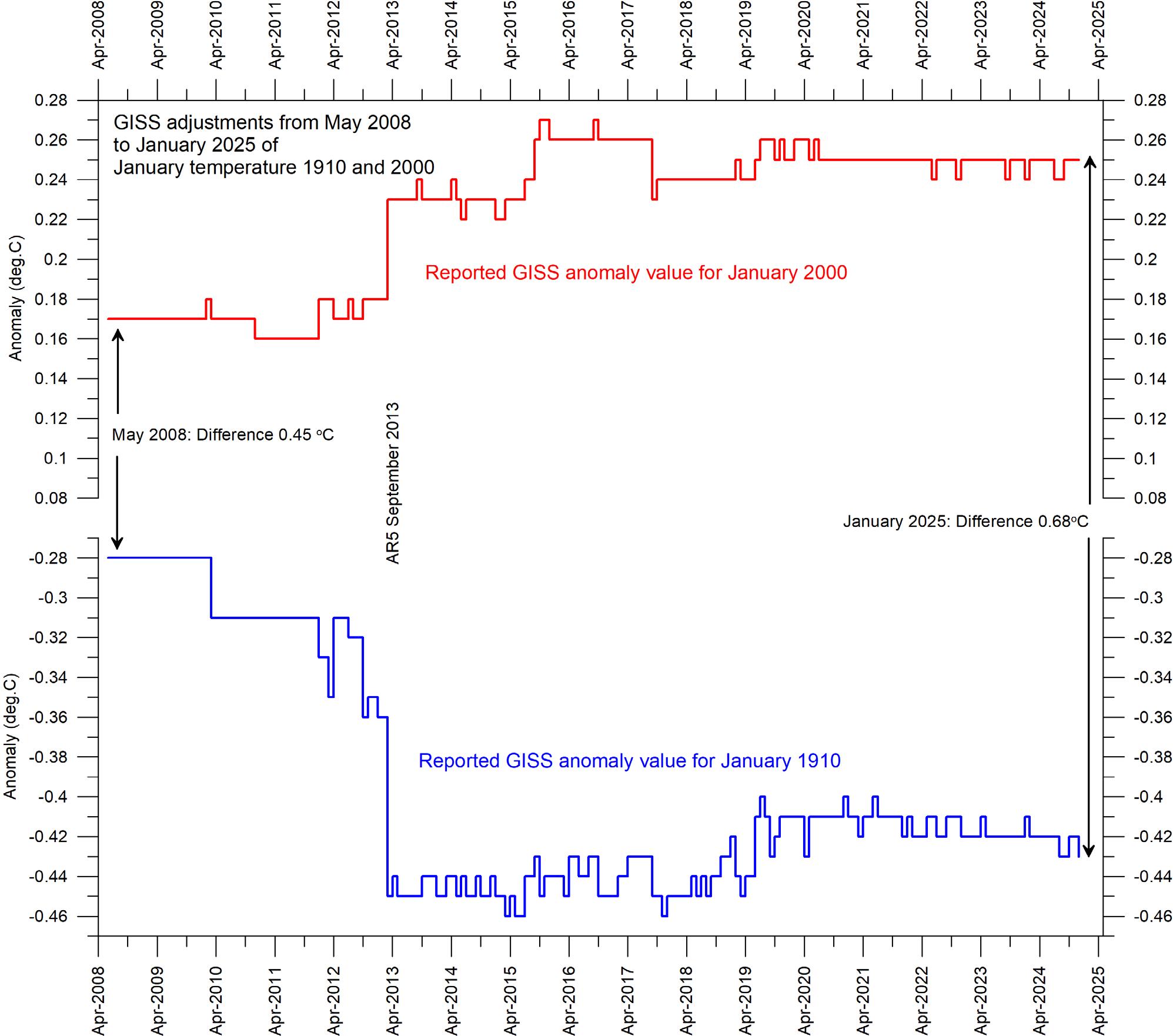
As an example, Figure 9 shows the accumulated effect since May 2008 of such administrative changes in the GISS global surface air temperature record, extending back to 1880. This is just an example taken from a particular record (GISS) to illustrate the effect of ongoing administrative changes, and any of the other datasets would display their specific administrative changes. The overall net effect of the administrative changes introduced in the GISS record since May 2008 is a warming of the early and modern part of the record and cooling of the period in between, roughly from 1900 to 1970. Several of the net changes introduced since 2008 are quite substantial, ranging from about +0.20 to -0.20oC.
To illustrate the effect of administrative changes in a different way, Figure 10 shows how the global surface air temperature for January 1910 and January 2000 (selected two months indicated in Figure 9) has changed since May 2008, again exemplified by the GISS record.
The administrative upsurge of the global surface air temperature increase (GISS) from January 1910 to January 2000 has grown from 0.45 (reported May 2008) to 0.68oC (reported January 2025). This represents about a 51% administrative temperature increase over this period, meaning that approximately half of the apparent global temperature increases from January 1910 to January 2000 (as reported by GISS in January 2025) is due to administrative changes of the original data since May 2008.
Thus, administrative changes are obviously important to consider when evaluating the overall quality of various temperature records, along with other standard sources of error. In fact, the magnitude of administrative changes may often
exceed the formal margin of error.
For obvious reasons, any record undergoing continuing changes cannot always describe the past correctly. Frequent and large corrections in a database inevitably signal a fundamental uncertainty about what is likely to represent the correct values.
Nevertheless, anyone interested in climate science should gratefully acknowledge the efforts put into maintaining the different temperature databases referred to in the present report. At the same time, however, it is also important to realise that all temperature records cannot be of equal scientific quality. The simple fact that they to some degree differ shows that they cannot all be completely correct.
Figure 9: Adjustments since 17 May 2008 in the GISS surface temperature record.
Figure 10: Adjustments made since May 2008 to GISS anomalies for the months January 1910 and January 2000.
‘AR5’ indicates the publication of IPCC report AR5 Climate Change 2013: The Physical Science Basis.
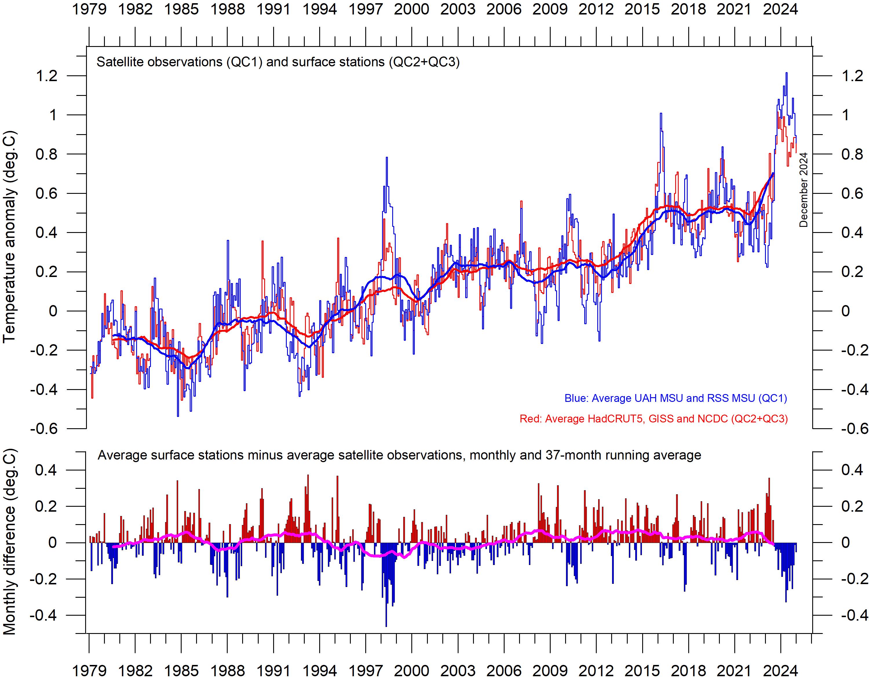
Comparing surface air temperatures with lower troposphere temperatures recorded by satellites
In general, there is close agreement between the average of surface and satellite records, as shown by Figure 11. However, before the major adjustment of the RSS satellite record in 2017, this was different, with the average of surface
records drifting in a warm direction, compared to the average of satellite records. Again, this illustrates the importance of ongoing administrative changes of the individual temperature records.
Figure 11: Surface temperatures versus lower troposphere temperatures. Average of monthly global surface air temperature estimates (HadCRUT5, NCDC and GISS) and satellite-based lower troposphere temperature estimates (UAH and RSS). The thin lines indicate the monthly value, while the thick lines represent the simple running 37-month average, nearly corresponding to a running 3-year average. The lower panel shows the monthly difference between surface air temperature and satellite temperatures. As the base period differs for the different temperature estimates, they have all been normalised by comparing to the average value of 30 years from January 1979 to December 2008.
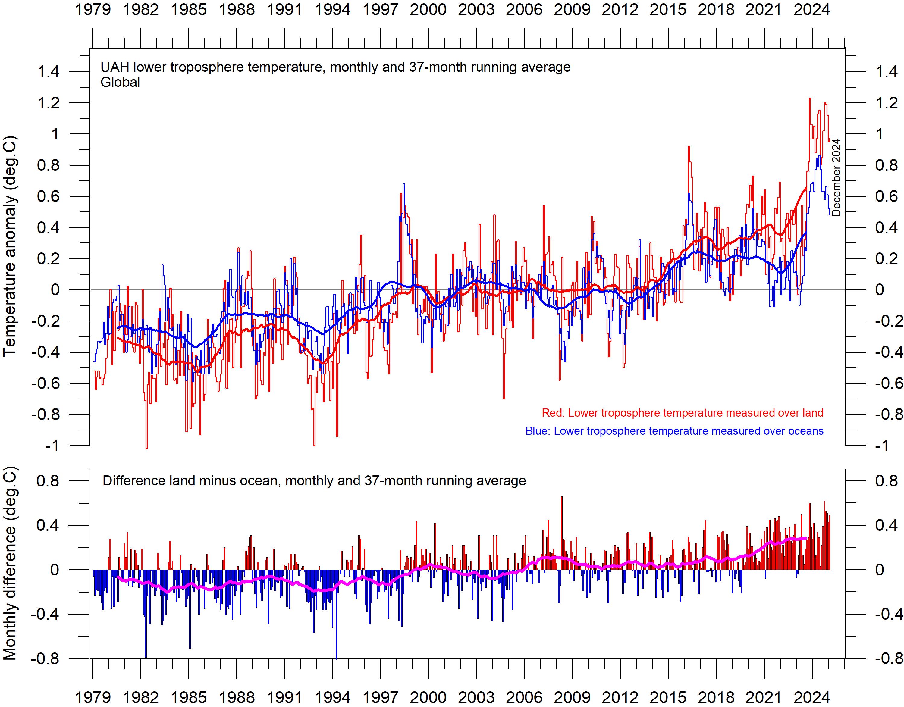
Comparing temperature change over land and oceans; lower troposphere air temperature
Since 1979, the lower troposphere over land has warmed considerably more than over oceans. There may be several reasons for this, such as,
e.g., differences in surface heat capacity, variations in incoming solar radiation, cloud cover and land use.
Figure 12: Lower troposphere temperatures over land and ocean.
Global monthly average lower troposphere temperature since 1979 measured over land and oceans, shown in red and blue, respectively, according to University of Alabama in Huntsville (UAH), USA. The thin lines represent the monthly average, and the thick line the simple running 37-month average, nearly corresponding to a running 3-year average.
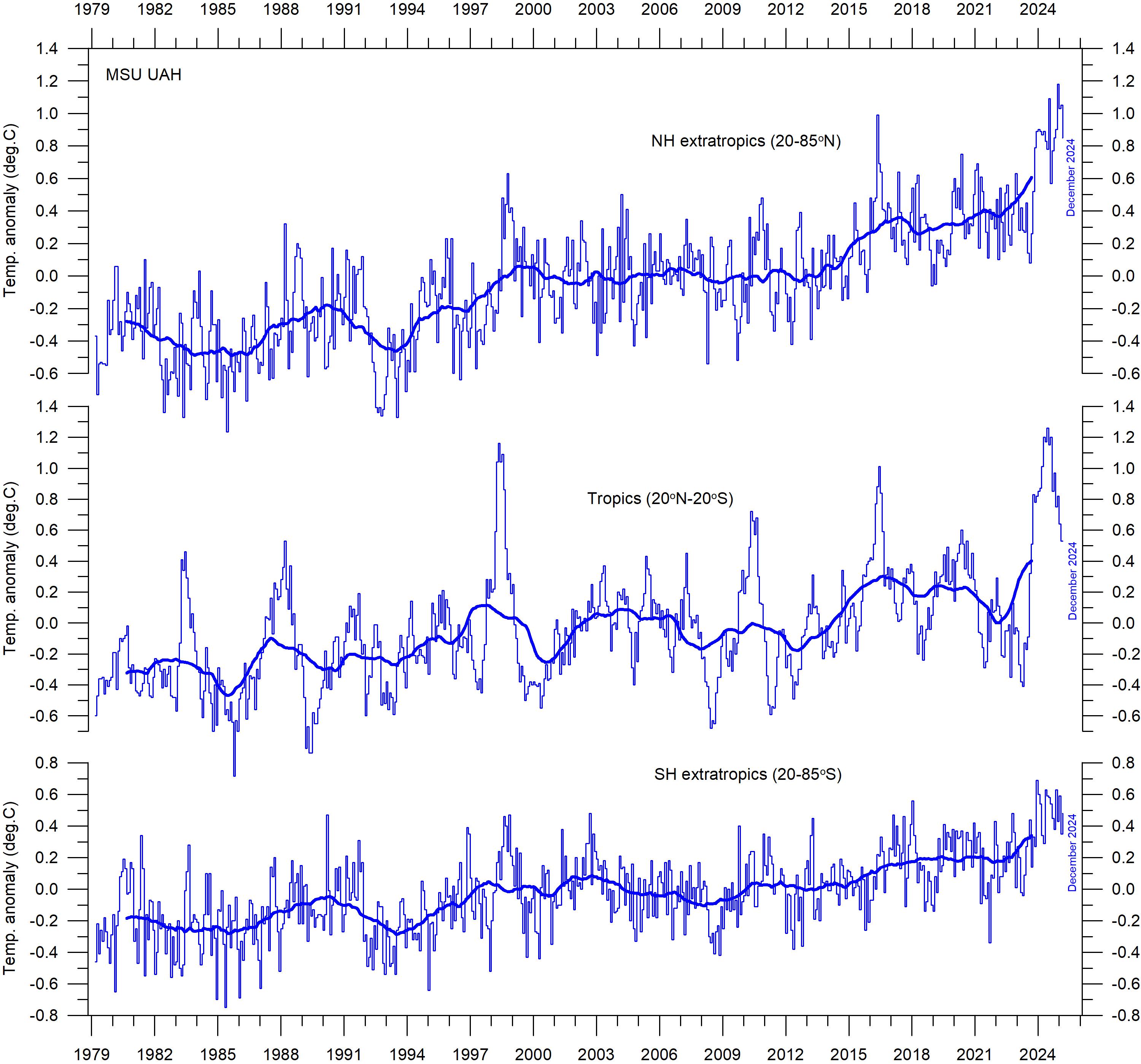
Zonal air temperatures
Figure 13 shows that the ‘global’ warming experienced after 1980 has predominantly been a Northern Hemisphere phenomenon, largely played out as two step changes (1994–1999 and 2015–2016). The first of these changes was, however, influenced by the Mt Pinatubo eruption of 1992–93 and the 1997 El Niño episode. It remains to be seen if the most recent 2023–2024 El Niño episode also will result in a step change.
Figure 13 also reveals how the temperature effects of the strong equatorial El Niños of
1997 and 2015–16, as well as the recent one in 2023–24, evidently spread to higher latitudes in both hemispheres, although with some delay. This air temperature effect was, however, mainly seen in the Northern Hemisphere, less so in the Southern Hemisphere. In general, the temperature variations in the tropics are, with some delay, reflected in both hemispheres, especially the Northern Hemisphere. The tropical regions are clearly of major importance for understanding global meteorological and climatic dynamics.
13:
air temperatures. Global monthly average lower troposphere temperature since 1979 for the tropics and the northern and southern extratropics, according to University of Alabama in Huntsville, USA. Thin lines: monthly value; thick lines: 3-year running mean.
Figure
Zonal
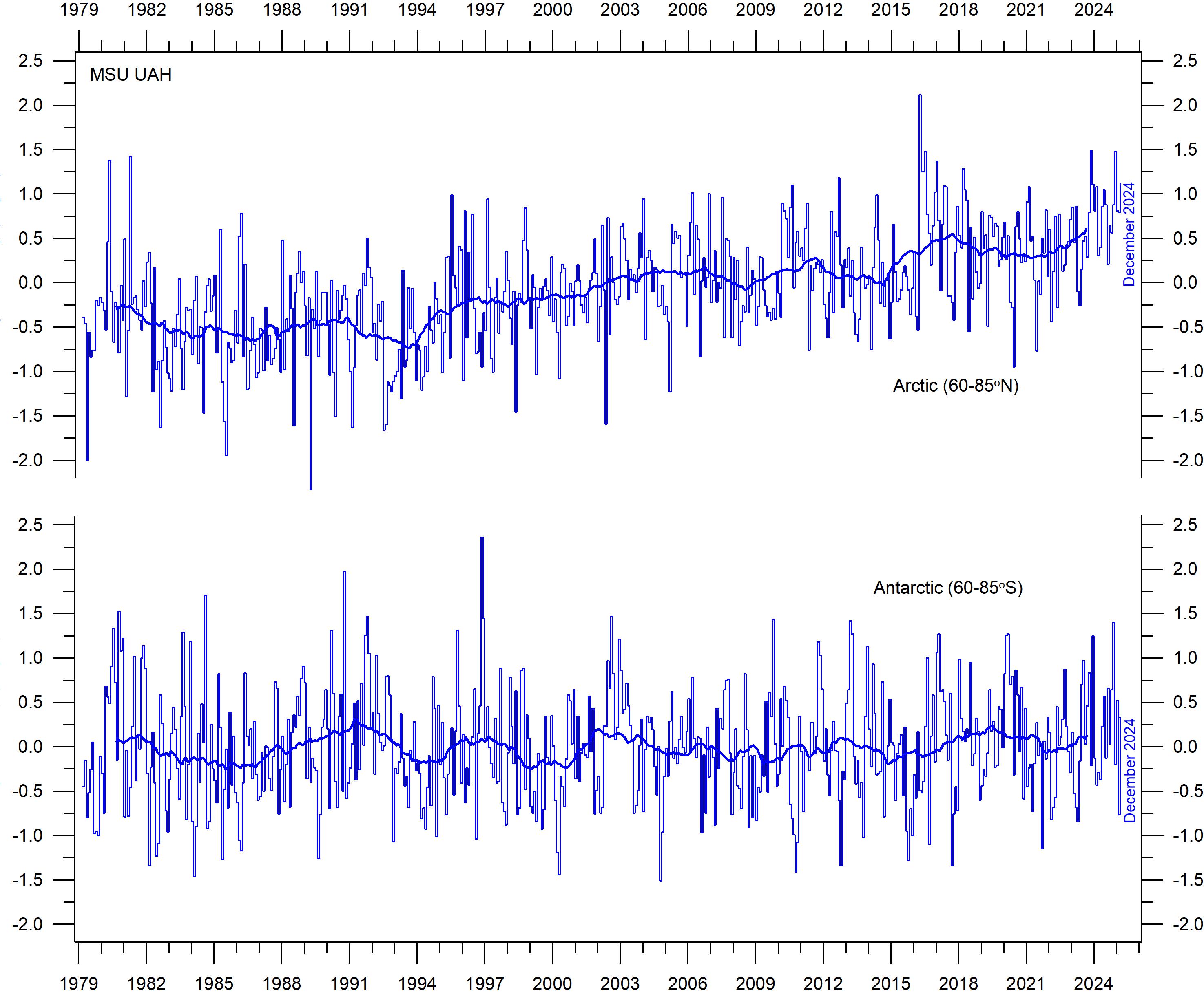
Polar air temperatures
In the Arctic, warming was rapid between 1994 and 1996, but slower subsequently (Figure 14). In 2016, however, temperatures peaked for several months, presumably because of oceanic heat given off to the atmosphere during the 2015–2016 El Niño (Figure 25) and subsequently partly advected to higher latitudes. A small temperature
decrease characterised the Arctic after 2016, but in 2023–24 a new temperature peak is seen, presumably derived from the most recent El Niño. The observed Arctic warming has mainly taken place during northern hemisphere winter, when the Sun is near or below the horizon.
In the Antarctic region, temperatures have
Figure 14: Polar temperatures.
Global monthly average lower troposphere temperature since 1979 for the North and South Pole regions, according to University of Alabama in Huntsville (UAH), USA. Thick lines are the simple running 37-month average.
essentially remained stable since the onset of the satellite record in 1979. In 2016–17 and in 2023–24, a small temperature peak is visible in the monthly record and might be interpreted as the subdued effect of El Niño episodes.
Arctic and Antarctic temperature peaks derived from El Niño episodes, as outlined above, are due to heat ventilating out from the Pacific Ocean near the Equator. Polar temperature peaks result in increased radiation loss to space, and there -
fore paradoxically represent incidents associated with cooling of planet Earth, when considered in a wider context.
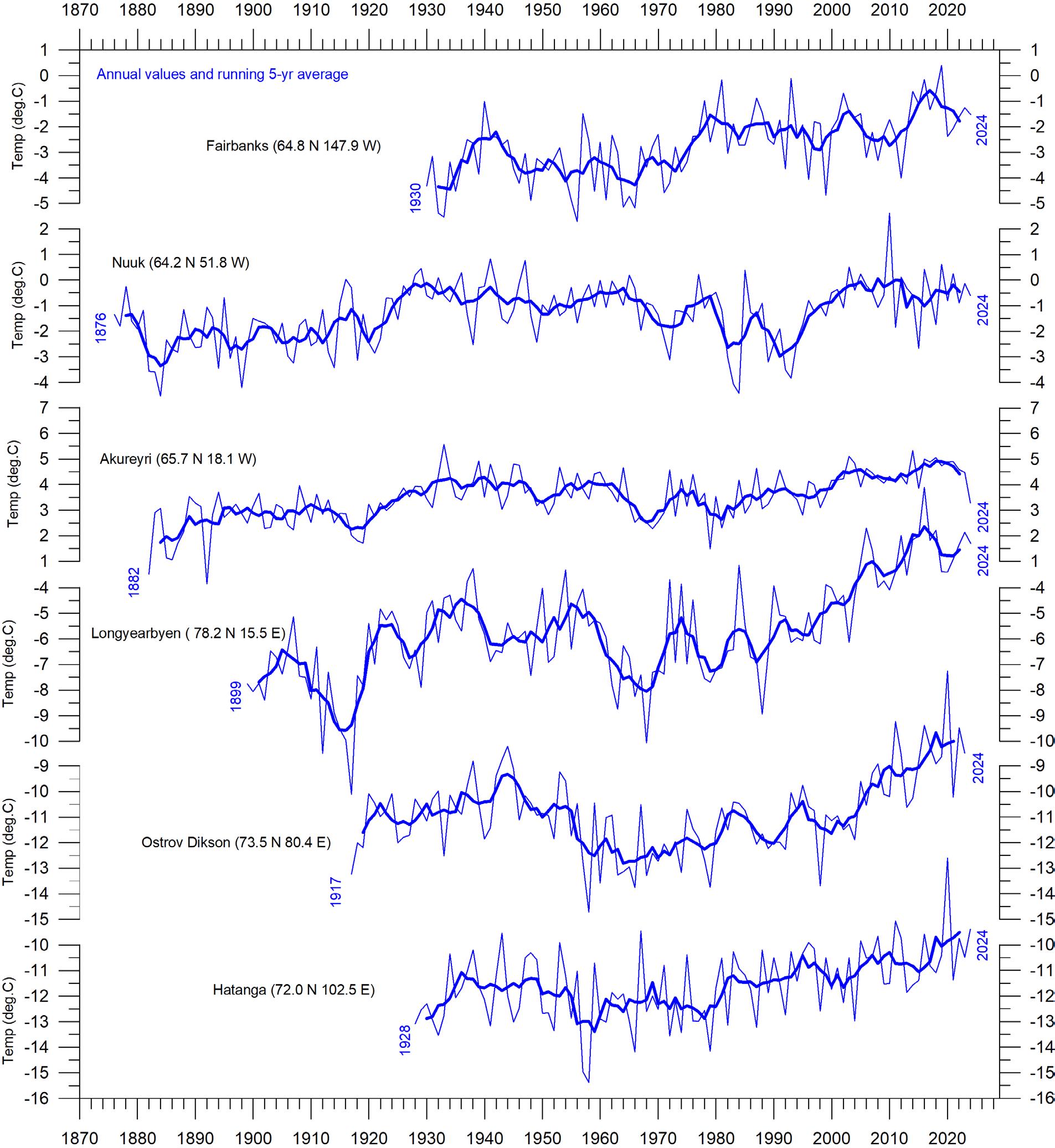
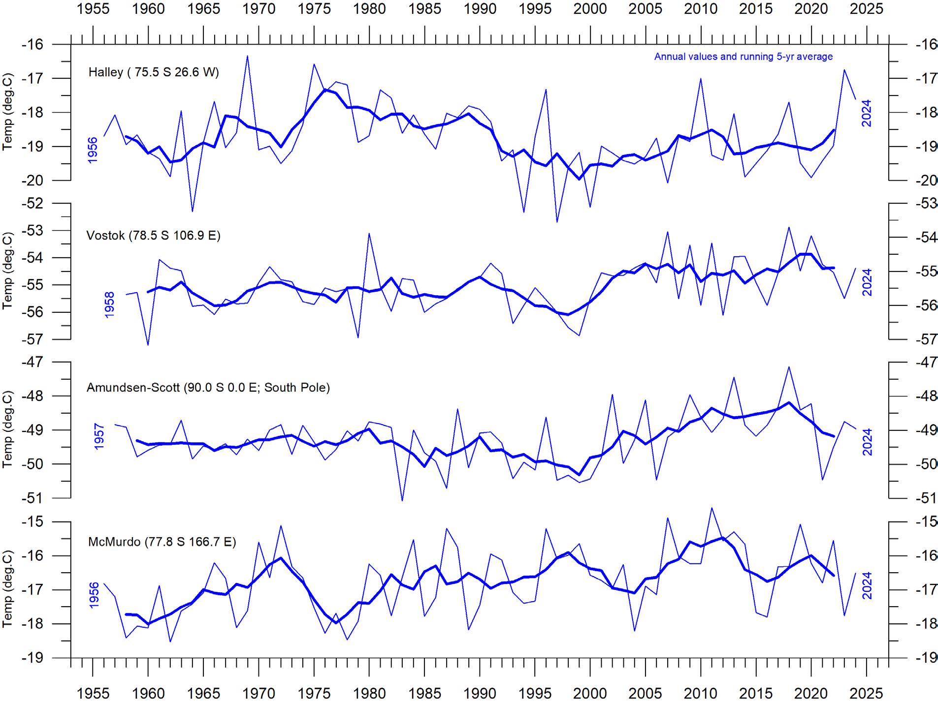
The above-mentioned overall developments are confirmed by considering available long Arctic and Antarctic surface air temperature series, as shown in Figure 15. At this station level, conditions specific for each site become apparent, demonstrating the amount of variation within both polar regions.
Figure 15: Long polar annual surface air temperature series.
Annual values were calculated from monthly average temperatures. Almost unavoidably, missing monthly data were encountered in some of the series. In such cases, the missing values were generated as either 1) the average of the preceding and following monthly values, or 2) the average for the month registered the preceding year and the following year. The thin blue line represents the mean annual air temperature, and the thick blue line is the running 5-year average. Data source: Goddard Institute for Space Studies (GISS).
(a) Arctic
(b) Antarctic
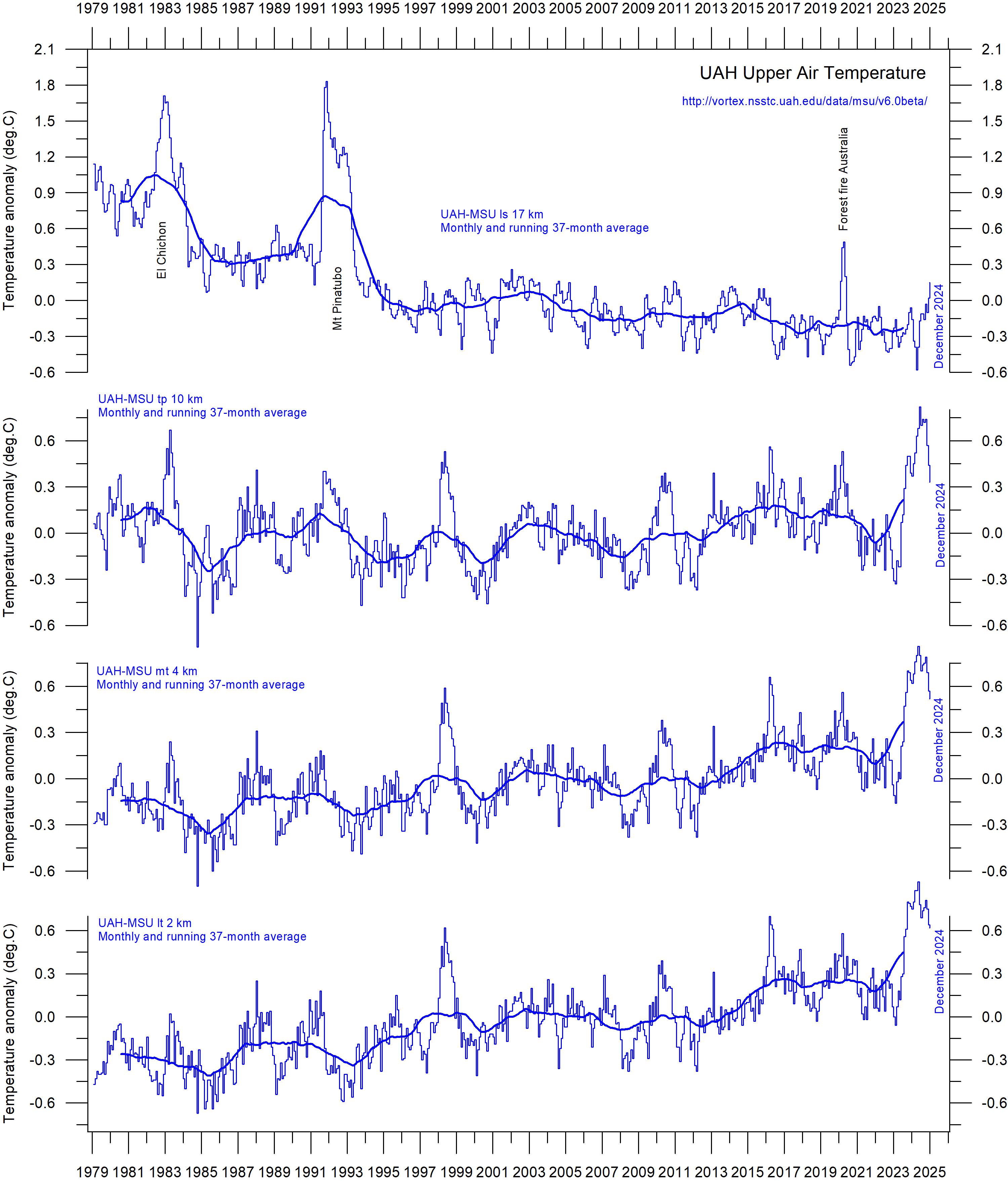
Comparing atmospheric temperatures from surface to 17 km altitude
Changes in the vertical temperature profile of the atmosphere are interesting. One reason is that increasing tropospheric temperatures, along with decreasing stratospheric temperatures, are two central features associated with the CO₂ hypothesis ascribing global warming to human-induced atmospheric CO₂ increases.
The temperature variations recorded in the lowermost troposphere are generally reflected at higher altitudes, up to about 10 km altitude, including many individual troughs and peaks, such as the El Niño-induced temperature spike of 2015–16, as well as the most recent El Niño episode 2023–24.
Figure 16: Global monthly average temperature at different altitudes. University of Alabama in Huntsville (UAH), USA. The thin lines represent the monthly average, and the thick line the simple running 37-month average, nearly corresponding to a running 3-year average.
At high altitudes, near the tropopause, the pattern of variations recorded lower in the atmosphere can still be recognised, but for the duration of the record (since 1979) there has been no clear trend towards higher or lower temperatures.
Higher in the atmosphere, in the stratosphere, at 17 km altitude, two pronounced temperature spikes are visible before the turn of the century. Both can be related to major volcanic eruptions, as indicated in the diagram. The spike in 2020 occurs when major wildfires were playing out in Australia. Ignoring such noticeable spikes, however, until about 1995 the stratospheric temperature
record shows a persistent and marked decline, ascribed by several scientists to the effect of heat being trapped by CO₂ in the troposphere below. However, the marked stratospheric temperature decline essentially ends around 1995–96, and a long temperature plateau has characterised the stratosphere since that time.
A Fourier analysis (not shown here) shows tropospheric temperatures at ca. 2 and 4 km altitude to be affected by a significant 3.6-year period. The identical period is feasibly present also at the tropopause (ca. 10 km altitude), but not in the stratosphere at 17 km altitude.
4. Atmospheric greenhouse gases
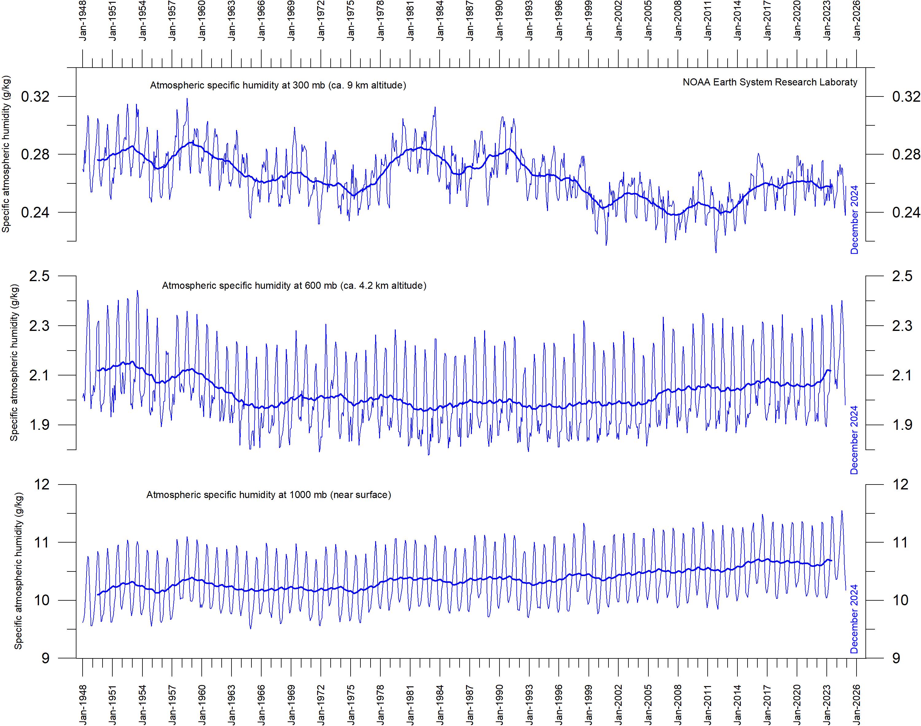
Water vapour
Water vapor (H₂O) is the most important greenhouse gas in the troposphere. The highest concentration is found within a latitudinal range from 50oN to 60oS. The two polar regions of the troposphere are comparatively dry. H₂O is a much more important greenhouse gas than CO₂, both because of its absorption spectrum and its higher concentration.
Climate models assume that the atmosphere during a CO₂-induced warming should display rising specific humidity but maintain a constant relative humidity.
Figure 17a shows the specific atmospheric humidity to be stable or slightly increasing up to about 4–5 km altitude. At higher levels in the troposphere (about 9 km), both the specific humidity
and the relative humidity (Figure 17b) have been decreasing for the duration of the record (since 1948), but with shorter variations superimposed on the falling trend. A Fourier frequency analysis (not shown here) suggests these changes are influenced not only by the significant annual variation but feasibly also by a longer variation of about 35 years’ duration.
The overall decrease since 1948 in specific humidity at about 9 km altitude is notable, as this altitude roughly corresponds to the level (the characteristic emission level) where the theoretical temperature effect of increased atmospheric CO₂ is expected initially to play out. Climate models assume specific humidity to increase at this height.
(a) Specific
(b) Relative
Figure 17: Specific and relative atmospheric humidity in the troposphere since 1948. Shown for three different heights in the troposphere. The thin blue lines show monthly values, while the thick blue lines show the running 37-month average (about 3 years). Data source: Earth System Research Laboratory, (NOAA)..
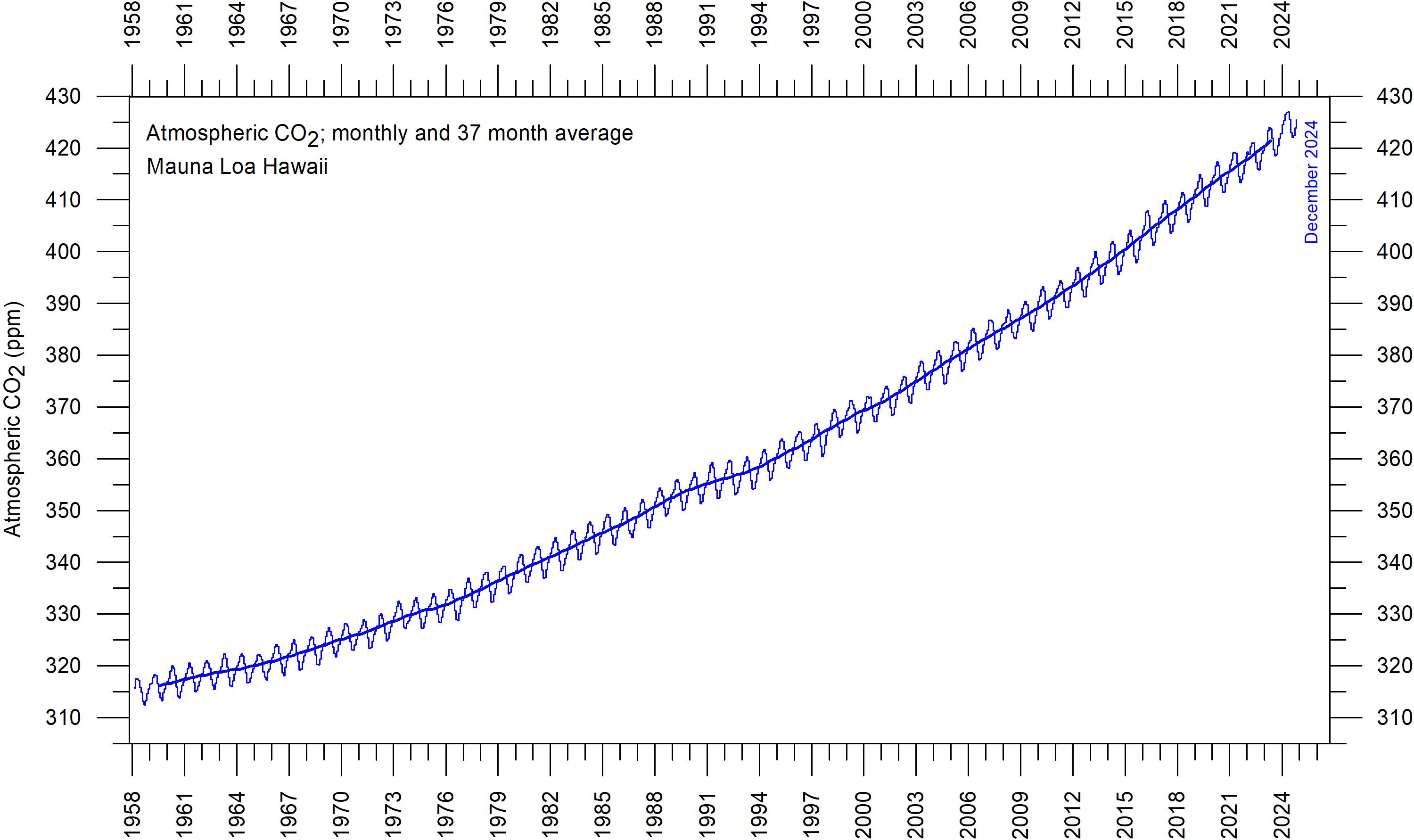
Carbon dioxide
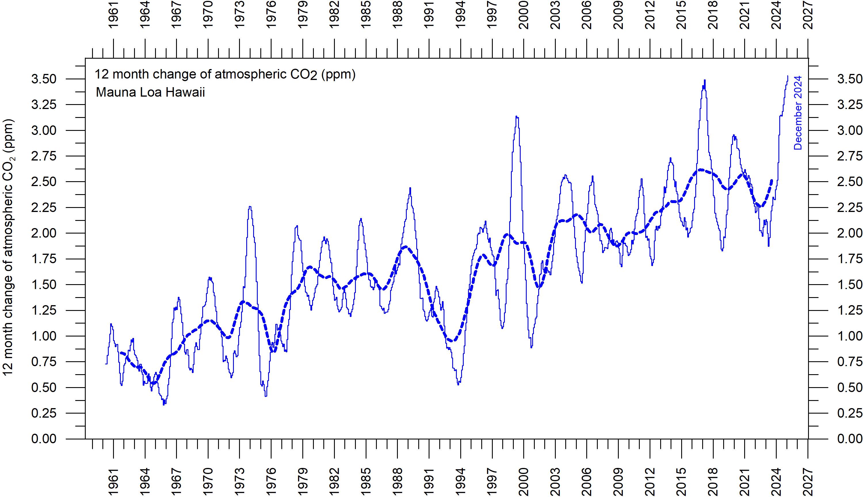
Carbon dioxide (CO₂) is an important greenhouse gas, although less important than H₂O. Since 1958, there has been an increasing trend in its atmospheric concentration, with an annual cycle superimposed. At the end of 2024, the amount of atmospheric CO₂ was near 425 ppm (Figure 25). CO₂ is generally considered as a relatively wellmixed gas in the troposphere.
The 12-month (annual) change in atmospheric CO₂ (Figure 26) has been increasing from about +1 ppm/year in the early part of the record, to about +2.5 ppm/year towards the end of the record. A Fourier frequency analysis (not shown here) shows the 12-month change of CO₂ to be
influenced especially by a significant periodic 3.6-year variation. There is no visible effect of the global COVID-19 lockdown 2020–2021 in the amount of atmospheric CO₂.
A variety of land plants display a frequence reduction of leaf stomata (openings) as atmospheric CO₂ increases (see, e.g. Wagner et al. 2004). Plants use stomata for taking up atmospheric CO₂ but are at the same time losing water. By reducing the frequency of stomata in a CO₂ enriched atmosphere, plants develop increased drought resistance. The increasing amount of atmospheric CO₂ is enhancing photosynthesis and thereby both processes enhance global crop yields.
Difference of two 12-month averages. Thin lines: monthly values; thick lines: 3-year running mean.
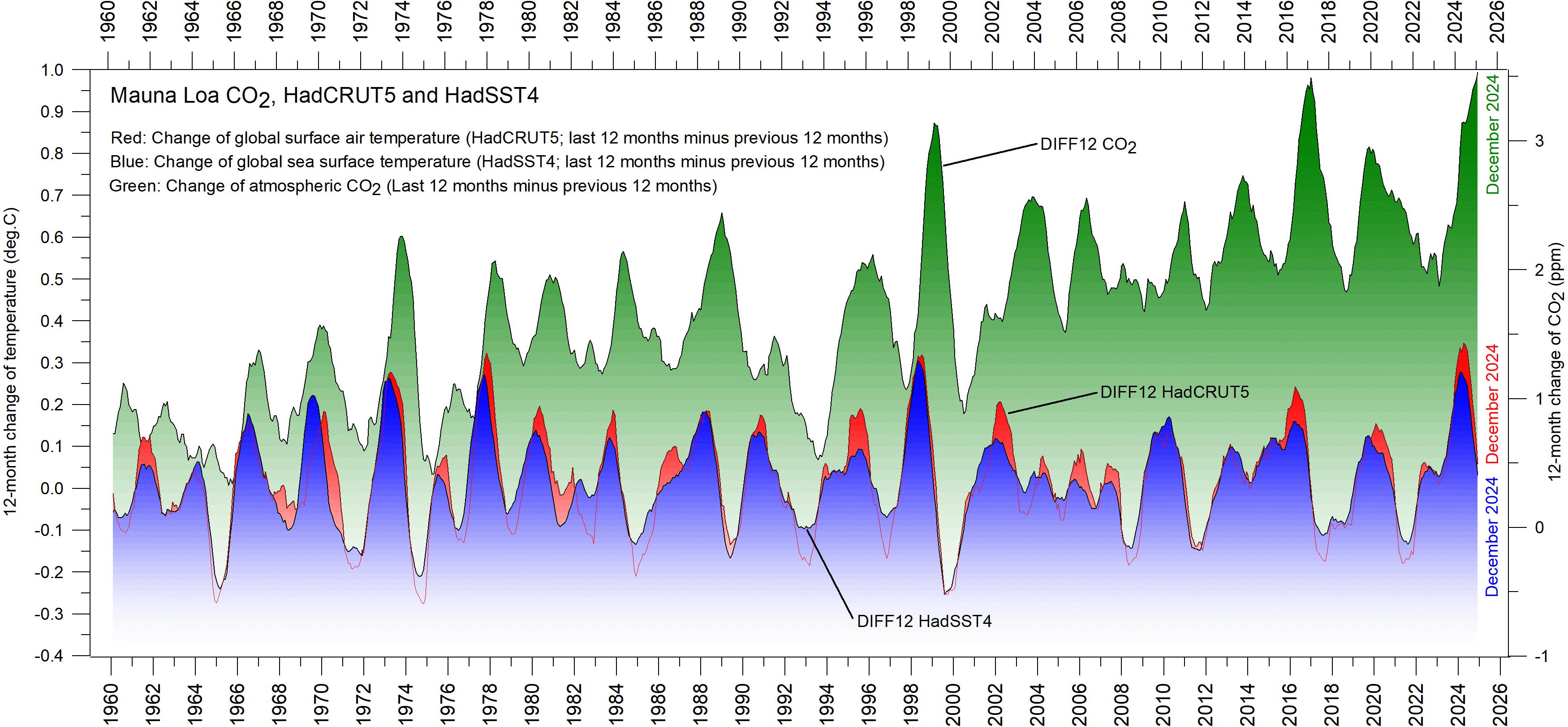
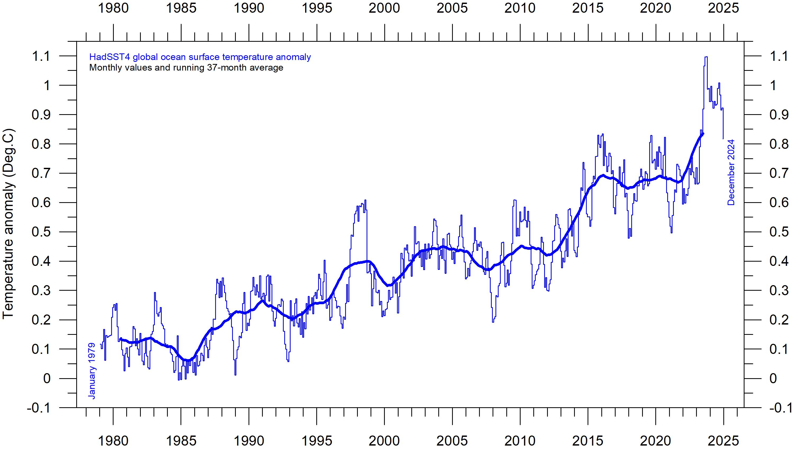
It is revealing to consider the variation of the annual rate of change of atmospheric CO₂, and global air temperature and global sea surface temperature (Figure 20). All three change rates vary visibly in overall concert, but sea-surface temperatures are a few months ahead of the global air temperature, and 11–12 months ahead of changes in atmospheric CO₂ (Humlum et al. 2012).
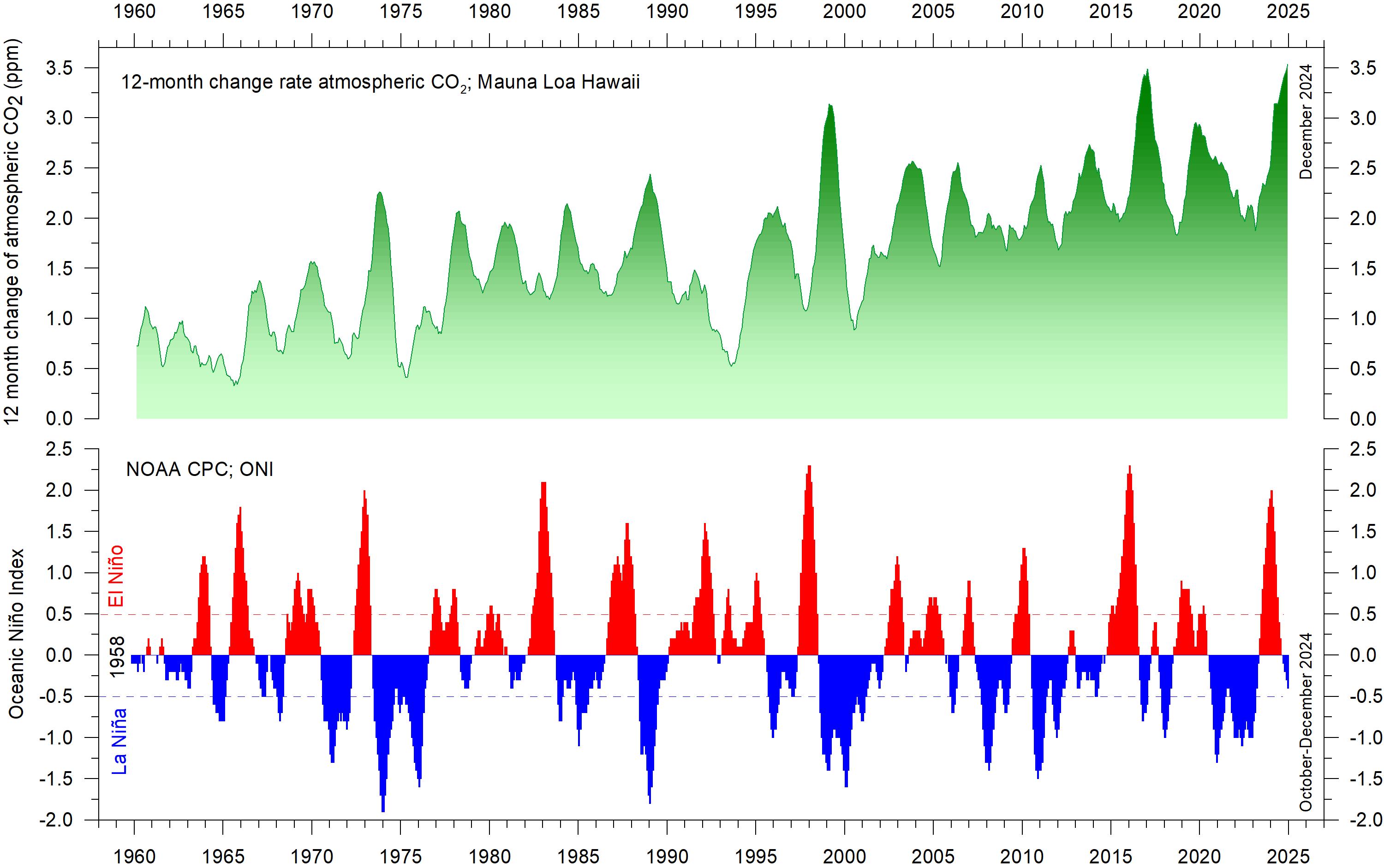
The ocean surface is evidently the starting point for many important climate-related variations. Figure 21 shows the visual association between annual change of atmospheric CO₂ and La Niña and El Niño episodes, again emphasizing the importance of oceanographic dynamics for understanding variations in atmospheric CO₂.
Figure 20: Correlation of carbon dioxide concentrations and temperature records. Annual (12-month) change of global atmospheric CO₂ concentration (Mauna Loa; green), global sea surface temperature (HadSST4; blue) and global surface air temperature (HadCRUT5; red). All graphs are showing monthly values of DIFF12, the difference between the average of the last 12 months and the average for the previous 12 months for each data series.
Figure 21: CO₂ growth and El Niño and La Niña episodes. Visual association between annual growth rate of atmospheric CO₂ (upper panel) and Oceanic Niño Index (lower panel).
5. Ocean temperatures
Sea surface temperature anomaly at the end of the years 2022, 2023 and 2024
Figure 22: Sea surface temperature anomalies.
December sea surface temperature anomalies 2022, 2023 and 2024, (°C).
Reference period: 1977–1991. Dark grey represents land areas. Map source: Plymouth State Weather Center.
Global monthly average since 1979, representing conditions at about 2 km altitude. Satellite data interpreted by University of Alabama in Huntsville (UAH), USA. Base period 1981–2010. The thick line is the simple running 37-month average, nearly corresponding to a running 3-year average.
Figure 24: Sea surface temperature anomalies.
Global monthly average since 1979, according to the University of East Anglia’s Climatic Research Unit (CRU), UK. Base period: 1961–1990. The thick line is the simple running 37-month average, nearly corresponding to a running 3-year average.
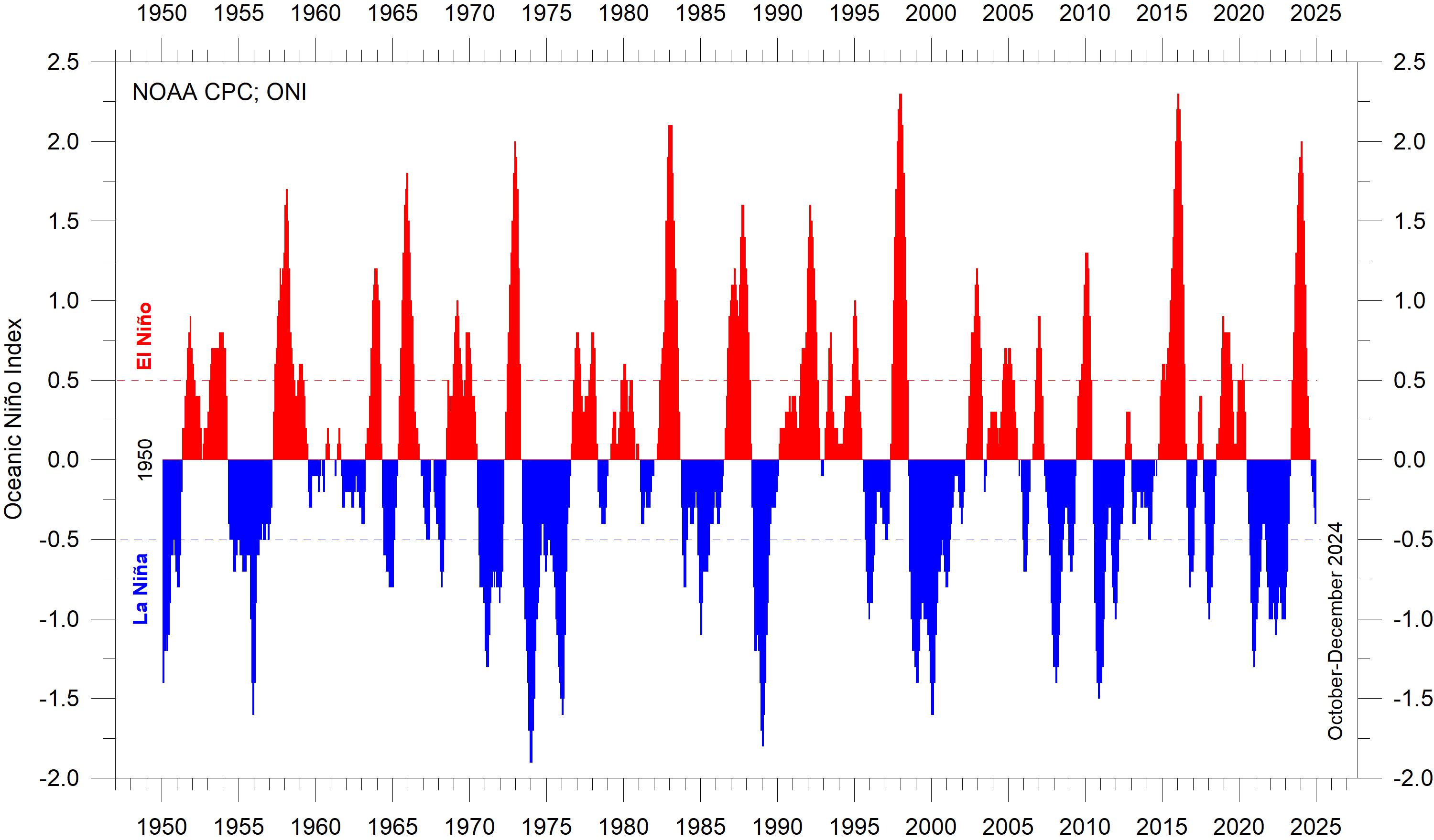
La Niña and El Niño episodes since 1950
In the Pacific Ocean, trade winds usually blow west along the equator, pushing warm water from South America towards Asia. To replace that warm water, cold water rises from the depths near South America.
During El Niño episodes, trade winds are weaker than usual, and warm water spreads back east, towards South America. In contrast, during La Niña episodes, trade winds are stronger than usual, pushing warm water towards Asia, and causing the upwelling of cold water near South America to increase.
The three maps in Figure 22 show the moderate La Niña episode characterising much of 2022, and the succeeding strong El Niño episode in 2023 and 2024. Finally, at the end of 2024, a coming
La Niña episode is beginning to emerge. See also associated global ocean temperature changes in Figures 23, 24, and 25, where all El Niño and La Niña episodes since 1950 are displayed.
The recent 2015–16 and 2023–24 El Niño episodes are among the strongest since the beginning of the record in 1950, and match with the recent global air temperature peaks in 2016 and 2023–24. Considering the entire record (Figure 25), however, recent variations between El Niño and La Niña episodes appear quite normal.
A Fourier frequency analysis (not shown here) shows the record of El Niño and La Niña episodes since 1950 to be influenced by a significant 3.6-year cycle, and feasibly also by a longer 5.6-year cycle.
25: The El Niño index. Warm and cold episodes for the Oceanic Niño Index (ONI), defined as 3-month running mean of ERSST.v5 SST anomalies in the Niño 3.4 region (5°N–5°S, 120°-170°W). Anomalies are centred on 30-year base periods updated every 5 years.
Figure
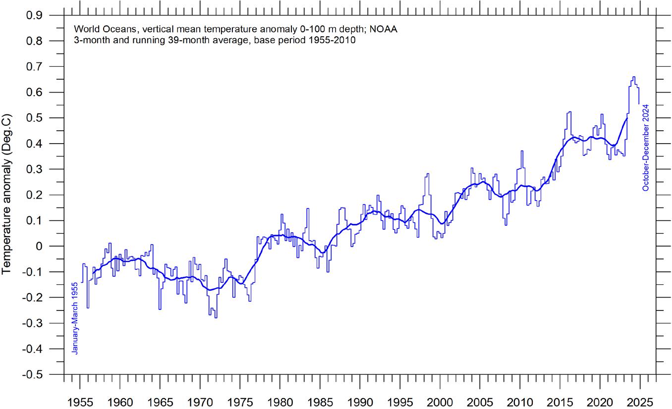
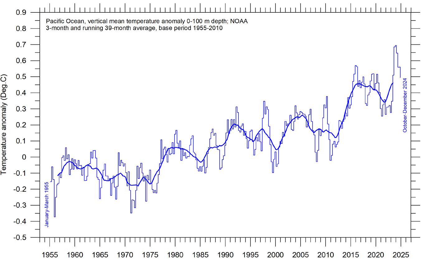
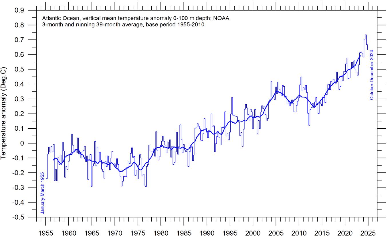
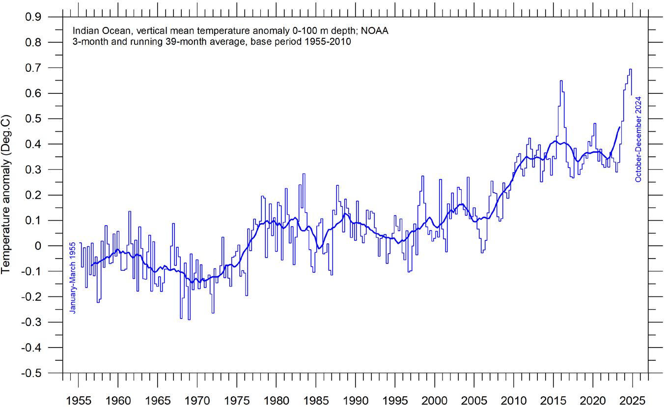
Global and regional ocean average temperatures, uppermost 100 m
(a) Global
(b) Pacific
(c) Atlantic
(d) Indian
Figure 26: Ocean average temperatures, uppermost 100m.
The thin line shows 3-month values, and the thick line represents the simple running 39-month (c. 3 year) average. Source: NOAA, National Centers for Environmental Information.
The penetration depth of the longwave (infrared) radiation into the ocean is less than 100 microns (Hale and Querry, 1973), while shortwave solar radiation penetrates much deeper, to about 150–200 m. Below 200 m there is rarely any significant light. Hence, ocean surface heating is largely a Sun-driven process, and considering temperatures within the uppermost 100 m of various ocean basins is therefore interesting.
All major ocean basins show increasing temperatures in the uppermost 100 m since 1955, but with important regional differences. The observed warming is largest and most straightforward for the Atlantic Ocean, and smaller and with a more
complicated dynamic in the Pacific Ocean. The Indian Ocean shows least warming of the three major ocean basins considered here. Due to its major surface extension, the temperature signal in the Pacific Ocean (Figure 26b) dominates the global ocean signal (Figure 26a).
A Fourier-analysis (not shown here) show the Pacific Ocean temperature signal to be influenced by a significant 3.6-year variation, and feasibly also by a longer, but weaker, 11.7-year variation. The 3.6-year cycle is also present in the time series from all other major ocean basins but not reaching a statistically significant level.
Global ocean average temperatures to 1900m depth
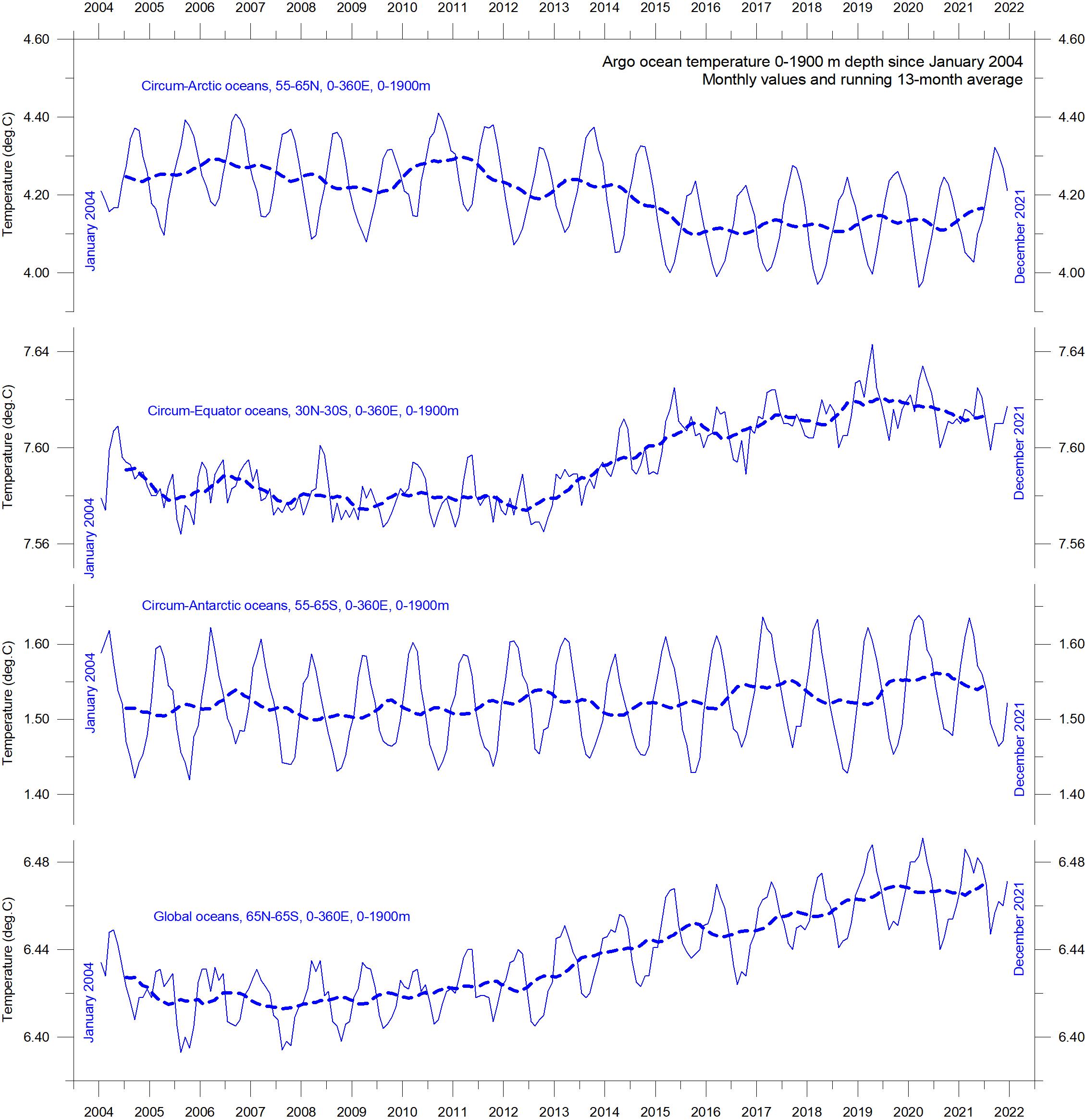
Based on observations by Argo floats (Roemmich and Gilson, 2009) the global summary diagram (Figure 27) shows that, on average, the temperature of the global oceans down to 1900 m depth has been increasing since about 2010. It can also be seen that this increase since 2013 is predominantly due to oceanic changes occurring near the Equator, between 30ºN and 30ºS. In contrast, for the circum-Arctic oceans, north of 55ºN, depth-integrated ocean temperatures have
been decreasing since 2011. Near the Antarctic, south of 55ºS, temperatures have largely been stable. At most latitudes, a clear annual rhythm is seen to play out.
From about 2020, the measurements available could indicate the onset of a new development, with decreasing circum-Equator temperatures, and increasing circum-Arctic temperatures. However, more measurements are needed to reach any sort of conclusion about this ongoing development.
27: Ocean temperatures to 1900 m.
Average ocean temperatures January 2004–December 2021 at 0–1900 m depth in selected latitudinal bands, using Argo data. The thin line shows monthly values, and the thick dotted line shows the running 13-month average. Source: Global Marine Argo Atlas.
Figure
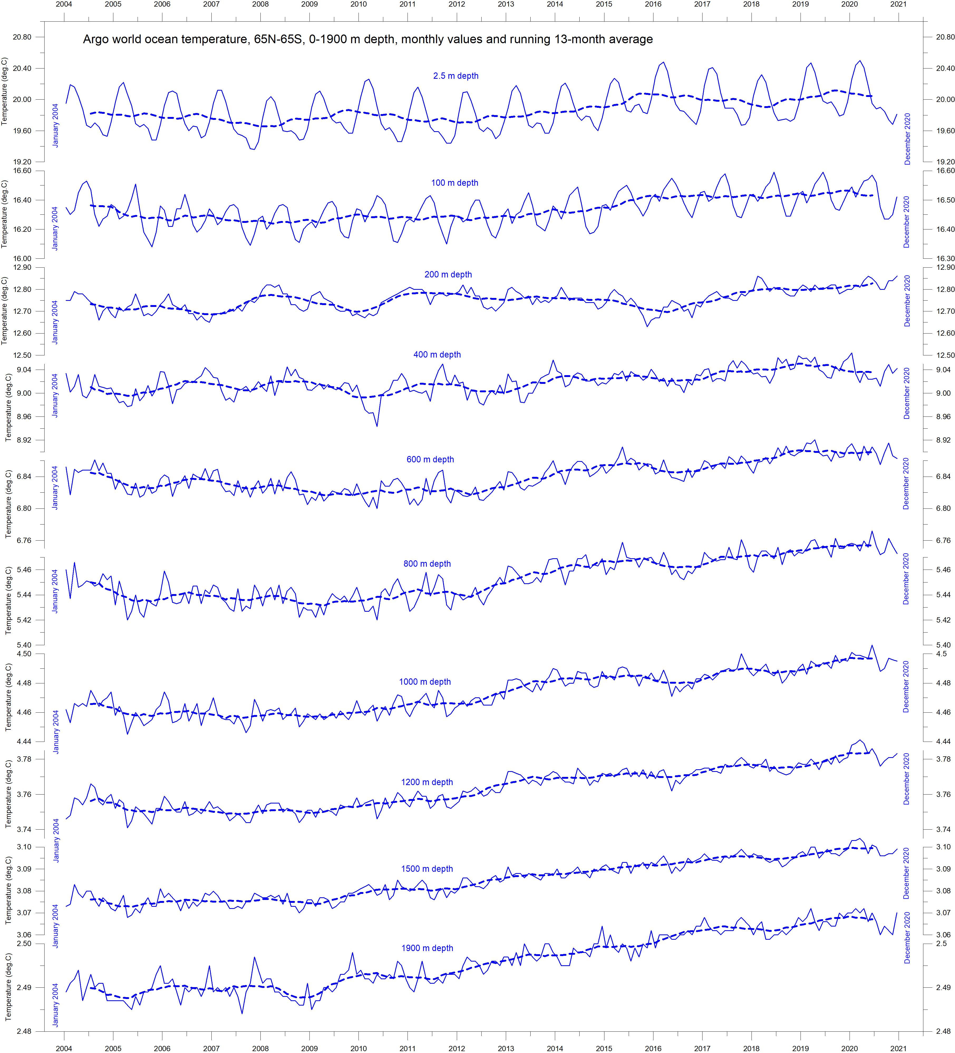
Global ocean temperatures at different depths
Figure 28 displays global average oceanic temperatures at different depths. An annual rhythm can be traced to about 100 m depth. In the uppermost 100 m, temperatures have increased since about 2011. At 200–400 m depth, temperatures have exhibited little change during the observational period.
For depths below 400 m, however, global average ocean temperatures have increased over the observational period. Interestingly, the data
suggests that this increase commenced at 1900 m depth in around 2009, and from there has gradually spread upwards. At 600 m depth, the present temperature increase began around 2012; that is, about three years later than at 1900 m depth. The timing of these changes shows that average temperatures in the upper 1900 m of the oceans are not only influenced by conditions playing out at or near the ocean surface, but also by processes operating at greater depths than 1900 m.
Figure 28: Ocean temperatures at different depths. Ocean temperatures January 2004–December 2020 at different depths between 65°N and 65°S, using Argo data. The thin line shows monthly values, and the dotted line shows the running 13-month average. Source: Global Marine Argo Atlas.
As a result, part of the current ocean warming appears to be due to circulation changes taking place at depths below 1900 m and are therefore not directly related to processes operating at or near the surface.
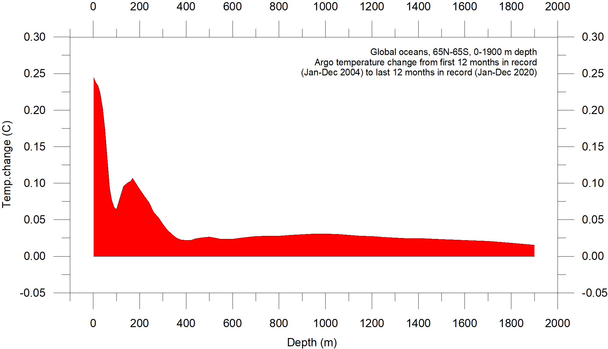
This development is also seen in Figure 29, which shows net changes of global ocean temperatures at different depths, calculated as the net
difference between two 12-month averages: for January–December 2004 and January-December 2020. The largest net changes are seen to have occurred in the uppermost 200 m of the water column. However, such average values, although valuable, also hide many interesting regional details. These are considered in the next two sections.
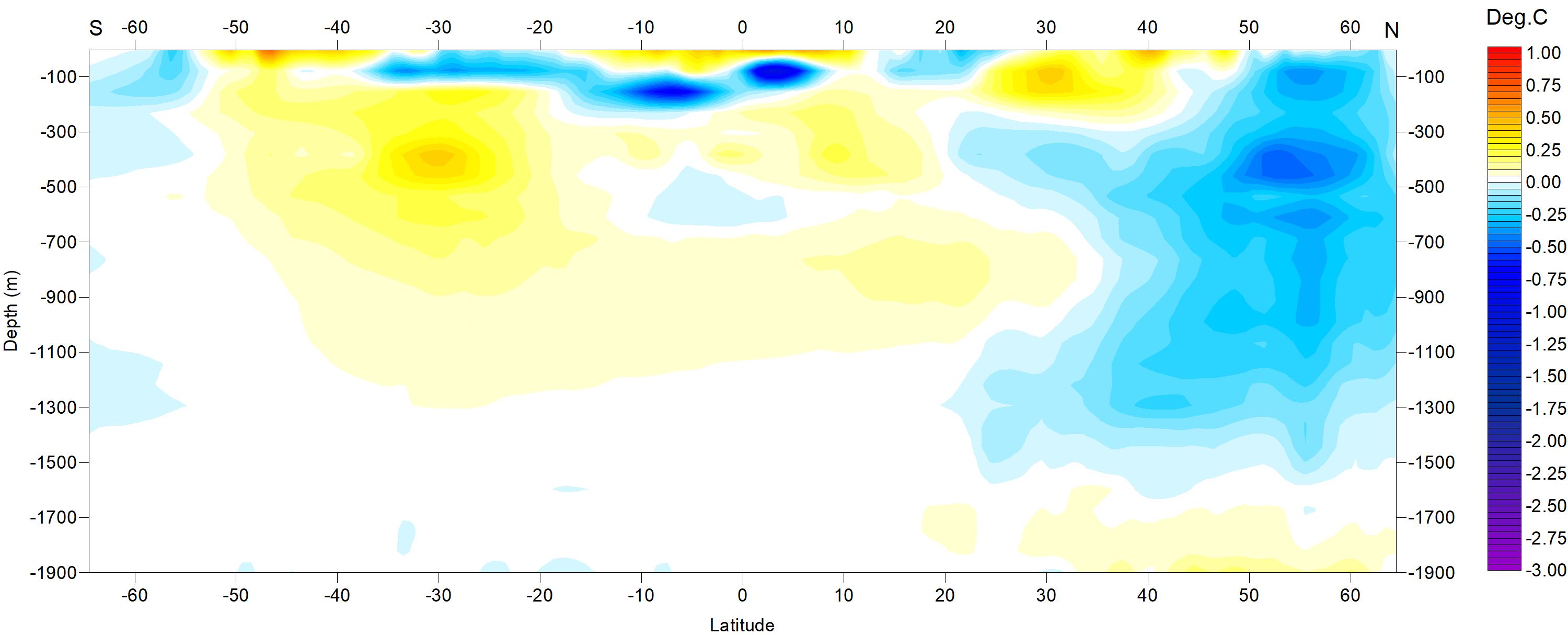
Regional ocean temperature changes temperatures 0–1900 m depth
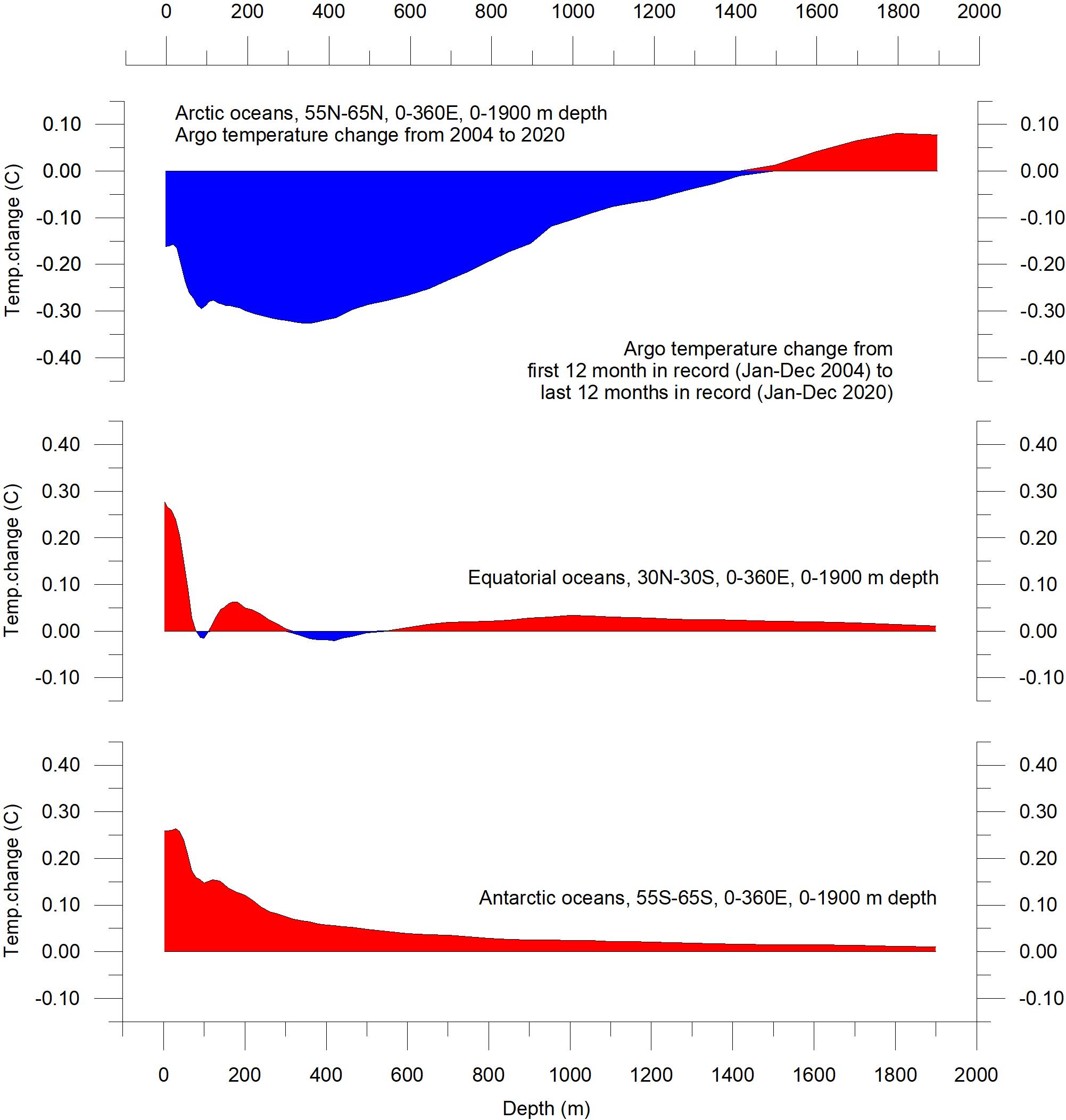
Figure 30 shows variation of oceanic temperature net changes between the identical two 12-month periods as in the previous section, for various depths, and for three different latitudinal bands, representing the Arctic Oceans (55–65ºN), Equatorial Oceans (30N-30ºS), and Antarctic Oceans (55–65ºS), respectively. The global net surface warming displayed in Figure 29 is seen to affect the Equatorial and Antarctic Oceans, but not the Arctic Oceans. In fact, net cooling is pronounced down to 1400 m depth for the northern oceans. However, a major part of Earth’s land area is in the Northern Hemisphere, so the surface area (and volume) of ‘Arctic’ oceans is much smaller than the ‘Antarctic’ oceans, which are in turn smaller than the ‘Equatorial’ oceans. In fact, half of the planet’s surface area (land and ocean) is located between 30oN and 30ºS.
Figure 29: Temperature changes 0–1900 m.
Global ocean net temperature change since 2004 from surface to 1900 m depth, using Argo -data. Source: Global Marine Argo Atlas
Nevertheless, the contrast in net temperature changes for the different latitudinal bands is instructive. For the two polar oceans, the Argo data appears to suggest the existence of a bi-polar seesaw, as described by Chylek et al. (2010). It is no less interesting that the near-surface ocean temperature in the two polar oceans contrasts with the overall development of sea ice in the two polar regions (see later in this report).
30:
Global ocean net temperature change since 2004 from surface to 1900 m depth. Source: Global Marine Argo Atlas
Figure
Temperature changes 0–1900 m.
Ocean temperature net change 2004–2021 in selected sectors
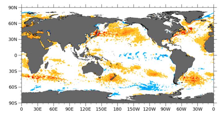
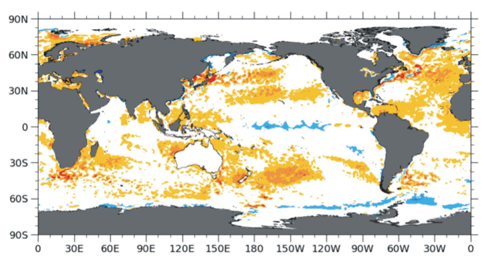
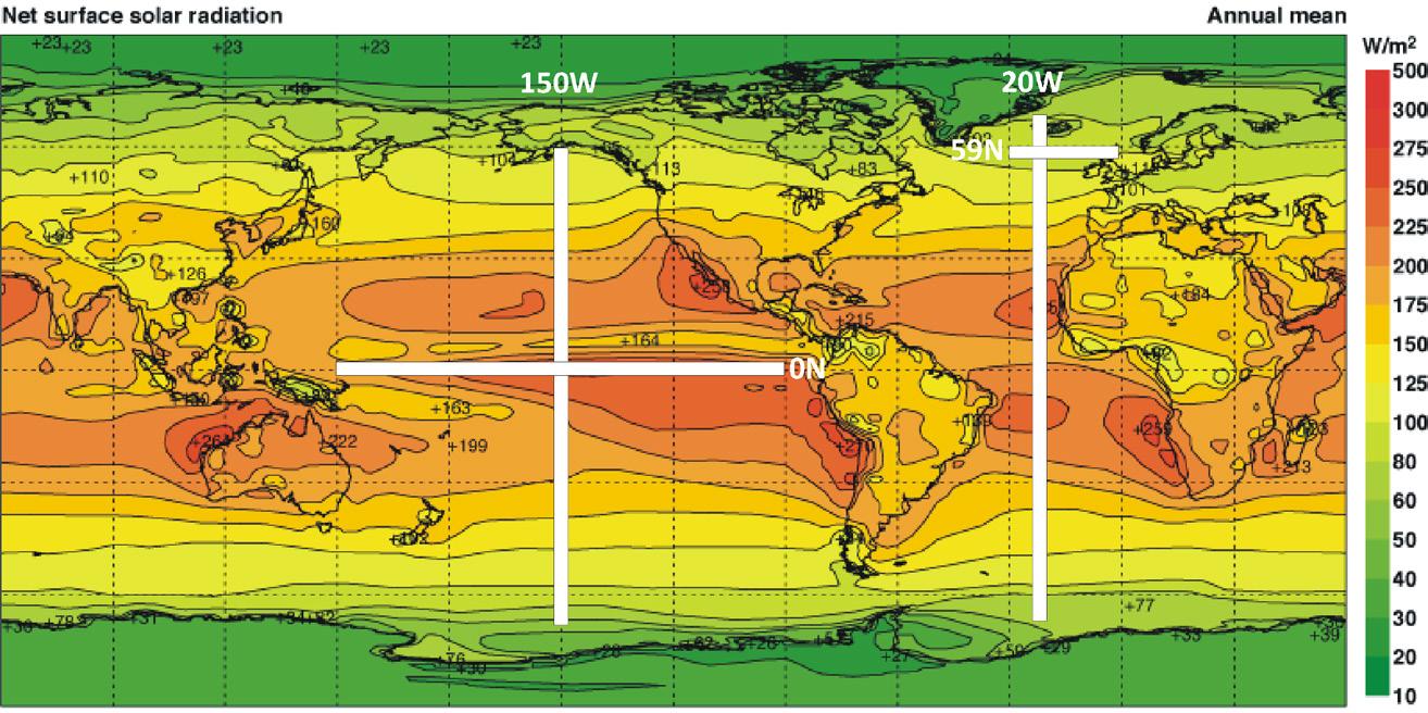
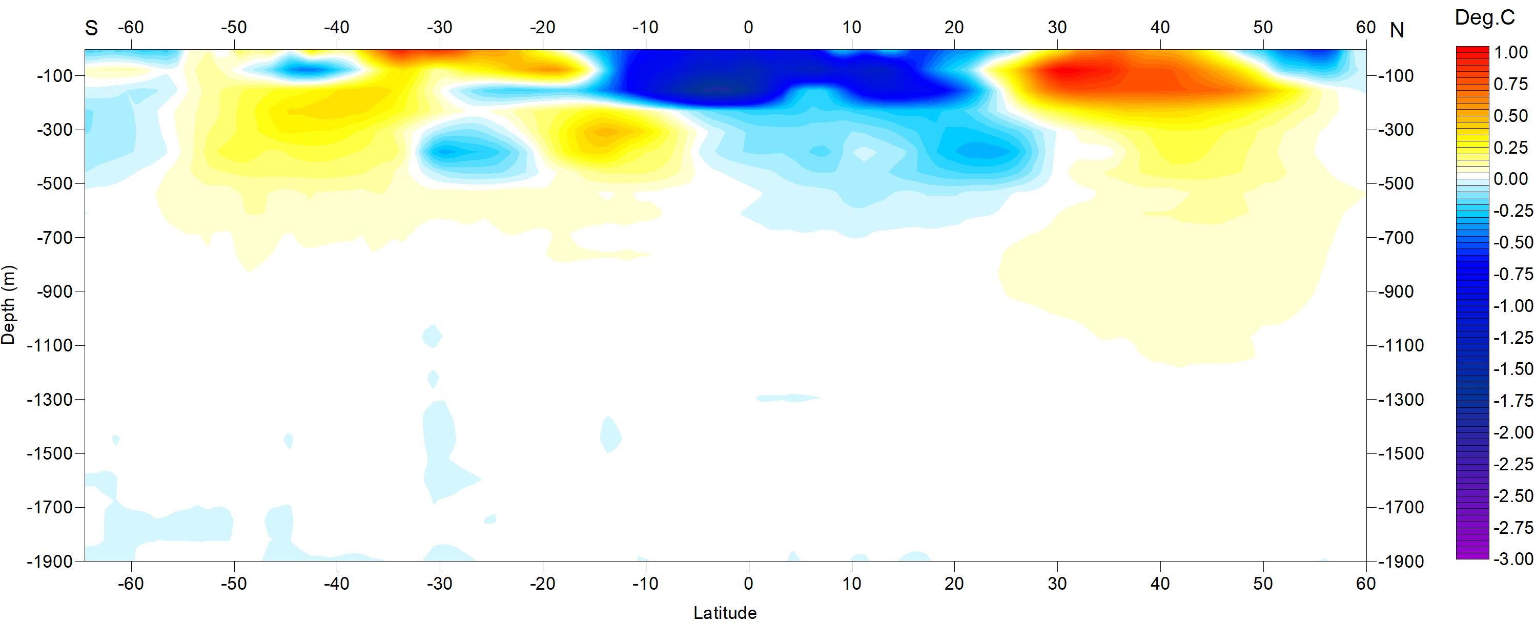
31: Location of the four profiles. Average annual mean net surface solar radiation (W/m2), and the location of profiles discussed below.
Figure 32a shows net temperature changes 2004–2021 and during 2021 along 20ºW, representing the Atlantic Ocean. To prepare the diagram, 12-month average ocean temperatures for 2021 were compared to annual average temperatures for 2004, representing the first 12 months in the Argo-record. To give an insight into the most recent changes, the 12-month net change from
January 2021 to December 2021 is shown in the lower diagram (Figure 32b). Warm colours indicate net warming and blue colours indicate cooling. Due to the spherical form of Earth, high latitudes represent smaller ocean volumes than lower latitudes near the Equator. With this reservation in mind, the data along the Atlantic transect nevertheless reveal several interesting features.
The most prominent feature in the 2004–2021 profile (Figure 32a) is a marked net cooling north of 35–40ºN, affecting depths down to 1500–1600 m. In contrast, warming characterises latitudes further south, especially between 20–50ºS, down to about 1100 m depth. At 100–150 m depth cooling dominates between 10ºN and 40ºS.
The temperature development over the last 12 months of the record (Figure 32b) shows a more complicated pattern, especially near the surface. Much of the South Atlantic displaying net warming 2004–2021 is currently undergoing
Figure 32: Temperature change along Atlantic profile (20ºW), 0–1900 m. (a) 2004–2021 and (b) Jan–Dec 21. See Figure 31 for geographical location of transect. Data source: Global Marine Argo Atlas
Figure
(a)
(b)
cooling, especially between 20oS and 40oS. In the North Atlantic, the last 12 months on record show warming north of 10ºN, affecting depths down to 200 m. At greater depths, cooling still prevails.
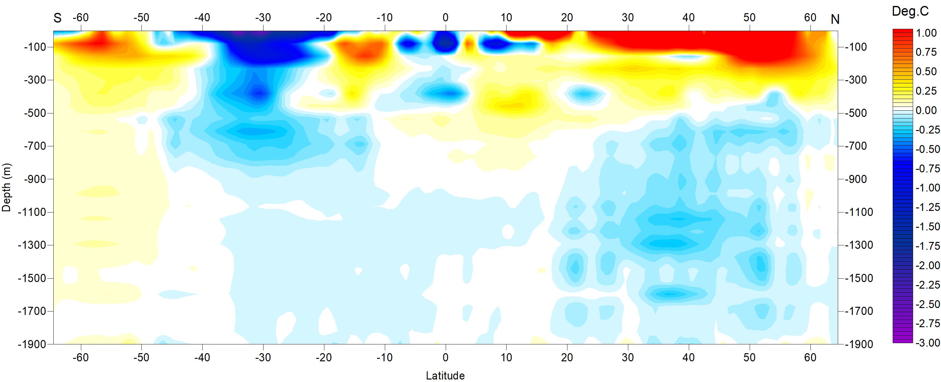
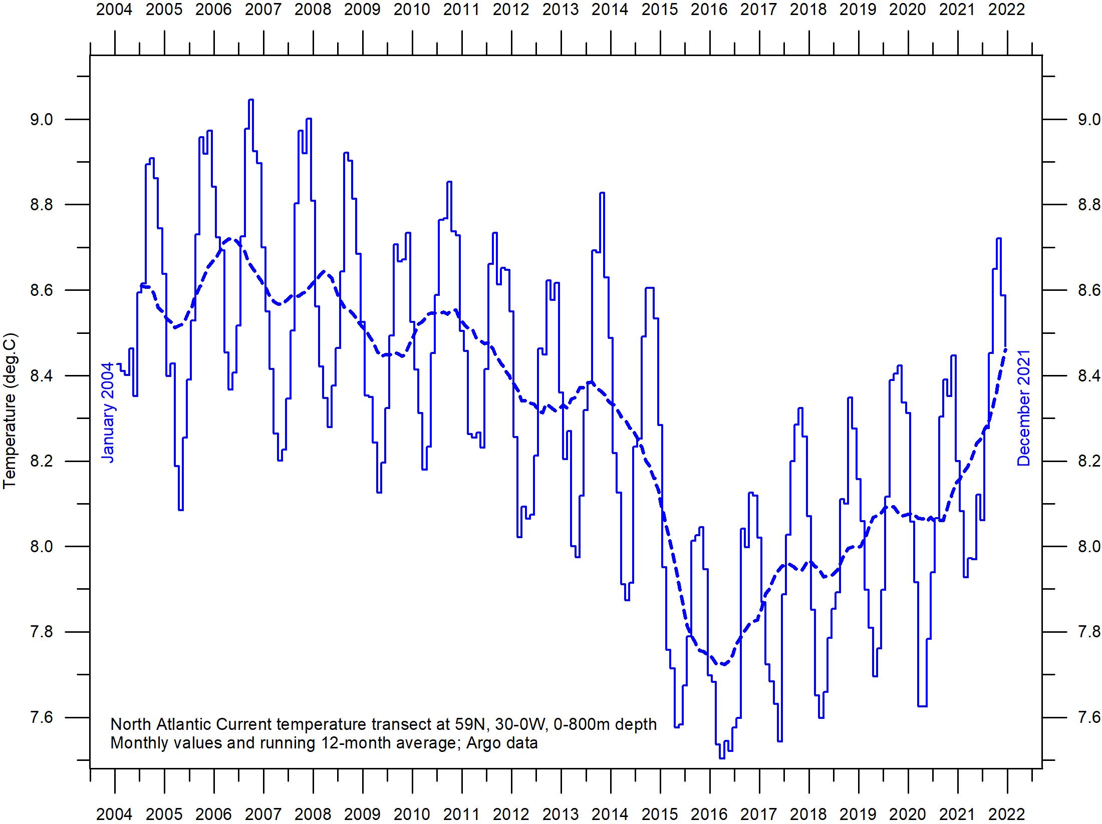
Of particular interest for Europe are oceanic temperature changes playing out within a 59ºN transect across the North Atlantic Current (Figure 31), just south of the Faroe Islands. This ocean region is important for weather and climate in much of Europe.
Figure 33 displays a time series at 59ºN, from 30ºW to 0ºW, and from the surface to 800 m depth. This essentially represents a section across the water masses affected by the North Atlantic Current. Ocean temperatures higher than 9oC are indicated by red colours.
This time series, although still relatively short, display noteworthy dynamics. The prominence of warm water (above 9ºC) apparently peaked in
Figure 33: Temperature change along North Atlantic Current profile, 0–800 m.
See Figure 31 for geographical location of transect. Data source: Global Marine Argo Atlas
Figure 34: Depth-integrated temperature for the North Atlantic Current profile.
See Figure 31 for geographical location of transect. Data source: Global Marine Argo Atlas
early 2006, after which temperatures gradually decreased until 2016. Since then, a partial temperature recovery has taken place. The observed change, from peak to trough, playing out over approximately 11 years, might possibly suggest a 22-year temperature cycle, but we will have to wait until the Argo series is longer before drawing conclusions.
Figure 34 shows the identical time series data (59ºN, 33–0ºW, 0–800 m depth, 2004–2021) as a graph of depth-integrated average ocean temperature.
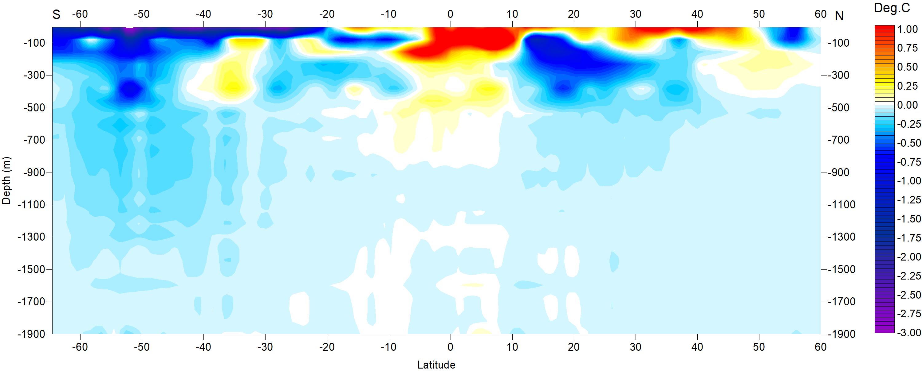
Figure 35 shows two Pacific Ocean diagrams, showing net changes 2004–2021 and during 2021 along 150oW, using data obtained by Argo-floats, and prepared like the two Atlantic diagrams above. Warm colours indicate net warming, and blue colours net cooling. Again, northern and southern latitudes represent only relatively small
ocean volumes, compared to latitudes near the Equator.
One interesting feature for 2004–2021 (Figure 35a) is net cooling near the Equator (15oS20oN) down to about 700 m depth. In contrast, two bands (20–40oS and 30–45oN) are characterised by net warming, down to 800–900 m depth. During the last 12 months in the Argo record (Figure 35b) net cooling is prominent, apart from surface water 5oS-50oN displaying warming down to 100–200 m depth. This recent (2021) warming at the surface near the Equator is likely to be the result of a short weakening of the La Niña playing out at that time (Figure 25).
Neither the Atlantic nor the Pacific longitudinal diagrams reveal the extent to which the net changes displayed are caused by ocean dynamics operating east and west of the two profiles considered. For that reason, they should not be
overinterpreted. They do, however, suggest an interesting contrast, with the Atlantic since 2004 displaying a more dynamic temperature development than the Pacific, except for depths and latitudes affected by El Niño and La Niña episodes in the Pacific.
Figure 36 shows a time series of sea temperatures from surface to 400 m depth in the El Niño/La Niña region (Pacific Ocean). By comparing with Figure 25 the individual episodes are clearly recognised as temperature variations in the upper 150–200 m of the ocean. Below 200–250 m temperature conditions are essentially constant, demonstrating that El Niño and La Niña episodes are phenomena mainly driven by variations in surface conditions, with little or no influence from greater depths. See also comments to Figures 22 and 25 for general information on El Niño and La Niña episodes.
Figure 35: Temperature change along Pacific profile, 0–1900 m. (a) 2004–2021 and (b) Jan–Dec 2021. See Figure 31 for geographical location of transect. Data source: Global Marine Argo Atlas (a)
(b)
Figure 36: Temperature change along Pacific profile, 0–400 m.
Sea temperature variations with depth January 2004–December 2020 in the El Niño and La Niña region along the Equator in the Pacific Ocean. See Figure 31 for geographical location of transect. Data source: Global Marine Argo Atlas.
6. Ocean cycles
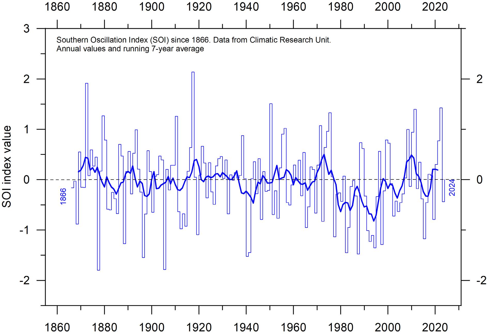
Southern Oscillation Index (SOI)
The Southern Oscillation (SOI) may be considered as the atmospheric component of El Niño/ La Niña episodes, and is a standardised index based on the observed sea level pressure (SLP) differences between Tahiti (French Polynesia) and Darwin (Australia). Smoothed time series of the SOI frequently correspond with changes in ocean temperatures across the eastern tropical Pacific Ocean.
The Southern Oscillation Index is related to the El Niño–Southern Oscillation (ENSO), that involves coordinated, season-long changes to ocean surface
Figure 37: Annual SOI anomaly since 1866. The thin line represents annual values, while the thick line is the simple running 5-year average.
Source: Climatic Research Unit, University of East Anglia.
temperature and atmospheric circulation in the tropical Pacific Ocean. The Southern Oscillation Index tracks the atmospheric part of the pattern, while the Oceanic Niño Index (Figure 25) tracks the ocean part.
Sustained negative values of the SOI (Figure 37) often indicate El Niño episodes. Such negative values are usually accompanied by persistent warming of the central and eastern tropical Pacific Ocean, a decrease in the strength of the Pacific Trade Winds, and a reduction in rainfall over eastern and northern Australia.
Positive values of the SOI are usually associated with stronger Pacific trade winds and higher sea surface temperatures to the north of Australia, indicating La Niña episodes. Waters in the central and eastern tropical Pacific Ocean become cooler during this time, and eastern and northern
Pacific Decadal Oscillation (PDO)
The PDO (Figure 38) is a long-lived El Niño-like pattern of Pacific climate variability, with data extending back to January 1854. When sea surface temperatures (SST) are low in the interior North Pacific and high along the North American coast, and when sea level pressures are below average
Australia usually receives increased precipitation during such periods.
A Fourier frequency analysis (not shown here) shows the SOI record to be influenced by 3.6-year cycles.
over the North Pacific, the PDO has a positive value. When this pattern is reversed, with high SST anomalies in the interior North Pacific and low SST anomalies along the North American coast, or above average sea level pressures over the North Pacific, the PDO has a negative value.
Figure 38: Annual values of the Pacific Decadal Oscillation (PDO) according to the Physical Sciences Laboratory, NOAA.
The thin line shows the annual PDO values, and the thick line is the simple running 7-year average. Source: PDO values from NOAA Physical Sciences Laboratory: ERSST V5 https://psl.noaa.gov/pdo/.
Origins for PDO are not currently known, but even in the absence of a theoretical framework, understanding its variability improves seasonto-season and year-to-year climate forecasts for North America because of its strong tendency for multi-season and multi-year persistence. The PDO also appears to be roughly in phase with global temperature changes. Thus, it is important from a societal-impact perspective, because it shows that ‘normal’ climate conditions can vary over periods comparable to the length of a human lifetime.
The PDO nicely illustrates how global temperatures at times (but not always) are tied to
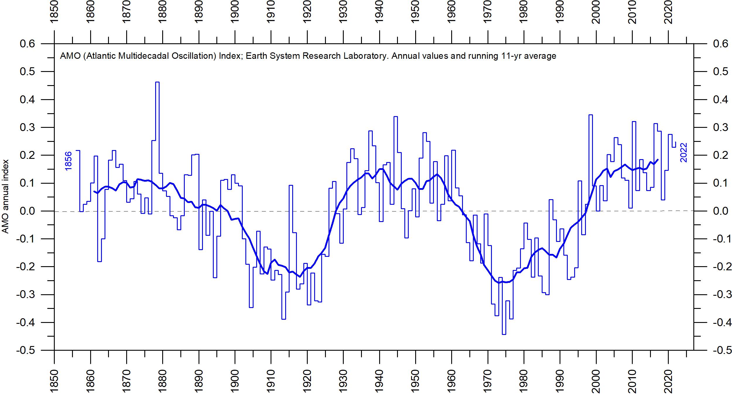
Atlantic Multidecadal Oscillation (AMO)
The Atlantic Multidecadal Oscillation (AMO) is a mode of variability occurring in the North Atlantic Ocean sea-surface temperature field (Figure 39).
The AMO is fundamentally an index of North Atlantic sea-surface temperatures (SST).
The AMO index appears to be correlated to air temperatures and rainfall over much of the Northern Hemisphere. The association appears to be high for rainfall in northeastern Brazil and African Sahel, and summer climate in North
sea-surface temperatures in the Pacific Ocean, the largest ocean on Earth. When sea-surface temperatures are relatively low (negative phase PDO), as they were from 1945 to 1977, global air temperature decreases. When sea-surface temperatures are high (positive phase PDO), as they were from 1977 to 1998, global surface air temperature increases.
A Fourier frequency analysis (not shown here) shows the PDO record to be influenced by a significant 5.6-year cycle, and feasibly also by a longer 18.6-year long period, corresponding to the length of the lunar nodal tide.
America and Europe. The AMO index also appears to be associated with changes in the frequency of North American droughts and is reflected in the frequency of severe Atlantic hurricanes.
As one example, the AMO index may be related to the past occurrence of major droughts in the US Midwest and the Southwest. When the AMO is high, these droughts tend to be more frequent or prolonged, and vice-versa for low values. Two of the most severe droughts of the
20th century in the US – in the 1950s and 1930s' ‘Dust Bowl’ – occurred during a time of peak AMO values, which lasted from 1925 to 1965. On the other hand, Florida and the Pacific Northwest tend to experience an opposite effect; high AMO in these areas being associated with relatively
high precipitation.
A Fourier-analysis (not shown here) shows the AMO record to be influenced by about a 70-year cycle, seemingly also found in the HadCRUT and the NCDC global surface air temperature records.
Figure 39: The Atlantic Multidecadal Oscillation.
Annual Atlantic Multidecadal Oscillation (AMO) detrended and unsmoothed index values since 1856. The thin blue line shows annual values, and the thick line is the simple running 11-year average. Data source: Earth System Research Laboratory, NOAA, USA.
7. Sea-level
Sea-level in general
Global, regional, and local sea levels always change. During the last glacial maximum, about 20–25,000 years ago, the average global sea level was about 120 m lower than in modern times. Since the end of the so-called Little Ice Age, about 100–150 years ago, global sea levels have increased on average 1–2 mm per year, according to tide gauge data.
It is well known that wind (storms) is a dominating factor in many flooding disasters, acting on time scales of hours to days. In this section, I focus mainly on processes operating on longer time scales, from years to centuries, and more.
Global sea-level change is measured relative to an idealised reference level, the geoid, which is a mathematical model of planet Earth’s surface (Carter et al. 2014). Global sea-level is a function of the volume of the planet surface ocean basins and the volume of water they contain. Changes in global sea-level are caused by – but not limited to – four main mechanisms:
1. Changes in local and regional air pressure and wind, and tidal changes introduced by the moon.
2. Changes in ocean basin volume by tectonic (geological) forces.
3. Changes in ocean water density caused by variations in currents, water temperature and salinity.
4. Changes in the volume of water caused by changes in the mass balance of terrestrial glaciers.
There are also some other mechanisms influencing sea level: storage of ground water, storage in lakes and rivers, evaporation, and so on.
Apart from regions affected by the Quaternary glaciations, ocean basin volume changes occur too slowly to be significant over human lifetimes. It is therefore mainly mechanisms 3 and 4 that drive contemporary concerns about sealevel rise, although on a local scale mechanism 2 may also be important (earthquakes).
Higher ocean water temperature is only one of several factors contributing to global sea-level rise, because seawater has a relatively small coefficient of expansion and because, over the timescales of interest, any warming is largely
confined to the upper few hundred metres of the ocean surface (e.g., Figure 28).
The growth or decay of sea ice and floating ice shelves has no influence on sea level. However, the melting of land-based ice – including both mountain glaciers and the ice sheets of Greenland and Antarctica – is a significant factor. As already noted, sea-levels were about 120 m lower during the last glacial maximum, and during the most recent interglacial, about 120,000 years ago, global temperatures and thus sea levels were higher than today, because significant parts of the Greenland ice sheet at that time melted.
On a regional and local scale, factors relating to changes in air pressure, wind and geoid must also be considered. As an example, changes in the volume of the Greenland ice sheet will affect the geoid in the regions adjacent to Greenland. Should overall mass in Greenland diminish, the geoid surface will be displaced towards the centre of the Earth, and sea level in the region will drop correspondingly. This will happen even though the overall volume of water in the global oceans increases as glacier ice is lost.
In northern Europe and in significant parts of North America, another factor must also be considered when estimating the future sea level. Norway, Sweden, Finland, and Denmark were all totally or partly covered by the European ice sheet 20–25,000 years ago. Even today, the effect of this ice load is seen in the ongoing isostatic land rise in the area, of several millimetres per year. At many sites this more than compensates for the slow global sea-level rise, so a net sea-level fall in relation to the land is recorded. As mentioned, the same applies to widespread regions in North America.
The enormous mass transfer associated with the growing ice sheets in North America and Europe resulted in viscoelastic mantle flow and elastic effects in the upper crust. Thus, outside the margin of large ice sheets, the planet surface was bulging up in concert with the isostatic depression taking place below the ice sheets. Such regions today are slowly sinking back, resulting in apparent
above-normal sea level rise rates. Several locations along the east coast of USA and the west coast of Europe are exposed to this process.
Viscoelastic mantle flow not only affects the land surface, but also the volume of adjoining ocean basins. In this way sea level may change in the affected regions and beyond. This is, however, a slow process usually not important on human
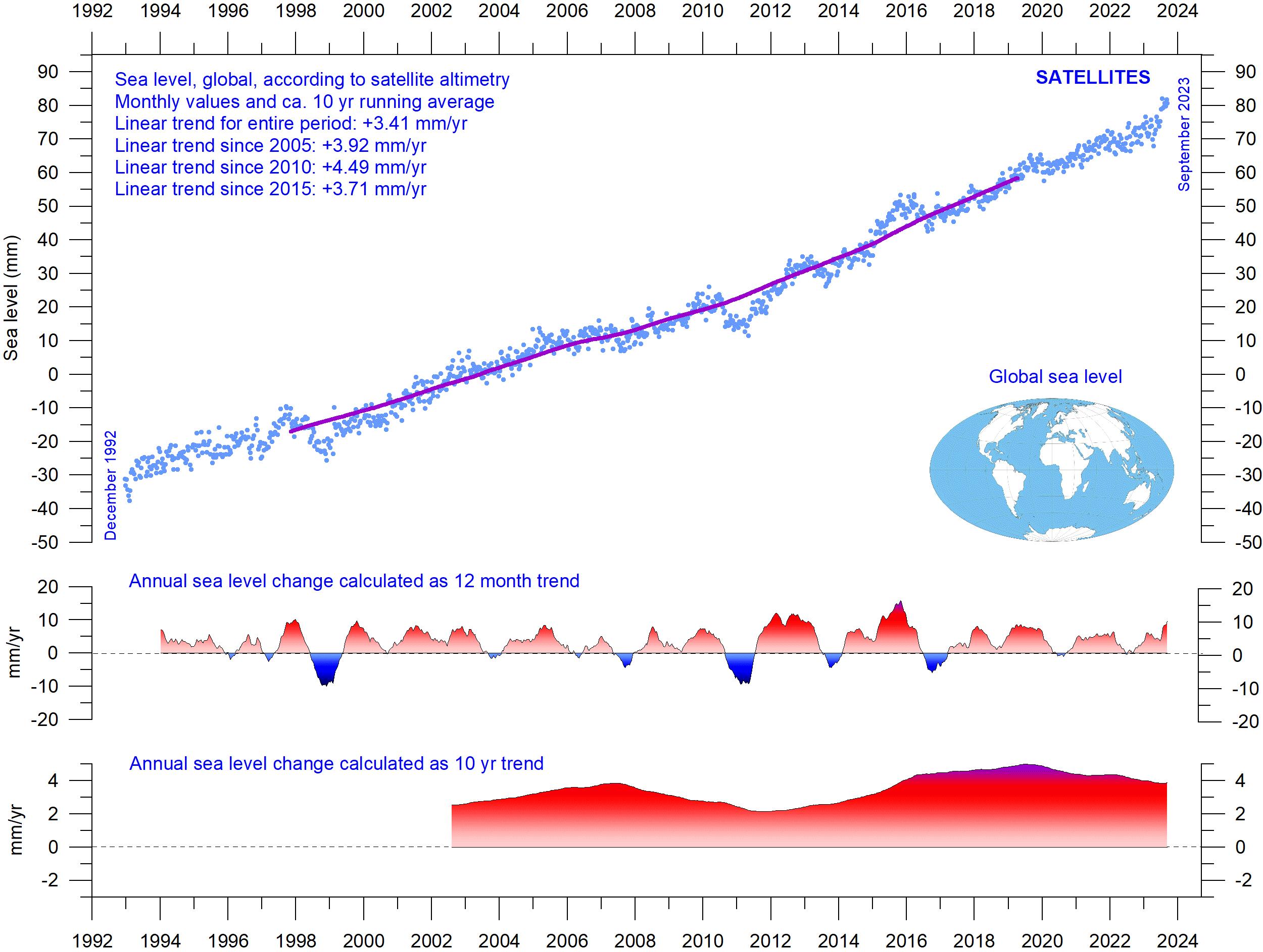
Sea-level from satellite altimetry
Satellite altimetry is a relatively new type of measurement, providing unique and valuable insights into changes in the detailed surface topography of the oceans, with nearly global coverage. However, it is probably not a precise tool for estimating absolute changes in global sea level due to interpretation issues surrounding the original satellite data.
time scales. On the other hand, rapid tectonic movement in connection with earthquakes may lead to shockwise changes of the local sea level in relation to land.
The relative movement of sea level in relation to land is what matters for coastal planning, and this is termed the ‘relative sea level change’. This is what is recorded by tide gauges.
The most important is the Glacial Isostatic Adjustment (GIA), a correction for the large-scale, long-term mass transfer from the oceans to the land that results from the waxing and waning of the large Quaternary ice sheets in North America and northern Europe.
This enormous mass transfer causes changes in surface load, resulting in viscoelastic mantle
Figure 40: Global sea level change since December 1992. The two lower panels show the annual sea level change, calculated for 1- and 10-year time windows, respectively. These values are plotted at the end of the interval considered. Source: Colorado Center for Astrodynamics Research at University of Colorado at Boulder. The blue dots are the individual observations (with calculated GIA effect removed), and the purple line represents the running 121-month (ca. 10-year) average.
flow and elastic effects in the upper crust, as mentioned above.
It is hard to correct the satellite data for this effect, since no single technique or observational network can give enough information. Scientists therefore must resort to modelling, and the answer they get depends upon the type of deglaciation model (for the last glaciation) and upon the type of crust-mantle model that is assumed. Because of this (and other factors), estimates of
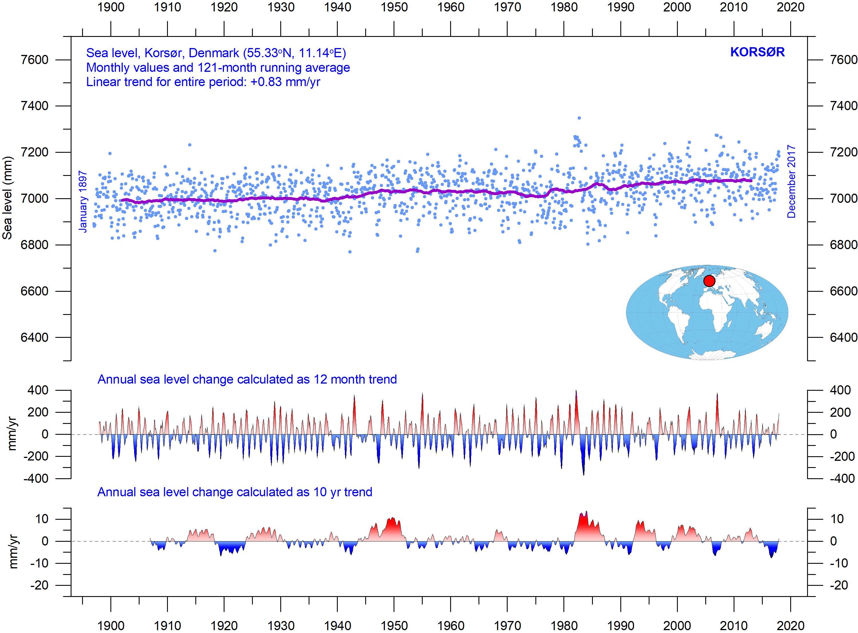
Sea level from tide-gauges
Tide-gauges are located at coastal sites and record the net movement of the local ocean surface in relation to land. These measurements are key information for local coastal planning, and therefore directly applicable for planning coastal installations (Parker and Ollier, 2016 and Voortman 2023), in contrast to satellite altimetry.
At any specific coastal site, the measured net movement of the local coastal sea-level comprises two local components:
• the vertical change of the ocean surface
• the vertical change of the land surface
global sea-level change based on satellite altimetry vary somewhat.
In the above case (Figure 40) the global sealevel rise estimate is about 3.4 mm/year (since 1992), with the estimated GIA effect removed. Linear trends calculated since 2005, 2010 and 2015 do not suggest any recent acceleration, and the lower panel in Figure 40 instead suggests that a peak in sea-level rise may possibly have been passed around 2020. Again, time will show.
For example, a tide-gauge may record an apparent sea-level increase of 3 mm/year. If geodetic measurements show the land to be sinking by 2 mm/year, the real sea-level rise is only 1 mm/year (3 minus 2 mm/year). In a global sea-level change context, the value of 1 mm/year is relevant, but in a local coastal planning context the 3 mm/year tide-gauge value is the one that is useful for local planning authorities.
To assemble a time series of sea-level measurements at each tide-gauge, the monthly and annual means must be reduced to a common
From PSMSL Data Explorer. The blue dots are the individual monthly observations, and the purple line represents the running 121-month (ca. 10-year) average. The two lower panels show the annual sea level change, calculated for 1- and 10-year time windows, respectively. These values are plotted at the end of the interval considered.
datum. The Revised Local Reference (RLR) datum at each station is defined to be approximately 7000 mm below mean sea level. This arbitrary choice was made many years ago, to avoid negative numbers in the resulting RLR monthly and annual mean values.
Few places on Earth are completely stable, and most tide-gauges are located at sites exposed to tectonic uplift or sinking (vertical change of the land surface). This widespread vertical instability has several causes and affects the interpretation of data from the individual tide-gauges. Much effort is therefore put into correcting for local tectonic movements.
As a result, data from tide-gauges located at tectonic stable sites are of special interest. One example of a long, continuous record from such a stable site is from Korsør, Denmark (Figure 41). This record indicates a stable sea-level rise of 0.83 mm
per year since 1897, without any sign of recent acceleration. As the tectonic correction for this particular station is zero, the recorded sea level rise of 0.83 mm per year is the relevant value for local planning authorities to consider.
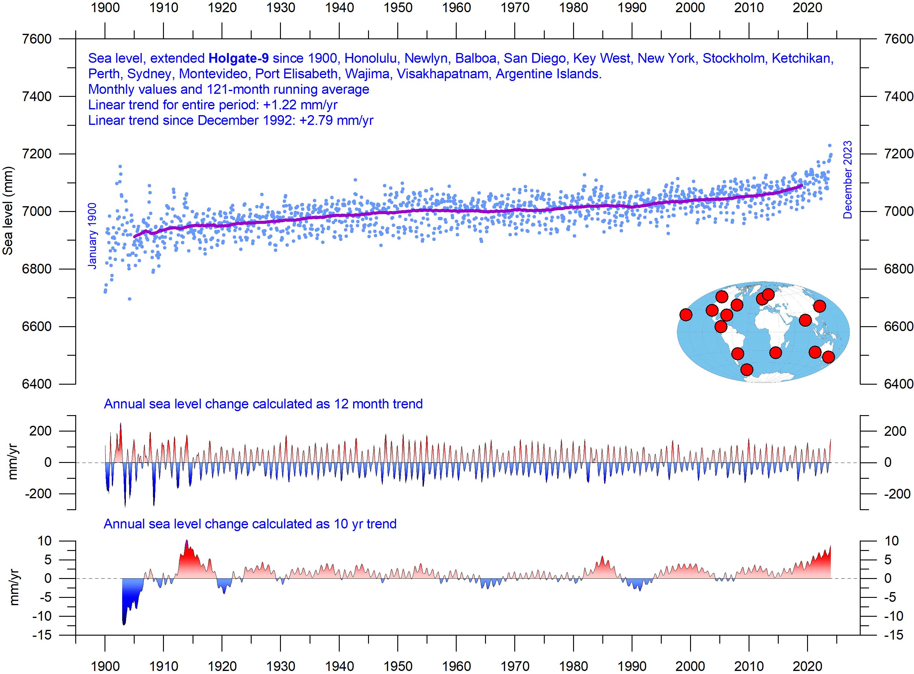
Evidently, it is interesting to compare tidegauge records from different places on the planet. Holgate (2007) suggested nine specific stations to capture the global variability found in a larger number of stations over the last half century. However, some of the stations suggested by Holgate have not reported values (to PSMSL) for several years, leading to the southern hemisphere now being seriously underrepresented in his original data set. Therefore, in the Holgatediagram (Figure 42) several other long tide-gauge series have been included, to provide a more balanced representation of both hemispheres (15 stations in total).
The Holgate-9 are a series of tide gauges located in geologically stable sites. The two lower panels show the annual sea level change, calculated for 1- and 10-year time windows, respectively. These values are plotted at the end of the interval considered. Source: Colorado Center for Astrodynamics Research at University of Colorado at Boulder. The blue dots are the individual observations, and the purple line represents the running 121-month (ca. 10-year) average.
Figure 42: Holgate-9 monthly tide gauge data from PSMSL Data Explorer.
The early part of the global tide-gauge record is showing poor coverage, due to a small number of stations. For that reason, in this report only observations from 1900 onward are considered. These data from tide-gauges all over the world suggest an average global sea-level rise of 1–2 mm/year (Figure 42), while the modern satellite-derived record (Figure 40) suggest a rise of about 3.4 mm/ year, or more. The difference between the two data sets is remarkable. It is however known that
Sea level modelled for the future
The issue of sea-level change, and particularly the identification of a hypothetical human contribution to that change, is a complex topic. Given the scientific and political controversy that surrounds the matter, the great public interest in this area is entirely understandable.
A recent IPCC publication, the 6th Assess-
satellite observations are facing several complications in areas near the coast. Vignudelli et al. (2019) provide an updated overview of the current limitations of classical satellite altimetry in coastal regions. Since 2015 an increased sea level rate may be suggested by the modified Holgate composite record (Figure 42), but it remains to be seen if this is the result of one of the recurrent variations displayed in the lower panel of the diagram.
ment Report from Working Group I, was released on August 9th, 2021. Modelled data for global and regional sea-level projections 2020–2150 are available from the IPCC AR6 Sea Level Projection Tool (link available at the end of this report).
The IPCC models future development of several factors, such as glacier mass change, vertical
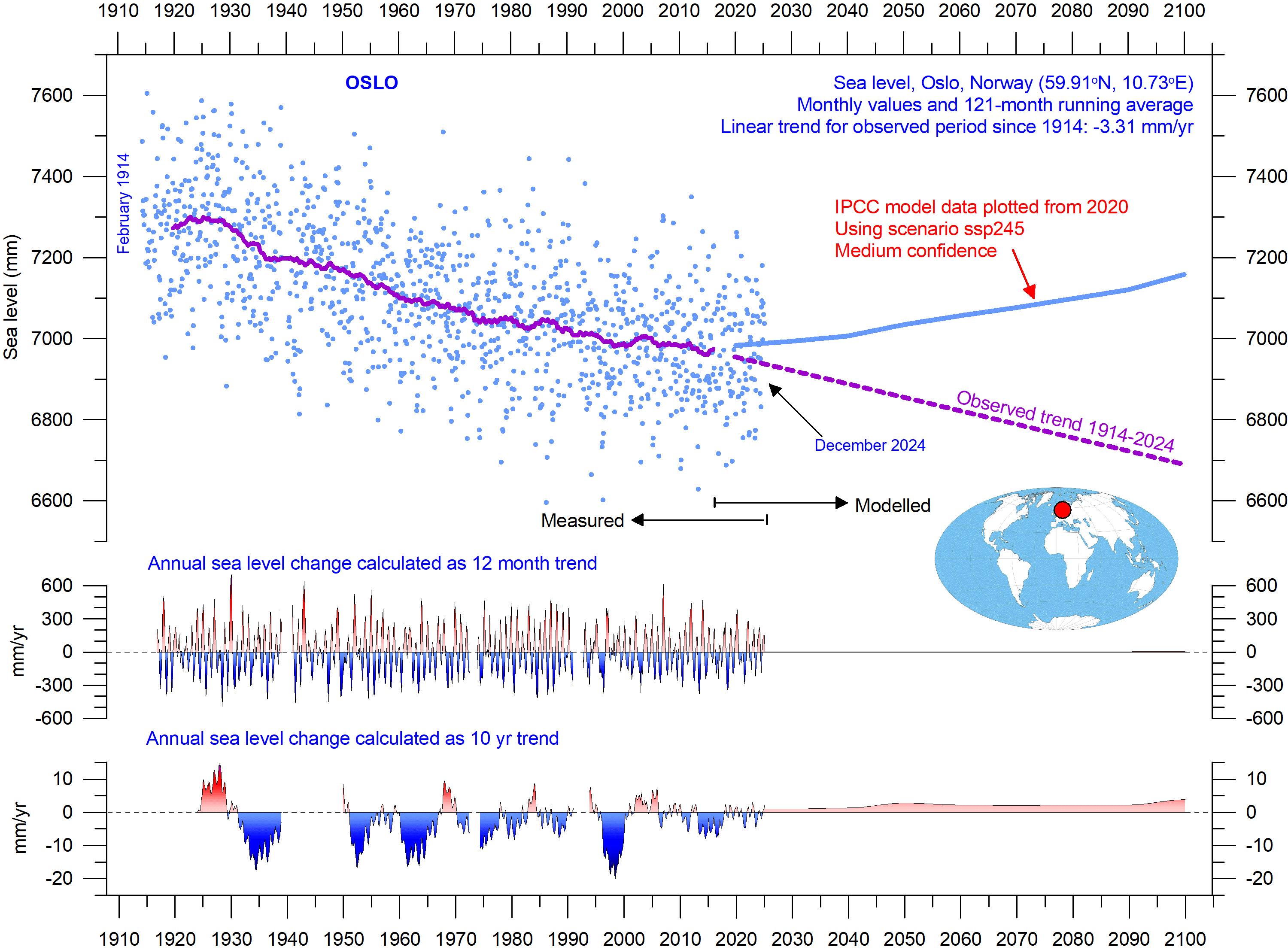
The blue dots are the individual monthly tide gauge observations (PSMSL Data Explorer) 1914–2024, and the purple line represents the running 121-month (ca. 10-year) average. The modelled data for the future is shown by a solid blue line 2020–2100, using the moderate SSP2–4.5 scenario (IPCC 2020). The two lower panels show the annual sea-level change, calculated for 1- and 10-year time windows, respectively. These values are plotted at the end of the interval considered.
Figure 43: Observed and modelled sea level for Oslo.
land movement, water temperature and storage. Modelled sea-level projections for different emissions scenarios are calculated relative to a baseline defined by observations for 1995–2014.
It is enlightening to compare the modelled data with observed sea-level data. Figure 43 shows this for one location, namely Oslo, in Norway. Northern Europe was covered by the European Ice Sheet 20–25,000 years ago, with more than 2 km of ice over the location of modern Oslo at the maximum glaciation. Today, the effect of this ice load is clearly demonstrated by the fact that southern Norway experiences an ongoing isostatic land rise of several millimetres per year. At many sites in Europe and North America affected by the last (Weichselian/Wisconsin) glaciation, this ongoing isostatic movement more than compensates for the slow global sea-level rise, so a net sea-level decrease in relation to land is recorded.
As Oslo was covered by thick ice during the last glaciation, it is affected by a marked isostatic land rise today. If the observed sea-level change rate at Oslo continues (based on 111 years of observations), by 2100, the relative sea-level (in relation to land) will have fallen by about 26 cm relative to 2020 (Figure 43). However, according to the IPCC, it will have increased about 17.5 cm. IPCC projects a rather sudden increase around 2020, which contrasts with the stable sea-level decline of -3.31 mm/year observed since 1914. Observed (measured) and modelled data now have an overlap of 3 years (Figure 43). The overlap
period is still short, and good comparison is difficult. The observed data, however, seems to suggest a continuous sea-level decrease at Oslo since 2020, in contrast to the model projection (blue line in Figure 43). Again, time will show as the overlap period grows.
A few reflections might be appropriate at this point. The step change in relative sea-level dynamics suggested by the IPCC for Oslo (and for many other coastal sites) in 2020 appears rather implausible and implies that the modelled data is not describing the real-world dynamics adequately. This is remarkable, as the modelled sea-level projections for the different SSP scenarios are calculated relative to a baseline defined by observations 1995–2014, for each station. The modelers must therefore have inspected the observed data.
According to the 6th Assessment Report, human activities are estimated to have caused roughly 1.0°C of global warming above preindustrial levels, with a likely range of 0.8–1.2°C (Summary for Policymakers, A.1.3). It is therefore particularly surprising that the modelled effect of this change should first affect sea levels in the shape of a step change in 2020. Had the modelers instead calibrated their sea-level data from an earlier date, say 1950, which would have been entirely possible, the contrast between observed and modelled data would immediately have become apparent.
8. Sea ice
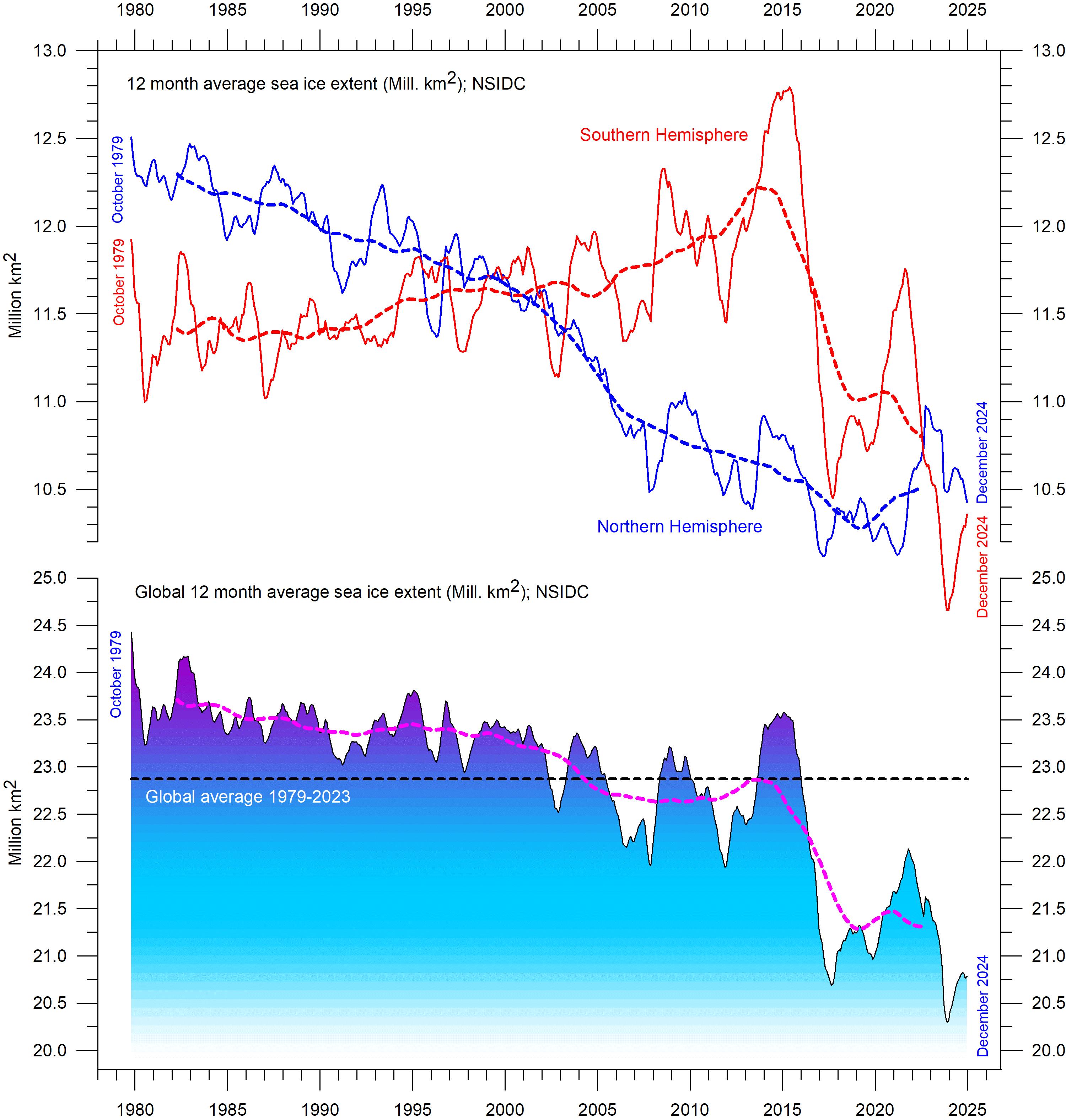
Global, Arctic and Antarctic sea ice extension
The two 12-month average sea-ice extent graphs in Figure 44 display a contrasting development between the two poles over the period 1979–2020. The Northern Hemisphere sea-ice trend towards smaller extent is clearly displayed by the blue line, and so is the simultaneous increase in
the Southern Hemisphere until 2016. In many respects, this and previous observations presented in this report suggest that the years 2016–2021 may feasibly mark an important shift in the global climate system (see, e.g., ocean temperatures in Figure 27).
Figure 44: Global and hemispheric sea ice extent since 1979. 12-month running means. The October 1979 value represents the monthly average of November 1978–October 1979, the November 1979 value represents the average of December 1978–November 1979, etc. The stippled lines represent a 61-month (ca. 5 years) average. The last month included in the 12-month calculations is shown to the right in the diagram. Data source: National Snow and Ice Data Center (NSIDC).
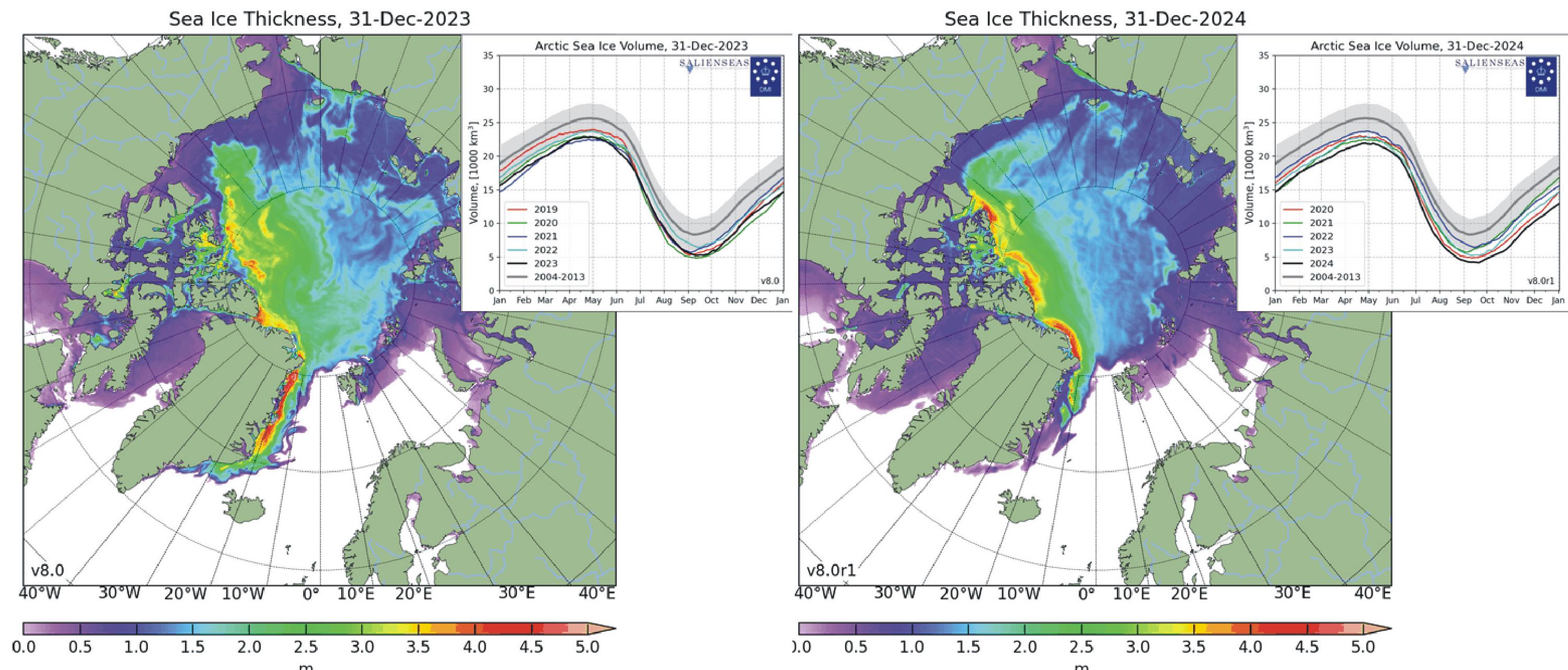
Figure 45: Arctic sea ice 2023 versus 2024
Arctic sea-ice extent and thickness 31 December 2023 (left) and 2024 (right) and the seasonal cycles of the calculated total arctic sea ice volume, according to the Danish Meteorological Institute (DMI). The mean sea ice volume and standard deviation for the period 2004–2013 are shown by grey shading in the insert diagrams.
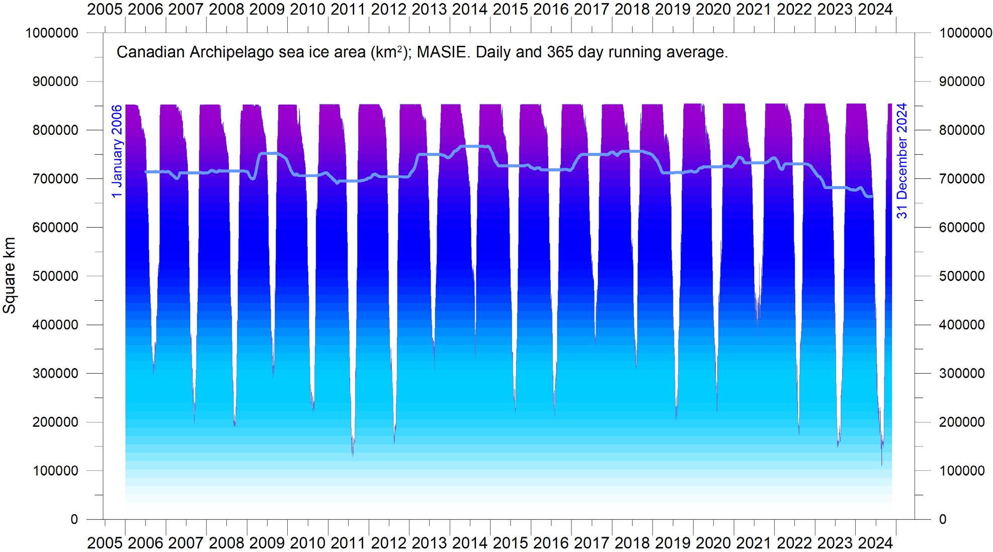
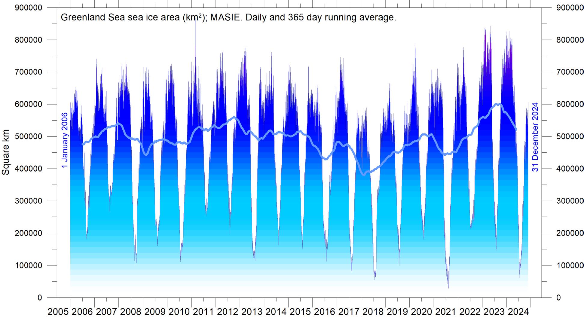
46: Daily sea ice extent in the Canadian Archipelago and in the Greenland Sea since 2006. (a) Canadian
The Antarctic sea-ice extent decreased extraordinary rapidly during the Southern Hemisphere spring of 2016, much faster than in any previous spring during the satellite era (since 1979). A strong ice retreat occurred in all sectors of the Antarctic but was greatest in the Weddell and Ross Seas. In these sectors, strong northerly (warm) surface winds pushed the sea ice back towards the Antarctic continent. The background for the special wind conditions in 2016 has been discussed by various authors (e.g. Turner et al. 2017 and Phys.org 2019) and appears to be a phenomenon related to natural climate variability. The satellite sea-ice record is still short and does not fully represent natural variations playing out over more than a decade or two.
What can be discerned from the still short
9. Snow
Northern Hemisphere snow cover extent
Variations in the global snow cover are mainly the result of changes playing out in the Northern Hemisphere (Figure 47), where all the major land areas are located. The Southern Hemisphere snow cover is essentially controlled by the size of the Antarctic ice sheet, and therefore relatively stable.
record is nevertheless instructive. The two 12-month average graphs in Figure 44 show recurring variations superimposed on the overall trends. These shorter variations are influenced by a 4.3-year periodic variation for the Arctic sea ice, while for the Antarctic sea ice a periodic variation of about 3.3 years is important.
Figure 45 illustrates the overall extent and thickness of the Arctic sea-ice from the end of 2023 to the end of 2024. Sea-ice thickness has increased somewhat near the coast of the Canadian Archipelago, but further towards the poles thickness has decreased. Concurrently, both sea-ice thickness and extent have decreased along the east coast Greenland during 2024. These recent developments are detailed in Figure 46.
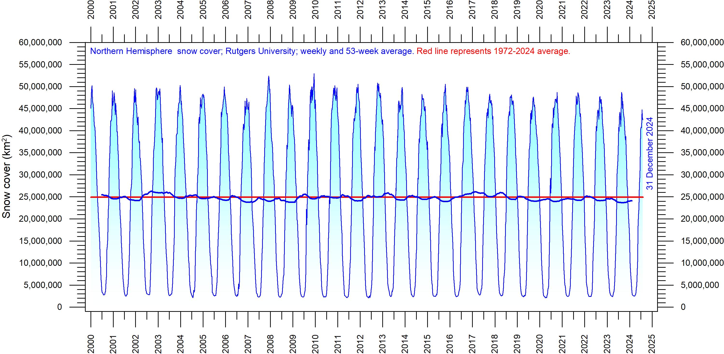
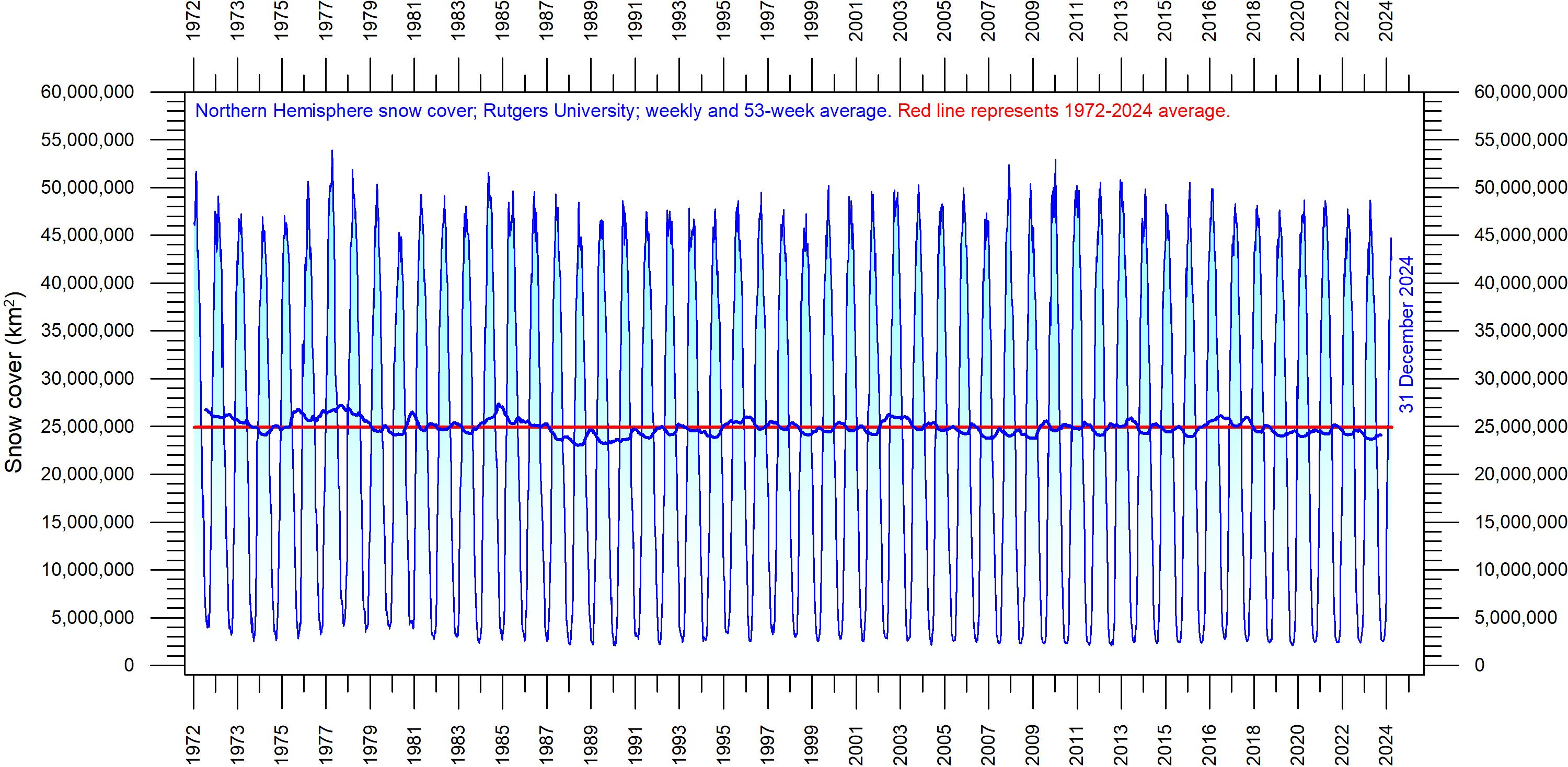
Northern Hemisphere snow cover is exposed to large local and regional variations from year to year. However, the overall tendency (since 1972) is towards quasi-stable conditions, as illustrated by Figure 48. During the Northern Hemisphere summer, the snow cover usually shrinks to about
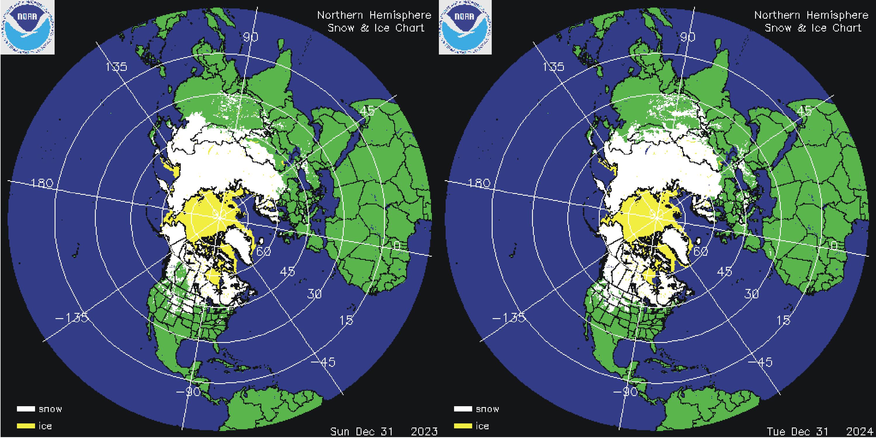
Figure 47: Northern Hemisphere snow and sea ice. Snow cover (white) and sea ice (yellow) 31 December 2023 (left) and 2024 (right). Map source: National Ice Center (NIC).
Figure 48: Northern Hemisphere weekly snow cover since 2000.
(a) Since January 2000 and (b) Since 1972. Source: Rutgers University Global Snow Laboratory. The thin blue line is the weekly data, and the thick blue line is the running 53-week average (approximately 1 year). The horizontal red line is the 1972–2024 average.
2,400,000 km2 (principally controlled by the size of the Greenland ice sheet), but during the winter it increases to about 50,000,000 km2, representing no less than 33% of planet Earth’s total land area. Northern Hemisphere snow cover maximum extension usually occurs in February, and the minimum in August (Figure 48).
A Fourier-analysis (not shown here) shows the Northern Hemisphere record to be influenced
not only by the annual cycle, but probably also by a longer cycle of about 6.5-years.
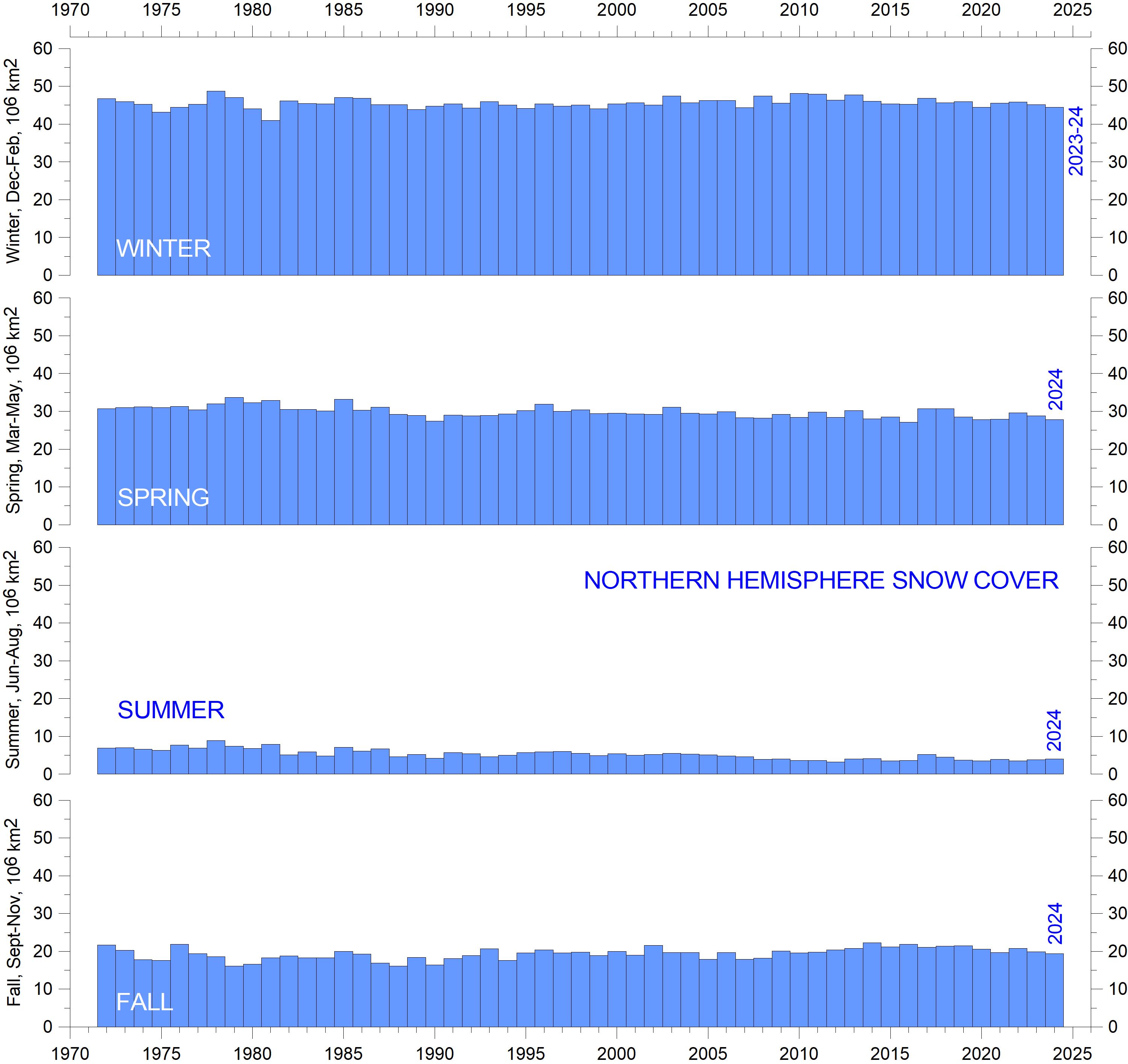
Considering seasonal changes (Figure 49), the Northern Hemisphere snow cover has slightly increased during autumn, is stable at mid-winter, and is slightly decreasing in spring. In 2024, the Northern Hemisphere snow cover extent was a little below the 1972–2024 average (Figure 48).
10. Precipitation
Global precipitation
Within the hydrological cycle, precipitation is the main component of water transport from the atmosphere to the Earth’s surface, and thereby essential for life on Earth. In addition, the hydrological cycle also transfers huge amounts of energy, significant for meteorology and global climate. When snow, ice or water evaporates from the planet surface and rises as vapor into the atmosphere, it carries heat from the sun-heated surface with it, thereby cooling the surface. Later, when the water vapor condenses to form cloud droplets and precipitation, the heat is released into the atmosphere. This process represents a significant part of Earth’s energy budget and climate.
As climatic variations may cause average temperatures at the Earth’s surface to increase, more evaporation and transpiration occur, adding more
moisture to the air, which in turn may increase the overall precipitation, and vice versa. Simultaneously, however, changes in wind patterns and ocean currents may well cause some areas to experience changes in precipitation opposite to the overall global trend.
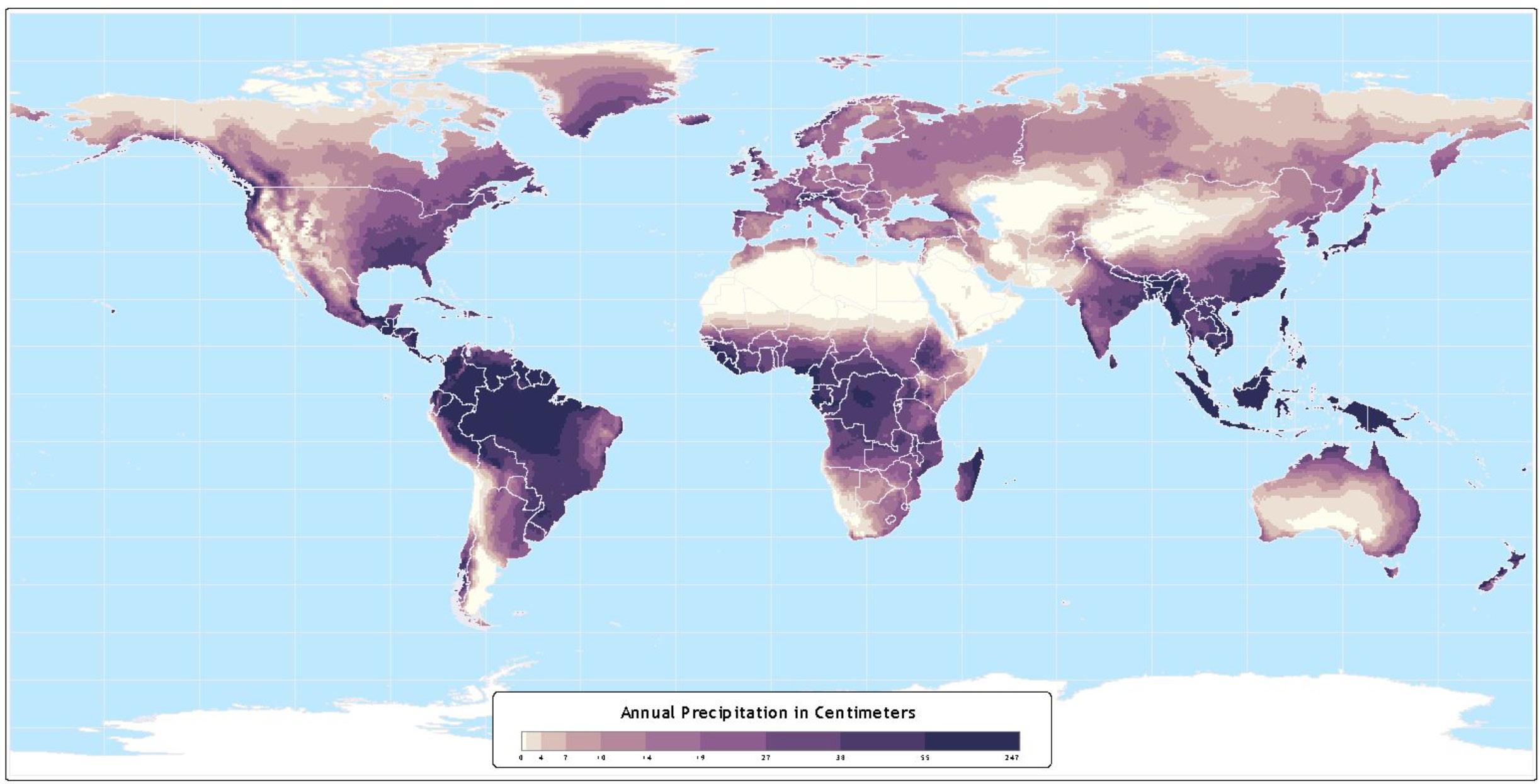
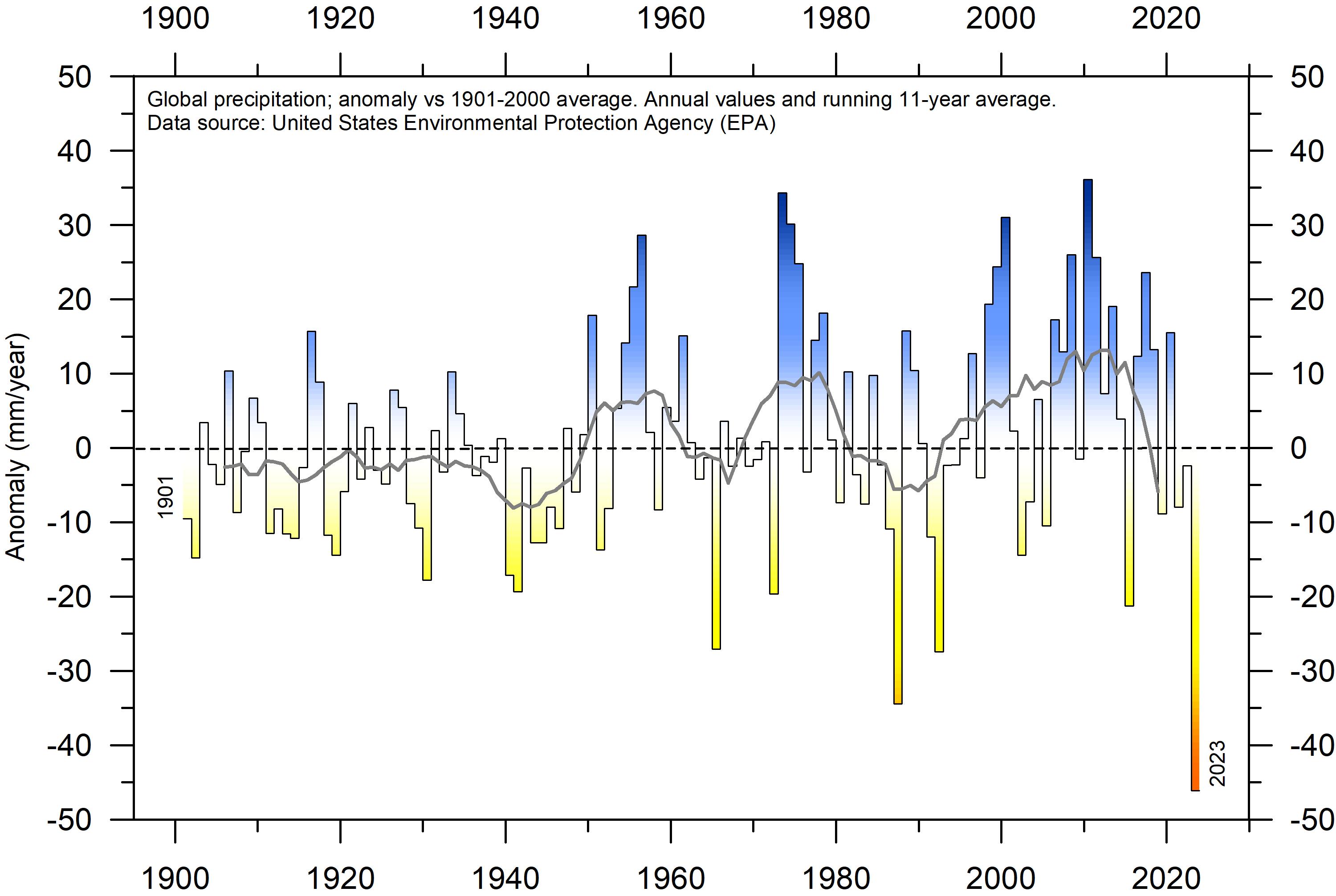
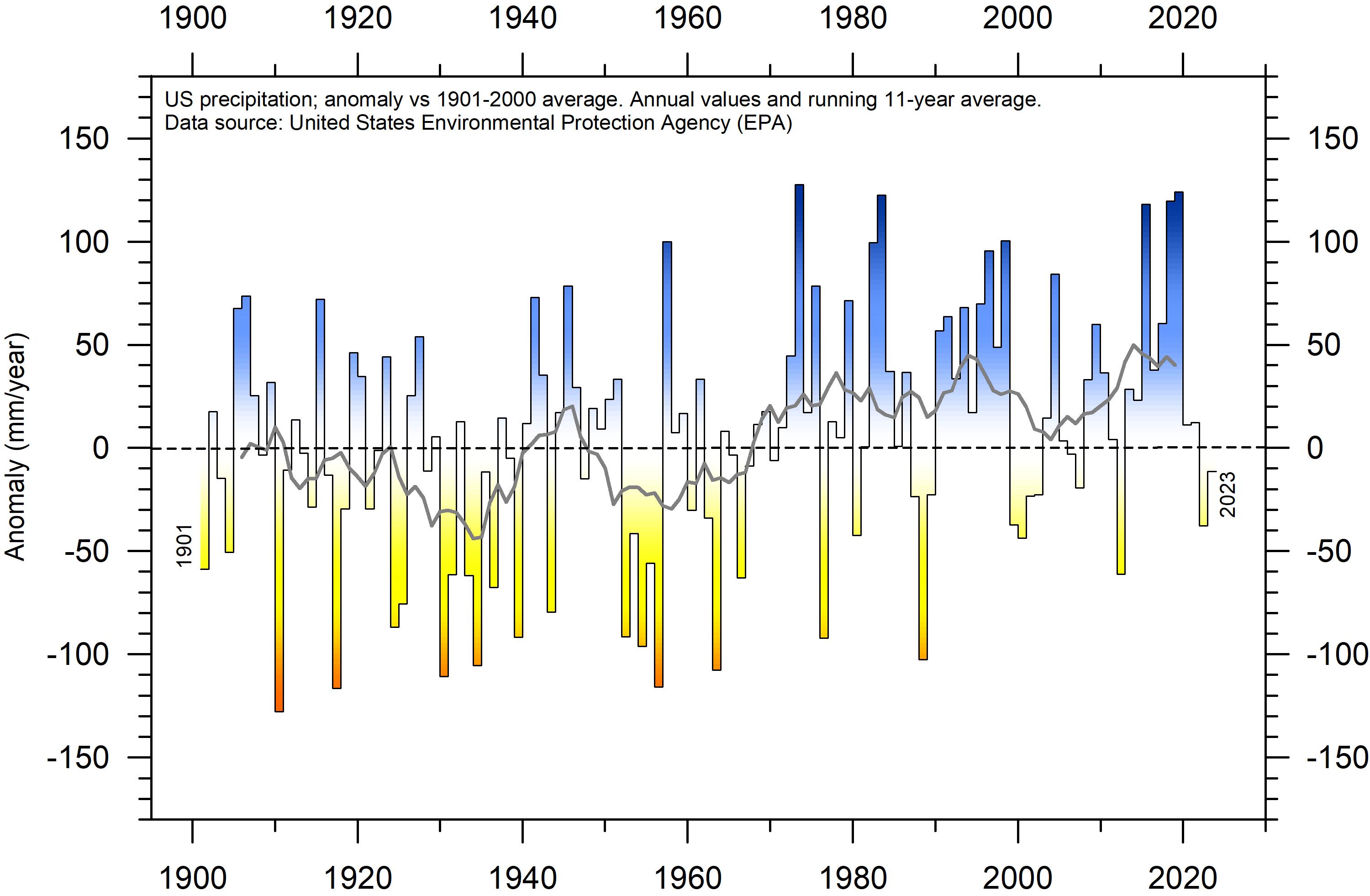
Annual regional precipitation (rain, snow) varies from more than 3000 mm/year to almost nothing (Figure 50). The global average precipitation undergoes variations from one year to the next, and the calculated annual anomaly in relation to the 1901–2000 average is shown in Figure 51. Annual variations in the global average precipitation up to ±30 mm/year are not unusual. Global precipitation was especially high around 1956, 1973 and 2010, and especially low around 1941, 1965, 1987, 1992 and latest in 2023.
Figure 49: Northern Hemisphere seasonal snow cover since 1972.
Source: Rutgers University Global Snow Laboratory.
Figure 50: Annual precipitation over land, 1960–90.
Source: NASA/Atlas of the Biosphere.
Figure 51: Global precipitation anomalies.
Variation of annual anomalies in relation to the global average precipitation from 1901 to 2023 based on rainfall and snowfall measurements from land-based weather stations worldwide. Data source: United States Environmental Protection Agency (EPA).
A Fourier frequency analysis (not shown here) shows the global precipitation anomaly (Figure 51) to be influenced by a significant 5.6-year cycle, and feasibly also by a 3.6-year cycle. The 3.6- and 5.6-year cycles are also found in the data describing variations of SOI and PDO (Figures 37–38), respectively.
The greatest annual amount of precipitation is recorded for regions near the equator (Figure 50). This is due to the immense uplift of air and moisture in the zone of convergence between the wind systems of the two hemispheres, the socalled intertropical convergence. Air moisture is high, because of the massive evaporation from the warm oceans and the extensive plant cover on land. Poleward of this zone, air masses sink toward the planet surface, centred around 20ºN and 20ºS, respectively. By this movement, air pressure and temperature increases, and relative
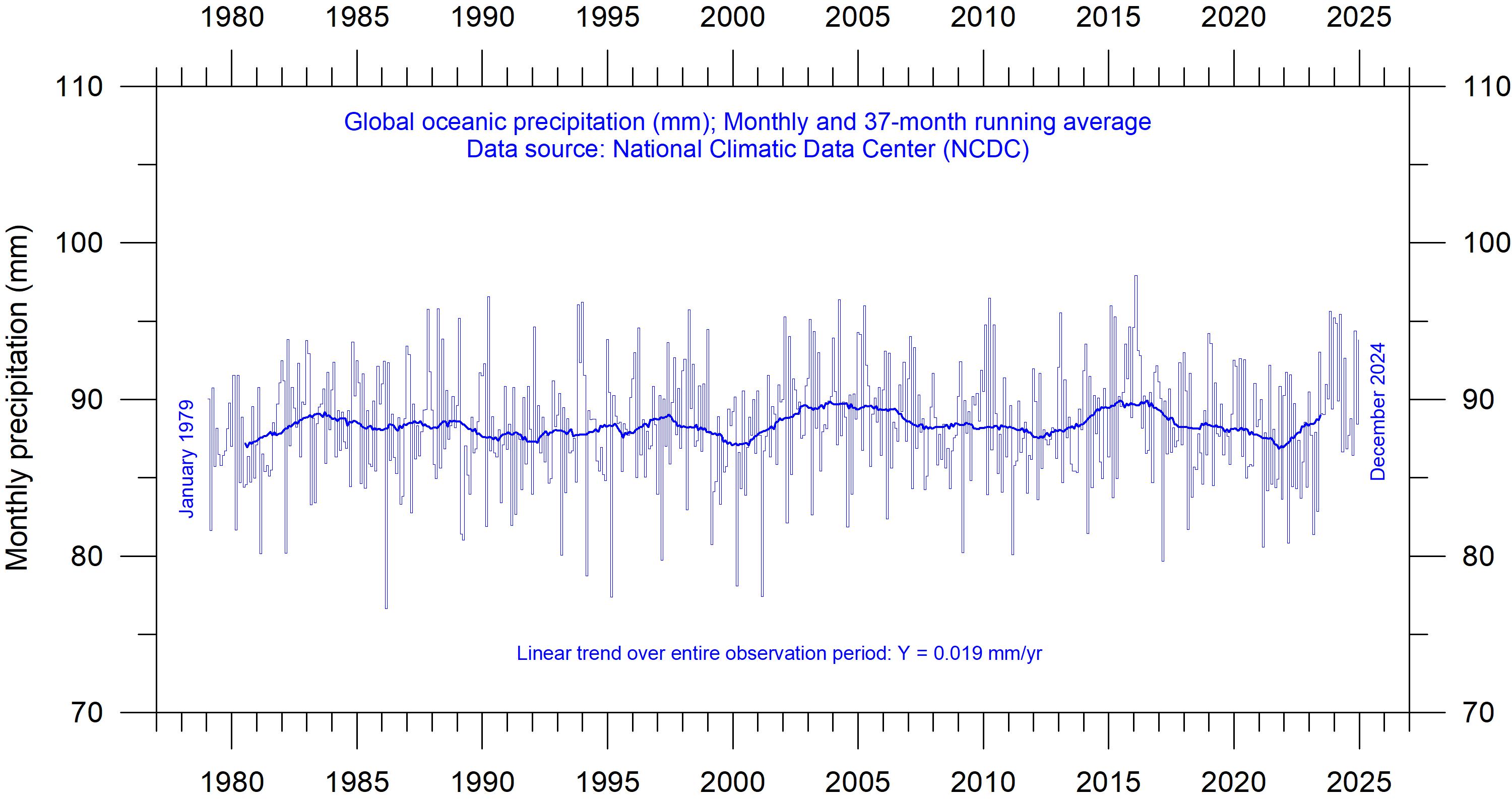
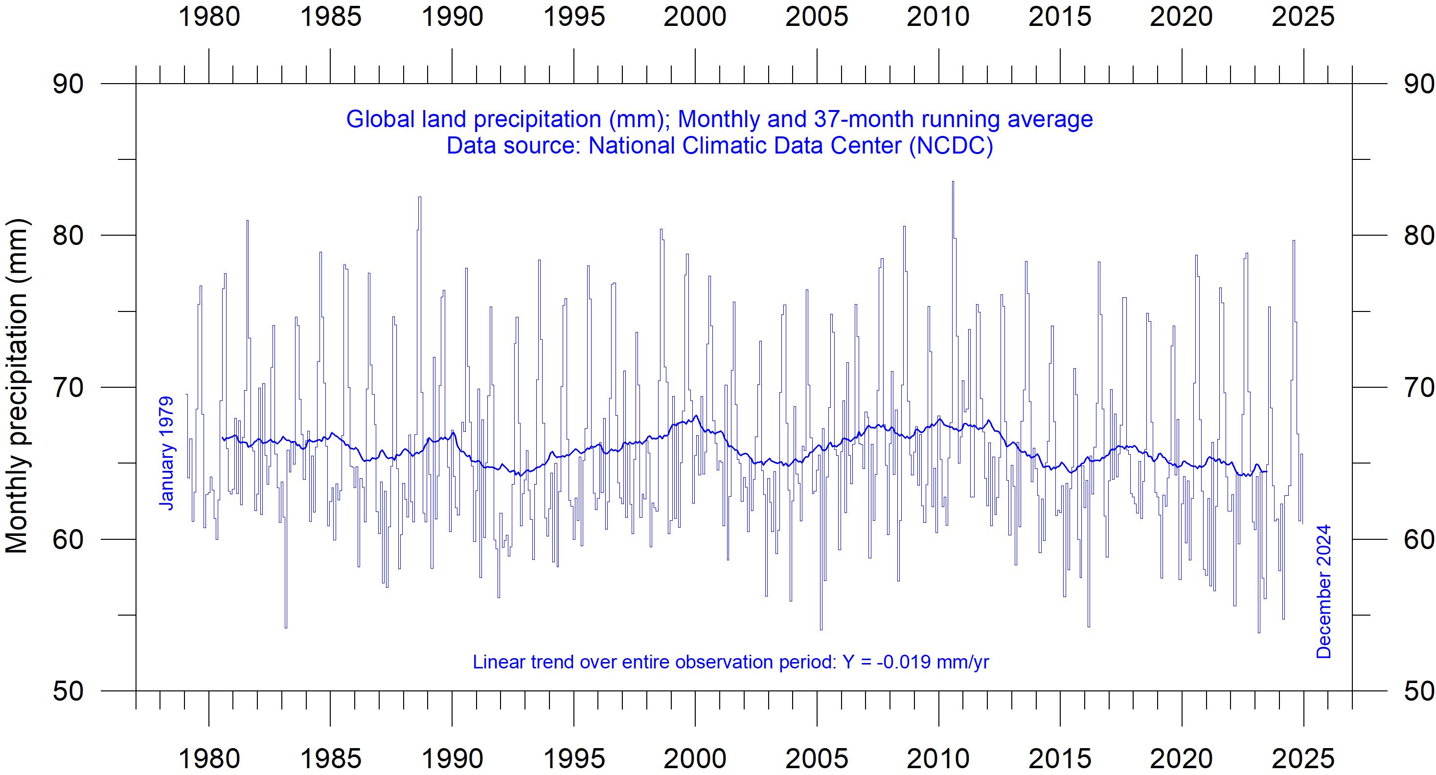
Precipitation over oceans and land
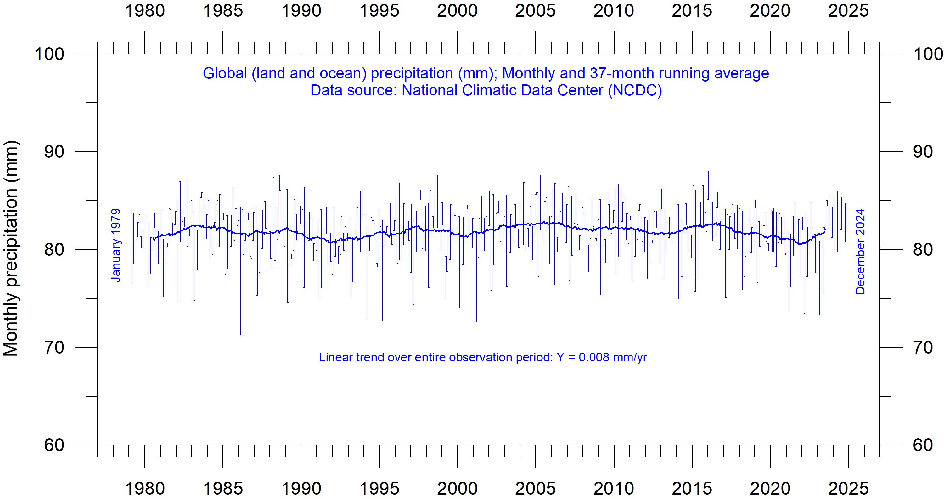
Figure 52 show the monthly observation series on global (land and oceans) precipitation since 1979. There are considerable variations from month to month, derived from regional and hemispheric
air humidity falls, with ensuing minor precipitation. This is the background for the two main desert regions on planet Earth.
Secondary precipitation maxima occur in the middle latitudes in the two hemispheres, where warm surface airmasses moving with a poleward component meets colder airmasses flowing towards lower latitudes. This is the location of the circumpolar vortex (the so-called west wind belt).
Near the poles, sinking airmasses are dominating, producing a dry surface climate. Each year these main precipitation belts move north and south with the wind circulation zones that produce them. As one important example, the African monsoon, like that over India and southern Asia, represents the seasonal northward displacement of the convergence between the surface wind systems of both hemispheres and the accompanying equatorial rains.
seasonal changes. Considering the entire series, however, it is remarkably stable throughout the observation period. The linear trend is not statistically different from zero (0.008 mm/yr).
Figure 52: Global monthly precipitation over land and oceans since January 1979.
Source: National Climatic Data Center (NCDC).
Figure 53: Global monthly precipitation over oceans since January 1979.
Source: National Climatic Data Center (NCDC).
Figure 54: Global monthly precipitation over land since January 1979.
Source: National Climatic Data Center (NCDC).
Figure 53 shows the monthly observation series on precipitation over oceans. The average monthly ocean value is somewhat higher than the global average (Figure 52), reflecting that oceans are the main source of evaporation. This is also essentially stable over the entire observation period, with a small positive linear gradient of 0.019 mm/yr, but not statistically different from zero.
Figure 54 show monthly precipitation values for land areas. Also, this series is essentially stable over the entire observation period, with a small negative linear gradient of -0.019 mm/yr, but again not statistically different from zero. The land pre -
US precipitation
The contiguous 48 US states have an observation system of high spatial density and it is therefore interesting to study this noteworthy observation series (Figure 55). A simple linear trend analysis suggests an overall increase of about 0.4 mm/ year since 1901, but the observation series clearly displays a much more dynamic development
cipitation series display lower values compared to the ocean series (Figure 53), reflecting that evaporation over land generally is smaller than over the oceans. The land precipitation series, however, display much larger monthly variations than the ocean series, reflecting the uneven distribution of land and ocean in the two hemispheres, and seasonal changes in vegetation and insolation. The maximum values are usually recorded in July-August, where extensive land areas in the Northern Hemisphere with vegetation represents an important source for evaporation and summer heat thunderstorms are frequent as a source for precipitation.
with recurrent variations. A Fourier frequency analysis (not shown here) suggests the annual US precipitation anomaly to be influenced mainly by a 11.2-year and a 3.6-year cycle, although not reaching a statistically significant level, given the still limited length of the observation series.
Variation of annual anomalies in relation to US average precipitation from 1901 to 2023 based on rainfall and snowfall measurements from land-based weather stations in the contiguous 48 states. Data source: United States Environmental Protection Agency (EPA).
Figure 55: US precipitation anomolies.
11. Wind and storms
Global wind distribution
Because of differences in average insolation (Figure 31), planet Earth is warmest at the equator and cooler toward the poles. Therefore, nearequator warm air rises and moves towards the poles. This phenomenon creates a low-pressure zone with low surface wind speeds near the equatorial area (Figure 56), called the Equatorial Low-Pressure Zone, or the Intertropical Convergence Zone (ITCZ). Approximately 30° north and 30° south of the equator, respectively, this air cools and descends to create high-pressure zones called Subtropical High-Pressure Zones. Cold air at the poles descends and creates Polar High-Pressure Zones. The cold polar air moves towards the equator, and starts rising at about 60° north and
south, where the polar air masses meet other air masses coming from lower latitudes. This overall movement of air masses across the surface of the Earth, due to permanent air pressure zones, creates a distinct pattern known as global wind patterns or global wind systems.
High average wind speeds are usually associated with the so-called westerlies (30–60ºN and 30–60ºS; Figure 56). The westerlies are moist prevailing winds that blow from the subtropical high-pressure belts towards sub-polar low-pressure belts. Westerlies come from the southwest in the Northern Hemisphere and the northwest in the Southern Hemisphere.
Figure 56: Global average wind speed (m/s)100 m above the land surface. The map is derived from high-resolution wind speed measurements 1998–2027, assisted by modelling. Source: Global Wind Atlas.
Tropical cyclones
A tropical cyclone is a rapidly rotating storm system with a low-pressure area, a closed low-level atmospheric circulation, strong winds, and a spiral arrangement of thunderstorms that produce heavy rain and squalls. Depending on its geographical location and strength, a tropical cyclone is called a hurricane, typhoon, tropical storm, cyclonic storm, tropical depression, or simply a cyclone.
A hurricane is a strong tropical cyclone that occurs in the Atlantic Ocean or northeastern Pacific Ocean. A typhoon is a strong tropical cyclone which occurs in the northwestern Pacific Ocean. In the Indian Ocean and South Pacific, comparable storms are referred to as tropical cyclones. In modern times, on average around 80 to 90 named tropical cyclones form each year around the world, over half of which develop hurricaneforce winds of 65 knots (120 km/h) or more.
Tropical cyclones typically form over large bodies of relatively warm water (near 27oC) and derive their energy through evaporation of water from the ocean surface. This ultimately condenses into clouds and rain when moist air rises and cools to saturation at higher altitude. This energy source differs from that of mid-latitude cyclonic storms, which are powered primarily by horizontal temperature contrasts. Tropical cyclones are typically between 100 and 2,000 km in diameter. The strong rotating winds of a tropical cyclone are a result of the conservation of angular momentum imparted by the Earth’s rotation as air flows inwards toward the axis of rotation. Consequently, cyclones form some distance from the equator, usually more than 5° north or south (Figure 57). Tropical cyclones are rare in the South Atlantic.
Global tropical cyclone frequency
The record for global tropical storm and hurricane frequency since 1970 (Figure 58) displays marked variations, superimposed on a slightly falling trend towards the most recent years. Presumably, there is an undercount bias of tropical storms, hurricanes, and major hurricanes before the satellite era (starting around 1965), due to the difficulty in correctly identifying all storms. If corrected, this would probably enhance the
reduced frequency of tropical storms and hurricanes in recent years.
The observed global historical hurricane data since 1980 display a variable pattern over time, but without any clear trend (Figure 59). There is no increase in frequency in recent years. A Fourier analysis (not shown here) indicates a significant oscillation of about 3.7-years’ duration.
Figure 57: Global tropical cyclone tracks from 1985 to 2005. Source: NASA.
Figure 58: Global tropical storm and hurricane frequency since 1970. 12-month running sums. The top time series is the number of tropical cyclones that reach at least tropical storm strength (maximum lifetime wind speed exceeds 34-knots). The bottom (green) time series is the number of hurricane strength (exceeding 64-knots) tropical cyclones. Source: Global Tropical Cyclone Activity, Ryan Maue.
Figure 59: Annual number of hurricanes since 1980.
Data source: Global historical tropical cyclone statistics, Colorado State University.
Accumulated cyclone energy
Accumulated cyclone energy (ACE) is a measure used by the National Oceanic and Atmospheric Administration (NOAA) to express the activity of individual tropical cyclones and entire tropical cyclone seasons. ACE is calculated as the square of the wind speed every six hours and is then scaled by a factor of 10,000 for usability, using a
duration for the global data, but the data series is too short to draw firm conclusions.
The period 1989–1998 was characterised by high ACE values. Other peaks were seen 2004, 2015 and 2018. In contrast, the periods 1980–1988, 1999–2003, 2006–2014 and 2020–2022 were characterised by comparatively low activity.
Figure 60: Annual global tropical storm and hurricane accumulated cyclone energy. Since 1980. Data source: Global Historical Tropical Cyclone Statistics, Colorado State University.
unit of 104 knots2. The ACE of a season is the sum of the ACE for each storm, and therefore encapsulates the number, strength, and duration of all the tropical storms in the season. The ACE data and ongoing cyclone dynamics are detailed in Maue (2011).
The damage potential of a hurricane is proportional to the square of the maximum wind speed, and thus ACE is not only a measure of tropical cyclone activity, but also a measure of the damage potential of an individual cyclone or a season. Existing records (Figure 59) do not suggest any abnormal cyclone activity in recent years.
The global ACE data since 1980 display a variable pattern over time, but without any clear trend (Figure 60). A Fourier analysis (not shown here) indicates oscillations of about 3.6-years’
The peaks in 1997/98, 2016 and 2023 coincide with strong El Niño events in the Pacific Ocean (Figure 25). Northern Hemisphere ACE values dominate the global signal shown in Figure 60, without any clear trend over the length of the record. The Northern Hemisphere’s main cyclone season is June–November. The Southern Hemisphere ACE values are generally lower than for the Northern Hemisphere, and the main cyclone season is December–April.
Tropical storms form over the warmest oceans, surface water temperatures of 27 oC or more seeming to be a minimum condition. Tropical storms seem to be most frequent in late summer and especially in years when the circumpolar vortex is displaced towards higher latitudes. At such times the general circulation over low latitudes is correspondingly weakened so that heat
may accumulate here. Tropical storms provide a release of some of this energy, which is thereby transported towards middle or higher latitudes and up to higher levels in the atmosphere. Here, at high latitude and high altitude, the excess energy may be lost by radiation to space. By contrast, in years when the circumpolar vortex is displaced somewhat nearer the equator than usual, and/ or it develops great meanders with frequent ‘blocking’, there is often relatively few tropical storms. Presumably, at such times the increased ‘meridional’ northerly and southerly wind streams in different regions around the globe provides sufficient poleward transport of heat to reduce the risk of tropical storms (Lamb, 1995).
The Atlantic Oceanographic and Meteoro -
(a) Atlantic Basin
logical Laboratory ACE data series goes back to 1851. A Fourier analysis (not shown here) for the Atlantic Basin (Figure 61a) shows the ACE series to be influenced by an important periodic variation of 61.5 years’ duration, and feasibly also by a 5.6-year period. The Atlantic Basin hurricane season often shows above-average activity when La Niña conditions are present in Pacific during late summer (August–October), as was the case in 2017 (Johnstone and Curry, 2017).
The Eastern Pacific Basin data series is shorter (Figure 61b), starting in 1971, and is influenced by an important cycle of 2.4-years’ duration, and feasibly also by a longer about 28-year period. Eastern Pacific ACE peaks were reached 1991–1994 and 2015–18.
(b) Eastern Pacific Basin
Figure 61: Accumulated cyclone energy.
(a) Atlantic basin (1851–2024), (b) Eastern Pacific basin (1971–2024). Thin lines show annual ACE values, and the thick line shows the running 11-year average. Data source: HURDAT, NOAA.
Other storm and wind observations
The number of hurricane landfalls in the continental United States is shown in Figure 62. The series shows considerable annual variations, but it is not possible to detect any clear trend over time. A Fourier analysis (not shown here) reveals two important periods of about 3.2 and 5.0 years, respectively, although not statistically significant. An insight into changes in prevailing wind conditions may be obtained from the inspection of observations carried out at coastal meteorological stations situated at particularly wind-exposed places. One example is the Lista Lighthouse, in
southernmost Norway (Figure 63). It sits on an exposed cape at the extreme southwestern edge of the mainland of Norway, well suited to register wind conditions in the adjoining North Sea and the European sector of the North Atlantic. It has a monthly wind record going back to January 1931, showing that peak wind strengths were recorded shortly after World War II and have since declined somewhat, to some degree mirroring the record of US hurricane landfalls (Figure 62); that is, on the opposite shore of the North Atlantic.
Figure 62: Continental United States hurricane impacts/landfalls, 1851–2023. The highest Saffir-Simpson Hurricane Scale impact in the United States is based upon estimated maximum sustained surface winds produced at the coast. Data source: Hurricane Research Division, NOAA.
Figure 63: Monthly maximum and average wind speed since January 1931, measured at Lista Lighthouse.
Lista Lighthouse is situated on an exposed cape located at the extreme southwestern edge of mainland Norway, in a position to register wind conditions in the adjoining North Sea and the European sector of the North Atlantic. Data source: SeKlima.
12. Summary for 2024
Atmosphere
Average air temperatures measured near the planet’s surface (surface air temperatures), or rather their deviation from the average calculated for a chosen reference period, are central to many climate deliberations. However, the significance of any short-term warming or cooling recorded in these datasets should not be overstated. Firstly, focusing on averages tends to hide the fact that people deal with much larger temperature variations daily without a problem. Secondly, whenever Earth experiences warm El Niño or cold La Niña episodes (Figure 25), major heat exchanges take place between the Pacific Ocean and the atmosphere above, eventually showing up as a signal in the global air temperature. However, this does not reflect similar changes in the total heat content of the atmosphere-ocean system. In fact, global net changes can be small, and such heat exchanges may well largely reflect redistribution of energy between ocean and atmosphere. Evaluating the dynamics of ocean temperatures is as important as evaluating changes of surface air temperatures. Relative to the whole observational period since 1850/1880, 2024 was warm, and all databases referred to in the present report has 2024 as the warmest year on record. A strong El Niño episode established itself during 2023, continued well into 2024, affecting large areas around the Equator (Figure 13 and 27). This contributes to the high annual global surface air temperature in both 2023 and 2024. This also underlines the remarkable importance of ocean-atmosphere exchanges mentioned above.
The influence of the underwater Hunga Tonga–Hunga Ha’apai eruption 15th January 2022 on atmospheric temperatures 2023–2024 is still uncertain. This eruption released an enormous plume of water vapor into the stratosphere, but any influence of this on atmospheric temperatures is not apparent (Figure 16); neither was there any clear influence on the amount of water vapour up to 8 km altitude (Figure 17). Conversely, Sellitto et al. (2022) found that this eruption produced the largest global perturbation of stratospheric aerosols since the Pinatubo eruption in 1991 and
the largest perturbation of stratospheric water vapour observed in the satellite era.
Since 1979, lower troposphere temperatures have increased over both land and oceans, but most over land (Figure 12). The most straightforward explanation for this observation is that a significant part of the observed warming is caused by solar insolation, but there may well be several additional contributing factors, such as differences in heat capacity and changes in cloud cover and land use.
Many Arctic regions experienced record high air temperatures in 2016, but since then conditions for some years turned toward somewhat cooler conditions (Figure 14). However, this changed again from 2023–2024, which feasibly may mark another temperature peak. Presumably, the Arctic temperature peaks in 2016 and 2023–2024 were affected by ocean heat released from the Pacific Ocean during strong El Niños and subsequently transported towards the Arctic region.
This highlights how Arctic air temperatures may be affected, not only by variations in local conditions, but also by variations playing out in geographically remote regions. Regarding regional Arctic warming during the last 20–30 years, this phenomenon has mainly been playing out in regions affected by the North Atlantic Drift (lower three stations in Figure 15).
Many diagrams in this report focus on the time from 1979 and onwards, reflecting the commencement of the satellite era, and the advent of a wide range of observations with nearly global coverage, including temperature. These new data provide a detailed view into temperature changes over time at different altitudes in the atmosphere. Among other phenomena, these observations reveal that a stratospheric temperature plateau has prevailed since 1995 (Figure 16).
Water vapor (H₂O) is the most important greenhouse gas in the troposphere. The highest concentration is found within a latitudinal range from 50oN to 60oS. The two polar regions of the troposphere are comparatively dry. H₂O is a much more important greenhouse gas than CO₂, both
because of its absorption spectrum and its higher concentration. The specific atmospheric humidity since 1948 has been stable or slightly increasing up to about 4–5 km altitude (Figure 17a). At higher levels in the troposphere (about 9 km), the specific humidity has been decreasing for the duration of the satellite record, but with shorter variations superimposed on the falling trend. In contrast, climate models assume specific humidity to increase at this height.
Carbon dioxide (CO₂) is an important greenhouse gas, although considerably less important than H₂O. Since 1958, there has been an increasing
Oceans
The penetration depth of the longwave (infrared) radiation into the ocean is less than 100 microns (Hale and Querry, 1973), while shortwave solar radiation penetrates much deeper, to about 150–200 m. Below 200 m there is rarely any significant light. Ocean heating in the uppermost 100–150 m is therefore essentially a Sun-driven process.
All major ocean basins show increasing temperatures in the uppermost 100 m since 1955, but with important regional differences. The observed warming is largest and most straightforward for the Atlantic Ocean, and smaller and with a more complicated dynamic in the Pacific Ocean. The Indian Ocean shows the least warming of the three major ocean basins considered here. Due to its major surface extension, the temperature signal in the Pacific Ocean (Figure 26b) dominates the global ocean signal (Figure 26a). The Pacific Ocean temperature signal is influenced by a significant 3.6-yr variation, and feasibly also by a longer, but weaker, 11.7-year variation.
The Argo program has now achieved 20 years of global coverage, growing from a relatively sparse global array of 1000 profiling floats in 2004, to more than 3900 in December 2024. Since their inception these have provided a unique ocean temperature dataset for depths down to 1900 m. The data is currently updated to December 2021. Although the oceans are much deeper than 1900 m, and the dataset is still relatively short, interesting features are now emerging from these observations (Figure 27).
Since 2004, the upper 1900 m of the oceans
trend in its atmospheric concentration, with an annual cycle superimposed (Figure 18). At the end of 2023, the amount of atmospheric CO₂ was close to 422 ppm. The annual change in atmospheric CO₂ (Figure 19) has been increasing from about +1 ppm/year in the early part of the record, to about +2.5 ppm/year towards the end of the record. There is no visible effect of the global COVID-19 lockdown 2020–2021 in the amount of atmospheric CO₂. The increasing amount of atmospheric CO₂ is enhancing photosynthesis and thereby global crop yields.
have experienced net warming of about 0.037 oC globally. The maximum net warming (about 0.2oC) affects the uppermost 100 m of the oceans (Figure 29). This is seen mainly in regions near the Equator, where the greatest amount of solar radiation is received. At greater depths, a small (about 0.025oC) net warming has occurred between 2004 and 2021.
This development in the global average ocean temperatures is generally reflected across the equatorial oceans, between 30oN and 30oS, with exception of slight cooling at 300–500 m depth. A temperature peak may possibly have been passed around 2019–2020 (Figure 27). Because of the spherical form of the planet, the equatorial oceans represent a huge surface area and have correspondingly great impact on global surface air temperatures.
Simultaneously, the northern oceans (55–65oN) have on average experienced a marked cooling down to 1400 m depth, and slight warming at greater depths (Figure 30). Just now a temperature recovery may be in process in parts of the North Atlantic (Figure 34). The southern oceans (55–65oS) have on average seen some warming at most depths since 2004, but mainly near the surface, above 200 m depth. However, averages may be misleading, and quite often better insight is obtained by studying the details, as discussed previously in this report.
The record of El Niño and La Niña episodes (Pacific Ocean) since 1950 is influenced by a significant 3.6-year cycle, and feasibly also by a 5.6-year cycle.
Rarely considered for ocean temperatures is heat added from mid ocean ridges, off axis submarine volcanoes and exothermic reactions from seawater circulating through the upper 5 km of the oceanic crust. Such heat sources and pro -
Sea level
Sea level is monitored by satellite altimetry and by direct measurements using tide-gauges situated along coasts. While the satellite-derived record suggests a global sea level rise of about 3.4 mm per year or more (Figure 40), data from tide-gauges all over the world suggest a smaller average global sea-level rise, about 1–2 mm per year (Figure 42). The tide-gauges' measurements do not indicate any clear recent acceleration (or deceleration),
Sea ice
In 2024 the global sea ice extent remained well below the average for the satellite era (since 1979). However, in recent years we have seen a stable or even rising global trend (Figure 44). At the end of 2016 the global sea ice extent reached a marked minimum, at least partly caused by the operation of two different natural variation patterns characterising sea ice in the Northernand the Southern Hemisphere, respectively. Both
Snow cover
Variations in the global snow cover extent are mainly driven by changes in the Northern Hemisphere, where all the major land areas are located. The Southern Hemisphere snow cover extent is essentially controlled by the size of the Antarctic ice sheet, and therefore relatively stable. The Northern Hemisphere average snow cover extent has also been essentially stable since the onset of satellite observations (Figure 48), although local
Global precipitation
Global annual precipitation (rain, snow) varies from more than 3000 mm/year in wet regions to almost nothing in desert regions (Figure 50). The global average precipitation however undergoes variations from one year to the next, and regional annual variations up to ±30 mm/year from the long-term global average are not unusual. The global precipitation was especially high around 1956, 1973 and 2010, and especially low around
cesses are undeniable, but unfortunately there is no credible observational data on this. Surely, we are facing several important future research questions here.
but the record is characterised by recurrent variations. The marked difference (a ratio of about 1:2) between the two datasets still has no universally accepted explanation, but it is known that satellite observations of sea level are complicated in areas near the coast (see, e.g. Vignudelli et al. 2019). Either way, for local coastal planning the tide-gauge data is preferred, as described in this report.
variations had simultaneous occurring minima in 2016, with resulting consequences for the global sea ice extension. The marked Antarctic 2016 sea ice reduction was also affected by special wind conditions. The opposite development, towards stable or higher ice extent at both poles, feasibly began around 2018, and has since been augmented, especially in the Northern Hemisphere.
and regional interannual variations may be large. Considering seasonal changes since 1979, the Northern Hemisphere snow cover autumn extent is slightly increasing, the mid-winter extent is basically stable, and the spring extent is slightly decreasing (Figure 49). In 2024, the Northern Hemisphere seasonal snow cover extent was near the 1972–2023 average.
1941, 1965, 1987 and 1992 (Figure 51). The global monthly precipitation over land and oceans (since 1979, Figure 52) shows considerable variations from month to month, derived from regional and hemispheric seasonal changes. Considering the entire series, however, it is remarkably stable throughout the observation period. The linear trend is not statistically different from zero (0.008 mm/ yr). The global precipitation anomaly is influenced
by 3.6- and 5.6-year cycles. This bears resemblance to observed cyclic behaviour for the Southern
Storms and hurricanes
The most recent data on global tropical storm and hurricane accumulated cyclone energy (ACE) is well within the range recorded since 1970. The global ACE data display a variable pattern over time, but without any clear trend towards higher or lower values (Figure 58). A Fourier analysis indicates oscillations of about 11.5- and 3.6-years’ duration for the global data and suggests a longer one of about 33-year length, but the data series is too
Summing it up
The global climate system represents a multifaceted system, involving sun, planets, atmosphere, oceans, land, geological processes, biological life, and the complex relationships between them. Many components and their interactions are still not fully understood, or perhaps not even recognised. Among all these influences, human CO₂ emissions have in all probability only contributed modestly to the current warming. In fact, believing that one minor constituent of the atmosphere (CO₂) controls nearly all aspects of climate is amazingly naïve and entirely unrealistic.
Oscillation and the Pacific Decadal Oscillation (PDO), respectively.
short to draw firm conclusions on this. A longer ACE series for the Atlantic Basin (since 1850), suggests natural rhythms of 61.5 years’ duration, and feasibly also a 5.6-year period. Modern data on the number of hurricane landfalls in the continental United States remains within the normal range throughout the entire observation period since 1851 (Figure 62).
The global climate has remained in a stable condition within certain limits for millions of years, although with important variations playing out over periods ranging from years to centuries, or more, but the global climate has never been in a fully stable state without change. Modern observations show that this normal behaviour is also characterizing recent years, including 2024, and there is no observational evidence for any global climate crisis. Our world should consider focussing on much more pressing problems.
13. Written references
Carter, R.M., de Lange, W., Hansen, J.M., Humlum, O., Idso, C., Kear, D., Legates, D., Mörner, N.A., Ollier, C., Singer, F. & Soon, W. 2014. Commentary and Analysis on the Whitehead & Associates 2014 NSW Sea-Level Report. Policy Brief, NIPCC, 24. September 2014, 44 pp. http://climatechangereconsidered.org/wp-content/uploads/2014/09/NIPCC-Report-on-NSW-Coastal-SL-9z-corrected.pdf
Chylek, P., Folland, C. K., Lesins, G., and Dubey, M. K. 2010. Twentieth century bipolar seesaw of the Arctic and Antarctic surface air temperatures. Geophysical Research Letters, 37, L08703, doi:10.1029/2010GL042793
Hale, G.M. and Querry, M.R. 1973. Optical constants of water in the 200 nm to 200 µm wavelength region, Applied Optics, v. 12, no. 3, pp. 555–563. https://doi.org/10.1364/AO.12.000555
Holgate, S.J. 2007. On the decadal rates of sea level change during the twentieth century. Geophysical Research Letters, 34, L01602, doi:10.1029/2006GL028492
Humlum, O., Stordahl, K. and Solheim, J-E. 2012. The phase relation between atmospheric carbon dioxide and global temperature. Global and Planetary Change, August 30, 2012. http://www.sciencedirect.com/science/article/pii/S0921818112001658?v=s5
Johnstone, J. and Curry, J. 2017. Causes and Predictability of the Exceptionally Active 2017 Atlantic Hurricane Season. Climate Forecast Applications Network (CFAN), 9 pages. https://curryja.files. wordpress.com/2017/11/hurricane_review_2017-final.pdf
Lamb. H.H. 1995. Climate, history and the modern world. Routledge, London, 2nd edition, 433 pp. ISBN 0-415-12734-3
Maue, R.L. 2011. Recent historically low global tropical cyclone activity. Geophysical Research Letters, Vol. 38, L14803, doi:10.1029/2011GL047711
Parker, A. and Ollier, C.D. 2016: Coastal planning should be based on proven sea level data. Ocean & Coastal Management, Vol. 124, p.1-9. https://doi.org/10.1016/j.ocecoaman.2016.02.005
Roemmich, D. and Gilson, J., 2009. The 2004-2008 mean and annual cycle of temperature, salinity, and steric height in the global ocean from the Argo Program. Progress in Oceanography, 82, 81-100
Sellitto, P., Podglajen, A., Belhadii, R., Boichu, M., Carboni, E., Cuesta, J., Duchamp, C., Kloss, C., Siddans, R., Bègue, N., Blarel, L., Jegou, F., Shaykin, S., Renard, J.-B. and Legras, B. 2022: The unexpected radiative impact of the Hunga Tonga eruption of 15th January 2022. Communications Earth & Environment, 3:288. https://doi.org/10.1038/s43247-022-00618-z
Turner et.al. 2017. Unprecedented springtime retreat of Antarctic sea ice in 2016. Geophysical Research Letters, Vol.44(13), p. 6868-6875. https://doi.org/10.1002/2017GL073656
Vignudelli et al. 2019. Satellite Altimetry Measurements of Sea Level in the Coastal Zone. Surveys in Geophysics, Vol. 40, p. 1319–1349. https://link.springer.com/article/10.1007/s10712-019-09569-1
Voortman, H. 2023: Robust validation of trends and cycles in sea level and tidal amplitude. Journal of Coastal and Hydraulic Structures, 3, 32pp. https://doi.org/10.59490/jchs.2023.0032
Wagner, F., Kouwenberg, L.L.R., van Hoof, T.B., and Visscher, H., 2004. Reproducibility of Holocene atmospheric CO2 records based on stomatal frequency. Quaternary Science Reviews, 23, 1947–1954
14. Links to data sources, accessed January–February 2025
ACE data: https://en.wikipedia.org/wiki/Accumulated_cyclone_energy AMO, Earth System Research Laboratory, NOAA, USA: https://www.esrl.noaa.gov/psd/data/ timeseries/AMO/
Atlantic Oceanographic and Meteorological Laboratory, Hurricane Research Division: http://www. aoml.noaa.gov/hrd/tcfaq/E11.html
NASA, Atlas of the Biosphere: https://www.jpl.nasa.gov/edu/teach/activity/precipitation-towers-modeling-weather-data/ Credit: Center for Sustainability and the Global Environment, University of Wisconsin - Madison; Climate Research Unit, University of East Anglia
Continental United States Hurricane Impacts/Landfalls: https://www.aoml.noaa.gov/hrd/hurdat/ All_U.S._Hurricanes.html
Colorado Center for Astrodynamics Research: http://sealevel.colorado.edu/ Danish Meteorological Institute (DMI): http://ocean.dmi.dk/arctic/icethickness/thk.uk.php
EPA, United States Environmental Protection Agency: https://www.epa.gov/climate-indicators/ climate-change-indicators-us-and-global-precipitation
Earth System Research Laboratory (ESRL): https://www.esrl.noaa.gov/psd/map/clim/olr.shtml
SeKlima: https://seklima.met.no/observations/
GISS temperature data: https://data.giss.nasa.gov/gistemp/
Global Historical Tropical Cyclone Statistics, Colorado State University: https://tropical.atmos. colostate.edu/Realtime/index.php?arch&loc=global
Global Marine Argo Atlas: http://www.argo.ucsd.edu/Marine_Atlas.html
Global Wind Atlas: https://globalwindatlas.info/en/download/high-resolution-maps/World
Goddard Institute for Space Studies (GISS): https://www.giss.nasa.gov/
HadCRUT temperature data: http://hadobs.metoffice.com/
Hurricane Research Division, NOAA: http://www.aoml.noaa.gov/hrd/tcfaq/E23.html
Hurricane Research Division, Continental United States Hurricane Impacts/Landfalls: https:// www.aoml.noaa.gov/hrd/hurdat/All_U.S._Hurricanes.html
Maue ACE data: http://climatlas.com/tropical/
Multisensor Analyzed Sea Ice Extent (MASIE): https://nsidc.org/data/masie National Ice Center (NIC). http://www.natice.noaa.gov/pub/ims/ims_gif/DATA/cursnow.gif
National Snow and Ice Data Center (NSIDC): http://nsidc.org/data/seaice_index/index.html
NCDC temperature data: https://www.ncdc.noaa.gov/monitoring-references/faq/ NOAA, National Centers for Environmental Information, ocean temperatures: https://www.ncei. noaa.gov/access/global-ocean-heat-content/basin_avt_data.html
Ocean temperatures from Argo floats: http://www.argo.ucsd.edu/ Oceanic Niño Index (ONI): http://www.cpc.ncep.noaa.gov/products/analysis_monitoring/ensostuff/ensoyears.shtml
Outgoing long wave radiation (OLR): https://www.esrl.noaa.gov/psd/map/clim/olr.shtml
PDO, NOAA Physical Sciences Laboratory: https://psl.noaa.gov/pdo/ Permanent Service for Mean Sea Level: http://www.psmsl.org/ Phys.org 2019: https://phys.org/news/2019-01-antarctica-sea-ice-climate.html
Pielke, R. and Maue, R. 2024, Global Tropical Cyclones: https://rogerpielkejr.substack.com/p/global-tropical-cyclones
Plymouth State Weather Center: http://vortex.plymouth.edu/sfc/sst/
PSMSL Data Explorer: http://www.psmsl.org/data/obtaining/map.html
Rutgers University Global Snow Laboratory : http://climate.rutgers.edu/snowcover/index.php
RSS temperature data: http://www.remss.com/measurements/upper-air-temperature
SeKlima: https://seklima.met.no
Sea level from satellites: https://sealevel.colorado.edu/data/2020rel1-global-mean-sea-level-seasonal-signals-retained
Sea level from tide-gauges: http://www.psmsl.org/data/obtaining/map.html
HadCRUT – Hadley Climatic Research Unit Temperature (UK)
ITCZ - Intertropical Convergence Zone
NCDC – National Climate Data Center (USA)
NOAA - National Oceanic and Atmospheric Administration
PDO - Pacific Decadal Oscillation
PSMSL – Permanent Service for Mean Sea Level
RLR - Revised Local Reference
RSS – Remote Sensing Systems
SLP - Sea Level Pressure
SOI - Southern Oscillation Index
SST - Sea Surface Temperatures
UAH – University of Alabama in Huntsville
Review process
GWPF publishes papers in a number of different formats, each subject to a more or less formal review process. This helps ensure that any materials published by the GWPF are of a proper academic standard, and will serve the GWPF’s educational purpose. As a charity, we recognise that educational material should provide any reader the opportunity to understand, and explore different perspectives on a subject.
Our flagship long-form GWPF Reports are all reviewed by our Academic Advisory Council, and are also made available for pre-publication open peer review. We will publish any substantive comments alongside the main paper, provided we are satisfied they will enhance the educational experience of the reader. In this way, we hope to encourage open and active debate on the important areas in which we work.
GWPF Briefings and Notes are shorter documents and are reviewed internally and/or externally as required.
The enhanced review process for GWPF papers is intended to take the content and analysis beyond a typical review for an academic journal:
• More potential reviewers can be involved
• The number of substantive comments will typically exceeds journal peer review, and
• The identity of the author is known to the potential reviewers.
As an organisation whose publications are sometimes the subject of assertive or careless criticism, this review process is intended to enhance the educational experience for all readers, allowing points to be made and considered in context and observing the standards required for an informed and informative debate. We therefore expect all parties involved to treat the reviews with the utmost seriousness.
Final responsibility for publication rests with the Chairman of the Trustees and the GWPF Director. But In every case, the views expressed are those of the author. GWPF has never had any corporate position beyond that dictated by its educational objectives.
About the Global Warming Policy Foundation
People are naturally concerned about the environment, and want to see policies that enhance human wellbeing and protect the environment; policies that don’t hurt, but help.
The Global Warming Policy Foundation (GWPF) is committed to providing a platform for educational research and informed debates on these important issues.
In order to make progress and advance effective policy assessments, it is essential to cultivate a culture of open debate, tolerance and learning.
Our aim is to raise standards in learning and understanding through rigorous research and analysis, to help inform a balanced debate amongst the interested public and decision-makers.
We aim to create an educational platform on which common ground can be established, helping to overcome polarisation and partisanship. We aim to promote a culture of debate, respect, and a hunger for knowledge.
Views expressed in the publications of the Global Warming Policy Foundation are those of the authors, not those of the GWPF, its trustees, its Academic Advisory Council members or its directors.
THE GLOBAL WARMING POLICY FOUNDATION
Founder: Lord Lawson of Blaby (1932–2023)
DIRECTOR
Lord Mackinlay of Richborough
BOARD OF TRUSTEES
Dr Jerome Booth (Chairman)
The Hon. Tony Abbott
Michael Cole
Professor Michael Kelly FRS
The Hon. Joe Oliver
Dr Benny Peiser
ACADEMIC ADVISORY COUNCIL
Professor Gautam Kalghatgi (Chairman)
Professor Michael Alder
Professor Anthony Barrett
Sir Ian Byatt
Dr John Carr
Dr John Constable
Professor Vincent Courtillot
Professor John Dewey
Professor Peter Dobson
Professor Christopher Essex
Professor Samuel Furfari
Christian Gerondeau
Professor Larry Gould
Professor William Happer
Professor Ole Humlum
Professor Terence Kealey
Allison Pearson
The Rt. Hon. Sir John Redwood
Karl Sternberg
Graham Stringer MP
Professor Fritz Vahrenholt
Bill Kininmonth
Brian Leyland
Professor Richard Lindzen
Professor Ross McKitrick
Professor Robert Mendelsohn
Professor Garth Paltridge
Professor Ian Plimer
Professor Gwythian Prins
Professor Paul Reiter
Professor Peter Ridd
Dr Matt Ridley
Sir Alan Rudge
Professor Nir Shaviv
Professor Henrik Svensmark
Dr David Whitehouse
25 Hughes The Bottomless Pit: The Economics of CCS 26 Tsonis The Little Boy: El Niño and Natural Climate Change 27 Darwall The Anti-development Bank
Booker Global Warming: A Case Study in Groupthink 29 Crockford The State of the Polar Bear Report 2017 30 Humlum State of the Climate 2017 31 Darwall The Climate Change Act at Ten 32 Crockford The State of the Polar Bear Report 2018
33 Svensmark Force Majeure: The Sun's Role in Climate Change
34 Humlum State of the Climate 2018
35 Peiser (ed) The Impact of Wind Energy on Wildlife and the Environment
36 Montford Green Killing Machines
37 Livermore Burnt Offering: The Biomess of Biomass
38 Kelly Decarbonising Housing: The Net Zero Fantasy
39 Crockford The State of the Polar Bear Report 2019
40 Darwall The Climate Noose: Business, Net Zero and the IPCC's Anticapitalism
41 Goklany The Lancet Countdown on Climate Change: The Need for Context
42 Humlum The State of the Climate 2019
43 Alexander Weather Extremes: Are They Caused by Global Warming?
44 Constable Hydrogen: The Once and Future Fuel?
45 Kessides The Decline and Fall of Eskom: A South African Tragedy
46 Goklany Impacts of Climate Change: Perception and Reality
47 Constable A Little Nudge with a Big Stick
48 Crockford The State of the Polar Bear Report 2020
49 Alexander Weather Extremes in 2020 50 Humlum The State of the Climate 2020 51 Humlum The State of the Climate 2021
52 Constable Europe’s Green Experiment
53 Montford Adaptation: The Rational Climate Policy
54 Alexander Extreme Weather: The IPCC’s Changing Tune
55 Ridd Coral in a Warming World: Causes for Optimism
56 Humlum The State of the Climate 2022
57 Porter Prospects for Nuclear Energy in the UK
58 Lesser Green Energy and Economic Fabulism
59 Kelly et al. Improving Science Advice to Governments
60 Alexander Weather Extremes in Historical Context
61 Humlum The State of the Climate 2023
62 Beddows Steel 2050: Revisited
63 Humlum The State of the Climate 2024
For further information about the Global Warming Policy Foundation, please visit our website at www.thegwpf.org.