
FREELANCE GRAPHIC DESIGNER BASED IN SYDNEY, AUSTRALIA
Portfolio
SPECIALISING IN BRANDING, CAMPAIGN, PRINT AND DIGITAL
JOEL JEFFERY

Joel Jeffery
HEY, I’M JOEL - A GRAPHIC & VISUAL IDENTITY DESIGNER FROM FORSTER, NSW WHO IS LOOKING FOR NEW OPPORTUNITIES. I USE MY DESIGN EXPERIENCE TO SUPPORT BRANDS OF ALL SIZES IN TELLING THEIR STORIES THROUGH TIMELESS VISUALS & STRATEGIC THINKING.
INDUSTRY: Health + Fitness
ROLE: Lead Identity Designer
ROLE:
Lead Identity Designer
ROLE:
Lead Identity Designer
My philosophy is that great design should not only improve the visual presence of a business but that it should also aid in communicating the ideals a brand upholds - resulting in clever and sophisticated work that tells visual stories and solves client problems.
When not in front of the computer, you can find me painting in the studio, tending to my indoor plants, seeking inspiration from pop culture, or traveling up and down the coast. I received my Postgraduate Diploma in Design
from the University of New South Wales in 2018, and it’s within my plans to complete my Masters in Design. I received a Bachelor of Fine Arts from the University of Newcastle in 2015, majoring in Painting and Graphic Design.
I would love to use my design experience to support your business in telling your story.
Let’s get in touch.
ABOUT ME 3


MOPHEADS
MAKES CLEANING EASY. MOVING HOUSE, CLEANING THE OFFICE, OR GIVING YOUR LOUNGEROOM A TIDY, MOPHEADS HAS GOT YOU COVERED!
INDUSTRY: Cleaning
ROLE: Visual Identity Designer
IDENTITY DESIGN
Mopheads Cleaning
Strategy:
To break away from the standard industry aesthetic, we identified a unique positioning for Mopheads: emphasising how their services free up time for fun and enjoyment. This insight led to the creation of a brand identity that was both playful and distinctive.
Solution:
Objective:
Mopheads Cleaning needed a brand identity that would differentiate them in a crowded market while resonating with their target audience of Gen Z and Millennials. The goal was to create a fun, relatable brand that would make cleaning feel less like a chore and more like a step towards enjoying life.
Challenge:
The cleaning industry is filled with brands that focus on a professional and clean image, typically using blue and green color palettes to convey a sense of sanitation. This conventional approach makes it difficult for any single brand to stand out, as well as makes it difficult for potential customers to connect with the brand on an emotional level
We developed a color palette of orange, cream, and chromatic black to create a lively and appealing visual identity. This palette was chosen specifically to resonate with younger audiences while standing out from the competition. Additionally, we designed a logo mascot inspired by the concept of a “mophead”—a playful nod to both the cleaning tool and the slang for long, messy hair, often associated with surfer culture. This theme was especially fitting given Newcastle’s reputation for great surfing beaches, aligning perfectly with the local demographic.
Outcome:
The rebranding positioned Mopheads Cleaning as a vibrant and relatable brand that speaks directly to its target audience. The unique visual identity and mascot have helped the brand stand out in an oversaturated market, attracting customers who appreciate the blend of efficiency and fun, as well as opening deals with local real estate companies to assist with bond cleans for tenants wishing to move out. The brand’s new look and feel have driven increased engagement, establishing Mopheads as a go-to choice for a fresh and enjoyable cleaning experience.


IDENTITY DESIGN


A NATIONAL AWARD WINNING, UNIQUE EARLY EDUCATION PROGRAM THAT PROVIDE THEMED MESSY SENSORY PLAY - LEARNING THROUGH PLAY, DEVELOPED BY QUALIFIED EDUCATORS.
INDUSTRY: Childcare + Education
Messy Makers
Objective:
The objective of this project was to create a refined visual identity for Messy Makers that would better align with the branding of Alexandria Homemaker Centre (AHC). The goal was to develop a cohesive and appealing identity that could effectively advertise Messy Makers’ services within the shopping complex while maintaining a playful and educational tone.
Challenge:
ROLE: Lead Identity Designer
AHC had removed a previous childcare play centre vendor due to poor customer service. It was essential to position Messy Makers in a positive light to restore faith in AHC’s provider services. Messy Makers’ existing branding needed refinement in order to complement the established visual and brand identity of Alexandria Homemaker Centre.The identity needed to appeal to parents
and children alike, while also fitting seamlessly within the aesthetic of the shopping complex and demonstrating that Messy Makers would deliver superior service.
Strategy:
I focused on building a colour palette that would complement the tones of AHC’s established identity while staying true to the vibrant colours found in Messy Makers’ sensory play activities. We incorporated textural elements that reinforced the playful and organic nature of the activities.
Solution:
The final visual identity successfully blended the playful and educational aspects of Messy Makers with the sophisticated and cohesive branding of Alexandria Homemaker Centre.
Outcome:
The refined visual identity was well-received by both Messy Makers and Alexandria Homemaker Centre. The new branding effectively communicated the fun, educational nature of Messy Makers’ services while seamlessly integrating with the shopping centre’s established aesthetic. As a result, bookings for Messy Makers’ activities increased by 175% compared to the previous vendor’s services, significantly contributing to a positive shopping experience for families at AHC..


TAMING THE WILD AND UNRULY, SASSQUATCH BEARD CO. CREATES HANDCRAFTED BEARD AND HAIR OILS FOR THOSE WHO
SEEK
TO STAND OUT!
INDUSTRY: Grooming + personal care
ROLE: Visual Identity Designer
IDENTITY DESIGN
Sassquatch Beard Co.
Objective:
The objective of this project was to develop a unique and inclusive brand identity for Sassquatch Beard Co., a company founded in response to the oversaturated beard oil market. The aim was to create a genderneutral and queer-allying brand that stood out in a market typically dominated by masculine ideals and scents.
Challenge:
The challenge was to break away from the traditional, gender-binary approach that characterises most beard oil brands, which often cater to a male demographic with woodsmen forest scents like cedarwood or pine. Sassquatch Beard Co. needed a brand identity that appealed to all individuals with facial or body hair, regardless of gender, while also focusing on gender-neutral scents and the product’s benefits for skin health.
Strategy:
To address the challenge, we designed a playful identity that reflected the brand’s commitment to inclusivity and fun. The visual identity incorporated elements that were queer-affirming and gender-neutral, ensuring the brand resonated with a diverse audience. We also developed a colour palette and design elements that were inviting and accessible, moving away from the traditionally masculine aesthetics of the market.
Solution:
The final brand identity successfully communicated Sassquatch Beard Co.’s mission to provide a welcoming and inclusive experience for all individuals with facial or body hair. The playful logo and iconography, combined with a carefully chosen colour palette, created a brand that was both fun and affirming. The design was genderneutral, ensuring it appealed to a wide range of customers, while also highlighting the product’s benefits for skin health, such as its antibacterial and moisturising qualities.
Outcome:
The launch of Sassquatch Beard Co. was met with positive feedback from a diverse customer base. The brand’s inclusive and gender-neutral approach resonated with consumers who felt underserved by traditional beard oil brands. The playful and queer-affirming visual identity helped Sassquatch stand out in the market, attracting a loyal customer base that appreciated the brand’s focus on inclusivity and quality.


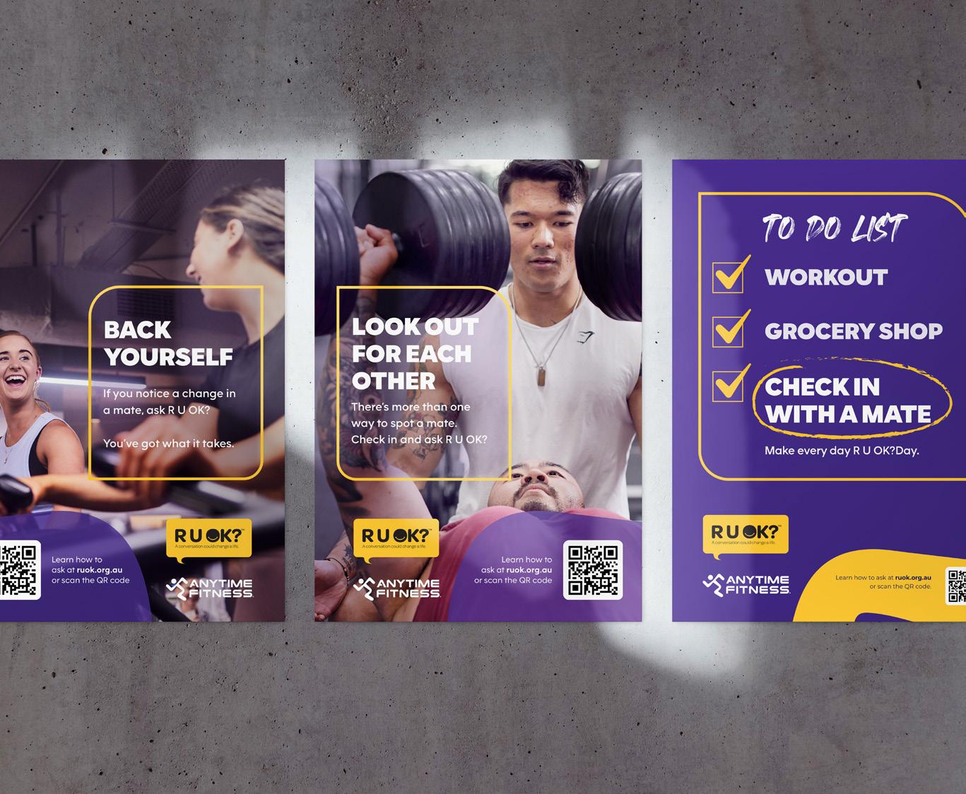
CAMPAIGN DESIGN
R U OK? Anytime Fitness


Objective:
The goal was to create a visual campaign for Anytime Fitness’s partnership with R U OK?, promoting suicide prevention by encouraging meaningful conversations within their Australian club communities.
Challenge:
The campaign needed to resonated with a broad audience while aligning with the branding of Anytime Fitness and R U OK?. Additionally, we needed a digital toolkit for franchisees to implement it nationwide.
Strategy:
developed the Art Direction and created digital and print assets, including social media graphics, web banners, and posters. The design emphasised warmth and inclusivity, making the campaign
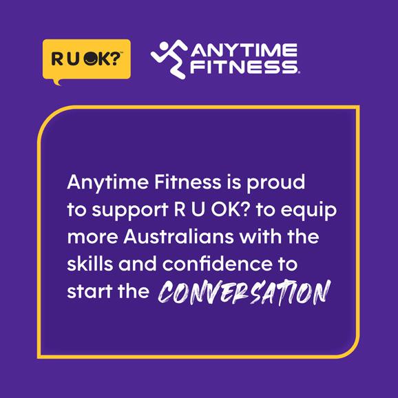


accessible. I also built a digital toolkit to ensure franchisees could effectively roll out the campaign in their local clubs.
Solution:
The campaign assets successfully unified the messaging of R U OK? and AF, focusing on promoting mental health awareness. The digital toolkit provided franchisees with all the resources needed to roll out the campaign.
Outcome:
The campaign was widely adopted across Australia, with franchisees using the toolkit to drive awareness in their clubs. The visual identity helped empower members and communities to ask ‘R U OK?’, reinforcing Anytime Fitness’s commitment to mental health.


CAMPAIGN DESIGN
Anytime Fitness
ONE DAY SALE (ODS) IS ANYTIME FITNESS’S BIGGEST NATIONAL SALE THAT BRINGS SUBSTANTIAL REVENUE INTO THE NETWORK.
THE SALE HAPPENS TWICE A YEAR – IN FEBRUARY & AUGUST.
Objective:
The objective was to develop versatile and consistent visual assets for Anytime Fitness’s biannual One Day Sale (ODS), a major national event offering a $0 Joining Fee for 24 hours. The goal was to maximise revenue across over 520 franchise locations in Australia.
Challenge:
The challenge was to adapt the new Any Body Any Time campaign and updated Anytime Fitness branding into templates that could be used across social, digital, and print platforms. These templates needed to be consistent with previous years while being customisable for individual franchisees.
Strategy:
developed and rolled out template variants for social media, web, and print, ensuring they were customisable yet maintained brand consistency.
These templates were designed to be adaptable and easy to use, catering to the needs of over 520 franchisees. I also uploaded the templates to Digital Stack, ensuring all club owners had access to the campaign elements well before the sale.
Solution:
The final templates effectively integrated the new branding while retaining the recognisable elements of past campaigns. The design was flexible, allowing franchisees to customise the assets while maintaining a cohesive look and feel across all platforms.
Outcome:
The new templates were widely adopted, driving strong engagement and contributing to the success of the One Day Sale. Franchisees appreciated the ease of use and customisability, which supported the overall goal of maximising revenue during the sale.


DIGITAL DESIGN
Goodman Group Internal Comms
AS THE BIGGEST SPECIALIST GLOBAL INDUSTRIAL PROPERTY AND DIGITAL INFRASTRUCTURE GROUP, THEY OWN, DEVELOP AND MANAGE HIGH-QUALITY, SUSTAINABLE PROPERTIES THAT ARE CLOSE TO CONSUMERS AND PROVIDE ESSENTIAL INFRASTRUCTURE FOR THE DIGITAL ECONOMY.
INDUSTRY: Global Property + Digital Infastructure
ROLE: Graphic Designer

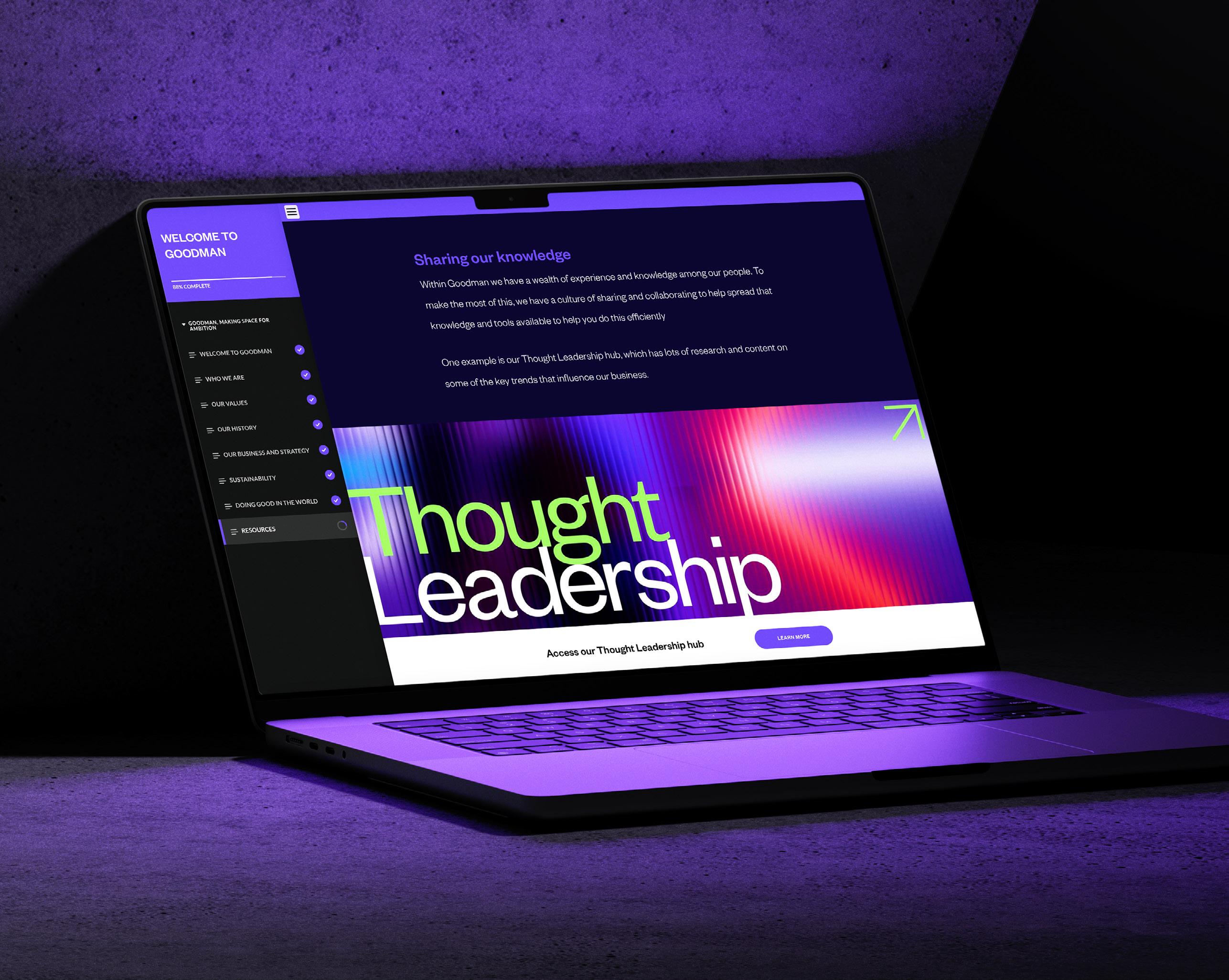
Goodman Group Employee Induction Module DIGITAL DESIGN
Objective:
During my time at Goodman, I was provided with the opportunity to redesign their Legal compliance training modules using Articulate and Rise360. The aim was to better align the courses with Goodman’s brand identity while improving employee engagement and retention of critical information.
Challenge:
The challenge was twofold: the existing modules were visually unengaging, and the design features of Articulate and Rise360 were limited. The platforms allowed only one custom feature colour, three custom fonts, and had restricted design capabilities, making it difficult to fully showcase Goodman’s brand identity.
Strategy:
I utilised animated learning features to incorporate branded elements from Goodman’s web and digital media into the modules. I also developed animated GIFs
and embedded core Goodman video content to bring the brand to life. also developed a range of banners using modern and trending design techniques across the deisgn. This helped compensate for the platform’s limitations, ensuring the design remained engaging and on-brand.
Solution:
The newly designed Employee Induction Module used the custom branding features within the limitations of Articulate and Rise360 while incorporating dynamic visuals and animations. This approach improved the presentation of complex learning topics and made the content more accessible and visually appealing.
Outcome:
The updated modules led to a significant improvement in employee engagement and retention. The new templates became the standard for future compliance courses, ensuring a consistent and effective learning experience across Goodman.
DOCUMENT DESIGN
Goodman Key Message Guide
Objective:
One notable project I worked on was updating the Goodman Key Message Guide, which is essential for maintaining aligned brand communication across the organisation. This project was particularly challenging due to Goodman’s annual brand updates, which required a fresh and cohesive corporate identity.
Challenge:
The challenge involved reviewing the new brand update collateral provided by external agencies and ensuring that it was effectively communicated to internal stakeholders. I needed to simplify complex data for readers while integrating new visual elements, all within the constraints of maintaining brand consistency.
Strategy:
To address these challenges, I collaborated closely with internal stakeholders, providing regular updates through prototype layouts. I focused on making the content more accessible by incorporating infographics and charts that clarified complex information. Additionally, I implemented a design shortcut that reduced design time by 35%, streamlining the process of updating the guide.
THE GOODMAN KEY MESSAGE GUIDE WAS CAREFULLY CRAFTED TO ENSURE CONSISTENT AND UNIFIED GOODMAN MESSAGING AT A GLOBAL LEVEL.
Solution:
The new design incorporated the updated visual elements seamlessly while making the data easier to digest. The collateral produced during this project was also used to refine Goodman’s new visual guidelines and training materials.
Outcome:
The updated Key Message Guide was successfully distributed to Goodman’s global team across 14 countries, ensuring consistent brand messaging. The guide is currently being translated into Chinese, Japanese, and German, further extending its reach and impact. The project also served as a foundation for refining Goodman’s new visual guidelines and training materials.


PACKAGING DESIGN
Decante This Vadin Plateau
AS THE BIGGEST SPECIALIST GLOBAL INDUSTRIAL PROPERTY AND DIGITAL INFRASTRUCTURE GROUP, THEY OWN, DEVELOP AND MANAGE HIGH-QUALITY, SUSTAINABLE PROPERTIES THAT ARE CLOSE TO CONSUMERS AND PROVIDE ESSENTIAL INFRASTRUCTURE FOR THE DIGITAL ECONOMY.
INDUSTRY: Health + Fitness
ROLE: Lead Identity Designer

PACKAGING DESIGN

‘Origine’ wines
Objective:
Decante This approached Den of Foxes to create a fresh brand identity for Origine, an exclusive Australian release of Vadin-Plateau’s Extra Brut Premier Cru Cuvee. The goal was to appeal to an Australian market, targeting an audience that appreciates an edgy, elegant, and modern design while maintaining the French heritage of Vadin-Plateau.
Challenge:
The challenge was to develop a logotype, visual identity, and packaging design that appealed to Australian consumers while honouring Vadin-Plateau’s rich tradition in Champagne production. The design needed to balance modern elegance with a sense of luxury while standing out in a crowded marketplace.
Strategy:
For the logotype and packaging, I combined vintage typography with contemporary isometric illustrations, inspired by 1960s Palm Springs advertising. The visual identity was designed to evoke the feeling of a luxury getaway, tying into the wine’s elegant and refined nature. The colour palette and illustration work balanced the rich tradition of French winemaking with the playful and bold sensibility of Australian markets.
Solution:
I developed a logotype, illustration work, and final label design that combined the nostalgic French aesthetic with modern, fresh visuals. The packaging design featured bold typography, soft pastel colours, and sophisticated isometric illustrations, capturing the essence of a luxurious getaway while maintaining a connection to Vadin-Plateau’s French roots.
Outcome:
The new Origine identity was successfully launched in the Australian market. The fresh and elegant packaging design resonated with the target demographic, helping Decante This stand out in the competitive market. This project strengthened the ongoing partnership between Vadin-Plateau and Decante This.


UX /UI DESIGN

THE LEADERS BEHIND AUSTRALIA’S FAVORITE FITNESS BRANDS ARE ALL ABOUT ENHANCING THE LIVES OF OVER 1 MILLION AUSSIES THROUGH PROMOTING PHYSICAL AND MENTAL WELLBEING.
INDUSTRY: Health + Fitness
Collective Wellness Group

ROLE: Lead Identity Designer

Objective:
The objective of this project was to modernise the visual identity of Collective Wellness Group (CWG) to better align with the company’s mission. The project aimed to create a cohesive digital and print presence that ensured consistent storytelling across all brand touchpoints.
Challenge:
The challenge was to create a new visual identity that resonated across all brand materials while staying true to CWG’s mission. Additionally, the website’s existing content needed to be restructured to improve user experience without compromising the company’s core messaging.
Solution:
The website’s content was restructured to enhance navigation and user
experience, with the design optimised for responsiveness across all devices. The updated visual identity was also extended to include PowerPoint presentations, LinkedIn social media elements, employee welcome packs, and an introductory video that showcased all the brand elements cohesively for the Team Day presentation.
Outcome:
The successful redesign of the Collective Wellness Group website, along with the accompanying brand materials was completed on schedule for the 2022 Team Day. The project not only modernised CWG’s digital presence but also established a unified brand identity across all touchpoints, reinforcing the company’s commitment to promoting physical and mental wellbeing for over 1 million Australians.


Thank you for taking the time to review some of the previous work I’ve had the pleasure of creating alongside some fantastic businesses and organisations. Creating visual touch points that communicates the values and ideal my clients hold is what I’m most passionate about as a designer. Let’s create and collaborate together - preferably over coffee & snacks.