This is the portfolio of Joel Jeffery (he/him/his). A Graphic Designer from the Mid North Coast of NSW.
He has an interest in Fine Art History, His strengths are in branding, campaign and document design. His kryptonite is any and all things caramel.
handcrafted specially for the review of NSW Telco Authority
2024 | JOEL JEFFERY
JOEL JEFFERY
Joel Jeffery
Graphic Designer + Creative Consultant
Hey, I’m Joel- a Graphic & Brand Designer based in Sydney, NSW who is looking for new opportunities. I use my design experience to support brands of all sizes in telling their stories through timeless visuals & strategic thinking.
My philosophy is that great design should not only improve the visual presence of a business, but that it should also aid in communicating the ideals a brand upholds - resulting in clever and sophisticated work that tells visual stories and solves client problems.
When not in front of the computer, you can find me painting in the studio, tending to my indoor plants, seeking inspiration from pop culture, or traveling up and down the coast to visit friends and family.
I received my Postgraduate Diploma in Design from the University of New South Wales in 2018, and it’s within my plans to complete my Masters in Design. I received a Bachelor of Fine Arts from the University of Newcastle in 2015, majoring in Painting and Graphic Design.
I would love to use my design experience to support your business in telling your story.
Let’s get in touch.
MMXXIV CREATIVE DESIGNER
Goodman Property Group
INDUSTRY ROLE
JOEL JEFFERY
Goodman is a specialist global industrial property and digital infrastructure group. They own, develop and manage high-quality, sustainable properties that are close to consumers and provide essential infrastructure for the digital economy.
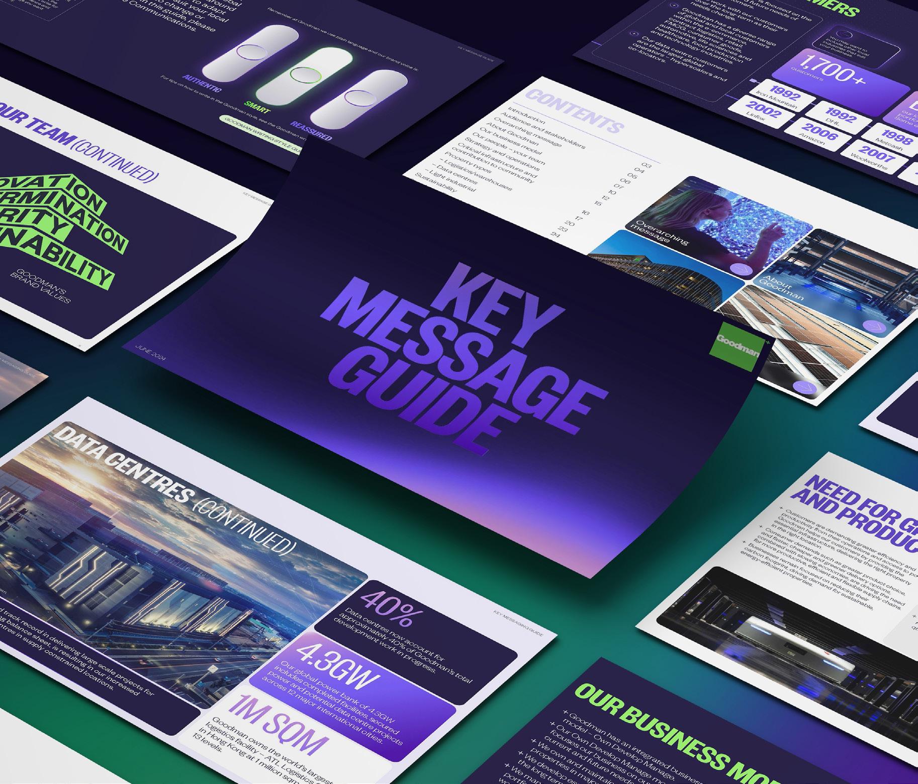
During my time at Goodman, I was required to update the Key Message Guide, an essential document for aligned brand messaging across the wider global organisation.
Goodman’s digital brand upgrade presented a unique challenge in aligning communications with the new brand identity. was briefed on reviewing the new brand guidelines to curate a new layout for the updated Key Message Guide that better reflected the brand’s overarching messaging and positioning.
The updated Key Message Guide was successfully distributed to our global team across 14 countries, meeting organisational requirements and ensuring staff were well trained in its use. The project also served as a highlight of our new visual identity update, providing a foundation for wider brand update training for our global marketing and design teams.
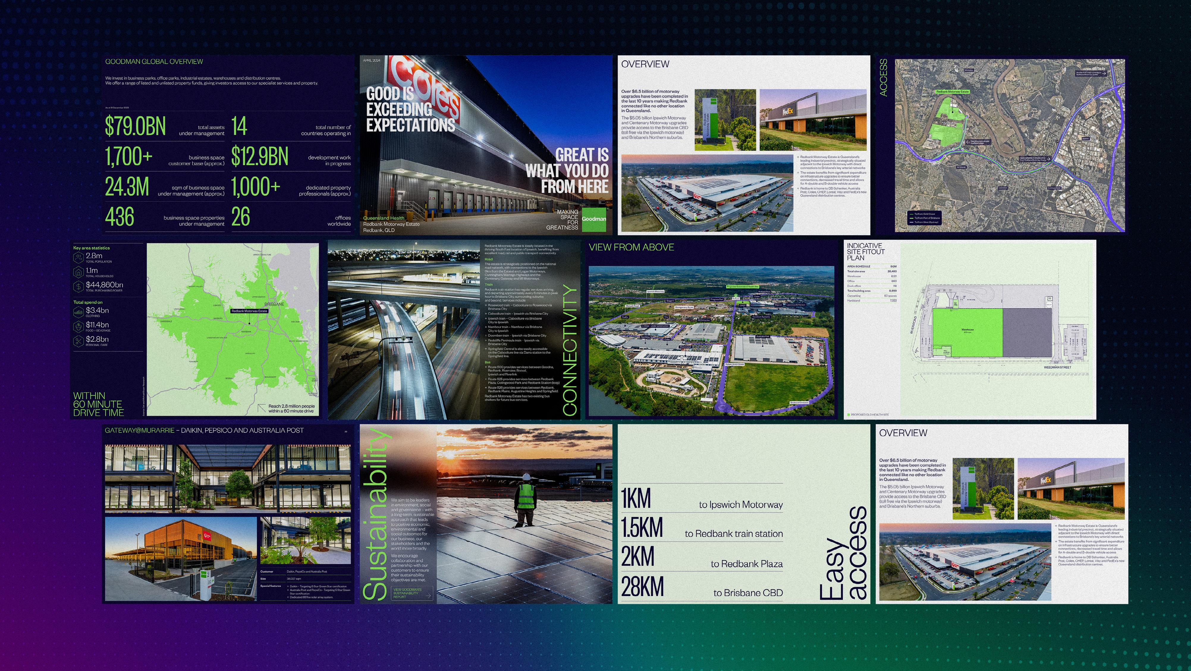
Part of my daily work at Goodman required editing Presentations, Customer Proposals and Information Memo documents that highlighted vacancies at Goodman’s properties across Australia.
When working on proposals and presentations for upcoming developments, collaborated closely with the property, marketing and developments teams respectively to create high quality pitch documents and proposals that highlighted the unique selling points of each property or development, placing emphasis on location, amenities and access, architectural design and sustainability features.
We also highlighted the successes of Goodman’s property performance and how their industry knowledge would best serve their potential customers. The presentations we actively worked on were instrumental in securing interest from investors and clients, demonstrating the impact that well-executed design can have on business outcomes.
JOEL JEFFERY
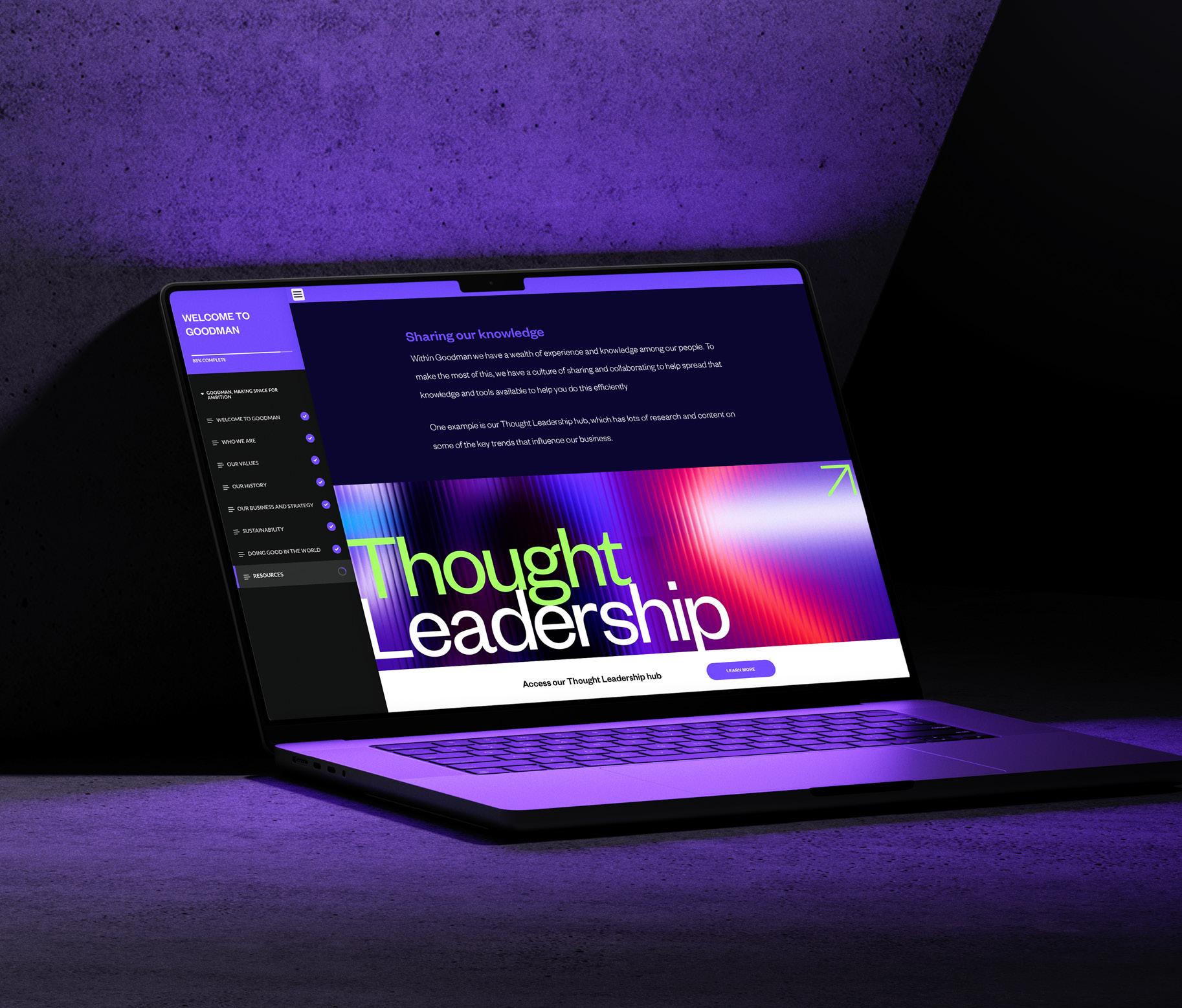
Goodman Employee Induction Module
INDUSTRY Property ROLE Graphic Designer
Goodman Group’s Legal team needed a revamp of their compliance training modules to better align with the company’s brand identity and enhance engagement. The existing courses were visually unappealing and difficult for employees to absorb, prompting a complete redesign.
The existing modules, used to train both new hires and current employees, were essential for ensuring adherence to a wide array of legal and ethical guidelines. However, these courses lacked a connection to Goodman’s brand identity and were visually unengaging, making it difficult for employees to absorb and retain critical information.
The challenge of this task was to align the course templates with Goodman’s brand visual identity, as well as enhance the visual elements to simplify complex compliance issues into easily digestible content. The existing templates were functional but generic, failing to represent Goodman’s brand and not visually compelling enough to keep learners engaged.
In creating the revised course templates, I thoroughly reviewed Goodman’s visual identity guidelines and integrated the brand’s look and feel into This ensured a cohesive look and feel that aligned with the company’s overall branding.
I developed custom infographics and visual elements that broke down complex compliance topics into simpler, more engaging formats. These visuals were strategically placed throughout the modules to enhance understanding and retention.
The redesigned Employee Induction Module was a huge suggest, and the template developed has gone on to inform all other course designs.
JOEL JEFFERY
MMXXIV CREATIVE DESIGNER
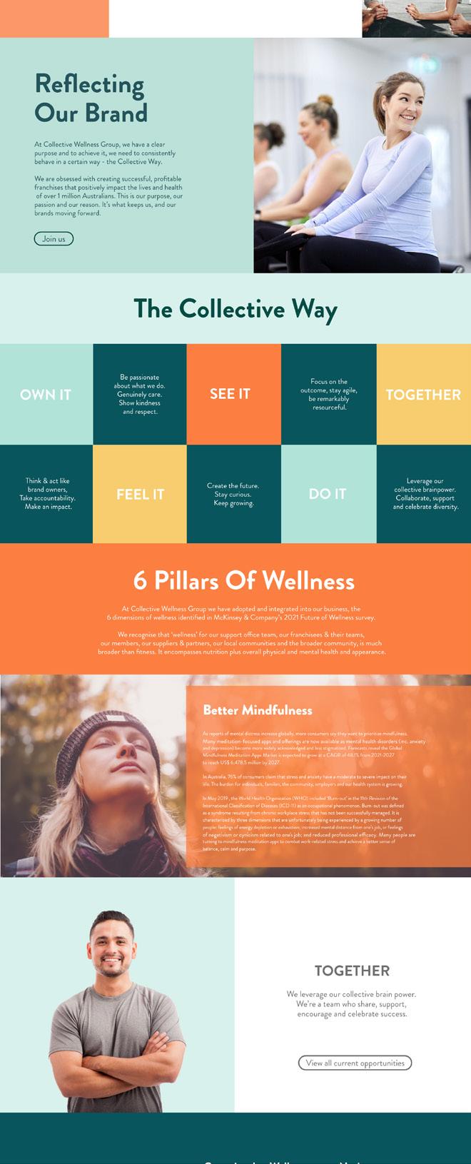
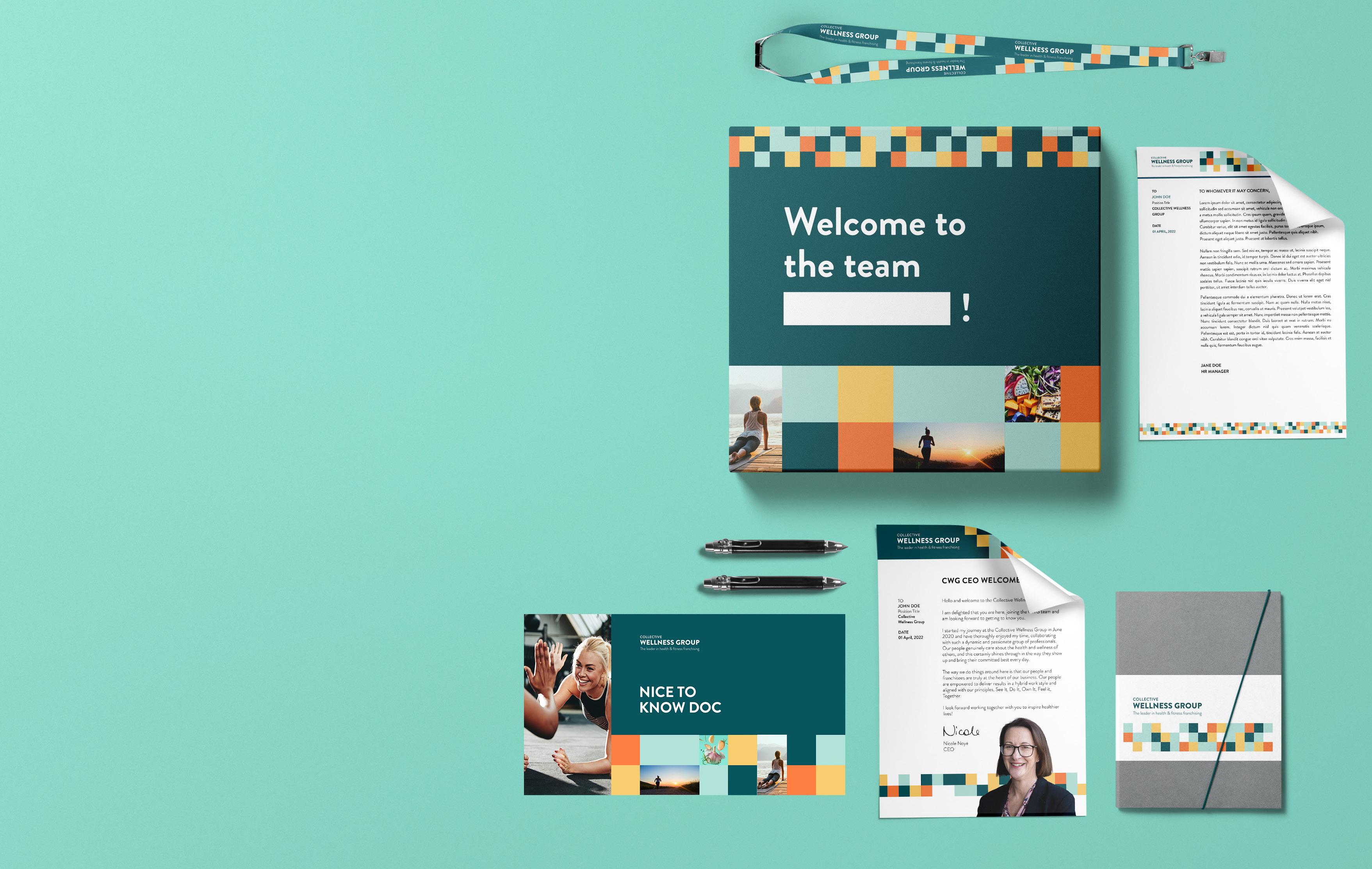
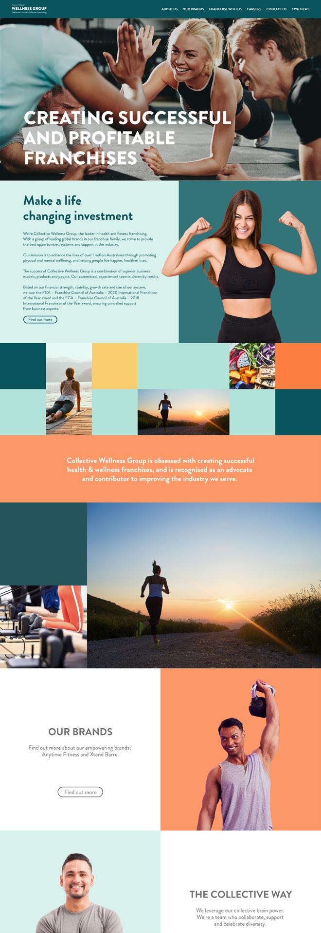
Collective Wellness Group
INDUSTRY Health + Fitness ROLE Lead Designer
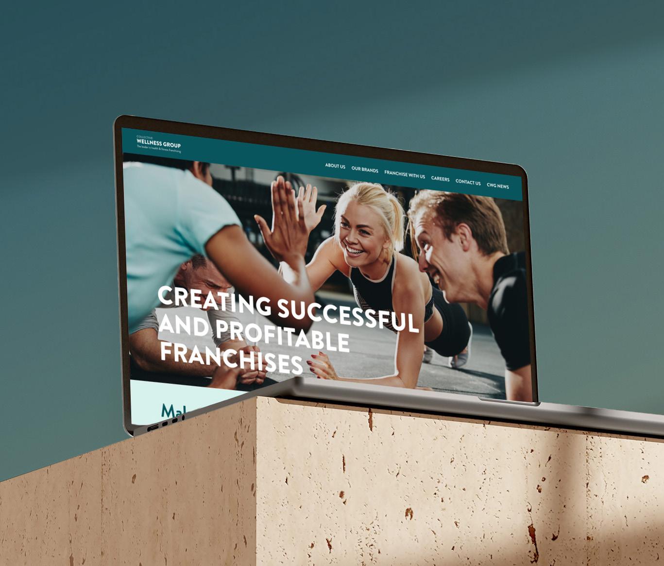
Collective Wellness Group are the leaders in health and fitness franchising. With a portfolio of brands such as Anytime Fitness and Xtend Barre, their mission is to enhance the lives of over 1 million Australians through promoting physical and mental wellbeing.
In collaboration with the CEO and Head of Marketing, I led the execution of Collective Wellness Group’s brand refresh. The project aimed to modernize CWG’s visual identity to ensure consistent storytelling across all touchpoints.
As the lead designer, I was responsible for creating the website and developing both print and digital collateral that reflected the new
brand. My focus was on delivering a clean, modern aesthetic that could be seamlessly applied across various platforms, including social media, digital ads, and event materials.
The successful implementation of the refreshed brand identity not only enhanced CWG’s visual presence but also solidified its position as a leader in the health and fitness industry.
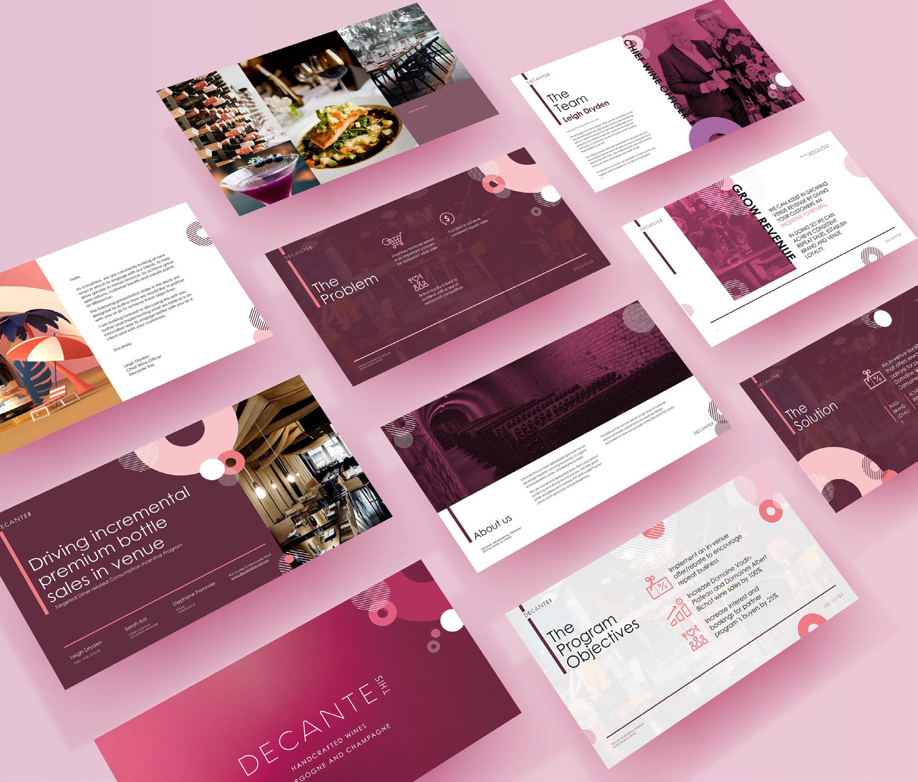
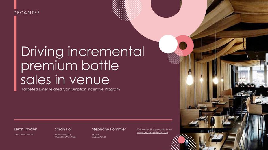
Decante This
INDUSTRY ROLE
Liquor Wholesale Presentation Designer
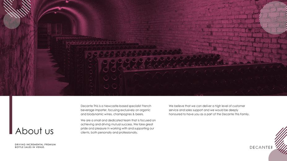
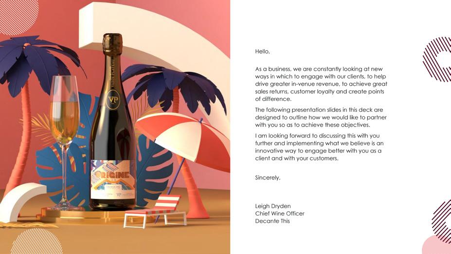
Decante This is a wine importing and distribution company that provides a worldly drinking experience to passionate Aussie wine connoisseurs. Focusing on bringing the finest wines from the Champagne and Bourgogne regions, they pride themselves on providing wine tasting experiences that are unmatched in quality.
JOEL JEFFERY
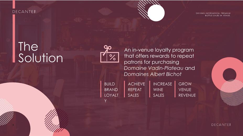
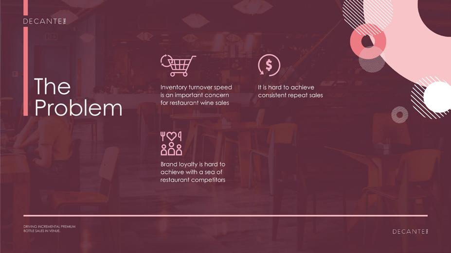
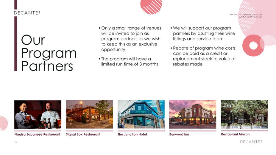
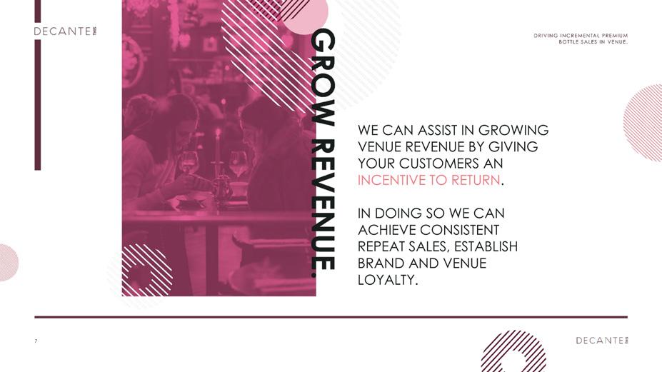
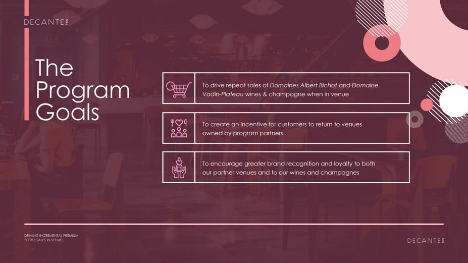
During my time as a Graphic Design Consultant at Decante This, I was required to develop multiple sales deck presentations for a variety of Targeted Diner-related Consumption Incentives that would target both restaurant vendors and customers respectively.
This particular incentive would implement an in-venue rebate for customers to encourage repeat business when they made purchases of either Vadin-Plateau or Albert Bichot products instore upon returning to dine.
I was tasked with developing the visual design of the sales deck and also with clarifying the sales message to eliminate any unnecessary information that didn’t support the core message or goals of the program.
Upon pitching the idea to potential leads, we had seven restaurants immediately sign up to the program in Newcastle and are currently proposing the incentive with restaurants in Sydney, Brisbane and the Hunter Valley.
JOEL JEFFERY
JOEL JEFFERY
R U OK? x Anytime Fitness
INDUSTRY
Health + Fitness ROLE Art Direction + Design
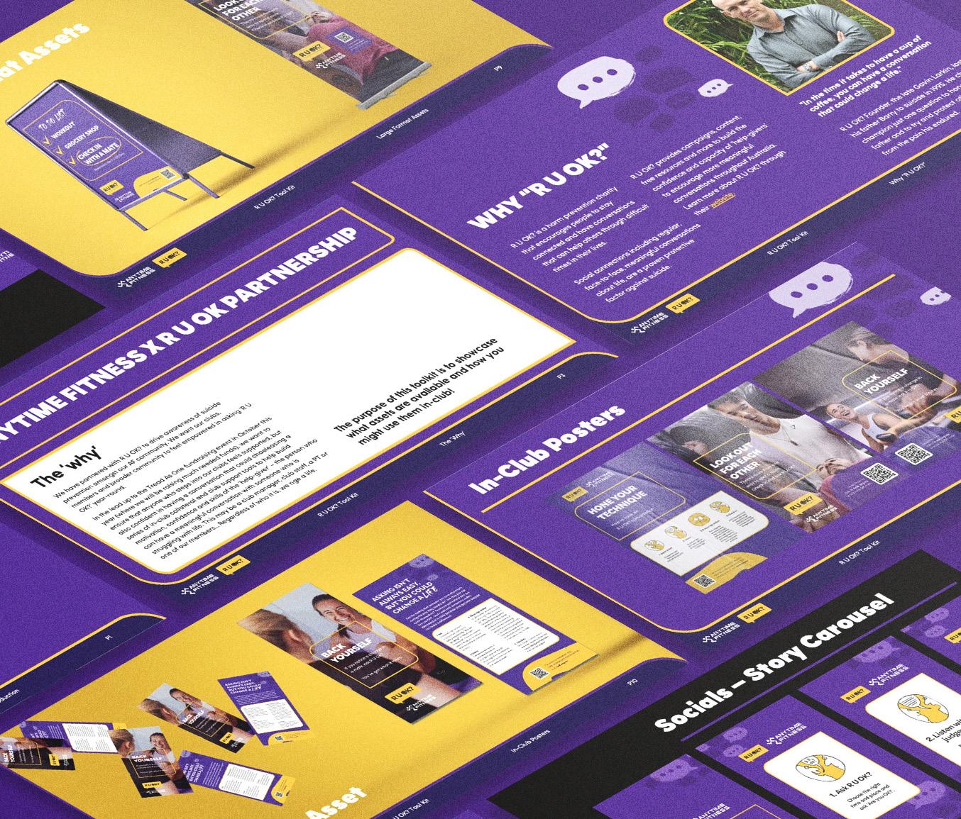
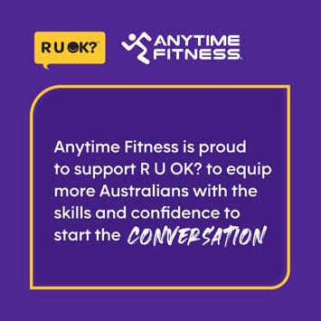
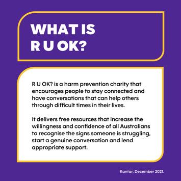
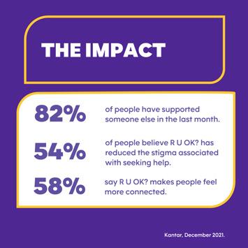
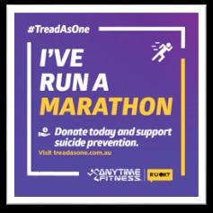
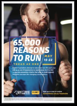
R U OK? is a harm prevention charity that encourages people to stay connected and have conversations that can help others through difficult times in their lives. Anytime Fitness partnered with R U OK? to drive awareness of suicide prevention amongst their club communities across Australia.
Anytime Fitness Australia wanted their clubs, members and broader community to feel empowered in asking ‘R U OK?’ year-round.
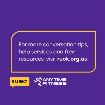
For this particular project, I was required to build a number of digital and print assets for the campaign, as well as building a digital toolkit that Anytime Fitness franchisees around Australia could use to roll out the campaign. These elements were a great opportunity to drive awareness of meaningful conversations as an element of suicide prevention and educating local communities on the significance of asking ‘R U OK?’’.
I was tasked with developing the Art Direction for the campaign, as well as building out all assets across digital, web and socials.
JOEL JEFFERY
CREATIVE DESIGNER
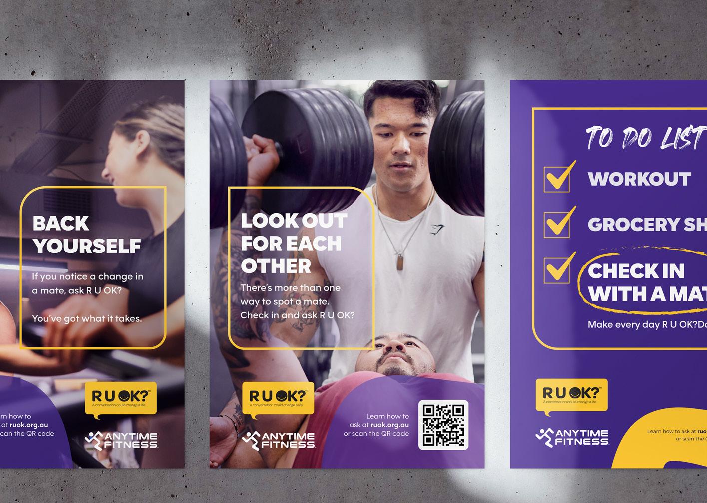
As the R U OK? x Anytime Fitness partnership has been an ongoing project prior to the 2021 Anytime Fitness Australia rebrand, I was asked to ensure the visuals of this campaign visually complemented the assets used in last years ‘Tread as One’ campaign - whilst giving it a fresher look that complemented the new AF visual identity.
Figure 2: Acquisition Posters
Figure 4: Tread as One Campaign 2021 assets
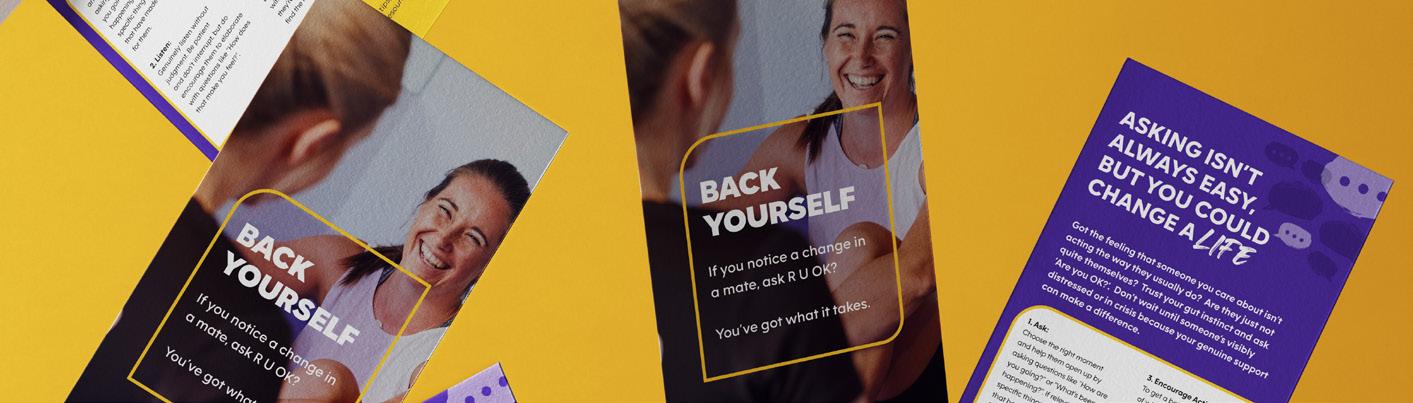
Figure 3: Campaign DL Flyers
Figure 1: Social Carousel
JOEL JEFFERY
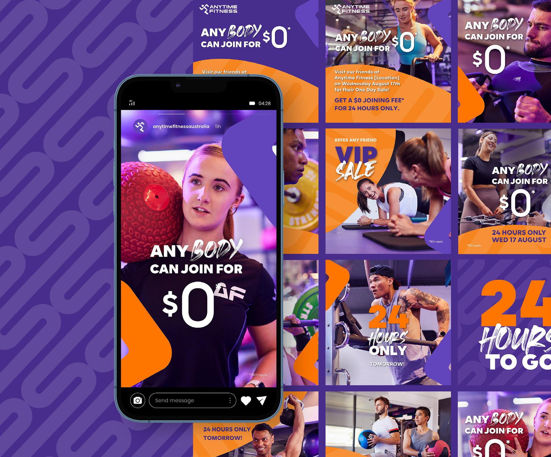
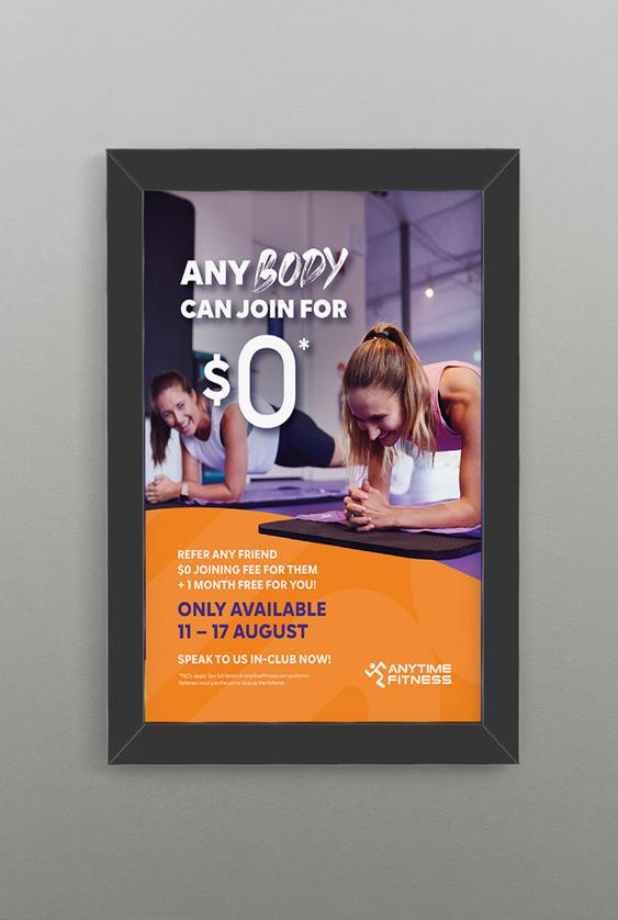
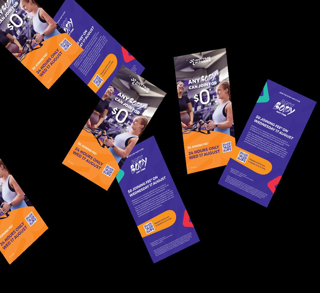
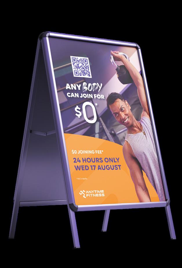
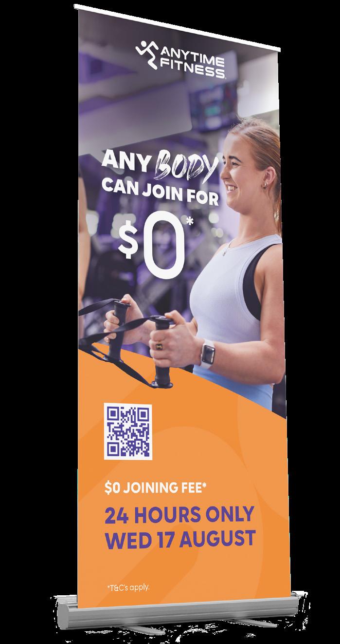
Anytime Fitness One Day Sale (ODS)
INDUSTRY ROLE Graphic Designer Health + Fitness
One Day Sale (ODS) is Anytime Fitness’s biggest national sale that brings substantial revenue into the network. The sale happens twice a year – in February & August. The offer is always $0 Joining Fee* and is available for 24 hours only.
I was tasked with creating social, web, and print assets for the February and August sales, incorporating the new Any Body Any Time campaign and updated AF Branding.
My challenge was to adapt the concept art into versatile templates for social, digital, and print use. These templates needed to be consistent with previous years, integrate the new branding, and be usable by over 520 franchisees across Australia.
I created and rolled out template variants across social media, digital, and print platforms. These templates
were customisable for franchisees while maintaining brand consistency. I also uploaded the templates to Digital Stack ensuring all 520+ club owners had acces sto the camapign elements before the sale went live.
The new templates were widely adopted, driving engagement and contributing to the success of the ODS campaign. Franchisees appreciated the customisability and ease of use, which supported the overall goal of maximising revenue during the sale period.
Figure 1 - Referral Posters
Figure 2 - From left to right; Acquisition DL Flyers, Acquisition A-FRAME, Acquisition Pull Up Banners
JOEL JEFFERY
JOEL JEFFERY
CREATIVE DESIGNER
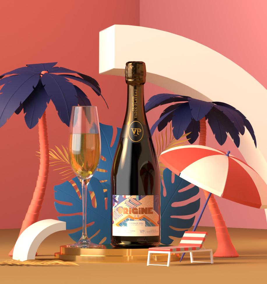
Vadin-Plateau ‘Origine’ Cuvee
INDUSTRY French Wine ROLE Art Direction + Brand Designer
Vadin-Plateau Champagne is a family run enterprise in the heart of the Great Valley of the Marne, in the village of Cumières, near Épernay, the capital of Champagne. Since 1785, a passion for wine and its cultivation has been transmitted from generation to generation.
Vadin-Plateau and Decante This host a decade long business partnership, allowing Australian audiences to experience authentic, award-winning Champagnes and French wines without having to travel the distance.
Approached by Decante This, Den of Foxes was commissioned to create a new product brand identity for an exclusive Australian release of Vadin-Plateau’s latest Extra Brut Premier Cru Cuvee.
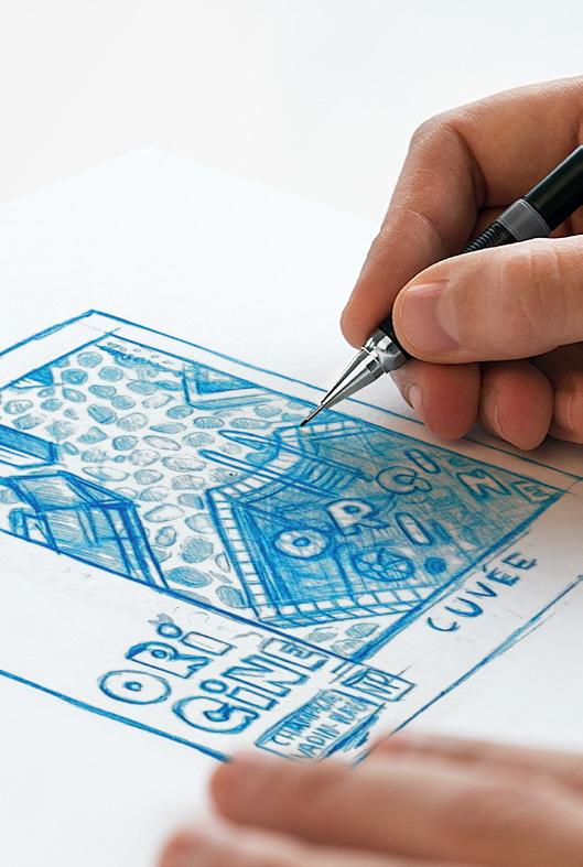
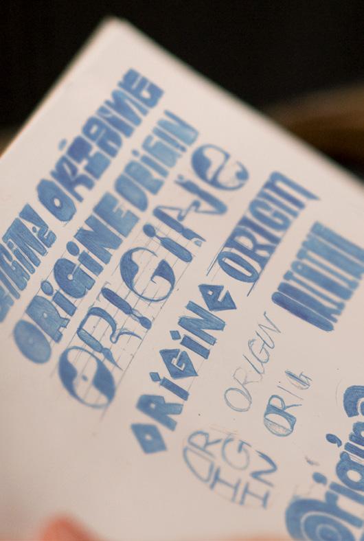
The Design Process:
The brief was to create a design that would target an untapped market that would appeal to an Australian audience that appreciated an edgy, elegant and fresh design.
This project that I had the pleasure of leading the art direction for required that I develop a logotype, a visual product identity, illustration work and a final label design for use on the bottle’s packaging.
I went through a number of initial drafts when developing the logotype- being drawn towards the usage of typography in vintage liquor and travel advertising posters, such as those found in ‘Cinzano Vermouth Drink Poster by Jean Pierre Otth (1955) and ‘WhiteLady Martini Rossi’ by Marcello-Dudovich (1847).
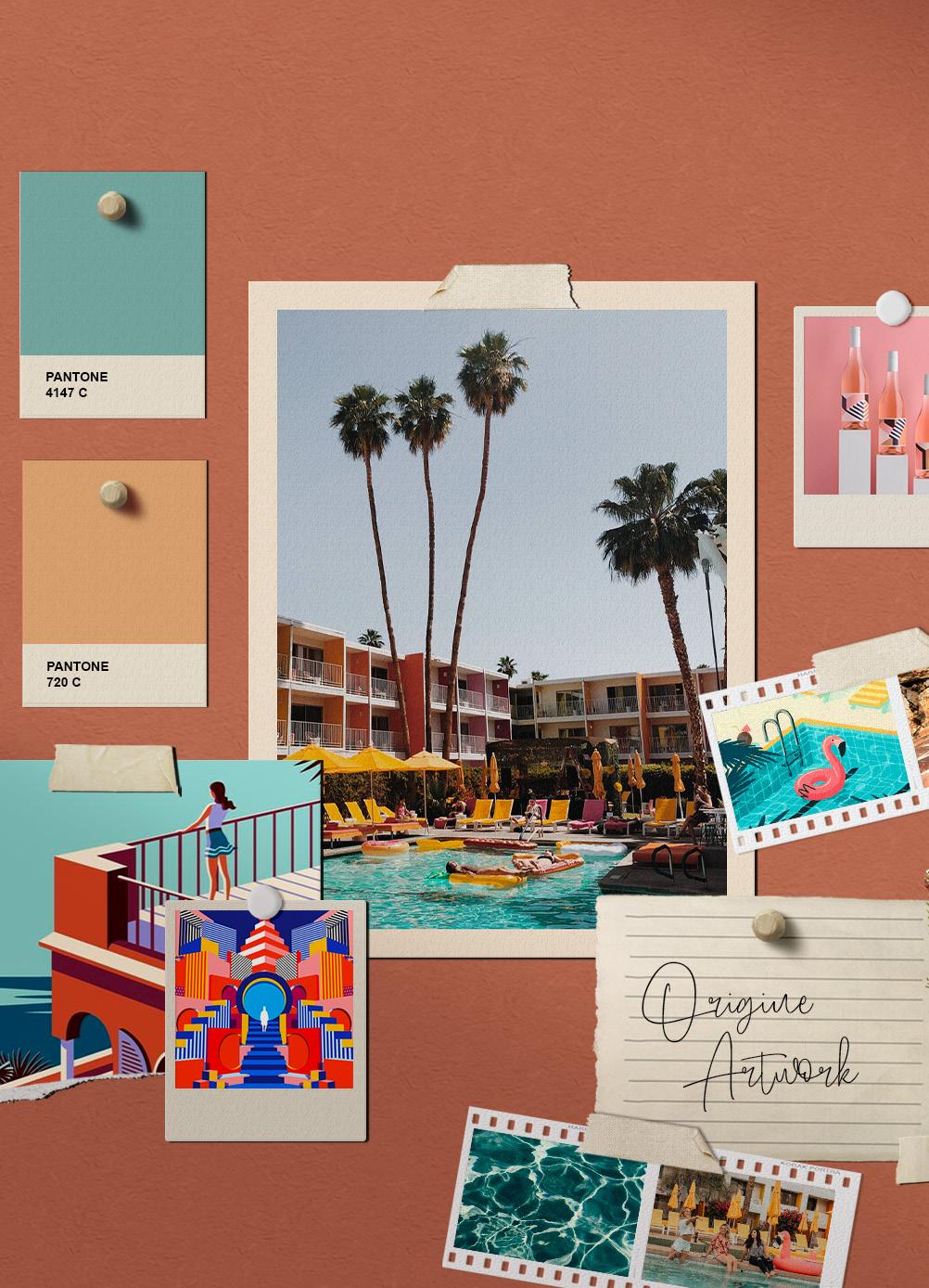
Whilst I was inspired by imagery found from the travel advertisements, particularly looked towards the gelato colour palettes used in vintage French Riviera travel advertisements from the 1950’s to tie in with the French heritage of the Vadin-Plateau brand.
This tied in well with the influence we took for the illustration work from 1960’s Sun Valley/ Palm Springs adverts and modern isometric environmental illustrations that have been trending in recent years.
After having been so inspired by the travel advertising imagery we uncovered in our research phase, we wanted to envision a luxury getaway destination that would inspire such trips for buyers of Origine. t