Churchill Process Book

 Joseph
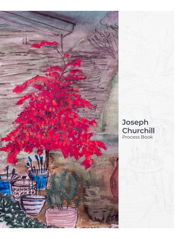
Joseph
Hello, my name is Joseph Churchill from Columbia, South Carolina by way of Des Moines, Iowa.
During my thirty year career in multiple information technology roles, I always found the best parts of my days were: working with users to elicit requirements, building out user interfaces, designing websites, and finding new ways to tell the story of a project’s current and future performance through data visualizations. However, as the aspects of my career continued to become more and more focused on maintaining a status quo I continued to grow weary. My struggles with toxicity in the workplace led me to resign from my position in February 2022. I took a month to myself reflect and contemplate what is it that I wanted to do.
During this time of reflection, I focused on what I loved to do in my free time, occasionally as a side hustle, and what I’d like to do with my life once I grew up, which happened to be photography, website design, and helping friends try to develop their brand. As I pondered how to pivot, I realized how ill-equipped I was to move forward. This led me to apply for readmission to the University of South Carolina after quitting my collegiate career in 1994.
After completing Summer and Fall 2022 classes, I am even more committed to my decision to return to earn my degree in a creative field.

I am very focused academically following readmission I have maintained a 4.0 GPA. Most of this focus can be attributed to having previously worked in a deadline-driven career. Academically it is also my goal to make the president’s list each semester. The professional experiences gained during my career that directly correlate to GD&I are Photoshop, Acrobat, HTML + CSS, problem-solving, analysis, UX/UI development, and data visualization.
I intend to apply to the GD+I program in Spring 2023. The GD+I BFA program is why I returned to school after thirty years in another career. Pivoting professionally is never easy, but I aspire to create a design firm with a focus on editorial illustration. I believe this program will help further my skills and provide additional tools to advance my career goals.
I hope this process book will offer a glimpse of my work, interests, and abilities.
With Regards, Joseph Churchill

Project 1 involved six-word stories. I developed two quick stories about what led me back to school after almost a 30year break from the university. After collecting the stories word maps were built for each to flush out ideas and words that might help drive the visual narratives image and typeface.
The best part of using the word maps helped with searching through stock images and typefaces to sync up the stories. For example, there are a lot of images of crows, but I happened across an image of crows with a very bold yellow backdrop it felt right. The second story’s search relied on the word map from the word pivot to switch.
Typefaces again, thanks to the word maps I had a fairly good idea of what sort of mood I wanted to set with each story. For the first I want something to be somewhat bold with a bit of movement below the typical bottom, that’s when I found Bree Semi bold, the ‘f’ sold me on this typeface. In the second story, I was torn, the original image had etched labels under the switches, removed through clone brush, but elsewhere on the
STORY 1 - WORD MAP
STORY 2 - WORD MAP


I do geek out a little bit about playing with typeface. One of our projects recently dealt with taking three consecutive letters from the alphabet and abstracting the typeface utilizing Adobe Illustrator. Sidebar, we also learned about C.R.A.P. (Contrast, Repetition, Alignment, and Proximity) this acronym makes the child inside happy. Also, I’ve used Illustrator in the past, but the idea of multiple art-boards same file life changing!


After completing the first three in class, the professor asked that I keep going, this was a blessing and a curse after completing eight and now having to cull down to three.
The first to go was UVW, I had fun playing with the U turning the W upside down into mountains and a V ground, it was an easy first bin. Second to shred was RST, even though I liked the symmetry of the mirror R with little t in the middle and the swirly quality of the S, it didn’t feel as strong. Third, to go was the very first OPQ, I’m still on the fence on whether I like the circular abstract, but I felt the P was just sort of there instead of bringing anything to the party.
Down to five was the easiest part editing down to three was the hardest. So, I tried to determine which of the 5 I liked the most, EFG which uses an illuminated manuscript style typeface, Orbe Pro, just felt right to me. Now only 2 spots left, again I looked at the last four and tried to choose the best for me XYZ, there’s something about the angle of the y next to the X and the way the Z intersects almost like a bow across a string instrument. The final three are JKL (Lion King vibe), ZAB (White Space 3D), and MNO (Skate Deck). The Skate deck for me won but the waffling over the last three went on for days.
If you had to choose between them, which three would you choose and why?


contrast of temperature (arts107)


In our latest project, we were tasked with developing a poster based on AIGA’s “Get out the Vote” campaign. We got to choose three quotes to develop into word maps and mood boards. The quotes I used to work on my maps were:

“Voting is the expression of our commitment to ourselves, one another, this country, and this world.”
— Sharon Salzberg
“We do not have government by the majority. We have government by the majority who participate.”

— Thomas Jefferson
“Someone struggled for your right to vote. Use it.”
— Susan B. Anthony
The world map and mood board that resonated the loudest in a small group was around the Jefferson quote and a lazy guy on a sofa and an idea of a butt print. With the sofa butt print idea in hand, I began sketching out as many ideas as possible. Starting with a brokendown sofa, confused puppy on the sofa, and ending with a word spiral. Again, the butt-print idea moved forward toward the final design.
My red sofa, it’s a well-used sofa, the lip of the cushion just sort of falls off a cliff and that’s what I chose to photograph. Considering our dogs believe this sofa to be theirs getting them off to snap a photo was a major challenge until I took a very low-angle shot. Using this picture to set off the text was fun! A lot of rough drafts, over the next week, went from black and white to a desaturated color pick, and even when I thought I was done, an idea to set the W off in the same style as another famous Jefferson doc.


 mockup Also, bonus mockup with doggo.

MAJORITY
PARTICIPATE -THOMAS
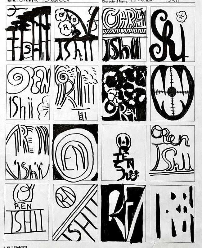
This project had us taking a popular movie, picking two characters, and building logomarks for each. First step was movie selection, I reached back to the aughts for Kill Bill. Then I selected the Beatrix Kido (aka the Bride) and O-Ren Ishii for the two characters.


Kiddo’s word maps focused on alias, her sword and her motherhood. There were quite a bit of linking thoughts between the base words.
O-Ren’s word maps drew from her call sign, being a gang leader, orpan, assasin, and her sword. It’s interesting how orphan and gang leader never really linked up.

The mood board for Beatrix Kiddo my initial feelings were muted earthy tones since every outfit she wore in the film eventually was soaked in blood.

O-Ren Ishii’s mood board really tried to focus on the color scheme from the cherry blossoms and the color of her code name in the movie, cotton-mouth.

For Kiddo’s sketches I really was focused on the continual motion and the way the katana almost made a K. This informed the rest of the logomark work.


For O-Ren’s sketches I bounced around from bonsai, to cherry blossoms, to assasin/snake, positive and negative themes until finally hitting on the monogram.

decided to decided rest of and on the gang run were added selected, The colors soiled with and a and typeface, elegance logo itself blossoms
Beatrix Kiddo is a former assassin who became pregnant, decided to get married, and leave the business. Her former boss, Bill, decided the only way out for Kiddo was for her to die and sent the rest of the assassin team to the wedding. Bill had a change of heart and left Kiddo alive in a coma. For the logomark I leaned heavily on the silhouette formed during a fight scene with the Crazy 88s, a gang run by O-Ren Ishii, inspiring the K form. Additional flourishes were added to the mark inspired by the striped jumpsuit. The typeface selected, AngieOpenProBlack, meant to mimic the jumpsuit stripe. The colors chosen play on the suit color from the film once it became soiled with blood and sweat.
O-Ren Ishii, Kill Bill Concept Statement
O-Ren Ishii is a member of the Deadly Viper Assassin Squad and a crime lord in Japan. The logomark built represents how clean and refined O-Ren Ishii always appears on the screen. The typeface, Bodega Sans (Light), was focused on trying to capture the elegance of the character and the curvy lettering style built into the logo itself especially the R. The colors chosen are based on the cherry blossoms and cottonmouth.
For this project, we needed to select a product anything from shoes to clothing to ink pens. I went with something I know and love guitar pedals. Next, we had to source images of high quality with no backgrounds. Following this, we needed to observe the products and comment about five specific categories.

(visual elements & relationships) is a fancy way of saying natural subject matter. Wait which term is fancier? We needed to describe the look and visual relationships of the product.
is the meaning which included denotation (specifics), connotation (associations), and Expression (feelings).
(contextual) is how something stands out in the context of where it’s seen. In what instance does this project have little presence versus a lot of presence.
After sourcing and researching I set up a 17” X 11” layout in InDesign and went about setting up a grid. Part of the fun with this project was tinkering with laying out four products versus each other and trying to keep some semblance of alignment. The layout continually shifted until I was happy with the white space balance.
We’re now onto project 6 and I’m learning even more about grid systems, spreads, and InDesign. It’s giving me a bit of déjà vu regarding web design. Do you like guitar pedals?
Lots: part of an exhibit in a museum
Little: on a pedal board
PRESENCE (contextual)
board
rock / metal / music / sound / live show / pedal
CONNOTATION (associations)
chunky / loud / overdrive / feedback

/ distortion EXPRESSION (feelings)
accessory / guitar / electric / pedal / gain effects
SEMANTICS DENOTATION (specified)
button for mashing.
of the pedal includes a large silver rectangular
knobs for Drive, Tone, and Level. The bottom
pedal includes a power light between three

contains an input and output. The top of the
Green rectangular metal box form. The side
SYNTAX (visual elements and relationships)
Lots: inside a pizza delivery box
Little: on a pedal board
PRESENCE (contextual)
board
rock / metal / music / sound / live show / pedal
CONNOTATION (associations)
hairy / sweet / savory / warm
/ fuzz EXPRESSION (feelings)
accessory / guitar / electric / pedal / gain effects
SEMANTICS DENOTATION (specified)
button for mashing.
Pig. The bottom of the pedal includes a silver
three knobs with icons for Pizza, Pineapple, and
top of the pedal includes a power light with
top contains an output, power, and input. The
Off white rectangular metal box form. The side
SYNTAX (visual elements and relationships)
Lots: door knocker
Little: on a pedal board
PRESENCE (contextual)
board
rock / prog / music / sound / live show / pedal
CONNOTATION (associations)
avant garde / rock / prog / synthesizer
effects EXPRESSION (feelings)
accessory / guitar / electric / pedal / modulation
SEMANTICS DENOTATION (specified)
just above a small silver button for mashing.
to filter the harmonics. Small lights are placed
trol envelope, pattern, rate. A set of fine tuners
and FREQ. The second set of black knobs con -
drive, mix, and output. Two switches for LFO
and power. The top contains black knobs for
sides. The side top contains inputs, outputs, midi,
White rectangular box from with white wood
SYNTAX (visual elements and relationships)
Lots: being used by a string quartet
Little: on a pedal board
PRESENCE (contextual)
board
rock / music / feedback / live show / pedal
CONNOTATION (associations)
deja vu / loop / repetition / distortion
EXPRESSION (feelings)
accessory / guitar / electric / pedal / time effects
SEMANTICS DENOTATION (specified)
bottom for mashing.
type of delay sound. A large silver button at the

at the top control delay, feedback, level, and the

put in either stereo or mono. Four black knobs
of the box includes two plugs for output and in
Light blue rectangular metal box. The both sides
SYNTAX (visual elements and relationships)


Donna Smith University of South Carolina Columbia SC Fall 2022
