process book two forty-five + two forty-six ARTS


This week, I read about the origins of typefaces while we began our first project, a grid of nine images. From the initial glance at these two topics, one might not see the correlation between the two subjects. Typefaces and Project 1 are related to each other in their craftiness.
Typefaces were designed to be repeated, just like the image of my chosen celebrity, Prince, will be repeated. Like typefaces, Project 1 will continually evolve each time. The use of the machine, whether the moveable type or Xerox, allowed for text and images to be mass-produced. Moving from a line drawing to a positive negative reminds me how typefaces went from calligraphy to a repeatable form. Our line drawing helped us get the feel of the image. The positive-negative will serve as the template for the second row of the project. There has been trial and error with figuring out how thick or thin the line should be on the image or if it would look better with addition or subtraction from the picture. I must remember what I can cut with an Exacto precisely thrice. This calls back to how letters in typefaces are built and refined. The grid: margins, columns, rows, gutters, folios, structure, modular, controlling, defining, structured. What’s not to love about a grid?
It was interesting to learn how the margins of the grid system became the user interface for the written word. As a former programmer, I have bad memories of forcing web layouts before the advent of CSS; this week’s reading brings back many of those feelings.
I was gleeful when I saw Gibson’s book “Neuromancer” mentioned. However, at the same time, I remember the book less about an abstract on the grid system and more about one of the best bad-asses ever in print, Molly. [IMHO, the Sprawl trilogy is a must-read]
Okay, back to the grid!
This week’s class work brings project one into the home stretch with, you guessed it, a grid layout for the nine images. Thanks to the black Canson paper being a wee bit wider than expected, 19.75” instead of 18”, our grid, thanks to its modularity, has compensated. My sheet is much longer than 24”, but I’m sure the grid can balance it in the gutters.
Power to the grid!


I have a new obsession! It’s math; no, that was an old obsessio n; in fact, it was never really an obsession so much as being talente d with harnessing it. Let’s talk about the golden section.
The golden section, golden ratio, divine proportions, extreme and mean [Fibonacci sequence made this ratio possible], but it’s interesting how math is used to calculate the ideal aesthetic pleasure; everything unknown is just a math problem that hasn’t been solved. I read that over the summer (“Stella Maris” by Cormac McCarthy, maybe). Manuscript (Single-column grid), Column (multi-column grid), and modular (squares grid). Should all pay tribute to the golden section in their setup.
We started our second project this week. It’s a quick turnaround. We’ll utilize three different grid layouts and experiment with texture formed by how text is formatted for print. I can’t stop thinking about ne gative and positive spaces and looking forward to the challenge. We did preliminary sketches in class, and now I need to see if I like what I see.
Oh! New term alert! “Furniture” holds the margins of the page, as in, I could have used some furniture for project one.
Spacing equals letting us take a breath or allowing us to breathe. Which is better: a single space, a double space, a comma, or a period? Which lets you breathe the best mentally and/or physically.
Okay, linearity. If you ask me to say it aloud, I’m sure it will come out like George W. Bush saying, nuke-clear-arr. However, I do love a good attack on text crawl. It would have been great if this section illuminated ways to avoid the pitfalls of a one-way slide deck, like six words max per slide…seriously… if you just want people to read the slides, put it in something easier to digest.
This week’s key takeaway from the reading is Roland Barthes’s idea that “text is a game to be played.”
I’ll leave with this thought on Text. How do we plan/think about the flow of text and its role/interaction regarding the visually im paired? [It’s amazing what you think about after an eye exam.] Should we only think about text in 2D? What about the 3D aspect of text? With VR on our doorstep, will that help move the needle of accessibility forward?
Project news: we had a rapid-fire project around the grid and the texture to text over the end of last week. We got to work on hand skills again. I had fun. I cut things. I glued things, re-glued things, threw the provided glue stick in the rubbish bin, used my own glue stick, and prayed to God it wouldn’t lift up if it had been sitting in the trunk of a car all day. I was left with what appears to be a potential crime scene of hostage note generation.


I have a confession to make: I'm an ex-type felony. I love the type crimes blurbs in this week's readings. Having committed almost every crime in this section except for vertically stacked lowercase text. Learning the rules and having this book in my toolbox is excellent. I will focus on committing fewer type crimes in the future.
It's sad to know that as characters grow in size, they also grow apart. Fortunately for us, kerning and tracking bring separated letterforms (cue Al Green and Teddy Pendergrass) back together; they can also push them apart (cue the breakup mix). Line spacing controls the negative space between lines of text. It was interesting to see the power of vertical baselines going in both directions. Don't sleep on alignment. I may have a new favorite alignment: vertical baselines going in both directions.
Django Unchained a film by
Quentin TarantinoThis week, we started on Project 4, crafting the missing 27th letter from a serif and sans serif font. We will be doing this by slicing up individual letterforms (letter form cannibalism). Both fonts selected have a lowercase g with an ear and a link. In my selected sans-serif, Gill Sans, the lowercase g feels odd (in a good way) compared to the almost perfect circle of the O. Can't wait to get in the weeds with this project. What's your favorite ligature?


Over the past week, I have been beaten down by the sure volume of anatomy terms given to letters within a typeface. Fortunately, I have a reference guide to help remember a beard line (how far that descender can grow) from a baseline (where most letters like to sit and hang out except for those descenders). Lowercase g really is the bad boy of type two counters, where’s a chain called a neck, with a loop, sometimes sporting an ear (piercing), has two counters, super special, sometimes the g likes to team up with other letters to form a ligature. I also enjoyed digging into the different classifications of typefaces beyond serif and sans. I feel myself pulled to humanist typefaces often (sidebar: I’m searching now for the type with the biggest family tree. Is there one bigger than Thesis?). We finished our reading this week with purpose-built designs, including hand lettering (think groovy posters), logotype, and fonts created to be legible on the computer screen as with bitmap font. I almost forgot about the math: 12 points = 1 pica, 6 picas = 1 inch = 72 points!
This week, we moved from sketch to vector to starting with layouts. I started out strong by forgetting to hide my sketch layer within my Illustrator file. This is indicative of the type of week it’s been in general. It feels like the project is progressing along, regressing, and progressing akin to shag dancing. Finally, I think I have a sans and a serif completed and 3 layouts to do over the weekend and into Tuesday morning class. Then, I can start to think about color.
Meet two new letterforms.


In this week’s reading, we learned about hierarchy or how to visually move the viewer’s eye around the text. We control this through the consistent use of visual cues. Within InDesign, we usually do this by setting up paragraph styles and applying them to different text sections. When working with the web, it’s baked into the language of HTML, but we can also change the default style through cascading style sheets (CSS). One takeaway is to not overdo cues with too many signals. The section on paragraphs was engaging, especially with all the different ways to break up text.
In class, we worked on tidying up our spreads for Project 4. The project is almost over, and so is the semester! Learning random technical tips for InDesign like Type > Story > Optical Margin Alignment to handle punctuation like a pro.
Also, this week, we started adding color to the spreads. I’ve played with yellows, purples, deep blue, browns, and pink. It’s interesting to see how dark backgrounds create the optical illusion of thinner text.


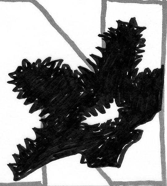
CombinetheletterNofthealphabetwithan imageofaflowerthatbeginwiththatletter (e.g.,N,nymphoides).OnlyMontserratBlack typefacemaybeused,onecolor,andoneflower. brief process
IgoogledflowersthatstartedwithNandfound imagesandsettledonnymphoides.NextIusedmysketchbooktocreatepencil drawingsoftheflower.Thenoverlay-edtracing papertodrawtheletterovertheflowerlooking forharmony.BeforeheadingtoAdobeIllustratorInIllustratorIusedthepentoolstotracethe scannedinpencildrawingoftheflower.Working toreduceitdowntoitsbasicshape.Then combinedtheoutlineoftheletterNandthe flowershapeusingthepathfindertoolto createacompoundshape.




First, what is a Shocker, and how did a team get named after wheat? The origin story of the Shockers is that it started out as the Wheatshockers, the name given to people who harvested wheat akin to the Nebraska Cornhuskers who gathered and shucked corn [Midwest teams]. The word “wheat” was dropped somewhere down the line, and Wichita State embraced the name Shockers.
Now that we have a little back story, the question remains: why wheat, of all things. Research on the history of Wichita shows that the city’s nickname is “Cowtown.” The city is also home to Beechcraft, Cessna, Stearman Aircraft, Textron Aviation, Learjet, Airbus, and Boeing; with such a vibrant past, it has another nickname, “The Air Capitol of the World.”
I was drawn to this school from the fictional portrayal of it as Ted Lasso’s jumping-off point before coaching soccer. Although, the football program at the school has been gone since 1986. However, one of the more significant nuggets on the football program is they broke the color bearer with the first African American head coach in D1 A football by hiring Willie Jeffries in 1979, a Jackie Robinson-sized event at the time.
We know the city has an exciting aviation past, but sadly, the Jets are already used by Newman, and Friends U is known as the Falcons. I started looking toward the cryptids of Kansas. However, they all seemed very Native-American-focused; the last thing we need is more appropriation in sports.
I’m still leaning towards renaming the team, which seems fraught with alienation fanbase, especially in a red state like Kansas. So maybe it is just the Shocks.
It feels like the whole semester is crashing down this month. As I read through the appendix of our textbook, it brings that whole idea to the forefront. The appendix even starts with a great picture of a running headless chicken. On to the actual reading, a handy guide for referencing when you’re too tired to remember. Right off the bat, “Dashes, Spaces, and Punctuation” was one of the molehills I fought for in corporate America for thirty years: double-spaced sentences. The keystrokes cheat sheet will probably find its way to a laminated card or its method into a poster design soon. “Editing” is a skill I’ve had to work on in teams with no copy editor. There was, shall we say, a constant churn of fixing found errors, introducing new mistakes, and, worse, removing critical information within process documentation. Again, I keep thinking about a fun poster full of all this condensed knowledge and free advice; I’m guessing a Google search will find me something already done.
This week in class, we’ve been working on our final projects. We’re into the mood board phase, and well, I still have a lot to learn about mood boards. At least I didn’t seem alone in this knowledge. After our roughs, we were tasked with going back and thinking less about the specific client and more about the illustration, texture, and style and less about the client’s detail. I found myself trolling the Internet for vintage 1920s-style marks. Still, I wanted to pair that with some mid-century modern texture style that I love (Orla Kiely and Charlie Harper). I think I ended up with a better mood board in the end. This is the way.


 mood board 1 aka all hail the hut


MSCW
MUST HAVES new branding update with an eye on inclusivity, accessibility, and a one-of-a-kind encounter. This must include brand ethos with explanation, final logo (color + b/w), wordmark with logo, type mark alone, color palette, pattern (color + b/w), an environmental product placement of the logo, a gear product placement of the logo, an ancillary application of the product.
SHOULD HAVES a satisfied client
COULD HAVES Multiple options for color palettes based on events (pride months, black history month, etc.), even more visual options of the logo in environmental placement.
WON’T HAVES a brand that is noninclusive, inaccessible, and a boring everyday brand.
MARV
MEMORABLE we will project a strong visual impression through line quality and color. The palette will sear into the subconscious.
APPROPRIATE The typography and logo mark will show both the Hero and outlaw archetype for the brand
RECOGNIZABLE The logo for this brand will stand out with its retro yet modernized feel. Harkening back to the advent of sports at the university yet calling out to its powerhouse in sports moving forward
VERSATILE we will ensure that this mark works on the smallest of scales to the largest Jumbotron.
Archetype
HERO / OUTLAW
When everything appears lost, the Hero rides over the hill and saves the day. The Hero wants to make the world a better place. They recommend cultivating mastery and competence as another means of communication. The message frequently concerns having the courage and expertise to make a significant difference in the world. Their tone of voice is always about proving yourself and making people feel like they’re in a race. As a result, they leave their customers feeling confident and strong. These brands aim to solve problems and inspire people to have big dreams and work harder. Images with warriors or inspirational messages are also commonly used.
The Outlaw is one of the main archetypes that has the enticement of forbidden fruit. They are romantic figures ready to shake up a society that has become tyrannical, repressed, conformist, or cynical. An Outlaw aspires to be a revolutionary and is unafraid to deviate from the norm and shake things up. They will tear down the current system to create a better one. Outlaws like to go against the flow to avoid the mainstream. They despise rules, regulations, and conformity that rob all freedom of choice. Even though they are motivated by anger, they are still kind-hearted. Outlaw brands are associated with confidence, boldness, adventure, and excitement. These brands might be associated with courage, bravery, passion, strength, and enthusiasm.

BRAND ETHOS challenge conformity improve the world
moving forward from analog to digitalPrimary Mark

Secondary Mark

Tertiary Mark


I was immediately hooked by Jason Mayden’s presentation right o ut of the gate with the fundamental right of parents to lie to children [go on]. The idea of good lies you tell your kid to preserve the truth; Santa is real; if you put your mind to anything, it is possible. Mayden had been given the ability to dream by his parents. It has followed him through life, from his dream to work at Nike designing shoes to creating the Super Heroic brand.
Super Heroic was a short-lived brand based on encouraging kids to dream. The brand focused on diversity and not pigeonholing people by gender or ethnicity. One of the products offered was a complete capsule kit that included every thing a superhero might need. It even plays a fun little sound when opened. The packaging was bright, colorful, and thoughtful. The ad campaigns also featured diverse imagery.
As for our first micro-project in class, I may need some remedi al lessons in the French curves. I got the pleasure of attempting to trace some t ypography, rekerning, etc. One day, I will have more confidence in these curves. There were a lot of mistakes made. A lot of cursing to myself early into the morning, but overall, I at least did get it complete-ish. My favorite bit of problem solving at 4:30a, was cutting out letters to fix the kerning/tracking. As a bonus, I got to use my new mini lightbox. Next on the list of tools is a graduated curve flexible ruler.

This week, we read about how easy it is now regarding typographic design. Imagine having to chisel a design into a stone tablet by hand. Carve wood one letter at a time, line them up for press, and hope nothing cracks.
As we work and rework our Humans of New York poster for class, from setup to printing, all we have to worry about is how it looks. We don't have to manually reset our typesetting each time and run it through the press bed. We can change almost everything in a design with just a few mouse clicks.
And while the computer has made things easier, there is still a place in this world for hand-crafted type. There's just something special about letter-pressed posters and cards. Dreaming about printmaking will always be a constant thought in the back of the brain, especially as a potential solution to a tricky problem.
Fun fact learned for the week: if you take a letterform outside the printable area, try to leave at least 60% of the letter visible.


Word matrix for Uncle (nouns)
This week's readings reminded me of how much I forget and remem ber simultaneously regarding typographic terminology. There were also a lot of new terms that I either didn't remember or haven't seen yet. Sometimes, these terms feel like a firehouse of information coming right at me with the hope that the important ones will stick and erase the mindless knowledge collected for half a century.
I am most drawn to sans serif type, landing somewhere in the gr otesque to humanist. Something about a two-storied a and g calls out to me every time with the humanist typefaces. These three historical classifications have simplicity and a natural form around the letters.
On the project front, I drew a noun (Uncle) and an adjective (Poor) to set about brainstorming riffing off the words. After thinking I'd come up with something fun and exciting to work off of, Google today showed me how un-original my brainstorming was. Oh well, more brainstorming. I was disappointed and happy at the same time to learn Soul Bowl is already an eatery in Minneapolis. This weekend, I aim to find more combos and verify they aren't already a thing.
Nothing thrills me more than reading out legibility as it relates to typography and getting distracted the whole time by the rag. Thinking that may have been a hidden easter egg by the author during this specific chapter, I flipped around the book to see a rag-tag bunch of paragraphs before me for the rest of the term. I enjoyed thinking about words as much more than just a bunch of letterforms put together and as little images. Thanks to this reading, I’m also way off task trying to build a value scale with words and letter spacing.
After a long weekend of “soul-bowl-searching” for new word combos, I played with “Grim Vigor” as a health tonic/box gym. Then, with “Thing Things,” I made some meh marks that were very TT-centric. I moved to “Hapless Roots,” and there was an exciting blob/tuber mark that I could find a use for later. Sometimes, your brain wakes you up in the middle of the night with a funny play on rigor mortis. Taking Forensic Chemistry this term could also be a factor in my brain wanting to make words that rhyme.
Vigor Tortas and Vigor Tortoise. One is a sandwich shop, and the other is potentially a gym for your turtle to get fit. The inner giggle is often the best giggle. After review and crit, I’m sold on Vigor Tortas. I am vectorizing three marks this weekend to see which will make it to the final project.

Word matrix for Poor (adjectives)
All of your grids [are] belong to us. It’s the meme that won’t die, and neither will the grid system. I’m also showing my age even though I’m slightly younger than the grid. The other throwback that had my brain drifting off into the nether regions of old age was a track by BT “Fibonacci Sequence.” Besides the sequence being spoken aloud, the underlying theme of mathematics is the language of the age. It drove me to learn CSS to build a Fibonacci-based grid for a website I administered then [1996 is calling].
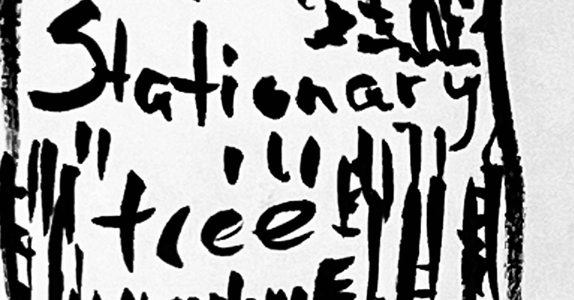
The stationery project continues to develop. I managed to vectorize my sketches, cull them down this week, and even drive to a name change again. Welcome the Grumpy Torta. A late-night sandwich shop near an entertainment district that op ens late and closes early features a grab-and-go brick-and-mortar or a food truck.
Having closed in on the logo for the brand, the process is send ing me down the path of mood-boarding ideas for the actual stationery system for this b rand. I’ve been thinking about butcher, wax, and parchment and how to incorporate them i nto the system.
[In memoriam, our dog Scarlet died Monday at 16. She was a toy poodle; she demanded lap time and sunshine.]
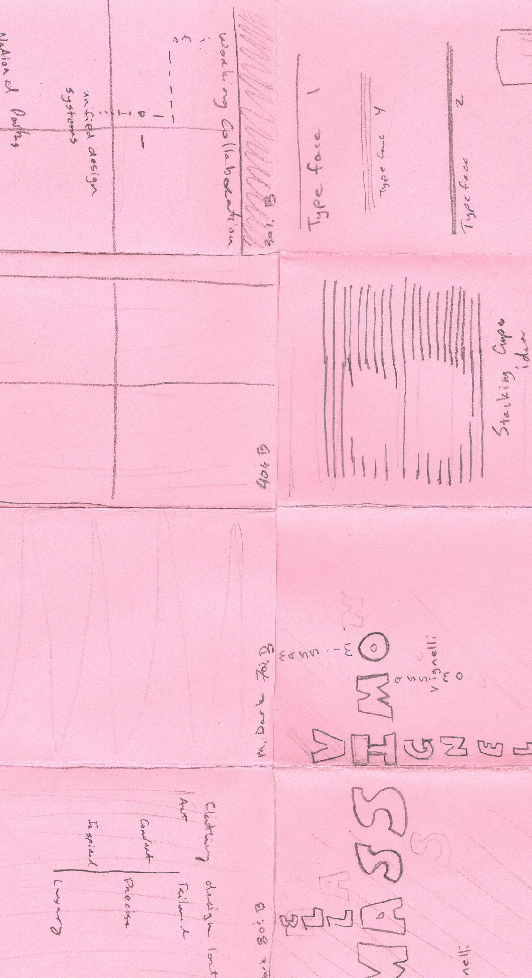
A new project dropped this Thursday, and it’s a zine! The current reading is more food for thought as the new project is about building a visual hierarchy and thinking about it in the small space we’ll have to work with. I saw Massimo’s name on the list of designers and knew watching all those docs over winter break would pay off. Not too much focus on this project just yet. We still have the first project to finish up this weekend. However, there are the recurring themes of hierarchy, space, alignment, scale, and har mony.
The stationery system is being built this weekend! A lot of trial and error was attempted over the weekend last week. My laser printer makes a mess of parchment, but on the plus side, it turns brown cardstock into toasted bread. It’s going to be a crafts-filled weekend.
I had a great conversation with artist Maya Smith about the bus iness side of being an illustrator during the closing of the Juried Exhibition. Her advice boiled down to starting freelancing sooner rather than later. One of the best things about being back in school is the opportunity to meet and talk with people in our field, esp. local artists.
I look forward to the coming weeks with all the visiting artists this spring.



Another busy week, so close to a break/ midpoint of the term. A refresher on the 3Vs (verbal, visual, vocal). Syntactic treatment of type may be my go-to for the zine project. As I roughed out the design, I realized I would need to create texture starting larger than my initial jumping-off point. It was nice to have it printed out to get an idea of the design. I noticed Massimo's fondness for tight kerning and line height, especially with bold text. I want to focus some of my efforts on that.
I also want to maintain a strong grid feel but tie it together. In my sketch, I tinkered around with aspects of posters, flyers, and subway maps. This weekend will be a lot of unification. It could be all Helvetica by the end of the weekend. Save the back for Massimo's edict on six typefaces that can solve any design problem.
This week’s reading left me cold and pale but aligned well with everything on my plate this week. It was interesting how all the older technology around typography is framed as past tense while this technology is still alive, well, and thriving. Thanks to visiting artists like Brad Vetter, letterpress will never die; the world will be better for it. I couldn’t help but think about how type has evolved with tech and devolved. Many typefaces would never see the light of day if an artisan had to carve it out of wood or cast it out of metal. I’m torn about whether or not the advances are net positive for the world.
We have a “week off” coming up, but I don’t think I can take more than the weekend off. There is plenty of work to do; while I have something ready for the zine project, there’s always the backside to work on. I want to push this around how Massimo talked about how Helvetica could set the mood and understanding based on weight, kerning, and leading.
Also, I need to find some electric pink tabloid paper. Where does one pick up Astrobright papers in Columbia? This order is not big enough for Mac Papers.


The screen and type have made so many advances in my lifetime. I had so many flashbacks to trying to figure out how to make customized graphics with text back in the ’90s and the aughts. Struggling to get text to appear smooth and not so rasterized and jaggy. It was a different time, first with a low resolution with 16 colors to work with, the awe of 256 colors at 640x480, to the first time seeing a computer produce high-resolution images at 1920x1024 with 16k colors. Yet, getting rid of jaggies continued until CSS arrived with the ability to code boxes with backgrounds and place inline text instead of relying on an image file.
Work-wise, with the zine completed and the initial sketching of the Type Hike project completed over spring break, I began working on more sketches to try not to make a poster of an arch that says arch. This national park is way more challenging than I thought, but it’s nice to see I’m in good company. Also, the final-final project dropped as well our process book.
Sometimes, reading and assignments sync better than others; this week was no exception as I moved to the National Park poster’s home stretch and started thinking about the Artivive portion. This part of the project requires me to show a type specimen triggered by the poster with help from AR. I keep jotting down notes on what to do with all those letters and thinking out some of my favorite title sequences that rely on text. This part of the project also syncs up with the sequential illustration project. It could have been a trifecta if I had taken a filmmaking class instead of forensic chemistry this semester.
Poster-wise, I keep working towards dialing in more of this arch’s feeling. I ran with the suggestion for memories that this park gave me from my childhood. My number one memory is my eyes from the glare, and that has informed my latest round. I also played around with the glare being a wild cornflower, but Dark Star probably does not have the right vibe. It’s going to be busy coming into the homestretch of spring.


 planning sketches on how to handled this park
playing around with the keystone of the arch for a different view
trying to use the arch as a letter


