Graphic Design Portfolio
1
Dai
Jingyi
2 1 2 12 20 24 28
Profile Logo Design Poster Design Brochure Design Character design Brand Design TABLE OF CONTENTS
jingyidai160204@gmail.com
9095065275
Davis, CA, 95616
I am a very creative person and often come up with unique ideas to help me solve problems I encounter. I have been involved in design since I was in high school, so I can use a variety of software to create logos, posters, infographics, and brochures. Being observant and having a basic knowledge of photography has helped me to accumulate a lot of material to inspire my work. I am also good at taking advantage of cultural differences and combining Eastern and Western cultures to give my work a unique style.
Education
In progress: Bachelor of Arts, Design, class 2023
University of California, Davis, 2021-2023, GPA 3.89/4.0
Associate in Arts

Riverside City College, 2019-2021, GPA 4.0/4.0
Skills
Hard skill
Adobe Cloud,
Soft skill
Detail-oriented,
Microsoft Office,
Basic Procreate,
Sketch,
Visual Studio Code
Leadership,
Creativity,
Problem
solving,
Persistence
1
Jingyi Dai
•
•
•
•
•
•
•
•
•
-
•
1
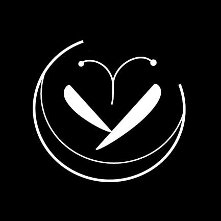
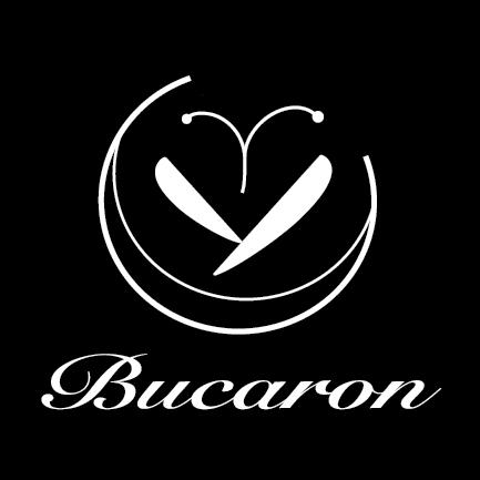
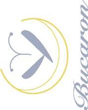
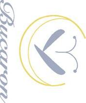
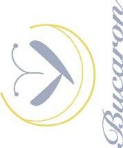
Brand design
Design for Macaron store
Created in Illustrator
The Bucaron logo is flexible to change to suit needs. The logo is divided into two parts, the graphic part and the “Bucaron” font part. The graphic and the text can be used independently of each other as needed.

2
The name of the store combines bug and macaroon, taking the sound of macaroons. to show that this is a macaron store that uses edible bugs as an ingredient. I used some elements of insects, wings, and feelers. A simple arc was used to represent macarons so that the store could still use the logo in the future when selling other items.
3
C=8 M=11 Y=69 K=0 C=52 M=39 Y=20 K=0 HEX: #8590ac R=133 G=144 B=172 HEX: #edd76e R=237 G=215 B=110
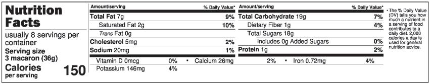
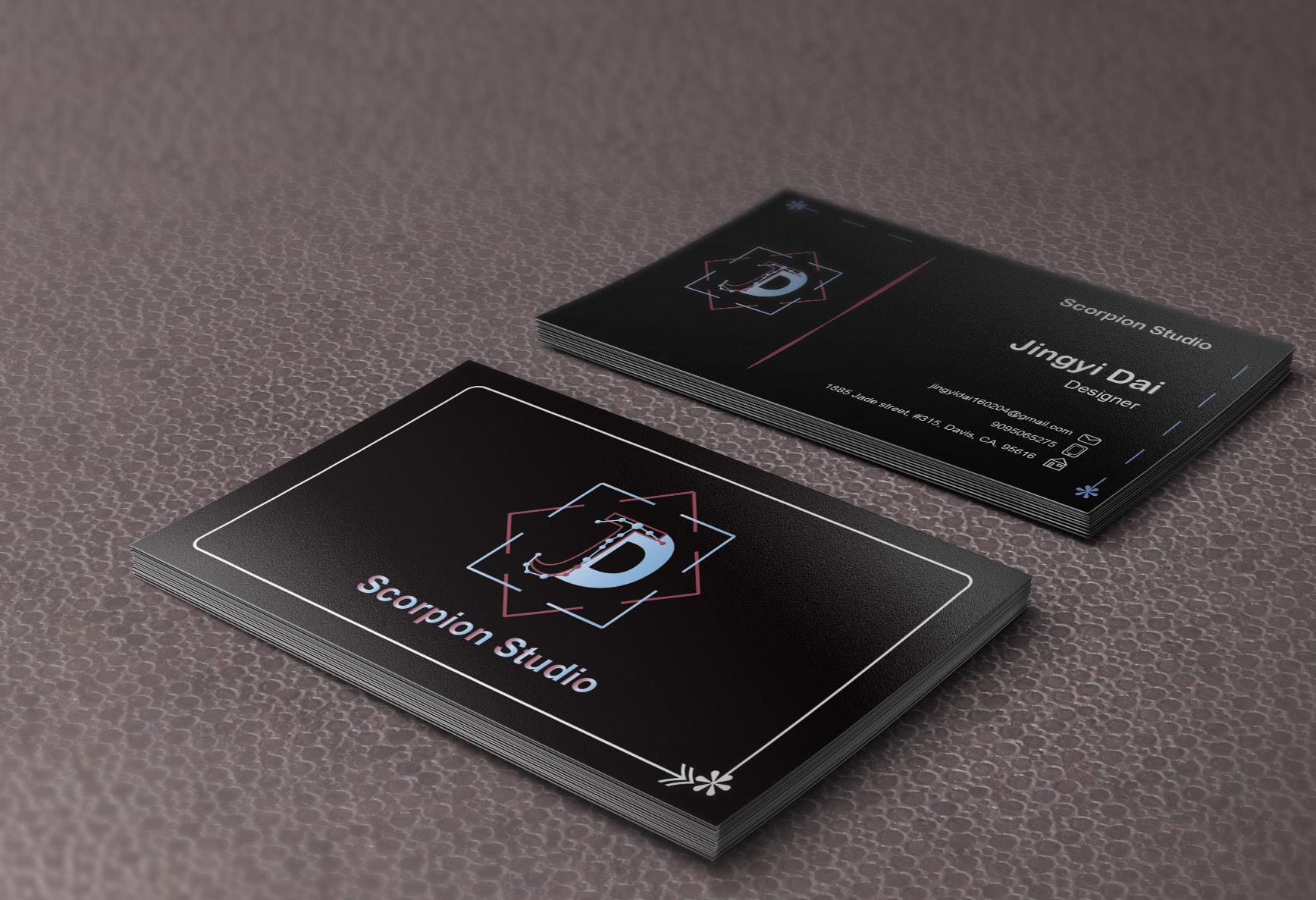
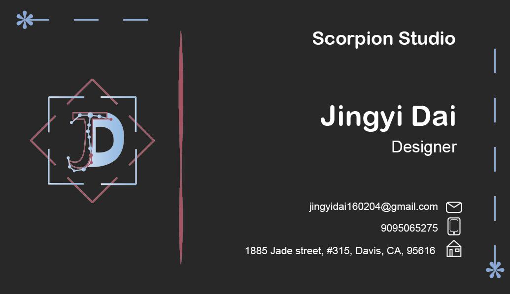
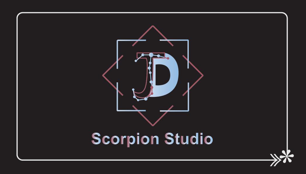
Business Card
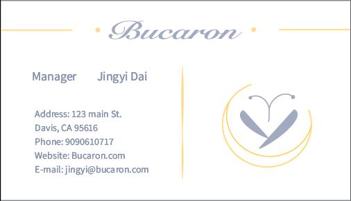
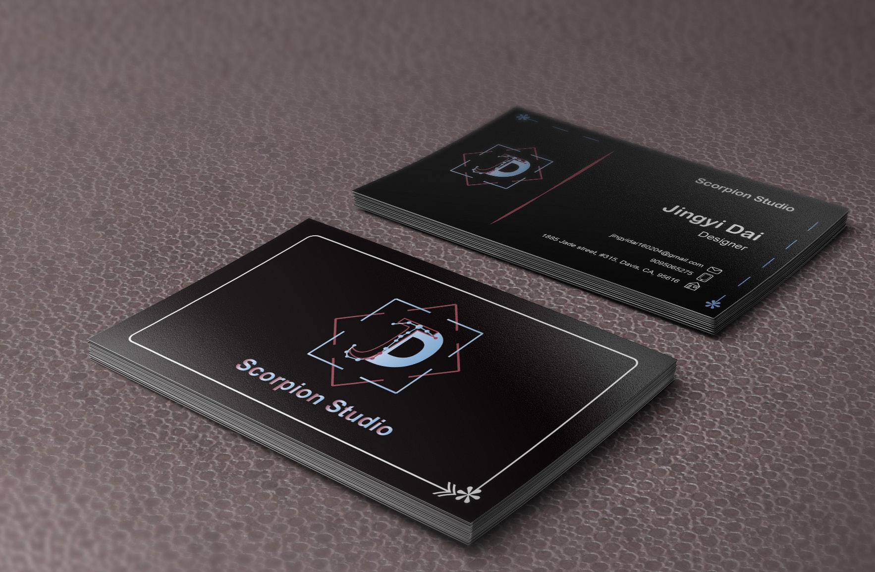
Business cards are standard 3.5 inch*2 inch. The front side has information about the company as well as a colorful brand logo. The back side has a blue background color and a yellow logo.

4
2 in
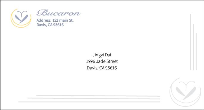
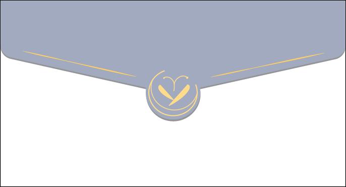
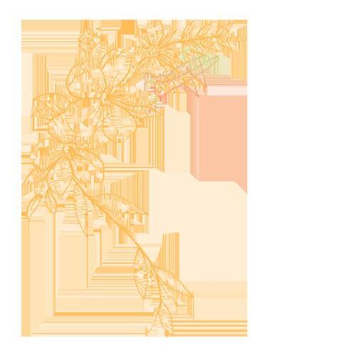
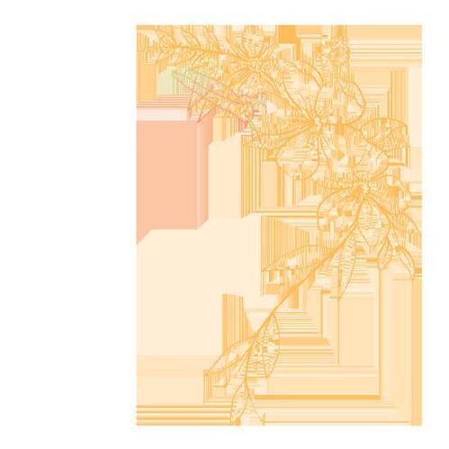
Bucaron’s envelopes are standard size, 9.5inch*5.125inch. the back side uses a blue background with a yellow logo and a rounded logo printed in imitation of fire paint at the opening. the front side carries a watermarked floral print.
5
5.125 in Envelope
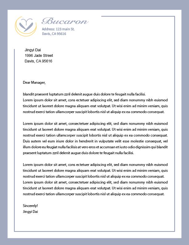
The Bucaron letterhead is a standard size of 8.5inch*11inch.Like the envelopes, it has a blue background with a yellow logo. The front of the letterhead has a blue border with the brand’s logo in the top left corner.
6
11 in
8.5 in Letterhead
in 8.5 in
11
7
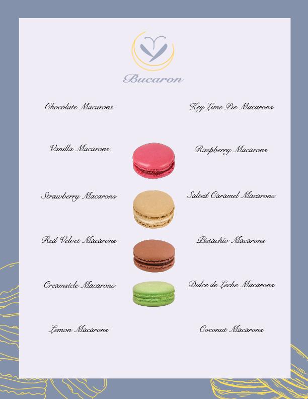
The size of the menu is 8.5inch*11inch, the back of the menu is a blue background with a yellow logo and a graphic of a macaron. The front side has a light pink background color. The menu font is the same as the font used in the logo. The center is divided using the macaron image. Menu
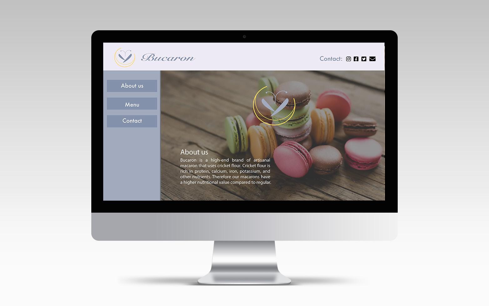
Website
This is how Bucaron’s website works. The site has a description of the brand and a menu. The menu includes pictures of each macaron sold and recipe information.
8
PACKAGING
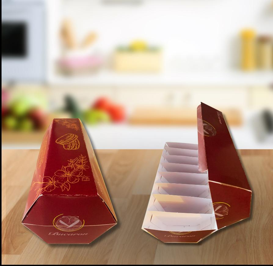
By studying some bionic cases, I started to think about how to design the packaging of macarons. I was impressed by the hexagonal structure of the turtle shell and the honeycomb. This shape is easy to stack and has good compression resistance. Therefore, I think it is very suitable for the packaging of fragile food like macarons. It protects the food inside to a great extent and is easy to transport and storage.
9
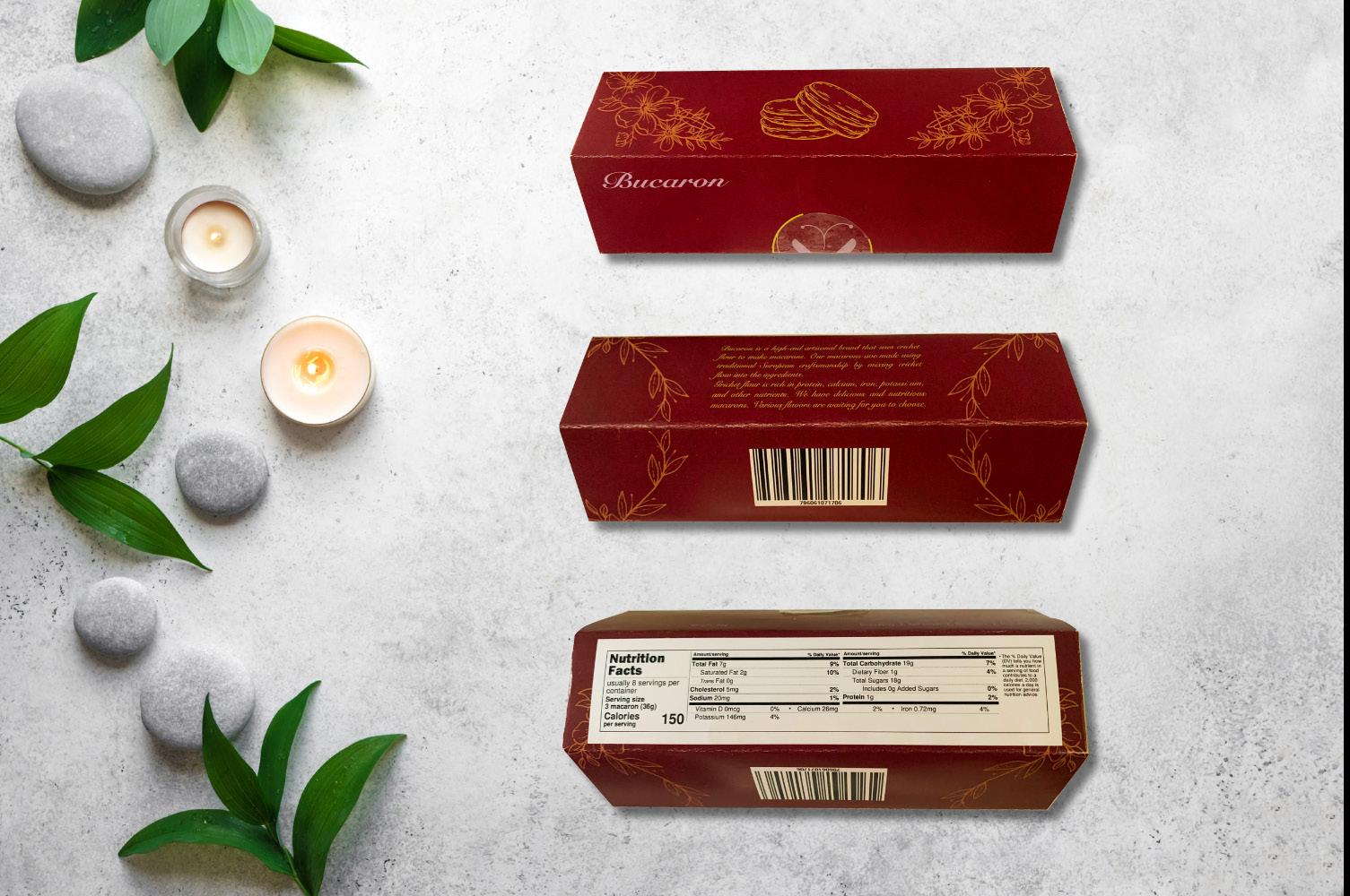
DIELINES 1
Since the packaging is not transparent, I added a macaron element at the top of the package and introduced the brand story. The packaging is decorated with a floral pattern and a cricket is hidden in the pattern to show that we use cricket powder to make the macarons. The opening shows the weight and the flavor. The bottom shows the product information.
10
Strawberry*2, Red Velvet*2, Raspberry*2, Chocolate*2
Weight: 96g
Partitions inside the box
DIELINES 2
The interior of the box is divided into eight separate spaces to prevent the macarons from bumping into each other. A transparent sticker is used on the seal to show whether the box is unopened or not. The original idea was to use a magnet to re-close the box, but the magnet is not a sustainable material.
11
Clear sticker on the seal
Logo design
Design for myself
Created in Illustrator
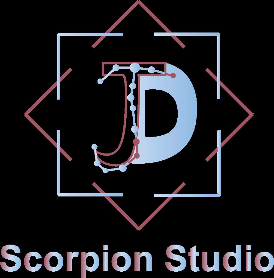
In this logo, “J” and “D” are my initials. To make them look more like a symbol, I combined the left and right parts of them. I wanted to include my astrological element, so I combined the sign of Scorpio with the “J”. The polygons on the outside are to represent the diversity of my design.
#a45564 #ccddf2
#90bbe4
12
#5d3428
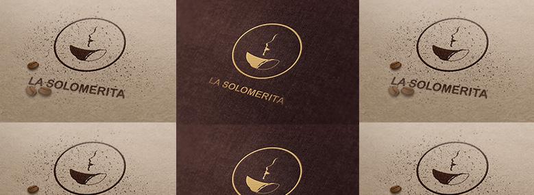
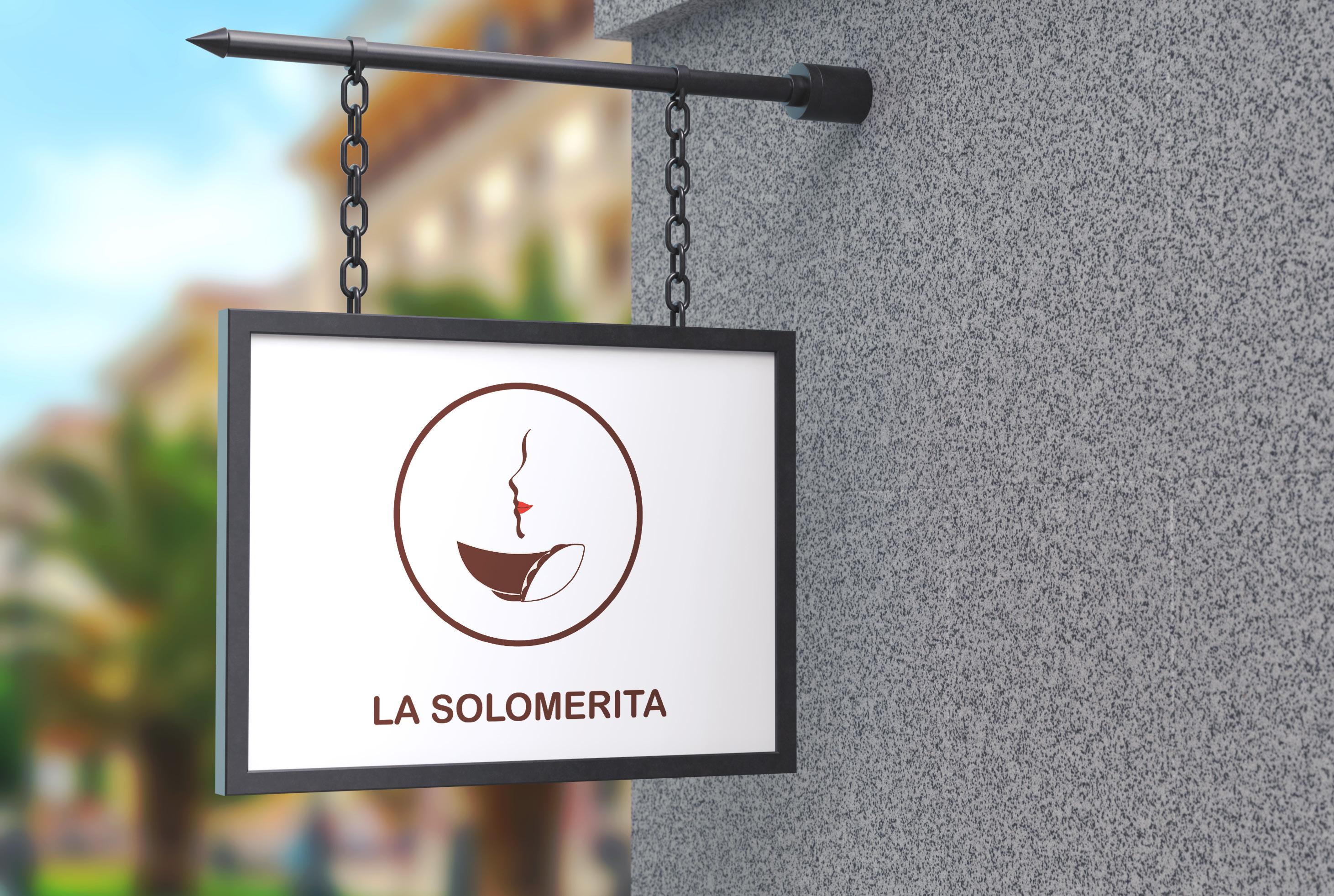
Taco store logo
Created in Illustrator
The client runs a taco store that also sells soup. The name of the store means “girl” in the native language of the client. So the logo should include an image of a girl. I included elements of food in the logo to reflect the item sold at the restaurant.
#ee3c2d
14
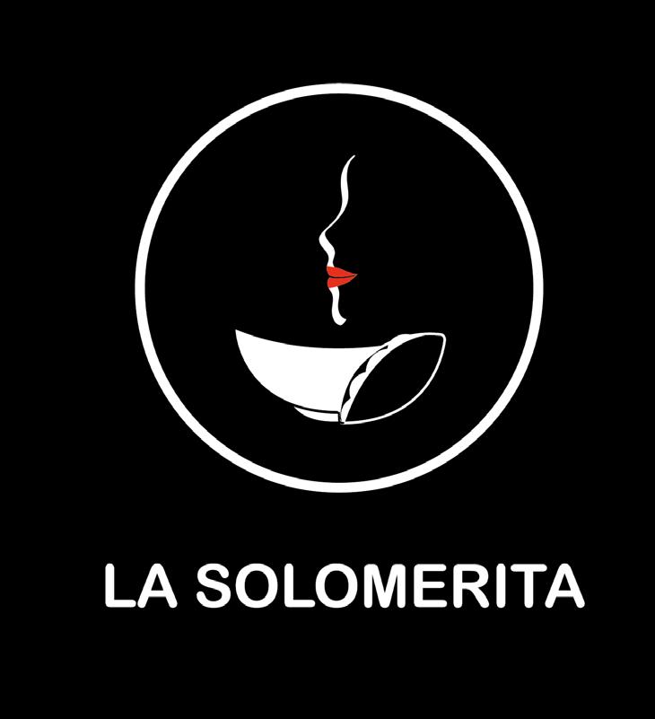
The food sold in the store was taco and soup, but the customer could not know it from the name of the store, so I blended the taco element with the soup bowl to better attract customers. The hot air coming out of the soup bowl forms the side of a person’s face, and the red lips are used to reflect the female feature.
16
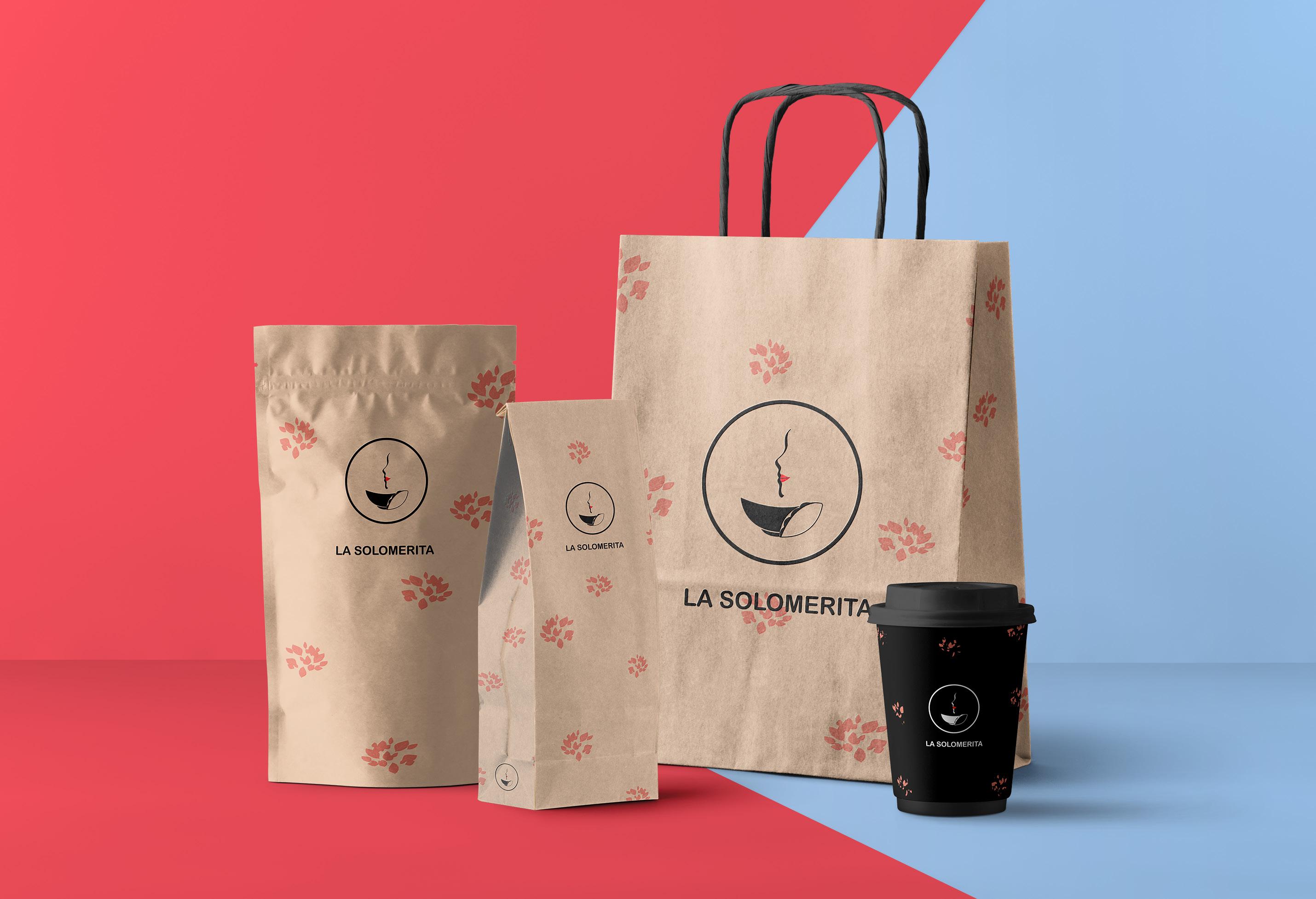
In line with the name of the store, “Girl”, the packaging uses a soft yellow color as the base color and adds a red leaf pattern to make the whole atmosphere gentle and bright. The color of the logo can also be changed according to the needs of use.
17
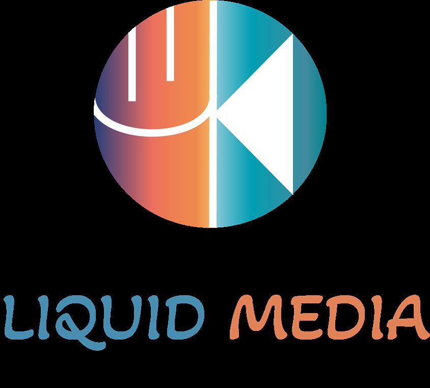
Self-media logo
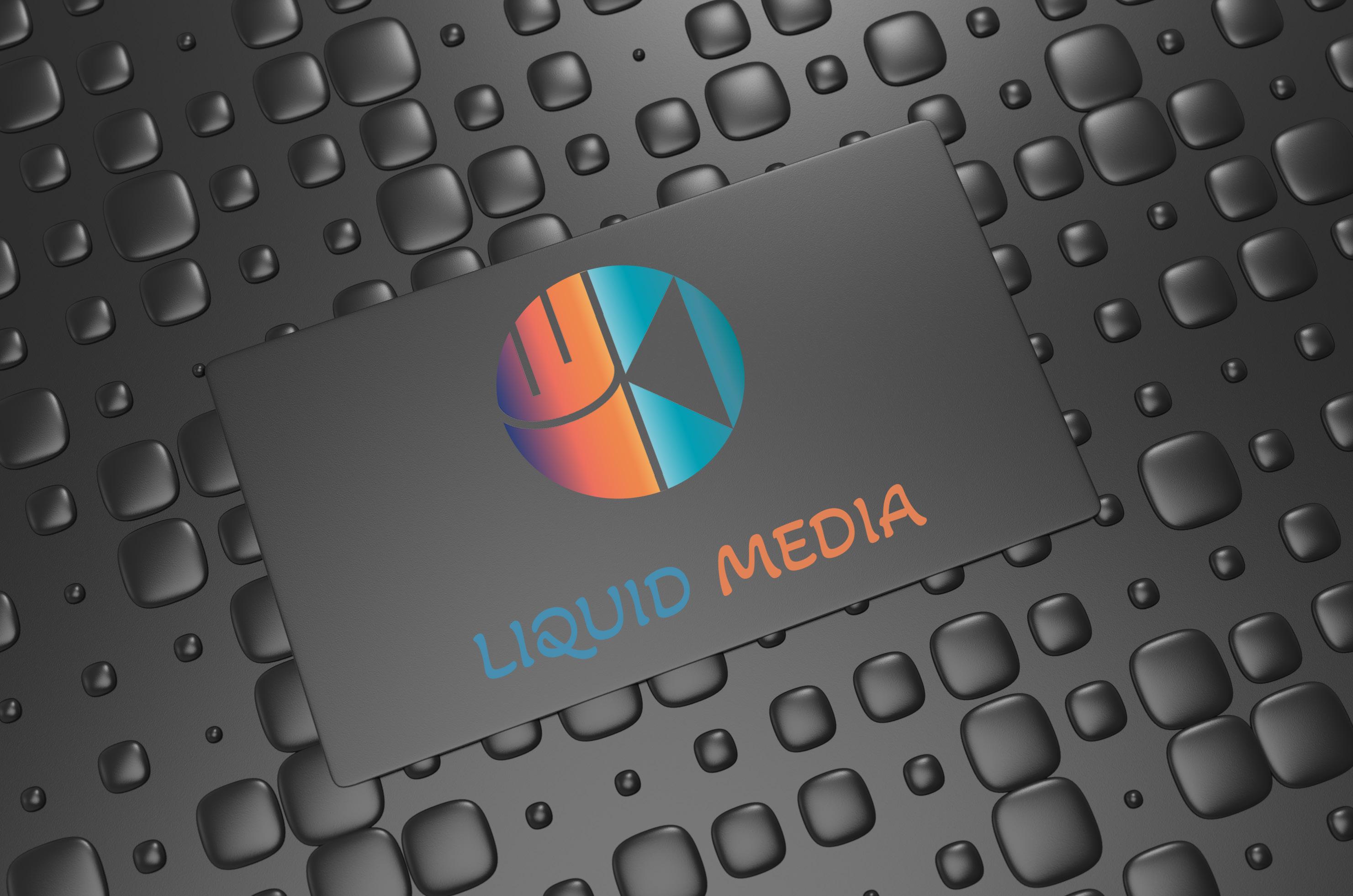
Created in Illustrator
Simple lines show the elements of microphone and camera as a way to reflect the characteristics of self-publishing. The water element is reflected in the colors to fit the name “liquid”.
18

19
Poster design
Animation poster
Created in Photoshop
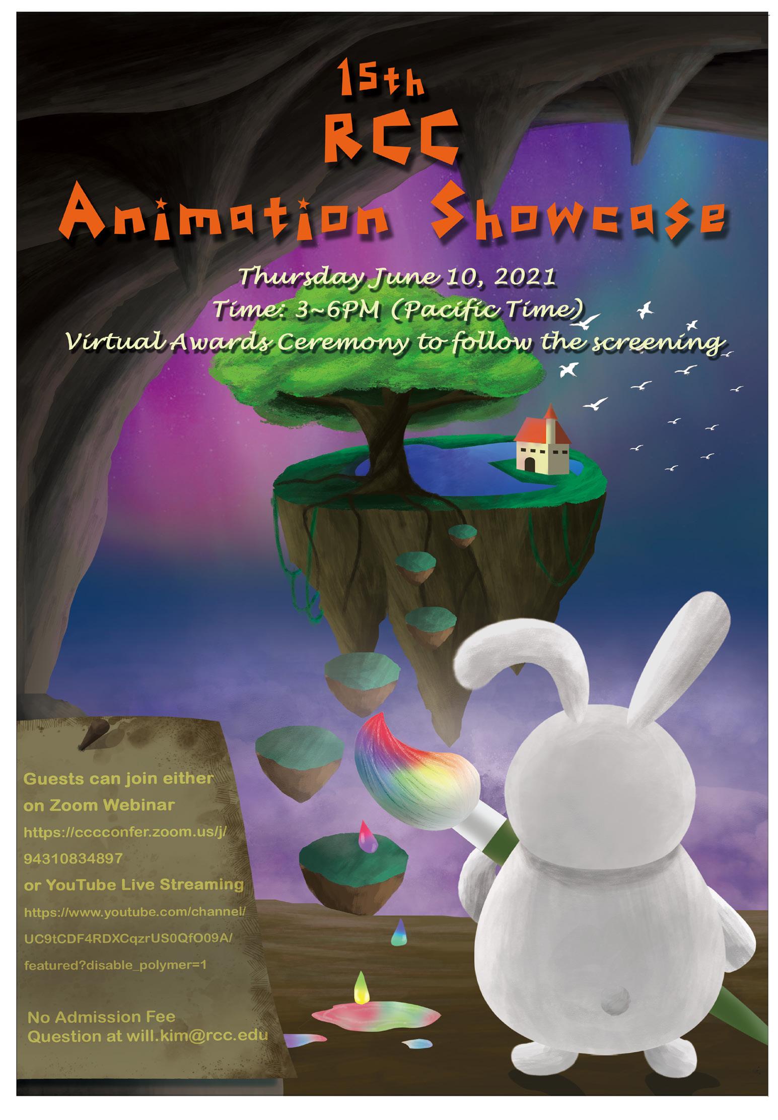
Create a poster for the school’s animation showcase. In order to fit the theme, the poster close to the style of animation, bright colors, the overall hand-painted in Photoshop to complete. The rabbit with a brush is walking towards the outside of the cave. The world outside looks fantastic, and it is the rabbit that portrays this world. The rabbit is exactly the person who makes the animation. Each person’s work is a unique world in their mind.
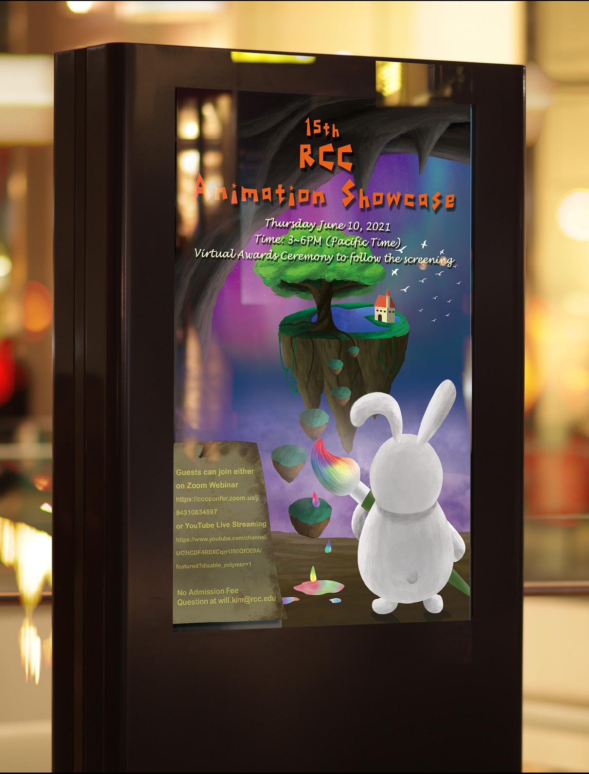
20
Playful fonts are used to increase childishness. The color used is the representative color of this school.
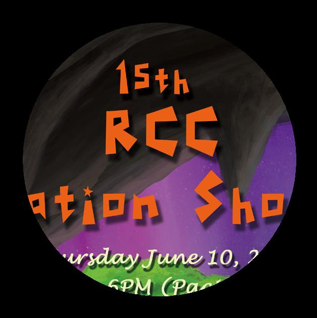
The island in the sky is inspired by the anime
“Laputa: Castle in the Sky.”. The construction of the island is not complicated, it represents a small world in everyone’s heart, and we can create it as we like.
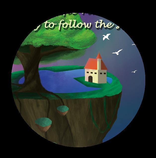
The rabbit holds a colorful paintbrush in its hand, reflecting the fact that the world it is leading to is exactly what it has created for itself.
21
Infographic
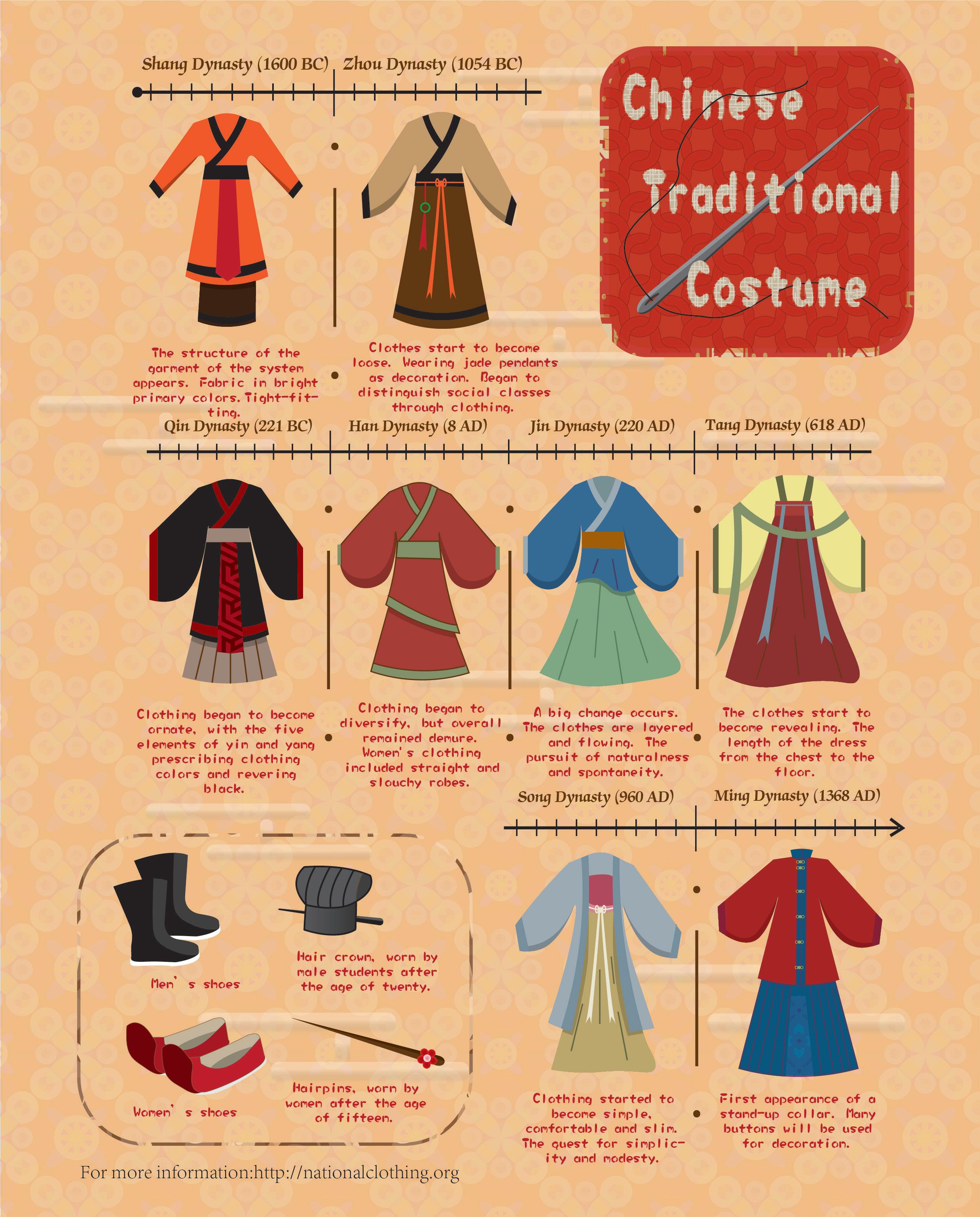
Created in Illustrator
An infographic about traditional Chinese costumes. A timeline of how the costumes changed is included. Its purpose is to let the audience know that traditional Chinese dress is not just cheongsam and Tang dress.
22
The theme of this infographic is clothing, so I inserted the element of stitching in the title, which is the most important part of what makes up a costume.
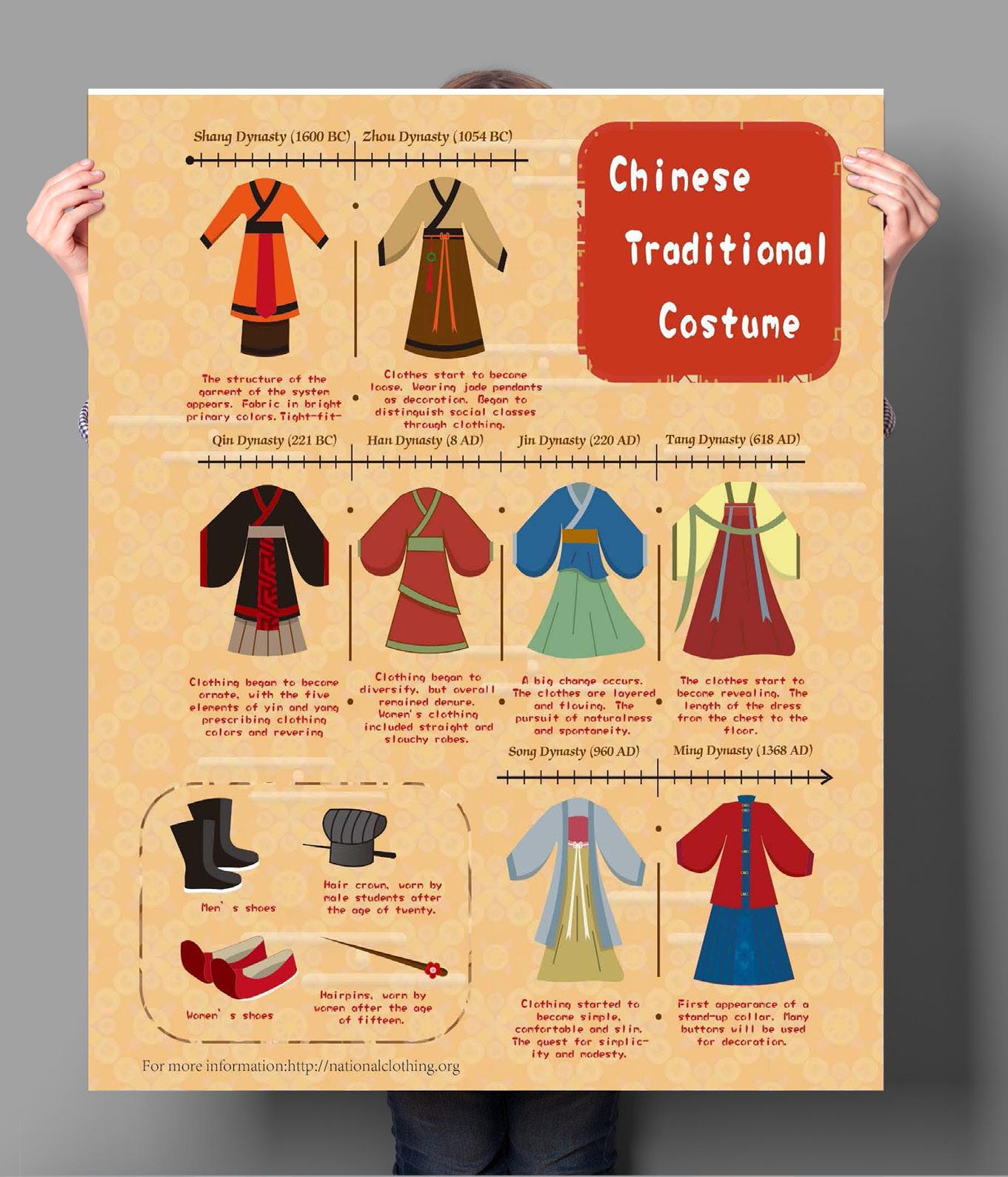
Each dynasty had different clothing styles. To more clearly show the evolution of clothing in each dynasty, I inserted a timeline to guide the way.
The regimental pattern in the background is a common pattern used in ancient Chinese costumes. In addition, the pattern of auspicious clouds adds to the feeling of Chinese style.
23
01 02 03
Brochure Design
24
Flower Arrangement
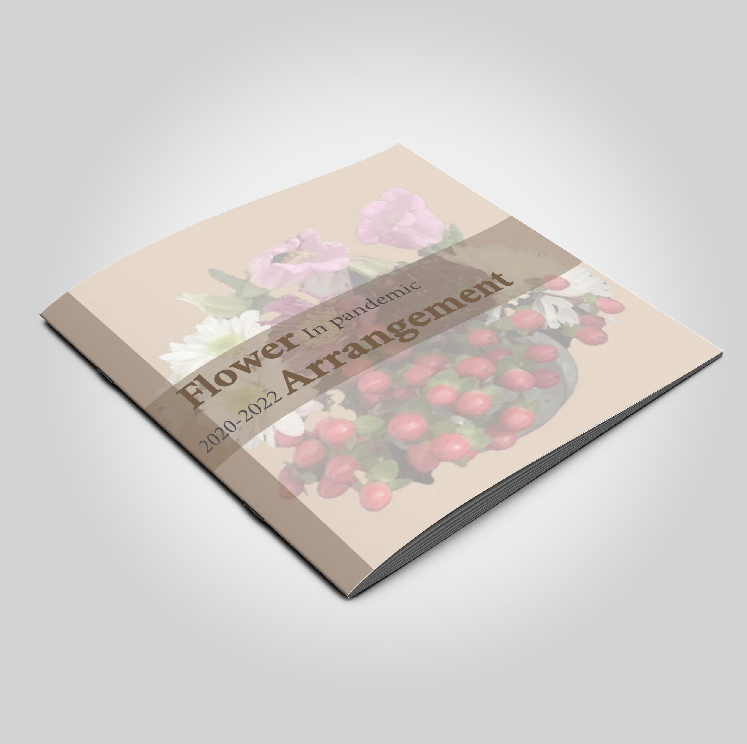
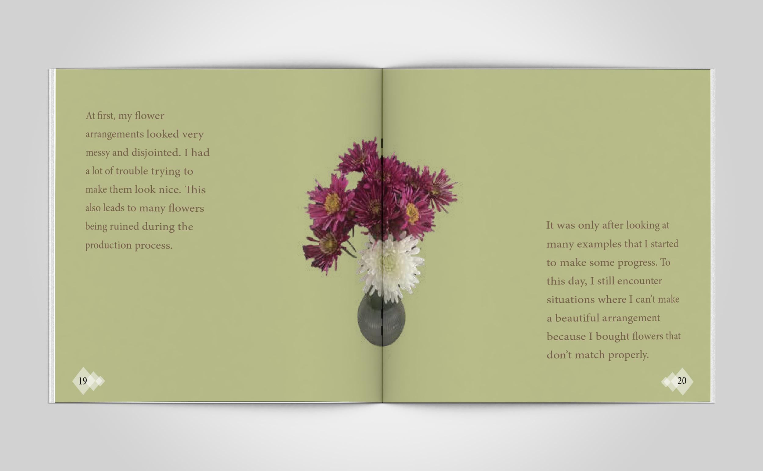
Created in Indesign
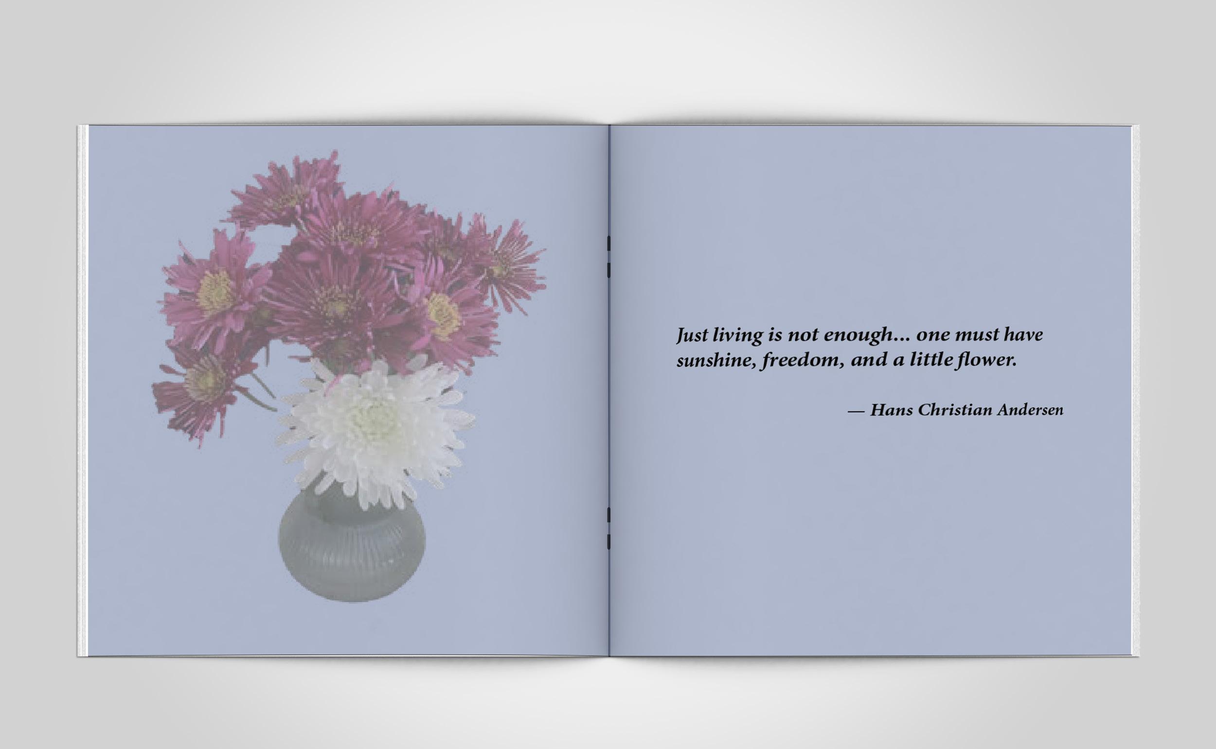
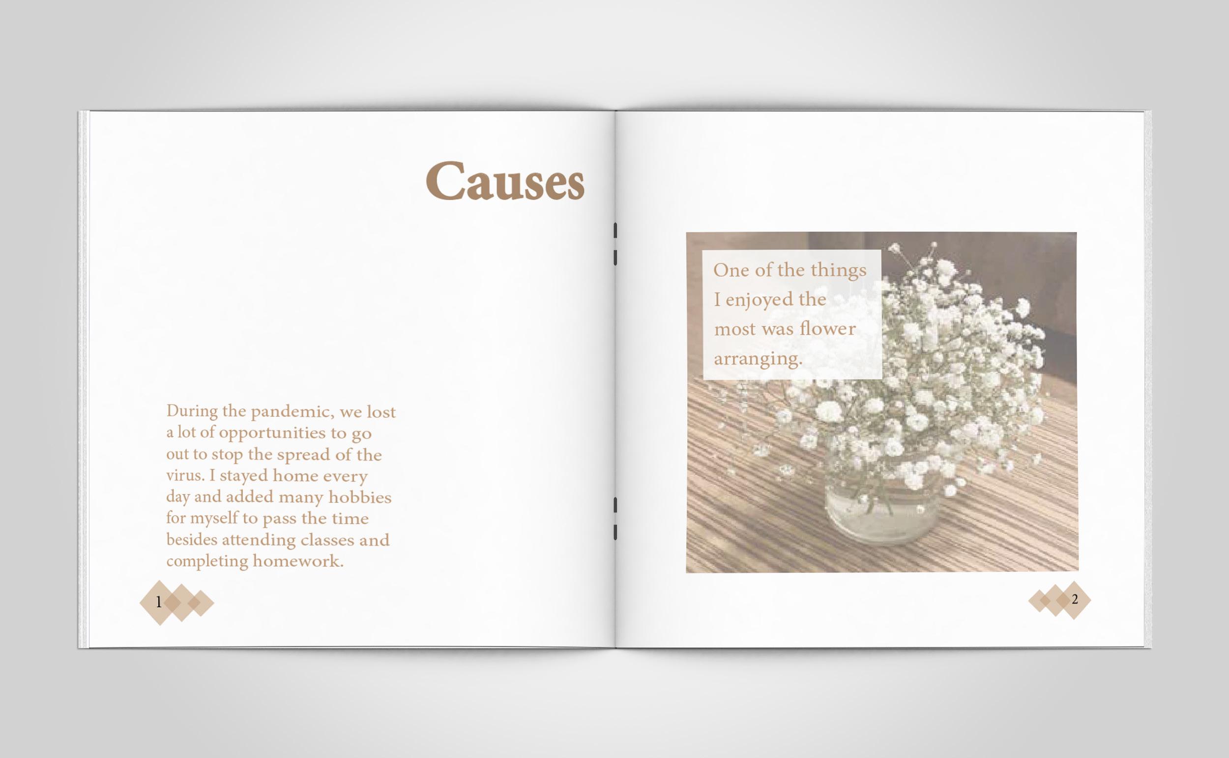
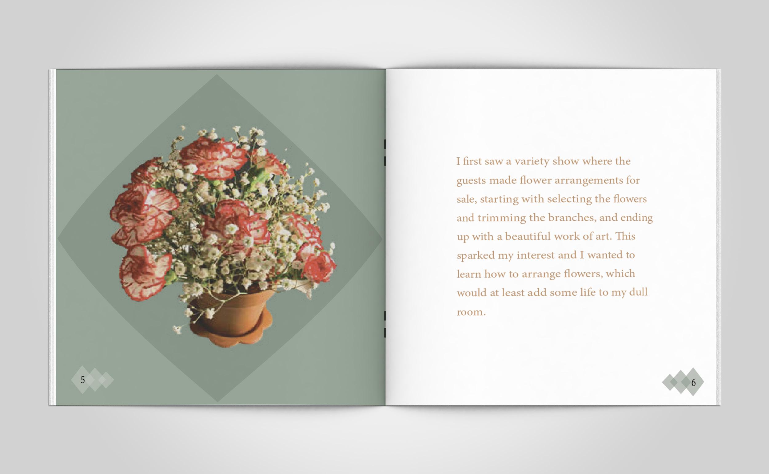
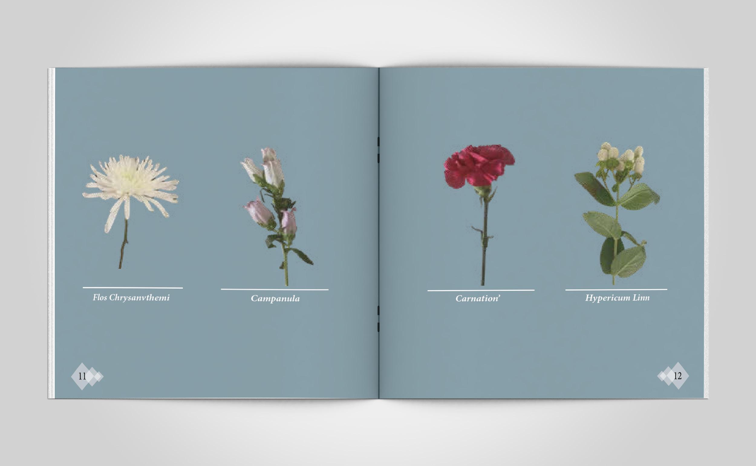
The booklet describes the whole process of learning how to arrange flowers. The entire booklet is in the same font, and I have changed the font size and the use of italics to distinguish the text from the additional content. In addition to placing the finished flower arrangement, I have listed and labeled each type of flower used.
25
26
27
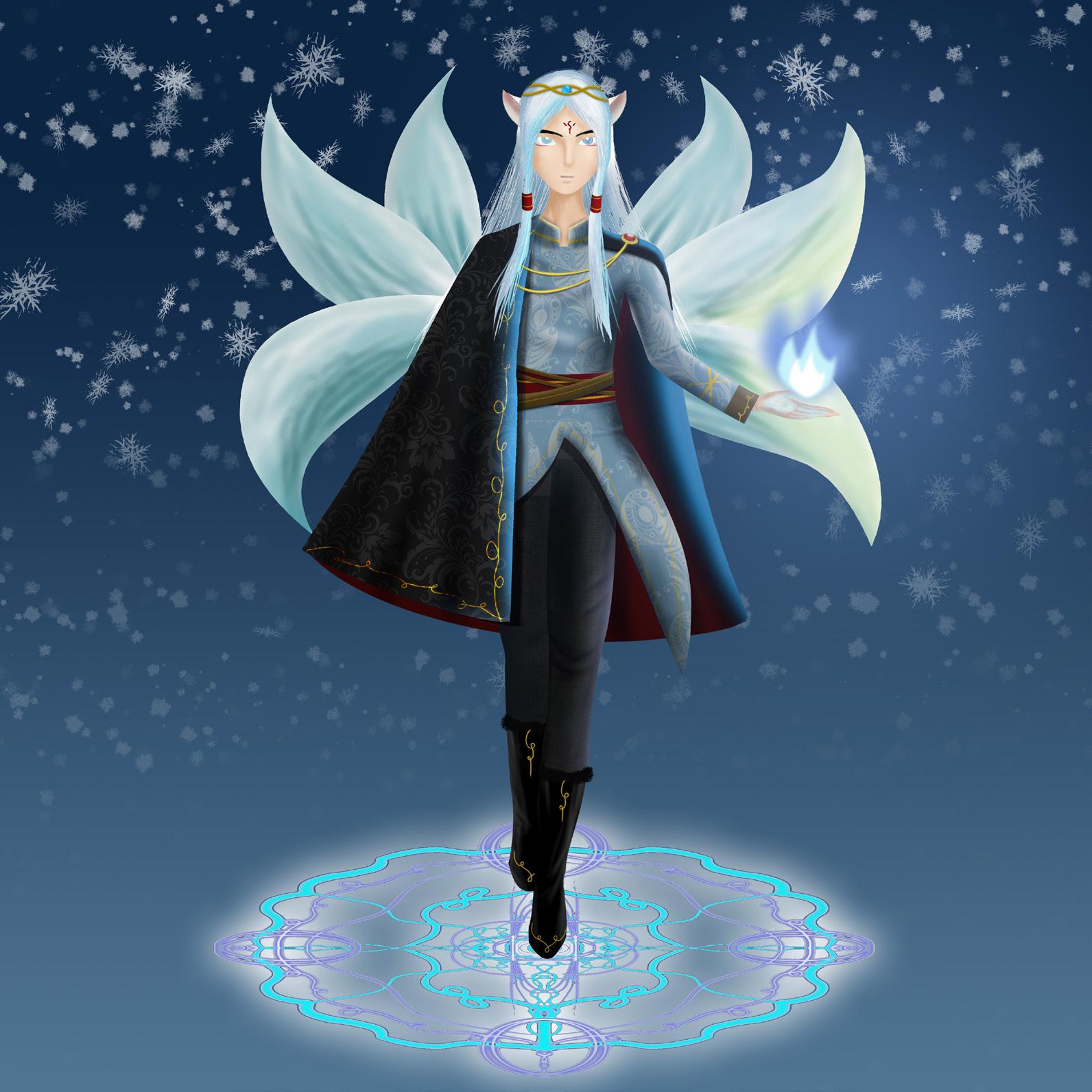
Character design
Snow Fox Fairy
Created in Photoshop
This character is college coursework. The character is a fox, after 600 years of training, has six tails, can be transformed into a human and perform demonic magic. The character combines the Eastern deity “Fox Fairy” with Western costumes.
28
The fox fairy will show himself in a mask in a crowded place. The purpose is not to let humans see his anthropomorphic form. The jewel on his hair crown is a rare blue topaz. This is the key to his ability to transform into human form.
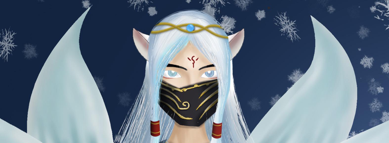
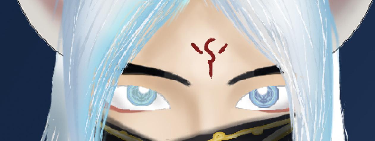
His eyes are heterochromatic pupils, and the red pattern between his forehead can add to his magical aura. When he casts spells, his eyes will appear spell formation.
29
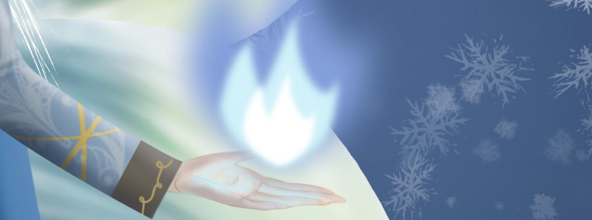
The blue flame that blooms from the snow fox’s hand can be used as an attack weapon. The blue flame looks like it has no temperature but can actually ignite firewood. Although the snow fox tribe of elves in the wild does not need to warm, but can be used to cook food.
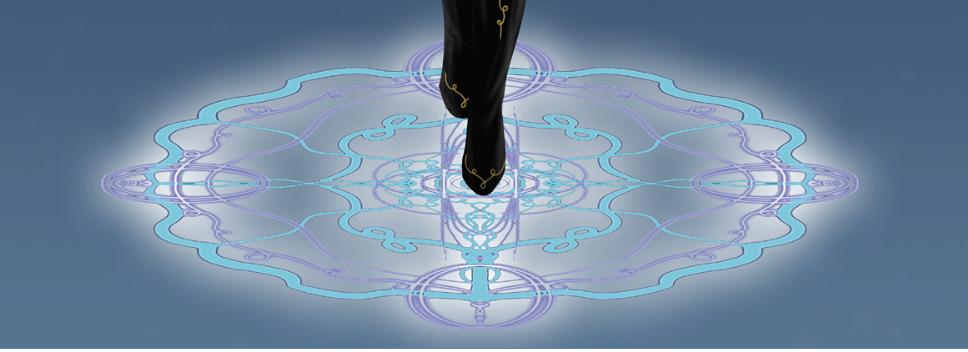
When he casts a spell magic formations will appear on the bottom of his feet and move with him. When he is floating in the air, the spell formation can be used as his foothold, tired of standing can also sit down to rest.
30
THANK YOU
31
