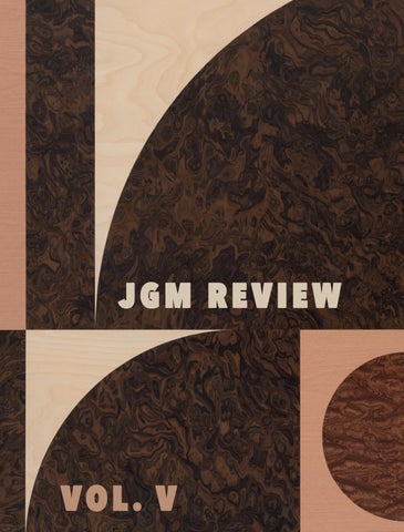
JGM REVIEW
JGM GALLERY ACKNOWLEDGES THE TRADITIONAL OWNERS AND CUSTODIANS OF COUNTRY
THROUGHOUT AUSTRALIA AND RECOGNISES THEIR CONTINUING CONNECTION TO THE LAND, WATERS AND SKIES, OFTEN EXPRESSED THROUGH ART.
WE PAY OUR RESPECTS TO ARTISTS, ELDERS AND COMMUNITY MEMBERS PAST, PRESENT AND FUTURE.
The JGM Review
Summer 2025
DIRECTOR
Jennifer Guerrini Maraldi
ASSOCIATE DIRECTOR
Julius Killerby
WRITER & RESEARCHER
Antonia Crichton-Brown
CONTRIBUTORS
Antonia Crichton-Brown
Cai Arfon Bellis
Gala Hills
Professor Margo Ngawa Neale
Chloe Redston
Ralph Anderson
Barbara Mbitjana Moore
Julius Killerby Olly Fathers
5
True Fiction
In her essay, ‘A Figurative Revival’, Antonia Crichton-Brown examines deviations from realism in True Fiction , an exhibition of works by 10 London based contemporary artists. Part of this section also includes an ‘In Conversation’ between Crichton-Brown and two of the exhibiting artists, Cai Arfon Bellis and Gala Hills.
15
The Legacy of Emily Kame Kngwarreye
Produced on the occasion of We call it Urapuntja (4 June - 4 September 2025), Professor Margo Ngawa Neale writes about the enduring impact of Emily Kame Kngwarreye’s practice.
24
Archaeology of Form
To accompany Dig (23 October - 30 November 2024), an exhibtion of works by Ralph Anderson, Chloe Redston writes ‘Archaeology of Form’, an essay in which she examines the conceptual implications of Anderson’s recent ‘Echo Paintings’. Included in this is an ‘In Conversation’ between Redston and Anderson.
35
In
conversation with Barbara Mbitjana Moore
In the weeks preceding Minyma Ninti Pulka: Wise Women (23 April - 30 May 2025), Antonia Crichton-Brown met with Barbara Mbitjana Moore over Zoom for a discussion about the upcoming exhibition.


44
Portraits of Material
For the Grow exhibition catalogue, Julius Killerby writes ‘Portraits of Material’, an essay in which he examines Olly Fathers’ emphasis on the materiality of timber, which functions as both his primary subject and medium. Following this is an ‘In Conversation’ between Killerby and Fathers.
58
Living Tracks: Networks in Indigenous Contemporary Art
In her essay, ‘Living Tracks: Networks in Indigenous Contemporary Art’, Antonia Crichton-Brown connects the artists from What do you see? (4 February - 8 March 2025) to their cultural and regional contexts.
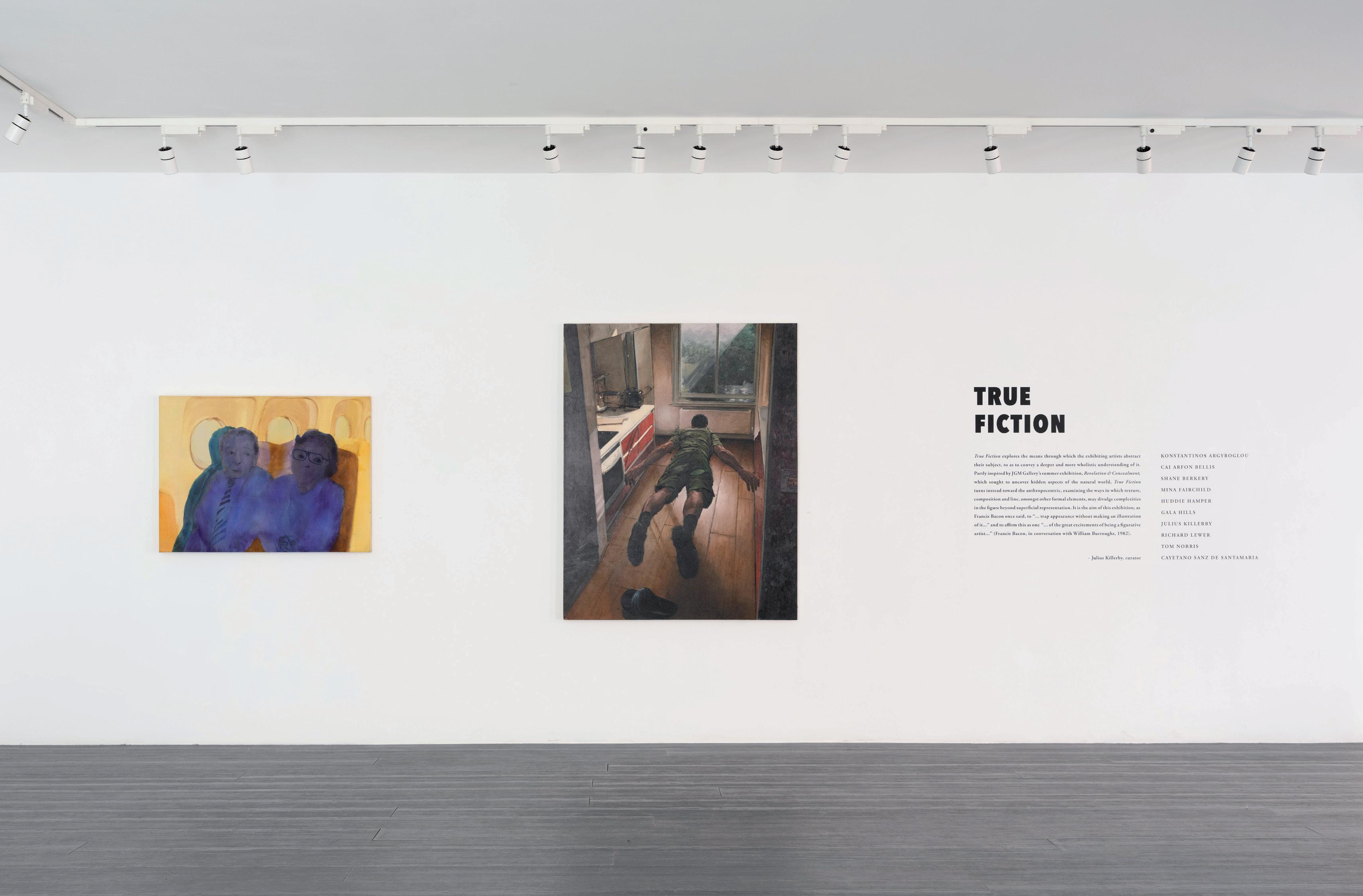
TRUE FICTION
FROM DECEMBER 2024 TO JANUARY 2025, JGM GALLERY EXHIBITED TRUE FICTION A SHOWCASE OF WORKS BY 10 LONDON-BASED FIGURATIVE ARTISTS. ON THE OCCASION OF THIS EXHIBITION, JGM GALLERY WRITER & RESEARCHER, ANTONIA CRICHTON-BROWN, WROTE AN ESSAY TITLED ‘A FIGURATIVE REVIVAL’. PRIOR TO THIS, SHE ALSO CONDUCTED AN INTERVIEW WITH TWO OF THE EXHIBITING ARTISTS, CAI ARFON BELLIS AND GALA HILLS, THE TRANSCRIPT OF WHICH FOLLOWS HER ESSAY.
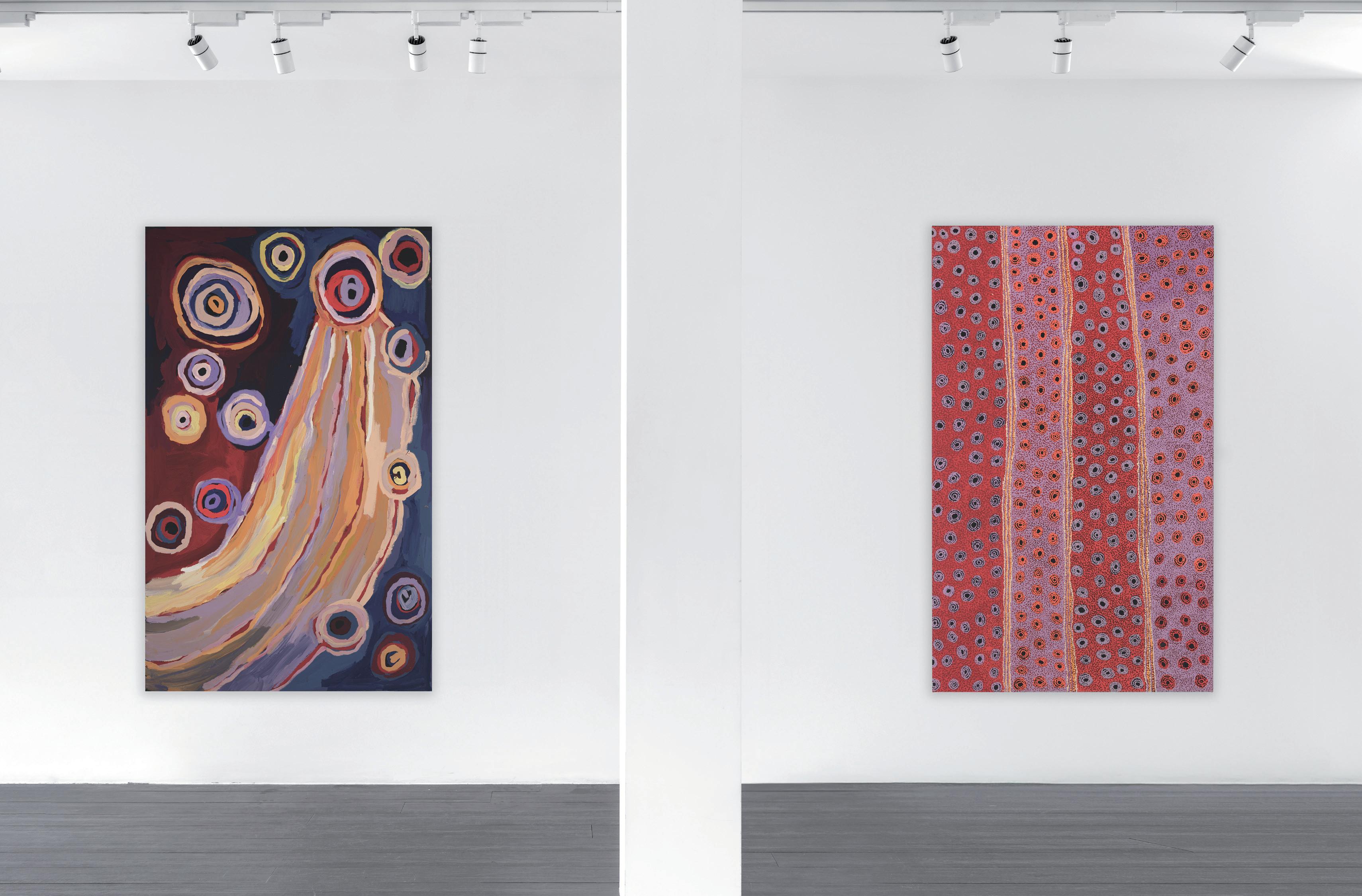
THE TEN ARTISTS in True Fiction are, in the words of curator and fellow exhibitor, Julius Killerby, “unified by their shared belief in the enduring strength of figuration.” In his introduction to the exhibition’s catalogue, Killerby further expands on the artists’ connection to one another, identifying the abstract elements in each of their diverse practices and, more broadly, in every depiction of a figure taken from life.
Artists who represent aspects of reality across eras have toyed with the threshold which figuration shares with abstraction, creating images which appear to simultaneously reconcile the two forms and locate the tension between them. The contrasts of linear and painterly qualities, for example, in Velázquez’s Portrait of Innocent X (1650) – the moments of volume and sculpting in the sitter’s face, versus the emulsification of his white alb – illustrate the entanglement of figuration and abstraction in paintings of figures from life. In the period following World War II, however, figuration and abstraction were polarised in Western art theory; the American critic, Clement Greenberg, equated abstraction with modernism, a culture of growing individualism and its liberation from the austerity and constraints of figurative representation. The contemporary revival of figuration suggests a cultural shift towards humanism and using the body as a site for the effects and expression of wider social and political issues.
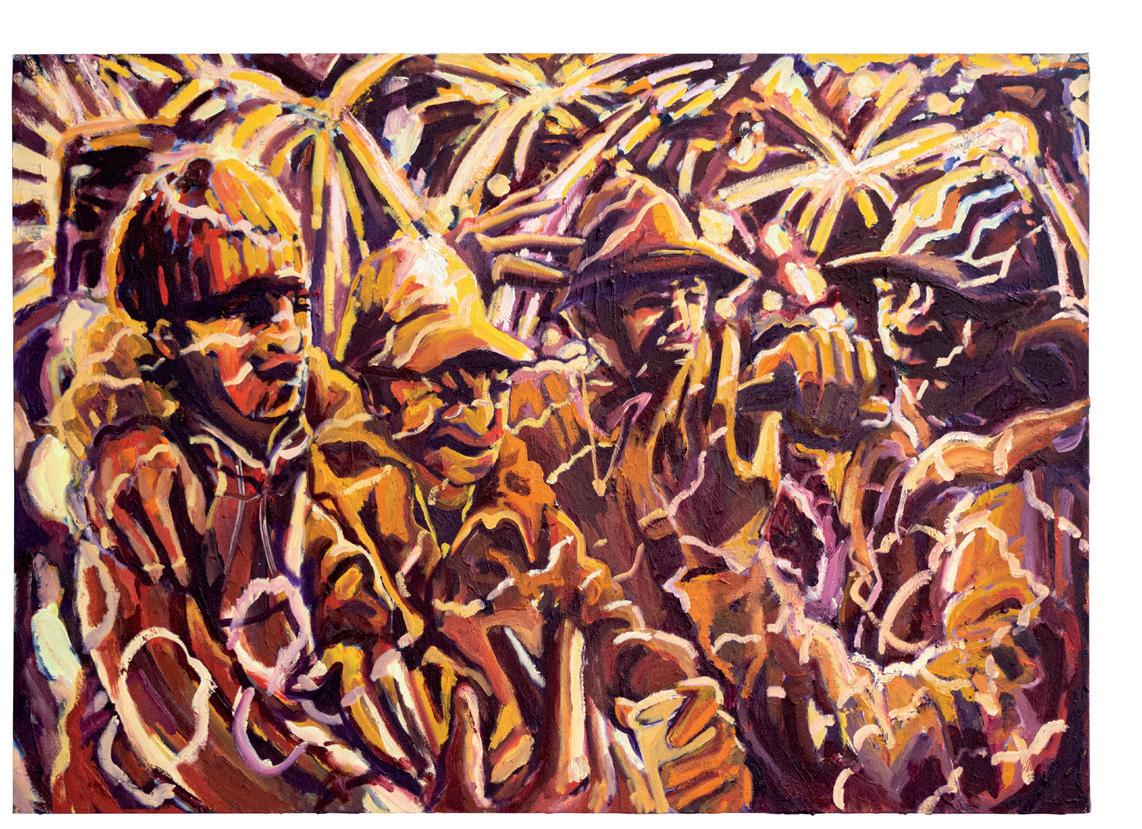
Killerby interprets line, shape, colour, and texture as revelatory tools for the artists of True Fiction used to generate meaning and emotional depth in their work, and to allude to significance beyond a plain illustration. Lewisham-born Cai Arfon Bellis, for example, begins his oil paintings depicting the Grime scene’s nightlife with bursts of gestural line work drawn in charcoal on canvas, evoking the frenzied motion and viscous swell of dancing bodies. Bellis says that these preliminary drawings are collages of the observational ones he makes on-site; the set of reference images he works from are often “the scribbly ones,” or those that are indexical and non-objective. Line and the scuffled marks of Bellis’ drawings are the residue of his collisions with other ravers in the crowd – events so transitory as to otherwise have been forgotten. Marks such as these are a physical record of their real context’s time, space and relationships. Bellis compresses these indices through paint into groups of caricature revellers, MCs and DJs, transforming something visually abstract into allusions to their origins.
This process of amassing figures from abstract marks is paralleled in the practice of the ceramicist, Tom Norris, and the painter, Konstantinos Argyroglou. Norris references the phenomenon, pareidolia: the human mind’s proclivity for organising and making patterns from nebulous imagery. His vessel, e Tempest integrates a final on-glaze transfer of photographic images in a third firing: a bucolic scene, an owl, the face of a cat, a pheasant and boar. These representational images are nestled within veils, drips and smears of colour, which could resemble marks made through contact with the skin of the artist’s hands and fingers. The tactility of these gestures reminds us that Norris has a hand in moulding the vessel and grasping figures from abstractions. Norris clarifies the content of his work through this process of layering raw material, colour and figure. Argyroglou takes a similar approach to painting. His representations of photos from his family albums and bathtime as a child rest on a groundwork of watercolour blots and stains which reflect the fluidity of memory. Secondary washes of diluted oil paints summon figures and objects from these backdrops that, while somewhat more material, also seem to slip lazily away.
Shane Berkery and Killerby’s works share common ground in their skilful and illusionistic rendering of the human figure. However, both also demonstrate a criticality towards the misleading nature of realism, Berkery through unfinished kitchen utensils and soft edges of the suspended figure face-down in Induced Levitation (2024), and Killerby through the tessellations, colour fields and negative space which frame his figures. Killerby leaves evidence of his brushwork, for example, in the background of his Self Portrait (2024) emphasising the flatness of the surface from which he sculpts his contorted head. As he is concerned with humanity’s physical and emotional extremes, Killerby also shows an awareness of the limitations to what a painted image can recreate from reality. The absence of identifying features in both Killerby and Berkery’s depictions of the human figure are also echoed in Richard Lewer’s back view of Kartujarra woman and contemporary artist, Bugai Whyoulter, and in Mina Fairchild’s photographic series of a figure masked by a silk fan. This anonymity renders the subject universal, allowing the viewer to find themselves in these artists’ images.
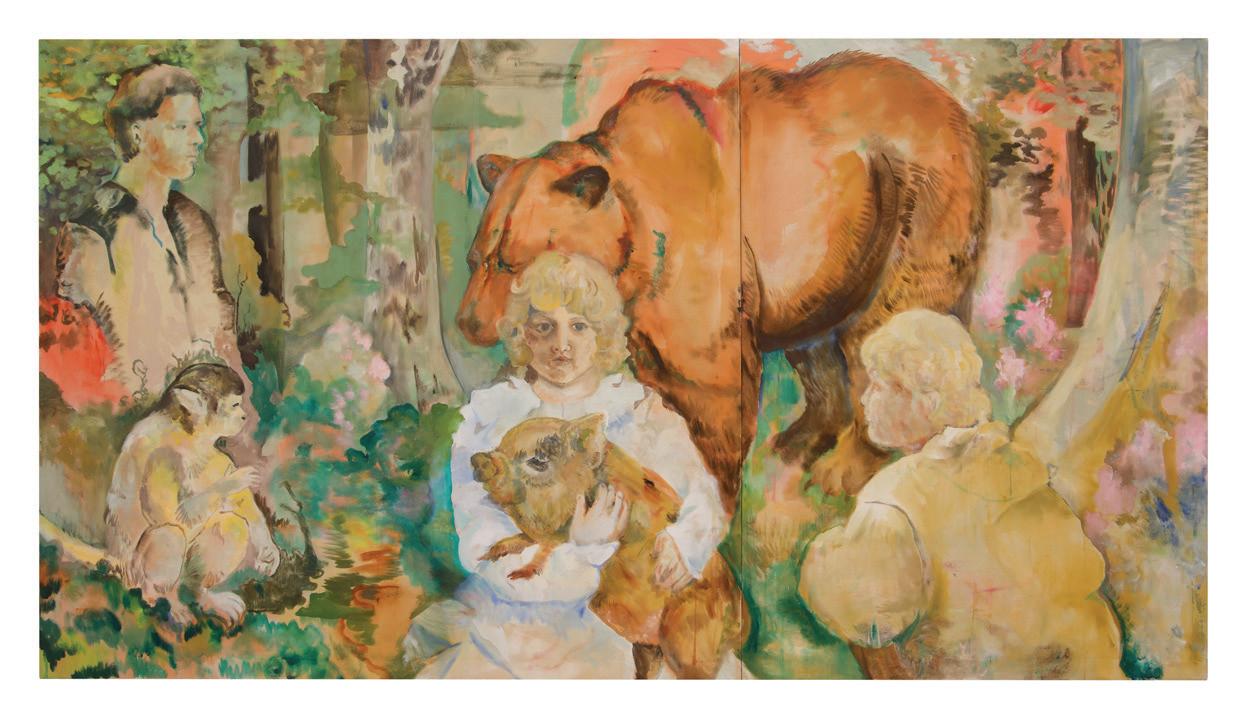
Animal allegories which allude to myth, dreams, fantasies, and identity connect the work of Gala Hills, Cayetano Sanz de Santamaría and Huddie Hamper. Hills suggests that, for her, painting is in part a space in which she can begin to question female genderism and femininity. She particularly empathises with the bear because of its behavioural complexities, and its maltreatment by the early church. It is a motif which has assumed an integral place in the composition of her practice. In Simius (2024), Hills unfurls an elaborate series of reflections between portraits of herself and animals, which suggest a correlation between the cultural connotations of these creatures and her biography. The intercessory figure of the girl at the centre of Hills’ work develops this sense of mirroring between the artist and the imaginary vaults of this painting. Sanz de Santamaria’s masked figures likewise operate as bridge-builders for the viewer’s entry into his personal mythologies. Hamper, conversely, has an initial resistance to autobiographical readings of his work, yet so ingrained is the horse archetype and its cultural significations in the collective unconscious that one can speculate on some reflection of the artist in his subjects.
The formal, psychological, political and allegorical abstractions in the works brought together in True Fiction convey a desire among the exhibiting artists to make images which express some essence of contemporary life. A proverb of the twentieth-century German artist, Max Beckmann, reinforces the reciprocal relationship of figuration with abstraction in reaching for this essence: “The important thing [in art] is first of all to have a real love for the visible world that lies outside ourselves as well as to know the deep secret of what goes on within ourselves. For the visible world in combination with our inner selves provides the realm where we may seek infinitely for the individuality of our own souls.” The nostalgics among us, such as Hamper, may lament over times in which a visual vocabulary was commonly shared, yet the language of figure that runs through all these artists’ work is one over which the audience may ultimately connect.
FOOTNOTES
Julius Killerby, in conversation with the author, 15 November 2024.
Julius Killerby, True Fiction introductory text, October 2024.
Clement Greenberg, “The New Sculpture”, Art and Culture: Critical Essays (Boston: Beacon Press, 1961), 139-145.
Cai Arfon Bellis, in conversation with the author, 1 November 2024.
Tom Norris, in conversation with the author, 1 November 2024.
Konstantinos Argyroglou, in conversation with the author, 1 November 2024.
Gala Hills, in conversation with the author, 31 October 2024.
Max Beckmann, “Letters To A Woman Painter”, 1948 (lecture delivered at Stephens College, Columbia, Missouri, January 1948), trans. Mathilde Q. Beckmann and Perry Rathbone, College Art Journal 9, no. 1 (Autumn 1949): 40.
Huddie Hamper, in conversation with the author, 15 November 2024.
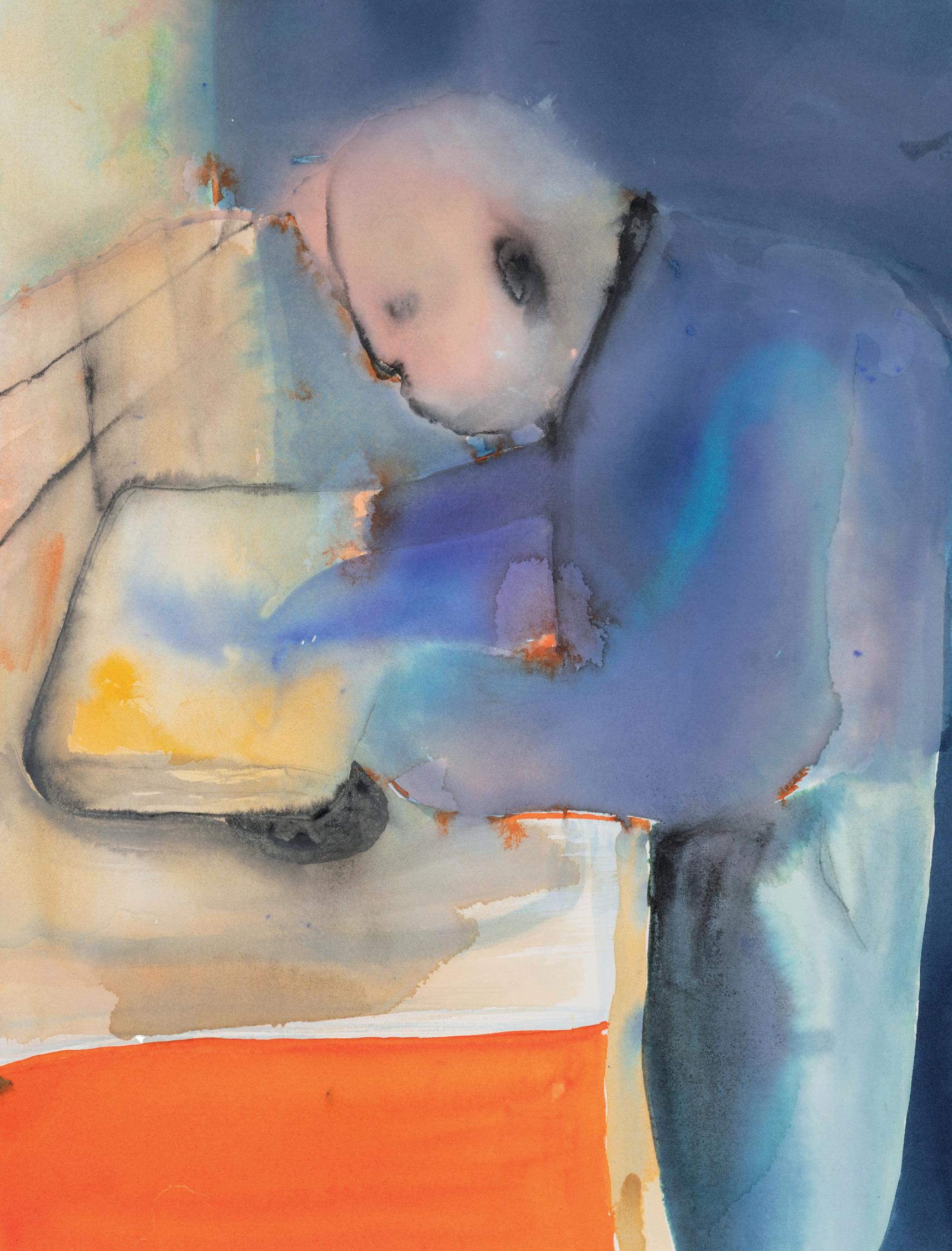
(Left) Konstantinos Argyroglou, Aeroplane Memory, Beyond Myself 2023, oil and watercolour on canvas, 80cm x 110cm, (right) Shane Berkery, Induced Levitation, 2024, oil on canvas, 152cm x 122cm. Image courtesy of Paul Williamson.
ANTONIA CRICHTON-BROWN What does ‘community’ mean to you and what do you hope to celebrate about Soundsystem culture in your work?
CAI ARFON BELLIS ‘Soundsystem culture’ is a very broad term. I use it because it’s very descriptive of UK electronic music and its origins. A big draw for me, for making my work, is my upbringing and where I come from –growing up in Lewisham. I was very lucky to come from a very rich musical heritage. Saxon sound system – that was a very pivotal dub sound system in New Cross which bled into what was happening in Lewisham. It also bled into a lot of Grime and Garage that came out of the borough. So, I simply use ‘Soundsystem culture’ for two reasons: one, to honour and respect the origins of where it came from, which was Jamaican Toasting sounds culture; and because of its links to Lewisham, which is heavily Caribbean populated. I also use ‘Soundsystem culture’ as a term because it’s a very particular style of community music. Sound systems essentially came from people throwing house parties because they couldn’t get into the clubs. They didn’t feel represented and so they started building their own sound rigs and their own speaker systems so that they could throw their own parties and play their own music. And the music I’m attracted to all comes from that community spirit of “we’re going to make-doand-mend.” Grime – the genre that I initially grew up with and started making work about – that came from them (young people) looking at their older brothers and older sisters going to these Garage raves dressed up to the nines. And they were fourteen and fifteen at the time and would want to get into these spaces but couldn’t, so they had to make their own spaces.
That’s when you see the rise of stuff like Pirate Radio. The more time I spend in those communities, the more I value that attitude of “We’re going to find a space for us, for our music, and we’re going to come together to do it.”
ACB It seems to me that your work then assists in telling the story of a community that is underrepresented in mainstream art worlds. Would you agree?
CAB That’s the thing that keeps me going. We all take for granted how wonderful it is to have those places you can go to, to let go and be a part of something bigger than yourself. In Jeremy Deller’s Everybody In The Place (2018), he makes this really interesting comparison between chapel and the religious experience of sound, which can be really heavily echoed in a lot of the underground early community sounds, like the techno scene coming out of Detroit. It’s not a coincidence that a lot of Grime MCs coming out of Britain come from gospel church backgrounds. And I think clubbing and raving have now been through decades worth of besmirchment. I used to get feedback that my work was very aggressive, very boisterous and quite angry. At New Contemporaries (at Camden Art Centre) this year, for example, I was compared a lot to the War painters like David Bomberg. It was a strange experience for me because my work is about this beautiful comradery, if anything. Throughout my time, I’ve realised that perception came from people who had never experienced spaces like those I depict, or that form of joy. And so now I see it as almost like a barman’s handshake; it’s for the people who know. They understand, they recognise, and it reaches them in a different way to how it reaches other people.
ANTONIA CRICHTON-BROWN Whose work influences you, either visual, musical, literary, or otherwise, and why?
GALA HILLS My influences have changed since the past summer. Lately, they’ve been a lot more literary. I’ve been looking a lot at Tove Jansson, who is known for the Moomins , but I’ve been reading Notes from an Island (Jansson) and she had this idea of a self-made world that she seems to believe in but also sort of doesn’t. She is sceptical of her own fairy tale, but she also has this very pragmatic approach to it, and I’ve been really inspired by that. Also, Alfred Wallis, the artist and fisherman from St. Ives, has been a recent influence. I’m from Devon in the West Country and I have been thinking about what art from there looks like. His work comes from quite a functional, practical lifestyle, being a fisherman…
ACB It then seems like there are two quite opposing forces at play for you in your work, as if you’re juggling the imaginary with the pragmatic, the tangible with the intangible. Would you agree?
aginative and playful at the same time… That’s part of Tove Jansson’s work. She did children’s books, but they are grounded in her real life as well. It’s a merging of something fantastical with something real.
ACB Although your practice spans a variety of mediums, you are very consistent with the imagery you use. It’s as if you are world-building and dressing stages for your characters. Would you agree?
ACB Who or what, would you say, has most impacted your work?
CAB My move towards drawing was really important. I was a photographer for a long time and, when I started painting, I was painting from my photographs. A really quite pivotal moment was when a tutor at the Slade asked me, “What are you doing that the photographs aren’t?” That’s when I started my sketchbook process of going into the spaces and doing observational drawings on site, because you then get these lovely messy bits, the hints and suggestions of someone walking through the crowd. I think my work became a lot more about the experience of a place rather than what it looked like. I’ve always loved Basquiat, and I was introduced by a tutor to the term ‘indexical marks’, which is the context of the space or the index that references the space. I think a lot of people, when I say I do the drawings on site, they think I’m at the back or I have an elevated space or I’m by the DJ, but I’m really in the crowd, in the middle, getting pushed and jostled about. When I’m in the studio, the drawings that I work from are the scribbly ones that I can’t quite make out because these capture the essence of a particular night and the rhythm of the crowd. The larger scale works and the paintings I make become almost like a curated night’s line-up. I’ll set up my sketchbooks as the reference points and then I will collage the rhythms and the movement of my drawings together, almost like referencing the experience of strobe lighting, where you get these flickers of images popping.
GH Yes, definitely. I don’t think that the imaginative aspects would really work if there wasn’t a reason for them. Using the imagination as a method to access something… to access memories or emotions that I would not be able to access otherwise… that is what’s pragmatic about it. I was diagnosed as autistic quite late in my life and one of the questions prior to the diagnosis was “Did you prefer fiction or nonfiction as a child?” and I wouldn’t say that was really the right question to ask because I think I made the nonfiction into fiction and vice versa. The way I work is that I do a lot of reading and a lot of research, but it is also im-
GH I like your insight that some of my paintings look like theatre sets. I feel limited when what I am making is just a painting or just a design. I like things to have multiple functions because it allows me to jump to the next thing, and then the next. Recently I made a bear mask that you can wear. It’s made out of fake fur and other stuff. In itself it’s an object and has a performative element, but it also allowed me to ‘see’ *laughs* through the bear’s eyes, if that makes any sense. It sounds a bit pretentious, but I think it allowed me to access parts of the work ( Simius ) that I couldn’t have without it. I look at this process as steps towards the next work. Functionally, it helped me learn how to draw a bear from any angle. It was a really good exercise.
ACB What does the bear symbolise for you?
GH Through doing more research into bears I learned that they are very unconventional animals. They are very sophisticated, and they will do completely contrary things. The main thing I can think of is that half of the year they are herbivores and then for the rest of the year they are carnivorous, based on food scarcity. These animals have such complex social behaviours that they can be both things.
The drawings I made were like being inside a bear, of being eaten but also of a creature that is almost nurturing and has maternal feelings. There’s fear but there’s also comfort, together in one. There’s this great book called The Bear: History of a Fallen King (Michel Pastoureau). It details the history of bears in Western Europe. It talks about how medieval scholars had three animals who they deemed to be sinful. The word ‘simius’ means ‘similar’, and ‘simian’ means ‘monkey’, or ‘ape’. Imitation is a sin in Christianity, so these animals – bears, monkeys and pigs – were all deemed too similar to humans… and so there was supposedly something wrong about them. They were too human… which means that they are bad *laughs*.
ACB You seem to draw a lot on folk and vernacular forms. Can you elaborate on where these come from and what inspires you about them?
GH I did a lot of research into print making and pattern making in the Weimar Republic, and a handmade aesthetic achieved through manufacturing processes… and obviously William Morris and the Arts and Crafts movement. I was fascinated by them and the power of making patterns. Connecting it with my own life, there was an old woman that I used to visit in the town that I grew up in who taught me how to embroider, and this practice feels like it’s something that is at risk of being lost. I know a lot of people here on my course (at the Slade School of Fine Art) who really enjoy learning how to weld, or how to forge, or how to actually make things. It feels like a really wonderful revival. When you learn how to do those things, it feels like you can change the world around you – your immediate environment –through these craft processes.
Left: Cai Arfon Bellis, Dance Dun 2024, oil on canvas, 85cm x 120cm. Image courtesy of the artist’s studio.
Right: Gala Hills, Simius, 2024, oil on calico canvas, 137cm x 254cm. Image courtesy of the artist’s studio.
Huddie Hamper in his studio, 2022.
BY PROFESSOR MARGO NGAWA NEALE
THE LEGACY OF EMILY KAME KNGWARREYE
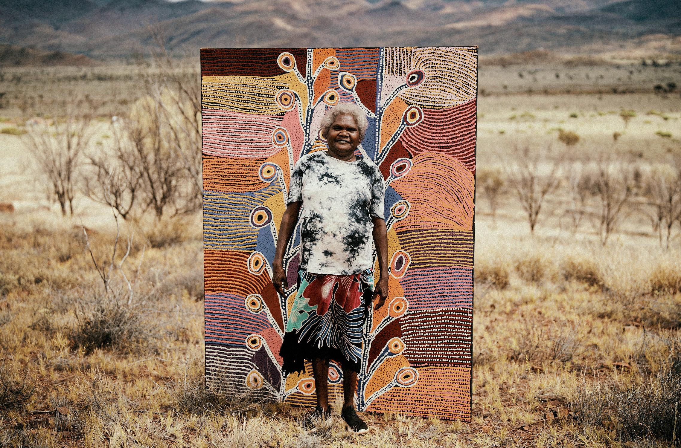
ADJUNCT PROFESSOR MARGO NGAWA NEALE CURATED THE FIRST NATIONAL TOURING RETROSPECTIVE FOR EMILY KAME KNGWARREYE (1998) IN CONSULTATION WITH THE ARTIST. ON MINISTERIAL REQUEST, SHE CURATED ANOTHER AWARD-WINNING AND EXPANDED VERSION FOR JAPAN (2008) TO CRITICAL AND POPULAR ACCLAIM. EMILY’S WISH TO HAVE HER STORIES GO TO THE WORLD COMMITTED MARGO TO POSITION EMILY IN THE PANTHEON OF THE WORLD’S GREAT ARTISTS. EMILY HAS NOW SHOWN IN TOKYO, OSAKA, VENICE, LONDON AND MANY OTHER CITIES. HER LEGACY TO THE COMMUNITY OF URAPUNTJA AND BEYOND IS FORMIDABLE, ATTESTED BY THE CALIBRE OF THE WORK IN JGM GALLERY’S SUMMER EXHIBITION, WE CALL IT URAPUNTJA (4 JUNE TO 4 SEPTEMBER 2025) , AND THE OPPORTUNITIES GIVEN TO THESE ARTISTS AND MANY OTHERS IN HER COMMUNITY. MARGO HAS AUTHORED, CO-AUTHORED, EDITED OR CO-EDITED 20 BOOKS INCLUDING THE OXFORD COMPANION TO ABORIGINAL ART AND CULTURE AND THE THAMES AND HUDSON FIRST KNOWLEDGES SERIES. SHE IS CURRENTLY CO-AUTHORING ONE OF TWO BOOKS IN THE FIRST KNOWLEDGES SERIES (10 VOLUMES), FOR WHICH SHE IS ALSO SERIES EDITOR.
ON THE OCCASION OF WE CALL IT URAPUNTJA , NEALE WROTE ‘THE LEGACY OF EMILY KAME KNGWARREYE’, AN ESSAY IN WHICH SHE EXAMINES KNGWARREYE’S IMPACT ON THE CONTEMPORARY ART WORLD.
Urlerrperl
Aboriginal art was the last great art movement of the 20th century.
This pronouncement made by New York based Australian art critic the late Robert Hughes was audacious at the time. Only European and American artists could occupy such a position, certainly not the marginalised ‘natives’ from the antipodes. The 1980s and 1990s were only the beginning. If only he could see our art now.
There would be little doubt that the phenomenal rise to prominence of Emily Kame Kngwarreye’s art in the ‘90s was a strong contributor to this international positioning. Coming on the heels of the male-led Papunya painting movement of the ‘70s, west of Alice Springs (Mparntwe), the desert women from nearby Yuendumu took the lead in the 80s, followed in the ‘90s by the desert women from Utopia (Urapuntja) where Emily and her mob come from, northeast of Mparntwe.
The difference between the women’s and men’s art from these regions could not be more pronounced. The quasi-earthy colours, hard-edge designs, geometric compositions and use of ideograms that characterised the men’s paintings stood in stark contrast to the paintings done by the women of Yuendumu. They fully embraced the painterly vibrancy of acrylic pigments with a looser, freer, more gestural style. They were constantly experimenting including a changing palette of high-keyed hues with hot pinks, electric blues, yellows and oranges.
Not that any of these community groups knew anything about the artworld, careers, CVs or indeed the Western understanding of art, which was entirely alien to them. The only language word that appears to approximate ‘art’ is ‘mark making’ that refers to the marks and tracks of the ancestors, which still informs art today regardless of style. Given that traditional Aboriginal societies were nontext-based, mark making was a highly sophisticated form of communication often on the body, which in concert with song and dance constitutes performance –the primary mode for the transmission of knowledge. Art, so-called, is subsidiary to performance and has only existed in a portable form for an outside market for the last three to four decades.
Songlines are a knowledge system that distributes knowledge across the country, dispersed across the natural features of the country where ancestors left parts of their story as they travelled from one encounter to another during the time of creation. This knowledge is imprinted in rock formations, river courses, waterholes and mountain ranges as well as embodied in plants, animals and insects. Like an ancestral script these marks can be read by those with the access. There are honey ant ancestors, yam ancestors, acacia wattle ancestors and many more. Everything that exists, both animate and inanimate, has a place in the Dreaming.
After Aboriginal Land Rights were granted to the Alyawarre and Anmatyerre in 1976, the people of Urapuntja were moved off the pastoral properties back to their Country, which had been named Utopia by white pastoralists. It was through the new Government funded, re-skilling programs that Emily and her community were introduced to art and craft programs which included the formation of a women’s batik group that practiced for ten years. In late 1988, paint and 100 canvases were dropped off to the batik artists and others as an experiment. No painting lessons necessary. Two weeks later, the first paintings from Utopia were collected and amongst them was a standout painting called Emu Woman by the then unknown elderly Emily Kame Kngwarreye. Liberated from the restrictive medium of batik, Emily’s painting took off. From then on, her paintings got bolder and gutsier and bigger despite the fact that she was already of advanced years.
This first collection of paintings from Utopia (Urapuntja) known as the Summer Project 1988/1989, includes some of the exhibiting artists, and was shown at the S.H. Ervin gallery in Sydney before being acquired by the esteemed Robert Holmes à Court collection. Only a year after Emily first put paint on canvas, she had her first solo show at Utopia Art, Sydney, run by gallerist and artist Christopher Hodges who together with art advisor Rodney Gooch from Alice Springs, started Emily on her artistic trajectory.
Emily’s legacy to Australian art and especially Aboriginal art is formidable. The value of her legacy to her community is inestimable, escalating and crossgenerational. Her artistic development uncannily parallels the trajectory of Western art, from figuration through ‘pointillism’ and abstract expressionism to
minimalism and the conceptual over the final seven years of her life. She had no knowledge of any of these styles or painting periods. She rarely left her desert home and spoke little English. Her genius was allied to the universality of her personal vision, her natural artistic development and a deep faith in her reason for painting that includes and transcends the local.
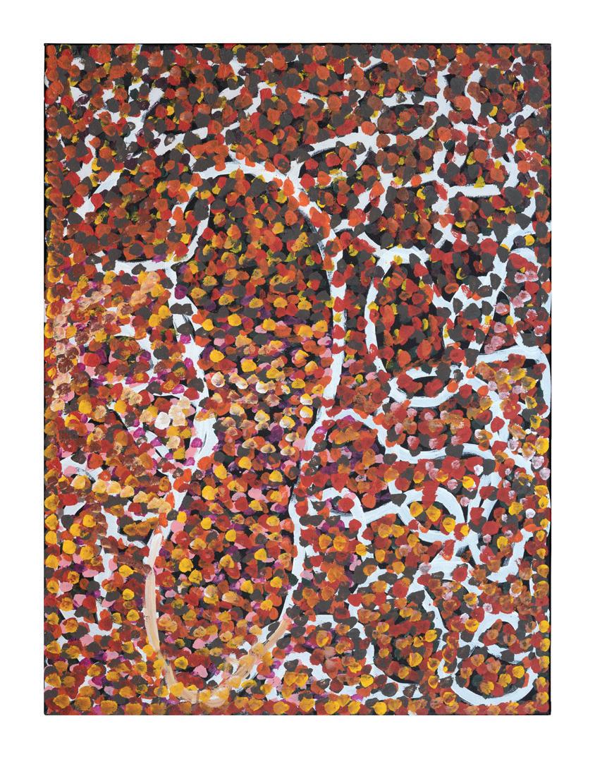
Her influence is palpable in the works of the senior artists in this exhibition who are all related one way or another by skin group, the kinship system or blood. Many of them share Emily’s Dreamings, particularly her primary Dreaming, Yam or Kame, such as artists Josie Kunoth Petyarr and Jedda Purvis Kngwarray, who were also part of Emily’s journey.
Following in the steps of Emily, the master artist, Josie’s paintings evolved from the figurative to the abstract. Like Emily she depicts the arterial roots of the yam as a network of overlapping lines that engulf the canvas, emanating from the circular yam tuber centred on the canvas. Josie’s lines however are stippled in a staccato-type movement suggestive of the pulsating life force of her yam ancestor, Atnwelarr
Jedda Purvis Kngwarray, also an Anmatyerre woman with the same yam Dreaming as Josie, creates her unique variation on the homage to her yam ancestor. She packs the canvas with what looks like bunches of dense skeins of yam tendrils in motion. Multicoloured, they wend their way seemingly into the canvas as if reaching below the desert sands in search of water.
When the yam is ripe and ready to dig up, the same crazed pattern of the arterial roots, more evident in Josie’s linear painting than Jedda’s, appears as identical cracks on the surface to show where to dig for the tubers. As above, so below.
Dotting became one of Emily’s signature styles in the first few years of painting, a direct transition from the wax dots of the batik medium. No-one has been more inventive with dots than Emily. From thick clusters of fine dotting to the layering of dots misting the surface of ever larger canvases she advanced to double then triple multi-coloured large dots. Finally, with large brushes heavily laden with paint, she would thrust them onto the canvas driving from the shoulder with such force that the brush hairs splayed, creating a floral look suggestive of the yam flower.
Audrey Kngwarray Morton had a great model in Emily, but her painting reveals her own personal development. Her canvases shimmer with delicate acacia flowers patterned in a lacey whiteness that creeps down the surface of her paintings like the syrup from the acacia, which unlike Emily’s yam flowers are meticulously defined. In contrast to the raw brushstrokes of Josie and Jedda’s painting Audrey’s surfaces are exquisite in their intricacy.
A huge departure from the women’s painting is the suite of works by Kudditji Kngwarreye (1938-2017), Emily’s kinship brother who sometimes painted with her. He is one of the relatively few men who painted at Urapuntja. His geometrically structured surfaces of large adjacent blocks of modified colours speak of large tracts of Country that he travels in his mind reflecting on earlier days when he travelled on foot tracking his Emu songlines around Boundary Bore. Though visually reminiscent of Mark Rothko’s squares and oblongs as many have noted, Kudditji’s luminosity comes from thinly layered veils of paint, transparent enough to see the underpainting of country below, while Rothko’s numinous squares and oblongs applied multiple thin veils layered to create an impenetrability – contemplative space of infinity. However, both artists create meditative and spiritual spaces. One for all to enter and the other for the artist to enter. As Kudditji says, his work is about how he experiences his Country.
Oscar Wilde once said, the most successful artists in the world are those born of necessity, not ambition. As counter intuitive as his truism may appear in relation to Aboriginal artists it is especially relevant to the motivation behind why artists from this region paint. It provides some measure of economic independence and a place in a changing world while being able to practice culture. After all, painting on canvas is for these artists like ceremony on canvas. It is a way to reaffirm culture, identity, attachment to County and rights and responsibilities. The artists sit cross-legged on the earth and often paint collaboratively and collectively. Many sing or chant while they perform ceremony on canvas with Country-in-mind.
0 NAME CHANGING
It was customary for a newly deceased person’s name to be suppressed in the relevant community, for a period of time. It was critical to avoid interrupting the deceased person’s passage to their ancestral resting place by calling out their name. In the past non-Indigenous linguists acknowledged this practice by dropping letters from the spelling thus altering the deceased person’s name for use in the outside world. Now it is considered more appropriate to denote respect for a deceased person by using the language term, Kumantjayi, or equivalent, in front of part of the name used publicly in life.
0 OUT OF RESPECT
Emily made it clear that her name and image were to continue posthumously and personally approved their use. She wished to be remembered. The name she approved was that used in the approval stage of the 1998 QAGOMA retrospective exhibition, Emily Kame Kngwarreye and we thus continue to honour her wishes.
The spelling of the Anmatyerre/Alyawarre language has changed several times and many artists continue to use the spelling they grew up with and we continue this tradition.
Opposite: Judy Kngwarray Greenie, Atnwelarr 2025, acrylic on linen, 102cm x 76cm. Image courtesy of Paul Williamson.
Left to right: (1) Jedda Kngwarray Purvis, Atnwelarr, 2024, acrylic on linen, 102cm x 76cm, (2) Kudditji Kngwarreye, My Country 14 2007, acrylic on canvas, 125cm x 180cm.
Image courtesy of Paul Williamson.
Left to right: (1) Lucky Kngwarreye Morton (2) Janice Kngwarreye Clarke, (3) Audrey Kngwarreye Morton 2025. Image courtesy of Utopia Art Centre.
BY CHLOE REDSTON
ARCHAEOLOGY OF FORM
ON THE OCCASION OF RALPH ANDERSON’S EXHIBITION AT JGM GALLERY, DIG (23 OCTOBER TO 30 NOVEMBER 2024), CHLOE REDSTON WROTE ‘ARCHAEOLOGY OF FORM’, AN ESSAY IN WHICH SHE ANALYSES THE ARTIST’S LATEST SERIES OF ‘ECHO PAINTINGS ’
CHLOE REDSTON IS A GRADUATE OF THE COURTAULD INSTITUTE OF ART’S (LONDON) MASTERS PROGRAM, WHERE SHE SPECIALISED IN INTERSECTIONS BETWEEN THE VERBAL AND VISUAL, FROM THE BIRTH OF MODERNISM TO THE PRESENT. HER STUDIES HAVE PRIMARILY FOCUSED ON CONTEMPORARY DIALOGUES WITH ANTIQUITY AND THE POETICS OF ABSTRACTION.
Left: Ralph Anderson, Llandudno Promenade (detail), 2024, acrylic on linen, 136cm x 106cm. Image courtesy of Benjamin Deakin.

Left to right: Ralph Anderson (1) Llandudno Promenade, 2024, acrylic on linen, 136cm x 106cm, (2) The Picnic 2024, acrylic on linen, 91.5cm x 71.5cm, (3) August Wonderland 2023, acrylic on jute, 60cm x 45cm. Image courtesy of Benjamin Deakin.
ARCHAEOLOGY OF FORM
RALPH ANDERSON’S LATEST body of work, the development and culmination of previous approaches, is distinguishable for the singularity of the technique he employs. Drawing on familiar themes of landscape painting, and human relationships to environment, he begins with a representational image, gradually manipulating it through layers upon layers of paint, varying the colour, the tonality, at the same time attacking the surface with expressive, gestural marks – “messing with the canvas”. When the original image has been abstracted to the point of obscurity, Anderson commences the meticulous process of ‘excavation’. Using a rotary tool, he effaces the surface, gradually sanding through the many accumulations of paint in an experiential process which somewhat resembles the act of ‘digging’. The result sees the original image partially obscured by paint, only to be uncovered as an unfaithful echo. In the process of understanding Anderson’s work, the viewer is confronted by a series of antitheses, between that of the expressive and considered mark; rationalisation and obfuscation; memorialisation and erasure.
Originally titling these new works as his ‘Echo Paintings’, Anderson takes partial inspiration from the work of Walter Sickert, whose retrospective he encountered at Tate Britain (2022). Towards the end of his career (1930s), Sickert produced a series of works based on Victorian engravings and press-cuttings which he entitled ‘Echoes’. Retaining elements of flattened perspective and the stark tonal contrasts of simplified forms, his appropriation and transformation of black and white illustrations from forgotten journals into vivid images on the canvas, creates an almost abstract effect in his finished paintings. It is a similar dialogue between the ages, coupled with a disregard for a hierarchy of form, which so permeates Anderson’s new work. Building on themes explored in his previous solo exhibition at JGM Gallery, ID in which Anderson reproduced the abstract forms of urban graffiti found in his local South London environment by scratching and defacing the surface of a painted landscape, his initial approach to the series had its roots in pure abstraction, or rather, mark-making. However, somewhat influenced by the work of Sickert, Anderson began to revisit works from his own oeuvre, incorporating them into his new practice. The first example of this, entitled e Barn (2024), sees a representational image of a barn, painted some 20 years prior, “reverberating through history and re-emerging” as an echo in the present. It is not, however, a mere iteration of the past but rather transformed by a process which Anderson describes as “memories of an approach to making.” In his seminal essay, e Painter of Modern Life, often attributed to being one of Modernism’s founding texts, Charles Baudelaire recognises that past and present exist in reciprocal dialogue. He defines modernity as “the ephemeral, the fugitive, the contingent, the half of art whose other half is the eternal and the immutable. Every old master has had his own modernity.” In a Baudelairean sense, therefore, it is essential to look to the past in the pursuit of the definition of the present. In a similar vein, Anderson’s acknowledgement of the past, coupled with a unique blend of personal meaning, imbues his work with a heightened sense of contemporary relevance.
In each of the works in Dig there is a tension between the processes of memorialisation and erasure which is carried out by the similarly opposing expressive and measured forces, as in Llandudno Promenade (2024). Though initially representational, Anderson’s marks become gradually more evocative, using broad gestures to mark the canvas, subsequently adorning his work with an inimitable quality. This articulates a contrast of form: whilst stemming from the same inherent action of marking the surface, the urge to rationalise, introduced by hints of realism, is obscured and interrupted by the physicality of the asemic paint. These marks, which evade meaning altogether, instead favouring mere allusion in a deconstruction of representation, seem at times to destabilise rather than consolidate the past, even as they invoke it. In archaeological terms, a ‘dig’ displaces layers of earth and the deposits of time, to reclaim the remains of history – a metaphor which can be extended to Anderson’s work. His erasure of said marks is intentional; it is a calculated process. Though at first seemingly contrary to our presupposed associations of an inherently destructive act, his painstaking removal of layers of paint, often conducted over many months, becomes emblematic of a fragmentary recollection of the past. It is as though the gradual nature of the practice, combined with the haziness of the final product, enacts the indistinctness of memory. As such, the physical act of digging mirrors a psychological one, with Anderson grasping at the remnants of a forgotten past. The action simultaneously parallels the abrasive, and yet, revelatory process of archaeological excavation, creating a texture which mirrors that of
patina, or perhaps, weathered walls, thus forming a double-edged allusion. This, paradoxically, lends the work an organic sense of construction, subsequently alluding to a generalised past via the lens of natural decay. Anderson therefore establishes a tension between the at once generative and erosive power of the artist’s mark which plays out through a self-referential action.
The “archaeology of forms” which Anderson establishes within these works, coupled with the layering and indistinct blurring of said elements, further reinforces a dialogue which exists within his oeuvre. In Anderson’s words: “Archaeology is about uncovering; you are trying to understand and rationalise what you are finding. I think that the difference with what I am doing is I am uncovering my own marks, my own drawings. So, I know exactly what’s there. I know what I’m going to uncover, but not exactly how it's going to play out.” As such, Anderson situates an interpretation of his practice within the realm of personal experience. There is a point, however, at which Anderson is able to translate the individual into the collective. Though citing specific sources – a landscape favoured by Danish painter Asper Jorn in Julsø (2024), or the blurred figures in Llandudno Promenade (2024), or even the depiction of the artist’s wife, Alice Wilson, in Waiting for a King sher (2024) – in each instance, Anderson, extricates the familiar and exalts it to the eminence of the memorable, the archetypal. For Anderson, “because it s a recognisable form in painting, it frees me to just throw paint at it and see what happens. For the viewer, it’s also a recognisable object which makes it more approachable and allows them to enter the painting, and read into it whatever they’d like to.” In referencing the archetype, Anderson addresses the collective unconscious, leaving “the painting open – open to interpretation or just open to individual experience.” Just as the artist can be perceived as the translator of life, so too can we consider the task of interpretation as one of translation. At which point, artistic intention becomes somewhat irrelevant: “it doesn’t matter what the artists intend, or don’t intend, for their works to be interpreted.” Anderson appeals to ambiguity, an effect heightened by the inclusion of familiar genres of painting, and by his ‘excavation’ technique. Conversely, the experiential is transferred to the viewer. We are, in Anderson’s works, immersed within the composition – confronted by an untranslatable experience.
FOOTNOTES
Ralph Anderson (in conversation with the author), 2024.
Cf. Tate Britain, Walter Sickert Exhibition Guide (Tate Britain, 2022), https:// www.tate.org.uk/whatson/tate-britain/walter-sickert/exhibition-guide (accessed 27 September 2024).
Ralph Anderson (in conversation with the author), 2024.
Ibid
Charles Baudelaire, e Painter of Modern Life (1863), in Jonathan Mayne (ed.) (trans.), e Painter of Modern Life and Other Essays (London: Phaidon, 1995), 13.
Mary Jacobus, Reading Cy Twombly: Poetry in Paint (Princeton University Press, 2016), 36.
Ralph Anderson (in conversation with the author), 2024.
Ibid.
Ibid.
Susan Sontag, Against Interpretation (Farrar, Straus & Giroux’, 1966), 6.
Bottom left: Ralph Anderson, The Motorway 2024, acrylic on jute, 26cm x 36cm. Image courtesy of Benjamin Deakin.
Top left: Ralph Anderson, August Wonderland 2023, acrylic on jute, 60cm x 45cm. Image courtesy of Benjamin Deakin.
CHLOE REDSTON What led you to create this series, and what are your biggest inspirations and influences?
RALPH ANDERSON I find that a lot of my work has a natural progression, so this body of work is a development from previous series of works. I have been developing these paintings for at least two years now, and inspirations come from all over the place. I am not inspired by one specific painter or artist necessarily –my inspirations also come from life, as well as art.
CR Do you primarily work from photographs or life, and what effect does that have on the end result?
RA I mainly work from photography, rarely from life. Sometimes I make drawings from life but they rarely come into my art practice. I quite like working from photography just because it feels image based. People also relate to photography more and through it I can more easily play with the composition. So, even if I am working directly from a photograph or an image, I ll then redraw it, alter the composition, maybe take out or add things. But the basis is that photographic image.
CR How has your personal relationship to Scotland influenced your work?
RA I don’t know. I mean, it has influenced me. It makes me who I am, I suppose, and I still spend a lot of time up there. That has probably influenced the landscapes in my work, and my relationship to them. So, I sort of understand nature and landscape. Growing up there, I was split between the city and the countryside. I used to live with my grandparents and they would always have me out chopping wood, or fishing, or walking in the hills. I grew up around nature, but also spent a lot of my childhood in the city as well. So I don’t know... it provided a balance.
CR Does your approach to landscape painting offer a form of escapism?
RA Not for me. Maybe for the viewer, but for me it’s about realism, not escapism. It s about conveying some thought of where we are, where I am. I don’t do this to escape; I do this to be part of the world.
CR What is your process? How does this perhaps differ from, or rather represent, the culmination of approaches you have taken in previous years?
RA The process for this is, simply put, building layers of paint and then stripping it all back. This came from my last show at JGM Gallery where I was trying to develop a technique to convey these carvings on walls and benches. I went through lots of different processes and then eventually started using sanders and rotary tools to cut through the surface of the paint, and ever since then I ve wanted to develop that technique. Initially, I was very much just going... I wouldn’t say abstract, but they were just paint on canvas. I tried different ways of scratching through it, drawing with the sander, taking the whole surface off. Eventually, I came to the point where adding a representational image to this process – adding that other element – brought this new meaning to the work, and brought it all together. So now I start off with the image and it becomes quite detailed work because that image has to hold all the various processes. While I’m doing that, I’m throwing paint on it, blocking whole colours out, messing with the canvas, dripping paint on it, rubbing it back. Then the whole painting transforms into something else. I’ll then sand it meticulously, bit by bit, and take the surface off again. I love the result and what I am left with.
CR In archaeological terms, a dig displaces layers of earth to uncover the remains of historic civilisations. In this way, at least to me, the physical act reflects the psychological aspect of uncovering and reclaiming memory. What are your thoughts on the experiential process of excavation?
RA Yes, I agree with that. I want this relationship with time, memory and histories in the work, and obviously including imagery adds to that. In the excavation process, there’s a relationship with archaeology but at the same time it’s completely different because I m uncovering things that I’ve done, that I ve put on the canvas, that I ve added to the painting. Archaeology is about uncovering; you are trying to understand and rationalise what you are finding. I think that the difference with what I am doing is I am uncovering my own marks, my own drawings. So, I know exactly what’s there. I know what I m going to uncover, but not exactly how it’s going to play out. The surprise is what s going to happen to
what I’ve done? How are all these other marks and spills and colours going to alter and distort the original image? I sometimes think of it as baking or cooking; I m adding all of these ingredients, but I don’t know what it s going to taste like at the end. It’s quite a strange process uncovering what I ve already done and seeing what happens. But it’s a deliberate process of destroying that image and then seeing what’s left.
CR To me, in your work, the process of destruction seems more measured than the gestural process of application. Would you agree with this?
RA Yes, absolutely. The destructive process is meticulous and time consuming, and I’m just taking paint, bit by bit, off the canvas, whereas the gestural process is instant. It can be done in seconds.
CR I guess this also introduces the idea of erasure as a generative process. There is this kind of tension at play between the layering of paint which obscures the image beneath and the revelation which occurs via its removal. Do you think your work therefore subverts the usual expectations of painting?
RA I hope so. All good painting subverts people’s expectations, otherwise what’s the point? You want to always be coming up with something new or doing something new with the medium. Erasure has been used before in art, but yes, it was a process I came across and it just seemed to speak to me. I also think that one usually focuses on evidence of the artist’s hand at work. The complete reverse of that is destroying the artist’s hand. With my process, you just get these shadows of the artist s hand or of the brush mark.
CR Making reference to Walter Sickert’s appropriation and transformation of black and white illustrations from forgotten mid-Victorian journals, you originally referred to these works as Echo Paintings. Aligning with this practice of blending past and present, in what way do you make reference to previous works in your own oeuvre?
RA There was a fantastic Walter Sickert exhibition at the Tate the year before last, which I went to see. I absolutely loved it. I have been influenced by his work ever since I started painting. I used to do a lot of landscape painting when I first left university. I was trying to do a painting a day, like, just doing very quick small landscapes, and I was always looking at the way Sickert approached painting. Fast forward 20 years and I am still influenced by his work. During that Tate show, however, I never knew about this series based on mid-Victorian journals. I knew about his later work, which I ve always loved because it brought a kind of postmodern style to painting, back in the 1920s or 30s. And he d started taking these prints from the Victorian era, and it was these which he referred to as Echo Paintings. I was developing these works at the time and it just clicked. I was like “Oh, that’s brilliant”, and so the term stuck with me for a long time after that, and I then then started calling these works Echo Paintings. At the same time, because the original works that I was developing were all abstract, when I started putting landscapes and imagery into them, I immediately went to paintings I’d done maybe eighteen years ago. I was looking at an abstract painting, and then a painting of a barn I did in 2006 just popped into my head and I thought, “Oh, that would look great in this.” So I quickly started repainting and revisiting these old works of mine. That’s the “echo”. It’s the same thing that Sickert was talking about. He was talking about these works that had been reverberating through history and re-emerging fifty years later. For me as well, these old paintings suddenly came back through my work, doing this almost twenty year cycle. However, I did not just want to repaint everything I d painted before. So I thought I’d better start putting new imagery in there.
CR So, do you think with these works in particular you are uncovering elements through the lens of your own personal memory?
RA Yes, absolutely. I feel art or the art practice goes round in circles, and I have just done this massive twenty year circle. I am making works that I was making back then, but at the same time I am making works that I was making five or six years ago. It’s memories of an approach to making, because I think that always develops and changes. Suddenly, I felt I was back in my mid twenties doing landscapes again and remembering what dragged me to that kind of work in the first place.
CR Through the presence of familiar or even archetypal elements of still life or landscape painting, do you think that these recollections possess the ability to
metamorphose into a collective one?
RA I’d hope so. I feel the viewer always brings their own history to the work anyway. Some are paintings of my wife, there are others of landscapes that I know very well... at the same time, for a viewer that doesn’t know that person or doesn’t know that landscape, they know people. They know faces. So, they’ll put their own history into that. Then there are others where I have been deliberately going back to standard genres of paintings, like flower painting or portraiture, where for me, because it’s a recognisable form in painting, it frees me to just throw paint at it and see what happens. For the viewer, it’s also a recognisable object which makes it more approachable and allows them to enter the painting, and read into it whatever they’d like to.
CR Leading on from that, what then do you think is the role of the viewer in the construction of meaning, and where does this place you as the artist?
RA The viewer is very important and I’ve always wanted to leave my work open to the viewer’s interpretation. I am not a fan of dictating meaning in my paintings. There might be meaning there and I might put meaning in, but I do not want that to dictate the way that the painting feels. Every viewer has their own history. Every viewer has their own level of understanding of art. Maybe they’re complete novices, but I’d always hope that they get something from the painting. I am not painting for an educated crowd necessarily. I am painting for friends from school or family or people that never really bother with art. So, it’s for everybody. In my approach, I’m always trying to leave the painting open –open to interpretation or just open to individual experience.
CR So there are a number of tensions and dichotomies at play within these works, one of them being between the abstract and the representational. The presence of the representational elements invites a rationalisation process, which is partially obscured by gestural asemic marks. I guess, aside from visually enacting the indistinctness of memory, or recollection, do you think this breaks down a notion of formal hierarchies which exist within art?
RA Yes, I’d hope so. It’s such an old conversation, abstraction and representation, and, in a way, when I first started painting, or even when I was born, abstract art had been and gone. There was, then, when I was at art school, a massive resurgence in representational painting. It was obviously a big deal when abstract painting came along, but I feel that now it’s a part of the landscape of visual language. Abstraction and representation are both different languages, different approaches, but they both say the same thing at the same time. For me, putting them both together is personally quite natural. I was not really trying to say anything with it or make a big deal about these two different ways of painting. Throughout my career, I have been a representational painter and I have been an abstract painter, and in my mind, they’re both very similar things – making these objects and making these paintings that hopefully reverberate through art history, or relate to things I’m thinking about. I quite like the fact that I’ve now got this process where both can co-exist. I want these works, however, to be read as abstract paintings. The representational imagery in them, for me, it’s just like another layer, rather than an element which makes it representational.
CR So, the process of erasure then becomes emblematic of a fragmentary recollection of the past, which, in my opinion, simultaneously mirrors the effect of weathered walls and surfaces – the end product kind of creates a double-edged allusion. Do you think this therefore aligns the abstract mark with a kind of graffiti aesthetic, similarly blending formal hierarchies?
RA In a way, yes. That graffiti aesthetic is so much a part of modern visual language now. It’s been present in my work for a long time, where I’ve kind of been trying to develop it, or bring it into “fine art”, for want of a better phrase. I just see it as part of so many visual languages out there. It’s something that, as a painter, I can use or bring in as I please. You mentioned weathered walls – old light, the patina. There’s these modern visual references but also old ones: a worn carpet, a tapestry, or just a weathered mural on a wall, rather than high end graffiti. A lot of these different visual languages come through my paintings, which I love, because painting now is such a traditional art form, but at the same time such a relevant and current one. So, playing those two things off each other, I find it quite fascinating.
CR Do you think then this also makes reference to any of your previous exhibitions?
RA Yes, slightly, I think. I have taken that avenue more than in any of my previous bodies of work. In my last show at JGM Gallery, ID there was obviously an overt reference to graffiti, but a very specific form of it where it wasn t spray paint or what you’d immediately think of as graffiti. It was about mark-making and gouging these initials and names on bricks and benches. And I was just more fascinated about that really basic raw mark-making, rather than graffiti as such and that then related to the landscape. The other thing with modern spray paint graffiti is it can be washed off or it can disappear over time. Whereas these ones I was finding were about one hundred and fifty and one hundred and sixty years old, and they’d become part of the landscape. So, in that show, it was landscape painting but I was also trying to bring these stories of the landscape and the people into the painting. These new works might reference it, but that whole show brought on this process. This way of making, gouging, that sort of cutting through the surface, is what has been developed in these new works. In a way, it’s still that sort of semi-violent, destructive aesthetic almost.
CR If we are to take the ‘archaeological dig’ as an extended metaphor for this exhibition, what I find quite interesting when you’re referencing graffiti, especially with regards to your exhibition, ID, and how you found things that were, let’s say, one hundred and sixty years old, is that even in Pompeii and places like that – literally places that have been frozen in time – there’s evidence of graffiti.
RA Oh, absolutely.
CR There’s evidence of people doing exactly the same things, like tagging their names. It demonstrates this kind of continuation; people have always been the same.
RA Yes, we don’t like rules or being told not to do something, or even clean surfaces. You walk into a brand new clean room, you want to make it your own. You don’t want to just live in a blank box. That reference to one hundred and sixty years – I was finding all these things locally from walks around South London, so I was not going to find marks much older than that. But yes, if you went to Pompeii or any ancient site, you’d find mark-making. Builders leave their marks as well all over these places. We want to leave our mark. We want to leave our identity there. So, the fact that humans have been doing this for thousands of years is not surprising because we’ve not changed in that time. We still want to make things our own. We want to disrupt this mechanised world we’re in. I think there’s this direct relationship with graffiti and mark-making in my work, but also just this presence of wanting to decorate, or wanting to add a layer of richness to life. You could call that graffiti or you could just call that, I don’t know, something…
CR Human nature?
RA Human nature, yes.
CR So, leading on from that Ralph, you’ve also created portraits of both yourself and your wife, Alice Wilson, using this process, one of which was nominated for the 2024 Scottish Portrait Award. How, if at all, does portraiture change the conceptual implications of your process?
RA Firstly, it was an amazing honour to be nominated for the Portrait Awards – it was a complete surprise! I find it fascinating because when I started making these, it was just landscape paintings or landscape imagery that I was using. Perhaps that was just natural because I’ve always painted landscapes. It felt like the obvious thing for me to do. It was only after about five or six of them that I thought, “Why don’t I do a portrait?” I’ve never painted portraits that much before so by doing that, it just opened this whole new world. I love it because it’s as though portraiture has got its own history, as do, obviously, people. Whereas, a lot of the landscapes, even though I’ve put figures in them, they are just empty landscapes and it is about the world we live in maybe rather than the people we are. So with these figurative works, it’s more about people.
CR Well, we look forward to seeing these new works hung in the gallery, come October. Thank you very much for your time, Ralph.
RA Yes, I look forward to it as well. Thank you, Chloe.
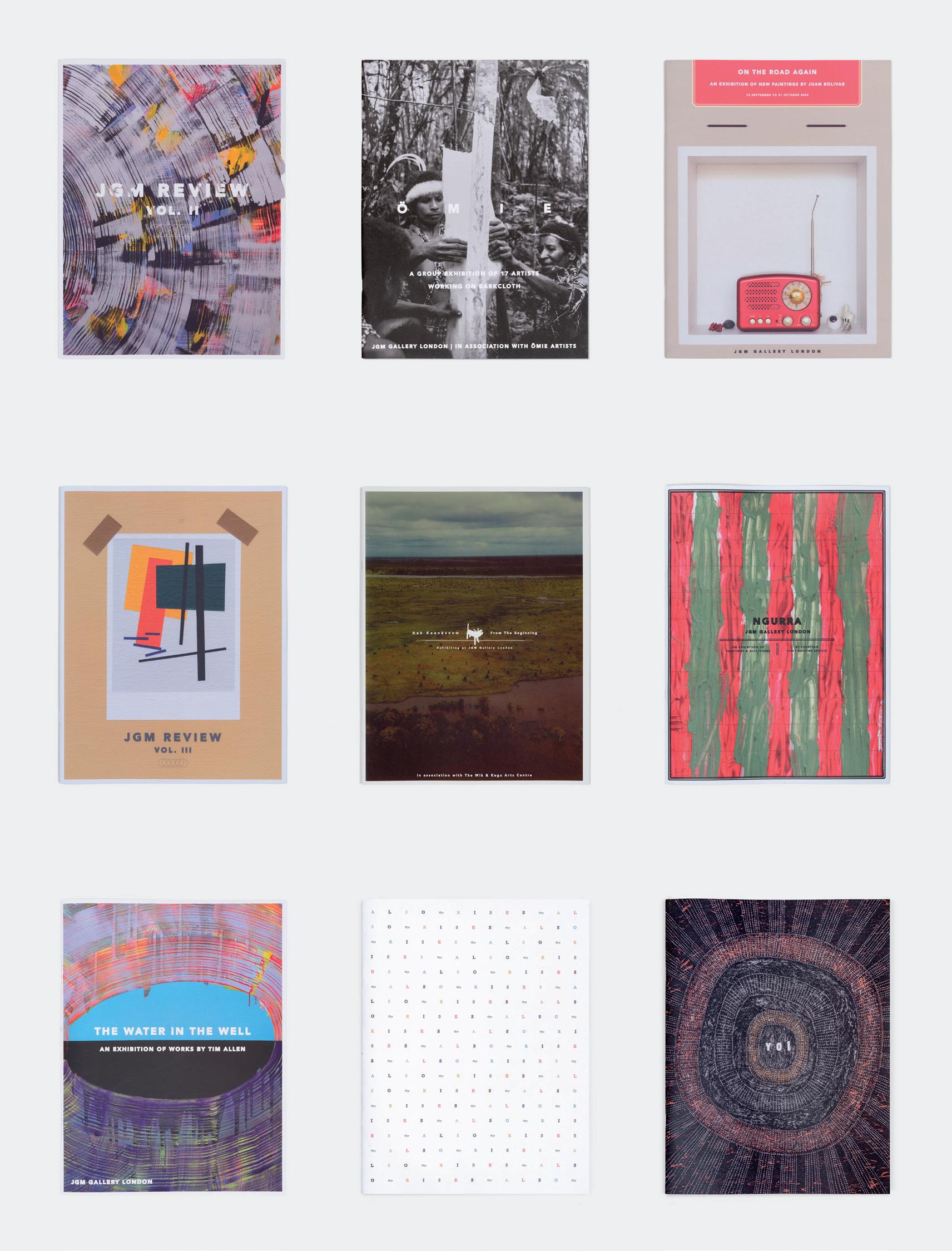
JGM GALLERY PUBLICATIONS
AT JGM GALLERY WE PLACE GREAT EMPHASIS ON OUR PUBLICATIONS. THROUGH THEM, WE AIM TO CONTEXTUALISE OUR EXHIBITIONS FOR OUR COMMUNITY OF FRIENDS, VISITORS AND COLLECTORS. PRODUCED ALONGSIDE THE EXHIBITION CATALOGUES ARE ISSUES OF THE
JGM REVIEW, A PUBLICATION WHICH SEEKS TO FURTHER AMPLIFY THE GALLERY’S PROJECTS.
IN CONVERSATION WITH BARBARA MBITJANA MOORE
BARBARA MBITJANA MOORE IS AN ANMATYERR CONTEMPORARY ARTIST WHO GREW UP IN AMOONGUNA, NORTHERN TERRITORY. SHE ATTENDED YIRARA COLLEGE, A BOARDING SCHOOL IN MPARNTWE (ALICE SPRINGS), BEFORE SHE MOVED FURTHER NORTH TO HER FATHER ’ S COUNTRY AT TI TREE AND WORKED AS A PRE-SCHOOL TEACHER. LATER ON, MOORE MOVED TO AMATA, SOUTH AUSTRALIA, WHERE SHE PAINTS AT TJALA ARTS AND WORKS IN CHILDCARE. MOORE WAS PRESENTED WITH THE ‘ GENERAL PAINTING AWARD ’ AT THE TELSTRA NATSIAA AWARDS IN 2012. IN 2019, SHE WAS A RESIDENT AT THE KLUGE-RUHE COLLECTION OF ABORIGINAL ART, VIRGINIA , AT WHICH SHE HELD HER FIRST SOLO EXHIBITION.
IN THE WEEKS PRECEDING MINYMA NINTI PULKA: WISE WOMEN , ANTONIA CRICHTON-BROWN MET WITH MOORE OVER ZOOM TO DISCUSS HER PRACTICE.
WHAT FOLLOWS IS A TRANSCRIPT OF THEIR CONVERSATION.
ANTONIA CRICHTON-BROWN So, Barbara, you are not originally from Amata. Can you tell me about where you are from?
BARBARA MBITJANA MOORE I’ve been living here for must be 20 years. [I’ve] been working at the health centre – in the clinic in Amata – and painting in the old art centre near the shop. My family [are] all from Northern Territory, not from South Australia… but my kids are from South Australia… my daughter, my son and my grandkids. That’s why I’m here with them, staying here and working here and painting as well. My grandkids don’t paint with me –they’re all too little – they go to school. They’re not ready. Tiffany’s the youngest. She’s only 5 years old.
ACB What does painting do for you?
BMM It makes me sit around… quiet way… and I like to be myself in a room working quiet way with the other ladies.
ACB What are your paintings about?
BMM I’m painting my mother’s side Country. It’s around Yarrampa area, Ti Tree, Yarrampa. I’ve got two ways – father’s Country and my mother’s Country. My father come from Ti Tree and my mother come from Yarrampa.
ACB Why do you paint your mother’s Country rather than your father’s?
BMM It’s got the hills nearby, near the community.
ACB Am I right in thinking that Amata is also quite a hilly landscape? Do you draw inspiration from Amata’s landscape?
BMM Yes, a lot.
ACB What do you remember about your mother’s Country?
we chat along when we paint and laugh, and giggle telling stories. All that sort of stuff.
ACB Tell me about what painting has done for you so far.
BMM The first painting that took me through… the one that won the Telstra Award in Darwin in 2012… that’s what made me famous. I went to America… to Virginia (in 2019)… I done a big painting on the wall there (at the Kluge-Ruhe Aboriginal Art Collection, Charlottesville). I went with Annie McLoughlin and Sharon Adamson. It was my trip. I was going to go myself. It was good – away from Australia to another world. It was fun. There were American Indians in Virginia that I [hadn’t] seen before. We met them and were talking to them and were asking about painting. It was really nice talking among us, another culture living there. I was asking them about how they work and how they live and how they do artist stuff like making paintings, or wooden stuff like that.
ACB What sort of connection did you feel to them?
“I come to the art centre and start painting. Even when I’m travelling on a plane, I look down and see the colours of the landscape and start doing painting...”
BMM I paint and remember getting it on my head, on my memory. I still love my mother’s Country and sometimes it gets in my head when I am starting to draw and getting some colours ready. She (her mother) brought me up. She was there for me all the time and now she’s not here. She’s not in the world, so that’s why I keep on thinking of her. While I’m painting, I think of her. It’s just me and my young brother and my big sister… and my kids. I lost my mum, all my family.
ACB When I hear you saying that you paint your mother’s Country and remember her while you’re painting, it makes me think about different generations of women passing knowledge on between them. What have you taught your kids?
BMM It’s not really getting there yet for them to start painting with me. The kids are still growing up. Sometimes they are coming in [the art centre] and play around and sit around and watch. And sometimes they like walking around, and coming in the office, and going in the spaces where the paint is.
ACB So is the art centre like a community centre? What’s it like painting with the other artists there?
BMM We sit around – sometimes on the floor, sometimes on the table – and
BMM It was nice – sharing my story to them and them sharing their story to us. I wasn’t shy. I was talking to them and making them be proud and happy. I was doing that to myself as an Aboriginal Australian, and them as aboriginal American. And there was also a big group of kids in a big building. And there was me and Annie in front of the class, and we was talking about the story. I was talking about my story back home here, and how I started and how I’ve been through it. And they was asking questions, and I was answering the questions for them. They were really interested hearing the story that I was talking about – my own painting – and telling them that I made a big painting in the place we were staying.
- Barbara Mbitjana Moore
ACB How would you describe your experience in America?
BMM It was the first time for me exploring, going to another state from outside of the world, going into another world away from Australia and see[ing] another country and how the people live there and how they work.
ACB Can you tell me about the mural painting you did there?
BMM It was the first time doing that on the wall. I didn’t know that I was going to do that. I thought I was going for my exhibition.
ACB So it was a bit of a shock?
BMM Yes *laughs*.
ACB How did the American landscape inspire you?
BMM The colours of the land did.
ACB Tell me more about the colours in your work and what they represent.
BMM They represent the skies, grass, land… desert land with waters around… all those kinds of flowers. Nature.
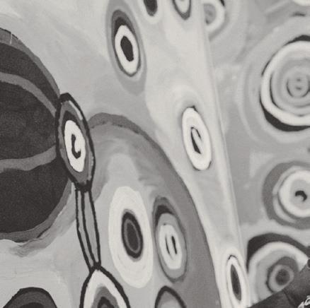
ACB What do the circles and lines between them represent to you?
BMM When you are going up to the hills and going to see the water – rock holes – you see a little stream coming down, going down and matching up with other water on the side. Big space of rock coming down with the water. It gets formed up. When you see another rock hole not far from the top of the hill, not right on top but between – in the middle – and you see the water holes and the stream matches up with the other rock hole down the bottom.
ACB How do you start a painting? Do you plan it beforehand?
BMM It comes along when I’m going through it. It just get into my head and making me able to know where I’m going to start and to start doing the pattern.
ACB Your paintings are very different to a lot of the other work that is in this exhibition. Tell me about your personal style.


your work?
BMM It’s about the rock hole. Kapi tjukula. That kapi tjukula is about the water… lots of rock hole.
ACB Is it the same story as the story the Mitakiki Women’s Collaborative paint?
BMM No, it’s a different story. Naomi does it with the sticks… dot painting… and I do it with the brush, the big brushes.
ACB What are you thinking of painting next?
BMM I’m not doing much painting at the moment because I’m working at the pre-school with the little ones. It’s not time for me to do more painting. I teach the little ones, the early childhood kids, the pre-schoolers. Childcare. On Monday to Thursday and then Friday no school for the pre-schoolers and only childcare for the little ones.


BMM My style is different from these people (Anangu). I normally do a brushy style with my brush, like quick way. Thick brush. All those rock holes and the streams going down to the rock holes. And the colours. They look like landscape, like trees, flowers, hills, sky, land. That’s the colour that I’m putting through with my imagination, focusing wherever I go. I see and I start getting it in my head. I come to the art centre and start painting. Even when I’m travelling on a plane, I look down and see the colours of the landscape and start doing painting and all that. When I’m painting, I’m thinking about my Country where I’m from. I’ve been doing dot painting before. Then I decided to do another style using the brush as a quick way [of] doing the rock holes and getting the colours.
ACB How long ago was it that you were painting using dots?
BMM Ten years ago… When Tracey Lea was working. Sarah was working at the old art centre and then we moved from there to this art centre with Skye, Natalie. The new ones came in, then Jonny and Trea (Tjala Arts’ current studio coordinator and manager) came in.
ACB We’re showing a beautiful red painting that looks like the colours of the desert and one with blues and yellows.
BMM Yes, that [second] one is like the water coming down from the rock hole, coming down from the waterfall. The yellow is the sun shining.
ACB Naomi’s work seems based firmly in stories. What stories do you tell in


ACB One of this exhibition’s themes is the intergenerational transmission of knowledge. Why do you think it is important to pass on knowledge to your kids?
BMM I would like them to follow my footsteps. They can take it on when I am gone.
ACB What do you teach the young people?
BMM Showing them how to paint so they can learn from me. I’m teaching them. They will sit down and watch me do this and that. Sit around and doing things together with them.
ACB Do you take them out on Country?
BMM Not really. Probably next year.
ACB What about the next generation of painters in Amata. What do you think of their work?
BMM The young ones are also coming to the art centre and learning and looking and doing their family painting. They got older ladies, middle age ladies, young ladies and quite young ladies together, collaborating when they work. We’ve got lots of them. But for myself, there’s no one beside me to do my collaborating work with my side of the family. There’s not. It’s difficult... It’s hard for me to do it on my own. [My grandkids] got to grow up and be young teenagers and then they’ll start doing this with me.
ACB Where would you like painting to take you next?
BMM Travelling the world and telling stories about painting. [I want people to have] big smiles [when they look at my work] and know about me and where I come from.
Left to right, (1) Barbara Mbitjana Moore, Ngayuku Ngura - My Country 2023, acrylic on linen, 195.5cm x 120cm, (2) Tjimpayi Presley, Kapi Tjukula Tjuta (Many Rock Holes) 2024, acrylic on linen, 197cm x 118.5cm.
Image courtesy of Paul Williamson.
ON THE OCCASION OF OLLY FATHERS’ EXHIBITION AT JGM GALLERY, GROW (12 MARCH TO 19 APRIL 2025) JULIUS KILLERBY WROTE ‘PORTRAITS OF MATERIAL’, AN ESSAY IN WHICH HE EXAMINES THE ARTIST’S EMPHASIS ON THE MATERIALITY OF TIMBER, TREATING IT NOT SIMPLY AS A MEDIUM BUT AS A SUBJECT IN ITSELF. PRIOR TO WRITING THIS TEXT, KILLERBY ALSO CONDUCTED AN INTERVIEW WITH FATHERS, THE TRANSCRIPT OF WHICH FOLLOWS THE ESSAY.
JULIUS KILLERBY IS AN ARTIST AND THE ASSOCIATE DIRECTOR OF JGM GALLERY. HE HAS PREVIOUSLY HELD POSITIONS AT THE AUSTRALIAN PAVILION (2022 VENICE BIENNALE), METRO GALLERY AND FLINDERS LANE GALLERY IN MELBOURNE, AUSTRALIA. WITHIN THE CONTEXT OF HIS OWN PRACTICE, HE HAS EXHIBITED AT THE ART GALLERY OF NEW SOUTH WALES, THE ART GALLERY OF BALLARAT, GEELONG GALLERY AND NORITO GALLERY (LONDON) AMONGST OTHER SPACES.
PORTRAITS OF MATERIAL
BY JULIUS KILLERBY
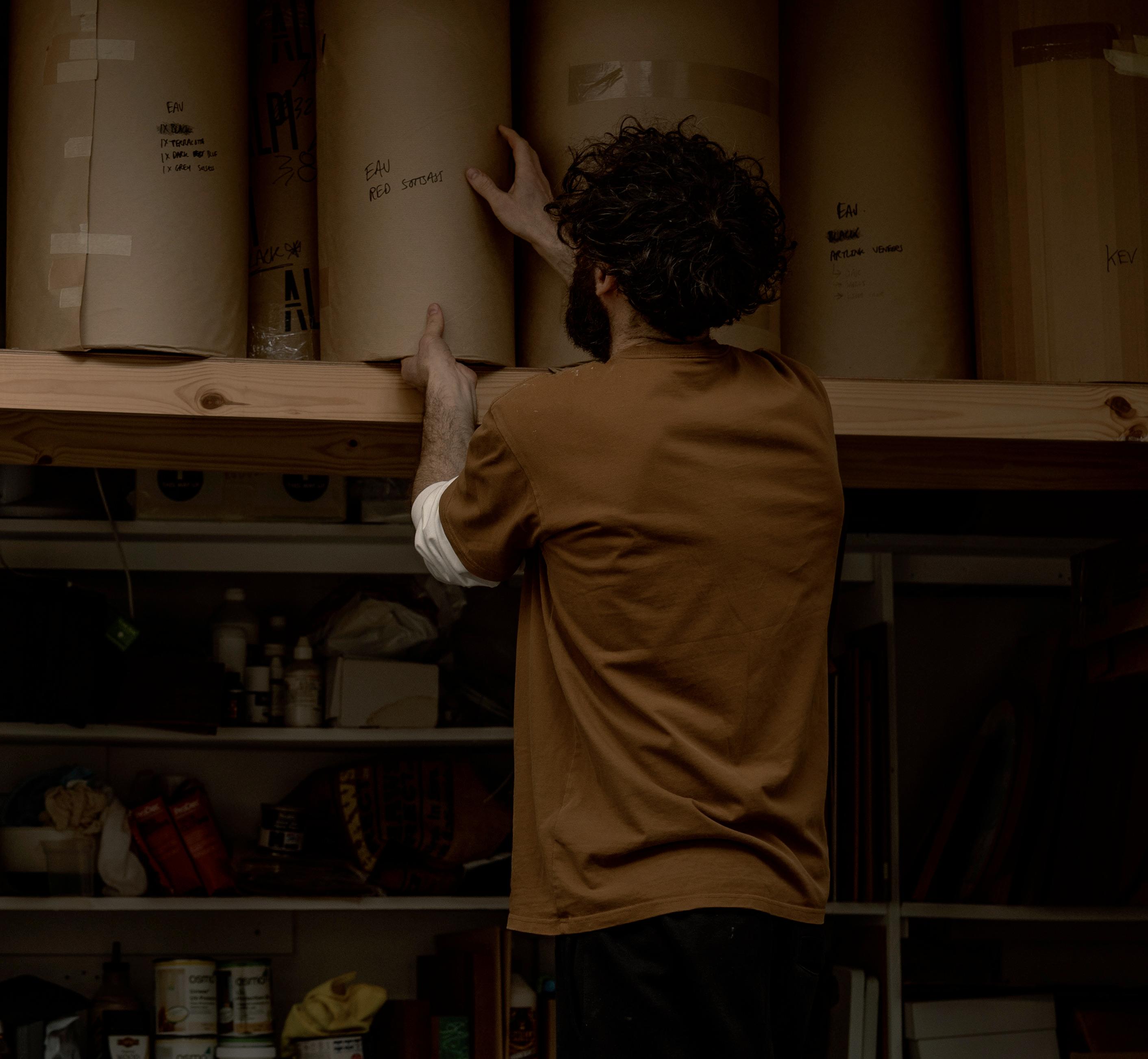
Opposite: Olly Fathers in his South London studio, 2025. Image courtesy of Justyna Kulam.
PORTRAITS OF MATERIAL
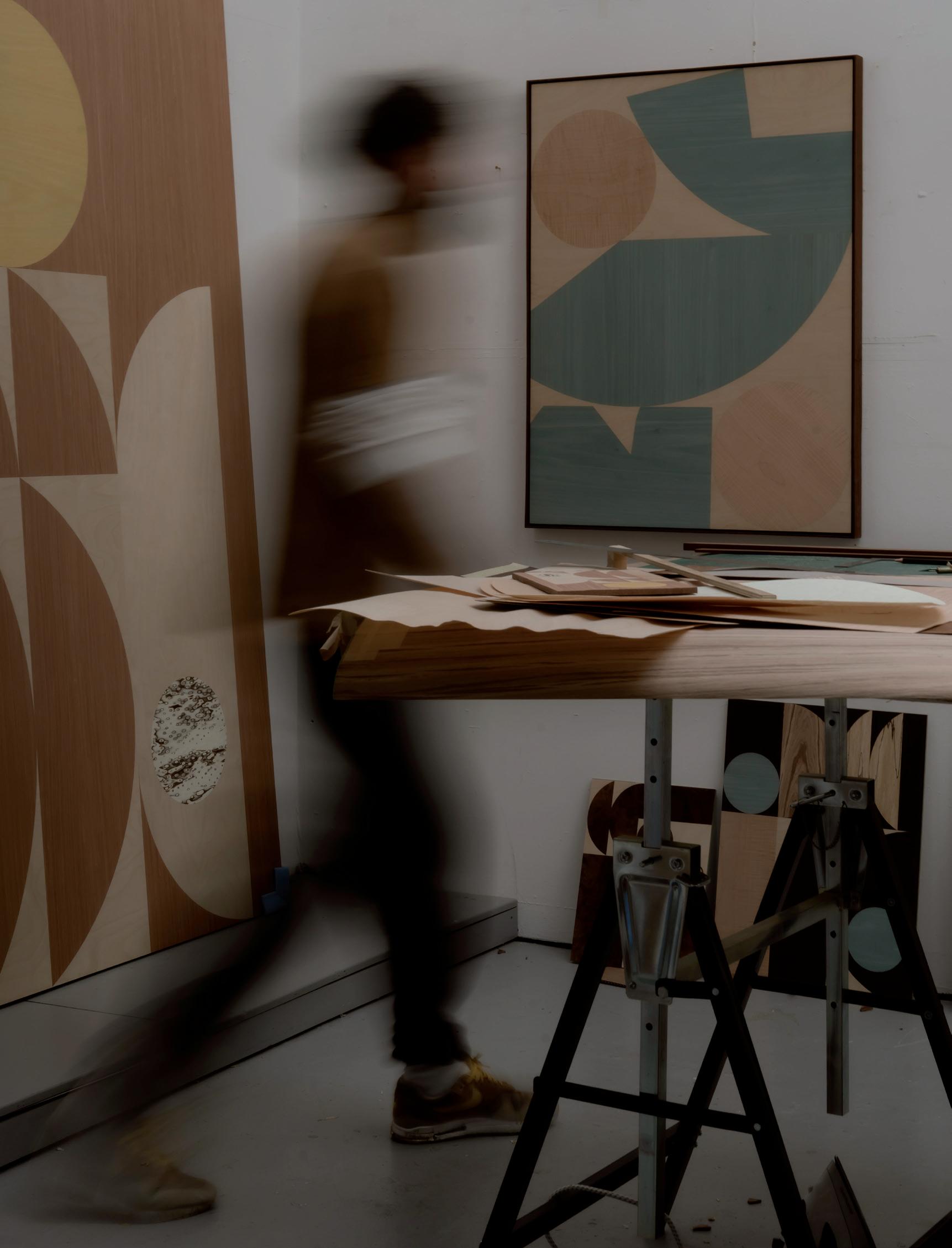
IRECENTLY met with Olly Fathers at his glass-ceilinged, art-crowded studio in South London. As a workspace it has, unsurprisingly, something of the same care and balance recognisable in his work. How does he understand his own creative process? Partly, he says, it is guided by his materials and the way he engages with them. His choice of veneer for a large work, for instance, might be determined by the complexity of the grain, and whether or not its detail will be lost on a grand scale. Some timbers are also denser than others and consequently harder to cut into certain shapes, or perhaps so fragile that they chip when made into a triangle rather than a square. “These are all part of the thought process when coming to designing and ultimately making the piece. The veneer does dictate aspects of the design and I love working within this constant dynamic of problem solving.”
The timber not only guides Fathers’ process, but seems to be what the works themselves depict. Much as Jackson Pollock produced paintings about paint, or Lucian Freud made that same medium “work as flesh,” Fathers’ subject and materials seem intertwined. His only task is how best to reveal the timber’s qualities and the life it has lived up until the moment he presents it to his audience. There is here an interesting parallel between Fathers practice and an idea espoused by Michelangelo in his poem Non ha l’ottimo artista alcun concetto (1547), in which he argues that a sculptor does not create, but instead reveals the work of God encased within a block of marble by removing its superfluous material.
The greatest artist does not have any concept
Which a single piece of marble does not itself contain
Within its excess, though only
A hand that obeys the intellect can discover it.
In a secular reinterpretation of this idea, Fathers invites his audience to view these works as inherent structures of the natural world, waiting to be uncovered. Though this concept is expressed in much of his work, it is perhaps given more
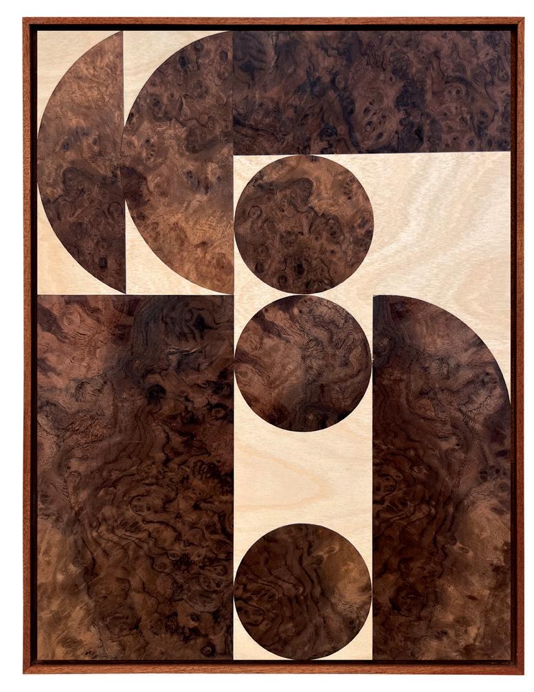
emphasis in Grow than in any of his previous exhibitions. This emphasis is conveyed by minimising evidence of the artist’s hand, such as the application of paint to the timber, which was far more ubiquitous in Tangram the artist’s previous exhibition at JGM Gallery. The result is not as minimalist, however, as one might think, and to compensate for what would otherwise be quite sparse and chromatically dull compositions, Fathers has used many more veneers in Grow than he usually would, sometimes between six and seven for each artwork. This material variety, which includes birch, spalted beech, figured sycamore, tamo, bubinga, Kevasingo, dyed tulip, ash, pear and birds eye maple, amongst many others, results in works with incredible detail and complexity.
One of the few impositions upon the medium are the geometric compositions in which Fathers presents it. These aid the viewer in differentiating the veneers and also highlight their aesthetic qualities. In rough e Canopy, for instance, the curvilinear grain of the marbled walnut corresponds to the curve of the circles it is cut into. rough e Canopy exemplifies another aspect of the works in this exhibition, namely a subtle sense of motion and even precariousness. The three circles almost appear to be moving through the rectangular passage of birch like pinballs collecting at the bottom of a machine. Though Fathers generally evades any kind of narrative or representational reading of his work, he admits that his audience may have their own associations with these compositions, and this is one of mine: the sense of movement and ricochet that a circular form inevitably evokes.
Slow Hours, a work composed with six types of veneer cut into circles, semicircles and rectangles, conveys a similar degree of motion, but with different aesthetic mechanisms. Each shape nestles neatly against another, except for a circle of blue-dyed tulip that Fathers suspends in the negative space of the bottom right corner. Especially in contrast to the other shapes, which seem confined by comparison, this Neptune-like form appears to be drifting away, or perhaps falling into the slant of the semi-circle beneath it. The textural juxtaposition of its vaporous veneer with the hard-edged lines of the fumed oak beneath it also conveys a sense of separation and instability, like oil gliding on the surface of water. The overall effect is an almost imperceptible degree of movement, which is perhaps expressed most distinctly in e Giants. In a wholly new approach, Fathers extends the shapes of this artwork beyond the confines of its border, as though they are, as the exhibition’s title underscores, growing. Much like Michelangelo’s Non ha l’ottimo artista alcun concetto, Fathers here conceives of his materials as existing independent of his impositions upon them. In fact, he extends this concept, suggesting that the artwork encased within is not revealed by the artist through a subtractive method, but that it develops with or without his removal of “its excess”.
The works in Grow can be thought of as portraits of the artist’s material. In presenting the timbers’ inner layers, however, Fathers perhaps reveals more about his subject than the wrinkles on a face ever could. As he explained to me, rot in the wood can disfigure the grain, causing its lines to drop sharply, like the change in rhythm on an electrocardiogram. You can determine the age of a tree by the number of its growth rings and, through the science of dendroclimatology, the climates and atmospheric conditions under which it grew. These works thus display a series of environmental conditions and the passage of time, the culmination of which is their presentation here at JGM Gallery.
FOOTNOTES
Olly Fathers (in conversation with the author), 2025.
Lucian Freud, “Lucian Freud in Conversation with Michael Auping” (May 7, 2009), in Lucian Freud: Portraits (London: National Portrait Gallery, 2012).
Michelangelo Buonarroti, Non ha l’ottimo artists alcun concetto, in e Sonnets of Michelangelo translated by Elizabeth Jennings, 87. New York: Tiger of the Stripe, 1995.
Olly Fathers working in his South London studio, 2025.
courtesy of Justyna Kulam.
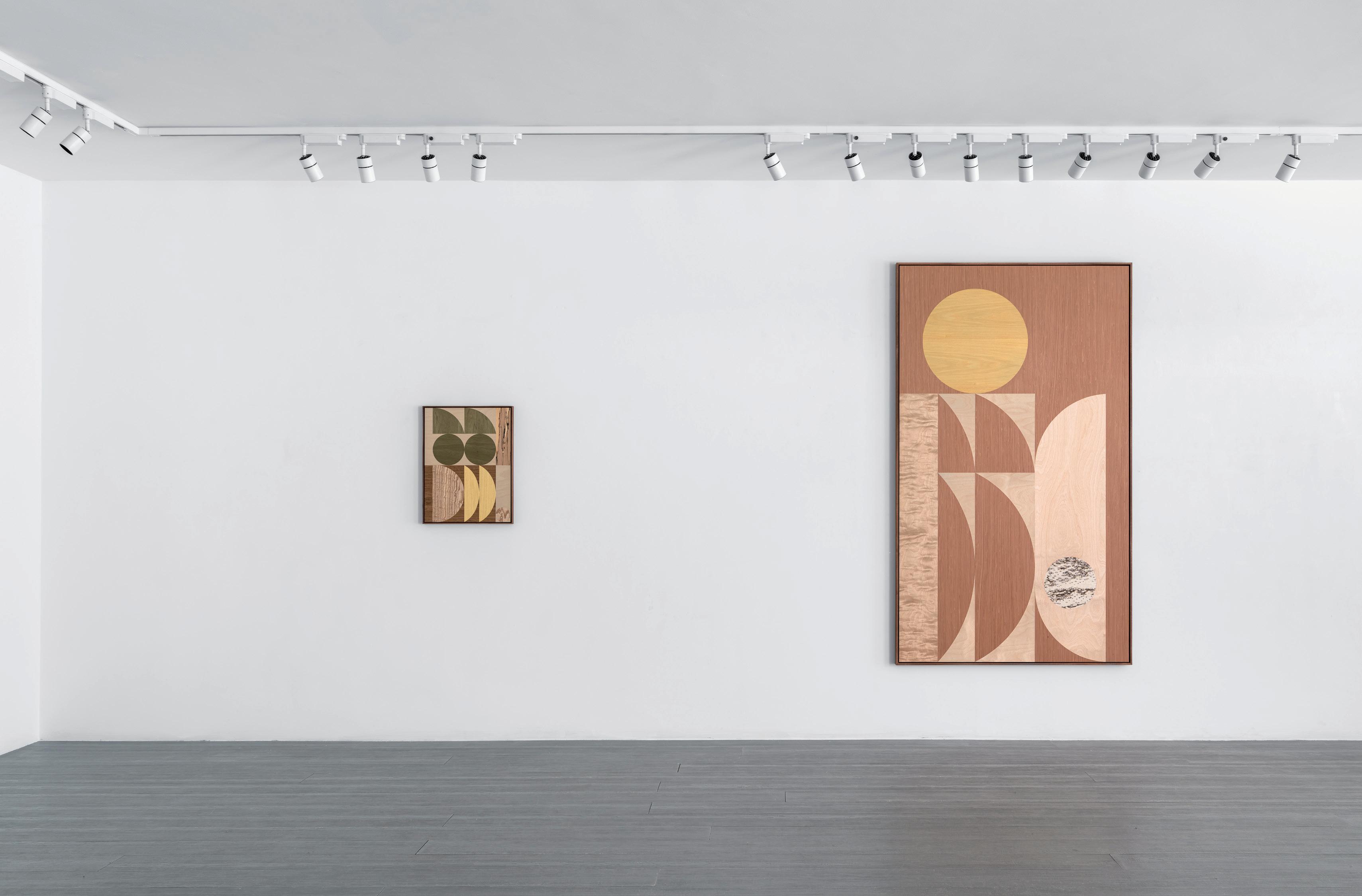
Left to right: Olly Fathers (1) Earthy Gleam 2025, spalted beech, birch, dyed tulip, Japanese ash, English brown oak, 62cm x 47cm, (2) Light Chases Shadow 2025, honey cherry, iced birch, Karelian birch, dyed tulip, birch, 211cm x 123cm. Image courtesy of Paul Williamson.
JULIUS KILLERBY What is distinct about this body of work compared to previous ones which you’ve produced?
OLLY FATHERS In this body of work we (Olly and his partner, Emma Fathers) wanted to use more natural tones with the veneers. In the past we have used a lot more dyed veneers. In Grow aside from the actual compositions, we wanted the emphasis to be on the wood grains themselves.
JK Will the exhibition be entirely devoid of colour, then?
OF Well we thought about it for a while, and we were considering not using colours at all, but then we did decided to incorporate colours which, although not necessarily natural, are colours which one might associate with the natural world; blues and greens for example.
JK In your last exhibition at JGM Gallery, Tangram you seemed to be emphasising the fact that the works in that show were human constructions. The title itself, which referenced a geometric puzzle, was quite an overt reference to that. In this exhibition, however, would you say that the emphasis is more on the organic aspects of your work and medium?
OF Not necessarily with the shapes and forms. We decided to use certain shapes because of the familiarity or associations that one might have with them. Circles, for instance, might be suggestive of a wheel and, by implication, movement. We will also try to make compositions that are balanced, with certain shapes resting on each other, or in a position that creates an overall sense of harmony. Some of these, though, might reference − perhaps subconsciously − some bits of architecture or design. So, the compositions aren’t directly inspired by something necessarily natural but the tones, the palette and the wood grains are definitely trying to reference that a bit more.
JK I imagine that with the use of less colour the eye is also going to be more drawn to the veneer itself.
OF Yes, and as opposed to the works in Tangram which were predominantly monotone and made up of only two veneers, the works in Grow are made up of between four and seven different veneers. Because of this we have to be a lot more considered in the way we put the compositions together, as making all the components complement one another is a much more complex process. We will sometimes have a really interesting veneer, and we ll then have to think how best to use that and how to highlight its qualities. The veneers, in some cases, almost help decide the composition.
JK And because you are using many more veneers, I would assume that the new works are, despite having less stains and dyes, almost more chromatically complex.
OF Yes, and trying to make five or six veneers work together is a lot more challenging. Certain tones and grains pop out more and consequently almost occupy a foreground, whereas others might recede. The use of so many veneers has almost created a lot more compositional depth and complexity. That s taken a greater understanding of the veneers and how they work together.
JK Have you been looking at any new source material for this exhibition? Any new artists who might be on your radar?
OF I have actually just made a point of researching more about the veneers themselves, rather than looking to any art historical references, or anything like that. We have also worked with a lot more suppliers. This exhibition has veneers in it that have come from about six different suppliers within the UK. Before, we might have only used two or three. So we have really tried to expand the types of material that we are working with.
JK What are some of the veneers that you ve used in this show?
OF There’s one called tamo, which is Japanese ash. It generally has this in-
credible figuration going through it, so I am incredibly excited to have that in the exhibition. There’s also some engineered veneers, which are produced in a really interesting and eco-friendly way. What the suppliers do is they replicate rarer or more endangered wood veneers by building up layers of pigment on a more common veneer. They look nearly identical to the real endangered veneers but are, as I say, a more responsible way to source them, and they have been a lot of fun to work with.
JK Have you got quite a close relationship with your supplier then?
OF I do now, yes.
JK You and Emma are probably their best customers, I imagine.
OF Some of their most frustrating customers *laughs*. They do like the variety of veneers that we are interested in. Often, people want to buy one veneer in bulk, whereas we want lots of different and interesting ones.
JK Are some veneers harder to work with? Are denser timbers, for instance, harder to cut?
OF Yes, definitely. One of the things we have to factor in when designing the compositions is that some of the timbers are prone to splitting, or when they arrive they are not very flat so you have to treat them before cutting. If it’s a larger piece it has to have multiple joins in the veneer. Some of the veneers also lend themselves much better to that process than the others. So, when we are designing and planning the pieces, we are very much thinking, “Okay, that rules out this or that”, or “If we want to use that veneer, it has to be that size.” Things like that. These are all part of the thought process when coming to designing and ultimately making the piece. The veneer does dictate aspects of the design and I love working within this constant dynamic of problem solving.
JK What is the title of this exhibition and why?
OF The title of this exhibition is Grow There’s an obvious double meaning, because of course trees and wood grow, and particularly in this exhibition we’ve really focused in on the natural burls and beauty in the grains of the wood. But I am also seeing this body of work as a development in our practice. An artistic growth.
JK I often get the sense with your work that, as the viewer, you are invited to consider variations of the composition that you, the artist, have presented. I suppose the title is consistent with this, in that the audience is encouraged to consider more expanded iterations of the artwork s current form. Would you agree with that?
OF Yes, as I have touched on before, with the shapes and forms that we use, there is a sense of movement toward something else. In Grow, some of the works we are producing for it are not going to be contained by the conventional rectangular or square format, and there will be works with shapes and forms that extend beyond the border of the artwork.
JK And I guess the grain of the veneer is also something that the audience would inevitably associate with growth and trees. Something that is not entirely static, but is developing almost imperceptibly.
OF Yes, the grain itself is such a great natural record of time passing. Although static pieces in themself, when you study them, the works really do give that sense of something that has grown, each with their own unique record of this in completely unique wood grains.
JK Because you are using less colour in this exhibition than you previously have, do you have to use particularly interesting wood veneers to make a compelling piece of work, and perhaps in answering that, could you explain what you and Emma are looking for when you are deciding which veneers to work with?
OF Yes, the way we approach this body of work is to have less contrasts between the veneers, and for the overall effect to be a lot more subtle. The nice thing about the veneers is the way in which they catch the light sometimes. They change as you walk around them. Something we have always been interested in is trying to make a work where the audience is encouraged to move around it and bend down to look up at it, look from the side, to catch the light in different ways. In doing that, it s actually a bit more challenging to get a veneer to work next to another one. It’s very easy if they are strongly contrasted or look very different to each other, but it s actually quite challenging to pair two veneers that are only subtly different, and then to expect each one to stand out. Often we’ll play with things, like having the grain go in a different direction. This can create a subtle difference in how the light hits it, even with the same type of wood. So there are some elements like that, and then we do have bits that highlight some really crazy, interesting veneers, which have this interesting patternation going through them. It’s been finding some of these veneers and being able to use them on this scale which has been a really interesting part of this show.
JK Am I right in saying that this is the first time you have made works which protrude beyond the borders?
OF We have made wall-based sculptures before, however, those were much more three-dimensional, whereas these new works are more similar to the twodimensional works we make, but with the extensions beyond the border. Also, because they won’t have frames, you’ll be able to see the veneers going around the edges, almost tricking the eye into thinking of them three-dimensionally. They’re a lot more playful.
JK How do you put these compositions together before cutting out the veneers? Will you make preliminary drawings?
work skills, but you know being able to build walls in galleries or do a shop fitting is a very different skill to dealing with wood veneers. I used to make quite intricate paintings, using masking tape. Everything that I’ve ever done has always been quite delicate and intricate, but I had never actually handled and worked with wood veneers. That s been part of the reason as to why it’s been so much fun, learning about it and researching how to do it, looking at YouTube, reading books, various different things, but mainly trial and error. It s been that element that s been the driving force, and still is really. It’s this constant exploration of figuring out how to work, how to make this bigger, better, more interesting.
JK So your process is your main inspiration then?
OF Yes, definitely. The way the works are made, it’s rare that we’d finish a body of work and be struggling for another idea. There s so many different possibilities with the material, and so many ideas that come along with it, that it’s more a case of having time to explore them properly.
JK Do you have a favourite shape that you use, and what do you think is the effect of that shape in your work?
OF When I was first making them, I think it was far more rigid. I’d use primary shapes like squares, rectangles, and a recurring thing is the use of a circle. I think that’s because it s a very satisfying and powerful shape that people have a lot of associations with. It also has these connotations with movement. So it’s a useful shape, it’s a strong shape but, technically, it s actually quite a tricky thing to cut out from a veneer.
JK How do you cut the circles?


’ll be the making a big veneer jigsaw puzzle, which then
OF Yes, because of the nature of the medium, when we are making these works everything has to be meticulously planned out to the millimetre. Sometimes, it might start off with a sketch, but often it will be drawn up straight on the computer in Adobe Illustrator. Initially, we will be working with lots of different designs. We then decide our favourite ones and tighten those up, scale them up, to perfectly match and join everything. That’ starting point in the process of cutting the veneers into all the shapes. You re then effectively making a big veneer jigsaw puzzle, which then gets joined and glued together.


JK We were speaking before about how when you were younger you used to also be interested in figuration and portraiture. Your work has clearly come a long way since then. When did you first come up with your current practice?


OF I think it was 2019. It was just before Covid when I started experimenting with wood veneer. Not in the way that we are now, but just out of intrigue. I was just interested in the medium and how people worked with it. Initially, my experimentations with it didn’t go all according to plan but once I started to figure it out and realised that it was working for me, it just sort of clicked.


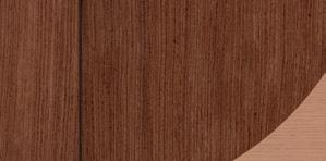
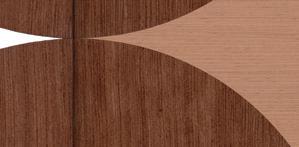
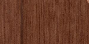
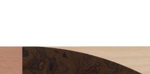
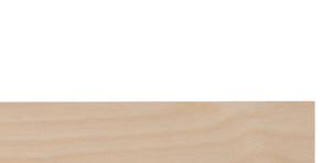
Essentially with home made compass cutters of varying shapes and sizes. s far less high-tech than people might think.
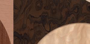
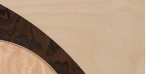
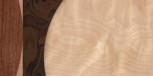
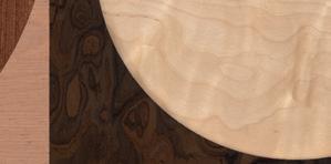
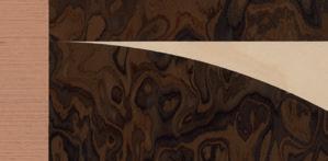
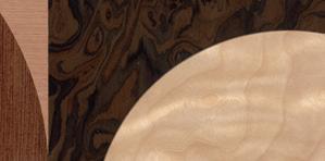
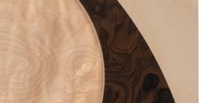
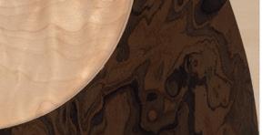
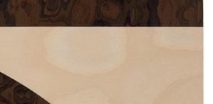
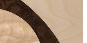


JK Did you already have the woodwork skills necessary for it?
Did you already have the woodwork
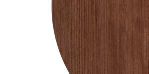
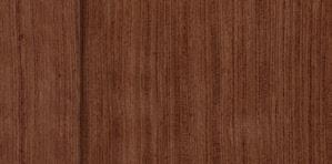
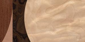
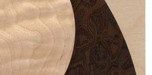

OF No, not really. I mean, I had wood-
No, not really. I mean, I had wood-

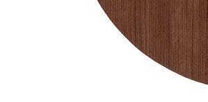

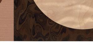
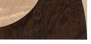


Opposite: Olly Fathers, The Giants, 2025, bubinga, iced birch, walnut burl, cherry and birch, 85cm x 85cm. Image courtesy of Paul Williamson.
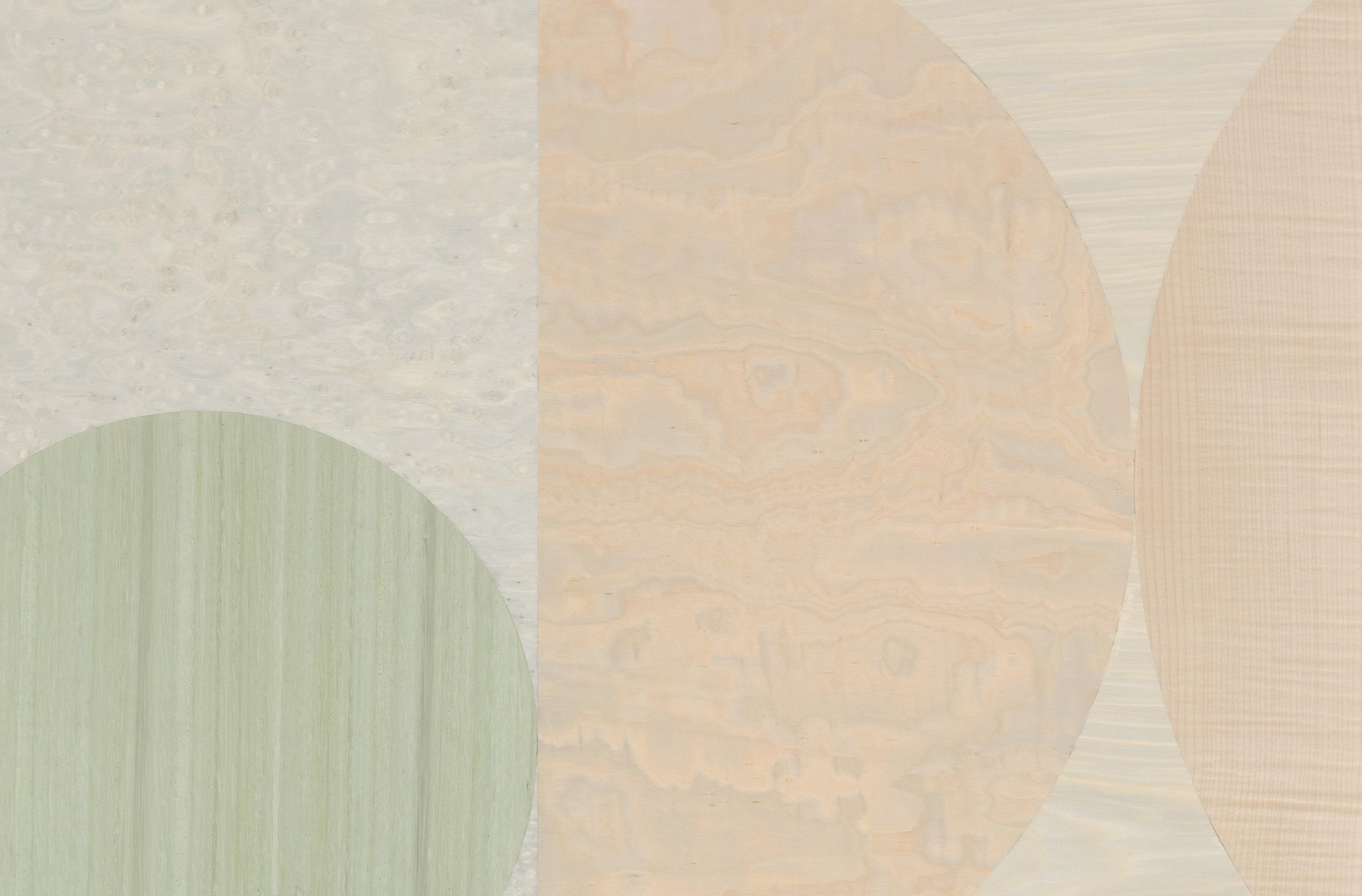
Olly Fathers, The Calm Of This Space (detail), 2025, dyed eucalyptus, dyed birds eye maple, figured sycamore, ash, bleached beech, birch, iced birch, iced maple, 124cm x 91.5cm. Image courtesy of Paul Williamson.
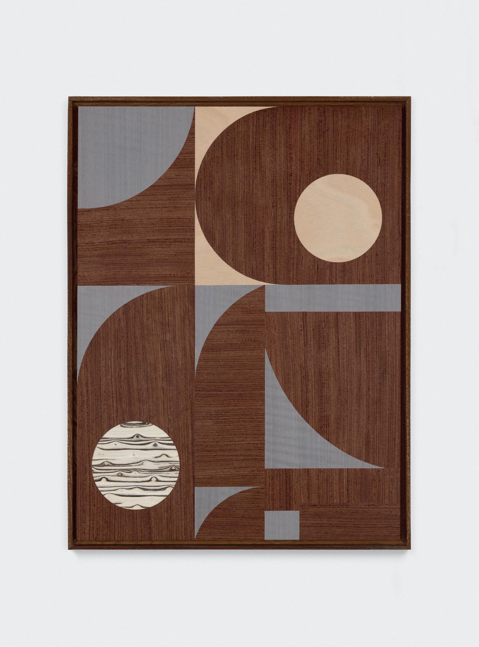
JK But painstaking and nerve-wracking I imagine?
OF Yes, definitely. You are also kind of limited by the shapes that you can use. They have to be hard-edged shapes so that you can cut and pair them with other veneers. If they are not hard-edged you obviously can’t join them. When we were first making them, they were far more rigidly composed and we were applying more rules to them. For instance, we’d make works composed of exact halves, thirds, or quarters of each shape, whereas now the shapes and their relationship to each other is a lot more fluid. Now that we also have a better understanding of how to cut the shapes, it’s given us a lot more scope compositionally. Now they don’t have to necessarily be a perfect semi-circle or it doesn t have to be a completely straight square or rectangular shape.
JK Are your works wholly devoid of narrative? Do they perhaps relate to certain moments from you and Emma’s life?
OF No, they don’t really relate to a certain moment or anything like that. Afterwards, we might see something in it, but that s not a driving force in the making of these works. I look back at them now and of course for me they make me remember certain times in my life, but that s more to do with what was going on whilst we were making them.
JK If they are devoid of narrative, is there then a feeling which you are trying to convey or elicit from your audience?
OF I think that the feeling or sensation can come across in the choice of the veneers and shapes. Some of them have a softer, calmer feeling than others. A lot of people say to me that they find them really calming and tranquil. I also think that has to do with our familiarity with the material. When some of the veneers are put together in certain ways, they do have connotations of things like the sea and movement. So, we are mindful of that when we’re making them but we’re not trying to depict that as a direct sort of reference. You know, we are not trying to make it look like a seascape or something quite as obvious as that, but we are aware that people have these kinds of connotations with them as well.
JK So you are comfortable, then, with people interpreting the work in their own way, rather than receiving it in the exact way that you and Emma intend?
OF Yes, I love to hear peoples interpretations of our work. I actually heard someone say that one of them looks like a penguin *both laugh*. I think that part of the beauty of it is it can really trigger different emotions for different people. As the person making the pieces it s really nice to hear that, and hear the benefits that it’s giving others.
JK I know that architecture is a big influence on your work. Is there any type of architecture which is of particular interest to you?
OF I am very interested in minimalist architecture. Brutalism is something I have always been fascinated by. Even around here in South London, just over the road from my studio, there s the Brixton Recreational Centre. In many ways it s quite an ugly building, but it has a lot of really sharp edges and joins. If you go inside, you’ll see that there are overlapping balconies and interesting things like that. It’s not necessarily a building that everyone would like but I find it really interesting. There’s another building called Dawsons Heights, which is near the Horniman Museum, also in South London. I actually met both the architects. They’re a couple called George Finch and Kate Mackintosh. I was speaking to them about the architecture and what they were trying to do with it was actually really interesting. The building is a block of flats, which is ostensibly quite boring. What they did though was they made the balcony of each flat stick out in different areas. Kate s reasoning for that was, as she described it to me, so that when kids are playing in the playground, they can look up and point to which is their flat, and have something to reference it by. I thought that was really nice.
JK For this exhibition, I know that you are making a very tall work. You mentioned to me earlier that you are trying to create this effect that as the viewer approaches it they are almost enveloped by it. Has this love of architecture
prompted you to work with scale a lot more, and to take advantage of its effects?
OF Yes, I think so. That work will be very tall and narrow and the idea is that when you stand in front of it, it will have an overpowering sense of height and loom over the viewer. It’s not meant to intimidate but it will just be nice for it to have that presence.
JK Almost as though you can t take it in all at once?
OF Yes, exactly.
JK Are the shapes in your work ever representational? Might a circle perhaps represent a globe or a clock? Or might a square ever represent a window or a building?
OF Not directly but sometimes those shapes are used sort of like tools in a way. If a circle is overlapping another shape, like a square, it kind of changes it. It might suggest something else, almost as though the shape is going through a window, and that then creates a sense of depth in the work. I think that I sometimes use a subconscious reaction to things like that, like windows, door frames, man-made structures. There’s an incredible installation that I once saw. It was a Fred Sandback work. He’d made a doorframe with string and suspended it in midair. There was nothing else. I had this pretty profound moment when walking through the doorframe, and I felt this chill. So, I will sort of use shapes that we re familiar with as a sort of tool to create depth or suggest something. They are never directly referring to something representational but I am certainly aware of the power of the shapes and the effects they can have on the audience.
JK Could you speak a bit about the importance of texture in your work?
OF Yes, well with this exhibition we are trying to put more emphasis on the veneers themselves and, as I say, use a lot more of them. We’ve spent a lot of time looking for different species of veneers for this show. There s a few that have much stronger and striking patternation than those we ve previously used. Often, the patternation can be affected by some kind of pain or discomfort that the tree has experienced, which I find quite fascinating.
JK So the grain can tell us something about the environmental conditions that the veneer has been subjected to?
OF Yes, you can get figuring through the tree, which is what gives some of the veneers this beautiful ripple effect. That often occurs as a result of the tree going through a certain degree of discomfort. Rather than the grain going straight up, it s effectively sort of moving and shivering as it’s growing. The oak, for instance, is a tone that many people will be familiar with, because of its use in furniture and certain things, but you can get different tones in oak that occur because of fungal infections. That can make the timber darker, for instance. You also sometimes find gradients going through the timber and that often happens because the wood has fallen and been partly submerged or buried in a bog, sometimes for hundreds or even thousands of years. Wood veneer is so fascinating to me, and that is a massive driving force in my practice, the material itself and researching and learning about it.
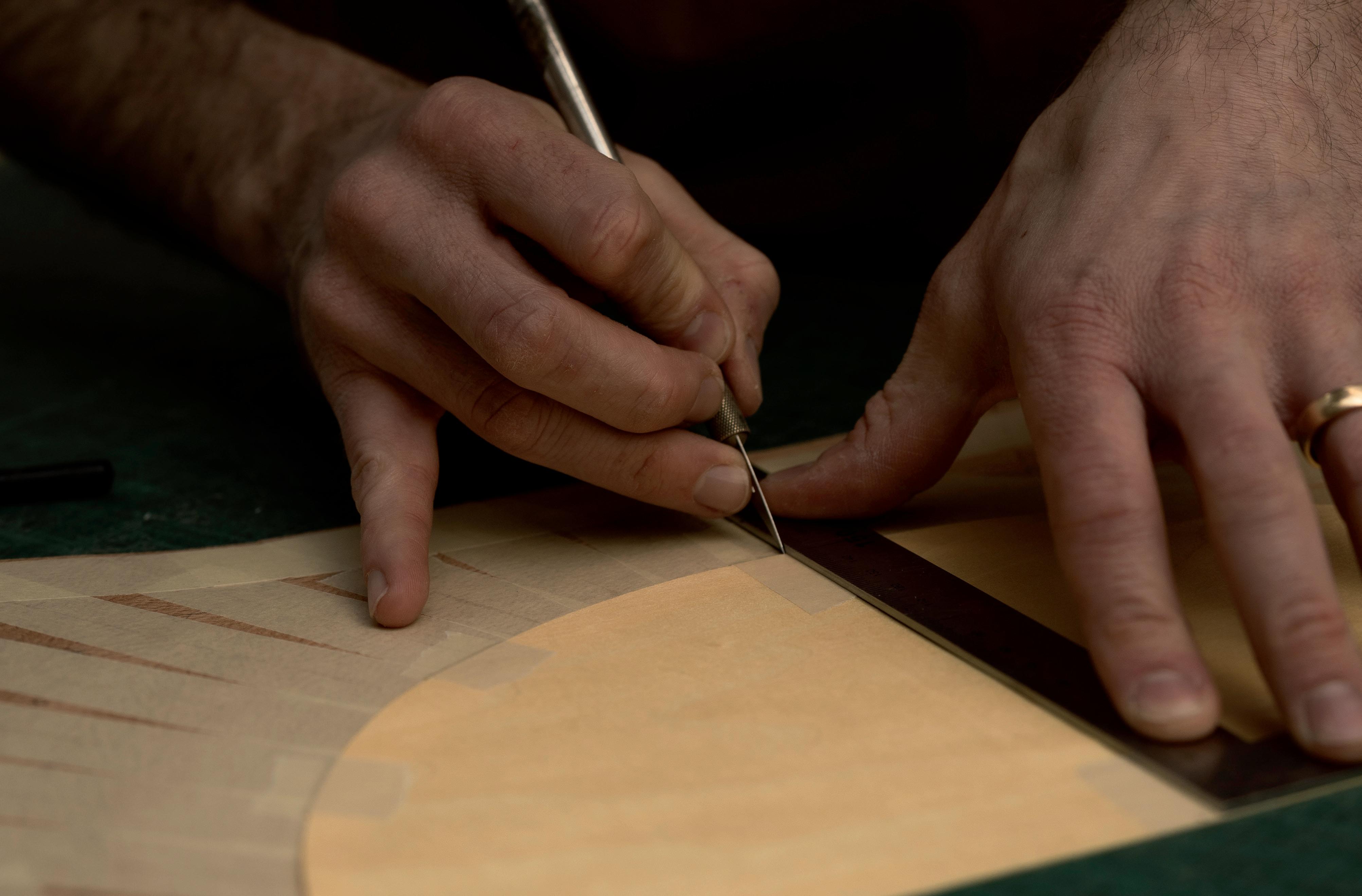
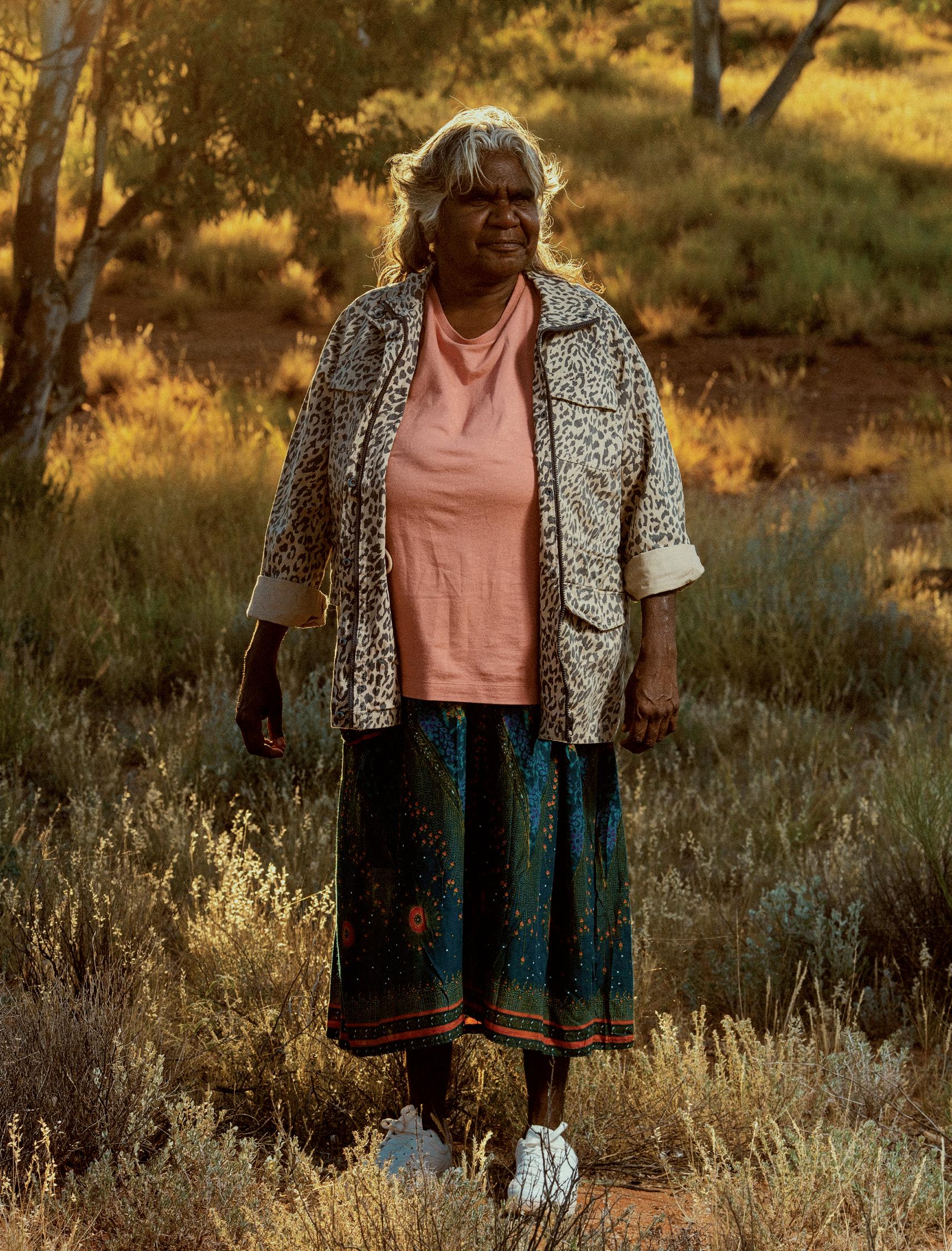
WHAT DO YOU SEE?
FROM 4 FEBRUARY TO 8 MARCH 2025 JGM GALLERY EXHIBITED WHAT DO YOU SEE? , AN EXHIBITION OF PAINTINGS BY 12 FIRST NATIONS CONTEMPORARY ARTISTS. ON THE OCCASION OF THIS EXHIBITION, ANTONIA CRICHTON-BROWN WROTE ‘LIVING TRACKS: NETWORKS IN INDIGENOUS CONTEMPORARY ART’, AN ESSAY IN WHICH SHE CONNECTS THE EXHIBITED WORKS TO THE ARTISTS’ CULTURAL AND REGIONAL CONTEXTS.
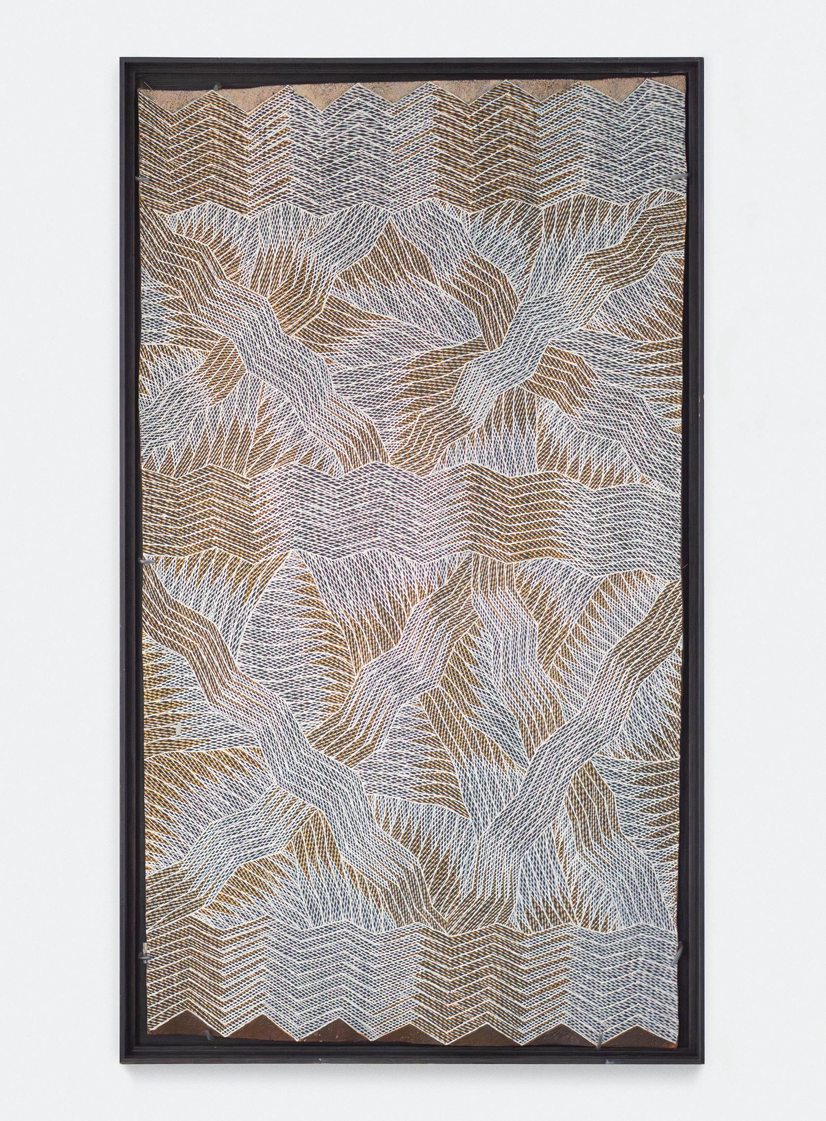
NETWORKS IN INDIGENOUS CONTEMPORARY ART
What do you see? is an exhibition about the perception of Indigenous contemporary art. It starts from the principle that our preconceptions often determine how we engage with a work of art and that our assumptions can reduce our appreciation and understanding of it. This was historically the case in approaches towards Indigenous contemporary art, demonstrated by the primitive bias of many twentieth-century analyses of work from the genre. This essay accompanies the exhibition to highlight the multiplicity of individual contexts in which the exhibited works were produced, and to elucidate the connections between them. These works tell of diverse artistic practices, local and specific knowledge, proximity and distance, the personal and planetary implications of art, tradition and breaking with it, the idea that, as John Berger wrote, “Every image embodies a way of seeing.”
The paintings of two women artists, working 340 miles apart across the Gulf of Carpentaria, demonstrate the plural ways of seeing that are implicit in Indigenous contemporary art practices. The octogenarian Kaiadilt abstractionist, Mirdidingkingathi Juwarnda Sally Gabori (1924-2015), painted My Country in 2009, the same year in which the younger artist, Manini Gumana (b. 1977), painted Garrapara Both images are depictions of the artists’ respective sea Country: the coastal waters on Bentinck Island’s southern side where Gabori was born and a sacred burial area in Blue Mud Bay for Gumana’s Dhalwangu clan. The subject of these salt waters is, however, addressed differently by each artist.
Gabori portrays her Country as a vastly abstracted colour field. The painting’s rugged texture and arrangement of colour in distinct blocks implies the landscape’s depiction from an aerial perspective. Gabori’s Country was Mirdidingki, the toponym that her forename comes from, its suffix -ngathi translating from Kayardild language as “born at” Gabori expresses her identification with place through both the intimacy of her contact with her medium, and her work’s title. In My Country, Gabori smeared technicolour acrylic across the breadth of the canvas. Her broad lashes of paint bleed at the contact points between colours, showing the speed at which she worked and her alla prima (wet on wet) treatment. My Country’s formation of shocking white, pink, orange and blue contours suggests vast passages of sand, salt, sea and sky made iridescent by bright sunshine. Brilliant colour such as this also tells of the liveliness Gabori felt from the world that she saw.
My Country evokes an attitude of observing and reproducing the appearance of a landscape spontaneously as it changes under shifting light conditions in a passing moment, and this relates further to Gabori s biography. Gabori and the other Kaiadilt people of Bentinck Island were forcibly removed by missionaries to Mornington Island in 1948, which catalysed decades of immense social and geographic dislocation. It was during this period that Kayardild was hardly ever spoken and traditional culture was virtually abandoned. Gabori returned to Bentinck Island in the 1990s when a small outstation was built in the southeast at Nyinyilki, and even then, it was not to stay but to visit. When Gabori began painting at Mornington Island Arts, she had until then spent half her life separated from her Country, witnessing the dampening of her culture and language. Gabori’s personal life informs a biographical reading of her collected works, as not only were they feverishly produced but stylistically idiosyncratic too, as are paintings by other Kaiadilt women artists practicing in the same era. These works arguably embody Gabori’s individuated way of seeing and comprehending her world.
Gumana’s portrayal of Garrapara conversely draws on traditional Yolngu aesthetics, techniques and culturally significant motifs. Painting on bark, Gumana uses a marwat (hair of the head), a brush fashioned from human hair, to mark out rectilinear designs which she then infills with rarrk (crosshatching) in earthy ochres. In a Western frame of analysis, crosshatching is used to give the impression of a plane image s tone and its three-dimensionality, which in part is also true of Gumana’s depiction. A mesh of layered linework creates depth in the image and alludes to Garrapara’s deep waters, while the zigzagged and intersecting boundaries of these crosshatched segments liken to cresting waves. In Garrapara, however, form also represents the metaphysical world. The desired effect of rarrk in Yolngu painting from eastern Arnhem Land is, as Howard
Morphy describes, to transform a “relatively flat dull surface to one of bir’yun (shimmering brilliance)” which is “a manifestation of the ancestral power that lies behind the painting.” Garrapara’s geometry encodes the miny’tji (clan designs) of Gumana s Yirritja moiety, which the Yolngu believe are the residue or footprint left by the ancestral beings on the country during Wangarr (Dreaming, or creation time). Gumana’s mark and pattern making therefore imitate the actions which both created the world and continue to make it meaningful. Gumana tells us that there is a physical link between creation, the world and the viewer, a connection emphasised by her use of bark as a canvas and naturally occurring ochres as paints. Through Gumana’s practice, bark from the artist’s immediate environment is transmuted to a sculptural object, into a metaphor in its context of fine art for the physical world of eastern Arnhem Land. Gumana similarly transforms ochres into paints which she uses to depict the life and history of her physical world, meaning which is again transferred into this new context. It is through these allusions via medium to place and peoples that Gumana’s experiences and histories are communicated cross-culturally.
This cross-culturality is paralleled in two paintings, Mokuy (2022) and Ngaraka (Bones) (2024), by Wägilak artist, Wally Wilfred (b. 1958). While Wilfred is Yolngu, like Gumana, his use of acrylic paint and vivid hues contrasts the canonical use of organic mediums by many Yolngu artists. Wilfred’s choice of colour and medium is partially indebted to his relocation in his adolescence from his country, Ngilipidji, west of Blue Mud Bay, to Ngukurr, which is located on the Roper River in southeastern Arnhem Land. Wilfred s style reflects more closely the aesthetics of the movement initiated in this region by his grandfather, Djambu Barra Barra, among other artists. As is the case of many artistic centres established in the remote communities of Australia, Ngukurr grew out of a mission settlement (1908-1968), which housed Aboriginal people of many different language groups escaping the violence of the colonial frontier. Barra Barra revised the traditional X-ray images and rarrk technique of Yolngu bark art through a fluorescent palette on canvas. It is as Judith Ryan writes: “Senior Indigenous people, living in exile from their homelands, forced to live according to the dictates of the colonisers, have invented cutting-edge art forms at the very heart of loss.”
Wilfred continues his grandfather s modification of Yolngu representation, painting on sheets of metal rather than canvas and scours into this material’s surface to create a modulation of tone and texture. Wilfred describes these markings as “tyre tracks in the metal”, alluding to the influence of both Western modernity and travel in his work. Mokuy and Ngaraka (Bones) are perhaps the most readable through Western eyes because of their representation of human features. In Mokuy, Wilfred outlines the figure of a mokuy (sinister or shadow spirit), which in Yolngu languages is the ghost of a deceased person. The viewer finds an immediate point of contact between the image world of the Yolngu and themselves through the face of this figure. In the mokuy s wide eyes, open mouth and raised hands, one cannot help but find an aspect of spooky humour, as if the ghost is saying, “boo!” This sonic quality is further enhanced by the performance of figures between the mokuy’s skeletal legs. Two figures play musical instruments and sing, while another two dance, demonstrating how to perform the mokuy dance. It is often humour, music and dance which connect people cross-culturally, an effect which Wilfred’s work achieves. As Henry F. Skerritt notes, this is a global theme in contemporary art, where its makers are “seeking ways to forge connections between disparate and seemingly incommensurate consciousnesses.”
Seven paintings by four Warlpiri women demonstrate the consistency of schema and symbolism in paintings from the Lajamanu Aboriginal community. Rosie Napurrurla Tasman (c.1935-2018), Lily Nungarrayi Hargraves (1930-2018), Myra Nungarrayi Herbert (b.c. 1946) and Margaret Pamparriya Martin (d. 2023) represent a generation of artists who reached their adolescence walking across the Tanami Desert in time to the rhythm of environmental change. These artists later began a more sedentary life in Lajamanu, which became one of a second wave of artistic centres for Indigenous contemporary art in 1986 after the example set by the artists of Papunya Tula. In part, the impetus for making work in the cases of the Papunya and Lajamanu schools was that painting could be educational for Europeans and for future generations of Aboriginal people, and that it brought a means of financial sustenance to remote Indigenous communities. These
Manina Gumana, Garrapara
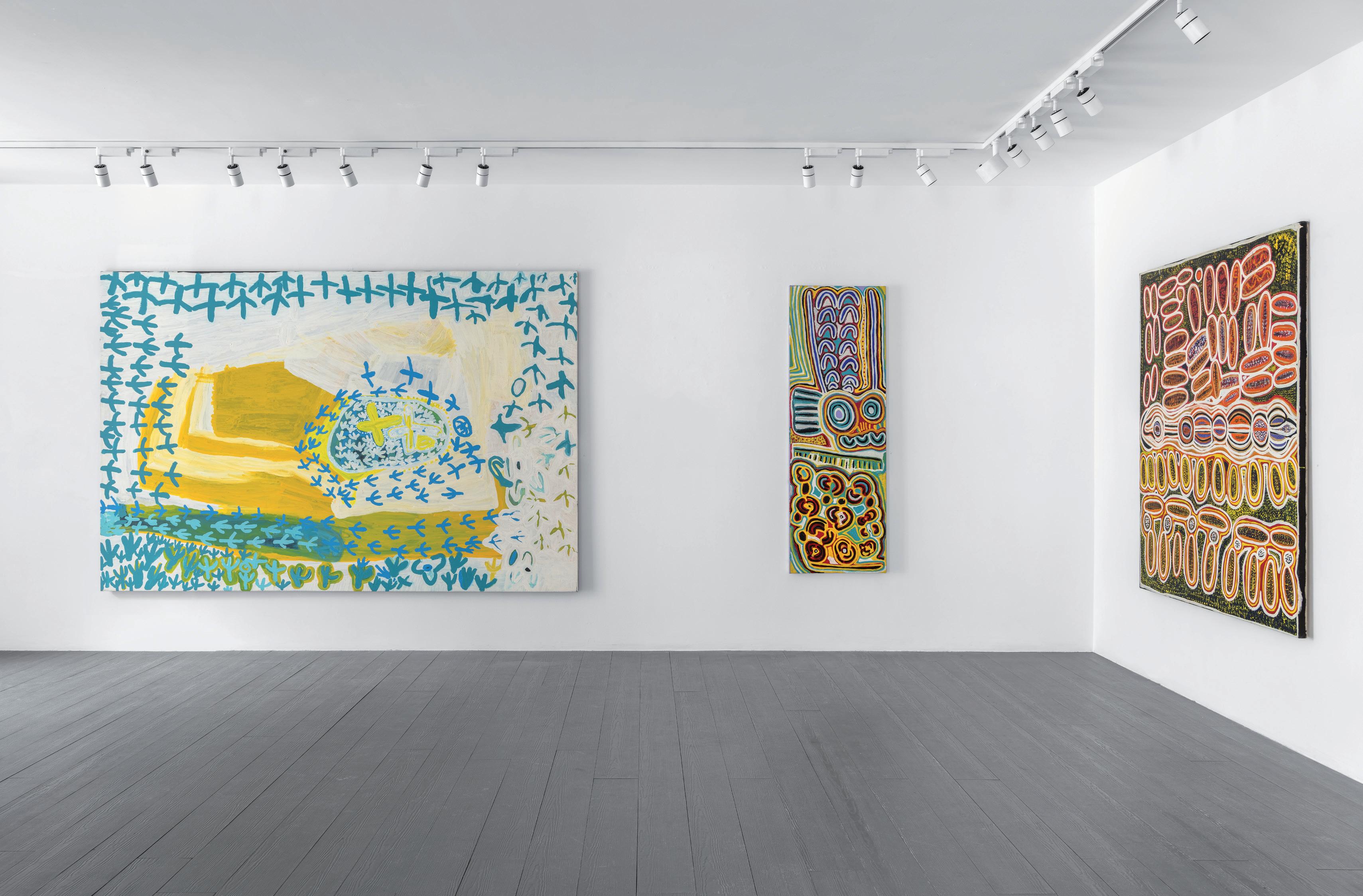
Left to right, (1) Lily Hargraves, Turkey Dreaming, 2015, acrylic on canvas, 200cm x 300cm, (2) Rosie Napurrurla Tasman, Seed Dreaming, 2010, acrylic on canvas, 180cm x 60cm, (3) Rosie Napurrurla Tasman, Seed Dreaming 2013, acrylic on linen, 180cm x 150cm. Image courtesy of Paul Williamson.
factors contributed to growing economic and political empowerment and selfdeterminacy among the Indigenous peoples of these communities after many had experienced enormous social and cultural upheaval. It was at this time that, as Christine Nicholls writes, “almost every member of the community was making art.”
A common thread which links these four women’s paintings is the repetition of potent and graphic motifs clustered together in turgid formations. The arrangement and seriality of these symbols across all seven works demonstrate the artists’ shared aesthetic and belief system. Hargraves’ and Martin’s paintings of the turkey Jukurrpa (Dreaming, or creation time), for example, both picture the splayed, three-toed footprints of the wardilyka (bush turkey). Similarly, the contrast between the pictorial simplicity and the grandeur of the painting’s scale in Hargraves’ Turkey Dreaming (2015) conveys the artist’s certainty in the value of these motifs. Tasman’s Seed Dreaming (2010) is composed of a motif that is replicated in depictions of the same Jukurrpa from Lajamanu. In this painting, two pillars of transverse lines converge on a central roundel, representing travel from different directions to the site of the Dreaming. On either side of these pillars, arcs indicate the gathering and transportation of seeds in coolamons, vessels made from the bark of a tree and moulded over a fire. The outline of these motifs in bright white heightens them, and their encirclement in neon orange and blue radials crystallises the image’s intensity. Tasman’s design is concentrated on the central column of motifs, an emphasis which further conveys her belief in the significance of Warlpiri law.
Seed Dreaming hangs as a triptych beside Martin’s Turkey Dreaming (2010) and Herbert’s Women’s Dreaming (2023), all vertical compositions in rectangular frames. The structure of these works resembles the first examples of paintings using Western materials to be made by Warlpiri artists in Lajamanu. These works, which were painted mostly by senior law men with housepaint on towering composition boards, are known as the Lajamanu panels. Tasman’s, Martin’s and Herbert’s paintings are, however, on a smaller, more transportable scale than their predecessors, and are painted with elongated markings rather than pointillist dot work. The elders who painted the Lajamanu panels described their ambition before the project’s initiation as, to “give a glimpse of the way we venerate the sacred Heroes who have given us our identity so that Europeans can have some understanding of what we are, and of how strongly we feel about being allowed to remain ourselves.” Tasman, Martin and Herbert express a similar desire through their paintings, which – emphasised by their rectangular composition – behave like portals to Warlpiri culture.
Each work exhibited in What do you see? is an evocation of its artist’s worldview, their relationship outward to the realities that lie beyond what can be represented. The networks made manifest by Indigenous contemporary art are multiple and far reaching, connecting its artists, their creation stories, different earth-bound and celestial geographies, non-Indigenous people, their cultures and philosophies. Indigenous contemporary art reminds us that we have never been closer in terms of accessing and understanding all the diverse and coeval realities of our world, and that recognising these differences is a movement towards greater unity.
FOOTNOTES
John Berger, “Chapter 1,” Ways of Seeing, https://www.ways-of-seeing.com/ch1 (accessed 23 January 2025).
All works referenced are exhibited in What do you see? at JGM Gallery London (4
February - 8 March 2025).
Berger, Ways of Seeing.
Nicholas Evans and Penelope Johnson give an account of the mission’s strategies to prevent Kaiadilt people from speaking their own language and the cultural effects of the Kaiadilt people’s separation from their ancestral lands to support their analysis of the emergence of Kaiadilt women’s art and their idiosyncratic styles. In Nicholas Evans and Penelope Johnson, “Bilda Miburiji Kurrij (Seeing with Far Eyes): The Root of Kaiadilt Women’s Art,” Art Journal 49, 12 September 2013, https://www.ngv.vic.gov.au/essay/bilda-miburiji-kurrij-seeing-with-fareyes-the-root-of-kaiadilt-womens-art/ (accessed 23 January 2025).
Sally Gabori had a prolific nine-year career from 2005-2015, painting over 2000 works; Evans and Johnson write that, “Each has invented her own distinctive artistic language for showing us how they see their world.” In Evans and Johnson, “Bilda Miburiji Kurrij.”
Howard Morphy, “Making the familiar unfamiliar: The aesthetics of eastern Arnhem Land art,” in Hetti Perkins and Margie West (Eds.), One Sun One Moon: Aboriginal Art in Australia (Sydney: Art Gallery of New South Wales, 2000), 73-74.
The idea that mark making mimics the act of creation is one taken from John Carty’s essay on Carlene West, “Carlene West: The End of Exploring,” in Henry F. Skerritt (Ed.), Marking the In nite: Contemporary Women Artists from Aboriginal Australia (Munich: Prestel Verlag, 2016), 92-105.
Of course, there are Yolngu artists who work with materials that are not naturally occurring. Nonggirrnga Marawili, for example, used printer ink found on Country in her later career. More recently, scrap metal is being used as a medium from which to create carved ‘paintings’, as in the work of Gunybi Ganambarr.
In 2021, Ngukurr had a population of about 1000 people from around nine different language groups.
Judith Ryan, “From Reckitts Blue to Neon: The Colour and Power of Aboriginal Art,” in Judith Ryan (Ed.), Colour Power: Aboriginal Art post 1984 (Melbourne: National Gallery of Victoria: 2004), 99.
Wally Wilfred, in conversation with Ngukurr Arts, 2022.
Ibid.
Henry F. Skerritt, “Marking the Infinite”, in Skerritt (Ed.), Marking the In nite, 13.
See Judith Ryan, “A bold aesthetic: the Lajamanu panels,” Art Journal 30 (18 June 2014), https://www.ngv.vic.gov.au/essay/a-bold-aesthetic-the-lajamanu-panels/ (accessed 23 January 2025).
Christine Nicholls, “Painting with Passion and Purpose: Yuendumu, Lajamanu, Willowra, Nyirrpi and Ikuntji,” in Perkins and West (Eds.), One Sun One Moon, 195.
Ryan, “A bold aesthetic.”
From D’un Autre Continent: L’Australie le Rêve et le Réel, Musée d’Art Moderne de la Ville de Paris, Paris, 1983, 49. In Ryan, “A bold aesthetic.”
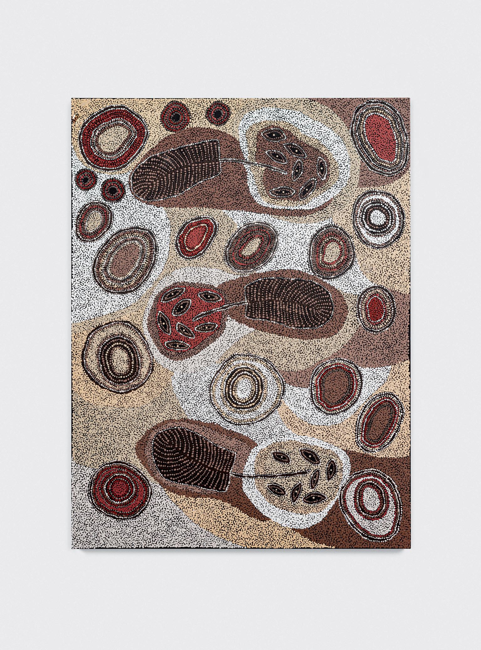
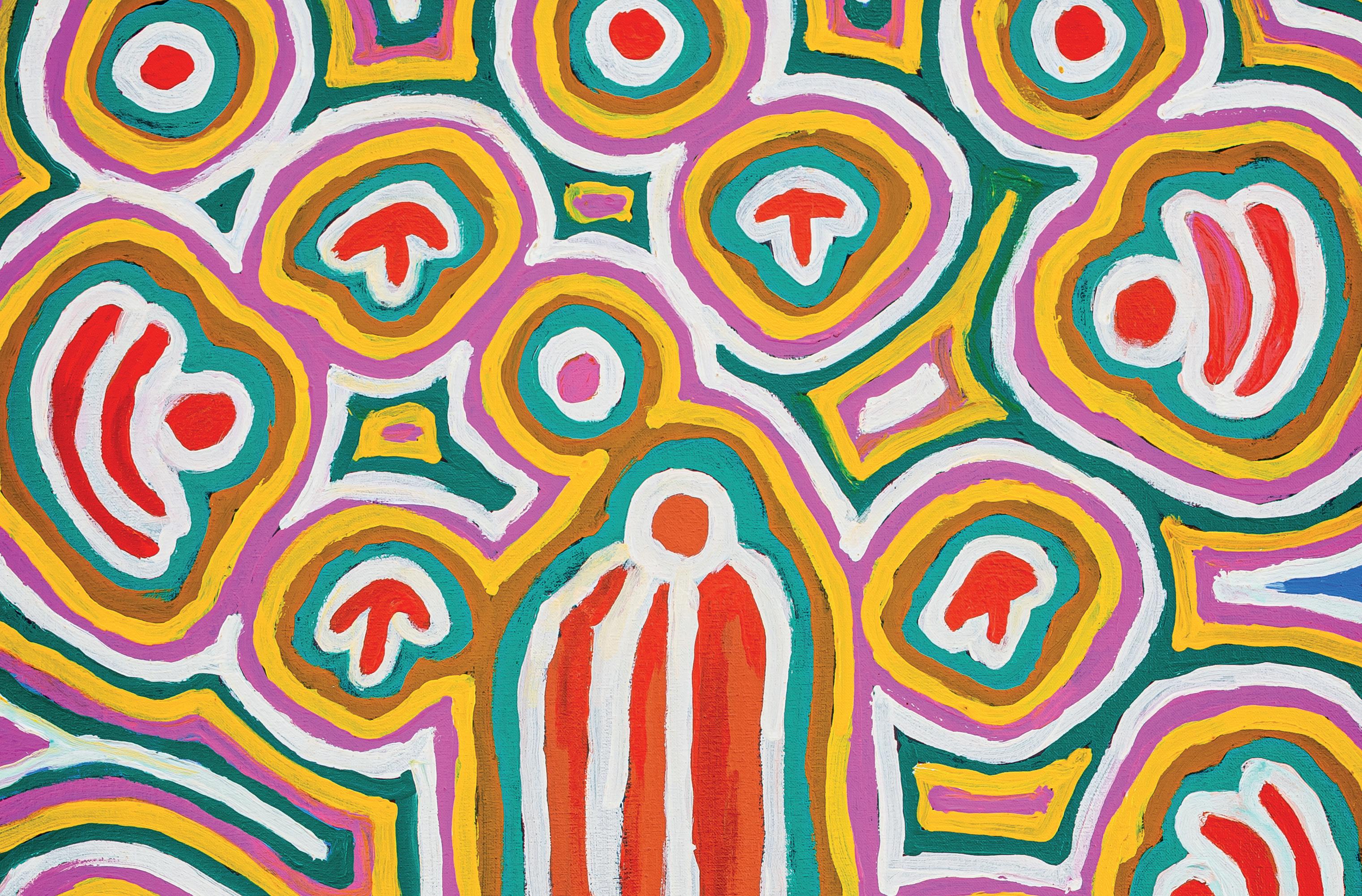
Margaret Pamparriya Martin, Turkey Dreaming (detail), 2010, acrylic on canvas, 120cm x 60cm. Image courtesy of Paul Williamson.
Artwork
Photography:
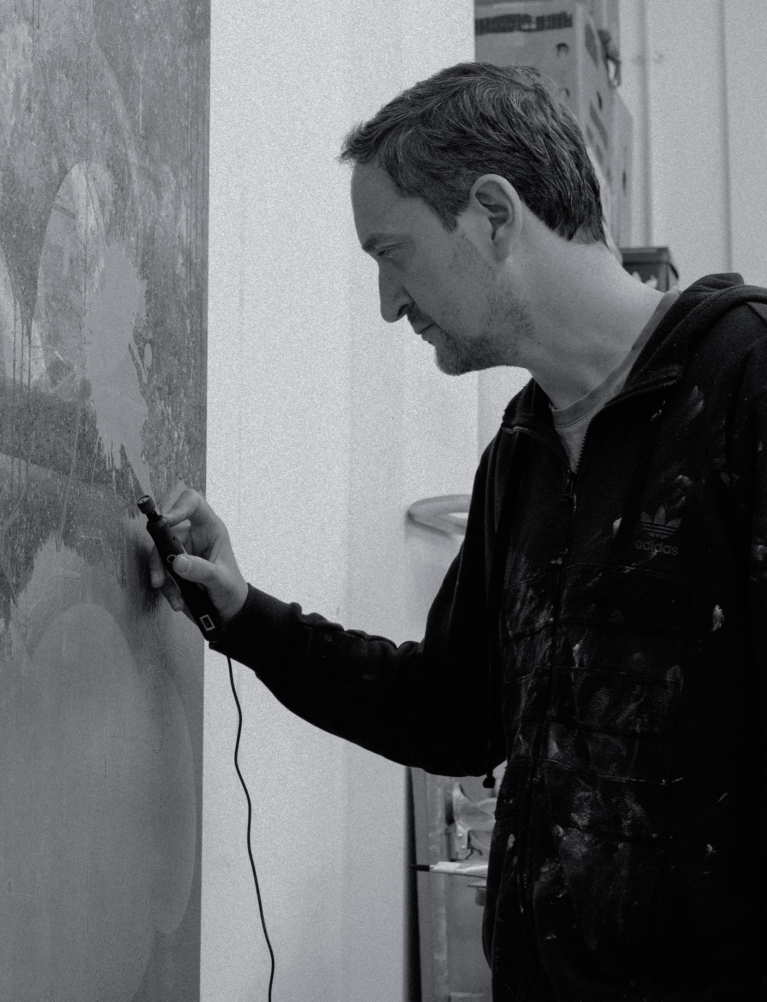
Editorial design:
© 2025 JGM Gallery. All rights reserved.
ISBN: 978-1-0682487-0-2
JGM Gallery
Front cover: Olly Fathers, Wander Through (detail), 2025, walnut burl, Kevasingo, iced birch, cherry, 121cm x 243cm. Image courtesy of Paul Williamson. Back cover: Ralph Anderson in his South London studio, 2025. Image courtesy of Julius Killerby.
Julius Killerby.
Utopia Art Centre, Rikard Österlund, Tyson Millar, Justyna Kulam, Julius Killerby & Iwantja Arts.
Photography: Olly Fathers' studio, Konstantinos Argyroglou’s studio, Paul Williamson, Julius Killerby & Benjamin Deakin.